Artists: David Goldblatt met Paul Alberts, Pieter Hugo, Santu Mofokeng, Sabelo Mlangeni, Zanele Muholi, Jo Ractliffe, Michael Subotzky, Guy Tillim, Graeme Williams and others, and the Market Photo Workshop in Johannesburg
Santu Mofokeng (South African, 1956-2020) Sunflowers harvest, Vaalrand farm, Bloemhof 1988 From the Bloemhof Series, 1988-1989, 1994
A raft of exhibitions finishing on the 8th June 2014 means a lot of postings over the next few days. This posting continues my fascination with African photography. The two excellent photographs by David Goldblatt are the stand out here, along with the portrait by Mikhael Subotzky.
Dr Marcus Bunyan
Many thankx to Huis Marseille for allowing me to publish the photographs in the posting. Please click on the photographs for a larger version of the image.
Santu Mofokeng (South African, 1956-2020) Windmill, Vaalrand 1988 From the Bloemhof Series, 1988-1989, 1994
Jo Ractliffe (South African, b. 1961) Military watchtower in a domestic garden, Riemvasmaak 2013 From The Borderlands (2011-2013)
Jo Ractliffe (South African, b. 1961) Playing soccer with marbles, Platfontein 2012 From The Borderlands (2011-2013)
Graeme Williams (South African, b. 1958) Kempton Park Nd From Previously Important Places series 1990s -2013
The Emperors Palace Casino and Chariots Entertainment World was build on the site [ in… add please date and place… ]? were the negotiations leading up to the Convention for a Democratic South Africa (CODESA) took place. Now, at the very same place a statue of the Roman Emperor Caesar Augustus greets visitors at the entrance of the afore mentioned entertainment centre.
Pieter Hugo (South African, b. 1976) In Sipho Ntsibande’s Home, Soweto 2013 From the series Kin, 2013
Guy Tillim (South African, b. 1962) Neri James, Petros Village, Malawi 2006 From the series Petros Village, 2006
“The scars left in South Africa’s collective memory by its apartheid regime were also inscribed visually on its collective retina. There is less consensus, however, on the period of ‘truth and reconciliation’ after political apartheid came to an end in South Africa in 1990. The exhibition Apartheid and After addresses the question: where did photographers whose earlier work had opposed the apartheid regime point their cameras after 1980?
They include David Goldblatt, for instance, now an éminence grise of South African photography whose exhibition Cross Sections hung in Huis Marseille and others. Has South African democracy been given a face? Where is the real development happening? And where are the scars? Has South African national identity got stuck on a runaway merry-go-round, as the South African visual artist William Kentridge has suggested? One thing is clear: after apartheid, most South African photographers continued to make their own country their work domain, and in doing so they have gained a considerable international reputation.”
“It is astonishing to think that until the beginning of the 1990s, merely two decades ago, modern and contemporary African photography was largely in the shadows.”
Okwui Enwezor in Events of the Self: Portraiture and Social Identity: Contemporary African Photography from the Walther Collection, Steidl, 2013, p. 23.
David Goldblatt (South African, 1930-2018) Child minder, Joubert Park, Johannesburg, 1975 (no.11) 1975 From the series Particulars, 2003 (publishing date)
David Goldblatt (South African, 1930-2018) Man on a beach, Joubert Park, Johannesburg, 1975 (no. 2) 1975 From the series Particulars, 2003 (publishing date)
Sabelo Mlangeni (South African, b. 1980) Coming to Johannesburg I, January, 2011 2011
Sabelo Mlangeni (South African, b. 1980) Coming to Johannesburg I, January, 2011 2011
Daniel Naudé (South African, b. 1984) Africanis 23. Richmond, Northern Cape, 298 January 2009 2009
Mikhael Subotzky (South African, b. 1981) Joseph Dlamini (Eye test), Matsho Tsmombeni squatter camp 2012 From the series Retinal Shift
Graeme Williams (South African, b. 1958) Nelson Mandela speaks at CODESA, 199..? Nd From Previously Important Places series 1990s-2013
Zanele Muholi (South African, b. 1972) Being (T)here (Amsterdam) 2009
Paul Alberts (South African, 1946-2010) The portraits of the applicants 1994 Gelatin silver prints
As the 1994 election approached in South-Africa many blacks living in small towns and rural areas had never been officially identified. In order to speed up these otherwise slow procedures, Charmaine and Paul Alberts set up an official, but temporary office and studio to process applications. The portraits of the applicants were taken before a paper back drop in the community hall of Majwemasweu. Each person held a slate with a number that corresponded to the number of the film and exposure, plus their name and place where they lived.
Huis Marseille – Museum for Photography Keizersgracht 401 1016 EK Amsterdam
“Maier doesn’t have a partner to dance with. She sees something well enough, whereas Lee Friedlander expects something. If there is an idea out there in the ether she grabs onto it in a slightly derivative way. Maier states that these things happened with this subject matter but with Arbus, for example, she meets something extra/ordinary and alien – and goes beyond, beyond, beyond.”
Dr Marcus Bunyan May 2014
The next best thing
The photographs of Vivian Maier. Unknown in her lifetime (nanny as secretive photographer), her negatives discovered at an auction after her death – some developed, all scanned, in some cases cropped, the medium format images then printed. The latest “must have” for any self respecting photography collection, be it private or public. But are they really that good?
To be unequivocal about it, they are good – but, in most cases, they are not “great”. Maier is a very good photographer but she will never be a great photographer. This might come as a surprise to the legions of fans on Facebook (and the thousands of ‘Likes’ for each image), those who think that she is the best thing since sliced bread. But let’s look at the evidence – the work itself.
The photographs can seen on the Vivian Maier Official website and I have spent quite a lot of time looking at them. As with any artist, there are some strong images and some not so strong ones but few reach ‘master’ status. The lighting is good, the use of low depth of field, the location and the presence of the people she photographed are all there, as are the influences that you recite in your mind as to the people her photographs remind you of: Lewis Hine, Berenice Abbott, Lisette Model, Diane Arbus, Helen Levitt, Lee Friedlander et al.
Somehow through all this she makes the photographs she takes her own for she has a “rare sense of photographic vision” as Edward Petrosky expressed it on my LinkedIn page, but ultimately they don’t really take you anywhere. It’s like she has an addiction to taking photographs (a la Gary Winogrand), but no way of advancing her art to the next level.
Vivien Maier’s photographs stand out because she hasn’t withheld enough within them. What do I mean by that? Let’s look at some examples to explain what I mean…
Included in the postings are two comparisons: Vivian Maier, June 19, 1961, Chicago IL, 1961 / Lee Friedlander, Stony Point, New York, 1966; and Vivian Maier, New York, Nd 1966 / Berenice Abbott, New York at Night, 1932. As with most of Maier’s photography, she relies on intuition when taking a photograph and a bloody good intuition it is too. This intuition usually stands her in good stead and she almost always gets the shot, but there is an underlying lack of structure to her images. Here I am talking as much about psychological structure as physical structure, for both go hand in hand.
If we compare the Maier with the Friedlander we can say that, if we look at the windows in the Friedlander, every one is a masterpiece! From the mother and son at left with the white-coated marchers, to the central window with the miniature house, dog and tree, to the dark-suited marchers at right. Everything feels compelling, intricate weavings of a narrative that the viewer has to try and make sense of. Each part of the Friedlander image is absolutely necessary for that picture… whereas there are so many things in the Vivien Maier that belong in other pictures ie. a good picture but a lot that doesn’t belong in that picture. Things that should have been held back, by making another image somewhere else. Her narrative is confusing and thus the eye is also confused.
A similar scenario can be observed when comparing the photographs of New York at night by Abbott and Maier. Abbott’s photograph is a tight, orchestrated and muscular rendition of the city which seethes with energy and form. Maier’s interpretation fades off into nothingness, the main arterials of the city leading the eye up to the horizon line and then [nothing]. It is a pleasant but wishy-washy photograph, with all the energy of the city draining away in the mind and in the eye.
One of Maier’s photographs that most resonates with me is September 1953, New York, NY (1953, below). This IS a masterpiece. There is a conciseness of vision here, reminiscent of Weston’s Nude of 1938 with its link to the anamorphic structure of his photographs of peppers. There is nothing auxiliary to the purpose of the photograph, yet there is that indefinable something that takes it out of itself. The dirt of the clothes, under the fingers, the ring on the hand, the shape that no human should be in and its descent onto the pavement, the despair of that descent captured in the angle of the camera looking down on the victim. The photograph has empathy, promotes understanding and empathy in the viewer. Most of us have been there. Other photographs that approach a higher perspective are Maier’s self-portraits, in which there is a conscious exploration of her reflection in/of the world: a slightly dour, serious figure reflected back from the world into the lens of the camera – a refracted identity, the phenomenon of self as light passing obliquely through the interface between one medium and another, between living, the camera and memory.
But too often Maier’s photographs are just so… obvious. Did she wait long enough for the composition to reveal itself to her more, god what’s the word, more ambiguously. Maier doesn’t have a partner to dance with. She sees something well enough, whereas Lee Friedlander expects something. If there is an idea out there in the ether she grabs onto it in a slightly derivative way. Maier states that these things happened with this subject matter but with Arbus, for example, she meets something extra/ordinary and alien – and goes beyond, beyond, beyond.
What we can say is that Maier’s vision is very good, her intuition excellent, but there is, critically, not that indefinable something that takes her images from good to great. This is the key thing – everything is usually thrown at the image, she withholds nothing, and this invariably stops them taking that step to the next level. This is a mighty difficult step for any artist to take, let alone one taking photographs in the shadows.
Personally I don’t believe that these images are a “photographic revelation” in the spirit of Minor White. What is a revelation is how eagerly they have been embraced around the world as great images without people really looking deeply at the work; how masterfully they have been promoted through films, books, websites and exhibitions; how Maier’s privacy has been expunged in the quest for dollars; and how we know very little about her vision for the negatives as there are no extant prints of the work.
Dr Marcus Bunyan
Many thankx to the Château de Tours for allowing me to publish the photographs in the posting. Please click on the photographs for a larger version of the image.
Edward Weston (American, 1886-1958) Nude 1936 Gelatin silver print
Vivian Maier was the archetypal self-taught photographer with a keen sense of observation and an eye for composition. She was born in New York in 1926, but spent part of her childhood in France before returning to New York in 1951 when she started taking photos. In 1956, she moved to Chicago, where she lived until her death in 2009.
Her talent is comparable with that of the major figures of American street photography such as Lisette Model, Helen Levitt, Diane Arbus and Garry Winogrand. The exhibition presented at the Château de Tours by the Jeu de Paume, in partnership with the Municipality of Tours and diChroma photography, is the largest ever exhibition in France devoted to Vivian Maier. It includes 120 black and white and colour gelatin silver prints from the original slides and negatives, as well as extracts from Super 8 films she made in the 60s and 70s. This project, which is sourced from John Maloof’s collection, with the valuable assistance of Howard Greenberg Gallery in New York, reveals a poetic vision that is imbued with humanity.
John Maloof discovered Vivian Maier’s astonishing photos completely by chance in 2007 at an auction in Chicago. At the time, this young collector was looking for historical documentation about a specific neighbourhood of the city and he bought a sizeable lot of prints, negatives and slides (of which a major part had not even been developed) as well as some Super 8 films by an unknown and enigmatic photographer, Vivian Maier. By all accounts, Vivian Maier was a discreet person and somewhat of a loner. She took more than 120,000 photos over a period of thirty years and only showed this consequential body of work to a mere handful of people during her lifetime.
Vivian Maier earned her living as a governess, but all her free time and every day off was spent walking through the streets of New York, then later Chicago, with a camera slung around her neck (first of all box or folding cameras, later a Leica) taking photos. The children she looked after describe her as a cultivated and open-minded woman, generous but not very warm. Her images on the other hand bear witness to her curiosity for everyday life and the attention she paid to those passers – by who caught her eye: facial features, bearing, outfits and fashion accessories for the well-to-do and the telltale signs of poverty for those who were less fortunate.
While some photos are obviously furtively taken snapshots, others bear witness to a real encounter between the photographer and her models, who are photographed face-on and from close up. Her photos of homeless people and people living on the fringe of society demonstrate the depth of her empathy as she painted a somewhat disturbing portrait of an America whose economic boom was leaving many by the wayside.
Vivian Maier remained totally unknown until her death in April 2009. She had been taken in by the Gensburgs, for whom she had worked for almost seventeen years, and many of her possessions as well as her entire photographic output had been placed in storage. It was seized and sold in 2007 to settle unpaid bills.
Her biography has now been reconstructed, at least in part, thanks to a wealth of research and interviews carried out by John Maloof and Jeffrey Goldstein after the death of Vivian Maier. Jeffrey Goldstein is another collector who purchased a large part of her work. According to official documents, Vivian Maier was of Austro-Hungarian and French origin and her various trips to Europe, in particular to France (in the Alpine valley of Champsaur where she spent part of her childhood) have been clearly identified and documented. However, the circumstances that led her to take an interest in photography and her life as an artist remain veiled in mystery.
Photography seemed to be much more than a passion: her photographic activity was the result of a deeply felt need, almost an obsession. Each time she changed employers and had to move house, all her boxes and boxes of films (that she hadn’t had developed for want of money), as well as her archives comprising books and press cuttings about various stories in the news, came along too.
Vivian Maier’s body of work highlights those seemingly insignificant details that she came across during her long walks through the city streets: odd gestures, strange figures and graphic arrangements of figures in space. She also produced a series of captivating self-portraits from her reflection in mirrors and shop windows.
Curators: Organised by Barry Bergdoll (Acting Chief Curator of Architecture and Design, MoMA) and Carole Ann Fabian (Director, Avery Architectural and Fine Arts Library), with Janet Parks (Curator of Drawings & Archives, Avery) and Phoebe Springstubb (Curatorial Assistant, MoMA)
Frank Lloyd Wright (American, 1867-1959) Grouped Towers, Chicago Project 1930 Perspective Pencil on tracing paper 19 x 28 1/4″ (48.3 x 71.8cm) The Frank Lloyd Wright Foundation Archives (The Museum of Modern Art | Avery Architectural & Fine Arts Library, Columbia University, New York)
A change of pace now… some exquisite drawings in this posting about the work of Frank Lloyd Wright. It’s a pity they can’t build a skyscraper such as the beautiful Mile High in Melbourne, instead of all the non-descript towers that are going up all over the place. At least we would then have a masterpiece on our hands.
Dr Marcus Bunyan
Many thankx to MoMA for allowing me to publish the art work and photographs in the posting. Please click on the photographs for a larger version of the image.
Frank Lloyd Wright (American, 1867-1959) Grouped Towers, Chicago Project 1930 Plan of the five towers and shared pedestal Pencil on tracing paper 13 3/4 x 35 3/8″ (34.9 x 89.9cm) The Frank Lloyd Wright Foundation Archives (The Museum of Modern Art | Avery Architectural & Fine Arts Library, Columbia University, New York)
Frank Lloyd Wright (American, 1867-1959) Broadacre City Project 1934-1935 Study for a plan of a highway interchange Pencil and coloured pencil on tracing paper 22 x 35″ (55.9 x 88.9cm) The Frank Lloyd Wright Foundation Archives (The Museum of Modern Art | Avery Architectural & Fine Arts Library, Columbia University, New York)
Frank Lloyd Wright and the City: Density vs. Dispersal celebrates the recent joint acquisition of Frank Lloyd Wright’s extensive archive by MoMA and Columbia University’s Avery Architectural and Fine Arts Library. Through an initial selection of drawings, films, and large-scale architectural models, the exhibition examines the tension in Wright’s thinking about the growing American city in the 1920s and 1930s, when he worked simultaneously on radical new forms for the skyscraper and on a comprehensive plan for the urbanisation of the American landscape titled “Broadacre City.” Visitors encounter the spectacular 12-foot-by-12-foot model of this plan, which merges one of the earliest schemes for a highway flyover with an expansive, agrarian domain.
Promoted and updated throughout Wright’s life, the model toured the country for several years in the 1930s, beginning with a display at Rockefeller Center. This dispersed vision is paired with Wright’s innovative structural experiments for building the vertical city. Projects, from the early San Francisco Call Building (1912), to Manhattan’s St. Mark’s-in-the-Bouwerie Towers (1927-1931), to a polemical mile-high skyscraper, engage questions of urban density and seek to bring light and landscape to the tall building. Highlighting Wright’s complex relationship to the city, the material reveals Wright as a compelling theorist of both its horizontal and vertical aspects. His work, in this way, is not only of historic importance but of remarkable relevance to current debates on urban concentration.
Text from the MoMA website
Frank Lloyd Wright and his assistant Eugene Masselink installing the exhibition Frank Lloyd Wright: American Architect at The Museum of Modern Art, November 13, 1940 – January 5, 1941. Photographic Archive. The Museum of Modern Art Archives, New York Photo: Soichi Sunami
Frank Lloyd Wright (American, 1867-1959) Broadacre City Project 1934-1935 Model under construction in Chandler, Arizona, 1935 Gelatin silver print on paper 4 1/4 x 6 5/8″ (10.8 x 16.8cm) The Frank Lloyd Wright Foundation Archives (The Museum of Modern Art | Avery Architectural & Fine Arts Library, Columbia University, New York) Photo: Roy E. Peterson
Frank Lloyd Wright (American, 1867-1959) Broadacre City Project 1934-1935 Taliesin fellows working on the model. Chandler, Arizona, 1935 Gelatin silver print on paper 9 9/16 x 7″ (24.3 x 17.8cm) The Frank Lloyd Wright Foundation Archives (The Museum of Modern Art | Avery Architectural & Fine Arts Library, Columbia University, New York)
Frank Lloyd Wright (American, 1867-1959) Broadacre City Project 1934-1935 Model in four sections Painted wood, cardboard, and paper 152 x 152″ (386.1 x 386.1cm) The Frank Lloyd Wright Foundation Archives (The Museum of Modern Art | Avery Architectural & Fine Arts Library, Columbia University, New York)
Frank Lloyd Wright (American, 1867-1959) H. C. Price Company Tower, Bartlesville, Oklahoma 1952-1956 Apprentices working on the model in the Taliesin drafting room. Spring Green, Wisconsin, c. 1952 Gelatin silver print on paper 7 3/4 x 9 1/2″ (19.7 x 24.1cm) The Frank Lloyd Wright Foundation Archives (The Museum of Modern Art | Avery Architectural & Fine Arts Library, Columbia University, New York)
The Museum of Modern Art presents Frank Lloyd Wright and the City: Density vs. Dispersal, which celebrates the recent joint acquisition of Frank Lloyd Wright’s extensive archive by MoMA and Columbia University’s Avery Architectural and Fine Arts Library, on view from February 1 to June 1, 2014. Frank Lloyd Wright (1867- 1959) – perhaps the most influential American architect of the 20th century – was deeply ambivalent about cities. For decades, Wright was seen as the prophet of America’s post–World War II suburban sprawl, yet the dispersed cities that he envisaged were also carefully planned – quite distinct from the disorganised landscapes that often developed instead. Paradoxically, Wright was also a lifelong prophet of the race for height that has played out around the world. Through an initial selection of drawings, films, and large-scale architectural models, the exhibition examines the tension in Wright’s thinking about the growing American city from the 1920s to the 1950s, when he worked simultaneously on radical new forms for the skyscraper and on a comprehensive plan for the urbanisation of the American landscape titled “Broadacre City.” The exhibition is organised by Barry Bergdoll, Acting Chief Curator of Architecture and Design, MoMA, and Carole Ann Fabian, Director, Avery Architectural and Fine Arts Library, with Janet Parks, Curator of Drawings & Archives, Avery Architectural and Fine Arts Library, and Phoebe Springstubb, Curatorial Assistant, Department of Architecture and Design, MoMA.
On view is Wright’s 1934-35 manifesto project, for what he called “Broadacre City,” which embodied his quest for a city of private houses set in nature and spread across the countryside. He believed that advances in technology had rendered obsolete the dense cities created by industry and immigration in the late 19th and early 20th centuries. Distributed along a rectilinear grid, these one-acre homesteads were to be combined with small-scale manufacturing, community centers, and local farming, and interspersed with parklands to form a carpet-like pattern of urbanisation. Visitors encounter the spectacular 12-foot-by-12-foot model of this plan, which merges one of the earliest schemes for a highway flyover with an expansive, agrarian domain. Promoted and updated throughout Wright’s life, the model toured the country for several years in the 1930s, beginning with a display at New York City’s Rockefeller Center. It is juxtaposed with the monumental models and drawings produced of his skyscraper visions: the six-foot tall model of his 1913 San Francisco Call Building; the model of his only built residential tower, the Price Tower, in Bartlesville, Oklahoma of 1952-56; and the eight-foot drawings of the Mile High tower project.
This dispersed vision is paired with Wright’s innovative structural experiments for building the vertical city, which engaged questions of urban density and sought to bring light and landscape settings to tall buildings. His ambitions grew from a 24-story design for the offices of the San Francisco Call newspaper (1913) to the 548-story, mile-high tower he envisioned in Chicago (1956) – a building large enough to house the entire population of Broadacre City. Wright’s proposal for the San Francisco Call Building celebrates verticality: repeated piers emphasise the height, drawing the eye up to a startlingly cantilevered cornice pierced with slots that frame the sky and allow daylight to wash the facades for dramatic effect. His design for the National Life Insurance Company Building (1924-1925) features a tower clad entirely in glass, setting aside the load-bearing frame of the Call Building to experiment with the curtain wall and other new building technologies. The project reveals Wright as a key participant in international debates on the possibility of cladding a tall building with a transparent glass facade, rather than cladding it in ornamental masonry for decorative effect.
An unregulated building boom in the 1920s in New York and Chicago resulted in an unprecedented urban density that Wright described as “congestion.” In response, he devised the Skyscraper Regulation – a set of design rules governing the lateral and vertical growth of American cities. By regulating the location and height of tall buildings, Wright sought to optimise light and views and to minimise the effects of closely spaced tall buildings that were turning urban streets into shadowy canyons. Wright’s Skyscraper Regulation was his last attempt to address the inherited city. He would turn instead to devising a set of regulations for an entirely new and dispersed urban fabric (Broadacre City), in which the unit of the city block was exchanged for the farmed acre.
In 1927, Wright’s design for the financially troubled Church of St. Mark’s-in-the-Bowery dramatically transformed the building by having the floors project outward from a single central core plunged deep into the ground. The concrete floors tapered toward the periphery, which he compared to the structural concept of the “taproot” of a tree. This “taproot” structure was finally tested in built form in the S.C. Johnson & Son Research Laboratory Tower (1943-1950) in Racine, Wisconsin. In 1956, Wright unveiled a 26-foot-tall rendering of a gleaming, vertiginously tapered skyscraper – which he said would house 100,000 employees of the state of Illinois. The mile-high tower adopts the “taproot” structure he had articulated 30 years before, in which a skyscraper’s vertical ascent is stabilised by a foundation plunged deep into the ground. Both a polemic and a rationalised proposal for the future of tall buildings, the Mile High marks the definitive return of Wright’s tower to the city. The Mile High embodies Wright’s paradoxical attitude toward the American city: meant to condense the experience of urban life and work within a single telescoping form, freeing the ground for the realisation of Broadacre, holding in tension two idealized images of the city – its extraordinary vertical reach and its extreme horizontal extension.
Press release from the MoMA website
Frank Lloyd Wright (American, 1867-1959) National Life Insurance Company Building, Chicago Project 1924-1925 Axonometric view Coloured pencil on tracing paper 40 x 24″ (101.6 x 61cm) The Frank Lloyd Wright Foundation Archives (The Museum of Modern Art | Avery Architectural & Fine Arts Library, Columbia University, New York)
Frank Lloyd Wright (American, 1867-1959) S.C. Johnson & Son Inc. Research Laboratory Tower, Racine, Wisconsin 1943-1950 Section Pencil, coloured pencil, and ink on tracing paper 35 1/8 x 20″ (89.2 x 50.8cm) The Frank Lloyd Wright Foundation Archives (The Museum of Modern Art | Avery Architectural & Fine Arts Library, Columbia University, New York)
Frank Lloyd Wright (American, 1867-1959) St. Mark’s-in-the-Bouwerie Towers, New York Project 1927-1931 Aerial perspective Pencil and coloured pencil on tracing paper 23 3/4 x 15″ (60.3 x 38.1cm) The Museum of Modern Art, New York. Jeffrey P. Klein Purchase Fund, Barbara Pine Purchase Fund, and Frederieke Taylor Purchase Fund
Frank Lloyd Wright (American, 1867-1959) St. Mark’s-in-the-Bouwerie Tower, New York Project 1927-1931 Perspective, 1928 Pencil and coloured pencil on tracing paper 28 1/4 x 10 1/8″ (71.8 x 25.7cm) The Frank Lloyd Wright Foundation Archives (The Museum of Modern Art | Avery Architectural & Fine Arts Library, Columbia University, New York)
Frank Lloyd Wright (American, 1867-1959) St. Mark’s-in-the-Bouwerie Tower, New York Project 1927-1931 Section and perspective cutaway of a duplex apartment with balcony and living-room floor plans, 1929 Ink, pencil, and coloured pencil on linen window shade 47 x 35″ (119.4 x 88.9cm) The Frank Lloyd Wright Foundation Archives (The Museum of Modern Art | Avery Architectural & Fine Arts Library, Columbia University, New York)
Frank Lloyd Wright (American, 1867-1959) The San Francisco Call Building Project 1913 Preliminary perspective Pencil, coloured pencil, and cut-and-pasted tracing paper on paper 47 3/4 x 23 7/8″ (121.3 x 60.6cm) The Frank Lloyd Wright Foundation Archives (The Museum of Modern Art | Avery Architectural & Fine Arts Library, Columbia University, New York)
Frank Lloyd Wright (American, 1867-1959) The Mile High Illinois, Chicago Project 1956 Perspective with Wright’s Golden Beacon Apartment Building project (1956-1957) Pencil, coloured pencil, ink, and gold ink on tracing paper 105 x 30″ (266.7 x 76.2cm) The Frank Lloyd Wright Foundation Archives (The Museum of Modern Art | Avery Architectural & Fine Arts Library, Columbia University, New York)
The Museum of Modern Art 11 West 53 Street New York, NY 10019 Phone: (212) 708-9400
Opening hours: 10.30 am – 5.30 pm Open seven days a week
In researching photographs for the upcoming exhibition Out of the closets, onto the streets: Gay Liberation photography 1971-73I came across this photograph taken by Ponch Hawkes of the Gay Liberation march that was part of Gay Pride week in 1973. Ponch had never seen this image before until I scanned the negative. And there, front and centre as always, is Rennie Ellis capturing the action… What a special find and a wonderful photograph by Ponch!
We Are Family
This is FAB, one of the best experiences I have had this year at an exhibition in Melbourne. You know you are having a good time when you laugh out loud at so many photographs, sharing the experience of the artist as though you had been there. As indeed I had, for in many cases the clubs pictured in Rennie Ellis’ photographs are the ones I went to.
I remember: Wednesday nights at Inflation in the late 80s, where to satisfy licensing restrictions you had to be served a “meal” so that you could drink alcohol (Dining Out, Inflation, 1980 below). The famous Razor Club (1986-1992), based at the Light Car Club of Australia’s clubrooms on the corner of Queens Road and Roy Street, opposite the Albert Park Lake and golf course. “It was Melbourne’s version of Studio 54, the hedonistic, off-the-wall New York disco of the late ’70s – both places notoriously hard to get into but once inside a wonderland of celebrities, freaks, transvestites and fantastic music free from the tyranny of genre.” Once on a big party night the gang of us tried to get in but the queue was so long it was impossible – so I went down the side, climbed up the drain pipes past the ladies loo, and up to the first floor balcony where someone pulled me over – completely off my face, just to get my friends in. Zu Zu’s, Cadillac Bar, 397, Commerce Club, Tasty, Freakazoid, Dome, Baseline, Hardware Club, The Peel and so many parties you could poke a stick at – what a time we had!
There to capture it all – affectionately, non-judgementally – was Rennie Ellis. He wasn’t like Diane Arbus, who thrust her camera as an outsider at people, waiting for a reaction. He was always part of the action because he was part of the family. He was a humanist photographer in the true sense of the word, for he loved photographing human beings, their social relations and their habitats, whatever that might be – sunning, partying, boozing, smoking, picking up. He referred to himself as a “people perv.”
Ellis had an eloquently “clumsy” eye, and for the type of baroque photographs he took this is a great thing. No perfect framing, no perfect tension points within the image, no regular alignment of horizontals, verticals or diagonals – just instinctual images taken in a split second, with his own particular brand of humour embedded in them. And always with this slight eccentricity in his vision. Look at the image of Dancing People, Razor Club (1991, below) and notice the odd hand poking in at the left hand side and the attitude of the dancers, or Fully equipped, Albert Park Beach (c. 1981, below), with the angle of the three cigarettes, the drink and the bottle of sun tan lotion strapped to the hip – FIERCE!
But he was not averse to understanding the structure of his images either, as can be seen by my comparison between the tight, formal structure of Paul Strand’s The Family, Luzzara, Italy (1953, below) and the looser, more natural gathering in Ellis’ The Gang, Windsor (1976, below); or the influence of other artists on his work, for example Norman Lindsay in his My Bare Lady, The Ritz, St Kilda (1977, below). Ellis also liked to push and pull at the pictorial plane; he liked to use pairs of people; he was not afraid of out of focus elements in the foreground of his images; he used chiaroscuro; and his use of light is always excellent. Above all, there is a consistency to his vision that never falters – a concatenation of images that is his style?
This is not just nostalgia. These are bloody good images, and Ellis takes these insightful type of images over and over again – the excesses of hedonism, the influences of wealth, the see-and-be-seen syndrome, things erotic and bizarre and, most importantly, enduring friendships. He photographs what he sees with a love and affection for his subject matter. None of this “staged” vernacular photography that I recently featured in an exhibition at the Art Gallery of New South Wales. This is the real deal. A friend said to me recently, “Ah, but you know, he never did in depth photo-essays like Mary Ellen Mark did of the circus, for example.” To which I have a one word reply: BULLSHIT.
His whole oeuvre is a huge photo-essay on the human race, specifically the construction of Australian identity as evidenced in sections like portraits, gangs, sharpies, Aboriginals, Kings Cross, Social Documentary, Decadence, Graffiti, Life’s a Parade, Life’s a Beach etc…
When you look at his photography it would seem to me that his images dissolve the barriers between image / subject / viewer. It’s a strange phenomena to feel so connected to a person’s work. It’s the journey that he takes us on, that we went on too – not so much the destination but the rejoicing in this journey… of company, of environment, friends, places – the joy of being human. He was allowed entry into these public/private spaces because he earned our trust. He lived with the people, and they allowed him to take a bit of their life with him – as a photographic memory, to be retold and relived in the present, allowing us all to relive those times and places. It’s the love, trust, humour and anticipation of the journey that make Ellis’ images truly unique in the history of Australian photography.
Dr Marcus Bunyan
Many thankx to Manuela Furci, Rennie Ellis Photographic Archive and the Monash Gallery of Art for allowing me to publish the photographs in the posting. Please click on the photographs for a larger version of the image.
Rennie Ellis (Australian, 1940-2003) Dancing People, Razor Club 1991 Selenium-toned gelatin silver print 26.7 x 40.7cm Courtesy of the Rennie Ellis Photographic Archive
Robyn Dean (Australian) Marcus dancing at an unknown club, Melbourne c. 1991-1992
Rennie Ellis (Australian, 1940-2003) Dining Out, Inflation 1980 Selenium-toned gelatin silver print 26.7 x 40.7cm Courtesy of the Rennie Ellis Photographic Archive
Sister Sledge – We Are Family (1979) Official Video
Rennie Ellis (Australian, 1940-2003) Fitzroy extrovert 1974 Selenium-toned gelatin silver print 40.5 x 50.8cm Courtesy of the Rennie Ellis Photographic Archive
Rennie Ellis (Australian, 1940-2003) Dino Ferrari, Toorak Road 1976 Selenium-toned gelatin silver print 26.7 x 40.7cm Courtesy of the Rennie Ellis Photographic Archive
Rennie Ellis (Australian, 1940-2003) Bon Scott and Angus Young, Atlanta, Georgia 1978 Selenium-toned gelatin silver print 26.7 x 40.7cm Courtesy of the Rennie Ellis Photographic Archive
Ronald Belford “Bon” Scott (9 July 1946 – 19 February 1980) was a Scottish-born Australian rock musician, best known for being the lead singer and lyricist of Australian hard rock band AC/DC from 1974 until his death in 1980.
Angus McKinnon Young (born 31 March 1955) is a Scottish-born Australian guitarist best known as a co-founder, lead guitarist, and songwriter of the Australian hard rock band, AC/DC. Known for his energetic performances, schoolboy-uniform stage outfits, and popularisation of Chuck Berry’s duckwalk, Rolling Stone magazine ranked Young as the 24th greatest guitarist of all time.
AC/DC’s popularity grew throughout the 1970s, initially in Australia, and then internationally. Their 1979 album Highway to Hell reached the top twenty in the United States, and the band seemed on the verge of a commercial breakthrough. However, on 19 February 1980, Scott died after a night out in London. AC/DC briefly considered disbanding, but the group quickly recruited vocalist Brian Johnsonof the British glam rock band Geordie. AC/DC’s subsequent album, Back in Black, was released only five months later, and was a tribute to Scott.
Rennie Ellis (Australian, 1940-2003) At the Pub, Brisbane 1982 Selenium-toned gelatin silver print 26.7 x 40.7cm Courtesy of the Rennie Ellis Photographic Archive
Rennie Ellis (Australian, 1940-2003) The Gang, Windsor 1976 Selenium-toned gelatin silver print 26.7 x 40.7cm Courtesy of the Rennie Ellis Photographic Archive
Paul Strand (American, 1890-1976) The Family, Luzzara, Italy 1953 Silver gelatin photograph
The photographer Rennie Ellis (1940-2003) is a key figure in Australian visual culture. Ellis is best remembered for his effervescent observations of Australian life during the 1970s-90s, including his now iconic book Life is a beach. Although invariably inflected with his own personality and wit, the thousands of social documentary photographs taken by Ellis during this period now form an important historical record.
The Rennie Ellis Show highlights some of the defining images of Australian life from the 1970s and ’80s. This is the period of Gough Whitlam and Malcolm Fraser, Paul Keating and Bob Hawke; AC/DC and punk rock; cheap petrol and coconut oil; Hare Krishnas and Hookers and Deviant balls.
This exhibition of over 100 photographs provides a personal account of what Ellis termed ‘a great period of change’. Photographs explore the cultures and subcultures of the period, and provide a strong sense of a place that now seems worlds away, a world free of risk, of affordable inner city housing, of social protest, of disco and pub rock, of youth and exuberance.
Text from the MGA website
Rennie Ellis (Australian, 1940-2003) My son Josh learns to swim 1972 Selenium-toned gelatin silver print 26.7 x 40.7cm Courtesy of the Rennie Ellis Photographic Archive
Rennie Ellis (Australian, 1940-2003) My Bare Lady, The Ritz, St Kilda 1977 Digital C Type photograph Fuji Crystal Archive print Courtesy of the Rennie Ellis Photographic Archive
Norman Lindsay (Australian, 1879-1969) The Olympians Nd Oil on canvas Collection of Hamilton Art Gallery
Rennie Ellis (Australian, 1940-2003) Mr Muscleman, Albert Park Beach c. 1986 Chromogenic print 26.7 x 40.7cm Courtesy of the Rennie Ellis Photographic Archive
Rennie Ellis (Australian, 1940-2003) Fully equipped, Albert Park Beach c. 1981 Digital C Type photograph Fuji Crystal Archive print Courtesy of the Rennie Ellis Photographic Archive
Rennie Ellis (Australian, 1940-2003) Don and Patrizia, St Kilda Beach 1985 Chromogenic print 40.5 x 50.8cm Courtesy of the Rennie Ellis Photographic Archive
Rennie Ellis (Australian, 1940-2003) Berlin Party, Inflation, Melbourne 1980 Digital C Type photograph Fuji Crystal Archive print Courtesy of the Rennie Ellis Photographic Archive
Rennie Ellis book covers:Decade: 1970-1980 (left) and Decadent: 1980-2000 (right)
Decade: 1970-1980 is a photography book showcasing Rennie Ellis’ (1940-2003) contribution to photography and social history. With an introduction by film maker and Rennie contemporary Paul Cox and an essay by academic Susan Van Wyk, Decade highlights Ellis as one of Australia’s most important chroniclers of the 1970s. The photographs, predominantly black and white, are drawn from a core selection originally made by Rennie from his own unpublished book, supplemented by other significant and iconic images from 1970 to 1980 drawn from the Rennie Ellis Photographic Archive and the State Library of Victoria Rennie Ellis collection. Many of the photographs are accompanied by extended captions written by Rennie himself, published here for the first time. Decade explores the cultures and sub-cultures of the seventies: the political upheavals, alternative lifestyles and counter culture, the women’s movement, gay liberation, the new religions and cults, pop festivals, Vietnam and other protests, massage parlours, the disco scene, the blossoming of Australia’s film industry, the new sexual freedom, Aboriginal rights, street festivals, the new theatre, fashion, drugs and the emergence of a decadent and hedonistic society that would later characterise the 1980s.
Decadent: 1980-2000 is a photography book showcasing Rennie Ellis’ (1940-2003) contribution to photography and social history. It is a fascinating snapshot of the wild, opulent, sometimes tacky and always decadent 1980s in Australia by a true original. With an introduction by photographer and Rennie contemporary William Yang and an essay by photographer and art critic Robert McFarlane, Decadent highlights Ellis as one of Australia’s most important chroniclers of the 1980s. The photographs, both colour and black and white, are drawn from the Rennie Ellis Photographic Archive and the State Library of Victoria Rennie Ellis collection. Decadent explores the rise of the hedonism that we now associate with the 1980s. Ellis’ boundary-pushing, racy and sometimes voyeuristic works capture a society that seems to be revelling in its abandonment of the politically charged 1970s documented in Decade.
About the Author
No other photographer has documented – in such depth – the life and times in Australia, throughout the 1970s until his death in 2003, with such insight into the human condition as Rennie Ellis. His non-judgmental approach was his ‘access-to-all-areas’ pass. Ellis used his camera as a key to open the doors to the social arenas of the rich and famous and to enter the underbelly of the nightclubs, bearing witness to the indulgences and excesses. In today’s post-[Bill] Henson era, these captured moments offer an intimate access to an Australia tantalisingly, but sadly, now almost out of reach.
Rennie Ellis (Australian, 1940-2003) Richmond fans, Grand Final, MCG 1974 Chromogenic print 40.5 x 50.8 cm Courtesy of the Rennie Ellis Photographic Archive
Interesting to note that Ellis must have been shooting both black and white and colour film during the VFL Grand Final of 1974. He must have had two cameras with him (this is more likely than swapping between films in the same 35mm camera) to shoot the photograph above in colour and the black and white image of Robbie McGhie (1974, below).
Rennie Ellis (Australian, 1940-2003) Robert McGhie, Grand Final, MCG 1974 Selenium-toned gelatin silver print 50.8 x 40.5cm Courtesy of the Rennie Ellis Photographic Archive
Robert ‘Robbie’ McGhie is a former Australian rules football player who played in the VFL between 1969 and 1972 and again in 1979 for the Footscray Football Club, from 1973 to 1978 for the Richmond Football Club and in 1980 and 1981 for the South Melbourne Football Club. His height was 192 cm and he weighed 85.5 kg. He played 46 games for Footscray, 80 games for Richmond and 16 games for South Melbourne. He was a Richmond Premiership Player 1973, 1974 (the year this photograph by Rennie Ellis was taken at the Grand Final).
Rennie Ellis (Australian, 1940-2003) Property of Hells Angels, Kings Cross 1970-1971 Selenium-toned gelatin silver print 50.8 x 40.5cm Courtesy of the Rennie Ellis Photographic Archive
Invitation to The Rennie Ellis Show at the Monash Gallery of Art
Monash Gallery of Art 860 Ferntree Gully Road, Wheelers Hill Victoria 3150 Australia Phone: + 61 3 8544 0500
A wonderful energy, a wonderful artist, a wonderful human being – sadly missed!
Marcus
Published on April 23, 2014
Interview filmed on the occasion of the solo exhibition Space and Gravity by Mari Funaki at Klimt02 Gallery in Barcelona in February 2008. The artist talks about her work, the process of work: drawing, breaking predictability, her gallery and steel and black concept.
Traveller Homes, a film about Dave Fawcett made by Tom Hunter and Robin Christian in France in 2013.
“Sadly a large part of this activity has become transformed into a nostalgic archive for a lifestyle that has largely disappeared from the highways & byways of England.” (Dave Fawcett, 2013)
Dave Fawcett’s archive of converted buses and trucks is a unique photographic record which formed the basis for his Traveller Homes website. His topographic studies record a segment of English social history, which still struggles to survive.
Since graduating from Leicester University in 1984 ‘Traveller’ Dave Fawcett has embraced the bender lifestyle. His first ‘mobile home’ was an ex-British Telecom Bedford TK. In 1992 he bought a 1966 Albion Chieftain furniture lorry and drove it on a one-way trip to Europe. He survives as a fruit picker during the summer months and still lives on his bus.
A selection from Dave Fawcett’s ‘Traveller Homes’ series is showing in Life on the Road, a Photography and the Archive Research Centre (PARC) project, made in partnership with London College of Communication as part of Green Week, 2014.
The exhibition features photography by Tom Hunter and Dave Fawcett and films by Andrew Gaston, at London College of Communication from 6 – 26 February 2014.
Some familiar images that were also seen in the posting Wols’ Photography: Images Regained are complimented by 5 new ones. The two portraits of the artist Max Ernst are eerie (is that a suitable word for a portrait that is strong and unsettling?) and perceptive, Wols responsive to the status of his sitter as a pioneer of the Dada movement and Surrealism.
Dr Marcus Bunyan
Many thankx to the Martin-Gropius-Bau for allowing me to publish the photographs in the posting. Please click on the photographs for a larger version of the image.
The term Art Informel was originated by the French critic Michel Tapié and popularised in his 1952 book Un Art autre (Another art). A Parisian counterpart of Abstract Expressionism, Art Informel emphasised intuition and spontaneity over the Cubist tradition that had dominated School of Paris painting. The resulting abstractions took a variety of forms. For instance, Pierre Soulages’s black-on-black paintings composed of slashing strokes of velvety paint suggest the nocturnal mood of Europe immediately after the war.
Germaine Émilie Krebs (1903-1993), known as Alix Barton and later as “Madame Grès”, relaunched her design house under the name Grès in Paris in 1942. Prior to this, she worked as “Alix” or “Alix Grès” during the 1930s. Formally trained as a sculptress, she produced haute couture designs for an array of fashionable women, including the Duchess of Windsor, Marlene Dietrich, Greta Garbo, Jacqueline Kennedy, and Dolores del Río. Her signature was cut-outs on gowns that made exposed skin part of the design, yet still had a classical, sophisticated feel. She was renowned for being the last of the haute couture houses to establish a ready-to-wear line, which she called a “prostitution”.
The name Grès was a partial anagram of her husband’s first name and alias. He was Serge Czerefkov, a Russian painter, who left her soon after the house’s creation. Grès enjoyed years of critical successes but, after Grès herself sold the business in the 1980s to Yagi Tsucho, a Japanese company, it faltered. In 2012, the last Grès store in Paris was closed.
Wolfgang Schulze, known as Wols, was born in Berlin in 1913. As a painter and graphic artist he is considered to have been an important trailblazer of Art Informel. For the first time the Martin-Gropius-Bau in Berlin is presenting the largely unknown photographic oeuvre of Wols. These works foreshadow his development in the direction of non-representational art.
Wols grew up in Dresden, where he had an early encounter with photography as a profession through his attendance at a course in the studio of the Dresden photographer Genja Jonas. In 1932, after a brief sojourn in the milieu of the Berlin Bauhaus – then in the process of breaking up – the young Wols set off for Paris to realise his artistic ambitions.
Soon he was involved with the local Surrealists and made the acquaintance of other personalities in the theatrical, literary and art scenes. In this period Wols was mainly active as a photographer. In 1937 his works were exhibited for the first time in the prestigious Parisian Galérie de la Pléiade, which established his reputation as a photographer. It was at this time that he adopted the pseudonym Wols. One of his commissions was to document the Pavillon de l’Elégance at the 1937 World Exhibition in Paris.
At the same time he produced striking multiple black-and-white portraits of personalities such as Max Ernst, Nicole Boubant or Roger Blin. Over the years Wols’ imagery became increasingly radical. The representational motifs gradually acquired a more abstract dimension and forced the viewer to see the objects represented in a new light. In particular, an extraordinary set of photograms confirms his interest in replacing representational motifs with non-representational ones. Transferred to painting, this trend would later make him a pioneer of Art Informel.
Immediately after the outbreak of the Second World War Wols spent over a year in various internment camps in the south of France. In this period he turned more to watercolours, most of which were lost while he was fleeing from the Nazis.
Living in straitened circumstances Wols fought a losing battle with alcoholism and poor health. In 1951, as a result of his weakened physical condition, he died of food poisoning in Paris at the early age of 38. After his death, Wols’ work was displayed at the first three documenta exhibitions in Kassel (1955, 1959, 1964) and, in 1958, at the Venice Biennale. On 27 May 2014 he would have been 101.
The show covers all of his photographic work, including multiple portraits of famous artists, actors and writers, photographs of the “Pavillon de l’Élégance”, numerous still lifes, and many hitherto unknown motifs. The exhibition has been curated by the Kupferstich-Kabinett, Staatliche Kunstsammlungen Dresden, where this unique collection will be kept and systematically catalogued.
Wols permanently settled in Paris in 1933, producing his first paintings but also working as a photographer. His photographic work of this period showed the clear influence of Surrealism. In 1936, he received official permission to live in Paris with the help of Fernand Léger; as an army deserter, Schulze had to report to the Paris police on a monthly basis. In 1937, the year in which he adopted his pseudonym WOLS, his photographs began to appear in fashion magazines such as Harper’s Bazaar, Vogue, Femina as well as Revue de l’art. Many of these photographs anticipate the displays at the Exposition Internationale du Surréalisme held in Paris in the following year, in which much use was made of mannequins.
At the outbreak of World War II Wols, as a German citizen, was interned for 14 months in the notorious Les Milles camp – together with some 3500 other artists and intellectuals. He was not released until late 1940. After his release Wols moved for two years to Cassis, near Marseille, where he struggled to earn a living. The occupation of Southern France by the Germans in 1942 forced him to flee to Dieulefit, near Montélimar, where he met the writer Henri-Pierre Roché, one of his earliest collectors. He spent most of the war trying to emigrate to the United States, an unsuccessful and costly enterprise that may have driven him to alcoholism.
After the war Wols returned to Paris where he met Jean-Paul Sartre, Tristan Tzara and Jean Paulhan. He started to paint in oils in 1946 at the suggestion of the dealer René Drouin, who showed 40 of his paintings at his gallery in 1947. The same year Wols began to work on a number of illustrations for books by Paulhan, Sartre, Franz Kafka and Antonin Artaud. He fell ill but lacked the money to go to hospital, and throughout 1948 he worked largely in bed on these illustrations. In 1949 he took part in the exhibition Huit oeuvres nouvelles at the Galerie Drouin, along with Jean Dubuffet, Roberto Matta, Henri Michaux and other artists with whom he had a stylistic affinity.
Undergoing treatment for alcoholism, he moved to the country at Champigny-sur-Marne in June 1951. His early death later that year from food poisoning helped foster the legendary reputation that grew up around him soon afterwards. His paintings helped pioneer Art informel and Tachism, which dominated European art during and after the 1950s as a European counterpart to American Abstract Expressionism. Influenced by the writings of the philosopher Lao Tzu throughout his life, Wols also wrote poems and aphorisms that expressed his aesthetic and philosophical ideas.”
Two consecutive postings on the German artist Wols (a pseudonym for Alfred Otto Wolfgang Schulze May 27, 1913, Berlin – September 1, 1951, Paris), who is today considered a pioneer of Lyrical Abstraction – a type of abstract painting related to Abstract Expressionism undertaken in the post-war years by mainly French artists. He is also considered to be one of the most influential artists of the Art Informel and Tachisme movements. Both movements were opposed not only to Cubist and Surrealist movements that preceded it, but also to geometric abstraction (or “cold abstraction”).
Lyrical abstraction represented an opening to personal expression: Wols was not only a painter and photographer but he also wrote poems and aphorisms and studied the philosophy of Lao Tzu. This fascinating exhibition connects Wols’s photography, drawing and painting, and argues that his art forms (in)formed each other. The number of artists that have successfully worked in both mediums is limited, but as Wols shows they are not, and never have been, mutually exclusive.
The great sadness is that Wols was another talented artist who died young, at the age of just 38 – collateral damage of the conflagration that was the Second World War. He was an army deserter when he moved to Paris and was interned for 14 months at the start of the war, only to be released to live near Marseilles in 1940. The occupation of Southern France by the Germans in 1942 forced him to flee and he spent most of the rest of the war trying unsuccessfully to escape to America. During this time his alcoholism developed, an addiction that caused poor health and which, along with food poisoning, was ultimately to cost him his life.
His photographs have a chthonic darkness. They inhabit a tenebrous reality, a shadowy underworld. Just look at Untitled (Cobblestone) (1932-1942, below) and observe how the dampness of the water seems to have the viscosity of congealed blood. During his internment he produced, as the press release states, “some of the strangest, most intricate and beautiful drawings of modern times.” They possess a certain, undefinable magic, filled as they are with amorphous animals and plants, filled with amour, a secret love. And finally his paintings – shattering, disturbing, bloody, hairy, earthbound and cerebral, homologous to wiring looms of the mind and/or the molecular structure of atoms – circling and popping and fizzing and scrapping their way into existence… creating an expanded conception of space and time that is both micro (cellular) and macro (celestial).
Wols has to be one of the most interesting artists of the 20th century and, elementally, one of its greatest. Such a pity that he died so young.
Dr Marcus Bunyan
Many thankx to the Museo Nacional Centro de Arte Reina Sofía for allowing me to publish the photographs and art work in the posting. Please click on the photographs for a larger version of the image
Wols (German, 1913-1951) Untitled Nd / 1976 Silver gelatin print 18.7 x 24cm Institute for Foreign Cultural Relations, Stuttgart
Wols (German, 1913-1951) Pepona doll on the cobbles 1938-1939 Silver gelatin print 23 x 17cm Acquisition 2004 Centre Pompidou, Paris National Museum of Modern Art/Centre for Industrial Creation
Wols is one of the most intriguing figures in 20th-century art. Born Otto Wolfgang Schulze into an upper middle class family in Berlin, he broke with Germany as the Nazis were coming to power, changed his name to Wols, and lived the rest of his life in France. During the 1930s he was best known as a photographer. The outbreak of the Second World War changed everything. As the citizen of a hostile country, Wols was continuously displaced from one French domicile, prison or internment camp to another. In these precarious conditions he started to draw in earnest, often by candlelight, lying on his bunk. In the harshness of the camps he developed the alcohol-dependency which contributed to his early death in 1951. At the same time he produced some of the strangest, most intricate and beautiful drawings of modern times.
Wols: Cosmos and Street does not attempt a survey of Wols’s work, nor a retrospective with a chronological structure. A significant aspect of Wols’s practice was that he did not title or date his works. Titles, somewhat over-poetic, were added later by his wife Gréty, and by friends such as the writer Henri-Pierre Roché. Instead, the exhibition presents his work in terms of two distinct kinds of ‘graphism’: one of the light (photography) and one of the line (drawing). It is true that in chronological terms photography came earlier in Wols’s life and was adopted partly for contingent reasons of making a living. He was intermittently a professional photographer but remained always a ‘poetic’ photographer with a inimitable eye.
In the exhibition title, “Street” stands for the everyday, earthbound, nitty-gritty human world revealed in Wols’s photographs. “Cosmos” stands for Wols’s exquisite drawings creating a vision of universal energy expressed in fluid constructs of biological and organic forms. The public is invited to come very close to Wols’s pictures, to peer into them and savour the details of their forms, the refined articulation of even the minutest mark.
During and after the Second World War Wols’s graphic work became increasingly abstract. Its difference from the crystalline and geometric end of the spectrum of abstraction, which is often identified with cosmological speculation, and informed much of kinetic art, could hardly be more marked. Wols’s creations are earthbound, biological, hairy and visceral, but they are no less a model of the universe. Tendencies in art which may have been mutually hostile at the time of their inception can now be seen to be two streams which converging in the desire to find a visual language which could encompass the hugely expanded conception of space and time that has come with the discoveries of modern science.
In its immediate context Wols’s work represents the turning of the Parisian surrealism of the 1930s towards the existentialism of the postwar years, towards l’art brut, l’art informel, and to artists like Fautrier, Dubuffet, Giacometti, and eventually Tinguely and Takis. A new conception of space is struggling to be born among those artists, which was in some ways foreseen in Wols’s works of the 1940s, where a gradual transformation takes place of a terrestrial into a cosmic space.
In 1945 the Parisian art dealer, René Drouin, proposed to Wols that he experiment with painting in oils on canvas. Drouin provided the necessary materials, encouraging Wols to work on a larger scale than he could achieve with watercolour on paper. Wols was philosophically and constitutionally against Drouin’s idea. Paintings in oil on canvas, he would say, “involve too much ambition and gymnastics. I am opposed to both.” Nevertheless, he began to produce oil paintings in 1947. It is as if Wols made paintings by attacking painting itself, an intensely individual position that artist Georges Mathieu at the time described as “shattering, disturbing and bloody.”
It is impossible to ignore the impression of ferocity that Wols’s oil paintings produce at their most audacious. Yet it was not through a simplistic ‘attack’ that Wols achieved this intensity since in these oil paintings passages of uncouth daubing alternate with passages of great delicacy.
Taking into account the contingencies that have helped shape it at distinct moments, and its abiding concerns and sensibilities, Wols’s work can be seen as a continuous play between abstraction and figuration. One of its special features is that it encompasses both photography and painting. In one sense, and allowing for the different technical procedures, the degree of abstraction in the ‘figurative’ photographs just about equals the degree of figuration in the ‘abstract’ drawings, watercolours and etchings. They take part in one another while remaining distinct. A fluid area is created, an area of transition conceived as something vast and tiny at the same time. It is in the creation of this uncertain, ‘unnamable’ but energised space that the insight and wit of Wols’s work really lies.
Press release from the Museo Nacional Centro de Arte Reina Sofía website
Installation views of the exhibition Wols: Cosmos and Street at the Museo Nacional Centro de Arte Reina Sofía, Madrid 2014
Wols (German, 1913-1951) Untitled (Green Composition) c. 1942 Pen and ink, watercolour, white zinc and scraping on paper 23.3 x 27cm Karin and Uwe Hollweg Stiftung, Bremen
Wols was the pseudonym of Alfred Otto Wolfgang Schulze (27 May 1913, Berlin – 1 September 1951, Paris), a German painter and photographer predominantly active in France. Though broadly unrecognised in his lifetime, he is considered a pioneer of lyrical abstraction, one of the most influential artists of the Tachisme movement. He is the author of a book on art theory entitled Aphorismes de Wols.
Tachisme (alternative spelling: Tachism, derived from the French word tache, stain) is a French style of abstract painting popular in the 1940s and 1950s. The term is said to have been first used with regards to the movement in 1951. It is often considered to be the European equivalent to abstract expressionism, although there are stylistic differences (American abstract expressionism tended to be more “aggressively raw” than tachisme). It was part of a larger postwar movement known as Art Informel (or Informel), which abandoned geometric abstraction in favour of a more intuitive form of expression, similar to action painting. Another name for Tachism is Abstraction lyrique (related to American Lyrical Abstraction). COBRA is also related to Tachisme, as is Japan’s Gutai group.
Wols (German, 1913-1951) Composition 1941-1942 Pen, coloured ink on paper 20 x 12.8cm The Menil Collection, Houston
Wols (German, 1913-1951) Slice of liver-cello c. 1944 Pen and ink, watercolour and zinc white 18.3 x 13.2cm Private collection
Wols (German, 1913-1951) Untitled; also known as It’s All Over The City 1946-1947 Oil on canvas 81 x 81cm The Menil Collection, Houston
Wols (German, 1913-1951) The bird 1949 Oil on canvas 92.1 x 65.1cm The Menil Collection, Houston
Wols (German, 1913-1951) Untitled 1946-1947 Oil on canvas
Museo Nacional Centro de Arte Reina Sofía Sabatini Building Santa Isabel, 52 Nouvel Building Ronda de Atocha (with plaza del Emperador Carlos V) 28012 Madrid Phone: (34) 91 774 10 00
Art Smith (American, 1917-1982) “Modern Cuff” Bracelet Designed c. 1948 Silver 1 5/8 x 2 1/2 x 4 in. (4.1 x 6.4 x 10.2cm) Brooklyn Museum, Gift of Charles L. Russell
Very much of their time, these beautiful, understated pieces of anamorphic jewellery are exquisitely designed and crafted objets d’art.
Dr Marcus Bunyan
Many thankx to the Cincinnati Art Museum for allowing me to publish the art work in the posting. Please click on the photographs for a larger version of the art.
Art Smith (American, 1917-1982) “Lava” Bracelet Designed c. 1946 Silver 2 1/2 x 2 5/8 x 5 3/4 in. (6.4 x 6.7 x 14.6cm) Brooklyn Museum, Gift of Charles L. Russell
Art Smith (American, 1917-1982) Autumn Leaves Brooch 1974 Gold, jade 1/2 x 3 x 1 3/4 in. (1.3 x 7.6 x 4.4cm) Brooklyn Museum, Gift of Charles L. Russell
Art Smith (American, 1917-1982) Untitled 1948-1979 Wood, paint, copper Brooklyn Museum, Gift of Charles L. Russell
It will be a feast for the eyes of those who appreciate jewellery this Spring in the Queen City. The spirit of craft and its revival will shine through in large scale, highly sculpted pieces of jewellery created by Art Smith and his contemporaries in From the Village to Vogue: The Modernist Jewelry of Art Smith, February 22, 2014 through May 18, 2014.
This exhibition features twenty-four pieces of silver and gold jewellery created by African American artist Art Smith, as well as more than forty pieces by his contemporaries, including Sam Kramer, Margaret De Patta, and Harry Bertoia. Three pieces of jewellery by Alexander Calder, who influenced many of these artists/jewellers, will also be featured in this exhibition. This exhibition was organised by the Brooklyn Museum of Art and the Cincinnati Art Museum is the first to host this exhibition. It will then continue to the Dallas Museum of Art and the High Museum of Art in Atlanta, Georgia.
Inspired by surrealism, biomorphism and primitivism, Art Smith (1917-1982) was one of the leading modernist jewellers of the mid-twentieth century. Early in his career, Smith met Talley Beatty, a young black dancer and choreographer, who introduced him to the world of dance, in particular the salon of Frank and Dorcas Neal. It was there that he met several prominent black artists, including writer James Baldwin, musician and composer Billy Strayhorn, singers Lena Horne and Harry Belafonte, actor Brock Peters, and painter Charles Sebree. Smith began to create pieces for dance companies, who in turn, encouraged him to design on a grander scale. This experience is evident in the scale of his mature work.
In 1946, Smith opened his own studio in Greenwich Village and started selling his jewellery. He soon caught the attention of buyers in Boston, San Francisco, and Chicago. In the early 1950s, Smith received pictorial coverage in both Harper’s Bazaar and Vogue and was mentioned in The New Yorker shoppers guide, “On the Avenue”. Smith soon established business relationships with Bloomingdales, Milton Heffling in Manhattan, James Boutique in Houston, L’Unique in Minneapolis and Black Tulip in Dallas. While his earlier work was executed primarily in copper and brass, because it was less expensive, growing recognition increased sales and special commissions for custom designs. This allowed him to begin producing more work in silver. He received a prestigious commission from the Peekskill, New York chapter of the NAACP, for example, to design a brooch for Eleanor Roosevelt. He was even commissioned to design a pair of cufflinks for Duke Ellington, whose music he often listened to while working.
Included in the exhibition are major works by Smith including his famous Patina Necklace (c. 1959). Worked in silver, it is an example both of the large scale of his jewellery and of his use of asymmetry. Alexander Calder’s influence is also clear in this piece. From the curved structure that wraps the neck, two pierced ellipses dangle over the breastbone, giving the necklace a kinetic energy that enlivens the piece. With a sculptor’s sensitivity, Smith emphasised negative space in his designs and viewed the human body as an armature for his creations. He considered his jewellery incomplete until it rested on the human structure.
According to Cincinnati Art Museum interim Chief Curator Cynthia Amnéus, “Working in the heart of Greenwich Village, Smith was influenced by jazz musicians like Charlie Parker, visual artists like Robert Motherwell, and the poetry readings of Beat Generation writers like Alan Ginsberg. Smith’s work, like that of his contemporaries, appealed to an artistic and intellectual clientele. These artisans were not concerned with making pretty jewellery. They created works of art that were meant to be worn on the body.”
Press release from the Cincinnati Art Museum website
Art Smith (American, 1917-1982) Linked Oval Necklace Designed by 1974 Silver, amethyst quartz 11 x 10 1/2 x 1/2 in. (27.9 x 26.7 x 1.3cm) Brooklyn Museum, Gift of Charles L. Russell
Art Smith (American, 1917-1982) Triangle Necklace c. 1969 Silver, turquoise, lapis lazuli, rhodochrosite 16 1/8 x 5 1/8 x 1/2 in. (41.0 x 13.0 x 1.3cm) Brooklyn Museum, Gift of Charles L. Russell
Art Smith (American, 1917-1982) Ellington Necklace c. 1962 Silver, turquoise, amethyst, prase, rhodonite 16 7/8 x 9 7/8 x 3/4 in. (42.9 x 25.1 x 1.9cm) Brooklyn Museum, Gift of Charles L. Russell
Art Smith (American, 1917-1982) New Orleans Necklace c. 1962 Silver, three semiprecious stones: Labradorite (?) 8 5/8 x 5 7/8 x 3/4 in. (21.9 x 14.9 x 1.9cm) Brooklyn Museum, Gift of Charles L. Russell
Art Smith (American, 1917-1982) “Bauble” Necklace c. 1953 Silver, colourless quartz 9 1/8 x 4 7/8 x 1/2 in. (23.2 x 12.4 x 1.3cm) Brooklyn Museum, Gift of Charles L. Russell
Peter Basch (American, 1921-2004) Model Wearing Art Smith’s “Modern Cuff” Bracelet c. 1948 Black-and-white photograph 13 3/4 x 103/4 in. (34.9 x 27.3cm) Courtesy of Brooklyn Museum
Cincinnati Art Museum 953 Eden Park Drive Cincinnati, OH 45202 Phone: 513-639-2872
Opening hours: Tuesday through Sunday, 11am – 5pm The Art Museum is closed on Mondays
The premise, spelt out in the intelligent and articulate catalogue essay by Laura Skerlj (below), is the holistic connection between an Aboriginal stone circle of the Western Victorian Volcanic Plains used for astronomy > the moles on the artists back as lexias or nodal points of energy > and the energy of celestial bodies in the cosmic sky, arranged by humans into pictures.
Evans precariously suspends pieces of rock (taken from near the site of the Aboriginal stone circle) in the air on the end of long poles in the position of the moles on her back – and then maps out the energy lines between them, connecting them with translucent Sellotape on the gallery wall. These lines become a trans/figured form of ley line, those lines of energy that exist within the earth that link spiritual places together. The lines could also be linked to reflexology, chakras, the positioning of stones on the body in reiki healing and Kundalini: a form of feminine shakti or “corporeal energy”, an unconscious, instinctive or libidinal force.
As the press release notes, “Standing Stone encompasses both the geographic and the corporeal time scales in order to examine the latent histories of these materials – that traverse the mineral to organic, the human and geologic, the infinite to the micro. At once personal and universal, Standing Stone opens up compelling new dialogues about the body and materiality.”
The work traverses both time and space, macro and micro. It undermines dichotomies and makes liminal connections which allows the viewer to embrace a quality of ambiguity or disorientation. Ultimately this lets them see the world and the cosmos from different, multiple perspectives via new associations and energies.
There are a couple of missed steps. The colour pink (associated with the flesh of the body) on the poles did not really work for me. It was too didactic. Better some translucent perspex rods that would have continued the theme of the Sellotape and would have made the rocks seem to float in the air more, made the balancing more ambiguous. Both the press release (“the raw materials of photography, such as unprocessed photographic paper exposed to ambient light”) and the catalogue essay (“Flesh-pink geometric shapes, made from unprocessed (and still-processing) photographic paper, provide platforms for rock-relics: two materials accumulating time at vastly different rates”) make reference to elements that were not in the exhibition. Flesh pink geometric shapes were to be placed under rocks on the ground and this would have made the flesh pink rods seem more logical and tied the exhibition together… but they were not necessary. While the installation of such a work is always going to be a fluid process, and the pared down version is ultimately a lot better, it is unfortunate that the catalogue had been printed and the press release not amended to reflect the changes. Such is energy and life.
The other element that envisioned a jarring note was the image of the bruise on the thigh of the artist (which I initially thought was an elbow). A beautifully ambiguous image in its own right I can see why Catherine included it in the exhibition (as it links specifically to the energy of the moles on her back), but it brought to my mind issues of domestic violence, control and power, and I don’t know whether these additional thoughts needed to be placed in the mind of the viewer. I loved the image, I liked some of its energies but others, not so much.
Having said all that, this is a fascinating, intelligent, thoughtful and beautiful installation. Like the artist herself, it has great energy and presence. I really enjoyed spending time with both.
Dr Marcus Bunyan
Many thankx to Catherine Evans for allowing me to publish the photographs in the posting and to Laura Skerlj for allowing me to publish the catalogue essay. Please click on the photographs for a larger version of the image. All artworks courtesy of the artist, installation documentation by Matthew Stanton, 2014
Standing Stone is an exhibition of photographs and sculpture that transposes the marks on our own bodies into a large-scale map using basalt boulders, sticky tape and the raw materials of photography, such as unprocessed photographic paper exposed to ambient light.
In this exhibition the artist will create a large-scale constellation where precariously suspended volcanic rocks collected from the Western Victorian Volcanic Plains mark the positions of moles on the artist’s own back. With reference to the Indigenous stone arrangement, Wurdi Youang,* that is situated on these plains, Standing Stone encompasses both the geographic and the corporeal time scales in order to examine the latent histories of these materials – that traverse the mineral to organic, the human and geologic, the infinite to the micro. At once personal and universal, Standing Stone opens up compelling new dialogues about the body and materiality.
This exhibition is the outcome of a mentorship with artist Susan Jacobs, supported by the Victorian College of the Arts and Arts Victoria through its Graduate Mentorship program. Accompanying the exhibition will be an essay by Laura Skerlj.
About the artist
Catherine Evans is a Melbourne-based artist who incorporates photography, video and sculpture to explore the latent history of materials. Often working with volcanic rocks and the raw materials of photography, she juxtaposes and isolates them against images of the body, testing the limits of scale and gravity.
Since completing first class Honours at the Victorian College of the Arts in 2011, Catherine has participated in many group and solo exhibitions. She is a current recipient of the inaugural VCA Graduate Mentorship (2013-2014) and was selected as a finalist in the Substation Contemporary Art Prize (2013 and 2011). Grants include an Australia Council ArtStart grant (2012) and a National Gallery of Victoria Trustee Award (2010).
Press release from Blindside
This exhibition and research took place on the lands of both the Wurundjeri and Wathaurong people who have been the traditional custodians of these lands for thousands of years, and whose sovereignty was never ceded. This exhibition is supported by the Victorian College of the Arts and Arts Victoria through its Graduate Mentorship program.
*The Wurdi Youang stone arrangement in Victoria was built by the Wathaurung people before European settlement, but all records of its use have now disappeared. This egg-shaped ring of stones, about 50m in diameter, has its major axis almost exactly East-West. In a paper published in May 2013 in Rock Art Research, Ray Norris and his colleagues confirm a suggestion (originally made by John Morieson) that some outlying stones seem to indicate the setting positions of the Sun at the equinoxes and solstices, and have shown that these same astronomically significant directions are built into the shape of the main ring. They also show, using a Monte Carlo statistical test, that this is unlikely to have occurred by chance, but instead the builders of this stone ring intentionally aligned it on the setting Sun on these astronomically significant dates.
We have long looked skyward, consumed by a desire to arrange celestial bodies into pictures. Sometimes these formations are difficult to see amid the city’s night-haze of light and pollution. Yet, on a drive out of town, these cosmic arrangements come into view. Constellations describe a visual relationship between groups of stars, which, over time, become culturally recognisable. To make a constellation, a dreamer must draw a line from one bright body to the next: the stars implicated in this formation need not be close to one another in reality, but merely form a visual engagement when viewed from an Earthly vantage point. For millennia, ancient cultures have made these connections, constructing apparitions in the ether that recall existential stories. However, these cosmic sketches have also served as insightful gauges of time.
In the volcanic plains of Western Victoria – the third largest of its kind in the world – lies a geological constellation. It is an Indigenous ‘map’ made of ancient stones, named by the Wathaurong people as Wurdi Youang. This egg-shaped arrangement is relatively humble in size, and up until recently was thought to be an initiation site. However, Wurdi Youang is now being considered a geological record of equinoxes and solstices, with each stone set at a considered angle, marking the movements of the sun over time.1 For artist Catherine Evans, this cosmic calendar held within it a latent agency that was both intimate and expansive. Through its very construction, the Indigenous peoples of the area had used a prehistoric material to articulate a schema that connected themselves, and their activities, with the unreachable workings of the universe: “I find the contrast in time scales at this site fascinating – that on the one hand we have an ancient time scale of the land (geologic), and on the other the human time scale, which in comparison is only a blip.”2
In Evans’ current exhibition, Standing Stone, the artist has used rocks from the plains nearby Wurdi Youang to recreate a constellation of markings found on her own body. The layout for these marks was initially realised on an inverted black and white photograph Evans took of her back: in this image, her usually pale skin appears darker than its illuminated blemishes. Using a biro and ruler, moles and freckles were connected with diagrammatic lines, just as planets, stars and dark nebula are drawn to one another in astronomical illustrations. In the exhibition, this exact configuration of blemishes is re-presented using volcanic rocks in a sculptural installation. Across the walls and floor, each point is connected with a gleaming line of transparent cello-tape.
Here, two seemingly opposing containers of time – the body and the universe – are depicted as insulated, yet reflexive, systems. Just as skin imperfections are reminders of age, trauma, exposure and adaptation, the individual rocks at Wurdi Youang are conscious notations of the sun’s movements in the sky. Each rock or blemish represents a passed event that, in conjunction, forms the schema for a cosmos. Although more commonly understood as the extraterrestrial zone outside the Earth’s atmosphere (and therefore, outside of ourselves), the etymology of ‘cosmos’ is derived from the less-boastful ‘ornament’: a sphere seen as ultimately expansive is reined into a handheld trinket. This oscillation becomes an underlying consideration in Evans’ new work, as temporality swings between what is known, even embodied, and what is all encompassing.
In understanding these holistic systems, we can draw on biosemiotician Jakob von Uexküll’s concept of ‘umwelt’. Umwelt describes the ‘phenomenal world’ or ‘self world’ of an animal, as shaped by a series of functions necessary for survival. These sets of functions are programmed to suit each specific organism, creating a harmonious motion, or pattern, for existence. In consequence, all animals, from the simplest to the most complex, are fitted into their unique worlds with equal completeness: “A simple world corresponds to a simple animal, a well-articulated world to a complex one.”3 From this theory, both the humble body and the celestial sphere could be seen to exist within an umwelt, or environment, tuned to its innate processes.
In Evans’ work, it is the configuration of a constellation that represents these sets of motions as markers on a temporal scale. For example, the blemishes found on our bodies, or the rocks moved by Indigenous people at Wurdi Youang thousands of years ago, exist in perfect accord with each organism, or system’s, relative lifespan. That could be a sunspot the artist developed one summer, 17 years into her life, or the fusion of gases that combined to form a star 13 billion years ago in the Milky Way’s galactic halo. As Uexküll explains, the animal or subject creates time through its own set of harmonious processes, no matter how simple or complex: “Instead of saying… that without time, there can be no living subject, we shall now have to say that without a living subject, there can be no time.”4
The visualisation of these essential movements is euphonious. Feminist and cultural theorist Elizabeth Grosz articulated Uexküll’s umwelt as nature set to counterpoint.5 In her interpretation, the environment works in a similar way to a musical melody, following a set of instructions that can be syncopated with another. She recalls one of Uexküll’s most examined specimens, the tick, describing the way in which it “lives in a simplified world, a harmonic world of its own rhythms and melody.”6 This melody, according to Grosz, is composed of the animal’s umwelt, as the conjunction of its three most vital processes: moving up a twig following the warmth of the sun; smelling the butyric acid expelled from the sweat of an animal; dropping onto the animal to suck its blood. In turn, the tick becomes what she describes as “a connective, an instrument.”7
This musicality is innate within Evans’ new work. Here, rocks intonate the room, propped at varied heights like notes on musical score, while reflective tape connects the specimens to one another in directional locomotion. Flesh-pink geometric shapes, made from unprocessed (and still-processing) photographic paper, provide platforms for rock-relics: two materials accumulating time at vastly different rates. Just as the vision of celestial space seen at night expands our image of the natural world, the constellation found on the artist’s back is magnified out into the gallery as an assemblage that connects ancient time with personal time. It is within this singular temporal frame that the intimate (that nebula-birthmark on your wrist) is a reflection of the processes that, even now, evade us (tangible stars imagined into dream shapes).
Consequently, Standing Stone envisions landscape as a phenomenological site, where the body and the universe share the same harmonic processes. As British archaeologist Chris Tilley explains, to perceive landscape as phenomenological resists any precise topographical boundary: as we have seen, landscape in its holistic form – as a cosmos – can transcend terrestrial limitations. Instead, he perceives landscape as “embodied sets of relationships between places, a structure of human feeling, emotion, dwelling, movement and practical activity.”8 In this way, Evans presents a landscape that is both intimate and expansive. Just as the celestial exterior looks down upon us, it shifts into us, reflecting back the documents we make. These documents are many, printed on our bodies and arranged in sophisticated groupings in the environment. The constellation, therefore, flips and folds, not just across a horizontal plane, but vertically, between what is cast in the night sky and its earthen recollection.”
Laura Skerlj is a Melbourne-based artist and writer

 'Sunflowers harvest, Vaalrand farm, Bloemhof' 1988 from the exhibition 'Apartheid and After' at Huis Marseille – Museum for Photography, Amsterdam, March - June, 2014")
 'Windmill, Vaalrand' 1988")
 'Military watchtower in a domestic garden, Riemvasmaak' 2013 from the exhibition 'Apartheid and After' at Huis Marseille – Museum for Photography, Amsterdam, March - June, 2014")
 'Playing soccer with marbles, Platfontein' 2012")
 'Kempton Park' Nd")
 'In Sipho Ntsibande's Home, Soweto' 2013")
 'Neri James, Petros Village, Malawi' 2006")
 'Child minder, Joubert Park, Johannesburg, 1975 (no.11)' 1975")
 'Man on a beach, Joubert Park, Johannesburg, 1975 (no. 2)' 1975")
 'Coming to Johannesburg I, January, 2011' 2011")
 'Coming to Johannesburg I, January, 2011' 2011")
 'Africanis 23. Richmond, Northern Cape, 298 January 2009' 2009")
 'Joseph Dlamini (Eye test), Matsho Tsmombeni squatter camp' 2012")
 'Nelson Mandela speaks at CODESA, 199..?' Nd")
 'Being (T)here (Amsterdam)' 2009")
 'Being (T)here (Amsterdam)' 2009")
 'Being (T)here (Amsterdam)' 2009")
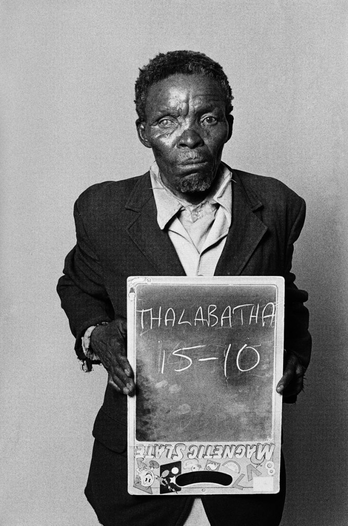
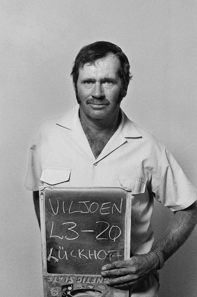
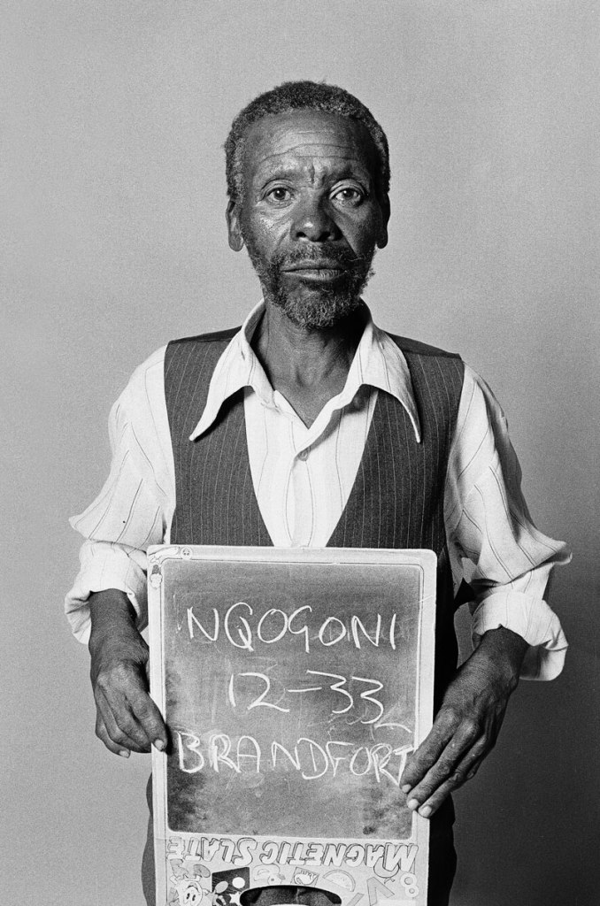
 'The portraits of the applicants' 1994")
 'The portraits of the applicants' 1994")
 'The portraits of the applicants' 1994")
 'The portraits of the applicants' 1994")
 'The portraits of the applicants' 1994")
 'Untitled' 1954")
 'Nude' 1936")
 'September 1953, New York, NY' 1953")
 'June 19, 1961, Chicago IL' 1961")
 'Stony Point, New York, 1966' 1966")
 'New York' Nd")
 'New York at Night' 1932")
 'New York, NY, 18 Octobre 1953' 1953")
 'New York, NY' c. 1953")
 'St East nº108, New York , NY, September 28, 1959' 1959")
 'New York, NY' 1954")
 'Self-portrait' Nd")
 'Chicago' Nd")
 'Florida, 9 January 1957' 1957")
 'Untitled' 1954")
 'Chicago, IL, January, 1956' 1956")
 'Chicago, August 22, 1956' 1956")
 'Grouped Towers, Chicago Project' 1930 from the exhibition 'Frank Lloyd Wright and the City: Density vs. Dispersal' at The Museum of Modern Art, February - June, 2014")
 'Grouped Towers, Chicago Project' 1930")
 'Broadacre City Project' 1934-1935")


 'Broadacre City Project' 1934-1935 from the exhibition 'Frank Lloyd Wright and the City: Density vs. Dispersal' at The Museum of Modern Art, February - June, 2014")
 'Broadacre City Project' 1934-1935")
 'Broadacre City Project' 1934-1935")
 'H. C. Price Company Tower, Bartlesville, Oklahoma' 1952-1956")
 'National Life Insurance Company Building, Chicago Project' 1924-1925")
 'S.C. Johnson & Son Inc. Research Laboratory Tower, Racine, Wisconsin' 1943-1950")
 'St. Mark’s-in-the-Bouwerie Towers, New York Project' 1927-1931")
 'St. Mark's-in-the-Bouwerie Tower, New York Project' 1927-1931")
 'The San Francisco Call Building Project' 1913")
 'The Mile High Illinois, Chicago Project' 1956")
 'Rennie Ellis photographing at the Gay Liberation march, Elizabeth Street, Melbourne, 1973' 1973")
 'Dancing People, Razor Club' 1991")
 'Marcus dancing at an unknown club, Melbourne' c. 1991-1992")
 'Dining Out, Inflation' 1980")
 'Fitzroy extrovert' 1974")
 'Dino Ferrari, Toorak Road' 1976")
 'Bon Scott and Angus Young, Atlanta, Georgia' 1978")
 'At the Pub, Brisbane' 1982")
 'The Gang, Windsor' 1976")
 'The Family, Luzzara, Italy' 1953")
 'My son Josh learns to swim' 1972")
 'My Bare Lady, The Ritz, St Kilda' 1977")
 'The Olympians' Nd")
 'Mr Muscleman, Albert Park Beach' c. 1986")
 'Fully equipped, Albert Park Beach' c. 1981")
 'Don and Patrizia, St Kilda Beach' 1985")
 'Berlin Party, Inflation, Melbourne' 1980")
 and 'Decadent, 1980-2000' (right)")
 'Richmond fans, Grand Final, MCG' 1974")
 'Robert McGhie, Grand Final, MCG' 1974")
 'Property of Hells Angels, Kings Cross' 1970-1971")

![Wols (German, 1913-1951) 'Untitled [Still life - dining table]' 1937 from the exhibition 'Wols Photographer. The Guarded Look' at Martin-Gropius-Bau, Berlin, March - June, 2014](https://artblart.com/wp-content/uploads/2014/05/wols_09_esstisch-web.jpg "Wols (German, 1913-1951) 'Untitled [Still life - dining table]' 1937 from the exhibition 'Wols Photographer. The Guarded Look' at Martin-Gropius-Bau, Berlin, March - June, 2014")
 'Nicole Bouban' Autumn 1932 - October 1933 / January 1935 to 1937 from the exhibition 'Wols Photographer. The Guarded Look' at Martin-Gropius-Bau, Berlin, March - June, 2014")
![Wols (German, 1913-1951) 'Untitled [Pavilion de l'Elegance - Creating a home with Alix (Germaine Krebs)]' 1937](https://artblart.com/wp-content/uploads/2014/05/wols_05_pavillon_de_l_elegance_2-web.jpg "Wols (German, 1913-1951) 'Untitled [Pavilion de l'Elegance - Creating a home with Alix (Germaine Krebs)]' 1937")
![Wols (German, 1913-1951) 'Untitled [Swiss Pavilion - Wire Figure]' 1937](https://artblart.com/wp-content/uploads/2014/05/wols_04_pavillon_drahtfigurine-web.jpg "Wols (German, 1913-1951) 'Untitled [Swiss Pavilion - Wire Figure]' 1937")
 'Max Ernst' Fall 1932 - October / January 1935 to 1936")
 'Max Ernst' Fall 1932 - October / January 1935 to 1936")
![Wols (German, 1913-1951) 'Untitled [Paris - Flea Market]' Autumn 1932 - October 1933 / January 1935 to 1936](https://artblart.com/wp-content/uploads/2014/05/wols_08_flohmarkt-web.jpg "Wols (German, 1913-1951) 'Untitled [Paris - Flea Market]' Autumn 1932 - October 1933 / January 1935 to 1936")
![Wols (German, 1913-1951) 'Untitled [Paris - Palisade]' Fall 1932 - October 1933 / January 1935 - August 1939](https://artblart.com/wp-content/uploads/2014/05/wols_07_paris_palisade.jpg "Wols (German, 1913-1951) 'Untitled [Paris - Palisade]' Fall 1932 - October 1933 / January 1935 - August 1939")
![Wols (German, 1913-1951) 'Untitled [Paris - Eiffel Tower]' 1937](https://artblart.com/wp-content/uploads/2014/05/wols_03_eiffelturm-web.jpg "Wols (German, 1913-1951) 'Untitled [Paris - Eiffel Tower]' 1937")
![Wols (German, 1913-1951) 'Untitled [Still Life - Grapefruit]' 1938 - August 1939](https://artblart.com/wp-content/uploads/2014/05/wols_06_pampelmuse-web.jpg "Wols (German, 1913-1951) 'Untitled [Still Life - Grapefruit]' 1938 - August 1939")
 'Self Portrait with Hat' 1937-1938")
 'Untitled' 1932-1941 from the exhibition 'Wols: Cosmos and Street' at the Museo Nacional Centro de Arte Reina Sofía, Madrid, February - May, 2014")
 'Untitled' Nd / 1976")
 'Pepona doll on the cobbles' 1938-1939 from the exhibition 'Wols: Cosmos and Street' at the Museo Nacional Centro de Arte Reina Sofía, Madrid, February - May, 2014")
 'Untitled (Cobblestone)' 1932-1942 / 1976")


 'Untitled (Green Composition)' c. 1942")

 'Slice of liver-cello' c. 1944")
 'Untitle'; also known as 'It's All Over The City' 1946-1947")
 'The bird' 1949")
 'Untitled' 1946-1947")
 '\"Modern Cuff\" Bracelet' designed c. 1948")
 '\"Lava\" Bracelet' designed c. 1946")
 'Autumn Leaves Brooch' 1974")
 'Untitled' 1948-1979")
 'Linked Oval Necklace' designed by 1974")
 'Triangle Necklace' c. 1969")
 'Ellington Necklace' c. 1962")
 'New Orleans Necklace' c. 1962")
 '\"Bauble\" Necklace' c. 1953")
 'Model Wearing Art Smith's \"Modern Cuff\" Bracelet' c. 1948")
 'Standing Stone' 2014")
 'Constellation II' 2014")

")
")
")
 'Bruise II' 2014")

You must be logged in to post a comment.