Artists: Laurenz Berges, Albrecht Fuchs, Karin Geiger, Claus Goedicke, Uschi Huber, Matthias Koch, Wiebke Loeper, Nicola Meitzner, Peter Piller, Heidi Specker.
An exhibition of the Institut für Auslandsbeziehungen e. V. (ifa/Institute for Foreign Cultural Relations), Stuttgart, Germany and presented in cooperation with the Goethe-Institut Australien.
I was looking forward to this exhibition and so on a cold and very windy winter’s day I ventured out on the drive to the Monash Gallery of Art in Wheelers Hill expecting to be challenged by a new generation of German photographers. I was to be sorely disappointed. This show, with the exception of excellent work by Andreas Koch and good work by Laurenz Berges, epitomises all that I find woeful about contemporary photography.
There is a lack of life and vigour to the work, no sense of enjoyment in taking photographs of the world. The narratives are shallow and vacuous inducing a deep somnambulism in the viewer that is compounded by the silent, deeply carpeted gallery making the experience one of entering a mausoleum (this is a great space that needs to be a contemporary space!). How many times have I seen photographs of empty spaces that supposedly impart some deep inner meaning? See how a great artist like Tacita Dean achieves the same end to startling effect with her film Darmstädter Werkblock (2007). How many times do I need to see ‘dead pan’ portrait photographs that are again supposed to impart rich psychological meaning? I have seen too many already.
Conceptually the work is barren. Technically the proficiency of some of the work is almost non-existent. If this standard of work was put up for assessment in a university course it would fail miserably. For example in Nicola Meitzner’s work Forward Motion (2006), vertical portraits (of the same person in different poses) and streetscapes of Tokyo are poor quality prints mounted in unattractive silver aluminium frames. They are forgettable. If an artist were to study the work of, say, Manuel Alvarez Bravo, then one might gain some insight into how to photograph the city and the people that live in it in a way that elicits a response from the viewer to the photo-poetry that is placed before them.
Uschi Huber’s photographs of boarded up shop fronts, while a nice conceptual idea, are again lacking in technical proficiency and are nothing we haven’t seen many times before while Peter Piller’s ten print-media type pigment prints of girls at a shooting range with rifles do not bare comment on both a conceptual and technical level. Similarly, Wiebke Loeper’s colour photographs of the city of Wismar – houses, roads, water, oat fields, people peering into shop windows – sent to friends living in Melbourne to show them the desolation and rebuilding of the city are seriously year 12 work.
The two redeeming artists are Laurenz Berges and Andreas Koch.
Berges four large type C colour photographs of an empty house and the surrounds as seen through a window are intimately detailed visions of human absence from the built environment: the huts, piles of wood chips, barren trees, the feathers on the floor of one print, the cigarette butts on the floor of another, the marks on the wall in blue and red add to a sense of abandonment and alienation from the environment – traces of human experience, identity and memory etched into the photographic medium.
As the text on the Institut für Auslandsbeziehungen (IFA) website observes,
“Laurenz Berges is a chronicler of absence. His minimalist photographs point to the earlier use of spaces, only fragments of which are shown, whose inhabitants have put them to other, new uses. Berges depicts the traces of this change in austere images that, due to their reduction, tell their stories indirectly and almost involuntarily. These are stories about the existential significance certain spaces have for our identity, and also about their transitoriness and their loss.”1
The star of the show was the work of Matthias Koch. His five large aqua-mounted type C prints from the series Sites of German History (2006) are both technically and conceptually superb, full of delicious ironies and humour. Using an aerial aesthetic (apparently by climbing the ladder of a fire engine that he owns) Koch looks down on the landscape and through his images formulates new ways of seeing national symbols (even though many of them are not in Germany). His re-presentation of spatial inter-relations and objects embedded in their rural and urban surroundings are both simple yet layered and complex.
Unfortunately I have only two photographs (above and below) to show you of his work. None other was available but the images gives you an idea of his raison d’être. The specimen of U-995, built in Kiel in 1944, is presented as a trapped and mounted animal, preserved for our delectation and inspection with gangways and stairs to view the innards. Little hobby craft lie on a beach behind while people paddle in the shallows, a ship barely seen in the distance out at sea. The fact that this U-boat was once used to destroy such a ship, the irony of the proposition, is not lost on the viewer.
Other images in the series include a photograph of the derelict runway of the Heinkel factory as seen from above, the overgrown concrete slabs cracked and lifting, the edges filled with grass, the distant view dissolving into mist and nothingness. The photograph Harbour, Allied landing near Normandy, 1944 (2006, below) shows an American jeep and half-track of the period on the beach of the Allied landing in Normandy, tyre tracks swirling in the sand while in the distance the concrete block remains of the Mulberry harbour used in 1944 still litter the coastline. How many men, both German and American, died on this beach all those years ago? In another tour de force Atlantic Defence Wall near Cherbourg. Bunker construction built 1940 (2006) concrete bunkers dot the landscape with the beach and sea beyond as people sunbathe on the grass amongst the ruined bunkers, probably oblivious to the context of their surroundings. Koch is a master of the re-presentation of the context of memory, history and place.
Overall this exhibition is a great disappointment. I find it hard to believe that the exhibition has been curated by the same man who curated the recent Andreas Gursky exhibition at the National Gallery of Victoria. The choice of work and the presentation of technically poor prints is not up to standard. I also find it difficult to reconcile some of the reviews I have read of this exhibition with the actual work itself. Thank goodness for the photographs of Matthias Koch for he alone made the journey into outer Melbourne a worthwhile journey into the memory of the soul.
Dr Marcus Bunyan
1/ Anonymous. “Presentation/representation: Laurenz Berges,” on the Institut für Auslandsbeziehungen (IFA) website [Online] Cited 08/08/2009 no longer available online
Many thankx to Monash Gallery of Art for allowing me to publish the photographs in the posting. Please click on the photographs for a larger version of the image.
This international touring exhibition was developed by the Institut für Auslandsbeziehungen (ifa) in Germany and is presented in cooperation with the Goethe-Institut Australien.
MGA is hosting the important international exhibition ‘presentation / representation: photography from Germany’, which brings to Melbourne the work of ten of Germany’s best contemporary photographers.
presentation/representation is curated by Thomas Weski (curator of Andreas Gursky recently seen at the National Gallery of Victoria), and covers the work of the generation of German photographers that has followed the now-legendary Kunstakademie Düsseldorf generation of Gursky, Thomas Ruff, Thomas Struth and Candida Höfer. For the artists in presentation/representation, including Matthias Koch, Laurenz Berges and Heidi Specker, photography is a medium that has its own language and characteristics, and their work collectively explores the limits of the medium.
Shaune Lakin, Director of the MGA states “MGA is thrilled to present ‘presentation / representation’ and to bring to the people of Melbourne such an important survey of contemporary German photography. As well as providing a comprehensive survey of German practice, the exhibition will complement the experience of those who saw Weski’s wonderful Gursky exhibition at NGV. We are also delighted to host participating artist Matthias Koch.”
Koch will be presenting a series of public programs including an artist talk, student tutorial and a field trip exploring the industrial suburban sites close to the gallery. “With his critical interest in landscape, architecture and history, Koch will provide some wonderful insights into our local landscape for participants in these programs,” notes Dr Lakin.
MGA’s Education and public programs coordinator Stephanie Richter says: “This is a great opportunity for students and Melbourne audiences to meet one of Germany’s most celebrated contemporary photographers and to participate in the busy schedule of talks, tutorials and field trips with Matthias.”
Press release from Monash Gallery of Art website [Online] Cited 05/08/2019 no longer available online
This is a solid retrospective of the work of the Australian artist John Brack (1920-1999) presented by the National Gallery of Victoria, Melbourne. John Brack is, quintessentially, an Australian and more specifically a Melbourne artist. Melbournians have a love hate relationship with his work – loving the earlier paintings that view the working classes of 1950s Melbourne through a nostalgic, humorous, sardonic lens (when originally the popularity of the work in the 1950s/60s was, as Robert Nelson has observed, mistakenly identified with ridicule of the subject matter)1 while finding the later work of massed pencils, postcards, deities and wooden people mystifying, cold and elusive.
Brack saw his paintings of suburbia as honest portrayals of the new milieux. His sparse, graphic style evidenced the emotionally distanced relationships between space and people in the new cityscapes and best suited his cerebral approach to the subject matter. Men become mannequins with skeletal faces that hover menacingly behind the barmaid in The bar (1954, above), an amorphous mass of brown-suited humanity. Two women are portrayed in all their high-collared stiffness in the painting ‘Two typists’ (1955, above), their stylised faces, black hat and hair surmounted by hanging, disembodied legs at the top of the painting. These two women then reappear at bottom right in one of Brack’s most famous paintings, Collins St, 5p.m. (1955, above) subsumed into the two lines of people wearily trudging home from a day’s work at the office.
Brack’s early paintings are full of stylised metaphor – for example the clinical emptiness of space, the implied threat of hanging ‘instruments’ in ‘The block’ (1954, above) or the decapitated bird-like alienation of the fish head in The fish shop (1955, above) – offer comment on the nature of suburban life: ordered, dead, soulless surfaces, facades behind which life seethes. Brack recognises the slightly macabre beauty of these industrial spaces, their form and purpose, where no one had recognised them before. There are oversized teeth (The veil, 1952), large hands, the fleshy pink of faces (The barbers shop, 1952) and the tribal mask of a face in Man in pub (1953) where man becomes fragment. Above all there is a simplicity and eloquence in line and form grounded in a limited palette of ochres, yellows, greys, blacks, whites and browns. These are the colours of the early cave painters and it’s poignant that Brack uses them so effectively to anchor his subject matter both in history, memory and the present of contemporary life, a life we still recognise intimately over fifty years later.
Here is the ‘Human Condition’ writ large (with capitals!), the humility of professions such as butchers, seamstresses, typists and barmaids (with their limited control of the environment) portraying the body of the worker, as in Satre’s ‘Nothingness’,2 living the tedium of suburban life whilst wanting to flee the anguish of this existence into the desirable light of the future toward which man projects himself. This a theme that Brack develops in the later paintings with their stilted, cerebral investigation of existentialism. These paintings offer a more general contribution to a view of the human condition – love and hate, we, us, them, pros and cons – a view originally grounded in the suburbs of Melbourne but elevated to the ethereal, paintings that seem to lack material substance but offer a hyper-refined conceptual aesthetic.
Sticks and Stones Will Break My Bones But Pencils Will Never Hurt Me
As early as Knives and forks (1958) and The playground (1959) we can observe the beginnings of the spaces of his later pencil paintings with their uniting of form, line and plane (think the planes of Cezanne). The later work is literally much colder, the palette now blues instead of the warmer ochres and yellows and this change is very obvious when you walk around the exhibition. There is an emotional distance here – from human contact and the warmth of company. Ronald Miller observed in 1970 that Brack’s work is about the rituals of life, about states of uneasy poise and vulnerability, about realities behind facades but in the later work the paintings become the facades: gone are the ambiguities and vulnerabilities to be replaced by an altogether different ‘order’ of existence.
We see in paintings such as Souvenirs (1976), We, Us, Them (1983), The pros and cons (1985) and Watching the flowers (1990-91 – see all below) how the canvas has become a stage set replete with turned up edges, spaces of ritual performance containing generalised metaphors for the nature of human existence, metaphors with universal themes. In his investigation of the universal Brack looses sight of the personal. His towers made of playing cards, his thrusting planes, the military precision of his opposing armies of goose-steeping pencils lack empathy for the thing that he was searching to be attuned with: the nature of existence, the human condition.
As Sartre observed,
“To apprehend myself as seen is, in fact, to apprehend myself as seen in the world and from the standpoint of the world. The look does not carve me out in the universe; it comes to search for me at the heart of my situation and grasps me only in irresolvable relations with instruments. If I am seen as seated, I must be seen as “seated-on-a-chair,” … But suddenly the alienation of myself, which is the act of being-looked-at, involves the alienation of the world which I organise. I am seated on this chair with the result that I do not see it at all, that it is impossible for me to see it …”3
This is the point that John Brack reached: through his desire to paint universal themes he was unable to visualise and apprehend himself as seen in the world from the standpoint of the world. It feels (yes feeling!) that he was alienated from the very thing he sought to portray – how the personal and the universal are one and the same.
Brack’s ‘failure’ as an artist (if indeed it can be called that) is not, as Robert Nelson has suggested, “because he didn’t talk enough or wisely enough to negotiate his way out of a misunderstanding” (that his work was sardonic). On the contrary I believe his ‘success’ as an artist is that he painted exactly what he wanted to paint in the time and place that he wanted to paint it. His later work might strike some as cold and impenetrable but if one looks clearly, with a steady eye, there still beats a heart under that chill exterior, a heart grounded in the life of suburban Melbourne. In the end Brack returns to the beginning, still exploring, still searching.
As T.S. Eliot wrote in one of The Four Quartets,4
“We shall not cease from exploration And the end of all our exploring Will be to arrive where we started And know the place for the first time.”
Dr Marcus Bunyan
Many thankx to the NGV for allowing me to publish the art work in the posting. Please click on the photographs for a larger version of the image.
1/ Nelson, Robert. The Age newspaper. Melbourne, Friday 24th April, 2009
2/ “We learn that Nothingness is revealed to us most fully in anguish and that man generally tries to flee this anguish, this Nothingness which he is, by means of “bad faith.” The study of “bad faith” reveals to us that whereas Being-in-itself simply is, man is the being “who is what he is not and who is not what he is.” In other words man continually makes himself. Instead of being, he “has to be”; his present being has meaning only in the light of the future toward which he projects himself. Thus he is not what at any instant we might want to say he is, and he is that towards which he projects himself but which he is not yet.” Barnes, Hazel. Introduction to Jean-Paul Satre’s Being and Nothingness. London: Methuen, 1966, pp. xvii-xix
3/ Satre, Jean-Paul. Being and Nothingness. (trans. Hazel Barnes). London: Methuen, 1966, p. 263
4/ Eliot, T.S. “Little Gidding” from The Four Quartets (1942)
“What I paint most is what interests me most, that is, people; the Human Condition, in particular the effect on appearance of environment and behaviour… A large part of the motive is the desire to understand, and if possible, to illuminate …”
John Reed, New Painting 1952-62, Longmans, Melbourne, 1963, p. 19.
Opening 24 April, the National Gallery of Victoria will present a major retrospective of the work of John Brack, the first in more than twenty years. This exhibition will survey John Brack’s complete career, incorporating over 150 works from all of his major series. John Brack will bring together a significant body of the artist’s paintings and works on paper, including pictures that have developed ‘icon status’ and others that have rarely, if ever, been seen publicly since they were first exhibited.
Kirsty Grant, Senior Curator Australian Art, NGV said that more than any other artist of his generation, John Brack was a painter of modern Australian life.
“John Brack painted images which explored the social rituals and realities of everyday life. Long considered the quintessential Melbourne artist, Brack’s images of urban and suburban Melbourne painted during the 1950s drew attention for their novelty of subject and instantly recognisable references. His work is much broader however and in this exhibition we will see the continuity throughout his career of his fundamental interest in people, human nature and the human condition,” said Ms Grant.
Frances Lindsay, NGV Deputy Director said John Brack was widely considered one of Australia’s greatest twentieth century artists.
“The NGV has enjoyed a long association with John Brack: he worked as an assistant frame maker at the gallery in 1949, became head of the National Gallery School in 1962, and the NGV was also the first public institution to purchase one of his works. Brack’s iconic works are certainly the highlight for many visitors to the Gallery. We are thrilled to be continuing this special relationship by presenting this important and timely retrospective.”
The exhibition will be displayed chronologically, beginning with some rare early student works. Each phase of Brack’s practice will be explored, from his well-known urban scenes of the 1950s to the highly symbolic paintings from the 1970s. Many of Brack’s most familiar paintings are included in the exhibition such as Collins St, 5p.m, The bar and The Old Time.
Brack produced compelling pictures which captured the essential characteristics of his subjects involved in everyday activities and, in some of his most engaging series, he depicted the characters of the racecourse, children at school and professional ballroom dancers. Throughout his career Brack also painted the nude, still life subjects and portraits, both of family and friends – including artists Fred Williams and John Perceval – as well as commissioned subjects, such as Barry Humphries as his alter-ego Edna Everage. During the 1970s Brack replaced the human figure with an assortment of everyday implements including cutlery, pens and pencils which he used as metaphors for the complexities of human behaviour and relationships.
Press release from the NGV website [Online] Cited 26/07/2009. No longer available online
John Brack (Australian, 1920-1999) Inside and outside (The shop window) 1972 Oil on canvas
Photographs from the exhibition are in the chronological order that they appear.
Tacita Dean (English, b. 1965) Grobsteingrab (floating) 2009
“The subjects are connected to the medium I use. It’s all about light and time and phenomena to some extent, like a rainbow or a gust of wind or even an eclipse or a green ray, things like that. And this is the language of light. It’s not the language of binary pixels.”
Tacita Dean1
“The value of her [Dean’s] work, writes Winterson, is one of the virtues of art itself: it is an intervention into the rush of everyday life, holding up time and space for contemplation.”
Jeanette Winterson2
This is a dense, ‘thick’ exhibition by Tacita Dean at the Australian Centre for Contemporary Art (ACCA), Melbourne that rewards repeat viewing. The theatricality of each work and the theatricality of the journey through ACCA’s dimmed galleries (an excellent installation of the work!) makes for an engrossing exhibition as Dean explores the minutiae of memory and the significance of insignificant events: a contemplation on the space, time and materiality of the everyday.
The exhibition starts with 3 very large floating rocks (Grobsteingrab (floating), Hunengrab (floating) and Riesenbelt (floating) all 2009) printed on multiple pieces of photographic paper, the surrounds of the rocks painted out with matt black blackboard paint (see image at top of this posting). The rocks look like mountain massif and are printed at different levels to each other; they move up and down, earthed in the sense that the viewer feels their heavy weight but also buoyant in their surface shininess, seeming to float into the void. The textuality of the rocks is incredible, the suspension of the rocks fragmented by the fact that they are printed on multiple pieces of photographic paper, the edges of the paper curling up to dislocate the unity of form.
Opposite is the large multi-panelled T + I (Tristan + Isolde), a tour de force of Romantic landscape meets mythological journey (see image second from top). Sunshine searing through cloud lights the 25 Turner-esque black and white gravure panels that feature an inlet, fjord and ravine. Semi-legible words dot the landscape, reflecting on the legendary story: ‘undergrowth’, ‘dispute’, ‘brightening up’, ‘BLIND FOLLY’ and ‘the union involved in a manifestation(?)’ for example. Each panel is beautifully rendered and a joy to behold – my friend and I stood transfixed, examining each panel in minute detail, trying to work out the significance and relation between the writing and image. As with most of the work in the exhibition the piece engages the viewer in a dialogue between reality, story and memory, between light, space, time and phenomena.
After the small rear projected film Totality (2000) that shows the extraordinary event of a total eclipse of the sun by the moon for a period of two minutes and six seconds the viewer takes a short darkened passage to experience the major installation in the exhibition Merce Cunningham Performs ‘Stillness’ (in three movements) to John Cage’s composition 4’33” with Trevor Carlson, New York City, 28 April 2007 (six performances; six films) 2007 (see images below).
The first thing you see is one image projected onto a small suspended screen, the rest of the installation blocked by a short gallery wall to the right. The dancer Merce Cunningham sits in studious calm and observes us. This in itself is magical but as we round the corner other screens of different sizes and heights come into view, all portraying Cunningham’s dance studio and him sitting in it from different angles, heights and distances (including close-ups of Cunningham himself). In the six screen projection the performances of Cunningham are sometimes in synch, sometimes not. The director Trevor Carlson, holding a stop watch, times the 3 movements of Cage’s musical piece 4’33” and directs Cunningham to change position at the end of every movement; his hands move, he crosses his legs and the performance continues.
The work is projected into the sculptural space using old 16mm film projectors and their sound mixes with the studied silence of the Cage work and white noise. The mirrors in the studio make spaces of infinite recess, showing us the director with the stop watch, the windows, the floor, the markings of the dancers hands on the mirrors surface adding another echo of past presences. As a viewer their seems to be an ‘openness’ around as you are pulled into a spatial and sound vortex, a phenomena that transcends normal spatio-temporal dimensionality. As people pass through the installation their shadows fall on the screens and become part of the work adding to the multi-layered feeling of the work. This is sensational stuff – you feel that you transcend reality itself as you observe and become immersed within this amazing work – almost as though space and time had split apart at the seams and you are left hanging, suspended in mid-air.
The next two films are my favourite pieces in the exhibition. Darmstädter Werkblock (2007) shows us the significance of insignificant markings – edges and intersections, textures, blends and bleeds, the minutiae of existence in the markings on the fabric of an internal wall (see photograph below). Here is light, wood panelling, texture and again the sound of the whirring of the film projector. Usually I am not a fan of this kind of work having seen enough ‘Dead Pan’ photography and photography of empty yet supposedly important spaces in my life, but here Dean’s film makes the experience come alive and actually mean something. Her work transcends the subject matter – and matter is at the point where these interstitial spaces have been marked by the abstract signs of human existence that constantly surround us.
In Michael Hamburger (2007) Dean reaches the empito-me of these personal narratives that inhabit everyday life. Film of an orchard with wind rustling through the trees, clouds drifting across the sky, rotting apples on the branches, fallen fruit on the ground and a clearing with a man looking up at the trees is accompanied by the industrial sounds of clicks and pops like that of an old radio (see photograph above). The swirling sound of the wind surrounds you in the darkened gallery space much as the panoramic screen of the projection seems to enfold you. The scene swaps to an interior of a house and shows the man, has face mainly in shadow, the film focusing on the different type of apples in front of him or on the aged wrinkles of his hands holding the apples. He talks intelligently and knowingly about the different types of apples and their rarity and qualities. This is Michael Hamburger (now dead which adds poignancy to the film) – poet, critic, memoirist and academic notable for his translations of the work of W. G. Sebald, one of Tacita Dean’s main influences (and also an author that I love dearly).
One can see echoes of Sebald’s work in that of Tacita Dean – the personal narratives accompanied by mythical and historical stories and pictures. The tactility of Hamburger’s voice and hands, his caressing of the apples with the summary justice of the tossing away of rotten apples to stop them ruining the rest of the crop is arresting and holds you transfixed. Old varieties and old hands mixed with the old technology of film make for a nostalgic combination. As John Matthews of ArtKritique has so insightfully observed in his review of this work Dean implicitly understands how objects can be elegies for fleeting lives.
After this work one should have a break – go to the front of the gallery and have a coffee and relax because this is an exhausting show!
The rest of the exhibition tends to tail off slightly, with less engaging but still interesting works.
In Die Regimentstochter (2005) (the name of a Donizetti opera) Dean uses a pile of 36 found and mutilated old opera and theatre programs from the 1930s and 1940s such as Staats Theatre, Berlin, Der Tanz and Deutsche Openhaus. These programs have had portions of their front covers roughly but clinically cut to reveal the inner pages beneath (see image below) and Dean uses them to comment on the politicisation of culture in Berlin’s mid-20th century history. The top of a powdered wigged head or the face of Beethoven has been revealed when the title of the work has been neatly removed along with something else:
“Each programme gives a tantalising glimpse of a title or a face through a small window cut into the embossed cover; we recognise Beethoven, Rossini, the face of a singer perhaps. When and by whom this incision in the cover was made, very neatly one might add, even more why these disfigured programmes were kept remains a mystery. A swift search in an archive would easily show what has been removed; most likely an embossed swastika, for these performances all happened during the Third Reich. Why they were removed is left to our imaginations; perhaps an avid theatre-goer livid at the co-option of culture by the regime, perhaps someone afraid they might be misinterpreted as fascist memorabilia, while wishing to retain the memories these performances triggered.”3
High up on a wall opposite these programs is the film Palast (2004) in which Dean reflects Berlin’s divided history in the jaded façade of the once iconic Palast, the government building of the former German Democratic Republic.4 Shards of light hit glass and reflections are fractured in their gridded panes (see images below). A bird is seen flying, viewed through the window and we see the stains on that window but in this film things feel a bit forced. Unlike the earlier Darmstädter Werkblock there is little magic here.
Again the minutiae of existence is examined in the final two films Noir et Blanc (2006), made on the last 5 rolls of Dean’s black and white double-sided 16mm film stock and Kodak (2006), both made at the Kodak factory in Chalon-sur-Saône before it closed it’s film production facilities (see images below). With the demise of the medium that she feels closest to Dean sought permission to film at the factory itself and both films examine that medium by turning it on itself.
“Dean became acutely aware of the threat to her chosen medium when she was unable to obtain standard 16mm black-and-white film for her camera. Upon discovering that the Kodak factory in Chalon-sur-Saône, France, was closing its film production facility, Dean obtained permission to document the manufacture of film at the factory, where cameras have never before been invited. The resulting rear-screen projection ‘Noir et Blanc’, filmed on the final five rolls Dean acquired, turns the medium on itself. The 44-minute-long work ‘Kodak’ constitutes a contemplative elegy for the approaching demise of a medium specific to Dean’s own practice. Kodak’s narrative follows the making of celluloid as it runs through several miles of machinery and explores the abandoned corners of the factory. On the day of filming, the factory also ran a test through the system with brown paper, providing a rare opportunity to see the facilities fully illuminated, without the darkness needed to prevent exposure, and underscoring the luster of the celluloid as the dull brown strips contrast with the luminous, transparent polyester.”5
As writer Tony Lloyd has commented, “The film “Kodak” documenting the manufacturing of film was as solemn and reverent as a Catholic mass and equally as dull and inexplicable.”6 I wouldn’t go that far but by the end of the exhibition the nostalgia for old technologies, the brown paper programs and the film strip as relic were starting to wear a bit thin, like the sprockets of an old film camera failing to take up the film.
At her best Tacita Dean is a fantastic artist whose work examines the measure of things, the vibrations of spirit in the FLUX of experience. Her work has a trance-like quality that is heavy with nostalgia and memory and reflects the machine-ations of contemporary life. In her languorous (thank you Tony Lloyd for that word, so appropriate I had to use it!) and dense work Dean teases out the significance of insignificant actions/events and imparts meaning and life to them. This is no small achievement.
As an exhibition this is an intense and moving experience. Go, take your time and enjoy!
Dr Marcus Bunyan
Footnotes
1/ Dean, Tacita quoted in Bunbury, Stephen.“Still Lives,” in The Age. Melbourne: Fairfax Publishing, A2 section, Saturday June 6th, 2009, p. 20
2/ Winterson, Jeanette, quoted in Bunbury, Stephen.“Still Lives,” in The Age. Melbourne: Fairfax Publishing, A2 section, Saturday June 6th, 2009, p. 20
3/ Anonymous. Product synopsis from Tacita Dean Die Regimentstochter [Paperback] on the Amazon website [Online] Cited 19/07/2009
4/ Anonymous. Description of Tacita Dean: ‘Palast’ on the Tate St. Ives website [Online] Cited 19/07/2009 no longer available online
5/ Anonymous. “The Hugo Boss Prize: Tacita Dean”, on the Guggenheim Museum website [Online] Cited 19/07/2009. No longer available online
6/ Lloyd, Tony. “Opnion: Tacita Dean at ACCA,” on the ArtInfo.com.au website [Online] Cited 19/07/2009. No longer available online
Many thankx to ACCA for allowing me to publish the photographs and art work in the posting. Please click on the photographs for a larger version of the image
Tacita Dean (English, b. 1965) T & I (Tristan & Isolde) 2006 Photogravure on twenty-five sheets Sheet (each): 26 3/4 x 33 7/8″ (68 x 86cm) Installation: 134 x 170″ (340.4 x 431.8cm) Niels Borch Jensen Gallery and Edition, Berlin and Copenhagen
Through drawings and films, Dean makes work that is frequently characterised by a poetic sensibility and fragmented narratives exploring past and present, fact and fiction. In this monumental printed work, she addresses themes of collective memory and lost history by combining the romantic legend of ill-fated medieval lovers Tristan and Isolde (whose initials give this piece its title) with the real-life tragedy of British sailor Donald Crowhurst. Dean often uses the sea and other maritime themes in her work, including the tale of Crowhurst, which has appeared in several of her projects.
In 1968 Crowhurst sailed from England for a solo, round-the-world yacht race and never returned. In T & I Dean connects the tale of this lost sailor to the story of Tristan and Isolde – whose tragic love story also hinges on sea voyages – through her majestic depiction of a barren, rocky coastline looking seaward. This work, based on a found postcard, includes the white, cryptic notes that Dean often scribbles on her prints and drawings. Here the musings include “start” and “stage 4,” clear theatrical directions, as well as fragments of a poem by “WSG” about an artist killed in an accident. The twenty-five-sheet composition suggests a cinematic narrative sequence, while reading it as a unified image has a breathtaking, visionary impact. The rich velvety texture of the photogravure medium contributes a nineteenth-century patina that is ideally suited to the intensity and foreboding melancholy of the subject.
Publication excerpt from The Museum of Modern Art, MoMA Highlights since 1980, New York: The Museum of Modern Art, 2007, p. 269
Tacita Dean (English, b. 1965) Totality 16mm colour film 2000
16mm film projector used by Tacita Dean to project Merce Cunningham Performs ‘Stillness’
Tacita Dean (English, b. 1965) Merce Cunningham Performs ‘Stillness’ (in three movements) to John Cage’s composition 4’33” with Trevor Carlson, New York City, 28 April 2007 (six performances; six films) (stills) 2007
Tacita Dean (English, b. 1965) Darmstädter Werkblock (stills) 16mm colour film, optical sound 18 minutes, continuous loop 2007
Take one of her best pieces, Darmstädter Werkblock 2007, which looks for most of its long eighteen minutes like an exploration of an empty room, which it is. The camera pans the space, exploring the frayed fringes of its empty, textile-clad, burnt brown walls. It settles on holes, tears, seams and faded spots marking where placards used to hang. We are formally intrigued, but also curious why we should care so much about this particular empty room in what we can vaguely sense is a museum. Perhaps we are even a little bored. Only later – not in the film itself, but in the accompanying materials – are we told that these rooms usually house the “Block Beuys”, a section of the Hessisches Landesmuseum in Darmstadt arranged by Beuys himself over the decade and a half between its opening and the artist’s death. The Block is mired in controversy now that the walls, which are actually left over from when the rooms showed medieval artefacts, but which evoke and mirror Beuys’s own work, are slated for renovation.
Text from Philip Tinari. “Meditations on time,” in Tate Etc. issue 23: Autumn 2011 on the Tate website 1 September 2011 [Online] Cited 18/03/2019
Stills taken from the 16mm film Darmstädter Werkblock (2007) filmed in the seven rooms that make up Block Beuys, Joseph Beuys’s installation in Darmstadt’s Hessisches Landesmuseum. In September 2007, the museum announced that they intended to renovate the rooms, and to remove the brown jute wall coverings and gray carpet that had become such a feature of the installation. The decision caused much upset in Germany and beyond. Unable to document the rooms for copyright reasons, Dean requested that instead she might document the walls and carpet and the details of the space that surround Beuys’s work without making any visual reference to the work itself. The resulting film concentrated on the patches and the stains and the labor of those who have been maintaining the space over the last four decades – the parallel entropy of the museum space with the ageing of the work itself.
Text from Google Books
Tacita Dean (English, b. 1965) Michael Hamburger (stills) 16mm colour anamorphic, optical sound 28 minutes 2007
Continuing her recent collection of film portraits, Tacita Dean’s Michael Hamburger is a moving portrayal of the poet and translator, a resident of Middleton in Suffolk and great friend of W.G. Sebald. It represented Dean’s first commission in Britain since 1999.
For its 28 minutes, the film quietly observes the poet in his study and among the apple trees in his garden. Sunlight dissolves the frames of the windows, the most insubstantial of thresholds between this home, only one-room-deep, and what lies outdoors; a rainbow marks its watery geometry in the sky; and the apples age upon the ground, shrunken, and yet somehow becoming more intensely themselves.
Although Hamburger is said to have despaired of reviews of his poetry which declared that he is ‘better known as a translator’, we might detect a similar deprecation of his self, by himself, in the film which shares his name. Unwilling, perhaps unable, to talk of his past and his migrations, most especially fleeing Nazism in 1933, he talks poignantly, instead, of his apple trees, of where they have come from, and of their careful cross-breeding. Purity is dismissed, and one senses with an awkward pathos that the poet is translating himself.
Tacita Dean’s portrait of the poet and translator Michael Hamburger was filmed, at his home in rural Suffolk, in the last year of his life. Set against muted autumn colours, and with Hamburger performing an evocative, anecdotal inventory of the harvest from his apple orchard, the piece is a bittersweet reminder of time’s passing that deftly captures, and quietly honours, an exemplary 20th century literary figure.
Tacita Dean (English, b. 1965) Die Regimentstochter (The Daughter of the Regiment) 2005
Die Regimentstochter is the latest in a series of projects made from material turned up in flea markets, in this case, a series of 36 antique opera programs from the 30s and 40s found in the flea markets of Berlin. Like the found photographs in Dean’s 2001 FLOH, these souvenirs remain unexplained by text. They retain the silence of the lost object, and they share a riddle: each program gives a tantalising glimpse of a title or a face through a small window cut into the embossed cover. Readers will recognise Beethoven, Rossini, or perhaps a singer. A swift search in an archive would easily confirm what has been removed, but it seems likely that the missing piece is a swastika. These performances all happened during the Third Reich. When and by whom the incision was made, and why these programs were both worth disfiguring and worth keeping, remains a mystery.
Text from the Amazon website
“Things no longer visible thus enhance our view of the past, and gaps, paradoxically, become memorials that engage the beholder’s imagination more actively than a didactic demonstration could. Merely by showing what remains, Tacita Dean not only calls up in our mind’s eye a specific historical situation and its abysses, but also erects an anti-monument to the forms customarily taken by the culture of memory.”
Andreas Kaernbach
Tacita Dean (English, b. 1965) Die Regimentstochter (The Daughter of the Regiment) 2005
They look lined up like a modern art object. The 36 opera program books are not considered as works of art. Nevertheless, the British and Berlin-based artist Tacita Dean turned them into a work of art.
“An incidental finding inspired Tacita Dean to her artwork,” tells the House of History. “At a Berlin flea market she discovered in the year 2000 36 opera program booklets from the years 1934 to 1942. Conspicuous were the title pages: from each of the booklets was a part cut out, including from the program of the eponymous opera “The Regimental Daughter” by Gaetano Donizetti (world premiere 1840). “Said part of the title pages of those notebooks was reserved for the swastika symbol. This was cut off by the previous owners. Why, that can only be speculated, continues the house of history. “Was it shame, the fear of being punishable or even a “private” act of resistance before the end of National Socialism? The program books in any case seem to have been of great cultural value to the former owner. “
“Whatever the motives that made the owner or the owner of the program booklets of the Berlin opera from 1934 to 1942 come to shears in order to remove the Nazi swastikas from the cover pages of the booklets: The voices speak of the desire to conclude with a time that one does not want to be reminded of – a basic motive of German post-war history that stood in the way of an honest confrontation with the era of National Socialism for a long time, “said the Minister of Culture.
With her work, Tacita asks Dean questions about dealing with the Nazi past. Which motive behind it and who had heard the booklets remains open until today. Tacita Dean has created a work of art from these finds, which poses subtle questions about the examination of the Nazi past – but in a way that goes beyond purely historical reflection and awakens additional associations. What does that object, created by the artist from Canterbury, say about the relationship between art and politics? “Can the opera narratives be separated from the political environment in which they were performed and played?” asks the President of the Foundation for the History of the Federal Republic of Germany, Prof. Dr Hans Walter Hütter.
Monika Grütters continues: “The fact that the dark part of our identity does not disappear through concealment and suppression, and that it becomes visible again even where it was attempted to be eradicated, impressively shows Tacita Dean’s work Regimentstochter. That is why I very much welcome the fact that this unique work of art has a place in the collection which, in view of its significance in contemporary history, necessarily belongs to it – a place in the House of History which, unlike any other museum in Germany, presents German history from 1945 in all its facets illustrated and also devoted to the effects of National Socialism on the political and cultural life in post-war Germany.”
Tacita Dean (English, b. 1965) Three stills from the film Palast 2004
A major survey of work by the internationally acclaimed British artist Tacita Dean will open at the Australian Centre for Contemporary Art (ACCA) on June 6th, 2009.
In a great coup for Melbourne, fourteen recent projects by this celebrated contemporary artist will come together in what is the largest survey of Dean’s work to ever be shown outside of Europe.
Tacita Dean is one of Britain’s most accomplished and celebrated contemporary artists. She won the New York Guggenheim’s Hugo Boss award in 2007, was a Turner Prize nominee in 1998, and has had numerous solo exhibitions in Europe – at the Schaulager in Basel, DIA Beacon in New York, the de Pont Museum in the Netherlands, the Tate Britain, UK, the Musee d’art Moderne in Paris, France and the Villa Oppenheim in Berlin, to mention just a few.
Dean was also recently given the highly prestigious title of Royal Academician, awarded sparingly to alumni’s of the revered London art school who have achieved greatness in their work.
Tacita Dean was born in Canterbury in 1965, and moved to Berlin in 2000 after being awarded a DAAD residency. Early works focused on the sea – most famously she explored the tragic maritime misadventures of amateur English sailor Donald Crowhurst. Since moving to Berlin she has devoted her attention to the architecture and cultural history of Germany, a recurring theme also being the salvaging, saving and collecting of things lost. Many of her works rest on the icons of modernism, heroic failures and forgotten utopian ideals.
Dean is best known for her work with 16mm film, although she also works with photography, print and drawing. The qualities of filmmaking itself play a central role in her works – which hauntingly capture the passing of time, space and the mysteries of the natural world.
Her work occupies a place between fact and fiction. As British author Jeanette Winterson says, “Her genius, with her slow, steady, held frames, is to allow the viewer to dream; to enter without hurry, without expectation, and to accept, as we do in a dream, a different experience of time, and a different relationship to everyday objects.”
Included in this exhibition is Dean’s revered film installation, Merce Cunningham Performs STILLNESS (in three movements) to John Cage’s composition 4’33” with Trevor Carlson, New York City, 28 April 2007, which was recently presented at the DIA Beacon in New York, and the 2007 work Michael Hamburger. Two new wall-based works especially created for this exclusive ACCA exhibition will also feature.
Dean is also known for creating ‘asides’ – totally absorbing texts on the subjects explored in her work. She will contribute texts on all the projects included in the exhibition for a catalogue which will be published to coincide with this unique ACCA survey.
The exhibition has been curated by ACCA’s Artistic Director, Juliana Engberg and follows an early 2002 exhibition of Dean’s work curated by Engberg for the Melbourne International Arts Festival.
“Tacita’s works continue to enthral and inspire me. Not only has she rescued relics from history and restored them with a visual dignity and affection in her wonderful film projects, but increasingly she rescues the traditional art forms of drawing, print making, painting, photography and film from a digital abyss,” says Juliana Engberg. “Her works have a truth and quiddity about them, but also a playful artifice and technical tactic to bring out the tactile and material in all she deals with. Tacita is a sublime story-teller, a narrator of odysseys and attempts. She is a true artist sojourner.
In this selection of works made since 2004 we grasp the breadth of her practice and her pursuit of the time-honoured landscape, portrait and abstract genres,” she says.”
Text from the press release from the ACCA website [Online] Cited 17/07/2009. No longer available online
Tacita Dean (English, b. 1965) Noir et Blanc [Still] 16mm black-and-white Kodak film 2006
Tacita Dean (English, b. 1965) Kodak (still) 16mm colour and b/w film optical sound 44 minutes loop system 2006
Tacita Dean (English, b. 1965) Kodak (still) 16mm colour and b/w film optical sound 44 minutes loop system 2006
As Dean said in a Guardian article back in February: “Digital is not better than analogue, but different. What we are asking for is coexistence: that analogue film might be allowed to remain an option for those who want it, and for the ascendency of one not to have to mean the extinguishing of the other.”
In the same text, she wrote of the difference between film and digital as “not only emulsion versus pixels, or light versus electronics, but something deeper – something to do with poetry.” This poetry is exactly what she explored in one of her landmark films, Kodak (2006), a 45-minute examination of the production process of celluloid itself at a French factory fated for early closure because of a lack of demand. A film about the making of film, it hinged on the sort of super-aestheticised conceit that has become her staple. This is a tactic which allows her to turn even time itself into a structural device, as she did in 2008 with a film called Amadeus, which depicts a 50-minute crossing of the English Channel in a small fishing boat of the same name.
Philip Tinari. “Meditations on time,” in Tate Etc. issue 23: Autumn 2011 on the Tate website 1 September 2011 [Online] Cited 18/03/2019
Tacita Dean (English, b. 1965) Kodak (still) 16mm colour and b/w film optical sound 44 minutes loop system 2006
Australia Centre for Contemporary Art (ACCA) 111 Sturt Street, Southbank Victoria 3006, Australia Phone: 03 9697 9999
Opening hours: Tuesday – Friday 10am – 5pm Weekends & Public Holidays 11am – 5pm Monday closed Open all public holidays except Christmas Day and Good Friday
Marco Fusinato (Australian, b. 1964) Double Infinitive 3 2009
Double Infinitives by Marco Fusinato at Anna Schwartz Gallery, Melbourne is an excellent exhibition of large UV ink on aluminium images sourced by Fusinato from the print media.
The images are made up of a dot pattern familiar to those who have examined photographs in the print media closely. Larger and smaller clusters of dots form the light and shade of the image. As you move closer to the works they dissolve into blocks of dots and become and optical illusion like Op Art from the 1960s. Fusinato contrasts this dot structure with the inclusion of flat panels of black ink to the left and right hand side of the images. The section lines that run through the images (for they are not one single image but made up of panels) also adds to the optical nature of the work as the lines cut the conflagrations, literally stitching the seams/scenes together.
Each image contains an individual holding a rock enclosed in the milieu and detritus of a riot; the figures are grounded in the earth and surrounded by fire but in their obscurity, in the veiling of their eyes, the figures seem present but absent at one and the same time. They become ghosts of the fire.
Fire consumes the bodies. The almost cut out presence of the figures, their hands clutching, throwing, saluting become mute. Here the experience of the sound, colour and movement of an actual riot is silenced in the flatness and smoothness of the images. The images possess the intensity of a newspaper reality ‘blown up’ to a huge scale by Fusinato (see the installation photograph below to get an idea of the effect). The punctum of the riot, that prick of consciousness that Barthes so liked, is translated into a silenced studium of the aluminium surface; an aural history (the sound) / oral history (the telling of the story) trapped in the structure of silence.
There is a double jeopardy – the dissolution of the image into dots and the disintegration of the body into fire. In one of the images the upraised arm and hand of one of the rioters holds a rock with what appears to be a figure on it, surrounded by fire. To me the arm turned into one of the burning Twin Towers with smoke and fire pouring from it (see the first photograph in the installation photograph below).
My only concern about the images were the black panels, perhaps too obvious a tool for the purpose the artist intended. Maybe the needed some small texture, like a moire pattern to reference the contours of a map and continue the topographical and optical theme. Perhaps they just needed to be smaller or occasionally placed as thin strips down the actual image itself but these are small quibbles. Overall this is an fantastic exhibition that I enjoyed immensely. The images are literally ripped from the matrix of time and space and become the dot dot dot of the addendum. What Fusinato does so excellently is to make us pause and stare, to recognise the flatness of these figures and the quietness of violence that surrounds us.
Music – Noise – Silence Flatness – Advertising – Earth – Fire Rock – Space – Memory
Dr Marcus Bunyan
Many thankx to Anna Schwartz Gallery for allowing me to publish the photographs in the posting. Please click on the photographs for a larger version of the image.
Marco Fusinato (Australian, b. 1964) Double infinitive 1 2009
Marco Fusinato (Australian, b. 1964) Double Infinitive 4 2009
A selection of images from the print media of the decisive moment in a riot in which a protagonist brandishes a rock against a backdrop of fire. Each image is from a different part of the world, from the early twenty-first century, and is blown up to history-painting scale using the latest commercial print technologies.
Text by Marco Fusinato on his website
Installation of Marco Fusinato Double Infinitives exhibition at Anna Schwartz Gallery, Melbourne
Double Infinitives
“Unheard music is better than heard.”
Greek proverb of late antiquity
“That music be heard is not essential – what it sounds like may not be what it is.”
Charles Ives, Essays Before a Sonata
“The proposition of Jacques Attali’s Noise is different. He says that while noise is a deadly weapon, silence is death.”
David Rattray, “How I Became One of the Invisible,” Semiotext(e), 1992.
The explosive communal act of rioting is most commonly delivered to an audience suspended in the stillness and silence of a photographic image. Noise is not removed in this process, it is almost amplified: the sound and action that deliver this singularly captured moment into existence are infinite, as all things remain while they are imagined, before they are anchored down by express articulation.
Photographic representation can easily be accused of subverting the truth of events, not because what is seen in the image has not transpired, but because static images leave so much space around them for multiple narratives to be constructed. The still image is totally contingent on the consciousness that confronts it. By contrast, the near-totality of videos can give too much away …
Sourced by Fusinato from print media published in the last few years, these images of rioting all contain an individual clutching a rock, bathed in the refractory glow of a nearby fire. The image has become prototypical, so much so that it lacks the sensation of spontaneity requisite to produce a riot. (Apropos to this predictability, Fusinato would check global newspapers after every forum or conference of global financial authorities, often finding the image he was looking for).
Double Infinitives is a succinct allegory for the reluctance to compromise comfort overpowering radical impulses. Conversations suggest this is a conflict frequently experienced by artists. Deprived of a volatile political reality, we experience radicalism through images that act as small ruptures, reminders that the world we live in might be more severely charged than our individual experiences allow. Fusinato’s works flatten these images of volatility onto a smooth slate: they are similar and radiate with the vexed beauty of sameness. A riot is a mad and brutal spectacle, a theatre that is often documented as if it were a play. Hugely expanded in scale and rendered in the suffused gloss of advertising, the real possibility of violence that these works infer deepens the layers of the fiction rather than comprising an indicator of human concern. Those things with which we come into such gentle contact that their thorns barely prick …
Liv Barrett June 2009
Text from the Anna Schwartz Gallery website [Online] Cited 10/07/2009. No longer available online
Marco Fusinato (Australian, b. 1964) Double Iinfinitive 2 2009
Marco Fusinato (Australian, b. 1964) Double Iinfinitive 2 (detail) 2009
Marco Fusinato (Australian, b. 1964) Double Iinfinitive 5 2009
Anna Schwartz Gallery 185 Flinders Lane Melbourne, Victoria 3000
Emma Davies (Australian, b. 1968) Sekai (meaning ‘be humorous’) 2009
A stimulating exhibition by Emma Davies at Craft Victoria of polypropylene industrial netting and packaging that has been heated, moulded, sculpted and literally morphed into these fantastical sculptures, inspired by the artist’s experiences when visiting Johannesburg in South Africa as part of the South Project. Davies evokes the mysterious and the bizarre in her figures, making the commonplace into something uncommon, taking her themes from the relics of bush medicine present in the street markets: the medicine market of Johannesburg full of dried animal bones, skulls, skins and bottles of alchemistic objects.
Despite their comforting South African names (translated into English as ‘hope’, ‘faith’, ‘quiet, tranquil’, ‘lady’, ‘chief’, ‘prince’ for example) these extremely individual figurative ‘presences’ have a powerful melancholic affect on the viewer. Their elongated long legged and armed, no necked forms create dark eyeless creatures that crouch in rusted boxes or sit on wooden posts with their legs and arms hanging, folded. They seem lonely and sad despite their titles, perhaps reflecting the harsh realities of a life of poverty on the streets of Soweto.
Two figures on wooden blocks seem to walk aimlessly, placed on large rough industrial tables with huge wheels while another figure sits up a rusted ladder propped against the wall. A group of figures are clustered together on top of large wooden posts of different heights, some with arms round each other for comfort, others with black or red feathers sprouting from shoulders, legs or wearing a red feathered skirt. These creatures create a marvellous group of contemplative wandering minstrels while behind them their eerie shadows fall on the gallery wall.
The crystalline nature to the surface of the creatures, like sparkling coal, reminds me of the work of William Kentridge, his white industrial protagonist Felix haunted by images of black workers deep underground mining coal (see Mine (1991) where his coffee plunger goes down into the ground through the bodies of black people). Some of the figures bat like ears also bring to mind the work of Francisco de Goya and specifically his work Los Caprichos (The Whims), plate 43 from the series of 80 etchings published in 1799 titled The Dream of Reason Produces Monsters. The artist described the collection as an exposé of “the innumerable foibles and follies to be found in any civilised society, and from the common prejudices and deceitful practices which custom, ignorance, or self-interest have made usual.”
As Goya began to sympathise with the suffering of the peasants so Davies seems to have been transformed by what she saw around her during her visit, trying to make sense of a foreign culture, dreaming the sleep of reason but surrounded and invaded by a world in which the natural and unnatural has fused and morphed.
I really liked this exhibition and the presence of these figures. I am obviously not alone as the show is almost sold out. A visit to these disturbing, enfolding creatures is recommended.
Dr Marcus Bunyan
All photographs courtesy of Craft Victoria (thankyou Amy Brand!) and taken by their photographer Alexia Skok. Please click on the photographs for a larger version of the image.
Emma Davies (Australian, b. 1968) Tariro (meaning ‘hope’) 2009
Emma Davies (Australian, b. 1968) Rutendo (detail – meaning ‘faith’) 2009
Francisco de Goya (Spanish, 1746-1828) Los Caprichos plate 43 from the series El sueño de la razón produce monstros 1799 Etching and aquatint Height: 21.3cm (8.3″) Width: 15.1cm (5.9″) Museo del Prado, Madrid
Emma Davies (Australian, b. 1968) Zola (detail – meaning ‘quiet, tranquil’) 2009
Emma Davies (Australian, b. 1968) Group with from left to right: Enitan (person of story), Ntombi (lady), Kgosi (chief), Nkosana (prince), Lucky and Alaba (second child after twins) 2009
Emma Davies (Australian, b. 1968) Nkosana (detail – meaning ‘prince’) 2009
Craft Victoria Watson Place, off Flinders Lane, Melbourne 3000 Phone: 03 9650 7775
Josephine Kuperholz presents a beautifully engineered set of photographs in her exhibition Blight at Gallery 101, Melbourne. Featuring hand coloured silver gelatin photographs of endangered Australian insects sourced from the Entomology collection of the Victoria Museum, Kuperholz literally weaves multiple narratives into the photographs. The execution (an apt word for the circumstances of extinction facing these insects) of these images is fastidious, the weaving superlative, almost clinical.
The layering of the photographs disrupts their surface tension. There is a disjunction between the dead specimen and the singular photograph of it, a disruption of the smooth surface of the photograph by the hand colouring and a further fragmentation of the original photograph by cutting and weaving. Through these processes the photographs become intertextual in their construction, assemblages, creating new tissues of past citations: animal, colour, silver, artist, text, photograph, environment. At their best the work subverts the concept of the text as self-sufficient and hermetically sealed, blurring the outlines of the fixed image, “dispersing its image of totality into an unbounded, illimitable tissue of connections and associations, paraphrases and fragments, texts and con-texts.”1
Kuperholz’s mutations, ‘differance’ in Derrida’s terminology, produce spaces that are both fluid and fixed at one and the same time; neither her nor there.Though the original specimens and photographs are already narrativised, already textualised, Kuperholz disrupts this marking, the continual reiteration of norms, by weaving a lack of fixity into her objects; in her reconceptualisations of space and matter Kuperholz redefines the significations of the body of the animal in the fold of inscription, through a process of materialisation. Kuperholz attempts to ground these re-inscriptions through the naming of these disrupted surfaces, equating the images back to the scientific labels for the original specimen, Trapezites eliena for example (see below), and through the box frames surrounding the work that are much like museum cases. Unfortunately I found the constant reference to the habitat of the insect, it’s Latin name inscribed in pencil under the images and the use of plain brown box frames somewhat irritating. These tropes are not necessary for the work is strong enough to stand on it’s own without having to tell the viewer what to think.
The singular beetles (as seen above) are beautiful images and the multiple images where the weaving intermingles, the self decentred and multiple, fluttering and vibrating like the strobing of a time lapse photograph caught in three-dimensional space, are fantastic. Other photographs are less successful: the reflected beetles are a little passe, while the grid photographs of insects lack presence and intensity (see bottom installation photograph below). Where the concept works it is pushed hard, the fragmentation and interweaving causes an anxiety of identity and a meditation on the problematic nature of existence, revealing the changing sizes, shapes and rhythms of space and structure.
Perhaps a loosening of the rigid structure surrounding the works (the text, the frame, the incantations) would have let the photographs ascend into the ether, further releasing the work from the constraints of author, text and earth. It will be interesting to see future developments of this work. Perhaps the incorporation of gentle, subtle physical elements into the photographs (through the sowing of patterns, through the sowing of objects directly onto the photograph?), will elevate these already beautiful photographs to an-other plane of existence.
Dr Marcus Bunyan
Many thankx to Gallery 101 for allowing me to publish the photographs in the posting. Please click on the photographs for a larger version of the image.
Josephine Kuperholz (Australian) Trapezites eliena 2008 Common name – Eliena Skipper Woven hand coloured silver gelatin photographic image
Josephine Kuperholz (Australian) Dryococelus australis 2008 Common name – Lord Howe Island Phasmid Woven hand coloured silver gelatin photographic image
Josephine Kuperholz Blight exhibition, Gallery 101 website text
Josephine Kuperholz Blight exhibition installation views at Gallery 101, Melbourne Photos: Marcus Bunyan
Roy de Maistre (Australian, 1894-1968) Colour Composition derived from three bars of music in the Key of Green 1935 Oil and pencil on composition board Private Collection
Despite some interesting highlight pieces this is a patchy, thin, incoherent exhibition assembled by the Powerhouse Museum, Sydney now showing at Heide Museum of Modern Art, Melbourne. Featuring a hotchpotch of work ranging across fields such as drawing, architecture, photography, painting, film, graphic design, craft, advertising, Australiana and aboriginal works the exhibition attempts to tell the untold story of Modernism in Australia to little effect. Within the exhibition there is no attempt to define exactly what ‘Modernism’ is and therefore an investigation into Modernism in Australia is all the more confusing for the visitor as there seems to be no stable basis on which to build that investigation. Perhaps reading the catalogue would give a greater overview of the development of Modernism in Australia but for the average visitor to the exhibition there seems to be no holistic rationale for the inclusion of elements within the exhibition which, much like Modernism itself, seems eclectically gathered from all walks of life with little regard for narrative structure.
With work spanning five decades from 1917-1967 we are presented with, variously, Robert Klippel’s kitsch Boomerang table from 1955, Robin Boyd’s ‘House of Tomorrow’ from 1949, Wolfgang Sievers ‘new objective’ photographs, Berlei’s scientific system for calculating beauty in woman in use till the 1960s, swimsuits from the 1920s-1940s, Featherston chairs from the Australian pavilion at the 1967 Expo, a recreation of Australian architect Harry Seidler’s office (the most interesting part of this being the books he had in his office library: Frank Lloyd Wright, Mies van de Rohe and Concerning Town Planning by Le Corbusier) and the wind tunnel test model of the Sydney Opera House in wood from 1960. Etcetera, etcetera, etcetera …
Highlight pieces include the above mentioned test model of the Sydney Opera House which is stunning in its scale and woodenness, in it’s simplicity of shape and form. Other highlight pieces are the colour music compositions of Roy de Maistre which were the tour de force of the show for me, true revelations in their rhythmic synchronic Moebius-like construction with layered planes of colour swirling in purples, greens and yellows. The large vintage photographic print of Sunbaker (1934) by Max Dupain was also a revelation with it’s earthy brown tones, the blending of the atmospheric out of focus foreground with the clouds behind, the architectural nature of the outline of the body almost like the outline of Uluru, the darkness of the head with the sensuality of the head and shoulders framed against the largeness of the hand resting on the sand. Lastly the two paintings and one rug by French artist Sonia Delaunay are a knockout. It says something about an exhibition when the best work in the show are two paintings by a French artist seemingly plucked at random to show external influences on Australian artists and designers.
While the exhibition does attempt to portray the breadth of the development of Modernism in Australia ultimately it falls well short in this endeavour. The most striking example of this shortcoming is the true star of the exhibition – the building that is Heide II itself. Commissioned by John and Sunday Reed and designed by the Victorian architect David McGlashan of the architectural firm McGlashan and Eversit in 1963 the building epitomises everything that is good about architectural Modernism and it’s form overshadows the exhibition itself. In this building we have beautiful spaces and volumes, an amazing staircase down into the lower area, suspended decking overlooking gardens, the blending of inside and outside areas, large expanses of glass to view the landscape, nooks and studies for privacy and the simplicity and eloquence of form that is Modernist design. With money one can indulge in the best of elitist Modernism. With position, position, position one can side steep the alienation of the city and the spread of surburbia where the dream of Australians owning a home of their own still continues in the vast, tasteless expanses of McMansion estates.
Robert Nelson in his review of this exhibition sees the car as creating the suburbs and Modernism as the emptying of the city after 6pm, the lessening of community and the devaluing of space he insists that there is little difference between a Californian bungalow in the suburbs and a utopian geometric neo-Corbusian box by Harry Seidler because they were equally shackled to motor transport.1 This is to miss the point.
Although Modernism in its basic form influenced most walks of life in Australia from swimsuit design to milk bars, from cinema to naturism, from bodies to advertising the most effective expressions of Modernism are architectural (as evidenced by Heide II) and were only open to those with money, power and position. Although Le Corbusier’s concept of public housing was a space ‘for the people’ the most interesting of his houses were the private commissions for wealthy clients. And so it proves here. One can imagine the parties on the deck at Heide II in the 1960s with men in their tuxedo and bow ties and woman in their gowns, or the relaxation of the Reed’s sitting in front of their fire in the submerged lounge. For the ordinary working class person Modernism brought a sense of alienation from the aspirational things one cannot buy in the world, an alienation that continues to this day; for the privileged few Modernism offered the exclusivity of elitism (or is it the elitism of exclusivity!) and an aspirational alienation of a different kind – that of the separation from the masses.
Go to Heide for the glorious gardens, the wonders of Heide II but don’t go to this exhibition expecting grand insights into the basis of Australian Modernism for that story, as Robert Nelson rightly notes, remains as yet untold.
Dr Marcus Bunyan
Many thankx to Heide Museum of Modern Art for allowing me to publish the art work in the posting. Please click on the photographs for a larger version of the image.
An excellent review of the exhibition by Jill Julius Matthews, “Modern times: The untold story of modernism in Australia,” (reCollections Volume 4 number 1) can be found on the Journal of the National Museum of Australia website [Online] Cited 20/02/2019
1/ “Emanating from Sydney’s Powerhouse Museum, Modern Times“explores how modernism transformed Australian culture from 1917 to 1967.” But something is missing. The overwhelming modern development in these 50 years was the proliferation of automotive transport, which redefined the layout and function of Australian cities.The cars created the suburbs; and as the individual bungalow drew out the vast dormitories of Sydney and Melbourne, the city centre was spiritually drained, dedicated to bureaucratic and commercial premises.The story at Heide emphasises the gradual triumph of the tall buildings of the CBD. It doesn’t really reflect how these abstract monuments didn’t contain a soul after 6pm.Although the project makes such a big deal of being interdisciplinary, the social history doesn’t have a robust geographical basis. And because of this, the exhibition and book fail to handle the new alienation that modernism brings: the evacuation of the city and the insularity of suburban people in bungalows with little street life and roads increasingly deemed unsafe for children.
What does it really matter if a house looks like a Californian bungalow or a utopian geometric neo-Corbusian box by Harry Seidler? In social terms, they’re structurally the same, equally retracting from a sense of community and equally shackled to motor transport. In this sense, the styles are immaterial, except that one of them gives you a feeling of intimacy while the other has a bit more light and is easily wiped with a sponge.
At the end of the chosen period, the folly of the dominant suburban pattern came to be understood in its dire ecological consequences. Alas, it was too late. The modernist devaluation of space had already occurred, and our whole society had been reorganised around petrol.”
Robert Nelson. The Age. Wednesday 6th May, 2009
Roy de Maistre (Australian, 1894-1968) Arrested Movement from a Trio 1934 Oil and pencil on composition board 72.3 × 98.8cm National Gallery of Victoria, Melbourne
In late 1918, Roy de Maistre collaborated with fellow artist Roland Wakelin in exploring the relationship between art and music. Their experiments produced Australia’s first abstract paintings, characterised by high-key colour, large areas of flat paint and simplified forms. The works received critical acclaim, but modernist developments were largely derided by the conservative establishment.
This painting exemplifies de Maistre’s theory of colour harmonisation based on analogies between colours of the spectrum and notes of the musical scale. It is also aligned with de Maistre’s search for spiritual meaning through abstraction, akin to other artists such as Kandinsky who were interested in the ideas of the theosophy and anthroposophy movements, spiritualism and the occult.
Text from the Art Gallery of New South Wales website
Sonia Delaunay (Ukraine, b. 1885 moved Paris 1905-1979) Rhythm 1938 Oil on canvas
Wolfgang Sievers (Australian born Germany, 1913-2007) “House of Tomorrow” exhibition at Exhibition Building, Melbourne 1949 Gelatin silver print National Library of Australia
Stanislaus Ostoja-Kotkowski (Australian born Poland, 1922-1994) Nymphex 1966 Gelatin silver photograph from electronic image 50.6 x 60.8cm Gift of Dr George Berger 1978 Art Gallery of New South Wales @ Estate of Stanislaus Ostoja-Kotkowski
Rayner Hoff (Australian born United Kingdom, 1894-1937) Decorative portrait – Len Lye 1925 Marble 30.5 x 22.5 x 16.5cm Purchased 1938 Art Gallery of New South Wales
Cossington Smith captures the drama of a crowd in Rushing, which depicts commuters clamouring down to the ferries of Circular Quay to get home after work. The flying scarf and fallen hat emphasise the speed at which the travellers are moving and the peril and claustrophobia of a, mostly faceless, city crowd. The steep gangplank and diagonal composition accentuates the dynamism of the painting.
A brilliant colourist, Cossington Smith’s work of the early 1920s adopts a darker palette than the vivid colours she is usually associated with. Inspired by a visit to Sydney in 1920 by the tonalist painter and teacher Max Meldrum, her paintings became studies in tone, rather than colour, a practice she had abandoned by 1925.
Text from the Art Gallery of New South Wales website
Robert Klippel (Australian, 1920-2001) Boomerang coffee table 1955
The Powerhouse Museum travelling exhibition Modern times: the untold story of modernism in Australia explores how modernism transformed Australian culture from 1917 to 1967, a period of great social, economic, political and technological change. From the ideals of abstraction and functionalism to the romance of high-rise cities, new leisure activities and the healthy body, modernism encapsulated the possibilities of the twentieth century. This exhibition is the first interdisciplinary survey of the impact of modernism in Australia, spanning art, design, architecture, advertising, photography, film and fashion.
Modern times is presented at Heide across all four of the Museum’s gallery spaces. It unfolds in thematic sections highlighting key stories about international exchange, the modern body, modernist ‘primitivism’, the city, modern pools, and the Space Age. Comprising over 300 objects and artworks, it showcases works by major artists including Sidney Nolan, Margaret Preston, Albert Tucker, Grace Cossington Smith, Max Dupain, Wolfgang Sievers, and Clement Meadmore, key architects Robin Boyd, Roy Grounds and Harry Seidler, and designers Fred Ward and Grant and Mary Featherston. An installation, Cannibal Tours, by Madrid-based Australian artist Narelle Jubelin is a contemporary adjunct to the exhibition.
Inspired by the futurist visions of various European avant-gardes, modernist ideas were often controversial and shaped by many competing positions. Modern times reveals how these ideas were circulated and took hold in Australia, via émigrés, expatriates, exhibitions, films and publications. Australian contact with significant international modernist sources, such as the Bauhaus school in Germany, occurred through figures such as influential artist and teacher Ludwig Hirschfeld-Mack, who taught Bauhaus principles at Geelong Grammar, and renowned architect Harry Seidler, who played a central role in shaping the modern city in Australia. Hirschfeld-Mack’s extraordinary film Colour Light Play of 1923 is shown for the first time in Australia, and Seidler’s 1948 studio, designed on his arrival from New York, has been re-created for the exhibition.
While modernism was international in character, an ‘Australian modernism’ was first championed in the 1920s by artist Margaret Preston, whose promotion of Aboriginal forms and motifs was important to the understanding of their artistic value. Preston’s designs, Len Lye’s stunning animation Tusalava (1929), Robert Klippel’s boomerang table (c. 1955) and other works show the development of a vernacular modernism.
Other highlights of Modern times include works from the visionary experiment in colour theory by Roy de Maistre and Roland Wakelin in 1919, a model of Robin Boyd’s innovative House of Tomorrow (1949), the iconic Featherston wing sound chairs from the Australian pavilion at the 1967 Montreal Expo, and a large wooden model for Jørn Utzon’s Sydney Opera House.
Text from the Heide Museum of Art website [Online] Cited 06/06/2009. No longer available online
Athlete and movie-star Annette Kellerman’s Modern Kellerman Bathing Suit for Women which became commercially available by the mid-1920s. The one-piece bathing suit became Kellermans trademark Gift of Dennis Wolanski Library, Sydney Opera House, 2000 Photo: Powerhouse Museum
On hot summer days cool off with Tooth’s KB Lager About 1940 Advertising poster Colour and process lithograph, artist name “Parker” in image lower right 100.4 x 75.4cm Sydney Living Museums
Grant Featherston (Australian, 1922-1995) and Mary Featherston (Australian, b. London 1943, migrated to Australia 1952) Expo mark II sound chair 1967 Aristoc Industries Polystyrene, polyurethane foam, Dunlopillo foam rubber, Pirelli webbing, fibreglass, hardwood, sound equipment, upholstery fabric Powerhouse Collection
The Expo Mark II sound chair, adapted for the Australian domestic market after Expo 67 in Montreal.
A cloth-covered high back winged chair with a circular base. The chair has a circular orange cloth covered cushion in the base and an integral full-width headrest. Two 125mm diameter inserts are pressed into the top of the back of the chair where speakers are fitted inside it. There is a cylindrical knob on the side of the chair.
National Archives of Australia A modernist vision of Australia: Grant and Mary Featherston’s wing sound chairs were a feature of the Australian Pavilion, designed by architect James Maccormick with exhibits selected by Robin Boyd, at Expo 67 in Montreal, 1967 1967
In 1967 Australia participated in the International and Universal Exposition held in Montreal, Canada. Australia’s Expo ’67 theme was the ‘Spirit of Adventure’. In the 30,000 square feet glass-walled Australian Pavilion, developed by the Australian Government and designed by Robin Boyd, exhibits explored Australian science, arts, people and development. The pavilion was designed as a ‘haven’ of ‘space and tranquillity’ floating above an Australian bushland setting. Inside, 240 innovative sound chairs offered ‘foot-weary Expo visitors’ the chance to hear the voices of famous Australians describing the exhibits, in French as well as English. The Great Barrier Reef was re-created in a lagoon beneath the pavilion while wallabies and kangaroos could be viewed in a sunken enclosure.
Text from the National Museum of Australia website [Online] Cited 20/02/2019
James Birrell (Australian, 1928-2019) View of the elevated restaurant, Centenary Pool, Brisbane Nd Powerhouse Museum
“A major exhibition opening for Sydney Design 08 in August, Modern times looks closely at the transformation of modern city life. The advent of cars, freeways, skyscrapers and new entertainment such as cinemas, milk bars, swimming pools, cafes and pubs are all legacies of modernism as revealed through the exhibition. The exhibition spans five decades from 1917 to 1967 – a tumultuous period marked by global wars, economic depression, a technological revolution and major social changes – out of which a modern cosmopolitan culture was shaped.
“The modernist movement was inspired by various European avant-gardes that projected visions of a better future, shaped by many competing positions. It was through émigrés, expatriates, exhibitions and publications that modernism become known in Australia,” Ann Stephen said. Encompassing art, design and architecture, Modern times focuses on seven themes: 1. the human body, image and health; 2. international influences and exchanges; 3. Indigenous art and modernism; 4. Interdisciplinary projects with retailers; 5. city landscapes and urban life; 6. public pools and milk bars; and 7. the space age.
Several great modern public pools were designed in Australia initially as part of an international swimming boom in the 1930s and boosted by the 1956 Melbourne Olympics. These will be shown on a large, immersive, panoramic audio visual screen celebrating the most Australian of past-times, being poolside. The earliest 1920s swimming costumes by silent film star Annette Kellerman, several decades of Australian icon ‘Speedo’ cossies and an early bikini will also be on display.
The much-loved corner milk bar from the 1930s will also be recreated in the exhibition for visitors to enter, complete with lolly jars, milkshakes and a juke box.
Other story highlights in the exhibition include Robin Boyd’s ‘House of Tomorrow’ that featured at the 1949 Modern Home Exhibition in Melbourne; and Boyd’s memorable Australian pavilion at the 1967 Montreal Expo that showcased Australian design including the iconic Featherston wing sound chairs and hostess uniforms designed by Zara Holt, wife of then prime minister Harold Holt.
Modernism also inspired new forms of public art and design like the abstract fountains by Tom Bass on Sydney’s former P&O building and Robert Woodward’s El Alamein Memorial Fountain, a popular tourist site in Sydney’s Kings Cross. Modernism shaped an exultant explosion of experiment as part of the Space Age informing such spectacular architectural feats as Roy Grounds’ dome for the Australian Academy of Science in Canberra and Jørn Utzon’s internationally-acclaimed Sydney Opera House, both featured in the exhibition.”
Ruzan Haruriunyan, “Modern Times: Untold Story Of Modernism In Australia,” on the Huliq News website [Online] Cited 20/02/2019
Hedie II photographs by Rory Hyde. More photos of Heide are on his Flickr photoset
Heide II – commissioned by John and Sunday Reed 1963, designed 1964, constructed 1964-1967
Designed by Melbourne architect David McGlashan of McGlashan Everist, it was intended as “a gallery to be lived in” and served as the Reeds’ residence between 1967 and 1980. The building is considered one of the best examples of modernist architecture in Victoria and awarded the Royal Institute of Architects (Victorian Chapter) Bronze Medal – the highest award for residential architecture in the State – in 1968. It is currently used to display works from the Heide Collection and on occasion projects by contemporary artists.
Max Dupain (Australian, 1911-1992) Australia Square: a keyhole to the future [Australia Square Tower] 1968 Gelatin silver print 49.9 × 39.2cm Courtesy of Max Dupain and Associates
Jeff Carter (Australian, 1928-2010) At the Pasha Nightclub, Cooma c. 1957-1959 Gelatin silver print
Modern Times: The Untold Story of Modernism in Australia, edited by Ann Stephen, Philip Goad and Andrew McNamara, Powerhouse Publishing, 2008 (paperback).
Heide Museum of Modern Art 7 Templestowe Road, Bulleen, Victoria 3105
Opening hours: Tuesday – Sunday Public holidays 10am – 5pm
John Beard (Australian born Wales, b. 1943) Darwin 2009
The final exhibition of the afternoon were the ephemeral images of John Beard at John Buckley Gallery, Melbourne. This was an enthralling show that I enjoyed tremendously. Beard draws in a multitude of cultural sources for his paintings often referencing painters, scientists, animals and evolution. His work has an intimate sense of knowing, a meditative mediation on the essence of the object being painted, the very presence of the thing itself. The marks on the canvas may be intuitive but it is an informed intuition that results in works that hover at the edge of consciousness. As much as the works are after images, or ghost images, they are also about the persistence of vision, the persistence of the artists vision in addressing issues of collective memory and cultural history that draw emotive responses from the viewer.
These images may be ‘on the verge of disappearance’ as an after-image but they are also pre-images as well, conjured from the mind of the artist and layered with complexity, presence and holistic wholeness. Their seduction, if I may use that word, is that they draw from the viewer peripheral memories and emotions that flit at the edges of consciousness. As Portugese curator Isabel Carlos has noted, “… Beard recreates a ‘figural’ space where the essence of the thing represented lies beyond its singular physical evidence.”1
Beard’s fragmented surfaces form a rhizomic web of dissolved pixellation, their structure almost fractal like in their linked hyper-real intimacies. These in between spaces open up the possibility of subversive commentaries that, on one level, bring a sense of disquiet to the holistic presence of the work. As Mark Poster has noted of the work of Deleuze and Guittari and which can be aptly applied to the work of John Beard,
“Deleuze and Guittari configure the social as a complex of bodily intensities in a state of continuous nonlinear movement. The logic they present is multidimensional, shifting, discontinuous. They speak of strata, assemblages, territorializations, lines of flight, abstract machines, a congerie of terms that disrupts the function of concepts to control a field through discursive articulations. Their categories cut through the normal lines of comprehension, the binary logic that governs modern social theory to present a picture of reality from the perspective of a sort of primitive life force. It is as if the earth itself were to describe the changes on its surface in the course of human history, a vantage point quite remote from the ego of the individual or from the disciplined consciousness of the social scientist.”2
Nonlinear, logical, shifting territorializations in multidimensional environments that hover below the edge of consciousness, investigations into the binary of presence / absence in the dreams of the imaginary. Powerful and poetic these works irradiate the viewer with their visceral presence.
Dr Marcus Bunyan
1/ Isabel Carlos quoted in Wright, William. HEADLANDS: John Beard works 1993-2008. Catalogue essay
2/ Poster, Mark. The Mode of Information: Poststructuralism and Social Context. Cambridge: Polity Press, 1990, pp. 135-137
Many thankx to John Buckley Gallery for allowing me to publish the art work in the posting. Please click on the photographs for a larger version of the image.
John Beard (Australian born Wales, b. 1943) Gorilla 2007
Installation view of John Beard’s exhibition After image at John Buckley Gallery, Melbourne
John Beard (Australian born Wales, b. 1943) Hand 6 2009
John Beard (Australian born Wales, b. 1943) Head SP3 2004
“Beard’s paintings often convey an overpowering sense of brooding stillness, but equally this volatile effervescence of light-reverberant phenomena, where head, headland, the Adraga rock, are no longer object so much as apparition, a painted parallel existence, a material presence invoking nature’s own organic processes …
There is a distinctive sense when encountering a body of John Beard’s works of entering into a site of composure, withheld, of images silently bespeaking truths both personal and historical; hovering presences each conveying some species quality of time-less recognition.”
William Wright from the catalogue essay HEADLANDS: John Beard works 1993-2008 [Online] Cited 29/05/2009. No longer available online
John Beard (Australian born Wales, b. 1943) Rose 2007
John Beard (Australian born Wales, b. 1943) Einstein 2 2009
John Beard (Australian born Wales, b. 1943) Rembrandt 2009
Anne Marie Graham (Australian born Austria, b. 1925) Jungle with Cassowary 2008 Oil on Linen 106 x 150cm National Museum for Women in Arts, Washington
I was walking around Anne Marie Graham’s new exhibition of painting at Gallery 101, Melbourne having read a review of her work on the gallery wall where the reviewer compared the structure of the work to the essentialness of the paintings of Giotto. A lady approached me and said, “You don’t want to believe everything that you read.”
And I said, “I don’t. I make up my own mind.”
This was the artist Anne Marie Graham.
We had a wonderful conversation about her work talking about space, colour and form. This is what Graham’s work is about. No conceptual arguments are needed. The work addresses the landscape in a magical way, drawing the viewer into the compositions like a piece of music. The viewer finds entrances and passageways, spaces through the images which open up a dialogue with the landscape.
Using repeated patterns and layered construction, from bottom to top, from front to back, the images subtly push and pull the viewer: space quietly recedes and comes towards the viewer. Complimentary bands of colours are muted except for stunning highlight colours – the red of flowers, the blue of leaves or the unexpected pink or yellow of a background. The forms and textures delight. Dr Sheridan Palmer is correct, these paintings have an almost hypnotic effect, meditative and peaceful. They make you feel good!
Their presence is undeniable. For such complex paintings, which on the surface seem very simple (a difficult task to accomplish); for such essential representations that address the heart of the matter… their affect is powerful.
Graham’s refined aesthetic allows the viewer to engage with the poetic spaces she creates, allowing them to appreciate the colour fields, plants and landscapes she orchestrates and to be subsumed into their fold. Here we come to understand the diverse empathy of an artist who lays it all ‘on the line’ and knows how to do so in a brilliant way.
A talented artist and a nice lady as well – what more can you ask for!
Dr Marcus Bunyan
Exotic Queensland: Recent Painting installation views at Gallery 101, Melbourne
These landscapes are inspired by the areas around Noosa, the Glasshouse Mountains and the Botanic Gardens in Cairns. Look at the bromeliads, those cousins of the pineapple that store pools of water in their depths. And the helliconias – they’re also called lobster-claw plants and you can see why! Look at the massive scarlet tassels set against tropical green – and not just the one green but the subtlest of shades and tones in combination.
‘If there’s a God, it must be there’, says Anne of the Cairns Botanical Gardens. ‘The inventiveness and colours, the lushness and tropical exuberance and shapes. I still can’t overcome this enthusiasm’. There is an analogy with Eugene von Guérard here. Like Ann, he was born in Vienna and was also a precisely scientific observer of nature, ever mindful that the world is a thing far greater than us: that the hand of God (for want of a better word) can be found in very leaf and every grain of sand.
How much further in both place and mood could Anne possibly have travelled from the order and long humanist traditions of her childhood home in Austria? In these Queensland paintings you’ll discover cockatoos, a water dragon, a fat goanna, ibises in the lotus pond, and the shy endangered cassowary almost hidden in the jungle. And look at the sky in that painting – the rosiest pink of a twilight had tells us tomorrow will be a perfect day.
Jane Clark Senior Research Curator, Museum of Old and New Art, Hobart
Extract from speech given at the opening of the exhibition Exotic Queensland, Gallery 101 Melbourne May 2009
Anne Marie Graham (Australian born Austria, b. 1925) Water Dragon with Banksias 2008
Anne Marie Graham (Australian born Austria, b. 1925) Heliconia No. 1 2008 Oil on Linen 106 x 150cm
Anne Marie Graham (Australian born Austria, b. 1925) Variations in Green and Mauve 2008 Oil on linen 106 x 150cm
“Anne Marie Graham’s painting career now spans more than six decades. Observed with a penetrating and affectionate gaze, her images are beautiful records of Australia’s vast landscape. Each work is an engagingly optimistic view, evoking the mystery and fragility of Australia’s rich environment. This survey of recent paintings concentrates on the tropical Queensland landscapes around Noosa and the Cairns Botanic Gardens.
As she casts he vision over mountains, rain forests and panoramic vistas or as she leads us into an intimate world of gardens, winding pathways and potted plants, we find ourselves amongst large succulents, variegated foliage, ferns and brilliant flowers, visually engaging at a Lilliputian level in her richly orchestrated fields and forests. In these locations she constructs marvellous labyrinthine worlds that reveal layers of muted colours, folding forms and textures that induce a most extraordinary hypnotic spell.”
Dr Sheridan Palmer, Art Curator, from the catalogue essay
Anne Marie Graham (Australian born Austria, b. 1925) Heliconia No. 2 2008
Rowan McNamara, Marissa Gibson, Mitjili Napanangka Gibson and Scott Thornton
Rowan McNamara as Samson and Marissa Gibson as Delilah
This is a tough nugget of a film, an absolute gem. It is a love story.
The deceptively simple narrative takes you into the dark side of Aboriginal life in the remote desert communities of central Australia. It pulls no punches taking the viewer on a empathetic ride into the lives of two young people struggling to find their reason for being on this earth. Here is violence, abuse, rape and addiction with the subtle hope of redemption.
Samson is addicted to petrol sniffing. Delilah tries to ignore him. She looks after her grandmother who is an artist, pushing her around in an wheelchair, feeding her medicine and taking her to the health clinic. Samson forces himself on Delilah, sleeping next to her but never with her. Then her grandmother dies and Delilah is blamed by the women elders of the community. Samson’s addiction escalates. He steals a car and with Delilah in tow they flee to Alice Springs to live under a flyover and sniff petrol, to be looked down upon by tourists in trendy cafes. Things get worse before they get (slightly) better.
That is the bare bones of the story. But I want to talk about other things.
The film is the traditional three acts but the narrative reads like an oral history only shown in images: themes are repeated over and again with subtle variations, like the arc of great music reiterating the flow of energy. There is little dialogue which intensifies the sounds of the desert, the band that plays on the verandah and the ringing of telephones. Every human seems to be alienated from the landscape. The Aborigines seem to be just floating on the surface of the land like everyone else, just struggling to survive. The landscape towers above the participants. Unlike our usual perception of Aboriginal people being in touch with the earth through the Dreamtime, here the director Warwick Thornton seems to suggest otherwise, until right at the end of the film.
Delilah is the strength in the film. It is her stoicism, her strength that helps Samson see it through. She ends up pushing Samson in the same wheelchair that she pushed her grandmother around in. His loss of strength is palpable, his addiction ongoing. You believe this story, the non-professional actors grounding you in the red dust of the desert.
There are several remarkable elements that lift this film to sublime places. Some of them are the most moving moments I have seen in a film in many a year:
The soundtrack, like a disjointed heartbeat, that accompanies their life under the flyover. The soundtrack of Samson’s rock and roll competing with Delilah’s music in her 4 wheel drive as one fades into the other.
Samson and Delilah sitting outside the health centre in white plastic chairs picking their feet off the ground so they won’t get bitten by ants.
Samson sitting in the wheelchair in the middle of the road at night, rocking back and forward on the wheels of the chair, so off his face that he is oblivious of the approaching 4 wheel drive until it is right upon him. Exceptional.
Delilah, towards the end of the film, washing the body of Samson with soap while he sits in a trough of water. More sensuality, more sexuality packed into 30 seconds than you will ever see in a full blown love scene. Amazing.
Samson, his head under a blanket under the flyover. The scene fades not to black as it does regularly in this film but to 80% of black and hovers there, just under the level of consciousness, before the sun rises again. This is masterful, poetic film making.
Samson, taking his ghetto blaster outside at night, dancing under the light of the verandah to rock and roll music watched by Delilah from her refuge in a 4 wheel drive. This scene is so beautiful, so genuine. The natural grace of Samson’s dancing opens Delilah’s eyes towards him. For the audience it is a revelatory, transcendent moment that crosses space and time as great cinema does. It grips you in an esoteric awareness: we are all human, we all live on the same earth. We all dance.
. Go and see this film. It is one of the finest ever made in Australia. Besides a beautiful love story it will take you to places and connect with your heart like no other. It’s not perfect by any means (in terms of some improbabilities in the narrative) but this can be forgiven in the arc of the story telling. It is harrowing there is no doubt, but in the almost timeless ebb and flow of the film, in the communion with the infinite, something that defines human existence, this film stands above all else.

 'Submarine Laboe near Kiel, built 1944' 2006 from the exhibition 'presentation/representation: photography from Germany' at the Monash Gallery of Art, Melbourne, July - August, 2009")
 'Harbour, Allied landing near Normandy, 1944' 2006 from the exhibition 'presentation/representation: photography from Germany' at the Monash Gallery of Art, Melbourne, July - August, 2009")
![Laurenz Berges (German, b. 1966) 'Garzweiler' [surface mine] 2003 from the exhibition 'presentation/representation: photography from Germany' at the Monash Gallery of Art, Melbourne, July - August, 2009](https://artblart.com/wp-content/uploads/2009/08/laurenz-berges-garzweiler-web-1.jpg "Laurenz Berges (German, b. 1966) 'Garzweiler' [surface mine] 2003 from the exhibition 'presentation/representation: photography from Germany' at the Monash Gallery of Art, Melbourne, July - August, 2009")
 'D'Elsi - Elsi' 12007")
 'Trip to the Moon' 2006")
 'Forward motion' 2006")
 'To the sisters of Carl Möglin' 2005")
 'Fronten' 2006")
 'Daniel Richter, Berlin' 2004")
 'The chase' 1959 from the 'John Brack' retrospective at the National Gallery of Victoria, NGV Australia, Federation Square, Melbourne, April - August, 2009")
 'The barber’s shop' 1952 from the 'John Brack' retrospective at the National Gallery of Victoria, NGV Australia, Federation Square, Melbourne, April - August, 2009")
 'Two Typists' 1955 from the 'John Brack' retrospective at the National Gallery of Victoria, NGV Australia, Federation Square, Melbourne, April - August, 2009")
 'Collins St, 5p.m.' 1955")
 'The bar' 1954")
 'The conference' 1956")
 'The block' 1954")
 'The fish shop' 1955")
 'The new house' 1953")
 'Self-portrait' 1955")
 'The unmade road' 1954")
 'Subdivision' 1954")
 'Nude in an armchair' 1957")
 'Inside and outside (The shop window)' 1972")
 'Latin American Grand Final' 1969")
 'Portrait of Fred Williams' 1979-1980")
 'The pros and cons' 1985")
' The Battle' 19181-1983")
 'We, Us, Them' 1983")
 'Kings and Queens' 1988")
 'Souvenirs' 1976")
 'Watching the flowers' 1990-1991")
 'Grobsteingrab (floating)' 2009")
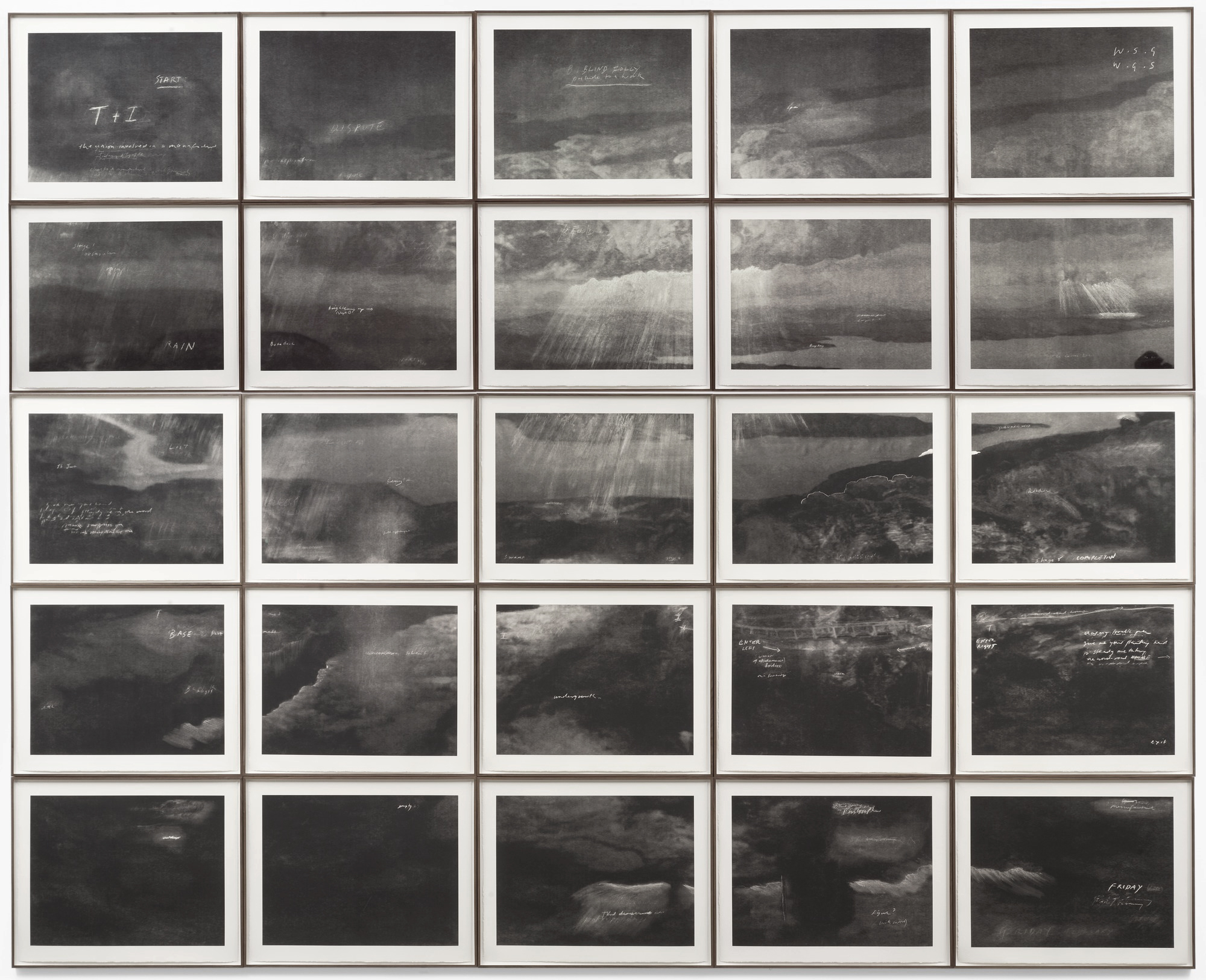
 'Totality' 2000")

 ‘Merce Cunningham Performs ‘Stillness’ (in three movements) to John Cage’s composition 4’33” with Trevor Carlson, New York City, 28 April 2007 (six performances; six films)’ 2007")
 ‘Merce Cunningham Performs ‘Stillness’ (in three movements) to John Cage’s composition 4’33” with Trevor Carlson, New York City, 28 April 2007 (six performances; six films)’ 2007")
 ‘Merce Cunningham Performs ‘Stillness’ (in three movements) to John Cage’s composition 4’33” with Trevor Carlson, New York City, 28 April 2007 (six performances; six films)’ 2007")
 ‘Merce Cunningham Performs ‘Stillness’ (in three movements) to John Cage’s composition 4’33” with Trevor Carlson, New York City, 28 April 2007 (six performances; six films)’ 2007")
 'Darmstädter Werkblock' 2007 (still)")
 'Michael Hamburger' 2007 (still)")
 'Michael Hamburger' 2007 (still)")
 'Michael Hamburger' 2007 (still)")
 'Michael Hamburger' 2007 (still)")
 'Die Regimentstochter' 2005")
 'Die Regimentstochter' 2005")
 'Palast' 2004")
 'Palast' 2004")
 'Palast' 2004")
![Tacita Dean. 'Noir et Blanc [Still]' 2006](https://artblart.com/wp-content/uploads/2009/07/noir_et_blanc-2006.jpg "Tacita Dean. 'Noir et Blanc [Still]' 2006")
 'Kodak' 2006 (still)")
 'Kodak' 2006 (still)")
 'Kodak' 2006 (still)")
 'Double Infinitive 3' 2009")
 'Double infinitive I' 2009")
 'Double Infinitive 4' 2009")

 'Double Iinfinitive 2' 2009")
 'Double Iinfinitive 2' 2009 (detail)")
 'Double Iinfinitive 5' 2009")
 'Sekai' (be humorous') 2009")
 'Tariro' (means 'hope') 2009")
 'Rutendo' (detail - means 'faith') 2009")
 'Los Caprichos', plate 43 from the series 'El sueño de la razón produce monstros' 1799")
 'Zola' (detail - means 'quiet, tranquil') 2009")
 Group with from left to right: Enitan (person of story), Ntombi (lady), Kgosi (chief), Nkosana (prince), Lucky and Alaba (second child after twins) 2009")
 'Nkosana' (detail - means 'prince') 2009")
 'Themognatha pascoci' 2008 from the exhibition 'Blight' at Gallery 101, Melbourne, June, 2009")
 'Trapezites eliena' 2008 from the exhibition 'Blight' at Gallery 101, Melbourne, June, 2009")
 'Dryococelus australis' 2008")


 'Colour Composition derived from three bars of music in the Key of Green' 1935 from the exhibition 'Modern Times: The Untold Story of Modernism in Australia' at Heide Museum of Modern Art, Melbourne, March - July, 2009")
 'Arrested Movement from a Trio' 1934 from the exhibition 'Modern Times: The Untold Story of Modernism in Australia' at Heide Museum of Modern Art, Melbourne, March - July, 2009")
 'Rhythmic composition in yellow green minor' 1919")
 'Colour chart' c. 1919")
 'Rhythm' 1938")
 '\"House of Tomorrow\" exhibition at Exhibition Building, Melbourne' 1949")
 'Nymphex' 1966")
 'Decorative portrait - Len Lye' 1925")
 'Sunbaker' 1934 printed 1937")
 'Rushing' c. 1922")
 'Boomerang' coffee table 1955")

")
 and Mary Featherston (Australian, b. London 1943, migrated to Australia 1952) 'Expo mark II sound chair' 1967")

 'View of the elevated restaurant, Centenary Pool, Brisbane' nd")


 'Australia Square Tower' 1968")
 'At the Pasha Nightclub, Cooma' c. 1957-1959")
 'Darwin' 2009 from the exhibition 'John Beard: After Image' paintings at John Buckley Gallery, Melbourne, May - June, 2009")
 'Gorilla' 2007 from the exhibition 'John Beard: After Image' paintings at John Buckley Gallery, Melbourne, May - June, 2009")

 'Hand 6' 2009")
 'Head SP3' 2004")
 'Rose' 2007")
 'Einstein 2' 2009")
 'Rembrandt' 2009")
 'Jungle with Cassowary' 2008")


 'Water Dragon with Banksias' 2008")
 'Heliconia No. 1' 2008")
 'Variations in Green and Mauve' 2008")
 'Heliconia No. 2' 2008")


You must be logged in to post a comment.