Peter James Smith (New Zealand, b. 1954) reENLIGHTENMENT installation views 2009
“Every passion borders on the chaotic, but the collector’s passion borders on the chaos of memories. More than that: the chance, the fate, that suffuse the past before my eyes are conspicuously present in the accustomed confusion of these books. For what else is this collection but a disorder to which habit has accommodated itself to such an extent that it can appear as order?”1
“Thus the claim is that texts themselves can actually be intrinsically ‘genuine’, but that authenticity is a ‘social construct’. In other words, a certain kind of authenticity is created through the interaction of the users, situations and the texts.”2
Peter James Smith links the culture of science and of human experience, bringing together mathematics and the power of nature in realist imagery that is balanced by strong mark making and text. Redolent still life and landscape images juxtapose with astronomical, poetic and historical observations in the painted images. Handwritten citations, notes, jottings, diagrams and erasures float on the loosely painted surfaces of stretched linen, paper collage and found pieces which bring a Beuysian sense of the charismatic object. A sunset, a violin, a book of verse, an installation of old bells or delicate Jasperware porcelain provide a resonant foil for the artist and viewer – and create a space for the imagination, for mathematical wonder and contemplation.
“Beyond painting, in the current work there is a sense of history allowing us to privilege its objects, their collecting and their housing on walls, in vitrines, on shelves and on plinths. Like any true collector I am keen to bring them to an audience, to show them in a revelatory way. If they are inflected by hand markings it is to personalise the revelation. There are no plastic imitations: the Jasperware vases are authentic collected Wedgwood; the small Greek Pelike is indeed a c 300 BC vase; the Roman glass is a c 300 AD; the collected Wollemi pine needles are indeed from this prehistoric plant. These and other antiquities have a long museological tradition. The narratives of Wedgwood blue and white Jasperware designs are of Greek antiquity – the firing of the white clay over a cobalt blue base (in around) 1772 was a triumph of chemistry over alchemy. With these objects, it is not a postmodernist kitsch that is revealed, but rather the resuscitated fabric of authenticity. I am re-enlightened by their tactile physical presence that has a timeless beauty. To render such things as a painted image is to engage in a different act, with different rules referring to different histories.”
~ Peter James Smith, 2009. Notes from the exhibition catalogue.
I am a collector like Peter James Smith. I display my collection of early 20th century English vases. I have a collection of 300 ties that span from the 1930s to the 1970s. I have eight rare 1940s suits, those suits that Humphrey Bogart used to wear with the wide wide lapels that nearly reach the seam of the sleeve.
Rare, fragile, beautiful, genuine.
In this exhibition Smith appeals not to the genuineness of the objects but to the authenticity of the objects he displays: “There are no plastic imitations … With these objects, it is not a postmodernist kitsch that is revealed, but rather the resuscitated fabric of authenticity.” He wants to show these objects in a revelatory way, for us to once more appreciate their authenticity. To make order out of disorder. But then Smith wants to personalise this revelation and overlays the objects with texts that re-order the taxonomy through a reinscription that is both a de-territorialization and re-territorialization of meaning, a loss of original meaning and the production of new meanings. This is the faint silver flicker of re-enlightenment the artist seeks. It is above all authentication as individual spectacle, as social construct.
“Authenticity is an issue for us today because of a widespread sense that there is something inauthentic in the way we experience the modern world.”3
In some of the works this process is effective and in other works it falls flat on it’s proverbial, intertextual backside. The process works well in the less cerebral works. The use of black paint in Paradise Lost IV (below) is particularly effective as the re-inscription of paint invades and threatens the motifs of the classical figures with the text and cross reinforcing the idea of a lost paradise. Cathedral (2009, below) is also a stunning installation of different bells hung at various heights within a locked cabinet, complicit in their silence as they would not be inside a cathedral. For me this was probably the best piece in the show for its simplicity of thought, eloquence of execution and understanding of how the installation re-enlightens the viewers socially constructed authenticity in a revelatory way. No double marking is needed – a zen balance is proposed and achieved in the quietness of the viewers mind.
Other pieces are less successful. Amphora in grey teracotta Han Dynasty c 100BC (2008), the amphora inscribed with text sitting on a painted black video recorder is particularly unengaging and unappealing – there is no revelatory experience to be had here. The Greek Pileke (see below) inscribed with lines from John Keats Ode on a Grecian Urn seems an appropriate intervention but sometimes in this exhibition one just longs to appreciate the sanctity of the object, it’s presence, in silence without the personalising of the revelation by the hand of the artist. To see the object clearly for what it is.
The large installation reELIGHTENMENT (2009 below, and installation photo at top) falls into darkness. The use of the doors as metaphor is clumsy, book covers have been more successfully used by other artists and the black paint is heavy and oppressive. More interesting are some of the paintings, for example The slow dance of an astronomical twighlight (2009, below) where the poem of William Wordsworth
… a sense sublime Of something far more deeply interfused, Whose dwelling is the light of setting suns
illuminates the poetry of the painting, adding an insightful double meaning to the universal revelation. A vibration of spirit is present both in the landscape and the markings upon the landscape. Unfortunately all too often in this exhibition access to the sublime is denied. Appeals to neo-authenticity fall on deaf ears. The motifs of this exhibition are universal, archetypal but the elements that go to make up this exhibition are too many and lack focus. Sometimes in art less in more and this exhibition is a classic example of this fact. There are some interesting elements but overall the whole is not the sum of its parts.
As John Donne observed
“All mankind is of one author, and is one volume; when one man dies, one chapter is not torn out of the book, but translated into a better language; and every chapter must be so translated … No man is an island, entire of itself; every man is a piece of the continent, a part of the main.”4
Our authentic place in the world, our spiritual space, our re-enlightenment needed to be better defined, more lucidly enunciated in this exhibition NOT IN CAPITAL LETTERS but in the quietness of our hearts.
Dr Marcus Bunyan
1/ Benjamin, Walter. “Unpacking my Library: A Talk about Book Collecting,” in Illuminations. English translation. London: Fontana, 1982, pp. 59-60
2/ Lee, W. “Authenticity revisited: text authenticity and learner authenticity,” in ELT Journal, 49(4). 1995, pp. 323-328 cited in Shomoossi, Nematullah and Ketabi, Saeed. “A Critical Look at the Concept of Authenticity,” in Electronic Journal of Foreign Language Teaching, 2007, Vol. 4, No. 1, pp. 149-155 [Online] cited on 29th March, 2009 at http://e-flt.nus.edu.sg/v4n12007/shomoossi.pdf
3/ McClure, Christoper. The Concept of Authenticity in Charles Taylor and Martin Heidegger. [Online] cited on March 29th, 2009 (no longer available online)
4/ Donne, John. Devotions Upon Emergent Occasions, Meditation XVII: Nunc Lento Sonitu Dicunt, Morieris. 1624.
Variously
Wedgwood Jasperware, Roman glass, Greek Pileke, books, doors, texts, paintings, bells, video, video machine, wooden boxes, black paint, crosses, albatross, Wollemi Pine needles, Paradise Lost, astronomy, linen, stars, photography, Chinese porcelain, collage, mathematical equations, mirrors, Amphora from the Han Dynasty, a violin, a sunset, a book of verse, notes, shelves, jottings, citations.
Notes to myself
~ Golden ratio ~ The archive ~ Topographical markings, inscriptions and decodings ~ The ‘nature’ of authenticity ~ The ‘voice’ of revelation ~ Re-possession of clarity and logic ~ Re-production of mystery, tenderness and love ~ Reverence for the object itself ~ Referentiality between image and text ~ The colour black: transcendent, the depths of the night sky but also the closing in of darkness at the end of days ~ Never one truth but many truths ~ Less is more
Many thankx to Gallery 101 for allowing me to publish the photographs in the posting. Please click on the photographs for a larger version of the image.
Peter James Smith (New Zealand, b. 1954) The slow dance of an astronomical twighlight 2009
Peter James Smith (New Zealand, b. 1954) Paradise Lost IV 2008
Peter James Smith (New Zealand, b. 1954) Ode on a Grecian Urn 2008
Peter James Smith (New Zealand, b. 1954) Cathedral 2009
Peter James Smith (New Zealand, b. 1954) reENLIGHTENMENT 2009
Curator: Manuela Mena, co-curator of the exhibition at the Prado
Francis Bacon (British, 1909-1992) Triptych inspired by T.S. Eliot’s ‘Sweeney Agonistes’ 1967 Oil on canvas 198 x 147.5cm (each) Washington, D.C. Hirshhorn Museum and Sculpture Garden, Smithsonian Institution. Gift of the Joseph H. Hirshhorn Foundation, 1972
Looks like an amazing exhibition of Francis Bacon’s work, one of my favourite artists – I wish I could see it!
Many thankx to the Museo Nacional del Prado for allowing me to publish the art work in the posting. Please click on the photographs for a larger version of the image.
The exhibition is constructed in different sections:
~ Animal ~ Zone ~ Apprehension ~ Crucifixion ~ Crisis ~ Archive ~ Portrait ~ Memorial ~ Epic ~ Late
Bacon’s work demonstrates marked similarities to that of many of the Spanish artists he admired. (Manuela Mena, co-curator of the exhibition at the Prado, has written an excellent essay on this topic that can be found in the exhibition’s catalog.) The retrospective at the Prado provides a rare opportunity to compare Bacon to some of the Spanish masters that influenced him.
Start by meandering through the vast Bacon exhibition. Spread between two floors of the new wing of the Prado, the exhibition has brought together Bacon’s most important works from nearly his entire artistic production. It begins with the work that put Bacon on the map, “Three Studies for Figures at the Foot of a Crucifixion” (1944), and follows his work through the interpretations of Velázquez, crucifixion triptychs, his unique portraits and the late works through the years shortly before his death.
Text from the Prado website
Francis Bacon (British, 1909-1992) Three Studies for Figures at the Base of a Crucifixion c. 1944 Oil on board 94 x 73.7cm London, Tate, presented by Eric Hall 1953
Animal
A philosophical attitude to human nature first emerges in Francis Bacon’s works of the 1940s. They reflect his belief that, without God, humans are subject to the same natural urges of violence, lust and fear as any other animal. He showed Figure in a Landscape and Three Studies for Figures at the Base of a Crucifixion in April 1945, and exhibited consistently thereafter. The bestial depiction of the human figure was combined with specific references to recent history and especially the devastating events of the Second World War. Bacon often drew his inspiration from reproductions, acquiring a large collection of books, catalogues and magazines. He repeatedly studied key images in order to probe beneath the surface appearance captured in photographs. Early concerns that would persist throughout his work include the male nude, which reveals the frailty of the human figure, and the scream or cry that expresses repressed and violent anxieties. These works are among the first in which he sought to balance psychological insights with the physical identity of flesh and paint.
Francis Bacon (British, 1909-1992) Study after Velázquez’s Portrait of Pope Innocent X 1953 Oil on canvas 153 x 118cm Des Moines, Nathan Emory Coffin Collection of the Des Moines Arts Center, purchased with funds from the Coffin Fine Arts Trust
Zone
In his paintings from the early 1950s, Bacon engaged in complex experiments with pictorial space. He started to depict specific details in the backgrounds of these works and created a nuanced interaction between subject and setting. Figures are boxed into cage-like structures, delineated ‘space-frames’ and hexagonal ground planes, confining them within a tense psychological zone. In 1952 he described this as “opening up areas of feeling rather than merely an illustration of an object”. Through his technique of ‘shuttering’ with vertical lines of paint that merge the foreground and background, Bacon held the figure and the setting together within the picture surface, with neither taking precedence in what he called “an attempt to lift the image outside of its natural environment”.
A theme that emerged in the 1950s was the extended series of variants of Velázquez’s Portrait of Pope Innocent X, 1650 (Rome, Galleria Doria Pamphilj), a work Bacon knew only from illustrations. He used this source to expose the insecurities of the powerful – represented most often in the scream of the caged figure. Through the open mouth Bacon exposed the tension between the interior space of the body and the spaces of its location, which is explored more explicitly in the vulnerability of the ape-like nudes.
Francis Bacon (British, 1909-1992) Chimpanzee 1955 Oil on canvas 152.5 x 117cm Stuttgart, Staatsgalerie
Apprehension
Implicit throughout Bacon’s work of the mid 1950s is a sense of dread pervading the brutality of everyday life. Not only a result of Cold War anxiety, this seems to have reflected a sense of menace at a personal level emanating from Bacon’s chaotic affair with Peter Lacy (who was prone to drunken violence) and the wider pressures associated with the continuing illegality of homosexuality. The Man in Blue series captures this atmosphere, concentrating on a single anonymous male figure in a dark suit sitting at a table or bar counter on a deep blue-black ground. Within their simple painted frames, these awkwardly posed figures appear pathetically isolated.
Bacon’s interest in situations that combine banality with acute apprehension was also evident in other contemporary works. From figures of anxious authority, his popes took on malevolent attributes and physical distortions that were directly echoed in the paintings of animals, whose actions are also both sinister and undignified. Some of these images derived from Bacon’s close scrutiny of the sequential photographs of animals and humans taken by Eadweard Muybridge (1830-1904), which he called “a dictionary” of the body in motion.
Francis Bacon (British, 1909-1992) Three Studies for a Crucifixion 1962 Oil on canvas 198.2 x 144.8cm New York, Solomon R. Guggenheim Museum
Crucifixion
Bacon made paintings related to the Crucifixion at pivotal moments in his career, which is why these key works are gathered here. The paradox of an atheist choosing a subject laden with Christian significance was not lost on Bacon, but he claimed, “as a non-believer, it was just an act of man’s behaviour”. Here the instincts of brutality and fear combine with a deep fascination with the ritual of sacrifice. Bacon had already made a very individual crucifixion image in 1933 before returning to the subject with his break-through triptych Three Studies for Figures at the Base of a Crucifixion in 1944. This is a key precursor to later themes and compositions, containing the bestial distortion of human figures within the triptych format. These monstrous creatures displace the traditional saints and Bacon later related them to the Eumenides – the vengeful furies in Greek mythology. In resuming the theme in the 1960s, especially in 1962 as the culmination of his first Tate exhibition, Bacon used references to Cimabue’s 1272-1274 Crucifixion to introduce a more explicitly violent vision. Speaking after completing the third triptych in 1965 he simply stated: “Well, of course, we are meat, we are potential carcasses”.
Francis Bacon (British, 1909-1992) Paralytic Child Walking on All Fours (from Muybridge) 1961 Oil on canvas 198 x 142cm The Hague, Collection Gemeentemuseum Den Haag
Crisis
Between 1956 and 1961, Bacon travelled widely. He spent time in places marginal to the art world, in Monaco, the South of France and Africa, and particularly with Peter Lacy in the ex-patriot community in Tangier. In this rather unsettled context, he explored new methods of production, shifting to thicker paint, violently applied and so strong in colour as to indicate an engagement with the light of North Africa. This was most extreme in his series based on a self-portrait of Van Gogh, The Painter on the Road to Tarascon (1888, destroyed), which became an emblem of the modern predicament. Despite initial acclaim, Bacon’s Van Gogh works were soon criticised for their “reckless energy” and came to be viewed as an aberration. They can now be recognised as pivotal to Bacon’s further development, however, and allow glimpses into his search for new ways of working. His innovations were perhaps in response to American Abstract Expressionism, of which he was publicly critical. Although he eventually returned to a more controlled approach to painting, the introduction of chance and the new vibrancy of colour at this moment would remain through out his career.
The posthumous investigation of Bacon’s studio confirmed the extent to which he used and manipulated photographic imagery. This practice was already known from montages recorded in 1950 by the critic Sam Hunter. Often united by a theme of violence, the material ranges between images of conflict, big game, athletes, film stills and works of art.
An important revelation that followed the artist’s death was the discovery of lists of potential subjects and preparatory drawings, which Bacon had denied making. Throughout his life, he asserted the spontaneous nature of his work, but these materials reveal that chance was underpinned by planning.
Photography offered Bacon a dictionary of poses. Though he most frequently referred to Eadweard Muybridge’s (1830-1904) survey of human and animal locomotion, images of which he combined with the figures of Michelangelo, he remained alert to photographs of the body in a variety of positions.
A further extension of Bacon’s preparatory practices can be seen in his commissioning of photographs of his circle of friends from the photographer John Deakin (1912-1972). The results – together with self-portraits, photo booth strips, and his own photographs – became important prompts in his shift from generic representations of the human body to portrayals of specific individuals.
A matrix of images
Bacon’s use of photographic sources has been known since 1950 when the critic Sam Hunter took three photographs of material he had selected from a table in Bacon’s studio in Cromwell Place, South Kensington. Hunter observed that the diverse imagery was linked by violence, and this fascination continued throughout Bacon’s life. Images of Nazis and the North African wars of the 1950s were prominent in his large collection of sources. Films stills and reproductions of works of art, including Bacon’s own, were also common. The dismantling of Bacon’s later studio, nearby at Reece Mews, after his death confirmed that the amassing of photographic material had remained an obsession. While some images were used to generate paintings, he also seems to have collected such an archive for its own sake.
The mediated image
From the 1960s, Bacon’s accumulation of chance images began to include a more deliberate strategy of using photographs of his close circle. They became key images for the development of the portraits that dominated his paintings at this time. Snap shots and photo booth strips were augmented by the unflinching photographs taken by his friend John Deakin. Bacon specifically commissioned some of these from Deakin as records of those close to him – notably his partner from 1962, George Dyer – and they served as sources for likenesses and for poses for the rest of his career.
The Physical Body
Bacon drew more from Eadweard Muybridge’s sequential photographs of human and animal locomotion than from any other source. These isolated the naked figure in a way he clearly found stimulating. He also, however, spoke of projecting on to them Michelangelo’s figures which for him had more “ampleness” and “grandeur of form”.
His fascination in photography’s freezing of the body in motion led him to collect sports photographs, particularly boxing, cricket and bullfighting. It was not just movement but the physicality of the body that Bacon scrutinised, using found images to provoke new ways of picturing its strength and vulnerability.
Francis Bacon (British, 1909-1992) Portrait of Isabel Rawsthorne Standing in a Street in Soho 1967 Oil on canvas 198 x 147.5cm Berlin, Staatliche Museen zu Berlin, Nationalgalerie
Portrait
During the 1960s, the larger part of Bacon’s work shifted focus to portraits and paintings of his close friends. These works centre on two broad concerns: the portrayal of the human condition and the struggle to reinvent portraiture. Bacon drew upon the lessons of Van Gogh and Velázquez, but attempted to rework their projects for a post-photographic world. His approach was to distort appearance in order to reach a deeper truth about his subjects. To this end, Bacon’s models can be seen performing different roles. In the Lying Figures series, Henrietta Moraes is naked and exposed. This unprecedented raw sexuality reinforces Bacon’s understanding of the human body simply as meat. By contrast Isabel Rawsthorne, a fellow painter, always appears in control of how she is presented. With a mixture of contempt and affection, Bacon depicted George Dyer, his lover and most frequent model, as fragile and pathetic. This is especially evident in Dyer’s first appearance in Bacon’s work, in Three Figures in a Room, in which he represents the absurdities, indignities and pathos of human existence. Everyday objects occasionally feature in these works, hollow props for lonely individuals which reinforce the sense of isolation that Bacon associated with the human condition.
Francis Bacon (British 1909-1992) Triptych in Memory of George Dyer 1971 Oil on canvas
Francis Bacon (British, 1909-1992) Triptych – August 1972 1972 Oil on canvas 198 x 147.5cm London, Tate
Memorial
This room is dedicated to George Dyer who was Bacon’s most important and constant companion and model from the autumn of 1963. He committed suicide on 24 October 1971, two days before the opening of Bacon’s major exhibition at the Grand Palais in Paris. Influenced by loss and guilt, the painter made a number of pictures in memorial to Dyer. From this period onwards the large-scale triptych was his established means for major statements, having the advantage of simultaneously isolating and juxtaposing the participating figures, as well as guarding against narrative qualities that Bacon strove to avoid. But while evading narrative, Bacon drew more than ever from literary imagery; the first of the sequence, Triptych In Memory of George Dyer 1971, refers to a specific section of T.S. Eliot’s The Waste Land (1922). In addition to his own memory, for Triptych – August 1972 Bacon relied on photographs, taken by John Deakin, of Dyer in various poses on a chair. He confined his dense and energetic application of paint to the figures in these works. The dark openings consciously evoke the abyss of mortality that would become a recurring concern in Bacon’s later works.
Francis Bacon (British, 1909-1992) Triptych 1987 Oil on canvas 198 x 147.5cm London, The Estate of Francis Bacon, courtesy Faggionato Fine Art
Epic
References to poetry and drama became a central element in Bacon’s work from the second half of the 1960s. Alongside images of friends and single figures (often self-portraits), he produced a series of grand works that identified with great literature. Imbued with the inevitability and constant presence of death, the poetry of T.S. Eliot was a particular source of inspiration. The sentiments of the poet’s character Sweeney could be said to echo the painter’s perspective on life:
Birth, and copulation, and death.
That’s all the facts when you come to
brass tacks:
Birth, and copulation, and death.
The works in this room refer to and derive from literature. Some make direct references in their titles, others depict, sometimes abstractly, a certain scene or atmosphere within the narratives themselves. Bacon repeatedly stated that none of his paintings were intended as narratives, so rather than illustrations, these works should perhaps be understood as evoking the experience of reading of Eliot’s poetry or Aeschylus’s tragedies: their violence, threat or erotic charge. Thus, of the triptych created after reading Aeschylus, Bacon explained “I tried to create images of the sensations that some of the episodes created inside me”.
Francis Bacon (British, 1909-1992) Portrait of John Edwards 1988 Oil on canvas 198 x 147.5cm The Estate of Francis Bacon, courtesy of Faggionato Fine Arts, London, and Tony Shafrazi Gallery, New York
Late
When Bacon turned seventy in 1979, more than a decade of work lay ahead of him. Neither his legendarily hedonistic lifestyle nor his work pattern seemed to age him, but he was continually facing up to mortality through the deaths of those around him. This unswerving confrontation, however mitigated by youthful companions such as John Edwards, became the great theme of his late style. Constantly stimulated by new source material – for example the photographs and the poetry of Federico García Lorca which triggered his bullfight paintings – he was able to adapt them to his abiding concerns with the vulnerability of flesh. Exploring new techniques he also extended his fascination with how appropriate oil paint is for rendering the human body’s sensuality and sensitivity. A certain despairing energy may also be felt in the forceful throwing of paint that dominates some of these final works: the controlled chance as a defiant gesture. Ultimately, and appropriately, Bacon’s last triptych of 1991 returns to the key image of sexual struggle that had frequently recurred in his work. He faced death with a defiant concentration on the exquisiteness of the lived moment.
Francis Bacon (British, 1909-1992) Three Studies for Self-Portrait 1979-1980 Oil on canvas 37.5 x 31.8cm Nueva York, The Metropolitan Museum of Art, Jacques and Natasha Gelman collection, 1998
Francis Bacon
Francis Bacon is internationally acknowledged as among the most powerful painters of the twentieth century. His vision of the world was unflinching and entirely individual, encompassing images of sensuality and brutality, both immediate and timeless. When he first emerged to public recognition, in the aftermath of the Second World War, his paintings were greeted with horror. Shock has since been joined by a wide appreciation of Bacon’s ability to expose humanity’s frailties and drives.
This major retrospective gathers many of his most remarkable paintings and is arranged broadly chronologically. Bacon’s vision of the world has had a profound impact. It is born of a direct engagement that his paintings demand of each of us, so that, as he famously claimed, the “paint comes across directly onto the nervous system”.
As an atheist, Bacon sought to express what it was to live in a world without God or afterlife. By setting sensual abandon and physical compulsion against hopelessness and irrationality, he showed the human as simply another animal. As a response to the challenge that photography posed for painting, he developed a unique realism which could convey more about the state of existence than photography’s representation of the perceived world. In an era dominated by abstract art, he amassed and drew upon a vast array of visual imagery, including past art, photography and film. These artistic and philosophical concerns run like a spine through the present exhibition.
Museo Nacional Del Prado Paseo del Prado, s/n, 28014 Madrid, Spain
Dale Frank (Australian, b. 1959) The Big Black Bubble (installation view) Left to right: Timothy Oliphant (2008), Ryan Gosling (2008/2009) and Matthew Macfadyen (2008) 2009
This is a brilliant exhibition by Dale Frank, one of my favourites so far this year in Melbourne.
Six large varnish on linen landscape paintings are presented in the beautiful Anna Schwartz gallery space in Melbourne. Photographs really do not do the paintings justice – they can only give an impression of the size and scale of the work but not of their intimacy or smell. The smell of varnish permeates the air. The serendipity of the natural convulsions of the varnish and the facilitations of the hand of the artist, his performance, have been caught like bugs in amber in the final molecular structure of the painting. Here are pendulous, globular goops of varnish, immersive heroic tone poems that form images in the mind of the viewer. Moving close to the paintings you are surrounded by flows and eddies, the macro and the micro; details become more apparent as you study the work.
While disagreeing that these paintings are the viewers to create (the viewer as author) what I can say is that the artist offers the viewer the ability to generate their own resonances with the painting, to use the imagination of ‘equivalence’ to suggest what these paintings stand for – and also what else they stand for. States of being, of transformation, wonder and joy emerge in the playfulness of these works. Perhaps this is where the titles of the paintings come from, referencing film actors in the pop tradition, but this is the only thing that did not ring true with the work, their titles. The use of this trope seems to me a bit facile given the nature of the work.
The hot pink painting Rupert Grint (2008/2009, above) is hotter and lighter than in the photograph below, the varnish more translucent, the effect altogether mesmeric. You are drawn into the work, the intensity of the colour, the thickness of the hanging varnish. Two cosmological galaxies (Timothy Oliphant (2008) and Matthew Macfadyen (2008)) surround the most complex painting in the exhibition, the darkness and light that is Ryan Gosling (2008/2009, below).
This painting is a tour de force. With the poetic structure of an oil spill, the varnish forms intricate slick upon slick contours that are almost topographical in their mapping. The black oozes light, becomes ‘plastic’ black before your eyes, like the black of Rembrandt’s backgrounds, illusive, illuminative and hard to pin down – perpetually hanging there in two dripping rows, fixed but fluid at one and the same time (you can just see the suspensions in the photograph above).
The painting reminds me of the black paintings of Mark Rothko that he undertook for The Rothko Chapel in Houston, Texas (see below). As with the Rothko paintings, this painting is not just black (physically there are swirls of purple as in the Rothko paintings), not about darkness at all. What both artists do is create a contemplative, transformative space – in Frank’s case for a world on the edge of oblivion. This is a post post-modern landscape: process and nature, performance and chance coalescing in the colour : black!
This painting is one of the most overwhelming syntheses of art and nature, of universal forces that I have seen in recent contemporary art. This exhibition is an electric pulsating universe of life, landscape and transformation. Magnificent!
Dr Marcus Bunyan
Many thankx to Anna Schwartz Gallery for allowing me to publish the photographs in the posting. Please click on the photographs for a larger version of the image.
Dale Frank (Australian, b. 1959) The Big Black Bubble (installation view) Left to right: Daniel Radcliffe (2008/2009), Khan Chittenden (2009) and Rupert Grint (2008/2009) 2009
The immersive scale of these new paintings at Anna Schwartz Gallery Melbourne allows us to experience their inner qualities of landscape and of transformation. This is painting at fundamental authenticity. The paint is its own agent; it is allowed to act, to behave. The artist is the facilitator of these phenomena of nature and natural forces, whose residue is a metaphor for nature itself.
Black contains all colours, contours and depths. A pink monochrome is transformed by pure varnish into an expressionistic moment of process and performance. All colour is absent from elemental silver aluminium and form and gesture alone survive. New dynamics are possible through an innovative colouration: the emergence of colour through black, and its equivalent power.
Dale Frank’s painting is one of poetry, performance and nature. It represents both the macro and micro. Huge universal forces pulsate with molecular, atomic activities. Imagination is gifted by the artist to the viewer. These are our paintings to create.
Anonymous text from the exhibition flyer.
Dale Frank (Australian, b. 1959) Ryan Gosling 2008/2009
The Rothko Chapel Houston, Texas
Anna Schwartz Gallery 185 Flinders Lane Melbourne 3000 Australia Phone: +61 3 9654 6131
Exhibition dates: 20th February – 12th April, 2009
Gerhard Richter (German, b. 1932) 9.4.89 10.1 x 14.8cm Oil on colour photograph
There is something unsettling in Richter’s serendipitious interventions. Using his own prosaic 10 x 15cm colour photographs that have been commercially printed as the basis of the works, Richter overlays the surface of the photograph with skeins of paint that disturb the reflexivity of each medium. Dragging the photograph through the paint or using a palette knife to apply layers of colour, the surfaces of paint and photograph no longer exist as separate entities. The process produces punctum like clefts rent in the fabric of time and space. If the intervention is judged unsuccessful the result if immediately destroyed.
In 5.Juli.1994 (below) blood red fingers of paint strain upwards as they invade the solidity of a dour suburban home, echoing the invading trees branches at top right of picture. In 11.2.98 (below) green paint slashes across the mouth and forehead of a woman in a floral dress, her eyes seemingly bloodshot and pleading stare into the distance to the left of our view, the silent scream strangled in her throat by the vibrations of paint. These are the instantaneous responses of the artist to the photograph, a single mood expounded in irreversible gestures, the actions of the painter’s hand disturbing the indexical link of the photograph and it’s ability to be ‘read’ as a referent of the object it depicts. Richter’s interventions challenge the concept of momentary awareness and offer the possibility of a space between, where the image stands for something else – access to Other, even a contemplation of the sublime.
“The colour of paint applied corresponds or contrasts the tonalities of the underlying photograph but link the two through formal relationships of the layers … Often a tense relationship, the results run the gamut of the surreal to the beautiful to the disturbed. It is all the more surprising that each in its perceived completeness was in essence accomplished by chance and trial and error.”1
“Richter’s painterly gestures bounce off the [photographs] content in peculiar ways, sometimes interacting with it, sometimes overlaying it and sometimes threatening to eclipse it altogether. The final effect is to cause both photography and painting to seem like incredibly bizarre activities, disparate in texture but often complicit in aspiration.”2
I love the violence, the sometimes subversive, sometimes transcendental ‘equivalence’ of these images: where a Steiglitz cloud can stand for music, where a Minor White infrared photograph posits a new reality, Richter offers us an immediacy that destroys the self-reflexive nature of everyday life. His spontaneous musings, his amorphous worlds, his bleeds and blends crack open the skin of our existential life on earth. Here, certainly, are ‘the clefts in words, the words as flesh’.
Gerhard Richter (German, b. 1932) 11.4.89 10 x 15cm Oil on colour photograph
Gerhard Richter (German, b. 1932) 11.3.89 10 x 14.9cm Oil on colour photograph
Gerhard Richter (German, b. 1932) 5.Juli.1994 10.2 x 15.2cm Oil on colour photograph
Gerhard Richter (German, b. 1932) 11.2.98 10 x 14.7cm Oil on colour photograph
Gerhard Richter (German, b. 1932) 22.2.96 9.6 x 14.7cm Oil on colour photograph
Gerhard Richter (German, b. 1932) 11.Febr.05 10.1 x 14.9cm Oil on colour photograph
The exhibition presents 330 of Richter’s largely unknown overpainted photographs, a technique he has been using since 1982.
The exhibition UERBERNALTE FOTOGRAFIEN / PHOTOGRAPHIES PEINTES (OVERPAINTED PHOTOGRAPHS) at the Centre de la photographie Geneva (CPG) presented a side of the work of Gerhard Richter largely unknown up till now. Only a few collectors and gallerists close to the artist were aware of the practise that Gerhard Richter, one of the most important artists of our times, had developed systematically since 1982. It is only because of this exhibition that more than 1000 of his over-painted photographs will enter into his catalogue raisone. The CPG presents approximately 330 of them in this show.
“By placing paint on photographs, with all their random and involuntary expressiveness, Gerhard Richter reinforces the unique aspect of each of these mediums and opens a field of tension rich in paradoxes, as old as the couple – painting / photography – which has largely defined modern art.”
Gerhard Richter is justly famed for the photorealism of his early canvases, but it is less well known that he has also painted directly onto photographic prints. These (mostly small-format) pieces were reproduced in books as early as the first Atlas, but practically all of the works themselves are housed in private collections and rarely exhibited in public. Overpainted Photographs gathers this body of work, which unites the labor of the hand with the work of mechanical reproduction to produce a kind of art as conceptually rich as Richter’s better-known paintings, neutralizing the expressive powers of each medium to reach an indifference to their potency. In an overture to Duchamp’s “degree zero” found objects, the original photographs are frequently bland in content – an empty office, a ball, a beach scene or tourist snapshot – and Richter’s painterly gestures bounce off that content in peculiar ways, sometimes interacting with it, sometimes overlaying it and sometimes threatening to eclipse it altogether. The final effect is to cause both photography and painting to seem like incredibly bizarre activities, disparate in texture but often complicit in aspiration. This monograph offers a unique opportunity to savour what had previously been a neglected but copious aspect of Richter’s work.
“The public scenes, whether on the beach or the ski slope or children’s theatre, are beset with sudden surges of colour that tend to resemble interventions of the sky or elemental forces, more than the moods of a decorative or ornamental painter annotation. Sometimes they seem like catastrophic visions. Blood-red snowflakes dance above the white fern. The photo shows skyscrapers in the urban morning sun – and the oil paint adds to the sulpherous fire that pours over the city from the sky”
Louise Paramor (Australian, b. 1964) Show Court 3 (II) 2009
Boarding a train at Flinders Street we emerge at South Yarra station to stroll down to River Street for our third opening of the night at Nellie Castan Gallery. We are greeted by the ever gracious Nellie Castan who has just returned from an overseas trip to Europe where she was soaking up the wonders of Rome amongst other places. For the latest exhibition in the gallery Louise Paramor is presenting two bodies of work: Show Court 3 and Mood Bomb (both 2009). Lets look at Show Court 3 first as this work has older origins.
Originally exhibited in 2006 at Nellie Castan under the title Jam Session the sculptures from this exhibition and many more beside (75 in all) were then installed in 2007 on show court 3 at Melbourne & Olympic Parks, hence the title of the installation. In the smaller gallery in 2009 we have six Lambda photographic prints that are records of this installation plus a video of the installation and de-installation of the work.
While interesting as documentary evidence of the installation these photographs are thrice removed from the actual sculptures – the sculptures themselves, the installation of the sculptures on court and then the photographs of the installation of the sculptures. The photographs lose something in this process – the presence or link back to the referentiality of the object itself. There is no tactile suggestiveness here, no fresh visual connections to be made with the materials, no human interaction. The intertextual nature of the objects, the jamming together of found pieces of bright plastic to make seductive anthropomorphic creatures that ‘play’ off of each other has been lost.
What has been reinforced in the photographs is a phenomena that was observed in the actual installation.
“The sculptures created a jarring visual disruption when placed in a location normally associated with play and movement. The stadium seating surrounding the tennis court incited an expectation of entertainment; a number of viewers sat looking at the sculptures, as though waiting for them to spin and jump around. But mostly, the exhibition reversed the usual role of visitors to place where one sits and watches others move; here the objects on the tennis court were static and the spectators moved around.” (2007)1
In the photographs of these objects and in the installation itself what occurs is an inversion of perception, a concept noted by the urbanist Paul Virilio.2 Here the objects perceive us instead of us perceiving the object: they stare back with an oculocentric ‘suggestiveness’ which is advertising’s raison d’être (note the eye sculpture above). In particular this is what the photographs suggest – a high gloss surface, an advertising image that grabs our attention and forces us to look but is no longer a powerful image.
In the main gallery was the most interesting work of the whole night – experiments of abstraction in colour “inspired by the very substance of paint itself.” Made by pouring paint onto glass and then exhibiting the smooth reverse side, these paintings are not so much about the texture of the surface (as is Dale Frank’s work below) but a more ephemeral thing: the dreamscapes of the mind that they promote in the viewer, the imaginative connections that ask the viewer to make. Simpler and perhaps more refined than Frank’s work (because of the smooth surface, the lack of the physicality of the layering technique? because of the pooling of amoebic shapes produced, not the varnish that accumulates and recedes?) paint oozes, bleeds, swirls, drips upwards and blooms with a sensuality of intense love. They are dream states that allow the viewer to create their own narrative with the title of the works offering gentle guides along the way: Girl with Flowers, Lovers, Mood Bomb, Emerald God, Mama, and Animal Dreaming to name just a few. To me they also had connotations of melted plastic, almost as if the sculptures of Show Court 3 had dissolved into the glassy surface of a transparent tennis court.
These are wonderfully evocative paintings. I really enjoyed spending time with them.
Dr Marcus Bunyan
1/ O’Neill, Jane. Louise Paramor: Show Court 3. Melbourne: Nellie Castan Gallery, 2009
2/ Virilio, Paul. The Vision Machine. (trans. Julie Rose). Bloomington: Indiana University Press, 1994, pp. 62-63
Many thankx to Nellie Castan Gallery for allowing me to publish the photographs in the posting. Please click on the photographs for a larger version of the image.
Louise Paramor (Australian, b. 1964) Show Court 3 (VI) 2009
Louise Paramor (Australian, b. 1964) Show Court 3 (detail) 2009
Louise Paramor (Australian, b. 1964) Show Court 3 (detail) 2009
Louise Paramor (Australian, b. 1964) Opening night crowd in front of Sky Pilot (left) and Mama (right) 2009 Paint on glass
Louise Paramor (Australian, b. 1964) Opening night crowd in front of Green Eyed Monster (right) and Sky Pilot (right) 2009 Paint on glass
Louise Paramor (Australian, b. 1964) Opening night crowd in front of Pineapple Express 2009 Paint on glass
Louise Paramor (Australian, b. 1964) A Dog and His Master (detail) 2009 Paint on glass
Louise Paramor (Australian, b. 1964) Lovers 2009 Paint on glass
Dale Frank (Australian, b. 1959) 2. One conversation gambit you hear these days: ‘Do you rotate?’ An interesting change of tack? No suck luck. ‘Do you rotate?’ simply fishes for information about the extent of your collection. Do you have enough paintings to hang a different one in your dining room every month? 2005
Louise Paramor (Australian, b. 1964) Mood Bomb 2009 Paint on glass
Louise Paramor (Australian, b. 1964) Slippery Slope (detail) 2009 Paint on glass
Louise Paramor (Australian, b. 1964) Green Eyed Monster (detail) 2009 Paint on glass
Richard Grigg (Australian) New Work exhibition Opening night crowd at Block Projects, Melbourne
Moving down Flinders Lane we ascended to the fourth floor and entered the beautiful light filled gallery space at Block Projects to view the ‘new work’ of Richard Grigg. An eclectic mix of sculpture, painting, drawing, and collage was presented. Preparatory drawings for one of the sculptures, a pencil drawing of two old men debating, a canvas of a camera in tempera, gold leaf and gesso vie for attention with the two standout pieces of the show: No more songs at funerals/hero today gone tomorrow (2007) and He can’t read well because of his horns (2009), surrealist sculptures both made of compressed cardboard (below).
These two sculptures are fantastic: the first forming a skull made out of birds perched on a cross surmounted by a bird holding an olive branch, the title deliciously ironic; the second a stooped gargoyle like creature with a massive extrusion for a nose, hanging tongue dripping saliva and phantasmagorical protrusions emerging from it’s head making it impossible for the creature to ‘read well’ in both the metaphorical and literal sense. This is a beautiful but grotesque primordial fantasy with the horns putting roots down in the soil like the roots of a mangrove tree, a gold leaf flower blooming at their outer reaches, the creature exhausted by the effort of trying to keep his head up.
Unfortunately the rest of the exhibition lacked core strength: conceptually the show is not strong. Evidence of beauty in decay and concerns about the process of ageing vie with environmental contexts; slippages in time (The Moment Between) contrast with cameras and their sight lines; Pinocchio lies under a shroud with a camera trapped in the back of a horse drawn cart (Dream of Rest). Apparently, the cameras do not signify the capturing of the frozen moment of beauty but they are there because the artist’s father collected cameras. To me they seemed to be defining the nature of our interaction with the world, the surface of the image controlling the interface between technology and earth.
One of the problems with undertaking an exhibition titled New Work is the assumption that the new work being produced hangs together holistically and tells a not necessarily linear narrative story but one that the viewer can investigate, question, and tease the pertinent concepts from – something the viewer can hang their hat on (perhaps the horns of a dilemma!) This was not the case here. The bits n bobs approach of this exhibition falls slightly flat but go see the show for the two sculptures – they alone are worth the effort!
Dr Marcus Bunyan
Many thankx to Block Projects for allowing me to publish the photographs in the posting. Please click on the photographs for a larger version of the image.
Richard Grigg (Australian) No more songs at funerals/hero today gone tomorrow 2007-2009 Layered boxboard, wood dowel, glue, pine, black gloss enamel, Perspex
Richard Grigg (Australian) He can’t read well because of his horns 2009 Layered boxboard, gold leaf, wood dowel, glue, pine, black gloss enamel, wood stain
Richard Grigg (Australian) A Late Night Story 2007 pencil on paper
Richard Grigg (Australian) Older than the value of beauty (detail) 2009 Tempera, gold leaf and gesso on board
Richard Grigg (Australian) Cloak 2008 Tempera, gold leaf and gesso on board
Block Projects Level 1 / 252 Church Street Richmond Victoria 3121 Australia Phone: +61 3 9429 0660
Exhibition dates: 25th February – 14th March, 2009
Junko Go (Australian born Japan, b. 1955) Opium Poppy 2008
“One person’s heaven is another’s nightmare. Seeing both sides to every story can be a blessing and a curse. Good and bad, right and wrong, purity and impurity are inextricably linked.”
A delicate, refined but strong presence is felt in the work of Junko Go in the her new exhibition ‘all about … blooming’ at Gallery 101, Melbourne. Nominally landscape painting about flowers but featuring thoughts and ideas about the seed, the shoot, pollen and the breath of life the work addresses the essence of what it is to be human and live compassionately on this earth in an intelligent and profound way.
Denying the nihilism of abstract expressionism each mark is fully considered by being attentive to the connection between brush, hand and meaning. Almost childlike in their use of charcoal and acrylic her dogs, crosses and flowers, jottings and dashes, rain and rivers, seeds and people show a Zen like contemplation in the marks she makes on the canvas – just so. A releasement towards things is proffered, a letting go of the ego to create an awareness of just being. There is genuine warmth and humility to this work.
In Opium Poppy (2008, above) the darkness of the nightmare is represented by the black marks, ascending like Jacob’s ladder balanced by the mandala like poppies whose petals seem like feathers of a bird’s wing – a flight of fancy both good and bad. In Pollen (2009) bees swarm around a sunflower leaving traces of their presence, a bird flies close to a tiny blue cloud, the sun burst forth in a tiny patch of aqua colour, and people hug arm in arm. As Go says, “Bees in a flower bear pollen unawares and play a crucial roll for the plant to survive. Our love, kindness, warmth and wisdom affect one another unawares and play a crucial roll for our planet to survive.” In New Shoot (2008, below) the puzzle of our existence, the nature of our existential being is laid bare for all to see.
In Seeds (2008) Go reminds us that rather than being focused on what we hoped for, we must make the most of whatever opportunities we are blessed with. This means being aware of the gifts one possesses, not the distance between ‘I’ and want, need and desire – now! The seed of our experience – the calm before the force that propelled us into existence – is already present within us.
Go’s musings on the existential nature of our being are both full and empty at one and the same time and help us contemplate the link to the breath of the sublime. In the end Go’s paintings are about endings and beginnings, about being strong or not, about the infinity of the seed and about our responses to living in harmony on this planet. Through the seed, the shoot, the flower and the earth access may be granted to the sublime and this perfectly sums up the work of this artist, a reflection of her energy and radiance transferred to the canvas. I loved it.
Dr Marcus Bunyan
Many thankx to Gallery 101 for allowing me to publish the art work in the posting. Please click on the art work for a larger version of the image.
Junko Go (Australian born Japan, b. 1955) New Shoot 2008
“Each of us is born to fill a special place in this world. In the process, we sometimes have trouble finding our niche. Life is like a jigsaw puzzle in which we make every effort to find our own place that makes a right connection with others, with the world and even with the whole universe.”
Junko Go (Australian born Japan, b. 1955) Red Hot Poker 2009
“Push and pull our inner strength. Sometimes, we need courage to take risks in confronting pain and loss in order to gain a deep and profound experience.”
“We live in a world where high achievers are congratulated, yet true achievements are not related to what we can get done, but to how deeply we aware of how wonderful it is to be alive. In this exhibition, flowers are not only a predominant source of visual inspiration, looking at them also engenders a kind of appreciation and wonder. The fragile and ephemeral flower provokes in me an awareness of the human condition that reveals the true nature of our existence.
My goal is to create images which are strong and soft, bold and precise, beautiful and ugly, figurative and abstract, all at once. My greatest challenge is to make art about what it is to be human … What really matters in art making to me is a kind of awareness – a being able to say, ‘I am as I am’.”
Exhibition dates: 3rd February – 21st February, 2009
Mary Newsome (Australian, b. 1936) Bowerhouse Blues installation photograph with The Bowerhouse centre 2009
This is a slight bouffant of an exhibition by Mary Newsome at Gallery 101, Collins St., Melbourne.
“The exhibition consists of separate collections to do with blue, centring on the Bowerhouse with its beckoning light. The ideas came from several different directions.” And what directions they are.
Firstly, the idea of the lonely male bowerbird at the Museum of Victoria, given blue biros as solace after killing his last mate. Secondly, Oscar Wilde trying to live with his blue china toying with Yves Klein and his uber-dimensionality, the invisible blue becoming visible. Then we have finger painting as a child upgraded to paste painting “which is finger painting under a more adult name”; and more – poetry, yes! by famous poets, sandwiched with shells and cans and bits of glass and plastic and pottery and pegs all offered up to the god of the azure.
Artefacts litter the floor around the edge of the gallery, media wash across the walls. A silkscreen here and a painting of blue and white china there, watercolours of a view out of a blue curtained Cornish cottage, a blue seascape, the “royal-ness” of a blue tampons collage, three-dimensional objects, acrylics, crayon, pencil, oils and stencils. The Bowerhouse itself, like a blue ‘red light’ house with flashing blue light inside and heart on top. And so it goes.
There are some interesting small single-pigment blue acrylics that have geometric and anamorphic shapes painted upon them with stencilled names of the colour along the spine of the canvases. There are also a couple of competent oils and silkscreens of tea sets in a dresser with cups hanging from hooks.
The works date from 1980 to the present day – and “without fully realising it” the artist has looked through her work over the past 30 years and come across lots and lots of blue. Any artist worth their salt knows their oevure indelibly from front to back. It seems inconceivable to me that this epiphany has occurred without the artist not fully understanding the importance of the colour blue to their art practice before now.
Recently I have been reading a book called Distraction (Damon Young. Distraction: A Philosopher’s Guide to Being Free. Melbourne: Melbourne University Publishing, 2008). The book surmises that distraction is often a matter of what one values in the world. The book demonstrates that the opposite of a life of distraction is one of grateful appreciation, based on patient, sensitive, and thoughtful attention to the world. In this exhibition we have a perfect example of distraction: the noise of the collective work has subsumed its individual charms. The work seems forced into a conceptualisation not of it’s making. Everything seems laboured to the point where all the fun has been squeezed from it and, in the end, it just left me feeling the blues.
Dr Marcus Bunyan
Photographs by Tim Gresham Images courtesy of Gallery 101
Mary Newsome (Australian, b. 1936) Blue Colours 2008
Mary Newsome (Australian, b. 1936) Bowerhouse Blues 2009 Installation photograph
Mary Newsome (Australian, b. 1936) Bathroom Sink 1992
Mary Newsome (Australian, b. 1936) What Bliss There is in Blueness Extract from Laughter in the Dark, 1989 by Vladimir Nabokov 2009
Mary Newsome (Australian, b. 1936) Royal Tampons 2009 Collage
Lyndell Brown (Australian, b. 1961) and Charles Green (Australian, b. 1953) Afghan traders with soldiers, market, Tarin Kowt base, Uruzgan province, Afghanistan 2007-2008 From The approaching storm series 2007-2009 Digital colour inkjet photograph 155 × 107.5cm
Despite one brilliant photograph and some interesting small painted canvases this exhibition is a disappointment. No use beating around the figurative bush in the landscape so to speak, talking plainly will suffice. Firstly, let’s examine the photographs. Thirteen large format colour photographs are presented in the exhibition out of an archive of “thousands of photographs Brown and Green created on tour”1 from which the paintings are derived.
Most of the photographs are inconsequential and need not have been taken. Relying on the usual trope of painters who take photographs they are shot at night, dusk or dawn when the shadows are long, the colours lush supposedly adding ‘mystique’ to the scene being portrayed. In some cases they are more like paintings than the paintings themselves. Perhaps this was the artist’s plan, the reverse marriage of photography and painting where one becomes the other, but this does little to advance photography as art. There is nothing new or interesting here: sure, some of the photographs are beautiful in the formal representation of a vast and fractured landscape but the pre-visualisation is weak: bland responses to the machines, industry, people and places of the conflict. Go look at the Andreas Gursky photographs at the National Gallery of Victoria to see world-class photography taking reality to the limit, head on.
Too often in these thirteen images the same image is repeated with variants – three images of the an aircraft having it’s propeller changed show a lack of ideas or artefacts to photograph – presented out of the thousands taken seems incongruous. The fact that only one photograph is reproduced in the catalogue is also instructive.
Some images are just unsuccessful. For example the photograph Dusk, ship’s bridge with two sailors, northern Gulf is of a formulaic geometry that neither holds the viewers attention nor gives a deeper insight into their lives aboard ship and begs the question why was the photograph taken in the first place? The dark space has little physical or metaphysical illumination and seems purely to be an exercise in formalism. The photograph Dusk, ships’ bridge with sailor, northern Gulf is more successful in the use of light and shade as they play across the form of a sailor, his head resting pensively in his hand, red life vests adding a splash of colour to the bottom right of the photograph.
The brilliant photograph of the group is View from Chinook, Helmand province, Afghanistan. This really is a monstrous photograph. With the large black mass of the helicopter in the foreground of the image containing little detail, the eye is drawn upwards to the windscreen through which a mountain range rises, with spines like the back of a Stegosaurus. To the right a road, guarded by a desolate looking pillbox and yellow barrier, meanders into the distance. Dead flies on the windscreen look like small bullet holes until you realise what they are. This is the image that finally evidences a disquieting beauty present in the vast and ancient landscape.
Turning to the paintings we can say that some of the small 31cm x 31cm paintings work well. From an ‘original’ photograph the artist selects and crops a final image that they work up into a highly detailed oil painting. Distilled (as the artist’s like to put it) from the ‘original’ photographs, the paintings become a “merging of a contemporary sense of composition – borrowed from photography, film and video – with the textures and processes of traditional oil painting.”2
“These works were developed by the artists to be something akin to “Hitchcockian clues” which create the sense of looking out at a scene but being distanced from the action. To some degree the entire suite of small pictures participate in developing this intrigue, by showing an array of ambiguous scenes in which direct action is never present, or is obscured by limited perspectives … The artists noted that the war zones they witnessed were low in action but high in tension”3
To an extent this tension builds in some of the small paintings: the small size lends an intimate, intense quality and forces the viewer to engage with highly detailed renditions of textures of clothing, material, skin and hair and the distorted scale of the ships and aeroplanes portrayed. In these intense visions the painting seems less like a photograph and more like a new way of seeing. However, this occurs only occasionally within the group of small paintings.
If we think of a photograph in the traditional sense as a portrayal of reality, then a distillation of that photograph (the removal of impurities from, an increase in the concentration of) must mean that these paintings are a double truth, a concentrated essence of the ‘original’ photograph that changes that essence into something new. Unfortunately most of these small canvases show limited viewpoints of distilled landscapes that do not lead to ambiguous enigmas, but to the screen of the camera overlaid by a skein of paint, a patina of posing.
This feeling is only amplified in the three large ‘History’ paintings. The three paintings seem static, lifeless, over fussy and lacking insight into the condition of the ‘machine’ that they are attempting to portray. It’s a bit like the ‘Emperors New Clothes’, the lack of substance in the paintings overlaid with the semantics of History painting (“a traditional genre that focused on mythological, biblical, historical and military subjects”) used to confirm their existence and supposed insight into the doubled, framed reality. As Robert Nelson noted in his review of 2008 art in Melbourne in The Age newspaper it would seem that painting is sliding into terminal decline. These paintings only seem to confirm that view.
Here was a golden opportunity to try something fresh in terms of war as conflict – both in photography and painting – to frame the discourse in an eloquent, innovative manner. Most of this work is not interesting because it does not seem to be showing, or being discursive about anything beyond a personal whim. Because an artist can talk about some things, doesn’t mean that he can make comments about other things that have any value. Although the artist was looking to portray landscapes of globalisation and entropy, there are more interesting ways of doing this, rather than the nature of the transcription used here.
“It is very good to copy what one sees: it is much better to draw what you can’t see any more but in your memory. It is a transformation in which imagination and memory work together. You only reproduce what struck you, that is to say, the necessary. That way your memory and your fantasy are freed from the tyranny of nature.”4
No thinking but the putting away of intellect and the reliance on memory and imagination, memory and fantasy to ‘distil’ the essence. This is what needed to happen both in the photographs and paintings – leaving posturing aside (perhaps an ‘unofficial war artist’ would have had more success!) to uncover the transformation of landscape that the theatre of this environment richly deserves.
Dr Marcus Bunyan
Footnotes
1/ Heywood, Warwick. Framing Conflict: Iraq and Afghanistan exhibition catalogue. Canberra: Australian War Memorial, 2008, p. 6 2/ Heywood, Warwick. Framing Conflict: Iraq and Afghanistan exhibition catalogue. Canberra: Australian War Memorial, 2008, p. 6 3/ Heywood, Warwick. Framing Conflict: Iraq and Afghanistan exhibition catalogue. Canberra: Australian War Memorial, 2008, p. 11 4/ Degas, Edgar quoted in Halligan, Marion. “Between the brushstrokes,” in A2 section, The Saturday Age newspaper, January 17th 2008, p. 18
Many thankx to The Ian Potter Museum of Art for allowing me to publish the photographs in the posting. Please click on the photographs for a larger version of the image.
Lyndell Brown (Australian, b. 1961) and Charles Green (Australian, b. 1953) Afghan National Army perimeter post with chair, Tarin Kowt base, Uruzgan province, Afghanistan 2007-2008 From The approaching storm series 2007-2009 Digital colour inkjet photograph 111.5 × 151.5cm
Lyndell Brown (Australian, b. 1961) and Charles Green (Australian, b. 1953) Dusk, ship’s bridge with two sailors, northern Gulf 2007-2008 Digital colour inkjet photograph
Lyndell Brown (Australian, b. 1961) and Charles Green (Australian, b. 1953) Late afternoon, flight line, military installation, Middle East 2007 Oil on linen
Lyndell Brown (Australian, b. 1961) and Charles Green (Australian, b. 1953) Market, Camp Holland, Tarin Kowt, Uruzgan province, Afghanistan 2007 Oil on linen
Lyndell Brown (Australian, b. 1961) and Charles Green (Australian, b. 1953) View from Chinook, Helmand province, Afghanistan 2007-2008 From The approaching storm series 2007-2009 Digital colour inkjet photograph 111.5 × 151.5cm
Lyndell Brown (Australian, b. 1961) and Charles Green (Australian, b. 1953) View from Chinook, Helmand province, Afghanistan 2007 Oil on linen
Lyndell Brown (Australian, b. 1961) and Charles Green (Australian, b. 1953) Trolley, propeller change, on flightline at night, military installation, Gulf 2007-2008 From The approaching storm series 2007-2009 Digital colour inkjet photograph 87.0 × 87.4cm
Lyndell Brown (Australian, b. 1961) and Charles Green (Australian, b. 1953) History painting: market, Tarin Kowt, Uruzgan province, Afghanistan 2007 Oil on linen
Lyndell Brown and Charles Green Installation view of photographs from the exhibition Framing Conflict at The Ian Potter Museum of Art, The University of Melbourne 2009
Lyndell Brown (Australian, b. 1961) and Charles Green (Australian, b. 1953) Installation view of paintings from the exhibition Framing Conflict at The Ian Potter Museum of Art, The University of Melbourne 2009
The Ian Potter Museum of Art The University of Melbourne, Corner Swanston Street and Masson Road Parkville, Victoria 3010
Exhibition dates: 15th November – 23rd December, 2008
Cindy Sherman (American, b. 1954) Untitled #466 2008 Chromogenic print 254.3 x 174.6cm
The artist Cindy Sherman is a multifaceted evocation of human identity standing in glorious and subversive Technicolor before the blank canvas of her imagination. Poststructuralist in her physical appearance (there being no one Cindy Sherman, perhaps no Sherman at all) and post-photographic in her placement in constructed environments, Sherman challenges the ritualised notions of the performative act – and destabilises perceived notions of self, status, image and place.
The viewer is left with a sense of displacement when looking at these tableaux. The absence / presence of the artist leads the viewer to the binary opposite of rational / emotional – knowing these personae and places are constructions, distortions of a perceived reality yet emotionally attached to every wrinkle, every fold of the body at once repulsive yet seductive.
They are masterworks in the manner of Rembrandt’s self portraits – deeply personal images that he painted over many years that examined the many identities of his psyche – yet somehow different. Sherman investigates the same territories of the mind and body but with no true author, no authoritative meaning and no one subject at their beating heart. Her goal is subversive.
As Roy Boyne has observed, “The movement from the self as arcanum to the citational self, has, effectively, been welcomed, particularly in the work of Judith Butler, but also in the archetypal sociology of Pierre Bourdieu. There is a powerful logic behind this approbation. When self-identity is no longer seen as, even minimally, a fixed essence, this does not mean that the forces of identity formation can therefore be easily resisted, but it does mean that the necessity for incessant repetition of identity formation by the forces of a disciplinary society creates major opportunities for subversion and appropriation. In the repeated semi-permanences of the citational self, there is more than a little scope for counter-performances marked, for example, by irony and contempt.”1
Counter performances are what Sherman achieves magnificently. She challenges a regularised and constrained repetition of norms and as she becomes her camera (“her extraordinary relationship with her camera”) she subverts its masculine disembodied gaze, the camera’s power to produce normative, powerful bodies.2 As the viewer slips ‘in the frame’ of the photograph they take on a mental process of elision much as Sherman has done when making the images – deviating from the moral rules that are impressed from without3 by living and breathing through every fold, every fingernail, every sequin of their constructed being.
Dr Marcus Bunyan
1/ Boyne, Roy. “Citation and Subjectivity: Towards a Return of the Embodied Will,” in Featherstone, Mike (ed.,). Body Modification. London: Sage, 2000, p. 212
2/ “To the extent that the camera figures tacitly as an instrument of transubstantiation, it assumes the place of the phallus, as that which controls the field of signification. The camera thus trades on the masculine privilege of the disembodied gaze, the gaze that has the power to produce bodies, but which itself has no body.” Butler, Judith. Bodies That Matter. New York: Routledge, 1993, p. 136
3/ “Universal human nature is not a very human thing. By acquiring it, the person becomes a kind of construct, built up not from inner psychic propensities but from moral rules that are impressed upon him from without.” Goffman, Erving. Interaction Ritual: Essays on Face-to-Face Behaviour. London: Allen Lane, The Penguin Press, 1972, pp. 44-45
Many thankx to Metro Pictures Gallery for allowing me to publish the photographs in the posting. Please click on the photographs for a larger version of the image.
Rembrandt van Rijn (Dutch, 1606-1669) Self-portrait as the apostle Paul (left) 1661 Self-portrait as Zeuxis laughing (right) 1662
Cindy Sherman (American, b. 1954) Untitled #464 2008 Chromogenic print 214.3 x 152.4cm
For her first exhibition of new work since 2004, Cindy Sherman will show a series of colour photographs that continues her investigation into distorted ideas of beauty, self-image and ageing. Typical of Sherman, these works are at once alarming and amusing, distasteful and poignant.
Working as her own model for more than 30 years, Sherman has developed an extraordinary relationship with her camera. A remarkable performer, subtle distortions of her face and body are captured on camera and leave the artist unrecognisable to the audience. Her ability to drastically manipulate her age or weight, or coax the most delicate expressions from her face, is uncanny. Each image is overloaded with detail, every nuance caught by the artist’s eye. No prosthetic nose or breast, fake fingernail, sequin, wrinkle or bulge goes unnoticed by Sherman.
Sherman shoots alone in her studio acting as author, director, actor, make-up artist, hairstylist and wardrobe mistress. Each character is shot in front of a “green screen” then digitally inserted onto backgrounds shot separately. Adding to the complexity, Sherman leaves details slightly askew at each point in the process, undermining the narrative and forcing the viewer to confront the staged aspect of the work.
Press release at Metro Pictures Gallery
Installation view of Cindy Sherman exhibition at Metro Pictures Gallery, New York, 2008
Cindy Sherman (American, b. 1954) Untitled 2008 Chromogenic print 148.6 x 146.7cm
Cindy Sherman (American, b. 1954) Untitled 2008 Chromogenic print 177.8 x 161.3cm
Cindy Sherman (American, b. 1954) Untitled #468 2008 Chromogenic colour print 191.8 x 151.1cm
The society portraits made in 2008 portray older women in opulent settings wearing expensive clothes, their faces stretched and enhanced unnaturally, showing signs of cosmetic surgery. These markers point to cultural standards of beauty and wealth, and here signal the failed aspiration to sustained youth. Printed large, presented in decorative and often gilded frames, and depicting figures in formal poses, these works are reminiscent of Sherman’s history portraits and classical portraiture in general. In this way, they remind the viewer that representation is not a new phenomenon, and the cultural implications in all images are tied to long and complex histories. In Untitled #468 the figure stands stoically with arms crossed and mouth slightly agape, wearing a fur, silk scarf, and white gloves, which the artist found at thrift shops. In the background, an ornate building mirrors the elaborate dress of the woman.
The perspective of the building does not align with that of the figure, blatantly breaking the illusion of reality and recalling Sherman’s 1980 series of rear-screen projections. This clear and deliberate artificiality indicates that images, characters, and even our own selves are constructed, not fixed.
Anonymous text. “Untitled #468,” on The Broad website Nd [Online] Cited 09/06/2022
Cindy Sherman (American, b. 1954) Untitled 2008 Chromogenic print 244.5 x 165.7cm


 'The slow dance of an astronomical twighlight' 2009 from the exhibition 'reENLIGHTENMENT' exhibition by Peter James Smith at Gallery 101, Melbourne, March - April, 2009")
 'Paradise Lost IV' 2008 from the exhibition 'reENLIGHTENMENT' exhibition by Peter James Smith at Gallery 101, Melbourne, March - April, 2009")
 'Ode on a Grecian Urn' 2008")
 'Cathedral' 2009")
 'reENLIGHTENMENT' 2009")
 'Triptych inspired by T.S. Eliot's 'Sweeney Agonistes'' 1967 from the exhibition 'Francis Bacon' at the Museo Nacional del Prado, Madrid, Feb - April, 2009")
 'Three Studies for Figures at the Base of a Crucifixion' c. 1944 from the exhibition 'Francis Bacon' at the Museo Nacional del Prado, Madrid, Feb - April, 2009")
 'Study after Velázquez’s Portrait of Pope Innocent X' 1953")
 'Chimpanzee' 1955")
 'Three Studies for a Crucifixion' 1962")
 'Paralytic Child Walking on All Fours (from Muybridge)' 1961")
 7 Cromwell Place, c. 1950")
 'Portrait of Isabel Rawsthorne Standing in a Street in Soho' 1967")
 'Triptych in Memory of George Dyer' 1971")
 'Triptych - August 1972' 1972")
 'Triptych' 1987")
 'Portrait of John Edwards' 1988")
 'Three Studies for Self-Portrait' 1979-1980")
 'The Big Black Bubble' installation view at Anna Schwartz Gallery, Melbourne 2009")
 'The Big Black Bubble' installation view at Anna Schwartz Gallery, Melbourne 2009")
 'Ryan Gosling' 2008/2009")

 '9.4.89' from the exhibition 'Overpainted Photographs' by Gerhard Richter at Centre de la Photographie, Geneva, Feb - April, 2009")
 '11.4.89' from the exhibition 'Overpainted Photographs' by Gerhard Richter at Centre de la Photographie, Geneva, Feb - April, 2009")
 '11.3.89'")
 '5.Juli.1994'")
 '11.2.98'")
 '22.2.96'")
 '11.Febr.05'")
 '22.1.2000 (Firenze)'")
 '21.1.2000 (Firenze)'")
 '22.4.07'")
 'Show Court 3 (II)' 2009")
' 2009")
 'Show Court 3' 2009 (detail)")
 'Show Court 3' 2009 (detail)")
 Opening night crowd in front of 'Sky Pilot' (left) and 'Mama' (right) 2009")
 Opening night crowd in front of 'Green Eyed Monster' (right) and 'Sky Pilot' (right) 2009")
 Opening night crowd in front of 'Pineapple Express' 2009")
 'A Dog and His Master' 2009 (detail)")
 'Lovers' 2009")
 '2. One conversation gambit you hear these days: 'Do you rotate?' An interesting change of tack? No suck luck. 'Do you rotate?' simply fishes for information about the extent of your collection. Do you have enough paintings to hang a different one in your dining room every month?' 2005")
 'Mood Bomb' 2009")
 'Slippery Slope' 2009 (detail)")
 'Green Eyed Monster' 2009 (detail)")

 'No more songs at funerals/hero today gone tomorrow' 2007-2009")
 'He can't read well because of his horns' 2009")
 'Dream of Rest' 2007")
 'Older than the value of beauty' 2009")
 'Cloak' 2008")
 'Opium Poppy' 2008")
 'New Shoot' 2008")
 'Red Hot Poker' 2009")
 'Bowerhouse Blues' installation photograph with 'The Bowerhouse' centre")
 'Blue Colours' 2008")
 'Bowerhouse Blues' installation photograph 2009")
 'Bathroom Sink' 1992")
 'What Bliss There is in Blueness' 2009")
 'Royal Tampons' collage")
 and Charles Green (Australian, b. 1953) 'Afghan traders with soldiers, market, Tarin Kowt base, Uruzgan province, Afghanistan.' 2007-2008 from the exhibition 'Framing Conflict – Iraq and Afghanistan' exhibition by Lyndell Brown and Charles Green at The Ian Potter Museum of Art, The University of Melbourne, Nov 2008 - Feb 2009")
 and Charles Green (Australian, b. 1953) 'Afghan National Army perimeter post with chair, Tarin Kowt base, Uruzgan province, Afghanistan' 2007-2008 from the exhibition 'Framing Conflict – Iraq and Afghanistan' exhibition by Lyndell Brown and Charles Green at The Ian Potter Museum of Art, The University of Melbourne, Nov 2008 - Feb 2009")
 and Charles Green (Australian, b. 1953) 'Dusk, ship's bridge with two sailors, northern Gulf' 2007-2008")
 and Charles Green (Australian, b. 1953) 'Late afternoon, flight line, military installation, Middle East' 2007")
 and Charles Green (Australian, b. 1953) 'Market, Camp Holland, Tarin Kowt, Uruzgan province, Afghanistan' 2007")
 and Charles Green (Australian, b. 1953) 'View from Chinook, Helmand province, Afghanistan' 2007-2008")
 and Charles Green (Australian, b. 1953) 'View from Chinook, Helmand province, Afghanistan' 2007")
 and Charles Green (Australian, b. 1953) 'Trolley, propeller change, on flightline at night, military installation, Gulf' 2007-2008")
 and Charles Green (Australian, b. 1953) 'History painting: market, Tarin Kowt, Uruzgan province, Afghanistan' 2007")


 'Untitled #466' 2008 from the exhibition Review: 'Cindy Sherman' at Metro Pictures Gallery, New York, Nov - Dec, 2008")
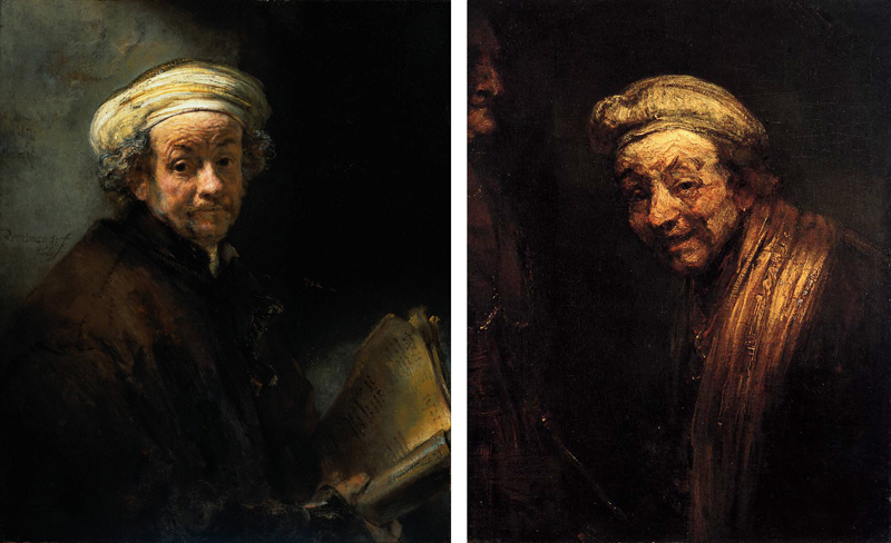
 'Untitled #464' 2008 from the exhibition Review: 'Cindy Sherman' at Metro Pictures Gallery, New York, Nov - Dec, 2008")

 'Untitled' 2008")
 'Untitled' 2008")
 'Untitled #468' 2008")
 'Untitled' 2008")

You must be logged in to post a comment.