
Exhibition dates: 6th June – 2nd August 2009
Photographs from the exhibition are in the chronological order that they appear.
 'Grobsteingrab (floating)' 2009")
Tacita Dean (English, b. 1965)
Grobsteingrab (floating)
2009
“The subjects are connected to the medium I use. It’s all about light and time and phenomena to some extent, like a rainbow or a gust of wind or even an eclipse or a green ray, things like that. And this is the language of light. It’s not the language of binary pixels.”
Tacita Dean1
“The value of her [Dean’s] work, writes Winterson, is one of the virtues of art itself: it is an intervention into the rush of everyday life, holding up time and space for contemplation.”
Jeanette Winterson2
This is a dense, ‘thick’ exhibition by Tacita Dean at the Australian Centre for Contemporary Art (ACCA), Melbourne that rewards repeat viewing. The theatricality of each work and the theatricality of the journey through ACCA’s dimmed galleries (an excellent installation of the work!) makes for an engrossing exhibition as Dean explores the minutiae of memory and the significance of insignificant events: a contemplation on the space, time and materiality of the everyday.
The exhibition starts with 3 very large floating rocks (Grobsteingrab (floating), Hunengrab (floating) and Riesenbelt (floating) all 2009) printed on multiple pieces of photographic paper, the surrounds of the rocks painted out with matt black blackboard paint (see image at top of this posting). The rocks look like mountain massif and are printed at different levels to each other; they move up and down, earthed in the sense that the viewer feels their heavy weight but also buoyant in their surface shininess, seeming to float into the void. The textuality of the rocks is incredible, the suspension of the rocks fragmented by the fact that they are printed on multiple pieces of photographic paper, the edges of the paper curling up to dislocate the unity of form.
Opposite is the large multi-panelled T + I (Tristan + Isolde), a tour de force of Romantic landscape meets mythological journey (see image second from top). Sunshine searing through cloud lights the 25 Turner-esque black and white gravure panels that feature an inlet, fjord and ravine. Semi-legible words dot the landscape, reflecting on the legendary story: ‘undergrowth’, ‘dispute’, ‘brightening up’, ‘BLIND FOLLY’ and ‘the union involved in a manifestation(?)’ for example. Each panel is beautifully rendered and a joy to behold – my friend and I stood transfixed, examining each panel in minute detail, trying to work out the significance and relation between the writing and image. As with most of the work in the exhibition the piece engages the viewer in a dialogue between reality, story and memory, between light, space, time and phenomena.
After the small rear projected film Totality (2000) that shows the extraordinary event of a total eclipse of the sun by the moon for a period of two minutes and six seconds the viewer takes a short darkened passage to experience the major installation in the exhibition Merce Cunningham Performs ‘Stillness’ (in three movements) to John Cage’s composition 4’33” with Trevor Carlson, New York City, 28 April 2007 (six performances; six films) 2007 (see images below).
The first thing you see is one image projected onto a small suspended screen, the rest of the installation blocked by a short gallery wall to the right. The dancer Merce Cunningham sits in studious calm and observes us. This in itself is magical but as we round the corner other screens of different sizes and heights come into view, all portraying Cunningham’s dance studio and him sitting in it from different angles, heights and distances (including close-ups of Cunningham himself). In the six screen projection the performances of Cunningham are sometimes in synch, sometimes not. The director Trevor Carlson, holding a stop watch, times the 3 movements of Cage’s musical piece 4’33” and directs Cunningham to change position at the end of every movement; his hands move, he crosses his legs and the performance continues.
The work is projected into the sculptural space using old 16mm film projectors and their sound mixes with the studied silence of the Cage work and white noise. The mirrors in the studio make spaces of infinite recess, showing us the director with the stop watch, the windows, the floor, the markings of the dancers hands on the mirrors surface adding another echo of past presences. As a viewer their seems to be an ‘openness’ around as you are pulled into a spatial and sound vortex, a phenomena that transcends normal spatio-temporal dimensionality. As people pass through the installation their shadows fall on the screens and become part of the work adding to the multi-layered feeling of the work. This is sensational stuff – you feel that you transcend reality itself as you observe and become immersed within this amazing work – almost as though space and time had split apart at the seams and you are left hanging, suspended in mid-air.
The next two films are my favourite pieces in the exhibition. Darmstädter Werkblock (2007) shows us the significance of insignificant markings – edges and intersections, textures, blends and bleeds, the minutiae of existence in the markings on the fabric of an internal wall (see photograph below). Here is light, wood panelling, texture and again the sound of the whirring of the film projector. Usually I am not a fan of this kind of work having seen enough ‘Dead Pan’ photography and photography of empty yet supposedly important spaces in my life, but here Dean’s film makes the experience come alive and actually mean something. Her work transcends the subject matter – and matter is at the point where these interstitial spaces have been marked by the abstract signs of human existence that constantly surround us.
In Michael Hamburger (2007) Dean reaches the empito-me of these personal narratives that inhabit everyday life. Film of an orchard with wind rustling through the trees, clouds drifting across the sky, rotting apples on the branches, fallen fruit on the ground and a clearing with a man looking up at the trees is accompanied by the industrial sounds of clicks and pops like that of an old radio (see photograph above). The swirling sound of the wind surrounds you in the darkened gallery space much as the panoramic screen of the projection seems to enfold you. The scene swaps to an interior of a house and shows the man, has face mainly in shadow, the film focusing on the different type of apples in front of him or on the aged wrinkles of his hands holding the apples. He talks intelligently and knowingly about the different types of apples and their rarity and qualities. This is Michael Hamburger (now dead which adds poignancy to the film) – poet, critic, memoirist and academic notable for his translations of the work of W. G. Sebald, one of Tacita Dean’s main influences (and also an author that I love dearly).
One can see echoes of Sebald’s work in that of Tacita Dean – the personal narratives accompanied by mythical and historical stories and pictures. The tactility of Hamburger’s voice and hands, his caressing of the apples with the summary justice of the tossing away of rotten apples to stop them ruining the rest of the crop is arresting and holds you transfixed. Old varieties and old hands mixed with the old technology of film make for a nostalgic combination. As John Matthews of ArtKritique has so insightfully observed in his review of this work Dean implicitly understands how objects can be elegies for fleeting lives.
After this work one should have a break – go to the front of the gallery and have a coffee and relax because this is an exhausting show!
The rest of the exhibition tends to tail off slightly, with less engaging but still interesting works.
In Die Regimentstochter (2005) (the name of a Donizetti opera) Dean uses a pile of 36 found and mutilated old opera and theatre programs from the 1930s and 1940s such as Staats Theatre, Berlin, Der Tanz and Deutsche Openhaus. These programs have had portions of their front covers roughly but clinically cut to reveal the inner pages beneath (see image below) and Dean uses them to comment on the politicisation of culture in Berlin’s mid-20th century history. The top of a powdered wigged head or the face of Beethoven has been revealed when the title of the work has been neatly removed along with something else:
“Each programme gives a tantalising glimpse of a title or a face through a small window cut into the embossed cover; we recognise Beethoven, Rossini, the face of a singer perhaps. When and by whom this incision in the cover was made, very neatly one might add, even more why these disfigured programmes were kept remains a mystery. A swift search in an archive would easily show what has been removed; most likely an embossed swastika, for these performances all happened during the Third Reich. Why they were removed is left to our imaginations; perhaps an avid theatre-goer livid at the co-option of culture by the regime, perhaps someone afraid they might be misinterpreted as fascist memorabilia, while wishing to retain the memories these performances triggered.”3
High up on a wall opposite these programs is the film Palast (2004) in which Dean reflects Berlin’s divided history in the jaded façade of the once iconic Palast, the government building of the former German Democratic Republic.4 Shards of light hit glass and reflections are fractured in their gridded panes (see images below). A bird is seen flying, viewed through the window and we see the stains on that window but in this film things feel a bit forced. Unlike the earlier Darmstädter Werkblock there is little magic here.
Again the minutiae of existence is examined in the final two films Noir et Blanc (2006), made on the last 5 rolls of Dean’s black and white double-sided 16mm film stock and Kodak (2006), both made at the Kodak factory in Chalon-sur-Saône before it closed it’s film production facilities (see images below). With the demise of the medium that she feels closest to Dean sought permission to film at the factory itself and both films examine that medium by turning it on itself.
“Dean became acutely aware of the threat to her chosen medium when she was unable to obtain standard 16mm black-and-white film for her camera. Upon discovering that the Kodak factory in Chalon-sur-Saône, France, was closing its film production facility, Dean obtained permission to document the manufacture of film at the factory, where cameras have never before been invited. The resulting rear-screen projection ‘Noir et Blanc’, filmed on the final five rolls Dean acquired, turns the medium on itself. The 44-minute-long work ‘Kodak’ constitutes a contemplative elegy for the approaching demise of a medium specific to Dean’s own practice. Kodak’s narrative follows the making of celluloid as it runs through several miles of machinery and explores the abandoned corners of the factory. On the day of filming, the factory also ran a test through the system with brown paper, providing a rare opportunity to see the facilities fully illuminated, without the darkness needed to prevent exposure, and underscoring the luster of the celluloid as the dull brown strips contrast with the luminous, transparent polyester.”5
As writer Tony Lloyd has commented, “The film “Kodak” documenting the manufacturing of film was as solemn and reverent as a Catholic mass and equally as dull and inexplicable.”6 I wouldn’t go that far but by the end of the exhibition the nostalgia for old technologies, the brown paper programs and the film strip as relic were starting to wear a bit thin, like the sprockets of an old film camera failing to take up the film.
At her best Tacita Dean is a fantastic artist whose work examines the measure of things, the vibrations of spirit in the FLUX of experience. Her work has a trance-like quality that is heavy with nostalgia and memory and reflects the machine-ations of contemporary life. In her languorous (thank you Tony Lloyd for that word, so appropriate I had to use it!) and dense work Dean teases out the significance of insignificant actions/events and imparts meaning and life to them. This is no small achievement.
As an exhibition this is an intense and moving experience. Go, take your time and enjoy!
Dr Marcus Bunyan
Footnotes
1/ Dean, Tacita quoted in Bunbury, Stephen.“Still Lives,” in The Age. Melbourne: Fairfax Publishing, A2 section, Saturday June 6th, 2009, p. 20
2/ Winterson, Jeanette, quoted in Bunbury, Stephen.“Still Lives,” in The Age. Melbourne: Fairfax Publishing, A2 section, Saturday June 6th, 2009, p. 20
3/ Anonymous. Product synopsis from Tacita Dean Die Regimentstochter [Paperback] on the Amazon website [Online] Cited 19/07/2009
4/ Anonymous. Description of Tacita Dean: ‘Palast’ on the Tate St. Ives website [Online] Cited 19/07/2009 no longer available online
5/ Anonymous. “The Hugo Boss Prize: Tacita Dean”, on the Guggenheim Museum website [Online] Cited 19/07/2009. No longer available online
6/ Lloyd, Tony. “Opnion: Tacita Dean at ACCA,” on the ArtInfo.com.au website [Online] Cited 19/07/2009. No longer available online
Many thankx to ACCA for allowing me to publish the photographs and art work in the posting. Please click on the photographs for a larger version of the image
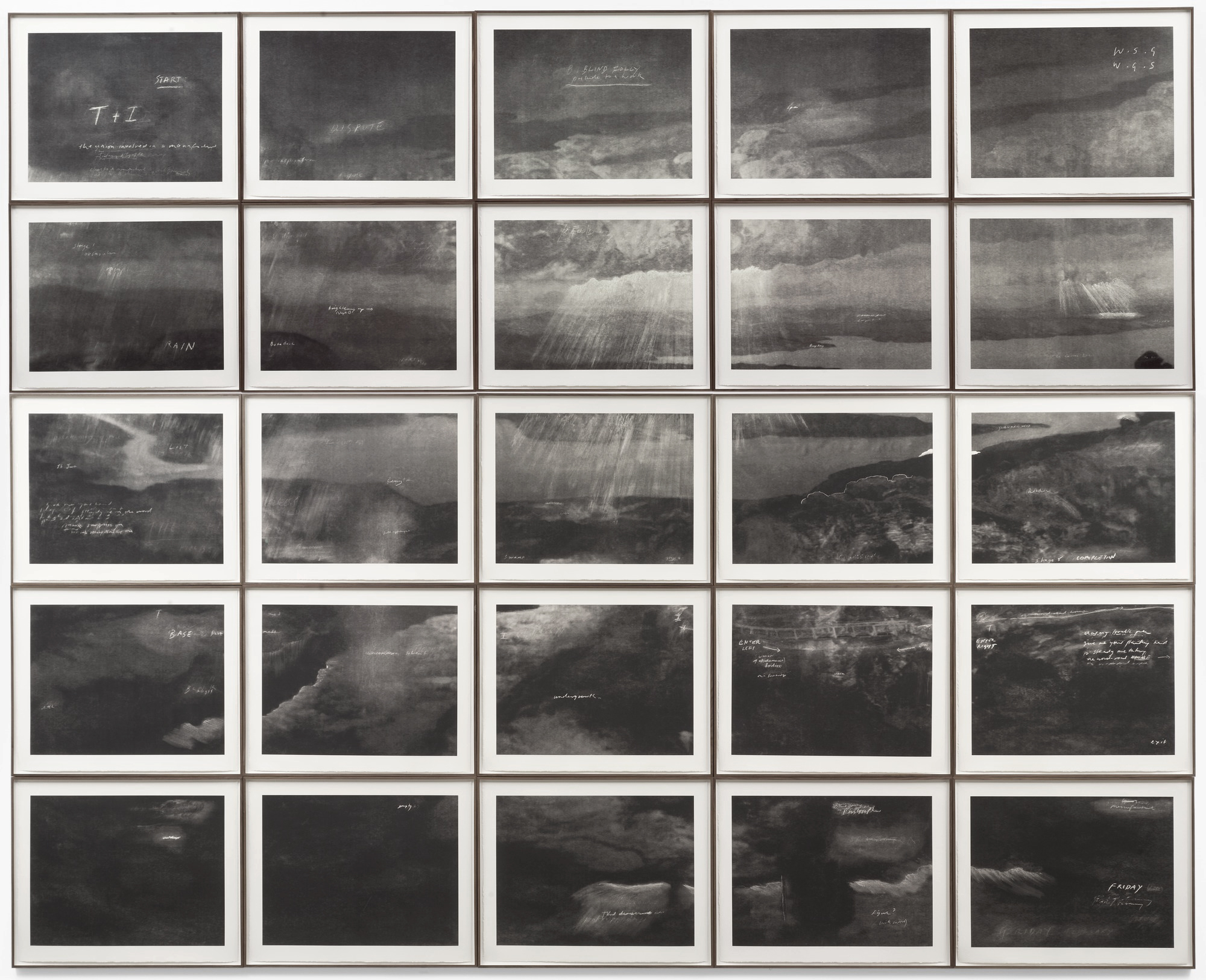
Tacita Dean (English, b. 1965)
T & I (Tristan & Isolde)
2006
Photogravure on twenty-five sheets
Sheet (each): 26 3/4 x 33 7/8″ (68 x 86cm)
Installation: 134 x 170″ (340.4 x 431.8cm)
Niels Borch Jensen Gallery and Edition, Berlin and Copenhagen
Through drawings and films, Dean makes work that is frequently characterised by a poetic sensibility and fragmented narratives exploring past and present, fact and fiction. In this monumental printed work, she addresses themes of collective memory and lost history by combining the romantic legend of ill-fated medieval lovers Tristan and Isolde (whose initials give this piece its title) with the real-life tragedy of British sailor Donald Crowhurst. Dean often uses the sea and other maritime themes in her work, including the tale of Crowhurst, which has appeared in several of her projects.
In 1968 Crowhurst sailed from England for a solo, round-the-world yacht race and never returned. In T & I Dean connects the tale of this lost sailor to the story of Tristan and Isolde – whose tragic love story also hinges on sea voyages – through her majestic depiction of a barren, rocky coastline looking seaward. This work, based on a found postcard, includes the white, cryptic notes that Dean often scribbles on her prints and drawings. Here the musings include “start” and “stage 4,” clear theatrical directions, as well as fragments of a poem by “WSG” about an artist killed in an accident. The twenty-five-sheet composition suggests a cinematic narrative sequence, while reading it as a unified image has a breathtaking, visionary impact. The rich velvety texture of the photogravure medium contributes a nineteenth-century patina that is ideally suited to the intensity and foreboding melancholy of the subject.
Publication excerpt from The Museum of Modern Art, MoMA Highlights since 1980, New York: The Museum of Modern Art, 2007, p. 269
 'Totality' 2000")
Tacita Dean (English, b. 1965)
Totality
16mm colour film
2000

16mm film projector used by Tacita Dean to project Merce Cunningham Performs ‘Stillness’
 ‘Merce Cunningham Performs ‘Stillness’ (in three movements) to John Cage’s composition 4’33” with Trevor Carlson, New York City, 28 April 2007 (six performances; six films)’ 2007")
 ‘Merce Cunningham Performs ‘Stillness’ (in three movements) to John Cage’s composition 4’33” with Trevor Carlson, New York City, 28 April 2007 (six performances; six films)’ 2007")
 ‘Merce Cunningham Performs ‘Stillness’ (in three movements) to John Cage’s composition 4’33” with Trevor Carlson, New York City, 28 April 2007 (six performances; six films)’ 2007")
 ‘Merce Cunningham Performs ‘Stillness’ (in three movements) to John Cage’s composition 4’33” with Trevor Carlson, New York City, 28 April 2007 (six performances; six films)’ 2007")
Tacita Dean (English, b. 1965)
Merce Cunningham Performs ‘Stillness’ (in three movements) to John Cage’s composition 4’33” with Trevor Carlson, New York City, 28 April 2007 (six performances; six films) (stills)
2007
 'Darmstädter Werkblock' 2007 (still)")
Tacita Dean (English, b. 1965)
Darmstädter Werkblock (stills)
16mm colour film, optical sound
18 minutes, continuous loop
2007
Take one of her best pieces, Darmstädter Werkblock 2007, which looks for most of its long eighteen minutes like an exploration of an empty room, which it is. The camera pans the space, exploring the frayed fringes of its empty, textile-clad, burnt brown walls. It settles on holes, tears, seams and faded spots marking where placards used to hang. We are formally intrigued, but also curious why we should care so much about this particular empty room in what we can vaguely sense is a museum. Perhaps we are even a little bored. Only later – not in the film itself, but in the accompanying materials – are we told that these rooms usually house the “Block Beuys”, a section of the Hessisches Landesmuseum in Darmstadt arranged by Beuys himself over the decade and a half between its opening and the artist’s death. The Block is mired in controversy now that the walls, which are actually left over from when the rooms showed medieval artefacts, but which evoke and mirror Beuys’s own work, are slated for renovation.
Text from Philip Tinari. “Meditations on time,” in Tate Etc. issue 23: Autumn 2011 on the Tate website 1 September 2011 [Online] Cited 18/03/2019
Stills taken from the 16mm film Darmstädter Werkblock (2007) filmed in the seven rooms that make up Block Beuys, Joseph Beuys’s installation in Darmstadt’s Hessisches Landesmuseum. In September 2007, the museum announced that they intended to renovate the rooms, and to remove the brown jute wall coverings and gray carpet that had become such a feature of the installation. The decision caused much upset in Germany and beyond. Unable to document the rooms for copyright reasons, Dean requested that instead she might document the walls and carpet and the details of the space that surround Beuys’s work without making any visual reference to the work itself. The resulting film concentrated on the patches and the stains and the labor of those who have been maintaining the space over the last four decades – the parallel entropy of the museum space with the ageing of the work itself.
Text from Google Books
 'Michael Hamburger' 2007 (still)")
 'Michael Hamburger' 2007 (still)")
 'Michael Hamburger' 2007 (still)")
 'Michael Hamburger' 2007 (still)")
Tacita Dean (English, b. 1965)
Michael Hamburger (stills)
16mm colour anamorphic, optical sound
28 minutes
2007
Continuing her recent collection of film portraits, Tacita Dean’s Michael Hamburger is a moving portrayal of the poet and translator, a resident of Middleton in Suffolk and great friend of W.G. Sebald. It represented Dean’s first commission in Britain since 1999.
For its 28 minutes, the film quietly observes the poet in his study and among the apple trees in his garden. Sunlight dissolves the frames of the windows, the most insubstantial of thresholds between this home, only one-room-deep, and what lies outdoors; a rainbow marks its watery geometry in the sky; and the apples age upon the ground, shrunken, and yet somehow becoming more intensely themselves.
Although Hamburger is said to have despaired of reviews of his poetry which declared that he is ‘better known as a translator’, we might detect a similar deprecation of his self, by himself, in the film which shares his name. Unwilling, perhaps unable, to talk of his past and his migrations, most especially fleeing Nazism in 1933, he talks poignantly, instead, of his apple trees, of where they have come from, and of their careful cross-breeding. Purity is dismissed, and one senses with an awkward pathos that the poet is translating himself.
Anonymous text. “Michael Hamburger: Tacita Dean,” on the FVU website [Online] Cited 18/03/2019
Tacita Dean’s portrait of the poet and translator Michael Hamburger was filmed, at his home in rural Suffolk, in the last year of his life. Set against muted autumn colours, and with Hamburger performing an evocative, anecdotal inventory of the harvest from his apple orchard, the piece is a bittersweet reminder of time’s passing that deftly captures, and quietly honours, an exemplary 20th century literary figure.
 'Die Regimentstochter' 2005")
Tacita Dean (English, b. 1965)
Die Regimentstochter (The Daughter of the Regiment)
2005
Die Regimentstochter is the latest in a series of projects made from material turned up in flea markets, in this case, a series of 36 antique opera programs from the 30s and 40s found in the flea markets of Berlin. Like the found photographs in Dean’s 2001 FLOH, these souvenirs remain unexplained by text. They retain the silence of the lost object, and they share a riddle: each program gives a tantalising glimpse of a title or a face through a small window cut into the embossed cover. Readers will recognise Beethoven, Rossini, or perhaps a singer. A swift search in an archive would easily confirm what has been removed, but it seems likely that the missing piece is a swastika. These performances all happened during the Third Reich. When and by whom the incision was made, and why these programs were both worth disfiguring and worth keeping, remains a mystery.
Text from the Amazon website
“Things no longer visible thus enhance our view of the past, and gaps, paradoxically, become memorials that engage the beholder’s imagination more actively than a didactic demonstration could. Merely by showing what remains, Tacita Dean not only calls up in our mind’s eye a specific historical situation and its abysses, but also erects an anti-monument to the forms customarily taken by the culture of memory.”
Andreas Kaernbach
 'Die Regimentstochter' 2005")
Tacita Dean (English, b. 1965)
Die Regimentstochter (The Daughter of the Regiment)
2005
They look lined up like a modern art object. The 36 opera program books are not considered as works of art. Nevertheless, the British and Berlin-based artist Tacita Dean turned them into a work of art.
“An incidental finding inspired Tacita Dean to her artwork,” tells the House of History. “At a Berlin flea market she discovered in the year 2000 36 opera program booklets from the years 1934 to 1942. Conspicuous were the title pages: from each of the booklets was a part cut out, including from the program of the eponymous opera “The Regimental Daughter” by Gaetano Donizetti (world premiere 1840). “Said part of the title pages of those notebooks was reserved for the swastika symbol. This was cut off by the previous owners. Why, that can only be speculated, continues the house of history. “Was it shame, the fear of being punishable or even a “private” act of resistance before the end of National Socialism? The program books in any case seem to have been of great cultural value to the former owner. “
“Whatever the motives that made the owner or the owner of the program booklets of the Berlin opera from 1934 to 1942 come to shears in order to remove the Nazi swastikas from the cover pages of the booklets: The voices speak of the desire to conclude with a time that one does not want to be reminded of – a basic motive of German post-war history that stood in the way of an honest confrontation with the era of National Socialism for a long time, “said the Minister of Culture.
With her work, Tacita asks Dean questions about dealing with the Nazi past. Which motive behind it and who had heard the booklets remains open until today. Tacita Dean has created a work of art from these finds, which poses subtle questions about the examination of the Nazi past – but in a way that goes beyond purely historical reflection and awakens additional associations. What does that object, created by the artist from Canterbury, say about the relationship between art and politics? “Can the opera narratives be separated from the political environment in which they were performed and played?” asks the President of the Foundation for the History of the Federal Republic of Germany, Prof. Dr Hans Walter Hütter.
Monika Grütters continues: “The fact that the dark part of our identity does not disappear through concealment and suppression, and that it becomes visible again even where it was attempted to be eradicated, impressively shows Tacita Dean’s work Regimentstochter. That is why I very much welcome the fact that this unique work of art has a place in the collection which, in view of its significance in contemporary history, necessarily belongs to it – a place in the House of History which, unlike any other museum in Germany, presents German history from 1945 in all its facets illustrated and also devoted to the effects of National Socialism on the political and cultural life in post-war Germany.”
Daniel Thalheim. “NS-Vergangenheit als Kunst – 36 Programmhefte aus der Nazi-Zeit im Haus der Geschichte,” on the ARTEFAKTE: Das Journal für Baukultur und Kunst website 2nd September 2015 [Online] Cited 17/03/2019 translated from the German by Google Translate.
 'Palast' 2004")
 'Palast' 2004")
 'Palast' 2004")
Tacita Dean (English, b. 1965)
Three stills from the film Palast
2004
A major survey of work by the internationally acclaimed British artist Tacita Dean will open at the Australian Centre for Contemporary Art (ACCA) on June 6th, 2009.
In a great coup for Melbourne, fourteen recent projects by this celebrated contemporary artist will come together in what is the largest survey of Dean’s work to ever be shown outside of Europe.
Tacita Dean is one of Britain’s most accomplished and celebrated contemporary artists. She won the New York Guggenheim’s Hugo Boss award in 2007, was a Turner Prize nominee in 1998, and has had numerous solo exhibitions in Europe – at the Schaulager in Basel, DIA Beacon in New York, the de Pont Museum in the Netherlands, the Tate Britain, UK, the Musee d’art Moderne in Paris, France and the Villa Oppenheim in Berlin, to mention just a few.
Dean was also recently given the highly prestigious title of Royal Academician, awarded sparingly to alumni’s of the revered London art school who have achieved greatness in their work.
Tacita Dean was born in Canterbury in 1965, and moved to Berlin in 2000 after being awarded a DAAD residency. Early works focused on the sea – most famously she explored the tragic maritime misadventures of amateur English sailor Donald Crowhurst. Since moving to Berlin she has devoted her attention to the architecture and cultural history of Germany, a recurring theme also being the salvaging, saving and collecting of things lost. Many of her works rest on the icons of modernism, heroic failures and forgotten utopian ideals.
Dean is best known for her work with 16mm film, although she also works with photography, print and drawing. The qualities of filmmaking itself play a central role in her works – which hauntingly capture the passing of time, space and the mysteries of the natural world.
Her work occupies a place between fact and fiction. As British author Jeanette Winterson says, “Her genius, with her slow, steady, held frames, is to allow the viewer to dream; to enter without hurry, without expectation, and to accept, as we do in a dream, a different experience of time, and a different relationship to everyday objects.”
Included in this exhibition is Dean’s revered film installation, Merce Cunningham Performs STILLNESS (in three movements) to John Cage’s composition 4’33” with Trevor Carlson, New York City, 28 April 2007, which was recently presented at the DIA Beacon in New York, and the 2007 work Michael Hamburger. Two new wall-based works especially created for this exclusive ACCA exhibition will also feature.
Dean is also known for creating ‘asides’ – totally absorbing texts on the subjects explored in her work. She will contribute texts on all the projects included in the exhibition for a catalogue which will be published to coincide with this unique ACCA survey.
The exhibition has been curated by ACCA’s Artistic Director, Juliana Engberg and follows an early 2002 exhibition of Dean’s work curated by Engberg for the Melbourne International Arts Festival.
“Tacita’s works continue to enthral and inspire me. Not only has she rescued relics from history and restored them with a visual dignity and affection in her wonderful film projects, but increasingly she rescues the traditional art forms of drawing, print making, painting, photography and film from a digital abyss,” says Juliana Engberg. “Her works have a truth and quiddity about them, but also a playful artifice and technical tactic to bring out the tactile and material in all she deals with. Tacita is a sublime story-teller, a narrator of odysseys and attempts. She is a true artist sojourner.
In this selection of works made since 2004 we grasp the breadth of her practice and her pursuit of the time-honoured landscape, portrait and abstract genres,” she says.”
Text from the press release from the ACCA website [Online] Cited 17/07/2009. No longer available online
![Tacita Dean. 'Noir et Blanc [Still]' 2006](https://artblart.com/wp-content/uploads/2009/07/noir_et_blanc-2006.jpg "Tacita Dean. 'Noir et Blanc [Still]' 2006")
Tacita Dean (English, b. 1965)
Noir et Blanc [Still]
16mm black-and-white Kodak film
2006
 'Kodak' 2006 (still)")
Tacita Dean (English, b. 1965)
Kodak (still)
16mm colour and b/w film optical sound
44 minutes loop system
2006
 'Kodak' 2006 (still)")
Tacita Dean (English, b. 1965)
Kodak (still)
16mm colour and b/w film optical sound
44 minutes loop system
2006
As Dean said in a Guardian article back in February: “Digital is not better than analogue, but different. What we are asking for is coexistence: that analogue film might be allowed to remain an option for those who want it, and for the ascendency of one not to have to mean the extinguishing of the other.”
In the same text, she wrote of the difference between film and digital as “not only emulsion versus pixels, or light versus electronics, but something deeper – something to do with poetry.” This poetry is exactly what she explored in one of her landmark films, Kodak (2006), a 45-minute examination of the production process of celluloid itself at a French factory fated for early closure because of a lack of demand. A film about the making of film, it hinged on the sort of super-aestheticised conceit that has become her staple. This is a tactic which allows her to turn even time itself into a structural device, as she did in 2008 with a film called Amadeus, which depicts a 50-minute crossing of the English Channel in a small fishing boat of the same name.
Philip Tinari. “Meditations on time,” in Tate Etc. issue 23: Autumn 2011 on the Tate website 1 September 2011 [Online] Cited 18/03/2019
 'Kodak' 2006 (still)")
Tacita Dean (English, b. 1965)
Kodak (still)
16mm colour and b/w film optical sound
44 minutes loop system
2006
Australia Centre for Contemporary Art (ACCA)
111 Sturt Street, Southbank
Victoria 3006, Australia
Phone: 03 9697 9999
Opening hours:
Tuesday – Friday 10am – 5pm
Weekends & Public Holidays 11am – 5pm
Monday closed
Open all public holidays except Christmas Day and Good Friday
 'Barcelona or its vicinity, August 1936. Loyalist militiamen.' 1936")
 'Near Zhengzhou, June-July 1938' 1938")
 'Near Barcelona, October 1938' 1938")
 'September 5, 1936. The death of a Loyalist militiaman' 1936")
 'Loyalist Militiawoman' 1936")
 'Near Troina, Sicily, August 4-5, 1943. Reconnaissance mission.' 1943")
 'American soldiers landing on Omaha Beach, D-Day, Normandy, France, June 6, 1944' 1944")
 'Omaha Beach, near Colleville-sur-Mer, Normandy coast, June 6, 1944. The first wave of American troops landing on D-Day' 1944")
 'Chartres, August 18, 1944' 1944")
 'Chartres, August 18, 1944' 1944 (detail)")
 'No.c' 2009")
 'No.d' 2009")
 'No.f' 2009")
 'No.g' 2009")
 'Untitled 3' 2009")
 'The Training' from the series 'Te Day Before I Went Away' 2003")
 'K.D. Lang, Le Meridien Hotel, London' 1992")
 'Quentin Crisp' 1989")
 'Virginia Woolf' 1939")

 'Joe Dallesandro' 1968")
 'Joe Orton' 1965")
 'Nelson Mandela' 1994")

 'Sylvia Townsend Warner' 1934")
 'Ronald Firbank' 1917 (detail)")
 'Ronald Firbank' 1917")
")
")

 'Double Infinitive 3' 2009")
 'Double infinitive I' 2009")
 'Double Infinitive 4' 2009")

 'Double Iinfinitive 2' 2009")
 'Double Iinfinitive 2' 2009 (detail)")
 'Double Iinfinitive 5' 2009")
 'Coming Home' 2005")
 'The Healing Garden, Wybalenna, Flinders Island, Tasmania' 2005")
 ‘Arthur, Wik elder’ from the series ‘Returning to places that name us’ 2000")
 'Gladys Tybingoomba' 2001")
 'Custodians' from the series 'Portrait of a Distant Land' 2005")
 'Vansittart Island' from the series 'Portrait of a Distant Land' 2007")
 'The Spit' from the series 'Portrait of a Distant Land' 2007")
 'The Mission' 2005 From the series 'Portrait of a Distant Land'")
 'Sekai' (be humorous') 2009")
 'Tariro' (means 'hope') 2009")
 'Rutendo' (detail - means 'faith') 2009")
 'Los Caprichos', plate 43 from the series 'El sueño de la razón produce monstros' 1799")
 'Zola' (detail - means 'quiet, tranquil') 2009")
 Group with from left to right: Enitan (person of story), Ntombi (lady), Kgosi (chief), Nkosana (prince), Lucky and Alaba (second child after twins) 2009")
 'Nkosana' (detail - means 'prince') 2009")
 and Gilbert (right) pose in front of their work \"The Church of England\" in Berlin, Germany")
 (George Passmore, English, b. 1942) 'Dating' 2008")
 (George Passmore, English, b. 1942) 'BRITISHISM' 2008")
 (George Passmore, English, b. 1942) 'JESUS JACK' 2008")
 (George Passmore, English, b. 1942)")


 (George Passmore, English, b. 1942) 'JESUS SUITS' 2008")
 (George Passmore, English, b. 1942) 'CHURCH OF ENGLAND' 2008")
 (George Passmore, English, b. 1942) 'POSTER DANCE' 2008")
 (George Passmore, English, b. 1942) 'REALM' 2008")
 (George Passmore, English, b. 1942) 'SPIDER' 2008")
 (George Passmore, English, b. 1942) 'UNION WALL DANCE' 2008")
 'Rings' 1971")
 'Ring' 1973")
 'Brooch and ring' 2003 and 1972")
 Boxes 1980")
 'Box and pendant' 1980")
 'Tray' 1986")
 'Centrepiece' 1987")
 'Centrepiece' 1991")
 'Vessel' 2007")
 'Vessel' 2007")
 'Vessel' 2008")
 'Vessel' 2009")
 'Vessel' 2009")
 'Armring' 1981")
 'Armring' 1990")
 'The Singer Building, New York' c. 1910")
 'Nautilus' 1927")
 'Italian Family Looking for Lost Baggage, Ellis Island' 1905")
![Benedict J. Fernandez (American, 1936-2021) 'Dick Gregory with MLK [Martin Luther King, JR.] New Politics Convention, Chicago, ILL. October, 1967' 1967](https://artblart.com/wp-content/uploads/2009/07/benedict-j.-fernandez-dick-gregory-with-mlk.jpg "Benedict J. Fernandez (American, 1936-2021) 'Dick Gregory with MLK [Martin Luther King, JR.] New Politics Convention, Chicago, ILL. October, 1967' 1967")
 'A Mother and Her Son at Her Home In Bed Sty in Brooklyn' c. 1990")
 'Clearing Winter Storm, Yosemite National Park' c. 1937")
 'Babe Ruth' 1945")
 'Powerhouse mechanic working on steam pump' 1920")
 'The Steerage' 1907")
 'Migrant Mother, Nipomo, California' 1936")

You must be logged in to post a comment.