
Exhibition dates: 11th December, 2015 – 28th February, 2016
Curator: Wendy Garden

Installation view of the exhibition On the beach at the Mornington Peninsula Regional Art Gallery
Photo: © Marcus Bunyan and the Mornington Peninsula Regional Art Gallery
This is another solid thematic group exhibition at the Mornington Peninsula Regional Art Gallery (curator Wendy Garden), following on from their recent success, Storm in a teacup.
The exhibition is not as successful as Storm in a teacup, mainly because most of the works are based on the monolithic, monosyllabic representation of beach culture, and its figuration, during the early decades of the twentieth century (White Australia policy, Australian stereotypes of the interwar period) and the re-staging of these ideas in the contemporary art presented through a diachronic (through/time), performative discourse.
There is so much re-staging in this exhibition I was left to wonder whether there was any original art work being produced that does not quote sources of history, memory, identity, representation and art from past generations. Daniel Boyd re-stages Captain Cook’s landing at Botany Bay with said hero as a pirate. Stephen Bowers replicates the Minton willow pattern motif and early paintings of kangaroos. Leanne Tobin re-stages Bungaree’s disrobing on the beach during his journey with Matthew Flinders. Diane Jones re-stages Max Dupain’s Sunbaker replacing the anonymous prostrate man with her head looking into the camera, or Dupain’s Form at Bondi with her head turned towards the camera. Worst offender is Anne Zahalka who re-states Dupain’s Sunbaker (again!) as a red-headed white women on the beach; or re-presents Charles Meere’s Australian beach pattern (1940, below) not once but twice – the first time in The bathers (1989) broadening the racial background of people to depict multicultural Australia in the 1980s, the second time in The new bathers (2013) broadening the mix even further. Most successful of these re-stagings is Michael Cook’s series of photographs Undiscovered in which the artist subverts deeply ingrained understandings of settlement, that of terra nullius, by depicting Captain Cook as black and positioning him in high-key, grey photographs of impressive beauty and power, surveying the land he has ‘discovered’ while perched upon an invisibly balanced ladder.
But with all of the works that quote from the past there is a sense that, even as the artists are critiquing the culture, they are also buying into the system of patriarchy, racism and control that they seek to comment on. They do not subvert the situation, merely (and locally) extrapolate from it. The idealised, iconic representation of early 20th century Australia culture in the paintings from the 1920-30s and the photographs from the 1940s-70s – specimens of perfect physical beauty – are simply shifted to a new demographic – that of iconic, individual figures in the same poses as the 1940s but of a different ethnicity. The colour of the figure and the clothing might have changed, but the underlying structure remains the same. And if you disturb one of the foundation elements, such as the base figure in one of George Caddy’s balancing beachobatics photographs, the whole rotten edifice of a racism free, multicultural Australia will come tumbling down, just as it did during the Cronulla Riot.
What I would have liked to have seen in this exhibition was a greater breadth of subject matter. Where are the homeless people living near the beach, the sex (for example, as portrayed in Tracey Moffat’s voyeuristic home video Heaven which shows footage of male surfers changing out of their wetsuits in car parks – “shot by Moffatt and a number of other women as if they were making a birdwatching documentary” – which challenges the masculinity of Australian surf culture and the ability of women to stare at men, instead of the other way around), death (drownings on beaches, the heartbreak of loss), and debauchery (the fluxus of Schoolies, that Neo-Dada performance of noise and movement), the abstract nature of Pictorialist photographs of the beach, not to mention erosion and environmental loss due to global warming. The works presented seem to have a too narrowly defined conceptual base, and a present narrative constructed on a coterie of earlier works representing what it is to be Australian at the beach. The contemporary narrative does not address the fluidity of the landscape in present time (in works such as Narelle Autio’s series Watercolours or The place in between).
The dark underside of the beach, its abstract fluidity, its constant movement is least well represented in this exhibition. Although I felt engaged as a viewer the constant re-quoting and rehashing of familiar forms left me a little bored. I wanted more inventiveness, more insight into the conditions and phenomena of beach culture in contemporary Australia. An interesting exhibition but an opportunity missed.
Dr Marcus Bunyan
Many thankx to the Mornington Peninsula Regional Art Gallery for allowing me to publish most of the photographs in the posting. Other photographs come from Art Blart’s archive and those freely available online. Thankx also go to Manuela Furci, Director of the Rennie Ellis Photographic Archive for allowing me to publish his photographs in the posting. Please click on the photographs for a larger version of the image. All text comes from the wall labels to the exhibition. Images noted © Marcus Bunyan and the Mornington Peninsula Regional Art Gallery.
")
Installation view of the exhibition On the beach at the Mornington Peninsula Regional Art Gallery with Daniel Boyd’s We call them pirates out here (2006, below)
Photo: © Marcus Bunyan and the Mornington Peninsula Regional Art Gallery
 'We call them pirates out here' 2006 (installation view)")
Daniel Boyd (Australian, b. 1982)
We call them pirates out here (installation view)
2006
Museum of Contemporary Art
Purchased with funds provided by the Coe and Mordant families, 2006
Photo: © Marcus Bunyan and the Mornington Peninsula Regional Art Gallery
“The landing of Captain Cook in Botany Bay, 1770 by E. Phillips Fox is such an iconic and important image relating to the birth of Australia. Shifting the proposed view of Fox’s painting to something that was an indigenous person’s perspective allowed for me to challenge the subjective history that has been created.”
Daniel Boyd, 2008
In this painting Daniel Boyd parodies E. Phillips Fox’s celebrated painting which was commissioned in 1902 by the Trustees of the National Gallery of Victoria to commemorate federation. No longer an image valorising colonial achievement, Boyd recasts the scene as one of theft and invasion. Captain Cook is depicted as a pirate to contest his heroic status in Australia’s foundation narratives. Smoke in the distance is evidence of human occupation and is a direct retort to the declaration that Australia was ‘terra nullius’ – land belonging to no-one, which was used to justify British possession.
 Peter Walker (board maker) (Australian, b. 1961) 'Antipodean willow surfboard' 2012 'Antipodean willow surfboard (Mini Simmons)' 2012 (installation view)")
Stephen Bowers (Australian, b. 1952)
Peter Walker (board maker) (Australian, b. 1961)
Antipodean willow surfboard (installation view)
2012
Antipodean willow surfboard (Mini Simmons) (installation view)
2012
Hollow core surfboard, Paulownia wood, fibreglass, synthetic polymer paint
Courtesy of the artist and Lauraine Diggins Fine Art, Caulfield
Photo: © Marcus Bunyan and the Mornington Peninsula Regional Art Gallery
 Peter Walker (board maker) (Australian, b. 1961) 'Antipodean willow surfboard (Mini Simmons)' 2012 (installation view detail)")
Stephen Bowers (Australian, b. 1952)
Peter Walker (board maker) (Australian, b. 1961)
Antipodean willow surfboard (Mini Simmons) (installation detail)
2012
Hollow core surfboard, Paulownia wood, fibreglass, synthetic polymer paint
Courtesy of the artist and Lauraine Diggins Fine Art, Caulfield
Photo: © Marcus Bunyan and the Mornington Peninsula Regional Art Gallery
In these works Bowers combines the willow pattern motif, a ready-made metaphor of hybridity, with an image of a kangaroo as envisioned by George Stubbs in 1772. The willow pattern as an English invention, created by Thomas Minton in 1790. It is an imaginative geography and, like the first known European painting of a kangaroo, considers other lands as strange, exotic places. In this work the imagery of colonial occupation is visualised as a fusion of cultures underpinned by half-truths, fantasy and desire.
 'Clothes don't always maketh the man' 2012 (installation view)")
 'Clothes don't always maketh the man' 2012 (installation view detail)")
Installation views of Leanne Tobin’s Clothes don’t always maketh the man (2012)
Leanne Tobin (Australian, b. 1961)
Clothes don’t always maketh the man (installation details)
2012
Sand, textile, wood
Collection of the artist
Photos: © Marcus Bunyan and the Mornington Peninsula Regional Art Gallery
Bungaree (c. 1755-1830) was a Garigal man who circumnavigated the continent of Australia with Matthew Flinders on the H.M.S. Investigator between 1802-1803. Unlike Bennelong, who attempted to assimilate with British ways and Pemulwuy, who resisted, Bungaree made the decision to navigate a relationship with the British while still maintaining his cultural traditions. He played an important role as an envoy on Flinder’s voyages, negotiating with the different Aboriginal groups they encountered. A skilled mediator, Bungaree was adept at living between both worlds. When coming ashore he would shed his white man’s clothes so that he could conduct protocol relevant to the local elders. In this respect the beach became a zone of transformation and exchange.
, and in the background left, photographs from Michael Cook's 'Undiscovered' series (2010)")
, and in the background right, photographs from Michael Cook's 'Undiscovered' series (2010)")
Installation views of the exhibition On the beach at the Mornington Peninsula Regional Art Gallery with in the foreground, Leanne Tobin’s Clothes don’t always maketh the man (2012), and in the background photographs from Michael Cook’s Undiscovered series (2010, below)
Photos: © Marcus Bunyan and the Mornington Peninsula Regional Art Gallery
 'Undiscovered 4' 2010 from the exhibition 'On the beach' at the Mornington Peninsula Regional Art Gallery, Mornington, Dec 2015 - Feb 2016")
Michael Cook (Australian, b. 1968)
Undiscovered 4
2010
inkjet print on Hahnemuhle paper
124.0 x 100.0cm
Australian National Maritime Museum
A selection of works from a series of ten photographs in which Michael Cook contests the idea of ‘discovery’ that underpins narratives of the British settlement of Australia… Cook depicts the historic Cook as an Aboriginal man replete in his British naval officers attire. His ship, the famed Endeavour, is anchored in the sea behind him. By mimicking the moment of first discovery Cook subverts deeply ingrained understandings of settlement and asks us to consider what type of national Australia would be if the British had acknowledged Aboriginal people’s prior ownership.
; to the right of that Dupain's 'At Newport' (1952); to the right upper is George Caddy's 'Chest strength and breathing exercise, 20 February 1937'; followed at far right by Rennie Ellis' 'St Kilda Lifesavers' (1968, top) and David Moore's 'Lifesavers at Manly' (1959, bottom)")
Installation view of the exhibition On the beach at the Mornington Peninsula Regional Art Gallery showing, at top left, Max Dupain’s Form at Bondi (1939); to the right of that Dupain’s At Newport (1952, below); to the right upper is George Caddy’s Chest strength and breathing exercise, 20 February 1937 (below); followed at far right by Rennie Ellis’ St Kilda Lifesavers (1968, top) and David Moore’s Lifesavers at Manly (1959, bottom)
Photo: © Marcus Bunyan and the Mornington Peninsula Regional Art Gallery
 'At Newport' 1952, Sydney from the exhibition 'On the beach' at the Mornington Peninsula Regional Art Gallery, Mornington, Dec 2015 - Feb 2016")
Max Dupain (Australian, 1911-1992)
At Newport
1952, Sydney
Silver gelatin photograph
 'Chest strength and breathing exercise, 20 February 1937' 1937")
George Caddy (Australian, 1914-1983)
Chest strength and breathing exercise, 20 February 1937
1937
Digital print on paper
Paul Caddy collection
Courtesy of Paul Caddy
Like Max Dupain, who was three years his senior, Caddy was interested in the new modernist approach to photography. During 1936 he read magazines such as Popular Photography from New York and US Camera rather than Australasian Photo-Review which continued to champion soft-focus pictorialism. This photograph was taken the same year as Dupain’s famous Sunbather photograph. The framing and angle is similar reflecting their common interest in sharp focus, unusual vantage points and cold composition.
 'Freshwater Surf Life Saving Club reel team march past, 3 April 1938' 1938")
George Caddy (Australian, 1914-1983)
Freshwater Surf Life Saving Club reel team march past, 3 April 1938
1938
Digital print
Collection of the Mitchell Library, State Library of New South Wales
Purchased from Paul Caddy, 2008
This photograph was taken only months after an infamous rescue at Bondi. On 6 February 1938 a sand bar collapsed sweeping two hundred people out to sea. 80 lifesavers rescued all but 5 people in a day subsequently described as Black Sunday. By 1938 the Surf Life Saving Association, which incorporated clubs from around Australia, had rescued 39,149 lives in its 30 year history. In 1938 alone there were 3,442 rescues. Up until the events of Black Sunday no one had drowned while lifesavers were on duty at Australian beaches. In comparison 2,000 people drowned in England each year.1
1/ Alan Davies, Bondi Jitterbug: George Caddy and his amera, Sydney: State Library of New South Wales, p. 13.
 and, at right, a selection of George Caddy's beachobatics photographs")
Installation view of the exhibition On the beach at the Mornington Peninsula Regional Art Gallery showing at far left, Anne Zahalka’s The sunbather #2 (1989, below) and, at right, a selection of George Caddy’s beachobatics photographs
Photo: © Marcus Bunyan and the Mornington Peninsula Regional Art Gallery
 with Diane Jones 'Sunbaker' (2003, below); in the centre Anne Zahalka's 'The sunbather #2' (1989); then Max Dupain's 'Form at Bondi' (1939, top) with Diane Jones 'Bondi' (2003) underneath")
Installation view of the exhibition On the beach at the Mornington Peninsula Regional Art Gallery showing at far left, Max Dupain’s Sunbaker (1937, top) with Diane Jones Sunbaker (2003, below); in the centre Anne Zahalka’s The sunbather #2 (1989, below); then Max Dupain’s Form at Bondi (1939, top) with Diane Jones Bondi (2003) underneath
Photo: © Marcus Bunyan and the Mornington Peninsula Regional Art Gallery
 'The sunbather #2' 1989")
Anne Zahalka (Australian, b. 1957)
The sunbather #2
1989
From the series Bondi: playground of the Pacific 1989
Type C photograph
 and Anne Zahalka's photograph 'The bathers' (1989) from the series 'Bondi: playground of the Pacific' 1989")
Installation photograph of Charles Meere’s painting Australian beach pattern (1940, below) and Anne Zahalka’s photograph The bathers (1989) from the series Bondi: playground of the Pacific 1989
Photo: © Marcus Bunyan and the Mornington Peninsula Regional Art Gallery
Zahalka restates Charles Meere’s painting in order to subvert the narrow stereotype of the Australian ideal… In this work Zahalka broadens the racial background of people depicted to create a more representative image of multicultural Australia in the 1980s
 'Australian beach pattern' 1940 (installation view detail)")
Charles Meere (Australian born England, 1890-1961)
Australian beach pattern (installation view detail)
1940
Oil and wax on canvas
Collection of Joy Chambers-Grundy and Reg Grundy AC OBE
Photo: © Marcus Bunyan and the Mornington Peninsula Regional Art Gallery
A now iconic representation of early 20th century Australia culture… The scene is dominated by a mass of suntanned bodies: muscular, square-jawed white Australians – specimens of perfect physical beauty – enjoying the strenuous physical activities of the beach. A glorification of the strong, healthy, racially pure Australian ideal of the 1930s, it is eerily reminiscent of Nazi German Aryan propaganda between the wars.
Notably, the figures themselves all appear anonymous and disconnected, with indistinct facial features that show no acknowledgement of their fellow beach-goers. Their identities are overwhelmed by Meere’s obsession with arrangement. Rather than reflect real life, the figures are placed to create an idealised work of perfect balance. It is fascinating to consider that this iconic representation of Australian beach culture actually came from the imagination of an Englishman, who had only lived in Australia since the mid-1930s and who, according to his apprentice, ‘never went to the beach’ and ‘made up most of the figures’.1
1/ Freda Robertshaw quoted in Linda Slutzkin, Charles Meere 1890-1961. Sydney: S. H. Ervin Gallery, 1987, p. 6.
 and Jeffrey Smart's 'Surfers Bondi' (1963)")
Installation view of the exhibition On the beach at the Mornington Peninsula Regional Art Gallery showing at far left, George Caddy’s beachobatic photographs, and on the far wall Sidney Nolan’s Bathers (1943, below) and Jeffrey Smart’s Surfers Bondi (1963, below)
Photo: © Marcus Bunyan and the Mornington Peninsula Regional Art Gallery
 'Bathers' 1943 (installation view)")
Sidney Nolan (Australian, 1917-1992)
Bathers (installation view)
1943
Ripolin enamel on canvas
Headed Museum of Modern Art, Melbourne
Bequest of John and Sunday Reed, 1982
Photo: © Marcus Bunyan and the Mornington Peninsula Regional Art Gallery
 'Surfers Bondi' 1963 (installation view)")
Jeffrey Smart (Australian, 1921-2013)
Surfers Bondi
1963
Oil on board
Private collection
When bans on daylight bathing were lifted in 1902, the beach became a prime leisure destination. The beach became not only as a public space of recreation but also as a place where the Australian identity was developing, for many epitomising the liberties of Australia’s society. On the beach brings together 76 outstanding and iconic paintings, photographs and installations to consider the defining relationship we have to the shore.
Works by artists including Vernon Ah Kee, Arthur Boyd, Gordon Bennett, Daniel Boyd, Max Dupain, Charles Meere, Tracey Moffatt, David Moore, Sidney Nolan, Polixeni Papapetrou, John Perceval, Scott Redford, Jeffrey Smart, Albert Tucker, Guan Wei and Anne Zahalka, as well as outstanding recently discovered works by George Caddy (see above). A champion jitterbug dancer, Caddy’s photographs of ‘beachobatics’ were kept undisturbed in a shoebox for 60 years until they were ‘discovered’ by his son after his death. They capture the exuberance and optimism of Australian society between the wars.
The beach first became a prime leisure destination in the early decades of the twentieth century. Up to Federation many artists had looked to the bush to galvanise a fledging nationalism, but during the interwar years this shifted and increasingly the beach became the site of Australian identity. Already by 1908 one Melbourne newspaper commented upon the ‘vast throng of holidaymakers all along the coast.’ In the years following the First World War, against a backdrop of a growing interest in physical fitness, the beach was seen as a place for creating ‘a fine healthy race of men.’ Understandings of the beach as an Australian way of life emerged during this period and increasingly the Australian type was associated with bronzed athletic bodies on the beach.
On the beach looks at artists’ responses to the stereotype of the interwar period and juxtaposes modernist works with contemporary artists’ responses to include a more culturally diverse mix of people. Other artists in the exhibition challenge understandings of the beach as a benign space and consider the history of violence that is latent.
Press release from the Mornington Peninsula Regional Art Gallery

Photographer Joyce Evans looking at two colour photographs by Rennie Ellis in the exhibition
Photo: © Marcus Bunyan and the Mornington Peninsula Regional Art Gallery

Installation view of the exhibition On the beach at the Mornington Peninsula Regional Art Gallery showing on the wall left hand side, photographs by Rennie Ellis
Photo: © Marcus Bunyan and the Mornington Peninsula Regional Art Gallery
")
Installation view of the exhibition On the beach at the Mornington Peninsula Regional Art Gallery showing on the wall right hand side, photographs by Rennie Ellis; and at right, Fiona Foley’s Nulla 4 eva IV (2009)
Photo: © Marcus Bunyan and the Mornington Peninsula Regional Art Gallery
 'Union Jack, Lorne' c. 1968")
Rennie Ellis (Australian, 1940-2003)
Union Jack, Lorne
c. 1968
Silver gelatin selenium toned fibre-based print
Rennie Ellis Photographic Archive
 'Four Sunbathers, Lorne' c. 1968")
Rennie Ellis (Australian, 1940-2003)
Four Sunbathers, Lorne
c. 1968
Type C photograph (ed. AP)
Rennie Ellis Photographic Archive
 'Bondi, New South Wales' 1997")
Rennie Ellis (Australian, 1940-2003)
Bondi, New South Wales
1997
“On the beach we chuck away our clothes, our status and our inhibitions and engage in rituals of sun worship and baptism. It’s a retreat to our primal needs.”
Rennie Ellis
 'cantchant' 2007-2009 (installation view)")
 'cantchant' 2007-2009 (installation view detail)")
 'cantchant' 2007-2009 (installation view detail)")
 'cantchant' 2007-2009 (installation view detail)")
 'cantchant' 2007-2009 (installation view detail)")
 'cantchant' 2007-2009 (installation view detail)")
 'cantchant' 2007-2009 (installation view detail)")
 'cantchant' 2007-2009 (installation view detail)")
 'cantchant' 2007-2009 (installation view detail)")
Installation views of Vernon Ah Kee’s cantchant 2007-09
Vernon Ah Kee (Australian, b. 1967; Kuku Yalandji, Waanji, Yidinji and Gugu Yimithirr)
cantchant (installation views)
2007-2009
Synthetic polymer paint and resin over digital print on roamer, vinyl
Courtesy of the artist and Milani Gallery, Brisbane
Photos: © Marcus Bunyan and the Mornington Peninsula Regional Art Gallery
Vernon Ah Kee’s response to the events at Cronulla (the Cronulla Riot) us a powerful retort to the racists and their mantra ‘we grew here, you flew here’ chanted on the beach during the riots. Ah Kee takes issue pointing out the hypocrisy in their statement.
“We grew here, you flew here is an insincere statement and they were chanting it over and over again. It’s a way to exercise racism. I’m like ‘WE’ grew here, say what you want, but we’re the fellas that grew here.”
The surfboards are printed with Yidinji shield designs and the portraits are members of the artists family. The work was exhibited in the Australian Pavilion at the 2009 Venice Biennale.
 and Arthur Boyd's 'Kite flyers (South Melbourne)' (1943)")
Installation view of the exhibition On the beach at the Mornington Peninsula Regional Art Gallery showing on the far wall, Charles Blackman’s Sunbather (c. 1954, below) and Arthur Boyd’s Kite flyers (South Melbourne) (1943, below)
Photo: © Marcus Bunyan and the Mornington Peninsula Regional Art Gallery
 'Sunbather' c. 1954 (installation view)")
Charles Blackman (Australian, b. 1928)
Sunbather (installation view)
c. 1954
Oil on board
Private collection, Melbourne
Photo: © Marcus Bunyan and the Mornington Peninsula Regional Art Gallery
This is one of a number of paintings and drawings made in response to Blackman’s observations of life on Melbourne’s beaches. Blackman moved from Sydney to Melbourne in 1945 to be part of Melbourne’s burgeoning art scene, making friends with John Perceval, Joy Hester and John and Sunday Reed amongst others.
During this period Blackman regularly took the tram to St Kilda beach to swim and paint. Although he enjoyed spending time on the beach, there is a sinister overtone to this painting of a prostrate figure lying on the sand. A bleak, grey palette articulates the pallid lifeless flesh amplifying a sense of death. The hollow slits that substitute for eyes further accentuate the corpse-like appearance. It is a stark contrast to many paintings of the era that emphasise physical vitality and wellbeing. Rather the sense of isolation and heavy treatment of shadows and water creates a painting that is psychologically disturbing. This painting can be seen as a response to his wife, Barbara’s developing blindness. It has been noted that as the ‘darkness grew in her life, his pictures got darker.’1 Blackman stated many years later ‘I was trying to paint pictures which were unseeable.’2
1/ Barry Humphries quoted in Peter Wilmoth. “An artist in wonderland,” in The Age, 21 May 2006
2/ Charles Blackman interviewed by James Gleeson, 28 April 1979
 'Kite flyers (South Melbourne)' 1943 (installation view)")
Arthur Boyd (Australian, 1920-1999)
Kite flyers (South Melbourne) (installation view)
1943
Oil on canvas mounted on cardboard
46.3 x 60.9cm
National Gallery of Victoria
The Arthur Boyd Gift, 1975
Photo: © Marcus Bunyan and the Mornington Peninsula Regional Art Gallery
. To the left of this painting is Nancy Kilgour's 'Figures on Manly Beach' (1930) and to the right Norma Bull's 'Bathing Beach' (c. 1950-1960s) with at bottom, George W. Lambert's 'Anzacs bathing in the sea' (1915)")
. To the left of this painting is Nancy Kilgour's 'Figures on Manly Beach' (1930) and to the right Norma Bull's 'Bathing Beach' (c. 1950-1960s) with at bottom, George W. Lambert's 'Anzacs bathing in the sea' (1915)")
. To the left of this painting is Nancy Kilgour's 'Figures on Manly Beach' (1930) and to the right Norma Bull's 'Bathing Beach' (c. 1950-1960s) with at bottom, George W. Lambert's 'Anzacs bathing in the sea' (1915)")
Installation views of the exhibition On the beach at the Mornington Peninsula Regional Art Gallery showing in the centre, Brett Whiteley’s Balmoral (1975-1978, below). To the left of this painting is Nancy Kilgour’s Figures on Manly Beach (1930, below) and to the right Norma Bull’s Bathing Beach (c. 1950-1960s, below) with at bottom, George W. Lambert’s Anzacs bathing in the sea (1915, below)
Photos: © Marcus Bunyan and the Mornington Peninsula Regional Art Gallery
 'Balmoral' 1975-1978 (installation view detail)")
Brett Whiteley (Australian, 1939-1992)
Balmoral (installation detail)
1975-1978
Oil and collage on canvas
180 x 204cm
Collection of the Hunter-Dyer family
Photo: © Marcus Bunyan and the Mornington Peninsula Regional Art Gallery
 'Figures on Manly Beach' c. 1930")
Nancy Kilgour (Australian, 1904-1954)
Figures on Manly Beach
c. 1930
Oil on canvas
76 x 117cm
Manly Art Gallery and Museum, Sydney
Purchase with the assistance of the NSW Ministry for the Arts, 1986
Nancy Kilgour’s artificial arrangement of figures is believed to have been painted in the 1930s before Charles Meere painted his highly contrived composition Australian Beach Pattern, 1940. The staged poses create a tableau of Australians enjoying the freedoms of life on the beach. What is interesting about Kilgour’s painting is that a number of people are depicted fully clothed. so the emphasis is not so much on toned physiques but rather the pleasures of relaxing on the beach. The painting is also unusual because, whereas most beach scenes are cast in brilliant sunshine, the figures in the foreground in this painting are rendered in shadow suggesting the presence of the towering Norfolk Island Pine trees which form a crescent along the Manly foreshore.
 'Bathing Beach' c. 1950-1960s")
Norma Bull (Australian, 1906-1980)
Bathing Beach
c. 1950s-60s
Oil on aluminium
30.5 x 40cm
Collection of the Warrnambool Art Gallery, Victoria
Norma Bull began her career at the National Gallery School in 1929, Receiving acclaim for her portraits she won the Sir John Longstaff Scholarship in 1937 and travelled to London where she worked as a war artist during the Second World War. After nine years in Europe, Bull returned to Australia and spent the next year following Wirth’s Circus, painting acrobats, clowns and scenes from circus life. She settled in the Melbourne suburb of Surrey Hills and spent her summer holidays at Anglesea which provided the opportunity to paint seascapes and beach scenes.
 'Anzacs bathing in the sea' 1915 (installation view)")
 'Anzacs bathing in the sea' 1915 (installation view detail)")
George W. Lambert (Australian, 1867-1930)
Anzacs bathing in the sea (installation full and detail)
1915
Oil on canvas
25 x 34cm
Mildura Arts Centre
Senator R.D. Elliott Bequest, presented to the City of Mildura by Mrs Hilda Elliott, 1956
Photos: © Marcus Bunyan and the Mornington Peninsula Regional Art Gallery
George Lambert, Australia’s official war artist, travelled to Gallipoli where he created detailed studies of large battle scenes. He also painted a number of smaller, more intimate works which were execute rapidly on the spot such as this scene of men bathing in the sea. Lambert’s focus is the musculature of their bodies. They are depicted as exemplars of heroic Australian masculinity. Historian C.E.W. Bean reflected in the 1920s that it was through the events on Anzac Cove on 25th April 1915 ‘that the consciousness of Australian nationhood was born.’1 In this respect the painting can be seen to have baptismal overtures.
1/ C.E.W. Bean, Official history of Australia in the War of 1914-1918 Volume 2, Sydney: Angus and Robertson, 1934, p. 346.
; at left on the far wall John Anderson's 'Abundance' (2015) followed by John Hopkins 'The crowd' (1970)")
Installation view of the exhibition On the beach at the Mornington Peninsula Regional Art Gallery showing at second left, Anne Zahalka’s The girls #2, Cronulla Beach (2007, below); and at left on the far wall John Anderson’s Abundance (2015, below) followed by John Hopkins The crowd (1970, below)
Photo: © Marcus Bunyan and the Mornington Peninsula Regional Art Gallery
 'The girls #2, Cronulla Beach' 2007 from the series 'Scenes from the Shire' 2007")
Anne Zahalka (Australian, b. 1957)
The girls #2, Cronulla Beach
2007
From the series Scenes from the Shire 2007
Type C photograph
73.3 x 89.2cm
Mornington Peninsula Regional Art Gallery
Gift of the artist, 2012
 'Abundance' 2015 (installation view detail)")
John Anderson (Australian, b. 1947)
Abundance (installation view detail)
2015
Oil on linen
Courtesy of the artist and Australian Galleries, Melbourne and Sydney
Photo: © Marcus Bunyan and the Mornington Peninsula Regional Art Gallery
 'The crowd' 1970")
John Hopkins (Australian, b. 1943)
The crowd
1970
Synthetic polymer paint on canvas
172.7 x 245.2cm
Mornington Peninsula Regional Art Gallery
Gift of the artist, 1974
 'Ocean Man' 2013")
Polixeni Papaetrou (Australian, 1960-2018)
Ocean Man
2013
From the series The Ghillies 2012-13
National Gallery of Victoria, Melbourne
Purchased NGV Foundation, 2013
The ghillie suit is a form of camouflage originally used by hunters and the military. Recently popularised in the video game, Call of duty, the ghillie suit is worn by Papapetrou’s son, Solomon, who poses on the beach at Queenscliff. Appearing neither man nor nature, his indistinct form speaks of transformation and becoming – of prison and absence. By depicting the figure as some sort of monster emerging from the depths of the ocean, Papapetrou creates an image that draws upon Jungian understanding of the sea as a symbol of the collective unconscious – both a source of life and return.
Mornington Peninsula Regional Art Gallery
Civic Reserve, Dunns Road, Mornington
Opening hours:
Tuesday – Sunday 10am – 5pm
 ‘1976 and 2005, Kamakura, Japan’ 2005 from the exhibition 'The Younger Generation: Contemporary Japanese Photography' at The J. Paul Getty Museum, Getty Centre, Los Angeles, Oct 2015 - Feb 2016")
 ‘Untitled’ 2005 from the exhibition 'The Younger Generation: Contemporary Japanese Photography' at The J. Paul Getty Museum, Getty Centre, Los Angeles, Oct 2015 - Feb 2016")
 ‘Untitled’ 2005 from the exhibition 'The Younger Generation: Contemporary Japanese Photography' at The J. Paul Getty Museum, Getty Centre, Los Angeles, Oct 2015 - Feb 2016")
 ‘Untitled’ 2005")
 ‘Untitled’ 2005")
 ‘1982 and 2005, Paris, France’ 2005")
 ‘1979 and 2006, Kitakamakura, Japan’ 2006")
 ‘1980 and 2009, Nagayama, Japan’ 2009")
 ‘Rasen Kaigan 21’ 2012")
 ‘Rasen Kaigan 39’ 2009")
 ‘Portrait of Cultivation’ 2009")
 ‘Candy Castle’ 2011")
 ‘Mother’s Gentle Hands’ 2009")
 ‘Portrait of Second-hand Clothes No. 1’ 1994")
 ‘Portrait of Second-hand Clothes No. 42’ 1997")
 ‘Portrait of Second-hand Clothes No. 52’ 1997")
 ‘Portrait of Second-hand Clothes No. 8’ 1994")
 ‘OMIAI ♡’ 2001")
 ‘OMIAI ♡’ 2001")
 ‘OMIAI ♡’ 2001")
 ‘OMIAI ♡’ 2001")
 ‘OMIAI ♡’ 2001")
 ‘OMIAI ♡’ 2001")
 ‘OMIAI ♡’ 2001")
 ‘OMIAI ♡’ 2001")
 ‘OMIAI ♡’ 2001")
 ‘OMIAI ♡’ 2001")


' 2012-2015 (detail)")
' 2012-2015 (detail)")
' 2012-2015 (detail)")
' 2012-2015 (detail)")
' 2012-2015 (detail)")

 'Hamish' 2004")
 'Pieces #1' 2015 (installation view)")
 'Pieces #2' 2015")
 'meniscus' 2014 (installation view detail)")
 'meniscus' 2014 (installation view detail)")
 'meniscus' 2014 (installation view detail)")

 'Orbital spin trick #2' 2013")
 'Orbital spin trick #2' 2013 (installation view detail)")
 'Orbital spin trick #2' 2013 (installation view detail)")
 'Orbital spin trick #2' 2013 (installation view detail)")
 'Looping #3' 2014 (installation view detail)")
 'Looping #3' 2014 (installation view detail)")
 'Screen memory' 2014 (installation view)")
 'After seeing every episode twice' 2006 (installation view)")
 'After seeing every episode twice' 2006 (installation view)")
 'pleasure / storage' 2012 (installation view)")
 'pleasure / storage' 2012 (installation view)")
' 2010 and 'Untitled (PK_10_02)' 2010")
 'Untitled (PK_10_02)' 2010 (installation view)")
 'Colourful mountain disruption' 2009 (installation view)")

 'Timeless' 2013 (installation view detail)")
 'Timeless' 2013 (installation view detail)")

 'Holey 1' 2003 (installation view)")
 'Holey 1' 2003 (installation view detail)")
 'Holey 1' 2003 (installation view detail)")
 'Holey 1' 2003 (installation view detail)")

 'Where I have always been an island #4' 2014 (installation view)")
 'When our horizons meet' 2013")
 'Where we begin (sunless)' 2014 (installation view detail)")
 'Where we begin (sunless)' 2014 (installation view detail)")


 'Owl of tranquillity' 2015 (installation view detail)")
 'Resonance' 2015 (installation view detail)")
 'Resonance' 2015 (installation view detail)")

 'Rock and Mud 'Grand Finale',' California, c. 1930 from the exhibition 'Every Photograph is an Enigma' at Fotomuseum Winterthur, Zurich, October 2015 - February 2016")
 'Professor Piccards Balloon' c. 1930")


 'The Photographer set on by His \"Victim\",' Hollywood Press photo 1938")
. 'Untitled' Nd")
. 'Untitled' Nd (detail)")


 'The Surging Sea of Humanity at the Opening of the Columbian Exposition, Chicago' 1893")
 'The Surging Sea of Humanity at the Opening of the Columbian Exposition, Chicago' 1893 (detail)")


, c. 1920")
, c. 1910")


, 1881")
. 'Patriot Missile Warheads Promoters' 1991")


 'XB Faclon 500 coupe John Goss special 1975' 2016")
 'Ford Falcon S Pack 1982' 2016")
 'HQ Holden Monaro GTS 1972' 2016")
 'VH Holden Commodore SL/E 1983' 2016")
 'Ford XY Fairmont 1969' 2016")
 'XW GT Ford Falcon 1968' 2016")
 'HK Holden Monaro GTS 127ci' 2016")
 'Cadillac Coupe de Ville 1965' 2016")
 'Ford Mustang Fastback 1966' 2016")
 'Ford Mustang 302 Boss 1970' 2016")
 'Ford Mustang 2 door hardtop' 2016")
 'Buick 1956' 2016")
 'Black Ford pick up truck' 2016")
 'VE Valiant sedan with red Ford pick up truck' 2016")
 'VF Valiant coupe 1969' 2016")
 'VF Valiant coupe 1969' 2016")
 'XA Ford Faclon coupe GT 1974 Faze 4' 2016")
 'HQ Holden Kingswood wagon 1972' 2016")
 'VK Chrysler Valiant 1976' 2016")
 'HDT Holden LH Torana L34 1978' 2016")
. 'Beach Scene' c. 1879 from the exhibition 'Coney Island: Visions of an American Dreamland, 1861-2008', Nov 2015 - March 2016")


. 'Bathers, Steel Pier, Coney Island' c. 1880–1885")
 'Coney Island' 1897")
 'Coney Island' 1897 (detail)")
. 'Landscape, near Coney Island' c. 1886")
 'Battle of Lights, Coney Island, Mardi Gras' 1913-1914")
. 'Luna Park and Surf Avenue, Coney Island' 1912")
. 'Luna Park and Surf Avenue, Coney Island' 1912 (detail)")

 'Carousel Horse with Raised Head, Coney Island, Brooklyn, New York' c. 1914")

 'Couple at Coney Island, New York' 1928")
 'X-ray of Ajax, the sword swallower' 1928")
 'Wonderland Circus Sideshow, Coney Island' 1929")
 'Harlem Black Birds, Coney Island' 1930")
 'Harlem Black Birds, Coney Island' 1930 (detail)")
 'The Steeplechase, Coney Island' 1929")
 'Coney Island' 1934")
 'Pip and Flip' 1932")
. 'Wooden Horses' 1936")
 'George Tilyou's Steeplechase Park' 1936")
. 'Coney Island Embrace, New York City' 1938")
 'Mother with Children' 1938")


 'The Barker’s Booth' 1948-1949")
 'Coney Island' 1948")
 (American, 1899-1968) 'Coney Island' 1940")

")
. 'Coney Island' July 30, 1949")
 'Little Fugitive', production still, 1953")


 'Coney Island, New York City, N.Y.,' 1952")
 'Two Youths, Coney Island'From the series 'Brooklyn Gang, 1958' print c. 1965")
 ‘The House of Horrors’ 1961")
 'Couple Arguing, Coney Island, N.Y.,' 1960")
 ‘Coney Island' 4th of July, 1958")
 'Coney Island' 1958")
 'Untitled (Buried Alive)' c. 1960s or 1970s")
 'Untitled' July 4, 1962")
 'Coney Island' 1971")
 'The Hug: Closed Eyes and Smile' 1982")
 'Weegee 1940' 1998-1999")
 'Anomie 1991: Winged Victory' 1991")
 'Coney Island Pier' 1995")
 'Kiddlyand Spirits' 1995")

 'A Congress of Curious Peoples' 2005")

 'Fortune Teller, Jones Walk, Coney Island' 2008")

, Let the Record Show… 1987/recreated 2015 from the exhibition 'Art AIDS America' at Tacoma Art Museum, Tacoma, Oct 2015 - Jan 2016")
 'Let the Record Show…' (detail) 1987/recreated 2015")
 'Steal This Book #2' 1991 from the exhibition 'Art AIDS America' at Tacoma Art Museum, Tacoma, Oct 2015 - Jan 2016")
 'Bozo Fucks Death' 1988")
 'AIDS, you can't catch it holding hands' 1987")
 'Untitled (In a Dream You Saw a Way To Survive and You Were Full of Joy)' 1983-1985")
 'Untitled (Expiring for Love Is Beautiful but Stupid)' 1983-1985")
 'Apocalypse I' 1988")
 'Apocalypse III' 1988")
 'Milk/Blood' 1989, printed 2015")
 'Blood and Semen III' 1990")
 'Untitled Memory (projection of Axel H.)' 1998")
 'Untitled Memory (projection of Axel H.)' 1998 (detail)")
 'Untitled (Hujar Dead)' 1988-1989")
 'Eternal Lovers' 2010")
 'Eternal Lovers' 2010 (detail)")
 'Untitled (Buffalo)' 1988-1989")
 'Altar Piece' 1990 (cast 1996)")
 'Untitled (It's our pleasure to disgust you)' 1991")
 'Drains' 1990")
 'Unveiling of a Modern Chastity' 1981")
 'Akedah' 1995")
 'Interim Portrait #373' 1992")
 'Ken Meeks, PWA' 1985")
 'Robert Chesley - ks portraits with harddick & superman spandex, #1–#6' 1989, printed 2015")
 'Robert' from the series 'Milky' 2004")
 'THE SKY REMAINS THE SAME: Tolentino Archives Ron Athey's Self-Obliteration #1' 2008")
 'Ron Athey/The Sick Man (from Deliverance)' 2000")
 'Life Altering Spencer from Leaves' 2013")
 'For the Record' 2013")
 Tribal Affiliation: Sicangu Lakota 'More Time Expected' 2002")
 Tribal Affiliation: Sicangu Lakota 'More Time Expected' 2002 (detail)")
 'Sweet Williams' 2013")
 'Still-Life with Forget-Me-Nots and One Week's Dose of Truvada' 2012")
 'Perfect Kiss' 2007")
 John Arsenault, Born Haverhill, Massachusetts, 1971 Adrian Gilliland, Born Douglas, Arizona, 1980 'Eden #31' 2012")
 'Lollypop' 2006")
 'Still Here' 2007")
 '24' 2014")
 '24' 2014")
 '24' 2014")

 at the opening of the exhibition 'Andy Warhol | Ai Weiwei' at the National Gallery of Victoria, Melbourne")
 'Forever Bicycles' 2015 (installation view detail)")
 'Forever Bicycles' 2015 (installation view detail)")
 'Forever Bicycles' 2015 (installation view detail)")
 'Forever Bicycles' 2015 (installation view detail)")
 'Forever Bicycles' 2015 (installation view detail)")
 'Forever Bicycles' 2015 (installation view detail)")

 and screen prints from his 'Campbell's Soup II' series (1969), with Ai Weiwei's 'Dropping a Han Dynasty Urn' (2015) made of LEGO-style plastic bricks at back left with, on the floor, his 'Coloured Vases' (2015) from the exhibition 'Andy Warhol | Ai Weiwei' at the National Gallery of Victoria, Melbourne")
, with Ai Weiwei's 'Coloured Vases' (2015, detail)")
, with Ai Weiwei's 'Dropping a Han Dynasty Urn' (2015) made of Lego, with on the floor his 'Coloured Vases' (2015, detail)")
 'Coloured Vases' 2015 (installation view detail)")
 'Coloured Vases' 2015 (installation view detail)")
 'Coloured Vases' 2015 (installation view detail)")
 'Dropping a Han Dynasty Urn' 2015 (installation view)")
 'Dropping a Han Dynasty Urn' 2015 (installation view)")
 'Dropping a Han Dynasty Urn' 2015 (installation view detail)")
 'Dropping a Han Dynasty Urn' 2015 (installation view detail)")
 'Neolithic Pottery with Coca-Cola Logo' 2007 (installation view)")
 with Ai's black and white photographs behind")
 with Ai's black and white photographs behind")
 with Ai's black and white photographs at the exhibition 'Andy Warhol | Ai Weiwei' at the National Gallery of Victoria, Melbourne")

 at the exhibition 'Andy Warhol | Ai Weiwei' at the National Gallery of Victoria, Melbourne")
 at the exhibition 'Andy Warhol | Ai Weiwei' at the National Gallery of Victoria, Melbourne")
 with a group of Andy Warhol's black and white photographs behind at the exhibition 'Andy Warhol | Ai Weiwei' at the National Gallery of Victoria, Melbourne")


 and And Warhol's 'Brillo Soap Pads Box' (1964) at the exhibition 'Andy Warhol | Ai Weiwei' at the National Gallery of Victoria, Melbourne")
 and And Warhol's 'Brillo Soap Pads Box' (1964) at the exhibition 'Andy Warhol | Ai Weiwei' at the National Gallery of Victoria, Melbourne")
 and And Warhol's 'Brillo Soap Pads Box' (1964) at the exhibition 'Andy Warhol | Ai Weiwei' at the National Gallery of Victoria, Melbourne")
 and And Warhol's 'Brillo Soap Pads Box' (1964) and 'You're in' (1967) at the exhibition 'Andy Warhol | Ai Weiwei' at the National Gallery of Victoria, Melbourne")
 and And Warhol's 'Brillo Soap Pads Box' (1964) and 'You're in' (1967) at the exhibition 'Andy Warhol | Ai Weiwei' at the National Gallery of Victoria, Melbourne")
 and And Warhol's 'Brillo Soap Pads Box' (1964) and 'You're in' (1967) at the exhibition 'Andy Warhol | Ai Weiwei' at the National Gallery of Victoria, Melbourne")
 with his 'Grapes' (2011) rear left, and Andy Warhol's 'Flowers (Hand Coloured)' (1974) on the wall behind at the exhibition 'Andy Warhol | Ai Weiwei' at the National Gallery of Victoria, Melbourne")
 'Blossom' 2015 (installation view detail)")
 'Blossom' 2015 (installation view detail)")
 'Grapes' 2011 (installation view detail)")
 'Grapes' 2011 (installation view detail)")
 'With Flowers' 2013-2015 (installation view detail)")

 'Letgo room' 2015 (installation view detail)")
 'Letgo room' 2015 (installation view detail)")
 'Letgo room' 2015 (installation view detail)")
 'Letgo room' 2015 (installation view detail)")
 hung on his 'Mao Wallpaper' (1974, reprint 2015), on the exterior of Ai Weiwei's 'Letgo room' (2015) at the exhibition 'Andy Warhol | Ai Weiwei' at the National Gallery of Victoria, Melbourne")
' (1986) and 'Mao (Facing Forward)' (1986) at the exhibition 'Andy Warhol | Ai Weiwei' at the National Gallery of Victoria, Melbourne")
 with Andy Warhol's 'Electric Chairs' (1971) silkscreens at left, and his 'Electric Chair' (1967) painting at right, hung on Warhol's 'Washington Monument Wallpaper' (1974, reprint 2015) at the exhibition 'Andy Warhol | Ai Weiwei' at the National Gallery of Victoria, Melbourne")
 with Andy Warhol's 'Gun' (1981-1982) paint and silkscreen ink on linen work on the wall behind at the exhibition 'Andy Warhol | Ai Weiwei' at the National Gallery of Victoria, Melbourne")
 'S.A.C.R.E.D. Maquettes' 2011 (installation view detail)")
 'S.A.C.R.E.D. Maquettes' 2011 (installation view detail)")
 'S.A.C.R.E.D. Maquettes' 2011 (installation view detail)")
 at the exhibition 'Andy Warhol | Ai Weiwei' at the National Gallery of Victoria, Melbourne")
 in the sixth room of the exhibition with his 'Study of Perspective' (1995-2011) series of photographs on the wall behind at the exhibition 'Andy Warhol | Ai Weiwei' at the National Gallery of Victoria, Melbourne")
' (2010), with Andy Warhol's silkscreen skulls on the wall behind at the exhibition 'Andy Warhol | Ai Weiwei' at the National Gallery of Victoria, Melbourne")
' (2010) (detail)")
' (2010) (detail)")


")
")
")
")
 'Possessed II' 2015")
 'Opening' 2015")
 'Untitled #1' 2014")

 'Pioneer pool' 2015")
 'Utah' 2015")
 'Sydney Sealife Aquarium, Sydney, Australia' 2014")
 'North Stradbroke' 2014")
 'Altiplano 1' 2015")


 'Le vol 1' 2014")
' 2014")
 'Florilegium #1' 2014")
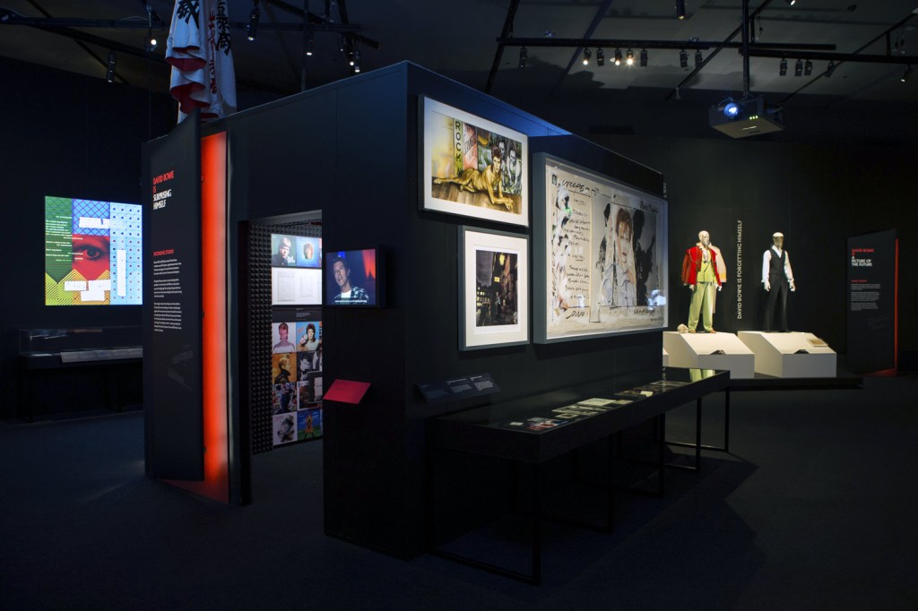
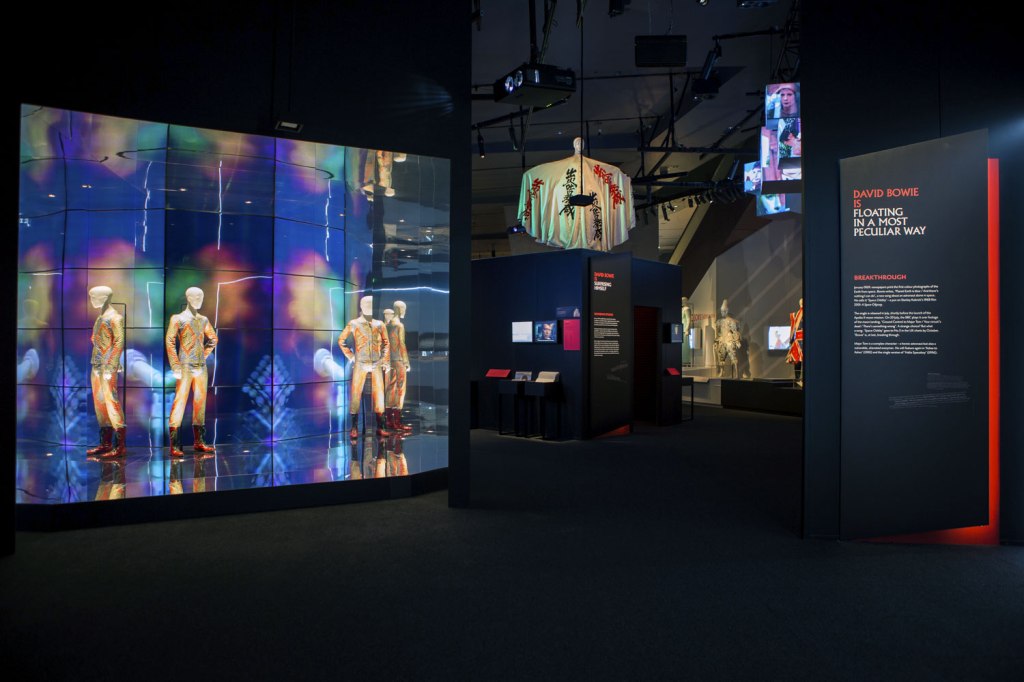
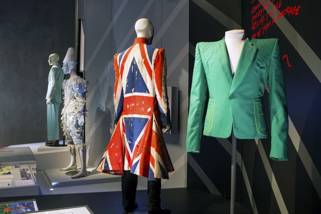
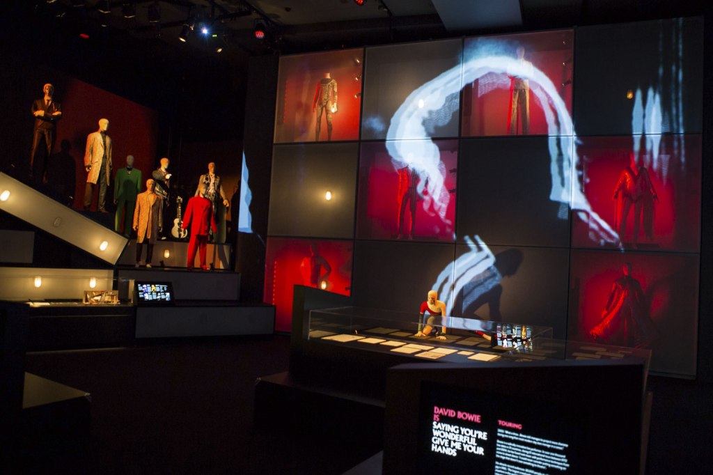
 (photographer) 'David Bowie' 1973 from the exhibition 'David Bowie is' at the Australian Centre for the Moving Image (ACMI), Melbourne, July - Nov, 2015")
, Melbourne, July - Nov, 2015")
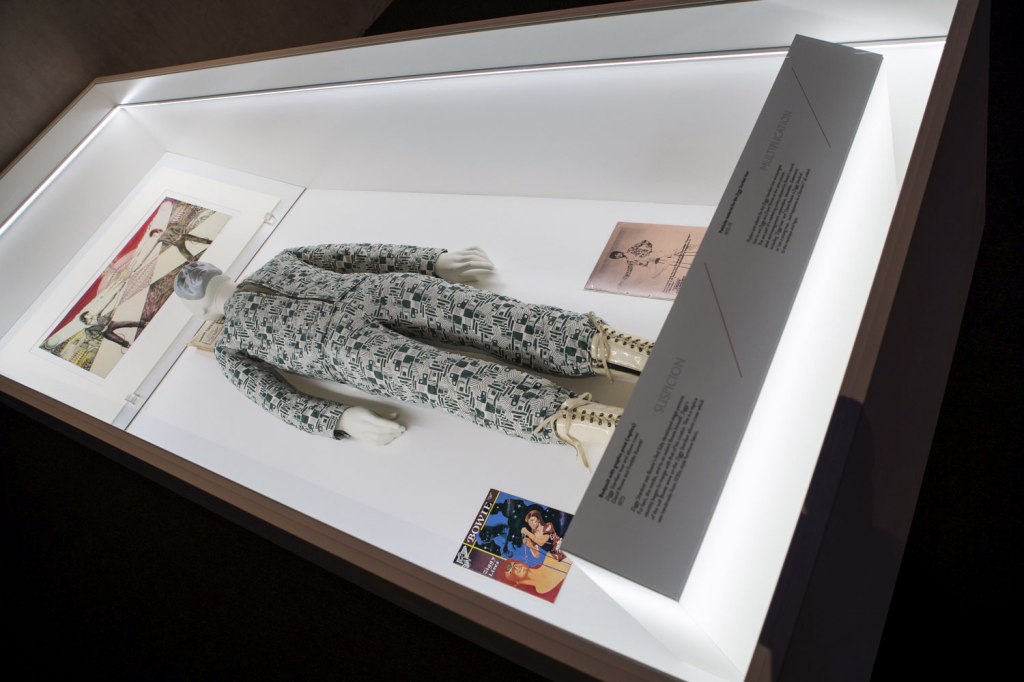
 (designer) 'Quilted two‐piece suit' 1972")
 (designer) Masayoshi Sukita (Japanese, b. 1938) (photographer) 'Striped bodysuit for the Aladdin Sane tour' 1973")

 (designer) 'Metallic bodysuit' 1973")
 'Album cover shoot for Aladdin Sane' 1973")
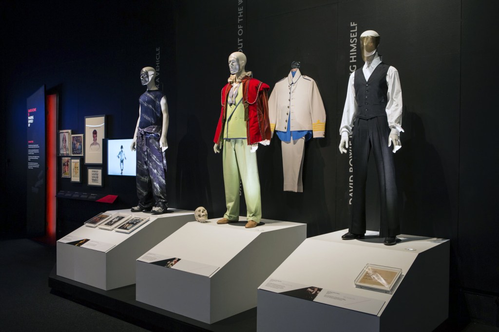


 and Freddie Burretti (British, b. 1952) (designer) 'Bodysuit with graphic print (replica)' 'Ziggy Stardust' tour and album cover 1972")
")

 (designer) 'Ice-blue suit' 1972")
 (designer) 'Asymmetric knitted bodysuit' 1973")
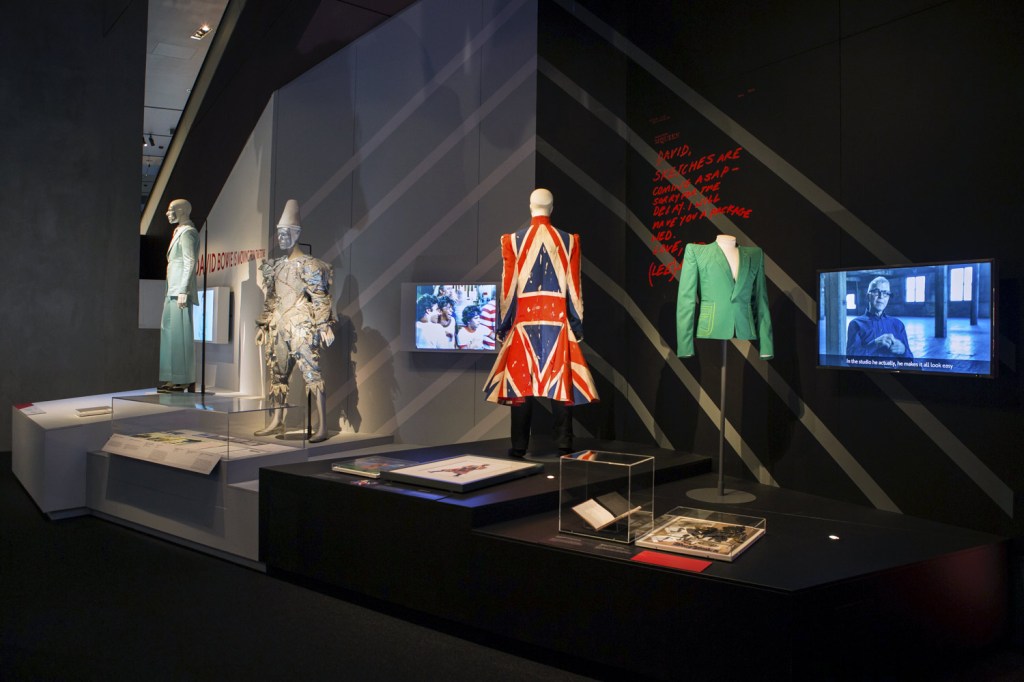
 'David Bowie with William Burroughs, February 1974' 1974")

 'Photo-collage by David Bowie of manipulated film stills from The Man Who Fell to Earth' 1975-1976")


 'David Bowie during the filming of the 'Ashes to Ashes' video' 1980")


You must be logged in to post a comment.