
Exhibition dates: 24th October – 6th December, 2025
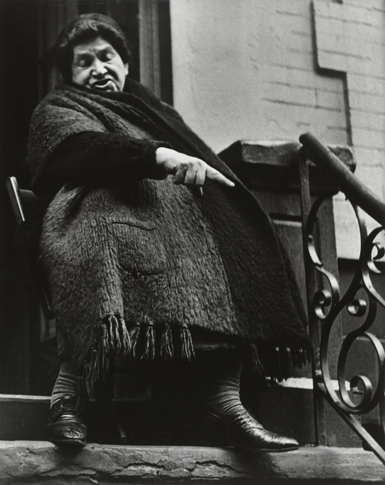
 'Brick Lane market' 1970 or 1972 from the exhibition 'A World Apart: Photographing change in London's East End 1970-76' at Four Corners, Oct - Dec, 2025")
Val Perrin (English)
Brick Lane market
1970 or 1972
Gelatin silver print
© Val Perrin
The heroes of this posting (I don’t know about the exhibition for I haven’t seen it!) are the photographs of Ron McCormick (English, b. 1947) which are deeply rooted in the traditions of photography and the community from which they emanate.
They picture an era of change in the East End of London in the 1970s with all the working class grittiness that area was renowned for. I remember going to Brick Lane market in the mid-1970s and it was a rough area. At that time, the East Enders seemed to be a throw back to a vanishing race born out of the Second World War: flat hats, heavy overcoats and a toughness to just carry on regardless. But things were changing.
“As the docks closed, and wholesale slum clearance replaced old neighbourhoods, many communities were being transformed beyond recognition… Yet a different East End was also coming into being, as new migrant communities created a space for themselves,” one that has become equally as British as previous white iterations. The narrow definition of an “East Ender” was gradually replaced with something more multicultural.
McCormick’s photographs picture such a transformation: Jewish, White, Muslim, Indian, Black, etc., all mixing together in a potpourri of ethnicities, “a vibrant cultural landscape with a variety of traditions, languages, and backgrounds existing together,” while his photographs are rooted in strong social documentary traditions.
In his work I can feel (the critical observation) the influence of Lewis Hine and Walker Evans, more recently that of Lisette Model and the interior photographs of Diane Arbus, Roman Vishniac’s photographs of Jewish life in Eastern Europe between the two World Wars, possibly even the contemporaneous portraits by Milton Rogovin.
Undoubtedly this blending of influences in his photographs ultimately reveals McCormick’s insightful eye and generous spirit: his love for the people he is photographing and his embeddedness in local social networks, deeply influenced by the social and cultural environment from which they emerge – a community in a time of rapid transition and social change.
Dr Marcus Bunyan
Many thankx to Four Corners for allowing me to publish the photographs in the posting. Please click on the photographs for a larger version of the image.
 'Wapping family at window' 1973 from the exhibition 'A World Apart: Photographing change in London's East End 1970-76' at Four Corners, Oct - Dec, 2025")
Paul Trevor (English, b. 1947)
Wapping family at window
1973
Gelatin silver print
© Paul Trevor
 'Mr and Mrs Kelleher in members pub' 1973")
Paul Trevor (English, b. 1947)
Mr and Mrs Kelleher in members pub
1973
Gelatin silver print
© Paul Trevor
 / Exit Photography. 'Floyd Wilson' 1973")
Nicholas Battye (British, 1950-2004) / Exit Photography
Floyd Wilson
1973
Gelatin silver print
© Nicholas Battye/Exit Photography

Exit Photography
Wapping pier
1973
Gelatin silver print
© Exit Photography

Exit Photography
Demolition at Colonial Wharf
1973
Gelatin silver print
© Exit Photography
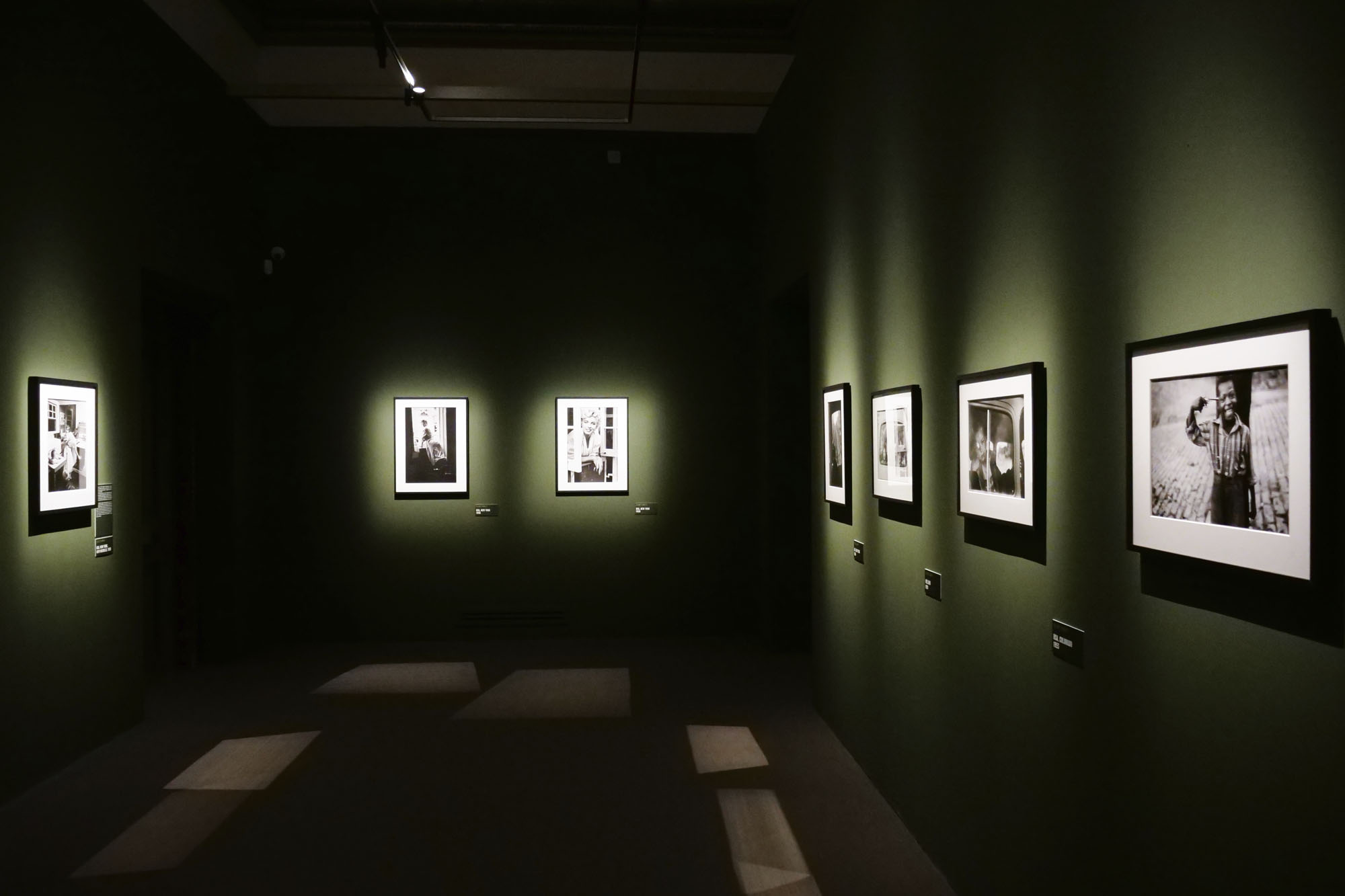
Four Corners’ autumn exhibition captures a unique moment of change in London’s East End.
As the docks closed, and wholesale slum clearance replaced old neighbourhoods, many communities were being transformed beyond recognition. Yet a different East End was also coming into being, as new migrant communities created a space for themselves.
A new generation of photographers were drawn to document ordinary people’s lives and give visibility to working-class experiences. They showed their photographs in everyday spaces where local people could view images of themselves and their own communities.
The exhibition features remarkable photographs by Ron McCormick and the Exit Photography collective of Nicholas Battye, Diane Bush, Alex Slotzkin, and Paul Trevor, alongside work by Ian Berry, John Donat, David Hoffman, Jessie Ann Matthews, Dennis Morris, Val Perrin, and Ray Rising.
With many thanks to Tower Hamlets Local History Library and Archives, Hackney Museum, the Royal Institute of British Architects, and Spectrum Photographic.
Text from the Four Corners website
 'Watch repairer, Black Lion Yard, Whitechapel' 1973 from the exhibition 'A World Apart: Photographing change in London's East End 1970-76' at Four Corners, Oct - Dec, 2025")
Ron McCormick (English, b. 1947)
Watch repairer, Black Lion Yard, Whitechapel
1973
Gelatin silver print
© Ron McCormick
 'Tea break, P & L Engineering, Heneage Street, East London' 1973")
Ron McCormick (English, b. 1947)
Tea break, P & L Engineering, Heneage Street, East London
1973
Gelatin silver print
© Ron McCormick
 'Street scene Spitalfields' 1971")
Ron McCormick (English, b. 1947)
Street scene Spitalfields
1971
Gelatin silver print
© Ron McCormick
 'Schmaltz herring shop, 35 Old Montague Street' 1971")
Ron McCormick (English, b. 1947)
Schmaltz herring shop, 35 Old Montague Street
1971
Gelatin silver print
© Ron McCormick
 'Mr and Mrs Ali, Brick Lane' 1973")
Ron McCormick (English, b. 1947)
Mr and Mrs Ali, Brick Lane
1973
Gelatin silver print
© Ron McCormick
 'Clothing sweatshop in Whitechapel' 1973")
Ron McCormick (English, b. 1947)
Clothing sweatshop in Whitechapel
1973
Gelatin silver print
© Ron McCormick
 'Brick Lane Sunday market' 1971")
Ron McCormick (English, b. 1947)
Brick Lane Sunday market
1971
Gelatin silver print
© Ron McCormick
 'Abdul Latif, Halal butcher, 44 Brick Lane' 1973")
Ron McCormick (English, b. 1947)
Abdul Latif, Halal butcher, 44 Brick Lane
1973
Gelatin silver print
© Ron McCormick
 'Mother and daughter, Fieldgate Street, Whitechapel' 1971")
Ron McCormick (English, b. 1947)
Mother and daughter, Fieldgate Street, Whitechapel
1971
Gelatin silver print
© Ron McCormick
 'Lady in Sunday best Brick Lane market' 1970")
Ron McCormick (English, b. 1947)
Lady in Sunday best Brick Lane market
1970
Gelatin silver print
© Ron McCormick
Lisette Model (American, born Austria 1901-1983)
Lower East Side
c. 1942
Gelatin silver print
 'Mohamhed Truffant in his bedsit, Hanbury Street, Spitalfields' 1973")
Ron McCormick (English, b. 1947)
Mohamhed Truffant in his bedsit, Hanbury Street, Spitalfields
1973
Gelatin silver print
© Ron McCormick
 'Family group, Settle Street, Whitechapel' 1971")
Ron McCormick (English, b. 1947)
Family group, Settle Street, Whitechapel
1971
Gelatin silver print
© Ron McCormick
 'Zysman's delicatessan and pickle shop, 49 Hessel Street' 1973")
Ron McCormick (English, b. 1947)
Zysman’s delicatessan and pickle shop, 49 Hessel Street
1973
Gelatin silver print
© Ron McCormick
Brought together for the first time, these rarely seen photographs document a now-disappeared world. Bengali migrants live side-by-side with elderly Jewish shopkeepers and artisans, dockers socialise in Wapping’s clubs and pubs, neighbours and children celebrate at a raucous, multicultural Stepney festival.
But the images reveal streetscapes and communities in upheaval. Desolation hangs over the soon-to-be demolished streets, dock cranes stand lifeless over empty quays awaiting speculative redevelopment. Amid this apparent wasteland a different East End was coming into being. New migrant communities were creating a space for themselves as economic decline displaced earlier neighbourhoods.
A young generation of photographers were drawn to record ordinary people’s lives at this moment of rapid transition and to advocate for social change. Their exhibitions at the Half Moon Gallery attracted people to view images of themselves and their neighbours. At a time when photography was largely unrecognised by the art world, these photographers mounted ‘guerrilla’ exhibitions in launderettes, on estate walls, and even on portable sandwich boards. They were part of a flourishing community arts scene that gave a voice to local people, including at pioneering shows at the Whitechapel Art Gallery.
A World Apart features photographs by Ron McCormick and Exit Photograph – Nicholas Battye, Diane Bush, Alex Slotzkin, and Paul Trevor – alongside work by Ian Berry, John Donat, David Hoffman, Jessie Ann Matthews, Dennis Morris, Val Perrin, and Ray Rising.
These remarkable photographs celebrate the people of the East End, an area whose identity has been defined by centuries of migration. In an age of increasing social division and intolerance, its strong community history is ever more important today.
A World Apart is made possible through a National Lottery Heritage Fund project, which is helping build Four Corners’ archive collection and opening up its history to new audiences. The exhibition celebrates the early history of the Half Moon Gallery, Britain’s second independent photography gallery, as part of Four Corners 50th anniversary programme in 2025.
Photographers
Ron McCormick is a self-taught photographer who has exhibited and published for fifty years. His early photographs of Whitechapel were first shown alongside the poetry of east London schoolchildren in the controversial book Stepney Words produced by school teacher Chris Searle. He taught at the renowned School of Documentary Photography in Newport, where he ran the NEWPORT SURVEY, an annual record of the community life. A dynamic contributor to the revitalisation of British photography of the 1970s and 1980s, he was the second director the Half Moon Gallery, and the founding director of Side Gallery, Newcastle on Tyne. He runs Communimedia, a community design and production enterprise in South Wales. He has exhibited widely at the Institute of Contemporary Art, Whitechapel Art Gallery, Serpentine Gallery, Photographers Gallery, Barbican, MIT Cambridge USA; La Photo Galeria, Madrid, among others.
Exit was a collective of four photographers, Nicholas Battye, Diane Bush, Alex Slotzkin, and Paul Trevor. Their first project, Down Wapping, focused on Wapping’s working class community that was threatened by the closure of the docks and imminent redevelopment. It was shown at the E1 Festival in Stepney in 1973, and at the Photographers Gallery later that year. A booklet of the photographs was designed by Exit and published by the East End Docklands Action Group in 1974. After some changes, Paul Trevor, Nicholas Battye and Chris Steele-Perkins went on to create Survival Programmes from 1974-79, a significant study of social and economic poverty in Britain’s inner-cities. A with. Side Gallery in Newcastle toured the exhibition around the country, and a book of the work was published by Open University Press in 1982. Find out more
Ian Berry is a Magnum photojournalist who worked for Drum magazine in South Africa, where he was the only photographer to document the Sharpeville massacre in 1960. In 1972 he was commissioned by the Whitechapel Art Gallery to photograph the changing local community, creating work which contributed to his book The English (1978). He has worked internationally, covering the invasion of Czechoslovakia, the Irish Troubles, famine in Ethiopia, and conflicts in Israel, Vietnam, and the Democratic Republic of Congo. His work is represented in Black and Whites: L’Afrique du Sud (1988) and Living Apart (1996). His project Water focused on the disaster of climate change, and was published by GOST in 2023.
John Donat (1933-2004) was one of Britain’s foremost architectural photographers of his generation. After studying architecture, he took up photography full-time. His early images can be seen in Crete 1960 (Crete University Press, 1999). Donat captured the built environment with a social documentary, almost photojournalistic approach. He was commissioned by the Whitechapel Art Gallery to capture change taking place in the area for the exhibition This is Whitechapel in 1972, although the focus of the show became the work of another important photographer, Ian Berry.
David Hoffman is a documentary photographer of protest and social issues. Living in a squat in Fieldgate Mansions, east London in the 1970s, he recorded homelessness, anti-racism and protest. In particular, he documented homeless people at St Botolph’s refuge in Aldgate. He has covered many of the key moments in contemporary British protest – from Brixton in 1981 and Broadwater Farm in 1985, to the poll tax riots and the Occupy movement. Recent books are A Place to Live, Endurance and Joy in Whitechapel, published by Spitalfields Life Books and accompanied by a exhibition at The Museum of the Home in 2024; and Protest!, published by Image and Reality, 2025.
Jessie Ann Matthew was born in 1952 and educated at the Central School of Art and Design, London. She worked as a portrait photographer for the Scottish National Portrait Gallery, including The Seven Poets (1981) with paintings by Alexander Moffat. She participated in Men Photographed by Women at Half Moon Gallery in 1975, and Gaining Momentum: 8 women photograph women, a Half Moon touring show in 1981. More recently, Matthew has been making with texiles, in particular wall-hangings and paintings.
British-Jamaican photographer Dennis Morris is world-renowned for his images of music icons such as Bob Marley and Marianne Faithfull. Growing up in Dalston, east London, he started his career aged just eleven. His early documentary photographs include powerful work such as Growing Up Black, Southall and This Happy Breed, images that show everyday life and Black British culture which capturing the pride and resilience of London’s communities. While still a teenager, he showed his early work, Dalston Photographs at the Half Moon Gallery in 1973.
Ray Rising is an ex-docker and self-taught photographer, whose exhibition Redundant River was shown at the Half Moon Gallery in 1973. He went on to be a reportage photographer for Report Digital, covering issues such as the 1984 miners’ strike, the death of Colin Roach in police custody in 1983, anti-racist protests, CND campaigns, among others.
Press release from Four Corners
 'E1 Festival steel band performers' Early 1970s")
Diane Bush (British born America, b. 1947)
E1 Festival steel band performers
Early 1970s
Gelatin silver print
© Diane Bush
 'Dancing at E1 Festival' 1975")
David Hoffman (British, b. 1946)
Dancing at E1 Festival
1975
Gelatin silver print
© David Hoffman
 'One of the last remaining shops in Hessel Street, Whitechapel' c. 1972")
David Hoffman (British, b. 1946)
One of the last remaining shops in Hessel Street, Whitechapel
c. 1972
Gelatin silver print
© David Hoffman
 'Child playing in tenement block, Whitechapel or Wapping' 1972")
David Hoffman (British, b. 1946)
Child playing in tenement block, Whitechapel or Wapping
1972
Gelatin silver print
© David Hoffman
Four Corners
121 Roman Road, Bethnal Green
London E2 0QN
Phone: 020 8981 6111
Opening hours:
Wednesday – Saturday 11am – 6pm
 enterprise near Oengaran south of Semarang' c. 1910 from the exhibition 'Hidden Connections' at the Van Abbemuseum, Eindhoven, Holland, April 2024 - June 2026")
' c. 1900 from the exhibition 'Hidden Connections' at the Van Abbemuseum, Eindhoven, Holland, April 2024 - June 2026")


 'Henri Van Abbe' 1929")


![Johan Braakensiek (Dutch, 1848-1940) "The coolie ordinances" in
'De [Groene] Amsterdammer', Date 23 November 1902](https://artblart.com/wp-content/uploads/2025/04/johan-braakensiek-de-koelie-ordonantien-de-groene-amsterdammer-datum-23-november-1902.jpg "Johan Braakensiek (Dutch, 1848-1940) \"The coolie ordinances\" in 'De [Groene] Amsterdammer', Date 23 November 1902")


 'Pleasures and Terrors of Levitation #37' 1953")


 'The Light That Never Was on Land or Sea' c. 1925")
 'Light Drawing #8 (Smoke)' 1938-1939")
![Ilse Bing (American born Germany, 1899-1998) 'Untitled [Seated Woman with Necklace, Solarized]' 1943](https://artblart.com/wp-content/uploads/2025/10/ilse-bing-seated-woman-with-necklace.jpg "Ilse Bing (American born Germany, 1899-1998) 'Untitled [Seated Woman with Necklace, Solarized]' 1943")
 'Camera Movement on Flashlight, Chicago' c. 1949")
 'Still Life with Wine Glass: Photogram on 20\" x 24\" Film' 2006")
 'Lightning Fields 182' 2009")
 '2/26/2010, 7:54 am – 8:54 am, S36° 49.622' E 175° 47.340'' 2010")
 'Camera Obscura: View of Philadelphia from Loews Hotel Room #3013 with Upside Down Bed, April 14th, 2014' 2014")
 'Calaeno' 2018")
 Sbor na demonstratsia (Gathering for a Demonstration) 1928")
 'The Bridge' 1929")

 'Esme Swimming, Parkroyal on Pickering, Singapore' 2014")
 'Agave Americanus' 1929")
 'Agave Design I' c. 1920")
 'Palma Cuernavaca II' 1925")
 'Electrical Switches' 1929")
 'Weed Against Sky, Detroit' 1948")
 'Espinas' c. 1985")
 'Men's Fashions (Avenue des Gobelins)' 1925, printed 1956")
 'Composition' 1932, printed 1972")
 'Construct NYC' 1984")
 'Protest' 1940")
 '31 St. Beach' c. 1955")
 'Untitled' 1964")
 'Untitled' 1974")
 'Untitled' 1989 From the 'Indomitable Spirit Portfolio'")
 'Studio (0X5A8180)' 2021")
 'Phoenix V' 2021")
 'It Lingers Sweetly' 2022")
 'Girl with Fan' c. 1936")
 'Ide Collar' 1922")
 'Wine Glass on Checker Board' 1922")
 'Jello Mould in Dish' 1923")
 'Men's Scarfs' 1924")
 'Woman in Bed (under satin sheets)' c. 1933")
 'Girl in Bathing Suit' 1936")
 'Window with Plants' 1937")
 'Political Thinking' 1938")
 'Nude with Mask and Hat' c. 1936")
 'Los Angeles' c. 1970s from the online exhibition 'Gary Krueger (re)Discoveries' from Joseph Bellows Gallery, La Jolla, California, Sept 2025")
 'Los Angeles' c. 1970s from the online exhibition 'Gary Krueger (re)Discoveries' from Joseph Bellows Gallery, La Jolla, California, Sept 2025")
 'Los Angeles' c. 1970s")
 'Los Angeles' c. 1970s")
 'Los Angeles' c. 1970s")
 'Los Angeles' c. 1970s")
 'Los Angeles' c. 1970s")
 'Los Angeles' c. 1970s")
 'Los Angeles' c. 1970s")
 'Los Angeles' c. 1970s")
 'Los Angeles' c. 1970s")
 'Los Angeles' c. 1970s")
 'Los Angeles' c. 1970s")
 'Los Angeles' c. 1970s")
 'Los Angeles' c. 1970s")
 'Los Angeles' c. 1970s")
 'Los Angeles' c. 1970s")
 'Los Angeles' c. 1970s")
 'Sandra Bennett, twelve year old, Rocky Ford, Colorado, August 23, 1980' 1980")


 'Ronald Fischer, beekeeper, Davis, California, May 9, 1981' 1981")
 'David Beason, shipping clerk, Denver, Colorado, July 25, 1981' 1981")
 'Jesse Kleinsasser, pig man, Hutterite Colony, Harlowton, Montana, June 23, 1983' 1983")
 'Ruby Mercer, publicist, Frontier Days, Cheyenne, Wyoming, July 31, 1982' 1982")
 'Petra Alvarado, factory worker, on her birthday, El Paso, Texas, April 22, 1982' 1982")

 'Richard Garber, drifter, Interstate 15, Provo, Utah, August 20, 1980' 1980")
 'Blue Cloud Wright, slaughterhouse worker, Omaha, Nebraska, August 10, 1979' 1979")

 'New York City' 1966")
 'New York City' 1962")
 'New York City' 1963")
 'New York City' 1965")
 'Philadelphia, PA' 1965")
 'Mount Rushmore' 1969")


 'Coney Island, New York' 1952")
 'Utah' 1964")
 'Circle Line Statue of Liberty Ferry, New York' 1971")
 'Untitled', from: 'Women are Beautiful' 1970")
 'Untitled', from: 'Women are Beautiful' 1973")
 'East Village, New York' 1984")
 '220 West Houston Street, New York' 1984")
 'I picked him up at a club and I took him to Brooklyn. He was a happy camper, New York' 1984")
 'At the Garage, my cab broke down, New York' 1984")
 'Meatpacking District, I picked him up from one of the clubs. He was a drag performer and I was taking him home to Brooklyn, New York' 1984")
 'Greenwich Village, The Anvil, New Jersey' 1984")
 'Pulaski Skyway, New Jersey' 1984")
 'Coney Island' 1968")
 'Coney Island' 1968")
 'Coney Island' 1971")
 'Coney Island' 1968")
 'Coney Island' 1969")
 'Coney Island' 1969")
 'Coney Island' 1969")
 'Coney Island' 1969")
 'Coney Island' 1969")
 'Coney Island' 1969")
 'Coney Island' 1969")
 'Coney Island' 1970")
 'Coney Island' 1971")
 'Coney Island' 1971")
 'Coney Island' 1972")
 'Coney Island' 1967-1972")
 'Coney Island' 4th of July, 1958")
 'Harlem Black Birds, Coney Island' 1930")
 'Couple at Coney Island, New York' 1928")
 'Afternoon Crowd at Coney Island, Brooklyn' 1940")
 'Coney Island' 1955")
 'Man in hat, trunks, socks and shoes, Coney Island, N.Y. 1960' 1960")
 'Two Youths, Coney Island' 1958 From the series 'Brooklyn Gang'")
 'England, Birmingham, 1991' 1991")


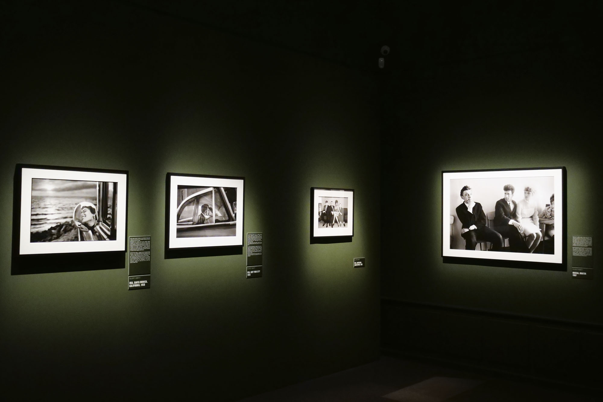
 'USA, Santa Monica, California, 1956' 1956")
 'USA, New York City, 1955' 1955")
 'USSR, Bratsk, Siberia, 1967' 1967")


 'Spain, Madrid, 1995' 1995")
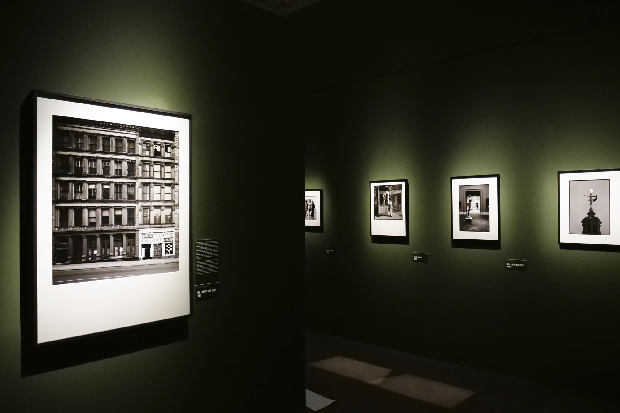
 'USA, New York City, 1969' 1969")


, 1956'")

 'USA, NewYork, 1956' 1956")
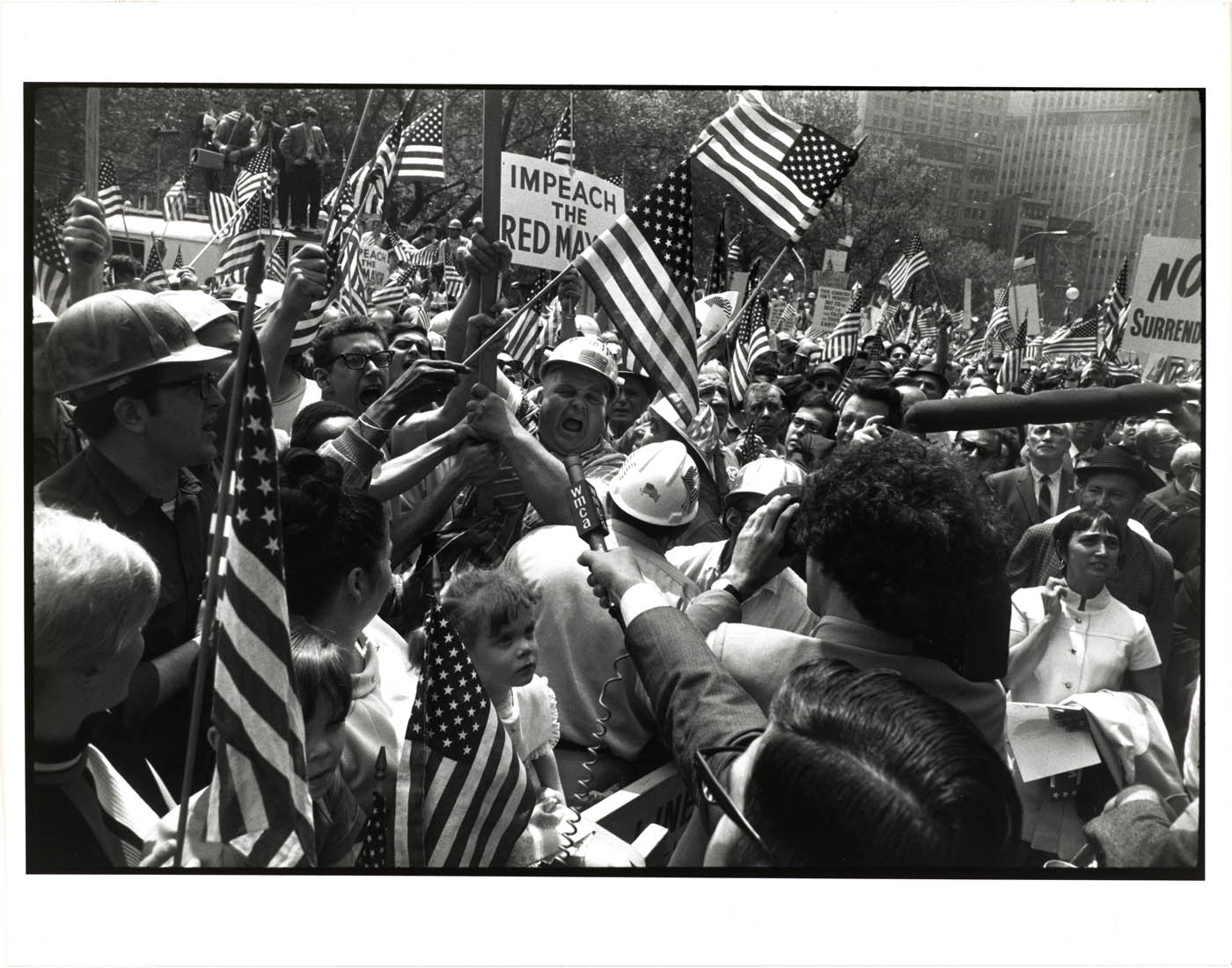
 'USA, Arlington, Virginia, Jacqueline Kennedy at John F. Kennedy's funeral, November 25, 1963' 1963")
")


 'USSR, Moscow, 1959' (Nikita Khruschchev and Richard Nixon) 1959")

; at third right, 'USA, New York City, 1946'; at second right, 'France, Paris, 1989'; and at right, 'USA, New York City, 2000'")
 'USA, New York City, 1946' 1946")
 'France, Paris, 1989' 1989")
 'USA, New York City, 2000' 2000")

 'USA, New York City, 1974' 1974")

 'USA, New York City, 1955' 1955")
 'Welcome Home' 1978-1984 From the series 'Family Pictures and Stories' from the exhibition 'Carrie Mae Weems: The Heart of the Matter' at Gallerie d'Italia, Turin, April - Sept, 2025")


 'The Edge of Time – Ancient Rome' 2006 from the series 'Roaming', 2006 from the exhibition 'Carrie Mae Weems: The Heart of the Matter' at Gallerie d'Italia, Turin, April - Sept, 2025")


 'Galleria Nazionale D'Arte Moderna' 2006-ongoing")


 'Untitled' Nd from the series 'Preach' 2025")
 'Road Sign' 1991-1992")


 'Untitled (Man and mirror)' 1990 From the series 'Kitchen Table'")
 'Untitled (Woman and daughter with children)' 1990 From the series 'Kitchen Table'")
 'Untitled (Woman standing alone)' 1990 from the series 'Kitchen Table'")
 'Untitled' 1988 from the series 'Four Women'")
 'Wilfredo, Laura and Me, I' 2002 From the series 'Dreaming in Cuba'")

You must be logged in to post a comment.