Kristian Laemmle-Ruff (Australian) Truck in Safi 2010 Type C print 100 x 67cm
Jeff Wall, the renowned Canadian photographer, observed recently that, “Photography is such a wide, complex art form medium that there’s no real single way of practising it. Up until 30 to 40 years ago, it was pretty much presumed that the way you practised photography seriously was in the documentary mode. It was very unilateral, other things weren’t really plausible. I never objected to documentary photography, but it’s not the whole story…”1
How true. In this post-photography world there are many spaces in the city for showing all kinds of photographic work, notably at the Centre for Contemporary Photography in Fitzroy. While the viewer does learn about different modes of photographic representation through experiential learning (making meaning from the direct experience of looking at such work), personally some contemporary photography often leaves me feeling rather underwhelmed. Rarely do I leave the CCP thinking, wow, that was a great “photography” exhibition, I have seen something amazing about the world that I had not recognised before. Interesting: possibly; inspiring / engaging / memorable: occasionally, which is perhaps why reviews of exhibitions at the CCP occur rather rarely in this archive. This is not to belittle the work that the CCP does as an establishment, far from it, but just to note that not much contemporary photography lasts long in the mind.
It was such a joy then to walk around the corner from the CCP to the Colour Factory Gallery and view the exhibition Littoral by emerging artist Kristian Laemmle-Ruff. This is one of the best, if not the best, “photography” exhibition I have seen so far this year. As soon as you walk into the simple, elegant gallery you are surrounded by fourteen large scale horizontal photographs that are suffused with colour variations bouncing across the gallery – here a blue, there a green, now a lush orange palette. The effect is much like Monet’s waterlilies at the Musée de l’Orangeriein Paris; seated in the middle of the four curved paintings you are surrounded by large daubs of paint of various hues that have an elemental effect – resonances of earth, air, water, fire – on the viewer. The same affection of colour and space can be found in Laemmle-Ruff’s photographs.
The artist’s literal rendition (the definition of littoral is that it relates to the coastal zone between the limits of high and low tides) of the interstitial spaces at the edge of urbana, the fluid spaces of a no man’s land, are beautifully visualised in the work. These entropic spaces are mainly devoid of physical human presence but filled with the detritus of humanity: concrete boxes and tangled beams of steel, satellite dishes and red-eyed chimney stacks. In Casablanca Terrace II (2010, below) satellite dishes shimmer in orange while in the distance alien lights seem to hover over the city; in Manneheim (2010, below) the whole photograph is a cold, chilly blue the only visible signs of human existence a couple of lights peeping from the flat windows (at left) while the belching smoke from numerous alien, red-eyed War of the Worlds chimney stacks blends seamlessly into the overcast sky (please enlarge the photograph to see these). When first looking at New Homes (2011, above) I thought the green lines at bottom left were trenches until I realised they were hedges. Then I noticed the empty oval in the upper right quadrant – a demolished sporting facility… a racetrack… a spaceship landing pad? In these familiar but alien landscapes (ice covered swimming pools, graveyards sitting under mountains) Laemmle-Ruff plays with colour, space and depth of field. In some photographs, such as Road to Essaouira (2010, below bottom) the depth of field is very shallow, the focus point in the photograph being the road and gravel, silver road sign and buildings falling out of focus beyond. Like the shifting of colour, this expansion and contraction of DOF from one photograph to the next adds to the body of works ethereality.
The best print in the exhibition is Truck in Safi (2010, above) which is an absolute knockout. The composition is beautifully visualised and the print is incredibly luminous and well balanced. The large white ‘M’ on the back of the earth-filled truck solidifies our gaze in the mid-foreground while, metaphorically, the letter stamps the earth as the possession of man. The road curves into the distance and upon it, as minute specks, are a bicycle and two motorbikes. The sweep of an industrial plant fills the horizon line in a sensuous entanglement of vessels and pipes. This truly is a beautiful photograph and therein lies the contradiction present in Laemmle-Ruff’s body of work.
While seeking to capture the paradoxes of urbanisation and consumerism, a vernacular world, familiar and normal (both the beauty and frailty of our times as Laemmle-Ruff puts it), the beauty of the photographs becomes the heart of the work, its strength in the presence of the viewer and perhaps its slight weakness as well.
The artist’s visual acoustics, his mythologising of the city if you like – the (dis)ease of the city as sublime photograph picturing the picturesque – has, to my mind, elements of Pictorialism in the artist’s scopophiliac looking. Nothing wrong with that, but we must acknowledge that there is a contradiction here, not between the beauty and frailty of our times, but between the frailty of the earth and the constructed beauty of the photograph seen through a desirous looking that might be at odds with Laemmle-Ruff’s intended project.
Be that as it may, it is a great pleasure to see a young, emerging artist produce such memorable photographic works. Walking into the gallery the viewer can littorally feel the pleasure that the artist has in capturing these complex, fluid spaces. The artist is at the beginning of a path of exploration where each new body of work will develop thematically out of concerns that have been evidenced here. Where this journey will take him is unknown but with courage, fortitude, knowledge, passion, a good eye and a camera he will go far. Good stuff!
Dr Marcus Bunyan
1/ Wall, Jeff quoted in Laurie, Victoria. “Lights, Camera,” in The Weekend Australian Review. May 19-20 2012, p. 5
Many thankx to the artist and the Colour Factory Gallery for allowing me to publish the photographs in the posting. Please click on the photographs for a larger version of the image.
Kristian Laemmle-Ruff (Australian) Safi 2010-2012 Type C print 100 x 67cm
Kristian Laemmle-Ruff (Australian) New Homes 2011 Type C print 100 x 67cm
Kristian Laemmle-Ruff (Australian) Casablanca Terrace II 2010 Type C print 100 x 67cm
Kristian Laemmle-Ruff (Australian) Manneheim 2010 Type C print 100 x 67cm
Littoral examines the shifting overlap between landscape and urbanscape. As a reaction to a traditional approach where the two are consciously separated, Laemmle-Ruff focuses on the often grotesque and ever-expanding littoral zone between civilisation and nature.
“I found these undefined zones did not discriminate on place or culture. From Morocco to the post WWII suburbs of Germany, somber skies were met with stubborn and aggressive urbanisation. I was drawn to contradictions. “The World Tastes Better with Pall Mall” claimed the cigarette ad. These empty remarks of consumerism seemed to go unchallenged. My intention was to capture these paradoxes and pull them from the wallpaper of modern sensibility. Our gaze once traveled to picturesque, unspoiled horizons, forests in mist and rolling plains. Instead it stops on concrete or becomes tangled in steel beams.”
Littoral presents us with spaces anticipating themselves. Housing estates on the fringe of development yet to be occupied; North African peasants walking past the mall’s facade where the market once stood; roof top terraces lined with satellite dishes streaming immaculate reception. We are left to wonder who will fill these homes. Who is in control of where urbanisation will go next?
Ultimately, this series may appear to be a presentation of a vernacular world, familiar and normal. This, in turn alludes to a desensitisation to our changing surroundings in an age of globalisation and overpopulation. Our landscape is increasingly becoming a manifestation of ourselves. Littoral urges one to question where the present seems to be leading us.
Practicing in both documentary and conceptual photography, from warm narratives to surreal visions, Kristian Laemmle-Ruff’s photographs subtly bring to light both the beauty and frailty of our times. As we spiral up the exponential curve of ‘progress’ there are dynamic ruptures, vulnerabilities and regenerative possibilities in our human reality – this is his motivation – a truth worth capturing.
Press release from the Colour Factory Gallery website
Kristian Laemmle-Ruff (Australian) Olympic Stadium 2012 Type C print 100 x 67cm
Kristian Laemmle-Ruff (Australian) Road to Essaouira 2010 Type C print 100 x 67cm
Kristian Laemmle-Ruff (Australian) Aqua dynamics 2010-2012 Type C print 100 x 67cm
Kristian Laemmle-Ruff (Australian) Valle de Zimatlan 2010-2012 Type C print 100 x 67cm
Kristian Laemmle-Ruff (Australian) Pall Mall 2010-2012 Type C print 100 x 67cm
Colour Factory Gallery 409-429 Gore Street Fitzroy, Victoria 3056 Phone: +61 3 9419 8756
Curators: Clément Chéroux, Sam Stourdzé, and Anne Lacoste
Artists: Jean-Michel Alberola, Louis Aragon, Marie-Berthe Aurenche, Richard Avedon, Alain Baczynsky, Jared Bark, Marc Bellini, Jacques-André Boiffard, André Breton, Hansjürg Buchmeier, Anita Cruz-Eberhard, Sabine Delafon, Anne Deleporte, Paul Eluard, Max Ernst, Michael Fent, Michel Folco, Valentine Fournier, Lee Friedlander, Näkki Goranin, Jeff Grostern, Susan Hiller, Dick Jewell , Svetlana Khachaturova, Jürgen Klauke, Jacques-Henri Lartigue, Naomi Leibowitz, Leon Levinstein, Annette Messager, Willy Michel, Daniel Minnick, Suzanne Muzard, Raynal Pellicer, Mathieu Pernot, Steven Pippin, Jacques Prévert, Raymond Queneau, Arnulf Rainer, Timm Rautert, Bruno Richard, Gerhard Richter, Thomas Ruff, Michel Salsmann, Tomoko Sawada, Joachim Schmid, Cindy Sherman, Lorna Simpson, Dimitri Soulas, Yves Tanguy, Amanda Tetrault, Roland Topor, Franco Vaccari, Andy Warhol, Gillian Wearing, Jan Wenzel, David Wojnarowicz and the group Fluxus.
This is one exhibition I wish I could really see in person. Such a fascinating subject!
The images are timeless, contextless and quite beguiling.
The exhibition questions the aesthetics of the photobooth through six major themes: The Booth, Automatism, The Strip, Who Am I?, Who Are You?, Who Are We?. In Melbourne there are still two black and white photobooths outside the Elizabeth Street exit of Flinders Street railway station, standing there like silent sentinels of a bygone age. I remember when I was younger queueing to have my photograph taken, for student cards and for my first passport. You needed two nearly identical black and white shoulder up portraits, no smiling, no glasses on. Now you just go to the chemist for your colour renditions. The magic and the fun has gone.
The whole performance has the illusion of the cinematic. You queue to get in, drawing back the curtain and closing it behind you, as they close the doors of the cinema. The privacy of the booth, not in darkness but behind a curtain that shields your face from prying eyes but leaves the lower half of your body exposed. Behind where you will be sitting another curtain – drawn or open? What background do you want? You adjust the seat up and down so that your face is at the correct level with the mark on the screen, enter your money and wait. The red light comes on, you (com)pose yourself and a couple of seconds later: flash! Your eyes try to recover in time for the next red light: flash!
Time seems to slow down and almost stop between the flashes of light. The experience of your performance before the screen possesses such a visceral, tense, gut feel but also a disembodied feeling. I never know how I am going to look on the cinematic film strip, not at 24 frames a second, but at 4 frames per minute. What happens to the time in between?
Standing outside the booth waiting for a strip of paper with your impression on it, not knowing what the images are going to be like, whether the development of the image in such a short space of time has worked correctly – and the smell of the chemicals on the paper as you handle the still wet strip. Magic…
Dr Marcus Bunyan
Many thankx to the Musée de l’Elysée for allowing me to publish the photographs in the posting. Please click on the photographs for a larger version of the image.
When the first photobooths were set up in Paris in 1928, the Surrealists used them heavily and compulsively. In a few minutes, and for a small price, the machine offered them, through a portrait, an experience similar to automatic writing. Since then, generations of artists have been fascinated by the concept of the photobooth. From Andy Warhol to Arnulf Rainer, Thomas Ruff, Cindy Sherman and Gillian Wearing, many used it to play with their identity, tell stories, or simply create worlds.
Behind the Curtain – the Aesthetics of the Photobooth, an exhibition created by the Musée de l’Elysée, is the first to focus on the aesthetics of the photobooth. It is divided into six major themes: the booth, the automated process, the strip, who am I ?, who are you?, who are we? Provider of standardised legal portraits, it is the ideal tool for introspection and reflection on others, whether individually or in groups. By bringing together over 600 pieces made on different media (photographs, paintings, lithographs and videos ) from sixty international artists, the exhibition reveals the influence of the photobooth within the artistic community, from its inception to the present day.
The exhibition questions the aesthetics of the photobooth through six major themes.
The Booth
An isolated space, closed in as if it were some sort of modern confessional, the photobooth is an invitation to the most intimate revelations. Generally located in public spaces-subway station, department store or train station-it also offers an extraordinary observation point onto the urban hustle and bustle. It is a world in between the intimate and the public, the inside and the outside, the debarred and the open.
Automatism
From the Surrealists to the most contemporary artists, all have been fascinated by the automatism of the photobooth. The machine does the work. The author vanishes behind the almighty technology. Malfunction can occur at times. The result is a form of poetry of the automatism made visible in its faults, failures or blunders.
The Strip
As a series of juxtaposed images, the strip recreates spatial or temporal continuities. It reconstructs improbable spaces: a closer look shows that, in fact, the adjacent image is the following image. Through this succession of images, the photobooth holds, as if folded into it, the principle of the cinema. Putting images side by side is already telling a story.
Who am I?
Identity is embodied within the space of the photobooth. It is a space for self-staging, where social, ethnic, sexual, community or any other identity can be strengthened or undone. One can pretend to ascertain one’s naked identity through the mirror of the photobooth, or on the contrary, by pulling faces or in disguise, to establish metamorphoses of the self. The photobooth is the ideal introspective tool.
Who are you?
The photobooth is not only a place suitable for self-reflection, it is also a place in which the other can be questioned, in particular through the legal identification system that delivers what is commonly referred to as ‘ID’. In devoting oneself to the compulsive and bulimic collecting of photobooth strips, one can also get lost in the faces of others.
Who are we?
While it allows us to reflect upon our own identity, or other people’s, the photobooth is also an opportunity to ponder about the nature of the couple, or the group. Inside the booth, some build their image through the mirror of the other, or of others; they pose in pairs or more, thus asserting their affiliation to a social entity. The photobooth reinforces our gregarious instinct; it embodies collective identity.
With works by Jacques-Henri Lartigue, Willy Michel, Lorna Simpson, Amanda Tetrault and the collection of albums of purikuras (see photograph below: in Japan, the name purikuras refers to a photo sticker booth or the product of such a photo booth. The name is a shortened form of the registered trademark Purinto Kurabu (プリント倶楽部). The term derives from the English print club. Jointly developed by Atlus and Sega, the first purikura machines were sold in July 1995).
The hand of the monkey Clear on the thigh of Dayaba Usman (see photograph below) – and the look on his face – makes us wonder who is really in chains.
Dr Marcus Bunyan
Many thankx to the Hague Museum of Photography for allowing me to publish the photographs in the posting. Please click on the photographs for a larger version of the image.
The South African photographer Pieter Hugo’s (b. 1976) monumental photographs, centred around contemporary Africa, are now well known around the world. He has already won numerous awards including the KLM Paul Huf award in 2008 and was recently nominated for the Deutsche Börse Photography Prize 2012. The Hague Museum of Photography will be the first museum to exhibit a comprehensive survey of Hugo’s work from 2002-2011. Together with many previously unseen works, the exhibition will include a curated selection of his most well-known series: The Hyena & Other Men, the bizarre Nollywood and the striking Permanent Error. His impressive portraits tell personal stories about recurring themes throughout his oeuvre, namely those people who inhabit the margins of society in Sub-Saharan Africa. The differences between the West and Africa, rich and poor, white and black are confronted in Hugo’s vivid compositions. Many of his series are prompted by newspaper articles, or radio and television pieces, which he finds compelling. He came in contact, for instance with the group of men who travel around Nigeria with hyenas and pythons, through an image sent via cell phone camera by a friend. He decided to accompany the group on their travels, and the outcome of this experience is The Hyena & Other Men (2005-2007), a series of portraits from a travelling group of street performers, who together with their – sometimes forcefully – tamed animals earn money to continue travelling.
In the series Permanent Error (2009-2010) he offers portraits of young men and woman who live amidst an immense waste dump of broken computers, mother boards and keyboards. To earn money these young people burn the computers dumped here as a means to extract valuable metals. The dangerous and poisonous vapours produce a hell on earth, where the quality of life is already challenging. The people who pose for Hugo stand in front of the camera with a defiant self-confidence.
From a different perspective comes his series about Nollywood (2008-2009) in Nigeria, the biggest film industry in the world after Hollywood and Bollywood. Here, stories that have for centuries been part of an oral tradition are told in dramatic films in which a central role is reserved for themes such as romance, witchcraft, bribery and prostitution. It is this world, where the everyday and the surreal exist simultaneously, that Hugo finds fascinating. In this series Hugo depicts actors and assistants posing in the role of movie characters. The result is an absurd tableau such as a photo of a half-naked woman sitting on a bed with a bloody knife stuck between her breasts. All the while she stares blankly at the camera. In another image, a woman well-dressed in Nigerian clothing sits completely unfazed by the man next to her made-up as the devil.
Press release from The Hague Museum of Photography website
Curators: curatorial intern Fabian Leyva-Barragan and assistant curator Stephanie Cannizzo.
PLEASE NOTE: This posting contains nude photographs. If you do not like please do not look!
Andy Warhol (American, 1928-1987) Untitled Pages 8 and 9 of The Andy Warhol Photographic Legacy Program, Vol. III of The Andy Warhol Foundation for the Visual Arts Twenty-Year Report, 1987-2007
ONE PERSON has found one of the images below offensive; so just for them please note that his posting has a PENIS and A-RRRRRR-SE rating. For all others, enjoy another spectacular Andy posting!
“I’ve never met a person I couldn’t call a beauty.”
Andy Warhol
Andy Warhol (American, 1928-1987) Untitled Pages 38 and 39 of The Andy Warhol Photographic Legacy Program, Vol. III of The Andy Warhol Foundation for the Visual Arts Twenty-Year Report, 1987–2007
The University of California, Berkeley Art Museum and Pacific Film Archive presents Andy Warhol: Polaroids / MATRIX 240. The exhibition features a selection of Warhol’s Polaroid portraits drawn from an extraordinary gift of The Andy Warhol Foundation for the Visual Arts to the museum. From 1970 to 1987, Warhol, armed with his Polaroid Big Shot camera, captured a wide range of individuals – the royalty, rock stars, executives, artists, patrons of the arts, and athletes who epitomised seventies and eighties high society, but also as many unknown subjects. From January 27 through May 20, 2012, BAM/PFA will feature a group of approximately forty of these photographs, including portraits of Caroline, Princess of Monaco; Diane von Furstenberg; and O.J. Simpson.
Famous for his contributions to Pop Art, Warhol used photography as a central part of his art-making process. Before turning to fine art, Warhol worked in advertising and commercial art, experiences that informed his approach to portraiture. In 1962, he debuted his first silkscreen paintings of celebrities, serialising pictures he pulled from magazines and press photos. In addition to using found images, Warhol eventually incorporated his own photography into his practice. In 1969 he launched inter/View magazine, which featured his photos of celebrities. By the 1970s and 1980s, portrait commissions were a major source of his income, and many of his Polaroids would serve as the basis for these works.
While each of the images in Andy Warhol: Polaroids is unique, the consistency of composition, poses, and plain white backdrop equalises the superstars and lesser-known subjects. To Warhol, they were all beautiful people. But even within this uniform staging, we see the artist finding numerous ways to create memorable, varied, and iconic compositions. Though these photos may be small in size, together the Warhol Polaroids provide a glimpse into the artistic process of one of the twentieth century’s most important artists.
From 1970 to 1987 Andy Warhol took scores of Polaroid and black-and-white photographs, the vast majority of which were never seen by the public. These images often served as the basis for his commissioned portraits, silk-screen paintings, drawings, and prints. In 2007, to commemorate its twentieth anniversary, the Andy Warhol Foundation for the Visual Arts launched the Andy Warhol Photographic Legacy Program. Designed to give a broad public greater access to Warhol’s photographs, the program donated over 28,500 of Warhol’s original Polaroids and gelatin silver prints to more than 180 college and university museums and galleries across the country. Each institution received a curated selection of over one hundred Polaroids and fifty black-and-white prints.
The number of images he took at each session varied as greatly as the figures he photographed. Repetition, a recurring motif in Warhol’s paintings, plays both a conceptual and practical role in his photography. By making several Polaroids, he had more material from which to work. By shooting at length, more about the sitter was exposed. Seen all together, the Polaroids destabilise the iconic status that a Warhol image assumes when displayed singly. On its own, a Polaroid image is fully identified with the artwork that ultimately grew out of it; the face depicted becomes a kind of signifier for larger cultural concepts of beauty, power, and worth.
Text adapted from “Andy Warhol’s Photographic Legacy,” in The Andy Warhol Photographic Legacy Program, Vol. III of The Andy Warhol Foundation for the Visual Arts Twenty-Year Report, 1987-2007 (New York: The Andy Warhol Foundation for the Visual Arts, Inc, 2007), 4-5.
From 1970 to 1987 Andy Warhol took thousands of Polaroid pictures, the vast majority of which were never seen by the public. These images often served as the basis for his commissioned portraits, silkscreen paintings, drawings, and prints. Warhol captured a wide range of individuals with his Polaroid Big Shot camera. The royalty, rock stars, industrialists, artists, patrons of the arts, and athletes who epitomised 1970s and 1980s high society, as well as unknown sitters, are represented with a sense of dignity and verve. Warhol was interested in a new definition of “Society” that emerged in this period. In the introduction to the 1979 publication Andy Warhol’s Exposures, the artist wrote:
“Now it doesn’t matter if you came over on the Mayflower, so long as you can get into Studio 54. Anyone rich, powerful, beautiful, or famous can get into Society. If you’re a few of those things you can really get to the top.”1
Warhol’s images not only documented, but participated in, the creation of this new social world, satisfying both the need of his subjects to be seen and the desire of the viewer to gain access to this milieu through the act of looking. Warhol worked in advertising and commercial art before turning to fine art, experiences that informed his approach to portraiture. In 1962, he debuted his first silk-screen paintings of celebrities, serialising pictures appropriated from magazines or press photos of the time. In addition to employing found images, Warhol eventually incorporated photography into his practice and, in 1969, started a magazine (originally called inter/VIEW) that often featured his own photographs of celebrities. By the 1970s and 1980s, portrait commissions became a main source of his income.
Warhol’s Polaroids are strikingly intimate, an effect achieved in part by his personal relationship with the sitters and in part by formal aspects of the images. The artist often provided a luncheon in advance of the photo session, establishing a bond with his subject and a tone for the shoot. In the resulting Polaroids, the sitter is in direct eye contact with Warhol and the camera. The strong sense of immediacy created by the sitter’s open gaze is enhanced by the tight compositions in which the subject, pressed up close to the picture plane, is isolated from any context. A feeling of vulnerability appears in some of the portraits (as suggested by the bared shoulders of Unidentified woman (blond with bangs), for example), indicating a willingness to be exposed as well as the seductive nature of the artist and the photo shoot itself. The closeness forged between photographer and sitter and captured by the camera offers an illusion of sharing these private moments and of entering into Warhol’s circle of beautiful people and their glamorous lives.
While each image is unique, the consistency of composition, poses, and plain white backdrop equalises the celebrities and the unknown subjects of Warhol’s Polaroids. After all, to Warhol, they were all beautiful people. Polaroids of individuals who are not immediately recognisable pique our curiosity. Who is the enigmatic Frau Buch? Like many of Warhol’s subjects, she is photographed with a prop. The small dog that she hugs may not identify her, but it suggests a dimension of her personality. In other Polaroids, Warhol used props as identifying elements like the attributes in Renaissance portraiture – major-league baseball pitcher Tom Seaver is shown with his mitt and NFL legend O.J. Simpson clutches a football. The teddy bear in the arms of the subject of Unidentified girl (blue t-shirt with teddy bear) represents an aspect childhood that everyone can relate to, although the girl is actually a scion of the new high society: Jade, the daughter of Mick and Bianca Jagger.
Warhol’s Polaroids were designed to be source material for his canvases. He would direct the sitter in a series of poses, which gave the artist ample material from which to create the subsequent silkscreen portraits. Subjects such as fashion designer Diane Von Furstenberg and patron of the arts Daryl Lillie are photographed wearing thick white makeup, black eyeliner, and bright red lipstick that evoke the stage or a high-fashion photo shoot; however, the makeup also served to flatten the images for a smooth effect in the screen-print transfer. The Polaroid Big Shot’s strong flash overexposes many images and increases the contrast, an effect Warhol deployed in the subsequent silkscreens; the flash also seems to catch each sitter – celebrities and unknowns alike – in the sudden glare of a paparazzo’s camera.
Warhol’s Polaroids borrow from paparazzi and high-fashion photography and at the same time elevate an inexpensive, everyday medium to the realm of high art. Warhol embossed his name in capital letters in the lower right-hand border of most of the Polaroids, marking them as a painter would sign a canvas. For Warhol, coming from the world of advertising, this was also a kind of branding. He wrote of Jade Jagger: “She never calls me Andy always Andywarhol, as if it were one word – or a brand name, which I wish it were.”2 Warhol’s portraits confuse the boundaries of advertising and art, high and low, celebrity portraiture and the depiction of everyday people, and even photography and painting. His subjects are perpetually illuminated by the afterimage of a flashbulb, their faces immortalised by Warhol’s style
Jacqui Stockdale (Australian, b. 1968) Rama-Jaara the Royal Shepherdess 2012 Type C Print 100 x 78cm
After a slow start to the season there has be a veritable feast of excellent photography exhibitions in Melbourne over the last month or so, including John Gollings and Jane Brown at Edmund Pearce Gallery, the Fred Kruger and Light Worksexhibitions (at NGVA and NGVI respectively), Littoral by Kristian Laemmle-Ruff at Colour Factory (the next local review after this one) and this exhibition, The Quiet Wild by Jacqui Stockdale at Helen Gory Galerie.
This is a very strong exhibition by Jacqui Stockdale, the metre tall colour prints (printed by the Colour Factory) displaying magnificently in the large gallery at Helen Gory. The photographs remind me of a perverse take on the ethnographic cartes de visite that were produced during the colonial Victorian era in Australia, images of native peoples taken in studios with painted backdrops together with their cultural artefacts (which, coincidentally, can be seen in great detail and sadness in the Fred Kruger exhibition at NGVA).
Drawing on personal places and stories, Mexican carnival and wrestlers masks, Indian masks, Aboriginal names and locations, Velasquez’s Las Meninas, the ghost of Frida Kahlo, rituals, gods (such as Rama) and deities, Australian scenery, performance (the process of painting the models and the outcome of this interaction), Stockdale creates a wonderful melange of archetypal characters that subvert traditional identities and narratives. Her creations “shape-shift” and frustrate attempts at categorisation and assimilation.
Stockdale’s performative tactics and multiple modes of address, her polyvocal subject if you like, may be said to be an effect of textuality: “a conscious recognition and pursuit of an altogether different set of values and historical and cultural trajectories.”1 Undeniably this performative act (this “ritual spectacle”2) has links to the Bakhtin’s idea of the carnivalesque and the carnival paradigm, which accords to certain patterns of play. Stockdale inverts cultural stereotypes (which embody elements of fixity, repetition, and ambivalence) located within the realms of the fetish, the scopic, and the Imaginary in order to subvert the collective memory of viewers that have been inscribed with a stereotypical collective vernacular: her work transgresses the fantasy that plays a formative role in colonial exercises of power.3
“Bakhtin likens the carnivalesque in literature to the type of activity that often takes place in the carnivals of popular culture. In the carnival… social hierarchies of everyday life – their solemnities and pieties and etiquettes, as well as all ready-made truths – are profaned and overturned by normally suppressed voices and energies. Thus, fools become wise, kings become beggars; opposites are mingled (fact and fantasy, heaven and hell).”4
In Stockdale’s world, a “world upside-down” (quite appropriate for Australia), “Each new identity is one of inversion; man becomes woman, child becomes adult, animals transform into humans and vice-versa.” Another example of this inversion can be seen in the “branding” of her photographs. In colonial cartes de visite the sitter is, more often than not, unknown – unless it is an important person. It is the photographer’s name which is printed on the front and back of the card. In these photographs the photographers name is an illegible signature at bottom left, while the title of the person in the photograph is stamped into the work at bottom right.
Here Stockdale again inverts traditional textual readings, the titles of her “photographic portraits that embody a world of mystical characters in masquerade” indecipherable to the uninitiated: a coded language of identity and place – Lagunta Man, El Gato, Les Jumeaux, Dogboy of Gondwanan, Infanta Shamanta and Rama Jaara, The Royal Shepherdess. ‘Lagunta’ is Aboriginal for Tasmanian Tiger and ‘Leeawuleena’ for the land around Cradle Mountain. ‘El Gato’ is the cat, ‘Jaara’ being the Aboriginal name for the Long Gully region and ‘Gondwanan’ the name for the southernmost of two supercontinents (the other being Laurasia) before the world split apart into the structure that we known today.
These are incredibly humorous, magical and symbolic photographs. A thought came into my mind when I was in the gallery surrounded by the work: for me they represented a vision of the Major Arcana of the Tarot (for example Jaguar Hombre could be seen as an inverted version of the Hanged Man with his foot in a figure four, the Hanged Man symbolising the need to just be in the world, yielding his mind and body to the Universal flow).
The Major Arcana deal with the human condition, each card representing the joys and sorrows every man and woman can experience in a lifetime. In a way Stockdale offers us her own set of subversive Major Arcana, images that transgress the boundaries of the colonial vernacular, offering the viewer a chance to explore the heart of the quiet wild.
Dr Marcus Bunyan
1/ Fisher, Jean. “Witness for the Prosecution: The Writings of Coco Fusco,” in Fusco, Coco. The Bodies That Were Not Ours. London: Routledge, 2001, pp. 227-228
2/ Bakhtin, Mikhail. Rabelais and His World (trans. Helene Iswolsky). Cambridge: MIT Press, 1968, p. 5
3/ “According to Bhabha, stereotypes are located within the realms of the fetish, the scopic, and the Imaginary. He suggests that fantasy plays a formative role in colonial exercises of power. Bhabha describes the mechanism of cultural stereotypes as embodying elements of fixity, repetition, fantasy, and ambivalence, and suggests that if certain types of images are constantly presented in a range of different contexts, they will become imprinted onto the collective memory of viewers and inscribed within a collective vernacular.” Vercoe, Caroline. “Agency and Ambivalence: A Reading of Works by Coco Fusco,” in Fusco, Coco. The Bodies That Were Not Ours. London: Routledge, 2001, p. 240
4/ Anon. “Carnivalesque,” on Wikipedia. [Online] Cited 13/05/2012
Many thankx to Helen Gory Galerie for allowing me to publish the photographs in the posting. Please click on the photographs for a larger version of the image.
Jacqui Stockdale (Australian, b. 1968) Les Jumeaux 2012 Type C Print 100 x 78cm
Jacqui Stockdale (Australian, b. 1968) Crudellia de Mon Botanica 2012 Type C Print 100 x 78cm
Jacqui Stockdale (Australian, b. 1968) Carnivale of the Night 2012 Type C Print 100 x 78cm
In this modern world of distractions there is a wild nature that stirs inside of us. A desire for transcendence, to become someone else, dance part naked and chant our lost songs so that they can be heard above the sounds of cities and mobile ring tones.
The Quiet Wild is a series of photographic portraits that embodies a world of mystical characters in masquerade set against hand-painted landscapes. The portraits playfully mimic the genre of exotic postcards and historical paintings where a fanciful subject is formally positioned within a make-believe landscape. The hand-painted settings in my photographs feature Australian scenery from places around Australia that have meaning to me including my mother’s property in Bendigo, the Melbourne Botanical Gardens and Lake Saint Claire in Tasmania.
I paint the models bodies and combine costumes and props including my own collection of rare masks originally used in dances of Mexican Carnival. This new work responds to established portrayals of human identity and masquerade informed by my research into different aspects of folk Carnivals where the masquerades are a fusion of clandestine voodoo, ancestral memory and personal revelation ritual and performance. Performance also plays a part in my photographic process where I interact with the models and allow the process to greatly determine the outcome. Each new identity is one of inversion; man becomes woman, child becomes adult, animals transform into humans and vice-versa.
The difference between painting the human subject and taking their portrait with a camera it is that during a photo shoot there is more of an element of performance. The subject, over a period of many hours often becomes a new character, extending a side of them that is not prevalent in daily life or invents a new identity. This is brought about by what I dress them in and how I direct them, provoking certain ideas, strengths about an animal power or super natural deity. I begin with an idea of character and a selection of costumes and them work intuitively as though in the dark or with eyes part open. I rarely end up with what I first imagined and revel in the surprise or discovery of a combined effort.
The inspiration for this series of work has come from a unique, rich and beautiful form of human expression that is found in the ritual side of folk art in the cultures around the world but mostly in Mexico. The traditional dances of Mexican Carnival provide an opportunity to revive the primeval gods from the depths of our communal memory, since dance constitutes our remotest language and most primitive sacred offering. The masks I have used in this series are from these types of ritual dance. They are recontextualised and worn in the works Lagunta Man and El Gato, Les Jumeaux, Dogboy of Gonwanan, Infanta Shamanta and Carnival of the Night. Other influences come from images of Exotic Postcards, regarding the formal presentation of the models, the constructed settings and the borders and way of labelling the image. Luchadora Botanica was influenced by a Goya Painting, Negro Returno – I wanted to bring one of my recent collages to life, See ‘to return’.
What I have done is imagined my own family as part ritualistic characters, setting in them in a landscape that I have visited.”
Artist statement by Jacqui Stockdale 2012
Jacqui Stockdale (Australian, b. 1968) Jaguar Hombre 2012 Type C Print 100 x 78cm
Jacqui Stockdale (Australian, b. 1968) Lagunta Man, Leeawuleena 2012 Type C Print 100 x 78cm
Jacqui Stockdale (Australian, b. 1968) El Gato, Leeawuleena 2012 Type C Print 100 x 78cm
Jacqui Stockdale (Australian, b. 1968) Araneus 2012 Type C Print 100 x 78cm
Jacqui Stockdale (Australian, b. 1968) Princess Eucalypt 2012 Type C Print 100 x 78cm
Jacqui Stockdale (Australian, b. 1968) Infanta Shamanta 2012 Type C Print 100 x 78cm
The ghost of Frida Kahlo is a haunting one that permeates many artists consciousness bringing with it not just a tragic story but intoxicating aromas of Mexican exotic, masks, Voo-Doo, bloody Mayan rituals and Catholicism gone troppo.
This is clearly evidenced in Jacqui Stockdale’s latest exhibition at Helen Gory Galerie in works such as Negro-Returno, Long Gully. The white lacy heart-shaped overlay of ghostly trees conceals a part-portrait of Frida here depicted in front of Long Gully Bendigo, the Stockdale property, after the Black Saturday bush fire three years ago. This haunting shadowy backdrop appears again in Rama Jaara, The Royal Shepherdess, ‘Jaara’ being the Aboriginal name for the Long Gully region. It is a personal aside of something that obviously touched this artist deeply, one to which she has bought her troupe of tableau vivant players to. Here, a Mauritian girl called Mimi, standing at attention, arms akimbo, dressed in remnants of regal colonial attire. The pose reminiscent of that of the Infanta Margarita in Velasquez’s Las Meninas. The dog has moved from bottom right to bottom left, here a small spotted Chinese Joss paper effigy made for the journey to the afterlife, rather than a great bounding Spanish mastiff. Our young self-possessed Mimi stares directly out of the picture space not as an Infanta, but as one of nature’s children, a shepherdess, her hairstyle resembling a ram’s head, informing that part of the title, ‘Rama’ a play on words.
Both the artists brothers are also players in this tableau: the younger as Lagunta Man, Leeawuleena and the artist’s twin as El Gato, van Diemonia. ‘Lagunta’ is Aboriginal for Tasmanian Tiger and ‘Leeawuleena’ for the land around Cradle Mountain. ‘El Gato’ is the cat, and both carrying a filmic reference to the recent movie The Hunter, filmed around Cradle Mt in Northern Tasmania. While the compositional phrasing has more than a nostalgic whiff of 19th century still studio photography, seen here such staged manners marry well to popular cinematic culture.
As this exhibition unfolds certain characterising concerns appear and reappear. Decapitation, and cross-cultural iconography make this a lavish art dining at the high table of pictorial fusion cuisine. Mexican masks, Joss paper, skulls, rites of passage tit-bits mix it with popular culture on the shag pile to produce a totally new hybrid. Folk memories merge with diaristic experiences, found objects flirt with finely painted trompe-oeil effects in an almost self-regulating metamorphosis.
In this Stockdale becomes a sort of gatekeeper, a ring master choreographer who will both mystify and amaze you with her family carnivale. Picture by picture, costume by costume, the staged imagined and the real, combine into a most fascinating enticement I find impossible to resist.
Catalogue essay by Jeff Makin, 2012
Jacqui Stockdale (Australian, b. 1968) Bala Opuntia 2012 Type C Print 100 x 78cm
Jacqui Stockdale (Australian, b. 1968) Dogboy of Gondwanan 2012 Type C Print 100 x 78cm
Jacqui Stockdale (Australian, b. 1968) Negro Returno, Long Gully 2012 Type C Print 100 x 78cm
Jacqui Stockdale (Australian, b. 1968) Luchadora Botanica 2012 Type C Print 100 x 78cm
The Duffner & Kimberly Company Lamp with Nasturtium Motif Early 20th century Collection of Dr. Byron Vreeland Photo courtesy Christopher Martin
I always love the beauty of a great light. I have some fantastic examples at home, mainly Italian (including the Tizio lamp created by Richard Sapper for Artemide in 1972 and a Pipistrello Lamp by Gae Aleunti, 1966) so I couldn’t resist publishing these photographs of Art Nouveau lamps. They are just magnificent!
Dr Marcus Bunyan
Many thankx to the Nevada Museum of Art for allowing me to publish the photographs in the posting. Please click on the photographs for a larger version of the image.
Tiffany Studios Lamp with Turtleback Motif Early 20th century Collection of Dr. Byron Vreeland Photo courtesy Christopher Martin
This exhibition features 20 exquisite lamps manufactured in the early twentieth century by Tiffany Studios, Handel, Durand, and Duffner & Kimberly. The exhibition focuses on themes related to the Art Nouveau style and its inspiration in nature. Discussion will also unfold related to various companies who competed for customers to sell lamps at the turn of the century and the competition between them. The exhibition will also explore the intricate copper foil production process used for the creation of glass lamps. All of the objects in Out of the Forest are from the private collection of Byron Vreeland.
Text from the Nevada Museum of Art website
The Duffner & Kimberly Company Lamp with Wisteria Motif Early 20th century Collection of Dr. Byron Vreeland Photo courtesy Christopher Martin
Tiffany Studios Lamp with Grape Motif Early 20th century Collection of Dr. Byron Vreeland Photo courtesy Christopher Martin
Nevada Museum of Art 160 West Liberty Street Reno, NV 89501, United States Phone: (775) 329-3333
Opening hours: Tuesday – Sunday 10am – 6pm Thursdays – 10am – 8pm Closed Mondays and national holidays
More wonderful photographs from this magnificent photographer as featured in this touring exhibition. It is invaluable to see other images from the artist’s oeuvre (especially early work from the 1950s to observe thematic development), not just the most famous of the surreal montages. Untitled (1966, below) is an absolute ripper that I have never seen before while Untitled (1959, bottom) is as disturbing in a fantastical way as any of Joel-Peter Witkins’ theatrical tableaux vivant.
See my other posting on this exhibition from the Harn Museum of Art, Florida.
Dr Marcus Bunyan
Many thankx to the Peabody Essex Museum for allowing me to publish the photographs in the posting. Please click on the photographs for a larger version of the image.
Beautiful and surreal, funny and provocative, the photographs of Jerry Uelsmann are icons of American photo history. The Peabody Essex Museum (PEM) presents the first retrospective of Uelsmann’s work in over 30 years. The Mind’s Eye: 50 Years of Photography by Jerry Uelsmann features 90 works spanning the artist’s celebrated and wide-ranging career, with well-known works shown alongside never-before-seen recent images.
As a pioneer of contemporary photography and master of experimental darkroom technique, Uelsmann has continuously pushed the creative and technical boundaries of photography, revealing new visual possibilities and critical considerations for the medium. In the late 1950s, Uelsmann began experimenting with multiple enlargers and advanced masking, diffusing, burning and dodging techniques, to create imaginary images in the darkroom decades before the advent of Photoshop. Uelsmann’s ingenious work references Surrealists like Rene Magritte, Max Ernst, and Man Ray, as well as Modern photographers such as Edward Weston and Ansel Adams. He has spent his career advocating for the acceptance of experimental photography as an art form.
“For more than half a century, Uelsmann has challenged conventional ideas about what photography can and should do,” said Phillip Prodger, exhibition curator and PEM’s curator of photography. “Uelsmann’s pictures provide a valuable touchstone for understanding new trends in photographic art. His ideas and example have become ever more relevant as photography embraces Photoshop and other computer technologies for altering and manipulating photographs.”
The Mind’s Eye presents works drawn from the artist’s personal archive of vintage materials and, in addition to photographic prints, includes a selection of three-dimensional photographic sculptures, films, artist’s books, albums and work prints to give viewers first-hand insight into Uelsmann’s creative process and expressive range. Through experimental techniques, Uelsmann has explored universal themes of relationships, family, home and politics by creating unexpected and surprising juxtapositions.
“My visual quest is driven by a desire to create a universe capable of supporting feelings and ideas,” said Jerry Uelsmann. “I am drawn to art that challenges one’s sense of reality.”
Born in Detroit in 1934, Uelsmann received a Bachelor of Fine Arts from the Rochester Institute of Technology in 1957 and Master of Science and Master of Fine Arts degrees from Indiana University in 1960. He is recently retired from the faculty of the University of Florida, which he joined in 1960. Uelsmann received a National Endowment for the Arts Fellowship and a Guggenheim Fellowship. In 1967 he had his first solo exhibition at the Museum of Modern Art, New York.
Curator: Kurt Sundstrom, curator at Currier Museum of Art, Manchester
Minor White (American, 1908-1976) Bird Lime and Surf, Point Lobos, CA 1951 Gelatin silver print 8 1/4 in. x 10 3/8 in. (20.96 x 26.35cm) Currier Museum of Art, Manchester, New Hampshire Gift of Edith Vallarino
The conceptual idea of Modernist photography is “look at this,” look at how photography interprets the world: through light, lens, glass, film, paper, brain and eye. Early Modernist photography occurred in the first two decades of the twentieth century (through the vision of Alfred Steiglitz, Paul Strand, Edward Steichen et al) before it was even named “Modernism” and led to radically different forms of artistic expression that broke the pictorialist conventions of the era. Gritty realism was the order of the day, clean lines, repetition of form, strange viewpoints where the photographers observation of the subject is as important as the subject itself. Look at how I, and the camera, see the world: that is all there is, the indexical relation to the word of truth.
“Artists and photographers began looking at the photographs used in mass culture, to develop an aesthetic true to the intrinsic qualities of photographic materials: the accurate rendition of visible reality; framing that crops into a larger spatial and temporal context; viewpoints and perspectives generated by modern lenses and typically modern spatial organisations (for example, tall buildings); and sharp, black-and-white images. This objective, mechanised vision became art by foregrounding not its subject matter, but its formal structure as an image.”1
Steiglitz and Strand, “often abstracted reality by eliminating social or spatial context; by using viewpoints that flattened pictorial space, acknowledging the flatness of the picture plane; and by emphasising shape and tonal rendition in highlights and shadows as much as in the actual subject matter.”2 Such use of highlights and shadows can be seen in the most famous work by the photographer Helmar Lerski, Transformation Through Light (1937), a photograph of which is presented below. Have a look on Google Images to see the changes wrought on the same face just through the use of light.
It is interesting to note the inclusion of photographers such as Paul Caponigro and Brett Weston in this exhibition as later examples of artists influenced by language of Modernism. While this may be partially true by the mid-1970s the mechanised vision of early Modernism (with its link to the indexicality of the image, its documentary authority and ability to express the individuality of the artist) had dissipated with the advent of the seminal exhibition New Topographics: Photographs of a Man-Altered Landscape (International Museum of Photography at the George Eastman House, 1975).
“The pictures were stripped of any artistic frills and reduced to an essentially topographic state, conveying substantial amounts of visual information but eschewing entirely the aspects of beauty, emotion and opinion.” These typologies, often shown in grids, “depicted urban or suburban realities under changes in an allegedly detached approach… casting a somewhat ironic or critical eye on what American society had become.” (Wikipedia)
While the photographs by Weston and Caponigro do show some allegiance to Modernist Photography they are of an altogether different order of things, one that is not predicated on what the object is or what the artist says it is (its reality), but also, what else it can be.
Of course, this leads into more critical readings on the meaning of photographs that emerged in the late 1970s-80s. As Patrizia di Bello has insightfully written,
“John Tagg, in The Burden of Representation (1988), argues that the indexical nature of the photograph does not explain its meanings. “What makes the link between the pre-photographic referent and the sign is a discriminatory technical, cultural and historical process in which particular optical and chemical devices are set to work to organise experience and desire and produce a new reality – the paper image which, through further processes, may become meaningful in all sorts of ways.” Rather than being a guarantor of realism, the camera is itself an ideological construct, producing an all-seeing spectator and effacing the means of its production. Analyses of who has possessed the means to represent and who has been represented reveal that photography has been profoundly implicated in issues of political, cultural, and sexual domination. This area of investigation has especially drawn upon Michel Foucault’s (1926-84) reflections on the emergence of forms of knowledge; on the modern notion of the subject; and on practices of power which produce subjects actively participating in the dominant disciplinary order. Particularly influential have been his rejection of the notion of a pre-given self or human nature, and his insistence that every system of power and knowledge also creates possibilities of resistance. The role of critics then becomes the deconstruction of dominant assumptions within and about representations, to identify works embodying the possibility of resistance.”3
The camera as ideological construct. Photography as profoundly implicated in issues of political, cultural, and sexual domination. In other words who is looking, at what, what is being pictured or excluded, who has control over that image (and access to it), who understands the language of that representation and controls its meaning (this picturing of a version of reality), and who resists the dominant assumptions within and about its representations.
Modernist Photography does indeed have a lot to answer for.
Dr Marcus Bunyan
1/ Patrizia di Bello. “Modernsim and Photography,” on Answers.com website [Online] Cited 03/08/2012 no longer available online 2/ Ibid., 3/ Ibid.,
Many thankx to the Currier Museum of Art for allowing me to publish the photographs in the posting. Please click on the photographs for a larger version of the image.
Paul Caponigro (American, 1932-2024) Two Pears, Cushing, ME 1999 Gelatin silver print 7 9/16 x 9 11/16 in Currier Museum of Art, Manchester, New Hampshire Gift of Paul Caponigro, photographer
Captured from above, the still-life Two Pears, Cushing, ME by Paul Caponigro is composed of two pieces of fruit nestled in a wooden bowl. The oval bowl is centrally located in the horizontal composition and is surrounded by a black background. The composition is roughly symmetrical, except for the stems of the pears, which break the central axis and create a diagonal frame. The pears hold a complementary position with relation to each other, reminiscent of a yin-yang symbol.
The pears glow a brilliant white in stark contrast to the black background. The fruit seems impossibly smooth, as though carved from marble, with the subtlest of grays suggesting vaguely corporeal curves. The smooth texture is juxtaposed with the rough natural bark that lines the edge of the wooden bowl. The interior of the bowl shows the subtle patterns, striations and concentric rings, of the tree from which the bowl was carved. …
Context and Analysis
Though primarily known as a landscape photographer, Caponigro also focuses on still-life. One of his favourite subjects is fruit. Caponigro began producing dramatic, black-and-white images of apples and pears in the 1960s. Devoid of their characteristic colour, the close-up images become abstract studies in form and, more important, pattern.
Many of Caponigro’s fruit still-lifes from the 1960s focus on the marks and patterns on the skin of the fruit. This is particularly true in Galaxy Apple, New York (1964), a high-contrast image that highlights the natural white markings on the dark surface of an apple, creating an effect reminiscent of stars in the night sky. Documenting decay in fruit still-life pictures is a tradition dating back hundreds of years, as seen in such works as Balthasar Van der Ast’s 1617 oil painting Still Life with Fruit on a Kraak Porcelain Dish (Currier, 2004.15 ). Still-life compositions are often about the passage of time. In the late-career photograph Two Pears, Cushing, ME, Caponigro instead presents the fruit as near-perfect and timeless.
Connections
Caponigro studied with pioneering photographer Minor White, whose work is also represented in the Currier’s collection. White and Caponigro shared an interest in modernist techniques and in ways of conveying the passage of time by using the natural world as subject matter. White’s 1963 photograph Bird Lime and Surf, Point Lobos, CA (Currier, 1992.15.13, above) shows a rock spotted with bright white bird droppings, traces of the birds gathering and flying along the shoreline.
Jane Seney. “Two Pears, Cushing, ME,” on the Currier Museum of Art website Nd [Online] Cited 17/10/2024. No longer available online. Used under fair use conditions for the purposes of education and research
Paul Caponigro (American, 1932-2024) San Sebastian, New Mexico 1980 Gelatin silver print 9 3/4 in. x 13 11/16 in. (24.77 x 34.77cm) Currier Museum of Art, Manchester, New Hampshire Henry Melville Fuller Fund
Helmar Lerski (Swiss, 1871-1956) Metamorphosis through Light #587 1935-1936 Vintage gelatin silver print 11 1/2 x 9 1/4 in Currier Museum of Art, Manchester, New Hampshire
Helmar Lerski (18 February 1871, Strasbourg – 19 September 1956, Zürich) was a photographer who laid some of the important foundations of modern photography. He focused mainly on portraits and the technique of photography with mirrors. Lerski concentrated on archetypal characteristics rather than on individual features, favouring extreme close-ups and tight cropping, and he became renowned for his experiments with multiple light sources.
Lerski was involved concurrently in the two major, emergent mediums of his time: film and photography. Born in Alsace in the then German city of Strausburg, he became involved in the theatre and, in 1896, moved to New York to pursue a career in acting, eventually working at the Irving Place Theater and later the German Pabst Theater. It was in this setting that Lerski first became aware of the unique visual effects achievable with stage lighting. Drawing from his acting experience, he began investigating photography as an artistic medium after meeting his wife, also a photographer. While photographing their colleagues, Lerski experimented with a series of portraits that severely manipulated the lighting effects. The resulting images formed a base for his later success in both commercial and art photography… This body of work upholds the artist’s declaration that “in every human being there is everything; the question is only what the light falls on.”
In 1937 he created his masterpiece, Transformation Through Light, on a rooftop terrace in Tel Aviv, in which he projected 175 different images of a single model, altered using multiple mirrors to direct intense sunlight towards his face at various angles and intensities. Siegfried Kracauer wrote about this series in his Theory of Film (Oxford University Press, 1960, p. 162):
“His model, he [Lerski] told me in Paris, was a young man with a nondescript face who posed on the roof of a house. Lerski took over a hundred pictures of that face from a very short distance, each time subtly changing the light with the aid of screens. Big close-ups, these pictures detailed the texture of the skin so that cheeks and brows turned into a maze of inscrutable runes reminiscent of soil formations, as they appear from an airplane. The result was amazing. None of the photographs recalled the model; and all of them differed from each other…
Out of the original face there arose, evoked by the varying lights, a hundred different faces, among them those of a hero, a prophet, a peasant, a dying soldier, an old woman, a monk. Did these portraits, if portraits they were, anticipate the metamorphoses which the young man would undergo in the future? Or were they just plays of light whimsically projecting on his face dreams and experiences forever alien to him? Proust would have been delighted in Lerski’s experiment with its unfathomable implications.”
The Currier Museum of Art’s latest special exhibition traces the development of the modernist movement from the 1920s to its impact on artists today. Featuring more than 150 works displayed in three expansive galleries, A New Vision: Modernist Photography reflects the international nature of modernism, and includes American photographers such as Ansel Adams, Edward and Brett Weston, Margaret Bourke-White, Man Ray and Charles Sheeler, as well as European artists including Lotte Jacobi, László Moholy-Nagy, Helmar Lerski and Imre Kinszki…
[Marcus: Imre Kinszki (1901-1944) was a pioneer of modernist photography in Hungary, and a founder member of the group called Modern Hungarian Photographers. His son died in Buchenwald while he died on a death march to Sachsenhausen in 1944. See a moving video on YouTube where his daughter, who survived the ghetto, Judit Kinszki Talks About Her Father. The heartbreaking quotation below comes from the Articles and Texticles website which is no longer available online. It makes me very angry and very sad.
“In the ghetto we didn’t know anything about Auschwitz and what happened to those in forced labor service. It didn’t even occur to us that my father might not be alive. My mother and I went every day to the Keleti railroad station and went up to everybody who got off and asked them. Once my mother found a man who had been in the same group, and he remembered my father. He said that their car had been unhooked and the train went on towards Germany. They got off somewhere and went on foot towards Sachsenhausen – this was a death march. They spent the night on a German farm, in a barn on straw, and the man [who came back] said his legs had been so full of injuries that he couldn’t go on, and had decided that he would take his chances: he wormed himself into the straw. He did it, they didn’t find him, and that’s how he survived. He didn’t know about the others. We never found anyone else but this single man. So it’s clear that somewhere between this farm and Sachsenhausen everyone had been shot. But we interpreted this news in such a way that all we knew about him was that he would arrive sometime soon. We didn’t have news of my brother for a long time, then my mother found a young man who had worked with my brother. He told us that when they arrived in Buchenwald in winter, they were driven out of the wagon, and asked them what kind of qualifications they had. My brother told them that he was a student. This young man told us that the Germans immediately tied him up, it was a December morning, and they hosed him down with water just to watch him freeze to death. Those who didn’t have a trade were stripped of their clothes and hosed with cold water until they froze. I think that at that moment something broke in my mother. She was always waiting for my father, she refused to declare him dead even though she would have been eligible for a widow’s pension. But she waited for my father until the day she died. She couldn’t wait for my brother, because she had to believe what she had heard. Why would that young man have said otherwise?”]
Boris Ignatovich’s 1930s Tramway Handles and Margaret Bourke-White’s 1928 photo Turbine, Niagara Falls Power Co. [see below] showcase modernist images of isolated elements from the manmade world. While close-ups of nature, such as Brett Weston’s 1980 (Untitled) Tide Pool and Kelp, reveal striking abstract compositions that emphasise the repetition of patterns and dramatic contrast of light and shade. This new vision shared by modernist photographers makes form and composition as important as subject matter in their photographs.
“This exhibition illustrates the diversity of the modernist movement and its important contribution to the art of the 20th and 21st centuries,” said Kurt Sundstrom, curator of the exhibition. Adding, “Modernist photographers expanded the visual vocabulary of art – making everyday objects – from grass, drying laundry, machinery and lumber to details of the human body – subjects worthy of artistic interest.”
Contemporary New England photographers are still building upon the artistic language that their predecessors developed. Paul Caponigro, who lives in Cushing, Maine, Carl Hyatt of Portsmouth, New Hampshire and Arno Minkkinen of Andover, MA all clearly connect to modernism and are part of A New Vision.
A New Vision also explores the reciprocal influences among all media that shaped the modern art movement. Artists in the varied media shared a common vision; to illustrate this interconnectedness, paintings by Marsden Hartley, Georgia O’Keeffe, Charles Sheeler and Childe Hassam are paired with photographs in this exhibition.
Press release from the Currier Museum of Art website
Boris Ignatovich, born in Lutsk, Ukraine in 1899, was a Soviet photographer and a member of the Russian avant-garde movement. Ignatovich began his career in 1918, first working as a journalist and a newspaper editor before taking up photography in 1923. In the early 1920s he worked for a number of publications, most notably, Bednota (Poverty), Krasnaya Niva (Red Field) and Ogonyok. Ignatovich’s first photographic success was a documentary series about villagers in the Ramenskoe’s Workers’ settlement, which coincided with the first 5-year plan after Stalin’s victory. Ignatovich tried to alter the traditional format of documentary photography by using very low and very high unconventional angles, developing new perspectives, and including birds-eye constructions, which rendered the landscape as an abstract composition. In 1926 Ignatovich participated at the exhibition of the Association of Moscow Photo-Correspondents, and later became one of its leaders. In 1927, he photographed power plants and factories for Bednota and developed close association with Alexander Rodchenko, as they photographed for Dajosch together. Ignatovich’s famous photo stories also included the first American tractors in the USSR and aerial photographs of Leningrad and Moscow. In 1928, Ignatovich participated in the exhibition 10 Years of Soviet Photography, in Moscow and Leningrad, which was organized by the State Academy of Artistic Sciences. Due to his companionship with Rodchenko, Ignatovich was greatly influenced by his style and unconventional techniques. Both became members of the distinguished Oktiabr, the October group, which was a union of artists, architects, film directors, and photographers. In February of 1930, a photographic section of the October group was organised. Rodchenko was the head of the section and wrote its program. Other members include Dmitrii Debabov; Boris, Ol’ga, and Elizaveta Ignatovich; Vladimir Griuntal’; Roman Karmen; Eleazar Langman; Moriakin; Abram Shterenberg; and Vitalii Zhemchuzhnyi. The October group, whose styles favored fragmentary techniques and the distortion of images in an avant-garde manner, captured the idea of a world in dynamic form and rhythms.
First general October exhibition opened at Gorky Park, a park of culture and rest named after Gorky in Moscow. The photography section, organised by Rodchenko and Stepanova, includes the magazine Radioslushatel, designed by Stepanova and illustrated with photographs by Griuntal, Ignatovich, and Rodchenko. When Rodchenko was expelled from the October group for his formalist photography, Ignatovich took over as head of the photographic section of the group until the group was dissolved in 1932 by governmental decree. Apart from October, Ignatovich worked on documentary films from 1930 to 1932. As a movie cameraman, Ignatovich worked on the first sound film, Olympiada of the Arts. After 1932 he began to pioneer ideas such as the theory of collectivism in photojournalism at the Soyuzfoto agency where he developed specific rules and laws of photography, so much so that the photographers working under him were obliged to follow and jointly credit their work to Ignatovich by signing their photographs “Ignatovich Brigade.” Ignatovich participated in 1935 Exhibition of the Work of the Masters of Soviet Photography as well as the All-Union Exhibition of Soviet photography at the State Pushkin Museum in 1937. During the 1930s, Ignatovich also contributed photographs to the USSR In Construction, and in 1941, worked as a war photo correspondent on the front. After the War, Ignatovich concentrated on landscape and portraiture, experimenting with the use of symbols, picture captions, and ideas of collectivism, particularly at the Soyuzfoto agency where he continued to work as a photojournalist until he died in 1976.
Text from the Nailya Alexander Gallery website
Man Ray (American, 1890-1976) Mr. and Mrs. Woodman c. 1930 Rayograph Currier Museum of Art, Manchester, New Hampshire
Paul Strand (American, 1890-1976) Akeley Motion Picture Camera 1923, printed 1976 Gelatin silver print 9 1/2 in. x 7 5/8 in. (24.13 x 19.37cm) Currier Museum of Art, Manchester, New Hampshire Gift of Edith Vallarino
The Currier’s Akeley Motion Picture Camera is one of the machine-inspired photographs that distinguished Strand early in his career. In the summer of 1922 Strand purchased an Akeley motion picture camera for the purpose of making freelance newsreel and documentary films. Fascinated by the camera’s complex construction, he made it the subject of a series of close-up photographs. In these works, Strand explored the expressive possibilities of abstract form and composition while simultaneously celebrating the technological achievement of the dawning machine age.
Avoiding anecdotal associations that might arise from showing the motion picture camera within a larger pictorial context, Strand adopts a close-up view that makes it difficult to identify the machine or its purpose. The resulting composition is a nearly abstract presentation that expresses the spirit of all machinery rather than the facts of a particular model of motion picture camera. Here the viewer is presented with an assemblage of interlocking parts, each polished and gleaming. Although it is unclear as to each part’s specific function, one cannot help but admire the precision with which each is made and fitted together. Taking the viewer’s gaze past an array of complex shapes and forms -disks, cylinders, spiral springs, and others more organic in nature- Strand points to the ingenuity of the engineers, draftsmen, and manufacturers behind their making. Like the Precisionist paintings of Strand’s friend Charles Sheeler, the image is one of newness, cleanliness, and logical rigor. Epitomizing the efficiency and purity of the modern machine, Akeley Motion Picture Camera becomes a metaphor for modernism itself, and a key to understanding Strand’s own philosophy as an artist.
Anonymous. “Akeley Motion Picture Camera,” on the Currier Museum of Art website Nd [Online] Cited 17/10/2024. No longer available online. Used under fair use conditions for the purposes of education and research
Lotte Jacobi (American, 1896-1990) Kaiser Wilhelm Memorial Church, Berlin 1932 Gelatin silver print 9 1/2 in. x 7 1/2 in. (24.13 x 19.05cm) Currier Museum of Art, Manchester, New Hampshire Gift of Mr. and Mrs. Richard Thorner in honor of Kurt Sundstrom
Emerging out of the enveloping darkness, a large church stands out from the background with a sense of imposing volume. The burned-in whites of the street lamps, the lights of the cars, and the bright reflections on the rain-streaked streets are all emphasised by the photographer’s use of a long exposure. Looking carefully, one can notice the trail of light left by a moving car, which also suggests a long exposure.
Photographer Lotte Jacobi chose to angle her camera slightly downward. In doing so, she enlarged the foreground space and enhanced the scale of the church by lowering the horizon line and emphasising the leading lines of the streetcar tracks. The massive medieval shapes of the church contrast in form and theme with the modernity of the lamps, cars, and streetcar tracks.
Context and Analysis
Jacobi is best known for her expressive portraits and also for her abstract “photogenic” series, but she photographed other subjects as well. Her body of work includes cityscapes of Berlin, Germany, her native city, and photographs documenting her trip to the Soviet Union in 1932-33.
Kaiser Wilhelm Memorial Church, Berlin is a modernist experiment with the expressive power of nighttime photography. Jacobi’s use of dramatic light and shadows recalls Brassaï’s nocturnal photographs of Paris from the same era. Jacobi would later explain: “I am involved in seeing.” In this photograph she created a dramatic record of her vision.
Although its architecture appears to be from the Middle Ages, with stone towers, arches, and stained-glass windows, Kaiser Wilhelm Memorial Church was actually built in the late 1800s in the Romanesque Revival architectural style. Designed by architect Franz Schwechten, it was constructed between 1891 and 1906. The church was dedicated to Kaiser Wilhelm I by his grandson, Kaiser Wilhelm II. Wilhelm I had achieved the unification of Germany, becoming the first German emperor. After Germany’s loss in World War I, Wilhelm II abdicated, and the German Empire was replaced by the Weimar Republic.
Eleven years after Jacobi made this photograph, the church was irreparably damaged by Allied bombing in World War II, one of many culturally significant buildings destroyed in that war. In the early 1960s a modern church was built around the site, preserving the ruins of the old structure.
Martin Fox. “Kaiser Wilhelm Memorial Church, Berlin,” on the Currier Museum of Art website Nd [Online] Cited 17/10/2024. No longer available online. Used under fair use conditions for the purposes of education and research
“These images unsettle our idea of Oztraliana, our perceived sense of Self and our place in the world.” Dr Marcus Bunyan
Exhibition dates: 25th April – 12th May, 2012
Curator: the artist
Jane Brown (Kuwait, Australia, b. 1967) Big Trout, New South Wales 2010 Museo silver rag print 59 x 46cm
As you should know by now, this archive tries to promote the work of less well known artists and subject matter. So instead of concentrating on the wonderful aerial bushfire photographs of the well-known artist John Gollings (showing in the same gallery in different spaces with the work of Michael Norton) I have decided to do a posting on the exhibition Australian Gothic by Jane Brown.
This is a good exhibition of small, darkly hewn, traditionally printed silver gelatin photographs, beautifully hung in the small gallery at Edmund Pearce and lit in the requisite, ambient manner. There are some outstanding photographs in the exhibition.
The strongest works are the surrealist tinged, film noir-ish mise-en-scènes, the ones that emphasise the metaphorical darkness of the elements gathered upon the stage. Photographs such as Big Trout, The Female Factory, Adelong, New South Wales and Captain’s Flat Hotel, New South Wales really invoke a feeling of unhomely (or unheimlich), where nature is out of kilter.
These images unsettle our idea of Oztraliana, our perceived sense of Self and our place in the world. They disrupt normal transmission; they transmutate the seen environment, transforming appearance, nature and form.
Less successful in this quest are the bushfire landscapes. I feel these add little to the narrative thread of the exhibition and could have easily been left out in a judicious cull of the photographs. This would have made the overarching story line stronger still.
One of the best photographs in the exhibition is Lathamstowe (2011, below). This dark, brooding, intense photograph is a beautifully realised visualisation, one that balances scale, tone, light, form and darkness to create a haunting image that stays with you a long time after you have seen it. This one images says it all: the artist has talent. More please!
Dr Marcus Bunyan
Many thankx to Edmund Pearce Gallery for allowing me to publish the photographs in the posting. Please click on the photographs for a larger version of the image.
Jane Brown (Kuwait, Australia, b. 1967) Bushfire Landscape I 2011 Fibre based, silver gelatin print 16.5 x 20.5cm
Jane Brown (Kuwait, Australia, b. 1967) Bushfire Landscape II, Lake Mountain, Victoria 2010 Fibre based, silver gelatin print 16.5 x 19.5cm
Jane Brown (Kuwait, Australia, b. 1967) The Female Factory (convict women’s prison), Ross, Tasmania 2009 Fibre based, silver gelatin print 15.8 x 19.5cm
Jane Brown (Kuwait, Australia, b. 1967) Front Bar, Wonthaggi Hotel, Victoria 2012 Fibre based, selenium toned, gelatin silver print
Jane Brown (Kuwait, Australia, b. 1967) Bush Christmas, Victoria 2011 Fibre based, selenium toned, gelatin silver print
Jane Brown (Kuwait, Australia, b. 1967) Lathamstowe 2011 Fibre based, silver gelatin print 16.5 x 16.5cm
“I find it interesting how monochrome is used to differentiate the living and the dead, the past and the present. It has an ability to transcend the constraints of time, memory and death. I examine this a lot in my work – landscapes seem to have vestiges or traces of past life and memorials become otherworldly.”
Jane Brown. ‘Weekend Australian Review’, August 2011
“The antipodes was seen as a world of reversals, the dark subconscious of Britain. It was for all intents and purposes Gothic par excellence.”
Gary Turcotte. “Australian Gothic,” in Marie Mulvey-Roberts (ed.). The Handbook to Gothic Literature. 1998
Comprising photographs taken in rural New South Wales, the ACT, Victoria and Tasmania, this exhibition takes its cue from the gothic imaginings of colonial Australia. We see images of a convict past, the bush Christmas, unforgiving landscapes and melancholic hotels. It carries echoes of the cinema of Wake in Fright (1971) and the Cars that Ate Paris (1974). Rendering visible the themes of the melancholic and the uncanny, Australian Gothic manifests itself in rural isolation – where the homely becomes unhomely (or unheimlich) and where nature is out of kilter.
Jane Brown (Kuwait, Australia, b. 1967) Adelong, New South Wales 2011 Fibre based, silver gelatin print 16.5 x 20.5cm
Jane Brown (Kuwait, Australia, b. 1967) Tumbarumba, New South Wales 2012 Fibre based, silver gelatin print 16.5 x 19.5cm
Jane Brown (Kuwait, Australia, b. 1967) One Way, Hobart, Tasmania 2009 Fibre based, silver gelatin print 16.5 x 19.5cm
Jane Brown (Kuwait, Australia, b. 1967) Unheimlich, French Island, Victoria 2010 Fibre based, silver gelatin print 19 x 16cm
Jane Brown (Kuwait, Australia, b. 1967) Captain’s Flat Hotel, New South Wales 2012 Fibre based, silver gelatin print 21.5 x 17.5cm
While Anthony Friedkin has documented subjects as diverse as the marginalised gay community of San Francisco, convicts at Folsom Prison, and brothels in New York, it is the Southern California coastline that has remained a recurrent theme throughout his forty-five-year career. The Los Angeles native took up photography about the same time he learned to surf. His images of waves deftly communicate the primordial power and elusive mysteries that he ascribes to the ocean. This photograph of surfer Rick Dano on an early morning drive up the coast conveys a mood of quiet, anticipatory harmony.
Text from Pacific Standard Time at the Getty
I have never particularly liked Los Angeles as a city. There seems to be something unappealing about the place, some energy lurking just beneath the surface that you can’t quite put your finger on. Maybe it is the comparison with the vivacious San Francisco just up the coast, the awful public transport or, more spookily, the lack of people on the street. People never walk anywhere in LA, it’s a car town. When I did walk on the street I felt vulnerable and surveyed with suspicion by people in cars, like a rabbit caught in the headlights.
These photographs confirm this feeling. Unlike the visual acoustics of the architectural photographs of Julius Shulman (photographs that mythologised this urban metropolis and then exported that idealised presence and Californian mid-century design to the rest of the world) these photographs have an unbelievably desolatory nature to them. They seem to be joyless and sorrowful, devoid of warmth, comfort, or hope – as though the human and the city were separated, as if we are separated from a loved one.
The row after row of tinderbox houses, the ubiquitous cars, the sense of emptiness, hopelessness and menace (see Gary Winogrand Los Angeles 1964, below – if looks could kill this would be it, the bandaged broken nose just perfect for the photograph) all paint a picture of despair. Even the supposedly quiet, anticipatory harmony of the photograph of surfer Rick Dano by Anthony Friedkin (1978, below top) is, to me, full of unresolved tension. The mist in the background hanging over the rocks, blocking out the view, the filthy hands and the bandaged little finger of the right hand, the downcast eyes, the impossibly long cigarette handing from his lips and most importantly the empty distance between the figure and the safety of the automobile. The tension in that distance and the downcast eyes says nothing to me of harmony but of isolation, sadness and regret.
Los Angeles is not my favourite city but it is a fascinating place none the less, as these photographs attest.
Dr Marcus Bunyan
Many thankx to the J. Paul Getty Museum for allowing me to publish the photographs in the posting. Please click on the photographs for a larger version of the image.
Hernandez started photographing what he refers to as “automotive landscapes” in 1977, using a 35mm camera until he realised that a large-format camera loaded with 5 x 7-inch negative film would provide the detail he desired. Taken from a slightly elevated vantage point, Hernandez’s image of an immobilised truck and its lone mechanic in front of a repair shop presents a sobering view of Los Angeles’s car-dominant culture.
This image of a couple seated in a parked convertible in front of a nightclub on Sunset Boulevard simultaneously captures the glamour and seediness associated with Hollywood. Evoking a 1940s or ’50s film noir crime drama, a seeming tough guy and femme fatale continue their heated conversation, apparently oblivious to the traffic around them – and to the photographer observing them. A native of New York City, Winogrand studied painting at Columbia University and photography at the New School for Social Research before doing freelance commercial work. He photographed incessantly, using a 35mm camera to create wide-angled or tilted shots that are densely composed and layered with meaning. More than 2,500 rolls of film remained undeveloped at the time of his death in 1984.
Text from Pacific Standard Time at the Getty
As part of the region-wide Pacific Standard Time: Art in L.A., 1945-1980 initiative, The J. Paul Getty Museum presents In Focus: Los Angeles, 1945-1980, an exhibition of photographs from the permanent collection made by artists whose time in Los Angeles inspired them to create memorable images of the city, on view at the Getty Center from December 20, 2011 – May 6, 2012.
This exhibition features both iconic and relatively unknown work by artists whose careers are defined by their association with Los Angeles, who may have lived in the city for a few influential years, or who might have visited only briefly,” said Virginia Heckert, curator, Department of Photographs, the J. Paul Getty Museum, and curator of the exhibition.
The photographs are loosely grouped around the themes of experimentation, street photography, architectural depictions, and the film and entertainment industry. Works featured in the exhibition are from artists such as Jo Ann Callis, Robert Cumming, Joe Deal, Judy Fiskin, Anthony Friedkin, Robert Heinecken, Anthony Hernandez, Man Ray, Edmund Teske, William Wegman, Garry Winogrand, and Max Yavno. Two of the works in the exhibition by Anthony Hernandez and Henry Wessel Jr. were acquired with funds from the Getty Museum Photographs Council. Drawn from the Museum’s permanent collection, including several recent acquisitions inspired by the Pacific Standard Time initiative, the exhibition offers visitors the opportunity to familiarise themselves with a broad range of approaches to the city of Los Angeles as a subject and to the photographic medium itself.
One of the most well-known works in the exhibition is Garry Winogrand’s photograph of two women walking towards the landmark theme building designed by Charles Luckman and William Pereira that has come to symbolise both Los Angeles International Airport and mid-century modern architecture in popular culture. Though a quintessential New Yorker, Winogrand made some of his most memorable photographs in Los Angeles, where he chose to settle in the final years of his life. Also included in the exhibition is Diane Arbus’ dreamily lit photograph of Sleeping Beauty Castle at Disneyland park in Anaheim. Although technically not located in either the city or the county of Los Angeles, Disneyland – and Arbus’ photograph – continues to capture the notion of entertainment and fantasy that has come to be so intrinsically associated with the city.
Other photographers in the In Focus: Los Angeles exhibition who produced the majority of their most creative work in the city include Edmund Teske, with his experimentation in the darkroom and his complex double solarisation process; Robert Heinecken, with images that are equally complex but often incorporate existing printed materials, such as negatives; Anthony Hernandez, whose portraits of Angelenos on the street emphasise the isolation of the individual in an urban environment; and Anthony Friedkin, who combines his passions for surfing and the Southland beaches in his photographs. The inclusion of three photographs from Judy Fiskin’s earliest photographic series, Stucco (1973-1976), provided the impetus for a monographic presentation of the artist’s complete photographic work by Getty Publications. Entitled Some Aesthetic Decisions: The Photographs of Judy Fiskin and featuring an introductory essay by curator Virginia Heckert, the book will be published concurrently with this exhibition.
Press release from the J. Paul Getty Museum website
The reduced scale and regular spacing of shapes lend a toy-like quality to Garnett’s suite of prints depicting construction phases of tract housing in the Los Angeles County suburb of Lakewood. The deep shadows, overall patterning, and dramatic diagonals that slice through each composition introduce a sophisticated sense of design and abstraction. After studying photography at Art Center College of Design and military service during World War II, William Garnett learned to fly so that he could photograph his subjects from his Cessna 170-B airplane. Although he was hired by developers to document the construction of 17,500 affordable single-family residences in Lakewood, the majority of his aerial photographs depict the beauty of America’s landscape.
After working for ten years as a commercial photographer, Sydney native Grant Mudford received funding from the Australia Council for the Arts, enabling him to travel throughout the United States to pursue personal work. Mudford’s love of architecture – particularly the vernacular, often anonymous structures of urban America – is evident in the photographs he produced. His head-on depictions of the façades of simple commercial buildings are enlivened by signage, the play of light and shade, the placement of doors and windows, or, as in this image, the rich variety of textures.
Joe Deal rose to prominence in the mid-1970s when work he made as a graduate student at the University of New Mexico was included in the exhibition New Topographics: Photographs of a Man-Altered Landscape (1975). From 1976 to 1989, he taught photography at the University of California, Riverside, where he was instrumental in establishing a photography program and developing the university-affiliated California Museum of Photography. His photographs of Diamond Bar feature backyards of this primarily residential suburb located at the junction of the Pomona and Orange freeways in eastern Los Angeles County. Deal’s implementation of a slightly elevated perspective that eliminates the horizon line and provides a view into neighbouring yards effectively conveys the close quarters of life in a master-planned community.
“It is immediately apparent that no city has ever been produced by such an extraordinary mixture of geography, climate, economics, demography, mechanics and culture; nor is it likely that an even remotely similar mixture will ever occur again.” ~ Reyner Banham, Los Angeles: The Architecture of Four Ecologies, 1971
This exhibition features photographs – made between 1945 and 1980 – from the Museum’s collection that represent diverse responses to the city of Los Angeles as a subject and to photography as a medium for documentary and creative expression. It is loosely grouped around the themes of experimental photography, vernacular architecture, car culture, and fantasy and the film industry.
Both iconic and relatively unknown works are included. One of the best known is Garry Winogrand’s image of two women walking towards the Theme Building at L.A. International Airport (see image above). Though a quintessential New Yorker, Winogrand settled in Los Angeles near the end of his life.
Experimental Photography
With its reclining figure set against a patterned background, Robert Heineken’s image recalls the odalisques of French painter Henri Matisse (see image above). To Heineken, however, traditional subjects and techniques were of little interest. He created this camera-less photograph by using a page torn from a magazine as the negative. This allowed light to pass through and merge depictions on both sides of the page into a single image with reversed tones.
In 1963, Heineken founded the photography program at the University of California, Los Angeles. He forged new directions in photography, utilising strategies of manipulation and appropriation to address themes of consumer culture and sexual politics.
Vernacular Architecture
Judy Fiskin’s propensity to backlight her subjects makes it difficult to read the details in the modest examples of vernacular architecture found in Westside neighbourhoods of Los Angeles that she photographed for her Stucco series. Viewers may be inclined to squint against the harsh light of Southern California that Fiskin makes so palpable. Nevertheless, the small scale of her images, contained by the black edges of the negative, encourages close viewing.
After completing graduate studies in art history at UCLA, Fiskin joined the faculty of the California Institute of Arts in 1977.
Car Culture
A native of Los Angeles, following two years of study at East Los Angeles College and two years of service in the U.S. Army, Anthony Hernandez took up photography in earnest around 1970.
For this image, Hernandez preset his 35mm camera so that objects within a specific range would be in focus. Then, while walking the streets of downtown Los Angeles, he swung the camera to his eye for a fraction of a second to capture fellow pedestrians as well as the ambient mood of a city more typically experienced from the driver’s seat (see image below).
Fantasy and the Film Industry
Los Angeles native Anthony Friedkin took up photography about the same time he learned to surf, and was already an accomplished photographer by age 16. He then studied at Art Center College of Design and the University of California, Los Angeles.
Friedkin began working as a still photographer for motion pictures in 1975. His depiction of row after row of film cans might be viewed as a historical document of a medium that has been replaced by new technology (see image below).
Following two years of study at East Los Angeles College and two years of service in the U.S. Army, Anthony Hernandez took up photography in earnest around 1970. For this image, he preset his 35mm camera so that objects within a specific range would be in focus. Then, while walking the streets of downtown Los Angeles, he swung the camera to his eye for a fraction of a second to capture fellow pedestrians as well as the ambient mood of a city more typically experienced from the driver’s seat. A native of Los Angeles, Hernandez has continued to photograph the city, addressing issues of community, shelter, and survival in his work.
Anthony Friedkin began taking photographs at a young age and had already published his work by the time he was 16. He nonetheless found it important to study photography seriously and did so at Art Center College of Design and the University of California, Los Angeles. Employment as a still photographer for motion pictures beginning in 1975 undoubtedly prepared him to create a portfolio of images of Universal Studios a few years later. His depiction of row after row of film cans might be viewed as a historical document of a medium that has been replaced by new technology. Friedkin’s continued commitment to shooting black-and-white film that he develops and prints in his own darkroom has become increasingly rare.
After completing his undergraduate degree in design at the University of California, Los Angeles, Darryl Curran entered the school’s newly established photography program, studying with Robert Heinecken, who is positioned toward the center of this image in a black turtleneck. The repeated printing of two frames is typical of Curran’s approach to the photographic medium and the ease with which he employs techniques and strategies derived from his background in printmaking and design. Another form of “mirroring” occurs in the placement of a Heineken beer bottle opposite Heinecken the artist. Curran founded the Department of Photography at California State University, Fullerton, where he taught from 1967 to 2001.
Henry Wessel began taking photographs while majoring in psychology at Pennsylvania State University in the mid-1960s. Travel throughout the United States in subsequent years led him to direct his gaze increasingly to details of human interaction with the natural and man-made environment. Wessel’s move to the West Coast in the early 1970s inspired him to incorporate light and climate into his work. His inclusion in the seminal exhibition New Topographics: Photographs of a Man-Altered Landscape, organised in 1975 by the George Eastman House in Rochester, New York, solidified his reputation as a keen observer of the American topography. In this image, electrical and telephone lines tether a row of modest residences to a single utility pole.
Text from Pacific Standard Time at the Getty
The J. Paul Getty Museum 1200 Getty Center Drive Los Angeles, California 90049


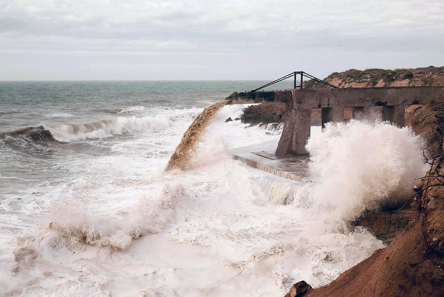
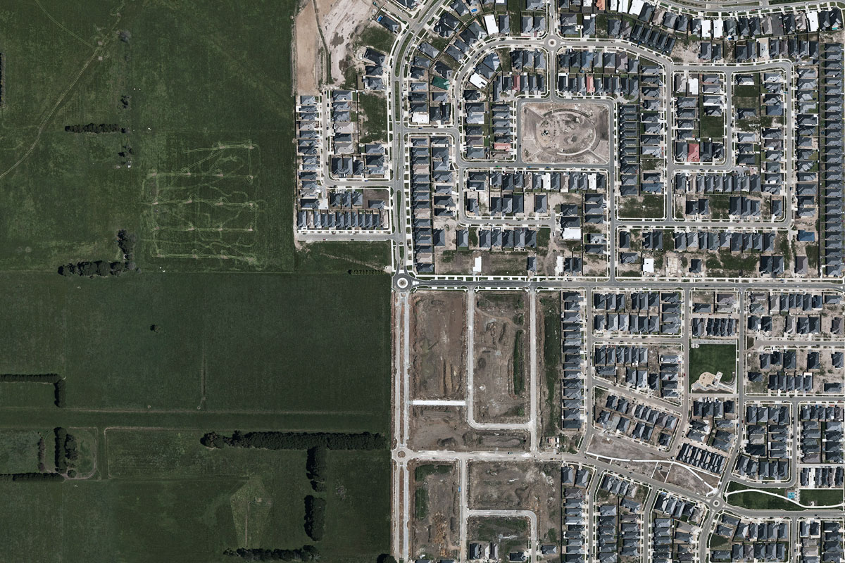


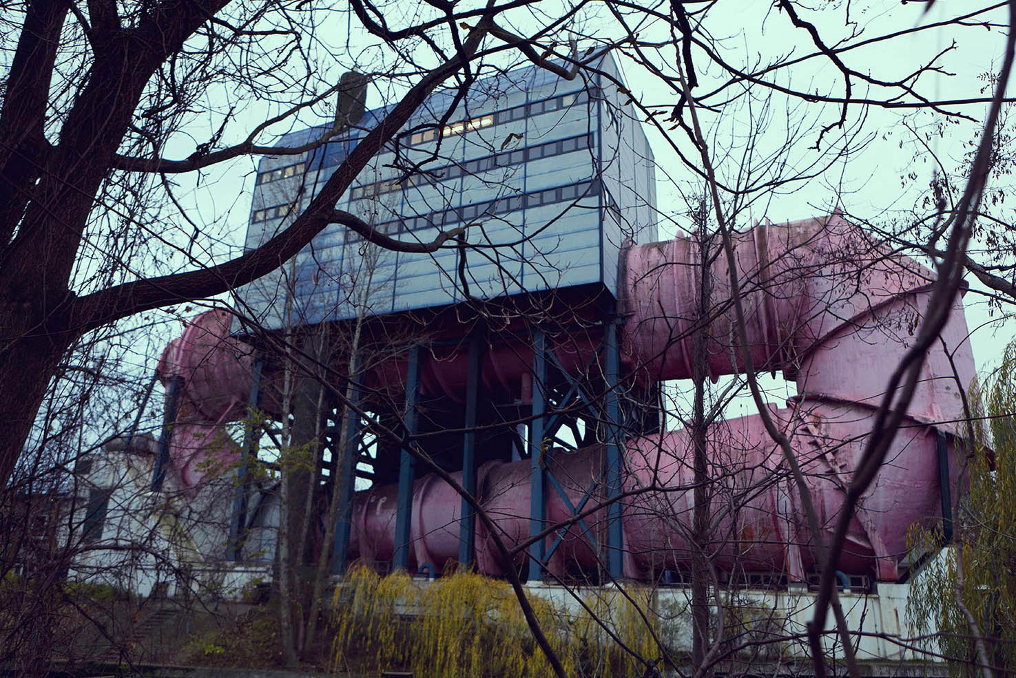
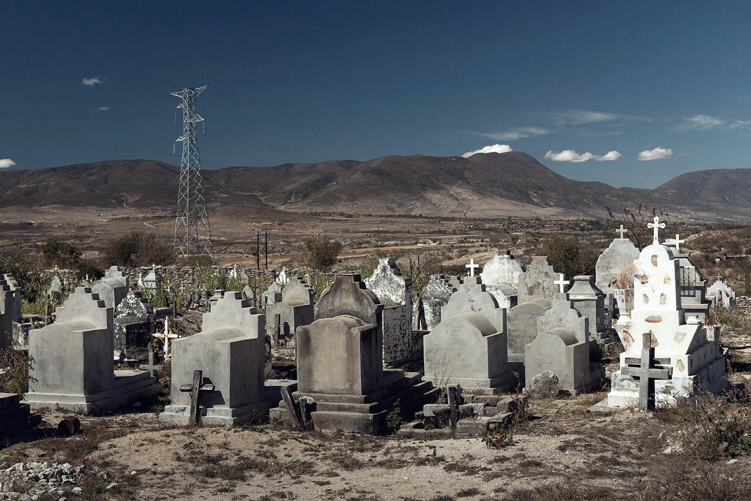
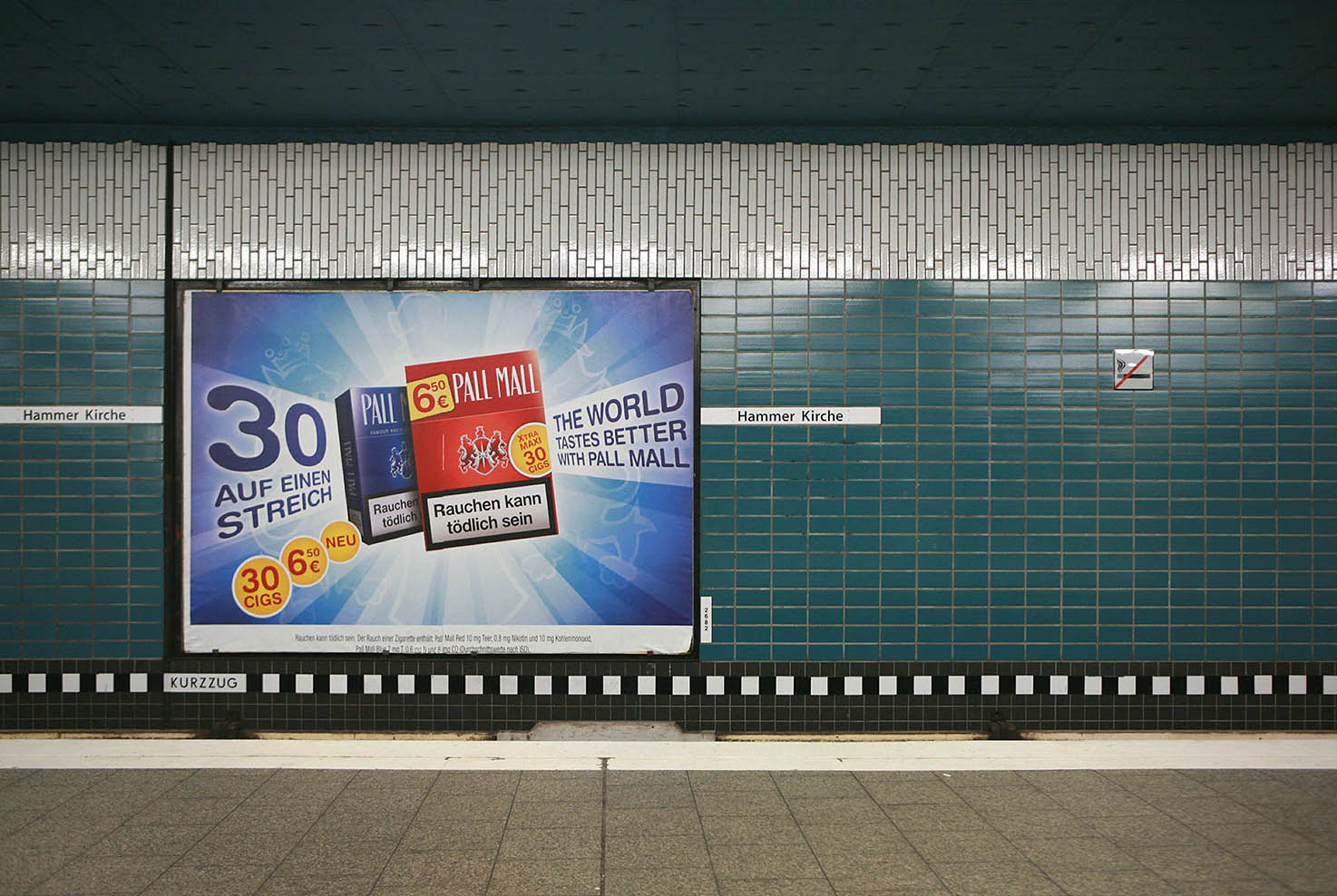

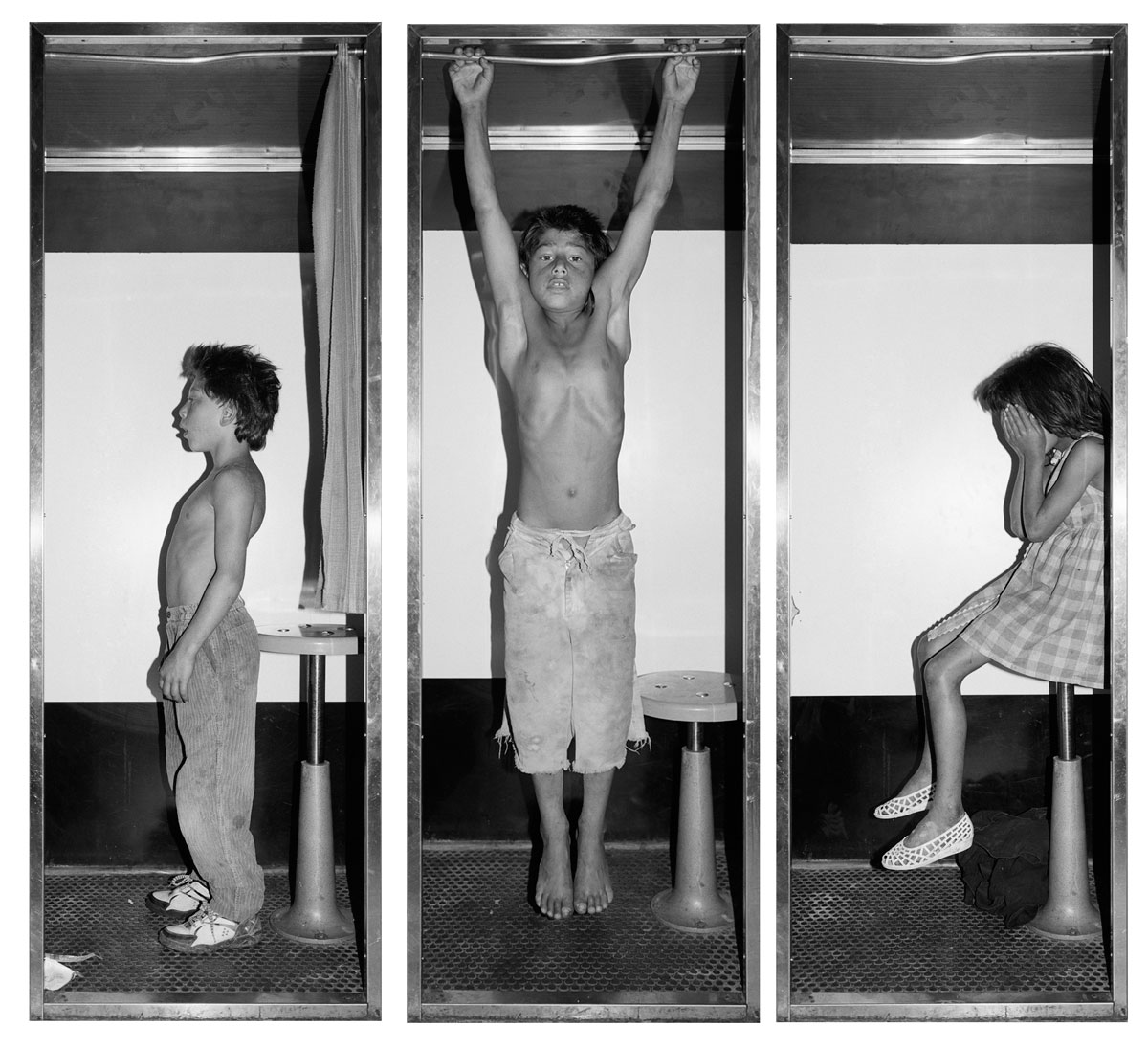


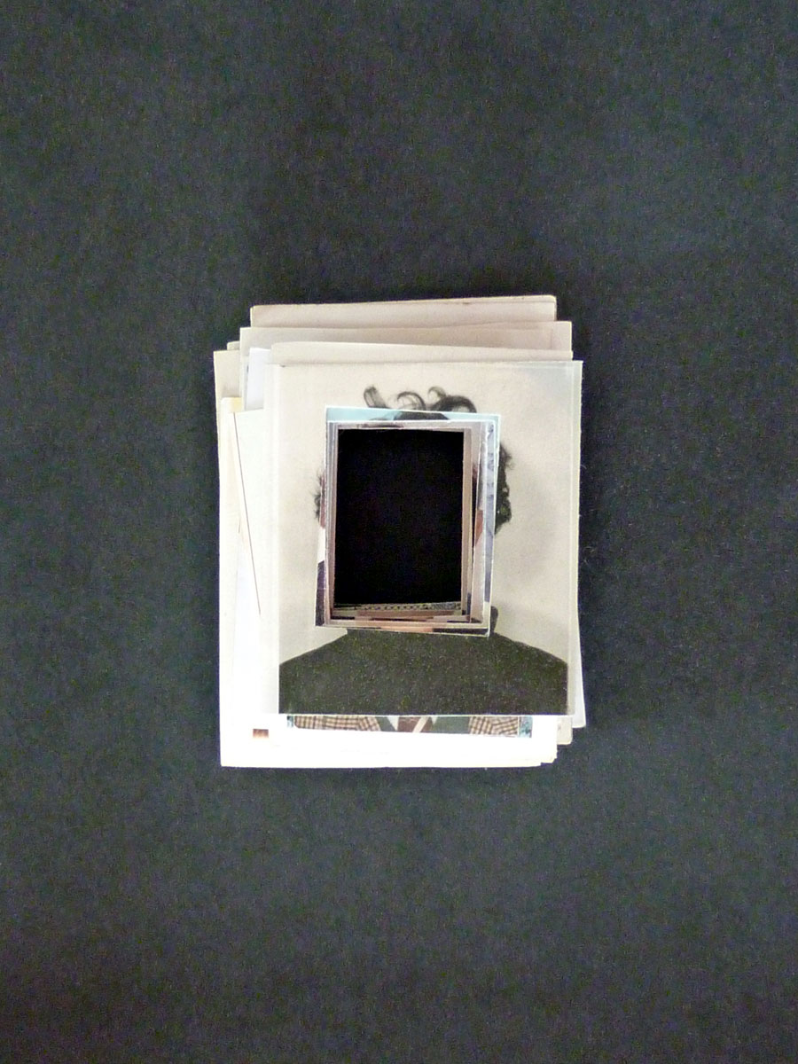


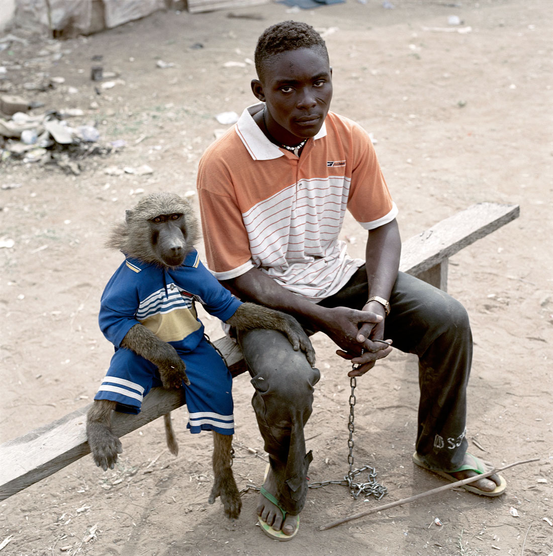


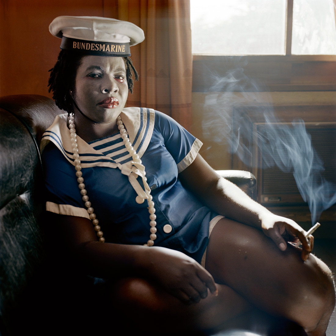


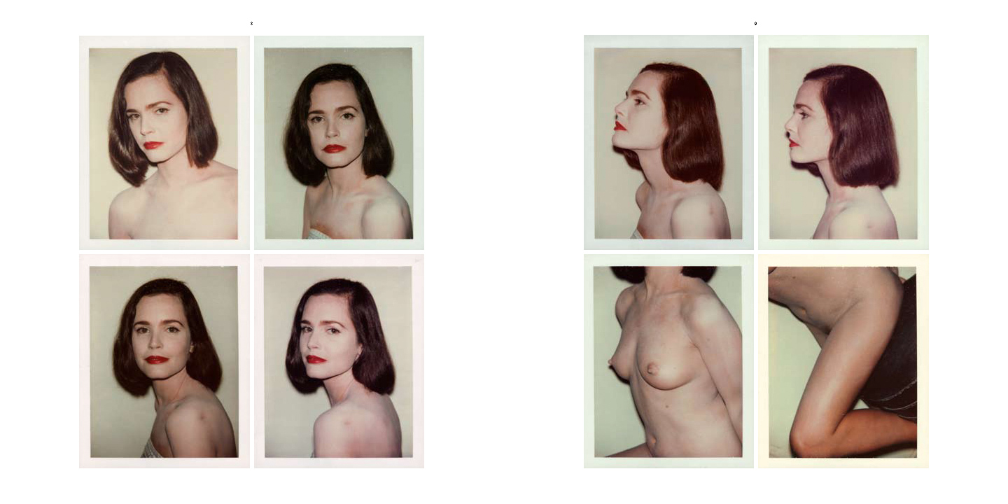
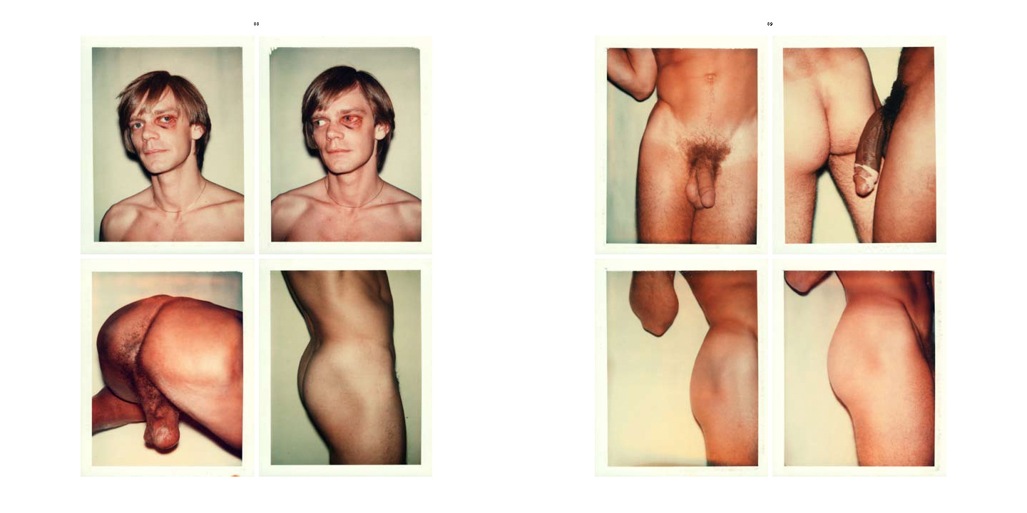


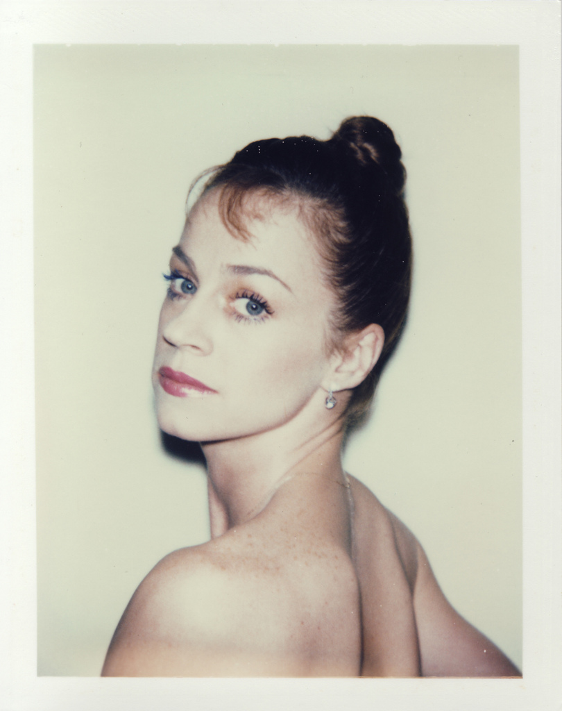
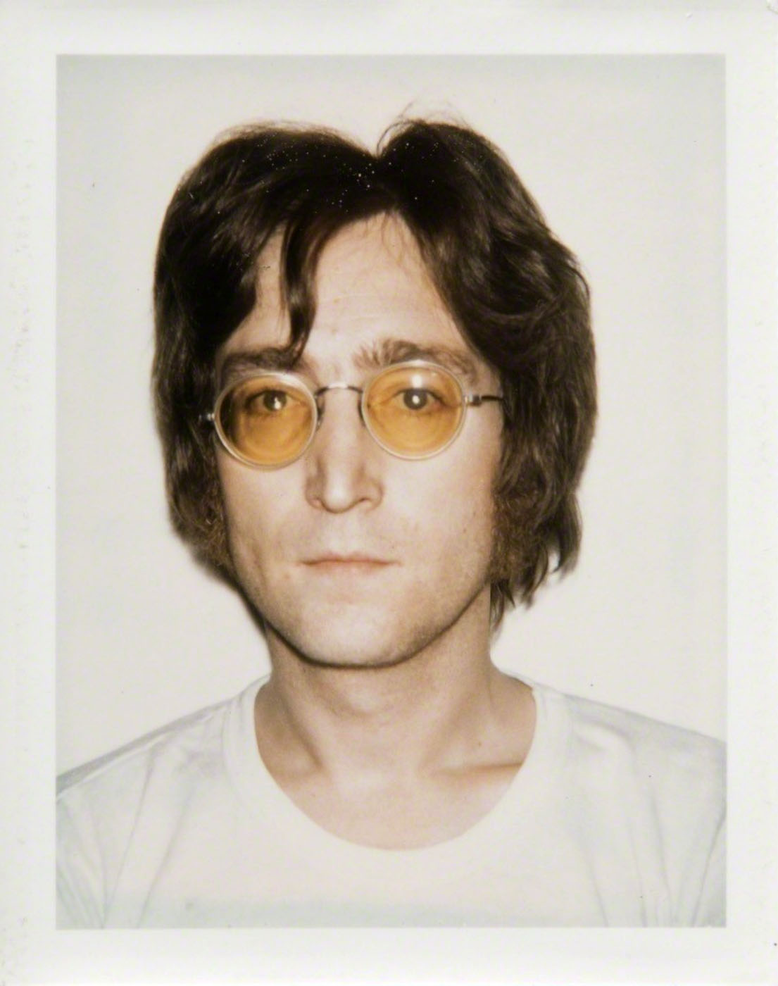
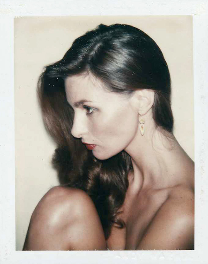
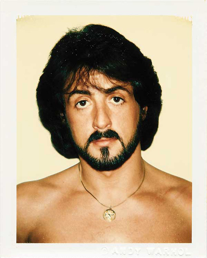
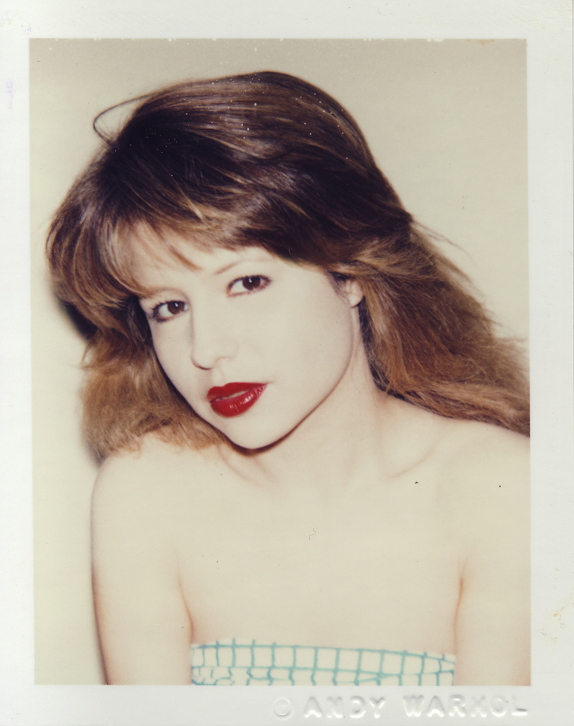
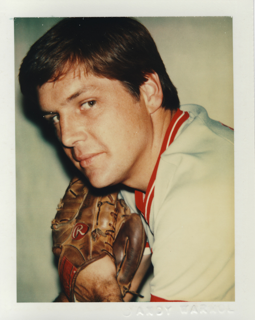
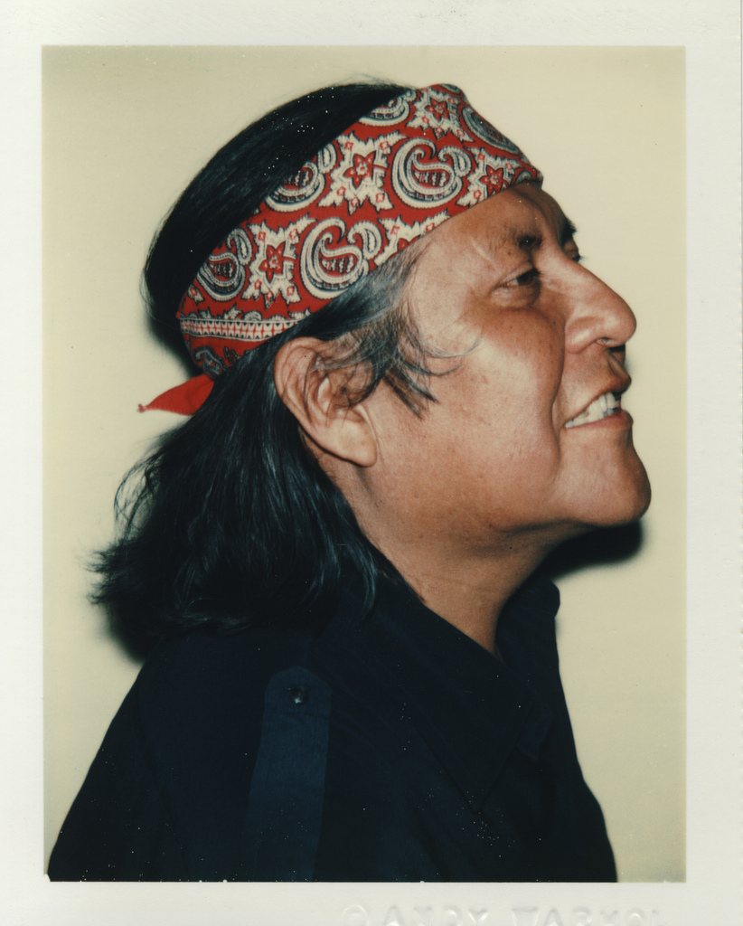

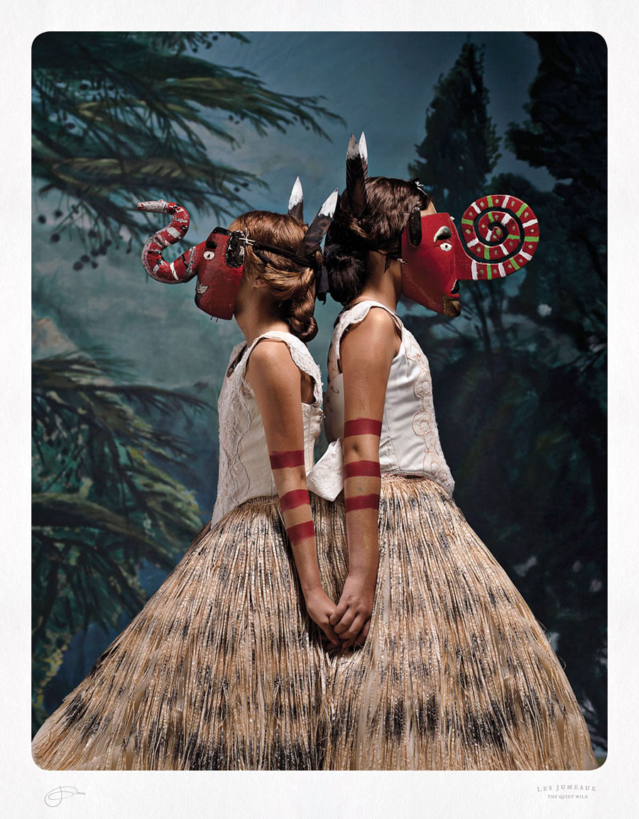
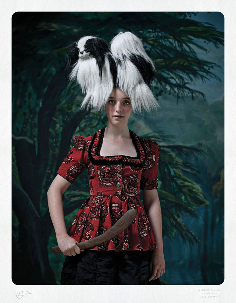
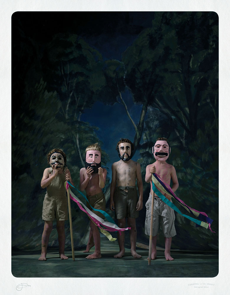
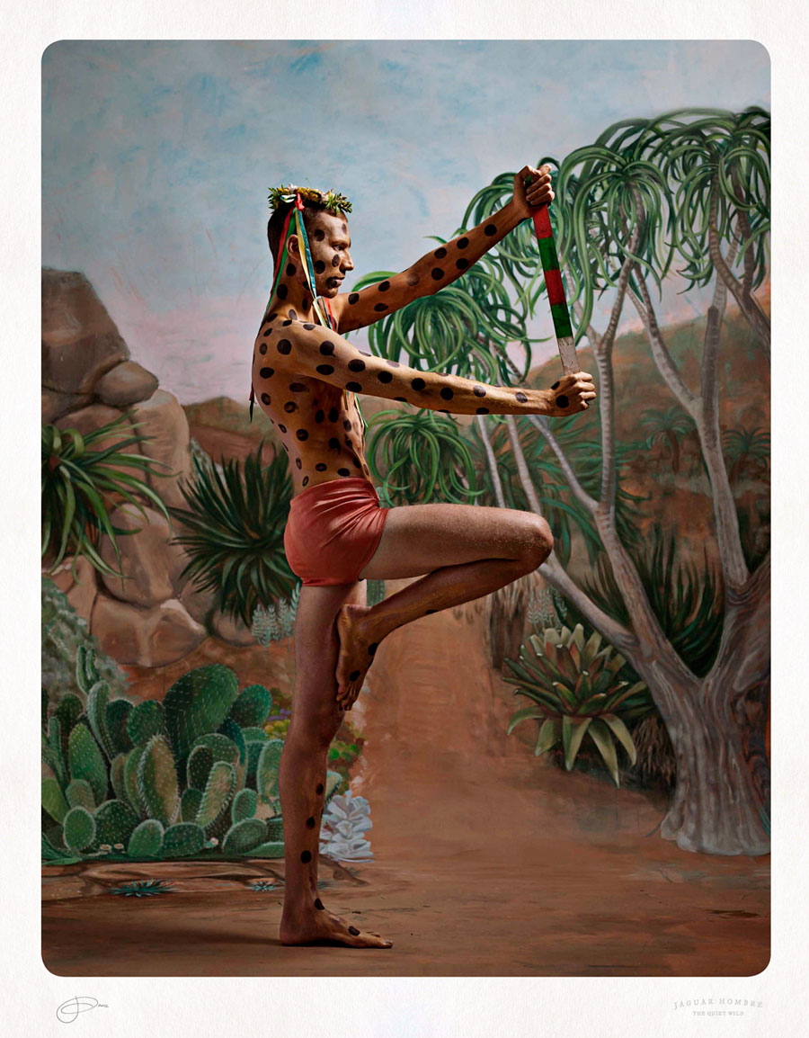

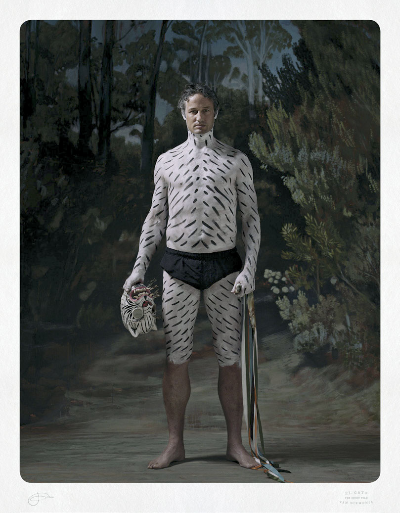
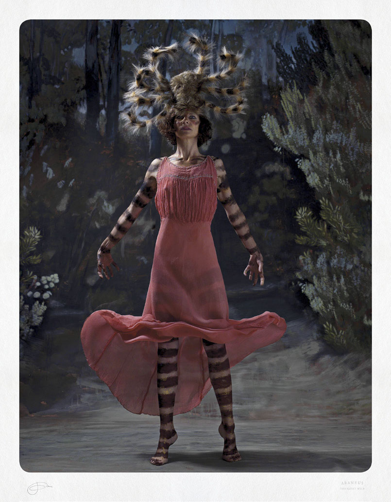
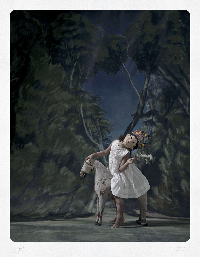
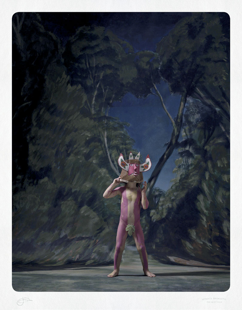
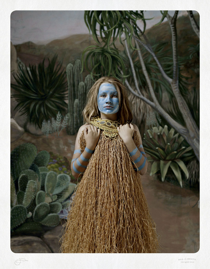


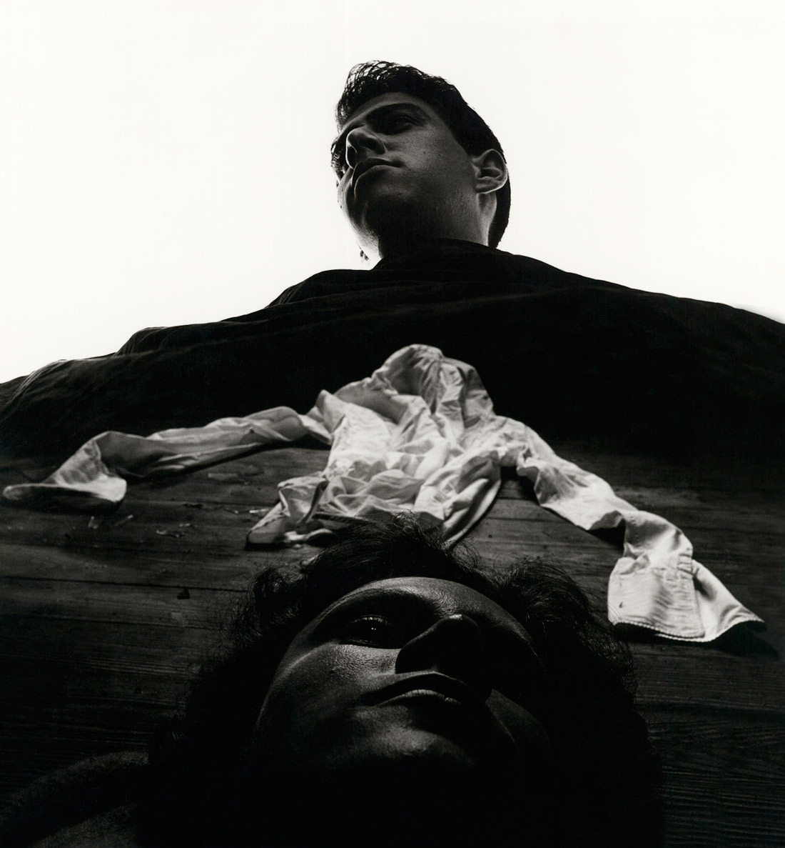


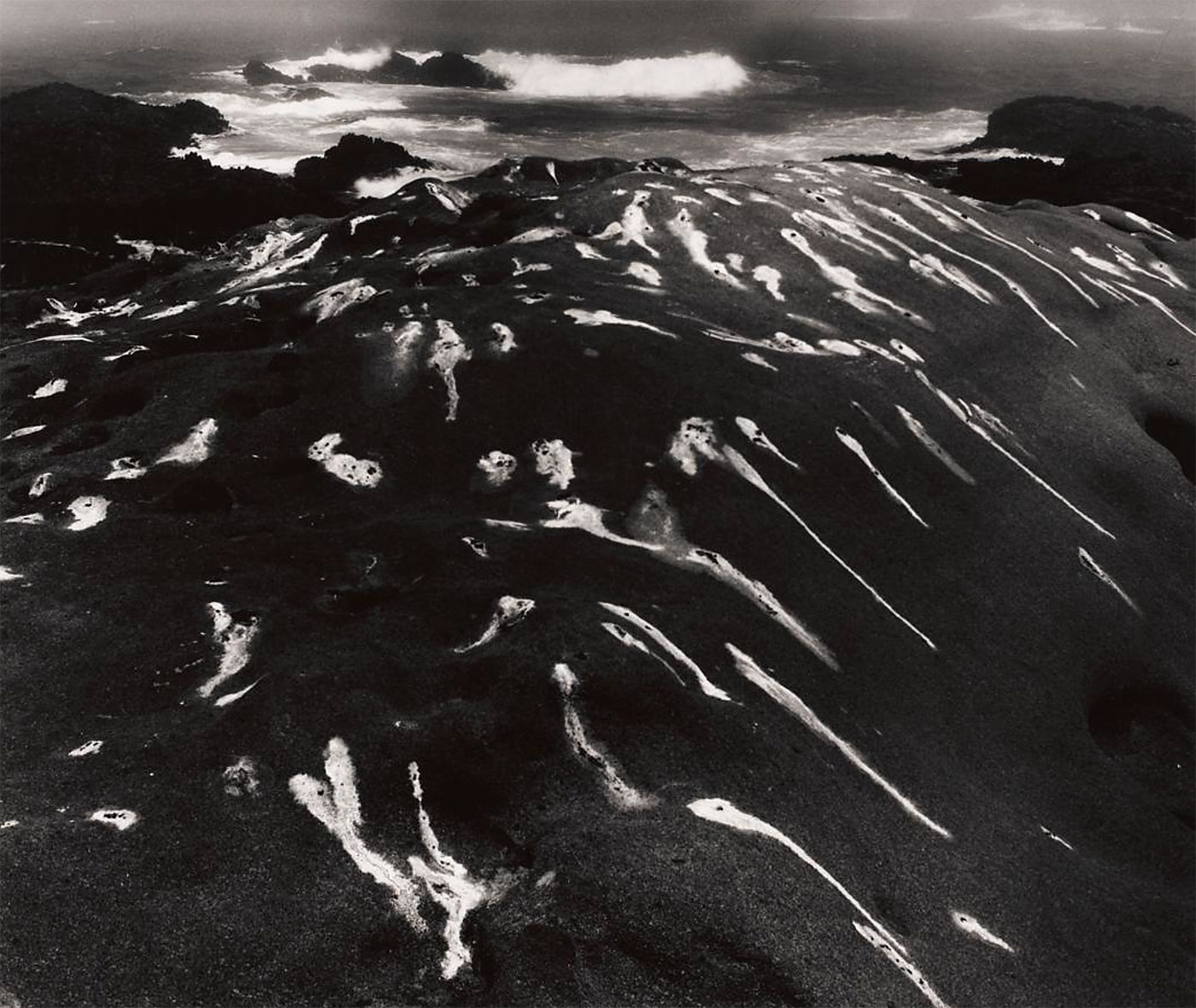
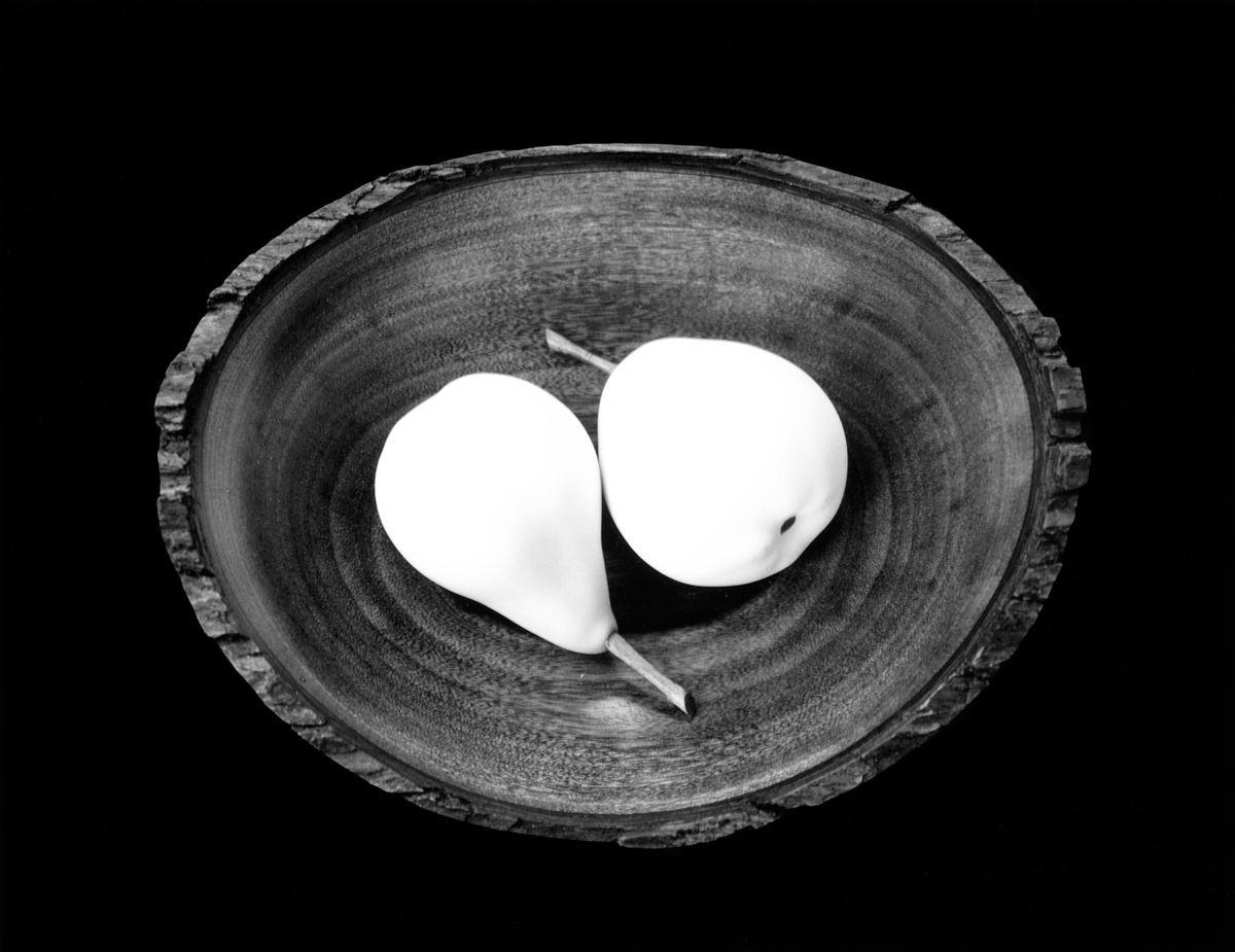
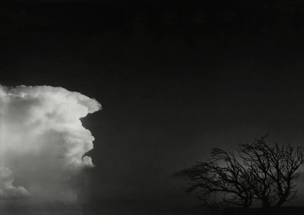


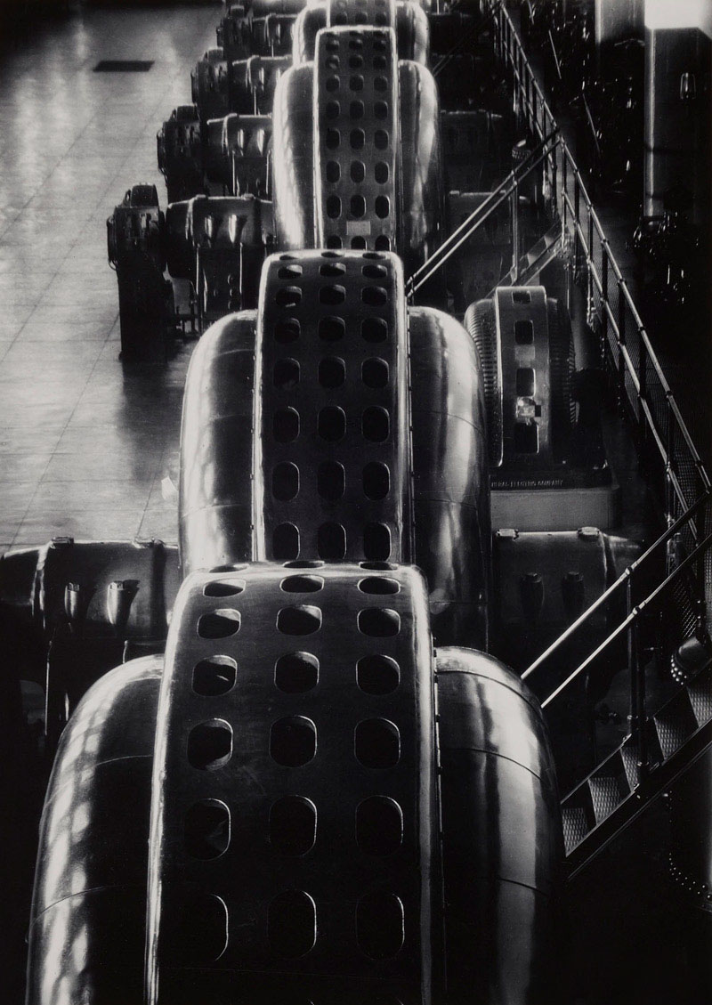

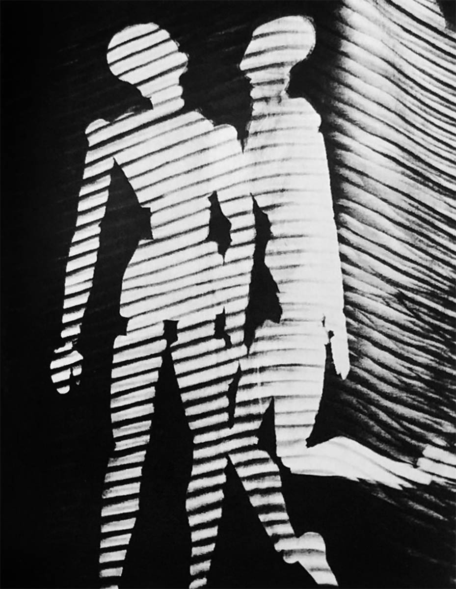

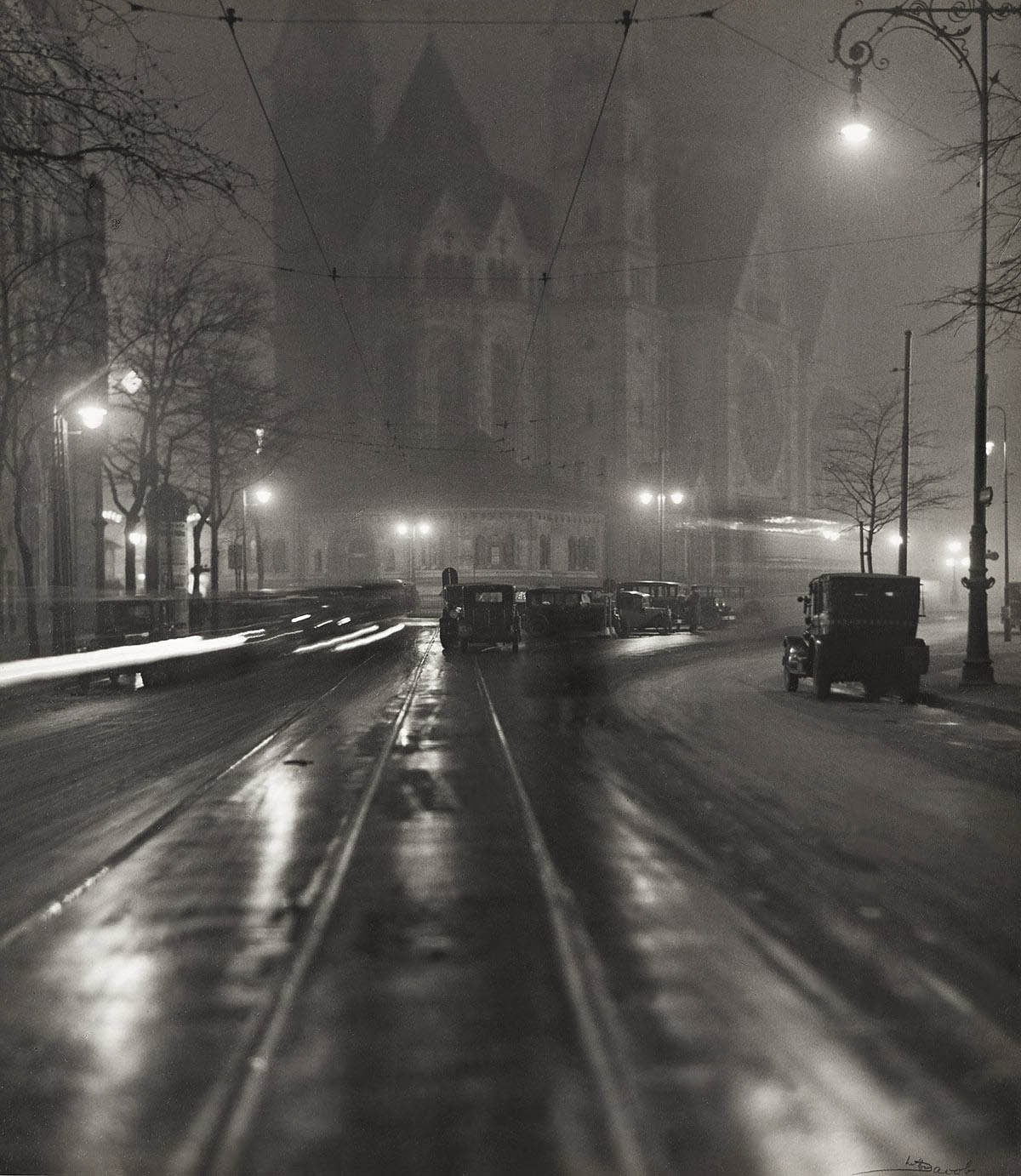


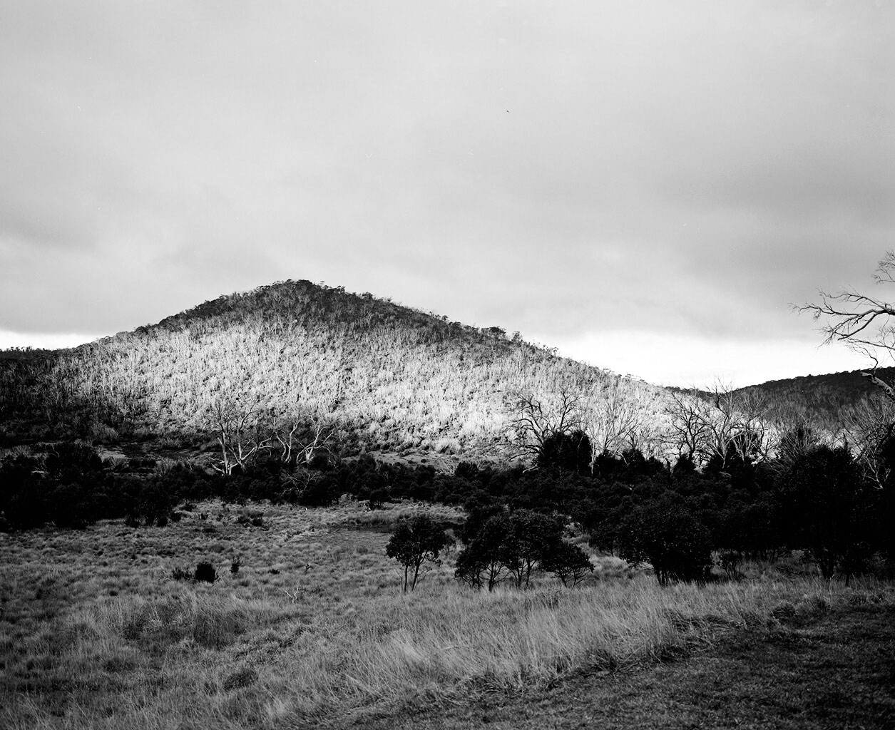
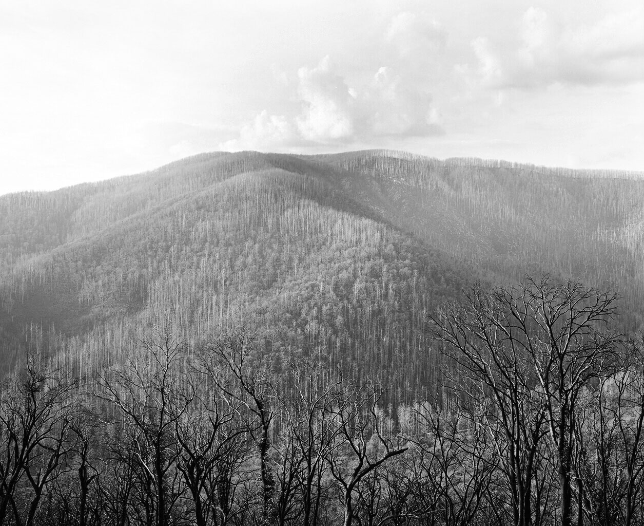
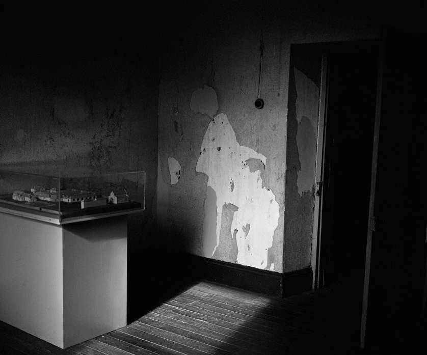
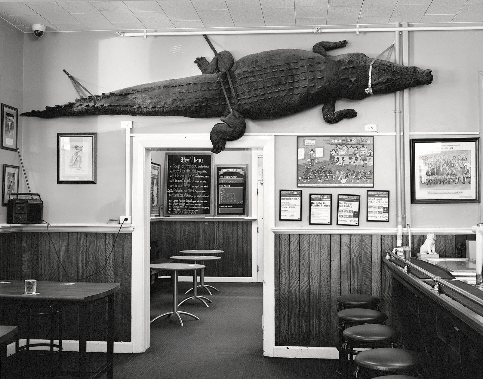
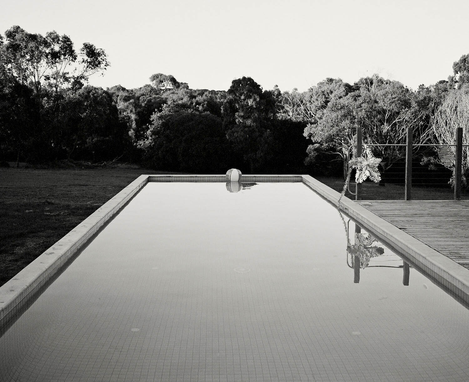
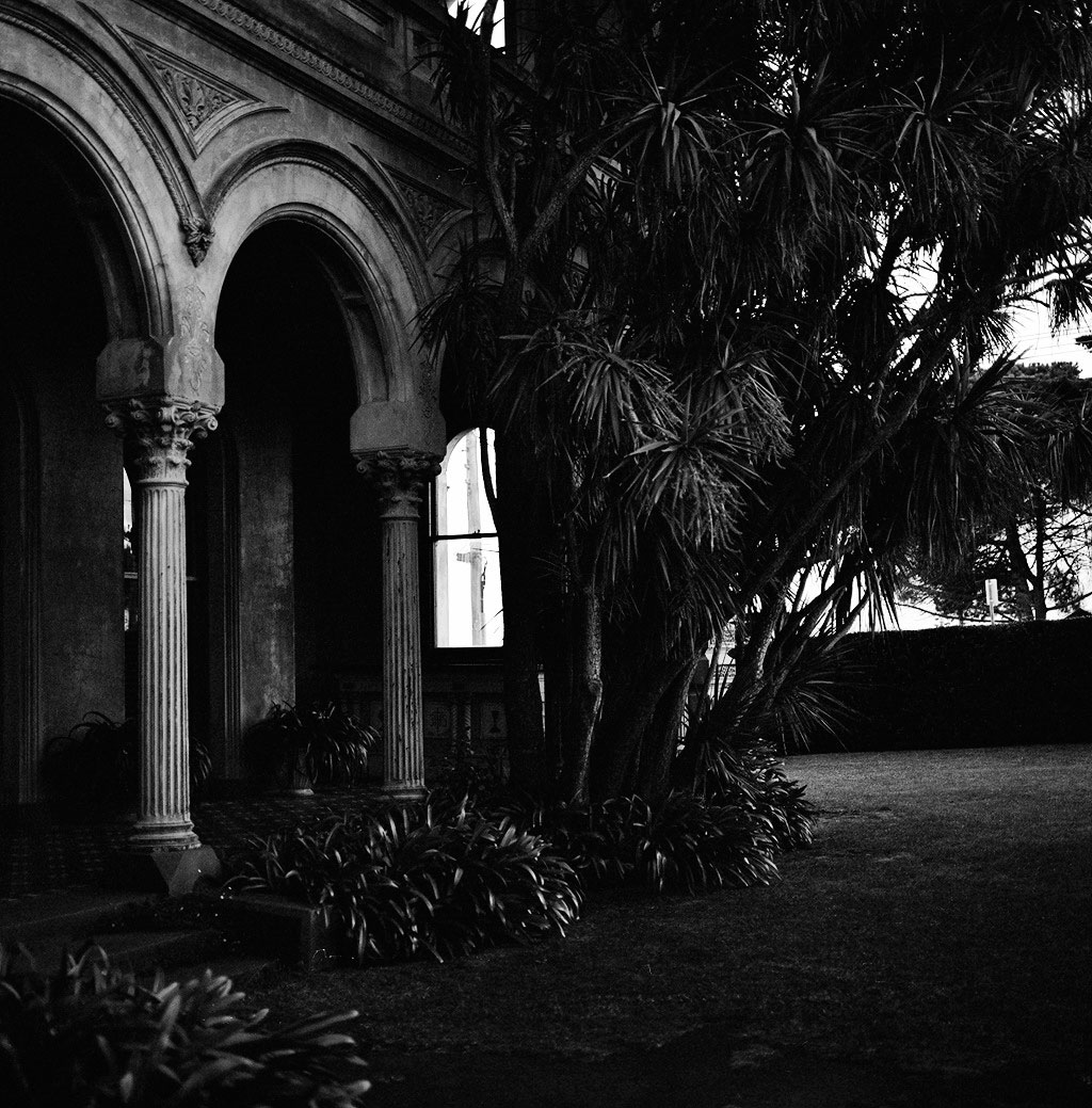


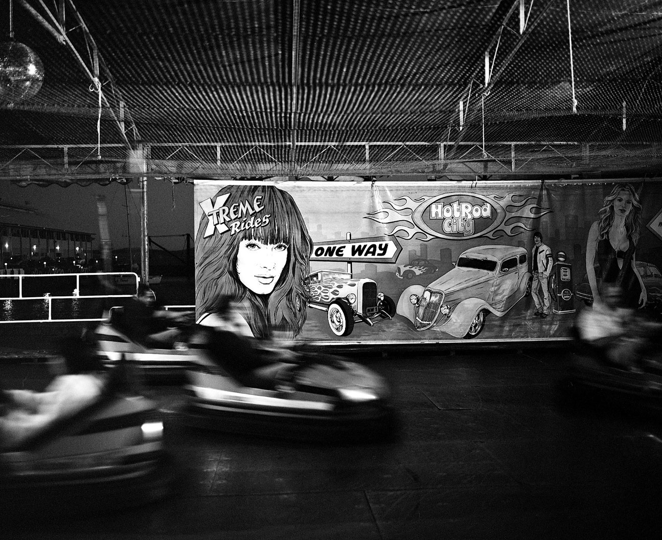

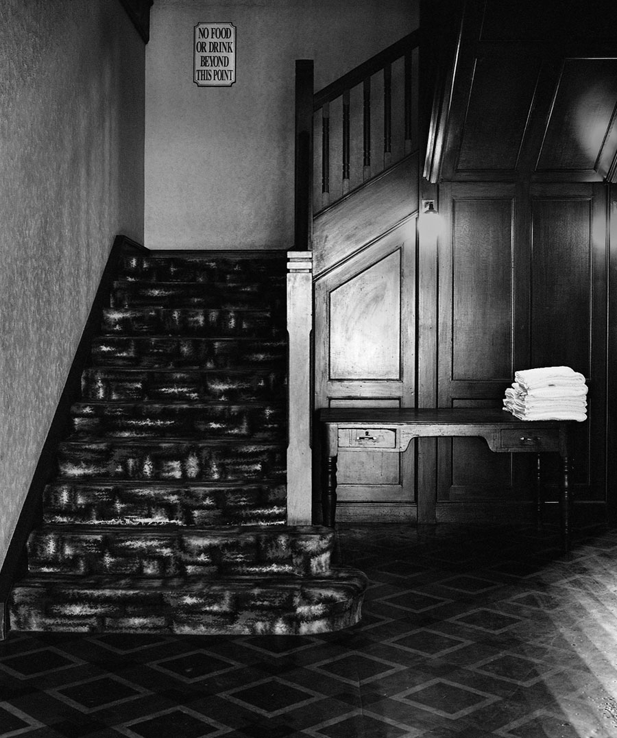

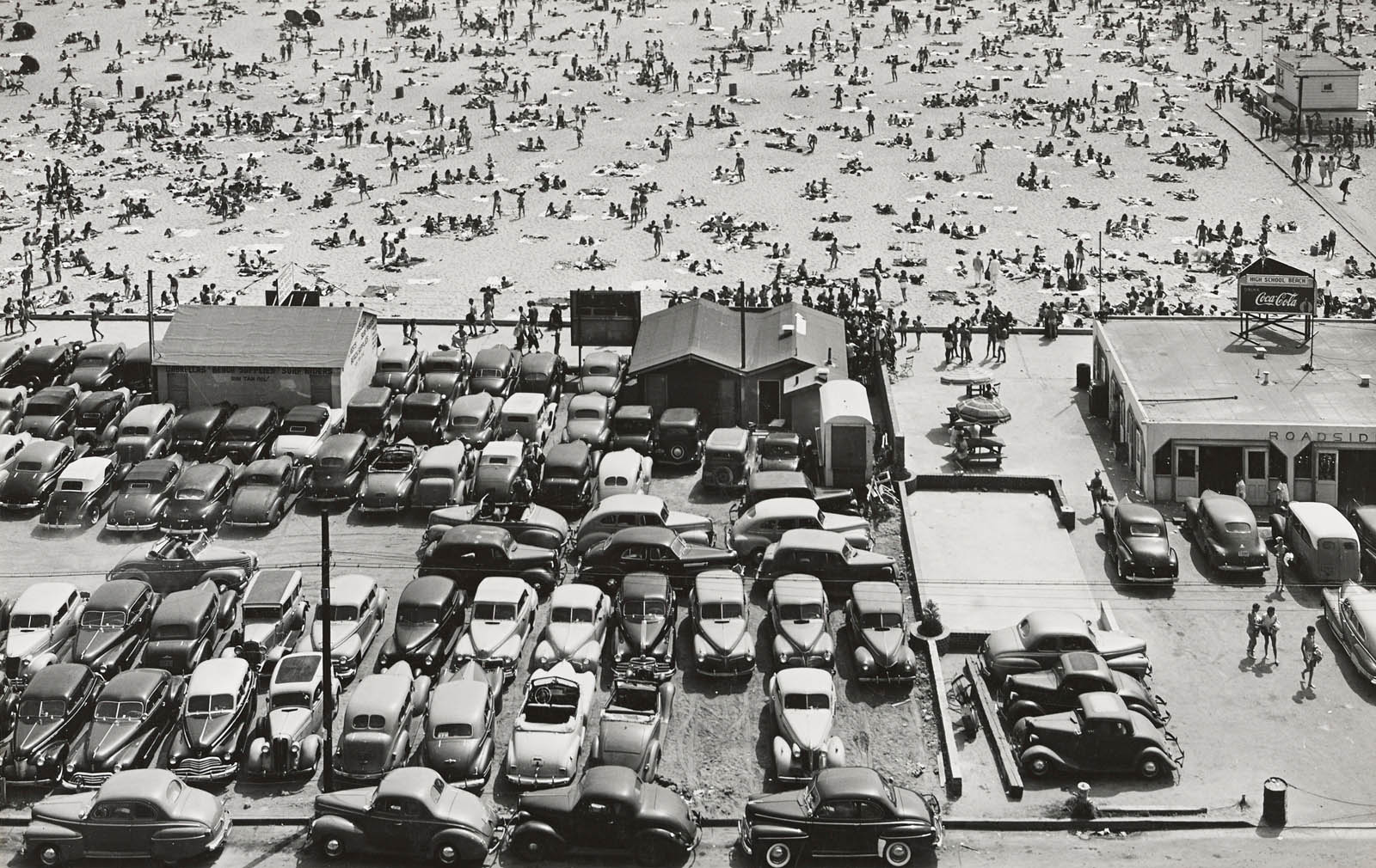
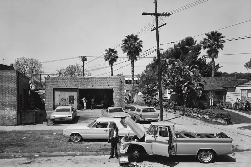

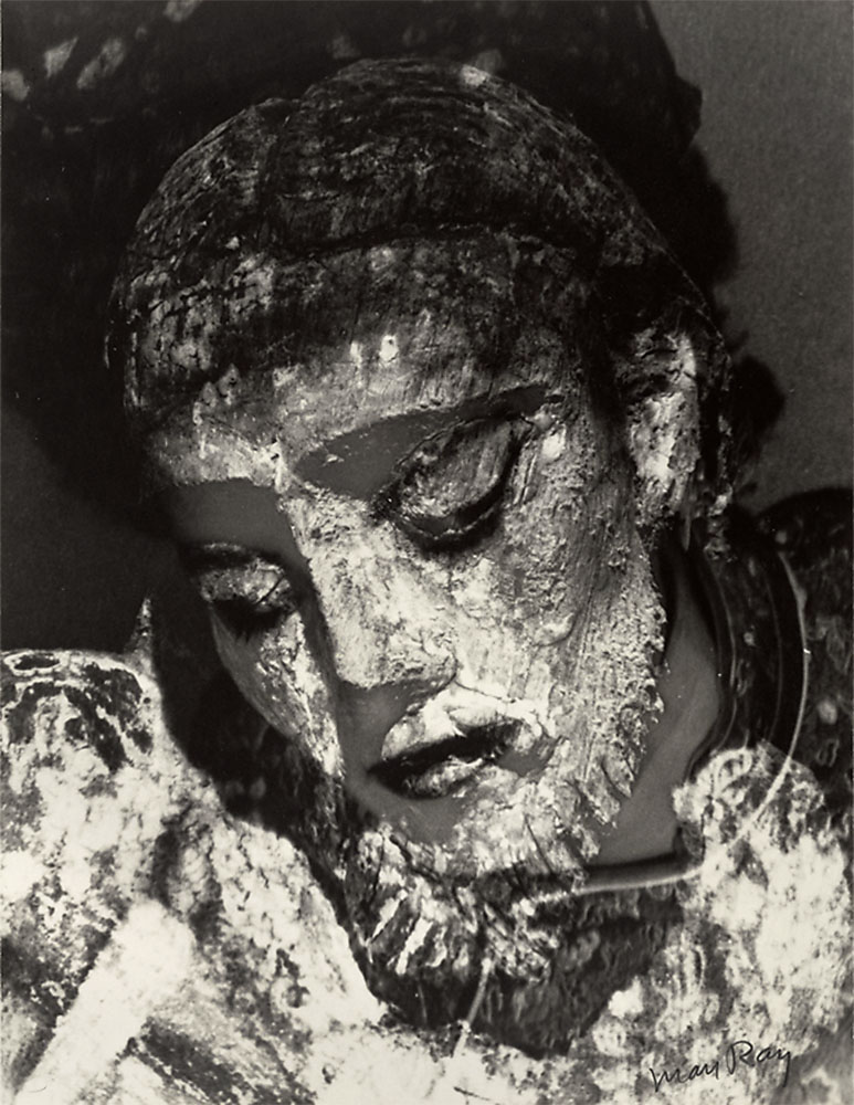
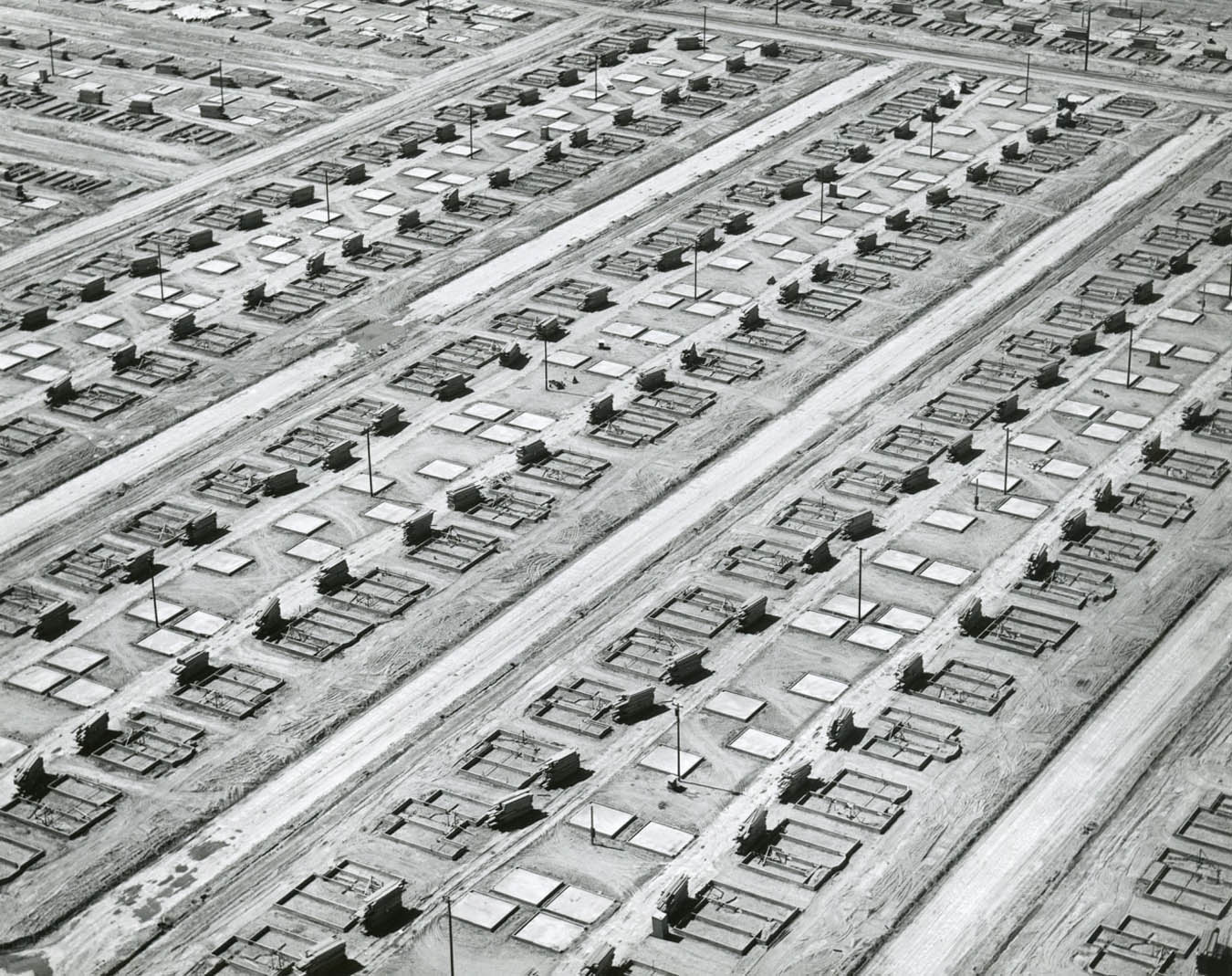
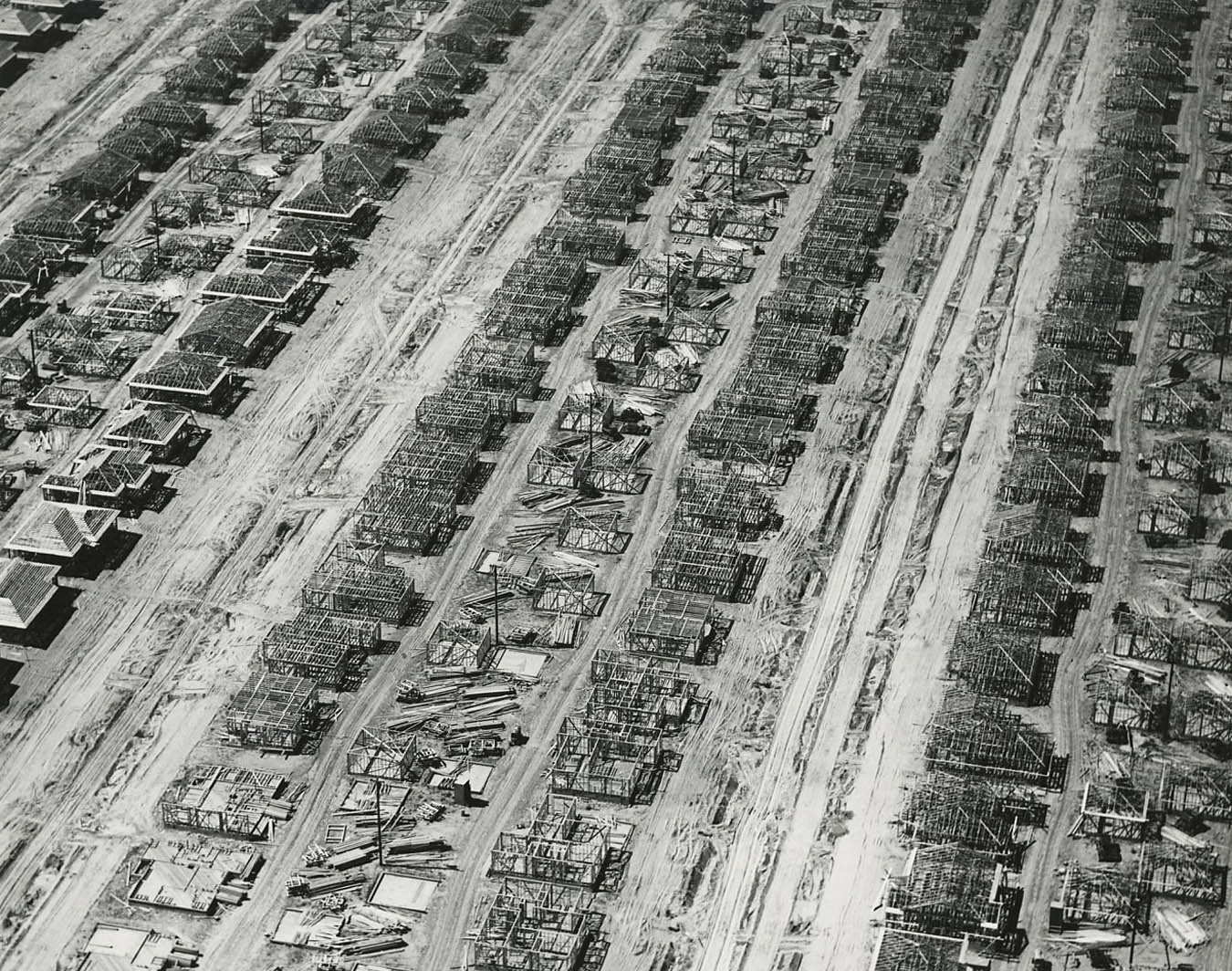
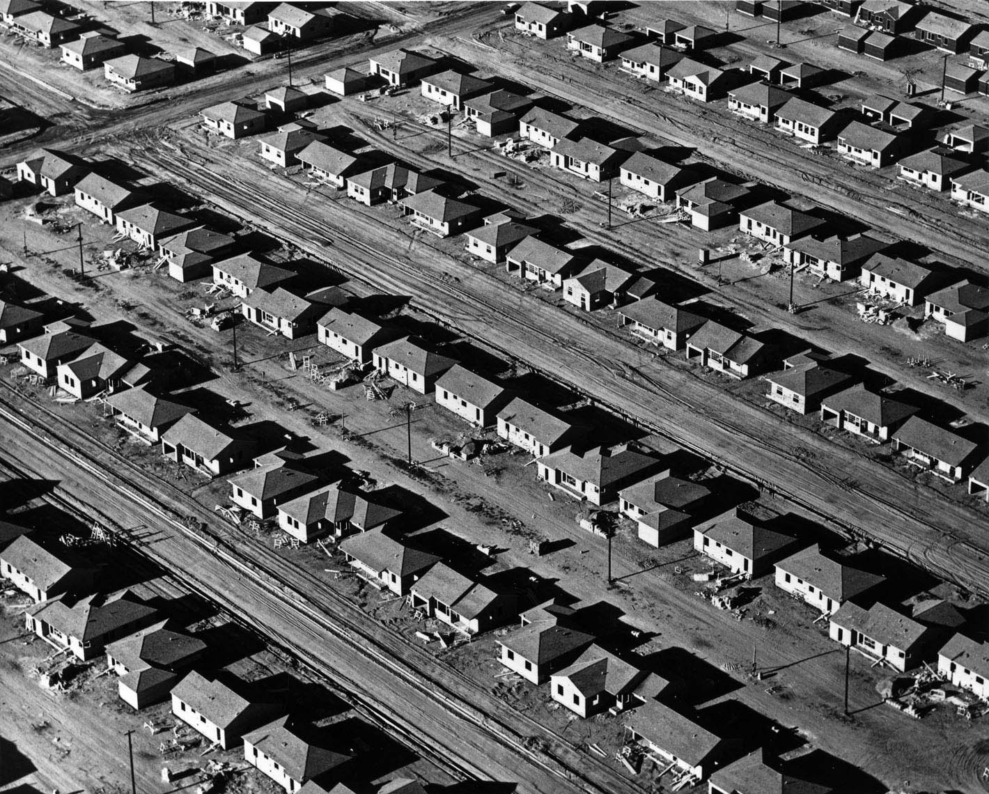
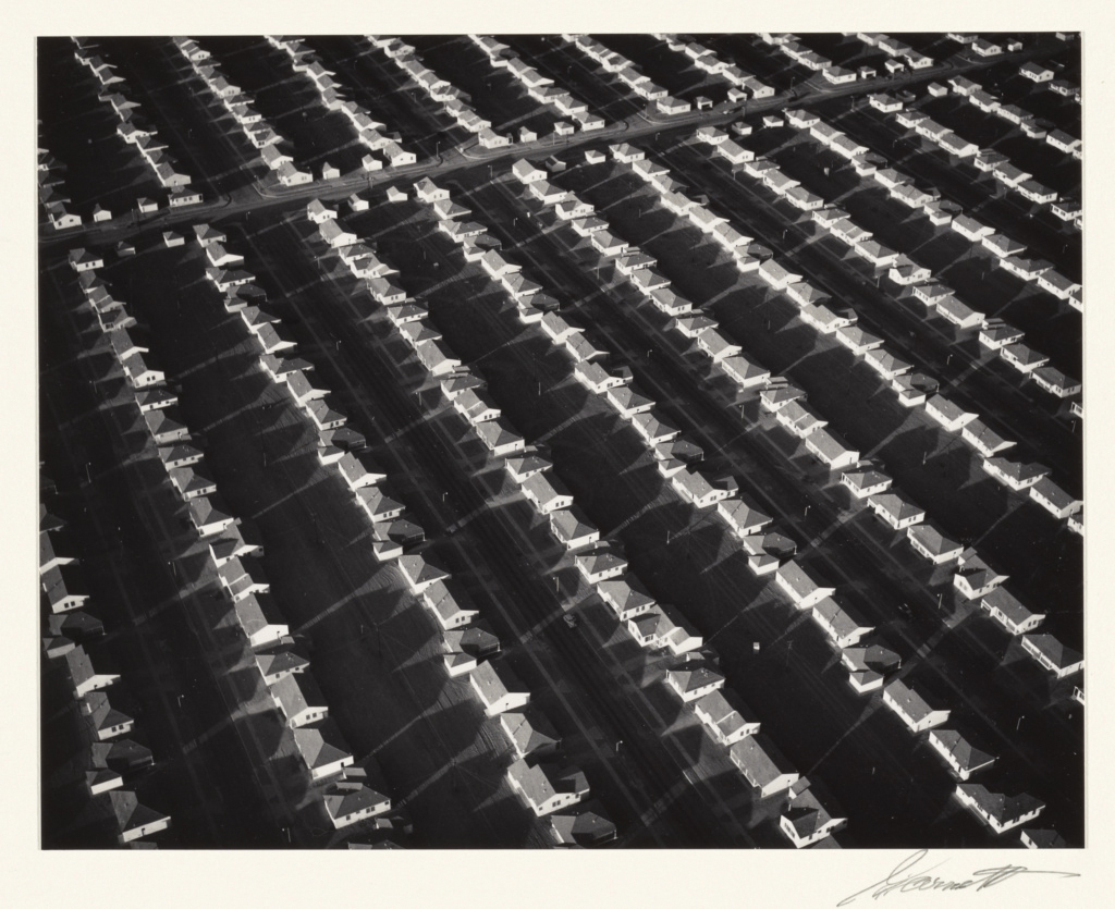
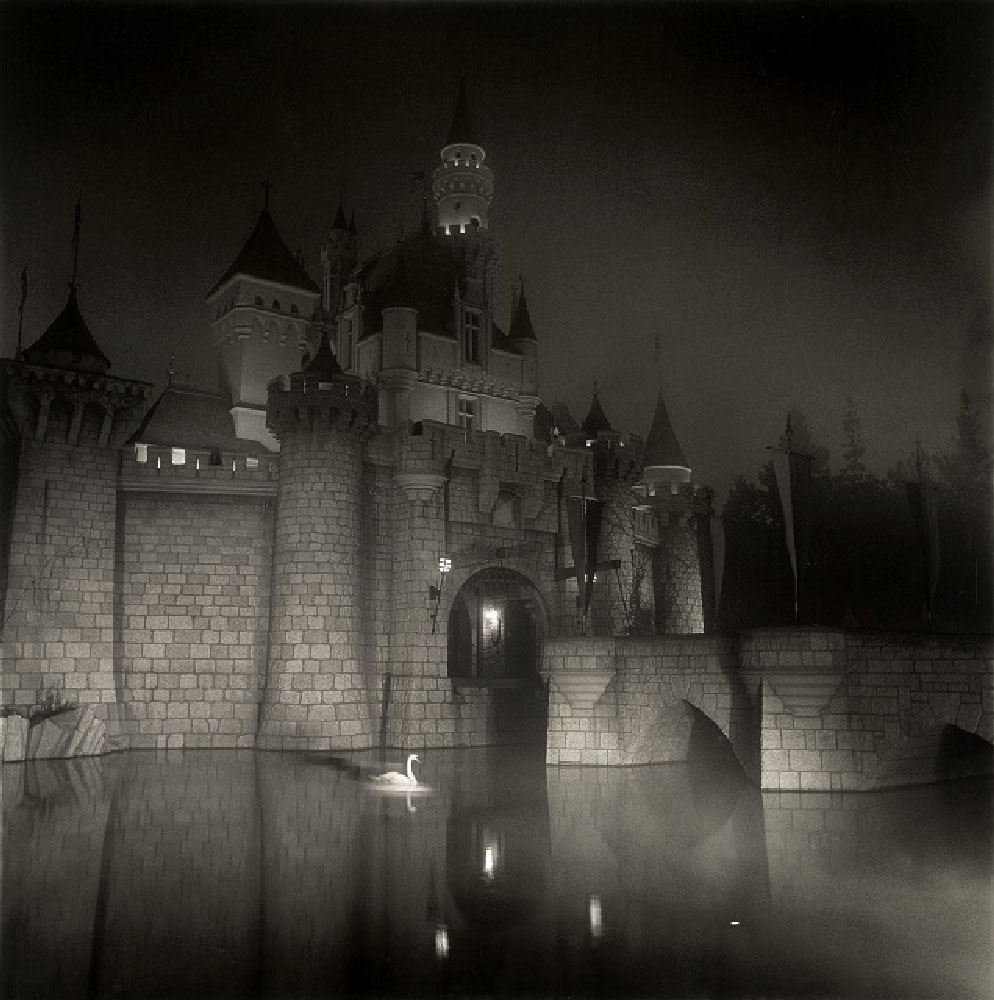
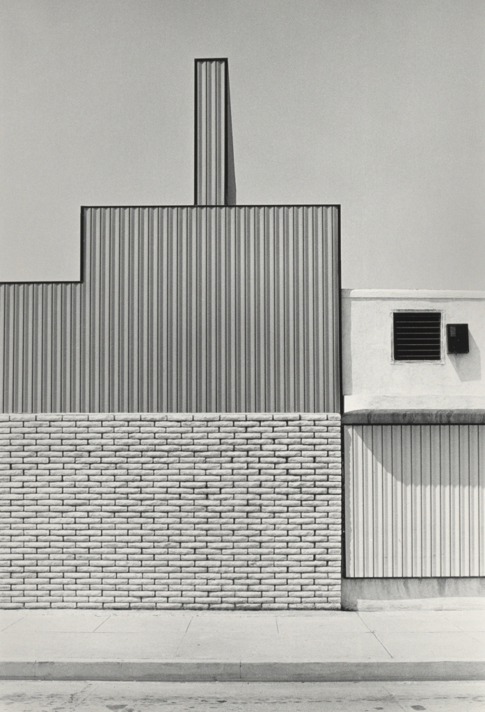

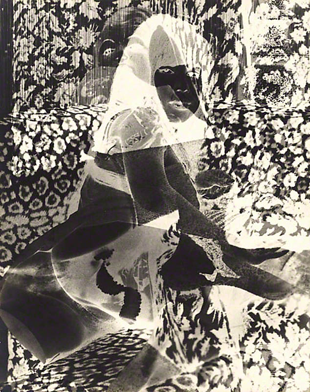




You must be logged in to post a comment.