Exhibition dates: 3rd September, 2011 – 13th May, 2012
Curator: Frauke Eigen
Many thankx to the Kunstmuseum Wolfsburg for allowing me to publish the photographs in the posting. Please click on the photographs for a larger version of the image.
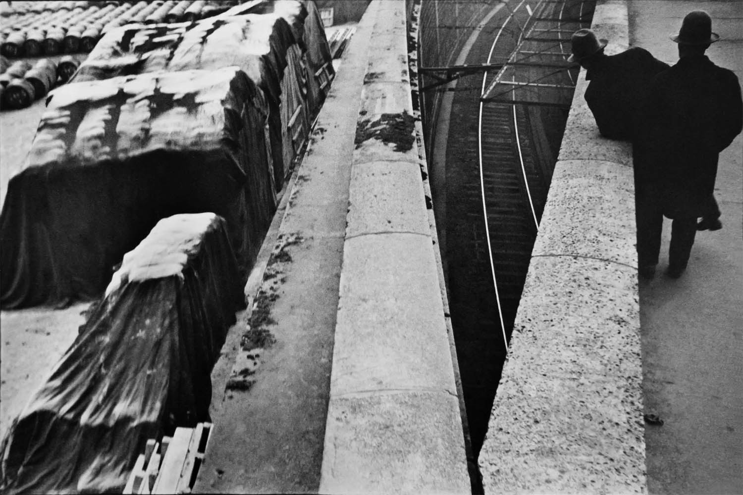
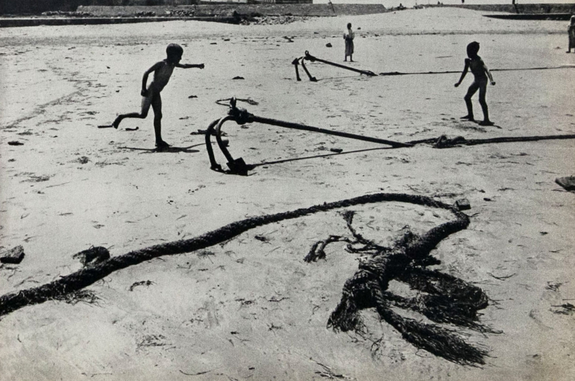
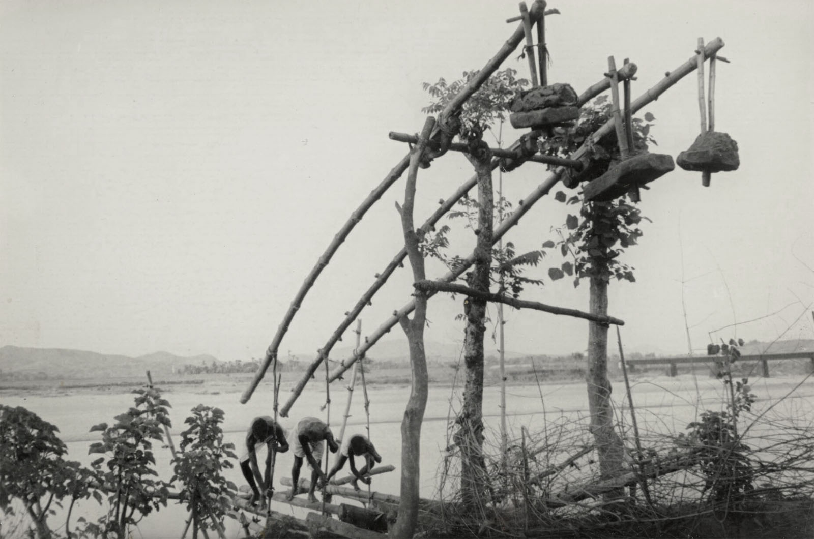
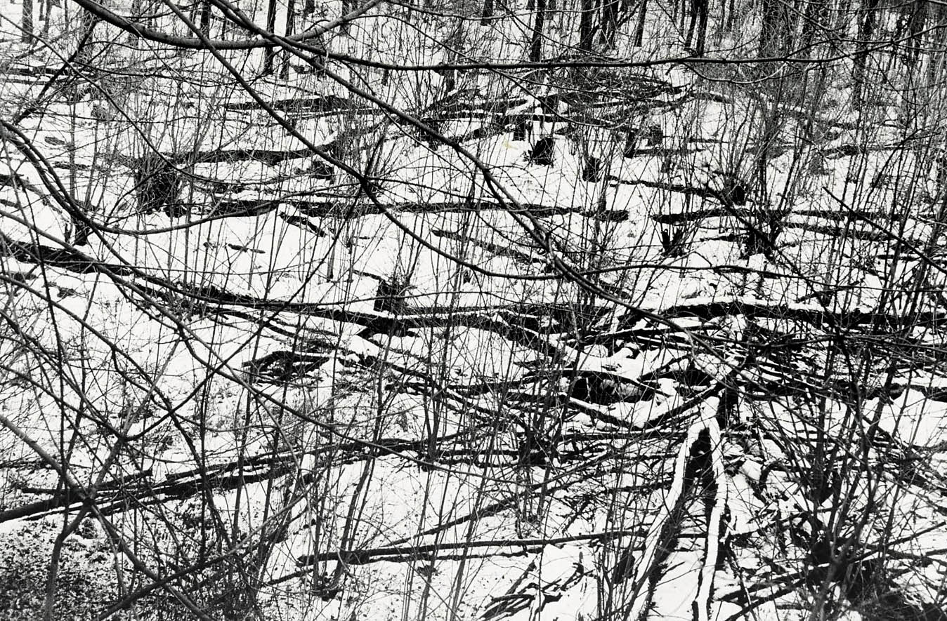
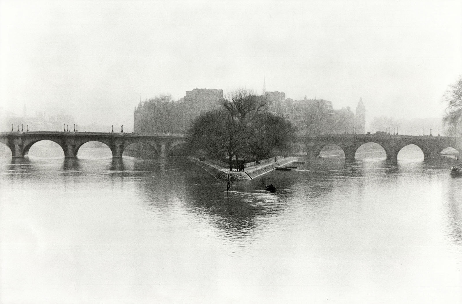
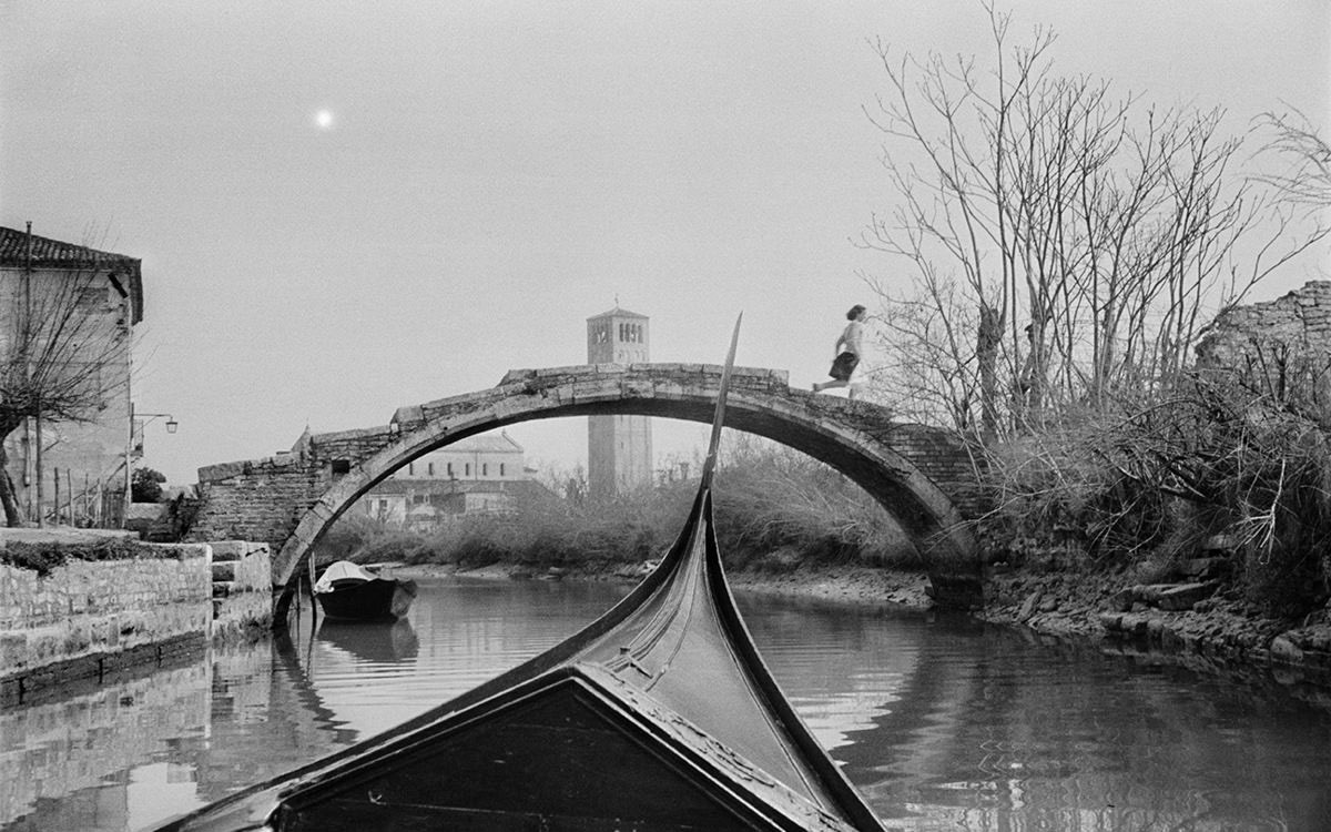
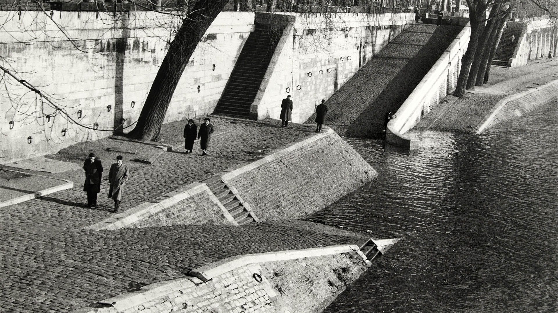
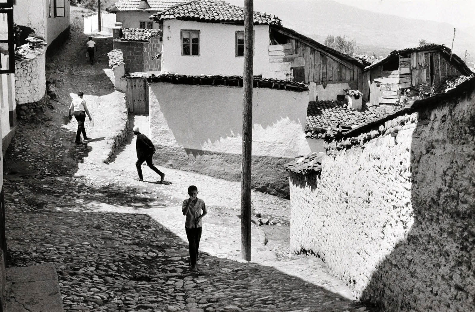
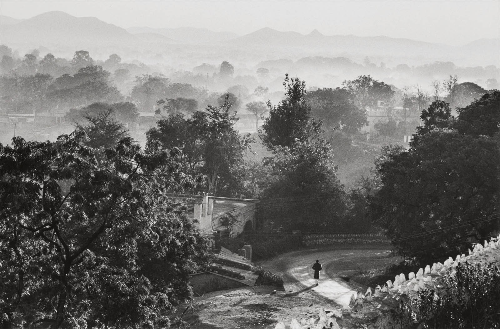
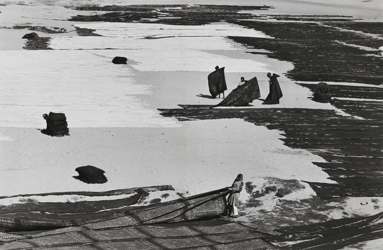
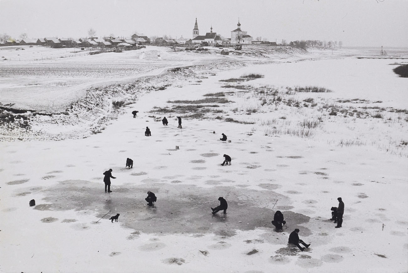
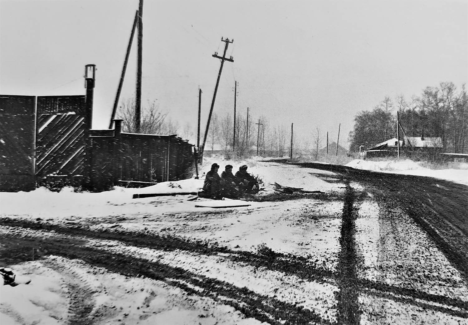
Henri Cartier-Bresson was one of the most accomplished and influential photographers of the 20th century; he was the acknowledged ‘master of the moment’, and many of his images are veritable masterpieces of photographic history. With this exhibition, the Kunstmuseum Wolfsburg is featuring another pioneering figure in its series of shows on great modernist photographers, which has to date included Brassaï (2004), Lee Miller (2006) and Edward Steichen (2008). The around 100 exhibits included in this very personal exhibition were originally compiled by Henri Cartier-Bresson, who died in 2004, under the heading of Paysages (Landscapes). His widow, the photographer Martine Franck, has also agreed to lend a rare group of seven lithographs from her private collection exclusively for this presentation.
Born in 1908 in Chanteloup, near Paris, Henri Cartier-Bresson’s original ambition was to be a painter, but he abandoned his art studies after only a short time. In 1930 he decided to concentrate on photography. He later worked as second assistant to the film director Jean Renoir and also directed a number of his own documentary films. After escaping from a German prisoner-of-war camp on his third attempt in 1943 he joined the French Resistance, and in 1947 he founded the now world-famous Magnum photo agency with four colleagues.
During his photographic career Henri Cartier-Bresson travelled widely through Europe, Mexico, India, China, Indonesia, the United States of America and the former Soviet Union. He always used an inconspicuous Leica rangefinder camera, and it was on these travels between 1933 and 1999 that the black-and-white landscape photographs were created. The impressive simplicity and precise composition of these images give them a meditative quality, and also show how strongly Cartier-Bresson’s photographic practice was influenced and inspired by Far Eastern philosophical concepts. In the mid-1960s Georges Braque had given him the book Zen in the Art of Archery by Eugen Herrigel; for Cartier-Bresson, this short monograph contained all the fundamental elements upon which his photographic aesthetic was based, above all because it described actual experience and dealt with every aspect of human life. It was the chronicle of a learning process, a questioning of the self, the pursuit of inner perfection and the achievement of harmony with the world.
All of Cartier-Bresson’s photographs have a black border around them [Marcus: not all!]. This characteristic feature is an explicit reference to the extreme precision of the photographer’s method, as it tells the viewer that the final image is exactly the same as the negative and has therefore not been cropped. The image was mentally ‘edited’ by the photographer as he took the picture – at the very moment when the shutter opened. His photographs contain all the key components: light and shadow, rigorous composition, the golden section, the element of chance. Using this ‘geometry of the moment’, he combined planes and lines, people and situations into a perfect arrangement.
The exhibition is arranged and constructed according to the principle of geometric composition. The Kunstmuseum commissioned the photo artist Frauke Eigen to design a concept for the presentation of the works. Past Cartier-Bresson exhibitions have always been arranged chronologically, thematically and geographically. Frauke Eigen has developed an innovative installation concept that shows the inner connection between the pictures through formal correspondences for the first time. Over and above the individual picture, the visitor becomes aware of how a design principles returns in the next picture in a modified fashion. The viewer can thus trace an abstract story of vivid forms from the first to last photograph, experiencing in the process something about the unique language of Henri Cartier-Bresson.
As a photographer, Cartier-Bresson’s style was marked by discretion and extreme sensitivity. He was also an incredibly self-effacing person: he rarely gave interviews and hated being photographed. In 1947, the Museum of Modern Art in New York even planned a large posthumous retrospective of his work, as they believed that he had been killed in the war. When Cartier-Bresson heard about this he decided to travel to the United States, and the exhibition was subsequently held with the artist present. The Frenchman loved stories like this.
Around 1973, at the height of his fame, Henri Cartier-Bresson abandoned photography and from then on only picked up his camera on rare occasions. Returning to his artistic roots, he devoted his time and energy to drawing, concentrating mainly on landscapes. He regarded this as merely a change in terms of ‘technique’, as his drawings were created with the same eye, the same sense of form and geometry as his photographs. For him, photography was an immediate action, whereas drawing was a form of meditation.
Sam Szafran, a painter and friend of Cartier-Bresson’s, once said to him: “In order to go fast you have to proceed very slowly. You have to observe, see how things occur, understand them, feel them, otherwise you will run into danger…”
In this sense, the exhibition The Geometry of the Moment,which has been organised in cooperation with the photo agency Magnum Photos, Paris and with the foundation HCB, Paris, forms the perfect complement to the large-scale thematic display The Art of Deceleration. Motion and Rest in Art from Caspar David Friedrich to Ai Weiwei, which will be shown in a parallel presentation at the Kunstmuseum Wolfsburg from 12 November 2011 onwards.
Press release from the Kunstmuseum Wolfsburg website
Marcus Bunyan (Australian, b. 1958) Two faces 1991 Gelatin silver print
I am scanning my negatives made during the years 1991-1997 to preserve them in the form of an online archive as a process of active memory, so that the images are not lost forever. These photographs were images of my life and imagination at the time of their making, the ideas I was thinking about and the people and things that surrounded me.
Photographs are available from this series for purchase. As a guide, a vintage 8″ x 10″ silver gelatin print costs $700 plus tracked and insured shipping. For more information please see my Store web page.
Marcus Bunyan (Australian, b. 1958) Fred and Andrew smoking a joint in Paris 1992 Gelatin silver print
Marcus Bunyan (Australian, b. 1958) Unknown landscape 1991-1992 Gelatin silver print
Marcus Bunyan (Australian, b. 1958) Base 1991 Gelatin silver print
Marcus Bunyan (Australian, b. 1958) Shower room, Punt Road, South Yarra 1991 Gelatin silver print
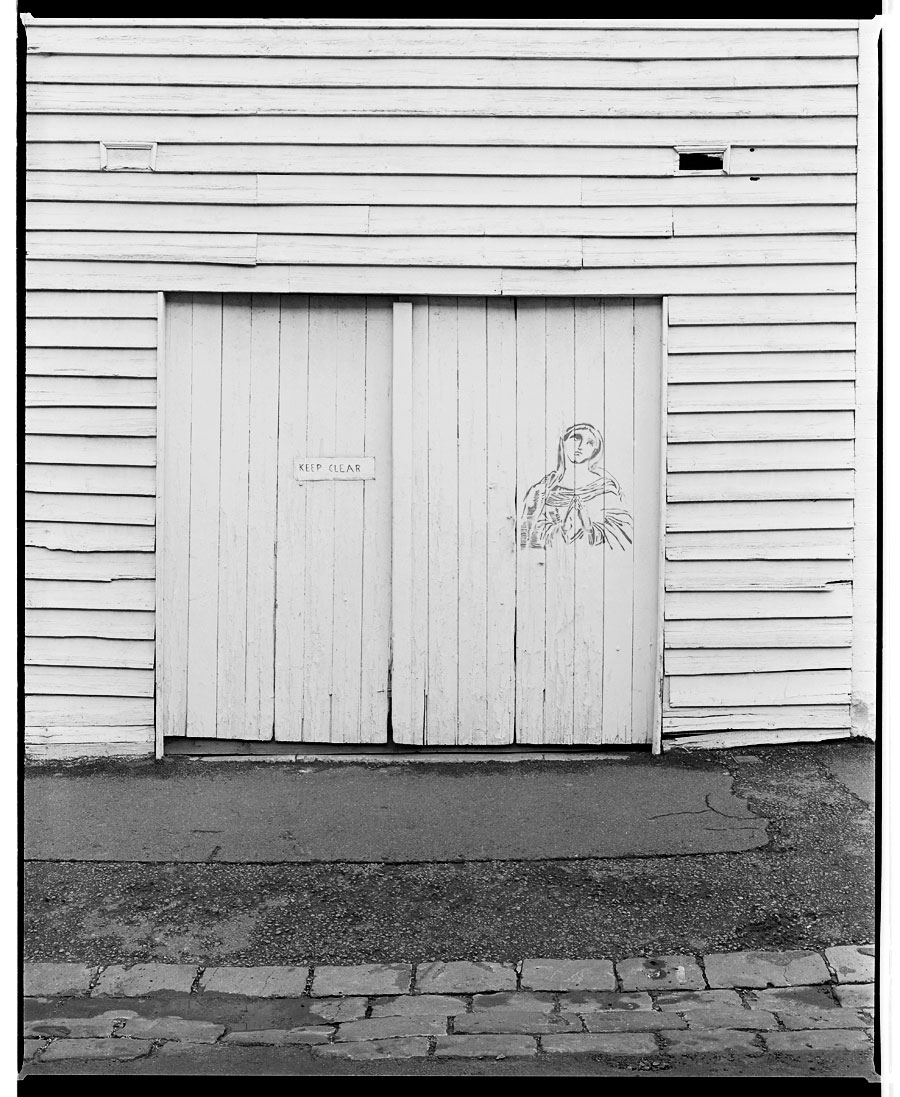
Marcus Bunyan (Australian, b. 1958) Keep Clear, Virgin Girl 1992 Gelatin silver print
Marcus Bunyan (Australian, b. 1958) Two torsos 1991 Gelatin silver print
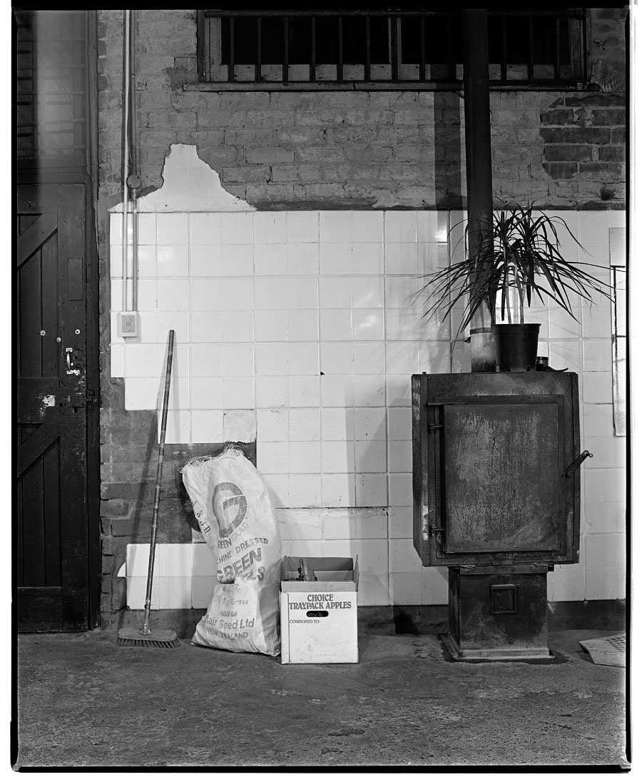
Marcus Bunyan (Australian, b. 1958) Standing stove, plant and broom 1991 Gelatin silver print
Marcus Bunyan (Australian, b. 1958) Suspended kitchen 1991 Gelatin silver print
Marcus Bunyan (Australian, b. 1958) Bring me the head of John the Baptist / Man with Big Ears 1992 Gelatin silver print
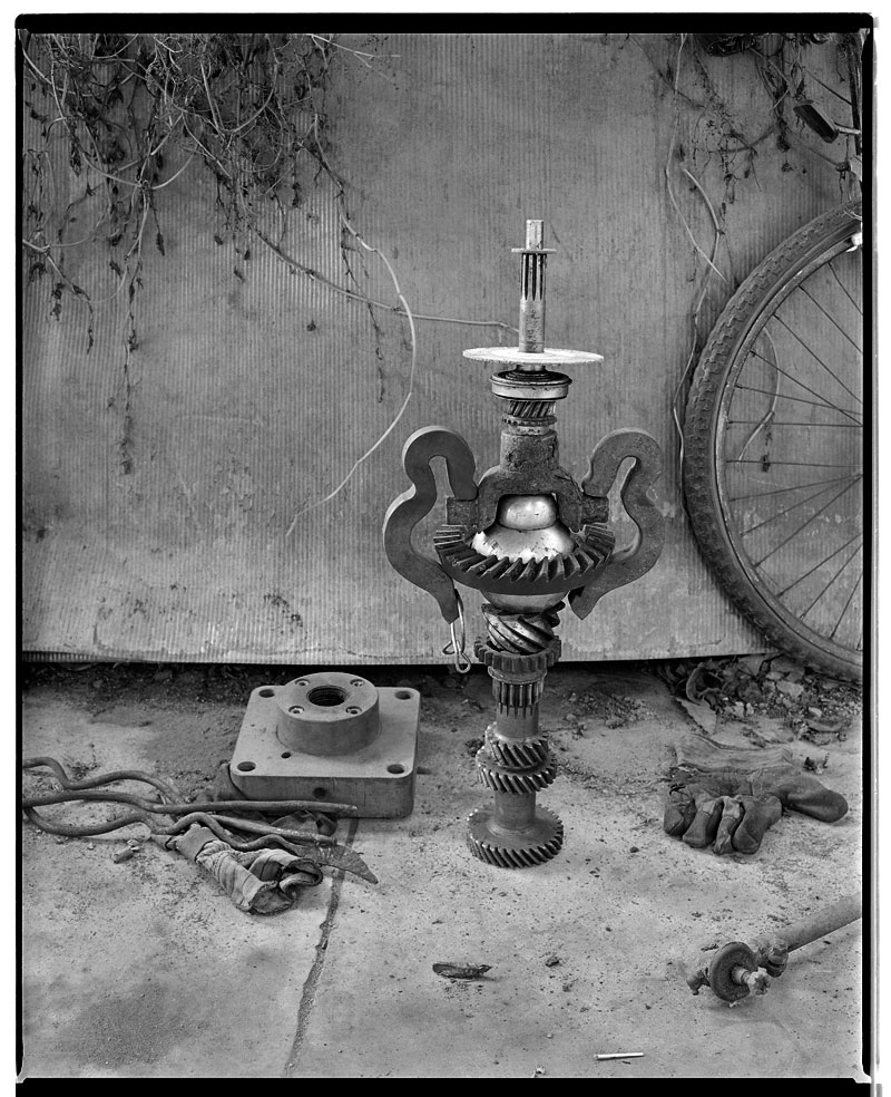
Marcus Bunyan (Australian, b. 1958) The Windmills of Don Q 1992 Gelatin silver print
Marcus Bunyan (Australian, b. 1958) Where the stars are (after Manuel Alvarez Bravo) 1991 Gelatin silver print
Marcus Bunyan (Australian, b. 1958) Fred and Andrew, Sherbrooke Forest 1992 Gelatin silver print
Marcus Bunyan (Australian, b. 1958) Jeff standing on his Chrysler, Studley Park, Melbourne, Victoria, 1992 1991-1992 Gelatin silver print
Another eclectic photography exhibition. I do love them for their interesting subject matter. Much as Australian photography may seem slightly obscure to the rest of the world so Canadian photography is little known in Australia. One of the important briefs of this archive is to promote all photography in its many forms, including Canadian and Australian, to the four corners of the globe.
Dr Marcus Bunyan
Many thankx to the Art Gallery of Ontario for allowing me to publish the photographs in the posting. Please click on the photographs for a larger version of the image.
“Oh the song of the future has been sung / All the battles have been won
On the mountain tops we stand / All the world at our command
We have opened up her soil / With our teardrops and our toil”
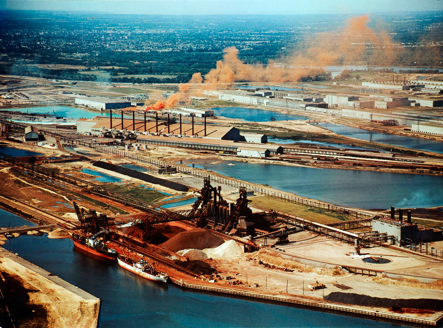
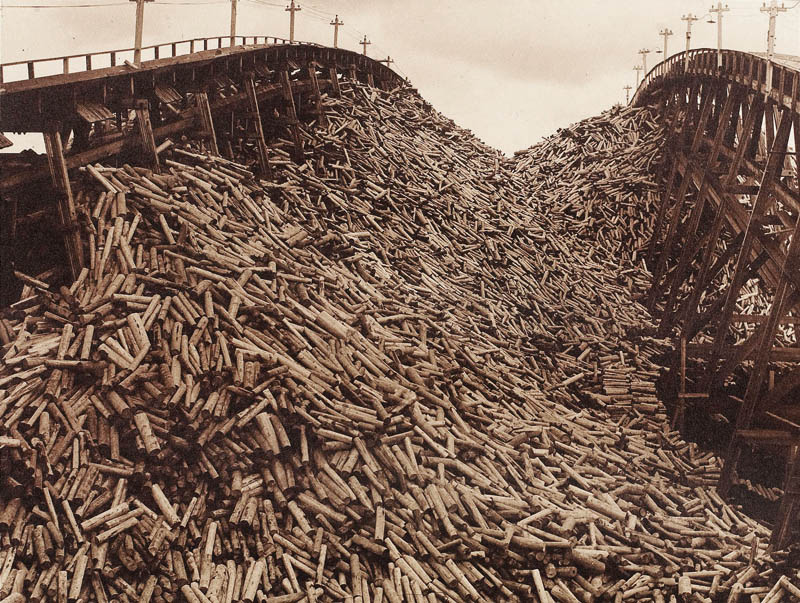
The practice of photography in Canada closely parallels the development of its industries. As railroad tracks were laid and bridges were built to allow access to remote forests and mineral-rich territories, photographers followed, as they did when mining and lumber interests developed. These industrial activities have undeniably shaped the Canadian landscape – for better and for worse. And photographs of these activities – whether made on commission by those eager to document their contribution to national progress, or for the photographer’s own interest – continue to feed our imaginations, shape our opinions and make us aware of what is at stake.
Songs of Future: Canadian Industrial Photographs, 1858 to Today includes more than 100 photographs – by such figures as William Notman, Alexander Henderson, Richard Maynard, J.C.M. Hayward, John Vanderpant, E. Haanel Cassidy, George Hunter, Bill Vazan, Ralph Greenhill, Geoffrey James, Edward Burtynsky, Peter MacCallum, Steven Evans, Jesse Boles, and Isabelle Hayeur – most drawn from the AGO’s permanent collection, and many of which have never been shown. Featuring sites from the west coast to the Maritimes, the exhibition showcases this other landscape tradition in Canadian art and the Canadian photographers who have described, evoked, celebrated, and cast a critical eye on our industrial landscapes for more than 150 years.
Depicting railway and bridge building, quarries and mines, and the lumber, pulp and paper, and concrete industries in Canada, Songs of the Future traces the shifting perspectives on industry and the Canadian landscape from the Industrial Revolution to today. The exhibition highlights the ways in which the photographers’ perspectives on industry have shifted along with those of society at large, as celebratory images of human domination over nature give way to more critical views of industrial impact.
The exhibition is curated by Sophie Hackett, the AGO’s assistant curator of photography, who integrates works from various periods into thematic concentrations, including images featuring: the construction of the Victoria Bridge over the St. Lawrence River in the late 1850s; the building of the Anglo-Newfoundland Development Company, a pulp-and-paper mill located in Grand Falls, Newfoundland, in 1912; and the development of the railroad in Canada.
“The exhibition explores the history of Canadian photography through the topic of industrial imagery,” says Hackett. “Featuring sites from the Maritimes to the west coast, and rooted in the fundamentally Canadian genre of landscape, the photographs bear witness to the various aesthetic techniques and styles emphasised by Canadian photographers over the past 150 years.”
“These neophytes on the path of life, both old/wise, young/hidden pass through (into?) our dreams.” Dr Marcus Bunyan
Exhibition dates: 28th March – 5th May, 2012
Curator: the artist
Polixeni Papapetrou (Australian, 1960-2018) The Wanderer No. 3 2012 From The Dreamkeepers Pigment print 105 x 105cm
I absolutely love these. The colours, the spaces, the ambiguous vistas, the fantastical archetypes, the fables. What springs to mind, with the use of masks to disguise youth positioned within the decorous landscape, is the notion of “passing”. Passing on (as in dying), passing through (as in travelling), in passing (as in an aside) and just “passing” (passing yourself off as someone or something else) to hide your true character or feelings. Gay men did this in the 1950s and 60s all the better to fit into society, for if it was found that you were homosexual you could loose your job, your apartment and even your life. Of course, there is also the passing of time, the longing for misspent youth in these masked ephebes and adolescent women. Age shall not weary them…
Wandering, dreaming, remembering, keeping, collecting, counting. These neophytes on the path of life, both old/wise, young/hidden pass through (into?) our dreams. Papapetrou creates visions that elude the senses, visions that slip between dreaming and waking, between conscious and subconscious realms. As John Berger and Jean Mohr have observed,
“Cameras are boxes for transporting appearances. Are the appearances which a camera transports a construction, a man-made cultural artefact, or are they, like a footprint in the sand, a trace naturally left by something that has passed? The photographer choses the events he photographs. This choice can be thought of as a cultural construction. The space for this construction is, as it were, cleared by his rejection of what he did not choose to photograph.”1
As an artist Papapetrou has the intelligence to leave this nature/nurture question open in her photographs. Her skill as an artist is in choosing the right things to photograph. This enables her creatures to pass through liminal spaces, the space of our consciousness. Through this process a trace will always be left with us, for this is a strong body of work, well realised, in passing.
Dr Marcus Bunyan
1/ Berger, John and Mohr, Jean. Another Way of Telling. New York: Pantheon Books, 1982, pp. 92-93.
Many thankx to Stills Gallery for allowing me to publish the photographs in the posting. Please click on the photographs for a larger version of the image.
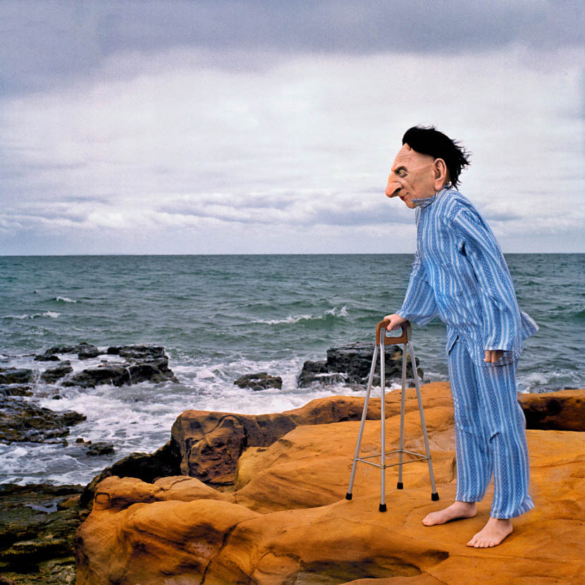
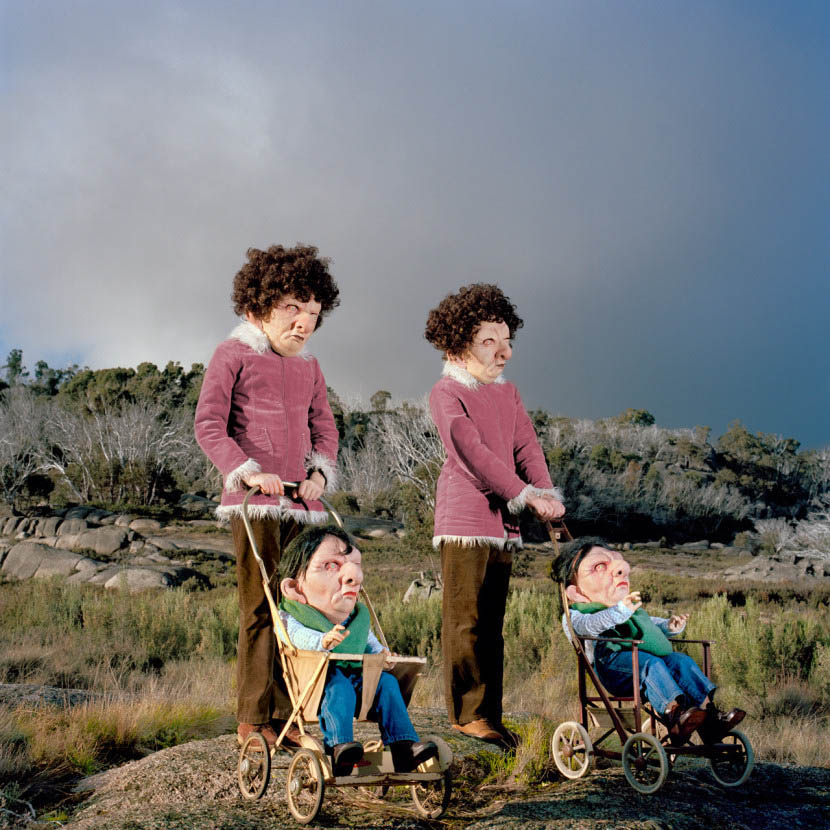
Polixeni Papapetrou (Australian, 1960-2018) The Wave Counter 2011 From The Dreamkeepers Pigment print 105 x 105cm
Polixeni Papapetrou (Australian, 1960-2018) The Mystical Mothers 2011 From The Dreamkeepers Pigment print 105 x 105cm
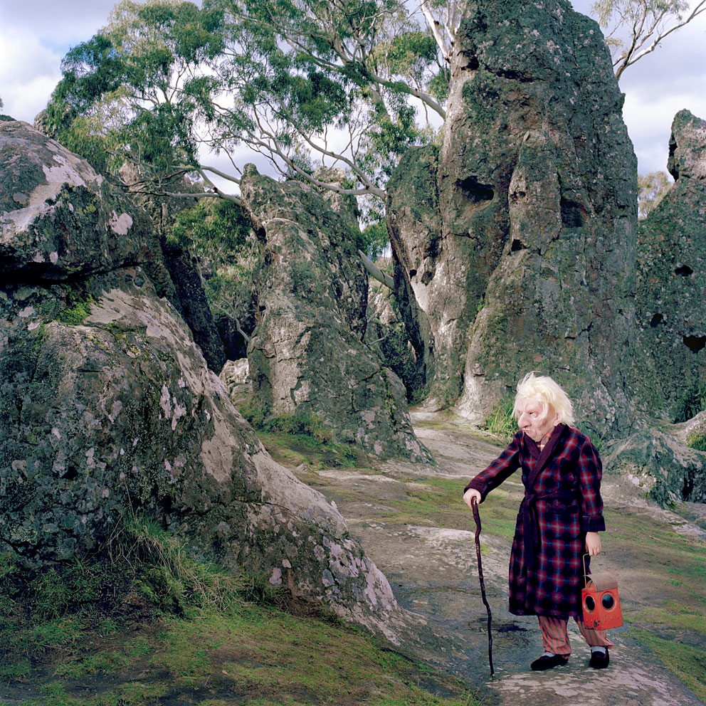
Polixeni Papapetrou (Australian, 1960-2018) The Lantern Keeper 2012 From The Dreamkeepers Pigment print 105 x 105cm
“These transitional places in one’s life are often the most creative, and as we grapple for answers and clarity what is often realized is ambiguity and confusion that reigns supreme. Like fairy stories, Papapetrou uses absurdity to make symbolic sense of world she struggles to understand.”
Susan Bright. Between Worlds catalogue 2009
In Polixeni Papapetrou’s work there is identification with the world of children that is rare and remarkable. She sees children themselves as ‘between worlds’, between infancy and adulthood. Yet she does more than identify, creating fantastical worlds that only adults can truly understand and relate to.
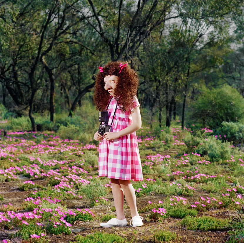
A man in blue striped pyjamas stands on a rock by the sea, leaning into the wind. His body seems young yet he supports himself with a walking frame. His face is old, oversized, a little grotesque. He is The Wavecounter. Like the other characters in Polixeni Papapetrou’s series The Dreamkeepers, he is lithe in body yet gnarly of physiognomy, both young and old. Gazing out in contemplation these dream keepers look with anticipation to the future, or is it with nostalgia to the past? The timeless backdrops of shoreline or hilltop reflect this ambiguity, echoing through landscape the collapsing of thresholds and blurring of boundaries.
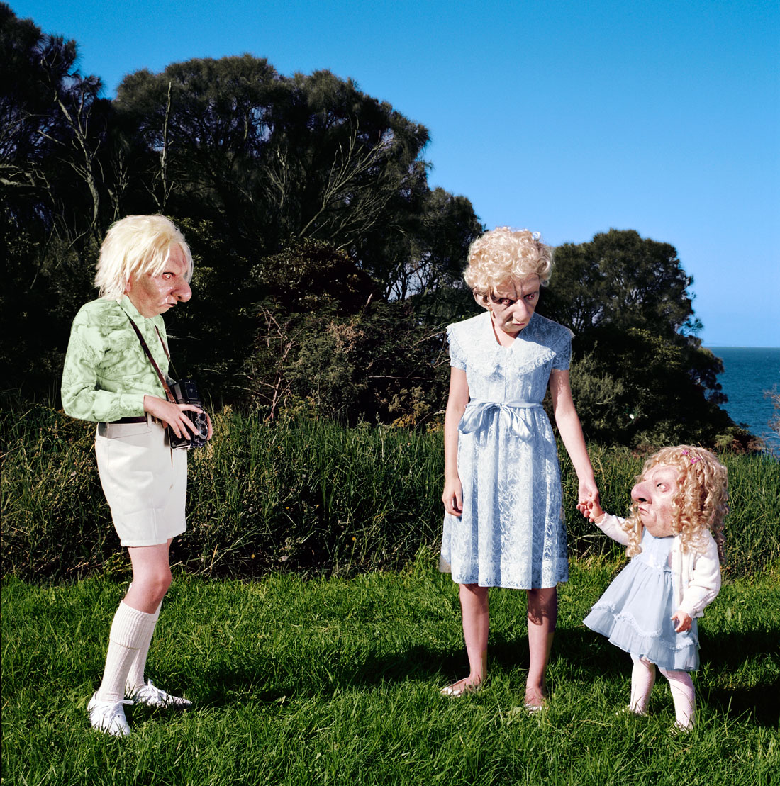
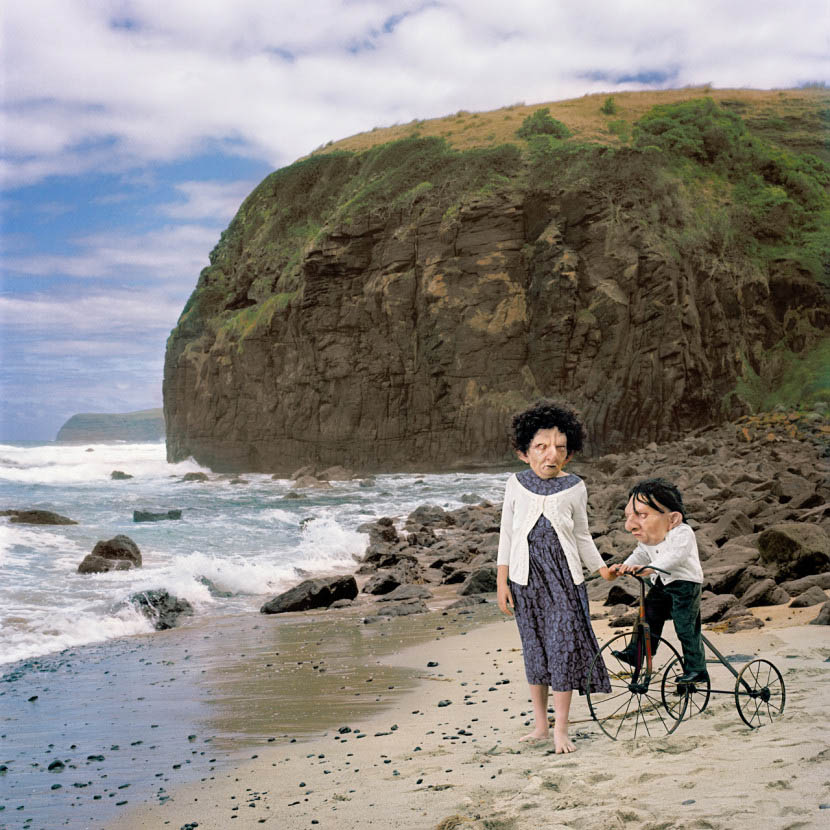
Papapetrou’s art practice has involved collaboration with her children and their friends for over 10 years. As they have grown and transformed so too have the roles they perform and spaces they inhabit. It is the awkward evolution of adolescence that informs the in-between space of The Dreamkeepers. To parallel the cripplingly self-conscious yet powerfully self-realising period of our lives, Papapetrou engages part reality, part fantasy from which a space of unreality emerges, the space of archetype. Here the anonymity afforded by masks separates her adolescent actors from who they really are, and allows them to stand in for us all. In this way, Papapetrou asks us to consider how masks, whether symbolic or literal, not only conceal identity, but also expand and transform it.
The aged masks do so in The Dreamkeepers by confounding adolescence, as the characters exude a quiet lack of self-consciousness, despite their disturbing appearance. They arouse a gentle pathos, reminding us of our own shapeshifting, of time playing out on our bodies and minds. The abstract meeting of these two ages may indicate the latent wisdom and self-acceptance that only realises with maturity, or the cyclical nature of our life spans that inevitably brings us back to the vulnerability of youth. In either case the work is a powerful testament to the surrendering of childhood.
Also on exhibition is a small selection of works from Papapetrou’s current work in progress. Using ghillie suits, she transforms her actors into animate objects – rocks with life and seaweed with attitude.
Press release from the Stills Gallery website
Polixeni Papapetrou (Australian, 1960-2018) The Holiday Makers 2011 From The Dreamkeepers Pigment print 105 x 105cm
Polixeni Papapetrou (Australian, 1960-2018) The Mender 2011 From The Dreamkeepers Pigment print 105 x 105cm
Polixeni Papapetrou (Australian, 1960-2018) The Joy Pedlars 2011 From The Dreamkeepers Pigment print 105 x 105cm
Polixeni Papapetrou (Australian, 1960-2018) The Shell Collectors 2012 From The Dreamkeepers Pigment print 105 x 105cm
Polixeni Papapetrou (Australian, 1960-2018) The Lighthouse Keepers 2011 From The Dreamkeepers Pigment print 105 x 105cm
Polixeni Papapetrou (Australian, 1960-2018) The Photographer 2011 From The Dreamkeepers Pigment print 105 x 105cm
It is not her portraits or the road trip photographs, nor her scientific work for which Berenice Abbott will be remembered.
Firstly, she will always be remembered as the person who photographed Eugene Atget in 1927 just before he died and who bought the remainder of his negatives (after the French government had bought over 2,000 in 1920 and another 2,000 had been sold after his death). She then tirelessly promoted Atget’s work helping him gain international recognition until her sale of the archive to the Museum of Modern Art in 1968.
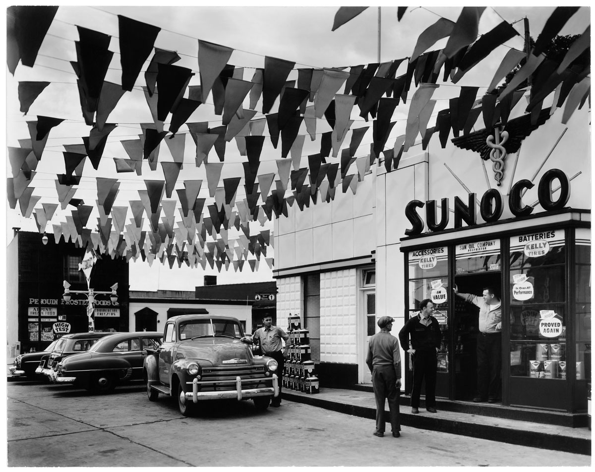
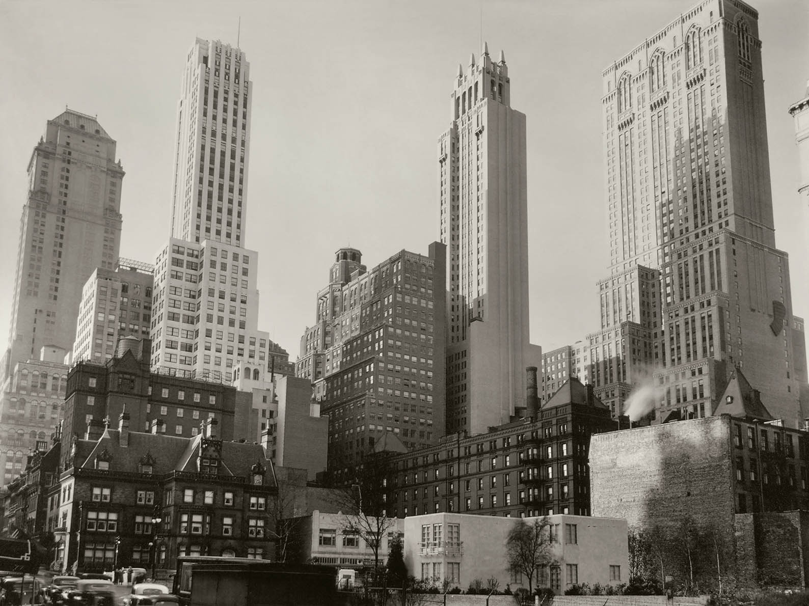
Secondly, she is remembered for her magnificent photographs of New York City and its urban environs, photographs that show the influence of Atget in their attention to detail and understanding of the placement of the camera, and imaging of old and new parts of the city (much as Atget had photographed old Paris before it was destroyed). However, these photographs are uniquely her own, with their modernist New Vision aesthetic, bold perspectives and use of deep chiaroscuro to enhance form within the photograph. Abbott’s best known project, Changing New York (1935-1939) eventually consisted of 305 photographs that document the buildings of Manhattan, some of which are now destroyed.
“Abbott’s project was primarily a sociological study imbedded within modernist aesthetic practices. She sought to create a broadly inclusive collection of photographs that together suggest a vital interaction between three aspects of urban life: the diverse people of the city; the places they live, work and play; and their daily activities. It was intended to empower people by making them realise that their environment was a consequence of their collective behaviour (and vice versa). Moreover, she avoided the merely pretty in favour of what she described as “fantastic” contrasts between the old and the new, and chose her camera angles and lenses to create compositions that either stabilised a subject (if she approved of it), or destabilised it (if she scorned it).”
In the text (below) Gaëlle Morel observes, “Rather than the kind of nostalgic approach often brought to bear on a city’s landmarks and typical sites, this ensemble offers an exploration of the nature of modernity and focuses on the ways in which the past and future are temporarily linked together. Seeking to reinvent the forms and functions of photography in relation to the practice of documentary, Abbott sets out to capture the “disappearance of the moment” by juxtaposing motifs from a city subject to an unprecedented process of demolition and reconstruction.”
While Abbott’s photographs are definitely modernist in nature I believe that today they can also be seen as deeply nostalgic, emerging as they do in the period after the Great Depression when the economy was on the move again, a peaceful time before the oncoming armageddon of the Second World War, closely followed by the fear of nuclear annihilation and the threat of communist indoctrination. They are timeless portraits of a de/reconstructed city. The images seem to float in the air, breathe in the shadows. This is the disappearance of the moment into the enigma of past, present, future – where the photograph becomes eternal, where the best work of both Atget and Abbott resides.
Dr Marcus Bunyan
Many thankx to Jeu de Paume for allowing me to publish the photographs in the posting. Please click on the photographs for a larger version of the image.
“The tempo of the city is not that of eternity, nor that of time, but that of the ephemeral. That is why recording it is so important, in both documentary and artistic terms.”
“All the photographs of New York took a long time to make, because the camera had to be carefully positioned. There is nothing fortuitous about these photographs.”
The exhibition features a substantial collection from Abbott’s best known project, Changing New York (1935-1939). Commissioned by the Roosevelt administration as part of its response to the nationwide economic crisis, Abbott saw this piece of work as both a way of documenting the City and as a personal work of art. Eighty of the 305 photographs taken by Abbott are on show here, along with various documents providing insight into the background of this major photographic undertaking, including posters and views of the exhibition organised by the Museum of the City of New York in 1937, sketches and historical notes made by the team of journalists working with Abbott on the project, and proofs and dummies of the layout made by the photographer before she started work.
Abbott homes in on the contrasts between old and new elements in the City’s structure. Her images alternate between a New Vision aesthetic, characterised by an emphasis on details and bold perspectives, and a more documentary style that is frontal and neutral. Rather than the kind of nostalgic approach often brought to bear on a city’s landmarks and typical sites, this ensemble offers an exploration of the nature of modernity and focuses on the ways in which the past and future are temporarily linked together. Seeking to reinvent the forms and functions of photography in relation to the practice of documentary, Abbott sets out to capture the “disappearance of the moment” by juxtaposing motifs from a city subject to an unprecedented process of demolition and reconstruction.
In 1938, hoping to take advantage of the fifty million visitors expected at the New York World’s Fair of 1939, the publisher, E.P. Dutton, offered to bring out a selection of one hundred images from the project accompanied by a text by the renowned art critic Elizabeth McCausland, who also happened to be Abbott’s companion and staunch supporter. Going against the women’s original ideas for an art book, Dutton produced a more standard tourist guide, breaking the City down into a series of tours, from south to north and from the centre outwards. The text, too, was shorn of its poetic and pedagogical dimensions, leaving only informative entries about the buildings in the pictures.
In the exhibition, this set of architectural photographs is rounded out by a selection of pictures of vernacular architecture taken by Abbott during a journey in the southern states of the US in the 1930s and when she was travelling along Route 1 in the 1950s. Here, portraits of farmers and wooden houses alternate with pictures of streets and local events.
Berenice Abbott Petit Journal
With over 120 photographs, plus a selection of books and documents never shown before, this is the first exhibition in France to cover the many different facets of the American photographer Berenice Abbott (1898-1991), who is also famous for her international advocacy of Eugène Atget. She came to Paris in 1921 where she learnt her craft from Man Ray before opening her own studio and embarking on a successful career as a portraitist. Returning to New York City in 1929, she conceived what remains her best‑known project, Changing New York (1935-1939). This was financed by the Works Progress Administration as part of its response to the economic crisis sweeping the country. The photographs she took in 1954 when travelling along the US East Coast on Route 1 (the exhibition presents a previously unseen selection of these images) reflect her ambition to represent the whole of what she called the “American scene.” Furthermore, in the 1950s, she also worked on a set of images for the Massachusetts Institute of Technology (MIT) designed to illustrate the principles of mechanics and light for educational purposes.
A committed member of the avant‑garde from the early 1920s, and a staunch opponent of Pictorialism and the school of Alfred Stieglitz, Abbott spent the whole of her career exploring the limits and nature of documentary photography and photographic realism. This exhibition shows the rich array of her interests and conveys both the unity and diversity of her work.
Portraits
Berenice Abbott moved to New York City in the early 1920s and went about becoming a sculptor. Mixing in the bohemian circles of Greenwich Village, she met writers and artists such as Djuna Barnes, Sadakichi Hartmann and Marcel Duchamp. She also posed for Man Ray. Economic hardship at home and the allure of what then seemed the cultural Eldorado of Europe impelled several of these artists to try their luck in Paris, and Abbott herself joined this group of American expatriates in 1921.
In 1923 she became the assistant of Man Ray, who had opened a portrait studio shortly after his arrival in France in 1921. While a fair portion of the studio’s clients were American tourists, Abbott found herself at the heart of the avant-garde scene – especially that of the Surrealists. Between 1923 and 1926 she thus learnt about darkroom techniques and portrait photography while at the same time picking up a broader intellectual and artistic education. She produced her portraits in Man Ray’s studio before opening her own in 1926. Success soon followed. Her clientele was a mixture of French cultural figures and American expatriates, of bourgeois, bohemians and literary types. Her portraits were on occasion manifestly influenced by Surrealism, and more generally show an interest in masquerade, play and disguise, but sometimes even in their use of overprinting and distortion.
The female models express a kind of sexual ambiguity, notably by their masculine haircut or clothes, deliberately exuding a sense of uncertainty with regard to their identity. In composing her portraits, Abbott developed a distinctive aesthetic, far removed from the usual commercial conventions. The absence of a set, with the background usually no more than a plain wall, helped to focus on the sitter and their posture, the position of their body and their facial expression. The use of a tripod and long-focus lenses placed at eye-height allowed her to avoid distortions and thus heighten the physical presence of the models. In early 1929 Abbott left Paris for New York City. Back in America she continued with the same activities, opening a new portrait studio and taking part in exhibitions of modernist photography, while also promoting the work of Eugène Atget, having bought part of his estate in 1928.
New York City
In the early 1930s, Abbott set about her project for a great documentary portrait of the City of New York, but had no luck when she approached institutions such as the Museum of the City of New York and the New York Historical Society for funding. She assembled her first efforts in an album (eight pages of which are exhibited here) in order to convey the scale of her ambitious undertaking, and in 1934 exhibited her photographs of the City at the Museum of the City of New York in the hope of attracting sponsors. In 1935, support was at last forthcoming from the Federal Art Project, a programme set up to aid artists by the Works Progress Administration as part of the New Deal; she now had the support of a team of researchers who produced an information pack with text and drawings to accompany each image. Entitled Changing New York, she conceived this commission as both a vast documentary record of the City and a personal work of art. Eighty of the 305 photographs constituting this project have been selected for the exhibition. These are accompanied by documents – a poster, exhibition views, sketches and historical notes, proofs, pages from the preparatory album and original editions – that help to convey the concerns and ambitions behind this major photographic undertaking.
Abbott focused on the contrasts and links between old and new in the City’s structure. Her images alternate between a New Vision aesthetic, characterised by an emphasis on details and bold perspectives, and a more documentary style that is frontal and neutral. Rather than the kind of nostalgic approach often brought to bear on a city’s landmarks and typical sites, this ensemble offers an exploration of the nature of modernity and focuses on the ways in which the past and future are temporarily linked together. Seeking to reinvent the forms and functions of photography in relation to the practice of documentary, Abbott sets out to capture the “vanishing instant” by juxtaposing motifs from a city subject to an unprecedented process of demolition and reconstruction.
The upshot of all this work was the publication of a book, Changing New York, in 1939. But there was considerable tension between the publisher, whose concerns were commercial, and the photographer, with her artistic ambitions. In 1938, hoping to take advantage of the fifty million visitors expected at the New York World’s Fair of 1939, the publishing house E.P. Dutton proposed to bring out a selection of one hundred images from the project accompanied by a text from the renowned art critic Elizabeth McCausland, who also happened to be Abbott’s companion and unfailing supporter. Straying far from the project originally envisaged by the two women, Dutton changed the presentation of the photographs and produced what was a standard tourist guide, breaking the City down into a series of tours, from south to north and from the centre outwards. The text, too, was shorn of its poetic and pedagogical dimensions, leaving only information about the buildings in the pictures.
The “American scene”
This set of architectural images is completed by a selection of vernacular photographs. In the summer of 1935, Berenice Abbott went on a road trip down to the Southern US in order to create a portrait of a rural world in crisis. Choosing the kind of documentary style that would be the hallmark of the photographic survey launched by the Farm Security Administration (FSA) that same year, she focused on the modest wooden houses and the farmers. Driving around these states with Elizabeth McCausland, Abbott took some two hundred photographs which the two women saw as part of an ambitious photographic portrait of America in book form, although in the end this was never published. A similar fate befell Abbott’s piece on the small towns and villages along Route 1, which she travelled in 1954. Covering approximately 6,500 kilometres as she followed this road along the East Coast of the US, she took some 2,400 photographs, taking in stalls, shops, portraits of farmers, diners and bars and dance halls. Her photography alternated between the documentary aesthetic and Street Photography. With Route 1, Abbott continued to pursue her ambition of representing the whole of the “American scene.”
Science
Abbott started photographing scientific phenomena in 1939. In 1944 she was recruited by the journal Science Illustrated, where she published some of her own pictures, as head of its photography department. Abbott took a committed, pedagogical approach, seeing her images as a vital bridge between modern science and the general public. In 1957, as a result of the anxiety about national science stirred by the Soviet launch of the Sputnik into outer space, at the height of the Cold War, the National Science Foundation set up a Physical Science Study Committee at Massachusetts Institute of Technology. Its role was to develop new textbooks for the teaching of science in schools and to use innovative photographs to illustrate the principles of quantum mechanics. Abbott was hired by MIT to produce photographs for the popularisation and teaching of the sciences. Using abstract forms to visually express complex mechanical concepts and invisible mechanical laws, she used black grounds to reveal principles such as gravity and light waves. The exhibition features a score of Abbott’s scientific and experimental images, as well as some of the books for which they were used. Harking back to the experiments of the avant-gardes, and in particular the Rayogram technique, she was able to produce visually attractive and surprising images that were also rich in discovery, thus combining documentary information with a sense of wonder.”
Text by Gaëlle Morel, curator of the exhibition, on the Jeu de Paume website
Presentation of the exhibition Berenice Abbott
The exhibition “Berenice Abbott (1898-1991), photographies” reveals for the first time in France the different stages of the career of this American photographer. This retrospective offers more than 120 photographs, original works and a series of unpublished documents. By presenting portraits, architectural photographs and scientific shots, the exhibition shows the multiple facets of a work often reduced to a few images.
Curators: Cy Twombly, who selected the photographic works, alongside Hubertus von Amelunxen, who served as the curator for the non-photographic section (paintings, drawings, and sculptures)
“In a certain sense, Twombly operates like the Pictorialists: his photographs look almost like paintings in which light is captured in brushstrokes.”
Text from the press release
Many thankx to the Centre for Fine Arts, Brussels for allowing me to publish the photographs in the posting. Please click on the photographs for a larger version of the image.
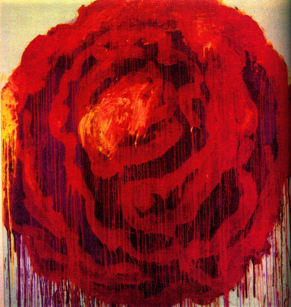
Cy Twombly (American, 1928-2011) Untitled (Rome) 1966 Oil, wall paint, grease crayon on canvas 190 x 200cm Sammlung Lambrecht-Schadeberg / Rubenspreisträger der Stadt Siegen im Museum für Gegenwartskunst
As a tribute to the recently deceased artist, the Centre for Fine Arts is turning the spotlight on a less familiar aspect of his oeuvre. The exhibition includes more than 100 dryprint Polaroid photographs (selected by Twombly himself), along with a selection of other works by Twombly and a film portrait by Tacita Dean.
Cy Twombly (who was born in Lexington in 1928 and died in Rome in 2011) was one of the most important US artists of his generation. He made his name with large-scale abstract paintings whose free form and spontaneous dynamism recall calligraphy and graffiti. In his work Twombly often referred to the myths of Classical Greek and Roman Antiquity, to literature and to art history.
The exhibition focuses on a less familiar aspect of Twombly’s oeuvre: his photographic work. The photographs are an addition to the artist’s creative world and throw new light on it. At the request of the publishers Schirmer / Mosel, Twombly selected more than 100 never previously published Polaroid photographs for a catalogue that was published just before his death on 5 July 2011. This selection is the subject of a travelling exhibition that has already been seen in Germany at the Museum Brandhorst (in Munich) and the Museum für Gegenwartskunst (in Siegen). At the Centre for Fine Arts the exhibition is being expanded, in collaboration with Dr. Hubertus von Amelunxen, who wrote an essay for the Twombly catalogue and who has made a selection for BOZAR of drawings and paintings by Twombly that reveal in greater depth the interplay of lines and light in his work. In addition, the exhibition is complemented by the screening of Tacita Dean’s intimate film portrait “Edwin Parker” (which takes its name from Twombly’s official given names).
Twombly and photography
Twombly took up photography back in his student days in the 1950s and continued to take photographs throughout his career. It was only in the 1990s, however, that he went public with his photographic work in gallery exhibitions and publications.
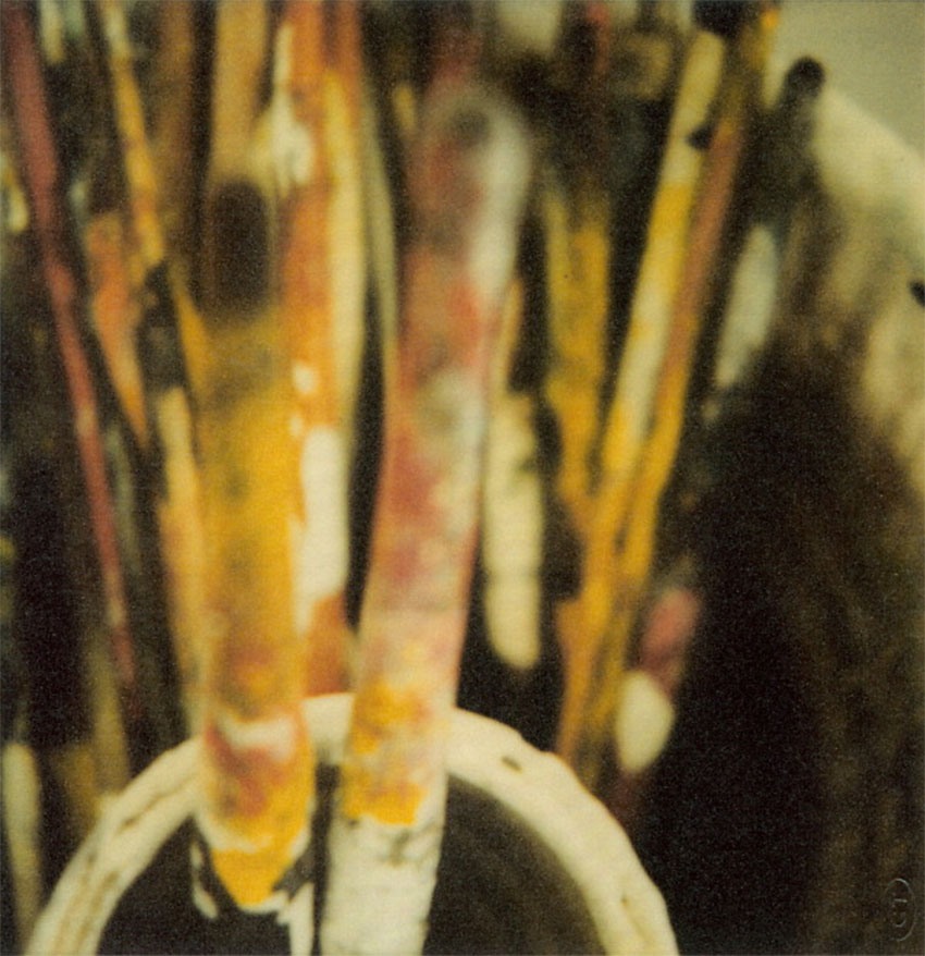
All the photographs in the exhibition were taken with a Polaroid camera, enlarged, printed using a special kind of dryprint, and reproduced in limited editions. This procedure, developed by Twombly himself, gives the photographs a hazy glow and a coarse grain. Twombly further reinforced this impression of blurring by playing with light and shade, by overexposure and sophisticated colour saturation, and by employing extreme close-ups. The lack of definition gives his photographs a certain indefinable quality and a poetic dimension. Our attention is no longer drawn to the subject, but to the texture of the picture. In a certain sense, Twombly operates like the Pictorialists: his photographs look almost like paintings in which light is captured in brushstrokes.
The subjects of his Polaroid photographs are extremely diverse. There are traditional still lifes with tulips, lemon leaves, and angel trumpets, alongside photographs of temples and atmospheric landscapes. Twombly surprises the viewer with intimate images of everyday objects such as his slippers, a detail from a painting, his brushes, a snapshot of his studio, etc.
The photographs are fascinating because they throw new light on Twombly’s creative spirit and visual language. These intangible, fragile images are permeated by the same themes that inspired the artist’s paintings, drawings, sculptures, and graphic art. The atmospheric colours and diffuse motifs of his photographs are an unexpected addition to his creative universe. Twombly’s oeuvre, moreover, is all about light – and is photography not the medium of light par excellence?
Tacita Dean
In the course of the exhibition circuit visitors can see an intimate film portrait of Twombly, Edwin Parker by the British artist Tacita Dean. The film takes its title from Twombly’s official given names (“Cy” is a traditional nickname in his family). The publicity-shy Twombly had become a mythical figure in the world of contemporary art. Dean’s film offers a rare insight into the artist’s life. The camera follows Twombly as he looks at his pictures in his studio, reads letters, looks through the louvres at the traffic in the city of his birth, or sits around a table with old friends and orders a meal. Tacita Dean is a British contemporary artist, known above all for her films. Her latest work to date is FILM, a 35 mm film continuously projected on a 13-metre-high monolith, which can be seen in the Turbine Hall at Tate Modern until 11 March 2012.
Press release from the Centre for Fine Arts website
Curator: Dr. Susan Cohn for the Design Museum, London
Installation photograph of the exhibition Unexpected Pleasures at the National Gallery of Victoria Photo: Dr Marcus Bunyan
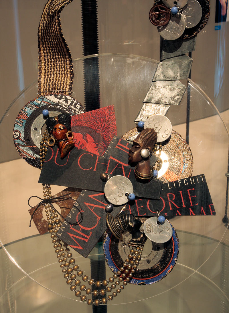
An elegant, refined exhibition of contemporary jewellery at the National Gallery of Victoria’s newly redeveloped Contemporary Exhibitions space. The most striking and beautiful pieces are the neck ornaments. I am a very much over some of the relatively unstructured jewellery made out of found objects. It really has been done to death.
Trying to take photographs of jewellery in cases with reflections and extraneous light is very difficult but I hope my photographs below give you an idea of the design, installation and some specific pieces in the exhibition.
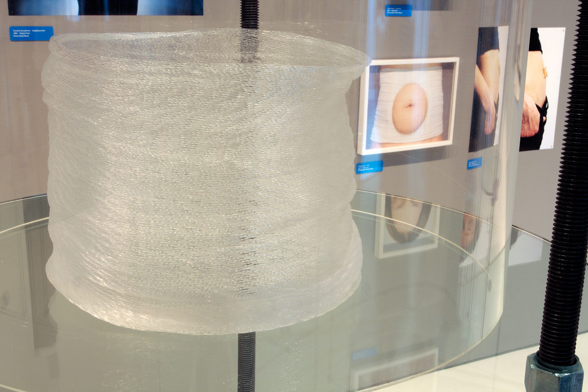
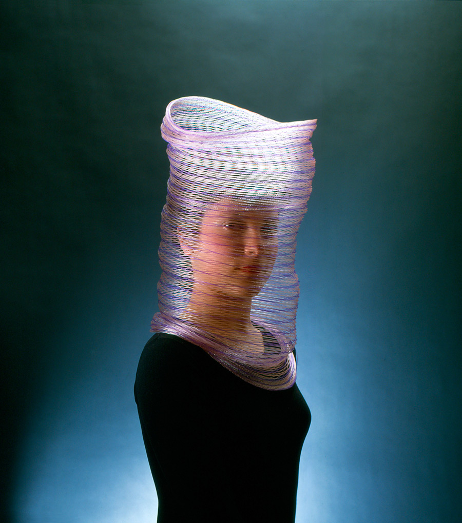
Susanne Klemm (Swiss, b. 1965) Frozen (installation view) 2007 Polyolefin Courtesy of Anna Schwartz Gallery Photo: Dr Marcus Bunyan
Lisa Walker (New Zealand, b. 1967) Necklace (installation view) 2009 Plastic, thread Photo: Dr Marcus Bunyan
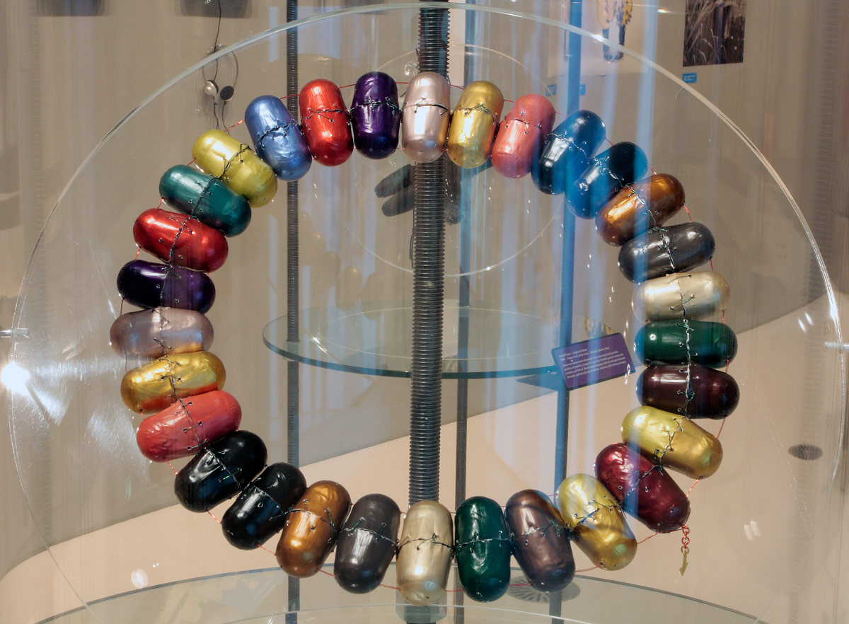
Beverley Price Nespresso Collier (installation view) 2012 Anodised aluminium, plastic coated wire, fine gold Photo: Dr Marcus Bunyan
Gijs Bakker (Dutch, b. 1942) Shoulder piece (installation view) 1967 Anodised aluminium Photo: Dr Marcus Bunyan
Unexpected Pleasures: The Art and Design of Contemporary Jewellery displays over 200 works by important Australian and international contemporary jewellers who have pushed conceptual and material boundaries within their practices. This Design Museum, London exhibition is curated by Guest Curator and Melbourne jeweller Susan Cohn, and is complemented by a selection of NGV Collection works and private loans.
Unexpected Pleasures looks at what we mean by jewellery from a number of different perspectives. Taking as its starting point the radical experiments of the Contemporary Jewellery Movement that challenged a conventional understanding of the language of personal adornment, and looking instead at the essential meanings of jewellery, the exhibition brings together important work from around the world, and looks at it from the point of view of the wearer as well as the maker. Contemporary Jewellery in this sense is at the intersection of art and design.
Dr Gerard Vaughan, Director, NGV said: “This is a remarkable and exciting exhibition, brilliantly installed in the Gallery’s newly redeveloped Contemporary Exhibitions space at NGV International.”
The exhibition explores the essential meanings of jewellery, bypassing traditional perceptions and instead tracing the radical experiments of contemporary jewellers who have challenged the conventions of jewellery design. The exhibition is curated through a number of themes: Worn Out – celebrating the experience of wearing jewellery; Linking Links – looking at the ways in which ‘meaning’ and narratives are invested and expressed through sub-themes such as Social Expressions and Creative Systems, and; A Fine Line – offering insight into the origins of contemporary jewellery today, highlighting key instigators of the Contemporary Jewellery Movement that started in the late 1970s.
Each theme within the exhibition provides an outline of current thinking and offers a unique view on how people use and interact with objects, through which design and production processes come to light. Photography in this context becomes a vital instrument for expressing the ‘wearability’ and the performative aspects of jewellery, and a selection of photographic works are also included in the exhibition.
New techniques and experimentation continue to question the relevance of preciousness, highlighting the shifting values from material worth to the personal associations that jewellery holds. The exhibition celebrates jewellery from the point of view of both the maker and the wearer. It considers the pleasures of wearing jewellery and the many meanings associated with jewellery which are at times unpredictable and, in turn, unexpected.
Press release from the NGV website
Otto Künzli (German, b. 1948) Wallpaper brooches (installation view) 1982 Wallpaper, synthetic polymer core, steel Photo: Dr Marcus Bunyan
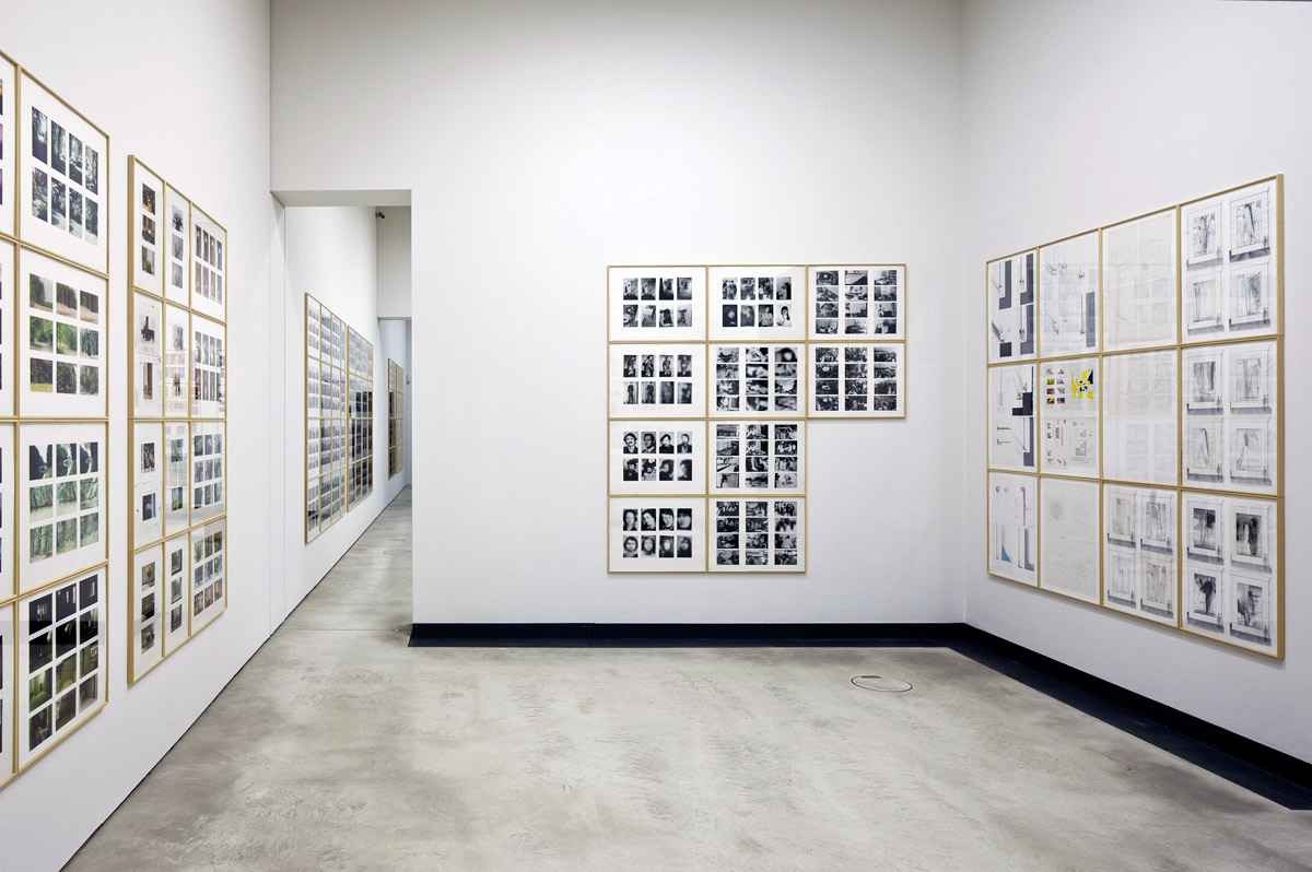
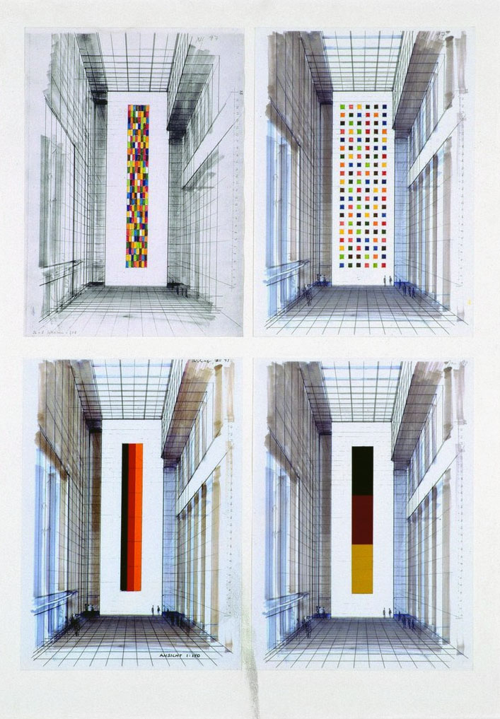
Meaning arises out of context – or the lack of it. Unlike the grids of the Bechers which promote multiple ways of seeing and construct narrative tension these images do not increase the photographic narrative. They are like the parrots, finches or scarab beetles in a display case at a natural history museum – part of a taxonomic classification system, where one out of a thousand is the most impressive beetle, the bird with the brightest plumage, where the composition is the most surprising. Multiples as collected here are fascinating but emerge from a slightly obsessive mind (which any collectors mind is!)
This photomontage of impressions, ground and movement blurs the history and memory embedded in each photograph. The assemblage of all these visions ranges far and wide but ultimately collapses time and space into one huge universal snapshot. As in advertising imagery the individual documentary-style images mean relatively little – it is the overall impression that impinges on the consciousness. If you watch MTV and stop to analyse the individual images in a pop video you soon acknowledge their vacuousness. The context of the singular image is lost. In this display the grid controls the photographs position relative to each other and the viewer – a compositional design matrix that has a symbolic function. The grid both decontextualises and recontextualises the floating signifier.
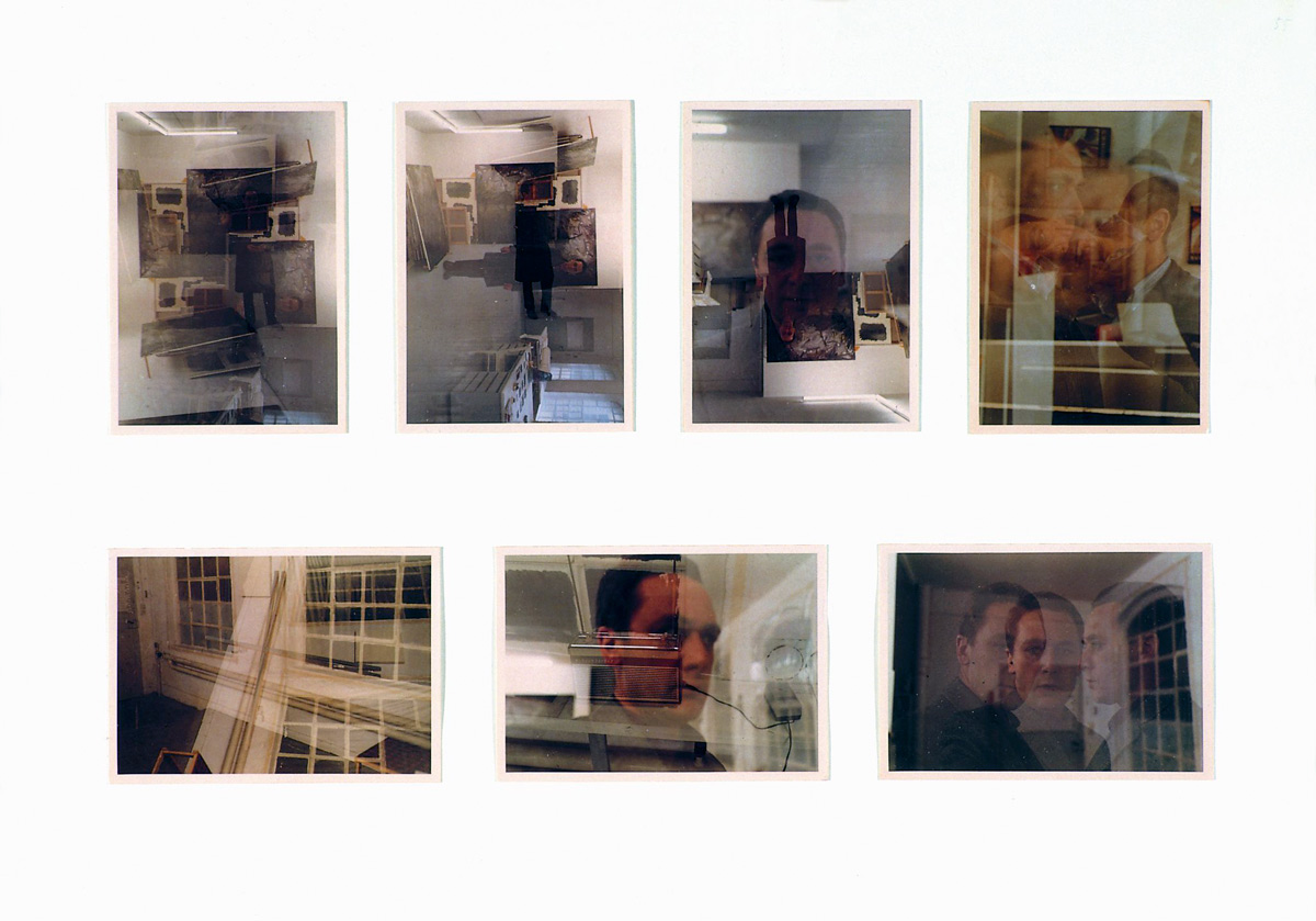
Richter obviously uses them as an aide-memoire. Some remind me of the folded photographs found in Francis Bacon’s studio; others Bacon’s portraits of blurred bodies; yet more, ethnographic mappings of Indigenous bodies or criminals cut out of newspapers. Others remind me of surrealist experiments and the overpainted colour photographs of the artist.
They may be the source material of a great artist but in this regimented form of prosaic knowledge they become like bugs caught in amber.
Dr Marcus Bunyan
Many thankx to the Staatliche Kunstsammlungen Dresden for allowing me to publish the photographs in the posting. Please click on the photographs for a larger version of the image.
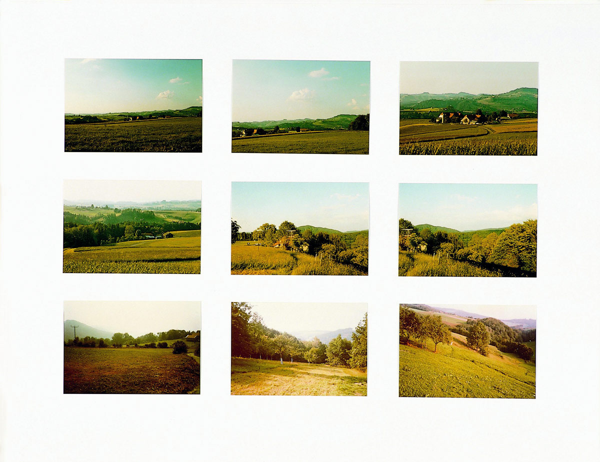
“I see countless landscapes, photograph barely one in 100,000, and paint barely 1 in 100 of those that I photograph,”
Gerhard Richter, 1986
“If the grids of art are about arrangement, synchronic vision, connections and knowledge, a standing back to grasp a pattern, then the grids of life are just as much about chance, disconnections among the connections, and the inability of the elements within the grid to perceive, and know, the larger patterns of which they are a part, so that it is only a ‘higher’ consciousness standing outside the grid that will be able to see it all (with or without understanding it). How you know and form a grid depends on whether you are inside or outside it. You can ‘form’ a grid both actively and passively, wittingly and unwittingly – either by simply being part of a grid or by actually assembling one… The grid becomes a potentially totalizing system with which reality (the real of experience as well as the real of the mind), another totalizing system, must endlessly play its games of elusiveness and containment, chaos and order, freedom and necessity.”
Aveek Sen. “The Grid and More,” in ‘What We Talk About When We Talk About Photography,’ on the Fotomuseum Winterthur website, 7th April 2012
Gerhard Richter. Atlas
The film for the special exhibition!
The ATLAS occupies an outstanding position in Gerhard Richter’s entire work. It is both the basis of his painterly oeuvre and an independent work. As a so-called work in progress, the artist, who was born on February 9, 1932 in Dresden, has repeatedly revised and supplemented the ATLAS for more than four decades.
The ATLAS was on display in a special exhibition at the Gerhard Richter Archive of the Dresden State Art Collections.
In celebration of Gerhard Richter’s 80th birthday, the Gerhard Richter Archive of the Staatliche Kunstsammlungen Dresden presents the ATLAS of the artist in the Kunsthalle im Lipsiusbau. The ATLAS takes a prominent role in the oeuvre of Gerhard Richter. It is the basis of many of his paintings just as it is an artwork in its own right. The ATLAS consists of approximately 800 framed panels with more than 15,000 photographs, newspaper clippings, sketches and designs, which Richter had accumulated for work in his studio from the early 1960s onwards. In 1972, he ordered and arranged the collection on boards and presented it under the title ATLAS for the first time. Ever since then, he has continuously added new material. The conceptual character of the ATLAS offers unique insights into the mindset of the artist, into the development of some ideas for works as well as into the creational process of several of his paintings.
Gerhard Richter’s ATLAS merits a special place within his oeuvre as a whole. It not only forms the basis of his entire work as a painter but is also an autonomous artwork in its own right. Born in Dresden on 9th February 1932, Richter has been constantly revising and augmenting this “work in progress” for more than four decades.
ATLAS may be seen as an accompaniment, commentary and extension of the entire oeuvre of Gerhard Richter, for it also develops its own perspectives and poses its own questions. ATLAS is Richter’s reflection not only on his own work but also on the everyday world of images that he himself has documented photographically in their thousands. “I see countless landscapes, photograph barely one in 100,000, and paint barely 1 in 100 of those that I photograph,” Richter wrote in 1986. This photographed, yet and seemingly inexhaustible flood of images has afforded Richter a concentrated, ready accessibility of motifs for his future works. Indeed, for some of his paintings, he has been able to draw upon old motifs in his ATLAS, some of them dating back more than a decade.
The accompanying artist’s book “ATLAS” is not just intended as a means of documenting the exhibition. Gerhard Richter sees it as an alternative presentation to the exhibited panels, one that permits an additional, different, non-linear approach to the material. By 1964, Richter had collected a vast amount of pictorial source material for his painting, first keeping it in drawers and portfolios. Five years later he began to sift through this material with a critical eye, grouping the individual photographs, reproductions and sketches into different themes and pasting them onto separate panels. Richter then soon recognised the intrinsic artistic quality of these collections of source material and, in 1972, framed the panels and exhibited them at the Museum Hedendaagse Kunst in Utrecht under the title ATLAS. Meanwhile this repository of source material has grown from its original 343 panels to its present 783, with more than 8,000 individual motifs.
Press release from the Staatliche Kunstsammlungen Dresden website
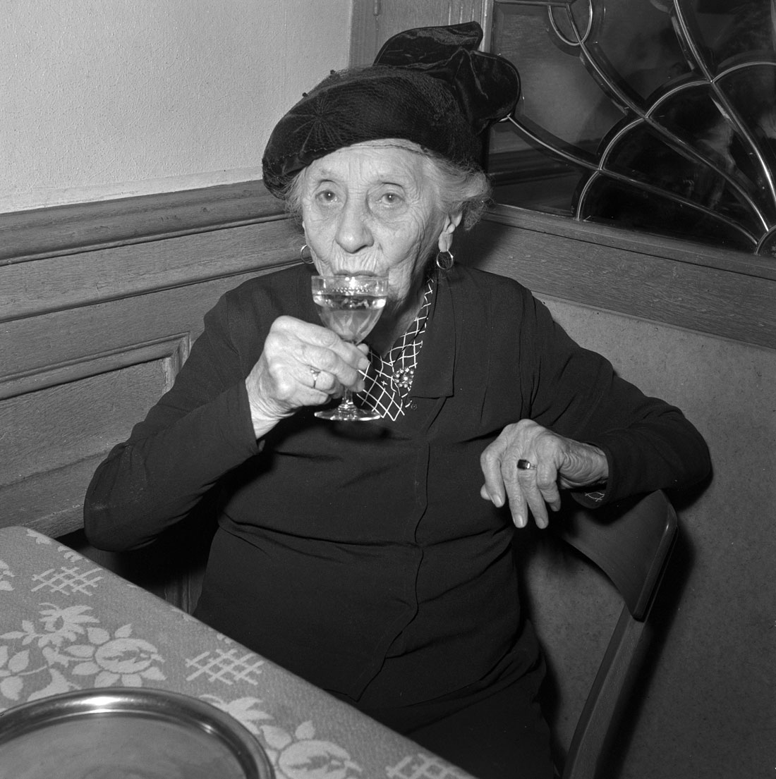
Another fascinating, quirky photography exhibition. The photographs from the 1940s are poignant, especially when we remember what was happening in the rest of Europe at this time.
Contrary to popular opinion, the Swiss did not have an easy time of it during the Second World War: threatened with invasion by Hitler on one the hand, this landlocked country relied heavily on imports to survive. Many of its citizens were near starvation during the course of the war but they became more self sufficient, growing their own food. They also built up their military (ironically using pre-war German assembled Messerschmitt planes as a basis for their air force). The Germans knew that Switzerland would be a hard country to conquer so they did not force the issue.
For an in depth look at the fate of neutral countries during the Second World War see the excellent book The Neutrals by Denis J. Fodor (Volume 35 of World War Two: Time-Life Books, 1982) which includes “chapters on Switzerland, Sweden, Norway, Finland, Netherlands, Belgium, Ireland, Turkey, and others including their success or lack of success in maintaining their neutrality.” (Neal A. Wellons) There is also a picture essay on Switzerland. An absorbing read.
The photograph Swimming lessons for schoolchildren at the Wollishofen lakeside swimming area, Zurich (1943, below) is especially foreboding of the conflict that was swirling around Switzerland in 1943, the child’s heads in a noose as he tries to stay afloat a metaphor for the conflagration that was occurring all around. One slip for Switzerland, and the world, and it was over. Chilling.
Dr Marcus Bunyan
Many thankx to the Swiss National Museum for allowing me to publish the photographs in the posting. Please click on the photographs for a larger version of the image.
Walter Diggelmann (Zürich, 11 August 1915 – Guntalingen, 5 March 1999) was a Swiss professional road bicycle racer. Diggelmann won one stage in the 1952 Tour de France.
For the first time, the Swiss National Museum in Zurich presents its extensive archive of press photographs. The exhibition looks at recent Swiss history from the perspective of the press photographer and reveals how, in the second half of the 20th century, press photography developed into the photojournalism we know today.
Housed in three original pavilions by the designer and engineer Jean Prouvé from the 1940s, C’est la vie includes meticulously composed photographs depicting political events, episodes from everyday life, unforgettable moments, candid pictures of well-known personalities and portraits of everyday heroes. It also shows how the extensive photo reportages of the early years were superseded by individual snapshots – initially still in black and white, then in colour. New methods of image transfer and printing technologies enabled ever-increasing numbers of up-to-the-minute photos to appear in the daily press. From the 1960s onwards, the illustrated weekly press went into decline. The exhibition illustrates this process by juxtaposing an analogue picture agency from the 1940s with its present-day digital counterpart.
In 2006 the Swiss National Museum acquired the archives of the press photo agencies Presse Diffusion Lausanne and Actualité Suisse Lausanne, which together comprise millions of negatives, paper prints and transparencies from 1940 (foundation of PDL) to 2000 (closure of ASL). The archives are an ideal complement to the photographs taken by private individuals that previously formed the core of the Swiss National Museum’s photography collection. An examination of the archives soon revealed a wealth of treasures. The diversity, breadth and aesthetic quality of the photographic material are remarkable and exceptional. The new holdings will also be an invaluable source of visual material for the Swiss National Museum’s research activities.
Press release from the Swiss National Museum website
Exhibition dates: 18th February – 22nd April, 2012
Curator: Magnus af Petersens
Many thankx to the Moderna Museet for allowing me to publish the photographs in the posting. Please click on the photographs for a larger version of the image.
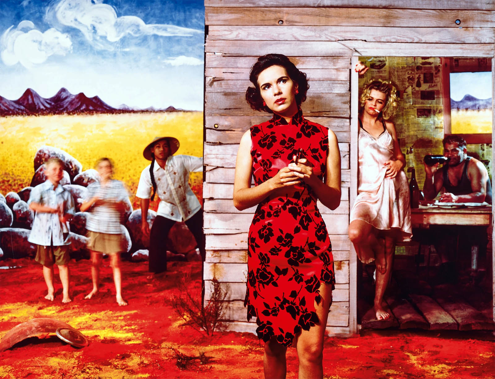
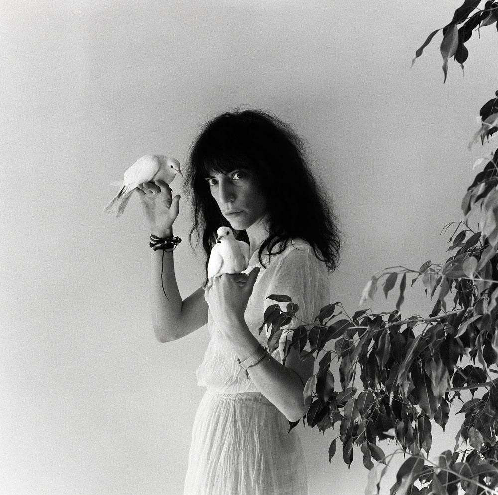
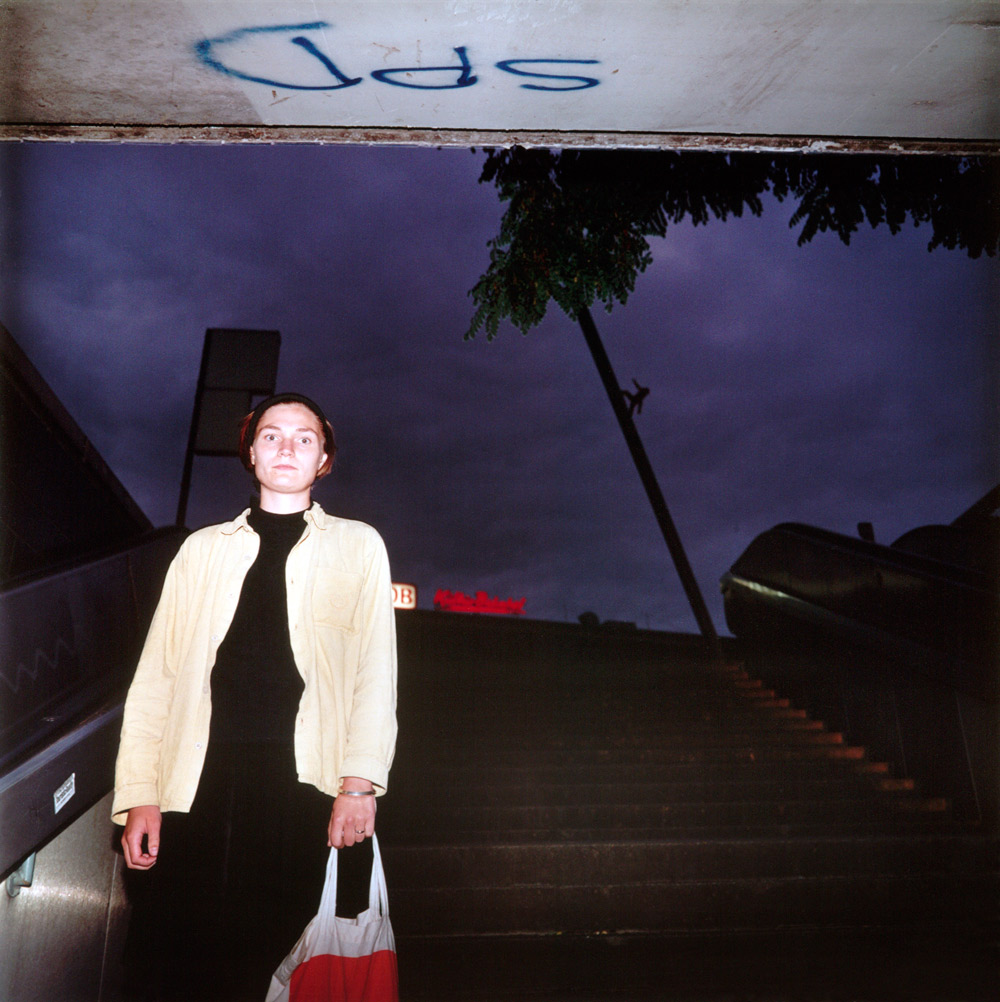
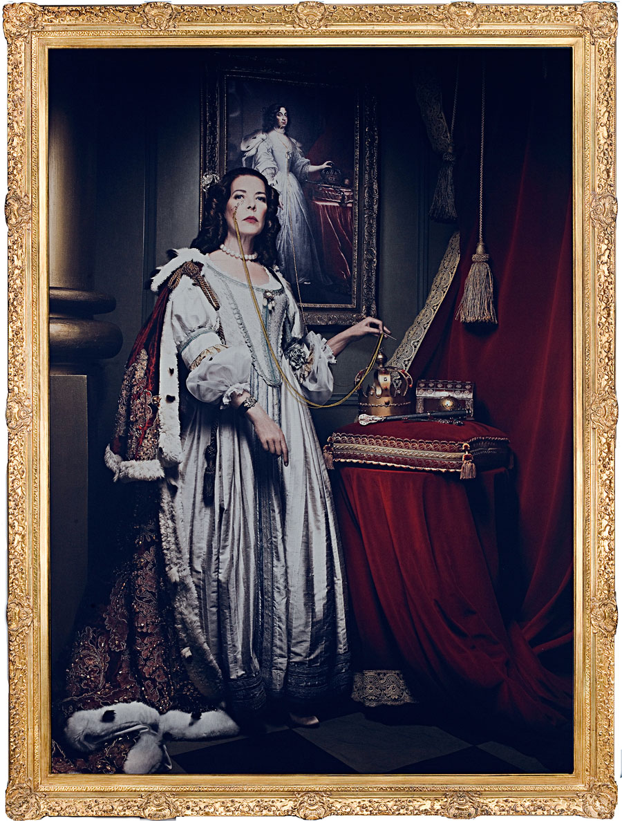
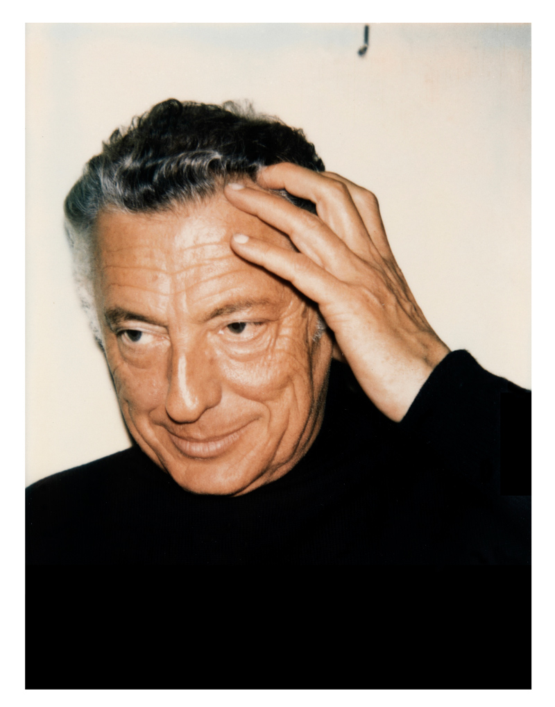
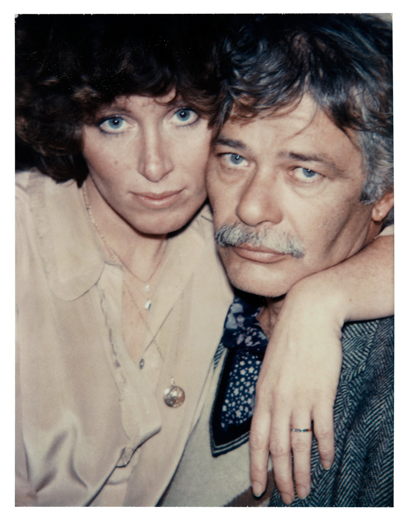
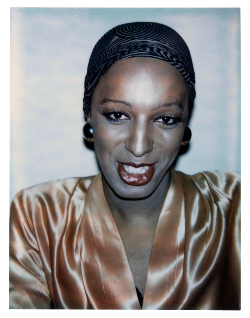
This spring we will be showing more than forty photographs from the period 1950-90 taken by leading artists such as Andy Warhol, Cindy Sherman, Robert Mapplethorpe, Samuel Fosso, Tracey Moffatt, and Elina Brotherus. The exhibition focuses on the art of portrait photography and how the artist in his or her studio creates images that depict people not just as they actually are, but also as they would like to appear.
Moderna Museet’s collection of photography is among the foremost in Europe, it includes some of the most prominent figures in the history of photography. Andy Warhol, Cindy Sherman, and Robert Mapplethorpe are all big names in photography, artists whose work often revolves around concepts of identity, sexuality, and performativity. The photography studio is a place for masquerades and manipulations, a stage where various identities and roles can be tested. It therefore problematises the idea that a portrait is meant to convey some truth about the subject’s inner life. How do we distinguish a staged scene from reality? Is it even possible to make such a distinction? How free are we to form our own identity? If it’s a matter of choosing a role, what roles are available to us?
Andy Warhol’s Polaroid pictures, whose title, Ladies and Gentlemen, has also provided the name for the exhibition, are examples of his interest in – or rather his obsession with – celebrities. From industrial magnates to movie stars, from rock musicians to the “superstar” friends who hung out around the Factory, his fabled studio. In the world of pop art and popular culture, surface is everything. Robert Mapplethorpe’s photographs are instead classically composed – stylised and aesthetically formed. In the controlled environment and lighting of the photo studio, he strives not for realism but for beauty. Here role-play becomes a part of the picture’s constructed character.
In Cindy Sherman’s suite of images called Untitled Film Stills (1977-1980), she plays with film clichés. The scenes and characters in her photographs seem familiar, but in fact it’s always Sherman herself we see in the leading role. Using the camera as a mirror, she takes on and explores various roles. It’s a game of trying on identities that is familiar to teenagers in particular the world over, a game we play in an attempt to find ourselves, or rather to construct an individual identity. One of the many ways in which Sherman’s pictures have been interpreted is as a feminist critique of the limited number of roles available to women.
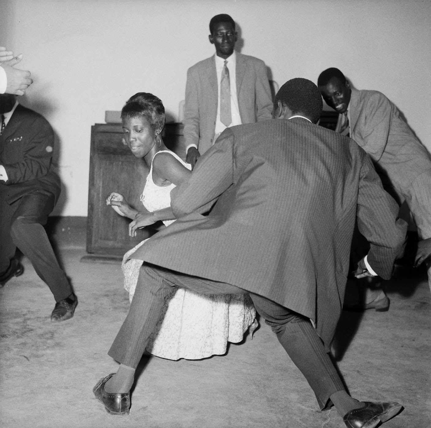
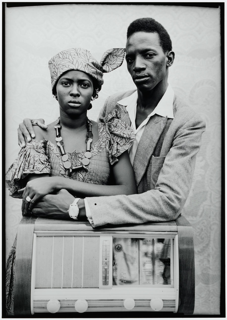
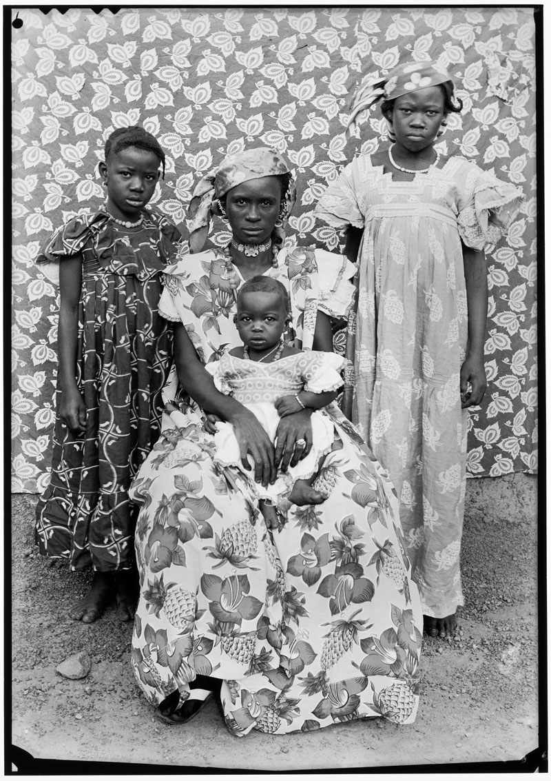
This exhibition also presents several works by Seydou Keïta, Malick Sidibé, and Samuel Fosso, studio photographers who work primarily with portrait photography. Keïta’s studio was next-door to a movie theater in Bamako, the capitol city of Mali. Sidibé takes pictures not just in his studio but also at weddings and other parties. His photographs from Bamako in the 1960s reflect the great hope that came with liberation from French colonial power. Fosso opened his studio in Bangui, in the Central African Republic, when he was still a teenager. He is best known for a series of self-portraits in which he dons a variety of outfits to assume different roles.
Moderna Museet Malmö is located in the city centre of Malmö. Ten minutes walk from the Central station, five minutes walk from Gustav Adolfs torg and Stortorget.
















































You must be logged in to post a comment.