In the 1970s, Daniel Meadows was at the forefront of the independent photography movement. His practice is complex, passionate and sometimes deeply autobiographical.
Daniel Meadows’ early work broke with tradition and infused the medium with new energies and ways of seeing. Between 1971 and 1987, he produced an astonishing record of urban society in Britain, working in a uniquely collaborative way through his interviews with – and writing about – his subjects.
Text from the National Science and Media Museum website
The National Science and Media Museum presents the first retrospective of the career of Daniel Meadows – photographer, documentarian, digital storyteller and unofficial co-founder of a uniquely British photography movement. Daniel Meadows was one of a group of photographers who spearheaded the independent photography movement in the early 1970s, breaking with tradition and infusing the medium with new energies and ways of seeing. His practice is complex, passionate and sometimes deeply autobiographical.
Between 1971 and 1987, he produced an astonishing record of urban society in Britain, working in a uniquely collaborative way through his interviews with – and writing about – his subjects. Meadows is a documentarist and an exceptional storyteller. He reveals historic and culturally significant aspects of people’s lives, dating from the 1970s to the present day. This exhibition displays photographic works alongside oral testimonies by some of the people featured in the photographs and Digital Stories.
Meadows’ practice developed at Manchester Polythechnic, where he trained alongside fellow photographers Martin Parr, Brian Griffin, Charlie Meecham and Peter Fraser. Together they spearheaded a new documentary movement intent on establishing an independent method for making and disseminating photographs, outside the existing conventions of commercial practitioners and photojournalists. Meadows’ resulting work displays complexity and passion, and confers a personal and sometimes deeply autobiographical imprint. During his career he has produced an astonishing record of urban British society, working in a uniquely collaborative way, through photography, digital stories and recorded interviews, to capture extraordinary aspects of everyday life.
His career began in 1972, when he opened a photographic studio in a former barber’s shop in the Moss Side area of Manchester. The Shop on Greame Street features residents from the district who posed for a portrait which they then received free of charge. None has been previously exhibited, and a selection will be on public display for the first time from October.
Two further early projects are also included in the exhibition, both undertaken in partnership with Martin Parr. June Street, 1973, is an intimate portrayal of working class households in an area of Salford, which have since been demolished. Butlin’s by the Sea, 1972, presents a fascinating record of the holiday camp in Filey, North Yorkshire, just after the heyday of this style of British resort.
In 1973, Meadows, aged 21, also bought a 25-year-old Leyland PD1 double-decker bus for £360.20. He removed the seats to make space for a darkroom and living quarters and named it the Free Photographic Omnibus. He spent 14 months taking his Greame Street studio philosophy of free portraits on tour around England. Original photographs from the journey appear in the retrospective, along with a selection from a follow-up project in which Meadows sought out his Photobus subjects more than 20 years later to re-photograph them for National Portraits: Now and Then, 1995-2000.
Other notable works displayed include Decline in the Cotton Industry, 1975-1978, Welfare State International, 1976-1983, and Nattering in Paradise, 1984-1987. The gallery will also screen a selection of Meadows’ Digital Storytelling films. Condensing personal stories into two-minute features of approximately 250 heartfelt words and 12 images, he created “multimedia sonnets from the people”, leading American commentator J.D Lasica to call him “one of the icons of the Digital Storytelling movement.”
This exhibition and the accompanying publication is the product of research by Professor Val Williams as part of an ongoing study into British photography of 1970s and 1980s at the University of the Arts London. It is preceded by the research project, The New British Photography, 1968-1981, funded by the Arts and Humanities Research Council.
Together Val Williams and Daniel Meadows have brought to light the photographer’s incredible archive of prints and negatives, along with ephemera and audio recordings. They have unearthed unpublished and sometimes forgotten treasures which add to a remarkable document – a dramatic, moving and empathetic evocation of a recognisable, yet increasingly alien era.
Press release from the National Science and Media Museum website
Many thankx to the Huis Marseille Museum for allowing me to publish the text and photographs in the posting. Please click on the photographs for a larger version of the image.
Installation view of the exhibition Adam Fuss A Survey of his Work: 1986/2010 at Huis Marseille Museum for Photography, Amsterdam showing at right, Untitled (1999, below) from the series My Ghost
Installation view of the exhibition Adam Fuss A Survey of his Work: 1986/2010 at Huis Marseille Museum for Photography, Amsterdam showing at second right, Untitled (1999, below) from the series My Ghost
Installation view of the exhibition Adam Fuss A Survey of his Work: 1986/2010 at Huis Marseille Museum for Photography, Amsterdam showing at left, Untitled (2003, below)
What immediately stands out with the work of Adam Fuss is that, both in terms of the chosen subject matter and in his approach to the photographic technique, he has greatly dissociated himself from conventional photography. That which Fuss produces is, in fact, still a photograph; but in order to achieve that, he did rid himself of all the finer luxuries available to users of the medium nowadays. Like a present-day alchemist, Fuss has mastered the medium’s most elementary and primitive forms; he sees just as much potential for creativity in technical knowledge as in the imagination, or the visionary power of the photographer.
His subjects (silhouettes, gossamer christening gowns, rabbits, butterflies, snakes, lace, smoke, drops of water) have also been removed from their natural habitats. In the studio they become so epitomised that they assume the strength and quality of a symbol, or icon, fraught with emotion. Fuss seems, figuratively speaking, to have given wings to his images: they have a weightless and elusive appearance, as though being supernatural in origin and import.
Bipolarity
Though ostensibly sublime, the work’s impact on the viewer is nevertheless one of predominantly earthly beauty. This may be a consequence of the bipolarity that lies at the heart of it. All of Fuss’s endeavours have a twofold focus: on matter and mind, on earth or water and the dynamics of fire or air – in short, on vital forces in relation to space and history. Sometimes, as a true photographic magician, he allows the vital fluids of animals (snakes, rabbits) literally to corrode the silver salts of the light-sensitive photographic emulsions. As though trying to allow the image and its model to share the same source of life.
In his technique as well, Fuss wants to reconcile, to connect, past and present. With this he goes back, through experimentation, to the source. Here and there his printing technique is reminiscent of the zeal and the limitations with which Daguerre and Fox Talbot, the disputed founders of photography, wanted to put their discoveries into practice. In the course of time, he came to master the various old and highly complex processes – that of the daguerreotype, the calotype, the photogram, the platinum print – to a degree that remains unsurpassed. Each of these works is unique, and their technical standard is unparalleled. Fuss’s accomplishments include the making of the world’s largest daguerreotypes. (Both daguerreotypes of the Taj Mahal on display here can be counted among these.)
‘Poetic Genius’
Throughout his work Adam Fuss seeks the very essence of the image; to him that lies particularly at the point where an observation of reality is so intensified that it takes on magical powers, so to speak. His outlook on this comes from the notion of ‘Poetic Genius’ expressed by the British poet, writer, engraver and painter William Blake (1757-1827). It seems that Fuss’s idea of producing daguerreotypes of poems and incorporating them into his work also began with Blake.
In Fuss’s extensive 1998 interview with Mark Haworth Booth (then Curator of Photography at the Victoria & Albert Museum in London) he explained this in relation to his photographs of babies in water, saying that the colour photographs are actually not about an individual, a child. The titles Invocation, Journey, Wish have more to do with emotional, romantic ideas. What the image conveys is a feeling, a sensibility. This is no depiction of a baby in water, even though it may be that as well.
Fuss has an incomparable command of the photogram technique. Since 1988 he has been achieving astonishing results with this. The photogram is produced without a camera – and yields, by definition, a unique print. The physical and lifelike quality of these silhouettes is further heightened by the 1:1 scale on which this technique is based. The previously mentioned photographs of babies in water, from the series Invocation (a continuous series with silhouettes of children) are the earliest photograms shown here. Since 1999 Fuss has been making work which he titles My Ghost. Here the themes relate to memory, loss, but also images of remarkable beauty, such as those of peacock feathers. In this series his magnificent daguerreotypes play a leading role.
Installation view of the exhibition Adam Fuss A Survey of his Work: 1986/2010 at Huis Marseille Museum for Photography, Amsterdam showing at left, Untitled (1999, below) from the series My Ghost; at second left, Medusa (2010, below); and at right, Untitled (1999, below) from the series My Ghost
Julia Margaret Cameron – you are one of my heroes!
Many thankx to the Musée d’Orsay for allowing me to publish the photographs in the posting. Please click on the photographs for a larger version of the image.
Consumed by the passion of unrequited love, a young woman lies suspended in the dark space of her unrealised dreams in Henry Peach Robinson’s illustration of the Shakespearean verse “She never told her love,/ But let concealment, like a worm i’ the bud,/ Feed on her damask cheek” (Twelfth Night II,iv,111-13). Although this picture was exhibited by Robinson as a discrete work, it also served as a study for the central figure in his most famous photograph, Fading Away, of 1858.
Purportedly showing a young consumptive surrounded by family in her final moments, Fading Away was hotly debated for years. On the one hand, Robinson was criticised for the presumed indelicacy of having invaded the death chamber at the most private of moments. On the other, those who recognised the scene as having been staged and who understood that Robinson had created the picture through combination printing (a technique that utilised several negatives to create a single printed image) accused him of dishonestly using a medium whose chief virtue was its truthfulness.
While addressing the moral and literary themes that Robinson believed crucial if photography were to aspire to high art, this picture makes only restrained use of the cloying sentimentality and showy technical artifice that often characterise this artist’s major exhibition pictures. Perhaps intended to facilitate the process of combination printing, the unnaturally black background serves also to envelop the figure in palpable melancholia.
Text from the Metropolitan Museum of Art website [Online] Cited 27/01/2020
The historian and art critic, John Ruskin, had a great influence in Great Britain not only on the Pre-Raphaelite movement created in 1848, but on the development of early photography in the 1850s. The leading Pre-Raphaelite painters, John Everett Millais, Dante Gabriel Rossetti, Holman Hunt and Ford Madox Brown and their followers, wished to change the pictorial conventions laid down by the Royal Academy, and in order to demonstrate the transformations in modern life, invented a radically new idiom marked by bright colours and clarity of detail.
Pre-Raphaelite painters and photographers frequently made similar choices of subjects, and the photographers, particularly Julia Margaret Cameron, David Wilkie Wynfield and Lewis Carroll, were often had close links with the painters.
When painting landscapes, the Pre-Raphaelite artists answered Ruskin’s call, meticulously observing nature in order to capture every nuance of detail. For their part, photographers, such as Roger Fenton, Henry White, William J. Stillman and Colonel Henry Stuart Wortley, experimented with the new process of wet plate collodion negatives that allowed much greater image detail, and achieved similar effects. Although highly impressed at first by the daguerreotype, which enabled the eye to see tiny, overlooked details, Ruskin was nonetheless still very critical of landscape photography, which could not reproduce the colours of nature and in particular of the sky. This failing also gave rise to a major debate amongst photography critics.
In portraiture, there were clear links between the painted portraits of Watts and Cameron’s photographic portraits. By using special lenses and photographing her models in close-up, Cameron, achieved, with a glass negative, exactly the opposite effect to the clear image advocated by Ruskin, and her work was distinctive for the breadth of relief and contour, as well as the compositions evoking Raphael’s paintings, also a source of inspiration for Watts.
The painter Dante Gabriel Rossetti repeatedly drew and painted Jane Morris, a model with whom he was infatuated, and he asked Robert Parsons to produce a series of photographs, under his personal direction, which captured the fascinating presence of the young woman as effectively as his own paintings.
Just like the Pre-Raphaelite painters, Victorian photographers would turn to religious or historical subjects, finding a shared inspiration in the poems of Dante, Shakespeare and possibly Byron, and above all in the Arthurian legend made popular once more by Lord Tennyson, the poet laureate. From a formal point of view, Millais’ Ophelia, one of his most successful paintings, was a source for Henry Peach Robinson’s photograph, The Lady of Shalott, even though it had a different theme.
Finally, Pre-Raphaelite painters and Victorian photographers both liked to present scenes from modern life with a moralising undertone: hence She Never Told Her Love, a photograph by Robinson that was very successful when exhibited at the Crystal Palace in 1858, William Holman Hunt’s painting, Awakening of Conscience, and Rossetti’s Found, a painting depicting a countryman who comes across his former sweetheart, now a prostitute in the city.
In the 1880s, Pre-Raphaelite painting would be transformed, with artists and writers like William Morris, Burne-Jones, Whistler and Oscar Wilde, into a very different movement concerned only with the cult of beauty and rejecting Ruskin’s concept of art as something moral or useful. British photographers, however, inspired by the Pre-Raphaelites would inspire the Pictorialist movement that flourished in the 1890s, encouraged by the writings of Henry Peach Robinson and Peter Henry Emerson, extolling artistic photography.
Frederick H. Evans (British, 1853-1943) Kelmscott Manor: Attics 1896 Platinum print Image and sheet: 6 1/16 × 7 7/8 inches (15.4 × 20cm) Philadelphia Museum of Art Gift of the artist, 1932
Attics often serve as metaphors for the space where memories reside. Here Frederick Evans captures the warm glow, the simple, rough-hewn timbers, and the striking geometry of the attic at Kelmscott Manor, the beloved summer retreat of designer William Morris (British, 1834-1896).
Morris, the leader of the Arts and Crafts movement – which valued Britain’s craft tradition and rejected its industrial revolution – drew inspiration from the architecture and workmanship of Kelmscott, designed and constructed in the 1500s. In 1896 Morris invited Evans to photograph the home, which he felt embodied the memory of Britain’s aesthetic past.
Platinum prints always have such luminosity. A Sea of Steps by Fredrick H. Evans (1903, below) is a knockout. I remember some beautiful platinum prints many years ago (1989) up in Sydney at the Museum of Contemporary Art in the touring exhibition Robert Mapplethorpe: The Perfect Moment that were an absolute knockout as well. Pity he didn’t print them himself but they were still superlative!
Dr Marcus Bunyan
Many thankx to Shen Shellenberger and the Philadelphia Museum of Art for allowing me to publish the last five images in the posting. Please click on the photographs for a larger version of the image.
Frederick H. Evans (British, 1853-1943) Kelmscott Manor 1896 Platinum print Image and sheet: 7 3/8 × 4 1/4 inches (18.7 × 10.8cm) Philadelphia Museum of Art Purchased with funds contributed by Dorothy Norman and with the Director’s Discretionary Fund, 1968
Frederick H. Evans (British, 1853-1943) Angers: Prefecture, Sculptured Arches of 11th-12th Century c. 1906-1907 Platinum print Image and sheet: 9 11/16 × 7 7/8 inches (24.6 × 20 cm) Philadelphia Museum of Art Purchased with funds contributed by Dorothy Norman and with the Director’s Discretionary Fund, 1968
Frederick H. Evans (British, 1853-1943) Southwell Cathedral, Chapter House Capital 1898 Platinum print Philadelphia Museum of Art
Frederick H. Evans (British, 1853-1943) View across the nave to the transept at York Minster 1901 Platinum print Philadelphia Museum of Art
Frederick H. Evans (British, 1853-1943) Durham Cathedral: West End Nave 1912 Platinum print Image and sheet: 9 1/2 × 4 13/16 inches (24.1 × 12.3cm) Philadelphia Museum of Art Purchased with funds contributed by Dorothy Norman, 1973
Frederick H. Evans (British, 1853-1943) Ancient crypt cellars in Provins 1910 Platinum print Philadelphia Museum of Art
Frederick H. Evans (British, 1853-1943) Westminster Abbey: North Transept: East Side 1911 Platinum print Image and sheet: 9 7/16 × 6 inches (23.9 × 15.3cm) Philadelphia Museum of Art Purchased with the Lola Downin Peck Fund, 1969
Frederick H. Evans (British, 1853-1943) Westminster Abbey: Staircase in Confessor’s Chapel 1911 Platinum print Image and sheet: 9 1/2 × 6 1/8 inches (24.2 × 15.6cm) Philadelphia Museum of Art Purchased with the Lola Downin Peck Fund, 1969
Frederick H. Evans (British, 1853-1943) Westminster Abbey: From the South Transept 1911 Platinum print Image and sheet: 9 1/2 × 7 7/16 inches (24.2 × 18.9cm) Philadelphia Museum of Art Purchased with the Lola Downin Peck Fund, 1969
Frederick H. Evans (British, 1853-1943) Westminster Abbey: East Ambulatory 1911 Platinum print Image and sheet: 9 5/16 × 6 11/16 inches (23.7 × 17cm) Purchased with the Lola Downin Peck Fund, 1969
Frederick H. Evans (British, 1853-1943) Westminster Abbey: 12th-Century Mosaic Floor at the Sanctuary 1911 Platinum print Image and sheet: 7 5/16 × 8 7/8 inches (18.6 × 22.6 cm) Philadelphia Museum of Art Purchased with the Lola Downin Peck Fund, 1969
Although Evans indicated that this mosaic floor was created in the twelfth century, the surface surrounding the High Altar of Westminster Abbey was in fact laid in 1268. King Henry III (1207-1272) commissioned the mosaic from Roman craftsmen who specialised in the opus sectile, or “cut work” technique, commonly called “Cosmati” after a well-known Italian family of mosaic artists. Materials used here include blue, red, and turquoise glass as well as yellow limestone, purple porphyry, green serpentine, and onyx. Evans’s unusual composition privileges the floor, drawing attention to the intricate and abstract design of squares, rectangles, and roundels.
Frederick H. Evans (British, 1853-1943) Westminster Abbey: East End, North Ambulatory 1911 Platinum print Image and sheet: 9 3/8 × 7 1/2 inches (23.8 × 19.1cm) Philadelphia Museum of Art Purchased with the Lola Downin Peck Fund, 1969
Frederick H. Evans (British, 1853-1943) Westminster Abbey: Apse from Choir 1911 Platinum print Image and sheet: 9 7/16 × 7 1/2 inches (23.9 × 19.1cm) Philadelphia Museum of Art Purchased with the Lola Downin Peck Fund, 1969
Country Life magazine commissioned Evans to photograph the interior of London’s Westminster Abbey in 1911, while the church was closed to worshipers in preparation for the coronation of King George V (1865-1936) and Queen Mary (1867-1953). Although the construction and removal of temporary facilities relating to the coronation regularly disrupted Evans’s work, the more than fifty photographs in the resulting portfolio reveal only the timeless beauty and grandeur of the Gothic structure that has hosted thirty-eight royal coronations since the year 1066.
Frederick H. Evans (British, 1853-1943) Westminster Abbey: Henry VII Chapel, Detail of Henry VII Tomb 1911 Platinum print Image and sheet: 8 1/16 × 7 3/16 inches (20.4 × 18.2cm) Philadelphia Museum of Art Purchased with the Lola Downin Peck Fund, 1969
Frederick H. Evans (British, 1853-1943) Westminster Abbey: Tomb of Edward III, Mary and William 1911 Platinum print Image and sheet: 8 11/16 × 6 5/8 inches (22.1 × 16.9cm) Philadelphia Museum of Art Purchased with the Lola Downin Peck Fund, 1969
Frederick H. Evans (British, 1853-1943) York Minster – In Sure and Certain Hope 1903 Platinum print Philadelphia Museum of Art
Frederick H. Evans (British, 1853-1943) A Sea of Steps – Stairs to Chapter House – Wells Cathedral 1903 Platinum print Philadelphia Museum of Art
Frederick H. Evans (British, 1853-1943) Wells Cathedral: North Transept c. 1903 Platinum print Image and sheet: 7 1/4 × 5 7/16 inches (18.4 × 13.8cm) Purchased with funds contributed by Dorothy Norman, 1973
Frederick H. Evans (British, 1853-1943) Ely Cathedral: Octagon into Nave Aisle c. 1899 Platinum print Image and sheet: 7 15/16 × 6 1/8 inches (20.2 × 15.6cm) Philadelphia Museum of Art Purchased with funds contributed by Dorothy Norman, 1973
Frederick H. Evans (British, 1853-1943) Fr: Sec: Spine of Echinus x. 40 c. 1887 Platinum print Image and sheet: 4 3/4 × 4 5/8 inches (12 × 11.8cm) Philadelphia Museum of Art Purchased with funds contributed by Dorothy Norman, 1973
Unlike many beginning photographers of the nineteenth century who experimented with straightforward portrait or landscape compositions, Evans’s earliest trials with photography involved minute organic matter and required the use of a microscope. His complicated “photo-microgram” process allowed him to capture the intricate structures of objects including a water beetle’s eye, tiny sea shells, and this section of a sea urchin’s spine. Although classified as scientific rather than artistic imagery by the Photographic Society of Great Britain, this photo-microgram demonstrates Evans’s ability to delineate the magnificence of organic patterns and presage his photographs that depict the structural beauty of cathedrals.
Frederick H. Evans (British, 1853-1943) Berberis: Plant Study c. 1908 Platinum print Image and sheet: 9 3/8 × 7 1/16 inches (23.8 × 17.9cm) Philadelphia Museum of Art Purchased with funds contributed by Dorothy Norman and with the Director’s Discretionary Fund, 1968
Frederick H. Evans (British, 1853-1943) Redlands Woods c. 1908 Platinum print Image and sheet: 6 × 4 3/16 inches (15.3 × 10.6cm) Philadelphia Museum of Art Purchased with funds contributed by Dorothy Norman and with the Director’s Discretionary Fund, 1968
Frederick H. Evans (British, 1853-1943) An English Glacier: Near Summit of Scafell c. 1905 Platinum print Image and sheet: 9 3/4 × 6 1/2 inches (24.8 × 16.5 cm) Philadelphia Museum of Art Purchased with funds contributed by Dorothy Norman and with the Director’s Discretionary Fund, 1968
Exhibition Highlights the Exceptional Beauty of the Platinum Process in Photography
A cornerstone of photographic practice during the late nineteenth and early twentieth centuries, the platinum print is revered by photographers and viewers alike as one of the most beautiful forms of photography, with subtle and lustrous shades that range from the deepest blacks to the most delicate whites. The Philadelphia Museum of Art will present an exhibition of more than 50 works from the late 19th century to the present, showcasing outstanding prints largely drawn from the Museum’s collection of photographs. The Platinum Process: Photographs from the Nineteenth to the Twenty-First Century, on view February 27 – May 23 in the Julien Levy Gallery at the Museum’s Perelman Building, will include images by early masters of the process including Frederick H. Evans (British, 1853-1943) and Alfred Stieglitz (American, 1864-1946), as well as works by skilled contemporary practitioners such as Lois Conner (American, born 1951) and Andrea Modica (American, born 1960), who continue to engage in this historic and painstaking process in an era noted for electronic imaging.
“The exhibition offers an opportunity to share this exceptionally beautiful form of photography with our visitors, some of whom may be seeing it for the first time,” Curator of Photographs Peter Barberie said, adding “the Museum is fortunate to have a particularly strong and varied collection of work by some of the truly great practitioners of this process.”
Unlike standard silver printing, in which particles are suspended in gelatin, platinum is brushed directly onto the paper, allowing artists to create a matte image with an exceptionally wide tonal range. Introduced in 1873, the process was enthusiastically embraced by the group of photographers known as the Pictorialists, who believed that fine art photography should emulate the aesthetic values of painting. The group included Evans, whose beautifully rendered images of Britain’s Westminster Abbey, York Minster Abbey and Ely Cathedral are included in the exhibition, and Stieglitz (American, 1876-1946), who is represented in the show by a portrait of his wife, the artist Georgia O’Keeffe (American, 1887-1986), as well as a landscape that foreshadows his Equivalents series.
While encompassing works spanning many dates and styles, The Platinum Process highlights one of the Museum’s treasures, the 1915 masterpiece “Wall Street” by Paul Strand (1890-1976, see above), whose work was at the forefront of the modernist aesthetic developing in New York during the early 20th century. Strand used the subtlety of the platinum print in this work to emphasise abstract patterns in the long shadows cast by figures that walk before a succession of monumental windows.
Reserves of platinum were appropriated for military use during World War I, and its high cost led manufacturers to cease production of commercial platinum paper by the 1930s. As photographers became more engaged in social concerns, documentation and realism, the process fell into disuse. It was not until the early 1960s when Irving Penn, then a successful photographer for Vogue magazine, began to experiment with the long-forgotten technique and took the first steps toward its revival. A meticulous craftsman, Penn was delighted by the luminous prints and lavish tonal range he could achieve using platinum and began to make new photographs with this process in the 1970s. Penn and many of the other contemporary artists on view including Thomas Shillea and Jennette Williams followed Strand’s example, using platinum not for idealised pictures, but to capture nuances of modern experience.
Press release from The Philadelphia Museum of Art website [Online] Cited 25/07/2019. No longer available online
Robert S. Redfield (American, 1849-1923) Heloise Redfield at Mount Washington 1889 Platinum print Image and sheet: 6 5/16 × 8 1/4 inches (16 × 21cm) Philadelphia Museum of Art Gift of Alfred G. Redfield, 1985
F. Holland Day (American, 1864-1933) Untitled 1905 Platinum prints mounted to paper Image and sheet (overall): 10 1/16 × 7 1/2 inches (25.6 × 19.1cm) Philadelphia Museum of Art From the Collection of Dorothy Norman, 1970
Katharine Steward Stanbery (American, 1870-1928) Untitled (Two Girls Playing Jacks) 1907 Platinum print Image and sheet: 8 15/16 x 4 11/16 inches (22.7 x 11.9cm) Philadelphia Museum of Art 125th Anniversary Acquisition. Purchased with the Lola Downin Peck Fund, the Alice Newton Osborn Fund, and with funds contributed by The Judith Rothschild Foundation, 2002
Paul Strand (American, 1890-1976) City Hall Park, New York 1915 Platinum print Sheet: 13 7/8 x 7 3/4 inches (35.2 x 19.7cm) Philadelphia Museum of Art Gift of the artist, 1972
Paul Strand (American, 1890-1976) Washington Heights, New York 1915 (negative); 1915 (print) Platinum print Image and sheet: 9 3/8 x 11 7/8 inches (23.8 x 30.2cm) Philadelphia Museum of Art The Paul Strand Retrospective Collection, 1915-1975, gift of the estate of Paul Strand, 1980
Paul Strand (American, 1890-1976) Wall Street 1915 (negative); 1915 (print) Platinum print Image: 9 3/4 × 12 11/16 inches (24.8 × 32.2cm) Philadelphia Museum of Art The Paul Strand Retrospective Collection, 1915-1975, gift of the estate of Paul Strand, 1980
Paul Strand (American, 1890-1976) Man in a Derby, New York 1916 Platinum print Image: 12 13/16 x 9 15/16 inches (32.5 x 25.2cm) Mat: 22 11/16 x 19 7/16 inches (57.6 x 49.4cm) Philadelphia Museum of Art The Paul Strand Retrospective Collection, 1915-1975, gift of the estate of Paul Strand, 1980
Paul Strand (American, 1890-1976) The Italian, New York 1916 (negative); 1916 (print) Platinum print Image and sheet: 13 × 9 5/16 inches (33 × 23.7cm) Philadelphia Museum of Art The Paul Strand Retrospective Collection, 1915-1975, gift of the estate of Paul Strand, 1980
Paul Strand (American, 1890-1976) Rebecca, New York 1922 (negative); 1922 (print) Palladium print Image: 9 3/4 x 7 13/16 inches (24.8 x 19.8cm) Philadelphia Museum of Art The Paul Strand Collection, purchased with funds contributed by Mr. and Mrs. Robert A. Hauslohner (by exchange), 1985
Alvin Langdon Coburn (British, born United States, 1882-1966) George Seeley c. 1902-1903 Platinum print Image and sheet: 11 x 8 9/16 inches (27.9 x 21.7cm) Philadelphia Museum of Art Purchased with the Lola Downin Peck Fund, the Alice Newton Osborn Fund, and with funds contributed by The Judith Rothschild Foundation in honour of the 125th Anniversary of the Museum, 2002
Gertrude Käsebier (American, 1852-1934) The Two Families c. 1910 Platinum print Image and sheet: 5 3/8 × 11 5/16 inches (13.6 × 28.8cm) Philadelphia Museum of Art Gift of William Innes Homer, 1986
Käsebier’s family members and close friends served as her earliest photographic subjects, and familial themes remained paramount in the images she produced throughout her career. This photograph of Käsebier’s two daughters and their families, taken in Woburn, Massachusetts, is a dynamic portrait of a multigenerational gathering. Curiously, Käsebier manipulated this print to emphasise the act of photography. In the original scene, the young boy and seated woman at right look downward at a wire-mesh food cover resting on a plate. These objects have been removed from this print, replaced by the considerably more fascinating camera.
Gertrude Käsebier (American, 1852-1934) Mrs. F. H. Evans c. 1900 Platinum print Image and sheet: 7 1/2 × 5 1/4 inches (19.1 × 13.4 cm) Philadelphia Museum of Art Purchased with funds contributed by Dorothy Norman, 1973
In 1889, at the age of thirty-seven, Käsebier enrolled at Brooklyn’s Pratt Institute to study portrait painting. Although the art school did not teach photography, Käsebier began using a camera at home to document her growing children, eventually favoring photography over other mediums. She established a commercial portrait studio in New York City in 1897, working to “bring out in each photograph the essential personality that is variously called temperament, soul, humanity.” This portrait features Ada Emily Longhurst, wife of photographer Frederick H. Evans, whom Käsebier befriended while on a trip to England in 1901.
William Henry Fox Talbot (British, 1800-1877) Lace 1839-1844 Photogenic drawing (salted paper print) Sheet (trimmed to image): 17.1 x 22cm (6 3/4 x 8 11/16 in.) Support: 24.8 x 31.1cm (9 3/4 x 12 1/4 in.) National Gallery of Art, Washington Patrons’ Permanent Fund Public domain
Many thankx to Kate Afanasyeva and the National Gallery of Art for allowing me to reproduce the photographs from the exhibition below. Please click on the photographs for a larger version of the image.
Dr Marcus Bunyan
Anna Atkins (British, 1799-1871) Ferns, Specimen of Cyanotype 1840s cyanotype National Gallery of Art, Washington R.K. Mellon Family Foundation Fund
Albert Sands Southworth and Josiah Johnson Hawes The Letter c. 1850 daguerreotype National Gallery of Art, Washington Patrons’ Permanent Fund
Southworth and Hawes’ aspirations for their portraits went far beyond those of the average photographer of their day. Whereas most daguerreotypists, simply concerned with rendering a likeness, used stock poses, painted backdrops, and even head restraints to firmly fix their subjects, Southworth and Hawes were celebrated not just for their technical expertise, but also for their penetrating studies, innovative style, and creative use of natural light. They sought to elevate their subjects “far beyond common nature” and embody their “genius and spirit of poetry,” as Southworth wrote in 1871. “What is to be done is obliged to be done quickly. The whole character of the sitter is to be read at first sight; the whole likeness, as it shall appear when finished, is to be seen at first, in each and all its details, and in their unity and combination.”2
Among Southworth and Hawes’ most accomplished studies, The Letter is exceptional in its composition and mood. Most American daguerreotype portraits made in the 1840s and 1850s were frontal, bust-length studies of single figures who rarely show any kind of facial expression because of the often long exposure times. The Letter, however, is a highly evocative study. With its carefully constructed composition and tight pyramidal structure, it presents two thoughtful young women contemplating a letter. Through their posture and expression, these women seem to gain not only physical support from each other, but also emotional strength. Although the identity of the women is unknown, as is the content of the letter, this large and distinguished daguerreotype reflects Southworth and Hawes’ aspiration to capture “the life, the feeling, the mind, and the soul” of their subjects.3
(Text by Sarah Greenough, published in the National Gallery of Art exhibition catalogue, Art for the Nation, 2000)
Charles Nègre (French, 1820-1880) Saint John the Evangelist, Chartres Cathedral c. 1854 Salted paper print from a paper negative National Gallery of Art, Washington Eugene L. and Marie-Louise Garbaty Fund, Pepita Milmore Memorial Fund and New Century Fund Public domain
In 1851 the French government’s Commission des Monuments Historiques selected five photographers to document architectural treasures throughout the country. Nègre was not included, perhaps because he was a member of the opposition party, but he took it upon himself to photograph extensively in Marseilles, Arles, Avignon, and Aix-en-Provence in the early 1850s, and in 1854 he made many photographs of Chartres Cathedral.
Nègre applied his growing understanding of light, shadow, line, and form in Saint John the Evangelist, Chartres Cathedral, and the photograph beautifully illustrates his willingness to sacrifice “a few details,” as he wrote, to capture “an imposing effect.” In addition, unlike photographers associated with the Commission des Monuments Historiques, who were asked to provide general studies of a building’s façade, Nègre was free to explore more unusual views. The statue of Saint John the Evangelist is situated high in the north spire of Chartres, several feet above a nearby balcony. Although difficult to see and even harder for Nègre to record (he most likely perched his camera on a platform), the view in his photograph succinctly captured what he called the cathedral’s “real character” and “preserved the poetic charm that surrounded it.”
Unknown photographer (American 19th Century) George E. Lane, Jr. c. 1855 Ambrotype National Gallery of Art, Washington Gift of Kathleen, Melissa, and Pamela Stegeman Public domain
Étienne Carjat (French, 1828-1906) Charles Baudelaire 1861, printed 1877 Woodburytype National Gallery of Art, Washington Gift of Jacob Kainen Public domain
William James Stillman (American, 1828-1901) The Acropolis of Athens 1869/1870 Carbon print National Gallery of Art, Washington Horace W. Goldsmith Foundation through Robert and Joyce Menschel
J.G. Ellinwood (American, 1844-1924) Portrait of a Woman c. 1870 Tintype, hand-coloured National Gallery of Art, Washington Mary and Dan Solomon Fund
Clarence White (American, 1871-1925) Mrs. White – In the Studio 1907 platinum print National Gallery of Art, Washington Horace W. Goldsmith Foundation through Robert and Joyce Menschel and R.K. Mellon Family Foundation Fund
Karl Struss (American, 1886-1981) Columbia University, Night 1910 Gum dichromate over platinum print Image: 24.1 × 19.9cm (9 1/2 × 7 13/16 in.) National Gallery of Art, Washington Horace W. Goldsmith Foundation through Robert and Joyce Menschel
László Moholy-Nagy (Hungarian, 1895-1946) Untitled (Positive) c. 1922-1924 gelatin silver print National Gallery of Art, Washington Gift of The Circle of the National Gallery of Art
László Moholy-Nagy (Hungarian, 1895-1946) Untitled c. 1922-1924 gelatin silver print National Gallery of Art, Washington New Century Fund
Eugène Atget (French, 1857-1927) Magasin, Avenue des Gobelins 1925 gelatin silver print, printed-out National Gallery of Art, Washington Patrons’ Permanent Fund Public domain
Aleksandr Rodchenko (Russian, 1891-1956) Pioneer with a Bugle 1930 Gelatin silver print National Gallery of Art, Washington Patrons’ Permanent Fund
Sid Grossman (American, 1913-1955) San Gennaro Festival, New York City 1948 gelatin silver print National Gallery of Art, Washington Anonymous Gift
Saul Leiter (American, 1923-2013) Snow 1960, printed 2005 Chromogenic colour print National Gallery of Art, Washington Gift of Saul Leiter
Diane Arbus (American, 1923-1971) A Young Man in Curlers at Home on West 20th Street, N.Y.C., 1966 1966 Gelatin silver print National Gallery of Art, Washington Gift of the Collectors Committee
The extraordinary range and complexity of the photographic process is explored, from the origins of the medium in the 1840s up to the advent of digital photography at the end of the 20th century, in a comprehensive exhibition and its accompanying guidebook at the National Gallery of Art, Washington. On view in the West Building, from October 25, 2009 through March 14, 2010, In the Darkroom: Photographic Processes Before the Digital Age chronicles the major technological developments in the 170-year history of photography and presents the virtuosity of the medium’s practitioners. Drawn from the Gallery’s permanent collection are some 90 photographs – ranging from William Henry Fox Talbot’s images of the 1840s to Andy Warhol’s Polaroid prints of the 1980s.
“In the Darkroom and the accompanying guidebook provide a valuable overview of the medium as well as an introduction to the most commonly used photographic processes from its earliest days,” said Earl A. Powell III, director, National Gallery of Art.
In the Darkroom
Organised chronologically, the exhibition opens with Lace (1839-1844), a photogenic drawing by William Henry Fox Talbot. Made without the aid of a camera, the image was produced by placing a swath of lace onto a sheet of sensitised paper and then exposing it to light to yield a tonally reversed image.
Talbot’s greatest achievement – the invention of the first negative-positive photographic process – is also celebrated in this section with paper negatives by Charles Nègre and Baron Louis-Adolphe Humbert de Molard as well as salted paper prints made from paper negatives by Nègre, partners David Octavius Hill and Robert Adamson, and others.
The daguerreotype, the first publicly introduced photographic process and the most popular form of photography during the medium’s first decade, is represented by a selection of British and American works, including an exquisite large-plate work by the American photographers Albert Sands Southworth and Josiah Johnson Hawes (see photograph above). By the mid-1850s, the daguerreotype’s popularity was eclipsed by two new processes, the ambrotype and the tintype. These portable photographs on glass or metal were relatively inexpensive to produce and were especially popular for portraiture.
The year 1851 marked a turning point in photographic history with the introduction of the collodion negative on glass and the albumen print process. Most often paired together, this negative-print combination yielded lustrous prints with a subtle gradation of tones from dark to light and became the most common form of photography in the 19th century, seen here in works by Julia Margaret Cameron, Roger Fenton, and Gustave Le Gray.
Near the turn of the 20th century, a number of new, complex print processes emerged, such as platinum and palladium, gum dichromate, and bromoil. Often requiring significant manipulation by the hand of the artist, these processes were favoured by photographers such as Gertrude Käsebier, Alfred Stieglitz, and Edward Weston.
One of the most significant developments of the late 19th century was the introduction of gelatin into photographic processes, which led to the invention of the film negative and the gelatin silver print. These became the standard for 20th-century black-and-white photography. A chronological selection of gelatin silver prints, including a contact print made by André Kertész in 1912; a grainy, blurred image of Little Italy’s San Gennaro festival at night by Sid Grossman from 1948 (see photograph above); and a coolly precise industrial landscape by Frank Gohlke from 1975, reveals how the introduction of the film negative and changes in the gelatin silver print process profoundly shaped the direction of modern photography. This section also explores the development of ink-based, photomechanical processes such as photogravure, Woodburytype, and halftone that enabled the large-scale, high-quality reproduction of photographs in books and magazines.
The final section of the exhibition explores the rise of colour photography in the 20th century. Although the introduction of chromogenic colour processes made colour photography commercially viable by the 1930s, it was not widely employed by artists until the 1970s. The exhibition celebrates the pioneers of colour photography, including Harry Callahan and William Eggleston, who made exceptional work using the complicated dye transfer process. The exhibition also explores the range of processes developed by the Polaroid Corporation that provided instant gratification to the user, from Andy Warhol’s small SX-70 prints to the large-scale Polaroid prints represented by the work of contemporary photographer David Levinthal.
Press release from the National Gallery of Art website [Online] Cited 15/02/2010 no longer available online
Roger Fenton (British, 1819-1869) The Cloisters, Tintern Abbey 1854 Salted paper print from a collodion negative 18.3 x 22.1cm (7 3/16 x 8 11/16 in.) National Gallery of Art, Washington Horace W. Goldsmith Foundation through Robert and Joyce Menschel Public domain
Although Roger Fenton’s photographic career lasted for only 11 years, he exerted a profound influence on the medium. Trained as a lawyer, he began to paint in the early 1840s, studying in Paris with Michel-Martin Drölling and later in London with Charles Lucy. But in 1851 he took up photography and produced a distinguished and varied body of work. He was a pivotal figure in the formation of the Photographic Society (later known as the Royal Photographic Society), garnering support from Queen Victoria and Prince Albert. He is best known for his 1855 photographs made during the Crimean War, among the first to document war. But he also made ambitious studies of English cathedrals, country houses, and landscapes as well as portraits of the royal family, a series of still lifes, and studies of figures in Asian costume.
When Fenton first began to make photographs, he generally posed figures in a fairly stiff, even anecdotal manner. But in 1854 he began to use figures to create a sense of tension at once intriguing and compelling. The Cloisters, Tintern Abbey shows this more dynamic approach. Fenton placed people in three groups, not interacting with one another but engaging in silent and solitary dialogue with their decaying surroundings. Tintern Abbey had, of course, inspired many artists and poets to reflect on both “the life of things” – as William Wordsworth wrote in his 1798 poem, “Lines Composed a Few Miles above Tintern Abbey” – and on the transitory nature of life itself.
Charles Nègre (French, 1820-1880) Cathédrale de Chartres – Portique du Midi XIIe Siècle (Chartres Cathedral, South Portal, 12th Century) c. 1854, printed c. 1857 photogravure National Gallery of Art, Washington William and Sarah Walton Fund
Roger Fenton (British, 1819-1869) Fruit and Flowers 1860 Albumen print from a collodion negative National Gallery of Art, Washington Paul Mellon Fund public domain
In the summer of 1860 Fenton made his most deliberate and exacting photographs to date: a series of still lifes. Although the subject obviously had its roots in painting, his densely packed compositions are far removed from the renditions of everyday life by the Dutch masters. Instead, Fenton extravagantly piled luscious fruits and intricately patterned flowers on top of one another and pushed them to the front of his composition so that they seem almost ready to tumble out of the photograph into the viewer’s space. It is that very immediacy – the precarious composition, the lush sensuousness of the objects, and our knowledge of their imminent decay – that makes these photographs so striking.
Gustave Le Gray (French, 1820-1884) Cavalry Maneuvers behind barrier, Camp de Châlons 1857 Albumen silver print from glass negative National Gallery of Art, Washington
Platt D. Babbitt (American, 1822-1879) Niagara Falls c. 1860 Ambrotype National Gallery of Art, Washington Vital Projects Fund
Alfred Stieglitz (American, 1864-1946) The Terminal 1893, printed 1920s/1930s Gelatin silver print National Gallery of Art, Washington Alfred Stieglitz Collection
Aaron Siskind (American, 1903-1991) Martha’s Vineyard 108 1954 Gelatin silver print National Gallery of Art, Washington Diana and Mallory Walker Fund
Dave Heath (Canadian, born United States, 1931-2016) Hastings-on-Hudson, New York 1963 Gelatin silver print National Gallery of Art, Washington Gift of Howard Greenberg
William Eggleston (American, b. 1939) Untitled (Car in Parking Lot) 1973 Dye imbibition print National Gallery of Art, Washington Anonymous Gift
Harry Callahan (American, 1912-1999) Providence 1977 Dye transfer print
Robert Adams (American, b. 1937) Summer Nights #2 (Longmont, Colorado) 1979 Gelatin silver print National Gallery of Art, Washington Gift of Mary and David Robinson
Richard Misrach (American, b. 1949) Dead Fish, Salton Sea, California 1983, printed 1997 Chromogenic colour print National Gallery of Art, Washington Anonymous Gift
Mark Klett (American, b. 1952) Under the Dark Cloth, Monument Valley, May 27 1989 Gelatin silver print from Polaroid instant film negative National Gallery of Art, Washington Gift of the Collectors Committee
Edward Burtynsky (Canadian, b. 1955) Shipbreaking #10, Chittagong, Bangladesh 2000, printed 2001 Chromogenic colour print National Gallery of Art, Washington Fund for Living Photographers
The National Gallery of Art, Washington, DC
The National Gallery of Art, located on the National Mall between 3rd and 7th Streets at Constitution Avenue NW.
A passionate and personal view of England by one of our greatest living photographers, In England reflected on England from the 1950s to the present day. For half a decade McCullin recorded images of England, highlighting issues surrounding wealth, race, class and social justice. This was the first ever exhibition dedicated exclusively to this aspect of his work.
The images, taken mainly from two books – Homecoming (1979) and In England (2007) – are often imbued with their social or political context. Several exhibited photographs were taken during McCullin’s trips to Bradford and around his own home city, London, as well as Liverpool and the North East. The exhibition also included McCullin’s first ever published photograph, The Guv’nors.
Dr Marcus Bunyan
Many thankx to the National Media Museum for allowing me to publish the photographs in the posting. Please click on the photographs for a larger version of the image.
A passionate and personal view of Britain by one of our greatest living photographers is being showcased in a major free-to-enter exhibition at the National Media Museum from 8 May – 27 September 2009.
Don McCullin – In England reflects on Britain from the 1950s to the present day. For half a decade McCullin, in addition to travelling the world photographing war ravaged countries to great acclaim, has been recording England and highlighting issues surrounding wealth, race, class and social justice.
The National Media Museum is hosting the first ever exhibition dedicated exclusively to this aspect of his work. Curator Colin Harding said: “Although Don is probably best known for his war photography, he is not purely a war photographer and does not class himself as such. However, many of the 70 black and white images displayed in this new show are clearly influenced by his experiences abroad. Don’s vision of England is not a pretty one. He photographed what he saw and what he saw was often harsh – poverty, unemployment, discrimination, but he always photographs with passion and empathy.”
Many of the images have a political or social context and are taken extensively from two books – Homecoming (1979) and In England (2007); coincidentally published in the same years Margaret Thatcher came to power and Tony Blair left power respectively. Some of the images will be publicly displayed for the first time.
Don McCullin – In England gives audiences the chance to see his first ever published photograph – of The Guv’nors, a 1950s gang from his neighbourhood around Finsbury Park, London. The picture appeared in The Observer newspaper after a policeman was murdered by one of the gang members.
Several exhibited photographs were taken during McCullin’s trips to Bradford (the National Media Museum’s home city) and around his own home city, London, as well as Liverpool and the North East. Other aspects of English life are featured – a series of landscapes, including a study of Hadrian’s Wall taken earlier this year, a 1968 shoot with The Beatles, and trips to the seaside and Royal Ascot.
To complement the exhibition a new area will be produced on the Museum’s website offering exclusive video interviews, images, further information, and links to other relevant websites.
Text from the National Media Museum website Nd [Online] Cited 12/09/2009 no longer available online
Photographer Don McCullin on his early years In 2009 Don McCullin spoke to us about his early years as part of his In England exhibition at the museum.
According to McCullin, a postcard of this photograph sold ‘like hotcakes’ in Australia. McCullin found Snowy, the man in the portrait, standing by the side of the road with an ice-cream barrow in Cambridge, in the early 1970s. He pulled the mouse out of his pocket and put it into his mouth as McCullin took pictures.
Ron Arad (British-Israeli, b. 1951) Concrete Stereo 1983 Photo courtesy of Ron Arad Associates and the Museum of Modern Art
One of my favourite designers!
Marcus
Many thankx to the Museum of Modern Art for allowing me to publish the photographs in the posting. Please click on the photographs for a larger version of the image.
Ron Arad (British-Israeli, b. 1951) The Rover Chair 1981 Tubular steel, leather, and cast-iron Kee Klamp joints 30 3/4 x 27 3/16 x 36 1/4″ (78 x 69 x 92cm); weight 57.3 lbs (26 kg) Edition by One Off, London Private collection, London Photo by Erik and Petra Hesmerg and courtesy of Private Collection, Maastricht, and the Museum of Modern Art
“I picked up this Rover seat and I made myself a frame and this piece sucked me into this world of design.” “If someone had told me a week before that I was going to be a furniture designer, I would think they were crazy.”
~ Ron Arad
Ron Arad (British-Israeli, b. 1951) Sketch for Well Tempered Chair 1986 Photo courtesy of Vitra Design Museum and the Museum of Modern Art
Ron Arad (British-Israeli, b. 1951) Well Tempered Chair Prototype 1986 Photo courtesy of Vitra Design Museum and the Museum of Modern Art
Ron Arad (British-Israeli, b. 1951) Big Easy chair 1988
Ron Arad (British-Israeli, b. 1951) Big Easy. Volume 2 1988 Polished stainless steel 42 1/8 x 50 1/2 x 36 1/4″ (107 x 128.3 x 92.1cm); weight 44 lbs (20 kg) Edition by One Off, London Collection of Michael G. Jesselson, New York Image: Ron Arad Associates, London
The Museum of Modern Art presents Ron Arad: No Discipline, the first major U.S. retrospective of Arad’s work, from August 2 to October 19, 2009. Among the most influential designers of our time, Arad (British, b. Israel 1951) stands out for his adventurous approach to form, structure, technology, and materials in work that spans the disciplines of industrial design, sculpture, architecture, and mixed-medium installation. Arad’s relentless experimentation with materials of all kinds – from steel, aluminium, and bronze to thermoplastics, crystals, fibre-optics, and LEDs – and his radical reinterpretation of some of the most established archetypes in furniture – from armchairs and rocking chairs to desk lamps and chandeliers – have put him at the forefront of contemporary design.
The exhibition features approximately 140 works, including design objects and architectural models, and 60 videos. Most of the objects featured in the exhibition are displayed in a monumental Corten-and-stainless-steel structure specially designed by the artist called Cage sans Frontières (Cage without Borders). The structure measures 126.5 feet (38.5 meters) long, spanning the entire length of the Museum’s International Council gallery, and over 16 feet (5 meters) tall. The exhibition is organised by Paola Antonelli, Senior Curator, and Patricia Juncosa Vecchierini, Curatorial Assistant, Department of Architecture and Design, The Museum of Modern Art.
Ms. Antonelli states: “Arad is well known for his iconoclastic disregard for disciplines – and, at least apparently, for discipline. He has defined much of the current panorama of design, inspiring a generation of practitioners who disregard established modes of practice in favour of mutant design careers that are flexible enough to encompass the range of contemporary design applications, from interactions and interfaces to furniture and shoes.”
Arad’s accomplishments over the past three decades have stirred up the design world by repeatedly updating the concept of the architect / designer / artist and repositioning design side by side with art, both in discourse and in the market – all while keeping one foot firmly in industrial production and large-scale distribution. Idiosyncratic and surprising, Arad’s designs communicate the joy of invention, pleasure, humour, and pride in the display of their technical and constructive skills.
This exhibition celebrates Arad’s spirit by combining industrial design, studio pieces, and architecture. It features Arad’s most celebrated historical pieces, including the Rover Chair (1981) (see above), the Concrete Stereo (1983) (see above), and the Bookworm bookshelves (1993) (see below), along with more recent products such as the PizzaKobra lamp (2008) (see below) and the latest reincarnation of his Volumes series (1998), the armchair duo titled Even the Odd Balls? (2009) (see below).
Cage sans Frontières was specially designed by Arad, developed with Michael Castellana from Ron Arad Associates, and manufactured and installed by Marzorati Ronchetti, Italy, under the direction of Roberto Travaglia. The structure is in the shape of a twisted loop and consists of 240 square cut-outs lined with stainless steel that act as shelves for the objects in the exhibition. The dramatic installation relies on the scale of the structure and on the reflectivity of the inner walls of the cut-outs which creates a ricocheting effect. One side of the structure is continually covered with grey gauze fabric that acts as a translucent, elastic membrane. The fabric was donated by the textile company Maharam and was cut and stitched by the jeans manufacturer Notify, which is also a sponsor of the exhibition. The structure was commissioned and lent to the exhibition by Singapore FreePort Pte Ltd, an arts storage facility.
Monitors installed in the structure and on the walls feature animations of the design and production process of some of the objects on view; animated renderings of architectural projects represented in the exhibition by models; and a video showing time-lapse footage of the construction of Cage sans Frontières. Other objects – including the Bookworm and This Mortal Coil bookshelves (both 1993) and the Shadow of Time clock (1986) – are installed along the perimeter of the gallery. Two of Arad’s sofas, Do-Lo-Res (2008) (see below) and Misfits (1993) (see below), are installed outside the exhibition entrance, and visitors are invited to sit on them.
Ever since he founded his studio, together with long-time business partner Caroline Thorman, in 1981 (first called One Off, and then reestablished in 1989 as Ron Arad Associates), Arad has produced an outstanding array of innovative objects, from limited editions to unlimited series, from carbon fibre armchairs to polyurethane bottle racks. A designer and an architect, trained at the Bezalel Academy of Art in Jerusalem and at London’s Architectural Association School of Architecture, he has also designed memorable spaces – some plastic and tactile, others digital and ethereal – such as the lobby of the Tel Aviv Opera House (1994-98), Yohji Yamamoto’s showroom in Tokyo (2003), and the Holon Design Museum, Israel (nearing completion), all of which will be represented in the exhibition with models and videos. In his influential role as Head of the Design Products Masters’ Degree course at the Royal College of Art in London from 1997 until this year, he has nurtured several innovative designers, including Julia Lohmann, Paul Cocksedge, and Martino Gamper.
The 1981 Rover Chairs (see above), which launched Arad’s design career even though at the time he was not seeking any particular professional label, are emblematic of his early readymade creations. The chairs are made of discarded leather seats from the Rover V8 2L, a British car, anchored in tubular-steel frames using Kee Klamps, an inexpensive scaffolding system. Arad stopped making them once he realised that the overwhelming demand for the chairs was transforming his atelier into a dedicated Rover Chair manufacturer. The Italian company Moroso is about to produce an industrial version of the chair under the name Moreover.
The Concrete Stereo (1983) (see above) is another milestone in Arad’s work with readymades. It is very simply a hi-fi system – with turntable, amplifier, and speakers – cast in concrete. The concrete was then partially chipped away, exposing the steel armature, the electronic components, and the pebbles in the cement.
Objects in the exhibition are grouped as families whose common thread is the exploration, sometimes over years, of a form, a material, a technique, or a structural idea. An example is the investigation of elasticity and surprise that began with the Well Tempered Chair (1986) (see above) – a chair made of four sprung sheets of steel held together by wing nuts that come together to suggest the archetypical shape of an armchair. Another example is the Volumes series (1988), which comprises, among others, his renowned Big Easy (1988) (see above) and its various iterations, among them the Soft Big Easy (1990) (see above) and the painted-fibreglass New Orleans (1999) (see above).
Not Made by Hand, Not Made in China, another important family and a milestone in Arad’s career and in the history of design, is a series of limited-edition objects – vases, sculptures, lamps, and bowls – that Arad presented in 2000 at the annual Milan Furniture Fair. All the objects in the series were made using 3-D printing, which at that time was almost exclusively used to create one-off models for objects that would later be produced in series using traditional manufacturing processes. Treating rapid prototypes as final products rather than templates, Arad turned the new process into an advanced production method, a path that was subsequently followed by several designers.
A more recent family is the Bodyguards (2008) (see below), in which the same initial shape in blown aluminium is differently intersected by imaginary planes and cut to reveal ever-changing personalities, from a rocking chair to a stern bodyguard-like sculpture.
To give life to his ideas, Arad relies on the latitude provided by computers as much as on his own exquisite drafting skills, and he uses both the most advanced automated manufacturing techniques and the simple welding apparatuses in his collaborators’ metal workshops. Often, his work is a combination of high and low technologies, such as his Lolita chandelier (2004) (see below) for Swarovski. Made with 2,100 crystals and 1,050 white LEDs, the Lolita takes the shape of a flat ribbon wound into a corkscrew shape. The ribbon contains 31 processors that enable the display of text messages sent to the Lolita’s mobile phone number. For this exhibition, visitors can send texts to (917) 774-6264. The messages appear at the top of the chandelier and slowly wind down the ribbon’s curves, creating the impression that the chandelier is spinning ever so slightly.”
Press release from the MoMA website
Ron Arad (British-Israeli, b. 1951) Soft Big Easy chair 1990 Injected flame-retardant polyurethane foam, steel, polypropylene, and wool 39 3/8 x 48 7/16 x 31 1/2″ (100 x 123 x 80cm) Manufactured by Moroso SpA, Italy Courtesy Moroso SpA, Udine, Italy Image: CNAC/MNAM/Dist. Réunion des Musées Nationaux/Art Resource, NY. Photo Jean-Claude Planchet
Ron Arad (British-Israeli, b. 1951) Large Bookworm 1993 Tempered sprung steel and patinated steel Bracket height variable, 7 7/8-11 13/16″ (20-30cm); total length 49′ 2 9/16″ (15m); depth 13″ (33cm) Edition by One Off/Ron Arad Associates, London Private collection Image: Ron Arad Associates, London
Ron Arad (British-Israeli, b. 1951) Misfits 1993 Injected flame-retardant polyurethane foam, steel, polypropylene, and wool Six modules: each h. variable, base 39 3/8 x 39 3/8″ (100 x 100cm) Manufactured by Moroso SpA, Italy, 2007 Courtesy Moroso SpA, Udine, Italy Image: Ron Arad Associates, London
Misfits is a seating system Arad developed, at Patrizia Moroso’s request, to launch Waterlily, a new water-blown foam made by ICI Polyurethane. From large cubes of foam he carved out modular – or, rather, mock-modular – sections, intending them to be graciously ill-fitting with each other (hence the name). The modules can stand on their own or be combined in various ways, but however they are lined up they are meant to look deliberately mismatched, without continuity from section to section. Some sections have backs and some do not, and the irregular solids and voids created quite a challenge for Moroso, who had to figure out how to cover them all with fabric. The recent reedition of Misfits is made with slightly larger blocks from a different polyurethane foam, which is injected into a mould rather than cut.
Ron Arad (British-Israeli, b. 1951) D-Sofa Prototype 1994 Patinated, painted, oxidised stainless steel and mild steel 38 3/16″ x 7′ 1 13/16″ x 35 7/16″ (97 x 218 x 90cm) Prototype by One Off, London Pizzuti Collection Image: Private collection, USA. Photo Erik and Petra Hesmerg
Ron Arad (British-Israeli, b. 1951) Uncut chair 1997 Vacuum-formed aluminium sheet and polished stainless steel 32 5/8 x 38 5/8 x 35″ (83 x 98 x 89cm) Edition by Ron Arad Studio, Italy Centre Pompidou, Paris, Musée national d’art moderne/Centre de création industrielle
Ron Arad (British-Israeli, b. 1951) FPE (Fantastic, Plastic, Elastic) 1997 Extruded aluminium profiles and injection-moulded polypropylene plastic sheet 31.25 x 17 x 22″ (79.4 x 43.2 x 55.9cm) Manufactured by Kartell, Italy The Museum of Modern Art, New York. Gift of the manufacturer Image: Ron Arad Associates, London
FPE (Fantastic, Plastic, Elastic) is an inexpensive stacking chair made from lightweight plastic and aluminium. The design, originally conceived in plywood (as the Cross Your T’s Chair), was part of a commission from Mercedes-Benz for a transportable exhibition stand that would be taken to motor shows in Europe. The chair was not suited to small-scale production, and was therefore tweaked and perfected for mass manufacture. Its final form is exceptional in the simplicity of its construction: a plastic seat is inserted into channels in double-barrelled extruded aluminium profiles, which, when the chair frame is bent, hold the plastic in place. With no need for glue, screws, or bolts, this method allows the simplest combination of frame and plane to create a sinuous, practical, resilient form – proving Arad’s ability to embrace industrial production and make the best of its possibilities. The FPE can be stacked in groups of eight, comes in three colours (opaline, blue, and red, although it was originally available in yellow), and can be used both indoors and out.
Ron Arad (British-Israeli, b. 1951) New Orleans chair 1999
Ron Arad (British-Israeli, b. 1951) Lolita Chandelier 2004 Crystals and light-emitting diodes (LEDs) 59″ (150cm) height x 43 1/4″ (110 cm) top-plate diam.; weight 352.7 lbs (160 kg) Edition by Swarovski, Austria Courtesy of Galerie Arums, Paris Send a text message to Lolita: (917) 774-6264 Image: Ron Arad Associates, London
When Nadja Swarovski set out to build a new division for her family’s company, Swarovski Crystal, she invited Arad to reinvent the chandelier as a juxtaposition of traditional form with modern technology. The new collection of chandeliers, called Crystal Palace, launched in 2002, and Arad’s Lolita was ready in 2004. Made with 2,100 crystals and 1,050 white LEDs, Lolita takes the shape of a flat ribbon wound into a corkscrew shape. The ribbon contains thirty-one processors that enable the display of SMS text messages sent to Lolita’s mobile phone number; these messages appear at the top of the chandelier and wind down the ribbon’s curves, slowly enough to give bystanders time to read, creating the impression that the chandelier is spinning ever so slightly. The name is the result of grace under pressure: on the phone with Swarovski and pressed for a name, Arad thought of another work in progress, his LED riddled Lo-Rez-Dolores-Tabula-Rasa, and from there went to “Lolita” – the nickname of Vladimir Nabokov’s Dolores Haze. The name stuck, creating not only a saucy entry in many a design buff’s phone book but a further literary association as well: as a journalist pointed out to Arad, Nabokov’s novel begins, “Lolita, light of my life…”
Ron Arad (British-Israeli, b. 1951) Oh Void 2 armchair 2004
Ron Arad (British-Israeli, b. 1951) Oh Void 2 armchair 2006 Acrylic 30 1/4 x 43 x 23 5/8″ (76.8 x 109.2 x 60cm) Edition by The Gallery Mourmans, the Netherlands Collection of Michael G. Jesselson, New York
Ron Arad (British-Israeli, b. 1951) Table Paved With Good Intentions No. 48 2005 Mirror-polished, laser-cut stainless steel 55″ x 8′ 2″ x 15″ (139.7 x 238.8 x 38.1cm); weight 176.4 lbs (80 kg) Edition by Ron Arad for The Gallery Mourmans, the Netherlands Collection Jérôme and Emmanuelle de Noirmont, Paris Image: Emmanuelle and Jérôme de Noirmont. Photo: Mathieu Ferrier
Arad’s installation for Design Miami in 2005 consisted of sixty-nine tables made of mirror-polished stainless steel and covering an entire gallery, folding at the corners and climbing up the walls like handsome quicksilver parasites from outer space. Arad had experimented with reflective tables eleven years earlier, in an installation for one of the Fondation Cartier’s famous Soirées Nomades, in which designers were invited to provide a stage for music and other types of performances in Jean Nouvel’s building for the Paris-based foundation. There, Arad displayed forty tables that covered the ground floor, reflecting the surrounding trees and enhancing the glass architecture’s openness toward the city surrounding it.
Ron Arad (British-Israeli, b. 1951) MT Rocker Chair 2005 Polished bronze rods 29 x 33 1/2 x 40″ (73.7 x 85.1 x 101.6cm) Edition by Ron Arad Associates, London Private collection, USA Image: Ron Arad Associates, London
Arad’s work often begins as a studio piece that is later adapted for industrial production, but in some cases the direction is reversed, as was the case with the MT (or “empty”) series. Intrigued by the untapped potential of rotation-moulding, one of the humblest methods of manufacturing plastic products, Arad came up with beautiful, complex concave / convex forms, highlighted by contrasting colours, for an armchair, rocker, and couch. The MT collection is manufactured by Driade, but Arad subsequently translated the rocking piece into versions made of polished stainless steel or bronze, using an exquisite technique involving the patient application, by hand, of metal rods onto a basic structure.
Ron Arad (British-Israeli, b. 1951) Southern Hemisphere 2007 Patinated aluminium Photo by Erik and Petra Hesmerg and courtesy of Private Collection, Maastricht, and the Museum of Modern Art
Ron Arad (British-Israeli, b. 1951) Do-Lo-Res 2008 Polyurethane foam, polyester fibres, and wood Dimensions variable: 10 13/16 x 8 1/4 x 8 1/4 x 32 1/16″ (27.5 x 21 x 21 x 83cm) Manufactured by Moroso SpA, Italy Courtesy Moroso SpA, Udine, Italy Image: Moroso
Do-Lo-Rez is a seating unit made of rectangular block elements, each one constructed from polyurethane foam, denser at the bottom and softer at the top. The name echoes the Lo-Rez-Dolores-Tabula-Rasa project, and both designs are different manifestations of Arad’s interest in digital pixilation and low resolution. Here the foam “pixels” of different heights are attached to a platform with steel pins and can be rearranged to create different sofa forms.
Ron Arad (British-Israeli, b. 1951) PizzaKobra lamp 2008 Chromed steel, aluminium, and light-emitting diodes (LEDs) Extended: 28 7/8″ (73.3cm) height x 10 1/4″ (26cm) diam.; collapsed: 3/4″ (1.9cm) height x 10 1/4″ (26cm) diam. Manufactured by iGuzzini illuminazione SpA, Italy, 2008 The Museum of Modern Art, New York. Gift of the manufacturer
This lamp, which transforms itself from a coil as flat as a pizza to a sinuous, rising metal cobra with a single glowing red eye (its on/off switch), is as surprising as it is playful, as much like a twisty Tangle Toy as a very efficient and flexible light source. With its tubular aluminium sections – except for the base, which is heavier steel, for balance – and six LEDs that can be oriented in any direction, the PizzaKobra can be adjusted to suit any lighting requirements.
Ron Arad (British-Israeli, b. 1951) Bodyguard chair 2008 Polished and partially coloured superplastic aluminium 49 x 36 x 70 1/2″ (124.5 x 91.4 x 179.1cm) Edition by The Gallery Mourmans, the Netherlands Private collection, Palm Beach, Florida
The Bodyguards, a recent result of Arad’s experiments with blown aluminium, are all derived from the same bulbous shape, intersected and carved in various ways. Although Arad had sworn off designing rocking chairs, it seemed a natural application for this new technology, allowing him to create these large, polished pieces, which, in addition to rocking back and forth, also swivel in a way Arad describes as “omnidirectional.” With the Bodyguards, as with much of his furniture, Arad explores the expressive qualities of the material, pursuing a way to transcend its physical limitations. He has described the pieces as monsters – huge and labor intensive, some resembling a human torso and revealing colourful insides when cut. (Arad was teased about the number of security guards present at a show in Dolce & Gabbana’s Metropol space in Milan, in 2006 – hence the name.)
Installation Photographs of the Exhibition
Installation view of Ron Arad: No Discipline exhibition featuring Cage sans Frontières (Cage without Borders) with Even the Odd Balls? chairs (2009) and Lolita Chandelier (2004) Photo courtesy of Ron Arad Associates and the Museum of Modern Art
Installation view of Ron Arad: No Discipline exhibition, featuring Cage sans Frontières (Cage without Borders) Photo courtesy of Ron Arad Associates and the Museum of Modern Art
Installation view of Ron Arad: No Discipline exhibition, featuring Cage sans Frontières (Cage without Borders) Photo courtesy of Ron Arad Associates and the Museum of Modern Art
Installation view of Ron Arad: No Discipline exhibition, featuring Cage sans Frontières (Cage without Borders)with two Rolling Volume chairs (1989 and 1991), left, and two Bodyguard chairs (2007)
Installation view of Ron Arad: No Discipline exhibition, featuring Cage sans Frontières (Cage without Borders) with in the foreground, Oh Void 2 armchairs
The Museum of Modern Art (MoMA) 11, West Fifty-Third Street, New York
Photographs from the exhibition are in the chronological order that they appear.
Tacita Dean (English, b. 1965) Grobsteingrab (floating) 2009
“The subjects are connected to the medium I use. It’s all about light and time and phenomena to some extent, like a rainbow or a gust of wind or even an eclipse or a green ray, things like that. And this is the language of light. It’s not the language of binary pixels.”
Tacita Dean1
“The value of her [Dean’s] work, writes Winterson, is one of the virtues of art itself: it is an intervention into the rush of everyday life, holding up time and space for contemplation.”
Jeanette Winterson2
This is a dense, ‘thick’ exhibition by Tacita Dean at the Australian Centre for Contemporary Art (ACCA), Melbourne that rewards repeat viewing. The theatricality of each work and the theatricality of the journey through ACCA’s dimmed galleries (an excellent installation of the work!) makes for an engrossing exhibition as Dean explores the minutiae of memory and the significance of insignificant events: a contemplation on the space, time and materiality of the everyday.
The exhibition starts with 3 very large floating rocks (Grobsteingrab (floating), Hunengrab (floating) and Riesenbelt (floating) all 2009) printed on multiple pieces of photographic paper, the surrounds of the rocks painted out with matt black blackboard paint (see image at top of this posting). The rocks look like mountain massif and are printed at different levels to each other; they move up and down, earthed in the sense that the viewer feels their heavy weight but also buoyant in their surface shininess, seeming to float into the void. The textuality of the rocks is incredible, the suspension of the rocks fragmented by the fact that they are printed on multiple pieces of photographic paper, the edges of the paper curling up to dislocate the unity of form.
Opposite is the large multi-panelled T + I (Tristan + Isolde), a tour de force of Romantic landscape meets mythological journey (see image second from top). Sunshine searing through cloud lights the 25 Turner-esque black and white gravure panels that feature an inlet, fjord and ravine. Semi-legible words dot the landscape, reflecting on the legendary story: ‘undergrowth’, ‘dispute’, ‘brightening up’, ‘BLIND FOLLY’ and ‘the union involved in a manifestation(?)’ for example. Each panel is beautifully rendered and a joy to behold – my friend and I stood transfixed, examining each panel in minute detail, trying to work out the significance and relation between the writing and image. As with most of the work in the exhibition the piece engages the viewer in a dialogue between reality, story and memory, between light, space, time and phenomena.
After the small rear projected film Totality (2000) that shows the extraordinary event of a total eclipse of the sun by the moon for a period of two minutes and six seconds the viewer takes a short darkened passage to experience the major installation in the exhibition Merce Cunningham Performs ‘Stillness’ (in three movements) to John Cage’s composition 4’33” with Trevor Carlson, New York City, 28 April 2007 (six performances; six films) 2007 (see images below).
The first thing you see is one image projected onto a small suspended screen, the rest of the installation blocked by a short gallery wall to the right. The dancer Merce Cunningham sits in studious calm and observes us. This in itself is magical but as we round the corner other screens of different sizes and heights come into view, all portraying Cunningham’s dance studio and him sitting in it from different angles, heights and distances (including close-ups of Cunningham himself). In the six screen projection the performances of Cunningham are sometimes in synch, sometimes not. The director Trevor Carlson, holding a stop watch, times the 3 movements of Cage’s musical piece 4’33” and directs Cunningham to change position at the end of every movement; his hands move, he crosses his legs and the performance continues.
The work is projected into the sculptural space using old 16mm film projectors and their sound mixes with the studied silence of the Cage work and white noise. The mirrors in the studio make spaces of infinite recess, showing us the director with the stop watch, the windows, the floor, the markings of the dancers hands on the mirrors surface adding another echo of past presences. As a viewer their seems to be an ‘openness’ around as you are pulled into a spatial and sound vortex, a phenomena that transcends normal spatio-temporal dimensionality. As people pass through the installation their shadows fall on the screens and become part of the work adding to the multi-layered feeling of the work. This is sensational stuff – you feel that you transcend reality itself as you observe and become immersed within this amazing work – almost as though space and time had split apart at the seams and you are left hanging, suspended in mid-air.
The next two films are my favourite pieces in the exhibition. Darmstädter Werkblock (2007) shows us the significance of insignificant markings – edges and intersections, textures, blends and bleeds, the minutiae of existence in the markings on the fabric of an internal wall (see photograph below). Here is light, wood panelling, texture and again the sound of the whirring of the film projector. Usually I am not a fan of this kind of work having seen enough ‘Dead Pan’ photography and photography of empty yet supposedly important spaces in my life, but here Dean’s film makes the experience come alive and actually mean something. Her work transcends the subject matter – and matter is at the point where these interstitial spaces have been marked by the abstract signs of human existence that constantly surround us.
In Michael Hamburger (2007) Dean reaches the empito-me of these personal narratives that inhabit everyday life. Film of an orchard with wind rustling through the trees, clouds drifting across the sky, rotting apples on the branches, fallen fruit on the ground and a clearing with a man looking up at the trees is accompanied by the industrial sounds of clicks and pops like that of an old radio (see photograph above). The swirling sound of the wind surrounds you in the darkened gallery space much as the panoramic screen of the projection seems to enfold you. The scene swaps to an interior of a house and shows the man, has face mainly in shadow, the film focusing on the different type of apples in front of him or on the aged wrinkles of his hands holding the apples. He talks intelligently and knowingly about the different types of apples and their rarity and qualities. This is Michael Hamburger (now dead which adds poignancy to the film) – poet, critic, memoirist and academic notable for his translations of the work of W. G. Sebald, one of Tacita Dean’s main influences (and also an author that I love dearly).
One can see echoes of Sebald’s work in that of Tacita Dean – the personal narratives accompanied by mythical and historical stories and pictures. The tactility of Hamburger’s voice and hands, his caressing of the apples with the summary justice of the tossing away of rotten apples to stop them ruining the rest of the crop is arresting and holds you transfixed. Old varieties and old hands mixed with the old technology of film make for a nostalgic combination. As John Matthews of ArtKritique has so insightfully observed in his review of this work Dean implicitly understands how objects can be elegies for fleeting lives.
After this work one should have a break – go to the front of the gallery and have a coffee and relax because this is an exhausting show!
The rest of the exhibition tends to tail off slightly, with less engaging but still interesting works.
In Die Regimentstochter (2005) (the name of a Donizetti opera) Dean uses a pile of 36 found and mutilated old opera and theatre programs from the 1930s and 1940s such as Staats Theatre, Berlin, Der Tanz and Deutsche Openhaus. These programs have had portions of their front covers roughly but clinically cut to reveal the inner pages beneath (see image below) and Dean uses them to comment on the politicisation of culture in Berlin’s mid-20th century history. The top of a powdered wigged head or the face of Beethoven has been revealed when the title of the work has been neatly removed along with something else:
“Each programme gives a tantalising glimpse of a title or a face through a small window cut into the embossed cover; we recognise Beethoven, Rossini, the face of a singer perhaps. When and by whom this incision in the cover was made, very neatly one might add, even more why these disfigured programmes were kept remains a mystery. A swift search in an archive would easily show what has been removed; most likely an embossed swastika, for these performances all happened during the Third Reich. Why they were removed is left to our imaginations; perhaps an avid theatre-goer livid at the co-option of culture by the regime, perhaps someone afraid they might be misinterpreted as fascist memorabilia, while wishing to retain the memories these performances triggered.”3
High up on a wall opposite these programs is the film Palast (2004) in which Dean reflects Berlin’s divided history in the jaded façade of the once iconic Palast, the government building of the former German Democratic Republic.4 Shards of light hit glass and reflections are fractured in their gridded panes (see images below). A bird is seen flying, viewed through the window and we see the stains on that window but in this film things feel a bit forced. Unlike the earlier Darmstädter Werkblock there is little magic here.
Again the minutiae of existence is examined in the final two films Noir et Blanc (2006), made on the last 5 rolls of Dean’s black and white double-sided 16mm film stock and Kodak (2006), both made at the Kodak factory in Chalon-sur-Saône before it closed it’s film production facilities (see images below). With the demise of the medium that she feels closest to Dean sought permission to film at the factory itself and both films examine that medium by turning it on itself.
“Dean became acutely aware of the threat to her chosen medium when she was unable to obtain standard 16mm black-and-white film for her camera. Upon discovering that the Kodak factory in Chalon-sur-Saône, France, was closing its film production facility, Dean obtained permission to document the manufacture of film at the factory, where cameras have never before been invited. The resulting rear-screen projection ‘Noir et Blanc’, filmed on the final five rolls Dean acquired, turns the medium on itself. The 44-minute-long work ‘Kodak’ constitutes a contemplative elegy for the approaching demise of a medium specific to Dean’s own practice. Kodak’s narrative follows the making of celluloid as it runs through several miles of machinery and explores the abandoned corners of the factory. On the day of filming, the factory also ran a test through the system with brown paper, providing a rare opportunity to see the facilities fully illuminated, without the darkness needed to prevent exposure, and underscoring the luster of the celluloid as the dull brown strips contrast with the luminous, transparent polyester.”5
As writer Tony Lloyd has commented, “The film “Kodak” documenting the manufacturing of film was as solemn and reverent as a Catholic mass and equally as dull and inexplicable.”6 I wouldn’t go that far but by the end of the exhibition the nostalgia for old technologies, the brown paper programs and the film strip as relic were starting to wear a bit thin, like the sprockets of an old film camera failing to take up the film.
At her best Tacita Dean is a fantastic artist whose work examines the measure of things, the vibrations of spirit in the FLUX of experience. Her work has a trance-like quality that is heavy with nostalgia and memory and reflects the machine-ations of contemporary life. In her languorous (thank you Tony Lloyd for that word, so appropriate I had to use it!) and dense work Dean teases out the significance of insignificant actions/events and imparts meaning and life to them. This is no small achievement.
As an exhibition this is an intense and moving experience. Go, take your time and enjoy!
Dr Marcus Bunyan
Footnotes
1/ Dean, Tacita quoted in Bunbury, Stephen.“Still Lives,” in The Age. Melbourne: Fairfax Publishing, A2 section, Saturday June 6th, 2009, p. 20
2/ Winterson, Jeanette, quoted in Bunbury, Stephen.“Still Lives,” in The Age. Melbourne: Fairfax Publishing, A2 section, Saturday June 6th, 2009, p. 20
3/ Anonymous. Product synopsis from Tacita Dean Die Regimentstochter [Paperback] on the Amazon website [Online] Cited 19/07/2009
4/ Anonymous. Description of Tacita Dean: ‘Palast’ on the Tate St. Ives website [Online] Cited 19/07/2009 no longer available online
5/ Anonymous. “The Hugo Boss Prize: Tacita Dean”, on the Guggenheim Museum website [Online] Cited 19/07/2009. No longer available online
6/ Lloyd, Tony. “Opnion: Tacita Dean at ACCA,” on the ArtInfo.com.au website [Online] Cited 19/07/2009. No longer available online
Many thankx to ACCA for allowing me to publish the photographs and art work in the posting. Please click on the photographs for a larger version of the image
Tacita Dean (English, b. 1965) T & I (Tristan & Isolde) 2006 Photogravure on twenty-five sheets Sheet (each): 26 3/4 x 33 7/8″ (68 x 86cm) Installation: 134 x 170″ (340.4 x 431.8cm) Niels Borch Jensen Gallery and Edition, Berlin and Copenhagen
Through drawings and films, Dean makes work that is frequently characterised by a poetic sensibility and fragmented narratives exploring past and present, fact and fiction. In this monumental printed work, she addresses themes of collective memory and lost history by combining the romantic legend of ill-fated medieval lovers Tristan and Isolde (whose initials give this piece its title) with the real-life tragedy of British sailor Donald Crowhurst. Dean often uses the sea and other maritime themes in her work, including the tale of Crowhurst, which has appeared in several of her projects.
In 1968 Crowhurst sailed from England for a solo, round-the-world yacht race and never returned. In T & I Dean connects the tale of this lost sailor to the story of Tristan and Isolde – whose tragic love story also hinges on sea voyages – through her majestic depiction of a barren, rocky coastline looking seaward. This work, based on a found postcard, includes the white, cryptic notes that Dean often scribbles on her prints and drawings. Here the musings include “start” and “stage 4,” clear theatrical directions, as well as fragments of a poem by “WSG” about an artist killed in an accident. The twenty-five-sheet composition suggests a cinematic narrative sequence, while reading it as a unified image has a breathtaking, visionary impact. The rich velvety texture of the photogravure medium contributes a nineteenth-century patina that is ideally suited to the intensity and foreboding melancholy of the subject.
Publication excerpt from The Museum of Modern Art, MoMA Highlights since 1980, New York: The Museum of Modern Art, 2007, p. 269
Tacita Dean (English, b. 1965) Totality 16mm colour film 2000
16mm film projector used by Tacita Dean to project Merce Cunningham Performs ‘Stillness’
Tacita Dean (English, b. 1965) Merce Cunningham Performs ‘Stillness’ (in three movements) to John Cage’s composition 4’33” with Trevor Carlson, New York City, 28 April 2007 (six performances; six films) (stills) 2007
Tacita Dean (English, b. 1965) Darmstädter Werkblock (stills) 16mm colour film, optical sound 18 minutes, continuous loop 2007
Take one of her best pieces, Darmstädter Werkblock 2007, which looks for most of its long eighteen minutes like an exploration of an empty room, which it is. The camera pans the space, exploring the frayed fringes of its empty, textile-clad, burnt brown walls. It settles on holes, tears, seams and faded spots marking where placards used to hang. We are formally intrigued, but also curious why we should care so much about this particular empty room in what we can vaguely sense is a museum. Perhaps we are even a little bored. Only later – not in the film itself, but in the accompanying materials – are we told that these rooms usually house the “Block Beuys”, a section of the Hessisches Landesmuseum in Darmstadt arranged by Beuys himself over the decade and a half between its opening and the artist’s death. The Block is mired in controversy now that the walls, which are actually left over from when the rooms showed medieval artefacts, but which evoke and mirror Beuys’s own work, are slated for renovation.
Text from Philip Tinari. “Meditations on time,” in Tate Etc. issue 23: Autumn 2011 on the Tate website 1 September 2011 [Online] Cited 18/03/2019
Stills taken from the 16mm film Darmstädter Werkblock (2007) filmed in the seven rooms that make up Block Beuys, Joseph Beuys’s installation in Darmstadt’s Hessisches Landesmuseum. In September 2007, the museum announced that they intended to renovate the rooms, and to remove the brown jute wall coverings and gray carpet that had become such a feature of the installation. The decision caused much upset in Germany and beyond. Unable to document the rooms for copyright reasons, Dean requested that instead she might document the walls and carpet and the details of the space that surround Beuys’s work without making any visual reference to the work itself. The resulting film concentrated on the patches and the stains and the labor of those who have been maintaining the space over the last four decades – the parallel entropy of the museum space with the ageing of the work itself.
Text from Google Books
Tacita Dean (English, b. 1965) Michael Hamburger (stills) 16mm colour anamorphic, optical sound 28 minutes 2007
Continuing her recent collection of film portraits, Tacita Dean’s Michael Hamburger is a moving portrayal of the poet and translator, a resident of Middleton in Suffolk and great friend of W.G. Sebald. It represented Dean’s first commission in Britain since 1999.
For its 28 minutes, the film quietly observes the poet in his study and among the apple trees in his garden. Sunlight dissolves the frames of the windows, the most insubstantial of thresholds between this home, only one-room-deep, and what lies outdoors; a rainbow marks its watery geometry in the sky; and the apples age upon the ground, shrunken, and yet somehow becoming more intensely themselves.
Although Hamburger is said to have despaired of reviews of his poetry which declared that he is ‘better known as a translator’, we might detect a similar deprecation of his self, by himself, in the film which shares his name. Unwilling, perhaps unable, to talk of his past and his migrations, most especially fleeing Nazism in 1933, he talks poignantly, instead, of his apple trees, of where they have come from, and of their careful cross-breeding. Purity is dismissed, and one senses with an awkward pathos that the poet is translating himself.
Tacita Dean’s portrait of the poet and translator Michael Hamburger was filmed, at his home in rural Suffolk, in the last year of his life. Set against muted autumn colours, and with Hamburger performing an evocative, anecdotal inventory of the harvest from his apple orchard, the piece is a bittersweet reminder of time’s passing that deftly captures, and quietly honours, an exemplary 20th century literary figure.
Tacita Dean (English, b. 1965) Die Regimentstochter (The Daughter of the Regiment) 2005
Die Regimentstochter is the latest in a series of projects made from material turned up in flea markets, in this case, a series of 36 antique opera programs from the 30s and 40s found in the flea markets of Berlin. Like the found photographs in Dean’s 2001 FLOH, these souvenirs remain unexplained by text. They retain the silence of the lost object, and they share a riddle: each program gives a tantalising glimpse of a title or a face through a small window cut into the embossed cover. Readers will recognise Beethoven, Rossini, or perhaps a singer. A swift search in an archive would easily confirm what has been removed, but it seems likely that the missing piece is a swastika. These performances all happened during the Third Reich. When and by whom the incision was made, and why these programs were both worth disfiguring and worth keeping, remains a mystery.
Text from the Amazon website
“Things no longer visible thus enhance our view of the past, and gaps, paradoxically, become memorials that engage the beholder’s imagination more actively than a didactic demonstration could. Merely by showing what remains, Tacita Dean not only calls up in our mind’s eye a specific historical situation and its abysses, but also erects an anti-monument to the forms customarily taken by the culture of memory.”
Andreas Kaernbach
Tacita Dean (English, b. 1965) Die Regimentstochter (The Daughter of the Regiment) 2005
They look lined up like a modern art object. The 36 opera program books are not considered as works of art. Nevertheless, the British and Berlin-based artist Tacita Dean turned them into a work of art.
“An incidental finding inspired Tacita Dean to her artwork,” tells the House of History. “At a Berlin flea market she discovered in the year 2000 36 opera program booklets from the years 1934 to 1942. Conspicuous were the title pages: from each of the booklets was a part cut out, including from the program of the eponymous opera “The Regimental Daughter” by Gaetano Donizetti (world premiere 1840). “Said part of the title pages of those notebooks was reserved for the swastika symbol. This was cut off by the previous owners. Why, that can only be speculated, continues the house of history. “Was it shame, the fear of being punishable or even a “private” act of resistance before the end of National Socialism? The program books in any case seem to have been of great cultural value to the former owner. “
“Whatever the motives that made the owner or the owner of the program booklets of the Berlin opera from 1934 to 1942 come to shears in order to remove the Nazi swastikas from the cover pages of the booklets: The voices speak of the desire to conclude with a time that one does not want to be reminded of – a basic motive of German post-war history that stood in the way of an honest confrontation with the era of National Socialism for a long time, “said the Minister of Culture.
With her work, Tacita asks Dean questions about dealing with the Nazi past. Which motive behind it and who had heard the booklets remains open until today. Tacita Dean has created a work of art from these finds, which poses subtle questions about the examination of the Nazi past – but in a way that goes beyond purely historical reflection and awakens additional associations. What does that object, created by the artist from Canterbury, say about the relationship between art and politics? “Can the opera narratives be separated from the political environment in which they were performed and played?” asks the President of the Foundation for the History of the Federal Republic of Germany, Prof. Dr Hans Walter Hütter.
Monika Grütters continues: “The fact that the dark part of our identity does not disappear through concealment and suppression, and that it becomes visible again even where it was attempted to be eradicated, impressively shows Tacita Dean’s work Regimentstochter. That is why I very much welcome the fact that this unique work of art has a place in the collection which, in view of its significance in contemporary history, necessarily belongs to it – a place in the House of History which, unlike any other museum in Germany, presents German history from 1945 in all its facets illustrated and also devoted to the effects of National Socialism on the political and cultural life in post-war Germany.”
Tacita Dean (English, b. 1965) Three stills from the film Palast 2004
A major survey of work by the internationally acclaimed British artist Tacita Dean will open at the Australian Centre for Contemporary Art (ACCA) on June 6th, 2009.
In a great coup for Melbourne, fourteen recent projects by this celebrated contemporary artist will come together in what is the largest survey of Dean’s work to ever be shown outside of Europe.
Tacita Dean is one of Britain’s most accomplished and celebrated contemporary artists. She won the New York Guggenheim’s Hugo Boss award in 2007, was a Turner Prize nominee in 1998, and has had numerous solo exhibitions in Europe – at the Schaulager in Basel, DIA Beacon in New York, the de Pont Museum in the Netherlands, the Tate Britain, UK, the Musee d’art Moderne in Paris, France and the Villa Oppenheim in Berlin, to mention just a few.
Dean was also recently given the highly prestigious title of Royal Academician, awarded sparingly to alumni’s of the revered London art school who have achieved greatness in their work.
Tacita Dean was born in Canterbury in 1965, and moved to Berlin in 2000 after being awarded a DAAD residency. Early works focused on the sea – most famously she explored the tragic maritime misadventures of amateur English sailor Donald Crowhurst. Since moving to Berlin she has devoted her attention to the architecture and cultural history of Germany, a recurring theme also being the salvaging, saving and collecting of things lost. Many of her works rest on the icons of modernism, heroic failures and forgotten utopian ideals.
Dean is best known for her work with 16mm film, although she also works with photography, print and drawing. The qualities of filmmaking itself play a central role in her works – which hauntingly capture the passing of time, space and the mysteries of the natural world.
Her work occupies a place between fact and fiction. As British author Jeanette Winterson says, “Her genius, with her slow, steady, held frames, is to allow the viewer to dream; to enter without hurry, without expectation, and to accept, as we do in a dream, a different experience of time, and a different relationship to everyday objects.”
Included in this exhibition is Dean’s revered film installation, Merce Cunningham Performs STILLNESS (in three movements) to John Cage’s composition 4’33” with Trevor Carlson, New York City, 28 April 2007, which was recently presented at the DIA Beacon in New York, and the 2007 work Michael Hamburger. Two new wall-based works especially created for this exclusive ACCA exhibition will also feature.
Dean is also known for creating ‘asides’ – totally absorbing texts on the subjects explored in her work. She will contribute texts on all the projects included in the exhibition for a catalogue which will be published to coincide with this unique ACCA survey.
The exhibition has been curated by ACCA’s Artistic Director, Juliana Engberg and follows an early 2002 exhibition of Dean’s work curated by Engberg for the Melbourne International Arts Festival.
“Tacita’s works continue to enthral and inspire me. Not only has she rescued relics from history and restored them with a visual dignity and affection in her wonderful film projects, but increasingly she rescues the traditional art forms of drawing, print making, painting, photography and film from a digital abyss,” says Juliana Engberg. “Her works have a truth and quiddity about them, but also a playful artifice and technical tactic to bring out the tactile and material in all she deals with. Tacita is a sublime story-teller, a narrator of odysseys and attempts. She is a true artist sojourner.
In this selection of works made since 2004 we grasp the breadth of her practice and her pursuit of the time-honoured landscape, portrait and abstract genres,” she says.”
Text from the press release from the ACCA website [Online] Cited 17/07/2009. No longer available online
Tacita Dean (English, b. 1965) Noir et Blanc [Still] 16mm black-and-white Kodak film 2006
Tacita Dean (English, b. 1965) Kodak (still) 16mm colour and b/w film optical sound 44 minutes loop system 2006
Tacita Dean (English, b. 1965) Kodak (still) 16mm colour and b/w film optical sound 44 minutes loop system 2006
As Dean said in a Guardian article back in February: “Digital is not better than analogue, but different. What we are asking for is coexistence: that analogue film might be allowed to remain an option for those who want it, and for the ascendency of one not to have to mean the extinguishing of the other.”
In the same text, she wrote of the difference between film and digital as “not only emulsion versus pixels, or light versus electronics, but something deeper – something to do with poetry.” This poetry is exactly what she explored in one of her landmark films, Kodak (2006), a 45-minute examination of the production process of celluloid itself at a French factory fated for early closure because of a lack of demand. A film about the making of film, it hinged on the sort of super-aestheticised conceit that has become her staple. This is a tactic which allows her to turn even time itself into a structural device, as she did in 2008 with a film called Amadeus, which depicts a 50-minute crossing of the English Channel in a small fishing boat of the same name.
Philip Tinari. “Meditations on time,” in Tate Etc. issue 23: Autumn 2011 on the Tate website 1 September 2011 [Online] Cited 18/03/2019
Tacita Dean (English, b. 1965) Kodak (still) 16mm colour and b/w film optical sound 44 minutes loop system 2006
Australia Centre for Contemporary Art (ACCA) 111 Sturt Street, Southbank Victoria 3006, Australia Phone: 03 9697 9999
Opening hours: Tuesday – Friday 10am – 5pm Weekends & Public Holidays 11am – 5pm Monday closed Open all public holidays except Christmas Day and Good Friday
Curator: Manuela Mena, co-curator of the exhibition at the Prado
Francis Bacon (British, 1909-1992) Triptych inspired by T.S. Eliot’s ‘Sweeney Agonistes’ 1967 Oil on canvas 198 x 147.5cm (each) Washington, D.C. Hirshhorn Museum and Sculpture Garden, Smithsonian Institution. Gift of the Joseph H. Hirshhorn Foundation, 1972
Looks like an amazing exhibition of Francis Bacon’s work, one of my favourite artists – I wish I could see it!
Many thankx to the Museo Nacional del Prado for allowing me to publish the art work in the posting. Please click on the photographs for a larger version of the image.
The exhibition is constructed in different sections:
~ Animal ~ Zone ~ Apprehension ~ Crucifixion ~ Crisis ~ Archive ~ Portrait ~ Memorial ~ Epic ~ Late
Bacon’s work demonstrates marked similarities to that of many of the Spanish artists he admired. (Manuela Mena, co-curator of the exhibition at the Prado, has written an excellent essay on this topic that can be found in the exhibition’s catalog.) The retrospective at the Prado provides a rare opportunity to compare Bacon to some of the Spanish masters that influenced him.
Start by meandering through the vast Bacon exhibition. Spread between two floors of the new wing of the Prado, the exhibition has brought together Bacon’s most important works from nearly his entire artistic production. It begins with the work that put Bacon on the map, “Three Studies for Figures at the Foot of a Crucifixion” (1944), and follows his work through the interpretations of Velázquez, crucifixion triptychs, his unique portraits and the late works through the years shortly before his death.
Text from the Prado website
Francis Bacon (British, 1909-1992) Three Studies for Figures at the Base of a Crucifixion c. 1944 Oil on board 94 x 73.7cm London, Tate, presented by Eric Hall 1953
Animal
A philosophical attitude to human nature first emerges in Francis Bacon’s works of the 1940s. They reflect his belief that, without God, humans are subject to the same natural urges of violence, lust and fear as any other animal. He showed Figure in a Landscape and Three Studies for Figures at the Base of a Crucifixion in April 1945, and exhibited consistently thereafter. The bestial depiction of the human figure was combined with specific references to recent history and especially the devastating events of the Second World War. Bacon often drew his inspiration from reproductions, acquiring a large collection of books, catalogues and magazines. He repeatedly studied key images in order to probe beneath the surface appearance captured in photographs. Early concerns that would persist throughout his work include the male nude, which reveals the frailty of the human figure, and the scream or cry that expresses repressed and violent anxieties. These works are among the first in which he sought to balance psychological insights with the physical identity of flesh and paint.
Francis Bacon (British, 1909-1992) Study after Velázquez’s Portrait of Pope Innocent X 1953 Oil on canvas 153 x 118cm Des Moines, Nathan Emory Coffin Collection of the Des Moines Arts Center, purchased with funds from the Coffin Fine Arts Trust
Zone
In his paintings from the early 1950s, Bacon engaged in complex experiments with pictorial space. He started to depict specific details in the backgrounds of these works and created a nuanced interaction between subject and setting. Figures are boxed into cage-like structures, delineated ‘space-frames’ and hexagonal ground planes, confining them within a tense psychological zone. In 1952 he described this as “opening up areas of feeling rather than merely an illustration of an object”. Through his technique of ‘shuttering’ with vertical lines of paint that merge the foreground and background, Bacon held the figure and the setting together within the picture surface, with neither taking precedence in what he called “an attempt to lift the image outside of its natural environment”.
A theme that emerged in the 1950s was the extended series of variants of Velázquez’s Portrait of Pope Innocent X, 1650 (Rome, Galleria Doria Pamphilj), a work Bacon knew only from illustrations. He used this source to expose the insecurities of the powerful – represented most often in the scream of the caged figure. Through the open mouth Bacon exposed the tension between the interior space of the body and the spaces of its location, which is explored more explicitly in the vulnerability of the ape-like nudes.
Francis Bacon (British, 1909-1992) Chimpanzee 1955 Oil on canvas 152.5 x 117cm Stuttgart, Staatsgalerie
Apprehension
Implicit throughout Bacon’s work of the mid 1950s is a sense of dread pervading the brutality of everyday life. Not only a result of Cold War anxiety, this seems to have reflected a sense of menace at a personal level emanating from Bacon’s chaotic affair with Peter Lacy (who was prone to drunken violence) and the wider pressures associated with the continuing illegality of homosexuality. The Man in Blue series captures this atmosphere, concentrating on a single anonymous male figure in a dark suit sitting at a table or bar counter on a deep blue-black ground. Within their simple painted frames, these awkwardly posed figures appear pathetically isolated.
Bacon’s interest in situations that combine banality with acute apprehension was also evident in other contemporary works. From figures of anxious authority, his popes took on malevolent attributes and physical distortions that were directly echoed in the paintings of animals, whose actions are also both sinister and undignified. Some of these images derived from Bacon’s close scrutiny of the sequential photographs of animals and humans taken by Eadweard Muybridge (1830-1904), which he called “a dictionary” of the body in motion.
Francis Bacon (British, 1909-1992) Three Studies for a Crucifixion 1962 Oil on canvas 198.2 x 144.8cm New York, Solomon R. Guggenheim Museum
Crucifixion
Bacon made paintings related to the Crucifixion at pivotal moments in his career, which is why these key works are gathered here. The paradox of an atheist choosing a subject laden with Christian significance was not lost on Bacon, but he claimed, “as a non-believer, it was just an act of man’s behaviour”. Here the instincts of brutality and fear combine with a deep fascination with the ritual of sacrifice. Bacon had already made a very individual crucifixion image in 1933 before returning to the subject with his break-through triptych Three Studies for Figures at the Base of a Crucifixion in 1944. This is a key precursor to later themes and compositions, containing the bestial distortion of human figures within the triptych format. These monstrous creatures displace the traditional saints and Bacon later related them to the Eumenides – the vengeful furies in Greek mythology. In resuming the theme in the 1960s, especially in 1962 as the culmination of his first Tate exhibition, Bacon used references to Cimabue’s 1272-1274 Crucifixion to introduce a more explicitly violent vision. Speaking after completing the third triptych in 1965 he simply stated: “Well, of course, we are meat, we are potential carcasses”.
Francis Bacon (British, 1909-1992) Paralytic Child Walking on All Fours (from Muybridge) 1961 Oil on canvas 198 x 142cm The Hague, Collection Gemeentemuseum Den Haag
Crisis
Between 1956 and 1961, Bacon travelled widely. He spent time in places marginal to the art world, in Monaco, the South of France and Africa, and particularly with Peter Lacy in the ex-patriot community in Tangier. In this rather unsettled context, he explored new methods of production, shifting to thicker paint, violently applied and so strong in colour as to indicate an engagement with the light of North Africa. This was most extreme in his series based on a self-portrait of Van Gogh, The Painter on the Road to Tarascon (1888, destroyed), which became an emblem of the modern predicament. Despite initial acclaim, Bacon’s Van Gogh works were soon criticised for their “reckless energy” and came to be viewed as an aberration. They can now be recognised as pivotal to Bacon’s further development, however, and allow glimpses into his search for new ways of working. His innovations were perhaps in response to American Abstract Expressionism, of which he was publicly critical. Although he eventually returned to a more controlled approach to painting, the introduction of chance and the new vibrancy of colour at this moment would remain through out his career.
The posthumous investigation of Bacon’s studio confirmed the extent to which he used and manipulated photographic imagery. This practice was already known from montages recorded in 1950 by the critic Sam Hunter. Often united by a theme of violence, the material ranges between images of conflict, big game, athletes, film stills and works of art.
An important revelation that followed the artist’s death was the discovery of lists of potential subjects and preparatory drawings, which Bacon had denied making. Throughout his life, he asserted the spontaneous nature of his work, but these materials reveal that chance was underpinned by planning.
Photography offered Bacon a dictionary of poses. Though he most frequently referred to Eadweard Muybridge’s (1830-1904) survey of human and animal locomotion, images of which he combined with the figures of Michelangelo, he remained alert to photographs of the body in a variety of positions.
A further extension of Bacon’s preparatory practices can be seen in his commissioning of photographs of his circle of friends from the photographer John Deakin (1912-1972). The results – together with self-portraits, photo booth strips, and his own photographs – became important prompts in his shift from generic representations of the human body to portrayals of specific individuals.
A matrix of images
Bacon’s use of photographic sources has been known since 1950 when the critic Sam Hunter took three photographs of material he had selected from a table in Bacon’s studio in Cromwell Place, South Kensington. Hunter observed that the diverse imagery was linked by violence, and this fascination continued throughout Bacon’s life. Images of Nazis and the North African wars of the 1950s were prominent in his large collection of sources. Films stills and reproductions of works of art, including Bacon’s own, were also common. The dismantling of Bacon’s later studio, nearby at Reece Mews, after his death confirmed that the amassing of photographic material had remained an obsession. While some images were used to generate paintings, he also seems to have collected such an archive for its own sake.
The mediated image
From the 1960s, Bacon’s accumulation of chance images began to include a more deliberate strategy of using photographs of his close circle. They became key images for the development of the portraits that dominated his paintings at this time. Snap shots and photo booth strips were augmented by the unflinching photographs taken by his friend John Deakin. Bacon specifically commissioned some of these from Deakin as records of those close to him – notably his partner from 1962, George Dyer – and they served as sources for likenesses and for poses for the rest of his career.
The Physical Body
Bacon drew more from Eadweard Muybridge’s sequential photographs of human and animal locomotion than from any other source. These isolated the naked figure in a way he clearly found stimulating. He also, however, spoke of projecting on to them Michelangelo’s figures which for him had more “ampleness” and “grandeur of form”.
His fascination in photography’s freezing of the body in motion led him to collect sports photographs, particularly boxing, cricket and bullfighting. It was not just movement but the physicality of the body that Bacon scrutinised, using found images to provoke new ways of picturing its strength and vulnerability.
Francis Bacon (British, 1909-1992) Portrait of Isabel Rawsthorne Standing in a Street in Soho 1967 Oil on canvas 198 x 147.5cm Berlin, Staatliche Museen zu Berlin, Nationalgalerie
Portrait
During the 1960s, the larger part of Bacon’s work shifted focus to portraits and paintings of his close friends. These works centre on two broad concerns: the portrayal of the human condition and the struggle to reinvent portraiture. Bacon drew upon the lessons of Van Gogh and Velázquez, but attempted to rework their projects for a post-photographic world. His approach was to distort appearance in order to reach a deeper truth about his subjects. To this end, Bacon’s models can be seen performing different roles. In the Lying Figures series, Henrietta Moraes is naked and exposed. This unprecedented raw sexuality reinforces Bacon’s understanding of the human body simply as meat. By contrast Isabel Rawsthorne, a fellow painter, always appears in control of how she is presented. With a mixture of contempt and affection, Bacon depicted George Dyer, his lover and most frequent model, as fragile and pathetic. This is especially evident in Dyer’s first appearance in Bacon’s work, in Three Figures in a Room, in which he represents the absurdities, indignities and pathos of human existence. Everyday objects occasionally feature in these works, hollow props for lonely individuals which reinforce the sense of isolation that Bacon associated with the human condition.
Francis Bacon (British 1909-1992) Triptych in Memory of George Dyer 1971 Oil on canvas
Francis Bacon (British, 1909-1992) Triptych – August 1972 1972 Oil on canvas 198 x 147.5cm London, Tate
Memorial
This room is dedicated to George Dyer who was Bacon’s most important and constant companion and model from the autumn of 1963. He committed suicide on 24 October 1971, two days before the opening of Bacon’s major exhibition at the Grand Palais in Paris. Influenced by loss and guilt, the painter made a number of pictures in memorial to Dyer. From this period onwards the large-scale triptych was his established means for major statements, having the advantage of simultaneously isolating and juxtaposing the participating figures, as well as guarding against narrative qualities that Bacon strove to avoid. But while evading narrative, Bacon drew more than ever from literary imagery; the first of the sequence, Triptych In Memory of George Dyer 1971, refers to a specific section of T.S. Eliot’s The Waste Land (1922). In addition to his own memory, for Triptych – August 1972 Bacon relied on photographs, taken by John Deakin, of Dyer in various poses on a chair. He confined his dense and energetic application of paint to the figures in these works. The dark openings consciously evoke the abyss of mortality that would become a recurring concern in Bacon’s later works.
Francis Bacon (British, 1909-1992) Triptych 1987 Oil on canvas 198 x 147.5cm London, The Estate of Francis Bacon, courtesy Faggionato Fine Art
Epic
References to poetry and drama became a central element in Bacon’s work from the second half of the 1960s. Alongside images of friends and single figures (often self-portraits), he produced a series of grand works that identified with great literature. Imbued with the inevitability and constant presence of death, the poetry of T.S. Eliot was a particular source of inspiration. The sentiments of the poet’s character Sweeney could be said to echo the painter’s perspective on life:
Birth, and copulation, and death.
That’s all the facts when you come to
brass tacks:
Birth, and copulation, and death.
The works in this room refer to and derive from literature. Some make direct references in their titles, others depict, sometimes abstractly, a certain scene or atmosphere within the narratives themselves. Bacon repeatedly stated that none of his paintings were intended as narratives, so rather than illustrations, these works should perhaps be understood as evoking the experience of reading of Eliot’s poetry or Aeschylus’s tragedies: their violence, threat or erotic charge. Thus, of the triptych created after reading Aeschylus, Bacon explained “I tried to create images of the sensations that some of the episodes created inside me”.
Francis Bacon (British, 1909-1992) Portrait of John Edwards 1988 Oil on canvas 198 x 147.5cm The Estate of Francis Bacon, courtesy of Faggionato Fine Arts, London, and Tony Shafrazi Gallery, New York
Late
When Bacon turned seventy in 1979, more than a decade of work lay ahead of him. Neither his legendarily hedonistic lifestyle nor his work pattern seemed to age him, but he was continually facing up to mortality through the deaths of those around him. This unswerving confrontation, however mitigated by youthful companions such as John Edwards, became the great theme of his late style. Constantly stimulated by new source material – for example the photographs and the poetry of Federico García Lorca which triggered his bullfight paintings – he was able to adapt them to his abiding concerns with the vulnerability of flesh. Exploring new techniques he also extended his fascination with how appropriate oil paint is for rendering the human body’s sensuality and sensitivity. A certain despairing energy may also be felt in the forceful throwing of paint that dominates some of these final works: the controlled chance as a defiant gesture. Ultimately, and appropriately, Bacon’s last triptych of 1991 returns to the key image of sexual struggle that had frequently recurred in his work. He faced death with a defiant concentration on the exquisiteness of the lived moment.
Francis Bacon (British, 1909-1992) Three Studies for Self-Portrait 1979-1980 Oil on canvas 37.5 x 31.8cm Nueva York, The Metropolitan Museum of Art, Jacques and Natasha Gelman collection, 1998
Francis Bacon
Francis Bacon is internationally acknowledged as among the most powerful painters of the twentieth century. His vision of the world was unflinching and entirely individual, encompassing images of sensuality and brutality, both immediate and timeless. When he first emerged to public recognition, in the aftermath of the Second World War, his paintings were greeted with horror. Shock has since been joined by a wide appreciation of Bacon’s ability to expose humanity’s frailties and drives.
This major retrospective gathers many of his most remarkable paintings and is arranged broadly chronologically. Bacon’s vision of the world has had a profound impact. It is born of a direct engagement that his paintings demand of each of us, so that, as he famously claimed, the “paint comes across directly onto the nervous system”.
As an atheist, Bacon sought to express what it was to live in a world without God or afterlife. By setting sensual abandon and physical compulsion against hopelessness and irrationality, he showed the human as simply another animal. As a response to the challenge that photography posed for painting, he developed a unique realism which could convey more about the state of existence than photography’s representation of the perceived world. In an era dominated by abstract art, he amassed and drew upon a vast array of visual imagery, including past art, photography and film. These artistic and philosophical concerns run like a spine through the present exhibition.
Museo Nacional Del Prado Paseo del Prado, s/n, 28014 Madrid, Spain

 '25th wedding anniversary party. Farnborough Park, Kent. August 1985'")
 and Martin Parr (British, b. 1952) 'Untitled' from 'June Street, Salford', February-April 1973")
 and Martin Parr (British, b. 1952) From the series 'June Street, Salford', photographed in Salford 1973")
 'Brighton, Sussex. May 1974' from 'the Free Photographic Omnibus', 1973-1974")
 'Barrow-in-Furness, Cumbria'. Left: identified as James O'Connor. Right: David Balderstone. November 1974")
 From 'the Free Photographic Omnibus' portrait series, photographed in Hulme, Manchester 1974")
 'The Free Photographic Omnibus' 1974")
 From the 'Free Photographic Omnibus' portrait series, photographed in Barrow-in-Furness, Cumbria 1974")
 From the series 'National Portraits: Now & Then', mother and son Susie and Peter Gatesy, Brighton, Sussex 1974 and London 2000")
 From the series 'National Portraits: Now & Then', twin brothers Michael (left) and Peter McParland, Barrow-in-Furness, Cumbria, 1974 and 1995")
 'Untitled' from 'Butlin's Filey, Yorkshire', July-August 1972")
 'The Dome of Fun and Fortune' 1972")
 'Falling' 1972")
 'Foster mother and children' 1972")
 'Portrait of Angela Loretta Lindsey, aged 8, with her brother Mark Emanuel Lindsey' 1972")
 'Hell's Angels' 1972")
 'Untitled' 1972")
 From 'The Shop on Greame Street' portrait series, Moss Side, Manchester 1972")
 from the series 'My Ghost'")
 From the series 'My Ghost' 1999")
 from the series 'My Ghost'")
 From the series 'My Ghost' 1999")
")
 'Untitled' 2003 Digital pigment print")
 'Untitled' 1998 Cibachrome photogram")
 'Invocation' 1992")
 'For Allegra' from the series 'My Ghost' 2009 Daguerreotype")
 'Untitled' 1988 Gelatin silver print photogram")
 from the series 'My Ghost'; at second left, 'Medusa' (2010); and at right, 'Untitled' (1999) from the series 'My Ghost'")
 From the series 'My Ghost' 1997")
 'Medusa' from the series 'Home and the World' 2010")
 From the series 'My Ghost' 1999")
 'Love' 1993")
 'Fougères et ronces' 1856")
 'Fribourg' 1859")
 'Fribourg, Switzerland, Palm Street and Berne Bridge' about 1854 or 1856")
 'Bolton Abbey' 1854")
 'La Chapelle de Bolton Abbey' 1853")
 'Fading Away' 1858")
 'She Never Told her Love' 1857")
 'Sunshine and Shade' 1859")
 'Weston Avenue, Warwickshire' c. 1860")
 'Le tournesol' 1866-1870")
, under the direction of Dante Gabriel Rossetti (English, 1828-1882) 'Jane Morris posing in the house of Rossetti' summer 1865")
 'Jane Morris posing in the garden of the house of Rossetti' summer 1865")
 'Jane Morris, the blue silk dress' 1868")
 (English, 1832-1898) 'Amy Hughes' 1863")
 'Maud' 1875")
 'A Huguenot, on St. Bartholomew's Day Refusing to Shield Himself from Danger by Wearing the Roman Catholic Badge' 1851-1852")
 'Princess Sabra (The King's Daughter)' 1865-1866")
 'And Enid Sang' 1874")
 'Kelmscott Manor: Attics' 1896 from the exhibition 'The Platinum Process: Photographs from the Nineteenth to the Twenty-First Century' at Philadelphia Museum of Art, February - May, 2010")
 'Kelmscott Manor' 1896 from the exhibition 'The Platinum Process: Photographs from the Nineteenth to the Twenty-First Century' at Philadelphia Museum of Art, February - May, 2010")
 'Angers: Prefecture, Sculptured Arches of 11th-12th Century' c. 1906-1907 from the exhibition 'The Platinum Process: Photographs from the Nineteenth to the Twenty-First Century' at Philadelphia Museum of Art, February - May, 2010")
 'Southwell Cathedral, Chapter House Capital' 1898")
 'View across the nave to the transept at York Minster' 1901")
 'Durham Cathedral: West End Nave' 1912")
 'Ancient crypt cellars in Provins' 1910")
 'Westminster Abbey: North Transept: East Side' 1911")
 'Westminster Abbey: Staircase in Confessor's Chapel' 1911")
 'Westminster Abbey: From the South Transept' 1911")
 'Westminster Abbey: East Ambulatory' 1911")
 'Westminster Abbey: 12th-Century Mosaic Floor at the Sanctuary' 1911")
 'Westminster Abbey: East End, North Ambulatory' 1911")
 'Westminster Abbey: Apse from Choir' 1911")
 'Westminster Abbey: Henry VII Chapel, Detail of Henry VII Tomb' 1911")
 'Westminster Abbey: Tomb of Edward III, Mary and William' 1911")
 'York Minster - In Sure and Certain Hope' 1903")
 'A Sea of Steps - Stairs to Chapter House - Wells Cathedral' 1903")
 'Wells Cathedral: North Transept' c. 1903")
 'Ely Cathedral: Octagon into Nave Aisle' c. 1899")
 'Fr: Sec: Spine of Echinus x. 40' c. 1887")
 'Berberis: Plant Study' c. 1908")
 'Redlands Woods' c. 1908")
 'An English Glacier: Near Summit of Scafell' c. 1905")
 'Heloise Redfield at Mount Washington' 1889")
 'Untitled' 1905")
 'Untitled (Two Girls Playing Jacks)' 1907")
 'City Hall Park, New York' 1915")
 'Washington Heights, New York' 1915")
 'Wall Street, New York' 1915")
 'Man in a Derby, New York' 1916")
 'The Italian, New York' 1916")
 'Rebecca, New York' 1922 (negative); 1922 (print)")
 'George Seeley' c. 1902-1903")
 'The Two Families' c. 1910")
 'Mrs. F. H. Evans' c. 1900")

 'Ferns, Specimen of Cyanotype', 1840s from the exhibition 'In the Darkroom: Photographic Processes before the Digital Age' at the National Gallery of Art, Washington, D.C., October 2009 - March, 2010")

 'Saint John the Evangelist, Chartres Cathedral' c. 1854")
 'George E. Lane, Jr.' c. 1855")
 'Charles Baudelaire' 1861, printed 1877")
 'The Acropolis of Athens' 1869/1870")
 'Portrait of a Woman' c. 1870")
 'Mrs. White - In the Studio', 1907")
 'Columbia University, Night' 1910")
 'Ghost Rock, Colorado Springs', 1919")
 'Untitled (Positive)', c. 1922-1924")
 'Untitled', c. 1922-1924")
 'Magasin, Avenue des Gobelins' 1925")
 'Pioneer with a Bugle' 1930")
 'San Gennaro Festival, New York City', 1948")
 'Snow' 1960")
 'A young man in curlers at home on West 20th Street, N.Y.C. 1966' 1966")
 'The Cloisters, Tintern Abbey' 1854 from the exhibition 'In the Darkroom: Photographic Processes before the Digital Age' at the National Gallery of Art, Washington, D.C., October 2009 - March, 2010")
 'Cathédrale de Chartres - Portique du Midi XIIe Siècle (Chartres Cathedral, South Portal, 12th Century)' c. 1854, printed c. 1857")
 'Fruit and Flowers' 1860")
 'Cavalry Maneuvers behind barrier, Camp de Châlons' 1857 albumen silver print from glass negative")


 'Martha's Vineyard 108' 1954")
 'Hastings-on-Hudson, New York' 1963")
 'Untitled (Car in Parking Lot)', 1973")
 'Providence' 1977")
 'Summer Nights #2 (Longmont, Colorado)', 1979")
 'Dead Fish, Salton Sea, California' 1983, printed 1997")
 'Under the Dark Cloth, Monument Valley, May 27' 1989")
 'Shipbreaking #10, Chittagong, Bangladesh' 2000, printed 2001")
 'Ladies' Day, Royal Ascot' 2006 from the exhibition 'Don McCullin – In England' at the National Media Museum, Bradford, May - Sept, 2009")
 'Early morning, Steel Foundry, West Hartlepool, County Durham, U.K.' 1963 from the exhibition 'Don McCullin – In England' at the National Media Museum, Bradford, May - Sept, 2009")
 'Kids on Bradford estate' c. 1970s from the exhibition 'Don McCullin – In England' at the National Media Museum, Bradford, May - Sept, 2009")
 'Bradford, early 1970s' c. 1970s")
 'Blackpool, early 1970s' c. 1970s")
 'Windsor Baths, Bradford, early 1970s' c. 1970s")
 'Mayfair, London' 1965")

 'The Guv'nors, Finsbury Park, London' 1958")
 'Snowy, Cambridge, early 1970s' c. 1970s")
 'Mother and son, Bradford' 1978")
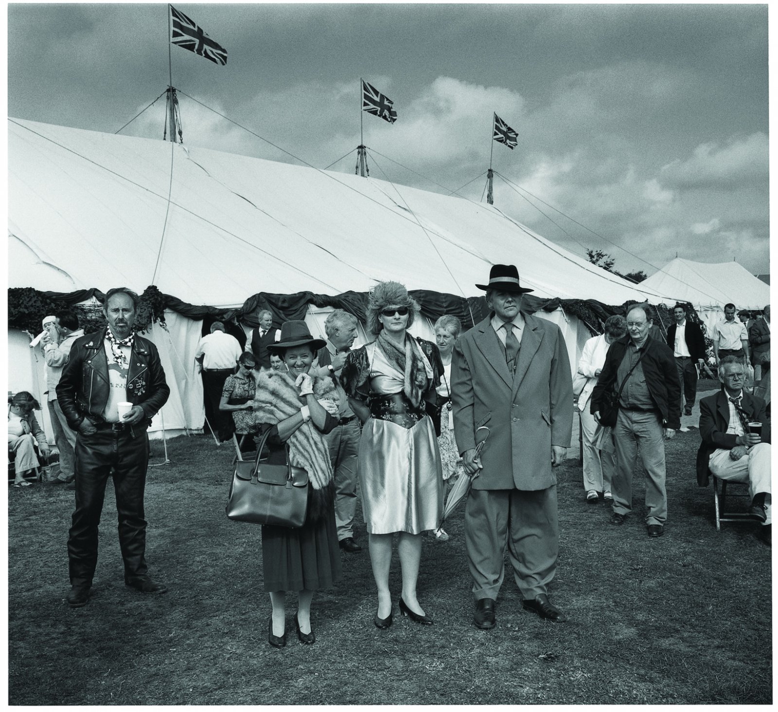
 'Concrete Stereo' 1983 from the exhibition 'Ron Arad: No Discipline' at The Museum of Modern Art (MoMA), New York, Aug - Oct, 2009")
 'The Rover Chair' 1981 from the exhibition 'Ron Arad: No Discipline' at The Museum of Modern Art (MoMA), New York, Aug - Oct, 2009")
 'Sketch for Well Tempered Chair' 1986")
 'Well Tempered Chair Prototype' 1986")
 'Big Easy' 1988")
 'Big Easy. Volume 2' 1988")
 'Soft Big Easy' 1990")
 'Large Bookworm' 1993")
 'Misfits' 1993")
 'D-Sofa' Prototype 1994")
 'Uncut' 1997")
 'FPE (Fantastic, Plastic, Elastic)' 1997")
 'New Orleans' 1999")
 'Lolita Chandelier' 2004")
 'Oh Void 2' armchair 2004")
 'Oh Void 2 armchair' 2006")
 'Table Paved With Good Intentions No. 48' 2005")
 'MT Rocker Chair' 2005")
 'Southern Hemisphere' 2007")
 'Do-Lo-Res' 2008")
 'PizzaKobra' lamp 2008")
 'Bodyguard' 2008")
' with 'Even the Odd Balls?' chairs (2009) and 'Lolita Chandelier' (2004)")
'")
'")
' with two 'Rolling Volume' chairs (1989 and 1991), left, and two 'Bodyguard' chairs (2007)")
' with in the foreground, 'Oh Void 2' armchairs")
 'Grobsteingrab (floating)' 2009")
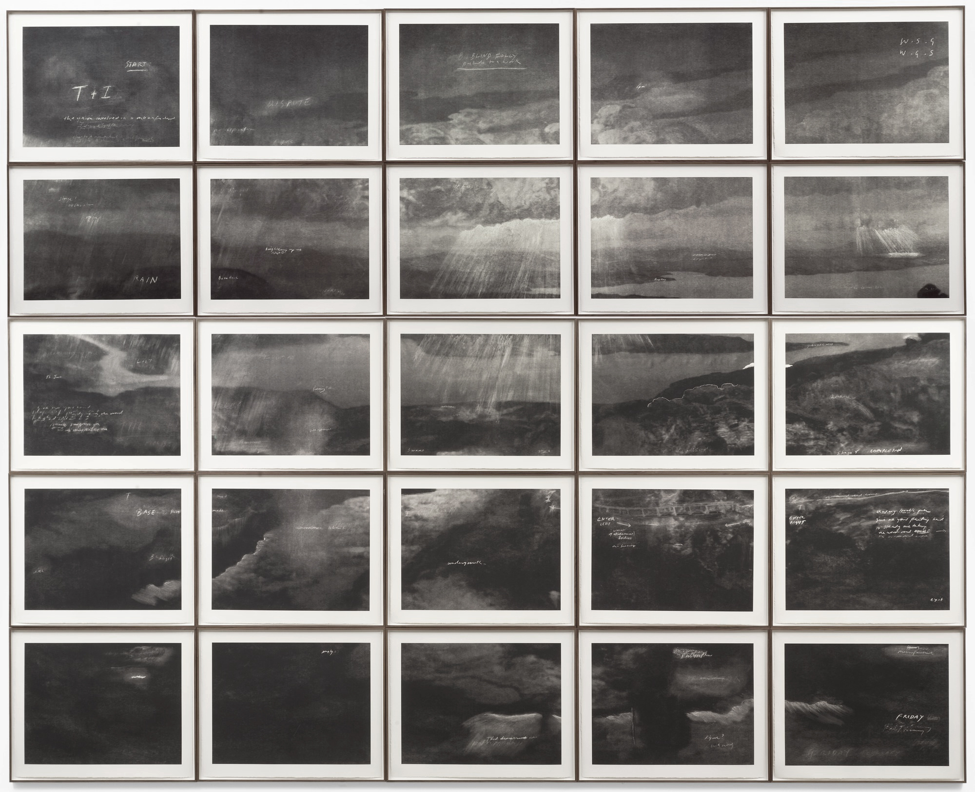
 'Totality' 2000")

 ‘Merce Cunningham Performs ‘Stillness’ (in three movements) to John Cage’s composition 4’33” with Trevor Carlson, New York City, 28 April 2007 (six performances; six films)’ 2007")
 ‘Merce Cunningham Performs ‘Stillness’ (in three movements) to John Cage’s composition 4’33” with Trevor Carlson, New York City, 28 April 2007 (six performances; six films)’ 2007")
 ‘Merce Cunningham Performs ‘Stillness’ (in three movements) to John Cage’s composition 4’33” with Trevor Carlson, New York City, 28 April 2007 (six performances; six films)’ 2007")
 ‘Merce Cunningham Performs ‘Stillness’ (in three movements) to John Cage’s composition 4’33” with Trevor Carlson, New York City, 28 April 2007 (six performances; six films)’ 2007")
 'Darmstädter Werkblock' 2007 (still)")
 'Michael Hamburger' 2007 (still)")
 'Michael Hamburger' 2007 (still)")
 'Michael Hamburger' 2007 (still)")
 'Michael Hamburger' 2007 (still)")
 'Die Regimentstochter' 2005")
 'Die Regimentstochter' 2005")
 'Palast' 2004")
 'Palast' 2004")
 'Palast' 2004")
![Tacita Dean. 'Noir et Blanc [Still]' 2006](https://artblart.com/wp-content/uploads/2009/07/noir_et_blanc-2006.jpg "Tacita Dean. 'Noir et Blanc [Still]' 2006")
 'Kodak' 2006 (still)")
 'Kodak' 2006 (still)")
 'Kodak' 2006 (still)")
 'Triptych inspired by T.S. Eliot's 'Sweeney Agonistes'' 1967 from the exhibition 'Francis Bacon' at the Museo Nacional del Prado, Madrid, Feb - April, 2009")
 'Three Studies for Figures at the Base of a Crucifixion' c. 1944 from the exhibition 'Francis Bacon' at the Museo Nacional del Prado, Madrid, Feb - April, 2009")
 'Study after Velázquez’s Portrait of Pope Innocent X' 1953")
 'Chimpanzee' 1955")
 'Three Studies for a Crucifixion' 1962")
 'Paralytic Child Walking on All Fours (from Muybridge)' 1961")
 7 Cromwell Place, c. 1950")
 'Portrait of Isabel Rawsthorne Standing in a Street in Soho' 1967")
 'Triptych in Memory of George Dyer' 1971")
 'Triptych - August 1972' 1972")
 'Triptych' 1987")
 'Portrait of John Edwards' 1988")
 'Three Studies for Self-Portrait' 1979-1980")

You must be logged in to post a comment.