Victor Vasarely (Hungarian-French, 1906-1997) Zebras. Prekinetic study (Preliminary study for the kinetic theory. Graphic Period, 1929-1939) (installation view) 1939 Gouache, pencil, colour and white chalk on paper Photo: Marcus Bunyan
While on my European art trip in 2019, I ventured by tram to the deepest suburbs of Budapest to visit the Vasarely Museum on a Sunday – one of only three days the museum is open. The journey was an experience in itself. The reward was that I got to see an artists work I have always admired (I have a Vasarely serigraph in my collection), set in one of the most beautiful art galleries I have ever seen in my life. What’s not too like.
Critically, I got to examine Vasarely’s work up close and personal, on a large scale. I noted how gestural his work is, even as it is geometric – emerging from his Gesture Drawings. Ground Plans of 1946. There is a mesmerising flow to his compositions, even as they are supposedly set, fixed, in their mathematical complexity.
Even as Josef Albers explored colour in the belief that colours have no inherent emotional associations, so Vasarely investigated the formula for a “plastic alphabet”, a universal visual language based on the structural interplay of form and colour, a programmed language with an infinite number of form and colour variations. Through serialisation and the processes of re-creation, multiplication and expansion, “in pictures based on the mutual association between forms and colours, he claimed to perceive a ‘grammar’ of visual language, with which a set of basic forms making up a composition could be arranged into a system similar to musical notation… He regarded colour-forms as the cells or molecules out of which the universe was made.”
Don’t believe all that is written on the can. While both artists want to euthanise the authenticity of the hand, the feeling of he eye, and the beauty of the object through an investigation of concept, form and replication, when in the presence of these paintings, once, twice, three times, one cannot deny the intimacy of their construction.
Unlike flat reproductions of these paintings in books, their serial reproduction, in these installation photographs you can see the ripples in the surface of these paintings. Their meticulous, hand-crafted production. For example, look at the surface of paintings such as Lom-Lan 2 (1953, below); Marsan (1950 / 1955 / 1958, below); and Sonora(1973, below). From a distance their patterns are stable but optically disturbing. Up close, their surface dis/integrates into swirls and ripples at a molecular level. The musical annotation – colour, form, pattern, repetition – of these optical illusions is subsumed into an aura, an earthly divination of a transient ‘planetary folklore’.
View of the downstairs galleries of the Vasarely Museum Budapest Photo: Marcus Bunyan
View of one of the downstairs galleries of the Vasarely Museum, Budapest showing at second left, Gesture Drawings. Ground Plans (1946); and at second right, Composition (1948) Photo: Marcus Bunyan
Victor Vasarely (Hungarian-French, 1906-1997) Gesture Drawings. Ground Plans (installation view) 1946 Pencil on paper Vasarely Museum Budapest Photo: Marcus Bunyan
The Galerie Denise René opened in 1944. Its first exhibition was Les dessins et composition de Vasarely (Vasarely’s drawings and graphic compositions). Surrealism influenced his works, and even caught the attention of André Breton. As Denise René recalled: ‘André Breton was even convinced we had found a Surrealist painter; it was mostly the trompe l’œils that made him think so, which abounded in Vasarely’s graphic innovations. Breton invited me and Vasarely to visit him in rue Fontaine. Éluard and Breton both came to see the exhibition, though on different days because Éluard had broken with Breton and Surrealism.’ Vasarely had a painterly turn. Shortly he made experimentations in gesture painting. (Victor Vasarely, Jazz, 1942, inv. V. 195) Later, despite his artistic discoveries, he described his earliest period as Les Fausses Routes (Wrong Roads).
Text from the Vasarely Museum website [Online] Cited 26/10/2020
Victor Vasarely (Hungarian-French, 1906-1997) Hombre en movimiento – Estudio del movimiento (El hombre) Man in motion. Study of Motion (The Man) 1943 Tempera on plywood 117 x 132cm Vasarely Museum Budapest
Victor Vasarely (Hungarian-French, 1906-1997) Composition (installation view) 1948 Oil on canvas Vasarely Museum Budapest Photo: Marcus Bunyan
Magyar Grafika (Hungarian Graphics) Az Ujság Hirdetés (The Newspaper is Advertised) (installation view) Edition 12 1931 Vasarely Museum Budapest Photo: Marcus Bunyan
A journal for the development of graphic industries and related professions. Budapest, 1. 1920 – 13. 1932
Installation views of the downstairs galleries of the Vasarely Museum, Budapest with in the last photo at left, Versant (1952) Photos: Marcus Bunyan
Victor Vasarely (Hungarian-French, 1906-1997) Versant (installation view) 1952 Acrylic on plywood Vasarely Museum Budapest Photo: Marcus Bunyan
Installation view of the Vasarely Museum, Budapest with at right, Lom-Lan 2 (1953) Photo: Marcus Bunyan
Victor Vasarely (Hungarian-French, 1906-1997) Lom-Lan 2 (installation view) 1953 Oil on fibreboard Vasarely Museum Budapest Photo: Marcus Bunyan
Installation views on one of the downstairs galleries of the Vasarely Museum, Budapest showing the painting Amir (“Rima”) 1953 (installation view) Photos: Marcus Bunyan
Victor Vasarely (Hungarian-French, 1906-1997) Amir (“Rima”) (installation view) 1953 Acrylic on plywood Vasarely Museum Budapest Photo: Marcus Bunyan
Victor Vasarely (Hungarian-French, 1906-1997) MORA (Oeuvre profonde cinétique) (installation views) 1954/1960 (?) Deep kinetic object, silk screen on plexiglas, glass and steel Vasarely Museum Budapest Photos: Marcus Bunyan
Installation view one of the downstairs galleries of the Vasarely Museum, Budapest showing at left, Orion noir (1970); and at right, Norma (1962-1979) Photo: Marcus Bunyan
Victor Vasarely (Hungarian-French, 1906-1997) Orion noir 1970 Acrylic on canvas Vasarely Museum Budapest
Victor Vasarely (Hungarian-French, 1906-1997) Norma (installation view) 1962-1979 Acrylic on canvas Vasarely Museum Budapest Photo: Marcus Bunyan
Installation view of the Vasarely Museum, Budapest Photo: Marcus Bunyan
Victor Vasarely (Hungarian-French, 1906-1997) Chess Set 1980 Multiple, plexiglass Vasarely Museum Budapest Photos: Marcus Bunyan
Installation view of one of the downstairs galleries of the Vasarely Museum, Budapest showing at left, Marsan-2 (1964/1974); at centre, Gizeh (1955/1962); and at right, Marsan (1950/1955/1958) Photo: Marcus Bunyan
Victor Vasarely (Hungarian-French, 1906-1997) Marsan-2 (installation views) 1964/1974 Acrylic on canvas Vasarely Museum Budapest Photos: Marcus Bunyan
Victor Vasarely (Hungarian-French, 1906-1997) Gizeh (installation view) 1955/1962 Oil on canvas Donation of Victor Vasarely, 1970 Vasarely Museum Budapest Photo: Marcus Bunyan
Victor Vasarely (Hungarian-French, 1906-1997) Marsan (installation view) 1950/1955/1958 Oil on canvas Donation of Victor Vasarely, 1970 Vasarely Museum Budapest Photo: Marcus Bunyan
Victor Vasarely (Hungarian-French, 1906-1997) Naissances (installation view) 1954/1960 From the album Hommage à Johann Sebastian Bach (Éd. Pierre belford, Paris, 1973. Éxemplaire XIV/XX), Supplement no. 3. Deep kinetic object, plexiglass, silk screen Vasarely Museum Budapest Photo: Marcus Bunyan
Victor Vasarely (Hungarian-French, 1906-1997) Zilia (installation view) 1981 Acrylic on canvas Vasarely Museum Budapest Photo: Marcus Bunyan
Victor Vasarely (Hungarian-French, 1906-1997) Stridio-Z (installation view) 1976-1977 Acrylic on canvas Vasarely Museum Budapest Photo: Marcus Bunyan
Victor Vasarely (Hungarian-French, 1906-1997) Tri-Axo (installation view) 1972/1976 Acrylic on canvas Vasarely Museum Budapest Photo: Marcus Bunyan
William Seitz The responsive eye (book cover) Museum of Modern Art, 1965 Photo: Marcus Bunyan
Installation view of the downstairs galleries of the Vasarely Museum, Budapest Photo: Marcus Bunyan
Installation view of the Vasarely Museum, Budapest showing Yllus (1978) Photo: Marcus Bunyan
Victor Vasarely (Hungarian-French, 1906-1997) Yllus 1978 Acrylic on canvas Vasarely Museum Budapest Photo: Marcus Bunyan
Upstairs galleries
Installation view of the upstairs galleries of the Vasarely Museum, Budapest Photo: Marcus Bunyan
Installation view of the Vasarely Museum, Budapest showing V.P. 102 (1979) Photo: Marcus Bunyan
Victor Vasarely (Hungarian-French, 1906-1997) V.P. 102 (installation view) 1979 Acrylic on cardboard, mounted on plywood Vasarely Museum Budapest Photo: Marcus Bunyan
Installation view of the upstairs galleries of the Vasarely Museum, Budapest showing at left in the display cabinet, KROA-MC (1969); and at centre, Quivar (Ouivar) (1974) Photo: Marcus Bunyan
Installation view of the upstairs galleries of the Vasarely Museum, Budapest showing at left, Eroed-Pre (1978); and at right, Quivar (Ouivar) (1974) Photo: Marcus Bunyan
Victor Vasarely (Hungarian-French, 1906-1997) Eroed-Pre (installation view) 1978 Acrylic on canvas Vasarely Museum Budapest Photo: Marcus Bunyan
Victor Vasarely (Hungarian-French, 1906-1997) Quivar (Ouivar) (installation view) 1974 Collage, gouache on cardboard, mounted on plywood Vasarely Museum Budapest Photo: Marcus Bunyan
Installation view of the upstairs galleries of the Vasarely Museum, Budapest showing at right, Stri-oet (1979) Photo: Marcus Bunyan
Victor Vasarely (Hungarian-French, 1906-1997) Stri-oet (installation view) 1979 Acrylic on canvas Vasarely Museum Budapest Photo: Marcus Bunyan
Installation view of the Vasarely Museum, Budapest showing at left centre, Stri-oet (1979); and in the display cabinet, KROA-MC (1969). Love the reflection of the colours on the wall behind! Photo: Marcus Bunyan
Installation view of the Vasarely Museum, Budapest showing KROA-MC (1969) Photo: Marcus Bunyan
Installation view of the upstairs galleries of the Vasarely Museum, Budapest showing at left, Bull (1973/74); and at centre left, Orion noir (1963) Photo: Marcus Bunyan
Victor Vasarely (Hungarian-French, 1906-1997) Bull (installation view) 1973/1974 Acrylic on canvas Vasarely Museum Budapest Photo: Marcus Bunyan
Victor Vasarely (Hungarian-French, 1906-1997) Vega Mir (Oeuvre profonde cinétique) (installation view) 1954/1960 From the album Hommage à Johann Sebastian Bach (Éd. Pierre belford, Paris, 1973. Éxemplaire XIV/XX), Supplement no. 1. Multiple, silk screen on anodised aluminium Vasarely Museum Budapest Photo: Marcus Bunyan
Victor Vasarely (Hungarian-French, 1906-1997) Vega Mir (Oeuvre profonde cinétique) (installation view detail) 1954/1960 From the album Hommage à Johann Sebastian Bach (Éd. Pierre belford, Paris, 1973. Éxemplaire XIV/XX), Supplement no. 1. Multiple, silk screen on anodised aluminium Vasarely Museum Budapest Photo: Marcus Bunyan. Self portrait with ‘Vega Mir’ 2019
Installation view of the upstairs galleries of the Vasarely Museum, Budapest showing at left, Bi. Octans (1979) Photo: Marcus Bunyan
Victor Vasarely (Hungarian-French, 1906-1997) Bi. Octans (installation view) 1979 Acrylic on canvas Vasarely Museum Budapest Photo: Marcus Bunyan
Installation view of the upstairs galleries of the Vasarely Museum, Budapest showing at left, Kotzka (1973-1976); and at right, Trybox (1979) Photo: Marcus Bunyan
Victor Vasarely (Hungarian-French, 1906-1997) Kotzka (installation view) 1973-1976 Acrylic on canvas Vasarely Museum Budapest Photo: Marcus Bunyan
Victor Vasarely (Hungarian-French, 1906-1997) Trybox (installation view) 1979 Acrylic on canvas Vasarely Museum Budapest Photo: Marcus Bunyan
Installation view of the upstairs galleries of the Vasarely Museum, Budapest showing at centre right, Vonal-Ket (1972/1977) Photo: Marcus Bunyan
Victor Vasarely (Hungarian-French, 1906-1997) Vonal-Ket (installation views) 1972/1977 Acrylic on canvas Vasarely Museum Budapest Photos: Marcus Bunyan
Installation view of the upstairs galleries of the Vasarely Museum, Budapest showing at centre left, Sonora (1973) Photo: Marcus Bunyan
Victor Vasarely (Hungarian-French, 1906-1997) Sonora (installation view) 1973 Acrylic on canvas Vasarely Museum Budapest Photo: Marcus Bunyan
Vasarely Museum 1033, Budapest Szentlélek tér 6 Phone: + 36 1 388 7551
Exhibition dates: 4th October, 2019 – 19th January, 2020 Visited October 2019 posted January 2020
Curator: Florence Ostende
Theo van Doesburg (Dutch, 1883-1931) The Ciné-bal (cinema-ballroom) at Café L’Aubette, Strasbourg, designed by Theo van Doesburg 1926-1928 Image: Collection Het Nieuwe Instituut, donation Van Moorsel, archive (code): DOES, inv.nr AB5252
Part 2 on this exceptional exhibition. Of particular interest here are:
the inspired paintings and drawings by Jeanne Mammen of Berlin nightlife which documents “the changing role of women and offer rare images of queer female desire.” Her work, associated with the New Objectivity and Symbolism movements, is incisive and sympathetic in its observation of difference and “depravity”. Her line is strong and the characterisation, assured;
Elfriede Lohse-Wächtler’s “scenes of Hamburg after dark [which] convey a raw sense of possibility through bold line, clashing colour and startling imagery.” The attitude of the hands in the painting Lissy (1931, below) balanced by the simplicity of the chair at left, and the furious line and bleeding, washes of watercolour of the men at the table at right – replete with their protruding, predatory teeth – make this a compelling image.
Installation views of the exhibition Into the Night: Cabarets and Clubs in Modern Art at the Barbican Art Gallery, London Photos: Marcus Bunyan
Theo van Doesburg (Dutch, 1883-1931) L’Aubette: Projet de composition pour le sol du café-brasserie et du café-restaurant (L’Aubette: Design for a composition for the floor of the café-brasserie and the café-restaurant) (installation view) 1927 Gouache and graphite pencil on tracing paper Paris, Centre Pompidou – Museé national d’art moderne – Centre de création industrielle Photo: Marcus Bunyan
Theo van Doesburg (Dutch, 1883-1931) L’Aubette: Projet de composition pour le sol du café-brasserie et du café-restaurant (L’Aubette: Design for a composition for the floor of the café-brasserie and the café-restaurant)(installation view) 1927 Gouache and graphite pencil on tracing paper Paris, Centre Pompidou – Museé national d’art moderne – Centre de création industrielle Photo: Marcus Bunyan
Theo van Doesburg (Dutch, 1883-1931) Final colour design for the screen wall of the Ciné-Dancing at L’Aubette(installation view) 1927 East India ink and paint on paper Collection Het Nieuwe Instituut, Rotterdam. Gift Van Moorsel Photo: Marcus Bunyan
Theo van Doesburg Ciné-Dancing wall text Photo: Marcus Bunyan
Sophie Taeuber-Arp (Swiss, 1889-1943) Aubette 63 (installation view) 1927 Gouache on paper Musée d’Art Moderne et Contemporain de Strasbourg Photo: Marcus Bunyan
Paris: Loïe Fuller 1890s wall text Photos: Marcus Bunyan
Unknown photographer (attributed to Falk Studio) Loïe Fuller c. 1901 Courtesy of the Library of Congress, Prints and Photographs Division, Washington, DC
1895-1908 Loie Fuller’s Serpentine Dance (highlights from the greatest movie pioneers’ films)
Many of the earliest filmmakers chose Loie Fuller’s Serpentine Dance as a subject for one or more films: the Skladanowsky brothers (1895), Dickson and Heise for Edison Manifacturing Company (1895), Dickson for American Mutoscope (1896), Lumière (1896), Demeny (1897), possibly Alice Guy (1899+1900+1902), Méliès (1899), G.A. Smith (1902), De Chomon (1902+1908) and many others.
Loie Fuller was a pioneer of modern dance and of theatrical lighting effects. She developed this dance in 1891 and combined her choreography with silk costumes illuminated by multi-colored lighting of her own design. In several of the Serpentine Dance movies her lighting has been reinterpreted through hand-colored effects. Fuller also had a successful Fire Dance of which elements are often incorporated in filmed Serpentine Dance performances (yet rarelymentioned).
It is unclear whether any performance by Loie Fuller herself has ever been filmed. Possibly all of the featured dancers are imitators, although Segundo de Chomon’s 1902 film title “Loie Fuller” makes a strong claim.
Text from the YouTube website
Magnificent! Not Loïe Fuller but one of her many imitators. She refused to be captured on film.
Installation views of the exhibition Into the Night: Cabarets and Clubs in Modern Art at the Barbican Art Gallery, London showing the work of Henri de Toulouse-Lautrec Photos: Marcus Bunyan
Henri de Toulouse-Lautrec (French, 1864-1901) Miss Loïe Fuller 1893 Bibliothèque de l’Institut National d’Histoire de l’Art, Collections Jacques Doucet Inv. no. NUM EM TOULOUSE-LAUTREC 49 e Courtesy Bibliothèque de l’Institut National d’Histoire de l’Art, Collections Jacques Doucet
Jules Chéret (French, 1836-1932) Fioles Bergère, La Loïe Fuller (installation view) 1893 Lithograph Paris, Musée des Arts Décoratifs Photos: Marcus Bunyan
Jules Chéret (French, 1836-1932) Folies Bergère, La Danse du Feu (The Fire Dance) (installation view) 1897 Lithograph Paris, Musée des Arts Décoratifs Photos: Marcus Bunyan
Paris: Chat Noir 1880s-90s wall text Photos: Marcus Bunyan
Installation views of the exhibition Into the Night: Cabarets and Clubs in Modern Art at the Barbican Art Gallery, London Photos: Marcus Bunyan
Henri Rivière (French, 1864-1951) Poster for the performances Clairs de lune by Georges Fragerolle, L’honnête gendarme by Jean Richepin and Le treizième travail d’Hercule by Eugène Courboin (Le Chat Noir, 16 December 1896) (installation view) Cliché and letterpress printing in black on wove paper on linen 58.7cm x 42.2cm Van Gogh Museum, Amsterdam Photo: Marcus Bunyan
Installation views of the exhibition Into the Night: Cabarets and Clubs in Modern Art at the Barbican Art Gallery, London showing Henri Rivière and Henry Somm’s shadow theatre and wall text Photos: Marcus Bunyan
Adolphe-Leon Wilette (French, 1857-1926) La Vierge verte (The Green Virgin) (installation view) c. 1881 Oil on canvas Collection Zimmerli Art Museum at Rutgers University Photo: Marcus Bunyan
In this oil study for a stained-glass window exhibited inside the cabaret, the black cat is held aloft in adoration under the full moon, as though part of an occult ceremony. The ‘chat’ noir’ of the cabaret’s title was celebrated throughout its design, symbolising fierce independence as well as night-time frolics. It gazes imperiously at the onlooker from Théophile-Alexandre Steinlen’s famous posters, perches on a crescent moon in Adolphe-Léon Willette’s street sign, and endangers pet goldfish in humorous cartoons.
Wall text from the exhibition
Installation view of the exhibition Into the Night: Cabarets and Clubs in Modern Art at the Barbican Art Gallery, London Photo: Marcus Bunyan
Théophile-Alexandre Steinlen (Swiss-born French, 1859-1923) Réouverture du cabaret du Chat Noir (Reopening of the Chat Noir Cabaret) (installation view) 1896 Lithograph Victoria and Albert Museum, London Photo: Marcus Bunyan
George Auriol (French, 1863-1938) Théâtre du Chat Noir (Couverture aux coquelicots) (Programme for the Chat noir Theatre (Cover with Poppies)) (installation view) 1890 Photomechanical print Bibliothèque nationale de France, Paris Photo: Marcus Bunyan
Opening 4 October 2019, Into the Night: Cabarets and Clubs in Modern Art explores the social and artistic role of cabarets, cafés and clubs around the world. Spanning the 1880s to the 1960s, the exhibition presents a dynamic and multi-faceted history of artistic production. The first major show staged on this theme, it features both famed and little-known sites of the avant-garde – these creative spaces were incubators of radical thinking, where artists could exchange provocative ideas and create new forms of artistic expression. Into the Night offers an alternative history of modern art that highlights the spirit of experimentation and collaboration between artists, performers, designers, musicians and writers such as Henri de Toulouse-Lautrec, Loïe Fuller, Josef Hoffmann, Giacomo Balla, Theo van Doesburg and Sophie Taeuber-Arp, as well as Josephine Baker, Jeanne Mammen, Aaron Douglas, Jacob Lawrence, Ramón Alva de la Canal and Ibrahim El-Salahi.
Focusing on global locations from New York to Tehran, London, Paris, Mexico City, Berlin, Vienna and Ibadan, Into the Night brings together over 350 works rarely seen in the UK, including paintings, drawings, prints, photographs, films and archival material. Liberated from the confines of social and political norms, many of the sites provided immersive, often visceral experiences, manifesting the ideals of the artists and audiences who founded and frequented them. The exhibition features full-scale recreations of specific spaces, such as the multi-coloured ceramic tiled bar of the Cabaret Fledermaus in Vienna (1907), designed by Josef Hoffmann for the Wiener Werkstätte, and the striking abstract composition of the Ciné-Dancing designed by Theo van Doesburg for L’Aubette in Strasbourg (1926-1928). The exhibition will feature a soundscape created by hrm199, the studio of acclaimed artist Haroon Mirza, specifically commissioned for the show.
Jane Alison, Head of Visual Arts, Barbican, said: “Into the Night casts a spotlight on some of the most electrifying cabarets and clubs of the modern era. Whether a creative haven, intoxicating stage or liberal hangout, all were magnets for artists, designers and performers to come together, collaborate and express themselves freely. Capturing the essence of these global incubators of experimentation and cross-disciplinarity, immersive 1:1 scale interiors will take the visitor on a captivating journey of discovery.”
Into the Night begins in Paris, on the eve of the 20th century, with two thrilling and iconic locations of the avant-garde. The theatrical shadow plays of the Chat Noir in the 1880s are brought to life through original silhouettes and works that decorated the interior of the cabaret, which acted as a forum for satire and debate for figures such as founder Rodolphe Salis, artist Henri Rivière and composer Erik Satie. The captivating serpentine dances of Loïe Fuller staged at the Folies Bergère in the 1890s were trail-blazing experiments in costume, light and movement. Henri de Toulouse-Lautrec captured her performances in his extraordinary series of delicately hand-coloured lithographs, brought together for the exhibition. Visitors will encounter the immersive “Gesamtkunstwerk” (total work of art) design of the Cabaret Fledermaus (1907) in Vienna by the Wiener Werkstätte, where experimental cabaret productions were staged. The exhibition includes original documentation of Oskar Kokoschka’s exuberant puppet theatre and Gertrude Barrison’s expressionist dance.
The Cave of the Golden Calf (1912), an underground haunt in Soho epitomising decadence and hedonism, is evoked through designs for the interior by British artists Spencer Gore and Eric Gill, as well as Wyndham Lewis’s highly stylised programmes for the eclectic performance evenings – advertised at the time as encompassing “the picturesque dances of the South, its fervid melodies, Parisian wit, English humour.” In Zurich, the radical atmosphere of the Cabaret Voltaire (1916) is manifested through absurdist sound poetry and fantastical masks that deconstruct body and language, evoking the anarchic performances by Hugo Ball, Emmy Hennings and Marcel Janco. This is the birthplace of Dada, where humour, chaos and ridicule reign. Two significant clubs in Rome provide insights into the electrifying dynamism of Futurism in Italy in the 1920s. Giacomo Balla’s mesmerising Bal Tic Tac (1921) is summoned by colour-saturated designs for the club’s interior, capturing the swirling movement of dancers. Also on show are drawings and furnishings for Fortunato Depero’s spectacular inferno-inspired Cabaret del Diavolo (1922) which occupied three floors representing heaven, purgatory and hell. Depero’s flamboyant tapestry writhes with dancing demons, expressing the club’s motto “Tutti all’inferno!!! (Everyone to hell!!!)”.
A few years later, a group of artists and writers from the radical movement Estridentismo, including Ramón Alva de la Canal, Manuel Maples Arce and Germán Cueto, began to meet at the Café de Nadie (Nobody’s Café) in Mexico City, responding to volatile Post-Revolutionary change and the urban metropolis. The ¡30-30! group expressed its values by holding a major print exhibition (partially reassembled here) in a travelling circus tent open to all. Meanwhile in Strasbourg, Theo van Doesburg, Hans Arp and Sophie Taeuber-Arp worked together to create the L’Aubette (1926-1928), conceived as the ultimate “deconstruction of architecture”, with bold geometric abstraction as its guiding principle. The vast building housed a cinema-ballroom, bar, tearoom, billiards room, restaurant and more, each designed as immersive environments.
After a period of restraint in Germany during the First World War, the 1920s heralded an era of liberation and the relaxation of censorship laws. Numerous clubs and bars in metropolitan cities, such as Berlin, playing host to heady cabaret revues and daring striptease; the notorious synchronised Tiller Girls are captured in Karl Hofer’s iconic portrait. Major works by often overlooked female artists such as Jeanne Mammen and Elfriede Lohse-Wächtler, as well as George Grosz, Otto Dix and Max Beckmann, capture the pulsating energy of these nightclubs and the alternative lifestyles that flourished within them during the 1920s and 1930s. During the same time in New York, the literary and jazz scenes thrived and co-mingled in the predominantly African American neighbourhood of Harlem, where black identity was re-forged and debated. Paintings and prints by Aaron Douglas and Jacob Lawrence convey the vibrant atmosphere and complex racial and sexual politics of the time, while poetry by Langston Hughes and early cinema featuring Duke Ellington shed light on the rich range of creative expression thriving within the city.
Into the Night also celebrates the lesser known but highly influential Mbari Artists and Writers Club, founded in the early 1960s in Nigeria. Focusing on two of the club’s key locations, in Ibadan and Osogbo, the exhibition explores how they were founded as laboratories for postcolonial artistic practices, providing a platform for a dazzling range of activities – including open-air dance and theatre performances, featuring ground breaking Yoruba operas by Duro Ladipo and Fela Kuti’s Afro-jazz; poetry and literature readings; experimental art workshops; and pioneering exhibitions by African and international artists such as Colette Omogbai, Ibrahim El-Salahi and Uche Okeke. Meanwhile in Tehran, Rasht 29 emerged in1966 as a creative space for avant-garde painters, poets, musicians and filmmakers to freely discuss their practice. Spontaneous performances were celebrated and works by artists like Parviz Tanavoli and Faramarz Pilaram hung in the lounge while a soundtrack including Led Zeppelin and the Beatles played constantly.
The exhibition is curated and organised by Barbican Centre, London, in collaboration with the Belvedere, Vienna.
Press release from the Barbican Art Gallery [Online] Cited 28/12/2019
Berlin: Weimar Nightlife 1920s-30s wall text from the exhibition Photos: Marcus Bunyan
Jeanne Mammen (German, 1890-1976) Bierseidelbetrachtung I (The Contemplative Drinkers I) (installation views) c. 1929 Watercolour and pencil on paper Ömer Koç Collection Photos: Marcus Bunyan
Jeanne Mammen (German, 1890-1976) Untitled (Vor dem Auftritt) (Before the Performance) (installation views) c. 1928 Jeanne Mammen Foundation at Stadtmuseum Berlin Photos: Marcus Bunyan
Jeanne Mammen (German, 1890-1976) Café Nollendorf (installation view) c. 1931 Watercolour and India ink over pencil Private collection Photo: Marcus Bunyan
Jeanne Mammen’s paintings and drawings of Berlin nightlife document the changing role of women and offer rare images of queer female desire. In contrast to the bitingly satirical images characteristic of George Grosz and Max Beckmann, Mammen sympathetically portrays her mostly female figures. Café Nollendorf is one of several by Mammen published in Curt Moreck’s subversive 1931 Guide to ‘Depraved’ Berlin (shown nearby). It illustrates his account of a lesbian club for ‘open-minded’ clientele. Mammen was also a successful commercial artist, recording modern fashions and mores in popular magazines.
Wall text from the exhibition
Otto Dix (German, 1891-1969) Anita Berber (installation view) 1925 Pastel on paper Private collection Photo: Marcus Bunyan
Otto Dix met the 26-year-old cabaret dancer and silent film star Anita Berber in Dūsseldorf in 1925. Berber was among the most provocative performers of her time, appearing at major Berlin venues like the Wintergarten and the Apollo, as well as the political cabaret Schall und Rauch and the lesbian club Topkeller. In her notorious dance ‘Cocaine’, accompanied by Camille Saint-Saëns’ Valse mignonne (1896), Berber played a sex worker and addict, wearing a leather corset with her breast exposed. Simulating trembles of pain, she dances spasms of hallucination before collapsing on the floor. Despite her theatrical makeup, Dix’s portrait offers a more intimate side of Berber.
Wall text from the exhibition
Installation view of the exhibition Into the Night: Cabarets and Clubs in Modern Art at the Barbican Art Gallery, London showing on the left, the work of Dodo Burgner and on the right, the work of George Grosz. Photo: Marcus Bunyan
Dodo (Dodo Burgner, German, 1927-1933) Revue neger (Josephine Baker) (installation view) c. 1926 Gouache over pencil on cardboard Collection Krümmer, Hamburg Photo: Marcus Bunyan
Dodo (Dodo Burgner, German, 1927-1933) The Fortune Teller, published in ULK (installation views) February 1929 Gouache over pencil on cardboard Collection Krümmer, Hamburg Photos: Marcus Bunyan
George Grosz (German, 1893-1959) Schönheit, dich will ich preisen (Beauty, Thee Will I Praise) (installation views) 1923 Offset lithograph Publisher: Malik-Verlag, Berlin Printer: Kunstanstalt Dr. Selle & Co. A.G. Berlin Photos: Marcus Bunyan
Installation view of the exhibition Into the Night: Cabarets and Clubs in Modern Art at the Barbican Art Gallery, London Photos: Marcus Bunyan
Installation view of the exhibition Into the Night: Cabarets and Clubs in Modern Art at the Barbican Art Gallery, London showing at left, Elfriede Lohse-Wächtler’s Ausblick im Nachtlokal (View of a Nightclub) 1930 Photo: Marcus Bunyan
Elfriede Lohse-Wächtler (German, 1899-1940) Ausblick im Nachtlokal (View of a Nightclub) (installation view) 1930 Pastel on paper Private collection, Berlin Photos: Marcus Bunyan
Elfriede Lohse-Wächtler Ausblick im Nachtlokal (View of a Nightclub) wall text Photo: Marcus Bunyan
Elfriede Lohse-Wächtler (German, 1899-1940) Ausblick im Nachtlokal (View of a Nightclub) 1930 Private collection, Berlin
Installation view of the exhibition Into the Night: Cabarets and Clubs in Modern Art at the Barbican Art Gallery, London showing at left, showing at left, Elfriede Lohse-Wächtler’s Lissy (1931) and at right, Karl Hofer’s Tiller Girls (before 1927) Photo: Marcus Bunyan
Elfriede Lohse-Wächtler (German, 1899-1940) Lissy (installation views) 1931 Watercolour and pencil on paper Private collection. Courtesy Städel Museum, Frankfurt Photos: Marcus Bunyan
Elfriede Lohse-Wächtler (born Anna Frieda Wächtler; 4 December 1899 – 31 July 1940) was a German painter of the avant-garde whose works were banned as “degenerate art”, and in some cases destroyed, in Nazi Germany. She was murdered in a former psychiatric institution at Sonnenstein castle in Pirna under Action T4, a forced euthanasia program of Nazi Germany. Since 2000, a memorial centre for the T4 program in the house commemorates her life and work in a permanent exhibition.
Life
Elfriede Lohse-Wächtler grew up in a middle-class family, but left at the age of 16 to study at the Royal Arts School Dresden from 1915 to 1918 (fashion, then applied graphics). From 1916 to 1919, she also attended drawing and painting courses at the Dresden Art Academy. She came into contact with the Dresden Secession Group 1919 and became part of the circle of friends around Otto Dix, Otto Griebel, and Conrad Felixmüller. Renting part of the studio of the latter near the Dresden city center she made a living with batiks, postcards and illustrations.
In June 1921, she married the painter and opera singer Kurt Lohse [de], following him to Görlitz in 1922 and in 1925 to Hamburg. The marriage was a difficult one and the couple separated several times in the following years. In 1926, Elfriede Lohse-Wächtler joined the Federation of female Hamburgian artists and art lovers; in 1928. she was able to participate in some exhibitions of the New Objectivity.
In 1929, she suffered a nervous breakdown because of financial and partnership difficulties and was committed to a psychiatric institution in Hamburg-Friedrichsberg. During the two months’ stay she painted the Friedrichsberg heads, a piece of work consisting of about 60 drawings and pastels, mainly portraits of fellow patients. After her recovery and a final separation from Kurt Lohse (in 1926), she had a very creative phase. She painted numerous paintings of Hamburg’s harbor, scenes from the life of workers and prostitutes, and pitiless self-portraits. But despite some exhibitions, sales, and smaller grants, she lived in grinding poverty.
Due to financial problems and increasing social isolation, she returned to her parents’ home in Dresden by midyear 1931. When her mental state worsened her father admitted her to the state mental home at Arnsdorf in 1932. There she was diagnosed with schizophrenia. From 1932 to 1935 she was still creatively active, drawing portraits and creating arts and crafts. After Kurt Lohse divorced her in May 1935 she was incapacitated due to “incurable insanity”.
After refusing to consent to a sterilisation, she was denied the permission to go out of the hospital any more. In December 1935, she underwent a forced surgical sterilisation in the Dresden-Friedrichstadt women’s hospital on the grounds of Nazi eugenicist policies. After this traumatic event she never painted again. In 1940 she was deported to the former psychiatric institution at Pirna-Sonnenstein (located in the Sonnenstein castle in Pirna), where, on 31 July, she was murdered along with the majority of the other residents as part of the Nazi “euthanasia” program, Action T4. The official cause of death was “pneumonia with myocardial insufficiency”. In the years of 1940 and 1941, a total of 13,720 mainly mentally ill or handicapped people were gassed by Nazis in this institution formerly well known for its humanistic traditions.
Installation view of the exhibition Into the Night: Cabarets and Clubs in Modern Art at the Barbican Art Gallery, London showing at left, Karl Hofer’s Tiller Girls (before 1927) Photo: Marcus Bunyan
Karl Hofer (German, 1878-1955) Tiller Girls (installation view) before 1927 Photo: Marcus Bunyan
Installation view of the exhibition Into the Night: Cabarets and Clubs in Modern Art at the Barbican Art Gallery, London showing at left, Karl Hofer’s Tiller Girls (before 1927, above); and at third from left, Erna Schmidt-Caroll’s Chansonette (Singer) (c. 1928, below) Photo: Marcus Bunyan
Installation view of the exhibition Into the Night: Cabarets and Clubs in Modern Art at the Barbican Art Gallery, London showing the work of George Grosz and Max Beckmann Photo: Marcus Bunyan
George Grosz (German, 1893-1959) Menschen in Cáfe (People in a Cáfe) (installation view) 1917 Black ink and pen on paper On loan from the Trustees of the British Museum Photo: Marcus Bunyan
Max Beckmann (German, 1884-1950) Nackttanz (Striptease), from Berliner Reise (Trip to Berlin) (installation view) 1922 Lithograph, one from a portfolio of eleven (including cover) Publisher: J.B. Neumann, Berlin Photo: Marcus Bunyan
Jeanne Mammen (German, 1890-1976) Sie reprasentiert! (She Represents!), published in Simplicissimus vol. 32, no 47, February 1928 Printed magazine Jeanne Mammen Foundation at Stadtmuseum Berlin Photo: Marcus Bunyan
Jeanne Mammen (German, 1890-1976) Maskenball (Masked Ball), published in Jugend vol. 34, no 5, January 1929 Printed magazine Jeanne Mammen Foundation at Stadtmuseum Berlin Photo: Marcus Bunyan
Jeanne Mammen (German, 1890-1976) Fasting (Carnival), published in Simplicissimus vol. 34, no 46, February 1930 Printed magazine Jeanne Mammen Foundation at Stadtmuseum Berlin Photo: Marcus Bunyan
Unknown photographer ‘Slide on the Razor’, performance as part of the Haller Revue ‘Under and Over’, Berlin, 1923 Courtesy Feral House
Ibadan & Osogbo Mbari Clubs 1961-66 wall text Photos: Marcus Bunyan
Installation view of the exhibition Into the Night: Cabarets and Clubs in Modern Art at the Barbican Art Gallery, London showing at left, Twins Seven-Seven Devil’s Dog (1964) and at right, Twins Seven-Seven THE BEAUTIFUL LADY and THE FULLBODIED GENTLEMAN THAT REDUCED TO HEAD (1967) Photo: Marcus Bunyan
Twins Seven-Seven Devil’s Dog (installation view detail) 1964 Ink, gouache and varnishon paper Iwalewahaus, Universitat Bayreuth Photos: Marcus Bunyan
Twins Seven-Seven THE BEAUTIFUL LADY and THE FULLBODIED GENTLEMAN THAT REDUCED TO HEAD (installation views) 1967 Gouache on paper Iwalewahaus, Universitat Bayreuth Photos: Marcus Bunyan
Installation view of the exhibition Into the Night: Cabarets and Clubs in Modern Art at the Barbican Art Gallery, London showing at left, Muraina Oyelami’s Burial Ground (1967) with Georgina Beier’s Gelede (1966) third from right Photo: Marcus Bunyan
Muraina Oyelami (Nigerian, b. 1940) Burial Ground (installation views) 1967 Oil on board Collection of M.K. Wolford Photos: Marcus Bunyan
Installation view of the exhibition Into the Night: Cabarets and Clubs in Modern Art at the Barbican Art Gallery, London showing at second left, Valente Malangatana Ngwenya’s Untitled (1961) Photo: Marcus Bunyan
Valente Malangatana Ngwenya (Mozambican, 1936-2011) Untitled (installation views) 1961 Oil on canvas Iwalewahaus, Universität Bayreuth Photos: Marcus Bunyan
The programme at the Mbari clubs was highly international: in addition to artists from across Africa, those from Europe, the Caribbean and the UA (particularly African Americans) were often invited to participate. When Mozambican artist Malangatana exhibited in Ibadan in 1962, Uli Beier’s accompanying text described his work as ‘wild and powerful but it is more than that. Far from being repelled by the scenes of horror, we are brought under an irresistible spell. For Malangatana’s work also contains a strong element of human sympathy and suffering and agony… he is full of stories. The artist was closely involved in the struggle against Portuguese rule in Mozambique and many of his works can be seen as allegories of colonial oppression.
Wall text from the exhibition
Colette Omogbai (Nigeria, b. 1942) Agony (installation view) 1963 Oil on hardboard Iwalewahaus, Universität Bayreuth Photo: Marcus Bunyan
Collete Omogbai held her first solo exhibition at the Mbari club in Ibadan in 1963, while still a student. Deconstructing the body ith saturated colours and jagged shapes, Agony conveys great emotional intensity. Omogbai’s highly expressive forms reflect the modernist ideas advocated in her 1965 manifesto, ‘Man Loves What is “Sweet” and Obvious’, in which she parodied mainstream taste: “‘Give us reality’, Man proclaims, ‘if possible, the reality as real as that of Bouguereau… No touch of black’.” Like many of the works in this section, it was acquired by Mbari founder Ulli Beier and later entered the collection of the University of Bayreuth in Germany.
Installation views of the exhibition Into the Night: Cabarets and Clubs in Modern Art at the Barbican Art Gallery showing some of the publishing output of the Mbari clubs and wall text Photos: Marcus Bunyan
London Cave of the Golden Calf wall text Photos: Marcus Bunyan
Installation view of the exhibition Into the Night: Cabarets and Clubs in Modern Art at the Barbican Art Gallery Photo: Marcus Bunyan
Spencer Gore (British, 1878-1914) Design for Tiger Hunting Mural in the Cabaret Theatre Club (installation view) 1912 Oil and pencil on card Yale Center for British Art, Paul Mellon Fund Photo: Marcus Bunyan
Spencer Gore (British, 1878-1914) Design for Deer Hunting Mural in the Cabaret Theatre Club(installation view) 1912 Oil and chalk on paper Yale Center for British Art, Paul Mellon Fund Photo: Marcus Bunyan
None of the original decorations from the Cave of the Golden Calf survive except for Eric Gill’s carved bull calf. Contemporaneous reports, however, describe their collective impact as intense, conveying a hedonistic energy. Gore’s murals depicted an Arcadian hunt, with frisking tigers and deep portrayed in glowing colours. The Times recounted ‘mural decorations representing we should not care to say what precise stage beyond impressionism – they would easily, however, turn into appalling goblins after a little too much supper in the cave’. The artists then at the forefront of modernism in Britain, were dubbed ‘Troglodytes’ or ‘Cave-dwellers’ by the press.
Wall text from the exhibition
Installation view of the exhibition Into the Night: Cabarets and Clubs in Modern Art at the Barbican Art Gallery showing some of the works by Wyndham Lewis (below) Photo: Marcus Bunyan
Wyndham Lewis (English, 1882-1957) Kermesse (installation views) 1912 Gouache, watercolour, pen and black ink, black wash and graphite on paper Yale Center for British Art, Paul Mellon Fund Photos: Marcus Bunyan
Wyndham Lewis designed the cabaret’s programme and posted as well as some of its interior decorations, which are now lost. His large oil painting, Kermesse (1912), whose dynamic figures evoked a carnival spirit hung on the club’s wall; only this drawing now survives. Along with other British modernist contemporaries, Lewis was fascinated by dance during this period, producing multiple works that may have been inspired by the cabaret’s ‘exotic’ programme.
Wall text
Wyndham Lewis (English, 1882-1957) Drop curtain design (installation views) 1912 Pencil, black in and watercolour on paper V&A Theatre and Performance, London Photos: Marcus Bunyan
Wyndham Lewis (English, 1882-1957) Indian Dance (installation view) 1912 Chalk and watercolour on paper Tate, Purchased 1955 Photo: Marcus Bunyan
Harlem Jazz Clubs and Cabarets 1920s-1940s wall text Photos: Marcus Bunyan
Installation view of the exhibition Into the Night: Cabarets and Clubs in Modern Art at the Barbican Art Gallery showing at left in the bottom image, Jacob Lawrence’s Vaudeville (1951); at second left, William H, Johnson’s Jitterbugs (III) (c. 1941); at second right, William H, Johnson’s Jitterbugs (II) (c. 1941); and at right, Edward Burra’s Savoy Ballroom, Harlem (1934) Photos: Marcus Bunyan
Jacob Lawrence (American, 1917-2000) Vaudeville (installation view) 1951 Egg tempera and pencil on Fibreboard Hirshhorn Museum and Sculpture Garden Photos: Marcus Bunyan
in this work, Lawrence pays tribute to his formative experiences watching vaudeville performances at the Apollo Theater as a young man during the Harlem renaissance. He later recalled, ‘I wanted a staccato-type thing – raw, sharp, rough – that’s what I tried to get’. The vibrant composition reveals Lawrence’s virtuoso handling of colour and form. The patterned backdrop comprises circles, triangles and organic forms in myriad colours, interlocking to create a syncopated, rhythmic effect. In contrast to their carnivalesque costumes and the comedic nature of vaudeville, the figure bear sorrowful expressions, perhaps reflecting the ‘melancholy-comic’ mood that contemporary Harlem writer Claude McKay identified as central to the black American experience.
Wall text from the exhibition
William H. Johnson (American, 1901-1970) Jitterbugs (III) (installation view) c. 1941 Oil on plywood Smithsonian American Art Museum Gift of the Harmon Foundation Photo: Marcus Bunyan
William H. Johnson (American, 1901-1970) Jitterbugs (II) (installation view) c. 1941 Oil on paperboard Smithsonian American Art Museum Gift of the Harmon Foundation Photo: Marcus Bunyan
Edward Burra (English, 1905-1976) Savoy Ballroom, Harlem (installation views) 1934 Gouache and watercolour on paper Omer Koc Collection Photos: Marcus Bunyan
Aaron Douglas (American, 1899-1979) Dance (installation view) c. 1930 Gouache on illustration board Collection of Dr Anita White Photo: Marcus Bunyan
Aaron Douglas (American, 1899-1979) Untitled (Dancers and Cityscape) (installation views) c. 1928 Ink on paper Private collection Photos: Marcus Bunyan
Tehran Rasht 29 1966-69 wall text Photos: Marcus Bunyan
Installation views of the exhibition Into the Night: Cabarets and Clubs in Modern Art at the Barbican Art Gallery showing the Tehran Rasht 29 1966-69 section Photos: Marcus Bunyan
Kamran Diba (Iranian, b. 1937) I’m a Clever Waterman (installation view) 1966 Lithograph (reproduction of lost painting) Collection Kamran Diba Photo: Marcus Bunyan
I’m a Clever Waterman was first created during a performance by artist and architect Kamran Diba and his contemporaries, which combined movement and live music with live painting. Faramarz Pilaram added the calligraphic text, which includes the work’s enigmatic title and the number 29, reflecting the importance of the Rasht 29 club to their artistic circle. The painting was shown at the bar area at Rasht but was lost during the 1979 Iranian Revolution: only the print survives now.
Parviz Tanavoli (Iranian, b. 1937) Cage, cage, cage (installation view) 1966 (repaired 2009) Wood, metal, feather, glass, paint and light Tate Photo: Marcus Bunyan
Parviz Tanavoli (Iranian, b. 1937) Boohoo, boohoo, boohoo, or her, or a gazelle (installation view) 1966 Wood, paint, plexiglass and metal Collection Parviz Tanavoli Photo: Marcus Bunyan
Throughout the 1960s Iran’s economy was rapidly industrialising. Tanavoli began incorporating found industrial elements into his work, scouring welding shops, blacksmiths, potteries and street vendors for salvage. Boohoo, boohoo, boohoo, or her, or a gazelle, which was shown at Rasht 29, incorporates the decorative grille motif that recurs in the artists work. Playfully juxtaposed with elements from pop culture, the grille alludes to the traditional design of a saqqakhaneh, the sacred commemorative water fountains from which the artistic community took its name.
Wall text from the exhibition
Faramarz Pilaram (Iranian, 1937-1982) Untitled (Composition 8) (installation view) c. 1960-1965 Ink, metallic paint and acrylic on paper Mohammed Afkhami Collection Photo: Marcus Bunyan
Exhibition dates: 4th October, 2019 – 19th January, 2020 Visited October 2019 posted January 2020
Curator: Florence Ostende
Installation view of the exhibition Into the Night: Cabarets and Clubs in Modern Art at the Barbican Art Gallery, London Photo: Marcus Bunyan
I saw this exhibition in London in October, my last on my European research trip.
Having been a clubber since 1975, I was fascinated to see the history of cabarets and clubs in modern art. I remember going to gay clubs such as Scandals in Soho in the 1970s with their Saturday Night Fever lit up glass dance floor – except this one had a revolving glass turntable at its centre; or Adams under the the Leicester Square Odeon (I think it was the Odeon?) with walls padded and buttoned in red velvet, where they played the latest funk and international disco. Sylvester was the first out and out gay disco star, still beloved, who was taken from us by AIDS. And then there was Heaven, at the time of its opening in December 1979 the biggest gay club in Europe, housed in the arches beneath Charing Cross railway station – the site of many a debauched evening of gay disco, then hi-energy, and sex. We could dance for hours on that huge dance floor, under the lasers and neons, only leaving to get water at the bar, just dancing on pure energy, and then cruise the famous tunnels and bars of the club. Fabulous.
Getting back to the exhibition, Into the Night was a tale of two halves, as can be seen in the installation photographs. The upper level gallery at the Barbican was stirring, intoxicating, mesmerising, especially the sections on Vienna and the Cabaret Fledermaus (see below) and Berlin and the Weimar Nightlife 1920s-1930s, always a favourite avant-garde era of mine (see part 2 of the posting). The lower level featured 3 separate rooms, recreations of the bar at the Cabaret Fledermaus; the Ciné-Dancing space of L’Aubette; and the shadow theatre of Chat Noir: interesting to see as a walk through but nothing more – then followed by some sparse sections on London’s Cave of the Golden Calf, Harlem’s Jazz Clubs and Cabarets and Tehran’s Rasht 29 (Part 2 of the posting). It felt to me as though the curators ran out of money / time? objects? and curatorial inspiration for the last sections of the exhibition.
Whatever the case, looking at the exhibition as a whole, this was a fascinating insight into cabaret and club art, architecture and design with gems such as Jeanne Mammen’s glorious watercolour paintings on queer female desire and Lohse-Watchler’s dark scenes of Hamburg nightlife.
The complex breadth of bohemian and artistic culture covered in the exhibition was truly breathtaking.
Catalogue cover for Into the Night: Cabarets and Clubs in Modern Art at the Barbican Art Gallery, London
Vienna: Cabaret Fledermaus 1907-1913 wall text Photos: Marcus Bunyan
Josef Hoffmann (Austrian, 1870-1956) Weiner Werkstätte Postkarte (left to right) (installation views) No. 74 (Interior view of the bar at the Cabaret Fledermaus); No. 75 (Interior view of the bar at the Cabaret Fledermaus); No. 67 (Interior view of the auditorium with stage at the Cabaret Fledermaus) 1907 Lithograph postcards Collection of Leonard A. Lauder Photos: Marcus Bunyan
Wall text about the Weiner Werkstätte postcards Photo: Marcus Bunyan
Josef Hoffmann (Austrian, 1870-1956) Wiener Werkstätte Postkarte No. 74 (Interior view of the bar at the Cabaret Fledermaus) 1907 Collection of Leonard A. Lauder
Josef von Divéky (Hungarian, 1887-1951) Poster design fro the Cabaret Fledermaus (unrealised) (installation views) 1907 Gouache over pencil on paper University of Applied Arts Vienna, Collection and Archive Photos: Marcus Bunyan
Carl Otto Czeschka (Austrian, 1878-1960) (design) with illustrations by various artists First programme for the Cabaret Fledermaus (installation view) 1907 Printed book Publisher: Wiener Werkstate, Vienna Printer: August Chwala, Vienna Theatermuseum, Vienna Photo: Marcus Bunyan
This programme for the opening night at the Cabaret Fledermaus on 19 October 1907 showcases its variety of experimental performances. Carl Otto Czeschka conceived the overarching design for the booklet, while vivid interior illustrations by contributing artists summon the spirit of the evenings activities.
Carl Otto Czeschka (design)(Austrian, 1878-1960) with illustrations by various artists First programme for the Cabaret Fledermaus (installation views) 1907 Printed book Publisher: Wiener Werkstate, Vienna Printer: August Chwala, Vienna Theatermuseum, Vienna Photos: Marcus Bunyan
Fritz Zeymer’s lyrical drawings capture the movements of Gertrude Barrison, who along with her sisters had become known in Europe and America for her bold, expressive dancing style. At the opening of the cabaret, Barrison performed solo to Edvard Greig’s romantic ‘Morgenstimmung’ (1875) in the ethereal white costume design by Zeymer himself (design shown here).
Carl Otto Czeschka (Austrian, 1878-1960) (design) with cover design and illustrations by Moriz Jung Second programme for the Cabaret Fledermaus (installation view) 1907 Printed book Publisher: Wiener Werkstate, Vienna Printer: August Chwala, Vienna Ariel Muzicant Collection, Vienna Photo: Marcus Bunyan
Le Corbusier (Swiss-French, 1887-1965) Plan at 1:100 for the Cabaret Fledermaus (installation views) 1907 Graphite pencil, ink and wash on paper Fondation Le Corbusier, Paris Photos: Marcus Bunyan
Artefacts in display cabinet include Josef Hoffmann plant pot (1907), pepper mill (1907), vases for the Cabaret Fledermaus (1907) and an ashtray (1907) (installation views) Photos: Marcus Bunyan
Installation views of the exhibition Into the Night: Cabarets and Clubs in Modern Art at the Barbican Art Gallery Photo: Marcus Bunyan
Bertold Löffler (Austrian, 1874-1960) Poster for the Cabaret Fledermaus (installation view) 1907 Lithograph The Albertina Museum, Vienna Photo: Marcus Bunyan
Bertold Löffler (Austrian, 1874-1960) Poster for a performance by Miss Macara at the Cabaret Fledermaus (installation view) 1909 Lithograph The Albertina Museum, Vienna Photo: Marcus Bunyan
Wall text about the poster for a performance by Miss Macara Photo: Marcus Bunyan
Fritz Lang (Austrian-German-American, 1890-1976) Poster for the Cabaret Fledermaus (installation view) 1911 Lithograph The Albertina Museum, Vienna Photo: Marcus Bunyan
Josef von Divéky (Hungarian, 1887-1951) Design for ‘Green Domino’, ‘Orange Domino’ and ‘Blue Domino’ for the Cabaret Fledermaus (installation views) 1908 Ink and pencil on paper MAK – Austrian Museum of Applied Arts, Vienna Photos: Marcus Bunyan
Opening 4 October 2019, Into the Night: Cabarets and Clubs in Modern Art explores the social and artistic role of cabarets, cafés and clubs around the world. Spanning the 1880s to the 1960s, the exhibition presents a dynamic and multi-faceted history of artistic production. The first major show staged on this theme, it features both famed and little-known sites of the avant-garde – these creative spaces were incubators of radical thinking, where artists could exchange provocative ideas and create new forms of artistic expression. Into the Night offers an alternative history of modern art that highlights the spirit of experimentation and collaboration between artists, performers, designers, musicians and writers such as Henri de Toulouse-Lautrec, Loïe Fuller, Josef Hoffmann, Giacomo Balla, Theo van Doesburg and Sophie Taeuber-Arp, as well as Josephine Baker, Jeanne Mammen, Aaron Douglas, Jacob Lawrence, Ramón Alva de la Canal and Ibrahim El-Salahi.
Focusing on global locations from New York to Tehran, London, Paris, Mexico City, Berlin, Vienna and Ibadan, Into the Night brings together over 350 works rarely seen in the UK, including paintings, drawings, prints, photographs, films and archival material. Liberated from the confines of social and political norms, many of the sites provided immersive, often visceral experiences, manifesting the ideals of the artists and audiences who founded and frequented them. The exhibition features full-scale recreations of specific spaces, such as the multi-coloured ceramic tiled bar of the Cabaret Fledermaus in Vienna (1907), designed by Josef Hoffmann for the Wiener Werkstätte, and the striking abstract composition of the Ciné-Dancing designed by Theo van Doesburg for L’Aubette in Strasbourg (1926-28). The exhibition will feature a soundscape created by hrm199, the studio of acclaimed artist Haroon Mirza, specifically commissioned for the show.
Jane Alison, Head of Visual Arts, Barbican, said: “Into the Night casts a spotlight on some of the most electrifying cabarets and clubs of the modern era. Whether a creative haven, intoxicating stage or liberal hangout, all were magnets for artists, designers and performers to come together, collaborate and express themselves freely. Capturing the essence of these global incubators of experimentation and cross-disciplinarity, immersive 1:1 scale interiors will take the visitor on a captivating journey of discovery.”
Into the Night begins in Paris, on the eve of the 20th century, with two thrilling and iconic locations of the avant-garde. The theatrical shadow plays of the Chat Noir in the 1880s are brought to life through original silhouettes and works that decorated the interior of the cabaret, which acted as a forum for satire and debate for figures such as founder Rodolphe Salis, artist Henri Rivière and composer Erik Satie. The captivating serpentine dances of Loïe Fuller staged at the Folies Bergère in the 1890s were trail-blazing experiments in costume, light and movement. Henri de Toulouse-Lautrec captured her performances in his extraordinary series of delicately hand-coloured lithographs, brought together for the exhibition. Visitors will encounter the immersive “Gesamtkunstwerk” (total work of art) design of the Cabaret Fledermaus (1907) in Vienna by the Wiener Werkstätte, where experimental cabaret productions were staged. The exhibition includes original documentation of Oskar Kokoschka’s exuberant puppet theatre and Gertrude Barrison’s expressionist dance.
The Cave of the Golden Calf (1912), an underground haunt in Soho epitomising decadence and hedonism, is evoked through designs for the interior by British artists Spencer Gore and Eric Gill, as well as Wyndham Lewis’s highly stylised programmes for the eclectic performance evenings – advertised at the time as encompassing “the picturesque dances of the South, its fervid melodies, Parisian wit, English humour.” In Zurich, the radical atmosphere of the Cabaret Voltaire (1916) is manifested through absurdist sound poetry and fantastical masks that deconstruct body and language, evoking the anarchic performances by Hugo Ball, Emmy Hennings and Marcel Janco. This is the birthplace of Dada, where humour, chaos and ridicule reign. Two significant clubs in Rome provide insights into the electrifying dynamism of Futurism in Italy in the 1920s. Giacomo Balla’s mesmerising Bal Tic Tac (1921) is summoned by colour-saturated designs for the club’s interior, capturing the swirling movement of dancers. Also on show are drawings and furnishings for Fortunato Depero’s spectacular inferno-inspired Cabaret del Diavolo (1922) which occupied three floors representing heaven, purgatory and hell. Depero’s flamboyant tapestry writhes with dancing demons, expressing the club’s motto “Tutti all’inferno!!! (Everyone to hell!!!)”.
A few years later, a group of artists and writers from the radical movement Estridentismo, including Ramón Alva de la Canal, Manuel Maples Arce and Germán Cueto, began to meet at the Café de Nadie (Nobody’s Café) in Mexico City, responding to volatile Post-Revolutionary change and the urban metropolis. The ¡30-30! group expressed its values by holding a major print exhibition (partially reassembled here) in a travelling circus tent open to all. Meanwhile in Strasbourg, Theo van Doesburg, Hans Arp and Sophie Taeuber-Arp worked together to create the L’Aubette (1926-28), conceived as the ultimate “deconstruction of architecture”, with bold geometric abstraction as its guiding principle. The vast building housed a cinema-ballroom, bar, tearoom, billiards room, restaurant and more, each designed as immersive environments.
After a period of restraint in Germany during the First World War, the 1920s heralded an era of liberation and the relaxation of censorship laws. Numerous clubs and bars in metropolitan cities, such as Berlin, playing host to heady cabaret revues and daring striptease; the notorious synchronised Tiller Girls are captured in Karl Hofer’s iconic portrait. Major works by often overlooked female artists such as Jeanne Mammen and Elfriede Lohse-Wächtler, as well as George Grosz, Otto Dix and Max Beckmann, capture the pulsating energy of these nightclubs and the alternative lifestyles that flourished within them during the 1920s and 1930s. During the same time in New York, the literary and jazz scenes thrived and co-mingled in the predominantly African American neighbourhood of Harlem, where black identity was re-forged and debated. Paintings and prints by Aaron Douglas and Jacob Lawrence convey the vibrant atmosphere and complex racial and sexual politics of the time, while poetry by Langston Hughes and early cinema featuring Duke Ellington shed light on the rich range of creative expression thriving within the city.
Into the Night also celebrates the lesser known but highly influential Mbari Artists and Writers Club, founded in the early 1960s in Nigeria. Focusing on two of the club’s key locations, in Ibadan and Osogbo, the exhibition explores how they were founded as laboratories for postcolonial artistic practices, providing a platform for a dazzling range of activities – including open-air dance and theatre performances, featuring ground breaking Yoruba operas by Duro Ladipo and Fela Kuti’s Afro-jazz; poetry and literature readings; experimental art workshops; and pioneering exhibitions by African and international artists such as Colette Omogbai, Ibrahim El-Salahi and Uche Okeke. Meanwhile in Tehran, Rasht 29 emerged in1966 as a creative space for avant-garde painters, poets, musicians and filmmakers to freely discuss their practice. Spontaneous performances were celebrated and works by artists like Parviz Tanavoli and Faramarz Pilaram hung in the lounge while a soundtrack including Led Zeppelin and the Beatles played constantly.
The exhibition is curated and organised by Barbican Centre, London, in collaboration with the Belvedere, Vienna.
Press release from the Barbican Art Gallery [Online] Cited 28/12/2019
Rome: Cabaret Del Diavolo 1922 wall text Photos: Marcus Bunyan
Installation views of the exhibition Into the Night: Cabarets and Clubs in Modern Art at the Barbican Art Gallery showing Fortunato Depero’s tapestry Diavoletti neri e bianchi. Danza di diavoli (Black and White Little Devils: Dance of the Devils), 1922 Photos: Marcus Bunyan
Rome: Bal Tic Tac 1921 wall text Photos: Marcus Bunyan
Giacomo Balla (Italian, 1871-1958) Design for the sign and flashing light for the facade of the Bal Tic Tac (installation views) 1921 Photos: Marcus Bunyan
Installation views of the exhibition Into the Night: Cabarets and Clubs in Modern Art at the Barbican Art Gallery Photos: Marcus Bunyan
Giacomo Balla (Italian, 1871-1958) Dancer from the Bal Tic Tac (installation views) 1921 Pencil on paper Biagiotti Cigna Foundation Photos: Marcus Bunyan
Giacomo Balla (Italian, 1871-1958) Design for a light for the Bal Tic Tac (installation view) 1921 Pencil and tempera on paper Torino, GAM – Galleria Civica d’Arte moderna e Contemporanea, Gabinetto Disegni e Stampe Photo: Marcus Bunyan
Giacomo Balla wall text Photo: Marcus Bunyan
Installation views of the exhibition Into the Night: Cabarets and Clubs in Modern Art at the Barbican Art Gallery Photos: Marcus Bunyan
Mexico City: Cafe De Nadie & Carpa Amaro 1920s wall text Photos: Marcus Bunyan
Installation views of the exhibition Into the Night: Cabarets and Clubs in Modern Art at the Barbican Art Gallery showing a group of Mexican woodcuts 1922-1928 Photos: Marcus Bunyan
Justino Fernandez (Mexican, 1904-1972) El corrido (The Corrido) (installation views) 1928 Woodcut Fondo Diaz de León Colección Andres Blastien, Mexico Photos: Marcus Bunyan
Justino Fernandez (Mexican, 1904-1972) La hora del mando (Market Time) (installation views) 1928 Woodcut Fondo Diaz de León Colección Andres Blastien, Mexico Photos: Marcus Bunyan
Fernando Leal (Mexican, 1896-1964) Danzantes (Dancers) (installation view) 1922 Woodcut Fondo Diaz de León Colección Andres Blastien, Mexico Photo: Marcus Bunyan
Francisco Diaz de León (Mexican, 1897-1975) Retablo (Altarpiece) 1928 Woodcut Fondo Diaz de León Colección Andres Blastien, Mexico Photos: Marcus Bunyan
Isabella Villaseñor (Mexican, 1909-1953) Autorretrato (Self-portrait) (installation view) 1928 Woodcut Colecciones Carlos Monsivais Museo del Estanquillo Photo: Marcus Bunyan
Fernando Leal (Mexican, 1896-1964) Dance of the Crescent Moon (installation view) 1922 Woodcut Museo Nacional de Arte, INBA Photo: Marcus Bunyan
Gabriel Fernández Ledesma (Mexican, 1900-1983) Cabeza de Lenin (Head of Lenin) (installation view) 1927 Woodcut Fondo Diaz de León Colección Andres Blastien, Mexico Photo: Marcus Bunyan
Gabriel Fernández Ledesma (Mexican, 1900-1983) Tlacuache (Opposum) (installation view) c. 1920s Woodcut Fondo Diaz de León Colección Andres Blastien, Mexico Photo: Marcus Bunyan
Gabriel Fernández Ledesma (Mexican, 1900-1983) Patos Chinos (Chinese Ducks) (installation view) 1928 Woodcut Fondo Diaz de León Colección Andres Blastien, Mexico Photo: Marcus Bunyan
Installation view of the exhibition Into the Night: Cabarets and Clubs in Modern Art at the Barbican Art Gallery showing Germán Cueto’s Máscara estridentista (Stridentist Masks), c. 1924 Photos: Marcus Bunyan
Germán Cueto (Mexican, 1893-1975) Máscara estridentista (Stridentist Mask) c. 1924 Colección Ysabel Galán, México Photo: Cortesia del Museo Frederico Silva Escultura Contemporeana, San Luis Potosi, Mexico
Installation views of the exhibition Into the Night: Cabarets and Clubs in Modern Art at the Barbican Art Gallery showing Ramón Alva de la Canal’s painting El Café de Nadie (Nobody’s Café), c. 1970 Photos: Marcus Bunyan
Installation views of the exhibition Into the Night: Cabarets and Clubs in Modern Art at the Barbican Art Gallery showing Mexican printed books 1923-1927 Photos: Marcus Bunyan
Ramón Alva de la Canal (Mexican, 1892-1985) El movimiento estridentista (The Stridentist Movement) (installation views) 1926 Woodcut Francisco Reyes Palma Collection Photos: Marcus Bunyan
Ramón Alva de la Canal (Mexican, 1892-1985) Manuel Maples Arce en el Café de Nadie (Manuel Maples Arce in the Café de Nadie) (installation view) c. 1924 Woodcut Museo Nacional de Arte, Mexico City Photos: Marcus Bunyan
Artists: Eero Aarnio | Jefferson Airplane | Michelangelo Antonioni | Richard Avedon | Günter Beltzig | Wolf Biermann | Big Brother and the Holding Company | Roman Brodmann | Pierre Cardin | Joe Colombo | Gerd Conradt | André Courrèges | Harun Farocki | Rainer Werner Fassbinder | Peter Handke | Haus-Rucker-Co | Jimi Hendrix | Helmut Herbst | Dennis Hopper | Theo Gallehr | Rudi Gernreich | Jean-Luc Godard | Gerhard von Graevenitz | F.C. Gundlach | Jasper Johns | Günther Kieser | Alexander Kluge | Yves Saint Laurent | Scott McKenzie | Egon Monk | Werner Nekes & Dore O. | Verner Panton | D.A. Pennebaker | Gaetano Pesce | Rosa von Praunheim | Paco Rabanne | Otis Redding | Kurt Rosenthal | Helke Sander | Ettore Sottsass | The Mamas & the Papas | The Who | Thomas Struck | Bernd Upnmoor | Roger Vadim | Valie Export | Agnès Varda | Wolf Vostell | Andy Warhol | Peter Weiss | Hans-Jürgen Wendt | Charles Wilp et al.
Ronald Traeger (American, 1936-1968) ‘Twiggy’ June 1966
Animation of Ronald Traeger’s photographs of Twiggy taken in June 1966 from the exhibition 68. Pop and Protest at the Museum für Kunst und Gewerbe Hamburg (MKG) 18th October 2018 – 17th March 2019
1968: the year that changed the world through radical action
From a posting about one revolutionary year in the 20th century (1918/19), we move 50 years in time to a another revolutionary year in that century: 1968.
I had wanted to do a posting on this exhibition and the 1968: Changing Times exhibition at the National Library of Australia (1st March 2018 – 12th August 2018) to compare and contrast what was happening in Australia and around the world in this most revolutionary year. But the six crappy press images that the National Library of Australia supplied were not worthy of a posting. Australian galleries in general and those in Canberra more particularly (I’m talking about you National Gallery of Australia!), really need to lift their game supplying media images. They are way behind the times in terms of understanding the importance of good media images to independent writers and critics.
In Australia, Prime Minister Harold Holt disappeared in the surf at Cheviot Beach, Victoria, presumed drowned in December 1967. A new prime minister, John Gorton, was sworn in in January 1968. Australians were dying in greater numbers in Vietnam; Aboriginal land rights issues vexed the Australian cabinet; and the White Australia policy of Old Australia, soon to be swept away in 1973, was still in full force. “Billy Snedden, the Minister for Immigration, said that Australians, and certainly the government, did not want a multiracial society. Sir Horace Petty, the Victorian Agent-General in London, explained that ‘the trouble comes when a black man marries a white woman. No one worries if a white man is silly enough to marry a black woman’.” (Text from the National Archives of Australia website [Online] Cited 01/03/2019. No longer available online)
Around the world, 1968 seemed to be the year where all the stars aligned in terms of protest against hegemonic masculinity, racism, war and social inequality.
1/ The assassinations of Martin Luther King Jr (civil rights movement) and Robert F. Kennedy (engagement with youth, social change, civil rights) shocked the world. Race riots rock America including the Orangeburg massacre, and riots in Baltimore, Washington, New York City, Chicago, Detroit, Louisville, Pittsburgh and Miami. U.S. President Lyndon B. Johnson signs the Civil Rights Act of 1968
2/ The frustrations of youth boiled over in the Paris student riots of 1968 (protests against capitalism, consumerism, American imperialism and traditional institutions, values and order), leading to a “volatile period of civil unrest in France during May 1968 was punctuated by demonstrations and major general strikes as well as the occupation of universities and factories across France”
3/ The Chinese Cultural Revolution of 1968 called for revolutionary committees to be established to help preserve the ideological purity of the Chinese Revolution
4/ Muhammad Ali toured American student campuses giving hundreds of anti-Vietnam war speeches; protestors massed outside the White House at all hours. Eventually 4 students were killed at the Kent State Shootings by the U.S. National Guard during a demonstration on 4 May 1970
6/ The Polish 1968 political crisis, also known in Poland as March 1968 or March events pertains to a series of major student, intellectual and other protests against the government of the Polish People’s Republic. Student protests also start in Belgrade, Yugoslavia
7/ The Prague Spring was a period of political liberalisation and mass protest in Czechoslovakia as a Communist state after World War II. It began on 5 January 1968, when reformist Alexander Dubček was elected First Secretary of the Communist Party of Czechoslovakia (KSČ), and continued until 21 August 1968, when the Soviet Union and other members of the Warsaw Pact invaded the country to suppress the reforms during the Warsaw Pact invasion of Czechoslovakia
8/ In the following year, the Stonewall riots took place, a series of spontaneous, violent demonstrations by members of the gay (LGBT) community against a police raid that took place in the early morning hours of June 28, 1969, at the Stonewall Inn in the Greenwich Village neighbourhood of Manhattan, New York City. They are widely considered to constitute the most important event leading to the gay liberation movement and the modern fight for LGBT rights in the United States, the official starting point of gay liberation, a movement that had been building momentum since the 1950s
(R)evolution was in the air.
Dr Marcus Bunyan
Many thankx to Museum für Kunst und Gewerbe Hamburg for allowing me to publish the photographs in the posting. Please click on the photographs for a larger version of the image.
Katzelmacher is a 1969 West German film directed by Rainer Werner Fassbinder. The film centres on an aimless group of friends whose lives are shaken up by the arrival of an immigrant Greek worker, Jorgos (played by Fassbinder himself, in an uncredited role).
In this unflinching German drama by Rainer Werner Fassbinder, a group of young slackers, including the couple Erich (Hans Hirschmuller) and Marie (Hanna Schygulla), spend most of their time hanging out in front of a Munich apartment building. When a Greek immigrant named Jorgos (played by Fassbinder), moves in, however, their aimless lives are shaken up. Soon new tensions arise both within the group and with Jorgos, particularly when Marie threatens to leave Erich for the outsider.
Katzelmacher | A Greek from Greece | 1969 | Dir. R. W. Fassbinder
Katzelmacher is a 1969 West German film directed by Rainer Werner Fassbinder. The film centres on an aimless group of friends whose lives are shaken up by the arrival of an immigrant Greek worker, Jorgos played by Fassbinder himself, in an uncredited role.
Rainer Werner Fassbinder directs and stars in this film, impersonating Jorgos, a Greek man who immigrated to a small German town to work. However, when he arrives, he is faced with the local residents, who find his status as a foreigner strange, as well as his communist conviction. Jorgos tries to please his new neighbours, thereby arousing the interest of some women in the city and achieving relative success with the beauties. Consequently, he provokes more hostile behaviour in the men of the city. Greeted and reviled in Germany upon its release, Katzelmacher helped the controversial Fassbinder gain international prominence with a strong, provocative and controversial film.
What is a “Katzelmacher”?
“Katzelmacher” is a Bavarian slang term, meaning vaguely “troublemaker,” though a monograph from New York’s Museum of Modern Art insists on a more literal meaning: “cat-screwer”.
The exhibition 68. Pop and Protest brings together all the defining pictures, movies, texts and sounds of this era forming a complex atmospheric picture. The Museum für Kunst und Gewerbe Hamburg (MKG) will display about 200 objects including music installations, fashion, movies, photos, posters, design objects, historical documents and spatial ensembles such as Verner Panton’s Spiegel canteen, which show what moved and motivated people in 1968 – in Hamburg, Germany and the rest of the world: awareness of their own rights, and the possibility to advocate their opinions publically through protest and revolt.
The year 1968 is shaken by dramatic events which lead to protests, and promote revolutionary ideas. At the same time, a global cultural revolution is initiated that imaginatively revolts against conservative authoritarian structures, propagates sexual freedom, and demands equality for all people. Various avant-garde forms of expression in all artistic departments are the non-violent weapons of the time: progressive music, unconventional styles, bold designs, contentious theatre, and socio-critical cinema d’auteur.
Furthermore, there is an unprecedented desire for critical discourse, public discussion, and civil disobedience. A common thread is hope; hope that the world will turn into a fairer place, that society will get more just, and that people will become better; hope that political suppression will stop, that borders will be overcome, walls will get torn down, and that sexuality will be non-exploitative.
It is more important than ever to once again consolidate these ideas of freedom and self-determination in our collective memory. Current events show that central aspects of a free and democratic way of life are at stake (again): individual development of the self, fundamental rights such as freedom of speech and freedom of the press, democratic participation, and first and foremost open-mindedness towards what and whom we don’t know.
Text from the Museum für Kunst und Gewerbe Hamburg [Online] Cited 11/02/2019
When maladjusted outfits become consumer society, materialism and conventionality are put to the test. After short time, the looks can be found in the department stores: the protest mode is moving from subculture to mainstream. In haute couture, designs are related to the changing society set, in which gender assignments stumble and a relaxed handling of physicality and sexuality is propagated.
Installation views of the exhibition 68. Pop and Protest at the Museum für Kunst und Gewerbe Hamburg (MKG) Photos: Michaela Hille
The exhibition 68. Pop and Protest brings together all the defining pictures, movies, texts and sounds of this era forming a complex atmospheric picture. The Museum für Kunst und Gewerbe Hamburg (MKG) will display about 200 objects including music installations, fashion, movies, photos, posters, design objects, historical documents and spatial ensembles such as Verner Panton’s Spiegel canteen, which show what moved and motivated people in 1968 – in Hamburg, Germany and the rest of the world: awareness of their own rights, and the possibility to advocate their opinions publically through protest and revolt.
The year 1968 is shaken by dramatic events which lead to protests, and promote revolutionary ideas. At the same time, a global cultural revolution is initiated that imaginatively revolts against conservative authoritarian structures, propagates sexual freedom, and demands equality for all people. Various avant-garde forms of expression in all artistic departments are the non-violent weapons of the time: progressive music, unconventional styles, bold designs, contentious theatre, and socio-critical cinema d’auteur.
Furthermore, there is an unprecedented desire for critical discourse, public discussion, and civil disobedience. A common thread is hope; hope that the world will turn into a fairer place, that society will get more just, and that people will become better; hope that political suppression will stop, that borders will be overcome, walls will get torn down, and that sexuality will be non-exploitative.
It is more important than ever to once again consolidate these ideas of freedom and self-determination in our collective memory. Current events show that central aspects of a free and democratic way of life are at stake (again): individual development of the self, fundamental rights such as freedom of speech and freedom of the press, democratic participation, and first and foremost open-mindedness towards what and whom we don’t know.
Atelier Populaire La base continue le combat 1968 Silk screen 65.4 x 50cm Museum für Kunst und Gewerbe Hamburg
La révolution est dans la rue – The revolution is on the street
In 1968, France is experiencing serious unrest, with a general strike. In the democratically organised Atelier Populaire, rehearsing artists and workers have productive co-operation: hundreds of protest motifs are printed in their thousands as posters, which create and shape the Parisian cityscape. La beauté est dans la rue – not only the revolution, but also the beauty of the road reached.
Public space becomes a central place of expression, the protesters getting their messages to the mass media and conveyed to the general public. But strong pictures are needed: the political actions offer in their skilful staging, great visual attraction potential. All means of expression unites an understanding of democracy, the current rules and power structures in the (media) public, performatively questioned.
Street as Mass Medium
In May 1968, France experiences severe riots. Students and workers take a stand for mutual political demands for reforms as well as for cries for international solidarity which leads to a “wild general strike”: They occupy factories and public facilities such as faculties of Paris’ art college Ecole des Beaux-Arts. The printing workshop is opened as an Atelier Populaire to give everyone the chance to publically express their own views by creating posters. Artists and workers productively collaborate in this democratically structured space: the community collectively consults about how the protest messages should look like, and everyone can be a printer. Within a few weeks, hundreds of protest pictures – printed thousand fold – are spread across the city and can be seen everywhere. Universities are breeding grounds for protests; this is also true for the Federal Republic of Germany. Here, students discuss controversial opinions in an academic discourse, and organise resistance. In the light of global protests against the Vietnam War and Western economic colonialism, they express basic criticism of the political landscape. Their criticism also addresses education policy, elitist structures, emergency laws, and the German media landscape. The street is the place for the non-parliamentary opposition to utter their opinions. In the fight for political recognition and public attention, performative actions are more and more successful. Sit-ins, teach-ins, rallies, happenings and demonstrations offer creative provocation, and civil disobedience in combination with well-known forms of protest such as flyers and posters, all of which arouses high visual sensations and great media response. These different forms of action range from giving out paper bags with caricatures depicting the ruling Persian couple, which Kommune 1 does in 1967 at a demonstration against their visit in Berlin, to the famous banner saying “Unter den Talaren – Muff von 1000 Jahren” (“underneath their robes – fustiness of a thousand years”), with which undergraduates demand university reforms on the 9th November in 1967 at the University of Hamburg; these protests also include knocking down the monument of colonial civil servant Hermann von Wissmann in Hamburg as a statement against the “ongoing exploitation of the Third World.”
The universities are the germ cells of the protest: right and left groups claim the opinion of (academic) youth and the interests of society for themselves. Each as truth, propagated views are sometimes radically represented. In the fight for attention and political perception, actions are used that are between creation and provocation and cause civil disobedience.
Rainer Hachfeld (German, b. 1939) Distribution: Kommune 1 Karikatur / caricature: Schah-Masken (Mohammad Reza Pahlavi, Farah Pahlavi) / Shah masks 1967 Paper Hamburger Institut für Sozialforschung Photo: MKG
The social discourse is characterised by civil rights movements, including feminist groups, the gay movement and the Civil Rights Movement of the African American population in the US. Racism, intolerance and discrimination are systematically and openly denounced. The means of protest range from demonstrations and information campaigns about civil disobedience to partly artistic, partly militant actions up to armed resistance.
Talking ’bout my Generation
In the 1960s, a pop revolution conquers the Western hemisphere, starting in Great Britain and the USA which conclusively establishes rock music as a generation-defining phenomenon and expression of an international way of life. This marks a paradigm shift in entertainment music that defines rock and pop as an essential part of youth and subculture with an existential identity-establishing function. For adolescents, English music also means separating themselves from the generation of their parents and the (fake) bourgeois Schlager music idyll. In only a short time, bands rise from playing in underground clubs to performing on big stages. One of the reasons is the growing festival scene that starts in 1967 with the Monterey Pop Festival and peaks in 1969 with Woodstock. The exhibition will feature the concert movie Monterey Pop that shows ground breaking performances by Jimi Hendrix, as he sets his guitar on fire, Jefferson Airplane, The Who, The Mamas & the Papas and more, which will give visitors the chance to dive into the festival atmosphere of the time. Concert posters, record covers and audio stations with the most famous songs bring the world of 68 to life. Already established musical genres are mixed, psychedelic rock captures the hippies‘ drug influenced style of life, experimental arrangements and instrumentation produce completely new electronically amplified and distorted sounds. Records are conceptualised as complete art works. As a consequence, a visual cross-media language evolves that includes psychedelic poster or album cover designs and extravagant style presentations of the rock stars themselves. Pop culture becomes the international language of an entire generation.
Rock music finally establishes itself as generation-determining phenomenon and an expression of an international lifestyle. This is accompanied by a cross-media visual language, from psychedelic poster and cover design to extravagant fashion staging of the rock stars. Pop Culture becomes the international language of a whole generation, that is in turn incorporated by the cultural industry.
Monterey Pop Official Trailer
The Monterey Pop Festival ran for three days in June 1967. For most of the five shows, the arena was jammed to bursting with perhaps as many as 10,000 people. The live performances were spectacularly successful. Janis Joplin, who was singing with Big Brother and the Holding Company, pulled out all the stops with a raw, powerful performance that helped establish her as the preeminent female rock singer of her day.
The Who climaxed a brilliant set by smashing their equipment at the conclusion of “My Generation”. Jimi Hendrix (in the American debut of the Jimi Hendrix Experience) offered an awesome display of his virtuosity as a guitarist and as a showman, humping his Marshall amplifiers and then setting his Stratocaster ablaze. Another highlight was Ravi Shankar’s meditative afternoon of Indian ragas. And then there was Otis Redding, the dynamic soul man turned in what many present believe was the festival’s best performance. ABC offered $400,000 for network rights to Pennebaker’s film (which was released in theatres after ABC decided it was too far out for the TV audience).
Karl Georg Günther Kieser (born March 24, 1930 in Kronberg im Taunus; † March 22 , 2023 in Offenbach) was a German graphic designer and sculptor.
Since the 1960s, he has been particularly well-known for his poster design for the German Jazz Festival in Frankfurt and his posters for events organised by the Lippmann + Rau concert agency, and is considered one of the most important German designers of jazz and rock posters. He also worked for the jazz label Blue Note.
Stages of Revolt
The performing arts are said to have a great political clout, and the stage becomes the place for social debates. Classical plays are reviewed regarding its political messages, and newly written plays accuse the bourgeois establishment. The shrine-like status of museums is challenged by wearing jeans to openings, no evening dresses, no champagne. The theatre leaves established institutions behind; companies are formed that take their messages to the streets. They no longer respect the division between actor/actress and spectator, exaggerated in Peter Handke’s Publikumsbeschimpfung (1966, Offending the Audience), or in Hans Werner Henze’s oratory Floß der Medusa (The raft of the Medusa) in which he criticises “the authority of humans over humans”. For its premiere with the NDR radio symphony orchestra, Henze puts a portrait of Che Guevara and a red flag on stage. Actors / actresses exit erratically, there is tumult, cries for Ho Chi Minh, an overwhelming police presence, and arrests – the show is stopped eventually. Art and life merge into each other, as can be seen in collectives like Rainer Werner Fassbinder’s antiteater in Munich. Such creative communities see themselves as antitheses to the middle-class, which could never give birth to any relevant art, because of its saturated complacency.
Filmstill from Publikumsbeschimpfung, premiere in Frankfurt am Main, 1966 Director: Claus Peymann , Aufzeichnung des HR
Bühnen der Revolte – Stages of revolt
The performing arts have major political clout and the stage becomes more about sociable Debates. The theatre leaves the institution, new pieces emerge and bring charges against the educated middle class Establishment. The border between actor and spectator is no longer respected, the audience is called to action. Art and life merge into collectives like Fassbinders antiteater and Steins Schaubühne.
Publikumsbeschimpfung (Offending the Audience) A speech piece by Peter Handke World premiere in the Frankfurt Theater am Turm 1966 Director: Claus Peymann Sprecher: Michael Gruner, Ulrich Hase, Claus-Dieter Reents, Rüdiger Vogler
Hans Werner Henze (1926-2012) Das Floß der Medusa (1968) The Raft of the Frigate “Medusa”
Abschied von gestern (Yesterday Girl), Alexander Kluge, 1966
The Old Film is Dead
In 1962, a young generation of filmmakers demands the aesthetic, thematic and economical reorientation of the German cinematic landscape, as expressed in their Oberhausener Manifest. The economic crisis of the film industry in the 1960s and international innovative movements like the Nouvelle Vague, lead them to clearly distance themselves from both the NS history and sentimental films with regional background (Heimatfilm) as well as the Karl May and Edgar Wallace franchise and the like. The 26 signers seek intellectual liberation through radically turning to film d’auteur and to independent productions apart from already established studio business. These filmmakers reject the conventional uplifting entertainment conventions of the time, and like to provoke the audience – impressively shown in Alexander Kluge’s Abschied von gestern (Yesterday Girl). Thus, the critical avant-garde of the Neuer Deutscher Film, including the works of Rainer Werner Fassbinder and others, is internationally successful. In 1967, in the wake of the American experimental and underground cinema, the Hamburger Filmmacher Cooperative is founded. Without any state funding or need to submit to corporate profit values, the partly autodidactic filmmakers realize unconventional projects, distribute them through their independent network, and establish their own public sphere of the Andere Kino (Other Cinema) with their several days long film-ins. Inexpensive substandard films and super 8 cameras forward a vital underground scene, which primarily produces short films that fathom the dividing lines between visual arts and filmic experiments.
Alexander Kluge (German, b. 1932) Abschied von gestern (Yesterday Girl) (videostill) 1966 Black and White film, 88 min. Courtesy/Copyright: Alexander Kluge
Der alte Film ist tot – The old film is dead
1962 calls a young generation of filmmakers with the Oberhausen Manifesto the aesthetic, content and economic realignment of German film. The collective project borders on the Nazi-film-burdened past and the presence marked by Heimatfilm. Many of the films refuse entertainment conventions, but provoke the emotional and sociopolitical reflection in the audience.
Gerd Conradt (born May 14, 1941 in Schwiebus) is a German cameraman, director, author and lecturer in video practice. His films and video programs are mostly portraits – conceptually designed time pictures, often as long-term documentaries.
Dore O. was born on 9 August 1946 in Mülheim an der Ruhr, Germany. She was a director and actress, known for Kaskara (1974), Blonde Barbarei (1972) and Alaska (1969).
Born Dore Oberloskammp in 1946, Dore O. was a painter before turning to film in the late ’60s, a not uncommon shift for young West German artists at the time, swept up as many of them were by the anti-imperialist and anti-fascist ideals of the New Left. The medium’s powers of documentation were considered key in the struggle against the prevailing social order, inspiring a rethinking of the means of artistic production and distribution that resulted in the proliferation of film collectives across the country. …
Dore often collaborated with her husband, the artist Werner Nekes; the two codirected Dore’s first film, the 1968 short Jüm-Jüm – a percussive concatenation of stationary shots that show a woman swinging in front of a large painting of a phallus – and they shared an affinity for vintage optical devices (Nekes was a collector). Their work both relied on an inventive manipulation of celluloid film, though Dore in particular used techniques like double exposure, rear projections, and superimposition to get at a new kind of language, a way of seeing whose logic was related more to the intuitively expressive powers of music than any rational principle. Dore’s fascination with the parameters of perception – how film can disrupt and expand them – is perhaps most obviously apparent in Kaskara (1974), composed almost entirely of the passageways (doors, windows, mirrors) that recur throughout Dore’s oeuvre, and which are here multiplied and dense with reflective layers. Shot in the couple’s summer cottage in Sweden, the film finds a man, Nekes, floating in and around the house, with superimpositions dissolving the boundaries between the landscape and the rooms, collapsing exterior and interior into one unified reality.
“As usual, the film is ‘shown’ in the dark. But the cinema has shrunk somewhat – only two hands fit inside it. To see (i.e. feel, touch) the film, the viewer (user) has to stretch his hands through the entrance to the cinema. At last, the curtain which formerly rose only for the eyes now rises for both hands. The tactile reception is the opposite of the deceit of voyeurism. For as long as the citizen is satisfied with the reproduced copy of sexual freedom, the state is spared the sexual revolution. Tap and Touch Cinema is an example of how re-interpretation can activate the public.”
Valie Export
This outdoor action on Munich’s Stachus square translates the concept of expanded cinema and the cinema’s fairground roots into the ‘first immediate women’s film’, as the artist describes her ‘Tap and Touch Cinema’. ‘Public’ accessibility – restricted to 30 seconds per person – is noisily proclaimed by Peter Weibel. A direct demonstration of cinema as a projection space for male fantasies, this still ironic transgression of the border between art and life is an early indication of Valie Export’s often risky, but always resolute, deployment of her own body in later works.
Text by Martina Boero from the YouTube website [Online] Cited 01/03/2019. No longer available online
At age twenty-eight, Waltraud Hollinger changed her name to VALIE EXPORT, in all uppercase letters, to announce her presence in the Viennese art scene. Eager to counter the male-dominated group of artists known as the Vienna Actionists including Günter Brus, Otto Mühl, Hermann Nitsch, and Rudolf Schwarzkogler she sought a new identity that was not bound by her father’s name (Lehner) or her former husband’s name (Hollinger). Export was the name of a popular cigarette brand. This act of provocation would characterise her future performances, especially TAPP und TASTKINO (TOUCH and TAP Cinema) and Aktionhose: Genitalpanik (Action Pants: Genital Panic). Challenging the public to engage with a real woman instead of with images on a screen, in these works she illustrated her notion of “expanded cinema,” in which film is produced without celluloid; instead the artist’s body activates the live context of watching. Born of the 1968 revolt against modern consumer and technical society, her defiant feminist action was memorialised in a picture taken the following year by the photographer Peter Hassmann in Vienna. VALIE EXPORT had the image screen printed in a large edition and fly-posted it in public spaces.
Text from the MoMA website, gallery label from Transmissions: Art in Eastern Europe and Latin America, 1960-1980, September 5, 2015 – January 3, 2016 [Online] Cited 12/02/2019
The design scene responds to the urge for freedom with a colourful drive during 1968. Right angles, hard edges and solid colour do not fit the modern attitude to life. Individual home accessories solve the interior design problem, from the assembly line. Furniture is no longer made for eternity; uncomplicated and practical is the new design ethos and above all, it is mobile. Design is no longer used for status determination; this also applies to fashion. Originality is more important than noble material and refined cuts.
Fashion as a Statement
The different clothing styles of the generation of 1968 express more than a mere taste of fashion. Fashion becomes a political statement. Elements of hippie and ethnic looks, pieces of uniforms, or uncommon revealing styles challenge society’s conventions. In many families, the generation conflict shows itself in arguments about the mini skirt, ascribed to fashion designer Mary Quant. While parents are worried about indecent provocation and for their daughters to carelessly sexualise themselves, for adolescents, the mini skirt expresses their desire for autonomy and a form-fitting style of clothes. Soon, these outfits can also be found in the shop windows of department stores: Protest fashion finds its way from subculture into mainstream. Originally designed as a promotional tool for the paper industry, the paper dress achieves an enthusiastic success in 1966 in the USA and Europe. Women’s magazines distribute these inexpensive A-line mini dresses which are used as a vehicle for advertising in electoral campaigns throughout the USA in 1968. Designed as Poster Dresses by graphic designer Harry Gordon, they represent the new and fast-paced fashion world showing the growing impact of pop art and pop culture. All-over prints range from everyday motifs to poems by leftist writer Allen Ginsberg, and even the portrait of Bob Dylan – the voice of a young critically thinking generation. The fashion avant-garde is interested in the social function of fashion and its normative effects. Designs such as the business pants suit for women by Yves Saint Laurent and Rudi Gernreich’s unisex bathing suit reflect a changing society, question gender norms, and propagate a free approach to body and sexuality.
Paper Dress “Campaign Dress” 1966-1968 Cellulose/Nylon non-woven Acquired with funds of the Campe’schen Historischen Stiftung Museum für Kunst und Gewerbe Hamburg
Paper Dress “Big Ones for 68” 1966-1968 Cellulose/Nylon non-woven Acquired with funds of the Campe’schen Historischen Stiftung Museum für Kunst und Gewerbe Hamburg
Paper Dress 1966-1968 Cellulose/Nylon non-woven Acquired with funds of the Campe’schen Historischen Stiftung Museum für Kunst und Gewerbe Hamburg
Art: Up against the Wall!
Global mass protests also mobilise visual artists. Andy Warhol, Wolf Vostell, Jasper Johns and others use posters, the artistic mass medium of the time, to criticise world events. Their poster aesthetics reflect contemporary artistic trends such as pop art and Fluxus, drawing on an unlimited repertoire of forms of expression: They use montages, collages, photography and xylography; a multifacetedness that matches their diverse voices and their political agendas.
The political trouble spots find global resonance and motivate prominent artists to political opinions. Posters, the artistic mass medium of the time, articulate a critical attitude. The aesthetics includes different expressions: from montages and collages via photographic cut-up to woodcut techniques. This multifariousness, artistic practice corresponds to the polyphony of the actors and their political concerns.
Wolf Vostell
Wolf Vostell (14 October 1932 – 3 April 1998) was a German painter and sculptor, considered one of the early adopters of video art and installation art and pioneer of Happening and Fluxus. Techniques such as blurring and Dé-coll/age are characteristic of his work, as is embedding objects in concrete and the use of television sets in his works.
Wolf Vostell was born in Leverkusen, Germany, and put his artistic ideas into practice from 1950 onwards. In 1953, he began an apprenticeship as a lithographer and studied at the Academy of Applied Art in Wuppertal. Vostell created his first Dé-collage in 1954. In 1955-1956, he studied at the École Nationale Superieur des Beaux Arts in Paris and in 1957 he attended the Düsseldorf Academy of Arts. Vostell’s philosophy was built around the idea that destruction is all around us and it runs through all of the twentieth century. He used the term Dé-coll/age, (in connection with a plane crash) in 1954 to refer to the process of tearing down posters, and for the use of mobile fragments of reality. Vostell’s working concept of décollage is as a visual force that breaks down outworn values and replaces them with thinking as a function distanced from media.
His first Happening, Theater is in the Street, took place in Paris in 1958, and incorporated auto parts and a TV. In 1958, he took part in the first European Happening in Paris and he produced his first objects with television sets and car parts. He was impressed by the work of Karlheinz Stockhausen, which he encountered in 1964 in the electronic studios of the German radio station WDR, and in 1959 he created his electronic TV Dé-coll/age. It marked the beginning of his dedication to the Fluxus Movement, which he co-founded in the early 1960s. Vostell was behind many Happenings in New York, Berlin, Cologne, Wuppertal and Ulm among others. In 1962, he participated in the Festum Fluxorum, an international event in Wiesbaden together with Nam June Paik, George Maciunas. In 1963 Wolf Vostell became a pioneer of Video art and Installation with his work 6 TV Dé-coll/age shown at the Smolin Gallery in New York, and now in the collection of the Museo Reina Sofía in Madrid. The Smolin Gallery sponsored two innovative Wolf Vostell events on TV; the first, Wolf Vostell and Television Decollage, featured visitors to the gallery who were encouraged to create poster art on the walls. In 1967 his Happening Miss Vietnam dealt with the subject of the Vietnam war. In 1968, he founded Labor e.V., a group that was to investigate acoustic and visual events, together with Mauricio Kagel, and others.
Wolf Vostell was the first artist in art history to integrate a television set into a work of art. This installation was created in 1958 under the title The black room is now part of the collection of the art museum Berlinische Galerie in Berlin. Early works with television sets are Transmigracion I-III from 1958 and Elektronischer Dé-coll/age Happening Raum (Electronic Dé-coll/age Happening Room) an Installation from 1968.
Robert Wesley Wilson (July 15, 1937 – January 24, 2020) was an American artist and one of the leading designers of psychedelic posters. Best known for designing posters for Bill Graham of The Fillmore in San Francisco, he invented a style that is now synonymous with the peace movement, the psychedelic era and the 1960s. In particular, he was known for inventing and popularizing a “psychedelic” font around 1966 that made the letters look like they were moving or melting.
His style was heavily influenced by the Art Nouveau movement. Wilson was considered to be one of “The Big Five” San Francisco poster artists, along with Alton Kelley, Victor Moscoso, Rick Griffin, and Stanley Mouse.
Günter Beltzig (German designer, 1941-2022) Brüder Beltzig, Wuppertal (manufacturer) Floris 1967 Polyester Photo: Museum für Kunst und Gewerbe Hamburg
The international design avant-garde aspires to revolutionise the established Bauhaus guiding principle “form follows function”. The spirit of departure and the desire for creative innovation characterise the new generation of designers, often in artistic collective works. Nothing is more wrong than a standstill. Some seating furniture almost appears as socio-political statement and proverbially shows a new attitude. Form now follows the idea.
Form follows idea
In the 1960s, the international design avant-garde strives towards an opposition to the so far prevalent Bauhaus dogma “form follows function”. This new generation oftentimes works in artistic collectives with passion for creative innovation. Objects to sit on should no longer mean that people are forced into an unnatural posture, it is rather the furniture such as the slack beanbag chair Sacco by Piero Gatti, Cesare Paolini and Franco Teodoro, or the unconventional chair Floris by Günter Beltzig that should adapt to forms and needs of people. These new approaches in product design show ideas and a new attitude towards life of a nonconformist, dynamic and critical generation. Some seating furniture seems to be a downright socio-political statement that proverbially presents a new stance. Now, form follows idea. In 1968, the publishing house Spiegel entrusts Danish architect and designer Verner Panton with the design of the interior of their new building in Hamburg. For every story, he uses a different colour of the rainbow, consistently designing everything in one tone – from the colour of the wall to the ashtray – and creates a pop art icon. In the course of the years, the colours of the offices get whitewashed. Only the red-orange-purple Spiegel canteen has survived unaltered, since 2011 it is located in the MKG as a Period Room.
Joe Colombo (Italian, 1930-1971) (designer) Elda 1963/1964 Museum of Arts and Crafts Hamburg
Günter F. Ris (German, 1928-2005) (designer) and Herbert Selldorf (German, 1929-2012) (designer) Rosenthal Möbel (manufacturer) Armchair “Sunball” 1969-1971 Polyester, Aluminium, polyurethane foam, cotton cord, synthetics Property of the Stiftung Hamburger Kunstsammlungen Photo: Hersteller
Gaetano Pesce (Italian, 1939-2024) (designer) Fa. Cassina and Busnelli (manufacturer) Armchair Donna UP5 with Bambino UP6 1969 Polyurethane foam and Nylon-jersey Photo: Hersteller
Gaetano Pesce is an Italian architect and a design pioneer of the 20th century. Pesce was born in La Spezia in 1939, and he grew up in Padua and Florence. During his 50-year career, Pesce has worked as an architect, urban planner, and industrial designer. His outlook is considered broad and humanistic, and his work is characterised by an inventive use of color and materials, asserting connections between the individual and society, through art, architecture, and design to reappraise mid-twentieth-century modern life.
Piero Gatti (Italian, 1940-2017), Cesare Paolini (Italian, 1937-1983) and Franco Teodoro (Italian, 1939-2005) (designers) Fa. Zanotta, Milan (manufacturer) Italien Sacco 1968 PVC and Polystyrene Photo: Museum für Kunst und Gewerbe Hamburg
Between Consumption Binge and Space Age
While in the 1950s in the beginning of the Miracle on the Rhine, it was most important for the population to cover the basic needs, the following decades are characterised by a consumption binge. Growing prosperity and a rapidly expanding choice of goods increases the desire for more and more consumer items and luxuries. Changing life styles challenge the commodity producing and the advertising industry. Zeitgeist aspects such as mobility, belief in progress, emancipation, individualism, and cult of the body gain in importance, also in terms of consumer behaviour. Desires are pre-formulated by an advertising industry which has a broad audience across all media with its TV ads, press advertising, and poster campaigns. They draw a picture of a hedonistic society between materialism and alleged expansion of consciousness that ultimately combines lifestyle aspects of youth culture with contemporary product design. Advertisements for items such as Afri-Cola or the Astro-Lavalampe (Astro lava lamp) by Edward Craven-Walker promise ecstatic sensory impressions without the use of drugs. The lava lamp, inspired by the science fiction movie Barbarella, becomes a popular accessory in clubs and living rooms; and to this day, it is representative for the psychedelic look of the time.
The 1960s are characterised by technophilia and optimistic belief in progress. The “Race to the Moon” is a battle between the political system of the United States of America and communist Russia. The era of space travel influences futuristic aesthetics, produces innovative materials, thus, inspiring new consumerist ideas. Furniture, electronic devices, everyday objects and fashion use the Space Age look, and define a creative Zeitgeist. Paco Rabanne is the futuristic designer of the 1960s. The trained architect frees himself of the traditions of haute couture and uses unusual materials. His martial mini dress (1966) has no threads at all: metal rings link aluminium plates and only allow minimal flexibility for the wearer. André Courrèges’ space collection from 1964 to 1965 shows girls from the moon in angular clothes with helmet-like hats and glasses made out of plastic with curved eye-slits as a stylish protection against space radiation.
In 1968 on Christmas Eve, NASA’s snapshot of the earth forever changes the way we see her. For the first time, a world audience views an “Earthrise” over the horizon of the moon through the eyes of the Apollo 8 astronauts. The iconic picture is henceforth symbolic of the preciousness of planet earth and the uniqueness of earthly life; and it makes people think about how to responsibly treat this world that seems to be so small and fragile from a distance.
Press release from the Museum für Kunst und Gewerbe Hamburg Cited 11/02/2019
Paco Rabanne (Spanish, 1934-2023) Minidress 1966 Aluminium, metal rings, metal studs L 74cm Museum für Kunst und Gewerbe Photo: Maria Thrun/MKG
Francisco Rabaneda Cuervo (18 February 1934 – 3 February 2023), more commonly known under the pseudonym of Paco Rabanne (French: [pako ʁaban]; Spanish: [ˈpako raˈβan]), was a Spanish fashion designer.
Rabanne rose to prominence as an enfant terrible of the fashion world in the 1960s with his use of unconventional materials such as metal and plastic in his clothing, and for his incorporation of futuristic elements in his designs, gaining notoriety for his space-age style. He collaborated with a range of iconic fashion houses and designed costumes for films, such as Barbarella. Rabanne was also the recipient of several awards, including the Legion of Honour, which recognised his contributions to the arts and fashion.
In addition to his fashion work, Rabanne was known for his fragrances. He created a number of highly successful scents, including 1 Million and Lady Million.
Von “Rauschhülle” bis Filmkulisse – From “noise cover” to film set
In 1968, Spiegel-Verlag commissioned the Danish architect and designer Verner Panton with the interior design of the new publishing house in Hamburg. He declines the colour gamut of the rainbow – consistently he designs everything uniformly in one tone. But taste changes and the rooms are painted white. The canteen alone remains spared and is now a listed building. Since the move the publisher is in the Museum of Arts and Crafts Hamburg.
Verner Panton (13 February 1926 – 5 September 1998) is considered one of Denmark’s most influential 20th-century furniture and interior designers. During his career, he created innovative and futuristic designs in a variety of materials, especially plastics, and in vibrant and exotic colours. His style was very “1960s” but regained popularity at the end of the 20th century; as of 2004, Panton’s most well-known furniture models are still in production (at Vitra, among others).
Museum für Kunst und Gewerbe Hamburg Steintorplatz, 20099 Hamburg
I have always loved the ordered forms, the elegiac simplicity of Clement Meadmore’s designs. Therefore, I very much looked forward to seeing this exhibition. Unfortunately, the installation left me feeling a little alienated both towards the objects themselves but more importantly, the artist and designer.
Simply put, the installation of the works was too clinical and cold, the designs either raised on white boxes or enclosed in metal frames… or both. If their presentation was to engender the idea that this was “art” – the art of mid-century design – by placing them in a “white cube”, isolating them from their functional context (in modernist homes, cafés and restaurants), then I was not buying what the exhibition was selling. The metal frames reminded me of the frame that surrounds some of Francis Bacon’s painting series, Study after Velázquez’s Portrait of Pope Innocent X (1946-mid-1960s), making this viewer want to scream at the museum control evidenced here.
The use of black and white walls didn’t help. In a jazz age (Meadmore was the most ardent admirer of jazz music) of music, colour and movement, and when Meadmore painted one of the interiors of his café in bold primary colours, the use of such bland colours seemed puzzling. Both I and my esteemed friend Joyce Evans, who knew Meadmore in New York and often went to the jazz clubs with him there, felt that the exhibition failed to capture the spirit of the artist, his wonderful personality – or the spirit of the age. The closest that the exhibition comes to that spirit, that sense of joie de vivre after the privations of the Second World War, are not works by Meadmore at all, but paintings that appeared on the wall of the Legend Expresso and Milk Bar interior c. 1956 by Leonard French titled The Legend of Sinbad the Sailor (1956, below). Here is a cacophony of sound, colour and movement redolent of the era.
Other things rankle. The importance of his contribution to the changing nature of the Melbourne art scene, and the Australian art scene in general, cannot be underestimated. Joyce Evans said to me that, as director of Gallery A, Meadmore’s influence on the direction of contemporary art in Melbourne was incredible, his influence in this sphere much more important than any of the designs he ever made. Other than a brief paragraph of wall text (below), there is little investigation into this aspect of Meadmore’s career in Australia. This is not the thrust of this exhibition as shown by its title, but to ignore his curatorial influence on contemporary art in Melbourne is, I believe, a mistake.
Further, while his groundbreaking designs are now presented as “art” – the hypothesis for the exhibition – at the time Meadmore’s sculpture was his art, his passion; his furniture and lighting was his business. What he did to pay the bills. Two facts are pertinent here: the fact that Meadmore did move to New York in 1963 to achieve international prominence as a sculptor, and the fact that after he moved to America he never made another chair. It says a lot about where his passion really lay.
Looking beyond all of these comments, it was absolutely fantastic to see the ordered forms, the simple functionality and elegant design of Meadmore’s objects, with his use of basic, everyday materials such as steel rod and cord to make his now iconic designs. Two things stood out for me. The ingenious sculptural steel base that enables the Calyx lamps to rest in two positions; and the most beautiful and sophisticated design and construction of the structure under a coffee table. The exhibition is worth visiting just to see these two design elements alone. But the work that most captures the spirit of the man better than anything else in this exhibition, and not the “art” on a pedestal, is that of a small welded steel and brass sculpture called The Trumpeter from 1957 (below). This is the man, the artist, in all his effervescence and gregariousness. It’s a pity the exhibition didn’t capture this spirit.
“Space should reveal itself to the wandering eye. Furniture should enhance a feeling of space by its non-obstructing presence.”
Clement Meadmore
Gallery 1
Installation views of Gallery 1 of the exhibition Clement Meadmore: The art of mid-century design at the Ian Potter Museum of Art, Melbourne Photos: Marcus Bunyan
Clement Meadmore: The art of mid-century design is the first major survey to focus on the industrial design practice of one of Australia’s most internationally successful artists. Curated by Dean Keep and Jeromie Maver, the exhibition charts the evolution of Clement Meadmore’s design aesthetic in the 1950s and early 60s, before he shifted his focus to sculpture, and highlights the role Meadmore played alongside Australia’s most innovative and progressive designers of the mid-century period.
The exhibition sheds light on a time when mid-century tastemakers sought to shape post-war Melbourne into a thriving and cosmopolitan city that, through the intersection of art, design and architecture, embodied the ideals and principles of the modernist aesthetic. Meadmore’s first furniture design, a steel rod and corded dining chair created in 1951, became an instant hit, catching the attention of the highly influential modernist architect Robin Boyd and receiving the Good Design Award from the Society of Interior Designers of Australia (SIDA). The chair would later form part of the iconic thirteen-piece series known as the Meadmore Originals.
For just over a decade, Meadmore produced a small range of innovative furniture and lighting designs, popular with architects, artists and designers of the period. The ground-breaking modern homes designed by architects such as Robin Boyd, Neil Clerehan and Peter McIntyre were not complete without Meadmore furniture or lighting, often placed alongside pieces by Frances Burke, Grant Featherston, Fred Lowen and Douglas Snelling. Meadmore’s furniture and designs were regularly featured in journals such as Australian Home Beautiful and Architecture and Arts, and sold at Marion Hall Best’s showrooms in Sydney and Frances Burke’s New Design store in Melbourne.
In 1955, prior to the 1956 Melbourne Olympics, Meadmore was commissioned by Ion Nicolades to design the interiors of the Legend Espresso and Milk Bar and the Teahouse, both in Melbourne. Drawing upon international modernism and a new-found passion for Italian culture, the Legend Espresso and Milk Bar is arguably one of Meadmore’s greatest achievements and became a touchstone for many young creatives in 1950s Melbourne.
In the latter part of the 1950s, Meadmore’s attention increasingly shifted to his sculptural practice and the gallery scene, whilst maintaining his industrial design practice. He would also play a pivotal role in establishing and managing Max Hutchinson’s Gallery A. Known as the Little Bauhaus, the gallery championed non-figurative art and industrial design, with Meadmore responsible for designing the gallery’s line of contract furniture.
The result of 10 years research, Clement Meadmore: The art of mid-century design presents many pieces for the first time, alongside newly discovered Meadmore designs. The exhibition also presents a rare opportunity to see original furniture and lighting designed by Meadmore for the modernist interiors of the Legend Espresso and Milk Bar and the Teahouse. The iconic designs in this exhibition – including chairs, tables, light fixtures, and graphics – are enlivened by archival images and documents, alongside interviews with the artist’s family and colleagues connected to the Melbourne art, jazz and design scenes of the 1950s. Clement Meadmore: The art of mid-century design showcases Meadmore’s rich design practice and shines a light on the important cultural shifts that shaped mid-century Melbourne.
Anonymous text from the Ian Potter Museum of Art website [Online] Cited 10/02/2019. No longer available online
Installation view of Gallery 1 of the exhibition Clement Meadmore: The art of mid-century design at the Ian Potter Museum of Art, Melbourne Photo: Marcus Bunyan
Installation views of Gallery 1 of the exhibition Clement Meadmore: The art of mid-century design at the Ian Potter Museum of Art, Melbourne Photos: Marcus Bunyan
GALLERY 2
Installation views of Gallery 2 of the exhibition Clement Meadmore: The art of mid-century design at the Ian Potter Museum of Art, Melbourne Photos: Marcus Bunyan
On the wall at rear is Erica McGilchrist (1926-2014) Frigidity from the series Moods 1954 and Clement Meadmore’s custom made frame. Pen and ink on paper; steel rod and hardwood (frame) Heide Museum of Modern Art, gift of Erica McGilchrist
Installation views of Gallery 2 of the exhibition Clement Meadmore: The art of mid-century design at the Ian Potter Museum of Art, Melbourne Photos: Marcus Bunyan
Calyx Lighting
The Calyx lighting range takes design cues from Meadmore’s interest in international modernism, and represents an important shift in his practice. A distinctive feature of the Calyx range is the ingenious sculptural steel base, that enables the lamp to rest in two positions.
Using low-cost materials, readily available from local suppliers, the lamps required no welding and were designed to be easily manufactured and assembled in the workshop. Aluminium shades were hand-painted in a range of matt enamel colours, then baked in a beehive kiln in the backyard of Meadmore’s Burwood Road shop. All components were cut to size by Meadmore for quick assembly: the shade was easily fixed to the metal bracket using two metal pins and tap washers, then with the addition of a length of electrical flex, the finished product was ready or sale. The Calyx range was featured at the Anderson’s Furniture stand (also designed by Meadmore) at the Homes Exhibition in 1954.
Wall text from the exhibition
Installation view of Gallery 2 of the exhibition Clement Meadmore: The art of mid-century design at the Ian Potter Museum of Art, Melbourne showing Calyx lighting design detail Photo: Marcus Bunyan
Clement Meadmore (Australian, 1929-2005) Calyx pendant lamp 1954 Steel, enamel paint on aluminium, steel Harris/Atkins Collection
Installation views of Gallery 2 the exhibition Clement Meadmore: The art of mid-century design at the Ian Potter Museum of Art, Melbourne Photos: Marcus Bunyan
The work of Clement Meadmore (1929-2005), one of Australia’s most innovative and progressive designers from the mid-century period, will be on display at the Ian Potter Museum of Art from 20 November. This will be the first major survey of the influential industrial design work Meadmore undertook in Australia, before he moved to New York in 1963 and achieved international prominence as a sculptor.
The exhibition focuses on the crossover of art, design and architecture, featuring Meadmore’s iconic designs including chairs, tables and light fixtures. Rare archival images and documents, and interviews with the artist’s family and colleagues connected to the Melbourne art, jazz and design scenes of the 1950s will be on display alongside sculptures and structures.
Curated by Dean Keep and Jeromie Maver, the exhibition shines a light on Meadmore’s rich design practice and the important cultural shifts that shaped mid-century Melbourne. The display charts the evolution of the artist’s design aesthetic in the 1950s and early 1960s, cementing the role he played with the Australian design scene of this time.
Curator Dean Keep said, “The exhibition is an important retrospective showing a snapshot of time when mid-century tastemakers sought to turn Melbourne into a thriving and cosmopolitan city.”
It was in 1951 that Meadmore designed his first piece of furniture; a steel rod and corded dining chair which would form part of the iconic thirteen-piece series known as Meadmore Originals. This chair design became an instant hit, catching the attention of the highly influential modernist architect Robin Boyd.
For the next ten years, Meadmore produced a range of innovative furniture and lighting designs, popular with architects, artists and designers of the period. The ground-breaking modern homes designed by architects such as Robin Boyd, Neil Clerehan and Peter McIntyre were not complete without Meadmore furniture.
In the mid-1950s, Meadmore was commissioned to design the interiors of the Legend Espresso and Milk Bar in Melbourne, opening for the 1956 Melbourne Olympics. Before shifting towards sculpture in the late 1950s, Meadmore’s designs were regularly featured in popular lifestyle magazines and sold in designer department stores in Sydney and Melbourne.
Clement Meadmore: The art of mid-century design is on at Ian Potter Museum of Art, The University of Melbourne from 20 November 2018 to 3 March 2019.
This project has been assisted by a State Library Victoria Creative Fellowship.
Press release from the Ian Potter Museum of Art
GALLERY 3
Installation views of Gallery 3 of the exhibition Clement Meadmore: The art of mid-century design at the Ian Potter Museum of Art, Melbourne Photos: Marcus Bunyan
Clement Meadmore (Australian, 1929-2005) Model for a six-hundered foot skyscraper 1978 Wood, gesso and paint Collection of Rosalind Meadmore Photo: Marcus Bunyan
Installation views of Gallery 3 of the exhibition Clement Meadmore: The art of mid-century design at the Ian Potter Museum of Art, Melbourne Photos: Marcus Bunyan
Michael Hirst
The three tables presented here pose interesting questions about the business and design arrangements between Clement Meadmore and Michael Hirst, and ambiguous boundaries between authorship and attribution in some of the Hirst manufactured furniture.
The two tiled occasional tables, traditionally attributed to Hirst, were both made by Clement Meadmore and were presented by he designer as gifts to the Dallwitz family in Adelaide. Meadmore considered the tables as prototypes for a new design, sharing with the Dallwitz family his process of making them: first, the glass tiles were laid out to form a pattern, then affixed to adhesive paper and turned upside down. A square structure could then be built around them to hold the wet plaster or cement until it had set hard.
The Dining Table (c. 1959) manufactured by Hirst, was originally owned by the Rippin family, friends of both Hirst and Meadmore. Ailsa Rippin maintained throughout her life that the table was designed by Meadmore, an assertion supported by the aesthetic and structural similarities it shares with a coffee table Meadmore designed for Violet Dulieu and with one of his earliest welded sculptures (c. 1954).
Wall text from the exhibition
Installation views of Gallery 3 the exhibition Clement Meadmore: The art of mid-century design at the Ian Potter Museum of Art, Melbourne Photo: Marcus Bunyan
GALLERY 4
At left: Clement Meadmore. Door handle (from Thomas’ music store) c. 1959 welded steel Collection of Ken Neale At right: Clement Meadmore. Untitled c. 1962 welded steel Private collection, Melbourne
Installation views of Gallery 3 the exhibition Clement Meadmore: The art of mid-century design at the Ian Potter Museum of Art, Melbourne Photos: Marcus Bunyan
Clement Meadmore (Australian, 1929-2005) The Trumpeter (installation view) 1957 Welded steel, brass Private collection, Canberra Photo: Marcus Bunyan
Installation views of Gallery 4 the exhibition Clement Meadmore: The art of mid-century design at the Ian Potter Museum of Art, Melbourne Photos: Marcus Bunyan
GALLERY 5
Photograph at rear is of the Teahouse interior c. 1958
Artefacts relating to the Legend Expresso and Milk Bar including building application (1955), menu book and cups and saucers
Photograph at rear is of the Legend Expresso and Milk Bar interior c. 1956, 239 Bourke Street, Melbourne Victoria, with Leonard French’s painting The Legend of Sinbad the Sailor (1956, below) on the wall behind the counter. Courtesy of I. A. Nicolades and L. French. Credit: Leonard Janiszewski and Effy Alexakis. In Their Own Image: Greek-Australians; and chair for Legend Expresso and Milk Bar c. 1956, steel, brass, Collection of Mr John and Ms Dora Dallwitz
Installation views of Gallery 5 of the exhibition Clement Meadmore: The art of mid-century design at the Ian Potter Museum of Art, Melbourne Photos: Marcus Bunyan
Café culture: the Legend and the Tea House
A time of great cultural shifts, the 1950s saw Melbourne evolve into a multi-cultural city enriched by the contributions of post-war migrants. The introduction of European café culture at this time had an enduring influence on the character of the city, as did the preparations for the 1956 Olympic Games, which prompted a major program of rebuilding and revitalisation, providing Clement Meadmore with the opportunity to create two of the most imaginative and original interiors in Melbourne.
Ion Nicolades was one of many business owners to remodel their premises in anticipation of the number of visitors soon to descend upon the city. Owner of the Anglo-American Café, a Melbourne institution which had operated on the same site since 1904, Nicolades approached Meadmore with the idea of transforming his business into a contemporary café, renamed the Legend Expresso and Milk Bar. Located in the heart of the city on Bourke Street, the space was divided by an internal wall, with the café to the left, and milk bar to the right – and ideal mix that would capitalise on its proximity to nearby offices and cinemas.
Noted on the plans as the ‘superintending architect’, Meadmore designed every aspect of the Legend, from structural elements through to interior design. From the stools, tables and steel rod chairs, through to the black metal pendant lights. Meadmore crafted an interior that embodied a playful mix of European modernism and contemporary styling. The refurbished Legend quickly became a hub for the young art and design crowd.
Nicolades soon commissioned Meadmore for a second project, the Tea House (also known as the T House). In contrast to the Italophile interiors of the Legend, this project blended British culture and Asian aesthetics with motifs from the botanical world. Meadmore’s subtle inclusion of visual metaphors can be seen in the shape of the chair backs, which reference tea leaves, and in the shape of his lighting: an allusion to the hats worn by plantation workers who picked the tea [see last installation photograph below]. Meadmore’s passion for geometry informed both the design and spatial arrangement of the interior and furnishings, creating a striking display of ordered forms. The rows of simple steel rod tables and chairs, enveloped by curtained walls that draw the eye deep into the room, demonstrate his ability to minimise visual weight and create a sense of light and space.
Wall text from the exhibition
Leonard French (Australian, 1928-2017) The Legend of Sinbad the Sailor (installation view) 1956 Duco and enamel on board La Trobe University Art Collection Donated under the Australian Government Cultural Gifts Program by Mr Ion Nicolades 1999 Photos: Marcus Bunyan
Gallery A
Gallery A was an art gallery in Melbourne’s Flinders Lane, established in 1959 by Max Hutchinson and Clement Meadmore, who took the role of gallery director. The inaugural exhibition included work b the Italian abstract expressionist Franco Meneguzzo (Italian, b. 1924), who Meadmore had met in Milan six years earlier, alongside a group of Australia abstract painters, such as Meadmore’s housemate Peter Upward (Australian, 1932-1983). In a climate of conservatism within the Australian art scene, Gallery A was unapologetically progressive, showcasing non-figurative and abstract art alongside design. An exhibition featuring the work of Ludwig Hirschfield-Mack (1893-1965, German 1893-1939, arrived Australia 1940) in 1961 helped earn Gallery A the title of ‘Little Bauhaus’. In keeping with the Bauhaus principle of bridging the gap between art and industry, Gallery A’s activities extended beyond the exhibition of art and design to the production of a range of furniture, designed by Meadmore and manufactured by Hutchison’s company Adroit Manufacturing. Described as ‘contract furniture’, these designs were intended for commercial projects and were advertised in the gallery’s brochures.
Wall text from the exhibition
Installation views of Gallery 5 the exhibition Clement Meadmore: The art of mid-century design at the Ian Potter Museum of Art, Melbourne Photo: Marcus Bunyan
The Ian Potter Museum of Art
The University of Melbourne,
Corner Swanston Street and Masson Road
Parkville, Victoria 3010
Christian Waller (Australian, 1894-1954) The daughter of the sun 1932 Paper lithograph, printed in black ink, from one zinc plate 21.4 x 15.8cm National Gallery of Australia, Canberra Purchased 1983
I travelled up to Bendigo to see this small gem of an exhibition with a friend of mine… and the trip was so very worthwhile.
Being a ceramic tragic (especially in my love of vases), I was in seventh heaven observing and admiring the sublime work of Klytie Pate – the precision of incised and pierced motifs, the clean, classic forms and the gorgeous, colourful glazes. Absolutely brilliant work.
But the revelation of the exhibition was the work of Christian Waller. Oh My God – literally, religion as “an idiosyncratic fusion of orthodox and alternative spiritual philosophies: Christianity, Theosophy, the Golden Dawn and the International Peace Mission Movement,” portrayed through a personal language of symbols in Waller’s art, used “to express her pantheistic sense of the spiritual and encourage spiritual contemplation…”
To the list of spiritual philosophies you can add the Tarot, Egyptology, and mythology – Arthurian and Irish. The list of influences includes the British Arts and Crafts Movement, the Pre-Raphaelites, and Art Deco. And the list of personal symbols includes the sun, the moon, stars and flowers.
These are mighty works, particularly the impressive linocuts. They had such a depth of form and feeling, the blackness of the ink seeming to draw you into the physical and spiritual structure of the works. The highlight was a darkened room at the centre of the exhibition in which was presented all seven linocuts from Waller’s book The Great Breath: A book of seven designs (1932, below).
Swear to my god (that is, an energy that I believe permeates every atom, tree, animal and pore of the earth and the cosmos), I had a spiritual revelation while contemplating this work. Some might say that the designs are “of their time”, the sentiments expressed romantic and trite. To that I have one word to say: bullshit.
Great art, great design, and great feeling (for/of spirit) never, ever, leaves the creator or the creation.
“The Spirit of Light… Who descended into the depths of Chaos.” “The Lords of the Flame… Who brought down to Earth the Divine Fire of Heaven.”
Australia has so many hidden gems in their artists. Thank you, thank you Bendigo Art Gallery for showing me two of them. Simply magical.
Christian Waller (Australian, 1894-1954) Destiny 1916 Oil on canvas 51.0 × 61.1cm National Gallery of Victoria, Melbourne Purchased with funds donated from the Estate of Ouida Marston, 2011
Destiny, 1916, a painting completed by Christian shortly after leaving the school, indicates that the influence of Hall’s teaching extended beyond her student years. She adroitly renders the flesh in paint, yet adds her personal style. Florence modelled for this work and assumes the character of a sorceress watching over a mystical concoction. Through the use of dark, muted tones, Christian suggests a macabre, mystical narrative: the woman dressed in a medieval cloak is depicted bent over a bubbling cauldron, while the naked humans are trapped in the bubbles.15 This work demonstrates that by 1916 she possessed high-level artistic skills and the capacity to develop original compositions informed by her literary and mystical interests.
Extract from Woman of the Sun: Christian Waller by Dr Grace Blakeley-Carroll
Christian Waller (Australian, 1894-1954) The conspirators c. 1920 Drawing in pen and black ink Image: 12.9 h x 25.9 w cm Sheet: 12.9 h x 25.9 w cm National Gallery of Australia
The phase of Christian’s practice immediately after she had left the National Gallery School, including the period when she and Napier were developing their home at Fairy Hills, saw her employ dynamic line and decorative expression to create original drawings (mainly in pen and ink) and book illustrations that increasingly reflected her engagement with mysticism and spiritual symbols, such as The Conspirators, c. 1920 (above), one of her finest pen-and-ink drawings. Her intricate line work evokes a sinister scene, one that bears little resemblance to the world in which she lived, suggesting instead a narrative from a medieval story. Her strong graphic abilities and striking use of symbolism were repeatedly singled out in reviews of the Victorian Artists’ Society exhibitions in which she participated from 1913 through to the 1920s.27
Extract from Woman of the Sun: Christian Waller by Dr Grace Blakeley-Carroll
Photographer unknown Napier and Christian Waller 1922 Gelatin silver photograph Courtesy the Trustees of the Waller Estate, Melbourne
Christian Waller, in a 1948 interview about her stained glass for the Woman’s Magazine, stated that there were ‘two words printed on my consciousness’, these being ‘work and God’.1 As she implies, Christian created artworks that unified her aesthetic interests with the spiritual values she held so profoundly – her art was inspired by her spiritual thinking. And her evolving artistic and spiritual values were expressed through the array of expressive decorative media harnessed by her, including drawing, illustration, printmaking, painting and stained glass.
Christian was driven by her aim to communicate spiritual values through art, articulating this towards the end of her life in the newspaper interview from which the earlier quotation was obtained: ‘My life is to get the message through, and I am trying to make religion real’.2 Her spirituality was an idiosyncratic fusion of orthodox and alternative spiritual philosophies: Christianity, Theosophy, the Golden Dawn and the International Peace Mission Movement. To express her pantheistic sense of the spiritual and encourage spiritual contemplation, she developed a personal language of symbols, these being predominantly the sun, the moon, stars and flowers. Her engagement with the values associated with the British Arts and Crafts Movement, specifically the privileging of the handmade work of art and its social function, was central to the overall spiritual significance of her work. Christian’s artworks were generally accompanied by – or explicitly responded to – written narratives, with the harmony of word, image and message central to her creative process.
Extract from Woman of the Sun: Christian Waller by Dr Grace Blakeley-Carroll
This exhibition tells the story of Christian Waller, celebrated Australian printmaker of the Art Deco era, and her niece, the pioneering ceramic artist, Klytie Pate.
Christian Waller, born in Castlemaine in Central Victoria in 1894, had a deep personal interest in spiritualism, symbolism and the mystical philosophies of the modern theosophical movement. Her print work is characterised by a complex symbolism, combining ancient classical and literary subjects alongside occult motifs in a dynamic style owing much to the bold geometry of Art Deco and the handmade ethos of the Arts and Crafts movement. In 1954, aged 59, Waller died a virtual recluse in the Fairy Hills home she shared with her artist husband, Napier Waller. At this time, she had also established a reputation as one of Australia’s leading stained glass artists, having produced some 65 windows for churches in Victoria, South Australia and New South Wales.
Christian Waller’s niece, Klytie Pate, came to live with the Wallers as a young teenager. As Pate’s maternal figure from a formative age, Christian Waller was an influential force in Pate’s life, directing her notable artistic talent into formal studies and guiding her early career. Klytie Pate mastered her chosen craft of ceramic art, forging innovations in design and glazing to become one of Australia’s foremost studio potters of the 20th century. Her aunt’s influence, in design and in subject, continued in Pate’s work for the whole of her long and successful career.
Daughters of the Sun: Christian Waller & Klytie Pate explores the intertwining lives and work of these artists, bringing together works from Bendigo Art Gallery’s own collection, as well as the Klytie Pate Treasury at Beleura, Napier Waller House, the National Gallery of Victoria, the National Gallery of Australia and other lenders. A major publication will accompany the exhibition, with essays by the exhibition curator, Emma Busowsky Cox, and art historian Dr Grace Blakeley-Carroll.
Text from the Bendigo Art Gallery website
Christian Waller (Australian, 1894-1954) Morgan Le Fay [Morgan the fairy] c. 1925 Oil on wood panel Collection of Dennis O’Hoy, AM
Christian Waller (Australian, 1894-1954) Morgan Le Fay [Morgan the fairy] c. 1927 Linocut on paper, printed in colour, hand coloured Sheet: 27.5 x 18.9cm Collection: Art Gallery of Ballarat Purchased, 1976
Daughters of the Sun: Christian Waller & Klytie Pate tells a story with its origins in Central Victoria. Christian Waller was born in Castlemaine in 1894, and received some of her early artistic tuition in Bendigo. A child prodigy, Waller first exhibited her work at Bendigo Art Gallery in 1909 with a classically themed painting called A Petition. She was just fourteen years old.
Christian Waller’s notable artistic talent saw the family move to Melbourne so she could attend the National Gallery School. Establishing a reputation in book illustration, printmaking and stained glass (both design and execution), Waller’s interests in the occult, ancient mythology, literature and theosophy are brought together in dazzling, original works. With her husband, the artist Napier Waller, she established a superb Arts and Crafts style home in an area of Melbourne’s Ivanhoe, fittingly called Fairy Hills.
In around 1925, following difficult family circumstances, Christian Waller’s young niece, Klytie Pate, came to live with the Wallers under their guardianship. As Pate’s maternal figure from a formative age, Christian Waller was an influential force in Pate’s life, directing her notable artistic talent into formal studies and guiding her early career. Klytie Pate mastered her chosen craft of ceramic art, forging innovations in design and glazing to become one of Australia’s foremost studio potters of the twentieth century. Her aunt’s influence, in design and in subjects, can be seen throughout Pate’s oeuvre – a career that spanned more than sixty years.
Karen Quinlan, Director of Bendigo Art Gallery
Installation views of the exhibition Daughters of the Sun showing the work Christian Waller with Baldur, Undine and Siren at Fairy Hills by Napier Waller, 1932 Photos: Marcus Bunyan
Napier Waller (Australian, 1893-1972) Christian Waller with Baldur, Undine and Siren at Fairy Hills 1932 Oil and tempera on canvas mounted on composition board 121.5 x 205.5cm National Gallery of Australia, Canberra Purchased 1984
Napier Waller (Australian, 1893-1972) Christian Waller with Baldur, Undine and Siren at Fairy Hills (detail) 1932 Oil and tempera on canvas mounted on composition board 121.5 x 205.5cm National Gallery of Australia, Canberra Purchased 1984
Christian Waller (Australian, 1894-1954) Ex Libris: Klytie c. 1932 Linocut 13.6 x 7.8cm Irreg. (block) 15.4 x 9.5 cm irreg. (sheet) National Gallery of Victoria, Melbourne Presented through The Art Foundation of Victoria by Ms Klytie Pate, Member, 1999
Christian Waller (Australian, 1894-1954) Untitled (Thomas and the Persian) 1932 Paper lithograph, printed in black ink, from one zinc plate 22.8 x 17.4cm National Gallery of Australia, Canberra Purchased 1979
Installation views of the exhibition Daughters of the Sun showing the 7 linocuts from The Great Breath: A book of seven designs by Christian Waller, 1932 Photos: Marcus Bunyan
Christian Waller (Australian, 1894-1954) The Lords of Venus from The Great Breath: A book of seven designs 1932 Linocut 31.8 x 13.5cm (block) 35.3 x 16.6cm irreg. (sheet) Bendigo Art Gallery R.H.S. Abbott Bequest Fund, 1990
Christian Waller (Australian, 1894-1954) The Magician of the Beautiful from The Great Breath: A book of seven designs 1932 Linocut 31.8 x 13.5cm (block) 35.3 x 16.6cm irreg. (sheet) Bendigo Art Gallery R.H.S. Abbott Bequest Fund, 1990
Christian Waller (Australian, 1894-1954) The Spirit of Light from The Great Breath: A book of seven designs 1932 Linocut 31.8 x 13.5cm (block) 35.3 x 16.6cm irreg. (sheet) Bendigo Art Gallery R.H.S. Abbott Bequest Fund, 1990
Installation view of the exhibition Daughters of the Sun showing the work The robe of glory by Christian Waller, 1937 Photo: Marcus Bunyan
Christian Waller (Australian, 1894-1954) The robe of glory 1937 Oil on canvas 172.0 x 267.0cm Collection of the Greater Metropolitan Cemeteries Trust
Christian Waller (Australian, 1894-1954) The robe of glory (detail) 1937 Oil on canvas 172 x 267cm Collection of the Greater Metropolitan Cemeteries Trust
Christian Waller (Australian, 1894-1954) Untitled (Angus Og and Caer Ormaith) c. 1930s Stained glass, lead 32cm diameter The Hilda Johns Collection on loan from Peter Johns
Installation views of the exhibition Daughters of the Sun showing the work East of the Sun and West of the Moon by Christian Waller, c. 1940 Photos: Marcus Bunyan
Christian Waller (Australian, 1894-1954) East of the Sun and West of the Moon c. 1940 Stained glass window Beleura House & Garden
One of Christian’s most impressive windows is also one of her only known secular windows, the baptistery-sized window East of the Sun and West of the Moon. It was made for her friend Tallis, whom she and her husband had met while travelling to London on the boat Otranto in 1929; the then teenager recorded his impressions of the ‘terribly imaginative and emotional’ Christian in his diary, which she illustrated.50 The window is located alongside a collection of Christian’s art and that of her niece at Beleura House & Garden in Mornington, Victoria. The use of pattern, symbols and sinuous line in East of the Sun and West of the Moon owes a stylistic debt to Danish illustrator Kay Nielsen, specifically his work in East of the Sun and West of the Moon: Tales from the North (1914), from which Christian derived the name for the window.51
Extract from Woman of the Sun: Christian Waller by Dr Grace Blakeley-Carroll
Jack Cato (Australian, 1889-1971) Untitled (Christian Waller) 1930s Gelatin silver photograph 24.3 × 18.8cm National Gallery of Victoria, Melbourne Presented through The Art Foundation of Victoria by Ms Klytie Pate, Member, 1999
Photographer unknown Untitled (Klytie Pate and cat) c. 1930 Gelatin silver photograph Klytie Pate Archive, Shaw Research Library, National Gallery of Victoria
Klytie Pate (Australian, 1912-2010) Youth and girl (detail) c. 1936 Brush and ink over pencil 11.9 x 21.0cm irreg. (image and comp.) 18.5 x 29.3cm irreg. (sheet) National Gallery of Victoria, Melbourne Purchased, 1981
Klytie Pate (Australian, 1912-2010) Youth and girl c. 1936 Brush and ink over pencil 11.9 x 21.0cm irreg. (image and comp.) 18.5 x 29.3cm irreg. (sheet) National Gallery of Victoria, Melbourne Purchased, 1981
Klytie Pate (Australian, 1912-2010) Youth and girl, plaque 1932-1936 Plaster 31.9 x 55.7 x 2.4cm irreg. National Gallery of Victoria, Melbourne Purchased from the artist, 1984
Installation view of the exhibition Daughters of the Sun showing the ceramics of Klytie Pate Photo: Marcus Bunyan
Klytie Pate (Australian, 1912-2010) Spirit of the trees (back) Terracota Collection John McPhee
Klytie Pate (Australian, 1912-2010) Fauna (right) 1937 wood engraving On loan courtesy of the Klytie Pate Collection at Beleura, Mornington
Installation view of the exhibition Daughters of the Sun showing the ceramics of Klytie Pate Photo: Marcus Bunyan
Klytie Pate (Australian, 1912-2010) Vase 1936 Incised and glazed earthenware On loan courtesy of the Klytie Pate Collection at Beleura, Mornington
Klytie Pate (Australian, 1912-2010) Vase 1936 Incised and glazed earthenware The Trustees of the Waller Estate, Melbourne
Klytie Pate (Australian, 1912-2010) Vase 1936 Incised and glazed earthenware The Trustees of the Waller Estate, Melbourne
Klytie Pate (Australian, 1912-2010) Vase 1936 Earthenware The Trustees of the Waller Estate, Melbourne Photo: Marcus Bunyan
Installation views of the exhibition Daughters of the Sun showing the ceramics of Klytie Pate Photos: Marcus Bunyan
Pate’s work from the late 1930s through to the 1940s indicates a maturing of her personal style and approach. Covered jar of 1939 embodies her deference both to the ginger jar form and the monochrome glaze, elements taken from the Chinese tradition and to which she would continuously return. The ginger jar, with its large globular body, provided the ideal vehicle to showcase her spectacular glazing technique and skilful decorative incising. Pate took a highly experimental approach to glazing, one adopted in the lean years of the Depression, when materials were scarce. (She was known to grind up mosaic tiles from Napier’s commissions to use in her glazes, and on a later occasion, employed sand pocketed during a trip to the Grand Canyon, to glittering effect.) However, the serene sea blue so favoured by Pate, known as ‘Klytie blue’, became a hallmark of her work.49 Pate acquired glazes from a range of sources, including England, with her recipes closely guarded secrets.50 Applied with a spray gun, their successes were garnered through trial and error and a bit of luck in the final firing, after which the kiln was not opened for three days. About the process, she said: ‘The suspense is awful’.51
Both the natural and spiritual worlds provided Pate with a wellspring of imagery and readily translated into designs for the ceramic form. Bottle-brush vase of c. 1939, to which the artist wrote a poetic ode for a competition, takes its motif from the plant Banksia serrata, and is a stunning conceptualisation of subject and form.52 The motif of her namesake and symbol of modern Spiritualism, the sunflower, repeatedly appears, as does the Tudor rose; it is also seen dotted throughout Christian’s work and that of Vienna Secession artist Michael Powolny, to whom Christian is arguably indebted. The Ouija board used as a plinth, and celestially themed works such as Milky Way vase, c. 1956, show that the formative influence of her spiritualist aunt continued as a tangible presence.53
Animals, often her adored cats, commonly appear in both incised frieze-like filigree decorations and in sculptural form. Material collected and kept by Pate indicates her admiration for the animal works of the late nineteenth-century Italian sculptor, Rembrandt Bugatti, as well as Sumerian animal sculpture from Ur.54 Dragons, gryphons and more earthly, but no less bizarre, sea creatures are favoured motifs for both non-functional and functional ceramic forms. Theatre and music are also recurring themes: Pate fondly recalls Christian taking her to piano recitals at Melbourne Town Hall in the 1930s.55 The pianist Roy Shepherd became a close friend and urged Pate to design pots for particular records. Mahler, Monteverdi, Chopin and Debussy were amongst her favourite composers.56
Pate remained true to the earthenware tradition, despite the proliferation of stoneware in the 1950s, which was ushered in by the ready availability of higher temperature kilns and a shift towards the utilitarian simplicity espoused by influential British studio potter Bernard Leach. In the first of many subsequent trips abroad, Pate took extended leave in 1951, travelling to Britain with Bill aboard the Otranto. It was the same elegant passenger ship that Christian and Napier had taken to the UK twenty one years earlier, a trip during which they had made the acquaintance of the young composer, John (Jack) Tallis. The trip was the foundation of a lifelong friendship between Tallis and the Wallers.57 Tallis later became a significant supporter of Pate’s work and also the final owner of Beleura, the splendid mansion on the Mornington Peninsula, built in 1863 by Scottish immigrant James Butchart. Tallis bequeathed Beleura to the people of Victoria in 1996 as a memorial to his late father, Sir George Tallis, the well-known theatre entrepreneur and head of J.C. Williamson Ltd. Several works by Christian Waller adorn Beleura, which now operates as a house museum, including the wonderful stained glass window, East of the Sun and West of the Moon, in what was Tallis’s bedroom. The Klytie Pate ceramics that Tallis collected over the years became the nucleus of the largest collection of her work in any museum. Anthony Knight, Director of Beleura and one of the trustees of the Tallis Foundation, has considerably expanded Beleura’s collection of Pate’s work. In 2015, Dr Will Twycross, whose parents had been lifelong friends of the Pates, donated significant pieces from their collection to Beleura. The Twycross family also contributed to the construction of the Klytie Pate Treasury to ensure the ongoing display, preservation and enjoyment of her work.
Extract from Daughter of the Sun: Klytie Pate by Emma Busowsky Cox
Installation views of the exhibition Daughters of the Sun showing the ceramics of Klytie Pate Photos: Marcus Bunyan
Klytie Pate (Australian, 1912-2010) Lidded jar (Tragedy and Comedy) c. 1943 Earthenware On loan courtesy of the Klytie Pate Collection, Beleura, Mornington
Klytie Pate (Australian, 1912-2010) Display plate Nd Earthenware with wax resist glaze On loan courtesy of the Klytie Pate Collection, Beleura, Mornington
Klytie Pate (Australian, 1912-2010) Incised ginger jar Nd Earthenware On loan courtesy of the Klytie Pate Collection, Beleura, Mornington
Klytie Pate (Australian, 1912-2010) Incised urn-shaped vase with carved seahorse lugs (flying fish motif) Nd Earthenware On loan courtesy of the Klytie Pate Collection, Beleura, Mornington
Klytie Pate (Australian, 1912-2010) Incised urn-shaped vase with carved seahorse lugs (flying fish motif) Date unknown Earthenware with biscuit glaze 36.5 x 25.5cm Beleura House & Garden Photo: Marcus Bunyan
Installation views of the exhibition Daughters of the Sun showing the ceramics of Klytie Pate Photos: Marcus Bunyan
Klytie Pate (Australian, 1912-2010) Vase (ovoid shape with rimmed neck) (left) Nd Earthenware On loan courtesy of the Klytie Pate Collection, Beleura, Mornington
Klytie Pate (Australian, 1912-2010) Sunflower plate (front) Nd Earthenware On loan courtesy of the Klytie Pate Collection, Beleura, Mornington
Klytie Pate (Australian, 1912-2010) Lidded jar (sunflower buds) (middle) Nd Earthenware On loan courtesy of the Klytie Pate Collection, Beleura, Mornington
Klytie Pate (Australian, 1912-2010) Covered jar (right) c. 1943 Earthenware National Gallery of Victoria, Melbourne
Klytie Pate (Australian, 1912-2010) Lidded jar (sunflower buds) Date unknown Glazed earthenware, incised Beleura House & Garden Photo: Marcus Bunyan
Klytie Pate (Australian, 1912-2010) Lidded jar (sunflower buds) (detail) Date unknown Glazed earthenware, incised Beleura House & Garden Photo: Marcus Bunyan
Installation view of the exhibition Daughters of the Sun showing the ceramics of Klytie Pate Photo: Marcus Bunyan
Klytie Pate (Australian, 1912-2010) Covered jar 1971 Earthenware National Gallery of Victoria, Melbourne Gift of Mrs Anne Howett Molan through the Australian Government’s Cultural Gifts Program, 2009
Klytie Pate (Australian, 1912-2010) Ginger jar 1981 Earthenware On loan courtesy of the Klytie Pate Collection at Beleura, Mornington
Klytie Pate (Australian, 1912-2010) Zodiac plates (from a suite) Nd Earthenware On loan courtesy of the Klytie Pate Collection at Beleura, Mornington
Klytie Pate (Australian, 1912-2010) Ginger jar (music) Nd Earthenware On loan courtesy of the Klytie Pate Collection at Beleura, Mornington
Klytie Pate (Australian, 1912-2010) Lidded bottle 1981 Earthenware On loan courtesy of the Klytie Pate Collection at Beleura, Mornington
Klytie Pate (Australian, 1912-2010) Urn Nd Earthenware On loan courtesy of the Klytie Pate Collection at Beleura, Mornington
Installation views of the exhibition Daughters of the Sun showing the ceramics of Klytie Pate Photos: Marcus Bunyan
Klytie Pate (Australian, 1912-2010) Ginger jar 1977 Terracota On loan courtesy of the Klytie Pate Collection at Beleura, Mornington
Klytie Pate (Australian, 1912-2010) Ginger jar Nd (late 1970s) Terracota On loan courtesy of the Klytie Pate Collection at Beleura, Mornington
Klytie Pate (Australian, 1912-2010) Bowl Nd (late 1970s) Terracota On loan courtesy of the Klytie Pate Collection at Beleura, Mornington
Klytie Pate (Australian, 1912-2010) Candleholder (central cross design) Nd (late 1970s) Terracota On loan courtesy of the Klytie Pate Collection at Beleura, Mornington
Klytie Pate (Australian, 1912-2010) Candleholder (filigree design) 1979 Terracota On loan courtesy of the Klytie Pate Collection at Beleura, Mornington
Klytie Pate (Australian, 1912-2010) Ginger jar Date unknown Terracotta, turquoise glaze Beleura House & Garden Photo: Marcus Bunyan
Klytie Pate (Australian, 1912-2010) Large pierced ginger jar (woven waterlily motif) 1950 Glazed earthenware 51 x 28cm Beleura House & Garden Photo: Marcus Bunyan
Installation views of the exhibition Daughters of the Sun showing the ceramics of Klytie Pate Photos: Marcus Bunyan
Klytie Pate (Australian, 1912-2010) Candlestick holder (filigree pheasant motif) (right) 1979 Earthenware Bendigo Art Gallery Purchased with a gift from the Bendigo Rotary Club and the assistance of the Crafts Board of the Australia Council, 1982
Installation view of the exhibition Victor Vasarely. The Birth of Op Art at the Museo Nacional Thyssen-Bornemisza, Madrid showing Vasarely’s Feny (1973, below)
No comment is really necessary. You just have to look at the spirit and inventiveness of the art. A pioneer of light and colour, a genius of plastic grid and form, is at play here!
The installation photographs show just how optically magnetic these works are. How they are holistic, singular works which then play magnificently off each other when placed in close proximity. Like the fugues of J.S. Bach these optical illusions create dazzlingly beautiful, intricate and powerful works, an earthly divination of a ‘planetary folklore’.
As my good friend Elizabeth Gertsakis said of the work of Robert Hunter, “he had the mind of abstract divination for a music of the spheres, of any geometry.”
Visit the VR Microsite for a Virtual Reality walk through of the exhibition.
Dr Marcus Bunyan
Many thankx to the Museo Nacional Thyssen-Bornemisza for allowing me to publish the photographs in the posting. Please click on the photographs for a larger version of the image.
From 7 June to 9 September 2018, the Museo Nacional Thyssen-Bornemisza will be presenting a monographic exhibition devoted to Victor Vasarely (Pécs, 1906 – Paris, 1997), the founding father of Op Art. Comprising works from the Vasarely Museum in Budapest, the Victor Vasarely Museum in Pécs, the Fondation Vasarely in Aix-en- Provence and prominent loans from private collections, the exhibition will aim to offer an overall vision of the life and work of this Hungarian painter whose best output was created in France. The exhibition includes works from all the principal phases of Vasarely’s career in order to present a chronological survey of his artistic evolution. Visitors will thus be able to appreciate the key role played by the artist in the development of geometrical post-war abstraction and to learn about the experiments based on his artistic principles and theoretical reflections which he undertook with the aim of bringing art and society closer together.
Victor Vasarely is a towering figure in the history of abstract geometric art. The results of his experiments with spatially ambiguous, optically dynamic structures and their effects on visual perception burst into public consciousness in the mid-1960s under the name of Op Art, launching a short-lived yet extraordinarily popular wave of fashion.
The exhibition is organised in eight chronological sections and an introductory space devoted to Vega Structures, one of the best-known and most emblematic series produced by Vasarely at the height of his career named after the brightest star in the northern hemisphere’s summer night sky.
1. Vega Structures
Inspired by contemporary news reports about mysterious signals received from distant galaxies, Vasarely named many of his works after stars and constellations. The Vega pictures rely on convex-concave distortions of a grid-like network, a sophisticated combination of the cube and the sphere, symbolically referring to the two-way motion of the light that emanates from pulsating stars, and to the functioning of condensing galaxies and the expanding universe. The common denominator in these works is Vasarely’s realisation that two dimensions can be expanded into three simply by deforming the basic grid, and that, depending on the degree of enlargement or reduction, the elements in the deformed grid can be transformed into rhombuses or ellipses.
Installation view of the exhibition Victor Vasarely. The Birth of Op Art at the Museo Nacional Thyssen-Bornemisza, Madrid
Blessed with exceptional drawing ability, Vasarely studied the basics of graphic design at Műhely (Workshop) from 1929 to 1930. The private school in Budapest was run by Sándor Bortnyik, a painter and graphic designer who had connections with the Bauhaus in Weimar. Through Bortnyik, Vasarely began to take an interest in the formal problems of the kind of art in which composition is based on geometric principles, and as such he adopted Piet Mondrian, Theo van Doesburg, El Lissitzky, Kazimir Malevich and László Moholy-Nagy as his spiritual masters. In the first period of the artist’s career, which lasted until 1939, the imagery had not yet broken away from the primary visual world, that is, it was not entirely abstract, but the paradoxical optical effects produced by his networks of lines and crosses already bore hints of the illusionistic spatiality to come.
Installation view of the exhibition Victor Vasarely. The Birth of Op Art at the Museo Nacional Thyssen-Bornemisza, Madrid showing the works Man in motion. Study of Motion (The Man) 1943 (left) and Material Study-Wood 1939 (right)
In 1951, the Galerie Denise René in Paris held an exhibition titled Formes et couleurs murales (Mural Forms and Colours). It was at this time that the Hungarian-French artist first considered representing the spatial problems of his pictures on a more monumental scale. At this exhibition, Vasarely used photographic methods to blow up his earlier pen-and-ink drawings, which he then arranged in series covering entire walls. These compositions were later rechristened Naissances (Births). The new name came about when the artist swept the photographic negatives of the drawings over one another, and disquieting, randomly arranged patterns emerged. In is Oeuvres profondes cinétiques (deep kinetic works), first exhibited in 1955, which Vasarely created following the same method of image-making, structuring them out of superimposed sheets of glass, acrylic or transparent foil, the sense of spatiality was combined with actual three-dimensional depth. Exploiting the physical laws of refraction and reflection, he produced spatial collages in a constant state of flux generated by the interference of two abstract patterns projected over each other, which were brought alive as the viewer changed position.
In 1947, while spending the summer on Belle Île, an island off the coast of Brittany, he discovered the internal geometry of nature. He took irregularly shaped glass tiles and pebbles polished by the ocean waves and stylised their abstract forms into ellipses. In 1948, he produced delicate pen-and-ink drawings that conjured up the strange meandering patterns of the hairline cracks that pervaded the ceramic tiles covering the Paris metro station named Denfert-Rochereau. From his sketches, which reveal a vivid imagination, he created evocative paintings composed with well unified colours. Those same years also saw the beginning of his Crystal period, which was inspired by the strict geometric structure of the stone houses in Gordes, a medieval town built on a cliff in the South of France. Vasarely strove to transpose reality into the two-dimensional plane with the help of the axonometric approach.
Installation view of the exhibition Victor Vasarely. The Birth of Op Art at the Museo Nacional Thyssen-Bornemisza, Madrid showing from left, the works Lan 2, 1953; Amir (Rima) 1953; and Vessant, 1952
Inspired by Kazimir Malevich’s Suprematist composition, Black and White (1915), which embodies the harmony of spirituality and is widely interpreted as the ‘end point’ of painting, Vasarely conceived of the picture titled Homage to Malevich. Its basic component, a square rotated about its axis so that it appears as a rhombus, became the starting point of his ‘kinetic’ works.
Installation view of the exhibition Victor Vasarely. The Birth of Op Art at the Museo Nacional Thyssen-Bornemisza, Madrid showing from left, the works Doupla, 1970-1975; Kotzka, 1973-1976 and Gixeh, 1955-1962
Installation view of the exhibition Victor Vasarely. The Birth of Op Art at the Museo Nacional Thyssen-Bornemisza, Madrid showing from left, the works Nethe, 1964; Noorum, 1960-1977 and Tlinko-F, 1956-1962
Installation view of the exhibition Victor Vasarely. The Birth of Op Art at the Museo Nacional Thyssen-Bornemisza, Madrid showing from left, the works Afa III, 1957-1973 Nethe, 1964; Noorum, 1960-1977
Installation view of the exhibition Victor Vasarely. The Birth of Op Art at the Museo Nacional Thyssen-Bornemisza, Madrid showing from left, the works Taymir II, 1956 and Afa III, 1957-1973
6. Universal systems built from a plastic alphabet
Vasarely presented the results of his analytical research into the Plastic Unit at an exhibition held in the Musée des Arts Décoratifs in Paris in 1963. His formula for this was built on the structural interplay of form and colour. He regarded colour-forms as the cells or molecules out of which the universe was made. ‘The form-color unit […] is to plasticity what the particle-wave is to nature’, he declared. In pictures based on the mutual association between forms and colours, he claimed to perceive a ‘grammar’ of visual language, with which a set of basic forms making up a composition could be arranged into a system similar to musical notation.
The plastic alphabet
The plastic alphabet is a kind of programmed language with an infinite number of form and colour variations. The basic unit of the alphabet is a coloured square containing smaller basic shapes like squares, triangles, circles and rectangles. Vasarely used these patterns and primary colours plus endless colour permutations as the duplicating and changing elements in his works. In each unit there was a number which determined its colour, tone, form and place in the whole.
Vasarely saw that his plastic alphabet, by enabling serial production, could open the way to countless applications. It could be used as the basis for planning houses and whole environments for cities: it offered countless permutations of form and colour, and the size of the basic unit could be changed or enlarged as required.
Installation view of the exhibition Victor Vasarely. The Birth of Op Art at the Museo Nacional Thyssen-Bornemisza, Madrid showing from centre to right, the works Villog, 1979; Zila, 1981 and Pavo II, 1979
Installation view of the exhibition Victor Vasarely. The Birth of Op Art at the Museo Nacional Thyssen-Bornemisza, Madrid showing from left to right in the bottom image, the works Vonal-Fegn, 1968-1971; Helios, 1964 (multiple) and Villog, 1979
Installation view of the exhibition Victor Vasarely. The Birth of Op Art at the Museo Nacional Thyssen-Bornemisza, Madrid showing from left in the bottom image, Doupla, 1970-1975; Kotzka, 1973-1976 and Vonal-Fegn, 1968-1971
Installation view of the exhibition Victor Vasarely. The Birth of Op Art at the Museo Nacional Thyssen-Bornemisza, Madrid showing from left, Bi-Octans, 1979; Doupla, 1970-1975; Kotzka, 1973-1976; Vonal-Fegn, 1968-1971 and Helios, 1964 (multiple)
Installation view of the exhibition Victor Vasarely. The Birth of Op Art at the Museo Nacional Thyssen-Bornemisza, Madrid showing from left Dirac, 1978 and Bi-Octans, 1979
Vasarely first discussed the necessity for his works to be duplicated and disseminated widely in 1953. Then, in his Yellow Manifesto of 1955 he outlined his ideas on the possibilities of re-creation, multiplication and expansion. He believed that a basic set of corpuscular elements, by virtue of their multiplicability and permutability, could be transformed using a pre-selected algorithm into a virtually infinite number of different compositions. The programmations that would record the picture-composition process onto graph paper assumed that the colours, shades and forms making up each image could be notated numerically, and even fed into an electronic brain to be retrieved at any time. Although Vasarely himself had never worked with computers, his principles led logically to the possibility of creating images with such technology. As conceived by the artist, in future, employing codes of colour and form that were objectively defined using alphanumerical data, his compositions could be recreated at anytime, anywhere in the world, by anybody at all.
Installation view of the exhibition Victor Vasarely. The Birth of Op Art at the Museo Nacional Thyssen-Bornemisza, Madrid showing from left Kekub, 1976-1978; Black Orion, 1970; Marsan-2, 1964-1974 and Eroed-Pre, 1978
Installation view of the exhibition Victor Vasarely. The Birth of Op Art at the Museo Nacional Thyssen-Bornemisza, Madrid showing in the bottom image from left Yllus, 1978; V.P. 102, 1979; Trybox, 1979 and Toro, 1973-1974
Installation view of the exhibition Victor Vasarely. The Birth of Op Art at the Museo Nacional Thyssen-Bornemisza, Madrid showing in the bottom image from left Stri-Oet, 1979; Cheiyt-Stri-F, 1975; Peer-Rouge, 1977; Woo, 1972-1975; Kekub, 1976-1978 and Black Orion, 1970
8. Planetary Folklore
In the early 1960s, Vasarely put forward a proposal for the use of a universal visual language formulated in accordance with the principle of the Plastic Unit, which he called ‘planetary folklore’. He believed that regularly arranged and numbered, homogeneous colours and constant forms, of the kind that could be manufactured industrially, could have meaning attached to them. His intention was for the opportunity of aesthetic pleasure to become part of the everyday environment. As Vasarely argued, artworks not only belonged in museums and galleries, but were also needed in every single segment of urban life. His concept, which built on the ideas of Le Corbusier and Fernand Léger, and which proclaimed a synthesis of the different fields of the arts, was for the building blocks of the cities of the future to consist of mass-produced, monumental ‘plastic’ works that could be extended to any desired size, which would provide limitless possibilities of variation. The first of his architectural integrations was implemented in Venezuela in 1954, on the campus of the Central University of Caracas; this was followed by monumental ‘plastic’ installations on buildings in Bonn, Essen, Paris and Grenoble.
An important part of Vasarely’s art philosophy was his conscious refusal to discriminate between an individual work and its duplicate. He was convinced that an artwork came alive again when multiplied, and that the multiple was the most democratic form of art. His aim was to topple the elitist concept of owning unique and unrepeatable works by replacing it with the notion of making pictures for mass distribution. The artist experimented with the most diverse assortment of materials and techniques, from the most modern to the most ancient. Weaving workshops in Aubusson, following traditions dating back centuries, produced tapestries from his designs. Vasarely was also especially fond of the serigraph. His individually signed and numbered screen prints were commercially available on the art market, as were the multiple objects composed of individually handcoloured or industrially reproduced sheets mounted on wooden or metal backing materials.
When the major exhibition titled The Responsive Eye opened at the New York Museum of Modern Art in 1965, it made Optical Art famous almost overnight. The limelight was stolen by two Europeans: Josef Albers, who continued the legacy of the Bauhaus in his art, and Victor Vasarely. Both men were represented at the show with six works each. But whereas Albers, oft neglected by the critics, was turned into the black sheep of the movement by contemporary art history writing, for Vasarely, who was just reaching the peak of his career, the show served as a launch pad to fame.(…)
The scientific definition of Op Art came soon afterwards, with the first attempt made in 1967 by the German art historian, Max Imdahl. Imdahl interpreted the art of Victor Vasarely as deriving from the Orphism of Robert Delaunay, which ascribed meaning to colour, the Neo-Plasticism of Piet Mondrian, which rested on the symmetry of two-dimensional structures, and the Mechano-Faktura of Henryk Berlewi, which borrowed its aesthetic principles from the schematism of mechanical production. Vasarely, meanwhile, preferred to call his own invention Kineticism, and he was fully justified in doing so, because if we accept the contents of his art philosophical writings, published in chronological order under the title of Notes brutes, then the artist was the first person to consistently use this name for the movement. He coined the phrase ‘kinetic art’ in 1953, basing the term on the description of the movement of gases written by Nicolas Sadi Carnot, the nineteenth-century French engineer who developed thermodynamics. In the light of Vasarely’s consistency of thought, his wide-ranging knowledge and his enthusiasm for science, it would have been the logical outcome of his principles to classify his works under a style or movement of his own construction. Kineticism, however, was regarded by Vasarely as something more than a simple art movement. He not only referred to it in a formal sense, but also accorded it ethical, economic, social and philosophical functions. He believed it to be of greater significance than Cubism, and he was convinced the Kineticism offered, for the first time since the Renaissance, a synthesis of ‘the two creative expressions of man: the arts and the sciences’. The simultaneous representation of movement, space and time had already found expression in Constructivist art in the 1920s, but Vasarely’s Op Art was fundamentally different, in that it aimed to generate a spatial effect through the use of a two-dimensional surface by creating the illusion of motion in macro-time, whereby the image formed on the retina underwent virtual manipulation. Consequently, the name Op Art can be given to any artwork ‘that shifts during the spectator’s act of perception’. (…).
‘Optical’ paintings
(…) Vibrant surfaces created from patterns of geometric figures arranged according to a particular algorithm can be found among the mosaics of Antiquity. The first stage in the history of the autonomisation of retina-based art, however, came at the end of the nineteenth century with Pointillist painting, which relied on the scientific theory of the optical combination of colours, and with the so-called Divisionists, who strove to separate optical effects using an analytical method. Georges Seurat’s ‘optical painting’, however, remained firmly attached to the real spectacle. Primary shapes became a means of generating illusions with the arrival of non-objective, abstract art styles, especially Cubism. Optical games derived from periodic series of geometric elements were incorporated into the repertoire of applied photography in the second half of the 1920s. During his studies in Budapest, Vasarely may have come across such depictions, even in the printed press, such as the photograph of the Hollywood actress, Alice White, in a room of mirrors decorated with abstract patterns.
Yet optical illusion was not enough to bring about Op Art, which also needed the dynamism of kinetics. It became inseparable from the concept of the fourth dimension of motion-time, which tipped the static work out of its fixed position by involving the viewer and turning the eye into the active organ of sight. In this sense, Vasarely’s optical kineticism also posed the question of the dematerialisation of the artwork, for in his works, the actual spectacle is not present on the canvas at rest in front of us, but comes about through interacting with the work and is generated on the retina. Vasarely was never concerned with the type of mechanical movement that brought about the works of Jean Tinguely or Marcel Duchamp. The Hungarian artist’s planar kineticism was in this respect far more closely connected to visual research than to the approach of works that emphasise their industrial nature. (…)
Op Art as Algorithm
(…) When it came to the aesthetic and market values of artworks that existed in multiple copies, opinion was split even among the artists participating in the exhibition. In terms of form, the experiments into perception conducted by Vasarely and Bridget Riley, for example, had much in common, and yet their views on the democratisation and interdisciplinarity of art differed sharply. Unlike Riley, who always insisted on her paintings being one of a kind, Vasarely’s programme of art targeted a re-evaluation of the aesthetic of reproduced, duplicated objects. It was in this regard that Vasarely came closest to Pop Art and to its iconic exponent, Andy Warhol. In spite of this, Vasarely was not in thrall to Pop Art. He spoke appreciatively of its achievements, but he considered it to be a movement outside the realm of painting, a parody or caricature of its own times. Pop Art, meanwhile, suffered greatly from the fact that Op Art ultimately proved far more popular. ‘I am “pop” in the sense that I would like to be popular’, Vasarely wittily replied when one journalist pressed him on his personal position in Op Art, shortly after it had found fame as a fashion phenomenon. A few years later, at a reception held in the Galerie Spiegel in Cologne in September 1971, where a work by Vasarely hung on the wall beside Tom Wesselmann’s Great American Nude, an iconic piece from the rival movement, the Hungarian-born artist was asked his opinion of Pop Art. He could not refrain from commenting that the essence of Pop was exaggeration. He then cast a malicious glance at Wesselmann’s painting before declaring, ‘Art is not about painting gigantic pictures for billionaires’. When it was subsequently suggested that his democratic views were not compatible with the high prices commanded by his works, he replied, ‘The critics compare me to hippies who loathe money but who want to get around by hitchhiking. And at such times it is of no concern to them that they are travelling with the help of General Motors, Shell and other billionaire companies’.
There was, however, a whole group of Pop-Art fans who would never have dreamed of denigrating Kineticism. Warhol, for instance, began to follow Vasarely’s career after seeing his works at the opening of The Responsive Eye. He was present at the artist’s exhibition held in 1965 in the Pace Gallery in New York, and his admiration endured until 1984, when he attended Vasarely’s birthday party, arranged by Yoko Ono. It was probably on this occasion that Warhol was given a handkerchief signed by Vasarely, decorated with a pre-kinetic zebra composition, which the American artist preserved among his relics up until his death. We would find few artists in the twentieth century who achieved more in rethinking the aesthetic of the multiplied artwork than Vasarely and Warhol, so there is a striking contradiction in the fact that the only work by Vasarely in Warhol’s collection was a monochromatic oil painting, titled Onix 107 (1966), which actually represented the counterpoint to the paradigm expressing the latent artistic opportunities in duplication (including the entire spectrum of vibrant and saturated colours). (…)
I have been to so many clubs in my life I have lost count!
I started going to clubs in 1975 when I came out as a gay man – a year before disco hit, with Sylvester’s You Make Me Feel Mighty Real, the first (gay) superstar of disco. What a star he was. I danced on revolving turntables with lights underneath, just like in the movie Saturday Night Fever, dressed in my army gear for uniform night at Scandals nightclub in Soho, London. Adams club, in Leicester Square, was also a favourite gay nightclub haunt.
I remember dancing to a 17 minute extended version of Donna Summer’s MacArthur Park several times a night at the Pan Club in Luton; and going to Bang on Tottenham Court Road on a Monday and Thursday night to hear the latest releases from the USA. Heaven nightclub (still going), the largest gay nightclub in Europe at the time, was a particular favourite. All around the world, Ibiza, America, Amsterdam, Berlin, etc… I have partied, and still do, in clubs. Night fever for a night owl, one who loves do dance, loves music and life.
After disco came High NRG where we used to dance for hours on the dance floor at Heaven on pure adrenaline, only coming off the dance floor to have a drink of water. New romantics, punk, and soul, techno and trance (my favourite) followed. I am a recovering trance addict. So many memories, so many people, good times and tunes – Black Box, Gloria Gaynor, Barry White, David Bowie, Grace Jones, the list goes on and on.
While this posting shows the design of some amazing clubs, and some photographs of the people who inhabited them, what it cannot capture is the atmosphere of a place. The most important thing in any club are… the people; the music; the lighting; and the DJs.
Without all four working together it doesn’t matter how good the design of a club, it will fail. You can have the most minimal lighting but the most electric atmosphere if the vibe is there: a congress of like-minded people who love dance music, who commune together on the dance floor and in the club, all having a good time. The DJ’s orchestrate this secular celebration of spirit. They can take you up, bring you around, twist you inside out. The modern temple of love, light and healing. Party hard, party on.
Dr Marcus Bunyan
Many thankx to the Vitra Design Museum for allowing me to publish the photographs in the posting. Please click on the photographs for a larger version of the image.
The nightclub is one of the most important design spaces in contemporary culture. Since the 1960s, nightclubs have been epicentres of pop culture, distinct spaces of nocturnal leisure providing architects and designers all over the world with opportunities and inspiration. Night Fever. Designing Club Culture 1960 – Today offers the first large-scale examination of the relationship between club culture and design, from past to present. The exhibition presents nightclubs as spaces that merge architecture and interior design with sound, light, fashion, graphics, and visual effects to create a modern Gesamtkunstwerk. Examples range from Italian clubs of the 1960s created by the protagonists of Radical Design to the legendary Studio 54 where Andy Warhol was a regular, from the Haçienda in Manchester designed by Ben Kelly to more recent concepts by the OMA architecture studio for the Ministry of Sound in London. The exhibits on display range from films and vintage photographs to posters, flyers, and fashion, but also include contemporary works by photographers and artists such as Mark Leckey, Chen Wei, and Musa N. Nxumalo. A spatial installation with music and light effects takes visitors on a fascinating journey through a world of glamour and subcultures – always in search of the night that never ends.
Night Fever opens with the 1960s, exploring the emergence of nightclubs as spaces for experimentation with interior design, new media, and alternative lifestyles. The Electric Circus (1967) in New York, for example, was designed as a countercultural venue by architect Charles Forberg while renowned graphic designers Chermayeff & Geismar created its distinctive logo and font. Its multidisciplinary approach influenced many clubs in Europe, including Space Electronic (1969) in Florence. Designed by the collective Gruppo 9999, this was one of several nightclubs associated with Italy’s Radical Design avant-garde. The same goes for Piper in Turin (1966), a club designed by Giorgio Ceretti, Pietro Derossi, and Riccardo Rosso as a multifunctional space with a modular interior suitable for concerts, happenings, and experimental theatre as well as dancing. Gruppo UFO’s Bamba Issa (1969), a beach club in Forte dei Marmi, was another highly histrionic venue, its themed interior completely overhauled for every summer of its three years of existence.
With the rise of disco in the 1970s, club culture gained a new momentum. Dance music developed into a genre of its own and the dance floor emerged as a stage for individual and collective performance, with fashion designers such as Halston and Stephen Burrows providing the perfect outfits to perform and shine. New York’s Studio 54, founded by Ian Schrager and Steve Rubell in 1977 and designed by Scott Bromley and Ron Doud, soon became a celebrity favourite. Only two years later, the movie Saturday Night Fever marked the apex of Disco’s commercialisation, which in turn sparked a backlash with homophobic and racist overtones that peaked at the Disco Demolition Night staged at a baseball stadium in Chicago.
Around the same time, places in New York’s thriving nightlife like the Mudd Club (1978) and Area (1983) offered artists new spaces to merge the club scene and the arts and launched the careers of artists like Keith Haring and Jean-Michel Basquiat. In early 1980s London, meanwhile, clubs like Blitz and Taboo brought forth the New Romantic music and fashion movement, with wild child Vivienne Westwood a frequent guest at Michael and Gerlinde Costiff’s Kinky Gerlinky club night. But it was in Manchester that architect and designer Ben Kelly created the post-industrial cathedral of rave, The Haçienda (1982), from where Acid House conquered the UK. House and Techno were arguably the last great dance music movements to define a generation of clubs and ravers. They reached Berlin in the early 1990s just after the fall of the wall, when disused and derelict spaces became available for clubs like Tresor (1991); more than a decade later, the notorious Berghain (2004) was established in a former heating plant, demonstrating yet again how a vibrant club scene can flourish in the cracks of the urban fabric, on empty lots and in vacant buildings.
Developments have become ever more complex since the early 2000s. On the one hand, club culture is thriving and evolving as it is adopted by global brands and music festivals; on the other, many nightclubs have been pushed out of the city or survive merely as sad historical monuments and modern ruins of a hedonistic past. At the same time, a new generation of architects is addressing the nightclub typology. The architectural firm OMA, founded by Rem Koolhaas, has developed a proposal for a twenty-first-century Ministry of Sound II for London, while Detroit-based designers Akoaki have created a mobile DJ booth called The Mothership to promote their hometown’s rich club heritage.
Based on extensive research and featuring many exhibits never before displayed in a museum, Night Fever brings together a wide range of material, from furniture to graphic design, architectural models to art, film and photography to fashion. The exhibition takes visitors through a fascinating nocturnal world that provides a vital contrast to the rules and routines of our everyday life.
While the exhibition basically follows a chronological concept, a music and light installation created specially by exhibition designer Konstantin Grcic and lighting designer Matthias Singer offers visitors the opportunity to experience all the many facets of nightclub design, from visual effects to sounds and sensations. A display of record covers, ranging from Peter Saville’s designs for Factory Records to Grace Jones’s album cover Nightclubbing, underlines the significant relationship between music and design in club culture. The multidisciplinary exhibition reveals the nightclub as much more than a dance bar or a music venue; it is an immersive environment for intense experiences.
Represented artists, designers and architects (extract): François Dallegret, Gruppo 9999, Halston, Keith Haring, Arata Isozaki, Grace Jones, Ben Kelly, Bernard Khoury, Miu Miu, OMA (Office for Metropolitan Architecture), Peter Saville, Studio65, Roger Tallon, Walter Van Beirendonck, Andy Warhol
Represented clubs (extract): The Electric Circus, New York, 1967 Space Electronic, Florenz, 1969 Il Grifoncino, Bolzano, 1969 Studio 54, New York, 1977 Paradise Garage, New York, 1977 Le Palace, Paris, 1978 The Saint, New York, 1980 The Haçienda, Manchester, 1982 Area, New York, 1983 Palladium, New York, 1985 Tresor, Berlin, 1991 B018, Beirut, 1998 Berghain, Berlin, 2004
Artists: George Barbier, Jean Carlu, AM. Cassandre, Paul Colin, Jean-Gabriel Domergue, Studio Dorland, Maurice Dufrène, Michel Dufet, Jean Dupas, Charles Gesmar, Raymond Gid, Natalja Gontscharowa, Agentur Havas, Auguste Herbin, Paul Iribe, Alexis Kow, André Lambert, Michail Larionow, Fernand Léger, Georges Lepape, Charles Loupot, André Édouard Marty, René Vincent, Gerda Wegener and others
Colourful and graphic, these designs are just fab!
From the androgynous creatures in Georges Lepape’s Japonisme inspired Rugby (Waisted Costume by Redfern) 1914 to Fernand Léger’s avant-garde Illustration of Blaise Cendrars, La Fin du Monde 1919 (both below) these creations are elegant and sophisticated illustrations.
The outrageous curve of the out flung arm in Paul Colin’s Josephine Baker in a Banana Skirt 1927 (above), so evocative of the dancer is, on its own, worthy of your attention.
Dr Marcus Bunyan
Many thankx to the the Museum für Kunst und Gewerbe Hamburg for allowing me to publish the artwork in the posting. Please click on the photographs for a larger version of the image.
Paul Iribe (French, 1883-1935) Illustration of Les Robes des Paul Poiret 1908 Etching and Pochoir print 31 x 27.7cm Museum für Kunst und Gewerbe Hamburg
Paul Iribe (8 June 1883 – 21 September 1935) was a French illustrator and designer in the decorative arts. He worked in Hollywood during the 1920s and was Coco Chanel’s lover from 1931 to his death.
Georges Lepape was a French poster artist, illustrator, and fashion designer. Lepape’s work incorporates orientalist motifs with fluid lines, bold coloration, and graphic stylisations that are evocative of the Art Nouveau movement, which includes Alphonse Mucha, Erté, Gustav Klimt, and Henri de Toulouse-Lautrec. The artist’s body of work spans across media, and he has contributed to the design of book covers, playbills, magazines, advertisements, and textiles. Born June 26, 1887 in Paris, France, Lepape studied at the Ecole des Beaux-Arts at the age of eighteen. In 1910 he began his iconic collaboration with artist and fashion designer Paul Poiret. The Musée des Arts Décoratifs in Paris held the first major exhibition of his work in 1920, and six years later he would be invited by publisher Condé Nast to work in New York. While there, he produced iconic cover art for Vogue and Vanity Fair magazines.
The term Art Deco is used to describe a style of decorative art popular between the heyday of Art Nouveau and the emergence of the International Style in the 1950s, roughly contemporaneous with the radical forms of avant-garde artistic expression exemplified by De Stijl, the Russian avant-garde, and the Bauhaus. The origins can be traced to Paris circa 1910. After 1930, Art Deco diverged in various directions. It was subsumed by the pompous neoclassicism of the 1930s, for example in Fascist architecture in Italy, and it survived in the USA until the 1950s in bakelite radios and plastic handbags. The name was derived from the 1925 world exhibition of applied arts in Paris: Exposition internationale des arts décoratifs et industriels modernes. The very words Art Deco summon images of opulent curved forms, exquisite furniture, costly fabrics, and sophisticated garments – and only rarely of graphic art. And yet the printed image witnessed some remarkable achievements during this period. In recent years, the Museum für Kunst und Gewerbe Hamburg (MKG) has acquired a collection of Parisian prints mainly from the 1920s that is unparalleled anywhere in Germany. From a total of over 700 sheets, some 150 will be on view at the show, representing in equal measure posters, graphics (pochoir prints and lithographs), and advertisements printed chiefly in the magazines Vogue and L’Illustration. It may be surprising to see advertising placed on equal footing here with other graphic artworks, but these ads were often designed by leading artists and reflect the major themes of the times: the automobile, which reached an aesthetic culmination circa 1930; the French chanson, which rose to prominence in the 1920s; the Parisian Haute Couture created during this era; and, last but not least, dance and cabaret, which played an important role especially in Paris.
The Paris Art Deco posters are regarded internationally as a high point in the history of the poster. Adolphe Mouron, aka Cassandre, along with Charles Loupot, Jean Carlu, and Paul Colin were the leading poster artists. Each developed his own signature style. Cassandre is still today considered the greatest poster artist of the 20th century. Between 1925 and 1935, he produced around one hundred posters, each unique in its own way and many of them masterpieces that still convey a convincing balance between modern design and vivid effect. While Cassandre and Loupot were active mainly in the area of product advertising, Jean Carlu’s graphic works covered a broad spectrum from political poster to product advertising to theatre posters. Paul Colin by contrast specialised in imagery for the city’s theatre and cabaret stages. He portrayed many of the great singers and actors of the day. One of the highlights of the exhibition is Colin’s portfolio for the Revue nègre, Josephine Baker’s dance company, which performed several times in Paris and for which Colin also designed stage sets and costumes.
The first catalogue of a collection designed by the couturier Paul Poiret came out in 1908: Les robes de Paul Poiret – a sort of founding manifesto of Art Deco. Poiret, who deserves to be called one of the inventors of Haute Couture, presents therein his new women’s fashions, with high waists and long, swinging robes: the typical Art Deco silhouettes are born. The catalogue also boasts the first important pochoir prints, designed by Paul Iribe, a political cartoonist who also had success as a fashion illustrator.
Pochoir prints are a special feature in Parisian graphics. The term refers to a specific technique, but came to stand for a whole genre, namely for sophisticated and elegant illustration dealing mainly with fashion and – subtle – eroticism. Literally translated, pochoir means stencil printing, but there is much more involved in the actual practice. Most of the prints were produced using complex mixed techniques with varying proportions of manual labor. Unsuitable for large editions at low prices, the prints were destined instead for deluxe editions and upscale fashion journals such as the Gazette du Bon Ton.
Press release from Museum für Kunst und Gewerbe Hamburg
George Barbier (French, 1882-1932) Day and Night 1924 Panel of the Almanac Falbalas et Fanfreluches Pochoir print 24 x 19cm Museum für Kunst und Gewerbe Hamburg
George Barbier (French), né Georges Augustin Barbier, (1882-1932) was one of the great French illustrators of the early 20th century.
Born in Nantes, France on 16 October 1882, Barbier was 29 years old when he mounted his first exhibition in 1911 and was subsequently swept to the forefront of his profession with commissions to design theatre and ballet costumes, to illustrate books, and to produce haute couture fashion illustrations.
For the next 20 years Barbier led a group from the Ecole des Beaux Arts who were nicknamed by Vogue “The Knights of the Bracelet” – a tribute to their fashionable and flamboyant mannerisms and style of dress. Included in this élite circle were Bernard Boutet de Monvel and Pierre Brissaud (both of whom were Barbier’s first cousins), Paul Iribe, Georges Lepape, and Charles Martin.
During his career Barbier also turned his hand to jewellery, glass and wallpaper design, as well as writing essays and many articles for the prestigious Gazette du Bon Ton. In the mid-1920s he worked with Erté to design sets and costumes for the Folies Bergère, and in 1929 he wrote the introduction for Erté’s acclaimed exhibition and achieved mainstream popularity through his regular appearances in L’Illustration magazine.
Barbier died in 1932 at the very pinnacle of his success. He is buried in Cemetery Miséricorde, Nantes.
Charles Loupot (20 July 1892 – 18 October 1962) was a French poster artist and painter. He was one of France’s most significant poster artists, along with A.M. Cassandre, Paul Colin, and Jean Carlu. His pioneering use of the lithographic technique was widely celebrated across his fifty year career.
Auguste Herbin (29 April 1882 – 31 January 1960) was a French painter of modern art. He is best known for his Cubist and abstract paintings consisting of colourful geometric figures. He co-founded the groups Abstraction-Création and Salon des Réalités Nouvelles which promoted non-figurative abstract art.
Paul Colin (27 June 1892 – 18 June 1985) born in Nancy, France, died in Nogent-sur-Marne. Paul Colin was a prolific master illustrator of Decorative Arts posters. And he is the brother of Alexandre-Marie Colin.
Paul colin was a professional artist, scenographer, graphic designer and theatre painter. He specialises in theatre sets, book design and costume design. During his lifetime he created over 1900 posters and worked in theatre for more than 40 years. He was praised for the perfect combination of organic and graphic themes with geometric forms. He was influenced by Surrealism and Cubism, typically using very exaggerated shapes, striking colours and very stylised art forms in his work. He used a large palette of colours to emphasise the energy and meaning conveyed by his subjects, and his art is strongly in the style of the Art Deco movement. Many of his most famous illustrations were created for Jazz Age music and theatre. His designs incorporate jazz elements, bold and striking colours, Cubist and Surrealist. Highly stylised or characterised humanoids are strangely juxtaposed with geometrically overlapping objects such as Cubist collages. His own background in painting and his love of theatre helped him to become one of the most important French poster artists of the 1920s and 1930s.
Colin designed posters for artists and theatres such as Folies Bergères, the Moulin Rouge and the Champs Elysées Theatre. In addition, he produces posters for various festivals, exhibitions, products and companies. For example, he designed posters for French films such as Le Voyage Imaginaries and produced stage and costume designs for theatres. He has been teaching his skills for over 40 years at the “Ecole Paul Colin” graphic arts school in Paris, where many graphic artists and designers have benefited.
Rougemont Mistinguett 1928/29 Poster, Lithograph 157.5 x 117.2cm Museum für Kunst und Gewerbe Hamburg
René Vincent (French, 1879-1936) Peugeot 1928 Poster, Lithograph 117,5 × 157.5cm Museum für Kunst und Gewerbe Hamburg
René Vincent (1879-1936) was a French illustrator who was active in the 1920s-1930s. He worked in an Art Deco style and became famous for his poster designs. He was influential in the Art Deco movement in the period between the two world wars. His illustrations helped define advertising in the 20th century. …
Vincent was an illustrator for La Vie Parisienne, L’Illustration and Fantiso. When he came to the United States, he did work for the Saturday Evening Post and Harper’s Bazaar. Most of his contributions to these magazines were fashion illustrations. When he came back to France, he created a plethora of advertisements for Bugatti, Peugeot, Michelin, and Shell Oil Company. His most recognisable work is the 1925 Porto Ramos Pinto poster.
John Gollings (Australian, b. 1944) Berman House (Harry Seidler), Joadja, New South Wales 2007
From ancient to modern; different but same
This is a solid exhibition of the work of architectural photographer John Gollings, which features highly colour saturated photographs of the built environment, from ancient to modern.
The formal, classical images are well seen and photographed, mainly for commercial clients who, at the end of the project, want to document their construction in the most flattering light. And that’s what you get with a Gollings architectural photograph – a known “style” used again and again to document an object devoid of human presence, usually photographed at the bewitching hour for photographers (dawn or dusk) or illuminated, to give the building that special glow. Sounds easy, but it isn’t!
For some people the intention of the photographer is primary… later on comes the successful manifestation of that intention. And of course, there is the public intention stated in the brief directed to a photographer who has accepted that brief. As well, there are the photographer’s private intentions and for these we have to refer to the image(s). I then ask, what happens when the photographer’s private intentions becomes his commercial practice, when his style becomes his trademark?
In these photographs which are about multiplicity / difference (in the sense of a different set of objects) / series and the pursuit of spirit (as compared to the pursuit of ego), Gollings evidences something inherent in man that has shown itself from the start – inhabitation – that has now has become something else. He has put these series together to make sense / no sense / nonsense and through this juxtaposition, he hopes that something transcendent happens when these environments are seen together. The contemporary structures are made by extraordinary people who keep pushing to make an ultimate ideal of their belief, and so they are extraordinary, yet different from each other. Gollings captures this difference.
“What is it that asks a question that cannot be answered” is a question that I believe that Gollings is interested in, and it manifests itself in people and some of their works, e.g. poetry, cinema, photography, music… and this is the scope of that question in architecture. I think that Gollings has just tried to be clear about this question in his work, in the images straightforward yet dramatic way.
In their usually monolithic grounding, the building is always front and centre, even in his views of ancient structures or the landscape. “Gollings will use dramatic lighting and acute points of view to create a moody effect, and draw people into the ambience of the architect’s creation.” (Wall text) That is the key word, effect. While Gollings has stripped everything back to the bare minimum, removed ego, has it got him any closer to that place of magic and noumenality – that place that we can know but never experience (e.g. death). SOME of the images work towards an exploration of this subliminal state of being, the unconscious raised to the surface (images such as Habitat filter (Matt Drysdale, Matt Myers and Tim Dow), Southbank, Victoria, 2017 and The Lotus Building (Studio 505), Changzhou, China, 2013), yet others just sit there, the camera angles too regulated, the monolithic structure too central. How I longed for a more unusual positioning of the camera – something Atget might have done for example – to capture the personality of the building, for I never really “get” the personality of the building in Gollings representational photographs.
Personally, what I love about photography is the magical space of exploration in the image, and that is something that I don’t really get in these photographs, from one image to the next. The same feeling emanates from them time after time. They have little human warmth despite their high colour sheen. But I think that a lot of the absence of the magical that I regret is probably quite intentional. That is not Gollings’ project or his projection, his “effect” if you like, for he is a very intelligent artist, and a very well informed photographer. He has considered all of this, and his photographs come out exactly the way he wants them to come out. They might not be my cup of tea but I can appreciate and understand them on an intellectual and aesthetic, if not a spiritual, level. Gollings’ holistic vision over more than 40 years has stood the test of time, proving that he is, indeed, a damn good photographer.
Installation views of the exhibition John Gollings: The history of the built world at the Monash Gallery of Art featuring the opening title and text Photos: Marcus Bunyan
Installation view of the exhibition John Gollings: The history of the built world at the Monash Gallery of Art showing the rear of opening wall featuring at right, Kay Street housing (Edmond & Corrigan), Carlton, Victoria 1983 Photo: Marcus Bunyan
Installation views of the exhibition John Gollings: The history of the built world at the Monash Gallery of Art showing at left in the bottom image, Melbourne CBD, Melbourne, Victoria 2009; middle, Federation Square, Melbourne, Victoria 2010; and right, Melbourne CBD, Melbourne, Victoria 2010 Photo: Marcus Bunyan
Installation view of the exhibition John Gollings: The history of the built world at the Monash Gallery of Art showing Gollings’ photograph Melbourne CBD, Melbourne, Victoria 2010 Photo: Marcus Bunyan
Installation views of the exhibition John Gollings: The history of the built world at the Monash Gallery of Art showing in the bottom image, Gollings’ photograph Vineyard House (Denton Corker Marshall), Yarra Valley, Victoria 2013 Photo: Marcus Bunyan
Installation view of the exhibition John Gollings: The history of the built world at the Monash Gallery of Art showing Gollings’ photograph Somers House (Kai Chen), Somers, Victoria 1997 Photo: Marcus Bunyan
Installation view of the exhibition John Gollings: The history of the built world at the Monash Gallery of Art Photo: Marcus Bunyan
Main gallery
Installation views of the exhibition John Gollings: The history of the built world at the Monash Gallery of Art showing in the bottom image, Gollings’ photograph Sabratha Theatre, Sabratha, Libya 2005 Photos: Marcus Bunyan
Installation view of the exhibition John Gollings: The history of the built world at the Monash Gallery of Art showing in the bottom image, Gollings’ photograph Underground temple, Kep, Cambodia 2007 Photo: Marcus Bunyan
Installation views of the exhibition John Gollings: The history of the built world at the Monash Gallery of Art Photos: Marcus Bunyan
Installation view of the exhibition John Gollings: The history of the built world at the Monash Gallery of Art showing Gollings’ photograph Jiaohe Old City, Turfan, China 2005 Photo: Marcus Bunyan
Installation view of the exhibition John Gollings: The history of the built world at the Monash Gallery of Art showing at right, Sidney Myer Music Bowl refurbishment (Yuncken Freeman/Greg Burgess), Melbourne, Victoria 2001 Photo: Marcus Bunyan
Installation view of the exhibition John Gollings: The history of the built world at the Monash Gallery of Art showing at second left, The Lotus Building (Studio 505), Changzhou, China 2013; third left, Croft House (James Stockwell), Inverloch, Victoria 2013; second right, Australian Centre for Contemporary Art (Wood Marsh), Southbank, Victoria 2002; and right, Habitat filter (Matt Drysdale, Matt Myers and Tim Dow), Southbank, Victoria 2017 Photo: Marcus Bunyan
Installation view of the exhibition John Gollings: The history of the built world at the Monash Gallery of Art showing Gollings’ photograph Croft House (James Stockwell), Inverloch, Victoria 2013 Photo: Marcus Bunyan
Installation views of the exhibition John Gollings: The history of the built world at the Monash Gallery of Art Photos: Marcus Bunyan
Installation view of the exhibition John Gollings: The history of the built world at the Monash Gallery of Art showing Gollings’ photograph Nawarla Gabarnmang, Arnhem Land, Northern Territory 2015 Photo: Marcus Bunyan
Installation view of the exhibition John Gollings: The history of the built world at the Monash Gallery of Art Photo: Marcus Bunyan
Third gallery
Installation view of the exhibition John Gollings: The history of the built world at the Monash Gallery of Art showing at left, El Dorado Motel, Surfers Paradise, Queensland 1973; second left, Golden Sun Motel, Surfers Paradise, Queensland 1973; second right, Biscayne Apartments, Surfers Paradise, Queensland 1973; and right, Cuba Flats, Surfers Paradise, Queensland 1973 Photo: Marcus Bunyan
Installation view of the exhibition John Gollings: The history of the built world at the Monash Gallery of Art showing at left Mid-century house, Surfers Paradise, Queensland 2017; middle, Mid-century house, Surfers Paradise, Queensland 2017; and right, Mid-century house, Surfers Paradise, Queensland 2017 Photo: Marcus Bunyan
Installation views of the exhibition John Gollings: The history of the built world at the Monash Gallery of Art showing at right in the bottom image, Gollings’ Every building on Surfers Paradise Boulevard west 1973 Photos: Marcus Bunyan
Installation view of the exhibition John Gollings: The history of the built world at the Monash Gallery of Art showing Every building on Surfers Paradise Boulevard west 1973 (detail) Photo: Marcus Bunyan
Installation view of the exhibition John Gollings: The history of the built world at the Monash Gallery of Art showing Every building on Surfers Paradise Boulevard west 1973 (detail) Photo: Marcus Bunyan
John Gollings is Australia’s most pre-eminent and prolific photographer of the built environment. For the past 50 years he has been synthesising his parallel interests in photography and architecture to explore the cultural construction of social spaces. From sacred rock art sites and ancient temples to suburban dream homes and the monuments of corporate architecture, Gollings’s catalogue of images provides a remarkable visual history of human habitats. The history of the built world is the first major survey of Gollings photographic practice, and offers a much anticipated opportunity to appreciate the full breadth of his unique photographic vision.
John Gollings (Australian, b. 1944) Monash Gallery of Art (Harry Seidler), Wheelers Hill, Victoria 1990
Wonderful photograph I love this.
Waverley City Gallery
Gollings photographed Harry Seidler’s Waverley City Gallery before it was extended and renamed as Monash Gallery of Art. Gollings worked under Seidler’s direction to document the building, and the photographs clearly reflect Seidler’s architectural philosophy of organic geometric forms and interlocking planes.
Gollings’s interior view shows a Josef Albers tapestry hanging in the original foyer; an artwork that Seidler donated to the gallery with the intention of it remaining a permanent feature. Seidler once stated that he learnt more about design from Albers than any architectural school, and two of Albers’s design principles are clearly articulated in the architecture of MGA. The first of these is the notion that a high centre of gravity makes visual forms more dynamic, as evidenced in MGA’s top-heavy roofline. And the second – that irregular forms are more interesting to the eye than symmetrical grids – is apparent in the complex geometry of the building.
Wall text from the exhibition
John Gollings (Australian, b. 1944) Webb Bridge (Robert Owen with Denton Corker Marshall), Docklands, Victoria 2003
Melbourne architecture
Gollings’s photographs of Melbourne offer a compelling portrait of the city he knows best. His aerial photographs draw out different features of Melbourne’s character, from the flatness of its suburban sprawl to the resplendent jewel box quality of its central business district. The sequence of images along this wall emphasises Gollings’s ability to metaphorically crawl inside the skin of his home town. Whether he’s photographing temporary architectural interventions or monumental entertainment stadiums, he finds ways to render them as skeletal structures or translucent surfaces. Gollings’s ability to embed the viewer in a scene is apparent across his work, but this is particularly evident in his images of Melbourne, where it seems he wears the built environment like a second skin. Even in his photograph of the Eureka Tower, Gollings uses the reflected light of a sunset to subdue this monolithic form and embed a reflected image of himself in the glass facade.
Wall text from the exhibition
John Gollings (Australian, b. 1944) Federation Square, Melbourne, Victoria 2010
John Gollings (Australian, b. 1944) Hotel Hotel foyer (March Studio), New Acton, Australian Capital Territory 2013
John Gollings (Australian, b. 1944) Karijini Visitor Centre (Woodhead International BDH), West Pilbara, Western Australia 2001
Modern and contemporary architecture
Gollings’s professional practice has always included fashion and advertising projects, and one could argue that his treatment of architecture is invested with a certain dramatic fl air that owes something to these other genres of photography. Rather than using a sequence of photographs to systematically document different aspects of an architect’s design, Gollings often composes a single shot that captures the personality of a building. These are like portrait photographs, which use props and the surrounding backdrop to accentuate a sitter’s identity. A domestic house might be photographed through foliage in order to give it a bucolic character. Or a photograph might include more sky than building in order to evoke the vista that can be enjoyed by the inhabitants. In a similar vein, Gollings will use dramatic lighting and acute points of view to create a moody effect, and draw people into the ambience of the architect’s creation.
Wall text from the exhibition
John Gollings (Australian, b. 1944) Penleigh and Essendon Grammar School (McBride Charles Ryan), Essendon, Victoria 2011
John Gollings (Australian, b. 1944) Featherston House (Robin Boyd), Ivanhoe, Victoria 2011
“Gollings’s photographic practice is driven by a deep enthusiasm and interest in the built environment,” explains MGA Senior Curator, Stephen Zagala. “He loves architecture and he uses photography to share his passion, bringing constructed spaces to life and drawing viewers into sensual encounters with architectural form.”
John Gollings is Australia’s pre-eminent, and most prolific, photographer of the built environment. For the past 50 years he has been synthesising his parallel interests in photography and architecture to explore the cultural construction of social spaces. While Gollings is well known for his documentation of new buildings and cityscapes, this survey exhibition situates these images within the broader context of his photographic practice. Alongside his commercial work, Gollings has always engaged in projects concerned with architectural history and heritage. This includes photographs of iconic modernist buildings, ancient sites of spiritual significance and the ruins of abandoned cities. Gollings’s interest in architectural heritage is also apparent in his documentation of places such as Melbourne and Surfers Paradise, where he has recorded the evolution of the built environment over extended periods of time.
From sacred rock art sites and ancient temples, to suburban dream homes, iconic monuments and architectural interventions, Gollings’s catalogue of images provides a remarkable visual history of how humans have chosen to inhabit their world. Constantly innovating with photographic technologies, and investigating new architectural subjects with a restless enthusiasm, Gollings has developed a distinctive visual style. This style typically conveys a personal or physical connection with the structure being photographed. Rather than documenting buildings in a way that reproduces the impersonal elevation plans of an architectural diagram, Gollings embeds the viewer in face-to-face encounters with built environments. Using a range of compositional techniques and visual effects to invest architecture with personality, he portrays buildings as lively habitats rather than static monuments.
The history of the built world is the first major survey of Gollings’s photographic practice and offers a much anticipated opportunity to appreciate the full breadth of his unique vision. With academic training in the history of architecture, and a professional grounding in photographic practice, Gollings documents and dramatises architecture with an informed artistic flair. Constantly innovating with photographic technologies, and investigating new architectural subjects with a restless enthusiasm, Gollings’s connoisseurship of the built world is unparalleled.
Press release from the Monash Gallery of Art
John Gollings (Australian, b. 1944) Uluru Visitor Centre (Gregory Burgess), Uluru, Northern Territory 1999
John Gollings (Australian, b. 1944) Kabaw Berber Granary, Kabaw, Libya 2005
John Gollings (Australian, b. 1944) Bayon, Angkor Thom, Cambodia 2012
John Gollings (Australian, b. 1944) North face, south gate, Angkor Thom, Cambodia 2007
John Gollings (Australian, b. 1944) Buddha detail, Borobudur, Java, Indonesia 2011
John Gollings (Australian, b. 1944) Mori Tim Stupa, Silk Road, China 2005
John Gollings (Australian, b. 1944) Jiaohe Old City, Turfan, China 2005
John Gollings (Australian, b. 1944) Pushkarani Kund (King’s Bath), Hampi, India 1988
John Gollings (Australian, b. 1944) Ta Prohm Temple, Angkor Thom, Cambodia 2007
John Gollings (Australian, b. 1944) Hanuman Temple, Hampi, India 2006
John Gollings (Australian, b. 1944) Small Ganesh, Hampi, India 2006
John Gollings (Australian, b. 1944) Vittala Dance Mandapa interior, Hampi, India 2005
Ancient architecture
Gollings has embarked on a number of heritage projects that document the evolution of architectural history under various religious and political regimes across Asia. This includes the Chinese city of Jiaohe, which was carved out of the earth 2 000 years ago and then abandoned after Genghis Khan invaded the area in the 13th century; the Khmer temples of the Angkor Empire that once extended across much of mainland south-east Asia; and the architecture of the Hindu Vijayanagara Empire that ruled over southern India for 200 years before being conquered by Muslim sultanates in the 16th century. Further a fi eld, Gollings has documented the grain stores of the nomadic Berbers in Lybia, and the marble theatres that supplanted them when the Roman Empire occupied northern Africa at the dawn of the Common Era. Gollings brings his characteristic style to bear on all these subjects, drawing the viewer into the built environment with embedded perspectives and dramatic lighting.
Wall text from the exhibition
John Gollings (Australian, b. 1944) Nawarla Gabarnmang, Arnhem Land, Northern Territory 2015
The Nawarla Gabarnmang rock shelter is the oldest human construction that Gollings has photographed. Located in southwestern Arnhem Land, on the traditional lands of the Jawoyn people, the architecture of this site was created by tunnelling into a naturally eroding cliff face. The roof is supported by 36 pillars, formed by the natural erosion of fissure lines in the bedrock. Archaeologists have shown that some pre-existing pillars were removed, some were reshaped and others were moved to new positions in order to modify the interior space. The ceiling, walls and pillars feature paintings of fi sh, wallabies, crocodiles, people and spiritual figures. Radiocarbon dating of floor deposits indicates that humans have used the shelter for over 45 000 years, and the rock art itself has been firmly dated back 28 000 years, making it some of the oldest surviving artwork in the world. Gollings’s photographs, with their accentuated perspectives and saturated colours, celebrate Nawarla Gabarnmang as a site of imagination and awe.
Wall text from the exhibition
John Gollings (Australian, b. 1944) Australian Centre for Contemporary Art (Wood Marsh), Southbank, Victoria 2002
John Gollings (Australian, b. 1944) Habitat filter (Matt Drysdale, Matt Myers and Tim Dow), Southbank, Victoria 2017
Wow! What a scintillating photograph…
John Gollings (Australian, b. 1944) Jean-Marie Tjibaou Cultural Centre (Renzo Piano), Nouméa, New Caledonia 1997
John Gollings (Australian, b. 1944) The Lotus Building (Studio 505), Changzhou, China 2013
Illuminated architecture
Photographing an inanimate object in the half light of dusk or dawn tends to invest it with a sense of life. A house with its interior lights on as night falls can seem enlivened with nocturnal possibilities. A building emerging from the shadows at daybreak might appear to be stirring from sleep. Gollings often takes advantage of the half light to give architecture a quiet vitality. He sometimes describes these photographs as ‘efficient images’, when the balance of sunlight and internal lighting allows him to make the interior and exterior of a building simultaneously visible. In effect, these images draw attention to the skin of architecture, rendering buildings as shells or envelopes rather than solid volumes. This approach is a particularly effective way of giving a sense of spiritual lightness to ancient stone temples.
Wall text from the exhibition
John Gollings (Australian, b. 1944) Surfers Paradise aerial, Surfers Paradise, Queensland 2012
Surfers Paradise
Gollings’s relationship with the Gold Coast stretches back to childhood road trips that he made to Queensland with his parents in the late 1950s and 1960s. While he was still a teenager, Gollings took photographs that testify to an early fascination with the fanciful architecture of roadside motels. And in recent years he has continued to record the quaint postwar architecture of Surfers Paradise, along with the high rise developments that now overshadow them.
During 1973 and 1974 Gollings embarked on a major survey of architecture in Surfers Paradise. This project was specifically inspired by a seminal book on postmodern architecture, Learning from Las Vegas, authored by Robert Venturi, Denise Scott Brown and Steven Izenour in 1972. This book turned its back on the formal purism of modernist architecture and argued for an approach to urban design that embraced popular culture, personal narratives and humour. Gollings, along with Mal Horner (urban planner), Julie James (graphic designer) and Tony Styant-Browne (architect), set out to produce a complimentary publication, Learning from Surfers Paradise. The publication was abandoned in 1975, but Gollings’s photographs remain an important record of Surfers Paradise and the postmodern condition in Australian culture.
The ideas associated with postmodern architecture have had a lasting influence on Gollings’s approach to photography. Throughout his work, Gollings subverts pure formalism with humorous juxtapositions and personal affectations.
Wall text from the exhibition
John Gollings (Australian, b. 1944) Every high rise on the Gold Coast, Surfers Paradise, Queensland 2012
John Gollings (Australian, b. 1944) Every high rise on the Gold Coast, Surfers Paradise, Queensland (detail) 2012
Monash Gallery of Art 860 Ferntree Gully Road, Wheelers Hill Victoria 3150 Australia Phone: + 61 3 8544 0500

 'Zebras. Prekinetic study (Preliminary study for the kinetic theory. Graphic Period, 1929-1939)' 1939 (installation view)")

; and at second right, Composition (1948)")
 'Gesture Drawings. Ground Plans' 1946 (installation view)")
 'Man in motion. Study of Motion (The Man)' 1943")
 'Composition' 1948 (installation view)")
. 'Az Ujság Hirdetés' (The Newspaper is Advertised) Edition 12 1931 (installation view)")


 'Versant' 1952 (installation view)")

 'Lom-Lan 2' 1953 (installation view)")
' 1953")
' 1953")
 'Amir (\"Rima\")' 1953 (installation view)")
 'MORA' Oeuvre profonde cinétique 1954/1960 (installation view)")
 'MORA' Oeuvre profonde cinétique 1954/1960 (installation view)")
; and at right, 'Norma' (1962-1979)")
 'Orion noir' 1970")
 'Norma' 1962-1979 (installation view)")

 'Chess Set' 1980 (installation view)")
 'Chess Set' 1980 (installation view)")
; at centre, 'Gizeh' (1955/1962); and at right, 'Marsan' (1950/1955/1958)")
 'Marsan-2' 1964/1974 (installation view)")
 'Marsan-2' 1964/1974 (installation view)")
 'Gizeh' 1955/1962 (installation view)")
 'Marsan' 1950/1955/1958 (installation view)")
 'Naissances' 1954/1960 (installation view)")
 'Zilia' 1981 (installation view)")
 'Stridio-Z' 1976-1977 (installation view)")
 'Tri-Axo' 1972/1976 (installation view)")


")
 'Yllus' 1978 (installation view)")

")
 'V.P. 102' 1979 (installation view)")
; and at centre, 'Quivar (Ouivar)' (1974)")
; and at right, 'Quivar (Ouivar)' (1974)")
 'Eroed-Pre' 1978 (installation view)")
 'Quivar (Ouivar)' 1974 (installation view)")
")
 'Stri-oet' 1979 (installation view)")
; and in the display cabinet, 'KROA-MC' (1969)")
")
; and at centre left, 'Orion noir' (1963)")
 'Bull' 1973/1974 (installation view)")
 'Vega Mir' 1954/1960 (installation view)")
 'Vega Mir' 1954/1960 (installation view detail)")
")
 'Bi. Octans' 1979 (installation view)")
; and at right, 'Trybox' (1979)")
 'Kotzka' 1973-1976 (installation view)")
 'Trybox' 1979 (installation view)")
")
 'Vonal-Ket' 1972/1977 (installation view)")
 'Vonal-Ket' 1972/1977 (installation view)")
")
 'Sonora' 1973 (installation view)")
 'The Ciné-bal (cinema-ballroom) at Café L'Aubette, Strasbourg, designed by Theo van Doesburg' 1926-1928 from the exhibition 'Into the Night: Cabarets and Clubs in Modern Art' at the Barbican Art Gallery, Oct 2019 - Jan 2020")
 'The Ciné-bal (cinema-ballroom) at Café L'Aubette, Strasbourg, designed by Theo van Doesburg' 1926-1928 from the exhibition 'Into the Night: Cabarets and Clubs in Modern Art' at the Barbican Art Gallery, Oct 2019 - Jan 2020")
 'The Ciné-bal (cinema-ballroom) at Café L'Aubette, Strasbourg, designed by Theo van Doesburg' 1926-1928 from the exhibition 'Into the Night: Cabarets and Clubs in Modern Art' at the Barbican Art Gallery, Oct 2019 - Jan 2020")


 'L'Aubette: Projet de composition pour le sol du café-brasserie et du café-restaurant' (L'Aubette: Design for a composition for the floor of the café-brasserie and the café-restaurant) 1927 (installation view)")
 'L'Aubette: Projet de composition pour le sol du café-brasserie et du café-restaurant' (L'Aubette: Design for a composition for the floor of the café-brasserie and the café-restaurant) 1927 (installation view)")
 'Final colour design for the screen wall of the Ciné-Dancing at L'Aubette' 1927 (installation view)")

")
 'Aubette 63' 1927 (installation view)")


. 'Loie Fuller' c. 1901")
 'Miss Loïe Fuller' 1893 (installation view)")
 'Miss Loïe Fuller' 1893 (installation view)")

 'Miss Loïe Fuller' 1893")
 'Folies Bergere La Loie Fuller' lithographs from the exhibition 'Into the Night: Cabarets and Clubs in Modern Art' at the Barbican Art Gallery, Oct 2019 - Jan 2020")
 'Fioles Bergère, La Loïe Fuller' 1893 (installation view)")
 'Folies Bergère, La Danse du Feu' (The Fire Dance) 1897 (installation view)")


 'Poster for the performances Clairs de lune by Georges Fragerolle, L'honnête gendarme by Jean Richepin and Le treizième travail d'Hercule by Eugène Courboin (Le Chat Noir, 16 December 1896)' (installation view)")


")
")
 'La Vierge verte' (The Green Virgin) c. 1881 (installation view)")

 'Réouverture du cabaret du Chat Noir' (Reopening of the Chat Noir Cabaret) 1896 (installation view)")
 'Réouverture du cabaret du Chat Noir' (Reopening of the Chat Noir Cabaret) 1896")
 'Théâtre du Chat Noir (Couverture aux coquelicots)' (Programme for the Chat noir Theatre (Cover with Poppies)) 1890 (installation view)")


 'Damenkneipe' (Women's Club) c. 1925")
 'Damenkneipe' (Women's Club) c. 1925 (installation view)")
 c. 1925 at left, followed by work by Jeanne Mammen")
 'Bar' c. 1930 (installation view)")
 'Bar' c. 1930")
 'Bierseidelbetrachtung I' (The Contemplative Drinkers I) c. 1929 (installation view)")
 'Bierseidelbetrachtung I' (The Contemplative Drinkers I) c. 1929 (installation view detail)")
 'Untitled (Vor dem Auftritt)' (Before the Performance) c. 1928 (installation view)")
 'Untitled (Vor dem Auftritt)' (Before the Performance) c. 1928 (installation view)")
 'Café Nollendorf' c. 1931 (installation view)")
 'Anita Berber' 1925 (installation view)")

 'Revue neger (Josephine Baker)' c. 1926 (installation view)")
 'The Fortune Teller', published in 'ULK' February 1929 (installation view)")
 'The Fortune Teller', published in 'ULK' February 1929 (installation view)")
 'Schönheit, dich will ich preisen' (Beauty, Thee Will I Praise) 1923 (installation view)")
 'Schönheit, dich will ich preisen' (Beauty, Thee Will I Praise) 1923 (installation view)")

 1930")
 'Ausblick im Nachtlokal' (View of a Nightclub) 1930 (installation view)")
 'Ausblick im Nachtlokal' (View of a Nightclub) 1930 (installation view)")
 wall text from the exhibition 'Into the Night: Cabarets and Clubs in Modern Art' at the Barbican Art Gallery, Oct 2019 - Jan 2020")
 'Ausblick im Nachtlokal' (View of a Nightclub) 1930")
 and at right, Karl Hofer's 'Tiller Girls' (before 1927)")
 'Lissy' 1931 (installation view)")
 'Lissy' 1931 (installation view)")
 'Lissy' 1931 (installation view)")
 'Lissy' 1931 (installation view detail)")
")
")
 'Tiller Girls' before 1927")
; and at centre, Karl Hofer's 'Tiller Girls' (before 1927)")
; and at third from left, Erna Schmidt-Caroll's 'Chansonette' (Singer) (c. 1928)")
 'Chansonette' (Singer) c. 1928 (installation view)")
 'Chansonette' (Singer) c. 1928 (installation view)")
 'Chansonette' (Singer) c. 1928")

 'Menschen in Cáfe' (People in a Cáfe) 1917 (installation view)")
 'Nackttanz' (Striptease), from 'Berliner Reise' (Trip to Berlin) 1922 (installation view)")
 'Sie reprasentiert!' (She Represents!), published in 'Simplicissimus' vol. 32, no 47, February 1928")
 'Maskenball' (Masked Ball), published in 'Jugend' vol. 34, no 5, January 1929")
 'Fasting' (Carnival), published in Simplicissimus vol. 34, no 46, February 1930")


 and at right, Twins Seven-Seven 'THE BEAUTIFUL LADY and THE FULLBODIED GENTLEMAN THAT REDUCED TO HEAD' (1967)")
 (installation view detail)")
")
")
 with Georgina Beier's 'Gelede' (1966) third from right")
 'Burial Ground' 1967 (installation view)")
 'Burial Ground' 1967 (installation view)")
 'Burial Ground' 1967 (installation view detail)")
 'Gelede' 1966 (installation view)")
")
 'Untitled' 1961 (installation view)")
 'Untitled' 1961 (installation view)")
 'Agony' 1963 (installation view)")
 'Agony' c. 1963")
' 1964 (installation view)")
' 1964 (installation view detail)")

' 1964")
, Osogbo, Oshun State, Nigeria / Iwalewahaus, University of Bayreuth, Germany")


 'Design for Tiger Hunting Mural in the Cabaret Theatre Club' 1912 (installation view)")
 'Design for Deer Hunting Mural in the Cabaret Theatre Club 1912' (installation view)")

 'Kermesse' 1912 (installation view)")
 'Kermesse' 1912 (installation view)")
 'Drop curtain design' 1912 (installation view)")
 'Drop curtain design' 1912 (installation view)")
 'Indian Dance' 1912 (installation view)")


; at second left, William H, Johnson's 'Jitterbugs (III)' (c. 1941); at second right, William H, Johnson's 'Jitterbugs (II)' (c. 1941); and at right, Edward Burra's 'Savoy Ballroom, Harlem' (1934)")
 'Vaudeville' 1951 (installation view)")
 'Vaudeville' 1951 (installation view)")
 'Jitterbugs (III)' c. 1941 (installation view)")
 'Jitterbugs (II)' c. 1941 (installation view)")
 'Savoy Ballroom, Harlem' 1934 (installation view)")
 'Savoy Ballroom, Harlem' 1934 (installation view)")
 'Dance' c. 1930 (installation view)")
 'Dance' c. 1930")
 'Untitled (Dancers and Cityscape)' c. 1928 (installation view)")
 'Untitled (Dancers and Cityscape)' c. 1928 (installation view)")


 'I'm a Clever Waterman' 1966 (installation view)")
 'I'm a Clever Waterman' 1966")
 'Still-life' 1962 (installation view)")
 'Heech and Hands' 1964")
 'Cage, cage, cage' 1966 (repaired 2009) (installation view)")
 'Boohoo, boohoo, boohoo, or her, or a gazelle' 1966 (installation view)")
 'Untitled (Composition 8)' c. 1960-65 (installation view)")


 'Weiner Werkstätte Postkarte' (left to right) No. 74 (Interior view of the bar at the Cabaret Fledermaus); No. 75 (Interior view of the bar at the Cabaret Fledermaus); No. 67 (Interior view of the auditorium with stage at the Cabaret Fledermaus) 1907 (installation view)")
 'Weiner Werkstätte Postkarte' (left to right) No. 74 (Interior view of the bar at the Cabaret Fledermaus); No. 75 (Interior view of the bar at the Cabaret Fledermaus); No. 67 (Interior view of the auditorium with stage at the Cabaret Fledermaus) 1907 (installation view)")

 'Wiener Werkstätte Postkarte No. 74 (Interior view of the bar at the Cabaret Fledermaus)' 1907")
, 2019")
, 2019")
, 2019")
 'Poster design for the Cabaret Fledermaus (unrealised)' 1907 (installation view)")
 'Poster design for the Cabaret Fledermaus (unrealised)' 1907 (installation view)")
 (design) 'First programme for the Cabaret Fledermaus' (installation view)")
 (design) 'First programme for the Cabaret Fledermaus' 1907 (installation view)")
 (design) 'First programme for the Cabaret Fledermaus' 1907 (installation view)")
 (design) 'Second programme for the Cabaret Fledermaus' 1907 (installation view)")
 'Plan at 1:100 for the Cabaret Fledermaus' 1907 (installation view)")
 'Plan at 1:100 for the Cabaret Fledermaus' 1907 (installation view)")

, pepper mill (1907), vases for the Cabaret Fledermaus (1907) and an ashtray (1907)")


")
 'Poster for the Cabaret Fledermaus' 1907")
 'Poster for a performance by Miss Macara at the Cabaret Fledermaus' 1909 (installation view)")

 'Poster for the Cabaret Fledermaus' 1911 (installation view)")
 'Design for 'Green Domino'for the Cabaret Fledermaus' 1908 (installation view)")
 'Design for 'Orange Domino'for the Cabaret Fledermaus' 1908 (installation view)")
 'Design for 'Blue Domino'for the Cabaret Fledermaus' 1908")

 'Design for Maskenspiele (Masquerades) (two characters)' 1907")


, 1922")


, 1922")
, 1922")

, 1922")

, 1922")
 'Diavoletti neri e bianchi. Danza di diavoli' (Black and White Little Devils: Dance of the Devils) 1922")


 'Design for the sign and flashing light for the facade of the Bal Tic Tac' 1921 (installation view)")
 'Design for the sign and flashing light for the facade of the Bal Tic Tac' 1921 (installation view)")

 'Design for the sign and flashing light for the facade of the Bal Tic Tac' 1921")


")
")
 'Design for a light for the Bal Tic Tac' 1921 (installation view)")


 'El corrido' (The Corrido) 1928 (installation view)")
 'El corrido' (The Corrido) 1928 (installation view)")
 'La hora del mando' (Market Time) 1928 (installation view)")
 'La hora del mando' (Market Time) 1928 (installation view)")
 'Danzantes' (Dancers) 1922 (installation view)")
 'Retablo' (Altarpiece) 1928 (installation view)")
 'Retablo' (Altarpiece) 1928 (installation view)")
 'Autorretrato' (Self-portrait) 1928 (installation view)")
 'Dance of the Crescent Moon' 1922 (installation view)")
 'Cabeza de Lenin' (Head of Lenin) 1927 (installation view)")
 'Tlacuache' (Opposum) c. 1920s")
 'Patos Chinos' (Chinese Ducks) 1928 (installation view)")

, c. 1924")
, c. 1924")

, c. 1924")
, c. 1924")
, c. 1924")
, c. 1924")
 'Máscara estridentista' (Stridentist Mask) c. 1924")
, c. 1970")
, c. 1970")
 wall text from the exhibition 'Into the Night: Cabarets and Clubs in Modern Art' at the Barbican Art Gallery, London, October 2019 - January 2019")
, c. 1970")
 'El Café de Nadie' (Nobody's Café) c. 1970")


 'El movimiento estridentista' (The Stridentist Movement) 1926 (installation view)")
 'Manuel Maples Arce en el Café de Nadie' (Manuel Maples Arce in the Café de Nadie) c. 1924 (installation view)")
 'Berlin, 1968 (Class struggle demonstration APO)' from the exhibition '68. Pop and Protest' at the Museum für Kunst und Gewerbe Hamburg (MKG), Oct 2018 - March 2019")
 'Hamburg, 1968'")
 'Paris, 1968 (Horst Wolf on car)'")
 'Katzelmacher' 1969 (still) from the exhibition '68. Pop and Protest' at the Museum für Kunst und Gewerbe Hamburg (MKG), Oct 2018 - March 2019")
 'Twiggy' June 1966 from the exhibition '68. Pop and Protest' at the Museum für Kunst und Gewerbe Hamburg (MKG), Oct 2018 - March 2019")
")
")
")
")
")

 'Che Guevara' 1968")

 Distribution: Kommune 1 Karikatur / caricature: 'Schah-Masken (Mohammad Reza Pahlavi, Farah Pahlavi) / Shah masks' 1967")
 Distribution: Kommune 1 Karikatur / caricature: 'Schah-Masken (Mohammad Reza Pahlavi, Farah Pahlavi) / Shah masks' 1967")
 'Die Worte des Vorsitzenden' (The words of the chairman) 1967 (videostill)")
 'Protestor at Weinstein Hall demonstration for the rights of gay people on campus' 1970")
 'Monterey Pop' (filmstill) 1968")
 'Jimi Hendrix Experience' 1969")

 'Abschied von gestern' (Yesterday Girl) (videostill) 1966")
 'Farbtest - Rote Fahne' (Colour test - Red Flag) (videostill) 1968")
, Dore O. (German, b. 1946) 'Jüm Jüm' (videostill) 1967")
 'Katzelmacher' 1969")
 'Tapp und Tastkino' / 'Tap and Touch Cinema' (detail) 1968")
 'Grace Coddington wearing red blouse and mini skirt by Missoni' 1969")


 'Umfunktionierungen' (Reinterpretations) 1969")
 'Jefferson Airplane... at the Fillmore' 1966")
 Brüder Beltzig, Wuppertal (manufacturer) 'Floris' 1967")
 'Elda' 1963/1964")
 (designer) and Herbert Selldorf (German, 1929-2012) (designer) Rosenthal Möbel (manufacturer) 'Armchair \"Sunball\"' 1969-1971")
 (designer) Fa. Cassina and Busnelli (manufacturer) 'Armchair Donna UP5 with Bambino UP6' 1969")
 (designer) Cesare Paolini (Italian, 1937-1983) and Franco Teodoro (Italian, 1939-2005) Fa. Zanotta, Milan (manufacturer) 'Italien Sacco' 1968")
 'Minidress' 1966")
 'Spiegel-Canteen, Snackbar' 1969")
 'Spiegel-Canteen, Orange Dining Room' 1969")
 'Reclining chair' 1953 from the exhibition 'Clement Meadmore: The art of mid-century design' at the Ian Potter Museum of Art, Melbourne, Nov 2018 - March 2019")


 'Glass top coffee table' 1952 from the exhibition 'Clement Meadmore: The art of mid-century design' at the Ian Potter Museum of Art, Melbourne, Nov 2018 - March 2019")

 'Corded armchair' 1952")


 'Three-legged plywood chair' 1955")


 'Calyx desk lamp' 1954")
 'Calyx pendant lamp' 1954")


 'Model for a six-hundered foot skyscraper' 1978")


 'The Trumpeter' 1957 (installation view)")


 on the wall behind the counter")

 'The Legend of Sinbad the Sailor' 1956 (installation view)")

 'The daughter of the sun' 1932 from the exhibition Daughters Of The Sun: Christian Waller & Klytie Pate' at Bendigo Art Gallery, Australia, Nov 2018- Feb 2019")
 'Destiny' 1916")
 The conspirators c. 1920")

 'Ethlinn' c. 1921")
 'Morgan Le Fay' c. 1925")
 'Morgan Le Fay' c. 1927")


 'Christian Waller with Baldur, Undine and Siren at Fairy Hills' 1932")
 'Christian Waller with Baldur, Undine and Siren at Fairy Hills' 1932 (detail)")
 'Ex Libris: Klytie' c. 1932")
 'Untitled (Thomas and the Persian)' 1932")


 'The Magician of the Beautiful' from 'The Great Breath: A book of seven designs' 1932")
 'The Spirit of Light' from 'The Great Breath: A book of seven designs' 1932")

 'The robe of glory' 1937")
 'The robe of glory' 1937 (detail)")
 'Untitled (Angus Og and Caer Ormaith)' c. 1930s")

")
 'East of the Sun and West of the Moon' c. 1940")
 'Untitled (Christian Waller)' 1930s")
' c. 1930")
 Studies for the linocut 'Limpang Tung' 1932")
![Photographer unknown. 'Untitled (Klytie Pate [centre] at Melbourne Technical College)' early 1930s](https://artblart.com/wp-content/uploads/2019/01/photographer-unknown-untitled-klytie-pate-at-melbourne-technical-college-early-1930s-web.jpg "Photographer unknown. 'Untitled (Klytie Pate [centre] at Melbourne Technical College)' early 1930s")
 'Scarab beetle plate' c 1932")
 'The sun, plaque' 1932")
 'Youth and girl' c. 1936 (detail)")
 'Youth and girl' c. 1936")
 'Youth and girl, plaque' 1932-1936")


 'Vase' 1936")


. 'Bottle-brush, vase' c. 1939")
 'Milky way vase' c. 1956")


 'Incised urn-shaped vase with carved seahorse lugs (flying fish motif)' Date unknown")


 'Covered jar' c. 1943")
 'Covered jar' c. 1943 (detail)")
 'Lidded jar' (sunflower buds) Date unknown")
 'Lidded jar' (sunflower buds) Date unknown (detail)")


 'Ginger jar' Date unknown")
 'Large pierced ginger jar (woven waterlily motif)' 1950")


 'Magnificent cat' 1980")
 'Magnificent cat' 1980 (detail)")


")
 'Feny' 1973 from the exhibition 'Victor Vasarely. The Birth of Op Art' at the Museo Nacional Thyssen-Bornemisza, Madrid, June - Sept, 2018")

 'Nora-Dell' 1974-1979 from the exhibition 'Victor Vasarely. The Birth of Op Art' at the Museo Nacional Thyssen-Bornemisza, Madrid, June - Sept, 2018")
 'Manipur–negativo' (Negative Manipur) 1971 from the exhibition 'Victor Vasarely. The Birth of Op Art' at the Museo Nacional Thyssen-Bornemisza, Madrid, June - Sept, 2018")
' 1943 (left) and 'Material Study-Wood' 1939 (right)")
 'Cébras - Estudio precinético' (Zebras. Prekinetic Study) 1939")
 'Zebra' 1938-1960")
 'Sophia-III' 1952")
 ‘Naissances’ 1954-1960")
' 1953; and 'Vessant', 1952")
' 1953; and 'Vessant', 1952")
 'Vessant' (Versant) 1952")
 'Amir (Rima)' 1953")
 'Tlinko-F' 1956-1962")
 'Gixeh' 1955-1962")


 'Noorum' 1960-1977")

 'Taymir II' 1956")


 'Pavo II' 1979")

 and 'Villog', 1979")


")
 'Vonal-Fegn' 1968-1971")
 'Kotzka' 1973-1976")
 'Doupla' 1970-1975")

 'Bi-Octans' 1979")
 'Stri-Per' 1973-1974")


 'Eroed-Pre' 1978")
 'Marsan-2' 1964-1974")
 'Zint-MC' 1960-1976")


 'Yllus' 1978")
 'Trybox' 1979")
 'Toro' 1973-1974")
 'Stri-Oet' 1979")


 'Ferde' 1966-1974")

 'Kroa-MC' 1969")
 'Tridim- HH' 1972")
 'Beryl-Positive' 1967")
 'Ajedrez' (Chess Set) 1980")
 'Transparence-XIII' 1952")


 collection for Mustang Jeans' Fall / Winter 1995/9")


 Nightclub Le Garage' Paris, 1965")

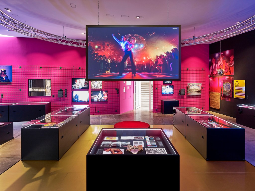
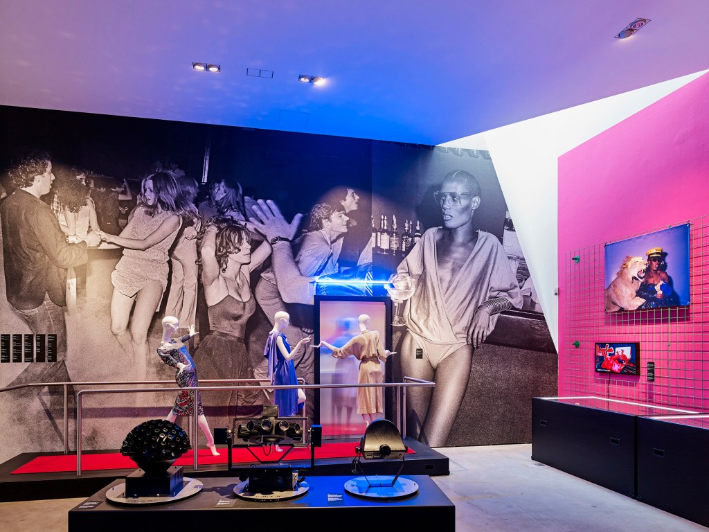
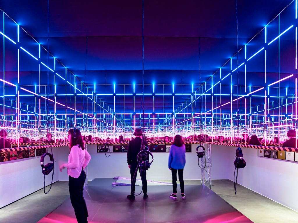
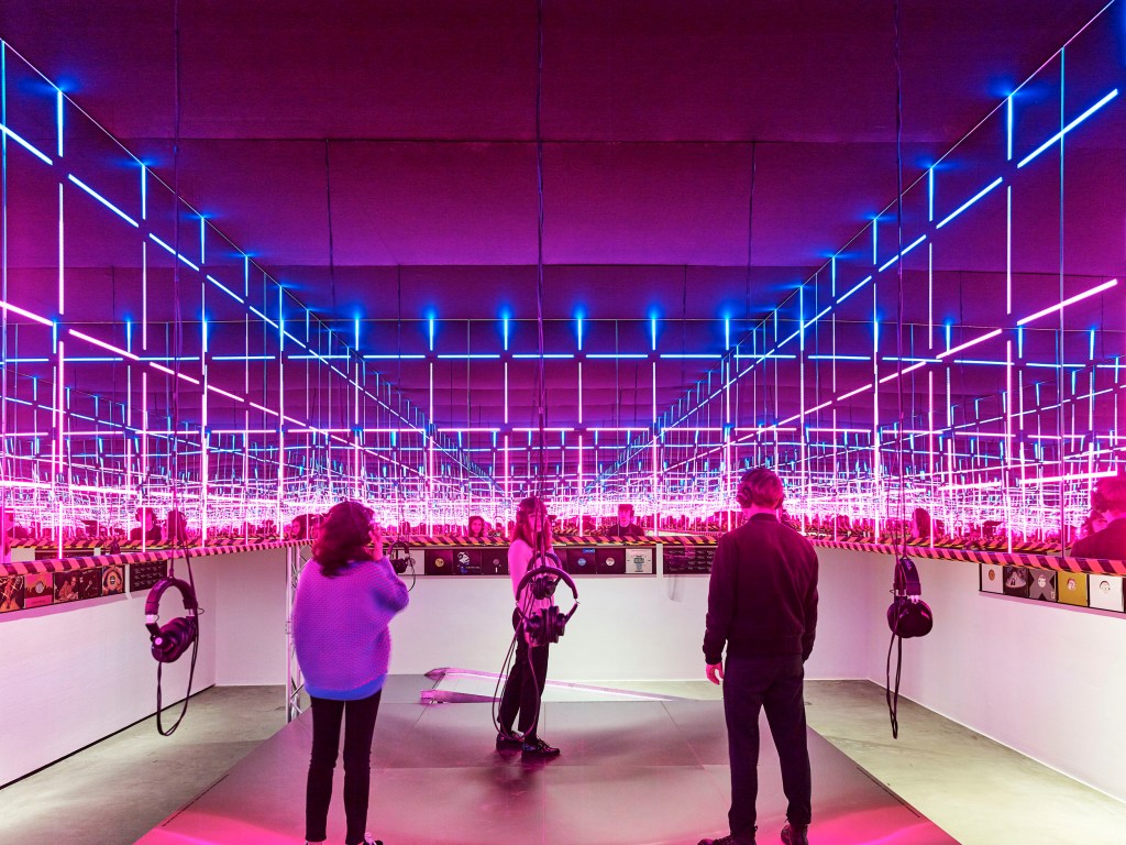
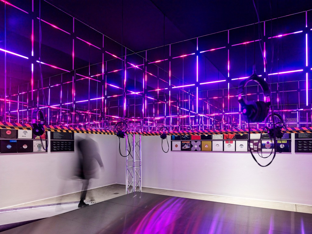
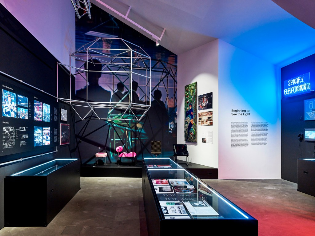
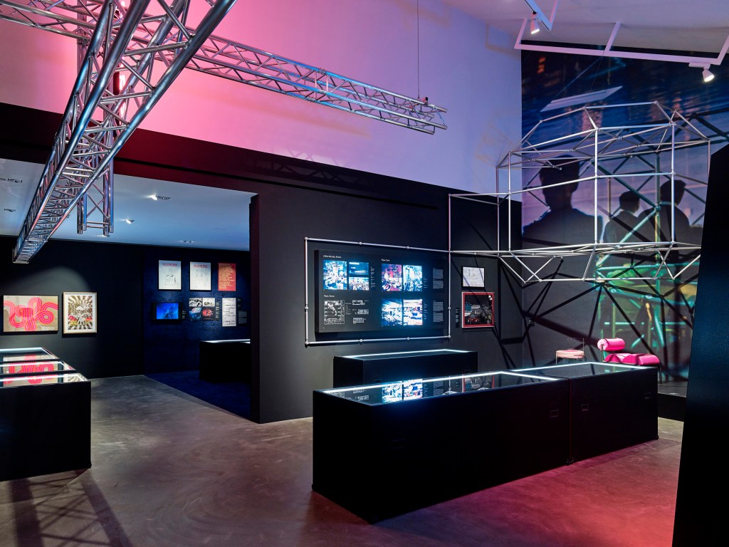
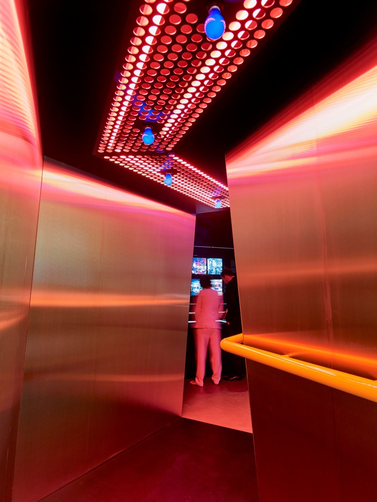
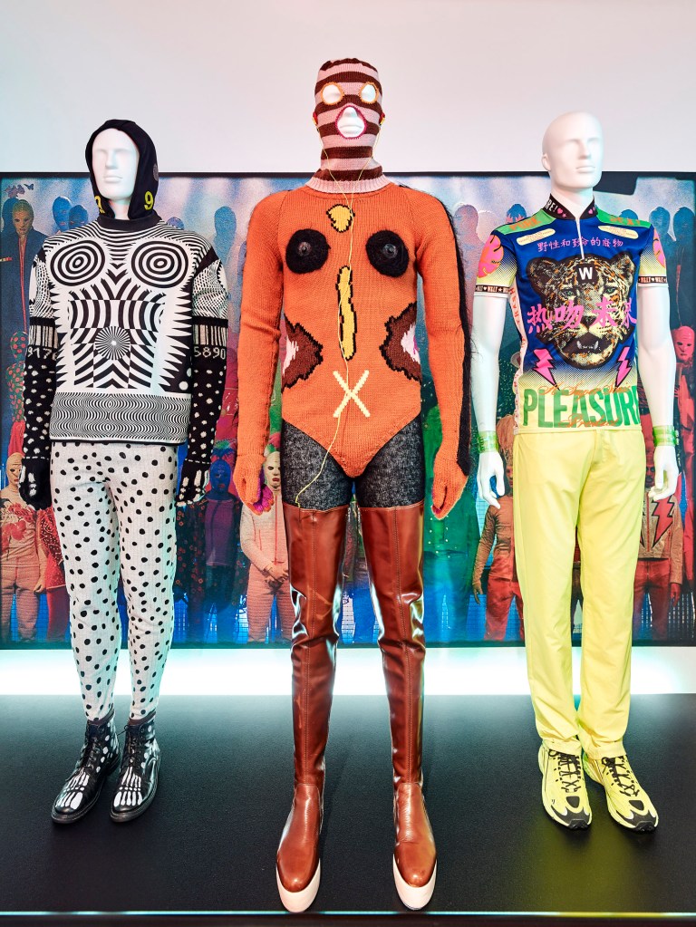
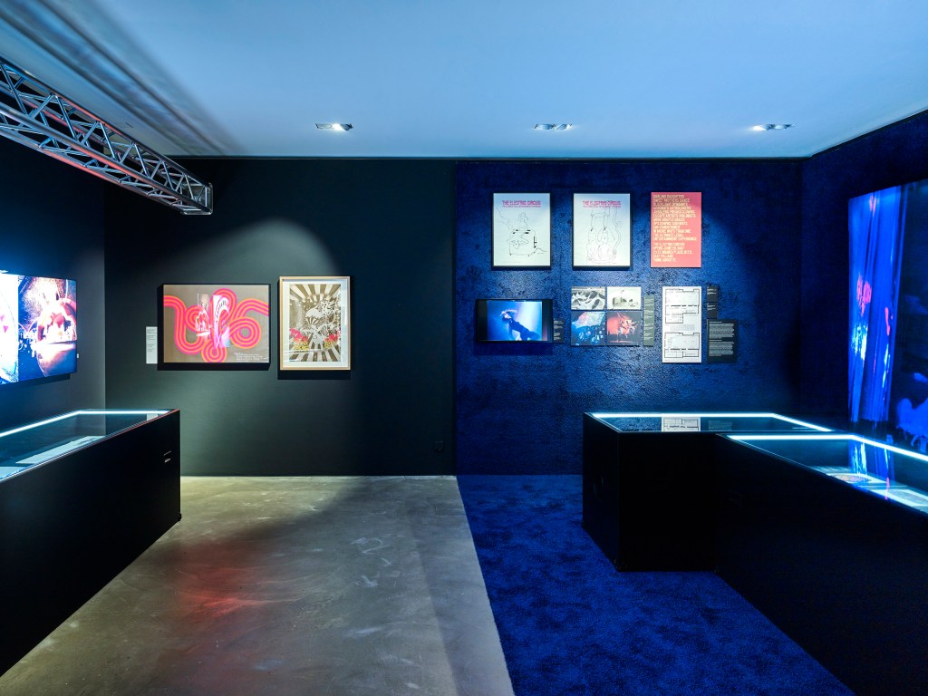
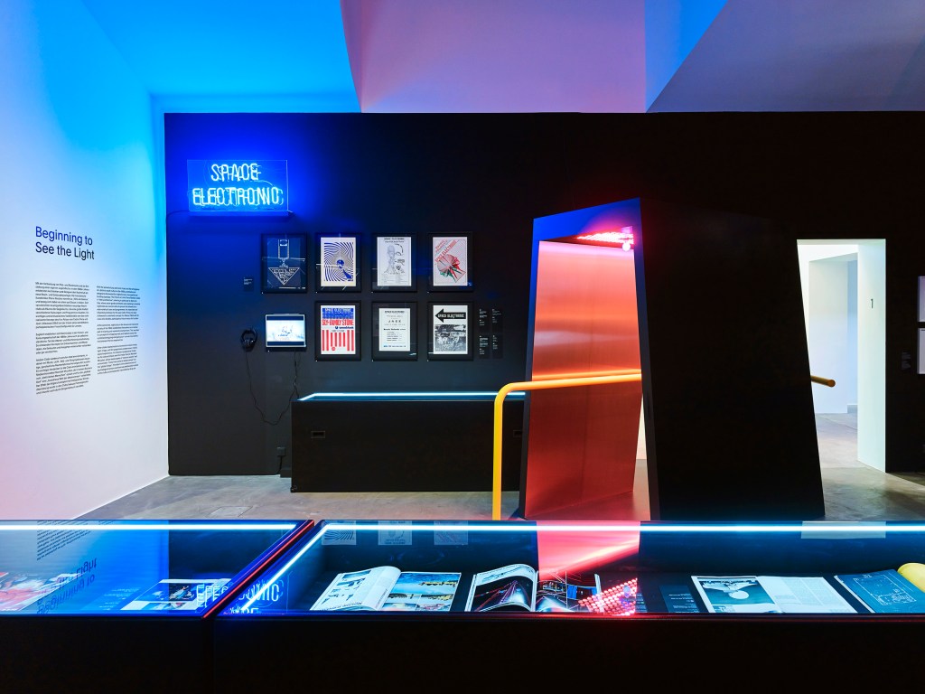
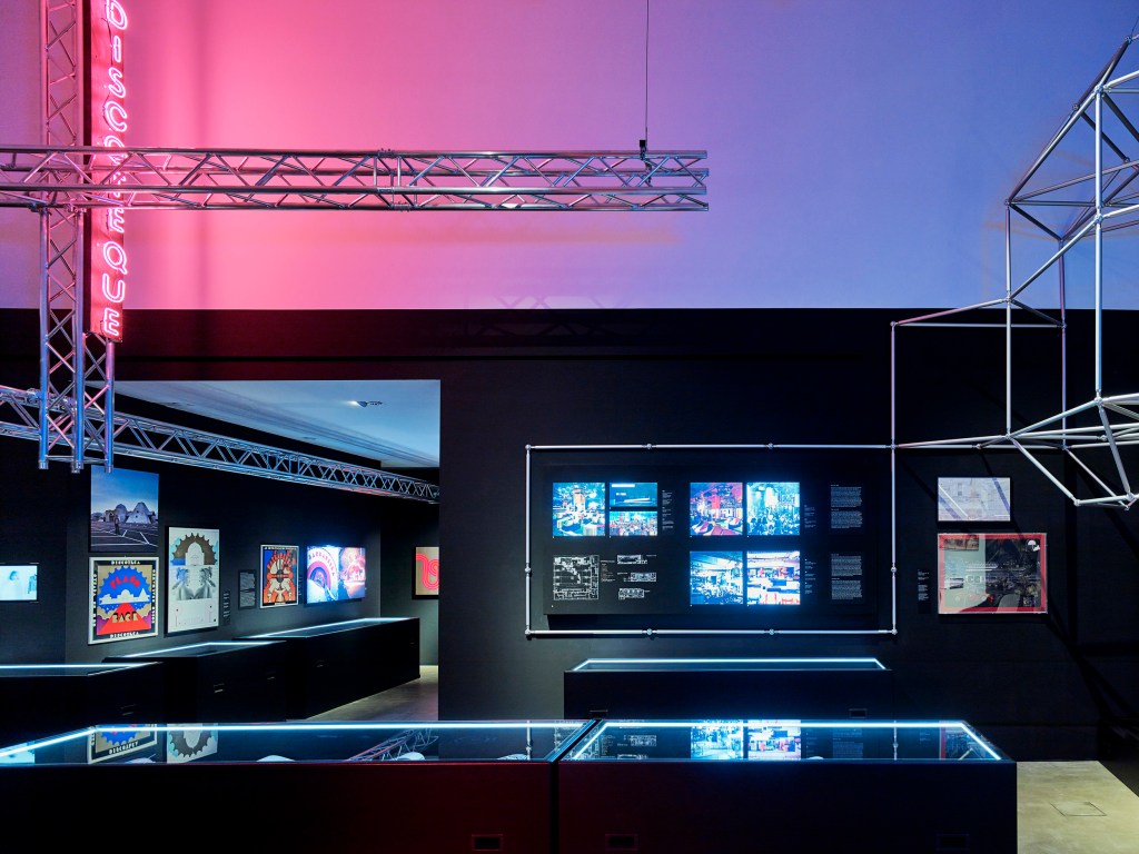
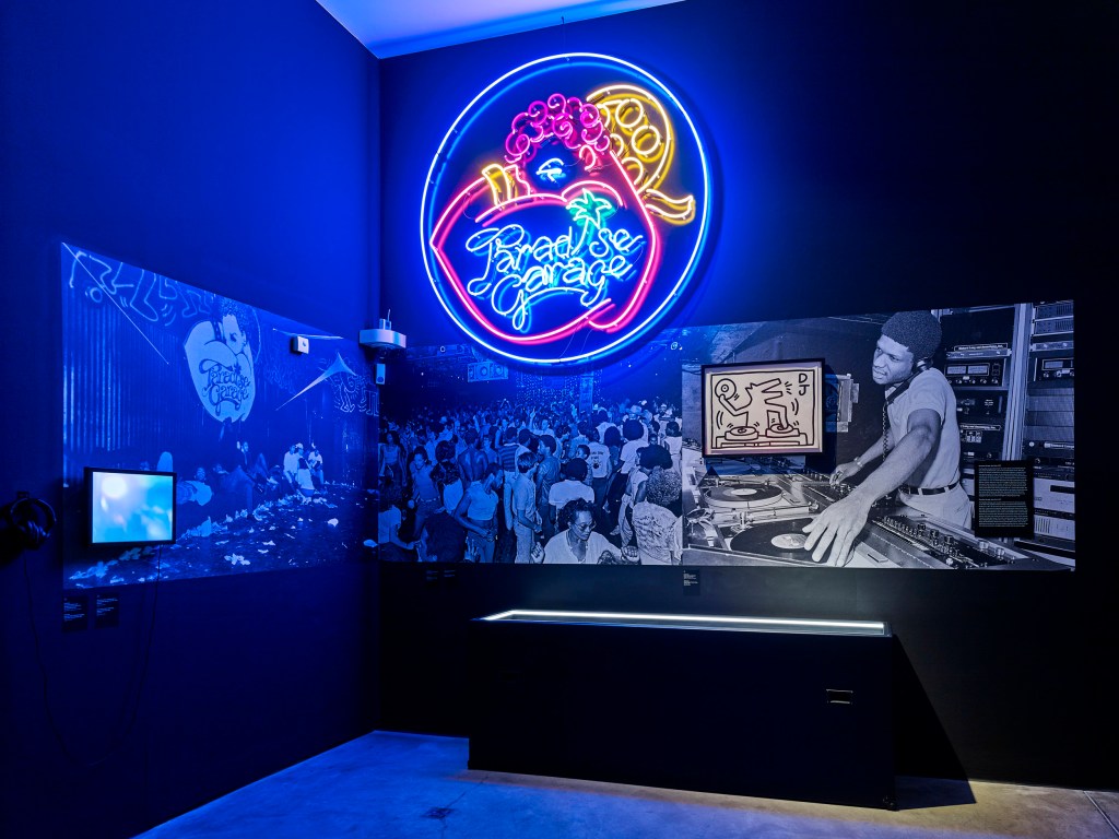
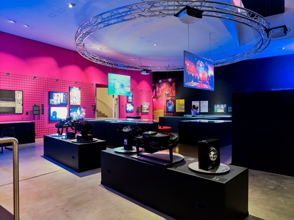
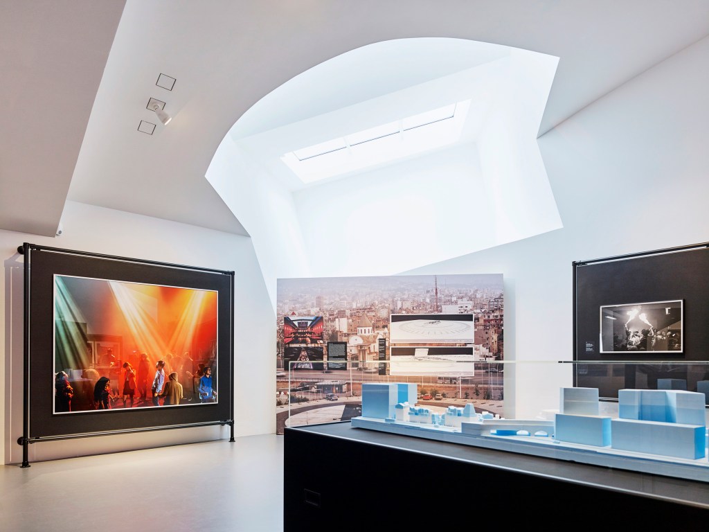
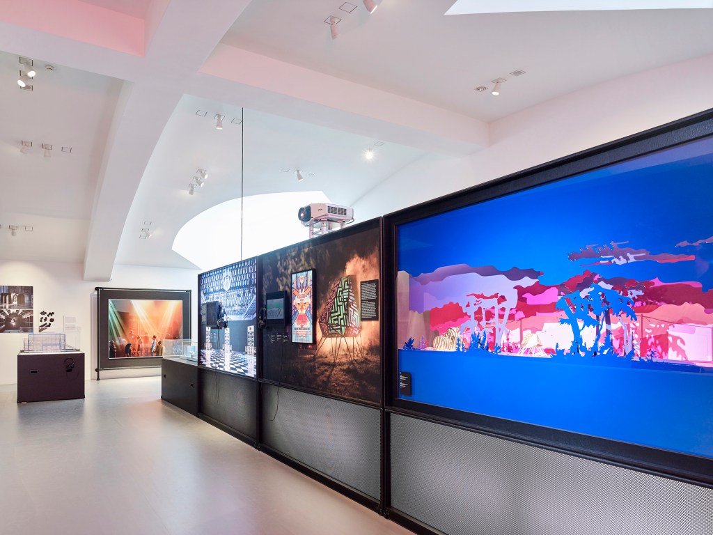
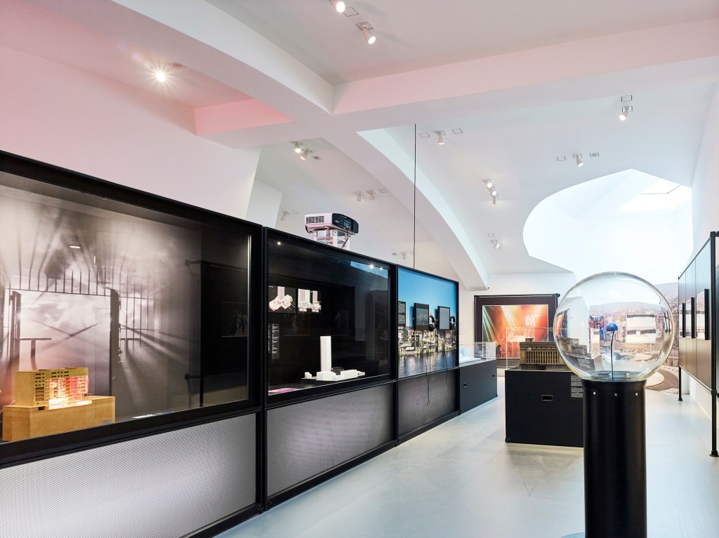
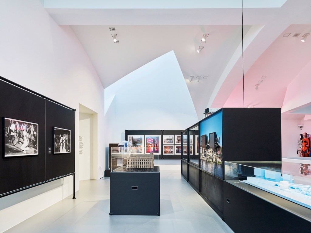
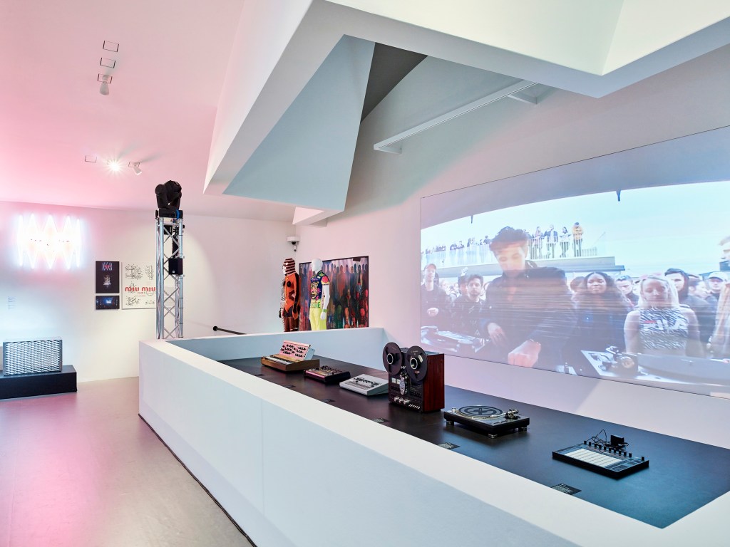
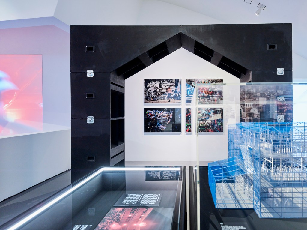
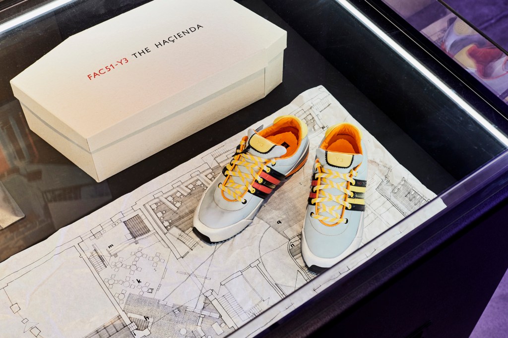


 'Josephine Baker in a Banana Skirt' 1927 from the exhibition 'Art Deco. Graphic Design from Paris' at the Museum für Kunst und Gewerbe Hamburg, May - Sept, 2018")
 Illustration of 'Les Robes des Paul Poiret' 1908 from the exhibition 'Art Deco. Graphic Design from Paris' at the Museum für Kunst und Gewerbe Hamburg, May - Sept, 2018")
 'We are watched - New Muffs for the Winter' 1913")
 'Rugby (Waisted Costume by Redfern)' 1914")
 Illustration of 'Blaise Cendrars, La Fin du Monde' 1919")
 'Day and Night' 1924")
 'The Blue Amazon' 1924")
 'Official Poster for the International Exhibition of Decorative Arts' 1925")
 'Mistinguett' 1925")
 'Bal de la Grande Course' 1925")
 'Jean Borlin' 1925")
 'The Jazz Orchestra of Josephine Baker' 1925")
 'Josephine Baker, dancing' 1927")

 'Peugeot' 1928")
 'André Renaud' 1929")
 'Delahaye' 1932")

 'Berman House (Harry Seidler), Joadja, New South Wales' 2007 from the exhibition 'John Gollings: The history of the built world' at the Monash Gallery of Art, Wheelers Hill, Melbourne, Dec 2017 - March 2018")


, Carlton, Victoria' 1983")


, Yarra Valley, Victoria' 2013")
, Somers, Victoria' 1997")


, Melbourne, Victoria' 2001")
, Changzhou, China' 2013; third left, 'Croft House (James Stockwell), Inverloch, Victoria' 2013; second right, 'Australian Centre for Contemporary Art (Wood Marsh), Southbank, Victoria' 2002; and right, 'Habitat filter (Matt Drysdale, Matt Myers and Tim Dow), Southbank, Victoria' 2017")
, Inverloch, Victoria' 2013")


")
")
 'Monash Gallery of Art (Harry Seidler), Wheelers Hill, Victoria' 1990")
 'Webb Bridge (Robert Owen with Denton Corker Marshall), Docklands, Victoria' 2003 from the exhibition 'John Gollings: The history of the built world' at the Monash Gallery of Art, Wheelers Hill, Melbourne, Dec 2017 - March 2018")
 'Federation Square, Melbourne, Victoria' 2010")
 'Hotel Hotel foyer (March Studio), New Acton, Australian Capital Territory' 2013")
 'Karijini Visitor Centre (Woodhead International BDH), West Pilbara, Western Australia' 2001")
 'Penleigh and Essendon Grammar School (McBride Charles Ryan), Essendon, Victoria' 2011")
 'Featherston House (Robin Boyd), Ivanhoe, Victoria' 2011")
 'Uluru Visitor Centre (Gregory Burgess), Uluru, Northern Territory' 1999")
 'Kabaw Berber Granary, Kabaw, Libya' 2005")
 'Bayon, Angkor Thom, Cambodia' 2012")
 'North face, south gate, Angkor Thom, Cambodia' 2007")
 'Buddha detail, Borobudur, Java, Indonesia' 2011")
 'Mori Tim Stupa, Silk Road, China' 2005")
 'Jiaohe Old City, Turfan, China' 2005")
 'Pushkarani Kund (King's Bath), Hampi, India' 1988")
 'Ta Prohm Temple, Angkor Thom, Cambodia' 2007")
 'Hanuman Temple, Hampi, India' 2006")
 'Small Ganesh, Hampi, India' 2006")
 'Vittala Dance Mandapa interior, Hampi, India' 2005")
 'Nawarla Gabarnmang, Arnhem Land, Northern Territory' 2015")
 'Australian Centre for Contemporary Art (Wood Marsh), Southbank, Victoria' 2002")
 'Habitat filter (Matt Drysdale, Matt Myers and Tim Dow), Southbank, Victoria' 2017")
 'Jean-Marie Tjibaou Cultural Centre (Renzo Piano), Nouméa, New Caledonia' 1997")
 'The Lotus Building (Studio 505), Changzhou, China' 2013")
 'Surfers Paradise aerial, Surfers Paradise, Queensland' 2012")
 'Every high rise on the Gold Coast, Surfers Paradise, Queensland' 2012")
 'Every high rise on the Gold Coast, Surfers Paradise, Queensland' 2012 (detail)")

You must be logged in to post a comment.