In my humble opinion Diane Arbus is the best portrait photographer of the 20th century.
As can be seen in the quotation from a 1939 high-school essay on Plato when Arbus was just 19 years old (below), latent inside her was an appreciation of difference, uniqueness, and the importance of life – all awaiting an out, an emanation of her spirit later manifested in her photographs through the picturing of her subjects.
Arbus found her mature voice as an artist, her métier if you like, when in 1962 she switched from a 35mm camera to a 2 1/4 inch twin-lens reflex (TLR) Rolleiflex (later a Mamiyaflex), a square format which became her iconic signature.
In the photograph Nancy Bellamy’s bedroom, N.Y.C. 1961 (1961, below) we therefore have evidence of the early results of the use of this new camera. In this photograph I believe you can feel how Arbus is still getting used to his new way of seeing the world, for you have to approach your visualisation of the world in a completely different way when constructing the image plane in a square format. Here she is still unsure as to where to place the camera. The light is fantastic coming in through the window and flooding the room but the out of focus left wall is weak and simply does not work with the image.
Fast forward to 1963-1965 and we see Arbus in complete control of her physical and emotional environment. In photographs from this period, whether medium distance portraits showing subjects in situ or tightly cropped portraits with minimal backgrounds, we see her undoubted mastery of natural light, flash, construction and tensioning of the image plane but, above all, in control of the feeling that emanates from the photographs that flows to the viewer.
Whether direct / acceptance / this is who I am (Interior decorator at the nudist camp in his trailer, New Jersey, 1963, 1963 below) to contained / introspective (Lucas Samaras, N.Y.C. 1966, 1966 below) – but never the dreaded “dead pan” – and on to the inscrutable / open / closed looks on each of the three faces in the photograph Triplets in their Bedroom, N.J., 1963 (1963, below), Arbus is the master at conjuring, no what is the word I’m looking for … Arbus is the master at materialising the energy of a person or place before our very eyes.
As the press release so eloquently states, “Through her singular combination of intelligence, charisma, intuition, and courage, Diane Arbus was frequently invited into homes and other private realms seldom seen by strangers. Though made in intimate settings, her photographs evidence no sense of intrusion or trespass. Instead, they reveal an unspoken exchange between photographer and subject, a moment of recognition in which confidences emerge freely and without judgment.”
An unspoken exchange between photographer and subject. A moment of revelation, or revelatio, where the curtain is pulled back to reveal our innermost secrets. Visualised by Arbus without judgement.
As the years progress towards 1968-1970 Arbus becomes bolder still. In photographs such as A naked man being a woman, N.Y.C., 1968 (1968, below), Girl sitting on her bed with her shirt off, N.Y.C., 1968 (1968, below) and Mexican Dwarf in his hotel room, N.YC., 1970 (1970, below) we see and feel such an intimate bond between the photographer and the subject – all crap cut out, all extraneous noise gone, just the baring of the soul of the sitter looking directly into the camera. As Minor White used to say, a communication / communion between the photographer and the subject, back through the lens of the camera and onto the film, forming a Zenian circle of energy, hoping for a revelation of spirit in the negative and subsequent print – whether that be from a rock, a landscape or a portrait.
And in two photographs from the same sitting, we can begin to understand how Arbus achieved her aim. In the photograph Transvestite at the birthday party, N.Y.C. 1969 (1969, below) we have the subject in situ, in context, laughing, happy, enjoying her birthday party surrounded by her things. Then things change. In Transvestite with her birthday cake, N.Y.C. 1969 (1969, below) Arbus closes in on this wonderful human being on her bed with her birthday cake. Isolating her from the background through the use of flash, there she is, fag in hand, staring directly into the camera in all her strength and vulnerability. Arbus evinces what it is to be this human being, she has empathy for the subject in these intimate settings.
I believe that Arbus’ empathy for her subjects was greatly enhanced by the waist level engagement with her sitters when using her medium format camera. Instead of bringing the camera up to the eye, Arbus looks down into the viewfinder to locate and ground the energy of her subjects, and the camera is nestled at solar plexus / belly button, with all the connection to mother, blood, energy and water (Amniotic Fluid) from which we all come. When singing and in yoga practice, breathing comes from the stomach and the energy flows in an out of the navel, the Manipura (solar plexus) in yoga, linked to personal power, emotional balance, and metabolism, acting as a hub for energy distribution.1 Having used an old Mamiya twin-lens C220 medium format camera myself I can totally appreciate the unique perspective and energy such a camera position brings to picturing the world.
“These archetypal images have become deeply embedded in the collective conscience where conscience is pre-eminently the organ of sentiments and representations. The snap, snap, snap of the shutter evinces the flaws of human nature, reveals the presence of a quality or feeling to which we can all relate. As Arbus states, the subject of the picture is always more important than the picture. And more complicated. That is why these photographs always capture our attention – because we become, we inhabit, we are the subject.”2
Dr Marcus Bunyan
1/ The (navel) is seen as a powerful energy centre in many traditions (Yoga, Ayurveda, TCM) and science, representing our origin, core strength, digestion (Agni/digestive fire), self-esteem, and life force (prana).
2/ Marcus Bunyan commenting on the exhibition Diane Arbus at Jeu de Paume, Paris, October 2011 – February 2012
Many thankx to David Zwirner for allowing me to publish the 5 images and installation photographs in the posting. All other photographs are used under fair use conditions for the purposes of eduction and research. Please click on the photographs for a larger version of the image.
“For me the subject of the picture is always more important than the picture. And more complicated.”
Diane Arbus
“There are and have been and will be an infinite number of things on earth: individuals all different, all wanting different things, all knowing different things, all loving different things, all looking different. Everything that has been on earth has been different from any other thing. That is what I love: the differentness, the uniqueness of all things and the importance of life…. I see something that seems wonderful; I see the divineness in ordinary things.”
Used under fair use conditions for the purposes of education and research
Installation view of the exhibition Diane Arbus: Sanctum Sanctorum at David Zwirner, London showing at left, Arbus’ Girl sitting on her bed with her shirt off, N.Y.C., 1968; at centre, Interior decorator at the nudist camp in his trailer, New Jersey 1963; at second right, Mrs. T. Charlton Henry in a negligee, Philadelphia, Pa. 1965; and at right, Triplets in their Bedroom, N.J., 1963
Installation view of the exhibition Diane Arbus: Sanctum Sanctorum at David Zwirner, London showing at second left, Arbus’ Two friends at home, N.Y.C., 1965; at second right, Brenda Diana Duff Frazier, 1938 Debutante of the Year, at home, Boston, Mass. 1966; and at right, Transvestite at her birthday party, N.Y.C., 1968
Installation view of the exhibition Diane Arbus: Sanctum Sanctorum at David Zwirner, London showing Arbus’ photograph A naked man being a woman, N.Y.C. 1968
Installation view of the exhibition Diane Arbus: Sanctum Sanctorum at David Zwirner, London showing in the centre distance, Arbus’ Mexican dwarf in his hotel room, N.Y.C. 1970; at second right, Lucas Samaras, N.Y.C. 1966; and at right, Bishop on her bed, Santa Barbara, Cal., 1964
Lucas Samaras (Greek: Λουκάς Σαμαράς; September 14, 1936 – March 7, 2024) was a Greek-born American photographer, sculptor, and painter. …
His “Auto-Interviews” were a series of text works that were “self-investigatory” interviews. The primary subject of his photographic work is his own self-image, generally distorted and mutilated. He worked with multi-media collages, and by manipulating the wet dyes in Polaroid photographic film to create what he calls “Photo-Transformations”.
~ Sanctum Sanctorum: a sacred room or inner chamber; a place of inviolable privacy
Diane Arbus: Sanctum Sanctorum, an exhibition of forty-five photographs made in private places across New York, New Jersey, California, and London between 1961 and 1971, is on view at David Zwirner, London, from 6 November to 17 January 2025, and travels to Fraenkel Gallery, San Francisco in spring 2026. The exhibition will be accompanied by a comprehensive monograph reproducing all works in the exhibition, jointly published by both galleries.
Through her singular combination of intelligence, charisma, intuition, and courage, Diane Arbus was frequently invited into homes and other private realms seldom seen by strangers. Though made in intimate settings, her photographs evidence no sense of intrusion or trespass. Instead, they reveal an unspoken exchange between photographer and subject, a moment of recognition in which confidences emerge freely and without judgment.
Arbus’s desire to know people embraced a vast spectrum of humanity. Her subjects in Sanctum Sanctorum include debutantes, nudists, celebrities, aspiring celebrities, socialites, transvestites, babies, widows, circus performers, lovers, female impersonators, and a blind couple in their bedroom.
The exhibition brings together little-known works, such as Girl sitting in bed with her boyfriend, N.Y.C. 1966; Ozzie and Harriet Nelson on their bed, Los Angeles1970; and Interior decorator at the nudist camp in his trailer, New Jersey 1963, alongside celebrated images like Mexican dwarf in his hotel room, N.Y.C. 1970 and A naked man being a woman, N.Y.C. 1968.
While many of Arbus’s photographs have become part of the public’s collective consciousness since her landmark retrospective at The Museum of Modern Art, New York, in 1972, seen in this context, viewers may discover aspects of even familiar works that have previously gone unnoticed.
Sanctum Sanctorum follows two recent major exhibitions of the artist’s work: Cataclysm: The 1972 Diane Arbus Retrospective Revisited at David Zwirner New York (2022) and Los Angeles (2025), and Diane Arbus: Constellation at LUMA, Arles (2023–2024) and the Park Avenue Armory, New York (2025).
Exhibition Catalogue
This new title ‘Sanctum Sanctorum’ illuminates Diane Arbus’s singular ability to enter private worlds.
Used under fair use conditions for the purposes of education and research.
One of Arbus’s lesser known pictures, this photograph is of the bedroom of Nancy Bellamy, the wife of Richard Bellamy, a leading gallerist in 1960s New York who influentially championed Pop Art and Minimalism. Before she began her personal projects, Arbus worked in fashion photography with her husband, Allan, and she first met Nancy when she modelled for the Arbuses on a fashion shoot. As well as modelling, Bellamy also worked as a dancer, painter and costume designer, and had a keen interest in spiritualism. Like ‘Xmas Tree in a Living Room in Levittown 1963’, Arbus uses an empty room to create a portrait of the person – the dressmaker’s dummy, the canvas on the wall, the photographs by the mirror and the simple, yet elegant furnishings together create an impression of Arbus’s friend’s personality.
Used under fair use conditions for the purposes of education and research.
The bishop in Diane Arbus’s photograph “Bishop on her bed, Santa Barbara, Cal.” (1964, above) was Bishop Ethel Predonzan, a unique figure who believed she was in Santa Barbara to await the Second Coming of Christ and wore elaborate robes, described by Arbus as a “small lady in damask robes with hair of phosphorescent pink”.
Predonzan was a key subject in Arbus’s exploration of individuals on the fringes, showcasing the artist’s ability to find deep personal connection and reveal inner strangeness.
Used under fair use conditions for the purposes of education and research.
Mrs T. Charlton Henry was a Philadelphia socialite, a philanthropist, and a fashion icon – often top of the ‘best-dressed’ lists. She was the kind of wealthy upper-class woman that Arbus’s father would have hoped to see in his Fifth Avenue department store buying the latest furs.
“Mrs. Henry, born Julia Rush Biddle of Philadelphia’s Main Line, weighs approximately 88 pounds. She will be 82 years old this month. She has been on the best-dressed list so often that she is now a member of fashion’s Hall of Fame. She still lives in Philadelphia, but commutes to New York for luncheon, shopping, theater. She sits, with the posture of another era, on a bound-to-be-seen banquette at La Caravelle restaurant and delves into a curry (“I’ll have jellied soup for dinner tonight”). Her silver and gold “57 varieties” hair is meticulously coifed; the fingernails that blow delicate little kisses of greeting to friends are tinted a deep pink. Her brown and white gingham Mainbocher is perked up with her favorite day jewels. There are marble-size pearls around the neck and one wrist, and massive yellow sapphires at the other wrist, the ears, and flashing away on a ring and a brooch.”
Around the world, 2025 hasn’t been a great year for photography exhibitions. As a friend of mine said on Facebook it has been a dreary year and I would tend to agree with him.
Curatorially, everything was pretty cut and dried, relying on the usual one artist show or group exhibition on a theme with nobody prepared to take a risk on anything creative, inventive even.
I found little to inspire me in terms of idiosyncratic but illuminating pairings of photographers or unusual insights into the conditions and conceptualisation of photographic production and presentation – other than a few of the exhibitions noted below: costume, gesture and expression – yes! the development of colour photography pre the ubiquitous American artists – yes! and the life in self-portraits of a photobooth operator in Melbourne, part magician, part artist – YES!
Out of the 60 postings on Art Blart in 2025 I’ve picked what I think are the 11 best exhibitions, plus a couple of honourable mentions.
I hope you enjoy the selection and a Happy New Year to you all!
Dr Marcus Bunyan
1/ Marcus Bunyan. “Past present,” on the exhibition Still Performing: Costume, Gesture, and Expression in 19th Century European Photography at the Nelson-Atkins Museum of Art, Kansas City, August 2024 – January 2025
Victor Plumier (Belgian, 1820-1878) Lady in Costume About 1850 Daguerreotype, half plate 5 1/2 × 4 1/2 inches The Nelson-Atkins Museum of Art Gift of the Hall Family Foundation
“The emotions and the sentiments, the gestures and the expressions. The actor and the stage, the photographer and the sitter. The staged photograph and the tableaux vivant. The Self and the Other.” ~ MB
2/ A Long Arc: Photography and the American South since 1845 at the Virginia Museum of Fine Arts, Richmond, October 2024 – January 2025
Andrew Joseph Russell (American, 1829-1902) Slave Pen, Alexandria, Virginia 1863 Albumen silver print High Museum of Art Purchased with funds Lucinda Weill Bunnen Fund and the Donald and Marilyn Keogh Family
“Photographs are containers of, fragments of, memories of, histories of, events – remembrances of events – brought from past into present, informing the future, showing only snippets of the stories of both past and present lives. Parallel to the usual thought that photographs are about death, they are also memory containers for (still) living people.” ~ MB
3/ Marcus Bunyan. “Out in the midday sun,” on the exhibition Martin Parr. Early Works at Fotografie Forum Frankfurt (FFF), September 2024 – February 2025
“I am always fascinated with the early work of an artist. In essence, the photographs tell you what are the primary concerns for the artist and these themes usually remain with them for the rest of their career. These early black and white photographs provide a window into that ongoing investigation, that golden path. They are more subtle in their modulation of British life than in the later colour work – it’s as though the artist had to change gears with the use of colour developing a more ironic way of seeing British life through a different spatial relationship to his subjects – but in these photographs there is still that deprecating humour that is often missing in the work of his contemporaries…” ~ MB
“There are the things that are out in the open, and there are the things that are hidden, and life has more to do, the real world has more to do with what is hidden.” ~ Saul Leiter
5/ True Colors: Color in Photography from 1849 to 1955 at Albertina Modern, Vienna, January – April, 2025
Léon Vidal (French, 1833-1906) Oriental Onyx Sardonyx Cup (16th century) 1876 Photomechanical proof (photochromy using the Léon Vidal process) mounted on cardboard H. 20.8 ; L. 26.2 cm. Don Fondation Kodak-Pathé, 1983
“What a wonderful exhibition. It’s so exciting to see the history and development of colour photography pre the ubiquitous, American artists William Eggleston and Stephen Shore, much as I like both artists.” ~ MB
6/ The basement: photography from Prahran College (1968-1981) at the Museum of Australian Photography, Wheelers Hill, Melbourne, March – May 2025
Julie Millowick (Australian, b. 1948) Mother and child from 46 Blanche Street, St Kilda 1977 Gelatin silver print 15.9 x 23.7cm Museum of Australian Photography, City of Monash Collection donated by Julie Millowick 2024
“Prahran College itself played a critical role in the legitimisation of photography as an art form within Australia. It spearheaded the integration of art photography into tertiary education curricula, fostering an environment where young artists … could experiment formally and conceptually.”
James McArdle. “Epoch,” on the On This Date in Photography website, 25th April, 2025 [Online] Cited 28/04/2025
“The wit, the humour (pigeons sitting outside the racing pigeon shop), the stiff upper lip, the carry on regardless, the working class pantomime of life and death – the public commission flats where people formed caring communities that were destroyed through redevelopment – the integrity of an existence that has largely come and gone pictured with warmth and empathy.” ~ MB
8/ Auto-Photo: A Life in Portraits at RMIT Gallery, Melbourne, June – August 2025
Installation view of the exhibition Auto-Photo: A Life in Portraits at RMIT Gallery, Melbourne, June – August, 2025 Photo: Marcus Bunyan
“Through the strip self-portraits Adler took while servicing and then testing the photobooths that he operated in Melbourne, Australia we become immersed in an archive of his world, the exhibition becoming a joyous ode to a man who devoted his life to photography (not in the traditional sense): in turns humorous and historical, a travelogue, his travelogue, through time and space.’ ~ MB
“Rodríguez’s moody, high contrast photographs of humanity and street scenes pictured from behind the wheel of his taxi in New York proffer an intuitive, empathetic and subjective view of the city and its people at a time of great economic and social upheaval…
Uncertain times, uncertain angles and perspectives, uncertain light give rise to a powerful body of work made certain by the talent of an impressive photographer. Glorious work.” ~ MB
10/ Marcus Bunyan. “Myths of the American West,” on the exhibition Richard Avedon ‘In the American West’ 1979-1984 at the Fondation Henri Cartier-Bresson, Paris, April – October 2025
“Avedon, while undercutting the myth of the American West through his storytelling, doesn’t seek to document, exploit or misrepresent his subjects, but to subjectively present them as on a theatrical set devoid of scenery – where their very appearance becomes scene / seen. As he himself said, “My concern is… the human predicament; only what I consider the human predicament may simply be my own.”” ~ MB
“The Bechers’ typologies and grids, their topographic state, their same same photographs and perspectives of industrial sculptures and landscapes are anything but objective. Their pictorial grammar, underlaid by a conceptual approach to subject matter, continuously reflected in the systematics of capture and display (the juxtaposition of works together), is constantly undermined by the ghost in the machine – those viral codes of mutation and difference which cannot be controlled.” ~ MB
“Weems blends the poetic and conceptual in photographs and bodies of work which investigate history, identity, racism, executive and patriarchal power from the perspectives of female / Black American.
What a fabulous artist, a guide into circumstances seldom seen, now revealed.” ~ MB
Curators: Stephanie D’Alessandro, Leonard A. Lauder Curator of Modern Art and Senior Research Coordinator in Modern and Contemporary Art at The Met, and Stephen C. Pinson, Curator in the Department of Photographs at The Met, with the assistance of Micayla Bransfield, Research Associate, Modern and Contemporary Art.
“Like the undisturbed ashes of an object consumed by flames these images are oxidized residues fixed by light and chemical elements of an experience, an adventure, not an experiment. They are the result of curiosity, inspiration, and these words do not pretend to convey any information.”
Man Ray1
The rayographs
Although not the inventor of the photogram, a photograph made without the use of a camera by placing objects directly onto sensitised photographic paper and then exposing the paper to light, Man Ray’s rayographs have become the most recognisable and famous form that photograms have taken. This is because of their inventiveness, their subliminal connection to the psyche, and the use of “objects from the real world to make ambiguous dreamscapes.”7
It is interesting that Man Ray called his images rayographs, for a graph implies a topographical mapping, a laying out of statistics, whereas Lucia Moholy and László Moholy-Nagy’s photograms imply in the title of their technique the transmission of some form of message, like a telegram. The paradox is that, as the quotation above states, Man Ray always insisted that his rayographs imparted no information at all; perhaps they are only dreams made (un)stable. Contrary to this the other two artists believed that, “photographic images – cameraless and other – should not deal with conventional sentiments or personal feelings but should be concerned with light and form,”8 quite the reverse of the title of their technique.
After his arrival in Paris Man Ray started experimenting in his darkroom and discovered the technique for his rayographs by accident. With the help of his friend the Surrealist poet Tristan Tzara, he published a portfolio of twelve Rayographs in 1922 called Les champs délicieux (The delicious fields). “This title is a reference to ‘Les champs magnétiques’, a collection of writings by André Breton and Philippe Soupault composed from purportedly random thought fragments recorded by the two authors.”9 The rayographs are visual representations of random thought fragments, “photographic equivalents for the Surrealist sensibility that glorified randomness and disjunction.”10
Man Ray, “denied the camera its simplest joy: the ability to capture everything, all the distant details, all the ephemeral lights and shadows of the world”11 but, paradoxically, the rayographs are the most ephemeral of creatures, only being able to be created once, the result not being known until after the photographic paper has been developed. In fact, for Man Ray to create his portfolio Les champs délicieux (The delicious fields), he had to rephotograph the rayographs in order to make multiple copies.12
Man Ray “insisted in nearly every interview that the rayograph was not a photogram in the traditional sense. He did something that a photogram didn’t; he introduced depth into the images,”13 which denied the images their photographic objectivity by depicting an internal landscape rather than an external one.14 What the rayographs do not deny, however, is the subjectivity of the artist, his skill at placing the objects on the photographic paper, expressed in their dream-like nature, both a subjective ephemerality (because they could only be produced once) and an ephemeral subjectivity (because they were expressions of Man Ray’s fantasies, and therefore had little substance).
Through an alchemical process the latent images emerge from the photographic paper, representations of Man Ray’s fantasies as embodied in the ‘presence’ of the objects themselves, in the surface of the paper. Perhaps these objects offer, in Heidegger’s terms, ‘a releasement towards things’,15 “a coexistence between a conscious and unconscious way of perceiving which sustains the mystery of the object confusing the distinction between real time and sensual time, between inside and outside, input and output becoming neither here nor there.”16
Finally, within their depth of field the rayographs can be seen as both dangerous and delicious, for somehow they are both beautiful and unsettling at one and the same time. As Surrealism revels in randomness and chance these images enact the titles of other Man Ray photographs: Danger-Dancer, Anxiety, Dust Raising, Distorted House. The rayographs revel in chance and risk; Man Ray brings his fantasies to the surface, an interior landscape represented externally that can be (re)produced only once – those dangerous delicious fields.
1/ Man Ray quoted in Janus (trans. Murtha Baca). Man Ray: The Photographic Image. London: Gordon Fraser, 1980, p. 213
7/ Mark Greenberg (ed.,). In Focus: Man Ray: Photographs from the J. Paul Getty Museum. Los Angeles, The J. Paul Getty Museum, 1998, p. 38
8/ Naomi Rosenblum. A World History of Photography. New York: Abbeville Press, 1997, 394
9/ Greenberg, op. cit., p. 28
10/ Jed Perl (ed.,). Man Ray: Aperture Masters of Photography. New York: Aperture, 1997 pp. 11-12
11/ Perl, op. cit., pp. 5-6
12/ Greenberg, op. cit., p. 28
13/ Greenberg, op. cit., p. 112
14/ Greenberg, op. cit., p. 28
15/ “We stand at once within the realm of that which hides itself from us, and hides itself just in approaching us. That which shows itself and at the same time withdraws is the essential trait of what we call the mystery … Releasement towards things and openness to the mystery belong together. They grant us the possibility of dwelling in the world in a totally different way…”
Martin Heidegger. Discourse on Thinking. New York: Harper & Row, 1966, pp. 55-56 quoted in Mauro Baracco. “Completed Yet Unconcluded: The Poetic Resistance of Some Melbourne Architecture,” in Leon van Schaik (ed.,). Architectural Design Vol. 72. No. 2 (‘Poetics in Architecture’). London: John Wiley and Sons, 2002, 74, Footnote 6.
Many thankx to The Metropolitan Museum of Art for allowing me to publish the photographs in the posting. Please click on the photographs for a larger version of the image.
“Stepping into the exhibition Man Ray: When Objects Dream at The Metropolitan Museum of Art feels like entering the bellows of an old camera. Through a rectangular frame cut into the entry, the darkened walls unfold, accordion-like, to reveal a visual feast of the artist’s work, as Man Ray’s earliest film, “Retour à la raison (Return to Reason)” (1923), flickers across the screen opposite. Although the exhibition brings together approximately 160 works from an impressive array of lenders, it reveals itself gradually, taking the viewer through several turns before one can grasp its sheer enormity. When Objects Dream proves, thrillingly, that anyone left feeling jaded from the many, many recent exhibitions surrounding Surrealism’s centennial in 2024 can still see the movement’s key photographer with a fresh set of eyes.”
“Objects to touch, to eat, to crunch, to apply to the eye, to the skin, to press, to lick, to break, to grind, objects to lie, to flee from, to honor, things cold or hot, feminine or masculine, objects of day or night which absorb through your pores the greater part of our life. … These are the projections surprised in transparence, by the light of tenderness, of objects that dream and talk in their sleep.”
. Tristan Tzara, “When Objects Dream,” 1934
“One sheet of paper got into the developing tray – a sheet unexposed that had been mixed with those already exposed under the negatives. … Regretting the waste of paper, I mechanically placed a small glass funnel, the graduate, and the thermometer in the tray on the wetted paper. I turned on the light; before my eyes an image began to form, not quite a simple silhouette of the objects as in a straight photograph, but distorted and refracted by the glass more or less in contact with the paper and standing out against a black background. … I remembered when I was a boy, placing fern leaves in a printing frame with proof paper, exposing it to sunlight, and obtaining a white negative of the leaves. This was the same idea, but with an added three-dimensional quality and tone graduation. I made a few more prints … taking whatever came to hand; my hotel-room key, a handkerchief, some pencils, a brush, a candle, a piece of twine … excitedly, enjoying myself immensely. In the morning I examined the results. … They looked startlingly new and mysterious.”
American artist Man Ray (1890-1976) was a visionary known for his radical experiments that pushed the limits of photography, painting, sculpture, and film. In the winter of 1921, he pioneered the rayograph, a new twist on a technique used to make photographs without a camera. By placing objects on or near a sheet of light-sensitive paper, which he exposed to light and developed, Man Ray turned recognisable subjects into wonderfully mysterious compositions. Introduced in the period between Dada and Surrealism, the rayographs’ transformative, magical qualities led the poet Tristan Tzara to describe them as capturing the moments “when objects dream.”
The exhibition will be the first to situate this signature accomplishment in relation to Man Ray’s larger body of work of the 1910s and 1920s. Drawing from the collections of The Met and more than 50 U.S. and international lenders, the exhibition will feature approximately 60 rayographs and 100 paintings, objects, prints, drawings, films, and photographs – including some of the artist’s most iconic works – to highlight the central role of the rayograph in Man Ray’s boundary-breaking practice.
“Before my eyes an image began to form, not quite a simple silhouette of the objects as in a straight photograph, but distorted and refracted … In the morning I examined the results, pinning a couple of the rayographs – as I decided to call them – on the wall. They looked startlingly new and mysterious.” ~ Man Ray
Text from The Metropolitan Museum of Art website
Installation views of the exhibition Man Ray: When Objects Dream at The Metropolitan Museum of Art, New York, September 2025 – February 2026
In the 1923 silent short of the same title, Man Ray filmed barely discernible scenes of Paris at night along with his own enigmatic photograms and conglomerations of spiraling or gyrating objects. The resulting sequence of near-total abstractions seems devoid of sense or purpose. The “return to reason” in the film comes finally in the form of a woman’s torso – modelled by cabaret personality Kiki de Montparnasse – turning to and fro beside a rain-covered windowpane. Man Ray reproduced the seductive finale, as well as other moments from the film, as photographs, singly and in strips. A still from Man Ray’s film, this particular photograph appeared on its own in the first issue of the key avant-garde journal La Révolution surréaliste, in 1924.
Le retour à la raison (Return to Reason), Man Ray, 1923
Emak-Bakia (1926) – directed by Man Ray
Emak-Bakia (Basque for Leave me alone) is a 1926 film directed by Man Ray. Subtitled as a cinépoéme, it features many techniques Man Ray used in his still photography (for which he is better known), including rayographs, double exposure, soft focus and ambiguous features.
Emak-Bakia shows elements of fluid mechanical motion in parts, rotating artifacts showing his ideas of everyday objects being extended and rendered useless. Kiki of Montparnasse (Alice Prin) is shown driving a car in a scene through a town. Towards the middle of the film Jacques Rigaut appears dressed in female clothing and make-up. Later in the film a caption appears: “La raison de cette extravagance” (the reason for this extravagance). The film then cuts to a car arriving and a passenger leaving with briefcase entering a building, opening the case revealing men’s shirt collars which he proceeds to tear in half. The collars are then used as a focus for the film, rotating through double exposures.
The film features sculptures by Pablo Picasso, and some of Man Ray’s mathematical objects both still and animated using a stop motion technique.
Originally a silent film, recent copies have been dubbed using music taken from Man Ray’s personal record collection of the time. The musical reconstruction was by Jacques Guillot.
When the film was first exhibited, a man in the audience stood up to complain it was giving him a headache and hurting his eyes. Another man told him to shut up, and they both started to fight. The theatre turned into a frenzy, the fighting ended up out in the street, and the police were called in to stop the riot.
Emak bakia can also mean “give peace” (“emak” is the imperative form of the verb “eman”, which means “give”) in Basque.
The film was based on Robert Desnon’s surrealist poem L’Étoile de mer.
The Met Presents First Major Exhibition on Man Ray’s Radical Reinvention of Art through the rayograph
Featuring 160 rayographs, paintings, objects, prints, drawings, films, and photographs, Man Ray: When Objects Dream highlights the principal place of the rayograph – a type of cameraless photograph – within the context of many of the artist’s most important works
This exhibition includes thirty-five works by Man Ray which are part of the major promised gift of nearly 200 works of Dada and Surrealist art from Trustee John Pritkzer
Man Ray: When Objects Dream at The Metropolitan Museum of Art is the first major exhibition to examine the radical experimentation of American artist Man Ray (1890-1976) through one of his most significant bodies of work, the rayograph. Man Ray coined the term rayograph to name his version of the 19th-century technique of making photographs without a camera. He created them by placing objects on or near a sheet of light-sensitive paper, which he then exposed to light and developed. These photograms – as they are also called – appear as reversed silhouettes, or negative versions, of their subjects. They often feature recognisable items that become wonderfully mysterious in the artist’s hands. Their transformative nature led the Dada poet Tristan Tzara to describe rayographs as capturing the moments “when objects dream.” While Man Ray acknowledged the photographic origins of his new works, he did not think of them as strictly bound by medium. Taking Man Ray’s lead, this presentation is the first – more than a century since he introduced the rayograph – to situate this signature accomplishment in relation to his larger artistic output. The exhibition is on view September 14, 2025, through February 1, 2026.
“As one of the most fascinating and multi-faceted artists in the avant-garde movements of the early 20th century, Man Ray challenged traditional narratives of modernism through his daring experimentation with diverse artistic mediums,” said Max Hollein, The Met’s Marina Kellen French Director and Chief Executive Officer. “Anchored by Man Ray’s innovative and mesmerising rayographs along with new research and discoveries, this exhibition invites visitors to explore his ground-breaking manipulation of objects, light, and media, which profoundly reframed his artistic practice and impacted countless other artists. We’re so thrilled to include thirty-five works by Man Ray in this exhibition as part of John’s incredible promised gift.”
Drawing from the collections of The Met and more than 50 U.S. and international lenders, the presentation includes more than 60 rayographs, many of which were featured in important publications and exhibitions at the time of their making, and 100 paintings, objects, prints, drawings, collages, films, and photographs to highlight the central role of the rayograph in Man Ray’s boundary-breaking practice. The exhibition marks a collaboration with the recently closed Lens Media Lab, Yale University, under the direction of Paul Messier, and with photography conservators and curators at various lending institutions, to study more than fifty rayographs.
In the winter of 1921, while working late in his Paris darkroom, Man Ray inadvertently produced a photogram by placing some of his glass equipment on top of an unexposed sheet of photographic paper he found among the prints in his developing tray. As he wrote in his 1963 autobiography, “Before my eyes an image began to form, not quite a simple silhouette of the objects as in a straight photograph, but distorted and refracted … In the morning I examined the results, pinning a couple of the rayographs – as I decided to call them – on the wall. They looked startlingly new and mysterious.” This supposed accident, now the stuff of legend, has obscured the fact that rayographs might be seen as the culmination of Man Ray’s work up to 1921 as well as the frame through which he would redefine his work thereafter. They harnessed his interests in working between dimensions, media, and artistic traditions, fittingly at the moment between Dada and Surrealism, which writer Louis Aragon once called the mouvement flou (flou means “hazy, blurry, or out of focus” in French).
Unfolding in a series of spaces that intersect with a central, dramatic presentation of rayographs, the exhibition illuminates their connections with Man Ray’s work in other media, including assemblage, painting, photography, and film. In approaching the rayograph in this expansive way, the exhibition also offers a reappraisal of the most productive and creatively significant period of his long career, beginning in New York around 1915 with his ambitious paintings and concluding in Paris in 1929 with his fine-tuning of the solarization process with Lee Miller. A critical factor across the exhibition is the central role of objects for Man Ray’s career, both in the creation of many of the rayographs and in his work more generally.
At its core, Man Ray: When Objects Dream focuses new attention on some of the artist’s most recognised, but little-studied, works, most particularly the rayograph. The exhibition opens with Champs délicieux (Delicious Fields) (1922), a portfolio of 12 rayographs which marks the first time Man Ray presented his photograms to the public. Critics hailed them for putting photography on the same plane as original pictorial works. The presentation concludes with the working copy of Champs délicieux, which the artist canceled and dedicated to his friend, Dada artist Tristan Tzara, in 1959.
Between these two works, twelve thematic sections of the exhibition explore such concepts as the silhouette, the dream, the body, the object, and the game, which are inspired by Man Ray’s experimentation with the rayograph. Other groupings will focus on specific media and techniques, and the artist’s studio, as well as watershed moments in the artist’s production, such as the years of 1923 and 1929, when Man Ray unexpectedly returned to painting. Three of his newly restored films, Retour à la raison (Return to Reason) (1923), Emak Bakia (1926), and L’étoile de mer (The Starfish) (1928), will be screened within the exhibition.
Highlights include such iconic objects like Man Ray’s iron studded with tacks, known as Cadeau (Gift) (1921), and his metronome, Object to be Destroyed (1923), that keeps time with the swinging eye of his companion, the photographer Lee Miller. Celebrated photographs, including his landmark Le violon d’Ingres (1924), in which the torso of the artist and performer Kiki de Montparnasse (Alice Prin) is depicted as a musical instrument, are also featured. The exhibition brings together some of his boldest but most refined experimental works – compositions like Aerograph (1919), a painting made with an airbrush and pigment sprayed through and around items from his studio. For Man Ray, objects could function as metaphors for the body, as demonstrated in works such as Catherine Barometer (1920) and L’homme (Man). Rarely seen paintings in the exhibition, including Paysage suédois (Swedish Landscape) (1926) record the artist’s great experimentation, working paint without a brush and in an almost sculptural way, building up and scraping down the surface that reflects his experiments in the darkroom.
Man Ray: When Objects Dream is curated by Stephanie D’Alessandro, Leonard A. Lauder Curator of Modern Art and Senior Research Coordinator in Modern and Contemporary Art at The Met, and Stephen C. Pinson, Curator in the Department of Photographs at The Met, with the assistance of Micayla Bransfield, Research Associate, Modern and Contemporary Art.
Installation view of the exhibition Man Ray: When Objects Dream at The Metropolitan Museum of Art, New York, September 2025 – February 2026 showing at centre, Man Ray’s photograph Le violon d’Ingres 1924 (below)
American artist Man Ray (1890-1976) was a visionary known for his radical experimentation that pushed the limits of art. His most iconic works – an iron studded with sharp tacks, a woman’s back reimagined as a violin – combine this boundary-breaking attitude with a singular belief in the transformative potential of everyday things.
In the 1920s, the most significant of Man Ray’s investigations – and the thing that connected much of his work – was what he called the rayograph, a new twist on an old technique for making photographs without a camera. By placing objects on or near a sheet of sensitised paper, which he then exposed to light and developed, he turned recognisable subjects into wonderfully mysterious compositions. This radical art form, inextricably linked to the era’s Dada and Surrealist movements, grew out of his early work in New York and redefined his groundbreaking career in Paris.
Introduction
This exhibition’s subtitle, When Objects Dream, comes from a phrase by Tristan Tzara, a poet, artist, and early champion of Man Ray. Witness to some of the earliest rayographs, Tzara understood perhaps better than anyone else their physical and metaphorical link to objects reimagined through art. In a similar spirit, the current presentation reconsiders the role of the rayograph within Man Ray’s practice, especially its ability to extend his ideas across diverse media. The loosely chronological installation unfolds across a series of interconnected galleries organized around ideas that motivated the artist; to that end, visitors are invited to explore it in any number of ways.
All works in the exhibition are by Man Ray (American, 1890-1976).
Champs délicieux
In April 1922, readers of a French literary journal discovered a curious announcement for an album titled Champs délicieux (Delicious Fields). Its twelve “original photographs” by Man Ray feature objects from his studio – tongs, a comb, string, a hotel room key – composed in groupings. The images are ordered without clear logic or narrative. Instead, as advertised, they mark a “state of mind,” the artist’s free play, alone at night and without work obligations, in his studio darkroom.
Man Ray introduced Champs délicieux in the period between two revolutionary movements that arose in the wake of World War I: Dada and Surrealism. Both challenged conventional art and society by upending traditional subjects, techniques, and expectations. Inspired in part by a collection of unconsciously driven, automatic writings by poets André Breton and Philippe Soupault, Man Ray sought to render everyday objects unfamiliar. As early subscriptions attest, the album found an enthusiastic audience who appreciated the language of the rayograph and its ability to open up a new visual world.
A New Art
Before Man Ray first picked up a camera in 1915, he was focused on painting. He set out to stake his claim in the exhilarating avant-garde scene, his interest fueled by cutting-edge exhibitions at Alfred Stieglitz’s gallery, 291, and thrilling examples of Cubism, Expressionism, Fauvism, and Futurism at the modern art presentation known as The Armory Show in 1913. Unexpectedly, photography offered Man Ray a path forward. Noting the way a camera lens could compress and flatten space, he determined to endow art with a similar “concentration of life” while simultaneously freeing it from the burden of illusionism. “The creative force and the expressiveness of painting,” he wrote at the time, “reside materially in the colour and texture of pigment, in the possibilities of form invention and organisation, and in the flat plane on which these elements are brought to play.” He made paintings using palette knives and other tools instead of brushes and employed patterns, cutouts, and collage to create a self-proclaimed “new art of two dimensions.”
Objects At Hand
NOT RESPONSIBLE FOR GOODS LEFT OVER THIRTY DAYS. So reads a sign in a photo, displayed nearby, of Man Ray’s West Eighth Street studio in New York. It was one of several items the artist discovered in the trash heap at his apartment building and brought up to his top-floor space. He considered retooling the sign to read LEFT OVER GOODS NOT RESPONSIBLE FOR THIRTY DAYS but decided it was perfect as is. This act – of elevating junk to art – is a familiar one in histories of the avant-garde, especially for the Dada movement. Art did not have to be painted or modelled or made with traditional materials and tools; it could be found in the everyday world and appreciated for the idea that it introduced, not for its beauty.
As Man Ray developed his “new art,” he came to see the latent potential of all the objects within his studio. This spurred further investigations that likewise tested the limits of two and three dimensions and blurred the boundaries between media. At the same time, he continued to explore how the camera could be used not only to document his work but to open new perspectives onto ordinary objects and their creative possibilities.
Clichés-verre
While the rayograph is often described as Man Ray’s first experiment with cameraless photography, that moment occurred years earlier. Around 1917 he explored several photographically based techniques, including the cliché-verre, or “glass-plate” print. A nineteenth-century reproductive process that incorporates both photography and printmaking, a cliché-verre is traditionally made by covering a plate of glass with a darkened medium and drawing into it to produce clear lines. When set onto sensitised paper and exposed to a light source, the plate transmits the scratched away areas as dark lines. Man Ray chose to incise directly into the emulsion of an exposed photographic plate, which he then subjected to light again with paper below it to make a contact print.
Photography
Man Ray first picked up a camera in 1915, to document his art. Through this experience, he discovered that the works acquired new qualities when reproduced in black and white. He made photographic portraits, too, which in Paris would become a dependable source of income. Revelling in the camera’s transformative optical abilities, Man Ray soon used it as a tool to facilitate his self-appointed role as a “marvellous explorer of those aspects that our retinas will never record.” He sought to reveal the creative potential of objects in his studio and in 1918 began a series of photographs using specifically arranged everyday items.
Aerographs
Still grappling with how to paint without a brush, Man Ray found inspiration at his day job working for an advertising agency, where he was introduced to an airbrush. He later brought the equipment back to his attic studio and began to experiment. Using an air compressor, the artist directed pigment through stencils and around masked areas and objects, which he rested on the composition board and repositioned as he worked. “It was thrilling,” he would later recount, “to paint a picture, hardly touching the surface – a purely cerebral act.” These works, which he termed “aerographs” were made, in effect, before they hit the paper. Objects were carved, shaped, and modeled in the air. Voids register as substance, and what we see on the paper is residue fused to the surface. “I tried above all,” Man Ray explained, “to create three-dimensional paintings on two-dimensional surfaces.”
Flou
Man Ray introduced his rayographs during a transitional period between the Dada and Surrealism movements that the French writer Louis Aragon called the mouvement flou – flou translating to “blurry” or “out of focus.” The term also suits these works, which viewers initially deemed curious and captivating but difficult to pin down. Rayographs, as cameraless photographs, exist in an indistinct place between photography and painting, the mechanical and the handmade, documentation and dream.
During the 1920s Man Ray also explored blurriness in his camera images. Even as technical improvements facilitated increased focus and detail, and the preference for sharp photographs grew, he generally pursued a flattering, soft-focus technique in his growing business of portrait commissions. At other times, he sought more radical effects, which the director Claude Heymann described as “strange, troubling blurs” produced “through distortions, prolonged poses or special focusing techniques.” The anomalies in the resulting photographs are visible signs of the effort and time Man Ray spent to realise the images – even if he later called them unplanned or accidental.
A New Field of Gravity
In his preface introducing the album Champs délicieux (Delicious Fields), Tristan Tzara remarked that rayographs “present to space an image that exceeds it, and the air, with its clenched fists and superior intelligence, seizes it and holds it next to its heart.” Indeed, objects in Man Ray’s images beckon us in but keep us thrillingly at the edge – or put another way, they test our senses of proximity and location. His experiments in New York expanded the bounds of the photograph, object, painting, and installation, and he developed a novel relationship between object and viewer. These works demonstrate in their construction what the French writer Georges Ribemont-Dessaignes would identify in the artist’s rayographs as a “new field of gravity.”
The rayograph
The term rayograph designates Man Ray’s version of a technique for making photographs without a camera: by setting objects on or near sensitised paper and exposing it to light. In his autobiography, the artist described happening upon the process by chance, late one night, while developing prints in his makeshift darkroom. For subjects, he looked no further than the things in his studio. When exposed to a directed flash of light, they appear as reversed silhouettes – but in Man Ray’s hands they also gained new life. The nature of the image depended on the items’ translucency, reflectivity, density, placement, and distance from the sheet, as well as the source and location of the illumination and the number of exposures. Surfaces could cast unexpected reflections or eclipse elements in darkness. Forms might multiply or transform. Sometimes Man Ray’s objects and the space between them acquired an insistent, compressed volume that registered on the paper. The resulting works present what writer Pierre Migennes described as a “metamorphosis of the most vulgar utensils.” Everyday things became wonderfully unfamiliar as Man Ray wielded light in the darkroom like a brush in paint.
As he prepared to launch his rayographs in Champs délicieux, Man Ray also considered how to disseminate them for reproduction in magazines. On November 1, 1922, he wrote to Harold Loeb, editor of Broom: “Each print is an original, no plate or duplicate exists, as the process is manipulated directly on the paper, like a drawing. If you could assure me that the … originals would be safely handled and returned, I shall gladly send them on [to Berlin]. If, however, you cannot guarantee their safe return, I can re-photograph them … which, while not having the intensity and contrast of the originals, would nevertheless reproduce well.” Loeb offered to transport them personally and published these four in Broom the following March.
Man Ray transformed and energised ordinary objects in his rayographs by tapping their powers of translucency or reflectance. Bodies and their proxies, however, remain stubbornly recognisable. Hands reach out, hold things, and interact with objects; heads turn to kiss and drink, even if the action might be staged. The artist’s rayographs tie the body to a kind of specificity that his objects do not experience; this might explain why there are fewer of these works with bodies than without. As Tristan Tzara explained in his appreciation of the rayographs in 1934, Man Ray approached objects in a manner that allowed them to be free “to dream.”
Dangerous Games
Reactions to Man Ray’s cameraless photographs consistently identified them with the realm of play. The first to comment on the rayograph was French poet Jean Cocteau, who wrote in an open letter, “You, my dear Man Ray, will nourish our minds with those dangerous games it craves.” He was soon joined by Tristan Tzara, who likened the rayograph to a “game of chess with the sun.”
Man Ray had a strong sense of the game as a strategy for producing art. For him, play was a state of readiness to engage. This comes through in the provocative humour of his objects and collages and in the invitation to chance embedded in the rayograph process – the “discovery” of which, he recounted, entailed real amusement. Marcel Duchamp once playfully defined his friend as synonymous with the joy of the game: “MAN RAY, n.m. synon. de joie, jouer, jouir” (joy, to play, to enjoy).
Chemical Paintings
In April 1922, the same month that the Champs délicieux album was announced, Man Ray proudly reported to friends and patrons that he had freed himself “from the sticky medium of paint.” His rayographs claimed a rebellious position aimed at the traditional hierarchy of fine art – and particularly its apex, painting. Critics asserted they had equal status, and New York’s Little Review even called them “chemical paintings.”
Just a year later, however, while his rayograph production remained steady, Man Ray quietly returned to painting. The works here show how his practice had changed. Abstract and relatively small, they were made on commercially available boards, wood, sandpaper, or metal supports. With their overlapping pictorial elements and dramatic contrasts of luminosity and shadow, angled and geometric forms, the compositions emulate aspects of rayographs. Each is a thorough exploration of depth on a flat surface and a bid to make paint reflect its own material reality.
Objects and Bodies
Man Ray’s experience of making rayographs informed his consideration of the human body, which he handled, at times, like an object, devoid of personhood and open for manipulation. Writing about the artist’s portraits and rayographs, André Breton noted that Man Ray considered the bodies of women in his work no different from the objects at hand in his darkroom:
The very elegant, very beautiful women who expose their tresses night and day to the fierce lights in Man Ray’s studios are certainly not aware that they are taking part in any kind of demonstration. How astonished they would be if I told them that they are participating for exactly the same reasons as a quartz gun, a bunch of keys, hoar-frost or fern!
For Man Ray, a body could function as a kind of concentrated equivalence, like the essence represented by an object. This attitude is visible in some of the most iconic works of his career, in which his presentation of female models such as the artist and performer Kiki de Montparnasse (Alice Prin) also involved darkroom manipulation. While his approach to men’s bodies was notably less sexualised, they too were posed and set up like the objects in his rayographs.
Darkroom Manoeuvres
Like other pictures of Kiki de Montparnasse in this gallery, Le violon d’Ingres involved multiple darkroom campaigns. For the version published in Littérature, Man Ray worked on a print to sharpen the contours and smooth the forms; he added f-shaped sound holes directly onto it with dark ink.
The version here, larger than the first, is the result of further experimentation. Man Ray covered the entire print with a mask from which he hand cut two f-shaped forms. He then made a second exposure, which turned the exposed spaces black. Instead of ink shapes that disrupt the surface, these marks read as deep, dark space compressed within the flat surface of the photograph. Man Ray described this version as “a combination of a photo and a rayograph.” As such, the f-holes are eerily – seamlessly – part of the woman’s body. She appears as a kind of dreamlike human-instrument hybrid, a whole object to be visually taken in and possessed.
Dreams
Even before the Surrealist manifesto of 1924 claimed the fertile ground of the unconscious, many poets and artists in Man Ray’s circle focused on dreams. The same group, two years earlier, had followed André Breton’s experiments with hypnosis and trance states. They practiced séances and so‑called sleeping fits, writing down or drawing what came to them in order to reveal hidden desires. The poet Louis Aragon wrote of these slumberous escapades: “Dreams, dreams, dreams, the domain of dreams expands with every step.”
Apart from photographing the sleep sessions, Man Ray remained an independent supporter of the group, explaining, “It has never been my object to record my dreams, just the determination to realise them.” Even so, Aragon included him in his multipage inventory of dreamers, with a nod to the rayographs: “Man Ray … dreams in his own way with knife rests and salt cellars: he gives meaning to light, which now knows how to speak.” The artist found great support among the Surrealist circle in Paris, whose members acquired his work and included him in exhibitions and publications.
Dream Objects
Man Ray’s dreamlike rayographs have counterparts in the new kinds of hybrid objects he began to make at the same time. These mysterious works seize upon unexpected transformations: a fragile soap bubble rendered solid; the taut strings on a musical instrument’s neck turned loose and sensuous; or a budding plant metamorphosed into a pudgy hand.
The strange bundle wrapped with string has long been associated with the power of objects to stir the unconscious. In 1920 Man Ray assembled, photographed, and deconstructed the original object. The Untitled photograph appeared in the first issue of La revolution surréaliste, in 1924, with the text “Surrealism opens the door of the dream to all those for whom night is miserly.” Over the next decade, the image came to embody another phrase popular among the Paris Surrealist group, by the poet Isidore Ducasse: “as beautiful … as the chance encounter of a sewing machine and an umbrella on a dissecting table.”
“Objects to touch, to eat, to crunch, to apply to the eye, to the skin, to press, to lick, to break, to grind, objects to lie, to flee from, to honor, things cold or hot, feminine or masculine, objects of day or night which absorb through your pores the greater part of our life. … These are the projections surprised in transparence, by the light of tenderness, of objects that dream and talk in their sleep.” (Tristan Tzara, “When Objects Dream,” 1934)
Returns
In 1929 Man Ray found himself “longing to touch paint again.” By the fall, he had taken a second Paris studio, near the Luxembourg Gardens, where he painted in the mornings before returning home to oversee photographic portraits and magazine work. In his new compositions, he let paint drip across a canvas from a poured line and squeezed pigment directly from the tube onto a support in a loose, calligraphic manner. Trading on narratives of chance and automatism, he later called these paintings “unpremeditated.”
Another return accompanied the arrival in Paris of Lee Miller, who became Man Ray’s apprentice in photography and then his personal and professional partner. As a result, he again embraced the camera as his primary tool of photographic experimentation, after years of making rayographs without one. Together, Miller and Man Ray discovered a creative synergy that led to their joint development of the solarization process. The same year signalled the near culmination of Man Ray’s exploration of the rayograph: by some accounts, he made one hundred in 1922, but just one in 1929.
Solarization
Together with Lee Miller, Man Ray developed a darkroom technique that complemented his return to painting. Like the rayograph, solarization was not entirely new, and both he and Miller claimed that it similarly resulted from an accident. The process involves exposing a negative a second time during development, which causes a reversal of the expected tonalities. Honed by Miller and Man Ray and applied to their portraits and nudes beginning in fall 1929, the process often endowed subjects with subtly glowing black contours that Miller called “halos.” This feature became so well-known – largely through reproductions of the solarized portrait of Miller shown nearby – that a 1932 article called it both “the beacon and despair of experimenters.” Like the drips and skeins in Man Ray’s 1929 paintings, these lines create a friction between the subject and surface of the image – a noted departure from the artist’s earlier approach to the flat plane.
Revisiting Champs délicieux
Man Ray completed his Champs délicieux project nearly forty years after its debut. A handwritten inscription to Tristan Tzara in the final copy (number 41, displayed here) refers to the sparks set off by their initial exploration of the rayograph; he added an almost identical inscription in his 1922 working copy. This suggests a Dada game between the two artists: the announcement laid out the rules and the inscriptions signified its end.
As promised in the 1922 first announcement of the album, the last copy features the canceled proofs (a practice meant to show that no further prints can be made from the originals). A canceled print edition is not unusual. In this case, however, a purposeful ambiguity was in play from the beginning of the project – when it was presented as an album of “original photographs” copied from unique rayographs – to the end. Only the negatives used to produce the album were canceled, meaning that the primary rayographs might still exist. Ever the prankster, Man Ray ensured that the game continues.
Man Ray (American, 1890-1976) Catherine Barometer 1920 Glass, metal, felt, washboard, tube, wire, wood, steel wool, gouache on paper, and paper stamp 48 1/8 × 12 × 2 1/8 in. (122.2 × 30.5 × 5.4cm) The Metropolitan Museum of Art, New York, Bluff Collection, Promised Gift of John A. Pritzker Photo courtesy of The Bluff Collection, photo by Ian Reeves
Curators: The exhibition is co-curated by Philip Brookman, consulting curator of the department of photographs at the National Gallery of Art, and Deborah Willis, university professor and chair of the department of photography and imaging at the Tisch School of the Arts and director of the Center for Black Visual Culture at New York University.
Thomas Ellis (American, 1963-2025) The Game 1947 Gelatin silver print 21 x 31.8cm (8 1/4 x 12 1/2 in.) Courtesy of the Darrel Ellis Estate, Hannah Hoffman, Los Angeles, and Candice Madey, New York Photo: Adam Reich
Thomas Sayers Ellis (October 5, 1963 – July 17, 2025) was an American poet, photographer, musician, bandleader and teacher.
“There’s nothing like a photograph for reminding you about difference. There it is. It stares you ineradicably in the face”
~ Professor Stuart Hall, 2008
This looks to be a “worthy” exhibition on photography and the Black Arts movement but without having seen it in person there is little specific comment I can make about the exhibition. However, some thoughts on the photographs in this posting are possible.
It is a joy for me to be able to learn more about an important area in photographic history, vis a vis “the role of African American photographers and artists working with photographs in developing and fostering a distinctly Black perspective on art and culture.” (Text from the NGA website)
There are many photographers in the posting who I have never heard of before, whose work I have never seen, and I always like learning, for in learning you may gain some small amount of wisdom and appreciation of different cultures and points of view. I have added biographical information for each artist to their images where possible.
The photographs from the period 1955-1985 mark a shift away from an aesthetic and formalist way of looking at the image where the role of the photographer and the reception of the print was in its primacy (the 1950s-1960s) “towards a more polemical, critical and cultural analysis by Tagg, Sekul, Solomon-Godeau and others in the 1980s and 90s. These shifts from the pictorial to the political … decentre the photographer and bring into focus the photographed and viewing subjects…”1
In these photographs it is not so much the primacy of the artist, the aesthetics of the image, nor the photographs status as art objects, but the people within the images that are the focus of attention. They bring to the forefront of the viewer’s consciousness (or should do) the racial politics at work within photography in the context of discussions around race and representation and the ongoing legacies of Western imperialism.
The photographs demonstrate “that if we do not recognise the historical and political conjunctures of racial politics at work within photography, and their effects on those that have been culturally erased, made invisible or less than human by such images, then we remain hemmed within established orthodoxies of colonial thought concerning the racialised body, the subaltern and the politics of human recognition.”2
They bring to light (aha!) “new ways of seeing that bring the Other into focus”, photographs that challenge us to acknowledge the structural racism that is embedded in daily life which produces adverse outcome for people of color. Through such an acknowledgement we may open up a personally and culturally transformative dialogic space, “a “space of possibilities” where participants listen, engage with, and even transcend their own viewpoints to see issues from multiple angles” – as there can never be a single view point when we “examine” social groups that are subaltern (groups that have been marginalised or oppressed).
From a distance this seems to be one of the problems of the exhibition. It’s all so worthy and righteous, full of the injustice of it all, and perhaps that’s as it should be for those were the times and the culture from which these photographs emerged. But I can’t help but get the feeling that this exhibition seems to feel and read more like a study in cultural anthropology, more a sociological statement than any celebration of Black history and culture from the period. Speaking from the standpoint of a white, middle class artist and writer, there seems to be little joy to be had here – to me one of the essential elements of Black culture, the joy of gospel, jazz, laughter, love – but I’m supposedly on the inside looking out (or is it the outside looking in!). Who am I to say.
What is undeniable is that, as Professor Stuart Hall so succinctly observes, there is nothing like a photograph to remind you of difference, to challenge your perceptions on how you view and interact with the world around you, to open up new ways of seeing. As such, the photographs in this exhibition may allow us deeper insight into the “conditions of our own becoming” (while human beings have agency, the circumstances under which they act and develop their humanity are largely shaped by existing material, social, and historical conditions that they did not choose) of the people that live around us, even as we acknowledge that there is no singular point of view, that cultural forms have no single determinate meaning, and that no one, and “no discipline, whether art- or photo-history, or ethnography or geography, speaks with a single voice.”1
Not one way of seeing, but multiple ways of seeing our fellow human beings.
Dr Marcus Bunyan
1/ Catherine De Lorenzo. “Oceanian imaginings in French photographic archives,” in History of Photography, Issue 2, Volume 28, 2004, pp. 137-184
The book examines how Western photographic practice has been used as a tool for creating Eurocentric and violent visual regimes, and demands that we recognise and disrupt the ingrained racist ideologies that have tainted photography since its inception in 1839.
Many thankx to the National Gallery of Art, Washington for allowing me to publish the photographs in the posting. Please click on the photographs for a larger version of the image.
“The work that was done by artists and photographers before, during, and after the Black Arts Movement establishes a strategy of community engagement. It is that engagement that allows communities to define themselves and also to engage people in new forms of looking.”
Co-curator Philip Brookman
Cultural forms set the wider terms of limitation and possibility for the (re)presentation of particularities and we have to understand how the latter are caught in the former in order to understand why such-and-such gets (re)presented in the way it does. Without understanding the way images function in terms of, say, narrative, genre or spectacle, we don’t really understand why they turn out the way they do.
Secondly, cultural forms do not have single determinate meanings – people make sense of them in different ways, according to the cultural (including sub-cultural) codes available to them. For instance, people do not necessarily read negative images of themselves as negative …
Richard Dyer. The Matter of Images: Essays on Representations. London: Routledge, 1993, pp.2-3
Adger Cowans (American, b. 1936) Coltrane at the Gate 1961 Gelatin silver print National Gallery of Art, Washington Charina Endowment Fund
Adger Cowans (American, b. 1936)
Adger Cowans is a pioneering photographer and one of the founding members of the Kamoinge Workshop, a collective that played a key role in shaping Black photography in the 1960s and beyond.
In 1958 Cowans worked as an assistant to renowned photographer Gordon Parks. Throughout the 1960s Cowans became involved with influential groups associated with the Black Arts Movement, including Group 35 and Afri-COBRA, which he joined in 1968.
His photographic work spans a wide range of approaches and subjects, from street photography in Harlem to documenting major historical events like the rallies and the funeral of Malcolm X. He also captured iconic jazz musicians, including John Coltrane and Pharoah Sanders.
Frank Dandridge is a freelance photojournalist who worked mainly for Life Magazine in the 60’s. He covered numerous assignments, including, The Harlem Riots in 1964, Dr. King’s March on Washington, in 1963, and the terrible Birmingham Bombing in 1963. His photos also appeared in Look, Saturday Evening Post, Pageant, Paris Match, Good Housekeeping, Quick Magazine, the Canadian Film Board, Playboy, and many other national magazines. He won an Art Director’s Award for his photo essay, “The Two Faces of Harlem”, that appeared in Look magazine. His work included photographing many celebrities, including, Bobby Kennedy, Muhammad Ali, President Johnson, Dr. Martin Luther King, Frank Sinatra, The Supremes, Sammy Davis, Jr., and Jimmy Hoffa.
The photos that Frank Dandridge shot for LIFE magazine paint a vivid portrait of violence and race in 1960s America. He reported on riots in Harlem, in Watts, and in Newark,. He was in Selma, Alabama when Martin Luther King marched in the days immediately after Bloody Sunday. Dandridge’s most famous photo is of Sarah Collins, a 12-year-old girl whose eyes were in bandages after the bombing of a Sunday school class at the16th Street Baptist Church in Birmingham, Alabama. That bombing killed four girls, including Collins’ sister, while wounding many others and leaving Collins blind in one eye. The image of Collins in her hospital bed made vivid for America the cruelty of this horrific bombing by four men who were members of a splinter group of the Klu Klux Klan.
Used under fair use for the purposes of education and research
Racism
Racism, when it is embedded in the structures, policies and practices of our social and political institutions can be termed “institutional”. Institutional racism, which will be described by the authors more fully below, is reflected in professional practice and working methods that result in racialized disparities. Frantz Fanon, psychiatrist and political philosopher, stands out as one of the earliest academics to explore the nature of racism from a psychosocial perspective. Fanon (1967) talked of “vulgar racism in its biological form”, which was evident for several hundreds of years, being replaced in the mid-20th century by “more subtle forms” (p. 35). In a study of Fanon’s clinical psychology and social theories, McCulloch (1983) refers to this new racism as “cultural racism” – describing this as “a more sophisticated form [of racism] in which the object is no longer the physiology of the individual but the cultural style of a people” (p. 120). Cultural racism believes that the dominant group’s culture is superior to the seemingly “lower” minority groups.
Cultural racism champions the supremacy of cultures. Commonly, some version of European culture or, more specifically, white European culture, rather than the white “race” (Amin, 1989), thereby producing a situation of racism without “races” (Balibar, 1991). It was the American civil leaders Stokely Carmichael (later Kwame Ture) and Charles V. Hamilton in their 1967 book, Black Power: The Politics of Liberation (Carmichael & Hamilton, 1967), who first described institutional racism:
It takes two, closely related forms … we call these individual racism and institutional racism. The first consists of overt acts by individuals … the second type is less overt, far more subtle, less identifiable in terms of specific individuals committing acts … and thus receives far less public condemnation than the first type. (p. 2)
Institutional racism forms an array of broader structural racism processes “that exclude … substantial numbers of members of particular groups from significant participation in major social institutions” (Henry & Tator, 2005, p. 352). According to minority mental health models like the racism-induced reactive negative emotionality cycle (Lazaridou & Heinz, 2021), structural racism and institutional racism result in experiences of rejection and emotional alienation in public spaces for Black people and People of Color (Lentin, 2015).
Structural racism in employment, earnings and credit may mutually limit equal access to quality, affordable accommodation. However, when public spaces are sites of surveillance, intimidation and frequent hostility by the police or by ordinary citizens, then the structure of social situations, such as even leaving one’s house and speaking in public, are filled with stress, anxiety, and fear (Chou et al., 2012; Sibrava et al., 2013). There is pervasive evidence that structural racism has destructive impacts on the health and wellbeing of patients from minority groups, including migrants, refugees, and asylum seekers (Alvarez et al., 2016; Bailey et al., 2017; Graham et al., 2016; Noh & Kaspar, 2003).
Felicia Lazaridou and Suman Fernando. “Deconstructing institutional racism and the social construction of whiteness: A strategy for professional competence training in culture and migration mental health,” in Transcult Psychiatry, 2022 Apr 4; 59(2), pp. 175-187.
Installation view of the exhibition Photography and the Black Arts Movement, 1955-1985 at the National Gallery of Art, Washington, September 2025 – January 2026
In the tradition of Black African photographers such as Malick Sidibé, Seydou Keïta and Sanlé Sory, Barnor’s photographs present people of all ages and all walks of life – whether in Accra, Ghana or in the suburbs of London, England – through direct and honest studio portraits or in more candid documents of the communities that surrounded him. …
Barnor’s photographs plant the seed of equality and happiness as a way of transmitting this knowledge to others. “He is a living archive, a link between the birth of photography in West Africa and the development of the discipline for the modern era.”2 It is his passion and feeling for the practice of photography, the stories that it tells and his engagement with the spirit of the people that he encounters – as a conversation between equals – that intuitively ground his work in the history of photography and the history of Black culture and makes them forever young.
Ralph Arnold (American, 1928-2006) Above this Earth, Games, Games 1968 Collage and acrylic on canvas Overall: 114.3 x 114.3 cm (45 x 45 in.) Collection of Museum of Contemporary Photography at Columbia College, Chicago Photo: P.D. Young / Spektra Imaging
During the tumultuous 1960s and 70s, the prolific artist Ralph Arnold (1928-2006) made photocollages that appropriated and commented upon mass media portrayals of gender, sexuality, race and politics. Arnold’s complex visual arrangements of photography, painting and text were built upon his own multilayered identity as a black, gay veteran and prominent member of Chicago’s art community…
Text from the Museum of Contemporary Photography in Chicago
Ralph Arnold (American, 1928-2006) Soul Box 1969 Assemblage with found objects and collage on Masonite Framed: 71.1 x 56.8 x 14.9cm (28 x 22 3/8 x 5 7/8 in.) Private collection of Courtney A. Moore Photo: Courtesy of the Museum of Contemporary Photography at Columbia College Chicago
The first exhibition to consider photography’s impact on a cultural and aesthetic movement that celebrated Black history, identity, and beauty.
Uniting around civil rights and freedom movements of the 1960s and 1970s, many visual artists, poets, playwrights, musicians, photographers, and filmmakers expressed hope and dignity through their art. These creative efforts became known as the Black Arts Movement.
Photography was central to the movement, attracting all kinds of artists – from street photographers and photojournalists to painters and graphic designers. This expansive exhibition presents 150 examples tracing the Black Arts Movement from its roots to its lingering impacts, from 1955 to 1985. Explore the bold vision shaped by generations of artists including Billy Abernathy, Romare Bearden, Kwame Brathwaite, Roy DeCarava, Doris Derby, Emory Douglas, Barkley Hendricks, Barbara McCullough, Betye Saar, and Ming Smith.
Text from the NGA website
Photography and the Black Arts Movement, 1955-1985 investigates the role of African American photographers and artists working with photographs in developing and fostering a distinctly Black perspective on art and culture. The Black Arts Movement was a uniquely American creative initiative, closely linked to the civil rights movement and comparable to the Harlem Renaissance of the 1920s in its impact. Through new institutions and publications, Black writers, musicians, filmmakers, and visual artists explored ways their art could further the American civil rights movement and communicate messages of Black history and identity. Photography and the Black Arts Movement reveals how studio and street photographers, photojournalists, painters, conceptual artists, graphic designers, and community activists used photography to cut across traditional racial boundaries, express messages of empowerment, and advance social justice.
Bringing together some 150 works by more than 100 artists, Photography and the Black Arts Movement also includes objects from Africa, the Caribbean region, and Great Britain, representing artistic dialogues created through travel, migrations, and international engagement with the social, political, and cultural ideas that propelled the movement. Among the artists included are Billy Abernathy, Anthony Barboza, Romare Bearden, Dawoud Bey, Frank Bowling, Kwame Brathwaite, Ernest Cole, Adger Cowans, Roy DeCarava, Emory Douglas, Louis Draper, David C. Driskell, Samuel Fosso, Charles Gaines, Barkley Hendricks, Danny Lyon, Barbara McCullough, Jeanne Moutoussamy-Ashe, Gordon Parks, Adrian Piper, Juan Sánchez, Coreen Simpson, Betye Saar, Jamel Shabazz, Lorna Simpson, Ming Smith, Frank Stewart, and Carrie Mae Weems.
The exhibition is organised by the National Gallery of Art, Washington.
Text from the NGA website
Cecil J. Williams (American, b. 1937) During the summer of 1960, the elders of Orangeburg took to the streets as part of ongoing demonstrations and boycotts in support of civil rights. They are standing outside a segregated supermarket where they were allowed to shop but not sit down for lunch 1960, printed 2024 Inkjet print 37.3 x 55.9cm (14 11/16 x 22 in.)
Cecil J. Williams (American, b. 1937)
Cecil J. Williams (born November 26, 1937) is an American photographer, publisher, author and inventor who is best known for his photographs documenting the civil rights movement in South Carolina.
He began his career at an early age, photographing wedding and family parties. He studied art at Claflin University, while also being a photographer for the university. …
At the age of 14, Williams was one of 25 photographers around the world freelancing for JET magazine. JET caught wind of the movement growing in Orangeburg. They needed an onsite correspondent for constant updates, and someone to document the events. The only time Williams’ work appeared on the cover of JET was his picture of Coretta Scott King speaking at the protest during the 1969 Charleston hospital workers’ strike.
Williams has photographed significant desegregation efforts in South Carolina since the 1950s. Some of his most notable pictures are of the activity during the Briggs v. Elliott case in Summerton. It was the first of five desegregation cases pushing to integrate public schools in the United States. The five cases combined into Brown v. Board of Education, the 1954 U.S. Supreme Court case that declared that having “separate but equal” public schools for whites and blacks was unconstitutional.
Cecil J. Williams (American, b. 1937) Clara White Mission, Jacksonville, Florida 1960s, printed 2024 Inkjet print 45.7 x 45.7cm (18 x 18 in.)
Bob Fletcher (American, b. 1938) Placards of Goodman, Chaney, and Schwerner at a Demonstration on the boardwalk during the Democratic National Convention, Atlantic City, New Jersey 1964 Gelatin silver print 33.97 × 22.86cm (13 3/8 × 9 in.) National Gallery of Art, Washington Anonymous gift
Bob Fletcher (American, b. 1938)
Robert E. “Bob” Fletcher is a photographer, filmmaker, writer, and educator. Born in 1938 in Detroit, Michigan, Fletcher majored in History and English at Fisk University and Wayne State University. In 1963, Fletcher became active in the civil rights movement, taking photographs for and administering the National Student Association’s Detroit Tutorial Program. After moving to New York City, he worked at the Harlem Education Project and set up a photographic workshop.
In the summer of 1964, Fletcher became a Freedom School teacher in Mississippi and joined the Student Nonviolent Coordinating Committee (SNCC) staff as a photographer; he documented the Civil Rights Movement throughout the South, between 1964 and 1968. After returning to New York in 1969, Fletcher set up a photography workshop at the Henry Street Settlement, and taught photography at Antioch College and Brooklyn College Film Studio.
Gordon Parks (American, 1912-2006) Ethel Sharrieff in Chicago 1963 Gelatin silver print 14.6 × 15.9cm (5 3/4 × 6 1/4 in.) National Gallery of Art, Washington Corcoran Collection (The Gordon Parks Collection)
Robert A. Sengstacke (American, 1943-2017) Dr. Martin Luther King January 1, 1965 Gelatin silver print 35.1 × 27.3cm (13 13/16 × 10 3/4 in.) National Gallery of Art, Washington Alfred H. Moses and Fern M. Schad Fund
Robert A. Sengstacke (American, 1943-2017)
Robert A. “Bobby” Sengstacke spent more than a half century photographing Chicago’s cultural and political landscape, most notably for the weekly newspaper the Chicago Defender, for which he also worked as an editor. The Defender was founded by Robert’s great-uncle Robert Sengstacke Abbott in 1905, and Robert’s father, John Sengstacke, ran the paper for nearly 60 years. In the mid-1950s, after attending Florida’s Bethune Cookman College, Bobby Sengstacke returned to Chicago and honed his skills with fellow photographers Billy (Fundi) Abernathy, Le Mont Mac Lemore, and Bob Black. In the years that followed, he became a member of a tight-knit network of South Side photojournalists who created intimate documents of Chicago’s Black community, from Civil Rights rallies led by Martin Luther King Jr. to the city’s lively entertainment scene.
Sengstacke was also a founding member of the Organization of Black American Culture (OBAC), which brought together Black artists, writers, intellectuals, and activists on Chicago’s South Side.
Doris A. Derby (American, 1939-2022) Member of Southern Media Photographing a Young Girl, Farish Street, Jackson, Mississippi 1968 Gelatin silver print National Gallery of Art, Washington Gift of David Knaus
Doris A. Derby (American, 1939-2022)
The photography of the US civil rights activist and academic Doris Derby … began through documenting the struggles of black people in the segregated south. However, rather than recording the dramatic events and protests of the nine years from her arrival in Mississippi from New York in 1963, Doris chose to capture the everyday human effort required to live through them.
She went into rural communities to witness the work of children in the fields and women living in wooden shacks trying to care for families. “They were looking to find some help, some way to get out of their horrible poverty and despair,” she said. …
Influenced both by the German expressionist artist Käthe Kollwitz, who was concerned with the effects of poverty, hunger and war on the working class, and the photographer Roy DeCarava, who captured the creativity of the Harlem Renaissance, she also took pictures of children in urban settings, of old and young people attending election events, and those working for the movement, among them the author Alice Walker.
Hannah Collins. “Doris Derby obituary,” on The Guardian website Wed 13 Apr 2022 [Online] Cited 26/11/2025
Darryl Cowherd (American, b. 1940) Stokely Carmichael, Unknown Chicago Church c. 1968 Gelatin silver print 24.8 × 15.5cm (9 3/4 × 6 1/8 in.) National Gallery of Art, Washington Alfred H. Moses and Fern M. Schad Fund
A key figure in Chicago’s Black Arts Movement, Darryl Cowherd has enjoyed an extensive career ranging from photojournalism to broadcast television. At the age of 20, frustrated with work and school, Cowherd followed the advice of his mentor, Chicago-based photographer Robert Earl Wilson, who encouraged him to travel and photograph abroad. Cowherd had initially studied to become a doctor and then worked for the postal service, but neither role proved a lasting fit. After nearly four years in Europe, during which Cowherd honed his photography skills, he returned to Chicago in 1964 and began taking freelance photography assignments while working at a film processing lab. His return to Chicago coincided with the emergence of the Chicago Freedom Movement (1965-67) and the Black Arts Movement (most active in the years 1965-76). An active participant in both movements, Cowherd frequently photographed the activities surrounding them as they grew and gained momentum.
Cowherd was a founding member of the Organization of Black American Culture (OBAC), a collective that brought together Black artists, writers, intellectuals, and activists on Chicago’s South Side.
Hiram Sebastian Maristany was a Nuyorican American photographer, and director of El Museo del Barrio (a museum in NYC which specialises in Latin American and Caribbean art, with an emphasis on works from Puerto Rico and the Puerto Rican community in New York City) from 1975 to 1977. He was known for his association with, and documentation of, the Young Lords chapter in Harlem, which he co-founded in 1969.
Juan González was a co-founder of the Young Lords, a radical Puerto Rican rights organisation in New York City, where he helped lead the group in protests for social justice. The Young Lords fought for better healthcare, education, and city services, and against police abuse and Puerto Rico’s colonial status. Following his work with the Young Lords, González became a celebrated journalist, co-hosting Democracy Now! and writing for the New York Daily News.
Texts from the Wikipedia website
What Is the Black Arts Movement? Seven Things to Know
Poet Larry Neal, who coined the term Black Arts Movement, described it as “a cultural revolution in art and ideas.” This movement included poets, playwrights, musicians, filmmakers, photographers, and painters. They came together to make art that advanced civil rights and celebrated Black history, identity, and beauty.
This cultural revolution shook up the art world in the 1950s and ’60s. It embodied the struggle for self-determination championed by global freedom movements. New collectives, workshops, and collaborations emerged. Creatives made art that promoted Black dignity, hope, and freedom. They asked, how could art inspire social and political change? And what would it look like?
Photography was a driving force from the beginning, playing a critical role as both a communications tool and art form. Learn more about the movement and photography’s part in it – major themes in our exhibition Photography and the Black Arts Movement, 1955-1985.
1/ Its origins are in the civil rights movement
Our exhibition begins in 1955, more than a decade before Larry Neal named the Black Arts Movement. That year, several events – and photographs of those events – helped catalyse the civil rights movement.
In September, Jet magazine was one of several publications that printed open-casket photographs of Emmett Till, a 14-year-old boy from Chicago who was lynched in Mississippi. Those disturbing images were seen across the country, including by a woman in Montgomery, Alabama: Rosa Parks. That December, Parks sat in the front, “white only” section of a segregated bus. The driver demanded that she give up her seat to a white passenger. She refused. As she later recounted, Emmett Till was on her mind in that moment.
Parks, in turn, was photographed sitting at the front of the segregated bus. Those images, and others like them, brought widespread awareness to the struggles for equal rights. Organisations like the Student Nonviolent Coordinating Committee (SNCC) encouraged photography of their marches, demonstrations, and acts of nonviolent civil disobedience. SNCC even taught some members to use a camera. Lifelong activist Maria Varela became a SNCC photographer after recognising the need for more images of Black life to support the movement.
2/ Poets, writers, and playwrights led the movement
The beginning of the Black Arts Movement is often pinned to poet, playwright, and writer Amiri Baraka founding the Black Arts Repertory Theatre/School in New York City’s Harlem neighbourhood in 1965. Nikki Giovanni, Gwendolyn Brooks, and Audre Lorde were among the many writers and poets active in the movement. Some collaborated with visual artists, even forming collectives such as the Organization of Black American Culture (OBAC) in Chicago.
OBAC writers, scholars, painters, and photographers collaborated to create the Wall of Respect community mural in 1967. It commemorated key figures in African American history, including W. E. B. Du Bois, Muhammad Ali, and Nina Simone. The mural was like a two-story collage that covered the facade of a building in the city’s South Side neighbourhood. It incorporated paintings by several artists alongside mounted photographs by Roy Lewis and Darryl Cowherd. At the centre was Amiri Baraka’s poem “SOS,” which opens, “Calling all black people.” The mural was demolished in 1972, but photographs by Roy Lewis and Robert Sengstacke continue to spread its message.
3/ It was inspired by jazz
Music was an equally important part of the Black Arts Movement. Musicians John Coltrane and Sun Ra both performed at a fundraiser for Amiri Baraka’s Black Arts Repertory Theatre/School. Their experimental and expressive jazz inspired Black Arts Movement writers and artists.
In Coltrane at the Gate, photographer Adger Cowans depicted the saxophonist’s energy. Ming Smith captured the magic of a Sun Ra performance. For his homage to saxophonist Charlie Parker (who was commonly known as “Bird”), painter Raymond Saunders embraced the spontaneous spirit of jazz. Saunders collaged a newsprint photograph below the word “bird” written in a chalk-like white script.
4/ It celebrated Black beauty
The Black Arts Movement celebrated the “beauty and goodness of being Black,” as Larry Neal put it. Photographer Kwame Brathwaite helped popularise the phrase “Black is beautiful.” Brathwaite was a pioneer of uplifting Black identity. He helped found groups that challenged conventional standards of beauty and celebrated African heritage. They organised fashion shows, created “Black is beautiful” products, and operated a photography studio.
In Untitled (Portrait, Reels as Necklace), Brathwaite adorned the model with a necklace made from film developing reels to “expose” her beauty. More than a decade later, Carla Williams created a self-portrait that echoed Brathwaite’s work. Showing herself in curlers, Williams challenged popular notions of beauty.
5/ It brought artists together
Small collectives of visual artists and photographers came together around the principles of the Black Arts Movement. In New York, the Kamoinge Workshop photography collective met regularly to critique each other’s work, debate photography’s purpose and aesthetics, and share tips. They created a space for their art by developing their own portfolios and exhibitions. The workshop also produced the groundbreaking Black Photographers Annual between 1973 and 1980.
A group of Chicago artists formed AfriCOBRA. The collective’s founders defined their own aesthetic principles, aimed at creating “images that jar the senses and cause movement” and “images designed for mass production.”
6/ It spread across the Atlantic
The Black Arts Movement made an impact beyond the United States. In Great Britain, Raphael Albert organised and photographed Black beauty pageants in London. James Barnor focused on style, migration, and Black city life in London and in Accra, Ghana. Horace Ové photographed the British Black Power Movement. He also captured scenes of the West African and West Indian communities in London, like his Walking Proud, Notting Hill Carnival.
Samuel Fosso opened his first photography studio in Bangui, Central African Republic, at age 13. After finishing with clients, Fosso would use his studio to experiment with self-portraits. He wore an array of costumes and adopted personas, often taking inspiration from the pictures of Black Americans he saw in magazines shared by American Peace Corps volunteers.
7/ It influenced generations of artists
By the end of the 1970s, the literary arm of the Black Arts Movement had waned, but a new generation of artists and photographers carried on its spirit. Coming out of art school, photographers such as Carrie Mae Weems and Lorna Simpson explored more personal, metaphorical, and conceptual ideas.
In her Family Pictures and Stories series, Weems made her own family the subjects. The intimate photographs presented a counterargument to claims that many Black Americans faced poverty and struggle as a result of weak family structures. Weems paired the photographs with brief stories about each family member.
Herbert Eugene Randall, Jr. is an American photographer who had documented the effects of the Civil Rights Movement. Randall is of Shinnecock, African-American and West Indian ancestry.
Randall studied photography under Harold Feinstein in 1957. From 1958 to 1966, he worked as a freelance photographer for various media organizations. His photographs were used by the Associated Press, United Press International, Black Star, various television stations, and other American and foreign publications. Randall was also a founding member of the Kamoinge Workshop, a collective of African-American photographers, in New York City in 1963.
In 1964, Sanford R. Leigh, the Director of Mississippi Freedom Summer’s Hattiesburg project, persuaded Randall to photograph the effects of the Civil Rights Movement in Hattiesburg, Mississippi. Randall had a Whitney Fellowship for that year, and had been looking for a project. He spent the entire summer photographing solely in Hattiesburg, among the African-American community and among the volunteers in area projects such as the Freedom Schools, Voter Registration, and the Mississippi Freedom Democratic Party campaign.
Only five of Randall’s photographs were published in the summer of 1964. One seen worldwide was the bloodied, concussed Rabbi Arthur Lelyveld, head of a prominent Cleveland congregation and former conscientious objector to World War II. However, most of his photographs sat in a file at the Shinnecock Reservation, on Long Island, New York.
Billy Abernathy (Fundi) (American, 1939-2016) Mother’s Day from the series “Born Hip” 1962 gelatin silver print 17.5 x 13.3cm (6 7/8 x 5 1/4 in.) The Art Institute of Chicago, Gift of the Illinois Arts Council Photo: The Art Institute of Chicago / Art Resource, NY
Billy Abernathy (Fundi) (American, 1939-2016)
Photographer Billy (Fundi) Abernathy was known for creating images that defined Black confidence, elegance, and style. This work extended to his collaborations with his wife, Sylvia (Laini) Abernathy, with whom he designed album covers for Delmark Records in the 1960s. Around that time, the poet and author Amiri Baraka (LeRoi Jones) encountered Abernathy’s photographs of Chicago and proposed a book project that would combine his poetry with Abernathy’s images. The resulting collaboration, In Our Terribleness (Some Elements and Meaning in Black Style), was designed by Laini and published in 1970. In 1971 the New York Times hailed the book as “an example of the new direction that black art is taking.”
Charles “Teenie” Harris (American, 1908-1998) A television playing coverage of James Baldwin at the March for Freedom and Jobs in Washington, DC 1963/2025 Gelatin silver print National Gallery of Art, Washington
African American artist Charles “Teenie” Harris, captured “the essence of daily African-American life in the 20th century. For more than 40 years, Harris – as lead photographer of the influential Pittsburgh Courier newspaper – took almost 80,000 pictures of people from all walks: presidents, housewives, sports stars, babies, civil rights leaders and even cross-dressing drag queens.”
In 1953, he enrolled at the historically Black college in Petersburg, which was not far from his hometown of Richmond. He began working as a reporter for the school paper, and during that time Draper’s father, who was an amateur photographer himself, sent Louis his first camera. By 1956, Draper’s title at the paper had changed to cameraman. After his revelatory first experience with The Family of Man, a catalogue that accompanied the 1955 photography exhibition at The Museum of Modern Art, he decided to leave school during his final semester and move to New York City to become a photographer. Once there, Draper enrolled in a photography workshop led by Harold Feinstein, and was mentored by W. Eugene Smith, one of the most prominent American photojournalists.
In 1963, the same year as the March on Washington, Draper became a founding member of the Kamoinge Workshop, a New York-based collective of Black photographers. Workshop members met regularly to discuss one another’s work, produced group portfolios, exhibitions, and publications, and mentored young people all over the city. Draper emerged as one of the group’s teachers, which began his long career as an educator (he worked in numerous teaching roles, including at Pratt Institute and Mercer County Community College). The collective aimed to “create the kind of images of our communities that spoke of the truth we’d witnessed and that countered the untruths we’d all seen in mainline publications.” Kamoinge members wanted to avoid the racial stereotypes prevalent in the media and the violence that was typical of journalistic coverage of the Civil Rights Movement, working instead to represent their communities in a positive light.
Jane Pierce, Carl Jacobs Foundation Research Assistant, Department of Photography, “Louis Draper,” on the MoMA website 2021 [Online] Cited 27/11/2025
Ernest C. Withers (American, 1922-2007) I Am A Man, Sanitation Workers Strike, Memphis, Tennessee March 28, 1968 Gelatin silver print 19 × 32.6cm (7 1/2 × 12 13/16 in.) National Gallery of Art, Washington Alfred H. Moses and Fern M. Schad Fund
Ernest C. Withers (American, 1922-2007)
Photojournalist Ernest C. Withers was born on August 7, 1922, in Memphis, Tennessee. Withers got his start as a military photographer while serving in the South Pacific during World War II. Upon returning to a segregated Memphis after the war, Withers chose photography as his profession.
In the 1950s, Withers helped spur the movement for equal rights with a self-published photo pamphlet on the Emmitt Till murder. Over the next two decades, Withers formed close personal relationships with Dr. Martin Luther King, Jr., Medgar Evers, and James Meredith. Withers’s pictures of key civil rights events from the Montgomery Bus Boycott to the strike of Memphis sanitation workers are historic. Indeed, Withers was often the only photographer to record these scenes, many of which were not yet of interest to the mainstream press.
Withers photographed more than the southern Civil Rights Movement. Whether Jackie Robinson, Willie Mays, and other Negro League baseball players, or those jazz and blues musicians who frequented Memphis’ Beale Street, Withers photographed the famous and not-so famous. Withers’s collection includes pictures of early performances of Elvis Presley, B.B. King, Ike and Tina Turner, Ray Charles, and Aretha Franklin.
First-of-Its-Kind Exhibition Opening at the National Gallery of Art Explores Photography’s Role in the Black Arts Movement
Never-before-seen photographs alongside images of cultural icons reveal the medium’s central role during a pivotal era of creative expression
The National Gallery of Art presents Photography and the Black Arts Movement, 1955-1985, an exhibition exploring the work of American and Afro-Atlantic diaspora photographers in developing and fostering a distinctly Black visual culture and identity. The first presentation to investigate photography’s role in the Black Arts Movement, a creative initiative comparable to the Harlem Renaissance in its scope and impact, which evolved concurrently to the civil rights and international freedom movements, the exhibition reveals how artists developed strategies to engage communities and encourage self-representation in media, laying a foundation for socially engaged art practices that continue today. Photography and the Black Arts Movement will be on view in the West Building from September 21, 2025, to January 11, 2026, before traveling to California and Mississippi.
Photography and the Black Arts Movement brings together approximately 150 works spanning photography, video, collage, painting, installation, and other photo-based media, some of which have rarely or never been on view. Among the over 100 artists included in the exhibition are Billy Abernathy (Fundi), Romare Bearden, Dawoud Bey, Frank Bowling, Kwame Brathwaite, Roy DeCarava, Louis Draper, David C. Driskell, Charles Gaines, James E. Hinton, Danny Lyon, Gordon Parks, Adrian Piper, Nellie Mae Rowe, Betye Saar, Raymond Saunders, Jamel Shabazz, Lorna Simpson, and Carrie Mae Weems.
This expansive selection of work showcases the broad cultural exchange between writers, musicians, photographers, filmmakers, and other visual artists of many backgrounds, who came together during the turbulent decades of the mid-20th century to grapple with social and political changes, the pursuit of civil rights, and the emergence of the Pan-African movement through art. The exhibition also includes art from Africa, the Caribbean, and Great Britain to contextualize the global engagement with the social, political, and cultural ideas that propelled the Black Arts Movement.
“Working on many fronts – literature, poetry, jazz and new music, painting, sculpture, performance, film, and photography – African American artists associated with the Black Arts Movement expressed and exchanged their ideas through publications, organisations, museums, galleries, community centres, theatres, murals, street art, and emerging academic programs. While focusing on African American photography in the United States, the exhibition also includes works by artists from many communities to consider the extensive interchange between North American artists and the African diaspora. The exhibition looks at the important connections between America’s focus on civil rights and the emerging cultural movements that enriched the dialog,” said Philip Brookman, cocurator of the exhibition and consulting curator of the department of photographs at the National Gallery of Art.
“Photography and photographic images were crucial in defining and giving expression to the Black Arts Movement and the civil rights movement. By merging the social concerns and aesthetics of the period, Black artists and photographers were defining a Black aesthetic while expanding conversations around community building and public history,” said Deborah Willis, guest cocurator, university professor and chair of the department of photography and imaging at the Tisch School of the Arts and founding director of the Center for Black Visual Culture at New York University. “The artists and their subjects helped to preserve compelling visual responses to this turbulent time and their images reflect their pride and determination.”
About the Exhibition
The exhibition draws significantly from the National Gallery’s collection – including more than 50 newly acquired works by Dawoud Bey, Kwame Brathwaite, Louis Draper, Ray Francis, Jeanne Moutoussamy-Ashe, Horace Ové, Jamel Shabazz, Malik Sidibé, Ming Smith, and Carrie Mae Weems, among others – and from lenders in the US, Great Britain, and Canada. Photography and the Black Arts Movement, 1955–1985 presents the cultural and political titans of the era, including civil rights leaders, artists, and musicians, as well as everyday people, scenes of daily life, and fashion and commercial photography. Structured around nine thematic sections – including explorations of the self, community, fashion and beauty, the media, and ritual – the exhibition weaves a holistic vision of the period and its cultural impact.
Among the works in the first section of the exhibition is a collage by Romare Bearden, 110th Street Harlem Blues (1972). A dynamic mixture of painted paper and photographs, the work illustrates the ongoing vitality of Harlem’s community, echoing the vibrancy and social content of the Harlem Renaissance, which Bearden was exposed to in his early life. Moving into the section titled Picturing the Self / Picturing the Movement, self-portraits by Coreen Simpson, Alex Harsley, and Barkley L. Hendricks underscore a central theme of the exhibition: artists asserting their presence within the broader narrative of the movement and the era, along with the importance of self-representation in their art. A highlight of Representing the Community – a section filled with everyday scenes of people at work and at rest – is Ralph Arnold’s Soul Box (1969), a mixed-media assemblage of found objects and collage, serving as a time capsule that captures stories of the Black Arts Movement.
Photographs were a crucial tool used to communicate the events of the civil rights movement to a national audience. Artists and news media understood the power of photographs to address inequality and advocate for civil and human rights, and some works in the exhibition are by photojournalists who captured the speeches, marches, and sit-ins that defined the era. A rarely seen 1965 photograph by Frank Dandridge captures Dr. Martin Luther King Jr. watching President Lyndon B. Johnson’s televised address following the Selma, Alabama, marches – events that would ultimately lead to the passage of the Voting Rights Act. Depicting Dr. King in a private, domestic moment, the image underscores not just the personal gravity of the moment but the television’s growing role in shaping public understanding of the era’s historic events. One of several works featured in the In the News section, it reflects how photographers responded to the shifting landscape of news media – from still photography to the rise of television.
The Black Arts Movement was instrumental in reshaping fashion, advertising, and media as tools of self-representation and cultural empowerment. A Kraft Foods advertisement (1977), photographed by Barbara DuMetz and featuring a young Black girl holding her doll, illustrates how the movement prompted advertisers to engage Black audiences more thoughtfully by hiring Black photographers and models in their campaigns. It is among the highlights of the Fashioning the Self section, along with an editorial photograph by Kwame Brathwaite, the photographer who helped coin the “Black is Beautiful” movement, and many depictions of women in beauty shops, showing the importance of these spaces to forming identity and community.
The exhibition’s concluding section, Transformations in Art and Culture, reflects a shift in the Black Arts Movement’s purpose – from its earlier focus on civil rights to a younger generation’s engagement with more historical and conceptual ideas, while still drawing on the movement’s visual language. Highlights include multimedia and time-based works by Ulysses Jenkins, Charles Gaines, and Lorna Simpson, which explore new and experimental ways to explore Black identity.
Exhibition Publication
Published in association with Yale University Press, the fully illustrated catalog accompanying the exhibition examines the vital role photography played in the evolution of the Black Arts Movement, which brought together writers, filmmakers, and artists as they explored ways of using art to advance civil rights and Black self-determination. Edited by Philip Brookman and Deborah Willis, with a preface by Angela Y. Davis and contributions by Makeda Best, Margo Natalie Crawford, Romi Crawford, Cheryl Finley, Sarah Lewis, and Audrey Sands, this book reveals how photographs operated across art, community building, journalism, and political messaging to contribute to the development of a distinctly Black art and culture. Essays by these distinguished scholars focus on topics such as women and the movement, community, activism, and Black photojournalism, and consider the complex connections between American artists and the African diaspora, and the dynamic interchange of Pan-African ideas that propelled the movement.
Harry Adams, also known as “One Shot Harry,” was one of the best-known members of the Los Angeles African American community. Having access to the city’s inner circle, he became known for his images of politicians, entertainers, and society figures. Adams worked as a freelancer for the California Eagle and Los Angeles Sentinel for 35 years and had a number of churches and lawyers as clients. His collection is particularly rich in its documentation of African American social life including images of social organisations, churches, schools, civil rights organisations, protests and cultural events. …
The collection of images for the period 1950-1985 is rich in its depiction of the unique lives of African Americans in and around the Los Angeles area. There are many images of important black political leaders, such as Dr. Martin Luther King, Jr., Rev. Ralph Abernathy, Malcolm X, and many others.
Between the late 1960s and the early 1990s, the cultural promoter, entrepreneur and photographer Raphael Albert organised and documented numerous black beauty pageants and other cultural events in London. His long and successful career as a promoter and chronicler of pageants included the establishment of Miss Black and Beautiful, Miss West Indies in Great Britain, and Miss Grenada.
These competitions celebrated the global ‘Black is Beautiful’ aesthetic in a local west London context: paired with the obligatory bathing costumes and high heels, Albert’s contestants often sported large Afro hairstyles, inventing and reinventing themselves on stage while articulating a particular and multifaceted black femininity as part of a widely contested and ambiguous cultural performance.
Gordon Parks (American, 1912-2006) Newsman Being Frisked at Muslim Rally in Chicago 1963, printed 1997 Gelatin silver print 47.3 x 33.7cm (18 5/8 x 13 1/4 in.) National Gallery of Art, Washington Corcoran Collection (The Gordon Parks Collection)
Herman Howard (American, 1942-1980) Sweet as a Peach, Harlem, New York City 1963 Gelatin silver print 16 x 23.1cm (6 5/16 x 9 1/8 in.) National Gallery of Art, Washington Alfred H. Moses and Fern M. Schad Fund
John W. Mosley (American, 1907-1969) View of the crowd as Dr. Martin Luther King Jr. addresses civil rights demonstrators at 40th Street and Lancaster Avenue, Philadelphia August 3, 1965 Gelatin silver print 24.8 x 19.7cm (9 3/4 x 7 3/4 in.) John W. Mosley Photograph Collection, Charles L. Blockson Afro-American Collection, Temple University Libraries
John W. Mosley (American, 1907-1969)
John W. Mosley (May 19, 1907 – October 1, 1969) was a self-taught photojournalist who extensively documented the everyday activities of the African-American community in Philadelphia, Pennsylvania, for more than 30 years, a period including both World War II and the civil rights movement. His work was published widely in newspapers and magazines including The Philadelphia Tribune, The Pittsburgh Courier and Jet magazine.
Mosley has been called a “cultural warrior” for preserving a record of African-American life in Philadelphia and Pennsylvania, one which combats “negative stereotypes and false interpretations of African-American history and culture”. …
Mosley flourished in his career as a photographer from the 1930s to the 1960s. He was known to photograph as many as four events a day, seven days a week. He traveled around Philadelphia on public transit, carrying his cameras and other equipment.
Mosley shot in black and white film. He used a large-format Graflex Speed Graphic camera. and a medium-format Rollieflex.
Proud of his heritage, Mosley chose to portray the black community positively at family, social, and cultural events that were part of daily life. He photographed individuals and families at weddings, picnics, churches, segregated beaches, sporting events, concerts, galas, and civil rights protests. During a time of racism and segregation, he emphasised the achievements of black celebrities, athletes, and political leaders.
“During the Civil Rights Movement, I was a participant just like everybody else. I just happened to be there with my camera, and I felt and firmly believed that my mission was to photograph and show the side of it that was the right side.”
~ Moneta Sleet Jr.
During Sleet’s 41 years at Ebony, he worked by Martin Luther King Jr.’s side for 13 years, capturing historical moments of the civil rights movement.
Sleet began working for Ebony magazine in 1955. Over the next 41 years, he captured photos of young Muhammad Ali, Dizzy Gillespie, Stevie Wonder, Emperor Haile Selassie I, Jomo Kenyatta, former ambassador Andrew Young in a blue leather jacket and jeans in his office at the United Nations, Ghana’s Kwame Nkrumah, Liberia’s William Tubman and Billie Holiday. He gained the affection and esteem of many civil rights leaders, many of whom called on him by name. When Coretta Scott King found out that no African American photographers had been assigned to cover her husband’s funeral service, she demanded that Sleet be a part of the press pool. If he was not, she threatened to bar all photographers from the service. Besides his photo of Coretta Scott King, he also captured grieving widow Betty Shabazz at the funeral of her husband Malcolm X.
Kwame Brathwaite (American, 1938-2023) Untitled (Charles Peaker Street Speaker, head of ANPM, after Carlos Cooks passed away, on 125th Street) c. 1968, printed 2016 Inkjet print 37.2 x 37.2 cm (14 5/8 x 14 5/8 in.) National Gallery of Art, Washington Alfred H. Moses and Fern M. Schad Fund and Pepita Milmore Memorial Fund
Kwame Brathwaite (American, 1938-2023)
Black Is Beautiful.
From Marcus Garvey to the Black Panther Party, these three words powered the political dreams and material possibilities of generations of Black people living in the United States. Over the course of seven decades, the recently departed photographer Kwame Brathwaite constructed a glorious visual lexicon to articulate a Pan-Africanist argument. Whether through his rhythmic documentation of the jazz scene in Harlem and the Bronx, or his cofounding of the African Jazz-Art Society & Studios (AJASS), Brathwaite positioned photography at the nexus of Black artistic, political, and musical expression. Moving between concert halls and boxing rings, portrait studios and protest movement scenes – his Hasselblad in hand – Brathwaite chronicled self-determination and creativity that celebrated Blackness in all of its forms. Each of his photographs brims with bombastic flare and undeniable elegance. Their narrative potential is still transfixing.
“Black Is Beautiful was my directive,” Brathwaite said. “It was a time when people were protesting injustices related to race, class, and human rights around the globe. I focused on perfecting my craft so that I could use my gift to inspire thought, relay ideas, and tell stories of our struggle, our work, our liberation…. Oppression still exists today, and we must keep fighting, keep on pushing until we are free. A luta continua, a vitória é certa – the struggle continues, victory is certain.”
Oluremi C. Onabanjo, Esther Adler, Roxana Marcoci, Marilyn Nance, David Hartt, Michael Famighetti. “Remembering Kwame Brathwaite (1938-2023),” on the MoMA website, Dec 26, 2023 [Online] Cited 30/11/2025
While the Black Arts Movement is generally pegged to the 1960s and ’70s, the point of departure for Willis and Brookman was the work of photographer Roy DeCarava, who in 1955, on the cusp of the civil rights movement, released a book titled The Sweet Flypaper of Life. The book featured portraits of Black life in Harlem activated by a fictitious character named Mary Bradley, a narrative invention of Harlem Renaissance writer Langston Hughes.
In the book, Sister Mary’s musings unfold within DeCarava’s photographic landscape. The exhibition includes an image from the book featuring bassist Edna Smith, whose face is partially illuminated by a single light in the distance. Her downward gaze conveys a sense of somberness that’s echoed by the shadows that surround her, while the single glint of light coming off her wristwatch draws attention to the bass like the beacon from a lighthouse.
Published decades following the Harlem Renaissance, one year after Brown v. Board of Education and months after the murder of Emmitt Till, DeCarava’s book came at a critical moment in art history, a time when photography became more broadly recognised as fine art through groundbreaking exhibitions like “The Family of Man” at the Museum of Modern Art, also in 1955. With that recognition, Black artists seized an opportunity to compose compelling visual narratives. “The collaboration between Langston Hughes and Roy De Carava was influential for so many photographers and artists, in part because De Carava and Hughes were looking at their respective communities, and they put together a story that was looking inward,” says Brookman.
Ray Francis (American, 1937-2006) Genie 1971 Gelatin silver print 13.97 × 17.78cm (5 1/2 × 7 in.) National Gallery of Art, Washington Alfred H. Moses and Fern M. Schad Fund
Ray Francis (American, 1937-2006)
Ray Francis was a founding member of the Kamoinge Workshop. He received his first camera in 1952, at the age of 15. In 1961 he met Louis Draper, with whom he formed Group 35. In 1963 Group 35 merged with other photographers to create Kamoinge, where Francis contributed significantly by creating a darkroom for the group and working as a photo editor for the Black Photographers Annual.
His photographic work spanned still life, portraiture, and landscape, often using dramatic light and shadow, influenced by Johannes Vermeer’s use of composition. Francis also made contributions as an educator, teaching at the Bedford-Stuyvesant Neighborhood Youth Corps (1966–1969) and later serving as director of the New York City Board of Education’s photography program for Intermediate School 201 from 1970 to 1974.
Kwame Brathwaite, [was] a photographer, musician and African American activist who was a unique politico-aesthete. With his brother Elombe Brath, he virtually invented the phrase “Black Is Beautiful” in the 1960s by photographing the Grandassa Models in Harlem: young African American women who became the sensational template for beauty, doing away with the usual cosmetic products and the usual white standard of femininity.
Black Is Beautiful became a radical rallying cry, an inspired three-word prose poem and manifesto for change. Simply to assert that black people were beautiful was a liberating force in art, politics and culture, and Brathwaite became a part of Black power’s pan-Africanist movement by photographing Muhammad Ali before his Rumble in the Jungle fight in Zaire in 1974. He was the exclusive photographer for the Jackson 5’s African tour, and became the house photographer for the Apollo theatre, building an amazing archive of black musicians, and with Elombe was the driving force behind bringing Nelson Mandela to speak in Harlem.
African-American artist, activist, and writer Romare Bearden was close friends with film producer and photographer Sam Shaw, and he often drew inspiration from Shaw’s creative projects. The portraits incorporated into this collage feature outtakes of extras from a movie Shaw may have documented as set photographer. Bearden’s work reflects his improvisational approach to his practice. He considered his process akin to that of jazz and blues composers. Starting with an open mind, he would let an idea evolve spontaneously. “You have to begin somewhere,” he once said, “so you put something down. Then you put something else with it, and then you see how that works, and maybe you try something else and so on, and the picture grows in that way.”
Text from the Fraenkel Gallery Facebook page via DC Gallery, New York
Other works of art in the show are a testament to the medium’s lasting influence on established visual artists. Among these was Romare Bearden, who in the mid-1960s began exploring photographic collage; it would become an art form he used to create his most influential works. “Romare Bearden has always been integral to understanding the Black Arts Movement,” says Brookman. “By using photographs in his collages, he makes a direct connection between photography in all of its forms and the Black Arts Movement. That was something I had not seen or thought a lot about before, how much photography is incorporated into his visual art, including painting, during that time.”
Dawoud Bey (American, b. 1953) The Blues Singer, Harlem, NY 1976 Gelatin silver print 22.1 x 32.7 cm (8 11/16 x 12 7/8 in.) National Gallery of Art, Gift of the Charina Endowment Fund in memory of Robert B. Menschel
Barbara DuMetz (American, b. 1947) Kraft Foods advertisement 1977
Barbara DuMetz (American, b. 1947)
Barbara DuMetz (born 1947) is an American photographer and pioneer in the field of commercial photography. She began working in Los Angeles as a commercial photographer in the 1970s, when very few women had established and maintained successful careers in the field, especially African-American women. Over the course of her career, “she made a major contribution to diversifying the landscape of images that defined pop culture in the United States.”
DuMetz is known for her work with African-American celebrities, corporations and images of everyday life in African-American communities. …
DuMetz has been a professional photographer for more than four decades. Over the course of her career, she has produced award-winning images for advertising agencies including Burrell Advertising, J. P. Martin Associates and InterNorth Corporation. Her photographs have appeared in African-American publications including Black Enterprise, Ebony, Essence, Jet and The Crisis. She has taken commercial photographs for corporations including The Coca-Cola Company, Delta Air Lines and McDonald’s Corporation.
DuMetz ran and maintained three different photography studios located in the Los Angeles area where she was contracted by department stores, record companies, graphic design studios, advertising agencies, public relations firms, film production companies, actors and business professionals. DuMetz’s has shot photo layouts of celebrities and artists and personalities including Maya Angelou, Ernie Barnes, Bernie Casey, Pam Grier, Kareem Abdul-Jabbar, Quincy Jones, Samella Lewis, Ed McMahan, Thelonious Monk, Lou Rawls, Della Reese, Richard Roundtree, Betye Saar, Charles Wilbert White, and Nancy Wilson. Her show The Creators: Photographic Images of Literary, Music and Visual Artists, at the Southwest Arts Center in Atlanta, Georgia, in 2015, included images of over two dozen African-American artists whom she has photographed.
Ming Smith (American, b. 1947) Sun Ra Space II, New York, New York 1978 Gelatin silver print 15.24 × 22.4cm (6 × 8 13/16 in.) National Gallery of Art, Washington Charina Endowment Fund
“You don’t make art for money, especially as a Black artist. You do it because there is that need to create – and that has been part of my survival; that has helped me survive.”
“My work as a photographer was to record, culturally, the period of time in which I lived – and I recorded it as an artist.”
“Oh no, it’s all discovery, it’s all improvisation. It’s like when jazz musicians solo. They improvise, and photography is definitely that, for me.”
“Whether I’m photographing a person on the street, someone I know, or on an assignment, I’m doing it because I admire them. I like the sense of exchange – they’re giving and I’m taking, but I’m also giving them something back. There were certain people who would understand what I was looking for and would try to give me a photograph by posing. Whatever I’m shooting, whether it’s a portrait or a place, my intention is to capture the feeling I have about that exchange and that energy.”
Simpson’s career launched when she became editor for Unique New York magazine in 1980, and she began photographing to illustrate her articles. She then became a freelance fashion photographer for the Village Voice and the Amsterdam News in the early 1980s, and covered many African-American cultural and political events in the mid-1980s. She is also noted for her studies of Harlem nightlife. She constructed a portable studio and brought it to clubs in downtown Manhattan, barbershops in Harlem, and braiding salons in Queens. Her work’s ability to present a wide variety of subjects with “depth of character and dignity” has been compared to that of Diane Arbus and Weegee.
Simpson became a photographer after noticing that she could make better images than the ones used to illustrate her stories as a freelance lifestyle writer. She took the chance to start creating the images she wanted to see. In 1976, she contacted her friend Walter Johnson, a street photographer who worked at a photo lab in Manhattan, with whom she had been acquainted from her modeling days, and asked if he could teach her how to use a camera. He showed her how to use it, and as soon as she got a hold of it, she became unstoppable.
She argues that great images are the key to having a successful published story. “You have to feel good about yourself, and good about the article that you’re presenting to the public,” she says. “So what makes it good? It’s the visuals. The visuals make it good.”
Anthony Barboza (American, b. 1944) Grace Jones, New York City 1970s Gelatin silver print 27 × 23.7cm (10 5/8 × 9 5/16 in.) National Gallery of Art, Washington Alfred H. Moses and Fern M. Schad Fund
Anthony Barboza (American, b. 1944)
Anthony Barboza (born 1944 in New Bedford, Massachusetts) is a photographer, historian, artist and writer. With roots originating from Cape Verde, and work that began in commercial art more than forty years ago, Barboza’s artistic talents and successful career helped him to cross over and pursue his passions in the fine arts where he continues to contribute to the American art scene.
Barboza has a prolific and wide range of both traditional and innovative works inspired by African-American thought, which have been exhibited in public and private galleries, and prestigious museums and educational institutions worldwide. He is well known for his photographic work of jazz musicians from the 1970s – ’80s. Many of these works are in his book Black Borders, published in 1980 with a grant from the National Endowment for the Arts. In an article printed in 1984 in The City Sun, he said, “When I do a portrait, I’m doing a photograph of how that person feels to me; how I feel about the person, not how they look. I find that in order for the portraits to work, they have to make a mental connection as well as an emotional one. When they do that, I know I have it.” Many of his photographs achieve his signature effect through the careful use of lighting and shadows, manipulation of the backdrop, measured adjustments to shutter speeds, composition, and many other techniques and mediums at his command.
Nellie Mae Rowe was born in Georgia, in the last year of the nineteenth century – to a once-enslaved father and mother born the year of Emancipation. Rowe laboured as a child, married young, was widowed twice, and worked much of her adult life as a uniformed “domestic” in white households. Although her early life was shaped by segregation and oppression, Rowe’s desire to define herself sparked a joyful and colourful body of art that suffused her home and yard. This undeniable and contagious positivity made Rowe one of the first Black self-taught women to be celebrated for her art.
Rowe saw art-making as a God-given way to convey gratitude and recover a girlhood lost to labor and poverty. She transformed her property into an enriched realm she called her “Playhouse,” embellished with artworks and found objects that brought a heightened animation to her surroundings. Amid a society that rarely featured Black women in works of art and cast them as demeaning stereotypes in popular culture, Rowe took control of the narrative. She depicted friends, neighbours, and herself in drawings and hand-coloured photographs, confident images of Black beauty and free-spirited joy. In a radical act of reclamation, she crafted a world where cultural pride, personal style, and a bit of the unexpected embody the richness of life.
(We Are Made of Stories: Self-Taught Artists in the Robson Family Collection, 2022)
Carrie Mae Weems (American, b. 1953) Mom at Work 1978-1984 Gelatin silver print 60.96 × 92.71cm (24 × 36 1/2 in.) National Gallery of Art, Washington Alfred H. Moses and Fern M. Schad Fund
Jeanne Moutoussamy-Ashe (American, b. 1951) Jake with His Boat Arriving on Daufuskie’s Shore, Daufuskie Island, South Carolina 1978, printed 2007 Gelatin silver print 31.1 x 46.6cm (12 1/4 x 18 3/8 in.) National Gallery of Art, Washington Gift of Funds from Diana and Mallory Walker
Jeanne Moutoussamy-Ashe (American, b. 1951)
Jeanne Moutoussamy-Ashe (b. 1951, USA) is an American photographer, photojournalist and AIDS activist. Beginning photography at the age of 18, she trained with American street photographer Garry Winogrand before graduating from the Cooper Union School of Art with a BFA in 1975, completing a year of independent photographic study in West Africa. Her 1977 photograph ‘Black Man, White Woman, Johannesburg, South Africa’ emblematised the visual narrative of apartheid at that time, recalling the institutionalised racism Jeanne had herself experienced as an African-American photographer.
Jeanne’s experience in South Africa informed her later work, encouraging her to focus on the contemporary experience of Blackness through humanist street photography. More recently, her photobook Daddy and Me: A Photo Story of Arthur Ashe and His Daughter, Camera (1993), which captures the last year of her husband Arthur Ashe’s life, has been praised as a sensitive record of family and mortality which demystifies AIDS. Following the tragedy of Ashe’s death, Jeanne has become a spokesperson for further AIDS research.
Barkley L. Hendricks (American, 1940-2017) Self-Portrait with Red Sweater 1980, printed 2023 Chromogenic print 24.8 × 15.5cm (9 3/4 × 6 1/8 in.) National Gallery of Art, Washington Alfred H. Moses and Fern M. Schad Fund
Barkley L. Hendricks (American, 1940-2017)
Barkley L. Hendricks (American, 1940-2017) was an American painter and photographer who revolutionised portraiture through his realist and post-modern oil paintings of Black Americans living in urban areas, beginning in the 1960s and 1970s.
Hendricks’ depictions of the Black figure exude attitude and style. The artist culled subjects for his hagiographic portraits from sartorially minded friends and acquaintances he encountered around the world, including travels to Jamaica, his hometown of Philadelphia, and Connecticut where he last lived and worked. He applied intense focus to his subjects while painting, allowing him to capture their unique personalities. Steeped in pop culture and balanced with exquisite detail, the cast of characters in Hendricks’ work inhabits an unconventional realism united by painterly mastery.
While the directness of his subjects’ gaze could be piercing, Hendricks invoked humour through the titling of his pieces, mitigating the gravity of the message and allowing for an opening into the work. His paintings are distinctly of their time, grounded in the style of their contemporary present, and simultaneously emphatically timeless. They are a direct engagement with art history, the tradition of portraiture, and a confrontation of institutional portrayal of the black subject.
Hendricks was first a photographer before taking up painting. Beyond his portraiture, he also made distinct works on paper and painted landscapes and still lifes, including an early series of Basketball paintings that explored abstraction and colour theory. Throughout his career, Hendricks refused to be boxed into a medium, and his practice is commanding, bold, and without limitations to media or form.
Gordon Parks (American, 1912-2006) Miles Davis 1981 Gelatin silver print 22.9 x 34.1cm (9 x 13 7/16 in.) National Gallery of Art, Washington Corcoran Collection (The Gordon Parks Collection)
Carla Williams (American, b. 1965) Untitled (curlers) #1.2 1984-1985 Gelatin silver print 27.31 × 34.93cm (10 3/4 × 13 3/4 in.) National Gallery of Art, Washington Pepita Milmore Memorial Fund
Carla Williams (American, b. 1965)
Los Angeles native Carla Williams is a photographer and curator known for her exploration of identity, race, gender, and representation.
She first encountered photography in 1983 during her sophomore year at Princeton University, studying under Emmet Gowin. Her early work in self-portraiture began at Princeton, where she used the large-format camera to explore her own image. The focus of renewed scholarship, these works reflected on the lack of visibility of African American women in photographic history. Williams earned an MFA in photography from the University of New Mexico in 1991, where her thesis project focused on the themes of self-representation and identity. After graduating, she worked as a curator of photography at institutions in Los Angeles and New York.
Juan Sánchez, the influential Nuyorican visual artist, teacher, writer, and curator once declared “Political art is a medium used as a weapon to hopefully recapture or regain the positive energy of celebration – to regain the goodness of humanity.” Sánchez, the child of Puerto Rican immigrants, was born and raised in Brooklyn. Encompassing a variety of mediums and techniques, including collage, painting, printmaking, photography, and video, his work is informed by his activism and engagement with issues of colonialism and its legacy, race, class, cultural identity, equality, social justice, and self-determination. At the same time, he has maintained a consistent focus on communities, families, and both personal and political histories in his work.
An exhibition by Die Photographische Sammlung/SK Stiftung Kultur in cooperation with the Bernd & Hilla Becher Studio, Düsseldorf
Anonyme Skulpturen. Eine Typologie technischer Bauten, Düsseldorf: Art-Press Anonymous Sculptures: A Typology of Technical Buildings, Düsseldorf: Art-Press 1970 (Buchcover) Courtesy Die Photographische Sammlung/SK Stiftung Kultur, Köln
When we think about the most influential photographers of the first five decades of the 20th century we conjure up names such as Eugène Atget, Alfred Stieglitz, Paul Strand, Walker Evans, László Moholy-Nagy, Dorothea Lange, and Berenice Abbott, to name just a few – and by influential, I mean those photographers that altered the intensification of the medium – the conceptualisation, creation, veracity, meaning and reception of the image.
In the last 50 years of the 20th century there are less of these medium-shifting artists that have really made a difference. Diane Arbus and Lee Friedlander are the two that readily spring to mind. And then there are the Bechers, Bernd & Hilla Becher. These German photographers changed the course of contemporary photographic practice, their conceptual art / objective photographic raison d’être still embedded at the heart of fine art photography today.
But, as I have argued elsewhere, their typologies and grids, their topographic state, their same same photographs and perspectives of industrial sculptures and landscapes are anything but objective. Their pictorial grammar, underlaid by a conceptual approach to subject matter, continuously reflected in the systematics of capture and display (the juxtaposition of works together), is constantly undermined by the ghost in the machine – those viral codes of mutation and difference which cannot be controlled.
While they professed to “eschew entirely entirely the aspects of beauty, emotion and opinion,” every photograph they took involves a subjective point of view, an element of uniqueness and beauty that can never be repeated.
“Despite protestations to the contrary (appeals to the objectivity of the image, eschewing entirely the aspects of beauty, emotion and opinion; the rigorous frontality of the individual images giving them the simplicity of diagrams, while their density of detail offers encyclopaedic richness) these are subjective images for all their objective desire. The paradox is the more a photographer strives for objectivity, the more ego drops away, the more the work becomes their own: subjective, beautiful, emotive.
Even though the Bechers’ demonstrate great photographic restraint with regard to documenting the object, the documentary gaze is always corrupted / mutated / distorted by personal interpretation: where to position the camera, what to include or exclude, how to interpret the context of place, how to crop or print the image, and how to display the image, in grids, sequences or singularly. In other words there are always multiple (con)texts to which artists conform or transgress. What makes great photographers, such as Eugène Atget, Walker Evans, August Sander and the Bechers, is the idiosyncratic “nature” of their vision: how Atget places his large view camera – at that particular height and angle to the subject – leaves an indelible feeling that only he could have made that image, to reveal the magic of that space in a photograph. It is their personal, unique thumbprint, recognisable in an instant. So it is with the Bechers.”1
For a deeper dive into the work of the Bechers, please see my text “Ghosts in the machine,” on the exhibition Bernd and Hilla Becher at the Metropolitan Museum of Art, New York, July – November, 2022.
Many thankx to Die Photographische Sammlung/SK Stiftung Kultur, Cologne for allowing me to publish the photographs in the posting. Please click on the photographs for a larger version of the image.
Installation view of the exhibition Bernd & Hilla Becher – History of a Method at Die Photographische Sammlung/SK Stiftung Kultur, Cologne
Installation view of the exhibition Bernd & Hilla Becher – History of a Method at Die Photographische Sammlung/SK Stiftung Kultur, Cologne
Installation view of the exhibition Bernd & Hilla Becher – History of a Method at Die Photographische Sammlung/SK Stiftung Kultur, Cologne showing Bernd Becher’s Calatayud 1956 (below)
Installation view of the exhibition Bernd & Hilla Becher – History of a Method at Die Photographische Sammlung/SK Stiftung Kultur, Cologne
Installation view of the exhibition Bernd & Hilla Becher – History of a Method at Die Photographische Sammlung/SK Stiftung Kultur, Cologne showing Hilla Becher’s Untitled (Makroaufnahme von Schaum) (Macro shot of foam) c. 1960
Hilla Becher (née Wobeser) discovered photography as a teenager. Her mother had trained as a photographer at the Lette Verein in Berlin and supported her daughter’s interest. Accordingly, from 1951 to 1953, Hilla completed an apprenticeship as a photographer at the Walter Eichgrün studio in her hometown of Potsdam. In 1953, the family fled East Germany, and Hilla continued her career in West Germany. For example, in 1957 she worked at the Troost advertising agency in Düsseldorf, where she also met Bernd Becher.
The photograph shown above belongs to a series of surface and structural studies from around 1960. Nothing is known about the exact context of the photographs; however, their stylistic affinity to the “Subjective Photography” movement, which gained influence from the early 1950s onward, is interesting. Distortion techniques were an important tool in “Subjective Photography,” and Hilla Becher’s macro photographs utilise extreme proximity to the subject as a means of creating a sense of alienation.
Text from the SK Stiftung Kultur Die Photographische Sammlung Instagram page
An exhibition of Die Photographische Sammlung/SK Stiftung Kultur in cooperation with the Bernd & Hilla Becher Studio, Düsseldorf
The artist couple Bernd and Hilla Becher (1931-2007/1934-2015) has written photographic history. With their joint work, which they developed from 1959 until the 2000s on the basis of an almost uninterrupted photographic activity in the industrial regions of Germany, the Benelux countries, Great Britain, France, Italy, the USA and Canada, they created a new artistically motivated documentary style.
For the first time in Europe, this exhibition will present the methodological and thematic range of their oeuvre in great detail with over 300 original black and white photographs and other exhibits by the artist couple. In the individual sections, almost all of Becher’s found subjects can be located in a compilation and sequencing largely determined by themselves. Photographs of landscapes, winding towers, blast furnaces, cooling towers, gas tanks or even views of entire collieries etc. are considered her trademark. The juxtaposition of the groups of works authentically conveys the pictorial grammar developed by Bernd and Hilla Becher and their continuously reflected systematics and conceptual approach.
The exhibits come from the Bernd and Hilla Becher Archive in Die Photographische Sammlung/SK Stiftung Kultur and the Bernd & Hilla Becher Studio, Düsseldorf, in collaboration with Max Becher under the supervision of the Bernd & Hilla Becher Estate. There are also loans from Sprüth Magers and the LVR-Landesmuseum Bonn.
The publication accompanying the exhibition will be published by Schirmer / Mosel Verlag, with texts by Max Becher, Gabriele Conrath-Scholl, Marianne Kapfer and Urs Stahel.
Text from the Die Photographische Sammlung/SK Stiftung Kultur, Cologne website
Installation view of the exhibition Bernd & Hilla Becher – History of a Method at Die Photographische Sammlung/SK Stiftung Kultur, Cologne showing Bernd and Hilla Becher’s photograph Kühlturm (Cooling tower) 1962, “Mont-Cenis” mine, Herne, Ruhr area 1965 (below)
We have dedicated an entire room of our current exhibition to the group of “Anonymous Sculptures.” With this series of images, Bernd and Hilla Becher defined the building types that were important to them, such as cooling towers. The fundamental principle of the comparability of the motifs was introduced, and the work on publications, so crucial to Bernd and Hilla Becher’s artistic output, was also initiated.
You can trace the artists’ approach using 41 photographs that exemplify the building types presented in seven chapters of the 1970 publication “Anonymous Sculptures: A Typology of Technical Structures.” An exhibition at the Düsseldorf Municipal Art Gallery preceded the book in 1969 [see the book cover at the top of the posting].
The term “Anonymous Sculptures” establishes a link to conceptual art. This connection between Bernd and Hilla Becher’s work and the visual arts was important for their subsequent work and its presentation in museums and galleries.
Text from the SK Stiftung Kultur Die Photographische Sammlung Instagram page
The first subjects Bernd and Hilla Becher photographed on their nearly fifty-year journey to documenting industrial buildings were half-timbered houses in the Siegerland region. For Bernd Becher, it was natural to photograph these “poor people’s houses,” as Hilla called them, from his childhood and youth. For the film “The Photographers Bernd and Hilla Becher,” we attempted to identify the Bechers’ subjects using the book “Siegerland Half-Timbered Houses” by Schirmer/Mosel. We asked locals and showed them the book. Although the Bechers provided the exact address of each house, they were often unrecognisable. Many, being drafty and cold, had been clad with asbestos cement, thus obscuring their exposed timber framing. Their original appearance is preserved only in the Bechers’ photographs.
Text from the Text from the SK Stiftung Kultur Facebook page
The artist couple Bernd and Hilla Becher (1931-2007/1934-2015) set a benchmark in the history of photography with their work. Beginning in 1959, they collaborated almost continuously for decades on a joint oeuvre, developed across Germany, the Benelux countries, the United Kingdom, France, Italy, the United States, and Canada. Their artistic style, characterised by a precise, documentary visual language and methodical systematisation, resonated significantly with movements such as Minimal Art and Conceptual Art. Against the backdrop of New Objectivity and inspired by 19th-century documentary photography, they created a visual grammar whose influence remains palpable in contemporary photography.
For the first time in Europe, Die Photographische Sammlung/SK Stiftung Kultur presents an extensive retrospective featuring over 300 original black-and-white photographs and complementary exhibits, showcasing the formal and thematic breadth and depth of Bernd and Hilla Becher’s work. The exhibition centers on the themes and methods developed by the Bechers: consistent methodical approaches to the photographic motif that evolved and were variably applied over decades. The exhibition explores how these methods emerged, how they developed, and how they reflected the Bechers’ perspective on the different shapes, functions, and integration of industrial buildings into the landscape.
Rare early works from both artists – created between the 1950s and 1970s – are on view, many for the first time. These pieces provide insight into the evolution of their shared aesthetic.
Room 2 is dedicated to the book Anonyme Skulpturen. Eine Typologie technischer Bauten (Anonymous Sculptures. A Typology of Technical Constructions), 1970, considered the foundation of their work. This publication systematically catalogued industrial structures and remains a key reference point. Quoted texts on the function of the objects and original prints illuminate its significance within their oeuvre.
Industrial Landscapes and photographs of entire sites form another focus and demonstrate that the Bechers did not merely document isolated buildings, but also functional and spatial relationships. Featured works include views of the Zollern 2 coal mine in Dortmund (published 1977) and the Ewald Fortsetzung mine in Recklinghausen (1982-1985).
The exhibition also includes “portraits” of residential and settlement houses from the Ruhr region – especially from the post-war era – reflecting the everyday life and environment of industrial workers. A framework house from the Siegerland region is used to show how a single subject can take on different meanings depending on presentation and context.
“Sequences” or “unfoldings” are illustrated using various building groups, presenting structures from multiple perspectives, so that a sculptural image of the motifs is created.
Lastly, the exhibition presents typologies – photographic series of coal bunkers, grain silos, winding and water towers, blast furnaces, and cooling towers. These highlight how the Bechers used specific representational strategies, systematic arrangement, and variation to achieve artistic expression. Created between the 1960s and early 2000s across different countries, the works powerfully demonstrate the visual grammar developed by the Bechers.
A kind of “cinematic epilogue” is provided by a video created by Max Becher, who accompanied his parents on a work trip to Ohio in 1987, offering an evocative glimpse into their working process.
The works are drawn from the Bernd and Hilla Becher Archive at Die Photographische Sammlung/SK Stiftung Kultur and the Bernd & Hilla Becher Studio in Düsseldorf, directed by Max Becher. Additional loans are provided by Sprüth Magers and the LVR-Landesmuseum Bonn.
A catalogue will accompany the exhibition, published by Schirmer/Mosel Verlag, Munich, with texts by Max Becher, Gabriele Conrath-Scholl, Marianne Kapfer, and Urs Stahel. (Will be released in early November.)
Press release from Die Photographische Sammlung/SK Stiftung Kultur
Walker Evans (United States of America 1903-1975) Graveyard and steel mill, Bethlehem, Pennsylvania 1935 Gelatin silver print
Installation view of the exhibition Bernd & Hilla Becher – History of a Method at Die Photographische Sammlung/SK Stiftung Kultur, Cologne showing at left Bernd and Hilla Becher’s photograph Bethlehem, Pennsylvania, USA 1986 (below)
Installation view of the exhibition Bernd & Hilla Becher – History of a Method at Die Photographische Sammlung/SK Stiftung Kultur, Cologne showing Bernd and Hilla Becher’s photograph Bethlehem, Pennsylvania, USA 1986 (below)
With their blast furnaces, chimneys, pipes, and conveyor belts, steelworks are less buildings than gigantic machines. They are among the most imposing industrial structures that Bernd and Hilla Becher have photographed since the late 1950s. Anatomically speaking, blast furnaces are like a body without skin, the artist couple wrote in 1990: excessively high temperatures, too much pressure, too many gases make cladding the steel shell impossible; they are nothing but function. In Bethlehem, Pennsylvania, the enormous work practically hangs over the town. Photographed from an elevated vantage point (similar to the one Walker Evans had chosen in 1935), the blast furnaces, houses, and the cemetery – work, life, death – are compressed into an inescapable proximity. Space compressed, time compressed.
Dr. Maria Müller-Schareck, art historian and member of the PS/SK management team
Text from the SK Stiftung Kultur Die Photographische Sammlung Instagram page
Installation views of the exhibition Bernd & Hilla Becher – History of a Method at Die Photographische Sammlung/SK Stiftung Kultur, Cologne showing Bernd and Hilla Becher’s Zeche Ewald Fortsetzung, Kühlturm/-türme (Ewald mine continuation, cooling tower(s)) 1985 (below)
Over the course of their artistic career, Bernd and Hilla Becher documented approximately 200 industrial sites, including the Ewald Fortsetzung coal mine in Recklinghausen, which we are featuring in our exhibition.
These documentations are based on systematic walks through the industrial sites and surrounding areas. A panoramic photograph, often central to each site, provides an overview of the grounds and allows the individual buildings to be located and understood in relation to one another.
The subsequent photographs portray the individual building types, in this case, two cooling towers. The five images in this group clearly demonstrate how Bernd and Hilla Becher approach their subject, photographing the building from different sides and perspectives, and highlighting a specific detail. The aim of this approach was to depict the industrial buildings in a way that is both technically clear and aesthetically pleasing.
Text from the SK Stiftung Kultur Die Photographische Sammlung Instagram page
Installation view of the exhibition Bernd & Hilla Becher – History of a Method at Die Photographische Sammlung/SK Stiftung Kultur, Cologne September, 2025 – February, 2026
Bernd & Hilla Becher – History of a Method book cover
Die Photographische Sammlung/SK Stiftung Kultur Im Mediapark 7, 50670 Cologne Phone: +49 221/888 95 300
Helen Levitt’s photographs from 1938-1940 are some of the earliest of her artistic career. “Her interest in photography blossomed when, aged 18, and having dropped out of high school, she began working in the darkroom of a commercial portrait photographer.”1
At the age of 23 she bought a secondhand Leica camera and walked the streets of New York – mainly Manhattan’s Lower East Side, the Bronx and Spanish Harlem – observing the social interactions of children and adults in this teeming metropolis. But she was not a flâneuse,2 strolling around the city observing but not interacting with her surroundings … she was fully engaged in the activity of the city.
What amazes me is that her vision as an artist was so well (in)formed at such a young age. And that the concerns and investigations into the nature of play, love and life in New York as a young, strong, independent “New Woman” remained constant throughout her life and decades long photographic career.
In her photographs there is an (in)direct engagement with the people that surrounded her (in her early works “she often hid her camera under her coat to capture candid, unnoticed moments on the streets”), an exchange of energy from the photographer to the subject and back through the camera onto the film… evidencing a generosity of spirit on the part of the artist towards her subjects. Here there is no pressing the camera into the face of the victim a la Garry Winogrand to evince a reaction, but a genuine sense of compassion and empathy towards the people who live in the great city of New York.
Influenced by social realism and the idea the photography could be an agent for change, avant-garde European film, surrealism and contemporaneous dance and theatre Levitt, “decided I should take pictures of working-class people and contribute to the movements,” Levitt later said of that time. “And then I saw pictures of [Henri] Cartier-Bresson and realised that photography could be an art – and that made me ambitious.”1
Levitt’s photographs are performative and theatrical, an engagement between artist, subject and viewer in the cause of art. “In her photographs, she presents the street as an almost theatrical landscape where the smallest interactions and gestures are incredibly resonant.”1
Levitt was not interested in concept nor didactic narrative. She was interested in the presence of the image before you … in just what you see.
As with any great art, the artist that produced it (even as she is ambitious) seems to be without ego. She lets the picture and the emotions tell the story without the shadow of the artist getting in the way (unlike much contemporary art and photography). For the work of art to have value in itself.
Thus, her photographs speak to us directly, or not at all.
2/ “The flâneuse is not a female flâneur, but she is a version of the flâneur. She does not experience the city in the same way as he does. It is hard to define the archetype of the flâneuse, because the flâneur himself consists of paradoxes and many subcategories. Key concepts for flâneur and flâneuse are the amount of spare time, the aesthetic detachment towards objects, crowd and sceneries they see and their ambiguity about it.”
Akkelies van Nes and Tra My Nguyen. “Gender Differences in the Urban Environment: The flâneur and flâneuse of the 21st Century,” in Daniel Koch, Lars Marcus and Jesper Steen (eds.,). Proceedings of the 7th International Space Syntax Symposium. Stockholm: KTH, 2009
Many thankx to Fundación MAPFRE for allowing me to publish the photographs in the posting. Please click on the photographs for a larger version of the image. See the second, larger posting on this exhibition with many more photographs when it was shown at Fundación MAPFRE, Madrid.
“Levitt was part of a highly intellectual cultural and political milieu in New York in the 1930s and her photography reflected her deep interest in surrealism, cinema, leftwing politics and the new ideas that were then emerging about the role of the body in art.”
Helen Levitt (1913-2009) began photographing the streets of New York, her hometown, in the late 1930s, focusing mainly on poor neighbourhoods such as Hispanic Harlem and the Lower East Side, where the street clearly takes center stage as the setting for everyday life. Her camera was directed mainly at children and their games in the streets. These scenes of children occupy a central place in a body of work that, as a whole, captivates us with its ability to transform everyday scenes into images that convey all the emotion, mystery, and humour that life can contain, and with which the viewer establishes an immediate connection even though they lack an explicit narrative. Her work soon gained the recognition it deserved, and in 1943 the MoMA in New York organised her first solo exhibition (Photographs of Children).
Later in her career, she also became closely interested in film and colour photography. In 1948, she collaborated on the documentary The Quiet One and co-directed In the Street, another documentary about the streets of Hispanic Harlem. Both titles were highly influential in the subsequent evolution of documentary filmmaking by artists such as Jonas Mekas and Andy Warhol.
After receiving a Guggenheim Fellowship in 1959 to explore chromatic techniques, she began experimenting with colour photography, a medium in which she would also develop pioneering work.
A socially committed artist, Levitt was one of the first women to forge a professional career in photography. This exhibition is the first to be based on her entire body of work and archives, which have only recently been made available to the public.
Dedicated full-time to her artistic activities, the photographer Helen Levitt (New York, 1913-2009) did not begin to gain public recognition until relatively late in life. Although her name has always been associated with “street photography,” as it was precisely the streets of her native city that provided the context for the production of her images, throughout her career Levitt made forays into film, visited other countries such as Mexico, and also focused on colour photography. Her images, almost invariably ambiguous and mysterious although not necessarily at first glance, are also characterised by their spontaneity, warmth and sensitivity. The movements and gestures of the figures captured by her lens and the communication between them transcend that inclination to “photograph children” which many critics pointed out after her first exhibition at the MoMA in 1943, entitled Helen Levitt: Photographs of Children.
Levitt’s work as a whole goes far beyond the latter aspect, revealing her acceptance of the pleasures, terrors and complexity of existence at all ages, traits often overlooked by the viewer when immersed in the harsh reality of the urban landscape. The exhibition, the first to be devoted to the artist on the basis of the entirety of her work and archives, which have only recently become available for study, offers a broad overview of Levitt’s career through nine sections and around 220 photographs. It includes previously unexhibited images, as well as work produced in Mexico in 1941 and a large proportion of the artist’s work in colour, which she explored from the 1950s onward. It also features her film In the Street, directed by Levitt in collaboration with Janice Loeb and James Agee, and a projection of her colour slides.
Born in Brooklyn to a Russian-Jewish family, Helen Levitt dropped out of high school early and began her photography training in a Bronx studio. Influenced by Henri Cartier-Bresson, she pursued independent photography, capturing everyday life in New York neighbourhoods between 1938 and 1942. Her first solo exhibition was at the MoMA in 1943. She also experimented with film, making In the Street, and with colour photography, which gained her a Guggenheim Fellowship in 1959. Levitt continued to work intermittently, exploring new settings such as the subway and rural areas. Her creative output is recognised for its ability to capture moments of human connection in complex urban environments.
Key themes
Enigmatic photographs
Helen Levitt’s images possess a mysterious quality that transforms them into true visual enigmas. Her unique and highly perceptive gaze turns everyday scenes into compositions that are hard to define, creating an immediate connection with the viewer even when there is no clear narrative to explain them.
A pioneer with her own voice
Helen Levitt was one of the first women to make her way in the world of photography, especially in the field of street photography. She always avoided constructing an explicit narrative in her images and preferred not to talk about them. Far from diminishing its value, that decision is one of the key traits that make her work so interesting. Despite this characteristic of reserve, Levitt’s photographs connect with the viewer through the universal emotions they convey.
Born and raised in Brooklyn, New York, Helen Levitt (1913-2009) became a photographer in the mid-1930s after meeting Henri Cartier-Bresson and seeing his radical new pictures made with a discreet, handheld camera. By the end of the decade, she had developed a unique sensibility, one informed by Surrealism and a love of avant-garde cinema but focused on the interactions of ordinary people in the streets, sidewalks, stoops, and vacant lots of her native city.
Grounded in gritty realism but brimming with subversive humor, mischief, and pathos, Levitt’s pictures are openended and enigmatic, concealing as much as they reveal. Her uncanny photographs of urban children and their games brought Levitt early renown even as she remained attentive to the quiet gestures and movements of a broader swath of humanity observed with her 35mm Leica, especially in Spanish Harlem, where the activity of everyday life often spilled out of doors.
Following a months long foray in Mexico City, Levitt began to work in filmmaking, leading to a long hiatus in her photographic activity. In 1959, advances in the sensitivity colour film spurred her to take to the streets again with her Leica. She continued to photograph in color throughout the 1970s, reverting to black-and-white film for a series of pictures taken in the New York City subway. Levitt continued to photograph intermittently until the early 1990s, when she became known as the “unofficial poet laureate” of New York and her oeuvre universally acknowledged as one of the most timeless and affecting in the history of the medium.
Early Work / Graffiti / Gypsies
Only a few examples survive from Levitt’s first year using a Leica camera. Amid the backdrop of the Great Depression, her pictures of lone figures hunched over or lying on the ground appear documentary in their impulse, while other depictions of people in urban surroundings are notably more ambivalent in their view.
In 1937, while employed by the Federal Art Project to teach at a public school in East (Spanish) Harlem, Levitt noticed the many chalk drawings and messages illicitly scrawled by children on streets and buildings on her way to work, and began to document them in all their variety, innocence, and vulgarity. She sometimes also portrayed the artists themselves posing next to their ephemeral interventions.
Around 1938, on the advice of Walker Evans, Levitt began to use a right-angle viewfinder, a device that allowed her to face one direction while pointing her camera in another. This was particularly effective in recording the uninhibited interactions of the “gypsy” families prevalent in Spanish Harlem and Yorkville. Drawn to their way of life, she also borrowed Evans’s 4 x 5-inch view camera and tripod to make portraits of “gypsy” children in their homes.
1938-1940 / Mexico City / A Way of Seeing
By 1940 Levitt had established her terrain, subject, and approach. In a rare statement, she later described her intent “to seize upon and record those apparently accidental disarrangements that nevertheless and in seeming contradiction provide a more intense apperception of reality.” Uninterested in portraying New York City as a bustling metropolis, Levitt instead saw it as an environment whose “size and varied character constantly forces into the open material for my camera.” The working class, immigrant neighbourhoods she frequented – where adults chatted on stoops, mothers and children leaned out of windows, and children were left to their own devices – proved to be an especially fertile ground for her work.
In 1941, again inspired by Cartier-Bresson’s example, Levitt, a reluctant traveler, went to Mexico City with a friend to photograph there. Initially struggling with the challenge of working in new environment, she was eventually able to find her artistic footing, producing a body of work that at once acknowledged rawer social realities while locating a subtle lyricism unique to the city and its people. It would be her only trip abroad.
Upon her return to New York City, Levitt picked up where she left off, picking up on more sober themes of melancholy, alienation, and what she referred to as “the deep repressions of the unyoung.” After having photographed for a decade, Levitt collaborated with her friend, the writer and critic James Agee, to edit and sequence a book of her New York photographs. Envisioning the project as an urban counterpart to Let Us Now Praise Famous Men, his 1941 collaboration with Walker Evans, Agee wrote an extensive essay to accompany Levitt’s pictures that heralded their lyric qualities, the sum of which presented “unified view of the world, an uninsistent but irrefutable manifesto.” After a series of setbacks, the book, eventually given the title A Way of Seeing, was not published until nearly two decades later in 1965.
In the Street
In the mid-1940s, along with her friend and patron, Janice Loeb, Levitt began to shoot footage around New York City with a home movie camera. They were joined by James Agee, who encouraged them to conceive of an experimental project that would serve as a cinematic extension of Levitt’s still photographs. This led the three of them to collaborate on the pioneering short film that was first screened in 1949 and then released in 1952 under the title In the Street, a forerunner of the cinéma verité style. By the end of the 1940s and for the next two decades, filmmaking became Levitt’s primary occupation.
Color / Subway / 1980s
In 1959, Levitt was granted a Guggenheim fellowship to experiment with “the latest techniques in colour photography.” Her Leica loaded with colour slide film, she walked some of the same streets she had frequented in the 30s and 40s, newly attentive to the chromatic character of her compositions. After the bulk of her slides were stolen by a burglar in 1970, Levitt redoubled her efforts, photographing throughout the decade with renewed zeal, developing an intuitive system of colour that was at once transporting and transparent. In 1974, a continuous projection of forty of Levitt’s slides were featured at MoMA in New York, after which she began to realise select images as dye transfer prints.
Around the same time, Levitt also decided to revisit the subterranean theatre of New York City subway as a site to make pictures, having served as a decoy for Walker Evans’s subway project work more than three decades earlier. With her subjects largely stationary in train cars and platforms, Levitt attended to the nuances of expression and gesture, recording quiet dramas amid unflattering light and cramped quarters.
From the 1980s onwards, Levitt continued to photograph, but only intermittently, working mainly in black and white, both in the city and outside it.
Fundación MAPFRE KBr Photography Center Avenida Litoral, 30 – 08005 Barcelona Phone: +34 93 272 31 80 (Attention only during the opening hours of the exhibition hall)
This is one of those wonderful, idiosyncratic exhibitions that Art Blart has always liked to promote: small, occluded histories that have great importance to local people; spaces and histories that deserve to be acknowledged in a wider sphere; microcosms of everyday life, work and encounters expanded into the macrocosm of the universe, making us aware of the importance of the seemingly in/consequential in this dance of death we call life.
“This exhibition delves into how these spaces have fostered social and cultural exchange since the 19th century, becoming living capsules of history and community. They reflect the complexities of urban life, showcasing how people shape their surroundings and creating a unique atmosphere that has long inspired artists.” (Press release)
Dr Marcus Bunyan
Many thankx to the Museum Ephraim-Palais for allowing me to publish the photographs in the posting. Please click on the photographs for a larger version of the image.
Hans Baluschek (German, 1870-1935) Fleisch am Knochen (Meat on the Bone) Berlin, 1924 Pen and black ink on paper 27.7cm x 35.2cm Collection of the Berlin City Museum Foundation Reproduction: Michael Setzpfandt, Berlin
Heinrich Zille (German, 1858-1929) “Eine kleine Freundin hat doch jedermann, eine kleine Freundin braucht man dann und wann…” (“Everyone has a little friend, and one needs a little friend now and then…”) Berlin, 1924 Lithograph on laid paper 45.5cm x 36.8cm Collection of the Berlin City Museum Foundation
Ever wondered about the secret lives tucked away behind Berlin’s bustling streets?
The Museum Ephraim-Palais is inviting you on a captivating journey with its new exhibition, “Berlin Courtyards: Between Everyday Life, Work, and Encounters,” running from July 18, 2025, to January 18, 2026.
From cozy residential nooks to bustling commercial hubs and serene artist retreats, Berlin’s courtyards tell the vibrant story of a city constantly evolving. This exhibition delves into how these spaces have fostered social and cultural exchange since the 19th century, becoming living capsules of history and community. They reflect the complexities of urban life, showcasing how people shape their surroundings and creating a unique atmosphere that has long inspired artists.
“Berlin Courtyards” brings together nearly 100 striking photographs and graphics from the vast collection of the Stadtmuseum Berlin. Visitors will discover gems from legendary artists like Heinrich Zille, Hans Baluschek, and Manfred Hamm, alongside contemporary perspectives from photographers like André Kirchner and Günther Steffen.
Adding a fresh layer to the historical narrative are new artistic works by urban researchers Duygu Örs and Sinthujan Varatharajah, specially commissioned for the show. Their multi-sensory exploration of Wedding’s backyards, using texts, photos, videos, and sound, offers an intimate look at these overlooked spaces.
What’s more, the exhibition features a dynamic display of modern-day Berlin courtyards, crowdsourced through the Stadtmuseum Berlin’s “Berlin now!” photo campaign. You’ll see 40 framed photos on the walls, plus 50 smaller photo cards that visitors can rearrange, literally co-creating the exhibition experience. Due to overwhelming interest, the “Berlin now!” photo call has been extended until September 18, giving photography enthusiasts more time to submit their own unique views of Berlin’s courtyards. Selected photos will even be rotated into the framed display in October!
Adding another exciting dimension, junior curators from the Refik-Veseli School in Kreuzberg, mentored by Yella Hoepfner, will share their own “courtyard stories” across five dedicated areas within the Museum Ephraim-Palais, including spaces within the “BerlinZEIT” permanent exhibition. Their personal narratives will engage in a dialogue with objects from the Stadtmuseum Berlin’s collection, offering fresh, youthful insights.
Don’t miss this chance to experience Berlin from a new perspective, delving into the hidden heart of its neighborhoods through the eyes of both historical and contemporary artists.
Press release from Museum Ephraim-Palais
Rudolf Dührkoop (German, 1848-1918) From the portfolio Das malerische Berlin, Band 1 (Picturesque Berlin, Volume 1) 1911
Unknown photographer Hoffest in der Falckensteinstraße 27 (Garden festival at Falckensteinstraße 27) 1920 Postcard From the collection of Eberhard Müller
Installation views of the exhibition Berlin Courtyards: Between Everyday Life, Work, and Encounters at the Museum Ephraim-Palais, Berlin, July 2025 – January 2026 Photos: Alexander Rentsch
Berlin backyards have a lot to tell. Since the industrial revolution in the 19th century at the latest, Berlin has been a center of attraction for people from other regions of Germany and from other countries. The history of the city has therefore always been a history of migration.
Due to enormous population growth, spatial expansion and structural densification, Berlin is characterised by backyards like no other city. They are used for residential, educational, commercial, artistic, culinaric and many other purposes. Their history is diverse, just like the people who live there. With the special exhibition “Berliner Höfe” (Berlin Backyards) on the 3rd floor of the Museum Ephraim-Palais, the Stadtmuseum Berlin invites you to explore these urban spaces between past and present.
The backyards are exemplary of urban coexistence with all its contradictions. They show how people shape space. And they encourage us to take a closer look: What can backyards tell us about Berlin? What about ourselves? In short: What is going on there?
Graphics, photography and history
The special atmosphere of the Berlin backyards has repeatedly inspired graphic artists, draughtsmen and photographers to create images. In the exhibition, highlights from the museum collection meet the artistic works of urban researchers Duygu Örs and Sinthujan Varatharajah, which were created especially for “Berliner Höfe”. Using sounds and light, they deal with different sensory impressions from backyards that Örs and Varatharajah encountered in Wedding.
In addition, the junior curators from the Refik Veseli School in Kreuzberg and their mentor Yella Hoepfner present their own spaces in the permanent exhibition “BerlinZEIT” on the first and second floors of the museum. Their individual stories interact with objects from the collection.
Biographical data
Duygu Örs is a researcher, art educator and curator specialising in cultural and urban research. Since 2019 she has headed the education and mediation work of the Berlin Biennale for Contemporary Art, since 2025 with Jas Wenzel. At the Institute for Sociology and Cultural Organisation (ISKO) at Leuphana University Lüneburg, she is working on the role of the museum in the ‘Right to the City’ movement. She is also a co-founder of the curatorial research collective Curating through Conflict with Care (CCC). Translated with DeepL.com (free version)
Sinthujan Varatarajah (சிந்துஜன் வரதராஜா) writes and researches in Berlin. As a political geographer, Varatarajah focuses on issues of statelessness, im-/mobility and displacement from the perspective of infrastructure, logistics and building culture. Varatarajah has published several books since 2022. Varatarajah’s next book, ‘Where Time Stands Still’, will be published by Carl Hanser Verlag in spring 2026.
Exhibition dates: 24th October – 6th December, 2025
Organisers: The project was a collaboration with the Swadhinata Trust, with notable input from Carla Mitchell (Artistic Development Director at Four Corners) and Julie Begum (Chair of Swadhinata Trust)
The heroes of this posting (I don’t know about the exhibition for I haven’t seen it!) are the photographs of Ron McCormick (English, b. 1947) which are deeply rooted in the traditions of photography and the community from which they emanate.
They picture an era of change in the East End of London in the 1970s with all the working class grittiness that area was renowned for. I remember going to Brick Lane market in the mid-1970s and it was a rough area. At that time, the East Enders seemed to be a throw back to a vanishing race born out of the Second World War: flat hats, heavy overcoats and a toughness to just carry on regardless. But things were changing.
“As the docks closed, and wholesale slum clearance replaced old neighbourhoods, many communities were being transformed beyond recognition… Yet a different East End was also coming into being, as new migrant communities created a space for themselves,” one that has become equally as British as previous white iterations. The narrow definition of an “East Ender” was gradually replaced with something more multicultural.
McCormick’s photographs picture such a transformation: Jewish, White, Muslim, Indian, Black, etc., all mixing together in a potpourri of ethnicities, “a vibrant cultural landscape with a variety of traditions, languages, and backgrounds existing together,” while his photographs are rooted in strong social documentary traditions.
In his work I can feel (the critical observation) the influence of Lewis Hine and Walker Evans, more recently that of Lisette Model and the interior photographs of Diane Arbus, Roman Vishniac’s photographs of Jewish life in Eastern Europe between the two World Wars, possibly even the contemporaneous portraits by Milton Rogovin.
Undoubtedly this blending of influences in his photographs ultimately reveals McCormick’s insightful eye and generous spirit: his love for the people he is photographing and his embeddedness in local social networks, deeply influenced by the social and cultural environment from which they emerge – a community in a time of rapid transition and social change.
Dr Marcus Bunyan
Many thankx to Four Corners for allowing me to publish the photographs in the posting. Please click on the photographs for a larger version of the image.
Four Corners’ autumn exhibition captures a unique moment of change in London’s East End.
As the docks closed, and wholesale slum clearance replaced old neighbourhoods, many communities were being transformed beyond recognition. Yet a different East End was also coming into being, as new migrant communities created a space for themselves.
A new generation of photographers were drawn to document ordinary people’s lives and give visibility to working-class experiences. They showed their photographs in everyday spaces where local people could view images of themselves and their own communities.
The exhibition features remarkable photographs by Ron McCormick and the Exit Photography collective of Nicholas Battye, Diane Bush, Alex Slotzkin, and Paul Trevor, alongside work by Ian Berry, John Donat, David Hoffman, Jessie Ann Matthews, Dennis Morris, Val Perrin, and Ray Rising.
With many thanks to Tower Hamlets Local History Library and Archives, Hackney Museum, the Royal Institute of British Architects, and Spectrum Photographic.
Brought together for the first time, these rarely seen photographs document a now-disappeared world. Bengali migrants live side-by-side with elderly Jewish shopkeepers and artisans, dockers socialise in Wapping’s clubs and pubs, neighbours and children celebrate at a raucous, multicultural Stepney festival.
But the images reveal streetscapes and communities in upheaval. Desolation hangs over the soon-to-be demolished streets, dock cranes stand lifeless over empty quays awaiting speculative redevelopment. Amid this apparent wasteland a different East End was coming into being. New migrant communities were creating a space for themselves as economic decline displaced earlier neighbourhoods.
A young generation of photographers were drawn to record ordinary people’s lives at this moment of rapid transition and to advocate for social change. Their exhibitions at the Half Moon Gallery attracted people to view images of themselves and their neighbours. At a time when photography was largely unrecognised by the art world, these photographers mounted ‘guerrilla’ exhibitions in launderettes, on estate walls, and even on portable sandwich boards. They were part of a flourishing community arts scene that gave a voice to local people, including at pioneering shows at the Whitechapel Art Gallery.
A World Apart features photographs by Ron McCormick and Exit Photograph – Nicholas Battye, Diane Bush, Alex Slotzkin, and Paul Trevor – alongside work by Ian Berry, John Donat, David Hoffman, Jessie Ann Matthews, Dennis Morris, Val Perrin, and Ray Rising.
These remarkable photographs celebrate the people of the East End, an area whose identity has been defined by centuries of migration. In an age of increasing social division and intolerance, its strong community history is ever more important today.
A World Apart is made possible through a National Lottery Heritage Fund project, which is helping build Four Corners’ archive collection and opening up its history to new audiences. The exhibition celebrates the early history of the Half Moon Gallery, Britain’s second independent photography gallery, as part of Four Corners 50th anniversary programme in 2025.
Photographers
Ron McCormick is a self-taught photographer who has exhibited and published for fifty years. His early photographs of Whitechapel were first shown alongside the poetry of east London schoolchildren in the controversial book Stepney Words produced by school teacher Chris Searle. He taught at the renowned School of Documentary Photography in Newport, where he ran the NEWPORT SURVEY, an annual record of the community life. A dynamic contributor to the revitalisation of British photography of the 1970s and 1980s, he was the second director the Half Moon Gallery, and the founding director of Side Gallery, Newcastle on Tyne. He runs Communimedia, a community design and production enterprise in South Wales. He has exhibited widely at the Institute of Contemporary Art, Whitechapel Art Gallery, Serpentine Gallery, Photographers Gallery, Barbican, MIT Cambridge USA; La Photo Galeria, Madrid, among others.
Exit was a collective of four photographers, Nicholas Battye, Diane Bush, Alex Slotzkin, and Paul Trevor. Their first project, Down Wapping, focused on Wapping’s working class community that was threatened by the closure of the docks and imminent redevelopment. It was shown at the E1 Festival in Stepney in 1973, and at the Photographers Gallery later that year. A booklet of the photographs was designed by Exit and published by the East End Docklands Action Group in 1974. After some changes, Paul Trevor, Nicholas Battye and Chris Steele-Perkins went on to create Survival Programmes from 1974-79, a significant study of social and economic poverty in Britain’s inner-cities. A with. Side Gallery in Newcastle toured the exhibition around the country, and a book of the work was published by Open University Press in 1982. Find out more
Ian Berry is a Magnum photojournalist who worked for Drum magazine in South Africa, where he was the only photographer to document the Sharpeville massacre in 1960. In 1972 he was commissioned by the Whitechapel Art Gallery to photograph the changing local community, creating work which contributed to his book The English (1978). He has worked internationally, covering the invasion of Czechoslovakia, the Irish Troubles, famine in Ethiopia, and conflicts in Israel, Vietnam, and the Democratic Republic of Congo. His work is represented in Black and Whites: L’Afrique du Sud (1988) and Living Apart (1996). His project Water focused on the disaster of climate change, and was published by GOST in 2023.
John Donat (1933-2004) was one of Britain’s foremost architectural photographers of his generation. After studying architecture, he took up photography full-time. His early images can be seen in Crete 1960 (Crete University Press, 1999). Donat captured the built environment with a social documentary, almost photojournalistic approach. He was commissioned by the Whitechapel Art Gallery to capture change taking place in the area for the exhibition This is Whitechapel in 1972, although the focus of the show became the work of another important photographer, Ian Berry.
David Hoffman is a documentary photographer of protest and social issues. Living in a squat in Fieldgate Mansions, east London in the 1970s, he recorded homelessness, anti-racism and protest. In particular, he documented homeless people at St Botolph’s refuge in Aldgate. He has covered many of the key moments in contemporary British protest – from Brixton in 1981 and Broadwater Farm in 1985, to the poll tax riots and the Occupy movement. Recent books are A Place to Live, Endurance and Joy in Whitechapel, published by Spitalfields Life Books and accompanied by a exhibition at The Museum of the Home in 2024; and Protest!, published by Image and Reality, 2025.
Jessie Ann Matthew was born in 1952 and educated at the Central School of Art and Design, London. She worked as a portrait photographer for the Scottish National Portrait Gallery, including The Seven Poets (1981) with paintings by Alexander Moffat. She participated in Men Photographed by Women at Half Moon Gallery in 1975, and Gaining Momentum: 8 women photograph women, a Half Moon touring show in 1981. More recently, Matthew has been making with texiles, in particular wall-hangings and paintings.
British-Jamaican photographer Dennis Morris is world-renowned for his images of music icons such as Bob Marley and Marianne Faithfull. Growing up in Dalston, east London, he started his career aged just eleven. His early documentary photographs include powerful work such as Growing Up Black, Southall and This Happy Breed, images that show everyday life and Black British culture which capturing the pride and resilience of London’s communities. While still a teenager, he showed his early work, Dalston Photographs at the Half Moon Gallery in 1973.
Ray Rising is an ex-docker and self-taught photographer, whose exhibition Redundant River was shown at the Half Moon Gallery in 1973. He went on to be a reportage photographer for Report Digital, covering issues such as the 1984 miners’ strike, the death of Colin Roach in police custody in 1983, anti-racist protests, CND campaigns, among others.
Exhibition dates: 27th April, 2025 – 1st June, 2026
Curators: Reggie Baay and Bibi de Vrie
Unknown photographer Women sort tobacco leaves by length in a shed at the Tegalsirondo (also Tegalgondo) enterprise near Oengaran south of Semarang c. 1910 University Libraries Le
Hidden histories
Exposed (in photographs, in texts)
The effects of colonialism are immediate (slavery, subjugation, exploitation, prison, murder) and pernicious, ongoing in so many obvious, subtle and insidious ways.
“… we must be ever vigilant in understanding the networks of power, dispossession and enslavement that patriarchal societies use to marginalise the poor, the weak, the different for their gain.”1
Dr Marcus Bunyan
PS. I so dislike Piet van der Hem’s painting of Henri Van Abbe – the self importance of the man, dressed to the nine, staring out at the viewer in all his entitlement, hands clasped over his masculine power even as it radiates through every pore of the painting – the epitome of white hegemonic power. And the museum is named after him …
Sejarah Tersembunyi
Terungkap (dalam foto, dalam teks)
Dampak kolonialisme bersifat langsung (perbudakan, penaklukan, eksploitasi, penjara, pembunuhan) dan merusak, berkelanjutan dalam begitu banyak cara yang nyata, halus, dan licik.
“… kita harus selalu waspada dalam memahami jaringan kekuasaan, perampasan, dan perbudakan yang digunakan masyarakat patriarki untuk meminggirkan kaum miskin, yang lemah, yang berbeda demi keuntungan mereka.”1
Dr. Marcus Bunyan
PS. Saya sangat tidak menyukai lukisan Henri Van Abbe karya Piet van der Hem – sosok pria yang sangat penting, berpakaian rapi, menatap penonton dengan segala keistimewaannya, tangan tergenggam di atas kekuatan maskulinnya, bahkan saat kekuatan itu terpancar melalui setiap pori lukisan – lambang kekuatan hegemoni kulit putih. Dan museum ini dinamai menurut namanya …
Many thankx to the Van Abbemuseum for allowing me to publish the photographs in the posting. Please click on the photographs for a larger version of the image.
“The horrific history of contract labour in Deli in Sumatra, which forced people to work for western entrepreneurs, seems to have been covered up. Stories of resistance were often not written down but passed on orally instead. This deliberate oppression and denial of the plantation workers and their experiences is still palpable to this very day.”
“Sejarah mengerikan buruh kontrak di Deli, Sumatra, yang memaksa orang bekerja untuk pengusaha Barat, tampaknya telah ditutup-tutupi. Kisah-kisah perlawanan seringkali tidak tertulis, melainkan diwariskan secara lisan. Penindasan dan penyangkalan yang disengaja terhadap para pekerja perkebunan dan pengalaman mereka masih terasa hingga saat ini.”
Press release from the Van Abbemuseum
Unknown photographer Workers on a plantation in Deli (now Medan) c. 1900 Photo: Stafhell-Kleingrothe
Installation views of the exhibition Hidden Connections at the Van Abbemuseum, Eindhoven, Holland
Piet van der Hem (Dutch, 1885-1961) Henri Van Abbe 1929 Oil on canvas
Why do we know so little about what happened on the plantations in the former Dutch East Indies? The horrific history of contract labour in Deli in Sumatra, which forced people to work for western entrepreneurs, seems to have been covered up. Stories of resistance were often not written down but passed on orally instead. This deliberate oppression and denial of the plantation workers and their experiences is still palpable to this very day. In its multi-year Hidden Connections research project, the Van Abbemuseum discovers the role it played in the Netherlands’ colonial past. The museum is presenting its research results in an exhibition and podcast and on a heritage platform.
Founder Henri van Abbe
The Van Abbemuseum was named after Henri van Abbe (1880-1940), the founder of the Karel 1 cigar factories, once the second biggest employer in Eindhoven and the surrounding area. The tobacco for Karel 1 cigars was sourced largely from plantations in the Dutch East Indies. Even though Van Abbe was not based in the Dutch East Indies, the tobacco he bought from Deli, on the island of Sumatra, had a big impact on the region and its inhabitants. In 1933, Van Abbe founded a museum for contemporary art, funded partly with money he had made from tobacco. Besides a building, Van Abbe donated 26 paintings from his personal collection, including works by Isaac Israëls, Carel Willink and Jan Sluijters.
Ongoing research
Over the last 10 years, the Van Abbemuseum has become increasingly aware of its roots in the tobacco industry. The donation of the Van Abbe family archive to the museum in 2018 was the starting point for ongoing research into its past. The initial results have been presented in the museum since autumn 2021. This presentation has been expanded to include new work inspired by this research. Why have events on the plantations in Sumatra been kept hidden? And why don’t we know anything about the different forms of resistance to it? Author and historian Reggie Baay has searched Dutch archives for forgotten stories about this period. At the same time, artists and researchers Ferial Affif and Dwihandono Ahmad spoke to descendants of contract workers on the plantations in Deli. Isabelle Britto also did research to find out how much Henri van Abbe could have known about the conditions there.
Hidden stories of resistance
Curators Reggie Baay and Bibi de Vries present the results of the research above in the exhibition Hidden Connections. Archive material, audio and video interviews and illustrations in the exhibition all focus on the perspective of the plantation workers in Deli and their working and living conditions. Graphic designer Gayle Tjong KimSang took inspiration for her huge wall drawings from the inventive ways contract workers chose to express their anger, sadness and warnings. Plantation owners were not always aware of resistance, but if contract workers were caught, they were thrown into prison, abused or even murdered. One form of resistance was the story ‘De Slang van Sumatra’ (which translates as ‘the snake of Sumatra’). This parable warned workers about a maneating snake on the neighbouring island. After eating its prey, it excreted gold for the Dutch. Another example of resistance was improvisation during theatre and wayang performances. Workers used this opportunity to criticise the western enterprises and sometimes tell (satirical) stories about the plantation owners.
Addition to the Delinking and Relinking collection presentation
The exhibition Hidden Connections is located in the basement of the collection building at the Van Abbemuseum. The longterm Delinking and Relinking collection presentation (2021-2026) can currently be seen on the three floors above; it allows visitors to experience art by smelling, hearing, feeling and seeing it. Hidden Connections, as the literal and figurative foundation for the multi-sensory Delinking and Relinking collection presentation, enlighten visitors on the origins of this longstanding display and offer a new perspective on the circumstances in which it was created. This new chapter provides a more complete historiography that includes the contemporary significance of the museum’s colonial past.
Collective memory
The Van Abbemuseum places great importance on the permanent preservation and communication of the stories from its Hidden Connections research. They are part of our cultural heritage and must be findable by and accessible to everyone. With this in mind, the museum is working with Erfgoed Brabant, the province’s knowledge and expertise centre, and is integrating its ongoing research into the platform Koloniale Historie Brabant (a platform on Brabant’s colonial history). The museum also launched a podcast with Reggie Baay and Aldus’ producties. In it, Baay explores why it is we know so little about this colonial past via a search in which he attempts to uncover his own Indonesian family history.
Press release from the Van Abbemuseum
Installation views of the exhibition Hidden Connections at the Van Abbemuseum, Eindhoven, Holland
Unknown photographer Coolies on a tobacco plantation of the Deli Maatschappij in Deli Shelfmark KITLV Deli Serdang 1920-1922
Installation views of the exhibition Hidden Connections at the Van Abbemuseum, Eindhoven, Holland
Identification card Soemo 1907 Loan from the National Archives of Suriname
Identification card Soemo 1908 Loan from the National Archives of Suriname
Johan Braakensiek (Dutch, 1848-1940) “The coolie ordinances” De [Groene] Amsterdammer, Date 23 November 1902
The Coolie Ordinances
From Koi. (To former Minister Cramer): What do you think about that? Cremer: Yes, we Deli Men [Deli on the island of Sumatra] … prefer to keep quiet about that.
Advertisement from Deli-Courant and the Sumatrapost:
“Emigration, sales and commission office. Telegram address: Esas, Surabaya. Supply: Strong, young, and healthy workers, including Madurese, Javanese, and Sudanese, as well as Chinese, for agricultural and mining companies. Risk of desertion on board at our expense. – We have had the most success with our coolie projects and are willing to send copies of satisfaction reports for review. Also supply: Chinese and Javanese artisans. We undertake to fulfil all possible orders, including for beautiful Madura and Balinese slaughter and draught cattle, at competitive prices.”
Dari Koi. (Kepada mantan Menteri Cramer): Apa pendapat Anda tentang itu? Cremer: Ya, kami, Deli Men [Deli di Pulau Sumatra] … lebih suka diam tentang itu.
Iklan dari Deli-Courant dan Sumatrapost:
“Kantor emigrasi, penjualan, dan komisi. Alamat Telegram: Esas, Surabaya. Pasokan: Pekerja yang kuat, muda, dan sehat, termasuk orang Madura, Jawa, dan Sudan, serta Tionghoa, untuk perusahaan pertanian dan pertambangan. Risiko desersi di kapal ditanggung oleh kami. – Kami telah meraih kesuksesan terbesar dengan proyek kuli kami dan bersedia mengirimkan salinan laporan kepuasan untuk ditinjau. Juga pasokan: pengrajin Tionghoa dan Jawa. Kami berkomitmen untuk memenuhi semua pesanan yang memungkinkan, termasuk sapi potong dan sapi penarik Madura dan Bali yang indah, dengan harga yang kompetitif.”
Unknown maker Advertisement from the Deli Courant of March 1, 1899 from De Millionenen uit Deli (Private collection), 1902
“Runaway A Javanese, named Kasan with 1 wife and 2 small children Age 35 years, height 161 cm Signs: left eye blind Request information A. Siemssen & Co., Post: Tebing Tinggi-Deli”
“Pelarian Seorang Jawa, bernama Kasan dengan 1 istri dan 2 anak kecil Usia 35 tahun, tinggi badan 161 cm Tanda-tanda: buta mata kiri Minta informasi A. Siemssen & Co., Pos: Tebing Tinggi-Deli”
Unknown maker Advertisement from the Sumatra-Post of May 7, 1902 from De Millionenen uit Deli(Private collection), 1902
“H.H. Chief-Administrators and Administrators, also Butchers and Mining Entrepreneurs! Delivery at the lowest prices: Castrated, solid Madurese or East Java draught cattle From 300-375 kg, with veterinary certificate Beautiful Madurese slaughter bulls Strong, young, and healthy East Java work force, Men or women for agriculture and mining, for 60 guilders per adult, free of charge Belawan. In charge of purchasing and selling: Savonian and Rottinean riding and carriage horses, Excellently suited for mountain terrain. Highly recommended, H. Leeksma Kzn., Surabaya.”
“Yang Mulia Kepala Administrator dan Administrator, juga Tukang Jagal dan Pengusaha Pertambangan! Pengiriman dengan harga terendah: Sapi penarik Madura atau Jawa Timur yang dikebiri dan sehat Berat 300-375 kg, dengan sertifikat dokter hewan Sapi potong Madura yang cantik Tenaga kerja Jawa Timur yang kuat, muda, dan sehat, Pria atau wanita untuk pertanian dan pertambangan, dengan harga 60 gulden per orang dewasa, gratis untuk Belawan. Bertanggung jawab atas pembelian dan penjualan: Kuda tunggang dan kereta Savonian dan Rottinean, Sangat cocok untuk medan pegunungan. Sangat direkomendasikan, H. Leeksma Kzn., Surabaya.”
Van Abbemuseum Stratumsedijk 2 Eindhoven +31 40 238 10 00

 'Transvestite with her birthday cake, N.Y.C. 1969' 1969 from the exhibition 'Diane Arbus: Sanctum Sanctorum' at David Zwirner, London, Nov 2025 - Jan 2026")
![Dennis McGuire (American) 'Untitled [Diane Arbus using her medium format Mamiya camera]' Nd](https://artblart.com/wp-content/uploads/2026/01/dennis-mcguire-diane-arbus.jpg "Dennis McGuire (American) 'Untitled [Diane Arbus using her medium format Mamiya camera]' Nd")
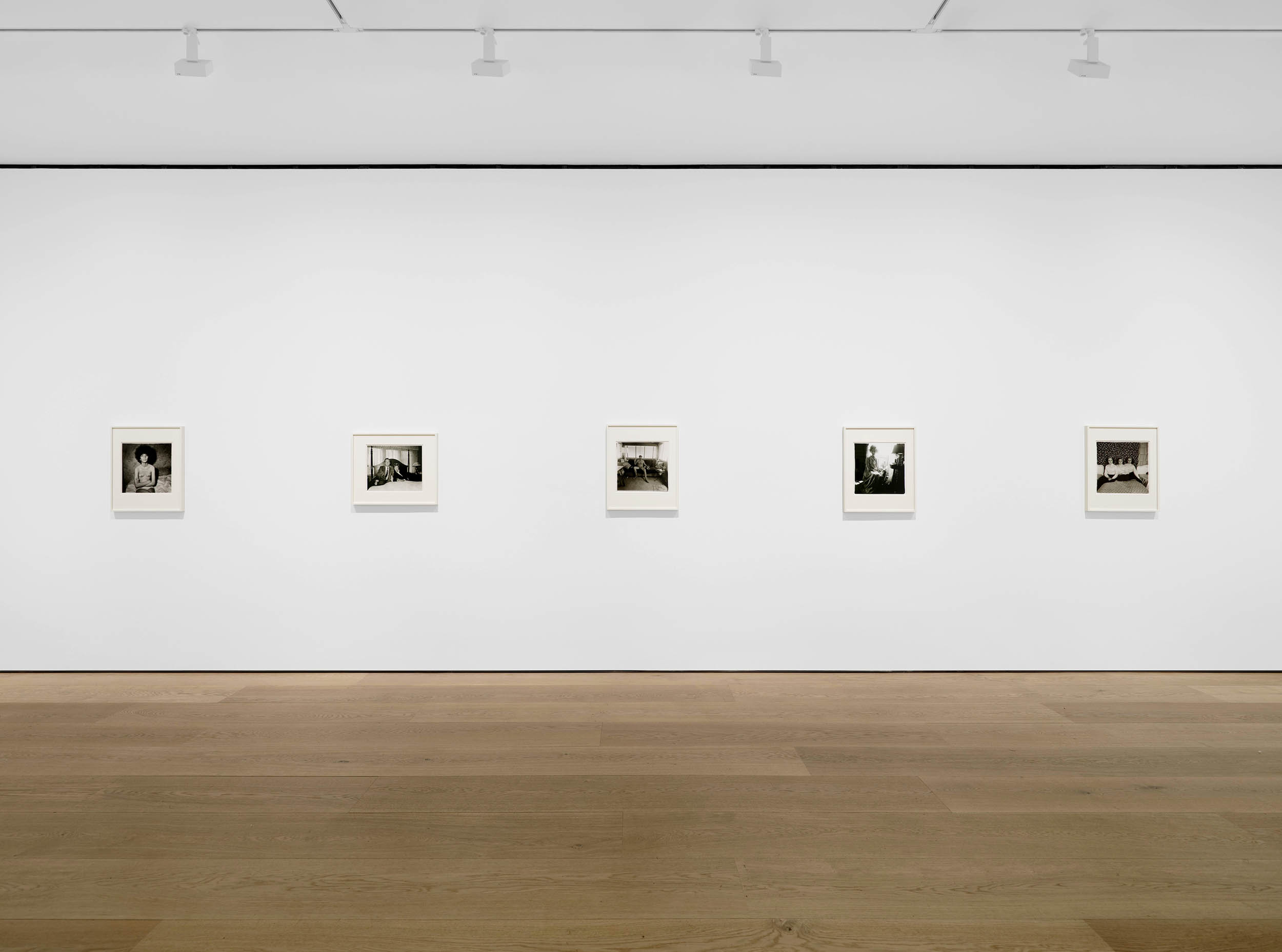
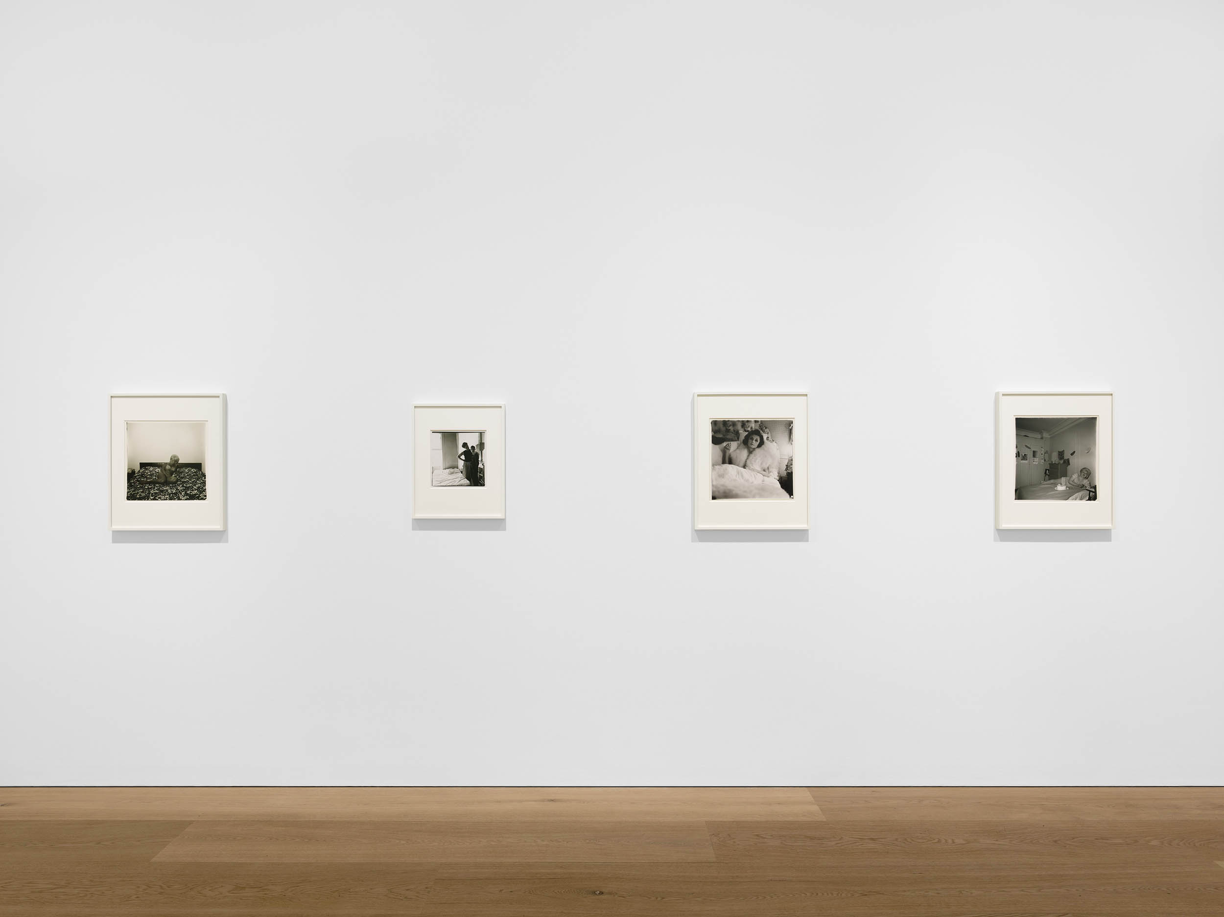
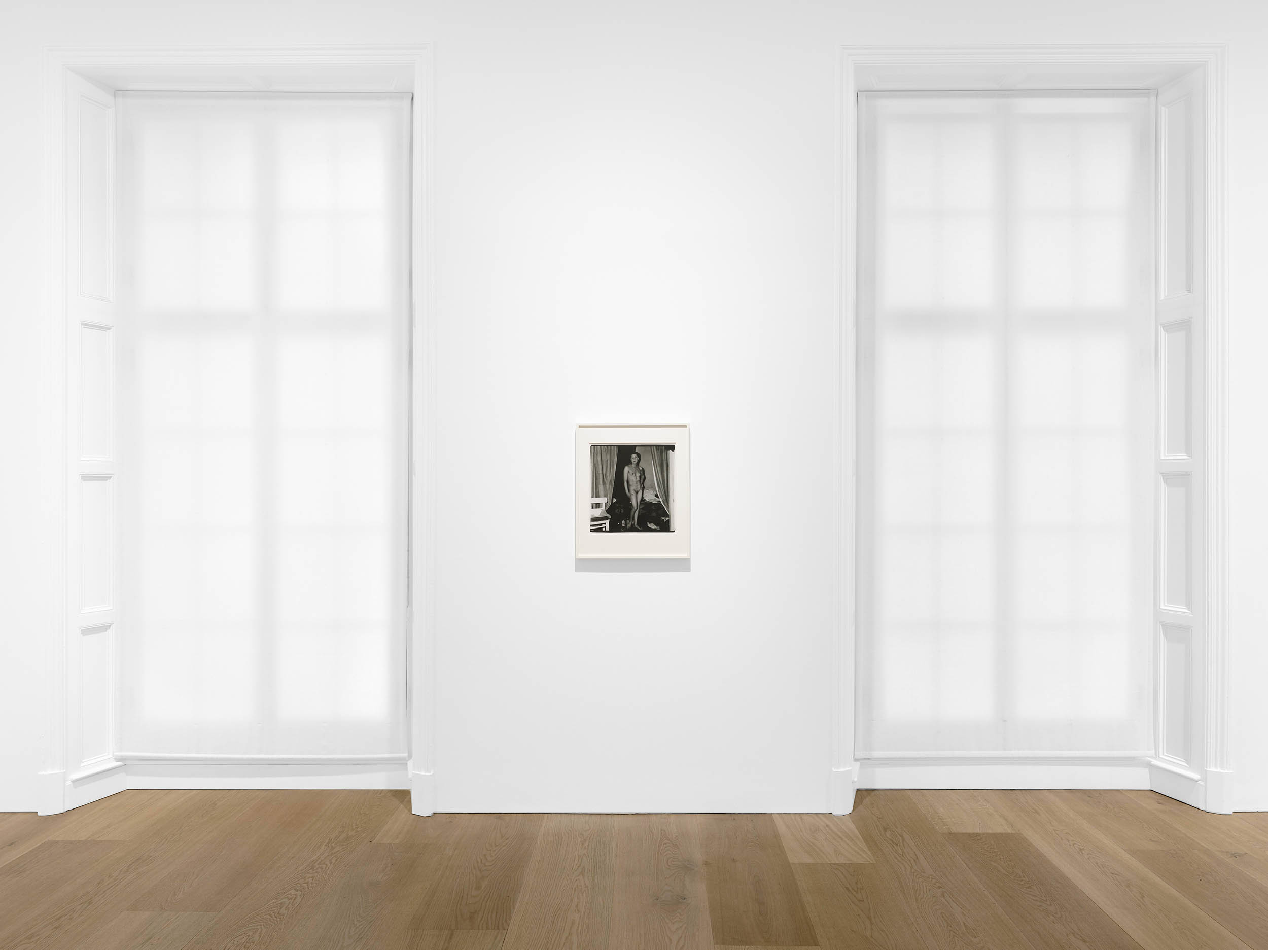
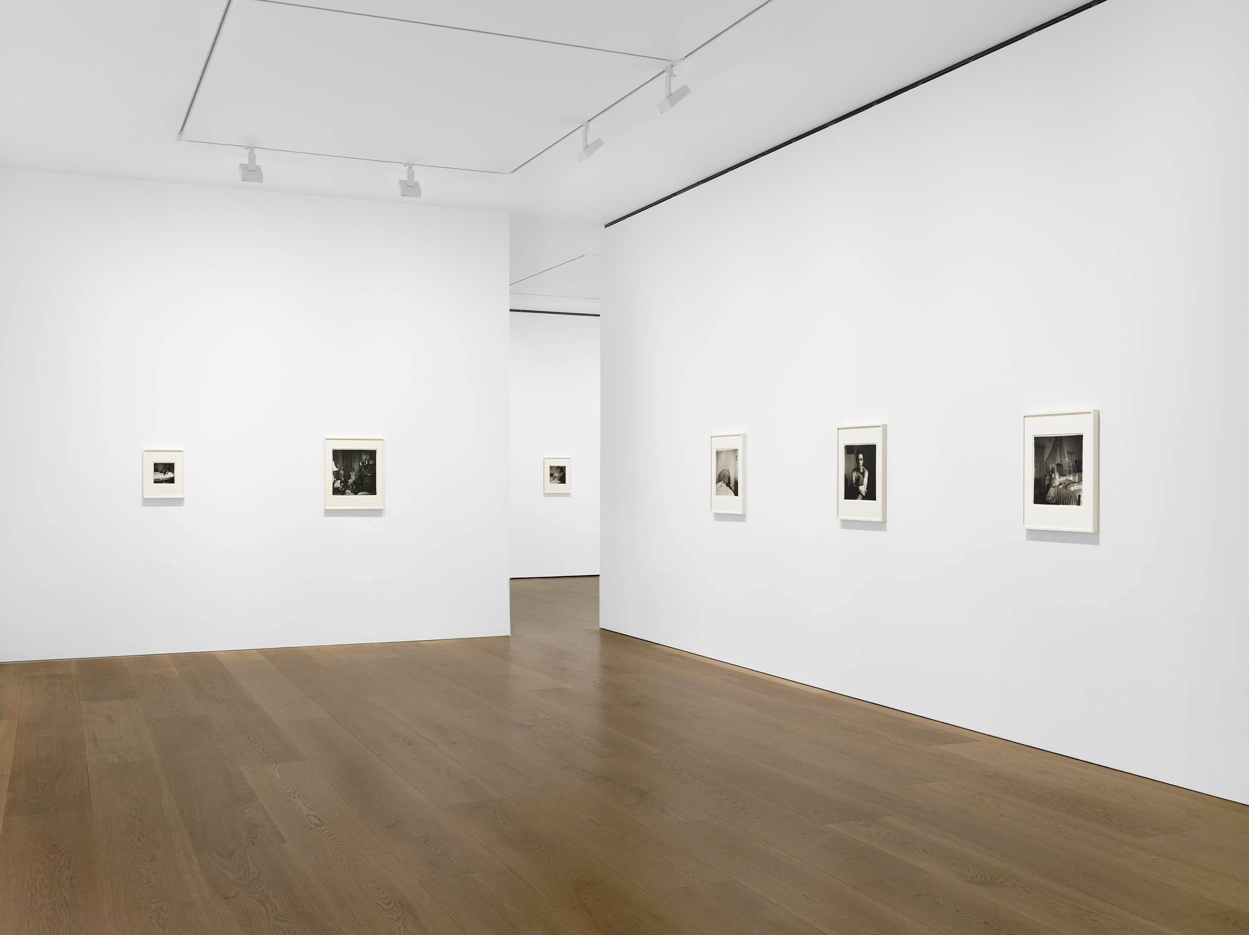
 'Female impersonator on bed, N.Y.C. 1961' 1961 from the exhibition 'Diane Arbus: Sanctum Sanctorum' at David Zwirner, London, Nov 2025 - Jan 2026")
 'The Backwards Man in his hotel room, N.Y.C. 1961' 1961")
 'Lucas Samaras, N.Y.C. 1966' 1966")
 'Brenda Diana Duff Frazier, 1938 Debutante of the Year, at home, Boston, Mass. 1966' 1966")
 'Nancy Bellamy’s bedroom, N.Y.C. 1961' 1961")
 'Interior decorator at the nudist camp in his trailer, New Jersey, 1963' 1963")
 'Triplets in their Bedroom, N.J., 1963' 1963")
 'Bishop on her bed, Santa Barbara, Cal., 1964' 1964, printed later")
 'Charlton Henry in a negligee, Philadelphia, Pa. 1965' 1965")
 'Two friends at home, N.Y.C., 1965' 1965")
 'A naked man being a woman, N.Y.C., 1968' 1968")
 'Girl sitting on her bed with her shirt off, N.Y.C., 1968' 1968")
 'Transvestite at the birthday party, N.Y.C. 1969' 1969")
 'Mexican Dwarf in his hotel room, N.YC., 1970' 1970")
 'Lady in Costume' About 1850")
 'Slave Pen, Alexandria, Virginia' 1863")
 'Mayor of Todmorden's inaugural banquet, Todmorden, West Yorkshire, England, 1977' 1977")

 'Oriental Onyx Sardonyx Cup (16th century)' 1876")
 'Mother and child from 46 Blanche Street, St Kilda' 1977")
 'Opticians, London, 1975' 1975")
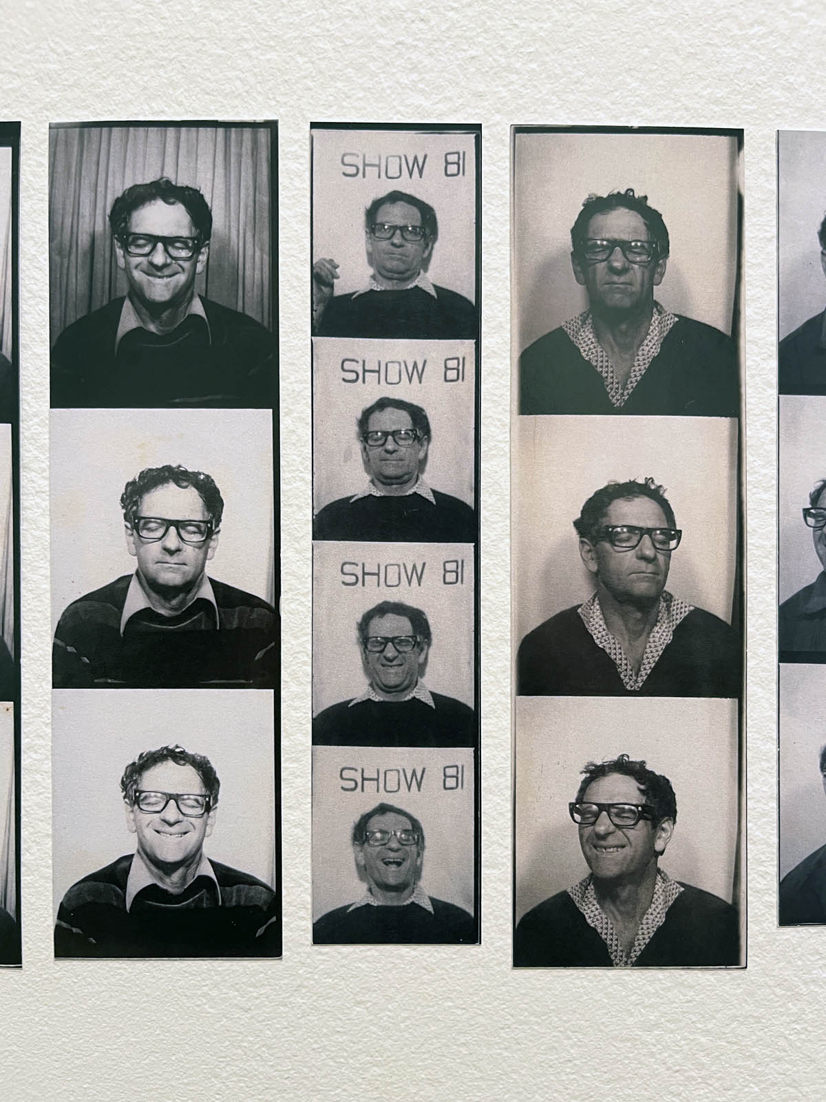
 '220 West Houston Street, NY' 1984")
 'Sandra Bennett, twelve year old, Rocky Ford, Colorado, August 23, 1980' 1980")
 'Wassertürme, USA' (Water towers, USA) 1974-1983")
![Heinrich Riebesehl (German, 1938-2010) 'Menschen Im Fahrstuhl, 20.11.1969' [People in the Elevator, 20.11.1969] 1969](https://artblart.com/wp-content/uploads/2025/06/2-typologien_heinrich-riebesehl_siae_sm.jpg "Heinrich Riebesehl (German, 1938-2010) 'Menschen Im Fahrstuhl, 20.11.1969' [People in the Elevator, 20.11.1969] 1969")
 'Welcome Home' 1978-1984 From the series 'Family Pictures and Stories'")
 'Marine' c. 1925 from the exhibition 'Man Ray: When Objects Dream' at The Metropolitan Museum of Art, New York, September 2025 - February 2026")
 'Rayograph' 1922 from the exhibition 'Man Ray: When Objects Dream' at The Metropolitan Museum of Art, New York, September 2025 - February 2026")
 'Rayograph' 1922")
 'Rayograph' 1922")
 'Rayograph' 1923")
 'Rayograph' 1923-1928")
 'Rayography' 1925")


![Man Ray (American, 1890-1976)
'Torse (Retour à la raison)' (Torso [Return to Reason]) 1923, printed c. 1935](https://artblart.com/wp-content/uploads/2014/09/man-ray-retour-c3a0-la-raison-web.jpg "Man Ray (American, 1890-1976) 'Torse (Retour à la raison)' (Torso [Return to Reason]) 1923, printed c. 1935")
 'La Femme (Woman)' c. 1918-1920")
 'L'homme (Man)' 1918-1920")
 'Élevage de poussière (Dust Breeding)' 1920")
 'Marchesa Luisa Casati' 1922")

 'Le violon d’Ingres' 1924")
 'Self-Portrait in 31 bis rue Campagne-Premiere Studio' 1925")
 'Noire et blanche' 1926")
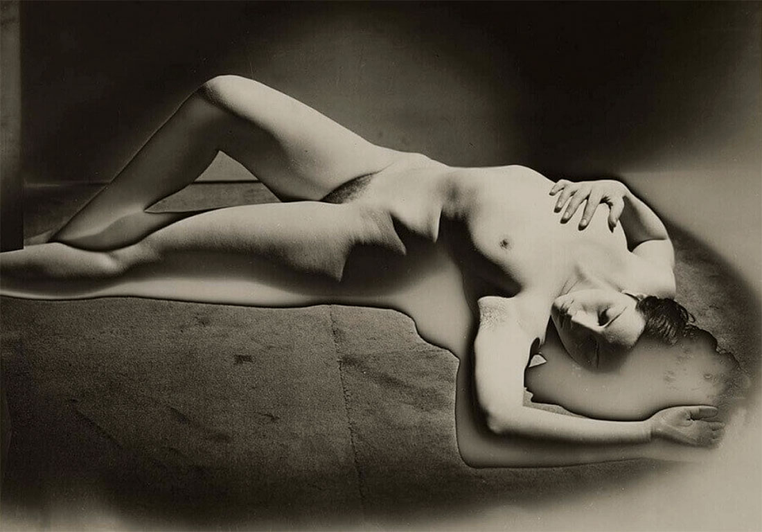
 'Lee Miller' 1929")
 'Self-Portrait with Camera' 1930")
 'Mary Gill' 1930")
 'Untitled (Glass Tears)' c. 1930-1933, printed 1935 or later")
 'Legend' 1916")
 'Boardwalk' 1917")
 'By Itself I' 1918")
 'ANPOR' 1919")
 'Aerograph' 1919")
 'Catherine Barometer' 1920")
 'Cadeau (Gift)' 1921 reconstructed 1970 (installation view)")
 'Paysage suedois' (Swedish Landscape) 1926")
 'Torso' 1929")
 'Xmas tree in a living room in Levittown, L.I. 1963' 1963")
 'The Game' 1947 from the exhibition Exhibition: 'Photography and the Black Arts Movement, 1955-1985' at the National Gallery of Art, Washington, Sept 2025 - Jan 2026")
 'Coltrane at the Gate' 1961 from the exhibition Exhibition: 'Photography and the Black Arts Movement, 1955-1985' at the National Gallery of Art, Washington, Sept 2025 - Jan 2026")
 'Blinded Birmingham Church Bombing survivor, Sarah Jean Collins, Birmingham, AL, 1963 \"Clutching robe in hospital bed, Sarah Jean Collins was near bomb when it exploded in church. Her sister was killed. It will be weeks before she knows whether she can see again.\"' September 27, 1963")
 'Martin Luther King and other civil rights leaders watched President Lyndon B. Johnson speak on television' 1965")

 'Drum Cover Girl Erlin Ibreck, London' 1966, printed 2010")
 'Above this Earth, Games, Games' 1968")
 'Soul Box' 1969")
 'During the summer of 1960, the elders of Orangeburg took to the streets as part of ongoing demonstrations and boycotts in support of civil rights. They are standing outside a segregated supermarket where they were allowed to shop but not sit down for lunch' 1960, printed 2024")
 'Clara White Mission, Jacksonville, Florida' 1960s, printed 2024")
 'Placards of Goodman, Chaney, and Schwerner at a Demonstration on the boardwalk during the Democratic National Convention, Atlantic City, New Jersey' 1964")
 'Ethel Sharrieff in Chicago' 1963")
 'Dr. Martin Luther King' January 1, 1965")
 'Member of Southern Media Photographing a Young Girl, Farish Street, Jackson, Mississippi' 1968")
 'Stokely Carmichael, Unknown Chicago Church' c. 1968")
 'Juan González, Minister of Information, in the doorway of the first office of the Young Lords' 1969, printed 2021")
 'Untitled (Bed-Stuy, New York)' 1960s")
 (American, 1939-2016) 'Mother's Day' from the series \"Born Hip\" 1962")
 'A television playing coverage of James Baldwin at the March for Freedom and Jobs in Washington, DC' 1963/2025")
 'Untitled (Playground)' from the \"Playground Series\" c. 1965")
 'Untitled (Santos)' from the \"Playground Series\" 1967")
 'I Am A Man, Sanitation Workers Strike, Memphis, Tennessee' March 28, 1968")
 'Fannie Lou Hamer, Mississippi' July 1971")
 'Protest Car, Los Angeles' 1962, printed 2024")
 'Beauty Salon, London' c. 1960s")
 'Handcuffed blacks were arrested for being in white area illegally' 1960-1966")
 'Newsman Being Frisked at Muslim Rally in Chicago' 1963, printed 1997")
 'Sweet as a Peach, Harlem, New York City' 1963")
 'View of the crowd as Dr. Martin Luther King Jr. addresses civil rights demonstrators at 40th Street and Lancaster Avenue, Philadelphia' August 3, 1965")
 'Two Teenaged Supporters of the Selma March' 1965, printed c. 1970")
 'Untitled (Charles Peaker Street Speaker, head of ANPM, after Carlos Cooks passed away, on 125th Street)' c. 1968, printed 2016")
 'Black-owned Grocery Store, Sunday, Mileston, Mississippi' 1968")
 'Genie' 1971")
 'Untitled (Portrait, Reels as Necklace)' c. 1972, printed later")
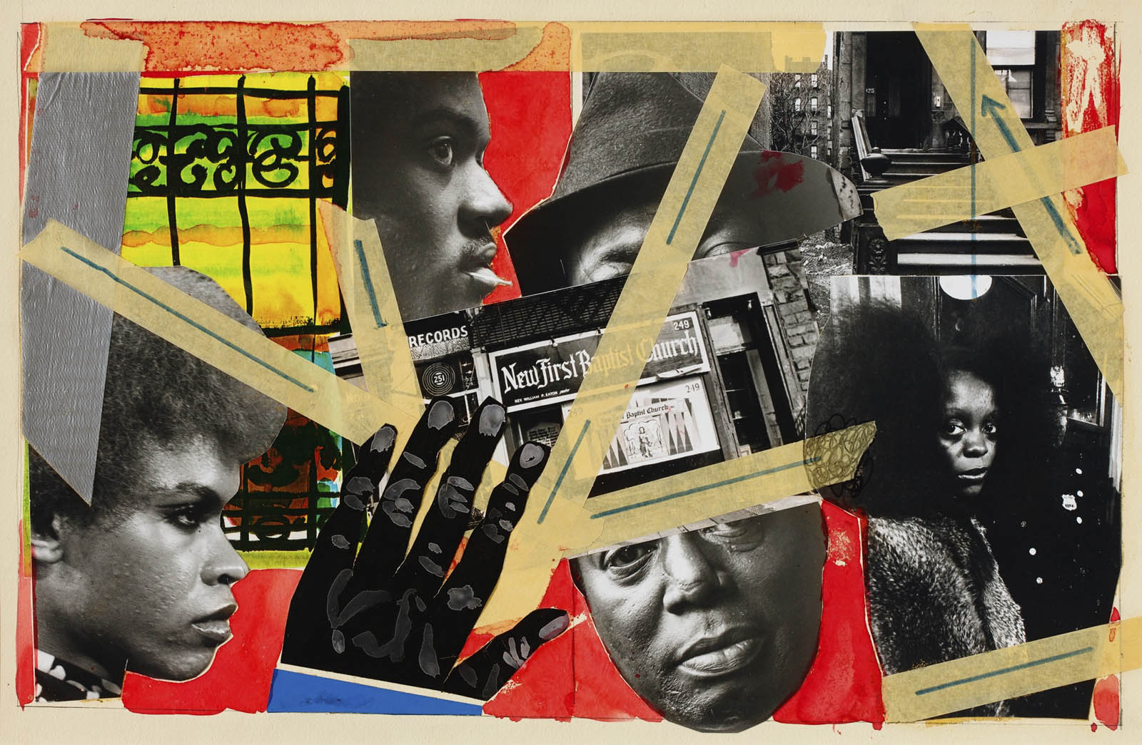
 'Father prays over son on Osu Beach, Accra, Ghana' 1973")
 'The Blues Singer, Harlem, NY' 1976")
 'Kraft Foods advertisement' 1977")
 'Sun Ra Space II' 1978")
 'Self-Portrait' 1978")
 'Grace Jones, New York City' 1970s")
 'God Loves us All' 1978")
 'Mom at Work' 1978-1984")
 'Jake with His Boat Arriving on Daufuskie's Shore, Daufuskie Island, South Carolina' 1978, printed 2007")
 'Self-Portrait with Red Sweater' 1980, printed 2023")
 'Miles Davis' 1981")
 'Untitled (curlers) #1.2' 1984-1985")
 'Mixed Statement' 1984")
 Düsseldorf: Art-Press 1970 (Buchcover)")


 'Mudersbach' 1950s")

 'Calatayud' 1956 from the exhibition 'Bernd & Hilla Becher – History of a Method' at Die Photographische Sammlung/SK Stiftung Kultur, Cologne, September 2025 - February 2026")
 'Grube Eisernhardter Tiefbau, Eisern, D' (Eisernhardter Tiefbau mine, Eisern, Germany) 1955/56 from the exhibition 'Bernd & Hilla Becher – History of a Method' at Die Photographische Sammlung/SK Stiftung Kultur, Cologne, September 2025 - February 2026")

' (Macro shot of foam) c. 1960")
 'Untitled (Makroaufnahme von Schaum)' (Macro shot of foam) c. 1960")
 'Meeresschnecke (Venuskamm)' (Sea snail (Venus comb)) 1960s")
 'Pflanzenstudie, Photogramme' (Plant study, photograms) 1960s")
 'Pflanzenstudie, Photogramme' (Plant study, photograms) 1960s")
 1962, \"Mont-Cenis\" mine, Herne, Ruhr area' 1965")
 'Kühlturm (Cooling tower) 1962, \"Mont-Cenis\" mine, Herne, Ruhr area' 1965")
 'Seven Sisters Pit, South Wales, GB' 1966")
 'Gasbehälter (Gas container) 1886 Tyldesley near Manchester, UK' 1966")
 'Förderturm (Conveyor tower) 1958 \"Graf Bismarck\" mine, Gelsenkirchen, Ruhr area' 1967")
 'Hochofen (Blast furnace) c. 1930, Blast furnace plant, Esch, Luxembourg' 1969")
 'Hochspannungsmast, Düsseldorf, D' (High-voltage pylon, Düsseldorf, Germany) 1969")
 'Giebelseiten Fachwerk, Siegerland D' (Gable sides half-timbered, Siegerland D) 1959-1973")
 'Bottrop, D' 1976")
 'Fördertürme' (Winding towers) 1966-1979")
 'auf der Grube Ensdorf, Saarland' (at the Ensdorf mine, Saarland) 1979")
 'Essen-Schönebeck, D' 1981")
 'Untitled (Water tower, Béziers, Hérault, F)' c. 1984")
 'Wassertürme' (Water tower) 1960s-1980s")
 'Graveyard and steel mill, Bethlehem, Pennsylvania' 1935")


 'Bethlehem, Pennsylvania, USA' 1986")
 'Förderturm, Schacht 2' (Winding tower, shaft 2) 1982")
) 1985")
) 1985")
 'Zeche Ewald Fortsetzung, Kühlturm/-türme' (Ewald mine continuation, cooling tower(s)) 1985")
 'Kühltürme' (Cooling towers) 1964-1993")
 'Kies- und Schotterwerk, Oberbüren/St. Gallen, CH' (Gravel and crushed stone works, Oberbüren/St. Gallen, CH) 2001")


 'New York' c. 1940 from the exhibition 'Helen Levitt' at Fundación MAPFRE, Barcelona, Sept 2025 - Feb 2026")
 'New York' c. 1938 from the exhibition 'Helen Levitt' at Fundación MAPFRE, Barcelona, Sept 2025 - Feb 2026")
![Helen Levitt (American, 1913-2009) 'New York' [113th Street] c. 1938](https://artblart.com/wp-content/uploads/2025/10/levitt-new-york-113th-street-c.-1938.jpg "Helen Levitt (American, 1913-2009) 'New York' [113th Street] c. 1938")
 'New York' c. 1939")
 'New York' c. 1939")
 'New York' c. 1939")
 'New York' c. 1939")
 'New York' c. 1939")
 'New York' c. 1939")
 'New York' c. 1939")
 'New York' c. 1940")
 'New York' c. 1940")
 'New York' c. 1940")
 'Mexico City' 1941")
 'New York' c. 1942")
 'New York' c. 1945")
 'New York' 1975")
 'Brooklyn, New York' 1982")
 'New York' Nd")
 'New York' 1971")
 'New York' 1976")
 'Stralauer Straße, Ecke Waisenstraße' from the series 'Nachtrag Berlin' 1990-1992 ('Stralauer Straße, corner of Waisenstraße' from the series 'Addendum Berlin') from the exhbition 'Berlin Courtyards: Between Everyday Life, Work, and Encounters' at the Museum Ephraim-Palais, Berlin, July 2025 - January 2026")
 'Fleisch am Knochen' (Meat on the Bone) 1924 from the exhbition 'Berlin Courtyards: Between Everyday Life, Work, and Encounters' at the Museum Ephraim-Palais, Berlin, July 2025 - January 2026")
 \"Eine kleine Freundin hat doch jedermann, eine kleine Freundin braucht man dann und wann…\" (\"Everyone has a little friend, and one needs a little friend now and then...\") 1924")
 'Naunynstraße, Hinterhof' 1979")
 'Giebelwand (Chausseestraße 16)' (Gable wall (Chausseestraße 16)) 1988")
 'Hirschhof' 1999")
 From the portfolio 'Das malerische Berlin, Band 1' (Picturesque Berlin, Volume 1) 1911")
 'Hofeinfahrt Kottbusser Straße 6' (Courtyard entrance at Kottbusser Straße 6) c. 1976")
 'Goerz'sche Höfe, Rheinstraße' 1978")
 From the series 'Das Haus Dunckerstr. 16 in Berlin 1058' (The House at Dunckerstrasse 16 in Berlin, 1058) 1985")
 From the report: \"Türken in Deutschland. Die zweite Generation\" (\"Turks in Germany. The Second Generation\") 1989/90")
 From the series 'Berliner Wandbilder' (Berlin Murals) 1974-1990 (Berlin-Prenzlauer Berg, Esmarchstraße 26, I. Hinterhof)")
")
 1920")


 'Hof mit Baum' (Courtyard with Tree) 2010")
 2020")

 2025")

 'Brick Lane market' 1970 or 1972 from the exhibition 'A World Apart: Photographing change in London's East End 1970-76' at Four Corners, Oct - Dec, 2025")
 'Wapping family at window' 1973 from the exhibition 'A World Apart: Photographing change in London's East End 1970-76' at Four Corners, Oct - Dec, 2025")
 'Mr and Mrs Kelleher in members pub' 1973")
 / Exit Photography. 'Floyd Wilson' 1973")


 'Watch repairer, Black Lion Yard, Whitechapel' 1973 from the exhibition 'A World Apart: Photographing change in London's East End 1970-76' at Four Corners, Oct - Dec, 2025")
 'Tea break, P & L Engineering, Heneage Street, East London' 1973")
 'Street scene Spitalfields' 1971")
 'Schmaltz herring shop, 35 Old Montague Street' 1971")
 'Mr and Mrs Ali, Brick Lane' 1973")
 'Clothing sweatshop in Whitechapel' 1973")
 'Brick Lane Sunday market' 1971")
 'Abdul Latif, Halal butcher, 44 Brick Lane' 1973")
 'Mother and daughter, Fieldgate Street, Whitechapel' 1971")
 'Lady in Sunday best Brick Lane market' 1970")
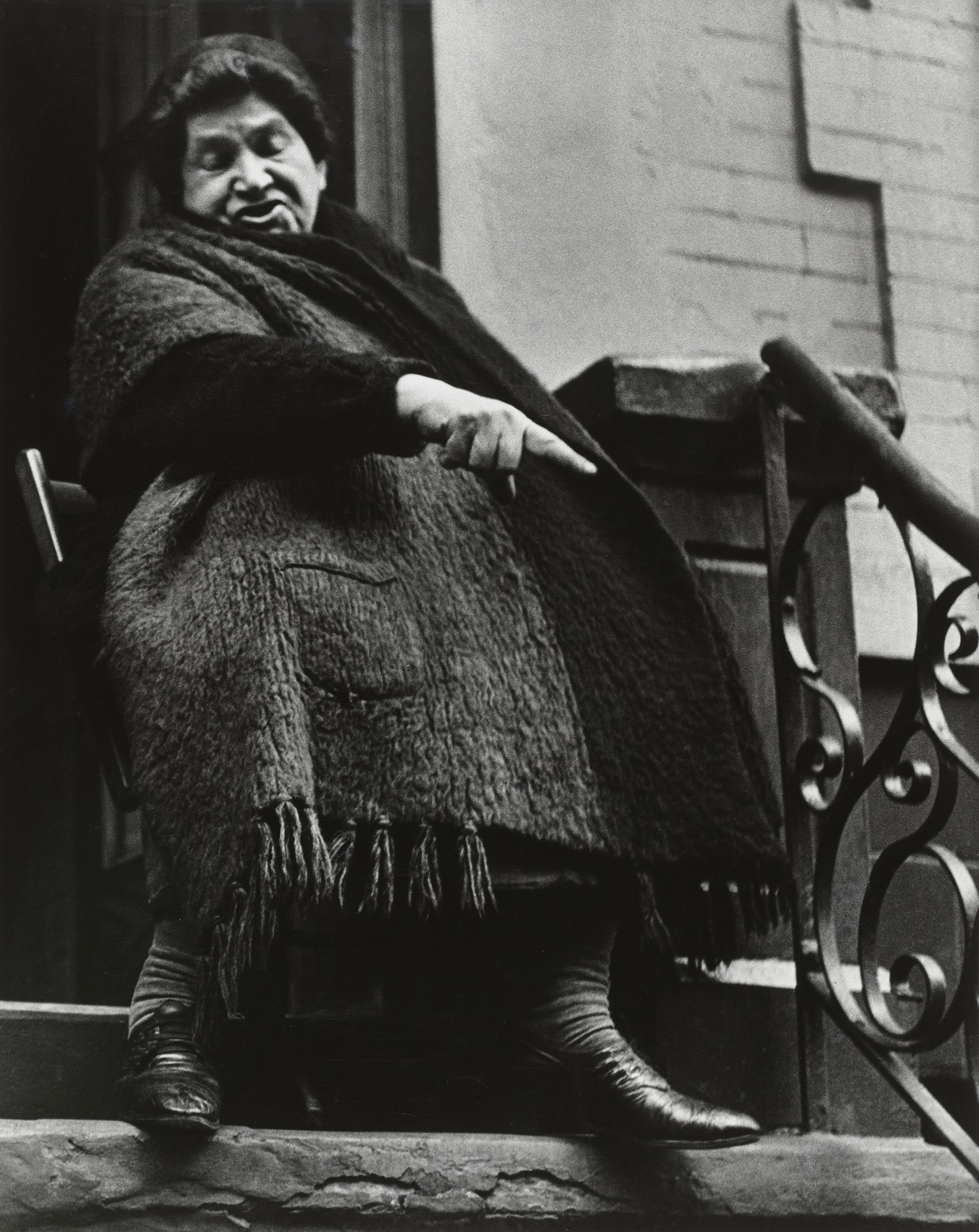
 'Mohamhed Truffant in his bedsit, Hanbury Street, Spitalfields' 1973")
 'Family group, Settle Street, Whitechapel' 1971")
 'Zysman's delicatessan and pickle shop, 49 Hessel Street' 1973")
 'E1 Festival steel band performers' Early 1970s")
 'Dancing at E1 Festival' 1975")
 'One of the last remaining shops in Hessel Street, Whitechapel' c. 1972")
 'Child playing in tenement block, Whitechapel or Wapping' 1972")
 enterprise near Oengaran south of Semarang' c. 1910 from the exhibition 'Hidden Connections' at the Van Abbemuseum, Eindhoven, Holland, April 2024 - June 2026")
' c. 1900 from the exhibition 'Hidden Connections' at the Van Abbemuseum, Eindhoven, Holland, April 2024 - June 2026")


 'Henri Van Abbe' 1929")


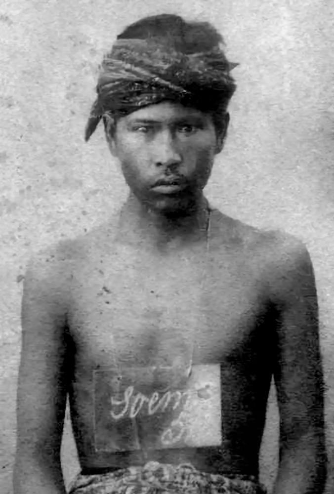
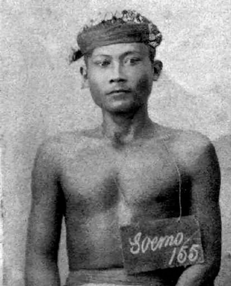
![Johan Braakensiek (Dutch, 1848-1940) "The coolie ordinances" in
'De [Groene] Amsterdammer', Date 23 November 1902](https://artblart.com/wp-content/uploads/2025/04/johan-braakensiek-de-koelie-ordonantien-de-groene-amsterdammer-datum-23-november-1902.jpg "Johan Braakensiek (Dutch, 1848-1940) \"The coolie ordinances\" in 'De [Groene] Amsterdammer', Date 23 November 1902")


You must be logged in to post a comment.