Exhibition dates: 25th August – 19th September, 2009
John Nicholson (Australian, b. 1970) Aerial Navigation 2009
You could say that the essence of the cosmos is not matter, it is consciousness.
It is not the external world that is real – it is “maya”, an illusion, for the real world lies within.
These works, with their striations, strata and suspension are emanations of that spirit – projections of the inner reality.
In terms of the ancient Chinese philosophy Lao Tzu we dream the butterfly and the butterfly is us. If you don’t ‘get’ these works, let go all pretensions and feel their colour as sound, as vibrations of energy.
Submerge yourself in their shape and form. Like DNA structure, a heart beat or the record of a seismic shock these works are music as art, the length of harmony quivering and slipping in our minds, before our eyes.
This is the colour music of Roy De Maistre’s paintings of the 1930’s updated to the 21st century. They are fugues of sound made physical entities, intertwining, coming and going. Here lines, tones and colours are organised in a parallel way – tone after tone, line after line. They are wavelengths of the interior made visible. The connection is solid and fluid at one and the same time; there are many connections to be discovered, many journeys to be made.
I hear them, I like them.
Dr Marcus Bunyan
Many thankx to Sophie Gannon Gallery for allowing me to publish the photographs in the posting. Please click on the photographs for a larger version of the image.
John Nicholson (Australian, b. 1970) Under the radar 2009 Photo: Marcus Bunyan
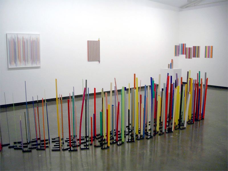
Installation views of Connection is Solid by John Nicholson at Sophie Gannon Gallery Photos: Marcus Bunyan
John Nicholson (Australian, b. 1970) Thrill seeker (detail) 2009 Photo: Marcus Bunyan
Roy de Maistre (Australian, 1894-1968) Arrested Movement from a Trio 1934 Oil and pencil on composition board 72.3 × 98.8cm
John Nicholson (Australian, b. 1970) Slip 2009
John Nicholson (Australian, b. 1970) The wire might sense 2009
John Nicholson (Australian, b. 1970) Swoop 2009 Photo: Marcus Bunyan
Installation view of Connection is Solid by John Nicholson with on the wall Satellite Graffitti (2009) and on the floor Cascade (2009) and Swoop (2009) Photo: Marcus Bunyan
Sophie Gannon Gallery 2, Albert Street, Richmond, Melbourne
Exhibition dates: 28th August 2009 – 21st February 2010
Opening: Thursday 27th August 2009 Artists: Christine Godden, Max Pam and Matthew Sleeth
Opening night crowd for Long Distance Vision at NGV Australia, Melbourne with Senior Curator of Photography, Dr Isobel Crombie, at left of photograph Photo: Marcus Bunyan
A small but social opening of the latest photography exhibition at NGV Australia. Wonderful to see Edwin Nicholls and Sophie Gannon from Sophie Gannon Gallery, Richmond in attendance along with Dr Isobel Crombie, Senior Curator of Photography at the NGV and Susan van Wyk, curator of this exhibition and Curator of Photography at the NGV. Also in attendance were the NGV Director, Gerard Vaughan and Frances Lindsay, Deputy Director of the NGV. The exhibition was opened by Associate Professor Christopher Stewart from RMIT University.
Dr Marcus Bunyan
Many thankx to Alison Murray and Sue Coffey for allowing me to take photographs of the opening, and for allowing me to publish the photographs in the posting. Please click on the photographs for a larger version of the image.
Opening night crowd for Long Distance Vision at NGV Australia, Melbourne Photos: Marcus Bunyan
Long Distance Vision will include over 60 photographs from the NGV Collection exploring the concept of the ‘tourist gaze’ and its relationship with the three artists.
Susan van Wyk, Curator Photography, NGV said the exhibition provides a fascinating insight into the unusual perspective brought by the three photographers to their varied world travel destinations.
“There’s a sense in the works in the exhibition that the photographers are not from the places they choose to photograph, and that each is a visitor delighting in the scenes they encounter.
What is notable about the photographs in Long Distance Vision is that rather than focussing on the well known scenes that each artist encountered, they have turned their attention to the ‘little things’, the details of the everyday,” said Ms van Wyk.
From the nineteenth century, photography has been a means by which people could discover the world, initially through personal collection and albums, and later via postcards, magazines, books and the internet.
Dr Gerard Vaughan, Director, NGV said that both contemporary photographers and tourists use the camera as a means to explore and capture the world.
“Through their photographs, the three artists featured in Long Distance Vision show us highly individual ways of seeing the world. This exhibition will surprise and delight visitors as our attention is drawn to not only what is different but what remains the same as we travel the world,” said Dr Vaughan.
Long Distance Vision: Three Australian Photographers is on display at The Ian Potter Centre: NGV Australia, Federation Square from 28 August 2009 to 21 February 2010. The Ian Potter Centre: NGV Australia is open every day 10am-5pm. Entry to this exhibition is free.”
Press release from the NGV
Opening night crowd for Long Distance Vision at NGV Australia, Melbourne looking at the work of Max Pam from his Tibet series (see the four images below) Photos: Marcus Bunyan
Sophie Gannon and Edwin Nicholls at the opening of Long Distance Vision at NGV Australia, Melbourne Photo: Marcus Bunyan
Dr Isobel Crombie, Senior Curator of Photography at the NGV (left) with Susan van Wyk, Curator of Photography at the NGV and curator of the exhibition (right) at the opening of Long Distance Vision Photo: Marcus Bunyan
.
Opening night crowd for Long Distance Vision at NGV Australia, Melbourne looking at the work of Max Pam from his Tibet series (see two images below) Photos: Marcus Bunyan
Exhibition dates: 19th August – 5th September, 2009
Carl Scrase (Australian, b. 1983) Fractal Alchemy installation view 2009
This is a slight exhibition of collages and constructions by Carl Scrase at John Buckley Gallery, Melbourne. Ironically, given the nature of the catalogue essay by Tai Snaith (see below) that waxes lyrical about the mystery and magic of symmetry, synchronicity and spirit, this exhibition lacks the depth of purpose needed to address spiritual elements that are the very basis of human existence.
The biomorphic forms that go to make up the work Fractal Alchemy (2009) fair better in this regard, the various size bull dog clips offering non-representational patterns that resemble living organisms and genetic structures in shape and appearance. At their best these elemental shapes start to transcend form and function to become something else: an instinctive and intuitive connection to the inherent fold in the universe, like the embedded pattern, the DNA template in a blank piece of paper before the folding of the origami model. Unfortunately the wonder of this piece is short-lived. Unlike the ever magical repetition of fractal geometry with its inherent iteration of forms that constantly a/maze, here the shapes are not stretched far enough, the exposition not grounded in broken or fractured forms that invite alchemical awareness in the viewer.
The collages are less successful in this mystery project. Made from cut-up images from magazines these symmetrical constructions lack spiritual presence. Like the aspired to symmetrical beauty of a human face it is, paradoxically, the irregularities of the human face that are their most attractive feature – our individuality. In the photographic stereoscopes of Victorian landscapes it is the difference between the left and right image that adds three-dimensional depth in the eye of the viewer, that transports them to other places, other worlds. In the collages of Picasso it is the irregularities that also transport the viewer into a hypertextural, hypertextual world of wonder. Scrase’s collages on the other hand, are flat, rigidly symmetrical life-less things that belie their stated aim – to be kaleidoscopic spirit guides in search of a pattern for inner peace. Although some of their forms are attractive their is no wonder, no my-story to be gleaned here.
Overall the work lacks the gravitas and sense of fun in and through the act of creation that the concepts require: to see things clearly and to ground this visualisation in objects that transcend ‘now’ and extend spirit into the eternal. These constructions do not stand as ‘equivalents’ for other states of consciousness, of being-in-the-world, nor do they offer a re-velatio where they open up ‘poetic spaces’ in which the alienation and opposition of inside and outside, of objectivity and subjectivity are seen to be disconnected. The Japanese ‘ma’, the interval which gives substance to the whole, is missing.
To express deep inner emotions and connection to spirit requires utmost focus on their expression-in-the-world, a releasement from ego and a layering of materials and form that transport the object and viewer into an’other’ plane of existence. Unfortunately this work falls short of this state of no-desire.
Dr Marcus Bunyan
Many thankx to John Buckley Gallery for allowing me to publish the photographs in the posting.
Carl Scrase (Australian, b. 1983) Fractal Alchemy installation view 2009
Carl Scrase (Australian, b. 1983) Fractal Alchemy (detail) 2009
Carl Scrase (Australian, b. 1983) Fractal Alchemy (detail) 2009
Carl Scrase (Australian, b. 1983) Fractal Alchemy (detail) 2009
Carl Scrase (Australian, b. 1983) Fractal Alchemy (detail) 2009
Carl Scrase (Australian, b. 1983) Fractal Alchemy (detail) 2009
Carl Scrase is a perfect example of an artist marking the turn of a tide. At this distinct ebb of the ravenous, rampant seas of consumption and production we’ve been surfing for the past couple of hundred years and with the onset of the new flow, towards the riptide of Mayan prophesies of fast approaching 2012, Carl is on it, or should I say in it. And he’s splashing around.
This new generation of creative humans (to which Carl belongs) are not really concerned with how much money, time or status something is worth, or what kind of flashy object the human next to them owns. They seem to be more interested in what kind of wisdom can be procured, how many friends can be found and how a thing can be recycled or was born from something else. It is all about a search for the spirit, the feeling. Moreover, what it means. We are getting sick of the bland smog of consumerism, the stench of blatant big business and seem to be looking for escape pointers, for enlightenment, for answers and for CHANGE.
Carl’s work suggests his role as an artist is almost akin to a kind of medium slash alchemist – a self-proclaimed, new-age, anonymous shaman of sorts. Big boots to fill indeed, but don’t worry, its not like Carl is about to declare himself a Secret Chief and start welcoming in the new Golden Dawn or reading your tarot at openings. Nor is he concerned with the alchemical properties and behaviour of inorganic compounds or scientific explanations or measurements of the planets. His interest lies in noticing the sparkling mist of questions surrounding these things. The mystery and magic of how these marvels, such as symmetry and synchronicity occur in nature and how we can possibly learn from them and experience them in our day-to-day lives.
A true spiritualist in an atheist age, Carl uses his work as a kind of cipher for sorting his beliefs via a material creative process. His collages begin with found images from magazines, chosen relatively arbitrarily. His sculptures begin in a similar fashion with found objects, usually of the mundane or mass produced variety. It may be that they are all parts of images of human faces or just a complete add for a pair of Crocs or a hundred boxes of bull dog clips. Starting with the colour and then cutting the shape, or with the objects and then finding their natural function- almost as if listening to an instinctive, visual Ouija board somewhere in his subconscious. Carl then arranges the pieces through play. Similar to the way that you need to relax your eyes to receive the effects of a Magic Eye picture (remember them?), Carl relaxes his mind in order to let his collages find their final composition. This allows a kind of subconscious code to come forward, thus acting as both a reflection of his thoughts but also a kind of guide or suggestion for other’s thoughts, and perhaps something deeper that we don’t understand just yet.
I remember as a child I found an empty plastic tubular casing of a biro pen whilst walking along the beach one day. It had been washed and scratched by the ocean and gave the pale blue, semi-translucent plastic a soft almost sparkly effect. I picked it up and instinctively looked through the tiny tunnel at the sun. The way the sunlight refracted through the plastic before reaching my retina made me think of a magical kaleidoscope and I immediately classified it as having ‘special powers’, granting it prime position in my pocket for months. It became a type of personal talisman or spirit guide.
Traditionally, in animist belief systems (such as Shinto and certain parts of Hinduism) sprits need either an object or a medium (ie, thunder, lightening, wind, animals, plants, etc) to be experienced or seen by humans. They need something else to exist in order to communicate with us. Carl’s images and objects seem to suggest or demonstrate this kind of medium as well as subtly questioning the message. In the same way that a child finds wonder in the changing symmetry of a Kaleidoscope before they even understand the science of the mirror involved, there is a wonder in these images and objects as soon as we encounter them. A wonder in creation, in ritual, in synchronicity and light. A wonder in life.
For Carl, the practice of Alchemy (and in this instance one might just as comfortably read Alchemy as Art) is ‘not the search for some magic potion’ but rather the ‘awareness that all life is eternal and the inner peace that comes from that realisation’. Just as we recognise similar patterns within nature, like the spiral formation of a shell or the layering of petals on a flower or the direction of the hair growing on a man’s scalp, we can notice these patterns on a spiritual and philosophical plane also. It doesn’t take a genius to recognise a similar search for meaning and self-realisation being revisited amongst some of the most interesting artists of our time, but let’s just hope that the search continues to prove that the process of making art itself is both the question and the answer.
Tai Snaith 2009
Text from the John Buckley website [Online] Cited 20/08/2009 no longer available online
Carl Scrase (Australian, b. 1983) Spiritguide 090501 2009
Carl Scrase (Australian, b. 1983) Spiritguide 090624 2009
Carl Scrase (Australian, b. 1983) Spiritguide 090504 2009
Carl Scrase (Australian, b. 1983) Spiritguide 090509 2009
Carl Scrase (Australian, b. 1983) Spiritguide 090520 2009
Carl Scrase (Australian, b. 1983) Spiritguide 090601 2009
Carl Scrase (Australian, b. 1983) Spiritguide 090617 2009
Exhibition dates: 20th August – 5th September, 2009
Little Treasures Toby Richardson, Will Nolan, CJ Taylor and Steve Wilson
Clay Cameras Alan Constable
Alan Constable (Australian, b. 1956) Not titled (ALE SLR) 2008 Ceramic Photo: Marcus Bunyan
A small crowd was in attendance for the opening of two new exhibitions at Helen Gory Galerie (due to two auctions, one at Sotheby’s and the other at Deutscher-Menzies). Despite this the crowd was appreciative of the beautifully printed and well presented work. In the main exhibition Little Treasures four photographers show various bodies of work. Toby Richardson’s stained pillows (Portrait of the artist) from the years 1986-2003 were effective in their muted tones and ‘thickened’ spatio-temporal identity. CJ Taylor’s winged detritus from the taxidermist were haunting in their mutilated beauty. Steve Wilson’s sometimes legless flies were startling in their precision, attitude/altitude and, as someone noted, they looked like jet fighters! Finally my favourite of this quartet were the recyco-pop iridescent bottle tops of Will Nolan – “these objects remain enigmatic, resonating with a sense of mystery, hidden thoughts and unknown histories.” (Lauren Tomczak, catalogue text).
Some good work then in this take on found, then lost and found again treasure trove, work that retrieves and sustains traces of life, history and memory in the arcana of discarded and dissected objects.
The hit of the night for me was the work of Alan Constable, his “objects that see”. I found his clay cameras intoxicating – I wanted to own one (always a good sign). I loved the exaggerated form and colours, the playfulness of the creativity on display. Being a photographer I went around trying to work out the different makes of these scratched and highly glazed cameras without looking at the exhibition handout. For a very reasonable price you could own one of these seductive (is that the right word, I think it is) viewfinders and they were selling like hot cakes!
Dr Marcus Bunyan
Many thankx to Helen Gory Galerie for allowing me to publish the photographs in the posting. Please click on the photographs for a larger version of the image.
Little Treasures
“Wings, pillows, flies and bottle tops are blown up vastly in stunning large scale prints that take the viewer through the looking glass into another universe, their brilliant colour and rich detail revealing unexpected beauty and delight in these forgotten things. Unmanipulated and finely printed, these images are the product of each artist’s technical mastery and inquisitive eye finding beauty in the cast off and delight in the ignored.” (Jemima Kemp, 2009)
Installation view of Little Treasures showing Toby Richardson’s Portrait of the Artist series (2009, left) Photo: Marcus Bunyan
Installation view of Little Treasures showing the work of CJ Taylor (2009, left) and Will Nolan’s Bottle Top series (2009, right) Photos: Marcus Bunyan
Installation view of Little Treasures showing the work of CJ Taylor (2009) Photo: Marcus Bunyan
CJ Taylor (Australian, b. 1951) Blue, turquoise yellow green 2009 Acrylic glass pigment print 110 x 79cm
CJ Taylor (Australian, b. 1951) Blue, Blue, Grey 2009 Acrylic glass pigment print 110 x 79cm
Installation view of Little Treasures showing Will Nolan’s Bottle Top series (2009) Photo: Marcus Bunyan
Will Nolan (Australian) Bottle top #10 2009
Will Nolan (Australian) Bottle top #1 2009
Installation view of Little Treasures showing Steve Wilson’s Fly series (2009) Photo: Marcus Bunyan
Clay Cameras
“From the box brownie to disposables, VHS to SLR, these works explore Alan Constable’s fascination with cameras. Unlike the streamlined design of the originals, Constable’s cameras appear soft, organic and malleable.”
Alan Constable (Australian, b. 1956) Not titled (pearlescent gold/black Leica) 2008 Ceramic Photo: Marcus Bunyan
Installation view of Clay Cameras by Alan Constable Photo: Marcus Bunyan
Alan Constable (Australian, b. 1956) Not titled (Hasselblad) 2008 Ceramic Photo: Marcus Bunyan
Alan Constable (Australian, b. 1956) Not titled (Digital with zoom lens) 2009 Ceramic Photo: Marcus Bunyan
Julia deVille (New Zealand, b. 1982) Ruby Heart Starling 2008 Starling, sterling silver, black rhodium & gold plate, rubies, antique frame 30 x 35 x 18cm
This is an itsy-bitsy show by Julia deVille at Sophie Gannon Gallery in Richmond, Melbourne. Offering a menagerie of macabre stuffed animals and conceptual ideas the exhibition fails to coalesce into a satisfying vision. It features many ideas that are not fully investigated and incorporated into the corporeal body of the work.
We have, variously, The Funerary Urn/Cinerarium, The Ossuary, Skeletons, Black, Victorian Funerary Customs, Feathers, Taxidermy, Time, Eggs and Religion. We also have stuffed animals, cigar boxes, lace and silver, pelts and columns, jet necklaces and Victorian glass domes, glass eyes and ruby hearts to name but a few. The viewer is overwhelmed by ideas and materials.
When individual pieces excel the work is magical: the delicate and disturbing Stillborn Angel (2009, below) curled in a foetal position with appended sparrows wings is a knockout. The large suspended raven of Night’s Plutonian Shore (2009, above) effectively evinces the feeling of the shores of the underworld that the title, taken from an Edgar Allan Poe poem, reflects on.
Other pieces only half succeed. Piglet (2009, below) is a nice idea with its lace snout and beaded wings sitting on a bed of feathers awaiting judgement but somehow the elements don’t click into place. Further work are just one shot ideas that really lead nowhere. For example Cat Rug (2008, below) features black crystals in the mouth of a taxidermied cat that lies splayed on a plinth on the gallery floor. And, so … Silver Rook (2008, below) is a rook whose bones have been cast in silver, with another ruby heart, suspended in mid-air in the gallery space. Again an interesting idea that really doesn’t translate into any dialogue that is substantial or interesting.
Another problem with the work is the technical proficiency of some of the pieces. The cast silver front legs and ribs of The Anatomy of a Rabbit (2008, below) are of poor quality and detract from what should have been the delicacy of the skeletal bones of the work. The bronze lion cartouche on the egg shaped Lion Urn (2009) fails to fit the curved shape of the egg – it is just attached at the top most point and sits proud of the egg shape beneath. Surely someone with an eye for detail and a sense of context, perfection and pride in the work they make would know that the cartouche should have been made to fit the shape underneath.
Despite its fashionable position hovering between craft, jewellery and installation this is ‘art’ in need of a good reappraisal. My suggestion would be to take one idea, only one, and investigate it fully in a range of work that is thematically linked and beautifully made. Instead of multiplying the ideas and materials that are used, simplify the conceptual theme and at the same time layer the work so it has more complexity, so that it reveals itself over time. You only have to look at the work of Mari Funaki in the previous post or the simple but conceptually complex photographs of Matthias Koch in the German photography review to understand that LESS IS MORE!
There are positive signs here and I look forward to seeing the development of the artist over the next few years.
Dr Marcus Bunyan
Many thankx to Sophie Gannon Gallery for allowing me to publish the photographs in the posting. Please click on the photographs for a larger version of the image.
Julia deVille (New Zealand, b. 1982) Night’s Plutonian Shore 2009 Tasmanian Forest Raven, black garnets, cotton, sterling silver, amethyst
Julia deVille (New Zealand, b. 1982) L’enfant (Infant Funerary Urn) 2009 Ostrich egg, sterling silver, ostrich plumes and black garnet 35 x 12 x 12cm
Julia deVille Cineraria installation views at Sophie Gannon Gallery, Melbourne Photos: Marcus Bunyan
Julia deVille (New Zealand, b. 1982) Piglet 2009 Piglet, antique lace, pins and feathers 25 x 23 x 13cm
Julia deVille (New Zealand, b. 1982) Cat Rug 2008 Cat, glitter and fibreglass 100 x 60 x 8cm
Julia deVille (New Zealand, b. 1982) Sympathy 2008
Julia deVille (New Zealand, b. 1982) Silver Rook 2008 Sterling silver, rubies 30 x 25 x 35cm
Cinerarium
n. pl. Cineraria A place for keeping the ashes of a cremated body.
Cineraria n. any of several horticultural varieties of a composite plant, Senecio hybridus, of the Canary Islands, having clusters of flowers with white, blue, purple, red, or variegated rays.
Origin: 1590-1600; < NL, fem. of cinerarius ashen, equiv. to L ciner- (s. of cinis ashes) + -rius -ary; so named from ash-coloured down on leaves.
CINERARIA is a study of the ritual and sentiment behind funerary customs from various cultures and eras.
Notes on inspirations
The Funerary Urn/Cinerarium: Funerary Urns have been used since the times of the ancient Greeks and are still used today. After death, the body is cremated and the ashes are collected in the urn.
The Ossuary: An ossuary is a chest, building, well, or site made to serve as the final resting place of human skeletal remains. They are frequently used where burial space is scarce. A body is first buried in a temporary grave, then after some years the skeletal remains are removed and placed in an ossuary. The greatly reduced space taken up by an ossuary means that it is possible to store the remains of many more people in a single tomb than if the original coffins were left as is. This was a common practice in post plague Europe in the 14th-16th Centuries.
Skeletons: Human skeletons and sometimes non-human animal skeletons and skulls are often used as blunt images of death. The skull and crossbones (Death’s Head) motif has been used among Europeans as a symbol of piracy, poison and most commonly, human mortality.
Black: In the West, the colour used for death and mourning is black. Black is associated with the underworld and evil. Kali, the Hindu god of destruction, is depicted as black.
Victorian Funerary Customs:
~ A wreath of laurel, yew or boxwood tied with crape or black ribbons would be hung on the front door to alert passers by that a death had occurred
~ The use of flowers and candles helped to mask unpleasant odours in the room before embalming became common
~ White was a popular colour for the funeral of a child. White gloves, ostrich plumes and a white coffin were the standard
Feathers: In Egyptian culture a recently deceased persons soul had to be as light as a feather to pass the judgment of Ma’at. Ma’at (Maet, Mayet) is the Egyptian goddess of truth, justice and the underworld. She is often portrayed as wearing a feather, a symbol of truth, on her head. She passed judgment over the souls of the dead in the Judgment Hall of Osiris. She also weighted up the soul against a feather. The “Law of Ma’at” was the basis of civil laws in ancient Egypt. If it failed, the soul was sent into the underworld. Ma’at’s symbol, an ostrich feather, stands for order and truth.
Taxidermy: Taxidermy to me is a modern form of preservation, a way for life to continue on after death, in a symbolic visual form.
The Raven: In many cultures for thousands of years, the Raven has been seen symbol of death. This is largely due to the Raven feeding on carrion. Edgar Allan Poe has used this symbolism in his poem, “The Raven”.
Time: Less blunt symbols of death frequently allude to the passage of time and the fragility of life. Clocks, hourglasses, sundials, and other timepieces call to mind that time is passing. Similarly, a candle both marks the passage of time, and bears witness that it will eventually burn itself out. These sorts of symbols were often incorporated into vanitas paintings, a variety of early still life.
Eggs: The egg has been a symbol of the start of new life for over 2,500 years, dating back to the ancient Persians. I have chosen egg shapes and even one Ostrich egg to represent the cycle of life, the beginning and the end.
Religion: Religion has played a large part in many funerary customs and beliefs. I am particularly interested in the Memento Mori period of the 16th-18th centuries. In a Calvinistic Europe, when the plague was a not too distant memory, a constant preoccupation with death became a fashionable devotional trend.
Julia deVille
Julia deVille (New Zealand, b. 1982) Stillborn Angel 2009 Stillborn puppy, sparrow wings and sterling silver 13 x 10 x 5cm
Julia deVille (New Zealand, b. 1982) The Anatomy of a Rabbit 2008 Rabbit, sterling silver, rubies, glitter and mahogany 30 x 30 x 30cm
Julia deVille Cineraria installation view at Sophie Gannon Gallery, Melbourne Photo: Marcus Bunyan
Sophie Gannon Gallery 2, Albert Street, Richmond, Melbourne
Mari Funaki (Australian, 1950-2010) Bracelet 1 from Space between 2005-2006 Heat-coloured mild steel
Mari Funaki (Australian, 1950-2010) Bracelet 2 from Space between 2005-2006 Heat-coloured mild steel
Mari Funaki is one of Australia’s leading jewellers. This exhibition celebrates her considerable achievements between 1992 and the present day. Her first major show in a state gallery, it includes nearly fifty works and will be the first time Perth audiences have seen her work in such depth. Many of these are new works produced especially for this show.
The exhibition will focus on rings, containers and bracelets. These forms have been the core of her practice, the foundation of her intricate material experimentations. Her sheer intensity of focus has seen her hone these forms into objects of extreme power and beauty. Funaki’s is no simple beauty, however. It is sharp, complicated. There is always a sense of danger in her work, as the spindly legs of her insect-like containers support unlikely, unwieldy torsos, and as her rings and bracelets cultivate miniature monoliths that play with scale and weight in fascinating ways.
This exhibition will frame these unique objects in such a way as to acknowledge Funaki’s ability to work with space and matter to form entrancing works that adorn the imagination in the same they adorn the body.
Text from the Art Gallery of Western Australia website [Online] Cited 10/08/2009. No longer available online
Mari Funaki (Australian, 1950-2010) Bracelet 3 from Space between 2005-2006 Heat-coloured mild steel
Mari Funaki (Australian, 1950-2010) Bracelet 4 from Space between 2005-2006 Heat-coloured mild steel
Notes from a Conversation with Mari Funaki, July 2006
Mari Funaki’s initial response comes from the environment – the response is part random, part constructed idea.
Funaki likes the ‘animated’ response from the viewer – allowing them to make their own associations with the work and their own meaning. The making of the work doesn’t emerge out of nothing but through the development of ideas over a long period of time.
Mari starts with a flat drawing – this approach comes from an Eastern perspective in the history of art making i.e. screens, woodcuts and scrolls. Initially when starting with the idea Mari is mentally thinking in two dimensions – then drawing out onto paper in two dimensions the ideas.
When actually making the work Mari then starts working and thinking in three dimensions – starting with a base piece of metal and working physically and intuitively around the object, to form a construction that evidences her feelings about what she wants to create. She likes the aesthetic beauty but uneasy aspect of a dead insect for example (like the Louise Bourgeois Maman spider outside the Guggenheim in Bilbao).
Now collaborating with architect Nonda Kotsalidis, Mari is working to produce her sculptural objects on a larger scale, up to 6 metres high. She needs the objects to have an emotional and physical impact on the viewer – both beautiful and threatening at one and the same time. How will her objects translate to a larger scale? Very well I think.
Funaki likes the physical distortion of space – and she likes telling a story to the viewer. She is working on a building where the facade is really strongly geometric and then she is embedding an emotion into the front of the building – constructing a narrative – constructing an emotional response with the viewer and establishing a relationship with the building. Here she is working from photographs of the space, her own recognition and remembrance of that space. She is having to work physically in 3D from the beginning for the first time, but still uses drawings to sketch out her ideas.
Several of Funaki’s pieces in the Cecily and Colin Rigg Contemporary Design Award (2006) at the NGV Federation Square were inspired by the work of Bernd and Hilla Becher. Their photographs of factories and gasworks, specifically the facades of such buildings (see image below), were the jumping off point for the development of the objects (the bracelets). Funaki takes the front of these buildings, a 3D structure ‘in reality’ but pictorially imaged on a 2D plane, and then twists and distorts their structure back into a 3D environment. The facades move up and around, as though a body is twisting around its own axis, pirouetting around an invisible central spine.
Each piece is created and then the next one is created in relation to the previous, or to each other. Each individual piece has its own character and relation to each other. They are never variations of the same piece with small differences – each is a separate but fully (in)formed entity.
Dr Marcus Bunyan
Bernd and Hiller Becher (German, 1931-2007 and 1934-2015) Water Towers 1980 Gelatin silver prints
“Black. Sharp, shifting contours. Familiar and alien. Confident, expressive and agile, it is easy to take the existence of these works for granted – and it is hard enough to trace in one’s mind the physical evolution back through heat colouring, sandblasting, soldering, assembling and cutting, to unremarkable, thin sheets of mild steel – let alone comprehend their conception and resolution.
They inhabit space in a way that is difficult to describe – the edge between each object and the space that encloses it is shockingly sudden.
How can something human-made be so insanely artificial and natural at the same time? It must be no accident that I described them as articulate – ambiguous and wide ranging in the breadth of associations and allusions, they can tell you everything and nothing at the same time.”
Sally Marsland, 2006
Text from the Gallery Funaki website [Online] Cited 10/08/2009 no longer available online
Mari Funaki (Australian, 1950-2010) Bracelet 5 from Space between 2005-2006 Heat-coloured mild steel
Mari Funaki (Australian, 1950-2010) Bracelet 6 from Space between 2005-2006 Heat-coloured mild steel
Art Gallery of Western Australia Perth Cultural Centre Perth WA 6000
Sarah Amos (Australian, b. 1965) Red Walk 2009 Collagraph and Monoprint
An interesting exhibition of Collagraphs (a type of collage printmaking)1 and etchings is presented by Sarah Amos at Gallery 101, Melbourne, work that is full of delicate coloured layering, topographical mapping and nodal, rhizomic and Spirogyra-type structures.
The ‘flux’ of the work, it’s musical cadence if you like, is the fusion of palimpsestic markings as viewed from the air – the dotted contours, the ploughed fields, the beautiful spatial layering that has an almost Kandinsky-like effect – with the aesthetics of Japanese paper, matt black colour (that subtly glistens on close inspection) and the tactility of the surface of the work. These intersections produce images that have some outstanding resonances: vibrations of energy that ebb and flow around the gallery space. These works are captivating!
For me the simpler images were the more successful especially the series named Intersections with their muted tonalities, shifting colours and topographical structure. They also reminded me of the black and white aerial landscape photography of Emmet Gowin (see below).
While I am unsure of the validity of the ‘landscape’/’urban lens’ ‘urban temperature’ references (which I found unnecessary and slightly irrelevant) these works and their synaptic interfaces must be experienced. For the viewer they hold a strange attraction as you stand before them drawn, inexorably, into their penumbral spaces. Recommended.
Dr Marcus Bunyan
Many thankx to gallery 101 for allowing me to publish the art work in the posting. Please click on the photographs for a larger version of the image.
1/ “A Collagraph print is a collage printmaking technique and is a form of Intaglio printing. The collagraph plate is printed in the same way as etchings, but also include the basic principle of relief printing and can be printed either as intaglio or relief.
The term collagraph refer to a collage board where the materials are assembled on a flat base or plate (matrix) to form a relief block with different surface levels and textures.
Collagraph plates are created by sticking and gluing materials like textured paper or fabric onto the plate and then coat it with varnish or acrylic medium afterwards to protect the materials.
Anonymous. “Printmaking: Collagraphs/Collage Blocks,” on the ArtistTerms.com website [Online] Cited 03/08/2009. No longer available online
Sarah Amos (Australian, b. 1965) Storm Loading 2009 Etching and hand drawing on Shiramine Japanese paper
Installation views of Intersections by Sarah Amos at Gallery 101, Melbourne Photos: Marcus Bunyan
Emmet Gowin (American, b. 1941) Harvest traffic over agricultural pivot near Hermiston, Orgeon, 1991 1991 Gelatin silver print
Sarah Amos (Australian, b. 1965) Intersections 8 2009 Collagraph with gouache
“(Flux) – where a total electric or magnetic field passes through a surface.”
My work is a fusion of both land and cityscape. I am interested in interpreting spatially dynamic, real and half forgotten landscapes through an urban lens. New to this body of work is my interest in the visual graphics of scientific diagrams in which dynamic and informative landscapes are drafted into linear minimal lines. I have absorbed this distilled language, translating it into an architectural and organic landscape where the intersections of line, volume and space are constantly in flux. This obscure knowledge is pared down, simplified and ordered into a clean analysis ready for instant translation.
The Australian landscape is central to my work and influences my use of colour, idiosyncratic marks and open space. These works are personalised maps of accumulated information, like printed histories, that record the duelling intersections where the weathers of the landscape and the urban temperature have begun to take on new and vital immediacy.”
Sarah Amos, 2009
Text from the Gallery 101 website [Online] Cited 01/08/2009. No longer available online
Sarah Amos (Australian, b. 1965) Lute 2009 Collagraph
Marco Fusinato (Australian, b. 1964) Double Infinitive 3 2009
Double Infinitives by Marco Fusinato at Anna Schwartz Gallery, Melbourne is an excellent exhibition of large UV ink on aluminium images sourced by Fusinato from the print media.
The images are made up of a dot pattern familiar to those who have examined photographs in the print media closely. Larger and smaller clusters of dots form the light and shade of the image. As you move closer to the works they dissolve into blocks of dots and become and optical illusion like Op Art from the 1960s. Fusinato contrasts this dot structure with the inclusion of flat panels of black ink to the left and right hand side of the images. The section lines that run through the images (for they are not one single image but made up of panels) also adds to the optical nature of the work as the lines cut the conflagrations, literally stitching the seams/scenes together.
Each image contains an individual holding a rock enclosed in the milieu and detritus of a riot; the figures are grounded in the earth and surrounded by fire but in their obscurity, in the veiling of their eyes, the figures seem present but absent at one and the same time. They become ghosts of the fire.
Fire consumes the bodies. The almost cut out presence of the figures, their hands clutching, throwing, saluting become mute. Here the experience of the sound, colour and movement of an actual riot is silenced in the flatness and smoothness of the images. The images possess the intensity of a newspaper reality ‘blown up’ to a huge scale by Fusinato (see the installation photograph below to get an idea of the effect). The punctum of the riot, that prick of consciousness that Barthes so liked, is translated into a silenced studium of the aluminium surface; an aural history (the sound) / oral history (the telling of the story) trapped in the structure of silence.
There is a double jeopardy – the dissolution of the image into dots and the disintegration of the body into fire. In one of the images the upraised arm and hand of one of the rioters holds a rock with what appears to be a figure on it, surrounded by fire. To me the arm turned into one of the burning Twin Towers with smoke and fire pouring from it (see the first photograph in the installation photograph below).
My only concern about the images were the black panels, perhaps too obvious a tool for the purpose the artist intended. Maybe the needed some small texture, like a moire pattern to reference the contours of a map and continue the topographical and optical theme. Perhaps they just needed to be smaller or occasionally placed as thin strips down the actual image itself but these are small quibbles. Overall this is an fantastic exhibition that I enjoyed immensely. The images are literally ripped from the matrix of time and space and become the dot dot dot of the addendum. What Fusinato does so excellently is to make us pause and stare, to recognise the flatness of these figures and the quietness of violence that surrounds us.
Music – Noise – Silence Flatness – Advertising – Earth – Fire Rock – Space – Memory
Dr Marcus Bunyan
Many thankx to Anna Schwartz Gallery for allowing me to publish the photographs in the posting. Please click on the photographs for a larger version of the image.
Marco Fusinato (Australian, b. 1964) Double infinitive 1 2009
Marco Fusinato (Australian, b. 1964) Double Infinitive 4 2009
A selection of images from the print media of the decisive moment in a riot in which a protagonist brandishes a rock against a backdrop of fire. Each image is from a different part of the world, from the early twenty-first century, and is blown up to history-painting scale using the latest commercial print technologies.
Text by Marco Fusinato on his website
Installation of Marco Fusinato Double Infinitives exhibition at Anna Schwartz Gallery, Melbourne
Double Infinitives
“Unheard music is better than heard.”
Greek proverb of late antiquity
“That music be heard is not essential – what it sounds like may not be what it is.”
Charles Ives, Essays Before a Sonata
“The proposition of Jacques Attali’s Noise is different. He says that while noise is a deadly weapon, silence is death.”
David Rattray, “How I Became One of the Invisible,” Semiotext(e), 1992.
The explosive communal act of rioting is most commonly delivered to an audience suspended in the stillness and silence of a photographic image. Noise is not removed in this process, it is almost amplified: the sound and action that deliver this singularly captured moment into existence are infinite, as all things remain while they are imagined, before they are anchored down by express articulation.
Photographic representation can easily be accused of subverting the truth of events, not because what is seen in the image has not transpired, but because static images leave so much space around them for multiple narratives to be constructed. The still image is totally contingent on the consciousness that confronts it. By contrast, the near-totality of videos can give too much away …
Sourced by Fusinato from print media published in the last few years, these images of rioting all contain an individual clutching a rock, bathed in the refractory glow of a nearby fire. The image has become prototypical, so much so that it lacks the sensation of spontaneity requisite to produce a riot. (Apropos to this predictability, Fusinato would check global newspapers after every forum or conference of global financial authorities, often finding the image he was looking for).
Double Infinitives is a succinct allegory for the reluctance to compromise comfort overpowering radical impulses. Conversations suggest this is a conflict frequently experienced by artists. Deprived of a volatile political reality, we experience radicalism through images that act as small ruptures, reminders that the world we live in might be more severely charged than our individual experiences allow. Fusinato’s works flatten these images of volatility onto a smooth slate: they are similar and radiate with the vexed beauty of sameness. A riot is a mad and brutal spectacle, a theatre that is often documented as if it were a play. Hugely expanded in scale and rendered in the suffused gloss of advertising, the real possibility of violence that these works infer deepens the layers of the fiction rather than comprising an indicator of human concern. Those things with which we come into such gentle contact that their thorns barely prick …
Liv Barrett June 2009
Text from the Anna Schwartz Gallery website [Online] Cited 10/07/2009. No longer available online
Marco Fusinato (Australian, b. 1964) Double Iinfinitive 2 2009
Marco Fusinato (Australian, b. 1964) Double Iinfinitive 2 (detail) 2009
Marco Fusinato (Australian, b. 1964) Double Iinfinitive 5 2009
Anna Schwartz Gallery 185 Flinders Lane Melbourne, Victoria 3000
I can remember coming here as a boy in old wooden boats to be taught by my grandparents and my parents. I’ll be 57 this year and I have missed only one year when my daughter Leanne was born. Mutton birding is my life. To me it’s a gathering of our fellas where we sit and yarn, we remember and we honour all of those birders who have gone before us. Sometimes I just stand and look out across these beautiful islands remembering my people and I know I’m home. It makes me proud to be a strong Tasmanian black man. This is something that they can never take away from me.
This winter the Museum of Contemporary Art presents a major survey of photographic works by documentary photographer Ricky Maynard, encompassing more than two decades of the artist’s practice.
Portrait of a Distant Land features more than 60 evocative and captivating photographic works, drawn from six bodies of work, which document the lives and culture of Maynard’s people, the Ben Lomond and Cape Portland peoples of Tasmania.
The exhibition is curated by MCA Aboriginal and Torres Strait Islander Programs Keith Munro and is presented at the MCA from 4 June until 23 August 2009. Born in Launceston, Tasmania in 1953 Maynard is a self taught documentary photographer now based on Flinders Island in the Bass Strait between Tasmania and mainland Australia.
Maynard first came to prominence in the late 1980s with a photographic essay about Aboriginal mutton bird farmers and he has continued to document physical and social landscapes which form a visual record and representation of Aboriginal and Torres Strait Islander people in Australia.
“For me, photographs have always been personal and I hope to convey the intimacy of a diary. Photography has the ability to tell stories about the world and how the photograph has power to frame a culture,” said Maynard, describing his practice.
The works presented in Portrait of a Distant Land survey a broad range of themes and issues facing Aboriginal and Torres Strait Islander people today. It includes photographs which document sites significant to Maynard’s people: ranging from serenely beautiful landscapes which follow the song lines, tribal movements and historical displacement routes of his ancestors, to the confrontational and emotionally-charged images of Indigenous people incarcerated in the South Australian prison system.
The six photographic series by Maynard which are featured in the exhibition are The Moonbird People (1985-1988), No More Than What You See (1993), Urban Diary (1997), In The Footsteps of Others (2003), Returning To Places That Name Us (2000) and Portrait of a Distant Land (2005- ). Together these works create a form of visual diary of multiple landscapes derived from collective oral histories of Maynard’s people.”
Press release from the MCA website [Online] Cited 05/07/2009. No longer available online
The owner of an enviable collection of antique cameras, Maynard is a lifelong student of the history of photography, particularly of the great American social reformers Jacob Riis, Lewis Hines, Dorothea Lange and Walker Evans. He is interested in the power of the uninflected image – of sheer veracity – as an agent of record and change. Maynard’s images cut through the layers of rhetoric and ideology that inevitably couch black history (particularly Tasmanian history) to present images of experience itself. ‘To know the meaning of a culture you must recognise the limits and meaning of your own,’ the artist explains. ‘You can see its facts but not its meaning. We share meaning by living it.’ Maynard’s photographs are, he says, about ‘leaving proof’ – about ‘… life in passing and in complicated times’.
The word ‘Wik’ has come to denote a historic decision of the High Court of Australia rather than the name of the Indigenous peoples from the western Cape York Peninsula in northern Queensland. In his intimate portraits of elders from these communities, Maynard aims to unpick this abstraction. Etched on each face is the complexity of an unspoken life story, delineated, one imagines, by hardship, perseverance and the burden – and wealth – of an extraordinary living memory. As he wrote in his artist’s statement for the exhibition Returning to Places that Name Us in 2001, ‘… I wanted a presence and portraits that spoke, and through this process to present an idea, rather than preach messages’. In this series, Maynard achieves his aim of capturing meanings that no other medium could convey.
Hannah Fink in ‘Tradition today: Indigenous art in Australia’, Art Gallery of New South Wales, Sydney, 2004
Maynard is a lifelong student of the history of photography, particularly of the great American social reformers Jacob Riis, Lewis Hines, Dorothea Lange and Walker Evans. Maynard’s images cut through the layers of rhetoric and ideology that inevitably couch black history (particularly Tasmanian history) to present images of experience itself. His visual histories question ownership; he claims that ‘the contest remains over who will image and own this history… we must define history, define whose history it is, and define its purpose as well as the tools used for the telling it’.
In Portrait of a distant land Maynard addresses the emotional connection between history and place. He uses documentary style landscapes to illustrate group portraits of Aboriginal peoples’ experiences throughout Tasmania. Each work combines several specific historical events, creating a narrative of shared experience – for example The Mission relies on historical records of a small boy whom Europeans christened after both his parents died in the Risdon massacre. This work highlights the disparity between written, oral and visual histories, as Maynard attempts to create ‘a combination of a very specific oral history as well as an attempt to show a different way of looking at history in general’.
Text from the Art Gallery of New South Wales website [Online] Cited 14/03/2019
Museum of Contemporary Art (MCA) 140 George Street The Rocks, Sydney, Australia
Emma Davies (Australian, b. 1968) Sekai (meaning ‘be humorous’) 2009
A stimulating exhibition by Emma Davies at Craft Victoria of polypropylene industrial netting and packaging that has been heated, moulded, sculpted and literally morphed into these fantastical sculptures, inspired by the artist’s experiences when visiting Johannesburg in South Africa as part of the South Project. Davies evokes the mysterious and the bizarre in her figures, making the commonplace into something uncommon, taking her themes from the relics of bush medicine present in the street markets: the medicine market of Johannesburg full of dried animal bones, skulls, skins and bottles of alchemistic objects.
Despite their comforting South African names (translated into English as ‘hope’, ‘faith’, ‘quiet, tranquil’, ‘lady’, ‘chief’, ‘prince’ for example) these extremely individual figurative ‘presences’ have a powerful melancholic affect on the viewer. Their elongated long legged and armed, no necked forms create dark eyeless creatures that crouch in rusted boxes or sit on wooden posts with their legs and arms hanging, folded. They seem lonely and sad despite their titles, perhaps reflecting the harsh realities of a life of poverty on the streets of Soweto.
Two figures on wooden blocks seem to walk aimlessly, placed on large rough industrial tables with huge wheels while another figure sits up a rusted ladder propped against the wall. A group of figures are clustered together on top of large wooden posts of different heights, some with arms round each other for comfort, others with black or red feathers sprouting from shoulders, legs or wearing a red feathered skirt. These creatures create a marvellous group of contemplative wandering minstrels while behind them their eerie shadows fall on the gallery wall.
The crystalline nature to the surface of the creatures, like sparkling coal, reminds me of the work of William Kentridge, his white industrial protagonist Felix haunted by images of black workers deep underground mining coal (see Mine (1991) where his coffee plunger goes down into the ground through the bodies of black people). Some of the figures bat like ears also bring to mind the work of Francisco de Goya and specifically his work Los Caprichos (The Whims), plate 43 from the series of 80 etchings published in 1799 titled The Dream of Reason Produces Monsters. The artist described the collection as an exposé of “the innumerable foibles and follies to be found in any civilised society, and from the common prejudices and deceitful practices which custom, ignorance, or self-interest have made usual.”
As Goya began to sympathise with the suffering of the peasants so Davies seems to have been transformed by what she saw around her during her visit, trying to make sense of a foreign culture, dreaming the sleep of reason but surrounded and invaded by a world in which the natural and unnatural has fused and morphed.
I really liked this exhibition and the presence of these figures. I am obviously not alone as the show is almost sold out. A visit to these disturbing, enfolding creatures is recommended.
Dr Marcus Bunyan
All photographs courtesy of Craft Victoria (thankyou Amy Brand!) and taken by their photographer Alexia Skok. Please click on the photographs for a larger version of the image.
Emma Davies (Australian, b. 1968) Tariro (meaning ‘hope’) 2009
Emma Davies (Australian, b. 1968) Rutendo (detail – meaning ‘faith’) 2009
Francisco de Goya (Spanish, 1746-1828) Los Caprichos plate 43 from the series El sueño de la razón produce monstros 1799 Etching and aquatint Height: 21.3cm (8.3″) Width: 15.1cm (5.9″) Museo del Prado, Madrid
Emma Davies (Australian, b. 1968) Zola (detail – meaning ‘quiet, tranquil’) 2009
Emma Davies (Australian, b. 1968) Group with from left to right: Enitan (person of story), Ntombi (lady), Kgosi (chief), Nkosana (prince), Lucky and Alaba (second child after twins) 2009
Emma Davies (Australian, b. 1968) Nkosana (detail – meaning ‘prince’) 2009
Craft Victoria Watson Place, off Flinders Lane, Melbourne 3000 Phone: 03 9650 7775

 'Untitled' 2009 from the exhibition 'Connection is Solid' by John Nicholson at Sophie Gannon Gallery, Richmond, Melbourne, Aug - Sept, 2009")
 'Under the radar' 2009 from the exhibition 'Connection is Solid' by John Nicholson at Sophie Gannon Gallery, Richmond, Melbourne, Aug - Sept, 2009")

 'Thrill seeker' 2009 (detail)")
 'Arrested Movement from a Trio' 1934")
 'Slip' 2009")
 'The wire might sense' 2009")
 'Swoop' 2009")
 and on the floor 'Cascade' (2009) and 'Swoop' (2009)")


 'Tibetan man' 1977")
 'Feet, Thiksè, Ladakh' 1977")
 'Rinzing lama and his drinking friend, Meru Ladakh' 1977")
 'Man on Tibetan pony, Leh Ladakh' 1977")

 with Susan can Wyk, Curator of Photography at the NGV and curator of the exhibition (right) at the opening of 'Long Distance Vision'")


 'Sisters' 1977")
 'Tibetan nomads' 1977")

 'Fractal Alchemy' 2009 from the exhibition Review: 'Symmetrical Spirit Guides and Fractal Alchemy' by Carl Scrase at John Buckley Gallery, Richmond, Melbourne, Aug - Sept, 2009")
 'Fractal Alchemy' 2009 (detail)")
 'Fractal Alchemy' 2009 (detail)")
 'Fractal Alchemy' 2009 (detail)")
 'Fractal Alchemy' 2009 (detail)")
 'Fractal Alchemy' 2009 (detail)")
 'Spiritguide 090501' 2009 from the exhibition Review: 'Symmetrical Spirit Guides and Fractal Alchemy' by Carl Scrase at John Buckley Gallery, Richmond, Melbourne, Aug - Sept, 2009")
 'Spiritguide 090624' 2009 from the exhibition Review: 'Symmetrical Spirit Guides and Fractal Alchemy' by Carl Scrase at John Buckley Gallery, Richmond, Melbourne, Aug - Sept, 2009")
 'Spiritguide 090504' 2009")
 'Spiritguide 090509' 2009")
 'Spiritguide 090520' 2009")
 'Spiritguide 090601' 2009")
 'Spiritguide 090617' 2009")
 'Not titled (ALE SLR)' 2008. from the exhibition 'Clay Cameras' at Helen Gory Galerie, Melbourne, Aug - Sept, 2009")


 and Will Nolan 'Bottle Top' series (2009, right) at Helen Gory Galerie, Melbourne")
")
 'Blue, turquoise yellow green' 2009 from the exhibition 'Little Treasures' at Helen Gory Galerie, Melbourne, Aug - Sept, 2009")
 'Blue, Blue, Grey' 2009 from the exhibition 'Little Treasures' at Helen Gory Galerie, Melbourne, Aug - Sept, 2009")
 at Helen Gory Galerie, Melbourne")
 'Bottle top #10' 2009")
 'Bottle top #1' 2009")
 at Helen Gory Galerie, Melbourne")
 'Not titled (pearlescent gold/black Leica)' 2008")

 'Not titled (Hasselblad)' 2008")
 'Not titled (Digital with zoom lens)' 2009")
 'Ruby Heart Starling' 2008 from the exhibition 'Cineraria' by Julia deVille at Sophie Gannon Gallery, Richmond, Melbourne, July - Aug, 2009")
 'Night's Plutonian Shore' 2009 from the exhibition 'Cineraria' by Julia deVille at Sophie Gannon Gallery, Richmond, Melbourne, July - Aug, 2009")
 'L'enfant (Infant Funerary Urn)' 2009 from the exhibition 'Cineraria' by Julia deVille at Sophie Gannon Gallery, Richmond, Melbourne, July - Aug, 2009")


 'Piglet' 2009")
 'Cat Rug' 2008")
 'Sympathy' 2008")
 'Silver Rook' 2008")
 'Stillborn Angel' 2009")
 'The Anatomy of a Rabbit' 2008")

 'Bracelet 1' from ‘Space between’ heat-coloured mild steel 2005-2006 from the exhibition 'Mari Funaki, Works 1992-2009' at Art Gallery of Western Australia, Perth. June - Oct, 2009")
 'Bracelet 2' from ‘Space between’ heat-coloured mild steel 2005-2006 from the exhibition 'Mari Funaki, Works 1992-2009' at Art Gallery of Western Australia, Perth. June - Oct, 2009")
 'Bracelet 3' from ‘Space between’ heat-coloured mild steel 2005-2006")
 'Bracelet 4' from ‘Space between’ heat-coloured mild steel 2005-2006")
 'Water Towers' 1980")
 'Bracelet 5' from ‘Space between’ heat-coloured mild steel 2005-2006")
 'Bracelet 6' from ‘Space between’ heat-coloured mild steel 2005-2006")
 'Red Walk' 2009 from the exhibition 'Intersections' by Sarah Amos at Gallery 101, Melbourne, July - August, 2009")
 'Storm Loading' 2009 from the exhibition 'Intersections' by Sarah Amos at Gallery 101, Melbourne, July - August, 2009")


 'Harvest traffic over agricultural pivot near Hermiston, Orgeon, 1991' 1991")
 'Intersections 8' 2009")
 'Lute' 2009")
 'Double Infinitive 3' 2009")
 'Double infinitive I' 2009")
 'Double Infinitive 4' 2009")

 'Double Iinfinitive 2' 2009")
 'Double Iinfinitive 2' 2009 (detail)")
 'Double Iinfinitive 5' 2009")
 'Coming Home' 2005")
 'The Healing Garden, Wybalenna, Flinders Island, Tasmania' 2005")
 ‘Arthur, Wik elder’ from the series ‘Returning to places that name us’ 2000")
 'Gladys Tybingoomba' 2001")
 'Custodians' from the series 'Portrait of a Distant Land' 2005")
 'Vansittart Island' from the series 'Portrait of a Distant Land' 2007")
 'The Spit' from the series 'Portrait of a Distant Land' 2007")
 'The Mission' 2005 From the series 'Portrait of a Distant Land'")
 'Sekai' (be humorous') 2009")
 'Tariro' (means 'hope') 2009")
 'Rutendo' (detail - means 'faith') 2009")
 'Los Caprichos', plate 43 from the series 'El sueño de la razón produce monstros' 1799")
 'Zola' (detail - means 'quiet, tranquil') 2009")
 Group with from left to right: Enitan (person of story), Ntombi (lady), Kgosi (chief), Nkosana (prince), Lucky and Alaba (second child after twins) 2009")
 'Nkosana' (detail - means 'prince') 2009")

You must be logged in to post a comment.