
Exhibition dates: 18th March – 12th June, 2016
Curator: Elena Taylor

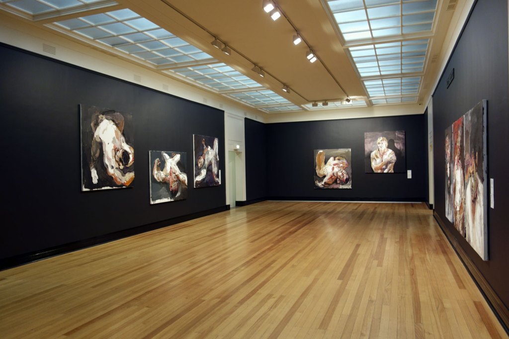
Installation view of the opening room of the exhibition Jan Senbergs: Observation – Imagination at The Ian Potter Centre: NGV Australia
Photo: Marcus Bunyan
You only have five days left to catch what I consider to be one of the best exhibitions I have seen this year in Melbourne.
If ever there was a man deserving of a large retrospective, it is Jan Senbergs. This wondrous, intelligent, immersive exhibition by this iconic Australian artist is a joy. Particularly so as you witness the gestation of the artist, the journey from very first exhibition to latest work.
Witness is a particularly apt metaphor for Senbergs – he is a witness to the world who uses his imagination to create, as he says, “maybe something architectonic or machine-like, but not quite: and ambiguous … I was trying to create something irrational, something out of the imagination but belonging to the world.” He belongs to the world but creates things not of the world as we know it. It is a twisted world n/visioned in multiple forms. Twisted labyrinthine structures – mechanistic, naturalistic, humanistic – swirling around in his head, put down as marks on paper, synthetic polymer paint on canvas.
Mark making is important to this man. He maps mechanistic and biomorphic elements, always intelligently informed by sources as diverse as “literature, history, architecture and non-Western art, and finds imagery within obscure technical journals, ancient mythology and illustrated encyclopaedias.” His influences are various – German Expressionism, Max Beckmann, Neo-Expressionist painting of the early 1980s, Brutalism, Eduardo Paolozzi, Pop Art and the writing of American postmodernist author Donald Bartheme – to name but a few. And his perspective is unique, as John Olsen insightfully observes, “not often on the vanishing point, but … more related to the spatial orientation in Chinese or Islamic art. This kind of perspective gives weight to an object; the sensation is abrupt and very blunt, ideally related to his vision.”
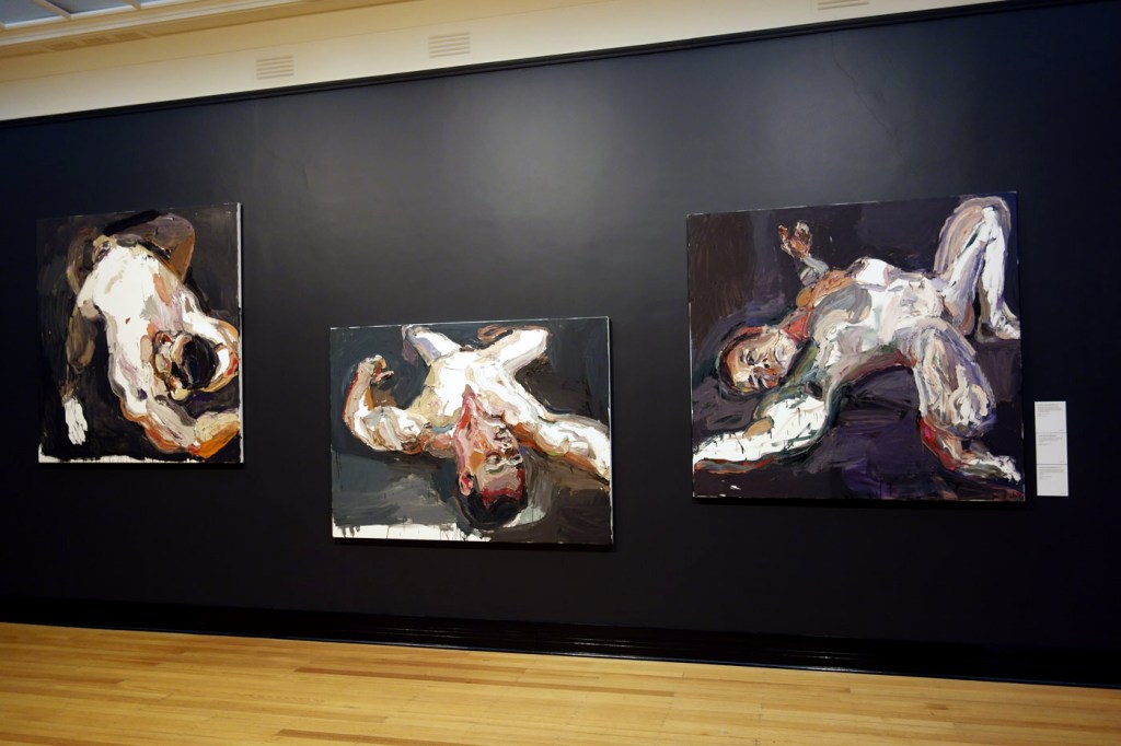
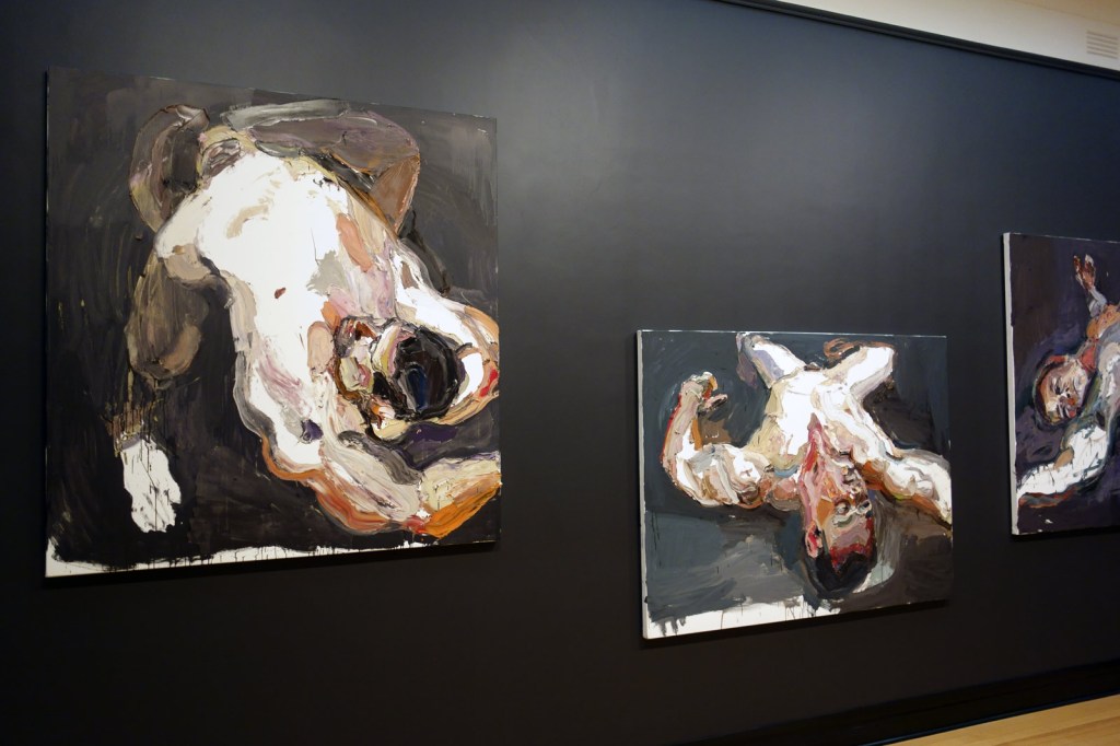
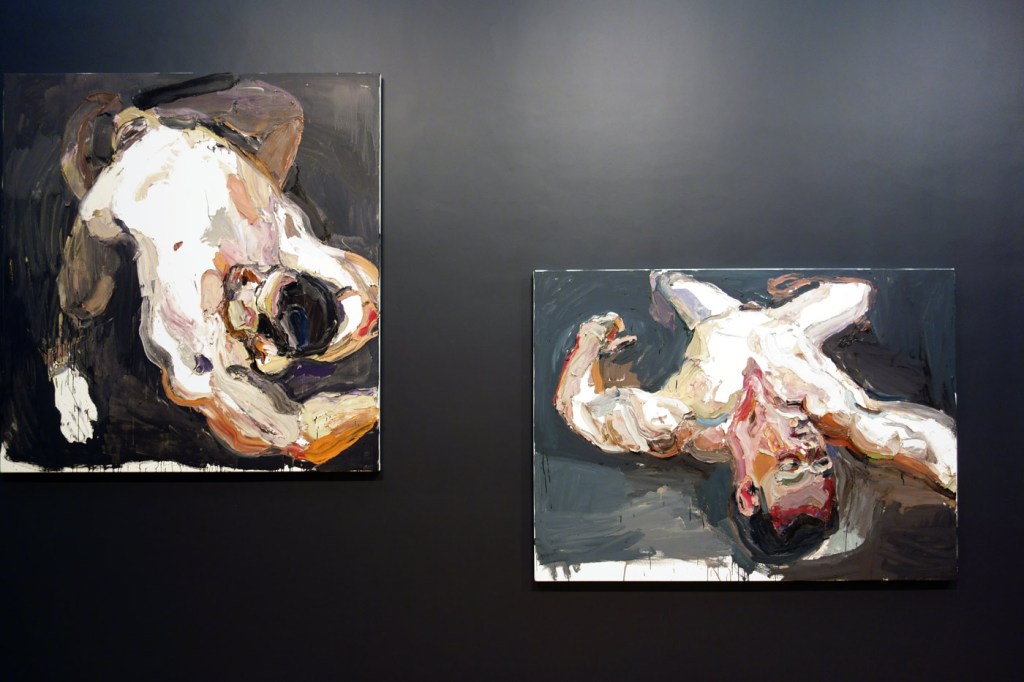
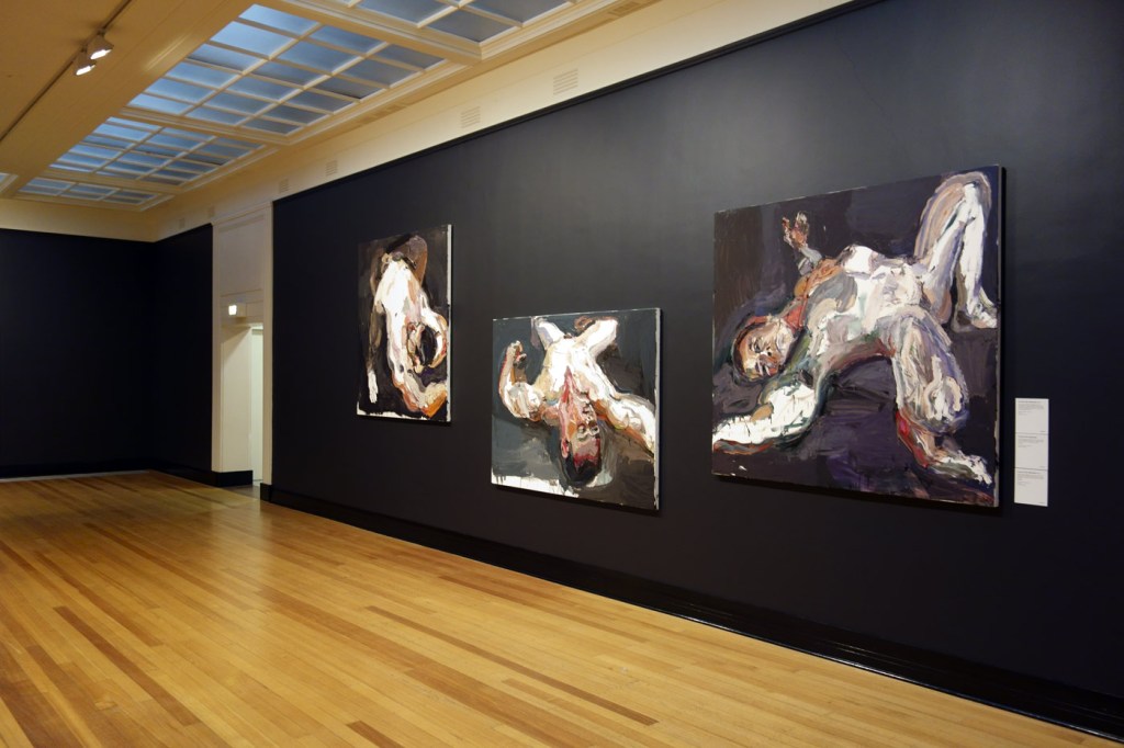
Standing in front of the huge six painting wall of Senbergs’ Antarctic paintings you feel the power of that (topographical? analytical? cut-away) vision. I dare you not to.
There are downsides. When they do appear in his paintings, his literal figures and landscapes (such as people, boats and bays), are weak. But that’s not what this artist is about. His screen print work of the mid to late 1970s lead him into a formally stylistic dead end. But he was an intelligent enough artist to recognise it as such and returned to mark making: “But it was a period when I was getting too confident. It was time to leave it alone, go back to the mark.” And his popularist map paintings of Sydney and Melbourne, painted in a brighter colour palette, don’t have the depth of feeling and response to the world that other works possess.
His limited colour palette – all blacks and subdued colours in the early enamel work; green and browns in the 1970s work; greys, blacks and beiges in the early 1980s; blues and greens with splashes of colour for the Antarctic and mining paintings; through to the more colourful map paintings of the 1990s and the recent oranges of the bushfire paintings – has always given weight to the object, weight to his constructed upside-down world, weight to his vision of a place where anything might happen. And frequently does.
Irrational, perhaps (but the irrational can only exist if there is the rational).
Something out of the imagination but belonging to the world, indubitably.
A world that is neither dysfunctional in vision nor balance.
Dr Marcus Bunyan
Many thankx to the National Gallery of Victoria for allowing me to publish the artworks in the posting. All installation photographs as noted © Marcus Bunyan and the National Gallery of Victoria. Please click on the photographs for a larger version of the image.
“I was always interested in painting buildings and things and I tried to make them half human, trying to put figures into them, in the end they blended together as one, the figures, the buildings and the people.”
Jan Senbergs, 1965
“I was always trying to invent new forms, different forms, shapes which were recognisable – maybe something architectonic or machine-like, but not quite: and ambiguous … I was trying to create something irrational, something out of the imagination but belonging to the world.”
Jan Senbergs, 2008

Alan Kilner
Jan Senbergs, Melbourne
c. 1959
Image courtesy Jan Senbergs
This is the first comprehensive retrospective of renowned Melbourne artist Jan Senbergs. Throughout his long career, Senbergs’ work has been characterised by a fundamental humanist vision, a finely-honed sense of the absurd, and a rigorous studio practice spanning printmaking, drawing and painting. He is considered to be amongst Australia’s leading painters and his large-scale expressive drawings are highly regarded. More recently Senbergs has created labyrinthine views of cities, employing aerial perspectives to present a bird’s eye view of humankind’s endeavours. The exhibition includes paintings, drawings and prints from his first exhibition in 1960 until the present day, borrowed from public and private collections around Australia.
Jan Senbergs is one of Australia’s most distinctive artists. He is both an acute observer and a creator of fantastical imagery. Since his first exhibition in 1960, Senbergs’s work has undergone many transformations of style, technique and subject, yet there have also been recurring themes and motifs. Elements from his very first works have reappeared, reworked and reinterpreted, throughout his career.
Senbergs’s artistic imagination has been fed by many sources, including his love of literature and poetry; his interest in no-Western artistic traditions and the work of outsider artists; journeys to distant locales as well as familiar places close to home. The artist has often referred to himself as a ‘visual scavenger’ of images – photographs, scientific diagrams, maps – which he transforms and incorporates into his own work. Above all, Senbergs’s art reflects his essential humanism, humour and wide-ranging curiosity.
Text from the NGV website
 'The whipper' 1961 from the exhibition Exhibition: 'Jan Senbergs: Observation – Imagination' at The Ian Potter Centre: NGV Australia, Melbourne, March - June, 2016")
Jan Senbergs (born Latvia 1939, arrived Australia 1950, died Melbourne 2024)
The whipper
1961
Enamel paint on composition board
183.0 x 122.0cm
Courtesy of the artist and Niagara Galleries, Melbourne
© Jan Senbergs
Literature has always been an important source of imagery for Senbergs. This work, one of his earliest, is based upon an episode in The Trial (1925) by Czech writer Franz Kafka. In the painting two figures cower beneath ‘the whipper’, who metes out a brutal punishment to them. This work was included in Senbergs’s second solo exhibition at the Argus Gallery, Melbourne, in 1962.
 'Two heads' 1961")
Jan Senbergs (born Latvia 1939, arrived Australia 1950, died Melbourne 2024)
Two heads
1961
Enamel paint on composition board
Private collection, Melbourne
“I was always interested in painting buildings and things and I tried to make them half-human, trying to put the figures into them; in the end they blended together as one, the figures and the buildings and the people.”
~ Jan Senbergs, 1965
 'Head' 1963")
Jan Senbergs (born Latvia 1939, arrived Australia 1950, died Melbourne 2024)
Head
1963
Colour screen print on paper, artist’s proof, edition of 10
42.4 x 35.2cm (image and sheet)
Courtesy of the artist and Niagara Galleries, Melbourne
© Jan Senbergs
 'The night parade' 1966 (installation view")
 'The night parade' 1966 (installation view)")
Jan Senbergs (born Latvia 1939, arrived Australia 1950, died Melbourne 2024)
The night parade (installation views)
1966
Enamel paint on composition board
Mornington Peninsula Regional Gallery
Gift of the artist, 1977
Photos: Marcus Bunyan
At the time of its creation, this was Senbergs’s largest and most ambitious painting to date, and it formed the centrepiece of his 1966 exhibition at Georges Gallery in Melbourne. The triptych format recalls the work of German Expressionist painter Max Beckmann, one of Senbergs’s earliest and ongoing artistic heroes. In his review of the exhibition, critic Allan McCulloch wrote: “Instead of simply looking at abstract pictures we have the feeling of standing on the perimeter of a vast industrial landscape in which hills and slag heaps, factories and cities are relentlessly pushed and jostled by an omni-present parade of silent watchers. The huge triptych “The night parade’ … illustrates the point.”
 'Observation post 2' 1968")
Jan Senbergs (born Latvia 1939, arrived Australia 1950, died Melbourne 2024)
Observation post 2
1968
Synthetic polymer paint, oil screenprint on canvas
246.0 x 185.0cm
National Gallery of Australia, Canberra
Purchased 1971
© Jan Senbergs
On his return to Melbourne in late 1967, Senbergs’ work changed dramatically. He ceased painting with enamel on Masonite composition boards, and instead started working with oil or acrylic on canvas and began to incorporate screen printed elements into his paintings. Of his year in Europe he later recalled, “I got a lot out of it, it completely made me revise and rethink a whole lot of things regarding my painting, my work, my attitudes and so on … I felt very refreshed and confident when I came back.”
By the mid 1960s Senbergs’ imagery was becoming increasingly sculptural, merging mechanistic and biomorphic elements, in part stimulated by his interest in the work of Scottish Pop artist Eduardo Paolozzi. Senbergs entered what he refers to as his ‘axle-grease’ period, when his colours became darker and more sombre, which he considered would enhance form in his work.
")
")
Installation views of the exhibition Jan Senbergs: Observation – Imagination at The Ian Potter Centre: NGV Australia showing at right, Column and still objects 1 (1968)
Photos: Marcus Bunyan
 'Column and still objects 1' 1968 (detail)")
Jan Senbergs (born Latvia 1939, arrived Australia 1950, died Melbourne 2024)
Column and still objects 1 (detail)
1968
The Edith Cowan University Art Collection
Donated through the Australian Government’s Cultural Gifts Program by Mr Timothy James Bernadt
 'Black garden' 1972 (detail)")
Jan Senbergs (born Latvia 1939, arrived Australia 1950, died Melbourne 2024)
Black garden (detail)
1972
Synthetic polymer paint, oil screenprint on canvas plywood
National Gallery of Australia, Canberra
Purchased 1973
In 1972 Senbergs exhibition sixteen new paintings at Melbourne’s Gallery A, including Black garden, in which he created ambiguous cityscapes from surrealistic combinations of screen printed fragments of images. With their absurdist sensibility and disjointed fragmentary images, these paintings emulate the writing of American postmodernist author Donald Bartheme, whose short stories Senbergs admired greatly and whom he credits with being a major influence upon him.
 'Fort 2' 1973")
Jan Senbergs (born Latvia 1939, arrived Australia 1950, died Melbourne 2024)
Fort 2
1973
Synthetic polymer paint, oil screen print on canvas
243.7 x 197.8cm
National Gallery of Australia, Canberra
Purchased 1974
© Jan Senbergs
The paintings Senbergs created in 1973 in response to his selection to represent Australia at the 12th São Paolo Biennial in Brazil were larger and more imposing than his 1972 paintings, and often incorporated an image of a ramp to suggest entry into the forms. With their realistic modelling of architectural forms set against a horizon line, these works evoke the real world, yet remain defiantly resistant to interpretation.
 'Structure, cloud' 1975")
Jan Senbergs (born Latvia 1939, arrived Australia 1950, died Melbourne 2024)
Structure, cloud
1975
Colour screen print, ed. 19/25
55.6 x 81.2cm (image), 71.0 x 100.2cm (sheet)
Courtesy of the artist and Niagara Galleries, Melbourne
© Jan Senbergs
“The printing technique was very important to me because I was a kind of scavenger of odd sorts of images. I mean a lot of those sort of shapes and forms were things that one saw perhaps in an old engraving book, a little detail of a section of some background somewhere and I’d look into it and see certain sorts of forms there … I was a collector, a scavenger. I used to go to libraries and collect these images and I’d buy a lot of books.”
~ Jan Senbergs
“When I was doing these prints and as I was coming to a conclusion to them, I also realised I was handling it in a more sophisticated way. The prints were becoming more refined, more in control … But it was a period when I was getting too confident. It was time to leave it alone, go back to the mark.”
~ Jan Senbergs 2008


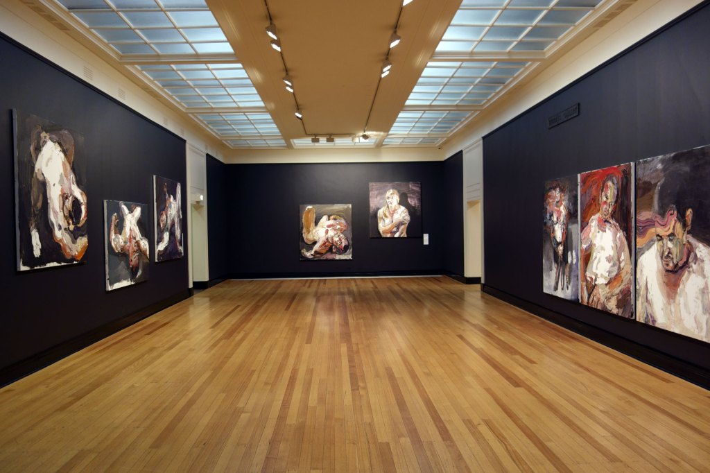
Installation views of the exhibition Jan Senbergs: Observation – Imagination at The Ian Potter Centre: NGV Australia
Photos: Marcus Bunyan

Jan Senbergs (born Latvia 1939, arrived Australia 1950, died Melbourne 2024)
The flyer
1975
Synthetic polymer paint, oil silkscreen on canvas
167.0 x 244.0cm
Collection of Paul Guest, Melbourne
© Jan Senbergs
 'Altered Parliament House 1' 1976 from the exhibition Exhibition: 'Jan Senbergs: Observation – Imagination' at The Ian Potter Centre: NGV Australia, Melbourne, March - June, 2016")
Jan Senbergs (born Latvia 1939, arrived Australia 1950, died Melbourne 2024)
Altered Parliament House 1
1976
Synthetic polymer paint, oil silkscreen on canvas
182.5 x 243.5cm
National Gallery of Victoria, Melbourne
Presented by Mrs Adrian Gibson as the winner of the 1976 Sir William Angliss Memorial Art Prize, 1977
© Jan Senbergs
While living in Canberra, on his walk home Senbergs would see Parliament House: “I’d see this white glowing dreadnought in the distance … that’s the way it appeared, sort of floating, just this whiteness because it was lit up … This form fascinated me. But also, and on another level, I was there in ’75 when all the political things happened and [after that] it didn’t have that sort of purity and whiteness that it appeared to have beforehand. In a way that gave me more liberty to change the imagery of the building.”
 'Observatory of hard edges' 1976 (detail)")
Jan Senbergs (born Latvia 1939, arrived Australia 1950, died Melbourne 2024)
Observatory of hard edges (detail)
1976
Synthetic polymer paint, oil screen print on canvas
National Gallery of Australia, Canberra
Purchased 1976
This is one of Senbergs’ most architectonic images; its massing of asymmetrical forms, pronounced geometry and pale colours bring to mind the contemporaneous style of Brutalist architecture.
 drawings late 1970s - early 1980s")
Jan Senbergs (born Latvia 1939, arrived Australia 1950, died Melbourne 2024)
Port piers and overpass (top left)
1979
Pastel on paper
Courtesy of the artist and Niagara Galleries, Melbourne
Port structure (bottom left)
1979
Pastel on paper
Courtesy of the artist and Niagara Galleries, Melbourne
Station Pier (top right)
1980
Pastel on paper
Courtesy of the artist and Niagara Galleries, Melbourne
Port signals (bottom right)
1980
Pastel on paper
Courtesy of the artist and Niagara Galleries, Melbourne
Photo: Marcus Bunyan
“Yesterday I visited Jan Senbergs at his studio in Port Melbourne … I was greatly impressed by what I saw: he has moved away from a photo image to observation, perhaps with [Max] Beckmann as his distant father. His line is slow and sullen and he creates a feeling of junk-heap menace … His perspective is not often on the vanishing point, but is more related to the spatial orientation in Chinese or Islamic art. This kind of perspective gives weight to an object; the sensation is abrupt and very blunt, ideally related to his vision.”
~ John Olsen 1980
 'Port Liardet' 2 1981")
Jan Senbergs (born Latvia 1939, arrived Australia 1950, died Melbourne 2024)
Port Liardet 2
1981
Synthetic polymer paint on canvas
183 x 244cm
Latrobe Regional Gallery Collection.
Acquired with assistance from the Caltex Victorian Government Art Fund and the Shire of Morwell
© Jan Senbergs

Installation view of the exhibition Jan Senbergs: Observation – Imagination at The Ian Potter Centre: NGV Australia with Sticht’s view to the smelters 1 at right
Photo: Marcus Bunyan
 'Sticht's view to the smelters 1' 1982 (installation view)")
Jan Senbergs (born Latvia 1939, arrived Australia 1950, died Melbourne 2024)
Sticht’s view to the smelters 1 (installation view)
1982
Synthetic polymer paint on canvas
Tasmanian Museum and Art Gallery, Hobart
Purchase with funds presented by Renison Goldfields Consolidated, 1983
Photo: Marcus Bunyan
 'Sticht's view to the smelters 1' 1982 (detail)")
Jan Senbergs (born Latvia 1939, arrived Australia 1950, died Melbourne 2024)
Sticht’s view to the smelters 1 (detail)
1982
Synthetic polymer paint on canvas
Tasmanian Museum and Art Gallery, Hobart
Purchase with funds presented by Renison Goldfields Consolidated, 1983
Robert Carl Sticht was an American metallurgist who in 1897 became general manager of the copper mine at Mount Lyell on the remote and rugged west coast of Tasmania. There he introduced a new technique of smelting which released large amounts of deadly sulphur into the air, one of the principal agents of destruction of the natural environment of the region.
In the Copperopolis – Mt Lyell series, Senbergs moved away from the smooth surfaces and clearly articulated forms of his Port Liardet paintings to a more gestural, painterly mode, in accord with the style of Neo-Expressionist painting of the early 1980s.
 'Broadening the mind in Italy' 1986, 1991")
Jan Senbergs (born Latvia 1939, arrived Australia 1950, died Melbourne 2024)
Broadening the mind in Italy
1986, 1991
Synthetic polymer paint on canvas
167 x 243cm
Private collection, Melbourne
© Jan Senbergs
 'Broadening the mind in Italy' 1986, 1991 (detail)")
Jan Senbergs (born Latvia 1939, arrived Australia 1950, died Melbourne 2024)
Broadening the mind in Italy (detail)
1986, 1991
Synthetic polymer paint on canvas
167 x 243cm
Private collection, Melbourne
© Jan Senbergs

Predrag Cancar/NGV Photographic Services
Jan Senbergs in his studio
2015
From the vast expanses of Antarctica to labyrinthine Melbourne cityscapes, more than five decades of artist Jan Senbergs’ prolific oeuvre will be revealed in the major retrospective Jan Senbergs: Observation – Imagination.
The exhibition, Senbergs’ first-ever comprehensive survey, will feature over 120 works including large-scale paintings, drawings and prints which depict sprawling aerial views of Australian cities, dystopic industrial landscapes, raging bushfires in the Victorian Otways, the remote deserts of north-Western Australia and more. The exhibition spans Senbergs’ first exhibition in 1960 through to the present day, representing all periods of his career. Recognised for his sheer visual inventiveness and sitting outside any defined artistic trend, Senbergs draws inspiration from a remarkably diverse range of influences; literature, history, architecture and non-Western art, and finds imagery within obscure technical journals, ancient mythology and illustrated encyclopaedias.
Tony Ellwood, Director, NGV, said, “As one of Australia’s leading contemporary artists, Jan Senbergs is an extraordinary inventor of his own visual language, at once simple and bold. From lush landscapes to barren urban spaces, his body of work signifies an artist who has continually experimented with shape, form and motif, and one who to this day continues to push his art in new and unexpected directions. The NGV is pleased to present the first major retrospective of Jan Senbergs’ work and offer visitors the opportunity to experience the full spectrum and constant evolution of his career.”
Senbergs, born in 1939 in Latvia, moved to Melbourne in 1950 following the end of World War II. Among other honours, he represented Australia at the prestigious 12th São Paolo Biennial in 1973 and was appointed to the Visiting Chair in Australian Studies at Harvard University in 1989, the first artist to hold this illustrious post. Observation – Imagination will include key works from Senbergs’ most important and critically acclaimed series including his 1973 São Paolo Biennial paintings, the Copperopolis – Mt Lyell mining landscape series, 1983, and his immense multi-panelled studio drawings of 1993-1995.
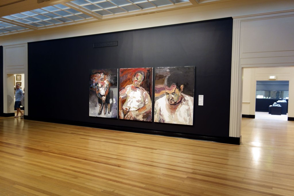
Senbergs’ Antarctica series is considered one of the most significant artistic responses to the continent. In 1987, Senbergs spent six weeks with the Australian Antarctic Division, travelling with fellow artists Bea Maddock and John Caldwell, on an annual resupply mission. Observation – Imagination will include key works such as his epic landscapes Mawson and Davis. The exhibition will also present Senbergs’ epic, 4.6 metre long Pulaski Skyway painting, which reflects the post-industrial landscape of the five and a half kilometre freeway that crosses the wasteland of western New Jersey from Newark to Jersey City. In this, Senbergs found a metaphor for the American experience and its splendour and decay.
More recently Senbergs has produced intricate labyrinthine views of cities, combining memory and imagination, and the exhibition will include map-like images of Melbourne, Sydney, Geelong, Wollongong and Port Kembla. The exhibition will also feature works from Senbergs’ recent 2014 Victorian bushfire series, which burst with visual drama and chromatic brilliance. Senbergs often refers to himself as a scavenger and collector of imagery taken from a wide variety of sources, and Observation – Imagination will include an enormous showcase, created by the artist, filled with cut-outs, photographs and personal artefacts that reference the people, places and artworks which have fuelled his visual imagination.
Press release from the National Gallery of Victoria
; and 'Otway night' at bottom right (1994, below)")

Installation views of the exhibition Jan Senbergs: Observation – Imagination at The Ian Potter Centre: NGV Australia showing in the top image, Blue angel of Wittenoom at top left (1988, below); and Otway night at bottom right (1994, below)
Photos: Marcus Bunyan
 'Blue angel of Wittenoom' 1988")
Jan Senbergs (born Latvia 1939, arrived Australia 1950, died Melbourne 2024)
Blue angel of Wittenoom
1988
Synthetic polymer paint on canvas
197.5 x 305cm
State Art Collection, Art Gallery of Western Australia, Perth
Purchased 1989
© Jan Senbergs
Photo: Eva Fernandez
The blue angel in the painting refers to the dangers of asbestos in the mining town of Wittenoom.
Wittenoom is a ghost town 1,106 kilometres (687 mi) north-north-east of Perth in the Hamersley Range in the Pilbara region of Western Australia. The area around Wittenoom was mainly pastoral until the 1930s when mining began in the area. By 1939, major mining had begun in Yampire Gorge, which was subsequently closed in 1943 when mining began in Wittenoom Gorge. In 1947 a company town was built, and by the 1950s it was Pilbara’s largest town. During the 1950s and early 1960s Wittenoom was Australia’s only supplier of blue asbestos. The town was shut down in 1966 due to unprofitability and growing health concerns from asbestos mining in the area.
Today, six residents still live in the town, which receives no government services. In December 2006, the Government of Western Australia announced that the town’s official status would be removed, and in June 2007, Jon Ford, the Minister for Regional Development, announced that the townsite had officially been degazetted. The town’s name was removed from official maps and road signs and the Shire of Ashburton is able to close roads that lead to contaminated areas.
The Wittenoom steering committee met in April 2013 to finalise closure of the town, limit access to the area and raise awareness of the risks. Details of how that would be achieved were to be determined but it would likely necessitate removing the town’s remaining residents, converting freehold land to crown land, demolishing houses and closing or rerouting roads. by 2015 six residents remained.
Text from the Wikipedia website
 'Otway night' 1994 (detail)")
Jan Senbergs (born Latvia 1939, arrived Australia 1950, died Melbourne 2024)
Otway night (detail)
1994
Synthetic polymer paint on canvas
Art Gallery of New South Wales
Purchase with assistance from Ruth Komon, 1994
After purchasing a holiday house at Aireys Inlet, Senbergs became interested in the history of Victoria’s west coast and the story of escaped convict William Buckley, ‘the wild white man’ who lived with the local Wathaurung people from 1803 until 1835 before being integrated back into colonial society.
 'Mawson' 1987 (detail)")
Jan Senbergs (born Latvia 1939, arrived Australia 1950, died Melbourne 2024)
Mawson (detail)
1987
Synthetic polymer paint on canvas
Private collection, Melbourne
“As in previous settlements in history, in Antarctica we are again squatting on the edge of yet another continent and bringing our cultural baggage with us. Already there is a sense of history there: architectural, social and visual.”
~ Jan Senbergs, 2002

; at top middle, 'Antarctic night' (1989); at bottom left, 'Mawson'; and at bottom middle, 'Platcha' (1987)")
Installation views of the exhibition Jan Senbergs: Observation – Imagination at The Ian Potter Centre: NGV Australia showing in the bottom image at top left, Bea Maddock being lifted onto the Icebird – Heard Island (1987, below); at top middle, Antarctic night (1989, below); at bottom left, Mawson; and at bottom middle, Platcha (1987, below)
Photos: Marcus Bunyan
 'Bea Maddock being lifted onto the Icebird – Heard Island' 1987")
Jan Senbergs (born Latvia 1939, arrived Australia 1950, died Melbourne 2024)
Bea Maddock being lifted onto the Icebird – Heard Island
1987
Synthetic polymer paint on canvas
197.2 x 274.1cm
State Art Collection, Art Gallery of Western Australia, Perth
Purchased 1987
© Jan Senbergs
Senbergs was one of three artists invited by the Australian Antractic Division to take part in the resupply Voyage Six to Antarctica as observers. Leaving Hobart in early January 1987, during their six‐week journey the artists visited Heard Island, Scullin Monolith, Law Base, Davis, Mawson and the Russian base at Mirny. This painting depicts fellow artist Bea Maddock who broke her leg while disembarking at Heard Island and needed to be winched back on board. Unfortunately, she was incapacitated for the remainder of the trip.
 'Antarctic night' 1989")
Jan Senbergs (born Latvia 1939, arrived Australia 1950, died Melbourne 2024)
Antarctic night
1989
Synthetic polymer paint and collage on canvas
202 x 292cm
National Gallery of Australia, Canberra
Purchased 1990
© Jan Senbergs
“In a “cut-away” view, [Antarctic night] shows the interior of a winterer’s hut with its wall covered in a “tapestry” of pin-up images – from the earliest “pin‐up”, the Venus of Willendorf, to the Playboy centrefolds of the 1950s and 1960s … The more you saw of it, the more it seemed like an Antarctic Pop Art movement.”
 'Platcha' 1987")
Jan Senbergs (born Latvia 1939, arrived Australia 1950, died Melbourne 2024)
Platcha
1987
Synthetic polymer paint on canvas
224.0 x 355.0cm
Melbourne Convention and Exhibition Trust Collection
© Jan Senbergs

Installation view of the exhibition Jan Senbergs: Observation – Imagination at The Ian Potter Centre: NGV Australia
Photo: Marcus Bunyan
 and 'New Guinea male triptych' (bottom row) both 1993")
Installation view of New Guinea sheilas triptych (centre row) and New Guinea male triptych (bottom row) both 1993
Pastel on paper
Courtesy of the artist and Niagara Galleries, Melbourne
Photo: Marcus Bunyan
 and 'New Guinea male triptych' (bottom row) both 1993")
Detail view of New Guinea sheilas triptych (centre row) and New Guinea male triptych (bottom row) both 1993
Pastel on paper
Courtesy of the artist and Niagara Galleries, Melbourne
Photo: Marcus Bunyan
 'New Guinea male triptych' 1993 (detail)")
Jan Senbergs (born Latvia 1939, arrived Australia 1950, died Melbourne 2024)
New Guinea male triptych (detail)
1993
pastel on paper
(a-c) 160 x 366cm (overall)
Courtesy of the artist and Niagara Galleries, Melbourne
© Jan Senbergs
“I enjoy the freedom of drawing, the directness of what I call my “Long Arm Drawing” with a black pastel or an oil stick, where there’s no room for corrections or embellishments – dancing in front of a sheet of paper, keeping a spontaneous line, and if you hesitate, it shows. It’s “unforgiving” drawing and if you’re out of form you lose, and sheets of paper end up in the bin. Like an athlete or a dancer, you’ve got to put in the hours to make the confident mark.”
Jan Senbergs, 2016
 'Melbourne' 1998-1999 from the exhibition Exhibition: 'Jan Senbergs: Observation – Imagination' at The Ian Potter Centre: NGV Australia, Melbourne, March - June, 2016")
Jan Senbergs (born Latvia 1939, arrived Australia 1950, died Melbourne 2024)
Melbourne
1998-1999
Synthetic polymer paint on canvas
183 x 274cm
State Library of Victoria, Melbourne
Gift of the Gualtiero Vaccari Foundation in recognition of services provided by the State Library to the Italian Community, 1999
© Jan Senbergs
“[The] map-like images of the city that I’ve developed – of Melbourne, Sydney, Wollongong, Barcelona – they come out of a fascination with map-making, particularly early map-making … I started to look for an imagined way of painting and drawing actual places like Melbourne or Sydney: not exactly what you see in front of you but what you know to be there … It’s like those early maps, imaginary maps where people were drawing what they knew, not what they saw or measured.”
Jan Senbergs, 2006
 'Sydney' 1998")
Jan Senbergs (born Latvia 1939, arrived Australia 1950, died Melbourne 2024)
Sydney
1998
Synthetic polymer paint on canvas
174 x 344cm (framed)
Collection of McDonald’s Australia Limited
© Jan Senbergs
Photo: Felicity Jenkins
 'The elated city' 2009")
Jan Senbergs (born Latvia 1939, arrived Australia 1950, died Melbourne 2024)
The elated city
2009
Synthetic polymer paint on canvas
239 x 196cm
Courtesy of the artist and Niagara Galleries, Melbourne
© Jan Senbergs
Figures and heads made from mechanistic and architectural elements was one of Senbergs’s earliest subjects. He returned to this motif recently in several monumental paintings, including Paolozzi’s city, 2010, and The elated city, 2009.
 'Coastal settlement' 2009")
Jan Senbergs (born Latvia 1939, arrived Australia 1950, died Melbourne 2024)
Coastal settlement
2009
Synthetic polymer paint on canvas
169 x 216cm
Private collection, Melbourne
© Jan Senbergs
 'Melbourne capriccio 3' 2009")
Jan Senbergs (born Latvia 1939, arrived Australia 1950, died Melbourne 2024)
Melbourne capriccio 3
2009
Synthetic polymer paint on canvas
195.2 x 184cm
National Gallery of Victoria, Melbourne
Purchased with funds donated by The Hugh D. T. Williamson Foundation, 2009
© Jan Senbergs
In the history of painting, a capriccio refers to an architectural fantasy where buildings and other architectural elements and places come together in imaginary settings. Senbergs’ Melbourne capriccio offers the viewer the pleasure of a bird’s-eye view of familiar landmarks, seen through a rich blend of memory and imagination.
 'Paolozzi's city' 2010")
Jan Senbergs (born Latvia 1939, arrived Australia 1950, died Melbourne 2024)
Paolozzi’s city
2010
Synthetic polymer paint on canvas
200.5 x 193.2cm
TarraWarra Museum of Art Collection
Acquired 2011
© Jan Senbergs
As a young artist in the 1960s, Senbergs greatly admired Scottish Pop artist Edouardo Paolozzi’s strange fusions of machine and organic forms, and explored similar ideas in his own paintings and screen prints. In Paolozzi’s city Senbergs has created a fantastical head out of buildings and roads, and pays homage to one of his first artistic heroes.
 'Paolozzi's city' 2010 (detail)")
Jan Senbergs (born Latvia 1939, arrived Australia 1950, died Melbourne 2024)
Paolozzi’s city (detail)
2010
Synthetic polymer paint on canvas
200.5 x 193.2cm
TarraWarra Museum of Art Collection
Acquired 2011
© Jan Senbergs
 'Geelong capriccio (if Geelong were settled instead of Melbourne)' 2010")
Jan Senbergs (born Latvia 1939, arrived Australia 1950, died Melbourne 2024)
Geelong capriccio (if Geelong were settled instead of Melbourne)
2010
Synthetic polymer paint on canvas
197 x 255cm
Deakin University Art Collection
© Jan Senbergs
Image courtesy Niagara Galleries, Melbourne
“One of the rarest qualities in contemporary painting is wit … Jan Senberg’s ‘Geelong capriccio’ is in every way a painting of wit, its single and absurd proposition as to what the world would look like if Geelong had become the capital and the site of Melbourne remained open paddocks … It seems to be a very Antipodean painting: the upside-down world, which Europe imagined Australia to be, a place where anything might happen.”
Patrick McCaughey, 2010
 'Extended Melbourne labyrinth' 2013")
Jan Senbergs (born Latvia 1939, arrived Australia 1950, died Melbourne 2024)
Extended Melbourne labyrinth
2013
Oil stick, synthetic polymer paint wash
(a-d) 162.5 x 497.4cm (framed) (overall)
National Gallery of Victoria, Melbourne
Yvonne Pettengell Bequest, 2014
© Jan Senbergs
; at left, 'Geelong capriccio (if Geelong were settled instead of Melbourne)' (2010, above); at right 'Melbourne capriccio 3'")
Installation view of the opening room of the exhibition Jan Senbergs: Observation – Imagination at The Ian Potter Centre: NGV Australia showing at top, Extended Melbourne labyrinth (2013, above); at left, Geelong capriccio (if Geelong were settled instead of Melbourne) (2010, above); at right Melbourne capriccio 3
Photo: Marcus Bunyan


Installation views of the opening room of the exhibition Jan Senbergs: Observation – Imagination at The Ian Potter Centre: NGV Australia showing at left in both images, The elated city followed by Paolozzi’s city
Photo: Marcus Bunyan
 'Fire and smoke' 1 2014")
Jan Senbergs (born Latvia 1939, arrived Australia 1950, died Melbourne 2024)
Fire and smoke 1
2014
Synthetic polymer paint on paper
48 x 70cm (sheet)
Private collection, Melbourne
© Jan Senbergs
Image courtesy Niagara Galleries, Melbourne
In contrast to the enclosed, almost claustrophobic spaces of the studio interiors, by the end of the 1990s Senbergs had embarked upon a new series of map-like paintings, sprawling bird’s-eye view of cities, which continue to occupy him to the present day. Initially inspired by seeing Melbourne from a high-rise building, these works reflect the artist’s long fascination with early and non-Western map-making traditions. Like these maps, Senbergs’ views are not scientifically measured recordings; rather they are imaginative constructions of place based on observation and memory.
At the same time Senbergs began his most extensive group of landscapes, painting the rugged terrain of the Victorian west coast, an area that he knew well. While some of these works depict untouched wilderness, others include roads and townships and employ multiple perspectives to convey the experience of travelling through the landscape. Senbergs’ recent Heat – Fire – Smoke series is a response to the 2014 bushfires in Victoria, a new subject for the artist, in which he reflects on the cycle of destruction and regeneration. (Wall text from the exhibition)
 'Code Red day 1' 2014")
Jan Senbergs (born Latvia 1939, arrived Australia 1950)
Code Red day 1
2014
Synthetic polymer paint on paper
119.0 x 145.0cm
Private collection, Melbourne
© Jan Senbergs
“In January 2014 in Melbourne we had four days of forty-plus degrees of intense heat – with bushfires raging in the countryside casting a pall of acrid smoke over the extended city and all around ominous skies that seemed to portend an inferno that would be all engulfing. That oppressive atmosphere and that sense of threat at the edges of the extended city seemed as if an overwhelming and merciless force was at the gates and ready to break down the barricades.”
~ Jan Senbergs, 2015
The Ian Potter Centre: NGV Australia
Federation Square
Corner of Russell and
Flinders Streets, Melbourne
Opening hours:
Daily 10am – 5pm
 'Voyager' 2016 from the exhibition 'Darron Davies: The Travellers' at the Centre for Theology and Ministry, Melbourne, April - May, 2016")
 'Horizon' 2016 from the exhibition 'Darron Davies: The Travellers' at the Centre for Theology and Ministry, Melbourne, April - May, 2016")
 'Unbridle' 2016")
 'Emanation' 2016")
 'The Break' 2016")
 'Manifest' 2016")
 'Embodiment' 2016")
 'Guise' 2016")
 'Frame' 2016")
 'The Self Returning' 2016")
 'Advent' 2016")
 'The Mainspring' 2016")
 'Designer' 2016")
; and 'Trooper M, after Afghanistan, no. 2' (2012)")

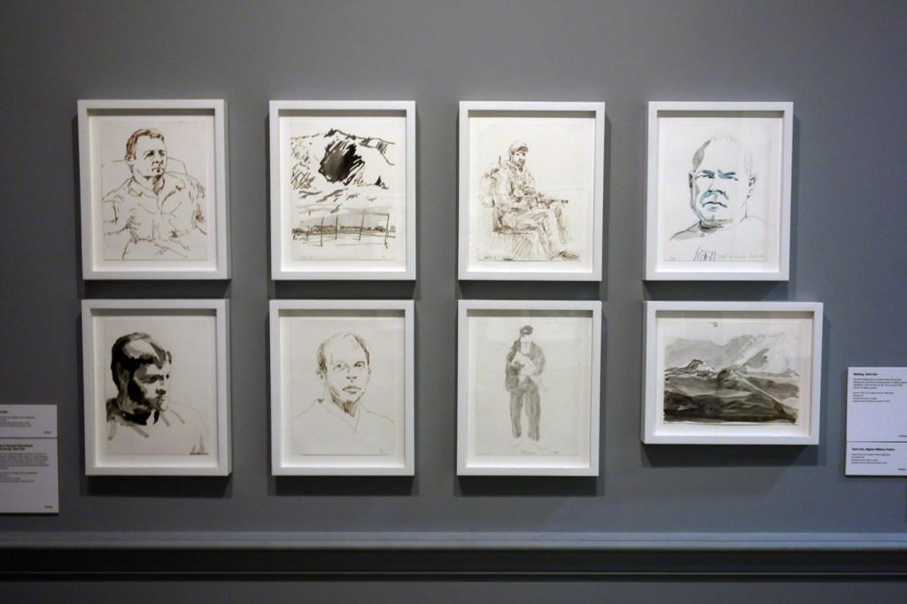

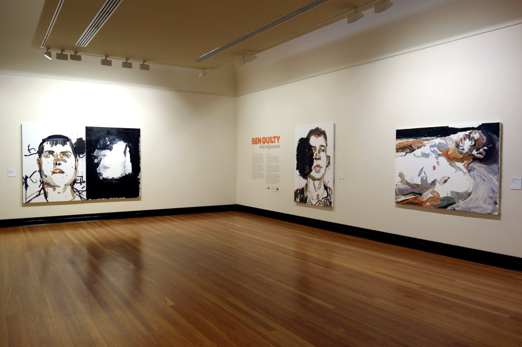


; 'Trooper Daniel Westcott, after Afghanistan' (2012); and 'Troy Park, after Afghanistan' (2012)")
 'Trooper Daniel Westcott, after Afghanistan' 2012 (installation view)")
 'Troy Park, after Afghanistan' 2012 (installation view)")


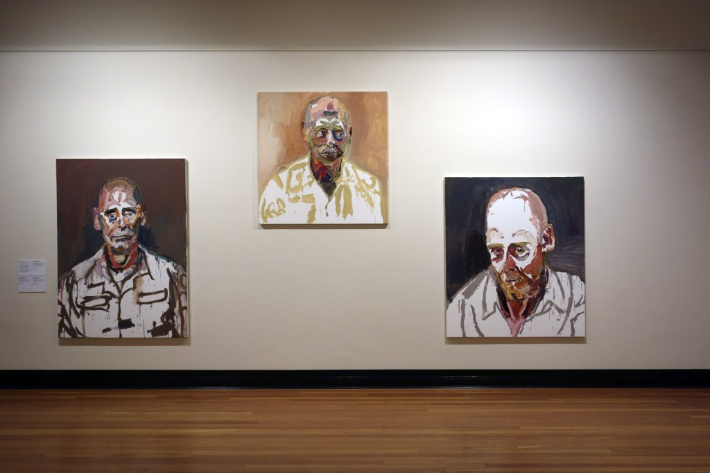
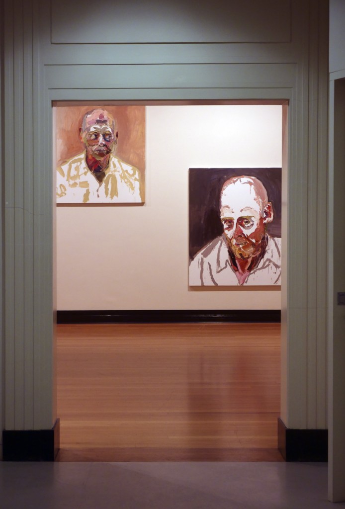
; 'Trooper M, after Afghanistan' (2012); and 'Trooper M, after Afghanistan, no. 2' (2012)")
; 'Trooper M, after Afghanistan' (2012); and 'Trooper M, after Afghanistan, no. 2' (2012)")
; 'Trooper M, after Afghanistan' (2012); and 'Trooper M, after Afghanistan, no. 2' (2012)")
 'Troy Park, after Afghanistan, no. 2' 2012 (installation view)")
 'Trooper M, after Afghanistan' 2012 (installation view)")
 'Trooper M, after Afghanistan, no. 2' 2012 (installation view detail)")
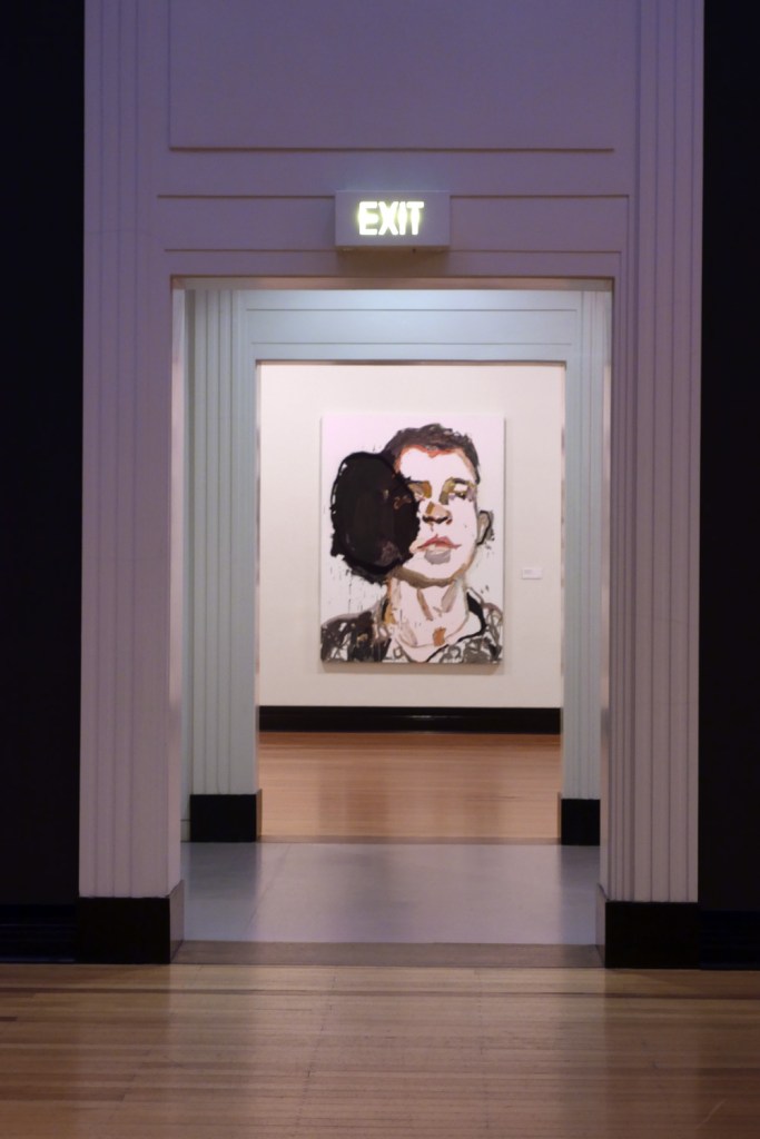
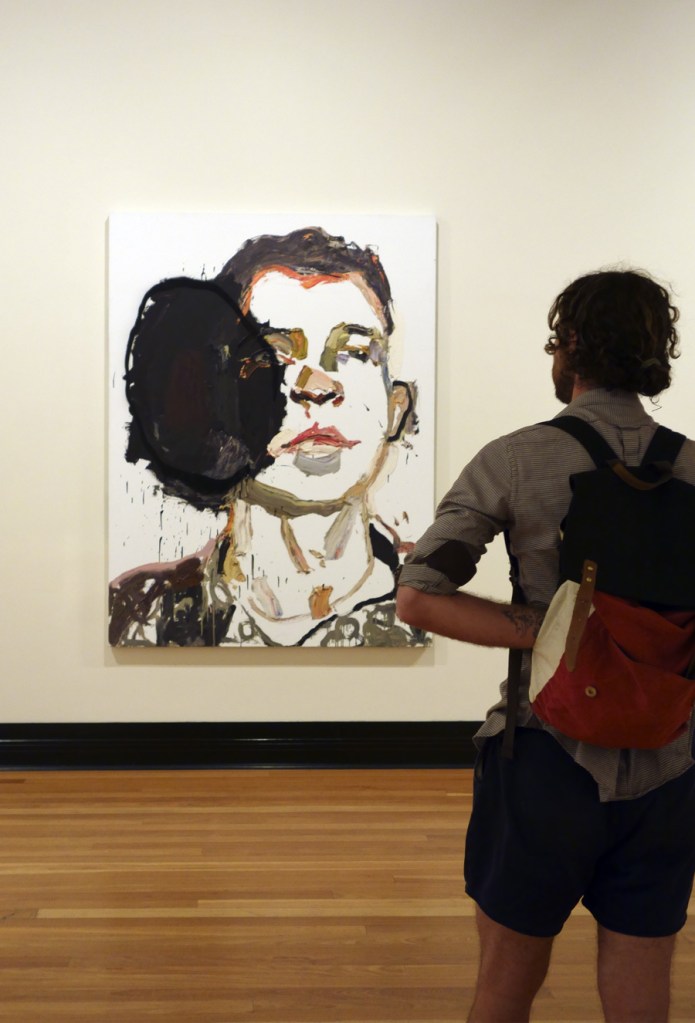
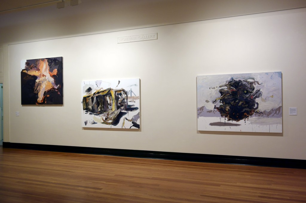
 'Bushmaster' 2012 (installation view)")
 'Captain S, after Afghanistan' 2012 (installation view)")
 'Lance Corporal M, after Afghanistan' 2012 (installation view)")
 'Lance Corporal M, after Afghanistan' 2012 (installation view detail)")
 and third from left top, 'Waiting, Tarin Kot' (October 2011)")

 'Captain Kate Porter' 27 October 2011 (installation view)")
 'Trooper M, Special Forces, Tarin Kot' October 2011 (installation view)")
 'Waiting, Tarin Kot' October 2011 (installation view)")
 'Captain M II, Tarin Kot' October 2011 (installation view)")
 'Tarin Kot, Hilux' 2012 (installation view)")
 'Kandahar' 2012 (installation view)")
 'Kandahar' 2012 (installation view detail)")
; and at right, 'Kandahar' (2012)")

")
")
")
 'Air Commodore John Oddie, after Afghanistan, no. 3' 2012 (installation view)")
 'Air Commodore John Oddie, after Afghanistan, no. 3' 2012 (installation view detail)")
 'Air Commodore John Oddie, after Afghanistan, no. 1' 2012 (installation view)")
 'Air Commodore John Oddie, after Afghanistan, no. 2' 2012 (installation view)")


")
 'Trooper Daniel Spain, Tarin Kot' 2012 (installation view)")
 'Trooper Luke Korman' 2012 (installation view)")
 and 'SOTG, after Afghanistan' (2011, right)")
 'Trooper Luke Korman, Tarin Kot' 2012 (installation view)")
 'SOTG, after Afghanistan' 2011 (installation view)")
 'Lake District, England' 1994")
 'Lake District, England' 1994")
 'Lake District, England' 1994")
 'Manchester Mardi Gras' 1994")
 'Manchester Mardi Gras' 1994")
 'Untitled' 1994")
 'Lake District, England' 1994")
 'Lake District, England' 1994")
 'Untitled' 1994")
 'Manchester Mardi Gras' 1994")
 'Manchester Mardi Gras' 1994")
 'Manchester Mardi Gras' 1994")
 'Manchester Mardi Gras' 1994")
 'Untitled' 1994")
 'Manchester Mardi Gras' 1994")
 'Untitled' 1994")
 'Manchester Mardi Gras' 1994")
 'Untitled' 1994")
 'Lake District, England' 1994")
 'Manchester Mardi Gras' 1994")
 'Regeneration after fire – the seeders and the sprouters, Mallee' (detail) 2009-2011 from the exhibition 'John Wolseley – Heartlands and Headwaters' at The Ian Potter Centre: NGV Australia, Melbourne, April - August, 2015")
 'History of the Whipstick Forest with ephemeral swamps and gold bearing reefs' 2011 from the exhibition 'John Wolseley – Heartlands and Headwaters' at The Ian Potter Centre: NGV Australia, Melbourne, April - August, 2015")
 'From Siberia to Roebuck Bay – the godwits reach the mangrove swamps, WA' 2012 (detail)")
 'Natural history of swamps III, heron in swamp - Loy Yang Power Station' 2009-2010 (detail)")
 'Murray-Sunset refugia with 14 ventifacts' 2008-2010")
 'Murray-Sunset refugia with 14 ventifacts' 2008-2010 (detail)")
 'Murray-Sunset refugia with 14 ventifacts' 2008-2010 (detail)")
 'Natural history of a sphagnum bog, Lake Ina, Tasmania' 2013")
 'Natural history of a sphagnum bog, Lake Ina, Tasmania' 2013 (detail)")
 'Natural history of a sphagnum bog, Lake Ina, Tasmania' 2013 (detail)")
 'Natural history of a sphagnum bog, Lake Ina, Tasmania' 2013 (detail)")
 'From the edge of the great flood plains of Garrangari and Garrangalli, NT' 2012-2014")
 'A Daly River creek, NT' 2012")
 'A Daly River creek, NT' 2012 (detail)")
 'Cycles of fire and water - Lake Tyrrell, Victoria' 2011-2012")
 'Cycles of fire and water – Lake Tyrrell, Victoria' 2011-212 (detail)")
 'After fire - spiny-cheeked honeyeaters at Lake Monibeong' 2009-2011 (detail)")
 'Swanfires, Chris's shed' 2002–2004 from the exhibition 'Earth Matters: contemporary photographers in the landscape' at the Monash Gallery of Art, Wheelers Hill, Melbourne, March - May, 2015")
 'I'm not going anywhere without you' 2009")

 'Wanderer in a sea of images' 2013")
 'Wanderer in a sea of images' 2013 (detail)")
 'Sanctuary' 2014")
 'Sanctuary I' 2014")
 'Sanctuary VI' 2014")


 'Minds in the cave / fragment 2' 2014")
 'Ekkyklema #1' 2014 (installation view detail)")
 'Ekkyklema #1' 2014 (installation view detail)")
 'Ekkyklema #1' 2014 (installation view detail)")
 'Untitled' 2008")
 'Untitled' 2008")


 (Christian Fletcher, left; Les Walkling, right) 2012-2013")
 From the series 'South West Light' 2012 (detail)")
 (Tony Hewitt, left; Peter Eastway, right) 2012-2013")
 From the series 'Shark Bay Inscription' 2013 (detail)")


 'Stirling Ranges' 2013")
 'Red Coast' 2014")
 'South of Faure Island' 2014")
 'In my Garden' 2012")
 'Too Much of the Air' 2015")
 'Too Much of the Air' 2015")
 'Too Much of the Air' 2015")
 'Too Much of the Air' 2015")
 'Too Much of the Air' 2015")
 'Too Much of the Air' 2015")
 'Too Much of the Air' 2015")
 'Too Much of the Air' 2015")
 'Too Much of the Air' 2015")
 'Too Much of the Air' 2015")
 'Too Much of the Air' 2015")
 'Too Much of the Air' 2015")
 'Too Much of the Air' 2015")
 'Too Much of the Air' 2015")
 'Too Much of the Air' 2015")
 'Too Much of the Air' 2015")
 'Too Much of the Air' 2015")
 'Too Much of the Air' 2015")
 'Too Much of the Air' 2015")
 'Too Much of the Air' 2015")
 'Too Much of the Air' 2015")
 'Too Much of the Air' 2015")
 'Too Much of the Air' 2015")
 'Too Much of the Air' 2015")
 'Too Much of the Air' 2015")
 'Untitled (Peter Milne and Rowland S Howard' from the series 'A Day in the Life of Rowland S Howard' 1977 from the exhibition 'Juvenilia: Peter Milne' at Strange Neighbour, Fitzroy, Melbourne, February - March, 2015")


 'Untitled (Rowland S Howard)' 1977 From the series 'A Day in the Life of Rowland S Howard' 1977")
 'Untitled (Rowland S Howard)' 1977 From the series 'A Day in the Life of Rowland S Howard' 1977")
 'Untitled (Rowland S Howard)' 1977 From the series 'A Day in the Life of Rowland S Howard' 1977")
 'Untitled (Rowland S Howard)' 1977 From the series 'A Day in the Life of Rowland S Howard' 1977")
 'Anita Lane and Nick Cave, The Venue, St Kilda' mid-1980s")
 'Anita Lane at a party' mid 1980s")
 'Boys Next Door first photo session after Rowland joined. Nick's bedroom, Caulfield' c. 1978")
 'George and Troy' mid-1980's")
 'Janet Austin and Katy Becle' 1977")
 'Polly Borland at home' early 1980s")
 'Rowland S. Howard, Gina Riley, Simon McLean. TATROC gig, Greville Street, 1976' 1976")
 'Rowland S. Howard and Genevieve McGuckin, St Kilda rooftop' 1977")
 'Nick Cave and Rowland S Howard after Birthday Party gig, Melbourne' 1982")
 'Untitled' 2014 from the exhibition 'Everyday imagining: new perspectives on Outsider art' at The Ian Potter Museum of Art, Melbourne, October 2014 - January 2015")
 'Untitled' 2012 from the exhibition 'Everyday imagining: new perspectives on Outsider art' at The Ian Potter Museum of Art, Melbourne, October 2014 - January 2015")
 'Stereo' 2011")
 'Telephone' 2011")
 'Untitled' 2011")

 'Untitled' 2013")
 'Untitled' 2013")
 'Queen of hearts' 2010")
 'Joanie pregnant' 1972 from the exhibition 'PHOTOGRAPHY MEETS FEMINISM: Australian women photographers 1970s-80s' at the Monash Gallery of Art, Melbourne, October - December, 2014")
 'Untitled' 1984 (1) from the exhibition 'PHOTOGRAPHY MEETS FEMINISM: Australian women photographers 1970s-80s' at the Monash Gallery of Art, Melbourne, October - December, 2014")


")
 'Outside the big top' 1979-1980")
 'Joanie and baby Jade, Larkspur' 1973")
 'Untitled' c. 1976")
 'Untitled' c. 1976")
 'Untitled' c. 1976")
")
 'Scenes on the death of nature, scene I' 1980-1986")
 at left and 'Lynn' (1976) at right in the exhibition 'Photography Meets Feminism' at the Monash Gallery of Art")
 'Vale Street' 1975")
 'Lynn' 1976")


 'Ponch and Ida' 1976")
 'Lorna and Mary' 1976")
 'Mimi and Dany' 1976")


")
 'Vehicle Builders Union Ball, Collingwood Town Hall, Melbourne' 1979")
 'Women’s dance, St Kilda Town Hall, Melbourne' 1985")
 'Miss World televised' 1974")
 'Untitled' 1969-1971")
 'Untitled' 1969-1971")
 'Queensland out west' 1982")
 'Queensland out west' 1982 (detail)")
 'Queensland out west' 1982 (detail)")
 'Queensland out west' 1982 (detail)")
 'Untitled (Geoff in Bondi)' 1981")
 'Untitled (Picnic)' 1981")
 'Ice' 1989")
 'Jet' 1989")
 'Persona and shadow: Madonna' 1984")
 'Old age' 1978")
 'Old age' 1978")
 'Old age' 1978")

You must be logged in to post a comment.