Exhibition dates: 25th August – 19th September, 2009
John Nicholson (Australian, b. 1970) Aerial Navigation 2009
You could say that the essence of the cosmos is not matter, it is consciousness.
It is not the external world that is real – it is “maya”, an illusion, for the real world lies within.
These works, with their striations, strata and suspension are emanations of that spirit – projections of the inner reality.
In terms of the ancient Chinese philosophy Lao Tzu we dream the butterfly and the butterfly is us. If you don’t ‘get’ these works, let go all pretensions and feel their colour as sound, as vibrations of energy.
Submerge yourself in their shape and form. Like DNA structure, a heart beat or the record of a seismic shock these works are music as art, the length of harmony quivering and slipping in our minds, before our eyes.
This is the colour music of Roy De Maistre’s paintings of the 1930’s updated to the 21st century. They are fugues of sound made physical entities, intertwining, coming and going. Here lines, tones and colours are organised in a parallel way – tone after tone, line after line. They are wavelengths of the interior made visible. The connection is solid and fluid at one and the same time; there are many connections to be discovered, many journeys to be made.
I hear them, I like them.
Dr Marcus Bunyan
Many thankx to Sophie Gannon Gallery for allowing me to publish the photographs in the posting. Please click on the photographs for a larger version of the image.
John Nicholson (Australian, b. 1970) Under the radar 2009 Photo: Marcus Bunyan
Installation views of Connection is Solid by John Nicholson at Sophie Gannon Gallery Photos: Marcus Bunyan
John Nicholson (Australian, b. 1970) Thrill seeker (detail) 2009 Photo: Marcus Bunyan
Roy de Maistre (Australian, 1894-1968) Arrested Movement from a Trio 1934 Oil and pencil on composition board 72.3 × 98.8cm
John Nicholson (Australian, b. 1970) Slip 2009
John Nicholson (Australian, b. 1970) The wire might sense 2009
John Nicholson (Australian, b. 1970) Swoop 2009 Photo: Marcus Bunyan
Installation view of Connection is Solid by John Nicholson with on the wall Satellite Graffitti (2009) and on the floor Cascade (2009) and Swoop (2009) Photo: Marcus Bunyan
Sophie Gannon Gallery 2, Albert Street, Richmond, Melbourne
Ron Arad (British-Israeli, b. 1951) Concrete Stereo 1983 Photo courtesy of Ron Arad Associates and the Museum of Modern Art
One of my favourite designers!
Marcus
Many thankx to the Museum of Modern Art for allowing me to publish the photographs in the posting. Please click on the photographs for a larger version of the image.
Ron Arad (British-Israeli, b. 1951) The Rover Chair 1981 Tubular steel, leather, and cast-iron Kee Klamp joints 30 3/4 x 27 3/16 x 36 1/4″ (78 x 69 x 92cm); weight 57.3 lbs (26 kg) Edition by One Off, London Private collection, London Photo by Erik and Petra Hesmerg and courtesy of Private Collection, Maastricht, and the Museum of Modern Art
“I picked up this Rover seat and I made myself a frame and this piece sucked me into this world of design.” “If someone had told me a week before that I was going to be a furniture designer, I would think they were crazy.”
~ Ron Arad
Ron Arad (British-Israeli, b. 1951) Sketch for Well Tempered Chair 1986 Photo courtesy of Vitra Design Museum and the Museum of Modern Art
Ron Arad (British-Israeli, b. 1951) Well Tempered Chair Prototype 1986 Photo courtesy of Vitra Design Museum and the Museum of Modern Art
Ron Arad (British-Israeli, b. 1951) Big Easy chair 1988
Ron Arad (British-Israeli, b. 1951) Big Easy. Volume 2 1988 Polished stainless steel 42 1/8 x 50 1/2 x 36 1/4″ (107 x 128.3 x 92.1cm); weight 44 lbs (20 kg) Edition by One Off, London Collection of Michael G. Jesselson, New York Image: Ron Arad Associates, London
The Museum of Modern Art presents Ron Arad: No Discipline, the first major U.S. retrospective of Arad’s work, from August 2 to October 19, 2009. Among the most influential designers of our time, Arad (British, b. Israel 1951) stands out for his adventurous approach to form, structure, technology, and materials in work that spans the disciplines of industrial design, sculpture, architecture, and mixed-medium installation. Arad’s relentless experimentation with materials of all kinds – from steel, aluminium, and bronze to thermoplastics, crystals, fibre-optics, and LEDs – and his radical reinterpretation of some of the most established archetypes in furniture – from armchairs and rocking chairs to desk lamps and chandeliers – have put him at the forefront of contemporary design.
The exhibition features approximately 140 works, including design objects and architectural models, and 60 videos. Most of the objects featured in the exhibition are displayed in a monumental Corten-and-stainless-steel structure specially designed by the artist called Cage sans Frontières (Cage without Borders). The structure measures 126.5 feet (38.5 meters) long, spanning the entire length of the Museum’s International Council gallery, and over 16 feet (5 meters) tall. The exhibition is organised by Paola Antonelli, Senior Curator, and Patricia Juncosa Vecchierini, Curatorial Assistant, Department of Architecture and Design, The Museum of Modern Art.
Ms. Antonelli states: “Arad is well known for his iconoclastic disregard for disciplines – and, at least apparently, for discipline. He has defined much of the current panorama of design, inspiring a generation of practitioners who disregard established modes of practice in favour of mutant design careers that are flexible enough to encompass the range of contemporary design applications, from interactions and interfaces to furniture and shoes.”
Arad’s accomplishments over the past three decades have stirred up the design world by repeatedly updating the concept of the architect / designer / artist and repositioning design side by side with art, both in discourse and in the market – all while keeping one foot firmly in industrial production and large-scale distribution. Idiosyncratic and surprising, Arad’s designs communicate the joy of invention, pleasure, humour, and pride in the display of their technical and constructive skills.
This exhibition celebrates Arad’s spirit by combining industrial design, studio pieces, and architecture. It features Arad’s most celebrated historical pieces, including the Rover Chair (1981) (see above), the Concrete Stereo (1983) (see above), and the Bookworm bookshelves (1993) (see below), along with more recent products such as the PizzaKobra lamp (2008) (see below) and the latest reincarnation of his Volumes series (1998), the armchair duo titled Even the Odd Balls? (2009) (see below).
Cage sans Frontières was specially designed by Arad, developed with Michael Castellana from Ron Arad Associates, and manufactured and installed by Marzorati Ronchetti, Italy, under the direction of Roberto Travaglia. The structure is in the shape of a twisted loop and consists of 240 square cut-outs lined with stainless steel that act as shelves for the objects in the exhibition. The dramatic installation relies on the scale of the structure and on the reflectivity of the inner walls of the cut-outs which creates a ricocheting effect. One side of the structure is continually covered with grey gauze fabric that acts as a translucent, elastic membrane. The fabric was donated by the textile company Maharam and was cut and stitched by the jeans manufacturer Notify, which is also a sponsor of the exhibition. The structure was commissioned and lent to the exhibition by Singapore FreePort Pte Ltd, an arts storage facility.
Monitors installed in the structure and on the walls feature animations of the design and production process of some of the objects on view; animated renderings of architectural projects represented in the exhibition by models; and a video showing time-lapse footage of the construction of Cage sans Frontières. Other objects – including the Bookworm and This Mortal Coil bookshelves (both 1993) and the Shadow of Time clock (1986) – are installed along the perimeter of the gallery. Two of Arad’s sofas, Do-Lo-Res (2008) (see below) and Misfits (1993) (see below), are installed outside the exhibition entrance, and visitors are invited to sit on them.
Ever since he founded his studio, together with long-time business partner Caroline Thorman, in 1981 (first called One Off, and then reestablished in 1989 as Ron Arad Associates), Arad has produced an outstanding array of innovative objects, from limited editions to unlimited series, from carbon fibre armchairs to polyurethane bottle racks. A designer and an architect, trained at the Bezalel Academy of Art in Jerusalem and at London’s Architectural Association School of Architecture, he has also designed memorable spaces – some plastic and tactile, others digital and ethereal – such as the lobby of the Tel Aviv Opera House (1994-98), Yohji Yamamoto’s showroom in Tokyo (2003), and the Holon Design Museum, Israel (nearing completion), all of which will be represented in the exhibition with models and videos. In his influential role as Head of the Design Products Masters’ Degree course at the Royal College of Art in London from 1997 until this year, he has nurtured several innovative designers, including Julia Lohmann, Paul Cocksedge, and Martino Gamper.
The 1981 Rover Chairs (see above), which launched Arad’s design career even though at the time he was not seeking any particular professional label, are emblematic of his early readymade creations. The chairs are made of discarded leather seats from the Rover V8 2L, a British car, anchored in tubular-steel frames using Kee Klamps, an inexpensive scaffolding system. Arad stopped making them once he realised that the overwhelming demand for the chairs was transforming his atelier into a dedicated Rover Chair manufacturer. The Italian company Moroso is about to produce an industrial version of the chair under the name Moreover.
The Concrete Stereo (1983) (see above) is another milestone in Arad’s work with readymades. It is very simply a hi-fi system – with turntable, amplifier, and speakers – cast in concrete. The concrete was then partially chipped away, exposing the steel armature, the electronic components, and the pebbles in the cement.
Objects in the exhibition are grouped as families whose common thread is the exploration, sometimes over years, of a form, a material, a technique, or a structural idea. An example is the investigation of elasticity and surprise that began with the Well Tempered Chair (1986) (see above) – a chair made of four sprung sheets of steel held together by wing nuts that come together to suggest the archetypical shape of an armchair. Another example is the Volumes series (1988), which comprises, among others, his renowned Big Easy (1988) (see above) and its various iterations, among them the Soft Big Easy (1990) (see above) and the painted-fibreglass New Orleans (1999) (see above).
Not Made by Hand, Not Made in China, another important family and a milestone in Arad’s career and in the history of design, is a series of limited-edition objects – vases, sculptures, lamps, and bowls – that Arad presented in 2000 at the annual Milan Furniture Fair. All the objects in the series were made using 3-D printing, which at that time was almost exclusively used to create one-off models for objects that would later be produced in series using traditional manufacturing processes. Treating rapid prototypes as final products rather than templates, Arad turned the new process into an advanced production method, a path that was subsequently followed by several designers.
A more recent family is the Bodyguards (2008) (see below), in which the same initial shape in blown aluminium is differently intersected by imaginary planes and cut to reveal ever-changing personalities, from a rocking chair to a stern bodyguard-like sculpture.
To give life to his ideas, Arad relies on the latitude provided by computers as much as on his own exquisite drafting skills, and he uses both the most advanced automated manufacturing techniques and the simple welding apparatuses in his collaborators’ metal workshops. Often, his work is a combination of high and low technologies, such as his Lolita chandelier (2004) (see below) for Swarovski. Made with 2,100 crystals and 1,050 white LEDs, the Lolita takes the shape of a flat ribbon wound into a corkscrew shape. The ribbon contains 31 processors that enable the display of text messages sent to the Lolita’s mobile phone number. For this exhibition, visitors can send texts to (917) 774-6264. The messages appear at the top of the chandelier and slowly wind down the ribbon’s curves, creating the impression that the chandelier is spinning ever so slightly.”
Press release from the MoMA website
Ron Arad (British-Israeli, b. 1951) Soft Big Easy chair 1990 Injected flame-retardant polyurethane foam, steel, polypropylene, and wool 39 3/8 x 48 7/16 x 31 1/2″ (100 x 123 x 80cm) Manufactured by Moroso SpA, Italy Courtesy Moroso SpA, Udine, Italy Image: CNAC/MNAM/Dist. Réunion des Musées Nationaux/Art Resource, NY. Photo Jean-Claude Planchet
Ron Arad (British-Israeli, b. 1951) Large Bookworm 1993 Tempered sprung steel and patinated steel Bracket height variable, 7 7/8-11 13/16″ (20-30cm); total length 49′ 2 9/16″ (15m); depth 13″ (33cm) Edition by One Off/Ron Arad Associates, London Private collection Image: Ron Arad Associates, London
Ron Arad (British-Israeli, b. 1951) Misfits 1993 Injected flame-retardant polyurethane foam, steel, polypropylene, and wool Six modules: each h. variable, base 39 3/8 x 39 3/8″ (100 x 100cm) Manufactured by Moroso SpA, Italy, 2007 Courtesy Moroso SpA, Udine, Italy Image: Ron Arad Associates, London
Misfits is a seating system Arad developed, at Patrizia Moroso’s request, to launch Waterlily, a new water-blown foam made by ICI Polyurethane. From large cubes of foam he carved out modular – or, rather, mock-modular – sections, intending them to be graciously ill-fitting with each other (hence the name). The modules can stand on their own or be combined in various ways, but however they are lined up they are meant to look deliberately mismatched, without continuity from section to section. Some sections have backs and some do not, and the irregular solids and voids created quite a challenge for Moroso, who had to figure out how to cover them all with fabric. The recent reedition of Misfits is made with slightly larger blocks from a different polyurethane foam, which is injected into a mould rather than cut.
Ron Arad (British-Israeli, b. 1951) D-Sofa Prototype 1994 Patinated, painted, oxidised stainless steel and mild steel 38 3/16″ x 7′ 1 13/16″ x 35 7/16″ (97 x 218 x 90cm) Prototype by One Off, London Pizzuti Collection Image: Private collection, USA. Photo Erik and Petra Hesmerg
Ron Arad (British-Israeli, b. 1951) Uncut chair 1997 Vacuum-formed aluminium sheet and polished stainless steel 32 5/8 x 38 5/8 x 35″ (83 x 98 x 89cm) Edition by Ron Arad Studio, Italy Centre Pompidou, Paris, Musée national d’art moderne/Centre de création industrielle
Ron Arad (British-Israeli, b. 1951) FPE (Fantastic, Plastic, Elastic) 1997 Extruded aluminium profiles and injection-moulded polypropylene plastic sheet 31.25 x 17 x 22″ (79.4 x 43.2 x 55.9cm) Manufactured by Kartell, Italy The Museum of Modern Art, New York. Gift of the manufacturer Image: Ron Arad Associates, London
FPE (Fantastic, Plastic, Elastic) is an inexpensive stacking chair made from lightweight plastic and aluminium. The design, originally conceived in plywood (as the Cross Your T’s Chair), was part of a commission from Mercedes-Benz for a transportable exhibition stand that would be taken to motor shows in Europe. The chair was not suited to small-scale production, and was therefore tweaked and perfected for mass manufacture. Its final form is exceptional in the simplicity of its construction: a plastic seat is inserted into channels in double-barrelled extruded aluminium profiles, which, when the chair frame is bent, hold the plastic in place. With no need for glue, screws, or bolts, this method allows the simplest combination of frame and plane to create a sinuous, practical, resilient form – proving Arad’s ability to embrace industrial production and make the best of its possibilities. The FPE can be stacked in groups of eight, comes in three colours (opaline, blue, and red, although it was originally available in yellow), and can be used both indoors and out.
Ron Arad (British-Israeli, b. 1951) New Orleans chair 1999
Ron Arad (British-Israeli, b. 1951) Lolita Chandelier 2004 Crystals and light-emitting diodes (LEDs) 59″ (150cm) height x 43 1/4″ (110 cm) top-plate diam.; weight 352.7 lbs (160 kg) Edition by Swarovski, Austria Courtesy of Galerie Arums, Paris Send a text message to Lolita: (917) 774-6264 Image: Ron Arad Associates, London
When Nadja Swarovski set out to build a new division for her family’s company, Swarovski Crystal, she invited Arad to reinvent the chandelier as a juxtaposition of traditional form with modern technology. The new collection of chandeliers, called Crystal Palace, launched in 2002, and Arad’s Lolita was ready in 2004. Made with 2,100 crystals and 1,050 white LEDs, Lolita takes the shape of a flat ribbon wound into a corkscrew shape. The ribbon contains thirty-one processors that enable the display of SMS text messages sent to Lolita’s mobile phone number; these messages appear at the top of the chandelier and wind down the ribbon’s curves, slowly enough to give bystanders time to read, creating the impression that the chandelier is spinning ever so slightly. The name is the result of grace under pressure: on the phone with Swarovski and pressed for a name, Arad thought of another work in progress, his LED riddled Lo-Rez-Dolores-Tabula-Rasa, and from there went to “Lolita” – the nickname of Vladimir Nabokov’s Dolores Haze. The name stuck, creating not only a saucy entry in many a design buff’s phone book but a further literary association as well: as a journalist pointed out to Arad, Nabokov’s novel begins, “Lolita, light of my life…”
Ron Arad (British-Israeli, b. 1951) Oh Void 2 armchair 2004
Ron Arad (British-Israeli, b. 1951) Oh Void 2 armchair 2006 Acrylic 30 1/4 x 43 x 23 5/8″ (76.8 x 109.2 x 60cm) Edition by The Gallery Mourmans, the Netherlands Collection of Michael G. Jesselson, New York
Ron Arad (British-Israeli, b. 1951) Table Paved With Good Intentions No. 48 2005 Mirror-polished, laser-cut stainless steel 55″ x 8′ 2″ x 15″ (139.7 x 238.8 x 38.1cm); weight 176.4 lbs (80 kg) Edition by Ron Arad for The Gallery Mourmans, the Netherlands Collection Jérôme and Emmanuelle de Noirmont, Paris Image: Emmanuelle and Jérôme de Noirmont. Photo: Mathieu Ferrier
Arad’s installation for Design Miami in 2005 consisted of sixty-nine tables made of mirror-polished stainless steel and covering an entire gallery, folding at the corners and climbing up the walls like handsome quicksilver parasites from outer space. Arad had experimented with reflective tables eleven years earlier, in an installation for one of the Fondation Cartier’s famous Soirées Nomades, in which designers were invited to provide a stage for music and other types of performances in Jean Nouvel’s building for the Paris-based foundation. There, Arad displayed forty tables that covered the ground floor, reflecting the surrounding trees and enhancing the glass architecture’s openness toward the city surrounding it.
Ron Arad (British-Israeli, b. 1951) MT Rocker Chair 2005 Polished bronze rods 29 x 33 1/2 x 40″ (73.7 x 85.1 x 101.6cm) Edition by Ron Arad Associates, London Private collection, USA Image: Ron Arad Associates, London
Arad’s work often begins as a studio piece that is later adapted for industrial production, but in some cases the direction is reversed, as was the case with the MT (or “empty”) series. Intrigued by the untapped potential of rotation-moulding, one of the humblest methods of manufacturing plastic products, Arad came up with beautiful, complex concave / convex forms, highlighted by contrasting colours, for an armchair, rocker, and couch. The MT collection is manufactured by Driade, but Arad subsequently translated the rocking piece into versions made of polished stainless steel or bronze, using an exquisite technique involving the patient application, by hand, of metal rods onto a basic structure.
Ron Arad (British-Israeli, b. 1951) Southern Hemisphere 2007 Patinated aluminium Photo by Erik and Petra Hesmerg and courtesy of Private Collection, Maastricht, and the Museum of Modern Art
Ron Arad (British-Israeli, b. 1951) Do-Lo-Res 2008 Polyurethane foam, polyester fibres, and wood Dimensions variable: 10 13/16 x 8 1/4 x 8 1/4 x 32 1/16″ (27.5 x 21 x 21 x 83cm) Manufactured by Moroso SpA, Italy Courtesy Moroso SpA, Udine, Italy Image: Moroso
Do-Lo-Rez is a seating unit made of rectangular block elements, each one constructed from polyurethane foam, denser at the bottom and softer at the top. The name echoes the Lo-Rez-Dolores-Tabula-Rasa project, and both designs are different manifestations of Arad’s interest in digital pixilation and low resolution. Here the foam “pixels” of different heights are attached to a platform with steel pins and can be rearranged to create different sofa forms.
Ron Arad (British-Israeli, b. 1951) PizzaKobra lamp 2008 Chromed steel, aluminium, and light-emitting diodes (LEDs) Extended: 28 7/8″ (73.3cm) height x 10 1/4″ (26cm) diam.; collapsed: 3/4″ (1.9cm) height x 10 1/4″ (26cm) diam. Manufactured by iGuzzini illuminazione SpA, Italy, 2008 The Museum of Modern Art, New York. Gift of the manufacturer
This lamp, which transforms itself from a coil as flat as a pizza to a sinuous, rising metal cobra with a single glowing red eye (its on/off switch), is as surprising as it is playful, as much like a twisty Tangle Toy as a very efficient and flexible light source. With its tubular aluminium sections – except for the base, which is heavier steel, for balance – and six LEDs that can be oriented in any direction, the PizzaKobra can be adjusted to suit any lighting requirements.
Ron Arad (British-Israeli, b. 1951) Bodyguard chair 2008 Polished and partially coloured superplastic aluminium 49 x 36 x 70 1/2″ (124.5 x 91.4 x 179.1cm) Edition by The Gallery Mourmans, the Netherlands Private collection, Palm Beach, Florida
The Bodyguards, a recent result of Arad’s experiments with blown aluminium, are all derived from the same bulbous shape, intersected and carved in various ways. Although Arad had sworn off designing rocking chairs, it seemed a natural application for this new technology, allowing him to create these large, polished pieces, which, in addition to rocking back and forth, also swivel in a way Arad describes as “omnidirectional.” With the Bodyguards, as with much of his furniture, Arad explores the expressive qualities of the material, pursuing a way to transcend its physical limitations. He has described the pieces as monsters – huge and labor intensive, some resembling a human torso and revealing colourful insides when cut. (Arad was teased about the number of security guards present at a show in Dolce & Gabbana’s Metropol space in Milan, in 2006 – hence the name.)
Installation Photographs of the Exhibition
Installation view of Ron Arad: No Discipline exhibition featuring Cage sans Frontières (Cage without Borders) with Even the Odd Balls? chairs (2009) and Lolita Chandelier (2004) Photo courtesy of Ron Arad Associates and the Museum of Modern Art
Installation view of Ron Arad: No Discipline exhibition, featuring Cage sans Frontières (Cage without Borders) Photo courtesy of Ron Arad Associates and the Museum of Modern Art
Installation view of Ron Arad: No Discipline exhibition, featuring Cage sans Frontières (Cage without Borders) Photo courtesy of Ron Arad Associates and the Museum of Modern Art
Installation view of Ron Arad: No Discipline exhibition, featuring Cage sans Frontières (Cage without Borders)with two Rolling Volume chairs (1989 and 1991), left, and two Bodyguard chairs (2007)
Installation view of Ron Arad: No Discipline exhibition, featuring Cage sans Frontières (Cage without Borders) with in the foreground, Oh Void 2 armchairs
The Museum of Modern Art (MoMA) 11, West Fifty-Third Street, New York
Exhibition dates: 19th August – 5th September, 2009
Carl Scrase (Australian, b. 1983) Fractal Alchemy installation view 2009
This is a slight exhibition of collages and constructions by Carl Scrase at John Buckley Gallery, Melbourne. Ironically, given the nature of the catalogue essay by Tai Snaith (see below) that waxes lyrical about the mystery and magic of symmetry, synchronicity and spirit, this exhibition lacks the depth of purpose needed to address spiritual elements that are the very basis of human existence.
The biomorphic forms that go to make up the work Fractal Alchemy (2009) fair better in this regard, the various size bull dog clips offering non-representational patterns that resemble living organisms and genetic structures in shape and appearance. At their best these elemental shapes start to transcend form and function to become something else: an instinctive and intuitive connection to the inherent fold in the universe, like the embedded pattern, the DNA template in a blank piece of paper before the folding of the origami model. Unfortunately the wonder of this piece is short-lived. Unlike the ever magical repetition of fractal geometry with its inherent iteration of forms that constantly a/maze, here the shapes are not stretched far enough, the exposition not grounded in broken or fractured forms that invite alchemical awareness in the viewer.
The collages are less successful in this mystery project. Made from cut-up images from magazines these symmetrical constructions lack spiritual presence. Like the aspired to symmetrical beauty of a human face it is, paradoxically, the irregularities of the human face that are their most attractive feature – our individuality. In the photographic stereoscopes of Victorian landscapes it is the difference between the left and right image that adds three-dimensional depth in the eye of the viewer, that transports them to other places, other worlds. In the collages of Picasso it is the irregularities that also transport the viewer into a hypertextural, hypertextual world of wonder. Scrase’s collages on the other hand, are flat, rigidly symmetrical life-less things that belie their stated aim – to be kaleidoscopic spirit guides in search of a pattern for inner peace. Although some of their forms are attractive their is no wonder, no my-story to be gleaned here.
Overall the work lacks the gravitas and sense of fun in and through the act of creation that the concepts require: to see things clearly and to ground this visualisation in objects that transcend ‘now’ and extend spirit into the eternal. These constructions do not stand as ‘equivalents’ for other states of consciousness, of being-in-the-world, nor do they offer a re-velatio where they open up ‘poetic spaces’ in which the alienation and opposition of inside and outside, of objectivity and subjectivity are seen to be disconnected. The Japanese ‘ma’, the interval which gives substance to the whole, is missing.
To express deep inner emotions and connection to spirit requires utmost focus on their expression-in-the-world, a releasement from ego and a layering of materials and form that transport the object and viewer into an’other’ plane of existence. Unfortunately this work falls short of this state of no-desire.
Dr Marcus Bunyan
Many thankx to John Buckley Gallery for allowing me to publish the photographs in the posting.
Carl Scrase (Australian, b. 1983) Fractal Alchemy installation view 2009
Carl Scrase (Australian, b. 1983) Fractal Alchemy (detail) 2009
Carl Scrase (Australian, b. 1983) Fractal Alchemy (detail) 2009
Carl Scrase (Australian, b. 1983) Fractal Alchemy (detail) 2009
Carl Scrase (Australian, b. 1983) Fractal Alchemy (detail) 2009
Carl Scrase (Australian, b. 1983) Fractal Alchemy (detail) 2009
Carl Scrase is a perfect example of an artist marking the turn of a tide. At this distinct ebb of the ravenous, rampant seas of consumption and production we’ve been surfing for the past couple of hundred years and with the onset of the new flow, towards the riptide of Mayan prophesies of fast approaching 2012, Carl is on it, or should I say in it. And he’s splashing around.
This new generation of creative humans (to which Carl belongs) are not really concerned with how much money, time or status something is worth, or what kind of flashy object the human next to them owns. They seem to be more interested in what kind of wisdom can be procured, how many friends can be found and how a thing can be recycled or was born from something else. It is all about a search for the spirit, the feeling. Moreover, what it means. We are getting sick of the bland smog of consumerism, the stench of blatant big business and seem to be looking for escape pointers, for enlightenment, for answers and for CHANGE.
Carl’s work suggests his role as an artist is almost akin to a kind of medium slash alchemist – a self-proclaimed, new-age, anonymous shaman of sorts. Big boots to fill indeed, but don’t worry, its not like Carl is about to declare himself a Secret Chief and start welcoming in the new Golden Dawn or reading your tarot at openings. Nor is he concerned with the alchemical properties and behaviour of inorganic compounds or scientific explanations or measurements of the planets. His interest lies in noticing the sparkling mist of questions surrounding these things. The mystery and magic of how these marvels, such as symmetry and synchronicity occur in nature and how we can possibly learn from them and experience them in our day-to-day lives.
A true spiritualist in an atheist age, Carl uses his work as a kind of cipher for sorting his beliefs via a material creative process. His collages begin with found images from magazines, chosen relatively arbitrarily. His sculptures begin in a similar fashion with found objects, usually of the mundane or mass produced variety. It may be that they are all parts of images of human faces or just a complete add for a pair of Crocs or a hundred boxes of bull dog clips. Starting with the colour and then cutting the shape, or with the objects and then finding their natural function- almost as if listening to an instinctive, visual Ouija board somewhere in his subconscious. Carl then arranges the pieces through play. Similar to the way that you need to relax your eyes to receive the effects of a Magic Eye picture (remember them?), Carl relaxes his mind in order to let his collages find their final composition. This allows a kind of subconscious code to come forward, thus acting as both a reflection of his thoughts but also a kind of guide or suggestion for other’s thoughts, and perhaps something deeper that we don’t understand just yet.
I remember as a child I found an empty plastic tubular casing of a biro pen whilst walking along the beach one day. It had been washed and scratched by the ocean and gave the pale blue, semi-translucent plastic a soft almost sparkly effect. I picked it up and instinctively looked through the tiny tunnel at the sun. The way the sunlight refracted through the plastic before reaching my retina made me think of a magical kaleidoscope and I immediately classified it as having ‘special powers’, granting it prime position in my pocket for months. It became a type of personal talisman or spirit guide.
Traditionally, in animist belief systems (such as Shinto and certain parts of Hinduism) sprits need either an object or a medium (ie, thunder, lightening, wind, animals, plants, etc) to be experienced or seen by humans. They need something else to exist in order to communicate with us. Carl’s images and objects seem to suggest or demonstrate this kind of medium as well as subtly questioning the message. In the same way that a child finds wonder in the changing symmetry of a Kaleidoscope before they even understand the science of the mirror involved, there is a wonder in these images and objects as soon as we encounter them. A wonder in creation, in ritual, in synchronicity and light. A wonder in life.
For Carl, the practice of Alchemy (and in this instance one might just as comfortably read Alchemy as Art) is ‘not the search for some magic potion’ but rather the ‘awareness that all life is eternal and the inner peace that comes from that realisation’. Just as we recognise similar patterns within nature, like the spiral formation of a shell or the layering of petals on a flower or the direction of the hair growing on a man’s scalp, we can notice these patterns on a spiritual and philosophical plane also. It doesn’t take a genius to recognise a similar search for meaning and self-realisation being revisited amongst some of the most interesting artists of our time, but let’s just hope that the search continues to prove that the process of making art itself is both the question and the answer.
Tai Snaith 2009
Text from the John Buckley website [Online] Cited 20/08/2009 no longer available online
Carl Scrase (Australian, b. 1983) Spiritguide 090501 2009
Carl Scrase (Australian, b. 1983) Spiritguide 090624 2009
Carl Scrase (Australian, b. 1983) Spiritguide 090504 2009
Carl Scrase (Australian, b. 1983) Spiritguide 090509 2009
Carl Scrase (Australian, b. 1983) Spiritguide 090520 2009
Carl Scrase (Australian, b. 1983) Spiritguide 090601 2009
Carl Scrase (Australian, b. 1983) Spiritguide 090617 2009
Mari Funaki (Australian, 1950-2010) Bracelet 1 from Space between 2005-2006 Heat-coloured mild steel
Mari Funaki (Australian, 1950-2010) Bracelet 2 from Space between 2005-2006 Heat-coloured mild steel
Mari Funaki is one of Australia’s leading jewellers. This exhibition celebrates her considerable achievements between 1992 and the present day. Her first major show in a state gallery, it includes nearly fifty works and will be the first time Perth audiences have seen her work in such depth. Many of these are new works produced especially for this show.
The exhibition will focus on rings, containers and bracelets. These forms have been the core of her practice, the foundation of her intricate material experimentations. Her sheer intensity of focus has seen her hone these forms into objects of extreme power and beauty. Funaki’s is no simple beauty, however. It is sharp, complicated. There is always a sense of danger in her work, as the spindly legs of her insect-like containers support unlikely, unwieldy torsos, and as her rings and bracelets cultivate miniature monoliths that play with scale and weight in fascinating ways.
This exhibition will frame these unique objects in such a way as to acknowledge Funaki’s ability to work with space and matter to form entrancing works that adorn the imagination in the same they adorn the body.
Text from the Art Gallery of Western Australia website [Online] Cited 10/08/2009. No longer available online
Mari Funaki (Australian, 1950-2010) Bracelet 3 from Space between 2005-2006 Heat-coloured mild steel
Mari Funaki (Australian, 1950-2010) Bracelet 4 from Space between 2005-2006 Heat-coloured mild steel
Notes from a Conversation with Mari Funaki, July 2006
Mari Funaki’s initial response comes from the environment – the response is part random, part constructed idea.
Funaki likes the ‘animated’ response from the viewer – allowing them to make their own associations with the work and their own meaning. The making of the work doesn’t emerge out of nothing but through the development of ideas over a long period of time.
Mari starts with a flat drawing – this approach comes from an Eastern perspective in the history of art making i.e. screens, woodcuts and scrolls. Initially when starting with the idea Mari is mentally thinking in two dimensions – then drawing out onto paper in two dimensions the ideas.
When actually making the work Mari then starts working and thinking in three dimensions – starting with a base piece of metal and working physically and intuitively around the object, to form a construction that evidences her feelings about what she wants to create. She likes the aesthetic beauty but uneasy aspect of a dead insect for example (like the Louise Bourgeois Maman spider outside the Guggenheim in Bilbao).
Now collaborating with architect Nonda Kotsalidis, Mari is working to produce her sculptural objects on a larger scale, up to 6 metres high. She needs the objects to have an emotional and physical impact on the viewer – both beautiful and threatening at one and the same time. How will her objects translate to a larger scale? Very well I think.
Funaki likes the physical distortion of space – and she likes telling a story to the viewer. She is working on a building where the facade is really strongly geometric and then she is embedding an emotion into the front of the building – constructing a narrative – constructing an emotional response with the viewer and establishing a relationship with the building. Here she is working from photographs of the space, her own recognition and remembrance of that space. She is having to work physically in 3D from the beginning for the first time, but still uses drawings to sketch out her ideas.
Several of Funaki’s pieces in the Cecily and Colin Rigg Contemporary Design Award (2006) at the NGV Federation Square were inspired by the work of Bernd and Hilla Becher. Their photographs of factories and gasworks, specifically the facades of such buildings (see image below), were the jumping off point for the development of the objects (the bracelets). Funaki takes the front of these buildings, a 3D structure ‘in reality’ but pictorially imaged on a 2D plane, and then twists and distorts their structure back into a 3D environment. The facades move up and around, as though a body is twisting around its own axis, pirouetting around an invisible central spine.
Each piece is created and then the next one is created in relation to the previous, or to each other. Each individual piece has its own character and relation to each other. They are never variations of the same piece with small differences – each is a separate but fully (in)formed entity.
Dr Marcus Bunyan
Bernd and Hiller Becher (German, 1931-2007 and 1934-2015) Water Towers 1980 Gelatin silver prints
“Black. Sharp, shifting contours. Familiar and alien. Confident, expressive and agile, it is easy to take the existence of these works for granted – and it is hard enough to trace in one’s mind the physical evolution back through heat colouring, sandblasting, soldering, assembling and cutting, to unremarkable, thin sheets of mild steel – let alone comprehend their conception and resolution.
They inhabit space in a way that is difficult to describe – the edge between each object and the space that encloses it is shockingly sudden.
How can something human-made be so insanely artificial and natural at the same time? It must be no accident that I described them as articulate – ambiguous and wide ranging in the breadth of associations and allusions, they can tell you everything and nothing at the same time.”
Sally Marsland, 2006
Text from the Gallery Funaki website [Online] Cited 10/08/2009 no longer available online
Mari Funaki (Australian, 1950-2010) Bracelet 5 from Space between 2005-2006 Heat-coloured mild steel
Mari Funaki (Australian, 1950-2010) Bracelet 6 from Space between 2005-2006 Heat-coloured mild steel
Art Gallery of Western Australia Perth Cultural Centre Perth WA 6000
Many thankx to Modernism for allowing me to publish the photographs in the posting. Please click on the photographs for a larger version of the image.
Dr Marcus Bunyan
Anonymous photographer The Dancer, Ted Shawn, Boston Dance Theater 1929 Vintage gelatin silver print 9 5/8 x 7 1/4″
Gérard Decaux Abbe Lane Rome, c. 1955 Vintage gelatin silver print 10 1/4 x 8 1/2″
Clarence Sinclair Bull (American, 1896-1979) Greta Garbo c. 1935 Gelatin silver print, printed later 14 x 11″
Clarence Sinclair Bull was born in Sun River, Montana in 1896. His career began when Samuel Goldwyn hired him in the 1920 to photograph publicity stills of the MGM stars. He is most famous for his photographs of Greta Garbo taken during the years of 1926-1941. Bull’s first portrait of Garbo was a costume study for the Flesh and the Devil, in September 1926.
Bull was able to study with the great Western painter, Charles Marion Russell. He also served as an assistant cameraman in 1918. Bull was skilled in the areas of lighting, retouching, and printing. He was most commonly credited as “C.S. Bull.” Bull died on June 8, 1979 in Los Angeles, California, aged 83.
Laure Albin Guillot (French, 1879-1962) La Flamme (Woman’s Head) c. 1935 Vintage gelatin silver print 6 3/8 x 4 3/8″
Anonymous photographer Acrobats c. 1920 Vintage gelatin silver print 8 5/8 x 5 5/8″
Pierre Nobel Still Life c. 1935 Vintage gelatin silver print mounted on paper 9 1/4 x 6 3/4″
Charles Jones (English, 1866-1959) Plum, Laxton Early Red c. 1910 Vintage gelatin silver print from a glass plate negative 6 x 4 1/4″
Modernism presents a wonderful and intriguing selection of photographs from the private collection of Robert Flynn Johnson. Robert Flynn Johnson is emeritus faculty in the Printmaking department. He is the curator in charge of the Achenbach Foundation for Graphic Arts at the Fine Arts Museums of San Francisco, a position he has held since 1975.
This exhibition coincides with the publication of his second book on vernacular photography, The Face in the Lens: Anonymous Photographs (University of California Press).
“When I am asked what it takes to become an accomplished collector, it is not the qualities of knowledge, judgment or that elusive term “taste” that comes to mind. Instead, it is the ability to be curious that is the crucial element in the makeup of a true collector – the ability to ask questions, to learn, and to get answers regarding works of art that catch your eye and move your emotions,” Robert Flynn Johnson said.
He added, “For more than thirty-five years I have followed my curiosity in passionately seeking out photographs that have stirred my imagination. Some of them have been by great artistic masters of the medium, while others have been anonymous photographic orphans that have nothing going for them but the image itself. Both types of photographs are included in this exhibition.”
“I have made a varied, and some may say eccentric, selection of images. From a heart-stopping snapshot of acrobats posed in a three-man handstand perched on the ledge of the 108th floor of the Empire State building, to a tender portrait of Marilyn Monroe and Joe DiMaggio that captures the instant before their lips meet in their first kiss as a married couple, They these pictures are a true reflection of my collecting philosophy that is attracted to profound, beautiful, humorous, and absurd aspects of life and art.”
“Nevertheless, I hope they these works convey some of the visual surprise and delight to you that I felt when I first saw each and every one of them.”
Oscar Wilde once said that the only person that liked all art equally was an auctioneer! I do not expect viewers to appreciate all the photographs in this exhibition, but through my visual curiosity in collecting them over time, I did, and that is why they are here together today.
Text from Artdaily.org website
Carelton Watkins (American, 1829-1916) San Francisco c. 1868 Vintage albumen print 8 x 12 1/8″
Mammoth-plate photograph of San Francisco taken from the top of Telegraph Hill showing the Golden Gate in the background.
Eugène Atget (French, 1857-1927) Landscape, Environs of Paris (Étang, Ville-d’Avray) 1917 vintage albumen print 7 x 9 1/4″
Anonymous photographer (Czechoslovakia) Train c. 1930 Vintage gelatin silver print 9 1/4 x 11 5/8″
Anonymous photographer (United Kingdom) Train c. 1930 Vintage gelatin silver print 9 1/2 x 11 1/2″
Sasha Archer Leaping Through the Air c. 1930 Vintage gelatin silver print 7 3/8 x 9 3/8″
Leopold Hugo (American born Poland, 1866-1933) Craters of the Moon, Idaho 1920 Tinted vintage gelatin silver print 7 3/8 x 9 3/8″
Anonymous photographer Acrobat Piroska at the Latin Quarter (Published in ‘Life Magazine’) c. 1945 Vintage gelatin silver print 9 5/8 x 9″
Felix Bonfils (French, 1831-1885) Woman in Burka c. 1870 vintage albumen print 8 3/4 x 6 5/8″
Modernism 724 Ellis Street San Francisco, CA 94109
Edward Burtynsky (Canadian, b. 1955) Jubilee Operations #1, Kalgoorlie, Western Australia 2007 Digital chromogenic colour photographic print 1560mm x 1260mm Western Australian Museum
All of these incredible, environmental aerial photographs – beauty, texture, pattern, fabric, scars, desecration, destruction, de / construction – are works in the exhibition. The effects of the Anthropocene era in full swing. I will be glad when I am not here to see the fateful outcome of all of this: the death of most of the animals, and the sickness of the planet.
A travelling exhibition from the Western Australian Museum.
Dr Marcus Bunyan
Many thankx to the Australian Centre for Photography for allowing me to publish the photographs in the posting. Please click on the photographs for a larger version of the image.
Edward Burtynsky (Canadian, b. 1955) Otter Juan Coronet Mine #1, Kalgoorlie, Western Australia 2007 Digital chromogenic colour photographic print 1560mm x 1260mm Western Australian Museum
Edward Burtynsky (Canadian, b. 1955) Silver Lake Operations #1, Lake Lefroy, Western Australia 2007 Digital chromogenic colour photographic print 1560mm x 1260mm Western Australian Museum
Edward Burtynsky (Canadian, b. 1955) Silver Lake Operations #2, Lake Lefroy, Western Australia 2007 Digital chromogenic colour photographic print 1560mm x 1260mm Western Australian Museum
Edward Burtynsky (Canadian, b. 1955) Silver Lake Operations #3, Lake Lefroy, Western Australia 2007 Digital chromogenic colour photographic print 1560mm x 1260mm Western Australian Museum
Edward Burtynsky (Canadian, b. 1955) Silver Lake Operations #5, Lake Lefroy, Western Australia 2007 Digital chromogenic colour photographic print 1560mm x 1260mm Western Australian Museum
Edward Burtynsky (Canadian, b. 1955) Silver Lake Operations #11, Lake Lefroy, Western Australia 2007 Digital chromogenic colour photographic print 1560mm x 1260mm Western Australian Museum
Edward Burtynsky (Canadian, b. 1955) Silver Lake Operations #12, Lake Lefroy, Western Australia 2007 Digital chromogenic colour photographic print 1560mm x 1260mm Western Australian Museum
Edward Burtynsky (Canadian, b. 1955) Silver Lake Operations #14, Lake Lefroy, Western Australia 2007 Digital chromogenic colour photographic print 1560mm x 1260mm Western Australian Museum
Edward Burtynsky (Canadian, b. 1955) Silver Lake Operations #15, Lake Lefroy, Western Australia 2007 Digital chromogenic colour photographic print 1560mm x 1260mm Western Australian Museum
Edward Burtynsky (Canadian, b. 1955) Silver Lake Operations #16, Lake Lefroy, Western Australia 2007 Digital chromogenic colour photographic print 1560mm x 1260mm Western Australian Museum
Edward Burtynsky is one of the world’s leading contemporary landscape photographers. His ‘manufactured landscapes’ have included stark images of recycling yards, mine tailings, quarries and refineries. This series of images, taken in the eastern goldfields and the Pilbara of Western Australia, continues Edward Burtynsky’s examination of natural landscapes modified by mankind in the pursuit of the raw materials required for our modern society.
“Our dependence on nature to provide the materials for our consumption and our concern for the health of our planet sets us into an uneasy contradiction. For me, these images function as reflecting pools of our times.” ~ Edward Burtynsky
Australian Minescapes is a new body of work by Burtynsky, commissioned for the FotoFreo 2008 Festival. For this exhibition a selection of images from his Shipyard images from China and Ship Breaking images from Bangladesh will be presented alongside his Australian Minescapes images.
Text from the Australian Centre for Photography website [Online] Cited 01/08/2009. No longer available online
Edward Burtynsky (Canadian, b. 1955) Super Pit #1, Kalgoorlie, Western Australia 2007 Digital chromogenic colour photographic print 1560mm x 1260mm Western Australian Museum
Edward Burtynsky (Canadian, b. 1955) Super Pit #4, Kalgoorlie, Western Australia 2007 Digital chromogenic colour photographic print 1560mm x 1260mm Western Australian Museum
Edward Burtynsky (Canadian, b. 1955) Tailings #1 Kalgoorlie, Western Australia 2007 Digital chromogenic colour photographic print 1560mm x 1260mm Western Australian Museum
All photographs are of work in the exhibition. Many thankx to the De La Warr Pavilion for allowing me to publish the photographs and art work in the posting. Please click on the photographs for a larger version of the image.
Dr Marcus Bunyan
Joseph Beuys (German, 1921-1986) Untitled (Sun State) 1974 Chalk and felt-tip pen on blackboard with wood frame 47 1/2 x 71 1/8″ (120.7 x 180.7cm)
Joseph Beuys (German, 1921-1986) I like America and America likes me action 1974
Joseph Beuys (German, 1921-1986) Überwindet endlich die Parteiendiktatur – Poster, N070815SE_118_098 – Overcome Party Dictatorship Now 1971 Print on paper 278 x 395 mm ARTIST ROOMS Tate and National Galleries of Scotland Galleries of Scotland through The d’Offay Donation with assistance from the National Heritage Memorial Fund and the Art Fund 2008
German artist Joseph Beuys (1921-1986) is widely recognised as one of the most influential and extraordinary artists of the twentieth century. Artist, educator, political and social activist, Beuys’s philosophy proposed the healing power and social function of art, in which everyone can participate and benefit. The works in this exhibition provide an opportunity to experience this expanded concept of art as he understood it. Collectively, the exhibition presents the ‘constellation of ideas’ central to Beuys’s practice, revealing his ideas on zoology, ecology, homeopathy, economics, politics, social activism, teaching and learning. Beuys incorporated into his work various materials such as felt, fat and metal, selected because of their inherent properties such as insulation, conduction and protection which all have associations with Beuys’s ideas.
The exhibition is largely selected from the ARTIST ROOMS collection and brings together well-known sculptures, drawings, vitrines and a remarkable selection of posters recalling live actions and events. Works include Fat Chair (1964-1985) and, in Gallery 2, a single major work Scala Napoletana (1985) is shown for the first time in the UK. In addition nearly twenty notable multiples are included within the exhibition selected from National Galleries of Scotland. The multiple was a form of communication for Beuys – a means by which he could share and distribute his ideas beyond the confines of the artworld.
Text from the De La Warr Pavilion website [Online] Cited 23/07/2009. No longer available online
Joseph Beuys (German, 1921-1986) Fettstuhl (Fat Chair) 1964-1985 Wood, glass, metal, fabric, paint, fat and thermometer 1830 x 1550 x 640 mm ARTIST ROOMS Tate and National Galleries of Scotland Galleries of Scotland through The d’Offay Donation with assistance from the National Heritage Memorial Fund and the Art Fund 2008
Joseph Beuys (German, 1921-1986) Entwurf für ein Filzenvironment (Model for a Felt Environment) 1964 Wood, glass, felt, oil paint and lead 1840 x 1680 x 840 mm ARTIST ROOMS Tate and National Galleries of Scotland Galleries of Scotland through The d’Offay Donation with assistance from the National Heritage Memorial Fund and the Art Fund 2008
The neat rolls of grey felt on painted wood inside this vitrine are intended as a model for an ‘environment’. Felt insulates and absorbs, representing protection but also a sense of constriction, like being suffocated. The same type of felt rolls are seen in the ‘environment’ Plight (1958/1985), now in the Pompidou Centre, in which the walls and ceiling are covered with felt to create a stifling atmosphere. Beuys used felt in an infamous ‘action’ performed the same year this model was made. The Chief saw the artist being wrapped in a felt blanket, fighting claustrophobia to lie practically still, as if in a coffin, for a nine-hour period.
Joseph Beuys (German, 1921-1986) Fettecke (Prozess) (Fat Corner (Process)) 1968 Wood, glass, 2 cardboard boxes and fat 1835 x 1680 x 840 mm ARTIST ROOMS Tate and National Galleries of Scotland Galleries of Scotland through The d’Offay Donation with assistance from the National Heritage Memorial Fund and the Art Fund 2008
Looking inside the two boxes in this vitrine, we can see that in one, the fat has been neatly shaped into the corner to make a wedge. In the other, the shape of the fat has a disturbing biological look to it, like inner organs which have been unceremoniously dumped in a heap. Beuys used triangles of fat in both his sculptures and ‘actions’. From around 1963, he would use wedges of fat or felt to mark the boundaries of a space when performing an ‘action’.
Joseph Beuys (German, 1921-1986) Langhaus (Vitrine) 1953-1962 Wood, glass, felt, oil paint and paper 1830 x 1545 x 640 mm ARTIST ROOMS Tate and National Galleries of Scotland Galleries of Scotland through The d’Offay Donation with assistance from the National Heritage Memorial Fund and the Art Fund 2008
Langhaus can be variously translated as ‘nave’ such as one finds in a church, or ‘longhouse’, such as the dwelling house for one or several families found in early north European regions or, still today, in tribal communities in the Amazon region or the South Seas. The block of wood has a small piece of felt attached to the top, suggesting, according to Beuys’s usual iconography, the idea of protection, a connotation strengthened by the length of felt also lying in the vitrine. The walking stick lying alongside the felt is a traditional Beuysian symbol for leadership and protection, much as a shepherd looks after his flock.
Beuys is recognised as one of the most influential artists of the late twentieth century. Adopting the roles of political and social activist and educator, his philosophy proposed the healing power and social function of art for all.
From the 1950s onwards, many of his works are made from a distinctive group of materials, in particular felt, fat and copper. These were chosen for their insulating, conductive, protective, transmitting and transforming properties. Animals of all kinds appear in his work, but he was particularly drawn to stags, bees and hares. A childhood interest in the natural sciences remained with him throughout his life, fuelling a desire to explore themes and experiment with the properties of materials.
Beuys produced a vast body of work that includes performance, drawing, print-making, sculpture and installation. His complex, interlocking themes cover science, myth, history, medicine and energy. Beuys’ own image and life story is inextricably linked to his work through his persona of the Shaman, shepherd or stag-leader.
This group of works covers forty years of Beuys’s career. Included are nature-based drawings of the 1950s, images and scores recording 1960s ‘actions’ and later installations, in addition to sculptures and vitrines. The collection brings together drawings with sculpture from the 1960s like the iconic Fat Chair, and images relating to Actions and installations like Coyote and Show Your Wound. It culminates with the sculpture Scala Napoletana which was made only a few months before the artist’s death, and relates to the theme of communication with the beyond.”
Text from the National Galleries of Scotland website [Online] Cited 23/07/2009. No longer available online
Joseph Beuys with Rose for Direct Democracy 1973
Joseph Beuys (German, 1921-1986) Schwangere und Schwan (Pregnant Woman with Swan) 1959 Oil paint and watercolour on paper 276 x 214 mm ARTIST ROOMS Tate and National Galleries of Scotland Galleries of Scotland through The d’Offay Donation with assistance from the National Heritage Memorial Fund and the Art Fund 2008
The tiny swan in this painting looks as if it is swimming serenely inside the woman, replacing the foetus inside her pregnant body. The drawing combines male and female elements, with the phallic nature of the swan’s neck. Beuys had been fascinated with swans since childhood. A sculpture of a large golden swan sat on top of the tower of Schwanenburg castle (Swan Castle) in his home town of Cleves, and was visible from his bedroom window while he was growing up. With his interest in language, the artist would also have delighted in the similarity between the German words for pregnant woman (Schwangere) and swan (Schwan).
Joseph Beuys (German, 1921-1986) Felt Suit 1970 Felt and wood 1660 x 660 x 260 mm ARTIST ROOMS Tate and National Galleries of Scotland Galleries of Scotland through The d’Offay Donation with assistance from the National Heritage Memorial Fund and the Art Fund 2008
Beuys began producing works in multiples in the 1960s, partly as a way to combat the elitism of the art world. This is probably his most famous multiple. It has its origins in the performance Action the Dead Mouse/Isolation Unit of 1970, where Beuys wore a felt suit with lengthened arms and legs, like the one seen here. He described the suit as an extension of the sculptures he made with felt, where the material’s insulating properties were integral to the meaning of the work. Beuys intended this concept of warmth to extend beyond the material to encompass what he described as ‘spiritual warmth or the beginning of an evolution’.
Joseph Beuys (German, 1921-1986) Stark beleuchteter Hirschstuhl (Brightly-Lit Stag Chair) 1957-1971 2 works on paper, oil paint, graphite and masking tape 1390 x 963 mm ARTIST ROOMS Tate and National Galleries of Scotland Galleries of Scotland through The d’Offay Donation with assistance from the National Heritage Memorial Fund and the Art Fund 2008
Although Beuys began this collage in 1957, it was not finished until 1971. The chair is similar to the subject of the artist’s 1972 sculpture Backrest for a fine-limbed person (Hare-type) of the 20th Century A.D. This is a cast iron impression of a child’s plaster corset, made as a multiple. However, the striding feet of the chair in this collage give it a human aspect, making it seem almost confident and self-possessed. The curved back of the chair is echoed in the lightbulb shape at the top of the image. The stag, in Beuys’s bestiary, guided the soul in its journey to the afterlife.
Joseph Beuys (German, 1921-1986) Passage der Zukunftplanetoiden (Hearts of the Revolutionaries: Passage of the Planets of the Future) 1955 Watercolour on card 295 x 490 mm ARTIST ROOMS Tate and National Galleries of Scotland Galleries of Scotland through The d’Offay Donation with assistance from the National Heritage Memorial Fund and the Art Fund 2008
The choice of red for this painting would seem like an obvious one, reflecting both the heart and the virtues of honour and courage of the revolutionary in the title of the piece. Red also represents socialism, a belief of Beuys which became central to his later work. However, the colour red is used sparingly and symbolically in the artist’s work, and here it makes a bold statement on life, vitality and the future. The inclusion of the round shape to represent a planet brings an astronomical element into the work.
Joseph Beuys (German, 1921-1986) Scala Napoletana 1985 Overall dimensions variable: 11000 x 10000 x 6000mm (room size at Bexhill) Ladder: 4510 x 250 x 80mm, Lead spheres: 500mm diameter each ARTIST ROOMS Tate and National Galleries of Scotland Galleries of Scotland through The d’Offay Donation with assistance from the National Heritage Memorial Fund and the Art Fund 2008
Much of the work Beuys made in his last few years includes objects or themes which suggest death. This sculpture was originally inspired by a ladder the artist found while recovering from illness on the island of Capri in Autumn 1985, which he hung with two stones. When he visited Amalfi at Christmas in the same year, he purchased a ladder (Scala Libera) from a landlord which he used to make this sculpture. Held in suspension, it appears as if the pair of lead weights are preventing this heavy wooden ladder from soaring into the air. This is one of the last sculptures Beuys made. He died in January 1986.
Joseph Beuys (German, 1921-1986) Sled 1969
The materials used in the making of this work relate to Beuys’s experience of being rescued by nomadic Tartars when his plane was shot down during the Second World War. Fat was rubbed into his body and he was wrapped in felt to keep him warm. The sled looks as if it has been prepared for an expedition or in response to an emergency, with a survival kit strapped to it. The flashlight represents the sense of orientation, the felt is protective, and the fat is for food.
Joseph Beuys (German, 1921-1986) Ohne Titel (Untitled) 1970 Gelatin silver print on canvas 2330 x 2275 mm ARTIST ROOMS Tate and National Galleries of Scotland Galleries of Scotland through The d’Offay Donation with assistance from the National Heritage Memorial Fund and the Art Fund 2008
Wearing his unmistakeable felt trilby hat, with his fishing vest poking through a luxuriant fur-lined jacket, this large image (over two metres square) shows Beuys at his most iconic. The clothes he wears here were part of his artist’s ‘uniform’, chosen for comfort and practicality (the multi-pocketed vest was particularly useful) but also as a way to create his image. Fittingly, he is depicted with one of his most distinctive sculptures. In the foreground is The Pack (1969), a group of twenty-four sledges. Each one has its own survival kit including fat for sustenance, felt for warmth and a torch for navigation, making the artist’s signature materials part of this image too.
Text under images from the National Galleries of Scotland website [Online] Cited 23/07/2009. No longer available online
De La Warr Pavilion Bexhill-on-Sea, East Sussex, TN40 1DP
Photographs from the exhibition are in the chronological order that they appear.
Tacita Dean (English, b. 1965) Grobsteingrab (floating) 2009
“The subjects are connected to the medium I use. It’s all about light and time and phenomena to some extent, like a rainbow or a gust of wind or even an eclipse or a green ray, things like that. And this is the language of light. It’s not the language of binary pixels.”
Tacita Dean1
“The value of her [Dean’s] work, writes Winterson, is one of the virtues of art itself: it is an intervention into the rush of everyday life, holding up time and space for contemplation.”
Jeanette Winterson2
This is a dense, ‘thick’ exhibition by Tacita Dean at the Australian Centre for Contemporary Art (ACCA), Melbourne that rewards repeat viewing. The theatricality of each work and the theatricality of the journey through ACCA’s dimmed galleries (an excellent installation of the work!) makes for an engrossing exhibition as Dean explores the minutiae of memory and the significance of insignificant events: a contemplation on the space, time and materiality of the everyday.
The exhibition starts with 3 very large floating rocks (Grobsteingrab (floating), Hunengrab (floating) and Riesenbelt (floating) all 2009) printed on multiple pieces of photographic paper, the surrounds of the rocks painted out with matt black blackboard paint (see image at top of this posting). The rocks look like mountain massif and are printed at different levels to each other; they move up and down, earthed in the sense that the viewer feels their heavy weight but also buoyant in their surface shininess, seeming to float into the void. The textuality of the rocks is incredible, the suspension of the rocks fragmented by the fact that they are printed on multiple pieces of photographic paper, the edges of the paper curling up to dislocate the unity of form.
Opposite is the large multi-panelled T + I (Tristan + Isolde), a tour de force of Romantic landscape meets mythological journey (see image second from top). Sunshine searing through cloud lights the 25 Turner-esque black and white gravure panels that feature an inlet, fjord and ravine. Semi-legible words dot the landscape, reflecting on the legendary story: ‘undergrowth’, ‘dispute’, ‘brightening up’, ‘BLIND FOLLY’ and ‘the union involved in a manifestation(?)’ for example. Each panel is beautifully rendered and a joy to behold – my friend and I stood transfixed, examining each panel in minute detail, trying to work out the significance and relation between the writing and image. As with most of the work in the exhibition the piece engages the viewer in a dialogue between reality, story and memory, between light, space, time and phenomena.
After the small rear projected film Totality (2000) that shows the extraordinary event of a total eclipse of the sun by the moon for a period of two minutes and six seconds the viewer takes a short darkened passage to experience the major installation in the exhibition Merce Cunningham Performs ‘Stillness’ (in three movements) to John Cage’s composition 4’33” with Trevor Carlson, New York City, 28 April 2007 (six performances; six films) 2007 (see images below).
The first thing you see is one image projected onto a small suspended screen, the rest of the installation blocked by a short gallery wall to the right. The dancer Merce Cunningham sits in studious calm and observes us. This in itself is magical but as we round the corner other screens of different sizes and heights come into view, all portraying Cunningham’s dance studio and him sitting in it from different angles, heights and distances (including close-ups of Cunningham himself). In the six screen projection the performances of Cunningham are sometimes in synch, sometimes not. The director Trevor Carlson, holding a stop watch, times the 3 movements of Cage’s musical piece 4’33” and directs Cunningham to change position at the end of every movement; his hands move, he crosses his legs and the performance continues.
The work is projected into the sculptural space using old 16mm film projectors and their sound mixes with the studied silence of the Cage work and white noise. The mirrors in the studio make spaces of infinite recess, showing us the director with the stop watch, the windows, the floor, the markings of the dancers hands on the mirrors surface adding another echo of past presences. As a viewer their seems to be an ‘openness’ around as you are pulled into a spatial and sound vortex, a phenomena that transcends normal spatio-temporal dimensionality. As people pass through the installation their shadows fall on the screens and become part of the work adding to the multi-layered feeling of the work. This is sensational stuff – you feel that you transcend reality itself as you observe and become immersed within this amazing work – almost as though space and time had split apart at the seams and you are left hanging, suspended in mid-air.
The next two films are my favourite pieces in the exhibition. Darmstädter Werkblock (2007) shows us the significance of insignificant markings – edges and intersections, textures, blends and bleeds, the minutiae of existence in the markings on the fabric of an internal wall (see photograph below). Here is light, wood panelling, texture and again the sound of the whirring of the film projector. Usually I am not a fan of this kind of work having seen enough ‘Dead Pan’ photography and photography of empty yet supposedly important spaces in my life, but here Dean’s film makes the experience come alive and actually mean something. Her work transcends the subject matter – and matter is at the point where these interstitial spaces have been marked by the abstract signs of human existence that constantly surround us.
In Michael Hamburger (2007) Dean reaches the empito-me of these personal narratives that inhabit everyday life. Film of an orchard with wind rustling through the trees, clouds drifting across the sky, rotting apples on the branches, fallen fruit on the ground and a clearing with a man looking up at the trees is accompanied by the industrial sounds of clicks and pops like that of an old radio (see photograph above). The swirling sound of the wind surrounds you in the darkened gallery space much as the panoramic screen of the projection seems to enfold you. The scene swaps to an interior of a house and shows the man, has face mainly in shadow, the film focusing on the different type of apples in front of him or on the aged wrinkles of his hands holding the apples. He talks intelligently and knowingly about the different types of apples and their rarity and qualities. This is Michael Hamburger (now dead which adds poignancy to the film) – poet, critic, memoirist and academic notable for his translations of the work of W. G. Sebald, one of Tacita Dean’s main influences (and also an author that I love dearly).
One can see echoes of Sebald’s work in that of Tacita Dean – the personal narratives accompanied by mythical and historical stories and pictures. The tactility of Hamburger’s voice and hands, his caressing of the apples with the summary justice of the tossing away of rotten apples to stop them ruining the rest of the crop is arresting and holds you transfixed. Old varieties and old hands mixed with the old technology of film make for a nostalgic combination. As John Matthews of ArtKritique has so insightfully observed in his review of this work Dean implicitly understands how objects can be elegies for fleeting lives.
After this work one should have a break – go to the front of the gallery and have a coffee and relax because this is an exhausting show!
The rest of the exhibition tends to tail off slightly, with less engaging but still interesting works.
In Die Regimentstochter (2005) (the name of a Donizetti opera) Dean uses a pile of 36 found and mutilated old opera and theatre programs from the 1930s and 1940s such as Staats Theatre, Berlin, Der Tanz and Deutsche Openhaus. These programs have had portions of their front covers roughly but clinically cut to reveal the inner pages beneath (see image below) and Dean uses them to comment on the politicisation of culture in Berlin’s mid-20th century history. The top of a powdered wigged head or the face of Beethoven has been revealed when the title of the work has been neatly removed along with something else:
“Each programme gives a tantalising glimpse of a title or a face through a small window cut into the embossed cover; we recognise Beethoven, Rossini, the face of a singer perhaps. When and by whom this incision in the cover was made, very neatly one might add, even more why these disfigured programmes were kept remains a mystery. A swift search in an archive would easily show what has been removed; most likely an embossed swastika, for these performances all happened during the Third Reich. Why they were removed is left to our imaginations; perhaps an avid theatre-goer livid at the co-option of culture by the regime, perhaps someone afraid they might be misinterpreted as fascist memorabilia, while wishing to retain the memories these performances triggered.”3
High up on a wall opposite these programs is the film Palast (2004) in which Dean reflects Berlin’s divided history in the jaded façade of the once iconic Palast, the government building of the former German Democratic Republic.4 Shards of light hit glass and reflections are fractured in their gridded panes (see images below). A bird is seen flying, viewed through the window and we see the stains on that window but in this film things feel a bit forced. Unlike the earlier Darmstädter Werkblock there is little magic here.
Again the minutiae of existence is examined in the final two films Noir et Blanc (2006), made on the last 5 rolls of Dean’s black and white double-sided 16mm film stock and Kodak (2006), both made at the Kodak factory in Chalon-sur-Saône before it closed it’s film production facilities (see images below). With the demise of the medium that she feels closest to Dean sought permission to film at the factory itself and both films examine that medium by turning it on itself.
“Dean became acutely aware of the threat to her chosen medium when she was unable to obtain standard 16mm black-and-white film for her camera. Upon discovering that the Kodak factory in Chalon-sur-Saône, France, was closing its film production facility, Dean obtained permission to document the manufacture of film at the factory, where cameras have never before been invited. The resulting rear-screen projection ‘Noir et Blanc’, filmed on the final five rolls Dean acquired, turns the medium on itself. The 44-minute-long work ‘Kodak’ constitutes a contemplative elegy for the approaching demise of a medium specific to Dean’s own practice. Kodak’s narrative follows the making of celluloid as it runs through several miles of machinery and explores the abandoned corners of the factory. On the day of filming, the factory also ran a test through the system with brown paper, providing a rare opportunity to see the facilities fully illuminated, without the darkness needed to prevent exposure, and underscoring the luster of the celluloid as the dull brown strips contrast with the luminous, transparent polyester.”5
As writer Tony Lloyd has commented, “The film “Kodak” documenting the manufacturing of film was as solemn and reverent as a Catholic mass and equally as dull and inexplicable.”6 I wouldn’t go that far but by the end of the exhibition the nostalgia for old technologies, the brown paper programs and the film strip as relic were starting to wear a bit thin, like the sprockets of an old film camera failing to take up the film.
At her best Tacita Dean is a fantastic artist whose work examines the measure of things, the vibrations of spirit in the FLUX of experience. Her work has a trance-like quality that is heavy with nostalgia and memory and reflects the machine-ations of contemporary life. In her languorous (thank you Tony Lloyd for that word, so appropriate I had to use it!) and dense work Dean teases out the significance of insignificant actions/events and imparts meaning and life to them. This is no small achievement.
As an exhibition this is an intense and moving experience. Go, take your time and enjoy!
Dr Marcus Bunyan
Footnotes
1/ Dean, Tacita quoted in Bunbury, Stephen.“Still Lives,” in The Age. Melbourne: Fairfax Publishing, A2 section, Saturday June 6th, 2009, p. 20
2/ Winterson, Jeanette, quoted in Bunbury, Stephen.“Still Lives,” in The Age. Melbourne: Fairfax Publishing, A2 section, Saturday June 6th, 2009, p. 20
3/ Anonymous. Product synopsis from Tacita Dean Die Regimentstochter [Paperback] on the Amazon website [Online] Cited 19/07/2009
4/ Anonymous. Description of Tacita Dean: ‘Palast’ on the Tate St. Ives website [Online] Cited 19/07/2009 no longer available online
5/ Anonymous. “The Hugo Boss Prize: Tacita Dean”, on the Guggenheim Museum website [Online] Cited 19/07/2009. No longer available online
6/ Lloyd, Tony. “Opnion: Tacita Dean at ACCA,” on the ArtInfo.com.au website [Online] Cited 19/07/2009. No longer available online
Many thankx to ACCA for allowing me to publish the photographs and art work in the posting. Please click on the photographs for a larger version of the image
Tacita Dean (English, b. 1965) T & I (Tristan & Isolde) 2006 Photogravure on twenty-five sheets Sheet (each): 26 3/4 x 33 7/8″ (68 x 86cm) Installation: 134 x 170″ (340.4 x 431.8cm) Niels Borch Jensen Gallery and Edition, Berlin and Copenhagen
Through drawings and films, Dean makes work that is frequently characterised by a poetic sensibility and fragmented narratives exploring past and present, fact and fiction. In this monumental printed work, she addresses themes of collective memory and lost history by combining the romantic legend of ill-fated medieval lovers Tristan and Isolde (whose initials give this piece its title) with the real-life tragedy of British sailor Donald Crowhurst. Dean often uses the sea and other maritime themes in her work, including the tale of Crowhurst, which has appeared in several of her projects.
In 1968 Crowhurst sailed from England for a solo, round-the-world yacht race and never returned. In T & I Dean connects the tale of this lost sailor to the story of Tristan and Isolde – whose tragic love story also hinges on sea voyages – through her majestic depiction of a barren, rocky coastline looking seaward. This work, based on a found postcard, includes the white, cryptic notes that Dean often scribbles on her prints and drawings. Here the musings include “start” and “stage 4,” clear theatrical directions, as well as fragments of a poem by “WSG” about an artist killed in an accident. The twenty-five-sheet composition suggests a cinematic narrative sequence, while reading it as a unified image has a breathtaking, visionary impact. The rich velvety texture of the photogravure medium contributes a nineteenth-century patina that is ideally suited to the intensity and foreboding melancholy of the subject.
Publication excerpt from The Museum of Modern Art, MoMA Highlights since 1980, New York: The Museum of Modern Art, 2007, p. 269
Tacita Dean (English, b. 1965) Totality 16mm colour film 2000
16mm film projector used by Tacita Dean to project Merce Cunningham Performs ‘Stillness’
Tacita Dean (English, b. 1965) Merce Cunningham Performs ‘Stillness’ (in three movements) to John Cage’s composition 4’33” with Trevor Carlson, New York City, 28 April 2007 (six performances; six films) (stills) 2007
Tacita Dean (English, b. 1965) Darmstädter Werkblock (stills) 16mm colour film, optical sound 18 minutes, continuous loop 2007
Take one of her best pieces, Darmstädter Werkblock 2007, which looks for most of its long eighteen minutes like an exploration of an empty room, which it is. The camera pans the space, exploring the frayed fringes of its empty, textile-clad, burnt brown walls. It settles on holes, tears, seams and faded spots marking where placards used to hang. We are formally intrigued, but also curious why we should care so much about this particular empty room in what we can vaguely sense is a museum. Perhaps we are even a little bored. Only later – not in the film itself, but in the accompanying materials – are we told that these rooms usually house the “Block Beuys”, a section of the Hessisches Landesmuseum in Darmstadt arranged by Beuys himself over the decade and a half between its opening and the artist’s death. The Block is mired in controversy now that the walls, which are actually left over from when the rooms showed medieval artefacts, but which evoke and mirror Beuys’s own work, are slated for renovation.
Text from Philip Tinari. “Meditations on time,” in Tate Etc. issue 23: Autumn 2011 on the Tate website 1 September 2011 [Online] Cited 18/03/2019
Stills taken from the 16mm film Darmstädter Werkblock (2007) filmed in the seven rooms that make up Block Beuys, Joseph Beuys’s installation in Darmstadt’s Hessisches Landesmuseum. In September 2007, the museum announced that they intended to renovate the rooms, and to remove the brown jute wall coverings and gray carpet that had become such a feature of the installation. The decision caused much upset in Germany and beyond. Unable to document the rooms for copyright reasons, Dean requested that instead she might document the walls and carpet and the details of the space that surround Beuys’s work without making any visual reference to the work itself. The resulting film concentrated on the patches and the stains and the labor of those who have been maintaining the space over the last four decades – the parallel entropy of the museum space with the ageing of the work itself.
Text from Google Books
Tacita Dean (English, b. 1965) Michael Hamburger (stills) 16mm colour anamorphic, optical sound 28 minutes 2007
Continuing her recent collection of film portraits, Tacita Dean’s Michael Hamburger is a moving portrayal of the poet and translator, a resident of Middleton in Suffolk and great friend of W.G. Sebald. It represented Dean’s first commission in Britain since 1999.
For its 28 minutes, the film quietly observes the poet in his study and among the apple trees in his garden. Sunlight dissolves the frames of the windows, the most insubstantial of thresholds between this home, only one-room-deep, and what lies outdoors; a rainbow marks its watery geometry in the sky; and the apples age upon the ground, shrunken, and yet somehow becoming more intensely themselves.
Although Hamburger is said to have despaired of reviews of his poetry which declared that he is ‘better known as a translator’, we might detect a similar deprecation of his self, by himself, in the film which shares his name. Unwilling, perhaps unable, to talk of his past and his migrations, most especially fleeing Nazism in 1933, he talks poignantly, instead, of his apple trees, of where they have come from, and of their careful cross-breeding. Purity is dismissed, and one senses with an awkward pathos that the poet is translating himself.
Tacita Dean’s portrait of the poet and translator Michael Hamburger was filmed, at his home in rural Suffolk, in the last year of his life. Set against muted autumn colours, and with Hamburger performing an evocative, anecdotal inventory of the harvest from his apple orchard, the piece is a bittersweet reminder of time’s passing that deftly captures, and quietly honours, an exemplary 20th century literary figure.
Tacita Dean (English, b. 1965) Die Regimentstochter (The Daughter of the Regiment) 2005
Die Regimentstochter is the latest in a series of projects made from material turned up in flea markets, in this case, a series of 36 antique opera programs from the 30s and 40s found in the flea markets of Berlin. Like the found photographs in Dean’s 2001 FLOH, these souvenirs remain unexplained by text. They retain the silence of the lost object, and they share a riddle: each program gives a tantalising glimpse of a title or a face through a small window cut into the embossed cover. Readers will recognise Beethoven, Rossini, or perhaps a singer. A swift search in an archive would easily confirm what has been removed, but it seems likely that the missing piece is a swastika. These performances all happened during the Third Reich. When and by whom the incision was made, and why these programs were both worth disfiguring and worth keeping, remains a mystery.
Text from the Amazon website
“Things no longer visible thus enhance our view of the past, and gaps, paradoxically, become memorials that engage the beholder’s imagination more actively than a didactic demonstration could. Merely by showing what remains, Tacita Dean not only calls up in our mind’s eye a specific historical situation and its abysses, but also erects an anti-monument to the forms customarily taken by the culture of memory.”
Andreas Kaernbach
Tacita Dean (English, b. 1965) Die Regimentstochter (The Daughter of the Regiment) 2005
They look lined up like a modern art object. The 36 opera program books are not considered as works of art. Nevertheless, the British and Berlin-based artist Tacita Dean turned them into a work of art.
“An incidental finding inspired Tacita Dean to her artwork,” tells the House of History. “At a Berlin flea market she discovered in the year 2000 36 opera program booklets from the years 1934 to 1942. Conspicuous were the title pages: from each of the booklets was a part cut out, including from the program of the eponymous opera “The Regimental Daughter” by Gaetano Donizetti (world premiere 1840). “Said part of the title pages of those notebooks was reserved for the swastika symbol. This was cut off by the previous owners. Why, that can only be speculated, continues the house of history. “Was it shame, the fear of being punishable or even a “private” act of resistance before the end of National Socialism? The program books in any case seem to have been of great cultural value to the former owner. “
“Whatever the motives that made the owner or the owner of the program booklets of the Berlin opera from 1934 to 1942 come to shears in order to remove the Nazi swastikas from the cover pages of the booklets: The voices speak of the desire to conclude with a time that one does not want to be reminded of – a basic motive of German post-war history that stood in the way of an honest confrontation with the era of National Socialism for a long time, “said the Minister of Culture.
With her work, Tacita asks Dean questions about dealing with the Nazi past. Which motive behind it and who had heard the booklets remains open until today. Tacita Dean has created a work of art from these finds, which poses subtle questions about the examination of the Nazi past – but in a way that goes beyond purely historical reflection and awakens additional associations. What does that object, created by the artist from Canterbury, say about the relationship between art and politics? “Can the opera narratives be separated from the political environment in which they were performed and played?” asks the President of the Foundation for the History of the Federal Republic of Germany, Prof. Dr Hans Walter Hütter.
Monika Grütters continues: “The fact that the dark part of our identity does not disappear through concealment and suppression, and that it becomes visible again even where it was attempted to be eradicated, impressively shows Tacita Dean’s work Regimentstochter. That is why I very much welcome the fact that this unique work of art has a place in the collection which, in view of its significance in contemporary history, necessarily belongs to it – a place in the House of History which, unlike any other museum in Germany, presents German history from 1945 in all its facets illustrated and also devoted to the effects of National Socialism on the political and cultural life in post-war Germany.”
Tacita Dean (English, b. 1965) Three stills from the film Palast 2004
A major survey of work by the internationally acclaimed British artist Tacita Dean will open at the Australian Centre for Contemporary Art (ACCA) on June 6th, 2009.
In a great coup for Melbourne, fourteen recent projects by this celebrated contemporary artist will come together in what is the largest survey of Dean’s work to ever be shown outside of Europe.
Tacita Dean is one of Britain’s most accomplished and celebrated contemporary artists. She won the New York Guggenheim’s Hugo Boss award in 2007, was a Turner Prize nominee in 1998, and has had numerous solo exhibitions in Europe – at the Schaulager in Basel, DIA Beacon in New York, the de Pont Museum in the Netherlands, the Tate Britain, UK, the Musee d’art Moderne in Paris, France and the Villa Oppenheim in Berlin, to mention just a few.
Dean was also recently given the highly prestigious title of Royal Academician, awarded sparingly to alumni’s of the revered London art school who have achieved greatness in their work.
Tacita Dean was born in Canterbury in 1965, and moved to Berlin in 2000 after being awarded a DAAD residency. Early works focused on the sea – most famously she explored the tragic maritime misadventures of amateur English sailor Donald Crowhurst. Since moving to Berlin she has devoted her attention to the architecture and cultural history of Germany, a recurring theme also being the salvaging, saving and collecting of things lost. Many of her works rest on the icons of modernism, heroic failures and forgotten utopian ideals.
Dean is best known for her work with 16mm film, although she also works with photography, print and drawing. The qualities of filmmaking itself play a central role in her works – which hauntingly capture the passing of time, space and the mysteries of the natural world.
Her work occupies a place between fact and fiction. As British author Jeanette Winterson says, “Her genius, with her slow, steady, held frames, is to allow the viewer to dream; to enter without hurry, without expectation, and to accept, as we do in a dream, a different experience of time, and a different relationship to everyday objects.”
Included in this exhibition is Dean’s revered film installation, Merce Cunningham Performs STILLNESS (in three movements) to John Cage’s composition 4’33” with Trevor Carlson, New York City, 28 April 2007, which was recently presented at the DIA Beacon in New York, and the 2007 work Michael Hamburger. Two new wall-based works especially created for this exclusive ACCA exhibition will also feature.
Dean is also known for creating ‘asides’ – totally absorbing texts on the subjects explored in her work. She will contribute texts on all the projects included in the exhibition for a catalogue which will be published to coincide with this unique ACCA survey.
The exhibition has been curated by ACCA’s Artistic Director, Juliana Engberg and follows an early 2002 exhibition of Dean’s work curated by Engberg for the Melbourne International Arts Festival.
“Tacita’s works continue to enthral and inspire me. Not only has she rescued relics from history and restored them with a visual dignity and affection in her wonderful film projects, but increasingly she rescues the traditional art forms of drawing, print making, painting, photography and film from a digital abyss,” says Juliana Engberg. “Her works have a truth and quiddity about them, but also a playful artifice and technical tactic to bring out the tactile and material in all she deals with. Tacita is a sublime story-teller, a narrator of odysseys and attempts. She is a true artist sojourner.
In this selection of works made since 2004 we grasp the breadth of her practice and her pursuit of the time-honoured landscape, portrait and abstract genres,” she says.”
Text from the press release from the ACCA website [Online] Cited 17/07/2009. No longer available online
Tacita Dean (English, b. 1965) Noir et Blanc [Still] 16mm black-and-white Kodak film 2006
Tacita Dean (English, b. 1965) Kodak (still) 16mm colour and b/w film optical sound 44 minutes loop system 2006
Tacita Dean (English, b. 1965) Kodak (still) 16mm colour and b/w film optical sound 44 minutes loop system 2006
As Dean said in a Guardian article back in February: “Digital is not better than analogue, but different. What we are asking for is coexistence: that analogue film might be allowed to remain an option for those who want it, and for the ascendency of one not to have to mean the extinguishing of the other.”
In the same text, she wrote of the difference between film and digital as “not only emulsion versus pixels, or light versus electronics, but something deeper – something to do with poetry.” This poetry is exactly what she explored in one of her landmark films, Kodak (2006), a 45-minute examination of the production process of celluloid itself at a French factory fated for early closure because of a lack of demand. A film about the making of film, it hinged on the sort of super-aestheticised conceit that has become her staple. This is a tactic which allows her to turn even time itself into a structural device, as she did in 2008 with a film called Amadeus, which depicts a 50-minute crossing of the English Channel in a small fishing boat of the same name.
Philip Tinari. “Meditations on time,” in Tate Etc. issue 23: Autumn 2011 on the Tate website 1 September 2011 [Online] Cited 18/03/2019
Tacita Dean (English, b. 1965) Kodak (still) 16mm colour and b/w film optical sound 44 minutes loop system 2006
Australia Centre for Contemporary Art (ACCA) 111 Sturt Street, Southbank Victoria 3006, Australia Phone: 03 9697 9999
Opening hours: Tuesday – Friday 10am – 5pm Weekends & Public Holidays 11am – 5pm Monday closed Open all public holidays except Christmas Day and Good Friday
Emma Davies (Australian, b. 1968) Sekai (meaning ‘be humorous’) 2009
A stimulating exhibition by Emma Davies at Craft Victoria of polypropylene industrial netting and packaging that has been heated, moulded, sculpted and literally morphed into these fantastical sculptures, inspired by the artist’s experiences when visiting Johannesburg in South Africa as part of the South Project. Davies evokes the mysterious and the bizarre in her figures, making the commonplace into something uncommon, taking her themes from the relics of bush medicine present in the street markets: the medicine market of Johannesburg full of dried animal bones, skulls, skins and bottles of alchemistic objects.
Despite their comforting South African names (translated into English as ‘hope’, ‘faith’, ‘quiet, tranquil’, ‘lady’, ‘chief’, ‘prince’ for example) these extremely individual figurative ‘presences’ have a powerful melancholic affect on the viewer. Their elongated long legged and armed, no necked forms create dark eyeless creatures that crouch in rusted boxes or sit on wooden posts with their legs and arms hanging, folded. They seem lonely and sad despite their titles, perhaps reflecting the harsh realities of a life of poverty on the streets of Soweto.
Two figures on wooden blocks seem to walk aimlessly, placed on large rough industrial tables with huge wheels while another figure sits up a rusted ladder propped against the wall. A group of figures are clustered together on top of large wooden posts of different heights, some with arms round each other for comfort, others with black or red feathers sprouting from shoulders, legs or wearing a red feathered skirt. These creatures create a marvellous group of contemplative wandering minstrels while behind them their eerie shadows fall on the gallery wall.
The crystalline nature to the surface of the creatures, like sparkling coal, reminds me of the work of William Kentridge, his white industrial protagonist Felix haunted by images of black workers deep underground mining coal (see Mine (1991) where his coffee plunger goes down into the ground through the bodies of black people). Some of the figures bat like ears also bring to mind the work of Francisco de Goya and specifically his work Los Caprichos (The Whims), plate 43 from the series of 80 etchings published in 1799 titled The Dream of Reason Produces Monsters. The artist described the collection as an exposé of “the innumerable foibles and follies to be found in any civilised society, and from the common prejudices and deceitful practices which custom, ignorance, or self-interest have made usual.”
As Goya began to sympathise with the suffering of the peasants so Davies seems to have been transformed by what she saw around her during her visit, trying to make sense of a foreign culture, dreaming the sleep of reason but surrounded and invaded by a world in which the natural and unnatural has fused and morphed.
I really liked this exhibition and the presence of these figures. I am obviously not alone as the show is almost sold out. A visit to these disturbing, enfolding creatures is recommended.
Dr Marcus Bunyan
All photographs courtesy of Craft Victoria (thankyou Amy Brand!) and taken by their photographer Alexia Skok. Please click on the photographs for a larger version of the image.
Emma Davies (Australian, b. 1968) Tariro (meaning ‘hope’) 2009
Emma Davies (Australian, b. 1968) Rutendo (detail – meaning ‘faith’) 2009
Francisco de Goya (Spanish, 1746-1828) Los Caprichos plate 43 from the series El sueño de la razón produce monstros 1799 Etching and aquatint Height: 21.3cm (8.3″) Width: 15.1cm (5.9″) Museo del Prado, Madrid
Emma Davies (Australian, b. 1968) Zola (detail – meaning ‘quiet, tranquil’) 2009
Emma Davies (Australian, b. 1968) Group with from left to right: Enitan (person of story), Ntombi (lady), Kgosi (chief), Nkosana (prince), Lucky and Alaba (second child after twins) 2009
Emma Davies (Australian, b. 1968) Nkosana (detail – meaning ‘prince’) 2009
Craft Victoria Watson Place, off Flinders Lane, Melbourne 3000 Phone: 03 9650 7775
Johannes Kuhnen (Australian born Germany, b. 1952) Rings 1971
This is a superlative exhibition, one of the highlights of the year so far in Melbourne.
The exhibition presents work from the early 1970s to contemporary work and evidences the breadth of vision of this master craftsman and artist, the arc of his investigation showing a consistency of feeling for the energy and form of his materials over many decades. Technically the work is superb; conceptually the work transcends the boundaries of jewellery and becomes something else altogether: it becomes magical.
Kuhnen’s use of colour in his favoured anodised aluminium material is exquisite, the perfection of his forms flawless. His fabulous Vessels reminding me of the ancient Neolithic standing stone circles at Stonehenge in their shape and use of vertical buttresses in different materials (such stainless steel and granite) that intersect the oval forms. His Boxes are like small ancient reliquaries, objects for holding ashes worked with a delicacy, simplicity and feeling for form and colour that is absolutely beautiful and consistent with the containment of energy within their structure.
I went with Marianne Cseh a jeweller friend of mine. We stood transfixed before this work, peering closely at it and gasping in appreciation of the beauty, technical proficiency and pure poetry of the pieces. This exhibition is highly recommended and not to be missed!
Now showing with the international SCHMUCK jewellery exhibition from Germany.
A book to accompany the exhibition is available from the RMIT Gallery.
Dr Marcus Bunyan
Many thankx to RMIT Gallery for allowing me to publish the photographs in the posting. Please click on the photographs for a larger version of the image.
Johannes Kuhnen (Australian born Germany, b. 1952) Ring 1972 Stainless steel, synthetic ruby disc
Johannes Kuhnen (Australian born Germany, b. 1952)
Brooch 2003 Anodised aluminium, monel
Ring 1972 Stainless steel, synthetic ruby disc
Johannes Kuhnen (Australian born Germany, b. 1952) Boxes 1980
Johannes Kuhnen (Australian born Germany, b. 1952) Box and pendant 1980
Johannes Kuhnen (Australian born Germany, b. 1952) Tray 1986 Anodised aluminium, titanium, stainless steel
Johannes Kuhnen (Australian born Germany, b. 1952) Centrepiece 1987
Johannes Kuhnen (Australian born Germany, b. 1952) Centrepiece 1991 Anodised aluminium, silver, monel: fabricated
In his work as a jeweller, object maker and photographer, Johannes Kuhnen is engaged with the interpretation and manipulation of a precise visual language of forms. The dramatic curvilinear shape of this centrepiece has been designed to emphasise the particular visual qualities of its materials and to fulfil its role as a low, but commanding central presence on a table. The vivid, iridescent colour of its anodised aluminium rim is designed to interact with differing light conditions, while the technical and precious qualities of its monel and silver elements play against each other. This orchestration of metals is underpinned with an unseen but precise and ingenious inner structure, giving this object weight and functional strength.
Johannes Kuhnen has made a pioneering contribution to Australian design and gold and silver smithing through his commitment as a generous educator and innovative practitioner. This exhibition will create linkages between his earlier works, some of which was made in Germany prior to migrating to Australia and new work specifically produced for this exhibition and this will be done both with objects and through a catalogue / monograph to be launched at the opening venue. The exhibition will borrow from Australian public and private collections to facilitate the demonstration of connecting design elements in the work from both significant streams in Kuhnen’s work in jewellery and hollowware.
Text from the RMIT Gallery website [Online] Cited 02/07/2009. No longer available online
Johannes Kuhnen (Australian born Germany, b. 1952) Vessel 2007 Anodised aluminium, titanium, stainless steel 11.2 h x 84.5 w x 21.0 d cm Weight 14 kg
Johannes Kuhnen (Australian born Germany, b. 1952) Vessel 2008 Anodised aluminium, titanium, stainless steel
Johannes Kuhnen (Australian born Germany, b. 1952) Vessel 2009 Anodised aluminium, titanium, stainless steel
Johannes Kuhnen (Australian born Germany, b. 1952) Armring 1981 Anodised aluminium 9.8 h x 10.4 w cm
Johannes Kuhnen (Australian born Germany, b. 1952) Armring 1990 Armring, anodised aluminium, gold 750, granite

 'Untitled' 2009 from the exhibition 'Connection is Solid' by John Nicholson at Sophie Gannon Gallery, Richmond, Melbourne, Aug - Sept, 2009")
 'Under the radar' 2009 from the exhibition 'Connection is Solid' by John Nicholson at Sophie Gannon Gallery, Richmond, Melbourne, Aug - Sept, 2009")

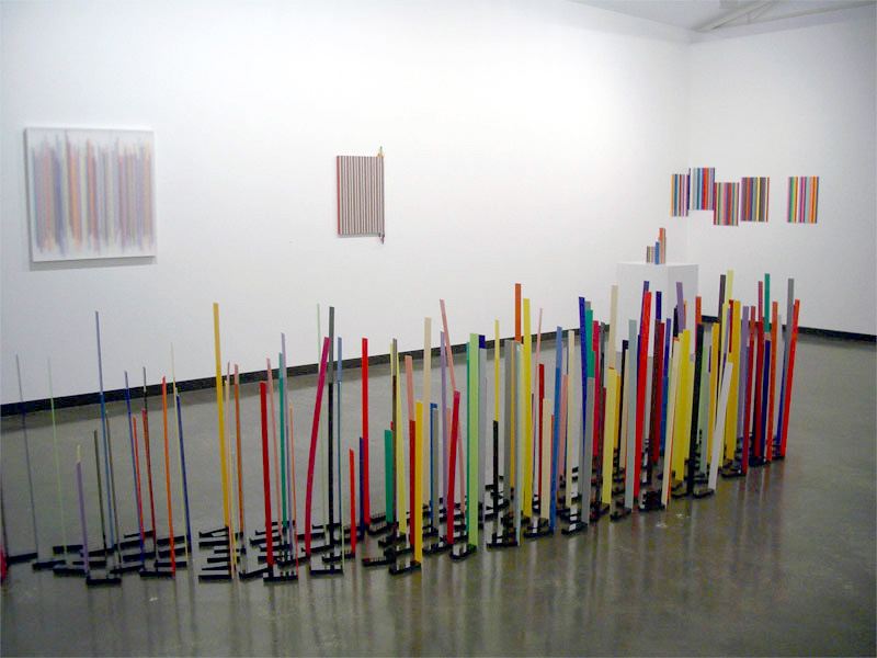
 'Thrill seeker' 2009 (detail)")
 'Arrested Movement from a Trio' 1934")
 'Slip' 2009")
 'The wire might sense' 2009")
 'Swoop' 2009")
 and on the floor 'Cascade' (2009) and 'Swoop' (2009)")
 'Concrete Stereo' 1983 from the exhibition 'Ron Arad: No Discipline' at The Museum of Modern Art (MoMA), New York, Aug - Oct, 2009")
 'The Rover Chair' 1981 from the exhibition 'Ron Arad: No Discipline' at The Museum of Modern Art (MoMA), New York, Aug - Oct, 2009")
 'Sketch for Well Tempered Chair' 1986")
 'Well Tempered Chair Prototype' 1986")
 'Big Easy' 1988")
 'Big Easy. Volume 2' 1988")
 'Soft Big Easy' 1990")
 'Large Bookworm' 1993")
 'Misfits' 1993")
 'D-Sofa' Prototype 1994")
 'Uncut' 1997")
 'FPE (Fantastic, Plastic, Elastic)' 1997")
 'New Orleans' 1999")
 'Lolita Chandelier' 2004")
 'Oh Void 2' armchair 2004")
 'Oh Void 2 armchair' 2006")
 'Table Paved With Good Intentions No. 48' 2005")
 'MT Rocker Chair' 2005")
 'Southern Hemisphere' 2007")
 'Do-Lo-Res' 2008")
 'PizzaKobra' lamp 2008")
 'Bodyguard' 2008")
' with 'Even the Odd Balls?' chairs (2009) and 'Lolita Chandelier' (2004)")
'")
'")
' with two 'Rolling Volume' chairs (1989 and 1991), left, and two 'Bodyguard' chairs (2007)")
' with in the foreground, 'Oh Void 2' armchairs")

 'Fractal Alchemy' 2009 from the exhibition Review: 'Symmetrical Spirit Guides and Fractal Alchemy' by Carl Scrase at John Buckley Gallery, Richmond, Melbourne, Aug - Sept, 2009")
 'Fractal Alchemy' 2009 (detail)")
 'Fractal Alchemy' 2009 (detail)")
 'Fractal Alchemy' 2009 (detail)")
 'Fractal Alchemy' 2009 (detail)")
 'Fractal Alchemy' 2009 (detail)")
 'Spiritguide 090501' 2009 from the exhibition Review: 'Symmetrical Spirit Guides and Fractal Alchemy' by Carl Scrase at John Buckley Gallery, Richmond, Melbourne, Aug - Sept, 2009")
 'Spiritguide 090624' 2009 from the exhibition Review: 'Symmetrical Spirit Guides and Fractal Alchemy' by Carl Scrase at John Buckley Gallery, Richmond, Melbourne, Aug - Sept, 2009")
 'Spiritguide 090504' 2009")
 'Spiritguide 090509' 2009")
 'Spiritguide 090520' 2009")
 'Spiritguide 090601' 2009")
 'Spiritguide 090617' 2009")
 'Bracelet 1' from ‘Space between’ heat-coloured mild steel 2005-2006 from the exhibition 'Mari Funaki, Works 1992-2009' at Art Gallery of Western Australia, Perth. June - Oct, 2009")
 'Bracelet 2' from ‘Space between’ heat-coloured mild steel 2005-2006 from the exhibition 'Mari Funaki, Works 1992-2009' at Art Gallery of Western Australia, Perth. June - Oct, 2009")
 'Bracelet 3' from ‘Space between’ heat-coloured mild steel 2005-2006")
 'Bracelet 4' from ‘Space between’ heat-coloured mild steel 2005-2006")
 'Water Towers' 1980")
 'Bracelet 5' from ‘Space between’ heat-coloured mild steel 2005-2006")
 'Bracelet 6' from ‘Space between’ heat-coloured mild steel 2005-2006")


 'Greta Garbo' c. 1935 from the exhibition 'Hunted and Gathered: Photographs' from the Private Collection of Robert Flynn Johnson at Modernism, San Franciso, July - August, 2009")
 'La Flamme (Woman's Head)' c. 1935")


 'Plum, Laxton Early Red' c. 1910")
 'San Francisco' c. 1868")
 'Landscape, Environs of Paris (Étang, Ville-d'Avray)' 1917")

. 'Train' c. 1930")

 'Craters of the Moon, Idaho' 1920")
' c. 1945")
 'Woman in Burka' c. 1870")
 'Jubilee Operations #1, Kalgoorlie, Western Australia' 2007 from the exhibition Exhibition: 'Edward Burtynsky: Australian Minescapes' at the Australian Centre for Photography, Sydney, July - August, 2009")
 'Otter Juan Coronet Mine #1 Kalgoorlie, Western Australia' 2007 from the exhibition Exhibition: 'Edward Burtynsky: Australian Minescapes' at the Australian Centre for Photography, Sydney, July - August, 2009")
 'Silver Lake Operations #1, Lake Lefroy, Western Australia' 2007 from the exhibition Exhibition: 'Edward Burtynsky: Australian Minescapes' at the Australian Centre for Photography, Sydney, July - August, 2009")
 'Silver Lake Operations #2, Lake Lefroy, Western Australia' 2007")
 'Silver Lake Operations #3, Lake Lefroy, Western Australia' 2007")
 'Silver Lake Operations #5, Lake Lefroy, Western Australia' 2007")
 'Silver Lake Operations #11, Lake Lefroy, Western Australia' 2007")
 'Silver Lake Operations #12, Lake Lefroy, Western Australia' 2007")
 'Silver Lake Operations #14, Lake Lefroy, Western Australia' 2007")
 'Silver Lake Operations #15 Lake Lefroy, Western Australia' 2007")
 'Silver Lake Operations #16, Lake Lefroy, Western Australia' 2007")
 'Super Pit #1, Kalgoorlie, Western Australia' 2007")
 'Super Pit #4 Kalgoorlie, Western Australia' 2007")
 'Tailings #1 Kalgoorlie, Western Australia' 2007")
 'Untitled (Sun State)' 1974 from the exhibition 'Beuys is Here; Sculpture Object Action Revolution' at De La Warr Pavilion, Bexhill-on-Sea, England, July - Sept, 2009")
 'I like America and America likes me' action 1974 from the exhibition 'Beuys is Here; Sculpture Object Action Revolution' at De La Warr Pavilion, Bexhill-on-Sea, England, July - Sept, 2009")

' 1964-1985")
![Joseph Beuys (German, 1921-1986) 'Entwurf für ein Filzenvironment [Model for a Felt Environment]' 1964](https://artblart.com/wp-content/uploads/2009/07/beuys-filzenvironment-web.jpg "Joseph Beuys (German, 1921-1986) 'Entwurf für ein Filzenvironment [Model for a Felt Environment]' 1964")
![Joseph Beuys. 'Fettecke (Prozess) [Fat Corner (Process)]' 1968](https://artblart.com/wp-content/uploads/2009/07/beuys-fettecke-web.jpg)
 'Langhaus (Vitrine)' 1953-1962")

 'Pregnant Woman with Swan' 1959")
 'Felt Suit' 1970")
 'Stark beleuchteter Hirschstuhl (Brightly-Lit Stag Chair)' 1957-1971")
 'Passage der Zukunftplanetoiden' (Hearts of the Revolutionaries: Passage of the Planets of the Future) 1955")
 'Scala Napoletana' 1985")
 'Sled' 1969")
 'Ohne Titel (Untitled)' 1970")
 'Grobsteingrab (floating)' 2009")
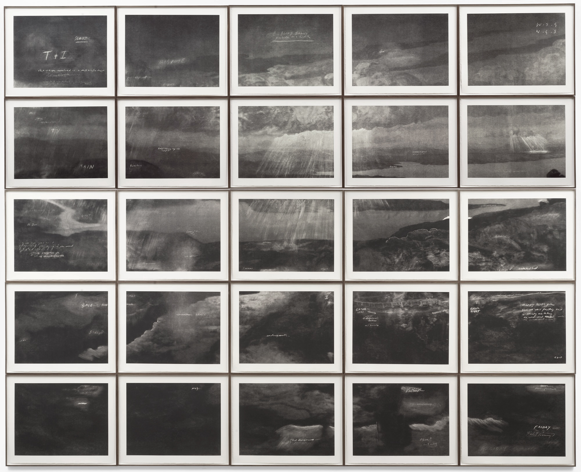
 'Totality' 2000")

 ‘Merce Cunningham Performs ‘Stillness’ (in three movements) to John Cage’s composition 4’33” with Trevor Carlson, New York City, 28 April 2007 (six performances; six films)’ 2007")
 ‘Merce Cunningham Performs ‘Stillness’ (in three movements) to John Cage’s composition 4’33” with Trevor Carlson, New York City, 28 April 2007 (six performances; six films)’ 2007")
 ‘Merce Cunningham Performs ‘Stillness’ (in three movements) to John Cage’s composition 4’33” with Trevor Carlson, New York City, 28 April 2007 (six performances; six films)’ 2007")
 ‘Merce Cunningham Performs ‘Stillness’ (in three movements) to John Cage’s composition 4’33” with Trevor Carlson, New York City, 28 April 2007 (six performances; six films)’ 2007")
 'Darmstädter Werkblock' 2007 (still)")
 'Michael Hamburger' 2007 (still)")
 'Michael Hamburger' 2007 (still)")
 'Michael Hamburger' 2007 (still)")
 'Michael Hamburger' 2007 (still)")
 'Die Regimentstochter' 2005")
 'Die Regimentstochter' 2005")
 'Palast' 2004")
 'Palast' 2004")
 'Palast' 2004")
![Tacita Dean. 'Noir et Blanc [Still]' 2006](https://artblart.com/wp-content/uploads/2009/07/noir_et_blanc-2006.jpg "Tacita Dean. 'Noir et Blanc [Still]' 2006")
 'Kodak' 2006 (still)")
 'Kodak' 2006 (still)")
 'Kodak' 2006 (still)")
 'Sekai' (be humorous') 2009")
 'Tariro' (means 'hope') 2009")
 'Rutendo' (detail - means 'faith') 2009")
 'Los Caprichos', plate 43 from the series 'El sueño de la razón produce monstros' 1799")
 'Zola' (detail - means 'quiet, tranquil') 2009")
 Group with from left to right: Enitan (person of story), Ntombi (lady), Kgosi (chief), Nkosana (prince), Lucky and Alaba (second child after twins) 2009")
 'Nkosana' (detail - means 'prince') 2009")
 'Rings' 1971")
 'Ring' 1973")
 'Brooch and ring' 2003 and 1972")
 Boxes 1980")
 'Box and pendant' 1980")
 'Tray' 1986")
 'Centrepiece' 1987")
 'Centrepiece' 1991")
 'Vessel' 2007")
 'Vessel' 2007")
 'Vessel' 2008")
 'Vessel' 2009")
 'Vessel' 2009")
 'Armring' 1981")
 'Armring' 1990")

You must be logged in to post a comment.