Exhibition dates: 26th August – 31st December 2023
Curatorium: Leo Schofield AM (curatorium chair), Ronan Sulich (advisor), Mark Sutcliffe (advisor) and Eva Czernis-Ryl (Powerhouse)
Assistant curator: Chloe Appleby (Powerhouse)
Exhibition manager: Anna Gardner (Powerhouse)
Exhibition coordinator: Kerrie Goodwin (Powerhouse)
Exhibition designers: Pip Runciman, Julie Lynch and Ross Wallace
Lighting Designer: Damien Cooper
 'Venus' early 1800s")
Wedgwood & Bentley (English, manufacturer)
Venus
Early 1800s
Black basalt, stoneware
Height: 350 mm
Width: 210 mm
Depth: 150 mm
Powerhouse Collection
Purchased 1949
Many rooms of wonder
What a visual feast we have for you this week!
Being an inveterate collector of eclectic objects who then puts them together in disparate but sympathetic arrangements (as in a Wunderkammer or ‘Cabinet of Curiosities’), the exhibition 1,001 Remarkable Objects at Powerhouse Ultimo, Sydney was a natural for me to post on.
“… the idea of a Wunderkammer was fully born in the sixteenth century as the princely courts of Europe became less peripatetic and as humanist philosophy spread. It was no longer enough simply to show off one’s wealth; every object should also enhance the virtues of the prince. In Inscriptiones vel tituli theatre amplissimi (1565), Samuel Quiccheberg detailed the ideal formula for the Wunderkammer as including naturalia (items created by the earth and items drawn from nature), mirabilia (unusual natural phenomena), artificialia (items wrought by man), ethnographica (items from the wider world), scientifica (items that brought a great understanding of the universe) and artefacta (items relating to history). Together these works would bring the wider world into the court and provide an understanding of the entire universe.”1
While Wunderkammer were the playthings of princes they brought to wider attention the miracles of the universe both natural and manmade. They made human beings aware of the enormity of the forces of nature and (human) industry that surrounded them … through the history and memory of objects.
John McDonald observes every piece has a story. But it is only through (in my case as a collector) being in the presence of these objects and physically handling them that we begin to understand the difference between one piece of Chinese bronze and another, one from the Ming dynasty and another from the Qing dynasty… and the difference in feeling between the two in terms of quality, casting, detail, aesthetics, form. Only through the physical handling of objects do we begin to understand the difference between an original and a fake, how old they are, how they were constructed, what their patina means, and what aura and power the object possesses. I have several pieces of treen (carved wood) in my collection and through the act of holding these objects I wonder about their history. The process is as much a tactile experience as it is a visual one.
The exhibition curators know their art. It is with great pleasure that I observe in an installation photograph in this posting the conflation of two objects that form what Minor White would call “ice/fire” where two disparate objects play off of each other: in this case a vase by that most famous and radical 19th century British designer Sir Christopher Dresser paired with a plate by the equally radical 20th century Russian designer El Lissitzky. A match made in heaven that plays out across the decades, repeated in numerous quirky juxtapositions and inspired nexus throughout the exhibition.
What further sets this exhibition off for me if the absolutely gorgeous and sympathetic “theatrical environments for these whimsical-but-rational groupings.” Exhibition designers Pip Runciman, Julie Lynch and Ross Wallace evoke a visually ravishing atmosphere in which the exhibition flâneur/flâneuse can stroll and take in the sights. Compare this stunning installation to the execrable rooting of the June 2023 Melbourne Winter Masterpieces exhibition Pierre Bonnard at the National Gallery of Victoria, Melbourne which presented the iridescent paintings of Bonnard within immersive scenography by Paris-based designer India Mahdavi. Here the work of Pierre Bonnard (which was supposed to be the subject of the exhibition not its addendum) was almost completely overwhelmed by the manic graphic design background of the installation. “Immersive scenography” = art speak for a load of no/sense.
Let the objects speak to us directly or not at all.
Dr Marcus Bunyan
1/ Anonymous. “Wunderkammer: Cabinet of Curiosities,” on the Royal Collection Trust website Nd [Online] Cited 01/12/2023
Many thankx to the Powerhouse Ultimo for allowing me to publish the photographs in the posting. Please click on the photographs for a larger version of the image.
“Every piece in this show has a story, but they are best sampled first-hand. Curatorially, 1,001 Remarkable Objects is a cultural pot-pourri, with disparate items clustered together based on a shared motif or theme. In some rooms, it’s as if Schofield, along with Mark Sutcliffe, Ronan Sulich and Eva Czernis-Ryl, simply put a word such as “peacock” or “music” into the collection database and selected the strangest things that popped up.
Ephemeral items of pop culture are juxtaposed with artefacts of ancient civilisations, tiny pieces of jewellery are linked with great clunking pieces of furniture. Viewers see everything from an Arnott’s biscuit to an electric car manufactured in Detroit in 1917. One extraordinary pairing puts a medieval suit of armour alongside the wheel of the plane in which Charles Kingsford-Smith perished when he crashed in November 1935.
The effect is almost hallucinogenic, and here one needs to give credit to exhibition designers Pip Runciman, Julie Lynch and Ross Wallace, who have created appropriately theatrical environments for these whimsical-but-rational groupings.
This approach, so contrary to the usual curatorial processes, harks back to the ancestor of the modern museum: the Wunderkammer, or cabinet of curiosities, in which royal courts and wealthy connoisseurs in the 17th and 18th centuries would display historical treasures, works of art, items of natural history and ingenious mechanisms.
John McDonald. “An irresistible, mind-boggling exhibition awakens sense of wonder,” on The Sydney Morning Herald website November 11, 2023 [Online] Cited 12/11/2023
 Royal Saxon Porcelain Manufactory (manufacturer, Meissen, Germany) 'Portrait bust, 'Baron Schmiedel'' 1739")
Johann Joachim Kändler (modeller)
Royal Saxon Porcelain Manufactory (manufacturer, Meissen, Germany)
Portrait bust, ‘Baron Schmiedel’
1739
Hard-paste porcelain
Height: 475 mm
Width: 360 mm
Depth: 260 mm
Powerhouse Collection
Purchased 1951
Baron Schmiedel bust by Joachim Kändler
The satirical portrait bust of the court jester Johann Gottfried Tuscheer (born as Johann Gottfried Graf), better known as Baron Schmiedel or Postmaster Schmiedel, was one of the last royal commissions for the Japanese Palace of Augustus the Strong, King of Poland (ruled 1694-1733) and Elector of Saxony. The Japanese Palace was a lavish structure in Dresden refurbished to house both the fabulous royal collection of East Asian porcelains and the amazing new products of the Royal Saxon Porcelain Manufactory in Meissen near Dresden in Germany. Established in 1710, following re-discovery of secret Chinese porcelain formula by the King’s imprisoned alchemist Johann Joachim Böttger, Meissen was Europe’s first factory to make true or hard-paste porcelain. By the mid 1730s, the factory had been able to make monumental animal sculptures, apostle figures and even architectural elements alongside their exquisitely painted vases and tableware.
The bust was modelled by Johann Joachim Kändler (1706-75), the court ‘Modellmeister’ (master modeller) who worked at the Meissen manufactory from 1731 until his death in 1775. The bust was ordered by Augustus III, Augustus the Strong’s son and successor. The medallion on Schmiedel’s chest is based on one of Augustus’ coronation medals.
A highly talented individual who delighted in dressing in the latest fashions, Schmiedel was one of two most prominent jesters at the Saxon court at the time. His role as a jester involved attending the kings in their dressing rooms, at dinners and even at the most intimate court gatherings. He kept company with the kings on visits and hunting expeditions, always ready to crack a joke, exchange witty badinage or play magic tricks with mice while pretending to have morbid fear of rodents. Schmiedel was rewarded with numerous ‘titles’ and valuable presents including Meissen porcelain.
The Schmiedel bust was discovered in Sydney in 1949 by the noted Sydney antique dealer William Bradshaw at a time when its importance and history had been long forgotten. It was acquired by the Museum in 1951. One of the most important objects in the Powerhouse Museum’s collection of ceramics, it is one of only four surviving the the world.
Eva Czernis-Ryl, Curator
For full story see: E. Czernis-Ryl, ‘The golden years of Meissen porcelain and Saxon jesters: the Schmiedel bust in Australia’, Keramik-Freunde der Schweiz (Bulletin des Amis Suisses de la Ceramique), Mitteilungsblatt nr 104, October 1989, pp. 5-11
Text from the Powerhouse Collection website
; and at bottom, Christopher Dresser's 'Vase' (c. 1888)")
Installation view of the exhibition 1,001 Remarkable Objects at Powerhouse Ultimo, Sydney showing at top, El Lissitzky’s Plate (c. 1923, below); and at bottom, Christopher Dresser’s Vase (c. 1888, below)
(designer and maker, Germany) 'Plate' c. 1923 (installation view)")
Lazar Markovich Lissitzky (El Lissitzky, Russian, 1890-1941)(designer and maker, Germany)
Plate (installation view)
c. 1923
Unglazed, earthenware
Depth: 26 mm
Diameter: 190 mm
Powerhouse Collection
Purchased 2002
Plate by Lazar Markovich Lissitzky
A round plate made of heavy unglazed earthenware. Decorated in red enamel, sprayed in a stencil like manner (schablonendecor), with geometric motifs along the rim. Three red circles of differing sizes decorate one side of the plate. Two red curved rectangular bands, one short and one long, decorate the other side of the plate. The text ‘Z 2864’ is impressed on the base of the plate.
An architect and graphic designer, El Lissitzky (1890-1941) was among the most important Russian artists to influence Modernism and one of the great avant-garde figures of the 20th century.
His lifetime involvement with abstract art began in 1919 soon after he met the Suprematist artist Kazimir Malevich (see the ‘Design’ section for a summary of his artistic development and achievements). Between December 1921 and January 1924 he lived and worked in Germany and in 1924 was being treated for tuberculosis in Switzerland. Although initially reluctant to apply his distinctive pictorial vocabulary to utilitarian objects, it is during that time that his abstract pictures known as Prouns began to inform Lissitzky’s designs for a group of ceramics. Soon Prouns were also to become the source of his typography, photography and book, furniture and poster design.
This boldly coloured plate is one of the relatively rare examples of Lissitzky’s ceramics. Examples of plates for the same series comprising plates of different sizes can be found in the Sammlung Ludewig in Berlin, National Museum in Nuremberg, Deutsches Museum in Munich, Australian National Gallery in Canberra and in other collections.
Eva Czernis-Ryl, Curator, 2003
Text from the Powerhouse Collection website
 Linthorpe Pottery (manufacturer, Middlesbrough, Yorkshire, England) 'Vase' c. 1888 (installation view)")
Christopher Dresser (designer, British, 1834-1906)
Linthorpe Pottery (manufacturer, Middlesbrough, Yorkshire, England)
Vase (installation view)
c. 1888
Earthenware
Powerhouse Collection
Gift of Bob Meyer under the Tax Incentives for the Arts Scheme, 1997
As opposed to John Ruskin and William Morris, Christopher Dresser was an enthusiastic advocate of scientific progress and the machine. The association of simplicity with progress led him to reject the taste for rich decoration of 19th century historical styles and Naturalism which used representational decoration and high-relief ornaments indiscriminately applied to objects. Dresser’s interest in forms based on the structure of plants, his emphasis on function in design and the economic use of materials such as electroplated silver, have no precedent in Western design traditions.The restrained design of this striking vase is a fine example of Dresser’s innovative pottery produced by the Linthrope Pottery.
Eva Czernis-Ryl. Curator
Text from the Powerhouse Collection website
 Carlo Scarpa (designer, Italian, 1906-1978) 'Bowl' c. 1940")
Carlo Scarpa for VSM Paolo Venini & Co (Murano, Venice, Italy)
Carlo Scarpa (designer, Italian, 1906-1978)
Bowl
c. 1940
Murrine opache
Height: 60 mm
Width: 232 mm
Depth: 365 mm
Powerhouse Collection
Purchased 1984
Before Carlo Scarpa began designing some of Italy’s most celebrated modernist buildings, he spent 15 years with Venini, pushing the boundaries of Venetian glassblowing techniques. He worked for Venini between 1932 and 1947, both pioneering new techniques and reviving traditional Veentian techniques. Franco Deboni, observes: ‘Scarpa’s glass was so radical and innovative for its time. You can see it in the colours, shapes, textures and quality of execution…When you start to analyse the glass, you also realise how extremely complex it was for the master blowers to execute.’ Many of Scarpa’s designs reinterpreted historical designs using modern methods. His murrine romane combined the traditionally round murrina patterns with the square tiles of Roman mosaics. Revealed at the XXII Venice Biennale of 1940, the Murrine Opache technique is amongst the architect’s greatest technical and stylistic achievements.
Text from the Powerhouse Collection website
, silk-double weave, Art Nouveau style, woven by Johann Backhausen and Sohne, Vienna, Austria, made by Koloman Moser, Vienna, Austria, 1900-1903")
Installation view of the exhibition 1,001 Remarkable Objects at Powerhouse Ultimo, Sydney showing at top left, Bowl, murrine opache, Carlo Scarpa for VSM Paolo Venini & Co, Murano, Venice, Italy, c. 1940; at top centre, Bowl form, Untitled, kiln formed fused mosaic glass, designed and made by Klaus Moje, Canberra, Australian Capital Territory, Australia, 1990-1991; at top right, Vase, blown glass with cane inclusions, Lino Tagliapietra, Rozelle, New South Wales, Australia, 1997; and at centre back, Textile length, Mohnkopfe (poppy heads), silk-double weave, Art Nouveau style, woven by Johann Backhausen and Sohne, Vienna, Austria, made by Koloman Moser, Vienna, Austria, 1900-1903
 (designer and maker, Canberra, Australian Capital Territory, Australia) Bowl form, 'Untitled' 1990-1991")
Klaus Moje (Australian born Germany, 1936-2016) (designer and maker, Canberra, Australian Capital Territory, Australia)
Bowl form, Untitled
1990-1991
Kiln formed fused mosaic glass
Height: 75 mm
Diameter: 540 mm
Powerhouse Collection
Purchased 1991
Fused Mosaic Glass Bowl by Klaus Moje
This bowl form, ‘Untitled’, was made from fused mosaic Bullseye glass, in Canberra, Australian Capital Territory, Australia, 1990-1991.
Klaus Moje (1936-2016, born Hamburg, Germany) was one of Australia’s most significant glass artists, and also one of the most influential through his teaching in Canberra for 10 years from 1982. His international connections provided many exhibiting and teaching opportunities for others.
The Bullseye Glass Company had been set up in Portland, Oregon, in 1974 by three young glassblowers, Daniel Schwoerer, Boyce Lundstrom and Ray Ahlgren. Schwoerer had also studied glass as graduate assistant to Harvey Littleton at the University of Wisconsin in the 1960s as well as doing graduate work in engineering. Although they were glass blowers, they wanted to support their art through an income-generating industry and saw a need for a manufacturer of flat glass. Schwoerer explains, ‘In the early ’70s the few American companies making opalescent glass were back-ordered for at least two years and weren’t taking on new customers.’ In the following years Ahlgren and Lundstrom both left to start up other glass-related ventures and Lani McGregor, now artistic director of the Bullseye Connection gallery, joined Schwoerer as partner in 1985.
Bullseye kept closely involved with the needs of the marketplace through direct connections with the art world. In the early 1980s Klaus Moje wanted to make kilnformed mosaic glass and needed colours that fused compatibly. He met Lundstrom at the Pilchuck Glass School and found they had a mutual interest in the development of what became Bullseye’s Tested Compatible sheet glasses. ‘Moje provided a huge further inspiration to continue on this path which really had no justifiable commercial rationale at that time,’ says Lani McGregor. This liaison had far-reaching repercussions, especially for Australians, because Moje moved to teach at the Canberra School of Art in 1982: ‘Bullseye made hand-rolled glass for architectural purposes. They saw the problems I had with compatible glass and a limited colour palette…[and] started to see a serious way of entering the studio glass movement with their product.’
By the 1990s Moje wanted to make vessel forms from his fused mosaic sheets. It required further collaboration to develop a glass working process to enable this to happen. He first tried with Bullseye glass at Pilchuck with glassblower Billy Morris in 1987 and again with Dante Marioni in Portland in 1993. Bullseye provided a compatible blowing glass for these sessions, where the sheets were wrapped around a gather of furnace glass, but ‘what eventually came out of them’ says McGregor, ‘was that Klaus discovered that a blowing glass is not necessary for blowing previously fused forms. What Dante was doing was a variation on the long-known Italian pick-up method. What evolved was the truly amazing Australian Roll-up that – although we do now make a blowing compatible glass – doesn’t need it’. Artists were to discover, however, that the provision of these two compatible glasses allows other processes to take place, where, for example, sections of blown and fused glass can be successfully joined using the encalmo technique.
Bullseye’s connection with Australia was established mainly through Moje’s interest in providing opportunities for graduates and colleagues to travel, study and exhibit elsewhere, that were continued later by his successor Stephen Procter, and Jane Bruce. In turn Bullseye became involved in supporting programs in Australia, the most notable being the Latitudes workshops and exhibitions of 1995 and 1997 organised at the Canberra School of Art by Kirstie Rea, where participants experimented with the many options now possible. Kirstie Rea and Scott Chaseling continued their own explorations of these new possibilities, and became well-known in the 1990s for their international ‘Roll-up’ workshops.
Text from the Powerhouse Collection website

Installation view of the exhibition 1,001 Remarkable Objects at Powerhouse Ultimo, Sydney showing at top, Carved form, Echidna shape, bean wood / echidna quills, painted, Louie Pwerle, Ngkawenyerre camp, Utopia, Northern Territory, Australia, 1996; and at second top, Figure, dog, Devil Dog, wood, Billy Petyarre, Utopia Station, Northern Territory, Australia, 1991; at second bottom, Coolamon, Bush Tomato Dreaming, wood / acrylic paint, Billy Petyarre, Utopia Station, Northern Territory, 1990-1991

Installation view of the exhibition 1,001 Remarkable Objects at Powerhouse Ultimo, Sydney showing at top, Carved form, Echidna shape, bean wood / echidna quills, painted, Louie Pwerle, Ngkawenyerre camp, Utopia, Northern Territory, Australia, 1996; and at second top, Figure, dog, Devil Dog, wood, Billy Petyarre, Utopia Station, Northern Territory, Australia, 1991
(Ngkawenyerre camp, Utopia, Northern Territory, Australia) 'Echidna shape' 1996")
Louie Pwerle (Cowboy ‘Louie’ Pula Pwerle (Australian, c. 1940-2022)(Ngkawenyerre camp, Utopia, Northern Territory, Australia)
Carved form, echidna shape
1996
Bean wood/ echidna quills, painted
Height: 160 mm
Width: 170 mm
Powerhouse Collection
Purchased 1996
Carved Echidna by Louie Pwerle
Carved animals and dishes, and painted seed necklaces, are made variously by artists including Queenie Kemarre, Louie Pwerle, Billy Petyarre, Wally Pwerle, Elizabeth Kngwarreye, Angelina Pwerle at the Ngkawenterre camp in the Utopia homelands. This particular camp is known for the carved animals made there.
Goannas, lizards, echidnas and kangaroos are sought after for food, as ‘bush tucker’, while the dogs are ‘devil dogs’. The devil dogs assist the ritual law enforcer, Kwertatye, in the beliefs of this group of Aboriginal people. Carved figures were made in earlier times, but it is not known what these were. The Ngkwarlerlaneme people at Utopia have revived the practice, following the introduction of acrylic painting in the 1980s; the dogs are painted in the manner of acrylic painting. Similalry the silk batiks made by this group often include figures or representations of animals and figures, real or mythological.
Designed and made by Louie Pwerle from a soft wood, locally called beanwood. The echidna is well-known as a form of bush tucker. Louie is part of a family who live at the Ngkawenterre camp in the Utopia homelands, and mostly carves and paints animals. He made three kangaroos in 1989 and none other until 1996, after Rodney Gooch brought back a ‘tree kangaroo’ (squirrel or possum) from Indonesia; following this Louie started to make kangaroos again. Only a few echidnas appear to be made (about 12 in the last 6 years), and only two with real quills seen by the Sydney agent in the last few years. This is (in 1996) the only camp where carved animals, figures and bowls are made, and paintings on canvas are also made at this camp. All the works in this particular collection are made by members of this family at this camp. All are consistent carvers, some like Queenie and Louie since about 1988.
Text from the Powerhouse Collection website
 ''Supreme' Mouse Trap Making Machine' 1942-1943")
AW Standfield and Co (manufacturer, Mascot, New South Wales, Australia, active 1925-2000)
‘Supreme’ Mouse Trap Making Machine
1942-1943
Metal/wood
1950 mm H x 2470 mm W x 1500 mm D
Weight 830 kg
Powerhouse Collection
Acquired October 2001
‘Supreme’ Mouse Trap Making Machine
This mouse trap making machine is part of the Museum’s Standfield collection of trap-making machines and associated items which are an unusual, indeed curious, ensemble of purpose-built machines and products that defined an Australian industry for sixty years.
The collection exemplifies a ‘making do’ approach to manufacturing in that the machines were built from secondhand parts from a range of sources; it also exemplifies the notion of technological stasis in that the machines were always considered efficient and sophisticated artefacts for the making of rodent traps. Likewise, the organisation, traditional skills, and daily customs of the Standfield firm did not change from the Second World War to the end of the twentieth century, a period when rapid industrial change was the norm.
The nature of production at Standfields was based on a belief that a unique machine would provide a quality product whose market was based upon the natural cycle of rodent population size. According to the Standfields, production was never based upon the traditional economic factors of supply and demand, as these concepts did not seem applicable to a production facility of this nature, size, and scale. Productivity was rarely increased or decreased from the machine’s range, that is, 1,000 traps per hour. Product stockpiling was a normative value that was practised by the firm.
Less demonstrative, but deeply embedded in the Standfield approach to manufacturing, was a belief that a well-made and simple product defined an Australian approach to the making of things.
The mouse trap making machine is made from a variety of metal and electronic components, painted white for framework and left plain for working parts. The machine can be divided into two segments consisting of the mouse trap assembly line and the spring and hammer making mechanism.
The front section of the machine features the assembly line from right to left. This section contains an intricate series of levers, pulleys and gears which feed the wooden mouse trap platforms through the production line. On the right is the platform feeder, filled with wooden platforms. From here the bases are pressed in a stamper, leaving the imprint, ‘Supreme / MOUSE TRAP / MADE IN AUSTRALIA’ on the top. The next phase involves the the catch or baiter and the holding bar both being stapled on to the platform. Once through this process, there is an open section in the centre for a worker to manually attach the spring and hammer device to the mousetrap and then place the traps back in the conveyor channel. The traps then pass through a plane or sander to remove any points on the base, and the process is complete. The power switch for this portion of the machine is positioned just below the sander, with a speed switch also present in the machines centre. On each side of the production line segment are different coils of metal, for each of the components used in constructing the mouse traps. Each of the coils is labelled with different specifications, based on their thickness, with some spare coils placed underneath. A counter, in a red casing, can be seen in the centre of the machine, indicating the number of traps which have been processed. Above the counter are two lamps, plugged into a powerboard at the top of the machine, for providing additional light in the dark workshop.
The back section is designed with the specific purpose of constructing the spring and hammer mechanism for the traps. This section also works like a production line with two sets of metal coils, suspended on metal poles, on the right and left sides of the machine. The wires are fed through a set of gears, pulleys and levers, which bend, coil and shape the wire to create the spring and hammer. The finished product reaches the end of the production line and is released down a slide or ramp, into a white tray at the front of the main production line for the worker to retrieve. A power switch can be found on the right side of this section
At the front of the machine is a black and white image of Arnold Wesley Standfield woking on the machine, with the final mousetrap that the machine made stuck to the front. A number of finished and half finished mousetraps as well plain platforms can be found on a wooden shelf on the machines right.
Formal patent applications were taken by Arnold Wesley Standfield for the ‘Westan’ all metal rodent trap, and the Kyogle cow-tail clip. The patent documents are supplemented with schematic designs, which illustrate the operational requirements of the products. Interestingly, no formal machine design or patent was ever taken on Standfield’s principal item, namely, the mouse-trap machine. The Standfield archives hold the patent applications for the ‘Westan’ mouse trap and Kyogle cow-tail clip, as well as other documentary accounts of these items.
The machines, traps, and the cow-tail clip, were entirely the creations of Arnold Wesley Standfield (1901-1990), the founder of A.W. Standfield and Co., ‘Supreme’ Mouse and Rat Traps. His sons Dave and Ron Standfield assisted their father with the repair and maintenance of the machines, and the sons became the owners and managers of the firm upon the death of their father. Knowledge of the machines and its products was passed to the sons by their father, and in turn they passed on knowledge and skill to long-term employees of the firm.
A.W. Standfield made the machine from wheels, gears and pieces of metal taken from scrapped machines he found in scrap-iron yards around Sydney. Although Standfield had no formal training in machining or associated trades, his accomplishment does suggest that he had an innate ability to build production machines. In a single operation, a mouse trap can be assembled in 1.5 seconds. The standard production rate is “over 1,000 traps per hour” (‘Mouse-Trap Making Machine’, n.d. probably composed by A.W. Standfield, Standfield archives).
The machine was made over a two-year period (1942-1943) and the first traps ‘came off’ the machine on 7 January, 1944. The machine is as it was first made, although broken and worn parts have been replaced over the years.
The machine itself makes all parts, and, as mentioned above, assembles a trap in 1.5 seconds. In operational terms, four strands of staple wire are fed, straightened, cut off, folded and driven into the base of the trap. The machine grounds off protruding staple ends. It feeds, straightens, cuts off, and forms into a trigger, wire of 3″ (76.2mm) length of 17 gauge wire, which was supplied by BHP. The machine staples the trigger wire to the pine base.
The machine makes and assembles the bait holder. The machine selects the length of steel for the bait-holder, cuts it, punches and forms the steel into the bait holder and affixes the holder (under the staple) to the pine base. The machine feeds, straightens, and cuts off 18″ (457.2mm) of 17 gauge spring wire and forms this as the mouse-trap spring. In the process, the wire is turned and bent 23 times at varying degrees to make a spring. The mouse-trap machine pushes the piece of pine along a slot and brands the base. The machine turns the spring ends. The spring is fed through and stapled by hand to the base. This operation completes the assembly of a mouse trap.
Text from the Powerhouse Collection website
 'Aircraft undercarriage from Lockheed Altair monoplane 'Lady Southern Cross', starboard side' Probably 1933")
Lockheed Aircraft Company (manufacturer, Burbank, California, United States of America)
Aircraft undercarriage from Lockheed Altair monoplane ‘Lady Southern Cross’, starboard side
Probably 1933
Metal/rubber
Height: 1420 mm
Width: 480 mm
Diameter/Length: 1000 mm
Powerhouse Collection
Acquired February 1994
Aircraft undercarriage from the Lady Southern Cross
The only surviving fragment of aircraft in which Sir Charles Kingsford Smith died, 8 November 1935
This wheel and oleo strut are part of the starboard undercarriage used by Sir Charles Kingsford Smith (Smithy) in his Lockheed Altair aircraft VH-USB ‘Lady Southern Cross’ for his attempt at a record breaking flight from England to Australia in 1935. On 8 November 1935 ‘Lady Southern Cross’ is estimated to have crashed into the Gulf of Martaban in the vicinity of Aye Island off the coast of Burma, now Myanmarm, at approximately 0216 local time. The undercarriage is the only major component to have been located and preserved after the loss of the aircraft with Smithy and his co-pilot/engineer, Tom Pethybridge, on board.
Sir Charles Kingsford Smith is Australia’s most renowned pioneer aviator. He established a number of records in a variety of aircraft, most notably the Fokker Trimotor, ‘Southern Cross’. His interest in competing in the MacRobertson Air Race of 1934 gave him the impetus to purchase the Lockheed Altair as an aircraft with the capability of achieving first place, but engineering problems and lack of time mean that he had to withdraw from the race. In testing the aircraft in Australia, he established a number of city to city speed records in the Altair. To ‘save face’ for withdrawing from the race he flew the Pacific instead in the west east direction establishing another record. Smithy and Tom Pethybridge, lost their lives endeavouring to break yet another record, the England-Australia speed record.
The single engined Lockheed monoplane aircraft of the late 1920s and 1930, encompassing the Sirius, Orion, Altair, Air Express, Explorer and Vega, were considered to be revolutionary in their time. According the their ‘biographer’, Richard Sanders Allen in ‘Revolution in the Sky’, those fabulous Lockheeds, the pilots who flew them, “…became the most copied, coveted, news making airplanes of their era”. They achieved a number of records in the hands of such famous aviators as Amelia Earhart, Charles Lindbergh, Wiley Post, Hubert Wilkins and Sir Charles Kingsford Smith, to name a few. As well as providing record breaking aircraft the Lockheed Aircraft Corporation, as it became, used the basic designs and manufacturing techniques to produce small airliners such as the Orion, Air Express and Vega. After the completion of the last of this series of designs Lockheed went on to design and manufacture such significant airliners as the Lockheed 10 Electra and the Lockheed 14 Super Electra. During World War II, Lockheed designed the Constellation which became the backbone of many airlines restarting services post-world War II. Qantas based its fleet on the Constellation before converting to the gas turbine powered Boeing 707.
Text from the Powerhouse Collection website
 'Model staircase' 1891")
John Lyon Gardiner (maker, Sydney Technical College, Sydney, New South Wales, Australia)
Model staircase
1891
Cedar (Toona australis)
Height: 2730 mm
Width: 1390 mm
Depth: 990 mm
Powerhouse Collection
Presented by Sydney Technical College, 11 November 1953
Model staircase
This model staircase is a significant example of the work of Sydney Technical College instructor, John Lyon Gardiner. It was built to demonstrate the principles of stair construction. Almost from its inception the Museum had a close relationship with the Technical College which was its immediate neighbour in Harris Street. At the time there was a new interest in education through observation or ‘learning by looking’. This was thought particularly important in the training of ‘practical men’ and museum’s were an essential part of this process. As the English philanthropist, Thomas Twining, wrote in Science made easy (1876) about the purpose behind his own Museum in Twickenham, outside London:
‘I became more and more impressed with the desirableness of propagating among the working population, sound practical knowledge calculated to secure for steady persevering industry, a well earned mead of Health and Comfort … [through] VISUAL EDUCATION.’
The staircase is made from cedar which is also significant as, at the time, the Museum was actively promoting commercial applications for colonial timbers.
Text from the Powerhouse Collection website
 'Long case clock' 1690")
James Brewer (maker, Darlestone, United Kingdom)
Long case clock
1690
Wood/glass/brass/metal
Height: 2240 mm
Width: 495 mm
Depth: 300 mm
Powerhouse Collection
Purchased 1963
 'Long case clock' 1733-1764")
John Dewe (maker, London, England)
Long case clock
1733-1764
Lapis-blue Japanned case, wood/metal
Height: 2240 mm
Width: 515 mm
Depth: 240 mm
Powerhouse Collection
Purchased 1964
, sheet gold alloy, Sumba, Indonesia, 1880-1950; and at second top, Textile length (mens waist cloth), handwoven cotton / shells / beads, maker unknown, East Sumba, Indonesia, 2000-2004")
Installation view of the exhibition 1,001 Remarkable Objects at Powerhouse Ultimo, Sydney showing at top, Man’s ceremonial headpiece (lamba), sheet gold alloy, Sumba, Indonesia, 1880-1950; and at second top, Textile length (mens waist cloth), handwoven cotton / shells / beads, maker unknown, East Sumba, Indonesia, 2000-2004
, sheet gold alloy, Sumba, Indonesia, 1880-1950; and at second top, Textile length (mens waist cloth), handwoven cotton / shells / beads, maker unknown, East Sumba, Indonesia, 2000-2004")
Installation view detail of the exhibition 1,001 Remarkable Objects at Powerhouse Ultimo, Sydney showing at top, Man’s ceremonial headpiece (lamba), sheet gold alloy, Sumba, Indonesia, 1880-1950; and at second top, Textile length (mens waist cloth), handwoven cotton / shells / beads, maker unknown, East Sumba, Indonesia, 2000-2004
 'Textile length (mens waist cloth)' 2000-2004")
Maker unknown (East Sumba, Indonesia)
Textile length (mens waist cloth)
2000-2004
Handwoven cotton/shells/beads
Width: 560 mm
Powerhouse Collection
Purchased 2010
Pictorial textile from East Sumba
This exceptionally long and narrow pictorial textile was woven on the island of Sumba in Indonesia. While the textile exemplifies the renowned skills of the Sumbanese women weavers, its design is highly innovative and a distinct departure from tradition. Innovation in textile design was not new to the Sumbanese weavers who certainly embodied strong traditions but who, under Dutch colonial rule, were encouraged to produce textiles specially designed to appeal to the Dutch market.
This long textile was probably produced for the tourist trade and reflects innovative approaches to design and production in several respects.
Supplementary warp patterning, known as pahikung on Sumba, has been used in the central decorative band for the full five metre length of the textile. In accomplishing such an extended length of pahikung, the weaver has produced a masterpiece of intricate and evenly tensioned weaving. This exacting technique was generally used for the short and highly decorative bands around a woman’s tube skirt or sarong whereas here it has been combined with the traditional five metre long men’s waist wraps called rohobanggi. However rohobanggi, which had a ritual function, were always woven with a simple design of stripes and had no additional ornament.
The most dominant motif in the textile, which is repeated in pahikung down the middle of the cloth, is a sailing boat with one person wearing a large hat at the tiller and three passengers. Boat motifs are not part of the traditional iconography of Sumbanese art; they are common in Sumatra however, where ‘ship cloths’ appear in several well-known forms. The ship imagery must have been brought to Sumba in some form, probably from Sumatra, for incorporation into the weavers’ design repertoire. Forming a wide border down each side of the cloth, are motifs traditional to Sumba which depict water creatures such as crocodiles, turtles and crayfish and have been worked in beads and small shells. Traditionally, shell decoration was also restricted to women’s tube skirts or sarongs.
Sumbanese textiles have changed significantly through interaction with the Dutch and other global markets, especially during the last decades during which tourism has grown exponentially in Indonesia. As exemplified in this remarkable example, textiles in Sumba today combine ancient ancestral symbols with contemporary images drawn from other sources. Their designers can pick and choose from a wealth of possibilities while still maintaining non-negotiable traditional design forms, weaving techniques and iconography.
Text from the Powerhouse Collection website
")
Installation view of the exhibition 1,001 Remarkable Objects at Powerhouse Ultimo, Sydney showing The Transparent Woman (1950-1953, below)
")
Installation view detail of the exhibition 1,001 Remarkable Objects at Powerhouse Ultimo, Sydney showing a detail of The Transparent Woman (1950-1953, below)

The German Health Museum (Cologne, Germany)
Anatomical model, full size, ‘The Transparent Woman’
1950-1953
Used by Museum of Applied Arts and Sciences, Sydney, New South Wales, Australia, 1954-2007
Perspex/aluminium/metal/wood/plastic
Height: 1740 mm
Width: 1060 mm
Powerhouse Collection
Purchased 1958
The Transparent Woman
This the first transparent anatomical model of a woman ever to be exhibited in Australia.
In 1939 the director of the Museum, Arthur Penfold, embarked on an international study tour visiting many different museums and galleries overseas. He visited museums in both Chicago and New York and became captivated by their displays of transparent human models and their promotion of healthy living and sanitary practices. Due to lack of funding, the Transparent Woman was not acquired by the Museum until 1954. She was the first electronic scientific anatomical model to be displayed in Australia and was acquired to further the Museum’s mission to shape model citizens.
People have historically been curious about seeing what is inside objects, especially the human body. In the nineteenth century members of the public were able to witness dissections on cadavers; however the sights, and smells must have been overwhelming at times. The technology then became available to preserve human organs and make them semi-transparent by passing light through them. People were able to see what was inside the body without the blood and guts of dissections. Papier mache and wax models were used and, with advancements in plastics technology, clear and flexible plastic became available for model making.
These models were a German innovation, originating in the early 1930s at the Museum of Hygiene in Dresden. They served as a teaching aid for students of anatomy, and promoted a message of health and sanitation to the general public. The models were based on ‘perfect forms’, of young men and women, and symbolised the healthy body that people should strive to achieve. Germany was undergoing rapid industrialisation; thus prompted rapid urban growth accompanied by inadequate sanitation. The German Government promoted the use of these models as a way of educating and preserving a healthy working class. In the early 1950s the Health Museum in Cologne, West Germany, was established and began producing the transparent models and exporting them to America and other countries.
In the late 1930s some thought that the transparent models were symbols of Nazi ideal racial ideology, most who saw them were transfixed by the eugenic ideal of a healthy body. The Powerhouse Museum’s Transparent Woman arrived in 1954 to advocate a message of individual responsibility to maintain a healthy body.
It is hard to imagine being shocked or offended by this model, but the Transparent Woman must have been something of a spectacle in the 1950s. On importation it is recorded that one customs official was so offended by the nature of the exhibit that she almost never made it into the country. To cover some of the huge cost involved in obtaining the model, she was put on displayed in the State Theatre and the public were charged 2 shillings per adult and 9 pence per child to see her. The viewing sessions were segregated by gender and a trained nurse was on standby to assist if anyone was overcome by the experience. To add to the sensationalism she was marketed using images depicting a dark and shadowy ‘sex siren’ type of woman.
After several months at the State Theatre, the Transparent Woman was moved to the Museum where she continued efforts to promote health and hygiene. The accompanying souvenir booklet proclaimed, “The transparent woman will help us to understand the mysteries of our body, nature’s crowning masterpiece. The transparent woman tells us how our body is made and how it works [she] provides us with the means towards greater understanding of ourselves – so necessary to our wellbeing and healthy living, it is the responsibility of the individual to keep his body healthy so that he may live a useful and a successful life.”.
She later assisted in the Museum’s first attempts to discuss the subject of sex. During the 1970s and 1980s the museum utilised the Transparent Woman to provide human anatomy lessons for school groups. Children were allowed to ask questions and teachers were assured that the museum’s education officers would “endeavour to answer each question openly and as scientifically as possible if the subject of reproduction was raised”. The model was a significant public education tool and, as her accompanying booklet declares, “has helped lift the veil of mystery from womanhood”.
The Transparent Woman has a long history of service to Museum. Starting life as a controversial sensation, she then became the iconic symbol of the Museum’s hygienic crusade. In the past 50 years she has been used to demonstrate how the nervous system works, for sex education, and to demonstrate the areas of the body where contraceptive activities take place. The Powerhouse Museum has a collection of over 380,000 objects, only a small amount of which are on display at any one time, yet the Transparent Woman has spent little of her working life in storage.
References:
Correspondence. A. R. Penfold to F.R. Morrison, 27th Oct 1952, museum records.
The Transparent Woman [souvenir booklet]. Sydney, 1954.
Internal Correspondence. A.R. Penfolds overseas trip, 1939, museum records.
Internal Correspondence. Memorandum to the Secretary: Department of Technical Education, Sydney, From A. R. Penfold, Museum Director, 22nd November, 1954, museum records.
Terence Measham, Discovering the Powerhouse Museum, Powerhouse Publishing, Sydney, 1997, pp. 139-147.
Klaus Vogel. Manifesting Medicines, Bodies and Machines: The transparent man- some comments on the history of a symbol, Harwood Academic Publishers, Netherlands, 1999.
Graeme Davidson and Kimberley Webber. Yesterday’s Tomorrows: The Powerhouse Museum and its Precursors 1880-2005. Powerhouse Publishing, Sydney, 2005, pp. 68-81.
The Museum of Applied Arts and Sciences Annual Report, 1954, museum records.
Written by Erika Dicker
Assistant Curator, October 2007
A life-size anatomical model of a woman with transparent plastic casing revealing her internal construction. The skeleton is cast aluminium painted white. The arterial and venous systems are represented by red and blue coloured plastic tubing. The nervous and lymphatic systems are represented by brown and green coloured plastic tubing.
The body organs and brain are made from pink, orange, brown and yellow plastics. The plastic organs consist of the brain, larynx, thyroid gland, lungs, heart, liver, gall bladder, spleen, pancreas, stomach, small intestine, caecum, transverse intestine, large intestine, rectum, kidneys, bladder, ovaries, womb and breasts. The organs and brain are fitted with small pilot lights that are controlled from the console to illuminate during different parts of a pre-recorded presentation.
The figure is standing on a turntable, is raised on a two tier platform, which contains rotating mechanisms and loud speakers. The wooden console contains an automatic operating tape recorder and relay switches to operate lighting of organs and rotation of figure.
Text from the Powerhouse Collection website
 (French, b. 1949) Daum Crystal (manufacturer, Nancy, France) Table vase, 'Quatre Etrangetes sous un mur' (Four curiosities below a wall) 1988")
Philippe Starck (designer) (French, b. 1949)
Daum Crystal (manufacturer, Nancy, France)
Table vase, ‘Quatre Etrangetes sous un mur’ (Four curiosities below a wall)
1988
Glass
Height: 490 mm
Width: 600 mm
Depth: 500 mm
Powerhouse Collection
Purchased 1996
 (English, 1941-2022) 'Shoes (pair), 'Super Elevated Gillie', 'Anglomania' collection, Autumn / Winter 1993-1994' 1993 Shoes (pair), 'Super Elevated Gillie'")
Vivienne Westwood (designer, London, England) (English, 1941-2022)
Shoes (pair), ‘Super Elevated Gillie’, ‘Anglomania’ collection, Autumn / Winter 1993-1994
1993
Leather/cork/silk
Height: 270 mm
Width: 68 mm
Powerhouse Collection
Purchased 1997
Powerhouse today unveiled 1001 Remarkable Objects, a major new exhibition led by Leo Schofield AM.
‘Our vision for 1001 Remarkable Objects was a seemingly simple one: to create an exhibition celebrating the sheer scale, breadth and relevance of the Powerhouse Collection. But how to choose? We rejected the nomenclature of ‘treasures’ or ‘masterpieces’ and instead determined all choices must be in some way ‘remarkable’ – whether by virtue of rarity, visual appeal, social history or an ability to invoke wonder. The result is a cornucopia of eras, styles, form, function, size and colour, to stoke memories that so many have of this iconic institution and signal the beginning of a new phase in its marvellous existence’, said Curatorium Chair Leo Schofield AM.
Leo Schofield AM has a long association with Powerhouse, as a former member of the Board of Trustees and a significant donor. He has worked in collaboration with advisors Ronan Sulich, Mark Sutcliffe and Powerhouse curator Eva Czernis-Ryl to select 1001 objects from the more than half a million objects within the collection. This selection includes objects that have never been exhibited before alongside much loved collection icons.
The Powerhouse Collection will be presented across the applied arts and applied sciences including the decorative arts, jewellery, costume, textiles, furniture, clocks, musical instruments, industrial design and social history.
Exhibition designers Pip Runciman, Julie Lynch and Ross Wallace were invited to respond to underlying themes of nature, power, movement and joy. They have created an exhibition that features more than 25 rooms, presenting an unexpected juxtaposition of objects and leads visitors on a journey across time and memory.
Extraordinary objects include a rare Meissen porcelain satirical portrait bust of the court jester known as Baron Schmiedel, made in 1739; the only surviving fragment of the Lockheed Altair aircraft Lady Southern Cross flown by pioneer aviator Sir Charles Kingsford Smith for his final flight in 1935; an Edo period samurai warrior’s suit of armour; and a Detroit Electric car manufactured in 1917.
Musical instruments include a double bass made in 1856 by John Devereux, one of the oldest surviving bowed string instruments made in Australia by a professional instrument maker; an acoustic guitar decorated with hand painted designs by Harold ‘The Kangaroo’ Thornton; and an upright bookcase grand piano, made in 1809.
Fashion highlights include a 1700s court dress; an evening dress by Gabrielle ‘Coco’ Chanel for her Spring collection of 1939; a pair of Super Elevated Gillie platform shoes by British designer Vivienne Westwood from Anglomania, her Autumn/Winter collection 1993-1994; and Romance Was Born’s 2009 ‘Iced VoVo’ dress.
Costumes include the ‘Showgirl’ costume worn by Kylie Minogue for the Closing Ceremony of the Sydney 2000 Olympic Games; the ‘Pink Diamonds’ dress worn by Nicole Kidman in the Baz Luhrmann film, Moulin Rouge and the ‘Fruity Mambo’ costumes designed by Catherine Martin for Strictly Ballroom the Musical.
More than 100 rare and remarkable pieces of jewellery will highlight a recent major donation by Anne Schofield AM. This includes Egyptian revival designs from the 1800s and mourning jewellery crafted from human hair, which will be on display at Powerhouse for the first time.
French and Venetian glass from the 1800-1900s will be presented, as will an English stained-glass window, ‘The Delphic Sibyl’, based on an 1873 painting by Sir Edward Coley Burne-Jones made by Morris & Co about 1900, alongside key examples of Australian and international studio glass ranging from Dale Chihuly to Canberra-based artist Jennifer Kemarre Martiniello and Sydney-based artist Brian Hirst.
‘Leo Schofield and his collaborators, through this exhibition, shed new light and new perspectives on the Powerhouse Collection. In 1001 Remarkable Objects we continue to extend our commitment to sharing with our communities the Powerhouse Collection and the many insights and connections it makes to both our past and our future’, said Powerhouse Chief Executive Lisa Havilah.
Powerhouse will present two special Powerhouse Late programs presented in collaboration with Liquid Architecture. The first program on 5 October is an exploration of the unusual and remarkable sonics in response to the exhibition with creative practitioners who evoke a range of moods through their work. On 23 November, a range of artists will take inspiration from the designers who have created unique worlds for these objects in conjunction with a celebration to launch companion publication 1001.
Press release from the Powerhouse
![J Hubert Newman (photographer, Sydney, New South Wales, Australia) (Australian, c. 1835-1916) 'Untitled [young boy in sailor suit]' Nd](https://artblart.com/wp-content/uploads/2023/10/newman-young-boy-in-sailor-suit.jpg?w=650 "J Hubert Newman (photographer, Sydney, New South Wales, Australia) (Australian, c. 1835-1916) 'Untitled [young boy in sailor suit]' Nd")
J Hubert Newman (photographer, Sydney, New South Wales, Australia) (Australian, c. 1835-1916)
Untitled [young boy in sailor suit]
Nd
Carte de visite
Paper/card
Height: 165 mm
Width: 107 mm
Powerhouse Collection
Acquired September 1984
 J Pintard (publisher, Rue Saint-Jacques, Paris, France) 'Toy theatre, 'La Pleine Mer, Scenes Maritimes en Action'' 1836")
Charles Letaille (designer)
J Pintard (publisher, Rue Saint-Jacques, Paris, France)
Toy theatre, ‘La Pleine Mer, Scenes Maritimes en Action’
1836
Paper/cardboard/textile/metal/timber
Height: 320 mm
Width: 704 mm
Depth: 85 mm
Powerhouse Collection
Purchased with funds donated by the Patrons of the Powerhouse, 1985
Children’s toy theatre, ‘La Pleine Mer’ (The Open Sea) by Charles Lataille
This extremely rare, hand-coloured, French children’s toy theatre ‘La Pleine Mer, Scenes Maritimes en Action’ (‘The Open Sea, Maritime Scenes in Action’) dates from 1836. The theatre comprises an ocean backdrop, a middle ground of waves and foreground of a South Pacific island reef. Numerous cardboard pieces of French ships, long boats, a drowning sailor and a shark attack can be slid in and out of the scene. By means of a booklet of seven short melodramatic plays (in French), to be read aloud by an adult or teacher, the drama and excitement of maritime adventures in the exotic South Pacific can be performed. The plays cover accounts of Australian aborigines fishing and building canoes, visits by French wayfarers to the Solomon Islands and Tahiti, and Maoris in New Zealand.
Many children’s theatres were made in the early 19th century with their popularity peaking between 1830 and 1860 when adult theatre was enjoying an unprecedented success with melodramas, masques and pantomimes. English toy theatres were the most complex often with a proscenium, stage, trap-doors, machinery for working curtains and trick effects, supports for scenery and a multitude of characters. However, Continental publishers produced simplified versions, although what they lacked in technical complexity was made up in settings and characters. French theatres, such as this one produced by J. Pintard in Paris, were noted for their beautiful hand-colouring.
Toys of the mid to late 19th century were designed to be educational rather than for play. The toy theatre, ‘La Pleine Mer’, would have instructed children in aspects of navigation, maritime life, exploration, geography and the people of the Pacific. The theatre features an unusual and appealing use of maritime pictorial material which is drawn heavily from books, paintings and journals of discovery of the day. It illustrates a popular representation of Australia and the South Pacific at the time. The theatre is one of the earliest graphic representations of Australia and the South Seas in the Museum’s collection. Furthermore, whereas the books, journals and paintings of this period survive in state, national and international libraries and art galleries virtually no toys depicting content related to Australia and the South Pacific in the 1830s are extant worldwide.
Margaret Simpson
Curator, Transport & Toys
August 2011
Mitchell, Louise, ‘La Pleine Mer Sailing over a cardboard sea’, in The Australian Antique Collector, 36th edition, 1988. pp. 37-41.
Publication of La Pleine Mer noted in Bibliographie de la France, 10 December 1836, p. 597, entry No. 6239.
Toy theatre comprising 27 printed and hand-coloured lithographic cardboard pieces, in a South Pacific setting. When assembled the theatre comprises a painted backdrop with two ships under sail flying French colours, a longboat pulling away, more ships in the background and a blue sky with clouds. Between this and the proscenium are five ranks of waves (two of which have wooden runners to support the moving pieces).
The foreground features lush tropical vegetation and a reef battered by breakers. It is in three parts with a base showing the shore and large pieces which are installed at the left and right composed of trees and rocks. There are seven separate lithograph boats, one for each of the plays, with a further six separate pieces to be added in where instructed in the script. The scenes are either fixed into slots in the foreground or locked into a balance placed on wooden runners obscured by the middle waves.
The script comprises a 32-page booklet designed to be read aloud by an adult or older child while the different scenes are activated. The plays depict customs of the Solomon Islands, Natives of New Guinea and Tahiti, whaling activity in the South Pacific and landing in New Zealand.
According to the ‘Bibliographie de la France’, this toy theatre was produced by J. Pintard on 10 December 1836. Pintard’s other toy theatres had titles including ‘Le Theatre Enfantin’, ‘Le Spectacle Asiatique’, ‘Ou Danse et Voltige sur La Corde’ and ‘La Voiere’.
In keeping with most toymakers of the period, Pintard produced a variety of toys and related material aimed at educating children in art, geography, scripture, history and natural history. Advertising his stock at the conclusion of the ‘La Pleine Mer’ script, he claimed “L’enseignement de la moral la plus pure forme la base de tous ces petits ouvrages instructifs” (“The moral teaching in its purest form is the basis of all these little educational works”).
This toy theatre, ‘La Pleine Mer’, includes seven plays written by Charles Letaille, who also produced the lithography. Letaille collaborated with his publisher to produce other children’s material during the 1830s and 1840s. The first play is entitled ‘The Sea, The Birth of Navigation’ and describes the simple craft of the natives of New Holland (Australia) and concludes with an account of the carved and outrigger canoes of New Guinea and Tahiti.
In the more dramatic second play, ‘The Whale’, native canoes are replaced with a spouting whale and a long boat from the whaling ship ‘Albatross’. The narrative begins in a bay of the Chilean coast and concludes with a whale-hunting drama. The play instructs children about the uses of whale products, (whale rib bones for umbrellas and whale fat boiled on board in large vats for oil) and includes a gruesome description of the sailors climbing over the carcass of the whale while tied to the side of the ship to remove the ribs, skin and fat.
The third and fourth plays, entitled ‘Man Overboard’ and ‘The Rescue’, describe an unlucky sailor falling overboard from the ship and being thrown a woven cane life preserver. In the meantime the ship is brought into the wind and the long boat launched for the sailor’s rescue.
The next play ‘The Shark’ begins with the deceptively calm description: “We are aboard the American three-master ‘Oceanic’ the sea breeze was barely enough to cause the waves to break on the nearby beach”. The pace picks up quickly with nail biting anticipation as it is revealed the ship’s master is repeatedly diving from the ship and hauling himself up on a rope to cool off from the heat while a short distance away a shark’s fin creates a “frothing shimmering wake”. Climbing into a small boat, the sailors go to his rescue. Gripped with fear they ‘could all foresee the struggle that was about to take place between themselves and the shark; a terrible struggle with a man as the contest’.
In the final play, ‘Putting in at New Zealand’, native figures are slotted into the foreground and a longboat is set into the waves. The play relates the meeting between French sailors and friendly Maoris. After an exchange of branches, the natives return with the sailors in their canoes and a priestess is invited on board ship. Attempts to rub noses with the ship’s steward end in chaos when he makes a sudden movement dislodging his wig and frightening the priestess into believing that he is a sorcerer.
According to Louise Mitchell in her article ‘La Pleine Mer Sailing over a cardboard sea’ many of the original details in the lithographs seen in this toy theatre can be traced to paintings, books and journals of the period. For example, the lithograph depicting New Holland natives tumbling from their capsized canoe while spearing fish, can be traced to an illustration by the Scottish engraver and miniaturist, John Heaviside Clark (c. 1777-1863). Clark had never seen Australian aborigines but adhered to the popular European imagery of them as being noble and savage sportsmen. The illustration appeared in a book published in London in 1813 with the title ‘Field sports & of the Native Inhabitants of New South Wales’, reprinted a year later as a supplement to ‘Foreign Field Sports, Fisheries, Sporting Anecdotes, etc’.
Several of the script’s plays can be traced to a journal entitled ‘La France Maritime’. The shark attack lithograph was derived from an American romantic horror-painting of 1778 by John Singleton Copley (1738-1815) ‘Watson and the Shark’. In the toy theatre play the man overboard facing a shark’s jaws of death is pulled to safety. Ironically, the victim in the play ends up being the 16-foot shark which is split open by the ship’s cook. In a scene which initially evokes terror the mood is transformed into humour when the sailors discover that a man’s otter-skin hat belonging to the ship’s doctor is inside the shark’s stomach. (Clothes and belongings hung over the side of ships were regularly eaten by sharks).
Other illustrations can be traced to ‘Le Voyage Pittoresque Autour du Monde’ also published in 1836 by the French explorer of the South Pacific renowned for his seamanship, Jules Dumont d’Urville (1790-1842). A canoe from the Solomon Islands and a Tahitian sailing boat are directly derived from d’Urville’s book.
By the 1830s Europeans were familiar with many popular accounts of seamen’s journals of scientific and exploratory maritime expeditions. Suitable pictorial material was also available from the atlases of the Pacific voyages of Cook, La Perouse, d’Urville and others, and were reproduced extensively in all kinds of publications.
Text from the Powerhouse Collection website
 J Pintard (publisher, Rue Saint-Jacques, Paris, France) 'Toy theatre, 'La Pleine Mer, Scenes Maritimes en Action'' 1836")
Charles Letaille (designer)
J Pintard (publisher, Rue Saint-Jacques, Paris, France)
Toy theatre, ‘La Pleine Mer, Scenes Maritimes en Action’
1836
Paper/cardboard/textile/metal/timber
Height: 320 mm
Width: 704 mm
Depth: 85 mm
Powerhouse Collection
Purchased with funds donated by the Patrons of the Powerhouse, 1985
 J Pintard (publisher, Rue Saint-Jacques, Paris, France) 'Toy theatre, 'La Pleine Mer, Scenes Maritimes en Action'' 1836 (detail)")
Charles Letaille (designer)
J Pintard (publisher, Rue Saint-Jacques, Paris, France)
Toy theatre, ‘La Pleine Mer, Scenes Maritimes en Action’ (detail)
1836
Paper/cardboard/textile/metal/timber
Height: 320 mm
Width: 704 mm
Depth: 85 mm
Powerhouse Collection
Purchased with funds donated by the Patrons of the Powerhouse, 1985

Installation view of the exhibition 1,001 Remarkable Objects at Powerhouse Ultimo, Sydney showing at centre an architectural model of the Macquarie Lighthouse made by the Department of Navigation, Sydney, New South Wales, Australia, c. 1880

Installation view detail of the exhibition 1,001 Remarkable Objects at Powerhouse Ultimo, Sydney showing at centre an architectural model of the Macquarie Lighthouse made by the Department of Navigation, Sydney, New South Wales, Australia, c. 1880
Architectural model, Macquarie Lighthouse, c. 1880
This lighthouse model is a record of a significant Sydney building and landmark. It shows the design of the second lighthouse built on the sight at Dunbar Head, Vaucluse, lit in 1883, and designed by colonial architect James Barnet. The original lighthouse, designed by convict architect Francis Greenway and lit in 1818 had deteriorated by 1823 due to the soft sandstone used in construction.
Scottish immigrant James Barnet arrived in Sydney in 1854. A trained builder and architect, he became Clerk of Works at the University of Sydney soon after his arrival. in 1860 he joined the Colonial Architect’s Office, and within two years was its Head. Barnet was strongly influenced by the Italian Renaissance, and had no sympathy for new American styles of architecture which were becoming fashionable in Sydney at the end of the century. He was equally critical of domestic architecture cluttered with ornamentation. As colonial architect for twenty-five years he has had a lasting influence the architecture of Sydney. As well as the genesis of the Museum of Applied Arts and Sciences, the 1879 Sydney International Exhibition Garden Palace building, Barnet’s buildings include the 1857 new wing of the Australian Museum, the Sydney General Post Office at Martin Place, Customs House, Medical School Anderson Stuart building at the University of Sydney, Callan Park Lunatic Asylum, East Sydney Technical College, Darlinghurst Court House, Victoria Lodge at the Botanical Gardens, and Mortuary Station, Central Railway.
The Macquarie Lighthouse is Australia’s longest serving lighthouse, and its current state is still well represented by this over-a-century year old model.
Damian McDonald
Curator
Text from the Powerhouse Collection website

Department of Navigation, Sydney, New South Wales, Australia
Architectural model, Macquarie Lighthouse
c. 1880
Wood / plastic
Height: 1885 mm
Width: 975 mm
Depth: 420 mm
Powerhouse Collection
Gift of Port Authority of New South Wales, 2015
, model 946, glass, designed by René Lalique, 1921, made by René Lalique et Cie, Wingen-sur-Moder, France, c. 1950)")
, model 946, glass, designed by René Lalique, 1921, made by René Lalique et Cie, Wingen-sur-Moder, France, c. 1950)")
Installation views of the exhibition 1,001 Remarkable Objects at Powerhouse Ultimo, Sydney showing 1880s Murano glass from Venice, Italy made by the Venice & Murano Glass and Mosaic Co. (except from the very top piece in the first image, which is a vase, ‘Ronces’ (Thorns), model 946, glass, designed by René Lalique, 1921, made by René Lalique et Cie, Wingen-sur-Moder, France, c. 1950)

W & M Stodart (maker, London, England)
Upright grand piano
1809
Timber, metal/ivory/fabric
Height: 2480 mm
Width: 1100 mm
Depth: 560 mm
Powerhouse Collection
Bequest of Mr William F Bradshaw, 2010
Upright Grand Piano by W & M Stodart
This upright grand bookcase piano is the first of its type to enter the Powerhouse Museum’s collection and the earliest upright piano to be found in it. Dating from 1809 it is made by one of London’s leading piano manufacturers, Matthew and William Stodart, and one of the few examples of this type of piano to be found in Australia. Apart from its rarity it is significant for its construction and design showing the transition from the standard horizontal grand piano to the cabinet piano, which then developed further into the upright piano known today.
This style of upright grand is also unique as it was purposely designed to incorporate a bookcase and therefore had the dual function of musical instrument and drawing room furniture. The style was first patented by William Stodart, one of the makers of this piano, in 1795. Rosamond Harding recounts that Joseph Haydn visited the Stodart shop and “expressed himself delighted with the new possibilities it foreshadowed in case-making and with the quality of tone.” (Harding, p. 63).
Unlike later upright pianos the design is similar to a horizontal grand which has been inverted to the vertical from the keyboard. This accounts for the great height of these instruments, having approximately the same string length as horizontal grand pianos of the time. The bookcase piano was an ornate instrument and expensive to buy as well as produce. This together with their unwieldy height and lack of portability as well as tuning difficulties contributed to bookcase grands only being produced up until about 1825. From this time the upright idea evolved further into the cabinet piano where the string and soundboard section of the piano was dropped to floor level thus reducing the height. This created other problems related to the position the hammers needed to be in to strike the strings to produce an optimum tone. This lead to further developments in piano action design to overcome the problem.
However, the trend to make pianos as ornate pieces of domestic furniture continued well into the 19th century when cabinet pianos would continue to be decorated with ornate fabric fronts or large mirrors, suitable for large domestic rooms.
Michael Lea
Curator, music & musical instruments
March 2010
Text from the Powerhouse Collection website
")
Installation view of the exhibition 1,001 Remarkable Objects at Powerhouse Ultimo, Sydney showing John Devereux’s Double bass (1856, below)
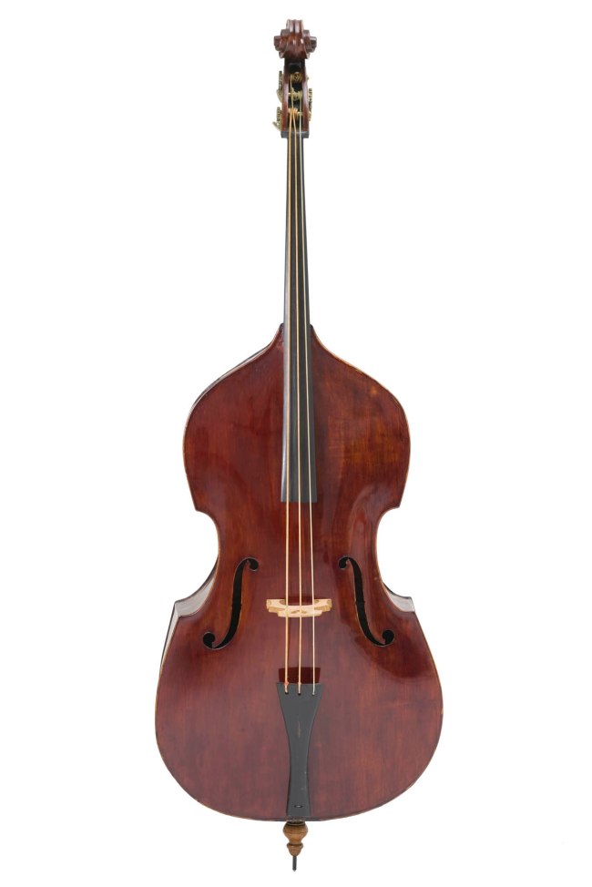
John Devereux (Australian born England, (c. 1815-1883)(maker, Melbourne, Victoria, Australia)
Double bass
1856
Red brown varnish, European Spruce/European Maple/Australian Cedar/brass/paper
Height: 1990 mm
Width: 655 mm
Depth: 385 mm
Powerhouse Collection
Purchased with the assistance of the Australian Government through the National Cultural Heritage Account and supporters of the Powerhouse Museum Foundation and the Pinchgut Opera, 2007
Double Bass made by John Devereux
John Devereux is one of the earliest violin makers known to have been working in Australia and is seen as Australia’s first professional bowed string instrument maker. He had a significant reputation and output from the 1860s to 1880s and was a contemporary of Australia’s other great maker of this period William Dow, also of Melbourne. Born in England in 1810, Devereux arrived in Australia in 1854 from London where he had been working in the workshop of violin maker Bernhard Simon Fendt (1800-1852). He settled in Melbourne and operated a violin making business there until his death in 1883. Apart from double basses he is known to have made violins, violas and cellos. He was apparently an accomplished double bass player and performed regularly at Government House in Melbourne. …
This double bass is possibly Devereux’s earliest instrument made in Australia that still survives. The instrument is made as a 3 string rather than 4 string bass which denotes an early period in bass making generally. Although the label is not original the bass has all the same characteristics of Devereux’s other instruments including two features that typify his work in Australia – his use in his double basses of Australian cedar especially for the back and an internal tension bar running the length of the body of the instrument from top to bottom. Independent assessments of the instrument also confirm this as a Devereux instrument. Most Devereux instruments remaining in original condition contain the tension bar which he devised in Australia to strengthen the instrument and prevent twisting of it in the Australian climate. This rigidity was also a way of keeping his instruments in tune in the local climate. There are only 4 other Australian made Devereux basses known to exist which date from a later period to this one.
In addition to the double bass the Powerhouse Museum also contains 2 violins by Devereux dating from 1869 and 1871 respectively, a viola by Devereux dated 1869, the 1866 gold medallion inter-colonial exhibition award, referred to above, and a separate tension bar and labels.
The exact number of instruments John Devereux made is unknown. Double basses made by Devereux both when he worked in London and in Australia survive, however, only five Australian made basses are currently known. Devereux also made violins, violas and cellos in Australia and examples of his work in general exist. He exhibited in a number of inter-colonial exhibitions and the catalogues of these mention the types of instruments he made. These catalogues also state that he used both European and Australian native timbers for his instruments.
Michael Lea,
Curator, music and musical instruments
May 2007
Text from the Powerhouse Collection website
 'Guitar' c. 1975 painted and used by Harold 'The Kangaroo' Thornton, Sydney, New South Wales, Australia, 1980-2000")
Lorenzo (maker, Japan)
Guitar
c. 1975
Painted and used by Harold ‘The Kangaroo’ Thornton, Sydney, New South Wales, Australia, 1980-2000
Handpainted, wood/nylon/plastic/metal/paper
Height: 1150 mm
Width: 375 mm
Depth: 97 mm
Powerhouse Collection
Gift of Philip Thornton, 2018
Hand painted Guitar by Harold ‘The Kangaroo’ Thornton
The guitar is part of a collection of extraordinary outfits and objects belonging to artist Harold ‘The Kangaroo’ Thornton (1915-2004), the creator of one of Australia’s rare historically themed art works, ‘Dr Brown and Green Old Time Waltz’. Hand painted by Harold, the guitar beautifully represents Harold’s personality and passion for art which shines through all of his works. In common with the other painted pieces in the collection, the artwork on the guitar is characterised by a sense of exuberant boldness and carefree abandon. The use of kaleidoscopic colours, uninhibited patterns both geometric and organic, mirrors Harold’s sense of playfulness and joy for life.
Largely self taught, Harold began painting at 8 years of age following the traditional art conventions of the times. It wasn’t until the 1980s however that Harold began painting in the style that perfectly matched his personality and philosophy of life. Stylistically, his work has been described as ‘psychedelic, naive or magic realistic’. Harold was never interested in making money or being aligned to a specific genre. His single-minded focus was to paint whatever took his fancy in his own inimitable way.
Several well-known Australian artists including Ken Done, Martin Sharp and body artist, Tim Gratton acknowledge Harold’s influence on their work. Largely denied recognition as a serious artist in life, over time there has been a growing appreciation of Harold’s artistic gift.
Glynis Jones and Wendy Circosta, 2017
Curator and Curatorial Volunteer
This guitar was hand painted by artist, Harold ‘The Kangaroo’ Thornton in Sydney possibly between 1980 and 1995.
Prominent Australian, Dr Bob Brown has described Harold as a ‘very unusual character. He had a little goatee, a wisp of beard coming out of his chin and he had a naked woman enamelled on to one of his teeth.’ Born in Enfield, an inner west suburb of Sydney, in 1915, Harold Leslie Thornton began his art career at the age of 8 when he used to write signs for the local butcher and grocer. Finding school a waste of time, he left at age 14 to work as a sign writer, learning by watching how others worked. In later years he spent some time at the Julian Ashton Art School and Desiderius Orban School of Art (1944-46), though he remained largely self-taught. In 1937, Harold departed Sydney with a friend on a motorbike and ended up settling in Griffith, New South Wales until 1941. Painting and wrestling were sources of income at this time. During the remainder of World War II, he lived in Sydney and worked as a sign painter at several places in the war industry. It wasn’t until after World War II that Harold began painting in earnest.
Harold returned to Griffith in 1947 and ran a sign writing business. In 1950 he began touring the Australian countryside setting up his own mini exhibitions in places such as Condobolin, Leeton, Wagga Wagga, Wollongong and Griffith for the next 10 years. He returned to Sydney in 1963.
He has said in both print and recorded interviews that he didn’t fit the mould of what the established art world considered an artist. From head to toe, he dressed flamboyantly in clothes which he’d fashioned and painted and he revelled in fun, whimsy and theatricality that had the art world questioning, ‘was he an artist or a showman’. Self-styled ‘ The Greatest Genius That Ever Lived’, Harold believed very much tongue in cheek that ‘You are what the public thinks you are so I’m the greatest genius that ever lived!’
Not represented by any local dealers and disenchanted with the power of art critics to make or break an artist, Harold left Australia to live in Papua New Guinea from 1968-1970 before making his way to Amsterdam where he spent many years creating art, writing songs and modelling for art classes. In Amsterdam, Harold received the recognition that the Sydney academic art world denied him. Known for his painted murals on shop windows, he was a well-loved and recognised figure in Amsterdam. His most famous mural was painted in 1975 on ‘The Bulldog’, one of the first establishments where marijuana from around the world could be sampled. It is now a landmark site protected by the Netherlands National Trust.
Harolds’s earlier works followed the more conventional style of realistic portraiture and landscapes. It wasn’t until the 1980s that Harold developed his own ‘magic realistic’ style. Nonconformist and reminiscent of psychedelia describes not only his art but Harold himself. A larger than life figure, he dedicated his life to his art, surrounding himself with objects that had received the ‘genius’ treatment, including clothing, accessories, his van, and a guitar and suitcase which are both included in the Museum’s collection.
Professionally, Harold had three portraits selected as finalists in the prestigious Archibald Prize which is held annually at the Art Gallery of NSW: comic Roy Rene (1948), Al Grassby (1982) Minister for Immigration in the Whitlam Government and Dr Bob Brown (1983), founder and leader of the Greens political party. Dr Brown was the subject of a very important Australian historical work, ‘Dr Brown and Green Old Time Waltz’ which is held in the National Portrait Gallery in Canberra. It documents the story of one of Australia’s most controversial environmental issues – the Gordon-below-Franklin Project. He also held several exhibitions in Sydney, Griffith and Amsterdam and has influenced well known Australian artists, Martin Sharp, Ken Done and Tim Gratton.
Harold died on 7 April 2004, leaving an archive of over 200 paintings. His greatest wish was for all of his paintings to be in the one place on permanent exhibition.
Text from the Powerhouse Collection website
Edward William Godwin (designer) (English, 1833-1886)
William Watt (maker, England, 1834-1885)
Sideboard
1867-1880
Oak/metal
Height: 1810 mm
Width: 2550 mm
Depth: 520 mm
Powerhouse Collection
Purchased 1991
Sideboard designed by Edward William Godwin
Edward William Godwin (1833-1886) was one of the most important designers of the English design reform movement in the second half of the 19th century. He was an active and influential member of the Aesthetic Movement and the first 19th century English furniture designer to turn to Japanese art for inspiration. His emphasis on the need to reconcile function and design, utility and beauty did much to redirect Victorian design and is now believed to have influenced the direction of 20th century design. The Anglo-Japanese sideboard is one of the earliest pieces of furniture by Godwin and expresses his enthusiasm for Japanese design as well as the importance he attached to function, lightness and simplicity. The sideboard remained his most radical Japanese-inspired design and is his best known piece of furniture.
Text from the Powerhouse Collection website
 J.W. Hukin and J.T. Heath (maker, London, England) 'Kettle and burner on stand' 1878")
Christopher Dresser (designer, British, 1834-1906)
J.W. Hukin and J.T. Heath (maker, London, England)
Kettle and burner on stand
1878
Electroplated silver/wood
Height: 275 mm
Width: 223 mm
Depth: 170 mm
Powerhouse Collection
Purchased 1991
Kettle and burner on stand designed by Christopher Dresser
This kettle was designed by Christopher Dresser for J.W. Hukin and J.T. Heath in London in 1878. A trained botanist and a visionary designer who bridged the gap between art and industry in Victorian England, Dr Christopher Dresser was a leading design reformer of the era. As opposed to John Ruskin and William Morris, Christopher Dresser was an enthusiastic advocate of the machine, believing that household items should be more affordable while being both beautiful and functional. The association of simplicity with progress led him to reject the taste for rich decoration of Victorian historicism and naturalism which used representational, often relief ornaments indiscriminately applied to objects. Dresser’s interest in forms based on the structure of plants, his emphasis on function in design and the economic use of materials such as electroplated silver, have no precedent in Western design traditions.
Dresser had a passion for Japanese art, which was rediscovered by the West in the 1850s, strengthened by his travel to Japan in 1876. The kettle’s chased plum-blossom-and-bamboo decoration, the angular spout and feet, straight wooden handle and exposed rivets reference the Japanese aesthetic. Dresser diverse designs for metal, textiles, glass and ceramics inspired by Japanese art and design are also associated with the Aesthetic movement which has a strong impact on the visual arts, literature and fashionable living in Britain from the 1860s to the 1895 trial of the writer Oscar Wilde, the movement’s best-known advocate and exponent. With its famous credo ‘art for art’s sake’, it highlighted the aesthetic value of the arts, privileging beauty over any moral or didactive purpose.
Eva Czernis-Ryl, Curator
Text from the Powerhouse Collection website
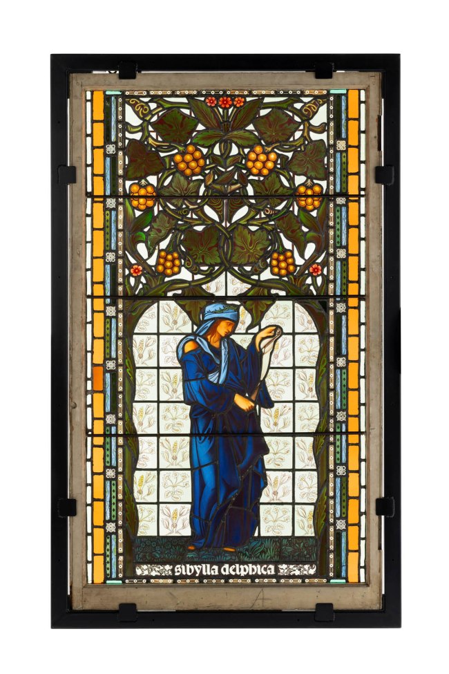
Sir Edward Coley Burne-Jones (English, 1833-1898)(designer)
William Morris Workshops (maker, England)
Stained glass window, ‘The Delphic Sibyl’
1869-1875
Glass/lead
Height: 1549 mm
Width: 915 mm
Depth: 140 mm
Powerhouse Collection
Purchased with funds donated by the Patrons of the Powerhouse, 1984
‘The Delphic Sibyl’ window designed by Sir Edward Coley Burne-Jones
This magnificent stained-glass window entitled, ‘Sibylla Delphica’, was produced in about 1900 in the workshops of Morris & Co. at Merton Abbey southwest of London after designs by the pre-Raphaelite painter, Sir Edward Coley Burne-Jones.
The window is an example of work from the Arts and Crafts Movement (1850s-1930s), which was born in industrialised England out of enthusiasm for the ‘morally superior’ work of the medieval craftsman. The movement was led by the great Victorian philosopher and art critic, John Ruskin, and the influential designer, William Morris.
While the Arts and Crafts movement drew on different cultures and periods, its members were united in their opposition to poor design standards and the dehumanising effects of industrialisation. They mostly handcrafted objects in small workshops, explored traditional techniques and materials and intended to make beautiful objects for all.
William Morris set out to produce only the finest quality furnishings for discerning customers including furniture and stained glass. This window is a later version of one made in England for the chapel of Jesus College, Cambridge, in 1872. Morris was most likely responsible for the pale painted botanical patterned background and stylised canopy of vines which frame the figure of Sibyl. (Sibyls were women the Ancient Greeks believed were oracles).
William Morris was a poet, writer, politician and conservationist as well as being an artist, designer and manufacturer, whose products underpinned a successful, long-lasting business. His innate ability to unify form, colour and pattern and his boundless creativity made him the most innovative and outstanding pattern designer of his generation. Even in the 1900s Morris’ wallpaper and textile designs remained popular.
Text from the Powerhouse Collection website

Attributed to the painter of ‘Group of Taranto 305’, Athens, Greece
Amphora with cover, Attic black figure
530-510 BC
Red earthenware
Height: 470 mm
Width: 265 mm
Depth: 270 mm
Powerhouse Collection
Gift of Sir Robert Webster and Sir Norman Rydge, 1952
Attic Black Figure Amphora
The amphora was made in Greece, c. 530-510 BC. The amphora is part of a large group of over 300 vessels (mostly amphorae) which are stylistically very closely related. More than 150 of these vessels have been divided into closely related groups, one called ‘Group of Taranto 305’ to which this amphora belongs, probably painted by one artist.
Terracotta amphora with Attic black figure design on a red ground. The amphora has a pedestalled foot, bulbous body, rounded shoulders and slim neck with flaring rim. Two ribbed strap handles extend from the shoulders to the top of neck. On one side is a female figure holding her cloak around her head and shoulders like a veil, a traditional gesture of modesty, especially associated with a bride. To the left, a satyr approaches with one arm outstretched; another satyr approaches from the right. This scene possibly represents Ariadne about to be conducted to her marriage to Dionysus. On the other side of the amphora are two young naked horsemen, each carrying two spears. The subsidiary decoration includes a double lotus and palmette chain on the neck of the vase; an elaborate palmette cross under the handles; a band of alternately black and red tongues around the base of the neck; a band of rays around the base of the vase and an animal frieze below the figured area. The lid or cover of the amphora is circular and has a knob handle. It features four concentric circles and two rows of small hearts or leaves around the perimeter of the rim.
Text from the Powerhouse Collection website
(painter) Sevres Royal Porcelain Manufactory (manufacturer, Sevres, Paris, France) 'Plate, 'Impression sur Etoffes: Teinture', from the 'Service des Arts Industriels' (Industrial Arts Service), with a scene illustrating textile dyeing workshop in the Manufacture Royale de Jouy' 1830")
Jean-Charles Develly (French, 1783-1862)(painter)
Sevres Royal Porcelain Manufactory (manufacturer, Sevres, Paris, France)
Plate, ‘Impression sur Etoffes: Teinture’, from the ‘Service des Arts Industriels’ (Industrial Arts Service), with a scene illustrating textile dyeing workshop in the Manufacture Royale de Jouy
1830
Hard paste porcelain
Height: 32 mm
Width: 240 mm
Depth: 240 mm
Powerhouse Collection
Purchased 1993
Sevres plate with painted textile workshop scene
This unique plate belongs to a relatively small group of sumptuous tableware that survive today from the unique 173-piece dessert service known as ‘Service des Arts Industriels’ (industrial arts service). There were 108 plates in the service.
The Sevres Royal Porcelain Manufactory took 15 years to complete the set, which was never replicated. The service was presented by King Louis-Philippe to the Austrian chancellor Prince von Metternich in 1836. Later it belonged to the royal house of Romania.
The service is among the Sèvres factory’s most brilliant technological and artistic achievements. It was made from true (hard-paste) porcelain and its scenes are painted with newly developed pigments that produced colours as richly toned as in oil paintings. These were developed under Alexandre Brongniart (1770-184), the Sèvres factory’s director. The scenes were painted by Jean-Charles Develly who based them on his sketches drawn entirely from life. This was a significant innovation as most services were decorated with subjects copied from engravings or paintings. The service celebrated the progress of technology as applied to different industries in France at the time. The choice of this unusual subject reflected the economic and political importance of a wide range of crafts and industries in France in the early 1800s. The scene decorating the well of this plate is entitled ‘Impression sur etoffes. Teinture.’ and depicts various activities in the textile dyeing workshop at the Manufacture Royale de Jouy in Josas (Yvelines).
The service is a late example of the Empire style in ceramics. The style was developed by the Sèvres factory under the patronage of Napoleon Bonaparte (1805-15) and was widely imitated by other European ceramic factories, remaining popular long after the defeat of Napoleon.
Eva Czernis-Ryl, 1993
References:
Pierre Ennès, ‘Four Plates from the Sèvres “Service des Arts Industriels” (1820 – 1835),’ Journal of the Museum of Fine Arts, Boston 2 (1990): 89-106
Tamara Préaud, ‘Brongniart as Administrator,’ in The Sèvres Porcelain Manufactory: Alexandre Brongniart and the Triumph of Art and Industry, 1800-1847, ed. Derek E.Ostergard (New Haven and London: Yale University Press, 1997), 43-53.
Text from the Powerhouse Collection website
(maker, Rome, Italy) 'Roman Ruins' c. 1876")
Biagio Barzotti (Italian, 1835-1908)(maker, Rome, Italy)
Roman Ruins
c. 1876
Mosaic panel, framed
Glass/gilt and stained wood/metal
Height: 1261 mm
Width: 2005 mm
Depth: 170 mm
Weight: 250 kg
Powerhouse Collection
Purchased 1948
This framed mosaic panel is entitled ‘Roman Ruins’. It was created by Biagio Barzotti (1835-1908) in Italy in about 1876 by means of a mosaic of coloured glass ‘tesserae’. Rome’s Forum was not completely excavated until the 1870s. Like the many ancient sites uncovered during the 1800s, its exposure increased interest in the classical past and inspired numerous artistic representations.
(designer) 'Settee, Regency Egyptian Revival style' c. 1802")
Thomas Hope (English born Holland, 1769-1831)(designer)
Settee, Regency Egyptian Revival style
c. 1802
Ebonised and gilt beech/bronze and gilt brass mounts/reproduction silk damask and trimmings
Height: 610 mm
Width: 1676 mm
Depth: 660 mm
Powerhouse Collection
Purchased with the funds donated by the Patrons of the Powerhouse, 1987
Bronze lions reproduced courtesy of Lord Faringdon, Buscot Park, England
The assistance of George Levy, H Blairman & sons, London is gratefully acknowledged
Regency Egyptian Revival settee by Thomas Hope
This pair of armchairs and settee in the Egyptian Revival style were designed by the English Regency designer, Thomas Hope, as part of the furnishings for the Egyptian room of his grand Robert Adam-designed residence in Duchess Street, London. The house was created as a showpiece for Hope’s collection of antiquities, and featured themed rooms with suites of furniture designed by Hope to provide a suitable background for his collection of classical and neoclassical statuary and objets d’art. His Egyptian room was located on the first floor, which was intended to be opened ‘museum-like’ to the public.
Thomas Hope was born in Amsterdam in 1769 into a wealthy Dutch banking family of Scottish descent. He settled in England around 1796 after an exhaustive eight-year grand tour of the Mediterranean countries, including Egypt, Turkey, Greece and Italy. His work in the Egyptian style has various sources including inspiration from his own travels and publications such as V. Denon’s “Voyage dans la basse et la haute Egypte” of 1802. The entire suite and its placement within the Egyptian room is illustrated in a meticulous line drawing in Thomas Hope’s “Household Furniture and Interior Decoration” of 1807 (plate VIII), an exceptional publication which established Hope’s reputation as a designer of outstanding vision and influential style. The Museum’s armchairs and couch form half of the suite of seating furniture originally in the Egyptian room; the other half is presently owned by the Faringdon Collection Trust, Buscot Park, England.
The provenance of the Powerhouse Museum’s pieces is interesting. A businessman, Sir Alfred Ashbolt, brought the suite to Australia in 1924 when he returned to Hobart after a term in London as agent-general for Tasmania (1919-1924). The furniture had been sold from the Hope estate to a London antique dealer in 1917. The couch and chairs were sold again at auction in the 1940s by the family of Sir Alfred Ashbolt. From then on, knowledge about their significance and origin appears to have faded until the armchairs were acquired at a Sydney auction by the Powerhouse Museum in 1984, and the couch acquired three years later, in 1987.
Anne Watson, 1984
Text from the Powerhouse Collection website

Unknown maker (Japan, Edo period)
Suit of armour and horse tack, possibly insignia of samurai officer Koma Kaemon of Bizen clan
Possibly 1775
Textile/leather/wood/lacquer/metal/paper/fibre/hair
Height: 1430 mm
Width: 800 mm
Depth: 520 mm
Powerhouse Collection
Purchased by the museum from Lawson’s auctioneers, Sydney, 1948

Unknown maker (Japan, Edo period)
Suit of armour and horse tack, possibly insignia of samurai officer Koma Kaemon of Bizen clan (detail)
Possibly 1775
Textile/leather/wood/lacquer/metal/paper/fibre/hair
Height: 1430 mm
Width: 800 mm
Depth: 520 mm
Powerhouse Collection
Purchased by the museum from Lawson’s auctioneers, Sydney, 1948
 'Figures (2), Sino-Tibetan deities, Brahma and Chandra, from Vajrabhairava group' 1403-1424 or Xuande reign, 1426-1435")
Gelugpa school (China, Ming dynasty, Yongle reign)
Figures (2), Sino-Tibetan deities, Brahma and Chandra, from Vajrabhairava group
1403-1424 or Xuande reign, 1426-1435
Gilt copper alloy/wood
Height: 350 mm
Width: 320 mm
Depth: 135 mm
Powerhouse Collection
Presented to the New South Wales Collection of Applied Art by Dame Eadith Campbell Walker, 1927
Sino-Tibetan figures from Vajrabhairava group
Manifestations of Hindu deities (Brahma and Chandra), which would have originally formed part of a Vajrabhairava group.
(-1) Figure, Brahma, seated, single head with 6 faces and four arms.
(-2) Figure, Chandra, similar to (-1) but with single head and two arms.
These two gilt bronze Sino-Tibetan figures are part of a set of eight Hindu gods enshrined in a Tibetan Buddhist temple in Beijing in the 15th century. These two figures would have been fourth and sixth from the left: Brahma and Chandra. These were most likely imperially commissioned, given the scale and quality of the figures, and were made by Newari metal craftsman who moved to China from Kathmandu Valley. The figures would have decorated the base of a monumental image of the cosmic deity Vajrabhairava, the wrathful manifestation of the Buddhisattva Manjusuri, the god of knowledge and wisdom. He is an important meditational deity of the Gelukpas, the largest and most powerful Buddhist order in Tibet. His form is characterised by multiple heads, including a buffalo head, and multiple limbs. The propositions of the present attendant figure suggest that the original sculpture would have stood over five feet high, arguable marking it one of the most important early Buddhist images recorded. A large embroidered silk thangka (Tibetan Buddhist painting) of Vajrabhairava in the Jokhang temple demonstrates the actual convention, showing eight deities in order were Shiva, Vishnu, Indra, Brahma, Katikeya, Chandra, Surya and Gannesha.
Min-Jung Kim
Curator
Feb 2017
Text from the Powerhouse Collection website
 'Figures (2), Sino-Tibetan deities, Brahma and Chandra, from Vajrabhairava group' 1403-1424 or Xuande reign, 1426-1435 (detail)")
 'Figures (2), Sino-Tibetan deities, Brahma and Chandra, from Vajrabhairava group' 1403-1424 or Xuande reign, 1426-1435 (detail)")
Gelugpa school (China, Ming dynasty, Yongle reign)
Figures (2), Sino-Tibetan deities, Brahma and Chandra, from Vajrabhairava group (details)
1403-1424 or Xuande reign, 1426-1435
Gilt copper alloy/wood
Height: 350 mm
Width: 320 mm
Depth: 135 mm
Powerhouse Collection
Presented to the New South Wales Collection of Applied Art by Dame Eadith Campbell Walker, 1927
(designer, Glasgow, Scotland) 'Chair, 'Argyle'' 1898-1899")
Charles Rennie Mackintosh (Scottish, 1868-1928)(designer, Glasgow, Scotland)
Chair, ‘Argyle’
1898-1899
Designed for the Argyle Street Tearooms, Glasgow, c. 1897
Height: 1370 mm
Width: 505 mm
Depth: 470 mm
Powerhouse Collection
Purchased with funds donated by the Patrons of the Powerhouse, 1984
‘Argyle’ chair by Charles Rennie Mackintosh
This unusually high backed chair was designed by the Scottish architect, Charles Rennie Mackintosh for Catherine Cranston’s Argyle Street Tearooms in Glasgow around 1898-1899. The design for the furniture of the tearooms was the first major private commission of Mackintosh’s career. The Argyle chair was shown at the Eighth Exhibition of the Vienna Secession, Austria in 1900 where Mackintosh’s highly individual style strongly influenced and contributed to the development of work at the Wiener Werkstatte.
The attenuated lines and exaggerated height of its back anticipated many of Mackintosh’s later designs. It is the first of his high back chairs to feature the top rail as an emblematic iconic symbol. The back uprights support an enlarged oval headrest with a fretted stylised flying swallow shape. Mackintosh raised the height of the chairs in order that the furniture make a dramatic statement within the room.
Mackintosh’s concentration on the formal qualities of the furniture within the interior very much anticipated the spirit of 20th century modernism. Although he was not as appreciated at home as he was on the continent (he died in relative poverty in London in 1928), his architecture and design went on to be revered worldwide and is appreciated for forming an important bridge between the 19th and 20th centuries, and between England and continental Europe.
Text from the Powerhouse Collection website
 'Mourning brooch' c. 1870")
Unknown maker (English)
Mourning brooch
c. 1870
Metal/human hair
Height: 50 mm
Width: 75 mm
Depth: 25 mm
Powerhouse Collection
Gift of Margaret Vella, 1995
Meticulously crafted from human hair about 1870, this brooch is an example of a practice which flourished in Europe for almost four centuries. Wearing finger-rings as a memento of a deceased relative or friend had been well established by the 1400s, but it was during the late 1700s that mourning jewellery became truly fashionable. Rings, brooches, bracelets and even earrings made from black-enamelled gold, jet and human hair were widely worn particularly in Britain and colonies including Australia.
Alongside a flourishing hair-jewellery industry that sprang up in the 1800s, self-help manuals provided patterns and instructions for braiding and plaiting of hair into jewellery at home. Sometimes seen as macabre, the keeping of the deceased relative’ s hair reflects a different sensibility from the modern sanitised view of death. Although most hair jewellery was intended for mourning, it was also made to celebrate love. Sadly, we don’ t know who wore this brooch. Though it was probably an expression of someone’ s grief, it could also have been intended as a token of love as the hair appears to have belonged to two people. It was made at a time when the fashion for hair jewellery was fading.
Eva Czernis-Ryl, Curator, 2020
Text from the Powerhouse Collection website
 'Chandelier, 'USA'' 2013")
Ken + Julia Yonetani (Katoomba, New South Wales, Australia)
Chandelier, ‘USA’
2013
From art installation Crystal Palace: The Great Exhibition of the Works of Industry of All Nuclear Nations
Uranium glass/UV lights/metal
Height: 2000 mm
Width: 1600 mm
Weight: 80 kg
Powerhouse Collection
Purchased with funds donated through the annual appeal and from the MAAS Foundation, 2016
‘USA’ Chandelier by Ken + Julia Yonetani
The chandelier is part of an installation created in response to the 2011 Fukushima Daiichi nuclear disaster. There are 31 chandeliers in the installation, each representing a country with nuclear power stations. Their sizes correspond to the nuclear capacity in that country, with the USA chandelier being the largest. All chandeliers are densely covered with specially sourced uranium glass beads and feature uranium glass crystal pendants. When lit in darkness, the ultraviolet light tubes react with the uranium inside the glass to create a fluorescent green effect, reminiscent of the presence of radiation. (Uranium glass contains very small traces of uranium and poses no health risks).
Working with a thrilling variety of conventional and unconventional materials including sugar and salt, Ken (b. 1971, Tokyo) who is Japanese with Australian residency, and his Australian partner Julia (b. 1972, Tokyo) are among the most creative contemporary artists emerging on the international art scene today. They explore environmental concerns through powerful installations such as the ‘Sweet Barrier Reef’ which comments on the effects of climate change and was first shown at the 2009 Venice Biennale. Other international shows include an installation at the 2013 Singapore Biennale and a major solo exhibition at the Abbey de Maubuisson in Paris in 2015.
The Yonetanis divide their time between Australia and Japan. The Fukushima plant accident had a profound effect on the artists and this installation explores their deeply-felt sense of fear associated with the impacts of radiation. Inspired by the world’s first large-scale international expo, the 1851 Great Exhibition of the Works of Industry of All Nations, the artists have created a provocative statement on our accelerating seduction with nuclear technology and power. Eerily beautiful, they mesmerise the viewer with the chandeliers’ magical presence while also posing timely questions. The artists explain: ‘You can’t see, smell or perceive radiation with your senses, but it becomes visible in our works when illuminated with ultraviolet lights… We hope to prompt viewers to react in their own way to this radioactive presence.’ (Interview, National Gallery of Australia, Canberra 2016)
In the MAAS context, this multi-media artwork highlights this Museum’s own history and its interlinked arts, design and technology collections: MAAS was modelled on London’s South Kensington Museum (now The Victoria & Albert Museum), a direct result of the Great Exhibition. This Museum also originated as a response to the 1879 Sydney International Exhibition, the first world’s fair in the southern hemisphere.
Eva Czernis-Ryl, Curator, 2016
Text from the Powerhouse Collection website
")
Installation view of the exhibition 1,001 Remarkable Objects at Powerhouse Ultimo, Sydney showing numerous examples of Australian colonial silver in the Powerhouse Collection including at centre, Evan Jones’ Inkstand, seated emu form (c. 1875, below)
")
Evan Jones (Australian born England)(Sydney, New South Wales, Australia)
Inkstand, seated emu form (installation view)
c. 1875
Silver gilt/emu egg shell/glass/wood
Height: 350 mm
Width: 400 mm
Depth: 260 mm
Weight: 6.5 kg
Powerhouse Collection
Purchased 1984
Silver Gilt Emu Inkstand by Evan Jones
This inkstand is the only one of its kind known to have been made in colonial Australia. It is a fine example of Australian-made presentation pieces bought or commissioned from silversmiths working in gold-rush Australia between the late 1850s and the depression of the early 1890s. Before that time, presentation silver was imported, mostly from England. From the late 1850s, newly arrived immigrant silversmiths from England, Ireland and continental Europe could more than satisfactorily meet the growing demand for silver or gold testimonials and sporting trophies. They developed a uniquely Australian style using Australian motifs such as the emu and kangaroo, and incorporating local materials, particularly the vivid-green emu egg and Australian malachite that provided such a striking contrast to polished silver.
This inkstand is one of the most impressive works made by Evan Jones, a leading silversmith in late colonial Sydney. Born in England, Jones worked as silversmith, watchmaker, medallist and jeweller in Sydney between about 1873 and 1917. At the age of twelve Jones became an apprentice at Hardy Brothers, and he later gained experience at the renowned firm of Hogarth, Erichsen & Co, and with Christian L Qwist. His business was first listed in the Sydney Directory in 1873 at 15 Hunter Street, a former address of Qwist. He established several branches in the city in the 1890s, but his principal workshop was in Erskine Street.
Evan Jones frequently exhibited in colonial and international exhibitions. It was reported, for example, that in the Sydney International Exhibition of 1879, Australia’s first, he showed “emu’s eggs …mounted in 101 different ways”. Jones also produced gold and silver racing cups, rowing and sculling trophies, and decorative tableware including spectacular silver epergnes (table centrepieces) with Australian motifs. His modelling skills in silver can be best appreciated in this marvellous sculptural inkstand made about 1875.
Eva Czernis-Ryl, curator, June 2007
Text from the Powerhouse Collection website
")
Installation view of the exhibition 1,001 Remarkable Objects at Powerhouse Ultimo, Sydney showing William Kerr’s Presentation trowel (c. 1883, below)
(maker, Sydney, New South Wales, Australia) 'Presentation trowel' c. 1883 (installation view detail)")
William Kerr (Australian born Ireland, 1838-1896)(maker, Sydney, New South Wales, Australia)
Presentation trowel (installation view)
c. 1883
Used by Lizzie Henrietta Harris to lay the foundation stone of the Great Hall of Sydney Town Hall, Sydney, New South Wales, Australia, 1883
Silver/gold/ivory
Width: 97 mm
Depth: 53 mm
Weight: 283.5 g
Powerhouse Collection
Donated through the Australian Government’s Cultural Gifts Program by John Atkinson, 2006
Presentation trowel used in laying the foundation stone of Sydney Town Hall
This trowel was used in laying the foundation stone of the Great Hall of Sydney Town Hall on 13 November 1883.
It relates to the history of a prominent Sydney family. Lizzie Henrietta Harris, to whom the trowel was presented by aldermen of the city, was wife of John Harris, Mayor of Sydney. Their daughter Mary Ann was herself Mayoress of Sydney in 1888 and 1889, during the five terms in which her father was Mayor.
It was made in the workshop of William Kerr (1838-1896), a leading watchmaker, jeweller and silversmith in Sydney in late 19th century. Today, Kerr is mostly remembered for his distinctive silver trophies, three of them receiving an award at Australia’s first International Exhibition which took place in Sydney in 1879. Kerr’s work was commended for ‘tasteful design’ and ‘careful workmanship’.
William Kerr was born in Northern Ireland and came to Australia on board of the ‘New York Packet’ with his family in 1841. Kerr obtained many important commissions for presentation pieces, like this trowel, often from the Sydney City Council. Recognising the importance of sporting life in Australia, Kerr also sponsored clubs which gave him a steady stream of orders. He used Australian motifs, mostly plants and animals, in his distinctive, finely worked pieces.
The striking design and execution as well as the original condition of the trowel, which is applied with Australian flowers crafted in gold, make it an outstanding item of Australian metalwork of the period. It is the only example of its kind known to have been made and survived.
Text from the Powerhouse Collection website
(maker) Kilpatrick & Co (retailer est. 1853, Melbourne, Victoria, Australia) 'Inkstand with kangaroo and emu motifs, gold and silver, presented to John Todd by Thomas Bibby Guest' 1865")
William Edwards (Australian born England, c. 1819 – c. 1889)(maker)
Kilpatrick & Co (retailer est. 1853, Melbourne, Victoria, Australia)
Inkstand with kangaroo and emu motifs, gold and silver, presented to John Todd by Thomas Bibby Guest
1865
Gold and silver
Height: 245 mm
Width: 320 mm
Depth: 190 mm
Powerhouse Collection
Purchased with the assistance of Silvanus Gladstone Evans bequest, 1986
Inkstand with Kangaroo and Emu Motifs by William Edwards
Only twenty four significant examples of Australian-made secular presentation pieces crafted in gold are known to have survived from the colonial period; almost eighty are known to have been made. This unique inkstand is one of the most striking, particularly in its use of sculptural elements and Australian iconography. Fashioned in silver and almost pure gold, it was made in the workshop of William Edwards (c. 1819 -c. 1889) in Melbourne in 1865 and retailed by Kilpatrick & Co (est. 1853). The son of a London silversmith and a manufacturing silversmith, Edwards came to Australia in 1857. Until about 1872 he ran a business in Melbourne which supplied silverware to major retailers; some objects were imported from the family business in London. From about 1873 Edwards was in partnership with Alexander Kaul.
William Edwards’ workshop excelled in the production of silver-mounted emu egg trophies and is credited with making the earliest surviving piece, the covered cup presented in 1859 to a Melbourne University scholar by his students (also in this Museum’s collection). Although silver-mounted emu eggs form the largest surviving body of Edward’s output, his workshop also produced a number of silver and occasionally gold trophies and epergnes, some of which were displayed in international exhibitions. Edwards was also responsible for major commissions such as the gifts for Prince Alfred, Duke of Edinburgh which subsequently brought him an appointment as goldsmith and jeweller the the Duke’s household.
The majority of the firm’s wares were designed in the naturalistic and rococo revival styles. From the early 1860s, classical revival motifs and forms began appearing, often in combination with rococo and sometimes gothic elements. Regency detailing, evident in the design of the base of this inkstand, was rare. Also well known are Edward’s silver claret jugs of the 1860s, which were made in many variations including richly repoussed pieces and even emu and ostrich egg versions.
Thomas Bibby Guest was a steam biscuit manufacturer in William Street in Melbourne who succumbed to the lure of the goldfields in about 1857 and ‘made a considerable sum of money in mining [and] … lost most of it’. John Todd, his English business associate, helped Guest by sending the latest biscuit-making machinery on credit which enabled Guest “to produce such a quality that no one else could & by this means I have got back my lost trade, & my returns… more than trebled & still go on increasing” ( TB Guest & Co, papers, University of Melbourne Archives, 1875). The loan was repaid in full in August 1865, when the inkstand was delivered to Todd in Manchester. Guest’s biscuit works were relocated to North Melbourne in 1897, and in 1900 the business was converted into a proprietary company. Guest died on 3 April 1908 as ‘a man of exceptional business capacity, and his enterprise in starting a new industry so early, earned him the esteem and respect of his fellow colonists.” (‘Age’, 4 April 1908, p. 17). John Todd died in Manchester in 1875, and the fate of his inkstand, until it was located in 1986 in England and purchased by the Powerhouse Museum, is unknown. The original invoice for the inkstand, for 100 pounds, dated 11 April 1865 and made out to TB Guest still survives in the University of Melbourne Archives.
Eva Czernis-Ryl, September 2007
Recommended further reading:
C Thompson, ‘Substantial evidence of your gratitude… A silver and gold presentation inkstand by William Edwards, Melbourne, 1865’, Australiana, August 1987, pp 91-95.
Text from the Powerhouse Collection website
, gold / operculum by F Allerding & Son, Sydney, New South Wales, Australia, 1879-1884; and at second top centre, Bangle, 'Soyons toujours unis / Par un divin amour', 18 carat gold, Henry Steiner, Adelaide, South Australia, c. 1878")
, gold / operculum by F Allerding & Son, Sydney, New South Wales, Australia, 1879-1884; and at second top centre, Bangle, 'Soyons toujours unis / Par un divin amour', 18 carat gold, Henry Steiner, Adelaide, South Australia, c. 1878")
Installation views of the exhibition 1,001 Remarkable Objects at Powerhouse Ultimo, Sydney showing examples of 19th century Australian gold jewellery in the Powerhouse Collection including at top, a parure comprising necklace, locket and earrings (pair), gold/operculum by F Allerding & Son, Sydney, New South Wales, Australia, 1879-1884 (below); and at second top centre, Bangle, ‘Soyons toujours unis / Par un divin amour’, 18 carat gold, Henry Steiner, Adelaide, South Australia, c. 1878 (below)
 'Necklace from a parure which includes locket and earrings (pair)' 1879-1884 (installation view)")
F Allerding & Son (maker, Sydney, New South Wales, Australia)
Necklace from a parure which includes locket and earrings (pair) (installation view)
1879-1884
Gold/operculum
Powerhouse Collection
Purchased, 1994
Operculum and Gold Parure by F Allerding & Son
This parure is probably the finest known surviving example of gold-mounted operculum jewellery made (and fully marked) in colonial Australia. Among the more unusual materials used in 19th century jewellery in Australia were shells of many varieties- nautilus, trigonia mother of pearl and operculum, the shell valve of the mouth of a sea-snail shell, which, when polished, resembles a ‘cat’s eye’. A fine necklace of operculum mounted in gold was shown by F Allerding & Son at the Sydney International Exhibition in 1879, alongside some examples by other Sydney jewellers: Evan Jones, William Kerr and Hippoyte Delarue.
F. Allerding & Son were jewellers and scientific instrument retailers who operated from 25 Hunter Street in Sydney. Friederich Allerding had been operating a shop in Hunter Street from as early as 1863 and around 1879 changed the name to incorporate his son Henry into the business. The firm’s name was changed to Allerding F. & Co. around 1892 and Henry continued to operate the business into the early 1900s.
Allerding was obviously well regarded by the local scientists in Sydney as he was invited by H. C. Russell, the Government Astronomer, to participate in the observation of the 1874 Transit of Venus. Allerding viewed the transit from the back-yard of his Hunter Street business and this is recorded in Russell’s book on the Transit observations. This books also refers to the fact that Allerding at this time was listed as a ‘chronometer maker’ although it appears more likely that he was a retailer of imported chronometers. This was not uncommon for the maker whose name is on the instrument typically organised for the parts to be brought together and supervised the final stages of its construction such as ‘springing’ or adjusting the mechanism. However the company also specialised in jewellery making and at the Sydney International Exhibition in 1879 were commended ‘for skilful workmanship and good quality of gold and shell jewellery’. Designed in the style popular in England particularly in the late 1870s and 1880s, this the finest example of Allerding’s parure work known to exist.
Eva Czernis-Ryl and Geoff Barker, Curatorial, 2007-2008
Further reading:
A.Schofield, ‘Materials used in 19th century Australian jewellery’, The Australian Antique Collector, April-October 1996, pp. 157-159.
Text from the Powerhouse Collection website
 'Bangle, 'Soyons toujours unis / Par un divin amour'' c. 1878 (installation view)")
Henry Steiner (Australian born Germany, 1835-1914)(maker, Adelaide, South Australia)
Bangle, ‘Soyons toujours unis / Par un divin amour’ (installation view)
c. 1878
18 carat gold
Height: 32 mm
Width: 59 mm
Depth: 68 mm
Powerhouse Collection
Purchased 1988
Gold Bangle by Henry Steiner
Only a small number of substantial, fully marked gold jewellery crafted in colonial Australia has survived and this rare bangle is one such work. Its significance is further enhanced by its believed association with the Paris Universal Exposition of 1878 where Steiner in known to have exhibited jewellery. This piece is one of Steiner’s finest. Meticulously crafted and decorated with a lavish French inscription, the bangle was most likely made for the Paris Universal Exposition of 1878 where Steiner exhibited.
Born in Bremen, Germany in 1835, Johann Henry Steiner arrived in Australia about 1858 and was first listed in the South Australian Almanac in 1864. While Steiner is best known for his silver presentation pieces (including silver-mounted emu eggs) often decorated with Australian flora and fauna, he also supplied a wide range of gold jewellery in Adelaide between 1864 and 1884, when he sold the business to August Brunkhorst, another German-born jeweller and silversmith. Steiner exhibited at a number of international exhibitions in Australia and overseas, receiving a first degree of merit in Sydney in 1879. Alongside J M Wendt, Henry Steiner was also a leading retailer of other silversmiths’ work in Adelaide.
Text from the Powerhouse Collection website
 'Diamond brooch in the form of a bee with sapphires on his head and in stripes across his body and with ruby eyes' 1860-1870")
Unknown maker (English)
Diamond brooch in the form of a bee with sapphires on his head and in stripes across his body and with ruby eyes
1860-1870
Gold/diamonds/sapphires/rubies
 'Advertising signage (1 of 5), white horse rampant' c. 1930s (installation view)")
Tooth & Co Ltd (Sydney, New South Wales, Australia)
Advertising signage (1 of 5), white horse rampant (installation view)
c. 1930s
Plaster
Height: 610 mm
Width: 188 mm
Depth: 433 mm
Powerhouse Collection
Acquired 1986


Installation views of the exhibition 1,001 Remarkable Objects at Powerhouse Ultimo, Sydney showing in the foreground, Figure, ‘Peacock’, earthenware with majolica glazes, modelled by Paul Comolera, made by Mintons, Stoke-on-Trent, Staffordshire, England, c. 1873-1875
(designer) Florence Broadhurst Wallpapers Pty Ltd (maker, Sydney, New South Wales, Australia) 'Wallpaper roll, 'Peacocks' design' 1969-1977 (installation view)")
Florence Broadhurst (Australian, 1899-1977)(designer)
Florence Broadhurst Wallpapers Pty Ltd (maker, Sydney, New South Wales, Australia)
Wallpaper roll, ‘Peacocks’ design (installation view)
1969-1977
Polyester/paper
Width: 758 mm
Wallpaper roll, ‘Peacocks’ design by Florence Broadhurst Wallpapers
Florence Broadhurst perceived her ‘Peacocks’ wallpaper as one of her best mature works. It became a ‘signature’ piece when Florence posed in front of it for her business advertisements in the 1970s. Sydney identities used the design in their homes, including Jill Wran and her husband Neville Wran, former Premier of NSW.
The full set of screens required to print the original ‘Peacocks’ design were acquired into the Museum’s collection in 1997 (97/322/2). Unused lengths or rolls of the ‘Peacocks’ wallpaper are extremely rare. This length was acquired opportunistically by the donor who purchased it from a local St Vincent de Paul outlet.
Florence Broadhurst is most renowned in Australia for her Sydney-based wallpaper business. As well as being a business woman, wallpaper and textile designer, Florence also had earlier careers as an artist (painter), dress consultant/designer and performer (singer and banjolele player). Born in Mt Perry, Queensland in 1899, she died in Sydney during 1977.
She established Australian (Hand Printed) Wallpapers Pty Ltd in St Leonards in 1959 moving to 12-24 Roylston Street, Paddington in 1969. She then changed the name of the business to Florence Broadhurst Wallpapers Pty Ltd advertising it as ‘the only studio of its kind in the world’. With the aid of a small number of production, office and design staff, Florence designed, manufactured and single-handedly marketed, locally-produced high quality, hand-crafted wallpapers with luxurious, oversized patterns in vivid combinations of psychedelic colours. The designs were drawn from, and inspired by, an eclectic range of sources. The colourful peacock, along with bold geometric, stripe and floral designs printed on metallic papers, became hallmark designs.
As well as being renowned for her flamboyant wallpapers, Florence was also a Sydney personality. With her vibrant personality she represented many charitable and fund raising organisations and committees, in particular those associated with the manifestation of memorable public occasions such as grand fund-raising balls for which Florence occasionally prepared elaborate festive decorations. …
Anne-Marie Van de Ven, Curator June 2002
Locally Broadhurst’s reputation hinges on her vibrant personality and her renowned and flamboyant wallpapers. She established Australian (Hand Printed) Wallpapers Pty Ltd in 1959 in premises behind her husband’s trucking business, L. Lewis & Son Pty. Ltd., 466 Pacific Highway, St. Leonards, Sydney. With the aid of a small number of production, office and design staff, she set out to design, manufacture and single-handedly market, locally-produced high quality, hand-crafted wallpapers with luxurious, oversized patterns in vivid combinations of psychedelic colours, often on metallic surfaces – the designs inspired by an eclectic range of sources. Brightly coloured peacocks became a hallmark piece, along with bold geometric, stripe and floral designs. Innovations included printing onto metallic surfaces, developing a washable vinyl coating finish and installing a drying rack system that allowed her wallpapers to be produced in large quantities.
Florence moved Australian (Hand Printed) Wallpapers to 12-24 Roylston Street, Paddington on 1 July, 1969. The company then became known as Florence Broadhurst Wallpapers Pty Ltd, advertising as ‘ the only studio of its kind in the world’ and ‘exporting to America, England, Hawaii, Kuwait, Peru, Norway, Paris, and Oslo’. In 1972, the Australia News and Information Bureau issued a press release titled ‘Australian Designer has international reputation’. By the mid 1970s, Florence Broadhurst Wallpapers reportedly contained around 800 designs in 80 different colour ways. With her eyesight and hearing failing, Florence flew to the United Kingdom to attend a Cell Therapy Clinic in 1973 in the hope of improving her health and rejuvenating her body. Four years later, she was brutally murdered on Saturday, 15 October 1977 in her Paddington premises. Her body was not discovered until the morning of Sunday 16 October. The murderer has never been convicted. Florence was cremated at Sydney’s Northern Suburbs Crematorium.
Text from the Powerhouse Collection website


Installation views of the exhibition 1,001 Remarkable Objects at Powerhouse Ultimo, Sydney showing in the background, Painting, ‘Althouse & Geiger / Sign Writers, Painters, Decorators’, glass / oil / gold leaf, designed and made by Althouse and Geiger Pty Ltd, Sydney, New South Wales, Australia, 1895-1905; and in the foreground Chair, reproduction, based on Lucien Henry, ‘Lyrebird’ or ‘staghorn fern’ design, jelutong & kauri timber / gesso finish / needlework, made by International Conservation Services Pty Ltd, Australia, 2000
 'Chair, reproduction, based on Lucien Henry, 'Lyrebird' or 'staghorn fern' design' 2000 (installation view)")
International Conservation Services Pty Ltd (maker, Australia)
Chair, reproduction, based on Lucien Henry, ‘Lyrebird’ or ‘staghorn fern’ design (installation view)
2000
Jelutong & kauri timber/gesso finish/needlework
Height: 979 mm
Width: 500 mm
Depth: 470 mm
Powerhouse Collection
Purchased 2000
Reproduction chair based on ‘Lyrebird’ or ‘Staghorn Fern’ Design by Lucien Henry
Lucien Felix Henry was born in 1850 in Provence, in the south of France. He arrived in Paris to study art in 1867 and was accepted into Gerome’s studio at the Ecoles des Beaux Arts. His studies were disrupted by the Franco-Prussian War and the siege of Paris. He played a leading role in the popular movement to defend the Paris Commune in 1871 as Chef de la Legion, responsible for the defence of the 14th arrondissement. After their defeat, Henry, along with some 4000 other Communards, was incarcerated in the French penal colony of New Caledonia for seven years. In 1879 the Communards were given amnesty and Henry arrived in Sydney.
That year the International Exhibition was held in Sydney, ushering in a decade of prosperous growth for the colony. Henry successfully argued for state involvement in art education and by the end of the decade he had become a widely respected teacher and artist at Sydney Technical College. His Parisian art education had encouraged interdisciplinary work between the arts and industry which he sought to foster locally. Coinciding with the movement towards federation, Henry expressed a strong desire to see the development of an ‘Australian Style’. Henry proposed to reinvigorate the classical language of decoration with stylised versions of Australian flora and fauna as ‘motives for the decoration of any construction from a cottage to a public building’. His major project was to be a book entitled ‘Australian Decorative Arts’ for which he made some one hundred watercolour designs between 1889-91. In 1891 Henry returned to Paris to seek a publisher. The accompanying text, however, remained largely unwritten and the severe economic depression of the 1890s made publication of such a lavish work impossible. Henry died in 1896 before the book could be published.
The watercolour designs from the unpublished book were given to the Museum in 1911 by Elizabeth Catherine Sea. These designs reflect Henry’s intense interest in the use of native motifs, and in particular explore what Henry argued was the artistic potential of the waratah. Henry wrote that the waratah’s ‘rigid lines offer themselves ready for use for constructive ornamentation…it carries qualities of style and a firmness such as very few flowers, if any, could give so abundantly.’ The illustrations were championed at the time of acquisition by the Museum’s director, R T Baker, who shared Henry’s interest in the potential of Australian imagery to define a distinctively Australian school of decorative art. Baker described Henry as ‘an artist possessing real genius, and his originality in design and other fields of fine and Applied Art will live long in the annals of New South Wales technical education’. However, the illustrations were subsequently overlooked for half a century until they were rediscovered in a storeroom in 1977.
In 2000, the Powerhouse Museum commissioned International Conservation Services to realise Lucien Henry’s ‘Lyrebird chair’ from full-size computer designs based on his three elevations. Vladimir Tsourkan carved the lyrebird, rising sun and staghorn fern on the reverse from jelutong timber on a kauri and hoop-pine frame. Tessa Evans made the needlework seat from Henry’s circular design. henry’s designs in their vernacular interpretation of classicism suggest a local version of the Neo-Grec style, popular when he was a student at the Ecole des Beaux-Arts in the late 1860s. As few of his designs were realised the reproduction chair provides an excellent opportunity to display henry’s innovative and witty combination of European style with local materials. Such hybrid forms give expression to the diverse forces that have shaped Australian culture.
Henry relished the possibility of transforming native flora and fauna into decorative forms. As an instructor in art at Sydney Technical College, he championed their use in the decorative arts, design and architecture. His own work draws on the shapes and forms of Australian native plants as the basis of his designs, as reflected in his design for the ‘Lyrebird/staghorn fern’ chair.
Text from the Powerhouse Collection website
 'Court dress, comprising open robe, petticoat, length of fabric and galloon (2)' c. 1760")
Unknown maker (English)
Court dress, comprising open robe, petticoat, length of fabric and galloon (2)
c. 1760
Silk brocade
Height: 1650 mm
Width: 1470 mm
Depth: 1220 mm
Powerhouse Collection
Gift of Nadine Turner through the Australian Costume and Textile Society, 1985
Court dress of silk brocade
The robe à la française or sack-back open robe was the most popular and lasting dress style for the fashionable women in the 18th century. So named for its association with the French court at Versailles and for the loose double box pleat of drapery that falls down the back from the shoulders. The gown is slipped on like a coat and is open at the front to reveal a matching petticoat and a triangular shaped bodice piece (which covers the corset) called the stomacher. Stomachers were usually pinned or tied in place and could be in a different fabric or match the rest of the open-robe like this one.
For much of the 18th century women’s fashionable dress featured an exaggerated wide-hipped silhouette which displayed the beautiful and costly silk fabrics to full advantage. This dress features a cream silk fabric which has been brocaded in silver thread with a design of bows, ribbons and flowers. Enhancing its sumptuous appearance is an applied border of metallic bobbin lace. It was probably worn for grand occasions like attendance at court. Although the basic construction of the sack gown remained relatively unchanged, the design of fabrics changed yearly.
The exaggerated shape was achieved by layers of foundation garments including linen stays stiffened with whalebone and a hoop shaped with insertions of cane or whalebone to create a pannier effect at the sides of the garment. At a time when baths were not a daily occurrence layers of washable linen kept the costly silks away from the skin. Accessories were an important part of the total look and would include a fan, high-heeled shoes and a powdered wig.
The sack-back robe was in origin a more informal negligee gown but by the mid 1700s was worn at court and formal occasions. While women’s dress changed dramatically in style in the last quarter of the 18th century these lavish panniered dresses continued to be worn as formal court dress into the early 19th century. The provenance accompanying this dress suggested it may have been worn by Lady Collingwood.
Text from the Powerhouse Collection website
(designer, Paris, France) 'Evening dress, womens, spring-summer 1939' 1939")
Gabrielle Chanel (French, 1883-1971)(designer, Paris, France)
Evening dress, womens, spring-summer 1939
1939
Silk/ostrich feather
Height: 1550 mm
Width: 500 mm
Powerhouse Collection
Purchased 1996
Chanel Evening Dress with Stole
Over the four decades that Gabrielle Chanel worked in haute couture she created many diverse styles of dress. She was known in the 1920s for her cardigan suits or sheath-like dresses and the 1950s and early 1960s when her braid trimmed, English tweed suits fastened with gilt buttons, became the default uniform for many affluent matrons.
Arguably, Chanel’s designs from the 1930s are less recognisable yet it was a period when the designer produced some of her most interesting work such as this full-length evening dress from the Chanel Spring 1939 collection. This strapless dress, made from a fine lightweight plain silk weave printed with a painterly feather motif in cyclamen, green, blue and yellow on a black ground, features cut-outs of the individual feather designs with meticulously oversewn edges, adorning the surface of the print, bringing the two-dimensional design to life. Chanel’s clothes were not usually known for their wit yet this effect, heightened with the use of dyed ostrich feathers around the bodice is a playful nod to Surrealist art of the 1930s.
Roger Leong, Senior Curator, 2016
Text from the Powerhouse Collection website
Catherine Martin (Australian, b. 1965)(designer)
Bazmark workrooms (maker, Sydney, New South Wales, Australia)
Headpiece by Rosie Boylan (maker, Sydney, New South Wales, Australia)
Performance costumes (2), ‘Fruity Mambo’, mens and womens, for ‘Strictly Ballroom The Musical’
2014
Lycra/leather/suede/cotton/synthetic/metal/plastic
Powerhouse Collection
 'Outfit, 'Iced Vo Vo', comprising of dress and shoes (pair), womens, Doilies and Pearls, Oysters and Shells collection, spring-summer 2009/2010' 2009")
Luke Sales and Anna Plunkett of Romance Was Born (designer and maker, Sydney, New South Wales, Australia)
Outfit, ‘Iced Vo Vo’, comprising of dress and shoes (pair), womens, Doilies and Pearls, Oysters and Shells collection, spring-summer 2009/2010
2009
Textile/metal/leather
Powerhouse Collection
Purchased 2010
‘Iced VoVo’ Outfit by Romance Was Born
The Iced VoVo dress by fashion design label Romance Was Born is an eccentric and cheeky take on an iconic Australian biscuit. Larrikin designers, Anna Plunkett and Luke Sales are famous for their portrayal of Australian kitsch and use of traditional craft techniques. Shown at Rosemount Australian Fashion Week, Spring/Summer 2009/2010 as part of the Doilies and Lace collection it was widely covered by both newspapers and magazine. Flamboyant and whimsical the collection included everything from a crochet dress, octopus hats and a budgie inspired dress. Their clothes have graced the cover of Australian Vogue and in 2009 they won the Woolmark Young Designer Award.
Anna Plunkett and Luke Sales met and became firm friends while studying at The Fashion Design Studio, Sydney Institute of Technology. After graduation they were selected to attend The Fourth International Support Awards in Italy where they famously turned down an invitation to intern with John Galliano designer for fashion house Dior. The pair had other plans for their designs and launched their label, Romance Was Born shortly after. Inspired by iconic 1980’s Australian designers Linda Jackson and Jenny Kee they are in Luke’s own words, ‘obsessed’! This influence can be seen through the use of bright eclectic prints, collaboration with Indigenous Australian artist, Esme Timbery and a recurring Australian theme. The duo have also collaborated with artist Del Kathryn Barton and high street fashion store Sportsgirl. They have dressed musicians Karen O of the Yeah Yeah Yeahs, Cindy Lauper, Bat For Lashes, Debbie Harry, Lilly Allen, MIA, the Presets and Architecture in Helsinki. Australian actress and Academy Award winner, Cate Blanchett has also worn their designs.
This Iced VoVo dress is significant as an example of unique and original contemporary Australian fashion design. It represents Australian themes in a playful manner and was one of the most talked about and acclaimed collections at Rosemount Australian Fashion Week, Spring/Summer 2009/2010. Anna Plunkett and Luke Sales are among the most creative and challenging Australian design teams to emerge in the last decade.
Assistant Curator, Rebecca Evans. March 2010.
Text from the Powerhouse Collection website
Powerhouse Ultimo
500 Harris Street,
Ultimo NSW 2007
Opening hours:
Daily 10am – 5pm
Powerhouse Ultimo website
LIKE ART BLART ON FACEBOOK
Back to top

 'Cookie at Tin Pan Alley, New York City' 1983")


 'Mark tattooing Mark, Boston' 1978")
 'Couple in Bed, Chicago' 1977")
 'Buzz and Nan at the Afterhours, New York City' 1980")
 'Flaming car, Salisbury Beach, N.H.' 1979")
 'Brian's face, West Berlin' 1984")

 'Suzanne in the green bathroom, Pergamon Museum, East Berlin' 1984")
 'Edwidge behind the bar at Evelyne's, New York City' 1985")
 'Greer on the bed, New York City' 1983")


 'Twisting at my birthday party, New York City' 1980")
 'French Chris on the convertible, New York City' 1979")
 'Philippe H. and Suzanne Kissing at Euthanasia, New York City' 1981")
 'Rise and Monty Kissing, New York City' 1980")
 'Heart-Shaped Bruise, New York City' 1980")
 'Nan and Dickie in the York Motel, New Jersey' 1980")
 'The Hug, New York City' 1980")

 'Thomas shaving, Boston' 1977")
 'Scarpota at the Knox bar, West Berlin' 1984")
 'Brian on the Bowery roof, New York City' 1982")
 'C.Z. and Max on the beach, Truro, Mass.' 1976")
 'Vivienne in the green dress, New York City' 1980")
 'Bruce with his portrait, New York City' 1981")


 'Portrait #3' 2014 From the series 'In the exodus, I love you more' 2014 - ongoing")
 / AP 'Doctors unsuccessfully try to resuscitate a girl hit by Russian shelling in Mariupol, Ukraine. February 27, 2022' 2022")
 / Getty Images 'A young girl cries as a man bids his daughter goodbye at the railway station in Lviv, Ukraine, on March 22, 2022. Lviv has served as a stopover and shelter for the millions of Ukrainians fleeing the Russian invasion, either to the safety of nearby countries or the relative security of western Ukraine' 2022")
 'Evacuation of civilians from Irpіn, Ukraine. March 4-5, 2022'")
 / AP 'Mariana Vishegirskaya stands outside a maternity hospital that was damaged by shelling in Mariupol, Ukraine, March 9, 2022. Vishegirskaya survived the shelling and later gave birth to a girl in another hospital in Mariupol' 2022")


 'Untitled' 2014 From the series 'In the exodus, I love you more' 2014- ongoing")
 'Grace' 2014 From the series 'In the exodus, I love you more' 2014- ongoing")
 'Crease' 2014 From the series 'In the exodus, I love you more' 2014 - ongoing")
 'Draw' 2016 From the series 'In the exodus, I love you more' 2014 - ongoing")
 'Twofold' 2014, printed 2023 From the series 'In the exodus, I love you more' 2014 - ongoing")
 'Untitled #4' From the series 'Behold' 2016")
 'Untitled #6' rom the series 'Behold' 2016")
 'Untitled #7' From the series 'Behold' 2016")

 'Behrouz Boochani – Manus Island' 2018 From the series 'Remain'")
 'Emad Moradi – Manus Island' 2018 From the series 'Remain'")
 'Ari Sirwan – Manus Island' 2018 From the series 'Remain'")

 'Untitled' From the series 'Speak the wind' 2015-2022")
 'Untitled' From the series 'Speak the wind' 2015-2022")

 'Untitled' From the series 'Speak the wind' 2015-2022")
 'Untitled #88' From the series 'Speak the wind' 2015-2022")
 'Untitled' From the series 'Speak the wind' 2015-2022")
 'Untitled #11' From the series 'Speak the wind' 2015-2022")
 'Untitled' From the series 'Speak the wind' 2015-2022")
 'Untitled #2' From the series 'Speak the wind' 2015-2022")

 'Portrait #3' From the series 'Agonistes' 2020")
 'A writer who was born into a closed Christadelphian community' From the series 'Agonistes' 2020")
 'An occupational health and safety manager working for security firm G4S at Manus Island Immigration Detention Centre' From the series 'Agonistes' 2020")
 'Agonistes' (video still) From the series 'Agonistes' 2020")


 'Untitled #2' From the series 'In turn' 2023")
 'Untitled #4' From the series 'In turn' 2023")
 'Untitled #10' From the series 'In turn' 2023")

")
")
")
 'Polar Bear' 1976")
 'Manatee' 1994")
 'Earliest Human Relatives' 1994")
 'UA Playhouse, New York' 1978")
")


")
 'Kenosha Theater, Kenosha' 2015")

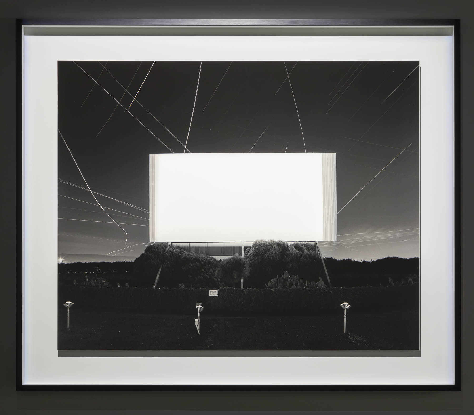
 'Union City Drive-in, Union City' 1993")


 'Bay of Sagami, Atami' 1997")


 'Chrysler Building' 1997")
 'World Trade Center' 1997")
 'Eiffel Tower' 1998")


' 1995")
 'Sea of Buddha 049 (Triptych)' 1995")


 'The Electric Chair' 1994")


 'Anne Boleyn' 1999")

 'Queen Victoria' 1999")
 'Salvador Dali' 1999")
 'Oscar Wilde' 1999")


 'Diana, Princess of Wales' 1999")


 'Lightning Fields 225' 2009")


 'Mathematical Model 002 Dini's Surface' 2005")


 'Conceptual Form Surface 0001 Helicoid: Minimal Surface' 2004")

 from Vale Larry Fink (American, 1941-2023)")
")
 Pat Sabatine's 8th Birthday Party' 1977 from Vale Larry Fink (American, 1941-2023)")
 'Russian Ball, New York City' 1976")
 'Pat Sabatine's 11th Birthday Party' 1980")
 'Benefit, MoMA, New York' 1977")
 'Skating Rink' 1980")
 'Studio 54, New York City' May 1977")
 'Oslin's Graduation Party' 1977")
 'N.Y.C. Club Cornich', from the portfolio '82 Photographs 1974 to 1982' 1977; printed 1983")
 'Melzer Family Picnic, Eastport, Long Island, New York' June 2002")
 'Peter Beard's, East Hampton', from the portfolio '82 Photographs 1974 to 1982' 1982; printed 1983")
 'Jean Sabatine and Molly' 1983")
 'Benefit, Corcoran Museum, Washington DC' 1975")
 'New York City' 1955 from Vale Elliott Erwitt (1928-2023)")
 'Pasadena, California, USA' Nd from Vale Elliott Erwitt (1928-2023)")
 'USA. California. Berkeley' 1956 from Vale Elliott Erwitt (1928-2023)")
 'USA. New York, New York' 1953 from Vale Elliott Erwitt (1928-2023)")
 'Felix, Gladys and Rover (New York, USA)' New York City, 1974")
 'Moscow, USSR' 1959")

 'Wilmington, North Carolina' 1950")
 'Paris, France' 1989")
 'USA. New York City' 1988")
 'Pittsburgh, USA' 1950")
 'Brazil. Buzios' 1990")
 'Guanajuato, Mexico' 1957")
 'Fort Dix, USA' 1951")
 'Bakersfield, USA' 1983")
 'Bal, Paris, France' 1967")

 'Huntsville, Alabama' 1974")
 'Venus' early 1800s")
 Royal Saxon Porcelain Manufactory (manufacturer, Meissen, Germany) 'Portrait bust, 'Baron Schmiedel'' 1739")
; and at bottom, Christopher Dresser's 'Vase' (c. 1888)")
(designer and maker, Germany) 'Plate' c. 1923 (installation view)")
 Linthorpe Pottery (manufacturer, Middlesbrough, Yorkshire, England) 'Vase' c. 1888 (installation view)")
, silk-double weave, Art Nouveau style, woven by Johann Backhausen and Sohne, Vienna, Austria, made by Koloman Moser, Vienna, Austria, 1900-1903")
, silk-double weave, Art Nouveau style, woven by Johann Backhausen and Sohne, Vienna, Austria, made by Koloman Moser, Vienna, Austria, 1900-1903")
 (designer and maker, Canberra, Australian Capital Territory, Australia) Bowl form, 'Untitled' 1990-1991")


 'Aircraft undercarriage from Lockheed Altair monoplane 'Lady Southern Cross', starboard side' Probably 1933")
 'Model staircase' 1891")
 'Long case clock' 1690")
 'Long case clock' 1733-1764")
, sheet gold alloy, Sumba, Indonesia, 1880-1950; and at second top, Textile length (mens waist cloth), handwoven cotton / shells / beads, maker unknown, East Sumba, Indonesia, 2000-2004")
, sheet gold alloy, Sumba, Indonesia, 1880-1950; and at second top, Textile length (mens waist cloth), handwoven cotton / shells / beads, maker unknown, East Sumba, Indonesia, 2000-2004")
")
")
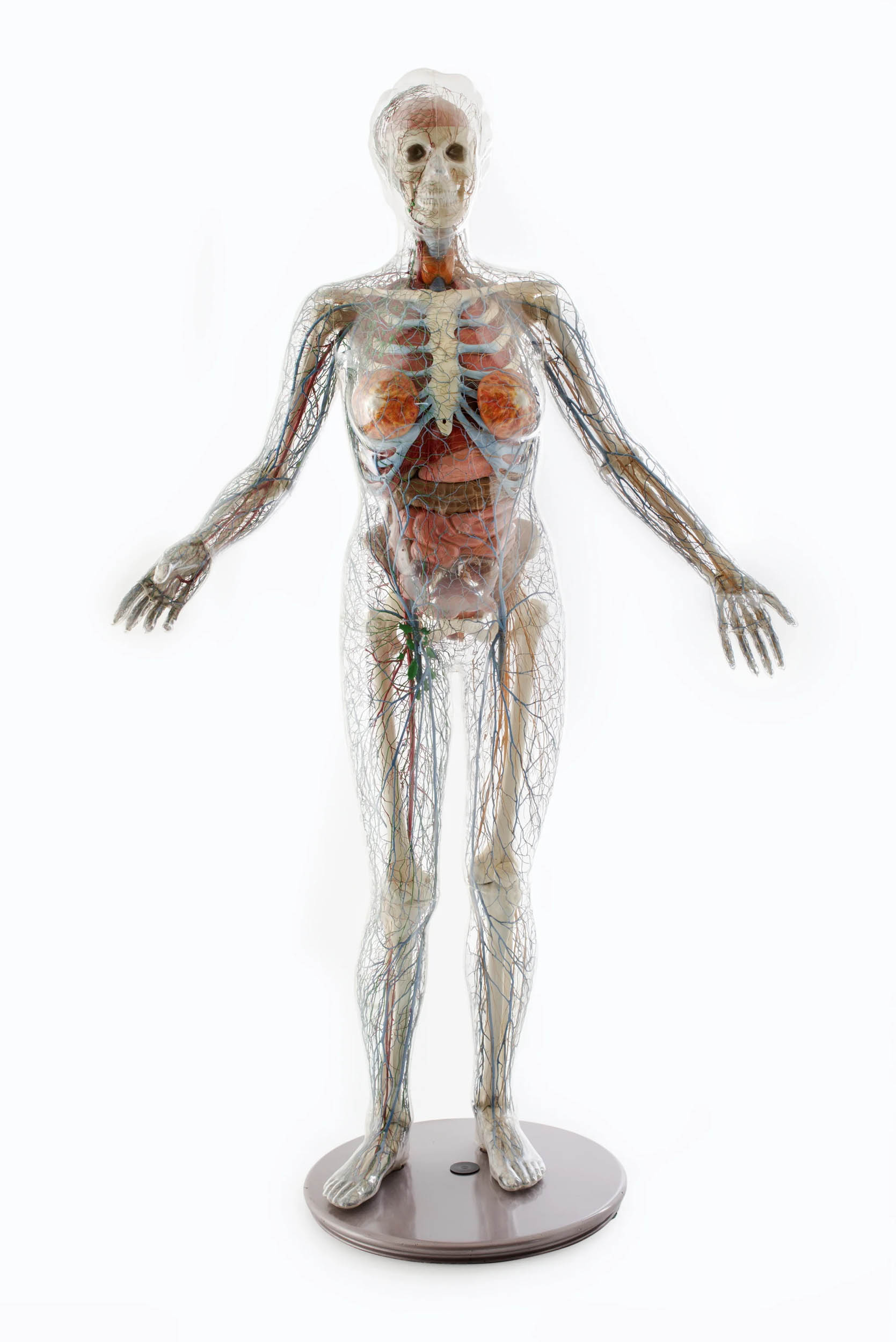
 (English, 1941-2022) 'Shoes (pair), 'Super Elevated Gillie', 'Anglomania' collection, Autumn / Winter 1993-1994' 1993 Shoes (pair), 'Super Elevated Gillie'")
![J Hubert Newman (photographer, Sydney, New South Wales, Australia) (Australian, c. 1835-1916) 'Untitled [young boy in sailor suit]' Nd](https://artblart.com/wp-content/uploads/2023/10/newman-young-boy-in-sailor-suit.jpg "J Hubert Newman (photographer, Sydney, New South Wales, Australia) (Australian, c. 1835-1916) 'Untitled [young boy in sailor suit]' Nd")


, model 946, glass, designed by René Lalique, 1921, made by René Lalique et Cie, Wingen-sur-Moder, France, c. 1950)")
, model 946, glass, designed by René Lalique, 1921, made by René Lalique et Cie, Wingen-sur-Moder, France, c. 1950)")
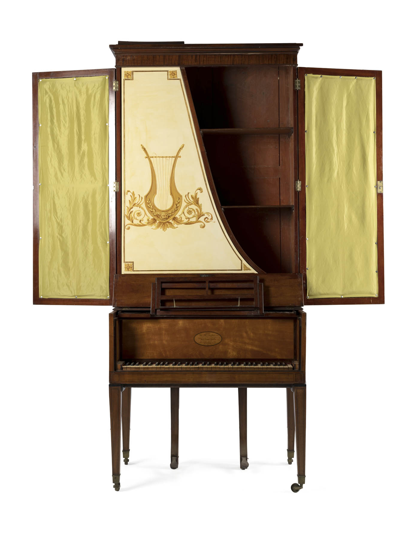
")
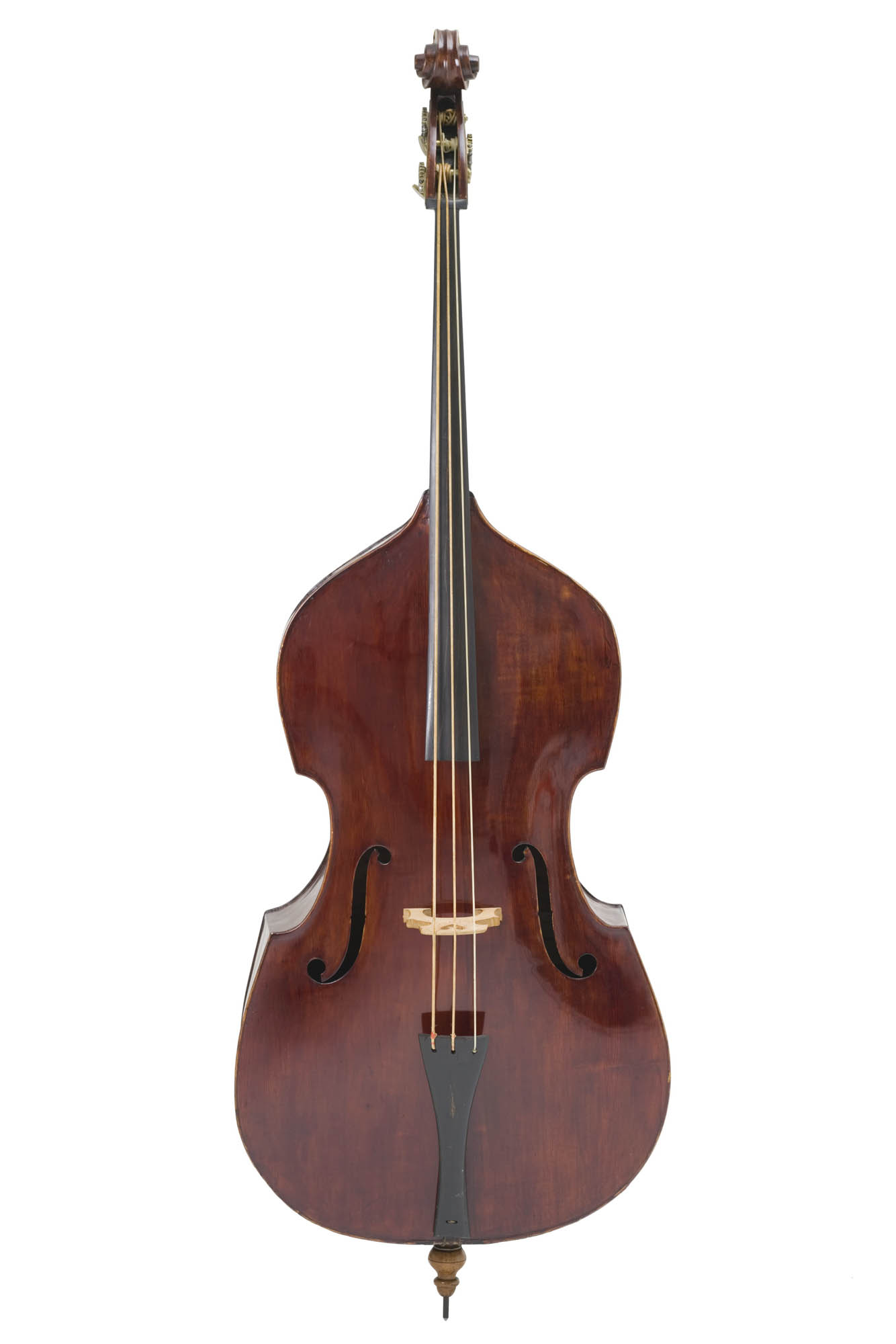
 'Guitar' c. 1975 painted and used by Harold 'The Kangaroo' Thornton, Sydney, New South Wales, Australia, 1980-2000")
 J.W. Hukin and J.T. Heath (maker, London, England) 'Kettle and burner on stand' 1878")
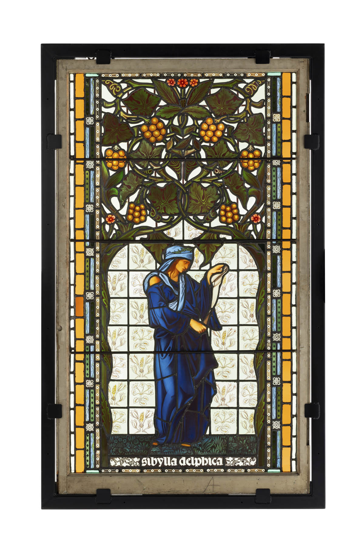

(painter) Sevres Royal Porcelain Manufactory (manufacturer, Sevres, Paris, France) 'Plate, 'Impression sur Etoffes: Teinture', from the 'Service des Arts Industriels' (Industrial Arts Service), with a scene illustrating textile dyeing workshop in the Manufacture Royale de Jouy' 1830")
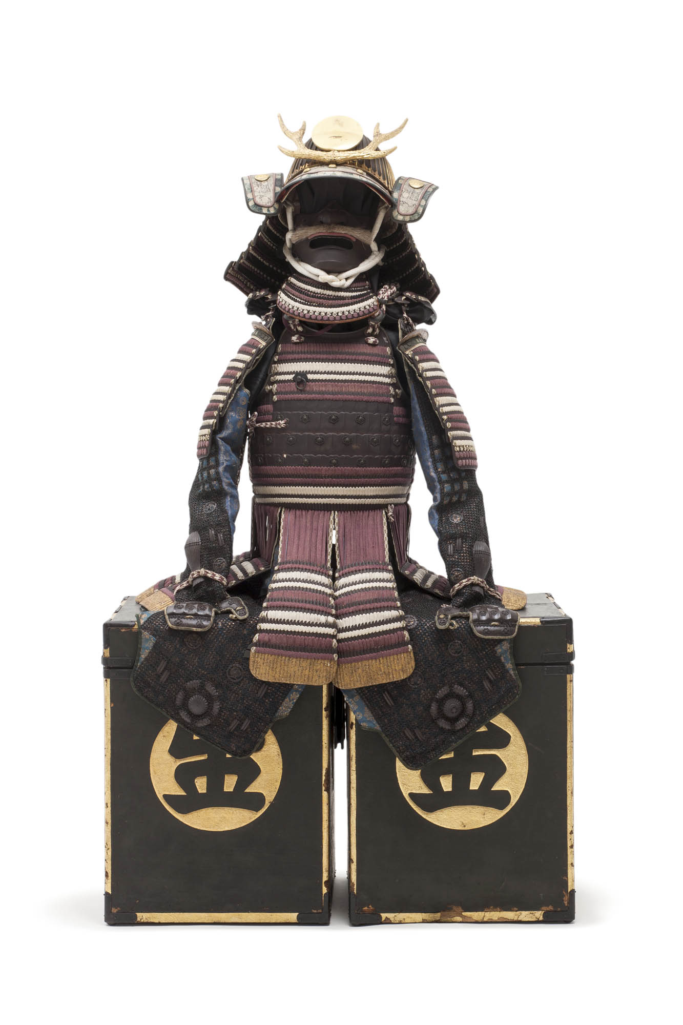
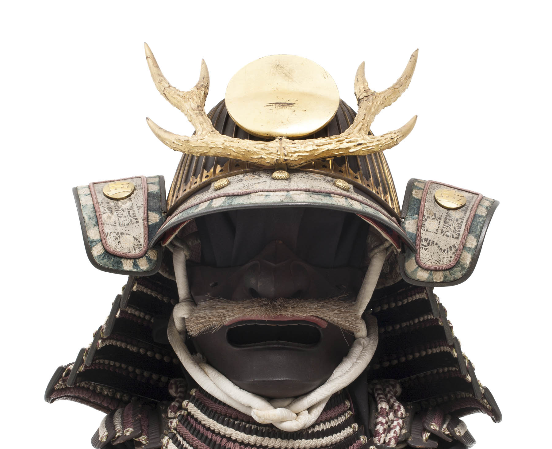
(designer, Glasgow, Scotland) 'Chair, 'Argyle'' 1898-1899")
 'Chandelier, 'USA'' 2013")
")
")
(maker, Sydney, New South Wales, Australia) 'Presentation trowel' c. 1883 (installation view detail)")
, gold / operculum by F Allerding & Son, Sydney, New South Wales, Australia, 1879-1884; and at second top centre, Bangle, 'Soyons toujours unis / Par un divin amour', 18 carat gold, Henry Steiner, Adelaide, South Australia, c. 1878")
, gold / operculum by F Allerding & Son, Sydney, New South Wales, Australia, 1879-1884; and at second top centre, Bangle, 'Soyons toujours unis / Par un divin amour', 18 carat gold, Henry Steiner, Adelaide, South Australia, c. 1878")
 'Necklace from a parure which includes locket and earrings (pair)' 1879-1884 (installation view)")
 'Advertising signage (1 of 5), white horse rampant' c. 1930s (installation view)")


(designer) Florence Broadhurst Wallpapers Pty Ltd (maker, Sydney, New South Wales, Australia) 'Wallpaper roll, 'Peacocks' design' 1969-1977 (installation view)")


 'Chair, reproduction, based on Lucien Henry, 'Lyrebird' or 'staghorn fern' design' 2000 (installation view)")
 'Court dress, comprising open robe, petticoat, length of fabric and galloon (2)' c. 1760")
(designer, Paris, France) 'Evening dress, womens, spring-summer 1939' 1939")
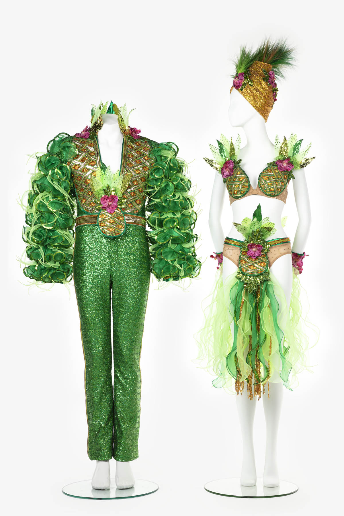
 'Outfit, 'Iced Vo Vo', comprising of dress and shoes (pair), womens, Doilies and Pearls, Oysters and Shells collection, spring-summer 2009/2010' 2009")
 'Dark Paradise' 2022")
 'Madre e hijo' (Mother and son) Nd")
' 2023")
 'Eb, 25 weeks pregnant, post mastectomy' Nd")
 'If I were a mangrove tree, I will rebirth on the sweet land' Nd")
 \"Alex\" from the project 'Ser Libre' (Be Free) Nd")
 'Jessica and a Dollhouse' 2021")
 'Brenda and Lucia' Nd")
 'Las Reinas' (The Queens) Nd")
 'Serenity' Nd")
 'When was your first kiss?' Nd")
 'Capri and Astro' Nd")
 'Woman Wearing Big White Wig, New York' Nd")
 'Self-portrait (reaching)' Nd")
 'Femme Orchid' (Orchid Woman) Nd")
 \"Ada and Amara\" from the project 'I am that I am' Nd")
 \"Heterochromia\" from the project 'What is beauty?' Nd")
 'Beirut Dystopia' Nd")
 'Dolphin Lady' Nd")
 'Every family has its demons' Nd")
 \"#266 Stranded\" from the project '90 Miles' Nd")
 'Red Room/Telephone' 2023")
 'Cow Master' Nd")
 '\"My Body (But I Do Not Own It) – Not the Governments Nor the Churches.\" Self portrait as gay skinhead' 1992")
 'I Do Dick, Glenn, Darlinghurst, Sydney' 1992")
 'Glenn, Darlinghurst, Sydney' 1992")

 'Jeff standing on his Chrysler, Studley Park, Melbourne, Victoria, 1992' 1992")
 'Fred and Andrew, Sherbrooke Forest, Victoria' 1992")


 'Andy in the flat, Punt Road, South Yarra' 1991-1992")


 'Untitled' 1995-96 From the series 'Sleep/Wound'")
 'Ernest Stones and Robert Bright (San Francisco)' 1949")
 'Untitled' 1995-1996 From the series 'Sleep/Wound'")
 'Untitled' 1995-1996 From the series 'Sleep/Wound'")
 'Skull' 1983")
; and at right, 'Skull' (1983, above) © Gerhard Richter 2023")
; and at right, 'Uncle Rudy' (1965/2000, below)")
 'Uncle Rudy' 1965/2000")
 'Tante Marianne' (Aunt Marianne) 1965/2019 from the exhibition 'Gerhard Richter. 100 Works for Berlin' at the Neue Nationalgalerie, Berlin, April 2023 - 2026")
 'Herr Heyde' 1965/2001 from the exhibition 'Gerhard Richter. 100 Works for Berlin' at the Neue Nationalgalerie, Berlin, April 2023 - 2026")
 'Besetztes Haus (695-3)' 1989 from the exhibition 'Gerhard Richter. 100 Works for Berlin' at the Neue Nationalgalerie, Berlin, April 2023 - 2026")
 'Schwarz, Rot, Gold' (Black, Red, Gold) 1999")

 'Birkenau' 2014")
 'Birkenau' 2014")
 'Birkenau' 2014")
 'Birkenau' 2014")

 '16.2.98' 1998")
 '25.2.98' 1998")

 '17. Nov 99' 1999")
 '20.6.05' 2005")
 'Aladdin' 2010")
 'MV. 133' 2011")
 'MV. 134' 2011")
 'MV. 136' 2011")
 'MV. 140' 2011")
 'MV. 142' 2011")
 '19. März 2015' 2015")
 '22.6.16' 2016")
 '25.6.16 (1)' 2016")
 'Abstract painting' 2016")
 'Abstract painting' 2016")
 'Abstract painting' 2016")
")
 '4900 colours' 2007 (detail)")
; and at centre right, 'Strip (930-3)' (2013/2016, below)")
' (2013/2016, below)")
' (2013/2016, below)")
 'Strip (930-3)' 2013/2016")
 'Strip (930-3)' 2013/2016 (detail)")
 'Young Woman in Black with Pendant, Estrada Courts, Boyle Heights, East Los Angeles, 1978' 1978 from the exhibition 'Fashioning Self: The Photography of Everyday Expression' at the Phoenix Art Museum, March - Nov 2023")
 'Albert and Lynn Morales, Silver City, New Mexico' 1978 from the exhibition 'Fashioning Self: The Photography of Everyday Expression' at the Phoenix Art Museum, March - Nov 2023")
 'Tucson, Arizona' 1992 from the exhibition 'Fashioning Self: The Photography of Everyday Expression' at the Phoenix Art Museum, March - Nov 2023")
 'Man with Reflective Glasses' 1969-1972")
 'White Girl 1970' 1970")
![Garry Winogrand (American, 1928-1984) 'Untitled [Liberace with his mother]' New York, 1954](https://artblart.com/wp-content/uploads/2023/09/83204a.jpg "Garry Winogrand (American, 1928-1984) 'Untitled [Liberace with his mother]' New York, 1954")
 'Muscle Beach, Los Angeles' 1949")
 'Kuniyoshi Portrait' c. 1941")
![Max Yavno (American, 1911-1985) 'Untitled [Opening Night at the San Francisco Opera]' 1947](https://artblart.com/wp-content/uploads/2023/09/92143117.jpg "Max Yavno (American, 1911-1985) 'Untitled [Opening Night at the San Francisco Opera]' 1947")
 'Air Force Pilot' 1975-1980")
 'Pennsylvania Dutch & Adidas, Santa Cruz, U.S.A.' 1975")
 'Jitterbugging in a night club. Memphis, Tennessee, 1939' 1939-11")
 'Spectators at the Paddock Fence, Warrenton, West Virginia' 1941")
 'Board of Directors of the Two Rivers Non-stock Cooperative at a Demonstration of Farmall \"M\" Tractor, Waterloo, Nebraska' 1941")
 'Self-portrait with Friend' c. 1912")
 'Mrs. Mary Hatchett, Chicago' 1979")
 'Easter, Chicago' 1979")
 'Helene Mayer, Two Time Olympic Fencing Champion' 1935")
 'Drive-in Owners, North Carolina' 1987")
 'Marseille' 2008")
 '70-40, Clairsville, Ohio' 1978")
 'Untitled' 1973")
 'Untitled' 1985")
 'Untitled' 1992")
 'Untitled' 1963")
 'David Jackson and James Merrill, Stonington, Connecticut' 1961")
 'Georgia O'Keeffe with René d'Harnoncourt, Director of MoMA, at the Georges Seurat Opening, NYC' 1958")
 'Untitled' 1948")
 'Ronis Wedding II, Easton Pennslyvania' January 1989")
 'John and Sandy's Wedding' 1980")
 'The Cotillion' 2015")
 'Juanito with Jesus Tattoo, Albuerquerque, NM' 1986")
 'President Barack Obama And First Lady Michelle Obama Attend The Inaugural Balls' 2009")
 'On the Ranch, Wyoming, USA' 1977")
 'First Lady Rosalyn Carter, Airforce 2 en route Orlando, USA' 1978")

You must be logged in to post a comment.