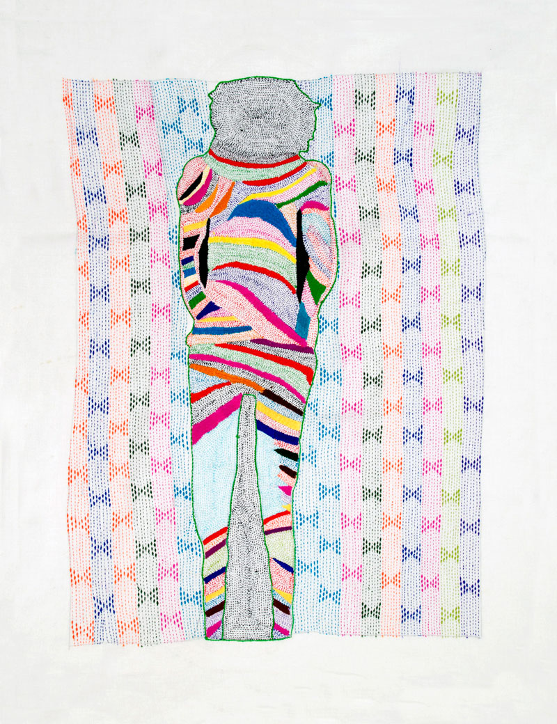
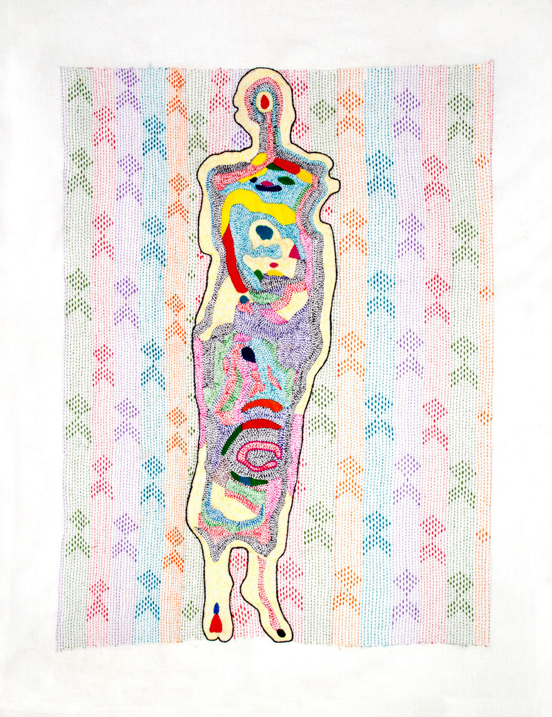
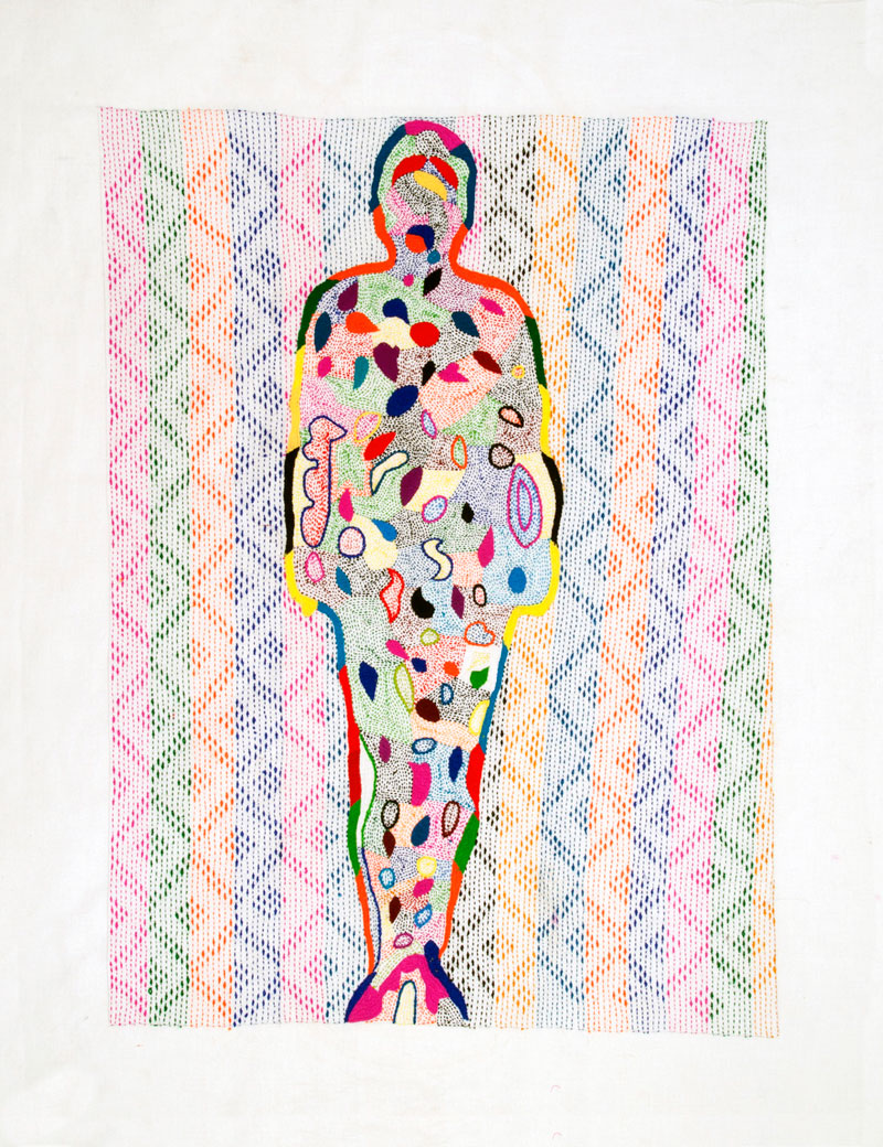
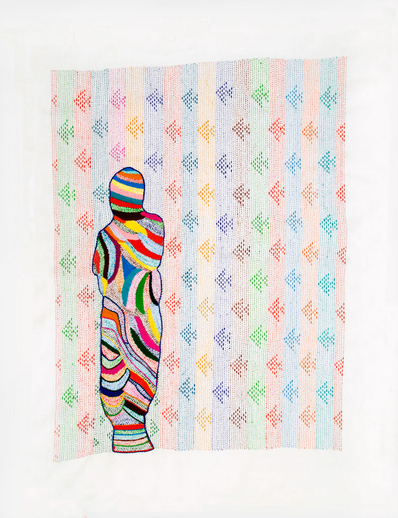
Appeal for donations: Andrew Follows and his exhibition in Edinburgh, August 2012

June 2012


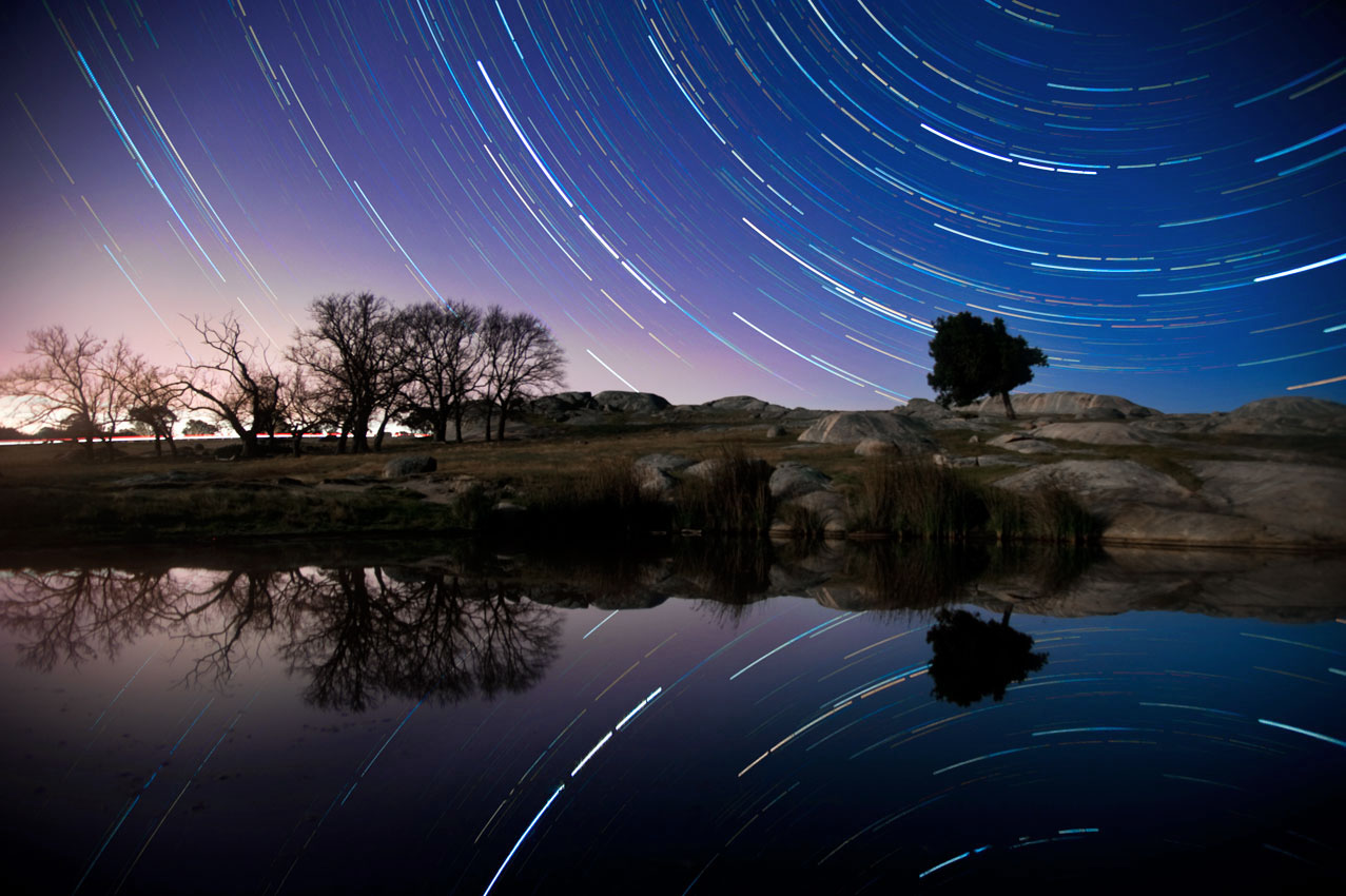
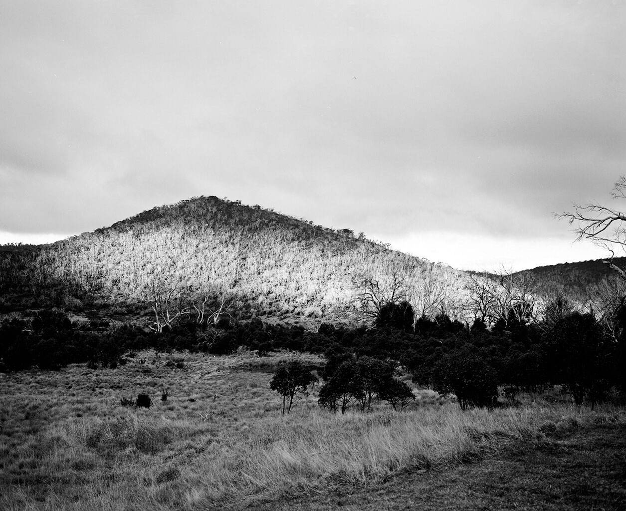
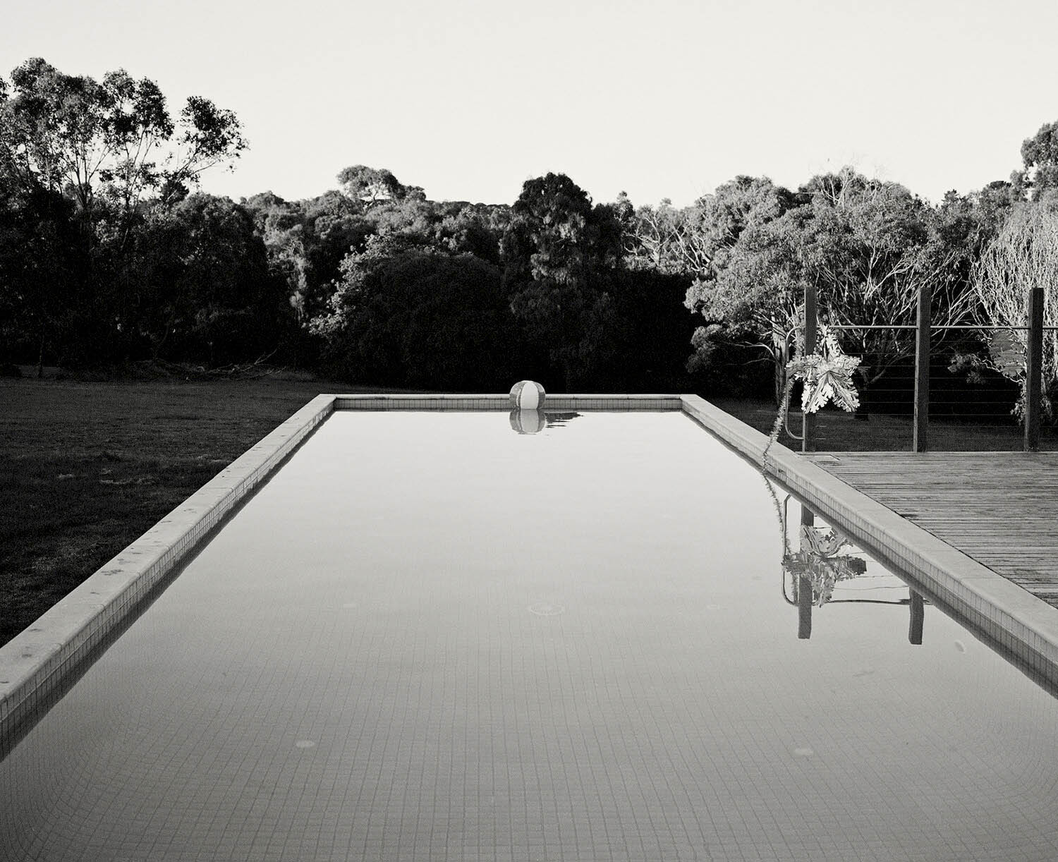
Andrew Follows (Australian, d. 2019) 'Untitled' 2012 From the series 'Night's Ocean Shore'


Andrew Follows (Australian, d. 2019)
Untitled
2012
From the series Night’s Ocean Shore


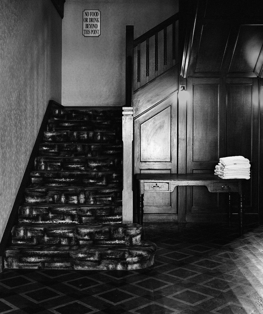
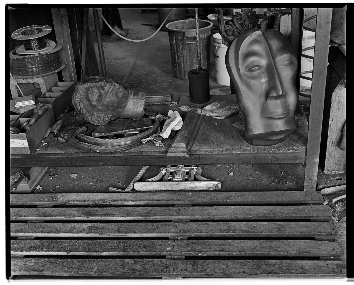
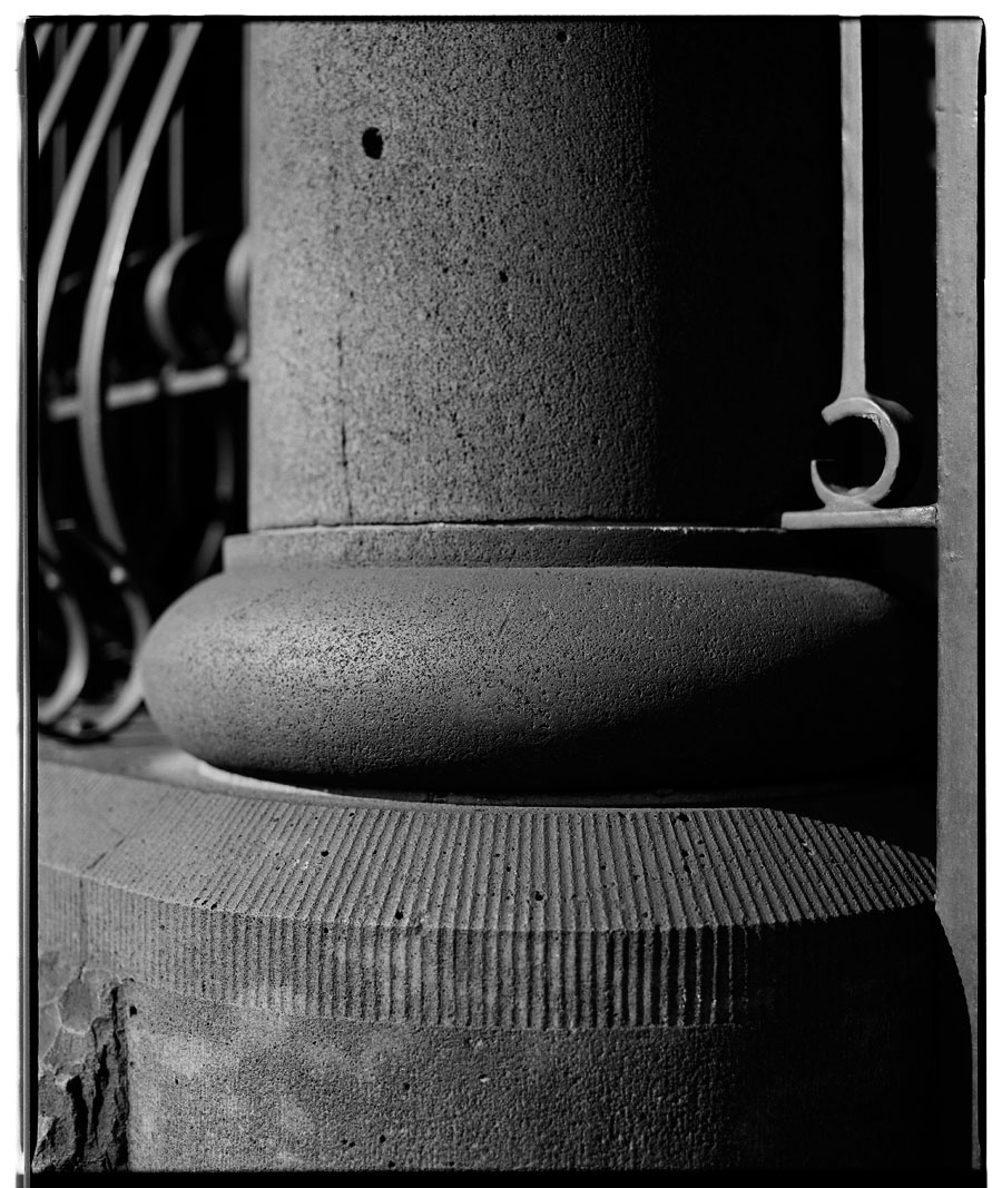
As you may know I have been helping vision impaired Australian photographer Andrew Follows as he prepares for the greatest adventure of his life, a joint exhibition as part of the Edinburg… Art Festival titled Through the Looking Glass, Dimly. The works have all be printed and framed and are on their way to Scotland at this very moment.

Dr Marcus Bunyan


Andrew Follows. 'Through the Looking Glass, Dimly' invitation

ABAF Andrew Follows support my art project


Andrew Follows website

LIKE ART BLART ON FACEBOOK

Back to top

Art Blart 600 postings and 600 likes!

May 2012


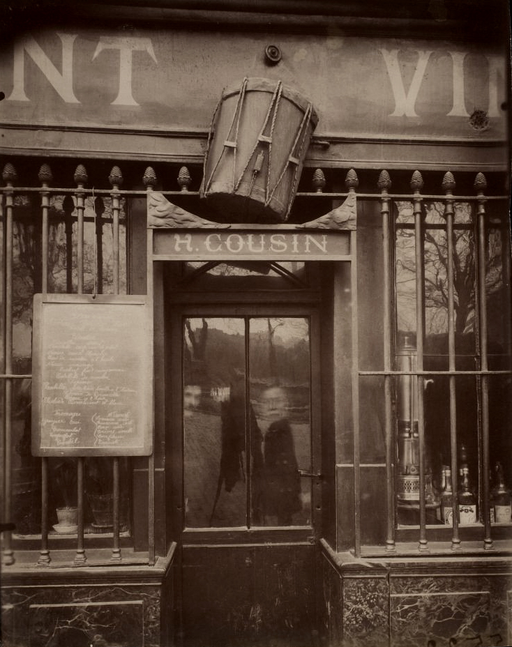
Eugene Atget (French, 1857-1927) 'Au Tambour, 63 quai de la Tournelle' 1908


Eugene Atget (French, 1857-1927)
Au Tambour, 63 quai de la Tournelle
1908


The second photograph ever published on Art Blart on the very first day. Ghosts in the machine (Asimov)…


Art Blart started on November 13th 2008 and has just posted its 600th post!
The third posting on the first day was a quotation by Susan Sontag about photography, an auspicious way to start.

Sontag, Susan. “Photography: A Little Summa”

Art Blart on Facebook has just clocked up its 600th Like!

Like Art Blart on Facebook


I like these coincidences in life… thank you to all the readers for following over the years *smiles*

Dr Marcus Bunyan


LIKE ART BLART ON FACEBOOK

Back to top

Review: ‘Littoral’ by Kristian Laemmle-Ruff at Colour Factory Gallery, Fitzroy

Exhibition dates: 4th May – 26th May 2012


Kristian Laemmle-Ruff (Australian) 'Truck in Safi' 2010


Kristian Laemmle-Ruff (Australian)
Truck in Safi
2010
Type C print
100 x 67cm


Jeff Wall, the renowned Canadian photographer, observed recently that, “Photography is such a wide, complex art form medium that there’s no real single way of practising it. Up until 30 to 40 years ago, it was pretty much presumed that the way you practised photography seriously was in the documentary mode. It was very unilateral, other things weren’t really plausible. I never objected to documentary photography, but it’s not the whole story…”1

How true. In this post-photography world there are many spaces in the city for showing all kinds of photographic work, notably at the Centre for Contemporary Photography in Fitzroy. While the viewer does learn about different modes of photographic representation through experiential learning (making meaning from the direct experience of looking at such work), personally some contemporary photography often leaves me feeling rather underwhelmed. Rarely do I leave the CCP thinking, wow, that was a great “photography” exhibition, I have seen something amazing about the world that I had not recognised before. Interesting: possibly; inspiring / engaging / memorable: occasionally, which is perhaps why reviews of exhibitions at the CCP occur rather rarely in this archive. This is not to belittle the work that the CCP does as an establishment, far from it, but just to note that not much contemporary photography lasts long in the mind.

It was such a joy then to walk around the corner from the CCP to the Colour Factory Gallery and view the exhibition Littoral by emerging artist Kristian Laemmle-Ruff. This is one of the best, if not the best, “photography” exhibition I have seen so far this year. As soon as you walk into the simple, elegant gallery you are surrounded by fourteen large scale horizontal photographs that are suffused with colour variations bouncing across the gallery – here a blue, there a green, now a lush orange palette. The effect is much like Monet’s waterlilies at the Musée de l’Orangerie in Paris; seated in the middle of the four curved paintings you are surrounded by large daubs of paint of various hues that have an elemental effect – resonances of earth, air, water, fire – on the viewer. The same affection of colour and space can be found in Laemmle-Ruff’s photographs.

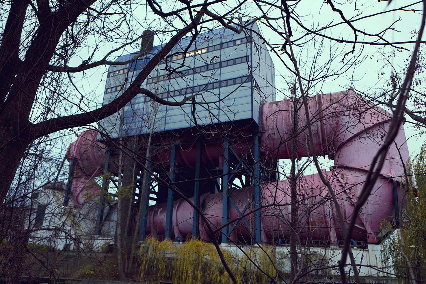
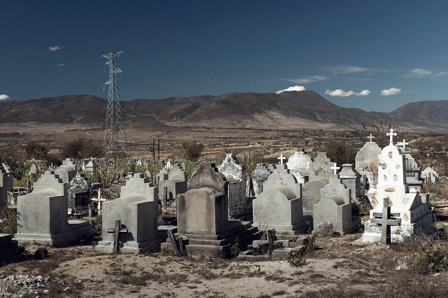
The artist’s literal rendition (the definition of littoral is that it relates to the coastal zone between the limits of high and low tides) of the interstitial spaces at the edge of urbana, the fluid spaces of a no man’s land, are beautifully visualised in the work. These entropic spaces are mainly devoid of physical human presence but filled with the detritus of humanity: concrete boxes and tangled beams of steel, satellite dishes and red-eyed chimney stacks. In Casablanca Terrace II (2010, below) satellite dishes shimmer in orange while in the distance alien lights seem to hover over the city; in Manneheim (2010, below) the whole photograph is a cold, chilly blue the only visible signs of human existence a couple of lights peeping from the flat windows (at left) while the belching smoke from numerous alien, red-eyed War of the Worlds chimney stacks blends seamlessly into the overcast sky (please enlarge the photograph to see these). When first looking at New Homes (2011, above) I thought the green lines at bottom left were trenches until I realised they were hedges. Then I noticed the empty oval in the upper right quadrant – a demolished sporting facility… a racetrack… a spaceship landing pad? In these familiar but alien landscapes (ice covered swimming pools, graveyards sitting under mountains) Laemmle-Ruff plays with colour, space and depth of field. In some photographs, such as Road to Essaouira (2010, below bottom) the depth of field is very shallow, the focus point in the photograph being the road and gravel, silver road sign and buildings falling out of focus beyond. Like the shifting of colour, this expansion and contraction of DOF from one photograph to the next adds to the body of works ethereality.

The best print in the exhibition is Truck in Safi (2010, above) which is an absolute knockout. The composition is beautifully visualised and the print is incredibly luminous and well balanced. The large white ‘M’ on the back of the earth-filled truck solidifies our gaze in the mid-foreground while, metaphorically, the letter stamps the earth as the possession of man. The road curves into the distance and upon it, as minute specks, are a bicycle and two motorbikes. The sweep of an industrial plant fills the horizon line in a sensuous entanglement of vessels and pipes. This truly is a beautiful photograph and therein lies the contradiction present in Laemmle-Ruff’s body of work. While seeking to capture the paradoxes of urbanisation and consumerism, a vernacular world, familiar and normal (both the beauty and frailty of our times as Laemmle-Ruff puts it), the beauty of the photographs becomes the heart of the work, its strength in the presence of the viewer and perhaps its slight weakness as well. The artist’s visual acoustics, his mythologising of the city if you like – the (dis)ease of the city as sublime photograph picturing the picturesque – has, to my mind, elements of Pictorialism in the artist’s scopophiliac looking. Nothing wrong with that, but we must acknowledge that there is a contradiction here, not between the beauty and frailty of our times, but between the frailty of the earth and the constructed beauty of the photograph seen through a desirous looking that might be at odds with Laemmle-Ruff’s intended project.

Be that as it may, it is a great pleasure to see a young, emerging artist produce such memorable photographic works. Walking into the gallery the viewer can littorally feel the pleasure that the artist has in capturing these complex, fluid spaces. The artist is at the beginning of a path of exploration where each new body of work will develop thematically out of concerns that have been evidenced here. Where this journey will take him is unknown but with courage, fortitude, knowledge, passion, a good eye and a camera he will go far. Good stuff!

Dr Marcus Bunyan


1/ Wall, Jeff quoted in Laurie, Victoria. “Lights, Camera,” in The Weekend Australian Review. May 19-20 2012, p. 5


Many thankx to the artist and the Colour Factory Gallery for allowing me to publish the photographs in the posting. Please click on the photographs for a larger version of the image.


Kristian Laemmle-Ruff (Australian) 'Safi' 2010-2012


Kristian Laemmle-Ruff (Australian)
Safi
2010-2012
Type C print
100 x 67cm


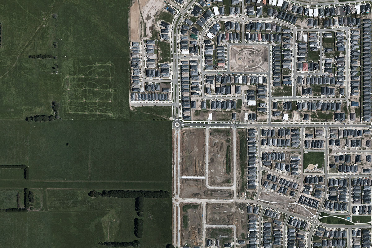
Kristian Laemmle-Ruff (Australian) 'New Homes' 2011


Kristian Laemmle-Ruff (Australian)
New Homes
2011
Type C print
100 x 67cm


Kristian Laemmle-Ruff (Australian) 'Casablanca Terrace II' 2010


Kristian Laemmle-Ruff (Australian)
Casablanca Terrace II
2010
Type C print
100 x 67cm


Kristian Laemmle-Ruff (Australian) 'Manneheim' 2010


Kristian Laemmle-Ruff (Australian)
Manneheim
2010
Type C print
100 x 67cm


Littoral examines the shifting overlap between landscape and urbanscape. As a reaction to a traditional approach where the two are consciously separated, Laemmle-Ruff focuses on the often grotesque and ever-expanding littoral zone between civilisation and nature.

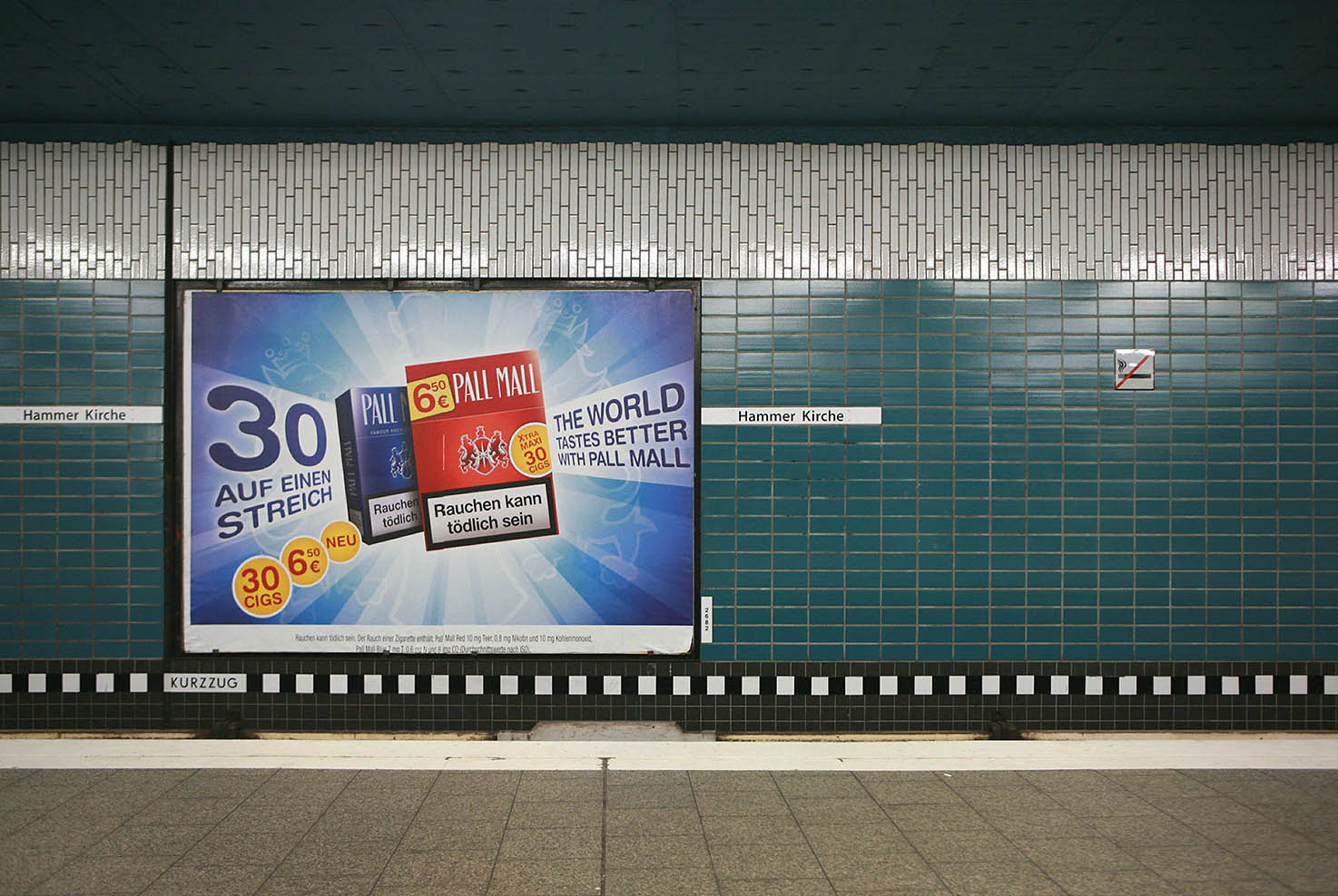
“I found these undefined zones did not discriminate on place or culture. From Morocco to the post WWII suburbs of Germany, somber skies were met with stubborn and aggressive urbanisation. I was drawn to contradictions. “The World Tastes Better with Pall Mall” claimed the cigarette ad. These empty remarks of consumerism seemed to go unchallenged. My intention was to capture these paradoxes and pull them from the wallpaper of modern sensibility. Our gaze once traveled to picturesque, unspoiled horizons, forests in mist and rolling plains. Instead it stops on concrete or becomes tangled in steel beams.”

Littoral presents us with spaces anticipating themselves. Housing estates on the fringe of development yet to be occupied; North African peasants walking past the mall’s facade where the market once stood; roof top terraces lined with satellite dishes streaming immaculate reception. We are left to wonder who will fill these homes. Who is in control of where urbanisation will go next?

Ultimately, this series may appear to be a presentation of a vernacular world, familiar and normal. This, in turn alludes to a desensitisation to our changing surroundings in an age of globalisation and overpopulation. Our landscape is increasingly becoming a manifestation of ourselves. Littoral urges one to question where the present seems to be leading us.

Practicing in both documentary and conceptual photography, from warm narratives to surreal visions, Kristian Laemmle-Ruff’s photographs subtly bring to light both the beauty and frailty of our times. As we spiral up the exponential curve of ‘progress’ there are dynamic ruptures, vulnerabilities and regenerative possibilities in our human reality – this is his motivation – a truth worth capturing.

Press release from the Colour Factory Gallery website
 

Kristian Laemmle-Ruff (Australian) 'Olympic Stadium' 2012


Kristian Laemmle-Ruff (Australian)
Olympic Stadium
2012
Type C print
100 x 67cm


Kristian Laemmle-Ruff (Australian) 'Road to Essaouira' 2010


Kristian Laemmle-Ruff (Australian)
Road to Essaouira
2010
Type C print
100 x 67cm


Kristian Laemmle-Ruff (Australian) 'Aqua dynamics' 2010-2012


Kristian Laemmle-Ruff (Australian)
Aqua dynamics
2010-2012
Type C print
100 x 67cm


Kristian Laemmle-Ruff (Australian) 'Valle de Zimatlan' 2010-2012


Kristian Laemmle-Ruff (Australian)
Valle de Zimatlan
2010-2012
Type C print
100 x 67cm


Kristian Laemmle-Ruff (Australian) 'Pall Mall' 2010-2012


Kristian Laemmle-Ruff (Australian)
Pall Mall
2010-2012
Type C print
100 x 67cm


Colour Factory Gallery
409-429 Gore Street
Fitzroy, Victoria 3056
Phone: +61 3 9419 8756

Colour Factory Gallery website
Kristian Laemmle-Ruff website
LIKE ART BLART ON FACEBOOK

Back to top

Review: ‘Jacqui Stockdale: The Quiet Wild’ at Helen Gory Galerie, Melbourne

Exhibition dates: 18th April – 19th May 2012


Jacqui Stockdale. 'Rama-Jaara the Royal Shepherdess' 2012


Jacqui Stockdale (Australian, b. 1968)
Rama-Jaara the Royal Shepherdess
2012
Type C Print
100 x 78cm


After a slow start to the season there has be a veritable feast of excellent photography exhibitions in Melbourne over the last month or so, including John Gollings and Jane Brown at Edmund Pearce Gallery, the Fred Kruger and Light Works exhibitions (at NGVA and NGVI respectively), Littoral by Kristian Laemmle-Ruff at Colour Factory (the next local review after this one) and this exhibition, The Quiet Wild by Jacqui Stockdale at Helen Gory Galerie.

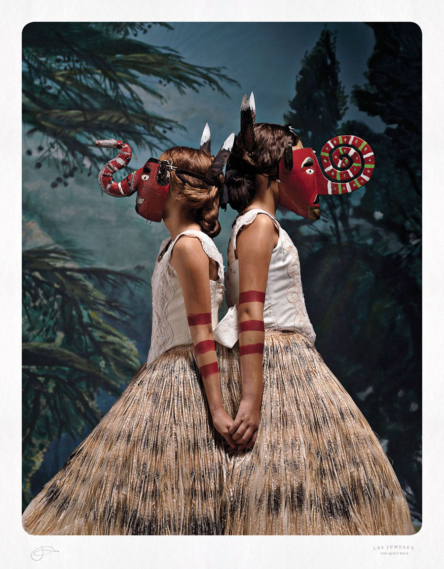
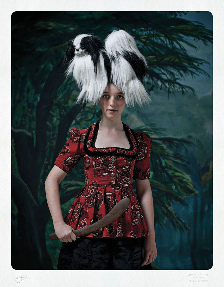
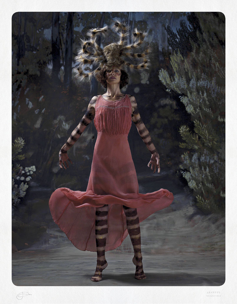
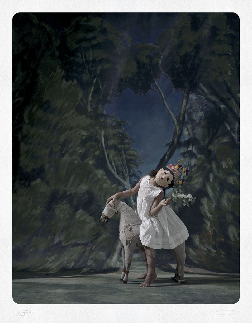
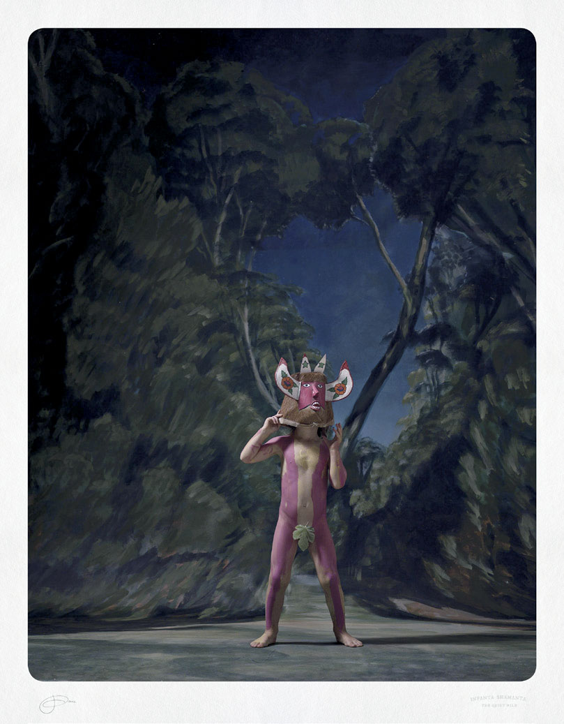
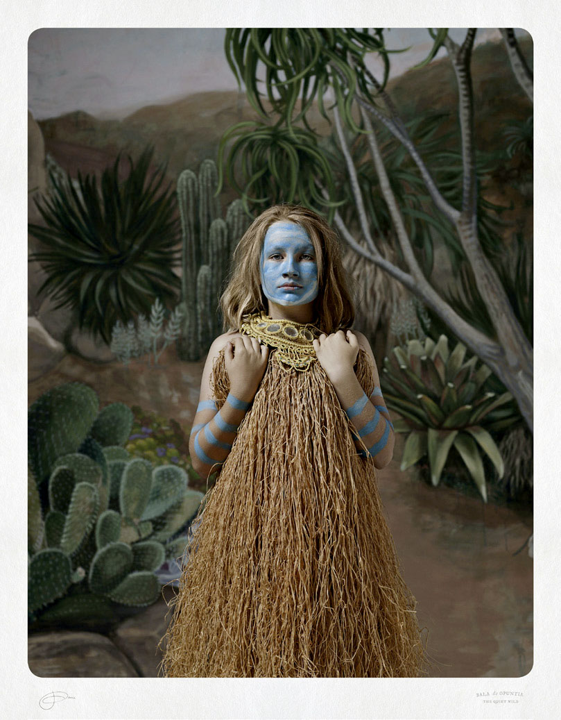
This is a very strong exhibition by Jacqui Stockdale, the metre tall colour prints (printed by the Colour Factory) displaying magnificently in the large gallery at Helen Gory. The photographs remind me of a perverse take on the ethnographic Cartes de visite that were produced during the colonial Victorian era in Australia, images of native peoples taken in studios with painted backdrops together with their cultural artefacts (which, coincidentally, can be seen in great detail and sadness in the Fred Kruger exhibition at NGVA). Drawing on personal places and stories, Mexican carnival and wrestlers masks, Indian masks, Aboriginal names and locations, Velasquez’s Las Meninas, the ghost of Frida Kahlo, rituals, gods (such as Rama) and deities, Australian scenery, performance (the process of painting the models and the outcome of this interaction), Stockdale creates a wonderful melange of archetypal characters that subvert traditional identities and narratives. Her creations “shape-shift” and frustrate attempts at categorization and assimilation.

Stockdale’s performative tactics and multiple modes of address, her polyvocal subject if you like, may be said to be an effect of textuality: “a conscious recognition and pursuit of an altogether different set of values and historical and cultural trajectories.”1 Undeniably this performative act (this “ritual spectacle”2) has links to the Bakhtin’s idea of the carnivalesque and the carnival paradigm, which accords to certain patterns of play. Stockdale inverts cultural stereotypes (which embody elements of fixity, repetition, and ambivalence) located within the realms of the fetish, the scopic, and the Imaginary in order to subvert the collective memory of viewers that have been inscribed with a stereotypical collective vernacular: her work transgresses the fantasy that plays a formative role in colonial exercises of power.3

Bakhtin likens the carnivalesque in literature to the type of activity that often takes place in the carnivals of popular culture. In the carnival… social hierarchies of everyday life – their solemnities and pieties and etiquettes, as well as all ready-made truths – are profaned and overturned by normally suppressed voices and energies. Thus, fools become wise, kings become beggars; opposites are mingled (fact and fantasy, heaven and hell).”4

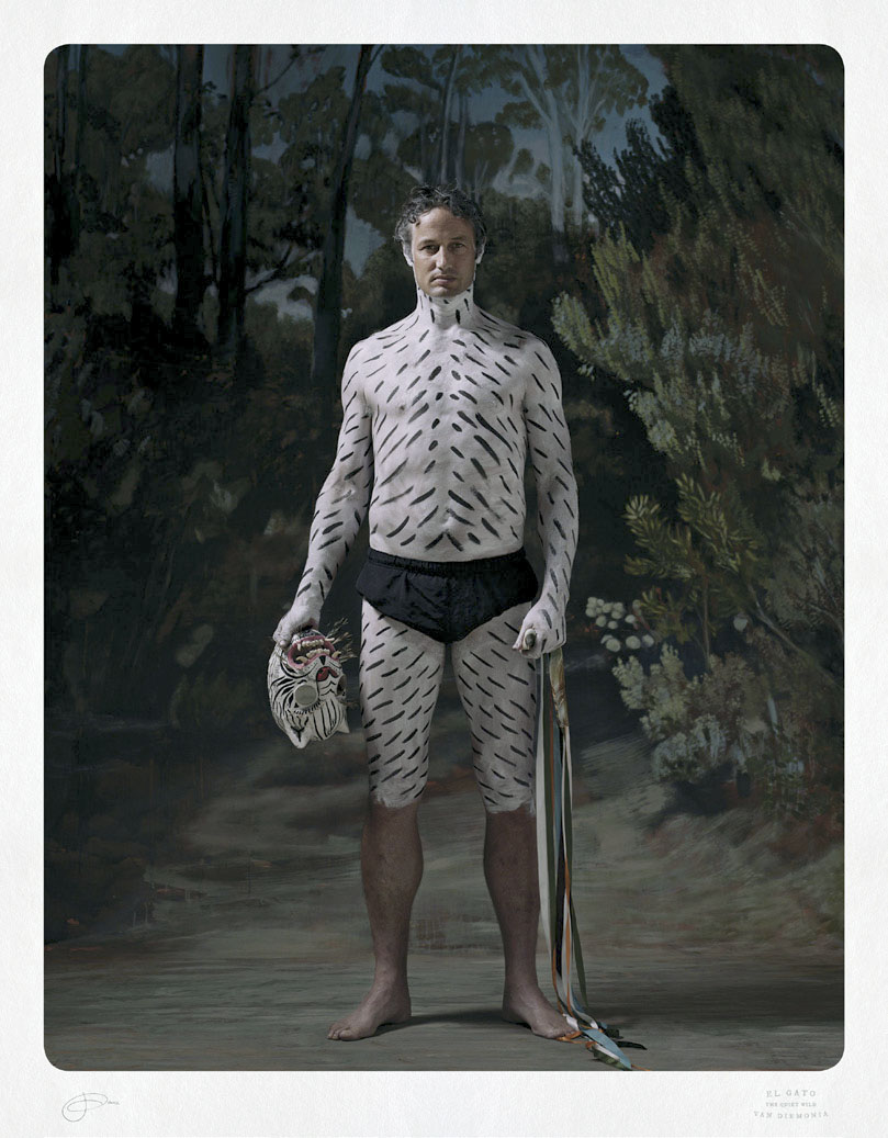
In Stockdale’s world, a “world upside-down” (quite appropriate for Australia), “Each new identity is one of inversion; man becomes woman, child becomes adult, animals transform into humans and vice-versa. Another example of this inversion can be seen in the “branding” of her photographs. In colonial Cartes de visite the sitter is, more often than not, unknown – unless it is an important person. It is the photographer’s name which is printed on the front and back of the card. In these photographs the photographers name is an illegible signature at bottom left, while the title of the person in the photograph is stamped into the work at bottom right. Here Stockdale again inverts traditional textual readings, the titles of her “photographic portraits that embody a world of mystical characters in masquerade” indecipherable to the uninitiated: a coded language of identity and place – Lagunta Man, El Gato, Les Jumeaux, Dogboy of Gondwanan, Infanta Shamanta and Rama Jaara, The Royal Shepherdess. ‘Lagunta’ is Aboriginal for Tasmanian Tiger and ‘Leeawuleena’ for the land around Cradle Mountain. ‘El Gato’ is the cat, ‘Jaara’ being the Aboriginal name for the Long Gully region and ‘Gondwanan’ the name for the southernmost of two supercontinents (the other being Laurasia) before the world split apart into the structure that we known today.

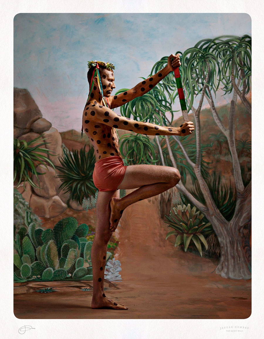
These are incredibly humorous, magical and symbolic photographs. A thought came into my mind when I was in the gallery surrounded by the work: for me they represented a vision of the Major Arcana of the Tarot (for example Jaguar Hombre could be seen as an inverted version of the Hanged Man with his foot in a figure four, the Hanged Man symbolising the need to just be in the world, yielding his mind and body to the Universal flow). The Major Arcana deal with the human condition, each card representing the joys and sorrows every man and woman can experience in a lifetime. In a way Stockdale offers us her own set of subversive Major Arcana, images that transgress the boundaries of the colonial vernacular, offering the viewer a chance to explore the heart of the quiet wild.

Dr Marcus Bunyan


1/ Fisher, Jean. “Witness for the Prosecution: The Writings of Coco Fusco,” in Fusco, Coco. The Bodies That Were Not Ours. London: Routledge, 2001, pp. 227-228

2/ Bakhtin, Mikhail. Rabelais and His World (trans. Helene Iswolsky). Cambridge: MIT Press, 1968, p. 5

3/ “According to Bhabha, stereotypes are located within the realms of the fetish, the scopic, and the Imaginary. He suggests that fantasy plays a formative role in colonial exercises of power. Bhabha describes the mechanism of cultural stereotypes as embodying elements of fixity, repetition, fantasy, and ambivalence, and suggests that if certain types of images are constantly presented in a range of different contexts, they will become imprinted onto the collective memory of viewers and inscribed within a collective vernacular.”
Vercoe, Caroline. “Agency and Ambivalence: A Reading of Works by Coco Fusco,” in Fusco, Coco. The Bodies That Were Not Ours. London: Routledge, 2001, p. 240

4/ Anon. “Carnivalesque,” on Wikipedia. [Online] Cited 13/05/2012


Many thankx to Helen Gory Galerie for allowing me to publish the photographs in the posting. Please click on the photographs for a larger version of the image.


Jacqui Stockdale. 'Les Jumeaux' 2012


Jacqui Stockdale (Australian, b. 1968)
Les Jumeaux
2012
Type C Print
100 x 78cm


Jacqui Stockdale (Australian, b. 1968) 'Crudellia de Mon Botanica' 2012


Jacqui Stockdale (Australian, b. 1968)
Crudellia de Mon Botanica
2012
Type C Print
100 x 78cm


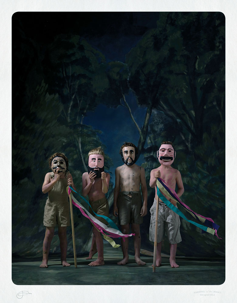
Jacqui Stockdale (Australian, b. 1968) 'Carnivale of the Night' 2012


Jacqui Stockdale (Australian, b. 1968)
Carnivale of the Night
2012
Type C Print
100 x 78cm


In this modern world of distractions there is a wild nature that stirs inside of us. A desire for transcendence, to become someone else, dance part naked and chant our lost songs so that they can be heard above the sounds of cities and mobile ring tones.

The Quiet Wild is a series of photographic portraits that embodies a world of mystical characters in masquerade set against hand-painted landscapes. The portraits playfully mimic the genre of exotic postcards and historical paintings where a fanciful subject is formally positioned within a make-believe landscape. The hand-painted settings in my photographs feature Australian scenery from places around Australia that have meaning to me including my mother’s property in Bendigo, the Melbourne Botanical Gardens and Lake Saint Claire in Tasmania.

I paint the models bodies and combine costumes and props including my own collection of rare masks originally used in dances of Mexican Carnival. This new work responds to established portrayals of human identity and masquerade informed by my research into different aspects of folk Carnivals where the masquerades are a fusion of clandestine voodoo, ancestral memory and personal revelation ritual and performance. Performance also plays a part in my photographic process where I interact with the models and allow the process to greatly determine the outcome. Each new identity is one of inversion; man becomes woman, child becomes adult, animals transform into humans and vice-versa.

The difference between painting the human subject and taking their portrait with a camera it is that during a photo shoot there is more of an element of performance. The subject, over a period of many hours often becomes a new character, extending a side of them that is not prevalent in daily life or invents a new identity. This is brought about by what I dress them in and how I direct them, provoking certain ideas, strengths about an animal power or super natural deity. I begin with an idea of character and a selection of costumes and them work intuitively as though in the dark or with eyes part open. I rarely end up with what I first imagined and revel in the surprise or discovery of a combined effort.

The inspiration for this series of work has come from a unique, rich and beautiful form of human expression that is found in the ritual side of folk art in the cultures around the world but mostly in Mexico. The traditional dances of Mexican Carnival provide an opportunity to revive the primeval gods from the depths of our communal memory, since dance constitutes our remotest language and most primitive sacred offering. The masks I have used in this series are from these types of ritual dance. They are recontextualised and worn in the works Lagunta Man and El Gato, Les Jumeaux, Dogboy of Gonwanan, Infanta Shamanta and Carnival of the Night. Other influences come from images of Exotic Postcards, regarding the formal presentation of the models, the constructed settings and the borders and way of labelling the image. Luchadora Botanica was influenced by a Goya Painting, Negro Returno – I wanted to bring one of my recent collages to life, See ‘to return’.

What I have done is imagined my own family as part ritualistic characters, setting in them in a landscape that I have visited.”

Artist statement by Jacqui Stockdale 2012


Jacqui Stockdale. 'Jaguar Hombre' 2012


Jacqui Stockdale (Australian, b. 1968)
Jaguar Hombre
2012
Type C Print
100 x 78cm


Jacqui Stockdale. 'Lagunta Man, Leeawuleena' 2012


Jacqui Stockdale (Australian, b. 1968)
Lagunta Man, Leeawuleena
2012
Type C Print
100 x 78cm


Jacqui Stockdale (Australian, b. 1968) 'El Gato, Leeawuleena' 2012


Jacqui Stockdale (Australian, b. 1968)
El Gato, Leeawuleena
2012
Type C Print
100 x 78cm


Jacqui Stockdale (Australian, b. 1968) 'Araneus' 2012


Jacqui Stockdale (Australian, b. 1968)
Araneus
2012
Type C Print
100 x 78cm


Jacqui Stockdale (Australian, b. 1968) 'Princess Eucalypt' 2012


Jacqui Stockdale (Australian, b. 1968)
Princess Eucalypt
2012
Type C Print
100 x 78cm


Jacqui Stockdale (Australian, b. 1968) 'Infanta Shamanta' 2012


Jacqui Stockdale (Australian, b. 1968)
Infanta Shamanta
2012
Type C Print
100 x 78cm


The ghost of Frida Kahlo is a haunting one that permeates many artists consciousness bringing with it not just a tragic story but intoxicating aromas of Mexican exotic, masks, Voo-Doo, bloody Mayan rituals and Catholicism gone troppo.

This is clearly evidenced in Jacqui Stockdale’s latest exhibition at Helen Gory Galerie in works such as Negro-Returno, Long Gully. The white lacy heart-shaped overlay of ghostly trees conceals a part-portrait of Frida here depicted in front of Long Gully Bendigo, the Stockdale property, after the Black Saturday bush fire three years ago. This haunting shadowy backdrop appears again in Rama Jaara, The Royal Shepherdess, ‘Jaara’ being the Aboriginal name for the Long Gully region. It is a personal aside of something that obviously touched this artist deeply, one to which she has bought her troupe of tableau vivant players to. Here, a Mauritian girl called Mimi, standing at attention, arms akimbo, dressed in remnants of regal colonial attire. The pose reminiscent of that of the Infanta Margarita in Velasquez’s Las Meninas. The dog has moved from bottom right to bottom left, here a small spotted Chinese Joss paper effigy made for the journey to the afterlife, rather than a great bounding Spanish mastiff. Our young self-possessed Mimi stares directly out of the picture space not as an Infanta, but as one of nature’s children, a shepherdess, her hairstyle resembling a ram’s head, informing that part of the title, ‘Rama’ a play on words.

Both the artists brothers are also players in this tableau: the younger as Lagunta Man, Leeawuleena and the artist’s twin as El Gato, van Diemonia. ‘Lagunta’ is Aboriginal for Tasmanian Tiger and ‘Leeawuleena’ for the land around Cradle Mountain. ‘El Gato’ is the cat, and both carrying a filmic reference to the recent movie The Hunter, filmed around Cradle Mt in Northern Tasmania. While the compositional phrasing has more than a nostalgic whiff of 19th century still studio photography, seen here such staged manners marry well to popular cinematic culture.

As this exhibition unfolds certain characterising concerns appear and reappear. Decapitation, and cross-cultural iconography make this a lavish art dining at the high table of pictorial fusion cuisine. Mexican masks, Joss paper, skulls, rites of passage tit-bits mix it with popular culture on the shag pile to produce a totally new hybrid. Folk memories merge with diaristic experiences, found objects flirt with finely painted trompe-oeil effects in an almost self-regulating metamorphosis.

In this Stockdale becomes a sort of gatekeeper, a ring master choreographer who will both mystify and amaze you with her family carnivale. Picture by picture, costume by costume, the staged imagined and the real, combine into a most fascinating enticement I find impossible to resist.

Catalogue essay by Jeff Makin, 2012


Jacqui Stockdale (Australian, b. 1968) 'Bala Opuntia' 2012


Jacqui Stockdale (Australian, b. 1968)
Bala Opuntia
2012
Type C Print
100 x 78cm


Jacqui Stockdale. 'Dogboy of Gondwanan' 2012


Jacqui Stockdale (Australian, b. 1968)
Dogboy of Gondwanan
2012
Type C Print
100 x 78cm


Jacqui Stockdale. 'Negro Returno, Long Gully' 2012


Jacqui Stockdale (Australian, b. 1968)
Negro Returno, Long Gully
2012
Type C Print
100 x 78cm


Jacqui Stockdale. 'Luchadora Botanica' 2012


Jacqui Stockdale (Australian, b. 1968)
Luchadora Botanica
2012
Type C Print
100 x 78cm


Helen Gory Galerie

This gallery has now closed.

LIKE ART BLART ON FACEBOOK

Back to top

Review: ‘Jane Brown / Australian Gothic’ at Edmund Pearce Gallery, Melbourne

Exhibition dates: 25th April – 12th May 2012


Jane Brown (Kuwait, Australia, b. 1967) 'Big Trout, New South Wales' 2010


Jane Brown (Kuwait, Australia, b. 1967)
Big Trout, New South Wales
2010
Museo silver rag print
59 x 46cm


As you should know by now, this blog tries to promote the work of less well known artists and subject matter. So instead of concentrating on the wonderful aerial bushfire photographs of the well-known artist John Gollings (showing in the same gallery in different spaces with the work of Michael Norton) I have decided to do a posting on the exhibition Australian Gothic by Jane Brown.

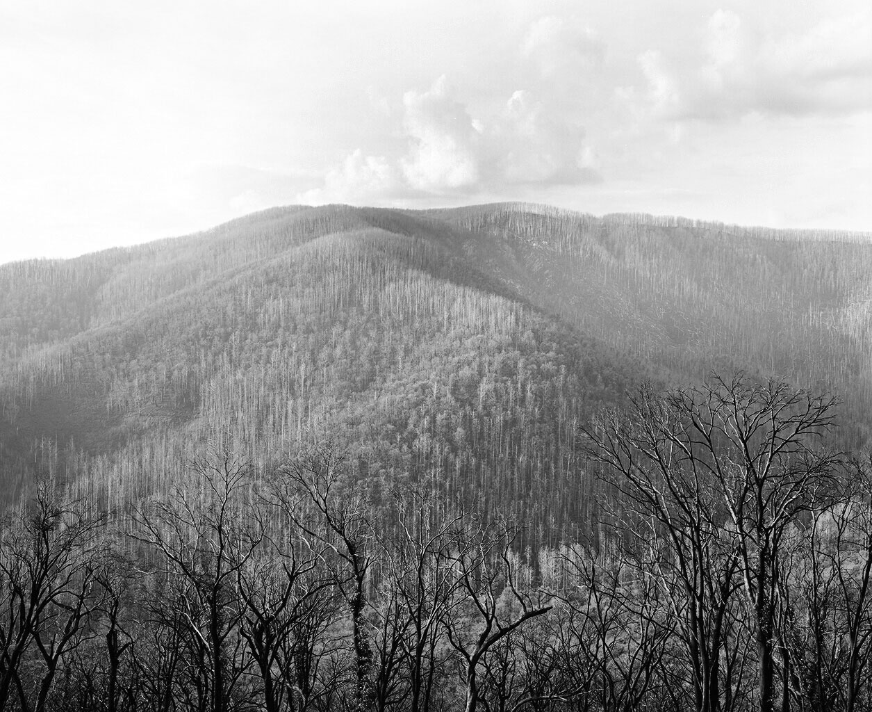
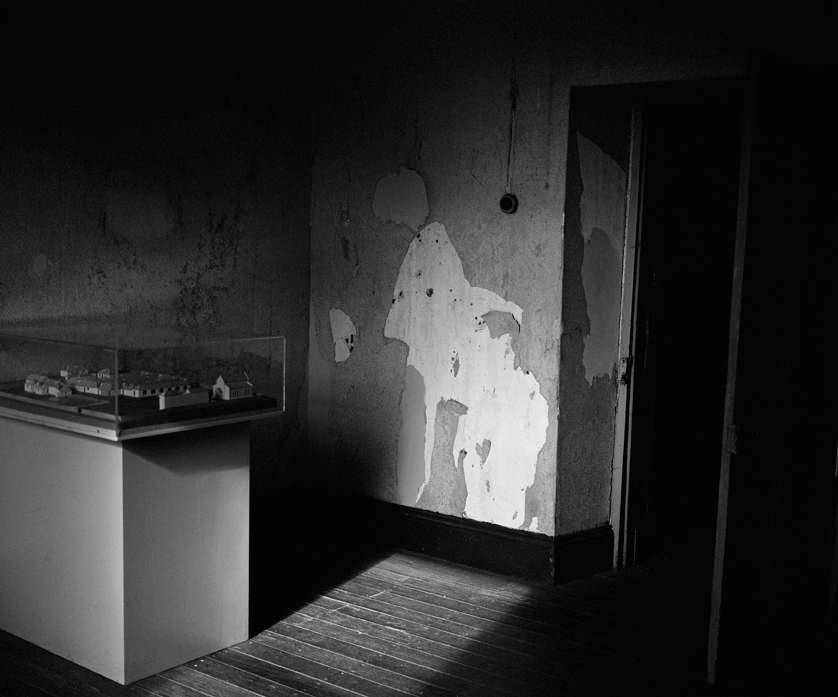
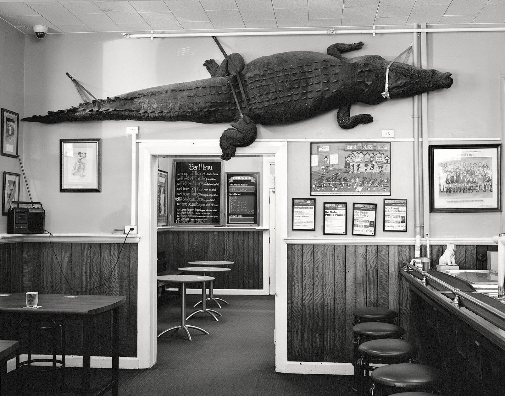
This is a good exhibition of small, darkly hewn, traditionally printed silver gelatin photographs, beautifully hung in the small gallery at Edmund Pearce and lit in the requisite, ambient manner. There are some outstanding photographs in the exhibition. The strongest works are the surrealist tinged, film noir-ish mise-en-scènes, the ones that emphasise the metaphorical darkness of the elements gathered upon the stage. Photographs such as Big Trout, The Female Factory, Adelong, New South Wales and Captain’s Flat Hotel, New South Wales really invoke a feeling of unhomely (or unheimlich), where nature is out of kilter. These images unsettle our idea of Oztraliana, our perceived sense of Self and our place in the world. They disrupt normal transmission; they transmutate the seen environment, transforming appearance, nature and form. Less successful in this quest are the bushfire landscapes. I feel these add little to the narrative thread of the exhibition and could have easily been left out in a judicious cull of the photographs. This would have made the overarching story line stronger still.

One of the best photographs in the exhibition is Lathamstowe (2011, below). This dark, brooding, intense photograph is a beautifully realised visualisation, one that balances scale, tone, light, form and darkness to create a haunting image that stays with you a long time after you have seen it. This one images says it all: the artist has talent. More please!

Dr Marcus Bunyan


Many thankx to Edmund Pearce Gallery for allowing me to publish the photographs in the posting. Please click on the photographs for a larger version of the image.


Jane Brown (Kuwait, Australia, b. 1967) 'Bushfire Landscape I' 2011


Jane Brown (Kuwait, Australia, b. 1967)
Bushfire Landscape I
2011
Fibre based, silver gelatin print
16.5 x 20.5cm


Jane Brown (Kuwait, Australia, b. 1967) 'Bushfire Landscape II, Lake Mountain, Victoria' 2010


Jane Brown (Kuwait, Australia, b. 1967)
Bushfire Landscape II, Lake Mountain, Victoria
2010
Fibre based, silver gelatin print
16.5 x 19.5cm


Jane Brown (Kuwait, Australia, b. 1967) 'The Female Factory (convict women’s prison), Ross, Tasmania' 2009


Jane Brown (Kuwait, Australia, b. 1967)
The Female Factory (convict women’s prison), Ross, Tasmania
2009
Fibre based, silver gelatin print
15.8 x 19.5cm


Jane Brown (Kuwait, Australia, b. 1967) 'Front Bar, Wonthaggi Hotel, Victoria' 2012


Jane Brown (Kuwait, Australia, b. 1967)
Front Bar, Wonthaggi Hotel, Victoria
2012
Fibre based, selenium toned, gelatin silver print


Jane Brown (Kuwait, Australia, b. 1967) 'Bush Christmas, Victoria' 2011


Jane Brown (Kuwait, Australia, b. 1967)
Bush Christmas, Victoria
2011
Fibre based, selenium toned, gelatin silver print


Jane Brown (Kuwait, Australia, b. 1967) 'Lathamstowe' 2011


Jane Brown (Kuwait, Australia, b. 1967)
Lathamstowe
2011
Fibre based, silver gelatin print
16.5 x 16.5cm


“I find it interesting how monochrome is used to differentiate the living and the dead, the past and the present. It has an ability to transcend the constraints of time, memory and death. I examine this a lot in my work – landscapes seem to have vestiges or traces of past life and memorials become otherworldly.”


Jane Brown. ‘Weekend Australian Review’, August 2011


“The antipodes was seen as a world of reversals, the dark subconscious of Britain. It was for all intents and purposes Gothic par excellence.”


Gary Turcotte. “Australian Gothic,” in Marie Mulvey-Roberts (ed.). The Handbook to Gothic Literature. 1998


Comprising photographs taken in rural New South Wales, the ACT, Victoria and Tasmania, this exhibition takes its cue from the gothic imaginings of colonial Australia. We see images of a convict past, the bush Christmas, unforgiving landscapes and melancholic hotels. It carries echoes of the cinema of Wake in Fright (1971) and the Cars that Ate Paris (1974). Rendering visible the themes of the melancholic and the uncanny, Australian Gothic manifests itself in rural isolation – where the homely becomes unhomely (or unheimlich) and where nature is out of kilter.


Jane Brown (Kuwait, Australia, b. 1967) 'Adelong, New South Wales' 2011


Jane Brown (Kuwait, Australia, b. 1967)
Adelong, New South Wales
2011
Fibre based, silver gelatin print
16.5 x 20.5cm


Jane Brown (Kuwait, Australia, b. 1967) 'Tumbarumba, New South Wales' 2012


Jane Brown (Kuwait, Australia, b. 1967)
Tumbarumba, New South Wales
2012
Fibre based, silver gelatin print
16.5 x 19.5cm


Jane Brown (Kuwait, Australia, b. 1967) 'One Way, Hobart, Tasmania' 2009


Jane Brown (Kuwait, Australia, b. 1967)
One Way, Hobart, Tasmania
2009
Fibre based, silver gelatin print
16.5 x 19.5cm


Jane Brown (Kuwait, Australia, b. 1967) 'Unheimlich, French Island, Victoria' 2010


Jane Brown (Kuwait, Australia, b. 1967)
Unheimlich, French Island, Victoria
2010
Fibre based, silver gelatin print
19 x 16cm


Jane Brown (Kuwait, Australia, b. 1967) 'Captain’s Flat Hotel, New South Wales' 2012


Jane Brown (Kuwait, Australia, b. 1967)
Captain’s Flat Hotel, New South Wales
2012
Fibre based, silver gelatin print
21.5 x 17.5cm


Edmund Pearce Gallery

This gallery has now closed.

LIKE ART BLART ON FACEBOOK

Back to top

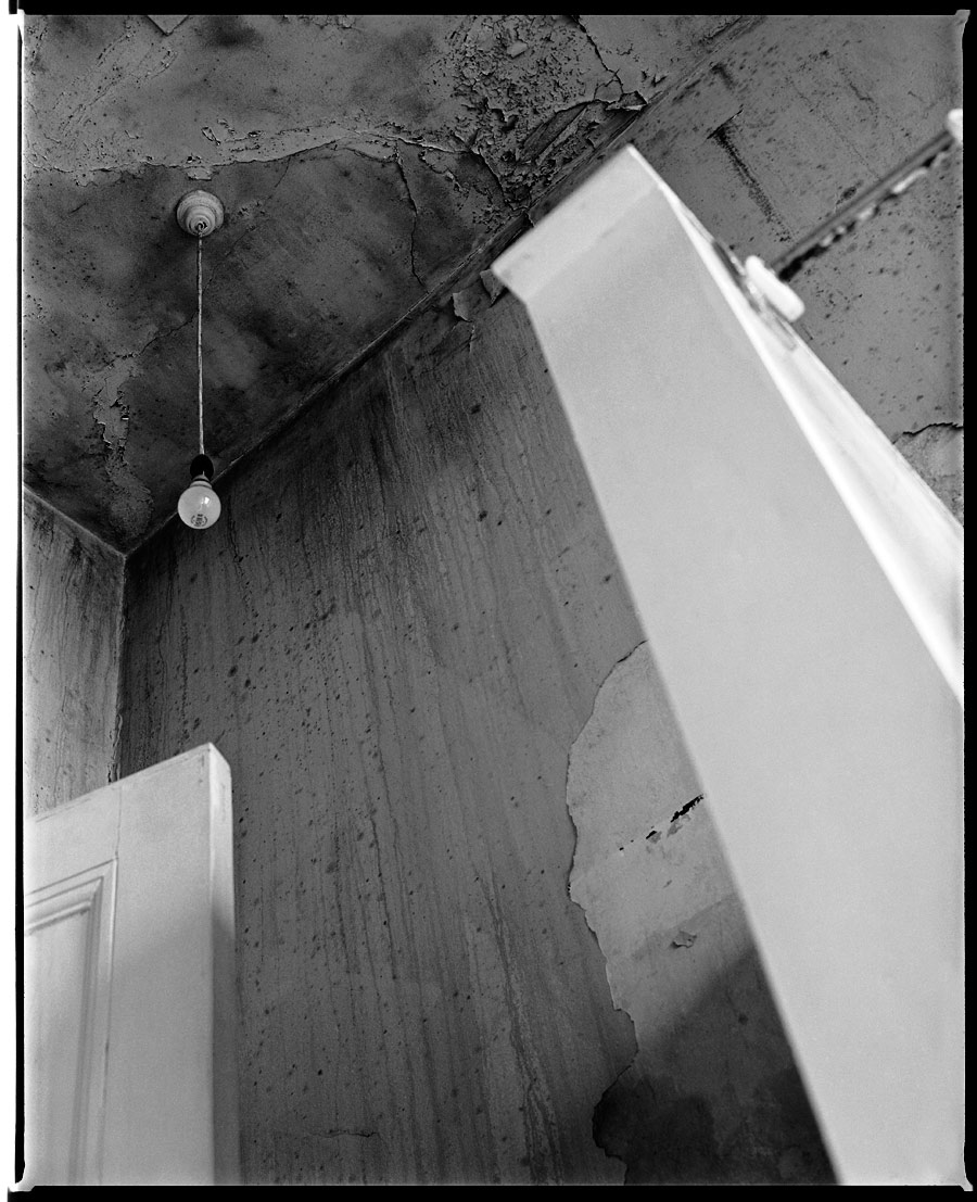
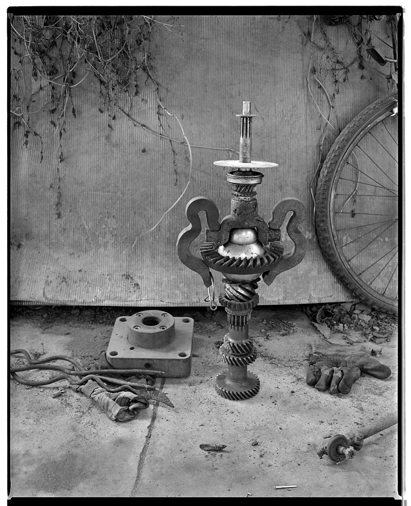
Marcus Bunyan black and white archive: objects, cars and places, 1991-1992

April 2012


Marcus Bunyan (Australian, b. 1958) 'Bench and two faces' 1991


Marcus Bunyan (Australian, b. 1958)
Two faces
1991
Gelatin silver print


I am scanning my negatives made during the years 1991-1997 to preserve them in the form of an online archive as a process of active memory, so that the images are not lost forever. These photographs were images of my life and imagination at the time of their making, the ideas I was thinking about and the people and things that surrounded me.

All images © Marcus Bunyan. Please click the photographs for a larger version of the image; remember these are just straight scans of the negatives !

Photographs are available from this series for purchase. As a guide, a vintage 8″ x 10″ silver gelatin print costs $700 plus tracked and insured shipping. For more information please see my Store web page.


Marcus Bunyan (Australian, b. 1958) 'Bench and two faces' 1991 'Fred and Andrew smoking a joint in Paris' 1992


Marcus Bunyan (Australian, b. 1958)
Fred and Andrew smoking a joint in Paris
1992
Gelatin silver print


Marcus Bunyan (Australian, b. 1958) 'Bench and two faces' 1991 'Unknown landscape' 1991-2


Marcus Bunyan (Australian, b. 1958)
Unknown landscape
1991-1992
Gelatin silver print


Marcus Bunyan (Australian, b. 1958) 'Bench and two faces' 1991 'Base' 1991


Marcus Bunyan (Australian, b. 1958)
Base
1991
Gelatin silver print


Marcus Bunyan (Australian, b. 1958) 'Shower room, Punt Road, South Yarra' 1991


Marcus Bunyan (Australian, b. 1958)
Shower room, Punt Road, South Yarra
1991
Gelatin silver print


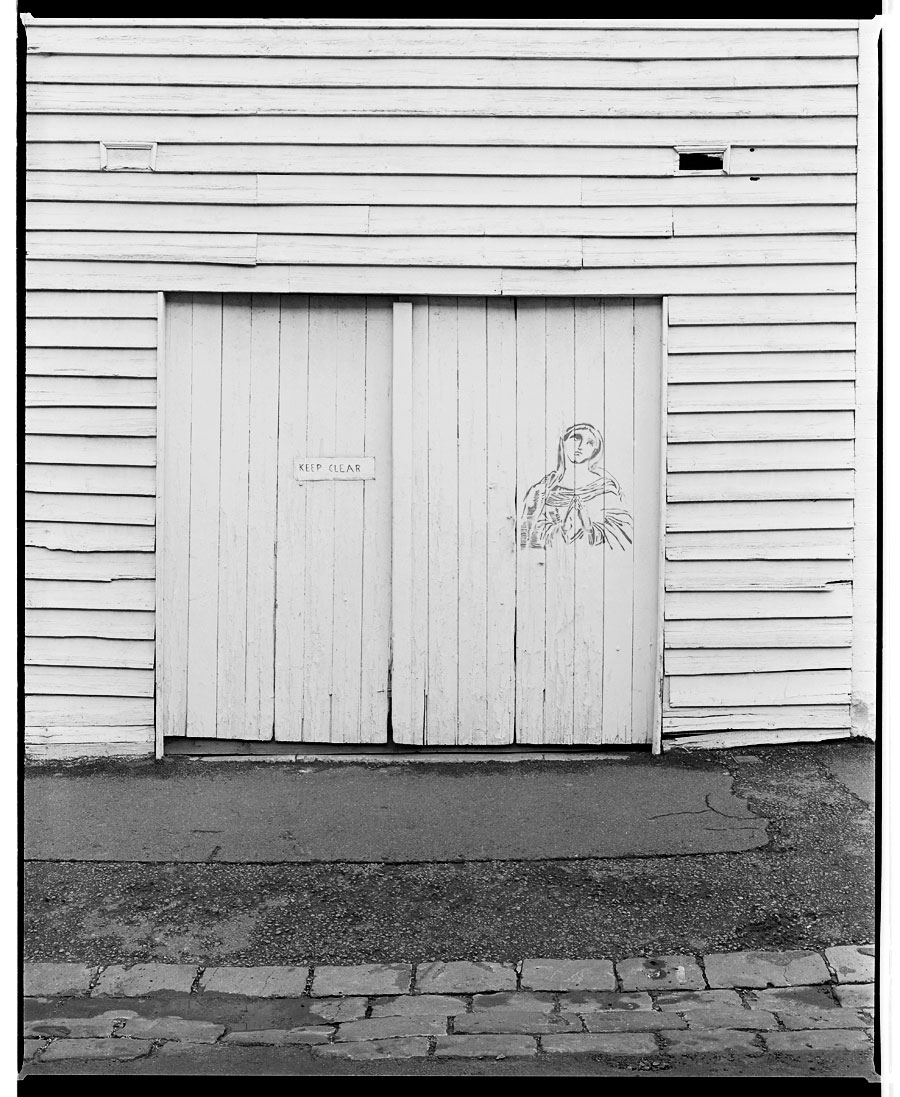
Marcus Bunyan (Australian, b. 1958) 'Keep Clear, Virgin Girl' 1992


Marcus Bunyan (Australian, b. 1958)
Keep Clear, Virgin Girl
1992
Gelatin silver print


Marcus Bunyan (Australian, b. 1958) 'Two torsos' 1991


Marcus Bunyan (Australian, b. 1958)
Two torsos
1991
Gelatin silver print


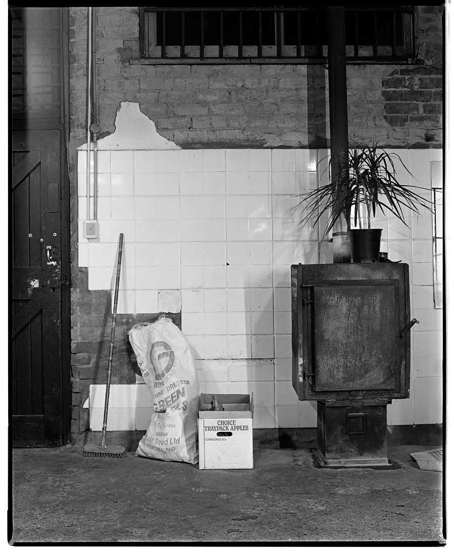
Marcus Bunyan (Australian, b. 1958) 'Standing stove, plant and broom' 1991


Marcus Bunyan (Australian, b. 1958)
Standing stove, plant and broom
1991
Gelatin silver print


Marcus Bunyan (Australian, b. 1958) 'Suspended kitchen' 1991


Marcus Bunyan (Australian, b. 1958)
Suspended kitchen
1991
Gelatin silver print


Marcus Bunyan (Australian, b. 1958) 'Bring me the head of John the Baptist / Man with Big Ears' 1992


Marcus Bunyan (Australian, b. 1958)
Bring me the head of John the Baptist / Man with Big Ears
1992
Gelatin silver print


Marcus Bunyan (Australian, b. 1958) 'The Windmills of Don Q' 1992


Marcus Bunyan (Australian, b. 1958)
The Windmills of Don Q
1992
Gelatin silver print


Marcus Bunyan (Australian, b. 1958) 'Where the stars are (after Manuel Alvarez Bravo)' 1991


Marcus Bunyan (Australian, b. 1958)
Where the stars are (after Manuel Alvarez Bravo)
1991
Gelatin silver print


Marcus Bunyan (Australian, b. 1958) 'Fred and Andrew, Sherbrooke Forest' 1992


Marcus Bunyan (Australian, b. 1958)
Fred and Andrew, Sherbrooke Forest
1992
Gelatin silver print


Marcus Bunyan (Australian, b. 1958) 'Jeff standing on his Chrysler, Studley Park, Melbourne, Victoria, 1992' 1992


Marcus Bunyan (Australian, b. 1958)
Jeff standing on his Chrysler, Studley Park, Melbourne, Victoria, 1992
1991-1992
Gelatin silver print


Marcus Bunyan black and white archive 1991-1997

LIKE ART BLART ON FACEBOOK

Back to top

Exhibition: ‘Unexpected Pleasures: The Art and Design of Contemporary Jewellery’ at the National Gallery of Victoria, Melbourne

Exhibition dates: 20th April – 26th August 2012


Installation photograph of the exhibition 'Unexpected Pleasures' at the National Gallery of Victoria


Installation photograph of the exhibition Unexpected Pleasures at the National Gallery of Victoria
Photo: Dr Marcus Bunyan


An elegant, refined exhibition of contemporary jewellery at the National Gallery of Victoria’s newly redeveloped Contemporary Exhibitions space. The most striking and beautiful pieces are the neck ornaments, although I am a very much over some relatively unstructured jewellery made out of found objects. It really has been done to death. Trying to take photographs of jewellery in cases with reflections and extraneous light is very difficult but I hope my photographs below give you an idea of the design, installation and some specific pieces in the exhibition.

Dr Marcus Bunyan


Many thankx to the NGV for inviting me to the media preview and for allowing me to take photographs of the exhibition. Please click on the photographs for a larger version of the image. All photographs not otherwise labelled © Marcus Bunyan and the National Gallery of Victoria.


Installation photograph of the exhibition 'Unexpected Pleasures' at the National Gallery of Victoria


Installation photograph of the exhibition Unexpected Pleasures at the National Gallery of Victoria
Photo: Dr Marcus Bunyan


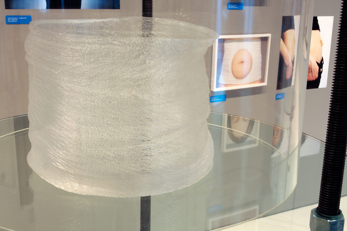
Caroline Broadhead (British, b. 1950) 'Necklace/Veil' 1983 (installation view)


Caroline Broadhead (British, b. 1950)
Necklace/Veil (installation view)
1983
Nylon
Photo: Dr Marcus Bunyan


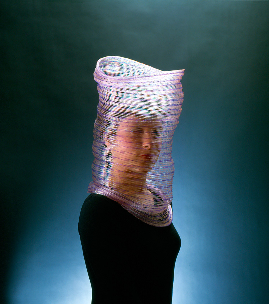
Caroline Broadhead (British, b. 1950) 'Veil, necklace' 1983


Caroline Broadhead (British, b. 1950)
Veil, necklace
1983
Nylon
60 x 30 x 30cm
Collection of the artist
© Caroline Broadhead
Photo: David Ward


Susanne Klemm (Swiss, b. 1965) 'Frozen' 2007 (installation view)


Susanne Klemm (Swiss, b. 1965)
Frozen (installation view)
2007
Polyolefin
Courtesy of Anna Schwartz Gallery
Photo: Dr Marcus Bunyan


Lisa Walker (New Zealand, b. 1967) 'Necklace' 2009 (installation view)


Lisa Walker (New Zealand, b. 1967)
Necklace (installation view)
2009
Plastic, thread
Photo: Dr Marcus Bunyan


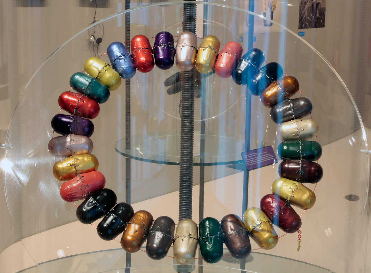
Beverley Price. 'Nespresso Collier' 2012 (installation view)


Beverley Price
Nespresso Collier (installation view)
2012
Anodised aluminium, plastic coated wire, fine gold
Photo: Dr Marcus Bunyan


Gijs Bakker (Dutch, b. 1942) 'Shoulder piece' 1967 (installation view)


Gijs Bakker (Dutch, b. 1942)
Shoulder piece (installation view)
1967
Anodised aluminium
Photo: Dr Marcus Bunyan


Unexpected Pleasures: The Art and Design of Contemporary Jewellery displays over 200 works by important Australian and international contemporary jewellers who have pushed conceptual and material boundaries within their practices. This Design Museum, London exhibition is curated by Guest Curator and Melbourne jeweller Susan Cohn, and is complemented by a selection of NGV Collection works and private loans.

Unexpected Pleasures looks at what we mean by jewellery from a number of different perspectives. Taking as its starting point the radical experiments of the Contemporary Jewellery Movement that challenged a conventional understanding of the language of personal adornment, and looking instead at the essential meanings of jewellery, the exhibition brings together important work from around the world, and looks at it from the point of view of the wearer as well as the maker. Contemporary Jewellery in this sense is at the intersection of art and design.

Dr Gerard Vaughan, Director, NGV said: “This is a remarkable and exciting exhibition, brilliantly installed in the Gallery’s newly redeveloped Contemporary Exhibitions space at NGV International.”

The exhibition explores the essential meanings of jewellery, bypassing traditional perceptions and instead tracing the radical experiments of contemporary jewellers who have challenged the conventions of jewellery design. The exhibition is curated through a number of themes: Worn Out – celebrating the experience of wearing jewellery; Linking Links – looking at the ways in which ‘meaning’ and narratives are invested and expressed through sub-themes such as Social Expressions and Creative Systems, and; A Fine Line – offering insight into the origins of contemporary jewellery today, highlighting key instigators of the Contemporary Jewellery Movement that started in the late 1970s.

Each theme within the exhibition provides an outline of current thinking and offers a unique view on how people use and interact with objects, through which design and production processes come to light. Photography in this context becomes a vital instrument for expressing the ‘wearability’ and the performative aspects of jewellery, and a selection of photographic works are also included in the exhibition.

New techniques and experimentation continue to question the relevance of preciousness, highlighting the shifting values from material worth to the personal associations that jewellery holds. The exhibition celebrates jewellery from the point of view of both the maker and the wearer. It considers the pleasures of wearing jewellery and the many meanings associated with jewellery which are at times unpredictable and, in turn, unexpected.

Press release from the NGV website
 

Otto Künzli (German, b. 1948) 'Wallpaper brooches' 1982 (installation view)


Otto Künzli (German, b. 1948)
Wallpaper brooches (installation view)
1982
Wallpaper, synthetic polymer core, steel
Photo: Dr Marcus Bunyan


Kiko Gianocca (Swiss, b. 1974) 'Who am I? rings' 2008-2011


Kiko Gianocca (Swiss, b. 1974)
Who am I? rings
2008-2011
Gold, silver, polyurethane
Various sizes
Collection of the artist
© Esther Knobel
Photo: Jeremy Dillon


Paul Derrez (Dutch, b. 1950) 'Pleated Collar' 1982 (installation view)


Paul Derrez (Dutch, b. 1950)
Pleated Collar (installation view)
1982
Plastic, steel
Collection of Paul Derrez
Photo: Dr Marcus Bunyan


Doug Bucci (American) 'Trans-Hematopoietic neckpiece' 2010


Doug Bucci (American)
Trans-Hematopoietic neckpiece
2010
3-D printed acrylic resin as one interlinked piece
45.7 x 45.7 x 5.1cm
Collection of the artist
© Doug Bucci
Photo: Rebecca Annand


David Bielander (Swiss, b. 1968) 'Scampi' 2007


David Bielander (Swiss, b. 1968)
Scampi
2007
Silver (copper anodised), elastic
10.0 cm (diam)
Collection of the artist
© David Bielander
Photo: Simon Bielander


Blanche Tilden (Australian, b. 1968) 'Speed, neckpiece' 2000


Blanche Tilden (Australian, b. 1968)
Speed, neckpiece
2000
Borosilicate glass, titanium, anodised aluminium
1.2 x 24cm
Collection of the artist
© Blanche Tilden
Photo: Marcus Scholz


Karl Fritsch (New Zealand born Germany, 1963) 'Screw ring' 2010


Karl Fritsch (New Zealand born Germany, 1963)
Screw ring
2010
Silver, nails, screws
6 x 4 x 4cm
Collection of the artist
© Karl Fritsch
Photo: Karl Fritsch


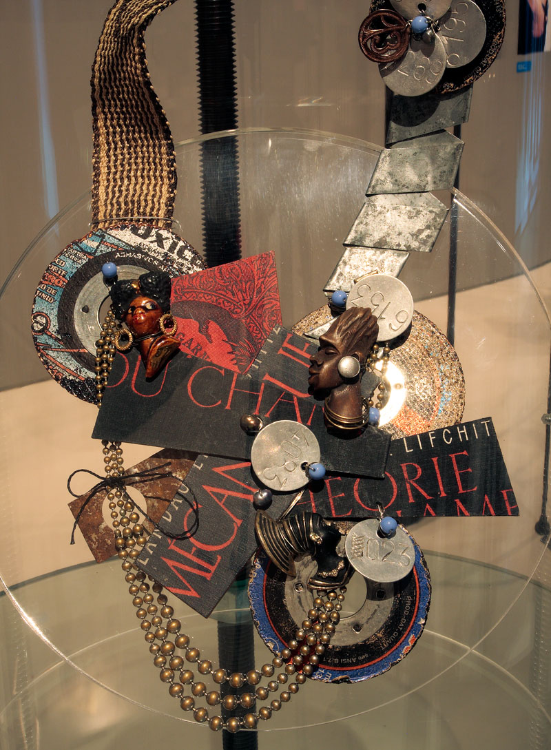
Tota Reciclados. 'Theorie du champ mechanique' 2010


Tota Reciclados
Theorie du champ mechanique (installation view)
2010
Found objects, book cover, mixed media
Photo: Dr Marcus Bunyan


NGV International
180 St Kilda Road

Opening hours
Daily 10am – 5pm

National Gallery of Victoria website
LIKE ART BLART ON FACEBOOK

Back to top

Review: ‘Tourist #5: Disappearing Project 1-41’ by Nicola Loder at Helen Gory Galerie, Prahran, Melbourne

Exhibition dates: 14th March – 7th April 2012


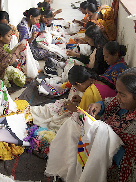
West Bengali woman embroidering the 'Disappearances'


West Bengali woman embroidering the Disappearances


I have always loved the work of Nicola Loder ever since I saw her solo exhibition Child 1-175: A Nostalgia for the Present at Stop 22 Gallery in St Kilda in 1996. This exhibition is no exception. Loder is the consummate professional, her work is as imaginative and intriguing as ever and there has been a consistent thematic development of ideas within her work over a long period of time. These ideas relate to the nature of seeing and being seen, the mapping of identity and the process of its (dis)appearance.

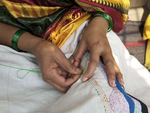
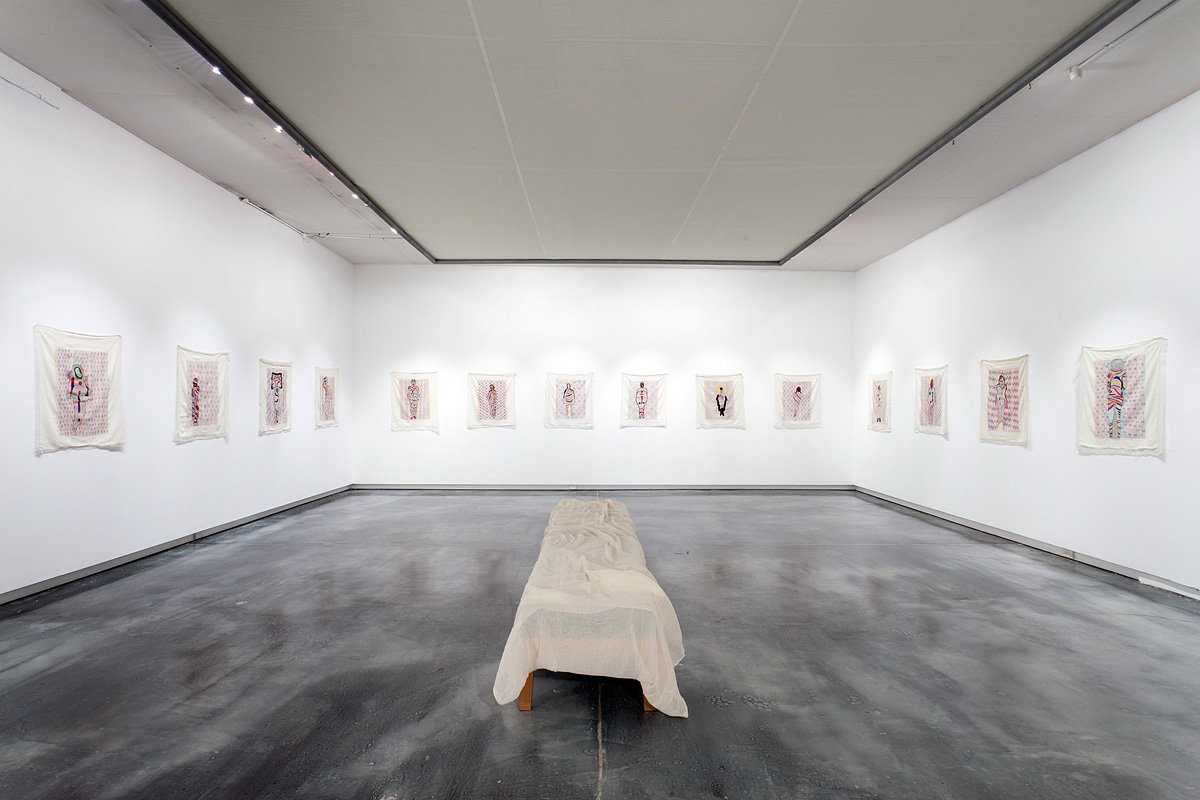
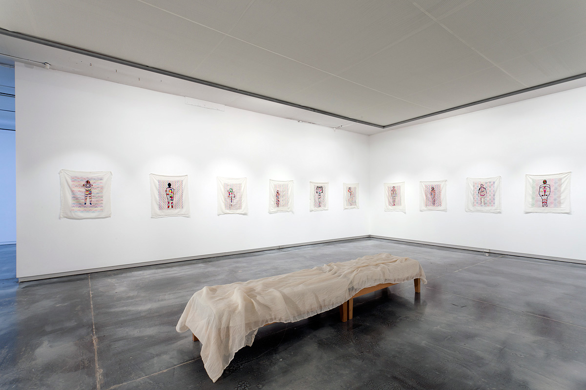
This latest iteration of her ongoing series Tourist (described in detail, below, in the erudite essay by Stuart Koop) again involves de/reconstructions of identity through slippages, elisions, deletions, disappearances and transformations. In Tourist #5: Disappearing Project 1-41 the shroud-like effigies that result from Loder’s project, a reference reinforced by the muslin cloth lying over the bench in the gallery space (see the installation photographs below), are a repeated re-presentation of a lost or missing identity: the disappearance of the person in their own minds; photography’s “capture” of the original person; Loder’s deletion of this identity (I was there) to be substituted by Photoshop’s geometric algorithms; the West Bengali women’s reinterpretation of this disappearance; and the reappearance of a new energy in the colourful, embroidered reinterpretations. I have very much a feeling of a spiritual energy in this last embodiment – think of the link between death and the spirit (as in the Shroud of Turin).

The images have multiple narratives and are already textualised but Loder disrupts this marking, the continual reiteration of norms by weaving a lack of fixity into her objects. In her reconceptualisations of space and matter Loder redefines the significations of the body in the fold of inscription, through a process of materialisation. But this materialisation, like the image seared into the fabric of the Shroud of Turin, still somehow eludes us. This is what makes this work so tantalising…

This interweaving of texts culminates in the body inscribed on another plane existing in, as Loder herself describes it, a “de-constructed non-space somewhere between image, imagination, identity, language and being,” which, as Stuart Koop observes, “is… not a removal or deletion but a reconfiguration beyond verisimilitude, beyond our appearance to others and ourselves.” This is the navigation through a virtual space that Sherry Turkle posits in the quotation at the top of the posting, where the self is decentred and identity is fluid and multiple.

Loder’s exquisitely sensuous description of disappearance allows us to see the phenomenal word afresh. I look forward with a sense of anticipation to the next voyage of discovery the artist will take me on.

Dr Marcus Bunyan


Many thankx to Nicola Loder, Stuart Koop and Helen Gorie Galerie for allowing me to publish the text and photographs in the posting. Please click on the photographs for a larger version of the image.


Fredric Jameson wrote that in the postmodern world, the subject is not alienated but fragmented. He explained that the notion of alienation presumes a centralized, unitary self who could become lost to himself or herself. But if, as a postmodernist sees it, the self is decentred and multiple, the concept of alienation breaks down. All that is left is an anxiety of identity… In simulation, identity can be fluid and multiple, a signifier no longer points to a thing that is signified, and understanding is less likely to proceed through analysis than by navigation through virtual space.


Sherry Turkle. Life on The Screen: Identity in the Age of the Internet. New York: Simon and Schuster, 1995, p. 49.


'Tourist #5: Disappearing Project 1-41' by Nicola Loder, installation photograph at Helen Gorie Galerie

'Tourist #5: Disappearing Project 1-41' by Nicola Loder, installation photograph at Helen Gorie Galerie


Tourist #5: Disappearing Project 1-41 by Nicola Loder, installation photograph at Helen Gorie Galerie
Photos: Marcus Bunyan


Photographer Nicola Loder explores the way in which people see.

The purpose of photography is largely to make things visible. Inspired in part by her experiences teaching blind children photography, Loder reverses photography’s function using it instead to capture objects and experiences that aren’t visible. She embraces Photoshop but counters its typical role of improving clarity and focus, rather using it to collapse images into layers of pattern and colour.

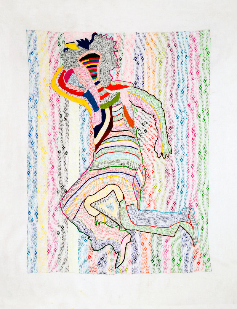
Tourist #5: disappearing project 1-40 is a multi-faceted project that teases out notions of seeing and being seen and the role of creator as truth teller. Loder sent out a flyer inviting people who had disappeared to send her a full-length image of themselves with a written description of what happened when they disappeared. The stories and images she received range from out of body near death experiences to the mundane act of sleeping, each shedding light on what people identify as disappearing. Loder then manipulated the submitted images into highly colourful digital patterns, resonant of her earlier photographic work. She took the reworked images to India where they were embroidered onto muslin by local women in West Bengal. The result is beautiful hand-embroidered works that reflect the women’s personal interpretations of the images and incorporate their rich history, cultural patterns and iconography.

“The obliterated, atomised, reconfigured portraits ‘rematerialise’ as tapestries executed by women from a small rural village, at the margins of Indian society, who – but for NGOs dedicated to overcome disadvantage, in this case Street Survivors empowering rural women through skills development – are largely invisible to their communities, to politicians, as well as their castes.

Of course, Loder has paid these women, a means of recognising and honouring their work, a means of bringing them into view, at the margins of economy, welfare and community. Indeed, she has taken their portraits and documented them at work, and it’s a startling contrast. Our middle-class stories, anxieties and interests ending up in the careful hands of these women in colourful saris, sitting and working together, our (largely) passing concerns darned into the muslin cloth in their laps, our own saturated photographic hues indistinguishable from the bright chaos of folded cloth and pleated skirts, with their nimble fingers tracing our desires and cares in bright lurid threads.” (Stuart Koops, 2012)

For Loder India is a central tenet of the project given its multiple associations with disappearing, from the focus on meditation to the burning of bodies at the Ghats in Varanasi, the final act of disappearing. On a personal level Loder lived in Calcutta as a child and views her experience of leaving India as another act of disappearing: both her Indian Ayah (Moti) and India physically disappeared from her life. Involving the women from her Ayah’s village is Loder’s reflection on and tribute to those experiences of disappearing.

Press release from Helen Gorie Galerie website


Nicola Loder (Australian, b. 1964) 'Tourist #5: Disappearing Project 1-41 (no 11)' 2012 Polyester thread, muslin 86 x 69cm


Nicola Loder (Australian, b. 1964)
Tourist #5: Disappearing Project 1-41 (no 11)
2012
Polyester thread, muslin
86 x 69cm


Nicola Loder (Australian, b. 1964) 'Tourist #5: Disappearing Project 1-41 (no 16)' 2012 Polyester thread, muslin 86 x 69cm


Nicola Loder (Australian, b. 1964)
Tourist #5: Disappearing Project 1-41 (no 16)
2012
Polyester thread, muslin
86 x 69cm


Catalogue Essay by Stuart Koops

Nicola Loder has facilitated childrens’ photography projects before, on several occasions working with marginalised groups, including kids from low socio-economic and non-English speaking schools and kids from the Royal Victorian Institute for the Blind. Indeed she chose these groups with purpose, to consider the role of photography in highlighting certain communities most often occluded on the basis of an incapacity – making the invisible visible, making those who cannot see visible to us, giving those without the means of expression a language we can understand – in many ways, reversing the polarity of familiar concepts, disrupting our conventional understanding.

In teaching blind kids especially, Nicola told me she felt like she was disappearing. Not surprising, I guess, when you try to describe the camera, the lens, optics, focus, framing, composition. When your identity or your role as a photographer dissipates along with the explanatory power of these foundation terms and concepts. And practical demonstrations must at first seem frustratingly pointless.

That profound experience seems to have led Loder to use photography in reverse, as the means to decompose images; to utilise Photo­shop’s algorithms, not to augment or highlight certain attributes in her portraits she ultimately took of these kids, but return images to an undifferentiated field of static, the digital correlate to the original photochemical chaos, the entropy of raw silver halides, which the ‘irrefutable sun’ miraculously sorts into resemblance. In short, to unphotograph the kids somehow, commensurate with their disability and her own disappearance in the workshops.

But it’s not just Loder who has had the experience of disappearing. It’s a profound sensation shared by many and for different reasons, and Loder has collected different accounts of the experience which illustrate the further registers in which one may ‘disappear’; from spiritual attainment in transcending physical reality to out of body transcendental near-death experiences, from relief at escaping a difficult situation, to feelings of terror as a child abandoned, or worse, abducted, from the social isolation and alienation of teenagers and adults, to a freedom or liberation from social constraint and physical containment, wanting to leave behind an unhappy circumstance or just wanting to be magically, wonderfully invisible.

Practically speaking, there’s considerable interest in – and information on – how to disappear, especially in America. In 2008 artist Seth Price published How to Disappear from America, excerpted text from found sectarian tracts, paranoid rants and helpful DIY tips to assist anyone wishing to get off the grid without a trace (burn your credit cards, dump your car, hide your tracks, grow your own, etc) including great suggestions about where to go (motorcycle hangouts, punk rocks groups, new age dance studios, soup kitchens, churches, and homeless shelters).

But Loder’s more interested in the personal, individual experience of disappearing. She asked for photo-portraits to accompany people’s descriptions of disappearing, from which she has seemingly excised each subject, using Photoshop as she did before with the blind kids, leaving a whorl of digital effect in the vacant space within their outline, set in high relief against a lounge-room, or a yard, or other family members. Yet on closer inspection this is perhaps a matter of transformation, since ‘disappearing’ may be very different from ‘deletion’.

In Photoshop we are each just so much chroma, luma and shape. A touch of the magic wand and we are separated from the rest of our lives, ‘lassooed’, a godly power to designate liberated from special-effects cinema by the Knoll brothers in 1988 and given to every geek with a Mac II. Since when it’s just too easy to be deleted; two clicks and we’re in the trash.

But in Loder’s work our data is recast, colour intensified, details blurred, outlines softened, curves modified, screens overlaid and so it seems Photoshop’s myriad algorithms – set against their intended technical imperative to optimise appearances – might provide a metaphor for our disappearing, which is indeed not a removal or deletion but a reconfiguration beyond verisimilitude, beyond our appearance to others and ourselves. And while we might lose visual coherence as an image, we are inscribed upon another plane altogether, one at odds with photographic realism, and which Loder describes as a “de-constructed non-space somewhere between image, imagination, identity, language and being.” Like the shimmering dissipation of Kirk on the teleporter’s deck in Star Trek, these subjects are transported to another realm, different orders of reality merging into a new volatile blend. Perhaps it’s a higher plane too where all souls mingle and coalesce as either zeros or ones, a digital afterlife in which everything is equivalent and a new digital equanimity prevails.

Stuart Koops 2012


Nicola Loder (Australian, b. 1964) 'Tourist #5: Disappearing Project 1-41 (no 8)' 2012 Polyester thread, muslin 86 x 69cm


Nicola Loder (Australian, b. 1964)
Tourist #5: Disappearing Project 1-41 (no 8)
2012
Polyester thread, muslin
86 x 69cm


Nicola Loder (Australian, b. 1964) 'Tourist #5: Disappearing Project 1-41 (no 17)' 2012 Polyester thread, muslin 86 x 69cm


Nicola Loder (Australian, b. 1964)
Tourist #5: Disappearing Project 1-41 (no 17)
2012
Polyester thread, muslin
86 x 69cm


Nicola Loder (Australian, b. 1964) 'Tourist #5: Disappearing Project 1-41 (no 18)' 2012 Polyester thread, muslin 86 x 69cm


Nicola Loder (Australian, b. 1964)
Tourist #5: Disappearing Project 1-41 (no 18)
2012
Polyester thread, muslin
86 x 69cm


West Bengali women embroidering the 'Disappearances'


West Bengali women embroidering the Disappearances


Helen Gory Galerie

This gallery is now closed.

Nicola Loder website

LIKE ART BLART ON FACEBOOK

Back to top

Review: ‘Martin Parr: In Focus’ at Niagara Galleries, Richmond, Melbourne

Exhibition dates: 6th March – 31st March, 2012


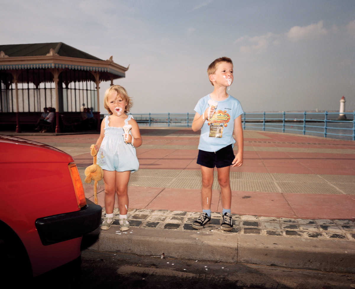
Martin Parr (British, 1952-2025) 'New Brighton, England' from the series 'The Last Resort' 1983-1985


Martin Parr (British, 1952-2025)
New Brighton, England
From the series Last Resort
1983-1985
Pigment print
Edition of 5
102 x 127cm
Image courtesy of the artist and Niagara Galleries, Melbourne


This is a fine exhibition of the work of celebrated English photographer Martin Parr at Niagara Galleries, Richmond, albeit with one proviso. The mainly large colour prints are handsomely displayed in plain white frames within the gallery space and are taken from his well known series: Last Resort, Luxury, New British and British Food. Parr’s work is at its best when he concentrates on the volume of space within the image plane and the details that emerge from such a concentrated visualisation – whether it be the tension points within the image, assemblage of colour, incongruity of dress, messiness of childhood or philistine nature of luxury.
The best photographs have a wonderful frisson about them, a genuine love of and resonance with the things he is imaging. This frisson can be seen in all of the photographs in this posting but most notably in :

~ The incursion of the surreal red colour to left in England. New Brighton (above) and Parr’s masterful use of vertical and horizontal lines within the image. Note the verticality: of the child’s toy, the two children themselves, the pillars of the pavilion and the lighthouse holding the whole image together at right. If this lighthouse were not there the eye would fall out of the image. As it is it is contained, forcing the viewer to look closely at the absurdity of the melting ice cream and the splashes that have fallen on the ground.

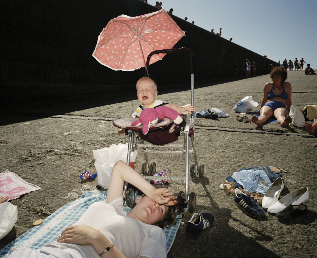
~ The complexity of the photograph England. New Brighton (below) where the eye does not know what to rest upon, constantly jumping from object to object. Do you look at the women on the ground, the shoes to right, the piece of fabric to left, the screaming baby, the sunlit pink umbrella, the women in blue bikini up the ramp, the long elongated shadowed wall with peek-a-boo heads leading to the outlined figures at the vanishing point of image – the top of the ramp. The understanding of light (with the use of flash) and the construction of the image is superlative. Wow!

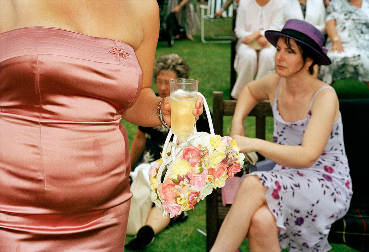
~ The incongruity evidenced in the photograph England, Ascot. 2003: the over tight pink sateen dress with unfortunate stain (which the eye is irrevocably drawn to), applique bow linked through to hideous flower embossed handbag which then contrasts with the seated women behind in hat and purple floral dress. In the large print in the gallery the background is more out of focus than in the small reproduction here, allowing the viewer’s eye an avenue of escape via the grass and deck chair beyond.

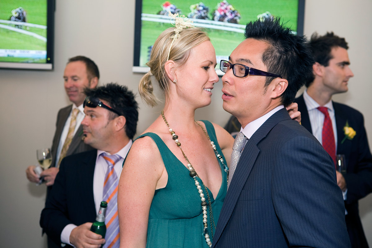
~ The delicious, choreographed mise-en-scène of Australia, The Melbourne Cup. 2008 – the suits, ties and glasses, the teezed hair, the alcohol – where none of the participants is looking at the camera, where only the ladies hand clutches at the back of the man’s shoulder. They look down, they look left, they look right, they look away, they never engage with each other or the viewer. The critical space in this assemblage is the distance between the man and the woman’s noses, that vitally small space of separation that is a synonym for the interactions occurring in the rest of the image. The blindness of Lux’ry, its crassness, its stain.


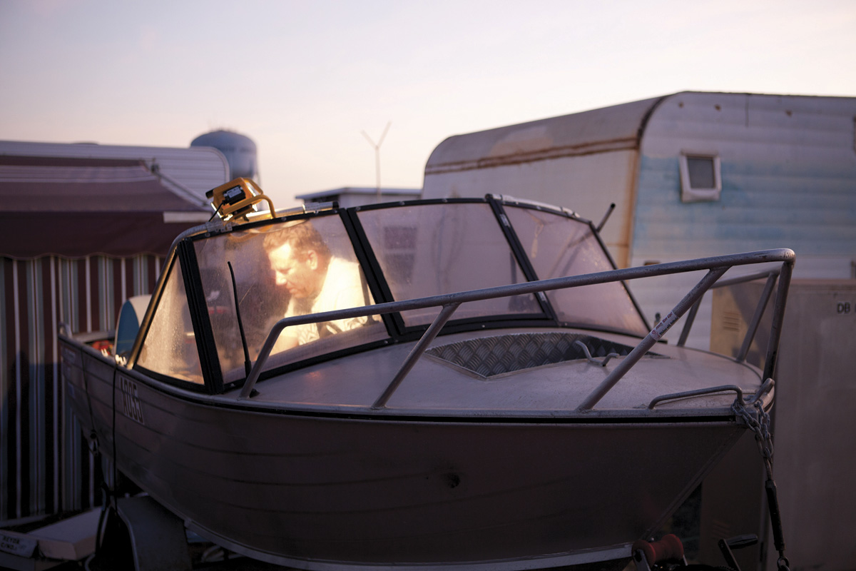
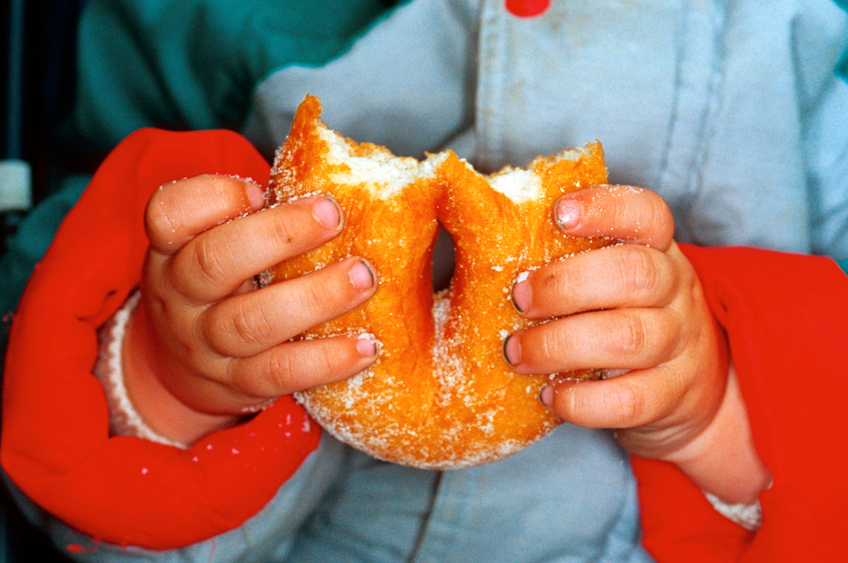
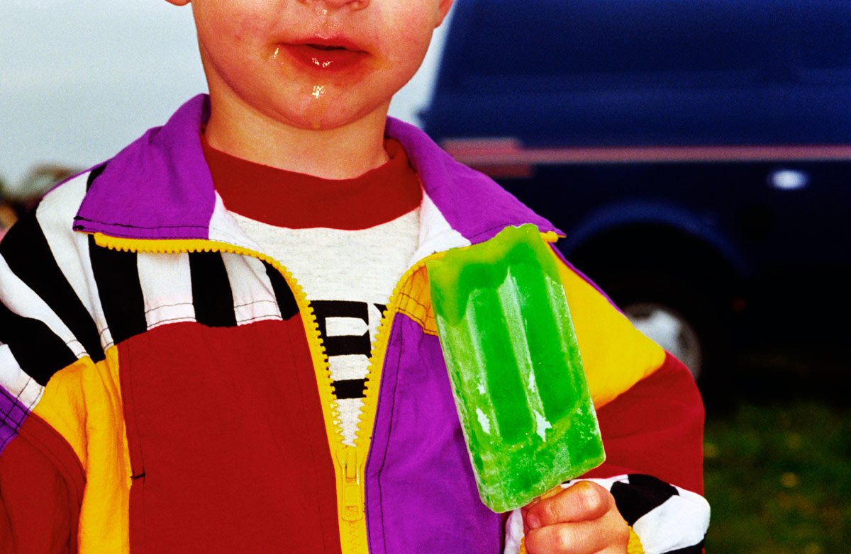
And so it goes. The dirt under the fingernails of the child eating a doughnut, the lurid colours of the popsicle and jacket of the kid with dribble on his face, all fantastic. There are moments of stasis, for example in the contemplative photograph Australia. South Hedland. Blackrock Tourist Park. 2011 (below) taken from Parr’s new series Australia, where Parr has photographed Australian life in three Western Australian port cities, Fremantle, Broome and Port Hedland. See the video at the bottom of the posting and listen to Parr talk about his work.

This is all fine and dandy, dressed up in polka dots and a lurid bow tie, but when the photographs become too reductive, as in the large photograph in the exhibition England. Dorset. West Bay. 1997 (see first column, fourth down) there is really not enough to hang your hat on. This feeling of over simplification, as though the photographer has said to himself “here’s something I have seen that you haven’t recognised, and I think it is important for you to recognise it” – the perceived essentialness of the object – can become a bit strained. I know that these type of images are part of the series about British or Scottish food or about objects from a specific place but do they really have this grand an importance in the scheme of things? This feeling is reinforced in the exhibition, and this is my proviso to show, when the images such as Scotland. Glasgow. Fairy cakes. 1999, England. Blackpool. 1995 (bread and butter on a plate on red check cloth) are presented at A4 size surrounded by heavy white frames. These photographs have to be large to have any chance of working at all and at the small size they fall flat.

The size of a photograph raises interesting questions about the display of contemporary photography. The giant light boxes of Jeff Wall, the huge group portraits of Thomas Struth, the huge portraits of Thomas Ruff, the huge environments of Candida Hofer and the huge panoramas of Andreas Gursky (to name but a few) are all points in case. Would they work at a smaller size? No. They rely on scale and detail, visual impact for their effect: the same with Martin Parr. What is really ‘In Focus’ is the visualisation of the artist, his ability to envisage the final print at this large size. The A4 prints in this exhibition simply do not work at that size, for these photographs.

Think of Ansel Adams’ famous Monolith, The Face of Half Dome, Yosemite National Park, Calif., (circa 1926). Originally printed as a contact 8″ x 10″ from the negative, Adams gradually increased the size of this image till it became a huge print as tall as a man in his later life. The image works at multiple sizes, it spoke to him (and the viewer) at all these sizes: the small contact is intense and gem-like, the larger imitating the monolithic structure of the Face itself. I feel that some large contemporary photographs are quite vacuous at this large size, that there is no reason for them to be at this size. In other words it is not appropriate for the image. Conversely it would seem that artists previsualise for this size in the end print, which is fine, but that the print cannot exist, cannot breathe in the world at a smaller size. Is this a problem? Does this matter? I believe it does, especially when a photograph is displayed at a size that simply doesn’t work. I was always taught to print a photograph at an appropriate size for the image, whatever size(s) that may be (and there can be multiples), as long as it has resonance for that particular image.

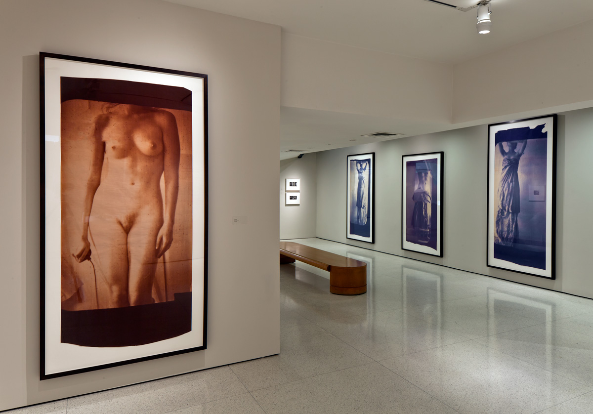
As evidenced in this exhibition, if the photograph cannot “work” at the size that it is to be exhibited then it should not be displayed at all – it is a diminution not just of the artists vision but of the resonance of the photograph, in this case going from large to small. In an upcoming posting about the retrospective of the work of American photographer Fransceca Woodman, there is an installation photograph of the exhibition at The Guggenheim, New York (see above). Her vintage prints (seen in the background) – small, intense visions – have been printed at a huge scale (with her permission) and they simply do not work at this floor to ceiling height. They have lost all of their intimacy, which is one of the strengths of her photography. Again, I believe it is a diminution of the artists vision and the integrity of the photograph, this time from small to large. Artists are not always right. The same can be said of the retrospective of Cartier-Bresson that I saw at the National Galleries of Scotland in Edinburgh in 2005. One room out of four had very small, intense vintage prints in brown hues and the other three galleries had large 20″ x 24″ grainy prints with strong contrast that really ruined any response I had to the work as evidenced by the vintage prints. They were almost reproductions, a simulacra of the real thing. I had a feeling that they weren’t even by the artist himself. The same could be said here.

To conclude I would say this is a fine exhibition of large photographs by Martin Parr that would have been even more focused without the small A4 prints. They are joyous paeans to the quirky, incongruous worlds in which we live and circulate. They evidence life itself in all its orthogonal absurdity. I love ’em!

Dr Marcus Bunyan


Many thankx to the artist and Niagara Galleries for allowing me to publish the photographs in the posting. Please click on the photographs for a larger version of the image.


Francesca Woodman installation photograph at The Guggenheim Museum, New York


Francesca Woodman installation photograph at The Guggenheim Museum, New York. Note the small, vintage prints on the far wall.


Martin Parr (British, 1952-2025) 'New Brighton, England' from the series 'The Last Resort' 1983-1985


Martin Parr (British, 1952-2025)
New Brighton, England
From the series The Last Resort
1983-1985
Pigment print
Edition of 5
102 x 127cm
Image courtesy of the artist and Niagara Galleries, Melbourne


Martin Parr (British, 1952-2025) 'Blackrock Tourist Park, South Hedland, Australia, 2011' from the series 'Australia' 2011


Martin Parr (British, 1952-2025)
Blackrock Tourist Park
, South Hedland, Australia, 2011
From the series Australia
2011
Pigment print
Edition of 5
101.6 x 152.4cm
Image courtesy of the artist and Niagara Galleries, Melbourne


Martin Parr (British, 1952-2025) 'Ascot, England, 2003' from the series 'Luxury' 1995-2009


Martin Parr (British, 1952-2025)
Ascot, England, 2003
From the series Luxury
1995-2009
Traditional C-type print
Edition of 5
101.6 x 152.4cm
Image courtesy of the artist and Niagara Galleries, Melbourne


Martin Parr (British, 1952-2025) 'The Melbourne Cup, Australia, 2008' from the series 'Luxury' 1995-2009


Martin Parr (British, 1952-2025)
The Melbourne Cup
, Australia, 2008
From the series Luxury
1995-2009
Pigment print
Edition of 5
101.6 x 152.4cm
Image courtesy of the artist and Niagara Galleries, Melbourne


Martin Parr (British, 1952-2025) 'Ramsgate, England, 1996' from the series 'New British' 1994-1996


Martin Parr (British, 1952-2025)
Ramsgate
, England, 1996
From the series New British
1994-1996
Traditional C-type print
Edition of 5
105.5 x 157.5cm
Image courtesy of the artist and Niagara Galleries, Melbourne


Martin Parr (British, 1952-2025) 'Car boot sale, Bristol, England, 1995' from the series 'British Food' 1994-1995


Martin Parr (British, 1952-2025)
Car boot sale, Bristol, England, 1995
From the series British Food
1994-1995
Traditional C-type print
Edition of 33
18 x 25.5cm
Image courtesy of the artist and Niagara Galleries, Melbourne


No Worries: Martin Parr – FotoFreo 2012

Magnum photographer Martin Parr was asked by FotoFreo Festival Director Bob Hewitt to photograph three Western Australian port cities, Fremantle, Broome and Port Hedland. Photographer David Dare Parker was assigned to document the project, the work titled No Worries.

© David Dare Parker


Niagara Galleries
245 Punt Road
Richmond, Melbourne
Victoria, 3121
Australia
Phone: +61 3 9429 3666

Opening hours:
Wednesday – Saturday 12pm – 5pm

Niagara Galleries website

LIKE ART BLART ON FACEBOOK

Back to top

Review: The work of Robyn Hosking, ‘AT_SALON’ at Anita Traverso Gallery, Richmond

Exhibition dates: 6th March – 24th March 2012


Robyn Hosking (Australian, b. 1948) 'Dodgem Discourse' 2011


Robyn Hosking (Australian, b. 1948)
Dodgem Discourse
2011
Mixed media


Although not the first to promote the concept, Anita Traverso Gallery must be congratulated for exhibiting nine unrepresented emerging and mid-career artists in the AT_SALON exhibition program. This inaugural exhibition features hand-picked artists practicing over a variety of media including ceramics, textiles, drawing, painting and photography allowing them to exhibit in a professional gallery environment which bridges the gap between artist-run spaces and full gallery representation.

Out of the nine artists it was the hilarious work of Robyn Hosking that was the standout for me. While guffaw inducing one couldn’t help but be entranced by these waggish, chimerical creations and wonder at their technical brilliance. Every detail, every nuance is meticulously observed and the sculptures are beautifully made (mostly using glazed ceramics). Every observation on contemporary politics, war and beauty regimes is concisely conceptualised and executed with panache and humour. For example, in the work Dodgem Discourse (2011) Senator Bob Brown, leader of the Australian Greens, is the only diver figure not to be in his dodgem car while everyone else is bashing into each other, having got out to push his car because the solar power has failed. What you cannot see in the photograph is that the lights atop the dodgem poles flash on and off on every other car except his! While Julia Gillard’s car is emblazoned with the number 1 on its side, another gem is that the number plates say “Question Time” referring to question time in Parliament, but also a double entendre as the viewer questions the supposed wisdom of our elected officials.

HMAS Ineptitude (2011) assiduously comments on the white elephant that is the North South pipeline while the slowly revolving HMAS Obfuscation (2011) – how I love that word: the hiding of intended meaning in communication, making communication confusing, wilfully ambiguous – spins the SPIN, spelt out on the wing-like form at the top of the sculpture, on the machinations of our politicians who are mounted on rearing ceramic kangaroos with the large, gold lettered word PARLIAMENT on the base. Profound, amusing and beautifully made.

My favourite has to be The Wing Walker (2011) as an irate Julia Gillard tries to get rid of Kevin Rudd once and for all, even poking him with a stick to push him off the edge of the biplane. Balanced on a slowly revolving turntable with the world at its centre, this political merry-go round is panacea for the soul for people sick of politicians. This is brilliant political satire. The planes are all ends up and even when Julia thinks she has got rid of Kevin there he is, hanging on for dear life from the undercarriage of one of the planes. Priceless…

Reminding me of the fantasy creatures of Tom Moore, these whimsical manifestations deal with serious, life changing and challenging issues with purpose, feeling and a wicked sense of humour. I really enjoyed this art (and joy is the correct word) because it takes real world issues, melds fantasy and pointed observation and reflects it back, as the artist observes, in a funfair’s distorted mirror. Magic!

Dr Marcus Bunyan


Many thankx to Anita for allowing me to publish the photographs in the posting. Please click on the photographs for a larger version of the image.


Robyn Hosking (Australian, b. 1948) 'Dodgem Discourse' 2011 (detail)


Robyn Hosking (Australian, b. 1948)
Dodgem Discourse (detail)
2011
Mixed media


Robyn Hosking (Australian, b. 1948) 'The Wing Walker' 2011

Robyn Hosking (Australian, b. 1948) 'The Wing Walker' 2011


Robyn Hosking (Australian, b. 1948)
The Wing Walker
2011
Mixed media


Robyn Hosking (Australian, b. 1948) 'The Wing Walker' 2011 (detail)

Robyn Hosking (Australian, b. 1948) 'The Wing Walker' 2011 (detail)


Robyn Hosking (Australian, b. 1948)
The Wing Walker (detail)
2011
Mixed media


Robyn Hosking Artist Statement

My work launches a humorous, freewheeling attack on our desensitisation to the white noise and emptiness surrounding us. Looking like a hybrid between art, machine and toy, my sculptures maintain a circus-like sense of amusement and curiosity for the viewer, all the while sending up societal norms and politics.

I like to celebrate the lavishly eccentric design of past eras and the sense of possibility it embodied. As hackneyed as it sounds, a Brave New World is upon us, stranger perhaps than our imaginations can conceive of. While my work casts a disparaging eye at the use of technology for inane and selfish reasons – from Botox to weaponry – it retains a playful, humorous edge. I am not interested in producing depressingly macabre images. Every work becomes a caricature or parody, as though the world is being viewed in a funfair’s distorted mirror.


Robyn Hosking (Australian, b. 1948) 'HMAS Ineptitude' 2011

Robyn Hosking (Australian, b. 1948) 'HMAS Ineptitude' 2011


Robyn Hosking (Australian, b. 1948)
HMAS Ineptitude
2011
Mixed media


Robyn Hosking (Australian, b. 1948) 'HMAS Ineptitude' 2011 (detail)

Robyn Hosking (Australian, b. 1948) 'HMAS Ineptitude' 2011 (detail)


Robyn Hosking (Australian, b. 1948)
HMAS Ineptitude (detail)
2011
Mixed media


Robyn Hosking (Australian, b. 1948) 'HMAS Obfuscation' 2011


Robyn Hosking (Australian, b. 1948)
HMAS Obfuscation
2011
Mixed media


Robyn Hosking (Australian, b. 1948) 'HMAS Obfuscation' 2011 (detail)

Robyn Hosking (Australian, b. 1948) 'HMAS Obfuscation' 2011 (detail)


Robyn Hosking (Australian, b. 1948)
HMAS Obfuscation (detail)
2011
Mixed media


Anita Traverso Gallery

Anita Traverso Gallery website

LIKE ART BLART ON FACEBOOK

Back to top