Exhibition dates: 29th October – 29th November, 2014
Polixeni Papapetrou (Australian, 1960-2018) The Day Dreamer 2014 Pigment print 100 x 150cm
“Art does not reproduce the visible; rather, it makes visible.”
Paul Klee. Creative Credo [Schöpferische Konfession] 1920
When “facing” adversity, it is a measure of a person’s character how they hold themselves, what face they show to the world, and how their art represents them in that world. So it is with Polixeni Papapetrou. The courage of this artist, her consistency of vision and insightful commentary on life even while life itself is in the balance, are inspiring to all those that know her.
Papapetrou has always created her own language, integrating the temporal dissemination of the historical “case” into a two-dimensional space of simultaneity and tabulation (the various archetypes and ancient characters), into an outline against a ground of Cartesian coordinates.1 In her construction, in her observation and under her act of surveillance, Papapetrou moves towards a well-made description of the states of the body in the tables and classification of the psychological landscape. Her tableaux (the French tableau signifies painting and scene (as in tableau vivant), but also table (as in a table used to organise data)) are a classification and tabulation that is an exact “portrait” of “the” illness, the lost psyche of the title. Her images lay out, in a very visible way, the double makeover: of the outer and inner landscape.
These narratives are above all self-portraits. The idea that image, archetype and artist might somehow be one and the same is a potent idea in Papapetrou’s work. What is “rendered” visible in her art is her own spirit, for these visionary works are nothing less than concise, intimate, focused self-portraits. They speak through the mask of the commedia dell’ arte of a face half turned to the world, half immersed in imaginary worlds. The double skin (as though human soul, the psyche, is erupting from within, forcing a face-off) and triple skin (evidenced in the lack of depth of field of the landscape tableaux) propose an opening up, a revealing of self in which the anatomy (anatemnein: to tear, to open a body, to dissect) of the living is revealed. The images become an autopsy on the living and the dead: “a series of images, that would crystallize and memorize for everyone the whole time of an inquiry and, beyond that, the time of a history.”2
Papapetrou’s images become the “true retina” of seeing, close to a scientific description of a character placed on a two dimensional background (notice how the stylised clouds in The Antiquarian, 2014 match the fur hat trim). In the sense of evidence, the artist’s archetypes proffer a Type that is balanced on the edge of longing, poetry, desire and death, one that the objectivity of photography seeks to fix and stabilise. These images serve the fantasy of a memory: of a masked archetype in a made over landscape captured “exact and sincere” by the apparatus of the camera. A faithful memory of a tableau in which Type is condensed into a unique image: the visage fixed to the regime of representation,3 the universal become singular. This Type is named through the incorporated Text, the Legend: I am Day Dreamer, Immigrant, Merchant, Poet, Storyteller.
But even as these photographs seek to fix the Type, “even as the object of knowledge is photographically detained for observation, fixed to objectivity,”4 the paradox is that this kind of knowledge slips away from itself, because photography is always an uncertain technique, unstable and chaotic, as ever the psyche. In the cutting-up of bodies, cutting-up on stage, a staging aimed at knowledge – the facticity of the masked, obscured, erupting face; the corporeal surface of the body, landscape, photograph – the image makes visible something of the movements of the soul. In these heterotopic images, sites that relate to more stable sites, “but in such a way as to suspect, neutralise, or invert the set of relations that they happen to designate, mirror or reflect,”5 Papapetrou’s psyche, “creates the chain of tradition which passes a happening on from generation to generation.”6 In her commedia dell’ arte, an improvised comedy of craft, of artisans (a worker in a skilled trade), the artist fashions the raw material of experience in a unique way.7 We, the audience, intuitively recognise the type of person being represented in the story, through their half masks, their clothing and context and through the skilful dissemination of collective memory and experience.
Through her storytelling Papapetrou moves towards a social and spiritual transformation, one that unhinges the lost psyche. Her landscape narratives are a narrative of a recognisable, challenging, unstable non-linear art, an art practice that embraces “the speculative mystery of ancient roles… They’re all souls with divided emotions, torn between dream and reality, who like us, converge on the collective stage that is the world.” They are archetype as self-portrait: portraits of a searching, erupting, questioning soul, brave and courageous in a time of peril. And the work is for the children (of the world), for without art and family, extinction.
Dr Marcus Bunyan
Footnotes
1/ Adapted from Didi-Huberman, Georges. Invention of Hysteria: Charcot and the Photographic Iconography of the Salpetriere (trans. Alisa Hartz). Cambridge, Mass.: MIT Press, 2003, p. 24-25. I am indebted to the ideas of Georges Didi-Huberman for his analysis of the ‘facies’ and the experiments of Jean-Martin Charcot on hysteria at the Hôpital Salpêtrière in Paris in the 1880s.
2/ Ibid., p. 48
3/ Ibid., p. 49
4/ Ibid., p. 59
5/ Foucault, Michel. “Of Other Spaces,” in Diacritics Spring 1986, p. 24 quoted in Fisher, Jean. “Witness for the Prosecution: The Writings of Coco Fusco,” in Fusco, Coco. The Bodies That Were Not Ours. London: Routledge, 2001, pp. 226-227
6/ Fisher, Ibid., p. 227-228
7/ “One can go on and ask oneself whether the relationship of the storyteller to his material, human life, is not in itself a craftsman’s relationship, whether it is not his very task to fashion the raw material of experience, his own and that of others, in a solid, useful, and unique way.”
Benjamin, Walter. Illuminations (trans. by Harry Zohn; edited by Hannah Arendt). New York: Schocken Books, 1968 (2007), p. 108
Many thankx to Polixeni Papapetrou and Stills Gallery for allowing me to publish the photographs in the posting. Please click on the photographs for a larger version of the image. All images copyright of the artist.
“For her, history indicates a view of culture that is more congruent with mortality, with the biological swell of great things arising and perishing, brilliant and melancholy, august and yet brittle. Without judgement, she reorients history as phenomenology: it contains a bracing dimension of loss which is congruent with that fatal sentiment lodged in our unconscious, that our very being – our psyche – is ultimately lost…
Lost Psyche is always about lost cultural innocence, where culture gets too smart and ends by messing with an earlier equilibrium. Papapetrou identifies these moments not to promote gloom but to recognise all the parallels that make for redemption. Parts of the psyche are undoubtedly lost; but Papapetrou proposes and proves that they can still be poetically contacted.”
Robert Nelson 2014
Polixeni Papapetrou (Australian, 1960-2018) The Immigrant 2014 Pigment print 100 x 150cm
Polixeni Papapetrou (Australian, 1960-2018) The Merchant 2014 Pigment print 100 x 150cm
Polixeni Papapetrou (Australian, 1960-2018) The Orientalist
2014
Pigment print
100 x 150cm
Polixeni Papapetrou (Australian, 1960-2018) The Poet 2014 Pigment print 100 x 150cm
Polixeni Papapetrou (Australian, 1960-2018) The Storyteller 2014 Pigment print 100 x 150cm
In Lost Psyche, Polixeni Papapetrou portrays emblematic figures that have come to the end of their tradition, their rationale, their place in the world. These intriguing and charismatic characters – the poet, the tourist, the immigrant, among others – bring to life antique Victorian paper masks. Yet, despite being cast beyond our immediate reality, their costumes harking back to earlier times, their settings to fantastical places, these archetypal figures live on in the cultural imagination.
Internationally celebrated for an oeuvre that has consistently tested the boundaries of performance and photography, reality and fantasy, childhood and adulthood, Lost Psyche marks a significant return for Papapetrou. Having extensively explored the Australian landscape as a stage for her photographic fictions, and working in response to the natural and historical dramas of our country, this series takes us back into her studio and the expansive scope of imaginary worlds.
Expressive, luscious and knowingly naïve, the painted backdrops bring to mind the simple seduction of children’s storybooks. At the same time, they reference the painting heavyweights and photographic forerunners that are celebrated within art history. Papapetrou’s image The Duchess, for instance, echoes Goya’s commanding oil painting of the Duchess of Alba (1797). Yet, in this newly imagined version, the ‘role’ of Duchess is playfully acted not endured, and like the melodrama of theatre, the dark sky and downcast actor are softened to become illustrative and symbolic – a scene in a universal story. So too, The Orientalist evokes Felix Beato’s 19th Century photographic forays in Japan, recalling his hand-colouring techniques and depictions of social ‘types’.
Consciously foregrounding this ever-present potential for art to present stereotyped representations, Papapetrou reminds us how these social roles and ‘masks’ play out within our souls and psyche’s just as they do on the cultural stage. As a metaphor for the loss of childhood, a time in which we openly switch between characters, identities and roles, this work evokes the persistence of that imagination, as it lives on within the adult world.
In Lost Psyche, the speculative mystery of ancient roles enjoys a fantastical and touching afterlife. In the contemporary world we may also entertain the inner poet, the storyteller, the clown, the connoisseur, the courtesan, the day dreamer or the dispossessed. They’re all souls with divided emotions, torn between dream and reality, who like us, converge on the collective stage that is the world.
Polixeni Papapetrou is an internationally acclaimed artist. Her works feature in significant curated exhibitions, including recently the 13th Dong Gang International Photo Festival, Korea, the TarraWarra Biennale, VIC, Remain in Light, Museum of Contemporary Art, and Melbourne Now, National Gallery of Victoria. She exhibits worldwide, including in Paris, New York, Tokyo, Seoul, Athens and Berlin. Recent solo exhibitions include Under My Skin, Northern Centre for Contemporary Art, 2014, Between Worlds in Fotogràfica Bogotá, 2013, and A Performative Paradox,Centre for Contemporary Photography, 2013. Her work is held in numerous institutional collections, including the National Gallery of Australia, National Gallery of Victoria, Museum of Contemporary Art Australia, Monash Gallery of Art, Artbank, Fotomuseo, Colombia, and the Museum of Fine Arts, Florida, USA.
Press release from Stills Gallery
Polixeni Papapetrou (Australian, 1960-2018) The Antiquarian 2014 Pigment print 150 x 100cm
Polixeni Papapetrou (Australian, 1960-2018) The Duchess 2014 Pigment print 150 x 100cm
Polixeni Papapetrou (Australian, 1960-2018) The Summer Clown 2014 Pigment print 150 x 100cm
Polixeni Papapetrou (Australian, 1960-2018) The Troubadour 2014 Pigment print 150 x 100cm
Exhibition dates: 19th September – 13th December, 2014
Artists: Thomas Barrow, Wayne Belger, Stephen Berkman, Matthew Brandt, Dan Burkholder, Darryl Curran, Binh Danh, Rick Dingus, Dan Estabrook, Robert Fichter, Robert Flynt, Judith Golden, Betty Hahn, Robert Heinecken, Robert Hirsch, Catherine Jansen, Harold Jones, Tantana Kellner, Les Krims, William Larson, Dinh Q. Lê, David Lebe, Martha Madigan, Curtis Mann, Stephen Marc, Scott McCarney, Chris McCaw, John Metoyer, Duane Michals, Vik Muniz, Joyce Neimanas, Bea Nettles, Ted Orland, Douglas Prince, Holly Roberts, Clarissa Sligh, Keith Smith, Jerry Spagnoli, Mike & Doug Starn, Brian Taylor, Maggie Taylor, Jerry Uelsmann, Todd Walker, Joel-Peter Witkin, John Wood.
Curator: Robert Hirsch
Vik Muniz (Brazilian, b. 1961) Picture of Dust (Barry Le Va, Continuous and Related Activities; Discontinued by the Act of Dropping, 1967, Installed at the Whitney Museum in New Sculpture 1965-1975: Between Geometry and Gesture, February 20-June 3, 1990) 2000 From the series The Things Themselves: Picture of Dust Framed, overall: 51 x 130 1/2 inches Two silver dye bleach prints (Ilfochrome) Whitney Museum of American Art, New York;/Licensed by VAGA, New York, NY
The resurgence of handmade photography in the 1960s had several sources and influences. It looked back to the “anti-tradition” of nineteenth-century romanticism, which accentuated the importance of making a highly personal response to experience and a critical response to society. It drew on contemporary popular culture. Many of the artists engaged in this movement were baby-boomers brought up on television and film, media that often portrayed photography as hip and sexy – eg. the film Blow-Up (1966) – and which drove home the significance of constructed photographic images. In addition, the widespread atmosphere of rebellion against social norms propelled the move toward handwork. The rejection of artistic standards in photography was consistent with the much broader exploration of sexual mores and gender roles that took place in the sixties. It was also consistent with the exploration of consciousness. The latter was encouraged by such counter-culture figures as Ken Kesey who, with his band of Merry Pranksters, boarded a Day-Glo bus called “Further” and took an LSD-fuelled trip across the country that echoed Dr. Timothy Leary’s decree “to tune in, turn on, and drop out.” On a broader level, the society-at-large was exposed to psychedelic exploration through Stanley Kubrick’s film 2001: A Space Odyssey (1968), which youthful audiences saw as a mysterious consciousness-expanding trip into humanity’s future. Finally, handmade photography was supported by the general growth of photographic education in the university. The ubiquity and importance of the medium in the culture at large, as well as pressure from those who championed photography from within art institutions gave credence in the post-war decades to the idea that people could study photography seriously. As new photography programs mushroomed in the universities, they produced graduates who took teaching positions in even newer programs. Many of these young teachers, who had grown up to the adage of “do your own thing,” were responsive to unconventional ways of seeing and working, and they encouraged these attitudes in their students, many of whom turned to handmade photography.
Despite the attractions of handmade photography there were in the sixties, and still are to some degree, emphatic objections to the open engagement of the hand in photographic art. One common objection is that such art constitutes a dishonest method to cover up aesthetic and technical inadequacies. Another comes from those who believe strongly in the Western tradition of positivism. These people tend to reject handmade photography on the grounds that it is unnecessarily ambiguous or irrational in its meanings. Nevertheless, more artists than ever are currently using the flexible, experiential methods of handwork. In addition to opening up an avenue to inner experience, artists find handwork attractive because it promotes inventiveness, allows for the free play of intuition beyond the control of the intellect, extends the time of interaction with an image (on the part of both the maker and the viewer), and allows for the inclusion of a wide range of materials and processes within the boundaries of photography…
[Curator] Peter C. Bunnell’s innovative exhibitions [MoMA: Photography as Printmaking (1968) and Photography Into Sculpture (1970)] demonstrated that in essence photography is nothing more than light sensitive material on a surface. The exhibitions also recognized that the way a photograph is perceived and interpreted is established by artistic and societal preconceptions about how a photographic subject is supposed to look and what is accepted as truthful. The work in the Bunnell exhibitions was indicative of a larger zeitgeist of the late 1960s that involved leaving the safety net of custom, exploring how to be more aware of and physically connected to the world, and critically examining expectations with regard to lifestyles…
In spite of post-modernism’s assault on the myth of authorship and its sardonic outlook regarding the human spirit, artists who produce handmade photography continue to believe that individuals can make a difference, that originality matters, and that we learn and understand by doing. They think that a flexible image is a human image, an imperfect and physically crafted one that possesses its own idiosyncratic sense of essence, time, and wonder. Their work can be aesthetically difficult, as it may not provide the audience-friendly narratives and well-mannered compositions some people expect. But sometimes this is necessary to get us to set aside the ordained answers to the question: “What is a photograph?” and allow us to recognise photography’s remarkable diversity in form, structure, representational content, and meaning. This acknowledgment grants artists the freedom and respect to explore the full photographic terrain, to engage the medium’s broad power of inquiry, and to present the wide-ranging complexity of our experiences, beliefs, and feelings for others to see and contemplate.
Many thankx to CEPA Gallery for allowing me to publish the photographs in the posting. Please click on the photographs for a larger version of the image.
Thomas Barrow (American, b. 1938) Dart, Albuquerque 1974 Fuji Crystal Archive Print
Barrow scratched through his landscape negatives, calling attention to the materiality of the medium itself and the fact that regardless of how much information is given, reality remains an accumulation of belief, knowledge, and one’s own experience.
Les Krims (American, b. 1942) The Static Electric Effect of Minnie Mouse on Mickey Mouse Balloons 1968 Kodalith Print
“Kodak Kodalith paper was a thin, matt, orthochromatic graphic arts paper that was not intended for pictorial purposes. However, when it was used for pictorial expression its responsiveness to time and temperature controls during development enabled one to produce a wide range of grainy, high-contrast, and sepia tonal effects. Its unusual handling characteristics also meant that photographers had to pull the print at precisely the “right” moment from the developer and quickly get it into the stop bath, making each print unique.”
Din Q Le (Vietnamese American, b. 1968) Ezekial’s Whisper 2014 C-print, linen tape
Ted Orland (American, b. 1941) Meteor! 1998 Hand coloured gelatin silver print
Brian Taylor (American) Our Thoughts Wander 2005 From the series Open Books Hand bound book
Open Books
I create photographically illustrated books springing from my fascination with the book format and a love of texture in art. My imagery is inspired by the surreal and poetic moments of living in our fast-paced, modern world. I’m fascinated by how daily life in the 21st Century presents us with incredible experiences in such regularity that we no longer differentiate between what is natural and what is coloured with implausibility, humour, and irony.
These hard cover books are hand bound with marbleised paper and displayed fully opened to a photographically illustrated two-page folio spread. Each book is framed in a wooden shadowbox and presented as a wall piece. I like the idea of making art that contains some imagery which can be sensed but not seen. The underlying pages contain my photographs, snapshots, and work prints that “gave their lives” for the imagery visible in the open spread. These images lie beneath the open pages like history.
Text from the Brian Taylor Photography website [Online] Cited 12/11/2022. Used under fair use conditions for the purposes of education and research
David Lebe (American, b. 1948) Angelo On The Roof 1979
Robert Heinecken (American, 1931-2006) Are You Rea #15 1968 Offset lithography
David Levinthal (American, b. 1949) andGarry Trudeau (American, b. 1948) Untitled, from the series Hitler Moves East 1977 8 x 10 inches Gelatin silver (Kodalith) print Courtesy Paul Morris Gallery, New York City
My favourite story comes from the early days of Levinthal’s career, when he was a college student working on Hitler Moves East with Garry Trudeau. They worked with childlike enthusiasm, purchasing smoke bombs from a local theatre supply shop and growing grass inside David’s apartment to achieve maximum realism. This culminated in a huge explosion of smoke, and the photograph above. Forever making jokes, Levinthal had this to say about the situation: “I’m not even sure we had 911 those days, so that was probably helpful.” He sometimes describes incidents in which things went wrong, but thankfully this wasn’t one of those situations. Instead he successfully produced this photo and began a transition from the early works, which show toys rearranged on his linoleum floor, to photographs that are sophisticated and deceptively real looking.
Ashleigh Ferran. “From Toys to Art: Learning from David Levinthal,” on the Corcoran website August 7, 2013 [Online] Cited 02/07/2021. No longer available online. Used under fair use conditions for the purposes of education and research
Joel-Peter Witkin (American, b. 1939) Poussin in Hell 1999 Toned gelatin silver print
Douglas Prince (American, b. 1943) Untitled 1969 Film and Plexiglas 5 x 5 x 2.5 inches
Mike and Doug Starn (American, b. 1961) Double Rembrandt with Steps 1987-1988 Toned gelatin silver print, toned ortho film, wood, Plexiglas, and glue. 108 x 108 inches Collection of the Museum of Modern Art, New York, NY
CEPA Gallery is pleased to announce Transformational Imagemaking: Handmade Photography Since 1960, a companion exhibition to Robert Hirsch’s recently published book of the same title (Focal Press). This extraordinary exhibition features work by some of the most innovative photographers and imagemakers of the mid- 20th century through today; artists who redefined the notion of photography as a medium and left an indelible mark on contemporary photographic practices.
This extensive survey will include more than 140 works by over 40 artists spanning nearly 50 years of artistic practice unified by a curatorial arc rooted in notions that deviate from the purview of traditional photographic practice. Citing Robert Heinecken’s practice as the genesis of conceptual handmade photography, this exhibition charts an intricate universe of artists whose practice dispenses with the self-prescribed limitations of conventional photography in order to mine the boundless potential of the photographic medium as a conceptual conveyance.
Transformational Imagemaking is the culmination of Hirsch’s lifelong exploration into handmade photography and the artists whose practices were formed on the principle of unearthing new possibilities. Hirsch sites the catalyst for the project as an article he published in exposure in 2003 entitled “Flexible Images: Handmade American Photography, 1969-2002”. It has since expanded into a comprehensive publication that includes personal conversations with each artist conducted over a six-month period during 2013. CEPA will now elaborate further by mounting an exhibition that features a selection of each artist’s work.
In addition to Transformational Imagemaking, CEPA will also show the complete folio of Robert Heinecken’s seminal series Are You Rea (1966). Considered to be the grandfather of post-modern photographic practices and a major figure of 20th century art, Heinecken was a key figure in promoting new sentiments about photography as an art form, influencing artists such Richard Prince, Barbara Kruger, Sherrie Levine, and others. Heinecken’s rebellious spirit challenged conventions about the ways photographs represent the tangible world: “We constantly tend to misuse or misunderstand the term reality in relation to photographs. The photograph itself is the only thing that is real.”
Are You Rea (1966), created by contact printing magazine tear-outs onto photographic paper, are ghostly compositions that layer sexually suggestive images of women with fractured text. This provocative body of work, sexually charged and evocatively ambiguous, reflects an awareness of desire as a commercial commodity that begs us to question the very root of our own desires.
Press release from CEPA Gallery
Keith Smith (American, b. 1938) Untitled 1972
Binh Danh (American born Vietnam, b. 1977) The Botany of Tuol Sleng Genocide Museum #2 2008 From the Immortality: The Remnants of the Vietnam and American War series Chlorophyll print and resin
The chlorophyll process is an organic alternative photography process akin to the anthotype process. However, instead of printing on the crushed extract of fruit or plant matter, the prints are bleached by sunlight directly onto the surface of leaves using a positive. The resulting images are stunningly delicate and beautiful, ranging from haunting silhouettes to crisp definition. Despite the simplicity of the finished product, the process itself can be tedious with plenty of trial and error.
Drawing on the anthotype process, Danh refined a method for securing a positive directly to a live leaf and allowing sunlight to bleach the image onto its surface naturally. He has also addressed a fundamental challenge with natural photography processes; that of fixing the image to prevent further bleaching and deterioration over time. To save his work, Dah casts his finished pieces in a layer of resin allowing them to be enjoyed for years to come.
Tiffany Pereira. “The chlorophyll process,” on the Alternative Photography website [Online] Cited 02/07/2021. Used under fair use conditions for the purposes of education and research
Dinh Q. Lê (Vietnamese, b. 1968) Untitled, from the series Cambodia: Splendor and Darkness 1998 C-print and linen tape
Dan Estabrook (American, b. 1969) Fever 2004 Salt print with ink and watercolor
Robert Fichter (American, b. 1939) Roast Beast 3 1968 Verifax transfer with rundowns, stamping, and crayon
Robert Heinecken (American, 1931-2006) Are You Rea #1 1966 Offset lithography
Chris McCaw (American, b. 1971) Sunburned GSP #676 (San Francisco Bay) 2013 Gelatin Silver paper negative
Curtis Mann (American, b. 1979) Photographer, Scratch 2009 Bleached c-print with synthetic polymer varnish
Vik Muniz (Brazilian, b. 1961) Atlas (Carlao) 2008 Digital C-print
CEPA Gallery 617 Main Street Buffalo, NY 14203 Phone: (716) 856-2717
Gyorgy Kepes (American born Hungary, 1906-2001) Lichtenberg figures: A. R. von Hippel 1951 Photographic enlargement on particleboard Lent by Department of Special Collections, Stanford University Libraries
Way to go… Abstract Expressionists eat your heart out!
Marcus
Many thankx to the Cantor Arts Center for allowing me to publish the photographs in the posting. Please click on the photographs for a larger version of the image.
“The obvious world that we know on gross levels of sight, sound taste and touch, can be connected with the subtle world revealed by our scientific instruments and devices. Seen together, aerial maps of river estuaries and road systems, feathers, fern leaves, branching blood vessels, nerve ganglia, electron micrographs of crystals and the tree-like patterns of electrical discharge-figures are connected, although they are vastly different in place, origin and scale … Their similarity of form is by no means accidental. As patterns of energy-gathering and energy-distribution, they are similar graphs generated by similar processes.”
György Kepes
This exhibition explores the question of art’s relevance in a scientific age through the work of Hungarian-born American artist, designer, and visual theorist Gyorgy Kepes (1906-2001). Forty-five panels depict what Kepes, associated with Germany’s Bauhaus and Chicago’s New Bauhaus, called the “new landscape” of scientific imagery – microscopic minerals, cellular patterns, and tissue fibres – as well as Kepes’s own experiments with camera-less photographic techniques. The exhibition is one of the first projects resulting from a $500,000 grant awarded to the Cantor and the Department of Art & Art History from the Andrew W. Mellon Foundation to facilitate research conducted by Stanford Ph.D. candidates on the Cantor’s collection.
Text from the Cantor Arts Center website
Gyorgy Kepes (American born Hungary, 1906-2001) Lichtenberg figures: A. R. von Hippel 1951 Photographic enlargement on particleboard Lent by Department of Special Collections, Stanford University Libraries
Gyorgy Kepes (American born Hungary, 1906-2001) Untitled Date unknown Photographic enlargement on particleboard, date unknown Lent by Department of Special Collections, Stanford University Libraries
Gyorgy Kepes (American born Hungary, 1906-2001) Untitled Date unknown Photographic enlargement on particleboard, date unknown Lent by Department of Special Collections, Stanford University Libraries
Gyorgy Kepes (American born Hungary, 1906-2001) Gate, Photogenic 1948 Photographic enlargement on particleboard, date unknown Lent by Department of Special Collections, Stanford University Libraries
Gyorgy Kepes (American born Hungary, 1906-2001) Photogenic Painting, Photogenic 1942 Photographic enlargement on particleboard, date unknown Lent by Department of Special Collections, Stanford University Libraries
Gyorgy Kepes (American born Hungary, 1906-2001) Light Graphic, Photogenic 1945 Photographic enlargement on particleboard, date unknown Lent by Department of Special Collections, Stanford University Libraries
Gyorgy Kepes (American born Hungary, 1906-2001) Camel’s tongue: 10X 1951 Photographic enlargement on particleboard Lent by Department of Special Collections, Stanford University Libraries
Gyorgy Kepes (American born Hungary, 1906-2001) Transverse section of Osmanthus wood: 50X
1951
Photographic enlargement on particleboard
Lent by Department of Special Collections, Stanford University Libraries
Gyorgy Kepes (American born Hungary, 1906-2001) Transverse section of wood: 250X 1951 Photographic enlargement on particleboard Lent by Department of Special Collections, Stanford University Libraries
Gyorgy Kepes (American born Hungary, 1906-2001) Ecological Light Plan for Boston Harbor 1964-1965
Cantor Arts Center at Stanford University 328 Lomita Drive at Museum Way Stanford, CA 94305-5060 Phone: 650-723-4177
End of the week. Not a lot of energy or time to write an in depth piece on the wonders of Walker Evans, so just a few observations…
I like this photographer, I like him a lot. No histrionics, little subjectivity being thrown at the audience. The images are -just -so. The compositions are seemingly simple but are actually very complex. Only a skilled craftsman can make the difficult look simple. As Thomas Struth has said of his photography: ‘for me it is more interesting to try and find out something from the real than to throw something subjective in front of the audience.’
“The uninflected image gives no hints as to how it is to be interpreted, and the viewer is led to linger over what might otherwise seem an un-noteworthy, everyday vista.” It’s recognising that vista in the first place for what it is, and what else it can be, so that it ‘gives pause’ to the viewer.
I really like the portrait of Berenice Abbott and it is also very educational. Look at the depth of field, with the view camera probably one stop past wide open. The sharpness plane is very tiny but look at the quality of the lens and how it renders the values that are slightly out of focus. What a very beautiful image and I suspect a top drawer lens. Notice also it is print 22. Walker Evans would keep a lot of prints and they were not the same. The next copy of this printmight have been better (he might have worked out something todo) or it might be worse – the developer might have gone off. So it is not strictly an “edition” it is just the numberingof the prints he made.
He used every sort of camera: 8 x 10 and the smallerview formats, roll film cameras, Colour polaroid! hence the different sizes of his prints. Occasionally he did crop his images but on other occasions he took “a stance” where you knew hewas about to perform and there would be no cropping. If you are really interested in this master photographer, the best Walker Evans book to get is First and Last (1978, available cheaply as a hardback on Amazon) which contains many pictures and “threads” that are dynamite… and the John Szarkowski book Walker Evans (1972) is a good one as well.
Dr Marcus Bunyan
Many thankx to Martin-Gropius-Bau for allowing me to publish the photographs in the posting. Please click on the photographs for a larger version of the image.
Walker Evans (1903-1975) was one of the great personalities of 20th century photography, being an exponent of what is called the “documentary style”. His work, which spans a period of over fifty years, will be represented by well over 200 original prints from the years 1928 to 1974, taken mostly from the considerable private collection of Clark and Joan Worswick, but also from various German collections.
For decades, right up to the present, the prolific photographic oeuvre of Walker Evans has acquired an increasingly model character. In the half century of his creative activity the photographer documented in sober documentary fashion a uniquely authentic picture of America, and like no other before him showed a particular feel for both the everyday and the subtle – the American Vernacular – creating a sense of identity and historic significance.
Visitors follow both Evans’ biography and the changing face of America, from the Great Depression to the onset of stability and business as usual: early impressions of the 1920s from the New York neighbourhood he lived in; portraits of his friends and fellow artists which give some indication of the ramified cultural ambience he inhabited; specimens of 19th century architecture that have blended into the evolving cultural life about them; picture cycles from Tahiti and Cuba; images of African sculptures and masks commissioned by the New York Museum of Modern Art; and numerous photographs taken in the 1930s in the rural south of the USA, which contrast starkly with the lifestyles of those who may be seen promenading in the fashionable streets of cities like New York.
In addition to street scenes, American monuments and shop window displays far from the world of “big business”, examples of his significant subway photographs are to be seen, taken with a hidden camera. We also see interiors whose modest appointments tell of the life of those who live in them, pictures that inevitably recall Evans’ remark that “I do like to suggest people by absence”. Evans’ predilection for typography, advertising and mass-produced articles give rise to strangely fascinating shots which seem to anticipate the soon-to-emerge Pop Art and its assemblages.
While the exhibition shows icons in the history of photography, it also highlights some of the photographer’s lesser known motifs dating from the 1940s, 1950s and 1960s. These include works done for Fortune, the magazine founded by Henry Luce in 1930; pictures taken on trips to London from 1945 onwards for the periodical Architectural Forum; or during stays at Robert Frank’s Nova Scotia house in the late 1960s.
This is a great project. The photographs are wonderful. At one time they could have almost been made here in Victoria, Australia.
Archie Foley who found the 500 or so railway related negatives taken by, at this stage, an anonymous British Railways engine driver was quite taken aback to get an email from half way around the world asking for some press images – but this is what this blog does, promote eclectic exhibitions of interesting photography from around the world, no matter how small they are.
I have always loved trains and the photographs of them (including the ones by Winston O. Link). Once I saw the images I think I shed a tear at the beauty of them. Archie informs me that the negatives are a mixture of 127; 6cm square and a larger 6cm x 8cm. There are notes of the cameras the photographer used and his favourite appears to have been an Isolette 11 (see below). However he also used Ikonta; Suprima; Isola and Super Isolette. These cameras have reasonable optical quality (not as good as a Rollei twin lens for example) with the advantage that they have a large negative and can be folded up and put in a jacket pocket, to be taken out when needed.
As a good friend of mine Ian Lobb observed,
“I nearly said 6×8 cm last night – I know its difficult to believe after the event, and the Isolette has the same basic shape as the Voigtlander I suspected. The Voigtlander was like some of the Rolleis and you could put in a metal mask that would allow 6 x 8, 6 x 6, 6 x 4.5 as well the full 6 x 9. I suspect the Voigtlander was a bit upmarket from the Isolette: the Agfa cameras at the time of these pictures were good cameras and (obviously) with German lenses. I don’t know if they had those masks but I am guessing you could do the same with the Isolette. One claim I have seen is that the lenses were more matched to emulsions of the 50’s and were contrasty with later emulsions. I would have to know a lot more to verify that. The pictures look optically good to me. There were some extraordinary European films in 120 stock – I caught the end of them – 12 ISO and wooden spools – and SENSATIONAL tonal scales.
Of all cameras (even 35mm), the drop front cameras like the Isolette had the best connection to the people you were photographing. I don’t mean through the viewfinder – I mean that the viewfinder was just for checking the composition – you really had to do a lot of looking over the camera. Probably the old Stieglitz Graflex was just as communicative. With the bellows extension there would be a scale on the focussing track that would tell you the distance the camera was focussed to – no other way to check!
As a kid I played with Marklin toy trains and they published a book that I still have called “The Marklin Miniature Railway and its Prototype”. It is old and faded now, but there were sections on how to do signalling etc. on your train set so that it matched the real thing etc…” (IL)
What interests me most about these stunning images is the use of space by the photographer. These railway photographs with their beautiful but naive space have an almost mythic quality to them. I know a little about photography and from my knowledge I cannot think of anyone else that handles space like this in a photograph (save for perhaps Thomas Struth and the space around the people in his museum photographs or his group portraits of people in Japan, and even then he blocks the exit for the eye behind his tableaux vivant).
I have been racking my brains but these are really unique, especially the square format portrait shots. Look at the first photograph Four men with loco 55210 (below) and notice the expanse of platform and line of the train that leads the eye into the depiction of the four men. The light that falls on them is superlative but notice how the photographer keeps a respectful distance for this is not portrait photography which attempts to capture a fleeting, revealing moment or expression. The photographer places them as though to “encourage contemplation and investigation, inviting the viewer to reflect upon the limits of his or her knowledge of other people.” The eye scans the image for clues, giving the viewer pause to take in the scene: and low and behold what opens up behind the four men is this most magnificent space with the curve of the platform, the girders and the silence of the dark train in the distance.
As in Thomas Struth’s photographs of architectural East Berlin these photographs bring about ‘a move to investigative viewing’ which is also a ‘call to interact’. But these photographs don’t possess the base objectivity of Struth for they are a little too engaging of their space (their antithesis being the photographs by Alec Soth from his series Niagara).
Further evidence of the sophistication of the composition of these images can be found in the two photographs Shotts Iron Work’s Signalbox and Man on platform in front of signal array (below). In the first photograph the man is embedded in the landscape, his weight shifting slightly to his right foot as his shadow falls on the fence beside him, the fence line and train tracks lead the eye into the image and off into an amorphous, infinite distance. Again, in the second photograph the figure is not front and centre but part of an ensemble as the eye is led this time by a massive horizontal plane into the image. He stands on the platform as if on the deck of an aircraft carrier. And then there are the two close up portraits, Jackie Collett at Beattock and A smiling fireman (below) where the photographer has climbed up into the intimate space of the drivers cab and got them to be comfortable enough to reveal themselves to the camera – in that light! – with those backgrounds!
The use of lenses today is proof of how difficult it is to think and feel space while taking a picture. These days everyone has a zoom lens but it is nearly always used by people to fill the frame with the main subject. But with a zoom there are infinite relationships between foreground and background if the photographer is free to move in relation to the main subject… and sometimes we are. Or to put it another way, we are able to control the degree of flattening of space with a zoom lens infinitely. If we have 2 fixed lenses we have 2 controls of space. This anonymous photographer and the German photographer Thomas Struth in particular seem to have the ability to think about this space control, and resolve it in different ways. Sometimes for Struth the quality of the space in the city streets or in a museum announces these places as pictures.
Struth is someone who has an affinity with the railway group photographs for his photographs, like these, resist immediate consumption. They make the viewer pause and think. “Discussing Struth’s work, the critic Richard Sennett has written: ‘We relate to these images as we might appreciate strangers in a crowd; we feel their presence without the need to transgress boundaries by demanding intimacy or revelation … people guard their separateness even as they present themselves directly to us.’ (Sennett p. 94.) Struth’s portraits encourage contemplation and investigation, inviting the viewer to reflect upon the limits of his or her knowledge of other people.”1 And, sotto voce, so do these photographs… The speaker gives the impression of uttering a truth which may surprise and delight.
As Archie has noted in his correspondence with me, the exhibition has been done on a shoestring budget but from small beginnings – and acorns – mighty oaks grow. All power to both Archie Foley and Peter Ross for arranging it. A book and larger exhibition would be a wonderful representation of this work. All I can say is this: that I hope this posting helps that process along for these photographs have a magnificent soul. Simply put, they are great.
Dr Marcus Bunyan
Footnotes
1/ Richard Sennett, Thomas Struth: Strangers and Friends, exhibition catalogue, Institute of Contemporary Art, London 1994 quoted in “Thomas Struth: The Shimada Family, Yamaguchi, Japan 1986” Text summary on the Tate website [Online] Cited 04/11/2014
This exhibition has been compiled from a collection of photo negatives found by Archie Foley in a collector’s fair in Portobello. As he went through the collection he was able to extract 100s of railway related negatives dating from the mid-1950s to the early 1960s that showed that the photographer must have been a British Railways engine driver. A chance meeting and conversation with local photographer and video producer, Peter E. Ross, on a bus going into Edinburgh led to the decision to mount an exhibition of photographs made from selected negatives.
As a colleague the driver/photographer was able to snap drivers, shunters, platelayers, signalmen, cleaners and others at work in locations in and around Edinburgh and, occasionally, a bit further afield. The photographs are a unique behind the scenes record of the men and women who worked on the railway and how it looked before diesel power finally replaced steam in 1968.
This is the first time that the photographs have been on public show and Archie and Peter feel privileged to be able to display, and pay tribute to, the dedication and skill of the, as yet unidentified, photographer. Neither Archie nor Peter is an expert on railways and invite visitors to use the Visitors’ Book to suggest possible locations for photographs where these are not given. Please also suggest amendments if you believe any of the captions are incorrect.
The exhibition is at Portobello Library, Rosefield Avenue from Monday, 20th October to Friday, 7th November.
The two photographs above were obviously taken at the same time as each other (look at the tall trees in the background). I love how the photographer has moved across the tracks from the distance shot onto an oblique angle with the twin arches of the bridge in the background for the closer photograph. You can seen some unevenness in the development of the film in the foreground of both images but no matter, these images give real insight into how this artist was operating, what his thinking was when photographing their behemoths.
Agfa Isolette II (1950-60), showing the characteristic wide raised centre of its top housing. The thick knurled disc on the right (of the picture) is a film-type reminder dial.
Isolette II
The Isolette II (1950-1960) was sold alongside the ‘I’; it is an alternative model offering higher specification than the ‘I’, not a successor to it. The camera was available (for at least some time) with coated 85 mm f/4.5 Agnar or Apotar or 75 mm f/3.5 Solinar lenses; however, most examples seen have the Apotar. McKeown gives a very wide range of shutters (Vario, Pronto, Prontor-S and SV, Compur Rapid and Synchro-Compur). This reflects changes in the specification over the period the camera was made (i.e. not all of these shutters were available at the same time): for example, a user’s manual (of unknown date) only lists the Pronto and Prontor SVS. The range of shutter speeds is therefore variable between examples. Some of the shutters have a delayed action. Most are synchronised (some have switchable M and X-synchronisation). On some examples of the camera, there is a shutter locking lever on the back of the top housing, to provide ‘T’ shutter by locking the release button down, where the shutter itself does not have a ‘T’ setting.
Unlike the Isolette I and all the preceding models, the film advance knob is on the right. The camera still has a swing-out spool-holder on the supply side of the film chamber. There is a double-exposure prevention interlock; this engages after releasing the shutter, and is disengaged by advancing the film. It has a red (locked) or silver (unlocked) indicator in a hole in the top-plate, next to the advance knob. Like the ‘T’ lock, this interlock acts on the body release button, so if the lock engages accidentally, or a double exposure is desired, it is still possible to release the shutter by pressing the linkage on the shutter itself (or with a cable release, on versions of the camera on which the cable attaches directly to the shutter, not the body release; they vary in this respect).
Like the Isolette I, early versions of the II have a disc-type depth-of-field indicator on the left of the top plate. On later cameras this is replaced with a film-type reminder, and the DOF scale, if any, is on the shutter face-plate.
Installation photograph of one half of the exhibition From Steam to Diesel at the Portobello Library, Edinburgh. The other half of the exhibition is off camera to the right.
One of the most beautiful postings that I have ever done on the blog. The colours, the people, the faces, the places: magnificent.
This was Sarajevo two years before Archduke Franz Ferdinand of Austria was assassinated there, catalyst that sparked the beginning of The Great War. Bread and dirty clothes, rough hands and mud-stained shoes.
Can you imagine the journey of Stéphane Passet in those days with plate cameras:
Turkey: September 1912 Morocco: December 1912 / January 1913 China: May 1913 Mongolia: July 1913 India: December 1913 – January 1914 France: June 1914
Dr Marcus Bunyan
Many thankx to Martin-Gropius-Bau Berlin for allowing me to publish the photographs in the posting. Please click on the photographs for a larger version of the image.
Stéphane François Marie Passet (French, 1875-1941) was an amateur photographer and appointed operator on behalf of the Archives de la Planète (Archives of the Planet). This archival project began thanks to the rich French-based banker and philanthropist Albert Kahn (1860-1940), who became concerned about the Chinese cultural heritage after his part-business, part-pleasure trip to China between November 1908 and May 1909.
After his return to Paris, Kahn decided to launch the worldwide project Les Archives de la Planète. This three-decade long project distinguished itself from any other initiated at that time thanks to the compilation of a visual inventory of the world utilising ground-breaking types of media from that time, namely autochrome and film. With the utopian aim to ‘fix once and for all the aspects, the practices, and modes of human activity whose fatal disappearing is just a question of time’, Kahn hired a dozen operators to help him visualise the world, including Passet.
Biographical elements of Passet remain quite meagre. What is known is that he volunteered in the French Army for fifteen years, settled down in Paris in 1910, and worked for Kahn’s Archives de la Planète from 1912 onwards. The circumstances of his previous training as a photographer and cameraman, as well as his recruitment, remain unknown. The visual archive left to us today reveal that two trips were organised [to China] in 1912 (between May and August) and 1913 (between the end of May and the end of June). Passet and his team travelled across China, visiting and recording places such as Beijing (which composes a large part of the archive in China) and northern sites (Great Wall and Ming Tombs), Shenyang, Zhangjiakou, Qufu, Shanghai, places along the Yangtze River, and Mount Tai (hereinafter referred to as Taishan).
The Archives de la Planète ended in 1931 when Kahn was bankrupted.
Anonymous text. “Stéphane Passet,” on the Photography of China website Nd [Online] Cited 10/11/2022
Auguste Leon (French, 1857-1942), French photographer who worked for the project “Archives of the Planet” (French: Les Archives de la Planète) of millionaire French banker and philanthropist Albert Kahn (1860-1940) since 1909. Together with Jean Brin, another French photographer, they visited Macedonia during the Balkan wars in the period of 1912-1913 where they made series of autochromes (very first colour photograps) which today are in the collection of Albert Kahn museum and were published later in the publication: Macedonia in 1913 – Autochromes from the collection of the Museum Albert Kahn.
The Archives of the Planet (French: Les Archives de la Planète) was photographical endeavour to document buildings and cultures.
In 1909, Kahn travelled with his chauffeur and photographer, Alfred Dutertre to Japan on business and returned with many photographs of the journey. On his return to Europe, he decided to go back, this time with the professional photographer Augustus Leon, for a second two-month trip to South America in 1909 where he visited Uruguay, Argentina, and Brazil. All materials became the first of the “Archives of the Planet” based in Paris: a collection of colour photographs (process autochrome plates, invented by the Lumiere brothers) and movies.
This prompted him to begin a project collecting a photographic record of the entire Earth. He appointed Jean Brunhes as the project director, and sent photographers to every continent to record images of the planet using the first colour photography, autochrome plates, and early cinematography.
Professional operators were recruited and sent around the world and in France to photograph (colour) and film (the movement) as evidence “aspects, practices and modes of human activity, including the fatal disappearance is only a matter of time.” Among them, the photographer Stéphane Passet conducted between 1912 and 1914, several trips to China, Mongolia and in the British Raj (India and Pakistan), yielding several thousand Autochromes and movies on the people and customs of these country. At the same time Kahn sent his operators, including Augustus Leon, to Scandinavia and more than twenty European countries on the eve of the Great War. Kahn’s photographers began documenting France in 1914, just days before the outbreak of World War I, and by liaising with the military managed to record both the devastation of war, and the struggle to continue everyday life and agricultural work. Other parts of France are not forgotten either, Kahn sending Brittany operators to take monochromes from 1909-1931. In 1926 and 1927, it was to Japan that he sends an operator, Roger Dumas.
Between 1909 and 1931 they collected 72,000 colour photographs and 183,000 meters of film. These form a unique historical record of 50 countries, known as The Archives of the Planet. Between 1909 and 1931, it is thus some 72,000 autochrome (first global fund of early colour photography), 4000 black-and-white, and a hundred hours of footage that will be reported from fifty country. These images are the iconographic side of a large documentation project that will take other forms (publications, documentation centres, etc.) and whose goal is a better understanding of other nations for a better deal in order to prevent conflicts. The images are also projected for this purpose to the guests, often prestigious people from around the world, as well as in higher education structures.
In commemoration of the outbreak of the First World War, the Martin-Gropius-Bau is presenting an exhibition entitled The World c. 1914 – Colour Photography Before the Great War, which features nearly forgotten colour photographs and films commissioned by the French banker Albert Kahn (1860-1940) before the First World War. As the nations of Europe were already arming themselves for battle, Kahn, who was excited by the Lumière Brothers’ colour photography process, dispatched photographers out into the world to develop a unique photo archive. Over 70,000 colour photos have survived in this collection. They represent an immense ethnographic treasure and were also intended to perform a mission of peace: Bringing the outside world closer to home. Kahn’s activities were intended to help secure the fragile peace. The exhibition brings this treasure trove of images from a long forgotten world to light.
For Albert Kahn, knowledge of peoples, buildings, landscapes and lifestyles was directly related to his desire for global peace: People who know and respect one another, and who encounter one another face to face, do not need to wage war. In 1908/09, excited by the new autochrome process of the brothers August and Louis Lumière, Kahn commissioned his photographers to document the world with the goal of assembling an archive of colour photographs from Europe, Asia and Africa. They photographed local scenes and people in typical clothing as well as monuments of cultural history. From this global treasure trove, more than 160 images have been selected for this exhibition. The autochromes from the Kahn archive form the centrepiece. The exhibition also displays images and projections by Adolf Miethe (1862-1927) and Sergei M. Prokudin-Gorskii (1863-1944).
Adolf Miethe, the inventor of a panchromatic film-coating process and thus the creator of three-colour printing, played a significant role in the development of colour photography. His presentation before the Kaiser led to a commission to create a colour documentation of German landscapes for the St. Louis World’s Fair. His work also enjoyed great popularity as collectible pictures sold with chocolate bars. This resulted in the “Stollwerck Album” – Germany’s first coloured photographic album.
Moreover, the Miethe Process inspired the Russian photographer Sergei Mikhailovich Prokudin-Gorskii. His work is present in the form of approximately twenty-five colour prints and fifty projected photos. A special item is on loan from the German Museum in Munich: The original projector with which Sergei Prokudin-Gorskii exhibited his work to Nicholas II, the last tsar. In 1909, as a result of this presentation, Prokudin-Gorskii received a commission to record the Russian Empire in 10,000 photos. Between 1909 and 1915, Gorskii made several thousand photographs of great brilliance. He documented the cultural diversity of the tsarist empire from the Crimean Peninsula to Siberia.
Another strong, passionate photographer has gone. One of his best images and one of my favourites is Men on a rooftop (1960, above). For more images see my earlier posting René Burri: A Retrospective at Flo Peters Gallery, Hamburg, November 2009 – January 2010.
Marcus
Please click on the photographs for a larger version of the image.
“When Burri left Zurich in the 1950s, he set out to discover the world and some sense of man’s smallness within it. Switzerland was landlocked, bordered by mountains; a camera was a way out. Even then, he worried about what he could do that was new – “when shutters rattle from morning to night in every corner of the world … when every continent is lit with the flash of cameras.” His job, he believes, has been to “trace the enormous social changes taking place in our age, conveying my thoughts and images of them.” And, more poetically, “to put the intensity that you yourself have experienced into the picture – otherwise it is just a document.” He retired from reporting once that intensity, that sense of the bigness of the world, was gone.”
It is with great sadness that the Musée de l’Elysée has learned of the death of René Burri, on Monday October 20 in Zurich, at the age of 81. In his later years, René Burri wished to create a foundation for the preservation of his work. The Musée de l’Elysée in Lausanne hosts the Fondation René Burri established in June 2013.
The members of the Fondation de l’Elysée as well as the Musée de l’Elysée team extend their deepest sympathies to the family. A member of Magnum, René Burri was without a doubt one of the most talented photographers of his generation. He was present wherever history was being made and an acute witness of the major events of his time.
On the occasion of his 80th year, René Burri wished to create a foundation for the conservation and promotion of his work in museums and among the public, both in Switzerland and around the world. The Musée de l’Elysée hosts the Fondation René Burri and has been working closely with the artist and his family since June 2013 toward this goal.
“Thanks to the work being undertaken by the Musée de l’Elysée, we feel confident that René Burri’s legacy, which is of universal importance, will be passed on to future generations in the best possible conditions,” says the family.
This major Swiss patrimony has been bestowed to the Musée de l’Elysée on a 20-year loan, with the possibility for renewal. The René Burri photographic archives consist of approximately 30,000 images (vintage and modern prints, contact sheets and slides), in black and white and in colour. One third of this collection has already been received by the museum and an open-air exhibition will be organised in Lausanne as early as next year.
Exhibition dates: 3rd October – 26th October, 2014
Artists: Cherine Fahd, Vivian Maier, Gabriella Mangano and Silvana Mangano, Debra Phillips, Patrick Pound, Clare Rae, Simone Slee, David Wadelton And Kellie Wells and Vivian Maier.
Curators: Naomi Cass, Louise Neri and Karra Rees
Vivian Maier (American, 1926-2009) East 108th Street. September 28, 1959, New York, NY 1959 Gelatin silver print 30.5 x 30.5cm Vivian Maier/Maloof Collection, courtesy of Howard Greenberg Gallery
Just slightly overrated…
Apologies to the wonderful and hard working Director of the CCP Naomi Cass for what I am about to say, but this is one of the most disappointing photographic exhibitions in Melbourne this year.
Let’s start with the Australian work. There is nothing at all wrong with any of the Australian work. Some of it is very strong, such as the found images of Patrick Pound and the social documentary work of David Wadelton. The problem comes with the lack of connection to the photographs of Vivian Maier. For work that is supposed to be “crossing paths” conceptually with the images of Maier many of the connections are so esoteric as to be almost indistinguishable, so obtuse (as Tim Robbins would say in the Shawshank Redemption) as to be almost unintelligible to the uninitiated.
Where the work is conceptualised around the performative context of identity and the occupation of space(s), such as in Claire Rae’s digital colour lightbox images of people jumping in the air stopped in suspended animation or the beautiful reinscription of the body in the almost dance like video work of Gabriella Mangano and Silvana Mangano, then the juxtaposition simply does not work. The ties that bind one to another simply are not strong enough to sustain the inquiry of the viewer.
More interesting would have been the investigation of the concept of an artist taking photographs in her own time, hidden, secretive, and then being discovered later after she had died – which brings up issues of visibility (the cameras and her gendered own), celebrity, posthumous recreation of identity, the fame of the artist after death, and how the self-portraits fit into this theme etc…
The photographs by Vivian Maier printed by ? are far more disappointing.
Touted as the NEXT BIG THING by curators who are always looking for the next big thing and people out to make a healthy buck or two, VM is a person who has been “posthumously invented” and her work, which was largely unprinted during her lifetime, has been brought to market in a commercial process. As Abigail Solomon-Godeau notes at the end of her excellent essay “Inventing Vivian Maier” on the Jeu de Paume website:
“Here one can see how the terms of an “aesthetic” discourse within the world of contemporary photography, turning on the individual author and her work, and the far less lofty realities of market and marketing, property relations, public relations, media relations and all the other apparatuses, illuminate one another, or even collide. “Her big project,” remarks Michael Williams, “was her life,” but perhaps the even larger project is her posthumous invention.”
Abigail Solomon-Godeau. “Inventing Vivian Maier,” on the Jeu de Paume website, 16th September 2013 [Online] Cited 26/06/2021. No longer available online
With this invention in mind (and the product that you want to sell being paramount), you would have thought that the people who now control her archive would have got a damn good black and white printer to print the work. But no. Some of the prints are appalling, so flat that there is little if any true black in them at all. As for the content of the images, they look better in reproduction than they do in real life.
Maier, as I have said elsewhere, is a competent photographer – but she will never be a great photographer. Periodically (and I use the word my female friend supplied) she is very good, but too often she lapses into cliche. There are lots of low depth of field photographs but the construction of the images is cold and stilted, there is little engagement it would seem but for the snap of the shutter as she wanders around city after city, keeping the resulting negatives securely hidden.
There is also little mystery in her photographs which is probably why they don’t rise to that next level: look at the photograph of the two men staring at a length of hose on the ground on a rainy street in NY. The hose just sits there, the men are caught mid-gesture… and that’s it. Lots of her photographs are like this. And there also seem to be some anger towards the world as well. If you compare the photograph of the two boys, Undated, Canada (below) with that of the twins by Diane Arbus, there seems to be a darkness and malevolence to VM’s photograph that contrasts with the mystery and joy in that of Arbus – not so much in the subject matter but in the feeling that the photographer projects towards what she is photographing.
There is a coldness when you see the prints in the flesh (like the wind whistling off Lake Michigan onto the Chicago streets), an ice chill, a lack of humour, something that is a little creepy and screwy (if you will pardon the colloquialism) about the work. She wants us to know she is there in the photograph, even when she is not physically present, as in the image September 18, 1962 (below) where the viewer understands that the photographer is down on one knee to get the shot.
There is also a healthy dose of narcissism in the photographs: the self-portraits with this serious woman peering back at us, one who’s eyes hardly ever smile (you can tell a lot from a person’s eyes!) are not psychological investigations like the self-portraits of Rembrandt as he ages throughout the years – portraits in which Rembrandt explores what it is to be him – they are something more obsessive which VM then hides under a bushel. The use of fragmentation and shadows in the two self-portraits that I have put together (New York City, September 10, 1955 and Self-Portrait; October 18, 1953, New York, NY, below) speak of a schism inside the person, one who exposes herself through photography and then possesses but disclaims the results.
People have been flocking to see the film with sold out sessions all over the city, and they were flocking into the CCP to see the exhibition last Saturday when we were there. People love the back story as it has been sold to them by “marketing, property relations, public relations, media relations and all the other apparatuses” and there has been a veritable feeding frenzy about this work: THE DISCOVERY OF KING TUT’S TOMB WITH 100,000 NEGATIVES AND ASSORTED ARTEFACTS!
Kudos to the CCP for getting these images to Australia and exhibiting them and its great to see so many people in the gallery but please, let’s understand the hype and then really look at the work. The ART in FACT is that these are not well printed images, and most of them are pretty prosaic in composition and feeling. There are maybe four really good images, but that is about it. As always, go and see for yourself and keep my words in mind.
Dr Marcus Bunyan
Many thankx to the CCP for allowing me to publish the photographs in the posting. Please click on the photographs for a larger version of the image.
Vivian Maier (American, 1926-2009) August 1960. Chicago, IL 1960 Gelatin silver print 30.5 x 30.5cm Vivian Maier/Maloof Collection, courtesy of Howard Greenberg Gallery
Vivian Maier (American, 1926-2009) Undated, Canada Nd Gelatin silver print 30.5 x 30.5cm Vivian Maier/Maloof Collection, courtesy of Howard Greenberg Gallery
Vivian Maier (American, 1926-2009) Self-Portrait, 1950ies c. 1950s Gelatin silver print 30.5 x 30.5cm Vivian Maier/Maloof Collection, courtesy of Howard Greenberg Gallery
Vivian Maier (American, 1926-2009) Armenian woman fighting on East 86th Street, September, 1956, New York, NY 1956 Gelatin silver print 30.5 x 30.5cm Vivian Maier/Maloof Collection, courtesy of Howard Greenberg Gallery
Vivian Maier (American, 1926-2009) April 7, 1960. Florida 1960 Gelatin silver print 30.5 x 30.5cm Vivian Maier/Maloof Collection, courtesy of Howard Greenberg Gallery
Vivian Maier (American, 1926-2009) January 1956 1956 Gelatin silver print 30.5 x 30.5cm Vivian Maier/Maloof Collection, courtesy of Howard Greenberg Gallery
Vivian Maier (American, 1926-2009) January, 1953, New York, NY 1953 Gelatin silver print 30.5 x 30.5cm Vivian Maier/Maloof Collection, courtesy of Howard Greenberg Gallery
Vivian Maier (American, 1926-2009) Self-Portrait, 1953 1953 Gelatin silver print 30.5 x 30.5cm Vivian Maier/Maloof Collection, courtesy of Howard Greenberg Gallery
Vivian Maier (American, 1926-2009) Self-Portrait, 1953 1953 Gelatin silver print 30.5 x 30.5cm Vivian Maier/Maloof Collection, courtesy of Howard Greenberg Gallery
Vivian Maier (American, 1926-2009) Undated, Canada Nd Gelatin silver print 30.5 x 30.5cm Vivian Maier/Maloof Collection, courtesy of Howard Greenberg Gallery
Vivian Maier (American, 1926-2009) July 1957. Chicago Suburb, I 1957 Gelatin silver print 30.5 x 30.5cm Vivian Maier/Maloof Collection, courtesy of Howard Greenberg Gallery
Vivian Maier (American, 1926-2009) January 9, 1957, Florida 1957 Gelatin silver print 30.5 x 30.5cm Vivian Maier/Maloof Collection, courtesy of Howard Greenberg Gallery
One of the most atmospheric and mysterious of Maier’s photographs.
Vivian Maier (American, 1926-2009) Self-Portrait, New York, February 3, 1955 1955 Gelatin silver print 30.5 x 30.5cm Vivian Maier/Maloof Collection, courtesy of Howard Greenberg Gallery
Vivian Maier (American, 1926-2009) March 1954, New York, NY 1954 Gelatin silver print 30.5 x 30.5cm Vivian Maier/Maloof Collection, courtesy of Howard Greenberg Gallery
Vivian Maier (American, 1926-2009) May 16, 1957. Chicago, IL 1957 Gelatin silver print 30.5 x 30.5cm Vivian Maier/Maloof Collection, courtesy of Howard Greenberg Gallery
Vivian Maier (American, 1926-2009) June 1963. Chicago, IL 1963 Gelatin silver print 30.5 x 30.5cm Vivian Maier/Maloof Collection, courtesy of Howard Greenberg Gallery
During her lifetime, Vivian Maier (1926-2009) produced more than 100,000 photographic images, which remained largely undiscovered until after her death. CCP celebrates this reluctant artist’s timely relevance, juxtaposing her work with contemporary Australian photography, performance and video.
Maier’s prolific body of work recording both herself and the world around her – predominately with a distinctive medium format Rolleiflex twin-lens reflex camera – is a precursor to our age of compulsive photographic documentation via smart phones and digital media. The posthumous construction of her identity is almost as compelling as her images and her ability to determine and frame a gripping moment with poignancy and beauty. Time has been Maier’s collaborator, where nostalgia plays a significant role in the popularity of her archive.
In Crossing Paths with Vivian Maier, Maier’s photography – printed well after her death – is presented with contemporary Australian artists working in still, moving and found photography and who also document the street and themselves in an equally obsessive manner.
Against the gritty street life captured by her probing lens, Patrick Pound responds with second-hand images gleaned from junk shops and the Internet, while Debra Phillips and David Wadelton make an inventory of the city and its quirky features. Maier’s self-portraits reverberate with Australian women artists who turn the camera on themselves in performative ways, in the work of Cherine Fahd, Gabriella Mangano and Silvana Mangano, Clare Rae, Simone Slee and Kellie Wells.
Text from the CCP website
Vivian Maier (American, 1926-2009) May 27, 1970. Chicago, IL 1970 Gelatin silver print 30.5 x 30.5cm Vivian Maier/Maloof Collection, courtesy of Howard Greenberg Gallery
Vivian Maier (American, 1926-2009) May 28, 1954, New York, NY 1954 Gelatin silver print 30.5 x 30.5cm Vivian Maier/Maloof Collection, courtesy of Howard Greenberg Gallery
Vivian Maier (American, 1926-2009) New York City, September 10, 1955 1955 Gelatin silver print 30.5 x 30.5cm Vivian Maier/Maloof Collection, courtesy of Howard Greenberg Gallery
Vivian Maier (American, 1926-2009) Self-Portrait; October 18, 1953, New York, NY 1953 Gelatin silver print 30.5 x 30.5cm Vivian Maier/Maloof Collection, courtesy of Howard Greenberg Gallery
Vivian Maier (American, 1926-2009) Undated, New York, NY Nd Gelatin silver print 30.5 x 30.5cm Vivian Maier/Maloof Collection, courtesy of Howard Greenberg Gallery
Vivian Maier (American, 1926-2009) Undated, New York, NY Nd Gelatin silver print 30.5 x 30.5cm Vivian Maier/Maloof Collection, courtesy of Howard Greenberg Gallery
Vivian Maier (American, 1926-2009) Undated, New York, NY Nd Gelatin silver print 30.5 x 30.5cm Vivian Maier/Maloof Collection, courtesy of Howard Greenberg Gallery
Vivian Maier (American, 1926-2009) Undated, New York, NY Nd Gelatin silver print 30.5 x 30.5cm Vivian Maier/Maloof Collection, courtesy of Howard Greenberg Gallery
Vivian Maier (American, 1926-2009) Undated, New York, NY Nd Gelatin silver print 30.5 x 30.5cm Vivian Maier/Maloof Collection, courtesy of Howard Greenberg Gallery
Vivian Maier (American, 1926-2009) New York, NY 1954 Gelatin silver print 30.5 x 30.5cm Vivian Maier/Maloof Collection, courtesy of Howard Greenberg Gallery
Vivian Maier (American, 1926-2009) Self-Portrait, 1959 1959 Gelatin silver print 30.5 x 30.5cm Vivian Maier/Maloof Collection, courtesy of Howard Greenberg Gallery
Vivian Maier (American, 1926-2009) Undated, New York, NY Nd Gelatin silver print 30.5 x 30.5cm Vivian Maier/Maloof Collection, courtesy of Howard Greenberg Gallery
Vivian Maier (American, 1926-2009) October 31, 1954. New York, NY 1954 Gelatin silver print 30.5 x 30.5cm Vivian Maier/Maloof Collection, courtesy of Howard Greenberg Gallery
Vivian Maier (American, 1926-2009) July 27, 1954. New York, NY 1954 Gelatin silver print 30.5 x 30.5cm Vivian Maier/Maloof Collection, courtesy of Howard Greenberg Gallery
Vivian Maier (American, 1926-2009) September 18, 1962 1962 Gelatin silver print 30.5 x 30.5cm Vivian Maier/Maloof Collection, courtesy of Howard Greenberg Gallery
Vivian Maier (American, 1926-2009) September 1956, New York, NY 1956 Gelatin silver print 30.5 x 30.5cm Vivian Maier/Maloof Collection, courtesy of Howard Greenberg Gallery
Vivian Maier (American, 1926-2009) Untitled, Undated Nd Gelatin silver print 30.5 x 30.5cm Vivian Maier/Maloof Collection, courtesy of Howard Greenberg Gallery
Vivian Maier (American, 1926-2009) Untitled, Undated Nd Gelatin silver print 30.5 x 30.5cm Vivian Maier/Maloof Collection, courtesy of Howard Greenberg Gallery
Love this one, with feeling
~ The balloons for a celebration ~ The exit sign ~ How he looks distractedly off camera into the distance ~ How her hands are clenched anxiously together ~ How she looks sad and lonely, looking off camera
Vivian Maier (American, 1926-2009) Untitled, Undated Nd Gelatin silver print 30.5 x 30.5cm Vivian Maier/Maloof Collection, courtesy of Howard Greenberg Gallery
Vivian Maier (American, 1926-2009) Undated, Vancouver, Canada Nd Gelatin silver print 30.5 x 30.5cm Vivian Maier/Maloof Collection, courtesy of Howard Greenberg Gallery
Vivian Maier (American, 1926-2009) Untitled, Undated Nd Gelatin silver print 30.5 x 30.5cm Vivian Maier/Maloof Collection, courtesy of Howard Greenberg Gallery
Vivian Maier (American, 1926-2009) Untitled, Undated Nd Gelatin silver print 30.5 x 30.5cm Vivian Maier/Maloof Collection, courtesy of Howard Greenberg Gallery
Never the objective camera, always a mixture of spirit and emotion
Minor White and Eugène Atget. Eugène Atget and Minor White. These two photographers were my heroes when I first started studying photography in the early 1990s. They remain so today. Nothing anyone can say can take away from the sheer simple pleasure of really looking at photographs by these two icons of the art form.
I have waited six years to do a posting on the work of Minor White, and this exhibition is the first major retrospective of White’s work since 1989. This posting contains thirty seven images, one of the biggest collections of his photographs available on the web.
What drew me to his work all those years ago? I think it was his clarity of vision that so enthralled me, that showed me what is possible – with previsualisation, clear seeing, feeling and thinking – when exposing a photograph. And that exposing is really an exposing of the Self.
Developing the concept of Steiglitz’s ‘equivalents’ (where a photograph can stand for an/other state of being), White “sought to access, and have connection to, fundamental truths… Studying Zen Buddhism, Gurdjieff and astrology, White believed in the photographs’ connection to the subject he was photographing and the subject’s connection back via the camera to the photographer forming a holistic circle. When, in meditation, this connection was open he would then expose the negative in the camera hopeful of a “revelation” of spirit in the subsequent photograph.” (MB) The capturing of these liminal moments in the flux of time and space is such a rare occurrence that one must be patient for the sublime to reveal itself, if only for a fraction of a second.
Although I cannot view this exhibition, I have seen the checklist of all the works in the exhibition. The selection is solid enough covering all the major periods in White’s long career. The book is also solid enough BUT BOTH EXHIBITION AND BOOK ARE NOT WHAT WE REALLY WANT TO SEE!
At first, Minor White photographed for the individual image – and then when he had a body of work together he would form a sequence. He seemed to be able to switch off the sequence idea until he felt “a storm was brewing” and his finished prints could be placed in another context. It was only with the later sequences that he photographed with a sequence in mind (of course there is also the glorious fold-out in The Eye That Shapes that is the Totemic sequence that is more a short session that became a sequence). In his maturity Minor White composed in sequences of images, like music, with the rise and fall of tonality and range, the juxtaposition of one image next to another, the juxtaposition of twenty or more images together to form compound meanings within a body of work. This is what we really need to see and are waiting to see: an exhibition and book titled: THE SEQUENCES OF MINOR WHITE. I hope in my lifetime! **
How can you really judge his work without understanding the very form that he wanted the work to be seen in? We can access individual images and seek to understand and feel them, but in MW their meaning remains contingent upon their relationship to the images that surround them, the ice/fire frisson of that space between images that guides the tensions and relations to each other. Using my knowledge as an artist and musician, I have sequenced the first seven images in this posting just to give you an idea of what a sequence of associations may look like using the photographs of Minor White. I hope he would be happy with my selection. I hope I have made them sing.
Other than a superb range of tones (for example, in Pavilion, New York 1957 between the flowers in shadow and sun – like an elegy to Edward Weston and the nautilus shell / pepper in thetin) the size, contrast, lighter/darker – warmer/cooler elements of MW’s photographs are all superb. These are the first things we look at whenwe technically critique prints from these simple criteria, and there aren’t many that pass. But these are all well made images by MW. He was never Diogenes with a camera, never the objective camera, he was always involved… and his images were printed with a mixture of spirit and emotion. Now, try and FEEL your response to the first seven images that I have put together. Don’t be too analytical, just try, with clear, peaceful mind and still body, to enter into the space of those images, to let them take you away to a place that we rarely allow ourselves to visit, a place that is is out of our normal realm of existence. It is possible, everything is possible. If photography becomes something else -then it does -then it does.
Finally, I want to address the review of the book by Blake Andrews on the photo-eye blog website (Blake Andrews. “Book Review: Manifestations of the Spirit,” on the photo-eye blog website October 6, 2014 [Online] Cited 26/06/2021). The opening statement opines: “Is photography in crisis again? Well then, it must be time for another Minor White retrospective.” What a thrown away line. As can be seen from the extract of an interview with MW (published 1977, below), White didn’t care what direction photography took because he could do nothing about it. He just accepted it for what it is and moved with it. He was not distressed at the direction of contemporary photography because it was all grist to the mill. To say that when photography is in crisis (it’s always in crisis!) you wheel out the work of Minor White to bring it back into line is just ridiculous… photography is -what it is, -what it is.
Blake continues, “Minor White was a jack-of-all-styles in the photo world, trying his hand at just about everything at one time or another. The plates in the book give a flavour of his shifting – some might say dilettantish – photo styles.” Obviously he agrees with this assessment otherwise he would not have put it in. I do not. Almost every artist in the world goes on a journey of discovery to find their voice, their metier, and that early experimentation is part of the overall journey, the personal and universal narrative that an artist pictures. Look at the early paintings of Jackson Pollock or Mark Rothko in their representational ease, or the early photographs of Aaron Siskind and how they progress from social documentary to abstract expressionism. The same with MW. In this sense every artist is a dilettante. Every photograph is part of his journey as an artist and has value in an of itself.
And I don’t believe that his mature voice was “internalised, messy, and deliberately obtuse,” – it is only so to those that do not understand what he sought to achieve through his images, those who don’t really understand his work.
Blake comments, “Twenty-five years later White’s star is rising again. One could speculate the reasons for the timing, that photography is in crisis, or at least adrift, and in need of a guru. But the truth is photography has been on the therapist’s couch since day one, going through this or that level of doubt or identity crisis. Is it an art? Science? Documentation? Can it be trusted? When Minor White came along none of these questions had been resolved, and they never will. But every quarter century or so it sure feels good to hang your philosopher’s hat on something solid. Or at least someone self-assured.”
Every quarter of a century, hang your philosophers hat on something solid? Or at least someone self-assured? The last thing that you would say about MW was that the was self-assured (his battles with depression, homosexuality, God, and the aftermath of his experiences during the Second World War); and the last thing that you would say about the philosophy and photographs of MW is that they are something solid and immovable.
For me, the man and his images are always moving, always in a constant state of flux, as avant-garde (in the sense of their accessing of the eternal) and as challenging and essential as they ever were. Through his work and writings Minor White – facilitator, enabler – allowed the viewer to become an active participant in an aesthetic experience that alters reality, creating an über reality (if you like), one whose aesthetics promotes an interrogation of both ourselves and the world in which we live.
“There are plays written on the simplest themes which in themselves are not interesting. But they are permeated by the eternal and he who feels this quality in them perceives that they are written for all eternity.” ~ Constantin Stanislavsky, (1863-1938) / My Life in Art.
Dr Marcus Bunyan
**The Minor White Archive at Princeton University Museum of Art has a project called The Minor White Archive proof cards: “The ultimate goal of this project is a stand-alone website dedicated to the Minor White Archive, and the completely scanned proof cards represent significant progress to this end. The website will be an authoritative source for the titles and dates of White’s photographs. All of the scanned proof cards will be available on the website so that users can search the primary source information as well as major published titles. Additionally, the website will include White’s major published sequences, with additional sequences uploaded gradually until the complete set is online. Eventually, the hope is to have subject-term browsing available, adding another access point to the Archive.”
Many thankx to the J. Paul Getty Museum for allowing me to publish the photographs in the posting. Please click on the photographs for a larger version of the image.
“Self-discovery through a camera? I am scared to look for fear of discovering how shallow my Self is! I will persist however … because the camera has its eye on the exterior world. Camera will lead my constant introspection back into the world. So camerawork will save my life.”
“When you try to photograph something for what it is, you have to go out of yourself, out of your way, to understand the object, its facts and essence. When you photograph things for what ‘Else’ they are, the object goes out of its way to understand you.”
Minor White
When Paul Martineau, an associate curator at the J. Paul Getty Museum, in Los Angeles, was collecting photographs for a new retrospective of Minor White’s photography, he discovered an album called The Temptation of Saint Anthony Is Mirrors. Only two copies of the volume were produced, each containing thirty-two images of Tom Murphy, Minor’s student and model. “It’s a visual love letter: he only created two, one given to Tom and one for him,” Martineau told me.
Martineau’s show, Minor White: Manifestations of the Spirit, is the first major retrospective of White’s work since 1989. White was born in Minneapolis, in 1908, took photographs for the Works Progress Administration during the nineteen-thirties, and served in the Army during the Second World War. He kept company with Ansel Adams, Alfred Steiglitz, and Edward Steichen, and, in 1952, he helped found the influential photography magazine Aperture. Martineau said that, while the Getty retrospective “comes at a time when life is rife with visual imagery, most of it designed to capture our attention momentarily and communicate a simple message,” White aimed to more durably express “our relationships with one another, with the natural world, with the infinite.” White believed that all of his photographs were self-portraits; as Martineau put it, “he pushed himself to live what he called a life in photography.”
Controversial, misunderstood, and sometimes overlooked, Minor White (American 1908-1976) pursued a life in photography with great energy and ultimately extended the expressive possibilities of the medium. A tireless worker, White’s long career as a photographer, teacher, editor, curator, and critic was highly influential and remains central to understanding the history of photographic modernism. Minor White: Manifestations of the Spirit, on view July 8 – October 19, 2014 at the J. Paul Getty Museum, Getty Center is the first major retrospective of his work since 1989.
The exhibition includes never-before-seen photographs from the artist’s archive at Princeton University, recent Getty Museum acquisitions, a significant group of loans from the collection of Daniel Greenberg and Susan Steinhauser, alongside loans from the Museum of Modern Art, New York, the Portland Art Museum, and the Los Angeles County Museum of Art. Also featured is White’s masterly photographic sequence Sound of One Hand (1965).
“Minor White had a profound impact on his many students, colleagues, and the photographers who considered him a true innovator, making this retrospective of his work long overdue” says Timothy Potts, director of the J. Paul Getty Museum. “The exhibition brings together a number of loans from private and public collections, and offers a rare opportunity to see some of his greatest work alongside unseen photographs from his extensive archive.”
One of White’s goals was to photograph objects not only for what they are but also for what they may suggest, and his pictures teem with symbolic and metaphorical allusions. White was a closeted homosexual, and his sexual desire for men was a source of turmoil and frustration. He confided his feelings in the journal he kept throughout his life and sought comfort in a variety of Western and Eastern religious practices. This search for spiritual transcendence continually influenced his artistic philosophy.
Early Career, 1937-1945
In 1937, White relocated from Minneapolis, where he was born and educated, to Portland, Oregon. Determined to become a photographer, he read all the photography books he could get his hands on and joined the Oregon Camera Club to gain access to their darkroom. Within five years, he was offered his first solo exhibition at the Portland Art Museum (1942). White’s early work exhibits his nascent spiritual awakening while exploring the natural magnificence of Oregon. His Cabbage Hill, Oregon (Grande Ronde Valley) (1941) uses a split-rail fence and a coil of barbed wire to demonstrate the hard physical labor required to live off the land as well as the redemption of humankind through Christ’s sacrifice on the cross.
During World War II, White served in Army Intelligence in the South Pacific. Upon discharge, rather than return to Oregon, he spent the winter in New York City. There, he studied art history with Meyer Shapiro at Columbia University, museum work with Beaumont Newhall at the Museum of Modern Art, and creative thought in photography with photographer, gallerist, and critic Alfred Stieglitz (American, 1864-1946).
Midcareer, 1946-1964
In 1946, famed photographer Ansel Adams (American, 1902-1984) invited White to teach photography at the California School of Fine Arts (CSFA) in San Francisco. The following year, White established himself as head of the program and developed new methods for training students. His own work during this period began to shift toward the metaphorical with the creation of images charged with symbolism and a critical aspect known as “equivalence,” meaning an image may serve as an idea or emotional state beyond the subject pictured. In 1952, White co-founded the seminal photography journal Aperture and was its editor until 1975.
In 1953, White accepted a job as an assistant curator at the George Eastman House (GEH) in Rochester, New York, where he organised exhibitions and edited GEH’s magazine Image. Coinciding with his move east was an intensification of his study of Christian mysticism, Zen Buddhism, and the I Ching. In 1955, he began teaching a class in photojournalism at the Rochester Institute of Technology and shortly after began to accept one or two live-in students to work on a variety of projects that were alternately practical and spiritually enriching. During the late 1950s and continuing until the mid-1960s, White traveled the United States during the summers, making his own photographs and organising photographic workshops in various cities across the country.
By the late 1950s, at the height of his career, White pushed himself to do the impossible – to make the invisible world of the spirit visible through photography. White’s masterpiece – and the summation of his persistent search for a way to communicate ecstasy – is the sequence Sound of One Hand, so named after the Zen koan which asks “What is the sound of one hand clapping?”
“White’s sequences are meant to be viewed from left to right, preferably in a state of relaxation and heightened awareness,” says Paul Martineau, associate curator of photographs at the J. Paul Getty Museum and curator of the exhibition. “White called on the viewer to be an active participant in experiencing the varied moods and associations that come from moving from one photograph to the next.”
Late Career, 1965-1976
In 1965, White was appointed professor of creative photography at the Massachusetts Institute of Technology (MIT), where he developed an ambitious program in photographic education. As he aged, he became increasingly concerned with his legacy, and began working on his first monograph, Mirrors Messages Manifestations, which was published by Aperture in 1969. The following year, White was awarded a Guggenheim Foundation Fellowship, and he was the subject of a major traveling retrospective organised by the Philadelphia Museum of Art in 1971.
Beginning in the late 1960s and continuing until the early 1970s, White organised a series of groundbreaking thematic exhibitions at MIT – the first of which served as a springboard for forming the university’s photographs collection. In 1976, White died of heart failure and bequeathed his home to the Aperture Foundation and his photographic archive of more than fifteen thousand objects to Princeton University. The exhibition also includes work by two of White’s students, each celebrated photographers in their own right, Paul Caponigro (American, 1932-2024) and Carl Chiarenza (American, born 1935).
“An important aspect of Minor White’s legacy was his influence on the next generation of photographers,” says Martineau. “Over the course of a career that lasted nearly four decades, he managed to maintain personal and professional connections with hundreds of young photographers – an impressive feat for a man dedicated to the continued exploration of photography’s possibilities.
Press release from the J. Paul Getty Museum website
A. It makes absolutely no difference what I want it to do. It’s going to do what it’s going to do. All I can do is stand back and observe it.
Q. What don’t you want it to do?
A. That doesn’t make any difference either, It’ll do that whether I want it to or not!
Q. Surely, you’ve got to have some feelings?
A. In one sense I don’t care what photography does at all. I can just watch it do it. I can control my photography, I can do what I want with it – a little. If I can get into contact with something much wiser than myself , and it says get out of photography, maybe I would. I hesitate to say this because I know its going to be misunderstood. I’ll put I this way – I’m trying to be in contact with my Creator when I photograph. I know perfectly well its not possible to do this all the time, but there can be moments.
Q. Do you see anything in contemporary photography that distresses you?
A. What ever they do is fine.
Q. Is there any work that you are particularly interested in?
A. What ever my students are doing.
Q. There seems to be a passing on of certain sets of ideas and understandings. Do you feel yourself to be an inheritor of a set of ideas or ideals?
A. Naturally. After all I have two parents, so I inherited some thing. I’ve had many spiritual fathers for example. The photographers who I have been influenced by for example. There have been many other external influences. Students have had an influence. In a sense that’s an inheritance. After a while we work with material that comes to us and it becomes ours, we digest it. It becomes energy and food for us, its ours. And then I can pass it on to somebody else with a sense of responsibility and validity. I am quoting it in my words, it has become mine and that person will take it from me – just as I have taken it from people who have influenced me. Take what you can use, digest it, make it yours, and then transmit it to your children or your students.
Q. It’s a cycle?
A. No, it’s a continuous line. Not a cycle at all.
Interview by Paul Hill and Thomas Cooper of Minor White, published in 3 parts in the January, February and March editions of Camera 1977.
Controversial, eccentric, and sometimes overlooked, Minor White (1908-1976) is one of the great photographers of the twentieth century, whose ideas and philosophies about the medium of photography have exerted a powerful influence on a generation of practitioners and still resonate today. Born and raised in Minneapolis, his photographic career began in 1938 in Portland, Oregon with assignments as a “creative photographer” for the Oregon Art Project, an outgrowth of the Works Progress Administration (WPA).
After serving in World War II as a military intelligence officer, White studied art history at Columbia University in New York. It was during this period that White’s focus started to shift toward the metaphorical. He began to create images charged with symbolism and a critical aspect called “equivalency,” which referred to the invisible spiritual energy present in a photograph made visible to the viewer and was inspired by the work of Alfred Stieglitz. White’s belief in the spiritual and metaphysical qualities in photography, and in the camera as a tool for self-discovery, was crucial to his oeuvre.
Minor White: Manifestations of the Spirit (Getty Publications, 2014) gathers together for the first time a diverse selection of more than 160 images made by Minor White over five decades, including some never published before. Accompanying the photographs is an in-depth critical essay by Paul Martineau entitled “‘My Heart Laid Bare’: Photography, Transformation, and Transcendence,” which includes particularly insightful quotations from his journals, which he kept for more than forty years.
The result is an engaging narrative that weaves through the main threads of White’s work and life – his growth and tireless experimentation as an artist; his intense mentorship of his students; his relationships with Edward Weston, Alfred Stieglitz, and Ansel Adams, who had a profound influence on his work; and his labor of love as cofounder and editor of Aperture magazine from 1952 until 1976. The book also addresses White’s life-long spiritual search and ongoing struggle with his own sexuality and self-doubt, in response to which he sought comfort in a variety of religious practices that influenced his continually metamorphosing artistic philosophy.
Published here in its entirety for the first time is White’s stunning series The Temptation of Anthony Is Mirrors, consisting of 32 photographs of White’s student and model Tom Murphy made in 1947 and 1948 in San Francisco. White’s photographs of Murphy’s hands and feet are interspersed within a larger group of portraits and nude figure studies. White kept the series secret for years as at the time he made the photographs it was illegal to publish or show images with male frontal nudity. Anyone making such images would be assumed to be homosexual and outed at a time when this invariably meant losing gainful employment.
Other works shown in this rich collection are White’s early images of the city of Portland that depict his experimentations with different styles and nascent spiritual awakening; his photographs of the urban streets of San Francisco where he lived for a time; his elegant images of rocks, sandy beaches and tidal pools in Point Lobos State Park in Northern California that are an homage to Edward Weston; and the series The Sound of One Hand made in the vicinity of Rochester, New York where he also taught classes at the Rochester Institute of Technology (RIT) and curated shows at the George Eastman House (GEH). Paul Martineau describes this iconic series as “White’s chef d’oeuvre, the work that is the summation of his persistent search or a way to communicate ecstasy.” Among the eleven images in the Getty collection are Windowsill Daydreaming, Rochester, Night Icicle, 72 N. Union Street, Rochester, and Pavilion, New York.
Minor White (American, 1908-1976) Dodd Building, Portland, Oregon c. 1939 Gelatin silver print 34.3 x 26.7cm (13 1/2 x 10 1/2 in.) Fine Arts Program, Public Buildings Service, U.S. General Services Administration
Minor White (American, 1908-1976) Lily Pads and Pike, Portland, Oregon c. 1939 Gelatin silver print 34 x 26.8cm (13 3/8 x 10 9/16 in.) Fine Arts Program, Public Buildings Service, U.S. General Services
Minor White (American, 1908-1976) Design (Cable and Chain), Portland, Oregon c. 1940 Gelatin silver print 33.8 x 25.8cm (13 5/16 x 10 3/16 in.) Fine Arts Program, Public Buildings Service, U.S. General Services Administration
Brave man, hanging over the side of a rickety biplane at 15,000 feet taking aerial photographs during World War One but just look at the images he brought back, especially the hellish Untitled (Vaux) (1918-1919, below). I’m still not that convinced by his portraiture. The technical proficiency is magnificent (lighting, set, costume) but they are just too styled for me – the cat in the top left corner of Noel Coward (1932, below), the bowler hat of Charles Chaplin (1931, below) and the double shadow of Fred Astaire in Funny Face (1927, below) coupled with bands of light/dark and tons of “atmosphere” (certainly not sharp and clear!) which echo the mannerisms of Pictorialism. I see little modernist aesthetics and advertising tactics in these photographs. They are beautiful but they leave me unengaged. I much prefer the advertising photography in the next posting, much more angular and modern. You will have to wait and see what it is!
Dr Marcus Bunyan
Many thankx to The Art Institute of Chicago for allowing me to publish the photographs in the posting. Please click on the photographs for a larger version of the image.
At the start of World War I in 1914, Edward Steichen was a pioneering champion of art photography – catapulting to fame as a leading member of the Photo Secessionists and as cofounder of the trailblazing magazine Camera Work. Yet by the early 1920s, Steichen had rejected the soft focus, dreamy landscapes and portraits of his early years in favour of realist photographs made for informational purposes or popular consumption. This turning point was first marked by his role in World War I as chief of the Photographic Section of the American Expeditionary Forces from 1917 to 1919; and was fully realised in his subsequent work as lead photographer at Condé Nast publications from 1923 to 1937.
While on military duty, Steichen helped adapt aerial photography for intelligence purposes, implementing surveillance programs that had a lasting impact on modern warfare. He later reflected: “The wartime problem of making sharp, clear pictures from a vibrating, speeding airplane ten to twenty thousand feet in the air had brought me a new kind of technical interest in photography… Now I wanted to know all that could be expected from photography.” Steichen began to value photography’s capacity to transmit and encode information, and he soon proved his savvy as a collaborator and producer rather than a solitary auteur – new skills that enabled his subsequent groundbreaking career in magazines. Upon his return to New York in 1923, Steichen joined Condé Nast publications, creating iconic fashion photographs and celebrity portraits for Vogue and Vanity Fair. Over a period of nearly 15 years he created images that redefined the field through their clever use of modernist aesthetics and advertising tactics, becoming an influential impresario who promoted photography as a mass-media tool.
Focusing on rarely seen Steichen photographs drawn from the Art Institute’s collection, this exhibition includes a unique album of over 80 World War I aerial photographs assembled and annotated by Steichen himself as well as a group of iconic glamour portraits and fashion photographs done for Condé Nast, featuring notable figures such as Greta Garbo, Fred Astaire, and Gloria Swanson.
Throughout his extensive career, famed photographer Edward Steichen (1879-1973) championed photography’s multiple roles – from his earliest efforts to promote American photography as an equal among the modern fine arts, to his groundbreaking work for the magazine industry. A new exhibition at the Art Institute of Chicago, Sharp, Clear Pictures: Edward Steichen’s World War I and Condé Nast Years, on view from June 28 – September 28, 2014, in Galleries 1-4, examines a crucial period in Steichen’s career, when he rejected the painterly Pictorialist aesthetic of his early years in favour of a straight, information-based approach. This turning point was first signalled by Steichen’s role in World War I, as chief of the Photographic Section of the American Expeditionary Forces from 1917 to 1919, and was fully realised in his work as lead photographer at Condé Nast Publications from 1923 to 1937.
Focusing on rarely seen Steichen photographs drawn from the Art Institute’s collection, this exhibition includes a unique album of over 80 World War I aerial photographs assembled and annotated by Steichen himself as well as a group of iconic glamour portraits and fashion photographs done for Condé Nast, featuring such early Hollywood royalty as Mary Pickford, Greta Garbo, Fred Astaire, Charlie Chaplin and Gloria Swanson, as well as key historical figures like Winston Churchill.
Prior to WWI, Edward Steichen was a pioneering champion of art photography – he had a leading reputation in the Photo Secession movement in New York, and, along with his mentor Alfred Stieglitz, had cofounded its trail-blazing fine-art journal Camera Work. Together, they opened the Little Galleries of the Photo-Secession, later 291, which first presented Picasso, Bråncusi, and a range of progressive photographers to the American public. In 1906, seeking a change, Steichen moved to Voulangis, France, with his family, where he immersed himself in European modern art. They remained there until the outbreak of the war in 1914, when, under the threat of advancing German troops, they fled home to the United States.
In July 1917, Steichen entered active duty with the goal of becoming “a photographic reporter, as Mathew Brady had been in the Civil War,” but he quickly abandoned this romantic notion to help implement the newest weapon of war – aerial photography. While on military duty, Steichen helped adapt aerial photography for intelligence purposes, implementing surveillance programs that had a lasting impact on modern warfare. He later reflected: “The wartime problem of making sharp, clear pictures from a vibrating, speeding airplane ten to twenty thousand feet in the air had brought me a new kind of technical interest in photography… Now I wanted to know all that could be expected from photography.” Steichen began to value photography’s capacity to transmit and encode information, and he soon proved his savvy as a collaborator and producer rather than a solitary auteur – new skills that enabled his subsequent groundbreaking career in magazines.
Following his military discharge in 1919, Steichen returned to Voulangis, where for a period of three years he created work that embraced clear focus, close cropping, and other techniques of modernist photography. Upon his return to New York in 1923, Steichen joined Condé Nast Publications, creating iconic fashion photographs and celebrity portraits for Vogue and Vanity Fair. In undertaking this challenging endeavour, the organisational and technical skills Steichen gained during his time in the military and in Voulangis proved invaluable.
Steichen championed the cultural and economic potential of celebrity, fashion, and advertising photography, creating images that became the foundation for contemporary magazine photography. Over a period of nearly 15 years he created images that redefined the field through their clever use of modernist aesthetics and advertising tactics, becoming an influential impresario who promoted photography as a mass-media tool.
Press release from The Art Institute of Chicago website

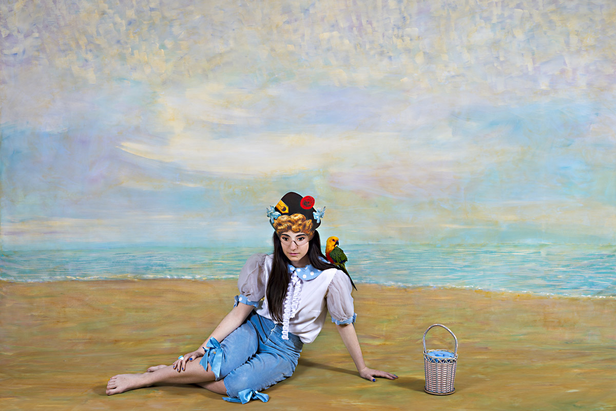
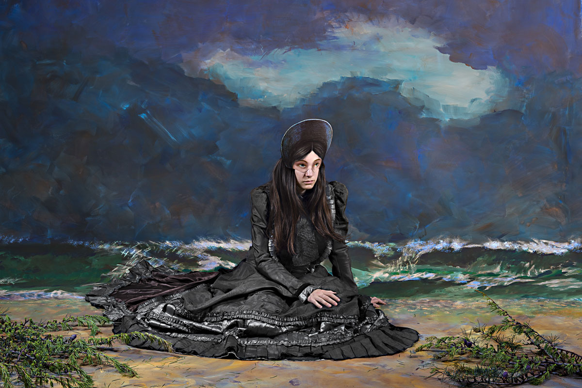
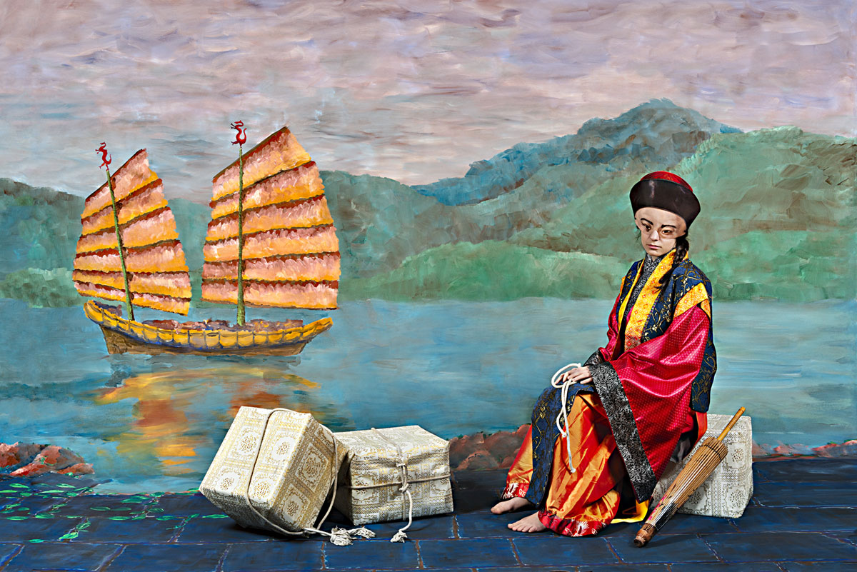
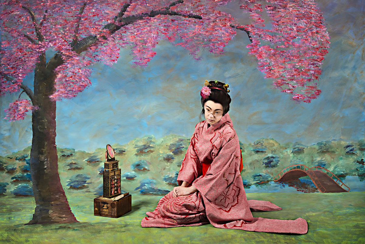
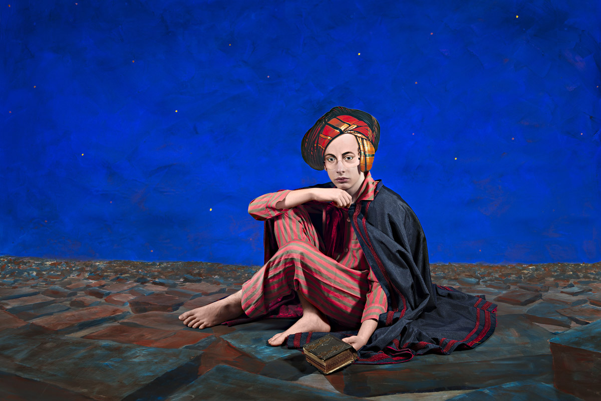
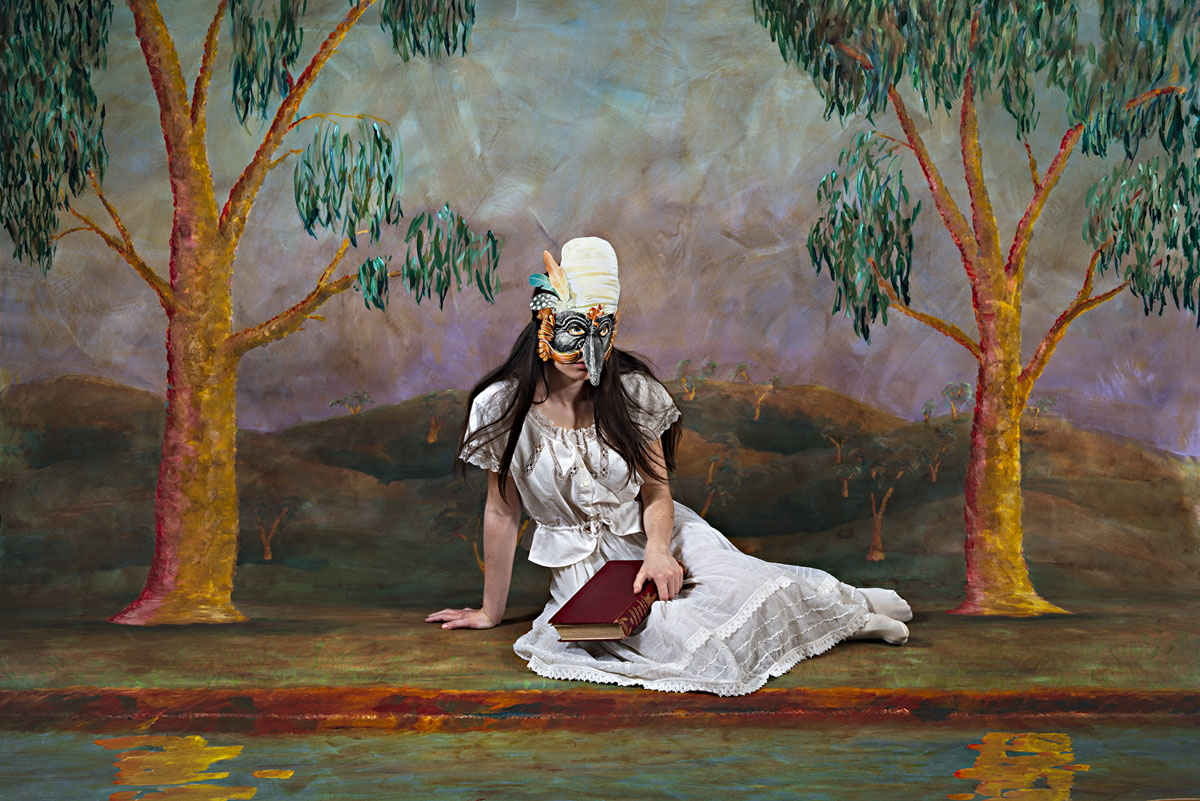
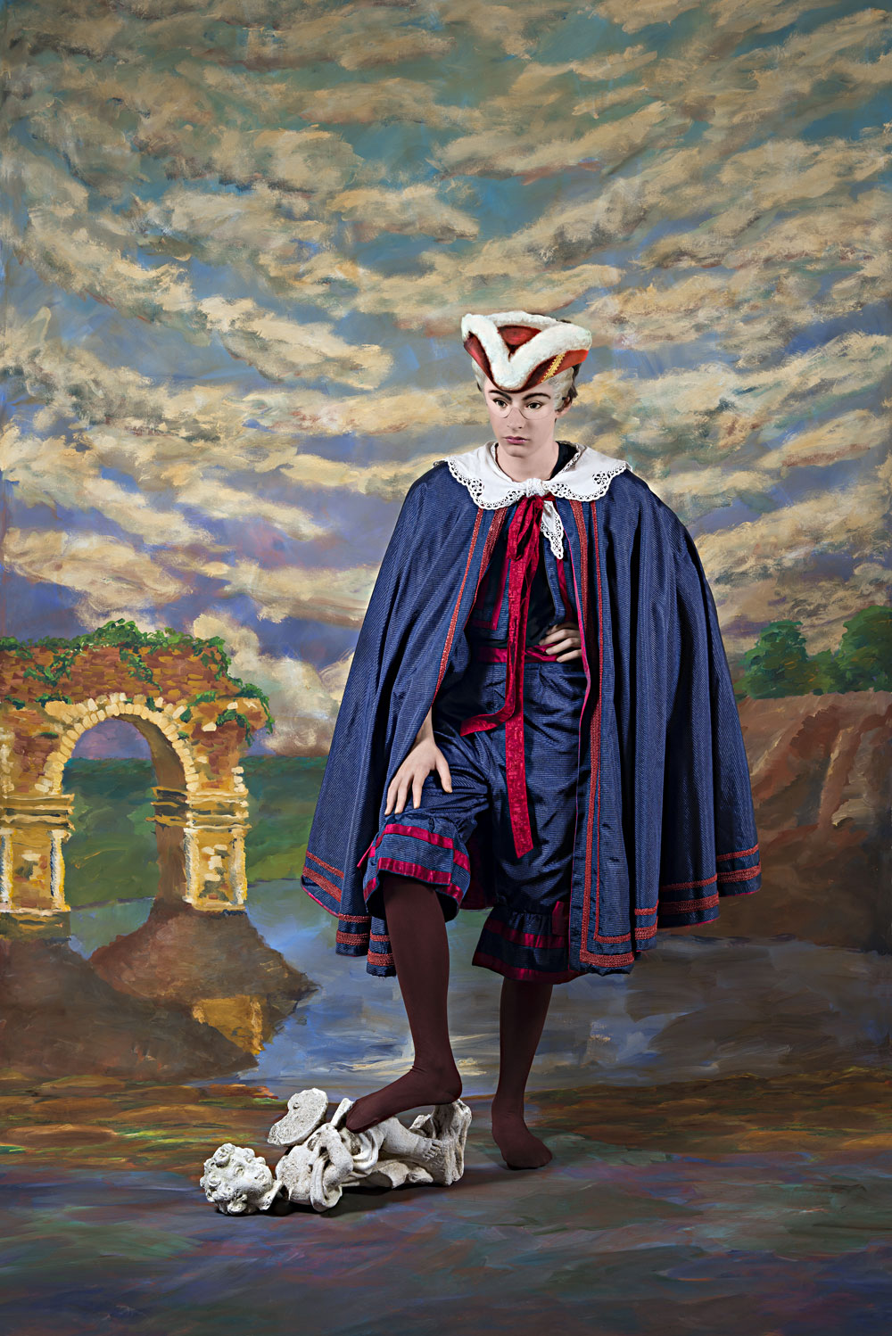

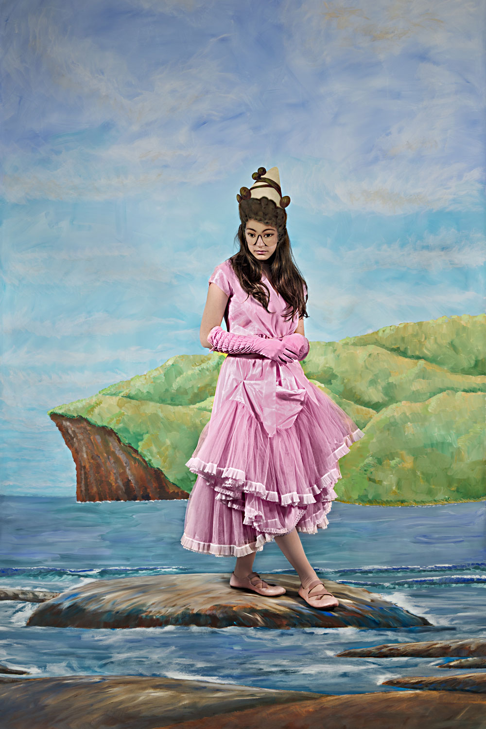
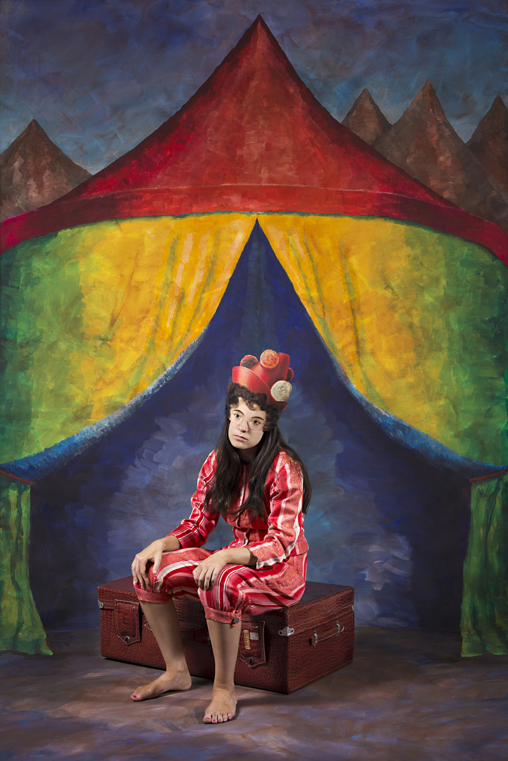
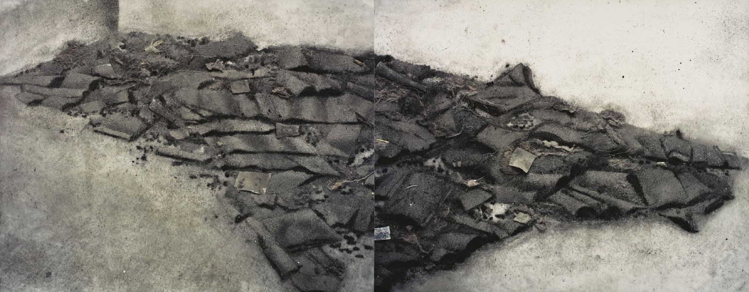
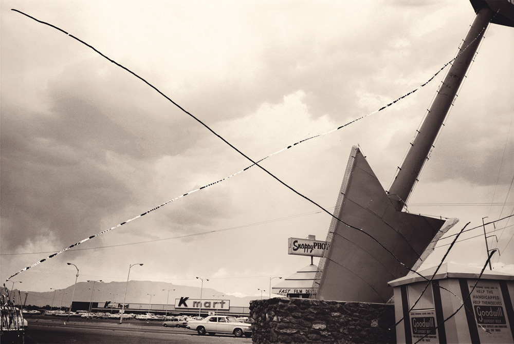

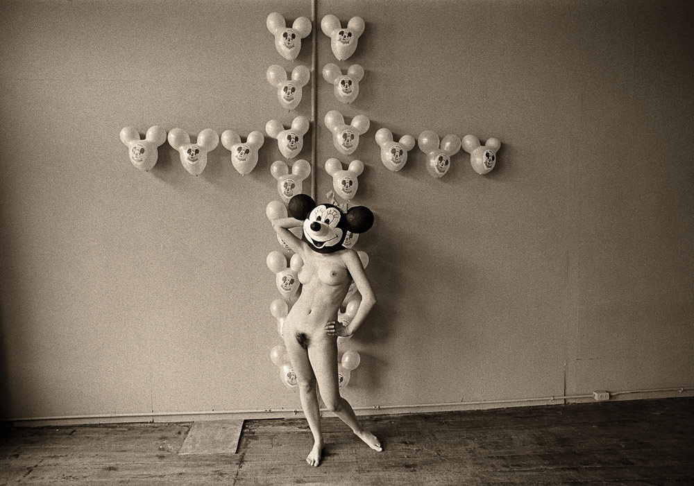


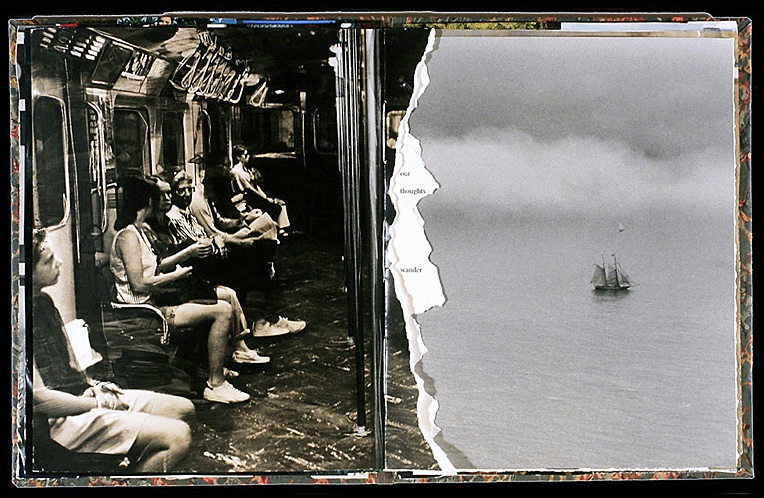
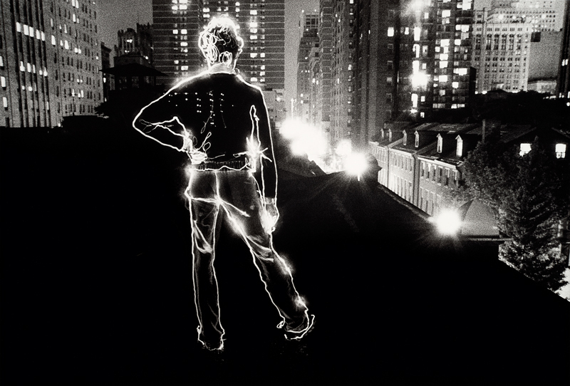
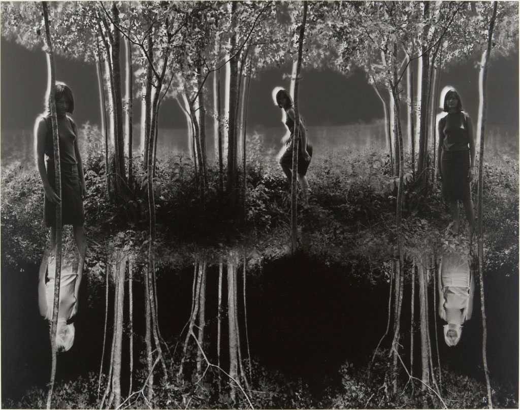
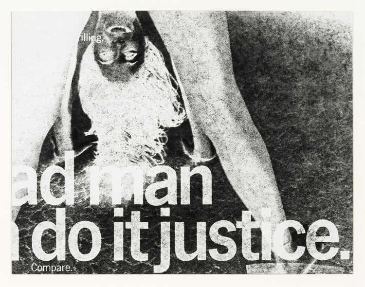
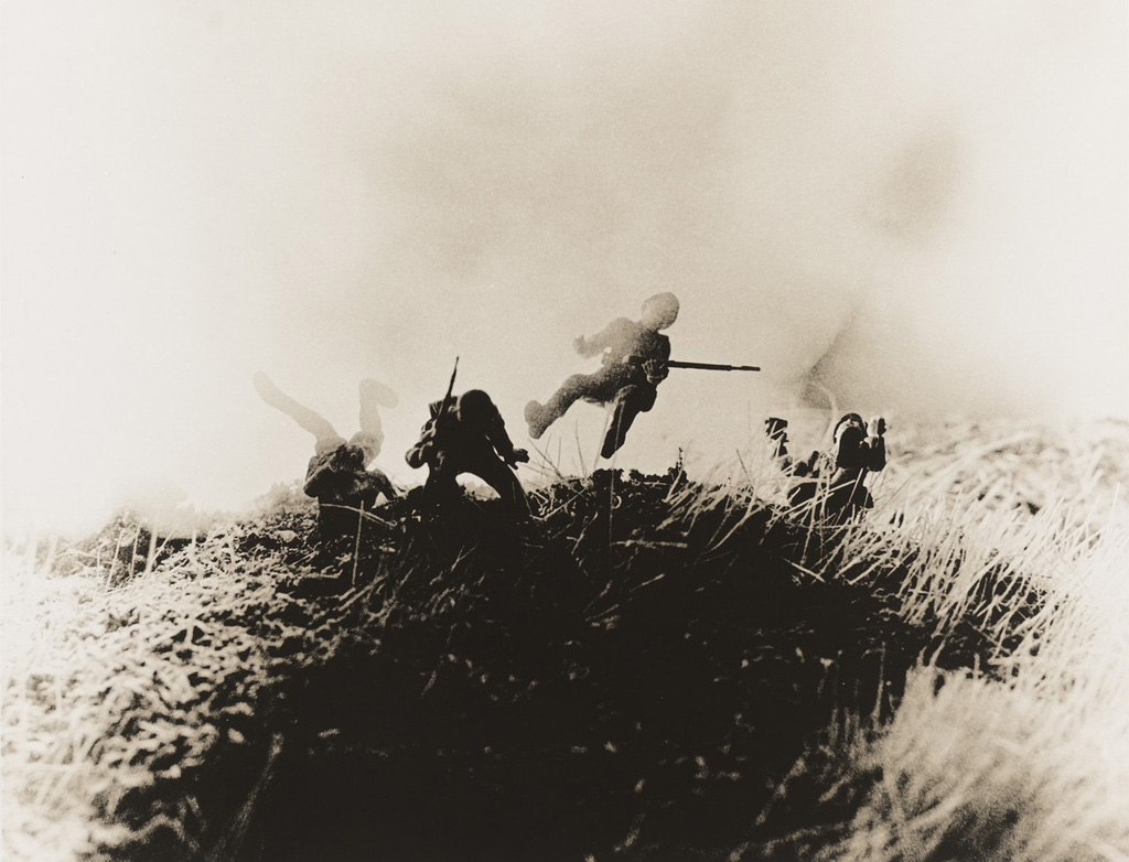

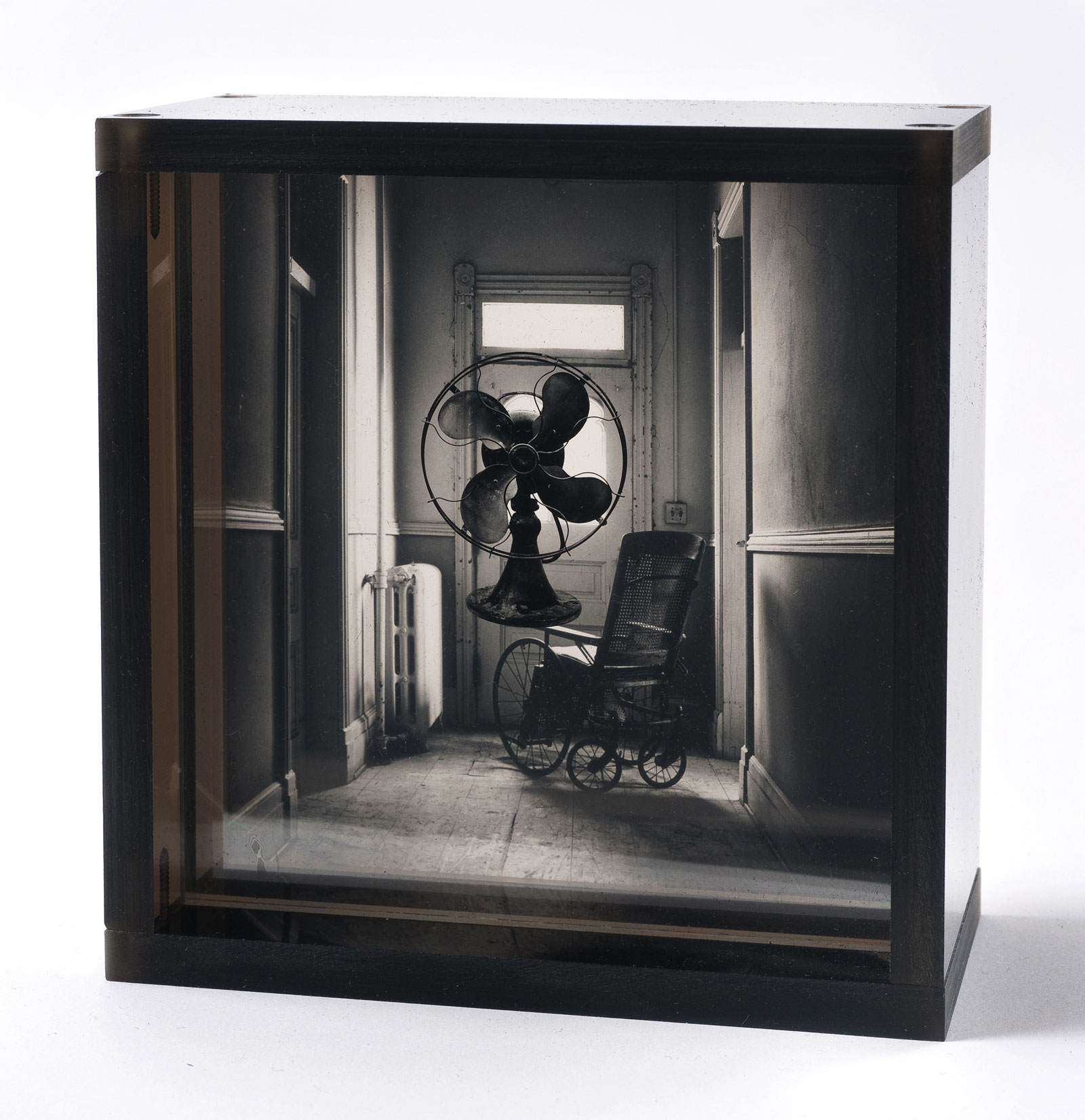
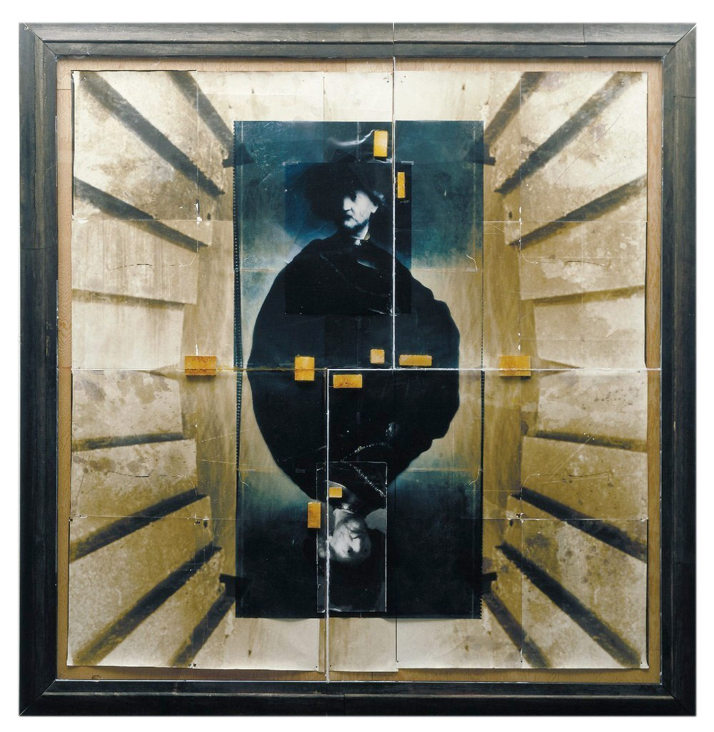
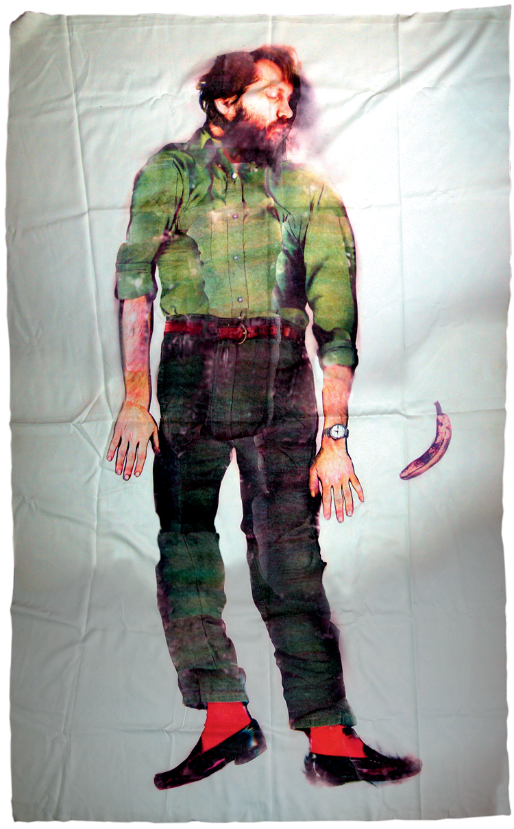
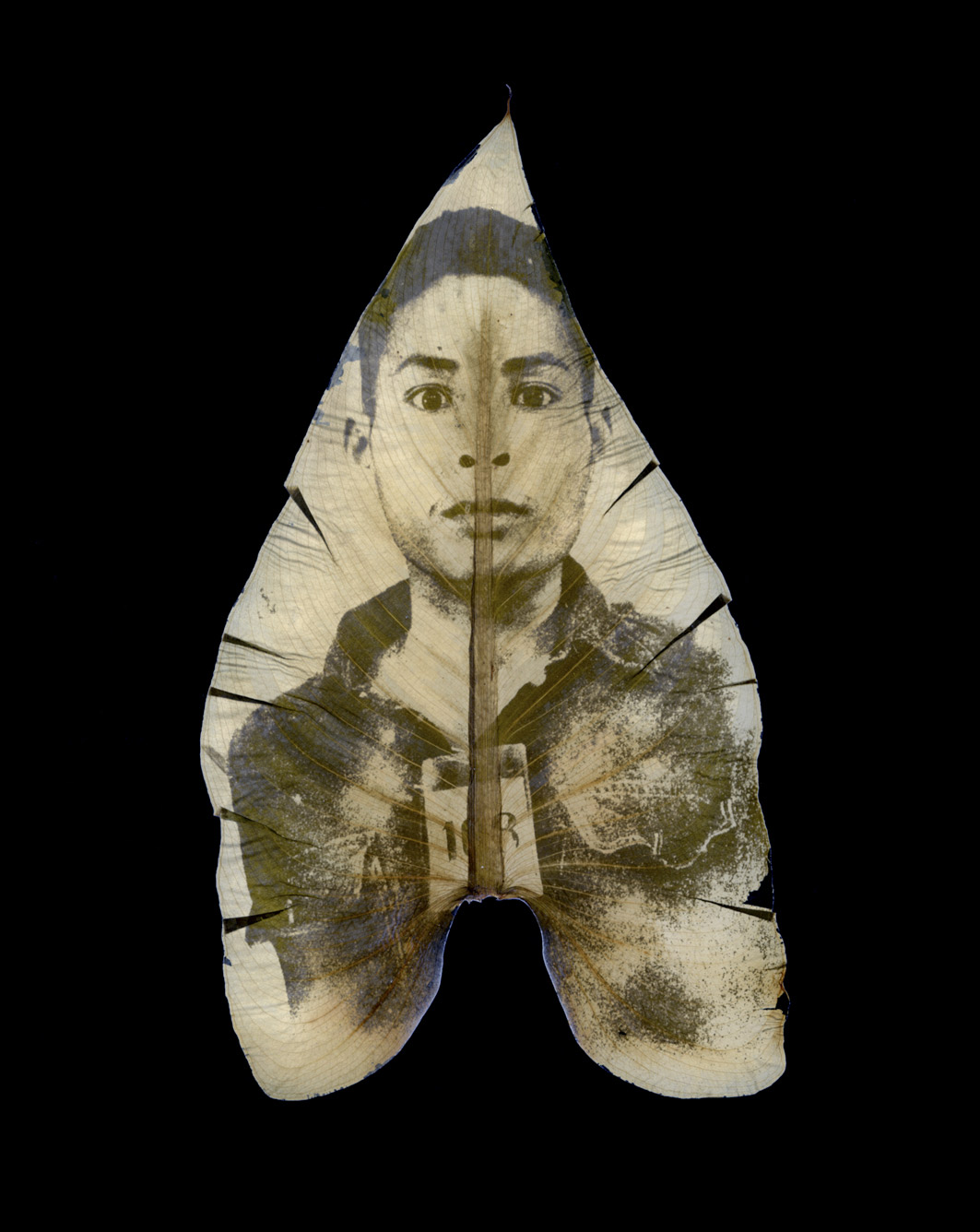

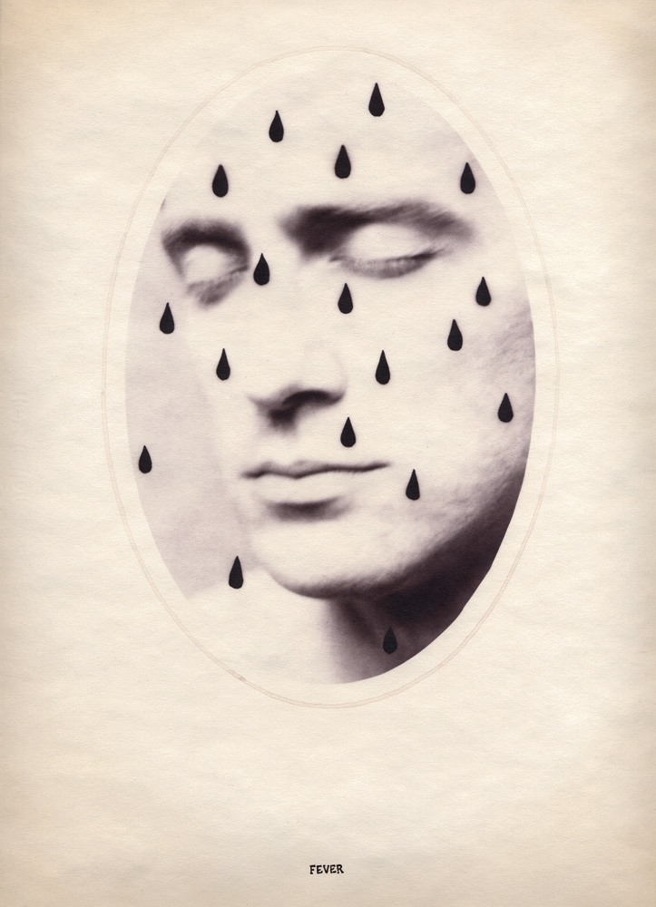
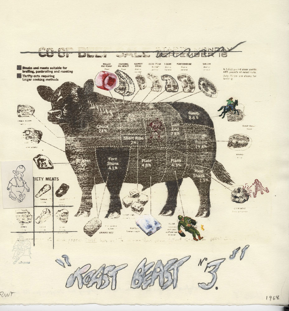

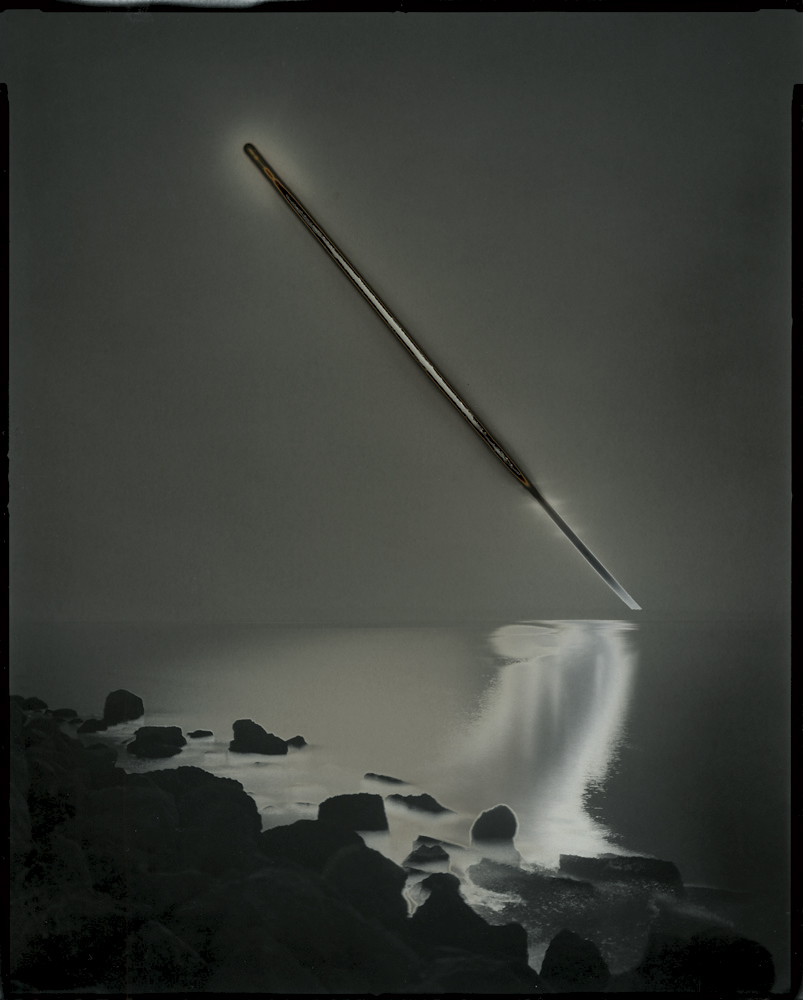

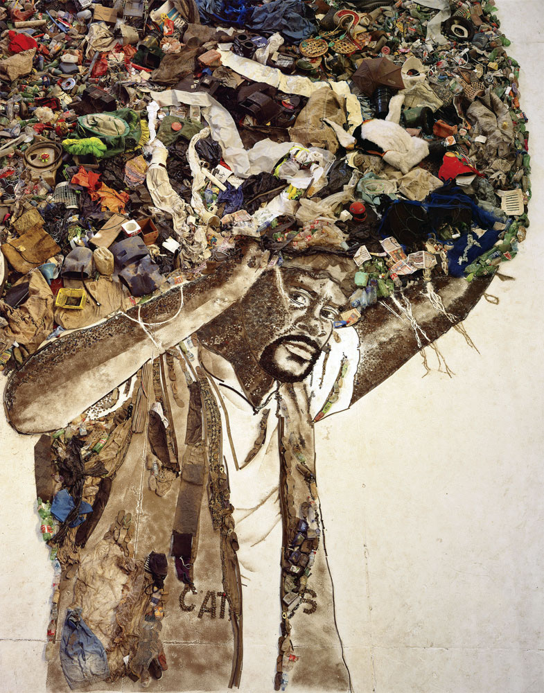


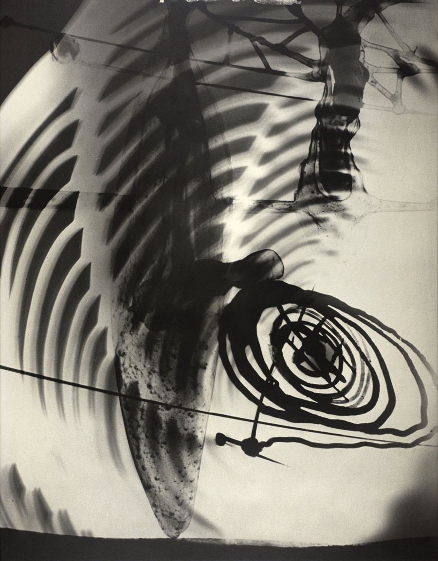
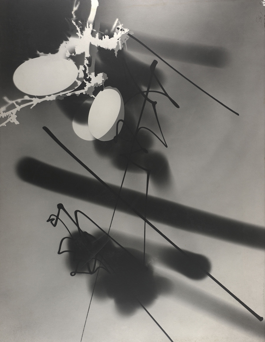


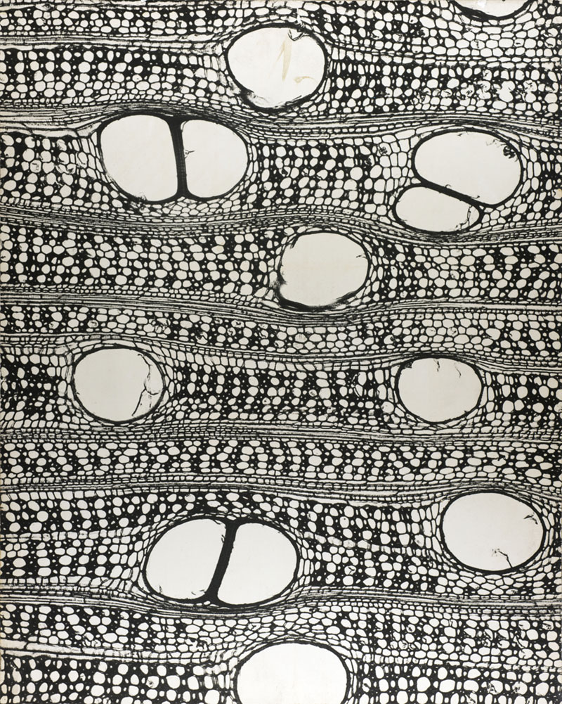
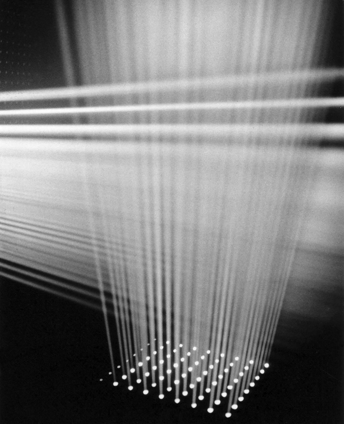
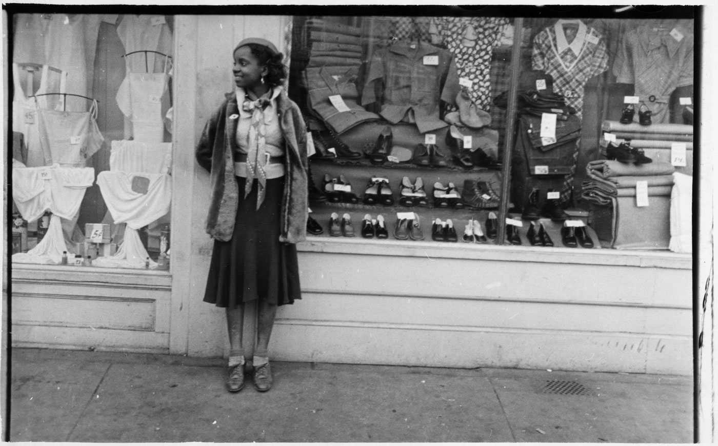
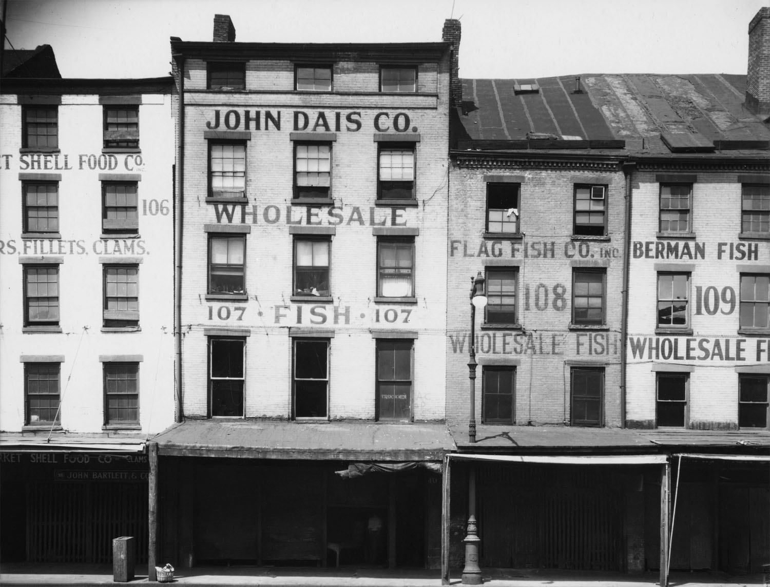
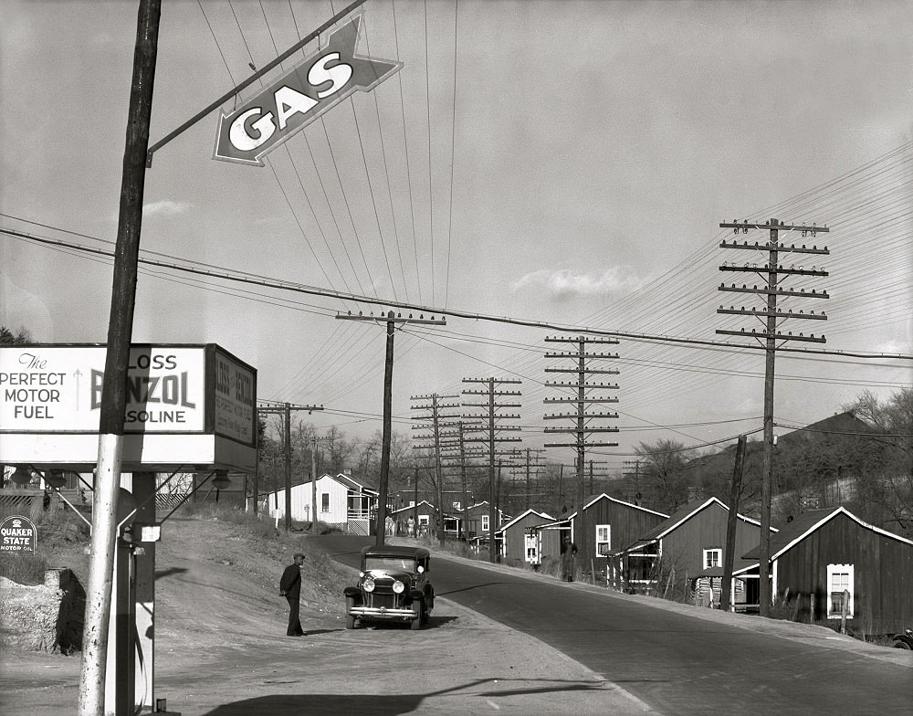
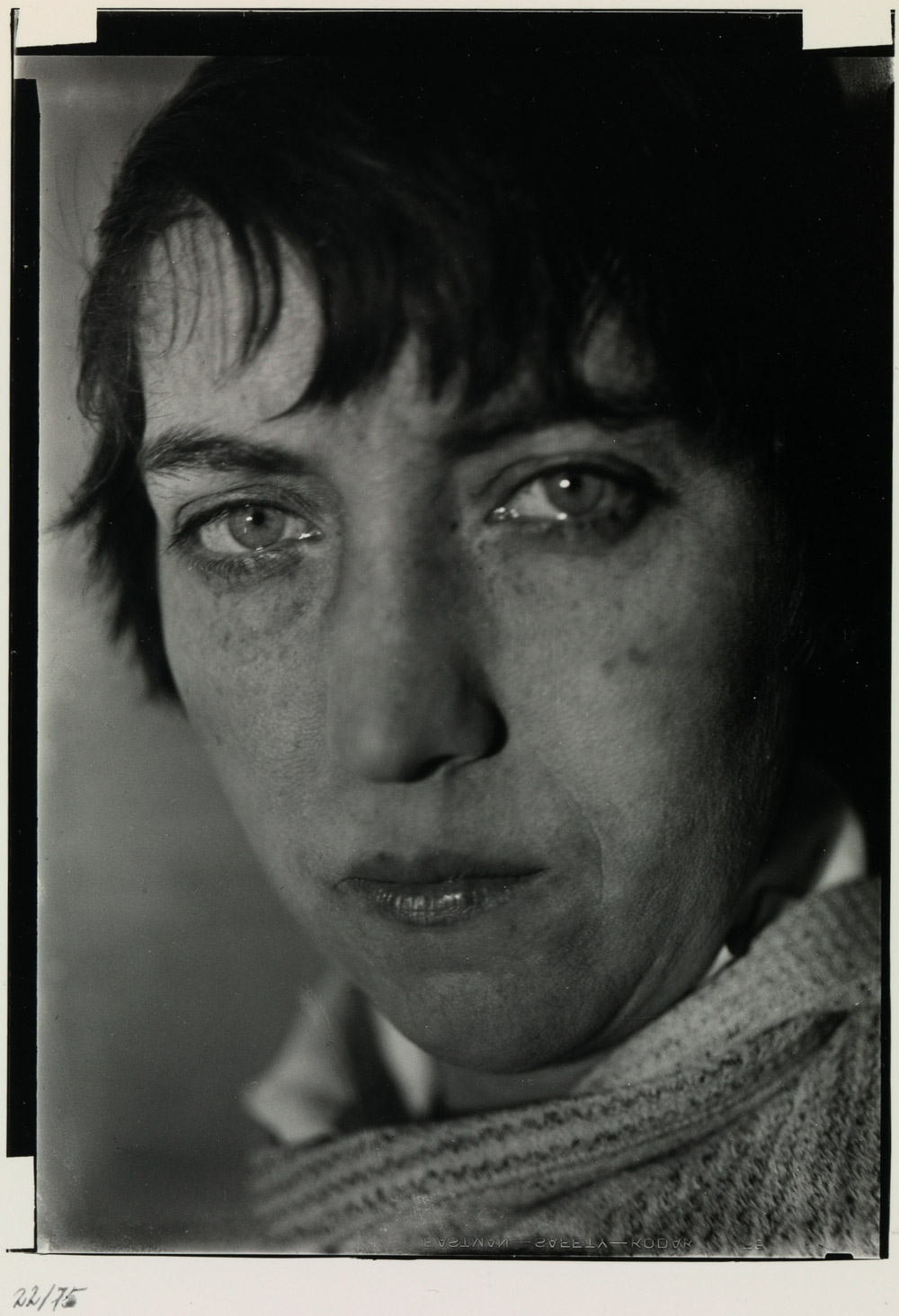
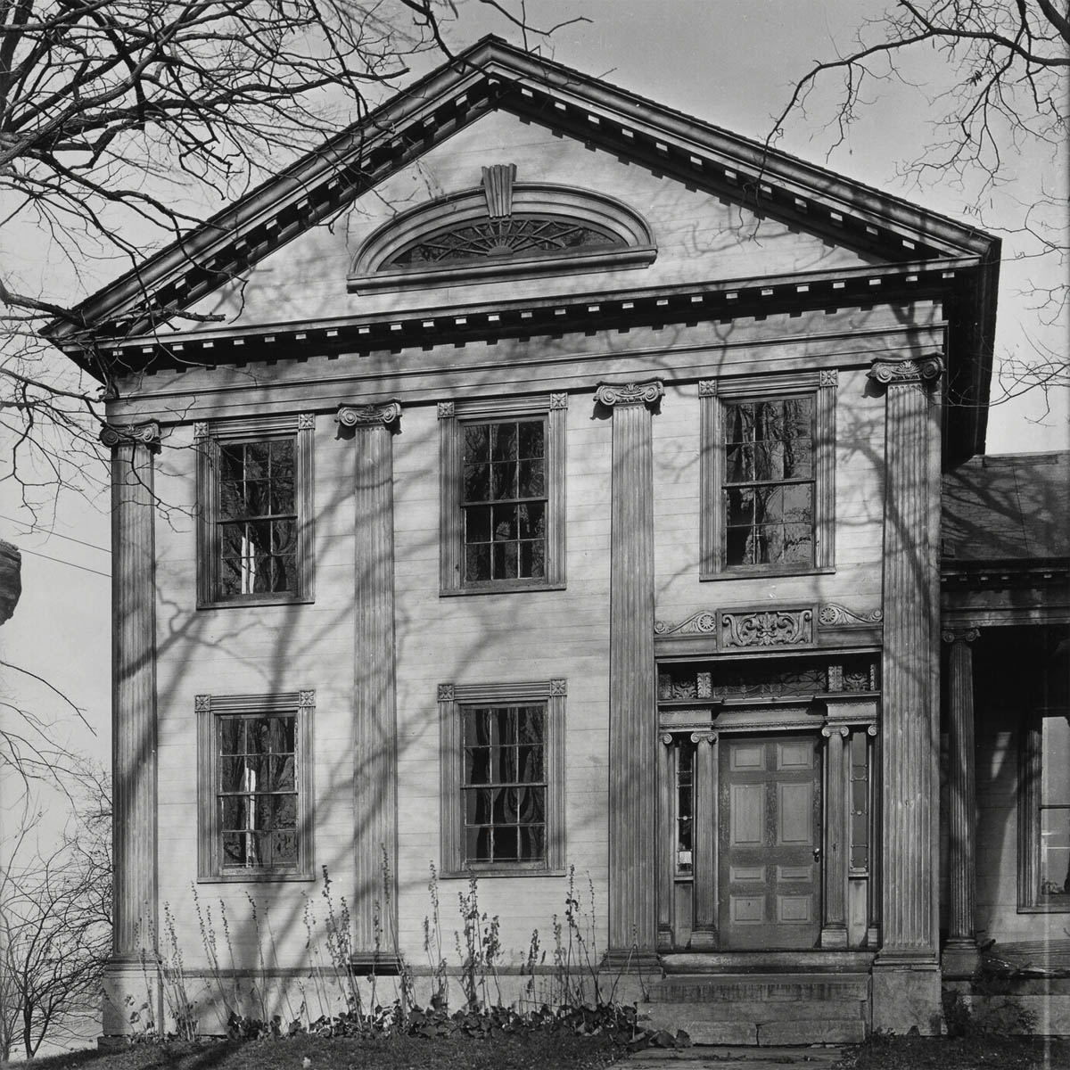
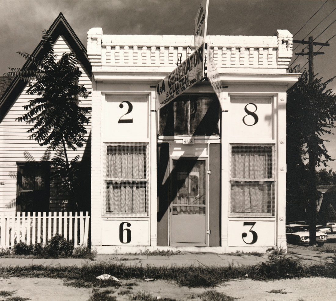
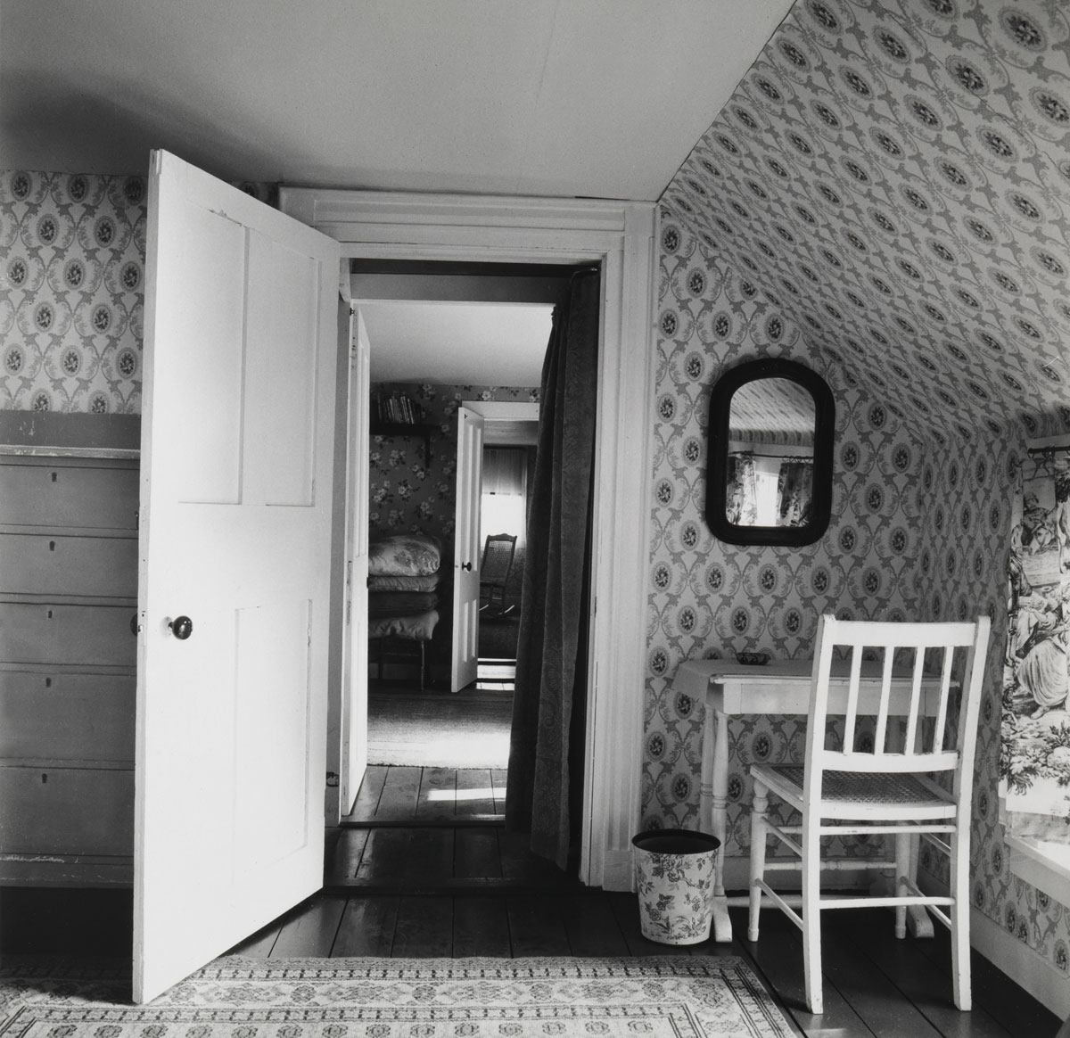
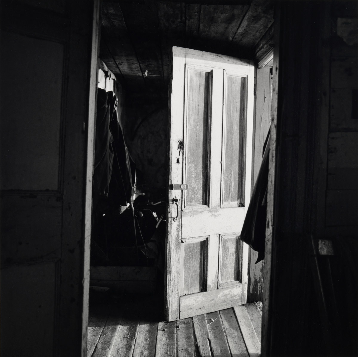
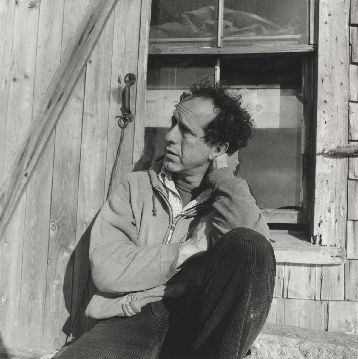
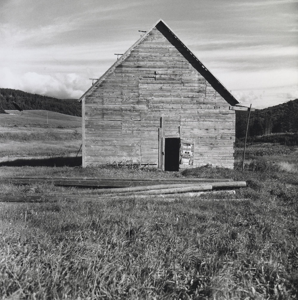
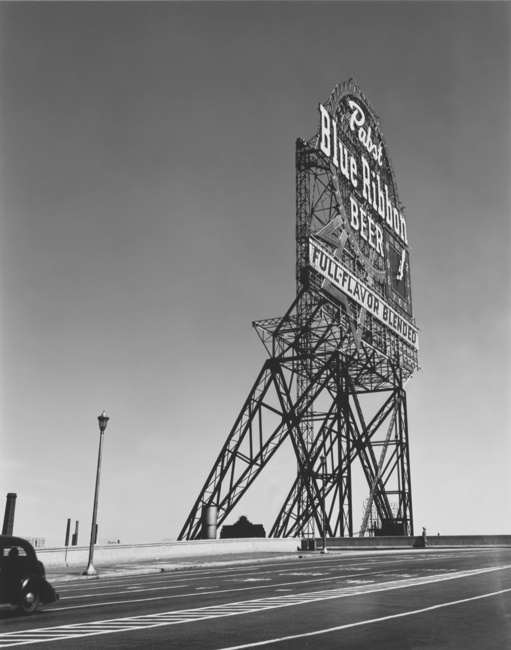
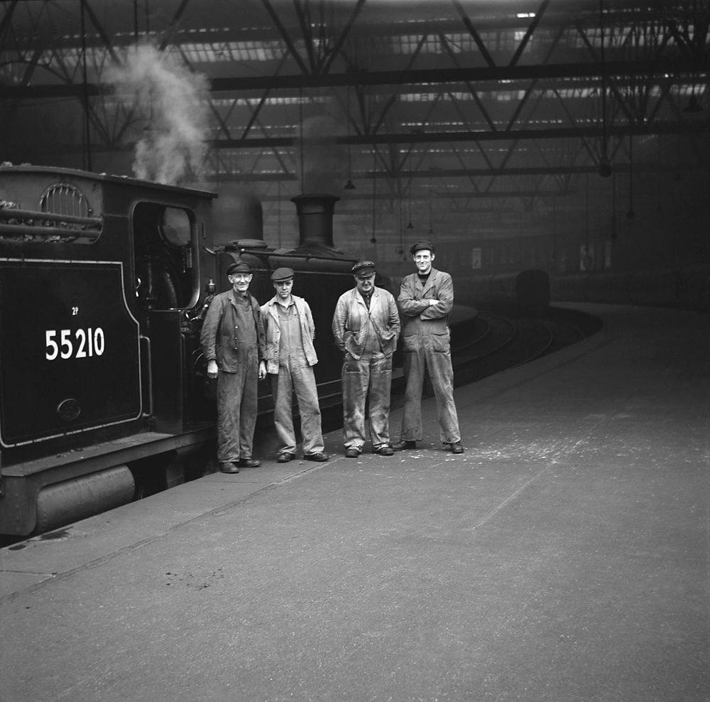


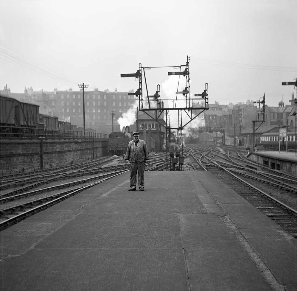
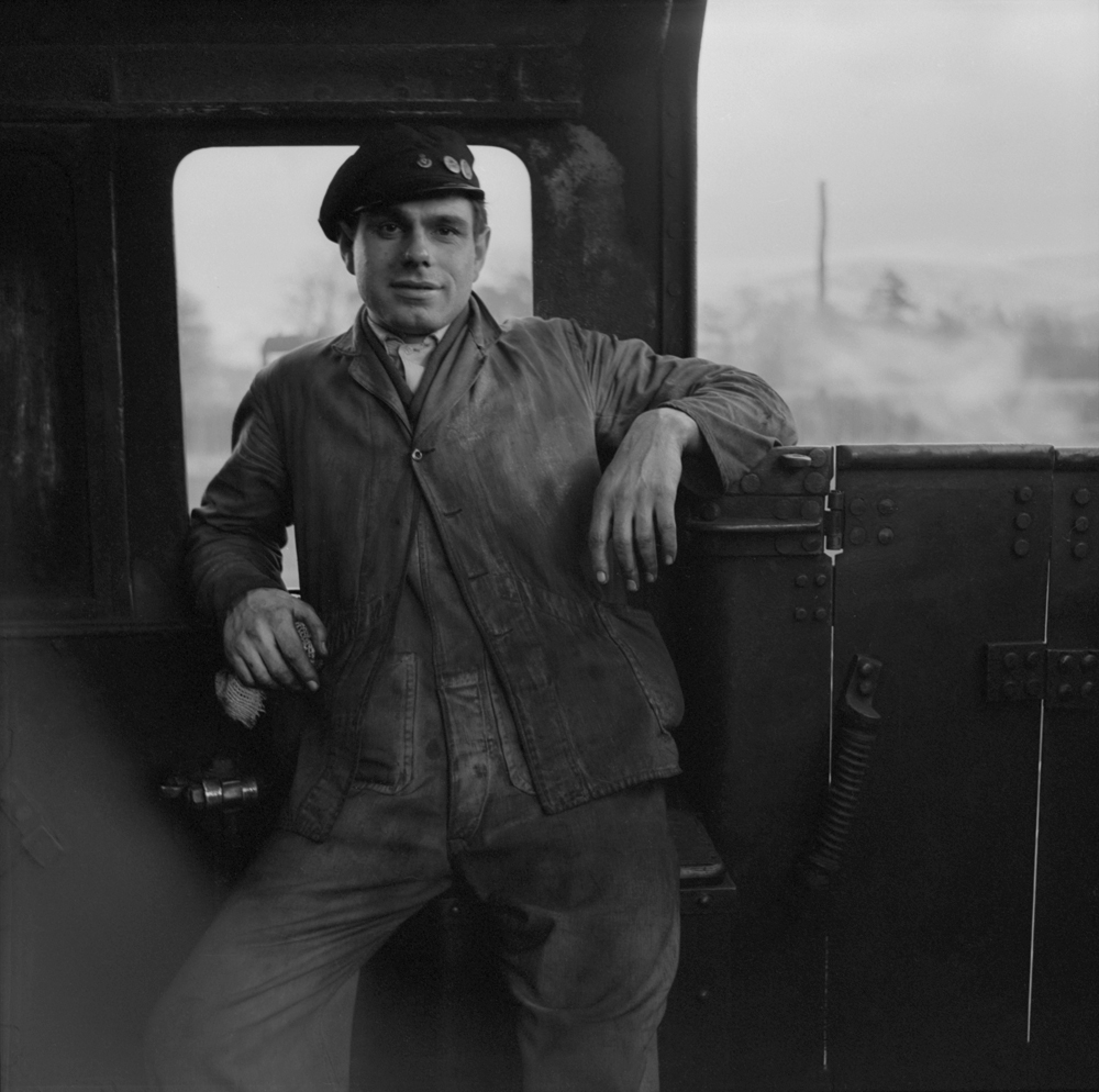
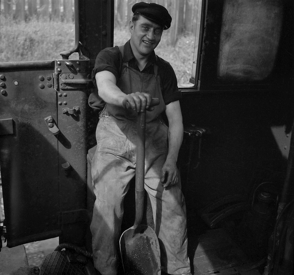
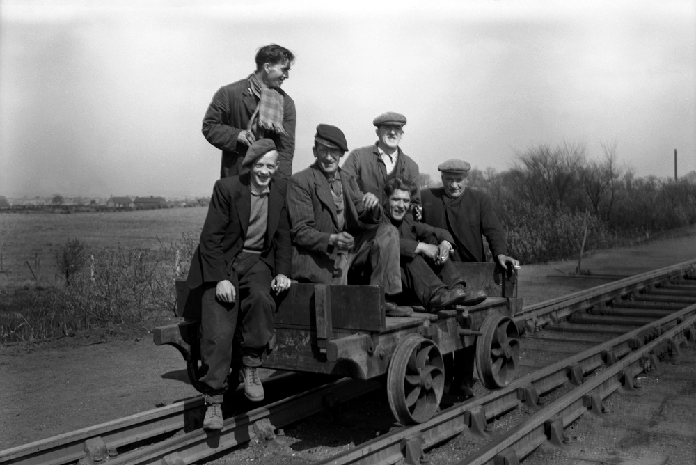
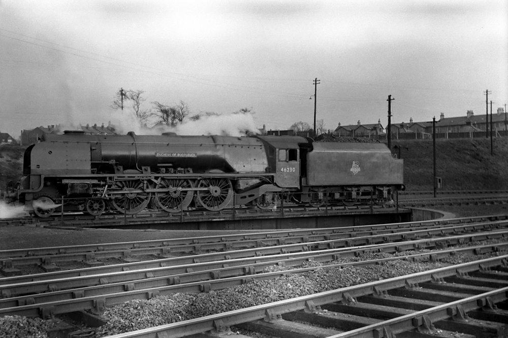
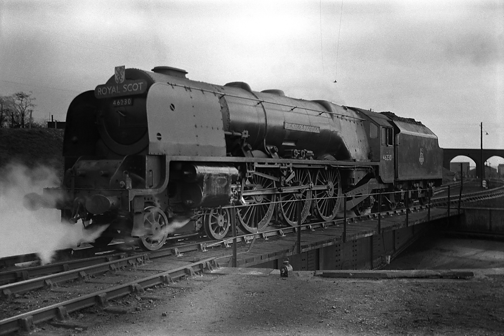
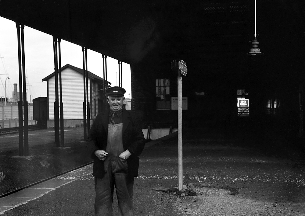
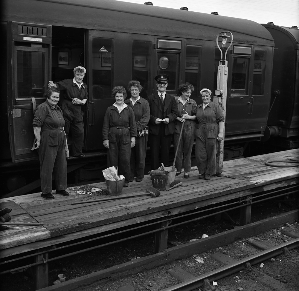


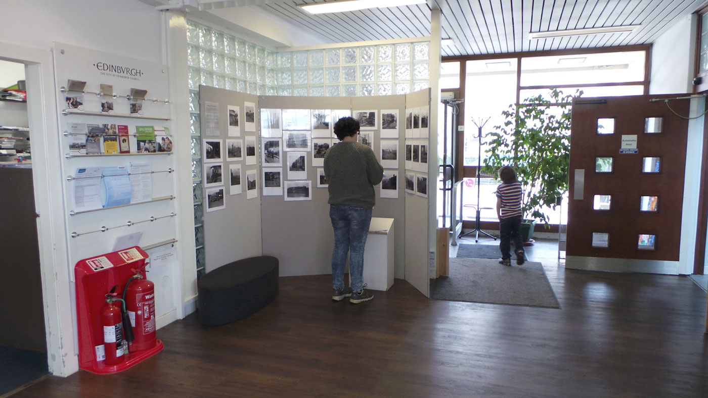

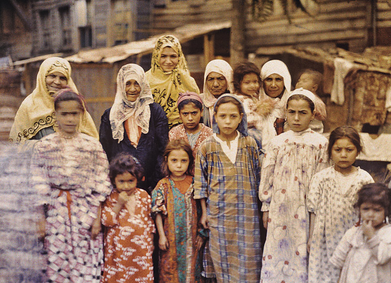


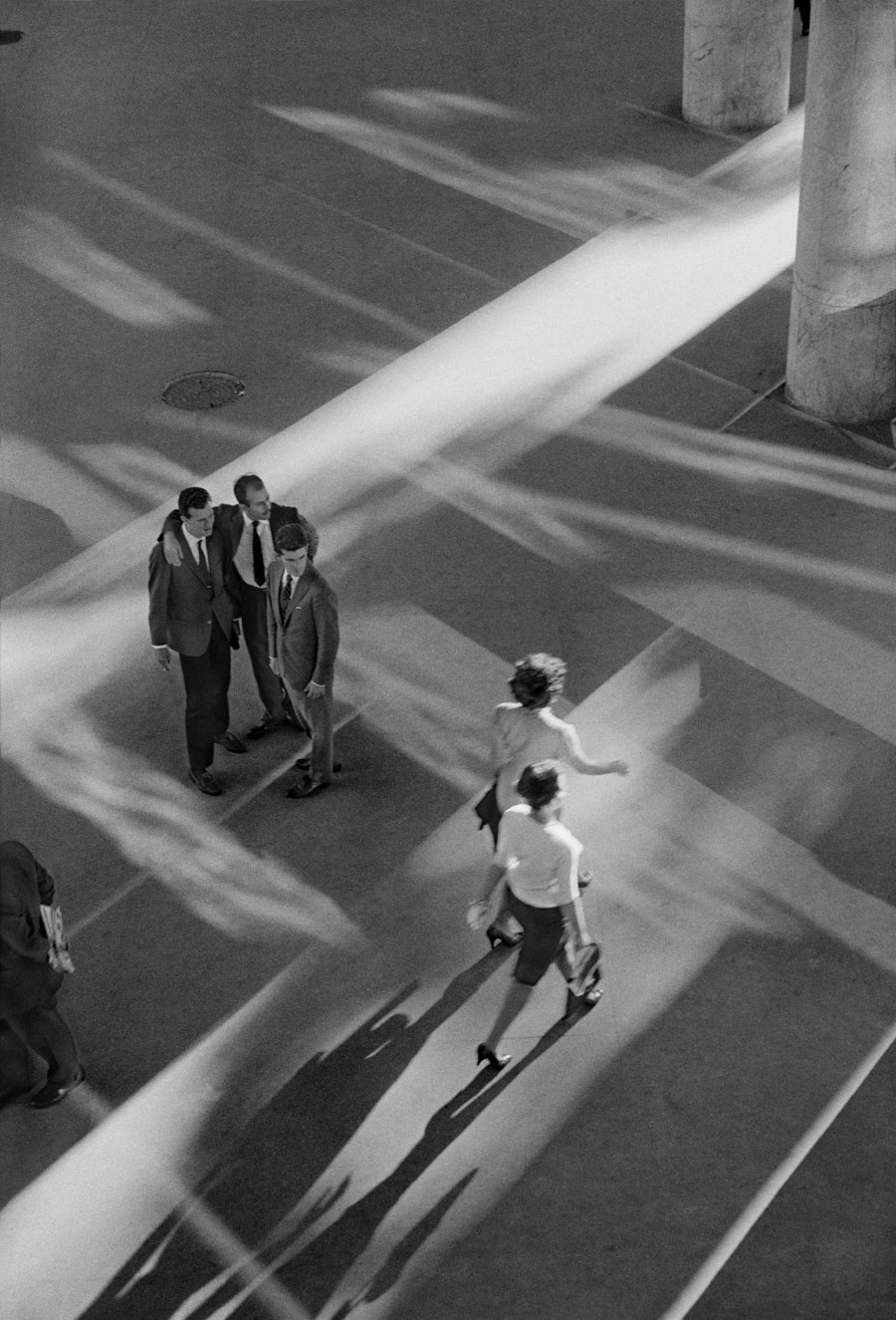

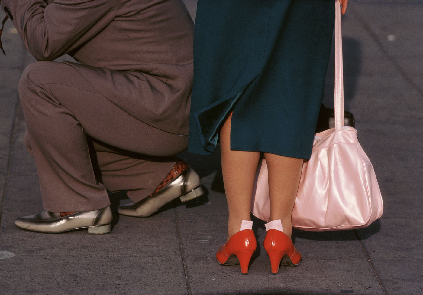
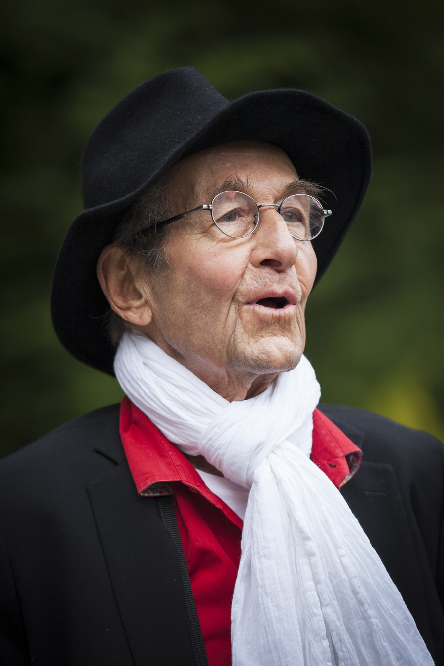
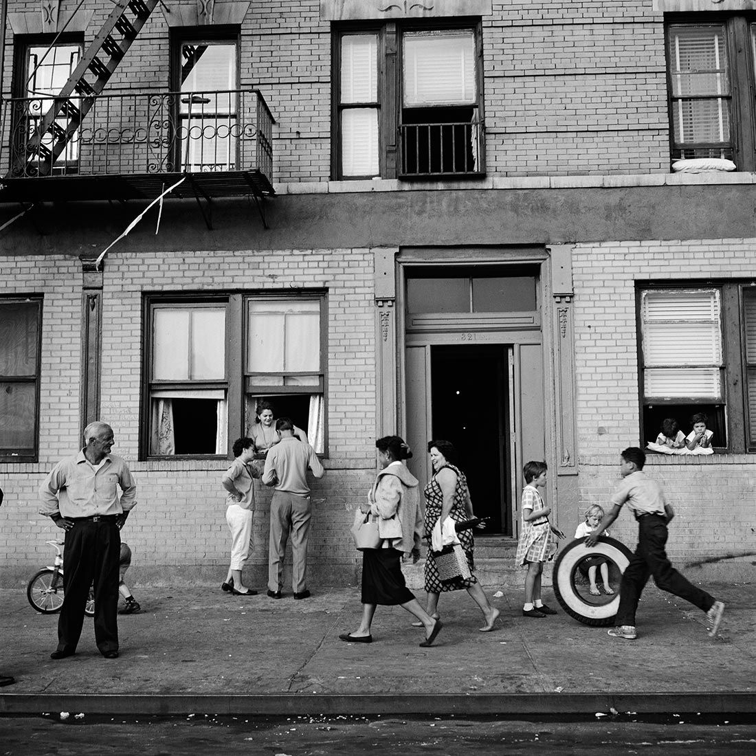
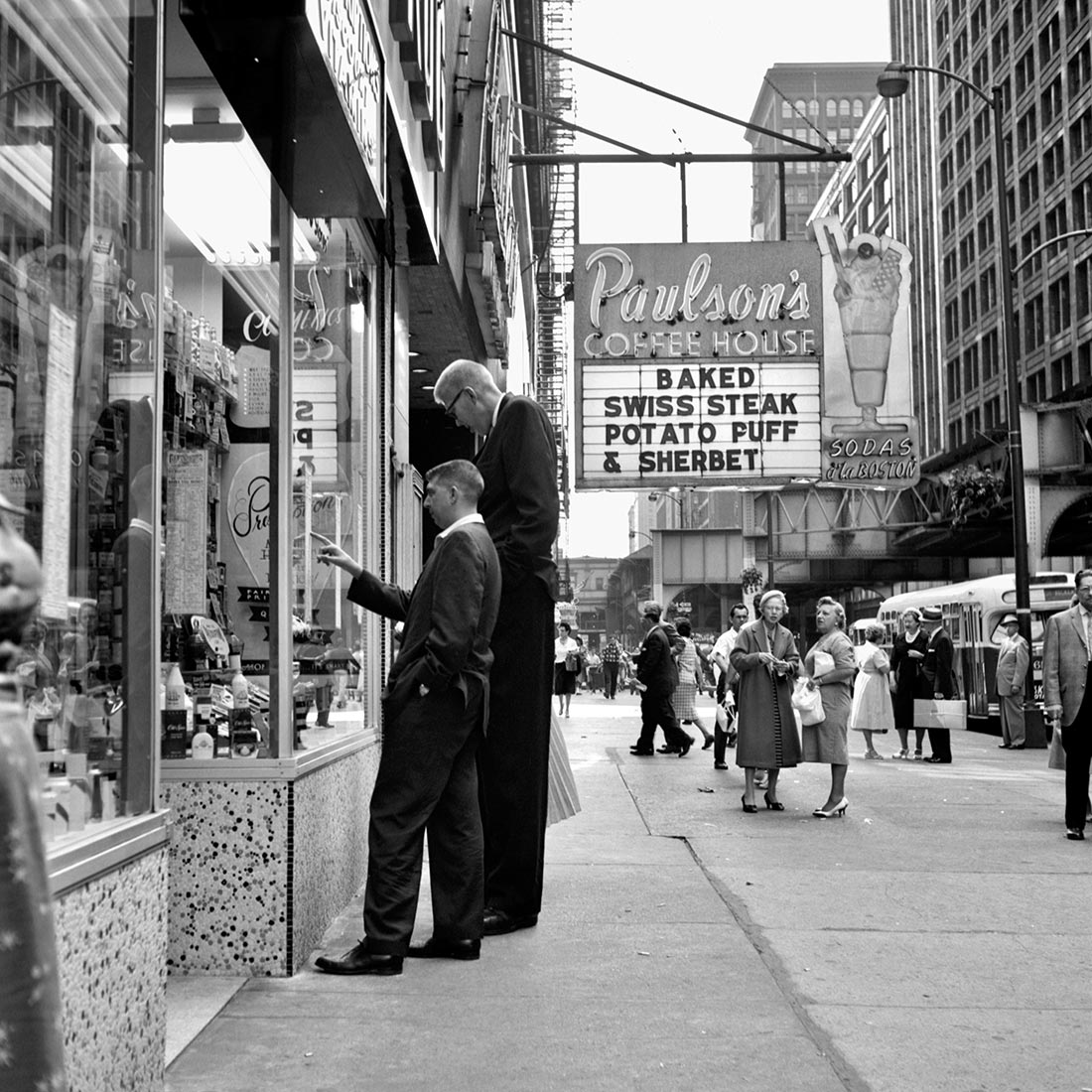
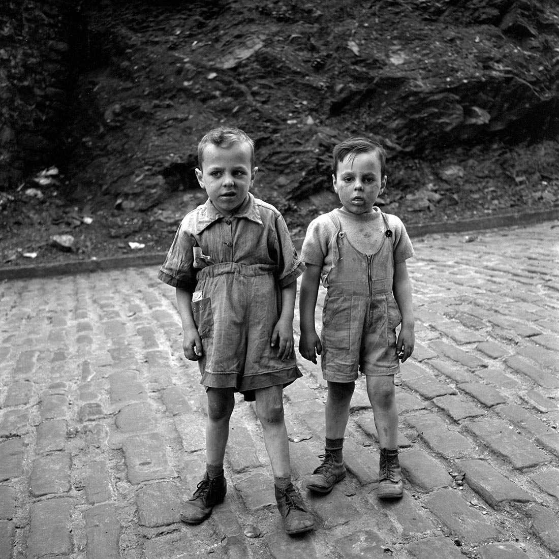

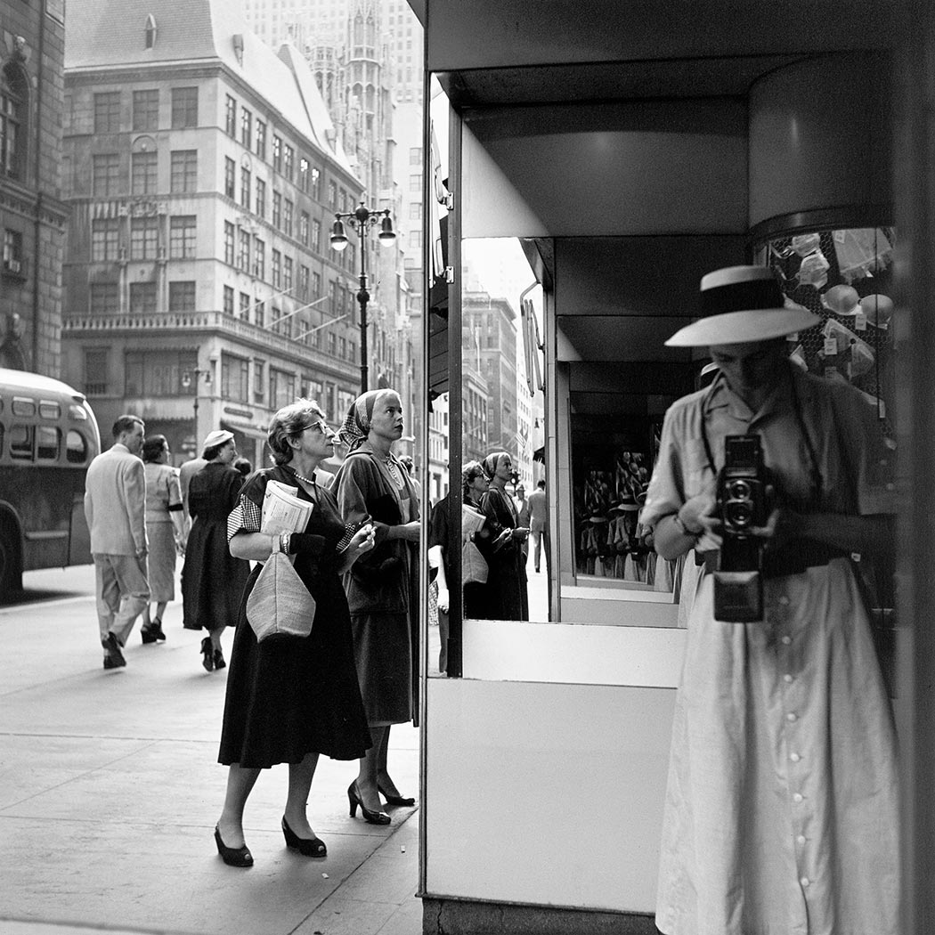
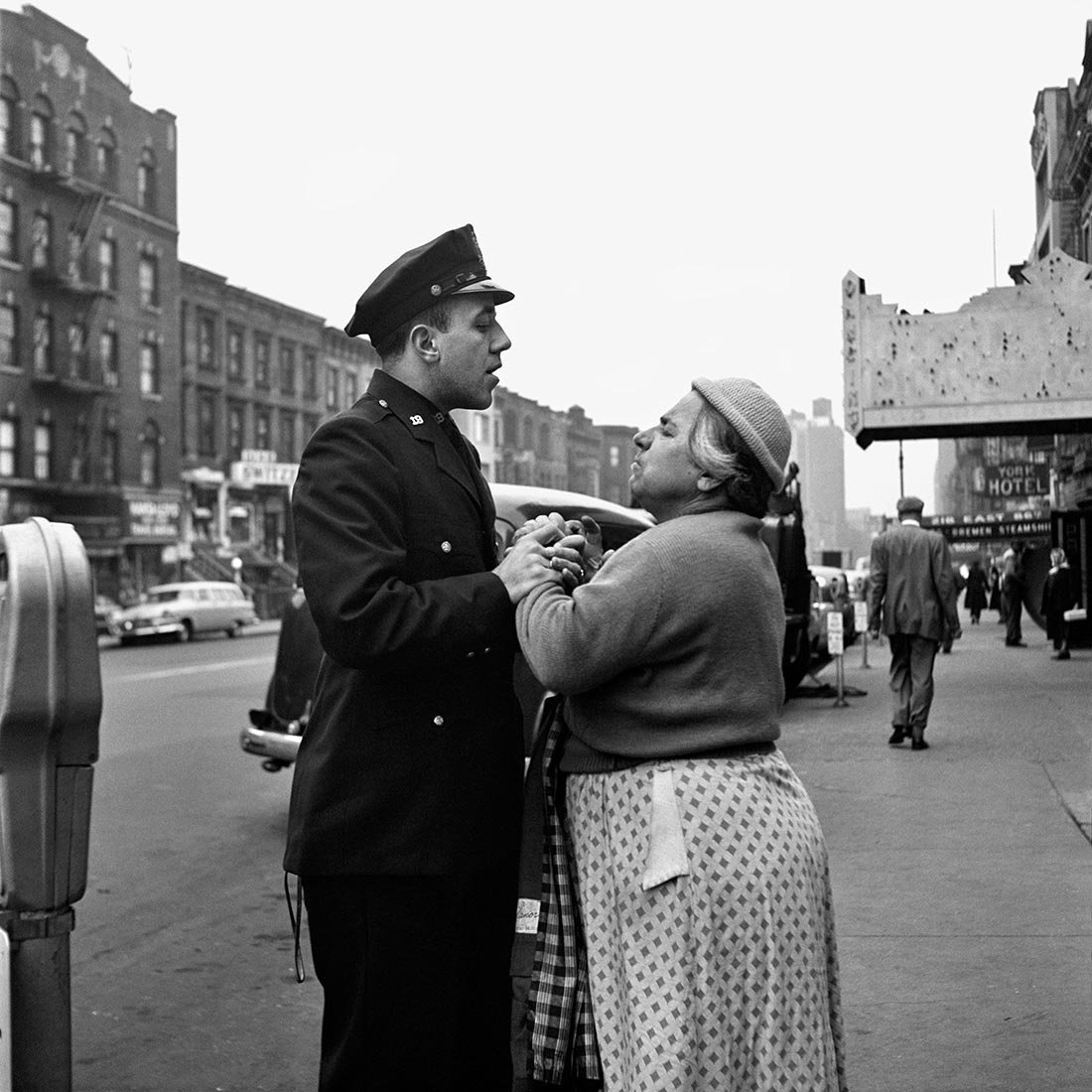
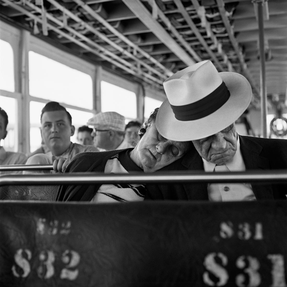
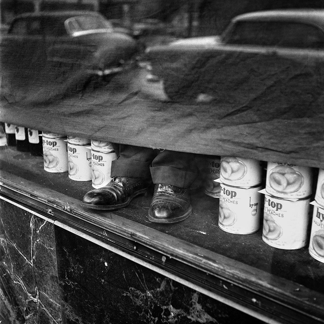
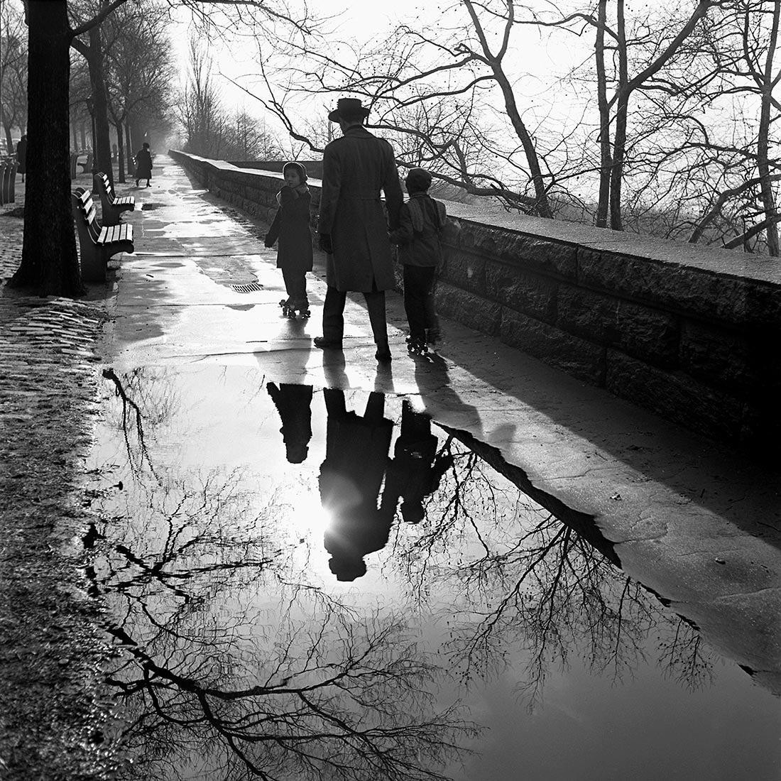
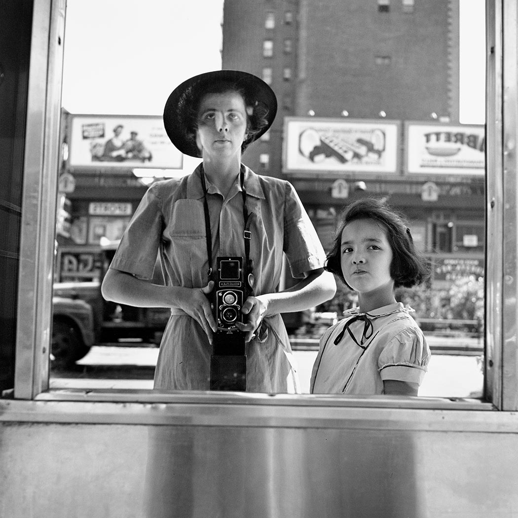
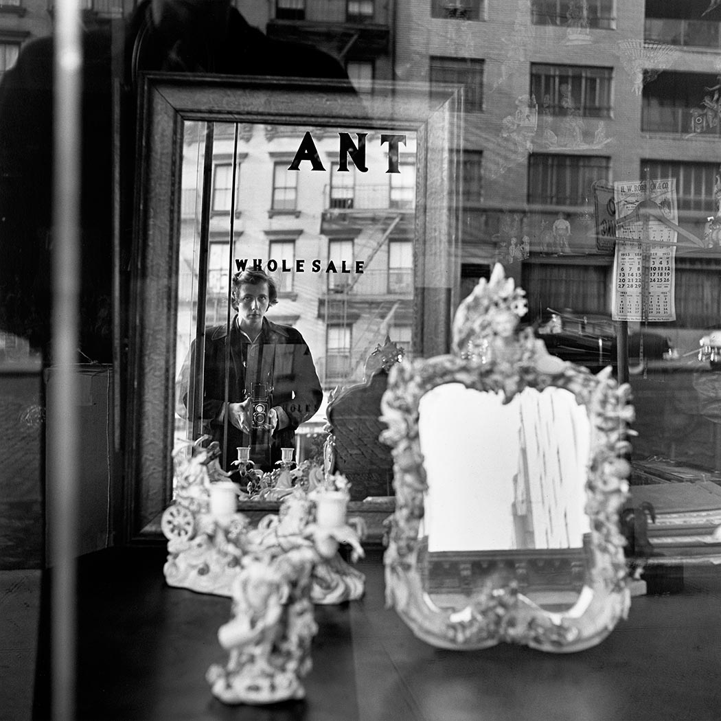
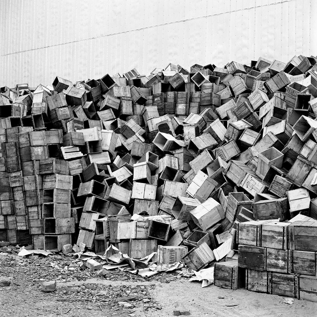
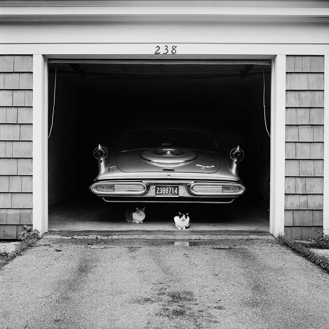
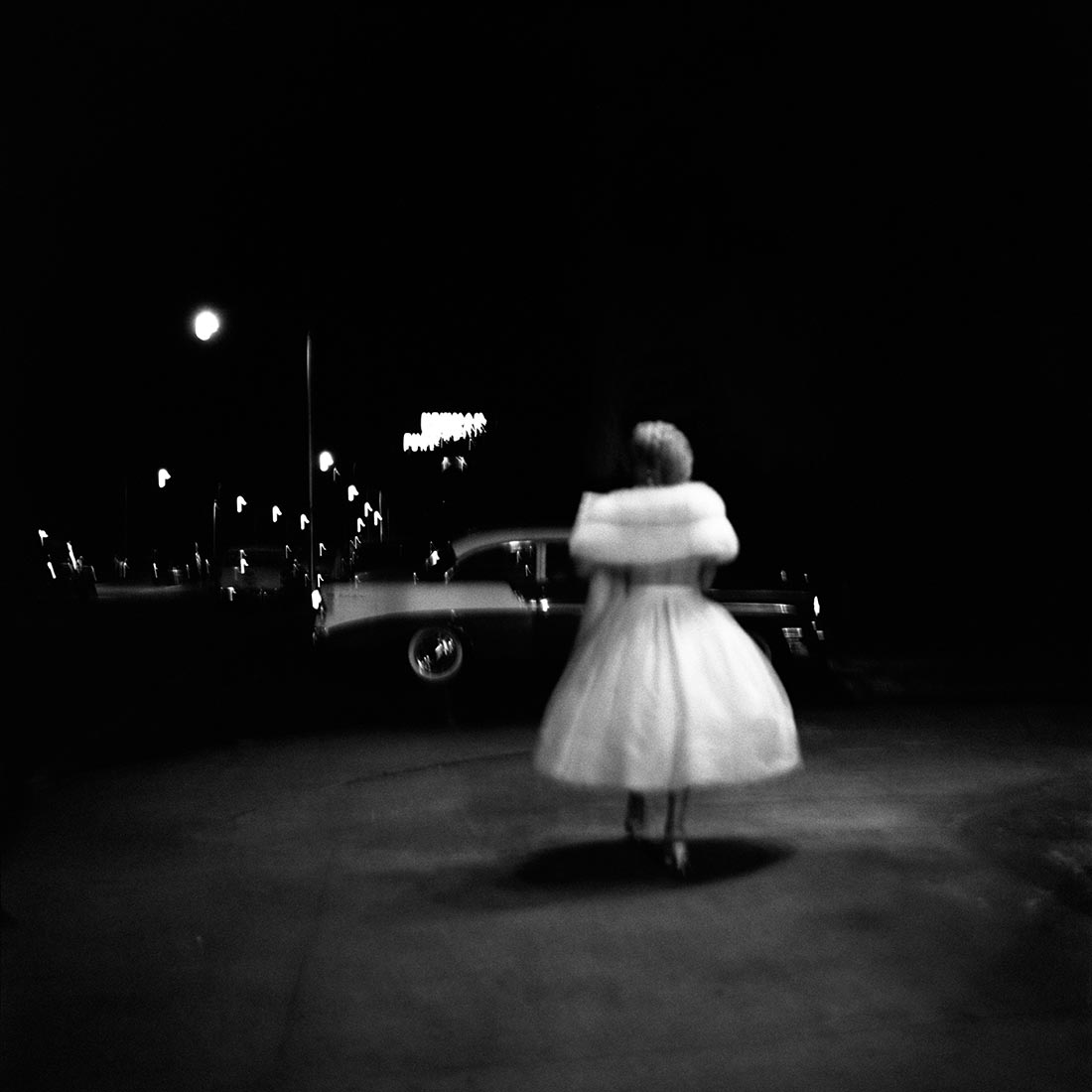
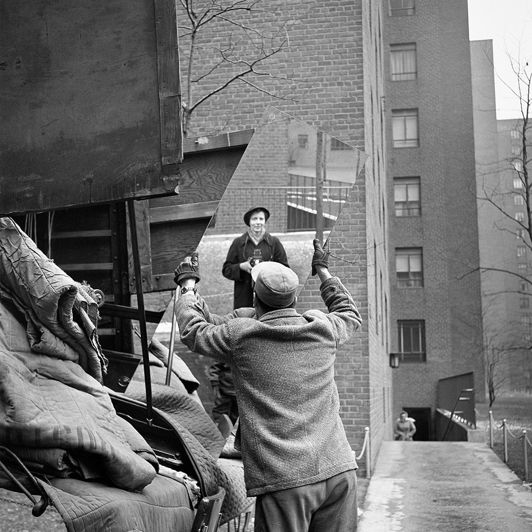
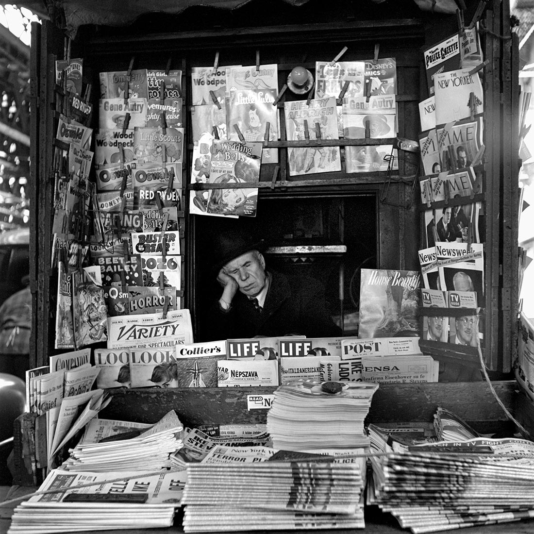
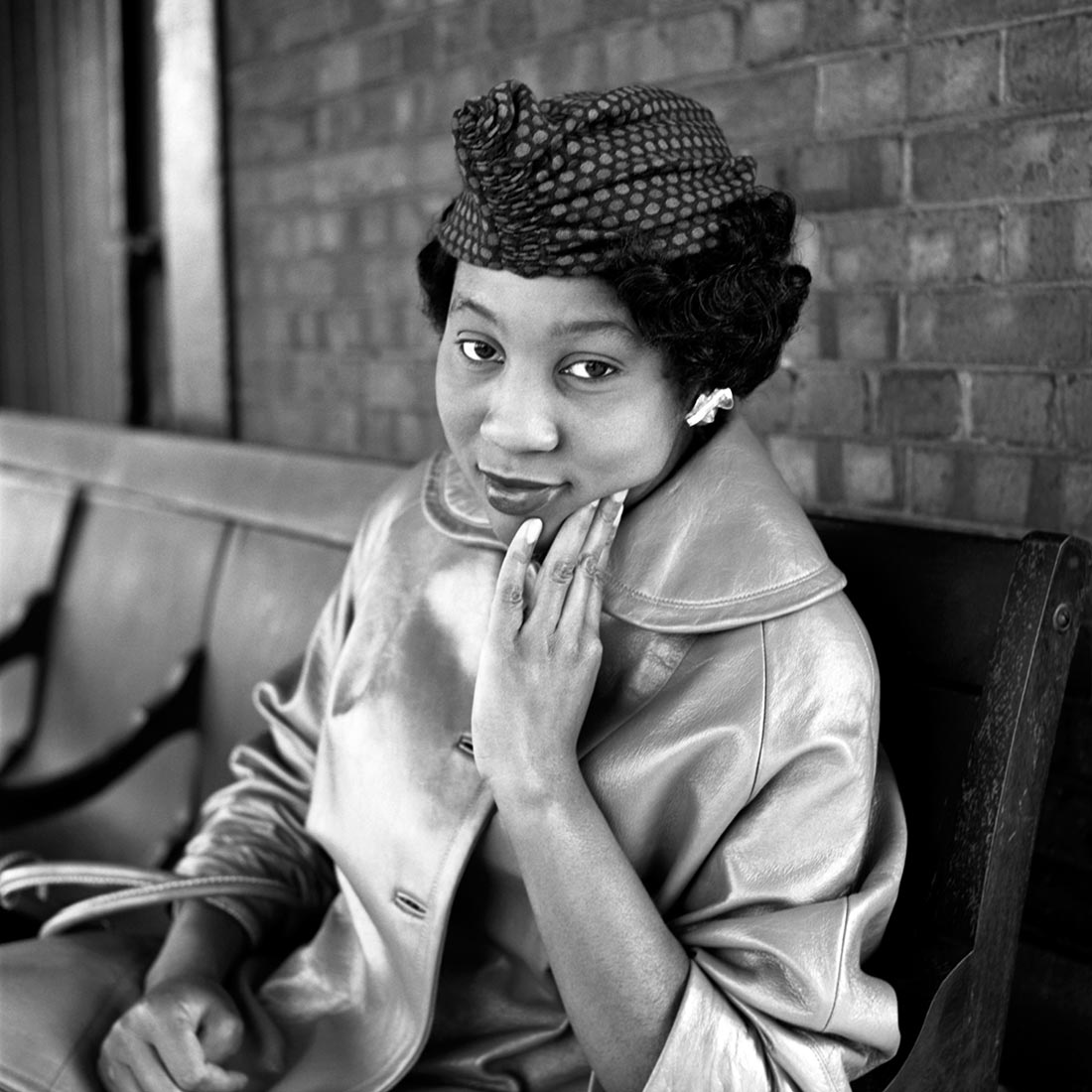
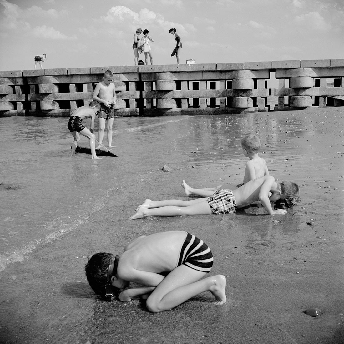
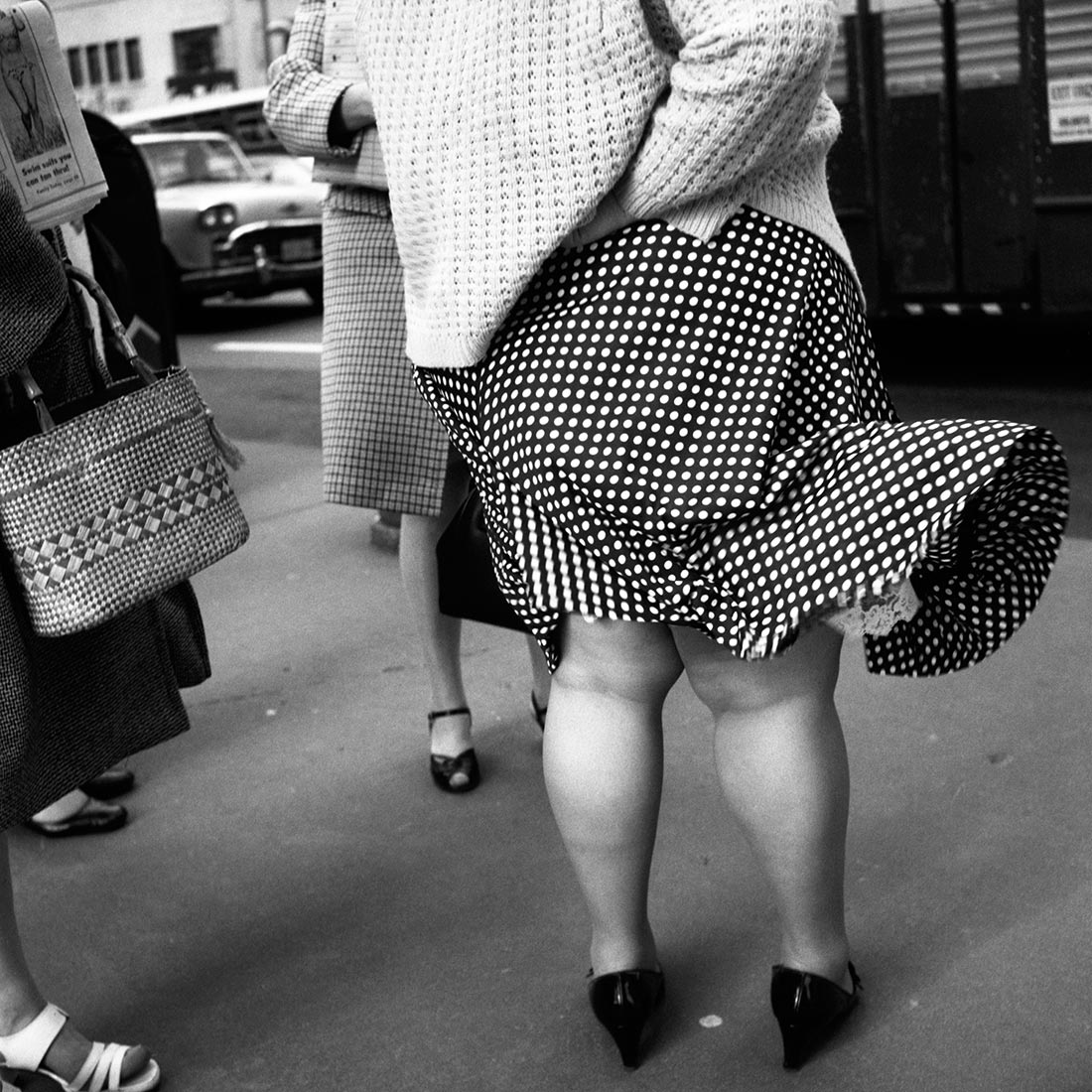
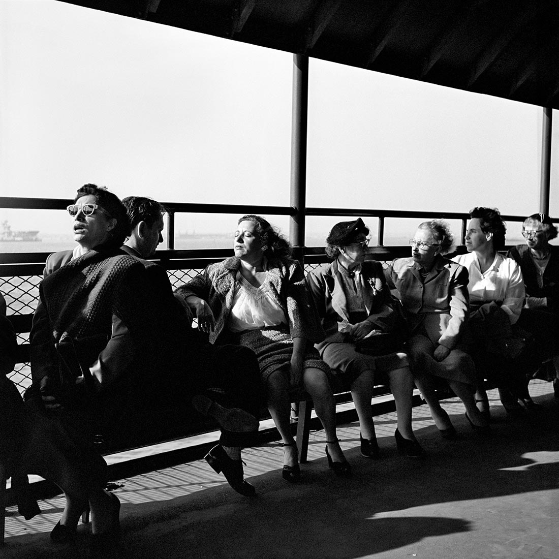
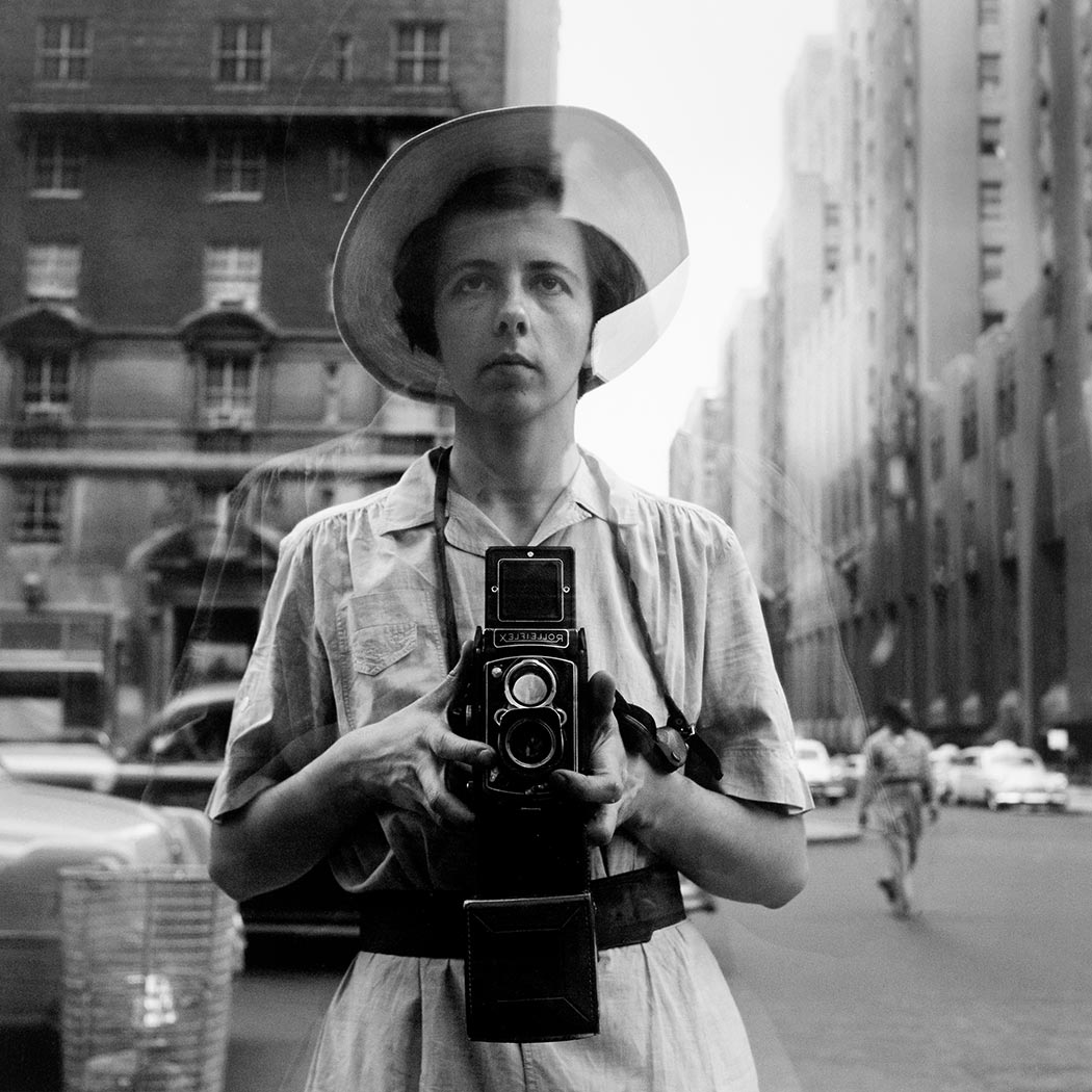
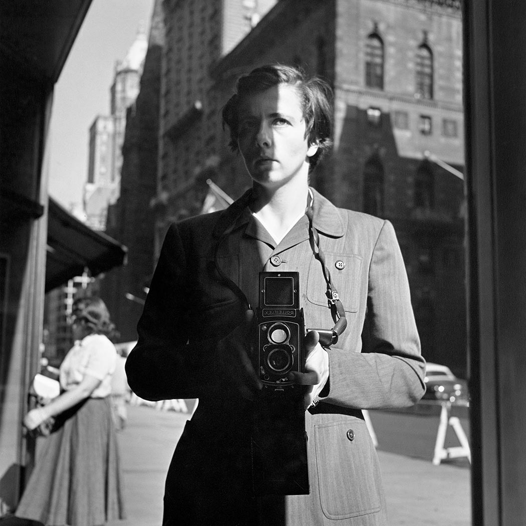
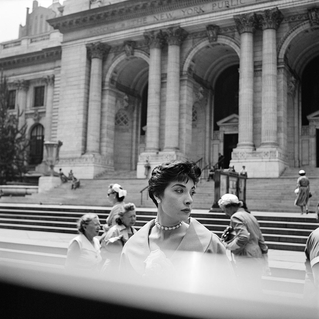
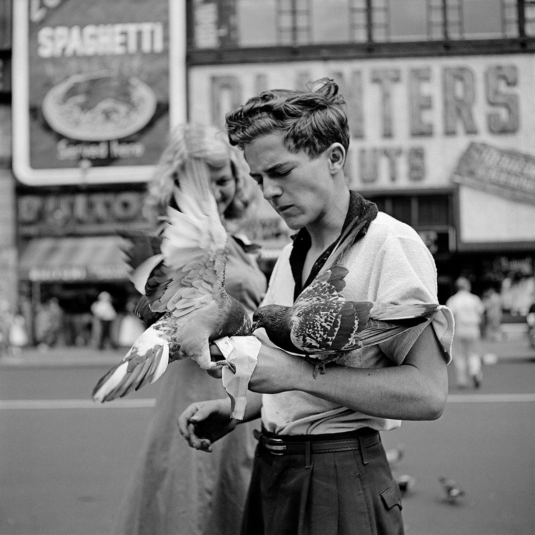
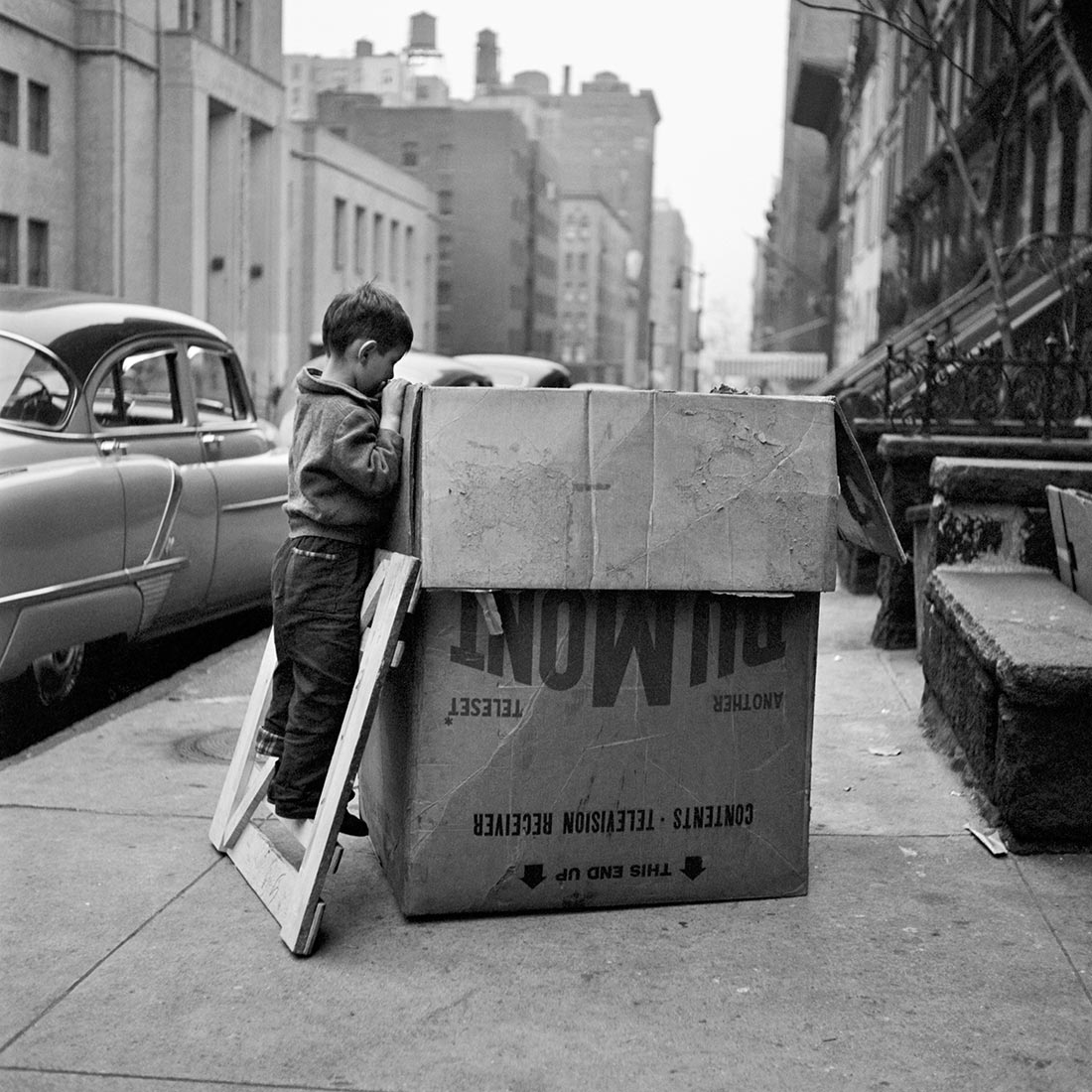
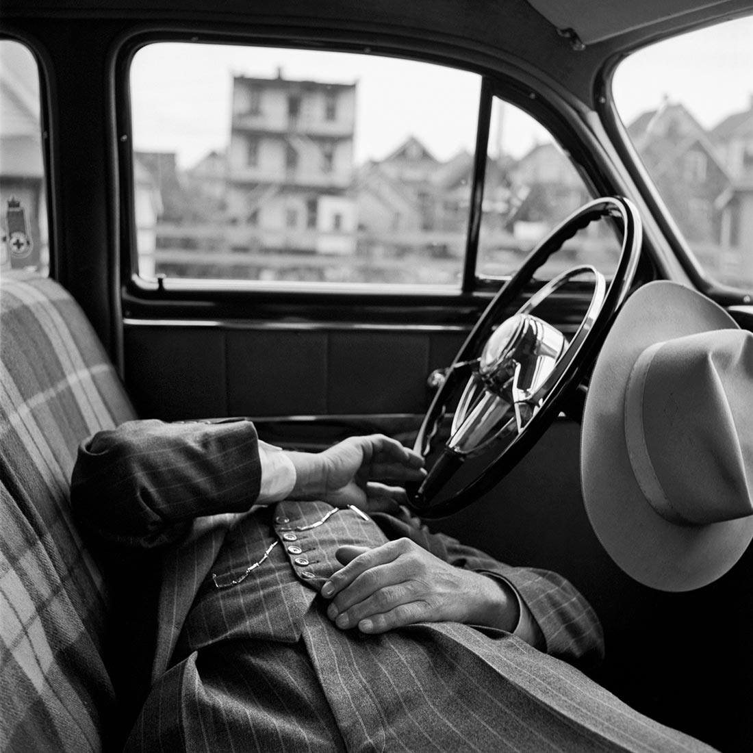
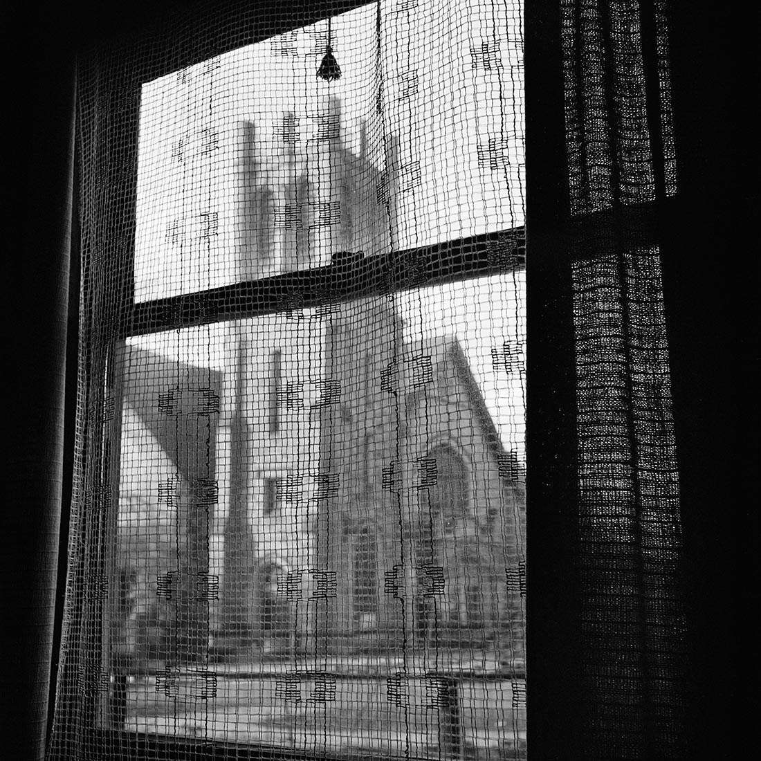
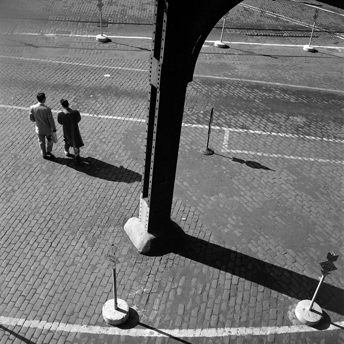
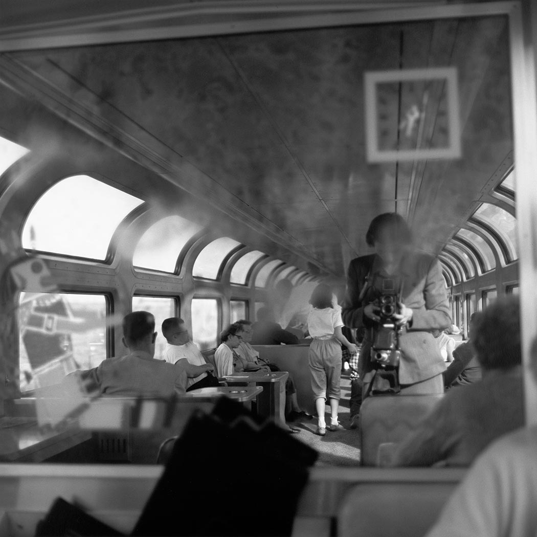
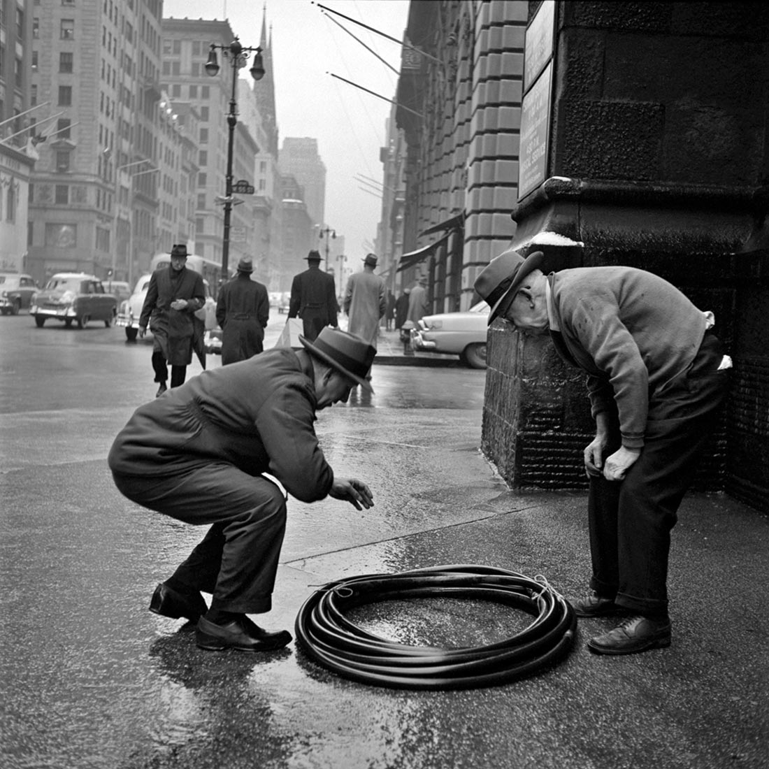
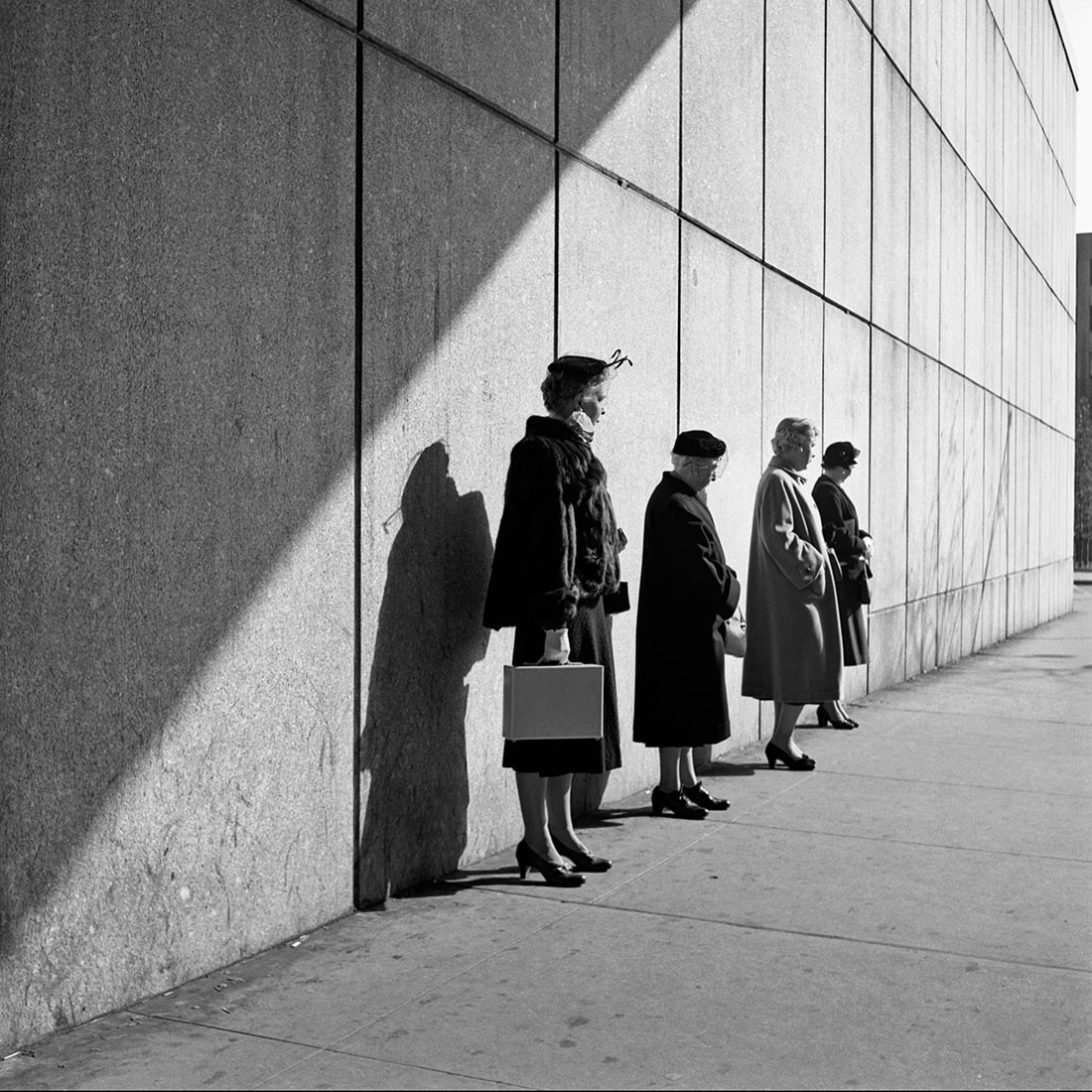
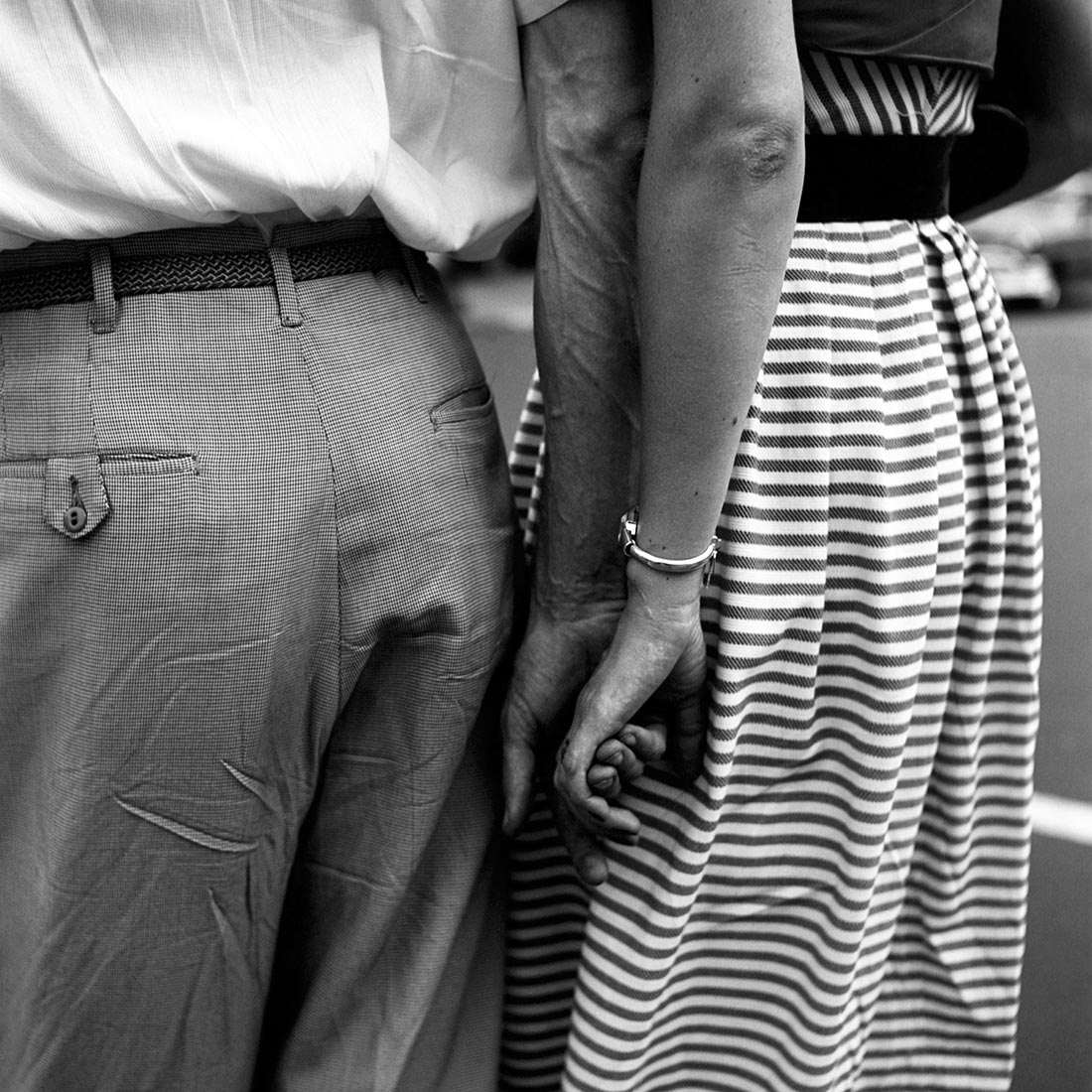
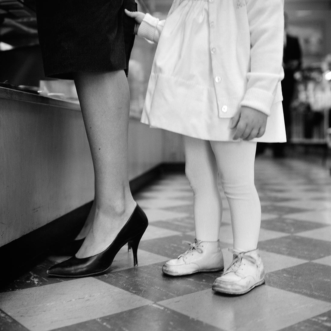
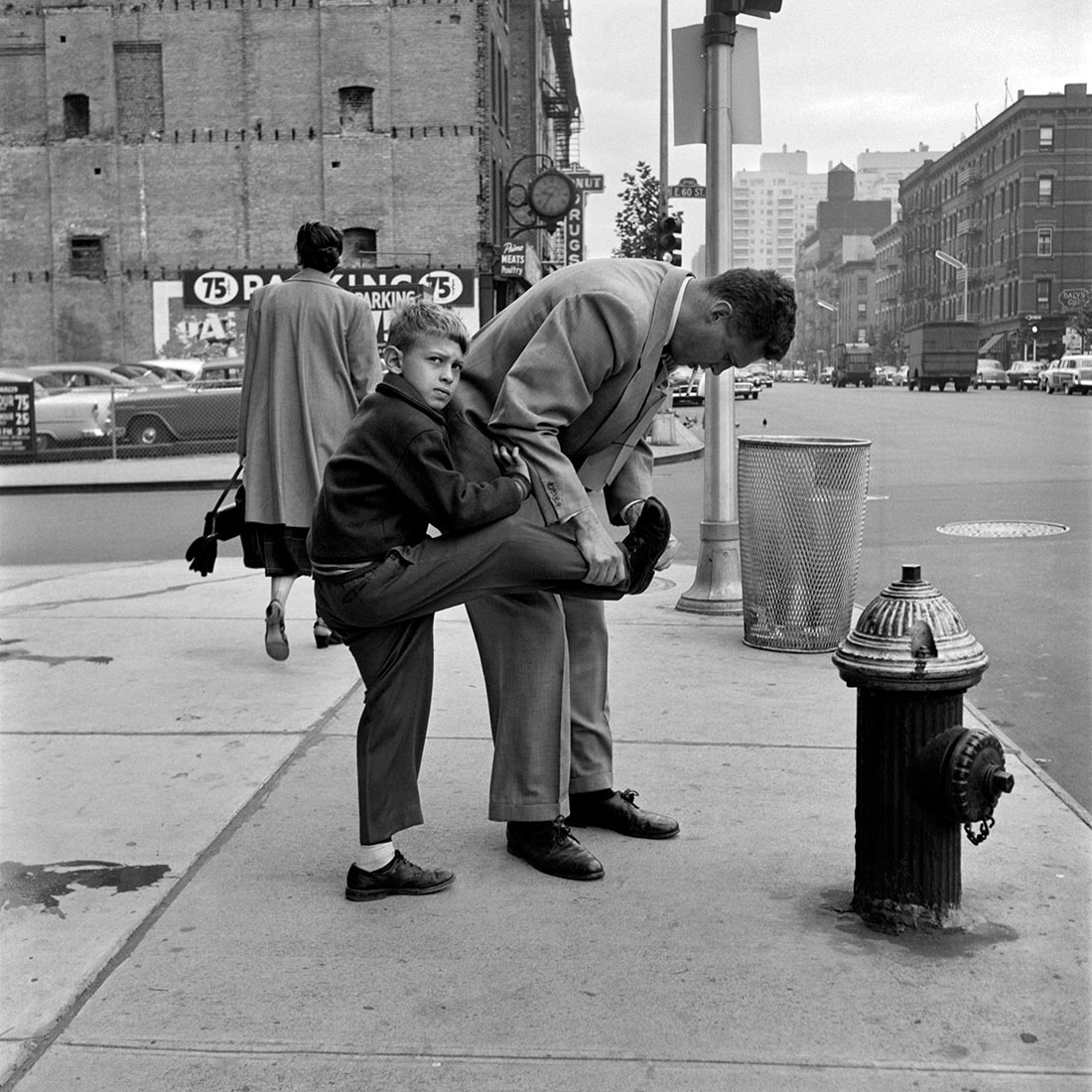
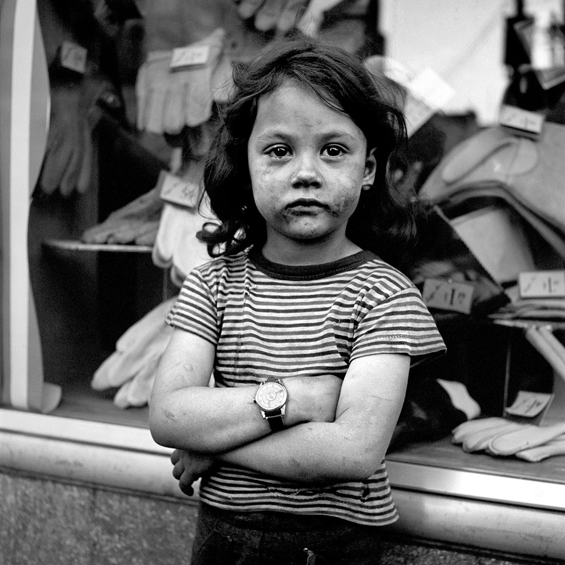
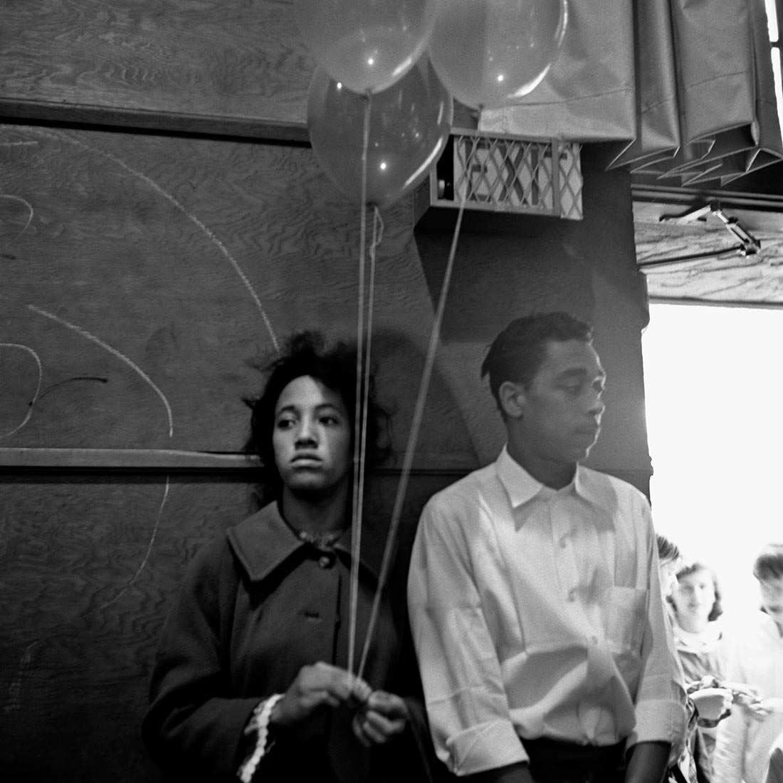
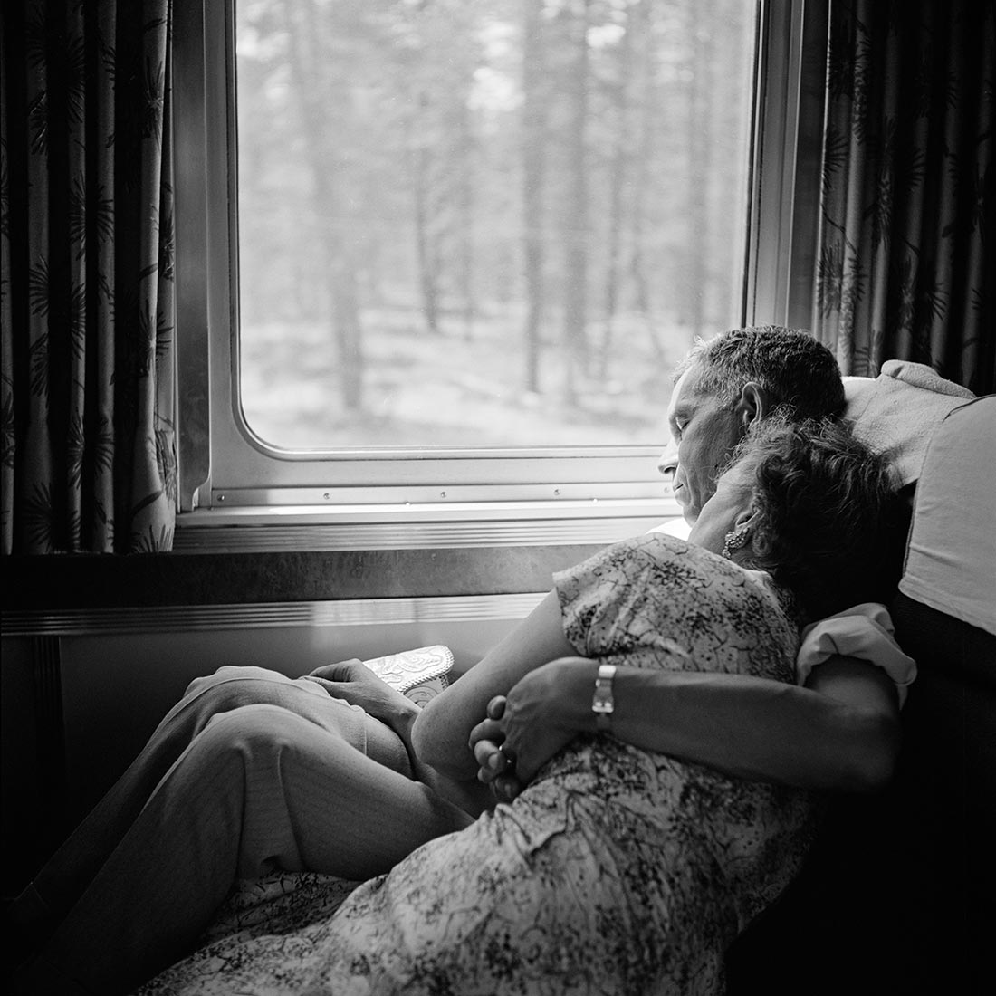
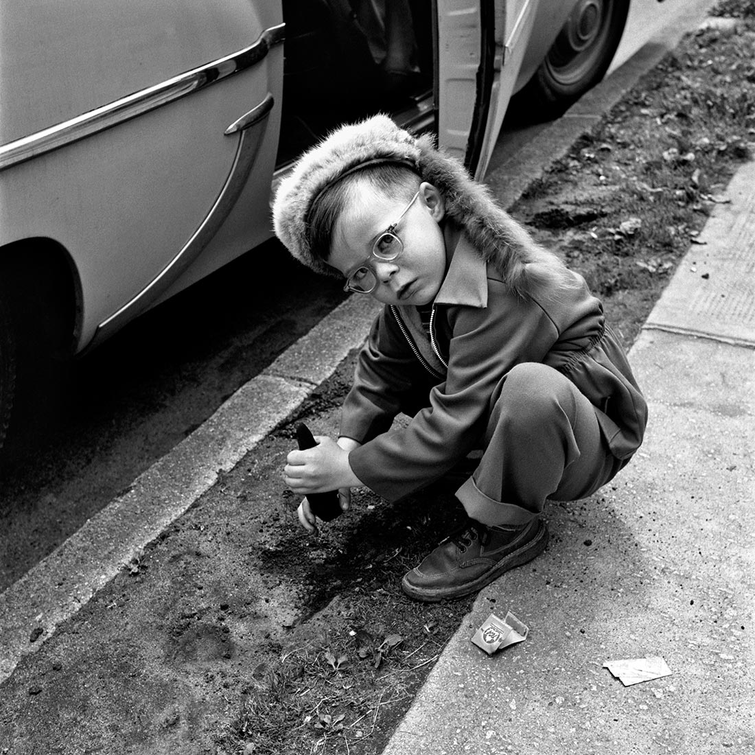
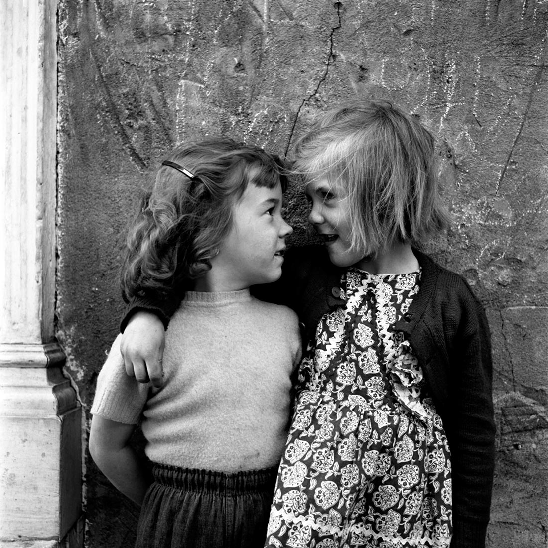
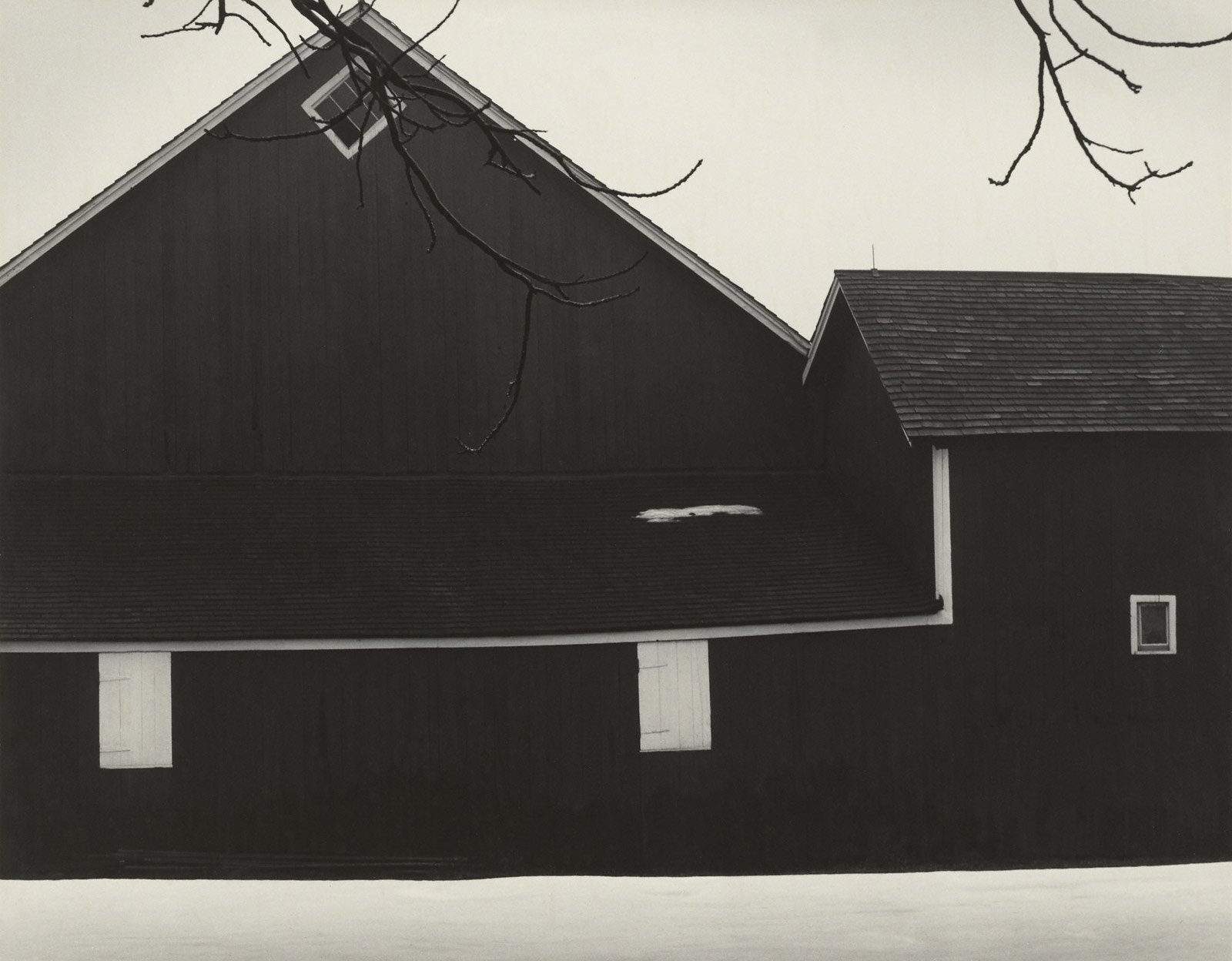
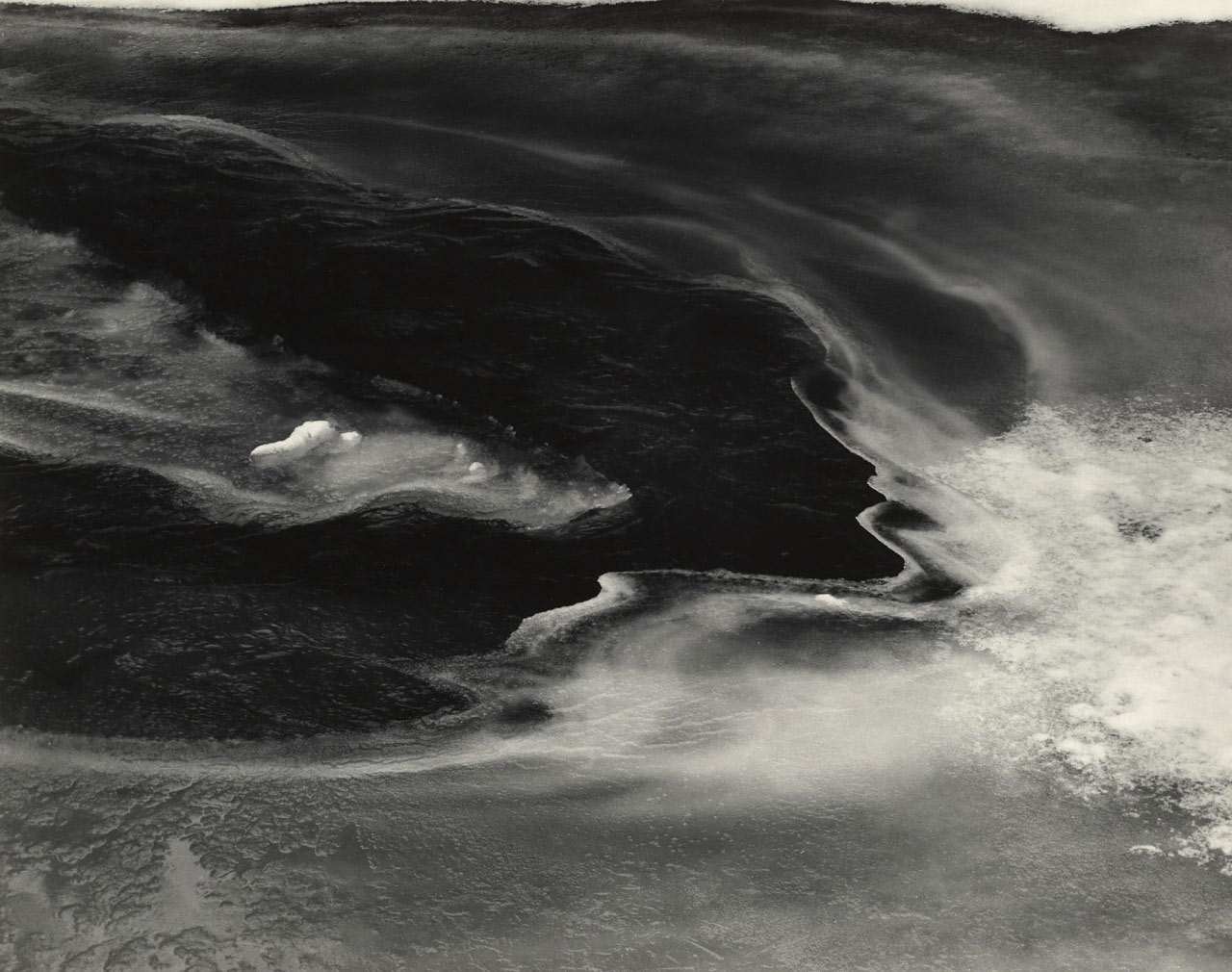
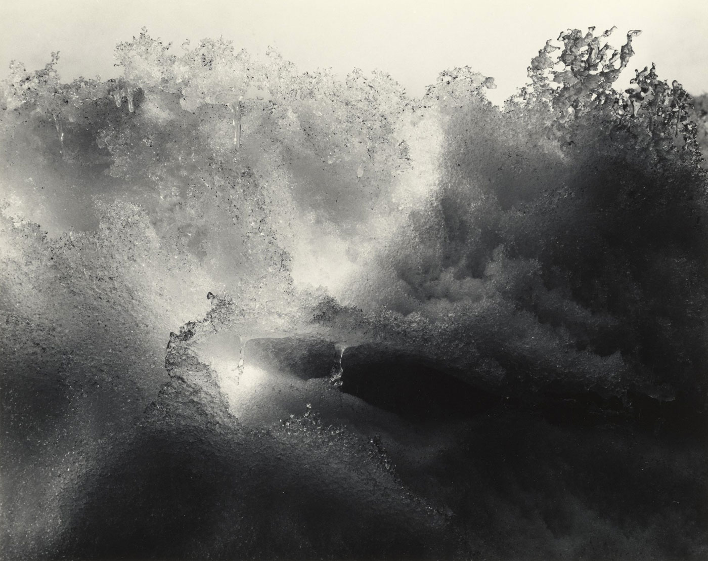

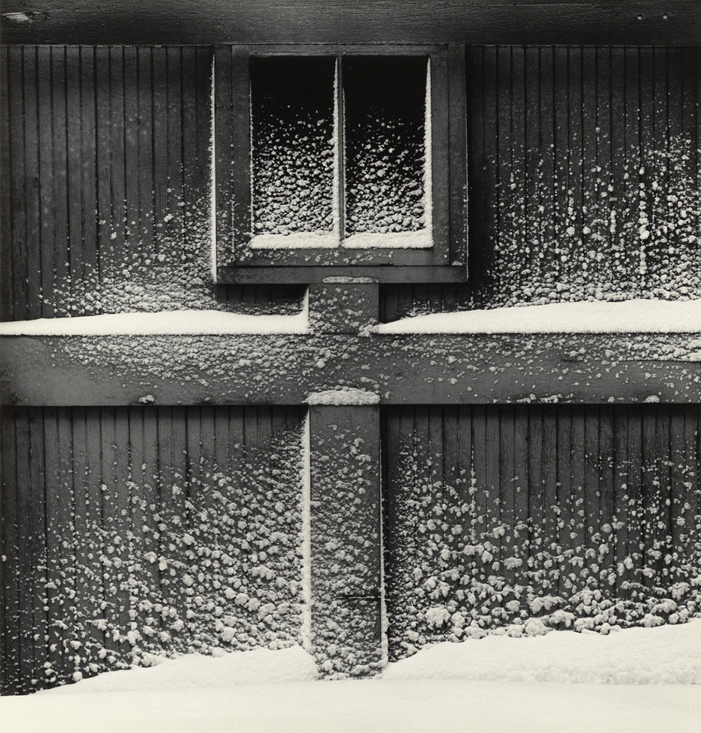
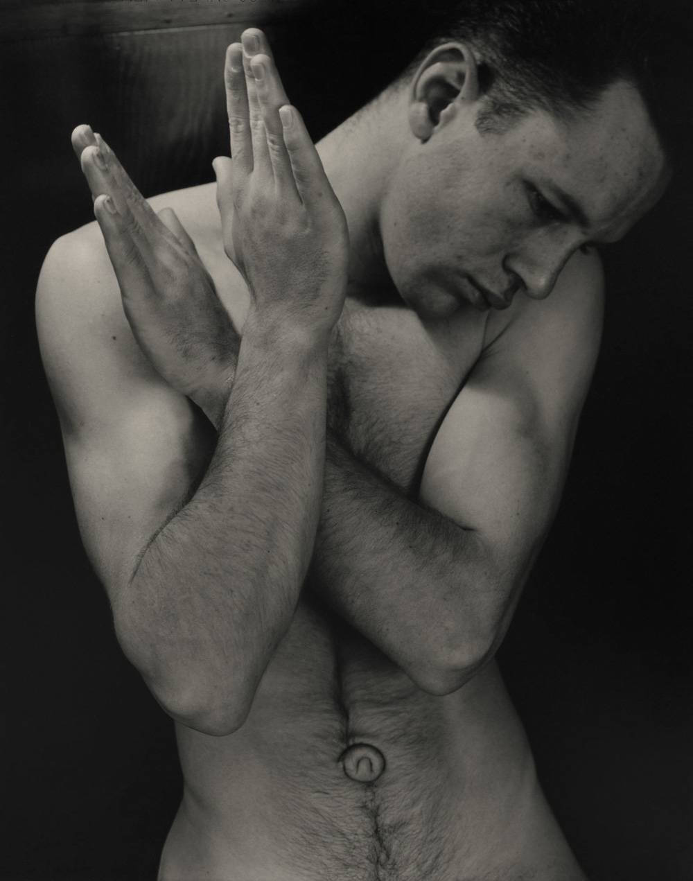
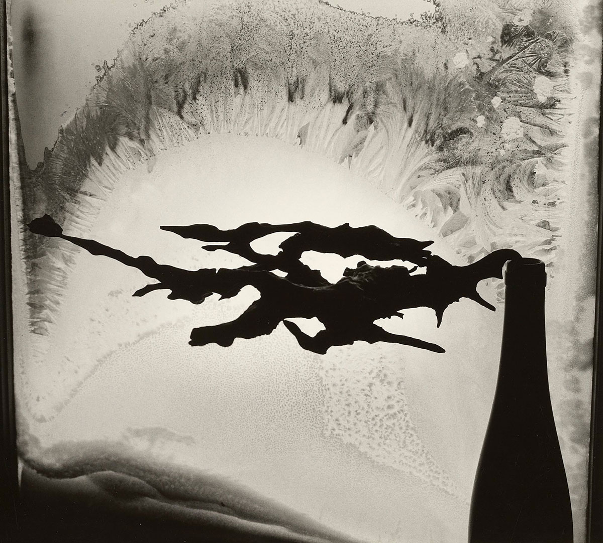
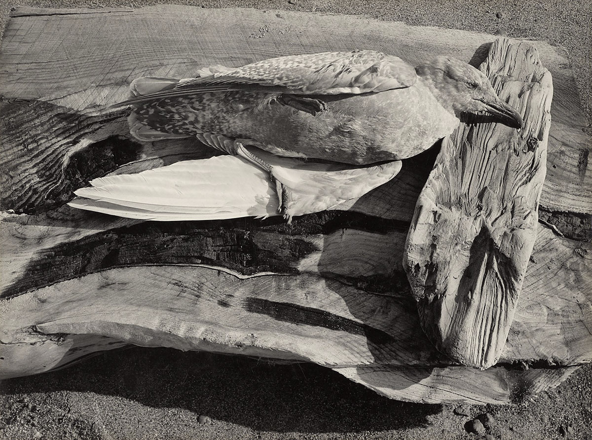

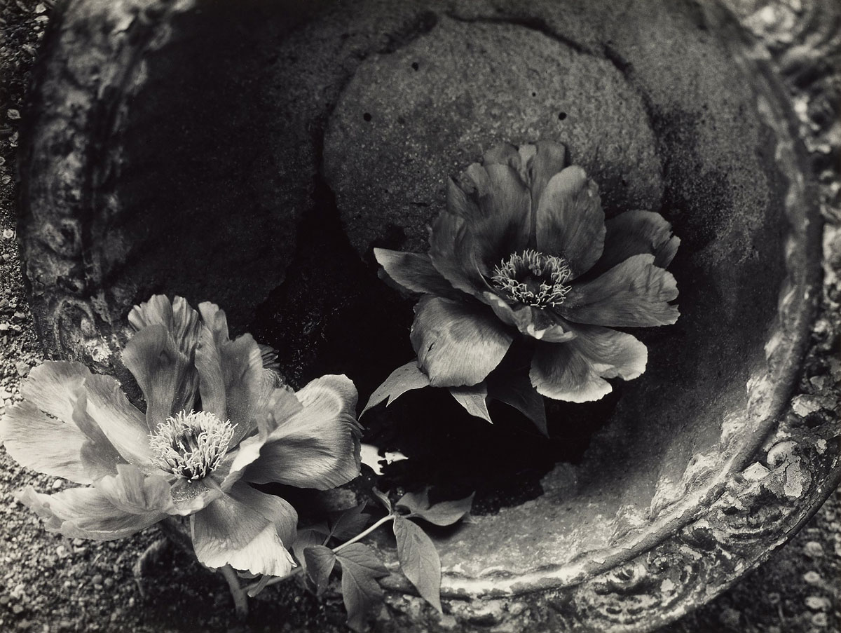
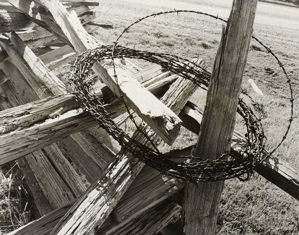
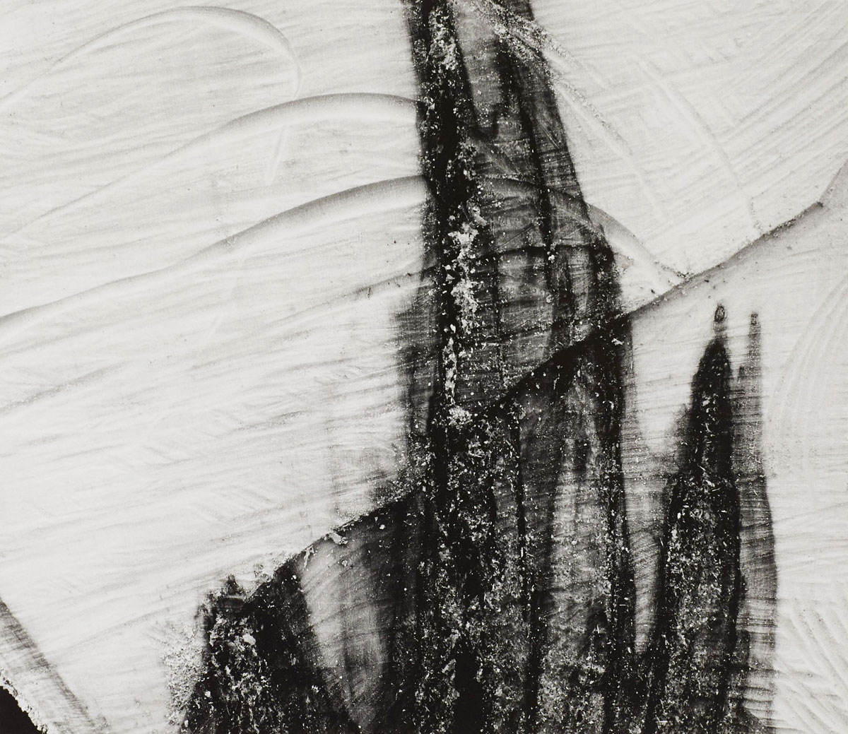
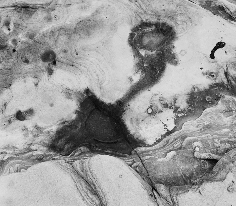
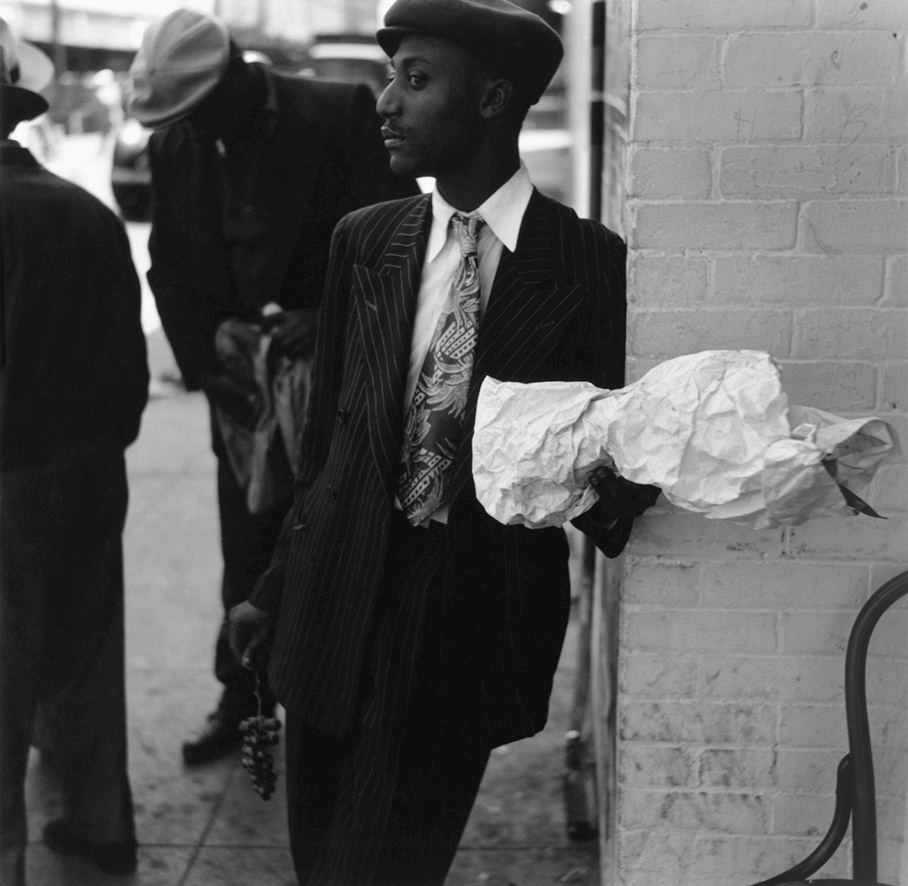
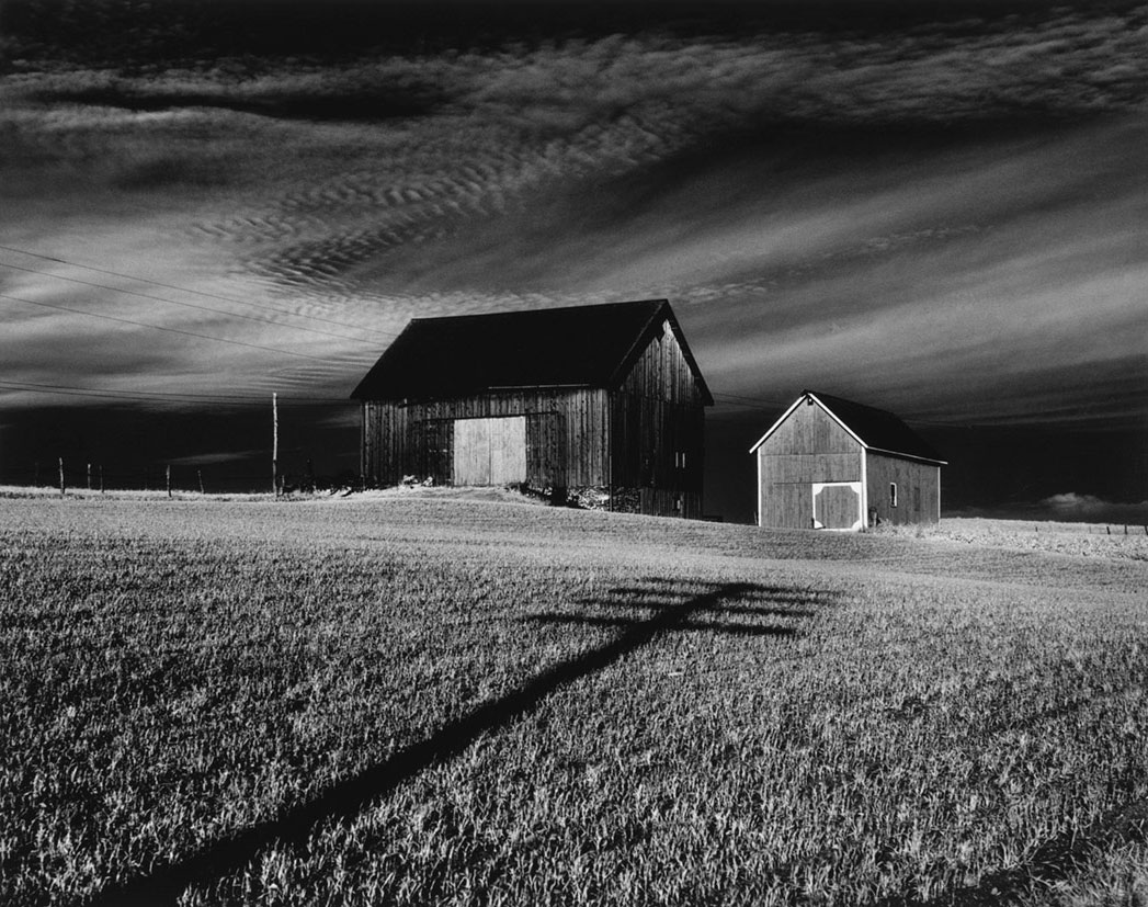
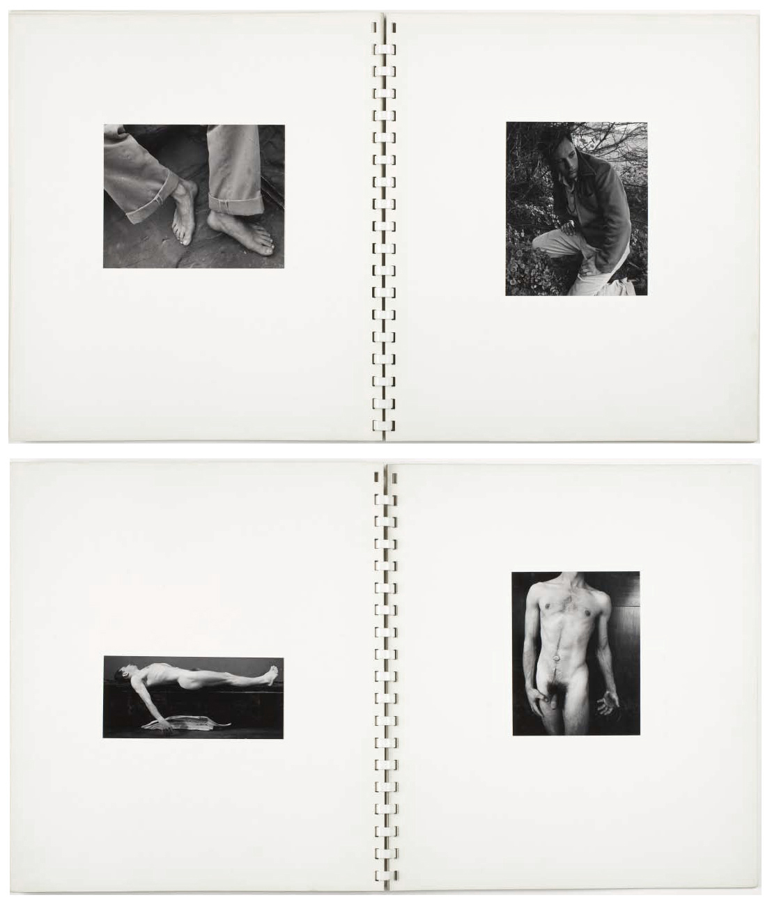
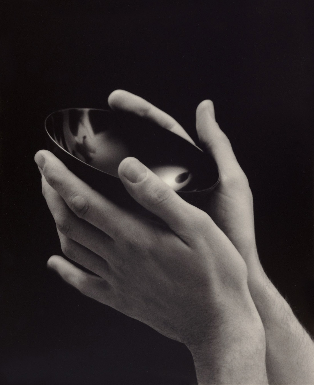
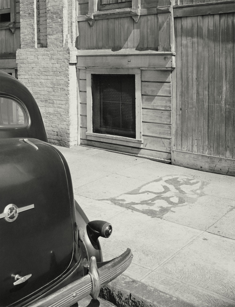
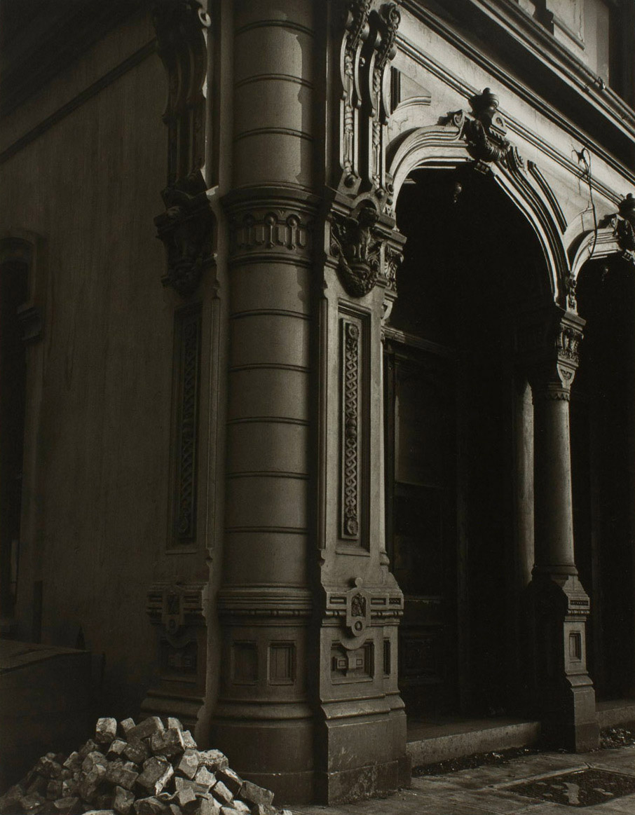
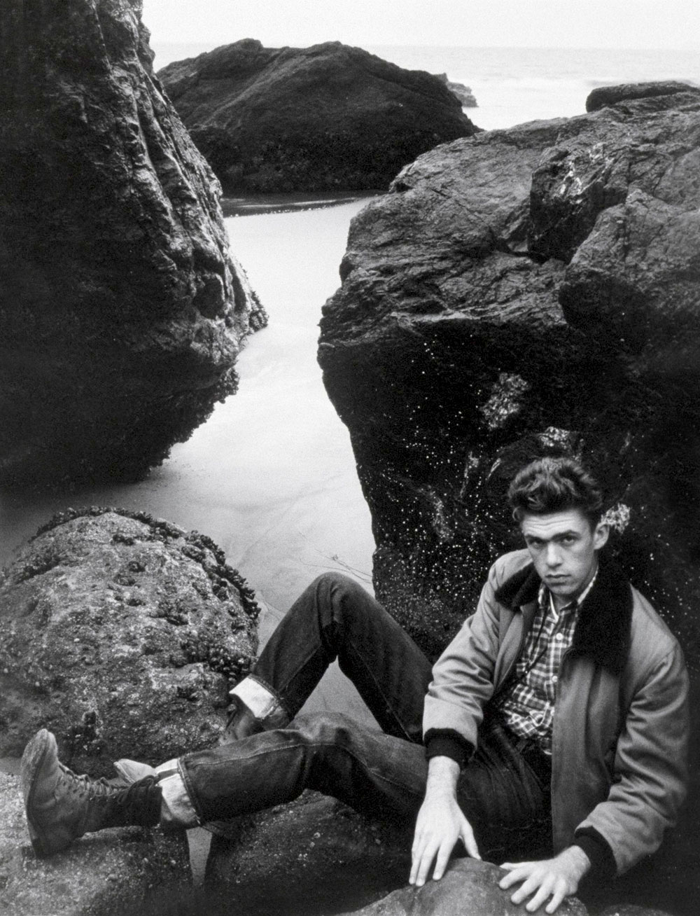
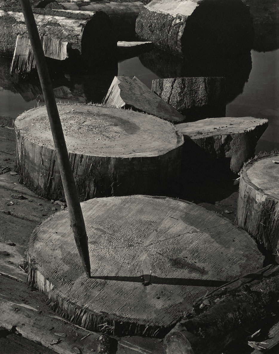
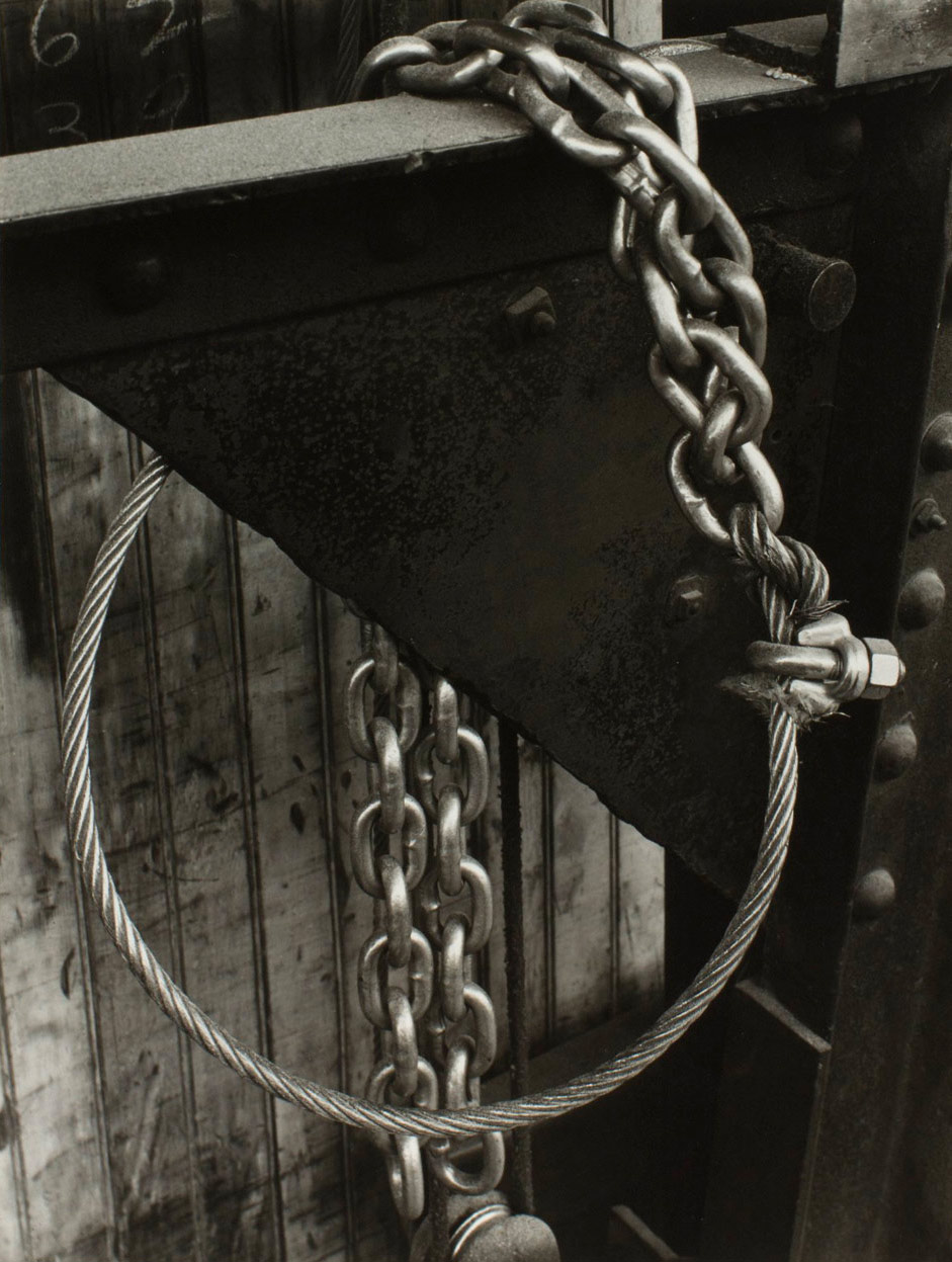
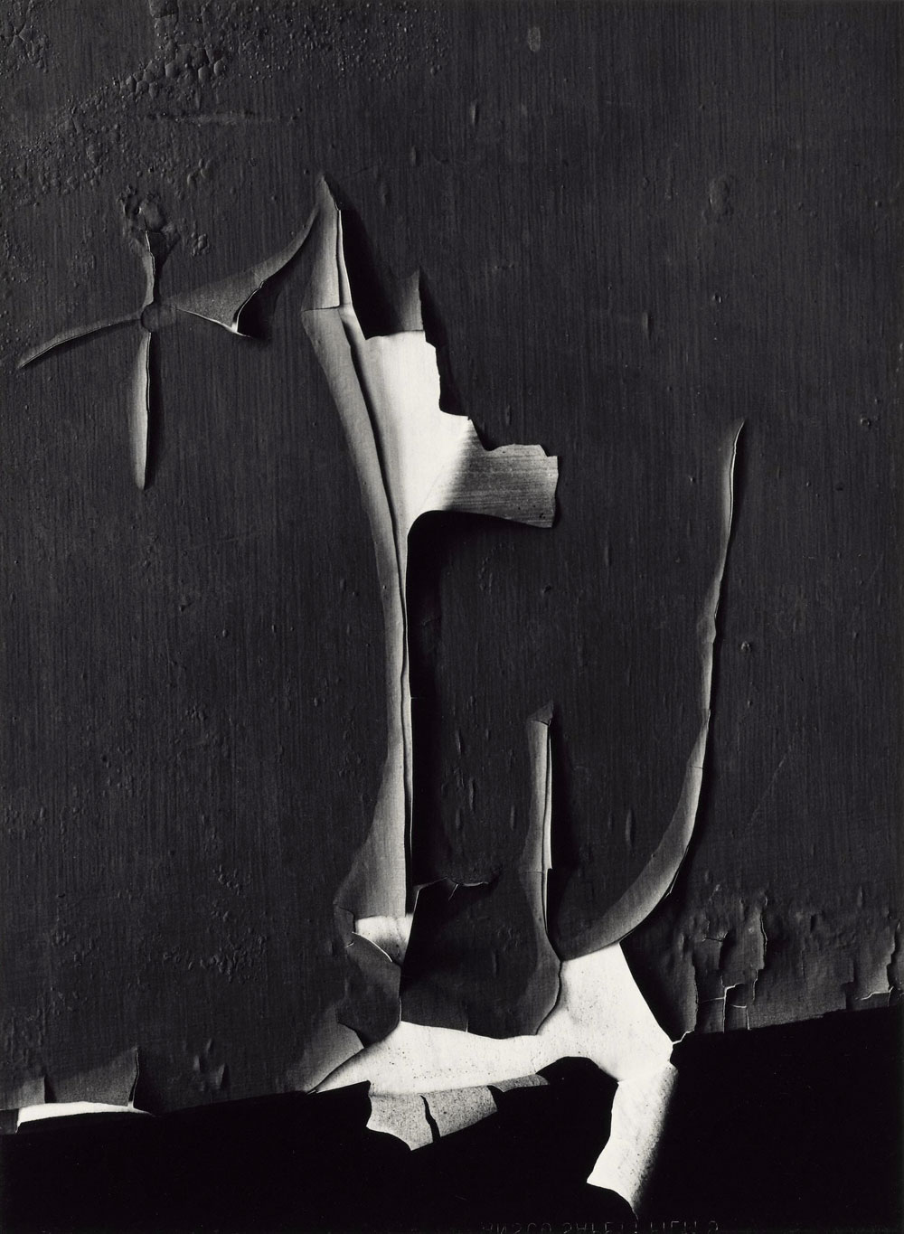
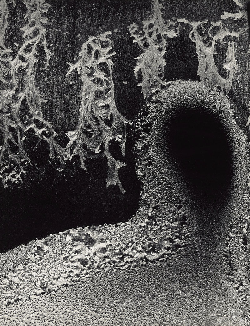
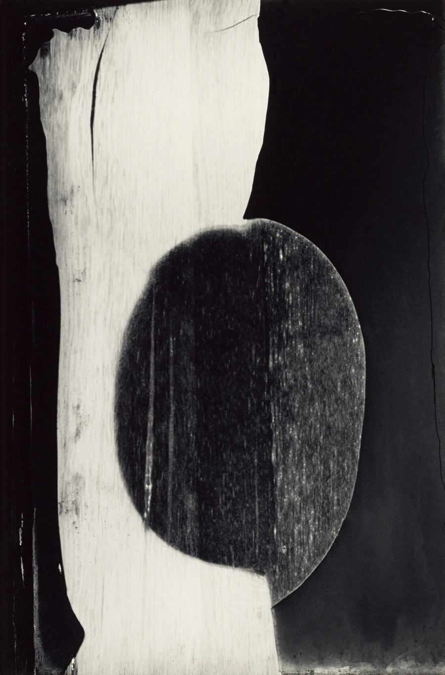
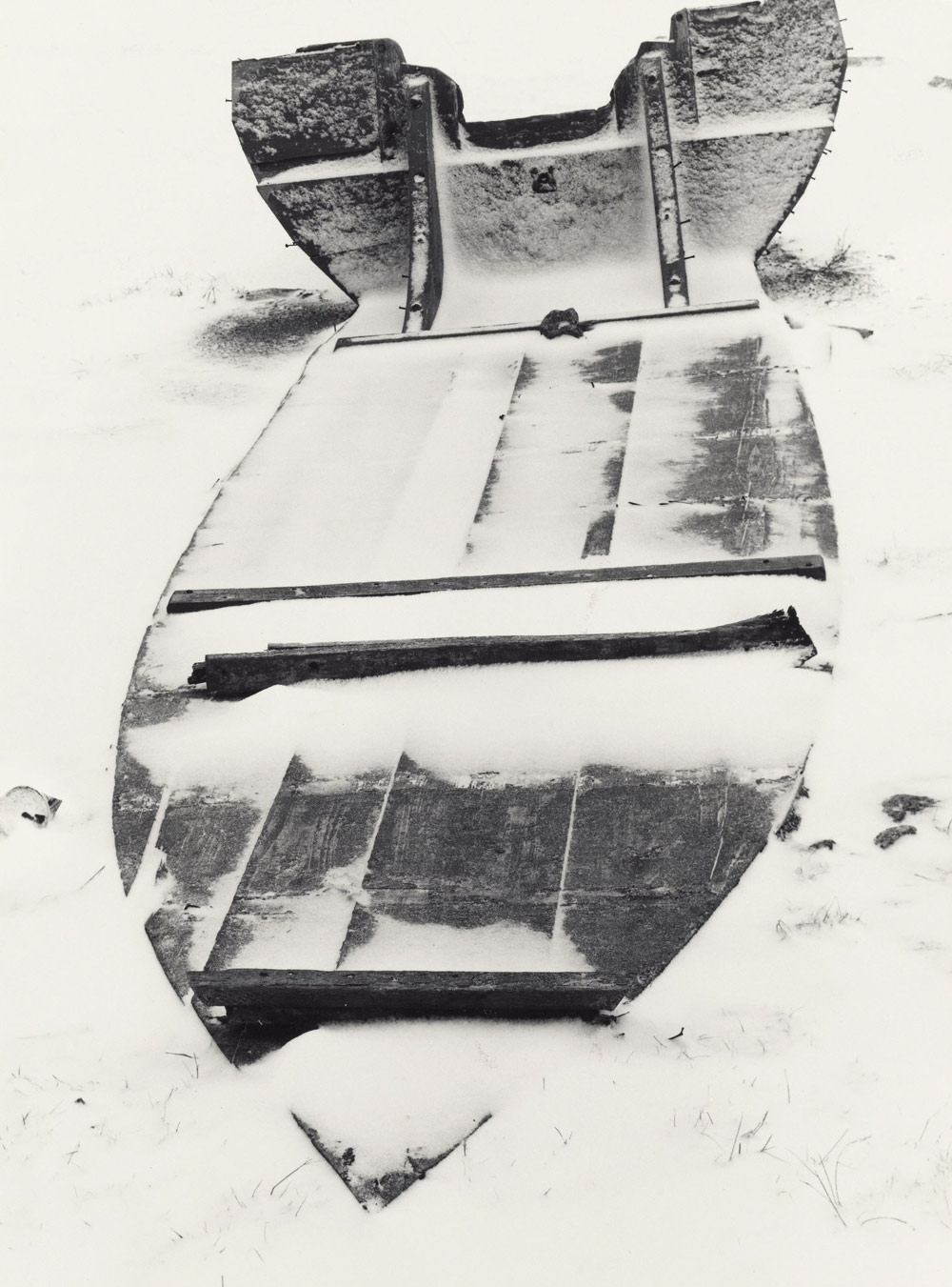
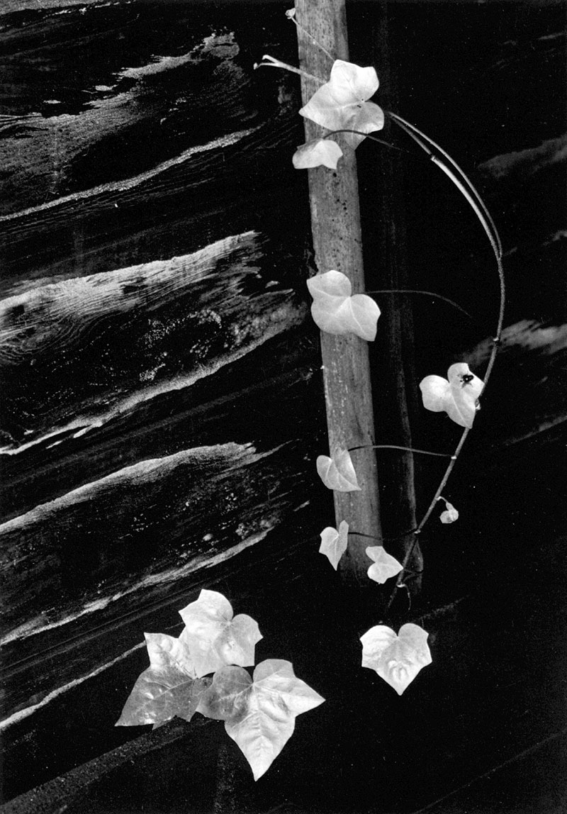
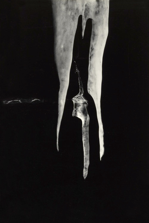
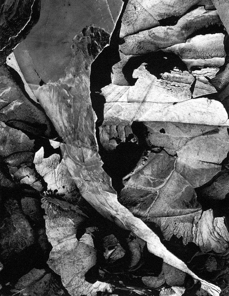
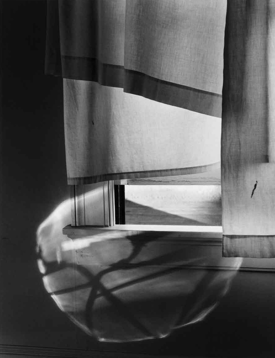
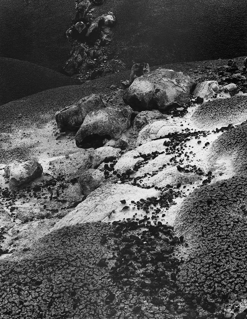
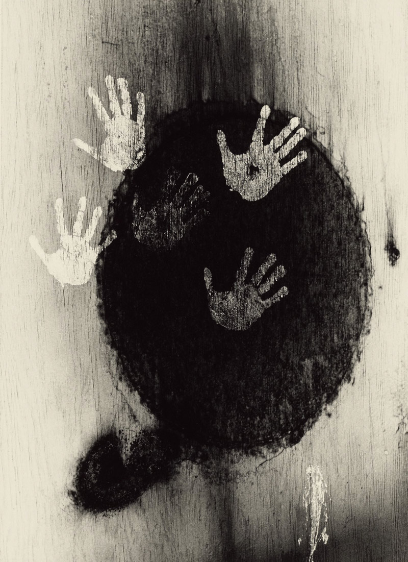
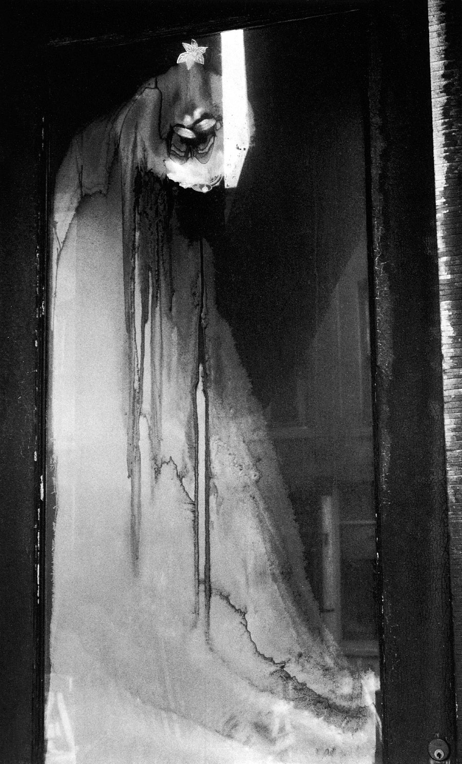
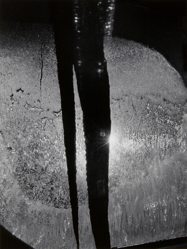
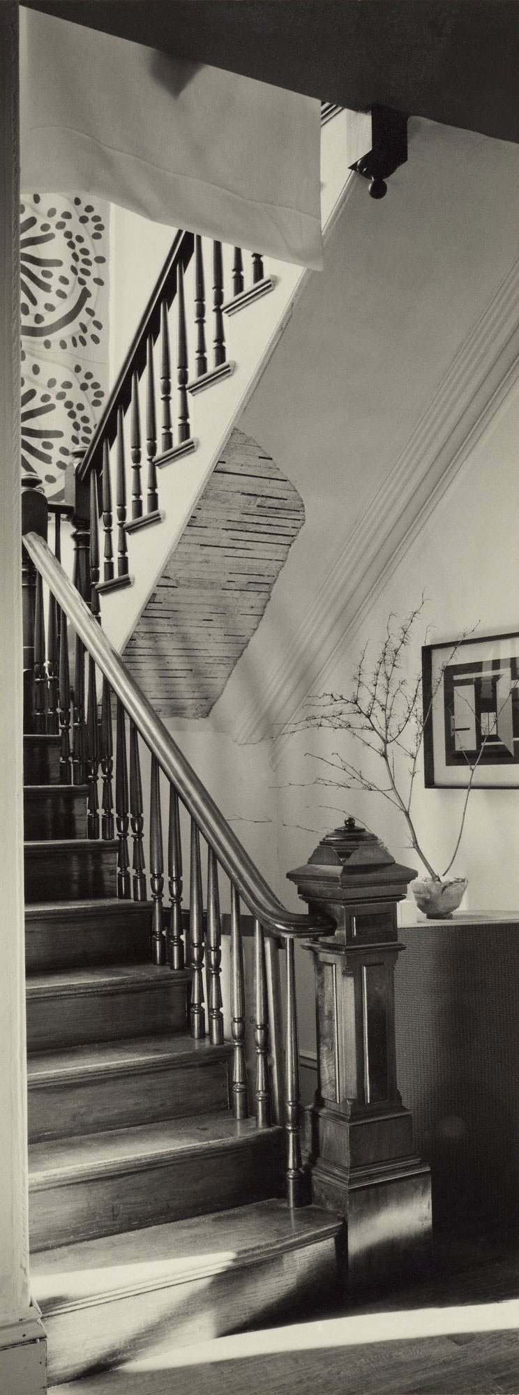
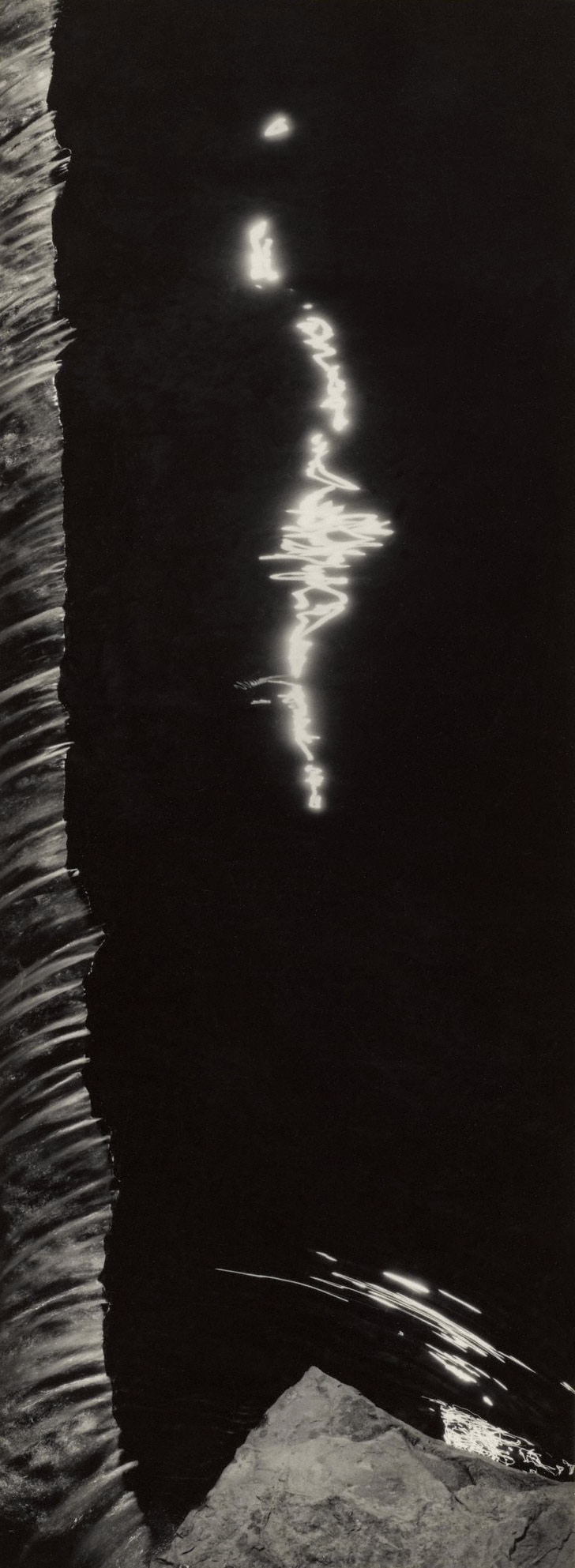
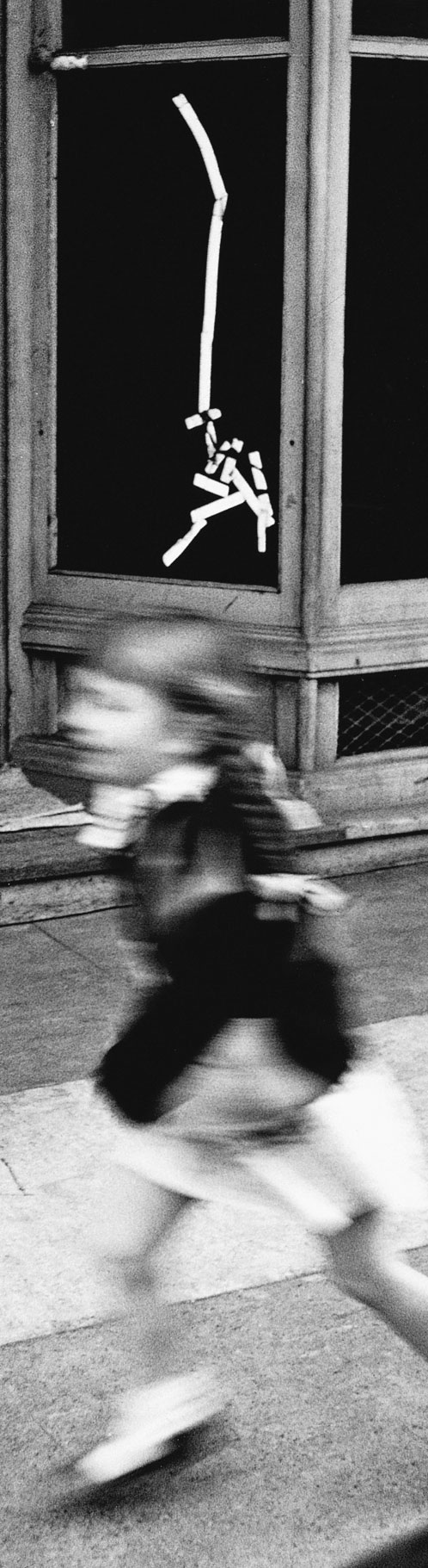
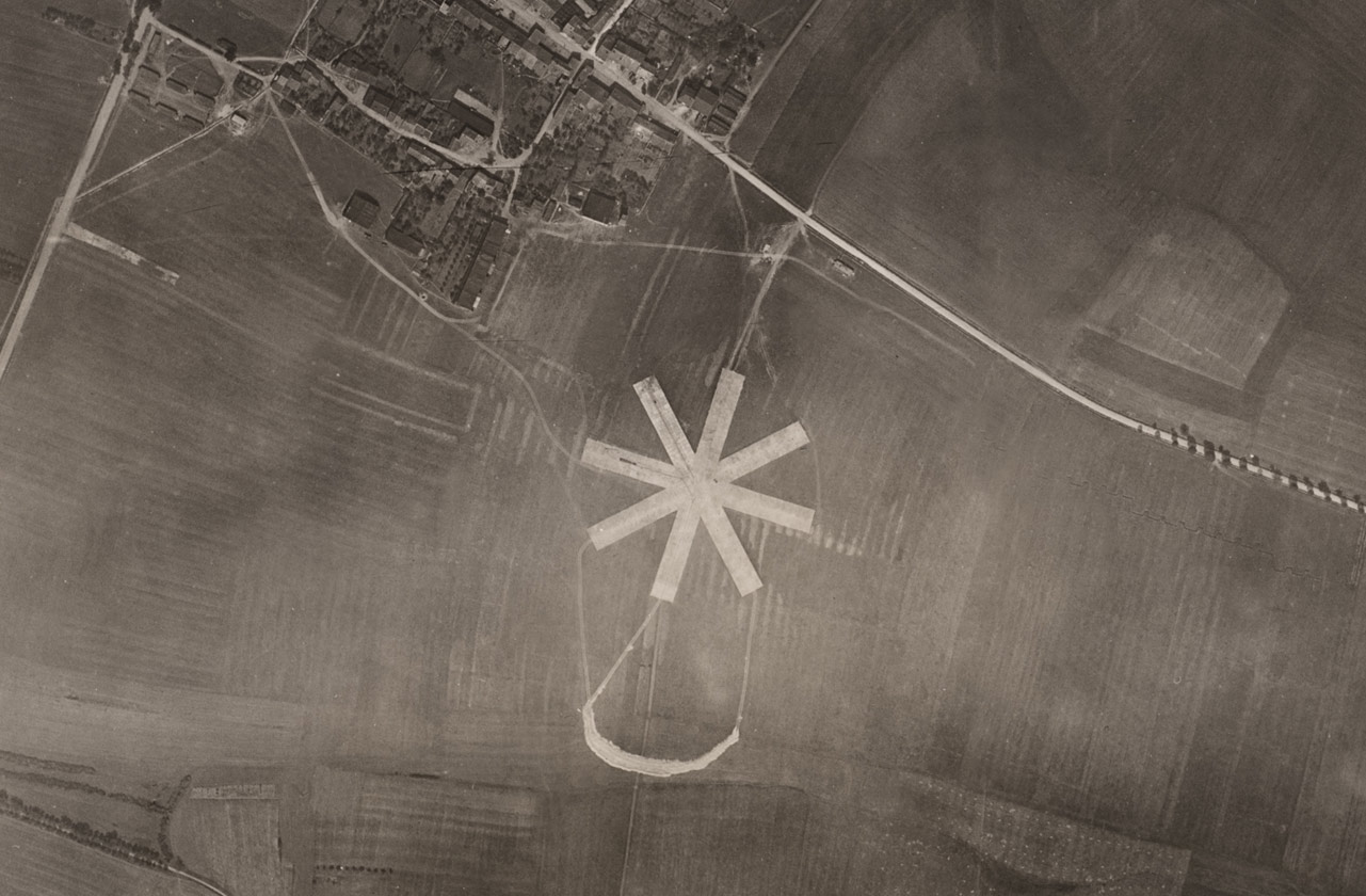
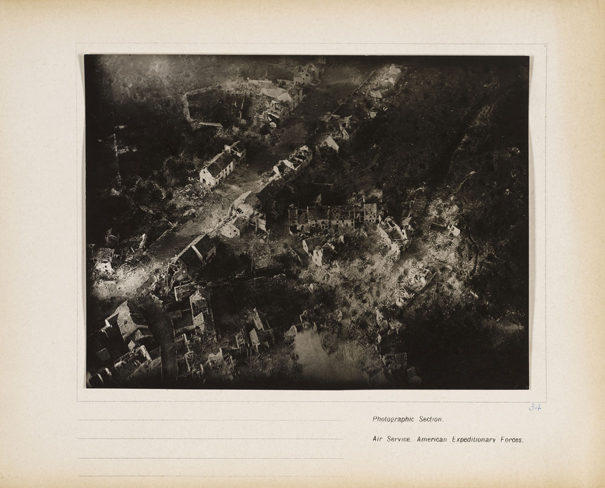
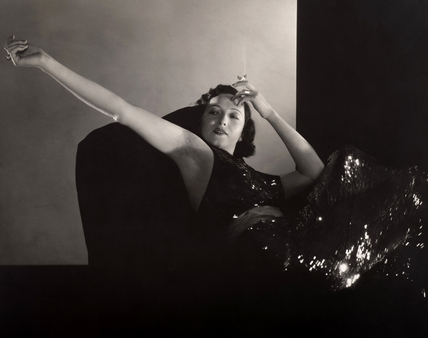
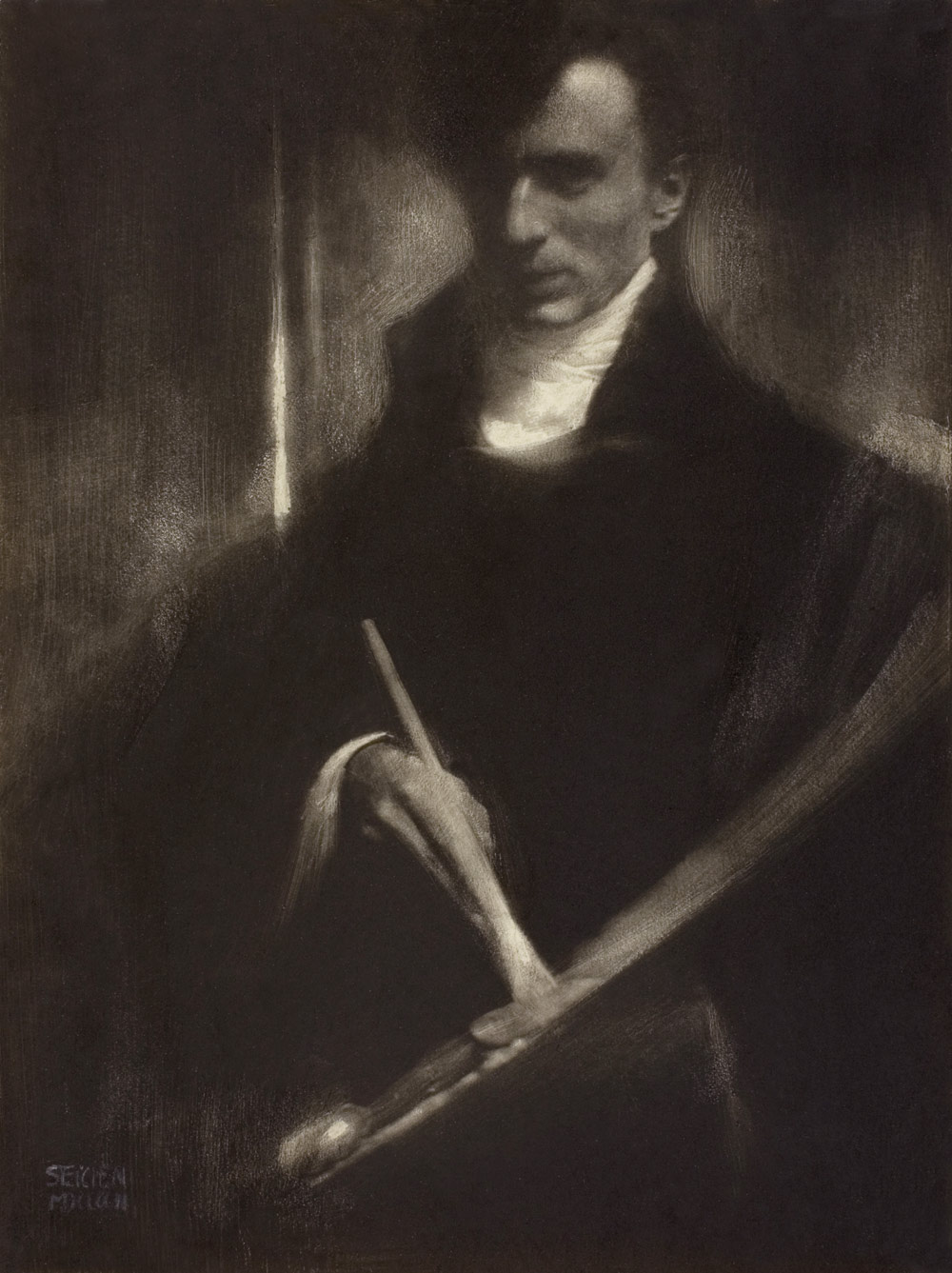


You must be logged in to post a comment.