“Photographs posit a reality that promotes the dream, that verifies the dream, as ‘an offer you can’t refuse’.” Dr Marcus Bunyan
Exhibition dates: 20th March – 8th September, 2024
Curators: Philipp Engel and Francesc Muñoz
Suburbia. Building the American Dream exhibition poster
An offer you can’t refuse
“The “American dream” can be summed up in a mental image that seems frozen in time: a home of one’s own, surrounded by lawns, with a pool in the back garden and a couple of cars slumbering in the garage… Suburbia. Building the American Dream draws us into the imaginary of the idyllic family home and shows how this lifestyle has been sold and promoted by fiction and the entertainment industry.” (Text from the CCCB website)
To me, there has always be something slightly askew, slightly out of kilter about the “American dream”. It promotes a generalised simulation of a imaginary reality, sold as a lifestyle, more fiction than fact. It is the ghost of desire that haunts the everyday reality of life, entirely on the side of demand: I want therefore I must have.
This desire must be satiated in the nuclear family, the white picket fence, the idyllic family home, the loveable children – as much a surface that reflects the approbation of others as for the sustenance of the self. As Anthony Giddens observes we are inescapably involved in a
“‘reflexive project of the self’: this project is reflexive because it involves unremitting self-monitoring, self-scrutiny, planning and ordering of all elements of our lives appearances and performances in order to marshal them into a coherent narrative called ‘the self’. We have to interpret the past and plan the future in relation to an identity we are attempting to constitute in a particularly immediate and transient social present. Consumerism is central to this self-obsession. This is partly because we not only have to choose a self, but (as Foucault’s line of argument also indicates) have to constitute ourselves as a self who choses, a consumer.”1
The American Dream endeavours to direct the identity we are attempting to constitute (through consumerism), so that it fits into a particularly conformist idea of a wholesome life: patriarchal, hegemonic, puritan (most important in America), god fearing, white – a particularly hyperreal simulation of a world that never existed in the first place. An imaginary construction.2
Photographs reinforce this “imaginary” state of being, this desire for the American Dream. As the wonderful Victor Burgin observes,
“The structure of presentation – point-of-view and frame – is intimately implicated in the reproduction of ideology (the ‘frame of mind’ of our ‘points-of-view’). More than any other textual system, the photograph presents itself as ‘an offer you can’t refuse’. The characteristics of the photographic apparatus position the subject in such a way that the object photographed serves to conceal the textuality of the photograph itself – substituting passive receptivity for active (critical) reading. … With most photographs we see, […] decoding and investiture takes place instantaneously, unselfconsciously, ‘naturally’; but it does take place – the wholeness, coherence, identity, which we attribute to the depicted scene is a projection, a refusal of an impoverished reality in favour of an imaginary plenitude. The imaginary object here, however, is not ‘imaginary’ [as in fictive] in the usual sense of the word, it is seen, it has a projected image.”3 (My bold and italics)
The photographs of the American Dream, then, deny an impoverished reality in favour of a desired imaginary plenitude. You too can live the dream, because you have seen the evidence of the projected image, and this imaginary identification can have very real effects.
In the desire for the dream we witness (elsewhere in the world) the egocentric obsession of some of the builders in the British series “Grand Designs” where people mortgage themselves up to the hilt, become sick, have marriage breakdowns and can’t finish the project, because of a dream… to build huge houses with 7 bedrooms and 4 bathrooms that no one in their right mind needs to build for 2 people. Or the case of the Australian Melissa Caddick who, in a Ponzi scheme stole A$30 million from investors, including her friends and family, in order to appear a successful business woman. “Caddick used the proceeds of her crimes to acquire “all the trappings of wealth” and that her “success was all a façade and the financial services business was an elaborate front for Ms. Caddick’s Ponzi scheme”.”4
Ego is reinforced by the image reflected back to us by the photograph.
Christopher Lasch comments that, “The proliferation of recorded images undermines our sense of reality. As Susan Sontag observes in her study of photography, “Reality has come to seem more and more like what we are shown by cameras.” We distrust our perceptions until the camera verifies them. Photographic images provide us with the proof of our existence, without which we would find it difficult even to reconstruct a personal history…”5
Photographs posit a reality that promotes the dream, that verifies the dream, as ‘an offer you can’t refuse’.
Thankfully, some of the contemporary artists in this posting (I particularly like the work of Weronika Gęsicka) undermine the utopian ideal through wit, humour and critical inquiry.
Dr Marcus Bunyan
1/ Anthony Giddens. Modernity and Self-Identity: Self and Society in the Late Modern Age. Polity Press, Cambridge, 1991
2/ “In sociology, the imaginary as a Lacanian term refers to an illusion and fascination with an image of the body as coherent unity, deriving from the dual relationship between the ego and the specular or mirror image… “The term ‘imaginary’ is obviously cognate with ‘fictive’ but in its Lacanian sense it is not simply synonymous with fictional or unreal; on the contrary, imaginary identifications can have very real effects.””
David Macey, “Introduction”, Jacques Lacan, The Four Fundamental Concepts of Psycho-Analysis. London, 1994, p. xxi quoted in “Imaginary (sociology)” on the Wikipedia website [Online] Cited 01/09/2024
3/ Victor Burgin (ed.,). Thinking Photography. Macmillan, Basingstoke, 1982, pp. 146-148.
4/ Farid Assaf SC quoted in Kate McClymont. “Melissa Caddick’s ‘trappings of wealth’ a front for her Ponzi scheme”. The Sydney Morning Herald 29 June 2021 in “Melissa Caddick,” on the Wikipedia website [Online] Cited 01/09/2024
5/ Christopher Lasch. The Culture of Narcissism. W.W.Norton and Company, New York, 1978, p. 48.
Many thankx to the Centre de Cultura Contemporània de Barcelona for allowing me to publish the photographs in the posting. Please click on the photographs for a larger version of the image.
Inside the exhibition: Suburbia. Building the American Dream
Philipp Engel, curator of the exhibition “Suburbia”, examines the origin and vast expansion of residential neighbourhoods in the United States, an urban model centred on constructing large swathes of single-family homes on the outskirts of cities. Engel reflects on the allure that suburban landscapes have stirred in Western culture while highlighting the main issues and contradictions of the model, including segregation, safety paranoia and unsustainable consumption of water and energy.
Introduction
Greg Stimac (American, b. 1976) Chandler, Arizona 2006 From Mowing the Lawn portfolio Impressió digital Museum of Contemporary Photography, Columbia College Chicago
Who hasn’t longed for the American dream? A big house with a garden, a swimming pool and a couple of cars in the garage. A quiet, safe place to live as a family, close to nature in a people-friendly neighbourhood. This exhibition traces the cultural history of a lifestyle ideal that has been endlessly reproduced on television, in advertising and in cinema, and analyses the validity and the most controversial aspects of its urban planning model.
Suburbia. Building the American Dream draws us into the imaginary of the idyllic family home and shows how this lifestyle has been sold and promoted by fiction and the entertainment industry. The exhibition goes back to the origins of residential neighbourhoods in the early nineteenth century, explains how they developed massively in the 1950s, and reviews the economic, political and social context of their relentless expansion across the United States.
Now, when more and more families are pursuing their own version of the dream on the outskirts of cities, it is a good moment to analyse the contradictions of an urban planning model based on social, ethnic and gender segregation.
The dream of living in a house with a swimming pool is still very much alive today and has been exported all over the world. The exhibition shows the impact of this highly unsustainable model, based on constant car use, with examples of developments around Barcelona and Madrid.
With abundant historical material, period documentaries, photographs, paintings, films and series, novels and magazines, works of art and everyday objects, the exhibition places us in the mental paradise of the suburb and invites us to rethink the value of the city and public space today.
Suburbia. Building the American Dream presents the work of foremost creators who, from different points of view, help us to take a critical look at the famed American way of life: Jessica Chou, Gregory Crewdson, Thomas Doyle, Gerard Freixes, Rodrigo Fresán, Gabriele Galimberti, Weronika Gesicka, Benjamin Grant, Todd Hido, Joel Meyerowitz, Matthias Müller, Blanca Munt, Alberto Ortega, Bill Owens, Sheila Pree Bright, León Siminiani, Todd Solondz, Amy Stein, Greg Stimac, Angela Strassheim, Deborah Stratman, Ed & Deanna Templeton, Kate Wagner and Christopher Willan.
Text from the CCCB website
Joel Meyerowitz (American, b. 1938) Land. Provincetown 1976 Archival pigment print Collecció Pancho Saula i Michelle Ferrara / Galeria Alta, Andorra
Joel Meyerowitz (American, b. 1938) Dusk. New Jersey 1978 Archival pigment print Collecció Pancho Saula i Michelle Ferrara / Galeria Alta, Andorra
The “American dream” can be summed up in a mental image that seems frozen in time: a home of one’s own, surrounded by lawns, with a pool in the back garden and a couple of cars slumbering in the garage. Suburbia. Building the American Dream traces the cultural history of a lifestyle ideal shared far and wide by literature, television, advertising and cinema, and analyses the most controversial aspects of an urban planning model that has spread beyond US territory and reached our shores. Journalist Philipp Engel curates this exhibition with geographer Francesc Muñoz collaborating as adviser on the model in the local context.
Suburbia. Building the American Dream draws us into the imaginary of the idyllic family home and shows how this lifestyle has been sold and promoted by fiction and the entertainment industry. The exhibition goes back to the origins of residential neighbourhoods in the early nineteenth century, explains how they developed massively in the 1950s, and reviews the economic, political and social context of their relentless expansion across the United States.
Since the 1990s most of the American population has lived in this sprawling urban mass that has continued to spread, even beyond US borders. At a time when more and more families are pursuing their own version of the dream on city outskirts, the exhibition analyses the contradictions of an urban planning model based on social, ethnic and gender segregation. It also shows the impact of this highly unsustainable model, based on constant car use, with examples of developments around Barcelona and Madrid. With abundant historical material, photographs, paintings, audiovisuals, literature, works of art and everyday objects, the exhibition situates us in the mental paradise of the model of residential development inspired by American suburbia, and invites us to rethink the value of the city and public space today.
Suburbia. Building the American Dream decodes an almost abstract landscape that is still valid in pop culture. It does so through the work of foremost creators who help us take a critical look at the famed American way of life. It includes works by Jessica Chou, Gregory Crewdson, Thomas Doyle, Gerard Freixes, Gabriele Galimberti, Weronicka Gęsicka, Benjamin Grant, Todd Hido, Joel Meyerowitz, Matthias Müller, Blanca Munt, Alberto Ortega, Bill Owens, Sheila Pree Bright, León Siminiani, Amy Stein, Greg Stimac, Angela Strassheim, Deborah Stratman, Ed & Deanna Templeton, Kate Wagner and Christopher Willan, among others.
Charlotte Brooks (American, 1918-2014) [Image from LOOK – Job 57-7621 titled Myers family] 20th December 1957 Film negative Look magazine photograph collection (Library of Congress) Library of Congress Prints and Photographs Division Washington, D.C.
Installation view of the exhibition Suburbia. Building the American Dream at the Centre de Cultura Contemporània de Barcelona | CCCB showing photographs by Gregory Crewdson (below)
Gregory Crewdson (American, b. 1962) Untitled (Dream House) 2002 Digital C-print 29 x 44 inches
American photographer Gregory Crewdson is best known for his uncanny images of deceptively serene suburban life. Using Hollywood film techniques and elaborate sets, Crewdson creates what he calls “frozen moments”: meticulously staged scenes whose narrative meaning remains a mystery. Throughout this series, special attention is paid to light. The twilight setting favoured by the photographer functions as a metaphor, an eerie evocation of the darkness on the edge of town.
Crewdson created this twelve-part portfolio, Dream House, as a commission for The New York Times Magazine in 2002. The cinematic character of these frozen vignettes is underscored by the use of Hollywood actors (Gwyneth Paltrow, Tilda Swinton, and Philip Seymour Hoffman among others) whose celebrity contrasts with the “Anytown” anonymity of their environments.
Gregory Crewdson (American, b. 1962) Julianne Moore (Dream House) 2002 Digital C-print 29 x 44 inches
Sections of the exhibition
Planning A Dream
When the Industrial Revolution reached the USA in the first half of the 19th century, big cities became engines of progress, but they were also seen as dangerous places, in contrast with the opulent nature of the New World. With the emergence of the railway, the tram and the automobile, the mobility revolution prompted the gradual colonisation of city outskirts, transforming the countryside into residential neighbourhoods.
From Llewellyn Park (New Jersey) to Tuxedo Park (New York), throughout the 19th century the first gated communities began to pop up across the United States. At the end of the century, after the West was won, the appearance of the tram gave the middle classes access to the periphery, giving rise to a new type of housing that led to an orderly arrangement of city grids. But it wasn’t until the popularisation of the famous Ford Model T that the US landscape was radically transformed, crisscrossed by roads that became freeways. The automobile became a symbol of freedom, marking the birth of the suburbs that were to spring up everywhere.
This first section includes historical material like the original lithograph View of New York by John William Hill (1836); The American Woman’s Home by Catharine Beecher, the bible of “domestic feminism”; a Ford T Touring (1923) produced by General Motors, and films like The Suburbanite (1908), among other Harold Lloyd and Buster Keaton classics.
Alexander Jackson Davis (American, 1803–1892) Villa for David Codwise, near New Rochelle, NY (project; elevation and four plans) 1835 Pen and ink, watercolour, graphite Sheet: 14 5/16 x 9 in. (36.4 x 22.9 cm) Metropolitan Museum of Art, New York Harris Brisbane Dick Fund, 1924 Public domain
Alexander Jackson Davis (American, 1803–1892) Ericstan, for John J. Herrick, Tarrytown, New York (perspective) 1855 Watercolour, ink, and graphite on paper 25 5/16 x 30in. (64.3 x 76.2cm) Metropolitan Museum of Art, New York Harris Brisbane Dick Fund, 1924 Public domain
Davis’ most successful castellated villa was built for dry-goods merchant John J. Herrick. The design was dominated by an enormous three-story circular tower facing west over the Hudson River. The tower housed an extraordinary circular parlor that had an intricately vaulted ceiling springing from a massive central cluster of delicate Gothic columns. Ericstan was demolished in 1944.
After Alexander Jackson Davis (American, 1803-1892) Friend & Aub (Publisher Philadelphia, Pennsylvania) Map of Llewellyn Park and Villa Sites, on Eagle Ridge in Orange & West Bloomfield 1857 Lithograph 14 7/16 x 23 7/16 in. (36.7 x 59.6cm) Metropolitan Museum of Art, New York Harris Brisbane Dick Fund, 1924 Public domain
Morse & Fronti (Charles W. Morse and J. Fronti) Residence of Mr. E. Hooker, Fremont Ave., Orange, N.J. 1860 The Miriam and Ira D. Wallach Division of Art, Prints and Photographs: Photography Collection The New York Public Library Public domain
Currier & Ives (Publisher, New York active between 1856-1907) Sunnyside on the Hudson 1856-1871 Hand coloured lithograph Library of Congress Prints and Photographs Division Washington, D.C. Public domain
Currier & Ives (Publisher, New York active between 1856-1907) Sunnyside on the Hudson (detail) 1856-1871 Hand coloured lithograph Library of Congress Prints and Photographs Division Washington, D.C. Public domain
Currier & Ives (Publisher, New York active between 1856-1907) American railroad scene: lightning express trains leaving the junction 1874 Hand coloured lithograph Library of Congress Prints and Photographs Division Washington, D.C. Public domain
Advertising by Samuel. E. Gross. August Gast & Co. New York c. 1900 Lithography Library of Congress
Advertising by Samuel. E. Gross. August Gast & Co. New York (detail) c. 1900 Lithography Library of Congress
Anonymous photographer Bain News Service (publisher) Skaters on the lake at Tuxedo Park 1910 Glass negative Library of Congress Prints and Photographs Division Washington, D.C. Public domain
Anonymous photographer Thomas Edison in the garden of his residence in Glenmont 1917 Thomas Edison National Historical Park, West Orange, New Jersey
Anonymous photographer General Motors Pavilion: Futurama, Norman Bel Geddes. New York World’s Fair. General Motors – Crowds leading into Futurama 1939 New York World’s Fair 1939-1940 records Manuscripts and Archives Division, The New York Public Library Public domain
Catalog of the Aladdin company selling houses by mail 1950 Courtesy Historic New England
Federal Housing Administration, Minneapolis and St. Paul, Minnesota c. 1950 Courtesy Minnesota Streetcar Museum, Minneapolis
The advertisement reads, “With a small down payment your rent money will buy a home. Consult your architect, builder, material dealer or any participating financial institution. Federal Housing Administration.”
The Suburban Room
The suburban explosion was first and foremost demographic, occurring as World War II soldiers returned, eager to set up home. There was no room for them in the crowded cities. With the support of the state, which offered generous loans, suburbs were built using the Fordist assembly-line production logic. It was the “American way of life”, the start of a collective dream that fascinated the whole world.
And so the baby boom took place in 11 million single-family homes fitted with all kinds of electrical domestic appliances, presided over by a brand new television set on which the new suburbanites watched idealised versions of themselves with identical skin colour and the same war experiences, age, mortgage and feeling of uprootedness. The media echoed this phenomenon, and cinema and literature reflected this standardised landscape in which a wife waited at home for her husband with a drink for him in her hand, children went everywhere by bicycle, and everyone had barbecues on Sundays.
Sponsored by the state, Suburbia became a paradise that excluded racial minorities. But little by little, by the sixties, the gates of paradise were opened to African Americans and other minorities, giving rise to a white exodus, the white flight.
As well as a variety of historical material, this section reviews sitcoms portraying the suburbs, from the 1940s to the present day. It also includes the famous illustration New Kids in the Neighborhood by Norman Rockwell and a broad selection of the photographs that make up Bill Owens’ Suburbia (1972), the first book of photographs about this American urban planning model.
Arthur S. Siegel (American, 1913-1978)
Detroit, Michigan. Riot at the Sojourner Truth homes, a new U.S. federal housing project, caused by white neighbours’ attempt to prevent Negro tenants from moving in. Mounted police and whites Detroit 1942 Library of Congress Public domain
General Electric advertisement It’s a promise 1945 Private collection, Barcelona
Anonymous photographer Aerial view of Levittown 1949 Courtesy Levittown Public Library
Mural of household appliance advertisements published in different American magazines 1947-1962
Mural of household appliance advertisements published in different American magazines (details) 1947-1962
Getting to Work. The Trials to U.S. commuters Time, January 18, 1960 Library of Catalonia, Barcelona
John Cheever Time, March 27, 1964 Library of Catalonia, Barcelona
Norman Rockwell (American, 1894-1978) New Kids in the Neighbourhood 1967 Lithograph Norman Rockwell Museum Collection
Bill Owens (American, b. 1938) Suburbia, Cul de sac, Pleseanton, California 1972 Gelatin silver Bill Owens Archive, Milan
Bill Owens (American, b. 1938) I don’t feel that Richie playing with guns will have a negative effect on his personality. (He already wants to be a policeman.) 1972 Gelatin silver Bill Owens Archive, Milan
The Residential Nightmare
And night fell on Suburbia. What had been a dream became a nightmare. The idea of a safe, healthy, happy place was gradually contaminated with fears, terrors and paranoias. Doors were bolted and alarms installed. After all, in the American Gothic tradition, the house, often haunted, had always been a source of horror – evil lurked there. With the appearance of mass-produced housing, a new sub genre called Suburban Gothic was consolidated, and began to manifest itself both in literature and in cinema. Unlike the traditional Gothic, in this new landscape the family residence was no longer tied to a specific territory, as it had been in New England; now, with its white picket fence and green lawn, it could be anywhere in the country. And evil came from outside, it threatened to invade the home and even undermine it. Under the guise of shiny normality, American suburbs always conceal cracks through which terror creeps.
To illustrate this residential nightmare, we take in historical materials of the atomic age, photographs of the dark side of suburbia by Amy Stein, Todd Hido, Gregory Crewdson, Angela Strassheim and Gabriele Galimberti, and Kate Wagner’s installation, McMansionHell. Alberto Ortega, an artist from Seville resident in the US who has devoted himself to painting the suburbs at night, presents two works for the first time at the CCCB.
Todd Hido (American, b. 1968) Untitled #2214 1998 From the series House Hunting
Angela Strassheim (American, b. 1969) Untitled (Elsa) 2005 Left Behind series Courtesy of the artist
Installation view of the exhibition Suburbia. Building the American Dream at the Centre de Cultura Contemporània de Barcelona | CCCB showing the work of Gabriele Galimberti from the series The Ameriguns with at top right, Joel, Lynne, Paige and Joshua (44, 43, 5 and 11 years old) – central Texas 2021; and at bottom right, Eric Arnsberger (30) and Morgan Gagnier (22) – Lake Forest, California 2021
Gabriele Galimberti (Italian, b. 1977) Joel, Lynne, Paige and Joshua (44, 43, 5 and 11 years old) – central Texas 2021 Digital printing Courtesy of the artist
Gabriele Galimberti (Italian, b. 1977) Avery Skipalis (33) – Tampa, Florida 2021 Digital printing Courtesy of the artist
Avery Skipalis (33) stands with her firearms in front of her house in Tampa, Florida, USA. Her son looks on from a window. Avery joined the US Air Force when she was 17, and after serving in the UAE, Japan and Germany, left to start a company that offers firearms safety classes to adults and children.
Alberto Ortega (American born Spain, b. 1976) Annunciation 2023 Oil on aluminium panel Courtesy of the artist
Alberto Ortega (Sevilla, Spain 1976) creates oil paintings made after miniature sets that he builds as references. The small-scale sets enable him to recreate suburban scenes using details that recall the 1950s. Since he’s able to control the angle and point of view, the lighting, the location of every element, much like a film director would do, his works have a strong cinematic feel.
As an immigrant to the United States, Alberto is intrigued by American suburban life as depicted in film, literature, and visual art. Through these images of American homes, buildings, and neighbourhoods, he portrays society and some of its contradictions. These scenes represent hopes and dreams, the threat of their failure, and alienation.
Text from the Alberto Ortega website
Kate Wagner (American, b. 1993) Observations from McMansion Hell 2023 Digital print on palboard Courtesy of the artist
McMansion Hell is a blog that humorously critiques McMansions, large suburban homes typically built from the 1980s to 2008 and known for their stylistic attempt to create the appearance of affluence using mass-produced architecture. The website is run by Kate Wagner, an architectural writer. …
The blog uses Wagner’s commentary atop images of the interiors and exteriors of McMansions, using arrows to note features she finds questionable or in poor taste. Besides critiquing the homes themselves, the website also criticises the perceived material culture of wastefulness McMansions can represent, gives anecdotes of situations when McMansions have been a poor financial investment, and provides other essays on urban planning and architectural history. The blog offers subscriptions with bonus content, generating sufficient funding for Wagner to work on the blog full-time.
The appearance of New Urbanism in the 1990s began to herald the inevitable death of Suburbia due to the announced depletion of oil that has not yet occurred. Meanwhile, Suburbia continues to spread, transform and diversify. Today, 8 out of 10 Americans live in sprawl and single-family homes, representing 75% of the residential areas where new generations continue to dream of living. This is a new suburbia that is more open but also more unequal.
This suburb is made up of very diverse communities, as captured by the cameras of the photographers Sheila Pree Bright (who portrays African American life around Atlanta) and Jessica Chou (who immortalises the Asian community in Monterrey Park, California). New lifestyles also proliferate there, like at Huntington Beach, a “contemporary suburb” and surfing capital featured in the works of artist and skateboarder Ed Templeton.
This section also focuses on the environmental impact of this highly polluting city model, through the apocalyptic bonsai of artist Thomas Doyle and the satellite photographs of Benjamin Grant, a lethal panorama of the effects of the sprawling city.
Thomas Doyle (American, b. 1976) Proxy (Haven Ln.) 2012 Mixed media Courtesy of the artist
Thomas Doyle work mines the debris of memory through the creation of intricate worlds sculpted in 1:43 scale and smaller. Often sealed under glass, the works depict the remnants of things past – whether major, transformational experiences, or the quieter moments that resonate loudly throughout a life. In much the way the mind recalls events through the fog of time, the works distort reality through a warped and dreamlike lens.
Weronika Gęsicka (Polish, b. 1984) Untitled #16 2015-2017 From the series Traces Digital printing Courtesy of the artist and Jednostka Gallery, Warsaw
For her series “Traces”, Polish artist Weronika Gęsicka searched through various online image databases for photographs from the 1940s to the 1960s that in her eyes reflect the American way of life at that time. Many of these scenes are full of clichés, showing happy-looking people in an apparently perfect world. The exact origin of the pictures is not verifiable. As a result, they are a mixture of advertisements and private photos. Gęsicka manipulates the idyllic scenes in a playful way by digitally distorting the images. In doing so, she does not follow a strict pattern, but instead decides intuitively what detail she finds fascinating and will edit. In this way, the rather stereotypical scenes of suburban American life are transformed into a humorous, but also uncomfortable reality. Covered faces, deformed bodies and peculiar superimpositions create a distorted version of the American dream. Gęsicka’s photos are characterised by a discomforting, almost oppressive mood that sometimes only reveals itself at second glance: young men at a tea dance, whose heads are submerged in the cleavages of their oversized female partners, family members hidden behind a curtain at the dinner table, or a father coming home from work, separated by a trench from his children, who are running towards him.
In “Traces”, Weronika Gęsicka questions how we perceive images. In doing so, she makes us aware that even the medium of photography, which allegedly reflects reality, is not objective. Each photograph merely satisfies a perception of what is happening and, in the photographer’s eye, remains a subjective likeness. By modifying the images, she is playing with the observer, who is initially confident that he can quickly classify and identify the scene – until he notices that nothing in these pictures is as it seems at first glance.
Anonymous. “Weronika Gęsicka: A Disconcerting Idyll,” on the Deutsche Börse Photography Foundation website Nd [Online] Cited 13/08/2024. Used under fair use conditions for the purposes of education and research
Weronika Gęsicka (Polish, b. 1984) Untitled #52 2015-2017 From the series Traces Digital printing Courtesy of the artist and Jednostka Gallery, Warsaw
Ed Templeton (American, b. 1972) Contemporary Suburbium 2017 Digital printing on baryta paper Courtesy of Roberts Projects, Los Angeles
Jessica Chou (American born Taiwan, b. 1985) The Mark Keppel High School Dance Team at the 2019 Miss Dance Drill Team USA National Dance Competition 2019 Digital printing Courtesy of the artist
Overview takes its inspiration from Daily Overview – an Instagram account established by author Benjamin Grant. Since he began the project in December 2013, his daily posts have both delighted and challenged his audience from all corners of the globe. For Overview, Grant has curated and created more than 200 original images by stitching together numerous high-resolution satellite photographs. With each Overview, Grant aims to not only inspire a fresh perspective of our planet but also encourage a new understanding of what human impact looks like. He lives and rides his bike in New York City.
The formation of Suburbia as a cultural phenomenon in Catalonia is a reality historically ignored by narratives about the Catalan process of urbanisation, too focused on city growth and the ideological differentiation between an urban, Barcelona-based Catalonia and an “inner” Catalonia, the birthplace of what still today we call the “countryside”.
Suburban Catalonia shows how, in many territories, urban growth no longer corresponds to the well-known metaphor of city growth as an “oil stain”. In fact, an endless mass of oil stains has spread across the territory, giving rise to the same cloned reality everywhere: regional urban sprawl. The sprawl that is so commonplace today developed with the motorisation of society starting in the latter half of the 20th century as part and parcel of a very heterogeneous cultural discourse: the ideological propaganda of the American way of life mixed with local traditions derived from criticism of the built-up, crowded industrial city popularly disseminated in expressions such as “la caseta i l’hortet” (a little house and a garden) that idealised rural life. The path leading from those initial suburban choices to today’s regional urban sprawl is not a straight one, making the Catalan suburb a world yet to be discovered.
Christopher Willan has made a photographic reportage about the Catalan suburban world specially for the exhibition, which also includes Blanca Munt’s installation Mira-Sol Alert about the neighbourhood’s paranoid state of alert and an audiovisual piece by filmmaker León Siminiani that closes the exhibition.
Pere Torné Esquius (Spanish, 1879-1936) The rocking chair (El balancí) 1913 Oil on canvas National Art Museum of Catalonia, Barcelona
For different reasons, the singular work of the painter, illustrator and cartoonist Pere Torné Esquius (Barcelona 1879 – Flavancourt, France, 1936) doesn’t fit in with either the modernist proposals or the noucentista style (turn of the century), even though the latter considered him to be one of theirs.
Settled in Paris from 1905 onwards, although he would often return to Barcelona to regularly exhibit there, his work, of apparent simplicity, responded to a certain primitivism which was somewhat naive and with a strong French influence. His painting, highly singular, maintained pictorial and atmospheric values which provided the whole production with a sense of unity.
The favourite topics of Torné Esquius were interior or secluded spaces, such as gardens or living rooms, humble or of artisan extraction. It is worth highlighting, very often, the absence of the human figure and the main presence of inanimate elements that on occasions would cause a disturbing or even alarming effect. He also produced other genres such as landscapes or portraits.
Despite the fact that he was a painter, his professional work was based on illustration, focused on three main lines: children’s literature, the illustration of literary texts and the collaboration in magazines and periodical publications, often satirical, such as Papitu, Picarol or Le Rire, amongst others.
Anonymous. “Torné Esquius. Poetics of the Everyday,” on the Museu Nacional D’Art De Catalunya website 2017 [Online] Cited 13/08/2024. Used under fair use conditions for the purposes of education and research
XXIII Barcelona International Exhibition Fair, 1955. USA Pavilion. OITF: Office of International Trade Fair. Single-family house model: “house beautiful prefabricated” 1955 Historical Archive of the College of Architects of Catalonia
Barcelona Metropolitan Area Orthophoto. Dispersed urbanisation in the municipality of Corbera de Llobregat 2015
Blanca Munt (Spanish, b. 1997) Mira-sol alert 2023 Digital printing Courtesy of the artist
In 2019, photographer Blanca Munt engaged in a neighbourhood chat group created to surveil her own neighbourhood and alert to any potential home burglaries or other suspicious activity. What is initially presented as an effective tool for the neighbours soon becomes a source of speculation, suspicion and paranoia. The seemingly quiet community life in a neighbourhood of well-lit streets and conventional homes founders due to the actual burglaries, but also due to the disintegration of the idea of community when personal security is at stake: mistrust, typically based on suspicious appearance or behaviour, now extends to any neighbours who fail to rigorously conform to the group’s purpose.
With a clean and sober design reminiscent of a real estate or security company brochure, the dispassionate pictures portrayed in Mira-sol Alert intertwine with the mental images stemming from an inflamed rhetoric, which gradually take shape as we learn the self-interested views of the different actors in this landscape – neighbours, suspects, police officers, local authorities – and which appeal strongly to our fears and contradictions. In her own words, Blanca Munt calls for a “reflection on the tension between the privilege of living in a peaceful place and the constant sense of lurking threat encouraged by our current culture of fear.”
Christopher Willan (British lives Spain) Sant Quirze del Vallès 2023 Digital printing Courtesy of the artist
Christopher Willan (British lives Spain) Els Trullols Park-1 2023 Digital printing Courtesy of the artist
The Curators
Philipp Engel: Graduate in Modern Literature from the University of Toulouse, with a thesis on Bret Easton Ellis. After ten years in the music sales and distribution business, he started to work as a cultural journalist, specializing in cinema and literature. He is currently a contributor to various periodicals, such as Cultura(s), El Mundo, Cinemanía, Sofilm and Coolt.
Francesc Muñoz: Lecturer in Urban Geography, director of the Observatory of Urban Planning at the Universitat Autònoma de Barcelona, and professor at the Università IUAV di Venezia. He has received prizes such as the Prize for the Best Doctoral Thesis Attending to Human Values in Engineering (UPC, 2004) and the Bonaplata Award for the exhibition The Light Factory, about the power station in Sant Adrià de Besòs (2014). He has curated shows such as the commemorative exhibition of 30 years of democratic town councils, Local, Local! The City to Come (CCCB, 2010), and the exhibition Architectures on the Waterfront (Fundació Mies van der Rohe, 2019), and was a member of the Cerdà Year Advisory Board (2010).
Press release from the CCCB
Centre de Cultura Contemporània de Barcelona | CCCB Montalegre, 5 – 08001 Barcelona Phone: (+34) 933 064 100
Opening hours: From Tuesday to Sunday and bank holidays 11.00 – 20.00 Closed Monday
“Let the objects speak to us directly or not at all.” Dr Marcus Bunyan
Exhibition dates: 26th August – 31st December, 2023
Curatorium: Leo Schofield AM (curatorium chair), Ronan Sulich (advisor), Mark Sutcliffe (advisor) and Eva Czernis-Ryl (Powerhouse) Assistant curator: Chloe Appleby (Powerhouse) Exhibition manager: Anna Gardner (Powerhouse) Exhibition coordinator: Kerrie Goodwin (Powerhouse) Exhibition designers: Pip Runciman, Julie Lynch and Ross Wallace Lighting Designer: Damien Cooper
Wedgwood & Bentley (English, manufacturer) Venus Early 1800s Black basalt, stoneware Height: 350 mm Width: 210 mm Depth: 150 mm Powerhouse Collection Purchased 1949
Many rooms of wonder
What a visual feast we have for you this week!
Being an inveterate collector of eclectic objects who then puts them together in disparate but sympathetic arrangements (as in a Wunderkammer or ‘Cabinet of Curiosities’), the exhibition 1,001 Remarkable Objects at Powerhouse Ultimo, Sydney was a natural for me to post on.
“… the idea of a Wunderkammer was fully born in the sixteenth century as the princely courts of Europe became less peripatetic and as humanist philosophy spread. It was no longer enough simply to show off one’s wealth; every object should also enhance the virtues of the prince. In Inscriptiones vel tituli theatre amplissimi (1565), Samuel Quiccheberg detailed the ideal formula for the Wunderkammer as including naturalia (items created by the earth and items drawn from nature), mirabilia (unusual natural phenomena), artificialia (items wrought by man), ethnographica (items from the wider world), scientifica (items that brought a great understanding of the universe) and artefacta (items relating to history). Together these works would bring the wider world into the court and provide an understanding of the entire universe.”1
While Wunderkammer were the playthings of princes they brought to wider attention the miracles of the universe both natural and manmade. They made human beings aware of the enormity of the forces of nature and (human) industry that surrounded them … through the history and memory of objects.
John McDonald observes every piece has a story. But it is only through (in my case as a collector) being in the presence of these objects and physically handling them that we begin to understand the difference between one piece of Chinese bronze and another, one from the Ming dynasty and another from the Qing dynasty… and the difference in feeling between the two in terms of quality, casting, detail, aesthetics, form. Only through the physical handling of objects do we begin to understand the difference between an original and a fake, how old they are, how they were constructed, what their patina means, and what aura and power the object possesses. I have several pieces of treen (carved wood) in my collection and through the act of holding these objects I wonder about their history. The process is as much a tactile experience as it is a visual one.
The exhibition curators know their art. It is with great pleasure that I observe in an installation photograph in this posting the conflation of two objects that form what Minor White would call “ice/fire” where two disparate objects play off of each other: in this case a vase by that most famous and radical 19th century British designer Sir Christopher Dresser paired with a plate by the equally radical 20th century Russian designer El Lissitzky. A match made in heaven that plays out across the decades, repeated in numerous quirky juxtapositions and inspired nexus throughout the exhibition.
What further sets this exhibition off for me if the absolutely gorgeous and sympathetic “theatrical environments for these whimsical-but-rational groupings.” Exhibition designers Pip Runciman, Julie Lynch and Ross Wallace evoke a visually ravishing atmosphere in which the exhibition flâneur/flâneuse can stroll and take in the sights. Compare this stunning installation to the execrable rooting of the June 2023 Melbourne Winter Masterpieces exhibition Pierre Bonnard at the National Gallery of Victoria, Melbourne which presented the iridescent paintings of Bonnard within immersive scenography by Paris-based designer India Mahdavi. Here the work of Pierre Bonnard (which was supposed to be the subject of the exhibition not its addendum) was almost completely overwhelmed by the manic graphic design background of the installation. “Immersive scenography” = art speak for a load of no/sense.
Let the objects speak to us directly or not at all.
Many thankx to the Powerhouse Ultimo for allowing me to publish the photographs in the posting. Please click on the photographs for a larger version of the image.
“Every piece in this show has a story, but they are best sampled first-hand. Curatorially, 1,001 Remarkable Objects is a cultural pot-pourri, with disparate items clustered together based on a shared motif or theme. In some rooms, it’s as if Schofield, along with Mark Sutcliffe, Ronan Sulich and Eva Czernis-Ryl, simply put a word such as “peacock” or “music” into the collection database and selected the strangest things that popped up.
Ephemeral items of pop culture are juxtaposed with artefacts of ancient civilisations, tiny pieces of jewellery are linked with great clunking pieces of furniture. Viewers see everything from an Arnott’s biscuit to an electric car manufactured in Detroit in 1917. One extraordinary pairing puts a medieval suit of armour alongside the wheel of the plane in which Charles Kingsford-Smith perished when he crashed in November 1935.
The effect is almost hallucinogenic, and here one needs to give credit to exhibition designers Pip Runciman, Julie Lynch and Ross Wallace, who have created appropriately theatrical environments for these whimsical-but-rational groupings.
This approach, so contrary to the usual curatorial processes, harks back to the ancestor of the modern museum: the Wunderkammer, or cabinet of curiosities, in which royal courts and wealthy connoisseurs in the 17th and 18th centuries would display historical treasures, works of art, items of natural history and ingenious mechanisms.
Johann Joachim Kändler (modeller) Royal Saxon Porcelain Manufactory (manufacturer, Meissen, Germany) Portrait bust, ‘Baron Schmiedel’ 1739 Hard-paste porcelain Height: 475 mm Width: 360 mm Depth: 260 mm Powerhouse Collection Purchased 1951
Baron Schmiedel bust by Joachim Kändler
The satirical portrait bust of the court jester Johann Gottfried Tuscheer (born as Johann Gottfried Graf), better known as Baron Schmiedel or Postmaster Schmiedel, was one of the last royal commissions for the Japanese Palace of Augustus the Strong, King of Poland (ruled 1694-1733) and Elector of Saxony. The Japanese Palace was a lavish structure in Dresden refurbished to house both the fabulous royal collection of East Asian porcelains and the amazing new products of the Royal Saxon Porcelain Manufactory in Meissen near Dresden in Germany. Established in 1710, following re-discovery of secret Chinese porcelain formula by the King’s imprisoned alchemist Johann Joachim Böttger, Meissen was Europe’s first factory to make true or hard-paste porcelain. By the mid 1730s, the factory had been able to make monumental animal sculptures, apostle figures and even architectural elements alongside their exquisitely painted vases and tableware.
The bust was modelled by Johann Joachim Kändler (1706-75), the court ‘Modellmeister’ (master modeller) who worked at the Meissen manufactory from 1731 until his death in 1775. The bust was ordered by Augustus III, Augustus the Strong’s son and successor. The medallion on Schmiedel’s chest is based on one of Augustus’ coronation medals.
A highly talented individual who delighted in dressing in the latest fashions, Schmiedel was one of two most prominent jesters at the Saxon court at the time. His role as a jester involved attending the kings in their dressing rooms, at dinners and even at the most intimate court gatherings. He kept company with the kings on visits and hunting expeditions, always ready to crack a joke, exchange witty badinage or play magic tricks with mice while pretending to have morbid fear of rodents. Schmiedel was rewarded with numerous ‘titles’ and valuable presents including Meissen porcelain.
The Schmiedel bust was discovered in Sydney in 1949 by the noted Sydney antique dealer William Bradshaw at a time when its importance and history had been long forgotten. It was acquired by the Museum in 1951. One of the most important objects in the Powerhouse Museum’s collection of ceramics, it is one of only four surviving the the world.
Eva Czernis-Ryl, Curator
For full story see: E. Czernis-Ryl, ‘The golden years of Meissen porcelain and Saxon jesters: the Schmiedel bust in Australia’, Keramik-Freunde der Schweiz (Bulletin des Amis Suisses de la Ceramique), Mitteilungsblatt nr 104, October 1989, pp. 5-11
Installation view of the exhibition 1,001 Remarkable Objects at Powerhouse Ultimo, Sydney showing at top, El Lissitzky’s Plate (c. 1923, below); and at bottom, Christopher Dresser’s Vase (c. 1888, below)
Lazar Markovich Lissitzky (El Lissitzky, Russian, 1890-1941)(designer and maker, Germany) Plate (installation view) c. 1923 Unglazed, earthenware Depth: 26 mm Diameter: 190 mm Powerhouse Collection Purchased 2002
Plate by Lazar Markovich Lissitzky
A round plate made of heavy unglazed earthenware. Decorated in red enamel, sprayed in a stencil like manner (schablonendecor), with geometric motifs along the rim. Three red circles of differing sizes decorate one side of the plate. Two red curved rectangular bands, one short and one long, decorate the other side of the plate. The text ‘Z 2864’ is impressed on the base of the plate.
An architect and graphic designer, El Lissitzky (1890-1941) was among the most important Russian artists to influence Modernism and one of the great avant-garde figures of the 20th century.
His lifetime involvement with abstract art began in 1919 soon after he met the Suprematist artist Kazimir Malevich (see the ‘Design’ section for a summary of his artistic development and achievements). Between December 1921 and January 1924 he lived and worked in Germany and in 1924 was being treated for tuberculosis in Switzerland. Although initially reluctant to apply his distinctive pictorial vocabulary to utilitarian objects, it is during that time that his abstract pictures known as Prouns began to inform Lissitzky’s designs for a group of ceramics. Soon Prouns were also to become the source of his typography, photography and book, furniture and poster design.
This boldly coloured plate is one of the relatively rare examples of Lissitzky’s ceramics. Examples of plates for the same series comprising plates of different sizes can be found in the Sammlung Ludewig in Berlin, National Museum in Nuremberg, Deutsches Museum in Munich, Australian National Gallery in Canberra and in other collections.
Christopher Dresser (designer, British, 1834-1906) Linthorpe Pottery (manufacturer, Middlesbrough, Yorkshire, England) Vase (installation view) c. 1888 Earthenware Powerhouse Collection Gift of Bob Meyer under the Tax Incentives for the Arts Scheme, 1997
As opposed to John Ruskin and William Morris, Christopher Dresser was an enthusiastic advocate of scientific progress and the machine. The association of simplicity with progress led him to reject the taste for rich decoration of 19th century historical styles and Naturalism which used representational decoration and high-relief ornaments indiscriminately applied to objects. Dresser’s interest in forms based on the structure of plants, his emphasis on function in design and the economic use of materials such as electroplated silver, have no precedent in Western design traditions.The restrained design of this striking vase is a fine example of Dresser’s innovative pottery produced by the Linthrope Pottery.
Carlo Scarpa for VSM Paolo Venini & Co (Murano, Venice, Italy) Carlo Scarpa (designer, Italian, 1906-1978) Bowl c. 1940 Murrine opache Height: 60 mm Width: 232 mm Depth: 365 mm Powerhouse Collection Purchased 1984
Before Carlo Scarpa began designing some of Italy’s most celebrated modernist buildings, he spent 15 years with Venini, pushing the boundaries of Venetian glassblowing techniques. He worked for Venini between 1932 and 1947, both pioneering new techniques and reviving traditional Veentian techniques. Franco Deboni, observes: ‘Scarpa’s glass was so radical and innovative for its time. You can see it in the colours, shapes, textures and quality of execution…When you start to analyse the glass, you also realise how extremely complex it was for the master blowers to execute.’ Many of Scarpa’s designs reinterpreted historical designs using modern methods. His murrine romane combined the traditionally round murrina patterns with the square tiles of Roman mosaics. Revealed at the XXII Venice Biennale of 1940, the Murrine Opache technique is amongst the architect’s greatest technical and stylistic achievements.
Installation view of the exhibition 1,001 Remarkable Objects at Powerhouse Ultimo, Sydney showing at top left, Bowl, murrine opache, Carlo Scarpa for VSM Paolo Venini & Co, Murano, Venice, Italy, c. 1940; at top centre, Bowl form, Untitled, kiln formed fused mosaic glass, designed and made by Klaus Moje, Canberra, Australian Capital Territory, Australia, 1990-1991; at top right, Vase, blown glass with cane inclusions, Lino Tagliapietra, Rozelle, New South Wales, Australia, 1997; and at centre back, Textile length, Mohnkopfe (poppy heads), silk-double weave, Art Nouveau style, woven by Johann Backhausen and Sohne, Vienna, Austria, made by Koloman Moser, Vienna, Austria, 1900-1903
Installation view of the exhibition 1,001 Remarkable Objects at Powerhouse Ultimo, Sydney showing at top left, Bowl, murrine opache, Carlo Scarpa for VSM Paolo Venini & Co, Murano, Venice, Italy, c. 1940; at top centre, Bowl form, Untitled, kiln formed fused mosaic glass, designed and made by Klaus Moje, Canberra, Australian Capital Territory, Australia, 1990-1991; at top right, Vase, blown glass with cane inclusions, Lino Tagliapietra, Rozelle, New South Wales, Australia, 1997; and at centre back, Textile length, Mohnkopfe (poppy heads), silk-double weave, Art Nouveau style, woven by Johann Backhausen and Sohne, Vienna, Austria, made by Koloman Moser, Vienna, Austria, 1900-1903
Klaus Moje (Australian born Germany, 1936-2016) (designer and maker, Canberra, Australian Capital Territory, Australia) Bowl form, Untitled 1990-1991 Kiln formed fused mosaic glass Height: 75 mm Diameter: 540 mm Powerhouse Collection Purchased 1991
Fused Mosaic Glass Bowl by Klaus Moje
This bowl form, ‘Untitled’, was made from fused mosaic Bullseye glass, in Canberra, Australian Capital Territory, Australia, 1990-1991.
Klaus Moje (1936-2016, born Hamburg, Germany) was one of Australia’s most significant glass artists, and also one of the most influential through his teaching in Canberra for 10 years from 1982. His international connections provided many exhibiting and teaching opportunities for others.
The Bullseye Glass Company had been set up in Portland, Oregon, in 1974 by three young glassblowers, Daniel Schwoerer, Boyce Lundstrom and Ray Ahlgren. Schwoerer had also studied glass as graduate assistant to Harvey Littleton at the University of Wisconsin in the 1960s as well as doing graduate work in engineering. Although they were glass blowers, they wanted to support their art through an income-generating industry and saw a need for a manufacturer of flat glass. Schwoerer explains, ‘In the early ’70s the few American companies making opalescent glass were back-ordered for at least two years and weren’t taking on new customers.’ In the following years Ahlgren and Lundstrom both left to start up other glass-related ventures and Lani McGregor, now artistic director of the Bullseye Connection gallery, joined Schwoerer as partner in 1985.
Bullseye kept closely involved with the needs of the marketplace through direct connections with the art world. In the early 1980s Klaus Moje wanted to make kilnformed mosaic glass and needed colours that fused compatibly. He met Lundstrom at the Pilchuck Glass School and found they had a mutual interest in the development of what became Bullseye’s Tested Compatible sheet glasses. ‘Moje provided a huge further inspiration to continue on this path which really had no justifiable commercial rationale at that time,’ says Lani McGregor. This liaison had far-reaching repercussions, especially for Australians, because Moje moved to teach at the Canberra School of Art in 1982: ‘Bullseye made hand-rolled glass for architectural purposes. They saw the problems I had with compatible glass and a limited colour palette…[and] started to see a serious way of entering the studio glass movement with their product.’
By the 1990s Moje wanted to make vessel forms from his fused mosaic sheets. It required further collaboration to develop a glass working process to enable this to happen. He first tried with Bullseye glass at Pilchuck with glassblower Billy Morris in 1987 and again with Dante Marioni in Portland in 1993. Bullseye provided a compatible blowing glass for these sessions, where the sheets were wrapped around a gather of furnace glass, but ‘what eventually came out of them’ says McGregor, ‘was that Klaus discovered that a blowing glass is not necessary for blowing previously fused forms. What Dante was doing was a variation on the long-known Italian pick-up method. What evolved was the truly amazing Australian Roll-up that – although we do now make a blowing compatible glass – doesn’t need it’. Artists were to discover, however, that the provision of these two compatible glasses allows other processes to take place, where, for example, sections of blown and fused glass can be successfully joined using the encalmo technique.
Bullseye’s connection with Australia was established mainly through Moje’s interest in providing opportunities for graduates and colleagues to travel, study and exhibit elsewhere, that were continued later by his successor Stephen Procter, and Jane Bruce. In turn Bullseye became involved in supporting programs in Australia, the most notable being the Latitudes workshops and exhibitions of 1995 and 1997 organised at the Canberra School of Art by Kirstie Rea, where participants experimented with the many options now possible. Kirstie Rea and Scott Chaseling continued their own explorations of these new possibilities, and became well-known in the 1990s for their international ‘Roll-up’ workshops.
Installation view of the exhibition 1,001 Remarkable Objects at Powerhouse Ultimo, Sydney showing at top, Carved form, Echidna shape, bean wood / echidna quills, painted, Louie Pwerle, Ngkawenyerre camp, Utopia, Northern Territory, Australia, 1996; and at second top, Figure, dog, Devil Dog, wood, Billy Petyarre, Utopia Station, Northern Territory, Australia, 1991; at second bottom, Coolamon, Bush Tomato Dreaming, wood / acrylic paint, Billy Petyarre, Utopia Station, Northern Territory, 1990-1991
Installation view of the exhibition 1,001 Remarkable Objects at Powerhouse Ultimo, Sydney showing at top, Carved form, Echidna shape, bean wood / echidna quills, painted, Louie Pwerle, Ngkawenyerre camp, Utopia, Northern Territory, Australia, 1996; and at second top, Figure, dog, Devil Dog, wood, Billy Petyarre, Utopia Station, Northern Territory, Australia, 1991
Louie Pwerle (Cowboy ‘Louie’ Pula Pwerle (Australian, c. 1940-2022)(Ngkawenyerre camp, Utopia, Northern Territory, Australia) Carved form, echidna shape 1996 Bean wood/ echidna quills, painted Height: 160 mm Width: 170 mm Powerhouse Collection Purchased 1996
Carved Echidna by Louie Pwerle
Carved animals and dishes, and painted seed necklaces, are made variously by artists including Queenie Kemarre, Louie Pwerle, Billy Petyarre, Wally Pwerle, Elizabeth Kngwarreye, Angelina Pwerle at the Ngkawenterre camp in the Utopia homelands. This particular camp is known for the carved animals made there.
Goannas, lizards, echidnas and kangaroos are sought after for food, as ‘bush tucker’, while the dogs are ‘devil dogs’. The devil dogs assist the ritual law enforcer, Kwertatye, in the beliefs of this group of Aboriginal people. Carved figures were made in earlier times, but it is not known what these were. The Ngkwarlerlaneme people at Utopia have revived the practice, following the introduction of acrylic painting in the 1980s; the dogs are painted in the manner of acrylic painting. Similalry the silk batiks made by this group often include figures or representations of animals and figures, real or mythological.
Designed and made by Louie Pwerle from a soft wood, locally called beanwood. The echidna is well-known as a form of bush tucker. Louie is part of a family who live at the Ngkawenterre camp in the Utopia homelands, and mostly carves and paints animals. He made three kangaroos in 1989 and none other until 1996, after Rodney Gooch brought back a ‘tree kangaroo’ (squirrel or possum) from Indonesia; following this Louie started to make kangaroos again. Only a few echidnas appear to be made (about 12 in the last 6 years), and only two with real quills seen by the Sydney agent in the last few years. This is (in 1996) the only camp where carved animals, figures and bowls are made, and paintings on canvas are also made at this camp. All the works in this particular collection are made by members of this family at this camp. All are consistent carvers, some like Queenie and Louie since about 1988.
AW Standfield and Co (manufacturer, Mascot, New South Wales, Australia, active 1925-2000) ‘Supreme’ Mouse Trap Making Machine 1942-1943 Metal/wood 1950 mm H x 2470 mm W x 1500 mm D Weight: 830 kg Powerhouse Collection Acquired October 2001
‘Supreme’ Mouse Trap Making Machine
This mouse trap making machine is part of the Museum’s Standfield collection of trap-making machines and associated items which are an unusual, indeed curious, ensemble of purpose-built machines and products that defined an Australian industry for sixty years.
The collection exemplifies a ‘making do’ approach to manufacturing in that the machines were built from secondhand parts from a range of sources; it also exemplifies the notion of technological stasis in that the machines were always considered efficient and sophisticated artefacts for the making of rodent traps. Likewise, the organisation, traditional skills, and daily customs of the Standfield firm did not change from the Second World War to the end of the twentieth century, a period when rapid industrial change was the norm.
The nature of production at Standfields was based on a belief that a unique machine would provide a quality product whose market was based upon the natural cycle of rodent population size. According to the Standfields, production was never based upon the traditional economic factors of supply and demand, as these concepts did not seem applicable to a production facility of this nature, size, and scale. Productivity was rarely increased or decreased from the machine’s range, that is, 1,000 traps per hour. Product stockpiling was a normative value that was practised by the firm.
Less demonstrative, but deeply embedded in the Standfield approach to manufacturing, was a belief that a well-made and simple product defined an Australian approach to the making of things.
The mouse trap making machine is made from a variety of metal and electronic components, painted white for framework and left plain for working parts. The machine can be divided into two segments consisting of the mouse trap assembly line and the spring and hammer making mechanism.
The front section of the machine features the assembly line from right to left. This section contains an intricate series of levers, pulleys and gears which feed the wooden mouse trap platforms through the production line. On the right is the platform feeder, filled with wooden platforms. From here the bases are pressed in a stamper, leaving the imprint, ‘Supreme / MOUSE TRAP / MADE IN AUSTRALIA’ on the top. The next phase involves the the catch or baiter and the holding bar both being stapled on to the platform. Once through this process, there is an open section in the centre for a worker to manually attach the spring and hammer device to the mousetrap and then place the traps back in the conveyor channel. The traps then pass through a plane or sander to remove any points on the base, and the process is complete. The power switch for this portion of the machine is positioned just below the sander, with a speed switch also present in the machines centre. On each side of the production line segment are different coils of metal, for each of the components used in constructing the mouse traps. Each of the coils is labelled with different specifications, based on their thickness, with some spare coils placed underneath. A counter, in a red casing, can be seen in the centre of the machine, indicating the number of traps which have been processed. Above the counter are two lamps, plugged into a powerboard at the top of the machine, for providing additional light in the dark workshop.
The back section is designed with the specific purpose of constructing the spring and hammer mechanism for the traps. This section also works like a production line with two sets of metal coils, suspended on metal poles, on the right and left sides of the machine. The wires are fed through a set of gears, pulleys and levers, which bend, coil and shape the wire to create the spring and hammer. The finished product reaches the end of the production line and is released down a slide or ramp, into a white tray at the front of the main production line for the worker to retrieve. A power switch can be found on the right side of this section
At the front of the machine is a black and white image of Arnold Wesley Standfield woking on the machine, with the final mousetrap that the machine made stuck to the front. A number of finished and half finished mousetraps as well plain platforms can be found on a wooden shelf on the machines right.
Formal patent applications were taken by Arnold Wesley Standfield for the ‘Westan’ all metal rodent trap, and the Kyogle cow-tail clip. The patent documents are supplemented with schematic designs, which illustrate the operational requirements of the products. Interestingly, no formal machine design or patent was ever taken on Standfield’s principal item, namely, the mouse-trap machine. The Standfield archives hold the patent applications for the ‘Westan’ mouse trap and Kyogle cow-tail clip, as well as other documentary accounts of these items.
The machines, traps, and the cow-tail clip, were entirely the creations of Arnold Wesley Standfield (1901-1990), the founder of A.W. Standfield and Co., ‘Supreme’ Mouse and Rat Traps. His sons Dave and Ron Standfield assisted their father with the repair and maintenance of the machines, and the sons became the owners and managers of the firm upon the death of their father. Knowledge of the machines and its products was passed to the sons by their father, and in turn they passed on knowledge and skill to long-term employees of the firm.
A.W. Standfield made the machine from wheels, gears and pieces of metal taken from scrapped machines he found in scrap-iron yards around Sydney. Although Standfield had no formal training in machining or associated trades, his accomplishment does suggest that he had an innate ability to build production machines. In a single operation, a mouse trap can be assembled in 1.5 seconds. The standard production rate is “over 1,000 traps per hour” (‘Mouse-Trap Making Machine’, n.d. probably composed by A.W. Standfield, Standfield archives).
The machine was made over a two-year period (1942-1943) and the first traps ‘came off’ the machine on 7 January, 1944. The machine is as it was first made, although broken and worn parts have been replaced over the years.
The machine itself makes all parts, and, as mentioned above, assembles a trap in 1.5 seconds. In operational terms, four strands of staple wire are fed, straightened, cut off, folded and driven into the base of the trap. The machine grounds off protruding staple ends. It feeds, straightens, cuts off, and forms into a trigger, wire of 3″ (76.2mm) length of 17 gauge wire, which was supplied by BHP. The machine staples the trigger wire to the pine base.
The machine makes and assembles the bait holder. The machine selects the length of steel for the bait-holder, cuts it, punches and forms the steel into the bait holder and affixes the holder (under the staple) to the pine base. The machine feeds, straightens, and cuts off 18″ (457.2mm) of 17 gauge spring wire and forms this as the mouse-trap spring. In the process, the wire is turned and bent 23 times at varying degrees to make a spring. The mouse-trap machine pushes the piece of pine along a slot and brands the base. The machine turns the spring ends. The spring is fed through and stapled by hand to the base. This operation completes the assembly of a mouse trap.
Lockheed Aircraft Company (manufacturer, Burbank, California, United States of America) Aircraft undercarriage from Lockheed Altair monoplane ‘Lady Southern Cross’, starboard side Probably 1933 Metal/rubber Height: 1420 mm Width: 480 mm Diameter/Length: 1000 mm Powerhouse Collection Acquired February 1994
Aircraft undercarriage from the Lady Southern Cross
The only surviving fragment of aircraft in which Sir Charles Kingsford Smith died, 8 November 1935
This wheel and oleo strut are part of the starboard undercarriage used by Sir Charles Kingsford Smith (Smithy) in his Lockheed Altair aircraft VH-USB ‘Lady Southern Cross’ for his attempt at a record breaking flight from England to Australia in 1935. On 8 November 1935 ‘Lady Southern Cross’ is estimated to have crashed into the Gulf of Martaban in the vicinity of Aye Island off the coast of Burma, now Myanmarm, at approximately 0216 local time. The undercarriage is the only major component to have been located and preserved after the loss of the aircraft with Smithy and his co-pilot/engineer, Tom Pethybridge, on board.
Sir Charles Kingsford Smith is Australia’s most renowned pioneer aviator. He established a number of records in a variety of aircraft, most notably the Fokker Trimotor, ‘Southern Cross’. His interest in competing in the MacRobertson Air Race of 1934 gave him the impetus to purchase the Lockheed Altair as an aircraft with the capability of achieving first place, but engineering problems and lack of time mean that he had to withdraw from the race. In testing the aircraft in Australia, he established a number of city to city speed records in the Altair. To ‘save face’ for withdrawing from the race he flew the Pacific instead in the west east direction establishing another record. Smithy and Tom Pethybridge, lost their lives endeavouring to break yet another record, the England-Australia speed record.
The single engined Lockheed monoplane aircraft of the late 1920s and 1930, encompassing the Sirius, Orion, Altair, Air Express, Explorer and Vega, were considered to be revolutionary in their time. According the their ‘biographer’, Richard Sanders Allen in ‘Revolution in the Sky’, those fabulous Lockheeds, the pilots who flew them, “…became the most copied, coveted, news making airplanes of their era”. They achieved a number of records in the hands of such famous aviators as Amelia Earhart, Charles Lindbergh, Wiley Post, Hubert Wilkins and Sir Charles Kingsford Smith, to name a few. As well as providing record breaking aircraft the Lockheed Aircraft Corporation, as it became, used the basic designs and manufacturing techniques to produce small airliners such as the Orion, Air Express and Vega. After the completion of the last of this series of designs Lockheed went on to design and manufacture such significant airliners as the Lockheed 10 Electra and the Lockheed 14 Super Electra. During World War II, Lockheed designed the Constellation which became the backbone of many airlines restarting services post-world War II. Qantas based its fleet on the Constellation before converting to the gas turbine powered Boeing 707.
John Lyon Gardiner (maker, Sydney Technical College, Sydney, New South Wales, Australia) Model staircase 1891 Cedar (Toona australis) Height: 2730 mm Width: 1390 mm Depth: 990 mm Powerhouse Collection Presented by Sydney Technical College, 11 November 1953
Model staircase
This model staircase is a significant example of the work of Sydney Technical College instructor, John Lyon Gardiner. It was built to demonstrate the principles of stair construction. Almost from its inception the Museum had a close relationship with the Technical College which was its immediate neighbour in Harris Street. At the time there was a new interest in education through observation or ‘learning by looking’. This was thought particularly important in the training of ‘practical men’ and museum’s were an essential part of this process. As the English philanthropist, Thomas Twining, wrote in Science made easy (1876) about the purpose behind his own Museum in Twickenham, outside London:
‘I became more and more impressed with the desirableness of propagating among the working population, sound practical knowledge calculated to secure for steady persevering industry, a well earned mead of Health and Comfort … [through] VISUAL EDUCATION.’
The staircase is made from cedar which is also significant as, at the time, the Museum was actively promoting commercial applications for colonial timbers.
James Brewer (maker, Darlestone, United Kingdom) Long case clock 1690 Wood/glass/brass/metal Height: 2240 mm Width: 495 mm Depth: 300 mm Powerhouse Collection Purchased 1963
John Dewe (maker, London, England) Long case clock 1733-1764 Lapis-blue Japanned case, wood/metal Height: 2240 mm Width: 515 mm Depth: 240 mm Powerhouse Collection Purchased 1964
Installation view of the exhibition 1,001 Remarkable Objects at Powerhouse Ultimo, Sydney showing at top, Man’s ceremonial headpiece (lamba), sheet gold alloy, Sumba, Indonesia, 1880-1950; and at second top, Textile length (mens waist cloth), handwoven cotton / shells / beads, maker unknown, East Sumba, Indonesia, 2000-2004
Installation view detail of the exhibition 1,001 Remarkable Objects at Powerhouse Ultimo, Sydney showing at top, Man’s ceremonial headpiece (lamba), sheet gold alloy, Sumba, Indonesia, 1880-1950; and at second top, Textile length (mens waist cloth), handwoven cotton / shells / beads, maker unknown, East Sumba, Indonesia, 2000-2004
This exceptionally long and narrow pictorial textile was woven on the island of Sumba in Indonesia. While the textile exemplifies the renowned skills of the Sumbanese women weavers, its design is highly innovative and a distinct departure from tradition. Innovation in textile design was not new to the Sumbanese weavers who certainly embodied strong traditions but who, under Dutch colonial rule, were encouraged to produce textiles specially designed to appeal to the Dutch market.
This long textile was probably produced for the tourist trade and reflects innovative approaches to design and production in several respects.
Supplementary warp patterning, known as pahikung on Sumba, has been used in the central decorative band for the full five metre length of the textile. In accomplishing such an extended length of pahikung, the weaver has produced a masterpiece of intricate and evenly tensioned weaving. This exacting technique was generally used for the short and highly decorative bands around a woman’s tube skirt or sarong whereas here it has been combined with the traditional five metre long men’s waist wraps called rohobanggi. However rohobanggi, which had a ritual function, were always woven with a simple design of stripes and had no additional ornament.
The most dominant motif in the textile, which is repeated in pahikung down the middle of the cloth, is a sailing boat with one person wearing a large hat at the tiller and three passengers. Boat motifs are not part of the traditional iconography of Sumbanese art; they are common in Sumatra however, where ‘ship cloths’ appear in several well-known forms. The ship imagery must have been brought to Sumba in some form, probably from Sumatra, for incorporation into the weavers’ design repertoire. Forming a wide border down each side of the cloth, are motifs traditional to Sumba which depict water creatures such as crocodiles, turtles and crayfish and have been worked in beads and small shells. Traditionally, shell decoration was also restricted to women’s tube skirts or sarongs.
Sumbanese textiles have changed significantly through interaction with the Dutch and other global markets, especially during the last decades during which tourism has grown exponentially in Indonesia. As exemplified in this remarkable example, textiles in Sumba today combine ancient ancestral symbols with contemporary images drawn from other sources. Their designers can pick and choose from a wealth of possibilities while still maintaining non-negotiable traditional design forms, weaving techniques and iconography.
Installation view of the exhibition 1,001 Remarkable Objects at Powerhouse Ultimo, Sydney showing The Transparent Woman (1950-1953, below)
Installation view detail of the exhibition 1,001 Remarkable Objects at Powerhouse Ultimo, Sydney showing a detail of The Transparent Woman (1950-1953, below)
The German Health Museum (Cologne, Germany) Anatomical model, full size, ‘The Transparent Woman’ 1950-1953 Used by Museum of Applied Arts and Sciences, Sydney, New South Wales, Australia, 1954-2007 Perspex/aluminium/metal/wood/plastic Height: 1740 mm Width: 1060 mm Powerhouse Collection Purchased 1958
The Transparent Woman
This the first transparent anatomical model of a woman ever to be exhibited in Australia.
In 1939 the director of the Museum, Arthur Penfold, embarked on an international study tour visiting many different museums and galleries overseas. He visited museums in both Chicago and New York and became captivated by their displays of transparent human models and their promotion of healthy living and sanitary practices. Due to lack of funding, the Transparent Woman was not acquired by the Museum until 1954. She was the first electronic scientific anatomical model to be displayed in Australia and was acquired to further the Museum’s mission to shape model citizens.
People have historically been curious about seeing what is inside objects, especially the human body. In the nineteenth century members of the public were able to witness dissections on cadavers; however the sights, and smells must have been overwhelming at times. The technology then became available to preserve human organs and make them semi-transparent by passing light through them. People were able to see what was inside the body without the blood and guts of dissections. Papier mache and wax models were used and, with advancements in plastics technology, clear and flexible plastic became available for model making.
These models were a German innovation, originating in the early 1930s at the Museum of Hygiene in Dresden. They served as a teaching aid for students of anatomy, and promoted a message of health and sanitation to the general public. The models were based on ‘perfect forms’, of young men and women, and symbolised the healthy body that people should strive to achieve. Germany was undergoing rapid industrialisation; thus prompted rapid urban growth accompanied by inadequate sanitation. The German Government promoted the use of these models as a way of educating and preserving a healthy working class. In the early 1950s the Health Museum in Cologne, West Germany, was established and began producing the transparent models and exporting them to America and other countries.
In the late 1930s some thought that the transparent models were symbols of Nazi ideal racial ideology, most who saw them were transfixed by the eugenic ideal of a healthy body. The Powerhouse Museum’s Transparent Woman arrived in 1954 to advocate a message of individual responsibility to maintain a healthy body.
It is hard to imagine being shocked or offended by this model, but the Transparent Woman must have been something of a spectacle in the 1950s. On importation it is recorded that one customs official was so offended by the nature of the exhibit that she almost never made it into the country. To cover some of the huge cost involved in obtaining the model, she was put on displayed in the State Theatre and the public were charged 2 shillings per adult and 9 pence per child to see her. The viewing sessions were segregated by gender and a trained nurse was on standby to assist if anyone was overcome by the experience. To add to the sensationalism she was marketed using images depicting a dark and shadowy ‘sex siren’ type of woman.
After several months at the State Theatre, the Transparent Woman was moved to the Museum where she continued efforts to promote health and hygiene. The accompanying souvenir booklet proclaimed, “The transparent woman will help us to understand the mysteries of our body, nature’s crowning masterpiece. The transparent woman tells us how our body is made and how it works [she] provides us with the means towards greater understanding of ourselves – so necessary to our wellbeing and healthy living, it is the responsibility of the individual to keep his body healthy so that he may live a useful and a successful life.”.
She later assisted in the Museum’s first attempts to discuss the subject of sex. During the 1970s and 1980s the museum utilised the Transparent Woman to provide human anatomy lessons for school groups. Children were allowed to ask questions and teachers were assured that the museum’s education officers would “endeavour to answer each question openly and as scientifically as possible if the subject of reproduction was raised”. The model was a significant public education tool and, as her accompanying booklet declares, “has helped lift the veil of mystery from womanhood”.
The Transparent Woman has a long history of service to Museum. Starting life as a controversial sensation, she then became the iconic symbol of the Museum’s hygienic crusade. In the past 50 years she has been used to demonstrate how the nervous system works, for sex education, and to demonstrate the areas of the body where contraceptive activities take place. The Powerhouse Museum has a collection of over 380,000 objects, only a small amount of which are on display at any one time, yet the Transparent Woman has spent little of her working life in storage.
References
Correspondence. A. R. Penfold to F.R. Morrison, 27th Oct 1952, museum records. The Transparent Woman [souvenir booklet]. Sydney, 1954. Internal Correspondence. A.R. Penfolds overseas trip, 1939, museum records. Internal Correspondence. Memorandum to the Secretary: Department of Technical Education, Sydney, From A. R. Penfold, Museum Director, 22nd November, 1954, museum records. Terence Measham, Discovering the Powerhouse Museum, Powerhouse Publishing, Sydney, 1997, pp. 139-147. Klaus Vogel. Manifesting Medicines, Bodies and Machines: The transparent man- some comments on the history of a symbol, Harwood Academic Publishers, Netherlands, 1999. Graeme Davidson and Kimberley Webber. Yesterday’s Tomorrows: The Powerhouse Museum and its Precursors 1880-2005. Powerhouse Publishing, Sydney, 2005, pp. 68-81. The Museum of Applied Arts and Sciences Annual Report, 1954, museum records.
Written by Erika Dicker Assistant Curator, October 2007
A life-size anatomical model of a woman with transparent plastic casing revealing her internal construction. The skeleton is cast aluminium painted white. The arterial and venous systems are represented by red and blue coloured plastic tubing. The nervous and lymphatic systems are represented by brown and green coloured plastic tubing.
The body organs and brain are made from pink, orange, brown and yellow plastics. The plastic organs consist of the brain, larynx, thyroid gland, lungs, heart, liver, gall bladder, spleen, pancreas, stomach, small intestine, caecum, transverse intestine, large intestine, rectum, kidneys, bladder, ovaries, womb and breasts. The organs and brain are fitted with small pilot lights that are controlled from the console to illuminate during different parts of a pre-recorded presentation.
The figure is standing on a turntable, is raised on a two tier platform, which contains rotating mechanisms and loud speakers. The wooden console contains an automatic operating tape recorder and relay switches to operate lighting of organs and rotation of figure.
Philippe Starck (designer) (French, b. 1949) Daum Crystal (manufacturer, Nancy, France) Table vase, ‘Quatre Etrangetes sous un mur’ (Four curiosities below a wall) 1988 Glass Height: 490 mm Width: 600 mm Depth: 500 mm Powerhouse Collection Purchased 1996
Powerhouse today unveiled 1001 Remarkable Objects, a major new exhibition led by Leo Schofield AM.
‘Our vision for 1001 Remarkable Objects was a seemingly simple one: to create an exhibition celebrating the sheer scale, breadth and relevance of the Powerhouse Collection. But how to choose? We rejected the nomenclature of ‘treasures’ or ‘masterpieces’ and instead determined all choices must be in some way ‘remarkable’ – whether by virtue of rarity, visual appeal, social history or an ability to invoke wonder. The result is a cornucopia of eras, styles, form, function, size and colour, to stoke memories that so many have of this iconic institution and signal the beginning of a new phase in its marvellous existence’, said Curatorium Chair Leo Schofield AM.
Leo Schofield AM has a long association with Powerhouse, as a former member of the Board of Trustees and a significant donor. He has worked in collaboration with advisors Ronan Sulich, Mark Sutcliffe and Powerhouse curator Eva Czernis-Ryl to select 1001 objects from the more than half a million objects within the collection. This selection includes objects that have never been exhibited before alongside much loved collection icons.
The Powerhouse Collection will be presented across the applied arts and applied sciences including the decorative arts, jewellery, costume, textiles, furniture, clocks, musical instruments, industrial design and social history.
Exhibition designers Pip Runciman, Julie Lynch and Ross Wallace were invited to respond to underlying themes of nature, power, movement and joy. They have created an exhibition that features more than 25 rooms, presenting an unexpected juxtaposition of objects and leads visitors on a journey across time and memory.
Extraordinary objects include a rare Meissen porcelain satirical portrait bust of the court jester known as Baron Schmiedel, made in 1739; the only surviving fragment of the Lockheed Altair aircraft Lady Southern Cross flown by pioneer aviator Sir Charles Kingsford Smith for his final flight in 1935; an Edo period samurai warrior’s suit of armour; and a Detroit Electric car manufactured in 1917.
Musical instruments include a double bass made in 1856 by John Devereux, one of the oldest surviving bowed string instruments made in Australia by a professional instrument maker; an acoustic guitar decorated with hand painted designs by Harold ‘The Kangaroo’ Thornton; and an upright bookcase grand piano, made in 1809.
Fashion highlights include a 1700s court dress; an evening dress by Gabrielle ‘Coco’ Chanel for her Spring collection of 1939; a pair of Super Elevated Gillie platform shoes by British designer Vivienne Westwood from Anglomania, her Autumn/Winter collection 1993-1994; and Romance Was Born’s 2009 ‘Iced VoVo’ dress.
Costumes include the ‘Showgirl’ costume worn by Kylie Minogue for the Closing Ceremony of the Sydney 2000 Olympic Games; the ‘Pink Diamonds’ dress worn by Nicole Kidman in the Baz Luhrmann film, Moulin Rouge and the ‘Fruity Mambo’ costumes designed by Catherine Martin for Strictly Ballroom the Musical.
More than 100 rare and remarkable pieces of jewellery will highlight a recent major donation by Anne Schofield AM. This includes Egyptian revival designs from the 1800s and mourning jewellery crafted from human hair, which will be on display at Powerhouse for the first time.
French and Venetian glass from the 1800-1900s will be presented, as will an English stained-glass window, ‘The Delphic Sibyl’, based on an 1873 painting by Sir Edward Coley Burne-Jones made by Morris & Co about 1900, alongside key examples of Australian and international studio glass ranging from Dale Chihuly to Canberra-based artist Jennifer Kemarre Martiniello and Sydney-based artist Brian Hirst.
‘Leo Schofield and his collaborators, through this exhibition, shed new light and new perspectives on the Powerhouse Collection. In 1001 Remarkable Objects we continue to extend our commitment to sharing with our communities the Powerhouse Collection and the many insights and connections it makes to both our past and our future’, said Powerhouse Chief Executive Lisa Havilah.
Powerhouse will present two special Powerhouse Late programs presented in collaboration with Liquid Architecture. The first program on 5 October is an exploration of the unusual and remarkable sonics in response to the exhibition with creative practitioners who evoke a range of moods through their work. On 23 November, a range of artists will take inspiration from the designers who have created unique worlds for these objects in conjunction with a celebration to launch companion publication 1001.
Press release from the Powerhouse
Hubert Newman (photographer, Sydney, New South Wales, Australia) (Australian, c. 1835-1916) Untitled [young boy in sailor suit] Nd Carte de visite Paper/card Height: 165 mm Width: 107 mm Powerhouse Collection Acquired September 1984
Charles Letaille (designer) J Pintard (publisher, Rue Saint-Jacques, Paris, France) Toy theatre, ‘La Pleine Mer, Scenes Maritimes en Action’ 1836 Paper/cardboard/textile/metal/timber Height: 320 mm Width: 704 mm Depth: 85 mm Powerhouse Collection Purchased with funds donated by the Patrons of the Powerhouse, 1985
Children’s toy theatre, ‘La Pleine Mer’ (The Open Sea) by Charles Lataille
This extremely rare, hand-coloured, French children’s toy theatre ‘La Pleine Mer, Scenes Maritimes en Action’ (‘The Open Sea, Maritime Scenes in Action’) dates from 1836. The theatre comprises an ocean backdrop, a middle ground of waves and foreground of a South Pacific island reef. Numerous cardboard pieces of French ships, long boats, a drowning sailor and a shark attack can be slid in and out of the scene. By means of a booklet of seven short melodramatic plays (in French), to be read aloud by an adult or teacher, the drama and excitement of maritime adventures in the exotic South Pacific can be performed. The plays cover accounts of Australian aborigines fishing and building canoes, visits by French wayfarers to the Solomon Islands and Tahiti, and Maoris in New Zealand.
Many children’s theatres were made in the early 19th century with their popularity peaking between 1830 and 1860 when adult theatre was enjoying an unprecedented success with melodramas, masques and pantomimes. English toy theatres were the most complex often with a proscenium, stage, trap-doors, machinery for working curtains and trick effects, supports for scenery and a multitude of characters. However, Continental publishers produced simplified versions, although what they lacked in technical complexity was made up in settings and characters. French theatres, such as this one produced by J. Pintard in Paris, were noted for their beautiful hand-colouring.
Toys of the mid to late 19th century were designed to be educational rather than for play. The toy theatre, ‘La Pleine Mer’, would have instructed children in aspects of navigation, maritime life, exploration, geography and the people of the Pacific. The theatre features an unusual and appealing use of maritime pictorial material which is drawn heavily from books, paintings and journals of discovery of the day. It illustrates a popular representation of Australia and the South Pacific at the time. The theatre is one of the earliest graphic representations of Australia and the South Seas in the Museum’s collection. Furthermore, whereas the books, journals and paintings of this period survive in state, national and international libraries and art galleries virtually no toys depicting content related to Australia and the South Pacific in the 1830s are extant worldwide.
Margaret Simpson Curator, Transport & Toys August 2011
Mitchell, Louise, ‘La Pleine Mer Sailing over a cardboard sea’, in The Australian Antique Collector, 36th edition, 1988. pp. 37-41.
Publication of La Pleine Mer noted in Bibliographie de la France, 10 December 1836, p. 597, entry No. 6239.
Toy theatre comprising 27 printed and hand-coloured lithographic cardboard pieces, in a South Pacific setting. When assembled the theatre comprises a painted backdrop with two ships under sail flying French colours, a longboat pulling away, more ships in the background and a blue sky with clouds. Between this and the proscenium are five ranks of waves (two of which have wooden runners to support the moving pieces).
The foreground features lush tropical vegetation and a reef battered by breakers. It is in three parts with a base showing the shore and large pieces which are installed at the left and right composed of trees and rocks. There are seven separate lithograph boats, one for each of the plays, with a further six separate pieces to be added in where instructed in the script. The scenes are either fixed into slots in the foreground or locked into a balance placed on wooden runners obscured by the middle waves.
The script comprises a 32-page booklet designed to be read aloud by an adult or older child while the different scenes are activated. The plays depict customs of the Solomon Islands, Natives of New Guinea and Tahiti, whaling activity in the South Pacific and landing in New Zealand.
According to the ‘Bibliographie de la France’, this toy theatre was produced by J. Pintard on 10 December 1836. Pintard’s other toy theatres had titles including ‘Le Theatre Enfantin’, ‘Le Spectacle Asiatique’, ‘Ou Danse et Voltige sur La Corde’ and ‘La Voiere’.
In keeping with most toymakers of the period, Pintard produced a variety of toys and related material aimed at educating children in art, geography, scripture, history and natural history. Advertising his stock at the conclusion of the ‘La Pleine Mer’ script, he claimed “L’enseignement de la moral la plus pure forme la base de tous ces petits ouvrages instructifs” (“The moral teaching in its purest form is the basis of all these little educational works”).
This toy theatre, ‘La Pleine Mer’, includes seven plays written by Charles Letaille, who also produced the lithography. Letaille collaborated with his publisher to produce other children’s material during the 1830s and 1840s. The first play is entitled ‘The Sea, The Birth of Navigation’ and describes the simple craft of the natives of New Holland (Australia) and concludes with an account of the carved and outrigger canoes of New Guinea and Tahiti.
In the more dramatic second play, ‘The Whale’, native canoes are replaced with a spouting whale and a long boat from the whaling ship ‘Albatross’. The narrative begins in a bay of the Chilean coast and concludes with a whale-hunting drama. The play instructs children about the uses of whale products, (whale rib bones for umbrellas and whale fat boiled on board in large vats for oil) and includes a gruesome description of the sailors climbing over the carcass of the whale while tied to the side of the ship to remove the ribs, skin and fat.
The third and fourth plays, entitled ‘Man Overboard’ and ‘The Rescue’, describe an unlucky sailor falling overboard from the ship and being thrown a woven cane life preserver. In the meantime the ship is brought into the wind and the long boat launched for the sailor’s rescue.
The next play ‘The Shark’ begins with the deceptively calm description: “We are aboard the American three-master ‘Oceanic’ the sea breeze was barely enough to cause the waves to break on the nearby beach”. The pace picks up quickly with nail biting anticipation as it is revealed the ship’s master is repeatedly diving from the ship and hauling himself up on a rope to cool off from the heat while a short distance away a shark’s fin creates a “frothing shimmering wake”. Climbing into a small boat, the sailors go to his rescue. Gripped with fear they ‘could all foresee the struggle that was about to take place between themselves and the shark; a terrible struggle with a man as the contest’.
In the final play, ‘Putting in at New Zealand’, native figures are slotted into the foreground and a longboat is set into the waves. The play relates the meeting between French sailors and friendly Maoris. After an exchange of branches, the natives return with the sailors in their canoes and a priestess is invited on board ship. Attempts to rub noses with the ship’s steward end in chaos when he makes a sudden movement dislodging his wig and frightening the priestess into believing that he is a sorcerer.
According to Louise Mitchell in her article ‘La Pleine Mer Sailing over a cardboard sea’ many of the original details in the lithographs seen in this toy theatre can be traced to paintings, books and journals of the period. For example, the lithograph depicting New Holland natives tumbling from their capsized canoe while spearing fish, can be traced to an illustration by the Scottish engraver and miniaturist, John Heaviside Clark (c. 1777-1863). Clark had never seen Australian aborigines but adhered to the popular European imagery of them as being noble and savage sportsmen. The illustration appeared in a book published in London in 1813 with the title ‘Field sports & of the Native Inhabitants of New South Wales’, reprinted a year later as a supplement to ‘Foreign Field Sports, Fisheries, Sporting Anecdotes, etc’.
Several of the script’s plays can be traced to a journal entitled ‘La France Maritime’. The shark attack lithograph was derived from an American romantic horror-painting of 1778 by John Singleton Copley (1738-1815) ‘Watson and the Shark’. In the toy theatre play the man overboard facing a shark’s jaws of death is pulled to safety. Ironically, the victim in the play ends up being the 16-foot shark which is split open by the ship’s cook. In a scene which initially evokes terror the mood is transformed into humour when the sailors discover that a man’s otter-skin hat belonging to the ship’s doctor is inside the shark’s stomach. (Clothes and belongings hung over the side of ships were regularly eaten by sharks).
Other illustrations can be traced to ‘Le Voyage Pittoresque Autour du Monde’ also published in 1836 by the French explorer of the South Pacific renowned for his seamanship, Jules Dumont d’Urville (1790-1842). A canoe from the Solomon Islands and a Tahitian sailing boat are directly derived from d’Urville’s book.
By the 1830s Europeans were familiar with many popular accounts of seamen’s journals of scientific and exploratory maritime expeditions. Suitable pictorial material was also available from the atlases of the Pacific voyages of Cook, La Perouse, d’Urville and others, and were reproduced extensively in all kinds of publications.
Charles Letaille (designer) J Pintard (publisher, Rue Saint-Jacques, Paris, France) Toy theatre, ‘La Pleine Mer, Scenes Maritimes en Action’ 1836 Paper/cardboard/textile/metal/timber Height: 320 mm Width: 704 mm Depth: 85 mm Powerhouse Collection Purchased with funds donated by the Patrons of the Powerhouse, 1985
Charles Letaille (designer) J Pintard (publisher, Rue Saint-Jacques, Paris, France) Toy theatre, ‘La Pleine Mer, Scenes Maritimes en Action’ (detail) 1836 Paper/cardboard/textile/metal/timber Height: 320 mm Width: 704 mm Depth: 85 mm Powerhouse Collection Purchased with funds donated by the Patrons of the Powerhouse, 1985
Installation view of the exhibition 1,001 Remarkable Objects at Powerhouse Ultimo, Sydney showing at centre an architectural model of the Macquarie Lighthouse made by the Department of Navigation, Sydney, New South Wales, Australia, c. 1880
Installation view detail of the exhibition 1,001 Remarkable Objects at Powerhouse Ultimo, Sydney showing at centre an architectural model of the Macquarie Lighthouse made by the Department of Navigation, Sydney, New South Wales, Australia, c. 1880
Architectural model, Macquarie Lighthouse, c. 1880
This lighthouse model is a record of a significant Sydney building and landmark. It shows the design of the second lighthouse built on the sight at Dunbar Head, Vaucluse, lit in 1883, and designed by colonial architect James Barnet. The original lighthouse, designed by convict architect Francis Greenway and lit in 1818 had deteriorated by 1823 due to the soft sandstone used in construction.
Scottish immigrant James Barnet arrived in Sydney in 1854. A trained builder and architect, he became Clerk of Works at the University of Sydney soon after his arrival. in 1860 he joined the Colonial Architect’s Office, and within two years was its Head. Barnet was strongly influenced by the Italian Renaissance, and had no sympathy for new American styles of architecture which were becoming fashionable in Sydney at the end of the century. He was equally critical of domestic architecture cluttered with ornamentation. As colonial architect for twenty-five years he has had a lasting influence the architecture of Sydney. As well as the genesis of the Museum of Applied Arts and Sciences, the 1879 Sydney International Exhibition Garden Palace building, Barnet’s buildings include the 1857 new wing of the Australian Museum, the Sydney General Post Office at Martin Place, Customs House, Medical School Anderson Stuart building at the University of Sydney, Callan Park Lunatic Asylum, East Sydney Technical College, Darlinghurst Court House, Victoria Lodge at the Botanical Gardens, and Mortuary Station, Central Railway.
The Macquarie Lighthouse is Australia’s longest serving lighthouse, and its current state is still well represented by this over-a-century year old model.
Department of Navigation, Sydney, New South Wales, Australia Architectural model, Macquarie Lighthouse c. 1880 Wood / plastic Height: 1885 mm Width: 975 mm Depth: 420 mm Powerhouse Collection Gift of Port Authority of New South Wales, 2015
Installation views of the exhibition 1,001 Remarkable Objects at Powerhouse Ultimo, Sydney showing 1880s Murano glass from Venice, Italy made by the Venice & Murano Glass and Mosaic Co. (except from the very top piece in the first image, which is a vase, ‘Ronces’ (Thorns), model 946, glass, designed by René Lalique, 1921, made by René Lalique et Cie, Wingen-sur-Moder, France, c. 1950)
W & M Stodart (maker, London, England) Upright grand piano 1809 Timber, metal/ivory/fabric Height: 2480 mm Width: 1100 mm Depth: 560 mm Powerhouse Collection Bequest of Mr William F Bradshaw, 2010
Upright Grand Piano by W & M Stodart
This upright grand bookcase piano is the first of its type to enter the Powerhouse Museum’s collection and the earliest upright piano to be found in it. Dating from 1809 it is made by one of London’s leading piano manufacturers, Matthew and William Stodart, and one of the few examples of this type of piano to be found in Australia. Apart from its rarity it is significant for its construction and design showing the transition from the standard horizontal grand piano to the cabinet piano, which then developed further into the upright piano known today.
This style of upright grand is also unique as it was purposely designed to incorporate a bookcase and therefore had the dual function of musical instrument and drawing room furniture. The style was first patented by William Stodart, one of the makers of this piano, in 1795. Rosamond Harding recounts that Joseph Haydn visited the Stodart shop and “expressed himself delighted with the new possibilities it foreshadowed in case-making and with the quality of tone.” (Harding, p. 63).
Unlike later upright pianos the design is similar to a horizontal grand which has been inverted to the vertical from the keyboard. This accounts for the great height of these instruments, having approximately the same string length as horizontal grand pianos of the time. The bookcase piano was an ornate instrument and expensive to buy as well as produce. This together with their unwieldy height and lack of portability as well as tuning difficulties contributed to bookcase grands only being produced up until about 1825. From this time the upright idea evolved further into the cabinet piano where the string and soundboard section of the piano was dropped to floor level thus reducing the height. This created other problems related to the position the hammers needed to be in to strike the strings to produce an optimum tone. This lead to further developments in piano action design to overcome the problem.
However, the trend to make pianos as ornate pieces of domestic furniture continued well into the 19th century when cabinet pianos would continue to be decorated with ornate fabric fronts or large mirrors, suitable for large domestic rooms.
Michael Lea Curator, music & musical instruments March 2010
Installation view of the exhibition 1,001 Remarkable Objects at Powerhouse Ultimo, Sydney showing John Devereux’s Double bass (1856, below)
John Devereux (Australian born England, (c. 1815-1883)(maker, Melbourne, Victoria, Australia) Double bass 1856 Red brown varnish, European Spruce / European Maple / Australian Cedar / brass / paper Height: 1990 mm Width: 655 mm Depth: 385 mm Powerhouse Collection Purchased with the assistance of the Australian Government through the National Cultural Heritage Account and supporters of the Powerhouse Museum Foundation and the Pinchgut Opera, 2007
Double Bass made by John Devereux
John Devereux is one of the earliest violin makers known to have been working in Australia and is seen as Australia’s first professional bowed string instrument maker. He had a significant reputation and output from the 1860s to 1880s and was a contemporary of Australia’s other great maker of this period William Dow, also of Melbourne. Born in England in 1810, Devereux arrived in Australia in 1854 from London where he had been working in the workshop of violin maker Bernhard Simon Fendt (1800-1852). He settled in Melbourne and operated a violin making business there until his death in 1883. Apart from double basses he is known to have made violins, violas and cellos. He was apparently an accomplished double bass player and performed regularly at Government House in Melbourne. …
This double bass is possibly Devereux’s earliest instrument made in Australia that still survives. The instrument is made as a 3 string rather than 4 string bass which denotes an early period in bass making generally. Although the label is not original the bass has all the same characteristics of Devereux’s other instruments including two features that typify his work in Australia – his use in his double basses of Australian cedar especially for the back and an internal tension bar running the length of the body of the instrument from top to bottom. Independent assessments of the instrument also confirm this as a Devereux instrument. Most Devereux instruments remaining in original condition contain the tension bar which he devised in Australia to strengthen the instrument and prevent twisting of it in the Australian climate. This rigidity was also a way of keeping his instruments in tune in the local climate. There are only 4 other Australian made Devereux basses known to exist which date from a later period to this one.
In addition to the double bass the Powerhouse Museum also contains 2 violins by Devereux dating from 1869 and 1871 respectively, a viola by Devereux dated 1869, the 1866 gold medallion inter-colonial exhibition award, referred to above, and a separate tension bar and labels.
The exact number of instruments John Devereux made is unknown. Double basses made by Devereux both when he worked in London and in Australia survive, however, only five Australian made basses are currently known. Devereux also made violins, violas and cellos in Australia and examples of his work in general exist. He exhibited in a number of inter-colonial exhibitions and the catalogues of these mention the types of instruments he made. These catalogues also state that he used both European and Australian native timbers for his instruments.
Michael Lea, Curator, music and musical instruments May 2007
Lorenzo (maker, Japan) Guitar c. 1975 Painted and used by Harold ‘The Kangaroo’ Thornton, Sydney, New South Wales, Australia, 1980-2000 Handpainted, wood/nylon/plastic/metal/paper Height: 1150 mm Width: 375 mm Depth: 97 mm Powerhouse Collection Gift of Philip Thornton, 2018
Hand painted Guitar by Harold ‘The Kangaroo’ Thornton
The guitar is part of a collection of extraordinary outfits and objects belonging to artist Harold ‘The Kangaroo’ Thornton (1915-2004), the creator of one of Australia’s rare historically themed art works, ‘Dr Brown and Green Old Time Waltz’. Hand painted by Harold, the guitar beautifully represents Harold’s personality and passion for art which shines through all of his works. In common with the other painted pieces in the collection, the artwork on the guitar is characterised by a sense of exuberant boldness and carefree abandon. The use of kaleidoscopic colours, uninhibited patterns both geometric and organic, mirrors Harold’s sense of playfulness and joy for life.
Largely self taught, Harold began painting at 8 years of age following the traditional art conventions of the times. It wasn’t until the 1980s however that Harold began painting in the style that perfectly matched his personality and philosophy of life. Stylistically, his work has been described as ‘psychedelic, naive or magic realistic’. Harold was never interested in making money or being aligned to a specific genre. His single-minded focus was to paint whatever took his fancy in his own inimitable way.
Several well-known Australian artists including Ken Done, Martin Sharp and body artist, Tim Gratton acknowledge Harold’s influence on their work. Largely denied recognition as a serious artist in life, over time there has been a growing appreciation of Harold’s artistic gift.
Glynis Jones and Wendy Circosta, 2017 Curator and Curatorial Volunteer
This guitar was hand painted by artist, Harold ‘The Kangaroo’ Thornton in Sydney possibly between 1980 and 1995.
Prominent Australian, Dr Bob Brown has described Harold as a ‘very unusual character. He had a little goatee, a wisp of beard coming out of his chin and he had a naked woman enamelled on to one of his teeth.’ Born in Enfield, an inner west suburb of Sydney, in 1915, Harold Leslie Thornton began his art career at the age of 8 when he used to write signs for the local butcher and grocer. Finding school a waste of time, he left at age 14 to work as a sign writer, learning by watching how others worked. In later years he spent some time at the Julian Ashton Art School and Desiderius Orban School of Art (1944-46), though he remained largely self-taught. In 1937, Harold departed Sydney with a friend on a motorbike and ended up settling in Griffith, New South Wales until 1941. Painting and wrestling were sources of income at this time. During the remainder of World War II, he lived in Sydney and worked as a sign painter at several places in the war industry. It wasn’t until after World War II that Harold began painting in earnest.
Harold returned to Griffith in 1947 and ran a sign writing business. In 1950 he began touring the Australian countryside setting up his own mini exhibitions in places such as Condobolin, Leeton, Wagga Wagga, Wollongong and Griffith for the next 10 years. He returned to Sydney in 1963.
He has said in both print and recorded interviews that he didn’t fit the mould of what the established art world considered an artist. From head to toe, he dressed flamboyantly in clothes which he’d fashioned and painted and he revelled in fun, whimsy and theatricality that had the art world questioning, ‘was he an artist or a showman’. Self-styled ‘ The Greatest Genius That Ever Lived’, Harold believed very much tongue in cheek that ‘You are what the public thinks you are so I’m the greatest genius that ever lived!’
Not represented by any local dealers and disenchanted with the power of art critics to make or break an artist, Harold left Australia to live in Papua New Guinea from 1968-1970 before making his way to Amsterdam where he spent many years creating art, writing songs and modelling for art classes. In Amsterdam, Harold received the recognition that the Sydney academic art world denied him. Known for his painted murals on shop windows, he was a well-loved and recognised figure in Amsterdam. His most famous mural was painted in 1975 on ‘The Bulldog’, one of the first establishments where marijuana from around the world could be sampled. It is now a landmark site protected by the Netherlands National Trust.
Harolds’s earlier works followed the more conventional style of realistic portraiture and landscapes. It wasn’t until the 1980s that Harold developed his own ‘magic realistic’ style. Nonconformist and reminiscent of psychedelia describes not only his art but Harold himself. A larger than life figure, he dedicated his life to his art, surrounding himself with objects that had received the ‘genius’ treatment, including clothing, accessories, his van, and a guitar and suitcase which are both included in the Museum’s collection.
Professionally, Harold had three portraits selected as finalists in the prestigious Archibald Prize which is held annually at the Art Gallery of NSW: comic Roy Rene (1948), Al Grassby (1982) Minister for Immigration in the Whitlam Government and Dr Bob Brown (1983), founder and leader of the Greens political party. Dr Brown was the subject of a very important Australian historical work, ‘Dr Brown and Green Old Time Waltz’ which is held in the National Portrait Gallery in Canberra. It documents the story of one of Australia’s most controversial environmental issues – the Gordon-below-Franklin Project. He also held several exhibitions in Sydney, Griffith and Amsterdam and has influenced well known Australian artists, Martin Sharp, Ken Done and Tim Gratton.
Harold died on 7 April 2004, leaving an archive of over 200 paintings. His greatest wish was for all of his paintings to be in the one place on permanent exhibition.
Edward William Godwin (designer) (English, 1833-1886) William Watt (maker, England, 1834-1885) Sideboard 1867-1880 Oak/metal Height: 1810 mm Width: 2550 mm Depth: 520 mm Powerhouse Collection Purchased 1991
Sideboard designed by Edward William Godwin
Edward William Godwin (1833-1886) was one of the most important designers of the English design reform movement in the second half of the 19th century. He was an active and influential member of the Aesthetic Movement and the first 19th century English furniture designer to turn to Japanese art for inspiration. His emphasis on the need to reconcile function and design, utility and beauty did much to redirect Victorian design and is now believed to have influenced the direction of 20th century design. The Anglo-Japanese sideboard is one of the earliest pieces of furniture by Godwin and expresses his enthusiasm for Japanese design as well as the importance he attached to function, lightness and simplicity. The sideboard remained his most radical Japanese-inspired design and is his best known piece of furniture.
Christopher Dresser (designer, British, 1834-1906) J.W. Hukin and J.T. Heath (maker, London, England) Kettle and burner on stand 1878 Electroplated silver/wood Height: 275 mm Width: 223 mm Depth: 170 mm Powerhouse Collection Purchased 1991
Kettle and burner on stand designed by Christopher Dresser
This kettle was designed by Christopher Dresser for J.W. Hukin and J.T. Heath in London in 1878. A trained botanist and a visionary designer who bridged the gap between art and industry in Victorian England, Dr Christopher Dresser was a leading design reformer of the era. As opposed to John Ruskin and William Morris, Christopher Dresser was an enthusiastic advocate of the machine, believing that household items should be more affordable while being both beautiful and functional. The association of simplicity with progress led him to reject the taste for rich decoration of Victorian historicism and naturalism which used representational, often relief ornaments indiscriminately applied to objects. Dresser’s interest in forms based on the structure of plants, his emphasis on function in design and the economic use of materials such as electroplated silver, have no precedent in Western design traditions.
Dresser had a passion for Japanese art, which was rediscovered by the West in the 1850s, strengthened by his travel to Japan in 1876. The kettle’s chased plum-blossom-and-bamboo decoration, the angular spout and feet, straight wooden handle and exposed rivets reference the Japanese aesthetic. Dresser diverse designs for metal, textiles, glass and ceramics inspired by Japanese art and design are also associated with the Aesthetic movement which has a strong impact on the visual arts, literature and fashionable living in Britain from the 1860s to the 1895 trial of the writer Oscar Wilde, the movement’s best-known advocate and exponent. With its famous credo ‘art for art’s sake’, it highlighted the aesthetic value of the arts, privileging beauty over any moral or didactive purpose.
Sir Edward Coley Burne-Jones (English, 1833-1898)(designer) William Morris Workshops (maker, England) Stained glass window, ‘The Delphic Sibyl’ 1869-1875 Glass/lead Height: 1549 mm Width: 915 mm Depth: 140 mm Powerhouse Collection Purchased with funds donated by the Patrons of the Powerhouse, 1984
‘The Delphic Sibyl’ window designed by Sir Edward Coley Burne-Jones
This magnificent stained-glass window entitled, ‘Sibylla Delphica’, was produced in about 1900 in the workshops of Morris & Co. at Merton Abbey southwest of London after designs by the pre-Raphaelite painter, Sir Edward Coley Burne-Jones.
The window is an example of work from the Arts and Crafts Movement (1850s-1930s), which was born in industrialised England out of enthusiasm for the ‘morally superior’ work of the medieval craftsman. The movement was led by the great Victorian philosopher and art critic, John Ruskin, and the influential designer, William Morris.
While the Arts and Crafts movement drew on different cultures and periods, its members were united in their opposition to poor design standards and the dehumanising effects of industrialisation. They mostly handcrafted objects in small workshops, explored traditional techniques and materials and intended to make beautiful objects for all.
William Morris set out to produce only the finest quality furnishings for discerning customers including furniture and stained glass. This window is a later version of one made in England for the chapel of Jesus College, Cambridge, in 1872. Morris was most likely responsible for the pale painted botanical patterned background and stylised canopy of vines which frame the figure of Sibyl. (Sibyls were women the Ancient Greeks believed were oracles).
William Morris was a poet, writer, politician and conservationist as well as being an artist, designer and manufacturer, whose products underpinned a successful, long-lasting business. His innate ability to unify form, colour and pattern and his boundless creativity made him the most innovative and outstanding pattern designer of his generation. Even in the 1900s Morris’ wallpaper and textile designs remained popular.
Attributed to the painter of ‘Group of Taranto 305’, Athens, Greece Amphora with cover, Attic black figure 530-510 BC Red earthenware Height: 470 mm Width: 265 mm Depth: 270 mm Powerhouse Collection Gift of Sir Robert Webster and Sir Norman Rydge, 1952
Attic Black Figure Amphora
The amphora was made in Greece, c. 530-510 BC. The amphora is part of a large group of over 300 vessels (mostly amphorae) which are stylistically very closely related. More than 150 of these vessels have been divided into closely related groups, one called ‘Group of Taranto 305’ to which this amphora belongs, probably painted by one artist.
Terracotta amphora with Attic black figure design on a red ground. The amphora has a pedestalled foot, bulbous body, rounded shoulders and slim neck with flaring rim. Two ribbed strap handles extend from the shoulders to the top of neck. On one side is a female figure holding her cloak around her head and shoulders like a veil, a traditional gesture of modesty, especially associated with a bride. To the left, a satyr approaches with one arm outstretched; another satyr approaches from the right. This scene possibly represents Ariadne about to be conducted to her marriage to Dionysus. On the other side of the amphora are two young naked horsemen, each carrying two spears. The subsidiary decoration includes a double lotus and palmette chain on the neck of the vase; an elaborate palmette cross under the handles; a band of alternately black and red tongues around the base of the neck; a band of rays around the base of the vase and an animal frieze below the figured area. The lid or cover of the amphora is circular and has a knob handle. It features four concentric circles and two rows of small hearts or leaves around the perimeter of the rim.
Jean-Charles Develly (French, 1783-1862)(painter) Sevres Royal Porcelain Manufactory (manufacturer, Sevres, Paris, France) Plate, ‘Impression sur Etoffes: Teinture’, from the ‘Service des Arts Industriels’ (Industrial Arts Service), with a scene illustrating textile dyeing workshop in the Manufacture Royale de Jouy 1830 Hard paste porcelain Height: 32 mm Width: 240 mm Depth: 240 mm Powerhouse Collection Purchased 1993
Sevres plate with painted textile workshop scene
This unique plate belongs to a relatively small group of sumptuous tableware that survive today from the unique 173-piece dessert service known as ‘Service des Arts Industriels’ (industrial arts service). There were 108 plates in the service.
The Sevres Royal Porcelain Manufactory took 15 years to complete the set, which was never replicated. The service was presented by King Louis-Philippe to the Austrian chancellor Prince von Metternich in 1836. Later it belonged to the royal house of Romania.
The service is among the Sèvres factory’s most brilliant technological and artistic achievements. It was made from true (hard-paste) porcelain and its scenes are painted with newly developed pigments that produced colours as richly toned as in oil paintings. These were developed under Alexandre Brongniart (1770-184), the Sèvres factory’s director. The scenes were painted by Jean-Charles Develly who based them on his sketches drawn entirely from life. This was a significant innovation as most services were decorated with subjects copied from engravings or paintings. The service celebrated the progress of technology as applied to different industries in France at the time. The choice of this unusual subject reflected the economic and political importance of a wide range of crafts and industries in France in the early 1800s. The scene decorating the well of this plate is entitled ‘Impression sur etoffes. Teinture.’ and depicts various activities in the textile dyeing workshop at the Manufacture Royale de Jouy in Josas (Yvelines).
The service is a late example of the Empire style in ceramics. The style was developed by the Sèvres factory under the patronage of Napoleon Bonaparte (1805-15) and was widely imitated by other European ceramic factories, remaining popular long after the defeat of Napoleon.
Eva Czernis-Ryl, 1993
References
Pierre Ennès, ‘Four Plates from the Sèvres “Service des Arts Industriels” (1820 – 1835),’ Journal of the Museum of Fine Arts, Boston 2 (1990): 89-106 Tamara Préaud, ‘Brongniart as Administrator,’ in The Sèvres Porcelain Manufactory: Alexandre Brongniart and the Triumph of Art and Industry, 1800-1847, ed. Derek E.Ostergard (New Haven and London: Yale University Press, 1997), 43-53.
Biagio Barzotti (Italian, 1835-1908)(maker, Rome, Italy) Roman Ruins c. 1876 Mosaic panel, framed Glass/gilt and stained wood/metal Height: 1261 mm Width: 2005 mm Depth: 170 mm Weight: 250 kg Powerhouse Collection Purchased 1948
This framed mosaic panel is entitled ‘Roman Ruins’. It was created by Biagio Barzotti (1835-1908) in Italy in about 1876 by means of a mosaic of coloured glass ‘tesserae’. Rome’s Forum was not completely excavated until the 1870s. Like the many ancient sites uncovered during the 1800s, its exposure increased interest in the classical past and inspired numerous artistic representations.
Thomas Hope (English born Holland, 1769-1831)(designer) Settee, Regency Egyptian Revival style c. 1802 Ebonised and gilt beech/bronze and gilt brass mounts/reproduction silk damask and trimmings Height: 610 mm Width: 1676 mm Depth: 660 mm Powerhouse Collection Purchased with the funds donated by the Patrons of the Powerhouse, 1987 Bronze lions reproduced courtesy of Lord Faringdon, Buscot Park, England The assistance of George Levy, H Blairman & sons, London is gratefully acknowledged
Regency Egyptian Revival settee by Thomas Hope
This pair of armchairs and settee in the Egyptian Revival style were designed by the English Regency designer, Thomas Hope, as part of the furnishings for the Egyptian room of his grand Robert Adam-designed residence in Duchess Street, London. The house was created as a showpiece for Hope’s collection of antiquities, and featured themed rooms with suites of furniture designed by Hope to provide a suitable background for his collection of classical and neoclassical statuary and objets d’art. His Egyptian room was located on the first floor, which was intended to be opened ‘museum-like’ to the public.
Thomas Hope was born in Amsterdam in 1769 into a wealthy Dutch banking family of Scottish descent. He settled in England around 1796 after an exhaustive eight-year grand tour of the Mediterranean countries, including Egypt, Turkey, Greece and Italy. His work in the Egyptian style has various sources including inspiration from his own travels and publications such as V. Denon’s “Voyage dans la basse et la haute Egypte” of 1802. The entire suite and its placement within the Egyptian room is illustrated in a meticulous line drawing in Thomas Hope’s “Household Furniture and Interior Decoration” of 1807 (plate VIII), an exceptional publication which established Hope’s reputation as a designer of outstanding vision and influential style. The Museum’s armchairs and couch form half of the suite of seating furniture originally in the Egyptian room; the other half is presently owned by the Faringdon Collection Trust, Buscot Park, England.
The provenance of the Powerhouse Museum’s pieces is interesting. A businessman, Sir Alfred Ashbolt, brought the suite to Australia in 1924 when he returned to Hobart after a term in London as agent-general for Tasmania (1919-1924). The furniture had been sold from the Hope estate to a London antique dealer in 1917. The couch and chairs were sold again at auction in the 1940s by the family of Sir Alfred Ashbolt. From then on, knowledge about their significance and origin appears to have faded until the armchairs were acquired at a Sydney auction by the Powerhouse Museum in 1984, and the couch acquired three years later, in 1987.
Unknown maker (Japan, Edo period) Suit of armour and horse tack, possibly insignia of samurai officer Koma Kaemon of Bizen clan Possibly 1775 Textile/leather/wood/lacquer/metal/paper/fibre/hair Height: 1430 mm Width: 800 mm Depth: 520 mm Powerhouse Collection Purchased by the museum from Lawson’s auctioneers, Sydney, 1948
Unknown maker (Japan, Edo period) Suit of armour and horse tack, possibly insignia of samurai officer Koma Kaemon of Bizen clan (detail) Possibly 1775 Textile/leather/wood/lacquer/metal/paper/fibre/hair Height: 1430 mm Width: 800 mm Depth: 520 mm Powerhouse Collection Purchased by the museum from Lawson’s auctioneers, Sydney, 1948
Gelugpa school (China, Ming dynasty, Yongle reign) Figures (2), Sino-Tibetan deities, Brahma and Chandra, from Vajrabhairava group 1403-1424 or Xuande reign, 1426-1435 Gilt copper alloy/wood Height: 350 mm Width: 320 mm Depth: 135 mm Powerhouse Collection Presented to the New South Wales Collection of Applied Art by Dame Eadith Campbell Walker, 1927
Sino-Tibetan figures from Vajrabhairava group
Manifestations of Hindu deities (Brahma and Chandra), which would have originally formed part of a Vajrabhairava group. (-1) Figure, Brahma, seated, single head with 6 faces and four arms. (-2) Figure, Chandra, similar to (-1) but with single head and two arms.
These two gilt bronze Sino-Tibetan figures are part of a set of eight Hindu gods enshrined in a Tibetan Buddhist temple in Beijing in the 15th century. These two figures would have been fourth and sixth from the left: Brahma and Chandra. These were most likely imperially commissioned, given the scale and quality of the figures, and were made by Newari metal craftsman who moved to China from Kathmandu Valley. The figures would have decorated the base of a monumental image of the cosmic deity Vajrabhairava, the wrathful manifestation of the Buddhisattva Manjusuri, the god of knowledge and wisdom. He is an important meditational deity of the Gelukpas, the largest and most powerful Buddhist order in Tibet. His form is characterised by multiple heads, including a buffalo head, and multiple limbs. The propositions of the present attendant figure suggest that the original sculpture would have stood over five feet high, arguable marking it one of the most important early Buddhist images recorded. A large embroidered silk thangka (Tibetan Buddhist painting) of Vajrabhairava in the Jokhang temple demonstrates the actual convention, showing eight deities in order were Shiva, Vishnu, Indra, Brahma, Katikeya, Chandra, Surya and Gannesha.
Gelugpa school (China, Ming dynasty, Yongle reign) Figures (2), Sino-Tibetan deities, Brahma and Chandra, from Vajrabhairava group (details) 1403-1424 or Xuande reign, 1426-1435 Gilt copper alloy/wood Height: 350 mm Width: 320 mm Depth: 135 mm Powerhouse Collection Presented to the New South Wales Collection of Applied Art by Dame Eadith Campbell Walker, 1927
Charles Rennie Mackintosh (Scottish, 1868-1928)(designer, Glasgow, Scotland) Chair, ‘Argyle’ 1898-1899 Designed for the Argyle Street Tearooms, Glasgow, c. 1897 Height: 1370 mm Width: 505 mm Depth: 470 mm Powerhouse Collection Purchased with funds donated by the Patrons of the Powerhouse, 1984
‘Argyle’ chair by Charles Rennie Mackintosh
This unusually high backed chair was designed by the Scottish architect, Charles Rennie Mackintosh for Catherine Cranston’s Argyle Street Tearooms in Glasgow around 1898-1899. The design for the furniture of the tearooms was the first major private commission of Mackintosh’s career. The Argyle chair was shown at the Eighth Exhibition of the Vienna Secession, Austria in 1900 where Mackintosh’s highly individual style strongly influenced and contributed to the development of work at the Wiener Werkstatte.
The attenuated lines and exaggerated height of its back anticipated many of Mackintosh’s later designs. It is the first of his high back chairs to feature the top rail as an emblematic iconic symbol. The back uprights support an enlarged oval headrest with a fretted stylised flying swallow shape. Mackintosh raised the height of the chairs in order that the furniture make a dramatic statement within the room.
Mackintosh’s concentration on the formal qualities of the furniture within the interior very much anticipated the spirit of 20th century modernism. Although he was not as appreciated at home as he was on the continent (he died in relative poverty in London in 1928), his architecture and design went on to be revered worldwide and is appreciated for forming an important bridge between the 19th and 20th centuries, and between England and continental Europe.
Unknown maker (English) Mourning brooch c. 1870 Metal/human hair Height: 50 mm Width: 75 mm Depth: 25 mm Powerhouse Collection Gift of Margaret Vella, 1995
Meticulously crafted from human hair about 1870, this brooch is an example of a practice which flourished in Europe for almost four centuries. Wearing finger-rings as a memento of a deceased relative or friend had been well established by the 1400s, but it was during the late 1700s that mourning jewellery became truly fashionable. Rings, brooches, bracelets and even earrings made from black-enamelled gold, jet and human hair were widely worn particularly in Britain and colonies including Australia.
Alongside a flourishing hair-jewellery industry that sprang up in the 1800s, self-help manuals provided patterns and instructions for braiding and plaiting of hair into jewellery at home. Sometimes seen as macabre, the keeping of the deceased relative’ s hair reflects a different sensibility from the modern sanitised view of death. Although most hair jewellery was intended for mourning, it was also made to celebrate love. Sadly, we don’ t know who wore this brooch. Though it was probably an expression of someone’ s grief, it could also have been intended as a token of love as the hair appears to have belonged to two people. It was made at a time when the fashion for hair jewellery was fading.
Ken + Julia Yonetani (Katoomba, New South Wales, Australia) Chandelier, ‘USA’ 2013 From art installation Crystal Palace: The Great Exhibition of the Works of Industry of All Nuclear Nations Uranium glass/UV lights/metal Height: 2000 mm Width: 1600 mm Weight: 80 kg Powerhouse Collection Purchased with funds donated through the annual appeal and from the MAAS Foundation, 2016
‘USA’ Chandelier by Ken + Julia Yonetani
The chandelier is part of an installation created in response to the 2011 Fukushima Daiichi nuclear disaster. There are 31 chandeliers in the installation, each representing a country with nuclear power stations. Their sizes correspond to the nuclear capacity in that country, with the USA chandelier being the largest. All chandeliers are densely covered with specially sourced uranium glass beads and feature uranium glass crystal pendants. When lit in darkness, the ultraviolet light tubes react with the uranium inside the glass to create a fluorescent green effect, reminiscent of the presence of radiation. (Uranium glass contains very small traces of uranium and poses no health risks).
Working with a thrilling variety of conventional and unconventional materials including sugar and salt, Ken (b. 1971, Tokyo) who is Japanese with Australian residency, and his Australian partner Julia (b. 1972, Tokyo) are among the most creative contemporary artists emerging on the international art scene today. They explore environmental concerns through powerful installations such as the ‘Sweet Barrier Reef’ which comments on the effects of climate change and was first shown at the 2009 Venice Biennale. Other international shows include an installation at the 2013 Singapore Biennale and a major solo exhibition at the Abbey de Maubuisson in Paris in 2015.
The Yonetanis divide their time between Australia and Japan. The Fukushima plant accident had a profound effect on the artists and this installation explores their deeply-felt sense of fear associated with the impacts of radiation. Inspired by the world’s first large-scale international expo, the 1851 Great Exhibition of the Works of Industry of All Nations, the artists have created a provocative statement on our accelerating seduction with nuclear technology and power. Eerily beautiful, they mesmerise the viewer with the chandeliers’ magical presence while also posing timely questions. The artists explain: ‘You can’t see, smell or perceive radiation with your senses, but it becomes visible in our works when illuminated with ultraviolet lights… We hope to prompt viewers to react in their own way to this radioactive presence.’ (Interview, National Gallery of Australia, Canberra 2016)
In the MAAS context, this multi-media artwork highlights this Museum’s own history and its interlinked arts, design and technology collections: MAAS was modelled on London’s South Kensington Museum (now The Victoria & Albert Museum), a direct result of the Great Exhibition. This Museum also originated as a response to the 1879 Sydney International Exhibition, the first world’s fair in the southern hemisphere.
Installation view of the exhibition 1,001 Remarkable Objects at Powerhouse Ultimo, Sydney showing numerous examples of Australian colonial silver in the Powerhouse Collection including at centre, Evan Jones’ Inkstand, seated emu form (c. 1875, below)
Evan Jones (Australian born England)(Sydney, New South Wales, Australia) Inkstand, seated emu form (installation view) c. 1875 Silver gilt/emu egg shell/glass/wood Height: 350 mm Width: 400 mm Depth: 260 mm Weight: 6.5 kg Powerhouse Collection Purchased 1984
Silver Gilt Emu Inkstand by Evan Jones
This inkstand is the only one of its kind known to have been made in colonial Australia. It is a fine example of Australian-made presentation pieces bought or commissioned from silversmiths working in gold-rush Australia between the late 1850s and the depression of the early 1890s. Before that time, presentation silver was imported, mostly from England. From the late 1850s, newly arrived immigrant silversmiths from England, Ireland and continental Europe could more than satisfactorily meet the growing demand for silver or gold testimonials and sporting trophies. They developed a uniquely Australian style using Australian motifs such as the emu and kangaroo, and incorporating local materials, particularly the vivid-green emu egg and Australian malachite that provided such a striking contrast to polished silver.
This inkstand is one of the most impressive works made by Evan Jones, a leading silversmith in late colonial Sydney. Born in England, Jones worked as silversmith, watchmaker, medallist and jeweller in Sydney between about 1873 and 1917. At the age of twelve Jones became an apprentice at Hardy Brothers, and he later gained experience at the renowned firm of Hogarth, Erichsen & Co, and with Christian L Qwist. His business was first listed in the Sydney Directory in 1873 at 15 Hunter Street, a former address of Qwist. He established several branches in the city in the 1890s, but his principal workshop was in Erskine Street.
Evan Jones frequently exhibited in colonial and international exhibitions. It was reported, for example, that in the Sydney International Exhibition of 1879, Australia’s first, he showed “emu’s eggs …mounted in 101 different ways”. Jones also produced gold and silver racing cups, rowing and sculling trophies, and decorative tableware including spectacular silver epergnes (table centrepieces) with Australian motifs. His modelling skills in silver can be best appreciated in this marvellous sculptural inkstand made about 1875.
Installation view of the exhibition 1,001 Remarkable Objects at Powerhouse Ultimo, Sydney showing William Kerr’s Presentation trowel(c. 1883, below)
William Kerr (Australian born Ireland, 1838-1896)(maker, Sydney, New South Wales, Australia) Presentation trowel (installation view) c. 1883 Used by Lizzie Henrietta Harris to lay the foundation stone of the Great Hall of Sydney Town Hall, Sydney, New South Wales, Australia, 1883 Silver/gold/ivory Width: 97 mm Depth: 53 mm Weight: 283.5 g Powerhouse Collection Donated through the Australian Government’s Cultural Gifts Program by John Atkinson, 2006
Presentation trowel used in laying the foundation stone of Sydney Town Hall
This trowel was used in laying the foundation stone of the Great Hall of Sydney Town Hall on 13 November 1883.
It relates to the history of a prominent Sydney family. Lizzie Henrietta Harris, to whom the trowel was presented by aldermen of the city, was wife of John Harris, Mayor of Sydney. Their daughter Mary Ann was herself Mayoress of Sydney in 1888 and 1889, during the five terms in which her father was Mayor.
It was made in the workshop of William Kerr (1838-1896), a leading watchmaker, jeweller and silversmith in Sydney in late 19th century. Today, Kerr is mostly remembered for his distinctive silver trophies, three of them receiving an award at Australia’s first International Exhibition which took place in Sydney in 1879. Kerr’s work was commended for ‘tasteful design’ and ‘careful workmanship’.
William Kerr was born in Northern Ireland and came to Australia on board of the ‘New York Packet’ with his family in 1841. Kerr obtained many important commissions for presentation pieces, like this trowel, often from the Sydney City Council. Recognising the importance of sporting life in Australia, Kerr also sponsored clubs which gave him a steady stream of orders. He used Australian motifs, mostly plants and animals, in his distinctive, finely worked pieces.
The striking design and execution as well as the original condition of the trowel, which is applied with Australian flowers crafted in gold, make it an outstanding item of Australian metalwork of the period. It is the only example of its kind known to have been made and survived.
William Edwards (Australian born England, c. 1819 – c. 1889)(maker) Kilpatrick & Co (retailer est. 1853, Melbourne, Victoria, Australia) Inkstand with kangaroo and emu motifs, gold and silver, presented to John Todd by Thomas Bibby Guest 1865 Gold and silver Height: 245 mm Width: 320 mm Depth: 190 mm Powerhouse Collection Purchased with the assistance of Silvanus Gladstone Evans bequest, 1986
Inkstand with Kangaroo and Emu Motifs by William Edwards
Only twenty four significant examples of Australian-made secular presentation pieces crafted in gold are known to have survived from the colonial period; almost eighty are known to have been made. This unique inkstand is one of the most striking, particularly in its use of sculptural elements and Australian iconography. Fashioned in silver and almost pure gold, it was made in the workshop of William Edwards (c. 1819 -c. 1889) in Melbourne in 1865 and retailed by Kilpatrick & Co (est. 1853). The son of a London silversmith and a manufacturing silversmith, Edwards came to Australia in 1857. Until about 1872 he ran a business in Melbourne which supplied silverware to major retailers; some objects were imported from the family business in London. From about 1873 Edwards was in partnership with Alexander Kaul.
William Edwards’ workshop excelled in the production of silver-mounted emu egg trophies and is credited with making the earliest surviving piece, the covered cup presented in 1859 to a Melbourne University scholar by his students (also in this Museum’s collection). Although silver-mounted emu eggs form the largest surviving body of Edward’s output, his workshop also produced a number of silver and occasionally gold trophies and epergnes, some of which were displayed in international exhibitions. Edwards was also responsible for major commissions such as the gifts for Prince Alfred, Duke of Edinburgh which subsequently brought him an appointment as goldsmith and jeweller the the Duke’s household.
The majority of the firm’s wares were designed in the naturalistic and rococo revival styles. From the early 1860s, classical revival motifs and forms began appearing, often in combination with rococo and sometimes gothic elements. Regency detailing, evident in the design of the base of this inkstand, was rare. Also well known are Edward’s silver claret jugs of the 1860s, which were made in many variations including richly repoussed pieces and even emu and ostrich egg versions.
Thomas Bibby Guest was a steam biscuit manufacturer in William Street in Melbourne who succumbed to the lure of the goldfields in about 1857 and ‘made a considerable sum of money in mining [and] … lost most of it’. John Todd, his English business associate, helped Guest by sending the latest biscuit-making machinery on credit which enabled Guest “to produce such a quality that no one else could & by this means I have got back my lost trade, & my returns… more than trebled & still go on increasing” ( TB Guest & Co, papers, University of Melbourne Archives, 1875). The loan was repaid in full in August 1865, when the inkstand was delivered to Todd in Manchester. Guest’s biscuit works were relocated to North Melbourne in 1897, and in 1900 the business was converted into a proprietary company. Guest died on 3 April 1908 as ‘a man of exceptional business capacity, and his enterprise in starting a new industry so early, earned him the esteem and respect of his fellow colonists.” (‘Age’, 4 April 1908, p. 17). John Todd died in Manchester in 1875, and the fate of his inkstand, until it was located in 1986 in England and purchased by the Powerhouse Museum, is unknown. The original invoice for the inkstand, for 100 pounds, dated 11 April 1865 and made out to TB Guest still survives in the University of Melbourne Archives.
Eva Czernis-Ryl, September 2007
Recommended further reading
C Thompson, ‘Substantial evidence of your gratitude… A silver and gold presentation inkstand by William Edwards, Melbourne, 1865’, Australiana, August 1987, pp 91-95.
Installation views of the exhibition 1,001 Remarkable Objects at Powerhouse Ultimo, Sydney showing examples of 19th century Australian gold jewellery in the Powerhouse Collection including at top, a parure comprising necklace, locket and earrings (pair), gold/operculum by F Allerding & Son, Sydney, New South Wales, Australia, 1879-1884 (below); and at second top centre, Bangle, ‘Soyons toujours unis / Par un divin amour’, 18 carat gold, Henry Steiner, Adelaide, South Australia, c. 1878 (below)
F Allerding & Son (maker, Sydney, New South Wales, Australia) Necklace from a parure which includes locket and earrings (pair) (installation view) 1879-1884 Gold/operculum Powerhouse Collection Purchased, 1994
Operculum and Gold Parure by F Allerding & Son
This parure is probably the finest known surviving example of gold-mounted operculum jewellery made (and fully marked) in colonial Australia. Among the more unusual materials used in 19th century jewellery in Australia were shells of many varieties- nautilus, trigonia mother of pearl and operculum, the shell valve of the mouth of a sea-snail shell, which, when polished, resembles a ‘cat’s eye’. A fine necklace of operculum mounted in gold was shown by F Allerding & Son at the Sydney International Exhibition in 1879, alongside some examples by other Sydney jewellers: Evan Jones, William Kerr and Hippoyte Delarue.
F. Allerding & Son were jewellers and scientific instrument retailers who operated from 25 Hunter Street in Sydney. Friederich Allerding had been operating a shop in Hunter Street from as early as 1863 and around 1879 changed the name to incorporate his son Henry into the business. The firm’s name was changed to Allerding F. & Co. around 1892 and Henry continued to operate the business into the early 1900s.
Allerding was obviously well regarded by the local scientists in Sydney as he was invited by H. C. Russell, the Government Astronomer, to participate in the observation of the 1874 Transit of Venus. Allerding viewed the transit from the back-yard of his Hunter Street business and this is recorded in Russell’s book on the Transit observations. This books also refers to the fact that Allerding at this time was listed as a ‘chronometer maker’ although it appears more likely that he was a retailer of imported chronometers. This was not uncommon for the maker whose name is on the instrument typically organised for the parts to be brought together and supervised the final stages of its construction such as ‘springing’ or adjusting the mechanism. However the company also specialised in jewellery making and at the Sydney International Exhibition in 1879 were commended ‘for skilful workmanship and good quality of gold and shell jewellery’. Designed in the style popular in England particularly in the late 1870s and 1880s, this the finest example of Allerding’s parure work known to exist.
Eva Czernis-Ryl and Geoff Barker, Curatorial, 2007-2008
Further reading
A.Schofield, ‘Materials used in 19th century Australian jewellery’, The Australian Antique Collector, April-October 1996, pp. 157-159.
Henry Steiner (Australian born Germany, 1835-1914)(maker, Adelaide, South Australia) Bangle, ‘Soyons toujours unis / Par un divin amour’ (installation view) c. 1878 18 carat gold Height: 32 mm Width: 59 mm Depth: 68 mm Powerhouse Collection Purchased 1988
Gold Bangle by Henry Steiner
Only a small number of substantial, fully marked gold jewellery crafted in colonial Australia has survived and this rare bangle is one such work. Its significance is further enhanced by its believed association with the Paris Universal Exposition of 1878 where Steiner in known to have exhibited jewellery. This piece is one of Steiner’s finest. Meticulously crafted and decorated with a lavish French inscription, the bangle was most likely made for the Paris Universal Exposition of 1878 where Steiner exhibited.
Born in Bremen, Germany in 1835, Johann Henry Steiner arrived in Australia about 1858 and was first listed in the South Australian Almanac in 1864. While Steiner is best known for his silver presentation pieces (including silver-mounted emu eggs) often decorated with Australian flora and fauna, he also supplied a wide range of gold jewellery in Adelaide between 1864 and 1884, when he sold the business to August Brunkhorst, another German-born jeweller and silversmith. Steiner exhibited at a number of international exhibitions in Australia and overseas, receiving a first degree of merit in Sydney in 1879. Alongside J M Wendt, Henry Steiner was also a leading retailer of other silversmiths’ work in Adelaide.
Unknown maker (English) Diamond brooch in the form of a bee with sapphires on his head and in stripes across his body and with ruby eyes 1860-1870 Gold/diamonds/sapphires/rubies
Tooth & Co Ltd (Sydney, New South Wales, Australia) Advertising signage (1 of 5), white horse rampant (installation view) c. 1930s Plaster Height: 610 mm Width: 188 mm Depth: 433 mm Powerhouse Collection Acquired 1986
Installation views of the exhibition 1,001 Remarkable Objects at Powerhouse Ultimo, Sydney showing in the foreground, Figure, ‘Peacock’, earthenware with majolica glazes, modelled by Paul Comolera, made by Mintons, Stoke-on-Trent, Staffordshire, England, c. 1873-1875
Florence Broadhurst (Australian, 1899-1977)(designer) Florence Broadhurst Wallpapers Pty Ltd (maker, Sydney, New South Wales, Australia) Wallpaper roll, ‘Peacocks’ design (installation view) 1969-1977 Polyester/paper Width: 758 mm
Wallpaper roll, ‘Peacocks’ design by Florence Broadhurst Wallpapers
Florence Broadhurst perceived her ‘Peacocks’ wallpaper as one of her best mature works. It became a ‘signature’ piece when Florence posed in front of it for her business advertisements in the 1970s. Sydney identities used the design in their homes, including Jill Wran and her husband Neville Wran, former Premier of NSW.
The full set of screens required to print the original ‘Peacocks’ design were acquired into the Museum’s collection in 1997 (97/322/2). Unused lengths or rolls of the ‘Peacocks’ wallpaper are extremely rare. This length was acquired opportunistically by the donor who purchased it from a local St Vincent de Paul outlet.
Florence Broadhurst is most renowned in Australia for her Sydney-based wallpaper business. As well as being a business woman, wallpaper and textile designer, Florence also had earlier careers as an artist (painter), dress consultant/designer and performer (singer and banjolele player). Born in Mt Perry, Queensland in 1899, she died in Sydney during 1977.
She established Australian (Hand Printed) Wallpapers Pty Ltd in St Leonards in 1959 moving to 12-24 Roylston Street, Paddington in 1969. She then changed the name of the business to Florence Broadhurst Wallpapers Pty Ltd advertising it as ‘the only studio of its kind in the world’. With the aid of a small number of production, office and design staff, Florence designed, manufactured and single-handedly marketed, locally-produced high quality, hand-crafted wallpapers with luxurious, oversized patterns in vivid combinations of psychedelic colours. The designs were drawn from, and inspired by, an eclectic range of sources. The colourful peacock, along with bold geometric, stripe and floral designs printed on metallic papers, became hallmark designs.
As well as being renowned for her flamboyant wallpapers, Florence was also a Sydney personality. With her vibrant personality she represented many charitable and fund raising organisations and committees, in particular those associated with the manifestation of memorable public occasions such as grand fund-raising balls for which Florence occasionally prepared elaborate festive decorations. …
Anne-Marie Van de Ven, Curator June 2002
Locally Broadhurst’s reputation hinges on her vibrant personality and her renowned and flamboyant wallpapers. She established Australian (Hand Printed) Wallpapers Pty Ltd in 1959 in premises behind her husband’s trucking business, L. Lewis & Son Pty. Ltd., 466 Pacific Highway, St. Leonards, Sydney. With the aid of a small number of production, office and design staff, she set out to design, manufacture and single-handedly market, locally-produced high quality, hand-crafted wallpapers with luxurious, oversized patterns in vivid combinations of psychedelic colours, often on metallic surfaces – the designs inspired by an eclectic range of sources. Brightly coloured peacocks became a hallmark piece, along with bold geometric, stripe and floral designs. Innovations included printing onto metallic surfaces, developing a washable vinyl coating finish and installing a drying rack system that allowed her wallpapers to be produced in large quantities.
Florence moved Australian (Hand Printed) Wallpapers to 12-24 Roylston Street, Paddington on 1 July, 1969. The company then became known as Florence Broadhurst Wallpapers Pty Ltd, advertising as ‘ the only studio of its kind in the world’ and ‘exporting to America, England, Hawaii, Kuwait, Peru, Norway, Paris, and Oslo’. In 1972, the Australia News and Information Bureau issued a press release titled ‘Australian Designer has international reputation’. By the mid 1970s, Florence Broadhurst Wallpapers reportedly contained around 800 designs in 80 different colour ways. With her eyesight and hearing failing, Florence flew to the United Kingdom to attend a Cell Therapy Clinic in 1973 in the hope of improving her health and rejuvenating her body. Four years later, she was brutally murdered on Saturday, 15 October 1977 in her Paddington premises. Her body was not discovered until the morning of Sunday 16 October. The murderer has never been convicted. Florence was cremated at Sydney’s Northern Suburbs Crematorium.
Installation views of the exhibition 1,001 Remarkable Objects at Powerhouse Ultimo, Sydney showing in the background, Painting, ‘Althouse & Geiger / Sign Writers, Painters, Decorators’, glass / oil / gold leaf, designed and made by Althouse and Geiger Pty Ltd, Sydney, New South Wales, Australia, 1895-1905; and in the foreground Chair, reproduction, based on Lucien Henry, ‘Lyrebird’ or ‘staghorn fern’ design, jelutong & kauri timber / gesso finish / needlework, made by International Conservation Services Pty Ltd, Australia, 2000
International Conservation Services Pty Ltd (maker, Australia) Chair, reproduction, based on Lucien Henry, ‘Lyrebird’ or ‘staghorn fern’ design (installation view) 2000 Jelutong & kauri timber/gesso finish/needlework Height: 979 mm Width: 500 mm Depth: 470 mm Powerhouse Collection Purchased 2000
Reproduction chair based on ‘Lyrebird’ or ‘Staghorn Fern’ Design by Lucien Henry
Lucien Felix Henry was born in 1850 in Provence, in the south of France. He arrived in Paris to study art in 1867 and was accepted into Gerome’s studio at the Ecoles des Beaux Arts. His studies were disrupted by the Franco-Prussian War and the siege of Paris. He played a leading role in the popular movement to defend the Paris Commune in 1871 as Chef de la Legion, responsible for the defence of the 14th arrondissement. After their defeat, Henry, along with some 4000 other Communards, was incarcerated in the French penal colony of New Caledonia for seven years. In 1879 the Communards were given amnesty and Henry arrived in Sydney.
That year the International Exhibition was held in Sydney, ushering in a decade of prosperous growth for the colony. Henry successfully argued for state involvement in art education and by the end of the decade he had become a widely respected teacher and artist at Sydney Technical College. His Parisian art education had encouraged interdisciplinary work between the arts and industry which he sought to foster locally. Coinciding with the movement towards federation, Henry expressed a strong desire to see the development of an ‘Australian Style’. Henry proposed to reinvigorate the classical language of decoration with stylised versions of Australian flora and fauna as ‘motives for the decoration of any construction from a cottage to a public building’. His major project was to be a book entitled ‘Australian Decorative Arts’ for which he made some one hundred watercolour designs between 1889-91. In 1891 Henry returned to Paris to seek a publisher. The accompanying text, however, remained largely unwritten and the severe economic depression of the 1890s made publication of such a lavish work impossible. Henry died in 1896 before the book could be published.
The watercolour designs from the unpublished book were given to the Museum in 1911 by Elizabeth Catherine Sea. These designs reflect Henry’s intense interest in the use of native motifs, and in particular explore what Henry argued was the artistic potential of the waratah. Henry wrote that the waratah’s ‘rigid lines offer themselves ready for use for constructive ornamentation…it carries qualities of style and a firmness such as very few flowers, if any, could give so abundantly.’ The illustrations were championed at the time of acquisition by the Museum’s director, R T Baker, who shared Henry’s interest in the potential of Australian imagery to define a distinctively Australian school of decorative art. Baker described Henry as ‘an artist possessing real genius, and his originality in design and other fields of fine and Applied Art will live long in the annals of New South Wales technical education’. However, the illustrations were subsequently overlooked for half a century until they were rediscovered in a storeroom in 1977.
In 2000, the Powerhouse Museum commissioned International Conservation Services to realise Lucien Henry’s ‘Lyrebird chair’ from full-size computer designs based on his three elevations. Vladimir Tsourkan carved the lyrebird, rising sun and staghorn fern on the reverse from jelutong timber on a kauri and hoop-pine frame. Tessa Evans made the needlework seat from Henry’s circular design. henry’s designs in their vernacular interpretation of classicism suggest a local version of the Neo-Grec style, popular when he was a student at the Ecole des Beaux-Arts in the late 1860s. As few of his designs were realised the reproduction chair provides an excellent opportunity to display henry’s innovative and witty combination of European style with local materials. Such hybrid forms give expression to the diverse forces that have shaped Australian culture.
Henry relished the possibility of transforming native flora and fauna into decorative forms. As an instructor in art at Sydney Technical College, he championed their use in the decorative arts, design and architecture. His own work draws on the shapes and forms of Australian native plants as the basis of his designs, as reflected in his design for the ‘Lyrebird/staghorn fern’ chair.
Unknown maker (English) Court dress, comprising open robe, petticoat, length of fabric and galloon (2) c. 1760 Silk brocade Height: 1650 mm Width: 1470 mm Depth: 1220 mm Powerhouse Collection Gift of Nadine Turner through the Australian Costume and Textile Society, 1985
Court dress of silk brocade
The robe à la française or sack-back open robe was the most popular and lasting dress style for the fashionable women in the 18th century. So named for its association with the French court at Versailles and for the loose double box pleat of drapery that falls down the back from the shoulders. The gown is slipped on like a coat and is open at the front to reveal a matching petticoat and a triangular shaped bodice piece (which covers the corset) called the stomacher. Stomachers were usually pinned or tied in place and could be in a different fabric or match the rest of the open-robe like this one.
For much of the 18th century women’s fashionable dress featured an exaggerated wide-hipped silhouette which displayed the beautiful and costly silk fabrics to full advantage. This dress features a cream silk fabric which has been brocaded in silver thread with a design of bows, ribbons and flowers. Enhancing its sumptuous appearance is an applied border of metallic bobbin lace. It was probably worn for grand occasions like attendance at court. Although the basic construction of the sack gown remained relatively unchanged, the design of fabrics changed yearly.
The exaggerated shape was achieved by layers of foundation garments including linen stays stiffened with whalebone and a hoop shaped with insertions of cane or whalebone to create a pannier effect at the sides of the garment. At a time when baths were not a daily occurrence layers of washable linen kept the costly silks away from the skin. Accessories were an important part of the total look and would include a fan, high-heeled shoes and a powdered wig.
The sack-back robe was in origin a more informal negligee gown but by the mid 1700s was worn at court and formal occasions. While women’s dress changed dramatically in style in the last quarter of the 18th century these lavish panniered dresses continued to be worn as formal court dress into the early 19th century. The provenance accompanying this dress suggested it may have been worn by Lady Collingwood.
Over the four decades that Gabrielle Chanel worked in haute couture she created many diverse styles of dress. She was known in the 1920s for her cardigan suits or sheath-like dresses and the 1950s and early 1960s when her braid trimmed, English tweed suits fastened with gilt buttons, became the default uniform for many affluent matrons.
Arguably, Chanel’s designs from the 1930s are less recognisable yet it was a period when the designer produced some of her most interesting work such as this full-length evening dress from the Chanel Spring 1939 collection. This strapless dress, made from a fine lightweight plain silk weave printed with a painterly feather motif in cyclamen, green, blue and yellow on a black ground, features cut-outs of the individual feather designs with meticulously oversewn edges, adorning the surface of the print, bringing the two-dimensional design to life. Chanel’s clothes were not usually known for their wit yet this effect, heightened with the use of dyed ostrich feathers around the bodice is a playful nod to Surrealist art of the 1930s.
Catherine Martin (Australian, b. 1965)(designer) Bazmark workrooms (maker, Sydney, New South Wales, Australia) Headpiece by Rosie Boylan (maker, Sydney, New South Wales, Australia) Performance costumes (2), ‘Fruity Mambo’, mens and womens, for ‘Strictly Ballroom The Musical’ 2014 Lycra/leather/suede/cotton/synthetic/metal/plastic Powerhouse Collection
Luke Sales and Anna Plunkett of Romance Was Born (designer and maker, Sydney, New South Wales, Australia) Outfit, ‘Iced Vo Vo’, comprising of dress and shoes (pair), womens, Doilies and Pearls, Oysters and Shells collection, spring-summer 2009/2010 2009 Textile/metal/leather Powerhouse Collection Purchased 2010
‘Iced VoVo’ Outfit by Romance Was Born
The Iced VoVo dress by fashion design label Romance Was Born is an eccentric and cheeky take on an iconic Australian biscuit. Larrikin designers, Anna Plunkett and Luke Sales are famous for their portrayal of Australian kitsch and use of traditional craft techniques. Shown at Rosemount Australian Fashion Week, Spring/Summer 2009/2010 as part of the Doilies and Lace collection it was widely covered by both newspapers and magazine. Flamboyant and whimsical the collection included everything from a crochet dress, octopus hats and a budgie inspired dress. Their clothes have graced the cover of Australian Vogue and in 2009 they won the Woolmark Young Designer Award.
Anna Plunkett and Luke Sales met and became firm friends while studying at The Fashion Design Studio, Sydney Institute of Technology. After graduation they were selected to attend The Fourth International Support Awards in Italy where they famously turned down an invitation to intern with John Galliano designer for fashion house Dior. The pair had other plans for their designs and launched their label, Romance Was Born shortly after. Inspired by iconic 1980’s Australian designers Linda Jackson and Jenny Kee they are in Luke’s own words, ‘obsessed’! This influence can be seen through the use of bright eclectic prints, collaboration with Indigenous Australian artist, Esme Timbery and a recurring Australian theme. The duo have also collaborated with artist Del Kathryn Barton and high street fashion store Sportsgirl. They have dressed musicians Karen O of the Yeah Yeah Yeahs, Cindy Lauper, Bat For Lashes, Debbie Harry, Lilly Allen, MIA, the Presets and Architecture in Helsinki. Australian actress and Academy Award winner, Cate Blanchett has also worn their designs.
This Iced VoVo dress is significant as an example of unique and original contemporary Australian fashion design. It represents Australian themes in a playful manner and was one of the most talked about and acclaimed collections at Rosemount Australian Fashion Week, Spring/Summer 2009/2010. Anna Plunkett and Luke Sales are among the most creative and challenging Australian design teams to emerge in the last decade.
Exhibition dates: 7th October, 2022 – 21st May, 2023
Head Curator: Karolina Kühn Curators: Juliane Bischoff, Angela Hermann, Sebastian Huber, Anna Straetmans, Ulla-Britta Vollhardt
Wer’e here, we’re queer, we’re not going anywhere.
Despite years of persecution, death and inequality, the presence of queer identity, diversity and creativity remains undimmed.
There are some fabulous, groundbreaking human beings who are “being seen” in this posting. Equally, there are some fabulous art works that illuminate the(ir) human condition.
Let’s celebrate their existence.
Dr Marcus Bunyan
Many thankx to the Munich Documentation Center for the History of National Socialism for allowing me to publish the photographs in the posting. Please click on the photographs for a larger version of the image.
About the exhibition
TO BE SEEN is an exhibition devoted to the stories of LGBTQI+ in Germany in the first half of the twentieth century. Through historical testimony and artistic positions from then and now, it traces queer lives and networks, the areas of freedom enjoyed by LGBTQI+, and the persecution they suffered.
The exhibition takes an intimate look at a variety of genders, bodies, and identities. It shows how queer life became ever more visible during the 1920s, giving rise to a more open treatment of role models and of desire. During this period, homosexual, trans, and non-binary people achieved their first successes in their fight for equal rights and social acceptance. They organised, fought for scientific and legal recognition of their gender identity, and carved out their own spaces.
But as recognition and visibility in art and culture, science, politics, and society increased, so did resistance. After the Nazis came to power, the LGBTQI+ subculture was largely destroyed. After 1945, their stories and fates were scarcely archived or remembered.
Text from the Munich Documentation Center for the History of National Socialism website
“When a right is withheld from you, you must fight and not give in; that is a moral duty.”
Joseph Schedel opened the first meeting of the Scientific-Humanitarian Committee of Munich on September 24, 1902
Exterior view of the NS Documentation Center in Munich showing a work in the exhibition TO BE SEEN: Queer Lives 1900-1950 – Maximiliane Baumgartner’s “You look at us – we look at you”: Rubbing against the architecture of the executive gaze (Based on a paper by Anita Augspurg ‘Mißgriffe der Polizei’ / ‘Abuses by the Police’, 1902) 2021 Photo: Connolly Weber Photography/NS-Dokumentationszentrum München
Installation view of the exhibition TO BE SEEN: Queer Lives 1900-1950 at the Munich Documentation Center for the History of National Socialism Photo: Connolly Weber Photography/NS-Dokumentationszentrum München
TO BE SEEN | Trailer
The exhibition TO BE SEEN: Queer Lives 1900-1950 is dedicated to the stories of LGBTIQ* in Germany in the first half of the 20th century from October 7th, 2022 to May 21st, 2023 at the Munich Documentation Center. With historical testimonies and artistic positions from then to the present, the exhibition traces queer life plans and networks, freedom and persecution.
The exhibition takes an intimate look at diverse genders, bodies and identities. It shows how queer life became more and more visible in the 1920s and how role models and desires were dealt with more openly. Homosexual, trans* and non-binary people achieved their first successes in their fight for equal rights and social acceptance: they organised themselves, fought for scientific and legal recognition of their gender identity and conquered their own spaces.
In addition to recognition and visibility in art and culture, science, politics and society, resistance also increased. After the National Socialists came to power, the LGBTIQ* subculture was largely destroyed. After 1945 their stories and fates were hardly archived or remembered.
Unknown photographer Lili, Paris 1926 From N. Hoyer (ed.). Man into Woman. An Authentic Record of a Change of Sex. The true story of the miraculous transformation of the Danish painter Einar Wegener (Andreas Sparre). London: Jarrolds, 1933, 1926, opp. p. 40. Attribution 4.0 International (CC BY 4.0)
Lili Elbe, a transgender woman who underwent sex reassignment surgery in Berlin in the 1930s.
Around 1900, queer people in Germany began gaining more and more visibility in public life – in art, culture, science, and politics. Existing role models for men and women were being questioned. Homosexual women and men as well as trans* and non-binary people achieved initial successes in their struggle for equal rights and acceptance: they organised and fought for scientific and legal recognition of their sexual and gender identity.
They met in public places, founded clubs and associations, and started magazines. New terms were coined to describe their identities and create a sense of belonging. Urning, lesbian, girlfriend, Bubi, homosexual: more than a hundred years ago there were already many expressions for what we call queer today. But as their visibility grew, so did the social and political backlash. The Nazi takeover in 1933 was a defining moment for queer people – their subculture was largely destroyed. In the postwar years, discrimination continued.
Even decades later, LGBTQI+ history is still hardly remembered or preserved in archives. Through historical testimonies and artistic positions from then and now, TO BE SEEN traces queer lives and networks, the spaces of freedom enjoyed by LGBTQI+ people, and the persecution they suffered.
Police photo of Liddy Bacroff, taken after an arrest, 1933. Barcoff described themself as a “homosexual transvestite”, lived from sex work, and was convicted several times. In 1943, they was murdered in the Mauthausen concentration camp.
Liddy Bacroff, a transgender woman initially from Ludwigshafen, who moved to Hamburg and lived for the majority of her life publicly presenting herself as a woman. She did not perceive herself to be a man (and, indeed, in papers she left after having been imprisoned, she determined what her name would be while also conspicuously referring to herself as “Liddy Bacroff, Transvestit”). But this was effectively her own form of self-ID. Certainly the authorities didn’t see her as such — her records remain filed under her deadname and identify her as a homosexual man – and, though she’d have been given a Transvestitenschein in Berlin, she wasn’t IN Berlin. Having not visited Hirschfeld and his Institut, it’s a marvel she uses the term “Transvestit”; elsewhere she does refer to herself as a “Mann-Weib” (a “male woman”), and frequently as a girl or a woman. The authorities, again, call her a man or, occasionally, a “Zwitter.” (NB. “Zwitter” means “hermaphrodite” and is here not meant literally but rather as an epithet recorded in the official files – an insult to her.) So the language that is used to describe trans people is inconsistent and, often, absent (depending on the sources). Reading between the lines is necessary, especially in the official records, which view trans women (regardless their lived circumstances or their appearance) only as homosexual men, and charge them as such. And while Hirschfeld was conscientious, the police were… not. This is especially true as the 1930s unfolded and the country Nazified. I wrote a very long thread a while back about “Heinrich Bode”, who was assigned male at birth but frequently presented as a woman. I used that thread to highlight difficulties of definition because Bode denounced their appearance as a woman in court filings and personal testimony, but at the same time also hinted that there was something much deeper than “just” dressing as a woman. But as they were subjected to prosecution by the Nazified judiciary and security state, they were under duress. So, do we assume that Bode was trans, and denied it because of the threat of punishment? Or was their presentation simply playing with the conventions of gender?
Dr. Bodie A. Ashton Historiker, Universität Erfurt. Text from his Twitter account
The androgynous dancer created new body images and developed the swapping of clothes into a stage genre of its own.
Installation view of the exhibition TO BE SEEN: Queer Lives 1900-1950 at the Munich Documentation Center for the History of National Socialism Photo: Connolly Weber Photography/NS-Dokumentationszentrum München
Queer
“Queer” originally referred to anything that did not fit into the usual categories. In English the word queer (meaning strange, other, suspicious), was used earlier as a derogative term for homosexuals. Since the 1990s, however, the term has been adopted by many non heterosexual and non-binary people as a positive self-designation. Within the exhibition, queer is used as a catch-all term for a variety of sexual and gender identities and practices that deviate from heterosexual ideas. The term primarily, but not only, refers to LGBTQI+ – in other words lesbian, gay, bisexual, trans and intersexual persons. Furthermore, “queering” can be understood as a practice of combating various forms of discrimination and exclusion. Applied to gender, sexuality, and identity issues, it means casting a critical gaze at the worldview that regards a heterosexual relationship between two persons as the social norm. The rigid binary division of gender into man and woman and the associated role models are thrown into question. In the exhibition, historical self-designations are used where they can be traced through sources.
Self empowerment
In the German Empire, politics, the economy, and society were dominated by men. The gender order, which was maintained over centuries by state and church, was strictly divided into two parts: men and women were assigned clear roles within which they must operate. People who did not conform to these role models and lived gender and sexual identities outside the normative order were ostracised. They were considered immoral, criminal, or ill. According to Paragraph 175 of the Imperial Criminal Code of 1871, sexual acts between men were forbidden and punishable by imprisonment. In Austria, sex between women was also punishable.
But there were individuals who rebelled against the prevailing gender order and fought for a more open society. They opposed the outlawing of homosexuality and transsexuality, advocated a change in criminal law, and assertively engaged in the recognition of their identities. New alliances and self-images emerged. Many of these pioneers paid a high price for their rebellion: they lost their jobs, their families, and their friendships, and were socially isolated.
In TO BE SEEN #QueerLives we present individuals and movements who rebelled against the gender order that prevailed around 1900 and advocated a more open society. In their fight for equal rights and acceptance, they showed solidarity with each other, organised themselves in clubs, founded magazines, coined new terms and met in bars and clubs.
One of them was the chansonnière and cabaret artist Claire Waldoff (1884-1957). Born as Clara Wortmann in Gelsenkirchen, she is a central figure in the Berlin cultural scene of the 1920s. Her songs are known throughout Germany. She lives openly with her partner Olga (Olly) von Roeder and shapes the city’s lesbian scene.
Emil Orlik (European born Prague, 1870-1932)
Emil Orlik (21 July 1870 – 28 September 1932) was a painter, etcher and lithographer. He was born in Prague, which was at that time part of the Austro-Hungarian Empire, and lived and worked in Prague, Austria and Germany.
Emil Orlik was born the son of a tailor on July 21, 1870, in Prague, then the capital of a province within the Austro-Hungarian empire. He first studied art at the private art school of Heinrich Knirr, where one of his fellow pupils was Paul Klee. Other friends at this time included Franz Kafka, Max Brod, and Rainer Maria Rilke.
Starting in 1891, Orlik studied at the Munich Academy under Wilhelm Lindenschmit. He later learned engraving from Johann Leonhard Raab and proceeded to experiment with various printmaking processes, including woodcut, which he and his friend, Bernard Pankok, experimented with in 1896.
Orlik left the Academy in 1893. He performed his military service for a year before returning to Prague in 1894. He relocated to Munich in 1896, where he worked for the magazine Jugend (Youth). He spent most of 1898 travelling through Europe, visiting the Netherlands, Great Britain, Belgium, and Paris.
Emil Orlik’s prints and techniques went through extensive changes as he traveled internationally, learning new methods wherever he went. Known for his portraits of a wide variety of well-known individuals including Josephine Baker, Albert Einstein, and Marc Chagall, Orlik was an artistic chameleon, never sticking to one genre or style but studying many. His prints catalog his travels, creating a kind of pictorial diary of the years 1892 to 1900 in particular. Many of his works, often produced in color, appeared in the European periodical PAN, along with the work of Toulouse-Lautrec, Kathe Kollwitz, and Max Klinger.
Japanese art and culture fascinated Orlik. He was aware of the impact Japanese art was having on European art and decided to visit Japan. In 1900, he traveled to Japan and spent a year studying Japanese woodblock cutting and printing. His studies of the Japanese culture led him to the art of Utamaro and Hiroshige. Orlik studied the language before his departure and within four months of his arrival he was proficient enough in Japanese to converse with the artisans whose work he admired and under whom he studied.
Orlik never limited himself to popular subject matter. He studied any scene that inspired him, major events or everyday life. He produced fourteen lithographs of the trial of Arthur Schnitzler and his fellow actors; reenactment of the banned play, “Aus dem Reigin,” for which Orlik was a defence witness. After the trial, Orlik began working for the theatre as a designer of costumes, stage sets, and posters.
He kept all his early woodblocks and, in 1920, he published his celebrated portfolio Kleine Holzschnitte (Small woodcuts) in an edition of 100, which also contained the text of his descriptions of each of the prints. The portfolio contained thirty-four woodcuts, eighteen of which were printed in colours. The complete portfolio is now very rarely found. It included such delightful items as Aus London and the superb colour woodcut Schneiderwerkstatt bei Orlik in Prag (the Orlik tailoring workshop in Prague), which depicts his father and colleague’s busy sewing.
Orlik was also commissioned to design colour posters for the Best-Litovsk Peace Conference at which Russia and Germany ended their conflict. He produced seventy-two lithographs, including a number portraits of Leon Trotsky. Around this time he also began to study photography, and by the mid-1920s was photographing celebrities such as Marlene Dietrich and Albert Eintstein.
Emil Orlik died of a heart attack on September 28, 1932. His brother Hugo was willed the estate, and with it the numerous works of art Orlik had collected throughout the years. Hugo Orlik and his family perished in WWII at the hands of the Nazis, and the only survivor was an aunt who regained what little was left of Emil’s effects. To this day Orlik’s work is still exhibited throughout the world.
Anonymous. “Emil Orlik Biography” on The Annex Galleries website Nd [Online] Cited 17/04/2023. Used under fair use conditions for the purposes of education and research
Installation views of the exhibition TO BE SEEN: Queer Lives 1900-1950 at the Munich Documentation Center for the History of National Socialism Photo: Connolly Weber Photography/NS-Dokumentationszentrum München
Bars and clubs, magazines, organisations, private or public places: queer subcultures and networks emerged in Germany beginning at the turn of the century and especially in the 1920s. Political goals were formulated together. People communicated using their own codes, ciphers, and symbols.
The public sphere continued to be reserved primarily for men – heterosexual, white, and Christian men. But the experience of conquering one’s own spaces against all social opposition, of joining forces and stepping into the public sphere together, led to a growing self-confidence in the queer scenes. In the process, they not only fought for their own interests; political bonds were forged and coalitions formed that bridged differences.
Visions for a society with equal rights for all people were drafted, and existing structures of power were questioned. But internal conflicts emerged as well, and not all queer groups pulled together.
§ 175 des Reichsstrafgesetzbuchs
Trancript: “Paragraph 175: Perverse fornication committed between persons of the male sex or by persons with animals is punishable by imprisonment; loss of civil rights may also be imposed.”
According to Paragraph 175 of the Imperial Criminal Code, sexual intercourse between men was punishable. This provision originated in the Prussian Criminal Code and was introduced throughout Germany with the founding of the German Empire in 1871. Prior to this, homosexuality was exempt from punishment in some German states, such as Bavaria, Württemberg, and Baden, following the example of France. The paragraph was controversial from the beginning: ecclesiastical conservatives and extreme right-wing parties demanded it be made more severe; liberals, social democrats, and communists called for its abolition.
Organisations and the conquest of public space
At the end of the nineteenth century, gay men joined forces to fight against persecution based on Paragraph 175. They founded clubs and associations and sought supporters to achieve their vision of a more open society. Berlin became the hub of this movement and developed into a leading centre of attraction for queer people. It was in Berlin that, in 1897, the Scientific-Humanitarian Committee was founded, which aimed to achieve legal and social equality for homosexual and trans* people.
Some activists from the women’s movements joined this struggle, especially when the extension of Paragraph 175 to encompass women was debated in 1909. Their goal was far-reaching sexual and social reform: a woman’s right to sexual self-determination, abortion, extramarital relations, and independence from her husband. Some leading women’s rights activists lived with another woman, but only few openly identified as lesbian.
Queer subcultures flourished in the Weimar Republic. A diverse landscape of organisations emerged that represented the interests of gays, lesbians, and trans* persons. However, the struggle against Paragraph 175 was not always synonymous with advocacy for an open society. Among gay activists there were also those who paid homage to a homoerotic male cult. They excluded – in addition to women – all those who did not conform to their heroic, in some cases also racist ideas of masculinity.
Adolf Brand (publisher) Der Eigene (The Unique) 1926
Founded in 1896 by Adolf Brand, “Der Eigene” was the longest-running homosexual journal. With its literary-artistic contributions it evoked the image of heroic masculinity.
Struggle against Paragraph 175: the Scientific-Humanitarian Committee
The physician Magnus Hirschfeld (1868-1935) came from a liberal Jewish family and began actively campaigning for the abolition of Paragraph 175 at the end of the nineteenth century. His actions were motivated by the persecution to which gay men were subjected. As a sexual reformer and founder of the Scientific-Humanitarian Committee, he fought against the prevailing rigid sexual morality and contributed significantly to the visibility of queer people.
Magnus Hirschfeld utilised modern means in his educational activities. The silent film drama was shot in 1919 with his active participation. It is considered the first film to deal openly with Anders als die Andern (Different from the Others) the subject of homosexuality. Heavily attacked by conservative and right-wing extremists, and by some with anti-Semitic motives, the film was used as an opportunity to curtail the artistic freedom introduced after the 1918 revolution. After being screened publicly for a full year, the film was banned by censors in 1920 and almost all copies were destroyed.
“Anders als die Andern” is about a homosexual musician who is subject to blackmail. When he no longer knows what to do and files charges, not only is the blackmailer convicted, but he himself is also sentenced – for violating Paragraph 175. He is shattered by the verdict and takes his own life.
Excerpts from Different From the Others (Anders als die Andern) (Germany, 1919), which was preserved by UCLA Film & Television Archive as part of the Outfest UCLA Legacy Project. Funding provided by The Andrew J. Kuehn Jr. Foundation and the members of Outfest.
Synopsis
The concert violinist Paul Koerner takes a student under his wing, much to the worry of the boy’s parents. Koerner is meanwhile being blackmailed by a former lover, since in Germany any homosexual relations at that time were punishable under the law, codified in Article 175, which was not removed from the books until the 1960s. The German film, Different From the Others is, as far as we know, the first fiction feature film to address a specifically gay audience. Fortunately, even though more than 90% of all German silent films have disappeared, this film exists today in at least half its original length. When the film was first shown in 1919, gay and lesbian audiences must have been amazed that a mainstream fiction feature film would portray their situation as a fact of nature, rather than a perversion. Today, this film celebrates the brief opening of that door, before it slammed shut for another 50 years.
The film was produced and directed by Richard Oswald, at that time one of Germany’s most prolific independents, who made films cheaply and premiered them in a Berlin cinema he owned, where his wife would often handle the office box. Oswald had earned a fortune in 1917 / 1918 with a number of “educational” feature films about sexually transmitted diseases, which were approved by the censorship authorities, simply because syphilis was rampant in the trenches. Oswald would continue to produce controversial films, like his acknowledged masterpiece, The Captain from Koepenick (1931) based on Carl Zuckmayer’s anti-authoritarian play. The Nazis never forgave Oswald for Anders als die Andern or Koepenick, forcing Oswald into exile and eventually to Hollywood, where he directed several films and televisions shows. Although long under appreciated in Germany, recent critical reappraisals have valued his in-your-face aesthetic and modern subject matter.
Only a severely truncated version of the film has survived, with Ukrainian titles, as Gosfilmofond in Russia. It was restored previously to a semblance of the original 1919 release by the Munich Film Museum. The UCLA restoration is based on that Munich reconstruction, with some changes and additions made.
Credits
Richard-Oswald-Produktion. Screenwriters: Magnus Hirschfeld and Richard Oswald. Cinematographer: Max Fassbender. With: Conrad Veidt, Leo Connard, Ilse von Tasso-Lind, Alexandra Willegh, Ernst Pittschau, Fritz Schulz.
Different From Others: A Legacy Preserved (2012)
Featurette about the restoration of German silent film Different From Others (1919). Produced for the Outfest Legacy Project and the UCLA Film & Television Archive.
On October 6 the exhibition TO BE SEEN: Queer lives 1900-1950 opens at the Munich Documentation Center for the History of National Socialism. TO BE SEEN is devoted to the stories of LGBTQI+ in Germany in the first half of the 20th century. Through historical testimony and artistic positions from then and now, it traces queer lives and networks, the areas of freedom enjoyed by LGBTQI+, and the persecution they suffered.
The exhibition takes an intimate look at a variety of genders, bodies, and identities. It shows how queer life became ever more visible during the 1920s, giving rise to a more open treatment of role models and of desire. During this period, homosexual, trans, and non-binary people achieved their first successes in their fight for equal rights and social acceptance. They organised, fought for scientific and legal recognition of their gender identity, and carved out their own spaces.
But as recognition and visibility in art and culture, science, politics, and society increased, so did resistance. After the Nazis came to power, the LGBTQI+ subculture was largely destroyed. After 1945, their stories and fates were scarcely archived or remembered.
Participating artists
Katharina Aigner, Maximiliane Baumgartner, Pauline Boudry & Renate Lorenz, Claude Cahun, Zackary Drucker & Marval Rex, Nicholas Grafia, Philipp Gufler, Richard Grune, Lena Rosa Händle, Hannah Höch, Paul Hoecker, Nina Jirsíková, Germaine Krull, Elisar von Kupffer, Zoltán Lesi & Ricardo Portilho, Herbert List, Heinz Loew, Jeanne Mammen, Michaela Melián, Henrik Olesen, Emil Orlik, Max Peiffer Watenphul, Jonathan Penca, Lil Picard, Karol Radziszewski, Alexander Sacharoff, Gertrude Sandmann, Christian Schad, Renée Sintenis, Mikołaj Sobczak, Wolfgang Tillmans and others.
TO BE SEEN will be accompanied by an extensive program of events and outreach on topics such as the persecution of LGBTQI+ persons under National Socialism, the queer history of Munich, intersectionality and drag, as well as queer identity in literature and film. All information and updates can be found at nsdoku.de/tobeseen.
The accompanying publication features a collection of texts and artworks from the exhibition as well as essays by key voices that shed light on past and present queer lives from an academic and social perspective. The book in German and English will be published in December 2022 by Hirmer Verlag. It features contributions by, among others, Gürsoy Doğtaş, Michaela Dudley, Sander L. Gilman, Dagmar Herzog, Ulrike Klöppel, Ben Miller, Cara Schweitzer, Sebastien Tremblay.
TO BE SEEN: Queer lives 1900-1950 takes place under the patronage of Claudia Roth, Minister of State for Culture and Media. The exhibition was funded by the German Federal Cultural Foundation and the German Federal Government Commissioner for Culture and the Media.
Director: Mirjam Zadoff Head Curator: Karolina Kühn Curators: Juliane Bischoff, Angela Hermann, Sebastian Huber, Anna Straetmans, Ulla-Britta Vollhardt Project Management: Karolina Kühn, Anna Straetmans, Sebastian Huber
Press release from the Munich Documentation Center for the History of National Socialism
In April 1933, the film “The Mystery of the Gender” ran in Viennese cinemas for about two weeks before it was banned. The film is a mixture of romance and medical educational film, including close-ups of the women’s genitals. Among the protagonists are – without mentioning their names – Toni Ebel, Charlotte Charlaque and Dora Richter. You can find an excerpt of the film in our storytelling http://www.tobeseen.nsdoku.de
Toni Ebel converted to Judaism in early 1933, but reversed the conversion as the pressure of persecution increased. After 1945 she was recognised in the GDR as a victim of fascism. Ebel was able to start a new life as a painter.
Charlotte Charlaque and Toni Ebel remained in correspondence after their forced separation in 1942. In 1946 Charlaque told her friend about her loneliness, her arrival as a refugee in New York and the difficulties in getting her female name recognised.
Dora Richter became known as one of the first trans* women to undergo gender reassignment surgery. Since it was difficult for trans* people to find work, she took a job as a housemaid at the Institute for Sexology, which was looted by National Socialist groups in 1933. Nothing is known of Richter’s fate after 1933.
Text from the Munich Documentation Center for the History of National Socialism Instagram page
Installation view of the exhibition TO BE SEEN: Queer Lives 1900-1950 at the Munich Documentation Center for the History of National Socialism showing at rear, an enlargement of an image by an unknown photographer of the Eldorado in the Motzstrasse (1932, below); and at left centre in the display cabinet, an image by an unknown photographer Trans* people in the Eldorado in Berlin (1926, above) Photo: Connolly Weber Photography/NS-Dokumentationszentrum München
The Eldorado on Lutherstraße was one of the city’s infamous cabaret bars.
The Eldorado was the name of multiple nightclubs and performance venues in Berlin before the Nazi Era and World War II. The name of the cabaret Eldorado has become an integral part of the popular iconography of what has come to be seen as the culture of the period in German history often referred to as the “Weimar Republic”. …
Eldorado was a gay cabaret in that along with gay, lesbian, bisexual, trans* patrons, a heterosexual-identifying audience (artists, authors, celebrities, tourists) would have been present as well. “Cross-dressing” was tolerated on the premises, though for the most part legally prohibited and / or sharply regulated in public (and to an extent in private) at the time. This exception to everyday life attracted not only male patrons who wished to dress in the “clothing of the opposite sex”, and their admirers, but also to no small extent women who wished to do the same, and their admirers. Wealthy lookers-on were encouraged to come and drink and watch as so-called “Zechenmacher” (tab payers). The practice was particularly common in so-called “Lesbian bars” or at so-called “Lesbian balls” in the neighbourhood at the time and up the 1960s in places like the Nationalhof at nearby Bülowstraße 37. As women’s incomes were on average much lower than men’s then as now, male spectators with money to spend were explicitly welcome, and it was not uncommon that there were sex-workers present to offer their services. Eldorado also included what have come to be called drag shows as a regular part of the cabaret performances.
The Eldorado, which opened in 1926 on Lutherstrasse in Berlin-Schoeneberg, was – along with its counterpart, the “new Eldorado” on Motzstrasse – one of the internationally most well-known trendy bars of its time. Magnus Hirschfeld, Claire Waldoff, Anita Berber and Marlene Dietrich often and happily visited the Eldorado, as did the prominent National Socialist Ernst Röhm. With its shows, it attracted a wealthy audience, which soon consisted not only of homosexuals and trans* people, but above all of onlookers heterosexuals. Guests could purchase tokens that could be exchanged for a dance with the Eldorado’s “transvestite” staff.
A popular accessory for lesbian women in the 1920s was the “dance monocle”
Short hair, ties, tails, and top hats were other identifying marks within part of the lesbian scene – and soon to be common among modern heterosexual women as well. The “New Woman” of the 1920s broke away from traditional gender images and appropriated new things and spaces that had previously been occupied by men.
In the Berlin scene, but also in other cities, numerous gay and lesbian clubs that rented premises, called for social activities, but also explicitly pursued political and emancipatory goals. One of the largest “women’s clubs” was the Violetta Ladies’ Club, founded in Berlin in 1926.
The founder of the women’s club Violetta was the lesbian activist Lotte Hahm (1890-1967), who also wrote for “The Girlfriend”. Together with her Jewish partner Käthe Fleischmann (1899-1967) she ran the lesbian bar Monokel-Diele in Berlin. After 1933, both initially tried to maintain lesbian networks and meeting places under cover names. Fleischmann, persecuted as a Jew, survived the Nazi era in various hiding places.
Text from the Munich Documentation Center for the History of National Socialism Instagram page
A lively scene for homosexuals and trans* persons emerged in Germany during the 1920s. Especially in major cities, a number of clubhouses, bars, and clubs functioned as meeting places. The undisputed centre of queer life was Berlin. Police authorities there followed a more liberal course than elsewhere after the end of the nineteenth century. Nearly two hundred subcultural venues are documented in the imperial capital between 1919 and 1933, about eighty of them for lesbian women.
In conservative Munich, as in smaller cities and rural areas, fewer venues existed. Homosexual men had to resort to informal meeting places, due to the ongoing criminal persecution. They used public parks and toilets as “pick-up spots” to socialise or have sex. In doing so, they always ran the risk of being denounced or stopped by the police.
Magazines and informal networks
Magazines were an important means of communication for queer subcultures. They listed relevant clubs and bars, bookstores, and associations, and served as contact exchanges. These references and opportunities were essential particularly for queer people in rural areas, where there were no functioning networks. However, the publishers had to reckon with the banning of their print products at any time. It was not uncommon for entire print runs or volumes to be labeled as “trash texts” and confiscated.
In order to avoid police persecution and social exclusion, the scene employed its own linguistic codes. Camouflage terms such as “friend”, “girlfriend”, “ideal friendship”, “friendly exchange of ideas”, or “ideal-minded” were used to refer to lesbian and gay connections. Lonely hearts ads in relevant magazines were often the only way to find like-minded people, especially in smaller towns and in the countryside.
Installation view of the exhibition TO BE SEEN: Queer Lives 1900-1950 at the Munich Documentation Center for the History of National Socialism showing historical magazines
In TO BE SEEN you can leaf through historical magazines. They were an important means of communication for queer subcultures.
Magazines such as “Die Freundsblatt”, “DasFreundschaftsblatt” or “Frauenliebe” referred to relevant pubs, bookstores and associations and served as contact exchanges. Especially for queer people in rural areas, where there were no functioning networks, these tips and opportunities were essential. However, the publishers had to expect their printed products to be banned at any time. It is not uncommon for entire editions or volumes to be marked as “trash and dirty writing” and confiscated.
“The Girlfriend” (subtitle “The Ideal Friendship Journal”, later “Weekly Journal for Ideal Female Friendship”) was a magazine for lesbian women from 1924 to 1933 in Berlin during the Weimar Republic. It is considered the first lesbian magazine and was first published monthly, then every two weeks, and later even weekly.
The editor was Friedrich Radzuweit (1876-1932), chairman of the Federation for Human Rights. The content focuses on information on lesbian life and meeting places for lesbians, political topics, short stories, serialised novels and classifieds. Although “The Girlfriend” was primarily aimed at a lesbian readership, there are also numerous articles that deal with topics such as ‘transvestism’ or transgender. It was discontinued a few weeks after the National Socialists seized power in January 1933: the last issue appeared on March 15, 1933, a week before the Enabling Act was passed.
Covers from Die Freundin (The Girlfriend), September 1932, and Liebende Frauen (Women in Love), 1929
The “Zwischenstufenwand” (sexual transitions wall) in the Institute for Sexology illustrated Hirschfeld’s theory that all people have male and female qualities in them.
The famous picture wall, illustrating Hirschfeld’s sex and gender theories. It was first exhibited in Leipzig (1922) on occasion of the German Natural Scientists’ and Physicians’ centenary and then in Vienna (1930) at the World League for Sexual Reform’s congress. The picture wall (2×1 m by 4×5 m) always had a prominent place in the Institute and was used to explain sexual theories to visitors.
Installation view of the exhibition TO BE SEEN: Queer Lives 1900-1950 at the Munich Documentation Center for the History of National Socialism
Knowledge, diagnosis, control
Scientific interest in sexuality and gender was expanding around the turn of the century. The amount of sexological research and number of publications increased. Most writings described homosexuality or trans* identities as “pathological” conditions. This assumption has since been scientifically refuted. At the same time, groundbreaking theories emerged, for example Magnus Hirschfeld’s model of “sexual intermediates.” In it, the sexologist anticipated the later realisation that numerous other gender identities besides man and woman exist.
Yet, then as now, knowledge also meant power and control. People were examined, described, classified, and judged as patients. Some sexologists incorporated ideas in their research that drew on biologism and eugenics. These were spread throughout society and later played a central role for the Nazis: their conception of so-called “racial hygiene” distinguished between “valuable” and “unworthy” life.
The driving forces in the German-speaking world from the 1860s on were the lawyer and physician Karl Heinrich Ulrichs and the physician Richard von Krafft-Ebing. Ulrichs in particular fought for the decriminalisation and recognition of homosexuality. His insights into the diversity of sexuality and gender are still essential today. Other scientists understood the “third sex” as a pathological phenomenon and wanted to effect the “re-education” and “healing” of their patients with methods that were sometimes questionable. The result was often physical or psychological trauma.
The Institute for Sexology and its patients
Magnus Hirschfeld was the best-known representative of sexology in the German-speaking world. He combined a pursuit for emancipation and a scientific perspective, was a champion of decriminalisation and a physician at the same time. His Institute for Sexology, founded in Berlin in 1919, became the centre of the liberal-leftist sexual reform movement of the Weimar Republic. In addition to research and medical consulting, the institute operated a library, an archive, and a museum. Unlike conservative sexologists, Hirschfeld and his staff worked towards the self-acceptance of homosexuals and trans* persons.
This “adaptation therapy” or “milieu therapy” aimed to help people adapt to the queer milieu that suited them, instead of repressing their identity. Many important people from the gay community, such as Lili Elbe, were treated here. Homosexual writers such as André Gide and Christopher Isherwood visited the institute. People who today would be considered intersex were also counselled. From the beginning, the Nazis were disturbed by liberal sexology, Hirschfeld, and his institute. Many of the institute’s employees were, like Hirschfeld himself, Jewish. In 1933, Nazi students and SA members demolished the institute; Hirschfeld was on a world tour at the time and remained in exile in France.
The institute grew to become a refuge for “transvestites”. This is how people who we understand today as trans* persons were called at the time. Some of them lived in the institute and earned their living there. They were particularly dependent on it. Despite the institute’s great merits, the relationship between doctors and “patients” was not unproblematic from today’s point of view.
By mediating between queer people and state power, Hirschfeld and his colleagues were able to protect their patients and fight for more rights and freedom for them. But in order to do so, they cooperated with the police and the courts, thus providing the state institutions with access and control. Then as now, intersex and trans* people were rarely perceived as experts on themselves, making them dependent on the recognition bestowed by medicine and the justice system. This was accompanied by a scientific and state-regulatory view of their bodies that pushed them into the role of patients, externally controlled subjects, instead of granting them autonomy over their bodies as well as their own voice.
Hirschfeld’s medical practices are controversial today
However, Magnus Hirschfeld also referred those male homosexuals who, based on his biological research, assumed that homosexuality could also be treated, to other doctors. They castrated the patients and implanted heterosexual testicles in them.
Not only Magnus Hirschfeld’s medical practices, but also his scientific approach is controversial today. His absolute belief in biology leaned towards social Darwinism and eugenics. He founded a “Medical Society for Sexology and Eugenics”. He thus promoted “sexual selection” in order to improve the “mental fitness of the offspring”. He was thus at the same time far away and entirely in line with the National Socialists.
The National Socialists saw Hirschfeld as a security risk, a threat to the population growth of the “Aryan race” and not only in him. Tens of thousands of gay men are sentenced to prison, jail, and concentration camps, the gay civil rights movement is crushed, gay hangouts are closed, magazines are banned, and then, on May 6, 1933, the Institute for Sex Research is looted and its library burned.
Gabi Schlag and Benno Wenz. “Magnus Hirschfeld – pioneer of sex research,” on the SWR website 29.7.2021 [Online] Cited 12/04/2023. Used under fair use conditions for the purposes of education and research.
Session of the “International Conference for Sex Reform on a Sexological Basis”, organised by Hirschfeld 1921 in Berlin at the Langenbeck-Virchow-Haus. (Hirschfeld, leaning forward, is seated just beneath the lectern.) This was the first sexological congress held anywhere, and it laid the groundwork for the Copenhagen congress of 1928.
Titled “Transvestites in Front of the Institute of Sexology” this photograph was taken on the occasion of the First International Congress for Sexual Reform on the Basis of Sexology in Berlin, 1921.
Willy Römer (December 31 , 1887 in Berlin – October 26, 1979 in West Berlin ) was a press photographer. His picture agency was one of the ten most important of the Weimar period. The pictures mainly illustrate life in Berlin from 1905 to 1935. It is thanks to a rare stroke of luck that his extensive picture archive survived the Second World War almost unscathed.
Starting in 1900, “Transvestite Certificates” were issued by a doctor, that officially certified that a person was known to be “wearing men’s clothing” or “wearing women’s clothing”.
In TO BE SEEN #QueerLives we also show Gerd Katter’s “Transvestite License”. From 1900, “transvestite certificates” were issued in some cities. It is a medically certified official confirmation that a person is known as “wearing men’s clothing” or “wearing women’s clothing”. The authorities refrain from making an arrest if you show them during checks. However, those affected are thus registered with the police and can be monitored more easily.
Gerd Katter (1910-1995) came to the Institute for Sexology at the age of 16 – at that time still with a female birth name. Barred from having his breasts amputated because of his youth, Katter tries to operate on himself, which requires an emergency amputation. Katter is one of many people who receive concrete, albeit unconventional, help at the institute. So he is prescribed to visit bars where “transvestites” meet. According to the adaptation therapy pursued at the institute, those seeking advice should be brought into contact with like-minded people. This is how they should learn to accept themselves.
Magnus Hirschfeld repeatedly invited Gerd Katter to the institute to show his guests a medical case study – a practice of displaying people and their bodies that was common at the time, but which is problematic from today’s medical-ethical point of view. Gerd Katter later completed an apprenticeship as a carpenter and lived in the GDR.
Text from the Munich Documentation Center for the History of National Socialism Instagram page
Female homosexuality and bisexuality received little attention in the male-dominated field of sexology. An exception was the research of Charlotte Wolff (1897-1986). The physician situated precisely these topics at the centre of her work. After 1933, left-wing, Jewish, and openly lesbian women in Germany were increasingly targeted by the Nazis. Being Jewish, she emigrated to Paris in 1933, and to London in 1936. Her research on lesbian sexuality and bisexuality earned her international recognition beginning in the 1960s.
Feeling Bodies, Seeing Images
At the same time as the advancements in sexology, new notions of the body, gender, and intimacy were finding expression in art and culture. Literature, theatre, film, and the visual arts offered an opportunity to question gender stereotypes and to create new roles and body images. These served as the basis for imagining freer ways of living and to lay the foundation for what we perceive today as queer aesthetics.
While Article 142 of the Weimar Constitution promised extensive artistic freedom, censorship was simultaneously introduced for the new medium of film. Munich in particular had numerous bans on film and theatre performances deemed offensive.
In the first half of the twentieth century, artists experimented with new representations of the human body. They conceived of a wide spectrum of possible identities and sexualities situated outside the dominant categories. Artists subverted binary notions of gender, whether through ambiguities, gender-neutral codes, or playing with androgynous body images.
In 1933, the Nazis put an end to this diversity. Avant-garde works by artists such as Hannah Höch or Jeanne Mammen were denounced as “degenerate” and confiscated, banned, or destroyed. The regime instead honoured artists such as Arno Breker, Leni Riefenstahl, and Josef Thorak, who immortalised traditional gender images in monumental depictions. Such images supported the Nazi regime’s racial ideals, and endured well into the postwar period.
Hannah Höch worked with clichés and role models in her art and was a significant influence on the Dada movement.
Hannah Höch (German, 1889-1878)
Hannah Höch (German: [hœç]; 1 November 1889 – 31 May 1978) was a German Dada artist. She is best known for her work of the Weimar period, when she was one of the originators of photomontage. Photomontage, or fotomontage, is a type of collage in which the pasted items are actual photographs, or photographic reproductions pulled from the press and other widely produced media.
Höch’s work was intended to dismantle the fable and dichotomy that existed in the concept of the “New Woman”: an energetic, professional, and androgynous woman, who is ready to take her place as man’s equal. Her interest in the topic was in how the dichotomy was structured, as well as in who structures social roles.
Other key themes in Höch’s works were androgyny, political discourse, and shifting gender roles. These themes all interacted to create a feminist discourse surrounding Höch’s works, which encouraged the liberation and agency of women during the Weimar Republic (1919-1933) and continuing through to today.
Installation view of the exhibition TO BE SEEN: Queer Lives 1900-1950 at the Munich Documentation Center for the History of National Socialism Photo: Connolly Weber Photography/NS-Dokumentationszentrum München
Lovers
The works gathered here show homosexual couples and their intimate relationship with each other. At a time when gay and lesbian love could almost solely take place in secret, capturing queer intimacy within art became a political statement. The images represent an act of self-assertion within a discriminatory environment. They propose utopias and alternative realities that make togetherness possible – partly with recourse to antiquity, partly with a visionary view of future forms of loving and being.
Gertrude Sandmann (16 November 1893 – 6 January 1981) was a German artist and Holocaust survivor. Born into a wealthy German-Jewish family, Sandmann studied at the Verein der Berliner Künstlerinnen and had private tutelage from Käthe Kollwitz. In 1935 she was banned from practicing her profession due to the Nuremberg Laws. Given a deportation order in 1942, she ignored it, faked her own suicide, and hid with friends in Berlin until the end of the war. She lived in an apartment in Berlin-Schöneberg until the end of her life. She was a lesbian and, after the war, worked to improve the rights and visibility of LGBT people. Much of her oeuvre is held by the Potsdam Museum.
Gertrude Sandmann (1893-1981), who trained in Berlin and Munich, took private lessons from Käthe Kollwitz in the 1920s. She and the older artist remained lifelong friends. Unlike Kollwitz, however, Sandmann was less focused on social critique. A committed feminist, women were her favourite theme, as they were for her colleague Jeanne Mammen, who was about the same age.
Installation view of the exhibition TO BE SEEN: Queer Lives 1900-1950 at the Munich Documentation Center for the History of National Socialism showing at centre, Dora Kallmus’ photograph The trapeze artist Barbette (Nd, below) Photo: Connolly Weber Photography/NS-Dokumentationszentrum München
The stage as site of utopias
In the Weimar Republic, vaudevilles, theatres, and nightclubs emerged in many major cities, on whose stages a freer treatment of sexuality and gender identities was allowed. Stage celebrities became role models for alternative gender roles, with drag performances developing into a genre in its own right.
The 1920s, often referred to as “golden” years, were by no means characterised by prosperity for most citizens, even though more and more people gained access to entertainment culture. War trauma and economic hardship stimulated the need to escape the worries of everyday life.
For many people, the bars and clubs of this period were places where they came into contact with alternative gender images and homosexuality, as well as where social debates were sparked.
The trapeze artist Barbette (real name Vander Clyde, 1899-1973) celebrated great success in Europe from the mid-1920s. Barbette performed, among other things, in the Berlin Varieté Wintergarten. The sensational productions of the “female impersonators” became increasingly known to a mass audience – and thus also helped the male and female impersonators of the Berlin scene to gain acceptance.
Dora Philippine Kallmus (Madame D’Ora) (Austrian, 1881-1963)
Dora Philippine Kallmus (20 March 1881 – 28 October 1963), also known as Madame D’Ora or Madame d’Ora, was an Austrian fashion and portrait photographer.
Early life
Dora Philippine Kallmus was born in Vienna, Austria, in 1881 to a Jewish family. Her father was a lawyer. Her sister, Anna, was born in 1878 and deported in 1941 during the Holocaust. Although her mother, Malvine (née Sonnenberg), died when she was young, her family remained an important source of emotional and financial support throughout her career.
She and her sister, Anna, were both “well-educated,” spoke English and French, and played the piano. They had also traveled throughout Europe.
She became interested in the photography field while assisting the son of the painter Hans Makart, and in 1905 she was the first woman to be admitted to theory courses at the Graphische Lehr- und Versuchsanstalt (Graphic Training Institute). That same year she became a member of the Association of Austrian photographers. At that time she was also the first woman allowed to study theory at the Graphischen Lehr- und Versuchsanstalt, which in 1908 granted women access to other courses in photography.
Career
In 1907, she established her own studio with Arthur Benda in Vienna called the Atelier d’Ora or Madame D’Ora-Benda. The name was based on the pseudonym “Madame d’Ora”, which she used professionally. D’ora and Benda operated a summer studio from 1921 to 1926 in Karlsbad, Germany, and opened another gallery in Paris in 1925. The Karlsbad gallery allowed D’Ora to cater to the “international elite vacationers.” These same clients later convinced her to open her Paris studio.
Between 1917 and 1927, D’Ora’s studio “produced” photographs for Ludwig Zwieback & Bruder, a Viennese department store. She was represented by Schostal Photo Agency (Agentur Schostal) and it was her intervention that saved the agency’s owner after his arrest by the Nazis, enabling him to flee to Paris from Vienna.
Her subjects included Josephine Baker, Coco Chanel, Tamara de Lempicka, Alban Berg, Maurice Chevalier, Colette, and other dancers, actors, painters, and writers.
Unknown photographer Dance study of Alexander Sakharoff 1912 Deutsche Kunst und Dekoration: illustr. Monatshefte für moderne Malerei, Plastik, Architektur, Wohnungskunst u. künstlerisches Frauen-Arbeiten – 30.1912
Installation view of the exhibition TO BE SEEN: Queer Lives 1900-1950 at the Munich Documentation Center for the History of National Socialism Photo: Connolly Weber Photography/NS-Dokumentationszentrum München
Life under dictatorship
After the Nazis took power in 1933, every form of queer life was threatened and continued to exist only in private spaces or secret locations. Hopes for a tacit tolerance of homosexuality by the Nazis were finally dashed after the murder of Ernst Röhm, chief of- staff of the SA (Storm Troopers). The period of open persecution had begun.
During the first major Nazi raids against homosexuals on October 20, 1934, 145 men were arrested in Munich alone. Paragraph 175 of the penal code was made more severe in June 1935: any act between men bearing sexual suggestion was now punishable.
About 57,000 homosexual men were sentenced to prison, and between 6,000 and 10,000 of them were deported to concentration camps, of whom at least half were murdered.
Female homosexuality was not prosecuted in the dictatorship, but was socially ostracised. If lesbian women and persons who did not conform to their gender were denounced, they were threatened with police investigations, house searches, and interrogations. If political opposition, social deviance, or racial persecution additionally occurred, they faced repression or even internment in a concentration camp.
The graphic artist Richard Grune (1903-1983) was imprisoned almost continuously from 1934 to 1945 because of his homosexuality. After his liberation from the concentration camp, he processed what he had experienced through art.
“Solidarity,” a lithograph of one prisoner supporting another, by German artist Richard Grune, who spent eight years in Nazi concentration camps after being convicted for homosexuality.
Trained as an artist and graphic designer, 29-year-old Richard Grune moved to Berlin the same month that the police began forcing these establishments to shut down. Although prominent nightclubs like the Eldorado faced closure, members of these communities still found ways to continue gathering more privately. For example, Grune hosted two parties for friends in his studio in fall 1934. He was denounced afterward – along with dozens of others – by a private citizen who often passed information to police. Grune was then arrested for alleged violations of Paragraph 175, the statute of the German criminal code that criminalised sexual relations between men. He was imprisoned for several months before being convicted and sentenced to a year in prison.
After serving his sentence, Grune was arrested again by the Gestapo and held indefinitely in what was misleadingly referred to as “protective custody” (“Schutzhaft”) – an experience shared by many convicted of violating Paragraph 175 under the Nazi regime.5 Grune spent the next decade in concentration camps, including Sachsenhausen and Flossenbürg. He escaped from Flossenbürg in April 1945 as American forces approached and camp authorities evacuated the prisoners.
Grune created the featured lithograph6 – “Solidarity: Prisoner Supports His Exhausted Comrade” – in 1945 as part of a series of images inspired by his experiences as a prisoner in the Nazi camp system. These lithographs were reproduced in two published portfolios in 1947.7 Grune’s artwork reflects many of his own experiences, but it does not reference his persecution as a gay man in any specific way. Instead, his lithographs seem to suggest the idea of shared suffering among all concentration camp prisoners. Because sexual relations between men remained criminalised for decades in Germany after the end of World War II, many people convicted under Paragraph 175 chose to conceal the details of their past persecution under the Nazi regime.8
After the war, Grune chose to portray himself as a political prisoner of Nazism, but he was not able to obtain official recognition or compensation for his suffering. Although his lithographs are among the most important artistic representations of concentration camp experiences created immediately after the war, Grune could not support himself as an artist. He did occasionally find design and illustration work, but he made his living by working as a bricklayer. Grune died in obscurity in Kiel, Germany in 1983.
Anonymous. “Lithograph by Richard Grune,” on the Holocaust Sources in Context website Nd [Online] Cited 10/04/2023. Used under fair use conditions for the purposes of education and research.
“This is how the Führer cleaned up!” Front page of the extra issue of the Völkischer Beobachter, June 30, 1934, Berlin edition Public domain
Homosexuality in Nazi organisations and in the military
The proscription of homosexuality was used by various sides in the political struggle. In 1931 / 1932, the Social Democrats utilised Ernst Röhm’s homosexuality to harm the Nazi Party. The Röhm case served the notion of “gay Nazis” gathering together in male associations, a phenomenon that did exist. Beginning in the mid-1930s, the Nazi regime increasingly cracked down on homosexual activity in the army, police, and Nazi associations. Intimacy between men was now punished particularly severely in party organisations and the police. Nazi propaganda labeled homosexual men as “enemies of the state” to legitimise this persecution. Nevertheless, clandestine homosexual encounters continued to occur.
Adapting to survive
After the dismantling of gay and lesbian subcultures across the entire state and the harshening of criminal law, homosexual contact took place almost exclusively in private spaces. Fear of denunciation and persecution drove most homosexuals to hide their sexuality and conform.
This also applied to lesbian women and trans* persons, who were not prosecuted per se. They could remain unhampered as long as they did not attract attention. Marriages of convenience were one of many survival strategies. Certain prominent artists were tolerated by the Nazi regime despite their widely known homosexuality. The regime, which needed these stars for its propaganda, held off on persecution, and demanded that they conform in their way of living.
Persecution and imprisonment
The Nazi regime’s treatment of homosexuals and trans* persons was not uniform. Initially, most of the men convicted under Paragraph 175 were released after serving their prison sentences. Especially since 1940 many were transferred to concentration camps. Lesbian women and trans* persons were sometimes charged with other crimes, such as prostitution or indecent behaviour. Others were persecuted for political, social, or racist reasons.
The Nazi regime’s treatment of homosexuals and trans* persons was not uniform. Initially, most of the men convicted under Paragraph 175 were released after serving their prison sentences. Especially since 1940 many were transferred to concentration camps. Lesbian women and trans* persons were sometimes charged with other crimes, such as prostitution or indecent behaviour. Others were persecuted for political, social, or racist reasons.
Part of the diary entry by Elisabeth (Lilly) Wust on the deportation of her Jewish partner Felice Schragenheim to the Theresienstadt concentration camp, August 21, 1944
Elisabeth (Lilly) Wust (1913-2006) and Felice Schragenheim (1922-1945) met in Berlin in 1942, shortly after Schragenheim went into hiding as a Jew. They moved in together a little later and promised to marry in June 1944. On August 21, 1944, Felice Schragenheim was discovered and taken to a Berlin collection point for Jews. Lilly Wust visited her there several times before the deportation to the Theresienstadt ghetto. In the hope of being able to help her beloved, Lilly Wust travelled to Theresienstadt herself in the fall of 1944.
Felice was deported to Auschwitz a little later. She died in early 1945, probably in the Bergen-Belsen concentration camp. Lilly Wust searched for her for years.
The love story of Lily Wust and Felice Schragenheim gained notoriety in the 1990s through the book “Aimée & Jaguar” and the feature film of the same name. However, there is another version of the story: Elenai Predski-Kramer, a former girlfriend of Felice Schragenheim, tells her perspective on the love story after the book was published and expresses the suspicion that Lilly Wust herself might have betrayed Felice Schragenheim. However, there is no evidence for this.
Text from the Munich Documentation Center for the History of National Socialism Instagram page
Only a few homosexual and trans* people succeeded in escaping Nazi persecution through emigration. This option was usually only open to the wealthy or those who had international contacts and could find work abroad thanks to their education and language skills. Leaving Nazi Germany was made more difficult by the measures against capital transfer, which were tightened in 1934. The “Reich Flight Tax” reduced assets by 25 percent upon departure, the export of foreign currency was prohibited, and the transfer of bank or securities assets was made almost impossible.
Individual homosexual or transgender people decided to actively resist the Nazi regime, also in the territories occupied by Germany. They documented the crimes of the Nazi regime, called for resistance, carried out sabotage, committed attacks, or fought as partisans or members of foreign troops against Hitler’s Germany.
Jewish-French author and photographer Claude Cahun (French, 1894-1954) and her partner Marcel Moore (French, 1892-1972) put up resistance against the Nazi regime.
After four years of subversive activity, the pair were arrested by the Germans in 1944. Initially, the Nazi authorities couldn’t believe that the women carried it out by themselves. “They believed that there must be somebody else involved, there must be a man involved,” says Downie.
While waiting to be questioned, Cahun and Moore attempted suicide. They both took pills – barbiturates – which put them into a coma. Once they were well enough, they were sentenced to death for undermining the German forces. But the Bailiff of Jersey and the French Consul pleaded on their behalf – by that time, the Normandy landings had happened and Saint-Malo (the main connecting port) had been liberated, so they could no longer be deported to camps in Europe – and their sentence was commuted.
Although their lives had been saved, Moore and Cahun were not pleased. “They wanted to be martyrs for their cause,” says Downie. “To them, that would’ve been the realisation of their life of resistance, to be a martyr for freedom.”
At 3.40pm on May 9, 1945, the swastika was lowered from Fort Regent, a 19th-century fortification in St Helier, and the Union Jack was hoisted, signalling the official end of the occupation. Then the celebrations began. Cahun joined the crowds in Royal Square cheering, flag-waving, and holding a sailor aloft. Despite ill health from their time in prison, they kept on creating work after the war. In the same month, a photograph shows them gripping a Nazi eagle badge brazenly between their teeth, a silk scarf tied around their head, their hands dug into their coat pockets, their eyes staring defiantly at the camera.
Queer history was hardly remembered or archived after 1945. To this day, we know only some of the pioneers of the queer emancipation movement. We know even less about the life of those who were persecuted, driven into exile, murdered – or simply remained invisible.
After the end of the war, queer people continued to be marginalised. Gay men in particular continued to suffer in large numbers under Paragraph 175, many of whom did not go free but were transferred from concentration camps directly to prisons.
The ongoing discrimination by state and society changed only slowly. In 1969, Paragraph 175 was reformed and criminal law liberalised. Beginning in the 1970s, new social movements emerged, including a homosexual emancipation movement. Various groups reclaimed the “pink triangle” as a symbol to stand up for the rights of queer people.
Lesbian and feminist groups also gained popularity during the 1970s. Although lesbian sexuality was not directly persecuted by the state, many suffered from the misogynistic legal situation. The legal preferential treatment of men made it difficult to live out lesbian relationships, due to discrimination in labor and marriage laws.
The emergence of HIV in the 1980s affected many gay men and trans* people: thousands became infected, developed AIDS, and died. The state did not help, but instead relied on stigmatising measures and an aggressive rhetoric of exclusion, especially in Bavaria. For those affected, this recalled the previous period of open persecution.
Thanks to the efforts of activists, the health, political, and social situation of LGBTQI+ persons has improved since the 1990s. Today, queer people in Germany can celebrate some achievements and are also represented in politics. However, much remains to be done for LGBTQI+ equality. In many places around the world the situation is increasingly deteriorating. Trans* people in particular continue to face great discrimination.
Therefore, the commitment to queer self-determination is not over, but more relevant than ever. Because in the end, it not only ensures the preservation of LGBTIQ* human rights, but creates a more just society for all.
Installation view of the exhibition TO BE SEEN: Queer Lives 1900-1950 at the Munich Documentation Center for the History of National Socialism showing in the bottom image at left on the wall, Paul Hoecker’s painting Head of a youth / Portrait of a boy (1901); and at right on the wall, Paul Hoecker’s painting Pierrot (Nd) Photo: Connolly Weber Photography/NS-Dokumentationszentrum München
Paul Hoecker (German, 1854-1910) Young Man’s Head Cover of Jugend magazine, volume 44, 1901 Public domain
A chapter of TO BE SEEN #QueerLives is dedicated to the artist Paul Hoecker (1854-1910). It was created in collaboration with @forummuenchenev, which researches Hoecker’s story to honor and commemorate his life and work.
Paul Hoecker shaped the Munich art scene in the late 19th century. After his homosexuality became known, the artist was excluded and fell into oblivion. As a professor at the Munich Academy of Fine Arts, Hoecker had a great deal of influence during his lifetime: almost all the painters in the artist group “Die Scholle” and many illustrators for the magazines “Simplicissimus” and “Die Jugend” were among his students. The co-founder of the Munich Secession also received great recognition for his artistic work.
Hoecker privately exchanged views with the sexologist Magnus Hirschfeld about the fact that he has “contrasexual tendencies”, i.e. is gay. When a sex worker was recognised in the model of his acclaimed work “Ave Maria”, he was involuntarily outed. Paul Hoecker forestalled a scandal by resigning from his professorship. In this way he was able to avoid having to take a public position on his sexuality. He withdrew first to Italy and later to his home in Silesia, Oberlangenau.
Text from the Munich Documentation Center for the History of National Socialism Instagram page
Paul Hoecker (German, 1854-1910)
Paul Hoecker (11 August 1854, Oberlangenau – 13 January 1910, Munich) was a German painter of the Munich School and founding member of the Munich Secession…
The Munich Academy
In 1891, at the young age of 36, he was appointed to the Munich Academy, where he replaced Friedrich August von Kaulbach, who had resigned suddenly. He was the first teacher at the academy to take his students on field trips, which often lasted two weeks. He was also one of the first “modern” teachers there, exposing his students to impressionism and the latest developments from the Barbizon School. His studio was often referred to as the “Geniekasten” (Genius Box).
Due to the pervasive influence of Franz von Lenbach, very little exhibition space was available for any art that was considered modern. In 1892, shortly after being appointed a professor, this problem motivated Hoecker to become one of the founding members of the Munich Secession, acting as its secretary. The Secession ultimately inspired similar movements in Berlin and other cities.
Scandal
In 1897, a scandal broke out when it was rumoured that Hoecker had used a male prostitute as a model for a painting of the Madonna. Eventually, the scandal became more personal in nature, and he chose to resign from the academy. He then travelled to Capri, where he stayed at the Villa Lysis, home of industrialist and poet Jacques d’Adelswärd-Fersen, who had left Paris in the wake of his own scandal. While there, Hoecker painted several portraits of Fersen’s lover, Nino Cesarini, a professional model. Though the Jugend magazine published one of his Nino portraits in 1904 – a fully clothed version. By 1901 he returned to Oberlangenau. In 1910, he died of what was diagnosed as “Roman Malaria”.
Posthumous recognition
Despite his important role for the Munich art scene of the late 19th century, Paul Hoecker is hardly known today. This is probably due to the fact that he left the professorship in connection with his homosexuality. In October 2019 a research group was formed at the Forum Queeres Archiv München to investigate the life and work of the painter. Part of the family owned estate of Paul Hoecker has found its way into the archive of the Forum Queeres Archiv München and was digitalised.
Elisàr August Emanuel von Kupffer (20 February 1872 – 31 October 1942) was a Baltic German artist, anthologist, poet, historian, translator, and playwright. He used the pseudonym “Elisarion” for most of his writings…
Career
In 1895 he published Leben und Liebe (Life and Love), a book of poetry. In autumn of that year he moved to Berlin to study at the Berlin Art Academy and moved in with Von Mayer. The following year, he left Agnes and wrote the dramas Der Herr der Welt (Master of the World), and Irrlichter (Wisps) as well as three one-act plays. In 1897 he published the anthology Ehrlos (Infamous, or Dishonorable).
Von Mayer graduated in 1897 and they travelled throughout Italy, Sicily, Southern France and Geneva before returning to Berlin. They spent the summer in Thuringia and Heiligendamm and went back to Italy in 1899. Early next year, Adolf Brand published Von Kupffer’s influential anthology of homoerotic literature, Lieblingminne und Freundesliebe in der Weltliteratur (roughly, “Love of Favourites and Love Between Friends in World Literature”. Lieblingminne is a neologism created by Von Kupffer). The anthology was researched and created, in part, as a protest against the imprisonment of Oscar Wilde in England. It was reprinted in 1995.
In 1908 he published a book on Il Sodoma, the Renaissance artist. In 1911, he and Von Mayer founded the publishing house Klaristische Verlag Akropolis in Munich and Von Kupffer published three major works: a play, Aino und Tio, Hymnen der heiligen Burg (Hymns of the Holy Castle) and Ein neuer Flug und eine heilige Burg (A New Flight and a Holy Castle). His work was also published and reviewed in the gay magazine Akademos, published by Jacques d’Adelswärd-Fersen. That same year, he and Von Meyer announced the creation of a “new religion”, Klarismus (Clarity), and established a community in Weimar. The following year he published a book on Klarismus called Der unbekannte Gott (The Unknown God). In 1913, the Brogi Gallery in Florence hosted his first art exhibition. Later that year, a Klarist community was established in Zürich.
Later life and death
In 1915, with World War I in progress and growing animosity towards Germans, they left Italy and moved to Ticino, where Von Kupffer established himself as a painter and muralist in Locarno, Switzerland. They were granted Swiss citizenship in 1922. From 1925 to 1929 they transformed their villa in Minusio, near Lake Maggiore, into an opulent collection of art, the “Sanctuarium Artis Elisarion”. He was also a photographer, making photographic studies of boys for use in the creation of his paintings, but most of his works featured a youthful version of himself. The Klarist “Elisarion Community” was founded at Minusio in 1926. During the 1930s, the number of visitors increased, then sharply decreased; stopping altogether just before the onset of World War II.
As his health declined, he became reclusive and died on 31 October 1942. Since 1981 the “Sanctuarium Artis Elisarion” has been a Museum dedicated to Von Kupffer’s work. The villa was willed to the municipality of Minusio, and his ashes are interred inside, together with Von Meyer’s. The Elisarion Community was satirically referenced as the “Polysadrion” (roughly; Place of Many Idiots), in the 1931 novel Schloss Gripsholm by Kurt Tucholsky.
Germaine Luise Krull (20 November 1897 – 31 July 1985) was a photographer, political activist, and hotel owner. Her nationality has been categorised as German, French, and Dutch, but she spent years in Brazil, Republic of the Congo, Thailand, and India. Described as “an especially outspoken example” of a group of early 20th-century female photographers who “could lead lives free from convention”, she is best known for photographically illustrated books such as her 1928 portfolio Métal.
Max Peiffer Watenphul (German, 1896-1976) Stillleben mit Mimosen (Still Life with Mimosas) 1932
Max Peiffer Watenphul (1896 – 13 July 1976) was a German artist. Described as a “lyric poet of painting”, he belongs to a “tradition of German painters for whom the Italian landscape represented Arcadia.” In addition to Mediterranean scenes, he regularly depicted Salzburg and painted many still lifes of flowers. As well as oil paintings, his extensive body of work encompasses watercolours, drawings, enamel, textiles, graphic art, and photographs.
Gerda Wegener (Danish, 1885-1940) Lili with a Feather Fan 1920
Gerda Wegener (Danish, 1885-1940) Lili Elbe c. 1928
Gerda Wegener (Danish, 1885-1940) At the mirror 1931-1936
On December 31, 1932 … this advertisement for Hella Knabe’s tailoring studio appeared in “Die Freund”. In the 1920s, a separate infrastructure was also created for “transvestites” – people who preferred the clothing of the opposite sex, including trans* people. Hella Knabe’s made-to-measure studio became a nationwide attraction. The hairdresser and seamstress, whose husband was a “transvestite” himself, advertised not only in scene magazines, but also in national magazines such as Jugend and Simplicissimus.
Hella Knabe made women’s underwear, artificial busts, corsets and chastity belts for her customers and ran a mail order business. In addition, she received boarders, clothed them, applied make-up and enabled them to live in the opposite sex for a short time. She continued to offer her services after 1933 and kept in touch with her clients through her own magazine with subcultural content. In 1938 she was therefore fined for distributing “lewd literature”.
Text from the Munich Documentation Center for the History of National Socialism Instagram page
Jeanne Mammen (German, 1890-1976) Damenbar (Lesbian Bar) c. 1930-1932 Lithograph
Jeanne Mammen (German, 1890-1976) Siesta c. 1930-1932
Jeanne Mammen (21 November 1890 – 22 April 1976) was a German painter and illustrator of the Weimar period. Her work is associated with the New Objectivity and Symbolism movements. She is best known for her depictions of strong, sensual women and Berlin city life.
Jeanne Mammen was born in Berlin, the daughter of a successful German merchant. She and her family moved to Paris when she was five years old. She studied art in Paris, Brussels and Rome from 1906-1911. Her early work, influenced by Symbolism, Art Nouveau, and the Decadent movement, was exhibited in Brussels and Paris in 1912 and 1913.
In 1916 Mammen and her family fled Paris to avoid internment during World War I. While her parents moved to Amsterdam, Mammen chose instead to return to Berlin. She was now financially on her own for the first time, as the French government had confiscated all of her family’s property. For several years Mammen struggled to make ends meet, taking any work she could find, and spending time with people from different class backgrounds. These experiences and newfound sympathies are reflected in her artwork from the period.
In time Mammen was able to find work as a commercial artist, producing fashion plates, movie posters, and caricatures for satirical journals such as Simplicissimus, Ulk, and Jugend. In the mid-1920s she became known for her illustrations evoking the urban atmosphere of Berlin. Much of her artwork depicted women. These women subjects often included haughty socialites, fashionable middle-class shop girls, street singers, and prostitutes. Her drawings were often compared to those of George Grosz and Otto Dix. Throughout the late 1920s and early 1930s she worked mainly in pencil with watercolour washes, and in pen and ink.
In 1921, Mammen moved into an apartment with her sister in Berlin. This apartment was a former photographer’s studio which she lived in until her death. Aside from Art throughout her life Mammen also was interested in science. She was close friends with Max Delbrück who left Europe and took some of her artwork with him and exhibited them in California. In addition to bringing these art works to be exhibited he also sent Mammen care packages from the United States with art supplies.
In 1930 she had a major exhibition in the Fritz Gurlitt gallery. Over the next two years, at Gurlitt’s suggestion, she created one of her most important works: a series of eight lithographs illustrating Les Chansons de Bilitis, a collection of lesbian love poems by Pierre Louÿs.
In 1933, following Mammen’s inclusion in an exhibition of female artists in Berlin, the Nazi authorities denounced her motifs and subjects as “Jewish”, and banned her lithographs for Les Chansons de Bilitis. The Nazis were also opposed to her blatant disregard to for apparent ‘appropriate’ female submissiveness in her expressions of her subjects. Much of her work also includes imagery of lesbians. The Nazis shut down most of the journals she had worked for, and she refused to work for those that complied with their cultural policies. Until the end of the war she practiced a kind of “inner emigration”. She stopped exhibiting her work and focused on advertising. For a time she also peddled second-hand books from a handcart.
In the 1940s, in a show of solidarity, Mammen began experimenting with Cubism and expressionism, a risky move given the Nazis’ condemnation of abstract art as “degenerate”. After the war she took to collecting wires, string, and other materials from the streets of bombed-out Berlin to create reliefs. In the late 1940s she began exhibiting her work again, as well as designing sets for the Die Badewanne cabaret. She created abstract collages from various materials, including candy wrappers. In the 1950s she adopted a new style, combining thick layers of oil paint with a few fine marks on the surface.
In the 1970s there was a resurgence of interest in Mammen’s early work as German art historians, as well as art historians of the women’s movement, rediscovered her paintings and illustrations from the Weimar period. In 2013 her later, more abstract work was featured in “Painting Forever!”, a large-scale exhibition held during Berlin Art Week. In 2017-2018, the Berlinische Galerie mounted a major exhibition of Mammen’s work, titled, “Jeanne Mammen: Die Beobachterin: Retrospektive 1910-1975” (Jeanne Mammen: The Observer: Retrospective 1910-1975), which included more than 170 works in various media, covering the period from the 1920s to her late work in the 1960s and beyond. The show was conceived as an update to a show mounted by the Galerie at the Martin Gropius Bau in 1997, which featured primarily works from the 1920s. In 2010 the Des Moines Art Center exhibited 13 water colour paintings done by Mammen which were inspired by Berlin in the Weimer era.
Renée Sintenis, née Renate Alice Sintenis (20 March 1888 – 22 April 1965), also known as Frau Emil R. Weiss, was a German sculptor, medallist, and graphic artist who worked in Berlin. She created mainly small-sized animal sculptures, female nudes, portraits, and sports statuettes. She is especially known for her Berlin Bear sculptures, which was used as the design for the Berlinale’s top film award, the Golden Bear…
Career
When Renée Sintenis (as she called herself from then on) met the sculptor Georg Kolbe in 1910, she became his model. She modelled for a now lost life-sized statue.
Inspired by this activity, she began creating in sculpture female nudes, expressive heads like those of André Gide and Joachim Ringelnatz, athletes like the Finnish runner Paavo Nurmi, and self-portraits in drawings, sculptures (in terracotta) and etchings.
After 1915, the concise animal figures emerged, which became the subject of her artistic life. Since she rejected monumentality in sculpture, she mainly created small-format sculptures. These small works of art such as horses, deers, donkeys and dogs, enjoyed great popularity with the public because they were cheaper, suitable as gifts and could be placed in small rooms.
From attending Kolbe’s studio, a long-term friendship developed, which he accompanied artistically. In the 1913 Berlin autumn exhibition, the first major exhibition of the Free Secession, Sintenis took part (as in the following years) with small-format plaster sculptures.
From 1913 on, she had her works cast in the Hermann Noack fine art foundry, which she attended artistically for decades.
In 1917 she married the type artist, book designer, painter and illustrator Emil Rudolf Weiß, whom she had met years earlier as her teacher and was also and then as a fatherly friend. He supported her and introduced her to numerous other artists. Their collaboration was limited to a few joint projects, of which the edition of the 22 Songs of the poems by Sappho, for which she created the etchings and Weiß made the font designs, achieved particular fame.
From 1913 she exhibited her sculptures regularly and was highly valued by her colleagues from the Free Secession, the most important Berlin artists’ association, among others, by Max Liebermann, Max Beckmann, and Karl Schmidt-Rottluff. The opening of a gallery in Berlin in 1922 made her the most important protagonist of the well-known Flechtheim art circle in those years. The art-interested public was infatuated with her athletic figures, portraits of friends and the small-format self-portraits.
In addition, due to her body size, slim figure, charisma, her self-confident, fashionable demeanor and androgynous beauty, she was often portrayed by artists like her husband, Emil Rudolf Weiß and Georg Kolbe, and by photographers, like Hugo Erfurth, Fritz Eschen and Frieda Riess. She embodied perfectly the type of the ‘new woman’ of the 1920s, even if she appeared rather reserved.
During the Weimar Republic, Renée Sintenis became an internationally recognised artist, with exhibitions in the Berlin Nationalgalerie, in Berlin, in Paris, the Tate Gallery, in London, the Museum of Modern Art, in New York, Glasgow and Rotterdam. Her small-sized depictions of athletes (boxers, footballers, runners) and portrait busts of their circle of friends were found in public and private collections around the world.
In 1928 Sintenis won the bronze medal in the sculpture section of the art competition for the Summer Olympics in Amsterdam, for her “Footballeur”. She is thought to be the first LGBTQ+ Olympic medallist. Renée Sintenis took part in the 1929 exhibition of the German Association of Artists in the Cologne State House, with five small-format animal sculptures. In 1930 she met the French sculptor Aristide Maillol in Berlin. In 1931 she was appointed as the first sculptor, and second woman after Käthe Kollwitz, together with 13 other artists, to join the Berlin Academy of the Arts – Fine Arts section, although the National Socialists forced her to leave in 1934.
In 1932, she created a statue of the Berlin Bear, a bear standing on its hind legs with its arms raised, based on the Coat of arms of Berlin. The design was popular, and she sold many 15 cm (5.9 in) statues of the bear, which brought wealth and was taken up again in later life.
Third Reich
Emil Rudolf Weiß was dismissed from his university post on 1 April 1933, because of an angry statement against the Nazi regime and the law to reintroduce the civil service. Sintenis herself was excluded from the Academy of the Arts in 1934 because of her Jewish origins – her maternal grandmother was Jewish before her conversion. Nevertheless, she was able to stay in the Reich Chamber of Culture, even if her works were removed from public collections by the National Socialists.
During the Third Reich, Renée Sintenis and her husband Emil Rudolf Weiß lived with considerable restrictions. She continued to exhibit, although one of her self-portraits was shown in the Degenerate Art exhibition in Munich in 1934. Since she was not banned from exhibiting, she was represented in Düsseldorf by the art dealer Alex Vömel, Flechtheim’s successor. In contrast to the 1920s, she was not doing well financially, which was reinforced by the bronze casting ban of 1941.
Until the forced dissolution of the Deutscher Künstlerbund in 1936, Sintenis remained a member of the German Association of Artists. That she was sponsored by the NSDAP propagandist Hans Hinkel, as it was later claimed, has not been proven and is highly unlikely.
Her husband died unexpectedly on 7 November 1942 in Meersburg on the Lake Constance. His death plunged Sintenis into a deep crisis. As a result, she took over his studio in the Künstlerhaus on Kurfürstenstrasse, where Max Pechstein also worked. His family took temporarily on her when her studio house was destroyed by arson and several Allied bombings in 1945. Sintenis lost almost all of her possessions; all papers and parts of her work were lost. While most of the cast models were preserved, the plaster frames of most of the portrait heads were also destroyed. In a self-portrait mask from 1944, the hardships of the war years are visible in her features.
Post-war career
After the war, Sintenis and her partner Magdalena Goldmann moved into an apartment on Innsbrucker Strasse in 1945, where they both lived until their deaths. In 1948, Sintenis received the art prize of the city of Berlin and was appointed by Karl Hofer to the Berlin University of Fine Arts. She was appointed full professor in 1955, although she gave up teaching the same year. She was also appointed to the newly founded Academy of the Arts of Berlin (West) in 1955.
In the 1950s, she became very successful once again. She stayed true to her artistic focus and motifs, which she called “making animals”.
Lena Rosa Händle (German, b. 1976) Girl Under Trees 2016 Courtesy the artist Photo: @frau_orla
In “These hands – a world without equal” (2022, below), the artist Lena Rosa Händle explores the continuation of hidden lesbian codes from the 1920s to the present day. Händle refers to the dancer Tilly Losch, the painter Mariette Lydis and the artist Claude Cahun and focuses on the motif of the hands as a gesture and code of lesbian people. In her photographs, @lenarosahaendle, together with DJane and curator @tonicahunter, reinterprets traditional gestures and is reminiscent of the first female photo studios of the 1920s.
For her work “Girls under Trees” (2016, above), Händle draws on the motif of a tapestry that schoolgirls painstakingly embroidered in 1941 in needlework classes, which were compulsory for girls at the time. Händle adds two personal ads from the newsreel published in Vienna in 1942 to the motif: “Miss is looking for correspondence with a girlfriend under modern” and “Lady wants a girlfriend for the purpose of cinema and theatre”. Advertisements like these are testimonies to the few coded signs of lesbian subculture during the Nazi era. Terms such as “Miss”, “Girlfriend” and “Lady” served as lesbian identification codes, as did the colours lilac and violet. In doing so, the artist sensitively refers to issues such as political power structures, socially enforced expectations and the resulting subtlety of lesbian aesthetics.
Text from the Munich Documentation Center for the History of National Socialism Instagram page
Lena Rosa Händle (German, b. 1976) These hands – a world without equal 2022 Courtesy the artist
Installation view of the exhibition TO BE SEEN: Queer Lives 1900-1950 at the Munich Documentation Center for the History of National Socialism showing Wolfgang Tillmans’s photograph The Cock (Kiss) (2002, below) Photo: Connolly Weber Photography/NS-Dokumentationszentrum München
Wolfgang Tillmans (German, b. 1968) The Cock (Kiss) 2002 Courtesy Galerie Buchholz
In their audiovisual piece Schreber is a Woman, the Barcelona-based artists’ collective El Palomar delves into the mind of Daniel Paul Schreber, a German lawyer (1842-1911) who became famous for his reports from a psychiatric clinic that later inspired Freud. In his Memoirs of My Nervous Illness from 1903 Schreber recounts feeling like a woman, among other experiences. The book influenced Sigmund Freud to elaborate his theories on paranoia and schizophrenia. Relevant to Schreber’s story is the fact that his father, Dr. Moritz Schreber, authored several books that proposed strict authoritarian models for the physical and moral education of children, which were very popular in Germany and other parts of Europe at the turn of the nineteenth century.
El Palomar uncover and reinterpret the writings of Schreber from a transfeminist perspective to deconstruct the Freudian link between Schreber and schizoprenic paranoia trough a queer viewpoint. Focusing on the images and sounds that Schreber describes in his memoirs, the film offers a rereading of the case as rooted in a period when gender identities were restricted to classical binary archetypes. Schreber is a Woman subverts the original circumstances of queer lineage, recontextualizing gender and pleasure in the present.
Anonymous. “Schreber is a Woman – Video Art on Queer and Trans History,” on the Munich Documentation Center for the History of National Socialism website Oct 7, 2022 [Online] Cited 10/04/2023. Used under fair use conditions for the purposes of education and research.
Installation view of the exhibition TO BE SEEN: Queer Lives 1900-1950 at the Munich Documentation Center for the History of National Socialism showing work from Philipp Gufler’s series Quilts, in the bottom image Quilt #43 (Sophia Goudstikker) (2021) Photo: Connolly Weber Photography/NS-Dokumentationszentrum München
Philipp Gufler (German, b. 1989) Quilt #50 (Lil Picard) 2022 Screenprint on fabric Courtesy the artist and Galerie Françoise Heitsch Photo: @frau_orla
In his quilts Philipp Gufler references queer artists, scholars, and places of queer life that have found little or no place in written memories and the historical canon. The series thus becomes an alternative archive that generates a form of intergenerational memory through the technique of “quilting.” In this technique the textiles left behind by deceased people are reassembled and contextualised. The fine materiality of the fabrics stands in direct contrast to the often massive, solid stone monuments of Western historiography. By reusing a variety of historical relics, he creates diverse personal and ancestral forms of memory of different origins. The choice of materials in the works is just as important as the choice of motifs and the associated stories that are told.
Text from the Munich Documentation Center for the History of National Socialism Instagram page
Zoltán Lesi (Hungarian, b. 1982) and Ricardo Portilho (Brazilian) In Frauenkleidung (In Women’s Clothing) 2019 Courtesy the artists and Edition Mosaik Salzburg Foto: @frau_orla
The poetry collection “In Frauenkleidung” (In Women’s Clothing, above) is a joint work by the lyricist Zoltán Lesi and the designer Ricardo Portilho and is dedicated to the lives of intergender athletes in the early 1930s. In their book, both artists combine documentary language with historical photographs and newspaper clippings drawn from Lesi’s image archive, which has been in the making since 2017. The resulting surrealistic collage uses historical distance to question facts, construction, and truth in a humorous yet sensitive way.
Parallel to the publication, they have created the audio installation “Ein Sprung und der Hummer” (A Jump and the Lobster, below) which, in the form of a Dadaist assemblage inspired by Joseph Cornell, blurs the line between fiction and the documentation of the biographies of the athletes, contributing another layer to the narrative level of the book of poems.
Text from the Munich Documentation Center for the History of National Socialism Instagram page
Zoltán Lesi (Hungarian, b. 1982) and Ricardo Portilho (Brazilian) Ein Sprung und der Hummer (A Jump and the Lobster) (installation view) 2018/2022 Courtesy the artists Foto: @frau_orla
Zoltán Lesi (Hungarian, b. 1982) and Ricardo Portilho (Brazilian) Ein Sprung und der Hummer (A Jump and The Lobster) (installation view) 2018/2022 Courtesy the artists Foto: @frau_orla
Munich Documentation Center for the History of National Socialism Max-Mannheimer-Platz 1 80333 Munich Phone: +49 (0)89 233-67000
Dominick & Haff (American, New York) (manufacturer) Footed dish 1880 Sterling silver, mixed metal Private Collection
Dominick & Haff, based in New York City, produced some of the most magnificent silver objects during the late nineteenth century. The “outer” layer of this footed dish displays hexagonal hammering that appears torn away to reveal differing patterns beneath. Multi-coloured gold butterflies and foliage accent the piece.
A change of pace… time for things exquisite!
Dr Marcus Bunyan
Many thankx to the SFO Museum for allowing me to publish the photographs in the posting. Please click on the photographs for a larger version of the image.
Royal Doulton (Burslem, Staffordshire, England) (manufacturer) Plate, “Spray” pattern border c. 1896 Earthenware with transfer print, glaze, gilding Courtesy of Jeffrey Ruda
Royal Doulton (Burslem, Staffordshire, England) (manufacturer) Moon flask, “Spray” pattern c. 1880 Earthenware with transfer print, glaze, gilding Courtesy of Jeffrey Ruda
This plate features hanging wisteria. A symbol of longevity (fuji, 藤), wisteria has been grown for thousands of years in Japan. The motif often appears on kimono and many forms of Japanese art. Royal Doulton, which was founded in 1815, produced this “Spray” pattern in the 1880s, likely inspired by Japanese mon (紋). Mon are decorative crests traditionally used to identify a Japanese family.
Gorham Manufacturing Company (American, Providence, Rhode Island) (manufacturer) Set of fruit knives c. 1875 Sterling silver, bronze, gilding Private Collection
Small utility knives, known as kozuka (小柄), had long been highly valued craft objects in Japan where they were traditionally cast from fine metals, such as bronze. After Japan opened to international trade, craftsmen produced kozuka for Westerners who sometimes repurposed the handles to make dining knives. Eventually Japanese manufacturers began selling the handles alone, crafting them from various metals with die stamped decoration gilded in select areas. The Gorham Manufacturing Company added their own sterling silver blade designs, decorated with butterflies, fans, and geometric patterns applied to Western-style utensils, such as dessert forks and salad servers. The resulting knives resemble Japanese swords with decorated handles.
[left to right]
Josiah Wedgwood & Sons (Etruria, Staffordshire, England) (manufacturer) Plate depicting an actor c. 1875 Earthenware with transfer print and enamels Courtesy of Jeffrey Ruda
Josiah Wedgwood & Sons (Etruria, Staffordshire, England) (manufacturer) Plate depicting an actor c. 1875 Earthenware with transfer print and enamels Courtesy of Jeffrey Ruda
Josiah Wedgwood & Sons (Etruria, Staffordshire, England) (manufacturer) Plate depicting a musician, “Mikado” border pattern c. 1875 Earthenware with transfer print and enamels Courtesy of Jeffrey Ruda
Josiah Wedgwood & Sons
Established in the eighteenth century, Josiah Wedgwood & Sons embraced Japonisme during the late nineteenth century when English transfer-printed earthenware with complex, inventive Japanese-inspired patterns reached an apex.
[centre plate]
The young man with a sword and the landscape backdrop on this plate are broadly adapted from Japanese woodblock prints of actors. A few details suggest that Wedgwood’s artist studied Japanese prints: the placement of the feet and the bend of a wrist. However, the clothing and the landscape structure are so unlike Japanese styles, they prove they were not copied from a Japanese source.
Unknown manufacturer (English) Dinner gong with sparrow c. 1885 brass, copper Courtesy of Brian D. Coleman
This dinner gong exhibits faux bamboo supports and a sparrow in flight, highlighting the European maker’s interpretation of Japan’s admiration for the natural world and its influence on Western art.
French author Philippe Burty (1830-1890) coined the term Japonisme in 1872 to describe the new fervor for all things Japanese, following Japan’s opening to international trade after a prolonged period of isolation from the West. The increased visibility of Japanese art and design overseas profoundly affected European and North American audiences as ceramics, ukiyo-e woodblock prints, metalwork, lacquerware, fans, and textiles flooded Western markets. Japonisme permeated fine and decorative arts, interior design, and graphic arts. Artists such as Vincent van Gogh (1853-1890) and James Abbott McNeill Whistler (1834-1903) were deeply inspired by Japanese art. American silver manufacturers including Tiffany & Company and the Gorham Manufacturing Company were determined to create metalwork as fine as Japan’s. English potteries took heed of Japanese designs to create a plethora of new patterns.
The first world’s fair to feature Japanese art took place in London in 1862. Japan’s official participation in an international exposition occurred in Paris in 1867, followed by Vienna in 1873, and Philadelphia in 1876. These expositions exposed millions of people to Japanese art, craft, design, and architecture. Japanese art dealers, such as Hiromichi Shugio (1853-1927) in New York, Bunkio Matsuki (1867-1940) in Boston, and Tadamasa Hayashi (1853-1906) in Paris, helped introduce Japanese arts to American and European clienteles. Prominent English designer Christopher Dresser (1834-1904) travelled to Japan in 1876, later publishing his influential book Japan: Its Architecture, Art, and Art Manufacturers (1882). Art critics and home journals of the era regularly published articles addressing how to decorate one’s home in a Japanese-inspired style. Collectors eagerly purchased authentic Japanese goods and Western interpretations of them.
Western decorative arts manufacturers adopted Japanese motifs, such as asymmetry and imagery inspired by the natural world, including insects – from butterflies and dragonflies to black flies. The spider and its web now adorned everything from silver plate to wallpaper and framed portraits. Birds and sea creatures, such as cranes, owls, and carp were introduced as decorative motifs. Western artists looked at familiar trees and changing foliage in a new light – from cherry blossoms to autumn maple leaves, and bamboo. A variety of flowers found new meaning, including peonies, wisteria, and irises. The intriguing decorative lexicon of Japan also included ocean waves, clouds, lightning bolts, and cracked ice.
This exhibition features American and European decorative arts from the 1870s-1890s, when Japonisme reached its peak in popularity. Rather than directly copying, Western artists drew freely from Japanese ornament reinterpreting objects ranging from sterling silver flatware and holloware to colourful ceramic plates and vessels. Designs on Japanesque lamps, fire screens, and book covers are among the many everyday items that also feature imaginative imagery, all of which reflect an early and remarkable example of international cultural exchange between Japan and the West.
Text from the SFO Museum website
Dominick & Haff (American, New York) (manufacturer) Sugar bowl 1884 Sterling silver Private Collection
William B. Durgin Company (American, Concord, New Hampshire) (manufacturer) Pitcher c. 1885 Sterling silver Private Collection
A dragonfly appears on this sugar bowl. This common Japanese decorative motif was eagerly absorbed by the West during the height of Japonisme and by the Art Nouveau movement that followed it. This unusually shaped pitcher, with chased decoration wrapping around all three sides, has a handle shaped like a segmented stalk of bamboo.
Gildea & Walker (Burslem, Stoke-on-Trent, England) (manufacturer) Serving platter, “Melbourne” pattern 1881-1885 Earthenware with transfer print and enamels Courtesy of Jeffrey Ruda
Christopher Dresser (English, 1834-1904) (designer) Old Hall Earthenware Company (Stoke-on-Trent, Staffordshire, England) (manufacturer) Pitcher c. 1881 Earthenware with transfer print and enamels Courtesy of Brian D. Coleman
The pattern Gildea & Walker marketed under the trade name of “Melbourne” was one of the most popular transfer-printed designs in the Japanesque style and was offered in several colours. The eclectic, asymmetrical pattern incorporates a seascape, horizon line, sparrows, bamboo, blossoms, and an owl in the moonlight.
English designer Christopher Dresser (1834-1904) traveled extensively throughout Japan in 1876-1877 as a guest of the Japanese government. He was accompanied by translators, guides, sketch artists, and photographers. Dresser visited Buddhist temples, Shinto shrines, and historic sites. He met artists and craftspeople at dozens of potteries and workshops focusing on metalwork, basketry, and lacquer. Upon returning, he published Japan: Its Architecture, Art, and Art Manufacturers (1882), one of the first wide-ranging Western publications on Japanese arts and architecture.
[Left to right]
Gorham Manufacturing Company (American, Providence, Rhode Island) (manufacturer) Cigar lighter 1881 Mixed metal Private Collection
Gorham Manufacturing Company (American, Providence, Rhode Island) (manufacturer) Coffee pot c. 1883 Copper, silver Private Collection
The Gorham Manufacturing Company excelled in crafting Japanese-inspired objects of copper with silver appliqués that were hand hammered by their artisans. The small, patinated copper lighter exhibited here has a dragon handle; a spider appears on one side, while a Japanese woman and crane appear on the other side.
The Gorham Manufacturing Company began as a small silversmithing company in 1831, later becoming New England’s premier artistic silver manufacturer. John Gorham (1820-1898) and his chief designer George Wilkinson (1819-1894), who traveled to Japan in 1880, rivalled Tiffany & Company in their successful adoption of Japanese principles in the development of a wide range of wares. This eclectic Turkish-style coffee pot exhibits applied silver floral decoration on its front and a dragonfly on back.
Two flies are perched upon this tea caddy. Like the spider-and-web motif, Western artists had never thought to use flies as applied ornament before exploring Japanese art.
[Clockwise]
Christopher Dresser (English, 1834-1904) (designer, attributed to) Minton’s China Works/Minton & Company (Stoke-on-Trent, Staffordshire, England) (manufacturer) Tile c. 1870-1880 Earthenware with block printing Courtesy of Jeffrey Ruda
Pierre Mallet (French, 1836-1898, active in England c. 1870) (designer) Brown-Westhead, Moore & Co. (Cauldon Place, Hanley, Staffordshire, England) (manufacturer) Tile c. 1880 Earthenware with transfer-printed etching and enamels Courtesy of Jeffrey Ruda
Sherwin & Cotton (Hanley, Staffordshire, England) (manufacturer) Tile, “Cracked Ice” pattern c. 1880 Earthenware with transfer prints and enamels Courtesy of Jeffrey Ruda
This first tile shows three cranes flying above waves, with a full moon and two clouds behind them. The cranes and waves are adapted from a Japanese pot that was displayed as a “jardinière” at the International Exhibition in London in 1862. The Minton Archive holds a drawing signed by Christopher Dresser that shifts the motif on the pot to a horizontal format with three cranes flying over stylised waves, along with a cloud and full moon.
Whiting Manufacturing Company (American, New York) (manufacturer) Seafood salad bowl, “Fish-net” pattern 1885 Sterling silver Private Collection
Tiffany & Company (American, New York) (manufacturer) Ice bowl c. 1877 Sterling silver Private Collection
The exterior of this seafood salad bowl is decorated with three different applied decorations in the form of a stylised carp caught in a net. In Japan, the carp (koi, 鯉) symbolises courage, strength, and fertility.
Tiffany & Company was America’s most distinguished artistic goods manufacturer and one of the first to adopt Japanese-influenced decoration, which was lauded as far as Europe and Japan. The company began importing Japanese works under the guidance of designer Edward C. Moore (1827-1891). Moore amassed a large collection of Japanese art, including ceramics, textiles, and metalwork that was later bequeathed to the Metropolitan Museum of Art. He also established Tiffany’s study collection and library. Most likely, Moore commissioned Christopher Dresser (1834-1904) to assemble a collection of objects during his tour of Japan in 1876-1877.
Arabella B. Buckley (British, 1840-1929) (author) D. Appleton and Company (American, New York) (publisher) Life and Her Children 1893 Collection of Catherine A. Ferron and Paul T. Roberts
Unknown manufacturer (American) Photo album c. 1880s Paper, ink, gilding Anonymous lender
Thomas W. Knox (American, 1835-1896) (author) Harper & Brothers Publishers (American, New York) (publisher) The Boy Travellers: Japan and China 1880 Collection of Catherine A. Ferron and Paul T. Roberts
Unknown manufacturer (English) Hand-painted fire screen c. 1880 glass, metal, paint Courtesy of Brian D. Coleman
During the 1870s, stores specialising in Japanese art and merchandise, commonly referred to as Japanese novelty stores or fancy goods stores, opened across the United States – from New York and Boston to Philadelphia, Houston, and San Francisco. Many of the stores were owned by Japanese entrepreneurs. Art historian and print collector Hiromichi Shugio (1853-1927), was born into a privileged family in Saga Prefecture. He arrived in New York around 1880 and became the proprietor of First Japan Manufacturing and Trading Company in New York. Shugio curated the first major American exhibition of ukiyo-e prints at the Grolier Club in New York City in 1889. Bunkio Matsuki (1867-1940) came to San Francisco in 1888, soon moving to Salem, Massachusetts, where he established a Japanese section in the city’s leading department store, Almy, Bigelow & Washburn, stocking more than twenty-thousand items. Matsuki also opened a store in Boston and supplied works of art to the Museum of Fine Arts, Boston. Tadamasa Hayashi (1853-1906) learned French in his native country of Japan before travelling to Paris in 1878 to serve as a translator at the Exposition Universelle. Hayashi decided to remain in Paris and became a highly regarded art dealer, selling ukiyo-e and other artworks to an international clientele.
Royal Worcester (Stoke-on-Trent, Staffordshire, England) (manufacturer) Dragon vase c. 1880s Earthenware, glaze Courtesy of Brian D. Coleman
SFO Museum San Francisco International Airport P.O. Box 8097 San Francisco, CA 94128 USA Phone: 650.821.6700
Ludwig Meidner (German, 1884-1966) Selfportrait (installation view) 1913 Oil on canvas Hessisches Landesmuseum Darmstadt Photo: Aubrey Perry
A portent of things to come…
In Germany, the years 1919-1933 were an extraordinary period of turbulence, emancipation, depravation and creativity. After the humiliation of defeat at the end of the First World War, revolution swept Germany which led to the establishment of democracy through the Weimar Republic, which was born out of the struggle for a new social order and political system.
The flowering of German Expressionism (modern art labelled by Hitler Entartete Kunst or “Degenerate Art” in the 1920s) in painting and sculpture took place under the Weimar Republic of the 1920s and the country emerged as a leading centre of the avant-garde. This exhibition focuses on the art and culture of the Neue Sachlichkeit (New Objectivity), a style which was a challenge to Expressionism and which advocated a return to realism and social commentary in art. “As its name suggests, it offered a return to unsentimental reality and a focus on the objective world, as opposed to the more abstract, romantic, or idealistic tendencies of Expressionism.”1
This multidisciplinary exhibition is structured into eight thematic sections corresponding to the groups and sociocultural categories created by August Sander in his seminal work Menschen des 20. Jahrhunderts (People of the 20th century), “intended, as he stated, to be “a physiognomic image of an age,” and a catalogue of “all the characteristics of the universally human.””2 In other words, Sander focused more on “archetypes” than on individuals, using his photographs to classify groups of people, to create a taxonomic ordering of society. At the time physiognomy (the art of discovering temperament and character from outward appearance) – today classified as a pseudoscience but at the time regarded as a genuine science – used photography to classify individuals and groups, notably used by the Nazis to classify Untermensch, that is, “non-Aryan “inferior people” notably Jews, Roma, and Slavs (Poles, Serbs, Ukrainians, and Russians). The term was also applied to Mixed race and Black people. Jewish, Polish and Romani people, along with the physically and mentally disabled, as well as homosexuals and political dissidents were to be exterminated in the Holocaust.” (Wikipedia)
“[Johannes] Molzahn, [László] Moholy-Nagy and others anticipated photography’s eventual achievement of a universally accessible and highly efficient form of communication. Germany’s immediate future did not fulfil such emancipatory predictions. By the end of the Weimar Republic, it was clear that one of photography’s most significant achievements was repackaging physiognomy, the ancient practice of identifying and classifying people according to racial and ethnic type, as a modern visual language… Declarations of photography as a new universal language and its revival of physiognomic looking went hand in hand with the racialized and metaphysical pursuits of National Socialist photography. This continuity points to uncomfortable connections between Weimar modernism and the fascist ideology of totalitarian regimes. As Eric Kurlander points out … scholars acknowledge that National-Socialist-era culture developed from – rather than broke with – Weimar aesthetic traditions.”3
The Weimar Republic and its culture is full of contradictions. On the one hand you have changes in gender norms, such as the open appearance of homosexuality, the emergence of the emancipated female, the establishment of Magnus Hirschfeld’s Scientific-Humanitarian Committee and World League for Sexual Reform which carried out “the first advocacy for homosexual and transgender rights”, and the disclosed existence of people such as Lili Elbe, who was a Danish painter and transgender woman, and among the early recipients of sex reassignment surgery. At the time of Elbe’s last surgery, her case was already a sensation in newspapers of Denmark and Germany. “Artists are also interested in changes in gender norms, like August Sander, who photographs “La femme” in Menschen des 20. Jahrhunderts. With an almost sociological eye, they construct a typology of the emancipated Neue Frau (New Woman): Bubikopf (short variant of the bob cut), cigarette, wearing of a shirt or even a tie become recurring attributes in the female portraits of the time.” (Text from the exhibition)
On the other hand you have male artists whose depiction of women – and not just the emancipated female – is highly misogynistic. Women are seen as a threat to men … and in many art works from this period, women’s bodies are mutilated, decapitated and hung. These art works attest to the misogyny of many male artists,4 to the desire of men to control women, to see them as fantasies (to be disfigured or killed), or to see them as unfit for purpose.
For example, Rudolf Schlichter’s smiling / grimacing Mutilated proletarian woman (1922-1923) who is missing a hand and half her forearm whilst still holding a child (which can just be seen in an installation image below), presages against her ability to be a “good” mother; Schlichter’s Der Künstler mit zwei erhängten Frauen (The Artist with Two Hanged Women) (1924) focuses on private fantasies of sexualised murder which was a recurrent theme within this period and the public interest in the rise of suicide; Otto Dix’s group of Lustmord (Sex Murder) paintings (one of which is pictured below) “attest to the anxieties of ’emasculated’, defeated men toward newly independent women. Such depraved fantasies of control, accomplished not by gunshots but gashes, were exploited and sensationalized in the rightwing press”5; and Heinrich Maria Davringhausen’s The Dreamer (1919, below) “is an especially surreal example: a grey-faced figure sits at a table, staring out; a bloody straight razor lays by his hand, while in the corner is a woman with her throat cut; above, the ceiling phases into a beach.”6
“The post-war period saw an emancipation of women, which influenced fashion towards masculinity: short hair, shirt, tie and flat chest. you see women active in all the technical fields previously reserved for male heroes. But… these are exceptions reserved for a certain urban high society because the traditional woman remains KKK (Kirchen, Küchen, Kinders: church, kitchen, children).
It is also the time of a liberation of morals, where Jeanne Mammen draws lesbian encounters… and Christian Schad of boys lovingly entwined… But, an opposite current is born towards a biological determinism of homosexuality, artists make violent reminders of the norm and Rudolf Schlichter, Karl Hubbuch or Otto Dix, for example, multiply the representations of sexual crimes by patients: the emancipated female is seen as a threat.”7
The interwar German interregnum was a period of incredible sensitivity and brutality at one and the same time. It was a period of disease (Spanish Flu), disfigurement (homecoming soldiers after the First World War), and economic depression and inflation (especially during the Great Depression of 1929). It was a period of the rise of the machine (machine gun, tank, aeroplane, total war). It saw the rise of aerodynamics, modernist architecture, graphic design, new typography, and photography (notably through the Bauhaus) as prolific forms of visual communication in which reading would be an obsolete skill. ‘”Stop reading! Look!” will be the motto in education,’ Molzahn wrote, ‘”Stop Reading! Look!” will be the guiding principle of daily newspapers’.”8 The period also saw the development of archetypes as socio-cultural norms, of the montage of “things” and their standardisation and rationalisation as utilities to be used (and abused).9
In Europe, the interwar period was one of the most wonderful eras of creativity the world has ever seen, the one to which I would most like to return if I had the possibility of going back in time. It was a period of transgression and experimentation, in which the new possibilities and new points of view opened up to the inquiring mind. The cabaret of life was in full flow in Europe in the interwar years: revolution and street battles, poverty and perversion, living for the moment… for tomorrow might never come, evidenced by the brutality a disillusioned society had witnessed during the First World War. The advances to social freedom and female emancipation which occurred during the period were only the scab that covered a gaping wound beneath, a wounding that would be brutally exposed anew during the repression, genocide and conflagration leading up to and during the Second World War. The depictions of life and death, of the i/rational, in the “objective” art of Neue Sachlichkeit were a portent of things to come…
Dr Marcus Bunyan
Word count: 1,235
Footnotes
1/ Anonymous text. “New Objectivity,” on the German Expressionism MoMA website Nd [Online] Cited 07/08/2022
4/ “During the years following World War I, and until the consolidation of the Nazi party in 1933, paintings and drawings of butchered, semi-nude women proliferated in the art galleries and publications of the Weimar Republic.2 This phenomenon coincided with the sensationalized serial killings of women and children by men who were known as – among other names – Lustmörders.Lustmord, a term derived from criminology and psychology, was the label assigned to this sensational genre.3 The Weimar Lustmördes clearly bother modern scholars, who are faced with the challenge that Weimar critics failed to comment on how these paintings represented the disfiguring of women. The misogyny of these works, uncommented upon in their own time, has become the central focus of much modern Lustmord scholarship, which ultimately defines this treatment of the female form as implicit attacks on the so-called New Woman, a name given to middle- and upper-class women pushing against the traditional roles and restrictions imposed upon them by society.”4
5/ Travis Diehl. “New Objectivity,” in Frieze magazine 10 March 2016 [Online] Cited 07/08/2022
6/ Ibid.,
7/ Anonymous text. “la Nouvelle Objectivité, Allemagne années 20,” on the Almanart website Nd [Online] Cited 04/08/2022 (translated from the French by Google translate)
8/ Johannes Molzahn. ‘Nicht mehr lessen! Sehen!’ Das Kunstblatt 12: 3 (1928), p. 80, quoted in Pepper Stetler, Op cit.,
9/ “Rationality is an important aspect of literary representations of Lustmord, and the suggestion of the metropolis as a rational sphere is linked to the role of the male protagonist.14 The male figure is depicted as intellectual and cultured, and even though he commits Lustmord, it is because his rational foundation has been somehow destroyed.15 The manifestation of this violence, this monstrosity that overtakes the rational male, is rooted in the feminine and consequently lashes out at women.”
Jay Michael Layne. “Uncanny Collapse: Sexual Violence and Unsettled Rhetoric in German-Language Lustmord Representations, 1900-1933” (PhD diss., University of Michigan, 2008, pp. 60-671) quoted in Stephanie Bender. “Lady Killers and Lust-Murderers: The Lustmord Paintings of Weimar Germany,” in Athanor XXIX (Vol. 29), 2011, pp. 77-83. Florida Online Journals [Online] Cited 07/08/2022
Many thankx to the Centre Pompidou for allowing me to publish some of the images in the posting. Thankx also to Aubrey Perry for the use of most of the installation photographs of the exhibition (except the five noted below)
0 – Introduction 1 – Prologue
2 – Standardisation
What is standardisation? The singularities are erased, in favour of recourse to models, standardised types, simple forms reproducible in series. Here we see paintings like those of George Grosz, with his faceless figures, schematic human beings with neutral expressions set in empty towns. This corresponds, in architecture, to the launch in Germany of major programs of housing estates, as in Frankfurt, for which the habitat is designed from standardized models. Here we see engravings made by Gernd Arntz, where people are schematized and geometricized. The silhouettes appear in a simple and subtle game of black and white: the stripes of a prisoner play with the grid, the attitudes of the workers are repeated to the rhythm of the wheels of the machine.
[Anglea Lampe, curator of the exhibition]: The attention of the artists is focused on the social belonging of the people. The sociological notion becomes important, especially with the group which was created in Cologne with the artists Gerd Arntz, Heinrich Hoerle, Franz W. Seiwert, who form the Cologne Progressives group with whom August Sander exhibits. Arntz produced the series of engravings Häuser der Zeit (12 Houses of the Time), where he represents social classes according to a set of codes. It’s a very political speech of the time. Arntz continues to develop this approach with the philosopher and economist Otto Neurath, who works in Vienna: he develops a universal visual language, called isotype. Isotype is the acronym for “international system of typographic picture education”, in other words it is the precursor of the pictogram or emoticons.
In the 1920s, there was the desire, this dream to create universal languages. These pictograms, which are associated with a colour code, make up, for example, a typology of professions, social categories or elements of daily life, for a democratization of knowledge. Economic and societal problems could be visualised and broadcast thanks to this new visual system… it really is a system of infographics before the letter.
3 – Visages de ce temps (Face of our time)
[Florian Ebner, curator of the “August Sander” section]: This two-part exhibition explores the dialogue between August Sander and the Progressive artists of Cologne. We see on the wall the portraits that Sander dedicated to artists and next to it, paintings by artists like Heinrich Hoerle, Franz Seiwert and Anton Räderscheidt. We see how much Sander is inspired by their art and it is a magical moment.
We see on a large table the exchanges between Sander and the Progressives of Cologne: the letters, but also the reproductions he made of their paintings. And at that moment, there is an opening in the picture rail which gives the perspective on the Sander corridor and we see the first group, Les Paysans (Farmers). We see these two forces that run through his work, both rooted in the land – he comes from Westerwald – and revolutionary energy. These are twelve sources of energy that make part of the productive tensions that marked his work.
“By seeing, observing and thinking, with the aid of the photo apparatus and adding a date indication, we can fix universal history and, thanks to the expressive possibilities of photography as a universal language, influence all of humanity.” ~ August Sander
[Florian Ebner]: To return to photography as a universal language, the 1920s in Germany are marked by discussions on the different types of society. It is a society that has asked many questions about itself.
“The fundamental idea of my photographic work People of the Twentieth Century, which I began in 1910 and which contains about five to six hundred photos, a selection of which was published in 1929 under the Antlitz der Zeit (Face of Our Time), is nothing but a profession of faith in photography as a universal language and the attempt to paint a physiognomic portrait of the German man, based on the optical-chemical process of the photography, therefore on the pure shaping of light.” ~ August Sander
[Florian Ebner]: I think Sander’s portraiture embodies something specific in photography: he invites people to stage themselves in front of his camera, to take a posture for several seconds. It is therefore a “self-portrait assisted”, according to photography historian Olivier Lugon, and at the same time he assigns these people a place in his theory of society.
The idea of editing society is exactly that: then in his photographic archives, he assigns models and their images a place in these seven groups and 45 portfolios. Face of our time, his book, allows people to understand in a subtle and fine way the class differences of the Weimar Republic.
4 – Montage
Photomontage appeared during the war among Dada artists. A few years later, this technique is taken up in painting, photography, cinema, literature, to be put at the service of the analysis of society. The mix of patterns or information, dissociated in reality, allows artists to offer a form of visual synthesis of the time.
5 – Les Choses (Things)
The scrutinising gaze of New Objectivity artists brings them take objects as models. Due to its supposedly objective technique, photography seems adapted to the precise rendering of things in their materiality. A dialogue is established between the two arts, painting and photography.
[Angela Lampe]: The paintings are animated by this tension between this inert plant and this bare and geometric environment which gives the false appearance of a bourgeois interior but which is completely artificial and fictitious. Architecture, geometric, abstract, these are the attributes that fascinate artists.
[Sophie Goetzmann]: No photo is objective from the moment there is a framing, a choice of motif, a choice of object photographed, we are in the order of choice. There is a whole practice of plant staging, sometimes point-based original views, close-ups, with attention to rendering detail and matter of these plants. These plants are photographed truly as objects. We are not interested in plants as living beings; they have no vividness, whether in paintings or photographs, they are very rigid, they are placed in neutral and empty environments. They are still life very dead!
6 – Persona froide (Cold persona)
The four murderous years of the war that ended in defeat cause general disappointment. Humiliation breeds a culture of shame. In the 1920s appears what the university specialist in culture German Helmut Lethen calls the “cold persona”.
[Sophie Goetzmann]: Helmut Lethen explains that guilt and shame are two different things. Guilt is having made a mistake and racking your brain, torturing yourself with this mistake to try to fix it; so the guilt, according to him, has to do with interiority.
Shame is having made a mistake but, instead of going into introspection, it’s about thinking outward, to think, “What are people going to think of me? How do I save face with others, how do I erase this shame?”. This is what he calls the culture of shame, people are dominated by a shame of ideas that they never had before the First World War, in particular because everyone had gone merrily to war. The war was a real moment of patriotism in Germany as in France, and all these people found themselves face to face with the reality of war: mutilation, dead, traumatised, bereaved families. At the end of the First World War there is a kind of shame that takes hold people compared to their ideas of four years ago.
How is it transcribed in portraits and in attitudes in general? Through a new way of being, of playing the detached person, of protecting oneself using a mask of indifference. In portraits, people don’t smile, do not display any particular expression, are detached on a neutral background. At the same time, portraits say something about people. In place to express their interiority, they show their position in the social order or their occupation. New Objectivity artists put people in boxes and represent people according to their profession, their place of work.
The portraits say something in general, which is to hide one’s feelings. In this section, there is a portrait of a woman putting on makeup. The make-up is a symbol of this new social attitude which is to put a layer of make-up on oneself so as not to reveal one’s torment, one’s feelings to others, it becomes something embarrassing to do that. Another example is the painter Otto Dix who represents the journalist Sylvia von Harden without complacency, as a typical emancipated intellectual of the Weimar Republic. She has short hair, wears a monocle, smokes and drinks a glass of alcohol. His sentimental torments are reflected in the choice of attributes: her bottom is undone, her pose is constrained, she is uncomfortable in a feminized pink universe. Its interior is exposed.
[Florian Ebner] There is a second meeting point where the two paths intersect. This is Chapter 6: The Cold Persona for the New Objectivity Exposition and group 3 of Sander dedicated to the woman. For women, he thinks about five portfolios that attempt to describe the role of women in society. The first three describe the woman passively; it is always someone else who defines the woman: The Woman and the Child, The Woman and the Man, The Family. It’s still a quite conservative design about society and the role of women. The last two portfolios, The Elegant Woman, The Intellectual Woman underline the new role and type of woman, the Neue Frau, the new woman. We can see together, the very beautiful portrait painted by Otto Dix of the journalist Sylvia von Harden and that of a German radio secretary photographed by Sander: the game of gestures, the hand, the cigarette, the clothes, they could be sisters, twins.
It is a conception of the portrait that no longer speaks of the interiority of a person but how to describe a person by external attributes, by gesture, accessories, the habitus. At this point, the dialogue between the painted portraits and the photographs of August Sander is very rich.
7 – Rationalité (Rationality)
After the war, it was the economic crisis in Germany, which experienced hyperinflation. In 1924, the Dawes Plan aimed to help Germany reconnect with the growth, thanks to the injection of American capital. It then develops in Germans a fascination for America which has invested generously. The model society of the United States is methodical, harmonious, innovative because it is governed by technology. It is in this context that rationalisation infuses culture in Germany, from how to organise interiors to popular entertainment, through graphic design.
[Angela Lampe]: The rationalisation of work developed by Taylor is imported into German companies, leading to rapid industrialisation and a mechanisation of tasks. The principle of rationalisation soon becomes a new norm that structures social and cultural life itself. For example, the graphic designer Paul Renner develops the Futura font, based on geometric shapes elementary. This new standard of rationality also applies to the development interior. Viennese architect Margarete Schütte-Lihotzky, who works in Frankfurt, designs a modern and functional kitchen.
8 – Utilité
New musical styles imported from America appear in Germany in the 1920s and became very popular. especially jazz and dance music like foxtrot. Composers Ernst Krenek, Kurt Wild or Paul Hindemith drew inspiration from it to create a new musical genre, the Zeitoper, in French: topical opera. The plots take place in the contemporary world, the sets incorporate modern machines like trains, cars, telephones. The opera then addresses a wide audience and draws its references from popular culture.
[Angela Lampe]: There is a great democratisation of this, let’s say, elitist medium, which was the opera. An important figure in the theatre of the 1920s was Bertolt Brecht. At the antipodes of the lyrical outpourings of expressionism it was he, Bertolt Brecht, with the director Erwin Piscator, who developed new forms of theatre, what is called epic theatre, episches theater. In fiction, they introduce scenic devices into their plays that allow the viewer to analyse the plot in order to participate in its awakening Politics. They work from the effects of distancing. The introduction, for example, of the narrator or the break in the unity of the action are all elements generating a distance that encourages reflection. The goal is really to make the spectator.
There are other moments, which can be called moments of neo-objectivity, so Neue Sachlichkeit, in Brecht. It is the theme of sport, he is keen on sport. Moreover, he compares the theatre to sporting events, especially boxing, which really becomes a very important reference for his pieces. There is also his dry and very sober style, which distinguishes it as a representative of this New Objectivity, especially in his poetry.
It is prose that takes precedence over poetry. It’s really another form of literature, which is with an approach, let’s say, rather sociological than poetic. Brecht shares with the New Objectivity also the concern for a democratisation of art. He was interested in the possibilities offered by mass broadcasting devices. For example, he works with recorded poems and radio plays, so broadcast on the radio which spread very quickly in German homes during that time. It’s really a novelty of the mass media, as they say today, which makes it possible to disseminate and democratise culture.
9 – Transgressions
[Sophie Goetzmann]: We have two forms of transgression which are shown in these rooms. The transgression of gender norms, first: the idea of gender norms that will shift, especially in expression, in clothes, for example, that we are going to choose, and in particular the women of that time.
So, often, the women of the upper middle class, who live in the big cities, will resort to men’s fashion, dress boyishly, wear short hair, a flat torso, ties, to modify the feminine fashion of the time. So transgression of gender norms and transgression of heterosexuality because, in the Berlin of the 1920s, there was a whole very important homosexual subculture, in particular through clubs, meeting places, restaurants, bars.
[Angela Lampe]: The painter and designer Jeanne Mammen creates watercolours featuring the daily life of lesbian meeting places, depicting the relationships between women with a certain tenderness, just like Christian Schad, who draws two young boys lovingly embraced. Otto Dix, in his portraits, depicts on the other hand its models according to a more heteronormative vision. The dancer Anita Berber, an openly bisexual star with multiple escapades, is caricatured as a personification of sin. All in red, she is presented as a figure really out of hell. She is truly the embodiment of Babylon, sinful.
[Sophie Goetzmann]: It is these two forms of transgression that are shown in the first two rooms. The last room in the section shows what is rather the opposite of a transgression, i.e. a reminder of the norm and the attitude of most male artists in the face of these transgressions, which is an attitude of anguish, which is an attitude of fear of seeing lesbian women who openly display their sexuality, to see gender norms that are blurred.
Doesn’t that open the door to a mix, too, of gender roles, a take on the power of women over men? So many of these men will multiply the images of women bruised, murdered, butchered, which also echoes the various facts of the time, where there is a whole phenomenon with serial killers that make the headlines, photographs of murders that are broadcast in the press. These are images that draw a lot of inspiration from this visual culture, almost, murder at that time. These are works that translate a certain anguish of these artists in the face of all these transgressions of the standards of gender and these transgressions of heterosexuality.
The shame felt by the men following the defeat of Germany after the First World War, is expressed through representations of violence against women because, too, women progressed on the social ladder during the First World War. Most of the time, positions that have been left vacant by men who went to the front were taken by women.
10 – Regard vers le bas (Look back)
In this last section, we are interested in artists who have been excluded, the losers from the appearance of Taylorism, who are obviously the workers who are exploited and which become an interchangeable mass and simple cogs in enormous machinery that overtakes them. But also, all the people who live in a form of marginality, whether war-disabled, or the unemployed, or people who live on the fringes of cities and who do not go to shows, operas or Zeitoper, or Brecht’s shows which are visible in city centres, but who are completely excluded from all this entertainment and who are doomed to a form of marginality in their life, in their place of living, and who are completely crushed by the capitalist economic machinery.
[Angela Lampe]: Far from the bustling boulevards and their neon signs, the painters like Hans Baluschek and Hans Grundig paint those excluded from urban entertainment, like poor families moving through these terrains, waves relegated to the fringes of cities. During these years, there was really a gap between what we call the rich and poor, between underprivileged backgrounds and bourgeois backgrounds, even industrialised capitals. This gap was widening during these years.
[Florian Ebner]: So Sander is going to dedicate portfolio 11 to this group, La grande ville, where we also see the youth of the big city, the young high school girl, the young high school student, dressed in a very chic way, but we also see the uprooted from society, we also see the invalids of the First World War, we see the left-behinds of the system capitalist.
There is a portfolio called The People Who Came to My Door, which is as a sort of mise-en-abyme of his method. That is to say, he invites people who came to ask for money (beggars, hawkers, unemployed), to have their photograph taken in the frame of their door, in front of the entrance wall. It is a true typology of these people. And there is a very beautiful sentence, a very nice idea, where he asks himself: “Can you imagine taking in all the employment offices in Germany, at the same time, a photograph. What strong image would that give of poverty?”
“Here, the photo speaks a very cultured language that can be heard by everybody; it is another language, but just as expressive, as photography would speak if cameras were installed in the 365 existing unemployment offices today on the sole territory of the German Reich and if we made them work simultaneously. If we photographed the people in these offices, then we gathered the results thus obtained and we added the date, 1931, the tragedy of this photographic language would certainly be understandable, without further comment, by all men today and in times to come.” ~ August Sander
11 – Epilogue
Text from the exhibition podcast transcription on the Centre Pompidou website translated from the French by Google translate
This exhibition on the art and culture of the Neue Sachlichkeit (New Objectivity) in Germany is the first overview presented in France of this artistic trend. Apart from painting and photography, the project brings together architecture, design, film, theatre, literature and music.
People of the 20th century, the masterwork by photographer August Sander, establishes the motif of a cross-section of a society, an “exhibition in the exhibition”, as a structural principle, the two interlinked perspectives opening up a large panorama of German art in the late 1920s.
This multidisciplinary exhibition is structured into eight thematic sections corresponding to the groups and sociocultural categories created by August Sander.
A review of German history in the context of contemporary Europe with populist movements and divergent societies in the throes of the digital revolution invites us to observe the political resonances and media analogies between yesterday’s situations and those of today.
Installation views of the exhibition Germany / 1920s / New Objectivity / August Sander at Centre Pompidou, Paris showing at right in the bottom image, works by Rudolf Schlichter: from left to right, Arbeiter mit Mütze (Worker with hat), 1926; Verstümmelte Proletarierfrau (Mutilated proletarian woman), 1922-1923; and Schwachsinnige II (Imbeciles II), 1923-1924 Photos: Centre Pompidou, Paris
Wall text from the exhibition Germany / 1920s / New Objectivity / August Sander at Centre Pompidou, Paris
Les choses / Things
The artists of the New Objectivity were particularly interested in the genre of still life and represented objects with great clarity, their gaze being both scrutinising and cutting. Because of its supposed objectivity, photography seems particularly suited to the precise rendering of things in their materiality. Inspired by this hyperrealistic fidelity, the painters appropriated the visual language of photography. Rubber cacti and fig trees were very popular in 1920s Germany, where they were sought after for their exoticism. Artists are passionate about these plants then perceived as the plant equivalent of crystalline stone: architectural, geometric, abstract. Xaver Fuhr and Alexander Kanoldt paint figs with great meticulousness, in uncluttered compositions that bring out their clear structure. Georg Scholz values the stiffness of the cactus, in resonance with the rigid pictorial style of the New Objectivity.
This reified nature is part of a broader fascination with the world of objects. Photographers and painters are also interested in glass objects, light bulbs and tableware, often depicted in plunging or unusual perspectives.
Persona froide / Cold persona
The four murderous years of the war ended in defeat engendered a form of general disillusion in Germany. According to literary historian Helmut Lethen, the humiliation inflicted by the victors gave rise to a culture of shame, characterised by widespread embarrassment about pre-war utopias. If guilt implies an introspective approach and supposes questioning oneself about one’s wrongs, shame is external and requires above all to preserve one’s image with others. In the 1920s, what Lethen called the “cold persona” appeared, a new social type that consisted of seeking to escape feelings of humiliation by displaying a mask of coldness and indifference.
This new behaviour profoundly modifies the practice of portraiture. Previously turned towards the interiority and the psychological expression of the model, it now focuses on the external signs of individuals. The artists of the New Objectivity thus represent less personalities than social types, defined by their profession. Often displayed in the very title of the work (businessman, textile merchant, doctor, etc.), it is also identifiable through attributes that allow it to be recognised.
In Menschen des 20. Jahrhunderts (People of the 20th century), August Sander devotes a group to “Socio-professional categories”, photographing less individual characters than occupations.
Like Julius Bissier, who represents himself forging his own image without emotion or affect (see below), the portraits appear cold, emptied of all feeling, in resonance with their often neutral and deserted backgrounds. The subjects appear alone and wear a detached expression, an absent, even empty gaze. Like the young girl represented by Lotte Laserstein, they seem to seek to disguise their feelings behind an impenetrable appearance.
Artists are also interested in changes in gender norms, like August Sander, who photographs “La femme” in Menschen des 20. Jahrhunderts. With an almost sociological eye, they construct a typology of the emancipated Neue Frau (New Woman): Bubikopf (short variant of the bob cut), cigarette, wearing of a shirt or even a tie become recurring attributes in the female portraits of the time.
Rationalité / Rationality
The economic crisis and spectacular post-war inflation were followed by a period of stabilisation and relative growth, favoured in particular by the Dawes Plan and the injection of American capital in 1924. A fascination for America and its model of society seen as methodical and harmonious, governed by technique, was born in Germany.
The rationalisation of work developed by Taylor is imported into German companies, leading to rapid industrialisation and the mechanisation of tasks. The aestheticisation of machines is found in the artists of the New Objectivity, who praise their beauty. Carl Grossberg’s paintings show sparkling clean industrial sites in clean, meticulously detailed compositions. The cult of technology continued with the appearance of the radio, a new domestic machine perceived by the painter Max Radler or the playwright Bertolt Brecht as a potential tool for emancipation.
The principle of rationalisation soon becomes a new norm that structures social and cultural life. The interior layout of the small-sized accommodation is studied by the architects and designers to optimise the space. Along the same lines, Marcel Breuer and Franz Schuster developed sleek, space-saving furniture that freed up as much space as possible. The architect Margarete Schütte-Lihotzky has designed a modern and functional kitchen in Frankfurt, organised as a workspace to limit the movements of the housewife. This concern to improve the daily life of women is part of a general desire for emancipation: the 1920s are those of the appearance of a financially independent Neue Frau (New Woman), who leaves her traditional role to confront to modern technology or to sports previously reserved for men.
Transgressions
In Germany, traditional gender roles were redefined after the First World War. After occupying vacant positions during the conflict, women are now established in the labor market, and obtain the right to vote in 1918. This new position leads them to adopt an androgynous appearance by appropriating the codes of masculinity: short hair, shirt, tie and flat chest, as shown in Selbstbildnis als Malerin (Self-Portrait as a Painter) (1935, below) by Kate Diehn-Bitt (1900-1978), oil on plywood.
In Berlin, in the famous Eldorado cabaret, transvestite artists push this confusion of genres even further. An important homosexual subculture develops in these clubs tolerated by the police. The painter and designer Jeanne Mammen creates watercolours that capture the daily life of lesbian meeting places, depicting the relationships between women with a certain tenderness.
The portraits of Otto Dix, on the other hand, are more imbued with the homophobic stereotypes of the time. The dancer Anita Berber, openly bisexual star with multiple escapades, is caricatured as a personification of sin. Jeweller Karl Krall appears with disproportionately scooped and wide hips, echoing physiologist Eugen Steinach’s ideas about “feminized men”.
Transgressions of heterosexuality and decompartmentalisation of genres generate anxiety in some male artists which is reflected in their works by a violent reminder of the norm. Rudolf Schlichter, Karl Hubbuch or Otto Dix multiply the representations of Lustmörder, sexual crimes showing women violently murdered by knife or hanging.
Regard vers le bas / Look down
The fascination for industry and machines clashes with the harsh reality of the daily life of the most modest populations. Driven by a desire to represent the reverse side of triumphant capitalism, certain artists of the New Objectivity turn their gaze towards those invisible things that technical progress excludes or condemns. Although pretending to a representation objective of the social world, they refuse political neutrality, most of them being committed to the Communist Party.
Karl Völker and Oskar Nerlinger create portraits of anonymous crowds of workers in the oppressive environment of industrial architecture: de-individuated, they are no more than simple cogs in the capitalist economic machine. Using a detached style, the artists represent the precarious populations living on the edge of large modern urban centres, showcases of German capitalism. Far from the bustling boulevards and their neon signs, Hans Baluschek and Hans Grundig paint those excluded from urban entertainment, poor families living in vacant lots on the outskirts of cities.
Max Radler (Polish, 1904-1971) Der Radiohörer (The Radio Listener) 1930 Oil on canvas
Wilhelm Heise (German, 1892–1965) Verblühender Frühling. Selbstbildnis als Radiobastler (Faded Spring. Self-portrait as a radio amateur) 1926 Oil on canvas
Raoul Hausmann (Austrian, 1886-1971) Mechanischer Kopf (Der Geist Unserer Zeit)The Mechanical Head (The Spirit of Our Time) 1919 Assemblage Wooden hairdresser’s puppet and various objects attached to it: telescopic beaker, a leather case, pipe stem, white cardboard bearing the number 22, a piece of a seamstress’ tape measure, a double decimeter, a watch cog, a roll of character d printing 32.5 x 21 x 20cm Pompidou Centre collection Purchase, 1974
“I wanted to unveil the spirit of our time, the spirit of everyone in its rudimentary state.”
Reducing the individual to a series of figures, this head criticises a harmful mechanisation revealed by the Great War. It also constitutes the announcement of a new, rational and impersonal man in tune with modern society. Anti-bourgeois and corrosive, does Raoul Hausmann reject the present or does he project himself into the future?
The most famous work by Hausmann, Mechanischer Kopf (Der Geist Unserer Zeit), “The Mechanical Head (The Spirit of Our Time)”, c. 1920, is the only surviving assemblage that Hausmann produced around 1919-1920. Constructed from a hairdresser’s wig-making dummy, the piece has various measuring devices attached including a ruler, a pocket watch mechanism, a typewriter, some camera segments and a crocodile wallet.
“Der Geist Unserer Zeit – Mechanischer Kopf specifically evokes the philosopher George Wilhelm Friedrich Hegel (1770-1831). For Hegel… everything is mind. Among Hegel’s disciples and critics was Karl Marx. Hausmann’s sculpture might be seen as an aggressively Marxist reversal of Hegel: this is a head whose “thoughts” are materially determined by objects literally fixed to it. However, there are deeper targets in western culture that give this modern masterpiece its force. Hausmann turns inside out the notion of the head as seat of reason, an assumption that lies behind the European fascination with the portrait. He reveals a head that is penetrated and governed by brute external forces.”
Carl Grossberg (German, 1894-1940) Jacquard-Weberei (Jacquard weaving workshop) 1934 Oil on wood
Hans Baluschek (German, 1870-1935) Sommernacht (Summer Evening) (installation view) 1929 Oil on canvas 120 x 151cm Photo: Aubrey Perry
Hans Baluschek (German, 1870-1935) Sommernacht (Summer Evening) 1929 Oil on canvas 120 x 151cm
Hans Baluschek (German, 1870-1935)
Hans Baluschek (9 May 1870 – 28 September 1935) was a German painter, graphic artist and writer.
Baluschek was a prominent representative of German Critical Realism, and as such he sought to portray the life of the common people with vivid frankness. His paintings centred on the working class of Berlin. He belonged to the Berlin Secession movement, a group of artists interested in modern developments in art. Yet during his lifetime he was most widely known for his fanciful illustrations of the popular children’s book Little Peter’s Journey to the Moon (German title: Peterchens Mondfahrt).
Hans Baluschek, after 1920, was an active member of the Social Democratic Party of Germany, which at the time still professed a Marxist view of history.
Installation view of the exhibition Germany / 1920s / New Objectivity / August Sander at Centre Pompidou, Paris showing at left, Karl Hubbuch’s Twice Hilde II and Twice Hilde (c. 1929, below); and at right, Otto Dix’s An die Schönheit (Selbstbildnis) (To the beauty (Selfportrait)) (1922, below) Photo: Centre Pompidou, Paris
Wall text from the exhibition Germany / 1920s / New Objectivity / August Sander at Centre Pompidou, Paris
Karl Hubbuch (German, 1891-1979) Zweimal Hilde II (Twice Hilde II) (installation view) c. 1929 Oil on canvas mounted on masonite Museo Nacional Thyssen-Bomemsiza, Madrid Photo: Aubrey Perry
Karl Hubbuch (German, 1891-1979) Zweimal Hilde (Twice Hilde) (installation view) c. 1929 Oil on canvas mounted on masonite Museo Nacional Thyssen-Bomemsiza, Madrid Photo: Aubrey Perry
Karl Hubbuch, who was originally from Karlsruhe, often travelled to Berlin. It was there that he met George Grosz and Rudolf Schlichter, with whom he joined the radical Novembergruppe and Rote Gruppe, and later the Neue Sachlichkeit. Despite his radical ideological stance, the critical accent of his painting was tempered by the more moderate and classical style characteristic of the Karlsruhe artists.
Twice Hilde II is a double image of Hubbuch’s wife, whom he painted on numerous occasions. Hilde Isai (1905-1971), one of his drawing from life students at the Karlsruhe academy, whom he married in 1928, was an energetic and independent woman who eventually left her husband to devote herself to her passion for photography at the Dessau Bauhaus. The composition, in the manner of a Doppelgänger, was initially designed as a quadruple portrait which the artist later cut into two after the central part was damaged by a leak. The two pieces, which were exhibited together on a few occasions, and the preparatory drawings provide a progressive sequence of Hilde’s personality. Hubbuch, who was very fond of multiple portraits, instead of attempting to capture Hilde’s personality in a single figure, breaks it down into numerous facets, from the image on the left – which shows her seated with crossed legs on a modern tube chair designed by Marcel Breuer in a serious, prim pose wearing glasses that give her an intellectual air – to the provocative, coquettish woman in her underclothes on the far right of the Munich double portrait. Like most of the members of the German New Objectivity movement, Hubbuch was attracted by everyday scenes and by rendering various objects and textures in minute detail.
Although the painting has often been dated to 1923, in the catalogue of the retrospective exhibition of the painter’s work in 1981, the first serious critical study of his oeuvre, Wolfgang Hartmann ascribed it to 1929 on the grounds of particular stylistic features and the fact that Hubbuch did not meet Hilde until 1926.
Paloma Alarcó. “Karl Hubbuch,” on the Museo Nacional Thyssen-Bomemsiza website Nd [Online] Cited 02/08/2022
Karl Hubbuch (German, 1891-1979) Zweimal Hilde II (Twice Hilde II) c. 1929 Oil on canvas mounted on masonite Museo Nacional Thyssen-Bomemsiza, Madrid
Heinrich Maria Davringhausen (German, 1894-1970) The Dreamer II (installation view) 1919 Photo: Aubrey Perry
Heinrich Maria Davringhausen (German, 1894-1970)
Heinrich Maria Davringhausen (1894-1970) spent his youth in Aachen and studied sculpture at the Düsseldorf Art Academy in 1913-14, where he met Carlo Mense. Rhenish Expressionism, with its leanings towards Fauvism, Cubism and Futurism, exerted a formative influence on Davringhausen’s palette and composition.
In the years that followed, Davringhausen travelled constantly and met Georg Schrimpf at the Monte Verità artists’ colony near Ascona. Several portraits were done of him in a realistically overpainted manner which show the artist against a coloured Futurist background. The loss of an eye in his childhood ensured that Davringhausen was spared military service when the first world war broke out. Heinrich Maria Davringhausen returned to Germany, moved to Munich in 1918 and joined the group of Düsseldorf artists known as Das junge Rheinland.
Under the influence of the Cologne “progressives”, Davringhausen now painted primarily abstract pictures with colour surfaces, some of them conceived in series. Between 1924 and 1925 the artist lived in Toledo, Spain, but chose to settle in Cologne in 1928, where he founded “Gruppe 32” with Anton Räderscheidt et al.
After he married Lore Auerbach, the daughter of a Jewish industrialist, Davringhausen emigrated with his wife to Cala Ratjada on Mallorca in 1933. The outbreak of the Spanish Civil War in 1936 compelled Davringhausen to flee to Ascona via Marseilles and Paris. A year later his work was shown in the exhibition of Degenerate Art. In 1939 Davringhausen was expelled from Switzerland and moved with his family to Haut-de-Cagnes near Nice. After managing to escape from Les Milles, where he was interned in 1939-1940, Davringhausen hid with his wife in Auvergne, returning to Haut-de-Cagnes after the war.
Most of Davringhausen’s work was lost during the war due to his being outlawed by the National Socialists and being continually on the run. In the postwar years Davringhausen exhibited his work, which reveals a close affinity with “Neue Sachlichkeit”, at many galleries across the world.
By the close of the 1950s art history was beginning to take notice of the New Objectivist style. As a result, Heinrich Maria Davringhausen’s early work was shown at numerous exhibitions and was included in publications dealing with the “Neue Sachlichkeit” movement. The artist’s comprehensive body of late work is primarily geometric and abstract yet it did not win much recognition. Heinrich Maria Davringhausen died in Nice on 13 December 1970.
Heinrich Maria Davringhausen (German, 1894-1970) The Dreamer 1919
Christian Schad (German, 1894-1982) Die Melancholische (The Melancholy) (installation view) 1931 Photo: Aubrey Perry
Christian Schad (21 August 1894 – 25 February 1982) was a German painter and photographer. He was associated with the Dada and the New Objectivity movements. Considered as a group, Schad’s portraits form an extraordinary record of life in Vienna and Berlin in the years following World War I.
The four devastating years of World War I, which ended in defeat for Germany, led to a general sense of disillusionment among the people. Abandoning the visionary, spiritual and psychological aesthetics of expressionism, the disabused artists turned to reality. In painting, this paradigm shift was reflected in the emergence of a more neutral and less expressive figurative style that tended towards greater objectivity.
The German empire was succeeded by a new political regime, the Weimar Republic, which promoted the development of a new democratic culture focused on the masses. The exaltation of the individual was replaced by an ideal of standardisation: singularities were erased in favour of models, standardised types and simple forms reproduced in series. In urban development, the unprecedented shortage of housing at the end of World War I led to the construction of large housing blocks with simple and identical forms, designed according to a principal of rationalisation. The notion of utility which was linked to the new objectivity movement, emerged in theatre, music and literature. This new concept promoted the creation of works intended for a wide audience, strongly anchored in their time and designed to be immediately understandable.
Art also expressed the social upheavals under the new German democracy. After World War I, women joined the labour market and obtained the right to vote in 1918; this very definition of traditional gender roles was a subject explored by painters and photographers. From 1924 onwards, the injection of American Capital ushered in a period of relative economic stabilisation, but many Germans remained excluded from the benefits of growth. Artists who are members of the communist party depicted labourers, the unemployed and beggars, driven by a desire to represent the underside of triumphant capitalism.
Carl Grossberg (German, 1894-1940) Self portrait 1928 Oil on panel 70.1 x 60cm
August Sander (German, 1876-1964) Hausierer (Peddler) 1930 Gelatin silver print 17.5 x 11.8cm (6.9 x 4.6 in)
August Sander (German, 1876-1964) Bailiff c. 1930 Gelatin silver print 10 3/16 × 7 3/8″ (25.8 × 18.7cm)
August Sander (German, 1876-1964) [Unemployed Man in Winter Coat, Hat in Hand] 1920 Gelatin silver print 23.0 x 14.7cm (9 1/16 x 5 13/16 in)
August Sander (German, 1876-1964) Frau eines Architekten (Dora Lüttgen) (Architect’s Wife (Dora Lüttgen)) 1926 Gelatin silver print 25.8 × 18.7cm
Otto Dix (German, 1891-1969) Rothaarige Frau (Damenporträt) (Red-haired woman (female portrait)) 1931 Photo: Aubrey Perry
Otto Dix (German, 1891-1969) Rothaarige Frau (Damenporträt) Red-haired woman (female portrait) 1931
Installation view of the exhibition Germany / 1920s / New Objectivity / August Sander at Centre Pompidou, Paris showing at centre left, Rudolf Schlichter’s Margot (1924, below); and at second right, Otto Dix’s Bildnis der Journalistin Sylvia von Harden (Portrait of the journalist Sylvia von Harden) (1926, below) Photo: Centre Pompidou, Paris
The prostitute Margot was portrayed several times by Rudolf Schlichter around 1924. Margot, portrayed in the pose of baroque portraits of rulers with a challenging look and self-confident right arm on her hips, bob haircut and cigarette, presents the type of the new woman. She buys her emancipation with the sale and – her swollen left eyelid indicates it – with the maltreatment of her body. The background shows a dreary tenement barracks, their “kingdom” is the street.
Text from the Städel Museum website
Rudolf Schlichter (German, 1890-1955)
Rudolf Schlichter (or Rudolph Schlichter) (December 6, 1890 – May 3, 1955) was a German painter and one of the most important representatives of the Neue Sachlichkeit (New Objectivity) movement.
Schlichter was born in Calw, Württemberg. After an apprenticeship as an enamel painter at a Pforzheim factory he attended the School of Arts and Crafts in Stuttgart. He subsequently studied under Hans Thoma and Wilhelm Trübner at the Academy in Karlsruhe. Called for military service in World War I, he carried out a hunger strike to secure early release, and in 1919 he moved to Berlin where he joined the Communist Party of Germany and the “November” group. He took part in a Dada fair in 1920 and also worked as an illustrator for several periodicals.
A major work from this period is his Dada Roof Studio, a watercolour showing an assortment of figures on an urban rooftop. Around a table sit a woman and two men in top hats. One of the men has a prosthetic hand and the other, also missing a hand, appears on closer scrutiny to be mannequin. Two other figures in gas masks may also be mannequins. A child holds a pail and a woman wearing high button shoes (for which Schlichter displayed a marked fetish) stands on a pedestal, gesturing inexplicably.
In 1925 Schlichter participated in the “Neue Sachlichkeit” exhibit at the Mannheim Kunsthalle. His work from this period is realistic, a good example being the Portrait of Margot (1924, above) now in the Berlin Märkisches Museum. It depicts a prostitute who often modelled for Schlichter, standing on a deserted street and holding a cigarette.
When Adolf Hitler took power, bringing to an end the Weimar period, his activities were greatly curtailed. In 1935 he returned to Stuttgart, and four years later to Munich. In 1937 his works were seized as degenerate art, and in 1939 the Nazi authorities banned him from exhibiting. His studio was destroyed by Allied bombs in 1942.
At the war’s end, Schlichter resumed exhibiting works. His works from this period were surrealistic in character. He died in Munich in 1955.
Rudolf Schlichter (German, 1890-1955) Damenkneipe (Ladies’ Bistro) c. 1925 Watercolour, India ink and pencil on paper
Otto Dix (German, 1891-1969) Bildnis der Journalistin Sylvia von Harden (Portrait of the journalist Sylvia von Harden) (installation view) 1926 Oil and tempera on wood 121 x 89cm Pompidou Centre collection Purchase, 1961 Photo: Aubrey Perry
Who is this woman who dares to appear in public alone, cigarette in hand, at a table of the Romanische Café, a haunt of the Berlin art worlds?
Sylvia von Harden was a journalist in Berlin in the 1920s. Her nonchalant stance is a statement of her emancipated intellectual role. Otto Dix undermines her arrogance with the detail of a loose stocking and her rather awkward pose. Her red-check dress contrast with the pink environment, typically Art Nouveau. The cold, satirical realism typifies the New Objectivity movement to which the painter belonged. Inspired by early 16th-century German masters (Cranach, Holbein), he embraced the tempera on wood panel technique as well as the choice to exhibit the ugliness.
Anton Räderscheidt (German, 1892-1970) Junger Mann mit gelben Handschuhen (Young man with yellow gloves) 1921 Oil on panel 27.4 x 18.6cm
Anton Räderscheidt (German, 1892-1970)
Anton Räderscheidt (October 11, 1892 – March 8, 1970) was a German painter who was a leading figure of the New Objectivity.
Räderscheidt was born in Cologne. His father was a schoolmaster who also wrote poetry. From 1910 to 1914, Räderscheidt studied at the Academy of Düsseldorf. He was severely wounded in the First World War, during which he fought at Verdun. After the war he returned to Cologne, where in 1919 he cofounded the artists’ group Stupid with other members of the local constructivist and Dada scene. The group was short-lived, as Räderscheidt was by 1920 abandoning constructivism for a magic realist style. In 1925 he participated in the Neue Sachlichkeit (“New Objectivity”) exhibition at the Mannheim Kunsthalle.
Many of the works Räderscheidt produced in the 1920s depict a stiffly posed, isolated couple that usually bear the features of Räderscheidt and his wife, the painter Marta Hegemann. The influence of metaphysical art is apparent in the way the mannequin-like figures stand detached from their environment and from each other. A pervasive theme is the incompatibility of the sexes, according to the art historian Dennis Crockett. Few of Räderscheidt’s works from this era survive, because most of them were either seized by the Nazis as degenerate art and destroyed, or were destroyed in Allied bombing raids. His work was also part of the painting event in the art competition at the 1932 Summer Olympics.
His marriage to Marta ended in 1933. In 1934-1935 he lived in Berlin. He fled to France in 1936, and settled in Paris, where his work became more colourful, curvilinear and rhythmic. He was interned by the occupation authorities in 1940, but he escaped to Switzerland. In 1949 he returned to Cologne and resumed his work, producing many paintings of horses shortly before adopting an abstract style in 1957.
Räderscheidt was to return to the themes of his earlier work in some of his paintings of the 1960s. After suffering a stroke in 1967, he had to relearn the act of painting. He produced a penetrating series of self-portraits in gouache in the final years of his life. Anton Räderscheidt died in Cologne in 1970.
Anton Räderscheidt (German, 1892-1970) Junger Mann mit gelben Handschuhen (Young man with yellow gloves) (installation view) 1921 Oil on panel 27.4 x 18.6cm Photo: Aubrey Perry
Anton Räderscheidt (German, 1892-1970) Painter with Model (Self Portrait) (installation view) 1928 Photo: Aubrey Perry
Anton Räderscheidt (German, 1892-1970) Painter with Model (Self Portrait) 1928
Installation views of the exhibition Germany / 1920s / New Objectivity / August Sander at Centre Pompidou, Paris showing Otto Dix’s Bildnis der Tänzerin Anita Berber (Portrait of the dancer Anita Berber) (1925, below) Photos: Aubrey Perry
Wall text from the exhibition Germany / 1920s / New Objectivity / August Sander at Centre Pompidou, Paris
This is Anita Berber in real life. The painted portrait was her at 26. She died three years later. “Sex, drugs, and rock & roll”
George Grosz (Georg Ehrenfried Gross) (German, 1893-1959) Porträt des Schriftstellers Max Herrmann-Neiße (Portrait of the writer Max Herrmann-Neisse) (installation view) 1925 Oil on canvas 100 x 101.50cm From the Pompidou Centre collection Photo: Aubrey Perry
Wall text from the exhibition Germany / 1920s / New Objectivity / August Sander at Centre Pompidou, Paris
August Sander (German, 1876-1964) Proletarian Intellectuals [Else Schuler, Tristan Rémy, Franz Wilhelm Seiwert, Gerd Arntz] c. 1925 Gelatin silver print From the Pompidou Centre collection
Hannah Höch (German, 1889-1978) Gläser (Glasses) (installation view) 1927 Oil on canvas 77.50 x 77.50cm From the Pompidou Centre collection Photo: Aubrey Perry
Better known for her Dadaist collages and photomontages, the Berlin artist Hannah Höch creates here a hyperrealistic still life whose composition is strongly influenced by photography of the time: overhanging point of view, tight framing, neutral space, absence of context particular. The texture of the glass objects is rendered with great precision: this transparency symbolises a new conception of painting, which must show the objects in a limpid manner, without filter. In the very foreground, in an inverted reflection, the painter has represented herself at her easel in front of a window.
Installation view of the exhibition Germany / 1920s / New Objectivity / August Sander at Centre Pompidou, Paris showing at second left, Franz Wilhelm Seiwert’s Wandbild für einen Fotografen (Mural for a Photographer) (1925, below); and at right, George Grosz’s Konstruktion (Ohne Titel) (1920, below) Photo: Aubrey Perry
Franz Wilhelm Seiwert (German, 1894-1933) Wandbild für einen Fotografen (Mural for a Photographer) (installation view) 1925 Oil on canvas 109.5 × 154.5cm Photo: Aubrey Perry
Franz Wilhelm Seiwert (German, 1894-1933) Wandbild für einen Fotografen (Mural for a Photographer) 1925 Oil on canvas 109.5 × 154.5cm
George Grosz (Georg Ehrenfried Gross) (German, 1893-1959) Konstruktion (Ohne Titel) (Construction (Untitled)) (installation view) 1920 Photo: Aubrey Perry
Franz Wilhelm Seiwert (German, 1894-1933) Freudlose Gasse (Joyless Street) (installation view) 1927 Oil on canvas 65.5 x 80cm Photo: Aubrey Perry
Franz Wilhelm Seiwert (German, 1894-1933)
Franz Wilhelm Seiwert (March 9, 1894 – July 3, 1933) was a German painter and sculptor in a constructivist style. He was also politically active as a communist making significant contributions, both graphic and theoretical to Die Aktion.
Seiwert was born in Cologne. He was seriously burned in 1901, at the age of seven, in an experimental radiological treatment. As a result, he subsequently lived with the fear that his life would be short.
He studied from 1910 to 1914 at the Cologne School of Arts and Crafts. In 1919 he met Max Ernst and took part in Dada activities. He was invited to exhibit in the large Dada exhibit in Cologne but withdrew at the last moment. In that same year he formed the Stupid group which included Heinrich Hoerle and Anton Räderscheidt. According to Ernst, “Stupid was a secession from Cologne Dada. As far as Hoerle and especially Seiwert were concerned, Dada’s activities were aesthetically too radical and socially not concrete enough”.
His first large solo exhibition was in Cologne at the Kunstverein in 1923, and by the mid-1920s he was a leader of the “Group of Progressive Artists”, who sought to reconcile constructivism with realism while expressing radical political views. In 1929 he founded the magazine “a-z”, a journal of progressive art. This became a vehicle for the exposition of Figurative Constructivism.
Seiwert was actively involved in the international discussions concerning proletarian culture during the revolutionary upsurge following the First World War. “Throw out the old false idols! In the name of the coming proletarian culture.”
Seiwert was the leading theorist of Figurative Constructivism describing its origins as “From the expressionist-cubist art-form abstract constructivism was developed, which in turn led into Figurative Constructivism”.
When Hitler came to power in 1933, Seiwert briefly fled to the mountain range Siebengebirge, but his health was badly deteriorating, and friends brought him back to Cologne, where he died on July 3, 1933.
Franz Wilhelm Seiwert (German, 1894-1933) Freudlose Gasse (Joyless Street) (installation view) 1927 Oil on canvas 65.5 x 80cm
Installation view of the exhibition Germany / 1920s / New Objectivity / August Sander at Centre Pompidou, Paris showing at left, Kate Diehn-Bitt’s Self Portrait as an Artist (1935, below); at middle, Gert Wollheim’s Untitled (Couple) (1926, below); and at right, Otto Dix’s Portrait of the Jeweller Karl Krall (1923, below) Photo: Aubrey Perry
Kate Diehn-Bitt (German, 1900-1978) Self Portrait as an Artist (installation view) 1935 Photo: Aubrey Perry
Gert Wollheim (German, 1894-1974) Untitled (Couple) (installation view) 1926 Oil on canvas Photo: Aubrey Perry
Gert Heinrich Wollheim (German, 1894-1974)
Gert Heinrich Wollheim (11 September 1894 – 22 April 1974) was a German expressionist painter later associated with the New Objectivity, who fled nazi Germany and worked in the United States after 1947.
Gert Heinrich Wollheim was born in Dresden-Loschwitz. From 1911 to 1913, he studied at the College of Fine Arts in Weimar , where his instructors included Albin Egger-Lienz and Gottlieb Forster. From 1914-1917 he was in military service in World War I, where he sustained an abdominal wound. After the war he lived in Berlin until 1919, when Wollheim, Otto Pankok (whom he had met at the academy in Weimar), Ulfert Lüken, Hermann Hundt and others created an artists’ colony in Remels, East Frisia.
At the end of 1919, Wollheim and Pankok went to Düsseldorf and became founding members of the “Young Rhineland” group, which also included Max Ernst, Otto Dix, and Ulrich Leman. Wollheim was one of the artists associated with the art dealer Johanna Ey, and in 1922 he was taken to court over a painting displayed at her gallery. In 1925, he moved to Berlin, and his work, which always emphasised the theatrical and the grotesque, began a new phase of coolly objective representation. His work was part of the art competitions at the 1928 Summer Olympics and the 1932 Summer Olympics.
After Hitler seized power in 1933 Wollheim’s works were declared degenerate art and many were destroyed. He fled to France and became active in the Resistance. He was one of the co-founders of the Union des Artistes Allemandes Libres, an organisation of exiled German artists founded in Paris in autumn 1937. In that same year, he became the companion of the dancer Tatjana Barbakoff. Meanwhile, in Munich, three of his pictures were displayed in the defamatory Nazi exhibition Entartete Kunst (Degenerate Art) in 1937.
From Paris, Wollheim fled to Saarbrücken and later to Switzerland. He was arrested in 1939 and held in a series of labour camps in France (Vierzon, Ruchard, Gurs and Septfonds) until his escape in 1942, after which he and his wife hid in the Pyrénées with the help of a peasant woman. At war’s end in 1945 he returned to France.
In 1947 he moved to New York and became an American citizen. He died in New York in 1974.
Gert Wollheim (German, 1894-1974) Untitled (Couple) 1926 Oil on canvas
Otto Dix (German, 1891-1969) Portrait of the Jeweller Karl Krall (installation view) 1923 Kunst- und Museumsverein im Von der Heydt-Museum Wuppertal Photo: Aubrey Perry
When the Nazis came to power in 1933, Dix was dismissed from his professorship teaching art at the Dresden Academy, where he had worked since 1927. The reason given was that, through his painting, he had committed a ‘violation of the moral sensibilities and subversion of the militant spirit of the German people’.
In the years following, some 260 of his works were confiscated by the Nazi Propaganda Ministry. Several of these works, including The Jeweller Karl Krall 1923, appeared in the Entartete Kunst (degenerate art) exhibition of 1937-1938. The exhibition was staged by the Nazis to destroy the careers of those artists they considered mentally ill, inappropriate or unpatriotic.
Otto Dix (German, 1891-1969) Portrait of the Art Dealer Alfred Flechtheim (installation view) 1926 Photo: Aubrey Perry
Alfred Flechtheim entered the art world as a collector of Far Eastern art. In 1910, he married the daughter of a wealthy Dortmund merchant. This union helped provide him with the means to open a gallery in 1913. On the eve of the First World War, Flechtheim’s gallery was filled with works by the French avant-garde. He had a reputation as Francophile with a particular affection for Cubism. In Düsseldorf, local artists unfairly suggested that he had turned his back on German art. In this unflattering, uncommissioned work by Dix, he is surrounded by Cubist works. He clutches one in one hand and bills in another. To Dix, he’s little more than a salesman in a cheap suit, hawking foreign merchandise for the local Bourgeoisie.
Otto Dix (German, 1891-1969) Portrait of the Art Dealer Alfred Flechtheim 1926
Julius Bissier (German, 1893-1965) Bildhauer mit Selbstbildnis (Sculptor with Self-portrait) 1928 Oil on canvas 77 x 61cm Museum für Neue Kunst, Städtische Museen Freiburg, Germany
Jeanne Mammen (German, 1890-1976) Two Women, Dancing (installation view) c. 1928 Watercolour and pencil on paper 48 x 36cm Private Collection, Berlin Photo: Aubrey Perry
She was born in Germany in 1890, but her family moved to Paris where she enjoyed a carefree and progressive upbringing (including art studies at the Académie Julian, as well as at the Académie Royale des Beaux-Arts in Brussels). In 1914, she returned to Germany and, from 1919, worked from a small fourth-floor, two-room living-quarters-cum-studio at Kurfürstendamm 29 in Berlin for more than 60 years, until her death in 1976.
During her lifetime, she gained a reputation beyond Berlin as a chronicler of life in the city, providing for herself largely by designing film posters for the then booming UFA studios and selling her illustrations to fashion and satirical magazines, including Simplicissimus, Uhu and Jugend. Especially during the 20s and 30s, when out and about, she was never without her sketchbook – several of which are included in the exhibition – capturing the goings-on in cafes, bars and on the streets…
In her early years in Berlin, Mammen lived with her sister Mimi. She was close friends with Hans Uhlmann, later visiting him in prison, following his arrest for distributing flyers in 1933, and some posit more than a friendship between the two artists; others, however, in particular the scholar Laurel Lampela, suppose that Mammen may have been more attracted to women, arguing that such intimate and tender paintings of lesbian couples could only have been made from experience.
Whatever the case, Mammen often withdrew from the world entirely, with repeated periods of isolation. She survived the years of dictatorship from 1933-1945 with the help of friends and mini-commissions, as well as by selling used books from a handcart. Although she had the opportunity to seek exile abroad, she did not want to start afresh for a second time in a foreign country. Instead, she lived the life of a recluse, working by candlelight after her building had been bombed, and often scarcely leaving her studio for days at a time. When she did, she noted (in the only interview she ever gave, carried out a year before her death): “I have always wanted to be just a pair of eyes, walking through the world unseen, only to be able to see others.”
Jeanne Mammen (1890-1976) Valeska Gert 1928-1929 Oil on canvas
Jeanne Mammen (German, 1890-1976) Café Nollendorf c. 1931 Watercolour and India ink over pencil on paper
Georg Scholz (German, 1890-1945) The House of Gatekeeper (installation view) 1924 Photo: Aubrey Perry
Georg Scholz (German, 1890-1945)
Georg Scholz (October 10, 1890 – November 27, 1945) was a German realist painter.
Scholz was born in Wolfenbüttel and had his artistic training at the Karlsruhe Academy, where his teachers included Hans Thoma and Wilhelm Trübner. He later studied in Berlin under Lovis Corinth. After military service in World War I lasting from 1915 to 1918, he resumed painting, working in a style fusing cubist and futurist ideas.
In 1919 Scholz became a member of the Communist Party of Germany, and his work of the next few years is harshly critical of the social and economic order in postwar Germany. His Industrial Farmers of 1920 is an oil painting with collage that depicts a Bible-clutching farmer with money erupting from his forehead, seated next to his monstrous wife who cradles a piglet. Their subhuman son, his head open at the top to show that it is empty, is torturing a frog. Perhaps Scholz’ best-known work, it is typical of the paintings he produced in the early 1920s, combining a controlled, crisp execution with corrosive sarcasm.
Scholz quickly became one of the leaders of the New Objectivity, a group of artists who practiced a cynical form of realism. The most famous among this group are Max Beckmann, George Grosz and Otto Dix, and Scholz’s work briefly vied with theirs for ferocity of attack. By 1925, however, his approach had softened into something closer to neoclassicism, as seen in the Self-Portrait in front of an Advertising Column of 1926 and the Seated Nude with Plaster Bust of 1927.
In 1925, he was appointed a professor at the Baden State Academy of Art in Karlsruhe, where his students included Rudolf Dischinger. Scholz began contributing in 1926 to the satirical magazine Simplicissimus, and in 1928 he visited Paris where he especially appreciated the work of Bonnard.
With the rise to power of Hitler and the National Socialists in 1933, Scholz was quickly dismissed from his teaching position. Declared a Degenerate Artist, his works were among those seized in 1937 as part of a campaign by the Nazis to “purify” German culture, and he was forbidden to paint in 1939.
In 1945, the French occupation forces appointed Scholz mayor of Waldkirch, but he died that same year, in Waldkirch.
Anonymous artist Isotype Brochure Around 1935 Sheet, front University of Reading, Otto and Marie Neurath Isotype Collection
Anonymous artist Isotype Brochure Around 1935 Sheet, front University of Reading, Otto and Marie Neurath Isotype Collection
Installation view of the exhibition Germany / 1920s / New Objectivity / August Sander at Centre Pompidou, Paris showing at right, Grethe Jürgens’s Stoffhändler (Fabric Merchant) (1936, below) Photo: Aubrey Perry
Grethe Jürgens (German, 1899-1981)
Grethe Jürgens (February 15, 1899 – May 8, 1981) was a German painter associated with the New Objectivity.
Jürgens was born in Holzhausen and grew up in Wilhelmshaven.[1] In 1918 she enrolled in the Berlin Technical College, where she studied architecture. From 1919 until 1922 she studied at the Hanover School of Arts and Crafts under Fritz Burgr-Mühlfeld. She was employed in advertising as a draftswoman for the Hackethal Wire Company in Hanover from 1923 to 1927, and continued afterward to work as a freelance commercial artist. Her paintings from this period, such as Garden Picture (1928) and Employment Exchange (1929), show the influence of French artists such as Henri Rousseau and Auguste Herbin.
From 1931 to 1932, Jürgens edited the 12-issue run of the magazine Der Wachsbogen, which served as a theoretical organ of the Hanover artists of the New Objectivity movement. In an essay she published in the magazine, she described the group’s artistic approach:
“One paints a landscape, trees, houses, vehicles, and sees the world in a new way. Unemployed people, tramps, or beggars are painted, not because they are “interesting characters” … or through a desire to appeal to the sympathy of society, but because one suddenly realizes that it is in these people that the most powerful expression of the present time is to be found.”
In 1932, she participated in the exhibition “Neue Sachlichkeit in Hanover” (“New Objectivity in Hanover”) at the Herzog Anton Ulrich Museum in Brunswick. In 1933 she had a solo exhibition in Cologne. After 1933, she worked extensively as an illustrator and designer of book covers. In 1951, the Wilhelm Busch Museum in Hanover presented a retrospective exhibition of her works. Jürgens died in 1981 in Hanover.
Installation view of the exhibition Germany / 1920s / New Objectivity / August Sander at Centre Pompidou, Paris showing at left, Lotte Laserstein’s Russian Girl with Compact (1928, below); and at right, Rudolf Schlichter’s Margot (1924, below) Photo: Aubrey Perry
Lotte Laserstein (German-Swedish, 1898-1993) Russian Girl with Compact (Russisches Mädchen mit Puderdose) 1928 Oil on panel 31.7 x 41cm Städel Museum Acquired in 2014 with means provided by the Werner Wirthle bequest
With a critical gaze, the Russian Girl with Compact examines her face in her pocket mirror. Her other hand is holding a fluffy powder puff. Facing the viewer, she is nonetheless interested only in what is hidden from our view. And yet the viewer still gets to see the young woman’s reflection, in the profile of her in the mirror on the wall. This duplication heightens her presence, as does the red colour of her elegant blouse. Lotte Laserstein repeatedly painted different types of women. Here, she portrays a modern woman of the 1920s: her bob hairstyle, clothing and use of make-up point to this new type of emancipated woman.
Text from the Städel Museum website
Lotte Laserstein (28 November 1898 – 21 January 1993) was a German-Swedish painter. She was an artist of figurative paintings in Germany’s Weimar Republic. The National Socialist regime and its anti-Semitism forced her to leave Germany in 1937 and to emigrate to Sweden. In Sweden, she continued to work as a portraitist and painter of landscapes until her death. The paintings she created during the 1920s and 1930s fit into the movement of New Objectivity in Germany.
Bernhard Dörries (German, 1898-1978) Breakfast Still Life (installation view) 1927 Photo: Aubrey Perry
Bernhard Dörries (German, 1898-1978)
Bernhard Dörries ( May 26, 1898 in Hanover – July 15, 1978 in Bielefeld ) was a German painter and art writer .
Bernhard Dörries was a son of the Protestant theologian Bernhard Dörries (1856-1934), his older brother was the church historian Hermann Dörries (1895-1977).
In 1917 Dörries studied architecture at the Technical University of Hanover, but through Kurt Schwitters he began painting and studied at the Art Academy in Berlin. During study visits he got to know Italy, Spain and France. From 1924 he became a board member of the Kunstverein Hannover. In 1933 Dörries joined the National Socialist German Workers’ Party (NSDAP). At the Paris World Exhibition of 1937 he won a “Grand Prix” for a portrait of a girl. After the death of Georg Schrimpf in 1938, he received a professorship at the Art Academy in Berlin, which he held until the end of the Second World War held. From 1937 to 1944, Dörries was represented with 10 paintings at seven major German art exhibitions in Munich.
After the war, Dörries lived in Langenholtensen near Northeim until 1949 and then in Hanover. In 1955 he became a professor again at the Berlin University of the Arts and retired in 1970. From 1973 he was a member of the German Association of Artists.
Bernhard Dörries (German, 1898-1978) Breakfast Still Life 1927
Gert Heinrich Wollheim (German, 1894-1974) Abshied von Düsseldorf (Farewell from Dusseldorf) (installation view) 1924 Oil on canvas Kunstpalast, Düsseldorf Photo: Aubrey Perry
Gert Heinrich Wollheim (German, 1894-1974)
Gert Heinrich Wollheim (11 September 1894 – 22 April 1974) was a German expressionist painter later associated with the New Objectivity, who fled Nazi Germany and worked in the United States after 1947.
Gert Heinrich Wollheim was born in Dresden-Loschwitz. From 1911 to 1913, he studied at the College of Fine Arts in Weimar , where his instructors included Albin Egger-Lienz and Gottlieb Forster. From 1914-1917 he was in military service in World War I, where he sustained an abdominal wound. After the war he lived in Berlin until 1919, when Wollheim, Otto Pankok (whom he had met at the academy in Weimar), Ulfert Lüken, Hermann Hundt and others created an artists’ colony in Remels, East Frisia.
At the end of 1919, Wollheim and Pankok went to Düsseldorf and became founding members of the “Young Rhineland” group, which also included Max Ernst, Otto Dix, and Ulrich Leman. Wollheim was one of the artists associated with the art dealer Johanna Ey, and in 1922 he was taken to court over a painting displayed at her gallery. In 1925, he moved to Berlin, and his work, which always emphasised the theatrical and the grotesque, began a new phase of coolly objective representation. His work was part of the art competitions at the 1928 Summer Olympics and the 1932 Summer Olympics.
After Hitler seized power in 1933 Wollheim’s works were declared degenerate art and many were destroyed. He fled to France and became active in the Resistance. He was one of the co-founders of the Union des Artistes Allemandes Libres, an organisation of exiled German artists founded in Paris in autumn 1937. In that same year, he became the companion of the dancer Tatjana Barbakoff. Meanwhile, in Munich, three of his pictures were displayed in the defamatory Nazi exhibition Entartete Kunst (Degenerate Art) in 1937.
From Paris, Wollheim fled to Saarbrücken and later to Switzerland. He was arrested in 1939 and held in a series of labor camps in France (Vierzon, Ruchard, Gurs and Septfonds) until his escape in 1942, after which he and his wife hid in the Pyrénées with the help of a peasant woman. At war’s end in 1945 he returned to France.
In 1947 he moved to New York and became an American citizen. He died in New York in 1974.
Wall text from the exhibition Germany / 1920s / New Objectivity / August Sander at Centre Pompidou, Paris
Gert Heinrich Wollheim (German, 1894-1974) Abshied von Düsseldorf (Farewell from Dusseldorf) 1924 Oil on canvas Kunstpalast, Düsseldorf
Otto Dix (German, 1891-1969) Karton zum “Groβstadt-Triptychon” (Cartoon for “The Grande Ville triptych”) (installation view) 1927-1928 Charcoal, chalk, pencil, sanguine, gouache on drawing paper laid down on tile 3 panels Photo: Aubrey Perry
Wall text from the exhibition Germany / 1920s / New Objectivity / August Sander at Centre Pompidou, Paris
Otto Dix (German, 1891-1969) Karton zum “Groβstadt-Triptychon” (Cartoon for “The Grande Ville triptych”) (installation view detail) 1927-1928 Charcoal, chalk, pencil, sanguine, gouache on drawing paper laid down on tile 3 panels Photo: Aubrey Perry
Otto Dix (German, 1891-1969) Karton zum “Groβstadt-Triptychon” (Cartoon for “The Grande Ville triptych”) (installation view detail) 1927-1928 Charcoal, chalk, pencil, sanguine, gouache on drawing paper laid down on tile 3 panels Photo: Aubrey Perry
Otto Dix (German, 1891-1969) Karton zum “Groβstadt-Triptychon” (Cartoon for “The Grande Ville triptych”) (installation view detail) 1927-1928 Charcoal, chalk, pencil, sanguine, gouache on drawing paper laid down on tile 3 panels Photo: Aubrey Perry
Georg Scholz (German, 1890-1945) Weiblicher Akt auf dem Sofa (Female nude on the sofa) 1928 Oil on canvas
Hans Grundig (German, 1901-1958) Am Stadtrand (On the outskirts) 1926 Oil on canvas
Hans Grundig (German, 1901-1958)
Hans Grundig (February 19, 1901 – September 11, 1958) was a German painter and graphic artist associated with the New Objectivity movement.
He was born in Dresden and, after an apprenticeship as an interior decorator, studied in 1920–1921 at the Dresden School of Arts and Crafts. He then studied at the Dresden Academy from 1922 to 1923. During the 1920s his paintings, primarily portraits of working-class subjects, were influenced by the work of Otto Dix. Like his friend Gert Heinrich Wollheim, he often depicted himself in a theatrical manner, as in his Self-Portrait during the Carnival Season (1930).
He had his first solo exhibition in 1930 at the Dresden gallery of Józef Sandel. He made his first etchings in 1933.
Politically anti-fascist, he joined the German Communist Party in 1926, and was a founding member of the arts organisation Assoziation revolutionärer bildender Künstler in Dresden in 1929.
Following the fall of the Weimar Republic, Grundig was declared a degenerate artist by the Nazis, who included his works in the defamatory Degenerate Art exhibition in Munich in 1937. He expressed his antagonism toward the regime in paintings such as The Thousand Year Reich (1936). Forbidden to practice his profession, he was arrested twice – briefly in 1936, and again in 1938, after which he was interned in Sachsenhausen concentration camp from 1940 to 1944.
In 1945 he went to Moscow, where he attended an anti-fascist school. Returning to Berlin in 1946, he became a professor of painting at the Dresden Academy of Fine Arts. In 1957 he published his autobiography, Zwischen Karneval und Aschermittwoch (“Between Shrovetide carnival and Ash Wednesday”). He was awarded the Heinrich Mann Prize in Berlin in 1958, the year of his death.
Hanna Nagel (German, 1907-1975) Untitled (Bare-Breasted Woman in Front of a Printing Press) 1929 Graphite and watercolour on paper 46 x 60.5cm
Hanna Nagel (German, 1907-1975)
The daughter of a merchant and a teacher, Hanna Nagel was trained as a bookbinder before enrolling in the Fine Arts School in Karlsruhe in 1919. In an institution that had set up a lithographic and engraving studio at the beginning of the century, the young artist naturally turned towards these techniques, in which she demonstrated great skill. She took courses with Walter Conz, Wilelm Schnarrenberger and, most importantly, Karl Hubbuch, head of the Baden branch of the Neue Sachlichkeit (New Objectivity), the post-war German movement that advocated for a realist representation of the contemporary world. This began the first period in the artist’s work: she followed the example of her professor in terms of themes, highly social content, as well as in her bold and sharp style, which was generally unflattering for models. However, contrary to K. Hubbuch, she chose to treat her figures alone, isolated in their environment, giving them a strange presence (Zigeunerin (gypsy), Munich, 1928; Mädchen mit Blauem Mantel (girl in blue coat), 1929). In 1929, she moved to Berlin, where she took courses with Hans Meid and Emil Orlik at the Fine Arts Academy. She married the painter Hans Fischer in 1931. This marked the end of her realist period.
Christian Schad (German, 1894-1982) Graf St. Genois d’Anneaucourt (installation view) 1927 Photo: Aubrey Perry
Christian Schad (German, 1894-1982) Graf St. Genois d’Anneaucourt 1927
Christian Schad (German, 1894-1982) Anna Gabbioneta 1927 Oil on canvas
Christian Schad (German, 1894-1982) Bildnis Dr. Haustein (Portrait of Dr. Haustein) 1928 Oil on canvas
Willi Müller-Hufschmid (German, 1890-1966) Akademie modell (Academic model) c. 1922 Oil on paper on plywood
Willi Müller-Hufschmid studied from 1908 at the Academy of Fine Arts in Karlsruhe. During this time he got to know Rudolf Schlichter, Georg Scholz and other painters from the “Rih” group. He became known as a representative of the New Objectivity towards the end of the 1920s. In the 1950s he turned to abstract painting.
Installation view of the exhibition Germany / 1920s / New Objectivity / August Sander at Centre Pompidou, Paris showing at left, Georg Scholz’s Kacteen und Semaphore (Cacti and semaphores) (1923, below); at centre, Rudolf Dischinger’s Grammophon (Gramophone) (1930, below); and at right, Franz Xaver Fuhr’s Stillleben (Gummibaum) (Still life (Rubber tree)) (c. 1925, below) Photo: Aubrey Perry
Georg Scholz (German, 1890-1945) Kacteen und Semaphore (Cacti and semaphores) 1923 Oil on hardboard
Franz Xaver Fuhr (German, 1898-1973) Stillleben (Gummibaum) (Still life (Rubber tree)) c. 1925 Oil on canvas
Franz Xaver Fuhr (German, 1898-1973)
Franz Xaver Fuhr was born in Mannheim-Neckarau on 23 September 1898. As a painter Fuhr was an autodidact. Obeying his father’s wishes, he learned the painter’s trade. When Fuhr presented his watercolours at the Mannheim “Kunsthalle” for appraisal, the “Kunsthalle” immediately bought several works. As a token of his high esteem of Fuhr’s work the director of the Kunsthalle, Gustav Hartlaub, offered the artist financial support as well as a studio and an apartment in the Mannheim palace.
The artist exhibited watercolours in the autumn exhibition at the Berlin Akademie in 1927 as well as at the Gallery Nierendorf in 1928. Exhibitions in Danzig, Königsberg, Düsseldorf and Lübeck followed.
Fuhr was admitted to the “Deutscher Künstlerbund” and participated regularly in the association’s exhibitions. A sign of public appraisal was the award of the Prize of the “Preußische Akademie” and the Villa-Romana-Prize in 1930 and 1931. During this period Fuhr’s work is characterised by a delicate, flowing colour combined with a grid-like, austere linearity which structures the composition. The artist consistently elaborated this compositional principle during the early 1930s. His works became less austere for the benefit of a more painterly aspect. The deteriorating economic situation and the effects of National Socialist cultural politics also effected Fuhr. The “Städtische Kunsthalle” took his works off show as early as 1934 and three years later 23 of his works were confiscated in German museums. Several works were shown in the exhibition “Degenerate Art”. Fuhr was banned from pursuing his profession.
When his apartment in Mannheim was hit during an air-raid in 1943 the painter decided to leave his home town. He moved to Nabburg, where he stayed until 1950, and then took up residence in Regensburg. The painter was appointed professor at the “Akademie der Bildenden Künste” in Munich in 1946, a post which he held for 20 years.
Franz Xaver Fuhr retreated during the last years of his life and died on 16 December 1973.
Anonymous text. “Franz Xaver Fuhr,” on the Art Directory website Nd [Online] Cited 03/08/2022
Rudolf Dischinger (German, 1904-1988) Grammophon (Gramophone) 1930 Oil on plywood
Rudolf Dischinger studied at the Baden State Art School with Georg Scholz and Karl Hubbuch. In 1927 he graduated from school with the drawing teacher examination and worked as a teacher in Freiburg until 1939. During this time he painted urban landscapes and still lifes in the New Objectivity style. From 1939 until he was wounded in 1942 he was a soldier in France and Russia. From 1946 he lived again as a freelance artist in Freiburg. There he taught at the art academy until it was closed in 1954. He then worked again in school until his retirement in 1965. In 1976 he received the Reinhold Schneider Prize of the City of Freiburg. After 1945 he started abstract painting. In his last years he turned back to representational painting.
Alexander Kanoldt (German, 1881-1939) Stillleben mit Gitarre (Still Life with Guitar) 1926 Oil on canvas
Alexander Kanoldt (German, 1881-1939)
Alexander Kanoldt (29 September 1881 – 24 January 1939) was a German magic realist painter and one of the artists of the New Objectivity. …
Alexander Kanoldt was born on 29 September 1881 in Karlsruhe in Baden-Württemberg, Germany. His father was the painter Edmund Kanoldt [de], a late practitioner of the Nazarene style.
After studies at the Academy of Fine Arts Karlsruhe he went to Munich in 1908, where he met a number of modernists such as Alexej von Jawlensky, Wassily Kandinsky and Gabriele Münter. He became a member of the Munich New Secession in 1913, with Jawlensky and Paul Klee.
After military service in World War I from 1914 to 1918, the still lifes Kanoldt painted show the influence of Derain and an adaptation of cubist ideas.
By the early 1920s Kanoldt developed the manner for which he is best known, a magic realist rendering of potted plants, angular tins, fruit and mugs on tabletops. He also painted portraits in the same severe style, as well as geometrical landscapes. In 1925 he was made a professor at Breslau Academy, a post he held until 1931. During this time he came into conflict with the Bauhaus faction at the Academy, and he was increasingly at odds with the avant garde. From 1933 until his resignation in 1936 he was the director of the State School of Art in Berlin.
With the rise of the Nazi regime in 1933 Kanoldt attempted accommodation, painting in a romantic style, but nonetheless many of his works were seized by the authorities as degenerate art in 1937. He died in Berlin on 24 January 1939.
Franz Lenk (German, 1898-1968) Amaryllis 1930 Egg tempera on canvas on wood 66 x 44cm
Franz Lenk (German, 1898-1968)
Franz Lenk (June 21, 1898 Langenbernsdorf, Germany – September 13, 1968 Schwäbisch Hall, Germany) was a landscape artist and co-founder of the group “The Seven”.
After an apprenticeship as a decorative painter and lithograph from 1912 to 1915, Franz Lenk studied at the Dresden Academy in 1916. Lenk was drafted for military service, and after from 1922 onwards he continued his studies. In 1928, Lenk was co-founder of the “Die Sieben” group and in 1929 Lenk was a member of the Berlin Artists’ Association, a member of the Berlin Secession in 1936, and a member of the Prussian Academy of Arts in 1937.
From 1933 to 1936 Franz Lenk was a member of the presidential council of the Reichskammer der bildenden Künste. Also in 1933, he was appointed professor to the United States School in Berlin. In 1937, Lenk denied his participation in the Great German Art Exhibition at the House of German Art and laid down his lecture at the United State School in protest against the defamation of his colleagues and against the repressive “art policy” in the “Third Reich”.
In 1950, he received a teaching assignment at the Carnegie Institute in Pittsburgh. In 1959, Lenk settled in Schwäbisch Hall, where he became the city’s cultural commissioner.
Anonymous text. “Lenz, Frank,” on the Hundertmarkartfair website Nd [Online] Cited 03/08/2022
Franz Lenk (German, 1898-1968) Stillleben mit gelber Tüte (Still life with a yellow bag) 1927 Mixed technique on canvas
Oskar Nerlinger (German, 1893-1969) Straßen der Arbeit (Labour routes) 1930 Tempera on cardboard
Karl Völker (German, 1889-1962) Beton c. 1924 Oil on canvas
Karl Völker (German, 1889-1962) Industriebild (Picture of Industry) 1924 Oil on canvas
Karl Völker (German, 1889-1962) Bahnhof (Train station) 1924-1926 Oil on wood
Centre Pompidou 75191 Paris cedex 04 Phone: 00 33 (0)1 44 78 12 33
Unknown photographer Ruth Bader as a child August 2, 1935 Collection of the Supreme Court of the United States
The future Justice Ginsburg was born Joan Ruth Bader on March 15, 1933. Nicknamed “Kiki,” she grew up in Flatbush, a working-class neighbourhood in Brooklyn, New York. Her parents, Celia and Nathan Bader, rented a small first-floor apartment in a grey stucco row house. Many of her neighbours were immigrants or first- and second-generation Americans whose families had come from Ireland, Italy, and Eastern Europe in search of a better life.
Hero
The courage of her love, intelligence and convictions.
Dr Marcus Bunyan
Many thankx to the New-York Historical Society for allowing me to publish the art work in the posting. Please click on the art work for a larger version of the image.
The New-York Historical Society honours the late Ruth Bader Ginsburg (RBG) – the trailblazing Supreme Court justice and cultural icon – with a special exhibition. Notorious RBG: The Life and Times of Ruth Bader Ginsburg is based on the popular Tumblr and bestselling book of the same name. A traveling exhibition organised by the Skirball Cultural Center in Los Angeles, the show takes an expansive and engaging look at the justice’s life and work, highlighting her ceaseless efforts to protect civil rights and foster equal opportunity for all Americans. Notorious RBG features archival photographs and documents, historical artefacts, contemporary art, media stations, and gallery interactives spanning RBG’s varied roles.
On what makes a meaningful life:
“If you want to be a true professional, you will do something outside yourself. Something to repair tears in your community. Something to make life a little better for people less fortunate than you. That’s what I think a meaningful life is – living not for oneself, but for one’s community.”
On social change:
“Real change, enduring change, happens one step at a time.”
On being an advocate:
“Fight for the things that you care about, but do it in a way that will lead others to join you.”
On relationships:
“Marty was most unusual. He was the first boy I ever met who cared that I had a brain. And he always thought I was better than I thought I really was.”
On speaking out:
“The number of women who have come forward as a result of the #MeToo movement has been astonishing. My hope is not just that it is here to stay, but that it is as effective for the woman who works as a maid in a hotel as it is for Hollywood stars.”
~ Ruth Bader Ginsburg
Justice Ruth Bader Ginsburg rare interview: ‘It’s not the best of times’ – BBC Newsnight
In a rare interview, US Supreme Court Justice Ruth Bader Ginsburg says the US is “not experiencing the best of times” – but the “pendulum” will swing back. For Newsnight, she spoke to filmmaker Olly Lambert at the final dress rehearsal of Dead Man Walking at the Kennedy Center in Washington, DC.
Rathbun Visiting Fellow 2017, Ruth Bader Ginsburg, Associate Justice of the Supreme Court of the United States, shares her vision for a meaning life while in conversation with The Rev. Professor Jane Shaw, Dean for Religious Life, on February 6, 2017 in Stanford Memorial Church. The Rathbun Lecture on a Meaningful Life honours the late Stanford Law School Professor Harry Rathbun.
Ruth Bader Ginsburg on Same-Sex Marriage, Women’s Rights, Health
U.S. Supreme Court Justice Ruth Bader Ginsburg talks about efforts to improve women’s rights and the outlook for legalising same-sex marriage. Ginsburg, speaking with Bloomberg’s Greg Stohr and Matthew Winkler in Washington on Wednesday, also discusses the her career, health and relationship with President Barack Obama.
Unknown photographer The Alpha Epsilon Phi sorority at Cornell University in 1953, featuring Ruth Bader, class of 1954, pictured third from right standing in front of the porch Published in The Cornellian, 1953 Division of Rare and Manuscript Collections, Cornell University Library
“I got the idea that being a lawyer was a pretty good thing because in addition to practicing a profession, you could do something good for your society.” RBG began at Cornell University on a full scholarship in the fall of 1950. There, she began to view lawyers as vanguards against injustice.
Unknown photographer Ruth as a bride June 1954 Courtesy of Justice Ginsburg’s Personal Collection
Ruth Bader married Martin “Marty” D. Ginsburg (1932-2010) in 1954. Their marriage defied gender expectations of the period and embodied her belief that “men, women, and families are better when both partners share their lives and goals on equal footing.” For nearly 60 years, RBG and her husband worked as equals raising a family and practicing law. Marty was a passionate supporter of his life partner’s legal career and shared in child-rearing and household responsibilities long before men were expected to do so.
Unknown photographer RBG and Marty with their daughter, Jane 1958 Collection of the Supreme Court of the United States
In 1957, Marty was diagnosed with testicular cancer. The doctor prescribed radical surgery and radiation for six weeks. The prognosis was grim. RBG poured her heart into making sure he remained on track with his studies, staying up all night to type his papers and class notes. When Marty fell asleep around 2 am, RBG would begin her own work. Her hours with their daughter Jane before bed helped leaven the library time.
The New-York Historical Society honours the late Ruth Bader Ginsburg (RBG) – the trailblazing Supreme Court justice and cultural icon – with a special exhibition this fall. On view October 1, 2021 – January 23, 2022, Notorious RBG: The Life and Times of Ruth Bader Ginsburg is based on the popular Tumblr and bestselling book of the same name. A traveling exhibition organised by the Skirball Cultural Center in Los Angeles, the show takes an expansive and engaging look at the justice’s life and work, highlighting her ceaseless efforts to protect civil rights and foster equal opportunity for all Americans.
“It is a great honour that we celebrate Ruth Bader Ginsburg, a native New Yorker whose impact on the lives of contemporary Americans has been extraordinary,” said Dr. Louise Mirrer, president and CEO of New-York Historical. “Justice Ginsburg fought hard to achieve justice and equality for all, inspiring us with her courage and tenacity in upholding our fundamental American ideals. A special friend to New-York Historical, in 2018 she presided over a naturalisation ceremony in our auditorium. The exhibition is a memorial tribute to her achievements and legacy.”
Notorious RBG features archival photographs and documents, historical artefacts, contemporary art, media stations, and gallery interactives spanning RBG’s varied roles as student, wife to Martin “Marty” Ginsburg, mother, lawyer, judge, women’s rights pioneer, and internet phenomenon. Highlights include a robe and jabot from RBG’s Supreme Court wardrobe; the official portraits of RBG and Sandra Day O’Connor – the first two women to serve on the Supreme Court – on loan from the National Portrait Gallery; and QR-code listening stations where visitors can hear RBG’s delivery of oral arguments, majority opinions, and forceful dissents in landmark Supreme Court cases on their own devices.
The exhibition also displays 3D re-imaginations of key places in RBG’s life – such as her childhood Brooklyn apartment; the kitchen in RBG and Marty’s home, with some of Marty’s favourite recipes and cooking utensils; and the Supreme Court bench and the desk in her chambers.
Personal materials range from home movies of RBG with Marty on their honeymoon and in the early years of their marriage to yearbooks from RBG’s academic life – from her Brooklyn high school to Harvard, Columbia, and Rutgers Universities – to a paper that she wrote as an eighth grader exploring the relationship between the Ten Commandments, the Magna Carta, the Bill of Rights, the Declaration of Independence, and the recently formed United Nations Charter.
Special to New-York Historical’s presentation are remembrances from RBG’s visit to the Museum in 2018 to officiate a naturalisation ceremony of new citizens after she learned about New-York Historical’s Citizenship Project which teaches U.S. history and civics to green card holders, a video featuring a map and photographs of key places in her life as a New Yorker, and an overview of the memorials that cropped up around her hometown in the wake of her passing. As part of New-York Historical’s upcoming public program series, on December 8, Supreme Court expert Linda Greenhouse looks at where the courts stand following Justice Ginsburg’s death. Families can explore the exhibition with a specially created family guide, and themed story times will take place throughout the exhibition’s run.
After debuting at the Skirball Cultural Center in 2018, Notorious RBG: The Life and Times of Ruth Bader Ginsburg has toured the country. After its New York run, the exhibition will travel to the Holocaust Museum Houston in Houston (March 2022) and the Capital Jewish Museum in Washington, D.C. (September 2022).
Notorious RBG: The Life and Times of Ruth Bader Ginsburg has been coordinated at New-York Historical by Valerie Paley, senior vice president and Sue Ann Weinberg Director, Patricia D. Klingenstein Library; Laura Mogulescu, curator of women’s history collections; and Anna Danziger Halperin, Andrew W. Mellon Postdoctoral Fellow in Women’s History and Public History, Center for Women’s History.
Press release from the New-York Historical Society
About Ruth Bader Ginsberg
Ruth Bader Ginsburg was born in Brooklyn, New York, on March 15, 1933.
Ginsburg was born in 1933 in Flatbush, and her stoicism was forged in a childhood spent in a house that, she said, bore “the smell of death.” When she was 2, her only sister died of meningitis; one day short of her high-school graduation, her mother died of cervical cancer. Celia Bader, who had once broken her nose reading while walking down the street but whose sweatshop wages had gone to her brother’s education, left behind secret college savings for her daughter and a will to accomplish what Celia had been denied.
She received her BA from Cornell University, attended Harvard Law School, and received her LLB from Columbia Law School. Ginsburg served as a law clerk to Judge Edmund L. Palmieri of the United States District Court for the Southern District of New York from 1959 to 1961. She then became associate director of the comparative law project sponsored by Columbia University, where she studied the Swedish legal system and produced the first official English language book on the subject. In 1963 Ginsburg joined the faculty of Rutgers Law School in Newark, New Jersey. In 1972 she was hired by Columbia Law School, where she taught until 1980. Ginsburg served as a fellow at the Center for Advance Study in the Behavioral Sciences in Stanford, California, from 1977 to 1978. In the 1970s Ginsburg litigated sex discrimination cases from the American Civil Liberties Union (ACLU) and was instrumental in launching its Women’s Rights Project in 1973. She served as general counsel of the ACLU from 1973 to 1980 and on the National Board of Directors from 1974 to 1980. President Jimmy Carter appointed Ginsburg to the United States Court of Appeals from the District of Colombia Circuit in 1980. On June 14, 1993, Ginsburg accepted President Bill Clinton’s nomination to the Supreme Court and took her seat on August 10, 1993.
Unknown photographer Ruth Bader Ginsburg teaching at Columbia Law School 1972 Courtesy of Columbia Law School
Ruth Bader Ginsburg ’59 is appointed the first female member of the Columbia Law School faculty in 1972. She had taught previously at Columbia in International Civil Procedure with Prof. Hans Smit ’58 LL.B. in 1961. She is the first female candidate to earn tenure at Columbia Law School.
In 1972, RBG become Columbia Law School’s first tenured female professor, which she juggled with her responsibilities at the Women’s Rights Project. Almost immediately, the women at Columbia began contacting RBG for help. Did RBG know that Columbia employees didn’t have pregnancy coverage and that women got lower pension benefits and lower pay? Now that she did, RBG helped file a class-action lawsuit.
RBG strongly preferred the prefix “Ms.” to “Mrs.” However, there is no information about how she felt when this 1972 Harvard Law School yearbook misidentified her as “Mr. Ginsburg.”
Unknown photographer RBG and Marty taking a break from work 1972 Collection of the Supreme Court of the United States
With the same fondly amused grin he usually wore, Marty (1932-2010) would portray himself as the lucky guy who came along for the ride of a lifetime, who moved to Washington when his wife got a “good job.” In fact, Marty was a superstar in his own right, whose tax law chops earned him clients like Ross Perot, the adulation of his peers, and millions of dollars. But he was proudest of the accomplishments of his wife, saying, “I think that the most important thing I have done is enable Ruth to do what she has done.”
Unknown photographer RBG as a federal appeals court judge 1980 Collection of the Supreme Court of the United States
President Jimmy Carter nominated Ruth Bader Ginsburg to the United States Court of Appeals for the District of Columbia Circuit on April 14, 1980. RBG saw the role of an appeals court judge as fundamentally different than her old job at the ACLU; she was to follow precedent, not try to change it. As a judge, she looked for consensus.
Unknown photographer RBG and Marty travel to Paris 1988 Courtesy of Justice Ginsburg’s Personal Collection
Unknown photographer Justice Antonin Scalia and RBG riding an elephant February 1994 Collection of the Supreme Court of the United States
Some liberals found the Scalia-Ginsburg friendship hard to grapple with. Even their clerks were mystified by the relationship. But clerks work at the court for only a year. Justices work there for life. Whatever their disagreements, they stuck together. The two shared a love of opera, and RBG liked people who could make her laugh.
RBG wasn’t President Bill Clinton’s first choice for the Supreme Court in 1993 – he came close to offering the position to several men. But RBG had the backing of key women in the administration and a tireless lobbying campaign by her husband in her favour. Above all, she dazzled the president in their first meeting. “She got the actual human impact of these decisions,” Clinton later recalled.
Frank Chi and Aminatou Sow Can’t Spell Truth Without Ruth 2013 Poster
In July 2013, after a flurry of important SCOTUS decisions, along with dissents authored by Justice Ginsburg, Chi and his friend Aminatou Sow created a poster, “Can’t Spell Truth Without Ruth,” celebrating Ginsburg. They shared it online, where Shana Knizhnik – who created the blog “The Notorious RBG” (and who would go on to coauthor a New York Times best-selling book of the same title) – saw the poster and wrote about it, and then the internet did its thing. The three artists, who became friends, gifted a print of the poster to Justice Ginsburg in December 2014, when she invited them to the Supreme Court. “The internet brought it together into this meme, initially, and then into something that became a phenomenon,” said Chi. “And, Justice Ginsburg embraced it. If she hadn’t, ‘Notorious RBG’ would’ve been something that was cool on the internet for a few months. That’s what I think is amazing – she had such a long, celebrated career, and she finally got to be the presence she was obviously comfortable being, and the internet allowed that to happen.”
Anonymous text. “More than a Meme,” on the Bowdoin Magazine website, November 17, 2020 [Online] Cited 29/10/2021
Art Lien Courtroom sketch of Justice Ginsburg’s dissent in Shelby County v. Holder June 25, 2013
In Shelby County v. Holder, the Supreme Court voted 5-4 to strike down a portion of the Voting Rights Act. In his majority opinion, Chief Justice John Roberts said the provision was no longer needed. “Any racial discrimination in voting is too much, but our country has changed in the last 50 years,” he declared. In her dissent, which inspired the nickname Notorious RBG, RBG compared getting rid of the provision to “throwing away your umbrella in a rainstorm because you’re not getting wet.”
In 2013 RBG wrote a fiery response (officially known as a dissent) disagreeing with the Supreme Court’s decision in Shelby County v. Holder. This bold dissent (and a few others made around the same time) earned her the nickname “Notorious RBG” in reference to the Brooklyn-born rapper Christopher Wallace, also known as “The Notorious B.I.G.” and “Biggie Smalls.”
With Shelby County v. Holder, the Supreme Court decided to end part of the Voting Rights Act of 1965. This Act prohibited states from having laws that made it harder for Black Americans to vote. The Voting Rights Act also made it harder for states with a history of racial discrimination to make future changes to their voting laws–but Shelby County v. Holder reversed that.
RBG felt strongly that this ruling could lead to more restrictions in voting, negatively impacting Black and minority communities.
In her ringing dissent, RBG compared getting rid of pre-clearance to “throwing away your umbrella in a rain storm because you’re not getting wet.” She quoted Martin Luther King Jr.’s famous dictum, “The arc of the moral universe is long, but it bends toward justice,” and added, “if there is a steadfast commitment to see the task through to completion. That commitment has been disturbed by today’s decision.” We have seen the destructive swath strewn across our electoral process in almost every election since, which of course was the intent of the decision. Yes, there is election fraud in this country, and it comes directly from the highest court in the land!
Erica A. Gordon. “The glorious, notorious Ruth Bader Ginsburg in a traveling exhibition,” on the Peoplesworld Social Media website, Oct 30, 2018 [Online] Cited 28/10/2021
Steve Petteway (American) Official portrait of United States Supreme Court Justice Ruth Joan Bader Ginsburg 2013 Courtesy Steve Petteway Collection of the Supreme Court of the United States
At the age of 80, Supreme Court Associate Justice Ruth Bader Ginsburg was reborn as the “Notorious RBG.” She earned the admiring, tongue-in-cheek nickname after a series of fiery, record-breaking dissents she gave from the Supreme Court bench in 2013 on voting rights, affirmative action, and workplace discrimination. Behind the nickname was a woman with a lifelong commitment to equality, justice, and the ideals of American law.
RBG became an icon to millions of people around the globe. All this is – to use the court’s language – without precedent, especially in a society that tends to dismiss the contributions of women as they age. Bestselling books about RBG for all age groups – including the 2015 book Notorious RBG: The Life and Times of Ruth Bader Ginsburg that inspired the exhibition – could fill a bookshelf.
Roxana Alfer Geffen (American) Dissent Collar #9 2016 Courtesy of the artist
The signature dissent collar, a glinty Banana Republic affair she got in a Glamour Women of the Year gift bag, came in 2012. She broke the record for dissenting from the bench – the once rare act of making everyone at the opinion announcements listen to your protest – and a thousand memes were born.
Moved by her anger over the 2016 presidential election, Roxana Alger Geffen created a series of imaginative jabots in honour of RBG. Geffen was inspired by RBG’s choice to wear her famous dissent collar the day after the election.
Roxana Alfer Geffen (American) Dissent Collar #13 2016 Courtesy of the artist
Washington National Opera: The Daughter of the Regiment – Ruth Bader Ginsburg’s first appearance
RBG was known to be a major opera fan. In 2016 the Washington National Opera surprised its audience by featuring her in a cameo appearance as the Duchess of Krakenthorp in Gaetano Donizetti’s The Daughter of the Regiment at the Kennedy Center.
At the top of Act 2, the Duchess of Krakenthorp meets with the Marquise of Berkenfield to arrange the marriage of the opera’s heroine Marie with the Duke of Krakenthorp. Ruth Bader Ginsburg plays the non-singing role of the Duchess, and mezzo-soprano Deborah Nansteel is the Marquise.
Ari Richter (American, b. 1983) RBG Tattoo II 2018 Pigmented human skin on glass Courtesy of the artist
RBG’s life and work have inspired unending creativity, including literally thousands of examples of fan-created RBG memorabilia. You can find RBG’s likeness on T-shirts, nail decals, and even as tattoos.
Nelson Shanks (American, 1937-2015) The Four Justices 2012 Oil on canvas 216.0 x 169.2cm Ian and Annette Cumming Collection, on loan to the Smithsonian’s National Portrait Gallery
Counterclockwise from bottom left: Sandra Day O’Connor born 1930; Ruth Bader Ginsburg born 1933; Elena Kagan born 1960; and Sonia Sotomayor born 1954
In 1880, Belva Lockwood became the first woman to argue before the Supreme Court. Distinguished jurist Florence Allen was considered for the Supreme Court in the 1940s, but opposition, including from the sitting justices, precluded her nomination. It was not until 1981 that Sandra Day O’Connor became the first woman to serve as a Supreme Court justice. Over ten years later, in 1993, Ruth Bader Ginsburg was nominated by President Clinton. Today, Ginsburg serves alongside Sonia Sotomayor and Elena Kagan, who were nominated to the Supreme Court in 2009 and 2010, respectively.
The Cummings commissioned this portrait to recognise the accomplishments of all four justices. Justice O’Connor’s office arranged their busy schedules so that they could pose at the same time for Nelson Shanks and his camera. The artist drew on the traditions of Dutch group portraiture, and the setting is based on interiors and a courtyard within the Supreme Court Building in Washington, D.C.
Installation view of Nelson Shanks’ The Four Justices (2012)
A major step in women’s struggle for equality came on March 3, 1879, when Belva Lockwood became the first woman to argue before the Supreme Court. In the 1940s, distinguished jurist Florence Allen was considered for the Court, but opposition, including from the sitting justices, precluded her nomination.
In 1981 Sandra Day O’Connor (born 1930) became the first woman to serve on the Court. O’Connor, a graduate of Stanford Law School, was serving on the Arizona Court of Appeals when President Ronald Reagan nominated her as an associate justice. O’Connor retired from the Court in 2006.
Ruth Bader Ginsburg (born 1933) graduated from Columbia Law School. She was serving on the U.S. Court of Appeals for the District of Columbia when President Bill Clinton nominated her as an associate justice of the Supreme Court in 1993.
Sonia Sotomayor (born 1954) received her J.D. from Yale Law School. She was serving on the United States Court of Appeals, Second Circuit, when President Barack Obama nominated her as an associate justice in 2009. She became the first Latino to sit on the Supreme Court.
Elena Kagan (born 1960) graduated from Harvard Law School. She was President Obama’s solicitor general when the president nominated her as an associate justice of the Supreme Court in 2010.
Nelson Shanks was commissioned to create this portrait to recognise the accomplishments of all four justices. He has drawn on the traditions of Dutch group portraiture for his composition, and the setting is based on interiors and a courtyard within the Supreme Court Building in Washington.
“Sandra Day O’Connor and Ruth Bader Ginsburg paved the way for me and so many other women in my generation. Their pioneering lives have created boundless possibilities for women in the law. I thank them for their inspiration and also for the personal kindnesses they have shown me.”
~ Elana Kagan, June 28, 2010, in her opening statement at her confirmation hearing
The Four Justices: Justice Ruth Bader Ginsburg
Justice Ruth Bader Ginsburg was interviewed by Jan Smith, for the Smithsonian’s National Portrait Gallery. Justice Ginsburg is depicted in the “The Four Justices” painting by artist Nelson Shanks, along with Justices Sandra Day O’Connor, Sonia Sotomayor and Elena Kagan.
On October 28, 2013, the National Portrait Gallery celebrated the arrival of Nelson Shanks’s “The Four Justices,” a tribute to the four female justices who have served on the U.S. Supreme Court. The work is monumental; it measures approximately seven feet by five-and-a-half feet (in its custom-made frame it is almost nine-and-a-half feet by eight feet) and holds the west wall of the National Historic Landmark Building’s second-floor rotunda. Of the work, NPG Chief Curator Brandon Fortune noted, “The National Portrait Gallery is honoured to have such an ambitious group portrait on loan to the museum.”
The work is based on sittings the justices had with Shanks; the two senior justices are seated and the recent appointees standing. Although the logistics of bringing three active and one retired justice into his studio was challenging, Shanks prefers to draw from life, which he feels brings each sitter’s distinct presence into his work. “If you can imagine a painting – no matter how facile – that doesn’t show character, something is missing,” Shanks noted in an interview with NPG. “Representation of character is really what counts to me.”
Only men had sat on the bench of the Supreme Court until President Ronald Reagan appointed Sandra Day O’Connor in 1981. After O’Connor, the next woman to receive an appointment was Ruth Bader Ginsburg, a nominee of President Bill Clinton in 1993. President Barack Obama appointed Justices Sonia Sotomayor and Elena Kagan. Ginsburg, Sotomayor, and Kagan are still on the bench; O’Connor retired in 2006.
REUTERS/Andrew Kelly RBG image projected onto New York State Civil Supreme Court building in Manhattan September 19, 2020 Courtesy Reuters/Andrew Kelly/Alamy Photo
An image of Associate Justice of the Supreme Court of the United States Ruth Bader Ginsburg is projected onto the New York State Civil Supreme Court building in Manhattan, New York City, U.S. after she passed away September 18, 2020. REUTERS/Andrew Kelly
Supreme Court Justice Ruth Bader Ginsburg wasn’t just a titan whose life and career revealed many of the legal and historical developments of the 20th century. She also was a New Yorker. Her hometown viscerally felt her loss upon her death in September 2020.
Adrian Wilson and Matt Duncan 50th Street subway stop altered in tribute to RBG 2020 Courtesy Adrian Wilson and Matt Duncan
The 50th Street ACE subway station sign in Manhattan was famously altered with a tribute sticker by Adrian Wilson and Matt Duncan on the day RBG passed.
Jennifer M. Mason (American) Fearless Girl with jabot September 22, 2020 Courtesy Jennifer M. Mason / Shutterstock.com
The memory of the justice’s life and work fuelled activism during the ensuing presidential election season across the city and beyond. The ‘Fearless Girl’ statue by Kristen Visbal in front of the New York Stock Exchange wearing a lace collar in tribute to Justice Ruth Bader Ginsburg.
Cristian Petru Panaite (American) RBG memorial outside Columbia University 2020 Courtesy of Cristian Petru Panaite
Memorials sprung up spontaneously and organically across the city.
New-York Historical Society 170 Central Park West at Richard Gilder Way (77th Street) New York, NY 10024 Phone: (212) 873-3400
An end of week posting before the exhibition closes.
Ernst A. Heiniger seems to have been a man of much learning and creativity … a polymath.
He belonged to the avant-garde of the Swiss “New Photography” movement in the 1930s; he was a retoucher by trade who taught himself the art of photography. He created one of the first photobooks in Switzerland; he created innovative designs combining photography and graphic design, photo | graphic design, “an entirely novel concept at the time.” He made posters. He started shooting short black and white promotional and documentary films. He taught himself the wide format of Cinemascope and Technicolor film – “previously untested creative tools for Heiniger” – and was hired by Walt Disney to shoot his “edutainment” films all over the world. He was commissioned to produce a 360 degree film for Expo 64 in Lausanne and produced the oldest panorama shots in Switzerland (see video below), and then went on to develop his own 360 degree recording and projection technology in 1965, which was ready for use under the name “Swissorama” at the beginning of the 1980s (see images and film below).
What an artist, what creativity, intelligence and drive. Was there nothing this man couldn’t do!
Dr Marcus Bunyan
Many thankx to Fotostiftung Schweiz for allowing me to publish the photographs in the posting. Please click on the photographs for a larger version of the image.
Ernst A. Heiniger (1909-1993) belonged to the avant-garde of the Swiss “New Photography” movement in the 1930s. A photo retoucher by trade, he taught himself the art of photography autodidactically. He quickly developed a keen sense for contemporary and modern aesthetics and soon became one of the first photographers to be admitted to the Swiss Werkbund (SWB). After this initial spark to his career, Heiniger constantly took on new challenges and continued to do pioneering work. In 1936 he created Puszta-Pferde (“Horses in Hungary”), one of the first modern photobooks in Switzerland. He worked with well-known graphic artists such as Heiri Steiner, Herbert Matter and Josef Müller-Brockmann and created innovative designs by combining photography and graphic design, an entirely novel concept at the time. In the 1950s, Heiniger travelled the world as a documentary filmmaker for Walt Disney – two of his short films were awarded an Oscar. He later created Switzerland’s first 360 degree film for Expo 64 in Lausanne.
Even though Ernst A. Heiniger’s visual worlds were admired by a broad public in his day, his name is still largely absent from the canon of Swiss photographic history. In 1986, he left Switzerland determined never to return and lived in Los Angeles until his death in 1993. Since then, the Fotostiftung Schweiz has sought to return his photographic estate to Switzerland – which it finally accomplished in 2014. The exploration and processing of his archive provide the basis for the first comprehensive retrospective of this creative visual designer. The exhibition Ernst A. Heiniger – Good Morning, World! shows object and nature photographs, photobooks, posters, films, making-of pictures and documentaries that situate his work within the history of photography. His 360 degree film Rund um Rad und Schiene (“Magic of the Rails”) – the SBB’s attraction at Expo 64 in Lausanne – has been recreated as an all-around projection. Ernst A. Heiniger’s diverse photographic and cinematic oeuvre was always at the cutting edge of technology and oscillates between cool perfection and sensual closeness to nature.
New Photography and the Swiss Werkbund
In 1929, at the age of twenty, Ernst A. Heiniger set up his own business as a positive retoucher. In the same year, the exhibition Film und Foto (FiFo) by the German Werkbund took place at the School of Applied Arts in Zurich. The title of the exhibition was to be emblematic of Heiniger’s further career, as the two camera-based media, film and photography, defined his entire artistic output. At the time, the international touring exhibition was considered a manifesto for a modern visual aesthetic. The terms “Neues Sehen” (New Vision) and “Neue Sachlichkeit” (New Objectivity) were used to describe those avant-garde tendencies that emphasised genuinely photographic means of design. The characteristics of the new aesthetic included sharpness of image, attention to detail, unusual perspectives such as high and low angle shots, (abstracting) close-ups or multiple exposures. The precise capture of structures and forms was also one of the typical qualities of this “New Photography”, as it became known in Switzerland. After only a short period as a self-employed retoucher, Ernst A. Heiniger decided to learn how to take photographs himself. He made his customers an offer: for the same price, they would receive a new, better photograph instead of a retouched one. Inspired by visits to exhibitions and publications such as Werner Gräff’s Es kommt der neue Fotograf! (“Here Comes the New Photographer”, 1929), he adapted the aesthetics of the international avant-garde and became one of the pioneers of New Photography in Switzerland. His achievements as a photographer did not go unnoticed by the Swiss Werkbund (SWB), which campaigned for the advancement of “New Photography in Switzerland” and organised an exhibition with this title in 1932. Heiniger was represented with several pictures at the exhibition and was one of the first photographers to be admitted to the SWB Zurich in 1933.
Ernst A. Heiniger book covers
Photobooks
In 1936, Ernst A. Heiniger ventured into a new medium – the photobook. For his first essayistic photobook Puszta-Pferde (“Horses in Hungary”), he travelled to Hungary to take pictures of the wild horses of the Pannonian Steppe over the course of several weeks. While designing the book, he experimented freely with his photographic material and composed lively and varied photo pages. In 1937, the book was published in high-quality rotogravure by the Zurich publishing house Fretz & Wasmuth. With a total (German) print run of 23,000 copies, it was a great success and showed for the first time that Ernst A. Heiniger was not merely an aloof representative of avant-garde photography, but also had a talent for inspiring a wider audience with his pictures.
Heiniger was able to build on this success with his next two books Tessin (“Ticino”, 1941) and Viertausender (“Four-Thousanders”, 1942). Both were produced during the Second World War against the backdrop of closed borders and a revival of sentimental homeland imagery. In the context of “spiritual national defence”, the “Heimatbuch”, a genre of books painting an idealised image of Alpine nature and culture, was encouraged by the authorities as a means to inspire the moral uplift of a beleaguered nation. For Heiniger, however, high alpine landscape photography was also a fresh opportunity to translate a subject he was passionate about into book form. The overly romantic transfiguration of the local landscape was kept in check by the fact that he remained true to his detached, objective style. With a firm belief in the documentary power of photography, he wanted to convey the experience that was revealed to the alpinist upon reaching a mountain peak. The many enthusiastic book reviews give an indication of the entertaining, escapist potential of his books in an age when a destructive war was raging outside Switzerland’s borders.
Heiri Steiner (Swiss, 1906-1983) (designer) Ernst A. Heiniger (Swiss, 1909-1993) (photographer) Grindewald poster 1935
Heiri Steiner (Swiss, 1906-1983) (designer) Ernst A. Heiniger (Swiss, 1909-1993) (photographer) Bally Shoes poster 1936
Installation view of the exhibition Ernst A. Heiniger – Good Morning, World!’ at Fotostiftung Schweiz, Winterthur, Zürich showing at right, Telefon poster (1942)
Ernst A. Heiniger (Swiss, 1909-1993) Telefon poster 1942 Poster 128 x 90.5cm (50.4 x 35.6 in.)
Ernst A. Heiniger (Swiss, 1909-1993) World Exhibition of Photography Lucerne poster 1952
Photo|graphic design
The medium of photography experienced a boom in the 1930s in the form of printed images. The quality standards of the printing trade were high in Switzerland, and photography was increasingly used for magazine illustrations, poster designs and commercial art. Important innovators in typography and graphic design such as Max Bill, Anton Stankowski or Jan Tschichold resided in Zurich; Ernst A. Heiniger worked in a creative and innovative environment. Under the terms “Fotografik” or “Typofoto”, photography entered into a new kind of combination with graphic and typographic elements. The progressive, neo-objective aesthetics of New Photography was ideally suited to applications in the field of advertising. Heiniger supplied images for well-known graphic artists such as Herbert Matter, Richard Paul Lohse and Josef Müller-Brockmann and also practised graphic design himself. From 1934 to 1939, he managed a studio for photography and graphic art on St. Annagasse in Zurich together with Heiri Steiner. As a duo with Steiner, and later as a solo artist, he designed visionary posters that still have a timeless and modern effect today.
Ernst A. Heiniger Das Buch vom Telephon book cover
“Pro Telephon” and first films
After parting company with Heiri Steiner, Ernst A. Heiniger was fortunate to have the opportunity to work for a loyal client that was open to modern advertising. The Swiss telecommunications company PTT had launched a campaign in 1927 to popularise the telephone in Switzerland. Heiniger worked for them as a photographer and graphic designer throughout the war and beyond. From 1942, he also started making his first short promotional films for “Pro Telephon”, and in 1946 he was behind the camera for the 20-minute documentary Sül Bernina (CH, 1948). The film uses impressive scenes and modernist imagery to show how the heavy telephone cable was joined together from the north and south at the Bernina Pass to replace the telephone poles that were susceptible to interference.
Ernst A. Heiniger World Exhibition of Photography 1952 Lucern, Switzerland catalogue
The World Exhibition of Photography in Lucerne
The year 1952 marked a turning point in Heiniger’s life and career. The World Exhibition of Photography was held in Lucerne – a universally oriented exhibition that aimed to show the medium’s areas of application as comprehensively as possible. Heiniger was involved in the major event in various capacities: as a graphic designer, he won the competition for the poster design, and as an expert in the field of object photography, he was entrusted with the curatorial task of organising the “Sachwiedergabe” (“object reproduction”) section. His own pictures were omnipresent at the exhibition. A prominent visitor recognised Heiniger’s talent, and in the summer of 1952 he and Walt Disney met for the first time at the Hotel Palace in Lucerne. Disney cut right to the chase and offered Heiniger a job as a cameraman for his planned documentary film about Switzerland. While working with the American media company, Ernst A. Heiniger met his future wife Jean Feaster. After their marriage in 1953, the two became an inseparable team, not only in private but also professionally.
Ernst A. Heiniger Masterpieces of Photography 1952
Masterpieces
In addition to the platform offered to Ernst A. Heiniger at the Lucerne exhibition, he produced an illustrated book in the same year to draw attention to his photographic work. He edited a portfolio of sorts comprising 52 of his best independent and applied works that he had produced since the 1930s. The publication appeared in two languages; he called the German edition Das Jahr des Fotografen (“The Year of the Photographer”). On each double-page spread he arranged two pictures that are characterised by contrasts in form or content, but have something in common in their juxtaposition, which the lyricist Albert Ehrismann pondered in the captions. The English edition contains picture commentary by the British writer R.A. Langford and bears the self-confident title Masterpieces of Photography. The estate includes almost all the original prints of these Masterpieces, which were used as print templates at the time. The objects laminated on photo mounting board form the core of the exhibition and provide an insight into Heiniger’s appraisal of his own work as the focus of his activity began to shift from the static to the moving image.
Films for Walt Disney
In the early 1950s, Walt Disney launched the documentary film series People & Places for the supporting programme of his animated films – an anthology of half-hour short films designed to introduce foreign countries and peoples to American audiences. One of these countries was Switzerland. While searching for a suitable cameraman, Disney became aware of Ernst A. Heiniger. Switzerland (CH, 1955) was to be the third film in the series and also the first to be shot in Cinemascope. The pronounced wide format of Cinemascope and Technicolor film were new, previously untested creative tools for Heiniger. But he never shied away from a challenge and quickly learned to work with the format and colour, and so he was immediately rehired for further films by Walt Disney Productions. From 1955 to 1957, Jean and Ernst A. Heiniger travelled extensively in Asia. They shot two new People & Places films in Japan: Ama Girls (USA, 1958) follows the lives of a fishing family from Inatori with a special focus on the unusual profession of the 18-year-old daughter, who earns her living as a seaweed diver. For the second film Japan (USA, 1960), the Heinigers documented Japanese festivals, traditional crafts and a Shinto wedding. Disney’s so-called “edutainment” films were designed to inform and entertain a broad cinema audience. Although Walt Disney gave the camera teams travelling all over the world for him a great deal of creative freedom, the films were eventually edited according to commercial criteria under the supervision of his producer Ben Sharpsteen. In 1958, the Heinigers spent another whole year in the Colorado River area for the film project Grand Canyon (USA, 1958), a film adaptation of the extremely popular suite of the same name by the composer Ferde Grofé. The short film was shown in 1959 as a supporting film for Sleeping Beauty. In the same year, the two films Ama Girls and Grand Canyon both won an Academy Award (“Oscar”) – one for Best Documentary (Short Subject), the other for Best Live Action Short Film.
The Ernst A. Heiniger Archive contains numerous slides that document the filming of Disney productions or can also be described as stills. The films Ama Girls, Japan, Grand Canyon and the German version of Switzerland were made available for viewing thanks to digital copies from film archives and are also part of the exhibition.
360 degree cinema
After film was plunged into crisis by the spread of television, the industry steadily introduced new film formats to enhance the viewing experience at the cinema. Following the various widescreen formats, Disney’s patented “Circarama” technology set new standards in the 1950s. The system, consisting of a camera and projection display, enabled the capture and reproduction of a full 360 degree angle. In the early 1960s, Ernst A. Heiniger was commissioned by the SBB to produce a 360 degree film for Expo 64 in Lausanne. He was not only responsible for the production, cinematography and direction of the project, but also developed the script for Rund um Rad und Schiene (“Magic of the Rails”, CH, 1964) in cooperation with the client. The 20-minute film was shown every half hour at the Expo in a round auditorium with a diameter of 26.5 metres and a capacity of 1500 people. Around 4 million people had seen the film by the end of the Expo. The Fotostiftung Schweiz is showing this first Swiss 360-degree film, which was restored and digitised in 2014 as part of a Memoriav project, on a smaller scale as a walk-in circular projection.
Despite the success of Magic of the Rails, Heiniger was only partially satisfied with the result; he was bothered by the technical shortcomings of the Circarama system, which did not allow seamless projection. He therefore began developing his own 360 degree recording and projection technology in 1965, which was ready for use under the name “Swissorama” at the beginning of the 1980s. From 1982 to 1984, he used his system to produce the film Impressions of Switzerland (CH, 1984), a total image of Switzerland, which was shown continuously from 1984 to 2002 at the Museum of Transport in Lucerne in a custom-built auditorium.
The exhibition was curated by Teresa Gruber and Katharina Rippstein. The publication Ernst A. Heiniger – Good Morning, World! accompanying the exhibition is available from Scheidegger & Spiess. The Ernst A. Heiniger Archive, which is maintained by the Fotostiftung Schweiz, has been comprehensively indexed and digitised and is accessible to the public via an online database: fss.e-pics.ethz.ch.
Press release from the Fotostiftung Schweiz website
A day’s trip west of Tokyo, Ernst A. Heiniger found a place that he imagined: the archaic-looking fishing village of Inatori. He selected a few villagers, arranged them into a family and let them play their “authentic” everyday life. Yukiko – an 18-year-old hairdresser in real life – is one of those divers with special skills in the film. They stay under water for minutes to harvest the coveted seaweed.
The 30-minute film “Ama Girls” won an Oscar in 1959 and spurred Heiniger’s further career. Numerous photographs were taken on the set between filming, such as this shot of the alleged diver who had just emerged from the sea. As a kind of mermaid, she embodies a phantasm: beautiful, mysterious, exotic and aloof.
Fotostiftung Schweiz. “Die Bildkritik – Perlen der Fotostiftung Schweiz,” on the NZZ website 8/9/2021 [Online] Cited 13/09/2021. Translated from the German.
Echorama in 360°: Eine Schweizer Zeitreise in die 60er-Jahre und zurück Echorama in 360°: A Swiss journey through time to the 1960s and back
The oldest panorama shots in Switzerland come from the film “All about wheel and rail” by Ernst A. Heiniger. The recordings amazed the visitors of Expo 64. Discover scenes from the crowd puller here: take a look around Bern’s old town, a dining car with neatly dressed people or a construction site from the 1960s. Recordings from the present also show how cityscapes, technologies and worldviews have changed. With headphones you can dive deeper into the pictures, which are underlaid with news articles from the respective time.
Heiniger, who had a passion for technology, was very much involved in the development of Disney’s “Circarama” system. Creating a circular movie theatre that screened 360° films became one of his dreams. He was able to realise this dream when the Swiss Federal Railways commissioned him to shoot a movie in this format for the Expo 64 in Lausanne. The film All About Wheels and Rails was a huge success. It is allegedly one of Switzerland’s most watched films with almost four million viewers.
Heiniger continued to develop the 360° technology until the end of the 1980s when he launched “Swissorama”, a new-and-improved cylindrical 360° film system. Europeans were sceptical of the system, and when Heiniger moved to Los Angeles with his wife in 1986, he sold it to a US company which marketed it under the new name “Imagine 360”.
His last wide-screen film, Destination Berlin, was due to be screened in a dome cinema near West Berlin’s tourist district, the Ku’damm, but historic events shuttered his project. With German reunification, half of the city, namely East Berlin, was missing from the movie. Audiences stayed away and the film never reached the expected success.
Heiniger’s death
The money he made with the sale of “Swissorama” enabled him to buy a house in the Hollywood Hills, where he lived for the remainder of his life. His death in 1993 went unnoticed in Switzerland where he is still relatively unknown, even though several exhibitions and events have been dedicated to him.
In 1997 the newly established Swiss Photo Foundation organised an exhibition of his work at the Zurich Art Museum, and one of his wide-screen films was shown at the Transportation Museum in Lucerne until 2002. When the Swissorama closed that year, this kind of film disappeared, dashing his dream of creating a worldwide network of 360° cinemas.
Anonymous. “On the trail of photographer and Oscar winner Ernst A. Heiniger,” on the Swissinfo website August 2, 2021 [Online] Cited 13/09/2021.
Books
Puszta horses (Zurich 1936) The Photo Book of the National Exhibition (Zurich 1939) Ticino (Zurich 1941) Four-thousanders. A picture book of the beauty of our Alps (Zurich 1942) The Year of the Photographer (Zurich 1952) Grand Canyon, nature and wildlife in 157 colour photos. Kümmerly & Frey Geographischer Verlag, Bern 1971 The Great Book of Jewels (Lausanne 1974)
Filmography
1942: The telephone cable 1943: The telephone set 1944: From wire to cable 1945: The telephone exchange 1948: On the Bernina 1954: Switzerland 1957: Japan 1956-1957: Ama Girls (TV series in 13 parts) 1958: Grand Canyon 1965-1967: Switzerland 1964: All about wheels and rails 1984: Impressions of Switzerland 1988: Shikoku Alive 1989: Destination Berlin
J.M. Tiron (goldsmith) Cage-mounted snuffbox with lacquer panels Paris, 1761-1762 Gold, lacquer Photo: Marcus Bunyan
I love boxes. Enamelled boxes, gold boxes, silver boxes, wooden boxes, Persian boxes, Chinese boxes, Japanese boxes… any type of small box. They are just so beautiful, sensual in the hand.
My friend Terrence likes boxes.
This posting is for Terrence.
Marcus
PS. These boxes were made during the reign of Louis XV of France. Historians generally criticise his reign, citing how reports of his corruption embarrassed the monarchy and wars drained the treasury and contributed to the French Revolution of 1789. No wonder there was a revolution: just as with Tsar Nicholas II of Russia and his patronage of the jeweller Fabergé, it is always a question of the haves and the have nots.
Installation view of the exhibition László Moholy-Nagy and New Typography: A Reconstruction of a Berlin Exhibition from 1929 at the Staatliche Museen zu Berlin Photo: Marcus Bunyan
A small, tight, focused exhibition which was stimulating for anyone interested in graphic design, photography, and typography – Neue Typografie.
Highlights included Covers for the Bauhaus books, 1925-1930, travel posters by A. M. Cassandre, plates from Moholy-Nagy’s 1929 Wohin geht die typographische Entwicklung? (Where is typography headed?) and a poster for the 1929 exhibition film und foto.
The inventiveness and creativity with colour, collage and the use of negative and positive space was peerless, elemental.
Wohin geht die typographische Entwicklung? Where is typography headed?
Installation views of the exhibition László Moholy-Nagy and New Typography: A Reconstruction of a Berlin Exhibition from 1929 at the Staatliche Museen zu Berlin Photos: Marcus Bunyan
die besten stuhl modelle der heutigen produktion The best models of today’s production ausstellung exhibition der Stuhl (installation view) 1929 Poster kunstgewerbemuseum Arts and Crafts Museum Kunstbibliothek der Staatlichen Museen zu Berlin Photo: Marcus Bunyan
Installation view of the exhibition László Moholy-Nagy and New Typography: A Reconstruction of a Berlin Exhibition from 1929 at the Staatliche Museen zu Berlin Photo: Staatliche Museen zu Berlin
Installation view of the exhibition László Moholy-Nagy and New Typography: A Reconstruction of a Berlin Exhibition from 1929 at the Staatliche Museen zu Berlin showing at left, Ausstellung Europäisches Kunstgewerbe (Exhibition of European applied arts) 1927; in the centre, Der Stuhl. Neue Typografie (New typography) 1929; and at right, Umschläge zu den Bauhausbüchern, 1925-1930 (Covers for the Bauhaus books, 1925-1930) 1925-1930 Photo: Marcus Bunyan
Herbert Bayer (1900-1985) Ausstellung Europäisches Kunstgewerbe (Exhibition of European applied arts) (installation view) 1927 Poster Druckerei Ernst Hedrich Nachfolger, Leipzig Buchdruck Ernst Hedrich printer, Leipzig Letterpress Lithograph Kunstbibliothek der Staatlichen Museen zu Berlin Photo: Marcus Bunyan
Herbert Bayer (1900-1985) Ausstellung Europäisches Kunstgewerbe (Exhibition of European applied arts) 1927 Poster Druckerei Ernst Hedrich Nachfolger, Leipzig Buchdruck Ernst Hedrich printer, Leipzig Letterpress Lithograph 35 1/4 x 23 3/4″ (89.5 x 60.3cm) Kunstbibliothek der Staatlichen Museen zu Berlin
László Moholy-Nagy (Hungarian, 1895-1946) Der Stuhl. Neue Typografie (New typography) (installation view) 1929 Poster Entwerfer Berek-Druck (Nachweiszeit: 1928-1940), Drucker Designer Berek-Druck (record time: 1928-1940), printer Printed in Berlin Printing ink (black) & paper Linocut 61.0 x 43.5cm Kunstbibliothek der Staatlichen Museen zu Berlin Photo: Marcus Bunyan
László Moholy-Nagy (Hungarian, 1895-1946) Umschläge zu den Bauhausbüchern, 1925-1930 (Covers for the Bauhaus books, 1925-1930) (installation view) 1925-1930 Book covers Druckerei Hesse & Becker, Leipzig Hesse & Becker printing company, Leipzig Druckerei Ohlenroth, Erfurt Klischees von Dr. von Löbbeke u. Co., Erfurt Buchdruck Ohlenroth printing company, Erfurt Letterpress Kunstbibliothek der Staatlichen Museen zu Berlin Photo: Marcus Bunyan
László Moholy-Nagy (Hungarian, 1895-1946) Bauhausbücher 8, L. Moholy-Nagy: Malerei, Fotografie, Film 1925 Albert Langen Verlag Herstellung, Entwerfer, Mitarbeit, Verleger Albert Langen Verlag, Manufacture, designer, collaboration, publisher Offset printing on paper and letterpress Art Library / Collection of graphic design Kunstbibliothek der Staatlichen Museen zu Berlin Photo: Marcus Bunyan
Installation view of the exhibition László Moholy-Nagy and New Typography: A Reconstruction of a Berlin Exhibition from 1929 at the Staatliche Museen zu Berlin showing at left, Etoile du Nord 1927 (below); and at second left, Chemin de Fer du Nord. Vitesse-Luxe-Confort 1929 (below) Photo: Marcus Bunyan
A. M. Cassandre (French, 1901-1968) Etoile du Nord (North Star) 1927 Poster Druckerei Hachard et Cie., Paris Hachard et Cie. Printing house, Paris Lithograph
A. M. Cassandre (French, 1901-1968)
Cassandre, pseudonym of Adolphe Jean-Marie Mouron (24 January 1901 – 17 June 1968) was a French painter, commercial poster artist, and typeface designer.
He was born Adolphe Jean-Marie Mouron in Kharkiv, Ukraine, to French parents. As a young man, Cassandre moved to Paris, where he studied at the École des Beaux-Arts and at the Académie Julian. The popularity of posters as advertising afforded him an opportunity to work for a Parisian printing house. Inspired by cubism as well as surrealism, he earned a reputation with works such as Bûcheron (Woodcutter), a poster created for a cabinetmaker that won first prize at the 1925 Exposition Internationale des Arts Décoratifs et Industriels Modernes.
Cassandre became successful enough that with the help of partners he was able to set up his own advertising agency called Alliance Graphique, serving a wide variety of clients during the 1930s. He is perhaps best known for his posters advertising travel, for clients such as the Compagnie Internationale des Wagons-Lits. He was a pioneer on airbrush arts.
His creations for the Dubonnet wine company were among the first posters designed in a manner that allowed them to be seen by occupants in moving vehicles. His posters are memorable for their innovative graphic solutions and their frequent denotations to such painters as Max Ernst and Pablo Picasso. In addition, he taught graphic design at the École des Arts Décoratifs and then at the École d’Art Graphique.
With typography an important part of poster design, the company created several new typeface styles. Cassandre developed Bifur in 1929, the sans serif Acier Noir in 1935, and in 1937 an all-purpose font called Peignot. In 1936, his works were exhibited at the Museum of Modern Art in New York City which led to commissions from Harper’s Bazaar to do cover designs.
A. M. Cassandre (French, 1901-1968) Chemin de Fer du Nord. Vitesse-Luxe-Comfort (Northern Railway. Speed-Luxury-Comfort) 1929 Poster Druckerei L. Danel, Lille L. Danel printing house, Lille Lithograph
Max Burchartz (1887-1961) Schubertfeier der Städtischen Bühnen Essen (Schubert celebration of the municipal theatres of Essen) (installation view) 1927 Poster Druckerei F.W. Rohden Essen Buchdruck F.W. Rohden Essen printing house Letterpress
Max Burchartz (1887-1961) Kölner Kammerorchester. Konzert aum Besten des Essener Blindenfürsorge-Vereins (Cologne Chamber Orchestra. Concert for the benefit of the Essen Blind Welfare Association) (installation view) 1927 Poster Druckerei C.W. Haafeld, Essen Buchdruck C.W. Haafeld, Essen printing house Letterpress Photo: Marcus Bunyan
Max Burchartz (1887-1961) Schubertfeier der Städtischen Bühnen Essen (Schubert celebration of the municipal theatres of Essen) 1927 Poster Druckerei F.W. Rohden Essen Buchdruck F.W. Rohden Essen printing house Letterpress
Installation view of the exhibition László Moholy-Nagy and New Typography: A Reconstruction of a Berlin Exhibition from 1929 at the Staatliche Museen zu Berlin showing American advertisement 1925 from The Saturday Evening Post Photos: Marcus Bunyan
Installation view of the exhibition László Moholy-Nagy and New Typography: A Reconstruction of a Berlin Exhibition from 1929 at the Staatliche Museen zu Berlin showing at left, Otto Baumberger’s Marque PKZ (1923, below) Photo: Marcus Bunyan
Otto Baumberger (1889-1961) Marque PKZ (installation view) 1923 Steindruckerei Wolfensberg, Zürich Wolfensberg lithography, Zurich Lithograph Photo: Marcus Bunyan
Otto Baumberger (21 May 1889 Altstetten, Zurich – 26 December 1961 Weiningen), was a noted Swiss painter and poster artist. Baumberger produced some 200 posters of great quality and style. His realistic rendering of a herringbone tweed coat became a classic of Swiss poster, an example of a Sachplakat (object poster).
Installation view of the exhibition László Moholy-Nagy and New Typography: A Reconstruction of a Berlin Exhibition from 1929 at the Staatliche Museen zu Berlin Photo: Marcus Bunyan
American advertisement Mallory Straws (installation view) 1926 Chicago Sunday Tribune Photo: Marcus Bunyan
Das Illustrierte Blatt (The Illustrated Sheet) Nr. 35, Page 895 “Boxweltmeister Tunneys Memoiren” (Boxing World Champion Tunney’s Memoir) 1927 First German publication
Jan Tschichold (1902-1974) Die Hose (The pants) (installation view) 1927 F. Bruckmann printing house, Munich Letterpress Photo: Marcus Bunyan
Jan Tschichold (1902-1974) Die Hose (The pants) 1927 F. Bruckmann printing house, Munich Letterpress
Jan Tschichold (German, 1902-1974) Die Frau ohne Namen (The woman without a name) (installation view) 1927 Lithographische Anstalt Gebr. Obpacher AG, Munich Lithographic Institute Gebr. Obpacher AG, Munich Letterpress Photo: Marcus Bunyan
Jan Tschichold (German, 1902-1974)
Jan Tschichold (born Johannes Tzschichhold, also known as Iwan Tschichold, or Ivan Tschichold; 2 April 1902 – 11 August 1974) was a calligrapher, typographer and book designer. He played a significant role in the development of graphic design in the 20th century – first, by developing and promoting principles of typographic modernism, and subsequently (and ironically) idealising conservative typographic structures. His direction of the visual identity of Penguin Books in the decade following World War II served as a model for the burgeoning design practice of planning corporate identity programs. He also designed the much-admired typeface Sabon. …
This artisan background and calligraphic training set him apart from almost all other noted typographers of the time, since they had inevitably trained in architecture or the fine arts. It also may help explain why he never worked with handmade papers and custom fonts as many typographers did, preferring instead to use stock fonts on a careful choice from commercial paper stocks.
Although, up to this moment, he had only worked with historical and traditional typography, he radically changed his approach after his first visit to the Bauhaus exhibition at Weimar. After being introduced to important artists such as László Moholy-Nagy, El Lissitzky, Kurt Schwitters and others who were carrying out radical experiments to break the rigid schemes of conventional typography. He became sympathetic to this attempt to find new ways of expression and to reach a much more experimental way of working, but at the same time, felt it was important to find a simple and practical approach.
He became one of the most important representatives of the “new typography” and in a famous special issue of ‘typographic communications’ in 1925 with the title of “Elemental Typography”, he put together the new approaches in the form of a thesis.
After the election of Hitler in Germany, all designers had to register with the Ministry of Culture, and all teaching posts were threatened for anyone who was sympathetic to communism. Soon after Tschichold had taken up a teaching post in Munich at the behest of Paul Renner, they both were denounced as “cultural Bolshevists”. Ten days after the Nazis surged to power in March 1933, Tschichold and his wife were arrested. During the arrest, Soviet posters were found in his flat, casting him under suspicion of collaboration with communists. All copies of Tschichold’s books were seized by the Gestapo “for the protection of the German people”. After six weeks a policeman somehow found him tickets for Switzerland, and he and his family managed to escape Nazi Germany in August 1933.
Jan Tschichold (1902-1974) Die Frau ohne Namen (The woman without a name) 1927 Lithographische Anstalt Gebr. Obpacher AG, Munich Lithographic Institute Gebr. Obpacher AG, Munich Letterpress
As part of the bauhauswoche berlin 2019 (Bauhaus week Berlin 2019) the Kunstbibliothek is showing an historical exhibition room by the Bauhaus artist László Moholy-Nagy.
This pioneering exhibition room, entitled Wohin geht die typographische Entwicklung? (Where is typography headed?), was first shown in May 1929 in the Martin-Gropius-Bau as part of the exhibition Neue Typographie (“New Typography”), organised by the Staatliche Kunstbibliothek. Moholy-Nagy had been invited to design a room presenting the future of typography. He came up with 78 wall charts with photos, texts and pictures, all of which have been preserved. The exhibition room can therefore be shown again, complemented by additional posters, letterheads, and other specimens of New Typography from the Kunstbibliothek collection.
Moreover, well-known posters and advertisements from the Kunstbibliothek collection in the style known as New Typography augment the Moholy-Nagy exhibition. The selection includes works by Willi Baumeister, A. M. Cassandre, Walter Dexel, Johannes Molzahn, Kurt Schwitters and Jan Tschichold. The functional graphic design of New Typography, a style of advertising designed by artists that gained wide acceptance in the 1920s, broke with a long design tradition in the printing trade. Its aim was to create a contemporary design: first by propagating a standardisation of fonts and the industrial DIN norms, and second, by promoting ideals of readability, clarity and directness in keeping with the principles of Constructivist Art.
The exhibition focuses on this large-scale presentation with which artist Moholy-Nagy summed up years of his own teaching work at the Bauhaus and the ideas and visions of New Typography, ranging from Jan Tschichold and Willi Baumeister to Herbert Bayer. The exhibition programme includes evening discussions evaluating Moholy-Nagy’s ideas from a contemporary standpoint. An important part of the programme will be the launch of a new publication on Moholy-Nagy’s historical exhibition, edited in collaboration with Gutenberg Design Lab at Mainz University of Applied Sciences.
Text from the Staatliche Museen zu Berlin website
Installation view of the exhibition László Moholy-Nagy and New Typography: A Reconstruction of a Berlin Exhibition from 1929 at the Staatliche Museen zu Berlin showing at right, Paul Schuitema’s 13 Tentoonstelling van Schilderijen en Beeldhouw 1927 Photo: Marcus Bunyan
Paul Schuitema (1897-1973) 13 Tentoonstelling van Schilderijen en Beeldhouw (13 Exhibition of Paintings and Sculptures) (installation view) 1927 Kühn & Zoon printing house, Rotterdam Lithograph Photo: Marcus Bunyan
Paul Schuitema (Dutch, 1897-1973) 13 Tentoonstelling van Schilderijen en Beeldhouw (13 Exhibition of Paintings and Sculptures) 1927 Kühn & Zoon printing house, Rotterdam Lithograph
Paul Schuitema (Dutch, 1897-1973)
Geert Paul Hendrikus Schuitema (February 27, 1897 in Groningen – October 25, 1973 in Wassenaar) was a Dutch graphic artist. He also designed furniture and expositions and worked as photographer, film director, painter and teacher for publicity design at the Royal Academy of Art in The Hague.
Industrial design
Schuitema studied at the Academie voor Beeldende Kunsten in Rotterdam. In the 1920s, he began to work on graphic design, applying the principles of De Stijl and constructivism to commercial advertising. Along with Gerard Kiljan and his famous colleague Piet Zwart, he followed ideas pioneered in the Soviet Union by El Lissitzky and Rodchenko, in Poland by Henryk Berlewi and in Germany by Kurt Schwitters.
During his employment at the NV Maatschappij Van Berkel Patent scale company in Rotterdam, Schuitema gained recognition for his original designs of stationery and publicity material, often using only the colours black, red and white and bold sans serif fonts. From 1926 on, he started working with photomontages, becoming one of the pioneers of this technique in the field of industrial design.
Even though he was a convinced socialist and often designed leftist publications directed at industrial workers, Schuitema also worked for major companies, such as Philips.
Kurt Hermann Eduard Karl Julius Schwitters (20 June 1887 – 8 January 1948) was a German artist who was born in Hanover, Germany. Schwitters worked in several genres and media, including dadaism, constructivism, surrealism, poetry, sound, painting, sculpture, graphic design, typography, and what came to be known as installation art. He is most famous for his collages, called Merz Pictures.
Internationalism, 1922-1937
Merz (periodical)
As the political climate in Germany became more liberal and stable, Schwitters’ work became less influenced by Cubism and Expressionism. He started to organise and participate in lecture tours with other members of the international avant-garde, such as Hans Arp, Raoul Hausmann and Tristan Tzara, touring Czechoslovakia, the Netherlands, and Germany with provocative evening recitals and lectures.
Schwitters published a periodical, also called Merz, between 1923 and 1932, in which each issue was devoted to a central theme. Merz 5 1923, for instance, was a portfolio of prints by Hans Arp, Merz 8/9, 1924, was edited and typeset by El Lissitsky, Merz 14/15, 1925, was a typographical children’s story entitled The Scarecrow by Schwitters, Kätte Steinitz and Theo van Doesburg. The last edition, Merz 24, 1932, was a complete transcription of the final draft of the Ursonate, with typography by Jan Tschichold.
His work in this period became increasingly Modernist in spirit, with far less overtly political context and a cleaner style, in keeping with contemporary work by Hans Arp and Piet Mondrian. His friendship around this time with El Lissitzky proved particularly influential, and Merz pictures in this period show the direct influence of Constructivism.
Thanks to Schwitters’ lifelong patron and friend Katherine Dreier, his work was exhibited regularly in the US from 1920 onwards. In the late 1920s he became a well-known typographer; his best-known work was the catalogue for the Dammerstocksiedlung in Karlsruhe. After the demise of Der Sturm Gallery in 1924 he ran an advertising agency called Merzwerbe, which held the accounts for Pelikan inks and Bahlsen biscuits, amongst others, and became the official typographer for Hanover town council between 1929 and 1934. Many of these designs, as well as test prints and proof sheets, were to crop up in contemporary Merz pictures. In a manner similar to the typographic experimentation by Herbert Bayer at the Bauhaus, and Jan Tschichold’s Die neue Typographie, Schwitters experimented with the creation of a new more phonetic alphabet in 1927. Some of his types were cast and used in his work. In the late 1920s Schwitters joined the Deutscher Werkbund (German Work Federation).
Exile, 1937-1948
Norway
As the political situation in Germany under the Nazis continued to deteriorate throughout the 1930s, Schwitters’ work began to be included in the Entartete Kunst (Degenerate Art) touring exhibition organised by the Nazi party from 1933. He lost his contract with Hanover City Council in 1934 and examples of his work in German museums were confiscated and publicly ridiculed in 1935. By the time his close friends Christof and Luise Spengemann and their son Walter were arrested by the Gestapo in August 1936 the situation had clearly become perilous.
On 2 January 1937 Schwitters, wanted for an “interview” with the Gestapo, fled to Norway to join his son Ernst, who had already left Germany on 26 December 1936. His wife Helma decided to remain in Hanover, to manage their four properties. In the same year, his Merz pictures were included in the Entartete Kunst exhibition titled in Munich, making his return impossible.
Installation views of the exhibition László Moholy-Nagy and New Typography: A Reconstruction of a Berlin Exhibition from 1929 at the Staatliche Museen zu Berlin showing at right, Photos: Staatliche Museen zu Berlin
László Moholy-Nagy (Hungarian, 1895-1946) Prospekttitelblatt (Prospectus title page) (installation view) 1928 film und foto 1929
László Moholy-Nagy (Hungarian, 1895-1946) 14 Bauhausbücher 1928 Letterpress 5 7/8 x 8 1/4″ (14.9 x 21cm)
Johannes Molzahn (German, 1892-1965) Wohung und Werkraum, Werkbundausstellung in Breslau (Apartment and workshop, Werkbund exhibition in Breslau) (installation view) 1929 Schenkalowsky, Breslau (Wroclaw) printing house Lithograph Photo: Marcus Bunyan
Johannes Molzahn (German, 1892-1965)
Johannes Ernst Ludwig Molzahn was born 21 May 1892 in Duisburg. He learned drawing and photography, but later concentrated on painting. 1908-1914 he stayed in Switzerland. Molzahn became acquainted with Herwarth Walden, Walter Gropius, Theo van Doesburg and El Lissitzky. He was a member of the Arbeitsrat für Kunst. After World War I he worked as a graphic designer and through intervention of Bruno Taut became a graphics teacher in Magdeburg. He was forbidden to work by the Nazis in 1933 and fired.Eight of his works were shown in the exhibition of entartete Kunst in 1937.
He emigrated to the United States in 1938 and returned to Germany 1959, settling in Munich. He died there 31 December 1965.
Text from the Wikipedia website
Johannes Molzahn (German, 1892-1965) Wohung und Werkraum, Werkbundausstellung in Breslau (Apartment and workshop, Werkbund exhibition in Breslau) 1929 Schenkalowsky, Breslau (Wroclaw) printing house Lithograph
Thanks to playing pinball, I’ve had my name up in lights as “highest scorer” in New York, Paris and London – just like the perfume bottles – and also Melbourne, Mentone (a suburb of the city), Adelaide and various other places around the world. As luck and skill would have it, on my recent trip around Europe, I scored highest score on Scared Stiff (1996, above and below) in a gay sauna – where else you might ask! – in Budapest. A surreal experience.
Along with my friends Jeff and Woody, I have been an addicted pinball playing wizard for many years. I love the sounds, the colour, the movement; the frenzy of the multiball (during which the flashing lights and noise serve to distract the player from the position of the balls), the exultation of the knocker when you score a replay; and the ultimate elation of becoming the highest scorer on the machine. Good fun is to be had, a test of skill and concentration in order to beat the machine and score a replay.
To say that I was in my element at the Flippermúzeum, Budapest is an understatement. Situated in a suitably dark underground cavern, and after paying the entry fee, you can play all the pinballs for free for as long as you want. There are “more than 140 machines, making the venue one of the biggest ongoing pinball collections in Europe… Some of the exhibition’s older pieces qualify as truly unique antiques, like the first pinball machines ever made with flippers, dating back to 1947.” Photographs of this pinball made by D. Gottlieb & Co. named Humpty Dumpty can be seen in the posting below. This is the oldest pinball I have ever played. Note that the flippers are not at the bottom of the machine, but in three pairs at the side of the machine. I found it very difficult to play, as the ball was easily lost between the large gap at the bottom, once the ball had made its way past the side mounted flippers. Other early idiosyncrasies were the outward facing flippers on Williams’ Jalopy (1951, below), and the fact that you got 5 balls for your money on the early machines, whereas today you only get 3.
The graphic art of the backglass and cabinet art add immeasurably to the playing experience. The art is linked to the theme of the particular machine and is often film, sci-fi, circus or mythically based – innovative, funny and sometimes lascivious – totally un-PC. In games up to the 1980s the eye-catching graphics would often objectify women, depicting them as playthings to be won (Genco’s Triple Action 1948, with graphic roots in the nose art of Second World War bombers), or portray them as available, large-breasted women in skimpy clothing (see Bally’s Wizard 1975; Bally’s Elvira and the Party Monsters 1989; and Bally’s Dr. Dude And His Excellent Ray 1990). In house jokes abound, such as the drum kit being named “The Bootles” in Williams’ Beat Time (1967) and “Gravestone Pizza Dig it!” in Bally’s Elvira and the Party Monsters 1989. My particular favourite graphic in this selection is Williams’ The Machine: Bride of Pinbot (1991) where humans work to repair the Metropolis-like robot, her leg lighting up in millions the closer you reach the jackpot. Completely sexist, completely over the top but fantastic, fantasy art nevertheless.
Ultimately for me, playing pinball is a complete melding between human and machine, a space where you loose yourself in the moment and movement of the ball(s), and the sights and sounds of the machine. On a good day when I am playing I become one with the machine, lost in time and space. Your concentration is so intense that nothing else matters. I remember playing a pinball up in Circular Quay in Sydney, and I was going so well that I had people two deep watching me play. What a blast!
Dr Marcus Bunyan
All iPhone images Dr Marcus Bunyan. Please click on the photographs for a larger version of the image.
“Two kind of people in this world; pinball people and video game people. You, Freddy, you’re pinball people.”
Gary Figgis (Ray Liotta) in the movie Cop Land (1997)
“So fun, It’s Scary!” “Elvira has the features that turn players on.”
Special scores
High score lists: If a player attains one of the highest scores ever (or the highest score on a given day), they are invited to add their initials to a displayed list of high-scorers on that particular machine. “Bragging rights” associated with being on the high-score list are a powerful incentive for experienced players to master a new machine.
Pinball designers also entice players with the chance to win an extra game or replay. Ways to get a replay might include the following:
Replay Score: An extra game is rewarded if the player exceeds a specified score. Some machines allow the operator to set this score to increase with each consecutive game in which the replay score is achieved, in order to prevent a skilled player from gaining virtually unlimited play on one credit by simply achieving the same replay score in every game.
Special: A mechanism to get an extra game during play is usually called a “special.” Typically, some hard-to-reach feature of the game will light the outlanes (the areas to the extreme left and right of the flippers) for special. Since the outlanes always lose the ball, having “special” there makes it worth shooting for them (and is usually the only time, if this is the case).
Match: At the end of the game, if a set digit of the player’s score matches a random digit, an extra game is rewarded. In earlier machines, the set digit was usually the ones place; after a phenomenon often referred to as score inflation had happened (causing almost all scores to end in 0), the set digit was usually the tens place. The chances of a match appear to be 1 in 10, but the operator can alter this probability – the default is usually 7% in all modern Williams and Bally games for example. Other non-numeric methods are sometimes used to award a match.
High Score: Most machines award 1-3 bonus games if a player gets on the high score list. Typically, one or two credits are awarded for a 1st – 4th place listing, and three for the Grand Champion.
When an extra game is won, the machine typically makes a single loud bang, most often with a solenoid that strikes a piece of metal, or the side of the cabinet, with a rod, known as a knocker, or less commonly with loudspeakers. “Knocking” is the act of winning an extra game when the knocker makes the loud and distinctive noise.
Installation view of the exhibition of pinball art at the Flippermúzeum, Budapest showing from left to right, Williams Terminator 2: Judgment Day (1991); Data East USA, Inc. Tales from the Crypt (1993); Data East USA, Inc. The Who’s Tommy Pinball Wizard (1994) Photo: Marcus Bunyan
Installation view of the exhibition of pinball art at the Flippermúzeum, Budapest showing from left to right, Gottlieb’s Caveman (1982); Gottlieb’s the Amazing Spiderman (1980); Gottlieb’s Circus (1980); Gottlieb’s Pink Panther (1981); and Gottlieb’s Rocky (1982) Photo: Marcus Bunyan
Installation view of the exhibition of pinball art at the Flippermúzeum, Budapest Photo: Marcus Bunyan
Installation view of the exhibition of pinball art at the Flippermúzeum, Budapest showing at left, Zaccaria’s FarFalla (1983); at second left, Game Plan, Inc. Attila the Hun (1984); and at right back, Bally’s Rolling Stones (1980) Photo: Marcus Bunyan
Installation view of the exhibition of pinball art at the Flippermúzeum, Budapest showing from left to right, Gottlieb’s Centigrade 37 (1977); Recel S. A. Criterium 75 (1978); Chicago Coin Machine Mfg. Co. Sound Stage (1976) Photo: Marcus Bunyan
Installation view of the exhibition of pinball art at the Flippermúzeum, Budapest showing at left, Bally’s Medusa (1981); and at second left, Bally’s Xenon (1980); and at right, Gottlieb’s Haunted House (1982) Photo: Marcus Bunyan
Installation view of the exhibition of pinball art at the Flippermúzeum, Budapest showing from left to right, Williams Beat Time (1967); Bally’s Wizard! featuring Ann Margret and Roger Daltrey (1975); and Bally’s Capt. Fantastic and the Dirt Brown Cowboy featuring Elton John (1976) Photo: Marcus Bunyan
Budapest Pinball Museum magnet
Budapest Pinball Museum
Budapest Pinball Museum deploys more than 140 machines (pinball, arcade video cabinets and other games), making the venue one of the biggest ongoing pinball collections in Europe. All of our games are set to free play. Some of the exhibition’s older pieces qualify as truly unique antiques, like the first pinball machines ever made with flippers, dating back to 1947. Some of pinball’s predecessors are also on display, such as the unique bagatelles from the 1880s. It is the most popular museum in Hungary, usually in the top 10 out of some 600 Budapest tourist attractions on Tripadvisor.
Pinballs are time machines
It might as well be the occasion of an anniversary. It was a quarter of a century ago that legendary Data East marketed a pinball called the Time Machine. This name has got a symbolic meaning ever since. Today all pinballs have transformed into a time machine, remnants of an old age. Their natural environment, the arcade has been outdated since then, yet we can find an ever increasing number of pinballs at collectors.
The moment that dwells in our memories will never pass, never fade away: the moment as we were standing in front of the machines or waiting our turn at the arcade. Beyond the lights, colours and sounds of pinballs, a mystical children’s dreamworld is still shaping for us. A dreamworld that is still alive in us adults, even as we read this.
This dreamworld, these lights, these colours and sounds will be reawaken by our ‘time machines’, at our carefully selected exhibition. Our inner Child is inviting us for an encounter we will never forget.
It was the 70’s: that’s where my love for pinball has really started, by the way. I have encountered first with these tinkling machines at camp sites and arcades of my childhood. Pinballs have been thrilling me ever since: anytime the opportunity arises, I try new ones out. I have met many people during the last four years who share my passion for pinball. This also encouraged me to set up an ‘institute’, with pinballs playing the main role, offering however, experiences also for those interested in the history of technology and for the pinball rookie.
In April 2013 I have finally succeeded in my endeavours: I was granted license to open the museum / exhibition. Pbal Gallery opened at last to the public on April 10th, 2014.
You’re welcome to join an unforgettable time travel at the gallery!
Balázs Pálfi (owner)
Text from the Flippermúzeum, Budapest [Online] Cited 03/11/2020
D. Gottlieb & Co. (1931-1977) Humpty Dumpty 1947 6,500 produced Photos: Marcus Bunyan
“Announcing… The Greatest Triumph in Pin Game History – Sensationally New Player Controlled Flipper Bumpers..The player will Laugh! The Spectator will Roar! The operator will be Thrilled!”
The very first FLIPPER Game. Harry Mabs invented the Flipper with this machine.
This is the oldest pinball I have ever played. Note that the flippers are not at the bottom of the machine, but in three pairs at the side of the machine. I found it very difficult to play, as the ball was easily lost between the large gap.
Humpty Dumpty flyer
Williams Electronic Games, Inc. (1967-1985) Jalopy 1951 Photos: Marcus Bunyan
Note the outward facing flippers, and the non-central exit lanes. Also, this is a five ball game, whereas later games are only 3 ball games. If you get a replay in 1 ball, you get 10 free replays. YOUR JALOPY is a WINNAH!
D. Gottlieb & Co. (1931-1977) Roto Pool (detail) 1958 Photo: Marcus Bunyan
Genco Manufacturing Company (Chicago, Illinois, USA, 1931-1958) Triple Action 1948 Photo: Marcus Bunyan
Williams Electronic Games, Inc. (1967-1985) Tic-Tac-Toe (detail) 1959 Photo: Marcus Bunyan
D. Gottlieb & Co. (1931-1977) Buckaroo (detail) 1965 2,600 produced Photo: Marcus Bunyan
Sega Basketball 1966 Photo: Marcus Bunyan
Sega Basketball flyer
D. Gottlieb & Co. (1931-1977) Dancing Lady 1966 2,675 produced Photo: Marcus Bunyan
Dancing Lady exists in 2 versions – the Serial-Run had a new, larger Top with a completely new designed Glass in different colours (above). Test-Samples (approximately 100 to 150 Machines) from Summer / Autumn 1966 had slightly different Art on the lower Playboard and a complete different, more colourful and smaller Backglass, because the Serial-Run from December 1966 used the new and much higher Backbox. This new sort of Backbox was used for the Four-Players until 1977 while the Two-Players still used the smaller Backbox.
Text from the Pinside website [Online] Cited 04/11/2020
D. Gottlieb & Co. (1931-1977) Masquerade (detail) 1966 3,662 produced Photo: Marcus Bunyan
Williams Electronic Games, Inc. (1967-1985) Beat Time (detail) 1967 2,802 produced Photo: Marcus Bunyan
Bally Manufacturing Corporation (1931-1983) Wizard! (details) 1975 10,005 produced Photos: Marcus Bunyan
Wizard!, released in May 1975, was Bally’s highest production flipper game to that date with over 10,000 units produced. The game comes at the tail end of Bally’s electromechanical production schedule, and sets the stage for the company’s solid state success in the years to follow. Widely regarded as one of the first proper licensed games in pinball history, Wizard! features the likenesses of Ann Margret and Roger Daltrey, stars of the 1976 Ken Russell film Tommy (a screen adaptation of the Who’s rock opera of the same name). Other than its classic theme, Wizard! is notable as being the first game to showcase playfield “flip flags”, a feature used on only a handful of other Bally games.
Text from the Pinside website [Online] Cited 04/11/2020
Wizard! flyer
Pinball
Pinball is a type of arcade game, in which points are scored by a player manipulating one or more metallic balls on a play field inside a glass-covered cabinet called a pinball machine. The primary objective of the game is to score as many points as possible. Many modern pinball machines include a “storyline” where the player must complete certain objectives in a certain fashion to complete the story, usually earning high scores for different methods of completing the game. Different numbers of points are earned when the ball strikes different targets on the play field. A drain is situated at the bottom of the play field, partially protected by player-controlled paddles called flippers. A game ends after all the balls fall into the drain a certain number of times. Secondary objectives are to maximise the time spent playing (by earning “extra balls” and keeping the ball in play as long as possible), and to earn bonus credits by achieving a high enough score or through other means.
Backglass
The backglass is a vertical graphic panel mounted on the front of the backbox, which is the upright box at the top back of the machine. The backglass contains the name of the machine and eye-catching graphics; in games up to the 1980s the artwork would often portray large-breasted women in skimpy clothing. The score displays (lights, mechanical wheels, an LED display, or a dot-matrix display depending on the era) would be on the backglass, and sometimes also a mechanical device tied to game play, for example, elevator doors that opened on an image or a woman swatting a cat with a broom such as on Williams’ 1989 “Bad Cats”. For older games, the backglass image is screen printed in layers on the reverse side of a piece of glass; in more recent games, the image is imprinted into a translucent piece of plastic-like material called a translite which is mounted behind a piece of glass and which is easily removable. The earliest games did not have backglasses or backboxes and were little more than playfields in boxes. Games are generally built around a particular theme, such as a sport or character and the backglass art reflects this theme to attract the attention of players. Recent machines are typically tied into other enterprises such as a popular film series, toy, or brand name. The entire machine is designed to be as eye-catching as possible to attract players and their money; every possible space is filled with colourful graphics, blinking lights, and themed objects, and the backglass is usually the first artwork the players see from a distance. Since the artistic value of the backglass may be quite impressive, it is not uncommon for enthusiasts to use a deep frame around a backglass (lighted from behind) and hang it as art after the remainder of the game is discarded.
Bally Manufacturing Corporation (1931-1983) Capt. Fantastic and the Dirt Brown Cowboy (detail) 1976 16,155 produced Photo: Marcus Bunyan
‘Capt. Fantastic’ was inspired by the movie ‘Tommy’ and includes a representation of Elton John, as his character from the movie, playing pinball on the backglass. The game name, however, is the title of Elton John’s 1975 autobiographical song and album where “Captain Fantastic” was Elton and “The Brown Dirt Cowboy” was his then-lyricist Bernie Taupin. Included in the song lyrics are the words “From the end of the world to your town” which appear at the very top center of the backglass.
Text from the The Internet Pinball Machine Database website [Online] Cited 04/11/2020
Bally Manufacturing Corporation (1931-1983) Space Invaders (detail) 1980 11,400 produced Photo: Marcus Bunyan
The alien depicted on the backglass was deemed an unlicensed use of the one used in the 1979 Hollywood movie Alien. Some playfield art elements and game sounds were borrowed from the 1978 ‘Space Invaders’ video game which was still popular at the time that this pinball machine came out.
Text from the The Internet Pinball Machine Database website [Online] Cited 04/11/2020
D. Gottlieb & Company, a Columbia Pictures Industries Company (1977-1983) The Amazing Spider-Man (details) 1980 7,625 produced Photos: Marcus Bunyan
D. Gottlieb & Company, a Columbia Pictures Industries Company (1977-1983) Circus (detail) 1980 1,700 produced Photo: Marcus Bunyan
“The Greatest Pinball On Earth!”
Circus pinball flyer
Bally Manufacturing Corporation (1931-1983) Xenon 1980 11,000 produced Photo: Marcus Bunyan
Bally Manufacturing Corporation (1931-1983) Centaur (detail) 1981 3,700 produced Photo: Marcus Bunyan
Centaur pinball flyer
Bally Manufacturing Corporation (1931-1983) Medusa (detail) 1981 3,250 produced Photo: Marcus Bunyan
“Bally MEDUSA… A Legend of Features”
Bally Manufacturing Corporation (1931-1983) Fathom 1981 3,500 produced Photo: Marcus Bunyan
Williams Electronics Incorporated (1967-1985) Hyperball (details) 1981 5,000 produced Photos: Marcus Bunyan
D. Gottlieb & Company, a Columbia Pictures Industries Company (1977-1983) Rocky (detail) 1982 1,504 produced Photo: Marcus Bunyan
Zaccaria (Bologna, Italy, 1974-1987) Farfalla 1983 Photos: Marcus Bunyan
Farfalla is Italian for “butterfly”
Bally (Midway Manufacturing Company) (Chicago, 1988-1999) Elvira and the Party Monsters (details) 1989 4,000 produced Photos: Marcus Bunyan
“Monstrous Pinball” “You’re Gonna Have a Ball!” “When They Named a Game After Me, It Had to be Built!”
Williams Electronic Games (1985-1999) Diner (detail) 1990 3,552 produced Photo: Marcus Bunyan
Bally (Midway Manufacturing Company) (Chicago, 1988-1999) Dr. Dude And His Excellent Ray (details) 1990 4,000 produced Photos: Marcus Bunyan
“Get Hip! Earn Respect! Be the Envy of your Friends!”
Dr. Dude And His Excellent Ray flyer
Williams Electronic Games (1985-1999) FunHouse (details) 1990 10,750 produced Photos: Marcus Bunyan
FunHouse backglass
FunHouse pinball flyer
Williams Electronic Games (1985-1999) The Machine: Bride of Pinbot (details) 1991 8,100 produced Photos: Marcus Bunyan
“Here Comes the Bride!” “Watch Her Turn Heads!”
Artist John Youssi provided us the following information:
“I painted the backglass based on a rough sketch Python [Anghelo] gave me. I re-sketched the whole thing, adding detail while tightening it up. Python was the artist for the cabinet while Kevin O’Connor inked only. I remember Python doing all the art except for the backglass. Plus it all looks like his style.”
Text from the The Internet Pinball Machine Database website [Online] Cited 04/11/2020
The Machine: Bride of Pinbot flyer
Williams Electronic Games (1985-1999) Fish Tales (detail) 1992 13,640 produced Photo: Marcus Bunyan
“Catch Em All – Hook Line and Sinker”
Bally (Midway Manufacturing Company) (Chicago, 1988-1999) The Addams Family (detail) 1992 20,270 produced Photo: Marcus Bunyan
Williams Electronic Games (1985-1999) The Getaway: High Speed II (detail) 1992 13,259 produced Photo: Marcus Bunyan
Sega Pinball Incorporated (Chicago, Illinois, USA, 1994-1999) Mary Shelley’s Frankenstein 1995 3,000 produced Photo: Marcus Bunyan
Sega Pinball Incorporated (Chicago, Illinois, USA, 1994-1999) Apollo 13 1995 2,000 produced Photo: Marcus Bunyan
“I Believe this will be Our Finest Hour.” “‘Apollo 13 the Pinball’ is on the Launch Pad with All Systems Go!” “The First Game in the Universe with 13 Ball Multiball!”
Flippermúzeum Radnóti Miklós utca 18. 1137, Budapest, Hungary


 'Chandler, Arizona' 2006 From 'Mowing the Lawn' portfolio from the exhibition 'Suburbia. Building the American Dream' at the Centre de Cultura Contemporània de Barcelona | CCCB, March - September, 2024")
 'Land. Provincetown' 1976 from the exhibition 'Suburbia. Building the American Dream' at the Centre de Cultura Contemporània de Barcelona | CCCB, March - September, 2024")
 'Dusk, New Jersey' 1978")


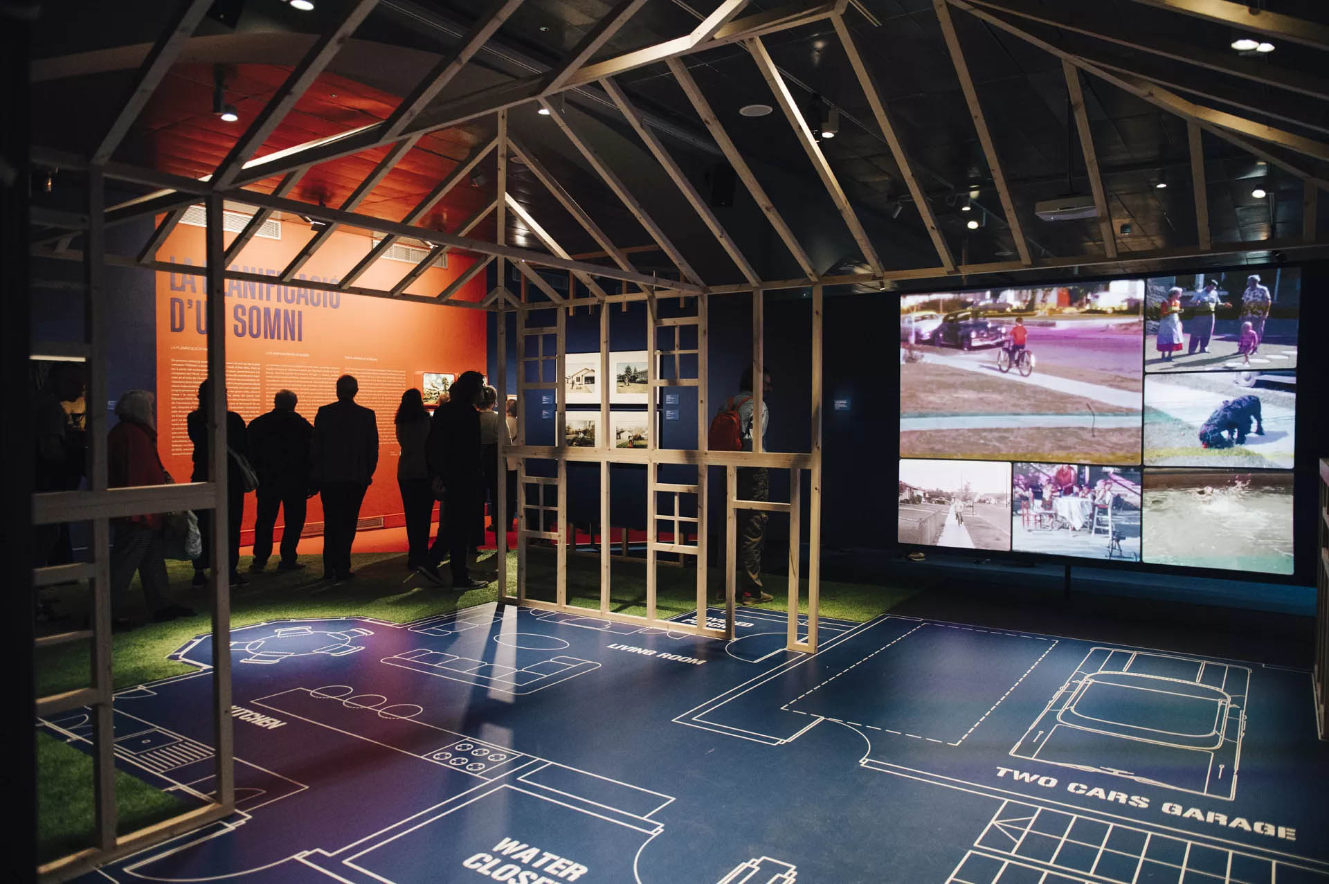
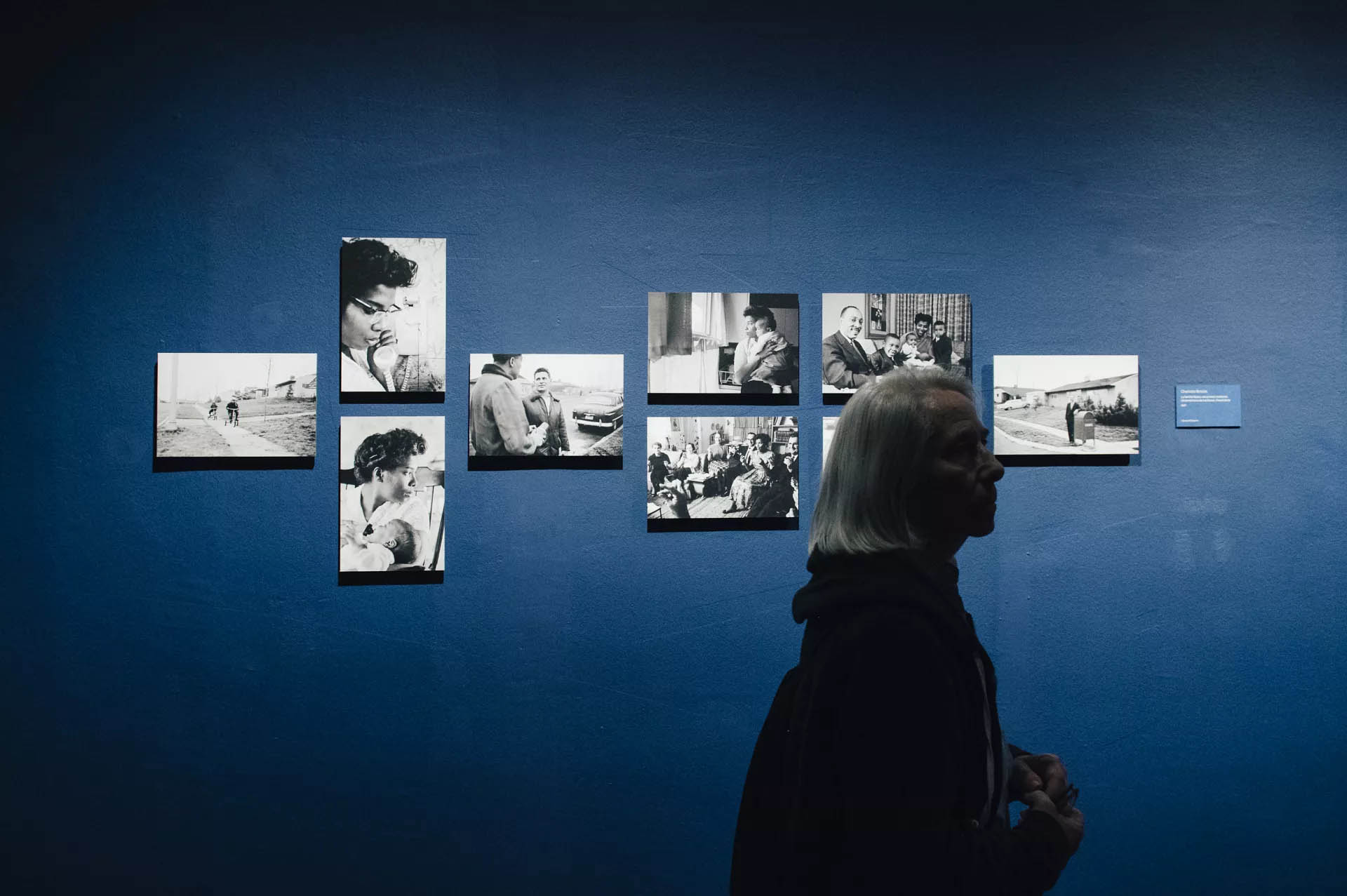
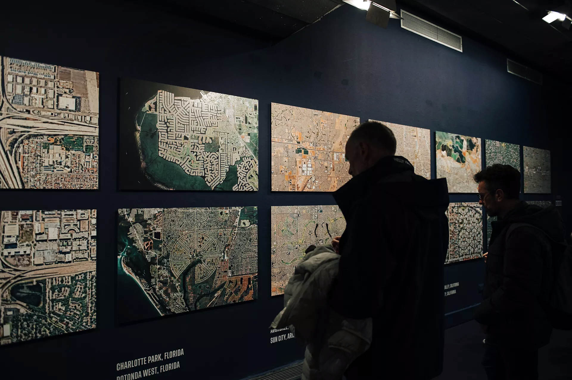
![Charlotte Brooks (American, 1918-2014) '[Image from LOOK - Job 57-7621 titled Myers family]' 20th December 1957](https://artblart.com/wp-content/uploads/2024/08/brooks-image-from-look-a.jpg "Charlotte Brooks (American, 1918-2014) '[Image from LOOK - Job 57-7621 titled Myers family]' 20th December 1957")

 'Untitled (Dream House)' 2002")
 'Julianne Moore (Dream House)' 2002")
 'Villa for David Codwise, near New Rochelle, NY (project; elevation and four plans)' 1835")
 'Ericstan, for John J. Herrick, Tarrytown, New York (perspective)' 1855")
 Friend & Aub (Publisher Philadelphia, Pennsylvania) 'Map of Llewellyn Park and Villa Sites, on Eagle Ridge in Orange & West Bloomfield' 1857")
 'Residence of Mr. E. Hooker, Fremont Ave., Orange, N.J.' 1860")
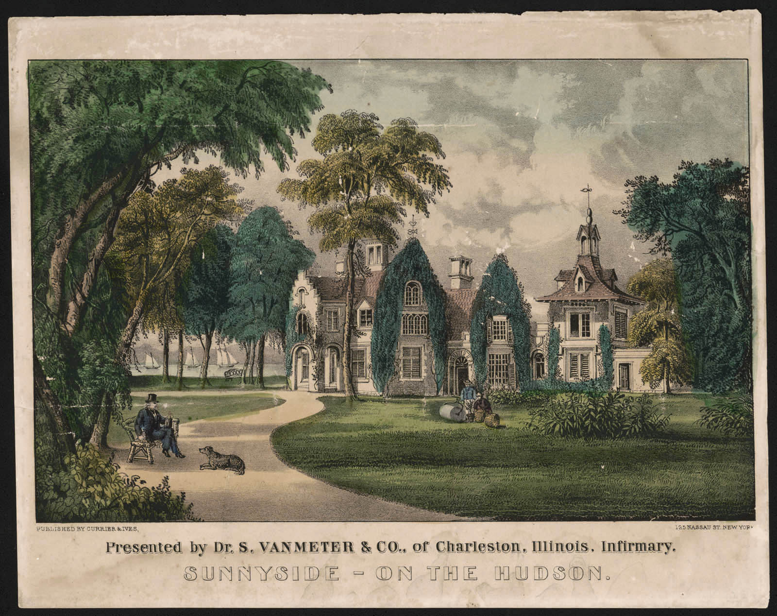
 'Sunnyside on the Hudson' 1856-1871 (detail)")
 'American railroad scene: lightning express trains leaving the junction' 1874")

")
 'Skaters on the lake at Tuxedo Park' 1910")


 'Detroit, Michigan. Riot at the Sojourner Truth homes, a new U.S. federal housing project, caused by white neighbours' attempt to prevent Negro tenants from moving in. Mounted police and whites' Detroit 1942")


")
")
")
")


 'New Kids in the Neighbourhood' 1967")
 'Suburbia, Cul de sac, Pleseanton, California' 1972")
 'I don't feel that Richie playing with guns will have a negative effect on his personality. (He already wants to be a policeman.)' 1972")
 'Untitled #2214' 1998")
 'Untitled (Elsa)' 2005")
 – central Texas' 2021; and at bottom right, 'Eric Arnsberger (30) and Morgan Gagnier (22) – Lake Forest, California' 2021")
 'Joel, Lynne, Paige and Joshua (44, 43, 5 and 11 years old) – central Texas' 2021")
 'Avery Skipalis (33) – Tampa, Florida' 2021")

 'Observations from McMansion Hell' 2023")
 'Proxy (Haven Ln.)' 2012")
 'Untitled #16' 2015-2017 From the series 'Traces'")
 'Untitled #52' 2015-2017 From the series 'Traces'")
 'Contemporary Suburbium' 2017")
 'The Mark Keppel High School Dance Team at the 2019 Miss Dance Drill Team USA National Dance Competition' 2019")
 'Berwyn, Illinois' 2023")
 'Berwyn, Illinois' 2023 (detail)")
 'The rocking chair' 1913")


 'Mira-sol alert' 2023")
 'Sant Quirze del Vallès' 2023")
 'Els Trullols Park-1' 2023")
 'Venus' early 1800s")
 Royal Saxon Porcelain Manufactory (manufacturer, Meissen, Germany) 'Portrait bust, 'Baron Schmiedel'' 1739")
; and at bottom, Christopher Dresser's 'Vase' (c. 1888)")
(designer and maker, Germany) 'Plate' c. 1923 (installation view)")
 Linthorpe Pottery (manufacturer, Middlesbrough, Yorkshire, England) 'Vase' c. 1888 (installation view)")
 Carlo Scarpa (designer, Italian, 1906-1978) 'Bowl' c. 1940")
, silk-double weave, Art Nouveau style, woven by Johann Backhausen and Sohne, Vienna, Austria, made by Koloman Moser, Vienna, Austria, 1900-1903")
, silk-double weave, Art Nouveau style, woven by Johann Backhausen and Sohne, Vienna, Austria, made by Koloman Moser, Vienna, Austria, 1900-1903")
 (designer and maker, Canberra, Australian Capital Territory, Australia) Bowl form, 'Untitled' 1990-1991")


(Ngkawenyerre camp, Utopia, Northern Territory, Australia) 'Echidna shape' 1996")
 ''Supreme' Mouse Trap Making Machine' 1942-1943")
 'Aircraft undercarriage from Lockheed Altair monoplane 'Lady Southern Cross', starboard side' Probably 1933")
 'Model staircase' 1891")
 'Long case clock' 1690")
 'Long case clock' 1733-1764")
, sheet gold alloy, Sumba, Indonesia, 1880-1950; and at second top, Textile length (mens waist cloth), handwoven cotton / shells / beads, maker unknown, East Sumba, Indonesia, 2000-2004")
, sheet gold alloy, Sumba, Indonesia, 1880-1950; and at second top, Textile length (mens waist cloth), handwoven cotton / shells / beads, maker unknown, East Sumba, Indonesia, 2000-2004")
 'Textile length (mens waist cloth)' 2000-2004")
")
")
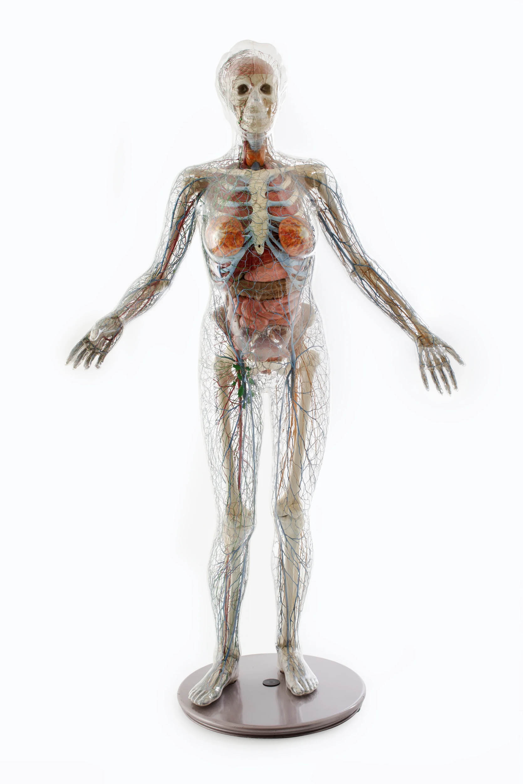
 (French, b. 1949) Daum Crystal (manufacturer, Nancy, France) Table vase, 'Quatre Etrangetes sous un mur' (Four curiosities below a wall) 1988")
 (English, 1941-2022) 'Shoes (pair), 'Super Elevated Gillie', 'Anglomania' collection, Autumn / Winter 1993-1994' 1993 Shoes (pair), 'Super Elevated Gillie'")
![J Hubert Newman (photographer, Sydney, New South Wales, Australia) (Australian, c. 1835-1916) 'Untitled [young boy in sailor suit]' Nd](https://artblart.com/wp-content/uploads/2023/10/newman-young-boy-in-sailor-suit.jpg "J Hubert Newman (photographer, Sydney, New South Wales, Australia) (Australian, c. 1835-1916) 'Untitled [young boy in sailor suit]' Nd")
 J Pintard (publisher, Rue Saint-Jacques, Paris, France) 'Toy theatre, 'La Pleine Mer, Scenes Maritimes en Action'' 1836")
 J Pintard (publisher, Rue Saint-Jacques, Paris, France) 'Toy theatre, 'La Pleine Mer, Scenes Maritimes en Action'' 1836")
 J Pintard (publisher, Rue Saint-Jacques, Paris, France) 'Toy theatre, 'La Pleine Mer, Scenes Maritimes en Action'' 1836 (detail)")


, model 946, glass, designed by René Lalique, 1921, made by René Lalique et Cie, Wingen-sur-Moder, France, c. 1950)")
, model 946, glass, designed by René Lalique, 1921, made by René Lalique et Cie, Wingen-sur-Moder, France, c. 1950)")
")
 'Guitar' c. 1975 painted and used by Harold 'The Kangaroo' Thornton, Sydney, New South Wales, Australia, 1980-2000")
 J.W. Hukin and J.T. Heath (maker, London, England) 'Kettle and burner on stand' 1878")
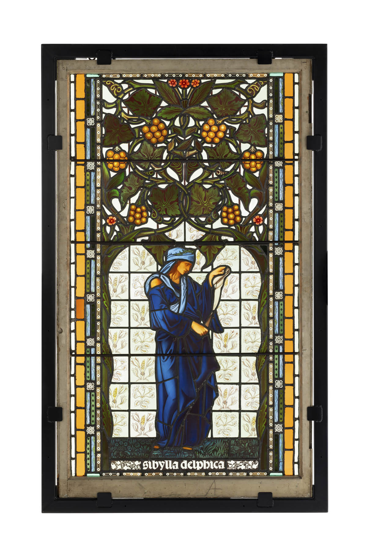

(painter) Sevres Royal Porcelain Manufactory (manufacturer, Sevres, Paris, France) 'Plate, 'Impression sur Etoffes: Teinture', from the 'Service des Arts Industriels' (Industrial Arts Service), with a scene illustrating textile dyeing workshop in the Manufacture Royale de Jouy' 1830")
(maker, Rome, Italy) 'Roman Ruins' c. 1876")
(designer) 'Settee, Regency Egyptian Revival style' c. 1802")

 'Figures (2), Sino-Tibetan deities, Brahma and Chandra, from Vajrabhairava group' 1403-1424 or Xuande reign, 1426-1435")
 'Figures (2), Sino-Tibetan deities, Brahma and Chandra, from Vajrabhairava group' 1403-1424 or Xuande reign, 1426-1435 (detail)")
 'Figures (2), Sino-Tibetan deities, Brahma and Chandra, from Vajrabhairava group' 1403-1424 or Xuande reign, 1426-1435 (detail)")
(designer, Glasgow, Scotland) 'Chair, 'Argyle'' 1898-1899")
 'Mourning brooch' c. 1870")
 'Chandelier, 'USA'' 2013")
")
")
")
(maker, Sydney, New South Wales, Australia) 'Presentation trowel' c. 1883 (installation view detail)")
(maker) Kilpatrick & Co (retailer est. 1853, Melbourne, Victoria, Australia) 'Inkstand with kangaroo and emu motifs, gold and silver, presented to John Todd by Thomas Bibby Guest' 1865")
, gold / operculum by F Allerding & Son, Sydney, New South Wales, Australia, 1879-1884; and at second top centre, Bangle, 'Soyons toujours unis / Par un divin amour', 18 carat gold, Henry Steiner, Adelaide, South Australia, c. 1878")
, gold / operculum by F Allerding & Son, Sydney, New South Wales, Australia, 1879-1884; and at second top centre, Bangle, 'Soyons toujours unis / Par un divin amour', 18 carat gold, Henry Steiner, Adelaide, South Australia, c. 1878")
 'Necklace from a parure which includes locket and earrings (pair)' 1879-1884 (installation view)")
 'Bangle, 'Soyons toujours unis / Par un divin amour'' c. 1878 (installation view)")
 'Diamond brooch in the form of a bee with sapphires on his head and in stripes across his body and with ruby eyes' 1860-1870")
 'Advertising signage (1 of 5), white horse rampant' c. 1930s (installation view)")


(designer) Florence Broadhurst Wallpapers Pty Ltd (maker, Sydney, New South Wales, Australia) 'Wallpaper roll, 'Peacocks' design' 1969-1977 (installation view)")


 'Chair, reproduction, based on Lucien Henry, 'Lyrebird' or 'staghorn fern' design' 2000 (installation view)")
 'Court dress, comprising open robe, petticoat, length of fabric and galloon (2)' c. 1760")
(designer, Paris, France) 'Evening dress, womens, spring-summer 1939' 1939")
(designer) Bazmark workrooms (maker, Sydney, New South Wales, Australia) Headpiece by Rosie Boylan (maker, Sydney, New South Wales, Australia) 'Performance costumes (2), 'Fruity Mambo', mens and womens, for 'Strictly Ballroom The Musical'' 2014")
 'Outfit, 'Iced Vo Vo', comprising of dress and shoes (pair), womens, Doilies and Pearls, Oysters and Shells collection, spring-summer 2009/2010' 2009")

' 2021")


 'Pavane Fantastique' c. 1916/1917")


 'Claire Waldoff' c. 1930")


, 1925")

; and at left centre in the display cabinet, an image by an unknown photographer Trans* people in the Eldorado in Berlin (1926)")


, September 1932, and Liebende Frauen (Women in Love), 1929")
 26. December 1927")

 c. 1925-1930")

 'Transvestites in Front of the Institute of Sexology' 1921")

 'Bisexuality' German edition from 1981")

 'Que me veux tu?' 1929")
 'Untitled (Hannah Höch at her easel, The Hague; self-portrait (double exposure) with the painting Symbolic Landscape III)' 1930")

 'Rosa Nachthemd und schwarzer Pyjama' (Pink nightgown and black pyjamas) 1928")

 'The vaudeville and trapeze artist Barbette' Nd")
 'The vaudeville and trapeze artist Barbette' Nd (detail)")


 'Solidarity: Prisoner Supports His Exhausted Comrade' 1945-1947")

 Wust's diary entry on the deportation of her Jewish partner Felice Schragenheim to the Theresienstadt concentration camp' August 21, 1944")
 Wust's diary entry on the deportation of her Jewish partner Felice Schragenheim to the Theresienstadt concentration camp' August 21, 1944 (detail)")

; and at right on the wall, Paul Hoecker's painting 'Pierrot' (Nd)")
 'Young Man's Head' Cover of 'Jugen' magazine, volume 44, 1901")
 'Dove Sei? / Where Are You?' 1914/1918")

 From the portfolio 'Les amies' c. 1924")
 'Doppelportrait Heinz Loew und Hermann Trinkaus im Atelier, Bauhaus Dessau, Doppelbelichtung' (Double portrait of Heinz Loew and Hermann Trinkaus in the studio, Bauhaus Dessau, double exposure) 1927")
 'Boys in Love' (Liebende Knaben), 1929")
 'Stillleben mit Mimosen' (Still Life with Mimosas) 1932")
. 'Lili with a Feather Fan' 1920")
. 'Lili Elbe' c. 1928")
. 'At the mirror' 1931-1936")

 'Damenbar' (Lesbian Bar) c. 1930-1932")
 'Siesta' c. 1930-1932")
 'Hermaphrodite' c. 1945")
 'Beachcomber, Baltic Sea' 1933")
 'Zwei stehende Rehe' (Two Standing Deer) 1948")
 'Girl Under Trees' 2016")
 'These hands – a world without equal' 2022")
 'These hands – a world without equal' 2022")
' (2002)")
 'The Cock (Kiss)' 2002")


' (2021)")
 'Quilt #50 (Lil Picard)' 2022")
 and Ricardo Portilho (Brazilian) In Frauenkleidung (In Women's Clothing) 2019")
 and Ricardo Portilho (Brazilian) 'Ein Sprung und der Hummer' (A Jump and the Lobster) 2018/2022 (installation view)")
 and Ricardo Portilho (Brazilian) 'Ein Sprung und der Hummer' (A Jump and The Lobster) 2018/2022")
 and Ricardo Portilho (Brazilian) 'Ein Sprung und der Hummer' (A Jump and The Lobster) 2018/2022")
 (manufacturer) 'Footed dish' 1880 from the exhibition 'Japonisme: A Passion for Japan' at SFO Museum, San Francisco international airport, May 2022 - April 2023")
 (manufacturer) 'Plate, \"Spray\" pattern border' c. 1896; 'Moon flask, \"Spray\" pattern' c. 1880 from the exhibition 'Japonisme: A Passion for Japan' at SFO Museum, San Francisco international airport, May 2022 - April 2023")
 (manufacturer) 'Set of fruit knives' c. 1875 from the exhibition 'Japonisme: A Passion for Japan' at SFO Museum, San Francisco international airport, May 2022 - April 2023")
 (manufacturer) 'Plate depicting an actor' c. 1875; 'Plate depicting an actor' c. 1875; 'Plate depicting a musician, \"Mikado\" border pattern' c. 1875")
 'Dinner gong with sparrow' c. 1885")
 (manufacturer) 'Sugar bowl' 1884; William B. Durgin Company (American, Concord, New Hampshire) (manufacturer) 'Pitcher' c. 1885")
 (manufacturer) 'Serving platter, \"Melbourne\" pattern' 1881-1885; Christopher Dresser (English, 1834-1904) (designer) Old Hall Earthenware Company (Stoke-on-Trent, Staffordshire, England) (manufacturer) 'Pitcher' c. 1881")
 (manufacturer) 'Cigar lighter' 1881; 'Coffee pot' c. 1883; 'Tea caddy' 1881")
 (designer, attributed to) Minton's China Works/Minton & Company (Stoke-on-Trent, Staffordshire, England) (manufacturer) 'Tile' c. 1870-1880; Pierre Mallet (French, 1836-1898, active in England c. 1870) (designer) Brown-Westhead, Moore & Co. (Cauldon Place, Hanley, Staffordshire, England) (manufacturer) 'Tile' c. 1880; Sherwin & Cotton (Hanley, Staffordshire, England) (manufacturer) 'Tile, \"Cracked Ice\" pattern' c. 1880")
 (manufacturer) 'Seafood salad bowl, \"Fish-net\" pattern' 1885; Tiffany & Company (American, New York) (manufacturer) 'Ice bowl' c. 1877")
 ‘Life and Her Children’ 1893; Unknown manufacturer (American) ‘Photo album’ c. 1880s; Thomas W. Knox (American, 1835-1896) ‘The Boy Travellers: Japan and China’ 1880")
 'Hand-painted fire screen' c. 1880")
 (manufacturer) 'Dragon vase' c. 1880s")
 'Selfportrait' 1913 (installation view) from the exhibition 'Germany / 1920s / New Objectivity / August Sander' at Centre Pompidou, Paris, May - Sept, 2022")


, 1926; 'Verstümmelte Proletarierfrau' (Mutilated proletarian woman), 1922-1923; and 'Schwachsinnige II' (Imbeciles II) 1923-1924")

 'Der Radiohörer' (The Radio Listener) 1930 from the exhibition 'Germany / 1920s / New Objectivity / August Sander' at Centre Pompidou, Paris, May - Sept, 2022")
 'Verblühender Frühling. Selbstbildnis als Radiobastler' (Faded Spring. Self-portrait as a radio amateur) 1926 from the exhibition 'Germany / 1920s / New Objectivity / August Sander' at Centre Pompidou, Paris, May - Sept, 2022")
 'Mechanischer Kopf (Der Geist Unserer Zeit)' The Mechanical Head (The Spirit of Our Time) 1919")
 'Jacquard-Weberei' (Jacquard weaving workshop) 1934")
 'Sommernacht' (Summer Evening) 1929 (installation view)")
 'Sommernacht' (Summer Evening) 1929")
; and at right, Otto Dix's 'An die Schönheit (Selbstbildnis)' (To the beauty (Selfportrait)) (1922)")

 'Zweimal Hilde II' (Twice Hilde II) c. 1929 (installation view)")
 'Zweimal Hilde' (Twice Hilde) c. 1929 (installation view)")
 'Zweimal Hilde II' (Twice Hilde II) c. 1929")
 'An die Schönheit (Selbstbildnis)' (To the beauty (Selfportrait)) 1922")
 'The Dreamer II' 1919 (installation view)")
 'The Dreamer' 1919")
 'Die Melancholische' (The Melancholy) 1931 (installation view)")
 'Malerehepaar' (Couple of painters) (Martha et Otto Dix) 1925-1926")
 'Painter (Marta Hegemann)' c. 1925")
 'Self portrait' 1928")
 'Hausierer' (Peddler) 1930")
 'Bailiff' c. 1930")
![August Sander (German, 1876-1964) '[Unemployed Man in Winter Coat, Hat in Hand]' 1920](https://artblart.com/wp-content/uploads/2013/10/unemployed-man-in-winter-coat-hat-in-hand-1920-august-sander1.jpg "August Sander (German, 1876-1964) '[Unemployed Man in Winter Coat, Hat in Hand]' 1920")
 'Frau eines Architekten (Dora Lüttgen)' (Architect's Wife (Dora Lüttgen)) 1926")
 'Rothaarige Frau (Damenporträt)' Red-haired woman (female portrait) 1931 (installation view)")
 'Rothaarige Frau (Damenporträt)' Red-haired woman (female portrait) 1931")
; and at second right, Otto Dix's 'Bildnis der Journalistin Sylvia von Harden' (Portrait of the journalist Sylvia von Harden) (1926)")
 'Margot' 1924")
 'Damenkneipe' (Ladies' Bistro) c. 1925")
 'Bildnis der Journalistin Sylvia von Harden' (Portrait of the journalist Sylvia von Harden) 1926 (installation view)")
 'Bildnis der Journalistin Sylvia von Harden' (Portrait of the journalist Sylvia von Harden) 1926")
 'Sekretärin beim Westdeutscher Rundfunk in Köln' (Secretary at the Westdeutscher Rundfunk in Cologne) 1931")
 'Der Maler Anton Räderscheidt' (Painter Anton Räderscheidt) 1926")
 'Junger Mann mit gelben Handschuhen' (Young man with yellow gloves) 1921")
 'Junger Mann mit gelben Handschuhen' (Young man with yellow gloves) 1921 (installation view)")
 'Painter with Model (Self Portrait)' 1928 (installation view)")
 'Painter with Model (Self Portrait)' 1928")
 'Zirkusarbeiter' (Circus Workers) 1926-1932")
 'Bildnis der Tänzerin Anita Berber' (Portrait of the dancer Anita Berber) 1925 (installation view)")
 'Bildnis der Tänzerin Anita Berber' (Portrait of the dancer Anita Berber) 1925 (installation view)")


 Lustmord (Sex Murder) 1922 (installation view)")
 'Lustmord' (Sex Murder) 1922")
 'Transvestitenlokal' (Local transvestite) c. 1931")
 'Selfportrait' c. 1931")
![August Sander (German, 1876-1964) 'Painter [Heinrich Hoerle]' 1928-1932](https://artblart.com/wp-content/uploads/2014/08/sander-maler-web.jpg "August Sander (German, 1876-1964) 'Painter [Heinrich Hoerle]' 1928-1932")
 (German, 1893-1959) 'Porträt des Schriftstellers Max Herrmann-Neiße' (Portrait of the writer Max Herrmann-Neisse) 1925 (installation view)")

 (German, 1893-1959) 'Porträt des Schriftstellers Max Herrmann-Neiße' (Portrait of the writer Max Herrmann-Neisse) 1925")
![August Sander (German, 1876-1964) 'Proletarian Intellectuals' [Else Schuler, Tristan Rémy, Franz Wilhelm Seiwert, Gerd Arntz] c. 1925](https://artblart.com/wp-content/uploads/2022/07/august-sander-proletarian-intellectuals.jpg "August Sander (German, 1876-1964) 'Proletarian Intellectuals' [Else Schuler, Tristan Rémy, Franz Wilhelm Seiwert, Gerd Arntz] c. 1925")
 'Werbefaltblatt \"Für Fotomontage Futura\"' (Promotional leaflet \"For photomontage Futura\") Nd")
 'Wirtshaustheke' (Pub bar) c. 1927")
 'Der Fayencesammler' (The faience collector) 1927")
 'Gläser' (Glasses) 1927 (installation view)")
 'Gläser' (Glasses) 1927")
 'Gläser' (Glasses) 1926-1927")
 'Bärwurz' Between 1926-1928")
 'Wenn Berlin Konstantinopel wäre' (If Berlin were Constantinople) Before 1929")
 (1925); and at right, George Grosz's 'Konstruktion (Ohne Titel)' (1920)")
 'Wandbild für einen Fotografen' (Mural for a Photographer) 1925 (installation view)")
 'Wandbild für einen Fotografen' (Mural for a Photographer) 1925")
![George Grosz (Georg Ehrenfried Gross) (German, 1893-1959) 'Construction (Untitled)' (Konstruktion [Ohne Titel]) 1920 (installation view)](https://artblart.com/wp-content/uploads/2022/08/germany-installation-g.jpg "George Grosz (Georg Ehrenfried Gross) (German, 1893-1959) 'Construction (Untitled)' (Konstruktion [Ohne Titel]) 1920 (installation view)")
![George Grosz. 'Construction (Untitled) (Konstruktion [Ohne Titel])' 1920](https://artblart.com/wp-content/uploads/2016/01/grosz-construction.jpg "George Grosz. 'Construction (Untitled) (Konstruktion [Ohne Titel])' 1920")
 'Freudlose Gasse' (Joyless Street) 1927 (installation view)")
 'Freudlose Gasse' (Joyless Street) 1927")
; at middle, Gert Wollheim's 'Untitled (Couple)' (1926); and at right, Otto Dix's 'Portrait of the Jeweller Karl Krall' (1923)")
 'Self Portrait as an Artist' 1935 (installation view)")
 'Untitled (Couple)' 1926 (installation view)")
 'Untitled (Couple)' 1926")
 'Portrait of the Jeweller Karl Krall' 1923 (installation view)")
' 1923")
 'Portrait of the Art Dealer Alfred Flechtheim' 1926 (installation view)")
 'Portrait of the Art Dealer Alfred Flechtheim' 1926")
 1928")
 'Two Women, Dancing' c. 1928 (installation view)")
 'Two Women, Dancing' c. 1928")
 'Valeska Gert' 1928-1929")
 'Café Nollendorf' c. 1931")
 'The House of Gatekeeper' 1924 (installation view)")
 'Isolatorenkette' (Chain of insulators) 1925")
 'Triebwerk einer Lokomotive' (Engine of a locomotive) 1925")
 'Nockenwelle einer Dampfmaschine' (Camshaft of a steam engine) 1927")
 'Musterzimmer im Fagus-Werk Benscheidt in Alfeld' (Shoe trees at the Fagus factory, Alfeld) 1928")
![Albert Renger-Patzsch (1897-1966) 'Bügeleisen für Schuhfabrikation, Faguswerk Alfeld [Shoemakers' irons, Fagus factory, Alfeld]' 1928](https://artblart.com/wp-content/uploads/2018/01/renger-patzsch-bugeleisen-fur-schuhfabrikation.jpg "Albert Renger-Patzsch (1897-1966) 'Bügeleisen für Schuhfabrikation, Faguswerk Alfeld [Shoemakers' irons, Fagus factory, Alfeld]' 1928")


 (1936)")
 'Stoffhändler' (Fabric Merchant) 1936")
; and at right, Rudolf Schlichter's 'Margot' (1924)")
 'Russian Girl with Compact' 1928")
 'Margot' 1924")
 'Breakfast Still Life' 1927 (installation view)")
 'Breakfast Still Life' 1927")
 'Abshied von Düsseldorf' (Farewell from Dusseldorf) 1924 (installation view)")

 'Abshied von Düsseldorf' (Farewell from Dusseldorf) 1924")
 'Karton zum \"Groβstadt-Triptychon\"' (Cartoon for \"The Grande Ville triptych\") 1927-1928 (installation view)")

 Karton zum \"Groβstadt-Triptychon\" (Cartoon for \"The Grande Ville triptych\") 1927-1928 (installation view detail)")
 Karton zum \"Groβstadt-Triptychon\" (Cartoon for \"The Grande Ville triptych\") 1927-1928 (installation view detail)")
 Karton zum \"Groβstadt-Triptychon\" (Cartoon for \"The Grande Ville triptych\") 1927-1928 (installation view detail)")
 'Weiblicher Akt auf dem Sofa' (Female nude on the sofa) 1928")
 'Am Stadtrand' (On the outskirts) 1926")
 'Untitled (Bare-Breasted Woman in Front of a Printing Press)' 1929")
 'Graf St. Genois d'Anneaucourt' 1927 (installation view)")
 'Graf St. Genois d'Anneaucourt' 1927")
 'Anna Gabbioneta' 1927")
 'Bildnis Dr. Haustein' (Portrait of Dr. Haustein) 1928")
 'Akademie modell' (Academic model) c. 1922")
 (1923); at centre, Rudolf Dischinger's 'Grammophon' (Gramophone) (1930); and at right, Franz Xaver Fuhr's 'Stillleben (Gummibaum)' (Still life (Rubber tree)) (c. 1925)")
 'Kacteen und Semaphore' (Cacti and semaphores) 1923")
 'Stillleben (Gummibaum)' (Still life (Rubber tree)) c. 1925")
 'Grammophon' (Gramophone) 1930")
 'Stillleben mit Gitarre' (Still Life with Guitar) 1926")
 'Amaryllis' 1930")
 'Stillleben mit gelber Tüte' (Still life with a yellow bag ) 1927")
 'Straßen der Arbeit' (Labour routes) 1930")
 'Beton' c. 1924")
 'Industriebild' (Picture of Industry) 1924")
 'Bahnhof' (Train station) 1924-1926")


 'Ruth Bader Ginsburg' 1996")


 'Official portrait of United States Supreme Court Justice Ruth Joan Bader Ginsburg' 2013")
 (illustrator) 'Notorious RBG' book cover illustration 2015")
 'Dissent Collar #9' 2016")
 'Dissent Collar #13' 2016")
 'RBG Tattoo II' 2018")
 'The Four Justices' 2012")
")


 'Fearless Girl with jabot' September 22, 2020")
 'RBG memorial outside Columbia University' 2020")
 '\"Bjesprisorni\", Sleeping boy in Leningrad' 1932 from the exhibition 'Ernst A. Heiniger – Good Morning, World!' at Fotostiftung Schweiz, Winterthur, Zürich, June - Oct, 2021")
 'Bahnhofplatz, Zurich' 1933 from the exhibition 'Ernst A. Heiniger – Good Morning, World!' at Fotostiftung Schweiz, Winterthur, Zürich, June - Oct, 2021")
 'Jumping over a crevasse, Bernese Oberland' 1933")
 'Grey and Brown, Puszta (Hungary)' 1936")
 'White wine star' 1939")
 'Rope team on the Bianco ridge, Grisons' 1941")
 'Fitting' 1942")
 'Water drop' 1943")

 (designer) Ernst A. Heiniger (Swiss, 1909-1993) (photographer) 'Grindewald poster' 1935")
 (designer) Ernst A. Heiniger (Swiss, 1909-1993) (photographer) 'Bally Shoes poster' 1936")
 (installation view)")
 'Telefon poster' 1942")
 'World Exhibition of Photography Lucerne poster' 1952")


 'Poster \"so telephonieren\"' 1950")
 'Self-portrait' around 1950")
 'Ernst A. Heiniger and his wife Jean were inseparable: here they traveled to Japan for a Cinemascope film' around 1956")
 'Seaweed diver, film scene from 'Ama Girls' (USA, 1958)' around 1956")
 'Women at a festival, Japan' around 1956")
 'Jean and Ernst A. Heiniger during the shooting of the Cinemasope film \"Grand Canyon\" (USA, 1958)' 1958")
 'Ernst A. Heiniger with his wife Jean while shooting a Cinemascope film' Nd")


 'Self-portrait' 1960s")


 'Cage-mounted snuffbox with lacquer panels' Paris, 1761-1762 Objet d'art: French and German enamelled boxes at the Louvre, Paris")

 'Snuffbox' Paris, 1750-1752")
 'Snuffbox' Paris, 1731-1732")


 'Louis XV' 1768-1769")
 'Marie Leczinska' Paris, 1775-1781")
 'Marie Leczinska' Paris, 1775-1781")


 'Tablet case' Dresden, c. 1775-1780")
 'Snuffbox' Dresden, c. 1770-1780")
 'Snuffbox' Dresden, c. 1760-1770")
 'Snuffbox' Dresden, c. 1760-1770")


")

 1927; in the centre, 'Der Stuhl. Neue Typografie' (New typography) 1929; and at right, 'Umschläge zu den Bauhausbüchern, 1925-1930' (Covers for the Bauhaus books, 1925-1930) 1925-1930")
 'Ausstellung Europäisches Kunstgewerbe' (Exhibition of European applied arts) 1927 (installation view)")
 'Ausstellung Europäisches Kunstgewerbe' (Exhibition of European applied arts) 1927 from the exhibition 'László Moholy-Nagy and New Typography: A Reconstruction of a Berlin Exhibition from 1929' at the Staatliche Museen zu Berlin, Aug - Sept, 2019")
 'Der Stuhl. Neue Typografie' (New typography) 1929 (installation view)")
 'Umschläge zu den Bauhausbüchern, 1925-1930' (Covers for the Bauhaus books, 1925-1930) 1925-30 (installation view)")
 'Bauhausbücher 8, L. Moholy-Nagy: Malerei, Fotografie, Film' 1925")
 'Etoile du Nord' (North Star) 1927 from the exhibition 'László Moholy-Nagy and New Typography: A Reconstruction of a Berlin Exhibition from 1929' at the Staatliche Museen zu Berlin, Aug - Sept, 2019")
 'Chemin de Fer du Nord. Vitesse-Luxe-Comfort' (Northern Railway. Speed-Luxury-Comfort) 1929")
 'Posters' 1927")
 'Schubertfeier der Städtischen Bühnen Essen' (Schubert celebration of the municipal theatres of Essen) 1927")


 'Marque PKZ' 1923 (installation view)")
 'Marque PKZ' 1923")


\" 1927 (installation view)")
 'Where is typography headed? Chart 58' 1929 (installation view)")
 'Die Hose' (The pants) 1927 (installation view)")
 'Die Hose' (The pants) 1927")
 'Die Frau ohne Namen' (The woman without a name) 1927 (installation view)")
 'Die Frau ohne Namen' (The woman without a name) 1927")

 '13 Tentoonstelling van Schilderijen en Beeldhouw' (13 Exhibition of Paintings and Sculptures) 1927 (installation view)")
 '13 Tentoonstelling van Schilderijen en Beeldhouw' (13 Exhibition of Paintings and Sculptures) 1927")
 'Where is typography headed? Chart 1' 1929")
 'Where is typography headed? Chart 12' 1929")
 'Where is typography headed? Chart 22' 1929")
 'Where is typography headed? Chart 34' 1929")
 'Where is typography headed? Chart 44' 1929")
 'Merz 11 Pelikan Nummer, Zeitschrift' 1924")
 'Einladung zur Ausstellung \"Neue Typographie\"' (Invitation to the exhibition \"New Typography\") Berlin 1929")


 'Prospekttitelblatt' (Prospectus title page) 1928 and 'film und foto' 1929 (installation view)")
 '14 Bauhausbücher' 1928")
 'Wohung und Werkraum, Werkbundausstellung in Breslau' (Apartment and workshop, Werkbund exhibition in Breslau) 1929 (installation view)")
 'Wohung und Werkraum, Werkbundausstellung in Breslau' (Apartment and workshop, Werkbund exhibition in Breslau) 1929")

 Pinball art at the Flippermúzeum, Budapest")
 from the posting Pinball art at the Flippermúzeum, Budapest")


; Data East USA, Inc. Tales from the Crypt (1993); Data East USA, Inc. The Who's Tommy Pinball Wizard (1994)")
; Gottlieb's the 'Amazing Spiderman' (1980); Gottlieb's 'Circus' (1980); Gottlieb's 'Pink Panther' (1981); and Gottlieb's 'Rocky' (1982)")

; at second left, Game Plan, Inc. 'Attila the Hun' (1984); and at right back, Bally's 'Rolling Stones' (1980)")
; Recel S. A. 'Criterium 75' (1978); Chicago Coin Machine Mfg. Co. 'Sound Stage' (1976)")
; and at second left, Bally's 'Xenon' (1980); and at right, Gottlieb's 'Haunted House' (1982)")
; Bally's 'Wizard! featuring Ann Margret and Roger Daltrey' (1975); and Bally's 'Capt. Fantastic and the Dirt Brown Cowboy featuring Elton John' (1976)")


")
")
")

")
")
")
 'Triple Action' 1948 (detail)")
")
")


")
")
 'Wizard!' 1975 (detail)")
 'Wizard!' 1975 (detail)")

 'Capt. Fantastic and the Dirt Brown Cowboy' 1976 (detail)")
 'Space Invaders' 1980 (detail)")
")
")
 'Circus' 1980 (detail)")

 'Xenon' 1980 (detail)")
 'Centaur' 1981 (detail)")

 'Medusa' 1981")
 'Fathom' 1981 (detail)")
 'Hyperball' 1981 (detail)")
 'Hyperball' 1981 (detail)")
")
")
")
")
")
 'Diner' 1990 (detail)")
 (Chicago, 1988-1999) 'Dr. Dude And His Excellent Ray' 1990 (detail)")
 (Chicago, 1988-1999) 'Dr. Dude And His Excellent Ray' 1990 (detail)")

 'FunHouse' 1990 (detail)")
 'FunHouse' 1990 (detail)")
 'FunHouse' 1990 (detail)")


 'The Machine: Bride of Pinbot' 1991 (detail)")
 'The Machine: Bride of Pinbot' 1991 (detail)")

 'Fish Tales' 1992 (detail)")
")
 'The Getaway: High Speed II' 1992 (detail)")
")
")

You must be logged in to post a comment.