This is an excellent exhibition by Greg Elms at Edmund Pearce Gallery, Melbourne. The photographs, made using a film scanner re-purposed into a lens-less camera, have great fidelity. Fidelity refers to the degree to which a model or simulation reproduces the state of a real world object and is therefore a measure of the realism of a model or simulation. These photographs have great overall presence – as the artist himself puts it, “Focus of the subject is likewise abnormal, sharp only where features press against the glass platen screen, dissolving into darkness and blur as they recede, implying a sense of entrapment behind the image surface.” This limited depth of field means that the taxidermies loom out of the intimate darkness into the artificial light, the scanners passing recorded as a crescent moon in the eyes of the preserved, the deceased.
Ashely Crawford, in an excellent piece of writing, notes how Elms captures the notion of the animal as ‘other’ while observing that there is much to say about the permeable membrane between human and non-human in postmodern culture. The press release states that, “Preserved raises allusions to the history of zoological inquiry and highlights the sense of loss intrinsic to mortality. Indeed, the works can be read as a series of ecological memento mori.”
These ideas can be further interrogated. Personally, I think it is more than just a singular, momentary death. There is the original death of the animal, its re/animation through the art of preservation, taxidermy, and then a second little death due to the light of the scanner. These photographic animalia may be a reflection on our ecological relationship to the world, caught in a double time-freeze – a postmodern reflection on our memories, histories and interactions with the animal world that are becoming released from the historical contexts on which they are traditionally based, the referent silently split from its once powerful reality. Much as we humans objectify our death through ritual (the dressing of the body, the viewing of the body, the singing of songs, the saying of validations for a life; the coffin, the priest, the burial, the burning) these photographs objectify a simulation of death, as though the death of these animals has been pre-served, like warming up a TV dinner in the microwave and then letting it go cold again. Our relationship to the animals of this world is now mainly about death (live sheep exports, eat your heart out!)
Gothic, nocturnal and now immortal, Elms photographs transcend the animal-human connection and evoke primal emotional responses in the viewer causing us to ask, yet again, what the hell we are doing to this planet.
Greg Elms (Australian, b. 1960) Female Red Kangaroo, Macropus Rufus
2010
Archival Inkjet Print
Gregory Elms pursues the rupture of photography’s implicit claim to realism. To this end his current series, Preserved, investigates the staged realism of taxidermy. Both zoological document and faux wildlife imagery, the work oscillates between life and death, veracity and fiction, the horrific and the sublime. It documents the lifelike lifelessness of taxidermy, presenting a zoological menagerie that is both hyper-real and otherworldly. The work was inspired by childhood memories of taxidermy hunting trophies on the walls of the Sportsmans Bar, at his father’s suburban hotel. But it’s also a gothic investigation of our relationship with animals, influenced by the Romantic movement, the Age of Enlightenment, and the tradition of vanitas painting with it’s metaphorical associations to mortality. According to curator Simon Gregg it “erects an invisible barrier between us and the animals; a physical barrier but in many ways and with more consequence to us, a psychological barrier.”
As the artist observes,
“I grew up in a suburban hotel with a public bar festooned in taxidermy hunting trophies. I’d spend ages gazing at them and have remained enthralled by their life-like lifelessness ever since. For me taxidermy is akin to photography: it too presents a frozen moment as a copy of the real thing. On one level, the work explores our primal emotional responses when in close proximity to animals and insects. But it also explores what truth means in photography – is a contrived photograph still real? And doesn’t photography always render the real as contrived? I seek to highlight this conundrum with the further contrivance of taxidermy.
Inspired by gothic and nocturnal precursors in art, and the history of zoology, the fauna are recontextualised into a menagerie of lost lives – some of them, presumably, the celebration of a now forgotten hunting spree. Each one echoes the story of their demise and surrender to human intervention, their poses animated by a taxidermist’s skills of presentation and reality re-enactment. To document the series, I have employed the idiosyncratic image making qualities of a film scanner re-purposed into a lens-less camera, its simplicity reminiscent of a camera obscura. Set in an otherwise unlit studio, the resultant image reveals a constructed twilight that fuels a dark narrative. Focus of the subject is likewise abnormal, sharp only where features press against the glass platen screen, dissolving into darkness and blur as they recede, implying a sense of entrapment behind the image surface.”
Preserved raises allusions to the history of zoological inquiry and highlights the sense of loss intrinsic to mortality. Indeed, the works can be read as a series of ecological memento mori.”
Press release from the Edmund Pearce Gallery website
Greg Elms (Australian, b. 1960) Red Fox, Vulpes Vulpes
2010
Archival Inkjet Print
The Art of Preservation
Ashley Crawford
In the world of Ridley Scott’s 1982 Science fiction classic Blade Runner one of the most prized possessions is a perfectly replicated owl. The film is based on a 1968 Philip K. Dick novel, Do Androids Dream of Electric Sheep in which social status is most often based on the ‘model’ of animal one can afford – or even better, the ownership of a real animal in a world where most species have been killed by nuclear fallout. This is the background to a more complex story, but it is one that is infused with melancholy and a powerful sense of loss. What is humanity without the context of the animal?
But humanity and the animal and insect kingdoms have long maintained an imbalanced sense of symbiosis. On the one hand we ogle animals in zoos or more regularly via television documentaries. Only the most hardy of tourists today bother venturing into what remains of natural habitats – all too often zones of environmental Armageddon. Very few species are truly ‘domesticated’. Indeed almost all animals remain the ‘other’, psychologically impregnable – some are good for eating, some are pests but they all, in one way or another, remain objects of fascination.
Gregory Elms captures this sense of fascination with unnerving potency. His menagerie of misfits, malcontents and monsters are captured with alluring charm. Elms reveals no prejudice when it comes to selecting his portraits; the pestilent hyena alongside the strangely elegant and impelling Dead Leaf Mantis, the odious Cane Toad against the loyal Jack Russell. Via Elms’ aesthetic each and every one of them carries a peculiar charm, as though they had been groomed for their portraiture session. With his deliberately formalised composition, his animals become indisputably individualistic. They are not generic dogs, toads or birds. They are members of a bestiary noblesse.
Animals have, of course, long been the stuff of artistic inspiration, from Durer’s famous rabbit to Hirst’s infamous shark. In Australia, Elms fits alongside an enduring history of animal as subject, seen contemporaneously in the powerful 2004 exhibition Instinct at the Monash Faculty Gallery, which featured artists as diverse as Emily Floyd, Sharon Goodwin, Irene Hanenbergh, Louise Hearman, Ronnie van Hout, David Noonan and Lisa Roet.
And while Elms may capture the notion of the animal as ‘other’ he also taps into the strange connections we feel toward other species. The animal-human connection is obviously a fertile one. In light of the success of recent works in the firecracker-hot field of comparative ethology, delving into the minds and emotional lives of animals, there is much to say about the permeable membrane between human and non-human in postmodern culture. Animals have also played an intriguing, little-examined role in the emergence of technological modernity, from NASA’s space monkeys to experiments on animal behaviour and intelligence.
But Elms work also hints at the pre-history of animal-human interaction. Throughout art history, animals have been utilised by artists to represent human character traits – a man is a ‘snake’ or a ‘dog’ or a ‘pig’ depending on their personality. Animals have also featured in mythology and the supernatural – the werewolf, the vampire. Elms also turns the gallery into the scientific laboratory, the taxidermists studio and, inevitably, the Hunting Lodge.
Yes, often sadly, (the Cane Toad aside), Elms’ subjects are dead. But they live on with a strange majesty via Elms’ lens.
“If, having fixed the original form in our mind’s eye, we ask ourselves how that form comes alive and fills with life, we discover a new dynamic and vital category, a new property of the universe: reverberation (retentir). It is as though a well-spring existed in a sealed vase and its waves, repeatedly echoing against the sides of this vase, filled it with their sonority. Or again, it’s as though the sound of a hunting horn, reverberating everywhere through its echo, made the tiniest leaf, the tiniest wisp of moss shudder in a common movement and transformed the whole forest, filling it to its limits, into a vibrating, sonorous world.”
Eugene Minkowski. ‘Vers une Cosmologie’ (translated by Maria Jolas) quoted on Michael Ormerod. “Minkowski’s Reverberating Forest,” on the ‘The Spirit of the Mass’ blog 23rd April 2012 [Online] Cited 24th October 2012 and again on 3rd September 2020
The Australian artist Rosemary Laing moves between different genres in her work, drawing upon installation, performance and photography at the same time. The groundspeed series is the result of a sort of “field trip” to the eucalyptus forests of southern Australia. Together with a team of assistants, Laing produced a series of images of landscapes in which reality and fiction combine through the insertion of ordinary industrially produced carpets in practically unspoilt natural settings. Her work thus weds the open landscape of the image in the background with an element in the foreground that instead recalls an interior, an inhabited human environment. But where is the reality or where is the fiction? Are we sure we can believe in the reality of pure and idyllic nature?
The artist’s working method is comparable to filmmaking. A team of professionals goes to the selected location and creates a set that meets all of the artist’s requirements and is therefore ready to be photographed. This procedure enables Laing to achieve results that would be impossible through digital manipulation of the images alone. The flower-patterned carpets Laing uses belong to a European tradition that was very popular and widespread in Australia when she was young. She thus “grafts” a piece of European culture onto the Australian landscape. She intervenes in nature and alters it. Reverberating in her works is an explicit criticism of the appropriation of the Australian continent by European colonisers, a process underway for at least 200 years. In the light of these considerations, Laing’s apparently idyllic and fantastic images suddenly take on a bitter and dramatic aftertaste. The artistic representation thus succeeds in arriving at a higher level of truth than that of the concrete visual reality it uses.”
Text from the Manipulating Reality: How Images Redefine the World website [Online] Cited 24th October 2012 and again on 3rd September 2020. No longer available online
“groundspeed (Red Piazza) #4 is from the series groundspeed, in which patterned Feltex carpet is laid on the forest floor or on the edge of a rocky coastal setting. This particular image uses retro Red Piazza carpet in the forest at the George Boyd Lookout in southern New South Wales. The carpet is obviously incongruous to the forest, even though its floral pattern is inspired by nature. The lush saturated colours are typical of Laing’s work. Here, red and green – opposites on the colour spectrum – are placed in combination, heightening the tone and conceptual vigour of the union. In each photograph from the series, nature is shown as living and abundant; from the fecund, green forest to, in other images, the ferocity of waves breaking against the coast.
The title is an amalgamation of Laing’s concerns: ‘ground’ refers to land and solidity, and ‘speed’ references flight and impermanence. Placed together these terms conceptually summarise the visual considerations at work. In a reversal of accepted norms in which nature is distanced from domestic living and where nature is historically sidelined by cultural pursuits, Laing figuratively brings the inside out. In so doing groundspeed makes concrete the unstable and provocative rapport between habitation and inhabitation, stillness and movement, growth and decay. Laing’s vibrant images subsume the visual in a historical, social and cultural dialogue where the ground keeps shifting.”
insidious adj.
Proceeding in a gradual, subtle way, but with harmful effects
There is a lot to celebrate living in Australia, the lucky country, especially if you are a white kid growing up in the perfect world of Cottees advertising. I have been viewing these TV commercials since 1986 and have yet to see an Indian, Asian, Aboriginal or child from a Muslim family in any of them. As far as I can see it is only white children of middle class suburban families that can “seize the day” in Cottee’s vision of contemporary Australia.
I ask my readers, do they think that these adverts promulgate a form of insidious racism? Are these adverts a form of racism by exclusion, rather than one by outright declamation?
Is this exclusion a form of societal system of oppression?
I leave the answer for you to decide.
Perhaps they should have said, “No matter how many white kids end up in your backyard, there’s always enough Cottee’s to go around…”
“We’re all responsible for naming, and saying no to, racism. We must call it when we see it… Race hate, racism, careless words – can harm entire populations. They can change the way that we live together… Racism can only be resisted, and eradicated, through solidarity, and cooperation. There are no exceptions. History has no bystanders – only participants.”
Graeme Innes AM, Race Discrimination Commissioner at the Australian Human Rights Commission, August 2011
VIDEO NO LONGER AVAILABLE
Cottees There’s a lot to celebrate (2012)
“This Sunday will see the launch of a new campaign for Cottee’s cordial. Created by George Patterson Y&R Melbourne, the commercial aims to take the brand back to its roots by celebrating the simple goodness of childhood – and the fact that no matter how many kids end up in your back yard at the end of the day, there’s always enough Cottee’s to go around.
Says Troy McKinna, advertising manager at Cottee’s: “We’re hoping the generation of Australians who grew up with classic ‘My dad picks the fruit’‚ ad will share this new Cottee’s classic with the next one.””
Exhibition dates: 8th September – 16th October 2012
Valerio Ciccone (Australian, b. 1970) Not titled (After Holbein) 1991
Pastel on paper
50 x 66cm
Courtesy of MADMusee, Belgium
This is a beautiful and vibrant exhibition by Arts Project Australia artist Valerio Ciccone. As you can see from the reproductions in the posting the art work is engaging and enveloping. The work makes me happy, it makes me smile. Arts Project Australia does a wonderful job promoting their artists. It must be very difficult for the curators to append a conceptual idea onto an artist’s work without much input from the artist themselves. Such is the case here. Talking with curator of the exhibition Dr Cheryl Daye, she told me that the title of the exhibition was as much about the person Valerio Ciccone as the work itself; how Valerio circles around people before coming up to say hello, before approaching the subject directly. He is always “keeping an eye out” for what is going on around him.
In the top quotation above – the only paragraph in the two catalogue essays that addresses the conceptual idea of the exhibition – the terms peripheral gaze, peripheral viewer and by extension the title of the exhibition (peripheral observer), are conjoined. Personally, I think that there is a distinct difference between each term that caused me some conceptual unease when they are used together as such.
1/ The peripheral gaze is a temporary, short state of uncertainty, before and between the active or passive state – perhaps! In studying social interaction, Michael Watson (1970) found cultural variability in the intensity of gaze. He distinguished between three forms of gaze:
~ sharp: focusing on the other person’s eyes ~ clear: focusing about the other person’s head and face ~ peripheral: having the other person within the field of vision, but not focusing on his head or face1
2/ A peripheral viewer is active, recipient and creative; sometimes part of the thing itself. They are able to transform into 3, passive.
3/ A peripheral observer can be passive, sometimes unconsciously so, as when someone is watching TV commercials, pictures on a channel that they do not like. Given more choice over control of the channels they become more active and the retain more interest in the program they are watching. The analogy could be that of a flaneur, strolling, looking but not interacting. They are able to transform into 2, active.
According to Jules Romains, “Seeing, and its spatio-temporal organisation, precede gesture and speech and their co-ordination in knowing, recognising, making known (as images of our thoughts), our thoughts themselves and cognitive functions, which are never passive …”2 and Merleau-Ponty notes in an important formulation that, “Everything I see is in principle within my reach, at least within reach of my sight, marked on the map of the ‘I can’.”3
Marked on the map of ‘I can’: active. This is what Valerio does in his artwork, he marks his vision on the map of ‘I can’; not the centre or the periphery (for in postmodernism there is no centre, no periphery for the periphery is the centre!) but an equal balance between what passes before his eyes: background and subject given equal wait / weight within the picture plane where, “in the new democracy of images everything is equal and everything is the same.” This is not a peripheral observer but an artist who actively/passively addresses with equal importance the elements placed before his vision, a passing flow over which he has little control. Sight is decentred and becomes seeing on the field of the other, seeing under the Gaze.
“In the same way, when I see, what I see is formed by paths or networks laid down in advance of my seeing. It may be the case that I feel myself to inhabit some kind of center in my speech, but what decentres me is the network of language. It may be similarly be that I always feel myself to live at the center of my vision – somewhere (where?) behind my eyes; but, again, that vision is decentred by the networks of signifiers that come to me from the social milieu …
Lacan’s analysis of vision unfolds in the same terms: the viewing subject does not stand at the center of the perceptual horizon, and cannot command the chains and series of signifiers passing across the visual domain. Vision unfolds to the side of, in tangent to, the field of the other. And to that form of seeing Lacan gives a name: seeing on the field of the other, seeing under the Gaze.”4
For me Valerio’s work is a result of a direct looking from a tangental position, not the other way around. His subjects and backgrounds are frontal to the viewer, his figures only rarely looking off to the side. The viewing subject, the artist in this case, stands not at the centre of the perceptual horizon and he cannot command what he sees, when he sees it. But what Valerio so brilliantly and sympathetically does is capture the visions that unfold in front of him with a wonderful joy of life that is breathtaking in its tangental difference, in its recognition of Otherness.
Dr Marcus Bunyan
1/ Watson, Michael. Proxemic Behavior: A Cross-Cultural Study. The Hague: Mouton, 1970 quoted in Chandler, Daniel. “Notes on “The Gaze”,” on the Aberystwyth University website [Online] Cited 05/10/2012 No longer available online
2/ Romains, Jules. La Vision extra-rétinienne et le sens paroptique. Paris: Gallimard, 1964 quoted in Virilio, Paul. The Vision Machine (trans. Julie Rose). Bloomington: Indiana University Press, 1994, p. 7
3/ Merleau-Ponty, Maurice. “Eye and Mind” (trans. Carleton Dallery) in The Primacy of Perception: And Other Essays on Phenomenological Psychology. Northwest University Press, 1964, p. 162
4/ Foster, Hal (ed.,). Vision and Visuality. Bay Press, Seattle: Dia Art Foundation Discussions in Contemporary Culture, Number 2, 1988, p. 94
Many thankx to the artist and Arts Project Australia for allowing me to publish the reproductions of the art in the posting. Please click on the photographs for a larger version of the image.
“Whatever medium he chooses, Ciccone’s work reflects a quiet connection with his subject, as well as a delicate poignancy or gentle sense of irony. There is a certain likeness between the peripheral gaze of his subjects and the way in which Ciccone, whilst remaining focused on his work, is able to keep a watchful eye on all that is happening around him. The subjects in Ciccone’s portraits rarely look directly at the viewer. They seem absorbed by action that is taking place off to the side, beyond the picture plane. Yet there is intentness in the expression, the feeling that the peripheral viewer does not miss a trick.”
Dr Cheryl Daye, “Valerio Ciccone: Peripheral Observer,” Arts Project Australia catalogue, 2012, p. 14
“When his gaze moves out into the world. whilst paradoxically he stays in the same spot, we realise that in the new democracy of images everything is equal and everything is the same. Gary Ablett is next to John Howard who sidles up the Kuwaiti Crown Prince. Cathedrals are as important as the corner of a studio, and lions lie with mice, elephants with koala bears. That expands out to other images too, like that of old standard ‘the nude’ or ‘the model’ from life drawing class. Or fluid instinctual portraits of his studio colleagues. Again, not moving far, finding magic around the corner or across the room.”
Glenn Barkly. “This is me – some thoughts on the art of Valerio Ciccone,” Arts Project Australia catalogue, 2012, p. 8
Valerio Ciccone (Australian, b. 1970) Not titled 1991
Pastel on paper
56 x 76.5cm Arts Project Australia Permanent Collection
Valerio Ciccone (Australian, b. 1970) Not titled 1991
Pastel on paper
76 x 57cm
Arts Project Australia Permanent Collection
Valerio Ciccone (Australian, b. 1970) Not titled (Gary Ablett) 1998
Pastel on paper
66 x 50cm Arts Project Australia Permanent Collection
Spanning a career of almost thirty years, Valerio Ciccone is an artist of complexity and subtly and this major survey exhibition is a testament to the varied terrain he has covered on his rich artistic journey. Valerio Ciccone:Peripheral Observer is a major survey exhibition that has been curated by Dr Cheryl Daye and will be officially opened by Glenn Barkley, Curator, Museum of Contemporary Art Australia on Saturday 8 September 2012.
Ciccone’s work reflects his fascination with the world around him. With drawing as his primary mode of expression, Ciccone also effectively employs ceramics and animation to create whimsical figures and narratives. Since commencing at Arts Project Australia in 1984, Ciccone’s work has undergone a series of changes: from his earliest watercolours through the powerful text-based monochromatic pastel portraits, to his colourful recreation of scenes from AFL and his enduring repertoire of animals, still life and pop culture icons, he continues to delight with his gentle insights.
Although warm and gregarious, Ciccone likes to place himself as a peripheral observer in relation to his subjects, quietly transforming what he sees into unique visual statements. Curator Dr Cheryl Daye first meet Ciccone in 1984 and says, “Ciccone is a man of few words… He cannot tell you about his artwork, what it means, how he made it or why. He cannot tell you about the subjects or why he chose them, but the deliberation of each mark made speaks of that which is important to him, his interpretation of the world and desire to share his experience of it.”
Accompanying this exhibition is the Leonard Joel Series catalogue Valerio Ciccone: Peripheral Observer, which is the second publication proudly supported by Leonard Joel.
Press release from the Arts Project Australia website
Valerio Ciccone (Australian, b. 1970) Not titled (life model) 1990
Ink on paper
76 x 57cm
Arts Project Australia Permanent Collection
Valerio Ciccone (Australian, b. 1970) Not titled (Notre Dame) 1990
Acrylic on paper
66 x 50cm
Arts Project Australia Permanent Collection
Valerio Ciccone (Australian, b. 1970) Not titled 1987
Pastel and felt pen on paper
66 x 50cm
Valerio Ciccone (Australian, b. 1970) Not titled (still life) 1990
Pastel on paper
66 x 50cm
Valerio Ciccone (Australian, b. 1970) Not titled (seated figure) 1997
Pastel on paper
66 x 50cm
Valerio Ciccone (Australian, b. 1970) Not titled (life drawing)
1996
Pastel on paper
66 x 50cm
Arts Project Australia
Studio
24 High Street
Northcote Victoria 3070 Phone: + 61 3 9482 4484
Gallery
Level 1 Perry Street building
Collingwood Yards
Enter via 35 Johnson Street or 30 Perry Street, Collingwood Phone: +61 477 211 699
Exhibition dates: 3rd August – 30th September 2012
Artists: Andrew Browne, John Cato, Jo Daniell, John Delacour, Peter Elliston, Joyce Evans, Chantel Faust, Susan Fereday, Anthony Figallo, George Gittoes, John Gollings, Graeme Hare, Melinda Harper, Paul Knight, Peter Lambropoulos, Bruno Leti, Anne MacDonald, David Moore, Grant Mudford, Harry Nankin, Ewa Narkiewicz, John Nixon, Rose Nolan, Jozef Stanislaw Ostoja-Kotkowski, Robert Owen, Wes Placek, Susan Purdy, Scott Redford, Jacky Redgate, Wolfgang Sievers, David Stephenson, Mark Strizic and Rick Wood.
There are some excellent works in this interestingly themed exhibition at the Monash Gallery of Art. Unfortunately the exhibition, the theme and the work are let down by two curatorial decisions. Before I address those issues I will give my insight into some of the work presented:
~ A wonderful print of Sisters of Charity, Washington DC by David Moore (1956) where the starched cornettes of the sisters reminded me of paper doves. The kicker or punctum in this image is the hand of one of the sisters pointing skywards/godwards
~ Wonderful David Stephenson Star Drawing. I always like photographs from this series. Taken in Central Australia using as many as 72 multiple exposures, Stephenson used a set of rules for each exposure – deciding on the length and amount of exposure and how far he would rotate the camera between each exposure before embarking on the creation of each image. The construction of the image was pre-determined but because of the movement of the earth and stars over a couple of hours, the result always incorporated an element of chance. Stephenson draws with light that is millions of years old, the source of which may not exist by the time the light falls on Stephenson’s photographic plate (the star might be dead)
~ John Gollings Untitled from the Bushfire series. Beautiful, luminous black and white silver gelatin prints of tracks in bushfire affected areas. These aerial photographs make the surface of the earth seem like the surface of the skin complete with hairs and wrinkles. In process they reference the New Topographics exhibition of 1975, where the mapping of the landscape is etched into the surface of the photographic print, where the pictorial plane records the environment like the marks on an etching plate. “The pictures were stripped of any artistic frills and reduced to an essentially topographic state, conveying substantial amounts of visual information but eschewing entirely the aspects of beauty, emotion and opinion.”
~ The beautiful Scott Redford Urinal photographs where the subject becomes secondary to the abstract visual elements as the flash bounces off the metal surfaces. Tight camera angles and a limited colour palette cause an almost transcendent composition. The swirls and markings and the sword-like quality of the central image (see below) remind me of Excalibur rising from the lake, dripping water.
~ Four photographs by John Cato, one each from Petroglyph 1971-79, Waterway 1971-79, Proteus 1971-79 and Tree – a journey 1971-79. These were incredibly beautiful and moving photographs, abstractions of the natural world. You need to be reminded what an amazing artist John was, one of the very best Australian photographers, his poetic photographs are cosmological in their musicology and composition
~ Two photographs from Paul Knight’s outstanding Cinema curtain series (below). For me there was a textural, sensory experience here, an intimacy with the subject matter that forced me to focus on the surface of the photograph, the flat plane of the photographic print, itself a highly abstract form. Amazing
~ My particular favourite in the exhibition were the unknown to me works of the artist Jozef Stanislaw Ostoja-Kotkowski (see the two images directly below). These photographs were the most delightful surprise of the exhibition – landscapes of the mind that had great feeling and focus, felt movement, space, flow of light and energy. This was wonderfully nuanced work that I wanted to see more of
Some excellent work then that was let down by two curatorial decisions. The first was the amount of work in the exhibition by each artist – a couple of prints here, another three small prints there – that really never gave the viewer chance to fully engage with the outcomes that the artist was trying to achieve nor explore the process that the artist was using. I know this was a group exhibition trying to highlight work from the collection but a more useful contribution would have been less artist’s in the exhibition with greater work from each, allowing for a more focused exhibition.
Far more serious, however, was the lack of any text that placed the work in a socio-cultural context. At the beginning of the exhibition there was 5 short paragraphs on a wall as you enter the space with mundane insights such as:
~ Photographic language engages the senses and imagination and challenges the way we “look” at the world
~ Through the use of cropping and obscure angle the familiar is made unfamiliar
~ Colour, shape and form (geometric patterns) are important
~ Some artists’ eliminate the camera altogether through photograms, scanner, collage
~ Use of multiple exposures, distortion, mirroring
~ By drilling down into the substances and processes of photography we can reflect on the very nature of photography itself
~ Exploring geometry and patterns found in nature and the built environment or alluding to more intangible themes such as time, mortality and spirituality
I have précised the five paragraphs but that’s all you get!
The only other information comes from brief wall texts accompanying each artist and these sound bites really don’t give any social and cultural context to the artist, the time they lived in or the social themes that would have influenced the work. For example, who would know from this exhibition that the artist John Cato was one of the first photographers in Australia to create visual tone poems using images of the Australian landscape, one of the first to work in sequences of images and who would go on to be a teacher of great repute, helping other emerging photographic artists at a critical time in the development of Australian art photography. Nobody. Also, I wanted to know more about the “substances” and “processes” of photography in regard to photographic abstraction. There was no serious theoretical enquiry, no educational component offered to the viewer here.
While money might be tight there is really no excuse for this lack of creditable, researched, insightful information. You don’t need a catalogue, all you need is a photo-stated 4-6 page essay to be given to visitors (if they desire to have one, if they want the information). It doesn’t take money it takes will to inform and educate the viewer about this important aspect of Australian photographic history. For a subject so engaging this was most disappointing. In this particular case the curators really did drop the abstract ball.
Dr Marcus Bunyan
Many thankx to the Monash Gallery of Art for allowing me to publish the photographs in the posting. Please click on the photographs for a larger version of the image.
While John Gollings is best known for his work as an architectural photographer, he has produced a number of works that hone in on the Australian landscape. This aerial photograph looks down onto a landscape that has been scorched by bushfire. Viewed from above, without any horizon line to give a sense of scale or orientation to the terrain, this charred topography takes on the appearance of hairy, stubbled skin. Gollings uses this ambiguity to great effect, making the dirt tracks look like wounds that have scarred the surface of the earth, and the effects of smoke and ash look like bruises. In this respect, the use of aerial photography has allowed the images to be read as abstract ciphers of ecological trauma.
In a career spanning over 40 years, David Stephenson has consistently used photography to transcend visible reality, photographing built and natural environments to explore abstract, intangible themes such as time, mortality and spirituality. Stephenson made these Star drawings in Central Australia, overlaying as many as 72 different exposures to make one work. For each photograph he used a list of predetermined rules. For instance, he would decide on the length and number of exposures and how far he would rotate his camera between each exposure before embarking on the creation of each image. The images, each of which took a couple of hours to produce, were in this sense pre-planned; however, the amount of variables involved such as the movement of the earth and the stars during each shoot, meant the result always incorporated an element of chance. Interested in the idea that photography is essentially drawing with light, Stephenson’s series of experimental abstract patterns is not so much about documenting the night sky as it is about conceptually exploring the nature of light, time and photography itself.
The function of the stage curtain in the cinema was to help suspend the illusion of reality in the moving image of the film. The idea being that the plain white screen behind the curtain was never seen without the moving image on it. So the illusion always existed behind the curtain and was simply masked-off from us by it. This is partly why the image was alway projected onto the curtain for a moment before it was opened, to ensure that we never saw the dead white screen. These works use this function of the cinema stage curtain as a way of engaging with the meta-reality offered by the flat-plane of a photographic print. Utilising the lure of aesthetics and pattern to bring the viewer onto the folded membrane of the curtain and onto the essentially flat plane of the print. Both give way to a potential of volume.
Text from the Paul Knight website [Online] Cited 21/09/2012 no longer available online
Originally trained as a painter, Jozef Stanislaw Ostoja-Kotkowski was interested in the advancement of art materials and techniques. He worked across a variety of media, including painting, sculpture, photography, electronic sound and light projections. He was also interested in combining different art forms and experimented with blending photography with music and sound.
Ostoja-Kotkowski played a key role in the development of experimental photography as well as electronic art in Australia. While his subjects were taken from the real world, they were photographically distorted and abstracted so that many became unrecognisable. He used this technique to create the series Inscape 871, examples of which are exhibited here. Inscape refers to an inner landscape, or images of the mind, while 871 refers to the month and year the works were completed. This series was included in the National Gallery of Victoria’s exhibition Frontiers (1971), which featured five Australian experimental photographers.
Like much of Chantal Faust’s photographic work, her series Milk was produced using a digital flatbed scanner, a method that allowed her to generate photographs without the use of a camera. The series documents milk being drunk from a bowl and can be linked to the tradition of 1960s and 1970s ‘process art’. During the late 20th century, photography was often employed by artists who wanted to document performance-based art actions and activities. Faust’s ‘action’ of slurping milk from a bowl is a playful extension of this tradition.
Drawing on MGA’s collection of Australian photographs, Photographic abstractions highlights the work of 33 Australian artists who use photography to achieve abstract effects. Ranging from modernist geometric abstraction and the psychedelic experiments and conceptual projects of the 1970s, through to recent explorations of pixelated pictorial space, this exhibition surveys a rich history of abstract Australian art photography. Photography is traditionally recognised for its ability to depict, record and document the world. However, this exhibition sets out to challenge these assumptions. As co-curator of the exhibition and MGA Curator Stephen Zagala states, “The artists in this exhibition are less concerned with documenting the world and more interested in engaging the senses, exciting the imagination and making the ordinary appear extraordinary.”
Some artists have eliminated the camera altogether, preferring the effects that can be achieved with photograms and digital scans. Other artists have experimented with multiple exposures, mirrored images, irregular lenses and the printing of the usually discarded stubs of negatives. Co-curator and MGA Curatorial Assistant Stella Loftus-Hills says, “Photography has always been tied to abstraction. Some of the first photographs ever produced were abstract and subsequent photographers have sought out abstract compositions in their work.”
One highlight of the exhibition is a selection of works by the iconic Australian photographer David Moore, who experimented with abstract photography alongside his more well-known figurative work. In Moore’s Blue collage (1983) the process of cutting bands of colour from existing photographs to create a new composition celebrates the artist’s imagination above and beyond the camera’s ability to capture content.
Artists include Andrew Browne, John Cato, Jo Daniell, John Delacour, Peter Elliston, Joyce Evans, Chantel Faust, Susan Fereday, Anthony Figallo, George Gittoes, John Gollings, Graeme Hare, Melinda Harper, Paul Knight, Peter Lambropoulos, Bruno Leti, Anne MacDonald, David Moore, Grant Mudford, Harry Nankin, Ewa Narkiewicz, John Nixon, Rose Nolan, Jozef Stanislaw Ostoja-Kotkowski, Robert Owen, Wes Placek, Susan Purdy, Scott Redford, Jacky Redgate, Wolfgang Sievers, David Stephenson, Mark Strizic and Rick Wood.
Redford’s photographs of urinals… dialogue with art historical motifs that precede discourses of minimal art and postmodern understandings of the abject. In representing the site of male urination, they evoke the oxidation paintings of Andy Warhol, who directed young men to piss onto canvases prepared with copper oxide, resulting in compelling abstract imagery… All of that is in Redford’s photographs and at the same time they are completely empty and quiet and contemplative… They are pure sensory experience like rainfall, even transcendent in their purity. They are concerned with beauty, but they are beyond debates about beauty. They are indifferent and in this they are transcendent.
Chapman, Christopher. “Scott Redford’s urinals,” in Redford, Scott et.al. Bricks are Heavy (exhibition catalogue). Brisbane: Institute of Modern Art, pp. 6-7.
Monash Gallery of Art 860 Ferntree Gully Road, Wheelers Hill
Victoria 3150 Australia Phone: +61 3 8544 0500
Exhibition dates: 5th September – 29th September 2012
Jenny Reddin (Australian) Caught in an Effervescent Breeze 2012 Oil on canvas
122 x 122cm
“Each epoch dreams the one to follow, creates it in dreaming”
Jules Michelet
“Each epoch dreams of itself as annihilated by catastrophes”
Theodor Adorno
A star is born
The origin of the word catastrophe is Greek (kata + strophein) and its literal meaning was “overturn”. According to its definition, it is an event that causes trauma due to its capacity to destroy most of a community. Catastrophes are extreme events that affect a large number of victims in the affected community, and are easily identified as events that cause physical suffering.1 The use of words such as disaster (origin in the Italian word disastro (dis + astro, “bad star”)) and catastrophe create the idea of a “disaster taxonomy,” one which is based on the principle that there are variable emotional responses that depend on the type of disaster, the degree of personal impact, the size of the group affected, and the geographical and temporal range of the event.2 These pure words define the event itself and the havoc they wreak without incorporating the perceptions of the victims; in other words they are an objective reflection on the subjective performativity of the act itself.
Catastrophes fascinate humans as they clearly show them the limits of their own existence. The dystopian catastrophe challenges the temporal linearity of a utopian dreaming in which the darkness of the lived moment is illuminated by the anticipatory daydreams of the “not-yet-conscious” future. What catastrophe codes is a dialectical relation to Utopianism, a rejection of the holistic vision of an anticipatory consciousness of a utopian future. As Matthew Charles observes,
“The catastrophic signifies the dialectical intrusion of the whole of history (including the present in which it is represented) into the construction epoch, and by extension the whole of the epoch into the life of the artist, and the whole life of the artist into a particular work. Benjamin’s messianic account of the experience of truth imposes the theological concepts of the infinite, fulfilled and perfected state of the world into the immanence of finite, particular, existing phenomenon. In this way, the intrusion of the historical Absolute contributes to the catastrophic ruination of the work.”3
As can be seen in the Jenny Reddin’s artist statement, the whole of the artist’s history is bound up in the creation of the work. The infinite possibilities of a subjective understanding of truth are bound together with the immanence of finite, particular, existing phenomenon, that of the art of catastrophe, the objective presentation of ruination, in the art itself. Reddin’s anticipatory daydreams become an anticipatory illumination as an image, a constellation, a configuration tied closely to the idea of the concrete / fluid utopic / dystopic landscapes of the body and the earth. Reddin’s paintings work at both a macro and micro level, a phenomenon that is cross-disciplinary like the phenomenon of catastrophe itself. The work reminds me of cellular structures at the micro level (cross-sections of diseased kidneys, the veins of the heart or scientific slides of blood cells) and of aerial views of the earth at the macro level (alluvial deltas and views of open cast mines). They balance beauty with serendipity, the manipulation of the “flow” of paint (from one point in time to many points) that captures light, the light of the cosmos and of the subconscious. These magnificent works of art have emerged from the artist’s life – much as Immanuel Velikovsky argued that the planet Venus is a former “comet” which was ejected from Jupiter – in an act of catastrophic creation. They are dreaming of the future and yet also dreaming of catastrophe.
Running with these ideas you might argue that these dream images are both an act of emergence and an emergency, a catastrophe. For some thinkers the sociology of emergences aims to identify and enlarge the signs of possible future experiences, under the guise of tendencies and latencies, that are actively ignored by hegemonic rationality and knowledge. For Ernst Bloch the concept of The Not Yet, “is the way in which the future is inscribed in the present. It is not an indeterminate or infinite future, rather a concrete possibility and a capacity that neither exists in a vacuum nor are completely predetermined. Subjectively, the Not Yet is anticipatory consciousness, a form of consciousness that is extremely important in people’s lives. Objectively, the Not Yet is, on the one hand, capacity (potency) and, on the other, possibility (potentiality).”4
Here the field of possibility has a dimension of darkness (disaster) as it originates in the lived moment whilst the sociology of emergences inquires into the alternatives that are contained in the horizon of concrete, utopian possibilities in order to identify therein the tendencies of the future (the Not Yet): the light of the future. Hence these images contain both emergency (of the catastrophe, of the lived moment) and an emergence (into the future). A (bad) star is born. I also believe that in this artist another star has been born, one that will shine strongly in future dreamings.
Many thankx to Anita Traverso Gallery for allowing me to publish the photographs of the paintings in the posting. Please click on the photographs for a larger version of the image.
Jenny Reddin (Australian)
Ms. Broadhurst’s Poppy 2012
Oil on canvas
122 x 122cm
Jenny Reddin (Australian) A Shifting Reality
2012
Mixes media on linen
137 x 122cm
At the heart of a catastrophe there is a massive burst of energy. Jenny Reddin’s works seek to capture that energy in an alchemic process that involves the dissolving of pigments in various solutions and pouring the viscous mixes onto prepared structures. Due to the varying specific gravities the pigments drop out at different rates offering alternately dry, textured or smooth, mirror-like fields. This series presents works inspired by the natural phenomenon and the interaction of the human form, capturing the juxtaposition of the beauty of the Australian country with the ongoing cycle of natural catastrophe.
Text from the gallery website
I have been painting for around 14 years. At a time when I should have been at Art School, I was studying for a bachelor of business. When I should have been exhibiting my work, I was running a consulting practice and managing people. It wasn’t until my husband and I adopted a little girl from India that I was able to take the time to explore my creative side. I have been painting ever since.
Catastrophe plays an important role in my life. I am an idea, act, plan person in everything I do. It’s how I live my life and it’s how I paint. I had to make a decision early on in my painting career that I either learned to celebrate the spontaneous nature of catastrophes or go mad trying to paint in a conventional manner. I found also that it was becoming increasingly important for me to find my own style and form of expression. I would cringe when people would compliment me by telling me that a work looked just like a Fred Williams or a John Olsen.
To a large extent, I have had to learn to paint from the subconscious. The more deliberate and planned I am at the commencement of a work, the less spontaneous and evocative the result. I go through what feels like long periods where the works are muddy and unsatisfying and I have to rip off the canvas and start again. I usually find when I take the time to analyse why, I have been trying to force an outcome and then all of a sudden, as my consciousness steps back and my subconscious takes over, they work.
Catastrophe is a piece that was painted early this year. It is a good example of the elements that I am looking for in my work, drama and light. The dramatic effect is created by dissolving pigments in viscous solvent solutions and then pouring them onto prepared canvas supports. I often pour two and three colours together so that they bump into each other creating riverlets and craters as the pigments drop out of solution at different rates. Light is captured by manipulating the flow of paint to trap sections of blank, white canvas which to my eye increase the sense of drama and luminance of the work.
It’s hard to say who inspires my work because I am unaware of anyone else painting in quite the same way. What I take from other artists would be honesty and integrity from artists such as Andy Goldsworthy; simplicity of form from the likes of Anthony Gormley and Antonio Tapies; the love of limited palette from Godwin Bradbeer; the beauty of gesture and rhythm from Yvonne Audette and Susan Rothenburg.
Jenny Reddin’s opening speech at the exhibition The Art of Catastrophe
Jenny Reddin Space within space within space
2012
Oil in linen
122 x 122cm
Jenny Reddin Amillaria
2012
Oil on canvas
120 x 100cm
Jenny Reddin Suspended Journey
2012
Oil on linen
138 x 97cm
Anita Traverso Gallery
PO Box 7001, Hawthorn North 3122 Phone: 0408 534 034
Exhibition dates: 11th August – 23rd September 2012
This slideshow requires JavaScript.
Installation photographs of Pat Brassington: À Rebours at the Australian Centre for Contemporary Art (ACCA), Melbourne Photos: Marcus Bunyan
Life and imagination on the path to alienation
This is a disenchanting exhibition of Pat Brassington’s photographic work at the Australian Centre for Contemporary Art. Despite two outstanding catalogue essays by Juliana Engberg and Edward Colless (whose textual and conceptual pyrotechnics morphs À Rebours – against the grain / against nature – into a “rebus,” an iconographic puzzle, a cryptic device usually of a name made by putting together letters and words; who notes that the work has strong links to the idea of perversion (of nature) and that the artist corrupts the normal taxonomic ordering of the photogenic so that the work becomes alien ‘other’, “an army of invaders from ‘the other side’ of the print, who give away their identities with the flick of reptilian tongue or a vulval opening on the back of the neck”) – despite all of this, the smallish images fail to live in the large gallery spaces of ACCA and fall rather flat, their effect as pail and wane as the limited colour palette of the work itself (which is why, I perceive, some of the gallery walls have been painted a sky blue colour, to add some life to the work).
Unlike most, I have never been convinced of the perceived importance of Brassington’s mature style. The work might have seemed fresh when it was originally produced but it now seems rather dated, the pieces too contrived for the viewer to attain any emotional sustenance from the work. The vulvic openings, the blind steps on a path to nowhere, the libidinal tongues, fallen bodies, slits, effusions, effluxions and fleshy openings (where internal becomes external, where memories, dreams and alienness toward Self become self-evident) are too basic in their use of surrealist, psycho-sexual tropes, too singular in their mono-narrative statements to allow the viewer answers to the questions which the artist poses. In other words the viewer is left hanging.
While it is instructive to see the work collectively because it builds the narrative through a collection of themes of disembodiment the claim (in the video) that sight lines are important in this regard does not stand scrutiny because the work is too small for the viewer to discern at a distance the correlation between different works. Look at the slideshow at the top of the posting and notice how the gallery hang makes the work and the space feel dead: too few pieces hung at too large a distance apart only adds to the isolation, both physically and conceptually, of the work.
For me the revelation of the exhibition was the earlier work. As can be seen from the photographs posted here, the groupings of analogue silver gelatin prints within the gallery spaces have real presence and narrative power because the viewer can construct their own meanings which are not didactic but open ended. These pieces really are amazing. They remind me of the best work of one of my favourite artists David Wojnarowicz and that is a compliment indeed. In the video Brassington rails against the serendipity of working with analogue photography whilst acknowledging that this was one of its strengths because you sometimes never knew what you would get – while working in Photoshop the artist has ultimate control. Perhaps some of that serendipity needs to be injected into the mature work! I get the feeling from the analogue work that something really matters, but you are unsure whatwhereas the digital work has me fixed like a rabbit in the headlights and leaves no lasting impression or imprint on my memory.
It amazes me in these days of post-photography, post postmodernism where there is no one meta-narrative … how curators and collectors alike try to pigeon hole artists into one particular style, mainly so that they can compartmentalise and order the work that they produce: such and such produces this kind of work. Of course the other reason is that when a person walks into a room and there is a Henson, Arkeley or Brassington on the wall, the kudos and social standing of the person becomes obvious. Oh, you have a Bill Henson, how wonderful! It’s like a signature dish at a restaurant and everybody expects it to be the same, every time you go there. In art this is because the curators have liked the work and the collectors have bought the work so the artist thinks, right, I’ll have some of that and they make more of the same. Does this make this artist’s “style” the best thing that they have done. Sadly no, and many artists get trapped in the honey pot and the work never progresses and changes. Such is the case in this exhibition.
Of course some artists have been more successful at evading this trap than others such as the master Picasso (who constantly reinvented himself in his style but not his themes) and in photography, Robert Mapplethorpe, who went from personal narrative to S & M photographs, to black men, to flowers and portraits as subject matter. What all of these transmogrifying artists do in all their bodies of work, however disparate they may be, is address the same thematic development of the work, ask the same questions of the audience in different forms. It is about time curators and collectors became more aware of this trend in contemporary art making.
In conclusion I would say to the artist – thank you for the strong, evocative work, especially the powerful analogue photographs, but how is the work going to develop further. Let’s see whether the journey has stalled or there is life and imagination yet on the path to alienation.
Dr Marcus Bunyan
Many thankx to the Australian Centre for Contemporary Art for allowing me to publish the photographs and text in the posting. Please click on the photographs for a larger version of the image.
Pat Brassington: Á Rebours, interview at ACCA 2012
Pat Brassington Speaks about her practice, Beauty, her use of source material and colour, and her show Á Rebours at the Australian Centre for Contemporary Art.
Pat Brassington (Australian, b. 1942)
Installation and individual photographs from Cumulus Analysis
1986-1987
18 silver gelatin photographs Photos: Marcus Bunyan
As part of its Influential Australian Artist series, ACCA will present a survey of works by leading Australian photo-based artist Pat Brassington from August 11. Pat Brassington was one of the first artists to recognise the potential of the digital format, and has used it to create an enormous body of work – images that are hauntingly beautiful, deeply psychological, and sometimes disturbing.
Her works reference the tradition of surrealist photography. Recurring motifs usually include interior and domestic spaces and strange bodily mutations that take place within the human, predominantly female, form. The manipulation of the image is restrained, but the effect often uncanny and dramatic. À Rebours brings together works from Brassington’s exceptional 30 year career, presented over a series of small rooms aimed to emphasise the unsettling domesticity and claustrophobic atmosphere in her images. The exhibition title is inspired by the banned 1884 French novel of the same name, which in English translates as ‘against nature’ or ‘against the grain’.
Brassington was born in 1942 in Tasmania, and studied printmaking and photography at the Tasmanian School of Art in the early eighties She has exhibited in a number of group exhibitions including Feminism never happened, IMA, Brisbane (2010), On Reason and Emotion, Biennale of Sydney (2004) and in solo exhibitions at Art One Gallery, Melbourne, Monash University Museum of Art and Gertrude Contemporary, Melbourne. ACCA’s Influential Australian Artist series celebrates the works of artists who have made a significant contribution to the history of Australian art practice, and the exhibition will be accompanied by a substantial catalogue documenting the artists’ career.”
Press release from ACCA
Pat Brassington (Australian, b. 1942) Installation and individual photographs from Untitled (triptych) 1989
3 silver gelatin photographs Photos: Marcus Bunyan
The Secret: The Photo Worlds of Pat Brassington
Juliana Engberg
The photo-based works of Pat Brassington gained significant attention in the mid to late 1980s. Black and white images, sourced from reproductions, were arranged in grid and cluster formations to establish their status as a visual language which signified meaning beyond the apparent information they delivered. Adopting a modus operandi inherited from the montage, frisson-based tactics of surrealism, Brassington’s works seduced the viewer into a psycho-linguistic game of puns, Freudian jokes and visual metaphors by careful juxtaposition of images. Exploiting the license permitted by appropriation, and registering a knowledge of the use of signs and signifiers as part of an engagement with psychoanalysis and visual theory, Brassington’s works can be seen in the historical context of surrealist artists such as Max Ernst, Andre Breton, Brassai, Luis Buñuel and Raoul Ubac, as well as contemporary, post-modern artists, such as Barbara Kruger, Martha Rosler, John Baldessari and Silvia Kolbowski, who used image / linguistic associations and provocations to create meta-narratives.
Brassington’s early works, like The Gift, 1986, with its set of images showing details of the paintings of Christ as the ‘Man of Sorrows’ exposing the slit of wounded flesh, crops of cacti, hyper details of vampire movie stills in which blood gushes from a girl’s eyes, and the face of a man with eyes wide open and mouth agape, develop a disquieting set of associations – wounds, pricks, mouths, blood. These are the stuff of B-Grade horror movies, as well as evangelical ecstasy, and perhaps hint at more sinister rites. Similarly, Cumulus Analysis, 1987/8 with its play of clouds, shattered glass, fish, female body in the throws of a spasm, tensed hands, brail, hat crowns upturned to the sky, praying bodies, and angel statuettes, are a lexicon of signs that signify the female genitalia combined with violations and evangelical obsessions. Right of the grid, a solitary female face is seen, and with this simple exclusion from the ‘system’, Brassington turns the tables on the male gaze and replaces the ‘peephole image’ with a feminine look. Nevertheless in this ensemble, gathering analysis, the use of the female voyeur is an uncomfortable reversal. Instead of being witnesses to an oedipal drama, we are perhaps collusive on-lookers on an unspeakable trauma, along with a maternal watcher.
These earlier works of Brassington play out like story-boards for an inconclusive matrix of events. Like the early surrealists who looked outside ‘art’ towards forensic and medical images for their content, Brassington also borrows images from photographs depicting the research into hysteria conducted by Jean-Martin Charcot at the Salpetriere hospital, Paris: an infamous 19th century asylum for (so-called) insane and incurable women; and from medical photographs of biological abnormalities. As well as their links to surrealism, Brassington’s borrowings from medical archives also acknowledge the feminist revisioning that took place during the 1980s, which saw in these images of women patients used as ‘hysterical’ evidence for the photographic and medical gaze, a female oppression by the patriarchal system. With this evident historical distancing and their clear links to popular culture through the borrowing of images from films, media and art, these mid-1980s works adopt an almost academic detachment from the personal: the open ended narratives become more general and part of a semiotic universality to some extent. For this reason many commentators, then and since, have been comfortable in describing these mid ’80s works as being within the theoretical, psychological-based feminisms of the 1980s.
Before these elegant, crisp and delineated works of the mid 1980s, however, Brassington made a series of small black and white images that carried a heavier, subjective and domestic load. Untitled VI, 1980, shows a young girl bound in rope and in Untitled IV, 1980, a little girl carries a decapitated doll. These small black and white photographs, altered in the development and printing process through over-exposure and intentional fuzziness, seem to burn like afterimages from some other time. Through visual manipulation, innocuous play obtains a macabre, torturous character. These photographs court unsettling ambiguity and suggestiveness. Unlike the more academic photo grids, these works also seem closer to home.
In the series 1+1=3, 1984 a male figure haunts the domestic space, his blurry outline, highlighted from behind to accentuate hirsuteness, seems ominous and domineering, his body is oversized to the frame of the image. In accompanying images from the same series, child like legs protruding from under a table, the skirt and dressed legs of a woman viewed from above, and a dog lying under a cover, all photographed with a kind of forensic clarity, suggest some ‘incident’ and portray hiding, and partial truths. These small, early works establish a precedent in Brassington’s future images in which very often legs are oddly organised, hoisted and disjointed from bodies, peculiar points of view are shown and bodies in partial concealment are all activated to produce mystery and unease.
In the early 1990s, the development of digital-format photography, with its capacity for image building, akin to, but even more potentially malleable then analogue forms of montage and collage, saw Brassington return to the mood of these earlier and enigmatic works with their focus on interiors and curious figures. The digital format provided Brassington with the opportunity to blend, blur, almost shake, and stain the photographic paper to unleash a new subjectivism. Works from the ’90s also see Brassington moving from black and white formats to experimenting with colour, which becomes vivid, livid and adds a kind of visceral saturation and abstraction to images with mute tonality.
In the works of the 1990s and 2000s Brassington enters into an extra-surreal phase, producing images that are cast adrift from reality or popular culture references and built from the imagination. Brassington’s own visual language is developed in these works that manipulate figures, surfaces, textures and odd attachments and visual interventions. As her expertise in image building increases Brassington’s works take on dense, viscous, and sometimes translucent qualities that tamper with natural tactility. Figures become phantasmic and morph-like, at times transparent or artificially bulky. Nostalgic colours are played off against sharper, off-registered hues. Bio-morphs appear liked strange growths attaching themselves to, or coming forth from bodies, especially mouths.
Brassington’s reoccurring symbolism is confirmed in these works in which fish are clutched, wounds appear like stigmata in necks and on dresses, tongues protrude and become uncanny matter, mouths are gagged, hold things or bring forth pearls of blood-red caviar seeds. The use of fabric, stockings and lace add a weird feminine monstrosity to the muted subject – mostly a child. This digital phase of newest works produce beautiful visual qualities in pearlescent colours and shiny surfaces, which make their clandestine, convulsive subjects all the more disconcerting to consider. Brassington lures the viewer into a game of guessing and provokes us to know – to dig deep into our collective unconscious, which innately understands these unnatural things. In these later works there is little, if any academic distancing. The images are compellingly honest and close.
During this time Brassington’s affiliation with surrealism and its deployment of artistic intuition drawn from the unconscious is strongly evident. Equally evident is the deliberation in these images, which is clear and unavoidable given the digital process which cannot provide an ‘accident’ like over-exposure, shaking, mis-framing or those usual happy ‘chance’ things that gave analogue photography its exciting edge for finding the surreal moment in a snap of reality. Brassington consciously works the unconscious. The domestic setting also reasserts itself in these later works in which odd things play out. In the series Cambridge Road, 2007 the atmosphere of reality is used in an almost bland, de-saturated way to give greater emphasis to figures which become smudges, dogs that seem electrified with alertness to some danger outside the frame, strangely framed corners of furniture, beds, and dressing tables that appear as dramatic items in some bizarre theatre of domesticity.
In Cambridge Road coated humans wear animal and portrait masks and adopt roles that are unclear: a wire clothes hanger, leaning on the wall, hung on a hook or discarded in the background takes on a nasty aspect. In these works an over exposed flash adds a spectral, apparitional aspect to the scene, causing it to seem inhabited by a haunting, or ghostly return. In another series Below Stairs, 2009, an x-ray rat and small child emerge from a trap door in the floor of a barren room. In a further work the trap door is vanished and a grown woman stands, with her back to the viewer indicating a closure against these hallucinations. These works, which have affinities with Max Ernst’s drawing, The Master’s Bedroom, confirm Brassington’s knowing attachment to the idea of the room-box as theatre explored in surrealism by Max Ernst, Rene Magritte, Joseph Cornell and female surrealists such as Dorothea Tanning, Lenora Carrington and Louise Bourgeois.
Around the same time as these picture theatres Brassington has created single figures. A scarlet dressed woman walks, retreating through an imaginary landscape in By the Way, 2010: a bag or pillow slip over her head – still hiding, or not seeing – but escaping – surviving perhaps. A doll, dressed in a blue frock, Radar 2010, replaces the head with a light bulb stretched from the ceiling – rope like – unsettlingly similar to a noose, which demolishes cuteness. The bulb, standing in for the head, becomes a Cyclops, one-eyed thing, reminding us of the surrealist trope of the single eye ever used by Bataille, Ernst, Dali, Magritte, Man Ray, Buñuel and others, which in the surrealist visual language can so quickly become the mouth, the vagina dentate and object of possible castration. This bright spark of a doll is not all she seems.
These strange personages are like escapees from Brassington’s domestic dramas, new protagonists ready for their own story in the photo and digital world that Brassington has conjured from places we will never know, that are lived and returned in her own mind. Among these personae Brassington creates an image of a person wrapped head to feet in a shiny eiderdown, a lone hand exposed clutches the cover closed. The figure stands against the wall where shadow stripes stretch behind. This strangely real image reminds us of the small girl, in Untitled IV, 1980 once bound, who is now unleashed and protected, but still in hiding. In this most recent group Brassington has also delivered the compelling close-up face of a young child whose one eye turns inward towards the other. A torn blue piece of fabric covers the mouth. This image is called The Secret.
Juliana Engberg
Pat Brassington (Australian, b. 1942) Installation and individual photographs from The Gift
1986
11 silver gelatin photographs Photos: Marcus Bunyan
An interview with Pat Brassington
What sorts of things have inspired your work?
Ideas. Ideas that come from life’s experiences, from family and friends, the ideas embodied in the vast array of exhibited and published visual artworks. Literature, cinema and music, the natural world and human nature.
Are there any particular artists who have influenced you?
There is a moving feast of artist’s works that passes through one’s consciousness. Here are a few from the past that popped into my head as I write: Goya, Giacometti, Fuseli, Magritte, Ernst, Hoch, Hesse, Bourgeois….
Can you explain the processes and techniques in your work?
They vary but I often recycle a lot of material from my own photographic archive, something I continue to accumulate. As a work develops a specific requirement may arise so I will hunt around, or create the elements to produce a result I’m after. Clarification about the shape of new work emerges during the making process. It’s important to entertain possibilities and not shut them off unexplored: it can be like being in an extended state of uncertainty. But decisions are made.
When you began working digitally and using Photoshop and digital colour printing techniques how did this develop or change the themes in your work?
I didn’t have the opportunity to explore analogue colour photography, but I probably didn’t want to really. I liked working in black and white. My early digital work was monochromatic – the outcome of scanning black and white negatives – but I quickly realised that the potential was there to enhance the expressive qualities of an image by introducing colour.
How did you realise its potential?
It is part of the form of the visual world. Generally I don’t try to feel or deal separately with the components of an image
People comment on the personal nature of your work – what do you think about that?
I’m assuming that you are asking whether my work is autobiographical! I would certainly attribute or acknowledge that my life experience has influenced how I respond to, or interpret, ‘being in the world’. Some things stick, they become a part of you whether you like it or not. Art endeavours bring strange impressions back to life and create a different past, a new past with new phantoms miming actions and walking through walls.
Was the emergence of feminist theory and film theory guided by semiotics important to you?
Yes. And exposure to key texts was a liberating experience.
What kinds of literature do you enjoy reading?
Fiction mostly, including poetry on occasion. Just wish I could engage more often. The last book I read was Jonathan Franzen’s Freedom and that was at least 12 months. I have bookshelves containing books I have read. A few missing links mind you but those I have managed to keep are a reminder to me of where I have been.
How would your work have developed if the digital process had not become available?
Well there can be an unstable relationship between content and process. Maybe the subject matter may not have been much different in much of the work, but you can find yourself projecting ideas in the mind through process or more specifically in the forms typical of a process. Possibly the demonstrated capacity of computers to store, manipulate and converge images lead the way. Without drama it happened and the chemical playground moved over and the pixel playground dominated my thinking, not about what to do but how to do it.
Does the digital permit a freedom from reality?
Look if you did a count digital manipulation may provide a few more options more easily, but the real struggle for freedom is in the mind.
Installation view of the exhibition Pat Brassington: À Rebours at the Australian Centre for Contemporary Art (ACCA), Melbourne
Pat Brassington (Australian, b. 1942) Sensors
2010
Installation view of the exhibition Pat Brassington: À Rebours at the Australian Centre for Contemporary Art (ACCA), Melbourne showing at centre, Brassington’s Radar (2009, below)
Pat Brassington (Australian, b. 1942) Radar
2009
Installation view of the exhibition Pat Brassington: À Rebours at the Australian Centre for Contemporary Art (ACCA), Melbourne showing at left, Brassington’s By the Way (2010, below)
Pat Brassington (Australian, b. 1942) By the Way
2010
Australian Centre for Contemporary Art (ACCA)
111 Sturt Street
Southbank
Victoria 3006
Australia
Opening hours:
Tuesday – Friday 10am – 5pm
Saturday – Sunday 11am – 5pm
Monday by appointment
Open all public holidays except Christmas Day and Good Friday
This is an intimate and stimulating photographic exhibition at the NGV International featuring the work of artists Mike and Doug Starn, David Stephenson, Hiroshi Sugimoto, Bill Henson, Adam Fuss, Simone Douglas, Park Hong-Chun, Eugenia Raskopoulos, Sam Shmith, Christoph Dahlhausen and Patrick Bailly-Maitre-Grand. It is fantastic to see an exhibition of solely contemporary photographs at the National Gallery of Victoria taken from their collection (with nary a vintage silver gelatin photograph in sight!), one which examines the orchestration of lightfrom which all photography emanates – used by different photographers in the creation, and there is the key word, of their work. Collectively, the works seem to ooze a mysterious inner light, a facing towards the transcendent divine – both comforting, astonishing and terrifying in part measure.
Works included range from photograms (camera-less images), large scale installations and photographs produced using digital light-based technologies. Every one of the fifteen works on display is worthy of inclusion, worthy of study at significant length so that the viewer may obtain insight into this element and its capture (by the camera, or not) on photographic paper, orthographic film and by the retina of the eye. What afterimage does this light leave, in the mind’s eye, in our subconscious thought?
The two Bill Henson photographs are evocative of the Romantic ideals of the nineteenth century where twilight possesses a luminescence that reveals shifting forms and meaning only through contemplation. As with all Henson the “mood” of the photographs is constructed as much by the artist as the thing being photographed. It is his understanding of the reflection of light from that object and the meaning of that reflection that creates the narrative “reality,” that allows the viewer the space for contemplation. In Sam Shmith’s photograph Untitled (In spates 2) (2011, below), Shimth turns day into night, creating his own reality by digitally compositing “30-40 photographs per pictorial narrative” taken during the day and then digitally darkened to form one single photographic instance. As a spectral ‘body’ the photograph works to create a new form of hallucination, one that haunts and perturbs the mind, like a disturbing psychological thriller. The viewer is (not really) flying, (not really) floating above the clouds contemplating the narrative, creating a visual memory of things. Spectral luminescences, not-quite-right perspectives, the photograph as temporal / temporary hallucination. The image takes me to other spaces and memories, opening up new vistas in my imagination (see more of my thoughts on Shmith’s work and the digital punctum).
Beginning in 1988, Adam Fuss began to explore studies of abstracted light and colour which “involved placing the paper in a tray of water and recording the concentric circles caused by disturbing the water or dripping droplets of water into the trays. These pieces, done between 1988-1990, have an eerie, spatial quality. Infused with bright, vibrant colours and blinding white light, they resemble some hitherto unknown solar system. [Here] Fuss is concerned with the metaphorical qualities of light.
In an interview with Ross Bleckner conducted in 1992, Fuss explained the role of light in his imagery: “Light is a physical sensation. If you look at it with purely scientific eyes, its a particle that behaves like a wave or a wave that behaves like a particle. No one knows exactly what it is. It travels very fast. It has something to do with our perception of time… When one works with the idea of light, one’s working with a metaphor that’s endless and huge and unspecific. because you’re talking about something that’s almost just an idea, we can think about it but we can never grasp it. The light of the sun represents life on Earth. Light represents the fuel that is behind our existence… It’s a mystery.”1
Another beautiful photograph is Eugenia Raskopoulos’ elegiac requiem to the dis/appearance of language and the body, Diglossia #8 (2009, below). Diglossic is defined as a situation in which two languages (or two varieties of the same language) are used under different conditions within a community, often by the same speakers, with one variety of speech being more prestigious or formal and the other more suited to informal conversation or taken as a mark of lower social status or less education. As Victoria Lynn states of the series, “Each of these images carries within it a letter from the Greek alphabet. There is a word in there somewhere, but the order has been disrupted. This word, or name, has been cut, and its pieces are now before us as fragments that refuse to re-collect themselves into meaning. As such, the relationship between the letters also becomes temporal, fluid, and heterogeneous opening up the question of translation between one language to another, and one culture to another.
The images have been created using the gesture of a hand writing on a steamed up mirror. The photograph is taken very quickly, before the image, the letter and the mark of the artist disappears. We have to ask, what is disappearing here? Is it the language, the name, the aura of the photograph (in the Benjaminian sense) or indeed the body? For behind each letter we can detect a human presence – the artists’ naked body as she makes the photograph. The apparatus of photography is revealed, undressed and made naked.”2
Sol Invictus (1992, below) by the Starn Twins overwhelms in the brute force of the installation, something that cannot really be captured in the two-dimensional representation posted here (go and see the real thing!). The layering and curving of orthographic film relates to the curvature of the sun, the film held in place by screw clamps as though the artist’s were trying to contain, to fix, to regulate the radiation of the sun. Sol Invictus (here is the paradox, it means “unconquered sun” even as the Starn Twins seek to tie it down) explores the metaphorical, scientific and religious properties that gives life to this Earth. A very powerful installation that had me transfixed. Hiroshi Sugimoto’s famous series Theaters is represented in the exhibition by the work Winnetka Drive-In, Paramount (1993, below) where Sugimoto “photographs auditoriums of American movie theaters, and drive-in movies, during showings. The exposure time used for the photograph corresponds with the projection time of the film. This allows him to save the duration of the entire film in a single shot. What remains visible of the film’s time-compressed, individual images is the bright screen of the movie theater, which illuminates the architecture of the space. That its content retreats into the background makes the actual film a piece of information, manifesting itself in the (movie theater) space. As a result, instead of a content-related event, film presents itself here as the relationship between time and spatial perception.”3
If we think of the camera lens as being fully open, like an eye without blinking, for the duration of the length of the film then the shutter of the lens has to be set on “B” for Bulb which allows for long exposure times under the direct control of the photographer. “The term bulb is a reference to old-style pneumatically actuated shutters; squeezing an air bulb would open the shutter and releasing the bulb would close it… It appears that when instantaneous shutters were introduced, they included a B setting so that the familiar bulb behaviour could be duplicated with a cable release.”4 In other words light waves, reflecting from the surface of objects, are controlled by the photographer over an indefinite period (not the short “snap” of the freeze frame / the decisive moment), accumulating light from thousands of years in the past through the lens of the camera onto the focal plane, coalescing into a single image, controlled and constructed by the photographer.
My favourite works in the exhibition are David Stephenson’s two Star Drawings (1996, below) which use the same Bulb technique to capture star trails travelling across the night sky. Stephenson says that drawing the stars at night by long time exposures, “are a contemporary expression of the sublime – a transcendental experience of awe with the vast space and time of existence” (DS, 1998). The photographs map our position and help us understand our space in the world, that we are all made of stars, every last one of us. As far as being expressions of the sublime, these almost Abstract Expressionist, geometric light drawings are only achieved through the tilting of the camera at certain points doing the exposure and the opening and closing of the shutter, to make the intricate patterns. Man and stars combine to create a spiritual force that emanates from everything and everyone. Stephenson tilts the axis of meaning. When we look at these photographs the light that has emanated from these stars may no longer exist. It had travelled thousands of light years from the past to the present to be embedded in the film at the time of exposure and is then projected into the future so that the viewer may acknowledge it a hundred years from now.
In a truly inspired piece of writing, artist and author Pablo Helguera muses on the nature of light falling on a landscape in his piece How to Understand the light on a Landscape (2005). In the text he examines qualities of light such as experiential light, home light, ghost light, the light of the deathbed (think Emmet Gowin’s photograph of Rennie Booher in her casket, “dead now and committed to mystery,” as Gowin puts it), rain light, protective light, artificial light, the light of the truly blind, the light of adolescence, sunday light, hotel light, used light, narrated light, transparent light, the light of the last day and after light.
“The conjunction of a random site, the accumulated data in the body’s memory that is linked to emotion, and the general behaviour of light form experience. Experience is triggered by light, but not exclusively by the visible light of the electromagnetic spectrum. What the human eye is incapable to perceive is absorbed by other sensory parts of the body, which contribute to the perception that light causes an effect that goes beyond the merely visual.”5
This is the crux of the “matter.” As much as photography is a dialogue between the natural and the unnatural, it is also an invocation to the gods (inside each of us and all around us). It is the breaking down of subjective and objective truths so that the myth of origin becomes fluid in this light. It is the light of creation that goes beyond the merely visual, that is an expression of an individualism that rises above the threshold of visibility – to stimulate sensory experience; to prick the imagination and memory; to make us aware and recognise the WAVELENGTH of creation. It is the LIGHT OF EXPERIENCE.
Helguera concludes, “The intersection of our body with the light and the landscape and the coded form of language that we have to construct by ourselves and explain to ourselves is our daily ordeal, and we are free to choose to ignore and live without it, because there is nothing we can do with this language other than talking to ourselves. There is no point in trying to explain it to others because it is not designed to be this way, other than remaining a remote, if equivalent, language.
Some for that reason prefer to construct empty spaces with nondescript imagery, and thus be free of the seductive and nostalgic indecipherability of the landscape and the light. Or we may choose to openly embrace the darkness of light, and thus let ourselves through the great gates of placehood, where we can finally accept the unexplainable concreteness of our moments for what they are.”6
I believe this is the role of artists, to embrace the darkness of light and the trace of experience and to show it to people that may not recognise it or have turned away from the light of experience. So many people walk through life as if in a dream, neither recognising their energy nor the good or bad that emanates from that light. As Helguera notes it causes us to create our own coded form of language to explain the LIGHT OF LIFE to ourselves. We can choose to ignore it (at out peril!) but we can also embrace light in an act of recognition, awareness, forgiveness. We can banish the empty spaces and nondescript imagery in our own lives and make connection to others so that they make gain insight into their own existence and being.
Dr Marcus Bunyan
1/ Halpert, Peter. “Adam Fuss: Light and Darkness,” in Art Press International, July/August 1993 on the Peter Hay Halpert Fine Art website. Nd. [Online] Cited 08/09/2012 No longer available online
2/ Lynn, Victoria. “Writing Towards Disappearance,” on the Eugenia Raskopoulos website. Nd. [Online] Cited 08/09/2012 No longer available online
3/ Kellein, Thomas Sugimoto, Hiroshi. Time Exposed. Thames & Hudson, First edition, 1995, p. 91, quoted in Heike Helfert. “Hiroshi Sugimoto “Theaters”,” on the the Media Art Net website Nd [Online] Cited 08/09/2012.
4/ Anon. “Bulb (photography),” on the Wikipedia website. Nd. [Online] Cited 08/09/2012
5/ Helguera, Pablo. How to Understand the Light on a Landscape (video, 15 min., 2005) is a work that simulates a scientific documentary about light to discuss the experiential aspects of light as triggered by memory. The images and text, taken from the video, are part of the book by Patt,Lise (ed.). Searching for Sebald: Photography After W.G. Sebald. Institute of Cultural Inquiry, 2007, pp. 110-119
6/ Ibid.,
Many thankx to the National Gallery of Victoria for allowing me to publish the photographs in the posting. Please click on the photographs for a larger version of the image.
“Light is a scientific fact, a metaphorical construct and even a spiritual force. It is considered an agent of truth, authenticity and revelation just as the absence of light signals mystery, danger and disorder. Light is also fundamental in the creation of photographs.”
Dr Isobel Crombie, Senior Curator, Photography NGV, 2012
“Light is a metaphor: where you have a dark place, and where that place becomes illuminated; where darkness becomes visible and one can see. The darkness is me, is my being. Why am I here? What am I here for? What is this experience I’m having? This is darkness. Light produces understanding.”
On March 23, the National Gallery of Victoria will open Light Works, a contemporary photography exhibition that explores various artists’ approaches to light – a fundamental element in the creation of photography. Drawn from the NGV’s Collection, the fifteen works on display show how photographers have exploited the creative potentials of natural and artificial light in their artworks.
Dr Isobel Crombie, Senior Curator, Photography NGV said: “Light is a scientific fact, a metaphorical construct and even a spiritual force. It is considered an agent of truth, authenticity and revelation just as the absence of light signals mystery, danger and disorder. Through a careful selection of works by international and Australian artists the emotive potential and scientific capacities of light are explored.”
Dr Gerard Vaughan, Director, NGV said: “Light Works is an exhibition that has broad appeal as it will intrigue those who are artistically, spiritually, technologically or scientifically minded. The works on display demonstrate the diverse and limitless depiction of this vital element. This exhibition also provides visitors with an opportunity to see works by some of the most important contemporary global and local photography artists – a must-see exhibition for 2012.”
Works included range from photograms (camera-less images), large scale installations and photographs produced using digital light-based technologies highlighting the depth of the NGV’s remarkable photography collection. On display are works by Mike and Doug Starn, David Stephenson, Hiroshi Sugimoto, Bill Henson, Adam Fuss, Simone Douglas, Park Hong-Chun, Eugenia Raskopoulos, Sam Shmith, Christoph Dahlhausen and Patrick Bailly-Maitre-Grand.
Some poignant photographs in this posting of young Australian men setting off to fight in the early stages of the Second World War. The message scrawled in chalk on the side of the train (below, at left) reads, “Berlin first stop. Look out Hitler, we’ll be there soon.” Little did they know it would be five long, hard years of fighting and countless deaths before that aphorism would come true. The 6th division AIF troops first fought in North Africa against the Italians at Tobruk and was then sent to Greece to fight the German advance. About 39 per cent of the Australian troops in Greece on 6 April 1941 were either killed, wounded or became prisoners of war. The division then fought in the Pacific War on the Kokoda Trail campaign in the New Guinea theatre until the end of the war.
I wonder how many of the men, smiling and leaning out of the train carriage or departing on a troop ship, returned to these shores?
The last photograph in the posting is so very eloquent it actually moved me to tears. The women being hoisted aloft to kiss her loved one last time – clutching her handbag, complete with rumpled, lumpy stockings. To the right (and this is what caught my eye), a man looks straight at the camera while another right next to him has this distant melancholy look on his face as though he is not actually there. A portent of things to come. Brave men, fighting in the only war that Australians have had to fight for their own freedom, not at the whim of a colonial power or overseas ally in some far of distant land. Brave men and women – we wouldn’t be here without them.
Dr Marcus Bunyan
Many thankx to the Museum of Sydney for allowing me to publish the photographs in the posting. Please click on the photographs for a larger version of the image.
Installation view of the exhibition Home Front: Wartime Sydney 1939-45 at the Museum of Sydney
Historic Houses Trust of NSW Photos: Jenni Carter
Installation view of the exhibition Home Front: Wartime Sydney 1939-45 at the Museum of Sydney showing at centre, a detail of Members of the Wardens’ Women’s Auxiliary making for the scene of an incident (c. 1943, below) by an anonymous photographer
Historic Houses Trust of NSW Photo: Jenni Carter
In May 1942 three Japanese midget submarines entered Sydney Harbour in an attempt to sink allied ships, bringing the once far away war to the shores of the harbourside city and shaking the country to its core. Coinciding with the 70th anniversary of the Japanese attack on Sydney Harbour, Home Front: Wartime Sydney 1939-45 a new exhibition opening 31 March at the Museum of Sydney, explores the experience of the women, men and children who rallied together to support the war effort from home.
Unprepared for another world war, Australians initially referred to the conflict as ‘the phoney war’, however it wasn’t long before propaganda posters were plastered around Sydney, censorship and food rationing became the norm, and tank traps and barbed wire replaced bronzed bodies on Sydney beaches. For six long years the world seemed to come to Sydney as soldiers, sailors and airmen from many nations called Sydney home, making wartime an exciting and thrilling period for some, while for others it was a long and lonely time interrupted by the occasional letter from a loved one serving overseas.
Almost 40,000 Australians lost their lives with the war leaving a lasting impact at home and transforming the lives of generations of Australians, in particular the lives of women, says Curator Annie Campbell. “As well as having to cope with war related anxieties and stress, many women were ‘manpowered’ to work in wartime industries such as ammunitions factories and aircraft construction. Everyone had to make sacrifices on the home front, however despite wartime shortages and rationing, women were expected and actively encouraged to look smart, which often involved some innovative thinking. One of my favourite objects in the exhibition is a wedding dress made out of parachute silk and mosquito net for a war bride, later worn by her sister and two girlfriends on their special days.
While the troops were busy on the battlefields, Sydneysiders prepared for the possibility of an enemy invasion on home soil. An anti-submarine boom net was installed across Sydney Harbour to keep out attacking forces, bomb shelters were constructed in Hyde Park and protective timbers were placed around landmark buildings. In 1942 blackout restrictions were introduced to limit the effectiveness of air raids, all Sydney lights were switched off and car, train and tram headlights were masked, giving the city a sinister feel. But it wasn’t all doom and gloom, large numbers of people were ready to have fun in Sydney and the Trocadero on George Street became a mecca for white American servicemen, while the Booker T Washington Club in Albion Street Surry Hills serviced the African-American GI’s,” says Campbell.
Highlights of the exhibition include the microphone used by Prime Minister Robert Menzies to announce that Australia was at war, remnants of the Japanese midget submarines that attacked Sydney, over 100 photographs and artworks depicting wartime Sydney, and a short documentary featuring historic footage. Over 200 wartime Sydney mementoes will also feature in the exhibition including propaganda posters, warden’s memorabilia, letters from soldiers serving overseas and a selection of wartime fashions.
Marcus Bunyan (Australian, b. 1958) Gryphon, Luna Park, St Kilda
1992-1994
Silver gelatin photograph
The titles from this period tend to be poetic, pragmatic or composed, like Japanese haiku. The two photographs How will it be when you have changed and Tell me your face before you were born (1994, below) were included in the seminal exhibition Don’t Leave Me This Way: Art in the Age of AIDS at the National Gallery of Australia in 1994. The floater (1992-94) is one of the best black and white photographs I ever took.
I am scanning my negatives made during the years 1991-1997 to preserve them in the form of an online archive as a process of active memory, so that the images are not lost forever. These photographs were images of my life and imagination at the time of their making, the ideas I was thinking about and the people and things that surrounded me.
Photographs are available from this series for purchase. As a guide, a vintage 8″ x 10″ silver gelatin print costs $700 plus tracked and insured shipping. For more information please see my Store web page.
Marcus Bunyan (Australian, b. 1958) Paul, Windsor railway station
1992-1994
Marcus Bunyan (Australian, b. 1958) Night, Windsor
1992-1994
Marcus Bunyan (Australian, b. 1958) The dusty city Stillness blossoms and mist within
1992-1994
Silver gelatin photograph
Marcus Bunyan (Australian, b. 1958) Afterlife
1992-1994
Marcus Bunyan (Australian, b. 1958) The face of man in the surface of Moon blinks
1992-1994
Silver gelatin photograph
Marcus Bunyan (Australian, b. 1958) How will it be when you have changed
1994
Silver gelatin photograph
Marcus Bunyan (Australian, b. 1958) Tell me your face before you were born
1994
Silver gelatin photograph
Marcus Bunyan (Australian, b. 1958) The floater
1992-1994
Silver gelatin photograph
Marcus Bunyan (Australian, b. 1958) Keyhole, Source, Form No. 1, Fredrick White
1993
Silver gelatin photograph
Marcus Bunyan (Australian, b. 1958) Gryphon and palms, St Kilda
1992-1994
Silver gelatin photograph
Marcus Bunyan (Australian, b. 1958) Untitled [divinity]
1992-1994
Silver gelatin photograph

 'Spotted Hyaena, Crocuta Crocuta' 2010")
 'Female Red Kangaroo, Macropus Rufus' 2010")
 'Sulphur Crested Cockatoo, Cacatua Galerita' 2010")
 'Red Fox, Vulpes Vulpes' 2010")
 'Thailand tarantula, Haplopelma Albostriatus' 2011")

 'groundspeed (Red Piazza) #04' 2001")
 'groundspeed (Red Piazza) #05' 2001")
 'Forest and Sun' 1927")
 'Not titled (After Holbein)' 1991")
 'Not titled' 1991")
 'Not titled' 1991")
 'Not titled (Gary Ablett)' 1998")
 'Not titled (life model)' 1990")
 'Not titled (Notre Dame)' 1990")
 'Not titled' 1987")
 'Not titled (still life)' 1990")
 'Not titled (seated figure)' 1997")
 'Not titled (life drawing)' 1996")
 'Untitled' 1988 From the series 'Bushfire aerials'")
 'Untitled' 1988 From the series 'Bushfire aerials'")
 'Star drawing 1996/402' 1996 From the series 'Star drawings' 1995-2006")
 'Cinema curtain #3' 2004")
 'Cinema curtain #4' 2004")
 'Australia Square – Sydney' 1971 From the series 'Inscape 871'")
 'Untitled' c. 1971")
 'Cloth (red velvet)' 2004")
 'Tree – a journey' 1971-1979")
 'Waiting' 2007")

 'Sun patterns within the Sydney Opera House' 1962")
 'Sisters of Charity' 1956")
 'Street, Burano, Italy' 1978")
 'Green Sheet, Burano, Italy' 1978")
 'Urinal (Broadbeach)' 2000-2001")
 'Urinal (Surfer's Paradise)' 2000-2001")
 'Urinal (Fortitude Valley)' 2000-01")
 'Caught in an Effervescent Breeze' 2012")
 'Ms. Broadhurst’s Poppy' 2012")
 'A Shifting Reality' 2012")
 'Space within space within space' 2012")
 'Amillaria' 2012")
 'Suspended Journey' 2012")
 Installation view of 'Cumulus Analysis' 1986-1987")
 Installation view of from 'Cumulus Analysis' 1986-1987")
 Installation view of 'Cumulus Analysis' 1986-1987")
 Installation and individual photographs from 'Cumulus Analysis' 1986-1987")
 Installation and individual photographs from 'Cumulus Analysis' 1986-1987")
 Installation and individual photographs from 'Cumulus Analysis' 1986-1987")
 Installation and individual photographs from 'Cumulus Analysis' 1986-1987")
 Installation and individual photographs from 'Cumulus Analysis' 1986-1987")
 Installation and individual photographs from 'Cumulus Analysis' 1986-1987")
 'Untitled (triptych)' 1989")
 'Untitled (triptych)' 1989")
 'Untitled (triptych)' 1989 'Untitled (triptych)' 1989")
 'Untitled (triptych)' 1989 'Untitled (triptych)' 1989")
 'The Gift' 1986")
 'The Gift' 1986")
 'The Gift' 1986 'The Gift' 1986")
 'The Gift' 1986 'The Gift' 1986")
 'The Gift' 1986 'The Gift' 1986")
, Melbourne")
, Melbourne")
, Melbourne")
 'Sensors' 2010")
, Melbourne showing at centre, Brassington's 'Radar' (2009)")
 ‘Radar’ 2009")
, Melbourne showing at left, Brassington's 'By the Way' (2010)")
 'By the Way' 2010")
 'Star Drawing 1996/402' 1996")
 'Winnetka Drive-In, Paramount' 1993")
 'Surrender (Collision) III' 1998 (detail)")
 'Untitled (In spates 2)' 2011")
 'Diglossia #8' 2009")
 and Doug Starn (American, b. 1961) 'Sol Invictus' 1992")
 'Untitled' 1991")
 '6th division AIF troops waving from troop-train carriage, 13 September 1940' 1940")
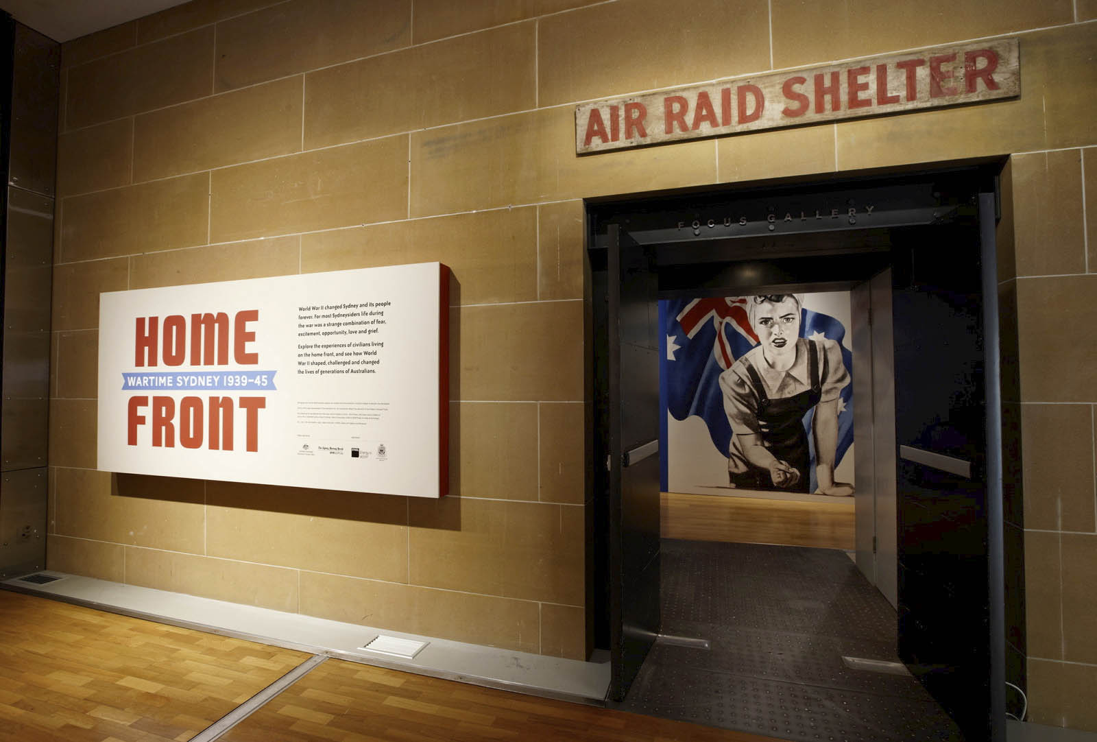
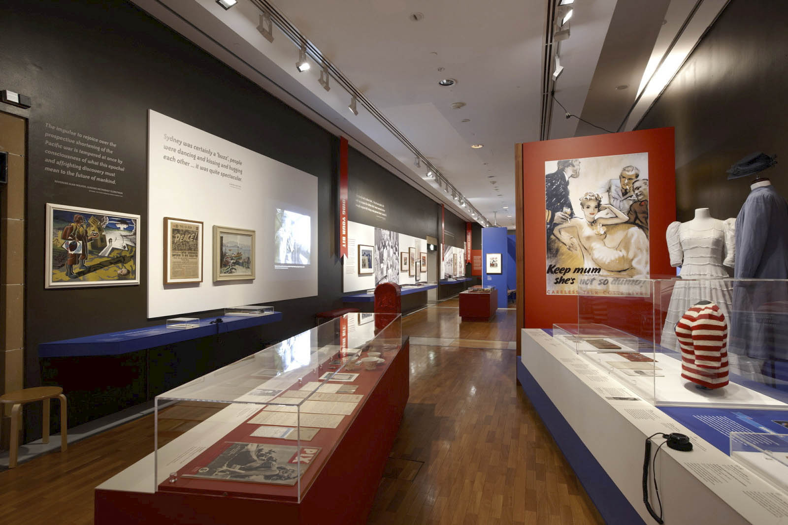
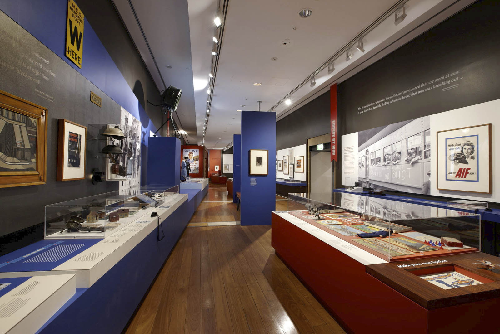


 by an anonymous photographer")


 'Jitterbugs' 1945")
 'Sydney embarkation, 13 September 1940' 1940")
 'Sydney embarkation, 13 September 1940' 1940 (detail)")
 'Gryphon, Luna Park, St Kilda' 1992-94")
 'Paul, Windsor railway station' 1992-94")
 'Night, Windsor' 1992-94")
 'The dusty city, Stillness, blossoms and mist within' 1992-94")
 'Afterlife' 1992-94")
 'The face of man, in the surface of Moon, blinks' 1992-94")
 'How will it be when you have changed' 1994")
 'Tell me your face before you were born' 1994")
 'The floater' 1992-94")
 'Keyhole, Source, Form No. 1, Fredrick White' 1993")
 'Gryphon and palms, St Kilda' 1992-94")
![Marcus Bunyan (Australian, b. 1958) 'Untitled [divinity]' 1992-94](https://artblart.com/wp-content/uploads/2012/08/metal-sculpture.jpg "Marcus Bunyan (Australian, b. 1958) 'Untitled [divinity]' 1992-94")

You must be logged in to post a comment.