Queer British Art 1861-1967 at Tate Britain examines the “historical reality of same-sex relationships and non-normative sexual identities” from 1861, the year for the end of the death penalty for sodomy in Great Britain, through to 1967 which is when sex between consenting adults in private, obviously male homosexuality is partially decriminalised in England and Wales. The timescale of the exhibition encompasses the beginning of a more considered understanding of gender and sexual identity through to the beginnings of a limited freedom: from repression to liberation.
For a man who came out in London in 1975, only 8 short years after the decriminalisation of homosexuality, this exhibition should have been more engaging than it was. While there were some outstanding art works and artefacts presented in the eight rooms of the exhibition, chronologically laid out in the posting below – such as the prison door from Oscar Wilde’s cell at Reading Gaol, Joe Orton and Kenneth Halliwell’s book covers, the paintings of Henry Scott Tuke and the photography of Angus McBean – there was little of the passion of being gay in evidence in much of the objects, or how they were presented. It all seemed so very academic, and not in a good way. Other than some stunning erotic drawings by Aubrey Beardsley, Duncan Grant and Keith Vaughan (see below) there was little to suggest that being gay had anything to do with sex, the exhibition living up to that very British of axiom’s, “No sex please, we’re British!” The curators may have thought that sex would be a distraction, for it was all ‘very Pauline’.
The exhibition is full of innuendo, supposition, obfuscation, abstinence, hints, traces, clouded desires and supposed longings – in both the art work and the wall texts which accompanied the work. Of course, this is how artists had to hide their sexuality, same-sex desires and relationships during much of this period for fear of ostracisation from society and possible prosecution, but the presentation came across as little more than “au fait”, so much matter of fact. The exhibition was not helped by illuminating texts such as this: “The exact nature of Thomas and Philpot’s relationship is unknown. Many of Philpot’s depictions of Thomas carry a homoerotic charge and some are exoticising. What Thomas felt about his years with Philpot from 1929 to the artist’s death in 1937 is unknown.” Ugh!
You might as well have said nothing, and let the art work speak for itself.
Other commentaries could have done with a more insightful enunciation of the circumstances of the particular artist, in addition to text on the specific art work. A perceptive anointing of their life would have added invaluably to the frisson of the exhibition. For example, I wanted to know why the painter Christopher Wood died at the young age of 29 as well as the specifics of his painting Nude Boy in a Bedroom (1930, below). According to Wikipedia, Wood – bisexual, addicted to opium and painting frenetically in preparation for his Wertheim exhibition in London – became psychotic and jumped under a train at Salisbury railway station. These are the things that you need to know if you are to fully appreciate the gravitas of a life and a person’s relationship to their art, don’t you think?
Further, no pictures were allowed in the gallery spaces. Whereas I could take photographs of the Rachel Whiteread exhibition at the same venue to my heart’s content (even after being confronted by a guard who said I couldn’t, who was then corrected by a colleague with no apology for his attitude to me), I had to play a Machiavellian game of cunning hide and seek with guards and attendants to get the installation photographs of this exhibition. Why was this so? It almost seemed to be a case of the gallery being ashamed of the art they were exhibiting, as though the attitudes of the past towards art that explores same-sex relationships was being replicated by the duplicity of the gallery itself: the art could be seen but not heard, hidden away in the bowls of an academic institution. I also noted that one of 19 collages that Kenneth Halliwell exhibited at the Anno Domino gallery in 1967 (see below) was purchased by the Tate in 2016. Considering “the exhibition was a failure and Halliwell’s professional frustration contributed to the breakdown of his relationship with Orton,” eventuating the murder of the playwright and his own suicide… for some of those very same works to now reside at the Tate is the ultimate irony. I doubt Halliwell would have been laughing in his grave.
The stand out works in this exhibition were by Duncan Grant and Keith Vaughan. Their work explores the strength and beauty of the male form with a vitality of purpose and harmony of composition that was succinct and illuminating for this viewer. Grant’s Bathing (1911, below) ascribes anthropomorphic qualities to distorted figures whose elongated arms, distended chests and exposed buttocks would have been shocking to the people of Belle Epoque Britain. His erotic drawings (below) were the most beautiful, sensitive and sensual art works in the whole exhibition. Vaughan’s simplification of the figuration of the male form into abstract shapes, whilst still retaining the enigma of sensuality, narrative and context, are the triumph of this inverts painting. Their patterning and displacement of time and space onto an intimate other – a copious, coital realm of existence full of feeling, information and matter – were a revelation to me.
While the exhibition enunciates a remarkable range of identities and stories, from the playful to the political and from the erotic to the domestic, it was a deflating experience. I came away thankful that I had seen the work, that the artist’s had been able to express themselves however surreptitiously, but angry that so much of the world still sees LGBTQI people as second class citizens whose art work has to be examined through the prism of sexuality, rather than on the quality of the work itself.
Dr Marcus Bunyan
PS. How you can classify Claude Cahun as a British artist I will never know: she lived on the Channel Islands for a few years, but she was the very epitome of a French artist!
“Much more fucking and they’ll be screaming hysterics in next to no time.”
Joe Orton
“For me, to use the word ‘queer’ is a liberation; it was a word that frightened me, but no longer.”
Derek Jarman
“It’s really interesting as to whether or not we should be concerned with the sexuality of an artist when we consider the merits of his artwork, because really what he does behind closed doors – or she does – has nothing to do, or shouldn’t have anything to do with the impact of the artwork as we see it. But what is important is the artist can use that material of their personal life and create a work that is almost a personal diary but visually.”
Estelle Lovatt
Featuring works from 1861-1967 relating to lesbian, gay, bisexual, trans and queer (LGBTQ) identities, the show marks the 50th anniversary of the partial decriminalisation of male homosexuality in England. Queer British Art explores how artists expressed themselves in a time when established assumptions about gender and sexuality were being questioned and transformed.
Deeply personal and intimate works are presented alongside pieces aimed at a wider public, which helped to forge a sense of community when modern terminology of ‘lesbian’, ‘gay’, ‘bisexual’ and ‘trans’ were unrecognised. Together, they reveal a remarkable range of identities and stories, from the playful to the political and from the erotic to the domestic. With paintings, drawings, personal photographs and film from artists such as John Singer Sargent, Dora Carrington, Duncan Grant and David Hockney the diversity of queer British art is celebrated as never before.
Text from the Tate Britain website
100 years of gay art history, from repression to liberation
On the 50th anniversary of the partial decriminalisation of homosexuality in England and Wales, the Tate Britain gallery is launching a major exhibition exploring Queer British Art. The new exhibition showcases 100 years of art and artists from the repression of the Victorian era through to the love and lust of 1960s Soho.
Room 1: Coded Desires
In spite of the Victorian era’s prudish reputation, there are many possible traces of transgressive desire in its art – in Frederic Leighton’s sensuous male nudes, for instance, or Evelyn De Morgan’s depictions of Jane Hales. Simeon Solomon attracted sustained criticisms of ‘unwholesomeness’ or ‘effeminacy’ – terms which suggest disapproval of alternative forms of masculinity as much as same sex desire. Yet other works which might look queer to us passed without comment.
The death penalty for sodomy was abolished in 1861 but it was still punishable with imprisonment. Sex between women was not illegal and society sometimes tolerated such relationships. Yet for most people, there seems to have been little sense that certain sexual practices or forms of gender expression reflected a core aspect of the self. Instead, this was a world of fluid possibilities.
These ambiguities offered scope for artists to produce work that was open to homoerotic interpretation. Queer subcultures developed: new scholarship on same-sex desire in Renaissance Italy and ancient Greece allowed artists to use these civilisations as reference points, while the beautiful youths in Wilhelm von Gloeden’s photographs attracted communities of collectors. As long as there was no public suggestion that artists had acted on their desires, there was much that could be explored and expressed.
Simeon Solomon (British, 1840-1905) Sappho and Erinna in a Garden at Mytilene 1864 Watercolour on paper 330 x 381mm Tate. Purchased 1980
Sappho and Erinna in a Garden at Mytilene is a touching image of female love. The piece is inspired by fragmented poems written by a woman named Sappho in the 4th century BC, in which she pleads that Aphrodite help her in her same-sex relationship. The term ‘lesbian’ derives directly from this poet, as her homeland was the Greek Island of Lesbos. Sappho’s story points to a longer history of same-sex desire. It’s perhaps for this reason that Simeon Solomon, a man who was attracted to men in defiance of the law, painted her. While a depiction of two men kissing would have been completely taboo, this is a passionate depiction of same-sex desire.
Solomon’s own sexual preferences eventually lead to his incarceration. When he was released from prison he was rejected by many of his acquaintances, struggled to find work and soon became homeless; a painful reminder of our repressive past.
Text from the Tate website
This strikingly frank image shows the ancient Greek poet Sappho in a passionate embrace with her fellow poet Erinna. Sappho is associated with the Island of Lesbos and her story gives us the word ‘lesbian’. There was a surge of interest in Sappho’s achievements and desires from the 1840s onwards. Solomon may be responding to his friend Algernon Charles Swinburne’s poem Anactoria which includes Erinna amongst Sappho’s lovers. While female same-sex desire was considered more acceptable than its male equivalent, Solomon’s depiction of Sappho’s fervent kiss and Erinna’s swooning response is unusually explicit and the image was not publicly exhibited.
Wall text from the exhibition
Simeon Solomon (British, 1840-1905) The Bride, Bridegroom and Sad Love 1865 Ink on paper Victoria and Albert Museum
This work was inspired by a passage from the Gospel of St John which tells how ‘the friend of the bridegroom… rejoices greatly at the bridegroom’s voice’. In Solomon’s drawing, the friend of the bridegroom has the wings of love but his downcast expression identifies him as ‘sad love’, forever excluded. The positioning of his and the bridegroom’s hands hints at the reason for his grief, implying that that they are former sexual partners. He is forced to look on as his lover enters a heterosexual marriage: a fate shared by many men in same-sex relationships in this period.
Wall text from the exhibition
Simeon Solomon (British, 1840-1905) Bacchus 1867 Oil paint on paper on canvas Lent by Birmingham Museums Trust on behalf of Birmingham City Council
The classical god of wine, Bacchus also embodies sexual ambiguity and gender fluidity. While grapes and vine leaves identify the god in Solomon’s painting, Bacchus’s full lips, luxuriant hair and enigmatic gaze hint at his elusive sexuality. When it was exhibited at the Royal Academy in 1867, the critic of The Art Journal thought the figure looked effeminate, commenting ‘Bacchus is a sentimentalist of rather weak constitution; he drinks mead, possibly sugar and water, certainly not wine’. Solomon’s friend, critic Walter Pater wrote a favourable essay about the painting and poet Algernon Charles Swinburne said he found in Solomon and Bacchus alike, ‘the stamp of sorrow; of perplexities unsolved and desires unsatisfied’.
Wall text from the exhibition
Simeon Solomon (British, 1840-1905) The Moon and Sleep 1894 Oil paint on canvas Tate. Presented by Miss Margery Abrahams in memory of Dr Bertram L. Abrahams and Jane Abrahams 1973
Made a few years after Solomon’s arrest and social ostracisation, this painting depicts the love of the moon goddess Selene for Endymion, who, in one version of the myth, is given eternal youth and eternal sleep by Zeus. While it ostensibly depicts a heterosexual pairing, the striking similarity of the profiles of the figures in Solomon’s painting gives them both an air of androgyny. This painting was given to Tate by a descendent of Rachel Simmons, Solomon’s first cousin, who helped to support him after his fall from public favour by regularly buying his works for small sums of money.
John Addington Symonds was a writer, critic and an early campaigner for greater tolerance of same-sex desire. This photograph probably dates from Symonds’s time at Oxford University (1858-1863). His studies informed his later essay, A Problem in Greek Ethics 1873, one of the earliest attempts at a history of male same-sex desire. Symonds frankly discussed his desires in his diaries and unpublished writings, which he believed would be ‘useful to society’. However, when his friend Edmund Gosse inherited Symonds’s papers in 1926, he burned them all apart from Symonds’s autobiography. This destruction nauseated Symonds’s granddaughter Janet Vaughan. It was not until 1984 that Symonds’s autobiography was finally published.
Wall text from the exhibition
Sidney Harold Meteyard (English, 1868-1947) Hope Comforting Love in Bondage Exhibited 1901 Oil paint on canvas Lent by Birmingham Museums Trust on behalf of Birmingham City Council
Hope is depicted as a respectably fully-clothed matron, whereas Love’s only costume is his elaborate cloth bindings and the rose briars that are delicately threaded through the feathers of his wings. The flowers and thorns of the roses hint at pleasures and pains combined. Love’s pensive expression and androgynous beauty is reminiscent of the work of Simeon Solomon and, while Hope stretches out her hand to comfort him, his gaze is fixed elsewhere, leaving the object of his affections undefined.
Frederic Leighton (British, 1830-1896) Daedalus and Icarus Exhibited 1869 Oil paint on canvas Private collection
In a story from the Roman poet Ovid’s Metamorphoses, Daedalus made wings for his son Icarus to escape from Rhodes. Icarus’s golden beauty is here contrasted with his weather-beaten father. When the work was exhibited at the Royal Academy Summer Exhibition in 1869, The Times anxiously remarked that Icarus had the air of ‘a maiden rather than a youth’ and exhibited ‘the soft rounded contour of a feminine breast’. This response may reflect increasing concern amongst educated circles about the pairings of older men and adolescent youths in books such as Plato’s Symposium, as new scholarship explored the eroticism of the original texts.
Henry Scott Tuke (English, 1858-1929) A Bathing Group 1914 Oil paint on canvas Lent by the Royal Academy of Arts, London
While Henry Scott Tuke used the professional model Nicola Lucciani for this painting, it is similar to his images of Cornish youths in its frank appreciation of the male nude. Lucciani’s torso is illuminated by a shaft of sunlight and he looks towards the second figure, who crouches as if in awe of his godlike beauty. Tuke presented the painting to the Royal Academy on his election as a member. Tuke used professional models when he first moved to Cornwall, but he soon befriended some of the local fishermen and swimmers in Falmouth who modelled for him in many paintings.
Wall text from the exhibition
Henry Scott Tuke (English, 1858-1929) The Critics 1927 Oil paint on board Courtesy of Leamington Spa Art Gallery & Museum (Warwick District Council)
Made just two years before Tuke’s death, The Critics is one of a number of works by Henry Scott Tuke depicting young men bathing off the Cornish coast. There has been much speculation about his relationships with his Cornish models although nothing has been substantiated. It is, however, not difficult to find a homoerotic undercurrent in this painting, as the two men on the shore appraise the swimming technique – and possibly the physique – of the youth in the water. Writer John Addington Symonds was a frequent visitor and he encouraged Tuke in his painting of male nudes in a natural outdoor setting.
Wall text from the exhibition
Room 2: Public Indecency
This room looks at ways in which sexuality and gender identity did – and did not – go public, from the 1880s to the 1920s. Public debate over sexuality and gender identity was stirred up by scandals, campaigns and scientific studies. The trials of Oscar Wilde in 1895 for gross indecency and Radclyffe Hall’s novel The Well of Loneliness in 1928 for supposed obscenity put a spotlight on same-sex desire. In the field of science, the project of classifying sexual practices and forms of gender presentation into distinct identities, which had been begun by German psychiatrists such as Richard von Krafft-Ebing, reached Britain through the work of Havelock Ellis who co-authored his book Sexual Inversion 1896 with John Addington Symonds. However, change was slow, and many people remained unaware of new terminologies and approaches to the self that this new science offered.
Henry Bishop (British, 1868-1939) Henry Havelock Ellis 1890s Oil paint on canvas National Portrait Gallery, London. Bequeathed by François Lafitte, 2003
The sexologist Henry Havelock Ellis’s great work Sexual Inversion, co-authored with John Addington Symonds, defined queer sexualities in Britain for a generation. Published in English in 1897, it drew on the experiences of people such as Edward Carpenter (whose portrait hangs nearby). It was effectively banned in Britain after the prosecution of a bookseller, George Bedborough. This informal portrait was probably made around the time of Bedborough’s trial. It depicts Ellis sitting in a deckchair in Henry Bishop’s studio in St Ives. There is some evidence Bishop was attracted to men and Ellis’s non-judgemental attitudes may have encouraged Bishop to make his acquaintance. He became a lifelong friend.
Wall text from the exhibition
Edmund Dulac (British born France, 1882-1953) Charles Ricketts and Charles Shannon as Medieval Saints 1920 Tempera on linen over board The Syndics of the Fitzwilliam Museum, University of Cambridge
Oscar Wilde described the home of the artist and designer Charles Ricketts and his lifelong partner the painter Charles Shannon as ‘the one house in London where you will never be bored’. Here, the couple are playfully depicted by their friend Edmund Dulac in the robes of Dominican friars. These robes possibly hint at the permanence of their bond: monastic vows were, after all, intended to mark entry for life into an all-male community. The peacock feather in Rickett’s hand signals their devotion to aestheticism, an art movement dedicated to beauty and ‘art for art’s sake’. By the 1920s, this was an emblem of a previous era.
Born ‘Marguerite’ Radclyffe Hall and known as ‘John’ to close friends, Radclyffe Hall was a key figure in provoking debate on female same-sex desire. This portrait was made ten years before Hall found fame as the author of The Well of Loneliness 1928. Despite the pleas of literary figures, including Virginia Woolf, this novel was effectively banned on the grounds of obscenity for its frank depiction of female same-sex desire. It was semi-autobiographical and was influenced by Havelock Ellis’s Sexual Inversion. Hall’s sober jacket, skirt, cravat and monocle in this image reflected contemporary female fashions for a more masculine style of dress. After the trial, Hall’s clothes and cropped hair became associated with lesbianism and this portrait has become a queer icon. It was given to the National Portrait Gallery by Hall’s lover, Una Troubridge.
This is the door of Oscar Wilde’s prison cell at Reading Gaol. Wilde spent three months of his incarceration writing a tortured letter to his lover Lord Alfred Douglas. This was later published as De Profundis (‘from the depths’). Wilde was not allowed to send the letter, although the manuscript was given back to him when he left prison. He told his friend Robert Ross, ‘I know that on the day of my release I will merely be moving from one prison into another, and there are times when the whole world seems to be no larger than my cell, and as full of terror for me’.
The American artist Harper Pennington gave this portrait to Wilde and his wife Constance as a wedding present in 1884. It captures Wilde as a young man aged 27, on the cusp of success and it hung in Wilde’s home in Tite Street, Chelsea, London. While awaiting trial, Wilde was declared bankrupt and all his possessions, including this portrait, were sold at public auction to pay his debts. Few objects from his extensive collection have been traced. This painting was bought by Wilde’s friend Ada Leverson and it was kept in storage. Wilde told a friend that Ada’s husband ‘could not have it in his drawing-room as it was obviously, on account of its subject, demoralising to young men, and possibly to young women of advanced views’.
Wall text from the exhibition
Aubrey Beardsley (English, 1872-1898) Enter Herodias from ‘Salome’ by Oscar Wilde 1890s Photo-process print on paper Victoria and Albert Museum
Here Herodias, Salome’s mother makes a dramatic entrance, bare-breasted and positioned at the centre of the composition. The grotesque figure on the left plucks at her cloak, his robe barely concealing his giant phallus, while the slender page appears notably unmoved. They seem to epitomise two forms of masculinity: the grotesquely heterosexual and the elegantly ambiguous. Oscar Wilde is satirised as the showman-like jester in the foreground.
Wall text from the exhibition
Cecil Beaton (British, 1904-1980) Cecil Beaton and his Friends 1927 Photograph, bromide print on paper National Portrait Gallery, London. Accepted in lieu of tax by H.M. Government and allocated to the Gallery, 1991
This photograph was taken at Wilsford Manor in Wiltshire, Stephen Tennant’s childhood home. The party depicted here includes Tennant, artist Rex Whistler, society hostess Zita Jungman and Beaton himself, although their elaborate fancy dress and make-up makes it hard to tell them apart. The poet Siegfried Sassoon, Tennant’s lover at this time, wrote in his diary, ‘It was very amusing, and they were painted up to the eyes, but I didn’t quite like it’.
Wall text from the exhibition
Room 3: Theatrical Types
The use of ‘theatrical’ as a euphemism for queer hints at the rich culture on the late nineteenth and early twentieth century stage. The extent to which audiences were aware of this varied. Music hall male and female ‘impersonation acts’ were wildly popular but were mostly seen as innocent ‘family fun’. In the formal theatre, plays for public production had to be passed by the Lord Chamberlain’s office. While some directors found ways to avoid censorship, there were few positive and explicit depictions of queer lives and experience. Many celebrities who were in same-sex relationships understandably tried to keep their lives from public view, although their desires were often open secrets. Nevertheless, whether as the subject of a moralistic ‘problem’ play or an innuendo in a saucy song, queer perspectives could find public expression on the stage.
Unknown photographer, published by The Philco Publishing Company Hetty King (Winifred Ems) 1910s National Portrait Gallery
Angus McBean (Welsh, 1904-1990)
Angus McBean’s career was forged in the theatre. Success came in 1936 with his photographs of Max Beerbohm’s The Happy Hypocrite 1896, starring Ivor Novello. In a break with convention, McBean’s close-up images were well lit with studio lights and staged as intimate tableaux. Inspired by the International Surrealist exhibitions of 1936 and 1937, he began to make playful ‘surrealised portraits’, which were initially published in The Sketch. These used complex props and staging to create fantastical scenes and to give the illusion of distorted scale.
The images here all depict sitters who were in same-sex relationships. McBean’s own relationships with men led to a police raid on his house and his arrest in 1942 for criminal acts of homosexuality. He was convicted and sentenced to four years in jail but was released in 1944 and quickly reestablished his reputation as a photographer.
McBean’s portrait of Robert Helpmann, published in The Tatler and Bystander on 28 April 1948, shows him in the role of Hamlet, which he was then playing at Stratford-upon-Avon. The production was designed to be Victorian gothic: an Elsinore of guttering candles and chiaroscuro lighting effects. There is perhaps some suggestion of this in the heavy shadows of McBean’s photograph, while Helpmann’s dramatic make-up emphasises his melancholic expression. The backdrop was created from a blown-up photograph of text from the First Folio of the play. In defiance of the law, Helpmann lived comparatively openly with his partner, the theatre director Michael Benthall. Their relationship lasted from 1938 until Benthall’s death, in 1974.
Wall text from the exhibition
Angus McBean (Welsh, 1904-1990) Danny La Rue 1968 Photograph, bromide print on paper National Portrait Gallery, London
Born Danny Carroll, Danny La Rue was one of the greatest stars in female impersonation. La Rue first performed while in the navy during the Second World War and later toured with all male revues such as Forces in Petticoats before becoming a cabaret star. La Rue’s glamorous appearance on stage, captured here, was undercut by the gruff ‘wotcher mates’, with which he opened his set. La Rue preferred the term ‘comic in a frock’ to ‘female impersonator’ and described his act as ‘playing a woman knowing that everyone knows it’s a fella’.
Wall text from the exhibition
Glyn Warren Philpot (British, 1884-1937) Glen Byam Shaw as ‘Laertes’ 1934-1935 Oil paint on canvas Kindly lent by the sitter’s grandson, Charles Hart
The actor Glen Byam Shaw is depicted here as Laertes in John Gielgud’s 1934 critically acclaimed production of Hamlet in a costume designed by Motley: Elizabeth Montgomery, Margaret Percy and Sophie Harris. Glyn Philpot cut down the original three-quarter length portrait after it was exhibited at the Royal Academy in 1935. This reduction puts even greater focus on Byam Shaw’s face and heavy stage make-up. While the image is typical of productions of the period, the medium of the portrait removes it from its original theatrical context. Coupled with Byam Shaw’s arch expression, the overriding impression is one of high camp. Byam Shaw had almost certainly been the lover of the poet Siegfried Sassoon (1886-1967) and may have met Philpot through Sassoon.
Wall text from the exhibition
Francis Goodman (English, 1913-1989) Oliver Messel 1945 Photograph, silver gelatin print on paper National Portrait Gallery, London Bequeathed by the estate of Francis Goodman, 1989
Francis Goodman’s carefully posed photograph depicts Oliver Messel, the foremost British stage designer from the 1920s to the 1950s, surrounded by eclectic props. The producer Charles Cochran recalled how Messel ‘would pull something new out of his pocket – usually something used for domestic work – which he proposed to employ to give the illusion of some other fabric’. Messel was attracted to men and his fascination with dandyish excess, pastiche and artifice has been interpreted as a queer aesthetic.
Wall text from the exhibition
Paul Tanqueray (English, 1905-1991) Douglas Byng 1934 Photograph, bromide print on paper National Portrait Gallery. Given by Paul Tanqueray, 1974
Gay performer Douglas Byng gained the title ‘The Highest Priest of Camp’ with songs such as ‘Doris the Goddess of Wind’, ‘I’m a Mummy (An Old Egyptian Queen)’ and ‘Cabaret Boys’, which he performed with Lance Lester. Coward described him as ‘The most refined vulgarity in London, mais quel artiste!’ Byng’s costume in Paul Tanqueray’s photograph was probably the one he wore for his song ‘Wintertime’.
Wall text from the exhibition
Room 4: Bloomsbury and Beyond
The Bloomsbury Group of artists and writers famously ‘lived in squares and loved in triangles’. Dora Carrington had relationships with men and women but loved and was loved by Lytton Strachey, who was attracted to men. Duncan Grant and Vanessa Bell lived together in Charleston Farmhouse in East Sussex. A chosen few of Duncan Grant’s male lovers made visits but Paul Roche was forced to camp on the South Downs as he did not meet with Bell’s approval. Bell’s husband Clive lived apart from her but they remained happily married. While sexual intimacy was valued by the Group, it was not the most important bond tying the members together. Their network was a profoundly queer experiment in modern living founded on radical honesty and mutual support.
Bloomsbury’s matter-of-fact acceptance of same-sex desire was unusual but not unique. The objects in this room show a variety of different perspectives, from the quiet homeliness of Ethel Sands’s Tea with Sickert, to Gluck’s defiant self-portrait. Together, they reveal a generation of artists and sitters exploring, confronting and coming to terms with themselves and their desires.
Ethel Walker (Scottish, 1861-1951) Decoration: The Excursion of Nausicaa 1920 Oil paint on canvas
The composition of this painting reveals Ethel Walker’s fascination with Greco-Roman friezes, as well as the artistic possibilities of the female nude. The painting is inspired by Book IV of Homer’s Odyssey, in which the princess Nausicaa bathes with her maidens. In 1900, Walker became the first woman member of the New English Arts Club, whose select committee reacted to this painting with ‘spontaneous and enthusiastic applause’. There has been some speculation about the nature of Walker’s relationship with painter Clara Christian, with whom she lived and worked in the 1880s, although little evidence survives. This image offers a utopian vision of an all-female community.
Bathing was conceived as part of a decorative scheme for the dining room at Borough Polytechnic, and it was Duncan Grant’s first painting to receive widespread public attention. Grant’s design takes inspiration from summers spent around the Serpentine in Hyde Park, which was one of a number of sites associated with London’s queer culture. The painting celebrates the strength and beauty of the male form, and its homoerotic implications were not lost on Grant’s contemporaries: the National Review described the dining room as a ‘nightmare’ which would have a ‘degenerative’ effect on the polytechnic’s working-class students.
This painting shows a scene filled with homoerotic possibilities. The setting is possibly Charleston Farmhouse in East Sussex, where Duncan Grant lived with Vanessa Bell, her children and his lover David (Bunny) Garnett. Grant’s use of dots of colour shows the influences of the pointillist technique pioneered by Georges Seurat. The nude figure in the foreground basks in the sun while the seated figures behind him exchange appreciative glances. Swimming ponds often served as cruising grounds and it is perhaps unsurprising that this work was not exhibited in Grant’s lifetime.
This painting depicts Duncan Grant’s close friend and possible lover Paul Roche, lying as if asleep. He is depicted against a patterned background reminiscent of colours and fabrics produced by the Omega Workshop, the design collective founded in 1913 by Roger Fry. These soft textures contrast with Roche’s bare torso, which is further emphasised by his briefs, socks and open shirt. Grant and Roche met by chance in July 1946: after making eye contact crossing the road at Piccadilly Circus, the two struck up a conversation. Their friendship lasted until Grant’s death in 1978.
Wall text from the exhibition
Duncan Grant (British, 1885-1978)
Duncan Grant produced erotic works on paper prolifically throughout his life. These objects were created in private and for personal consumption only. Racially diverse figures are presented in various states of sexual play, and Grant’s range of representation moves from explicit passion to tender post-coital repose. Overlapping bodies are depicted in impossible contortions, and the works reveal Grant’s fascination with the artistic possibilities of the male form as well as the importance of harmonious composition. The objects also demonstrate a characteristically witty approach to sexuality, with some copulating figures playfully masquerading as ballet dancers and wrestlers. As his daughter Angelica Garnett recalled, one of Grant’s favourite maxims was to ‘never be ashamed’, and his private erotica offers an unapologetic celebration of gay male sex and love.
Ethel Sands (English born America, 1873-1962) Tea with Sickert c. 1911-1912 Oil paint on canvas Tate. Bequeathed by Colonel Christopher Sands 2000, accessioned 2001
The scene of this painting is the sitting room Nan Hudson and Sands’s home. Although it features two figures – the artist Walter Sickert and Hudson – the table is set for afternoon tea for three. The composition of the painting is arranged as if the artist was standing behind Nan, and this perspective highlights their position as a couple. In 1912, the work was exhibited as part of Sands and Hudson’s joint exhibition at the Carfax Gallery and it drew mixed reactions: Westminster Gazette called it ‘a daring picture’ but ‘a somewhat overwhelming indulgence in pure orange vermilion’.
Wall text from the exhibition
Clare Atwood (British, 1866-1962) John Gielgud’s Room 1933 Oil paint on canvas Tate. Presented by Mrs E.L. Shute 1937
This picture was painted in Sir John Gielgud’s flat at the time he was playing Richard II in Gordon Daviot’s Richard of Bordeaux at the New Theatre. Rather than emphasising his life in the public eye, this work draws attention to Gieglud’s domestic life. In this way, Clare ‘Tony’ Atwood gently subverts traditional associations of the feminine with private space. Atwood lived in a menage a trois with Gielgud’s second-cousin, Edith (Edy) Craig and the feminist playwright Christopher St John, who had previously lived together as an openly lesbian couple. St John later stated that ‘the bond between Edy and me was strengthened not weakened by Tony’s association with us’.
Gluck (Hannah Gluckstein) (British, 1895-1978) Self-Portrait 1942 Oil paint on canvas National Portrait Gallery, London Given by the sitter and artist, ‘Gluck’ (Hannah Gluckstein), 1973
Gluck locks gazes with the viewer in this unflinching self-portrait. Born Hannah Gluckstein, Gluck requested that the name Gluck be reproduced with ‘no prefix, suffix or quotes’. Gluck exhibited to great acclaim at the ‘The Gluck Room’ of The Fine Art Society, where visitors included Queen Mary. This painting was painted in 1942, in a difficult period in Gluck’s relationship with Nesta Obermer, Gluck’s ‘darling wife’. Obermer was frequently away, sometimes with her husband Seymour Obermer. In 1944, their relationship broke down and Gluck went to live with Edith Shackleton Herald. Their relationship lasted until Gluck’s death.
Wall text from the exhibition
Gluck (Hannah Gluckstein) (British, 1895-1978) Lilac and Guelder Rose 1932-1937 Oil paint on canvas Manchester Art Gallery
This was one of a number of flower paintings that Gluck made during and immediately after her relationship with society florist and author Constance Spry, who she met in 1932. Spry was a leading figure in cultivating a fashion for white flowers, and often used Gluck’s paintings to illustrate her articles. Many of Spry’s customers also commissioned flower paintings from Gluck. When Lilac and Guelder Rose was exhibited at Gluck’s 1937 exhibition at the Fine Art Society, it was much admired by Lord Villiers, who remarked ‘It’s gorgeous, I feel I could bury my face in it’.
Henry Thomas was Glyn Philpot’s servant and one of his favourite models. The high-cheekboned angularity of Thomas’s face is echoed in the diagonal lines of the abstracted background, perhaps an allusion to the batik fabric behind. The exact nature of Thomas and Philpot’s relationship is unknown. Many of Philpot’s depictions of Thomas carry a homoerotic charge and some are exoticising. What Thomas felt about his years with Philpot from 1929 to the artist’s death in 1937 is unknown. The words he wrote on Philpot’s funeral wreath, ‘For memory to my dear master as well as my father and brother to me’, hints at the imbalance between them, while also suggesting many complex layers of relationship.
Patrick Nelson emigrated from Jamaica to North Wales in 1937, before settling in London to study law the following year. While living in Bloomsbury, Nelson worked as an artists’ model and soon became acquainted with Edward Wolfe. Nelson would also meet other prominent gay artists at this time, including his sometime boyfriend and lifelong friend Duncan Grant. Wolfe’s depiction of Nelson against the rich green background is exoticising and his pose invites the viewer to admire his body. Such objectification was typical of many depictions of black men from this time and reflects an uneven power dynamic, although Nelson’s friendship with members of the Bloomsbury group adds a level of complexity to the relationship between artist and sitter.
Glyn Philpot developed a strong reputation as a society portraitist until the 1930s, at which point he began to explore modernist forms, as well as express his sexuality more openly. This work depicts Philpot’s friend Jan Erland, who was the subject of a series of paintings by Philpot on the theme of sports and leisure. Erland is depicted cradling a gun which, he recalled, had been specifically borrowed for the occasion. Erland’s firm grip on the gun’s phallic barrel seems suggestive. Writing to his sister Daisy, Philpot described ‘every moment with this dear Jan’ as filled with ‘inspiration and beauty’.
Wall text from the exhibition
Glyn Warren Philpot (British, 1884-1937) Man with a Gun 1933 Oil paint on canvas The Ashmolean Museum, Oxford. Bequeathed by Jeffrey Daniels, 1986
Tate Britain today opens the first exhibition dedicated to queer British art. Unveiling material that relates to lesbian, gay, bisexual, trans and queer (LGBTQ+) identities, the show marks the 50th anniversary of the partial decriminalisation of male homosexuality in England and Wales. It presents work from the abolition of the death penalty for sodomy in 1861 to the passing of the Sexual Offences Act in 1967 – a time of seismic shifts in gender and sexuality that found expression in the arts as artists and viewers explored their desires, experiences and sense of self.
Spanning the playful to the political, the explicit to the domestic, Queer British Art 1861-1967 showcases the rich diversity of queer visual art and its role in society. Themes explored in the exhibition include coded desires amongst the Pre-Raphaelites, representations of and by women who defied convention (including Virginia Woolf), and love and lust in sixties Soho. It features works by major artists such as Francis Bacon, Keith Vaughan, Evelyn de Morgan, Gluck, Glyn Philpot, Claude Cahun and Cecil Beaton alongside queer ephemera, personal photographs, film and magazines.
Work from 1861 to 1967 by artists with diverse sexualities and gender identities is showcased, ranging from covert images of same-sex desire such as Simeon Solomon’s Sappho and Erinna in a Garden at Mytilene 1864 through to the open appreciation of queer culture in David Hockney’s Going to be a Queen for Tonight 1960. A highlight of the exhibition is a section focusing on the Bloomsbury set and their contemporaries – an artistic group famous for their bohemian attitude towards sexuality. The room includes intimate paintings of lovers, scenes of the homes artists shared with their partners and large commissions by artists such as Duncan Grant and Ethel Walker.
Many of the works on display were produced in a time when the terms ‘lesbian’, ‘gay’, ‘bisexual’ and ‘trans’ had little public recognition. The exhibition illustrates the ways in which sexuality became publicly defined through the work of sexologists such as Henry Havelock Ellis and campaigners such as Edward Carpenter. It also looks at the high profile trials of Oscar Wilde and Radclyffe Hall. Objects on display include the door from Wilde’s prison cell, Charles Buchel’s portrait of Radclyffe Hall and erotic drawings by Aubrey Beardsley.
In contrast to the bleak outlook from the courtroom prior to 1967, queer culture was embraced by the British public in the form of theatre. From music hall acts to costume design, the theatre provided a forum in which sexuality and gender expression could be openly explored. Striking examples on display include photographs of performers such as Beatrix Lehmann, Berto Pasuka and Robert Helpmann by Angus McBean, who was jailed for his sexuality in 1942, alongside stage designs by Oliver Messel and Edward Burra. Theatrical cards of music hall performers such as Vesta Tilley (whose act as ‘Burlington Bertie’ had a large lesbian following) are featured, as well as a pink wig worn in Jimmy Slater’s act ‘A Perfect Lady’ from the 1920s.
Queer British Art 1861-1967 shows how artists and audiences challenged the established views of sexuality and gender identity between two legal landmarks. Some of the works in the show were intensely personal while others spoke to a wider public, helping to forge a sense of community. Alongside the exhibition is a room showing six films co-commissioned by Tate and Channel 4 Random Acts. Created in response to Queer British Art 1861-1967 and featuring figures in the LGBTQ+ community, including Sir Ian McKellen and Shon Faye, they present personal stories prompted by the themes in the show, and invite visitors to relate their own experiences.
Queer British Art 1861-1967 is curated by Clare Barlow, Assistant Curator, Tate Britain with Amy Concannon, Assistant Curator, Tate Britain. The exhibition is accompanied by a fully illustrated catalogue from Tate Publishing and a programme of talks and events in the gallery.
Press release from Tate Britain
Why is the word ‘queer’ used in the exhibition title?
Queer has a mixed history – from the 19th century onwards it has been used both as a term of abuse and as a term by LGBT people to refer to themselves. Our inspiration for using it came from Derek Jarman who said that it used to frighten him but now ‘for me to use the word queer is a liberation’. More recently, of course, it has become reclaimed as a fluid term for people of different sexualities and gender identities. Historians of sexuality have also argued that it is preferable to other terms for sexualities in the past as these often don’t map onto modern sexual identities. In addition to carrying out audience research, we took advice from Stonewall and other LGBT charities and held focus groups with LGBT people. The advice from all of these sources was overwhelmingly that we should use it. While we tried other titles, no other option captured the full diversity of sexualities and gender identities that are represented in the show.
Text provided by Clare Barlow, curator of Queer British Art.
Alvaro Guevara (Chilean, 1894-1951) Dame Edith Sitwell 1916 Oil paint on canvas Tate. Presented by Lord Duveen, Walter Taylor and George Eumorfopoulos through the Art Fund 1920
The poet Edith Sitwell does not seem to have had sexual relationships but was viciously satirised by the artist and writer Wyndham Lewis as a lesbian. Sitwell described the life of the artist as ‘very Pauline’, referring to the letters of St Paul, which may suggest she thought sex would be a distraction. She was close friends with Alvaro Guevara, the artist of this portrait, who had relationships with men and women. Diana Holman Hunt in her 1974 biography of Guevara suggested that Sitwell and Guevara shared a love that was ‘not physical but certainly romantic and spiritual.’ The bright colours reflect the designs of Roger Fry and Vanessa Bell’s Omega Workshops and Sitwell is sitting on a dining chair designed by Fry.
Wall text from the exhibition
Room 5: Defying Conventions
This room shows how artists and writers in the late nineteenth and early twentieth century challenged gender norms. Some, such as Laura Knight, laid claim to traditionally masculine sources of artistic authority by depicting themselves in the act of painting nude female models. Others, such as Vita Sackville-West, had open marriages and same-sex relationships, or, like Claude Cahun, questioned the very concept of gender binaries. This was a period of radical social change. Women took on new roles during the First and Second World Wars, and gained the vote in 1918. Sackville-West worked with the Land Girls. Cahun resisted the Nazis on Jersey and was sentenced to death, imprisoned for a year and only freed by the end of the war. New fashions developed. For women, wearing trousers in public became stylishly avant-garde. Expectations were changing. Public discussion about female same-sex desire offered ways of viewing the self, but it also brought problems. Lives that had previously passed without comment might now be labelled transgressive. But for some, this was a time of liberating possibilities.
William Strang (Scottish, 1859-1921) Lady with a Red Hat 1918 Oil paint on canvas Lent by Glasgow Life (Glasgow Museums) on behalf of Glasgow City Council Purchased 1919
This portrait is of writer Vita Sackville-West. According to her son, Nigel Nicolson, she attended sittings with her lover Violet Trefusis. Sackville-West adopted a male persona, ‘Julian’, at some points in this relationship, allowing her and Trefusis to pose as a married couple so they could stay together at a boarding-house. Her fashionable dress in this image, however, gives no sign of such androgynous role-playing. The book in Sackville-West’s hand may refer to her book Poems of East and West 1917. At the time this was painted she was writing Challenge, a novel about her relationship with Trefusis, but this was not published until 1974.
Wall text from the exhibition
Laura Knight (English, 1877-1970) Self-portrait 1913 Oil paint on canvas National Portrait Gallery, London
When this painting was exhibited at the Grosvenor Gallery in 1913, the reviewer Claude Phillips wrote ‘it repels, not by any special inconvenience – for it is harmless enough and with an element of sensuous attraction – but by dullness and something dangerously close to vulgarity’. His strong reaction hints at anxieties over women painting the female nude, which subverted the hierarchy of male artist and female model. When Laura Knight was at art school women were not been allowed to attend life classes. Her sensuous depiction of herself painting Ella Naper, a friend, lays claim to a professional artistic identity. In 1936, Knight was the first woman to become an Academician since its foundation.
Wall text from the exhibition
Dorothy Johnstone (Scottish, 1892-1980) Rest Time in the Life Class 1923 Oil paint on canvas City Art Centre, City of Edinburgh Museums and Galleries
This image depicts the life-class Johnstone taught for women at Edinburgh College of Art, which Johnstone presents as a space of friendship and collaboration. In the foreground, one woman comments on another’s drawing while in the background, Johnstone depicts herself gesturing towards the canvas. Johnstone had an intense relationship with Cecile Walton and Walton’s husband Eric Robertson, who were also part of the Edinburgh Group of artists. She later married fellow artist David Macbeth Sutherland.
Wall text from the exhibition
Claude Cahun (French, 1894-1954) Untitled 1936 2 photographs, gelatin silver print on paper
These images (to the left and right of I Extend My Arms), from a larger group of photographs, hint at different narrative possibilities for the sexless manikin. In one, the doll seems to take on a feminine air, posed as if delighting in the long hair that trails round its body. The other is less overtly gendered, wearing a hat made from an upright feather and holding aloft a tiny plant. The porcelain dolls’ heads outside the jar in one image are reminiscent of the masks that repeated occur in Cahun’s work and these images seem to hint at the themes of role-playing that Cahun explored in earlier self-portraits.
Wall text from the exhibition
Room 6: Arcadia and Soho
London was a magnet for queer artists. In the 1950s and 1960s, Soho was the epicentre of queer culture, described by Francis Bacon as ‘the sexual gymnasium of the city’. Many of the artists shown in this room were friends, often living in London, sometimes sharing studios. Several were encouraged by the patron and collector Peter Watson, founder of the influential literary magazine Horizon and co-founder of the Institute of Contemporary Arts. Their work was often inspired by travel: to the Mediterranean, to costal Brittany, or to the seedy American bars that inspired works such as Edward Burra’s Izzy Orts.
John Craxton, John Minton and Keith Vaughan have been described as ‘neo-romantics’. Craxton, however, preferred the term ‘Arcadian’, referencing a classical utopian vision of a harmonious wilderness, populated by innocent shepherds. Yet, while it is idealised, depictions of Arcadia still sometimes include references to death and its peace can be disrupted by undercurrents of desire.
Christopher Wood (English, 1901-1930) Nude Boy in a Bedroom 1930 Oil paint on hardboard laid on plywood Scottish National Gallery of Modern Art, Edinburgh
Christopher Wood’s Nude Boy in a Bedroom depicts the artist’s friend and sometime lover Francis Rose, in a hotel room in Brittany where they stayed with a group of friends in 1930. The group was later joined by Wood’s mistress, Frosca Munster. According to Rose, the work ‘is a nude painting of me washing at a basin’ in which Wood ‘scattered playing cards on the bed’. The cards are tarot cards and the top card shows the Page of Cups reversed, symbolising anxiety about a deception that will be soon discovered, or referring to someone incapable of making commitments. Wood may have included these cards as an oblique reference to his ongoing relationships with his male lover and female mistress.
Edward Burra based Soldiers at Rye on sketches of troops around his home town of Rye between September and October 1940. His macabre sensibility was informed by his experiences in the Spanish Civil War. In the final stages of painting, he added red and yellow Venetian carnival masks, giving the figures the air of predatory birds – a regular symbol in Burra’s work from the 1930s. Seen from behind, the soldiers’ close-fitting uniforms and bulbous physiques led one critic to comment that they had the ‘bulging husky leathery shape’ of ‘military ruffians’. There is an ominous atmosphere to the painting, conveying a dangerous homoeroticism.
The sitter in this portrait was on national service in the Greek Navy when he first met John Craxton in a taverna in Poros. He caught Craxton’s eye with his performance of the Greek dance the zeibékiko, with ‘splendidly controlled steps, clicking his thumbs and forefingers and circling round and round in his white uniform like a seagull’. Craxton followed him to Crete in 1947, where the sailor was now working as a butcher in Herákleion. The island was a revelation and Craxton returned often, eventually partly settling there in 1960.
Robert Medley (English, 1905-1994) Summer Eclogue No. 1: Cyclists 1950 Oil paint on canvas Tate. Purchased 1992
Exhibited at the Hanover Gallery in February 1950, Robert Medley’s painting of racing cyclists on a summer’s evening in a Gravesend public park underscores his attraction to cross-class sociability. The river esplanade offers a permissible space for observing the muscular bodies and taut limbs of the youths and their admirers. The title refers to Virgil’s Eclogues, in which pastoral tranquillity is disrupted by erotic forces and revolutionary change. Medley wrote in his autobiography that the eclogue theme provided for ‘a more contemporary subject matter’. One of the cyclists was modelled on fellow artist Keith Vaughan’s lover, Ramsay McClure.
Keith Vaughan (British, 1912-1977) Kouros 1960 Oil paint on canvas Private collection
In a diary entry for 1956, Keith Vaughan wrote of ‘A silver bromide image of Johnny standing naked in my studio, aloof, slightly tense, withdrawn like a Greek Kouros, gazing apprehensively at himself in the mirror, lithe, beautiful… it lies tormenting me on my table’. This was a photograph of Vaughan’s lover Johnny Walsh who is also represented in this painting. A ‘Kouros’ was a free-standing ancient Greek sculpture of a male youth and the image may also have been inspired by a visit Vaughan made to Greece in 1960.
Three Figures is typical of Keith Vaughan’s approach to group figure painting. The subjects are depicted in indeterminate locations and the lack of details a makes it to impossible to identify them or guess at their social class or profession. The close proximity of the figures in this image and the contrast between the nudity of the man with his back towards us and the other two men might suggest that this is an erotic encounter. Yet the composition remains intentionally enigmatic.
Wall text from the exhibition
Keith Vaughan (British, 1912-1977) Bather: August 4th 1961 1961 Oil paint on canvas Tate. Purchased 1962
Keith Vaughan wrote in his journal, ‘The continual use of the male figure…retains always the stain of a homosexual conception… “K.V. paints nude young men”. Perfectly true, but I feel I must hide my head in shame. Inescapable, I suppose – social guilt of the invert’. He wrestled with the competing impulses of figuration and abstraction in his work, describing how: ‘I wanted to go beyond the specific, identifiable image – yet I did not want to do an “abstract” painting. Bather: August 4th 1961 was the first break through. Every attempt up to then had finally resolved itself into another figure painting or an “abstract”.’
Wall text from the exhibition
Keith Vaughan (British, 1912-1977)
In contrast over his concerns whether his desires would be shown in his paintings, Keith Vaughan’s private drawings are explicitly erotic. Across them he depicts a range of different encounters, from sadomasochistic fantasies through to moments of tender intimacy. This is perhaps a hint of these fluctuating desires in his descriptions of relationship with his lover Jonny Walsh, of which Vaughan said, ‘I can move from tenderness to sadism in the same harmonic key’.
This room explores the contradictions of queer life in the 1950s and 1960s. Before the partial decriminalisation of sex between men in 1967, the boundaries between public and private were acutely important to couples in same-sex relationships. Joe Orton and Kenneth Halliwell had separate beds in their tiny flat to maintain the pretence that they weren’t a couple. Such caution was justified. Peter Wildeblood, Lord Montagu of Beaulieu and Michael Pitt-Rivers were sent to jail in a case that became a rallying point for calls to change the law, which was increasingly attacked as a ‘blackmailer’s charter’. Lesbianism was not illegal, but women faced prejudice. Avant-garde photographer Barbara Ker-Seymer was thrown out of her room after she left a copy of Radclyffe Hall’s banned book The Well of Loneliness out in plain sight.
Yet despite the threat of exposure, couples lived happily together, community flourished, and a few even became queer celebrities.
Stephen Tennant (British, 1906-1986) Lascar, a story of the Maritime Boulevard Nd Ink, watercolour and collage on paper The Viktor Wynd Museum of Curiosities, Fine Art & Natural History, London
In this illustration for Stephen Tennant’s novel Lascar a riotous collage of burly sailors, bright flowers, letters and visiting cards seem to burst forth from the page. Some of Tennant’s initial sketches of sailors were made on visits to the Old Port of Marseilles in the 1930s, but he constantly reworked the illustrations and text, never completing it. In the last two decades of his life, visitors to Wilsford Manor in Wiltshire where Tennant lived in virtual seclusion, found pages of the novel strewn across the decaying interiors.
Wall text from the exhibition
Because We’re Queers
Between 1959 and 1962, couple Joe Orton and Kenneth Halliwell borrowed and stole books from libraries around Islington. They cut out some of the illustrations, which they used to paper the walls of their flat and to create new collaged covers for the books. They then returned the volumes to the shelves of the libraries and waited to watch reactions.
The covers they created are full of jokes and references to queer culture. The addition of wrestling men turns Queen’s Favourite into an innuendo. Acting family the Lunts become kitsch glass figurines, while The Secret of Chimneys is depicted as a pair of giant cats. Others were more explicit: The World of Paul Slickey gains not only a phallic budgerigar but also a cut out shape of an erect penis. The plays of Emlyn Williams are retitled Knickers must fall and Fucked by Monty.
Orton and Halliwell were eventually caught and jailed for six months for ‘malicious damage’, which Orton claimed was ‘because we’re queers’. Prison destroyed Halliwell. While Orton became a successful playwright, Halliwell became an alcoholic. In 1967, he killed Orton and took his own life. Yet while their lives ended in tragedy, the book covers give insight into a playful and subversive relationship.
Joe Orton (British, 1933-1967) and Kenneth Halliwell (British, 1951-1967) The Secret Chimneys by Agatha Christie Islington Local History Centre
Joe Orton (British, 1933-1967) and Kenneth Halliwell (British, 1951-1967) Queen’s Favourite Islington Local History Centre
Interior of the flat at 25 Noel Rd showing the extent of the collages Image courtesy of Islington Council
This is one of 19 collages that Halliwell exhibited at the Anno Domino gallery in 1967. Unlike the earlier book-covers, these were made by Halliwell alone, yet they are similarly kaleidoscopic in their use of images. An archeological artefact here sits alongside fashion photography, sea-shells, insects and words from newspapers and magazines. Some of these juxtapositions are playful: ‘Eye’ appears where an eye would be. Others are more obscure and the phrases ‘Blackmail’ and ‘dirty word’ perhaps hint at oppression. The exhibition was a failure and Halliwell’s professional frustration contributed to the breakdown of his relationship with Orton, who was now established as a playwright.
Wall text from the exhibition
George Elam Joe Orton in Islington, London 1967 George Elam/Daily Mail/REX
Angus McBean (Welsh, 1904-1990) Quentin Crisp 1941 Photograph, bromide print on paper National Portrait Gallery, London
Angus McBean met the writer and raconteur Quentin Crisp while walking in the blackout in 1941 and the two became lovers. McBean later said of Crisp, ‘He was really one of the most beautiful people I have ever photographed. It was a completely androgynous beauty and under different circumstances it would have been difficult to know what sex he was’. This ambiguity is captured in McBean’s photograph, which is posed to emphasise Crisp’s long lashes, glossy lips and elaborate ring, the position of which is suggestive of an earring. Crisp’s refusal to conform to traditional masculine appearance was courageous and unswerving.
We don’t know anything about the sitter in this portrait. Deakin’s friend Bruce Bernard, who catalogued John Deakin’s negatives, likely gave it the label ‘Colin’, perhaps from memory, perhaps from an original sleeve note by Deakin. It is therefore not clear whether it depicts a drag performance or whether the glamorous outfit reflects the sitter’s true identity. It is, however, shot in a domestic setting rather than on the stage, leaving open the possibility that it depicts the sitter’s lived experience.
Wall text from the exhibition
John Deakin (English, 1912-1972)
John Deakin seems almost to embody queer Soho of the 1950s. A close friend and drinking companion of Francis Bacon, his portrait photographs include many artists, actors, poets and celebrities. His style was often startlingly unflattering, capturing his sitters as they truly were. He said of his work, ‘Being fatally drawn to the human race, what I want to do when I take a photograph is make a revelation about it. So my sitters turn into my victims’. Deakin admitted to a drink problem which led to a chequered career and was twice sacked from Vogue. After his death, many of his photographic negatives were found in a box under his bed and were saved by his friend, writer and picture editor Bruce Bernard.
John Deakin (Englsih, 1912-1972) The Two Roberts Asleep – Colquhoun and MacBryde c. 1953 Photograph, gelatin silver print on paper John Deakin Archive / James Moores Collection
Robert Colquhoun and Robert MacBryde are here shown asleep on each other shoulders in a moment of tender intimacy. They had met on their first day at Glasgow School of Art and became lovers and lifelong partners. This photograph was probably taken at Tilty Mill, the home of the writer Elizabeth Smart, who invited Colquhoun and MacBryde to live with her and her partner the poet George Barker, when they’d been evicted from their studio in London. They spent the next four years there, combining painting with helping to raise Smart and Barker’s four children. The edges of the image show evidence of fire damage from some forgotten occasion.
Wall text from the exhibition
Barbara Ker-Seymer (British, 1905-1993)
Barbara Ker-Seymer was a photographer active in the interwar years. After studying at the Chelsea School of Art, she worked for the society portrait photographer Olivia Wyndham. When Wyndham moved to New York to be with her lover, the African-American actress Edna Lloyd-Thomas, Ker-Seymer was left in charge of her studio. She established her own studio on New Bond Street in 1931, and began a successful career as a fashion photographer for Harper’s Bazaar. She pursued relationships with both men and women, and was associated with the queer subculture known as the Bright Young Things. After the Second World War, she ceased to work as a photographer, opening a laundrette in 1951. Her papers, in Tate Archive, are full of playful images of her friends.
This creatively arranged spread in one of Ker-Seymer’s photograph albums shows images of a number of her friends, including Marty Mann, an American who was for a time Ker-Seymer’s business partner and lover. Mann’s drinking was increasingly a problem and their relationship floundered. She later became an important advocate for the newly formed ‘Alcoholics Anonymous’.
Wall text from the exhibition
Room 8: Francis Bacon and David Hockney
The most fearless depictions of male same-sex desire in the years before 1967 are in the work of Francis Bacon and David Hockney. Bacon told how as a teenager his parents threw him out of their home for trying on his mother’s underwear. He gravitated to London, where he began his visceral exploration of the human figure. Hockney arrived in London in 1959 to study at the Royal College of Art. He was deeply impressed by Bacon’s 1960 exhibition at the Marlborough Gallery, commenting ‘you can smell the balls’, but his own style was more playful, experimenting with abstraction and graffiti.
Hockney and Bacon both drew heavily on the visual culture that surrounded them, from well-established artistic sources such as Eadweard Muybridge’s innovative photographs of wrestlers to cheap bodybuilding magazines. They were not alone in spotting the homoerotic potential of this material – artists such as Christopher Wood had already used the trope of wrestlers to hint at queer intimacy. Yet Hockney and Bacon went further, fearlessly stripping away ambiguities.
Their work was controversial. Bacon’s 1955 exhibition at the Institute of Contemporary Arts was investigated by the police for obscenity while Hockney once described his early paintings as ‘homosexual propaganda’. They both continued to push the boundaries of what could be depicted in art, breaking new ground.
Two Figures in a Landscape combines the homoerotic themes of the ‘crouching nude’ and ‘figures in the grass’ that Francis Bacon explored in multiple paintings throughout the 1950s. He was inspired by Eadweard Muybridge’s photographs of wrestlers and athletes, along with Michelangelo’s drawings and sculpture. Bacon adapted these to explore his homosexuality with varying degrees of ambiguity. He later explained ‘Michelangelo and Muybridge are mixed up in my mind together’ and ‘I manipulate the Muybridge bodies into the form of the bodies I have known’.
This image probably depicts Francis Bacon’s former lover Peter Lacy. Bacon was a masochist and Lacy once told him ‘you could live in a corner of my cottage on straw. You could sleep and shit there’. Lacy’s suit and the inclusion of domestic details such as the exotic rug and chair contrast with the tempestuous abstract backdrop, giving the image an air of suppressed violence. Bacon spoke of his treatment of sitters in his portraits as an ‘injury’ and once said ‘I hate a homely atmosphere… I want to isolate the image and take it away from the interior and the home’.
David Hockney (British, b. 1937) Life Painting for a Diploma 1962 Oil paint, charcoal and collage on canvas Yageo Foundation Collection, Taiwan
Life Painting for a Diploma formed part of David Hockney’s final submission at the Royal College of Art. The hanging skeleton displays Hockney’s skills as a draftsman but it is the well-toned bodybuilder who catches the viewer’s attention. Hockney’s gay American friend Mark Berger introduced him to ‘beefcake’ magazines such as Physique Pictorial. Here, the stereotypical model and inscription PHYSIQUE references this material. Hockney claimed he painted this image to satisfy the RCA’s requirement that students produce a number of life-drawings. The work’s title and its contrast between the arid skeleton and lively model (clearly not painted from life) subtly mocks his instructors.
Wall text from the exhibition
David Hockney (British, b. 1937) Going to be a Queen for Tonight 1960 Oil paint on canvas Royal College of Art
The words ‘queer’ and ‘queen’, both terms for gay men at this time, are scrawled across the surface of this image. Hockney was fascinated with the graffiti in the public toilets at Earls Court Underground station. Here, messages about opportunities for casual sex were mixed with other slogans. The title playfully hints at these possibilities – ‘queen’ but only for the night. It was one of a number of paintings made by Hockney at the Royal College Of Art which reference queer urban life. Hockney described his early works as ‘a kind of mixture of Alan Davie cum Jackson Pollock cum Roger Hilton’.
British Physique photography flourished after the Second World War. Body-building magazines such as Health and Strength or Man’s World could be purchased quite innocently in newsagents. For many gay men, however, these publications were an important first step towards finding a community.
Bodybuilding shots, wrestlers and ‘art studies’ offered a pretext for gay photographers such as Vince, Basil Clavery (alias ‘Royale’ and ‘Hussar’), Lon of London and John Barrington to produce homoerotic imagery. Their work often included references to classical civilisation, an established shorthand for queer culture. Some dropped the pretence of bodybuilding altogether and sold more explicit material directly to a burgeoning private market.
This was a risky business: selling or sending such images through the post could land both photographer and purchaser in jail. Yet for many gay men, the easy availability of physique imagery gave reassurance that they were not alone. Somebody out there understood and shared their desires.
Exhibition dates: 20th April – 24th September, 2017
Artists: Robert Adams • Eve Arnold • Bernard Asset • Éric Aupol • Theo Baart Et Cary Markerink • Sue Barr • Valérie Belin • Martin Bogren • Nicolas Bouvier • David Bradford • Brassaï • Alain Bublex • Edward Burtynsky • Andrew Bush • Ronni Campana • Gilles Caron • Alejandro Cartagena • Kurt Caviezel • Philippe Chancel • Larry Clark • Langdon Clay • Stéphane Couturier • Bruce Davidson • Jean Depara • Raymond Depardon • John Divola • Robert Doisneau • William Eggleston • Elliott Erwitt • Walker Evans • Barry Feinstein • Pierre De Fenoÿl • Alain Fleischer • Robert Frank • Lee Friedlander • Bernhard Fuchs • Paolo Gasparini • Óscar Fernando Gómez • Jeff Guess • Andreas Gursky • Fernando Gutiérrez • Jacqueline Hassink • Anthony Hernandez • Yasuhiro Ishimoto • Peter Keetman • Seydou Keïta • Germaine Krull • Seiji Kurata • Justine Kurland • Jacques Henri Lartigue • O. Winston Link • Peter Lippmann • Marcos López • Alex Maclean • Ella Maillart • Man Ray • Mary Ellen Mark • Arwed Messmer • Ray K. Metzker • Sylvie Meunier Et Patrick Tourneboeuf • Joel Meyerowitz • Kay Michalak et Sven Völker • Óscar Monzón • Basile Mookherjee • Daido Moriyama • Patrick Nagatani • Arnold Odermatt • Catherine Opie • Trent Parke • Martin Parr • Mateo Pérez • Jean Pigozzi • Bernard Plossu • Matthew Porter • Edward Quinn • Bill Rauhauser • Rosângela Rennó • Luciano Rigolini • Miguel Rio Branco • Ed Ruscha • Sory Sanlé • Hans-christian Schink • Antoine Schnek • Stephen Shore • Malick Sidibé • Guido Sigriste • Raghubir Singh • Melle Smets Et Joost Van Onna • Jules Spinatsch • Dennis Stock • Hiroshi Sugimoto • Juergen Teller • Tendance Floue • Thierry Vernet • Weegee • Henry Wessel • Alain Willaume
I missed this exhibition when I was in Paris recently. A great pity, I would have liked to have seen it. Some rare photographs that I have never laid eyes on before. I especially love Ray K. Metzker’sWashington, DC. The photography in both Paris and London was disappointing during my month overseas. Other than a large exhibition of Gregory Crewdson’s photographs at the Photographers’ Gallery London, there was not much of interest on offer.
Dr Marcus Bunyan
PS. So many more horizontal photographs than vertical, the automobile obviously lending itself to this orientation. I love this observation: “Photography, a tool of immobility, benefited from the automobile, a mobility tool.” And this from Jean Baudrillard: “Riding is a form spectacular amnesia. Everything to discover, everything to be erased.”
Many thankx to Fondation Cartier pour l’art contemporain for allowing me to publish the photographs in the posting. Please click on the photographs for a larger version of the image.
“Photographing is a profession. Craftsmanship. A job that one learns, that one makes more or less well, like all trades. The photographer is a witness. The witness of his time. The true photographer is the witness of every day, they are the reporter. “
Germaine Krull
“I think that cars today are almost the exact equivalent of the great Gothic cathedrals; I mean the supreme creation of an era, conceived with passion by unknown artists, and consumed in image if not in usage by a whole population which appropriates them as a purely magical object.”
Roland Barthes, Mythologies, Le Seuil, Paris, 1970, p. 150
Thirty years after the exhibition Hommage à Ferrari, the Fondation Cartier pour l’art contemporain will once again focus its attention on the world of cars with the exhibition Autophoto, dedicated to photography’s relationship to the automobile. Since its invention, the automobile has reshaped our landscape, extended our geographic horizons, and radically altered our conception of space and time. The car has also influenced the approach and practice of photographers, providing them not only with a new subject but also a new way of exploring the world and a new means of expression. Based on an idea by Xavier Barral and Philippe Séclier, Autophoto will present over 500 works from the beginning of the 20th century to the present. It will invite us to discover the many facets of automotive culture – aesthetic, social, environmental, and industrial – through the eyes of photographers from around the world. The exhibition will bring together over 90 photographers including both famous and lesser-known figures such as Jacques Henri Lartigue, William Eggleston, Justine Kurland and Jacqueline Hassink, who have shown a fascination for the automobile as a subject or have used it as a tool to take their pictures.
Visite de l’exposition – Autophoto – 2017
Thirty years after the Hommage à Ferrari exhibition which put the spotlight on these legendary cars, the Fondation Cartier pour l’art contemporain presents, on a proposal by Xavier Barral and Philippe Séclier, the Autophoto exhibition devoted to the relationship between photography and the automobile. Since its creation, the automobile has shaped the landscape, allowed the discovery of new horizons and upset our conception of time and space.
Studio portraits China c. 1950 Collected by Thomas Sauvin Colourised gelatin silver print 7.5 x 11.5cm Collection Beijing Silvermine/Thomas Sauvin, Paris Photo all rights reserved
“A panorama framed by the rectangle of the windshield. A long ribbon of asphalt, a line of flight that stretches towards the horizon. For more than a century, we can capture this image and travel the world by car, this photographic “box”. Automotive and photography, two tools to model the landscape, two mechanics of the traction and attraction, have emerged at the end of the nineteenth century, through new rhythms and new rites, the society of modern times. If the photograph allows multiple views and list them, to memorise the movement and leave a trace, the automobile makes it possible to move in space. Photography, a tool of immobility, benefited from the automobile, a mobility tool. And if the automobile like photography is constantly evolving, these two inventions have parallel paths in order to better, to master space-time. “Riding is a form spectacular amnesia. Everything to discover, everything to be erased,”1 writes Jean Baudrillard.”
From the foreword by commissioners of the exhibition Xavier Barral and Philippe Séclier
1/ Jean Baudrillard, Amérique, Grasset, Paris, 1986, p. 15
In the early 20th century, the automobile and its impact on the landscape had already become a subject of predilection for many photographers, influencing both the form and content of their work. The exhibition will begin by focusing on early photographers like Jacques Henri Lartigue, Germaine Krull, and Brassaï, who used the automobile to varying degrees in their work. They registered the thrill of speed, the chaos of Parisian traffic or the city’s dramatic car-illuminated nocturnal landscape to represent a society in transition at the birth of the modern age. Other photographers of the time were attracted by the promise of freedom and mobility offered by the automobile. Anticipating the modern road trip, Swiss writers and photographers Ella Maillart and Nicolas Bouvier, travelled throughout Asia in the 1930s and 1950s respectively, using their cars and cameras to record their adventures along the way.
Auto Portraits
The exhibition will also present a series of “auto portraits”* made by a variety of photographers from the mi-twentieth century to the present. Yashuhiro Ishimoto and Langdon Clay’s photographs, for example, are portraits in profile of cars parked on sparsely inhabited city streets, that immerse the viewer in a different eras and atmospheres. Ishimoto’s black and white photographs, taken in Chicago in the 1950s, emphasise their polished, curved silhouettes in a distanced and serial manner, while Langdon Clay’s colour pictures taken in New York in the 1970s, show their decaying and dented chassis in an eerie nocturnal light. Other works in this section, such as the found photographs of Sylvie Meunier and Patrick Tourneboeuf’s American Dream series, or the flamboyant portraits of African photographers Seydou Keïta and Sory Sanlé, focus on the role of the automobile as a emblem of social mobility showing proud owners posing with their cars.
*A play on words in French: auto portrait meaning self-portrait.
The Car as a Medium: New Perspectives on the Landscape
Many photographers have exploited the technical and aesthetic possibilities offered by the automobile, using it like a camera to capture the surrounding landscape through car windows or the reflections in rear-view mirrors.
Cars have determined the framing and composition as well as the serial nature of the photographs of Joel Meyerowitz, Daido Moriyama, John Divola and David Bradford who have all worked from moving cars. From behind their windshields, these photographers capture an amusing store sign, a white car behind a wire fence, a dog running along a dusty road, a highway stretching out into the horizon. Other photographers, including Sue Barr, Robert Adams, Ed Ruscha, and Alex MacLean scrutinise our car-altered environment. Their landscape is no longer one of magnificent mountains, wondrous waterfalls or awe-inspiring canyons, but of a world transformed by the automobile with its suburban housing complexes, parking lots, and highway infrastructure.
Our Car Culture: Industry, History and New Ways of Life
Many photographers have explored other aspects of our car culture, from the car industry and its impact on the environment to its role in history and society. Both Robert Doisneau and Robert Frank registered life in the factory, from the machines and productions lines to the activities of the workers lives, the first at the Renault plant in the 1930s and the second at Ford River Rouge in the 1950s. Their photographs, unique in their attention to individual assembly line workers, contrast with the work of contemporary photographer Stéphane Couturier whose deliberately distanced, impersonal pictures taken at a Toyota factory reflect the increasingly dehumanised nature of contemporary industry. Working in Ghana, far from the automated factory photographed by Stéphane Couturier, Dutch artist Melle Smets, and sociologist Joost Van Onna, put industrial waste from the car industry to good use. Collaborating with local craftsman in a region called Suame Magazine, where cars are disassembled and their parts traded, they created a car specifically for the African market called Turtle 1, using parts from different brands that happened to be available. Their installation, which includes photographs, drawings, and videos, documents the entire fabrication process of this car.
Photographers such as Philippe Chancel, Éric Aupol and Edward Burtynsky are concerned with the car industry’s damage to the environment. Philippe Chancel’s work focuses on the city of Flint and its dismantled General Motors factory, while Éric Aupol’s and Ed Burtynsky’s photographs reveal the sculptural yet apocalyptic beauty of industrial waste sites.
Other photographers reveal how the car plays an important role in historical events, in society and in daily life. Arwed Messmer’s Reenactement series brings together photographs from the archives of the Stasi showing how people used cars in unusual ways to escape from East Germany, and Fernando Gutiérrez work, Secuelas, explores the role of the Ford Falcon, a symbol of Argentina’s military dictatorship, in the collective imaginary of the Argentinean people. Jacqueline Hassink’s immersive projection Car Girls investigates the role and status of women who work in car shows around the world. Martin Parr’s series From A to B chronicles the thoughts dreams and anxieties of British motorists. Still other series by photographers such as Rosângela Rennó, Óscar Monzón, Kurt Caviezel and Bruce Davidson show how the car has become an extension of the home, used for weddings and picnics, living and sleeping, arguments and making love.
The Fondation Cartier has also invited artist Alain Bublex to create for the exhibition a series of 10 model cars that cast a fresh eye on the history of automobile design. His installation combines photographs, drawings and models to explore how the car design has evolved over time incorporating new techniques, forms, and practices.
Despite energy crises, ecology movements, and industrial mismanagement, the car remains essential to our daily lives. At a time when we are questioning the role and the future of the automobile in our society, the Autophoto exhibition reexamines, with nostalgia, humour, and a critical eye, this 20th century symbol of freedom and independence.
The Catalogue
Bringing together over 600 images, the catalogue of the Autophoto exhibition reveals how photography, a tool privileging immobility, benefited from the automobile, a tool privileging mobility. The catalogue features iconic images by both historic and contemporary photographers who have captured the automobile, and transformed this popular accessible object through their passionate and creative vision. Quotes by the artists, and a chronology of automobile design, as well as interviews and texts by specialists provide a deeper understanding of this vast topic through a variety of aesthetic, sociological, and historical perspectives.
Installation view of the exhibition Thomas Struth: Figure Ground at Haus der Kunst, Munich Courtesy of the artist and Haus der Kunst, Munich
I have always liked this man’s work. His understanding of space, colour, form and photograph as aesthetic experience is sublime. His muscular compositions show evidence of clear thinking and seeing… an investigation into sachlichkeit, that is objectivity: the boundaries between human, animal and machine (the aesthetics of innovation).
And yet Struth’s “unheroic” images also show evidence of subjective forces at work: impulsion, chaos, and serendipity to name a few, capturing a ‘razzmatazz of sensations’ that challenge the existential nature of the human, ‘being’.
Dr Marcus Bunyan
Many thankx to Haus der Kunst for allowing me to publish the art work in the posting. Please click on the photographs for a larger version of the image.
“Most of the images are very unheroic.I have a strong relationship to clarity. That’s why my compositions and choices are very meticulous.”
Installation view of the exhibition Thomas Struth: Figure Ground at Haus der Kunst, Munich with Louvre 4, Paris (1989) centre left Courtesy of the artist and Haus der Kunst, Munich
Installation view of the exhibition Thomas Struth: Figure Ground at Haus der Kunst, Munich with Paradise 26 (Bougainville), Palpa, Peru (2003) to the right Courtesy of the artist and Haus der Kunst, Munich
This major exhibition by the pioneering German photographer Thomas Struth (born 1954) presents the most comprehensive survey of his genre-defining oeuvre. Covering four decades of work and every phase of his illustrious artistic career, the exhibition focuses especially on the aspect of Struth’s social interests which represent the important forces of his internationally influential artistic development. Starting with his first series Unbewusste Orte (Unconscious Places) published in 1987 through his current works that deal with the field of research and technology in the globalised world, Struth’s work develops its own specific analytical nature through his choice of subject matter, the manner of its photographic realisation and its modes of presentation. These aspirations are manifested in questioning the relevance of public space and transformation of cities, the cohesive factor of family solidarity, the importance of the relationship between nature and culture, and exploring the limits and possibilities of new technologies. The momentum of participation further characterises these aspirations, as Struth’s extensive pictorial inventions and strategies allow individual interpretation based on collective knowledge.
In this exhibition, early works and research materials related to the artist’s subject matter, and collected over several decades, are shown for the first time in the context of an exhibition, offering access and insight into Struth’s working methods. Together with the photographs, these materials elucidate his longstanding interests behind the different series, demonstrating the process of artistic translation before the perfection of the image.
Featuring around 130 works, two multichannel video installations, and a selection of archival material, the exhibition in Haus der Kunst is the largest survey of Struth’s artistic career to date. The survey links his early ideas to well-known series such as Straßen (Streets), Unbewusste Orte (Unconscious Places), Portraits, Museumsbilder (Museum Pictures), Paradise, and Audiences which are placed in dialogue with site-specific works like Löwenzahnzimmer (Dandelion Room), the landscape- and flower photographs that were made for the patients’ rooms at the Hospital on the Lindberg in Winterthur, Switzerland. It also includes photographs recently shown in the exhibition Nature & Politics. Within this interplay, the exciting ability of the artist to combine analysis and individual pictorial invention in multifaceted works and techniques builds an overarching idea on how to deal with the elementary matters of our times.
The exhibition is accompanied by a publication from Schirmer / Mosel Publishers, Munich, designed by Fernando Gutierrez, with texts by Thomas Weski, Ulrich Wilmes, Jana-Maria Hartmann, and an interview with the artist by Okwui Enwezor. The exhibition is organised by Haus der Kunst and curated by Thomas Weski.
Installation view of the exhibition Thomas Struth: Figure Ground at Haus der Kunst, Munich with Semi Submersible Rig, DSME Shipyard, Geoje Island (2007) at centre Courtesy of the artist and Haus der Kunst, Munich
Installation view of the exhibition Thomas Struth: Figure Ground at Haus der Kunst, Munich with Tokamak Asdex Upgrade Periphery, Max Planck IPP, Garching (2009) at left Courtesy of the artist and Haus der Kunst, Munich
Installation view of the exhibition Thomas Struth: Figure Ground at Haus der Kunst, Munich with The Faez Family, Rehovot (2009) second left Courtesy of the artist and Haus der Kunst, Munich
Take, for instance, Struth’s photograph “Chemistry Fume Cabinet, The University of Edinburgh” (2010). Ostensibly a photograph of a chemistry fume cabinet at the University of Edinburgh, photographed through a clear, glass window, the work is also a study in colour and form. Within a white background space, the back wall has black horizontal lines running along it, while the side walls have one vertical line each. These opposing lines create what appear to be a haphazard grid. A wide red horizontal structure runs across the front of the room, creating one more line that both breaks up and contributes to the grid. Various machines within the room, two square red panels on the left and right sides of the window, and six coloured balloons provide a series of objects that fit within the finely structured container of the photograph’s frame.
What struck me immediately upon seeing this image was how the various lines and objects interact with one another. Struth presents the viewer with a kind of interactive field in which she can either read the image “as is” – photograph documenting a chemistry fume cabinet – or as a purely aesthetic experience. Or, of course, she can do both, which is what makes Struth’s work so rich and gratifying. It is in the way his mastery of colour and other formal elements coincides with his documentation of the world.
Installation view of the exhibition Thomas Struth: Figure Ground at Haus der Kunst, Munich with Queen Elizabeth II & The Duke of Edinburgh, Windsor Castle (2010) at left Courtesy of the artist and Haus der Kunst, Munich
Installation view of the exhibition Thomas Struth: Figure Ground at Haus der Kunst, Munich with Aquarium, Atlanta, Georgia (2013) at right Courtesy of the artist and Haus der Kunst, Munich
I missed the closing date for this exhibition due to the ongoing problems with my hand. However, I believe it is valuable to post these images because Louise Lawler is an always provocative, thoughtful and interesting artist. She shines a light or, more possibly, pokes a big stick at patriarchal systems of value in art – turning perceived points of view, ways of seeing, and “the cultural circumstances that support art’s production, circulation, and presentation” on their head.
“… behind Ms. Lawler’s shape-shifting works lies a poetic intelligence, a political sharpness and an understanding of the artwork as a form of value, but also as a source and an object of love.”
Well said.
Lawler possesses a unique understanding of the forms of culture embodied within images and also an intimate knowledge of the archetypal forms buried deep within their bones. Is the pattern immanent in the paper (the cosmos), or is the paper a blank slate to be written on by the creator?
Distorted, restaged, reframed and re-presented for the times…
Dr Marcus Bunyan
Many thankx to MoMA for allowing me to publish the photographs in posting. Please click on the photographs for a larger version of the image.
(Note on reproducing Lawler’s Adjusted to Fit works: Each time these images are reproduced, they should be stretched to the space given to the reproduction. The original file (un-stretched) is the origin point for anything that is then adjusted by the photo editor.)
Louise Lawler: WHY PICTURES NOW is the first major survey in New York of the artist Louise Lawler (American, b. 1947), spanning the 40-year creative output of one of the most influential artists working in the fields of image production and institutional critique. The exhibition takes its title from one of Lawler’s most iconic works, Why Pictures Now (1982), a black-and-white photograph showing a matchbook propped up in an ashtray. Reminiscent of an advertising photograph or a film noir still, it asks the viewer to consider why the work takes the form of a picture, and why the artist is making pictures now. Lawler came of age as part of the Pictures Generation, a loosely knit, highly independent group of artists named for an influential exhibition, Pictures, organised in 1977 by art historian Douglas Crimp at Artists Space in New York. These artists used photography and appropriation-driven strategies to examine the functions and codes of representation. Lawler’s signature style was established in the late 1970s and early 1980s, when she began taking pictures of other artists’ works displayed in collectors’ homes, museums, storage spaces, and auction houses to question the value, meaning, and use of art.
WHY PICTURES NOW is organised by Roxana Marcoci, Senior Curator, with Kelly Sidley, Curatorial Assistant, Department of Photography.
“Ms. Lawler and Roxana Marcoci, the exhibition’s curator, have devised something quite different: an open, airy survey with lots of room for roaming, some chairs for sitting and two conjoined, markedly different halves focusing on Ms. Lawler’s activities with pictures and then words. The first half is dominated by photographs in various shapes and guises, including mural-size images. The second, which seems almost empty at first, contains two large vitrines of ephemera that show off Ms. Lawler’s gifts for graphic design and for language, with displays of everything from matchbook covers and napkins to exhibition announcements and art books that she photo-edited. …
Ms. Lawler’s images have multiple lives, exposing the ceaseless flexibility of photographs. Constantly recycled, they go from framed and portable to paperweights to the wall-covering murals of her “adjusted to fit” series. In the show’s first half, four “adjusted” photos cover immense, staggered walls, looming like ocean liners sliding out of their docks. Their monumentality thrills but also chides the art world for its embrace of spectacle and the overblown. …
It is hard to know if these words [“Why Pictures Now”] proclaim the power, or the worthlessness, of pictures. Probably both. Either way, behind Ms. Lawler’s shape-shifting works lies a poetic intelligence, a political sharpness and an understanding of the artwork as a form of value, but also as a source and an object of love.”
Join us for a conversation with MoMA director Glenn Lowry and curator Roxana Marcoci on the opening of the exhibition, Louise Lawler: WHY PICTURES NOW. The first New York museum survey of the work of American artist Louise Lawler, this exhibition is an exploration of her creative output, which has inspired fellow artists and cultural thinkers alike for the past four decades.
Among the most intriguing aspects of Lawler’s working process is her continuous re-presentation, reframing, or restaging in the present, a strategy through which she revisits her own images by transferring them to different formats – from photographs to paperweights, tracings, and works she calls “adjusted to fit” (images stretched or expanded to fit the location of their display). Lawler’s critical strategies of reformatting existing content not only suggest the idea that pictures can have more than one life, but underpin the intentional, relational character of her farsighted art.
Louise Lawler | HOW TO SEE the artist with MoMA curator Roxana Marcoci
Can the exact same image have a completely different meaning if its title or medium is changed? Explore the work of one of today’s most influential female artists, Louise Lawler, in the new exhibition Louise Lawler: WHY PICTURES NOW.
MoMA curator Roxana Marcoci gives us a tour of the exhibition that charts Lawler’s continuous re-presentation, reframing, or restaging of the present, a strategy through which Lawler revisits her own images by transferring them to different formats – from photographs to paperweights, tracings, and works she calls “adjusted to fit” (images stretched or expanded to fit the location of their display).
Louise Lawler’s Birdcalls at MoMA
You’re not hearing things. For the duration of the Louise Lawler exhibition, a stroll through our Abby Aldrich Rockefeller Sculpture Garden places you squarely in the middle of Birdcalls, the artist’s defiant, humorous critique of the art world’s captivation with male artists. Find out what exhibition inspired Lawler’s sole sound piece with MoMA curator Roxana Marcoci.
Lawler’s study of art in its commercial context will be complemented by the display of a work by a younger artist that highlights a different kind of economy. The sculpture New York State Unified Court System (top photo), by artist Cameron Rowland, included in the artist’s knockout exhibition at Artists Space this winter, takes the form of four oak benches used in courtrooms and built using prison labour.
“Swimming among the show’s images are words and wordplay that can have a few layers. One of Ms. Lawler’s better-known photographs shows Jasper Johns’s creamy “White Flag” (1955) hanging above a bed with an equally creamy monogrammed satin spread. The image is sensibly titled “Monogram,” all the more fittingly since “Monogram” is also the title of one of Robert Rauschenberg’s combines from the 1950s, when he and Mr. Johns were lovers.
“Lawler’s suspicion of the image is nothing new. In WHY PICTURES NOW, her career survey currently on view at the Museum of Modern Art, the Pictures Generation artist is again and again engaged in taking the familiar – a famous work of art, different forms of banal ephemera – and making it abnormal through clever subversion. There is a timid jostling of her male peers, a slight nudge off the pedestal of reverence, which is evident in much of her work and makes it eminently appealing – even if some of its institutional critique is diminished under the museum’s glow of prestige. But what is often obscured in Lawler’s work is the way that it’s not only questioning the apparatus of making and displaying art, but also its reception – the formalised way that we, the spectators, are looking.”
The Museum of Modern Art announces Louise Lawler: WHY PICTURES NOW, the first major survey in New York of the artist Louise Lawler (American, b. 1947). Spanning the 40-year creative output of one of the most influential artists working in the fields of image production and institutional critique, the exhibition will be on view from April 30 to July 30, 2017, in The Joan and Preston Robert Tisch Exhibition Gallery, sixth floor, along with one sound work, Birdcalls (1972-1981), which will be installed in The Abby Aldrich Rockefeller Sculpture Garden. The exhibition takes its title from one of Lawler’s most iconic works, Why Pictures Now (1982), a black-and-white photograph showing a matchbook propped up in an ashtray. Reminiscent of an advertising photograph or a film noir still, it asks the viewer to consider why the work takes the form of a picture, and why the artist is making pictures at this moment. Lawler came of age as part of the Pictures Generation, a loosely knit, highly independent group of artists named for an influential exhibition, Pictures, organised in 1977 by art historian Douglas Crimp at Artists Space in New York. These artists used photography and appropriation-driven strategies to examine the functions and codes of representation. Lawler’s signature style was established in the late 1970s and early 1980s, when she began taking pictures of other artists’ works displayed in collectors’ homes, museums, storage spaces, and auction houses to question the value, meaning, and use of art. WHY PICTURES NOW is organised by Roxana Marcoci, Senior Curator, with Kelly Sidley, Curatorial Assistant, Department of Photography.
Lawler’s work offers a defiant, witty, and sustained feminist analysis of the strategies that inform art’s production and reception. In 1971, she was invited to assist several artists for independent curator Willoughby Sharp’s Pier 18, an exhibition that featured 27 male artists on an abandoned pier on the Hudson River. While walking home after leaving the pier one evening, Lawler began to mimic birdlike sounds in order to ward off any unwanted interactions, chanting “Willoughby! Willoughby!” This parody evolved into Birdcalls, a seven-minute audio piece in which Lawler squawks, chirps, and twitters the names of famous male artists, from Vito Acconci to Lawrence Weiner – an astute critique of the name recognition enjoyed by her male contemporaries. Birdcalls thematises Lawler’s strategy of resistance to the authoritative and the patronymic proper name. This work will be played throughout the course of the exhibition, in MoMA’s Abby Aldrich Rockefeller Sculpture Garden.
An intriguing aspect of Lawler’s practice is her process of continuous re-presentation, reframing, or restaging in the present: she revisits her own work by transferring her images to different formats, from a photograph to a tracing, and to works that she calls “adjusted to fit.” The “tracings” are large-format black-and-white line versions of her photographs that eliminate colour and detail, functioning instead as “ghosts” of the originals. “Adjusted to fit” images are stretched or expanded to fit the location of their display, not only suggesting the idea that pictures can have more than one life, but also underpinning the intentional, relational character of Lawler’s farsighted art.
The exhibition consists of a sequence of mural-scale, “adjusted to fit” images set in dynamic relation to non-linear groupings of photographs – of collectors’ homes, auction houses, and museum installations – distinctive of Lawler’s conceptual exercises. Additionally, a deceptively empty gallery presents black-and-white tracings of Lawler’s photographs that have been printed on vinyl and mounted directly on the wall. A display of the artist’s ephemera from the 1970s to today highlights the feminist and performative undercurrents of her art. Lawler’s long history of artistic collaborations, with Sherrie Levine, Allan McCollum, Andrea Fraser, Felix Gonzalez-Torres, Christopher d’Arcangelo, Peter Nadin, and Lawrence Weiner, among others, come full circle in the ephemera on display. Furthermore, on the platform outside the gallery space, two “adjusted to fit” images are shown together with Cameron Rowland’s work New York State Unified Court System. Comprised of four oak courtroom benches, it was included in Rowland’s exhibition 91020000, presented at Artists Space in 2016. Lawler and Rowland share an interest in examining the imbalances of exploitative economies, the use value and exchange value of art, the politics of space, and the interplay of power between human relations and larger institutional structures, including markets, museums, prisons, and governments. Additionally, Andrea Fraser will perform her work May I Help You? in the exhibition space. In foregrounding her work’s relationship to the economies of collaboration and exchange, Lawler shifts focus from the individual picture to the broader history of art. Her careful attention to artistic contexts, modes of presentation, and viewers’ receptions generates witty, affective situations that contribute to institutional transformation.
One of her most famous images, “Pollock and Tureen” (1984), shows a fragment of a painting by Jackson Pollock above an antique soup tureen. In the photograph, the colour relationships are clear, offering insight into the choices of the collectors who “arranged” (a favourite word of Lawler’s) the scene. The work is about class, capitalism, and domesticity, not to mention reality and fiction. But when all the site-specific context is removed [in the tracing] … all we’re left with is contemplating the original Lawler artwork’s role in art history and the market.
In Benjamin Buchloh’s essay for Lawler’s retrospective last year at the Museum Ludwig, one of his most cogent points is about the nature of melancholy in her original photographs. “[H]er images,” he writes, “leave equally little doubt that there is hardly a more melancholic space than that of a fulfilled and seemingly satisfied utopian aspiration, one that has, however, not quite lived up to the originary promises … “
Nils Strindberg (Swedish, 1872-1897) Örnen efter landningen. Ur serien Ingenjör Andrées luftfärd, 14/7 1897 14/7 1897. The Eagle Balloon after landing From the series The Flight of the Eagle 1897/1930 Gelatin silver print
While there are some outstanding photographs in this posting, the selection seems rather ad hoc. It is always good to see the work of Julia Margaret Cameron and other illuminati of late 19 century photography, but the highlight in this posting are the ethereal and tragic photographs from the Eagle polar expedition.
We can only be grateful that so many negatives have survived, a testament to both the photographer, the developer and the coldness of the ice, leaving us with such transcendent images of human endurance.
Dr Marcus Bunyan
Many thankx to Moderna Museet for allowing me to publish the photographs in the posting. Please click on the photographs for a larger version of the image.
Nils Strindberg (Swedish, 1872-1897) 14/7 1897. After the crash From the series The Flight of the Eagle 1897/1930 Gelatin silver print Some rights reserved by Tekniska museet
Nils Strindberg (Swedish, 1872-1897) Setting up-camp, raising the Swedish flag From the series The Flight of the Eagle 1897/1930 Gelatin silver print Some rights reserved by Tekniska museet
Nils Strindberg (Swedish, 1872-1897) Moving a boat through the icy waters From the series The Flight of the Eagle 1897/1930 Gelatin silver print Some rights reserved by Tekniska museet
Nils Strindberg (Swedish, 1872-1897)
In July 1897, Salomon August Andrée (1854-1897) embarked on his voyage to the North Pole in the balloon Örnen [The Eagle], accompanied by the engineer Knut Frænkel (1870-1897) and the photographer Nils Strindberg. A few days later, the balloon crashed on the ice, and they were forced to continue their journey on foot. The conditions were severe, and the expedition ended in disaster. After a few months, in October, they made up camp on Kvitøya on Svalbard. This is where their bodies were found thirty years later, along with Strindberg’s camera.
The expedition and the events surrounding it, were widely publicised both at the time of the expedition, and later when they were found. Per Olof Sundman’s book The Flight of the Eagle (1967) was turned into a film by Jan Troell in 1982. Although these photographs were taken as scientific observations, and to document the work of the members of the expedition, they now appear as some of the most remarkable and beautiful photographs in polar history.
John Hertzberg (1871-1935) was a photographer and docent at the KTH Royal Institute of Technology. He was commissioned to develop the exposed films, and managed successfully to process ninety-three of Strindberg’s photographs. He made copies of the negatives, which were used to produce the prints on paper that are now at institutions including Moderna Museet, the National Museum of Science and Technology in Stockholm and Grenna Museum – Polarcenter in Gränna.
The original negatives ended up at the Royal Swedish Academy of Sciences in Stockholm. Hertzberg re-touched some of the pictures, and these are primarily the ones that have been published and embody the public perception of the expedition. Moderna Museet has both sets, and the re-touched photographs are shown above the un-retouched versions in this exhibition.
Nils Strindberg (Swedish, 1872-1897) At camp From the series The Flight of the Eagle 1897/1930 Gelatin silver print Some rights reserved by Tekniska museet
Nils Strindberg (Swedish, 1872-1897) Camp on White Island From the series The Flight of the Eagle 1897/1930 Gelatin silver print Some rights reserved by Tekniska museet
William Henry Fox Talbot (English, 1800-1877) Four Shelves of Books 1844 Salted Paper Print
William Henry Fox Talbot (English, 1800-1877)
The Scientist William Henry Fox Talbot in Britain experimented with various silver salt solutions on paper. In the mid-1830s, he succeeded in producing a negative image on photosensitive paper in a camera and had thus ingeniously invented the negative.
In 1844-1846, he published what could be regarded as the first photographically illustrated magazine, The Pencil of Nature, in which he described the technique and how photography could be used in practice. He himself claimed that its most important use was to produce evidence, but he also had artistic ambitions for his photographic images. It was Talbot who eventually launched the term “photography” (writing with light) for his invention. Many different words and metaphors were used to describe this new medium, but photography was soon established as its proper name.
Oscar Gustave Rejlander (British born Sweden, 1813-1875) Lesson 1860 Albumen silver print
Carl Jacob Malmberg (Swedish, 1824-1895) The copper quay and the polishing works at Fiskars bruk, Finland 1872 Albumen silver print
Fiskars (Swedish, Finnish: Fiskari) is a village in the town of Raseborg (Raasepori) in western Uusimaa, Finland. The village is the site of the former Fiskars Bruk, which was founded in 1646 and gave rise to the company Fiskars.
The exhibition Written in Light – The First Photographers explores Moderna Museet’s collection of photography from the second half of the 19th century. It includes the Museum’s unique collection of daguerreotypes and works by a few of the world’s most famous photographers: Julia Margaret Cameron, Oscar Gustave Rejlander, and Carleton E. Watkins.
Since its invention, photography has developed, changed, and been used for many different aims and purposes. With the breakthrough of digital images, and their omnipresence in social media, photography is once again in a period of change. This gives all the more reason to look back and consider the impact of its legacy on contemporary photography. This exhibition highlights the Museum’s collection of daguerreotypes, but also gives examples of other early photographic techniques.
Thanks to two significant acquisitions in the mid-1960s, the Helmut Gernsheim Duplicate Collection, and the Helmer Bäckström Photographic Collection, some of the most internationally famous photographers in history are represented at Moderna Museet.
Before and Behind the Lens
Written in Light and Film Inside an Image are part of the photographic project Before and Behind the Lens, which consists of a series of exhibitions, discussions and guided tours. Before and Behind the Lens examines the role of photographic images in art and the transformation of the medium since the early experiments with new technology in the 19th century, to today’s explorations of the potential of the optical lens. Moderna Museet has one of Europe’s finest collections of photography, ranging from pioneers such as Julia Margaret Cameron to many of the most influential contemporary artists who visualise the world for us with the camera lens.
Press release from Moderna Museet
Robert Adamson and David Octavius Hill Misses Grierson c. 1845 Salted paper print, calotype
Robert Adamson (Scottish, 1821-1848) and David Octavius Hill (Scottish, 1802-1870)
The first prominent calotype practitioners were active in Scotland, which was exempt from Talbot’s patent restrictions. David Octavius Hill was a portrait painter, and Robert Adamson an engineer. In 1843, they began collaborating as photographers, after Hill had been assigned to portray a group of clergymen and laymen who had left the Church of Scotland and founded the Free Church of Scotland. Hill wanted to use photographs to create individual portraits of the several hundred participants in this assembly.
It took them more than a year to produce a calotype of each member, and the painting took another 20 years for Hill to complete. They continued working together for four years, until Adamson’s premature death, producing nearly 3,000 photographs of architecture, landscapes, but especially portraits, which they always signed together. They also documented working women and men in the fishing village of Newhaven near Edinburgh in a natural and personal style that was unusual for that period.
Salted Paper Print, Calotype
Silver in common salt on/in paper 1839 – c. 1870
A paper is first soaked in a saline solution and then brushed on one side with silver nitrate, forming light-sensitive silver chloride. After allowing the paper to dry in the dark, it is exposed in sunlight for hours, in contact with a negative, until the image appears (printing-out). Excess silver chloride is then subjected to fixation in a strong saline solution or in sodium thiosulphate and is rinsed away in water. Subsequent gold toning (after 1849) lent the picture a richer tonal range and greater permanence. After 1850 they were often waxed and/or sometimes coated with a layer of albumen. Salted paper prints have a matte finish, and the paper fibres of the support are clearly visible in magnification. When fixed in salt, the image tone is reddish brown; in sodium sulphate it is a yellowish orange. Permanence is relatively low, and when faded or discoloured the prints turn to a yellowish brown. This technique was the first used to reproduce an image on paper from a negative. Although the term calotype is sometimes used, a calotype is actually a salted paper negative.
Johan Wilhelm Bergström (Swedish, 1812-1881) Self-Portrait c 1850 Daguerreotype
In 1844 Bergström became a photographer, an occupation he would hold for about ten years. As a daguerreotypist he became diligently engaged, and took pictures of the great people of the day. He also took a series of topographic images, which today are of great value. During a visit to Uppsala in 1845, he captured what is today the oldest known photographic image of the city, as well as a stereoscope image.
Daguerreotype
Amalgam on silver-coated copper 1839 – c. 1865
A copper plate is coated with a thin layer of silver, buffed and treated with iodine vapour in a closed container, transforming the silver to light-sensitive silver iodide. After being exposed in the camera for 10-30 minutes, the image is developed in heated mercury vapour. Silver and mercury form a white amalgam and the image is a reverse, low contrast positive. The picture was initially fixed in a saline bath, later in a bath of sodium sulphite. A subsequent toning in gold solution strengthened the sharpness and stability of the image. To protect the image against chemical and physical damage, the plate was tightly sealed with mats and glass and often enclosed in a case. Daguerreotypes are detailed, neutral in tone, sometimes hand-tinted, and are easily distinguishable by their alternately negative and positive impressions, depending on the angle of the light in which they are viewed.
Marcus Selmer (Danish worked Norway, 1819-1900) Bride from Birkeland 1855 Daguerreotype, hand coloured
Marcus Selmer (Danish worked Norway, 1819-1900) Bride from Birkeland (detail) 1855 Daguerreotype, hand coloured
It is not immediately clear what drew Marcus Selmer (1819-1900), a Danish portrait photographer, to spend most of his life working in Norway. He trained as a pharmacist in his native Denmark, and was working in a chemist owned by his uncle when he discovered daguerreotype photography. He experimented with this new technology in his spare time and began sending his pictures in to local exhibitions. In 1852, Selmer travelled to Norway, to visit some of his uncle’s family in the city of Bergen. He never returned.
He soon found work as a photographer in Bergen and, within a year, was able to establish his own studio. This became the first permanent photographic studio in Bergen, as few photographers who visited would stay all year round. Photographers often visited Bergen in the summer, hoping to capture the fjords and mountains that surround the area, but, as they needed good light for their work, the dark and cold weather had driven most of them away by the time winter rolled around. Selmer ingeniously built his studio almost entirely out of glass, allowing enough light into the space, which enabled him to continue working throughout the year.
Selmer’s work quickly became well-known throughout Norway. He sold many books of his photographs, and sold individual images to the press and the burgeoning tourist industry, before eventually being appointed the royal photographer in 1880. Although his career was varied, Selmer is primarily remembered today for his portraits of local people in national folk costume… These photographs depict the customs, traditions and culture of the Norwegian people, and reflect Selmer’s interest in his adopted home.
Carl Jacob Malmberg (Swedish, 1824-1895) Maria Catharina Malmberg with Children c. 1860 Ambrotype
Ambrotype
Silver in collodion on glass 1854 – c. 1880
A glass plate, coated with silver halogens in collodion, is sensitised with silver nitrate and then exposed wet in the camera. After being developed in iron sulphate – occasionally with the addition of silver nitrate – and fixed in potassium cyanide and washed, the plate is allowed to dry. The picture is then lacquered or protected with a sheet of glass, and the back is coated with black lacquer, textile, or cardboard so that the picture – actually a thin negative – is seen as a positive. It is a direct positive which is often tastefully displayed with mats and under glass in cases. Ambrotypes have a neutral tone, but are sometimes hand-tinted. The surface is characterised by a typical “doubleness”, as high-keys can be seen in the negative on the glass surface and low-keys against the dark background lining.
Oscar Gustave Rejlander (British born Sweden, 1813-1875) No title (Shoeless boy playing whistle) c. 1860 Albumen silver print
Oscar Gustave Rejlander (British born Sweden, 1813-1875)
One of few internationally famous Swedish photographers is Oscar Gustave Rejlander, but little is known of his early life in Sweden. He settled in Britain around 1840, where he worked as a photographer until he died. He had probably studied art and was interested in art history. His works show distinct influences from Italian renaissance, Spanish baroque, Dutch 17th-century painting and the British Pre-Raphaelites.
In his studio, he would build and photograph a kind of “tableaux vivants”, or staged scenes. Perhaps the most famous of Rejlander’s works is The Two Ways of Life from 1857, a negative montage consisting of some 30 exposures combined into a composition. Rejlander’s oeuvre also includes a series of pictures of poor children and families. Towards the end of his life, Rejlander met Charles Darwin and was commissioned to illustrate his acclaimed book The Expressions of the Emotions in Man and Animals (1872).
Oscar Gustave Rejlander (British born Sweden, 1813-1875) The Two Ways of Life 1857 Albumen silver print
In 1857 Rejlander made his best-known allegorical work, The Two Ways of Life. This was a seamlessly montaged combination print made of thirty-two images in about six weeks. First exhibited at the Manchester Art Treasures Exhibition of 1857, the work shows two youths being offered guidance by a patriarch. Each youth looks toward a section of a stage-like tableaux vivant – one youth is shown the virtuous pleasures and the other the sinful pleasures. (Wikipedia)
Carleton E. Watkins (American, 1829-1916) Down the Valley, Yosemite 1861 Albumen silver print
Carleton E. Watkins (American, 1829-1916) Tutueamela, El Capitan, 3000ft, Yosemite 1861 Albumen silver print
Carleton E. Watkins (American, 1829-1916)
Voyages of discovery, nature and landscapes were popular motifs for the early photographers. The growing tourism increased demand for pictures from exotic places, making this a source of income for publishers of photographic literature. The American West was one such region, and some of the photographers who began working there also documented the American Civil War. One of the most prominent of these was Carleton E. Watkins, who had travelled and photographed the Yosemite Valley on several occasions in the first half of the 1860s.
In his large-format photographs, so-called mammoth prints, he captured the massive mountain formations, dramatic waterfalls and gigantic trees. His heavy equipment was carried by some ten mules, and it is almost a miracle, considering the difficult conditions, that so many of his photographs survived.
A definite advancement in the process of creating negatives was made by the Brit Frederick Scott Archers (1813-1857), who discovered how to use glass sheets for the negative instead of paper. Collodion was used to bind the necessary silver salt to the glass, but it could only be exposed while wet, hence the term wet plate process. The glass negatives gave sharp details, and a large number of paper prints could be made from one negative.
Julia Margaret Cameron (British, 1815-1879) The Mother of Salome 1870 Albumen silver print
Julia Margaret Cameron (British, 1815-1879) The Angel at the Tomb 1870 Albumen silver print
Julia Margaret Cameron (British born India, 1815-1879)
In Victorian Britain, a small group of photographers were the very first to attempt to create and formulate art photography. Julia Margaret Cameron, who belonged to this group, left behind a fantastic collection of intimate portraits of her family and large circle of friends. She was an amateur photographer who was active mainly in the 1860s and 1870s.
Her staged pictures, inspired by myths, biblical stories and English literature, have a characteristically expressive soft focus. Cameron’s photographs are reminiscent of the Pre-Raphaelites and renaissance painting. The Moderna Museet collection of Julia Margaret Cameron includes portraits of Charles Darwin, Henry Taylor and Alfred Tennyson, along with staged tableaux of The Angel at the Grave and the melodramatic Maud from one of Tennyson’s most famous poems. Cameron’s last major photographic project in the UK, before she and her family moved to Ceylon, present Sri Lanka, was to illustrate Tennyson’s work Idylls of the King (1874-75).
Julia Margaret Cameron (British, 1815-1879) Maud “There has Fallen a splendid Tear From the Passion Flower at the Gate” 1875 Illustration to Tennyson’s Idylls of the King and Other Poems. Sitter is Mary Ann Hillier Albumen silver print
Albumen Silver Print
Silver in albumen on paper 1850 – c. 1900
A paper is brushed with a solution of albumen (egg white) and table salt and is allowed to dry. It is then bathed in silver nitrate and again allowed to dry, this time in darkness. Albumen, salt and silver form an emulsion containing light-sensitive silver salts which are exposed in daylight in direct contact with a negative until the desired image appears (printing-out). Residual light-sensitive silver salts are then removed through fixation, and the picture is washed in water. After 1855, most albumen silver photographs were gold-toned, followed by additional fixation and rinsing. Commercially produced albumen silver paper became available in 1863. Albumen silver prints have a thin paper support and are therefore normally mounted. The surface is usually glossy, and the tone may vary from yellow / red / brown to a violet blue, depending on exposure time and toning. Prints commonly change in tone to yellow / yellow-green in high-keys due to deterioration of the albumen. In magnification characteristic cracks can be seen.
Rosalie Sjöman (Swedish, 1833-1919) Alma Sjöman c. 1875 Albumen silver print, hand coloured
Rosalie Sjöman (Swedish, 1833-1919)
Rosalie Sjöman was one of many prominent women photographers. She opened a studio in 1864 on Drott-ninggatan 42 in Stockholm, after being widowed with three small children. The photographer Carl Jacob Malmberg had had his studio at this address previously, and there are some indications that Sjöman may have been working for him. Her business prospered, and towards the end of the 1870s Rosalie Sjöman had five female employees, and she seems to have chosen to hire women only. R. Sjöman & Comp. later opened studios on Regeringsgatan 6, and in Kalmar, Halmstad and Vaxholm.
Her oeuvre includes numerous carte-de-visite portraits and larger so-called cabinet cards, with a mixture of classic portraits, various staged scenes, people wear-ing local folk costumes, and mosaics. The expertly hand-tinted photographs are especially eye-catching; several of them portray her daughter Alma Sjöman.
In the 1860s, photography progressed from being an exclusive novelty into a more widespread and popular medium. The popular carte-de-visite were introduced in France in the mid-1850s, but became extremely fashionable when Emperor Napoleon III had his portrait made in the new format (6 x 9 cm). This trend spread rapidly, and portrait studios opened in large cities and smaller towns. This cartomania lasted for a decade, and the market stabilised around the mid-1870s, when the photographic medium entered a calmer phase.
Carl Jacob Malmberg (Swedish, 1824-1895) No title From the series Gymnastics c. 1875 Albumen silver print
Carl Jacob Malmberg (Swedish, 1824-1895)
The collection Carl Jacob Malmberg left behind includes most photographic techniques and image types. He is also an example of a photographer’s career development after the first innovative period in the 1840s and up to the 1890s. Malmberg was born in Finland and first studied to be a goldsmith in St Petersburg, where he also learned photography.
He moved to Stockholm, where he opened a studio in 1859 on Drottninggatan 42, and later on Norrtullsgatan 2, and finally on Regeringsgatan 6. Around this period, when cartes-de-visite portraits came into fashion, Malmberg’s practice really took off. On a visit to Finland in 1872, he took a series of photographs at Fiskars iron mill, documenting all the workshops and buildings. A slightly odd portfolio in Malmberg’s collection consists of more than 100 pictures of gymnasts. He had been commissioned by Hjalmar Ling at the Gymnastiska Centralinstitutet in Stockholm to take these pictures to illustrate the book Förkortad Öfversikt af allmän Rörelselära (Short Summary of General Exercise Physiology, 1880).
David Octavius Hill and Robert Adamson William Etty 1844/c. 1880 Carbon Print Reproduction photo: Prallan Allsten/Moderna Museet
Carbon Print
Charcoal (and colour) pigments and potassium bichromate in gelatin on paper 1864 – c. 1930
An emulsion with pigment and potassium dichromate in gelatin on thin paper is exposed in contact with a negative in daylight. The gelatin is hardened in relation to the amount of light during the exposure. The soaked paper is then turned over and pressed against a new support, coated with insoluble gelatin. The original support comes off in a bath of warm water or may be pulled off, and leaves an image with hardened pigmented gelatin. Any unexposed gelatin can then be washed off. The picture is finally subjected to an alum bath to remove the residual light-sensitive dichromate and to further harden the remaining gelatin. The result is a reversed image. It can be corrected by first reversing the negative or by transferring the image to a new support (Autotype).
Bühler and Höchheimer: A direct process on fabricated papers which were sensitised in alcohol, exposed in contact with a negative and developed in water. Carbon prints have a clear relief character with raised and glossy low-key areas. The tone is usually deep brown or black, but may vary with the choice of pigment. In magnification the emulsion gives a “ragged” impression, especially in high-keys.
Carl Curman (Swedish, 1833-1913) Waldemarsudde 1888 1888 Cyanotype
Carl Curman (Swedish, 1833-1913)
The physician Carl Curman had many interests, and studied both medicine and art as a young man. Eventually, he became a famous balneologist, and initiated the plan for public baths in Stockholm and eventually also the Sturebadet swimming baths.
He built a photographic studio at the Karolinska Institute in the early 1860s, and was a pioneer of medical photography, before being appointed a professor of plastic anatomy at the Royal Academy of Fine Arts in 1869. His lectures have been documented, in pictures showing students gathered around Curman for dissections. These photographic studies of the human anatomy were also used in the emerging field of eugenics – a troubling part of Western history.
Curman was never a professional photographer, but is one of the many practitioners who have made their mark on the history of photography. His more private projects include pictures from Lysekil, where he worked as a balneologist, from Stockholm where he lived, and from various travels abroad, together with his wife Calla Curman, co-founder of the women’s society Nya Idun.
Moderna Museet, Stockholm
Moderna Museet is ten minutes away from Kungsträdgården, and twenty minutes from T-Centralen or Gamla Stan. Walk past Grand Hotel and Nationalmuseum on Blasieholmen, opposite the Royal Palace. After crossing the bridge to Skeppsholmen, continue up the hill. The entrance to Moderna Museet and Arkitekturmuseet is on the left-hand side.

 'Untitled (Still life with mask and statue)' 1942")
 'Untitled' Nd")
 'Untitled' Nd")
 'Untitled' c. 1933-1938")
 'Untitled' c. 1933-1938")
 'Untitled (Sea landscape)' Nd")
 'I Heard A Voice Wailing Where The Ships Went Sailing' c. 1935-1940")
 'Untitled (At the well)' Nd")
 'Untitled (At the well)' Nd")
 'Untitled (At the well)' Nd")
 'Untitled' Nd")
 'Untitled (At the pottery)' Nd")
 'Untitled (Architecture surréaliste)' Nd")
 'Untitled (Buddha head and wine goblet)' Nd")
 'Gunaya Yakdessa Costume' Nd")
 'Untitled' Nd")
 'Untitled (Solarised woman)' c. 1933-1938")
 'Untitled' Nd")
 'Untitled' Nd")
 'Untitled' Nd")
 'Untitled (Solarised nude)' c. 1934-1937")
 'Untitled (Solarised man in ocean)' Nd")
 'The Misery of Balanced Perplexities' Nd")
 'Untitled' Nd")
 'Untitled (Canes)' Nd")
 'Untitled' Nd")
 'Narayanan' Nd")

 in the middle of the room")
 in the middle of the room")
 'Sappho and Erinna in a Garden at Mytilene' 1864 from the exhibition 'Queer British Art 1861-1967' at Tate Britain, London, April - October, 2017")
 'The Bride, Bridegroom and Sad Love' 1865 from the exhibition 'Queer British Art 1861-1967' at Tate Britain, London, April - October, 2017")
 'Bacchus' 1867")
 'The Moon and Sleep' 1894")
 c. 1850s")
 'Hope Comforting Love in Bondage' Exhibited 1901")

 'Daedalus and Icarus' Exhibited 1869")

 'A Bathing Group' 1914")
 'The Critics' 1927")

 'Henry Havelock Ellis' 1890s")
 'Charles Ricketts and Charles Shannon as Medieval Saints' 1920")
 'Radclyffe Hall' 1918 (installation view)")


 'Oscar Wilde' c. 1881 (installation view)")
 'Enter Herodias' 1893")
 'Cecil Beaton and his Friends' 1927")

' 1910s")
 'Sir Robert Murray Helpmann' 1950")
 'Danny La Rue' 1968")
 'Glen Byam Shaw as 'Laertes'' 1934-1935")
 'Oliver Messel' 1945")
 'Douglas Byng' 1934")

 'Decoration: The Excursion of Nausicaa' 1920")


 'Bathing' 1911")
 'Bathers by the Pond' 1920-1921 (installation view)")
 'Paul Roche Reclining' c. 1946 (installation view)")


 'Tea with Sickert' c. 1911-1912")
 'John Gielgud's Room' 1933")

 (British, 1895-1978) 'Self-Portrait' 1942")
 (British, 1895-1978) 'Lilac and Guelder Rose' 1932-1937")
 'Henry Thomas' 1934-1935 (installation view)")
 'Portrait of Pat Nelson' 1930s (installation view)")
 'Man with a Gun' 1933 (installation view)")
 'Man with a Gun' 1933")

 'Dame Edith Sitwell' 1916")


 'Lady with a Red Hat' 1918")
 'Self-portrait' 1913")
 'Rest Time in the Life Class' 1923")
 'Untitled' 1936")
 'Untitled' 1936")

 'Nude Boy in a Bedroom' 1930")
 'Soldiers at Rye' 1941")
 'Head of a Cretan Sailor' 1946")


 'Summer Eclogue No. 1: Cyclists' 1950")

 'Kouros' 1960")
 'Three Figures' 1960-1961 (installation view)")
 'Bather: August 4th 1961' 1961")
 'Drawing of two men kissing' 1958-1973")
 'Lascar, a story of the Maritime Boulevard' Nd")
 and Kenneth Halliwell (British, 1951-1967) 'The Secret Chimneys by Agatha Christie'")
 and Kenneth Halliwell (British, 1951-1967) 'Queen's Favourite'")

 'Untitled' 1967 (installation view)")

 'Quentin Crisp' 1941")
 'Colin' c. 1950s (installation view)")
 'The Two Roberts Asleep - Colquhoun and MacBryde' c. 1953")
 'Photograph album' Nd (installation view)")
 'Two Figures in a Landscape' 1956 (installation view)")
 'Seated Figure' 1961")

 'Life Painting for a Diploma' 1962")
 'Going to be a Queen for Tonight' 1960")
 'Wrestlers' 1965 (installation view)")


 'Une Delage au Grand Prix de l’Automobile Club de France, circuit de Dieppe' June 26, 1912 from the exhibition 'Autophoto' at Fondation Cartier pour l'art contemporain, Paris, April - Sept, 2017")
 'OJ Simpson no. 5' Miami 2000 from the exhibition 'Autophoto' at Fondation Cartier pour l'art contemporain, Paris, April - Sept, 2017")


 'Untitled' 1952–1955 from the exhibition 'Autophoto' at Fondation Cartier pour l'art contemporain, Paris, April - Sept, 2017")
 'Entre Prilep et Istanbul, Turquie' 1953")
 'Hot Shot Eastbound' 1956")
 'Washington, DC' 1964")
 'Sur la route d'Acapulco, Mexique' 1966")
 'Chiapas, Mexique' 1966")
 'Pennsylvania' 1968")
 'Los Alamos' series 1965-1968")
 'Los Alamos' series c. 1974")
 'Detroit Auto Show' series c. 1975")
 'Zizka Cleaners car, Buick Electra' 1976")
 'Upstate New York' 1977")
 'Passager d'Alain Prost (Alain Prost au volant d’une Renault RE30B, tests F1 sur le circuit Dijon-Prenois)' 1982")
 'Coaster Ride Stealth' 1994")
 'Woman Waiting to Proceed South at Sunset and Highland Boulevards, Los Angeles, at Approximately 11:59 a.m. One Day in February 1997' 1997")
 'Cerimônia do Adeus' series,1997-2003")
 'Untitled' 2002")
 'MELT, Toyota No 8' 2005")
 'Windows' series, 2009")
 'Windows' series, 2009")
 'Windows' series, 2009")
 'Windows' series, 2009")
 'Windows' series, 2009")
 '#5069' 2012")
 'Citroën Traction 7' 2012")
 '280 Coup' 2012")

 'Tribute to Giorgio de Chirico' 2017")
 'Hintere Kotflügel' 1953")
 '7133 Kester, Van Nuys' 1967")
 'Taximan avec voiture' 1970")
 'Montana' 2008")
 'California' 2008")
 'The Carpoolers' series 2011–2012")
 'Badly Repaired Cars' series 2016")

 'Crosby Street, Soho, New York' 1978 from the exhibition 'Thomas Struth: Figure Ground' at Haus der Kunst, Munich, May - Sept, 2017")
 'Rue de Beaugrenelle, Beaugrenelle, Paris' 1979")

 'National Gallery 1, London' 1989")
 centre left")
 'Louvre 4 Paris' 1989")
 'Kyoko and Tomoharu Murakami, Tokyo' 1991")
, Palpa, Peru (2003)' to the right")
 'Bright sunflower - No. 1, Winterthur' 1991")
 'Wangfujing Dong Lu, Shanghai' 1997")
 'Paradise 10 (Xi Shuang Banna), Yunnan Province, China' 1999")
 'Self-Portrait, Munich' 2000")
 'National Gallery 2, London' 2001")
 'Audience 7, Florence' 2004")
 'Audience 11, Florence' 2004")
 at centre")
 'Semi Submersible Rig, DSME Shipyard, Geoje Island' 2007")
 at left")
 'Tokamak Asdex Upgrade Periphery, Max Planck IPP, Garching' 2009")
 'Har Homa, East Jerusalem' 2009")
 second left")
 'The Faez Family, Rehovot' 2009")
 'Grazing Incidence Spectrometer, Max Planck IPP, Garching' 2010")
 'Chemistry Fume Cabinet, The University of Edinburgh' 2010")
 at left")
 'Queen Elizabeth II & The Duke of Edinburgh, Windsor Castle' 2010")
 at right")
 'Aquarium, Atlanta, Georgia' 2013")
 'Schaltwerk 1 Berlin' 2016")
 'Pollyanna (adjusted to fit) distorted for the times' 2007/2008/2012 from the exhibition 'Louise Lawler: WHY PICTURES NOW' at the Museum of Modern Art (MoMA), New York, April - July, 2017")
 'Pollyanna (adjusted to fit)' 2007/2008/2012 from the exhibition 'Louise Lawler: WHY PICTURES NOW' at the Museum of Modern Art (MoMA), New York, April - July, 2017")
 'Produced in 1988, Purchased in 1989; Produced in 1989, Purchased in 1993 (adjusted to fit), distorted for the times' 1995/2010")
 'Produced in 1988, Purchased in 1989; Produced in 1989, Purchased in 1993 (adjusted to fit)' 1995/2010")


 'Why Pictures Now' 1981")
 'Why Pictures Now (traced)' 1981/2013")
 '(Roy Lichtenstein and Other Artists) Black' 1982")
 '(Andy Warhol and Other Artists) Tulip' 1982")
 'Monogram' 1984")
 'Untitled, 1950-51' 1987")
 'Does Andy Warhol Make You Cry?' 1988")
 'Untitled (Salon Hodler)' 1992")
 'Salon Hodler (traced)' 1992/1993/2013")
 'Sentimental' 1999/2000")
 'WAR IS TERROR' 2001/2003")
 'Nude' 2002/2003")
 'White Gloves' 2002/2004")
 'Life After 1945 (Faces)' 2006/2007")
 'Triangle (adjusted to fit)' 2008/2009/2011")
 'No Drones' 2010/2011")
 'Marie +270' 2010/2012")
 'Pollock and Tureen (traced)' 1984/2013")
 'Hand on Her Back (traced)' 1997/1998/2013")
 'Evening Sale' 2010/2015")
 'Big (adjusted to fit)' 2002/2003/2016")
 'Still Life (Candle) (adjusted to fit)' 2003/2016")
 'Arranged by Donald Marron, Susan Brundage, Cheryl Bishop at Paine Webber Inc. (adjusted to fit)' 1982/2016")
 '14/7 1897. The Eagle Balloon after landing' 1897/1930 from the exhibition 'Written in Light – The First Photographers' at Moderna Museet, Stockholm, April - Sept, 2017")
 '14/7 1897. After the crash' 1897/1930 from the exhibition 'Written in Light – The First Photographers' at Moderna Museet, Stockholm, April - Sept, 2017")
 'Setting up-camp, raising the Swedish flag' 1897/1930")
 'Moving a boat through the icy waters' 1897/1930")
 'At camp' 1897/1930")
 'Camp on White Island' 1897/1930")
 'Four Shelves of Books' 1844")
 'Lesson' 1860")
 'The copper quay and the polishing works at Fiskars bruk, Finland' 1872")

 'Self-Portrait' c 1850")
 'Bride from Birkeland' 1855")
 'Bride from Birkeland' 1855 (detail)")
 'Maria Catharina Malmberg with Children' c. 1860")
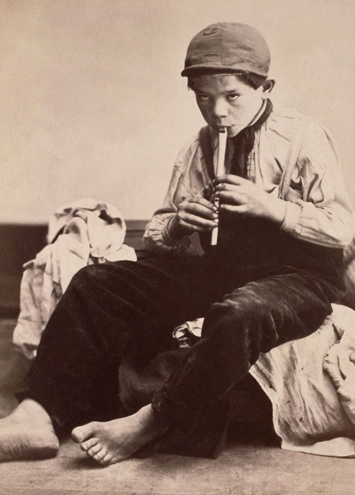
 'The Two Ways of Life' 1857")
 'Down the Valley, Yosemite' 1861")
 'Tutueamela, El Capitan, 3000ft, Yosemite' 1861")
 'The Mother of Salome' 1870")
 'The Angel at the Tomb' 1870")
 'Maud \"There has Fallen a splendid Tear From the Passion Flower at the Gate\"' 1875")
 'Alma Sjöman' c. 1875")
 'No title' From the series 'Gymnastics' c. 1875")

 'Waldemarsudde 1888' 1888")

You must be logged in to post a comment.