This is a solid retrospective of the work of the Australian artist John Brack (1920-1999) presented by the National Gallery of Victoria, Melbourne. John Brack is, quintessentially, an Australian and more specifically a Melbourne artist. Melbournians have a love hate relationship with his work – loving the earlier paintings that view the working classes of 1950s Melbourne through a nostalgic, humorous, sardonic lens (when originally the popularity of the work in the 1950s/60s was, as Robert Nelson has observed, mistakenly identified with ridicule of the subject matter)1 while finding the later work of massed pencils, postcards, deities and wooden people mystifying, cold and elusive.
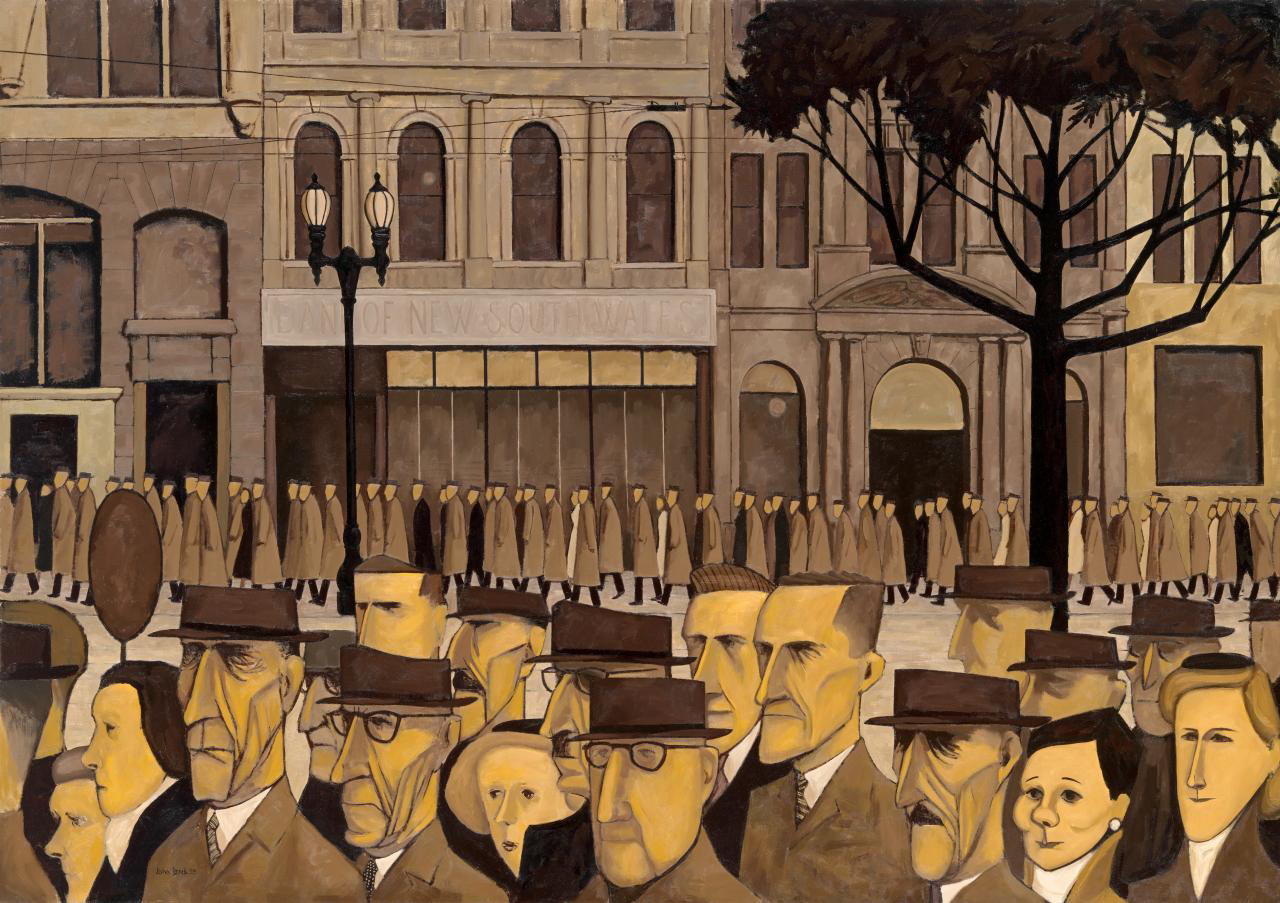
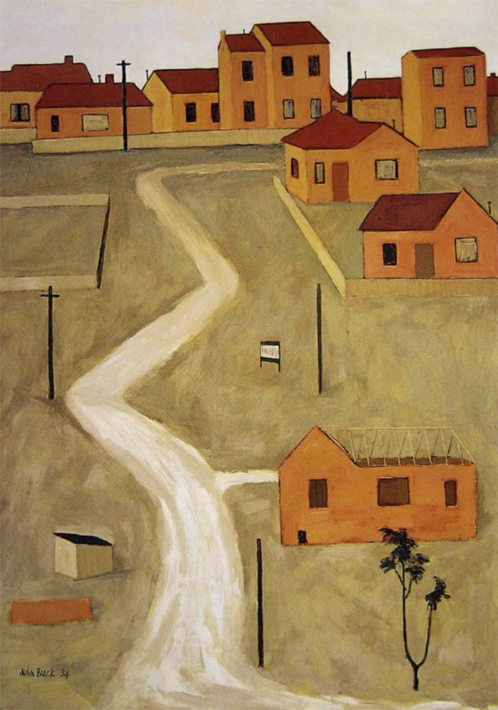
Brack saw his paintings of suburbia as honest portrayals of the new milieux. His sparse, graphic style evidenced the emotionally distanced relationships between space and people in the new cityscapes and best suited his cerebral approach to the subject matter. Men become mannequins with skeletal faces that hover menacingly behind the barmaid in The bar (1954, above), an amorphous mass of brown-suited humanity. Two women are portrayed in all their high-collared stiffness in the painting ‘Two typists’ (1955, above), their stylised faces, black hat and hair surmounted by hanging, disembodied legs at the top of the painting. These two women then reappear at bottom right in one of Brack’s most famous paintings, Collins St, 5p.m. (1955, above) subsumed into the two lines of people wearily trudging home from a day’s work at the office.
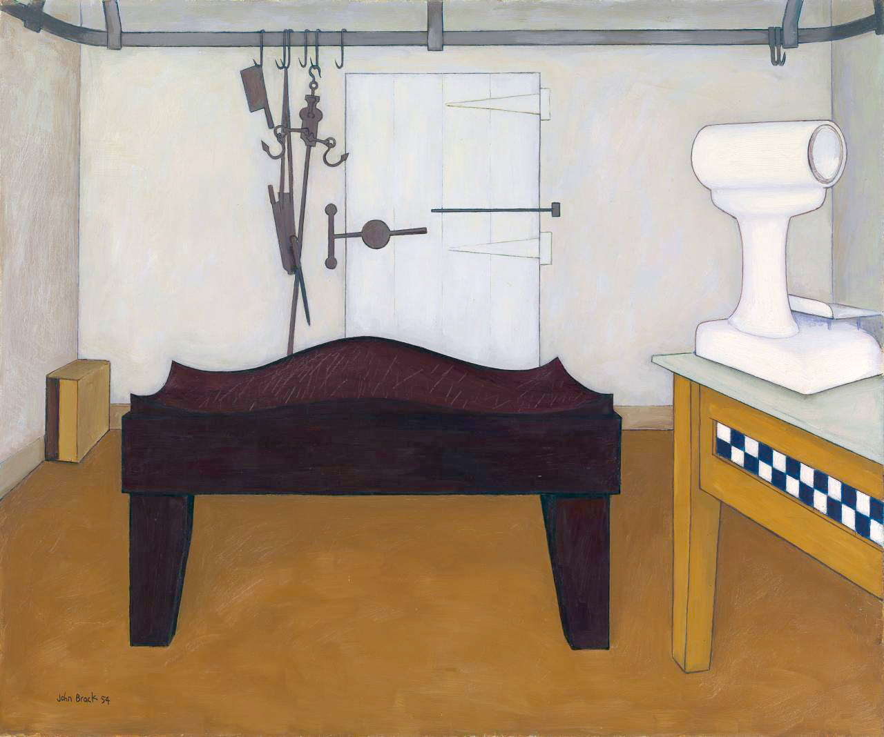
Brack’s early paintings are full of stylised metaphor – for example the clinical emptiness of space, the implied threat of hanging ‘instruments’ in ‘The block’ (1954, above) or the decapitated bird-like alienation of the fish head in The fish shop (1955, above) – offer comment on the nature of suburban life: ordered, dead, soulless surfaces, facades behind which life seethes. Brack recognises the slightly macabre beauty of these industrial spaces, their form and purpose, where no one had recognised them before. There are oversized teeth (The veil, 1952), large hands, the fleshy pink of faces (The barbers shop, 1952) and the tribal mask of a face in Man in pub (1953) where man becomes fragment. Above all there is a simplicity and eloquence in line and form grounded in a limited palette of ochres, yellows, greys, blacks, whites and browns. These are the colours of the early cave painters and it’s poignant that Brack uses them so effectively to anchor his subject matter both in history, memory and the present of contemporary life, a life we still recognise intimately over fifty years later.
Here is the ‘Human Condition’ writ large (with capitals!), the humility of professions such as butchers, seamstresses, typists and barmaids (with their limited control of the environment) portraying the body of the worker, as in Satre’s ‘Nothingness’,2 living the tedium of suburban life whilst wanting to flee the anguish of this existence into the desirable light of the future toward which man projects himself. This a theme that Brack develops in the later paintings with their stilted, cerebral investigation of existentialism. These paintings offer a more general contribution to a view of the human condition – love and hate, we, us, them, pros and cons – a view originally grounded in the suburbs of Melbourne but elevated to the ethereal, paintings that seem to lack material substance but offer a hyper-refined conceptual aesthetic.
Sticks and Stones Will Break My Bones But Pencils Will Never Hurt Me
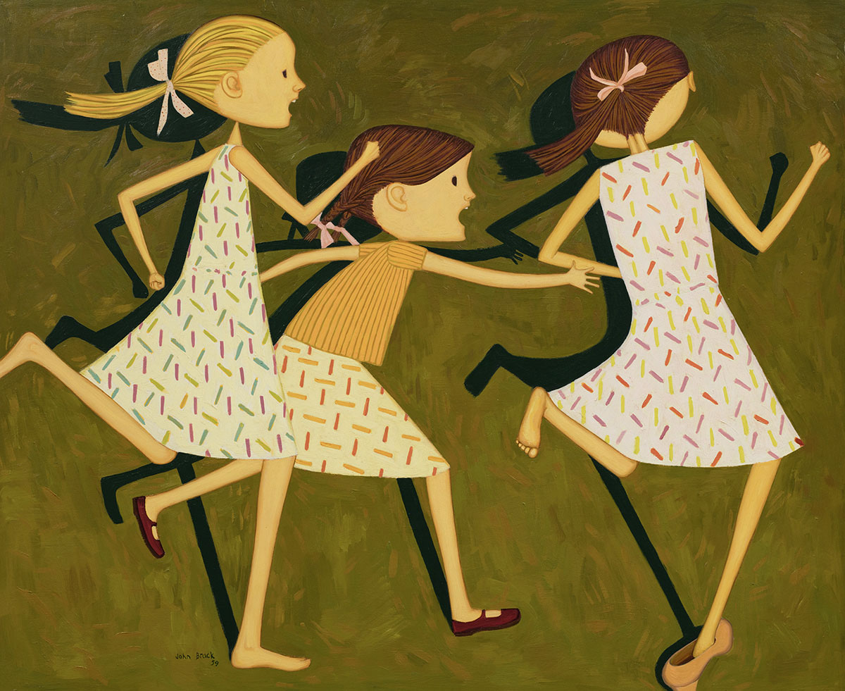
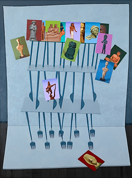
As early as Knives and forks (1958) and The playground (1959) we can observe the beginnings of the spaces of his later pencil paintings with their uniting of form, line and plane (think the planes of Cezanne). The later work is literally much colder, the palette now blues instead of the warmer ochres and yellows and this change is very obvious when you walk around the exhibition. There is an emotional distance here – from human contact and the warmth of company. Ronald Miller observed in 1970 that Brack’s work is about the rituals of life, about states of uneasy poise and vulnerability, about realities behind facades but in the later work the paintings become the facades: gone are the ambiguities and vulnerabilities to be replaced by an altogether different ‘order’ of existence.
We see in paintings such as Souvenirs (1976), We, Us, Them (1983), The pros and cons (1985) and Watching the flowers (1990-91 – see all below) how the canvas has become a stage set replete with turned up edges, spaces of ritual performance containing generalised metaphors for the nature of human existence, metaphors with universal themes. In his investigation of the universal Brack looses sight of the personal. His towers made of playing cards, his thrusting planes, the military precision of his opposing armies of goose-steeping pencils lack empathy for the thing that he was searching to be attuned with: the nature of existence, the human condition.
As Sartre observed,
“To apprehend myself as seen is, in fact, to apprehend myself as seen in the world and from the standpoint of the world. The look does not carve me out in the universe; it comes to search for me at the heart of my situation and grasps me only in irresolvable relations with instruments. If I am seen as seated, I must be seen as “seated-on-a-chair,” … But suddenly the alienation of myself, which is the act of being-looked-at, involves the alienation of the world which I organise. I am seated on this chair with the result that I do not see it at all, that it is impossible for me to see it …”3
This is the point that John Brack reached: through his desire to paint universal themes he was unable to visualise and apprehend himself as seen in the world from the standpoint of the world. It feels (yes feeling!) that he was alienated from the very thing he sought to portray – how the personal and the universal are one and the same.
Brack’s ‘failure’ as an artist (if indeed it can be called that) is not, as Robert Nelson has suggested, “because he didn’t talk enough or wisely enough to negotiate his way out of a misunderstanding” (that his work was sardonic). On the contrary I believe his ‘success’ as an artist is that he painted exactly what he wanted to paint in the time and place that he wanted to paint it.
His later work might strike some as cold and impenetrable but if one looks clearly, with a steady eye, there still beats a heart under that chill exterior, a heart grounded in the life of suburban Melbourne.
In the end Brack returns to the beginning, still exploring, still searching.
As T.S. Eliot wrote in one of The Four Quartets,4
“We shall not cease from exploration And the end of all our exploring Will be to arrive where we started And know the place for the first time.”
Dr Marcus Bunyan
Many thankx to the NGV for allowing me to publish the art work in the posting. Please click on the photographs for a larger version of the image.
1/ Nelson, Robert. The Age newspaper. Melbourne, Friday 24th April, 2009
2/ “We learn that Nothingness is revealed to us most fully in anguish and that man generally tries to flee this anguish, this Nothingness which he is, by means of “bad faith.” The study of “bad faith” reveals to us that whereas Being-in-itself simply is, man is the being “who is what he is not and who is not what he is.” In other words man continually makes himself. Instead of being, he “has to be”; his present being has meaning only in the light of the future toward which he projects himself. Thus he is not what at any instant we might want to say he is, and he is that towards which he projects himself but which he is not yet.”
Barnes, Hazel. Introduction to Jean-Paul Satre’s Being and Nothingness. London: Methuen, 1966, pp. xvii-xix
3/ Satre, Jean-Paul. Being and Nothingness. (trans. Hazel Barnes). London: Methuen, 1966, p. 263
4/ Eliot, T.S. “Little Gidding” from The Four Quartets (1942)
“What I paint most is what interests me most, that is, people; the Human Condition, in particular the effect on appearance of environment and behaviour… A large part of the motive is the desire to understand, and if possible, to illuminate …”
John Reed, New Painting 1952-62, Longmans, Melbourne, 1963, p. 19.
Opening 24 April, the National Gallery of Victoria will present a major retrospective of the work of John Brack, the first in more than twenty years. This exhibition will survey John Brack’s complete career, incorporating over 150 works from all of his major series. John Brack will bring together a significant body of the artist’s paintings and works on paper, including pictures that have developed ‘icon status’ and others that have rarely, if ever, been seen publicly since they were first exhibited.
Kirsty Grant, Senior Curator Australian Art, NGV said that more than any other artist of his generation, John Brack was a painter of modern Australian life.
“John Brack painted images which explored the social rituals and realities of everyday life. Long considered the quintessential Melbourne artist, Brack’s images of urban and suburban Melbourne painted during the 1950s drew attention for their novelty of subject and instantly recognisable references. His work is much broader however and in this exhibition we will see the continuity throughout his career of his fundamental interest in people, human nature and the human condition,” said Ms Grant.
Frances Lindsay, NGV Deputy Director said John Brack was widely considered one of Australia’s greatest twentieth century artists.
“The NGV has enjoyed a long association with John Brack: he worked as an assistant frame maker at the gallery in 1949, became head of the National Gallery School in 1962, and the NGV was also the first public institution to purchase one of his works. Brack’s iconic works are certainly the highlight for many visitors to the Gallery. We are thrilled to be continuing this special relationship by presenting this important and timely retrospective.”
The exhibition will be displayed chronologically, beginning with some rare early student works. Each phase of Brack’s practice will be explored, from his well-known urban scenes of the 1950s to the highly symbolic paintings from the 1970s. Many of Brack’s most familiar paintings are included in the exhibition such as Collins St, 5p.m, The bar and The Old Time.
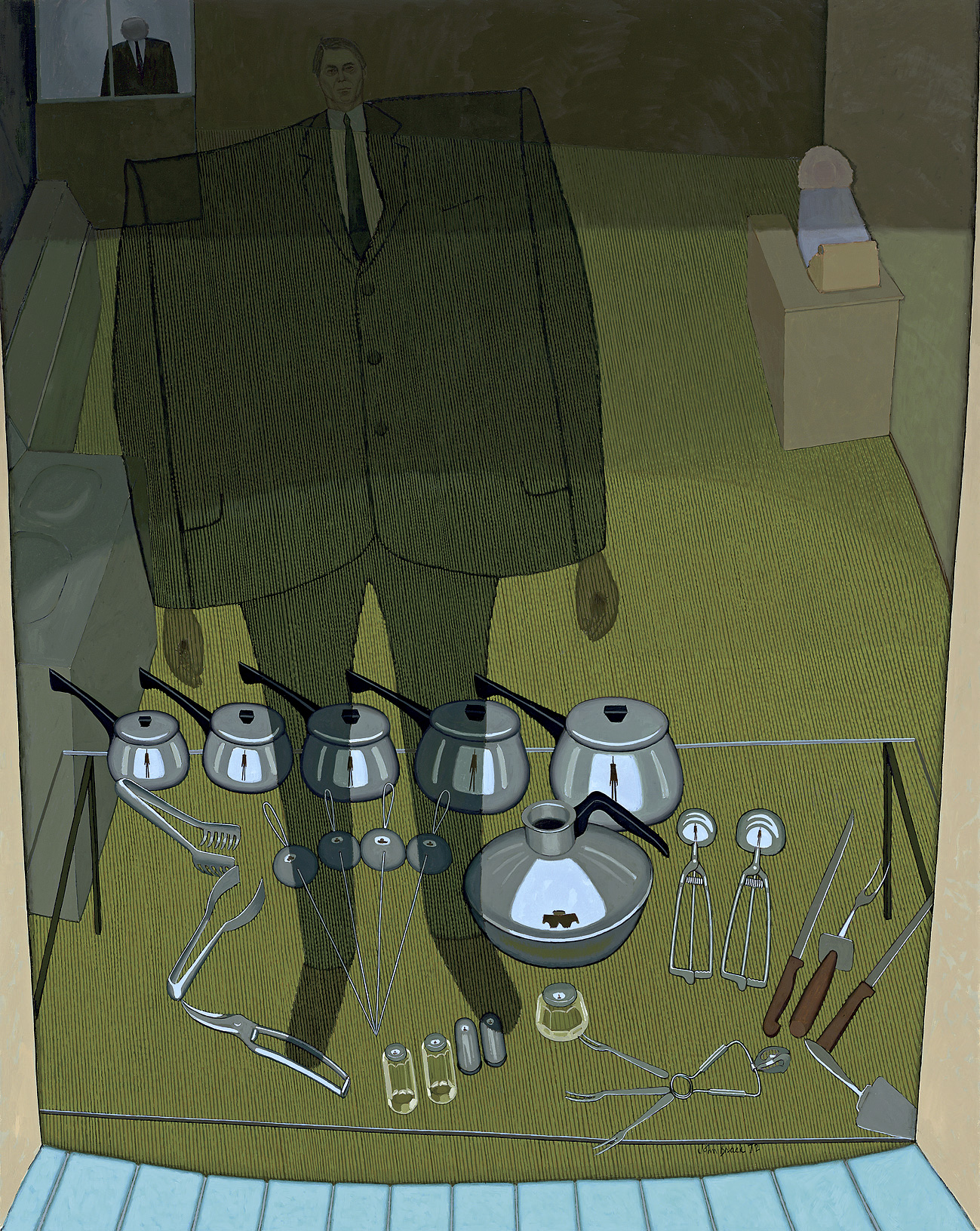
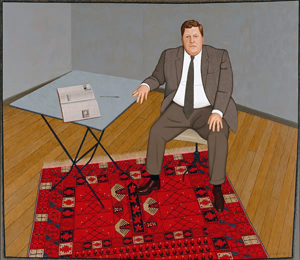
Brack produced compelling pictures which captured the essential characteristics of his subjects involved in everyday activities and, in some of his most engaging series, he depicted the characters of the racecourse, children at school and professional ballroom dancers. Throughout his career Brack also painted the nude, still life subjects and portraits, both of family and friends – including artists Fred Williams and John Perceval – as well as commissioned subjects, such as Barry Humphries as his alter-ego Edna Everage. During the 1970s Brack replaced the human figure with an assortment of everyday implements including cutlery, pens and pencils which he used as metaphors for the complexities of human behaviour and relationships.
Press release from the NGV website [Online] Cited 26/07/2009. No longer available online. Used under fair use conditions for the purposes of education and research
John Brack (Australian, 1920-1999) Inside and outside (The shop window) 1972 Oil on canvas
“Tacita Dean is a fantastic artist whose work examines the measure of things, the vibrations of spirit in the FLUX of experience.” Dr Marcus Bunyan
Exhibition dates: 6th June – 2nd August, 2009
Curator: Juliana Engberg (with Anna Macdonald as coordinating curator)
Photographs from the exhibition are in the chronological order that they appear.
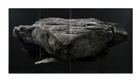
Tacita Dean (English, b. 1965) Grobsteingrab (floating) 2009
“The subjects are connected to the medium I use. It’s all about light and time and phenomena to some extent, like a rainbow or a gust of wind or even an eclipse or a green ray, things like that. And this is the language of light. It’s not the language of binary pixels.”
Tacita Dean1
“The value of her [Dean’s] work, writes Winterson, is one of the virtues of art itself: it is an intervention into the rush of everyday life, holding up time and space for contemplation.”
Jeanette Winterson2
This is a dense, ‘thick’ exhibition by Tacita Dean at the Australian Centre for Contemporary Art (ACCA), Melbourne that rewards repeat viewing. The theatricality of each work and the theatricality of the journey through ACCA’s dimmed galleries (an excellent installation of the work!) makes for an engrossing exhibition as Dean explores the minutiae of memory and the significance of insignificant events: a contemplation on the space, time and materiality of the everyday.
The exhibition starts with 3 very large floating rocks (Grobsteingrab (floating), Hunengrab (floating) and Riesenbelt (floating) all 2009) printed on multiple pieces of photographic paper, the surrounds of the rocks painted out with matt black blackboard paint (see image at top of this posting). The rocks look like mountain massif and are printed at different levels to each other; they move up and down, earthed in the sense that the viewer feels their heavy weight but also buoyant in their surface shininess, seeming to float into the void. The textuality of the rocks is incredible, the suspension of the rocks fragmented by the fact that they are printed on multiple pieces of photographic paper, the edges of the paper curling up to dislocate the unity of form.
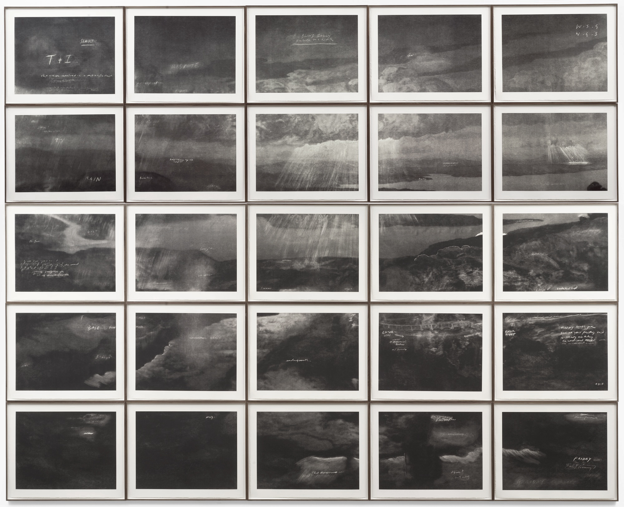
Opposite is the large multi-panelled T + I (Tristan + Isolde), a tour de force of Romantic landscape meets mythological journey (see image second from top). Sunshine searing through cloud lights the 25 Turner-esque black and white gravure panels that feature an inlet, fjord and ravine. Semi-legible words dot the landscape, reflecting on the legendary story: ‘undergrowth’, ‘dispute’, ‘brightening up’, ‘BLIND FOLLY’ and ‘the union involved in a manifestation(?)’ for example. Each panel is beautifully rendered and a joy to behold – my friend and I stood transfixed, examining each panel in minute detail, trying to work out the significance and relation between the writing and image. As with most of the work in the exhibition the piece engages the viewer in a dialogue between reality, story and memory, between light, space, time and phenomena.
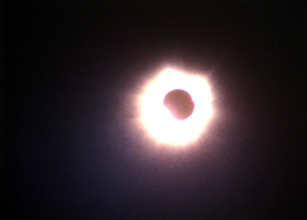
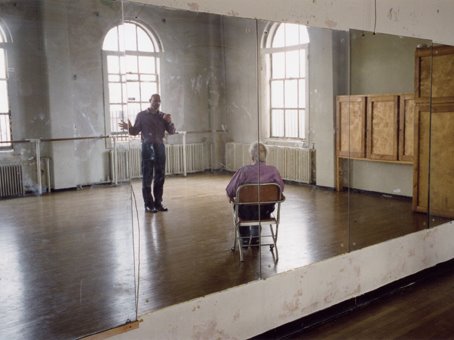
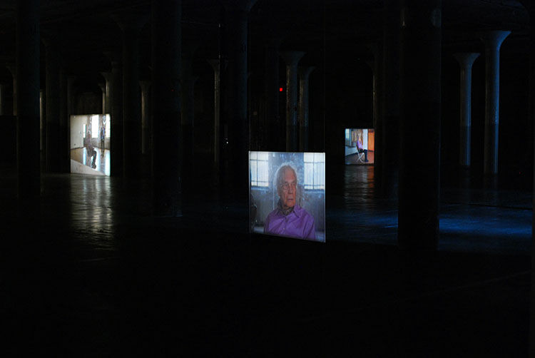
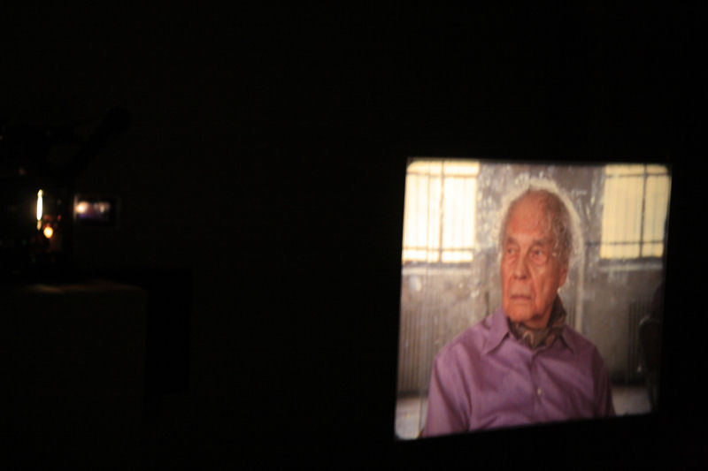
After the small rear projected film Totality (2000) that shows the extraordinary event of a total eclipse of the sun by the moon for a period of two minutes and six seconds the viewer takes a short darkened passage to experience the major installation in the exhibition Merce Cunningham Performs ‘Stillness’ (in three movements) to John Cage’s composition 4’33” with Trevor Carlson, New York City, 28 April 2007 (six performances; six films) 2007 (see images below).
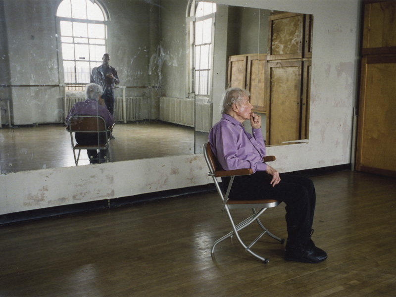
The first thing you see is one image projected onto a small suspended screen, the rest of the installation blocked by a short gallery wall to the right. The dancer Merce Cunningham sits in studious calm and observes us. This in itself is magical but as we round the corner other screens of different sizes and heights come into view, all portraying Cunningham’s dance studio and him sitting in it from different angles, heights and distances (including close-ups of Cunningham himself). In the six-screen projection the performances of Cunningham are sometimes in synch, sometimes not. The director Trevor Carlson, holding a stop watch, times the 3 movements of Cage’s musical piece 4’33” and directs Cunningham to change position at the end of every movement; his hands move, he crosses his legs and the performance continues.
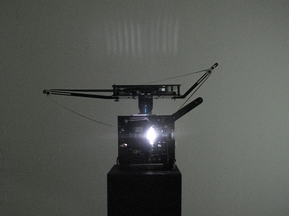
The work is projected into the sculptural space using old 16mm film projectors and their sound mixes with the studied silence of the Cage work and white noise. The mirrors in the studio make spaces of infinite recess, showing us the director with the stop watch, the windows, the floor, the markings of the dancers hands on the mirrors surface adding another echo of past presences. As a viewer their seems to be an ‘openness’ around as you are pulled into a spatial and sound vortex, a phenomena that transcends normal spatio-temporal dimensionality. As people pass through the installation their shadows fall on the screens and become part of the work adding to the multi-layered feeling of the work. This is sensational stuff – you feel that you transcend reality itself as you observe and become immersed within this amazing work – almost as though space and time had split apart at the seams and you are left hanging, suspended in mid-air.
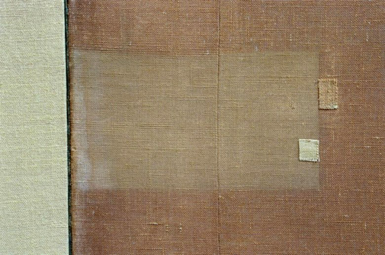
The next two films are my favourite pieces in the exhibition. Darmstädter Werkblock (2007) shows us the significance of insignificant markings – edges and intersections, textures, blends and bleeds, the minutiae of existence in the markings on the fabric of an internal wall (see photograph below). Here is light, wood panelling, texture and again the sound of the whirring of the film projector.
Usually I am not a fan of this kind of work having seen enough ‘Dead Pan’ photography and photography of empty yet supposedly important spaces in my life, but here Dean’s film makes the experience come alive and actually mean something. Her work transcends the subject matter – and matter is at the point where these interstitial spaces have been marked by the abstract signs of human existence that constantly surround us.
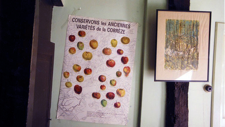
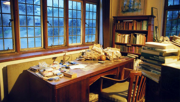
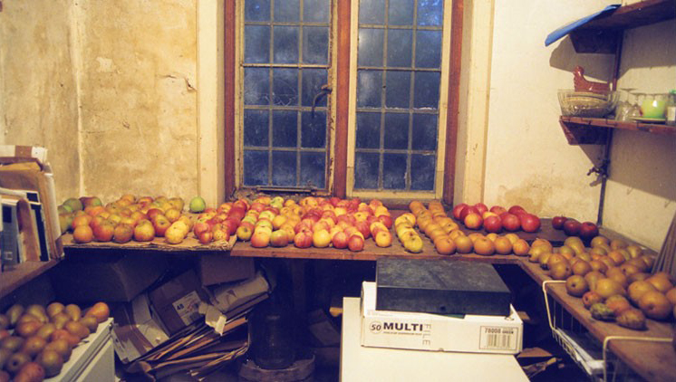
In Michael Hamburger (2007) Dean reaches the empito-me of these personal narratives that inhabit everyday life. Film of an orchard with wind rustling through the trees, clouds drifting across the sky, rotting apples on the branches, fallen fruit on the ground and a clearing with a man looking up at the trees is accompanied by the industrial sounds of clicks and pops like that of an old radio (see photograph above). The swirling sound of the wind surrounds you in the darkened gallery space much as the panoramic screen of the projection seems to enfold you. The scene swaps to an interior of a house and shows the man, has face mainly in shadow, the film focusing on the different type of apples in front of him or on the aged wrinkles of his hands holding the apples. He talks intelligently and knowingly about the different types of apples and their rarity and qualities. This is Michael Hamburger (now dead which adds poignancy to the film) – poet, critic, memoirist and academic notable for his translations of the work of W. G. Sebald, one of Tacita Dean’s main influences (and also an author that I love dearly).
One can see and feel echoes of Sebald’s work in that of Tacita Dean – the personal narratives accompanied by mythical and historical stories and pictures. The tactility of Hamburger’s voice and hands, his caressing of the apples with the summary justice of the tossing away of rotten apples to stop them ruining the rest of the crop is arresting and holds you transfixed. Old varieties and old hands mixed with the old technology of film make for a nostalgic combination. As John Matthews of ArtKritique has so insightfully observed in his review of this work Dean implicitly understands how objects can be elegies for fleeting lives.
After this work one should have a break – go to the front of the gallery and have a coffee and relax because this is an exhausting show!
The rest of the exhibition tends to tail off slightly, with less engaging but still interesting works.
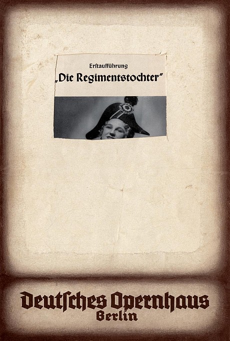
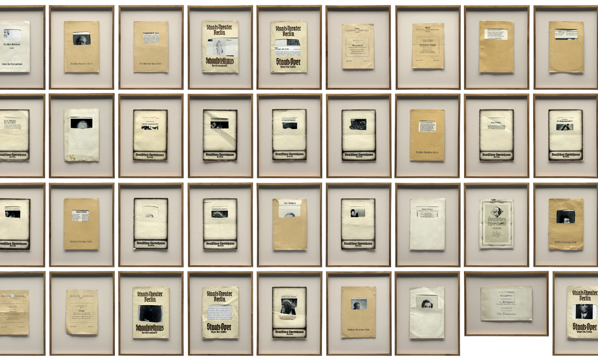
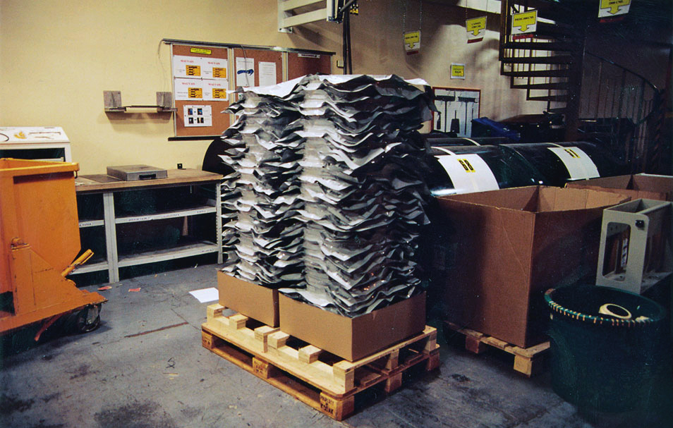
In Die Regimentstochter (2005) (the name of a Donizetti opera) Dean uses a pile of 36 found and mutilated old opera and theatre programs from the 1930s and 1940s such as Staats Theatre, Berlin, Der Tanz and Deutsche Openhaus. These programs have had portions of their front covers roughly but clinically cut to reveal the inner pages beneath (see image below) and Dean uses them to comment on the politicisation of culture in Berlin’s mid-20th century history. The top of a powdered wigged head or the face of Beethoven has been revealed when the title of the work has been neatly removed along with something else:
“Each programme gives a tantalising glimpse of a title or a face through a small window cut into the embossed cover; we recognise Beethoven, Rossini, the face of a singer perhaps. When and by whom this incision in the cover was made, very neatly one might add, even more why these disfigured programmes were kept remains a mystery. A swift search in an archive would easily show what has been removed; most likely an embossed swastika, for these performances all happened during the Third Reich. Why they were removed is left to our imaginations; perhaps an avid theatre-goer livid at the co-option of culture by the regime, perhaps someone afraid they might be misinterpreted as fascist memorabilia, while wishing to retain the memories these performances triggered.”3
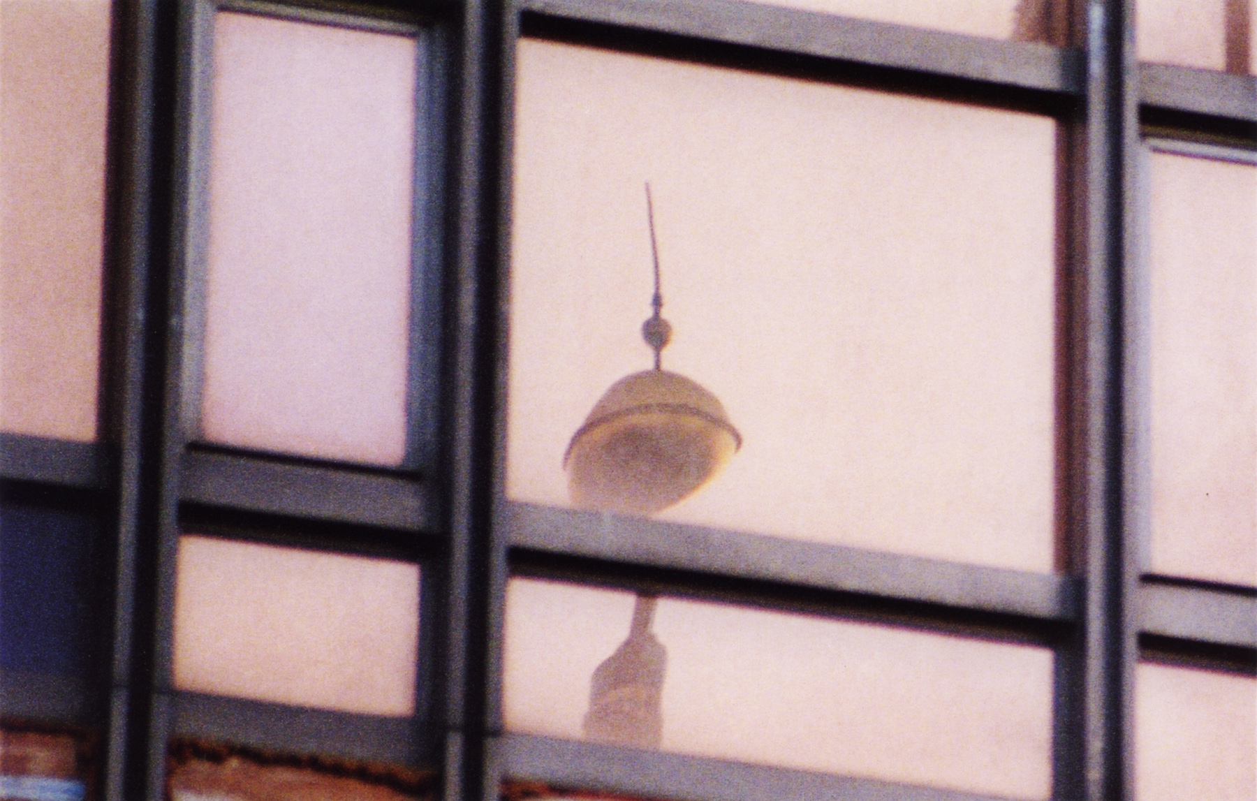
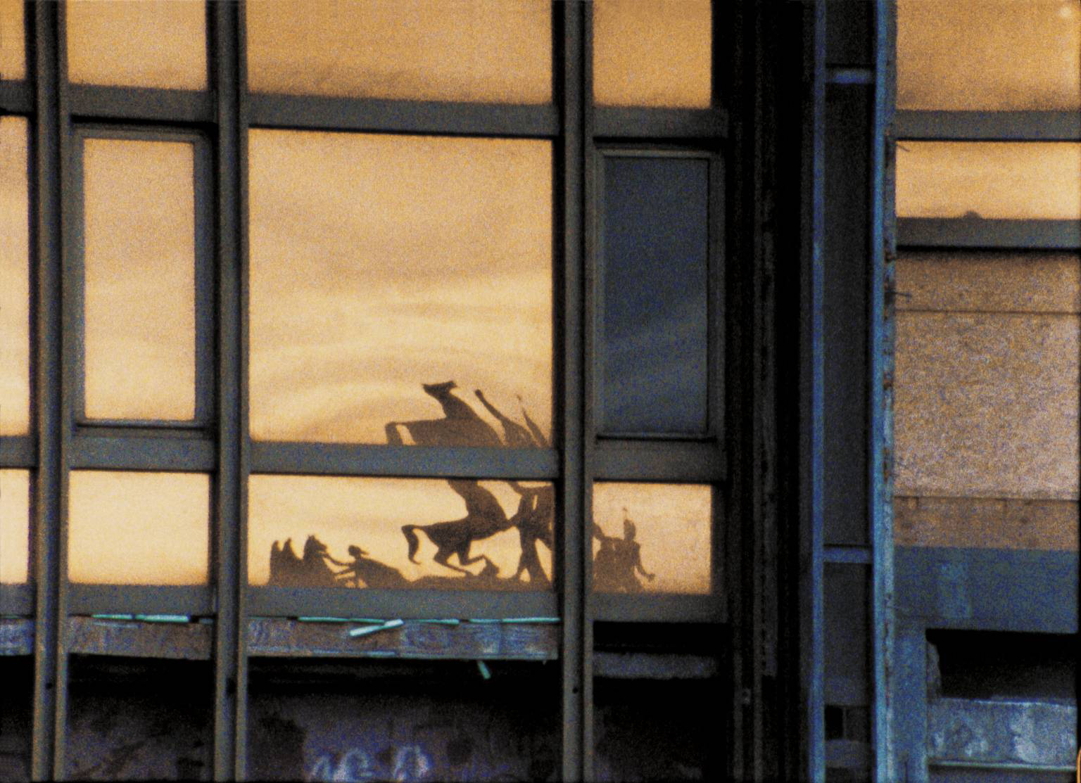
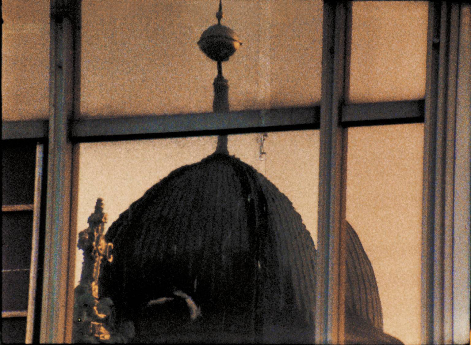
High up on a wall opposite these programs is the film Palast (2004) in which Dean reflects Berlin’s divided history in the jaded façade of the once iconic Palast, the government building of the former German Democratic Republic.4 Shards of light hit glass and reflections are fractured in their gridded panes (see images below). A bird is seen flying, viewed through the window and we see the stains on that window but in this film things feel a bit forced. Unlike the earlier Darmstädter Werkblock there is little magic here.
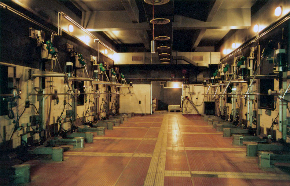
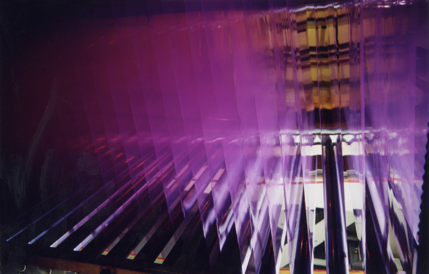
Again the minutiae of existence is examined in the final two films Noir et Blanc (2006), made on the last 5 rolls of Dean’s black and white double-sided 16mm film stock and Kodak (2006), both made at the Kodak factory in Chalon-sur-Saône before it closed it’s film production facilities (see images below). With the demise of the medium that she feels closest to Dean sought permission to film at the factory itself and both films examine that medium by turning it on itself.
“Dean became acutely aware of the threat to her chosen medium when she was unable to obtain standard 16mm black-and-white film for her camera. Upon discovering that the Kodak factory in Chalon-sur-Saône, France, was closing its film production facility, Dean obtained permission to document the manufacture of film at the factory, where cameras have never before been invited. The resulting rear-screen projection ‘Noir et Blanc’, filmed on the final five rolls Dean acquired, turns the medium on itself. The 44-minute-long work ‘Kodak’ constitutes a contemplative elegy for the approaching demise of a medium specific to Dean’s own practice. Kodak’s narrative follows the making of celluloid as it runs through several miles of machinery and explores the abandoned corners of the factory. On the day of filming, the factory also ran a test through the system with brown paper, providing a rare opportunity to see the facilities fully illuminated, without the darkness needed to prevent exposure, and underscoring the luster of the celluloid as the dull brown strips contrast with the luminous, transparent polyester.”5
As writer Tony Lloyd has commented, “The film “Kodak” documenting the manufacturing of film was as solemn and reverent as a Catholic mass and equally as dull and inexplicable.”6 I wouldn’t go that far but by the end of the exhibition the nostalgia for old technologies, the brown paper programs and the film strip as relic were starting to wear a bit thin, like the sprockets of an old film camera failing to take up the film.
At her best Tacita Dean is a fantastic artist whose work examines the measure of things, the vibrations of spirit in the FLUX of experience. Her work has a trance-like quality that is heavy with nostalgia and memory and reflects the machine-ations of contemporary life.
In her languorous (thank you Tony Lloyd for that word, so appropriate I had to use it!) and dense work Dean teases out the significance of insignificant actions/events and imparts meaning and life to them. This is no small achievement.
As an exhibition this is an intense and moving experience. Go, take your time and enjoy!
Dr Marcus Bunyan
Footnotes
1/ Dean, Tacita quoted in Bunbury, Stephen.”Still Lives,” in The Age. Melbourne: Fairfax Publishing, A2 section, Saturday June 6th, 2009, p. 20
2/ Winterson, Jeanette, quoted in Bunbury, Stephen.”Still Lives,” in The Age. Melbourne: Fairfax Publishing, A2 section, Saturday June 6th, 2009, p. 20
3/ Anonymous. Product synopsis from Tacita Dean Die Regimentstochter [Paperback] on the Amazon website [Online] Cited 19/07/2009
4/ Anonymous. Description of Tacita Dean: ‘Palast’ on the Tate St. Ives website [Online] Cited 19/07/2009. No longer available online
5/ Anonymous. “The Hugo Boss Prize: Tacita Dean”, on the Guggenheim Museum website [Online] Cited 19/07/2009. No longer available online
6/ Lloyd, Tony. “Opnion: Tacita Dean at ACCA,” on the ArtInfo.com.au website [Online] Cited 19/07/2009. No longer available online
Many thankx to ACCA for allowing me to publish the photographs and art work in the posting. Please click on the photographs for a larger version of the image
Tacita Dean (English, b. 1965) T & I (Tristan & Isolde) 2006 Photogravure on twenty-five sheets Sheet (each): 26 3/4 x 33 7/8″ (68 x 86cm) Installation: 134 x 170″ (340.4 x 431.8cm) Niels Borch Jensen Gallery and Edition, Berlin and Copenhagen
Through drawings and films, Dean makes work that is frequently characterised by a poetic sensibility and fragmented narratives exploring past and present, fact and fiction. In this monumental printed work, she addresses themes of collective memory and lost history by combining the romantic legend of ill-fated medieval lovers Tristan and Isolde (whose initials give this piece its title) with the real-life tragedy of British sailor Donald Crowhurst. Dean often uses the sea and other maritime themes in her work, including the tale of Crowhurst, which has appeared in several of her projects.
In 1968 Crowhurst sailed from England for a solo, round-the-world yacht race and never returned. In T & I Dean connects the tale of this lost sailor to the story of Tristan and Isolde – whose tragic love story also hinges on sea voyages – through her majestic depiction of a barren, rocky coastline looking seaward. This work, based on a found postcard, includes the white, cryptic notes that Dean often scribbles on her prints and drawings. Here the musings include “start” and “stage 4,” clear theatrical directions, as well as fragments of a poem by “WSG” about an artist killed in an accident. The twenty-five-sheet composition suggests a cinematic narrative sequence, while reading it as a unified image has a breathtaking, visionary impact. The rich velvety texture of the photogravure medium contributes a nineteenth-century patina that is ideally suited to the intensity and foreboding melancholy of the subject.
Publication excerpt from The Museum of Modern Art, MoMA Highlights since 1980, New York: The Museum of Modern Art, 2007, p. 269
Tacita Dean (English, b. 1965) Totality 16mm colour film 2000
16mm film projector used by Tacita Dean to project Merce Cunningham Performs ‘Stillness’
Tacita Dean (English, b. 1965) Merce Cunningham Performs ‘Stillness’ (in three movements) to John Cage’s composition 4’33” with Trevor Carlson, New York City, 28 April 2007 (six performances; six films) (stills) 2007
Tacita Dean (English, b. 1965) Darmstädter Werkblock (stills) 16mm colour film, optical sound 18 minutes, continuous loop 2007
Take one of her best pieces, Darmstädter Werkblock 2007, which looks for most of its long eighteen minutes like an exploration of an empty room, which it is. The camera pans the space, exploring the frayed fringes of its empty, textile-clad, burnt brown walls. It settles on holes, tears, seams and faded spots marking where placards used to hang. We are formally intrigued, but also curious why we should care so much about this particular empty room in what we can vaguely sense is a museum. Perhaps we are even a little bored. Only later – not in the film itself, but in the accompanying materials – are we told that these rooms usually house the “Block Beuys”, a section of the Hessisches Landesmuseum in Darmstadt arranged by Beuys himself over the decade and a half between its opening and the artist’s death. The Block is mired in controversy now that the walls, which are actually left over from when the rooms showed medieval artefacts, but which evoke and mirror Beuys’s own work, are slated for renovation.
Text from Philip Tinari. “Meditations on time,” in Tate Etc. issue 23: Autumn 2011 on the Tate website, 1 September 2011 [Online] Cited 18/03/2019. Used under fair use conditions for the purposes of education and research
Stills taken from the 16mm film Darmstädter Werkblock (2007) filmed in the seven rooms that make up Block Beuys, Joseph Beuys’s installation in Darmstadt’s Hessisches Landesmuseum. In September 2007, the museum announced that they intended to renovate the rooms, and to remove the brown jute wall coverings and gray carpet that had become such a feature of the installation. The decision caused much upset in Germany and beyond. Unable to document the rooms for copyright reasons, Dean requested that instead she might document the walls and carpet and the details of the space that surround Beuys’s work without making any visual reference to the work itself. The resulting film concentrated on the patches and the stains and the labor of those who have been maintaining the space over the last four decades – the parallel entropy of the museum space with the ageing of the work itself.
Text from Google Books
Tacita Dean (English, b. 1965) Michael Hamburger (stills) 16mm colour anamorphic, optical sound 28 minutes 2007
Continuing her recent collection of film portraits, Tacita Dean’s Michael Hamburger is a moving portrayal of the poet and translator, a resident of Middleton in Suffolk and great friend of W.G. Sebald. It represented Dean’s first commission in Britain since 1999.
For its 28 minutes, the film quietly observes the poet in his study and among the apple trees in his garden. Sunlight dissolves the frames of the windows, the most insubstantial of thresholds between this home, only one-room-deep, and what lies outdoors; a rainbow marks its watery geometry in the sky; and the apples age upon the ground, shrunken, and yet somehow becoming more intensely themselves.
Although Hamburger is said to have despaired of reviews of his poetry which declared that he is ‘better known as a translator’, we might detect a similar deprecation of his self, by himself, in the film which shares his name. Unwilling, perhaps unable, to talk of his past and his migrations, most especially fleeing Nazism in 1933, he talks poignantly, instead, of his apple trees, of where they have come from, and of their careful cross-breeding. Purity is dismissed, and one senses with an awkward pathos that the poet is translating himself.
Anonymous text. “Michael Hamburger: Tacita Dean,” on the FVU website [Online] Cited 18/03/2019. Used under fair use conditions for the purposes of education and research
Tacita Dean’s portrait of the poet and translator Michael Hamburger was filmed, at his home in rural Suffolk, in the last year of his life. Set against muted autumn colours, and with Hamburger performing an evocative, anecdotal inventory of the harvest from his apple orchard, the piece is a bittersweet reminder of time’s passing that deftly captures, and quietly honours, an exemplary 20th century literary figure.
Tacita Dean (English, b. 1965) Die Regimentstochter (The Daughter of the Regiment) 2005
Die Regimentstochter is the latest in a series of projects made from material turned up in flea markets, in this case, a series of 36 antique opera programs from the 30s and 40s found in the flea markets of Berlin. Like the found photographs in Dean’s 2001 FLOH, these souvenirs remain unexplained by text. They retain the silence of the lost object, and they share a riddle: each program gives a tantalising glimpse of a title or a face through a small window cut into the embossed cover. Readers will recognise Beethoven, Rossini, or perhaps a singer. A swift search in an archive would easily confirm what has been removed, but it seems likely that the missing piece is a swastika. These performances all happened during the Third Reich. When and by whom the incision was made, and why these programs were both worth disfiguring and worth keeping, remains a mystery.
Text from the Amazon website
“Things no longer visible thus enhance our view of the past, and gaps, paradoxically, become memorials that engage the beholder’s imagination more actively than a didactic demonstration could. Merely by showing what remains, Tacita Dean not only calls up in our mind’s eye a specific historical situation and its abysses, but also erects an anti-monument to the forms customarily taken by the culture of memory.”
Andreas Kaernbach
Tacita Dean (English, b. 1965) Die Regimentstochter (The Daughter of the Regiment) 2005
They look lined up like a modern art object. The 36 opera program books are not considered as works of art. Nevertheless, the British and Berlin-based artist Tacita Dean turned them into a work of art.
“An incidental finding inspired Tacita Dean to her artwork,” tells the House of History. “At a Berlin flea market she discovered in the year 2000 36 opera program booklets from the years 1934 to 1942. Conspicuous were the title pages: from each of the booklets was a part cut out, including from the program of the eponymous opera “The Regimental Daughter” by Gaetano Donizetti (world premiere 1840). “Said part of the title pages of those notebooks was reserved for the swastika symbol. This was cut off by the previous owners. Why, that can only be speculated, continues the house of history. “Was it shame, the fear of being punishable or even a “private” act of resistance before the end of National Socialism? The program books in any case seem to have been of great cultural value to the former owner. “
“Whatever the motives that made the owner or the owner of the program booklets of the Berlin opera from 1934 to 1942 come to shears in order to remove the Nazi swastikas from the cover pages of the booklets: The voices speak of the desire to conclude with a time that one does not want to be reminded of – a basic motive of German post-war history that stood in the way of an honest confrontation with the era of National Socialism for a long time, “said the Minister of Culture.
With her work, Tacita asks Dean questions about dealing with the Nazi past. Which motive behind it and who had heard the booklets remains open until today. Tacita Dean has created a work of art from these finds, which poses subtle questions about the examination of the Nazi past – but in a way that goes beyond purely historical reflection and awakens additional associations. What does that object, created by the artist from Canterbury, say about the relationship between art and politics? “Can the opera narratives be separated from the political environment in which they were performed and played?” asks the President of the Foundation for the History of the Federal Republic of Germany, Prof. Dr Hans Walter Hütter.
Monika Grütters continues: “The fact that the dark part of our identity does not disappear through concealment and suppression, and that it becomes visible again even where it was attempted to be eradicated, impressively shows Tacita Dean’s work Regimentstochter. That is why I very much welcome the fact that this unique work of art has a place in the collection which, in view of its significance in contemporary history, necessarily belongs to it – a place in the House of History which, unlike any other museum in Germany, presents German history from 1945 in all its facets illustrated and also devoted to the effects of National Socialism on the political and cultural life in post-war Germany.”
Tacita Dean (English, b. 1965) Three stills from the film Palast 2004
A major survey of work by the internationally acclaimed British artist Tacita Dean will open at the Australian Centre for Contemporary Art (ACCA) on June 6th, 2009.
In a great coup for Melbourne, fourteen recent projects by this celebrated contemporary artist will come together in what is the largest survey of Dean’s work to ever be shown outside of Europe.
Tacita Dean is one of Britain’s most accomplished and celebrated contemporary artists. She won the New York Guggenheim’s Hugo Boss award in 2007, was a Turner Prize nominee in 1998, and has had numerous solo exhibitions in Europe – at the Schaulager in Basel, DIA Beacon in New York, the de Pont Museum in the Netherlands, the Tate Britain, UK, the Musee d’art Moderne in Paris, France and the Villa Oppenheim in Berlin, to mention just a few.
Dean was also recently given the highly prestigious title of Royal Academician, awarded sparingly to alumni’s of the revered London art school who have achieved greatness in their work.
Tacita Dean was born in Canterbury in 1965, and moved to Berlin in 2000 after being awarded a DAAD residency. Early works focused on the sea – most famously she explored the tragic maritime misadventures of amateur English sailor Donald Crowhurst. Since moving to Berlin she has devoted her attention to the architecture and cultural history of Germany, a recurring theme also being the salvaging, saving and collecting of things lost. Many of her works rest on the icons of modernism, heroic failures and forgotten utopian ideals.
Dean is best known for her work with 16mm film, although she also works with photography, print and drawing. The qualities of filmmaking itself play a central role in her works – which hauntingly capture the passing of time, space and the mysteries of the natural world.
Her work occupies a place between fact and fiction. As British author Jeanette Winterson says, “Her genius, with her slow, steady, held frames, is to allow the viewer to dream; to enter without hurry, without expectation, and to accept, as we do in a dream, a different experience of time, and a different relationship to everyday objects.”
Included in this exhibition is Dean’s revered film installation, Merce Cunningham Performs STILLNESS (in three movements) to John Cage’s composition 4’33” with Trevor Carlson, New York City, 28 April 2007, which was recently presented at the DIA Beacon in New York, and the 2007 work Michael Hamburger. Two new wall-based works especially created for this exclusive ACCA exhibition will also feature.
Dean is also known for creating ‘asides’ – totally absorbing texts on the subjects explored in her work. She will contribute texts on all the projects included in the exhibition for a catalogue which will be published to coincide with this unique ACCA survey.
The exhibition has been curated by ACCA’s Artistic Director, Juliana Engberg and follows an early 2002 exhibition of Dean’s work curated by Engberg for the Melbourne International Arts Festival.
“Tacita’s works continue to enthral and inspire me. Not only has she rescued relics from history and restored them with a visual dignity and affection in her wonderful film projects, but increasingly she rescues the traditional art forms of drawing, print making, painting, photography and film from a digital abyss,” says Juliana Engberg. “Her works have a truth and quiddity about them, but also a playful artifice and technical tactic to bring out the tactile and material in all she deals with. Tacita is a sublime story-teller, a narrator of odysseys and attempts. She is a true artist sojourner.
In this selection of works made since 2004 we grasp the breadth of her practice and her pursuit of the time-honoured landscape, portrait and abstract genres,” she says.”
Press release from the ACCA website [Online] Cited 17/07/2009. No longer available online. Used under fair use conditions for the purposes of education and research
Tacita Dean (English, b. 1965) Noir et Blanc [Still] 16mm black-and-white Kodak film 2006
Tacita Dean (English, b. 1965) Kodak (still) 16mm colour and b/w film optical sound 44 minutes loop system 2006
Tacita Dean (English, b. 1965) Kodak (still) 16mm colour and b/w film optical sound 44 minutes loop system 2006
As Dean said in a Guardian article back in February: “Digital is not better than analogue, but different. What we are asking for is coexistence: that analogue film might be allowed to remain an option for those who want it, and for the ascendency of one not to have to mean the extinguishing of the other.”
In the same text, she wrote of the difference between film and digital as “not only emulsion versus pixels, or light versus electronics, but something deeper – something to do with poetry.” This poetry is exactly what she explored in one of her landmark films, Kodak (2006), a 45-minute examination of the production process of celluloid itself at a French factory fated for early closure because of a lack of demand. A film about the making of film, it hinged on the sort of super-aestheticised conceit that has become her staple. This is a tactic which allows her to turn even time itself into a structural device, as she did in 2008 with a film called Amadeus, which depicts a 50-minute crossing of the English Channel in a small fishing boat of the same name.
Philip Tinari. “Meditations on time,” in Tate Etc. issue 23: Autumn 2011 on the Tate website 1 September 2011 [Online] Cited 18/03/2019. Used under fair use conditions for the purposes of education and research
Tacita Dean (English, b. 1965) Kodak (still) 16mm colour and b/w film optical sound 44 minutes loop system 2006
Australia Centre for Contemporary Art (ACCA) 111 Sturt Street, Southbank Victoria 3006, Australia Phone: 03 9697 9999
Opening hours: Tuesday – Friday 10am – 5pm Weekends & Public Holidays 11am – 5pm Monday closed Open all public holidays except Christmas Day and Good Friday
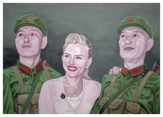
Guo Jian (Chinese-Australian, b. 1962) No.c 2009 Acrylic on canvas 152 x 213cm
This exhibition of eight new paintings and one older work by Chinese artist Guo Jian presented at Arc One Gallery in Melbourne is, with the exception of one outstanding painting, a disappointment.
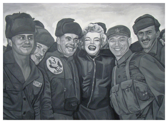
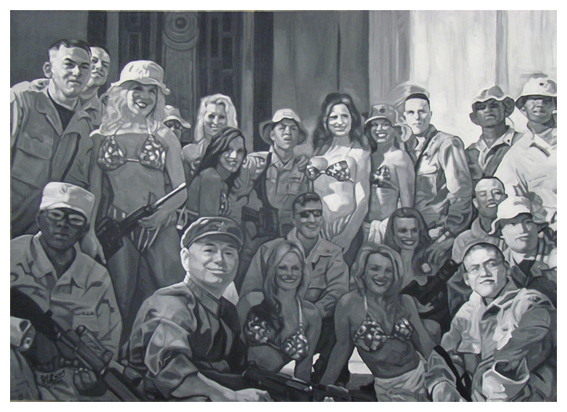
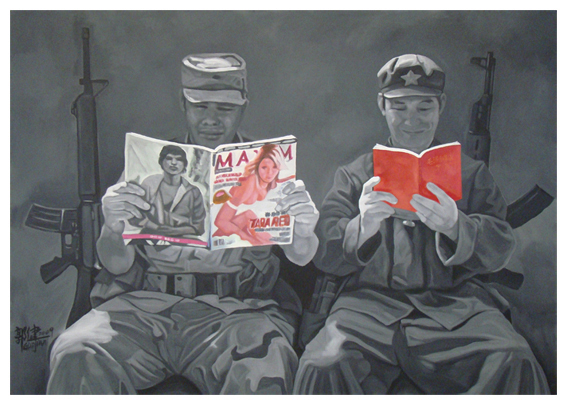
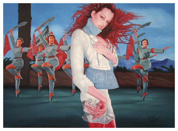
The new work addresses, variously, themes of consumerism, stardom, sex appeal, the military and Chinese culture. Using old photographs as reference and inserting the body and face of the artist into the canvases, Jian examines the paradoxes that exist between Western / American and Chinese culture to limited effect.
Using a restricted colour palette in each painting Jian’s ‘mise en scène’ places American soldiers and babes wearing bikinis of distorted American flags with the artist as lone Chinese soldier – his face pulled into focus while the other figures almost become cut-outs with the overlay of a “blur filter” softening their features. In another set piece Untitled 3 (2009) a seductive woman with flaming red hair and half open jacket holds a bottle of Chloe perfume in her hand while behind Chinese female military dancers brandish swords and red flags. In No.g (2009) two soldiers with guns propped behind them read contrasting books – one the ‘Little Red Book’ and the other ‘A Big Naughty Girly Magazine’. Marilyn and Madonna feature heavily, pastiches in a built environment – all pink and fleshy with a silver heart (perhaps it should have been a Purple Heart).
The iconography in these staged ‘tableaux vivants’ is a one shot idea repeated in all eight paintings. The themes seem hackneyed, their language a bricolage of ironic archetypes that don’t have anything new to say about the subject matter but repeat things we know already: vis a vis that Chinese society is struggling to cope with the burden of becoming a consumer culture.
On reflection, the new paintings have not impinged on my consciousness – always a sign whether the work really has made a connection. However, the single work from 2003 is a different beast.
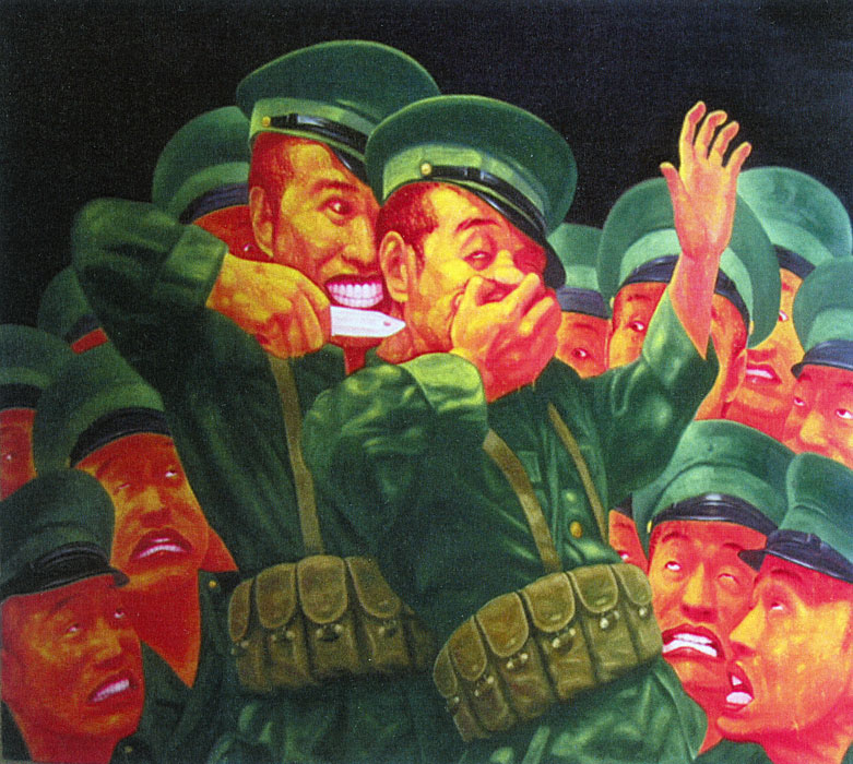
The Training from the series The Day Before I Went Away (2003) is a hypnotic, mesmerising and powerful work, lurid even, with it’s hyper-real colours and maniacal faces, eyes rolling in the back of heads, barring of teeth, the hand over the mouth, the upraised hand, the glistening white of the blade – oh the lust for blood!
This painting is so evocative it shames the new work by comparison – you think about this work, you remember it!
Here is the passion and insightfulness of the artist. Danger and terror grab you and shake you and force you to think about the human condition. This is what I want art to do in whatever way it can – subtly, quietly, psychologically, forcefully. Great art challenges us to look, feel and think. Unfortunately the new work, while clever on a superficial level, fails to deliver.
Dr Marcus Bunyan
Many thankx to the Arc One Gallery for allowing me to publish the art work in the posting.
Guo Jian (Chinese-Australian, b. 1962) No.d 2009 Acrylic on canvas 152 x 213cm
“This series is about looking at the persuasion or morale boosting efforts for soldiers from another perspective. I considered how starlets and celebrities are deployed in the West – often not dissimilarly to the way Chinese Entertainment Soldiers are used to influence and motivate in my part of the world.” ~ Guo Jian
Guo Jian (Chinese-Australian, b. 1962) No.f 2009 Acrylic on canvas 152 x 213cm
Guo Jian (Chinese-Australian, b. 1962) No.g 2009 Acrylic on canvas 152 x 213cm
Guo Jian (Chinese-Australian, b. 1962) Untitled 3 2009 Acrylic on canvas 152 x 213cm
Born in China in 1963, Jian was raised in a controlled political environment. He served over three years in the Peoples Liberation Army and bore witness to the horrific Tiananmen Square massacre in 1989, where he assisted carrying the wounded to the hospital.
Jian’s personal atlas of history continues to feed his visual commentary. His voice is both satirical and erotic, challenging and confronting. He plays with irony and foreplay to exploit and raise potent questions surrounding propaganda and manipulation.
“As I have grown older, I have realised that all of the education I have received is rarely practical in real life. Reality and education are conflicting. The way in which you inherently view the world is influenced by education which is the perspectives of others. Our surrounding environment defines our perception of ‘right’ and ‘wrong’, ‘enemy’ and ‘friend’, ‘them’ and ‘us’. But, if you dare to open your eyes and liberate your mind, you will find that the world is not exactly the way you have been told. Put your feet into someone else’s shoes to think about the world and your own life differently. For me, if the surroundings change, are combined, are old or new, it doesn’t matter. My life is defined relative to my self-experience and the things I have heard or seen. From this perspective, I have discovered the freedom to reopen my eyes to a new world and to new possibilities.”
Guo Jian
Text from the press release on the Arc One Gallery website [Online] Cited 10/07/2009. No longer available online. Used under fair use conditions for the purposes of education and research
Guo Jian (Chinese-Australian, b. 1962) The Training from the series The Day Before I Went Away 2003
Arc One Gallery 45 Flindes Lane Melbourne, Victoria 3000
Marco Fusinato (Australian, b. 1964) Double Infinitive 3 2009
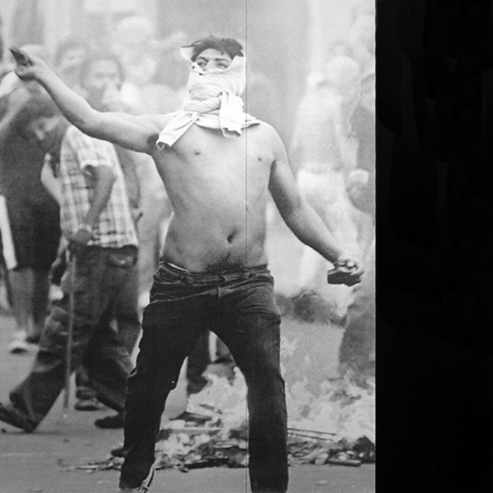
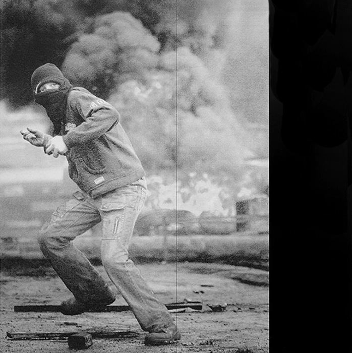
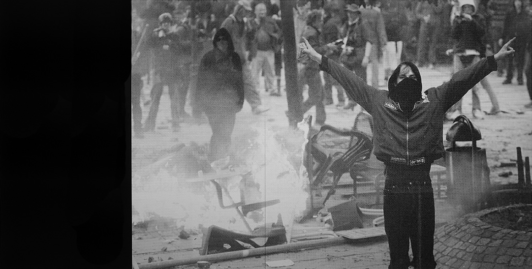
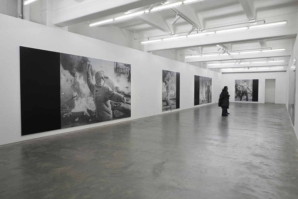
Double Infinitives by Marco Fusinato at Anna Schwartz Gallery, Melbourne is an excellent exhibition of large UV ink on aluminium images sourced by Fusinato from the print media.
The images are made up of a dot pattern familiar to those who have examined photographs in the print media closely. Larger and smaller clusters of dots form the light and shade of the image. As you move closer to the works they dissolve into blocks of dots and become and optical illusion like Op Art from the 1960s. Fusinato contrasts this dot structure with the inclusion of flat panels of black ink to the left and right hand side of the images. The section lines that run through the images (for they are not one single image but made up of panels) also adds to the optical nature of the work as the lines cut the conflagrations, literally stitching the seams/scenes together.
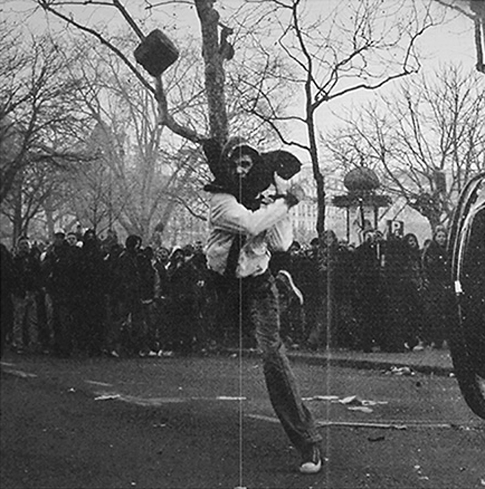
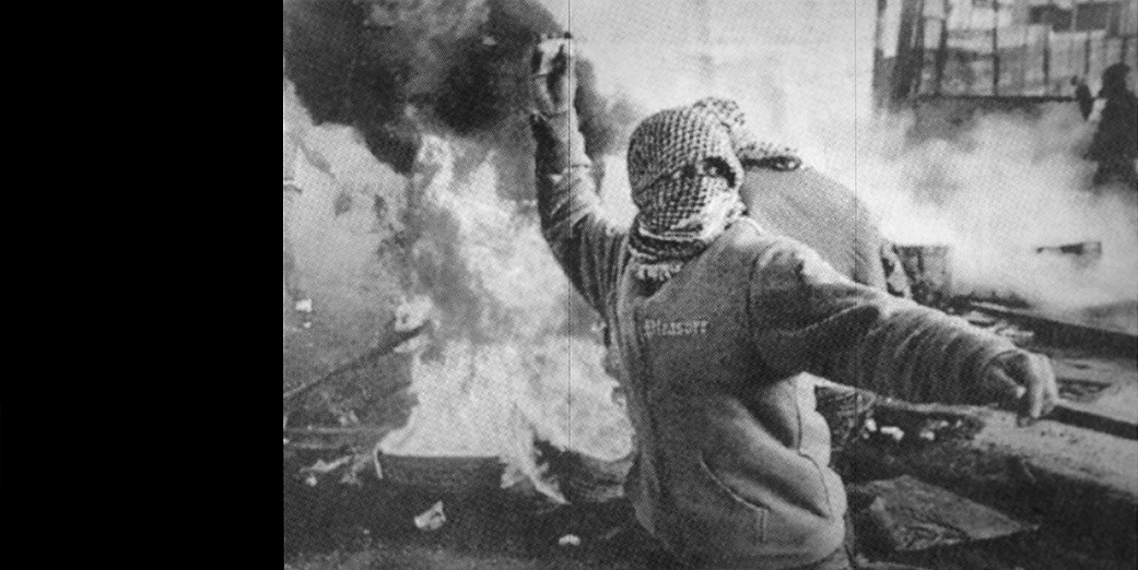
Each image contains an individual holding a rock enclosed in the milieu and detritus of a riot; the figures are grounded in the earth and surrounded by fire but in their obscurity, in the veiling of their eyes, the figures seem present but absent at one and the same time. They become ghosts of the fire.
Fire consumes the bodies. The almost cut out presence of the figures, their hands clutching, throwing, saluting become mute. Here the experience of the sound, colour and movement of an actual riot is silenced in the flatness and smoothness of the images. The images possess the intensity of a newspaper reality ‘blown up’ to a huge scale by Fusinato (see the installation photograph below to get an idea of the effect). The punctum of the riot, that prick of consciousness that Barthes so liked, is translated into a silenced studium of the aluminium surface; an aural history (the sound) / oral history (the telling of the story) trapped in the structure of silence.
There is a double jeopardy – the dissolution of the image into dots and the disintegration of the body into fire. In one of the images the upraised arm and hand of one of the rioters holds a rock with what appears to be a figure on it, surrounded by fire. To me the arm turned into one of the burning Twin Towers with smoke and fire pouring from it (see the first photograph in the installation photograph below).
My only concern about the images were the black panels, perhaps too obvious a tool for the purpose the artist intended. Maybe the needed some small texture, like a moire pattern to reference the contours of a map and continue the topographical and optical theme. Perhaps they just needed to be smaller or occasionally placed as thin strips down the actual image itself but these are small quibbles. Overall this is an fantastic exhibition that I enjoyed immensely. The images are literally ripped from the matrix of time and space and become the dot dot dot of the addendum. What Fusinato does so excellently is to make us pause and stare, to recognise the flatness of these figures and the quietness of violence that surrounds us.
Music – Noise – Silence Flatness – Advertising – Earth – Fire Rock – Space – Memory
Dr Marcus Bunyan
Many thankx to Anna Schwartz Gallery for allowing me to publish the photographs in the posting. Please click on the photographs for a larger version of the image.
Marco Fusinato (Australian, b. 1964) Double infinitive 1 2009
Marco Fusinato (Australian, b. 1964) Double Infinitive 4 2009
A selection of images from the print media of the decisive moment in a riot in which a protagonist brandishes a rock against a backdrop of fire. Each image is from a different part of the world, from the early twenty-first century, and is blown up to history-painting scale using the latest commercial print technologies.
Text by Marco Fusinato on his website
Installation of Marco Fusinato Double Infinitives exhibition at Anna Schwartz Gallery, Melbourne
Double Infinitives
“Unheard music is better than heard.”
Greek proverb of late antiquity
“That music be heard is not essential – what it sounds like may not be what it is.”
Charles Ives, Essays Before a Sonata
“The proposition of Jacques Attali’s Noise is different. He says that while noise is a deadly weapon, silence is death.”
David Rattray, “How I Became One of the Invisible,” Semiotext(e), 1992.
The explosive communal act of rioting is most commonly delivered to an audience suspended in the stillness and silence of a photographic image. Noise is not removed in this process, it is almost amplified: the sound and action that deliver this singularly captured moment into existence are infinite, as all things remain while they are imagined, before they are anchored down by express articulation.
Photographic representation can easily be accused of subverting the truth of events, not because what is seen in the image has not transpired, but because static images leave so much space around them for multiple narratives to be constructed. The still image is totally contingent on the consciousness that confronts it. By contrast, the near-totality of videos can give too much away …
Sourced by Fusinato from print media published in the last few years, these images of rioting all contain an individual clutching a rock, bathed in the refractory glow of a nearby fire. The image has become prototypical, so much so that it lacks the sensation of spontaneity requisite to produce a riot. (Apropos to this predictability, Fusinato would check global newspapers after every forum or conference of global financial authorities, often finding the image he was looking for).
Double Infinitives is a succinct allegory for the reluctance to compromise comfort overpowering radical impulses. Conversations suggest this is a conflict frequently experienced by artists. Deprived of a volatile political reality, we experience radicalism through images that act as small ruptures, reminders that the world we live in might be more severely charged than our individual experiences allow. Fusinato’s works flatten these images of volatility onto a smooth slate: they are similar and radiate with the vexed beauty of sameness. A riot is a mad and brutal spectacle, a theatre that is often documented as if it were a play. Hugely expanded in scale and rendered in the suffused gloss of advertising, the real possibility of violence that these works infer deepens the layers of the fiction rather than comprising an indicator of human concern. Those things with which we come into such gentle contact that their thorns barely prick …
Liv Barrett June 2009
Text from the Anna Schwartz Gallery website [Online] Cited 10/07/2009. No longer available online. Used under fair use conditions for the purposes of education and research
Marco Fusinato (Australian, b. 1964) Double Iinfinitive 2 2009
Marco Fusinato (Australian, b. 1964) Double Iinfinitive 2 (detail) 2009
Marco Fusinato (Australian, b. 1964) Double Iinfinitive 5 2009
Anna Schwartz Gallery 185 Flinders Lane Melbourne, Victoria 3000
Emma Davies (Australian, b. 1968) Sekai (meaning ‘be humorous’) 2009
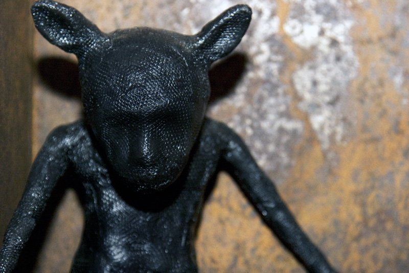
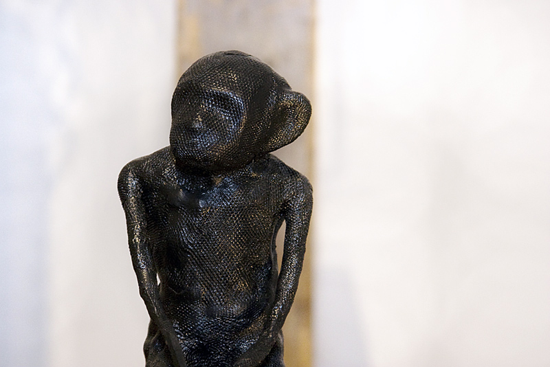
A stimulating exhibition by Emma Davies at Craft Victoria of polypropylene industrial netting and packaging that has been heated, moulded, sculpted and literally morphed into these fantastical sculptures, inspired by the artist’s experiences when visiting Johannesburg in South Africa as part of the South Project. Davies evokes the mysterious and the bizarre in her figures, making the commonplace into something uncommon, taking her themes from the relics of bush medicine present in the street markets: the medicine market of Johannesburg full of dried animal bones, skulls, skins and bottles of alchemistic objects.
Despite their comforting South African names (translated into English as ‘hope’, ‘faith’, ‘quiet, tranquil’, ‘lady’, ‘chief’, ‘prince’ for example) these extremely individual figurative ‘presences’ have a powerful melancholic affect on the viewer. Their elongated long legged and armed, no necked forms create dark eyeless creatures that crouch in rusted boxes or sit on wooden posts with their legs and arms hanging, folded. They seem lonely and sad despite their titles, perhaps reflecting the harsh realities of a life of poverty on the streets of Soweto.
Two figures on wooden blocks seem to walk aimlessly, placed on large rough industrial tables with huge wheels while another figure sits up a rusted ladder propped against the wall. A group of figures are clustered together on top of large wooden posts of different heights, some with arms round each other for comfort, others with black or red feathers sprouting from shoulders, legs or wearing a red feathered skirt. These creatures create a marvellous group of contemplative wandering minstrels while behind them their eerie shadows fall on the gallery wall.
The crystalline nature to the surface of the creatures, like sparkling coal, reminds me of the work of William Kentridge, his white industrial protagonist Felix haunted by images of black workers deep underground mining coal (see Mine (1991) where his coffee plunger goes down into the ground through the bodies of black people). Some of the figures bat like ears also bring to mind the work of Francisco de Goya and specifically his work Los Caprichos (The Whims), plate 43 from the series of 80 etchings published in 1799 titled The Dream of Reason Produces Monsters. The artist described the collection as an exposé of “the innumerable foibles and follies to be found in any civilised society, and from the common prejudices and deceitful practices which custom, ignorance, or self-interest have made usual.”
As Goya began to sympathise with the suffering of the peasants so Davies seems to have been transformed by what she saw around her during her visit, trying to make sense of a foreign culture, dreaming the sleep of reason but surrounded and invaded by a world in which the natural and unnatural has fused and morphed.
I really liked this exhibition and the presence of these figures. I am obviously not alone as the show is almost sold out. A visit to these disturbing, enfolding creatures is recommended.
Dr Marcus Bunyan
All photographs courtesy of Craft Victoria (thankyou Amy Brand!) and taken by their photographer Alexia Skok. Please click on the photographs for a larger version of the image.
Emma Davies (Australian, b. 1968) Tariro (meaning ‘hope’) 2009
Emma Davies (Australian, b. 1968) Rutendo (detail – meaning ‘faith’) 2009
Francisco de Goya (Spanish, 1746-1828) Los Caprichos plate 43 from the series El sueño de la razón produce monstros 1799 Etching and aquatint Height: 21.3cm (8.3″) Width: 15.1cm (5.9″) Museo del Prado, Madrid
Emma Davies (Australian, b. 1968) Zola (detail – meaning ‘quiet, tranquil’) 2009
Emma Davies (Australian, b. 1968) Group with from left to right: Enitan (person of story), Ntombi (lady), Kgosi (chief), Nkosana (prince), Lucky and Alaba (second child after twins) 2009
Emma Davies (Australian, b. 1968) Nkosana (detail – meaning ‘prince’) 2009
Craft Victoria Watson Place, off Flinders Lane, Melbourne 3000 Phone: 03 9650 7775
Johannes Kuhnen (Australian born Germany, b. 1952) Rings 1971
This is a superlative exhibition, one of the highlights of the year so far in Melbourne.
The exhibition presents work from the early 1970s to contemporary work and evidences the breadth of vision of this master craftsman and artist, the arc of his investigation showing a consistency of feeling for the energy and form of his materials over many decades. Technically the work is superb; conceptually the work transcends the boundaries of jewellery and becomes something else altogether: it becomes magical.
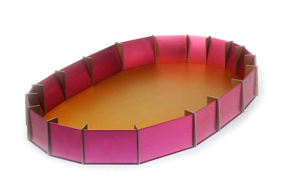
Kuhnen’s use of colour in his favoured anodised aluminium material is exquisite, the perfection of his forms flawless. His fabulous Vessels reminding me of the ancient Neolithic standing stone circles at Stonehenge in their shape and use of vertical buttresses in different materials (such as stainless steel and granite) that intersect the oval forms. His Boxes are like small ancient reliquaries, objects for holding ashes worked with a delicacy, simplicity and feeling for form and colour that is absolutely beautiful and consistent with the containment of energy within their structure.
I went with Marianne Cseh a jeweller friend of mine. We stood transfixed before this work, peering closely at it and gasping in appreciation of the beauty, technical proficiency and pure poetry of the pieces. This exhibition is highly recommended and not to be missed!
Now showing with the international SCHMUCK jewellery exhibition from Germany.
A book to accompany the exhibition is available from the RMIT Gallery.
Dr Marcus Bunyan
Many thankx to RMIT Gallery for allowing me to publish the photographs in the posting. Please click on the photographs for a larger version of the image.
Johannes Kuhnen (Australian born Germany, b. 1952) Ring 1972 Stainless steel, synthetic ruby disc
Johannes Kuhnen (Australian born Germany, b. 1952)
Brooch 2003 Anodised aluminium, monel
Ring 1972 Stainless steel, synthetic ruby disc
Johannes Kuhnen (Australian born Germany, b. 1952) Boxes 1980
Johannes Kuhnen (Australian born Germany, b. 1952) Box and pendant 1980
Johannes Kuhnen (Australian born Germany, b. 1952) Tray 1986 Anodised aluminium, titanium, stainless steel
Johannes Kuhnen (Australian born Germany, b. 1952) Centrepiece 1987
Johannes Kuhnen (Australian born Germany, b. 1952) Centrepiece 1991 Anodised aluminium, silver, monel: fabricated
In his work as a jeweller, object maker and photographer, Johannes Kuhnen is engaged with the interpretation and manipulation of a precise visual language of forms. The dramatic curvilinear shape of this centrepiece has been designed to emphasise the particular visual qualities of its materials and to fulfil its role as a low, but commanding central presence on a table. The vivid, iridescent colour of its anodised aluminium rim is designed to interact with differing light conditions, while the technical and precious qualities of its monel and silver elements play against each other. This orchestration of metals is underpinned with an unseen but precise and ingenious inner structure, giving this object weight and functional strength.
Johannes Kuhnen has made a pioneering contribution to Australian design and gold and silver smithing through his commitment as a generous educator and innovative practitioner. This exhibition will create linkages between his earlier works, some of which was made in Germany prior to migrating to Australia and new work specifically produced for this exhibition and this will be done both with objects and through a catalogue / monograph to be launched at the opening venue. The exhibition will borrow from Australian public and private collections to facilitate the demonstration of connecting design elements in the work from both significant streams in Kuhnen’s work in jewellery and hollowware.
Text from the RMIT Gallery website [Online] Cited 02/07/2009. No longer available online. Used under fair use conditions for the purposes of education and research
Johannes Kuhnen (Australian born Germany, b. 1952) Vessel 2007 Anodised aluminium, titanium, stainless steel 11.2 h x 84.5 w x 21.0 d cm Weight 14 kg
Johannes Kuhnen (Australian born Germany, b. 1952) Vessel 2008 Anodised aluminium, titanium, stainless steel
Johannes Kuhnen (Australian born Germany, b. 1952) Vessel 2009 Anodised aluminium, titanium, stainless steel
Johannes Kuhnen (Australian born Germany, b. 1952) Armring 1981 Anodised aluminium 9.8 h x 10.4 w cm
Johannes Kuhnen (Australian born Germany, b. 1952) Armring 1990 Armring, anodised aluminium, gold 750, granite
Apocrypha (from the Greek word ἀπόκρυφα, meaning “those having been hidden away”) are texts of uncertain authenticity, or writings where the authorship is questioned.
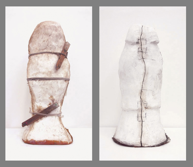
Julie Davis (Australian, b. 1959) and Alex Rizkalla (Australian, b. 1950) Apocrypha #1 (left) and Apocrypha #4 (right) 2008
“Intuitively we know the definition of the output from this process lies hidden within each object, seemingly carved into the underside of their skin, although we cannot see it. But actually it is not carved, it is the three-dimensional tracing of the original. The original becomes a throw-away. It is obsolete. The point of origin lies no longer within an object but at the heart of the creative impulse.”
Vanessa Mooney
Apocrypha is an interesting, if slight, exhibition of eleven photographs by Julie Davis and Alex Rizkalla at Place Gallery in Richmond. Conceptually the work is resolved if not pushed to any great depth, the small photographs of sarcophagi like casements and moulds addressing issues surrounding the absence / presence of the original object and the subsequent loss of identity. In their masking, the objects photographed hide an inner identity that has gone missing; the headless figures, like faceless mummies, protect something that has existed since early man – the inner spiritual machinations of belief – that are embedded within the existential nature of our being. Identity has been rubbed out and spirit is splitting apart the moulds trying to escape the confines of mortality, only held in check by the wooden pegs and ropes.
Like the sutures of the human skull, the marks on the casements (see below right image) try to align form across space and time but these objects are grounded in a contextless backgrounds, seemingly floating free of earthly constraints. Here we have a double tracing – that of the tracing of the original object that has been thrown away (see Vanessa Mooney quotation above) and the tracing of the indexicality of the object by the photograph – the re-presentation of an original that no longer exists. There is a double loss through this re-retracing that fits perfectly with the title Apocrypha – as the photographs become texts of uncertain authenticity.
Where the exhibition is less successful is in the physical presence of the photographs and their aesthetic qualities. While Vanessa Mooney asserts that the photographs are “meticulous in their detail and exact in their depth and texture” this assertion is untrue.
From a technical point of view the photographs are soft in focus and lack depth of field. The ropes are fuzzy and the lack of depth of field in the focus plane from front to back adds to a lack of presence that the photographs needed to counterbalance the conceptual idea of apocrypha. I am also unsure about the scale of the photographs – there seems something in-between about the size of the images, neither here nor there.
Aesthetically they needed either more presence (through being bigger), or more intensity through a jewel-like nature in being smaller, again to counterbalance the conceptual themes.
Finally, being surrounded by these eleven photographs in the gallery gives you the feeling of a ‘one shot’ idea that needed further investigation and refinement, an idea that needed to be pushed further.
While the actual ideas themselves are interesting the work itself is too simple, too slight to hold the attention and reveal layers of meaning over time.
Dr Marcus Bunyan
Many thankx to Place Gallery for allowing me to publish the photographs in the posting.
Julie Davis (Australian, b. 1959) and Alex Rizkalla (Australian, b. 1950) Apocrypha #5 (left) and Apocrypha #7 (right) 2008
The Father, The Son And Apocrypha
We all have faith that we must lodge somewhere: you; the microscope, me; the earth, and the artist? There are two stories present. The first is Apocrypha, a series of works by Davies and Rizkalla and the second is something you cannot see but will soon know.
Davies and Rizkalla present to us Apocrypha; a series of photographs that are meticulous in their detail and exact in their depth and texture. It is an evocative title and encapsulates the resonance of the objects. What we can see is clear – plaster moulds used by someone, somewhere for casting objects. The clarity of the details of rope, wedges of wood and the depth of the seam tell us of the real working nature of them. The inversion here from background process to foreground subject matter is not for irony’s sake but to evoke the simultaneous banality and sacredness of the transformative creative process. It is documented honestly before the viewer, and yet, the mystery remains. Intuitively we know the definition of the output from this process lies hidden within each object, seemingly carved into the underside of their skin, although we cannot see it. But actually it is not carved, it is the three-dimensional tracing of the original. The original becomes a throw-away. It is obsolete. The point of origin lies no longer within an object but at the heart of the creative impulse.
Tony Scalzo, my father-in-law, was drawn to this process. While the creation of a religious icon amused his communist leanings the irresistible pull of the transformation from dust and water to artefact must have, I feel, fulfilled a greater need to live through making. Countless times he would present to us his recent army of saints or holy persons (Padre Pio was a boom time) to be sold through his community, and would scoff and laugh at how he could make an object that to others was an icon. He would point to the shed, the latex, the plaster dust as if to dispel the mystery, and yet the mystery remained.
Perhaps the final mystery is the process, the collaboration that has come about since Tony passed away and his son Stefano came into possession of the simple and unusual collection. Stefano like his father is drawn to the creative process. So innately aware of the artist, his father, he approached Julie and Alex with these as gifts that are, in a way, not his to give. As a custodian might he passed on the objects and communicated his intuitive knowledge of their meaning. One plus one equals three. The result, Apocrypha, is like a window that was obscured and now has been opened. We can see with clarity what was unseen, but known, before. Apocrypha silently demonstrates the entwining of faith and mystery in the creative life of all.”
Vanessa Mooney
Text from the Place Gallery website [Online] Cited 09/03/2019. No longer available online. Used under fair use conditions for the purposes of education and research
Julie Davis (Australian, b 1959) and Alex Rizkalla (Australian, b. 1950) Apocrypha #8 (left) and Apocrypha #9 (right) 2008
Installation view of LE MONDE v. DER MOND by Matthew Hale at The Narrows, Melbourne with n.n. (2008) centre bottom, andPage 93 of MIRIAM DIVORCEE (2008) centre right
Below is the only text I could find on the work – some of which was displayed in London earlier this year.
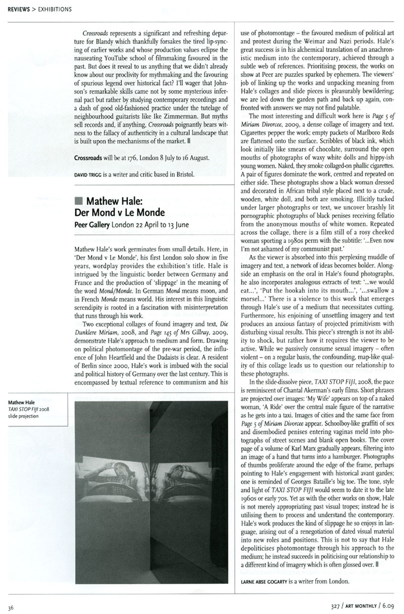
DER MOND v LE MONDE is Mathew Hale’s first solo exhibition in London for five years. It consists of five works: one two-projector and one three-projector slide piece; a constructed painting (that could equally be described as a wall-mounted sculpture); and two large collage works …
Hale’s work has many possible points of departure: a found photograph, a scrap of paper, a page torn from an instructive and obscure book, a bit of out-moded pornography, some anachronistic advertising from the 1970s or 1980s and so forth. Once plucked from a huge collection of such material amassed in his domestic studio space, the work evolves like an unplanned journey – both moving away and turning back on itself … The path of discovery in Hale’s work is the subject of his work, providing it with narrative and process.
With its roots in the collage traditions of political photomontage, dadaist assemblage and free associative surrealism, Hale’s work prioritises process over methodology or style. It activates a complex web of references that takes in history, politics, literature, and philosophy, as much as it does sex, religion, art, architecture and popular culture. To engage with the work is to become carried along by clues that lead to other clues and then circuitously lead somewhere else unexpected yet somehow familiar. Sometimes the clues are visual, sometimes they are language based, often they are both. Even when the work is finished and exhibited it is in a state of flux, the meaning is not fixed. Hale likes slippage of meaning and this constant state of ambiguity and openness for (mis)interpretation or confusion. He explains the title of the show as follows: ‘[in German] … and strikingly weirdly, “der Mond” means “The Moon” and, as we all know, “Le Monde” means “The Earth”. How can a word flip so totally by crossing a border? I am making a work for the show which hinges on their being apparently identical (almost) and yet meaning precisely the opposite – I wonder how it happened.’
Text from the London exhibition of this work (note with title reversed!), on the Peer website [Online] Cited 23/06/2009. No longer available online. Used under fair use conditions for the purposes of education and research
Matthew Hale (British, b. 1962) Page 93 of MIRIAM DIVORCEE 2008 Paper collage 69 x 103cm
Matthew Hale (British, b. 1962) Page 150 of MIRIAM DIVORCEE (detail) 2008 Paper collage
Matthew Hale (British, b. 1962) n.n. 2008 Rifle, paper collage 69 x 153cm
Matthew Hale (British, b. 1962) Page 145 of MRS. GILLRAY 2009 Paper collage
Matthew Hale (British, b. 1962) Page 48 of DIE NEUE MIRIAM 2008 Paper collage
Review in Art Monthly, June 2009 from the Peer website [Online] Cited 23/06/2009. No longer available online. Used under fair use conditions for the purposes of education and research
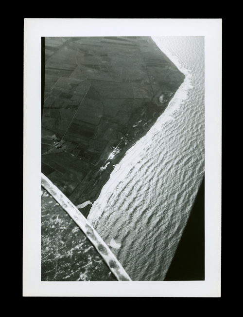
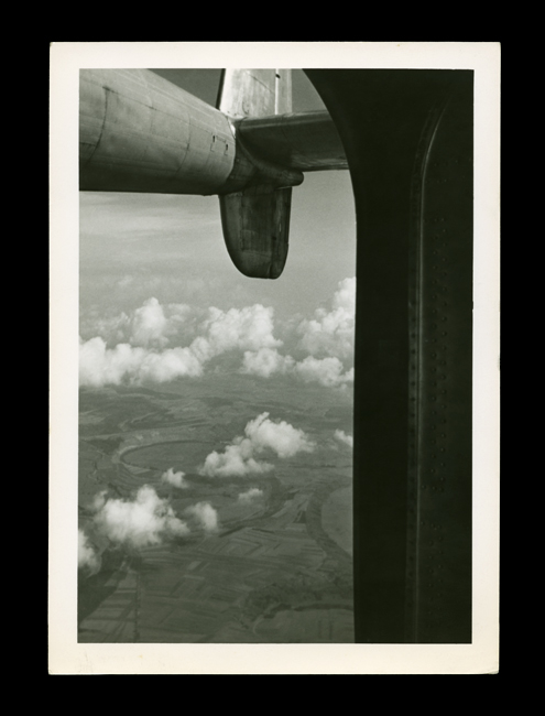
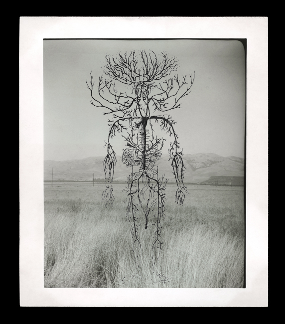
Marcus Bunyan (Australian, b. 1958) Spire of der Dom, 1 – 52 2009 From the series The Shape of Dreams Gelatin silver print
The Shape of Dreams
I am pleased to announce a body of work, the second for 2009, is now online on my website.
The photographs are a sequence: one tone follows another (much like a piece of music) until the final coda. With this in mind please view the work sequentially. Below are a selection of photographs from the whole work.
Dr Marcus Bunyan
Please click on the photographs for a larger version of the image.
Photographs are available from this series for purchase. As a guide, a digital colour 16″ x 20″ costs $1000 plus tracked and insured shipping. For more information please see my Store web page.
Photographs from the series The Shape of Dreams 2009
“the form of formlessness the shape of dreams”
Marcus Bunyan (Australian, b. 1958) Untitled 2009 From the series The Shape of Dreams Gelatin silver print
Marcus Bunyan (Australian, b. 1958) Untitled 2009 From the series The Shape of Dreams Gelatin silver print
Marcus Bunyan (Australian, b. 1958) Untitled 2009 From the series The Shape of Dreams Gelatin silver print
Marcus Bunyan (Australian, b. 1958) 9/24/52 2009 From the series The Shape of Dreams Gelatin silver print
Marcus Bunyan (Australian, b. 1958) Untitled 2009 From the series The Shape of Dreams Gelatin silver print
Marcus Bunyan (Australian, b. 1958) Navy Base, Unidentified 2009 From the series The Shape of Dreams Gelatin silver print
Marcus Bunyan (Australian, b. 1958) Untitled 2009 From the series The Shape of Dreams Gelatin silver print
Marcus Bunyan (Australian, b. 1958) Part of the French Riviera taken while Whit held me at the door! 2009 From the series The Shape of Dreams Gelatin silver print
Marcus Bunyan (Australian, b. 1958) Untitled 2009 From the series The Shape of Dreams Gelatin silver print
Marcus Bunyan (Australian, b. 1958) Untitled 2009 From the series The Shape of Dreams Gelatin silver print
All the photographs from the series are now on my website.
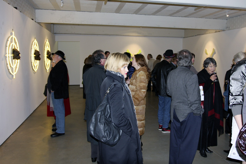
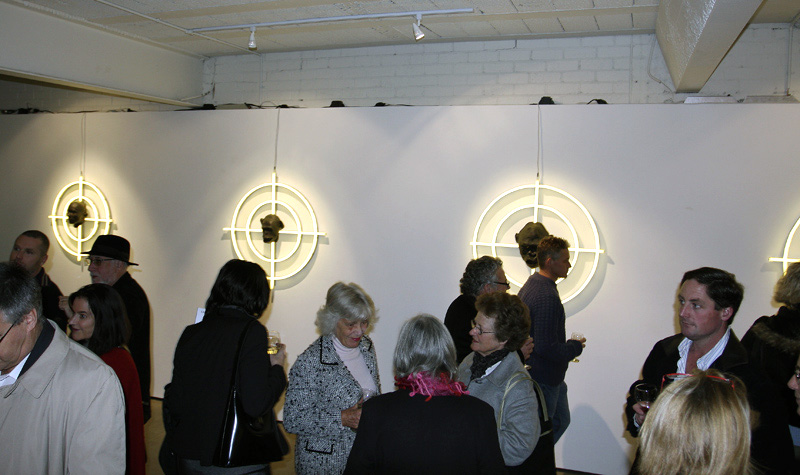
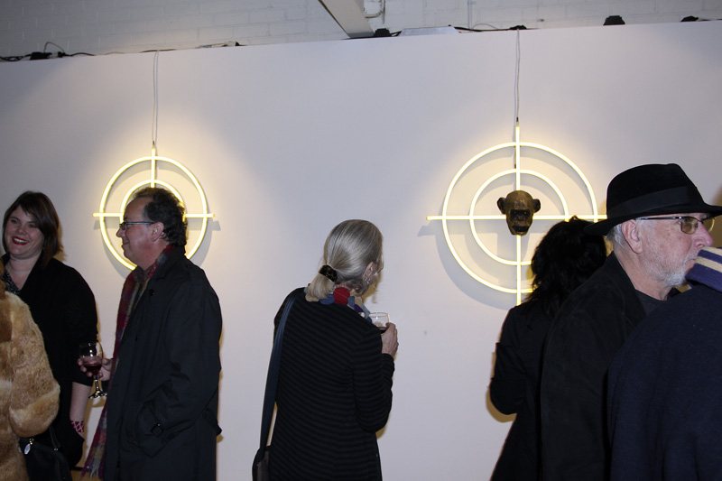
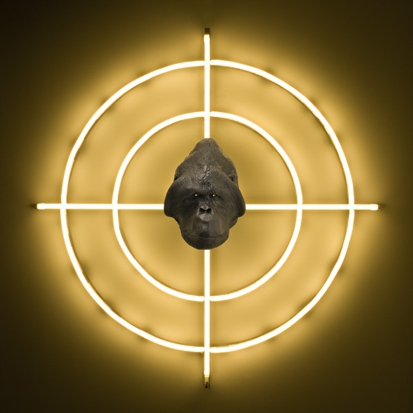
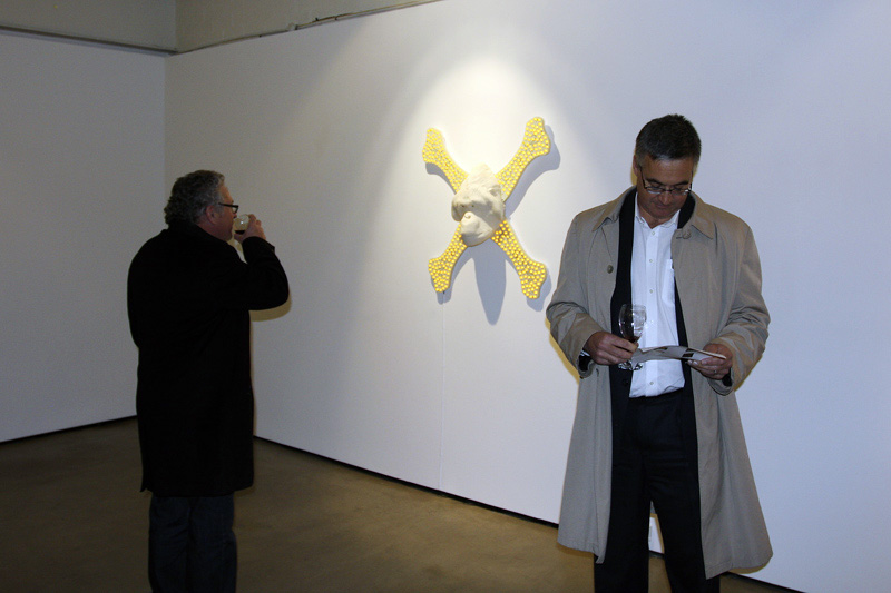
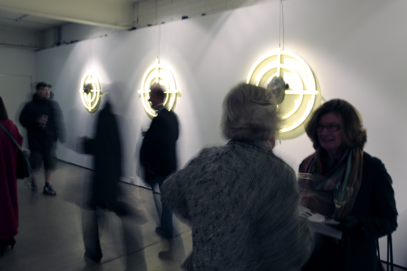
Opening night crowd in front of the work In-Sight (2009) by Lisa Roet at Karen Woodbury Gallery, Melbourne
Another excellent opening this time of the work of the delightful Lisa Roet. If you visit the gallery don’t forget the upstairs exhibition space with further work by the artist including a marvellous large bronze Orangutan Foot.














![Tacita Dean. 'Noir et Blanc [Still]' 2006](https://artblart.com/wp-content/uploads/2009/07/noir_et_blanc-2006.jpg "Tacita Dean. 'Noir et Blanc [Still]' 2006")


















You must be logged in to post a comment.