Marcus Bunyan (Australian, b. 1958) Untitled 2017-2020 From the series Stones, Vaults, Flowers: Père Lachaise Digital photograph
les jeunes ñ’oublient pas souvenir et jeunesse
young people don’t forget memory and youth
Stones, Vaults, Flowers: Père Lachaise
A body of work from Père Lachaise cemetery, Paris. Unfortunately, I can’t display the series how I would like them laid out on Art Blart due to the limited page width… please see the layout on desktop (not mobile, again problems) at https://marcusbunyan.com/stones-vaults-flowers-pere-lachaise/
There are some beautiful individual images here – closing in on details, low depth of field, over saturated colours, out of focus, blurred – but in bringing them together I compose with the camera … a feeling, an homage to this place.
Conceptual: Instead of the axis ‘xyz’ being ‘space time context’ I roll the matrix through 90 degrees so the axis is now context (x), space (y) and time (z) – time being the floating variable (not just the variable time of the camera’s shutter): a photograph of the memorial to the victims of the Paris Commune; photographs of the tomb of Victor Noir who became a symbol of opposition to the imperial regime after he was assassinated; photographs of stones laid in respect to the victims of the Nazi death camps; the life of flowers (mostly artificial); the light streaming through stained glass windows at the back of vaults. Light, bending, light bending – illuminating the Stygian darkness, revealing hidden relations, small revelations.
I am the unmoved mover contemplating the perfectly beautiful, indivisible connection between life and death.
Photographs are available from this series for purchase. As a guide, a digital colour 16″ x 20″ print costs $1,000 plus tracked and insured shipping. For more information please see the Store web page.
Exhibition dates: 25th September – 22nd November, 2015
Judges: The 2015 William and Winifred Bowness Photography Prize was judged by MGA Senior Curator Stephen Zagala, renowned artist Bill Henson, and Bendigo Art Gallery Director Karen Quinlan
Installation photograph of the William and Winifred Bowness Photography Prize 2015 at the Monash Gallery of Art Photo: Marcus Bunyan
Reality, passing
In terms of the professional quality of work, the pristine printing and framing, and the “less is more” nature of the hang, this is the best William and Winifred Bowness Photography Prize I have seen at the Monash Gallery of Art. The surprise about the nature of this year’s finalists is the surfeit of landscape work and the weakness of the portrait photographs. Key words when looking at the landscape work are: the sublime, internal terrain, elision, fear, darkness, constructed landscapes, aesthetic hyper reality, unreachable worlds, presence and absence, layering, pigment prints.
There is a heavy sense of un/reality about all of the landscape work, as though there is no such thing as the unmediated, straight landscape photograph any more. Reality passes (passing itself off for something else), and the viewer is left to tease out what is constructed (or not), how many layers (both mental and physical) are involved, and what the possible outcomes might be. In this post-landscape photography even straight digital photographs or analogue photographs of the landscape take on this desiccated view complete with surface flatness and “air” of unreality.
For example, look at Murray Fredericks’ North Stradbroke (2014), Silvi Glattauer’s Altiplano 1 (2015) Anne Algar’s Eruption (2015) and numerous others throughout the exhibition. These places exist in real life yet feel so un/real in these photographs – through scale, through colour, through surface – that you are left wondering what’s it all about. There is certainly no link to traditional notions of the sublime and little connection to the elemental (as in the object as itself). As I have said before about contemporary photography, these photographs are all about the photographers ideas and desires, not about the world itself. The photographs are flat are rather uninteresting with no depth of feeling or ambiguity of meaning. I found it hard to get excited about any of the landscape photographs.
And when photographers do use traditional techniques, such as black and white printing, silver gelatin prints or the analogue / digital combo, the results are similarly underwhelming. It is as if the aesthetic of the digital realm, this aesthetic hyper reality, has taken over how people use analogue photography as well. Robert Ashton’s Opening (2015) (analogue/digital), David Bibby’s Untitled #1 (2014) (black and white digital) and Virginia Cummins’ Gone tender, river’s edge (2015) (silver gelatin print) all evidence this cut-up, layering, obscure non-seeing where the magic of the traditional print has been lost.
Another surprise to me was that the two works that I found most successful in the exhibition were two of the most heavily conceptual. These images were both beautiful and intellectually stimulating. Brook Andrew’s Possessed II (2015) left me wondering about the original slides, marvelling at the technique used to create the image and wanting to see the rest of the series and interrogate further the artist’s background and “the tradition of the psychological in depiction and stories of the Australian alien landscape.” There was ambiguity and feeling here!
The work that I thought should have won was Peta Clancy’s She carries it all like a map on her skin (2014-2015). I have always liked Clancy’s work for there is so much sensitivity to subject matter embedded in her work. Clancy probes the boundaries of the photograph and the skin through punctures made using a fine silver needle to create a lace-like effect or ‘internalised landscape’ which is visible from both the emulsion and non-emulsion sides of the print. She then re-photographs the photograph and punctures the print again, the print becoming a palimpsest of punctures, of wounds, of the journey of life (with the needles link to woman’s work and the lips relation to desire). The installation of the work then emphasises the physicality of the print, Clancy “activating the materiality of the photographic medium by exploring photographs in terms of what the image content depicts as well as three-dimensional objects that exist in space and time.” Such a wonderfully tactile, sensual and conceptual work of negative / positive, presence / absence that kept drawing me back to hidden worlds.
As for the winner, Joseph McGlennon’s Florilegium #1 (2014), according to gallery staff some people love it and some people don’t. I am of the latter camp. The photograph is beautiful and “pretty” in a superficial, constructed way but flat like a piece of Florence Broadhurst wallpaper in another. Basically it’s an illustrated plate from a 19th century colour plate book made out of multiple negatives and digitally rendered. These images are taken in the exotic locations of Madagascar, Tahiti and Singapore and one could apply the critique of “Orientalism” to this piece of work… the proposal of lush landscapes and unreachable worlds as ‘Other’ – the imitation or depiction of aspects in Middle Eastern, South Asian, African and East Asian landscapes and cultures evidenced by a patronising Western attitude towards them. Further, photographs such as Valerie Sparks’ Le vol 1 (2014) imagine this exotic ‘Other’ by pasting taxidermy birds into “hybrid” (in other words, artist made) environments, while work such as Carolyn Young’s Reference grassy woodland: spring (Bookham) (2014) topographically map a uniform, constructed, imagined terrain of becoming that will never exist.
Most of the landscape work could be associated with a de-territorialization and re-territorialization of meaning across locations and through technologies (Deleuze, Gilles and Guattari, Felix. A Thousand Plateaus: Capitalism and Schizophrenia. Minneapolis and London: University of Minneapolis Press, 1987), where moments of connectivity and the assemblages that form them, “are the processes by which various configurations of linked components function in an intersection with each other, a process that can be both productive and disruptive. Any such process involves a territorialization; there is a double movement where something accumulates meanings (re-territorialization), but does so co-extensively with a de-territorialization where the same thing is disinvested of meanings.”1 Unfortunately in this exhibition, the intensification of these processes around a particular site through a multiplicity of intersections in these landscape photographs, are mostly dead ends. They lead nowhere of much interest and they fail to speak to me, which is what I want art to do.
What I have picked up from all this viewing is another couple of insights. It’s a sad state of affairs to see “Collection of the artist” on most of these works. Hardly a single one is in a collection. It’s difficult to be a contemporary photographic artist in Australia. You will make no money at it, even if you are represented by commercial gallery for, unlike America, there are simply not the collectors in Australia for the art of contemporary photography. Even as I critique the work, I admire the artist’s for producing it, for I know the cost, courage and dedication needed to keep making work that hardly ever gets purchased.
And secondly, all of these “pigment” prints. A pigment is a colouring matter or substance which when suspended in a liquid vehicle becomes a paint, ink, etc. or whose presence in the tissues or cells of animals or plants colours them. In other words, it is an additive which has no real body of its own. No wonder all of these pigment prints look so flat and have the feeling of a lack of depth. Show me a Stephen Shore original photograph and I will show you more presence than all of these digital prints put together.
Dr Marcus Bunyan
Word count: 1,220
1/ Wood, Aylish. “Fresh Kill: Information technologies as sites of resistance,” in Munt, Sally (ed.,). Technospaces: Inside the New Media. London: Continuum, 2001, p. 166.
Installation photographs of the William and Winifred Bowness Photography Prize 2015 at the Monash Gallery of Art Photos: Marcus Bunyan
Peta Clancy (Australian, b. 1970) She carries it all like a map on her skin 2014-2015 From the series Punctures Chromgenic prints 55 x 80cm (each) Reproduction courtesy of the artist
The series Punctures which explores skin, mortality and ageing expands on my long-term preoccupation with probing the boundaries of the photograph and the skin. Comprised of images of a woman’s lips punctured with a fine silver needle to create a lace-like effect or ‘internalised landscape’ and visible from both the emulsion and non-emulsion sides of the print. I am interested in activating the materiality of the photographic medium by exploring photographs in terms of what the image content depicts as well as three-dimensional objects that exist in space and time.
Installation photographs of Peta Clancy’s She carries it all like a map on her skin (2014-2015) Photos: Marcus Bunyan
In 2006 the MGA Foundation established the William and Winifred Bowness Photography Prize to promote excellence in contemporary Australian photography. The annual $25,000 non-acquisitive William and Winifred Bowness Photography Prize is an initiative of the MGA Foundation.
MGA Senior Curator, Stephen Zagala was joined by two of Australia’s most notable art world figures, Bill Henson and Karen Quinlan, to select the finalists for this year. The prize is open to any Australian photographer, whether amateur or professional, and all genres of photography are eligible, provided that the work has been produced in the last 12 months. Each year a panel of three judges considers hundreds of entries and curates an exhibition of finalists, before settling on a single winner.
The panel selected the shortlist of 47 works to be exhibited, and will convene again when the exhibition has been installed to choose a winner, which will be announced on Thursday 1 October. Bill Henson said of the selection process: ‘In the end, it really just comes down to how compelling I find a work to be. Matters of subject, issue or agenda have to find a form which is their equal for without that we’re left with something that simply holds no interest for us.’
Finalists: Anne Algar, Brook Andrew, Robert Ashton, Svetlana Bailey, Del Kathryn Barton, Clare Bedford, David Bibby, Devika Bilimoria, Frederico Câmara, Peter Campbell, Danica Chappell, Che Chorley, Peta Clancy, Virginia Cummins, Rebecca Dagnall, Cherine Fahd, David Flanagan, Murray Fredericks, Silvi Glattauer, Wayne Grivell, Molly Harris, Kern Hendricks, Lyndal Irons, Mark Kimber, Courtney Krawec, Michael Krzanich, Cathy Laudenbach, Jon Lewis, David Manley, AHC McDonald, Joseph McGlennon, Rod McNicol, Bill Moseley, Ward Roberts, Daniel Shipp, Valerie Sparks, Rodney Stewart, Rebekah Stuart, Ian Tippett, Justine Varga, John Watson, Kim Westcott, Peter Whyte, Amanda Williams, Rudi Williams, Melissa Williams-Brown and Carolyn Young.
On Thursday 1 October Joseph McGlennon was announced as the $25,000 winner of the William and Winifred Bowness Photography Prize. Colour Factory Honourable Mentions were awarded to Peter Campbell, Daniel Shipp and Valerie Sparks.
Text from the MGA website
Brook Andrew (Australian, b. 1970) Possessed II 2015 Gelatin silver print 137 x 127cm Reproduction courtesy of the artist, Tolarno Galleries (Melbourne) and Galerie Nathalie Obadia (Paris and Brussels)
Possessed is a black-and-white photographic series inspired by a rare collection of late 19th-century glass lantern slides depicting images of landscapes from Tasmania and Victoria. Recreated in a trompe l’oeil visual effect – some aspects of this work are akin to Rorschach imagery practice and reference the tradition of the psychological in depiction and stories of the Australian alien landscape.
Robert Ashton (Australian, b. 1950) Opening 2015 Pigment ink-jet print 60 x 95cm Reproduction courtesy of the artist
I have lived close to the scrubby coastal bush for many years and watched it continually transform through fire, drought and habitation. This landscape can be an unsettling place and I am continually drawn to it, trying to describe the beauty and menace. For these images I have used a 4 x 5 field camera to facilitate a slower and more concise way of working. Looking for the place where the literal meets the abstract. Taking only a couple of exposures, committing to the moment. Embracing the limitations of the medium and letting the result be defined by the practice. As a diptych the images form a complimentary pair. Each distinct but instructing the other, to make a series of fractured dioramas.
David Bibby (Australian, b. 1970) Untitled #1 2014 From the series Darkness Pigment ink-jet print 50 x 75cm Reproduction courtesy of the artist
Fear of dark places gave our ancient ancestors an evolutionary advantage, by priming brains and bodies for a fight-or-flight response when faced with the threat of danger or the unknown. These primal fears also had a strong influence on our cultures. Our fear of darkness and of forests, as dark places that conceal the unknown, has placed them at the centre of many of our myths, legends and folktales.
Despite, or perhaps because of our fear we seem to have an attraction to the darkness and there is something intrinsically beautiful in many dark images. Maybe the darkness has become a refuge in the modern world for those things we can’t control, including mystery and imagination.
Virginia Cummins Gone tender, river’s edge 2015 From the series Spirit work Gelatin silver print 70 x 70cm reproduction courtesy of the artist
This image was shot in remote South Gippsland, where I grew up. It’s part of the Spirit work series, exploring the positive power of nature and how our immersion in this world can move and change us. This work calls on the old-world landscape tradition of Romanticism and the quest for ‘the sublime’. To acknowledge the strength and transformative qualities of nature seems vital right now, in light of society’s blinkered approach to environmental concerns and our preoccupation with communication through technology.
This series was shot with obscure film cameras from the 1950s and 1960s. I enjoy the meditative qualities of traditional photographic practices and the potential for a bit of magic in these revelations.
Rebecca Dagnall (Australian, b. 1972) Pioneer pool 2015 From the series In the presence of absence – states of being in the Australian landscape Pigment ink-jet print 100 x 150cm Reproduction courtesy of the artist
There is certain darkness in the Australian imaginary of the landscape that is tangled in a history that holds both a presence and an absence, a knowledge and yet a denial of past colonial deeds. It is as though this history haunts the landscape, like a ‘ghost’ with unfinished business. My current work is an exploration of how the Australian Gothic informs our response to the Australian landscape. The images respond to myths and stories about the landscape that focus on an understanding of the things that we cannot see.
Svetlana Bailey (German born Russia, b. 1984) Utah 2015 From the series All dreams come true Pigment ink-jet print 114 x 91cm Reproduction courtesy of the artist
I work with images or artefacts that I find, such as on walls, billboards or shop window displays. They present an alternative reality, and I photograph them with their surroundings, and flatten these two spaces into one. Often the images I find are a montage, creating a reality that never truly existed. I collect them into a personal global album of images created by strangers in response to a common dream. Perhaps their makers considered place and interpreted its environment and beliefs, or were trying to shape our perception of reality. I wonder if these images exist for us or against us, if they beautify our life or mislead us, and if believing in their deception adds to our satisfaction.
Frederico Cãmara (Brazilian, b. 1971) Sydney Sealife Aquarium, Sydney, Australia 2014 From the series Views of Paradise Pigment ink-jet print 150 x 120cm Reproduction courtesy of the artist
Views of Paradise is a research project that aims to create a world atlas of the artificial environments of zoos and aquariums, as an investigation on the relations between the zoo and the concepts of paradise, utopia, dystopia and heterotopia. This project signals the possibility of a meaningful existence for the empty zoo, either as image or an actual site, by shifting the viewer’s gaze from the animal to humans, as principal agents in the destruction of the environment, and our failed attempt at its re-creation.
Currently, the focus of this project is Oceania (Australia, New Zealand, Papua New Guinea and New Caledonia), where it will identify the characteristics that are related to this region’s natural and cultural environments.
Murray Fredericks (Australian, b. 1970) North Stradbroke 2014 From the series Origins Pigment ink-jet print 90 x 250cm Reproduction courtesy of the artist, ARC One (Melbourne) and Annandale Galleries (Sydney)
This work is drawn from my current series Origins. In Origins fire has become the central subject, specifically with regards to fire’s place in the social and cultural imagination of Australia. ‘North Stradbroke’ records the scene of a wildfire sparked by lightning, causing holidaymakers to flee their bush campsites under a thunderstorm as it moves up the coast.
Silvi Glattauer (Australian born Argentina, b. 1977) Altiplano 1 2015 From the series Altiplano Pigment ink-jet print 100 x 140cm Reproduction courtesy of the artist
A personal narrative of identity that pendulates between Australia and South America. I am drawn to these elusive Altiplanic landscapes as abstract topographical storyboards that read like textural braille. The aesthetic hyper reality that is often associated with classical landscape photography is replaced here with a ‘visual text’.
Anne Algar Eruption 2015 From the series Night sky Pigment ink-jet print 60.0 x 90.0cm Reproduction courtesy of the artist
This image reflects my interest in low light landscape and night sky photography. We have scientific knowledge and understanding of the night sky but there is also an emotional element, whereby our human experience of it has no bearing on its material make up. For example many Indigenous Australians refer to the Milky Way as the ’emu’.
For me, there is a certain wonder, excitement and sometimes trepidation when photographing at night. What intrigues me is how objects, vistas and other things, only dimly visible to the human eye in darkness, can be captured in infinite detail by the camera, due to its greater light sensitivity and colour spectrum. It truly does open up another world.
Rebekah Stuart Dreaming in reverse 2 2014 From the series Pictures of elision Pigment ink-jet print 102 x 140cm Reproduction courtesy of the artist
I am a contemporary visual artist who explores an alternative aesthetic to the traditional and romantic landscape. Constructing fragments of nature via digital media I create landscapes that do not exist in reality. The images evolve in a similar fashion to painting, over long duration. I build and refine details for a new whole to emerge, disorientating the observer’s position in a subtle way to reflect on their own internal terrain. The landscapes are a reflection of the horizons carried within – an intimate sublime for a time when wilderness is perhaps uninhabitable.
Valerie Sparks (Australian, b. 1960) Le vol 1 2014 From the series Le vol Pigment ink-jet print 140 x 229cm Reproduction courtesy of the artist and THIS IS NO FANTASY + dianne tanzer gallery (Melbourne)
I am interested in hybrid environments as a reflection of migration as an ongoing natural and cultural occurrence. The birds in this work were photographed at the Vienna and La Rochelle Natural History Museums. These extraordinary collections include birds collected on Cook’s voyages to the Pacific, as well as many collected from South East Asia, Indonesia, Brazil and other South and Central American locations as far back as the mid 1700s. The French term le vol translates as flight, flying, theft or burglary. For the birds in this work, life and flight have been stolen and yet reanimated by the taxidermist. Whereas collecting practices have changed dramatically, the work raises questions about early collecting practices as acts of theft.
Carolyn Young Reference grassy woodland: spring (Bookham) 2014 From the series Grassy woodlands Pigment ink-jet print 70 x 84.9cm Reproduction courtesy of the artist and Weswal Gallery (Tamworth)
For a number of years I have been documenting grassy woodlands in NSW and Victoria. Once common, these ecosystems have been reduced to small pockets amongst farmed land, along roadsides, across reserves and in tucked away cemeteries. Responding to ecologists and landholders, I return to the same sites and shoot seasonally. Represented in my photographs are intact (reference) grassy woodlands, and woodlands that have been altered by agriculture. The repetitive still life structure across my photographs highlights the change in plant diversity as land management changes. The images urge viewers to reflect on the past, present and future of these woodlands.
Joseph McGlennon (Australian born Scotland, b. 1957) Florilegium #1 2014 From the series Florilegium Pigment ink-jet print 127 x 100cm Reproduction courtesy of the artist and Michael Reid (Sydney)
A Latin term reconfigured in the Middle Ages; florilegium (to gather flowers), had its early language roots in the gathering together of scholarly church writings, into the one tome. In the 16th and 17th centuries, Botanical Gardens emerged across Europe, privately hoarding exotic world flowers and animals, signalling the rise of the illustrated colour plate book. The growing desire to corral and record the world’s flora and fauna, alongside the growing confidence in science, all fused to produce a notion of the florilegium as a luxurious record of the rare; of important beauties to be viewed in the one vista.
Photographed in Madagascar, Tahiti and Singapore, in ‘Florilegium #1’, I have captured each bird, flower, vine and butterfly and created a florolegium landscape straight from the Age of Enlightenment. There is an enchanting clash of empirical scientific observation coupled with a deep romantically lush and diffused spotlight of compassion for something wild, observed for a brilliant moment before vanishing into the fog of time. This lush landscape dwells in a most complex, beautiful and sadly unreachable world.
$25,000 winner
Monash Gallery of Art 860 Ferntree Gully Road, Wheelers Hill Victoria 3150 Australia Phone: + 61 3 8544 0500
Marcus Bunyan (Australian, b. 1958) Untitled 2015 Digital photograph From the series Too Much of the Air
Too Much of the Air
After 16 months hard work, I have completed a new 52 image sequence.
These images will be printed large to reinforce the disintegration of the image, technology and human being. Tullio Crali‘s painting Before the Parachute Opens (Prima che si apra il paracadute) (1939) was one of a few starting points, inspirations, for the new sequence.
Below is a selection of images from the sequence. Please click on the photographs for a larger version of the image.
Photographs are available from this series for purchase. As a guide, a digital colour 16″ x 20″ costs $1000 plus tracked and insured shipping. For more information please see my Store web page.
“Imagine being in these planes knowing that you only had moments to live, and knowing that you could do nothing about it. What brought you to that point, what decisions did you take as a human being (or were taken for you) that enacted this scenario.
The “greatness” as the event passes is what is being worked with here. It is the inverse aspect of the sublime. Usually the sublime is regarded as beyond time … but not here. Essentially I am sustaining the last moments of a doomed life, outside of time.
We are unusually privileged to experience the sublime in this way. It is usually a lost aspect through the death of the witness.”
Darron Davies (Australian) Encased 2012 Archival Pigment Print on Photo Rag 80 x 80cm / edition of 6
Here’s my pick of the nine best local exhibitions which featured on the Art Blart art and cultural memory archive in 2013 (plus a favourite of the year from Hobart). Enjoy!
Dr Marcus Bunyan
1/ Review: Terraria by Darron Davies at Edmund Pearce Gallery, Melbourne
This is the first “magical” exhibition of photography that I have seen in Melbourne this year. Comprising just seven moderately large Archival Pigment Print on Photo Rag images mounted in white frames, this exhibition swept me off my feet. The photographs are beautiful, subtle, nuanced evocations to the fragility and enduring nature of life…
A sense of day / dreaming is possible when looking at these images. Interior / exterior, size / scale, ego / self are not fixed but fluid, like the condensation that runs down the inside of these environments (much like blood circulates our body). This allows the viewer’s mind to roam at will, to ponder the mysteries of our short, improbable, joyous life. The poetic titles add to this introspective reflection. I came away from viewing these magical, self sustaining vessels with an incredibly happy glow, more aware of my own body and its relationship to the world than before I had entered Darron Davies enveloping, terrarium world.
Darron Davies (Australian) The Red Shard 2012 Archival Pigment Print on Photo Rag 80 x 80cm / edition of 6
Presently, contemporary photography is able to reveal intangible, constructed vistas that live outside the realm of the scientific. A photograph becomes a perspective on the world, an orientation to the world based on human agency. An image-maker takes resources for meaning (a visual language, how the image is made and what it is about), undertakes a design process (the process of image-making), and in so doing re-images the world in a way that it has never quite been seen before.
These ideas are what a fascinating exhibition titled Confounding: Contemporary Photography, at the National Gallery of Victoria, Melbourne investigates. In the confounding of contemporary photography we are no longer witnessing a lived reality but a break down of binaries such as sacred and profane, public and private, natural and artificial, real and dreamed environments as artists present their subjective visions of imagined, created worlds. Each image presents the viewerwith a conundrum that investigates the relationship between photographs and the “real” world they supposedly record. How do these photographs make you feel about this constructed, confounding world? These fields of existence?
This is a tough, stimulating exhibition of late works by Louise Bourgeois at Heide Museum of Modern Art, Melbourne. All the main themes of the artist’s work explored over many years are represented in these late works: memory, emotion, anxiety, family, relationships, childhood, pain, desire and eroticism are all present as are female subjectivity and sexuality, expressed through the body…
Bourgeois’ work gives me an overall feeling of immersion in a world view, one that transcends the pain and speaks truth to power. Bourgeois confronted the emotion, memory or barrier to communication that generated her mood and the work. She observed, “My art is an exorcism. My sculpture allows me to re-experience fear, to give it a physicality, so that I am able to hack away at it.” By weaving, stitching and sewing Bourgeois threaded the past through the present and enacted, through artistic performance, a process of repair and reconstruction, giving meaning and shape to frustration and suffering. I have not been so lucky. My mother refuses to discuss the past, will not even come close to the subject for the pain is so great for her. I am left with a heaviness of heart, dealing with the demons of the past that constantly lurk in the memory of childhood, that insistently impinge on the man I am today. Louise Bourgeois’ sculptures brought it all flooding back as the work of only a great artist can, forcing me to become an ethical witness to her past, my past. A must see exhibition this summer in Melbourne.
A stunning, eloquent and conceptually complex exhibition buy Petrina Hicks at Helen Gory Galerie…
I am just going to add that the photograph Venus (2013, below) is one of the most beautiful photographs that I have seen “in the flesh” (so to speak) for a long while. Hicks control over the ‘presence’ of the image, her control over the presence within the image is immaculate. To observe how she modulates the colour shift from blush of pink within the conch shell, to colour of skin, to colour of background is an absolute joy to behold. The pastel colours of skin and background only serve to illuminate the richness of the pink within the shell as a form of immaculate conception (an openness of the mind and of the body). I don’t really care who is looking at this photograph (not another sexualised male gaze!) the form is just beauty itself. I totally fell in love with this work.
Forget the neo-feminist readings, one string of text came to mind: The high fidelity of a fetishistic fecundity.
Petrina Hicks (Australian, b. 1972) Venus 2013 Pigment print, Edition of 8 100 x 100cm
Petrina Hicks (Australian, b. 1972) Enigma 2013 Pigment print, Edition of 8 100 x 100cm
5/ Exhibition: Density by Andrew Follows at Anita Traverso Gallery, Richmond
I include this in my list of magnificent photographic exhibitions for the year not because I curated it, but because of the conceptualisation, the unique quality of the images and the tenacity of a visually impaired artist to produce such memorable work.
A wonderful exhibition by vision impaired photographer Andrew Follows at Anita Traverso Gallery, Richmond. It has been a real pleasure to mentor Andrew over the past year and to see the fruits of our labour is incredibly satisfying. The images are strong, elemental, atmospheric, immersive. Due to the nature of Andrew’s tunnel vision there are hardly any traditional vanishing points within the images, instead the ‘plane of existence’ envelops you and draws you in.
Densityn.
The degree of optical opacity of a medium or material, as of a photographic negative;
Thickness of consistency;
Complexity of structure or content.
Andrew Follows (Australian, d. 2019) Number 31, Eltham 2013 Digital photograph on archival cotton rag 130 cm x 86.5cm
Andrew Follows (Australian, d. 2019 Green, Montsalvat 2013 Digital photograph on archival cotton rag 130 cm x 86.5 cm
This is a fascinating National Gallery of Australia exhibition about the work of Australian photographer Carol Jerrems at Monash Gallery of Art, Wheelers Hill – in part both memorable, intimate, informative, beautiful, uplifting and disappointing…
The pity is that she died so young for what this exhibition brought home to me was that here was an artist still defining, refining her subject matter. She never had to time to develop a mature style, a mature narrative as an artist (1975-1976 seems to be the high point as far as this exhibition goes). This is the great regret about the work of Carol Jerrems. Yes, there is some mediocre work in this exhibition, stuff that really doesn’t work at all (such as the brothel photographs), experimental work, individual and collective images that really don’t impinge on your consciousness. But there are also the miraculous photographs (and for a young photographer she had a lot of those), the ones that stay with you forever. The right up there, knock you out of the ball park photographs and those you cannot simply take away from the world. They live on in the world forever.
Does Jerrems deserve to be promoted as a legend, a ‘premier’ of Australian photography as some people are doing? Probably not on the evidence of this exhibition but my god, those top dozen or so images are something truly special to behold. Their ‘presence’ alone – their physicality in the world, their impact on you as you stand before them – guarantees that Jerrems will forever remain in the very top echelons of Australian photographers of all time not as a legend, but as a women of incredible strength, intelligence, passion, determination and vision.
What a gorgeous exhibition. It’s about time Melbourne had a bit of style put back into the National Gallery of Victoria, and this exhibition hits it out of the park. Not only are the photographs absolutely fabulous but the frocks are absolutely frocking as well. Well done to the NGV for teaming the photographs with the fashion and for a great install (makes a change to see 2D and 3D done so well together). Elegant, sophisticated and oozing quality, this is a sure fire winner….
Installation photograph of the exhibition Edward Steichen & Art Deco Fashion at NGV International
Monash University Museum of Art (MUMA) is generating an enviable reputation for holding vibrant, intellectually stimulating group exhibitions on specific ideas, concepts and topics. This exhibition is no exception. It is one of the best exhibitions I have seen in Melbourne this year. Accompanied by a strong catalogue with three excellent essays by Thierry de Duve, Dr Rex Butler and Patrice Sharkey, this is a must see exhibition for any Melbourne art aficionado before it closes.
“This transition is a flash, a boundary where this becomes that, not then, not that – falling in love, jumping of a bridge. Alive : dead; presence : absence; purpose : play; mastery : exhaustion; logos : silence; worldly : transcendent. Not this, not that. It is an impossible presence, present – a moment of unalienated production that we know exists but we cannot define it, place it. How can we know love? We can speak of it in a before and after sense but it is always a past moment that we recognise.”
Dr Marcus Bunyan. Made Ready: A Philosophy of Moments. December 2013
Jeff Koons (American, b. 1955) Balloon dog (Red) 1995 designed Porcelain, ed. 1113/2300 11.3 x 26.3 cm diameter National Gallery of Victoria, Melbourne Photo: Marcus Bunyan
Andrew Liversidge (Australian, b. 1979) IN MY MIND I KNOW WHAT I THINK BUT THAT’S ONLY BASED ON MY EXPERIENCE 2009 10,000 $1 coins (AUD) 30 x 30 x 30cm Courtesy of the artist and The Commercial Gallery, Sydney Photo: Marcus Bunyan
Claudia Terstappen (Australian born Germany, b. 1959) Cabbage trees (Queensland, Australia) 2002 From the series Our ancestors 1990- Gelatin silver print 29 x 29cm Courtesy of the artist
Claudia Terstappen (Australian born Germany, b. 1959) Zion Park (USA) 1996 From the series Sacred land of the Navajo Indians 1990- Gelatin silver print 37 x 37cm Courtesy of the artist
Without doubt this is the best pure photography exhibition I have seen this year in Melbourne. The exhibition is stimulating and enervating, the image making of the highest order in its aesthetic beauty and visual complexity. The artist explores intangible spaces which define our physical and spiritual relationship with the un/known world…
In Terstappen’s work there is no fixed image and no single purpose, a single meaning, or one singular existence that the images propose. They transcend claims about the world arising from, for example, natural or scientific attitudes or theories of the ontological nature of the world. As the artist visualises, records the feeling of the facts, such complex and balanced images let the mind of the viewer wander in the landscape. In their fecundity the viewer is enveloped in that situation of not knowing. There is the feeling of the landscape, a sensitivity to being “lost” in the landscape, in the shadow of ‘Other’, enhanced through the modality of the printing. Dreamworld vs analytical / descriptive, there is the enigma of the landscape and its spiritual places. Yes, the sublime, but more an invocation, a plea to the gods for understanding. This phenomenological prayer allows the artist to envelop herself and the viewer in the profundity – the great depth, intensity and emotion – of the landscape. To be ‘present’ in the the untrammelled places of the world as (divine) experience…
I say to you that this is the most sophisticated reading of the landscape that I have seen in a long time – not just in Australia but from around the world. This is such a joy of an exhibition to see that you leave feeling engaged and uplifted. Being in the gallery on your own is a privilege that is hard to describe: to see (and feel!) landscape photography of the highest order and by an Australian artist as well.
The claiming of things The touching of things The digging of land The tagging of place The taking over of the world
Tag and capture. Tag and capture. Shop, dig, spray, destroy.
An ironic critique of the pastoral, neo/colonial world, tagged and captured in the 21st century.
Excellent work. The construction, sensibility and humour of the videos is outstanding. I also responded to the two works Tag and capture and Shopping for butterfly (both 2013, below).
Joan Ross (Australian, b. 1961) Tag and capture 2013 Hand painted pigment print on cotton rag paper 50 x 47cm (image size) Edition of 3
Joan Ross (Australian, b. 1961) Shopping for butterfly 2013 Hand painted pigment print on cotton rag paper 51.5 x 50cm (image size) Edition of 3
Marcus Bunyan (Australian, b. 1958) Untitled 2013
From the series upside, down 2013
Digital photograph
upside, down
Finally, I got my act together for a new series of my own work titled upside, down (2013). The series is now online on my website or you can click on the thumbnails below to go the full image. There are 30 images in the series formed as a sequence. Below is a selection of images from the series. Please click on the photographs for a larger version of the image.
People have asked me what this series is about. It’s about the suspension of belief; it’s about taking an enormous, heavy war machine and floating it in mid air and the impossibility of this; it’s about looking at this structure of destruction as a constructivist object, looking at the mass of this object; it is about the disintegration of this object (for these are poor quality scans that when enlarged will fall apart) – about raising the object up and letting it fall into the world. It is against war.
People have said to me the images look strange, that they look better the right way up. I’m glad that they are inverted for the world is a very strange place, where we make huge machines just to kill ourselves. I’m glad they look strange, I’m glad they make you feel uncomfortable. They are meant that way.
The sculptor Fredrick White has observed that the work is also about the beauty of the object, emphasising its form by inverting the mass of the ship, and also the weight, compression and displacement of space – almost like a time slippage / fracture, a time portal to another world. This is very perceptive because the work is about all of these things. I love layering the work so it reveals different things!
Dr Marcus Bunyan
Photographs are available from this series for purchase. As a guide, a digital colour 16″ x 20″ costs $1000 plus tracked and insured shipping. For more information please see my Store web page.
“The initial feeling of the series was of a curtain rising – and that strongly draws us into the drama. But the whole series is very witty, very touching and appeals very strongly to the senses. There is an inevitability about the human condition here that is very sobering. In the end the strongest of your gestures are almost ignored by the viewer who becomes aware of this atmosphere.”
Text from my friend Ian Lobb
Marcus Bunyan (Australian, b. 1958) Untitled 2013
From the series upside, down
Digital photograph
Marcus Bunyan (Australian, b. 1958) Untitled 2013
From the series upside, down
Digital photograph
Marcus Bunyan (Australian, b. 1958) Untitled 2013
From the series upside, down
Digital photograph
Marcus Bunyan (Australian, b. 1958) Untitled 2013
From the series upside, down
Digital photograph
Marcus Bunyan (Australian, b. 1958) Untitled 2013
From the series upside, down
Digital photograph
Marcus Bunyan (Australian, b. 1958) Untitled 2013
From the series upside, down
Digital photograph
Marcus Bunyan (Australian, b. 1958) Untitled 2013
From the series upside, down
Digital photograph
Marcus Bunyan (Australian, b. 1958) Untitled 2013
From the series upside, down
Digital photograph
Marcus Bunyan (Australian, b. 1958) Untitled 2013
From the series upside, down
Digital photograph
Marcus Bunyan (Australian, b. 1958) Untitled 2013
From the series upside, down
Digital photograph
Marcus Bunyan (Australian, b. 1958) Untitled 2013
From the series upside, down
Digital photograph
Exhibition dates: 11th October – 1st November 2013
Anne MacDonald (Australian, b. 1960) Party no.1 2012-2013
Fine art ink-jet print
110 x 160cm
edition of 5
Children’s birthday parties as symbols of loss and impermanence.
In these wonderful photographs there is a sense of sadness and perhaps even nostalgia. There is a certain wistfulness at play, a longing / yearning / pining for the past: a past that never happened (in my case). There is a delicacy and spareness here – in the colours and placement of objects in the mise-en-scène – which enhances the poetic telling of the story, the restrained aesthetic emphasising the choreographed movements within the scene. This, in turn, emphasises a sense of loss.
In these bittersweet longings for an innocence (of person, of situation), small vibrations of energy carry great import. The suspended stars of Party No. 1, the abandoned heart of Party No. 5 with the single red ball perched precariously on the edge of the table – a masterstroke! If that little red ball was not there, the image simply would not work. To realise what the image needed, and to place that single ball there in the most knowing (yet spiritual) of positions, shows that this artist really knows what she is doing in this body of work. The fun / longing continues in Party No. 7, with its delicious monochromatic colours counterbalanced with the effusive staining of the spilt slurpee. Balance, restraint and intimacy are the key to these works, and MacDonald has achieved this to marvellous affect.
The only mis-step is the size of these images. I saw Party No. 2 at the William and Winifred Bowness Photography Prize 2013 at the Monash Gallery of Art recently at the largest size (110 x 160cm, the other sizes being 76 x 110cm and 33 x 38cm) and it simply didn’t work. No ifs and buts, it simply did not work at the size it was displayed. Why artists persist is printing their work at a huge scale when the image simply cannot sustain such a size, both conceptually and visually, is beyond me. Is it because they think it will be lost in the crowd (of a prize) if they don’t print it that big, or because it’s fashionable to print so large and the clientele want it that size as a statement piece for their home? The ONLY size out of the three that these images will work is at 33 x 38cm because of the intimacy of the subject matter. They photographs need to be jewel-like to radiate their energy. At the larger sizes this energy is totally lost.
So if you like this work buy three or four at the smaller size and let the images draw you into an intimate embrace with an impermanent, and perhaps fond remembered, past.
Dr Marcus Bunyan
Many thankx to Bett Gallery for allowing me to publish the photographs in the posting. Please click on the photographs for a larger version of the image.
Anne MacDonald (Australian, b. 1960) Party no.2 2012-2013
Fine art ink-jet print
110 x 160cm
edition of 5
Anne MacDonald (Australian, b. 1960) Party no.3 2012-2013
Fine art ink-jet print
110 x 160cm
edition of 5
Anne MacDonald (Australian, b. 1960) Party no.4 2012-2013
Fine art ink-jet print
110 x 160cm
edition of 5
As a parent, observing my child growing up fills me with wonder, but also a sense of loss.
Children’s birthday parties are important social rituals, and on the surface of things, joyous and festive celebrations of life. However, on another level, they are compelling indicators of time’s inexorable passing. Children’s party decorations, food, gifts, games, toys and costumes alter each year with the age of the child. Their role extends beyond pure ornament and artifice to become symbolic of a transitory childhood world.
Looking at children’s birthday parties as symbols of loss and impermanence, Party continues my exploration into the relationship between the photographic still life, transience and mortality. In this series I have recreated ephemeral banquet scenes of party cakes and decorations. The images record the aftermath of the party, when all the fun is over, the presents have been opened, the cake eaten and the guests have left.
Artist statement
Anne MacDonald (Australian, b. 1960) Party no.5 2012-2013
Fine art ink-jet print
110 x 160cm
edition of 5
Anne MacDonald (Australian, b. 1960) Party no.6 2012-2013
Fine art ink-jet print
110 x 160cm
edition of 5
Anne MacDonald (Australian, b. 1960) Party no.7 2012-2013
Fine art ink-jet print
110 x 160cm
edition of 5
Anne MacDonald (Australian, b. 1960) Party no.8 2012-2013
Fine art ink-jet print
110 x 160cm
edition of 5
Anne MacDonald (Australian, b. 1960) Party no.9 2012-2013
Fine art ink-jet print
110 x 160cm
edition of 5
Bett Galllery
369 Elizabeth Street
North Hobart Tasmania 7000
Australia Phone: +61 (0) 3 6231 6511
This is a patchy exhibition by Michael Corridore at Edmund Pearce Gallery.
The four small images from the initial foray into digital collage (the photograph above and the top three photographs below, all 2001) are the most striking and effective works in the exhibition. Lucid in their Duchampian layering and movement, these beautiful photographs most clearly express the conceptual ideas behind the collages. The four pieces literally stopped me in my tracks when I saw them in the gallery space. The colours are bold, the overlapping and movement refined and the effect on this viewer was profound, so intense was the visualisation of the work.
The new photographs possess a different order of being. Subtle and requiring greater contemplation there were only five images that impinged on my consciousness in the rest of the exhibition (the first five photographs after the press release below, all 2013). Even the best of them seem more an exercise in the formal qualities of digital collage rather than the élan vital of the earlier work. While Corridore re-interprets “what we see from differing perspectives and synthesise[s] those components of our observations and memory information into a two-dimensional image,” what he produces are images that are not that memorable. Interesting exercises, perhaps, in the topography of being, but not that memorable or emotive as images.
The rest of the new photographs simply did not work for me. Either there was not enough for this viewer to hang his hat on (visually speaking) or the image was so subtle and occluded behind the glass of the frame that the viewer gets no feeling, no presence from the image at all. (Of course, this is the perennial difficulty of framing dark or subtle work in a gallery environment, the ability of the viewer to actually see the work if glass or perspex is placed in front of it. Either you pin the work to the wall, or frame it without glass, or mount on aluminium but all but the latter precludes the easy sale to customers who want an artwork ready to purchase off the gallery wall). Tangentially speaking, it is as if the train of thought of the artist has wandered as he seeks other pathways to creation, pathways that fail to interestingly develop the initial topic of conversation.
It is all very well to go off at a tangent (defined as a line, curve, or surface meeting another line, curve, or surface at a common point and sharing a common tangent line or tangent plane at that point; a sudden digression or change of course), but the meeting point between artist’s intentions and the viewer’s reception have to at some point possess some common ground of interest and understanding. As it stands, I will always, always remember Corridore’s initial ‘fictional realities’ for their intensity and beauty but the later work will seep from my mind as easily as thought placed it there.
Dr Marcus Bunyan
Many thankx to Edmund Pearce Gallery for allowing me to publish the photographs in the posting. Please click on the photographs for a larger version of the image.
Although a departure from the Angry Black Snake series and ongoing landscape work, Tangents reflects Michael’s deep artistic practise and an ability to experiment confidently with different techniques and styles. Such strong technique reflects this photographer’s mastery of his craft.
Michael Corridore’s primary interest in his fine-art and commercial photography has been in inventing new narratives. Whether it is spectators shrouded in the smoke of burning rubber, his unique portraits of the famous and not so famous, capturing empty urban everyday spaces, or external landscapes that are at times exceptionally beautiful or beautifully strange and mysterious, you cannot help but be drawn in by Corridore’s ‘fictional realities’.
In this new series, Tangents,Corridore uses references to Cubism and art history, redefining such ideas in a modern photographic context. This project was commenced in 2000 and now in 2013 it has been fully realised by the artist due to advances in digital capture technology. Vibrant and subtle colour can now be fully preserved in the collage process.
“In this series of collages, I have returned to a series that I had started in 2000. The original series resulted in about a dozen or so photographs. My first attempts at collage were through printing negatives onto black and white Lithographic film and layering multiple sheets of those films onto a light box and photographing the assembled sheets as collages.
From there I decided to experiment with digital capture of the original components and assemble the layers in photoshop so that I could preserve colour, which was lost in the lithographic printing process. This was my first foray into working with digital capture technology.
In the past year I began to explore this collage process again photographing various forms working with life models, mannequins and various household objects which offered me the opportunity to explore both malleable and solid forms and shapes that could be layered together in the assembled collages.
This exploration in collage stems from my interest in the Cubists approach to re-interpreting what we see from differing perspectives and synthesise those components of our observations and memory information into a two-dimensional image.”
Jessie Boylan (Australian, b. 1986) Clunes (Cottage) 2013
From the series Fourteen Ounces
Hahnemuhle Photo Rag
80cm x 60cm
Edition 10 +2AP
“… the work itself – which describes various traces of industry and built history amid the expanses of rural and outback Australia – is of a much subtler cadence. These works are more a collection of scattered traces and silent armatures that sit within the vastness of the Australian landscape… While Koenning’s spacious works picture the rusted tractors and empty gain silos of dried-out farming communities and desert towns, Boylan’s images of Victorian forests and mining country have a more claustrophobic feel. In each case. the stories and traces prove elusive and assumed. It is a powerful allegory for Australia… As far as I know whispers of tacit, embedded history – of small echoes amid a vast land.”
Dan Rule “In the Galleries,” in The Saturday Age, July 13, 2013, p. 7.
There are some interesting visual elements to this exhibition by Katrin Koenning and Jessie Boylan at The Colour Factory Gallery but ultimately these elements do not add up to a satisfying whole.
Boylan’s images are well seen and the artist makes the environment within the pictorial plane seem much bigger than the space the photograph occupies, almost cinematic in their scope. However, the artist relies too heavily on the single tree or structure to hold the centre of the image, whilst placing the horizon line all to regularly half way up the image (see the 1, 2, 3, 4, and yes 5 images below). Even in the dense bush scenes there is a horizon line in the middle of the image, mentally blocking the viewer from any imaginative engagement with the landscape.
Koenning’s photographs evidence the bleached sunlight of rural Australia with visual elegance, but the artist is much cleverer when she is handling a number of elements within the picture plane (for example, see her series Transit), instead of being out of her environment and then simplifying the pictorial structure. I have seen so many of this type of photograph. They picture the traces of settlement as the detritus of an ailing economy – of a failed negotiation with the land – through a “Tom Roberts” moment. Surely there is more life, more to life in rural Australia than single trees (is there a theme emerging here?), desolate spaces and people in the mid-foreground with their back to the painter / photographer, staring off into the distance. They might have a presence but there are no possible futures intimated here.
But what really puts the nail in the coffin of this exhibition is the quality of the digital printing.
Boylan’s photographs are over saturated in the flesh while Koenning’s photographs are so pale and wane, even in the reproductions, that the print does not HOLD the image. It is one thing to capture the harsh light of rural Australia but when you are printing this light, you must have a STRUCTURE, some base upon which that light can sit in the print. These photographs fail in this regard. It says something when you look at the DL invite to the exhibition and there is the picture of the swimming pool radiant in blue, and then you look at that same photograph in the exhibition which is a pale imitation of the invite. I just wonder what happened in the printing process?
When artist’s used to print their own work in the darkroom they only had themselves to blame for poor printing. Today, photographers are reliant on their relationship with the printer at the digital photo lab, unless they are able to afford thousands of dollars to set up a printing space themselves. To find a good printer and build up a relationship with that person, a person who understands what the artist is trying to achieve in the look and feel of a body of work, takes time and patience. Unfortunately, that chemistry and magic has not happened in this exhibition.
And by the way, none of the photographs in this exhibition were printed at The Colour Factory, just to make that quite clear!
For me, these photographs are not allegories, pictures that can be interpreted to reveal a hidden meaning for what little meaning they have is far to obvious. They are taciturn photographs, reticent, silent of more interesting truths – images that have little new to say which makes me want to look at them less.
Dr Marcus Bunyan
Many thankx to The Colour Factory Gallery for allowing me to publish the photographs in the posting. Please click on the photographs for a larger version of the image.
Jessie Boylan (Australian, b. 1986) Clunes (Tree)
2013
From the series Fourteen Ounces
Hahnemuhle Photo Rag
80cm x 60cm
Edition 10 +2AP
Jessie Boylan (Australian, b. 1986) Hepburns Clunes Rd
2013
From the series Fourteen Ounces
Hahnemuhle Photo Rag
80cm x 60cm
Edition 10 +2AP
Jessie Boylan (Australian, b. 1986) Mistletoe Mine #2
2013
From the series Fourteen Ounces
Hahnemuhle Photo Rag
80cm x 60cm
Edition 10 +2AP
Jessie Boylan (Australian, b. 1986) Amelia Mine #1
2013
From the series Fourteen Ounces
Hahnemuhle Photo Rag
80cm x 60cm
Edition 10 +2AP
As far as I know…
“Places don’t just have histories – they also have a presence and possible futures” ~ Daniel Palmer
There are limits to what we can know about a place. Its history and memory, somewhat elusive, are always something slightly out of reach. Influenced by individual experience and expectation, understanding and connection to place will always be personal, and what we bring to a place determines how we see it.
Drawing from two different bodies of work, As far as I know is a story of people and place in regional and rural Australia, tracing remnants left behind by the industrial boom. Almost frozen, these traces of past hover in the land, seemingly waiting to be reused and reworked. As far as I know explores passages of time in manufactured, remembered and imaginary Australian landscapes. Contesting the division between the realm of memory and experience, the images study dynamics of landscape, and what this landscape means to us.
Press release from The Colour Factory Gallery website
Katrin Koenning (Australian born Germany, b. 1978) Camp Detail #1, Fowlers Bay 2013
From the series Loraine and the Illusion of Illoura
Pigment print
80cm x 80cm
Edition 5 +2AP
Katrin Koenning (Australian born Germany, b. 1978) Campsite, Coorong National Park 2013
From the series Loraine and the Illusion of Illoura
Pigment print
80cm x 80cm
Edition 5 +2AP
Katrin Koenning (Australian born Germany, b. 1978) Grain Silo, Loch 2013
From the series Loraine and the Illusion of Illoura
Pigment print
80cm x 80cm
Edition 5 +2AP
Katrin Koenning (Australian born Germany, b. 1978) 15 Port Augusta Bathers 2013
From the series Loraine and the Illusion of Illoura
Pigment print
80cm x 80cm
Edition 5 +2AP
Katrin Koenning (Australian born Germany, b. 1978) Boy #2, Port Augusta Jetty 2013
From the series Loraine and the Illusion of Illoura
Pigment print
80cm x 80cm
Edition 5 +2AP
Katrin Koenning (Australian born Germany, b. 1978) Port Victoria Main Street 2013
From the series Loraine and the Illusion of Illoura
Pigment print
80cm x 80cm
Edition 5 +2AP
Katrin Koenning (Australian born Germany, b. 1978) Pool #2, Whyalla Foreshore Motel 2013
From the series Loraine and the Illusion of Illoura
Pigment print
80cm x 80cm
Edition 5 +2AP
The Colour Factory Gallery
409-429 Gore Street
Fitzroy, Victoria 3056 Phone: +61 3 9419 8756
Troy Ruffels (Australian, b. 1972) Cicada 2013 Archival solvent based inkjet print on composite aluminium 120 cm x 240cm Edition of 3
This scratching away at reality. Abstractness of becoming.
Tension. Music. Light. Undertow.
1/ A current below the surface of the sea moving in the opposite direction to the surface current.
2/ An implicit quality, emotion, or influence underlying the surface aspects of something and leaving a particular impression.
Imagined, chthonian (of or relating to the underworld, from Greek khthonios, of the earth) landscape.
(Dis)possession of the land, as though the land is rebelling against subjective gaze of the viewer.
Prosaic titles (Bracken, Cinder, Rift) with a poetic zest (remains of the day).
Spaces of isolation / human marking (thumbprints on work) / absence / presence.
Manifestations of the mind.
The landscape as Other.
Dr Marcus Bunyan
Many thankx to James Makin Gallery for allowing me to publish the photographs in the posting. Please click on the photographs for a larger version of the image.
Gustave Courbet (French, 1819-1877) The Wave c. 1869
Troy Ruffels (Australian, b. 1972) Sea #3 (remains of the day) 2013 Archival solvent based inkjet print on composite aluminium 107 cm x 107cm Edition of 12
Troy Ruffels (Australian, b. 1972) Bracken 2013 Archival solvent based inkjet print on composite aluminium 107 cm x 107cm Edition of 12
Troy Ruffels (Australian, b. 1972) Cinder 2013 Archival solvent based inkjet print on composite aluminium 107 cm x 107cm Edition of 12
Troy Ruffels (Australian, b. 1972) Sea #4 (Second Winter) 2013 Archival solvent based inkjet print on composite aluminium 107 cm x 107cm Edition of 12
This exhibition sees photo media artist Troy Ruffels employ innovative techniques to create his evocative imagery, which is heavily informed by the natural world. Ruffels has developed a unique process of drawing from multiple photographic source images to create each final work, which is subsequently printed using solvent based inks onto composite aluminium sheets, as opposed to standard archival papers. By utilising the reflective qualities of the aluminium Ruffels illuminates his intriguing landscape imagery with shifting light effects.
“Photo-media artist Troy Ruffels extends the boundaries of traditional photography towards a realm of limitless creative possibilities. Observing and recording sites within the Tasmanian wilderness and beyond, Ruffels draws from multiple source images to arrive at his final works. In doing so the artist weaves a highly personal and emotive response to various locations within the natural world that have remained lodged in his imagination. His process allows for a range of atmospheres and moods to be evoked, from a dreamlike softness, to a densely weighted gravity.
Overall the works in Cinder reflect a highly personal response to place, as in the process of revealing nature’s secrets the artist reveals a part of himself. Ruffels displays his impressive technical and creative prowess in transfiguring and reassembling the elements, blending fact with fiction to tell the understory of the night.” (Marguerite Brown, Cat. Essay JMG Journal, 2013)
Press release from the James Makin Gallery website
Installation views of Troy Ruffels: Cinder at James Makin Gallery Photos: Marcus Bunyan
Troy Ruffels (Australian, b. 1972) Etude No.9 2013 Archival solvent based inkjet print on composite aluminium 107 cm x 107cm Edition of 12
Troy Ruffels (Australian, b. 1972) Rift 2013 Archival solvent based inkjet print on composite aluminium 107 cm x 107cm Edition of 12
Troy Ruffels (Australian, b. 1972) Understory 2013 Archival solvent based inkjet print on composite aluminium 107 cm x 107cm Edition of 12
Troy Ruffels (Australian, b. 1972) Sea #1 (Arc) 2013 Archival solvent based inkjet print on composite aluminium 107 cm x 107cm Edition of 12
Sam Shmith (Australian born England, b. 1980) Untitled (In Spates 2) 2011 125 x 75cm Pigment print on archival rag
The Digital Punctum
Spate, definition: A sudden flood, rush, or outpouring
This is a visually strong body of work by Sam Shmith that thematically hangs together beautifully in the Arc One Gallery space. The mystery, the sublime and the journey are well handled by the artist. As a spectral ‘body’ the photographs work together to create a new form of hallucination, one that haunts and perturbs the mind, like a disturbing psychological thriller a la David Lynchian ‘Twin Peaks’. The work, as a whole, becomes a meta-narrative and as Shmith develops as an artist, they seem to me like work that has journeyed to the point of departure. The viewer is (not really) flying, (not really) floating above the clouds observing the meta-narrative, creating a visual memory of things. Spectral luminescences, not-quite-right perspectives, the photograph as temporal hallucination.
Shmith’s photographs are constructed from “30-40 photographs per pictorial narrative” taken during the day and then digitally darkened: the clouds from Queensland, the cities from here, the cars from there. To be honest the clouds and cities could be from anywhere they are just part of the process. Shmith’s technique is interesting to know and then is quickly forgotten when looking at the photographs – like reading, it does not become the meaning (just a layer) of the work. The images, when constructed (however!) take me to other spaces and memories, opening up new vistas in my imagination.
Shmith’s series acts as a punctum, working to create an unitary impression on the mind that pricks my consciousness. The whole work becomes punctum. This is a very interesting and powerful proposition.
The punctum, as argued by Barthes in Camera Lucida, relies on the QUESTION OF INTENTIONALITY – the detail that pricks and wounds is an unconscious act on the part of the photographer – not one of intention. It cannot be perceived by the photographer or indeed anyone else in the present. In other words, when the photographer photographs the total object, he cannot not not photograph the part object, which is what the punctum is:
“Hence the detail which interests me is not, or a least not strictly, intentional, and probably must not be so; it occurs in the field of the photographer thing like a supplement that is at once inevitable and graceful; it does not necessarily attest to the photographer’s art; it says only that the photographer was there, or else, still more simply, that he could not not photograph the partial object at the same time as the total object … The photographer’s “second sight” does not consist in “seeing” but in being there. And above all, imitating Orpheus, he must not turn back to look at what he is leading – what he is giving to me!” (CL 47/CC 79-80)
As Michael Fried observes in his analysis of Camera Lucida, the punctum is “antitheatrical” in the sense that we see it for ourselves and are not shown it by the photographer: it is not consciously constructed by the photographer but unconsciously captured as part of the total object:
“As Fried has argued, the experience of the punctum lives or dies for Barthes according to the absence of presence of intentionality on the part of the photographer; if there is visible intention, there is no punctum. That the punctum can exist only in the absence of intention is consistent, Fried claims, with his distinction between “seeing” (understood positively as antitheatrical) and “being shown” (understood negatively as theatrical). The possibility of the punctum is cancelled if bound to the photographer’s intention – if we are shown what can only be seen. As Fried states: “The punctum, we might say, is seen by Barthes but not because it has been shown to him by the photographer, for whom it does not exist; as Barthes recognizes, ‘it occurs [only] in the photographic field of the photographed thing,’ which is to say that it is not a pure artefact of the photographic event.”1
This changes in digital photography, especially with photographs such as Shmith’s constructed from 30-40 photographs. Here the construction can only be intentional (or can it?), dissolving the relation between referent and photograph, the unseen nature of punctum and the ability to not not photograph the part object:
“Fried mentions the subject I have in mind when he says digital photographs undermine the condition of the punctum by making it impossible that “a partial object in the photograph that might otherwise prick or wound me may never have been part of a total object, which itself may be a digital construction” (Michael Fried, “Barthes’s Punctum,” Critical Inquiry 31, Spring 2005, p.563). In the sentence just preceding that, Fried notes that digitalization “threatens to dissolve the ‘adherence’ of the referent to the photograph,” thus ending the fundamental claim that “the photographer could not not photograph the partial object at the same time as the total object.”2
But the digital punctum still exists. Shmith’s work is evidence of this. It exists in the mind of the artist and viewer, external to rather than strictly “in” or “of” the image:
“Curiously, however, Barthes does claim in Camera Lucida that the punctum may also be of the mind, or at the level of remembrance, rather than strictly “in” or “of” the image: “… the punctum (is) revealed only after the fact, when the photograph is no longer in front of me and I think back on it. I may know better a photograph I remember than a photograph I am looking at, as if direct vision oriented its language wrongly, engaging it in an effort of description which will always miss its point of effect, the punctum” (Roland Barthes, Camera Lucida: Reflections on Photography, trans. Richard Howard (New York: Hill and Wang, 1981), 53.) Indeed, the punctum is a most difficult thing to pin down, or, should one say, to prick. Fried recognizes the truly aporetic [characterised by an irresolvable internal contradiction or logical disjunction] nature of the punctum when he points to certain affinities between the literalist work of the Minimalists and the punctum, whereby the Minimalists understood the relationship between the literalist work and the beholder as ’emphatically not determined by the work itself’, suggesting that meaning in literalism was essentially indeterminate.”3
As James Elkins has observed, the punctum, or the image’s antitheatricality, is not necessarily threatened by digitalisation either through the detaching of the referent from the photograph or through the detaching of the part object from the full object within the image itself.
“The presence and efficaciousness of the part object are independent of digitalisation because the concept of the part object arises from a certain understanding of the internal structure of pictures and objects. Part objects can be found as readily in photographs of galaxies, which are assembled from layers of cleaned and enhanced digital images, as in the background of Wessing’s Nicaragua. Nor does the detachment of the photograph from its referent threaten the operation of the punctum because photographs with subjects that are wholly digitally constructed can be understood as having overlooked elements waiting to be discovered by each viewer.”4
My belief is that the digital photographer can evidence punctum in the construction of image through an anticipation of it’s affect – either consciously or unconsciously. Not through the ‘placement’ inside disparate texts but a holistic embedding through intertextuality. The punctum becomes the (non)intentional ground of discovery – the part part object if you like – the prick among many photographs now created as one, in this case 30-40 turned into one pictorial narrative. The punctum does not have to be part of a total object and digitalisation does not undermine the punctum; it may even enhance it so that, in this case, the whole series becomes punctum.
Shmith’s series and individual photographs within the series work best when the artist lets go of his consciousness and lets the ‘thing itself’ emerge, like a Japanese haiku poem. While consciously constructed by the artist the haiku takes on a life and meaning of it’s own outside the confines of intentionality.
“The artist can proffer a ‘releasement toward things’ (Heidegger, Martin. Discourse on Thinking. New York: Harper & Row, 1966, pp. 55-56), a coexistence between a conscious and unconscious way of perceiving which sustains the mystery of the object confusing the distinction between real time and sensual time, between inside and outside, input and output becoming neither here nor there. The mystery of the image is not to be found in its emasculation (in the sense of it’s deprivation of vigour) but by being attentive to the dropping a way of awareness, of memory, imagination, and the fixed gaze of desire through the glimpsing of a coexistence between a conscious and unconscious way of perceiving, a ‘releasement towards things’ which enables the seeing of the ‘Thing Itself’.”5
While Shmith’s series works as a whole and there are some wonderful individual images occasionally the artist has become too conscious of the punctum, the marks he intentionally makes. There are too many planes in clouds, the marking of these planes loosing their aura of (in)significance. They should be discovered afresh, “overlooked elements waiting to be discovered by each viewer,” not intentionally placed and shown by the artist. The series needed other themes embedded within them to allow the viewer to discover, to journey – more! As I said in the opening paragraph the photographs seems to me like work that has journeyed to the point of departure.
And what an exciting departure it is, for what happens next is in his, and our, imagination.
Dr Marcus Bunyan
1/ Fried, Michael. “Barthes’s Punctum,” in Critical Inquiry 31, Spring 2005 quoted in Hughes, Gordon. “Camera Lucida, Circa 1980,” in Batchen, Geoffrey (ed.,). Photography Degree Zero: Reflections on Roland Barthes’s Camera Lucida. Cambridge, MA: MIT Press, 2009
2/ Elkins, James. “What Do We Want Photography To Be?” in Batchen, Geoffrey (ed.,). Photography Degree Zero: Reflections on Roland Barthes’s Camera Lucida. Cambridge, MA: MIT Press, 2009, pp. 176-177
3/ Haraldsson, Arni. “Fried’s Turn,” on Fillip website, Spring 2004 [Online] Cited 12/04/2011. fillip.ca/content/frieds-turn
Many thankx to Angela Connor for her help and to Arc One Gallery for allowing me to publish the text and photographs in the posting. Please click on the photographs for a larger version of the image.
Sam Shmith (Australian born England, b. 1980) Untitled (In Spates 7) 2011 50 x 30cm Pigment print on archival rag
Sam Shmith (Australian born England, b. 1980) Untitled (In Spates 14) 2011 50 x 30cm Pigment print on archival rag
Sam Shmith’s photographs resemble the opening scenes of a Hollywood blockbuster. By harnessing our collective imagination, each image is charged with mystery and intrigue, leaving the viewer to draw their own conclusions about the narrative embedded in each of the works.
Digitally layered from an image bank of over 60,000 self-shot images, Sam’s twenty-two new landscapes choreograph a series of temporal clues into single images that simultaneously obliterate all references to a particular locality. His works are a hybrid of images from his personal archives, composited so that each journey is no longer distinct, but melded to create their single, artificial realities.
Influenced by François Truffaut’s film Day for Night (1973), the works are shot during the day, and meticulously transformed into twilight scenes. Reworking and repeating particular motifs, these elaborately constructed works are broken up into four distinct groups – sky, mountains, cities and roads. The centre of the frame concentrates an immediate human intervention enveloped by mountainous panoramas, vaporous clouds or close foliage to create a murky tension between the encompassing landscape and specks of synthetic light. Intuitively composited from between 30 to 40 photographs per pictorial narrative, the works are shot from cars, aeroplanes and hot air balloons producing mood scenes that have athematic unity.
Through his methods Sam fashions an unconventional approach to landscape photography. Citing the melancholic landscapes of Bill Henson, the suburban malaise of Gregory Crewdson and drawing motivation from Alfred Stieglitz’s Equivalents, In Spates communicates the artist’s devotional dedication to the emotive importance of the genre. Though isolation appears as a common theme in his work, Sam’s observations should also be considered as an arbitrary moment viewed from afar, evoking a feeling of alienation and disengagement between the environment and ourselves.
Text from the Arc One Gallery press release
Sam Shmith (Australian born England, b. 1980) Untitled (In Spates 5) 2011 125 x 75cm Pigment print on archival rag
Sam Shmith (Australian born England, b. 1980) Untitled (In Spates 21) 2011 125 x 75cm Pigment print on archival rag
Arc One Gallery 45 Flinders Lane Melbourne, 3000 Phone: (03) 9650 0589

 'Stones, Vaults, Flowers: Père Lachaise' 2017-2020")
 'Stones, Vaults, Flowers: Père Lachaise' 2017-2020")
 'Stones, Vaults, Flowers: Père Lachaise' 2017-2020")
 'Stones, Vaults, Flowers: Père Lachaise' 2017-2020")
 'Stones, Vaults, Flowers: Père Lachaise' 2017-2020")
 'Stones, Vaults, Flowers: Père Lachaise' 2017-2020")
 'Stones, Vaults, Flowers: Père Lachaise' 2017-2020")
 'Stones, Vaults, Flowers: Père Lachaise' 2017-2020")
 'Stones, Vaults, Flowers: Père Lachaise' 2017-2020")
 'Stones, Vaults, Flowers: Père Lachaise' 2017-2020")
 'Stones, Vaults, Flowers: Père Lachaise' 2017-2020")
 'Stones, Vaults, Flowers: Père Lachaise' 2017-2020")
 'Stones, Vaults, Flowers: Père Lachaise' 2017-2020")
 'Stones, Vaults, Flowers: Père Lachaise' 2017-2020")
 'Stones, Vaults, Flowers: Père Lachaise' 2017-2020")
 'Stones, Vaults, Flowers: Père Lachaise' 2017-2020")
 'Stones, Vaults, Flowers: Père Lachaise' 2017-2020")
 'Stones, Vaults, Flowers: Père Lachaise' 2017-2020")
 'Stones, Vaults, Flowers: Père Lachaise' 2017-2020")
 'Stones, Vaults, Flowers: Père Lachaise' 2017-2020")
 'Stones, Vaults, Flowers: Père Lachaise' 2017-2020")
 'Stones, Vaults, Flowers: Père Lachaise' 2017-2020")
 'Stones, Vaults, Flowers: Père Lachaise' 2017-2020")
 'Stones, Vaults, Flowers: Père Lachaise' 2017-2020")
 'Stones, Vaults, Flowers: Père Lachaise' 2017-2020")
 'Stones, Vaults, Flowers: Père Lachaise' 2017-2020")
 'Stones, Vaults, Flowers: Père Lachaise' 2017-2020")
 'Stones, Vaults, Flowers: Père Lachaise' 2017-2020")
 'Stones, Vaults, Flowers: Père Lachaise' 2017-2020")
 'Stones, Vaults, Flowers: Père Lachaise' 2017-2020")
 'Stones, Vaults, Flowers: Père Lachaise' 2017-2020")
 'Stones, Vaults, Flowers: Père Lachaise' 2017-2020")
 'Stones, Vaults, Flowers: Père Lachaise' 2017-2020")
 'Stones, Vaults, Flowers: Père Lachaise' 2017-2020")
 'Stones, Vaults, Flowers: Père Lachaise' 2017-2020")
 'Stones, Vaults, Flowers: Père Lachaise' 2017-2020")
 'Stones, Vaults, Flowers: Père Lachaise' 2017-2020")
 'Stones, Vaults, Flowers: Père Lachaise' 2017-2020")
 'Stones, Vaults, Flowers: Père Lachaise' 2017-2020")
 'Stones, Vaults, Flowers: Père Lachaise' 2017-2020")
 'Stones, Vaults, Flowers: Père Lachaise' 2017-2020")
 'Stones, Vaults, Flowers: Père Lachaise' 2017-2020")
 'Stones, Vaults, Flowers: Père Lachaise' 2017-2020")
 'Stones, Vaults, Flowers: Père Lachaise' 2017-2020")
 'Stones, Vaults, Flowers: Père Lachaise' 2017-2020")
 'Stones, Vaults, Flowers: Père Lachaise' 2017-2020")
 'Stones, Vaults, Flowers: Père Lachaise' 2017-2020")
 'Stones, Vaults, Flowers: Père Lachaise' 2017-2020")
 'Stones, Vaults, Flowers: Père Lachaise' 2017-2020")
 'Stones, Vaults, Flowers: Père Lachaise' 2017-2020")
 'Stones, Vaults, Flowers: Père Lachaise' 2017-2020")
 'Stones, Vaults, Flowers: Père Lachaise' 2017-2020")
 'Stones, Vaults, Flowers: Père Lachaise' 2017-2020")
 'Stones, Vaults, Flowers: Père Lachaise' 2017-2020")
 'Stones, Vaults, Flowers: Père Lachaise' 2017-2020")
 'Stones, Vaults, Flowers: Père Lachaise' 2017-2020")
 'Stones, Vaults, Flowers: Père Lachaise' 2017-2020")
 'Stones, Vaults, Flowers: Père Lachaise' 2017-2020")
 'Stones, Vaults, Flowers: Père Lachaise' 2017-2020")
 'Stones, Vaults, Flowers: Père Lachaise' 2017-2020")
 'Stones, Vaults, Flowers: Père Lachaise' 2017-2020")
 'Stones, Vaults, Flowers: Père Lachaise' 2017-2020")
 'Stones, Vaults, Flowers: Père Lachaise' 2017-2020")
 'Stones, Vaults, Flowers: Père Lachaise' 2017-2020")
 'Stones, Vaults, Flowers: Père Lachaise' 2017-2020")


")
")
")
")
 'Possessed II' 2015")
 'Opening' 2015")
 'Untitled #1' 2014")

 'Pioneer pool' 2015")
 'Utah' 2015")
 'Sydney Sealife Aquarium, Sydney, Australia' 2014")
 'North Stradbroke' 2014")
 'Altiplano 1' 2015")


 'Le vol 1' 2014")
' 2014")
 'Florilegium #1' 2014")
 'Too Much of the Air' 2015")
 'Too Much of the Air' 2015")
 'Too Much of the Air' 2015")
 'Too Much of the Air' 2015")
 'Too Much of the Air' 2015")
 'Too Much of the Air' 2015")
 'Too Much of the Air' 2015")
 'Too Much of the Air' 2015")
 'Too Much of the Air' 2015")
 'Too Much of the Air' 2015")
 'Too Much of the Air' 2015")
 'Too Much of the Air' 2015")
 'Too Much of the Air' 2015")
 'Too Much of the Air' 2015")
 'Too Much of the Air' 2015")
 'Too Much of the Air' 2015")
 'Too Much of the Air' 2015")
 'Too Much of the Air' 2015")
 'Too Much of the Air' 2015")
 'Too Much of the Air' 2015")
 'Too Much of the Air' 2015")
 'Too Much of the Air' 2015")
 'Too Much of the Air' 2015")
 'Too Much of the Air' 2015")
 'Too Much of the Air' 2015")
 'Encased' 2012")
 'The Red Shard' 2012")
 'Public housing' 2003")
 'The ancestors' 2004")

 'Untitled' 2002")
 'Venus' 2013")
 'Enigma' 2013")
 'Number 31, Eltham' 2013")
 'Green, Montsalvat' 2013")
 'Mark and Flappers' 1975")
 'Carol Jerrems, self-portrait with Esben Storm' c. 1975")

 'Marlene Dietrich' 1934")
 'Balloon dog (Red)' 1995 designed")
 'IN MY MIND I KNOW WHAT I THINK BUT THAT’S ONLY BASED ON MY EXPERIENCE' 2009")
 'Cabbage trees (Queensland, Australia)' 2002")
 'Zion Park (USA)' 1996")
 'Tag and capture' 2013")
 'Shopping for butterfly' 2013")
 'Untitled' from the series 'upside, down' 2013")
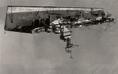
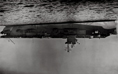
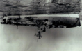
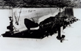


 'Untitled' from the series 'upside, down' 2013")
 'Untitled' from the series 'upside, down' 2013")
 'Untitled' from the series 'upside, down' 2013")
'Untitled' from the series 'upside, down' 2013")
 'Untitled' from the series 'upside, down' 2013")
 'Untitled' from the series 'upside, down' 2013")
 'Untitled' from the series 'upside, down' 2013")
 'Untitled' from the series 'upside, down' 2013")
 'Untitled' from the series 'upside, down' 2013")
 'Untitled' from the series 'upside, down' 2013")
 'Untitled' from the series 'upside, down' 2013")
 'Party no.1' 2012-13")
 'Party no.2' 2012-13")
 'Party no.3' 2012-13")
 'Party no.4' 2012-13")
 'Party no.5' 2012-13")
 'Party no.6' 2012-13")
 'Party no.7' 2012-13")
 'Party no.8' 2012-13")
 'Party no.9' 2012-13")
 'Form Collage 0004' 2001")
 'Form Collage 0015' 2001")
 'Form Collage 0001' 2001")
 'Form Collage 0003' 2001")
 'Form 3784' 2013")
 'Form 3781' 2013")
 'Form 4107' 2013")
 'Form 4102' 2013")
 'Form 0137' 2013")
 'Form 3783' 2013")
 'Clunes (Cottage)' 2013")
 'Clunes (Tree)' 2013")
 'Hepburns Clunes Rd' 2013")
 'Mistletoe Mine #2' 2013")
 'Amelia Mine #1' 2013")
 'Camp Detail #1, Fowlers Bay' 2013")
 'Campsite, Coorong National Park' 2013")
 'Grain Silo, Loch' 2013")
 '15 Port Augusta Bathers' 2013")
 'Boy #2, Port Augusta Jetty' 2013")
 'Port Victoria Main Street' 2013")
 'Pool #2, Whyalla Foreshore Motel' 2013")
 'Cicada' 2013 from the exhibition 'Troy Ruffels: Cinder' at James Makin Gallery, Collingwood, Melbourne, June - July, 2013")
 'The Wave' c. 1869")
 'Sea #3 (remains of the day)' 2013 from the exhibition 'Troy Ruffels: Cinder' at James Makin Gallery, Collingwood, Melbourne, June - July, 2013")
 'Bracken' 2013")
 'Cinder' 2013")
 'Sea #4 (Second Winter)' 2013")


 'Etude No.9' 2013")
 'Rift' 2013")
 'Understory' 2013")
 'Sea #1 (Arc)' 2013")
 'Untitled (In Spates 2)' 2011")
 'Untitled (In Spates 7)' 2011")
 'Untitled (In Spates 14)' 2011")
 'Untitled (In Spates 5)' 2011")
 'Untitled (In Spates 21)' 2011")

You must be logged in to post a comment.