Review: ‘Standing Stone’ by Catherine Evans at BLINDSIDE, Melbourne

Exhibition dates: 30th April – 17th May 2014


Catherine Evans (Australian) 'Standing Stone' 2014


Catherine Evans (Australian)
Standing Stone
2014
Aluminium, steel, volcanic rocks, sticky tape
7 x 3m
© Catherine Evans
Photo: Matthew Stanton, 2014


I like this exhibition, I like it a lot.

The premise, spelt out in the intelligent and articulate catalogue essay by Laura Skerlj (below), is the holistic connection between an Aboriginal stone circle of the Western Victorian Volcanic Plains used for astronomy > the moles on the artists back as lexias or nodal points of energy > and the energy of celestial bodies in the cosmic sky, arranged by humans into pictures.

Evans precariously suspends pieces of rock (taken from near the site of the Aboriginal stone circle) in the air on the end of long poles in the position of the moles on her back – and then maps out the energy lines between them, connecting them with translucent Sellotape on the gallery wall. These lines become a trans/figured form of ley line, those lines of energy that exist within the earth that link spiritual places together. The lines could also be linked to reflexology, chakras, the positioning of stones on the body in reiki healing and Kundalini: a form of feminine shakti or “corporeal energy”, an unconscious, instinctive or libidinal force. As the press release notes, “Standing Stone encompasses both the geographic and the corporeal time scales in order to examine the latent histories of these materials – that traverse the mineral to organic, the human and geologic, the infinite to the micro. At once personal and universal, Standing Stone opens up compelling new dialogues about the body and materiality.” The work traverses both time and space, macro and micro. It undermines dichotomies and makes liminal connections which allows the viewer to embrace a quality of ambiguity or disorientation. Ultimately this lets them see the world and the cosmos from different, multiple perspectives via new associations and energies.

There are a couple of missed steps. The colour pink (associated with the flesh of the body) on the poles did not really work for me. It was too didactic. Better some translucent perspex rods that would have continued the theme of the Sellotape and would have made the rocks seem to float in the air more, made the balancing more ambiguous. Both the press release (“the raw materials of photography, such as unprocessed photographic paper exposed to ambient light”) and the catalogue essay (“Flesh-pink geometric shapes, made from unprocessed (and still-processing) photographic paper, provide platforms for rock-relics: two materials accumulating time at vastly different rates”) make reference to elements that were not in the exhibition. Flesh pink geometric shapes were to be placed under rocks on the ground and this would have made the flesh pink rods seem more logical and tied the exhibition together… but they were not necessary. While the installation of such a work is always going to be a fluid process, and the pared down version is ultimately a lot better, it is unfortunate that the catalogue had been printed and the press release not amended to reflect the changes. Such is energy and life.

The other element that envisioned a jarring note was the image of the bruise on the thigh of the artist (which I initially thought was an elbow). A beautifully ambiguous image in its own right I can see why Catherine included it in the exhibition (as it links specifically to the energy of the moles on her back), but it brought to my mind issues of domestic violence, control and power, and I don’t know whether these additional thoughts needed to be placed in the mind of the viewer. I loved the image, I liked some of its energies but others, not so much.

Having said all that, this is a fascinating, intelligent, thoughtful and beautiful installation. Like the artist herself, it has great energy and presence. I really enjoyed spending time with both.

Dr Marcus Bunyan


Many thankx to Catherine Evans for allowing me to publish the photographs in the posting and to Laura Skerlj for allowing me to publish the catalogue essay. Please click on the photographs for a larger version of the image. All artworks courtesy of the artist, installation documentation by Matthew Stanton, 2014


Catherine Evans (Australian) 'Constellation II' 2014


Catherine Evans (Australian)
Constellation II
2014
Ballpoint pen on photographic paper
21 x 30cm
© Catherine Evans


Standing Stone is an exhibition of photographs and sculpture that transposes the marks on our own bodies into a large-scale map using basalt boulders, sticky tape and the raw materials of photography, such as unprocessed photographic paper exposed to ambient light.

In this exhibition the artist will create a large-scale constellation where precariously suspended volcanic rocks collected from the Western Victorian Volcanic Plains mark the positions of moles on the artist’s own back. With reference to the Indigenous stone arrangement, Wurdi Youang,* that is situated on these plains, Standing Stone encompasses both the geographic and the corporeal time scales in order to examine the latent histories of these materials – that traverse the mineral to organic, the human and geologic, the infinite to the micro. At once personal and universal, Standing Stone opens up compelling new dialogues about the body and materiality.

This exhibition is the outcome of a mentorship with artist Susan Jacobs, supported by the Victorian College of the Arts and Arts Victoria through its Graduate Mentorship program. Accompanying the exhibition will be an essay by Laura Skerlj.

About the artist

Catherine Evans is a Melbourne-based artist who incorporates photography, video and sculpture to explore the latent history of materials. Often working with volcanic rocks and the raw materials of photography, she juxtaposes and isolates them against images of the body, testing the limits of scale and gravity.

Since completing first class Honours at the Victorian College of the Arts in 2011, Catherine has participated in many group and solo exhibitions. She is a current recipient of the inaugural VCA Graduate Mentorship (2013-2014) and was selected as a finalist in the Substation Contemporary Art Prize (2013 and 2011). Grants include an Australia Council ArtStart grant (2012) and a National Gallery of Victoria Trustee Award (2010).

Press release from Blindside


This exhibition and research took place on the lands of both the Wurundjeri and Wathaurong people who have been the traditional custodians of these lands for thousands of years, and whose sovereignty was never ceded. This exhibition is supported by the Victorian College of the Arts and Arts Victoria through its Graduate Mentorship program.

*The Wurdi Youang stone arrangement in Victoria was built by the Wathaurung people before European settlement, but all records of its use have now disappeared. This egg-shaped ring of stones, about 50m in diameter, has its major axis almost exactly East-West. In a paper published in May 2013 in Rock Art Research, Ray Norris and his colleagues confirm a suggestion (originally made by John Morieson) that some outlying stones seem to indicate the setting positions of the Sun at the equinoxes and solstices, and have shown that these same astronomically significant directions are built into the shape of the main ring. They also show, using a Monte Carlo statistical test, that this is unlikely to have occurred by chance, but instead the builders of this stone ring intentionally aligned it on the setting Sun on these astronomically significant dates. More information…


Installation view of 'Standing Stone' by Catherine Evans at BLINDSIDE, Melbourne 2014


Installation view of Standing Stone by Catherine Evans at BLINDSIDE, Melbourne
2014
© Catherine Evans
Photo: Matthew Stanton, 2014


Installation view of 'Standing Stone' by Catherine Evans at BLINDSIDE, Melbourne 2014 (detail)


Installation view of Standing Stone by Catherine Evans at BLINDSIDE, Melbourne (detail)
2014
© Catherine Evans
Photo: Matthew Stanton, 2014


With the Universe at Our Backs

We have long looked skyward, consumed by a desire to arrange celestial bodies into pictures. Sometimes these formations are difficult to see amid the city’s night-haze of light and pollution. Yet, on a drive out of town, these cosmic arrangements come into view. Constellations describe a visual relationship between groups of stars, which, over time, become culturally recognisable. To make a constellation, a dreamer must draw a line from one bright body to the next: the stars implicated in this formation need not be close to one another in reality, but merely form a visual engagement when viewed from an Earthly vantage point. For millennia, ancient cultures have made these connections, constructing apparitions in the ether that recall existential stories. However, these cosmic sketches have also served as insightful gauges of time.

In the volcanic plains of Western Victoria – the third largest of its kind in the world – lies a geological constellation. It is an Indigenous ‘map’ made of ancient stones, named by the Wathaurong people as Wurdi Youang. This egg-shaped arrangement is relatively humble in size, and up until recently was thought to be an initiation site. However, Wurdi Youang is now being considered a geological record of equinoxes and solstices, with each stone set at a considered angle, marking the movements of the sun over time.1 For artist Catherine Evans, this cosmic calendar held within it a latent agency that was both intimate and expansive. Through its very construction, the Indigenous peoples of the area had used a prehistoric material to articulate a schema that connected themselves, and their activities, with the unreachable workings of the universe: “I find the contrast in time scales at this site fascinating – that on the one hand we have an ancient time scale of the land (geologic), and on the other the human time scale, which in comparison is only a blip.”2

In Evans’ current exhibition, Standing Stone, the artist has used rocks from the plains nearby Wurdi Youang to recreate a constellation of markings found on her own body. The layout for these marks was initially realised on an inverted black and white photograph Evans took of her back: in this image, her usually pale skin appears darker than its illuminated blemishes. Using a biro and ruler, moles and freckles were connected with diagrammatic lines, just as planets, stars and dark nebula are drawn to one another in astronomical illustrations. In the exhibition, this exact configuration of blemishes is re-presented using volcanic rocks in a sculptural installation. Across the walls and floor, each point is connected with a gleaming line of transparent cello-tape.

Here, two seemingly opposing containers of time – the body and the universe – are depicted as insulated, yet reflexive, systems. Just as skin imperfections are reminders of age, trauma, exposure and adaptation, the individual rocks at Wurdi Youang are conscious notations of the sun’s movements in the sky. Each rock or blemish represents a passed event that, in conjunction, forms the schema for a cosmos. Although more commonly understood as the extraterrestrial zone outside the Earth’s atmosphere (and therefore, outside of ourselves), the etymology of ‘cosmos’ is derived from the less-boastful ‘ornament’: a sphere seen as ultimately expansive is reined into a handheld trinket. This oscillation becomes an underlying consideration in Evans’ new work, as temporality swings between what is known, even embodied, and what is all encompassing.

In understanding these holistic systems, we can draw on biosemiotician Jakob von Uexküll’s concept of ‘umwelt’. Umwelt describes the ‘phenomenal world’ or ‘self world’ of an animal, as shaped by a series of functions necessary for survival. These sets of functions are programmed to suit each specific organism, creating a harmonious motion, or pattern, for existence. In consequence, all animals, from the simplest to the most complex, are fitted into their unique worlds with equal completeness: “A simple world corresponds to a simple animal, a well-articulated world to a complex one.”3 From this theory, both the humble body and the celestial sphere could be seen to exist within an umwelt, or environment, tuned to its innate processes.

In Evans’ work, it is the configuration of a constellation that represents these sets of motions as markers on a temporal scale. For example, the blemishes found on our bodies, or the rocks moved by Indigenous people at Wurdi Youang thousands of years ago, exist in perfect accord with each organism, or system’s, relative lifespan. That could be a sunspot the artist developed one summer, 17 years into her life, or the fusion of gases that combined to form a star 13 billion years ago in the Milky Way’s galactic halo. As Uexküll explains, the animal or subject creates time through its own set of harmonious processes, no matter how simple or complex: “Instead of saying… that without time, there can be no living subject, we shall now have to say that without a living subject, there can be no time.”4

The visualisation of these essential movements is euphonious. Feminist and cultural theorist Elizabeth Grosz articulated Uexküll’s umwelt as nature set to counterpoint.5 In her interpretation, the environment works in a similar way to a musical melody, following a set of instructions that can be syncopated with another. She recalls one of Uexküll’s most examined specimens, the tick, describing the way in which it “lives in a simplified world, a harmonic world of its own rhythms and melody.”6 This melody, according to Grosz, is composed of the animal’s umwelt, as the conjunction of its three most vital processes: moving up a twig following the warmth of the sun; smelling the butyric acid expelled from the sweat of an animal; dropping onto the animal to suck its blood. In turn, the tick becomes what she describes as “a connective, an instrument.”7

This musicality is innate within Evans’ new work. Here, rocks intonate the room, propped at varied heights like notes on musical score, while reflective tape connects the specimens to one another in directional locomotion. Flesh-pink geometric shapes, made from unprocessed (and still-processing) photographic paper, provide platforms for rock-relics: two materials accumulating time at vastly different rates. Just as the vision of celestial space seen at night expands our image of the natural world, the constellation found on the artist’s back is magnified out into the gallery as an assemblage that connects ancient time with personal time. It is within this singular temporal frame that the intimate (that nebula-birthmark on your wrist) is a reflection of the processes that, even now, evade us (tangible stars imagined into dream shapes).

Consequently, Standing Stone envisions landscape as a phenomenological site, where the body and the universe share the same harmonic processes. As British archaeologist Chris Tilley explains, to perceive landscape as phenomenological resists any precise topographical boundary: as we have seen, landscape in its holistic form – as a cosmos – can transcend terrestrial limitations. Instead, he perceives landscape as “embodied sets of relationships between places, a structure of human feeling, emotion, dwelling, movement and practical activity.”8 In this way, Evans presents a landscape that is both intimate and expansive. Just as the celestial exterior looks down upon us, it shifts into us, reflecting back the documents we make. These documents are many, printed on our bodies and arranged in sophisticated groupings in the environment. The constellation, therefore, flips and folds, not just across a horizontal plane, but vertically, between what is cast in the night sky and its earthen recollection.”

Laura Skerlj is a Melbourne-based artist and writer

Laura Skerlj website


Installation view of 'Standing Stone' by Catherine Evans at BLINDSIDE, Melbourne 2014 (detail)

Installation view of 'Standing Stone' by Catherine Evans at BLINDSIDE, Melbourne 2014 (detail)


Installation views of Standing Stone by Catherine Evans at BLINDSIDE, Melbourne (detail)
2014
© Catherine Evans
Photos: Matthew Stanton, 2014


Catherine Evans (Australian) 'Bruise II' 2014


Catherine Evans (Australian)
Bruise II
2014
Framed photograph
51 x 76cm
© Catherine Evans
Photo: Matthew Stanton, 2014


BLINDSIDE
Room 14, Level 7
Nicholas Building,
37 Swanston Street,
Melbourne VIC 3000

Opening hours:
Wednesday – Saturday, 12 – 6pm

BLINDSIDE website

Laura Skerlj website

Catherine Evans website

LIKE ART BLART ON FACEBOOK

Back to top

Review: ‘The Paper’ by Rosemary Laing at Tolarno Galleries, Melbourne

Exhibition dates: 5th April 2014 – 3rd May 2014


Rosemary Laing (Australian, 1959-2024) 'The Paper, Monday' 2013


Rosemary Laing (Australian, 1959-2024)
The Paper, Monday
2013
C Type photograph
110 x 214cm
Courtesy the artist and Tolarno Galleries, Melbourne


I always look forward to new work by the incomparable Rosemary Laing with great anticipation. I have never been disappointed. This magnificent group of five images is no exception, one of the photographic highlights so far this year in Melbourne.

These large, Type-C analogue landscape format photographs feature decomposing newspapers literally (being words) carpeting the forest floor. These site-specific interventions feature no digital manipulation and, as the erudite catalogue essay by George Alexander observes below, investigate the replacement of our daily newspaper by online information bytes, “the graphic graphic newsprint breaking down like typographic stew,” the “transmigration of matter from one form to another,” “a meditation on time,” recycling, deforestation, information overload. These concepts build on earlier fragments from work by the artist (such as groundspeed2001) into something transformational, transnational and, even, otherworldly.

These entropic panoramas, which hang mysteriously between words and worlds, are indeed meditations on time and space. As Annette Hughes states,

“Laing’s pictorial space, like that of cinema, is generally art-directed, constructed, rehearsed, performed and shot in physical time and space, and though it could easily be Photoshopped these days, that’s not the point. The art object is only the end product of the making of these images. Being able to see the many human hours devoted to their execution is also a way of building duration back into the photograph.”1


Here’s my tuppence worth on Laing’s new work.

This suite of photographs has a panoramic immersiveness. The viewer feels as though time has stood still when looking at these photographs, where the newspapers are analogous to snow upon the ground, imparting something of a dream-like existence to the images. There is a talismanic quality to the images, like a standing stone circle that is believed to have magic powers and cause good things to happen. And they are full of symbols, such as arrows, to mark the way (see The Paper, Wednesday, earlier, 2013, below).

These are not unquiet images, suspended midway between fantasy and reality, but (un)quiet images – a subtle but pivotal difference. They possess the quietness of the forest but also the isolation and loneliness. They are based on a harmonic instability, like a minor chord at the beginning of a Beethoven symphony, which is then eventually resolved in the major. These images are the journey of that resolution. The words, the flesh of the textural body, has been pulped: that immersive instability of the fecund body laying down in the soil of mother earth.

The viewer is disorientated. We have no idea where we are, the paper (the word and world) creating for the body this foggy, dream-like atmosphere. As in all of Laing’s work, there is an inquiring instability here, one that seeks the resolution of stability through the love of the human body and of our existence. I stand still before them.

Dr Marcus Bunyan


1/ Hughes, Annette. “ABIGAIL SOLOMON-GODEAU Rosemary Laing,” Review on The Newtown Review of Books website 3th July 2012 [Online] Cited 27th April 2014. No longer available online


Many thankx to Tolarno Galleries for allowing me to publish the photographs in the posting. Please click on the photographs for a larger version of the image.


Rosemary Laing (Australian, 1959-2024) 'The Paper, Tuesday' 2013


Rosemary Laing (Australian, 1959-2024)
The Paper, Tuesday
2013
C Type photograph
110 x 209cm
Courtesy the artist and Tolarno Galleries, Melbourne


Rosemary Laing (Australian, 1959-2024) 'The Paper, Wednesday, earlier' 2013


Rosemary Laing (Australian, 1959-2024)
The Paper, Wednesday, earlier
2013
C Type photograph
110 x 203cm
Courtesy the artist and Tolarno Galleries, Melbourne


Rosemary Laing

The Paper

A forest is carpeted with truckloads of newspapers. A cacophony of printed voices layers the soil horizon of the ground. The former surface litter of loose and partly decayed organic matter is overlaid with pulped tree product. The 21st century cultural carpet of current events and mercenary babble is already time-lined by weathering, which is fast-tracking the decomposition of the worded pages. The graphic of newsprint is breaking down like typographic stew, falling apart like old lacework, dissolving like paint – it’s losing its imprint as fallen branches and leaves scatter over it. It seems to expect that over time it will disappear beneath what comes after, what fresh coats some future century will lay over it.

For this undertaking, Rosemary Laing located her activity among the woodlands of Bundanon, a casuarina forest peppered with eucalyptus and Burrawang. Located in the Shoalhaven of southern New South Wales, the site was originally the land of the Wodi Wodi people of the Yuin nation. Layered with subsequent occupations since the early 19th century, in 1993 the properties were gifted by Arthur and Yvonne Boyd and became the Bundanon Trust – a place for artists of all disciplines to work and a place for all people to draw inspiration.

Two unique opportunities here were made possible by the Trust to Rosemary Laing. The opportunity to develop and consider her actions unhindered by a time frame; together with access to the Bundanon collection of the influential gnarled ceramics that Arthur’s father Merric Boyd (1888-1959) made with their blue and green underglazes and swaying lines of treescapes on clay.

As it happened, while making this work, the place was inundated with floodwaters. Natural disaster has often enclosed her work, as in swanfires (2002-2004), with its incinerated sheds and buildings, following bushfires in the Sussex Inlet area – also part of the Shoalhaven. Destruction sculpts and re-sculpts the world, and Laing joins the material cycle, the perpetual transmigration of matter from one form to another. A “terrible beauty”, as a friend remarked.

This series is called The Paper, for the daily newspaper – our long time companion and a primary fix for information of the world – that is swiftly being superseded by the new material technologies of our times. If the overwhelming flood of data and culture and spin is hitting us with some 500,000 discrete bits of information at any time, then we may be faced with inabilities to absorb that Total Noise. We probably missed the 25 bits that were important. The latest innovations of the Infosphere replay confections of overstimulation and boredom, sugar-hits of overload followed by emotional numbness.

Yet the covering of the ground that we saw in 2001 with groundspeed – not far geographically from this site – isn’t the same as here in the series The Paper. The point of loungeroom carpets in groundspeed was as an index of the latecomer’s sense of belonging. A kind of comfort zone for the non-indigenous, bridging old world and new. The carpeting this time – as she writes in her notes – “seems to be composting the present as a past about to happen; taking a once-upon- a-time not-that-long-ago standard as the ground-amendment-of- tomorrow already.” It is, among other things, a meditation on time.

Every new presentation of Laing’s work is also a running commentary on her previous corpus of work. The Paper explores themes touched upon in – Natural Disasters (1988), groundspeed (2001) with its patterned loungeroom carpets out in the ‘wild’ and in 2006, weather with its cyclone of newspaper shreds – while constantly replenishing what had remained surplus to that work. And this compost of earlier fragments, that are dismembered and scattered and gathered again, expands her material formation on this site.

From top to bottom the planet is being transfigured. Something essential is changing now and forever. The “global” has become everyone’s “local”. The human race is going through things it has never experienced before – as we are forced to join the caravan of this moment in time.

Hellish or heavenly? Promised Land or Wasteland? Take your pick. You do get the sense – with the dramatic shiny green of the ancient Burrrawang palms scattered about – of human impermanence against the bedrock temporal dimensions of the primitive Gondawan rainforest margins. As anyone who has spent time slogging through genuine bushland, and sensing the century’s long pulse of trees: we’ve fallen out of tune with the eternal present of the animal world, we’ve fallen into Time with its past and future, the chopped-up time of daily newspapers.

Find tongues in trees, books in the running brooks, sermons in stones … wrote Shakespeare (As You Like It, 2.1). The quote recalls the medieval idea of the Book of Nature that we are here to read, whose infinite pages unfold enormous landscapes: some see good, some evil, some both, some neither. Laing’s art takes root in a fissure, in that crack in the covenant between word and world, and the historical moment is right: we are in the age of the “trans-book” with the rise of the Kindle and iGoogle, and with it the end of newspapers, the demise of print and the retrenchment of journalists.

So as you enter the space, walk around the room with the suite of images – named for the days of the week – there’s an entropic feel with their grubby matte and muted beauty. Underfoot, things fall apart, the riggings of the page disintegrate into tissue, print naturalises into leaf mould, and words on paper are composted back into wood pulp and waste slurry. Accordingly, to make the images this time around, she put her dalliances with digital cameras and print-output machines aside, in favour of analogue, for all the lovely limitations and imperfections of light on cellulose triacetate, and the physical shadings of Laing’s printer in the darkroom.

The curving earth is a body, and these lacework landscapes show off the marks of ageing. The woods are a damp chamber, with a thick carpet of newspapers, and many doors open to the wind and faraway light. The images enclose you in brushwork of soft jade while the soggy colours of disintegration make time tangible.

There’s nothing said about the world here (recycling, deforestation, information overload) that you couldn’t find more reliably elsewhere. It’s rather Laing’s process of invention, through the hinterlands of her material imagination, that communicates her unexpected vision, tells her story of an imagined afterwards of along-the-way. There’s a stand of trees in these pictures still growing inside the shellacking and composting of our times.

George Alexander
September 2013

Published with permission


Rosemary Laing (Australian, 1959-2024) 'The Paper, Wednesday' 2013


Rosemary Laing (Australian, 1959-2024)
The Paper, Wednesday
2013
C Type photograph
110 x 197.5cm
Courtesy the artist and Tolarno Galleries, Melbourne


Rosemary Laing (Australian, 1959-2024) 'The Paper, Thursday' 2013


Rosemary Laing (Australian, 1959-2024)
The Paper, Thursday
2013
C Type photograph
110 x 207cm
Courtesy the artist and Tolarno Galleries, Melbourne


Rosemary Laing (Australian, 1959-2024) 'The Paper, Friday' 2013


Rosemary Laing (Australian, 1959-2024)
The Paper, Friday
2013
C Type photograph
110 x 196.3cm
Courtesy the artist and Tolarno Galleries, Melbourne


Tolarno Galleries
Level 4
104 Exhibition Street
Melbourne VIC 3000
Australia
Phone: 61 3 9654 6000

Opening hours:
Tue – Fri 10am – 5pm
Sat 1pm – 4pm

Tolarno Galleries website

LIKE ART BLART ON FACEBOOK

Back to top

Michael Leunig. ‘Meditation on two photographs’ 2014

April 2014


Michael Leunig (Australian, b. 1945) 'Meditation on two photographs' 2014


Michael Leunig (Australian, b. 1945)
Meditation on two photographs
Friday April 25, 2014
in The Age newspaper


Spot on as always, Michael Leunig. You never fail to hit the mark.

The Australian prime minister, Tony Abbott, sitting in the cockpit of a replica Joint Strike Fighter (Lockheed Martin F-35 Lightning II) aircraft, having committed the Australian government to spend $AUD12.4 billion to purchase 58 aircraft from America, plus another $AUD12 billion for ongoing support and maintenance. All at a time when the government is raising the pension age to 70 years old, cracking down on disability pensions, forcing people to start paying to go to the doctors, cutting health, education and support for pensioners.

Defence Minister David Johnston defended the billions in spending – less than a month before Treasurer Joe Hockey delivers a budget with expected cuts to health and welfare, while Labour opposition leader Bill Shorten backed the purchase, saying the previous Labor government believed the Joint Strike Fighter was the “right way to go”. Both Liberal and Labour parties are as bad as each other. They put boys toys before the welfare of their people – of the under privileged, the vulnerable and the needy.

Look at the inane smile of this man, like the Cheshire cat with the cream, with his thumbs up.

What will they do next… start dropping bombs on refugee boats for practice. That would certainly turn the boats back.

Now I know why they call it the cock / pit. Now I know why I make anti-war images using aircraft!

Dr Marcus Bunyan


Please click on the photograph for a larger version of the image.


Michael Leunig on Wikipedia

LIKE ART BLART ON FACEBOOK

Back to top

Text / review: ‘A Vocabulary of Printing and the Syntax of the Image’ from the exhibition ‘KHEM’ at Strange Neighbour, Fitzroy, Melbourne

Exhibition dates: 11th April – 3rd May 2014

Curator: Linsey Gosper

Artists: Jane Brown, Ponch Hawkes, Siri Hayes, Ruth Maddison, Lloyd Stubber, David Tatnall, Claudia Terstappen


Emmet Gowin printing mask for The Hint That Is a Garden: Siena, Italy 1975


Emmet Gowin printing mask for The Hint That Is a Garden: Siena, Italy 1975 (below)


A Vocabulary of Printing and the Syntax of the Image


“No matter how slow the film, Spirit always stands still long enough for the photographer It has chosen.”

“One should not only photograph things for what they are but for what else they are.”


Minor White


As an artist who originally trained in the alchemical, analogue art of photography, the magic of this process will always hold sway in my heart. No matter how many excellent digital photographs I see, there is always a longing for silver – that indescribable feeling of looking at a master printers work, an image that literally takes your breath away. I hardly ever get that in a digital print. For me, it’s the difference between the fidelity of a CD and the aura of an LP, with all its scratches and pops, hisses and, yes, atmosphere.

Minor White, that guru of enlightenment, knew how difficult it was to capture spirit in a photograph. To make a connection between photographer and object, back through a glass lens and a metal box onto a piece of plastic or glass (completing a Zen circle), then printed onto a piece of paper. There are three ways it goes: you see something (you previsualise it) and you don’t capture it in the negative; you don’t see it, and the negative surprises you; but, best of all, you see it and you capture it – the object of your attention reveals itself to you. Then all you have to do is print it – easier said than done. Much testing and assessing, dodging and burning to balance the print knowing that, as MW says, each negative is like a dragon that an image has to be wrenched from.


No longer for ears …: sound
which like a deeper ear,
hears us, who only seem
to be hearing. Reversal of spaces.


Extract from Rainer Maria Rilke Gong 1925


When you do the analogue printing yourself (or when assessing a digital test print at a lab such as CPL Digital), the most important thing is to understand the vocabulary of printing. In both analogue and digital printing it all starts from the negative/file. If you don’t understand your negative or digital file, what hope have you of attaining a good end result? You must study the negative to understand its pushes and pulls, what needs to be held back, what other areas brought forward in the image. You have to feel the balance within the negative/file in the sensibility of the print. Darren from CPL observes that he has a lot of photographers and students come in and say, “I don’t want it to be like that,” but then they can’t explain what they do want it to be like or how they can get there. They have no vocabulary of printing or how to get the “feel” that they want from the print. I believe this is where training in the analogue darkroom can stand digital photographers in good stead.

What photographers need to understand is the syntax of an image, “the system of organization used in putting lines together to form pictures that can stand as representations of particular objects,”1 where they is a clear association between the structure of photographic prints and the linguistic structure that makes verbal communication possible. Photographers are the Keepers of Light and photography broke the boundaries of the visual field that had been delimited by etchings and prints, to allow human beings to see far beyond the physical field of view, to have photographic power over space and time which fundamentally changed the scope of human consciousness.2 Photography makes drawing unnecessary in the physical sense, but through previsualisation photography is predicated on mental drawing (with light) and through the physical form of the photograph, the print, photography has a syntactical basis – which comes from the languages of the photographer inherent in human consciousness and the chemical, optical and mechanical relationships that make photography possible. Both feeling and technology.

I believe that these two things go hand in hand and when photographers have no language, no vocabulary to describe what they want from a photographic print, then they are basically coming up against the limitations of their feelings, technologies and the machine. “Genius is constantly frustrated – and tempered – by the machine.”3 As William Crawford observes, “You simply cannot look at photographs as if they were ends without means. Each is the culmination of a process in which the photographer makes his decisions and discoveries within a technological framework.”4 “Each step in the photographic process plays a syntactical role to the degree that it affects the way the information, the sentiment, the surprises, and the frozen moments found in photographs actually meet the eye.”5 In the case of the photographic print, this means understanding the emotional linguistic vocabulary of printing through the syntax of the image.


With these thoughts in mind, the two standouts in this delightful group exhibition are Claudia Terstappen and Ponch Hawkes. Terstappen’s Brazilian rainforest photographs are as well seen and exquisitely printed as ever but this time they are slightly let down by the nearness of the frame and the colour of the moulding, both of which seen to limit the breathe of the image. Hawkes’ photographs are sublime (especially the two reproduced below), the best silver gelatin photographs that I have seen by an Australian artist in since Terstappen’s last solo exhibition In the Shadow of Change at Monash Gallery of Art. They have wonderful tonality and presence, and a quietness that really lets you contemplate the image through the beauty of the print – and a snip at only $800 each framed!

Other artists in the exhibition have singular images that are interesting (pictured below), but the major disappointment are the prints of Jane Brown. When I first saw the images of Brown’s Australian Gothic at Edmund Pearce Gallery in 2012 I said that they were, “small, darkly hewn, traditionally printed silver gelatin photographs… surrealist tinged, film noir-ish mise-en-scènes, the ones that emphasise the metaphorical darkness of the elements gathered upon the stage. Photographs such as Big TroutThe Female Factory, Adelong, New South Wales and Captain’s Flat Hotel, New South Wales really invoke a feeling of unhomely (or unheimlich), where nature is out of kilter. These images unsettle our idea of Oztraliana, our perceived sense of Self and our place in the world. They disrupt normal transmission; they transmutate the seen environment, transforming appearance, nature and form.”6 This was again the feeling that I got when I saw the series at a later exhibition at the Centre for Contemporary Photography.

Not this time. The prints shown here are much darker and have become almost ungrammatical; where the syntax of the image has broken down so that the linguistic structure of the image makes communication nearly impossible. It is not enough just to make prints darker and darker, hoping for some mystery to magically appear in the image because it won’t. This is a case of overprinting the negative, forcing the vocabulary of the image through a wish to impart something emphatic, some condition of being from the negative that has been imperfectly understood. Is this because this is Edition 2 out of 7, a different printer and a different size? I don’t know the answer to those questions, but Brown really needs to go back to the negatives and reassess the results, especially as these nearly incomprehensible prints are selling for an overinflated $2,000 each framed.

Dr Marcus Bunyan


Footnotes

1/ Crawford, William. “Photographic Syntax,” in Crawford, William. The Keepers of Light: A History and Working Guide to Early Photographic Processes. Morgan and Morgan, 1979, p. 2

2/ Ibid., p. 5

3/ Ibid., p. 6

4/ Ibid., p. 6

5/ Ibid., p. 7

6/ Bunyan, Marcus. Review: Jane Brown / Australian Gothic at Edmund Pearce Gallery, Melbourne, 6th May 2012 [Online] Cited 21st April 2014


Many thankx to Strange Neighbour for allowing me to publish the photographs in the posting. Please click on the photographs for a larger version of the image.


Emmet Gowin (American, b. 1941) 'The Hint That Is a Garden: Siena, Italy' Dedicated to Frederick Sommer, 1975


Emmet Gowin (American, b. 1941)
The Hint That Is a Garden: Siena, Italy
Dedicated to Frederick Sommer, 1975
Gelatin silver print
19.5 x 24.5cm (7 11/16 x 9 5/8 in.)
Gift of Mrs Saul Reinfeld


William Crawford. "Photographic Syntax," in William Crawford. The Keepers of Light: A History and Working Guide to Early Photographic Processes. Morgan and Morgan, 1979, p. 6.


William Crawford. “Photographic Syntax,” in William Crawford. The Keepers of Light: A History and Working Guide to Early Photographic Processes. Morgan and Morgan, 1979, p. 6.


Claudia Terstappen (Australian born Germany, b. 1959) 'Jungle I (Brazil)' 1991


Claudia Terstappen (Australian born Germany, b. 1959)
Jungle I (Brazil)
1991
From the series Ghosts at the Jucurucu
Silver gelatin print
46 x 68cm


Lloyd Stubber (Australian) 'Untitled' 2012


Lloyd Stubber (Australian)
Untitled
2012
Fibre-based silver gelatin print
11 x 14 inches


David Tatnall (Australian, b. 1955) 'Clifton Springs Jetty' 2012


David Tatnall (Australian, b. 1955)
Clifton Springs Jetty
2012
From the series Coastal Pinholes
Silver gelatin contact print
20 x 25cm


Ruth Maddison (Australian, b. 1945) 'Bellambi, NSW' 1989


Ruth Maddison (Australian, b. 1945)
Bellambi, NSW
1989
Hand coloured gelatin silver print
19.6 x 49cm
Vintage print, unique state


Ruth Maddison (Australian, b. 1945) 'Self-portrait #2' 2004


Ruth Maddison (Australian, b. 1945)
Self-portrait #2
2004
From the series Light touches
Sun print on black and white photographic paper
Vintage print, unique state


“The process of analogue photography is created through darkness and light. To celebrate the launch of the Strange Neighbour Darkroom this exhibition brings together a group of artists who pursue and extend the practice of analogue and darkroom photography. These artists work across many of the countless possibilities of the medium: 35mm, medium format and large format photography, and their diverse processes include pinhole photography, photograms, sun prints, fibre printing and hand colouring. Contemporary photographers are driving the current resurgence in analogue photography and Strange Neighbour is excited to be able to facilitate this irreplaceable art form. Darkroom practice is unique and magickal, alive and well.”

Press release from the Strange Neighbour website


Khem; a possible derivative of the word alchemy, the native name of Egypt, is thought to mean black. Some scholars maintain that Khem is derived from a root meaning wise.1

Alchemy is described as chemistry endowed with magic, and alchemists as those who work with metals and keep these operations secret.2 Apart from the obvious associations of working with metals (silver) and chemistry, there are more subtle and intimate parallels between the art and science of alchemy and darkroom practice.

It is common among darkroom practitioners to consider the process as ‘magic’. When most people encounter printing their first photograph in the darkroom, the simple sight of an image appearing on the paper in the developer tray seems ‘magical’. Even experienced darkroom practitioners never lose this special feeling. Exhibiting artist, Siri Hayes notes, “Watching images come up in developing tray is as mysterious and exciting as any magic show. Perhaps more so as there are no tricks except that the photographic product is the grandest of illusions.”

Distinct from many other forms of photography, darkroom based practice is now specialised, with few people having access to the knowledge, equipment and skills associated with the medium. Like a secret esoteric order, few share this wisdom, and even those willing to teach it may keep special recipes, techniques and discoveries to themselves or within a select dedicated group. Some of this information, although scientific, is not completely understood in rational terms of facts or calculations, but is more related to intuition and perception. It is technical and it is intuitive.

The complex rituals associated with the process allow practitioners to get into a headspace that is conducive to contemplation, bringing forth intuition, allowing space for chance and universal cause and effect. In this art and science there are so many variables with endless possibilities. Ruth Maddison‘s Sun prints are made without camera, film, enlarger or developer. She states, “the tonal range depends on variables like paper stock, length of time in sun or shade, whether the objects are wet or dry … and an unpredictable magic that happens when light sensitive paper is touched by light.”

In this unpredictable environment often mistakes lead to new ideas and create new methodologies. One of the charms of analogue processes is the discovery of beauty through error. Ponch Hawkes recalls this as disasters and wonderful happenstance. Claudia Terstappen remarks it is the number of variables in the darkroom that leaves the creative process wide open and it is often these inaccuracies caused by chemical reactions that lead to a new meaning. This is what makes analogue processes so valuable and irreplaceable. There are many effects in the analogue process that one can recreate with digital technologies, but not invent.

Imperfections caused by these variables or ‘mistakes’ may imbue the image with a ‘spirit’ and otherworldliness, as if the energy of a place or person has been captured. Black and white photography too has the ability to transcend time, memory and death. Jane Brown says, “I examine this a lot in my work – landscapes seem to have vestiges or traces of past life and memorials become otherworldly.” Claudia Terstappen’s work, “is motivated by the stories, beliefs and histories of the people who live there. Here people spoke about the forest spirits that one should be aware of. B+W images suggest a kind of silence.” At a symbolic level, silence is part of most sacred traditions3, and it is part of darkroom practice.

Using analogue processes and working in the darkroom can be aligned to the slow movement, of valuing quality over quantity and returning to a feeling of connectedness. For the images in this exhibition David Tatnall has used an 8 x 10 inch pinhole camera and made contact prints. He expresses of this technology, “my reasons for using this slow, cumbersome and fickle means to make photographs is because I feel it conveys the interaction of the sky and water, the presence of wind and the pulse of nature. I am particularly interested in how the long exposures and lack of sharpness make these features merge into something else… (The) simplicity: no lens, shutter or batteries, no need to upgrade, no click or buzz, no flashing lights or mega pixels no viewfinder and no distortion.” For Ruth Maddision, “she says of working with hand colouring, the pleasure of it – I love working on the real object again, and away from the screen.”

Clearly there is belief and an element of trust in the medium. Lloyd Stubber‘s images in this exhibition are taken from a one-month round the world trip. On return he processed the 15 rolls of film in his laundry. Perhaps the potential fear of loss is overwhelmed by the sense of anticipation, surprise and the flood of memories that return on seeing the work at a later date, as compared to digital, which is immediate and holds none of the mystery.

Another important distinction of darkroom and analogue practice from other forms of photography is the presence of artist’s hand throughout the entire progression of creation to final outcome. In each step of the process, significant choices are made from the many possibilities, from exposing light sensitive film in the camera, developing the film, to printing and finishing the art object. The artist’s mark is therefore not only discernible but also inherently valuable. To Ponch Hawkes, being the maker is of significance. For Terstappen, The physicality of arriving at the ‘perfect’ Gelatin Silver print – with its deep tonal ranges – is something that I highly value.

Contemporary artists are driving the current resurgence in analogue photography. This is a treasured, magickal4 and irreplaceable art form. It is with great pleasure that I declare the Strange Neighbour Darkroom open, and may it provide the space and opportunity for the love of darkroom practice to be enjoyed, shared and fostered.”

Linsey Gosper, curator, darkroom lover, 2014

1/ Francis Melville. The Book of Alchemy. Quarto Publishing plc, 2002, p. 6
2/ Kurt Seligman. Magic, Supernaturalism and Religion. Pantheon Books, 1948, p. 84
3/ Ami Ronnberg (ed.,). The Book of Symbols. Taschen, 2010, p. 676
4/ Magick, in the context of Aleister Crowley’s Thelema, is a term used to differentiate the occult from stage magic and is defined as the Science and Art of causing Change to occur in conformity with Will, including both mundane acts of will as well as ritual magic


Jane Brown (Australian, b. 1967) 'Decommissioned Art History Library, University of Melbourne' 2012-2013


Jane Brown (Australian, b. 1967)
Decommissioned Art History Library, University of Melbourne
2012-2013
Fibre-based gelatin silver print
44 x 49.5cm
Edition 2 of 7


Jane Brown (Australian, b. 1967) 'Lathamstowe' 2011- 2013


Jane Brown (Australian, b. 1967)
Lathamstowe
2011- 2013
Fibre-based, gelatin silver print
46 x 44cm
Edition 2 of 7


Ponch Hawkes (Australian, b. 1946) 'Silken Seam' 2005


Ponch Hawkes (Australian, b. 1946)
Silken Seam
2005
Silver gelatin print
34 x 34cm
Courtesy of the artist and Chrysalis Gallery, Melbourne


Ponch Hawkes (Australian, b. 1946) 'Rouleau' 2005


Ponch Hawkes (Australian, b. 1946)
Rouleau
2005
Silver gelatin print
34 x 34cm
Courtesy of the artist and Chrysalis, Melbourne


Siri Hayes (Australian, b. 1977) 'Aquatic listening device' 2009


Siri Hayes (Australian, b. 1977)
Aquatic listening device
2009
Silver gelatin print
39 x 45cm
Courtesy of the artist and M.33, Melbourne


Strange Neighbour

This gallery has now closed

LIKE ART BLART ON FACEBOOK

Back to top

Review: ‘Stephen Dupont / The White Sheet Series No. 1’ at Edmund Pearce Gallery, Melbourne

Exhibition dates: 2nd April – 3rd May 2014


Stephen Dupont (Australian, b. 1967) 'Untitled #16' 2010


Stephen Dupont (Australian, b. 1967)
Untitled #16
2010
Silver gelatin print and ink
20 x 16″ (51 x 40.5cm) / edition of 5 + 2 AP’s


This is a wonderful exhibition by Stephen Dupont at Edmund Pearce Gallery. Using a 4″ x 5″ Polaroid type 55 and striping away the emulsion, Dupont is left with a fine grain large format black and white negative (which he can use in an enlarger) with the “Polaroid frame look”, which he incorporates into the silver gelatin prints.1

Most of the photographs are glorious, notably the ones where Dupont pulls back from his subject to reveal the context of the sitter (much like taking the mat of a Daguerreotype to reveal more of the studio hidden underneath). I particularly like where you can see two hands poking over the top of the white sheet hiding the person behind (see Untitled #08 2010, below). The spontaneity and improvisation of this act is very appealing. As Dupont observes this allows him “to reveal the audience gathering and the environment around the sheet. This is meant to give the viewer a real sense of place and time, and a window onto the streets of Haridwar.” This technique gives the images real presence, they fairly “sing” to me from the gallery wall. And then! to surround the silver with hand printed Indian textile stamps in red ink… these images are really something.

Dupont’s incisiveness at the coal face of the pictorial plane is also exemplary. Notice the construction of Untitled #14 (2010, below), and observe the arms of the protagonists. An arm is raised aloft mirroring the arm of the swami in the photograph behind and also the supporting pole of the tent at top right. His other arm points to the earth but this is crossed by the arm of an out of focus man at left, which forms a strong diagonal intervention into the image as he reaches out. The money and mobile phone, at bottom left, add to the incongruity of the scene.

I am less enamoured with Dupont’s riff on Richard Avedon’s contextless background portraits. They don’t really possess the power or presence of the photographs mentioned above or of Avedon’s portraits from the series In The American West. I would have also liked to have seen the field journal (the small images at the bottom of the posting) in the exhibition. It would have been fascinating to read the text and view the other textile stamp designs. Finally, a couple of prints at a much larger size would have been good to see, to break the regularity of the series.

Having said that, you really have to see these images in the flesh for they look so much better than when reproduced online. The red is luminous and it is a joy to see good silver gelatin prints instead of so-so digital failures (Polly Borland I hope your ears are burning). This exhibition is a perfect example of what Bill Henson was talking about in his recently curated exhibition Wildcards: Bill Henson shuffles the deck at Monash Gallery of Art (MGA) where he states that his interest “is in the photograph as an object, in the physical presence of the print or whatever kind of technology is being used to make it…”2 where the images appeal not just to the eye but to the whole body, “because photographs are first and foremost objects, their size, shape grouping and texture are as important as the images they’re recording.”3

These photographs have, as Henson notes of some photographs, “the ability to suggest some other thing and that’s what draws you in.”4 You stand in front of the best of these images and contemplate them with a sense of wonder, for they suggest to the viewer – through the hand and eye of the artist in the analogue process, through the hand of the artist when applying the wood block printing which was made with much spontaneity and feeling – other worlds of which we know very little brought close to our imagination. Through their inherent textures and tonalities, their physical presence, there is a sense of the people who populate that place, but more than that, there is a sense of our own fragility and mortality.

A feeling of anOther existence for our life if we had been born into such worlds.
And that is what makes these images so compelling.

Dr Marcus Bunyan


Footnotes

1/ According to Wikipedia, “Type 55 negatives are the famous source of the “Polaroid frame look” … the Polaroid reagent / gel is squeezed between the negative and positive. Some of the reagent is trapped underneath the onion-skin-like frame that crops the print into a perfect 4 x 5 image. This reagent however creates an impression of that frame on the negative, which is not protected. The result is a perfect negative, but with imperfect frame-like image surrounded 3 of the four sides, while the 4th side shows the impression of the connective mesh that controls aspects of the Polaroid packet’s sleeve functionality.”

2/ Interview with Bill Henson by Toby Fehily posted 01 Feb 2014 on the Art Guide Australia website [Online] Cited 18/02/2014. No longer available online

3/ Fiona Gruber. “Review of Wildcards, Bill Henson Shuffles the Deck” on the Guardian website, Wednesday 12 February 2014 [Online] Cited 16/03/2014

4/ Fehily op. cit.,


Many thankx to Edmund Pearce Gallery for allowing me to publish the photographs in the posting. Please click on the photographs for a larger version of the image.


Stephen Dupont (Australian, b. 1967) 'Untitled #08' 2010


Stephen Dupont (Australian, b. 1967)
Untitled #08
2010
Silver gelatin print and ink
20 x 16″ (51 x 40.5cm) / edition of 5 + 2 AP’s


Stephen Dupont (Australian, b. 1967) 'Untitled #14' 2010


Stephen Dupont (Australian, b. 1967)
Untitled #14
2010
Silver gelatin print and ink
20 x 16″ (51 x 40.5cm) / edition of 5 + 2 AP’s


Stephen Dupont (Australian, b. 1967) 'Untitled #04' 2010


Stephen Dupont (Australian, b. 1967)
Untitled #04
2010
Silver gelatin print and ink
20 x 16″ (51 x 40.5cm) / edition of 5 + 2 AP’s


Edmund Pearce is excited to present a solo exhibition by legendary Australian photographer Stephen Dupont, entitled The White Sheet Series Number 1. This new series was shot during India’s most important Hindu Festival, Kumbh Mela, and features portraits of pilgrims and visitors combined with hand printed Indian textile stamps.

Stephen Dupont has produced a remarkable body of visual work throughout his career; hauntingly beautiful photographs of fragile cultures and marginalised peoples. He captures the human dignity of his subjects with great intimacy and his images have received international acclaim for their artistic integrity and valuable insight into the people, culture and communities that have existed for hundreds of years, yet are fast disappearing from our world.

Mark Feeney of the Boston Globe states, “Inevitably, Dupont is an outsider; yet he’s an engaged outsider, full of calm, clear-eyed curiosity. There’s not just a sense of place in his work but also something that matters even more: a sense of the people who populate that place.”

Stephen’s work has earned him a number of photography’s most prestigious prizes, including a Robert Capa Gold Medal citation from the Overseas Press Club of America. His work has featured in influential publications such as The New Yorker, Aperture and The New York Times Magazine; and he has had major exhibitions in London, Paris, New York, Sydney, Canberra, Tokyo, and Shanghai. His photographic artist books and portfolios are held in numerous private collections and by prestigious institutions such as the National Gallery of Australia, the National Library of Australia, the British Library and the Library of Congress in Washington DC to name but a few.

Press release from the Edmund Pearce Gallery website


Stephen Dupont (Australian, b. 1967) 'Untitled #07' 2010


Stephen Dupont (Australian, b. 1967)
Untitled #07
2010
Silver gelatin print and ink
20 x 16″ (51 x 40.5cm) / edition of 5 + 2 AP’s


Stephen Dupont (Australian, b. 1967) 'Untitled #13' 2010


Stephen Dupont (Australian, b. 1967)
Untitled #13
2010
Silver gelatin print and ink
20 x 16″ (51 x 40.5cm) / edition of 5 + 2 AP’s


Stephen Dupont (Australian, b. 1967) 'Untitled #12' 2010


Stephen Dupont (Australian, b. 1967)
Untitled #12
2010
Silver gelatin print and ink
20 x 16″ (51 x 40.5cm) / edition of 5 + 2 AP’s


Stephen Dupont (Australian, b. 1967) 'Untitled #18' 2010


Stephen Dupont (Australian, b. 1967)
Untitled #18
2010
Silver gelatin print and ink
20 x 16” (51 x 40.5cm) / edition of 5 + 2 AP’s


Richard Avedon at work


Richard Avedon at work


Richard Avedon (American, 1923-2004) 'Bill Curry, drifter, Interstate 40, Yukon, Oklahoma, 6/16/80' 1980


Richard Avedon (American, 1923-2004)
Bill Curry, drifter, Interstate 40, Yukon, Oklahoma, 6/16/80
1980
from In the American West, 1979-1984


Stephen Dupont artist book


This body of work is a selection of portraits I made in 2010 at India’s most important Hindu festival called the Kumbh Mela. In one of four locations every four years Hindu pilgrims and visitors descend into the holy waters of the Ganges River to purify the soul in a spiritual ritual considered the largest peaceful gathering in the world. The photographs were taken in Haridwar of pilgrims and sadhus I chose randomly during that festival.

Inspired by an earlier series I made of anonymous portraits of Afghans in Kabul titled Axe Me Biggie, or Mr Take My Picture, but instead of an existing Afghan outdoor studio backdrop I chose the white sheet this time for its purity and simplicity. My subjects were asked to simply stand and pose before my camera. I use a white bed sheet to create an outdoor studio that not only captures my subject but also allows me to reveal the audience gathering and the environment around the sheet. This is meant to give the viewer a real sense of place and time, and a window onto the streets of Haridwar. Had I used the backdrop in a conventional way, to solely isolate a person, you’d have the impression that they were taken anywhere – New York, Sydney, or in a studio. This process is a creative choice and allows me with some control over my sitter but brings with it the spontaneity and surprise of what may take place around the zone I am working in: the gaze of someone holding the sheet that has no idea they are in the frame, or a hand holding the sheet or something else that crops up in front or behind. In the end my portraits are environmental or even landscapes.

Over many years of travel throughout India I have been collecting textile stamps and I decided to use them on my photographs. The research and experiments started in my field journal and then to the final hand printed images in this show. I wanted to create a relationship with Indian design and cloth, the Polaroid borders and the people in my pictures. Much like my photographic practice here the wood block printing was made with much spontaneity and feeling. The photographs have been handcrafted by Chris Reid at Blanco Negro using warmtone paper and processed in a specialised developer for unique tonality.

Stephen Dupont
Sydney, February 28, 2014


Edmund Pearce Gallery

This gallery has now closed.

LIKE ART BLART ON FACEBOOK

Back to top

Review: ‘Hoda Afshar / Under Western Eyes’ at Edmund Pearce Gallery, Melbourne

Exhibition dates: 2nd April – 3rd May 2014


Hoda Afshar (Australian born Iran, b. 1983) 'Westoxicated #1' 2013


Hoda Afshar (Australian born Iran, b. 1983)
Westoxicated #1
2013
Archival Pigment Print
104 x 90cm / edition of 5


Dear readers, my apologies for the lack of local reviews and postings since the beginning of the year. It’s not that I haven’t been out and about looking at exhibitions, far from it, simply that there has been little stimulating enough to do a posting on. Photographically, it has been a very slow start to 2014 in Melbourne.

It is a great pleasure then to finally discover some strong exhibitions around Melbourne town that are worthy of a posting: Hoda Afshar / Under Western Eyes and Stephen Dupont / The White Sheet Series No. 1, both at Edmund Pearce; the group exhibition Khem at Strange Neighbour; The Rennie Ellis Show at Monash Gallery of Art; and the magnificent Rosemary Laing / The Paper at Tolarno Galleries. Other postings to follow in the next week or so.


I love Hoda Afshar’s work. It’s big, bold, brash, beautiful, and it has something important to say and does so, eloquently. I only wish I could read the text written on nipple and background to further understand the intricacies and references of the work. The photographs pull back the veil on how Westerners commodify the representation of Islamic women in the form of decodable stereotypes. This reductive interpretation of the identity of Muslim women is bound up with aspects of exoticism, which has links to the influential book Orientalism (1978), by Edward W. Saïd, “a foundational text for the academic field of Post-colonial Studies, wherein the denotations and connotations of the term “orientalism” are expanded to describe what Saïd sees as the false cultural assumptions of the “Western world”, facilitating the cultural misrepresentation of the “The Orient”, in general, and of the Middle East, in particular.” (Wikipedia)

For Western society, “oriental” art emanated from a type of primitive fantasy, reflecting the increasingly exotic tastes of Europe from the late 19th-century following European colonialism. In her work Afshar interrogates aspects of a visual neo-colonialism. Here the voices of the marginalised are acknowledged but only so far as the language of acknowledgement is controlled by neo-colonialism (another form of imperialism which is an out a growth of classical colonialism) – in which the image and literature of the oppressed is controlled by societal structures that seek to delimit the nature of their independence.

As Bhabha notes, “Postcolonial perspectives emerge from the colonial testimony of Third World countries and the discourses of “minorities” within the geopolitical divisions of East and West, North and South. They intervene in those ideological discourses of modernity that attempt to give a hegemonic “normality” to the uneven development and the differential, often disadvantaged, histories of nations, race, communities, peoples.” (Bhabha, H. K. The location of culture. London: Routledge, 1994, p. 71)

Postcolonial theory formulates its critique around the social histories, cultural differences and political discrimination that are practised and normalised by colonial and imperial machineries. What Afshar does is poke a great big stick at these (visual) machineries, phenomenologies that continue to operate within the operating “theatres”, the mass-produced and parcelled consumer identities of the Western world.

Dr Marcus Bunyan


Many thankx to Edmund Pearce Gallery for allowing me to publish the photographs in the posting. Please click on the photographs for a larger version of the image.


Hoda Afshar (Australian born Iran, b. 1983) 'Westoxicated #2' 2013


Hoda Afshar (Australian born Iran, b. 1983)
Westoxicated #2
2013
Archival Pigment Print
104 x 90cm / edition of 5


Hoda Afshar (Australian born Iran, b. 1983) 'Westoxicated #3' 2013


Hoda Afshar (Australian born Iran, b. 1983)
Westoxicated #3
2013
Archival Pigment Print
104 x 90cm / edition of 5


Edmund Pearce is pleased to present Under Western Eyes, a solo exhibition by Hoda Afshar. The exhibition comprises a series of digitally manipulated photographs, criticising the continual representation of Islamic women in the contemporary art world as veiled, subjugated and suppressed. This new project explores how the veil – seen as a sort of forced enclosure – has become the dominant mode of representing Islamic women in the West.

In speaking of the series Hoda states, “veiled women are often portrayed as a homogeneous group; powerless subjects whose veil serves either as a symbol and tool of oppression, or is celebrated as an exotic commodity. As such, the images of Muslim women have been reduced to easily decodable stereotypes; mass-produced and parcelled for Western audiences as a consumer item. In this series, I intend to emphasise the reductive interpretation of the identity of Muslim women in the West and praising of such imagery as an attitude bound up with aspects of exoticism.”

Hoda Afshar is a visual artist and Photographer. She is currently a PhD candidate at the Department of Art at Curtin University. After finishing a BFA, majoring in Photography, at Azad University of Art and Architecture in Tehran, she began her career as a documentary photographer. In 2006 she was selected by World Press Photo as one of the top ten young documentary photographers of Iran to attend their Educational training program. Additionally, Hoda is currently a lecturer at the Photography Studies College in Melbourne. She has also been exhibiting locally and internationally since 2007 and was short listed for prestigious photography awards such as the Moran Contemporary Photographic Prizes (2012) and the Josephine Ulrick and Win Schubert Photography Prize (2013). She lives and works in Melbourne, Australia.


Hoda Afshar (Australian born Iran, b. 1983) 'Westoxicated #5' 2013


Hoda Afshar (Australian born Iran, b. 1983)
Westoxicated #5
2013
Archival Pigment Print
104 x 90cm / edition of 5


Hoda Afshar (Australian born Iran, b. 1983) 'Westoxicated #6' 2013


Hoda Afshar (Australian born Iran, b. 1983)
Westoxicated #6
2013
Archival Pigment Print
104 x 90cm / edition of 5


Hoda Afshar (Australian born Iran, b. 1983) 'Westoxicated #7' 2013


Hoda Afshar (Australian born Iran, b. 1983)
Westoxicated #7
2013
Archival Pigment Print
104 x 90cm / edition of 5


Hoda Afshar (Australian born Iran, b. 1983) 'Westoxicated #9' 2013


Hoda Afshar (Australian born Iran, b. 1983)
Westoxicated #9
2013
Archival Pigment Print
104 x 90cm / edition of 5


Edmund Pearce Gallery

This gallery has now closed.

LIKE ART BLART ON FACEBOOK

Back to top

Exhibition and book launch preview: ‘In the Folds of Hills’ by Kristian Laemmle-Ruff at The Field Institute, Melbourne

Exhibition dates: 1st – 8th May 2014

Exhibition opening and book launch: Thursday 1st May, 6 – 8.30 pm

To be opened by Robert McFarlane
Stories by Charlotte Laemmle


Kristian Laemmle-Ruff (Australian) 'In the Folds of Hills' book cover 2014


Kristian Laemmle-Ruff (Australian)
In the Folds of Hills book cover
2014


One of my favourite contemporary Australian photographers has a new book and exhibition!

Hopefully a review to follow but having seen a digital copy of the book, the sensitivity of the work feels admirable… unrecalled stories and photographs of people’s lives and the environments in which they live.

The book retails for $60 AUD and will be available in selected book stores nationally. It is being published by Pearce Press and includes a foreword by former prime minister Malcolm Fraser and an essay by Robert McFarlane.

Marcus


Many thankx to Kristian Laemmle-Ruff for allowing me to publish the photographs in the posting. Please click on the photographs for a larger version of the image.


Kristian Laemmle-Ruff (Australian) 'Barn in the Mist' 2014


Kristian Laemmle-Ruff (Australian)
Barn in the Mist
2014


Foreword

In the Folds of Hills depicts a life in the secluded valleys around Lima, a little over 100 kms from Melbourne, Victoria. Kristian Laemmle-Ruff not only has great technical control of his craft, but translates this skill into truly artistic photographs.

His images of ordinary objects from everyday life invite the viewer to slow down and contemplate. These photos create a narrative that offers us insight into the way these people live.

The portfolio focuses on individuals who have lived most, if not all their lives in this area. They would all be hard-working and modest in their possessions. Their individual characters shine through the photographs with a rugged determination and strength.

In the Folds of Hills will come to have historic significance because it captures aspects of Australian rural life, which in many parts of this country are fast disappearing.

Rt Hon Malcolm Fraser AC CH


Kristian Laemmle-Ruff (Australian) 'Lima East Valley' 2014


Kristian Laemmle-Ruff (Australian)
Lima East Valley
2014


Kristian Laemmle-Ruff (Australian) 'Ralph Pearce' 2014


Kristian Laemmle-Ruff (Australian)
Ralph Pearce
2014


Photographer’s Note

This project began with a curiosity to discover something that is quietly going unnoticed. As our cities grow and society increasingly relies on technological advances, there remain those older generations whose lives are still rooted in a past era: the early to mid 20th century. This was an era where small-scale labor-intensive livelihoods could thrive. In the face of changing needs and corporate competition these kinds of livelihoods, such as the family-owned farm, are disappearing.

Susan Sontag wrote in her book On Photography that “a beautiful subject can be the object of rueful feelings because it has aged or decayed or no longer exists … Photography is a twilight art.” This photo-series also lingers in some kind of twilight zone and has a sense of urgency; indeed one person has passed away since being photographed.

I first intended to capture day-to-day life and work in these secluded rural valleys. With subject matter so steeped in romanticism, I felt a need to explore beyond the ‘countryside’ clichés and idealisation common in the attitudes of city people. After meeting the subjects and gaining their trust, I sensed personal stories that needed to be told. To my surprise these stories were told not so much in the words spoken, but rather in the person’s material surrounds. Domestic interiors scattered with objects became allegories for human experience. These environments were full of memory.

It wasn’t uncommon for someone to still live in the house they were born in. An empty chair, a leaning barn, a clock ticking on the wall: these once mundane objects became potent symbols of their owner’s past, their hopes and their reality. Some objects suggested loss and melancholia, others embodied feelings of pride and even humour.

In the Folds of Hills is an exploration of the wisdom and rich humanity found in the characters living and working on this land. In celebrating and acknowledging them and their stories, the photo-narratives also offer a somewhat poetic insight into their inner worlds.

Kristian Laemmle-Ruff


Kristian Laemmle-Ruff (Australian) 'On Mother's Bed' 2014


Kristian Laemmle-Ruff (Australian)
On Mother’s Bed
2014


Kristian Laemmle-Ruff (Australian) 'Old Flowers' 2014


Kristian Laemmle-Ruff (Australian)
Old Flowers
2014


Ralph Pearce

Ralph’s knowledge and understanding of this part of the world is humbling. Rainfall patterns, geography and vegetation are things that matter to Ralph. He invites us to climb into his ute and drives to a stand of fabled Lima stringybarks. Few now exist in the valley. Our gentle giant is very much at home amongst the tall timbers that have been his livelihood for so many years.

“I still love mucking about in the bush,” chuckles Ralph with a twinkle in his eye. He shows us his tools, most importantly his axes, and carefully describes their variations and uses. The sheds back at the homestead hold a treasury of farming history and Ralph proudly shows us the old dairy, his shearing shed and a faithful companion, a Honda 110 motorbike. The land continues to give Ralph what he needs. His vegetable patch is impressive and the old gnarled fruit trees bear their gifts seasonally. Once a fortnight Ralph drives to Benalla for groceries and a chat. Every second Tuesday evening he travels to the nearby Moorngag Hall for a round of cards with friends from the district. Charlie Jensen, his childhood mate, collects him.

When next we visit Ralph he shows us around the rest of his house. His mother was clearly a significant influence. She died in 1985 aged ninety-eight and was blind for the last nine years of her life. Ralph cared for her. Her suitcase, packed for hospital, still sits in her room. Little has changed in the house since she died.

ABC Radio keeps Ralph informed. And informed he is. Television has never made an appearance in this house. Ralph speaks to us with the wisdom of someone who has seen many fashions and many politicians come and go. One cannot help but be touched by the simplicity and integrity of this man’s life. Ralph is a quiet gentleman, unassuming, self-reliant and comfortable within his skin.

Extract from stories by Charlotte Laemmle from the book In the Folds of Hills


Kristian Laemmle-Ruff (Australian) 'Ralph's oven' 2014


Kristian Laemmle-Ruff (Australian)
Ralph’s oven
2014


The Field Institute at The Compound Interest (Centre for the Applied Arts)
15-25 Keele Street, Collingwood, Victoria

LIKE ART BLART ON FACEBOOK

Back to top

Exhibition preview: ‘Out of the closets, into the streets: gay liberation photography 1971-73’ at Edmund Pearce Gallery, Melbourne

Exhibition dates: Tuesday 22nd July – Saturday 26th July, 2014

Opening: Tuesday 22nd July 6-8pm
Nite Art: Wednesday 23rd July until 11pm
Artists represented: Philip Potter, John Storey, John Englart, Barbara Creed, Ponch Hawkes, Rennie Ellis

Curated by Dr Marcus Bunyan and Nicholas Henderson


Rennie Ellis (Australian, 1940-2003 'Confrontation, Gay Pride Week Picnic, Botanical Gardens 1973' 1973, printed later


Rennie Ellis (Australian, 1940-2003)
Confrontation, Gay Pride Week Picnic, Botanical Gardens 1973
1973, printed 2014
Silver gelatin photograph
© Rennie Ellis


Five days, that’s all you’ve got! Just five days to see this fabulous exhibition, so make a note of it now in your diaries…

The exhibition Out of the closets, into the streets: gay liberation photography 1971-73 pictures the very beginning of the gay liberation movement in Australia through the work of Philip Potter, John Storey, John Englart, Barbara Creed, Ponch Hawkes and Rennie Ellis. The exhibition examines for the first time images from the period as works of art as much as social documents. The title of the exhibition is a slogan from the period.

As gay people found their voice in the early 1970s artists, often at the very beginning of their careers, were there to capture meetings in lounge rooms, consciousness raising groups and street protests. The liberation movement meant ‘being there’, putting your body on the line. “It was a key feature of the new left that this embodied politics couldn’t stop in the streets: that is, the public arena as conventionally understood. ‘Being there’ politically also applied to households, classrooms, sexual relations, workplaces and the natural environment.”1

Curated by Dr Marcus Bunyan and Nicholas Henderson and with a catalogue essay by Professor Dennis Altman, the show is a stimulating experience for those who want to be inspired by the history and art of the early gay liberation movement in Australia.

The exhibition coincides with AIDS 2014: 20th International AIDS Conference (20-25 July 2014) and Nite Art which occurs on the Wednesday night (23rd July 2014). The exhibition will travel to Sydney to coincide with the 14th Australia’s Homosexual Histories Conference in November at a venue yet to be confirmed.

Dr Marcus Bunyan


1/ Connell, Raewyn. “Ours is in colour: the new left of the 1960s,” in Carolyn D’Cruz and Mark Pendleton (eds.,). After Homosexual: The Legacies of Gay Liberation. Perth: UWA Publishing, 2013, p. 43.

Many thankx to all the artists for allowing me to publish the photographs in the posting. Please click on the photographs for a larger version of the image.


Phillip Potter (Australian) 'Queens' 1971


Phillip Potter (Australian)
Queens
1971, printed 2014
Digital C type print on Kodak Endura Matte
© Phillip Potter


From a series of photographs of the very first gay rights demonstration which attracts 70 people outside NSW Liberal Party headquarters in support of the pre-selection of Tom Hughes against a right wing challenge following his support for homosexual law reform.


Unknown artist. 'Cricket is homosexual' Melbourne, c. 1971 - 1973


Unknown artist
Cricket is homosexual!
Melbourne, c. 1971-1973, printed 2014
Giclee print on Hahnemuhle william turner 310gsm
© Australian Lesbian and Gay Archives


Barbara Creed (Australian, b. 1943) 'Stills from a Super 8mm film of a Women’s Liberation march' Melbourne, 1973


Barbara Creed (Australian, b. 1943)
Stills from a Super 8mm film of a Women’s Liberation march
Melbourne, 1973, printed 2014
Still from a Super 8mm film
Digital C type print on Kodak Endura Matte
© Barbara Creed


Still from a super 8mm movie of a Women’s Liberation march, Melbourne, 1973.


John Storey (Australian, 1950-2019) 'I am a Lesbian and Beautiful' 1971, printed 2014


John Storey (Australian, 1950-2019)
I am a Lesbian and Beautiful
1971, printed 2014
Digital C type print on Kodak Endura Matte
© John Storey


From a series of photographs of the very first gay rights demonstration which attracts 70 people outside NSW Liberal Party headquarters in support of the pre-selection of Tom Hughes against a right wing challenge following his support for homosexual law reform.


Phillip Potter (Australian) 'Policeman reading 'Camp Ink' magazine' 1971


Phillip Potter (Australian)
Policeman reading ‘Camp Ink’ magazine
1971, printed 2014
Digital C type print on Kodak Endura Matte
© Phillip Potter


From a series of photographs of the very first gay rights demonstration which attracts 70 people outside NSW Liberal Party headquarters in support of the pre-selection of Tom Hughes against a right wing challenge following his support for homosexual law reform.


Sponsored by

CPL Digital logo

For photographic services in Australia, Art Blart highly recommends CPL Digital (03) 8376 8376 cpldigital.com.au

Art Blart logo

Dr Marcus Bunyan and the best cultural archive in Australia sponsor this event artblart.com

ALGA logo

AQUA actively collects and preserves lesbian and gay material from across Australia
queerarchives.org.au

Supported by

Rennie Ellis logo

Rennie Ellis is an award winning photographer and writer (03) 9525 3862 www.rennieellis.com.au


AIDS 2014: 20th International AIDS Conference
20 July – 25 July 2014
Melbourne, Australia

Edmund Pearce Gallery

This gallery has now closed.

LIKE ART BLART ON FACEBOOK

Back to top

Review: ‘Simon Harsent / Melt: Portrait of an Iceberg’ at Edmund Pearce Gallery, Melbourne

Exhibition dates: 5th February – 1st March 2014


Simon Harsent (British, b. 1965) 'Melt #028a' 2008


Simon Harsent (British, b. 1965)
Melt #028a
2008
Archival Pigment Print
58.5 x 86cm
Edition of 25


A solid exhibition by Simon Harsent to open the year at Edmund Pearce Gallery, Melbourne.

Things I felt and observed

~ Harsent shows me sculptural photographs of icebergs as I have never seen them before

~ The photographs are well printed and framed, have great colour variation and work at both sizes the images are presented at

~ The horizon line of the sea rises and falls throughout the series, allowing the viewer to levitate and drop as you walk around the gallery

~ The ecological component of the exhibition, while inherent, is not overpowering. Which is a good thing

~ The non-chronological hang benefits the exhibition immensely. If the exhibition had been hung from large to small iceberg, the effect would have been too didactic

~ The Brancusi-esque forms held more interest for me, such as Melt #029, Melt #036 and Melt #039 (seen with a photograph of Brancusi’s The Newborn 1920, below), together with the intense, close-up abstract forms such as Melt #014 and Melt #023. These are superb!

Things I wanted to feel and observe

~ When viewing the series I didn’t feel Harsent’s metaphorical reflection upon his own mortality. Only in two images, Melt #042 and Melt #09 (where the sunlight hits the top of the iceberg deliciously) did I feel an anthropomorphic link to humanity

~ I didn’t feel the grandeur of these icebergs. Perhaps just one image at the largest size possible would have shook me from my reverie

~ I didn’t feel the personality of each iceberg in its own journey. In the exhibition I never knew which large iceberg had metamorphosed into which smaller iceberg. Therefore I was unsure of each iceberg’s life-span and story. For that reason these are not ontological portraits concerned with the nature and relations (the relation of one photograph and the next) of being

~ Finally, I wanted the images to push forward, to take me further on the journey. Taking the adage that two-thirds of the iceberg is always below water, I never really felt the psychological power of these objects, something dark that is hidden beneath the sea. All the icebergs are photographed in clear, calm weather. Some photographed in storms, in mist or fog, or at night would have added ineffably to the atmosphere


These are not sublime photographs. I never got that feeling from viewing the work. They come nowhere close to Alain de Botton’s wonderful prose on the significance of sublime places:

“If the world is unfair or beyond our understanding, sublime places suggest it is not surprising things should be thus. We are the playthings of the forces that laid out the oceans and chiselled the mountains. Sublime places acknowledge limitations that we might otherwise encounter with anxiety or anger in the ordinary flow of events. It is not just nature that defies us. Human life is as overwhelming, but it is the vast spaces of nature that perhaps provide us with the finest, the most respectful reminder of all that exceeds us. If we spend time with them, they may help us to accept more graciously the great unfathomable events that molest our lives and will inevitably return us to dust.”(de Botton, Alain. The Art of Travel. London: Penguin, 2002, p. 178-179.)

I never felt that the photographs transported the viewer on an emotional journey that furthers our understanding of the fragility of life both of the planet and of ourselves. And that is the one thing I wished they had of done.

Dr Marcus Bunyan


Many thankx to Edmund Pearce Gallery for allowing me to publish the photographs in the posting. Please click on the photographs for a larger version of the image.


Simon Harsent (British, b. 1965) 'Melt #026' 2008


Simon Harsent (British, b. 1965)
Melt #026
2008
Archival Pigment Print
58.5 x 86cm
Edition of 25


Simon Harsent (British, b. 1965) 'Melt #029' 2008


Simon Harsent (British, b. 1965)
Melt #029
2008
Archival Pigment Print
110 x 160cm
Edition of 10


Simon Harsent (British, b. 1965) 'Melt #039' 2008


Simon Harsent (British, b. 1965)
Melt #039
2008
Archival Pigment Print
58.5 x 86cm
Edition of 10


Simon Harsent (British, b. 1965) 'Melt #036' 2008


Simon Harsent (British, b. 1965)
Melt #036
2008
Archival Pigment Print
58.5 x 86cm
Edition of 25


Constantin Brancusi (Romanian, 1876-1957) 'The Newborn'. Version I 1920 (close to the marble of 1915)


Constantin Brancusi (Romanian, 1876-1957)
The Newborn. Version I
1920 (close to the marble of 1915)
Bronze
14.6cm x 21cm x 14.6cm
Acquired through the Lillie P. Bliss request
© 2010 Artists Rights Society (ARS), New York / ADAGP, Paris

Used under conditions of fair use for the purpose of art criticism


Simon Harsent (British, b. 1965) 'Melt #037' 2008


Simon Harsent (British, b. 1965)
Melt #037
2008
Archival Pigment Print
58.5 x 86cm
Edition of 25


Simon Harsent (British, b. 1965) 'Melt #042' 2008


Simon Harsent (British, b. 1965)
Melt #042
2008
Archival Pigment Print
58.5 x 86cm
Edition of 25


After successful exhibitions in Australia and abroad, Simon Harsent’s sublime photographic series Melt: Portrait of an Iceberg makes its Melbourne premiere at Edmund Pearce this February. The exhibition and accompanying monograph present portraits of icebergs as they travel Greenland’s Ilulissat Icefjord. The ecological story is self-evident; more sections are breaking away from the arctic ice cap and melting faster due to global warming. But the chronicle of the iceberg is, for the artist, a metaphorical reflection upon his own mortality.

Harsent states; “Seeing them first overpowering in grandeur and then, later, about to be absorbed back into the flux from which they came, is both beautiful and humbling: a metamorphosis that endows them with a life-span, each with its own personality, each with its own story.”

Born in England Simon Harsent studied photography at Watford College before moving to Australia in 1988 to establish himself as one of the country’s leading photographers. Currently based in New York, Harsent’s career has seen him win numerous national and international awards including, Cannes Lions, One Show, Clio, D&AD, and Australia’s first Cannes Grand Prix – making him one of the most awarded photographers in the world. His work is included in the permanent collection of the Queensland Art Gallery and The Powerhouse Museum. Melt: Portrait of an Iceberg was published in late 2009 to critical acclaim, reinforced by its inclusion in the prestigious D&AD and PDN Photo Annuals.

Text from the Edmund Pearce Gallery website


Simon Harsent (British, b. 1965) 'Melt #023' 2008


Simon Harsent (British, b. 1965)
Melt #023
2008
Archival Pigment Print
58.5 x 86cm
Edition of 25


Simon Harsent (British, b. 1965) 'Melt #014' 2008


Simon Harsent (British, b. 1965)
Melt #014
2008
Archival Pigment Print
58.5 x 86cm
Edition of 25


Simon Harsent (British, b. 1965) 'Melt #021' 2008


Simon Harsent (British, b. 1965)
Melt #021
2008
Archival Pigment Print
58.5 x 86cm
Edition of 25


Simon Harsent (British, b. 1965) 'Melt #010' 2008


Simon Harsent (British, b. 1965)
Melt #010
2008
Archival Pigment Print
58.5 x 86cm
Edition of 25


Simon Harsent (British, b. 1965) 'Melt #09' 2008


Simon Harsent (British, b. 1965)
Melt #09
2008
Archival Pigment Print
58.5 x 86cm
Edition of 25


Simon Harsent (British, b. 1965) 'Melt #020' 2008


Simon Harsent (British, b. 1965)
Melt #020
2008
Archival Pigment Print
58.5 x 86cm
Edition of 25


Simon Harsent (British, b. 1965) 'Melt #05' 2008


Simon Harsent (British, b. 1965)
Melt #05
2008
Archival Pigment Print
58.5 x 86cm
Edition of 25


Simon Harsent (British, b. 1965) 'Melt #03' 2008


Simon Harsent (British, b. 1965)
Melt #03
2008
Archival Pigment Print
58.5 x 86cm
Edition of 25


Simon Harsent (British, b. 1965) 'Melt #07' 2008


Simon Harsent (British, b. 1965)
Melt #07
2008
Archival Pigment Print
110 x 160cm
Edition of 10


Edmund Pearce Gallery

This gallery has now closed.

LIKE ART BLART ON FACEBOOK

Back to top

Review: ‘Claudia Terstappen: In The Shadow Of Change’ at the Monash Gallery of Art, Wheelers Hill, Melbourne

Exhibition dates: 9th November 2013 – 19th January 2014


Claudia Terstappen (Australian born Germany, b. 1959) 
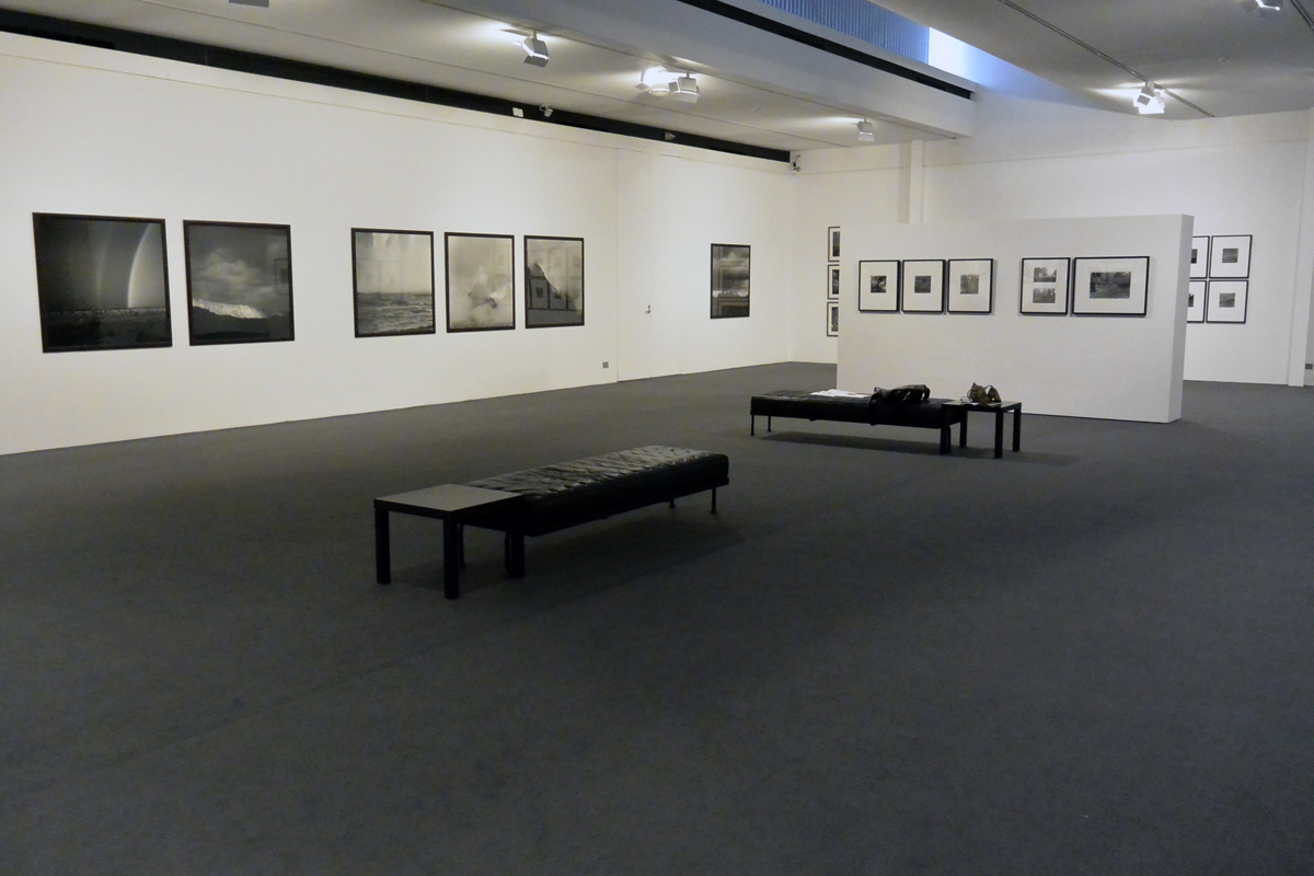
'After the fire (Northern Territory, Australia)' 2002


Claudia Terstappen (Australian born Germany, b. 1959)
After the fire (Northern Territory, Australia)
2002
From the series Our ancestors 1990-
29 cm x 29cm


“For me, trees have always been the most penetrating preachers. I revere them when they live in tribes and families, in forests and groves. And even more I revere them when they stand alone. They are like lonely persons. Not like hermits who have stolen away out of some weakness, but like great, solitary men, like Beethoven and Nietzsche. In their highest boughs the world rustles, their roots rest in infinity; but they do not lose themselves there, they struggle with all the force of their lives for one thing only: to fulfil themselves according to their own laws, to build up their own form, to represent themselves. Nothing is holier, nothing is more exemplary than a beautiful, strong tree…

A longing to wander tears my heart when I hear trees rustling in the wind at evening. If one listens to them silently for a long time, this longing reveals its kernel, its meaning. It is not so much a matter of escaping from one’s suffering, though it may seem to be so. It is a longing for home, for a memory of the mother, for new metaphors for life. It leads home. Every path leads homeward, every step is birth, every step is death, every grave is mother.

So the tree rustles in the evening, when we stand uneasy before our own childish thoughts: Trees have long thoughts, long-breathing and restful, just as they have longer lives than ours. They are wiser than we are, as long as we do not listen to them. But when we have learned how to listen to trees, then the brevity and the quickness and the childlike hastiness of our thoughts achieve an incomparable joy. Whoever has learned how to listen to trees no longer wants to be a tree. He wants to be nothing except what he is. That is home. That is happiness.”


Herman Hesse. Bäume: Betrachtungen und Gedichte (Trees: Reflections and Poems) 1984


This is the last review of 2013 and what a cracker of an exhibition to finish the year. Without doubt this is the best pure photography exhibition I have seen this year in Melbourne. The exhibition is stimulating and enervating, the image making of the highest order in its aesthetic beauty and visual complexity. The artist explores intangible spaces which define our physical and spiritual relationship with the un/known world.

Briefly stated the bulk of the exhibition features small, square, tonally rich black and white medium format landscape images of unspoiled places from around the world taken between the mid-1980s and the early 2000s, images that possess a sense of the sublime and suggest a link to indigenous cultures. These images are hung in rows, sometimes double row grids, that flesh out the narrative that Terstappen seeks to establish. It is a beautiful, enlightening hang and whoever sequenced the work and hung the show should be congratulated for they understood the artist’s narrative and the tonal range of the printing.

In an excellent review in The Age newspaper (Wednesday December 18th 2013) the writer Robert Nelson suggests that these vistas depict something holy to an earlier or parallel civilisation. He observes that Terstappen’s images go beyond the mere picturesque because the artist applies a persistent inquiry to image making no matter where she is in the world, for “she always looks for properties that the environment shares with counterparts elsewhere.” He goes on to state that the photographs have three systematic demands that the artist places on her interpretation of the landscape: 1/ that they express something elemental (earth, air, water, fire); 2/ the scene has to sustain a dark print with a visual weight that is almost contrary to the nature of photography; and 3/ the picture must reconcile the expansive and the intimate. In her world, everything must have presence, no matter how far away, and press up against the picture plane; everything must have a certain density, a thickness of being which is not about light but about the darkness of light

“All photographs depend on light; but Terstappen’s sensibility errs to descriptions of the density of things, not their reception or reflection of sunshine or even moonlight. Her scenery is gravid with banks engorged by roots, the bulk of outcrops or the intricate tangle of overlapping forest, which is also what seems to activate the water within the air to express it heaviness… A part of the impetus behind Terstappen’s project is pictorial: how to make the most rigorous sense of multiplicity, to frame big things so that they harmonise with little things, so that everything has an equivalent weight, including the air. The corollary of this consistent investigation is a poetic respect for the natural subject matter…”


Through images of visual and conceptual beauty and complexity, Terstappen imparts a strange kind of temporality to the work. The artist layers shapes within the photographs and, befitting her training as a sculptor, pushes and pulls at the image plane like a malleable piece of clay, sometimes blocking vision at the surface of the print, sometimes allowing access to a partially accessible (psychological) interiority. For example, look at the last three images before the press release below: Cabbage trees (Queensland, Australia)Curtain fig tree (Queensland, Australia) and Alligator nest (Queensland, Australia) (all 2002). In Cabbage trees the artist creates a visual pattern, like a fabric pattern, that holds the viewer at the surface of the image while still allowing glimpses of what lies beyond; in Curtain fig tree it is as if a curtain has literally descended blocking any access to the interior; while in Alligator nest there is a beautiful, open density to the work that invites contemplation and meditation upon the scene.

In Terstappen’s work, there is always a sense of space moving back, moving from the bottom up or top down and a conscious use of a restricted tonality (no bright whites or blackest blacks). The artist blocks movement, opens it up or swirls it around. Sometimes earth becomes sky as steam turns to cloud, or rock becomes water as the two meld at the base of a waterfall. In this multiplicity, each element is given equal weight within certain atmospheres and an equilibrium is formed, to live at the heart of these images. Each complex, thoughtful image becomes a living and breathing entity.

In Terstappen’s work there is no fixed image and no single purpose, a single meaning, or one singular existence that the images propose. They transcend claims about the world arising from, for example, natural or scientific attitudes or theories of the ontological nature of the world. As the artist visualises, records the feeling of the facts, such complex and balanced images let the mind of the viewer wander in the landscape. In their fecundity the viewer is enveloped in that situation of not knowing. There is the feeling of the landscape, a sensitivity to being “lost” in the landscape, in the shadow of ‘Other’, enhanced through the modality of the printing. Dreamworld vs analytical/descriptive, there is the enigma of the landscape and its spiritual places. Yes, the sublime, but more an invocation, a plea to the gods for understanding. This phenomenological prayer allows the artist to envelop herself and the viewer in the profundity – the great depth, intensity and emotion – of the landscape. To be ‘present’ in the the untrammelled places of the world as (divine) experience.

The only doubt I have about the exhibition is the ex post facto interpretation of the archive as picturing places that are threatened by social and ecological change. As the catalogue text states, “These pictures now form part of an archive of historically significant places that are threatened by social and ecological change. This archive of spiritual sites has, over time, become an environmental archive, reminding us that photography not only has the power to bring places to life, but also to bear witness to the forces that threaten life.” If they are only now forming part of an environmental archive, what memory of sacred place did they initially respond to?

While Terstappen’s work has always focused on a physical encounter with space and an imaging of places that have deep or hidden meanings and mythical / symbolic significance, when I look at this work I do not get a strong sense of these places being under threat. Only through written (not visual) language is this environmental threat enunciated. While archives are always fluid and will always gather new meaning (look at Atget’s “documents for artists”, images that are now acknowledged as some of the most artistic and influential in the whole canon of photography), we must also acknowledge that nothing in this world remains the same, that everything changes all the time, for better or worse. The landscapes that Terstappen photographs are no more “natural” then as they are now, due to the effects of bushfires, human cultivation, erosion, habitation, hunting, farming and natural disaster. Humans cannot appeal to some vision of a world, some garden of Eden, that exists pre humanity. Who is to stay that these places in the world are disappearing or appearing? By the very act of photographing these places, Terstappen labels them, names them as inconsolable places that should never change. This is not the mysterious way of the world. I prefer to look at these places and acknowledge that this is how they looked through the eyes of this artist at this point in time. They have full presence before me, in all their mystery and majesty.

Is this textual analysis necessary for the work to succeed? I do not believe it is, in fact I believe it lessens the inherent quality of these images. Use these images to help people understand what human beings are doing to the planet by all means, but please do not try to retrofit concepts of destruction onto the work.

This minor quibble aside, I say to you that this is the most sophisticated reading of the landscape that I have seen in a long time – not just in Australia but from around the world. This is such a joy of an exhibition to see that you leave feeling engaged and uplifted. Being in the gallery on your own is a privilege that is hard to describe: to see (and feel!) landscape photography of the highest order and by an Australian artist as well. If you grant anything for your New Year’s wish you could do no better than to visit this magnificent exhibition and drink of its atmospheres.

Dr Marcus Bunyan


Many thankx to the Monash Gallery of Art for allowing me to publish the photographs in the posting. All installation photographs © Marcus Bunyan and the Monash Gallery of Art. Please click on the photographs for a larger version of the image.


Claudia Terstappen (Australian born Germany, b. 1959) 'Bushfire III (Northern Territory, Australia)' 2002


Claudia Terstappen (Australian born Germany, b. 1959)
Bushfire III (Northern Territory, Australia)
2002
From the series Our ancestors 1990-
29 cm x 29cm


Claudia Terstappen (Australian born Germany, b. 1959) 'Sickness country II (Northern Territory, Australia)' 2002


Claudia Terstappen (Australian born Germany, b. 1959)
Sickness country II (Northern Territory, Australia)
2002
From the series Our ancestors 1990-
29 cm x 29cm


Claudia Terstappen (Australian born Germany, b. 1959) 'Cabbage trees (Queensland, Australia)' 2002


Claudia Terstappen (Australian born Germany, b. 1959)
Cabbage trees (Queensland, Australia)
2002
From the series Our ancestors 1990-
29 cm x 29cm


Claudia Terstappen (Australian born Germany, b. 1959) 'Curtain fig tree (Queensland, Australia)' 2002


Claudia Terstappen (Australian born Germany, b. 1959)
Curtain fig tree (Queensland, Australia)
2002
From the series Our ancestors 1990-
29 cm x 29cm


Claudia Terstappen (Australian born Germany, b. 1959) 'Alligator nest (Queensland, Australia)' 2002


Claudia Terstappen (Australian born Germany, b. 1959)
Alligator nest (Queensland, Australia)
2002
From the series Lost world 2002-
21 cm x 21cm


Over the last thirty years Claudia Terstappen has taken photographs of places throughout the world that have spiritual resonance or associations. The basis of this exhibition is a selection of these landscapes, presented as gelatin silver prints printed by the artist between the 1980s – early 2000s.

The landscapes in this exhibition document places that have spiritual associations or significance for indigenous people, to make sense of their relationship to the land. But I now realise that the archive has taken on another set of meanings or intention. Today, these pictures form part of a vast archive of landscapes and places undergoing significant change. This archive of spiritual places has become an environmental archive.

Terstappen was born in Germany, and her landscapes are in many ways informed by her heritage. Like Australia, Germany has a particular tradition of landscape, where places of nature carry important associations for cultural understanding and a sense of belonging. Terstappen is herself part of a long tradition of German artists to explore this relationship.

Terstappen studied at the Düsseldorfer Kunstakademie, the training ground for many of Germany’s most important contemporary artists. Having been taught by the famous photographer Bernd Becher and then the architect and sculptor Erich Reusch, Terstappen has since exhibited widely throughout Europe, North America and Australia.

Text from the Monash Gallery of Art website


Claudia Terstappen originally trained a a sculptor but for over three decades she has worked in the medium of photography. In some respects, her art practice has been developed between these two artistic disciplines. She retains a strong interest in the sculptural sensation of a physical encounter in space, but she uses the two-dimensional medium of photography to document and reiterate these experiences.

Terstappen’s interest in the interplay between depth and surface is also evident in the subjects that she explores. She often photographs places that have deep or hidden meanings. This includes sites of pilgrimage, shrines of worship and landscapes invested with mythic significance. These associations are not always apparent, and often subsist as a type of secret knowledge, but they can be given tangible form through processes of story-telling and ceremonial action. Terstappen engages with these locations in order to give them a tangible photographic form, elaborating a sense of symbolic power or sublime drama across the surface of her images.

This exhibition features 75 photographs depicting places that have been invested with spiritual resonances or mythical associations, from Iceland and southern Europe to the Americas and Australia. The starting point for this exhibition is a selection of gelatin silver prints that were hand-printed by the artist between the mid-1980s and the early 2000s. These pictures now form part of an archive of historically significant places that are threatened by social and ecological change. This archive of spiritual sites has, over time, become an environmental archive; reminding us that photography not only has the power to bring places to life, but also to bear witness to the forces that threaten life.

Text from the exhibition pamphlet


Claudia Terstappen (Australian born Germany, b. 1959) 'Turtle Dreaming, Australia (Northern Territory)' 2002


Claudia Terstappen (Australian born Germany, b. 1959)
Turtle Dreaming, Australia (Northern Territory)
2002
from the series Vanishing landscapes 1987-
Gelatin silver print
120 x 120cm
Courtesy of the artist


Claudia Terstappen (Australian born Germany, b. 1959) 'Namandi spirit [Queensland, Australia]' 2002


Claudia Terstappen (Australian born Germany, b. 1959)
Namandi spirit (Queensland, Australia)
2002
from the series Our ancestors 1990-
Gelatin silver print
29 x 29cm
Courtesy  of the artist


Claudia Terstappen (Australian born Germany, b. 1959) 'Cabbage trees [Queensland, Australia]' 2002


Claudia Terstappen (Australian, born Germany 1959)
Cabbage trees (Queensland, Australia)
2002
from the series Our ancestors 1990-
Gelatin silver print
29 x 29cm
Courtesy  of the artist


Claudia Terstappen (Australian born Germany, b. 1959) 'Full moon [France]' 1997


Claudia Terstappen (Australian born Germany, b. 1959)
Full moon (France)
1997
from the series I believe in miracles 1997-
Gelatin silver print
80 x 80cm
Courtesy  of the artist


Claudia Terstappen (Australian born Germany, b. 1959) 'Mountain [Brazil]' 1991


Claudia Terstappen (Australian born Germany, b. 1959)
Mountain (Brazil)
1991
from the series Sacred mountains 1989-
Gelatin silver print
37 x 37cm
Courtesy  of the artist


Claudia Terstappen (Australian born Germany, b. 1959) 'Mountain [Las Palmas, Spain]' 1992


Claudia Terstappen (Australian born Germany, b. 1959)
Mountain (Las Palmas, Spain)
1992
from the series Sacred mountains 1989-
Gelatin silver print
49 x 49cm
Courtesy  of the artist


Claudia Terstappen (Australian born Germany, b. 1959) 'Zion Park [USA]' 1996


Claudia Terstappen (Australian, born Germany 1959)
Zion Park (USA)
1996
from the series Sacred land of the Navajo Indians 1990-
Gelatin silver print
37 x 37cm
Courtesy  of the artist


In the shadow of change features almost 100 of Claudia Terstappen’s magnificent landscape photographs. Terstappen is a German-born photographer who studied at the famous Dusseldorf art academy and is now Professor of Photography at Monash University in Melbourne.

For over three decades, Terstappen has been photographing landscapes the world over. Brazil, Colombia, Canada, Japan, USA, Iceland and Spain have been destinations for the artist, who has travelled the world looking for landscapes which have particular spiritual or mythical meanings. This search brought Terstappen to Australia in 2002; the artist now lives in Melbourne as a permanent resident.

Terstappen’s vast archive of landscape photographs has taken on significant environmental associations. As debates about the politics and impact of land use and climate change continue, Terstappen’s landscapes – from intimately scaled views of forests and riverbeds to grand views of mountains and glaciers – present a truly beautiful account of landscape photography and its contemporary significance.

As Terstappen states: ‘There is a moral dimension to looking at and photographing landscape today. Landscape photography has tremendous currency. Many of the landscapes in my photographs will have either completely disappeared or drastically changed by now. I firmly believe we need to re-establish our relationship with nature and landscape and photography can help us to achieve this.’

MGA Director and curator of the exhibition Shaune Lakin states: ‘MGA is very proud to have developed this exhibition with Claudia, which will be accompanied by a beautifully illustrated book. We have timed the exhibition to coincide with the 30-year anniversary of one of the defining moments in Australian photography, when landscape photographs actually brought about significant social and political change. It is now 30 years since Peter Dombrovskis’s now-iconic photographs of the Gordon River helped prevent construction of the Franklin Dam in Tasmania, which to this day remains one of the world’s great wilderness areas.

‘With the election of a new government and promises of a new environmental agenda, it seems a perfect time for us to reconsider the power of landscape photography and the status of environmentalism in Australia today.’

Press release from the Monash Gallery of Art website


Installation photograph of the exhibition 'Claudia Terstappen: In The Shadow Of Change' at the Monash Gallery of Art, Wheelers Hill, Melbourne

Installation photograph of the exhibition 'Claudia Terstappen: In The Shadow Of Change' at the Monash Gallery of Art, Wheelers Hill, Melbourne

Installation photograph of the exhibition 'Claudia Terstappen: In The Shadow Of Change' at the Monash Gallery of Art, Wheelers Hill, MelbourneInstallation photograph of the exhibition 'Claudia Terstappen: In The Shadow Of Change' at the Monash Gallery of Art, Wheelers Hill, Melbourne

Installation photograph of the exhibition 'Claudia Terstappen: In The Shadow Of Change' at the Monash Gallery of Art, Wheelers Hill, Melbourne

Installation photograph of the exhibition 'Claudia Terstappen: In The Shadow Of Change' at the Monash Gallery of Art, Wheelers Hill, Melbourne

Installation photograph of the exhibition 'Claudia Terstappen: In The Shadow Of Change' at the Monash Gallery of Art, Wheelers Hill, Melbourne

Installation photograph of the exhibition 'Claudia Terstappen: In The Shadow Of Change' at the Monash Gallery of Art, Wheelers Hill, Melbourne

Installation photograph of the exhibition 'Claudia Terstappen: In The Shadow Of Change' at the Monash Gallery of Art, Wheelers Hill, Melbourne

Installation photograph of the exhibition 'Claudia Terstappen: In The Shadow Of Change' at the Monash Gallery of Art, Wheelers Hill, Melbourne

Installation photograph of the exhibition 'Claudia Terstappen: In The Shadow Of Change' at the Monash Gallery of Art, Wheelers Hill, Melbourne

Installation photograph of the exhibition 'Claudia Terstappen: In The Shadow Of Change' at the Monash Gallery of Art, Wheelers Hill, Melbourne


Installation photographs of the exhibition Claudia Terstappen: In The Shadow Of Change at the Monash Gallery of Art, Wheelers Hill, Melbourne
Photos: © Marcus Bunyan


Bob Browns opening speech at artist Claudia Terstappen’s exhibition In the shadow of change at the Monash Gallery of Art (MGA) in Melbourne. Recorded on Saturday 9 November 2013.


Monash Gallery of Art
860 Ferntree Gully Road, Wheelers Hill
Victoria 3150 Australia
Phone: + 61 3 8544 0500

Opening hours:
Tuesday – Friday 10am – 5pm
Saturday – Sunday 12pm – 4pm
Mon/public holidays closed

Monash Gallery of Art website

LIKE ART BLART ON FACEBOOK

Back to top