
Exhibition dates: 7th October, 2022 – 19th February, 2023
 'Family on a Sunday walk, Skinningrove' 1982 from the exhibition 'Chris Killip, Retrospective' at The Photographers' Gallery, London, October 2022 - Feb 2023")
Chris Killip (British, 1946-2020)
Family on a Sunday walk, Skinningrove
1982
From Skinningrove 1981-1984
Gelatin silver print
© Chris Killip Photography Trust
All images courtesy Martin Parr Foundation
Forever present
So many words have been written about the gritty photographs of British photographer Chris Killip that sometimes it feels hard to say something new, something that reveals more about the work. Perhaps I am just adding to the noise around the artist? What can I say that is insightful / eloquent?
Please allow me to talk about how the work makes me feel … interspersed with some of the facts that we know.
I feel humble before this work. Somehow less important as human being than the directness of the photographers vision and the stories he tells through his photographs about salt of the earth people. Human beings existing, getting by, in hardship, in winter, gathering coal at the edge of the sea under the ramparts of a power station – a tough place but not an unhappy place.
“Killip says that Lynemouth, where the sea-coalers worked, was a “tough place, but it wasn’t an unhappy place … There was lots of energy and lots of fun,” he adds. “There was rivalry and enthusiasms and passions. People were not despairing. It was a very complex community and with a great sense of purpose, which was: get the coal and make money. And I’ve always been interested in places that had purpose.”1
Killip’s purpose was to capture human dignity amid industrial decline in England’s north-east, “the human element of economic deprivation” and the resilience of communities affected. He embedded himself in his community – “I stayed in Newcastle for fifteen years. I mean, to get the access to photograph the sea-coal workers took eight years. You do get embroiled in a place”2 – in order for people to accept his presence and be relaxed in front of his large format camera. It’s almost as though the photographer and his very big, very visible camera were part of the scenery, as though the photographer and his equipment became invisible, indivisible from the story.
“In Winter 1983, believing his photographs felt too ‘remote’, Killip acquired a caravan of his own, and moved it onto the beach. Despite storm and snow, he could now photograph at will, in accordance with he rhythms of life on the camp itself. Killip tempers the extreme conditions of work with intimacy, kinships, and the quiet dignities of family life – so much so, that ‘photography’ seems hardly involved.”3
So much so, that ‘photography’ seems hardly involved. Just take a second to think about that statement.
And so admiration is another feeling that swells in the breast, through an understanding of how difficult these poetic images would have been to take with a large format camera (slung around the photographer’s neck, fired using a pistol grip in his hand without Killip ever looking through the lens, the artist just going on when it felt right to take a photograph and the intensity of the moment). How much patience, time, knowledge of the history of art and photography, technique and visualisation it would take to imagine these images into existence: these intimate photographs of families, friends, dogs, motorcycles, cars, ships, cranes and idle time that showcase not only Killip’s empathy for subject matter but also for himself, for he is also part of the story.4
“For a photographer whose work was grounded in the urgent value of documenting “ordinary” peoples’ lives, these nuanced images – radiating a vast stillness of light and time, embedded with the granularity of lives lived – reveal Killip’s conviction that no life is ordinary: everyday lives are sublime.”5
Killip’s visualisations always engage with the light of being and the place of existence with honesty and integrity. To see this, just look at the pairing and sequencing of images from Creative Camera in May 1977 at the end of the posting. A graveyard overlooked by a far away power station opposite two old men, the bald man’s hat hanging on the railing, overlooked by an “all out” demonstration poster; a man with platform shoes and flares, slumped on the ground bracing himself with a tattooed arm, surrounded by graffiti, supports a sleeping almost dead child in the crook of his other arm… whilst opposite a desolate scene of public housing, bleak pillars and fleeing mother and child overwhelmed by concrete madness; and a shrouded, dark, bent, woman in silhouette opposite the trappings of power in the civic robes of the mayors of Jarrow and South Shields. Every life is valuable.
Early influences in the Isle of Man images come from photographers such as August Sander, Paul Strand and Frank Sutcliffe. Later photographs have hints of the photo stories of Bill Brandt. Ultimately Killip forged his own authentic voice as an artist through his persistence in documenting “the human element of economic deprivation” and the resilience of communities affected. As he observed, “I wanted to record people’s lives because I valued them. I wanted them to be remembered. If you take a photograph of someone they are immortalised, they’re there forever. For me that was important, that you’re acknowledging people’s lives, and also contextualising people’s lives.”6
Killip’s focused (ie. in the zone, a mental state of focused concentration on the performance of an activity, in which one dissociates oneself from distracting or irrelevant aspects of one’s environment), complex and layered photographs are forever present. In a world where “there is nothing permanent except change” (Heraclitus), and where there are few traces left of the transitional worlds that Killip was documenting – “The sea-coal camp has gone, so have the coal mine and the power station. The area has been landscaped and now looks like an unused golf course. You would never know that the sea-coal camp had existed.”7 – Killip’s palpable realities make these human beings live and breathe again.
We care about them because Killip’s photographs enable within us a clarity of perception that means we are able to grasp what is there, the way it is. “If reality enters you without distortion, that is proper perception. The rest is distortion.” (Sadhguru)
Clear seeing and clear feeling. Where the forever is ever present.
Dr Marcus Bunyan
1/ Carolina A. Miranda. “Seven photos, seven stories: Chris Killip on capturing the declining industrial towns of England in the ’70s and ’80s,” on the Chicago Tribune website Jul 22, 2017 [Online] Cited 27/01/2023. No longer available online
2/ Anonymous. “Chris Killip,the closest way to make our memories seem real,” on the In de stilte website 17 April 2019 [Online] Cited 27/01/2023
3/ Wall text from the exhibition
4/ Here we could adapt what Pierre Boulez said about his work Pli selon pli (Fold by fold): “So, fold by fold, as the five movements develop, a portrait of Killip is revealed.” See Anonymous. “Pli selon pli,” on the Wikipedia website Nd Footnote 3 [Online] Cited 10/02/2023
5/ Anonymous. “Chris Killip: Skinningrove,” on the Amazon website Nd [Online] Cited 10/02/2023
6/ Chris Killip quoted in Diane Smyth. “Now Then: Chris Killip and the Making of In Flagrante,” on the British Journal of Photography website 6 June 2017 [Online] Cited 26/01/2023
7/ Chris Killip quoted in Olivier Laurent and Natalie Matutschovsky. “Chris Killip’s Celebrated Photobook In Flagrante Makes Its Return,” on the Time website January 27, 2016 [Online] Cited 26/01/2023
Many thankx to The Photographers’ Gallery for allowing me to publish the photographers in the posting. Please click on the photographs for a larger version of the image.
“The photography that I practice takes place in a specific time and place, depicting real moments in peoples lives. In many ways I think of myself as a historian, but not of the world. History is most often written from a distance, and rarely from the viewpoint of those who endured it.”
“I don’t want photography to transcend its subject matter, but for many art historians that is the limitation of photography … I don’t see it as a limitation; it puts me more in the camp of photography than art when I say I don’t acknowledge that as a limitation, I acknowledge it as an interesting fact and strength. Why would I want to transcend the subject when I am interested in the subject matter.”
Chris Killip
“The working class get it in the neck basically, they’re the bottom of the pile,” says Chris Killip. “I wanted to record people’s lives because I valued them. I wanted them to be remembered. If you take a photograph of someone they are immortalised, they’re there forever. For me that was important, that you’re acknowledging people’s lives, and also contextualising people’s lives.”
Chris Killip quoted in Diane Smyth. “Now Then: Chris Killip and the Making of In Flagrante,” on the British Journal of Photography website 6 June 2017 [Online] Cited 26/01/2023
‘I didn’t set out to be the photographer of the English de-Industrial Revolution. It happened all around me during the time I was photographing’ Chris Killip, 2019
Grounded in sustained immersion and participation in the communities he photographed, Chris Killip’s keenly observed work chronicled ordinary people’s lives in stark, yet sympathetic, detail. His photographs are recognized as some of the most important visual records of 1980s Britain; as editor of this book Ken Grant reflects, they tell the story of those who ‘had history “done to them”, who felt its malicious disregard and yet, like the photographer with whom they shared so much of their lives, refused to yield or look away’.”
Anonymous. “Chris Killip,” on the Magnum Photos website Nd [Online] Cited 26/01/2023
Chris Killip’s continued efforts to value and document the lives of those affected by the economic shifts in the North of England, throughout the 1970s and 80s, have made him one of the most influential figures of British Photography. This retrospective exhibition of more than 140 works, serves as the most comprehensive survey of the photographer’s work to date and includes previously unseen works.
His sustained immersion into the communities he photographed remains without parallel. Whilst marking a moment of deindustrialisation, Killip’s stark yet tender observation moves beyond the urgency to record such circumstances, to affirm the value of lives he grew close to – lives that, as he once described ‘had history done to them’, who felt history’s malicious disregard and yet, like the photographer himself, refused to yield or look away.
Against a background of shipbuilding and coal mining, he witnessed the togetherness of communities and the industries that sustained them and stayed long enough to see their loss.
Text from The Photographers’ Gallery website
Chris Killip, retrospective trailer – The Photographers’ Gallery (7 October 22 – 19 February 23)
This retrospective exhibition of more than 140 works, serves as the most comprehensive survey of the photographer’s work to date and includes previously unseen works. Chris Killip’s continued efforts to value and document the lives of those affected by the economic shifts in the North of England, throughout the 1970s and 80s, have made him one of the most influential figures of British Photography.
Chris Killip, retrospective – An Interview with Exhibition Curators Tracy Marshall Grant and Ken Grant
An interview with Chris Killip, retrospective exhibition curators Tracy Marshall-Grant and Ken Grant.
CAMERA Exhibitions: Chris Killip, retrospective. The Photographers Gallery
This retrospective exhibition of more than 140 works, serves as the most comprehensive survey of Chris Killip’s work to date and includes previously unseen works.
Chris Killip
In 1963, aged 17, Chris Fillip opened a copy of Paris Match magazine hoping for news of the Tour de France cycle race, and instead found Henri Cartier-Bresson’s photograph of a boy carrying two bottles of wine in Rue Mouffetard, Paris. Sensing the potential for photography to serve as an untethered means of expression, Killip’s life took a new turn. He didn’t own a camera, yet nevertheless told his father he would become a photographer. A summer working as a beach photographer earned him enough to leave for London in 1964, where he finally secured a position assisting the commercial photographer Adrian Flowers.
Killip’s immersion into the London cultural scene of te 1960s, share with painters and musicians, brought an appreciation for its buoyant gallery culture and an education that was both self-directed and formative. Quickly establishing himself as a sought-after freelance assistant, he led the production of major campaigns, until a 1969 trip to New York prompted an epiphany and a return to his native Isle of Man. There, he began the first of the long-term bodies of worksheet would define his career, each of which are characterised by their independence, tenderness and profound humanity.
Chris Killip’s legacy bears witness to an era of deindustrialisation, whilst serving as a portent to its longer consequences. From that first urgent return to the Isle of Man, into the early 1970s, when he first photographed in the North of England, until his death in October 2020, Fillip remained close to those he photographed ‘those’, he once said, ‘who’d had history done to them’.
Wall text from the exhibition
Isle of Man 1970-1973
In Autumn 1969, while in New York for a commercial photo shoot, a visit to Bill Brandt’s exhibition at the Museum of Modern Art would cause Killip’s life to change course again. It was the permanent collection that inspired him most: Paul Strand, August Sander, Walker Evans… each offered license to make photography for its own sake, free of commercial imperatives, and Fillip left the museum reeling. That same evening, he rang his father, telling him he would return to the Isle of Man to photograph.
By the late 1960s, a peasant culture that had long word the land and sea had been joined by many working financial enterprises on the island. Two instinct Isles of Man were emerging, one of which was now threatened. Between 1970 and 1972, Fillip photographed during the day and worked evenings in his father’s pub. Time away from the island had clarified the political shifts and external influences that were coming to bear on his family and their community, and he knew the urgency of his task. Though completed in 1973, Isle of Man: A book about the Manx, was published in 1980.
Wall text from the exhibition
 'Golden Meadow mill, Castletown' 1972 from the exhibition 'Chris Killip, Retrospective' at The Photographers' Gallery, London, October 2022 - Feb 2023")
Chris Killip (British, 1946-2020)
Golden Meadow mill, Castletown
1972
From Isle of Man 1970-1973
Gelatin silver print
© Chris Killip Photography Trust
All images courtesy Martin Parr Foundation
 'Cashtal ny Ard, Maughold (neolithic burial site)' 1972 from the exhibition 'Chris Killip, Retrospective' at The Photographers' Gallery, London, October 2022 - Feb 2023")
Chris Killip (British, 1946-2020)
Cashtal ny Ard, Maughold (neolithic burial site)
1972
From Isle of Man 1970-1973
Gelatin silver print
© Chris Killip Photography Trust
All images courtesy Martin Parr Foundation
 'Interior of St Luke's church, Baldwin' 1972")
Chris Killip (British, 1946-2020)
Interior of St Luke’s church, Baldwin
1972
From Isle of Man 1970-1973
Gelatin silver print
© Chris Killip Photography Trust
All images courtesy Martin Parr Foundation
 'Mr 'Snooker' Corkhill and his son, Castletown' 1970-1973")
Chris Killip (British, 1946-2020)
Mr ‘Snooker’ Corkhill and his son, Castletown
1970-1973
From Isle of Man 1970-1973
Gelatin silver print
© Chris Killip Photography Trust
All images courtesy Martin Parr Foundation
 'Mrs Pitts, Slieu Whuallian' 1970-1973")
Chris Killip (British, 1946-2020)
Mrs Pitts, Slieu Whuallian
1970-1973
From Isle of Man 1970-1973
Gelatin silver print
© Chris Killip Photography Trust
All images courtesy Martin Parr Foundation
 'John Radcliffe, Black Hill, Ballasalla' 1970-1973")
Chris Killip (British, 1946-2020)
John Radcliffe, Black Hill, Ballasalla
1970-1973
From Isle of Man 1970-1973
Gelatin silver print
© Chris Killip Photography Trust
All images courtesy Martin Parr Foundation
Mr Radcliffe remained a bachelor all his life. When he was given a print of this photograph he folded it in four and put it in his pocket, but told the photographer he was glad to have it as he had lost his cat in the meantime to a traffic accident.
 'Ms Redpath, Regaby' 1970-1973")
Chris Killip (British, 1946-2020)
Ms Redpath, Regaby
1970-1973
From Isle of Man 1970-1973
Gelatin silver print
© Chris Killip Photography Trust
All images courtesy Martin Parr Foundation
 'Mrs Hyslop, Ballachrink Farm, the Braaid' 1970-1973")
Chris Killip (British, 1946-2020)
Mrs Hyslop, Ballachrink Farm, the Braaid
1970-1973
From Isle of Man 1970-1973
Gelatin silver print
© Chris Killip Photography Trust
All images courtesy Martin Parr Foundation
 'Thrashing, Grenaby Farm, Isle of Man' 1970-1973")
Chris Killip (British, 1946-2020)
Thrashing, Grenaby Farm, Isle of Man
1970-1973
From Isle of Man 1970-1973
Gelatin silver print
© Chris Killip Photography Trust
All images courtesy Martin Parr Foundation
In Thrashing, Grenaby … I think I failed better, although I suspect that its atmosphere of ‘bucolic idyll’ would be a different sort of problem. This photograph more accurately describes threshing work, and shows something from the past: agricultural labour as communal effort.
 'TT Races Supporter, Isle of Man' 1971")
Chris Killip (British, 1946-2020)
TT Races Supporter, Isle of Man
1971
From TT Races 1970-1972
Gelatin silver print
© Chris Killip Photography Trust
All images courtesy Martin Parr Foundation
“Making a portrait fills me with a certain amount of dread. It’s the impertinence of what you are about to do in reducing a human being into one fixed moment. You think about the subject’s complexity (knowing them makes this worse) and the predetermined limitations that surround any attempt at portraiture. Then you convince yourself that you have to try, and you go ahead. This brief moment between you and the person in front of you is based on their trust in your intent.”
~ Chris Killip
Early work 1974-1977
In 1972, a commission by the Arts Council of Great Britain led Fillip to photograph Bury St Edmunds and Huddersfield. Drawn to the Yorkshire city’s mills, tenement housing and workplaces, he photographed widely in the region, making portraits in the street, and settling on an approach that would continue in subsequent decades.
After a move to Newcastle in 1975 to undertake a British Gas / Northern Arts Fellowship, Fillip used his non-contracted time to photograph independently. From the edges of the shipyards near his new home, to the coalmining towns of Castleford and Workington, he gathered an understanding of the industrial regions of the North and built an accord with the communities bound by them. An early search for a Newcastle darkroom led to Amber Films, an association that would eventually see him taking on the directorship of Amber’s Side Gallery between 1977-1979.
In May 1977, the editors of Creative Camera magazine [see the end of this posting] gave over the entire issue to a portfolio of Killip’s Northeast photographs – a rare move that acknowledged the work’s authority, whilst suggesting something of the potential future sequencing of work drawn from across the region.
Wall text from the exhibition
 'Youth on wall, Jarrow, Tyneside' 1975")
Chris Killip (British, 1946-2020)
Youth on wall, Jarrow, Tyneside
1975
Gelatin silver print
© Chris Killip Photography Trust
All images courtesy Martin Parr Foundation
The boy with his Punk hair and boots seems to be a study in bravado and insecurity, recorded with magnifying glass clarity by a 5 × 4 camera. Chris later told me that he had captured this unlikely picture by putting a false lens on the side of his view camera (à la Paul Strand) and wearing a hazard jacket, like a council surveyor.
Mark Haworth-Booth. “Chris Killip,” on the V&A Blog website October 30, 2020 [Online] Cited 26/01/2023
 'Whippet Fancier, Huddersfield' 1973")
Chris Killip (British, 1946-2020)
Whippet Fancier, Huddersfield, Yorkshire
1973
Gelatin silver print
© Chris Killip Photography Trust
All images courtesy Martin Parr Foundation
 'Two girls, Grangetown, Middlesbrough, Teesside' 1975")
Chris Killip (British, 1946-2020)
Two girls, Grangetown, Middlesbrough, Teesside
1975
Gelatin silver print
© Chris Killip Photography Trust
All images courtesy Martin Parr Foundation
The Last Ships 1975-1977
 'Tyne Pride at the end of the street, Wallsend' 1976")
Chris Killip (British, 1946-2020)
Tyne Pride at the end of the street, Wallsend
1976
From The Last Ships 1975-1977
Gelatin silver print
© Chris Killip Photography Trust
All images courtesy Martin Parr Foundation
 'Girls Playing in the street, Wallsend, Tyneside' 1976")
Chris Killip (British, 1946-2020)
Girls Playing in the street, Wallsend, Tyneside
[Looking East on Camp Road, Wallsend]
1976
From The Last Ships 1975-1977
Gelatin silver print
© Chris Killip Photography Trust
All images courtesy Martin Parr Foundation
“When I was making my shipbuilding photographs I didn’t show them to anyone, as shipbuilding on Tyneside had become a personal obsession. I made them with a sense of urgency as I thought it wasn’t going to last. I didn’t set out to be the photographer of the English de-industrial revolution, it happened all around me during the time I was photographing.”
~ Chris Killip
This photograph belongs to a bigger series by Chris Killip called The Last Ships, which traces the decline of shipbuilding on the Tyne. “I made them with a sense of urgency, as I thought it wasn’t going to last,” Killip said later. “I didn’t set out to be the photographer of the English de-Industrial Revolution. It happened all around me during the time I was photographing.”
Killip was intrigued by the contrast between the epic scale of the ships that loomed over the streets of Wallsend and South Shields and the working-class communities that lived in their shadow. Here, children play on a quiet terraced street beneath the towering outline of the Tyne Pride, the biggest ship ever built on the Tyne and, as it turned out, one of the last. The red-brick houses, the stone wall, the fog lend the scene an almost Victorian feel. Within a few years, though, that way of life came to an end with a brutal finality. Just two years after this photograph was taken, Killip made another in the same place: the street was demolished, the community scattered. …
Many of Killip’s shipbuilding photographs, though, remained unseen until recently. Now, alongside three other series he made in the north-east – The Station (1985), Skinningrove (1981-84) and Portraits (1970-89) – The Last Ships (1975-1977) has been published as a large format zine. The scale suits the subject matter perfectly. The images, which move from the epic to the intimate, evoke another England in which the terms “working class” and “community” were still synonymous. It seems an eternity ago.
Sean O’Hagan. “The big picture: Chris Killip captures the last days of shipbuilding,” on The Guardian website Sun 6 Jan 2019 [Online] Cited 26/01/2023
“The ship was so massive you could see it from miles around dominating the area, not to mention the cranes and the noises from the yard which could be heard clattering through the night. When I think of those yards, which have just been filled in, flattened and abandoned, I think it’s a crying shame. We’re an island nation that cannot build a ship. If I had to pick a symbol to represent what the shipyards meant to me, it was the comradeship in the yards. We were a close-knit community of people living and working together. Everyone relied on each other and are all linked. When I look at the remains of what’s left I feel nothing. The community’s gone. There’s nothing left. It hasn’t changed for the best. You’ve saved money and destroyed this community.”
Frank Duke quoted in Hunter Charlton. Landscape and Change: Shipbuilding and Identity on the Tyne. University of Bristol, 2015, p. 4.
 'Wallsend in the snow' 1976")
Chris Killip (British, 1946-2020)
Wallsend in the snow
1976
From The Last Ships 1975-1977
Gelatin silver print
© Chris Killip Photography Trust
All images courtesy Martin Parr Foundation
 'Demolished housing, Wallsend' August 1977")
Chris Killip (British, 1946-2020)
Demolished housing, Wallsend
August 1977
From The Last Ships 1975-1977
Gelatin silver print
© Chris Killip Photography Trust
All images courtesy Martin Parr Foundation
 'The Ship Inn' 1975")
Chris Killip (British, 1946-2020)
The Ship Inn
1975
From The Last Ships 1975-1977
Gelatin silver print
© Chris Killip Photography Trust
All images courtesy Martin Parr Foundation
 'Ford Plant - Criss-Crossed Conveyors' 1927")
Charles Sheeler (American, 1883-1965)
Ford Plant – Criss–Crossed Conveyors
1927
Gelatin silver print
© The Lane Collection
Courtesy, Museum of Fine Arts, Boston
![Chris Killip (British, 1946-2020) 'Untitled? [Shipbuilding on Tyneside]' 1975-1977](https://artblart.com/wp-content/uploads/2023/01/killip-shipbuilding-on-tyneside.jpg "Chris Killip (British, 1946-2020) 'Untitled? [Shipbuilding on Tyneside]' 1975-1977")
Chris Killip (British, 1946-2020)
Untitled? [Shipbuilding on Tyneside]
1975-1977
From The Last Ships 1975-1977
Gelatin silver print
© Chris Killip Photography Trust
All images courtesy Martin Parr Foundation
Sealcoal 1981-1984
Killip first attempted to photograph the beach at Lynemouth, Northumberland, in 1976, only to be chased away by men on horse-drawn carts wary of any stranger. He’d hoped to photograph as winter tides returned the waste coal expelled into the sea from a nearby mine. After attempts over several years were met with violent rejection, Killip’s eventual acceptance came in 1982, when visiting a pub the seculars frequented to make a final plea. A man recognised him as the Manx photographer he’d give tea and shelter to during a rainstorm at Appleby Horse Fair, and confirmed Killip’s intentions were good.
In Winter 1983, believing his photographs felt too ‘remote’, Killip acquired a caravan of his own, and moved it onto the beach. Despite storm and snow, he could now photograph at will, in accordance with he rhythms of life on the camp itself. Killip tempers the extreme conditions of work with intimacy, kinships, and the quiet dignities of family life – so much so, that ‘photography’ seems hardly involved. Perhaps that’s what Killip liked so much when, years later, he called the words of seacoaler Brian Ladler, ‘…the commandment: love one another. It’s not a bad idea, is it Chris?’
Wall text from the exhibition
 'Gordon in the water, Seacoal Beach, Lynemouth' 1983")
Chris Killip (British, 1946-2020)
Gordon in the water, Seacoal Beach, Lynemouth
1983
From Seacoal 1982-1984
Gelatin silver print
© Chris Killip Photography Trust
All images courtesy Martin Parr Foundation
In 1975 Chris Killip received a fellowship from the Northern Gas Board to photograph the laying of a natural gas pipeline near Newcastle, which for him became the start of a deep engagement with that area of the North East. He first attempted to photograph on Lynemouth Beach in 1976 but was quickly given the boot by those living and working there – again he tried, and in the end it took nearly six years to gain the trust of the community.
Between 1982 to 1984, Killip lived on and off in a caravan at the seacoal camp in Lynemouth – becoming an embedded part of the community, Killip observed the daily struggles to work and survive in this inhospitable environment. As well as the scenes of hard working conditions, images of tenderness in the relationships between the residents show kindness and camaraderie in times of uncertainty as the region underwent rapid de-industrialisation.
Anonymous. “Seacoal 1982-1984,” on the Martin Parr Foundation website Nd
Killip states that his impression of the beach was “the Middle Ages and twentieth century entwined” (Killip, 2022, p. 80).
 'Unidentified man and Brian Laidler, Seacoal Beach, Lynemouth' January 1984")
Chris Killip (British, 1946-2020)
Unidentified man and Brian Laidler, Seacoal Beach, Lynemouth
[Blondie and Brian in the water, Seacoal Beach, Lynemouth, Northumberland]
January 1984
From Seacoal 1982-1984
Gelatin silver print
© Chris Killip Photography Trust
All images courtesy Martin Parr Foundation
 'Helen and her Hula-hoop, Seacoal Camp, Lynemouth, Northumbria' 1984")
Chris Killip (British, 1946-2020)
Helen and her Hula-hoop, Seacoal Camp, Lynemouth, Northumbria
1984
From Seacoal 1982-1984
Gelatin silver print
© Chris Killip Photography Trust
All images courtesy Martin Parr Foundation
 'Alice and the little dog, Lynemouth, Northumberland' 1983")
Chris Killip (British, 1946-2020)
Alice and the little dog, Lynemouth, Northumberland
1983
From Seacoal 1982-1984
Gelatin silver print
© Chris Killip Photography Trust
All images courtesy Martin Parr Foundation
 'Cookie in the snow, Seacoal Camp, Lynemouth, Northumbria' 1984")
Chris Killip (British, 1946-2020)
Cookie in the snow, Seacoal Camp, Lynemouth, Northumbria
1984
From Seacoal 1982-1984
Gelatin silver print
© Chris Killip Photography Trust
All images courtesy Martin Parr Foundation
‘I remember speaking with Josef Koudelka in 1975 about why I should stay in Newcastle. Josef said that you could bring in six Magnum photographers, and they could stay and photograph for six weeks – and he felt that inevitably their photographs would have a sort of similarity. As good as they were, their photographs wouldn’t get beyond a certain point. But if you stayed for two years, your pictures would be different, and if you stayed for three years they would be different again. You could get under the skin of a place and do something different, because you were then photographing from the inside. I understood what he was talking about. I stayed in Newcastle for fifteen years. I mean, to get the access to photograph the sea-coal workers took eight years. You do get embroiled in a place.’
Anonymous. “Chris Killip,the closest way to make our memories seem real,” on the In de stilte website 17 April 2019 [Online] Cited 27/01/2023
Killip’s photos have an austere beauty to them – such as the image of a man nicknamed “Cookie” purposefully walking through a snowstorm. But the stories behind them can be quite humorous.
“Cookie was one of the people I was very friendly with,” Killip says. “It was a Sunday morning and his horse, Creamy, had just won a trotting race against guys from town. He’d won a £1,000. The race takes place very early so the police aren’t around. Then we go to the pub – at half past 7 in the morning – and the drinks are on Cookie because he has all of this money.
“Walking back to camp, I knew Cookie had to come back that way,” he adds. “I put the camera on the tripod and I’m swaying quite a bit because I’m drunk. But I knew exactly when I was going to take the picture of him. He didn’t lift his head. I took that one picture, just one frame.” …
Killip says that Lynemouth, where the sea-coalers worked, was a “tough place, but it wasn’t an unhappy place.”
“There was lots of energy and lots of fun,” he adds. “There was rivalry and enthusiasms and passions. People were not despairing. It was a very complex community and with a great sense of purpose, which was: get the coal and make money. And I’ve always been interested in places that had purpose.”
Carolina A. Miranda. “Seven photos, seven stories: Chris Killip on capturing the declining industrial towns of England in the ’70s and ’80s,” on the Chicago Tribune website Jul 22, 2017 [Online] Cited 27/01/2023. No longer available online
Chris Killip: I’m still in touch with the sea-coalers that I was big friends with and I’m up to date with how they are doing now that they have moved away from the area. The sea-coal camp has gone, so have the coal mine and the power station. The area has been landscaped and now looks like an unused golf course. You would never know that the sea-coal camp had existed.
I went back to Skinningrove three years ago and that was a big shock as it was so quiet as only two boats do any fishing from there. Everyone else has stopped as they couldn’t keep up with European Economic Community and Health and Safety regulations. It was as if all the life had gone out of the place.
Chris Killip quoted in Olivier Laurent and Natalie Matutschovsky. “Chris Killip’s Celebrated Photobook In Flagrante Makes Its Return,” on the Time website January 27, 2016 [Online] Cited 26/01/2023
 ''Boo' on a horse, Seacoal Camp, Lynemouth, Northumbria' 1984")
Chris Killip (British, 1946-2020)
‘Boo’ on a horse, Seacoal Camp, Lynemouth, Northumbria
1984
From Seacoal 1982-1984
Gelatin silver print
© Chris Killip Photography Trust
All images courtesy Martin Parr Foundation
The Photographers’ Gallery this autumn presents a full-career retrospective of work by one of the UK’s most important and influential post-war documentary photographers, Chris Killip (1946-2020).
Taking place over two upper floors of the Gallery, the retrospective exhibition of more than 150 works serves as the most comprehensive survey of the photographer’s work to date and includes previously unseen ephemera and colour works.
Grounded in his sustained immersion into the communities he photographed, Chris Killip’s photographs of those affected by economic shifts throughout the 1970s and 80s in the North of England remain without parallel. Whilst marking a moment of deindustrialisation, Killip’s stark yet tender observation moves beyond the urgency to record such circumstances, to affirm the value of lives he grew close to – lives that, as he once described ‘had history done to them’, who felt history’s malicious disregard and yet, like the photographer himself, refused to yield or look away.
From early work made in his native Isle of Man, through overlapping series’ made over two decades in the North of England, Killip’s approach to portraying communities is explored. Against a background of shipbuilding and coal mining, he witnessed the togetherness of communities and the industries that sustained them and stayed long enough to see their loss. At Lynemouth, for his series ‘Seacoal’, he photographed men on horse-driven carts reclaiming coal which had been discarded into the sea by a nearby mine, and at Skinningrove he documented a group of young men, their friendships and labours as they waited for the tide to turn.
The exhibition, curated by Tracy Marshall-Grant and Ken Grant, also draws upon less familiar work by a photographer whose life and career has proved so influential in shaping British photography. Killip’s dedicated recording of the miners’ strike of 1984-1985 and his engagement with shipbuilding a decade earlier, remain lesser known yet pivotal works that betrayed not only a changing economy, but the concerns of a photographer moved to witness them. In dialogue with the prints made by the photographer towards the end of his life, the exhibition also considers Killip’s photo books, drawing on early maquettes to map the development of books acknowledged as landmarks in the genre and offer new perspectives on the photographer’s storytelling.
The exhibition is accompanied by a major monograph co-published with Thames and Hudson, edited by Ken Grant and Tracy Marshall-Grant and designed by Niall Sweeney. The book includes a foreword by Brett Rogers, in depth essays by Ken Grant and texts by Amanda Maddox, Greg Halpern and Lynsey Hanley. The exhibition will tour to the BALTIC Centre of Contemporary Art in 2023. Exhibition supported by the Isle of Man Arts Council.
Chris Killip
Born in Douglas, Isle of Man in 1946, Chris Killip left school at age sixteen and joined the only four star hotel on the Isle of Man as a trainee hotel manager. In June 1964 he decided to pursue photography full time. He worked as a freelance assistant for various photographers in London from 1966-1969. In 1969, after seeing his very first exhibition of photography at the Museum of Modern Art in New York, he decided to return to photograph in the Isle of Man. In 1972 he received a commission from The Arts Council of Great Britain to photograph Huddersfield and Bury St Edmunds for the exhibition Two Views – Two Cities. In 1975, he moved to live in Newcastle-upon-Tyne on a two year fellowship as the Northern Arts Photography Fellow. He was a founding member, exhibition curator and advisor of Side Gallery, Newcastle-upon-Tyne, as well as its director, from 1977-1979. In 1989 he received the Henri Cartier Bresson Award and in 1991 was invited to be a Visiting Lecturer at the Department of Visual and Environmental Studies, Harvard University. In 1994 he was made a tenured professor and was department chair from 1994-1998. He retired from Harvard in December 2017 and died in 2020. His work is featured in the permanent collections of major institutions such as the Museum of Modern Art, New York; George Eastman House; Fine Arts Museum of San Francisco; Museum Folkwang, Essen; the Stedelijk Museum, Amsterdam; National Gallery of Australia, Canberra; and the Victoria and Albert Museum, London.
Press release from The Photographers’ Gallery
The Time of In Flagrante 1976-1987
In 1985, David Godwin, then Editor at Secker & Warburg, had written to Fillip to suggest that if he wished to make another book, he would like to publish it. Although Secker had no track record of working with photography, Fillip liked the prospect of reaching a wider audience and a collaboration began with editor Mark Holborn and designer Peter Dyer that led to the 1988 book In Flagrante.
In Flagrante‘s achievements are manifold. Whilst Fillip threw himself into long term series, like the 1984-85 Miners’ Strike, the uncoupling of photographs from their original contexts freed them from more conventional narratives. Mindful of the Yeats poem He wishes for the cloths of heaven, which head chosen to open the book, Killip reads softly, to achieve work that John Berger recognised as being ‘branded, like a hundred cattle, with the tenderness of those eight lines.’
Wall text from the exhibition
He wishes for the cloths of heaven
W.B. Yeats 1899
Had I the heavens’ embroidered cloths,
Enwrought with golden and silver light,
The blue and the dim and the dark cloths
Of night and light and the half light,
I would spread the cloths under your feet:
But I, being poor, have only my dreams;
I have spread my dreams under your feet;
Tread softly because you tread on my dreams.
Replaced in In Flagrante Two (2016) with:
“The photographs date from 1973 to 1985 when the Prime Ministers were: Edward Heath, Conservative (1970-1974), Harold Wilson, Labour (1974-1976), James Callaghan, Labour (1976-1979), Margaret Thatcher, Conservative (1979-1990).”
“In Flagrante means ‘caught in the act,’ and that’s what my pictures are. You can see me in the shadow, but I’m trying to undermine your confidence in what you’re seeing, to remind people that photographs are a construction, a fabrication. They were made by somebody. They are not to be trusted. It’s as simple as that.” ~ Chris Killip
Chris Killip: My camera’s very visible. It’s big. And there’s something good about this, where you have to deal with the fact that I am a photographer and I am here. Look at this great big contraption.
Laura Hubber: When you take a picture of someone, what are you hoping to capture or convey?
CK: I don’t know. You want the picture to be good. You want the picture to represent the complexity that you know that this person has.
My pictures are a mixture of people I know well and intimately and people I don’t know.
It’s more difficult when you have strong feelings about the person. Sometimes you’re more successful when you know less about someone, because I think I see them more clearly. I don’t see them as my friend, or the people that I know, or a person that I maybe even don’t like that much or something. They have no baggage. I see them just as a visual thing with no preconditions.
Laura Hubber. “Caught in the Act: A Conversation with Photographer Chris Killip,” on the Getty website July 7, 2017 [Online] Cited 26/01/2023
“You’re going to get a picture by being there. It’s never easy. Sometimes you’re good and they’re good… I’d never seen them before and I never saw them again.” ~ Chris Killip
 'Miners' Strike, Easington, Co Durham' 1984")
Chris Killip (British, 1946-2020)
Miners’ Strike, Easington, Co Durham
1984
From Miners’ Strike 1984-1985
Gelatin silver print
© Chris Killip Photography Trust
All images courtesy Martin Parr Foundation
Skinningrove 1982-1984
Killip photographed Skinningrove, North Yorkshire, between 1982 and 1984, but first noted it during an early drive up the east coast of England in 1974. He’d been impressed by the steelworks, which had sat above the village since the 1870s to service ironstone excavation, and noticed that, by any measure, Skinningrove was ‘a difficult place to see’.
Villagers dovetailed shifts on the hill with fishing, forcibly discouraging those inclined to trespass in their waters. Killip’s presence in the village was made easier by a young local called Leso, who calmed anyone nervous of the camera. Leso’s life was tragically cut short after the fishing boat in which he and some friends had been at sea overturned. Leso and his friend David drowned, while Bever was washed ashore. After David’s mother asked for photographs of her lost son, Killip made her an album of three dozen photographs showing the boy between the ages of thirteen and seventeen. He would go on to do the same for Leso’s father, later reflecting that if this gesture, between precious life and loss, was the only reason to have even been in the village at all, perhaps that was reason enough.
Wall text from the exhibition
Killip’s working practice is distinctive for the way he immerses himself into the communities he photographs and builds relationships with his subjects over a long period of time. This close level of involvement shows itself through images that are sensitive to the local environment and its inhabitants, as seen in the Skinningrove series.
Text from the Tate website
 'Boat repair and seven men, Skinningrove' 1982")
Chris Killip (British, 1946-2020)
Boat repair and seven men, Skinningrove
1982
From Skinningrove 1981-1984
Gelatin silver print
© Chris Killip Photography Trust
All images courtesy Martin Parr Foundation
 'Leso, Blackie, Bever, ?, David, on a bench, Whippet standing, Skinningrove (Leso and David were to drown of Skinningrove on July 29, 1986)' 1982-1983")
Chris Killip (British, 1946-2020)
Leso, Blackie, Bever, ?, David, on a bench, Whippet standing, Skinningrove (Leso and David were to drown of Skinningrove on July 29, 1986)
1982-1983
From Skinningrove 1981-1984
Gelatin silver print
© Chris Killip Photography Trust
All images courtesy Martin Parr Foundation
 'Leso at sea, Skinningrove' 1983")
Chris Killip (British, 1946-2020)
Leso at sea, Skinningrove
1983
From Skinningrove 1981-1984
Gelatin silver print
© Chris Killip Photography Trust
All images courtesy Martin Parr Foundation
 'Crabs and People, Skinningrove, North Yorkshire, UK' 1981")
Chris Killip (British, 1946-2020)
Crabs and People, Skinningrove, North Yorkshire, UK
1981
From Skinningrove 1981-1984
Gelatin silver print
© Chris Killip Photography Trust
All images courtesy Martin Parr Foundation
There’s nothing showy about these pictures. Framing and composition just seem to occur — which is, of course, the highest compliment one can pay a photographer. A photograph like “Crabs and People” requires a second look, or even a third, to realize how much is going on in it: the people, the dogs, the interplay of car and pram and cart, of ocean and rock.
Mark Feeney. “Where the greeting is ‘now then’ rather than ‘hello’,” on The Boston Globe website May 15, 2019 [Online] Cited 27/01/2023. No longer available online

Chris Killip’s Crabs and People, Skinningrove, North Yorkshire, UK 1981 showing the construction of the pictorial plane, including Killip’s use of opposing triangles, the two people looking away to form the vanishing point, the man in the car looking towards the camera and the two dogs facing out of the picture in opposite directions.
 'Bever, Skinningrove, N. Yorkshire' 1983")
Chris Killip (British, 1946-2020)
Bever, Skinningrove, N. Yorkshire
1983
From Skinningrove 1981-1984
Gelatin silver print
© Chris Killip Photography Trust
All images courtesy Martin Parr Foundation
Chris Killip might not be as well known as Martin Parr or have the cult kudos of Tony Ray-Jones, but the work he produced in the 1970s and ’80s arguably stands above either of them. Killip was born on the Isle of Man and returned there after quitting commercial photography in the early 1970s to concentrate on the communities he grew up amongst. It still looks like the 1930s: men till fields with horses, stone walls grid the landscape under glowering skies. Killip’s portraits are full of dignity and empathy for the relentless bleak toil of these people’s lives. It would be a fine body of work in itself, but it’s what comes next that makes this show so vital.
Taking his cues from the changes he saw happening to the traditional Manx way of life, Killip started exploring other disintegrating communities in the north of England: Tyne shipbuilders, steelworkers in Yorkshire and seacoal scavengers on the Northumbrian coast. The prow of gigantic oil tanker Tyne Pride appears suddenly and surreally at the end of a glum terraced street as children play in its shadow. But the ship’s buyer fell through, and when Killip returns two years later, the shipyard is gone and the street is being demolished. …
Killip isn’t brutal for brutality’s sake. If anything, the overriding emotion here is tenderness coupled with a certain discreet awe that people want to continue, to strive, to live. That’s the real power of this show. Whether it’s gangs of glue-sniffers or burly men trying to get a rare ray of seaside sunshine, the people that Killip portrays, and the landscapes they inhabit, are always shockingly, immediately alive, full of interest and possibility. Possibility that they are always denied, except through Killip’s photography.
Chris Waywell. “Chris Killip: Retrospective,” on the TimeOut website Tuesday 8 November 2022 [Online] Cited 26/01/2023
Skinningrove
In the short film, “Skinningrove,” 2013, Chris Killip tells personal stories about the people in his photographs. Director Michael Almereyda made the film from a lecture Killip gave at Harvard University.
 'Father and son watching a parade, West-end of Newcastle, Tyneside' 1980")
Chris Killip (British, 1946-2020)
Father and son watching a parade, West-end of Newcastle, Tyneside
1980
Gelatin silver print
© Chris Killip Photography Trust
All images courtesy Martin Parr Foundation
Killip points out he spent years getting to know the area, living in Newcastle for 26 years (from 1975, when he won a two-year fellowship from Northern Arts to photograph North East England, until 1991, when he started teaching at Harvard).
He says he stayed because he liked it, and that he might never have left had the Harvard job not come along – but he was also inspired by the Magnum photographer Josef Koudelka, who came to visit him early on and “talked about the importance of being in one place, to get under the surface of things”. He was also interested in how differently Paul Strand and Manuel Alvarez Bravo photographed Mexico, he says, despite Strand’s sympathetic, card-carrying Communist credentials.
“Strand beautifies poverty and simplifies the Mexican people into ‘the poor Mexicans, but isn’t this wonderful visually’,” he says. “But Alvarez Bravo was Mexican, his pictures are very complicated because he was able to accept ambiguities and contradictions, which Strand couldn’t… I think because I lived in Newcastle for so long I was able to accept ambiguities and not worry about them, just accept them and show them. I wanted to be there and be more accepting.”
Diane Smyth. “Now Then: Chris Killip and the Making of In Flagrante,” on the British Journal of Photography website 6 June 2017 [Online] Cited 26/01/2023
‘I went to my father and said: Dad, I’m going to become a photographer’ Interview with Chris Killip
Born on the Isle of Man in 1946, Chris Killip was a Professor of Visual and Environmental Studies at Harvard University where he had taught from 1991. Since 2012 he has held solo exhibitions at Museum Folkwang, Essen; Le Bal, Paris; Tate Britain, London; Museo Reina Sofia, Madrid; and the J. Paul Getty Museum, Los Angeles. Killip’s works are held in the permanent collections of institutions including the Museum of Modern Art, New York; George Eastman House, Rochester; and the Victoria and Albert Museum, London. His books with Steidl are ‘Pirelli Work’ (2006), ‘Seacoal’ (2011), ‘Arbeit / Work’ (2012), ‘Isle of Man Revisited’ (2015), ‘In Flagrante Two’ (2016) and most recently ‘The Station’ (2020).
The Station 1985
 'The Station, Gateshead' 1985")
Chris Killip (British, 1946-2020)
The Station, Gateshead
1985
From The Station 1985
Gelatin silver print
© Chris Killip Photography Trust
All images courtesy Martin Parr Foundation
 'The Station, Gateshead' 1985")
Chris Killip (British, 1946-2020)
The Station, Gateshead
1985
From The Station 1985
Gelatin silver print
© Chris Killip Photography Trust
All images courtesy Martin Parr Foundation
“Inside, the place was painted black. The ceiling was black, the floor was black. There were no lights. I was photographing with my big 4×5 plate camera and Norman flash. And in the end, there was a sameness about all the pictures. So after about six months I stopped because I felt I was repeating myself.
I used one photo for my book ‘In Flagrante’ and packed the rest away. I forgot I even had them. Then in 2016 my son was in my studio looking through some boxes and said, ‘Dad you should really do something with these photos.’ That’s how the book, The Station, came about. Looking back, I didn’t realise what I had. If my son hadn’t kicked me up the backside to go and look at them again, they’d still be in that box now. …
“There is a great value in capturing these cultural moments. It’s a part of somebody else’s history, and it’s a history that gets overlooked. Young people doing something – succeeding at doing something, organising this club, running it successfully – it’s all forgotten. My hope is that it can be an inspiration to young people today. As in: get your act together, don’t ask permission, get on with it and do it. Raise some money, you know. That’s what they did.”
Chris Killip. “Chris Killip’s timeless portrait of working class punk culture,” on the Huck website 4th September, 2020 [Online] Cited 26/01/2023. No longer available online
In 1985, Chris Killip was “trying unsuccessfully to photograph nightlife in Newcastle” when a friend told him about the Station, a former police social club in nearby Gateshead that had been turned into a live venue by a collective of local punks.
“I went there and everything else around it had been demolished,” he recalls. “You could hear the music echoing across this vast urban wasteland as you approached the building. Inside, the noise coming off the stage was deafening and the punks were thrashing around, banging into each other, drinks flying. I just stood there. It was so loud and so intense that I was overwhelmed.”
Nevertheless, between March and October, Killip returned to the Station “about 20 times”, placing himself in the centre of the maelstrom in order to capture the visceral energy of the place. …
He describes the Station fondly as “a total anarcho-punk zone: black walls, black ceiling, black floor. There was a big sign saying, ‘No glue, no glass bottles’, but there was a bit of glue-sniffing and gallons of strong cheap cider. Basically they didn’t have money for better drugs.”
The atmosphere, he says, was charged but never threatening despite the pummelling music and the ritual aggression enacted on the dance floor. Throughout his time there, he never witnessed a single fight or experienced any hassle save for one “mad-eyed guy” who would occasionally emerge from the melee “to take a swing” at his head.
In the pitch-black interior of the Station, he cut a curious figure, carrying a big plate camera around his neck as well as a flash and an outsized battery that was strapped to his waist. “No one ever said, ‘Who the fuck are you?’ They were in their own world and I was in mine. I was concentrating so much that I never had time to chat. After three hours in there, I’d be totally exhausted. I used to drive home and go straight to sleep, the noise ringing in my ears.” …
“It [The Station] created its own scene, not dependent on elsewhere. For the people who went there every week, it was part of their identity. It had a meaning for them that outsiders would have found hard to understand. It was a place for them to consolidate their identity. In Thatcher’s Britain, they were the ignored, the overlooked, the dismissed. The Station was their home. It was them.”
Sean O’Hagan. “Moshpit mayhem: the northern club where punks rampaged to Hellbastard,” on The Guardian website Tue 31 Mar 2020 [Online] Cited 26/01/2023
 'The Station, Gateshead' 1985")
Chris Killip (British, 1946-2020)
The Station, Gateshead
1985
From The Station 1985
Gelatin silver print
© Chris Killip Photography Trust
All images courtesy Martin Parr Foundation
Pages from “Chris Killip Photographs 1975-1976” in Creative Camera magazine May 1977
It is interesting to note the pairing and sequencing of the photographs. These photographs are not in the exhibition.

pp. 150-151

pp. 154-155

pp. 156-157

pp. 160-161

pp. 162-163

pp. 164-165

pp. 166-167

pp. 168-169

pp. 170-171
“Chris Killip Photographs 1975-1976” in Colin Osman (ed.,). Creative Camera May 1977 Number 155. London: Coo Press Ltd., 1977, pp. 150-171
The Photographers’ Gallery
16-18 Ramillies Street
London
W1F 7LW
Opening hours:
Mon – Wed: 10.00 – 18.00
Thursday – Friday: 10.00 – 20.00
Saturday: 10.00 – 18.00
Sunday: 11.00 – 18.00
![Frederick Evans (British, 1853-1943) 'Aubrey Beardsley [with hands]' 1893 from the exhibition 'Aubrey Beardsley' at Tate Britain, London, March - May, 2020](https://artblart.com/wp-content/uploads/2020/04/frederick-evans-portrait-of-aubrey-beardsley.jpg "Frederick Evans (British, 1853-1943) 'Aubrey Beardsley [with hands]' 1893 from the exhibition 'Aubrey Beardsley' at Tate Britain, London, March - May, 2020")
 'Withered Spring' 1891 from the exhibition 'Aubrey Beardsley' at Tate Britain, London, March - May, 2020")
 'Incipit Vita Nova' 1892")
 'Self-portrait' 1892")

 'The Finding of Medusa; The Death of Medusa (The Birth of Pegasus and Chrysaor); Perseus Pursued by the Gorgons' 1875-1876")
 'The Finding of Medusa' 1875-1876")
 'The Death of Medusa (The Birth of Pegasus and Chrysaor)' 1875-1876")
 'Perseus Pursued by the Gorgons' 1875-1876")
 'The Litany of Mary Magdalen' 1891")
 'The Entombment of Christ' c. 1465-1475")
 'Tannhäuser' 1891")
 'Die Götterdämmerung' 1892")
 'The Achieving of the Sangreal' 1892")
 'How Morgan Le Fay Gave a Shield to Sir Tristram' 1893")
 'How la Beale Isoud Wrote to Sir Tristram' c. 1893")
 'How Sir Tristram Drank of the Love Drink' 1893")
 'How La Beale Isoud Nursed Sir Tristram' 1893")
 'How King Arthur saw the Questing Beast, and thereof had great marvel' 1893")
 Design for a Frontispiece to 'Virgilius the Sorcerer' c. 1893")
 'The Kiss of Judas' 1893")
 'The Climax' 1893")
 'The Dancer’s Reward' 1893")
 'The Toilette of Salome' (second version) 1893")
 'The Stomach Dance' 1893")
 'The Eyes of Herod' 1893")
 'Enter Herodias' 1893")
 'John and Salome' 1893")
 'The Black Cape' 1893")
 'The Peacock Skirt' 1893")
 'J’ai baisé ta bouche Iokanaan' 1892-1893")
")
 Divan Japonais 1892")
 'The Pseudonym and Autonym Libraries' 1894")
 'Isolde' Printed 1899")
 'A Comedy of Sighs' 1894")
 'Professor Fred Brown' 1892")
 'Charles Conder' 1904")
 'Aubrey Beardsley' 1895")
 'Aubrey Beardsley' 1894")
 'W.B. Yeats' 1908")
 'Robbie Ross' 1895-1930")
 'John Gray' c. 1896-1897")
 'Cover Design for 'The Yellow Book'' Vol.I 1894")
 'The Yellow Book' Volume I 1894")
 'The Slippers of Cinderella' 1894")
 'La Dame aux Camélias' 1894")
 'The Black Cat' 1894-1895")
 'Frontispiece to Chopin’s Third Ballade' 1895")
 'The Fat Woman' 1894")
 Title page to 'The Story of Venus and Tannhäuser' 1895")
 'The Mirror of Love' 1895")
 'Venus between Terminal Gods' 1895")
 'Caprice' c. 1894")
 'Masked Woman with a White Mouse' c. 1894")
 'The Savoy', Number 1 1896")
 'Third Tableau of Das Rheingold' c. 1896")
 'The Savoy', Number 2 1896")
 'Ave Atque Vale' 1896")
 'The Dream' 1896")


 'The Cave of Spleen' 1896")
 'The Battle of the Beaux and the Belles' c. 1896")
 'Mademoiselle de Maupin' 1898")
 'The Lady with the Rose' 1897")
 'Lysistrata Shielding her Coynte' 1896")
 'Two Athenian Women in Distress' 1896")
 'Cinesias Entreating Myrrhina to Coition' 1896")
 'The Examination of the Herald' 1896")
 'The Lacedaemonian Ambassadors' 1896")
 'The Impatient Adulterer' 1896-1897")
 'Messalina and her Companion' 1895")
 'Aubrey Beardsley' 1897")
 'Volpone Adoring his Treasure' 1898")

 'Ali Baba' 1897")
 'Poster for ‘The Glasgow Institute of Fine Arts’' 1894-1896")
 'The Hindu Maid' 1916")
 '‘Music! Music’ cried the Emperor. ‘You little precious golden bird, sing!’' 1916")
 ''I know what you want,' said the Sea Witch' 1916")
 'Arms Broken By A Window, New Mexico' 1980 from the exhibition 'Joel-Peter Witkin – Photographs 1980-2016' at William Mora Galleries, Melbourne, August 2017")
 'The Great Masturbator And The Country He Rode In On, New Mexico' 2017 from the exhibition 'Joel-Peter Witkin – Photographs 1980-2016' at William Mora Galleries, Melbourne, August 2017")
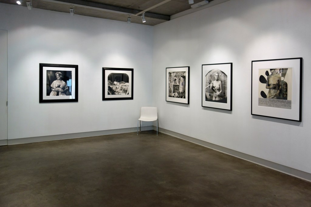


 'Man With Dog, Mexico' 1990")
 'Self Portrait Reminiscent As A Self Portrait As A Vanity' 1995")
 'Beauty Had Three Nipples' 1998")
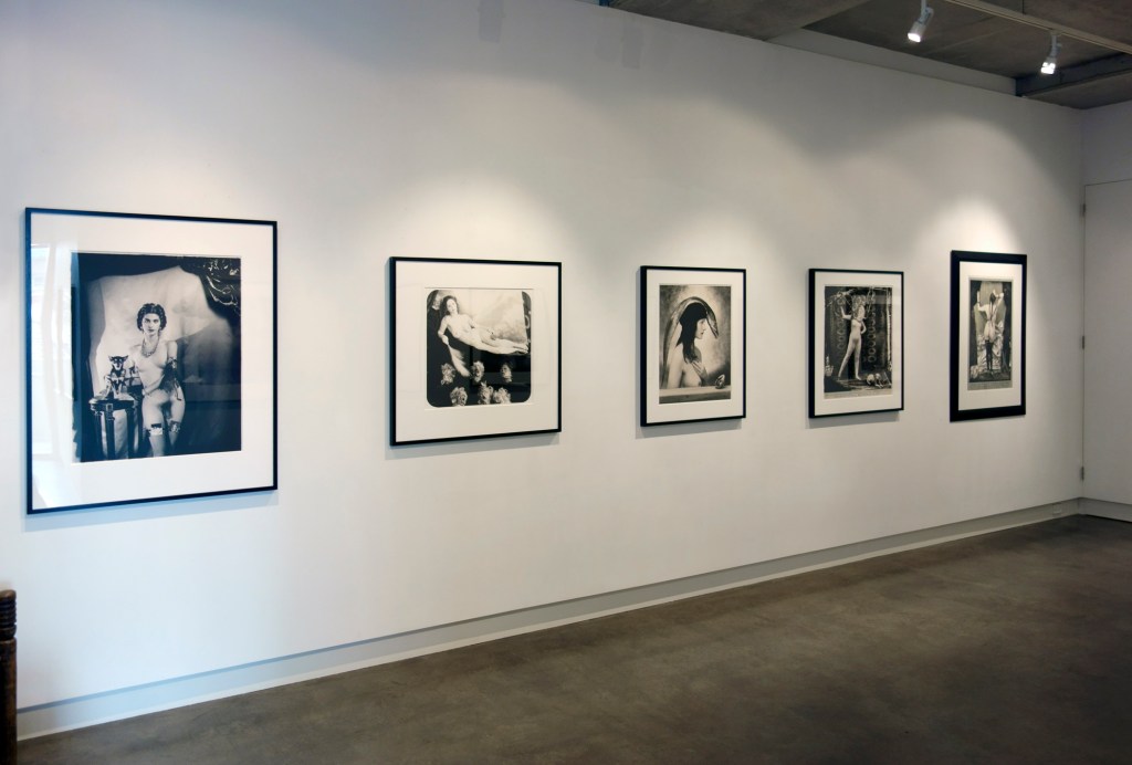
 'Monsieur Baguette As Orpheo' 2004")
 'Mother Of The Future' 2004")
 'Ars Moriendi' 2007")
 'Bad Student' 2007")
 'Myself As A Dead Clown' 2007")
 'La Giovanissima' 2007")
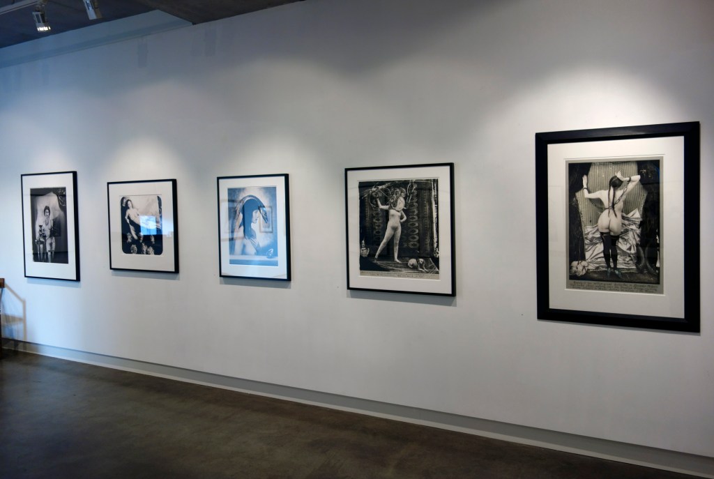
 'The Scale, Bogota' 2008")
")
 'The Paris Triad : Venus in Chains, Paris' 2010")
 'The Green Princess, Paris' 2011")
 'A History Of The White World' 2011")
 'Presenter Of The End Of Time Award' 2013")
 'Imperfect Thirst' 2016")

You must be logged in to post a comment.