
Exhibition dates: 13th October 2023 – 4th February 2024
Warning: Aboriginal and Torres Strait Islander readers should be aware that this posting contains images and names of people who may have since passed away.
 No title (The Virgin in prayer) c. 1858-1860")
O. G. Rejlander (British born Sweden, 1813-1875)
No title (The Virgin in prayer)
c. 1858-1860
Albumen silver photograph
20.2 × 15.4cm irreg. (image and sheet)
National Gallery of Victoria, Melbourne
Purchased, 2002
Public domain
This is an ambitious, complex but flawed exhibition of photographic works from the NGV Collection. Further comment in Part 2 of the posting…
Dr Marcus Bunyan
Many thankx to the NGV for allowing me to publish the media images in the posting. Other photographs in the posting are public domain. All installation images are by Marcus Bunyan.
Photography: Real and Imagined examines two perspectives on photography; photography grounded in the real world, as a record, a document, a reflection of the world around us; and photography as the product of imagination, storytelling and illusion. On occasion, photography operates in both realms of the real and the imagined.
Highlighting major photographic works from the NGV Collection, including recent acquisitions on display for the very first time, Photography: Real and Imagined examines the complex, engaging and sometimes contradictory nature, of all things photographic. The NGV’s largest survey of the photography collection, the exhibition includes more than 300 works by Australian and international photographers and artists working with photo-media from the nineteenth, twentieth and twenty-first centuries.
Text from the NGV website
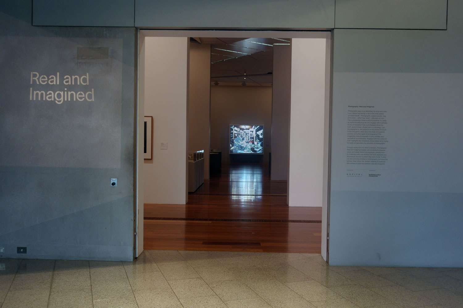
Installation view of the entrance to the exhibition Photography: Real & Imagined at The Ian Potter Centre: NGV Australia, Melbourne with introduction wall text to the right
Photo: Marcus Bunyan
Introduction
Photography was once described by writer and critic Lucy Lippard as having ‘a toe in the chilly waters of verisimilitude’. Photographs, Lippard posits, may be a close – rather than exact – reflection of truth. This proposition raises a raft of questions. Is reality so uncomfortable that we only engage with it partially, or out of necessity? Can a photograph show the truth, and if it does, whose truth is it showing – the photographer’s, the subject’s or the viewer’s? If truth is the end game, what does this mean for creative practice and other types of photography? The suggestion that photography is only partially, and somewhat uncomfortably, engaged with the notion of truth highlights the complexity encountered when trying to nearly encapsulate any selection of photographs.
Through works from the NGV Collection, Photography: Real and Imagined teases out connections between iconic and lesser known photographs, putting them in a dialogue with one another that both explores and transcends the time in which they were made. It dos not set out to be a history of photography, but historical context does inform the content, leading to nuanced discussions of past and present, real and imagined.
Introductory wall text from the exhibition
")
Installation view of the exhibition Photography: Real & Imagined at The Ian Potter Centre: NGV Australia, Melbourne showing at right, Mike and Doug Starn’s Invictus (1992); and at left works by John Kauffmann, Norman Deck and Edward Steichen (see below)
Photo: Marcus Bunyan
The sun was the light source that enabled the earliest photographs to be made in the 1830s. More than 150 years later the sun is the subject of this photographic sculpture by Mike and Doug Starn that embraces the possibilities of light and its potential effects on photography, in terms of both producing an image and as a force contributing to its irreparable damage. In the centre of their installation, the circular form of a sun seems to pulse and leach out of the layers of exposed orthographic film, which is stretched and layered across steel beams and held with pipe clamps and tape.
Wall text from the exhibition
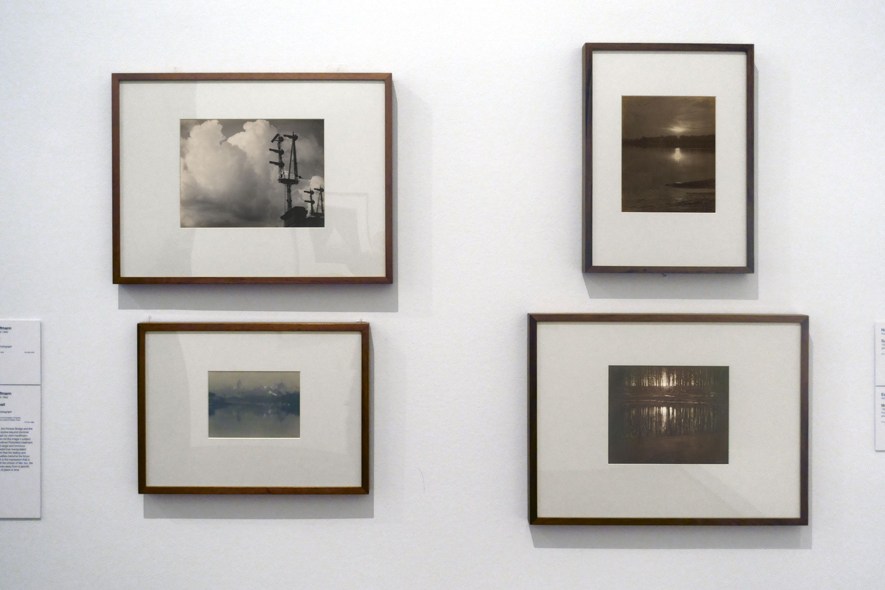
Installation view of the exhibition Photography: Real & Imagined at The Ian Potter Centre: NGV Australia, Melbourne showing at top left, John Kauffmann’s The Cloud (c. 1905, below); at bottom left, Kauffmann’s The grey veil c. 1919; at top right, Norman Deck’s Sunset, Parramatta River (1909); and a bottom right, Edward Steichen’s Moonrise (1904)
Photo: Marcus Bunyan
 'The cloud' c. 1905")
John Kauffmann (Australian, 1864-1942)
The cloud
c. 1905
Gelatin silver photograph
28.2 × 37.2cm
National Gallery of Victoria, Melbourne
Gift of Mr John Bilney, 1976
Public domain
 'The grey veil' c. 1919")
John Kauffmann (Australian, 1864-1942)
The grey veil
c. 1919
Gelatin silver photograph
National Gallery of Victoria, Melbourne
Purchased through The Art Foundation of Victoria with the assistance of the Herald & Weekly Times Limited, Fellow, 1990
Public domain
The Yarra River, the Princes Bridge and the Melbourne city skyline beyond shimmer in this photograph by John Kauffmann. And yet, they are not the image’s subject. Using a highly refined Pictorialist treatment, a reduced tonal range and luminous mid tones, the artist has manipulated light to the extent that the feeling and atmospheric qualities become the focus of the image – it is the impression that is paramount. With the choice of title, too, the photograph moves away from a specific documentation of place or time.
Wall text from the exhibition
 'Sunset, Parramatta River' 1909")
Norman Deck (Australian 1882-1980)
Sunset, Parramatta River
1909
Gelatin silver photograph
30.5 × 24.9cm
National Gallery of Victoria, Melbourne
Gift of Joyce Evans, 1993
Public domain
, Taking a Monochrome for a Walk (London)' (2010-2011)")
Installation view of the exhibition Photography: Real & Imagined at The Ian Potter Centre: NGV Australia, Melbourne showing at centre, David Thomas’ The Movement of Colour (White), Taking a Monochrome for a Walk (London) (2010-2011), with at right works by David Noonan, Hiroshi Sugimoto, László Moholy-Nagy and Susan Fereday (see below)
Photo: Marcus Bunyan
 'The Movement of Colour (White), Taking a Monochrome for a Walk (London)' 2010-2011 (installation view)")
David Thomas (British, b. 1951, Australia 1958- )
The Movement of Colour (White), Taking a Monochrome for a Walk (London) (installation view)
2010-2011
National Gallery of Victoria, Melbourne
Gift of an anonymous donor through the Australian Government’s Cultural Gifts Program 2015
Photo: Marcus Bunyan
“It was made during a residency at the Centre for Drawing Research at Wimbledon School of Art University of the Arts London… and plays on Paul Klee’s definition of drawing as taking a line for a walk on a page… this is taking a monochrome for a walk in the world where the monochrome becomes a key for seeing other colours… an interval in the world. It also suggests the ideas of movement in time and feelings of impermanence.”
~ David Thomas

Installation view of the exhibition Photography: Real & Imagined at The Ian Potter Centre: NGV Australia, Melbourne showing at top right, David Noonan’s Untitled (1992); at bottom left, Hiroshi Sugimoto’s Winnetka Drive-In, Paramount (1993); at top right, László Moholy-Nagy’s Fotogram, 1925 (1925); and at bottom right, Susan Fereday’s Untitled (2001)
Photo: Marcus Bunyan
Light and time are both the means and subject of Hiroshi Sugimoto’s Drive-In Theaters series. To produce the images, the artist directs his camera at the movie screen. Once the film starts, Sugimoto opens the lens shutter of his large-format camera and shuts it the moment the movie ends. The result is a visual condensation of the moving images and projected light of the film for its duration into a vivid, hovering rectangle of virtually pulsating light and, in the case of this drive-in cinema, the surrounding human-made and astronomical light, too.
Wall text from the exhibition
")
Installation view of the exhibition Photography: Real & Imagined at The Ian Potter Centre: NGV Australia, Melbourne showing David Noonan’s Untitled (1992)
Photo: Marcus Bunyan
 'Fotogram, 1925' 1925")
László Moholy-Nagy (Hungarian 1895-1946, Germany 1920-1934, England 1935-1937, United States 1937-1946)
Fotogram, 1925
1925
Gelatin silver photograph
National Gallery of Victoria, Melbourne
Presented by the National Gallery Society of Victoria, 1985
Public domain
From 1922 to 1943 László Moholy-Nagy experimented extensively with the photogram process – he was passionate about the optical effects and inherent properties of these camera-less images freed from a purely representational mode. In this work a pale shape, an organic swathe, streams across a page while curved shapes dance at the base. A halo above emits small geometric patterns. The work is a celebration of abstraction of the image – of the effects of playing with light, objects and photographic paper in a darkroom.
Wall text from the exhibition
; and at right, Lydia Wegner's Purple square (2017)")
Installation view of the exhibition Photography: Real & Imagined at The Ian Potter Centre: NGV Australia, Melbourne showing at left, Barbara Kasten’s Composition 8T (2018, below); and at right, Lydia Wegner’s Purple square (2017, below)
Photo: Marcus Bunyan
 'Composition 8T' 2018")
Barbara Kasten (American, b. 1936)
Composition 8T
2018
Digital type C print
160.0 x 121.9cm (image and sheet)
ed. 1/1
National Gallery of Victoria, Melbourne
Purchased NGV Foundation, 2018
© Barbara Kasten, courtesy Kadel Willborn, Düsseldorf
This photograph from Barbara Kasten’s Collisions/Compositions series continues her practice of creating architectural spaces in the studio using a range of materials, such as plexiglas and mirrors, which she lights and photographs at close range. Influenced by Constructivism and the teachings of the Bauhaus, specifically the work of László Moholy-Nagy, Kasten has experimented with the parameters of abstract photography for around five decades. She has written of her ongoing fascination with light in the creation and conceptual development of her photographs, saying, ‘The interdependency of shadow and light is the essence of photographic exploration and an inescapable part of the photographic process’.
Wall text from the exhibition
")
Installation view of the exhibition Photography: Real & Imagined at The Ian Potter Centre: NGV Australia, Melbourne showing Lydia Wegner’s Purple square (2017)
Photo: Marcus Bunyan
; and at right, Sue Pedley's 'Sound of lotus 1' (2000)")
Installation view of the exhibition Photography: Real & Imagined at The Ian Potter Centre: NGV Australia, Melbourne showing at left, Todd McMillan’s Equivalent VIII (2014); and at right, Sue Pedley’s Sound of lotus 1 (2000)
Photo: Marcus Bunyan

Installation view of the exhibition Photography: Real & Imagined at The Ian Potter Centre: NGV Australia, Melbourne showing at back left, Thomas Ruff’s Portrait (V. Liebermann D) (1999); and at back second left, Ruff’s Portrait (A. Koschkarow) (2000)
Photo: Marcus Bunyan
' (1999); and at right, Ruff's 'Portrait (A. Koschkarow)' (2000)")
Installation view of the exhibition Photography: Real & Imagined at The Ian Potter Centre: NGV Australia, Melbourne showing at left, Thomas Ruff’s Portrait (V. Liebermann D) (1999); and at right, Ruff’s Portrait (A. Koschkarow) (2000)
Photo: Marcus Bunyan
The earnest gazes of the man and woman in these two monumental photographs by Thomas Ruff are so calm and serene that they bely the intense experience of viewing their enlarged faces. Applying a standardised approach – similar to a generic passport photograph – these portraits have a timeless quality that invites you to attempt to ‘read’ their faces and to search for clues as to the inner state of the person. Ruff, however, lets nothing slip. The faces are known to the artist but remain anonymous to the viewer.
Wall text from the exhibition
 (detail)")
Installation view of the exhibition Photography: Real & Imagined at The Ian Potter Centre: NGV Australia, Melbourne showing Robert Rooney’s AM-PM: 2 Dec 1973-28 Feb 1974 (1973-1974) (detail)
Photo: Marcus Bunyan
Featuring some of the most iconic photographs ever created alongside contemporary approaches to the photographic medium, Photography: Real & Imagined is the largest survey of the NGV’s Photography collection in the institution’s history and features more than 270 photographs by Australian and international practitioners.
Four years in the making, this landmark exhibition features photographs from across the 200-year period since the invention of photography in the 19th century, including work by leading international photographers including Man Ray, Cindy Sherman, Wolfgang Tillmans, Gilbert & George and Nan Goldin, alongside Australian photographers Max Dupain, Olive Cotton, Mervyn Bishop, Polly Borland, Destiny Deacon and Darren Sylvester.
Through twenty-one thematic sections, this large-scale exhibition explores the proposition that a photograph can be grounded in the real world, recording, documenting and reflecting the world around us; or be the product of imagination, storytelling and illusion; and on occasion operate in both realms. The thematic sections explore subject matter such as light, place and environment, consumption, conflict, community, and death.
Exhibition highlights include Mervyn Bishop’s important photograph of former Prime Minister of Australia, Gough Whitlam, pouring sand into the open palm of Gurindji Elder Vincent Lingiari. The 1975 image captures the historic meeting between these two figures where Lingiari received the crown lease of his ancestral lands. Also on display is Joe Rosenthal’s World War II photograph Raising the flag on Iwo Jima, 1945, in which American marines raise their country’s flag over the Japanese Island. Both Bishop and Rosenthal’s photographs were staged, or re-constructed for better pictorial effect, illustrating the fluid space between the real and imagined.
The exhibition also presents fashion and advertising photography, including key examples by Lilian Bassman, Athol Smith, Horst P. Horst and Dora Maar. These images showcase a world of designer fashion and high-end products, which set a standard in advertising that continues today. Ilse Bing’s Surrealist inspired photograph commissioned by Elsa Schiaparelli to launch her new perfume Salut in 1934 is a highlight of the exhibition.
Highlighting an area of focused collecting for the NGV, the exhibition recognises the work of women practicing in the early 20th century, including Barbara Morgan whose acclaimed photo montage City shell, 1938, shows an unexpected view of the then recently completed Empire State Building.
Through to the current day, Photography: Real & Imagined presents contemporary photographers of the 21st century including Zanele Muholi, Richard Mosse and Alex Prager. Highlights include Cindy Sherman’s celebrated self-portrait in the guise of Renaissance aristocrat. Also on display will be the oldest photographic work in the NGV Collection, an early 19th century portrait by Englishman William Henry Fox Talbot, one of the inventors of the medium, as well as examples of daguerreotypes, unique images on silver plated copper sheets that are amongst the earliest forms of photography.
The exhibition is accompanied by a major publication – the most ambitious book published on the NGV Photography Collection, generously supported by the Bowness Family Foundation. The publication comprises essays from NGV Senior Curator of Photography, Susan van Wyk, Susan Bright and David Campany; alongside texts by Curator of Photography, Maggie Finch and external authors from Australia, Europe, North America and Southeast Asia.
Regular introductory talks for students are held on weekdays during term times, and free drop-by guided tours each Thursday and Sunday at 10.30am during the exhibition period.
Tony Ellwood AM, Director, NGV, said: ‘This exhibition celebrates the collections and achievements of the NGV’s photography department, which has presented more than 180 exhibitions in its 55-year history. The exhibition is a testament to the strength of the NGV Collection, with so many key examples of the history of photography represented, from the earliest examples from the 19th century, through to contemporary images being produced right now in the twenty-first century. We are grateful for the support of the many donors and philanthropists, such as the Bowness Family Foundation, who have helped to grow and strengthen the NGV’s photography collection.’
Press release from the NGV
; at bottom left, Henry Peach Robinson's 'Elaine watching the shield of Lancelot' (1859); at centre, Ruth Hollick's 'Thought' (1921); and at right Cindy Sherman's 'Untitled' (1988) from the 'History Portraits' series (1988-1990)")
Installation view of the exhibition Photography: Real & Imagined at The Ian Potter Centre: NGV Australia, Melbourne at top left, O. G. Rejlander’s The Virgin in prayer (c. 1858-1860, below); at bottom left, Henry Peach Robinson’s Elaine watching the shield of Lancelot (1859); at centre, Ruth Hollick’s Thought (1921); and at right Cindy Sherman’s Untitled (1988) from the History Portraits series 1988-1990
Photo: Marcus Bunyan
Describing the complex conundrum presented by Cindy Sherman in this photograph, photographer and curator Patrick Pound once wrote: ‘Fake chested and with a face like a mask, here Cindy Sherman is costumed to the max. She stares out like a disapproving Renaissance figure who has just walked off set from a Peter Greenaway extravaganza. Here we have a photographer looking like a painting that walked out of a film. Sherman’s photographs speak of the fragilities of the visage in an image-saturated world where information and construction slip into foreplay. In Sherman’s photographic world gender and identity is a compilation album. There is a toughness to the excess that is all her own’.
Wall text from the exhibition
")
Installation view of the exhibition Photography: Real & Imagined at The Ian Potter Centre: NGV Australia, Melbourne showing O. G. Rejlander’s The Virgin in prayer (c. 1858-1860, below)
Photo: Marcus Bunyan
 'Elaine watching the shield of Lancelot' 1859")
Henry Peach Robinson (English, 1830-1901)
Elaine watching the shield of Lancelot
1859
Albumen silver photograph
24.3 × 19.3cm (image and sheet)
National Gallery of Victoria, Melbourne
Purchased from Admission Funds, 1988
Public domain
In the 1850s Henry Peach Robinson was renowned for producing elaborately staged narrative images based on scenes from popular literary sources. He was particularly interested in Arthurian legends and drew upon these stories as inspiration for some of his most admired photographs. Elaine watching the shield of Lancelot is based on Alfred Tennyson’s version of the story of Lancelot and Elaine. Peach Robinson has recreated the scene in which the lovelorn Elaine gazes dreamily at the shield of Lancelot. She is shown as a woman who has shunned reason and propriety and abandoned herself to the intensity of her emotions, making this photograph both a tragic love story and a cautionary narrative.
Wall text from the exhibition
 'Thought' 1921")
Ruth Hollick (Australian, 1883-1977)
Thought
1921
Gelatin silver photograph
37.4 × 25.3cm
National Gallery of Victoria, Melbourne
Presented through The Art Foundation of Victoria by Mrs Lucy Crosbie Morrison, Member, 1993
Public domain

Installation view of the exhibition Photography: Real & Imagined at The Ian Potter Centre: NGV Australia, Melbourne
Photo: Marcus Bunyan
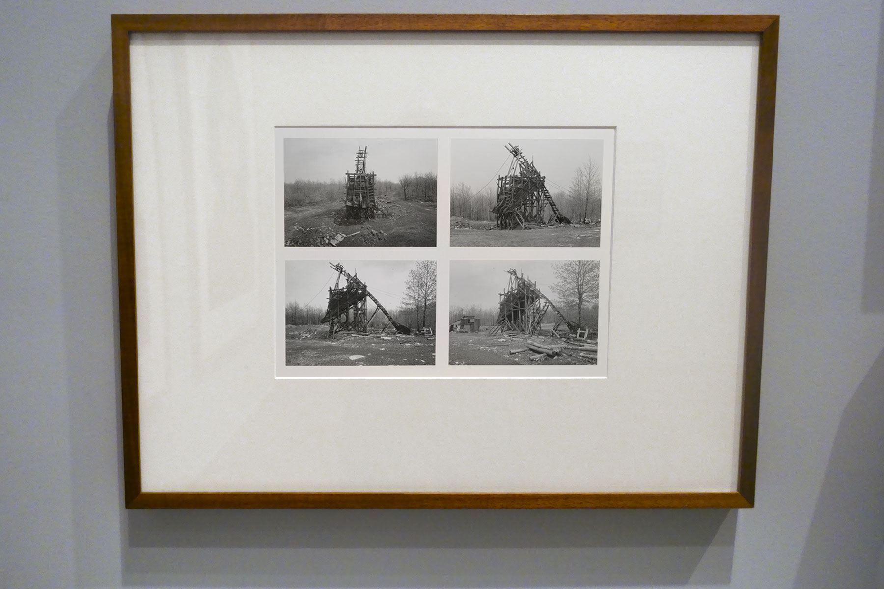
Installation view of the exhibition Photography: Real & Imagined at The Ian Potter Centre: NGV Australia, Melbourne showing Bernd and Hilla Becher’s Coal tipple, Goodspring, Pennsylvania 1975 from the Artists and Photographs folio 1975
Photo: Marcus Bunyan
In 1959, German-born artists Bernd and Hilla Becher began travelling throughout Europe to create photographic typologies of vanishing industrial architecture (a practice they continued for more than four decades). While predominantly documenting German structures and landscapes, they occasionally worked overseas. This image, four views of a coal tipple, was taken on their first trip to North America in the mid 1970s. The Bechers constructed a system for comparing structures: photographed from a consistent angle, with virtually identical lighting conditions, printed at the same size and often displayed in grids.
Wall text from the exhibition
 'Twentysix Gasoline Stations' 1963, published 1967 (installation view)")
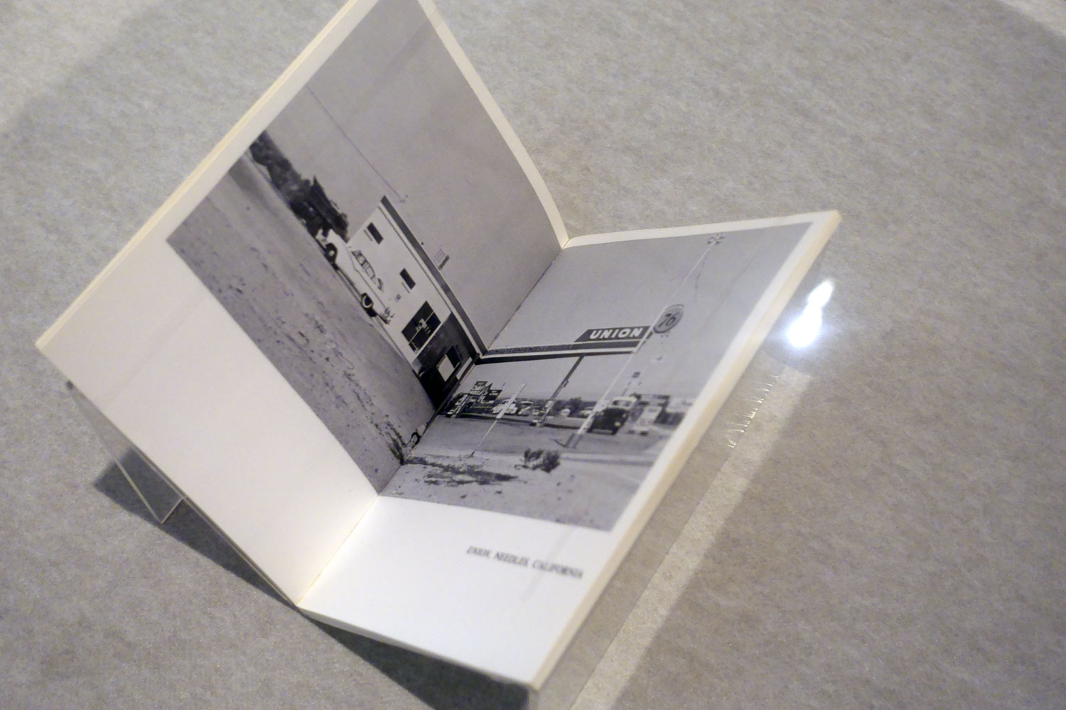
Edward Ruscha (American, b. 1937)
Twentysix Gasoline Stations (installation view)
1963, published 1967
Artist’s book: photo-offset lithograph and printed text, 48 pages, printed cover, glued binding
National Gallery of Victoria, Melbourne
Gift of Robert Rooney through the Australian Government’s Cultural Gifts Program, 2009
Photos: Marcus Bunyan
With the first publication of Twentysix Gasoline Stations, and his subsequent artist books, Edward Ruscha’s work was influential in initiating the widespread interest in photographic book publishing that continues today. Ruscha’s use of photographs as a means of recording – a seemingly unemotional, detached cataloguing of the world – and simply as a ‘device to complete the idea’ influenced the interest in serial imaging adopted by many conceptual artists. Ruscha’s use of the book format was also crucial, providing a transportable way of presenting art in varied contexts that existed as a type of ‘map’ to be read and interpreted, with the subject matter becoming less important than the documentation as a whole.
Wall text from the exhibition
 ‘Fable: A Sentence of Thirteen Parts (with Twelve Alternate Verbs) Ending in a Fable’ 1977 (installation view)")
 ‘Fable: A Sentence of Thirteen Parts (with Twelve Alternate Verbs) Ending in a Fable’ 1977 (installation view)")
John Baldessari (American 1931-2020)
Fable: A Sentence of Thirteen Parts (with Twelve Alternate Verbs) Ending in a Fable (installation views)
1977
Artist’s book: photo-offset lithography on concertina fold-out in cross formation, folded paper cover
9.8 × 14.0 × 1.8cm (closed) 70.0 × 126.5cm approx. (overall, opened)
National Gallery of Victoria, Melbourne
Purchased, Friends of the Gallery Library, 2017
Photos: Marcus Bunyan
Conceptual artist John Baldessari, is renowned for his often-playful investigations into ideas of language, image and authenticity, once said: ‘I was always interested in language. I thought, why not? … And then I also had a parallel interest in photography … I could never figure out why photography and art had separate histories. So I decided to explore both’. Taking art off the walls and requiring someone to unfold and activate it is a central idea of this artist’s book. A visual puzzle, it invites an interaction between looking and reading, creating your own fables as you jump from image to word to image again.
Wall text from the exhibition
 'Real time' 1968-1974 (installation view)")
 'Real time' 1968-1974 (installation view)")
Eve Sonneman (American, b. 1946)
Real time (installation view)
1968-1974, published 1976
Artist’s book: photo-offset lithograph and printed text, 46 folios, printed paper cover, glued binding
National Gallery of Victoria, Melbourne
Purchased NGV Supporters of Photography, 2021
Photos: Marcus Bunyan
Eve Sonneman’s photobook Real time includes paired photographs, each separated by a black line border. The diptychs allow for the occurrence of movement and gestures and changes between the artist’s camera clicks. The ordered presentation, however, takes the images away from a straight documentary reading and to a consideration of their ‘objectness’. After first showing the photographs at MoMA, New York, then photography curator, John Szarkowski, set up a mentorship for Sonneman with the photographer Diane Arbus. As Sonneman recalled: ‘[Arbus] loved my pictures and we got along great. For two years she helped me edit’. Sonneman then published the images through the newly established Printed Matter in New York in 1976.
Wall text from the exhibition
; at top centre, Nan Goldin's book 'The Ballad of Sexual Dependency' (1986); and at bottom left, Tracey Emin's 'Exploration of the Soul' (1994)")
Installation view of the exhibition Photography: Real & Imagined at The Ian Potter Centre: NGV Australia, Melbourne showing at top left, Carol Jerrems and Virginia Fraser’s book A Book About Australian Women (published 1974); at top centre, Nan Goldin’s book The Ballad of Sexual Dependency (published 1986); and at bottom left, Tracey Emin’s Exploration of the Soul (published 1994)
Photo: Marcus Bunyan
; and at top right, Lee Friedlander's 'The American Monument' (published 1976)")
Installation view of the exhibition Photography: Real & Imagined at The Ian Potter Centre: NGV Australia, Melbourne showing at bottom left, Harold Cazneaux’s book The Bridge Book (published 1930); and at top right, Lee Friedlander’s book The American Monument (published 1976)
Photo: Marcus Bunyan
 'The American Monument' Published by The Eakins Press Foundation, New York, 1976 (installation view)")
Lee Friedlander (American, b. 1934)
The American Monument (installation view)
Published by The Eakins Press Foundation, New York, 1976
Half-tone plate
Shaw Research Library, National Gallery of Victoria
Photo: Marcus Bunyan
 'Changing New York' Published by E. P. Dutton & Co, New York, 1939 (installation view)")
Berenice Abbott (American 1898-1991, worked in France 1921-1929)
Changing New York (installation view)
Published by E. P. Dutton & Co, New York, 1939
Half-tone plate and letterpress text
National Gallery of Victoria, Melbourne
Purchased NGV Foundation, 2022
Photo: Marcus Bunyan
; at bottom left, Claude Cahun and Marcel Moore's book 'Aveux non Avenus' (Disavowals or Cancelled Confessions) (published 1930); at top right, Bill Brandt's book 'Perspective of Nudes' (published 1961); and at bottom right, Germaine Krull's book 'Nude studies' (Études de nu) (published 1930)")
Installation view of the exhibition Photography: Real & Imagined at The Ian Potter Centre: NGV Australia, Melbourne showing at top left, Man Ray’s book Photographs by Man Ray Paris 1920-1934 (published 1934); at bottom left, Claude Cahun and Marcel Moore’s book Aveux non Avenus (Disavowals or Cancelled Confessions) (published 1930); at top right, Bill Brandt’s book Perspective of Nudes (published 1961); and at bottom right, Germaine Krull’s book Nude studies (Études de nu) (published 1930)
Photo: Marcus Bunyan
Photographs today are often viewed in galleries in frames, hung on walls. Many photographs, however, were originally created for display in combination with text and graphic design; to be laid out on a page and reproduced in different formats; to be held, worn on the body, published, and shared.
With recognition of these expanded histories of photography, and the contemporary resurgence in publishing, this exhibition includes artist books, magazines and photobooks that use the photographic image in print, publishing and design. These two cases include examples that show the influence of Surrealism, the New Objectivity and Constructivist graphic design in dynamic modern publications.
Artist and author Martin Parr has described the photobook as the ‘supreme platform’ for photographers to share the work with a broad audience. The 1920s to the 1970s were arguably the most important period for the publication of photobooks. These two cases include examples that show the influence of modernist, humanist and documentary photography traditions in innovative publications from this time. These include exhibition catalogues, examples of first edition books, publications published in larger un-editioned print runs and coveted collectable limited-edition books and portfolios.
Wall text from the exhibition

Installation view of the exhibition Photography: Real & Imagined at The Ian Potter Centre: NGV Australia, Melbourne showing Man Ray’s book Photographs by Man Ray Paris 1920-1934 (published 1934) with at right, Man Ray’s Anatomies (1930, below)
Photo: Marcus Bunyan
 'Anatomies' 1930")
Man Ray (Emmanuel Radnitzky) (American, 1890-1976)
Anatomies
1930
Gelatin silver photograph
Please note: this photograph is not in the exhibition
 Marcel Moore (French, 1892-1972) 'Aveux non Avenus' (Disavowals or Cancelled Confessions) Published by Éditions du Carrefour, Paris, 1930 (installation view)")
 Marcel Moore (French, 1892-1972) 'Aveux non Avenus' (Disavowals or Cancelled Confessions) Published by Éditions du Carrefour, Paris, 1930 (installation view)")
Claude Cahun (French, 1894-1954) Marcel Moore (French, 1892-1972)
Aveux non Avenus (Disavowals or Cancelled Confessions) (installation view)
Published by Éditions du Carrefour, Paris, 1930
Illustrated book: photogravure, letterpress text, 237 pages, 10 leaves of plates, paper cover, stitched binding
National Gallery of Victoria, Melbourne
Shaw Research Library, acquired through the Friends of the Gallery Library endowment, 2017
Photos: Marcus Bunyan
Aveux non Avenus, by the celebrated poet, writer, sculptor and photographer Claude Cahun, was published in 1930 by Éditions du Carrefour, Paris, in an edition of five hundred. The book comprises a series of texts in French: poems, literary aphorisms, recollections of dream sequences and philosophical thoughts, ideas and meanderings. Pierre Mac Orlan, a French novelist who wrote the preface to the book, described Mademoiselle Claude Cahun’s text as ‘de poèmes-essais et d’essais-poèmes’, or ‘poem-essays and essay-poems’, and said that overall ‘the book is virtually entirely dedicated to the word adventure’
The alliterative title presents a conundrum for English translation – ‘aveux’ meaning ‘avowals’ or ‘confessions’, and ‘non avenus’ meaning ‘voided’ – and is variously translated as Disavowals, Denials, and Unavowed confessions, among other things. Curator Jennifer Mundy has written that the title suggests ‘an affirmative expression immediately followed by some form of negation or retraction’.
Ambiguities around the title aside, there is a strong visual aspect to the book too. The texts are each demarcated with a complex and fantastical photogravure created by Cahun’s partner, Marcel Moore. These photogravure (where an image from the negative of a photograph is etched into a metal plate, similar to printmaking) are collages made up of photographic images of, and by, Cahun. Throughout the book, graphic devices of stars, eyes and lips are also used to separate sections of text. Aveux non Avenus, which has been described as an anti-realist or surrealist-autobiography of the multi-disciplinary Cahun, exists as a potential critique of the autobiography format altogether, is wonderfully irreducible.
Maggie Finch and Isobel Crombie. “Claude Cahun,” in the 2019 July/August edition of NGV Magazine on the NGV website 9th April 2020 [Online] Cited 28/01/2024
 and Marcel Moore (French, 1892-1972) 'Untitled' 1930")
Claude Cahun (French, 1894-1954) and Marcel Moore (French, 1892-1972)
Untitled
1930
In Aveux non avenus 1930
published by Éditions du Carrefour, Paris
illustrated book: heliographs
National Gallery of Victoria, Melbourne
Shaw Research Library, acquired through the Friends of the Gallery Library endowment, 2017
 'Nude Studies' (Études de Nu) Published by Librarie des arts décoratifs, Paris, 1930 (installation view)")
Germaine Krull (German, 1897-1985)
Nude Studies (Études de Nu) (installation view)
Published by Librarie des arts décoratifs, Paris, 1930
24 photogravures, letterpress on paper, white cloth-backed orange paper-covered board portfolio with ribbons
National Gallery of Victoria
Purchased, NGV Foundation, 2022
Photo: Marcus Bunyan
 'Perspective of Nudes' Published Bodley Head, London, 1961 (installation view)")
Bill Brandt (English born Germany, 1904-1983)
Perspective of Nudes (installation view)
Published Bodley Head, London, 1961
Half-tone plate
Shaw Research Library, National Gallery of Victoria
Photo: Marcus Bunyan
 'Art Forms in Nature: Examples from the Plant World Photographed Direct from Nature' Published by A. Zwemmer, London, 1929 (installation view)")
Karl Blossfeldt (German, 1865-1932)
Art Forms in Nature: Examples from the Plant World Photographed Direct from Nature (installation view)
Published by A. Zwemmer, London, 1929
Half-tone plate
Shaw Research Library, National Gallery of Victoria
Photo: Marcus Bunyan
 Karel Paspa photographer (Czechoslovakia 1862-1936) 'ABECEDA (Alphabet)' Published by J. Otto, Prague, 1926 (installation view)")
Karel Teige typographer (Czechoslovakia 1900-1951)
Karel Paspa photographer (Czechoslovakia 1862-1936)
ABECEDA (Alphabet) (installation view)
Published by J. Otto, Prague, 1926
Photomontage
National Gallery of Victoria
Shaw Research Library, acquired through the Friends of the Gallery Library endowment, 2017
Photo: Marcus Bunyan
 Varvara Stepanova (Russian, 1894-1958) 'USSR in Construction, no. 12 (Parachute issue)' (URSS en Construction) 1935")
Aleksandr Rodchenko (Russian, 1891-1958) and Varvara Stepanova (Russian, 1894-1958)
USSR in Construction, no. 12 (Parachute issue) (URSS en Construction) (installation view)
1935
Illustrated journal: colour rotogravure, 22 pages with fold-out inserts, lithographic cover
National Gallery of Victoria
Purchased, NGV Supporters of Prints and Drawings, 2019
Photo: Marcus Bunyan
; at bottom left, Ewa Narkiewicz's 'Copper flax #4' (1999); at centre top, Harry Nankin's 'The first wave: fragment 2' (1996); at centre bottom, Peter Peryer's 'Seeing' (1989); and at right, Aaron Siskind's 'New York' (1950)")
Installation view of the exhibition Photography: Real & Imagined at The Ian Potter Centre: NGV Australia, Melbourne showing at top left, Eliza Hutchinson’s No. 9 (2010); at bottom left, Ewa Narkiewicz’s Copper flax #4 (1999); at centre top, Harry Nankin’s The first wave: fragment 2 (1996); at centre bottom, Peter Peryer’s Seeing (1989); and at right, Aaron Siskind’s New York (1950)
Photo: Marcus Bunyan
In much the same way that tactile writing systems such as braille are impenetrable to those with vision, a photograph printed in two dimensions can be incomprehensible for people with vision impairment. Each system presents a conversion – of letters, texts and illustration – into raised dots on a page; of visible wavelengths of light into an image on a light-sensitive surface. Each relies on an irreversible alteration of the surface. Seeing, the title of this Peter Peryer photograph, infers an action – seeing something. Yet the conversion into a photographic image draws attention to the impenetrability of both acts.
Wall text from the exhibition
 from the Twilight series (1998-2002); at centre, Malerie Marder's 'Untitled' (2001); and at right, Anne Zahalka's 'Sunday, 2:09pm' (1995)")
Installation view of the exhibition Photography: Real & Imagined at The Ian Potter Centre: NGV Australia, Melbourne showing at left, Gregory Crewdson’s Untitled (1999) from the Twilight series (1998-2002); at centre, Malerie Marder’s Untitled (2001); and at right, Anne Zahalka’s Sunday, 2:09pm (1995)
Photo: Marcus Bunyan
 'Untitled' 1999 (installation view)")
Gregory Crewdson (American, b. 1962)
Untitled (installation view)
1999
From the Twilight series 1998-2002
Type C photograph
121.9 × 152.4cm
National Gallery of Victoria, Melbourne
Kaiser Bequest, 2000
Photo: Marcus Bunyan
 'Sunday, 2:09pm' 1995, printed 2019 (installation view)")
Anne Zahalka (Australian, b. 1957)
Sunday, 2:09pm
1995, printed 2019
From the Open House series 1995
Colour cibachrome transparency, light box
121.7 × 161.4cm
National Gallery of Victoria, Melbourne
Purchased, Victorian Foundation for Living Australian Artists, 2019
Photo: Marcus Bunyan
; and at right, Anne Zahalka's 'Sunday, 2:09pm' (1995)")
Installation view of the exhibition Photography: Real & Imagined at The Ian Potter Centre: NGV Australia, Melbourne showing at left, Polly Borland’s Untitled (2018); and at right, Anne Zahalka’s Sunday, 2:09pm (1995)
Photo: Marcus Bunyan
 from the 'Twilight' series (1998-2002); at second left, Malerie Marder's 'Untitled' (2001); and centre, Anne Zahalka's 'Sunday, 2:09pm' (1995); and at right, Alex Prager's 'Crowd #11 (Cedar and Broad Street)' (2013)")
Installation view of the exhibition Photography: Real & Imagined at The Ian Potter Centre: NGV Australia, Melbourne showing at rear from left to right, Gregory Crewdson’s Untitled (1999) from the Twilight series (1998-2002); at second left, Malerie Marder’s Untitled (2001); and centre, Anne Zahalka’s Sunday, 2:09pm (1995); and at right, Alex Prager’s Crowd #11 (Cedar and Broad Street) (2013, below)
Photo: Marcus Bunyan
' (2013)")
Installation view of the exhibition Photography: Real & Imagined at The Ian Potter Centre: NGV Australia, Melbourne showing Alex Prager’s Crowd #11 (Cedar and Broad Street) (2013, below)
Photos: Marcus Bunyan
 'Crowd #11 (Cedar and Broad Street)' 2013")
Alex Prager (American, b. 1979)
Crowd #11 (Cedar and Broad Street)
2013
Inkjet print
149.7 × 142.0cm (image and sheet)
National Gallery of Victoria, Melbourne
Bowness Family Fund for Contemporary Photography, 2014
Alex Prager’s staged photographs openly reference the aesthetics of mid-twentieth century American cinema, fashion photography and the photographs of Cindy Sherman. Her images resemble film stills and are packed with emotion and human melodrama. Working with actors, directing their placement and interaction to create a hyperreal dramatisation of crowd behaviour, Prager’s narrative tableaux pair the banal and fantastic, the everyday and the theatrical, real life and cinematic representation. In this image we have a bird’s eye view of a mass of people crossing the road. We can see the patterns of movement, contact and avoidance and a suggestion of the narrative possibilities of the interacting crowd.
Wall text from the exhibition
; and at right, Yvonne Todd's 'Werta' (2005)")
Installation view of the exhibition Photography: Real & Imagined at The Ian Potter Centre: NGV Australia, Melbourne showing at second right, Pat Brassington’s Rosa (2014); and at right, Yvonne Todd’s Werta (2005)
Photo: Marcus Bunyan
 'Fonteyn' 2012 (installation view)")
Zoë Croggon (Australian, b. 1989)
Fonteyn (installation view)
2012
Digital type C print
102.8 × 99.9cm
Purchased with funds arranged by Loti Smorgon for Contemporary Australian Photography, 2013
Photo: Marcus Bunyan
")
Installation view of the exhibition Photography: Real & Imagined at The Ian Potter Centre: NGV Australia, Melbourne showing Loretta Lux’s The Drummer (2004, below)
Photo: Marcus Bunyan
 'The drummer' 2004")
Loretta Lux (German, b. 1969)
The drummer
2004
Cibachrome photograph
45.0 x 37.7cm
National Gallery of Victoria, Melbourne
Purchased, NGV Foundation, 2006
© Loretta Lux. VG Bild-Kunst/Copyright Agency, 2023
Loretta Lux is known for her eerie, hyperreal photographs of children. The luminous pallor of the boy’s skin and the subtle tonal range throughout the photograph is achieved through Lux’s delicate use of digital manipulation to reduce the palette in her image. Lux’s history as a painter informs photographs such as this, which seem to owe as much of a debt to Old Master paintings as modern technology. Her skilful combination of photographic reality and painterly effect gives the image a profoundly disconcerting quality that is reminiscent of the fantastical (and disturbing) character of Oskar, the little drummer boy, in the Günter Grass novel The Tin Drum (1959).
Wall text from the exhibition

Installation view of the exhibition Photography: Real & Imagined at The Ian Potter Centre: NGV Australia, Melbourne showing at bottom left, Raoul Ubac’s Penthésilée (c. 1938, below); at top centre, André Kertész’s Satiric Dancer, Paris (1926, below); and at right, Max Dupain’s Impassioned clay (1936, below)
Photo: Marcus Bunyan
 'Penthésilée' c. 1938")
Raoul Ubac (Belgian, 1909-1985)
Penthésilée
c. 1938
Gelatin silver photograph
31.0 × 41.5cm
National Gallery of Victoria, Melbourne
Purchased NGV Foundation, 2013
From the mid 1930s onwards Surrealist photographer Raoul Ubac experimented with collage, photomontage and solarisation. These processes disrupted the surface of his photographs, enabling him to create new and fantastic realities and introducing an element of chance into his image making. Penthésilée is from his most important series of photographs. The image is based on the story of Penthesilea, queen of the Amazons, who was killed by Achilles while fighting alongside the Trojans. To represent this mythic battle Ubac created this complex photomontage by cutting up, collaging, rephotographing and solarising photographs of nude female figures. The resulting image has an uncanny sense of movement suggesting the height of battle.
Wall text from the exhibition

André Kertész (Hungarian 1894-1985, France 1925-1936, United States 1936-1985)
Satiric Dancer, Paris
1926, printed c. 1972
Gelatin silver photograph
Purchased, 1973
")
Installation view of the exhibition Photography: Real & Imagined at The Ian Potter Centre: NGV Australia, Melbourne showing Max Dupain’s Impassioned clay (1936, below)
Photo: Marcus Bunyan
 'Impassioned clay' 1936")
Max Dupain (Australian 1911-1992)
Impassioned clay
1936
Gelatin silver photograph
50.4 × 36.7cm irreg.
National Gallery of Victoria, Melbourne
William Kimpton Bequest, 2016
Public domain
; and at right, Yvonne Todd's 'Werta' (2005)")
Installation view of the exhibition Photography: Real & Imagined at The Ian Potter Centre: NGV Australia, Melbourne showing at left, Pat Brassington’s Rosa (2014); and at right, Yvonne Todd’s Werta (2005)
Photo: Marcus Bunyan
Yvonne Todd selects her subjects, most often young women, from ‘call outs’ seeking certain types, people encountered on the street, or modelling agencies where she invariably chooses those with little or no industry experience. In her studio Todd uses costumes, heavy make-up and wigs to style her models. Costuming is an important aspect of Todd’s practice; her interest lies in in what she describes as, ‘the way they carry character and narrative connotations’. Todd’s finished photographs are heavily reworked using Photoshop so that they appear obviously artificial. This overt use of artifice shifts her images from simply being nostalgic recreations to being strangely familiar and undeniably creepy.
Wall text from the exhibition
 and at back centre, Polly Borland's 'Untitled' (2018)")
Installation view of the exhibition Photography: Real & Imagined at The Ian Potter Centre: NGV Australia, Melbourne showing at back left, Robyn Stacey’s Nothing to see here (2019) and at back centre, Polly Borland’s Untitled (2018)
Photo: Marcus Bunyan
 'Nothing to see here' 2019")
Robyn Stacey (Australian, b. 1952)
Nothing to see here
2019
From the Nothing to See Here series 2019
Lenticular image
155.5 × 119cm
National Gallery of Victoria, Melbourne
Purchased, Victorian Foundation for Living Australian Artists, 2020
This large-scale lenticular photograph shows the face of a woman projected onto a curtain. The curtain suggests a hidden cinema screen; however, Robyn Stacey’s curtains cannot be pulled back. From one viewpoint a beautiful face with eyes softly closed as if in sleep appears, but as you move past the image you can only see the curtain. The curtain becomes what the artist described as ‘a membrane between reality and allegory’ and acts as the screen as the portrait appears and disappears.
Wall text from the exhibition
")
")
")
Installation views of the exhibition Photography: Real & Imagined at The Ian Potter Centre: NGV Australia, Melbourne showing Polly Borland’s lenticular photograph Untitled (2018) from the MORPH series
Photos: Marcus Bunyan
 'Untitled' 2018")
Polly Borland (Australia, b. 1959)
Untitled
2018
From MORPH series 2018
Inkjet print on rice paper on lenticular cardboard
216.0 × 172.7 × 13.0cm
National Gallery of Victoria, Melbourne
Purchased, Victorian Foundation for Living Australian Artists, 2019
© Polly Borland
; and at right, Selina Ou's 'Convenience' (2001)")
Installation view of the exhibition Photography: Real & Imagined at The Ian Potter Centre: NGV Australia, Melbourne showing at left, Narelle Autio’s two photographs Untitled from The Seventh Wave series (1999-2000); and at centre right, Selina Ou’s Convenience (2001)
Photo: Marcus Bunyan
")
Installation view of the exhibition Photography: Real & Imagined at The Ian Potter Centre: NGV Australia, Melbourne showing Narelle Autio’s two photographs Untitled from The Seventh Wave series (1999-2000)
Photo: Marcus Bunyan
 'Untitled' 2000 (installation view)")
Narelle Autio (Australian, b. 1969)
Untitled (installation view)
2000
From The Seventh Wave series 1999-2000
Gelatin silver photograph
90.0 × 134.1cm
National Gallery of Victoria, Melbourne
Purchased with funds arranged by Loti Smorgon for Contemporary Australian Photography, 2001
Photo: Marcus Bunyan

Installation view of the exhibition Photography: Real & Imagined at The Ian Potter Centre: NGV Australia, Melbourne showing at back centre, Selina Ou’s Convenience (2001); and at right, Rosemary Laing’s welcome to Australia (2004)
Photo: Marcus Bunyan
' (1880s-1910s)")
Installation view of the exhibition Photography: Real & Imagined at The Ian Potter Centre: NGV Australia, Melbourne showing at back left, Ben Shahn’s Young cotton picker, Pulaski County, Arkansas. Schools for coloured children do not open until January 1st so as not to interfere with cotton picking 1935; and back right, Lewis Hine’s Finishing garments, 10 Hanover Ave., Boston, Massachusetts 1912; and at right in the cabinet, Kusakabe Kimbei’s album (Landscape and portraits) (1880s-1910s)
Photo: Marcus Bunyan
 'Young cotton picker, Pulaski County, Arkansas. Schools for coloured children do not open until January 1st so as not to interfere with cotton picking' 1935, printed c. 1975 (installation view)")
Ben Shahn (Lithuanian 1898-1969, United States c. 1925-1969)
Young cotton picker, Pulaski County, Arkansas. Schools for coloured children do not open until January 1st so as not to interfere with cotton picking (installation view)
1935, printed c. 1975
Gelatin silver photograph
21.7 × 32.8cm
National Gallery of Victoria, Melbourne
Purchased, 1975
Photo: Marcus Bunyan
Lewis Hine (American, 1874-1940)
Finishing garments, 10 Hanover Ave., Boston, Massachusetts
1912
Gelatin silver photograph
11.4 × 16.4cm
National Gallery of Victoria, Melbourne
Purchased, 1980
Public domain
' (1880s-1910s)")
Installation view of the exhibition Photography: Real & Imagined at The Ian Potter Centre: NGV Australia, Melbourne showing Kusakabe Kimbei’s album (Landscape and portraits) (1880s-1910s)
Photo: Marcus Bunyan
; at top right, Heather George's 'Stockyards, stockmen in distance. Wave Hill Station, Northern Territory' (1952); and at bottom right, Fred Kruger's 'Group of Aborigines in hop gardens, Coranderrk' (1876, below)")
Installation view of the exhibition Photography: Real & Imagined at The Ian Potter Centre: NGV Australia, Melbourne showing at left, John Thomson’s The crawlers (1876-1877, below); at top right, Heather George’s Stockyards, stockmen in distance. Wave Hill Station, Northern Territory (1952); and at bottom right, Fred Kruger’s Group of Aborigines in hop gardens, Coranderrk (1876, below)
Photo: Marcus Bunyan
")
Installation view of the exhibition Photography: Real & Imagined at The Ian Potter Centre: NGV Australia, Melbourne showing John Thomson’s The crawlers (1876-1877, below)
Photo: Marcus Bunyan
 'The crawlers' 1876-1877")
John Thomson (Scottish 1837-1921)
The crawlers
1876-1877
From the Street Life in London series 1877
Woodbury type
11.5 × 8.7cm (image and sheet)
National Gallery of Victoria, Melbourne
Felton Bequest, 1977
Public Domain
 'Stockyards, stockmen in distance. Wave Hill Station, Northern Territory' 1952, printed 1978 (installation view)")
Heather George (Australian 1907-1983)
Stockyards, stockmen in distance. Wave Hill Station, Northern Territory (installation view)
1952, printed 1978
From the Northern Territory series 1952
Gelatin silver photograph
Purchased, 1980
Photo: Marcus Bunyan
In 1952 the Australian magazine Walkabout included a series of images made by photojournalist Heather George at Wave Hill Station in the Northern Territory. The vast pastoral lease on the lands of the dispossessed Gurindji people would later become famous as a turning point in the recognition of land rights for Australia’s First Nations peoples, but when George visited, it was a place of entrenched, officially sanctioned discrimination. In George’s photograph, the Gurindji stockmen appear overshadowed by the stockyards in the foreground, perhaps reflecting the attitude of pastoralists who, having been granted leases, took advantage of people living on Country, exploiting them as an unpaid workforce.
Wall text from the exhibition
 'Group of Aborigines in hop gardens, Coranderrk' 1876")
Fred Kruger (German 1831-1888, Australia 1860-1888)
Group of Aborigines in hop gardens, Coranderrk
1876
Albumen silver photograph
13.3 × 20.2cm
National Gallery of Victoria, Melbourne
Gift of Mrs Beryl M. Curl, 1979
Public domain
In 1876 Fred Kruger was commissioned to produce two series of photographs at Coranderrk, a settlement and working farm established to rehouse dispossessed people of the Kulin Nation. One of the many subjects he photographed was the productive farmland and the activities of the community working the land. Kruger’s photograph shows a multigenerational group of people in the lush Arcadian setting of the hop garden, but what it obscures is the reality of exploitation and poverty that afflicted First Nations people in this place. Kruger’s photographs met a brief to promote the so-called ‘civilising’ work of colonial authorities but in doing so represented a largely imagined reality and created an effective form of propaganda.
Wall text from the exhibition
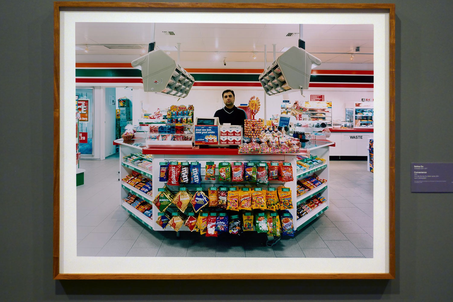
Selina Ou (Australian, b. 1977)
Convenience (installation view)
2001
From the Serving You Better series 2001
Type C photograph
National Gallery of Victoria, Melbourne
Purchased with funds arranged by Loti Smorgon for Contemporary Australian Photography, 2005
Photo: Marcus Bunyan
; at bottom left, David Wadelton's 'Richmond hairdresser' (1979, below); at top centre, Rennie Ellis' 'Between strips, Kings Cross' (1970-1971, below); at bottom centre, Brassai's 'Washing up in a brothel, Rue Quincampoix (La Toilette, rue Quincampoix (Bidet))' (1932, below); and at right, Wolfgang Sievers' 'Shiftchange at Kelly and Lewis engineering works, Springvale, Melbourne' (1949, below)")
Installation view of the exhibition Photography: Real & Imagined at The Ian Potter Centre: NGV Australia, Melbourne showing at top left, Kusakabe Kimbei’s Vegetable peddler (1880s, below); at bottom left, David Wadelton’s Richmond hairdresser (1979, below); at top centre, Rennie Ellis’ Between strips, Kings Cross (1970-1971, below); at bottom centre, Brassai’s Washing up in a brothel, Rue Quincampoix (La Toilette, rue Quincampoix (Bidet)) (1932, below); and at right, Wolfgang Sievers’ Shiftchange at Kelly and Lewis engineering works, Springvale, Melbourne (1949, below)
Photo: Marcus Bunyan
 'Vegetable peddler' 1880s")
Kusakabe Kimbei (Japanese, 1841-1934)
Vegetable peddler
1880s
Albumen silver photograph, colour dyes
20.6 × 26.3cm (image and sheet)
National Gallery of Victoria, Melbourne
Gerstl Bequest, 2000
Public domain
Japanese photographer Kusakabe Kimbei established his studio in 1881, making photographs for the domestic and tourist markets. Most of the photographs in this elaborate album are conventional, staged domestic scenes; picturesque views of popular tourist attractions; and street scenes. This image, however, stands alone in the album as an unusual view of contemporary life. Despite the women weavers wearing traditional dress and working hand-operated looms, the factory in which they are working is lit by electric lights and they are supervised by men wearing European-style dress. Unlike its companion works in Kimbei’s album, this photograph speaks to the industrialisation that was part of the Meiji-era modernisation in Japan.
Wall text from the exhibition
Kusakabe Kimbei (Japanese, 1841-1934)
Kusakabe Kimbei (日下部 金兵衛; 1841-1934) was a Japanese photographer. He usually went by his given name, Kimbei, because his clientele, mostly non-Japanese-speaking foreign residents and visitors, found it easier to pronounce than his family name
Kusakabe Kimbei worked with Felice Beato and Baron Raimund von Stillfried as a photographic colourist and assistant. In 1881, Kimbei opened his own workshop in Yokohama, in the Benten-dōri quarter. From 1889, the studio operated in the Honmachi quarter. By 1893, his was one of the leading Japanese studios supplying art to Western customers. Many of the photographs in the studio’s catalogue featured depictions of Japanese women, which were popular with tourists of the time. Kimbei preferred to portray female subjects in a traditional bijinga style, and hired geisha to pose for the photographs. Many of his albums are mounted in accordion fashion.
Around 1885, Kimbei acquired the negatives of Felice Beato and of Stillfried, as well as those of Uchida Kuichi. Kusakabe also acquired some of Ueno Hikoma’s negatives of Nagasaki. Kimbei retired as a photographer in 1914.
Text from the Wikipedia website
 (installation view)")
Installation view of the exhibition Photography: Real & Imagined at The Ian Potter Centre: NGV Australia, Melbourne showing David Wadelton’s Richmond hairdresser (1979, below)
Photo: Marcus Bunyan
 'Richmond hairdresser' 1979")
David Wadelton (Australian, b. 1955)
Richmond hairdresser
1979
Gelatin silver photograph
13.4 × 20.2cm
National Gallery of Victoria, Melbourne
Gift of David Wadelton through the Australian Government’s Cultural Gifts Program, 2015
© David Wadelton
 'Between strips, Kings Cross' 1970-1971")
Rennie Ellis (Australian, 1940-2003)
Between strips, Kings Cross
1970-1971; 2000 {printed}
from the Kings Cross series 1971
gelatin silver photograph
37.1 x 24.1 cm (image) 40.3 x 30.4 cm (sheet)
National Gallery of Victoria, Melbourne
Purchased, 2005
© Rennie Ellis Photographic Archive

Installation view of the exhibition Photography: Real & Imagined at The Ian Potter Centre: NGV Australia, Melbourne showing Brassaï’s Washing up in a brothel, Rue Quincampoix (La Toilette, rue Quincampoix (Bidet)) (1932, below)
Photo: Marcus Bunyan
 'Washing up in a brothel, Rue Quincampoix' (La Toilette, rue Quincampoix (Bidet)) 1932; printed c. 1979")
Brassaï (Hungarian-French, 1899-1984)
Washing up in a brothel, Rue Quincampoix
(La Toilette, rue Quincampoix (Bidet))
1932; printed c. 1979
from The secret of Paris in the 30s series 1931–1935
Gelatin silver photograph
20.5 × 29.2cm (image and sheet)
National Gallery of Victoria, Melbourne
Purchased, 1980
Public Domain
In the 1930s Brassaï became well-known for his photographs of the nightlife of Paris, but it was the sex workers, along with other characters of the city’s underbelly, who excited his imagination. Reflecting on this time, he wrote, ‘Rightly or wrongly, I felt at that time that this underground world represented Paris at its least cosmopolitan, at its most alive, its most authentic, that in these colourful faces of its underworld there had been preserved, from age to age, almost without alteration, the folklore of its remote past’. This photograph presents a matter-of-fact view – there is nothing exotic or erotic about the woman washing herself as her client ties his shoes and prepares to leave.
Wall text from the exhibition
")
Installation view of the exhibition Photography: Real & Imagined at The Ian Potter Centre: NGV Australia, Melbourne showing Wolfgang Sievers’ Shiftchange at Kelly and Lewis engineering works, Springvale, Melbourne (1949, below)
Photo: Marcus Bunyan
 'Shiftchange at Kelly and Lewis engineering works, Springvale, Melbourne' 1949; printed 1986")
Wolfgang Sievers (Australian born Germany, 1913-2007)
Shiftchange at Kelly and Lewis engineering works, Springvale, Melbourne
1949; printed 1986
Gelatin silver photograph
49.4 × 40.5cm
National Gallery of Victoria, Melbourne
Purchased, 1986
© National Library of Australia
Wolfgang Sievers arrived in Australia in 1938, bringing photographic equipment, rigorous training in modernist photography, a firmly held belief in the union of art and industry, left-leaning political views, and the self-declared desire to ‘assist this country through my knowledge as thanks for the freedom I can enjoy here’. The human face of industrial Australia is captured in Sievers’s celebrated photograph of the change of shift at a Melbourne engineering works, showing a sea of men and women surging into work. The upturned, smiling faces of the masses speaking to Sievers’s firmly held belief in the dignity of work.
Wall text from the exhibition
 'welcome to Australia' 2004 (installation view)")
Rosemary Laing (Australian, 1959-2024)
welcome to Australia (installation view)
2004
Type C photograph
110.8 × 224.4cm
National Gallery of Victoria, Melbourne
Purchased with funds from the Victorian Foundation for Living Australian Artists, 2005
Photo: Marcus Bunyan
This photograph by Rosemary Laing makes an obviously ironic statement, as curator Kyla MacFarlane notes: ‘The title and compositional beauty of this photograph … purposefully jar against its subject matter – the remote Woomera Immigration Detention and Processing Centre in South Australia. Photographing the site while the sun sits low in the sky, Laing observes the Centre’s mechanisms of containment and surveillance – a violent presence on the red dirt and gravel road, and sun-tinged, cloudless sky of its remote location’. The photograph’s formal emptiness reflects the lack of freedom imposed on those seeking asylum and the loss of their civil liberties once detained.
Wall text from the exhibition
; and at right, four photographs from Michael Cook's 'Civilised' series (2012)")
Installation view of the exhibition Photography: Real & Imagined at The Ian Potter Centre: NGV Australia, Melbourne showing at left, Rosemary Laing’s welcome to Australia (2004, above); and at right, four photographs from Michael Cook’s Civilised series (2012)
Photo: Marcus Bunyan
")
Installation view of the exhibition Photography: Real & Imagined at The Ian Potter Centre: NGV Australia, Melbourne showing Dorothea Lange’s Towards Los Angeles, California (1936, below)
Photo: Marcus Bunyan
 'Towards Los Angeles, California' 1936, printed c. 1975")
Dorothea Lange (United States 1895-1965)
Towards Los Angeles, California
1936; c. 1975 {printed}
Gelatin silver photograph
39.6 x 39.1cm
National Gallery of Victoria, Melbourne
Purchased, 1975
In this photograph Dorothea Lange has ironically juxtaposed the aspiration of clean, comfortable train travel with the exhausting reality of the unemployed traversing America in search of work in the 1930s. Renowned for making photographs that combine empathy and clear-eyed observation, Lange also believed that photographs and text should be presented together to amplify the messages carried in both mediums. She understood that captions ‘fortified’ her photographs and that they should ‘not only (carry) factual information, but also add clues to attitudes, relationships and meanings’. Although it doesn’t have a caption, the opportunistic combination of image and text in this image highlights the gulf between the haves and have nots.
Wall text from the exhibition
; at bottom left, David Moore's 'Migrants arriving in Sydney' (1966); at centre, Charles Nettleton's 'Hobsons Bay railway pier' (1870s); at top right, Maggie Diaz's 'The Canberra, Port Melbourne' (1961-1967); and at bottom right, Paul Haviland's 'Passing steamer' (1910)")
Installation view of the exhibition Photography: Real & Imagined at The Ian Potter Centre: NGV Australia, Melbourne showing at top left, Alfred Stiegliz’s The steerage (1907, below); at bottom left, David Moore’s Migrants arriving in Sydney (1966, below); at centre, Charles Nettleton’s Hobsons Bay railway pier (1870s, below); at top right, Maggie Diaz’s The Canberra, Port Melbourne (1961-1967); and at bottom right, Paul Haviland’s Passing steamer (1910)
Photo: Marcus Bunyan
 'The Steerage' 1907")
Alfred Stieglitz (American 1864-1946, Germany 1881-1990)
The steerage
1907, printed 1911
Photogravure
National Gallery of Victoria, Melbourne
Purchased, 1979
Public domain
Alfred Stieglitz was a pioneering photographer, publisher and gallery director. The steerage, arguably his most important photograph, is regarded as his first great modernist work. The composition, with its compressed space, apparent lack of horizon and striking diagonal lines, is suggestive of avant-garde painting of the time. Showing the densely packed lower decks of the of the transatlantic steamer Kaiser Wilhelm II, Stieglitz’s oblique reference to the return movement of unsuccessful immigrants to America offers an insight into the social outcomes and complexities of mass global migration in the early twentieth century.
Wall text from the exhibition
 'Migrants arriving in Sydney' 1966")
David Moore (Australia, 1927-2003)
Migrants arriving in Sydney
1966
Gelatin silver photograph
26.7 × 40.4cm
National Gallery of Victoria, Melbourne
Purchased, 1991
© Estate of David Moore
David Moore was Australia’s pre-eminent photojournalist of the 1960s. His work was regularly seen in leading local and international magazines. Moore’s Migrants arriving in Sydney, was commissioned and published by National Geographic in 1966. This now iconic image shows the climactic moment when a ship carrying migrants to Australia docks at Sydney harbour. The tightly framed photograph reveals a range of emotions on the faces of a group of people about to disembark and begin a new life. “We must do more than record the sensational, the bizarre, and the tragic. The lens of the camera must probe, with absolute sincerity, deep into the lives of ordinary men and women and show how we work and play.” David Moore, 1953
Text from the National Gallery of Victoria website
THIS IS NOT CORRECT NGV!
In 2015, Judy Annear [Head of Photography at the Art Gallery of New South Wales] said of this famous photograph: “It’s great to consider that it’s not actually what it seems.” Years after the photo was published, it emerged that four of the passengers in it were not migrants but Sydneysiders returning home from holiday.
 'Hobsons Bay railway pier' 1870s")
Charles Nettleton (English 1825-1902, Australia 1854-1902)
Hobsons Bay railway pier
1870s
Albumen silver photograph
12.8 × 19.2cm
National Gallery of Victoria, Melbourne
Purchased, 1992
Public domain
 'The Canberra, Port Melbourne' 1961-1967, printed 2014")
Maggie Diaz (American, 1925-2016, Australia 1961-2016)
The Canberra, Port Melbourne
1961-1967, printed 2014
Pigment print
National Gallery of Victoria, Melbourne
Purchased, Victorian Foundation for Living Australian Artists, 2015
As a young woman, Maggie Diaz had been fascinated by the work of French photographer Henri Cartier-Bresson. Her photographs are a ‘slice of life’ offering similar insights into the everyday experiences of people wherever she encountered them. The ship she photographed at Melbourne’s Station Pier in the 1960s was The Canberra, the largest of the passenger ships sailing between Britain and Australia at that time. Often bringing British migrants on assisted passages, the ship also held personal significance for Diaz: as a migrant from the United States, she travelled one-way from the US to Australia on The Canberra’s maiden voyage in 1961.
Wall text from the exhibition
")
Installation view of the exhibition Photography: Real & Imagined at The Ian Potter Centre: NGV Australia, Melbourne showing four photographs from Michael Cook’s Civilised series (2012)
Photo: Marcus Bunyan
 'Civilised #11' 2012")
Michael Cook (Australian / Bidjara, b. 1968)
Civilised #11
2012
From the Civilised series 2012
Inkjet print
100.0 x 87.5cm
ed. 3/8
National Gallery of Victoria, Melbourne
Purchased NGV Foundation, 2013
© Michael Cook and Michael Reid Sydney + Berlin
Bidjara artist Michael Cook poses a question in his Civilised series: ‘What makes a person civilised?’ In these photographs he represents the ways Europeans – English, French, Portuguese and Spanish colonists – responded to First Nations people when they arrived on these shores. The artist asserts that his Civilised series ‘suggests how different history might have been if those Europeans had realised that the Aborigines were indeed civilised’.
Wall text from the exhibition
")
Installation view of the exhibition Photography: Real & Imagined at The Ian Potter Centre: NGV Australia, Melbourne showing at right, Narelle Autio’s two photographs Untitled from The Seventh Wave series (1999-2000)
Photo: Marcus Bunyan
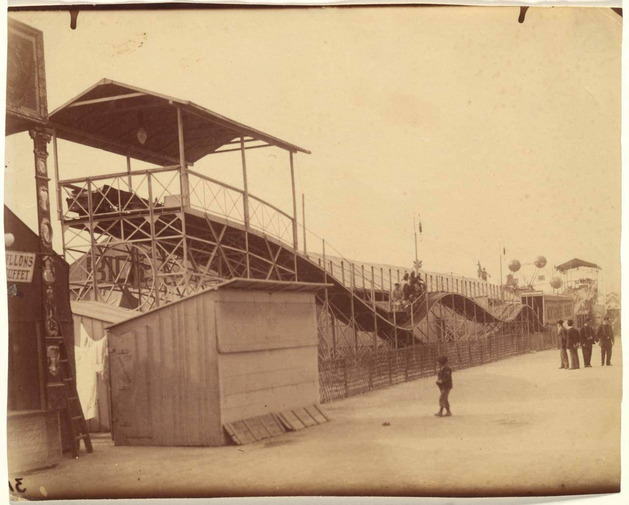
; at fourth left top, Gabriel de Rumine’s 'Caryatid porch of Erechtheum, Acropolis, Athens' (1859, below); at fourth left bottom, Lee Friedlander's 'Mount Rushmore' (1969, below); at centre top, John Williams' 'Clovelly Beach, Sydney' (1969, below); at top right, Eugène Atget's 'The roller coaster, Invalides funfair (Montagnes russes, fête des Invalides)' (1898, below); and at bottom right, Roger Scott's 'Ghost train, Sydney Royal Easter Show' (1972? 1975? below)")
Installation view of the exhibition Photography: Real & Imagined at The Ian Potter Centre: NGV Australia, Melbourne showing at third left bottom, Henri Cartier-Bresson’s Sunday on the banks of the Marne (1938, below); at fourth left top, Gabriel de Rumine’s Caryatid porch of Erechtheum, Acropolis, Athens (1859, below); at fourth left bottom, Lee Friedlander’s Mount Rushmore (1969, below); at centre top, John Williams’ Clovelly Beach, Sydney (1969, below); at top right, Eugène Atget’s The roller coaster, Invalides funfair (Montagnes russes, fête des Invalides) (1898, below); and at bottom right, Roger Scott’s Ghost train, Sydney Royal Easter Show (1972? 1975? below)
Photo: Marcus Bunyan

Installation view of the exhibition Photography: Real & Imagined at The Ian Potter Centre: NGV Australia, Melbourne showing David Goldblatt’s The playing fields of Tladi, Soweto, Johannesburg, August 1972
Photo: Marcus Bunyan
 'Fairy Lane steps' 1910")
Harold Cazneaux (Australian born New Zealand, 1878-1953)
Fairy Lane steps
1910
Bromoil print
24.8 × 18.5cm
National Gallery of Victoria, Melbourne
Purchased, 1979
© The Cazneaux family
Harold Cazneaux was one of the most important and influential Australian photographers of the early twentieth century. He had a great love of the natural world but early in his career also found a rich subject in the inner-city streets of Sydney. Cazneaux made photographs that appear lively and spontaneous, although given the limitations of the equipment at the time they are almost certain to have been staged to a degree. His charming studies of children at play in city streets transformed the bleak, impoverished urban environments of inner-city Sydney into a wonderful playground.
Wall text from the exhibition
' c. 1940")
Installation view of the exhibition Photography: Real & Imagined at The Ian Potter Centre: NGV Australia, Melbourne showing Helen Levitt’s New York (Boys fighting on a pediment) c. 1940
Photo: Marcus Bunyan
 'New York (Boys fighting on a pediment)' c. 1940")
Helen Levitt (American, 1913-2009)
New York (Boys fighting on a pediment)
c. 1940
Gelatin silver print
31.8 × 21.1cm
National Gallery of Victoria, Melbourne
Bowness Family Fund for Photography, 2022
Public domain
 (English, 1815-1894) 'Fairy Glen, Betws-y-Coed' (Ffos Noddyn, Betws-y-Coed) c. 1860")
Francis Bedford (attributed to) (English, 1815-1894)
Fairy Glen, Betws-y-Coed
(Ffos Noddyn, Betws-y-Coed)
c. 1860
from the No title (Stephen Thompson album) (1859 – c. 1868)
Albumen silver photograph
13.7 × 17.8cm (image and sheet)
National Gallery of Victoria, Melbourne
Purchased from Admission Funds, 1988
Public domain
 'Sunday on the banks of the Marne, Juvisy, France' 1938")
Henri Cartier-Bresson (French, 1908-2004)
Sunday on the banks of the Marne, Juvisy, France
1938; (1990s) {printed}
Gelatin silver photograph
29.1 x 43.9 cm (image)
National Gallery of Victoria, Melbourne
Purchased NGV Foundation, 2015
2015.566
© Fondation Henri Cartier-Bresson/Magnum Photos
In 1938 Henri Cartier-Bresson photographed a group of people picnicking on the banks of the river Marne. It is a celebratory image showing a quintessential aspect of everyday life in France: long Sunday lunches. But it also reveals something of the revolutionary politics of the period and their profound influence on Cartier-Bresson in the 1930s. In 1938 the left-wing Popular Front swept into power in France and the newly elected government mandated two weeks paid leave for all workers. At the time, Cartier-Bresson worked for the Paris-based communist press and was commissioned by Regards magazine to photograph an extended series that looked at the social impact of this initiative.
Wall text from the exhibition
 'No title (Caryatid porch of Erechtheum, Acropolis, Athens)' 1859")
Gabriel de Rumine (European, 1841-1871)
No title (Caryatid porch of Erechtheum, Acropolis, Athens)
1859
Albumen silver photograph
25.7 × 35.8cm irreg. (image and sheet)
National Gallery of Victoria, Melbourne
Presented by the National Gallery Women’s Association, 1995
Public domain

Installation view of the exhibition Photography: Real & Imagined at The Ian Potter Centre: NGV Australia, Melbourne showing Lee Friedlander’s Mount Rushmore (1969, below)
Photo: Marcus Bunyan
 'Mount Rushmore' 1969, printed c. 1977")
Lee Friedlander (United States, b. 1934)
Mount Rushmore
1969; printed c. 1977
Gelatin silver print
18.3 × 27.5cm
National Gallery of Victoria, Melbourne
Purchased, 1977
© Lee Friedlander, courtesy Fraenkel Gallery, San Francisco and Luhring Augustine, New York
")
")
Installation views of the exhibition Photography: Real & Imagined at The Ian Potter Centre: NGV Australia, Melbourne showing John Williams’ Clovelly Beach, Sydney (1969, below)
Photos: Marcus Bunyan
 'Clovelly Beach' 1964")
John Williams (Australian, 1933-2016)
Clovelly Beach, Sydney
1969; printed 1988
Gelatin silver photograph
25.6 × 25.4cm
National Gallery of Victoria, Melbourne
Purchased, 1989
© John Williams
Eugène Atget (French, 1857-1927)
The roller coaster, Invalides funfair (Montagnes russes, fête des Invalides)
1898
From the Festivals and Fairs series in the Art in Old Paris series 1898-1927
Albumen silver photograph
National Gallery of Victoria, Melbourne
Gift of Patrick Pound through the Australian Government’s Cultural Gifts Program, 2020
Public domain

Roger Scott (Australian, b. 1944)
Ghost train, Sydney Royal Easter Show
1972? 1975?
Gelatin silver print
30.4 × 45.6cm
National Gallery of Victoria, Melbourne
Gift of Mr James Mollison, 1994
© Roger Scott
The Ian Potter Centre: NGV Australia
Federation Square
Corner of Russell and
Flinders Streets, Melbourne
Opening hours:
Daily 10am – 5pm
 'Cathédrale de Chartres – Portique du Midi XIIe Siècle' c. 1854, printed c. 1857")
![Paul Strand (American, 1890-1976) 'New York [Wall Street]' Negative 1915; print 1916 Photogravure](https://artblart.com/wp-content/uploads/2024/01/strand-wall-street-a.jpg "Paul Strand (American, 1890-1976) 'New York [Wall Street]' Negative 1915; print 1916 Photogravure")
![Paul Strand (American, 1890-1976) 'New York [Wall Street]' Negative 1915; print 1916 Photogravure](https://artblart.com/wp-content/uploads/2024/01/strand-wall-street-b.jpg "Paul Strand (American, 1890-1976) 'New York [Wall Street]' Negative 1915; print 1916 Photogravure")
 and Auguste-Rosalie Bisson (French, 1826-1900) 'Notre-Dame' 1850s")
 and Robert Howlett (British, 1831-1858) 'Crimean Braves – Men of the Trenches and Battlefields in the Crimea' 1856")
 'A Winter's Morning' 1887")
 'The Poacher – A Hare in View' 1888")
 'The Poacher – A Hare in View' 1888 (detail)")
 'A Black Canal' 1894")
 'Marsh Leaves' Published 1895")
 'Spring' 1899")
 'Beatrice' 1899")
 'Edge of the Woods, Evening' 1900")
 'Morning' 1905")
 'Trafalgar Square' 1909")
 'Brooklyn Bridge' c. 1910")
 'The Battery' c. 1909")
 'The Street - Design for a Poster / The Street – Fifth Avenue' 1896? / 1901-1902?, printed 1903")
 'Old and New New York' 1910, printed in or before 1913")
 'After Working Hours – The Ferry Boat' 1910, printed in or before 1913")
 'The City of Ambition' 1910, printed in or before 1913")
 'The Cleft of the Rock' 1912")
 'The Tunnel Builders' 1913")
 'Électricité' 1931")
 'Le Monde' 1931")
 'The City' (Èlectricité - La Ville) 1931")
 'Le Souffle' (Breeze) 1931")
 'Virgin San Felipe, Oaxaca, Mexico' (Virgen San Felipe, Oaxaca, Mexico) 1933")

 'Boy, Uruapan, Michoacán, Mexico' (Niño, Uruapan, Michoacán, México) 1933")

 'Cristo with Thorns, Huexotla' 1933, printed 1940")
 'Church, Coapiaxtla' 1933, printed 1940")
 'Plate 35' 1933")
 'Plate 47' 1933")
 'Album of 37 photographs' c. 1887-1888")

 'Detachment of Bhopal Battalion at Indore' 1886")
 'Detachment of Bhopal Battalion at Indore' 1886 (detail)")
 'The Duke and Duchess of Connaught, with Col. Adam, Captain H.V. Benett, Col. Becher, Gen. Knowles, Captain Herbert, Col. Cavaye, Mrs. Cavaye, and Gen. R. Gellispie, Mhow' 1887")
 'A Ruler Seated on a Terrace Worshipping at a Shrine of Radha and Krishna' c. 1800")
 'Ornament' 1800s")
 'Medallion' 1800s")
 'Pendant' 1700s")
 'Portrait of Murad Bakhsh (1624-1661)' c. 1635; borders c. 1700s")
 'His Highness Maharaja Scindia of Gwalior' 1887")
 'His Highness Maharaja Scindia of Gwalior' 1887 (detail)")
 'Cap' 1800s")
 'Maharaja of Rewa and Classmates' 1886")
 'Maharaja of Rewa and Sardars' 1886")
 'Maharaja of Rewa in Prayer' 1886")
 'His Highness the Maharaja of Rewa' 1886")
 'His Highness the Maharaja of Rewa' 1886")
 'Turban Ornament (Sarpech)' 1800s")
 'Royal Elephant Ramkali with a Mahout' c. 1761")
 'Ramkishore Singh of Rewa' 1886")
 'Ramkishore Singh of Rewa' 1886")
 'Colonel F. G. Oldham, Simla' 1887")
 'Colonel H.R. Thuillier and His Wife Emmeline Williams Thuillier, Simla' 1887")
 'Colonel H.R. Thuillier and His Wife Emmeline Williams Thuillier, Simla' 1887 (detail)")
 'His Honor The Lieutenant Governor of the Punjab and Party, Simla' 1887")
 'Lord Dufferin and the Supreme Council of Government of India' 1887")
 'His Eminence Commander in Chief and Party, Simla' 1887")
 'Tiger Hunt of Ram Singh II' c. 1830-1840")
 'His Eminence Commander in Chief and Party, Simla' 1887 (detail)")
 'Miss Lyall, Simla' 1887")
 'Miss Lyall, Simla' 1887 (detail)")
 'Mrs. and Miss Lyall, Simla' 1887")
 'Mrs. and Miss Lyall, Simla' 1887 (detail)")
 'Sir Auckland Colvin and Family, Simla' 1887")
 'Picnic party, Mashobra' 1887")
 'Picnic party, Mashobra' 1887 (detail)")
 'Reverend Loche at Neemuch' 1887")
 'Heavy Field Battery, Jhansi' 1886")
 'Jhansi Fort and Elephant Battery' 1886")
 'Mr. Brown's Horses, Jhansi' 1887")
 c. 1860-1890")
 'Treacher and Co.'s Shop in the Fort, Bombay' 1886")
 'Treacher and Co.'s Shop in the Fort, Bombay' 1886 (detail)")
 'Cookie at Tin Pan Alley, New York City' 1983")


 'Mark tattooing Mark, Boston' 1978")
 'Couple in Bed, Chicago' 1977")
 'Buzz and Nan at the Afterhours, New York City' 1980")
 'Flaming car, Salisbury Beach, N.H.' 1979")
 'Brian's face, West Berlin' 1984")

 'Suzanne in the green bathroom, Pergamon Museum, East Berlin' 1984")
 'Edwidge behind the bar at Evelyne's, New York City' 1985")
 'Greer on the bed, New York City' 1983")


 'Twisting at my birthday party, New York City' 1980")
 'French Chris on the convertible, New York City' 1979")
 'Philippe H. and Suzanne Kissing at Euthanasia, New York City' 1981")
 'Rise and Monty Kissing, New York City' 1980")
 'Heart-Shaped Bruise, New York City' 1980")
 'Nan and Dickie in the York Motel, New Jersey' 1980")
 'The Hug, New York City' 1980")

 'Thomas shaving, Boston' 1977")
 'Scarpota at the Knox bar, West Berlin' 1984")
 'Brian on the Bowery roof, New York City' 1982")
 'C.Z. and Max on the beach, Truro, Mass.' 1976")
 'Vivienne in the green dress, New York City' 1980")
 'Bruce with his portrait, New York City' 1981")


 'Portrait #3' 2014 From the series 'In the exodus, I love you more' 2014 - ongoing")
 / AP 'Doctors unsuccessfully try to resuscitate a girl hit by Russian shelling in Mariupol, Ukraine. February 27, 2022' 2022")
 / Getty Images 'A young girl cries as a man bids his daughter goodbye at the railway station in Lviv, Ukraine, on March 22, 2022. Lviv has served as a stopover and shelter for the millions of Ukrainians fleeing the Russian invasion, either to the safety of nearby countries or the relative security of western Ukraine' 2022")
 'Evacuation of civilians from Irpіn, Ukraine. March 4-5, 2022'")
 / AP 'Mariana Vishegirskaya stands outside a maternity hospital that was damaged by shelling in Mariupol, Ukraine, March 9, 2022. Vishegirskaya survived the shelling and later gave birth to a girl in another hospital in Mariupol' 2022")


 'Untitled' 2014 From the series 'In the exodus, I love you more' 2014- ongoing")
 'Grace' 2014 From the series 'In the exodus, I love you more' 2014- ongoing")
 'Crease' 2014 From the series 'In the exodus, I love you more' 2014 - ongoing")
 'Draw' 2016 From the series 'In the exodus, I love you more' 2014 - ongoing")
 'Twofold' 2014, printed 2023 From the series 'In the exodus, I love you more' 2014 - ongoing")
 'Untitled #4' From the series 'Behold' 2016")
 'Untitled #6' rom the series 'Behold' 2016")
 'Untitled #7' From the series 'Behold' 2016")

 'Behrouz Boochani – Manus Island' 2018 From the series 'Remain'")
 'Emad Moradi – Manus Island' 2018 From the series 'Remain'")
 'Ari Sirwan – Manus Island' 2018 From the series 'Remain'")

 'Untitled' From the series 'Speak the wind' 2015-2022")
 'Untitled' From the series 'Speak the wind' 2015-2022")

 'Untitled' From the series 'Speak the wind' 2015-2022")
 'Untitled #88' From the series 'Speak the wind' 2015-2022")
 'Untitled' From the series 'Speak the wind' 2015-2022")
 'Untitled #11' From the series 'Speak the wind' 2015-2022")
 'Untitled' From the series 'Speak the wind' 2015-2022")
 'Untitled #2' From the series 'Speak the wind' 2015-2022")

 'Portrait #3' From the series 'Agonistes' 2020")
 'A writer who was born into a closed Christadelphian community' From the series 'Agonistes' 2020")
 'An occupational health and safety manager working for security firm G4S at Manus Island Immigration Detention Centre' From the series 'Agonistes' 2020")
 'Agonistes' (video still) From the series 'Agonistes' 2020")


 'Untitled #2' From the series 'In turn' 2023")
 'Untitled #4' From the series 'In turn' 2023")
 'Untitled #10' From the series 'In turn' 2023")
 'North Side of Quadrangle, Arundel Castle' 1852-1854")
 'Arbre le long d'une clotûre' (Tree along a fence) 1852-1854")
 'Chichen Itza: Bas-relief des Tigres, Palais du Cirque' (Chichen Itza: Bas-relief of the Tigers, Circus Palace) 1859-1861")
 'Uxmal: détail de la façade dite de la couleuvre' (Uxmal: detail of the so-called snake facade) 1859-1861")
 and Auguste-Rosalie (French, 1826-1900) 'La crevasse (départ) sur le chemin du grand plateau, ascension du Mont-Blanc' (The crevasse (departure) on the way to the grand plateau, ascent of Mont-Blanc) 1862")
 'Mademoiselle L. Vulliemin, à mi-corps, la tête couverte d’un chapeau' (Miss L. Vulliemin, half-length, head covered with a hat) 1889")
 'Denise et Jacques, les enfants d'Émile Zola' (Denise and Jacques, the children of Émile Zola) 1898 or 1899")
 'Untitled' 1909-1912")
 'Untitled' 1909-1912")
 'Untitled' 1909-1912")
 'Plage de Sainte-Adresse avec les bains Dumont' (Sainte-Adresse beach with Dumont baths) 1856")
 'Vapeur' (Steam) 1856-1857")
 'Groupe de navires - Sète - Méditerranée - No. 10' (Group of ships - Sète - Mediterranean - No. 10) 1857")
 'La Vague brisée. Mer Méditerranée No. 15' (The Broken Wave. Mediterranean Sea No. 15) 1857")
 'La Grande vague - Sète - N° 17' (The Great Wave) 1857")
 'Flotte franco-anglaise en rade de Cherbourg' (Franco-English fleet in Cherbourg harbour) August 4-8, 1858")
 'La Princesse Marie Cantacuzène' (The Princesse Marie Cantacuzène) around 1855-1860")
 'Bakounine' About 1862")
 'Jean Journet (1799-1861)' 1857")
 'Charles Asselineau (1820-1874)' Between 1854 and 1870")
 'Jeune fille au Leica' (Young girl with Leica) 1934")
 'Bar sur la plage, Adriatique' (Beach bar, Adriatic) 1957")
 'Venise' (Venice) 1959")
 'Kayak, Frankfurt' 1961, printed around 1970")
 'Je n'ai pas de main qui me caresse le visage' (I have no Hands caress my face) 1961-1963")
 'Portrait d'acteur' (Actor portrait) 1968")
 '1er janvier 1972 à la Martinique' (January 1, 1972 in Martinique) 1972")
 'Paris' 1973")
 'Immigrants, Istanbul, Turkey' c. 1977")
 'Melting Snow on a Rock, Nagano, Japan' 1988")
 'Canasta de Luz' (Corbeille de lumière)(Basket of Light) 1989")
 'Chéa, Cambodge' (Chéa, Cambodia) 2000")
 'My shadow down the hill' San Francisco, 1938")
 'My shadow down the hill' San Francisco, 1938")
 'Bay from Coit Tower, Treasure Island at left' San Francisco, 1938")
 'Bay from Coit Tower, Treasure Island at left' San Francisco, 1938")
 'San Francisco 1939' 1939")
 'Pendant l'éclipse' 1912")
 'These people are standing in the middle of Washington St & reading the blackboard wall bulletins, on a newspaper office' Boston, 1939")
 'These people are standing in the middle of Washington St & reading the blackboard wall bulletins, on a newspaper office. Sept 1.' Boston, 1939")
 'Chicago 1939' 1939")
'U.S. Continent and Chicago 1939' 1939")
 'Conn & the Sound. Nearly lost my camera taking these because of wind' New England, 1939")
 'Conn & the Sound. Nearly lost my camera taking these because of wind' New England, 1939")
 'Washington 1939' 1939")
 'Washington Monument as seen from the Lincoln Memorial & reflected in the Mall' Washington D.C., 1939")
 'Washington Monument as seen from the Lincoln Memorial & reflected in the Mall' Washington D.C., 1939")
 '\"Through the Wheels of Justice\" The Supreme Court across from Capitol Hill' Washington D.C., 1939")
 '\"Through the Wheels of Justice\" The Supreme Court across from Capitol Hill' Washington D.C., 1939")
 '\"EI\" running over a slum street. Municipal building in background' New York, 1939")
 '\"EI\" running over a slum street. Municipal building in background' New York, 1939")
 'Sunset over lower Manhattan' New York, 1939")
 'Sunset over lower Manhattan' New York, 1939")
 '17-Year-Old Girl Pedals Bicycle From Los Angeles to Boston, newspaper clipping from Boston' August 1939")

 'An American Girl in Italy' Florence, 1951")

")
")
")
 'Polar Bear' 1976")
 'Manatee' 1994")
 'Earliest Human Relatives' 1994")
 'UA Playhouse, New York' 1978")
")


")
 'Kenosha Theater, Kenosha' 2015")

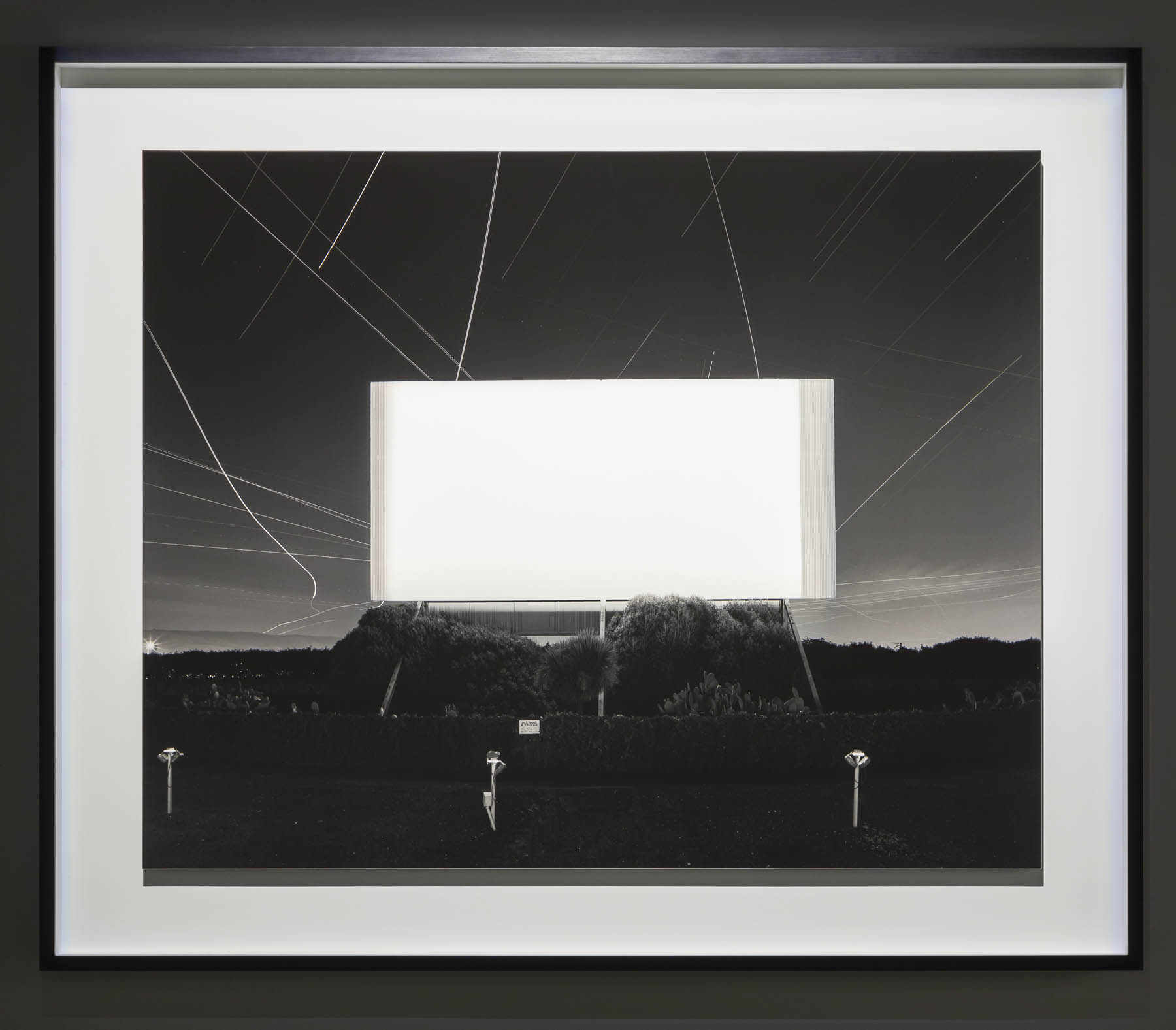
 'Union City Drive-in, Union City' 1993")


 'Bay of Sagami, Atami' 1997")


 'Chrysler Building' 1997")
 'World Trade Center' 1997")
 'Eiffel Tower' 1998")


' 1995")
 'Sea of Buddha 049 (Triptych)' 1995")


 'The Electric Chair' 1994")


 'Anne Boleyn' 1999")

 'Queen Victoria' 1999")
 'Salvador Dali' 1999")
 'Oscar Wilde' 1999")


 'Diana, Princess of Wales' 1999")


 'Lightning Fields 225' 2009")


 'Mathematical Model 002 Dini's Surface' 2005")


 'Conceptual Form Surface 0001 Helicoid: Minimal Surface' 2004")

 from Vale Larry Fink (American, 1941-2023)")
")
 Pat Sabatine's 8th Birthday Party' 1977 from Vale Larry Fink (American, 1941-2023)")
 'Russian Ball, New York City' 1976")
 'Pat Sabatine's 11th Birthday Party' 1980")
 'Benefit, MoMA, New York' 1977")
 'Skating Rink' 1980")
 'Studio 54, New York City' May 1977")
 'Oslin's Graduation Party' 1977")
 'N.Y.C. Club Cornich', from the portfolio '82 Photographs 1974 to 1982' 1977; printed 1983")
 'Melzer Family Picnic, Eastport, Long Island, New York' June 2002")
 'Peter Beard's, East Hampton', from the portfolio '82 Photographs 1974 to 1982' 1982; printed 1983")
 'Jean Sabatine and Molly' 1983")
 'Benefit, Corcoran Museum, Washington DC' 1975")
 'New York City' 1955 from Vale Elliott Erwitt (1928-2023)")
 'Pasadena, California, USA' Nd from Vale Elliott Erwitt (1928-2023)")
 'USA. California. Berkeley' 1956 from Vale Elliott Erwitt (1928-2023)")
 'USA. New York, New York' 1953 from Vale Elliott Erwitt (1928-2023)")
 'Felix, Gladys and Rover (New York, USA)' New York City, 1974")
 'Moscow, USSR' 1959")

 'Wilmington, North Carolina' 1950")
 'Paris, France' 1989")
 'USA. New York City' 1988")
 'Pittsburgh, USA' 1950")
 'Brazil. Buzios' 1990")
 'Guanajuato, Mexico' 1957")
 'Fort Dix, USA' 1951")
 'Bakersfield, USA' 1983")
 'Bal, Paris, France' 1967")

 'Huntsville, Alabama' 1974")

You must be logged in to post a comment.