Marcus Bunyan (Australian, b. 1958) Untitled 2011 From the series The Symbolic Order (cartes de visite) Digital photograph
The body of work The Symbolic Order (cartes de visite) 2011 is now online on my website. There are 23 images in the series of modulated fighter aircraft recognition cards that cycle through the colour wheel. Below is a selection of images from the series.
I hope you like the work!
Marcus
Please click on the photographs for a larger version of the image.
Photographs are available from this series for purchase. As a guide, a digital colour 16″ x 20″ costs $1000 plus tracked and insured shipping. For more information please see my Store web page.
All photographs: Untitled from the series The Symbolic Order (cartes de visite) 2011 by Marcus Bunyan
Exhibition dates: 10th November 2010 – 10th April 2011
Aleksey Ivanovich Saveliev (Russian, 1883-1923) At the Prepared Grave 1910 Gelatin silver print 8.9 x 13.3cm (3 1/2 x 5 1/4 in.) The Metropolitan Museum of Art Gift of Pierre Apraxine, 2010
These six photo-postcards show various places and moments surrounding the death and burial of Leo Tolstoy. In November 1910 the eighty-two-year-old novelist walked away from his great wealth to devote himself to Christian charity and died in a stationmaster’s house after falling ill on a train. Tolstoy’s death was of tremendous national importance, and how he was to be mourned – whether to kneel or stand at the grave, for instance – signified a contrast between old and new that would be decided during the Russian Revolution seven years later.
Text from the Metropolitan Museum of Art website
What an eclectic group of photographs in this posting as well as a great title for an exhibition!
Marcus
Many thankx to the The Metropolitan Museum of Art for allowing me to publish the photographs in the posting. Please click on the photograph for a larger version of the image.
Aleksey Ivanovich Saveliev (Russian, 1883-1923) Peasant Carts with Funeral Wreaths 1910 Gelatin silver print 8.9 x 13.3cm (3 1/2 x 5 1/4 in.) The Metropolitan Museum of Art Gift of Pierre Apraxine, 2010
Aleksey Ivanovich Saveliev (Russian, 1883-1923) Deputation of the Yasno-Polyanskyi Peasants 1910 Gelatin silver print 8.9 x 13.3cm (3 1/2 x 5 1/4 in.) The Metropolitan Museum of Art Gift of Pierre Apraxine, 2010
Felix Thiollier (French, 1842-1914) A Village Street in the Auvergne c. 1910 Gelatin silver print The Metropolitan Museum of Art Twentieth-Century Photography Fund, 2008
An industrialist and serious amateur photographer in Saint-Étienne, Thiollier left to posterity a vast archive of photographs and negatives. Most are landscapes done in the Pictorialist style, but his more unusual images depict factories and daily life outside major cities in early twentieth century France.
Paul Haviland (American, 1880-1950) Passing Steamer 1910 Platinum print The Metropolitan Museum of Art Gilman Collection Purchase, Harriette and Noel Levine Gift, 2005
The son of a well-off china manufacturer in Limoges, Haviland encountered Alfred Stieglitz’s Little Galleries of the Photo-Secession in 1908. He soon contributed articles to and published photographs in Stieglitz’s journal Camera Work (and acted as the gallery’s secretary at one point), even bankrolling the gallery’s three-year lease for Stieglitz when the rent was raised. In 1915 he started – with the Mexican-born caricaturist and gallerist Marius de Zayas and the journalist Agnes Ernest Meyer – a new magazine called 291, named for Stieglitz’s gallery at 291 Fifth Avenue.
This image appeared as a photogravure in a 1912 issue of Camera Work. While the soft focus and platinum printing are traces of the waning Pictorialist style, the unexpected vantage point and stark design made Passing Steamer a harbinger of things to come.
Text from The Metropolitan Museum of Art
Anton Giulio Bragaglia (Italian, 1890-1960) Change of Position 1911 Gelatin silver print 12.8 x 17.9cm (5 1/16 x 7 1/16 in) The Metropolitan Museum of Art Gilman Collection Purchase, The Horace W. Goldsmith Foundation Gift, through Joyce and Robert Menschel, 2005
At age nineteen, Bragaglia became enamored of the Italian Futurist movement, which espoused the beauty of speed and war, the interdependence of time and space, and the total dissolution of time-consecrated institutions. Not following the stop-motion photography of Eadweard Muybridge and Étienne-Jules Marey from the previous century, Bragaglia left the camera’s shutter open to register the absolute fluidity of motion itself – in this case, the trajectory created by the sweeping, continuous arc of a simple change of body position. The result is a dissolution or dematerialisation of the man’s body in a seamless picture of active life. Although later banished from the Futurists’ ranks, the photographer created perhaps the first truly avant-garde images with the camera – the kind that would become prevalent across the continent only a decade later.
Text from The Metropolitan Museum of Art
Adolph de Meyer (American born France, 1868-1949) [Dance Study] c. 1912 Platinum print The Metropolitan Museum of Art Alfred Stieglitz Collection, 1949
De Meyer – who would become Vogue magazine’s first official fashion photographer, in 1913 – photographed the dancer Nijinsky and other members of Sergei Diaghilev’s troupe when L’Après midi d’un Faun was presented in Paris in 1912. It has been suggested that this photograph, the only nude by de Meyer, has some connection to the Russian ballet, but if so, it remains mysterious. In 1913 Mabel Dodge, a patroness of the avant-garde, wrote: “Nearly every thinking person nowadays is in revolt against something, because the craving of the individual is for further consciousness, and because consciousness is expanding and bursting through the moulds that have held it up to now.”
Text from The Metropolitan Museum of Art
Stanislaw Ignacy Witkiewicz (Polish, 1885-1939) Tadeus Langier, Zakopane 1912-1913 Gelatin silver print 12.6 x 17.6cm (4 15/16 x 6 15/16 in) The Metropolitan Museum of Art Gilman Collection Purchase, Denise and Andrew Saul Gift, 2005
A painter who considered photography a hobby, Lartigue was seven when his father, an accomplished amateur photographer, presented him with his first camera. reserving his images from childhood onward in album after album, Lartigue created a rich chronicle of the sporting life and entertainments of his upper-class milieu but one that, like his diaries, remained essentially private. Until 1963, when a show at the Museum of Modern Art, New York, revealed Lartigue as a major photographer, his work was known only to a group of friends.
[This print has] been made by Lartigue prior to his public recognition, in his customary intimate scale. He made the Grand Prix picture by swinging the camera from left to right as the racing car sped by. It captures the same awestruck, slate-erasing feeling that inspired the Futurist Marinetti to rhapsodise four years earlier, “A roaring motor car which seems to run on machine-gun fire, is more beautiful than the Victory of Samothrace.”
Text from The Metropolitan Museum of Art
Unknown Artist, British School The Great British Advance in the West: A Raiding Party Waiting for the Word to Go 1914-1918 Gelatin silver print The Metropolitan Museum of Art Twentieth-Century Photography Fund, 2010 Wikipedia Commons public domain
Unknown Artist, French School The Great Nave: Wounded Soldiers Performing Arms Drill at the End of Their Medical Treatment, Grand Palais, Paris 1916 Gelatin silver print The Metropolitan Museum of Art Gilman Collection Purchase, Ann Tenenbaum and Thomas H. Lee Gift, 2005 Wikipedia Commons public domain
During World War I, wounded soldiers who had been sent to Paris to recover were drilled in the cavernous Grand Palais to prepare them for a return to the front.
Unknown artist (American School) (Charlie Chaplin and Douglas Fairbanks Selling Liberty Loans during the Third Loan Campaign at the Sub Treasury Building on Wall Street, New York City) 1918 Gelatin silver print 19.4 x 24.1cm (7 5/8 x 9 1/2 in) The Metropolitan Museum of Art Purchase The Horace W. Goldsmith Foundation Gift, through Joyce and Robert Menschel, 1996
The twentieth century was truly born during the 1910s. This exhibition, which accompanies Stieglitz, Steichen, Strand, surveys the range of uses to which photography was put as its most advanced practitioners and theorists were redefining the medium as an art. The title “Our Future Is in the Air“ is taken from a military aviation pamphlet that figures prominently (in French) in a 1912 Cubist tabletop still life by Picasso; it suggests the twinned senses of exhilarating optimism and lingering dread that accompanied the dissolution of the old order.
Photography was handmaiden and witness to the upheavals that revolutionised perception and consciousness during this tumultuous era. Space and time were overcome by motorcars and airplanes, radio and wireless, and man seemed liberated from the bounds of gravity and geography. This seemingly limitless expanse was mirrored by a new understanding of the unconscious as infinitely deep, complex, and varied – a continent ripe for discovery. The camera was seen as the conduit between these two states of self and world, and “straight photography” – stripped of the gauzy blur of Pictorialist reverie – was espoused by Alfred Stieglitz and Paul Strand among others.
This turn was not accidental: since handheld cameras became available in the late 1880s, anyone could be a photographer; similarly, photography had snaked its way into every corner of the culture. Elevated perception would distinguish the new artists from the amateur and the tradesman. The exhibition casts the widest possible net in order to show the foundations upon which the medium staked its claim as an independent art.
The 1910s – a period remembered for “The Great War,” Einstein’s theory of relativity, the Russian Revolution, and the birth of Hollywood – was a dynamic and tumultuous decade that ushered in the modern era. This new age – as it was captured by the quintessentially modern art of photography – will be the subject of the exhibition “Our Future Is In The Air”: Photographs from the 1910s, on view at The Metropolitan Museum of Art from November 10, 2010, through April 10, 2011.
An eclectic centennial exhibition devoted to photography of the 1910s, “Our Future Is In The Air” provides a fascinating look at the birth of modern life through 58 photographs by some 30 artists, including Eugène Atget, Alvin Langdon Coburn, Eugène Druet, Lewis Hine, Jacques-Henri Lartigue, Adolph de Meyer, Christian Schad, Morton Schamberg, Charles Sheeler, and Stanislaw Witkiewicz, among others. Drawn exclusively from the Museum’s collection, the exhibition also features anonymous snapshots, séance photographs, and a family album made by Russian nobility on the eve of revolution. “Our Future Is In The Air” complements the Museum’s concurrent presentation of groundbreaking photographs by Alfred Stieglitz, Edward Steichen, and Paul Strand in the exhibition Stieglitz, Steichen, Strand. The exhibition’s title is taken from a pamphlet for military aviation that figures prominently (in French) in a 1912 Cubist tabletop still-life by Picasso, but is used here because of its double meaning: the feelings of excitement and anxiety that accompanied such radical change.
“Our Future Is In The Air” opens in dramatic fashion with a series of photographs showing moments in the funeral procession and burial of Leo Tolstoy on November 9, 1910. The great Russian novelist passed away just after walking away from his great wealth and literary fame to lead a life of Christian charity. Certain details that can be seen in the photo-postcards – such as whether or not to kneel by the grave – represented a long simmering struggle between old and new, spiritual and secular, that would lead to revolution seven years later.
As cameras became smaller, faster, and easier to operate, amateur photographers such as the child prodigy Jacques-Henri Lartigue pushed the medium in directions that trained photographers shied away from. Since Lartigue was only recognised much later as a key figure in photography, prints such as the ones included here – showing speeding motorcars – are exceedingly rare. Lartigue made one of his most memorable photographs, Le Grand Prix A.C.F. (1913), by swinging his camera in the same direction as the car, as it sped by.
The camera also afforded access to the previously invisible, whether capturing a broken leg bone, revealed in an X-ray from 1916 or the trajectory created by a simple change in body position, in a 1911 motion study by the Futurist artist Anton Giulio Bragaglia.
At the same time, photography became an agent of democratic communication, and documentary photographers used its growing influence to expose degrading conditions of workers, the injustice of child labor, and the devastation of war. Beginning in 1908, Lewis Hine made 5,000 photographs of children working in mills, sweatshops, factories, and street trades; six of his photographs will be featured in this exhibition, including Newsboy asleep on stairs with papers, Jersey City, New Jersey, February 1912. Hine’s reports and slide lectures were meant to trigger a profound, empathetic response in the viewer.
During World War I, photography was utilised to document the mass casualties of mechanised warfare; in the exhibition, an affecting image from 1916, by an unknown artist, shows wounded French soldiers performing drills in the nave of the Grand Palais in Paris as part of their rehabilitation.
Also in the exhibition is an evocative 1918 photograph, again by an unknown artist, of Charlie Chaplin and Douglas Fairbanks entertaining a huge crowd at a war bonds rally on Wall Street.
“Our Future Is In The Air” accompanies the exhibition Stieglitz, Steichen, Strand, which focuses on contemporaneous works by three modernist masters of American photography: Alfred Stieglitz, Edward Steichen, and Paul Strand. It includes photographs by several friends and compatriots of Alfred Stieglitz, from Adolph de Meyer, Alvin Langdon Coburn, Paul Haviland, and Karl Struss to Morton Schamberg and Charles Sheeler, in whose works one can trace the transition from soft focus Pictorialism to a harder-edged, more detached “straight photography.”
Press release from the Metropolitan Museum of Art website
Alvin Langdon Coburn (British born America, 1882-1966) The Octopus 1909 Platinum print The Metropolitan Museum of Art Ford Motor Company Collection, Gift of Ford Motor Company and John C. Waddell, 1987
During the early 1910s, photographers such as Paul Strand, Karl Struss, and Coburn were using Pictorialist techniques from the previous century to depict startling perspectives on contemporary urban subjects, such as this dizzying, bird’s-eye view of New York’s Madison Square from a new skyscraper.
Unknown artist (American School) (Man Holding Baseball in Catcher’s Mitt) 1910 Gelatin silver print 13.8 x 8.7cm (5 7/16 x 3 7/16 in.) The Metropolitan Museum of Art Funds from various donors, 1998
Lewis Hine (American, 1874-1940) 11:00 A.M. Monday, May 9th, 1910. Newsies at Skeeter’s Branch, Jefferson near Franklin. They were all smoking. Location: St. Louis, Missouri 1910 Gelatin silver print The Metropolitan Museum of Art, Gilman Collection Gift of Phyllis D. Massar, 1970
Trained as a sociologist at Columbia University, Hine gave up his teaching job in 1908 to become a full-time photographer for the National Child Labor Committee. The success of the reform agency, created four years earlier, was largely dependent on its ability to sway public opinion.
Influenced by Jacob Riis’s pictures of slum conditions on New York’s Lower East Side, Hine obsessively documented the working conditions of children in mills, factories, and fields across the country, often going undercover to gain access to his subjects. The results – more than five thousand photographs – were used in field reports, exhibitions, pamphlets, and slide lectures. Hine’s decidedly unromantic, understated pictures served as a potent weapon of persuasion.
Text from The Metropolitan Museum of Art
Lewis Hine (American, 1874-1940) Addie Card, 12 years. Spinner in North Pownal Cotton Mill. Girls in mill say she is ten years. She admitted to me she was twelve; that she started during school vacation and now would “stay”. Location: Vermont, August 1910 1910 Gelatin silver print 24.4 x 19.3cm (9 5/8 x 7 5/8 in) The Metropolitan Museum of Art Gilman Collection Purchase, Anonymous Gifts, by exchange, 2005
Lewis Hine (American, 1874-1940) Newsboy asleep on stairs with papers, Jersey City, New Jersey February 1912 Gelatin silver print Image: 11.5 x 16.8cm (4 1/2 x 6 5/8 in) Metropolitan Museum of Art Gilman Collection, Purchase, Ann Tenenbaum and Thomas H. Lee Gift, 2005
Exhibition Overview
The twentieth century was truly born during the 1910s. This exhibition, which accompanies Stieglitz, Steichen, Strand, surveys the range of uses to which photography was put as its most advanced practitioners and theorists were redefining the medium as an art. The title “Our Future Is in the Air” is taken from a military aviation pamphlet that figures prominently (in French) in a 1912 Cubist tabletop still life by Picasso; it suggests the twinned senses of exhilarating optimism and lingering dread that accompanied the dissolution of the old order.
Photography was handmaiden and witness to the upheavals that revolutionised perception and consciousness during this tumultuous era. Space and time were overcome by motorcars and airplanes, radio and wireless, and man seemed liberated from the bounds of gravity and geography. This seemingly limitless expanse was mirrored by a new understanding of the unconscious as infinitely deep, complex, and varied – a continent ripe for discovery. The camera was seen as the conduit between these two states of self and world, and “straight photography” – stripped of the gauzy blur of Pictorialist reverie – was espoused by Alfred Stieglitz and Paul Strand among others.
This turn was not accidental: since handheld cameras became available in the late 1880s, anyone could be a photographer; similarly, photography had snaked its way into every corner of the culture. Elevated perception would distinguish the new artists from the amateur and the tradesman. The exhibition casts the widest possible net in order to show the foundations upon which the medium staked its claim as an independent art.
Text from the Metropolitan Museum of Art website
Eugène Atget (French, 1857-1927) Boulevard de Strasbourg 1912 Albumen silver print from glass negative 22.4 x 17.5cm (8 13/16 x 6 7/8 in.) The Metropolitan Museum of Art Gilman Collection Purchase, Ann Tenenbaum and Thomas H. Lee Gift, 2005
Atget found his vocation in photography in 1897, at the age of forty, after having been a merchant seaman, a minor actor, and a painter. He became obsessed with making what he termed “documents for artists” of Paris and its environs and compiling a visual compendium of the architecture, landscape, and artefacts that distinguish French culture and history. By the end of his life, Atget had amassed an archive of more than eight thousand negatives, which he organized into such categories as Parisian Interiors, Vehicles in Paris, and Petits Métiers (trades and professions). In Atget’s inventory of Paris, shop windows figure prominently and the most arresting feature mannequin displays. In the 1920s the Surrealists recognised in Atget a kindred spirit and reproduced a number of his photographs in their journals and reviews. Antiquated mannequins such as the ones depicted here struck them as haunting, dreamlike analogues to the human form.
Text from The Metropolitan Museum of Art
Stanislaw Ignacy Witkiewicz (Polish, 1885-1939) Jadwiga Janczewska, Zakopane c. 1913 Gelatin silver print The Metropolitan Museum of Art Gilman Collection Museum Purchase, 2005
Witkiewicz was prolific in many mediums, writing plays, novels, and philosophical treatises as well as painting and making darkly brooding photographic portraits and self-portraits. In all his work, he describes a proto-existential sense of the self struggling in vain against the undifferentiated mass of men and the indifference of death; he often turned to drugs to recover this missing plenitude of existence.
Between 1912 and 1913, when he thought he was going mad, Witkiewicz made a series of extraordinary self-portraits and portraits of friends, his dying father, and his fiancée, Jadwiga Janczewska. After this time, his engagement with photography was brief, as he devoted himself instead to literature and painting. He took his life on the day Russian troops entered Poland in 1939 – in part a gesture of national solidarity.
Text from The Metropolitan Museum of Art
Karl Struss (American, 1886–1981) Claremont Inn, Riverside Drive 1915 Platinum print The Metropolitan Museum of Art Warner Communications Inc. Purchase Fund, 1977
A member of the Photo-Secession, Struss was a student of Clarence White and a friend of Alfred Stieglitz. He made dozens of photographs of New York City at dusk, delighting in the way things merged and were illuminated by strings of fine lights. This photograph, with its gleaming automobiles and electric lights, shows a popular summer restaurant housed in a colonial-era home on the Upper West Side. Four years later, Struss moved to Los Angeles to work as a still photographer in the burgeoning movie business. He wound up being hired as a cameraman by Cecil B. DeMille and in 1927 won the first Oscar for cinematography for his work on F. W. Murnau’s Sunrise.
Text from The Metropolitan Museum of Art
Morton Schamberg (American, 1881–1918) [View of Rooftops] 1917 Gelatin silver print The Metropolitan Museum of Art Ford Motor Company Collection, Gift of Ford Motor Company and John C. Waddell, 1987 Public domain
Had he not died of influenza in 1918, Schamberg likely would have remained one of the best avant-garde painters and photographers of his generation in America. He absorbed the lessons of Cubism through his contacts with the Stieglitz and Arensberg circles, and in photographs such as this one he demonstrated his deft application of the new artistic idioms.
After reaching a point of almost pure abstraction in his painting in the wake of the Armory show of 1913, Schamberg turned in 1915 toward more objective machine forms in his pastels and paintings, and toward urban images in his photographs.
Like Stieglitz’s photographs of the city made from the windows of his galleries, Schamberg’s New York is seen from an elevated perspective, but unlike the elder photographer’s images, Schamberg’s photograph is cool, altogether lacking in human or natural references, and celebrates an almost wholly geometric order underscored by his calculated framing and point of view. For many years this print, the only one Schamberg made from this negative, belonged to his closest friend, Charles Sheeler.
Morton Schamberg (American, 1881-1918) Elsa von Freytag-Loringhoven (German, 1874-1927) “God” by Baroness Elsa von Freytag-Loringhoven and Morton Schamberg 1917 Gelatin silver print 24.1 x 19.2cm (9 1/2 x 7 9/16 in.) The Metropolitan Museum of Art The Elisha Whittelsey Collection, The Elisha Whittelsey Fund, 1973 Wikipedia Commons public domain
This photograph of a drain pipe attached to a miter box documents one of the most famous examples of American Dada. The sculpture God, a Readymade in the spirit of Marcel Duchamp’s upended urinal Fountain, has traditionally been attributed to Schamberg. Recent scholarship suggests, however, that it was primarily the creation of Baroness Elsa von Freytag Loringhoven, a poet, shoplifter, junk collector, and Duchamp worshiper famous for strolling the streets of Greenwich Village with cancelled postage stuck to her face and a birdcage with a live canary dangling from her neck. The sculpture’s irreverent title recalls the sculptor Beatrice Wood’s unattributed comment, included in a published defence of Duchamp’s Fountain, “The only works of art America has given are her plumbing and her bridges.”
Text from The Metropolitan Museum of Art
Charles Sheeler (American, 1883–1965) Dan Mask c. 1918 Gelatin silver print 24.2 x 18.2cm (9 1/2 x 7 3/16 in.) The Metropolitan Museum of Art Gilman Collection, Purchase, Denise and Andrew Saul Gift, 2005
When Charles Sheeler took up the camera sometime in 1910-11, he was already a modestly accomplished painter. He began to photograph domestic architecture in the Philadelphia area, and within three years he had a successful sideline documenting fine private and public American collections of Chinese bronzes, Meso-American pots, and modern painting and sculpture by Cézanne, Picasso, and Duchamp. Through this work Sheeler met Walter Arensberg, Alfred Stieglitz, and other important collectors and dealers; to a few of them he sold his paintings.
The rigorous demands of detailed record photography soon influenced his painting as the direct, generally frontal assessment of both an object’s form and structure retrained and refined his eye. By 1916, Sheeler had begun to paint from photographs and also to pursue photography as an end in itself. With his first exhibition of photographs, a three-person show with Paul Strand and Morton Schamberg at Marius de Zayas’s Modern Gallery in 1917, Sheeler emerged as one of America’s few prominent artists equally skilled with brush and camera.
This photograph of a Dan mask from Ivory Coast may have been commissioned by John Quinn, a New York lawyer, collector of African art, and patron of the avant-garde. The ceremonial mask emerges from virtual obscurity, filled with mystery, its highly polished wood surface animated by a raking, angular light. The photograph functions as a fetish, speaking with its own voice, commanding our attention, and even, it would seem, judging our response.
This photograph was published in the March 1923 issue of “The Arts,” in an article by de Zayas entitled “Negro Art.”
Charles Sheeler (American, 1883-1965) Doylestown House – Stairs from Below 1917 Gelatin silver print 21 x 15cm (8 1/4 x 5 15/16 in.) The Metropolitan Museum of Art Alfred Stieglitz Collection, 1933
The Metropolitan Museum of Art 1000 Fifth Avenue at 82nd Street New York, New York 10028-0198 Information: 212-535-7710
Opening hours: Sunday – Tuesday and Thursday: 10am – 5pm Friday and Saturday: 10am – 9pm Closed Wednesday
“In the meantime the landscape presents scenes of desolation which mark the memory of all who see it. Thousands of carcasses are strewn on the baked and cracked plains. There is a brooding air of almost Biblical intensity over millions of acres which bear no trace of surface waters. The dry astringent air extracts every drop of moisture from the grass, leaving it so brittle that it breaks under foot with the tinkling of thin glass.”
Sidney Nolan. Epic Drought in Australia 1952
“Peering into the pantry, which held a particular fascination for me, my eye was caught by several jars of preserved fruit that stood on the otherwise empty shelves and by a few dozen diminutive crimson apples on the sill of the window darkened by the yew tree outside. And as I looked on these apples which shone through the half-light … the quite outlandish thought crossed my mind that these things … had all outlasted me …”
W.G. Sebald. The Rings of Saturn 1988
This is a superb exhibition of 61 black and white photographs by Sidney Nolan. The photographs were shot using a medium format camera and are printed in square format from the original 1952 negatives. They were taken near the Birdsville Track in Queensland and were commissioned at the time by the Brisbane newspaper The Courier Mail. Although not intended to be studies for the later ‘Drought paintings’ they have become, were the beginning of, can be seen as, preparatory ideas pre sketching and painting.
There are two proof sets of the Drought Photographs (including the one displayed on the gallery wall) that are printed on a cool-toned Type C photographic paper (analogue to digital to analogue) at about 8″ square. These are the less successful of the prints for the “beauty is in the box.” The more impressive prints are the edition of 10 that is for sale, either as individual prints or as a whole folio, that are printed at approximately 10″ square on a slightly warm-toned Canson Infinity 310 gsm archival inkjet paper (analogue to digital). These are the knockout prints with lots of mid-toned hues – for the warm tone of the paper more closely matches the feel of the dusty Outback. They possess a very “inky” atmosphere and wonderful light. Make sure that you get the gallery staff to show you some of these prints!
The work itself is a joy to behold. The photographs hang together like a symphony, rising and falling, with shape emphasising aspects of form. The images flow from one to another. The formal composition of the mummified carcasses is exemplary, the resurrected animals (a horse, for example, propped up on a fifth leg) and emaciated corpses like contemporary sculpture. Here I am reminded of some of the work of Henry Moore.
The handling of the tenuous aspects of human existence in this uniquely Australian landscape is also a joy to behold. Through an intimate understanding of how to tension the space between objects within the frame Nolan’s seemingly simple but complex photographs of the landscape are previsualised by the artist in the mind’s eye before he even puts the camera to his face. Unfortunately I don’t have any photographs to show you of these works but for me they were one of the highlights of the exhibition, rivalling any of the work of the Farm Security Administration (FSA) photographers photographing in the American Dustbowl during the 1930s. Finally, some great Australian landscape photographs!!
As the curator Damian Smith notes of both strands, “Throughout the series emphasis shifts from detached observation to intimate contemplation – between the forces of the outer landscape to the darkness of the animals’ inner being.”
I would not say the landscapes are ‘detached observation’. Both forms require intimate contemplation.
Let us investigate the presence of these images further.
“Barthes mentions the apparently “universal” experiences of birth and death, experiences that, he points out, are in fact always mediated by historical and thus political circumstances. Echoing a famous remark by Bertolt Brecht, he contends that “the failure of photography seems to me to be flagrant in this connection: to reproduce death or birth tells us, literally, nothing.””1
“To reproduce death or birth tells us, literally, nothing.” Hence, you could argue, through an appeal to nostalgia for a mythology of the Australian bush we are held at the surface of an identity. Drought, desolation, despair, death. But these photographs go beyond the reproduction of death, go beyond mere nostalgia, by pushing the prick of consciousness, Barthes punctum, into a sense of spatial immediacy and temporal anteriority – an experience Barthes “sums up as the “having-been-there” that is the basis of every photograph’s sense of witness.”2
The new punctum becomes other than the detail – no longer of form but of intensity, of Time: conjuring past, present and future in a single image.3 We, the viewer, bring our own associations to the image, our knowledge of drought in this big land – the knowledge that this drought has happened, it did happen and it will happen again and again and again in the future, probably with more frequency than it does now. The photograph becomes an active, mental representation of the material world. It becomes the world’s ‘essence’.
The photographs stand for something else, some other state of being, much as this work can be seen as one small aspect of Nolan’s art that stands for the whole – a close examination of a small part of something that represents the whole, like a sail represents a yacht, a metonymic resonance. They tell us something through time, of life and death. As the great author W. G. Sebald eloquently observes in his quotation at the top of this posting these things outlast us – in our imagination.
Dr Marcus Bunyan
1/ Batchen, Geoffrey. “Palinode: An Introduction to Photography Degree Zero,” in Batchen, Geoffrey (ed.,). Photography Degree Zero: Reflections on Roland Barthes’s Camera Lucida. Cambridge, MA: MIT Press, 2009, p. 6 2/ Ibid., pp. 8-9 3/ Ibid., p. 13
Many thankx to Ingrid Oosterhuis (General Manager Melbourne) for her help and to Australian Galleries for allowing me to publish the text and the photographs in the posting. Please click on the photographs for a larger version of the image.
Sidney Nolan (Australian, 1917-1992) Untitled (calf carcass in tree) 1952 Archival inkjet print 23 x 23cm
In 1952 Sidney Nolan was commissioned by the Brisbane newspaper The Courier Mail to travel through far northern Queensland to record his impressions of one of the worst droughts in Australia’s history. Throughout this journey Nolan took numerous black and white photographs using a medium format camera, resulting in a host of startling and memorable images. Focusing on both the macabre spectre of the many animal carcasses strewn across the landscape and on the singular dwellings announcing a tenuous human presence, Nolan created numerous iconic images.
Having returned to Australia after an extended period traveling in Europe, Nolan commented that the animal carcasses reminded him of the petrified bodies he had seen at Pompeii. Throughout the series emphasis shifts from detached observation to intimate contemplation – between the forces of the outer landscape to the darkness of the animals’ inner being. With their carefully composed compositions the photographs represent a dramatic shift from the artist’s earlier photographic experiments. In place of a prior spontaneity, drought-stricken animal carcases are framed in formally rigorous compositions, the moment seemingly trapped in time.
For the first time this exhibition includes the complete and unabridged series of Sidney Nolan’s Drought Photographs, including images previously unavailable for public exhibition.
Damian Smith Archivist for the Nolan Estate 1996-1999
Australia has not a very long history, but it is long enough to indicate that she must expect a major drought once every decade. Even so the present drought which the north and west of the continent is enduring, is by far the worst in living memory.
Rivers which have not been dry for over a century are now beds of hot sand, and even the aborigines can find no parallel in their mythology for a drought of this magnitude.
To cattle raising areas, failure of the annual monsoonal rains spells near tragedy. Of a total of 11.4 million beef cattle 1.5million have already perished.
The position is complicated by the lack of a railway connecting the North-centre of Australia with the eastern seaboard. Had such a railway been in existence many thousands of cattle could have been shifted to agistment areas and saved. As it is, the cattle must survive journeys from 500 to 1500 miles on stock routes, and this is generally impossible owing to the weakened positions of the animals. Thus cattle men must face the prospect of watching their herds dwindle until at least the end of the year when there is the probability of early summer storms bringing relief.
In the meantime the landscape presents scenes of desolation which mark the memory of all who see it. Thousands of carcasses are strewn on the baked and cracked plains. There is a brooding air of almost Biblical intensity over millions of acres which bear no trace of surface waters. The dry astringent air extracts every drop of moisture from the grass, leaving it so brittle that it breaks under foot with the tinkling of thin glass.
Death takes on a curiously abstract patter under these arid conditions. Carcasses of animals are preserved in strange shapes which have often a kind of beauty, or even grim elegance.
Over the whole country there is a silence in which men and animals bring forth the qualities necessary for survival. Patience, endurance – and for many Australians, a bitter and salty attitude of irony.
Sidney Nolan, August 1952
Text from the Australian Galleries website [Online] Cited 18/03/2011 no longer available online
Sidney Nolan (Australian, 1917-1992) Untitled (cow in tree) 1952 Archival inkjet print 23 x 23cm
Sidney Nolan (Australian, 1917-1992) Untitled (Brian the stockman mounting dead horse) 1952 Archival inkjet print 23 x 23cm
Australian Galleries is delighted to present this fascinating exhibition of selected photographs by Sidney Nolan curated by Damian Smith, Archivist for the Nolan Estate 1996-1999.
Smith states in the accompanying exhibition catalogue:
“In 1952 Sidney Nolan was commissioned by the Brisbane newspaper The Courier Mail to travel through far northern Queensland to record his impressions of one of the worst droughts in Australia’s history. Throughout this journey Nolan took numerous black and white photographs using a medium format camera, resulting in a host of startling and memorable images. Focusing on both the macabre spectre of the many animal carcasses strewn across the landscape and on the singular dwellings announcing a tenuous human presence, Nolan created numerous iconic images. This exhibition includes the complete and unabridged series of Sidney Nolan’s Drought Photographs, including images previously unavailable for public exhibition.”
In his 1952 essay Epic Drought in Australia Sidney Nolan remarked on the poignancy of the images, noting the following:
“Death takes on a curiously abstract patter under these arid conditions. Carcasses of animals are preserved in strange shapes which have often a kind of beauty, or even grim elegance.”
To coincide with the exhibition Drought Photographs, Australian Galleries will be showing a selection of Drought Drawings by Sidney Nolan that include works previously exhibited at the National Gallery of Victoria, in it’s landmark survey of Nolan’s work Desert Drought in 2003.
Sidney Nolan Drought Photographs Curated by Damian Smith
In 2010 Damian Smith established Words For Art, a consultancy specialising in art writing and curatorial projects.
Damian has always had a strong interest in Nolan’s work, he was appointed the inaugural archivist for the estate of Sidney Nolan in 1996. Since that time he has curated numerous Nolan exhibitions including a major exhibition, Unmasked: Sidney Nolan and Ned Kelly 1950-1990 for the Heide Museum of Modern Art in 2006.
Building up to the Heide exhibition, Damian was based at Sidney Nolan’s home ‘The Rodd’ at Herefordshire, a 16th Century manor on the border of England and Wales. During that research period he developed an interest in Nolan’s life-long engagement with photography. He discovered vintage prints of Nolan’s photographs of outback Australia and the devastating drought in far northern Queensland, which were included in the landmark survey Sidney Nolan: Desert and Drought, at the National Gallery of Victoria in 2003. The exhibition included previously unseen photographic images from 1949 to 1952.
In the NGV exhibition, numerous small-scale contact prints showing Nolan’s ‘Drought animals’ were featured, as were larger black and white prints from the same series. Additional small-scale prints were sourced as well through Nolan’s step-daughter Jinx Nolan. Of note was Nolan’s now famous Untitled (Brian the stockman mounting a dead horse at Wave Hill Station), 1952, a startling image that first featured in the 1961 Thames & Hudson monograph Sidney Nolan, where it appeared titled Desert.
Having researched and written about these images, Damian recognised that Nolan had spent many hours studying the images, notating them and ultimately using them in the development of his now famous Drought paintings. Nolan offered the photographs to Life Magazine, New York in a bid to bring this extraordinary series to public attention. This bid was unsuccessful.
After all of the years since these photographs were taken, Damian made the decision to resurrect Nolan’s photographs working closely with Sidney Nolan’s widow Mary Nolan, nee Boyd. The result being this exhibition at Australian Galleries, Melbourne in 2011.
Keen to preserve the artist’s vision, the photographs have been produced to a scale consistent with the vintage prints and all are printed from the original negatives which were discovered at ‘The Rodd’.
Text from Australian Galleries Melbourne
Sidney Nolan (Australian, 1917-1992) Untitled (cow carcass and cow skull) 1952 Archival inkjet print 23 x 23cm
Sidney Nolan (Australian, 1917-1992) Untitled (cow and calf carcass covered in dirt I) 1952 Archival inkjet print 23 x 23cm
Australian Galleries 35 Derby Street [PO Box 1183] Collingwood 3066 Phone: +61 3 9417 4303
How I wish I could have been in New York to see this exhibition!
Marcus
Many thankx to the Museum of Modern Art (MoMA) for allowing me to publish the photographs in the posting. Please click on the photographs for a larger version of the image.
Frances Benjamin Johnston (American, 1864-1952) Physiology. Class in emergency work 1899-1900 Platinum print 7 9/16 × 9 1/2″ (19.2 × 24.2cm) The Museum of Modern Art, New York Gift of Lincoln Kirstein
“It is wrong to regard photography as purely mechanical. Mechanical it is, up to a certain point, but beyond that there is great scope for individual and artistic expression.” ~ Frances Benjamin Johnston
After setting up her own photography studio in 1894, in Washington, D.C., Frances Benjamin Johnston was described by The Washington Times as “the only lady in the business of photography in the city.”1 Considered to be one of the first female press photographers in the United States, she took pictures of news events and architecture and made portraits of political and social leaders for over five decades. From early on, she was conscious of her role as a pioneer for women in photography, telling a reporter in 1893, “It is another pet theory with me that there are great possibilities in photography as a profitable and pleasant occupation for women, and I feel that my success helps to demonstrate this, and it is for this reason that I am glad to have other women know of my work.”2
In 1899, the principal of the Hampton Normal and Agricultural Institute in Virginia commissioned Johnston to take photographs at the school for the 1900 Exposition Universelle in Paris. The Hampton Institute was a preparatory and trade school dedicated to preparing African American and Native American students for professional careers. Johnston took more than 150 photographs and exhibited them in the Exposition Nègres d’Amerique (American Negro Exhibit) pavilion, which was meant to showcase improving race relations in America. The series won the grand prize and was lauded by both the public and the press.
Years later, writer and philanthropist Lincoln Kirstein discovered a leather-bound album of Johnston’s Hampton Institute photographs. He gave the album to The Museum of Modern Art, which reproduced 44 of its original 159 photographs in a book called The Hampton Album, published in 1966. In its preface, Kirstein acknowledged the conflict inherent in Johnston’s images, describing them as conveying the Institute’s goal of assimilating its students into Anglo-American mainstream society according to “the white Victorian ideal as criterion towards which all darker tribes and nations must perforce aspire.”3 The Hampton Institute’s most famous graduate, educator, leader, and presidential advisor Booker T. Washington, advocated for black education and accommodation of segregation policies instead of political pressure against institutionalized racism, a position criticized by anti-segregation activists such as author W. E. B. Du Bois.
Johnston’s pictures neither wholly celebrate nor condemn the Institute’s goals, but rather they reveal the complexities of the school’s value system. This is especially clear in her photographs contrasting pre- and post-Hampton ways of living, including The Old Well and The Improved Well (Three Hampton Grandchildren). In both images, black men pump water for their female family members. The old well system is represented by an aged man, a leaning fence, and a wooden pump that tilts against a desolate sky, while the new well is handled by an energetic young boy in a yard with a neat fence, a thriving tree, and two young girls dressed in starched pinafores. Johnston’s photographs have prompted the attention of artists like Carrie Mae Weems, who has incorporated the Hampton Institute photographs into her own work to explore what Weems described as “the problematic nature of assimilation, identity, and the role of education.”4
Kristen Gaylord, Beaumont and Nancy Newhall Curatorial Fellow, Department of Photography, 2016
1/ “Washington Women with Brains and Business,” The Washington Times, April 21, 1895, 9 2/ Clarence Bloomfield Moore, “Women Experts in Photography,” The Cosmopolitan XIV.5 (March 1893), 586 3/ Lincoln Kirstein, “Introduction,” in The Hampton Album: 44 photographs by Frances B. Johnston from an album of Hampton Institute (New York: The Museum of Modern Art, 1966), 10 4/ Quoted in Denise Ramzy and Katherine Fogg, “Interview: Carrie Mae Weems,” Carrie Mae Weems: The Hampton Project (New York: Aperture, 2000), 78
One day I went to the market in Spoleto, Italy, where my husband and I spent every summer and my flowers were wrapped up in a newspaper that I brought home and realised had a photograph of the serial killers, Charlie Manson and Jeffrey Dahmer, and an article in Italian that asked why these things happen in America. I knew immediately that I wanted to incorporate it into a photograph. And in our bedroom, I had leaned some jumbo postcards from the Courtauld Museum in London on the dresser.
Although the photograph could have a lot of traditional still life elements in it, you know, the bottle or the fruit, or the flowers, I like the fact that an aspect of the still life work that I’m able to bring in is the news that’s going on in another part of the world.
In my still lives, bringing in the newspaper allows me to connect these things that might seem very disparate, a fragment of a painting by a French painter from another century, put together with a news article about murder. But in fact, the nature of our contemporary lives is that we’re flipping the channels all the time. We’re experiencing so many things at once, and we’re not able to selectively engage only one thing at a time.
The Museum of Modern Art draws from its rich collection of photography to present the history of the medium from the dawn of the modern period to the present with the exhibition Pictures by Women: A History of Modern Photography, from May 7 to August 30, 2010. Filling the entire third-floor Edward Steichen Photography Galleries with photographs made exclusively by women artists, this installation comprises more than 200 works by approximately 120 artists, including a selection of exceptional recent acquisitions and works on view for the first time by such artists as Anna Atkins, Claude Cahun, Rineke Dijkstra, VALIE EXPORT, Nan Goldin, Helen Levitt, and Judith Joy Ross. The exhibition also includes masterworks by such luminaries as Berenice Abbott, Diane Arbus, Gertrude Käsebier, Dorothea Lange, Lisette Model, Tina Modotti, Cindy Sherman, and Carrie Mae Weems, as well as pictures, collages, video, and photography-based installations drawn from other curatorial departments by artists such as Hannah Höch, Barbara Kruger, Annette Messager, Yoko Ono, Lorna Simpson, Kiki Smith, and Hannah Wilke. The exhibition is organised by Roxana Marcoci, Curator; Sarah Meister, Curator; and Eva Respini, Associate Curator, Department of Photography, The Museum of Modern Art.
The Edward Steichen Photography Galleries comprise a circuit of six rooms devoted to a rotating selection of photographs from the Museum’s collection. The galleries featuring works from 1850 to the 1980s open on May 7, 2010, and remain on view through March 21, 2011. The most contemporary works in the exhibition are currently on view in The Robert and Joyce Menschel Gallery, and they remain on view through August 30, 2010.
For much of photography’s 170-year history, women have contributed to its development as both an art form and a means of communication, expanding its parameters by experimenting with every aspect of the medium. Self-portraits and representations of women by a variety of women practitioners are a recurring motif, as seen in works by artists ranging from Julia Margaret Cameron to Lucia Moholy, and from Germaine Krull to Katy Grannan. Significant groups of works by individual photographers are highlighted within this chronological survey, including in-depth presentations of the work of Frances Benjamin Johnston, Käsebier, Modotti, Lange, Levitt, Arbus, Goldin, and Ross.
Marking the entrance to The Edward Steichen Photography Galleries is a large-scale photographic wallpaper, Fluxus Wallpaper, realised by Yoko Ono and George Maciunas in the early 1970s. This work depicts the serial repetition of a set of buttocks, an image originating from a provocative Fluxus film made by Ono in 1966.
Pictures by Women opens with a gallery of nineteenth and early twentieth-century work, representing the variety of photography’s applications. The earliest photograph in the installation was made in the 1850s by British photographer Anna Atkins, who used the cyanotype process to record her many plant specimens. Presented side by side are in-depth groupings of work by American photographers Frances Benjamin Johnston and Gertrude Käsebier. In 1899 the Hampton Institute commissioned Johnston to take photographs at the school that were featured in an exhibition about contemporary African American life at the Paris Exposition of 1900. On view is a selection of pictures taken from a larger album of 156, which exemplify Johnston’s talent for balancing pictorial delicacy and classical composition with the demands of working on assignment. Käsebier – another woman who produced photographic works of art while operating a successful commercial studio – is best known for her portraits and symbolic, soft-focus pictures of the mother-and-child theme.
The rise of photographic modernism in the 1920s and 1930s is traced in the second gallery primarily with the work of European women artists. A wall of portraits of women showing the range of artistic expression and experimentation during this period includes Claude Cahun’s radical gender-bending self-portrait in drag (1921); Lucia Moholy’s striking portrait of fellow Bauhaus student Florence Henri (1927); and Hannah Höch’s Indian Dancer: From an Ethnographic Museum (1930), a collage evoking the modern woman. Included here is also a photocollage by the little known Japanese artist Toshiko Okanoue, titled In Love (1953). Cannibalising images from U.S. magazines such as Life and Vogue, this surreal collage represents a young Japanese woman’s perception of the Western way of life. A group of pictures taken in Mexico in the late 1920s by Italian photographer Tina Modotti possess an aesthetic clarity and beauty that reflect her increasing political involvement within her adopted country. Also included is Ilse Bing’s Self-Portrait in Mirrors (1931), a picture staging a complex mise-en-scène between two reflections – one in the mirror and the other in the camera’s eye – as well as similarly powerful works by Imogen Cunningham, Florence Henri, Germaine Krull, and Lee Miller, who experimented with mobile perspectives of the handheld camera and graphic compositions.
The third gallery features photographers who devoted themselves to the complex challenge of exploring the social world in the interwar and postwar periods. Largely comprising work by American women, this gallery includes comprehensive presentations of two of America’s leading photographers, Dorothea Lange and Helen Levitt. The breadth of Lange’s accomplishments is represented through a selection of approximately 20 photographs, all of women, including her iconic Depression-era picture Migrant Mother, Nipomo, California (1936); the memorable One Nation, Indivisible, San Francisco (1942); and pictures capturing the bustle of postwar life in America, such as Mother and Child, San Francisco (1952). Opposite these works is a wall of colour photographs taken by Levitt in the 1970s on the streets of New York City. These lively, spontaneous pictures are full of humour and drama, and continue the rich tradition of the American documentary genre that Levitt helped establish in the 1940s with her black-and-white photographs. The rest of the gallery includes a variety of work made during the period, including Berenice Abbott’s documents of the changing architecture and character of New York City in the 1930s, and Barbara Morgan’s elegant 1940 photograph of dancer Martha Graham performing her dramatic piece “Letter to the World,” based on the love life of American poet Emily Dickinson.
Photography’s documentary tradition in the postwar period continues in the fourth gallery, most notably with a selection of Diane Arbus’s portraits of women, such as A Widow in Her Bedroom, New York City (1963); Identical Twins, Roselle, New Jersey (1966); and Girl in Her Circus Costume, Maryland (1967). This gallery also includes work by artists of the 1960s and 1970s who embraced photography not just as a way of describing experience, but as a conceptual tool for appropriating and manipulating existing photographs. Examples include Martha Rosler’s collage Cleaning the Drapes (1969-1972), which juxtaposes images of domestic bliss taken from women’s magazines with news pictures of the war in Vietnam. The gallery also introduces several notable examples of acts performed for the camera, including Adrian Piper’s self-portrait series Food for the Spirit (1971), a meditation on transcendental being through an analysis of Kant’s Critique of Pure Reason; and VALIE EXPORT’s provocative Action Pants: Genital Panic (1969). Presented as a set of posters, this work memorialised a performance in which the Austrian artist marched into an experimental art-film house in Munich wearing crotchless trousers, challenging mostly male viewers to “look at the real thing” instead of passively enjoying images of women on the screen.
The emergence of colour photography as a major force in the 1970s is seen in the fifth gallery, with large photographs, including Tina Barney’s Sunday New York Times (1982) and a picture from Cindy Sherman’s celebrated Centerfolds (1981) series. This gallery also includes the work of postmodern artists associated with The Pictures Generation, such as Barbara Kruger, Louise Lawler, Sherrie Levine, and Laurie Simmons, who played with photography’s potential to comment on the increasingly image-saturated world of the late twentieth century. Representing the other end of the photographic spectrum is the diaristic aesthetic of Nan Goldin. A group of Goldin photographs dating from 1978 to 1985 capture the shared experience of an artistic downtown New York community – a generation ravaged by drug abuse and AIDS. These pictures of the artist’s friends, lovers, and Goldin herself explore the highs and the lows of amorous relationships. These are presented opposite work by Gay Block, Sally Mann, and Sheron Rupp, who use the probing vision of straightforward photography to explore the world around us.
Concluding the installation in The Robert and Joyce Menschel Gallery are major groups of works that suggest the diversity of artistic strategies and forms in contemporary photography. A group of Judith Joy Ross portraits of very different women – a graduation guest (1993), a soldier (1990), a congresswoman (1987), and a visitor to the Vietnam Veterans Memorial (1984) – invite us to reflect upon the relationship between social roles and the unique identities of the individuals who fulfil them. Presented on the same wall is Rineke Dijkstra’s ongoing series Almerisa, comprising 11 photographs made over a period of 14 years. Dijkstra first photographed Almerisa – a six-year-old Bosnian girl whose family had relocated from their war-torn native country to Amsterdam – as part of a project documenting children of refugees. Dijkstra continued to photograph her at one- or two-year intervals, chronicling not only her development from childhood through adolescence and into adulthood but also her cultural assimilation from Eastern to Western Europe. A selection from Carrie Mae Weems’s series From Here I Saw What Happened and I Cried (1995) superimpose sand-blasted text over found photographs to dissect photography’s historical role in imposing stereotypes upon African Americans. Rounding out this gallery is a wall dedicated to portraits of women, including work by Valérie Belin, Tanyth Berkeley, Katy Grannan, and Cindy Sherman, suggesting the plasticity of photography and, indeed, of female identity itself.
Press release from the MoMA website
Julia Margaret Cameron (British, 1815-1879) Untitled c. 1867 Albumen silver print 13 3/16 x 11″ (33.5 x 27.9cm) The Museum of Modern Art, New York Gift of Shirley C. Burden
Gertrude Käsebier (American, 1852-1934) The Manger 1899 Platinum print 12 13/16 x 9 5/8″ (32.5 x 24.4cm) The Museum of Modern Art, New York Gift of Mrs. Hermine M. Turner
Tina Modotti (Italian, 1896-1942) Workers Parade 1926 Gelatin silver print 8 7/16 x 7 5/16″ (21.5 x 18.6cm) The Museum of Modern Art, New York Given anonymously
Through the cut-and-pasted elements of Indian Dancer, Höch assembled references to film, Central African sculpture, and the domestic sphere. Her collaged model is the actress Renée (Maria) Falconetti (also known simply as “Falconetti”), appearing in a publicity still for Carl Theodor Dreyer’s 1928 film The Passion of Joan of Arc. Half of Falconetti’s face is replaced with the ear, eye, and mouth of a wooden dance mask from Cameroon. Atop her head rests a crown of cutlery: cutout shapes of spoons and knives, set against glinting metallic foil.
This work belongs to a series of photomontages called From an Ethnographic Museum (1924-1934), in which Höch juxtaposed images of women with reproductions of tribal art cut from magazines. The artist cited a visit to the ethnographic museum in Leiden, in the Netherlands, as an influence in the conception of this series; however, she used material from other cultures mostly as a point of departure for commentary on the status of women in contemporary German society. Invoking an androgynous fifteenth-century French martyr as embodied by a glamorous movie star, capping her with the finery of a domestic goddess, and aligning her with a cultural Other, this composite representation examines the complex facets of modern femininity.
Publication excerpt from MoMA Highlights: 375 Works from The Museum of Modern Art, New York (New York: The Museum of Modern Art, 2019)
Rosler conceived Bringing the War Home during a time of increased intervention in Vietnam by the United States military. Splicing together pictures of Vietnamese citizens maimed in the war, published in Life magazine, with images of the homes of affluent Americans culled from the pages of House Beautiful, Rosler made literal the description of the conflict as the “living-room war,” so called in the USA because the news of ongoing carnage in Southeast Asia filtered into tranquil American homes through television reports. By urging viewers to reconsider the “here” and “there” of the world picture, these activist photomontages reveal the extent to which a collective experience of war is shaped by media images.
Gallery label from The Shaping of New Visions: Photography, Film, Photobook, April 16, 2012 – April 29, 2013
Vanila Netto (Brazil, b. 1963) Pole Relief 2011 50 x 50cm Archival pigment ink on cotton rag paper
“There’s an odd diaristic quality to Vanila Netto’s photographic, still life, video and neon works. What at first might seem like a hotchpotch of gestures, assemblages and moments reveals a lateral narrative – still points on a fluid map.”
Dan Rule in The Age newspaper
Netto’s work moves from one place to another, Navigating Widely. Some elements are more successful than others. The grainy colour field photographs of extruded objects (foam packing, the detritus of cardboard) fail to impress lacking the fidelity that the subject matter requires and the ability to integrate successfully into the lateral narrative. The Super 8 film transferred to digital video It is time to bridge (2011) is excellent, evoking as it does the utopian ideals of industrialisation, planes and rockets becoming “permanent and sedentary residents” of an abandoned dream park. The diptych neon installation Elation, Deflation (Inner Tubes) (2011) is also effective in evoking the interface between human and machine.
The best work in the exhibition is the series of small square format, analogue colour photographs that have been printed digitally (see photographs below). There is a lovely spatial resistance in these photographs – hints of colour, slices, markings on walls, the collision of opposites – that elevates them above the rest of the exhibition. In these photographs, the punctum pricks our consciousness but is it enough? Although these are interesting photographs, are they photographs that you would remember in a week, a month or a year? More was needed to hang your hat on, perhaps an ambiguous sense of Time that stretched the frame of reference.
Overall, the hotchpotch of gestures, assemblages and moments needed a more substantial grounding and, for me, became points on a confused map: a collection of complexities, both global and personal, that needed a focusing of rationale and conceptualisation. Less is more! Drawing what are some good ideas and threads together in a simplified form would add to the strength of the work for there is talent here. Perhaps concentrating on one idea and exploring it more fully would be a step along the path. I look forward to the next literation.
Dr Marcus Bunyan
Many thanxk to Angela Connor for her help and to Arc One Gallery for allowing me to publish the photographs in the posting. Please click on the photograph for a larger version of the image.
Vanila Netto (Brazil, b. 1963) Colossus 2011 100 x 100cm Archival pigment ink on cotton rag paper
Vanila Netto (Brazil, b. 1963) Mir 2011 50 x 50cm Archival pigment ink on cotton rag paper
Vanila Netto (Brazil, b. 1963) Wheeling Consorts 2011 50 x 50cm Archival pigment ink on cotton rag paper
Vanila Netto (Brazil, b. 1963) Solaris 2011 50 x 50cm Archival pigment ink on cotton rag paper
Vanila Netto (Brazil, b. 1963) Air Buzzing 2011 50 x 50cm Archival pigment ink on cotton rag paper
Arc One Gallery 45 Flinders Lane Melbourne, 3000 Phone: (03) 9650 0589
Many thankx to the Hermitage Amsterdam for allowing me to publish the photographs in the posting. Please click on the photographs for a larger version of the image.
No other king from antiquity has such a powerful appeal to the imagination as Alexander the Great (356-323 BC). Nor other king has been so often cited and depicted as an example.
The exhibition The Immortal Alexander the Great will be on view from 18 September 2010 until 18 March 2011 in the Hermitage Amsterdam, with over 350 masterpieces, including the famous Gonzaga cameo from the State Museum the Hermitage in St Petersburg. This is the first time that any Dutch museum has devoted an exhibition to Alexander the Great, his journey to the East, and the influence of Hellenism. The exhibition spans a period of almost 2500 years. In the Hermitage Amsterdam, the ‘immortal’ Alexander will be brought to life for six months.
Alexander was born in 356 BC as the son of King Philip II of Macedonia. In boyhood he was taught by Aristotle, who would be an abiding influence on him. At twenty years of age Alexander succeeded to the throne, following his father’s assassination. Two years later he embarked on the great expedition that would seal his fame. His conquests brought him into contact with numerous countries and cultures: Syria, Egypt, Persia, Bactria, and India. He founded new cities wherever he went, naming many of them Alexandria. His arrival had a lasting impact on local architecture, art, language, and ways of life: in the course of time they assimilated and displayed Greek influence, a process that became known as Hellenism.
The Greek sphere of influence was vast: it extended from Asia Minor to India, from Egypt to Mongolia. Alexander’s name and fame has endured down to the present day.
The exhibition in the Hermitage Amsterdam gives a picture of Alexander himself and of the great cultural and artistic changes that followed in the train of his conquests.
The exhibition begins with the myth of Alexander. Images in paintings dating from the seventeenth to the nineteenth centuries, tapestries, and decorative arts display his heroic deeds and conquests. Impressive examples include paintings by Pietro Antonio Rotari (Alexander the Great and Roxana) and Sebastiano Ricci (Apelles painting Campaspe), and a tapestry depicting The Family of Darius before Alexander the Great.
The exhibition then moves on to Alexander’s reality, his native Macedonia, his teachers, his heroes Achilles and Heracles, and his ideals. The lion’s share of this reality consists of his journey, the Great Expedition to the East: an unparalleled campaign of conquest lasting over ten years, with an army that was more than 50,000 strong. Objects from Egypt and Persia, from the nomads and the Babylonians, attest to the rich cultures that he encountered on his travels. Visitors can follow the route of his celebrated journey on interactive maps and computers.
This part of the exhibition also highlights the Greek influence on those other cultures. Terracotta figurines depicting men and women, gods and satyrs, musicians and Eros, and stone fragments of architecture, testify to the artistic wealth that characterised the Hellenistic territories from the fourth century BC to the first few centuries AD. While many of these works reflect the Greek spirit of cheerfulness and playfulness, the Greeks also took an interest in the atypical, such as disabilities and deformities.
Finally, the exhibition dwells on Alexander’s heritage. Fourth-century reliefs from Palmyra demonstrate the endurance of Greek traditions outside Greece, as do papyruses bearing texts in Greek, which were still being produced in the ninth century. In the fifteenth and sixteenth centuries, Alexander played a prominent role in Persian literature, in which he is known as Iskander. He is recognisable in finely executed miniatures.
Alexander the Great is still a topical figure in our own times. Very recently (2004) a broad international public became better acquainted with him thanks to Oliver Stone’s film of his life. Alexander is a phenomenon. He is immortal. And the exhibition on show at the Hermitage Amsterdam makes this abundantly clear.
Erwin Olaf was asked to make photographic interpretations of Alexander, which he did in a photographic series and a short film. By interlacing objects from the exhibition with photographs of an actual model, Olaf has succeeded in skilfully conveying Alexander’s character traits and his handsome features.
Press release from the Hermitage Amsterdam website [Online] Cited 13/03/2011 no longer available online
Pietro Rotari (Italian, 1707-1762) Alexander the Great and Roxane 1756 Oil on canvas Height: 243cm (95.6 in) Width: 202cm (79.5 in)
Pietro Antonio Rotari (30 September 1707 – 31 August 1762) was an Italian painter of the Baroque period. Born in Verona, he led a peripatetic career, and died in Saint Petersburg, where he had traveled to paint for the Russian court. His portraits, mostly of women, are renowned for being beautiful and realistic. Rotari’s works were generally limited to royal portraits held by notables such as emperors and court ladies.
Brompton was a pupil of Benjamin Wilson. He then went to Italy, and spent some time in Rome, where he had lessons with Raphael Mengs. He was also introduced to the patronage of the Earl of Northampton, and accompanied the earl to Venice when he was appointed ambassador to the republic. At Venice Brompton painted a conversation-piece, in which he introduced the portraits of the Duke of York and several English gentlemen then on their travels. The picture was afterwards exhibited at the rooms in Spring Gardens in 1763, at which time he returned to England, and for some years practised portrait painting. Extravagant living and debtors brought him to the King’s Bench, but he was rescued by the Empress of Russia, at whose request he went to St. Petersburg, where he was appointed portrait painter to the empress, and where he met with much employment. During this time he was patronized by the empress favorite, Grigory Potemkin. He died in that city in 1783.
Curators: Maria Zagala, Associate Curator of Prints, Drawings and Photographs, Art Gallery of South Australia and Stephen Zagala, Curator at Monash Gallery of Art
Tracey Moffatt (Australia, b. 1960) Something More (no. 3) From the series of 9 photographs Something More 1989 Direct positive colour photograph 98 × 127cm Courtesy the artist and Roslyn Oxley9 Gallery, Sydney
Many thankx to the Art Gallery of South Australia for allowing me to publish the photographs in the posting. Please click on the photographs for a larger version of the image.
Tracey Moffatt: Narratives is the first major exhibition of this leading contemporary Australian artist to be held in Adelaide. The exhibition is a collaboration between the Monash Gallery of Art in Melbourne and the Art Gallery of South Australia and explores Moffatt’s interest in the history of cinema and the formal language of film and video in her construction of ‘photo-narratives’. It features seven of Moffatt’s multi-part photographic series, including Something More (1989), Scarred for Life I (1994) and II (1999), Up in the Sky (1997), Laudanum (1999), Invocations (2000), and The Adventure Series (2004).
In these series Moffatt uses photographic stills to build non-linear and open-ended stories. The narrative aspect of these series allows her to develop dream-like sequences, in which the real and the imaginary can unfold alongside each other. In this way, Moffatt invests the social reality of issues like race relations and domestic violence with uncertainty and subconscious dimensions. She presents disturbing subject matter in highly staged photographs which use the seductive language of film and popular culture to directly engage her audience.
The exhibition also includes Moffatt’s ground breaking films Nice Coloured Girls (1987), Night Cries (1990), Heaven (1997) and BeDevil (1993), and the critically acclaimed video montages produced with Gary Hillberg, Artist (2000), Revolution (2008) and Other (2009).
Text from the AGSA website
Tracey Moffatt (Australia, b. 1960) Something More (no. 5) From the series of 9 photographs Something More 1989 Direct positive colour photograph 98 × 127cm Courtesy the artist and Roslyn Oxley9 Gallery, Sydney
Tracey Moffatt (Australian, b. 1960) Something More (no. 1) 1997 From the series of 9 photographs Something More 1989 Direct positive colour photograph 98 × 127cm Courtesy the artist and Roslyn Oxley9 Gallery, Sydney
Tracey Moffatt (Australia, b. 1960) Job hunt, 1976 From the series of 10 prints Scarred for life I 1994 Colour photolithograph on paper 80 x 60cm Monash Gallery of Art, City of Monash Collection Courtesy of the artist and Roslyn Oxley9 Gallery, Sydney
Tracey Moffatt (Australia, b. 1960) Useless, 1974 From the series of 10 prints Scarred for life I 1994 Colour photolithograph on paper 80 x 60cm Monash Gallery of Art, City of Monash Collection Courtesy of the artist and Roslyn Oxley9 Gallery, Sydney
Tracey Moffatt (Australia, b. 1960) Up in the sky (no. 1) From the series of 25 prints Up in the sky 1997 colour photolithograph on paper 61 x 76cm Monash Gallery of Art, City of Monash Collection Courtesy of the artist and Roslyn Oxley9 Gallery, Sydney
Tracey Moffatt (Australia, b. 1960) Up in the sky From the series of 25 prints Up in the sky 1997 colour photolithograph on paper 61 x 76cm Monash Gallery of Art, City of Monash Collection Courtesy of the artist and Roslyn Oxley9 Gallery, Sydney
Tracey Moffatt (Australia, b. 1960) Laudanum (no. 1) From the series of 19 prints Laudanum 1998 Photogravure on paper 76 × 57cm Courtesy the artist and Roslyn Oxley9 Gallery, Sydney
Tracey Moffatt (Australia, b. 1960) Invocations (no. 2) From the series of 13 prints Invocations 2000 Colour silkscreen on paper 146 x 122cm Monash Gallery of Art, City of Monash Collection Courtesy of the artist and Roslyn Oxley9 Gallery, Sydney
Tracey Moffatt (Australia, b. 1960) Invocations (no. 5) From the series of 13 prints Invocations 2000 Colour silkscreen on paper 146 x 122cm Monash Gallery of Art, City of Monash Collection Courtesy of the artist and Roslyn Oxley9 Gallery, Sydney
Tracey Moffatt (Australia, b. 1960) Invocations (no. 7) From the series of 13 prints Invocations 2000 Colour silkscreen on paper 146 x 122cm Monash Gallery of Art, City of Monash Collection Courtesy of the artist and Roslyn Oxley9 Gallery, Sydney
Tracey Moffatt (Australia, b. 1960) Adventure Series (no. 1) from the series of 10 prints Adventure Series 2004 Inkjet print on paper 132 × 114cm Courtesy the artist and Roslyn Oxley9 Gallery, Sydney
Tracey Moffatt (Australia, b. 1960) Adventure Series (no. 2) From the series of 10 prints Adventure Series 2004 Inkjet print on paper 132 × 114cm Courtesy the artist and Roslyn Oxley9 Gallery, Sydney
Art Gallery of South Australia North Terrace Adelaide Public information: 08 8207 7000
On Tuesday I visited Australian Galleries in Smith Street to view the Drought Photographs by Sidney Nolan. A wonderful experience. Thursday night was the opening of Manstyle at NGV Australia, Federation Square, the new exhibition that “explores the extremes of masculine style and some of the most influential ideas that have pervaded menswear over the past three centuries.” A lively opening with lots of milliners, designers and fashionistas but only a modicum of style from many of the men in attendance.
Friday saw a trip up Flinders Lane to visit Arc One Gallery (review of Navigating Widely by Vanila Netto), Craft Victoria and drop in and say hello to Mary Lou Jelbart, director of fortyfivedownstairs and view the extensive renovations to the office and storage areas. Always good to catch up with Mary Lou. Then onward, battling terrible traffic, to the opening of New11 at the Australian Centre for Contemporary Art (ACCA) where the work was a bit ‘thin’ with a couple of notable exceptions.
Saturday saw a drive to Albert Street, Richmond to catch up with the galleries there – mostly stable exhibitions. Wade Marynowsky’s The Hosts: A Masquerade Of Improvising Automatons at John Buckley Gallery were interesting for 10 minutes or so reminding me of evil, corseted, twirling, marionette Daleks. I then had a chat with the delightful Edwin at Sophie Gannon Gallery and saw the first stages of installation of the upcoming Daniela Federici exhibition that is part of L’Oréal Melbourne Fashion Festival. Looks to be an interesting show.
Dr Marcus Bunyan
Antoinette or Louis Thuillier No title (unknown Australian soldier wearing sheepskin jerkin) c. 1916/17 Glass negative France
This image is published under fair dealing for the purposes of criticism or review (Commonwealth of Australia Consolidated Acts: Copyright Act 1968 – Sect 41)
This is a truly amazing story – finding these large format glass slides of First World War soldiers in an attic!
The original farmhouse has so much atmosphere. The photographs themselves are funny, poignant, informal, beautifully shot (the photographer, either Antoinette or Louis Thuillier, had a generous eye) and exhibit wonderful camaraderie
To actually find the original backdrop and be standing in the very place where these photographs were taken sends goose bumps up the spine just looking at the video. Imagine actually being there.
Look at the details – the hands, wedding rings, muddied boots, the children clasped by diggers with smokes in their hands, the props (chairs, motorbikes, guns, plant stands), sheepskin jerkins and the signs – We will soon, be, home, All that is left of them, France, 1916-1918.
They were so young, stoic, handsome. They stare out at you across time.
As Barthes and Sontag would say, these photographs haunt you.
View the video of the remarkable story from the link The Lost Diggers.
Look at hundreds of wonderful photographs from the links below:
Exhibition dates: 29th September 2010 – 13th March 2011
Frank Gehry (American, b. 1929) Wiggle Side Chair Los Angeles/Cal., U.S.A., 1972 Easy Edges Inc., New York, U.S.A., 1972 84 x 37 x 59cm Cardboard, hard fiber board Museum für Kunst und Gewerbe Hamburg Photo: Jörg Arend/Maria Thrun
I love chairs! There are such fabulous designs throughout the centuries. Once seen as the symbol of ultimate power (only the king and queen could be seated) our favourite chair now occupies the place of form fitting sculpture, the place where we feel most comfortable. Most of these works are not of that mould but they are a tour de force of the designers art and a testament to the mutability of the form, chair.
Dr Marcus Bunyan
Many thankx to the Museum für Kunst und Gewerbe, Hamburg for allowing me to publish the photographs in the posting. Please click on the photographs for a larger version of the image.
Trailer zur Ausstellung IDEEN sitzen – 50 Jahre Stuhldesign
You can see an excerpt from the introductory film for the exhibition IDEEN Sitz – 50 Jahre Stuhldesign, which is being shown from September 28th, 2010 to March 13th, 2011 in the Museum für Kunst und Gewerbe Hamburg.
Chair design over the last 50 years shows that an everyday object can be infinitely varied and reinvented again and again. In this exhibition, classics stand alongside contemporary positions, but the boundaries between art and design are fluid: some objects are autonomous sculptures that reveal the chair as a source of inspiration without fulfilling its function. New technologies have also changed chair design significantly in recent years.
Installation view of the exhibition Ideen sitzen. 50 Years of Chair Design at Museum für Kunst und Gewerbe, Hamburg
Marc Newson (Australian, b. 1963) Chair ‘Wooden Chair’ Sydney, 1988 Made by Cappellini, Arosio/Como, 1993-97 Beech wood (solid, curved) 65 x 85 x 100cm Museum of Arts and Crafts Hamburg Photo: Cappellini
Joe Colombo (Italian, 1930-1971) Elda Italy, 1963 Comfort, Meda/Mailand, Italy, 1963 92.5 x 95 x 96cm Polyester, reinforced glass-fibre Museum für Kunst und Gewerbe Hamburg Photo: Jörg Arend/Maria Thrun
Patrick Jouin (French, b. 1967) C2 Solid Chair Paris, 2008 Paris, Frankreich, 2008 78.5 x 40.4 x 54cm Plastic (formed with technology of the Stereolithographie/Rapidly Prototyping manufacture) Museum für Kunst und Gewerbe Hamburg Photo: Jörg Arend/Maria Thrun
Joris Laarman (Netherlands, b. 1979) Bone Chair Utrecht, 2006 77 x 45 x 76cm Aluminium (poured and polished) Museum für Kunst und Gewerbe Hamburg Photo: Jörg Arend/Maria Thrun
With Ideen sitzen. 50 Years of Chair Design the Museum für Kunst und Gewerbe is presenting the first large exhibition on recent seat design dating from 1960 to the present day. One hundred exceptional exhibits selected from the high-calibre collection held by the MKG, among them chairs, arm chairs, chaise longues and stools, offer an insight into the most diverse approaches and motivations of design during five eventful decades. The focus lies on the chair as contemporary witness be it as expression of a utopian idea or instrument in political protest, a reaction to ecological changes or a calculated business idea, an experiment with the most recent technologies or a sculptural art object, where the chair – divorced from its function – can only just be recognised as the source of inspiration. Chairs are regarded as the business card of any designer. They are visually more attractive than tables, wardrobes, settees or kitchen furniture and exemplify the increasingly blurry demarcation between art and design.
Designing a chair forms part of the great challenge of any designer. In modernity it seemed to have found its perfect answer in Michael Thonet’s Coffee House Chair Model No. 14, made in the revolutionary bentwood technique. Today, 150 years on, a multitude of new chair designs are demonstrating artistic, technical and social changes. No other object juxtaposes the conflicting interests of design as directly: appropriate functionality versus the free reign of fantasy and autonomous artistic form. A new idea lies at the core of any new seating furniture, which will then be moulded by factors such as use, the market, the target group, the company’s philosophy, materials, production methods, technological progress and not least the designers interests, depending on whether he or she is an artist, sculptor, director, architect or simply a product designer. The expression “same, same – but different” is particularly valid when it comes to chairs: an intellectual and a practical product, which is manifest in hundreds of forms. The exhibition Ideen sitzen. 50 Years of Chair Design therefore becomes a reflection of time and its self-concept, its necessities and the longing for freedom of artistic expression.
A design exhibition turns into an art exhibition once it presents autonomous sculpture. The chair freed from its functional requirements becomes a source of information only. The MKG’s most recent acquisitions illustrate this phenomenon of contemporary chair design and demonstrate the increasingly blurred demarcation of art and design. Some of them are design classics: the famous spherical Sunball lounge chair by Günter Fedinand Ris, the Well Tempered Chair by Ron Arad, chairs by Stefan Wewerka and Alessandro Mendini’s Proust Armchair – the latter combining baroque opulence of Louis XV style with an impressionist colour scheme referencing Marcel Proust’s time. The design positions represented in the collection are expanded by Joris Laarman’s Bone Chair, which was inspired by the natural growth of bone. Vladi Rapaport turned an oversized skull and an oversized brain into seats called The skull chair and The brain footstool respectively. Tord Boontje created the bench Petit Jardin where a tender web of leaves, flowers and twigs made of white coated laser cut steel is embracing the sitter. For Veryround Louise Campbell interlinked 240 steel circles to form an ornamental seat sculpture.
Putting the various ideas and trends in design into their historical context, highlights how directly it is informed by social and economic trends. At the beginning of the 20th Century chair design was dictated by social factors and functionality: good quality seats had to be produced at low cost for the masses. New materials such as steel tube and multiplex warranted new production techniques. The introduction of injection-moulding for plastic chairs in the early 1960s revolutionised ideas yet again. The 1960s are determined by the new prosperity after the war, but also by burgeoning social unrest. The exhibition presents some increasingly unconventional types of armchair, which reflect the tensions of the period. Gaetano Pesce’s Donna, 1969 is both: a comfortable armchair and a biting political criticism of women’s role in modern society. The prospect of growing markets led the chemical and furniture industry to invest in the production of plastic chairs, a development, which found its preliminary end in the oil crisis of 1973.
The 1970s produced relatively few sweeping designs; the decade is characterised by the criticism of capitalism, consumerism and a heightened sense of uncertainty in manufacturing. Stefan Wewerka created an icon of instability when he came up with “Classroom Chair”; the tried and trusted breaks away, dissolves. The American architect Frank Gehry on the other hand developed new chairs from corrugated cardboard, constructing and glueing the layers so they withhold the greatest pressure; his Wiggle Side Chair is a trendsetting seat constructed with minimal material investment and an original design idea. Towards the end of the century Alessandro Mendini created its antithesis when he combined a neo-baroque silhouette with light colours quoting Impressionism – Proust‘s purpose is the quotation of historic style, which makes it one of the early classics of postmodernism. The architectural and design-movement deliberately cited traditional style elements to reinterpret or pass ironic comment on their meaning. Architecture and interior design were turned into an intellectual game.
Around 1980 the postmodernist approach set off the Italian artists group Memphis led by Ettore Sottsass and Michele de Lucchi. Sottsass turned to the past and to architectural evidence of the world’s cultural heritage. He achieved new singular pieces of furniture inspired by sculpture and architecture – colourful monuments that for a few years were recognised as style icons. Memphis introduced fun and joy into the hitherto predominantly grey and brown furniture scene. Their products offer entertainment value. They are evocative of ideas, full of allusions to earlier cultures, hip, they cherish masquerade and express a way of thinking clearly opposed to industrialism and market strategies. Memphis’ furniture is simply made, using MDF laminated in bright colours. It is to Sottsass’ credit, that against the Zeitgeist Memphis made use of ornament.
While the group’s unique furnishing objects created a lust for new furniture, designers in Germany, England, Japan or Switzerland who followed contemporary product design conceived chairs from metal – tubular steel, steel panel or metal mesh. Intellectually these designers are followers of the Bauhaus creations from the 1920s and 1930s and their proposals are accordingly ambitious. Apart from Northern Italy Paris with Philippe Starck and Barcelona established themselves as the new centres of design. Starck designed numerous new models of chairs from various materials – metal, wood and plastic – within only a few years. His philosophy is to offer to the market ideas that are as innovative as possible while being fairly priced. He formed the counterpart to a fad from the 1980s, where design objects were produced in limited editions and offered to an exclusive clientele. Artists such as Donald Judd, Franz West and Bob Wilson were designing chairs and fittingly documenta in 1989 had a focus on design.
The 1990s return to a design ethos bethinking simplicity and rediscovering natural wood. Pale woods and a concise and rational tenor respond to the demand for clear shapes with a warm and natural character. Numerous designers, including Jasper Morrison or Axel Kufus, turn against the euphoria and affluence of the fin de siècle. Rifts within the structure of society are addressed by works such as Tejo Remy’s Rug Chair made of leftover shred reinforced by a carbon core and s of fabric. In Brazil the Campana brothers conceive an armchair from waste wood of the slums called Favela. The seat is pointing at the destitution of the residents of the slums as well as the creative possibilities inherent in poor materials. Equally Marcel Wanders’ Knotted Chair makes use of the simplest rope; its carbon core and hardened epoxy fix the knotted structure in the shape of a chair giving the illusion of the sitter being suspended on a soft hanging structure.
In the first decade of the 21st century designers like Konstantin Grcic or the Bouroullec Brothers continued to work on intelligent solutions for large social groups. At the same time young designers such as the Dutchman Joris Laarman or the Frenchman Patrick Jouin employ digital methods of design, which allow them to calculate new ways of construction. They also make use of Rapid Prototyping. Their objects are highly experimental and seem to offer a glimpse of the world of tomorrow. Other designers like Tord Boontje work with laser cut metal sheet to create ornamental compositions. Most designs by the younger scene are produced in small numbers and are distributed largely by design galleries. The seating furniture of a new era is taking up the elitist impulse of the 1980s – produced in highly limited numbers they are treated as unique art works. Museums who manage to acquire such pieces directly from the artists are thus in a position to present models that are wholly fresh to the eye and provoke spontaneous responses.
As one of the leading museums of its kind in Germany the MKG holds an extensive collection on the history of modern design. The collection of seating furniture is at its core and comprises hundreds of examples of the history of modern design of all periods from leading countries in Europe, Australia, the USA, Brazil and Japan. William Morris, Peter Behrens, Henry van de Velde, Le Corbusier, Ludwig Mies van der Rohe, Alvar Aalto, Eero Saarinen, Charles Eames, Verner Panton, Joe Colombo, Stefan Wewerka, Frank Gehry, Alessandro Mendini, Ettore Sottsass, Michele De Lucchi, Philippe Starck, Shiro Kuramata, Ron Arad, Marc Newson, Jasper Morrison, Tom Dixon, Konstantin Grcic and many more designers are represented in the collection.
Designers and artists: Eero Aarnio, Ron Arad, Archizoom, Teppo Asikainen, Gijs Bakker, Helmut Bätzner, Mario Bellini, Günter Beltzig, Ricardo Blumer, Matteo Borghi, Tord Boontje, Mario Botta, Andrea Branzi, Fernando and Humberto Campana, Louise Campbell, Joe Cesare Colombo, Paolo Deganello, Tom Dixon, Uwe Fischer, Formfürsorge, Piero Gatti, Frank Gehry, Ginbande Design, Konstantin Grcic, Gruppo Strum, Klaus Achim Heine, Patrick Jouin, Donald Judd, Toshiyuki Kita, Poul Kjaerholm, Gunter König, Axel Kufus, Shiro Kuramata, Angela Kurrer, Joris Laarman, Paolo Lomazzi, Ross Lovegrove, Michele de Lucchi, Vico Magistretti, Peter Maly, Enzo Mari, Javier Mariscal, Alessandro Mendini, Jasper Morrison, Marc Newson, Katsuhito Nishikawa, Verner Panton, Cesare Paolini, Jonathan de Pas, Pierre Paulin, Maurizio Peregalli, Gaetano Pesce, Giancarlo Piretti, Tom Price, Dieter Rams, Bernard Rancillac, Vladi Rapaport, Karim Rashid, Tejo Remy, Günter Ferdinand Ris, Herbert Selldorf, Hubert Matthias Sanktjohanser, Peter Schmitz, Stiletto, Ettore Sottsass, Philippe Starck, Studio 65, Roger Tallon, Donato d’Urbino, Marcel Wanders, Franz West, Stefan Wewerka, Robert Wilson, Tokujin Yoshioka and others.”
Press release from Museum für Kunst und Gewerbe, Hamburg
Alessandro Mendini (Italian, 1931-2019) Poltrona di Proust (Proust Armchair) Studio Alchimia, Mailand, 1978 107 x 93 x 90cm Wood, Leinenbezug (painted) Museum für Kunst und Gewerbe Hamburg Photo: Jörg Arend/Maria Thrun
Ricado Blumer (Italian, b. 1959) and Matteo Borghi (Italian, b. 1976) Origami Casciago, 2007 Ycami, Novedrate, 2007 76 x 61 x 63cm Aluminium Museum für Kunst und Gewerbe Hamburg Photo: Jörg Arend/Maria Thrun
Tokujin Yoshioka (Japanese, b. 1967) Honey-Pop Armchair Tokyo, Japan, 2000 83 x 81 x 81cm Greaseproof paper (folded into form) Justus Brinckmann Society Museum für Kunst und Gewerbe Hamburg Photo: Jörg Arend/Maria Thrun
Gunter Beltzig (German, 1941-2022) Chair ‘Floris’ Wuppertal, 1967 Polyester (reinforced fiberglass, painted) 109 x 59 x 40cm Museum fur Kunst und Gewerbe Hamburg Foto: Maria Thrun, Jurgen Arendt
Museum für Kunst und Gewerbe Hamburg Steintorplatz, 20099 Hamburg
Rosemary Laing (Australian, b. 1959) Jim 2010 From the series Leak C Type photograph Large image size 110 x 238cm Framed size 127 x 255cm Edition of 8
You have just got to love these!
A wonderful suite of five panoramic photographs, framed in white, inhabit the beautiful space of Tolarno Galleries, Melbourne. The photographs, different angles of the same bleached bone inverted skeleton of a house that was constructed by five builders in the Australian landscape around Cooma, New South Wales (no Photoshop tricks here!) have a subdued colour palette of misty greys and greens – all except one that has a vibrant blue sky with clouds, a man with his sheep dogs and a flock of sheep. Two of the photographs are framed upside down, one photograph a closer study from the same angle.
The house on the hill is surrounded by wondrous light gently highlighting the wooden bones of the building embedded into the landscape in a context that is soon to become another suburban housing estate. The skeleton rises up (and falls into the sky) like a foundering ship amongst mysterious gum trees, surrounded by broken stumps and littered branches. The best photograph (top, below) has the effect of the bones being lit up like a giant puzzle.
Examining ‘the encroachment of suburban development and the socio-economic and environmental pressures on the Australian landscape’ these photographs, named after the characters from Patrick White’s novel The Twyborn Affair, are ecologically aware and politically astute, as well as being fine photographs. The title of the exhibition, leak, perfectly sums up the osmotic nature of the encroachment of human habitation upon the ‘natural’ environment, which is already a mediated landscape due to European farming techniques and clearance of the landscape. But this is not a one way discourse; what do we call the ‘new’ Australian bush? What if the humpy invaded suburbia and pushed back the tide?
I would love to see different types of houses in different contexts. I want to see more these are so good!
Rosemary Laing (Australian, b. 1959) Prowse 2010 From the series Leak C Type photograph Large image size 110 x 247cm Framed size 127 x 264cm Edition of 8
Rosemary Laing (Australian, b. 1959) Aristide 2010 From the series Leak C Type photograph 60 x 122cm Edition of 8
Rosemary Laing (Australian, b. 1959) Eddie 2010 From the series Leak Type C photograph Framed 127.0 x 274.6cm Edition of 8
Tolarno Galleries Level 4 104 Exhibition Street Melbourne VIC 3000 Australia Phone: 61 3 9654 6000

 'Untitled' 2011 From the series 'The Symbolic Order (cartes de visite)'")
 'Untitled' 2011 From the series 'The Symbolic Order (cartes de visite)'")
 'Untitled' 2011 From the series 'The Symbolic Order (cartes de visite)'")
 'Untitled' 2011 From the series 'The Symbolic Order (cartes de visite)'")
 'Untitled' 2011 From the series 'The Symbolic Order (cartes de visite)'")
 'Untitled' 2011 From the series 'The Symbolic Order (cartes de visite)'")
 'Untitled' 2011 From the series 'The Symbolic Order (cartes de visite)'")
 'At the Prepared Grave' 1910")
 'Peasant Carts with Funeral Wreaths' 1910")
 'Deputation of the Yasno-Polyanskyi Peasants' 1910")
 'A Village Street in the Auvergne' c. 1910")
 'Passing Steamer' 1910")
 'Change of Position' 1911")
![Adolph de Meyer (American born France, 1868-1949) '[Dance Study]' c. 1912](https://artblart.com/wp-content/uploads/2018/02/adolf-de-meyer-dance-study-web.jpg "Adolph de Meyer (American born France, 1868-1949) '[Dance Study]' c. 1912")
 'Tadeus Langier, Zakopane' 1912-1913")
 'Le Grand Prix A.C.F.' 1913")


' 1918")
 'The Octopus' 1909")
' 1910")
 '11:00 A.M. Monday, May 9th, 1910. Newsies at Skeeter’s Branch, Jefferson near Franklin. They were all smoking. Location: St. Louis, Missouri' 1910")
 'Addie Card, 12 years' 1910")
 'Newsboy asleep on stairs with papers, Jersey City, New Jersey' February 1912")
 'Boulevard de Strasbourg' 1912")
 'Jadwiga Janczewska, Zakopane' c. 1913")
 'Claremont Inn, Riverside Drive' 1915")
![Morton Schamberg (American, 1881–1918) '[View of Rooftops]' 1917](https://artblart.com/wp-content/uploads/2011/03/schamberg-view-of-rooftops.jpg "Morton Schamberg (American, 1881–1918) '[View of Rooftops]' 1917")
 Elsa von Freytag-Loringhoven (German, 1874–1927) (sculptor) '\"God\" by Baroness Elsa von Freytag-Loringhoven and Morton Schamberg' 1917")
 'Dan Mask' c. 1918")
 'Doylestown House - Stairs from Below' 1917")
 'Untitled (desiccated horse carcass sitting up)' 1952")
 'Untitled (calf carcass in tree)' 1952")
 'Untitled (camp bed)' 1952")
 'Untitled (cow in tree)' 1952")
 'Untitled (Brian the stockman mounting dead horse)' 1952")
 'Untitled (cow carcass and cow skull)' 1952")
 'Untitled (cow and calf carcass covered in dirt I)' 1952")
 'Self-Portrait in Mirrors' 1931")
 'Physiology. Class in emergency work' 1899-1900")
 'Untitled #92' 1981")
 'Nan One Month After Being Battered' 1984")
 'Still Life with Serial Killers' 1991")
 'Untitled' c. 1867")
 'The Manger' 1899")
 'Campesinos (Workers' Parade)' 1926")
 'Untitled (Florence Henri)' 1927")
 'Indian Dancer: From an Ethnographic Museum' 1930")

 'In Love' 1953")
 'Cleaning the Drapes' from the series 'House Beautiful: Bringing the War Home' c. 1967-1972")
 'New York' 1977")
 'Pole Relief' 2011")
 'Colossus' 2011")
 'Mir' 2011")
 'Wheeling Consorts' 2011")
 'Solaris' 2011")
 'Air Buzzing' 2011")


175-150 BC")
 3rd century BC")


, after original by Pierre Philippe Thomire 1830-40 (?)")

, 2nd century BC")


 'Alexander the Great and Roxane' 1756")
, from Charles Le Brun 'The Courage of Porus' 1700-1733")
. Late 4th century BC")
 'Portrait of Grand Dukes Alexander Pavlovich and Constantin Pavlovich' 1781")

 'Something More (no. 3)'
from the series of 9 photographs ‘Something More’ 1989")
 'Something More (no. 5)' from the series of 9 photographs 'Something More' 1989")
 'Something More (no. 1)' 1997")

 'Useless, 1974' 1994")
 'Up in the sky (no. 1)' 1997")
 'Up in the sky' 1997")
 'Laudanum (no. 1)' 1998")
 'Invocations (no. 2)' 2000")
 'Invocations (no. 5)' 2000")
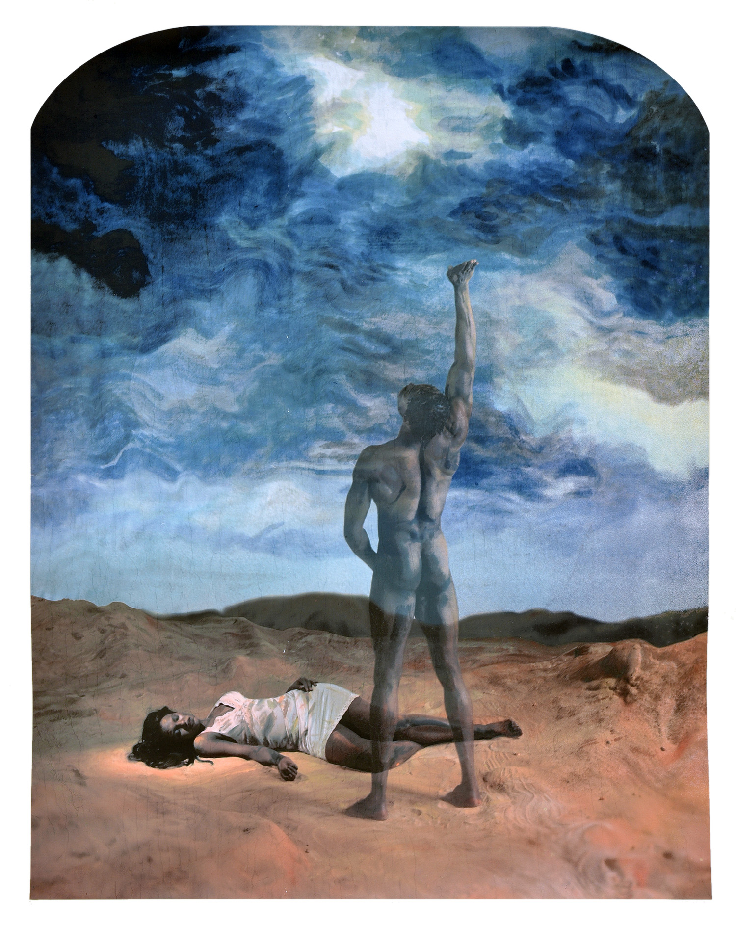
' 2004")
 'Adventure Series (no. 2)' 2004")
' c. 1916/17")
' c. 1916/17")
 'Wiggle Side Chair' 1972")

 'Chair 'Wooden Chair'' Sydney, 1988")


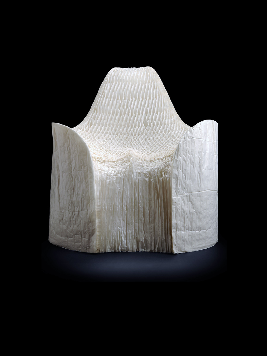
 'Chair 'Floris'' Wuppertal, 1967")
 'Jim' 2010")
 'Prowse' 2010")
 'Aristide' 2010")
 'Eddie' 2010")

You must be logged in to post a comment.