Tom Butler Tucker 2014 Gouache on albumen print / Cabinet card 16.5 x 10.5cm
Phenomenal, wondrous!
The original video from The Photographers’ Gallery that was in this posting is unfortunately no longer available. I have replaced it with a few images of hand-painted cabinet cards by Tom Butler from 2014, examples of which were in the missing video.
Dr Marcus Bunyan
Tom Butler Locke 2014 Gouache on albumen print / Cabinet card 16.5 x 10.5cm
Tom Butler Jackson 2014 Gouache on albumen print / Cabinet card 16.5 x 10.5cm
The Photographers’ Gallery
16-18 Ramillies Street,
London W1F7Lw
Curators: Professor Hubertus Gaßner and Luisa Pauline Fink
Installation view of Feuerbach’s Muses – Lagerfeld’s Models at Hamburger Kunsthalle
Don’t give up your day job
From the sublime (Feuerbach) to the downright awful (Lagerfeld).
From gorgeous, sensitive portrait paintings of women, full of detail and texture, colour and stillness to what I would term soft-cock porn. Fashion influenced, hyper airbrushed faces; Saint Sebastian poses referencing classical ideals of male beauty (done so much more authentically and grittily by Baron Wilhelm von Gloeden), all staged in sylvan settings. Then printed onto silver- and gold-coloured fabric. Can’t wait to see that…
Not absolutely fabulous, just absolutely hideous.
Dr Marcus Bunyan
Many thankx to Hamburger Kunsthalle for allowing me to publish the art work and photographs in the posting. Please click on the photographs for a larger version of the image.
Installation views of Feuerbach’s Muses – Lagerfeld’s Models at Hamburger Kunsthalle
Iphigenia (Greek mythology) the daughter of Clytemnestra and Agamemnon; Agamemnon was obliged to offer her as a sacrifice to Artemis when the Greek fleet was becalmed on its way to Troy; Artemis rescued her and she later became a priestess.
From February 2014 the Hamburger Kunsthalle is presenting an unusual double exhibition on beauty, eroticism and the adoration of muses and models that brings together paintings by Anselm Feuerbach and hit her to unseen photographs by Karl Lagerfeld. In a similar way both Feuerbach and Lagerfeld seek an actualisation of an ideal of timeless beauty founded in the ancient world. The exhibition examines the cult of beauty, which stylises the model to an icon. Over forty works by Feuerbach, most of them from the years 1860-70, will be on show. They are loans from the Feuerbachhaus Speyer and from numerous German, Swiss and Austrian museums ad private collections. Karl Lagerfeld has created a series of around sixty black-and-white photographs specially for the exhibition. Mostly in large formats, they have been printed in a complex procedure onto silver- and gold-coloured fabric.
Anselm Feuerbach (1829-80) one of the most important German painters of the late nineteenth century, lived in Rome from 1856 onwards. The city, with its magnificent architecture and heroic surrounding landscape, was a place of yearning that seemed eligible like no other to revive the classical ideal of ancient times. Feuerbach devoted himself to antique subject matter, which he filled with imagination and personal feeling. This is most excitingly shown in the series of unique portraits, begun in 1860, which portray Feuerbach’s model and muse, Anna Risi, known as Nanna. Feuerbach painted Nana in a wide variety of roles and sensitively staged settings that reveal an almost cultic veneration for his model. When Nanna left Feuerbach in 1865, she was followed by Lucia Brunacci. Similarly to Nanna she matched the classical ideal of beauty of the time, with her Greek profile and thick dark hair. Lucia inspired Feuerbach to impressive portrayals of mythological themes that form the highpoint of his ouevre.
‘Happy is he whom the muses love’, wrote the Greek poet Hesiod, and so the muses are a symbol of the higher power that is needed, according to the ancients, to be creative. The photographic series Modern Mythology (2013) by Karl Lagerfeld, explores the love story of Daphnis and Chloe, and shows models such as Baptiste Giabiconi and Bianca Balti, who have accompanied Lagerfeld in his work for several years. The story, by the poet Longus, tells of a boy and a girl who grow up without parents among shepherds and over the years develop a strong affection for one another. The narration has been taken up many times since the Renaissance. Lagerfeld’s photographs belong to a series of works by Pierre Bonnard, François Boucher or Aristide Maillol which present the ancient text as a symbol of the idyllic life. Karl Lagerfeld’s stagings were shot against the picturesque natural background of the South of France, and are the actualisation of an ancient theme.
The exhibition is accompanied by two publications: the catalogue on Anselm Feuerbach is published jointly with the Museum Wiesbaden and introduces Feuerbach’s paintings and drawings from an art-historical perspective; the second book combines Karl Lagerfeld’s photographs and Longus’s mythological narrative of Daphnis and Chloe in a bibliophile volume that will be elaborately produced by the publisher Gerhard Steidl.
Curators: Professor Hubertus Gaßner and Luisa Pauline Fink
Press release from the Hamburger Kunsthalle website
I loved Sugimoto’s time lapse movie screens, where the exact length of a movie was captured by the open lens of the camera, the substance of time and space evidenced by a seemingly empty screen. There was something wonderfully poetic and transformational about that gesture, about the notion of compressing the narrative, reality and action of a movie into a single frame of light: “the ‘annihilation of time and space’ as a particular moment in a dynamic cycle of rupture and recuperation enables a deliberate focus on the process of transition.”1 The process of transition in the flow of space and time.
Sugimoto’s art since that ground breaking body of work has been a bit of a let down. Where the movie theatres photographs were transubstantiationalist, the three series presented here – Dioramas (1975-1994), Portraits (1999) and his newest series, Photogenic Drawings (2008-present) play, if that is the right word, with the re/animation of death. The stuffed animals, the wax figures, the redrawing of William Henry Fox Talbot photogenic drawings, the redrawing of a light already past, just seem DEAD to me – a kind of double death or even triple death – the death of the animal / the death of the photograph, the unreality (the undead) of the wax figures and their death in the photograph, the death of the plant, their capture not once but twice by the death of the photograph. We know exactly what Sugimoto is doing, but the images are stilted and lifeless and I am not convinced by them.
The diorama images are just OK – almost good undergraduate work but nothing more. My problem with the waxworks images and the pencil of nature is “other images”. We all know Cindy Sherman and her images of historical figures, and we know the work of William Henry Fox Talbot. Somehow these earlier images crowd Sugimoto’s work in a way that doesn’t often happen. Winogrand never crowded Friedlander or vice versa – and you can think of many other examples where comparing is actually beneficial… but not here.
I’m not saying Sugimoto is derivative but because of these other works, they don’t have much room to move. Indeed, they hardly move at all. They are so frozen in attitude that all the daring transcendence of light, the light! of space time travel, the transition from one state to another, has been lost. The Flame of Recognition (Edward Weston) – has gone.
Dr Marcus Bunyan
1/ McQuire, Scott. The Media City. London: Sage Publications, 2008, p. 14.
Many thankx to the J. Paul Getty Museum for allowing me to publish the photographs in the posting. Please click on the photographs for a larger version of the image.
Since the mid-1970s, Hiroshi Sugimoto (Japanese, born 1948) has used photography to investigate how history pervades the present. Featuring photographs of habitat dioramas, wax portraits, and early photographic negatives, Hiroshi Sugimoto: Past Tense, on view February 4 – June 8, 2014 at the J. Paul Getty Museum, Getty Center, brings together three separate bodies of work that present objects of historical and cultural significance in the collections of various museums. By photographing subjects that reimagine or replicate moments from the distant past and diverse geographical locations, Sugimoto critiques the medium’s presumed capacity to portray history with accuracy.
“This exhibition presents work that inventively reframes objects from the collections of a variety of museums, including from our extensive holdings of prints from the early days of photography,” explains Timothy Potts, director of the J. Paul Getty Museum. “Mr. Sugimoto has generously donated eighteen prints from his recent Photogenic Drawings series, which reprise a selection of important experiments by William Henry Fox Talbot that are in the Getty Museum’s collection.”
Sugimoto’s meticulously crafted prints are the result of a rigorous working method that includes extensive preparatory research, the use of a large-format view camera, and long exposures. Each of his projects is rooted in a sustained exploration of a singular motif and often carried out over many years. The exhibition will present a selection of prints from three bodies of work, Dioramas (1975-1994), Portraits (1999) and, his newest series, Photogenic Drawings (2008-present).
Dioramas
The diorama was first introduced in Paris in 1822 by the stage designer Jacques Louis Mandé Daguerre (French, 1787-1851), who later developed the daguerreotype photographic process. Situated in a darkened room, the first diorama consisted of a large painted scene on a semi-transparent curtain that was illuminated by the opening and closing of skylights and the constant shifting or dimming of lamps to create the impression of movement. In the early 20th century, habitat dioramas in natural history museums became popular, staging creatures in their faithfully replicated “natural” environments.
Sugimoto first encountered elaborate animal dioramas at the American Museum of Natural History after moving to New York in 1974, and began to focus his camera on individual scenes shortly thereafter. Omitting the educational text surrounding each display, the works heighten the illusion that animals such as manatees, wapiti, and sea lions were photographed in their natural habitats. While each photograph appears to be a candid moment captured by an experienced nature photographer, the subjects are – in actuality – depicted in poses they hold indefinitely.
Wax Portraits
While waxworks have a long history, contemporary wax museums can be traced to the French sculptor Marie Grosholz (French, 1761-1850), who achieved success in the Parisian entertainment market by creating waxworks of popular politicians and cultural figures. After moving to London in 1802, she established a commercial enterprise under the name Madame Tussaud, specialising in the production and display of full-length wax figures modelled after commissioned portraits.
Posed against pitch-black backdrops and framed by the camera in a manner suggesting old master portrait-painting traditions, each of Sugimoto’s subjects was captured with a nine-minute exposure that illuminates the finely modelled expressions and the sumptuous costumes. These life-size photographs record likenesses that have been distilled through multiple reproductions of the original sitter. The source material for the wax figures of Henry VIII and his wives is based on 16th-century panel paintings, while the portrait of Queen Victoria’s likeness is taken from a photograph of her from the 1890s, around the time of her Diamond Jubilee celebration.
“Hiroshi Sugimoto’s photographic practice is deeply rooted in a tradition of image making that was developed and perfected during the 19th century,” explains Arpad Kovacs, assistant curator in the Department of Photographs at the J. Paul Getty Museum and curator of the exhibition. “By employing century-old techniques and turning his lens to subjects and compositions that recreate or simulate moments from the past, Sugimoto intimately connects himself to the historical moments depicted.”
Photogenic Drawings
In the early 1830s, William Henry Fox Talbot (English, 1800-1877) began trying to create pictures without the aid of a pencil. After coating small pieces of writing paper with a salt solution and silver nitrate, he successfully captured the outlines of leaves and lace placed on the paper and exposed to sunlight. He continued his experiments with a camera obscura, placing a sheet of paper in this precursor to the camera to produce the first negatives, with highlights and shadows reversed. Talbot called the results of these experiments photogenic drawings.
In 2007, Hiroshi Sugimoto visited the J. Paul Getty Museum to study the earliest photographs in the collection. After photographing some of Talbot’s photogenic drawing negatives, he produced large-scale prints and coloured them with toning agents during the processing to replicate the often-bright hues of the original sheets. The scale of the enlarged prints reveals the fibres of the original writing paper, which create subtle and delicate patterns embedded in the images.
The artist’s gift of eighteen gelatin silver prints from his Photogenic Drawings series significantly enhances the Museum’s holdings of work by Sugimoto. His photographic practice, rooted in a serial approach and primarily concerned with the medium’s relationship to the passage of time, has long been an important source of influence for a younger generation of artists. The prints greatly enhance the Getty Museum’s growing collection of contemporary photographs.
Hiroshi Sugimoto: Past Tense is on view February 4 – June 8, 2014 at the J. Paul Getty Museum, Getty Center. The exhibition will run concurrently in the Center for Photographs with A Royal Passion: Queen Victoria and Photography, an exhibition featuring rare private and public photographs from the Victoria era.
Press release from the J. Paul Getty Museum website
Curators: Organised by Barry Bergdoll (Acting Chief Curator of Architecture and Design, MoMA) and Carole Ann Fabian (Director, Avery Architectural and Fine Arts Library), with Janet Parks (Curator of Drawings & Archives, Avery) and Phoebe Springstubb (Curatorial Assistant, MoMA)
Frank Lloyd Wright (American, 1867-1959) Grouped Towers, Chicago Project 1930 Perspective Pencil on tracing paper 19 x 28 1/4″ (48.3 x 71.8cm) The Frank Lloyd Wright Foundation Archives (The Museum of Modern Art | Avery Architectural & Fine Arts Library, Columbia University, New York)
A change of pace now… some exquisite drawings in this posting about the work of Frank Lloyd Wright. It’s a pity they can’t build a skyscraper such as the beautiful Mile High in Melbourne, instead of all the non-descript towers that are going up all over the place. At least we would then have a masterpiece on our hands.
Dr Marcus Bunyan
Many thankx to MoMA for allowing me to publish the art work and photographs in the posting. Please click on the photographs for a larger version of the image.
Frank Lloyd Wright (American, 1867-1959) Grouped Towers, Chicago Project 1930 Plan of the five towers and shared pedestal Pencil on tracing paper 13 3/4 x 35 3/8″ (34.9 x 89.9cm) The Frank Lloyd Wright Foundation Archives (The Museum of Modern Art | Avery Architectural & Fine Arts Library, Columbia University, New York)
Frank Lloyd Wright (American, 1867-1959) Broadacre City Project 1934-1935 Study for a plan of a highway interchange Pencil and coloured pencil on tracing paper 22 x 35″ (55.9 x 88.9cm) The Frank Lloyd Wright Foundation Archives (The Museum of Modern Art | Avery Architectural & Fine Arts Library, Columbia University, New York)
Frank Lloyd Wright and the City: Density vs. Dispersal celebrates the recent joint acquisition of Frank Lloyd Wright’s extensive archive by MoMA and Columbia University’s Avery Architectural and Fine Arts Library. Through an initial selection of drawings, films, and large-scale architectural models, the exhibition examines the tension in Wright’s thinking about the growing American city in the 1920s and 1930s, when he worked simultaneously on radical new forms for the skyscraper and on a comprehensive plan for the urbanisation of the American landscape titled “Broadacre City.” Visitors encounter the spectacular 12-foot-by-12-foot model of this plan, which merges one of the earliest schemes for a highway flyover with an expansive, agrarian domain.
Promoted and updated throughout Wright’s life, the model toured the country for several years in the 1930s, beginning with a display at Rockefeller Center. This dispersed vision is paired with Wright’s innovative structural experiments for building the vertical city. Projects, from the early San Francisco Call Building (1912), to Manhattan’s St. Mark’s-in-the-Bouwerie Towers (1927-1931), to a polemical mile-high skyscraper, engage questions of urban density and seek to bring light and landscape to the tall building. Highlighting Wright’s complex relationship to the city, the material reveals Wright as a compelling theorist of both its horizontal and vertical aspects. His work, in this way, is not only of historic importance but of remarkable relevance to current debates on urban concentration.
Text from the MoMA website
Frank Lloyd Wright and his assistant Eugene Masselink installing the exhibition Frank Lloyd Wright: American Architect at The Museum of Modern Art, November 13, 1940 – January 5, 1941. Photographic Archive. The Museum of Modern Art Archives, New York Photo: Soichi Sunami
Frank Lloyd Wright (American, 1867-1959) Broadacre City Project 1934-1935 Model under construction in Chandler, Arizona, 1935 Gelatin silver print on paper 4 1/4 x 6 5/8″ (10.8 x 16.8cm) The Frank Lloyd Wright Foundation Archives (The Museum of Modern Art | Avery Architectural & Fine Arts Library, Columbia University, New York) Photo: Roy E. Peterson
Frank Lloyd Wright (American, 1867-1959) Broadacre City Project 1934-1935 Taliesin fellows working on the model. Chandler, Arizona, 1935 Gelatin silver print on paper 9 9/16 x 7″ (24.3 x 17.8cm) The Frank Lloyd Wright Foundation Archives (The Museum of Modern Art | Avery Architectural & Fine Arts Library, Columbia University, New York)
Frank Lloyd Wright (American, 1867-1959) Broadacre City Project 1934-1935 Model in four sections Painted wood, cardboard, and paper 152 x 152″ (386.1 x 386.1cm) The Frank Lloyd Wright Foundation Archives (The Museum of Modern Art | Avery Architectural & Fine Arts Library, Columbia University, New York)
Frank Lloyd Wright (American, 1867-1959) H. C. Price Company Tower, Bartlesville, Oklahoma 1952-1956 Apprentices working on the model in the Taliesin drafting room. Spring Green, Wisconsin, c. 1952 Gelatin silver print on paper 7 3/4 x 9 1/2″ (19.7 x 24.1cm) The Frank Lloyd Wright Foundation Archives (The Museum of Modern Art | Avery Architectural & Fine Arts Library, Columbia University, New York)
The Museum of Modern Art presents Frank Lloyd Wright and the City: Density vs. Dispersal, which celebrates the recent joint acquisition of Frank Lloyd Wright’s extensive archive by MoMA and Columbia University’s Avery Architectural and Fine Arts Library, on view from February 1 to June 1, 2014. Frank Lloyd Wright (1867- 1959) – perhaps the most influential American architect of the 20th century – was deeply ambivalent about cities. For decades, Wright was seen as the prophet of America’s post–World War II suburban sprawl, yet the dispersed cities that he envisaged were also carefully planned – quite distinct from the disorganised landscapes that often developed instead. Paradoxically, Wright was also a lifelong prophet of the race for height that has played out around the world. Through an initial selection of drawings, films, and large-scale architectural models, the exhibition examines the tension in Wright’s thinking about the growing American city from the 1920s to the 1950s, when he worked simultaneously on radical new forms for the skyscraper and on a comprehensive plan for the urbanisation of the American landscape titled “Broadacre City.” The exhibition is organised by Barry Bergdoll, Acting Chief Curator of Architecture and Design, MoMA, and Carole Ann Fabian, Director, Avery Architectural and Fine Arts Library, with Janet Parks, Curator of Drawings & Archives, Avery Architectural and Fine Arts Library, and Phoebe Springstubb, Curatorial Assistant, Department of Architecture and Design, MoMA.
On view is Wright’s 1934-35 manifesto project, for what he called “Broadacre City,” which embodied his quest for a city of private houses set in nature and spread across the countryside. He believed that advances in technology had rendered obsolete the dense cities created by industry and immigration in the late 19th and early 20th centuries. Distributed along a rectilinear grid, these one-acre homesteads were to be combined with small-scale manufacturing, community centers, and local farming, and interspersed with parklands to form a carpet-like pattern of urbanisation. Visitors encounter the spectacular 12-foot-by-12-foot model of this plan, which merges one of the earliest schemes for a highway flyover with an expansive, agrarian domain. Promoted and updated throughout Wright’s life, the model toured the country for several years in the 1930s, beginning with a display at New York City’s Rockefeller Center. It is juxtaposed with the monumental models and drawings produced of his skyscraper visions: the six-foot tall model of his 1913 San Francisco Call Building; the model of his only built residential tower, the Price Tower, in Bartlesville, Oklahoma of 1952-56; and the eight-foot drawings of the Mile High tower project.
This dispersed vision is paired with Wright’s innovative structural experiments for building the vertical city, which engaged questions of urban density and sought to bring light and landscape settings to tall buildings. His ambitions grew from a 24-story design for the offices of the San Francisco Call newspaper (1913) to the 548-story, mile-high tower he envisioned in Chicago (1956) – a building large enough to house the entire population of Broadacre City. Wright’s proposal for the San Francisco Call Building celebrates verticality: repeated piers emphasise the height, drawing the eye up to a startlingly cantilevered cornice pierced with slots that frame the sky and allow daylight to wash the facades for dramatic effect. His design for the National Life Insurance Company Building (1924-1925) features a tower clad entirely in glass, setting aside the load-bearing frame of the Call Building to experiment with the curtain wall and other new building technologies. The project reveals Wright as a key participant in international debates on the possibility of cladding a tall building with a transparent glass facade, rather than cladding it in ornamental masonry for decorative effect.
An unregulated building boom in the 1920s in New York and Chicago resulted in an unprecedented urban density that Wright described as “congestion.” In response, he devised the Skyscraper Regulation – a set of design rules governing the lateral and vertical growth of American cities. By regulating the location and height of tall buildings, Wright sought to optimise light and views and to minimise the effects of closely spaced tall buildings that were turning urban streets into shadowy canyons. Wright’s Skyscraper Regulation was his last attempt to address the inherited city. He would turn instead to devising a set of regulations for an entirely new and dispersed urban fabric (Broadacre City), in which the unit of the city block was exchanged for the farmed acre.
In 1927, Wright’s design for the financially troubled Church of St. Mark’s-in-the-Bowery dramatically transformed the building by having the floors project outward from a single central core plunged deep into the ground. The concrete floors tapered toward the periphery, which he compared to the structural concept of the “taproot” of a tree. This “taproot” structure was finally tested in built form in the S.C. Johnson & Son Research Laboratory Tower (1943-1950) in Racine, Wisconsin. In 1956, Wright unveiled a 26-foot-tall rendering of a gleaming, vertiginously tapered skyscraper – which he said would house 100,000 employees of the state of Illinois. The mile-high tower adopts the “taproot” structure he had articulated 30 years before, in which a skyscraper’s vertical ascent is stabilised by a foundation plunged deep into the ground. Both a polemic and a rationalised proposal for the future of tall buildings, the Mile High marks the definitive return of Wright’s tower to the city. The Mile High embodies Wright’s paradoxical attitude toward the American city: meant to condense the experience of urban life and work within a single telescoping form, freeing the ground for the realisation of Broadacre, holding in tension two idealized images of the city – its extraordinary vertical reach and its extreme horizontal extension.
Press release from the MoMA website
Frank Lloyd Wright (American, 1867-1959) National Life Insurance Company Building, Chicago Project 1924-1925 Axonometric view Coloured pencil on tracing paper 40 x 24″ (101.6 x 61cm) The Frank Lloyd Wright Foundation Archives (The Museum of Modern Art | Avery Architectural & Fine Arts Library, Columbia University, New York)
Frank Lloyd Wright (American, 1867-1959) S.C. Johnson & Son Inc. Research Laboratory Tower, Racine, Wisconsin 1943-1950 Section Pencil, coloured pencil, and ink on tracing paper 35 1/8 x 20″ (89.2 x 50.8cm) The Frank Lloyd Wright Foundation Archives (The Museum of Modern Art | Avery Architectural & Fine Arts Library, Columbia University, New York)
Frank Lloyd Wright (American, 1867-1959) St. Mark’s-in-the-Bouwerie Towers, New York Project 1927-1931 Aerial perspective Pencil and coloured pencil on tracing paper 23 3/4 x 15″ (60.3 x 38.1cm) The Museum of Modern Art, New York. Jeffrey P. Klein Purchase Fund, Barbara Pine Purchase Fund, and Frederieke Taylor Purchase Fund
Frank Lloyd Wright (American, 1867-1959) St. Mark’s-in-the-Bouwerie Tower, New York Project 1927-1931 Perspective, 1928 Pencil and coloured pencil on tracing paper 28 1/4 x 10 1/8″ (71.8 x 25.7cm) The Frank Lloyd Wright Foundation Archives (The Museum of Modern Art | Avery Architectural & Fine Arts Library, Columbia University, New York)
Frank Lloyd Wright (American, 1867-1959) St. Mark’s-in-the-Bouwerie Tower, New York Project 1927-1931 Section and perspective cutaway of a duplex apartment with balcony and living-room floor plans, 1929 Ink, pencil, and coloured pencil on linen window shade 47 x 35″ (119.4 x 88.9cm) The Frank Lloyd Wright Foundation Archives (The Museum of Modern Art | Avery Architectural & Fine Arts Library, Columbia University, New York)
Frank Lloyd Wright (American, 1867-1959) The San Francisco Call Building Project 1913 Preliminary perspective Pencil, coloured pencil, and cut-and-pasted tracing paper on paper 47 3/4 x 23 7/8″ (121.3 x 60.6cm) The Frank Lloyd Wright Foundation Archives (The Museum of Modern Art | Avery Architectural & Fine Arts Library, Columbia University, New York)
Frank Lloyd Wright (American, 1867-1959) The Mile High Illinois, Chicago Project 1956 Perspective with Wright’s Golden Beacon Apartment Building project (1956-1957) Pencil, coloured pencil, ink, and gold ink on tracing paper 105 x 30″ (266.7 x 76.2cm) The Frank Lloyd Wright Foundation Archives (The Museum of Modern Art | Avery Architectural & Fine Arts Library, Columbia University, New York)
The Museum of Modern Art 11 West 53 Street New York, NY 10019 Phone: (212) 708-9400
Opening hours: 10.30 am – 5.30 pm Open seven days a week
A wonderful energy, a wonderful artist, a wonderful human being – sadly missed!
Marcus
Published on April 23, 2014
Interview filmed on the occasion of the solo exhibition Space and Gravity by Mari Funaki at Klimt02 Gallery in Barcelona in February 2008. The artist talks about her work, the process of work: drawing, breaking predictability, her gallery and steel and black concept.
Art Smith (American, 1917-1982) “Modern Cuff” Bracelet Designed c. 1948 Silver 1 5/8 x 2 1/2 x 4 in. (4.1 x 6.4 x 10.2cm) Brooklyn Museum, Gift of Charles L. Russell
Very much of their time, these beautiful, understated pieces of anamorphic jewellery are exquisitely designed and crafted objets d’art.
Dr Marcus Bunyan
Many thankx to the Cincinnati Art Museum for allowing me to publish the art work in the posting. Please click on the photographs for a larger version of the art.
Art Smith (American, 1917-1982) “Lava” Bracelet Designed c. 1946 Silver 2 1/2 x 2 5/8 x 5 3/4 in. (6.4 x 6.7 x 14.6cm) Brooklyn Museum, Gift of Charles L. Russell
Art Smith (American, 1917-1982) Autumn Leaves Brooch 1974 Gold, jade 1/2 x 3 x 1 3/4 in. (1.3 x 7.6 x 4.4cm) Brooklyn Museum, Gift of Charles L. Russell
Art Smith (American, 1917-1982) Untitled 1948-1979 Wood, paint, copper Brooklyn Museum, Gift of Charles L. Russell
It will be a feast for the eyes of those who appreciate jewellery this Spring in the Queen City. The spirit of craft and its revival will shine through in large scale, highly sculpted pieces of jewellery created by Art Smith and his contemporaries in From the Village to Vogue: The Modernist Jewelry of Art Smith, February 22, 2014 through May 18, 2014.
This exhibition features twenty-four pieces of silver and gold jewellery created by African American artist Art Smith, as well as more than forty pieces by his contemporaries, including Sam Kramer, Margaret De Patta, and Harry Bertoia. Three pieces of jewellery by Alexander Calder, who influenced many of these artists/jewellers, will also be featured in this exhibition. This exhibition was organised by the Brooklyn Museum of Art and the Cincinnati Art Museum is the first to host this exhibition. It will then continue to the Dallas Museum of Art and the High Museum of Art in Atlanta, Georgia.
Inspired by surrealism, biomorphism and primitivism, Art Smith (1917-1982) was one of the leading modernist jewellers of the mid-twentieth century. Early in his career, Smith met Talley Beatty, a young black dancer and choreographer, who introduced him to the world of dance, in particular the salon of Frank and Dorcas Neal. It was there that he met several prominent black artists, including writer James Baldwin, musician and composer Billy Strayhorn, singers Lena Horne and Harry Belafonte, actor Brock Peters, and painter Charles Sebree. Smith began to create pieces for dance companies, who in turn, encouraged him to design on a grander scale. This experience is evident in the scale of his mature work.
In 1946, Smith opened his own studio in Greenwich Village and started selling his jewellery. He soon caught the attention of buyers in Boston, San Francisco, and Chicago. In the early 1950s, Smith received pictorial coverage in both Harper’s Bazaar and Vogue and was mentioned in The New Yorker shoppers guide, “On the Avenue”. Smith soon established business relationships with Bloomingdales, Milton Heffling in Manhattan, James Boutique in Houston, L’Unique in Minneapolis and Black Tulip in Dallas. While his earlier work was executed primarily in copper and brass, because it was less expensive, growing recognition increased sales and special commissions for custom designs. This allowed him to begin producing more work in silver. He received a prestigious commission from the Peekskill, New York chapter of the NAACP, for example, to design a brooch for Eleanor Roosevelt. He was even commissioned to design a pair of cufflinks for Duke Ellington, whose music he often listened to while working.
Included in the exhibition are major works by Smith including his famous Patina Necklace (c. 1959). Worked in silver, it is an example both of the large scale of his jewellery and of his use of asymmetry. Alexander Calder’s influence is also clear in this piece. From the curved structure that wraps the neck, two pierced ellipses dangle over the breastbone, giving the necklace a kinetic energy that enlivens the piece. With a sculptor’s sensitivity, Smith emphasised negative space in his designs and viewed the human body as an armature for his creations. He considered his jewellery incomplete until it rested on the human structure.
According to Cincinnati Art Museum interim Chief Curator Cynthia Amnéus, “Working in the heart of Greenwich Village, Smith was influenced by jazz musicians like Charlie Parker, visual artists like Robert Motherwell, and the poetry readings of Beat Generation writers like Alan Ginsberg. Smith’s work, like that of his contemporaries, appealed to an artistic and intellectual clientele. These artisans were not concerned with making pretty jewellery. They created works of art that were meant to be worn on the body.”
Press release from the Cincinnati Art Museum website
Art Smith (American, 1917-1982) Linked Oval Necklace Designed by 1974 Silver, amethyst quartz 11 x 10 1/2 x 1/2 in. (27.9 x 26.7 x 1.3cm) Brooklyn Museum, Gift of Charles L. Russell
Art Smith (American, 1917-1982) Triangle Necklace c. 1969 Silver, turquoise, lapis lazuli, rhodochrosite 16 1/8 x 5 1/8 x 1/2 in. (41.0 x 13.0 x 1.3cm) Brooklyn Museum, Gift of Charles L. Russell
Art Smith (American, 1917-1982) Ellington Necklace c. 1962 Silver, turquoise, amethyst, prase, rhodonite 16 7/8 x 9 7/8 x 3/4 in. (42.9 x 25.1 x 1.9cm) Brooklyn Museum, Gift of Charles L. Russell
Art Smith (American, 1917-1982) New Orleans Necklace c. 1962 Silver, three semiprecious stones: Labradorite (?) 8 5/8 x 5 7/8 x 3/4 in. (21.9 x 14.9 x 1.9cm) Brooklyn Museum, Gift of Charles L. Russell
Art Smith (American, 1917-1982) “Bauble” Necklace c. 1953 Silver, colourless quartz 9 1/8 x 4 7/8 x 1/2 in. (23.2 x 12.4 x 1.3cm) Brooklyn Museum, Gift of Charles L. Russell
Peter Basch (American, 1921-2004) Model Wearing Art Smith’s “Modern Cuff” Bracelet c. 1948 Black-and-white photograph 13 3/4 x 103/4 in. (34.9 x 27.3cm) Courtesy of Brooklyn Museum
Cincinnati Art Museum 953 Eden Park Drive Cincinnati, OH 45202 Phone: 513-639-2872
Opening hours: Tuesday through Sunday, 11am – 5pm The Art Museum is closed on Mondays
The premise, spelt out in the intelligent and articulate catalogue essay by Laura Skerlj (below), is the holistic connection between an Aboriginal stone circle of the Western Victorian Volcanic Plains used for astronomy > the moles on the artists back as lexias or nodal points of energy > and the energy of celestial bodies in the cosmic sky, arranged by humans into pictures.
Evans precariously suspends pieces of rock (taken from near the site of the Aboriginal stone circle) in the air on the end of long poles in the position of the moles on her back – and then maps out the energy lines between them, connecting them with translucent Sellotape on the gallery wall. These lines become a trans/figured form of ley line, those lines of energy that exist within the earth that link spiritual places together. The lines could also be linked to reflexology, chakras, the positioning of stones on the body in reiki healing and Kundalini: a form of feminine shakti or “corporeal energy”, an unconscious, instinctive or libidinal force.
As the press release notes, “Standing Stone encompasses both the geographic and the corporeal time scales in order to examine the latent histories of these materials – that traverse the mineral to organic, the human and geologic, the infinite to the micro. At once personal and universal, Standing Stone opens up compelling new dialogues about the body and materiality.”
The work traverses both time and space, macro and micro. It undermines dichotomies and makes liminal connections which allows the viewer to embrace a quality of ambiguity or disorientation. Ultimately this lets them see the world and the cosmos from different, multiple perspectives via new associations and energies.
There are a couple of missed steps. The colour pink (associated with the flesh of the body) on the poles did not really work for me. It was too didactic. Better some translucent perspex rods that would have continued the theme of the Sellotape and would have made the rocks seem to float in the air more, made the balancing more ambiguous. Both the press release (“the raw materials of photography, such as unprocessed photographic paper exposed to ambient light”) and the catalogue essay (“Flesh-pink geometric shapes, made from unprocessed (and still-processing) photographic paper, provide platforms for rock-relics: two materials accumulating time at vastly different rates”) make reference to elements that were not in the exhibition. Flesh pink geometric shapes were to be placed under rocks on the ground and this would have made the flesh pink rods seem more logical and tied the exhibition together… but they were not necessary. While the installation of such a work is always going to be a fluid process, and the pared down version is ultimately a lot better, it is unfortunate that the catalogue had been printed and the press release not amended to reflect the changes. Such is energy and life.
The other element that envisioned a jarring note was the image of the bruise on the thigh of the artist (which I initially thought was an elbow). A beautifully ambiguous image in its own right I can see why Catherine included it in the exhibition (as it links specifically to the energy of the moles on her back), but it brought to my mind issues of domestic violence, control and power, and I don’t know whether these additional thoughts needed to be placed in the mind of the viewer. I loved the image, I liked some of its energies but others, not so much.
Having said all that, this is a fascinating, intelligent, thoughtful and beautiful installation. Like the artist herself, it has great energy and presence. I really enjoyed spending time with both.
Dr Marcus Bunyan
Many thankx to Catherine Evans for allowing me to publish the photographs in the posting and to Laura Skerlj for allowing me to publish the catalogue essay. Please click on the photographs for a larger version of the image. All artworks courtesy of the artist, installation documentation by Matthew Stanton, 2014
Standing Stone is an exhibition of photographs and sculpture that transposes the marks on our own bodies into a large-scale map using basalt boulders, sticky tape and the raw materials of photography, such as unprocessed photographic paper exposed to ambient light.
In this exhibition the artist will create a large-scale constellation where precariously suspended volcanic rocks collected from the Western Victorian Volcanic Plains mark the positions of moles on the artist’s own back. With reference to the Indigenous stone arrangement, Wurdi Youang,* that is situated on these plains, Standing Stone encompasses both the geographic and the corporeal time scales in order to examine the latent histories of these materials – that traverse the mineral to organic, the human and geologic, the infinite to the micro. At once personal and universal, Standing Stone opens up compelling new dialogues about the body and materiality.
This exhibition is the outcome of a mentorship with artist Susan Jacobs, supported by the Victorian College of the Arts and Arts Victoria through its Graduate Mentorship program. Accompanying the exhibition will be an essay by Laura Skerlj.
About the artist
Catherine Evans is a Melbourne-based artist who incorporates photography, video and sculpture to explore the latent history of materials. Often working with volcanic rocks and the raw materials of photography, she juxtaposes and isolates them against images of the body, testing the limits of scale and gravity.
Since completing first class Honours at the Victorian College of the Arts in 2011, Catherine has participated in many group and solo exhibitions. She is a current recipient of the inaugural VCA Graduate Mentorship (2013-2014) and was selected as a finalist in the Substation Contemporary Art Prize (2013 and 2011). Grants include an Australia Council ArtStart grant (2012) and a National Gallery of Victoria Trustee Award (2010).
Press release from Blindside
This exhibition and research took place on the lands of both the Wurundjeri and Wathaurong people who have been the traditional custodians of these lands for thousands of years, and whose sovereignty was never ceded. This exhibition is supported by the Victorian College of the Arts and Arts Victoria through its Graduate Mentorship program.
*The Wurdi Youang stone arrangement in Victoria was built by the Wathaurung people before European settlement, but all records of its use have now disappeared. This egg-shaped ring of stones, about 50m in diameter, has its major axis almost exactly East-West. In a paper published in May 2013 in Rock Art Research, Ray Norris and his colleagues confirm a suggestion (originally made by John Morieson) that some outlying stones seem to indicate the setting positions of the Sun at the equinoxes and solstices, and have shown that these same astronomically significant directions are built into the shape of the main ring. They also show, using a Monte Carlo statistical test, that this is unlikely to have occurred by chance, but instead the builders of this stone ring intentionally aligned it on the setting Sun on these astronomically significant dates.
We have long looked skyward, consumed by a desire to arrange celestial bodies into pictures. Sometimes these formations are difficult to see amid the city’s night-haze of light and pollution. Yet, on a drive out of town, these cosmic arrangements come into view. Constellations describe a visual relationship between groups of stars, which, over time, become culturally recognisable. To make a constellation, a dreamer must draw a line from one bright body to the next: the stars implicated in this formation need not be close to one another in reality, but merely form a visual engagement when viewed from an Earthly vantage point. For millennia, ancient cultures have made these connections, constructing apparitions in the ether that recall existential stories. However, these cosmic sketches have also served as insightful gauges of time.
In the volcanic plains of Western Victoria – the third largest of its kind in the world – lies a geological constellation. It is an Indigenous ‘map’ made of ancient stones, named by the Wathaurong people as Wurdi Youang. This egg-shaped arrangement is relatively humble in size, and up until recently was thought to be an initiation site. However, Wurdi Youang is now being considered a geological record of equinoxes and solstices, with each stone set at a considered angle, marking the movements of the sun over time.1 For artist Catherine Evans, this cosmic calendar held within it a latent agency that was both intimate and expansive. Through its very construction, the Indigenous peoples of the area had used a prehistoric material to articulate a schema that connected themselves, and their activities, with the unreachable workings of the universe: “I find the contrast in time scales at this site fascinating – that on the one hand we have an ancient time scale of the land (geologic), and on the other the human time scale, which in comparison is only a blip.”2
In Evans’ current exhibition, Standing Stone, the artist has used rocks from the plains nearby Wurdi Youang to recreate a constellation of markings found on her own body. The layout for these marks was initially realised on an inverted black and white photograph Evans took of her back: in this image, her usually pale skin appears darker than its illuminated blemishes. Using a biro and ruler, moles and freckles were connected with diagrammatic lines, just as planets, stars and dark nebula are drawn to one another in astronomical illustrations. In the exhibition, this exact configuration of blemishes is re-presented using volcanic rocks in a sculptural installation. Across the walls and floor, each point is connected with a gleaming line of transparent cello-tape.
Here, two seemingly opposing containers of time – the body and the universe – are depicted as insulated, yet reflexive, systems. Just as skin imperfections are reminders of age, trauma, exposure and adaptation, the individual rocks at Wurdi Youang are conscious notations of the sun’s movements in the sky. Each rock or blemish represents a passed event that, in conjunction, forms the schema for a cosmos. Although more commonly understood as the extraterrestrial zone outside the Earth’s atmosphere (and therefore, outside of ourselves), the etymology of ‘cosmos’ is derived from the less-boastful ‘ornament’: a sphere seen as ultimately expansive is reined into a handheld trinket. This oscillation becomes an underlying consideration in Evans’ new work, as temporality swings between what is known, even embodied, and what is all encompassing.
In understanding these holistic systems, we can draw on biosemiotician Jakob von Uexküll’s concept of ‘umwelt’. Umwelt describes the ‘phenomenal world’ or ‘self world’ of an animal, as shaped by a series of functions necessary for survival. These sets of functions are programmed to suit each specific organism, creating a harmonious motion, or pattern, for existence. In consequence, all animals, from the simplest to the most complex, are fitted into their unique worlds with equal completeness: “A simple world corresponds to a simple animal, a well-articulated world to a complex one.”3 From this theory, both the humble body and the celestial sphere could be seen to exist within an umwelt, or environment, tuned to its innate processes.
In Evans’ work, it is the configuration of a constellation that represents these sets of motions as markers on a temporal scale. For example, the blemishes found on our bodies, or the rocks moved by Indigenous people at Wurdi Youang thousands of years ago, exist in perfect accord with each organism, or system’s, relative lifespan. That could be a sunspot the artist developed one summer, 17 years into her life, or the fusion of gases that combined to form a star 13 billion years ago in the Milky Way’s galactic halo. As Uexküll explains, the animal or subject creates time through its own set of harmonious processes, no matter how simple or complex: “Instead of saying… that without time, there can be no living subject, we shall now have to say that without a living subject, there can be no time.”4
The visualisation of these essential movements is euphonious. Feminist and cultural theorist Elizabeth Grosz articulated Uexküll’s umwelt as nature set to counterpoint.5 In her interpretation, the environment works in a similar way to a musical melody, following a set of instructions that can be syncopated with another. She recalls one of Uexküll’s most examined specimens, the tick, describing the way in which it “lives in a simplified world, a harmonic world of its own rhythms and melody.”6 This melody, according to Grosz, is composed of the animal’s umwelt, as the conjunction of its three most vital processes: moving up a twig following the warmth of the sun; smelling the butyric acid expelled from the sweat of an animal; dropping onto the animal to suck its blood. In turn, the tick becomes what she describes as “a connective, an instrument.”7
This musicality is innate within Evans’ new work. Here, rocks intonate the room, propped at varied heights like notes on musical score, while reflective tape connects the specimens to one another in directional locomotion. Flesh-pink geometric shapes, made from unprocessed (and still-processing) photographic paper, provide platforms for rock-relics: two materials accumulating time at vastly different rates. Just as the vision of celestial space seen at night expands our image of the natural world, the constellation found on the artist’s back is magnified out into the gallery as an assemblage that connects ancient time with personal time. It is within this singular temporal frame that the intimate (that nebula-birthmark on your wrist) is a reflection of the processes that, even now, evade us (tangible stars imagined into dream shapes).
Consequently, Standing Stone envisions landscape as a phenomenological site, where the body and the universe share the same harmonic processes. As British archaeologist Chris Tilley explains, to perceive landscape as phenomenological resists any precise topographical boundary: as we have seen, landscape in its holistic form – as a cosmos – can transcend terrestrial limitations. Instead, he perceives landscape as “embodied sets of relationships between places, a structure of human feeling, emotion, dwelling, movement and practical activity.”8 In this way, Evans presents a landscape that is both intimate and expansive. Just as the celestial exterior looks down upon us, it shifts into us, reflecting back the documents we make. These documents are many, printed on our bodies and arranged in sophisticated groupings in the environment. The constellation, therefore, flips and folds, not just across a horizontal plane, but vertically, between what is cast in the night sky and its earthen recollection.”
Laura Skerlj is a Melbourne-based artist and writer
Curators: Francesco Stocchi and Peter van der Coelen
Installation photograph of the exhibition Brancusi, Rosso, Man Ray – Framing Sculpture Museum Boijmans Van Beuningen, 2014 Foto / Photo: Gert-Jan de Rooij, Amsterdam
What a magnificent exhibition. We all know Brancusi and Man Ray but it is the work of Medardo Rosso that surprises and delights here, an artist I admit I knew nothing about before this posting. What a revelation, both his sculptures and photographs. I must try and do a whole posting just on his photographs!
The two self-portraits of the artists in the studio are telling… Rosso, pensive, brooding, with a stack of chopped wood surrounding him, face wreathed in shadow, head titled slightly down and hands stuffed in pockets; Brancusi, seated on a plinth, legs crossed, swarthy arms folded replete with large hands, staring directly at the camera and surrounded by his work. Rosso in malleable darkness, Brancusi in towering light. The photographs reflect their respective personalities and inform the art which represents them.
Dr Marcus Bunyan
Many thankx to Museum Boijmans Van Beuningen for allowing me to publish the art work in the posting. Please click on the image for a larger version of the art.
Alessio delli Castelliconsiders the Italian sculptor’s photographic legacy.
“Medardo Rosso was born in Turin in 1858 and died in Milan 1928. However, he spent most of his life away from Italy, in Paris especially, from where he travelled to all the major European capitals. It was in Paris that, towards the close of the 19th century, he emerged alongside Auguste Rodin as a serious contender for the title of father of modern sculpture. Yet it was Rodin who achieved universal recognition. In spite of Rosso’s influence on sculptors such as Constantin Brancusi – whose Sleeping Muse (1909-10), with its radically abstracted features of a female head, is strongly reminiscent of Rosso’s Madame X (1896) – he was long held hostage by a provincial criticism which saw his practice confined, chronologically, thematically and formally, to the 19th century. Although it is true that Rosso only created two original sculptural works in the 20th century, to claim that he was no longer a practicing artist would be to overlook the variations he made of his sculptures, and the copies from antiquity. More importantly, it would be to dismiss his photographic work of that period merely as images of sculptures that already existed. This would mean ignoring the fact that his photography showed all the signs of rigorous artistic investigation – and was not, as critics in the 20th century often declared, indicative of either an accident that injured his leg and made him weak or a more general creative block.
It is only in recent years that Rosso’s photographs have acquired the status of art objects in and of themselves…”
Installation photographs of the exhibition Brancusi, Rosso, Man Ray – Framing Sculpture Museum Boijmans Van Beuningen, 2014 Foto / Photos: Gert-Jan de Rooij, Amsterdam
In mythology, Leda is a girl who is seduced by Zeus who turns her into a swan. In the Brancusi sculpture, Leda (foreground, above) is that metamorphosis. The swan is an animal whose body is often associated with a hybrid identity between male and female. His neck is close to a phallic shape while her body has feminine attributes. The bird and woman, male and female mingle in the same sculptural movement. This transfiguration is reflected in the complex forms of sculpture, asymmetrical contours, the offset top shape intersecting with the lower form, giving rise to multiple passages and perceptions.
In 1932, Brancusi sculpture adds a large polished steel disc which suggests the presence of water and Leda is reflected in the mirror which changes its shape. Modifications qu’accentuera still provide a motor and a ball bearing arranged in the circular plate. Within the workshop, the body of Leda is in a state of constant metamorphosis. The shimmer of light on the surface of polished bronze sculpture blends with its reflection in the steel circle and absorbs its environment. Leda becomes a pure luminous presence. Weight and lightness, balance and imbalance are the same event within a continuous time duration in the sculptures of Constantin Brancusi.
Translated from the French on the Constantin Brancusi web page of the Centre Pompidou website [Online] Cited 05/05/2014. No longer available online. Used under fair use conditions for the purposes of education and research
Installation photograph of the exhibition Brancusi, Rosso, Man Ray – Framing Sculpture Museum Boijmans Van Beuningen, 2014 Foto / Photo: Gert-Jan de Rooij, Amsterdam
In the spring of 2014 Museum Boijmans Van Beuningen brings together works from all over the world by three artists who were decisive for the development of modern art. This is the first exhibition to combine sculptures by Brancusi, Rosso and Man Ray together with their photographs, affording a unique insight into the artists’ working methods.
Masterpieces that have rarely or never been seen in the Netherlands will be lent by important museums such as the Centre Pompidou, MoMA and Tate. Museum Boijmans Van Beuningen will show more than 40 sculptures and hundred photographs by Constantin Brancusi (Hobita 1876 – Paris 1957), Medardo Rosso (Turin 1858 – Milan 1928) and Man Ray (Philadelphia 1890 – Paris 1976). The exhibition will feature sculptures such as Brancusi’s Princesse X (1915-1916) and Rosso’s Ecce Puer (1906) alongside works by Man Ray from the museum’s collection, including the sculpture L’Énigme d’Isidore Ducasse (1920 / 1971). Presenting the sculptures together with the artists’ photographs of their sculptures reveals their often-surprising perspectives on their own works.
Framing Sculpture
Brancusi, Rosso and Man Ray employed photography not so much as a means of recording their work. The photographs show how they interpreted their sculptures and how they wanted them to be seen by others. Brancusi is considered the father of modern sculpture with his highly simplified sculptures of people and animals. In his photographs he experimented with light and reflection so that his sculptures absorb their environment and appear to come to life. Rosso is the artist who introduced impressionism in sculpture. The indistinct contours of his apparently quickly modelled figures in plaster and wax make them appear to fuse with their surroundings. Rosso cut up the soft-focus photographs of his work, made them into collages and reworked them with ink so that the sculptures appear even flatter and more contourless. Man Ray is best known as a photographer but was also a painter and sculptor. His choice of materials was unconventional: he combined existing objects to create new works, comparable to the ‘readymades’ of his friend Marcel Duchamp. Man Ray’s experimental use of photography led him to make photographs without the use of a camera. He made these so-called ‘rayographs’ by placing objects directly on photographic paper and exposing them briefly to light, leaving behind a ghostly impression.
Press release from the Museum Boijmans Van Beuningen
Medardo Rosso (Italian, 1858-1928) Enfant à la Bouchée de pain (Child in the soup kitchen) 1897 (1892-1893) Wax over plaster 46 x 49 x 37cm Galleria Nazionale d’Arte Moderna e Contemporanea, Rome
Medardo Rosso (Italian, 1858-1928) Enfant à la Bouchée de pain in the Cézanne room at the Salon d’Automne 1904 Felatin silver print 12.3 x 15.5cm Private collection
The Italian sculptor Medardo Rosso (1858-1928) is the oldest and most traditional of the three artists. He stands in the Impressionist tradition of French sculptor August Rodin. Rosso has made many portraits of children, which he adored. They were one of his favourite subjects. Rosso kept working on the same pieces throughout his career, making changes to their titles, shapes or materials. Sometimes he combined materials or poured another substance over the original. A work of plaster then became a wax sculpture. Other times he made two different versions of the same image, using different materials…
Rosso… used his camera to present his art in the way he preferred. By taking pictures and displaying them next to the actual sculptures he could show the audience what was, in his opinion, the right angle to look at his piece. Of course, everyone is free to walk around the sculpture, but the photographs show what the artist had in mind when he created it. Many times he would cut up his pictures, tear away corners or colour them with ink. This way he even reinterpreted his interpretations. Together the sculptures, photographs and collages give a complete picture of the work by Medardo Rosso. Never before have there been so many of his works on display in the Netherlands.
Text by Evita Bookelmann on the Kunstpedia website [Online] Cited 05/05/2014. No longer available online. Used under fair use conditions for the purposes of education and research
Constantin Brancusi (Romanian, 1876-1957) Tête d’enfant endormi (Head of a Sleeping Child) 1906-1907 Plaster, coloured dark brown 10.8 x 13.6 x 15.2cm Private collection
A previously unknown sculpture by Constantin Brancusi (1876-1957) can be seen in Brancusi, Rosso, Man Ray – Framing Sculpture, the exhibition opening at Museum Boijmans Van Beuningen on Saturday. The museum is especially delighted by the arrival of Tête d’enfant endormie (Head of a Sleeping Child, 1906-07). This early sculpture is an important key work in Brancusi’s development of his famous ‘ovoid’.
The exhibition, which features more than forty sculptures by Constantin Brancusi, Medardo Rosso and Man Ray and a hundred vintage photographs taken by them, runs in Museum Boijmans Van Beuningen for three months from 8 February. The plaster sculpture was purchased at a sale by a French private collector. Leading expert Friedrich Teja Bach has recently confirmed that it is a version of the ‘head of a sleeping child’. Curators Francesco Stocchi and Peter van der Coelen remarked, “It is unusual for a previously unknown work by Brancusi to turn up at a sale. Works by Brancusi are rare and almost all of them are in prominent museum collections like those of the Centre Pompidou, the Tate and MoMA.”
The Road to Abstraction
The child’s head with natural features is in the tradition of the contemporary Impressionists Auguste Rodin and Medardo Rosso. At the same time, this early work is a starting point in Brancusi’s journey towards a more abstract style, which culminated in an entirely smooth oval form, devoid of any facial features. This process can also be seen in the photographs taken by Brancusi himself, in which he pictured Tête d’enfant endormie in his studio with Le Nouveau-Ne II, a work he made ten years later. The exhibition in Rotterdam examines the artistic practices and development of Brancusi, Rosso and Man Ray by showing the sculptures alongside the photographs they took of them.
Painted Bronze
Brancusi’s oeuvre contains a number of recurring subjects, which the artist executed in a variety of materials, including plaster, marble and bronze. This allowed Brancusi to explore various effects, such as the reflection of light. The signed Tête d’enfant endormie is an early version in the series. It is unusual that Brancusi painted the plaster, making it look like bronze.
Press release from the Museum Boijmans Van Beuningen
Man Ray’s Noire et blanche is a photograph exemplary of Surrealist art. The striking faces of the pale model and the dark mask have a doubling effect. This repetition is a reminder that a photograph is a double of what it represents, namely, a sign or an index of reality. In Surrealism the act of doubling indicates that we are all divided subjects made up of the conscious and unconscious. In reading this photograph as typical of primitivism, the woman can be understood as European civilisation and the mask as “primitive” Africa. The image draws a parallel between the two faces presenting them as related to each another. The title “black and white” is a word play because the order is reversed when reading the image left to right. The artist also printed a negative version of this image. The photograph was first published in Vogue. It is a portrait of Kiki of Montparnasse, Man Ray’s lover and model at the time the photograph was taken.
Text from the Stedelijk Museum Amsterdam website [Online] Cited 05/05/2014. No longer available online. Used under fair use conditions for the purposes of education and research
Medardo Rosso (Italian, 1858-1928) Enfant malade (Ziek kind) c. 1909 Aristotype 7.9 x 6.3cm Private collection
Medardo Rosso (Italian, 1858-1928) Enfant malade (Ziek kind) 1895 (1903-1904) Bronze 25.5 x 14.5 x 16.5cm Collectie Galleria d’Arte Moderna, Milan
Con una coerenza assoluta, insensibile alle polemiche e alle controversie che la sua arte suscitava, e più ancora al disprezzo oltraggioso di cui lo faceva segno la cultura ufficiale, il Rosso deduceva alle estreme conseguenze le premesse fondamentali della sua visione. Davanti ai nostri occhi una sgomentante superficie d’ombra da cui emerge la lama trepida e vibrante di un essere vivente, che contesta al nulla misterioso che lo incalza e in cui in un soffio si dissolverà, il suo diritto alla luce, cioè all’essenza vitale. Le premesse letterarie, le suggestioni filosofiche o vagamente esoteriche sono totalmente assorbite nella suprema qualità stilistica: lo scultore modula ed assottiglia la materia al limite del possibile, sull’orlo dell’astrazione assoluta, ricercandone spasmodicamente ogni vibrazione musicale; l’equazione scultura-luce-pittura poteva dirsi verificata.”
“With absolute consistency, insensitive to the controversies and disputes that his art aroused, and even more outrageous contempt of which he did hold official culture, Rosso deduced to the extreme the basic premises of his vision. Before our eyes a daunting shadow surface which shows the blade trembling and vibrating of a living being, which criticises the mysterious anything that presses him and when you blow in a dissolver, its right in the light, that all ‘vital’ essence. The premises literary, philosophical or vaguely esoteric suggestions are totally absorbed in the supreme quality of style: the sculptor modulation and tapering the matter to the extent possible, the absolute brink of abstraction, seeking spasmodically every musical vibration; the equation of light-sculpture-painting could be said to be verified.
Terrible translation by Google translate of an anonymous text = but so beautiful at the same time!
Princess X is a sculptured rendering of the French princess, Marie Bonaparte, by the artist Constantin Brâncusi. Princess Bonaparte was the great-grand niece of the emperor Napoleon Bonaparte…
According to the Philadelphia Museum of Art, Brâncusi had been “at the center of two of modern arts most notorious scandals.” One of the scandals being that the Salon des Indépendants, in Paris where Brâncusi practiced his trade, discontinued the display of Princess X from its establishment for its apparent obscene content, as some thought it looked like a penis. After having his art taken off display, Brâncusi was shocked. He declared the incident a misunderstanding. He had created Princess X not as a sculpture depicting a more masculine subject, but the object of feminine desire and vanity.
After much accusation, Brâncuși insisted the sculpture had been his rendition of Marie Bonaparte. Brâncusi discussed the comparison of the bronze figure to the princess. He described his detest of Marie, as a “vain woman.” He claimed she went as far as placing a hand mirror on the table at mealtimes, so she could gaze upon herself. The sculpture’s C-like form reveals a woman looking over and gazing down, as if looking into an object. The large anchors of the sculpture resemble the “beautiful bust” which she possessed. Without knowing the context, to a viewer Princess X could look like an erect penis. Brâncusi allows the princess to gaze upon herself in an eternal loop locked in the bronze sculpture.
The style of Brâncusi is one that “was largely fuelled by myths, folklore, and primitive culture,” this combined with the modern materials and tools Brâncuși used to sculpt, “formed a unique contrast… resulting in a distinctive kind of modernity and timelessness.” The technique Brâncusi was known for and used on Princess X could be mistaken for a penis, but in fact it was the simple form of a woman.
“What my art is aiming at, is above all realism; pursue the inner hidden reality, the very essence of objects in their own intrinsic fundamental nature: this is my only preoccupation.” – Constantine Brâncusi.
According to Constantin Brancusi’s own testimony, his preoccupation with the image of the bird as a plastic form began as early as 1910. With the theme of the Maiastra (1910-18), he initiated a series of about thirty sculptures of birds.
The word maïastra means “master” or “chief” in Brancusi’s native Romanian, but the title refers specifically to a magically beneficent, dazzlingly plumed bird in Romanian folklore. Brancusi’s mystical inclinations and his deeply rooted interest in peasant superstition make the motif an apt one. The golden plumage of the Maiastra is expressed in the reflective surface of the bronze; the bird’s restorative song seems to issue from within the monumental puffed chest, through the arched neck, out of the open beak. The heraldic, geometric aspect of the figure contrasts with details such as the inconsistent size of the eyes, the distortion of the beak aperture, and the cocking of the head slightly to one side. The elevation of the bird on a saw-tooth base lends it the illusion of perching. The subtle tapering of form, the relationship of curved to hard-edge surfaces, and the changes of axis tune the sculpture so finely that the slightest alteration from version to version reflects a crucial decision in Brancusi’s development of the theme.
Seven other versions of Maiastra have been identified and located: three are marble and four bronze…
Extract from Lucy Flint. “Constantin Brancusi: Maiastra,” on the Guggenheim website [Online] Cited 17/03/2021. Used under fair use conditions for the purposes of education and research
Medardo Rosso (Italian, 1858-1928) Self-portrait in the studio c. 1906 Modern contact print of the original glass negative 12.7 x 13cm Private collection
Brancusi, Rosso, Man Ray – Framing Sculpture exhibition poster
Exhibition dates: 23rd November 2013 – 11th May, 2014
Curator: Russell Storer, Curatorial Manager, Asian and Pacific Art at GOMA
Cai Guo-Qiang (China, b. 1957) Heritage 2013 99 life-sized replicas of animals, water, sand, drip mechanism Installed dimensions variable Commissioned for the exhibition Falling Back to Earth, 2013 Purchased 2013 with funds from Josephine Ulrick and Win Schubert Diversity Foundation through and with the assistance of the Queensland Art Gallery | Gallery of Modern Art Foundation Photo: Queensland Art Gallery | Gallery of Modern Art
99 wolves a leaping 99 replicas of animals a drinking 31-metre suspended eucalyptus tree a leaning 170 tonnes of water a seeping 3,000 square metres of GOMA’s ground floor a taking and not a partridge in a pear tree in sight…
FANTASTIC ART!
Many thankx to the Gallery of Modern Art (GOMA) for allowing me to publish the photographs in the posting. Please click on the photographs for a larger version of the image.
Cai Guo-Qiang (China, b. 1957) Heritage 2013 99 life-sized replicas of animals, water, sand, drip mechanism Installed dimensions variable Commissioned for the exhibition Falling Back to Earth, 2013 Purchased 2013 with funds from Josephine Ulrick and Win Schubert Diversity Foundation through and with the assistance of the Queensland Art Gallery | Gallery of Modern Art Foundation Photos: Queensland Art Gallery | Gallery of Modern Art
Thought-provoking and spectacular new installations inspired by Queensland landscapes will premiere in the first Australian solo exhibition of leading international contemporary artist Cai Guo-Qiang, opening tomorrow at the Gallery of Modern Art (GOMA). Cai Guo-Qiang: Falling Back to Earth, on display from November 23 to May 11, 2014, builds on a longstanding working relationship between the artist and the Gallery, which dates back to Cai’s participation in the Asia Pacific Triennial of Contemporary Art exhibitions in 1996 and 1999.
For the first time ever, all 3,000 square metres of GOMA’s ground floor will be dedicated to an exhibition of work by a single living artist. Falling Back to Earth features installations of 99 replicas of animals drinking from a pristine lake; 99 wolves leaping en masse and colliding with a glass wall; a suspended 31-metre eucalyptus tree, creating a space for contemplation; and a tea pavilion where visitors can pause, drink tea, and find out more about the artist and the exhibition. There will also be an interactive installation for children and a chronological display of the artist’s career, with photographs, ephemera, and original art works selected by the artist.
Queensland Art Gallery | Gallery of Modern Art (QAGOMA) Director Chris Saines said Cai Guo-Qiang’s ground-breaking practice over 25 years used unexpected materials to create transformative event-based and social projects. “This exhibition is a significant evolution for one of today’s most compelling and highly respected global artists, realised with a level of ambition unprecedented for an Australian art museum,” Mr Saines said. “Cai is shifting his focus from the cosmos to the Earth and to humanity’s complex relationship with nature, while maintaining his keen eye on both the seen and unseen forces that impact life.”
Cai Guo-Qiang said the exhibition title Falling Back to Earth was inspired by fourth-century poet Tao Yuanming’s well-known prose poem, Ah, homeward bound I go! “The text captures the concept behind the exhibition, and expresses the idea of going home, returning to the harmonious relationship between man and nature, and re-embracing the tranquillity in the landscape,” he said.
Exhibition curator Russell Storer, Curatorial Manager of Asian and Pacific Art, QAGOMA, said the new commissions drew on the striking beauty of Queensland landscapes and the exquisite imagery in historical Chinese painting and poetry, to express concerns regarding the ecological and social issues of our time. “Heritage 2013 is an installation of 99 replicas of animals including pandas, tigers, bears, giraffes and kangaroos, lowering their heads to drink water together from a lake that is surrounded by white sand, evoking the islands of Brisbane’s Moreton Bay,” Mr Storer said. “Seemingly a peaceful gathering of predator and prey, the menagerie of Heritage conveys an almost reverential solemnity, in a lyrical utopian vision loaded with uncertainty. It embodies Cai’s image of a ‘last paradise’ and his awareness of a sense of crisis in contemporary societies across the world.”
The first single artwork to take up the entire 1,100m2 of GOMA’s largest gallery space, Heritage presents animals drinking from a lake filled with 170 tonnes of water, which is viewable from a walkway that circles the entire installation. The Gallery will acquire Heritage thanks to a generous contribution from benefactor Win Schubert, through the Josephine Ulrick and Win Schubert Diversity Foundation with the assistance of the QAGOMA Foundation.
“Eucalyptus 2013, a 31-metre tree suspended along GOMA’s central Long Gallery, came from a plantation earmarked for clearing for urban community development. The work was inspired by the ancient trees of Lamington National Park, and creates a meditative, immersive experience for visitors,” Mr Storer said. “Drawing on his history of socially provocative projects, Cai presents Eucalyptus as an unfinished work to be completed by the audience, who are invited to draw and write their ideas on the tree’s past and future. A third major installation, Head On 2006 – Cai’s signature work of 99 life-size sculptures of wolves, which was commissioned by Deutsche Bank, Berlin – is appearing in Australia for the first time.”
In the free interactive installation, Let’s Create an Exhibition with a Boy Named Cai 2013, Cai Guo-Qiang and the QAGOMA Children’s Art Centre invite children to participate, using the artist’s working methods to create their own exhibition through hands-on and multimedia activities, which include an online ‘gunpowder drawing’ making program. An illustrated storybook written by the artist and created in collaboration with the Children’s Art Centre will be available from the QAGOMA Store.
The Tea Pavilion in the River Room invites visitors to pause, rest and reflect on the works in the exhibition. Visitors can sample Tie Guan Yin tea from Cai’s home province of Fujian and watch a documentary created especially for ‘Falling Back to Earth’ to learn more about the processes behind the exhibition. A detailed chronology of Cai’s work, including early works, ephemera, photographs and artefacts selected by the artist from his private collection and the QAGOMA Research Library, will be presented in the GOMA Foyer. The display will offer insights into the artist’s history with QAGOMA and the complexity and risk involved in Cai’s work. The exhibition will be fully documented in a major publication, available in January 2014. The book will feature photography of the new works and essays from leading curators, as well as reflections from Cai Guo-Qiang on his collaboration with children throughout his career.
Cai’s recent solo exhibitions and projects have included the retrospective Cai Guo-Qiang: I Want to Believe, presented at the Solomon R. Guggenheim Museum, New York, the National Art Museum of China in Beijing in 2008 and the Guggenheim Bilbao in 2009. He was Director of Visual and Special Effects for the opening and closing ceremonies of the Beijing Olympics in 2008, and his first exhibition in the Middle East was staged in Doha, Qatar, in 2011. In 2012, the artist appeared in solo exhibitions in Los Angeles, Hangzhou and Copenhagen. His first South American exhibition toured to Brasília, São Paolo and Rio de Janeiro in Brazil in 2013.
Press release from the Gallery of Modern Art website
Cai Guo-Qiang (China, b. 1957) Tea Pavilion 2013 Spotted gum (Corymbia maculata), wooden stools, Fujian Tie Guan Yin tea and video documentary Commissioned for the exhibition Falling Back to Earth, 2013 Photo: Yuyu Chen, courtesy Cai Studio
Cai Guo-Qiang (China, b. 1957) Eucalyptus 2013 Spotted gum (Corymbia maculata), wooden stools, paper and pencils Length: 3150cm (approx.) Commissioned for the exhibition Falling Back to Earth, 2013 Photos: Queensland Art Gallery | Gallery of Modern Art
Cai Guo-Qiang (China b. 1957) Head On 2006 99 life-sized replicas of wolves and glass wall. Wolves: gauze, resin, and hide Dimensions variable Deutsche Bank Collection, commissioned by Deutsche Bank AG Photos: Queensland Art Gallery | Gallery of Modern Art
Gallery of Modern Art (GOMA)
The Queensland Art Gallery (QAG) and Gallery of Modern Art (GOMA) are located 150 metres from each other, on the south bank of the Brisbane River. Entrance to both buildings is possible from Stanley Place, and the river front entrance to the Queensland Art Gallery is on Melbourne Street. The Galleries are within easy walking distance to the city centre and South Bank Parklands.
Opening hours: Daily 10.00am – 5.00pm Closed Christmas Day, Good Friday, open from 12.00 noon ANZAC Day
Matthew Brandt b. 1982, Los Angeles; lives and works in Los Angeles. Marco Breuer b. 1966, Landshut, Germany; lives and works in New York State. Liz Deschenes b. 1966, Boston; lives and works in New York City. Adam Fuss b. 1961, London; lives and works in New York City. Owen Kydd b. 1975, Calgary, Canada; lives and works in Los Angeles. Floris Neusüss 1937-2020, German. Marlo Pascual 1972-2020, American. Sigmar Polke 1941-2010; Germany. Eileen Quinlan b. 1972, Boston; lives and works in New York City. Jon Rafman b. 1981, Montreal; lives and works in Montreal. Gerhard Richter b. 1932, Dresden; lives and works in Cologne. Mariah Robertson b. 1975, Indianapolis, Indiana; lives and works in Brooklyn. Alison Rossiter b. 1953, Jackson, Mississippi; lives and works in the metro New York area. Lucas Samaras 1936-2024, Macedonia, Greece; lives and works in New York City. David Benjamin Sherry b. 1981, Woodstock, New York; lives and works in Los Angeles. Travess Smalley b. 1986, Huntington, West Virginia; lives and works in New York City. Kate Steciw b. 1978, Bethlehem, Pennsylvania; lives and works in Brooklyn. Artie Vierkant b. 1986, Breinerd, Minnesota; lives and works in New York City. James Welling b. 1951, Hartford, Connecticut; lives and works in Los Angeles. Christopher Williams b. 1956, Los Angeles; lives and works in Cologne, Düsseldorf, and Amsterdam. Letha Wilson b. 1976, Honolulu; lives and works in Brooklyn.
A Vocabulary of Photography: representation and the original, the ‘I can’ of sight
What is a photograph? These days, it can be anything your imagination desires, any imag(in)ing that takes your fancy…
The images in this posting are a case in point. In a postmodern, post-photographic world where there is (allegedly) no centre and periphery, these art works are photography playing at the edges of photography. They examine “the range of creative experimentation that has occurred in photography since the 1970s,” reconsidering and reinventing, “the role of light, color, composition, materiality, and the subject in the art of photography.”
In an earlier posting I talked about A Vocabulary of Printing and the Syntax of the Image. Here we could equally posit a Vocabulary of Photography, a compendium of techniques and imaginings, noting that technology and imagination should never delimit the creativity of the photographer/artist. In other words visions, boundaries and technologies are there to be pushed!
All well and good. To solidify meaning in such a nebulous world, there is penchant for (ambiguous) numbers – titles such as 6236; Untitled (C-1189); 154 – or definitive titles that try to fix ambiguity in a specific time, place or typology (a classification according to general type) eg Image Object Friday 7 June 2013 4:33 PM, 2013 or Supplement ’13 (Mixed Typologies) #3.
However, what is produced by this experimentation, this voluminous vocabulary, seldom leads to satisfying results. When you actually look at this type of work, really look at it with a clear and aware mind (as Krishnamurti would say), a large proportion of it is blather, noise for the sake of making noise, tinkering for a terrestrial world saturated in meaningless images. No wonder I get disillusioned with the “contemporary” in photography. The art work seems to mean very little and takes me nowhere I particularly want to go.
While photographs are no longer necessarily “points of view” analogous to Littré’s rigorous definition: ‘The point of view is a collection of objects to which the eye is directed and on which it rests within a certain distance’,1 and “the image has nothing to do with signification, meaning, as implied by the existence of the world, the effort of truth, the law and the brightness of the day”2 – meaning that there is no single truth, there are only competing narratives and interpretations of a world that cannot be wholly, accurately described3 – for me there still needs to be a re(as)semblance towards some form of inherent truth in the image, ideally manifested in some form of human imagination, creativity and happiness.
The ‘I can’ of site (representation) / sight (vision) …
Dr Marcus Bunyan
1/ Virilio, Paul. The Vision Machine (trans. Julie Rose). Bloomington: Indiana University Press, 1994, p. 19
2/ Blanchot, Maurice. The Gaze of Orpheus. New York: Barrytown, 1981, p. 85
3/ Townsend, Chris. Vile Bodies: Photography and the Crisis of Looking. Munich: Prestel, 1998, p. 10
Many thankx to the International Center of Photography for allowing me to publish the photographs in the posting. Please click on the photographs for a larger version of the image.
“Vision is ordered according to a mode that may be generally called the function of images. This function is defined by a point-by-point correspondence of two unities in space. Whatever optical intermediaries may be used to establish their relation, whether their image is virtual, or real, the point-by-point correspondence is essential. That which is the mode of the image is therefore reducible to the simple schema that enables us to establish anamorphosis, that is to say, to the relation of an image, in so far as it linked to a surface, with a certain point that we shall call the ‘geometrical’ point. Anything that is determined by this method, in which the straight line plays its role of being the path of light, can be called an image.”
Lacan, Jacques. The Four Fundamental Concepts of Psycho-Analysis (trans. Alan Sheridan). London: The Hogarth Press, 1977, p. 86
“With the industrial proliferation of visual and audiovisual protheses and unrestrained use of instantaneous-transmission equipment from earliest childhood onwards, we now routinely see the encoding of increasingly elaborate mental images together with a steady decline in retention rates and recall. In other words we are looking at the rapid collapse of mnemonic [aiding memory] consolidation.
This collapse seems only natural, if one remembers a contrario that seeing, and its spatio-temporal organisation, precede gesture and speech and their co-ordination in knowing, recognising, making known (as images of our thoughts), our thoughts themselves and cognitive functions, which are never passive… (Romains, Jules. La Vision extra-rétinienne et le sens paroptique. Paris: Gallimard, 1964).
Everything I see is in principle within my reach, at least within reach of my sight, marked on the map of the ‘I can’. In this important formulation, Merleau-Ponty pinpoints precisely what will eventually find itself ruined by the banalisation of a certain teletopology. The bulk of what I see is, in fact and in principle, no longer with in my reach. And even if it lies within reach of my sight, it is no longer necessarily inscribed on the map of the ‘I can’. The logistics of perception in fact destroy what earlier modes of representation preserved of the original, ideally human happiness, the ‘I can’ of sight… “
Virilio, Paul. The Vision Machine (trans. Julie Rose). Bloomington: Indiana University Press, 1994, p. 7 (my bold)
On view at the International Center of Photography from January 31 through May 4, 2014, What Is a Photograph? explores the range of creative experimentation that has occurred in photography since the 1970s.
This major exhibition brings together 21 emerging and established artists who have reconsidered and reinvented the role of light, colour, composition, materiality, and the subject in the art of photography. In the process, they have also confronted an unexpected revolution in the medium with the rise of digital technology, which has resulted in imaginative reexaminations of the art of analog photography, the new world of digital images, and the hybrid creations of both systems as they come together.
“Artists around the globe have been experimenting with and redrawing the boundaries of traditional photography for decades,” said ICP Curator Carol Squiers, who organised the exhibit. “Although digital photography seems to have made analog obsolete, artists continue to make works that are photographic objects, using both old technologies and new, crisscrossing boundaries and blending techniques.”
Among those included in the exhibition is Lucas Samaras, who adopted the newly developed Polaroid camera in the late 1960s and early 1970s and immediately began altering its instant prints, creating fantastical nude self-portraits. Another artist who turned to photography in the 1970s was Sigmar Polke. Although better known as a painter, Polke explored nontraditional ways of photographing and printing, manipulating both his film and prints in the darkroom and often drawing and painting on his images.
More recently, Liz Deschenes has used camera-less photography in a subtle investigation of nonrepresentational forms of expression and the outmoded technologies of photography. And, James Welling has created a heterogeneous body of work that explores optics, human perception, and a range of photographic genres both abstract and representational.
Press release from the International Center of Photography website


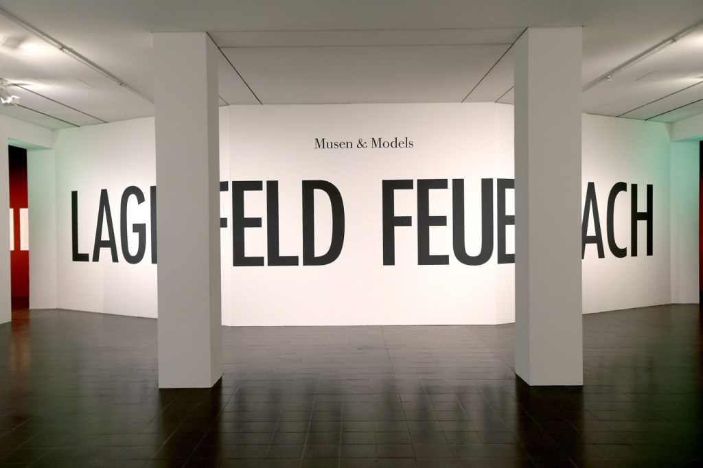
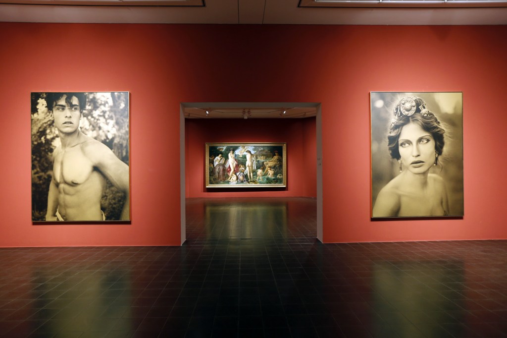
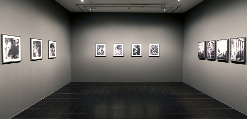
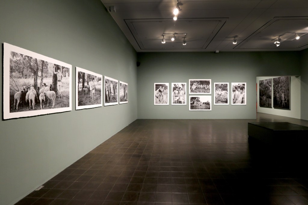
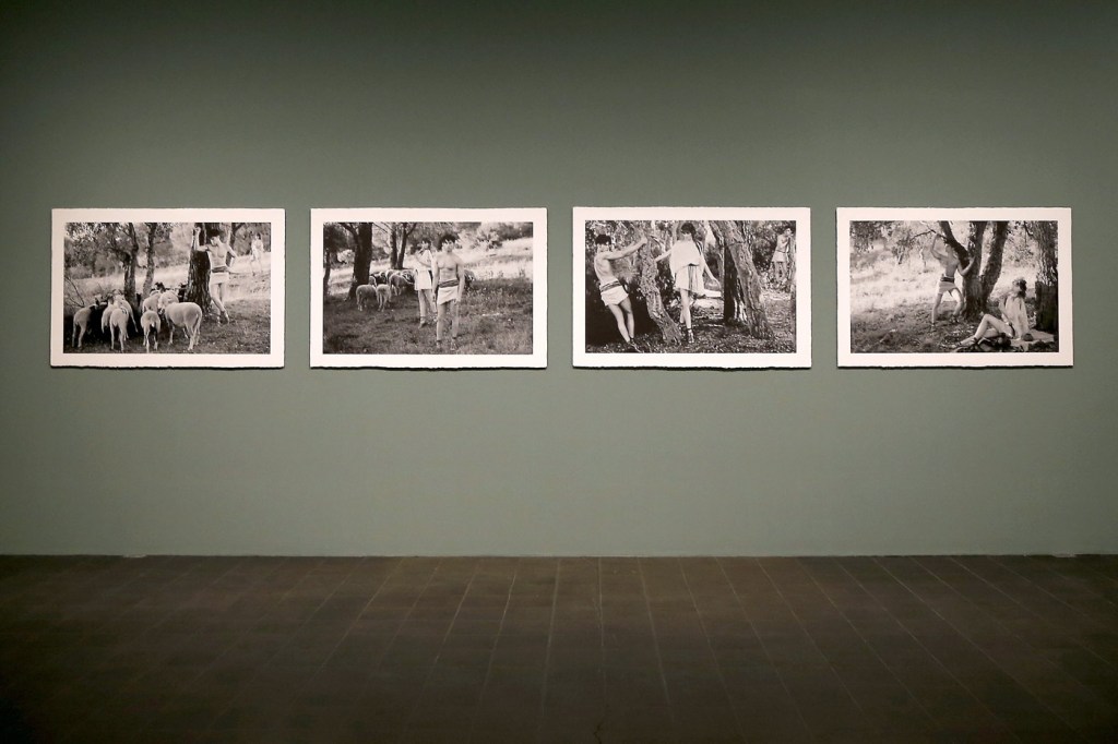
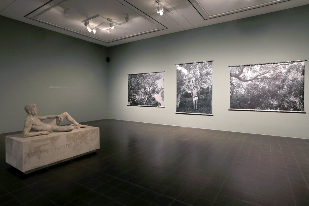


 'Nanna' 1864")
![Anselm Feuerbach (German, 1829-1880) 'Studienkopf zur Stuttgarter Iphigenie [Study of a Head for Stuttgart Iphigenia]' 1870](https://artblart.com/wp-content/uploads/2014/05/feuerbach_studienkopf-web.jpg "Anselm Feuerbach (German, 1829-1880) 'Studienkopf zur Stuttgarter Iphigenie [Study of a Head for Stuttgart Iphigenia]' 1870")
![Anselm Feuerbach (German, 1829-1880) 'Poesie, Zweite Fassung [Poetry, Second Version]' 1863](https://artblart.com/wp-content/uploads/2014/05/feuerbach_poesie-web.jpg "Anselm Feuerbach (German, 1829-1880) 'Poesie, Zweite Fassung [Poetry, Second Version]' 1863")
![Anselm Feuerbach (German, 1829-1880) 'Lucrezia Borgia, Bildnis einer Römerin in weißer Tunika und rotem Mantel [Lucrezia Borgia, Portrait of a roman in white tunic and red cloak]' 1864/1865](https://artblart.com/wp-content/uploads/2014/05/feuerbach_borgia-web.jpg "Anselm Feuerbach (German, 1829-1880) 'Lucrezia Borgia, Bildnis einer Römerin in weißer Tunika und rotem Mantel [Lucrezia Borgia, Portrait of a roman in white tunic and red cloak]' 1864/1865")
 'Nanna' 1861")
![Anselm Feuerbach (German, 1829-1880) 'Das Urteil des Paris [The Judgement of Paris]' 1870](https://artblart.com/wp-content/uploads/2014/05/feuerbach_paris-web.jpg "Anselm Feuerbach (German, 1829-1880) 'Das Urteil des Paris [The Judgement of Paris]' 1870")
![Anselm Feuerbach (German, 1829-1880) 'Ruhende Nymphe [Resting Nymph]' 1870](https://artblart.com/wp-content/uploads/2014/05/feuerbach_nymphe-web.jpg "Anselm Feuerbach (German, 1829-1880) 'Ruhende Nymphe [Resting Nymph]' 1870")
 'Modern Mythology' 2013")
 'Modern Mythology' 2013 from the exhibition 'Feuerbach's Muses – Lagerfeld's Models' at Hamburger Kunsthalle, Hamburg, February - June, 2014")
 'Modern Mythology' 2013 from the exhibition 'Feuerbach's Muses – Lagerfeld's Models' at Hamburger Kunsthalle, Hamburg, February - June, 2014")
 'Modern Mythology' 2013")
 'Modern Mythology' 2013")
 'Modern Mythology' 2013")
 'Modern Mythology' 2013")
 'Sam Eric, Pennsylvania' 1978")
 'Polar Bear' 1976 from the exhibition 'Hiroshi Sugimoto: Past Tense' at the J. Paul Getty Museum, Getty Center, Los Angeles, February - June, 2014")
 'Wapiti' 1980")
 'Sable Antelope' 1994")
 'Manatee' 1994")
 'Birds of Japan' 1994")
 'Cheetah' 1980")
 'White Rhinoceros' 1980")
 'Henry VIII' 1999 from the exhibition 'Hiroshi Sugimoto: Past Tense' at the J. Paul Getty Museum, Getty Center, Los Angeles, February - June, 2014")
 'Queen Victoria' 1999")
 'Anne Boleyn' 1999")
 'Asplenium Halleri, Grande Chartreuse 1821 - Cardamine Pratensis, April 1839' 2008")
 'Roofline of Lacock Abbey, circa 1835-1839' 2008")
 'Bust of Venus, November 26, 1840' 2009")
 'A Stem of Delicate Leaves of an Umbrellifer, circa 1843-1846' 2009")
 'Arrangement of Botanical Specimens, 1839' 2008")
 'Nicolaas Henneman, circa 1841' 2008")
 'Bust of Patroclus, September 8, 1841' 2009")
 'Grouped Towers, Chicago Project' 1930 from the exhibition 'Frank Lloyd Wright and the City: Density vs. Dispersal' at The Museum of Modern Art, February - June, 2014")
 'Grouped Towers, Chicago Project' 1930")
 'Broadacre City Project' 1934-1935")


 'Broadacre City Project' 1934-1935 from the exhibition 'Frank Lloyd Wright and the City: Density vs. Dispersal' at The Museum of Modern Art, February - June, 2014")
 'Broadacre City Project' 1934-1935")
 'Broadacre City Project' 1934-1935")
 'H. C. Price Company Tower, Bartlesville, Oklahoma' 1952-1956")
 'National Life Insurance Company Building, Chicago Project' 1924-1925")
 'S.C. Johnson & Son Inc. Research Laboratory Tower, Racine, Wisconsin' 1943-1950")
 'St. Mark’s-in-the-Bouwerie Towers, New York Project' 1927-1931")
 'St. Mark's-in-the-Bouwerie Tower, New York Project' 1927-1931")
 'The San Francisco Call Building Project' 1913")
 'The Mile High Illinois, Chicago Project' 1956")
 '\"Modern Cuff\" Bracelet' designed c. 1948")
 '\"Lava\" Bracelet' designed c. 1946")
 'Autumn Leaves Brooch' 1974")
 'Untitled' 1948-1979")
 'Linked Oval Necklace' designed by 1974")
 'Triangle Necklace' c. 1969")
 'Ellington Necklace' c. 1962")
 'New Orleans Necklace' c. 1962")
 '\"Bauble\" Necklace' c. 1953")
 'Model Wearing Art Smith's \"Modern Cuff\" Bracelet' c. 1948")
 'Standing Stone' 2014")
 'Constellation II' 2014")

")
")
")
 'Bruise II' 2014")


 'L'Énigme d'Isidore Ducasse' (The Riddle of Isidore Ducasse) 1920 (1971)")
 'L'Énigme d'Isidore Ducasse' (The Riddle of Isidore Ducasse) 1920 (1975)")
 'Enfant à la Bouchée de pain' (Child in the soup kitchen) 1897 (1892-1893)")
 ''Enfant à la Bouchée de pain' in the Cézanne room at the Salon d'Automne' 1904")
 'Tête d’enfant endormi' (Head of a Sleeping Child) 1906-1907")
 'La Muse endormie' (Sleeping muse) 1910")
 'Noire et blanche (Black and white)' 1926")
 'Enfant malade (Ziek kind)' c. 1909")
 'Enfant malade (Ziek kind) 1895 (1903-1904)")
 'Madame X' 1896")
 'Princesse X' (Princess X) c. 1930")
 'Princesse X (Princess X)' 1915-1916")
 'View of the Studio with Maïastra' 1917")
 'Self-portrait in the studio' c. 1934")
 'Rayographie' (Rayograph) 1925")
 'Le Violon d'Ingres' (Ingres's Violin or The Hobby) 1924")
 'Self-portrait with the lamp' 1934")
 'Self-portrait in the studio' c. 1906")

 'Heritage' 2013")
 'Heritage' 2013")
 'Heritage' 2013")
 'Heritage' 2013")
 'Heritage' 2013")
 'Heritage' 2013")
 'Tea Pavilion' 2013")
 'Eucalyptus' 2013")
 'Eucalyptus' 2013")
 'Eucalyptus' 2013")
 'Head On' 2006")
 'Head On' 2006")
 'Head On' 2006")
 'Head On' 2006")
 '6236' 2008 from the exhibition 'What Is a Photograph?' at the International Center of Photography, New York, January - May, 2014")
 'Grays Lake, ID 7' 2013 from the exhibition 'What Is a Photograph?' at the International Center of Photography, New York, January - May, 2014")
 'Kilborn Acme Kruxo, exact expiration date unknown, ca. 1940s, processed in 2013 (#1)' 2013")
 'The Drink' 2011")
 '18.2.08' 2008")
 'Armchair, Background, Basic, Beauty, Bed, Bedside, Bread, Breakfast, Bright, Cereal, Closeup, Cloth, Color, Contemporary, Couch, Crust, Day, Decor, Fox, Frame, Grain, Ingredient, Interior, Invitation, Irregular, Juice, Life, Living, Loaf, Luxury, Macro, Sofa, Speed, Style, Sweet, Texture' 2013")
 'Colorado Purple' 2012")
 'Untitled' 1988")
 'Untitled (C-1189)' 2012")
 'Lower Yosemite Falls, Yosemite, California' 2013")
 '154' 2010 (detail)")
 'Image Object Friday 7 June 2013 4:33 PM, 2013' 2013")
 'Supplement '13 (Mixed Typologies) #3' 2013 (detail)")
 'New Age Demanded (The heart was a place made fast)' 2013")
 'Tango' 1983")
 'Untitled' 2010")
 'Pico Boulevard (Nocturne)' 2012")

You must be logged in to post a comment.