Exhibition dates: 24th August – 18th September 2010
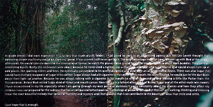
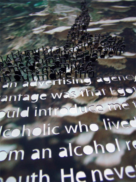
Martin Smith (Australian, b. 1971) Enough 2010
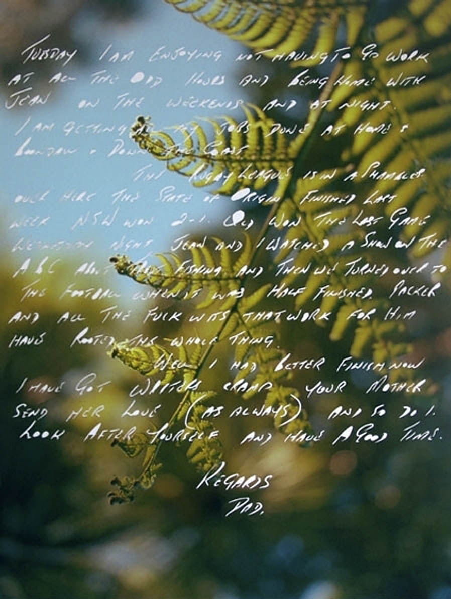
Following on from last year’s exhibition My Jesus Lets Me Rub His Belly that examined issues of place and faith when the artist was growing up, Martin Smith now presents a slice of poignant son father love at Sophie Gannon Gallery, Richmond. The combination of images and text create narratives on growing up, life, male bonding and mortality.
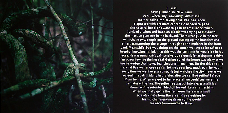
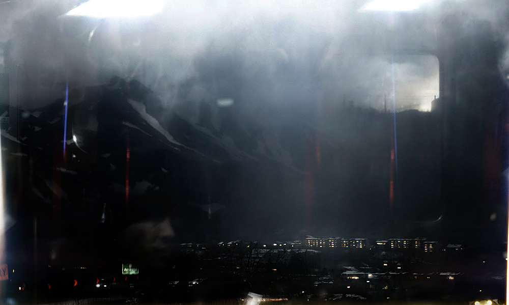
In Fix It Up (2010, below) the use of a circle of text on black (the circle of life) in this image paired with a dark photograph of moss covered twigs and branches is exemplary, the metaphor of the arborist chopping down a gum tree in the backyard as his father is waiting to be taken to hospital by ambulance with prostrate cancer, the last time he will be present in his house, incredibly moving. The use of blurred images, such as the central panel in the triptych Sydney (2010, below) adds emotional weight to the narratives, as though the stories told can only be fragmentary memories, as all memories are, of the events that have passed. The feeling of an excavation of the meaning of life and death is further enhanced by the incision of the letters into the photographs surface and the extrusion of the letters to form three-dimensional sculptural forms, as in the work Enough (2010, see photograph and detail below). The letters shape references the fungi on the tree behind, new life growing out of old, as though the words were being extruded out of the forest, archives of communal memory.
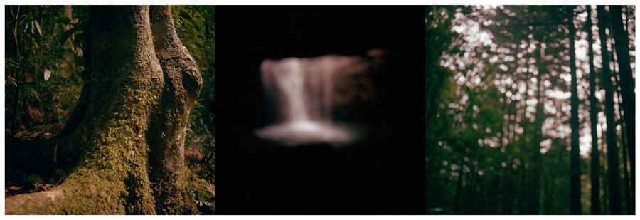
My favourite image in the exhibition didn’t have any words at all, not even piled as detritus at the bottom of the frame as many of Smith’s works do. It didn’t need them. The triptyph Untitled 1 (2010, below) is simple and eloquently beautiful and almost brought me to tears. When read in combination with the other works and their texts, the moss covered trees on the left become two wrinkled elbows, the image on the right the wandering mind and the image in the centre – for me, the feeling of life force as it flows in the darkness. As my yoga teacher says to me, “You must learn to navigate the dazzling darkness.”
This illumination of the mind, body, memory and spirit is what Smith’s work is all about. I adore it.
Exhibition dates: 24th August – 18th September 2010
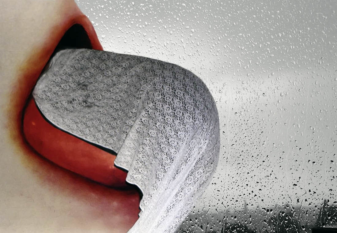
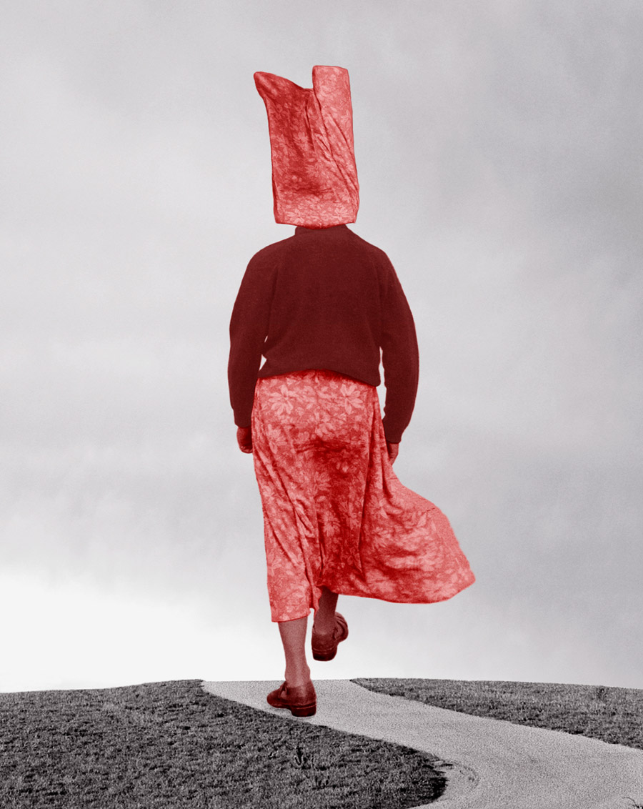
Pat Brassington (Australian, b. 1942) Camouflage 2010
I have a critically ambivalent attitude towards the work of artist Pat Brassington. While the exhibition at Arc One Gallery in Melbourne contains some wonderful ‘images’ her work never seems to move me in an emotional sense. What it does do admirably is constantly engage me in cerebral jousting and sensory debate. Intellectually and visually I find the images stimulating, emotionally I am left a little bit cold.
Brassington’s sometimes fetishistic collage-like digital photographs occupy ambiguous spaces – fascinating ‘other’ worlds, constructed worlds that disturb and delight, drawing the viewer into subjective judgements on what, exactly, they are seeing. Brassington doesn’t need to speak about her work, much like Bill Henson never speaks about his work, because the viewer does that for her and that is the point – Brassington lets the viewer construct the story, a story that is open to multiple viewpoints and interpretations.
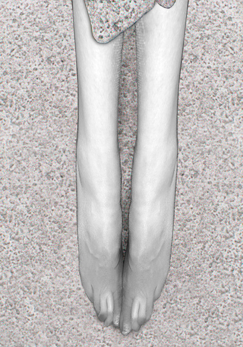
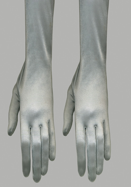
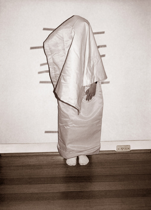
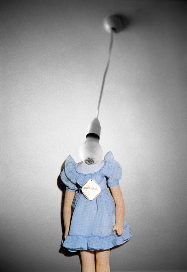
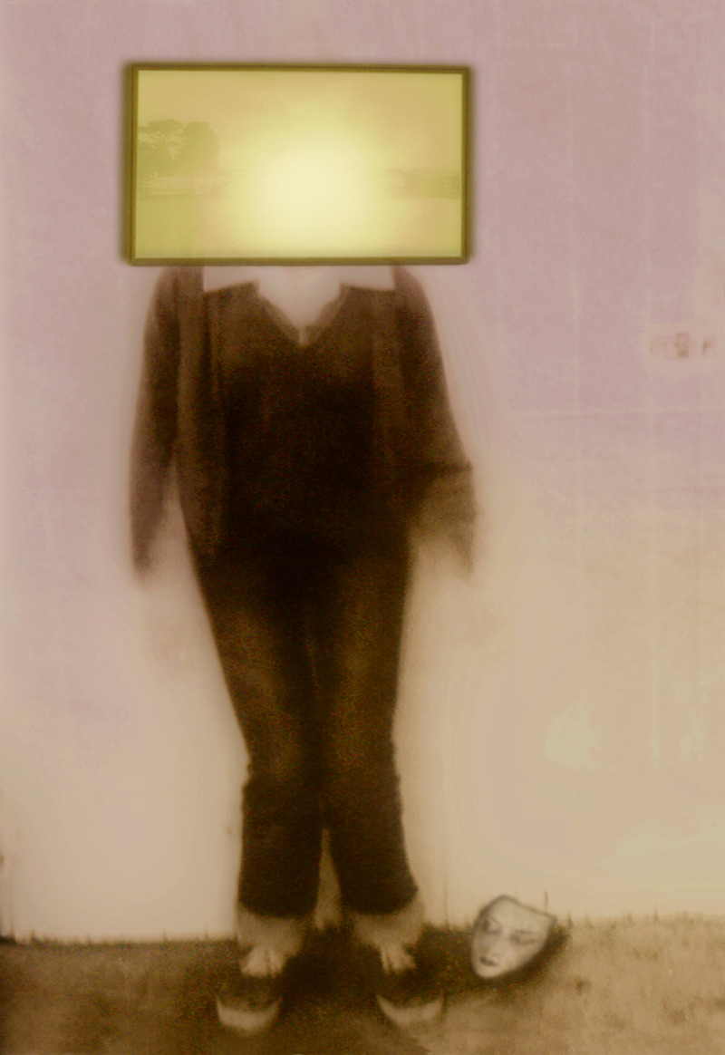
To see the work as just “surrealist” is to do it a disservice for it is much more than that. Of course the work uses various surrealist tropes but the power of these images is in setting up psychological encounters that are often bizarre, confronting and disturbing at a deeper level than just surface juxtapositions. These images seem to haunt you long after you have seen them. Using a limited colour palette of washed out purples, greys, yellows and pinks with a hit of red or blue where applicable (only once a green, never any solid, bright, strong colours) Brassington’s work keeps repeating objects and themes throughout the years – the dress, fish, gloves, hands, legs and the sensual mouth – to “evoke uneasy tensions between bizarre, sinister intimations of menace and weirdly beautiful, benign harmonies.” (Diane Foster).
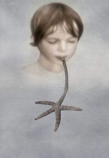
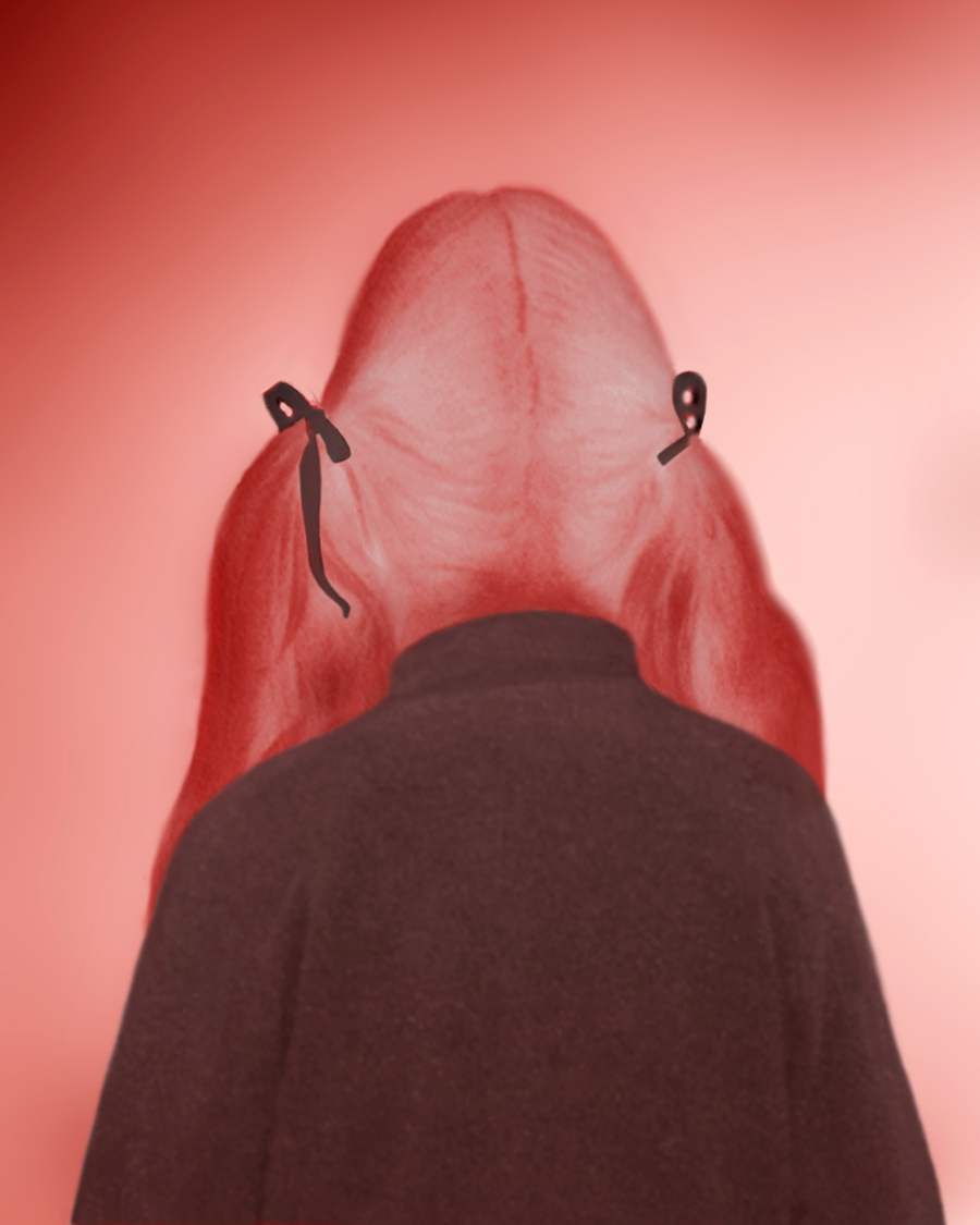
In these new images the lascivious tongue is camouflaged, a woman marches determinedly and blindly over a hill, a child is wrapped and taped, two sateen gloves emanate and a boy breathes life into the sea (or is it the other way around, or is the boy destroying the sea through his breath?). The paradoxes are beautifully enacted and always challenging and that is the strength of the work of Brassington – offering us, the viewer, no easy way out as we stare at the red ribbons in a girl’s hair.
Exhibition dates: 10th August – 4th September 2010
David Neale (Australian, b. 1977) Brooch Steel, paint, marble, lapis lazuli 2009-2010
A nice double act of an exhibition at Gallery Funaki that showcases the jewellery of David Neale and first time exhibitor Emma Price. Neale’s delicate folded and layered brooches of bud and leaf-life forms sparkle with crushed marble, turquoise and lapis lazuli forming a palette of pale blues, pinks, greens and vibrant hints of red, the shapes almost a form of metal collage. As pieces of art they work excellently but as jewellery they seem fragile perhaps due to the thinness of the metal used and what I perceived as a lack of structural integrity. As brooches I wonder how carefully one would have to wear them (very carefully I suspect) and how long the crushed sparkling rock would adhere to the surface of the metal (I have since been reliably informed by Simon that they are very sturdy but this was an initial reaction on picking up the brooches).
Of more significance are the articulated trapezoid necklaces by Emma Price. These are stunning architectural works (at very reasonable prices!) that are made of gold, silver, brass and copper. They exude a quietness and balance that is beautiful and a playfulness (because of the interlinked forms that actually move) that is delightful. In these geometric forms there seems to be a suspension in/of reality as if the world is hanging by a thread. A bright future awaits for this artist.
Dr Marcus Bunyan
Many thankx to Katie Scott and Gallery Funaki for allowing me to publish the photographs in the posting. Please click on the photographs for a larger version of the image.
David Neale (Australian, b. 1977) Brooch Steel, paint, marble, lapis lazuli 2009-2010
David Neale (Australian, b. 1977) Brooch Steel, paint, marble, lapis lazuli 2009-2010
Highly respected Melbourne jeweller David Neale presents new pieces alongside Emma Price, who will be showing her first significant group of work at Gallery Funaki in this exhibition.
David Neale’s intriguing folded forms, borne of his sensitive treatment of metal sheeting using texture and paint, have earned him a significant reputation both in Australia and overseas. His recent work shows a shift away from botanical influences, towards more abstract and expressive forms. There is a bold sense of the painterly in these works, as Neale’s powdery, textured colours become a dominant focus.
Emma Price completed her Masters of Gold and Silversmithing at RMIT in 2005 before spending a year at the Munich Academy of Fine Arts in 2008. Her finely balanced structures are constructed from painstakingly drawn down tubing in gold, brass, silver and copper. The shifting, architectonic forms of her neckpieces seem to dance against the body.
Text from the Gallery Funaki website [Online] Cited 26/08/2010 no longer available online
Emma Price (Australian, b. 1975) Necklace 2 silver, brass, gold 2010
Emma Price (Australian, b. 1975) Necklace 6 silver, brass, copper, gold 2010
Emma Price (Australian, b. 1975) Necklace 8 silver 2010
Gallery Funaki Sackville House Apartment 33 27 Flinders Lane Melbourne 3000 Australia
Opening hours: Wednesday – Friday 12 – 5pm Saturday on occasion (check our socials) or by appointment
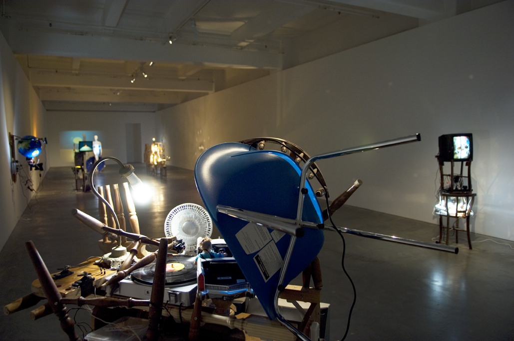
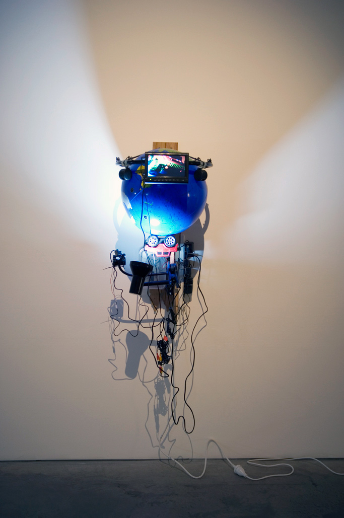
Ian Burns (Australian, b. 1964) AND THEN… 2010 Installation view at Anna Schwartz Gallery, Melbourne
Two words: JUST GO!
Yes the work can be analysed as in the text (below) from the Anna Schwartz Gallery website but this is not necessary to enjoy the work. These are such fun assemblages, the created mis en scenes so magical and hilarious, guffaw inducing even, that they are entirely playful.
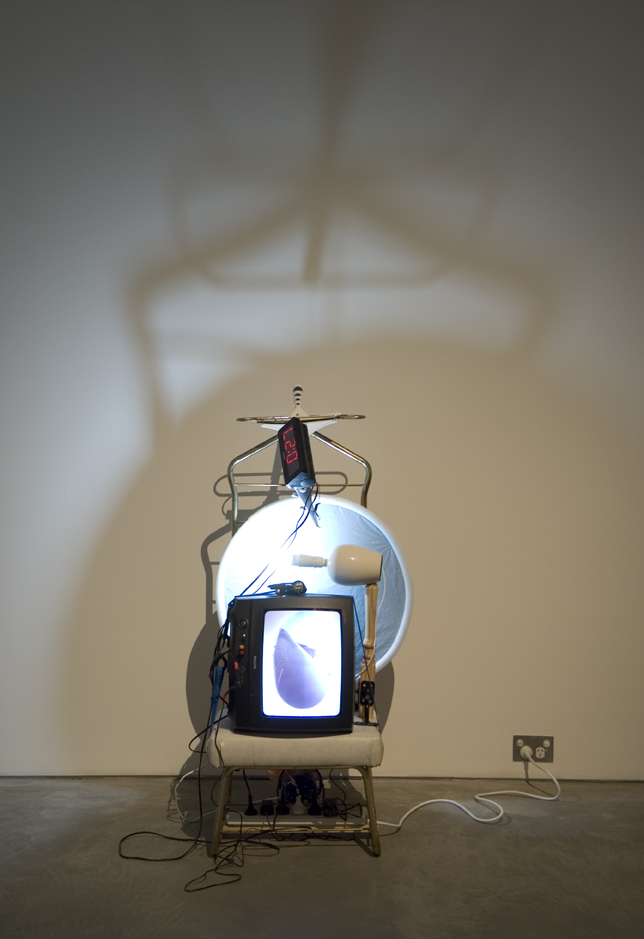
I delighted in how they were constructed, almost thrown together from found objects that relate to the theme of each work; in the miniature cameras and environments – the Jumbo jet flying through the ‘sky’ of clouds created by a boiling water heater; in every particle of light as the words AND THEN… were created through aligned lens prisms (A Moment Implied 2010); and I was in wonder at the shimmering, setting sun in Venus (2010).
There is so much to like here – the inventiveness, the freshness of the work, the insight into the use of images in contemporary culture. Still photographs of this work do not do it justice. I came away from the gallery uplifted, smiling, happy – and that is a wonderful thing to happen.
As I said at the beginning: JUST GO!
Dr Marcus Bunyan
Many thankx to Ash Kilmartin and the Anna Schwartz Gallery for the photographs in the posting. Please click on the images for a larger version of the image. All images are courtesy the artist and Anna Schwartz Gallery.
Ian Burns (Australian, b. 1964) 15 hours v.4 2010 Found object kinetic sculpture, live video and audio Image courtesy the artist and Anna Schwartz Gallery
For his first solo exhibition in Melbourne, and his first exhibition at Anna Schwartz Gallery, Ian Burns presents a number of sculptures that continue to explore the manufactured screen image. Referring in title to the simplistic and little-nuanced plots of pulp fiction, AND THEN… provides a space in which we might become more conscious of the images we consume on a daily basis. Incorporating and sometimes generating sound and image, Burns’ ‘meta-cinematic’ monuments invoke popular moving imagery and by extension the culture which produces them. Burns builds these audio-visual-sculptural forms in order to reveal the clichés of contemporary screen culture. Without ignoring the context of his own production, Burns’ critique of mindless images also extends to those contemporary art practices that similarly play upon the objects familiar to daily life. Comprised of found objects, each sculpture contains within it a unique narrative. For example, the coincidence of discovering a clam-shaped, children’s swimming pool, along with some discarded mannequins, led the artist to Botticelli’s Birth of Venus. What ensues is a unique extension of the metaphor, as Venus – through Burns – gives birth to video. This brings us to the underlying essence of Burns’ work: while critically bringing to light complex theories about popular culture and the entertainment industry, these works contain a necessary dose of humour – making them utterly compelling.
Artists: Justine Khamara, Lyndell Brown and Charles Green, Imants Tillers, Sam Shmith, Janet Laurence, Murray Fredericks and Huang Xu
Janet Laurence (Australian, b. 1947) Carbon Vein (installation view) 2008 Duraclear, oil pigment on acrylic 235 x 100cm Photo: Marcus Bunyan
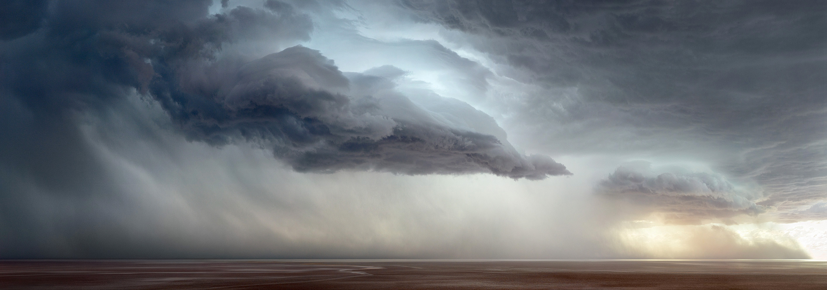
This is an excellent group exhibition at Arc One Gallery, Melbourne. Together the works form a satisfying whole; individually there are some visually exciting works. There are two insightful paintings by Imants Tillers, Nature Speaks: BP (2009) and Blossoming 21 (2010), a digitally constructed landscape by Sam Shmith, Untitled (Passenger) (2010, below) that the online image doesn’t really do justice to, a large photographic landscape of a storm over Lake Eyre Salt 304 (2009, below) by Murray Fredericks and two layered transcapes by Janet Laurence (see image above) that just confirm the talent of this artist after the exciting installation of her work at the Melbourne Art Fair (I call them transcapes because they seem to inhabit a layered in-between space existing between dream and reality).
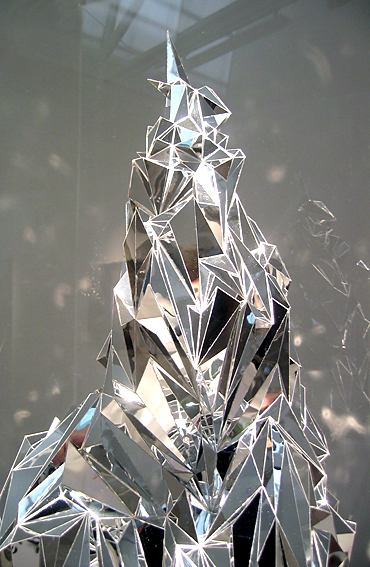
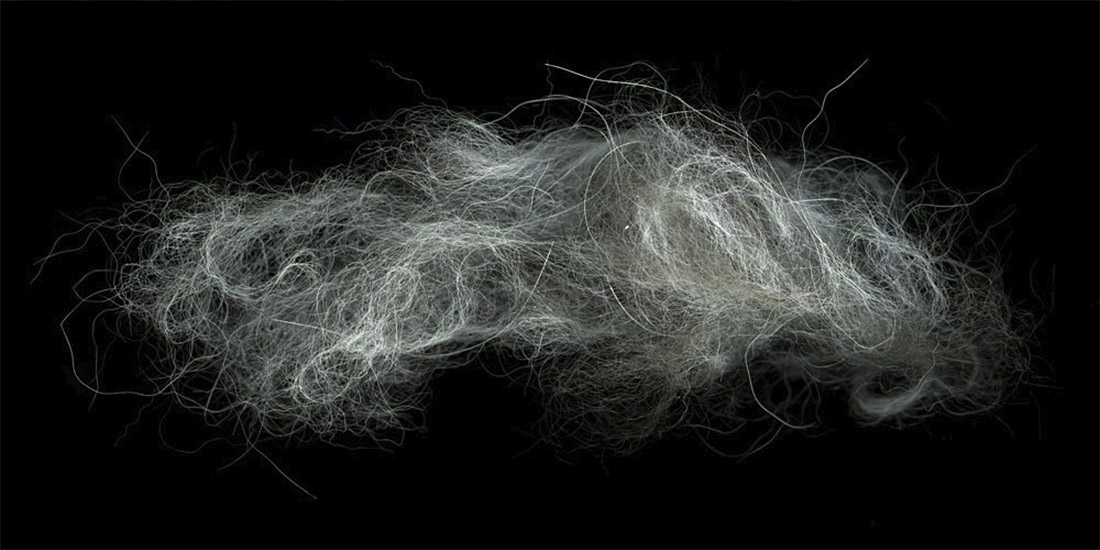
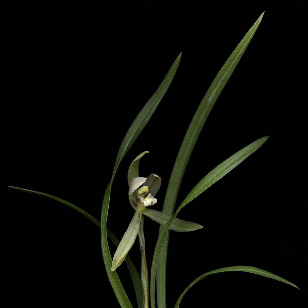
For me the three outstanding works were the large horizontal photograph Hair No.2 (2009, below) by Huang Xu, in which hair hangs like a delicate cloud on a dark background and his photograph Flower No. 1 (2008, below) in which the white petals of the chrysanthemum, symbol of death or lamentation and grief in some Western and Eastern countries in the world, seemingly turn to marble in the photographic print (you can see this online in the enlarged version of the image below). What a magnificent photograph this is – make sure that you don’t miss it because it is tucked away in the small gallery off the main gallery in the Arc One space. The third outstanding work is the sculpture you are a glorious, desolate prospect (2010) by Justine Khamara (see photographs below), a glorious magical mountain, twinkling in the light, all shards of reflectiveness, cool as ice. I would have loved to have seen this work without it’s protective case – in one sense the case works conceptually to trap the speaking of the mountain but in another it blocks access to the language of this work, the reflection of the light of the gallery, the light of the world bouncing off it’s surfaces.
This is not, of course, how nature speaks but how humans speak for nature – through image-ining and seeking to control and order the elemental forces that surround us. This construction of reality has a long tradition in the history of art, the mediation of the world through the hands, eyes and mind of the artist offering to the viewer, for however brief a moment, that sense of awakening to the possibilities of the world in which we all live.
Dr Marcus Bunyan
Many thankx to Angela and all at Arc One Gallery for allowing me to publish the photographs in the posting. Please click on the photographs for a larger version of the image.
Justine Khamara (Australian, b. 1971) you are a glorious, desolate prospect (installation view) 2010 Mirror, perspex, plinth 80 x 186cm Photo: Marcus Bunyan
Justine Khamara (Australian, b. 1971) you are a glorious, desolate prospect (installation view detail) 2010 Mirror, perspex, plinth 80 x 186cm Photo: Marcus Bunyan
Lyndell Brown (Australian, b. 1961) and Charles Green (Australian, b. 1961) Galatea Point 2005 Digital photograph on duraclear film edition of 5 112 x 112cm
Huang Xu (Chinese, b. 1968) Hair No.2 2009 Type C Photograph 120 x 245cm
Huang Xu (Chinese, b. 1968) Flower No.1 2008 Type C photograph 120 x 120cm
Huang Xu (Chinese, b. 1968) Flower No.2 2008 Type C Photograph 120 x 120cm
Murray Fredericks (Australian, b. 1970) Salt 304 2009 Pigment print on cotton rag 244 x 88cm
Sam Shmith (Australian, b. 1980) Untitled (Passenger) 2010 pigment print on archival rag 180 x 108cm
Arc One Gallery 45 Flinders Lane Melbourne, 3000 Phone: (03) 9650 0589
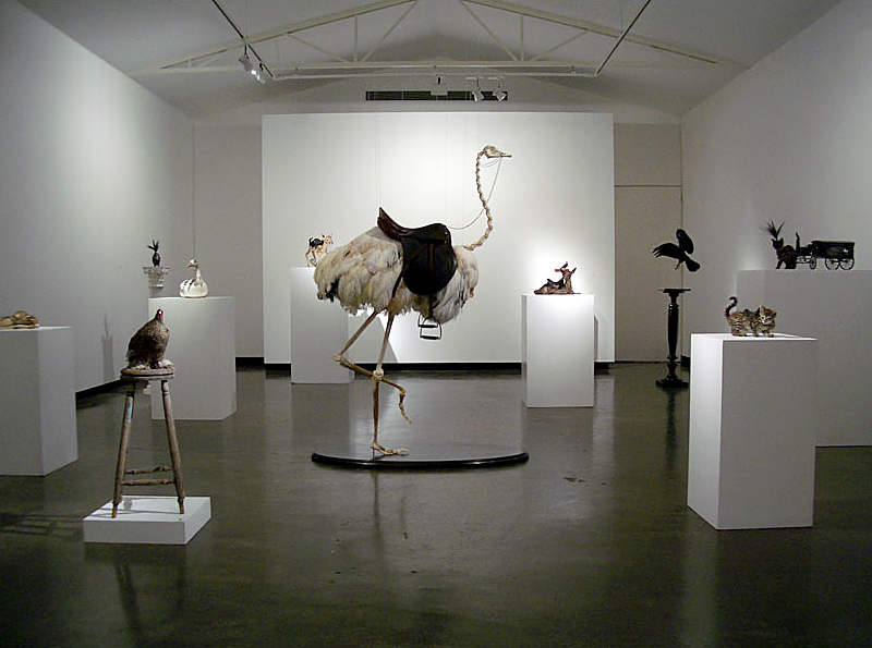
Installation view of Night’s Plutonian Shore by Julia deVille at Sophie Gannon Gallery, Richmond Photo: Marcus Bunyan
This is an excellent exhibition by Julia deVille at Sophie Gannon Gallery in Richmond. Compared to last year’s ‘shock and paw’ exhibition Cineraria reviewed on this blog, this exhibition shows a commendable sense of restraint, a beautiful rise and fall in the work as you walk around the gallery space with the exhibits displayed on different types and heights of stand and a greater thematic development of the conceptual ideas within the work. There are some exquisite pieces.
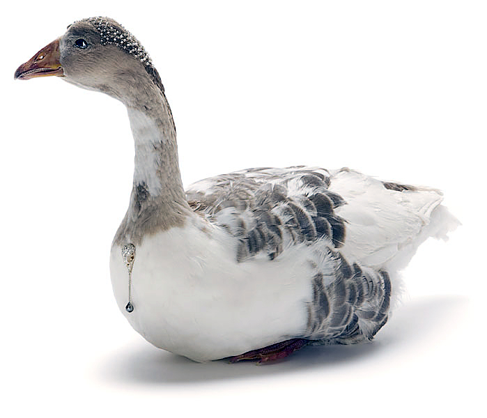
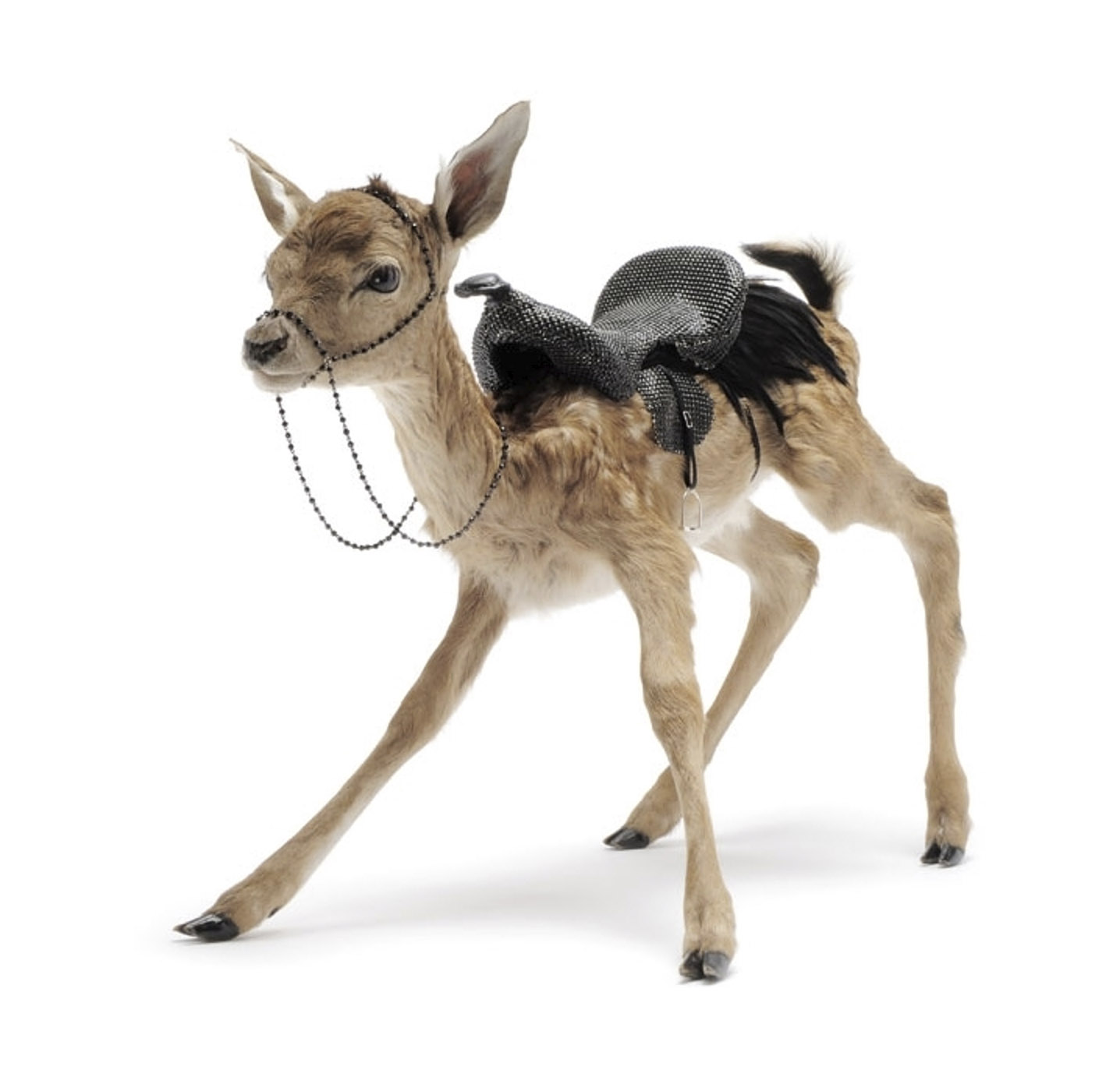
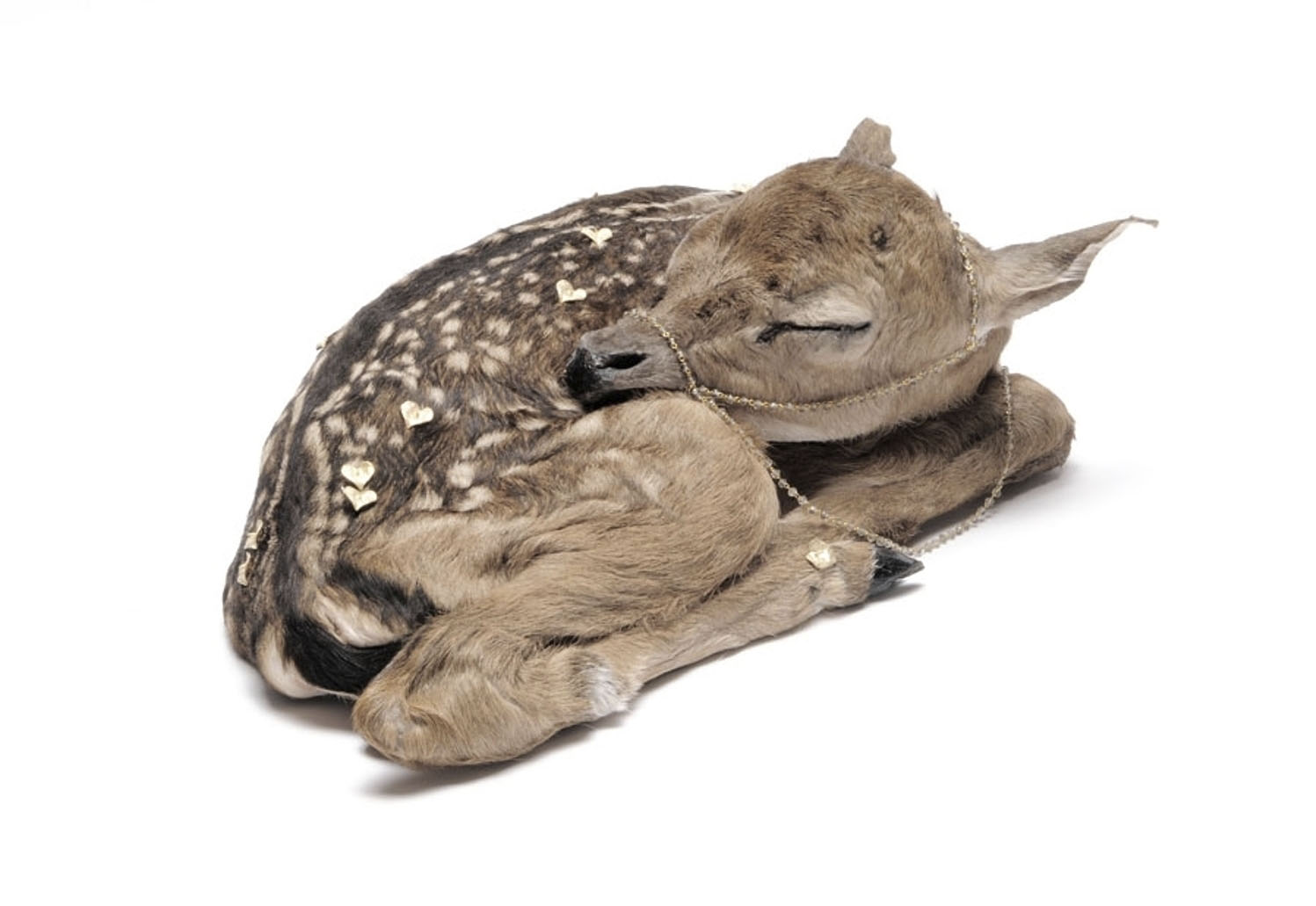
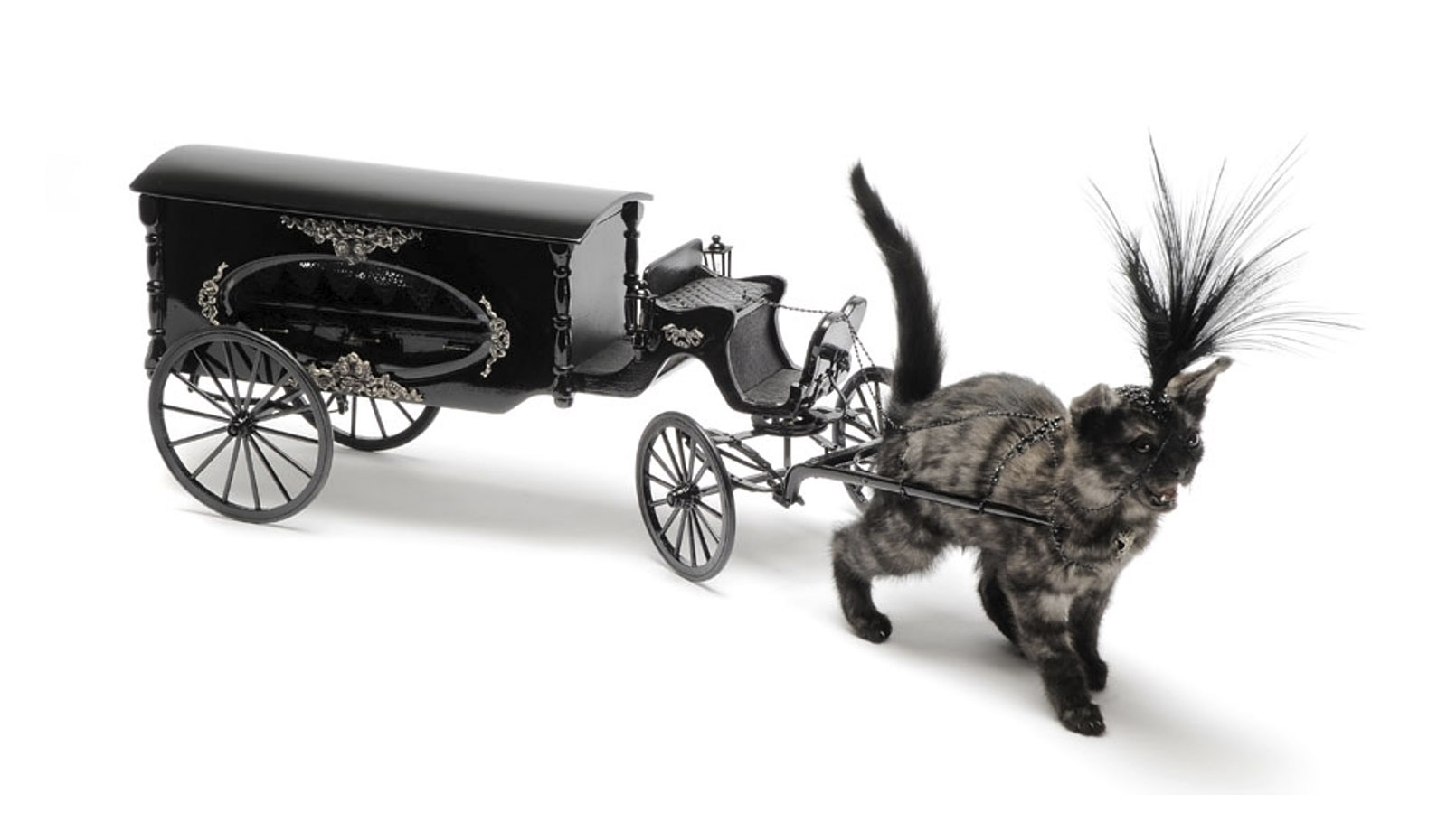
From the bejewelled Golden Gosling (2010), the goose that wears the gold not lays it to the cute stillborn fawn Lenore (2010), named after Edgar Allan Poe’s poem of the same name that discusses “the proper decorum in the wake of the death of a young woman, described as “the queenliest dead that ever died so young”,” (Wikipedia text) there is a delicacy to these sculptures that seemed absent in the last exhibition. The sleeping fawn wears a little golden bridle and is covered in golden hearts, the harness bringing in the element of control (of life, of death, of the body, of identity) into the pieces not seen in the earlier work. This sense of control is reinforced in other pieces in the exhibition including the three pieces Charon (2010), Nevermore (2010) and Kitten drawn hearse (2010, see photographs below).
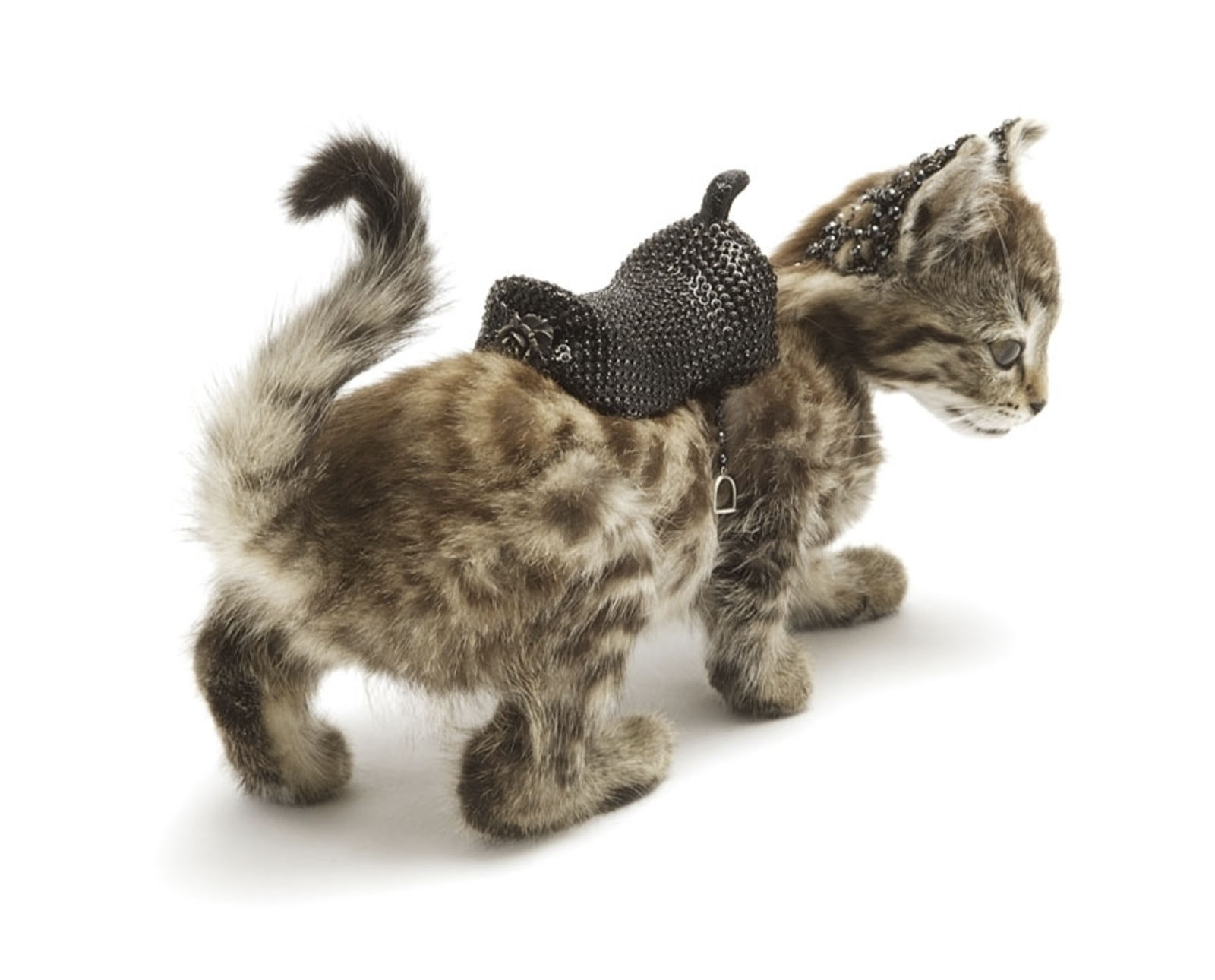
In Charon the kitten has an amazing beaded saddle and stirrups to allow the occupant to control the dead stead because in Greek mythology Charon is the ferryman who carries the souls of the newly deceased across the river Styx. Nevermore also features the saddle and bridle whilst the standout piece of the whole exhibition, Kitten drawn hearse just wows you with it’s delicacy and showmanship – the plume atop the harnessed kitten’s head faithfully replicating the dressage of a Victorian horse drawn funeral cortege.
In these pieces there is a simplification of the noise of the earlier works and in this simplification a conversant intensification of the layering of the conceptual ideas. Playful and witty the layers can be peeled back to reveal the poetry of de Sade, the stories of Greek mythology and the amplification of life force that is at the heart of these works.
Good stuff.
Dr Marcus Bunyan
Many thankx to Edwin and Sophie Gannon Gallery for allowing me publish the photographs in the posting. Please click on the photographs for a larger version of the image.
Another well considered response to the exhibition can be found on Karen Thompson’s Melbourne Jeweller blog.
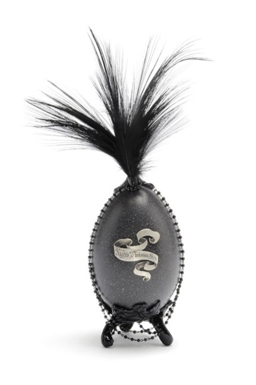
Julia deVille (Australian, b. 1982) Nameless here for evermore 2010 Emu egg, black garnet beads, sterling silver, bronze, enamel paint, egret feathers 31 x 16 x 16cm Courtesy Sophie Gannon Gallery
Julia deVille (Australian, b. 1982) Golden Gosling 2010
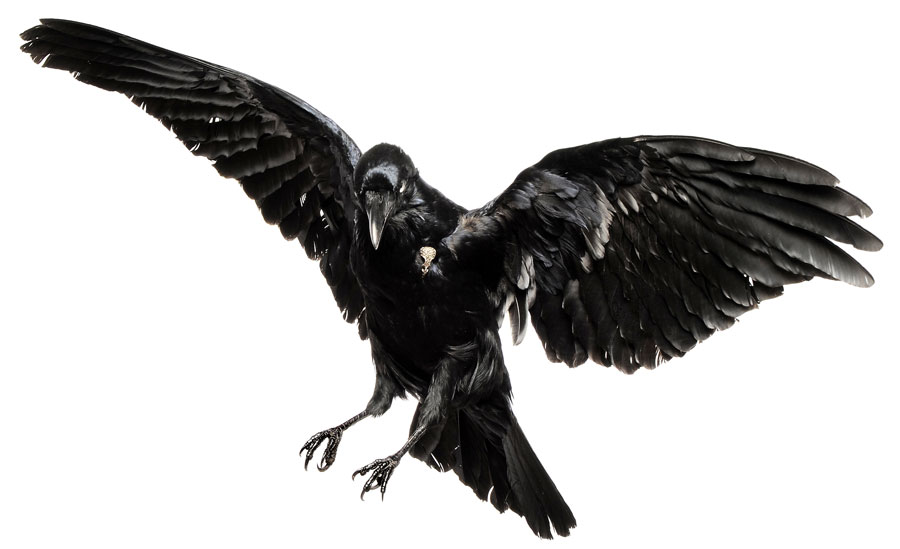
Julia deVille (Australian, b. 1982) Ghastly grim and ancient raven 2010
Julia deVille (Australian, b. 1982) Nevermore 2010 Still-born fawn, black garnet beads, sterling silver, coque feathers, chain mail, glass 27 x 41 x 59cm Courtesy Sophie Gannon Gallery
Julia deVille (Australian, b. 1982) Charon 2010 Kitten, hematite beads, mystic spinel beads, sterling silver, chain mail, glass 30 x 12 x 19cm Courtesy Sophie Gannon Gallery
Julia deVille (Australian, b. 1982) Lenore 2010 Stillborn fawn, black garnet beads, sterling silver, gold plate, glass 35 x 17 x 12cm Courtesy Sophie Gannon Gallery
Julia deVille (Australian, b. 1982) Kitten drawn hearse 2010 Kitten, black garnet beads, sterling silver, egret feathers, wood, glass 83 x 30 x 15cm Courtesy Sophie Gannon Gallery
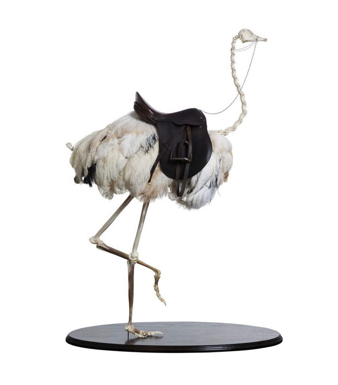
Julia deVille (Australian, b. 1982) Bird or beast 2010 Ostrich skeleton, ostrich feathers, smoky quartz, sterling silver, leather and wood Courtesy Sophie Gannon Gallery
Sophie Gannon Gallery 2, Albert Street, Richmond, Melbourne
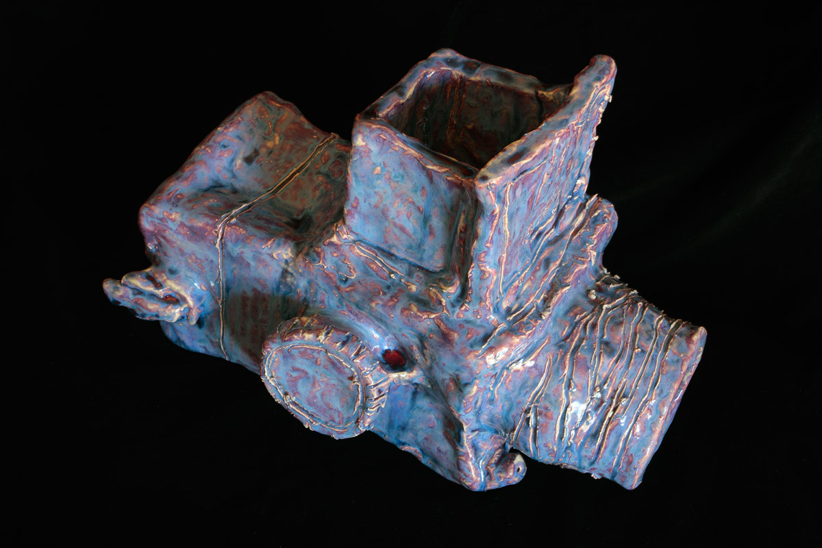
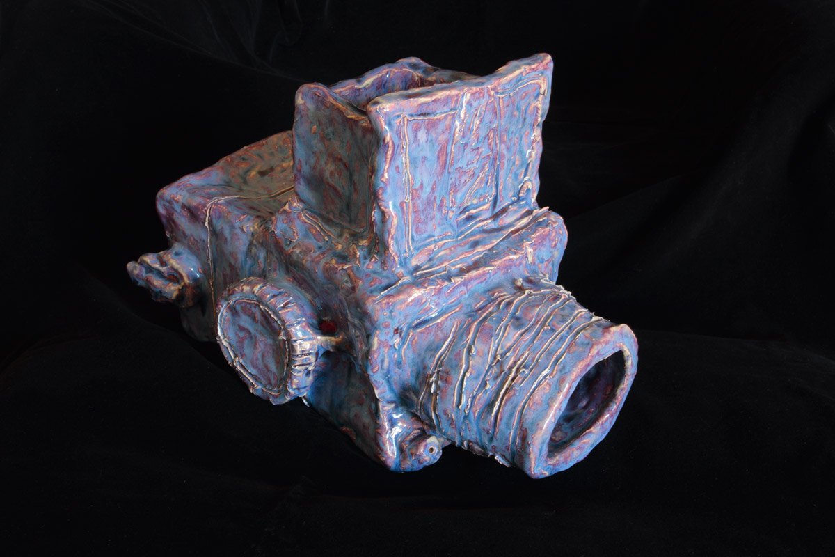
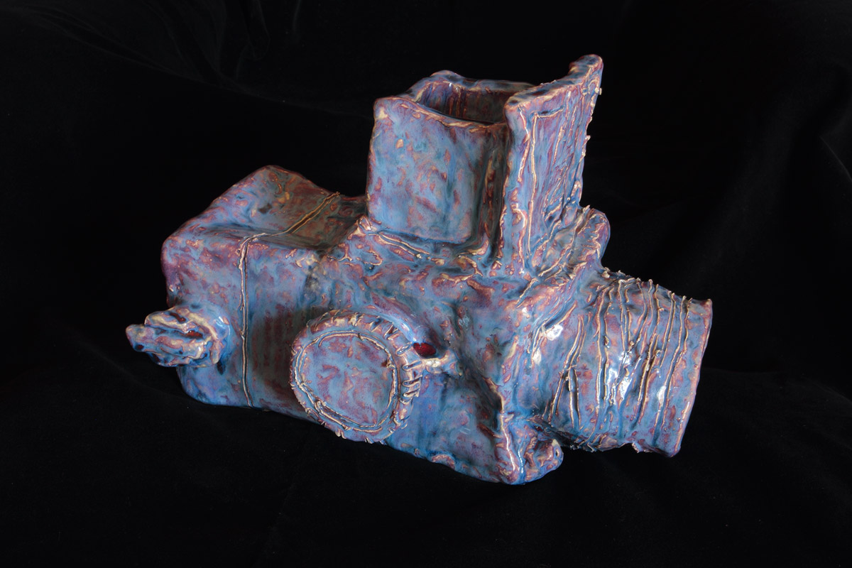
Alan Constable (Australian, b. 1956) Untitled (Hasselblad) 2008 Clay, glaze
I finally succumbed and bought myself a wonderful Alan Constable ceramic camera from the Arts Project Australia stand at the Melbourne Art Fair on Saturday (see photographs below – click on the photographs for a larger version of the image). I first saw Alan’s ceramic work at his solo exhibition called Clay Cameras at Helen Gorie Galerie in August 2009 (see photographs from the exhibition) and was instantly attracted to the tactility and beauty of the work. Months later I saw more of his cameras at Sophie Gannon Gallery in Richmond and now at the Art Fair. Third time lucky, I found a stunning medium format Hasselblad in a beautiful two tone glaze that really spoke to me in terms of it’s form and aesthetic appeal. Constable’s work has really impinged on my consciousness and the piece has a special resonance for me.
“Constable’s ceramic works reflect a life-long fascination with old cameras, which began with his making replicas from cardboard cereal boxes at the age of eight. The sculptures are lyrical interpretations of technical instruments, and the artist’s finger marks can be seen clearly on the clay surface like traces of humanity. In this way, Alan Constable cameras can be viewed as extensions of the body, as much as sculptural representations of an object.” (Arts Project Australia text)
Highlights of the Art Fair were the outstanding paintings of Juan Ford at Dianne Tanzer Gallery, the mesmeric video work of Daniel Crooks at Anna Schwartz Gallery (who I think is one of the best artists in the country – see more images of his work from his Intersection exhibition), the delicately layered and outrageously beautiful collage work of Peter Madden at Ryan Renshaw Gallery, the layered transcapes of Janet Lawrence at Arc One Gallery and the cosmological paintings of Lara Merrett at Karen Woodbury Gallery. Brickbats for the most overblown presentation must go to Danie Mellor at Michael Reid for a truly over the top performance that just left one speechless.
It was a real pleasure to meet so many gallery directors and managers face to face including Gina Lee at Niagara Galleries, James Makin at James Makin Gallery, Matt Glen at Martin Browne Fine Art, Sydney, Paul Greenway from Gagprojects, Berlin and Ken Fehily from Fehily Contemporary, Melbourne.
Finally, I visited the Notfair 2010 exhibition in Richmond, a disappointing group exhibition of 30 artists selected from over 300 artists suggested by curators from around the country. As with many group exhibitions that lack thematic development the work was all over the place, in every media imaginable. The absolute standout work were the two antique stereoscopic cabinet and LED light animations of Chris Henschke from the duo Topologies. While the idea for the exhibition is to be applauded (that of presenting an exhibition of unknown or little known artists that may or may not be represented by a gallery) perhaps the next exhibition should have fewer artists to give the work chance to speak for the artist instead of just being a token gesture.
Dr Marcus Bunyan
Alan Constable (Australian, b. 1956) Untitled (Hasselblad) 2008 Clay, glaze
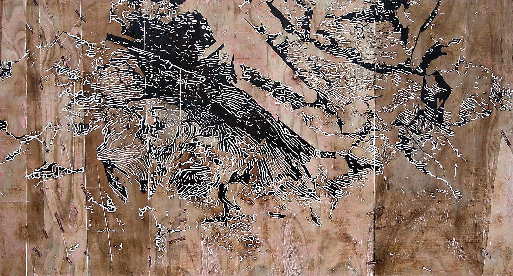
Ewen Ross (Australian, b. 1957) Plain of Mars 2010 from the Warrina Portraits series
There is little more to say about this exhibition of works by Ewen Ross than the erudite catalogue essay by Geraldine Barlow enunciates (see essay below), except to say that the ‘presence’ of these works is extremely moving. It is difficult when viewing photographs of the work to explain the physical impact of actually standing in front of these works, absorbing their energy, examining their surfaces, their depths.
The larger photograph of Thenar Eminence (2010, below) is the closest one can get in the virtual world to appreciating the elemental quality of the work – the fire, the fragmentation and the soil, the contour-like mapping of the earth – as the work resembles a memory of earth, of place, re(as)sembles a signification, a meaning wholly of its own in the mind of the viewer. In the spectator the act of looking may turn into contemplation and this work does seem to have that effect = the context of looking at the work invites a contemplation on place and connection to earth.
Barlow asks. “Is this matter, or its coded representation? Ross sets up a liquid movement between such possibilities.”
Ross does indeed set up a liquid movement between matter and representation. But here I would offer a counter argument to the idea that matter and coded representation are binary opposites. As noted by Judith Butler in the excellent quotation below, matter is already meaningful, already coded and materialised. It always has a history and narrativisation embedded within it. Butler suggests the body is never a valueless matter on which inscription takes place because this hides the inscription already there.
Continuing this idea, Ross brings matter back into the fold, into the peeled away surfaces of his work. His process of materialisation offers these liquid movements not through an oppositional relationship between matter and coded representation but because a) his works are no longer anchored in an unquestionable reality and b) they have moved beyond coded representation. Ross reconceptualises both space and matter in his objects of place and invites us, the viewer, to contemplate these (e)motional environments.
Dr Marcus Bunyan
Many thankx to Anita from Anita Traverso Gallery for allowing me to publish the photographs in the posting and to Geraldine Barlow for allowing me to publish the catalogue essay, all very much appreciated. Please click on the photographs for a larger version of the image.
Body and Text
“Judith Butler has done much to interrogate and upset the assumes inside / outside binary of culture and nature, and has shown that what is called matter, and therefore presumed to be extra-discursive, is already meaningful. In her book entitled Bodies That Matter (1993) she argues that matter is already materialized, that is, it always has a history, is always narrativized. Any reference to matter will always be a particular formation of materiality that has been discursively set. Matter, nature or the body is never an absolute outside but is rather a constitutive outside that generates the significance of an interiority, culture or law. It is an outside that gives the inside its meaning and is, therefore, already textualized and incorporated within the oppositional space in which signification takes place. For Butler, the suggestion that the body is the valueless matter on which inscription takes place hides the inscription already there … Bringing matter back into the fold of inscription increases the manoeuvrability of political activism as it is no longer anchored by an unquestionable reality, the fixity of which is only secured by continual iteration of the norms attributed to it. ‘I would propose’, Butler argues, ‘a return to the notion of matter as a process of materialization that stabilizes over time to produce effects of boundary, fixity, and surface we call matter’ (Butler 1993: 9).
A useful analogy for this lack of fixity might be the reconceptualization of both space and matter within the new sciences, especially quantum mechanics, where matter, even that which we perceive as rigid or solid, is shown to be permanently in motion, and where the space which gives form to seemingly individual and autonomous objects is now understood to be a less dense area of matter itself.”
Curtis, Neal. “The Body as Outlaw: Lyotard, Kafka, and the Visible Human Project,” in Featherstone, Mike (ed.,). Body Modification. London: Sage, 2000, p. 258.
Ewen Ross (Australian, b. 1957) Thenar Eminence 2010 from the Warrina Portraits series
Warrina Portraits
This body of work presents as a suite of portraits, and continues my ambition to track the truth through creative practice. Metaphorically the palm of my left hand symbolises the natural patterns and rhythms of line found in the landscape along the Glenelg River in the Southern Wimmera, with particular reference to the property where I lived (Warrina).
This work presents as part of a portrait series derived solely from my left hand. It continues the story of my search for the truth of my genesis in reference to the property (Warrina) where I was raised. The notion of touching the landscape with an open hand in order to investigate the relationship between landscape and portraiture underpins this image.
The concept of looking down and across this country continues to drive the format of my work as does the idea of using fire to peel back the surface of the plywood which often reveals new and mysterious information to work with. Fire is part of the natural ecosystem and a valuable means of cleansing and regenerating new life and truth into this landscape. This premise remains integral to my practice.
The linear information gleaned from the palmar in theory creates a conduit for bridging the concept of portraiture and landscape. The notion of inlaying the narrative of my palm into the surface to construct an image of landscape underpins this body of work.
The significance of the left hand is relevant to the principle. It is controlled by the right brain (pattern recognition, relationship understanding), reflects the inner person, the natural self, the anima, and the ability to think laterally. It could even be considered to be part of a person’s spiritual and personal development.
It is also said the left hand is the one we are born with, the one the gods give you; the right is what we do it with.
Ironically, of the four descriptors allied with hands, earth, air, fire, and water, my hands are relative to fire.
Ewen Ross July 2010
Ewen Ross (Australian, b. 1957) Palmar Quartet 2010 from the Warrina Portraits series
Catalogue essay by Geraldine Barlow
Our palms and fingers each bear unique imprints. The intricate and entwined lines and loops of each palmscape have been generated from within the very core of what makes us individual, our encoded DNA.
“DNA molecules themselves, as physical entities, are like dewdrops. Under the right conditions they come into existence at a great rate, but no one of them has existed for long, and all will be destroyed within a few months. They are not durable like rocks. But the patterns they bear in their sequences are as durable as the hardest rocks.”1.
How should we read the patterned lines of a palm? The art of palmistry promised to decode the connections between this intimate landscape and our life to come. Palmistry is now dismissed as a quaint pseudoscience, yet the palm holds a special resonance, a very special part of the body from which the future might be foretold. Via the fingerprint, and now DNA traces, contemporary technology has developed seeking absolute recognition of each individual. Through our palms and fingers we hold and grip the world, we wield tools and touch those we care for. These interior sensate surfaces of the hand are at the centre of our embodied being in the world.
In his latest body of work Warrina Portraits, Ewen Ross has taken his own palm print as the starting point for a highly personal exploration of the relation between self and place. The furrowed banks of lines and shadows etched into ply sheets do not relay the literal five-fingered imprint of a hand, more a topography of interlaced systems, networks of lines which are at once familiar and strange to us.
In bringing these works into being, Ross has evolved a deliberate and multilayered process of making. He relays a detail of his palm print onto plywood, then channels the resulting lines into the layered timber surface. The finished surface of the ply sheet is then removed, to reveal an entirely new layer, with it’s own character and markings. Filler is applied, dries and the surface is sanded back, many times over. Sometimes further layers of stain or fine in-painting are added. This process involves a constant relay between layers of information, impression and counter-impression. At each stage there is the potential for slippage, opportunities for translation, room for the materials and the process of making to assert themselves. When Ross removes the finished surface of the plywood he welcomes chance into the artistic process, allowing for the planned and entirely unexpected to collide.
In Palmar Trilogy 2010 the mapped tracery of white lines and dark hollows sprawls over a surface of many parts. Various separate pieces of timber have been joined on this layer of the sheet; we can still see the remnants of the glue where the pieces were taped. Two systems of information are in conversation here, jostling against each other. Sometimes the incongruities suggest meaning; at other times they raise a series of questions. Looking at this work, I am reminded of a contour map superimposed onto a satellite image, or a geological survey. I see the echo of a tree branch in the patterns on a sheet of timber, overlaid with something more like an x-ray or a brain scan.
Is this matter, or its coded representation? Ross sets up a liquid movement between such possibilities.
In these works, palm print and wood grain take us into an intimate landscape. For Ross this is a place of memory. Warrina is the name of the Wimmera property where he grew up, where he ploughed the fields as a young man. Like Ross’ previous bodies of work Such is Dry Land, Red Gum Country and The Green Pick, these works speak of an intimate and formative connection with the Wimmera landscape. The artist works into and over ground that is familiar in the measure of his own life, as well as in the lives of previous generations.
Ross is sensitive to the connections of the many past generations associated with this land, stretching back beyond his own family’s history in this country. He works with the surface, but also looks behind it, tearing back the first skin, so that what was embedded in the substrate is now called into dialogue with other marks and textures, highlights and shadows.
In these works the artist’s hand is the model for a series of shimmering, chimera-like patterned imprints, echoes, reflections, templates and coursing sequences of code – allowing us to measure one life against many generations, the transitory against the eternal, our intimate landscape against the widest horizons.”
Geraldine Barlow Senior Curator/Collection Manager Monash University Museum of Art / MUMAMelbourne, May 2010
1/ Richard Dawkins, The Blind Watchmaker, Penguin, London, 2006, p. 127
Ewen Ross (Australian, b. 1957) Palmar Trilogy 2010 from the Warrina Portraits series
Anita Traverso Gallery PO Box 7001, Hawthorn North 3122 Phone: 0408 534 034
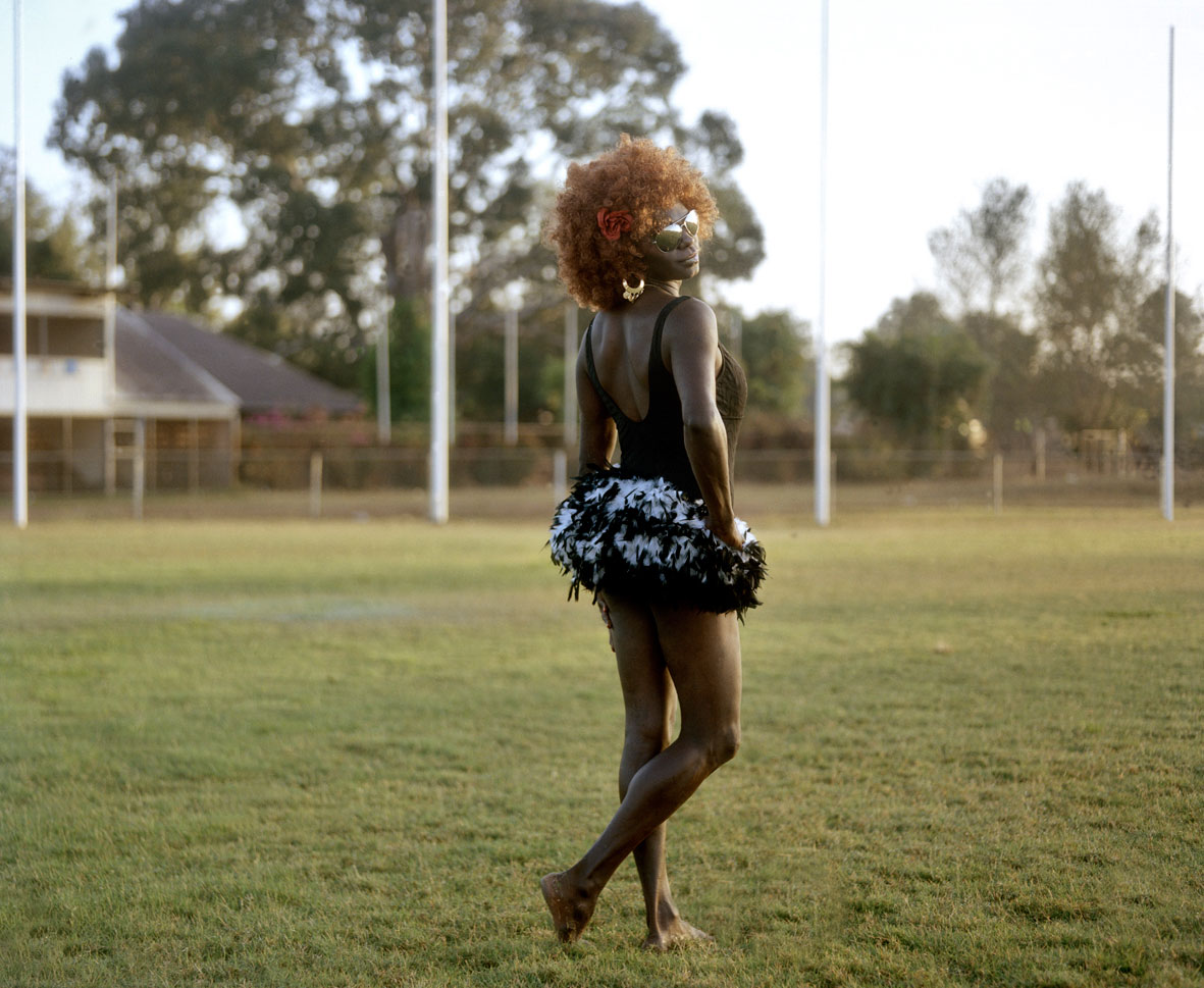
Bindi Cole Chocka (Australian, b. 1975) Bimbo 2009
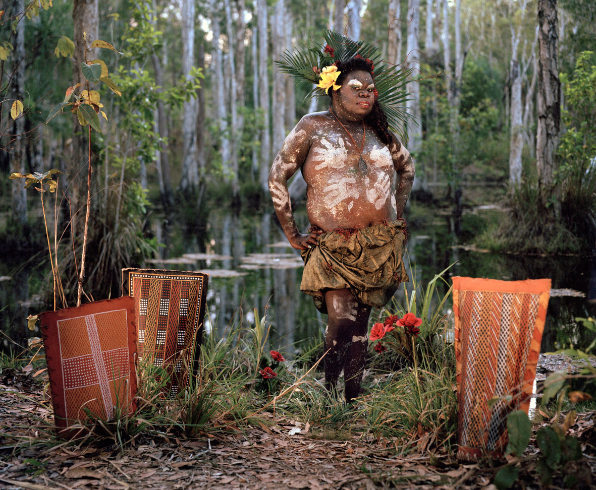
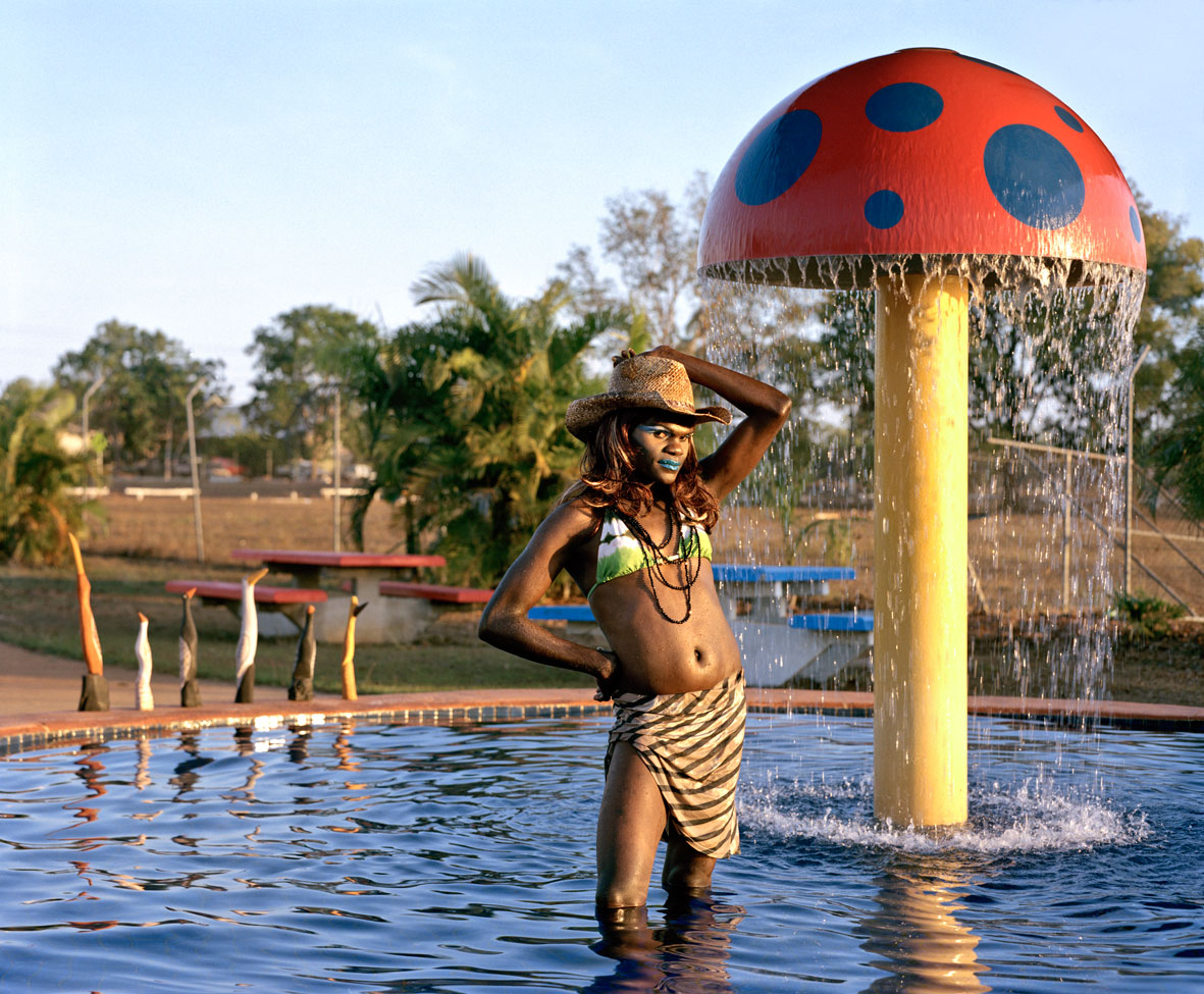
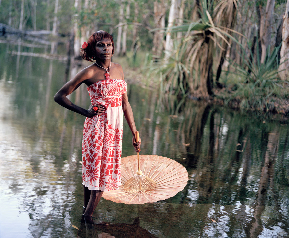
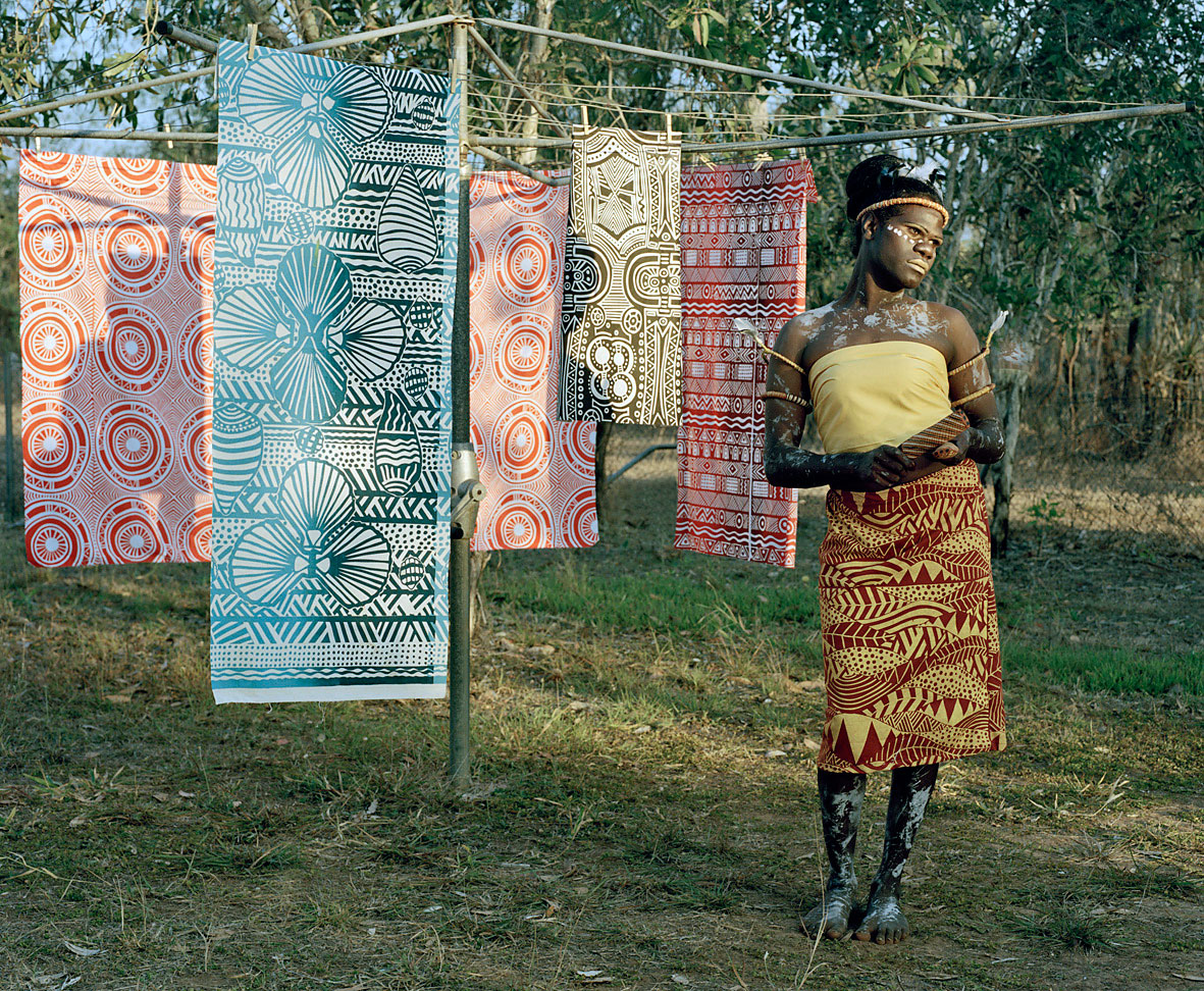
The exhibition Sistagirls by Bind Cole at Nellie Castan Gallery contains some beautiful photographs and others that are less successful. The successful portraits the ones that depict the Sistagirls in a more natural, less stylised way – they are the more interesting photographs. The subjects seem to speak for themselves without restriction, to be not so beholden to the pose that photographer wishes them to assume and/or the pose they wish to impose on themselves.
For example, the photograph of Jemima (see below) is just stunning in it’s naturalness and beauty. The two photographs of Crystal and Patricia, where the transgendered person asked to be photographed in traditional body paint with traditional objects, are highly successful in their form, composition and in the ability of the photographs to challenge stereotypical notions of Aboriginal culture.
Other portraits are anachronistic and a little try hard, with the misplacing of persons and objects in regard to each other. The portrait of Bimbo (very top photograph) did not need the two objects placed on the beach next to the person to make it a successful photograph; the portrait of Frederina (below) had enough going on in the photograph without the seemingly gratuitous placement of traditional objects in the background. We get the point and there was really no need to labour it.
One of the problems, of course, of a ‘stylised’ portrait (Bind Cole’s word in her artist statement) is that the portrait can become a double forgery, that of the pose of the person and that of the photographer imposing the style …
” … in a sense, the posed photograph is a kind of forgery, an imposition of an artificial composition before the recording instrument. On the other hand, the photo of a posing subject captures the authenticity of the practice of posing. A version of a person’s image is still an image of that person …
We are confronted with the pose, the conscious composition of the image to be photographed, the inherent constructedness of the posed photograph. Our heretofore implicit faith in the photograph as an evidentiary document is shaken. This is not to imply an outright rejection of photography … the effect is more properly an inducement to engage the document directly, personally, and on its own terms.”1
As noted at the end of the quotation, we, the viewer, must cut through this com-pose-ition to address the document directly. We must cut away the appendages of style and view the person and the photograph on its own terms. This is why the simpler portraits in the exhibition have so much more power than the overly constructed ones – they reach for an intangible essence that Cole is seeking by dropping away style and surrendering to the ineffable, a recognition of the lightness and joy in just being.
Dr Marcus Bunyan
1/ Feiereisen, Florence and Pope, Daniel. “True Fiction and Fictional Truths: The Enigmatic in Sebald’s Use of Images in The Emigrants,” in Patt, Lise (ed.,). Searching for Sebald: Photography after W.G. Sebald. Los Angeles: The Institute of Cultural Inquiry, 2007, p. 175.
Bindi Cole Chocka (Australian, b. 1975) Buffy 2009
Bindi Cole Chocka (Australian, b. 1975) Crystal 2009
Bindi Cole Chocka (Australian, b. 1975) Frederina 2009
The term ‘Sistagirl’ is used to describe a transgender person in Tiwi Island culture. Traditionally, the term was ‘Yimpininni’. The very existence of the word provides some indication of the inclusive attitudes historically extended towards Aboriginal sexual minorities. Colonisation not only wiped out many indigenous people, it also had an impact on Aboriginal culture and understanding of sexual and gender expression. As Catholicism took hold and many traditions were lost, this term became a thing of the past. Yimpininni were once held in high regard as the nurturers within the family unit and tribe much like the Faafafine from Samoa. As the usage of the term vanished, tribes’ attitudes toward queer indigenous people began to resemble that of the western world and religious right. Even today many Sistergirls are excluded from their own tribes and suffer at the hands of others.
Within a population of around 2500, there are approximately 50 ‘Sistagirls’ living on the Tiwi Islands. This community contains a complex range of dynamics including a hierarchy (a queen Sistergirl), politics, and a significant history of pride and shame. The Sistagirls are isolated yet thriving, unexplored territory with a beauty, strength and diversity to inspire and challenge.
During August and September of 2009, I was fortunate enough to have the opportunity to spend a month living with the ‘Sistagirls’ on the Tiwi Islands creating a series of highly stylised portraits of them. I loaded a barge with a four wheel drive, lights, a generator, cameras and enough film to fill a suitcase. Each day brought an emotional roller coaster from moments of elation around what was being achieved with the images to complete anxiety from the many dramas that occurred. This time has affected me in a profound way. The ‘Sistagirls’ have touched my heart. I only hope that in some way I have captured the essence of who they are and the spirit of their community. I know that they will always be a part of me and that I will be a regular visitor to Tiwi to visit the ‘Sistagirl’ community for the rest of my life.
Artist statement from the Nellie Castan website [Online] Cited 22/07/2010 no longer available online
Bindi Cole Chocka (Australian, b. 1975) Jemima 2009
Bindi Cole Chocka (Australian, b. 1975) Patricia 2009
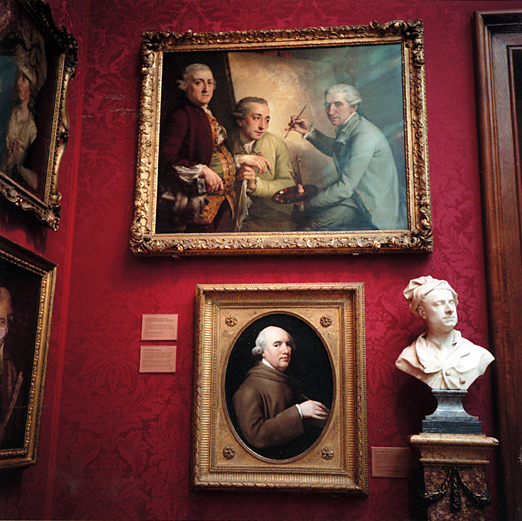
Anne Zahalka (Australian, b. 1957) National Portrait Gallery #1 1992/2010
A patchy exhibition by Anne Zahalka at Arc One Gallery, Melbourne. I can’t help feeling that we have seen this before, and done better, in the work of Candida Hofer and Thomas Struth.
Although the square photographs are taken by a medium format film camera (a Hasselblad I suspect) and printed as C-type prints (hence the lush colours) because the camera was handheld this means that, in some of the photographs, little is actually in focus. While this may add to the immediacy of the images, like a quick snapshot as Zahalka prowls the galleries, it detracts from the clarity of the previsualisation of the artist whilst also detracting from the visual depth of field that the subject matter needed.
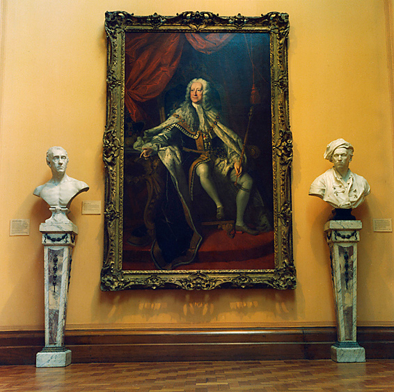
On the positive side there are some lovely spatial relationships between the figures in the paintings and the busts on the pedestals: in one particular photograph (National Portrait Gallery #2, 2010) there is an almost symbiotic relationship between the man in the painting at left, the bust of the man on the pedestal and the man at the very left in the right hand painting. This arrangement is like a triple portrait of the same person. A similar understanding of the spatial relationships within the image frame can be seen in National Portrait Gallery #1 (see photograph above), one of the more successful photographs in the series, with it’s wonderful red flocked wallpaper and gilt frames.
On the right hand side of the gallery there are numerous vertical colour photographs taken on a 35mm camera that feature the back of people looking at a work of art (see National Gallery of Australia, Masters of Paris #5, 2010). These are basic photographs that seek to conceptualise the act of looking at art as a tourist industry to no great affect or insight into the condition being examined.
Dr Marcus Bunyan
Many thankx to Angela Connor and Arc One Gallery for allowing me to publish the photographs in the posting. Please click on the photograph for a larger version of the image.
Anne Zahalka (Australian, b. 1957) National Portrait Gallery #5 2010
Anne Zahalka (Australian, b. 1957) National Portrait Gallery #3 1992/2010
Anne Zahalka (Australian, b. 1957) Prado Museum, Madrid 1992/2010
Arc One Gallery 45 Flinders Lane Melbourne, 3000 Phone: +61 3 9650 0589













You must be logged in to post a comment.