Around the world, 2025 hasn’t been a great year for photography exhibitions. As a friend of mine said on Facebook it has been a dreary year and I would tend to agree with him.
Curatorially, everything was pretty cut and dried, relying on the usual one artist show or group exhibition on a theme with nobody prepared to take a risk on anything creative, inventive even.
I found little to inspire me in terms of idiosyncratic but illuminating pairings of photographers or unusual insights into the conditions and conceptualisation of photographic production and presentation – other than a few of the exhibitions noted below: costume, gesture and expression – yes! the development of colour photography pre the ubiquitous American artists – yes! and the life in self-portraits of a photobooth operator in Melbourne, part magician, part artist – YES!
Out of the 60 postings on Art Blart in 2025 I’ve picked what I think are the 11 best exhibitions, plus a couple of honourable mentions.
I hope you enjoy the selection and a Happy New Year to you all!
Dr Marcus Bunyan
1/ Marcus Bunyan. “Past present,” on the exhibition Still Performing: Costume, Gesture, and Expression in 19th Century European Photography at the Nelson-Atkins Museum of Art, Kansas City, August 2024 – January 2025
Victor Plumier (Belgian, 1820-1878) Lady in Costume About 1850 Daguerreotype, half plate 5 1/2 × 4 1/2 inches The Nelson-Atkins Museum of Art Gift of the Hall Family Foundation
“The emotions and the sentiments, the gestures and the expressions. The actor and the stage, the photographer and the sitter. The staged photograph and the tableaux vivant. The Self and the Other.” ~ MB
2/ A Long Arc: Photography and the American South since 1845 at the Virginia Museum of Fine Arts, Richmond, October 2024 – January 2025
Andrew Joseph Russell (American, 1829-1902) Slave Pen, Alexandria, Virginia 1863 Albumen silver print High Museum of Art Purchased with funds Lucinda Weill Bunnen Fund and the Donald and Marilyn Keogh Family
“Photographs are containers of, fragments of, memories of, histories of, events – remembrances of events – brought from past into present, informing the future, showing only snippets of the stories of both past and present lives. Parallel to the usual thought that photographs are about death, they are also memory containers for (still) living people.” ~ MB
3/ Marcus Bunyan. “Out in the midday sun,” on the exhibition Martin Parr. Early Works at Fotografie Forum Frankfurt (FFF), September 2024 – February 2025
“I am always fascinated with the early work of an artist. In essence, the photographs tell you what are the primary concerns for the artist and these themes usually remain with them for the rest of their career. These early black and white photographs provide a window into that ongoing investigation, that golden path. They are more subtle in their modulation of British life than in the later colour work – it’s as though the artist had to change gears with the use of colour developing a more ironic way of seeing British life through a different spatial relationship to his subjects – but in these photographs there is still that deprecating humour that is often missing in the work of his contemporaries…” ~ MB
“There are the things that are out in the open, and there are the things that are hidden, and life has more to do, the real world has more to do with what is hidden.” ~ Saul Leiter
5/ True Colors: Color in Photography from 1849 to 1955 at Albertina Modern, Vienna, January – April, 2025
Léon Vidal (French, 1833-1906) Oriental Onyx Sardonyx Cup (16th century) 1876 Photomechanical proof (photochromy using the Léon Vidal process) mounted on cardboard H. 20.8 ; L. 26.2 cm. Don Fondation Kodak-Pathé, 1983
“What a wonderful exhibition. It’s so exciting to see the history and development of colour photography pre the ubiquitous, American artists William Eggleston and Stephen Shore, much as I like both artists.” ~ MB
6/ The basement: photography from Prahran College (1968-1981) at the Museum of Australian Photography, Wheelers Hill, Melbourne, March – May 2025
Julie Millowick (Australian, b. 1948) Mother and child from 46 Blanche Street, St Kilda 1977 Gelatin silver print 15.9 x 23.7cm Museum of Australian Photography, City of Monash Collection donated by Julie Millowick 2024
“Prahran College itself played a critical role in the legitimisation of photography as an art form within Australia. It spearheaded the integration of art photography into tertiary education curricula, fostering an environment where young artists … could experiment formally and conceptually.”
James McArdle. “Epoch,” on the On This Date in Photography website, 25th April, 2025 [Online] Cited 28/04/2025
“The wit, the humour (pigeons sitting outside the racing pigeon shop), the stiff upper lip, the carry on regardless, the working class pantomime of life and death – the public commission flats where people formed caring communities that were destroyed through redevelopment – the integrity of an existence that has largely come and gone pictured with warmth and empathy.” ~ MB
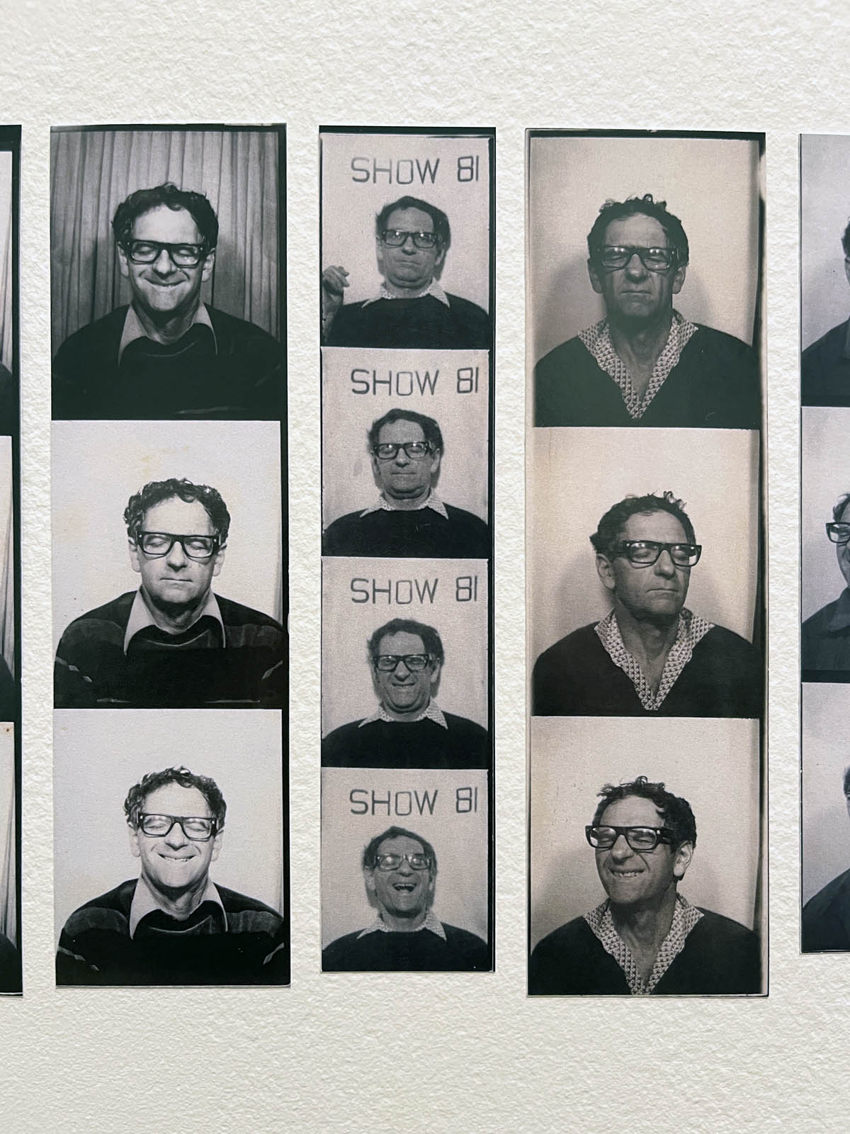
8/ Auto-Photo: A Life in Portraits at RMIT Gallery, Melbourne, June – August 2025
Installation view of the exhibition Auto-Photo: A Life in Portraits at RMIT Gallery, Melbourne, June – August, 2025 Photo: Marcus Bunyan
“Through the strip self-portraits Adler took while servicing and then testing the photobooths that he operated in Melbourne, Australia we become immersed in an archive of his world, the exhibition becoming a joyous ode to a man who devoted his life to photography (not in the traditional sense): in turns humorous and historical, a travelogue, his travelogue, through time and space.’ ~ MB
“Rodríguez’s moody, high contrast photographs of humanity and street scenes pictured from behind the wheel of his taxi in New York proffer an intuitive, empathetic and subjective view of the city and its people at a time of great economic and social upheaval…
Uncertain times, uncertain angles and perspectives, uncertain light give rise to a powerful body of work made certain by the talent of an impressive photographer. Glorious work.” ~ MB
10/ Marcus Bunyan. “Myths of the American West,” on the exhibition Richard Avedon ‘In the American West’ 1979-1984 at the Fondation Henri Cartier-Bresson, Paris, April – October 2025
“Avedon, while undercutting the myth of the American West through his storytelling, doesn’t seek to document, exploit or misrepresent his subjects, but to subjectively present them as on a theatrical set devoid of scenery – where their very appearance becomes scene / seen. As he himself said, “My concern is… the human predicament; only what I consider the human predicament may simply be my own.”” ~ MB
“The Bechers’ typologies and grids, their topographic state, their same same photographs and perspectives of industrial sculptures and landscapes are anything but objective. Their pictorial grammar, underlaid by a conceptual approach to subject matter, continuously reflected in the systematics of capture and display (the juxtaposition of works together), is constantly undermined by the ghost in the machine – those viral codes of mutation and difference which cannot be controlled.” ~ MB
“Weems blends the poetic and conceptual in photographs and bodies of work which investigate history, identity, racism, executive and patriarchal power from the perspectives of female / Black American.
What a fabulous artist, a guide into circumstances seldom seen, now revealed.” ~ MB
Auguste and Louis Lumière (French, 1862-1954) (French, 1864-1948) Bangles 1893-1900 ALL Chroma 8.4 x 17.8cm The ALBERTINA Museum, Vienna – Permanent loan by Höhere Graphische Bundes-Lehr- und Versuchsanstalt
What a wonderful exhibition.
It’s so exciting to see the history and development of colour photography pre the ubiquitous, American artists William Eggleston and Stephen Shore, much as I like both artists.
In my eyes, that would have made the exhibition even better!
Dr Marcus Bunyan
Many thankx to the Albertina Modern for allowing me to publish the photographs in the posting. Gracious thankx also to Karin Svadlenak-Gomez for allowing me to use her wonderful photographs of the exhibition in the posting, noted below each image. Please click on the photographs for a larger version of the image.
Installation view of the exhibition True Colors: Color in Photography from 1849 to 1955 at Albertina Modern, Vienna showing in the bottom image, Léon Vidal’s photograph Oriental Onyx Saucier, 16th century, from Le Tresor artistique de la France, c. 1876-1878 (below)
Léon Vidal (French, 1833-1906) Oriental Onyx Sardonyx Cup (16th century) 1876 Photomechanical proof (photochromy using the Léon Vidal process) mounted on cardboard H. 20.8 ; L. 26.2 cm. Don Fondation Kodak-Pathé, 1983
Installation view of the exhibition True Colors: Color in Photography from 1849 to 1955 at Albertina Modern, Vienna showing at left, Heinrich Kühn’s Twilight 1896 (below); and at right, Heinrich Bachmann’s Winter Landscape 1903
One of my personal highlights from True Colours was the section dedicated to pictorialist photography. Emerging in the late 19th and early 20th centuries, pictorialism sought to elevate photography to the level of fine art, favouring soft focus, painterly compositions, and atmospheric effects. In fact the Albertina modern had a whole exhibition on Pictorialism in 2023, which was a great joy to me.
Heinrich Kühn’s Twilight (1896, above), produced through the autochrome process, was a standout for me, its subtle gradations of light and shadow creating an almost dreamlike serenity. Kühn was also one of the pioneers of the autochrome process, the first commercially successful colour photography method introduced by the Lumière brothers in 1907. Autochromes used a fine layer of dyed potato starch grains to filter light, creating rich and softly textured images. Kühn masterfully employed this process to enhance the painterly, impressionistic quality of his photographs, further bridging the gap between photography and fine art. Seeing these images up close, I was reminded of how photographers of the past fought for their medium to be recognised as more than mere documentation – it was, and remains, an art form in its own right.
Karin Svadlenak-Gomez. “Photography in Full Spectrum,” on the ViennaCultgram website 13th March 2025 [Online] Cited 25/03/2024
Installation view of the exhibition True Colors: Color in Photography from 1849 to 1955 at Albertina Modern, Vienna Photo:Karin Svadlenak-Gomez
Installation view of the exhibition True Colors: Color in Photography from 1849 to 1955 at Albertina Modern, Vienna showing Anonymous. Laboratory Still Life 1906
Installation view of the exhibition True Colors: Color in Photography from 1849 to 1955 at Albertina Modern, Vienna showing two photographs by Atelier D’Ora with at right, Maria Delvard as Tambour 1913
The aesthetics of fine art photography had their greatest impact on studio photograph. In the early twentieth century, such progressive studios as Atelier d’Ora (later called Atelier d’Ora Benda) adopted the reformed portrait style and its elaborate techniques. The bromoil and broccoli transfer processes finally offered an alternative to gum prints, so that works in colour could be produced in a much less complicated and inexpensive way.
Wall text from the exhibition
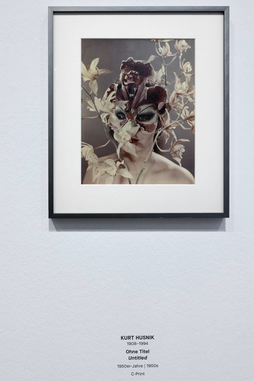
Installation view of the exhibition True Colors: Color in Photography from 1849 to 1955 at Albertina Modern, Vienna showing Kurt Husnik’s three photographs Untitled 1950s
Installation view of the exhibition True Colors: Color in Photography from 1849 to 1955 at Albertina Modern, Vienna showing Kurt Husnik’s Untitled 1950s
Installation view of the exhibition True Colors: Color in Photography from 1849 to 1955 at Albertina Modern, Vienna showing at left, Hans Madensky’s Fashion Portrait – Student of the Vienna-Hetzendorf School of Fashion 1952 (below)
The exhibition True Colors – Color in Photography from 1849 to 1955 answers this question with outstanding works from the Albertina Museum’s photo collection.
The desire for colour in photography has dominated the world of photography from the very beginning. True Colors traces the development of colour photography, from the first experimental techniques in the 19th century to generally applicable analog colour photography.
Even in the early days of photography, daguerreotypes and salt paper prints were colored by hand to create colorful images. Monochrome pigment papers, which enjoyed great popularity until the 1890s, also contributed to the broad chromatic diversity of 19th century photographs.
The first successful color process, which was reserved for an exclusive circle, was introduced in 1891. The brilliant images in the so-called interference colour process are based on the physical principle of standing waves, which also allows us to see coloured reflections in soap bubbles. The unique pieces from the Albertina Museum’s Collection represent a unique focal point.
The autochrome process, which was introduced in 1907, brought about a major change in image culture. It was also practicable for amateurs and helped its inventors, the Lumière brothers, to achieve great commercial success. However, it was mainly used as a glass slide for projection. At the same time, around 1900, fine art printing processes were developed that used color pigments to produce multicolored image solutions. They fulfilled the artistic aspirations of the Pictorialists and were commonplace in large photo studios until the 1930s. For a long time, the challenge was to obtain colored prints on paper. This was also achieved at the beginning of the 20th century with the use of various three-color processes, which were assembled in several steps.
Kodak finally achieved the breakthrough to easy-to-use and therefore mass-market colour photography in 1936 with the first 35mm colour slide films. These products revolutionised the use of colour photography in the following decades, which form the conclusion of this Albertina Museum exhibition.
True Colors provides an insight into the rich holdings of the Albertina Museum’s photography collection, the historical part of which is based on the collection of the Höhere Graphische Bundes- Lehr- und Versuchsanstalt (GLV). The exhibition demonstrates the great public interest, the constant development and the various fields of application of historical photography in colour. True Colors also explores the impact of popular colour processes on the visual culture of the early 20th century.
The exhibition is on view from 24 January until 21 April 2025 at the Albertina Modern
Photochrom Print Collection (photographer) The Falls of the Rhine, by Bengal Light, Schaffhausen, Switzerland Between 1890 and 1900 Print no. “16491”.; Forms part of: Views of Switzerland in the Photochrom print collection.; Title from the Detroit Publishing Co., Catalogue J-foreign section, Detroit, Mich.: Detroit Publishing Company, 1905. Photomechanical print, photochrom, colour
True Colors: Color in Photography from 1849 to 1955
Today, colour photography is omnipresent, but the knowledge about its complex genesis is not very familiar. This exhibition highlights the multifaceted developments that were initiated starting in the mid-nineteenth century to bring colour into photography. Thanks to the extensive photographic collection of the Imperial-Royal Institution of Graphic Education and Research, the Albertina possesses unique holdings of important examples from this exciting chapter of photographic history.
As early as the middle of the nineteenth century, individual scientists managed to create unique photographs in color, which, however, were not intended for everyday use. Therefore, it was common from the early days to employ colouration or toned photographic papers. In 1891, Gabriel Lippmann achieved a crucial success in direct color photography by formulating the interferential colour process, which produced brilliantly vivid images. The Lumière brothers finally accomplished the first revolution in color photography: in 1907, they brought industrially manufactured autochromes to market. It was now for the first time that photographers and amateurs could access a practicable process for the production of colour glass slides. Thanks to more elaborate three-colour processes and Pictorialist fine art printing, which were developed around the same time, it was also possible to produce photographs in colour on paper.
The desire for colour in photography, which had been evident since it had existed, continued to prevail in the twentieth century. A decisive breakthrough was achieved by the Kodak Company in the mid-1930s, when it produced the first 35 mm photographic color slide film. Starting out from the USA, more practical materials for analog color photography, which had been developed gradually, also established themselves in Europe after World War II. It was now impossible to stop the triumph of modern colour photography.
All objects on display here come from the holdings of the Albertina or are on permanent loan from the collection of the Höhere Graphische Bundes-Lehr- und Versuchsanstalt [Higher Federal Institution of Graphic Education and Research].
Chromatic Diversity
Before it was possible to produce color photographs, photographers made use of a number of methods to bring color into their images. Even in the early days, daguerreotypes and salted paper prints were coloured by hand. While daguerreotypes were usually colored only partially, salted paper prints were sometimes heavily painted over. The so-called pigment papers, which enjoyed great popularity from the 1850s onward, enabled monochrome prints in various colours. Industrial manufacturers offered a wide range of nuances that could be variably used depending on the motif. Another way of lending prints uniform colour effects were toning baths. It was thus variable methods that were employed to produce photographs displaying a rich chromatic diversity.
A vital contribution to photography in colour was the introduction of the so called orthochromatic negative plates. In 1873, Hermann Wilhelm Vogel discovered the sensitisation of the photographic emulsion, so that the plates truthfully rendered the brightness values of blue, orange, yellow, and green. Earlier, the grey values of the blue areas had appeared overly bright, while the other colours had often seemed too dark. With the development of so-called panchromatic negative material it became possible from 1902 on to accurately record the entire visible spectral range according to tonal values. This progress was crucial for colour photography, as an incorrect recording of the tonal values during a shot could result in a distorted colour impression in the final product.
A Solitaire – the Interferential Colour Process
The interferential colour process, with which Gabriel Lippmann went public in Paris in 1891, is considered a first milestone in direct color photography. The method ensured permanently stable, brilliantly vivid colour images. It is based on the interference of light waves caused during exposure by the reflections of incident light rays off a reflective layer of mercury behind the negative. In the photographic emulsion, the finest layers are created alongside the standing waves, in which accumulations of silver are deposited. The spacing between the layers corresponds to the wavelength of the recorded colour, so that when the image is viewed at the correct angle, the individual parts reflect their original colour. Standing waves are the phenomenon that also causes the colour effects on soap bubbles.
The process, which had its pitfalls, was enthusiastically received by specialists. The Lumière brothers, who as producers of photographic plates were highly interested in colour photography, collaborated with Lippmann to improve emulsions. The Berlin-based scientist Richard Neuhauss also dealt intensively with this method, based on the research conducted by the Viennese photochemist Eduard Valenta. Due to its chromatic purity, the spectrum offered itself as an ideal motif for images. Neuhauss’s plates fascinate us not only because of their luminous colours, but mainly for their wide range of motifs, which was facilitated by the reduction of exposure times.
Photomechanical Color Printing Processes
Since the development of chromolithography in 1837, color reproductions had been increasingly used for luxury volumes. In combination with photography, the printing plates could either be exposed directly, or the photographic images were transferred to the plates by means of transfer printing. This and related procedures led to an increase of elaborately produced publications of scholarly character. For the work Le Trésor artistique de la France, which contained high-quality colour reproductions of art objects held by the Louvre, the French photographer Léon Vidal developed a complex process referred to as photochromie. Photographic prints constituted the base layer onto which he printed several tinted lithographic plates. Through the additional use of metallic colours or papers and a layer of varnish, Vidal achieved three-dimensional effects.
Another important step was the introduction of the collotype process, which, from 1868 onward, allowed printing black-and-white photographs in halftones. Institutions like the Imperial-Royal Austrian Trade Museum in Vienna published such luxurious scholarly publications as the illustrated volume Orientalische Teppiche [Oriental Rugs], which appeared in 1892. For this work, black-and-white collotypes and the chromolithographic plates were partly each executed across the entire surface and partly combined with each other in order to document the knotting technique and the colouration of the objects equally accurately. A colour sample based on the original rug was first painted on the collotype and then transferred by lithography. Up to thirteen individually tinted printing plates were employed in the process. Both publications stand out for the effort to imitate the object character in the coloured reproduction.
Commercial Successes – the Autochrome and Other Color Screen Processes
In 1893, in search of a viable color process, the industrialists Auguste and Louis Lumière developed the ALL Chroma, a transparency made up of three coloured layers. Since its production and use involved a high input of costs and time, the method did not prevail, despite the vivid colors it produced. Following further research, the Lumière brothers eventually achieved a breakthrough with the autochrome in 1907, which was to revolutionise colour photography for the first time. The autochrome is also a positive transparency, yet based on the principle of additive color synthesis. A glass plate functioning as carrier material is covered with a photosensitive layer on one side. A mixture of red, green, and blue starch granules is applied on top of it, forming an irregular pattern. The image is created after exposure and negative and positive development, as the granules fuse together to form coloured areas when viewed in transmitted light. Its vibrant colors and uncomplicated handling earned the inventors of this method great commercial success. The autochrome was no longer exclusively accessible to specialists. The process was not only employed for scientific images, but also and mainly in amateur photography.
In addition to the autochrome, there were numerous products relying on the principle of additive color synthesis, such as the Joly process, which had already been developed in England ten years earlier and which was based on a grid of vertical lines. By 1910, further colour screen processes had made it onto the market, such as Omnicolore or the Agfacolor plate. But the autochrome remained the most widely used colour process until the early 1930s because of its unsurpassed chromatic brilliance.
Colour by “Indirect” Means – Three-Colour Processes
Three-colour photographic printing methods on paper are based on the principle of subtractive colour mixing. The processes, their implementation differing in detail, followed a multistep procedure. At first, three subsequent black-and-white shots were taken behind red, green, and blue filters. The so called colour separation negatives were then inverted into positives. From the three positives, three matrices – in the complementary colours cyan, magenta, and yellow – were then produced. The colour image was finally composed of these three colours.
For the pinatype, three matrices were transferred onto a sheet of prepared paper. What mattered for an accomplished picture was not only proper colour adjustment, but also an absolutely precise alignment of the images. The still life of various laboratory utensils demonstrates the individual steps leading to a colourful picture. The so-called interpositives provide the basis for the coloured matrices, which, printed one upon the other, provide the final version of the picture. Apart from still lifes, photographers also employed this technique, which was developed to market maturity by Ernst König in 1905, for portraits. In these photographs, they showcased their creative skills in handling colour.
Pictorialist Endeavors – Fine Art Printing Processes
Artistic photography around 1900 was propagated by wealthy amateurs who wished to elevate photography to the level of fine art. Their ambition was to be able to manipulate the photographic print by hand, as the mechanical aspect of photography was criticised as being inartistic. The gum bichromate print, a so-called fine art printing process, allowed them to control the work as much as possible. A mixture of pigments, gum arabic, and photosensitive salts was applied to coarse paper and then exposed. After washing out the unexposed areas, the image became visible. For multicolor works, this process could be repeated as often as desired, each time using a different pigment. This advancement of the gum bichromate printing technique toward multicolour printing was first implemented by members of the Camera Club in Vienna, an association of amateur photographers. The possibility of creating such colourful images that could be used as decorative works of art on the wall and sometimes reach large dimensions, was particularly enthusiastically received in German-speaking countries.
Paths to Modern Colour Photography
The consequential breakthrough to mass-market color photography was achieved in the mid-1930s, when the companies Eastman Kodak (USA) and, shortly thereafter, Agfa (Germany) put so-called modern multilayer films with dye couplers on the market. By 1936, the first 35mm colour slide films and, by 1942, the first colour films and corresponding photographic papers for the negative-positive process were available, the latter of which revolutionised colour photography a second time. Yet the outbreak of World War II initially delayed the spread of these innovations in Europe. But from the 1950s onward, the triumph of modern analog colour photography could not longer be stopped.
However, contemporary high-quality copying and printing processes were still extremely expensive and complicated. The Duxochrome and dye-transfer processes, for example, were valued not only for the brilliance and stability of their colours, but also because they could be manipulated during the production process. But due to the high cost of production, they were mainly used for commercial purposes. Product and fashion photography accommodated the needs of advertising and the press. In Vienna, the photographers Arthur Benda and Hans Madensky were very successful in these fields.
Text from the Albertina Museum
Installation views of the exhibition True Colors: Color in Photography from 1849 to 1955 at Albertina Modern Photos:Karin Svadlenak-Gomez
Ernst König (German, 1869-1924) Still-life with flowers 1905 Pinatype Photo:Karin Svadlenak-Gomez
Installation view of the exhibition True Colors: Color in Photography from 1849 to 1955 at Albertina Modern, Vienna showing Kodak Company. Photo Magazines for Amateurs 1957-1959
Installation views of the exhibition True Colors: Color in Photography from 1849 to 1955 at Albertina Modern, Vienna Photos:Karin Svadlenak-Gomez
True Colors: Color in Photography from 1849 to 1955 at Albertina Modern poster
The Albertina Museum Albertinaplatz 1 1010 Vienna Phone: +43 (0)1 534 83 0

 'Lady in Costume' About 1850")
 'Slave Pen, Alexandria, Virginia' 1863")
 'Mayor of Todmorden's inaugural banquet, Todmorden, West Yorkshire, England, 1977' 1977")

 'Oriental Onyx Sardonyx Cup (16th century)' 1876")
 'Mother and child from 46 Blanche Street, St Kilda' 1977")
 'Opticians, London, 1975' 1975")
 '220 West Houston Street, NY' 1984")
 'Sandra Bennett, twelve year old, Rocky Ford, Colorado, August 23, 1980' 1980")
 'Wassertürme, USA' (Water towers, USA) 1974-1983")
![Heinrich Riebesehl (German, 1938-2010) 'Menschen Im Fahrstuhl, 20.11.1969' [People in the Elevator, 20.11.1969] 1969](https://artblart.com/wp-content/uploads/2025/06/2-typologien_heinrich-riebesehl_siae_sm.jpg "Heinrich Riebesehl (German, 1938-2010) 'Menschen Im Fahrstuhl, 20.11.1969' [People in the Elevator, 20.11.1969] 1969")
 'Welcome Home' 1978-1984 From the series 'Family Pictures and Stories'")
 (French, 1864-1948) 'Bangles' 1893-1900 from the exhibition 'True Colors: Color in Photography from 1849 to 1955' at Albertina Modern, Vienna, January - April, 2025")


; and at right, Heinrich Bachmann's 'Winter Landscape' 1903")
 'Twilight' 1896")


) 'Sample board of various pigment papers from Ad. Braun et Cie.' around 1910")
) 'Sample board of various pigment papers from Ad. Braun et Cie.' around 1910 (detail)")
) 'Sample board of various pigment papers from Ad. Braun et Cie.' around 1910 (detail)")


")
 'Fashion Portrait - Student of the Vienna-Hetzendorf School of Fashion' 1952")
 'Portrait of a Young Officer' 1849")

 'Parrot' 1899")
 'The Falls of the Rhine, by Bengal Light, Schaffhausen, Switzerland' between 1890 and 1900")
 'Exotic Butterflies' 1908-1914")
 'The Parasol' 1912")
 'Evening Gown by Madame Grès' 1950/1954")


 'Still-life with flowers' 1905")
 'Mrs. Oergan' 1924")


You must be logged in to post a comment.